The Google Nest Audio smart-speaker gets its own detachable Walkie-Talkie with a touch display

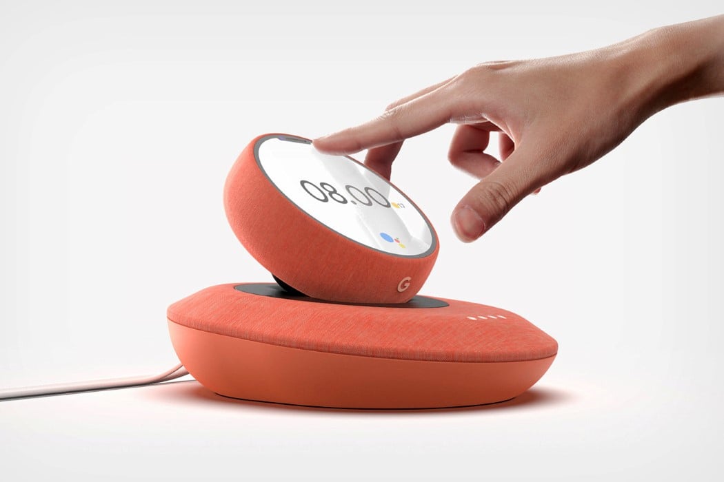
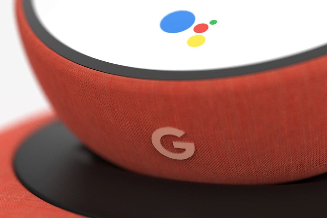
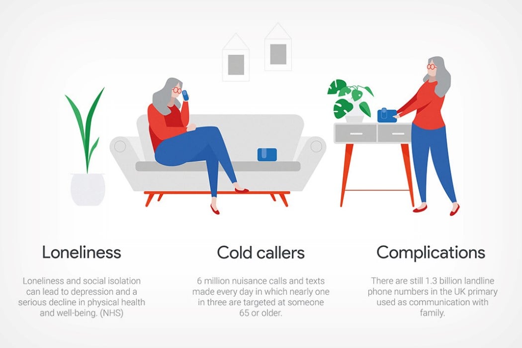
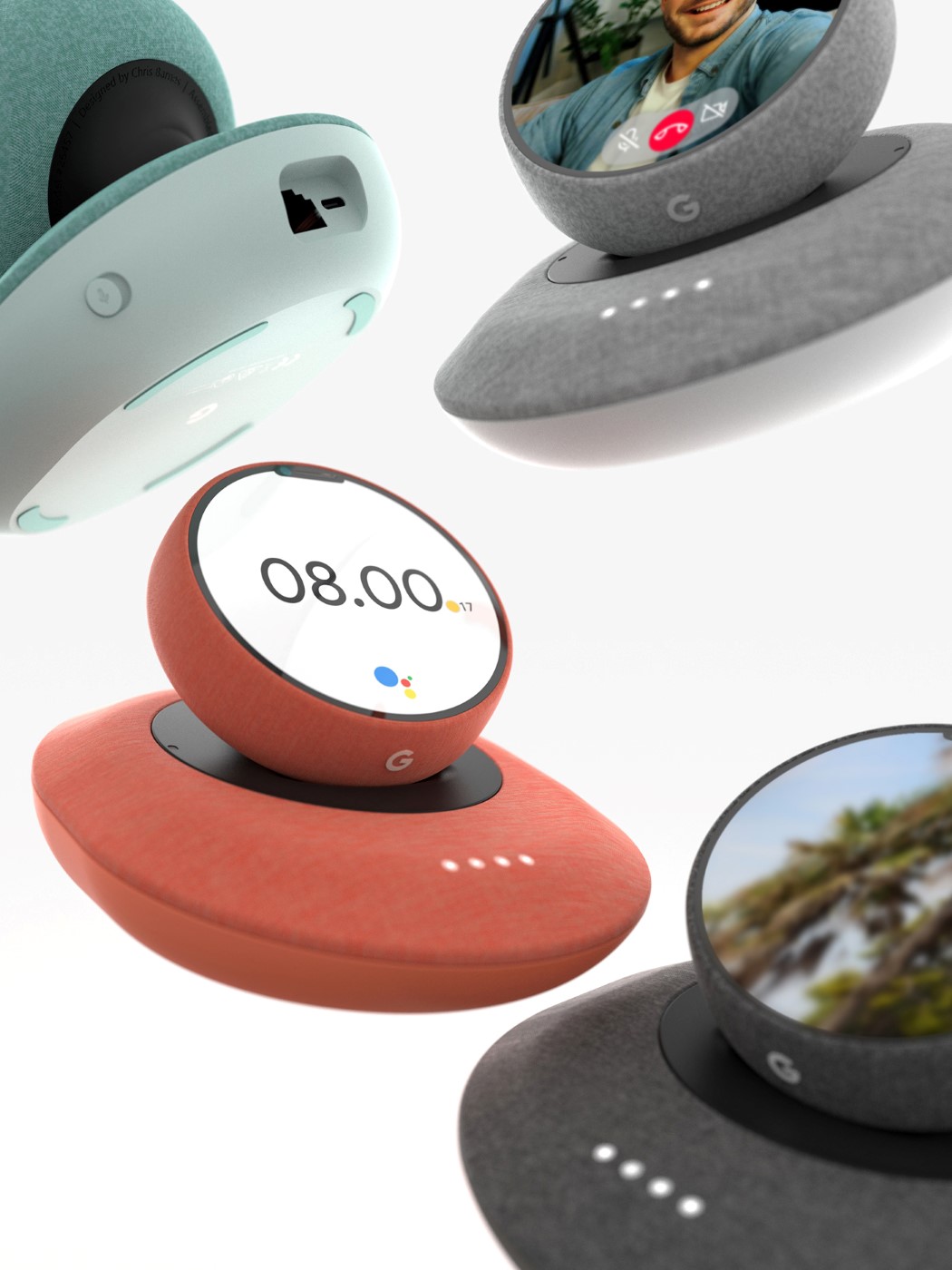
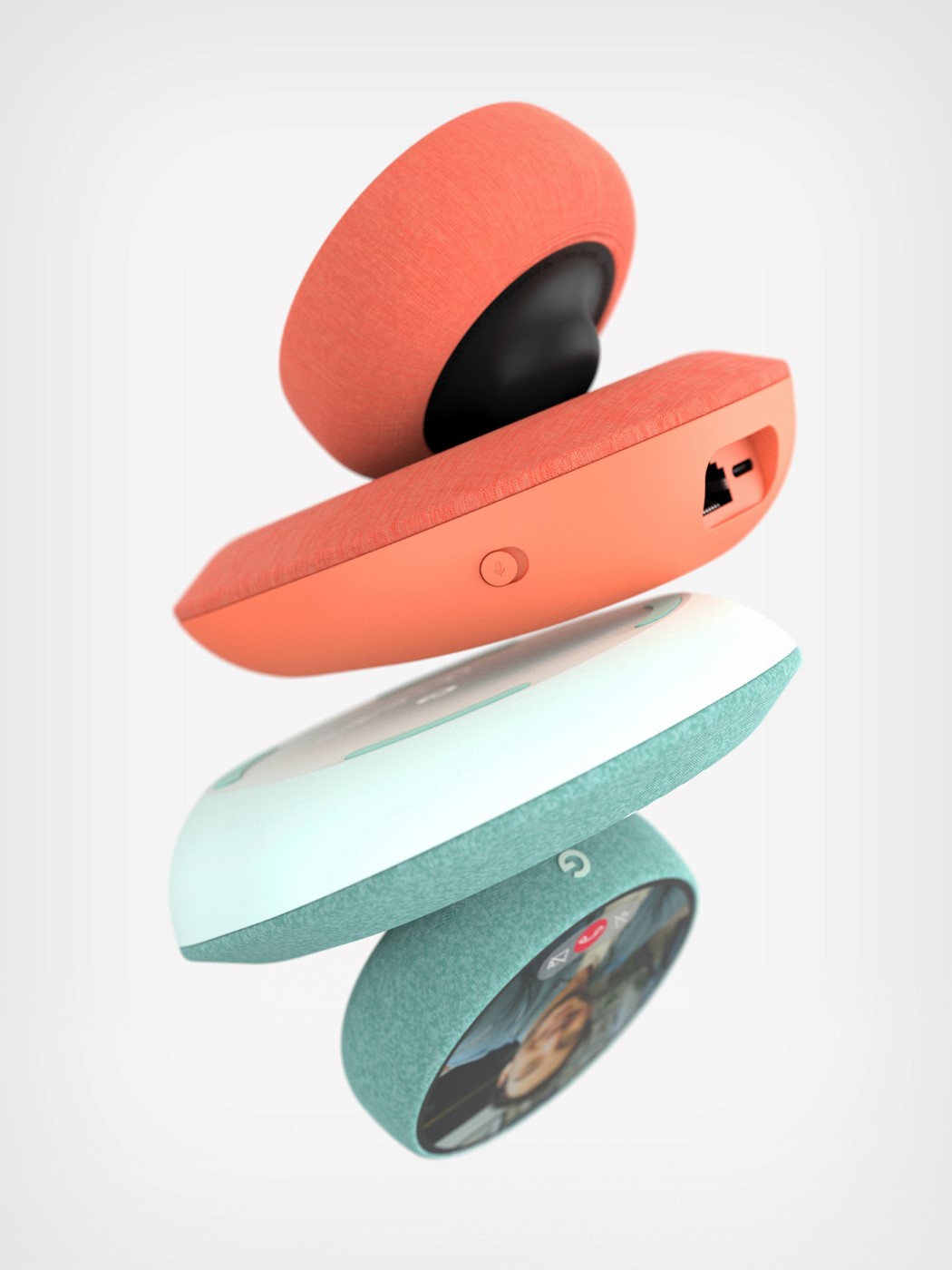
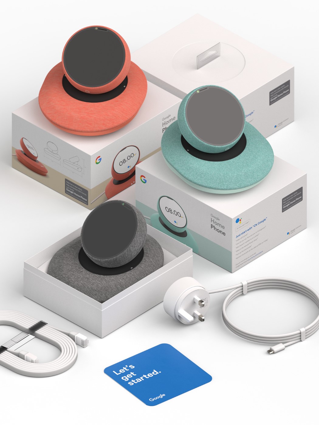
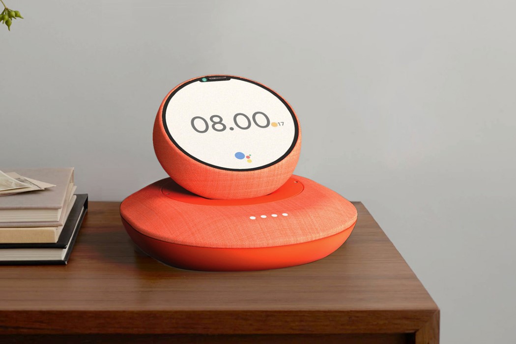
Chris Barnes’ conceptual Google device caters to the niche audience that needs connectivity the most, but struggle to keep up with technology or to avoid the complications associated with advanced tech. The Google Home Phone is a fusion of the Google Home smart-speaker (now the Nest Audio smart-speaker) and the Google Pixel), but its spiritual ancestor is, in fact, the landline phone. Designed to be a smart device with a dockable receiver or ‘phone’, the Google Home Phone lets the elderly connect with their relatives and friends who are also a part of the Google ecosystem. Once set up, the Home Phone works like a smart speaker, allowing you to ask for help, access information, or contact people, while the detachable ‘handset’ functions as the receiver on a landline, allowing you to lift it off the base and talk to people, not just using audio, but using video too!

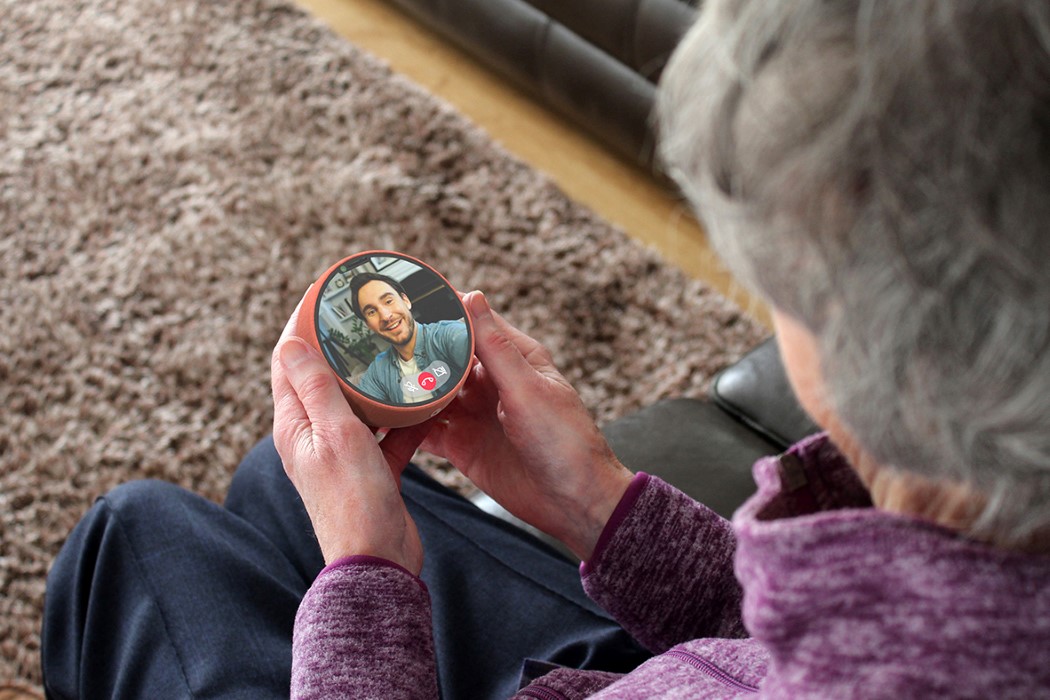
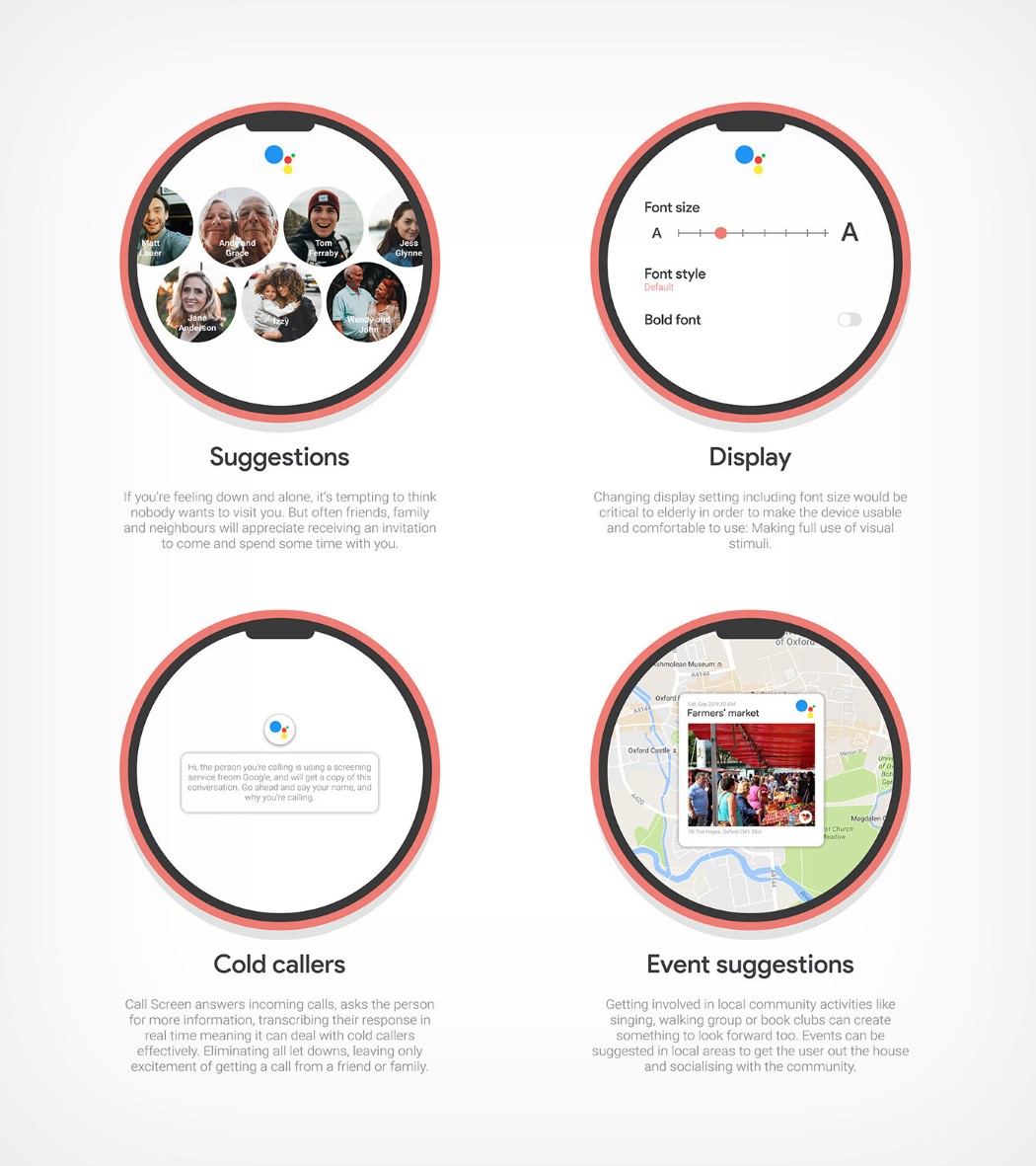
The Home Phone is an incredibly interesting concept for a whole bunch of reasons. For starters, Barnes envisions it as a “better”, smarter, and wireless version of a landline, allowing you to contact people without remembering phone numbers, see who’s calling (via Google’s contact database), be unencumbered by coiled wires, and easily avoid robocalls (thanks to Google’s incredible spam-detection AI). The touchscreen display on the detachable unit serves as a visual aid, allowing the elderly to tap icons without navigating confusing interfaces… and accessibility features like adjustable font-sizes make it easy for people with visual impairment.

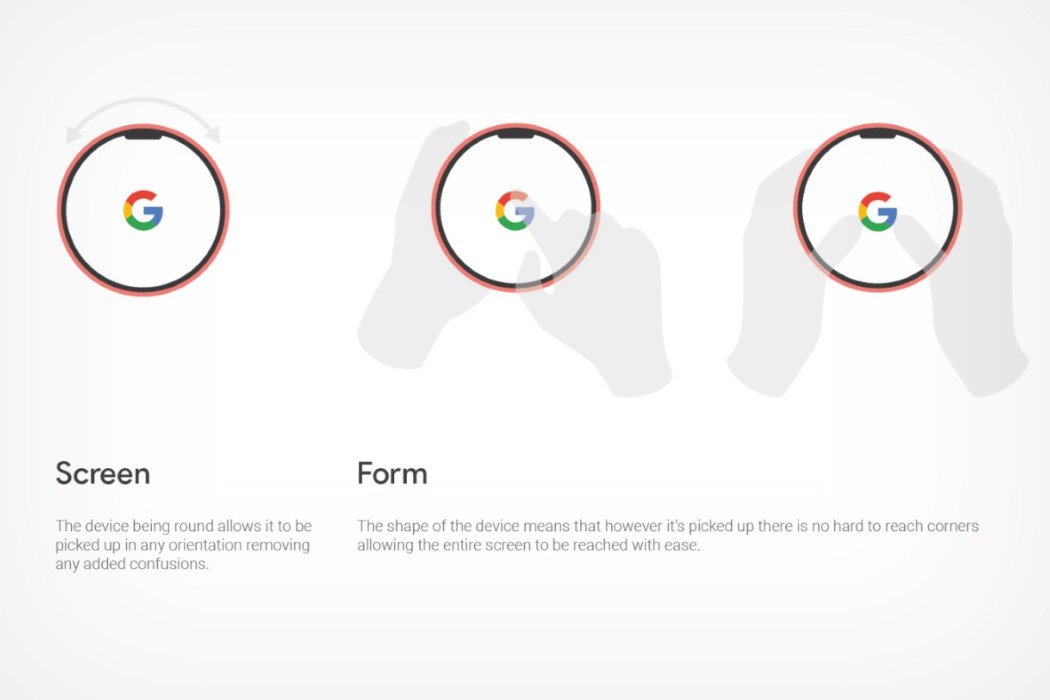
Personally, the Google Home Phone gets a bunch of things right with its form factor. Not only is the dockable receiver + base interaction very reminiscent of the landline telephone (in fact the receiver can be held to one’s ear like a conventional phone too), but its circular ‘phone’ also ticks two arguably important boxes. The circular form-factor is rather comfortable to hold in any angle (a great win for people with dexterity issues), but at the same time, dock it onto its base and it also resembles a magical crystal ball, which believe it or not, is a familiar silhouette that also cleverly ties into the magical ability for the circular screen to really display anything, from faces of loved ones, to the time, weather, messages, and even Map routes!

Barnes even fleshed out the Home Phone concept to make sure it’s a practical systems solution (and not just a pretty concept). The base sports a wired connection (so you never have to worry about batteries), and features a powerful smart-speaker that’s easy to talk to. The dockable ‘phone’ sits loosely on top of the base, with ‘no fixed docking position’, which means the elderly never have to worry about making sure they’ve placed the receiver the right way. As soon as the phone and hub are in proximity, the hub begins wirelessly charging the phone. The phone-unit also comes with a notch of its own, featuring a powerful camera system that enables two-way video communication. Not only does it mean the elderly can have video conferences with their friends, family, caretakers, and medical staff, it also enables the latter to keep a watchful eye on their elderly wards by allowing the Google Home Phone to function as a home-camera.

Designer: Chris Barnes

This low-cost baby health monitor is designed to make baby’s healthcare easy for new parents!

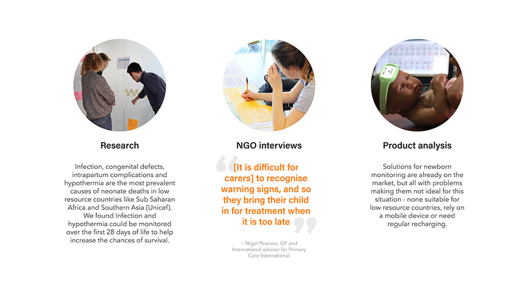
Across the globe in 2018, 2.5 million babies died within their first month of life. Collectively, Africa and Southern Asia made up approximately 87.7% of these deaths. – UNICEF

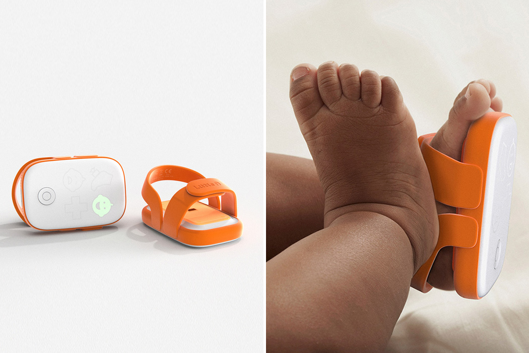
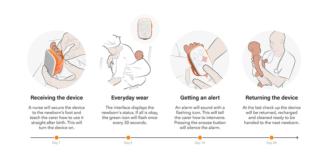
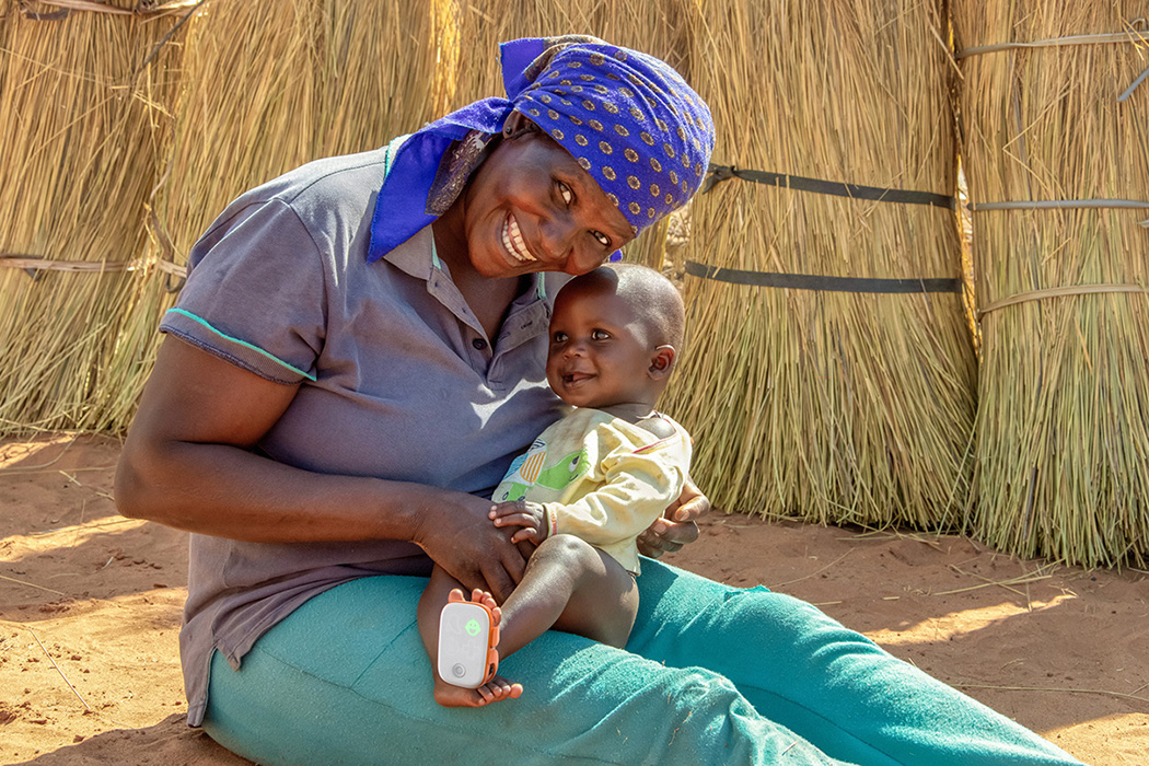
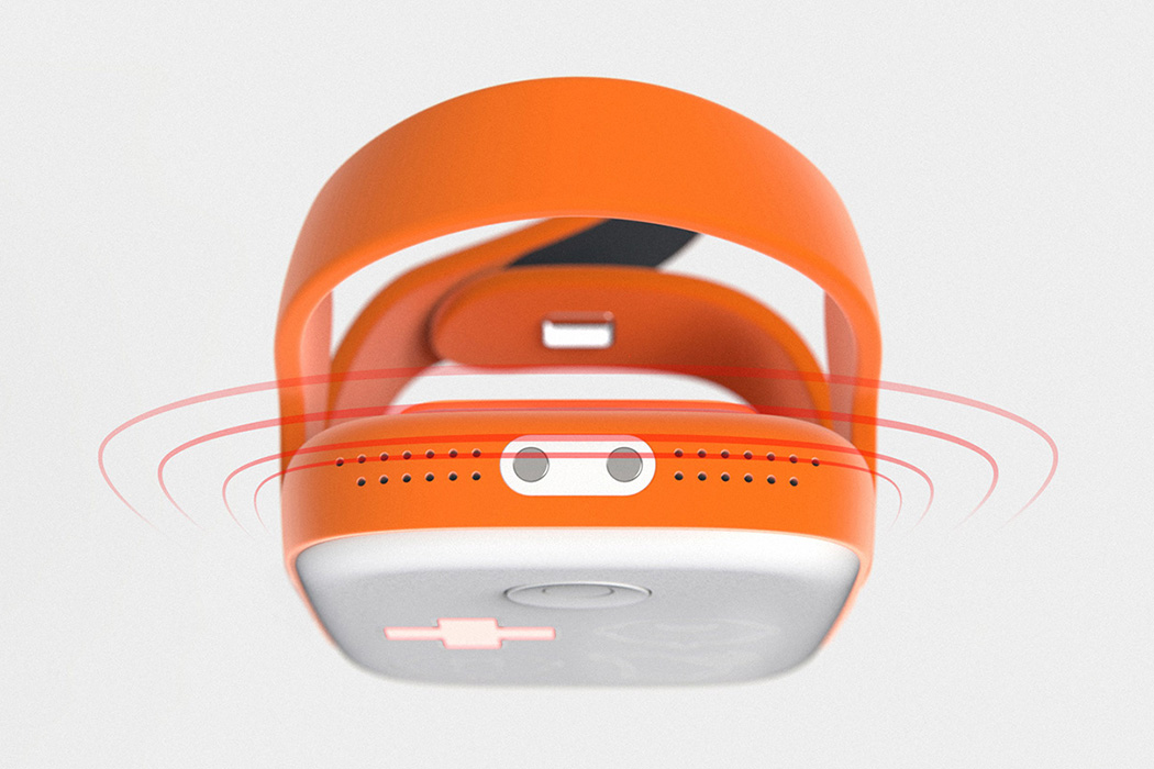
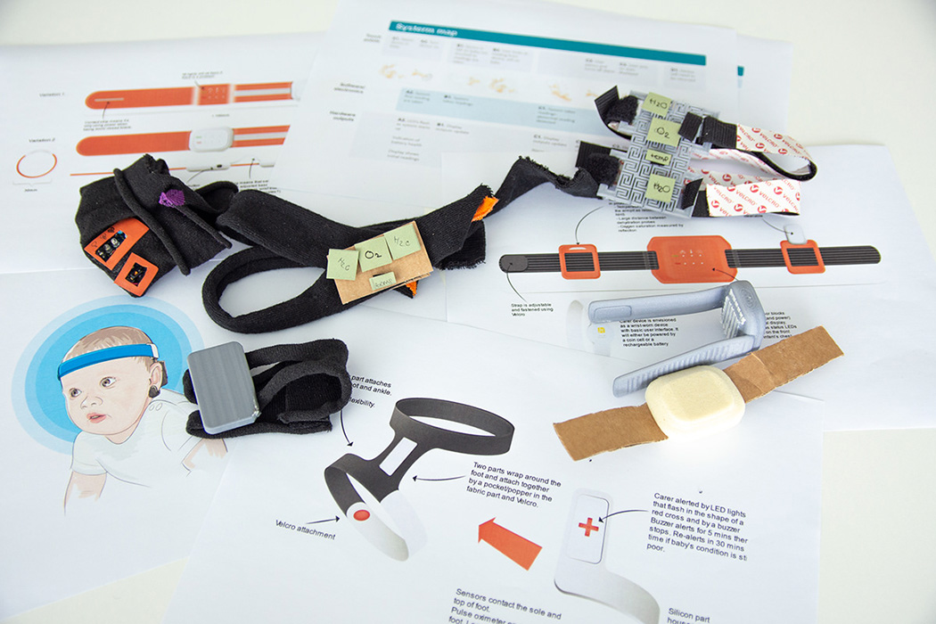
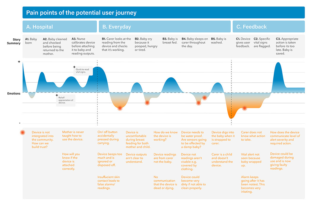
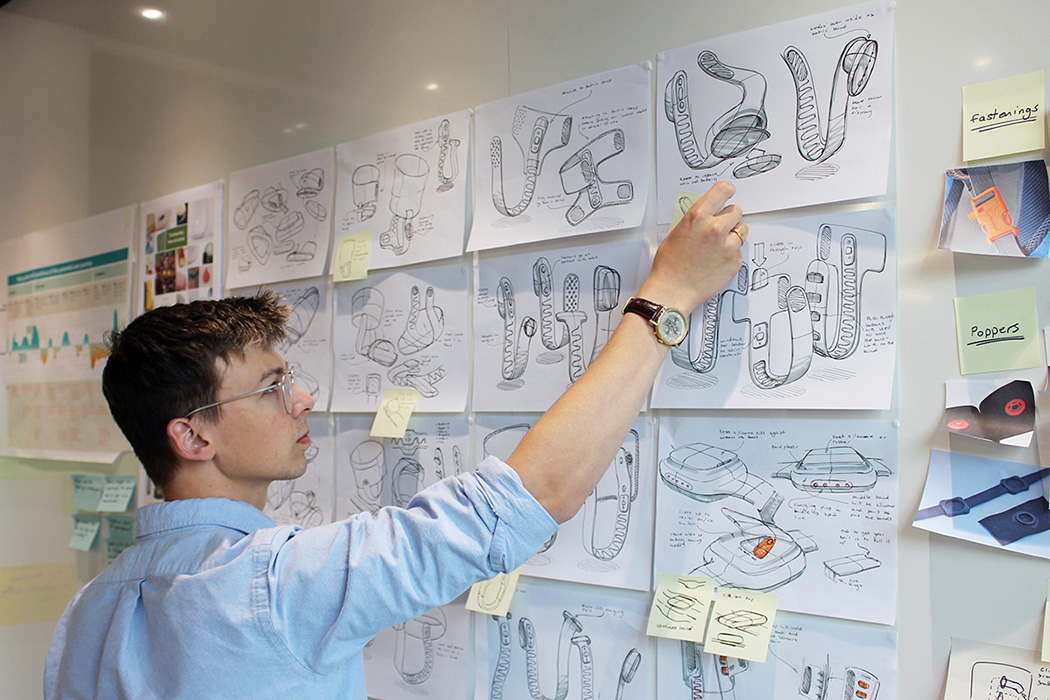
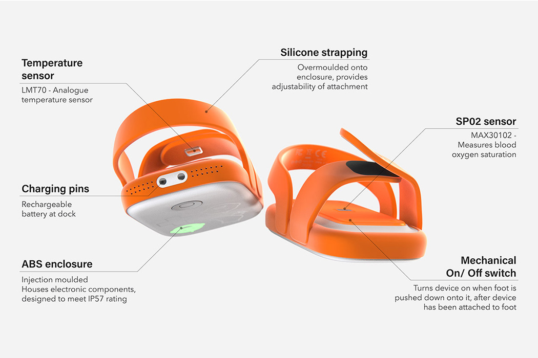
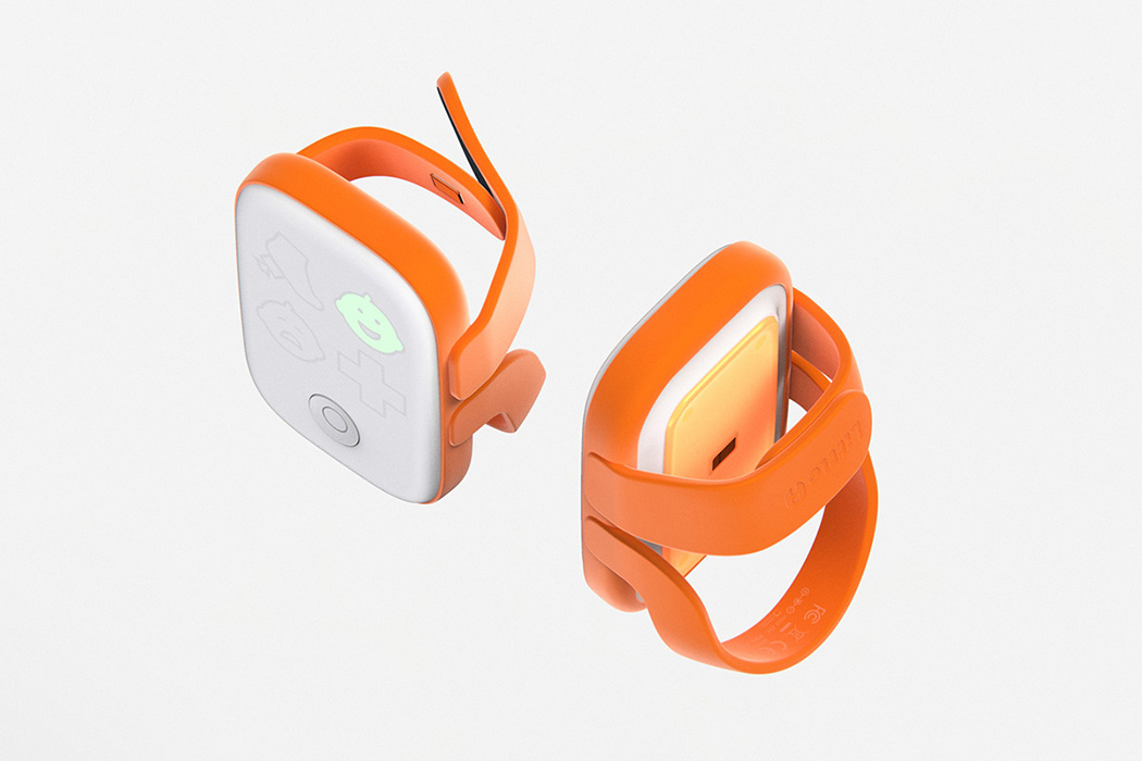
To address this issue, designers Chris Barnes and others at Cambridge Consultants of Cambridge, UK have designed a wearable health monitor for newborns in areas where current solutions are not easily available. Called ‘Little I’, their innovation empowers parents in low resource countries to monitor the health of their newborns by providing a low-cost, durable device that gives them assurance of their newborn’s survival despite lack of medical knowledge. This service is implemented by NGOs first buying and transporting the device to the community and teaching the workers how to use it. And in parallel, the mother/caregiver would hear about the device within the community and then later be provided one by a health care professional after giving birth. After 28 days, the device is returned which is then cleaned and recharged to be used by another newborn.
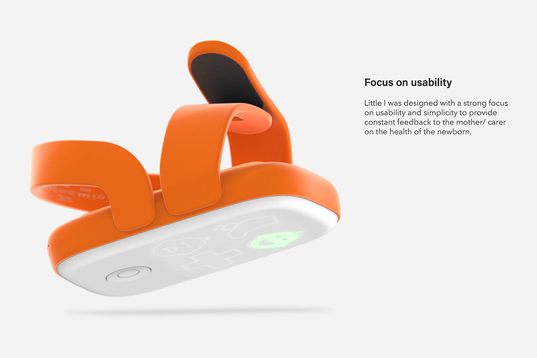
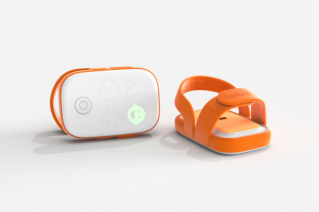
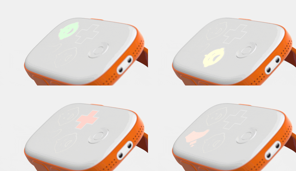
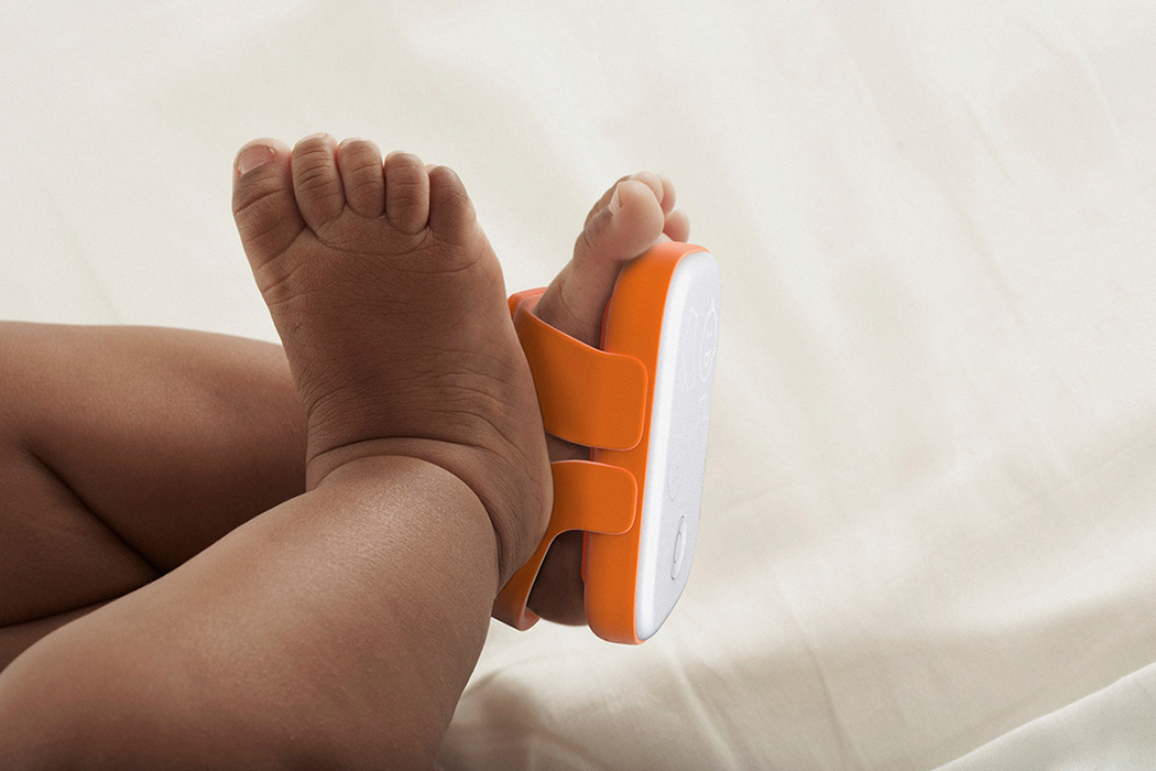
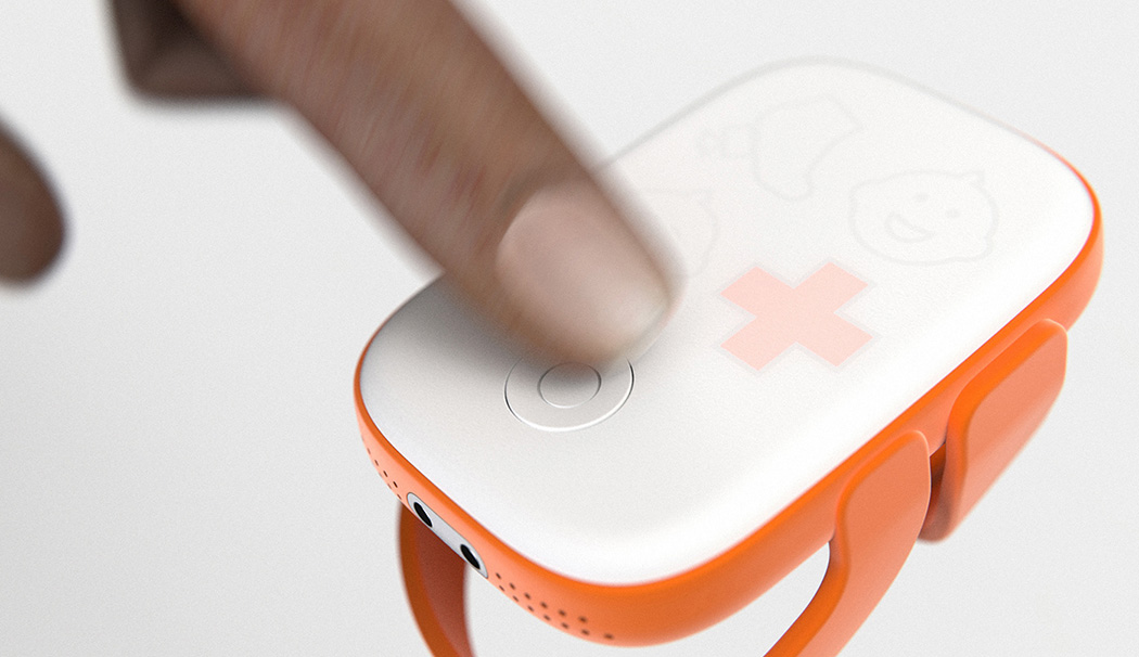
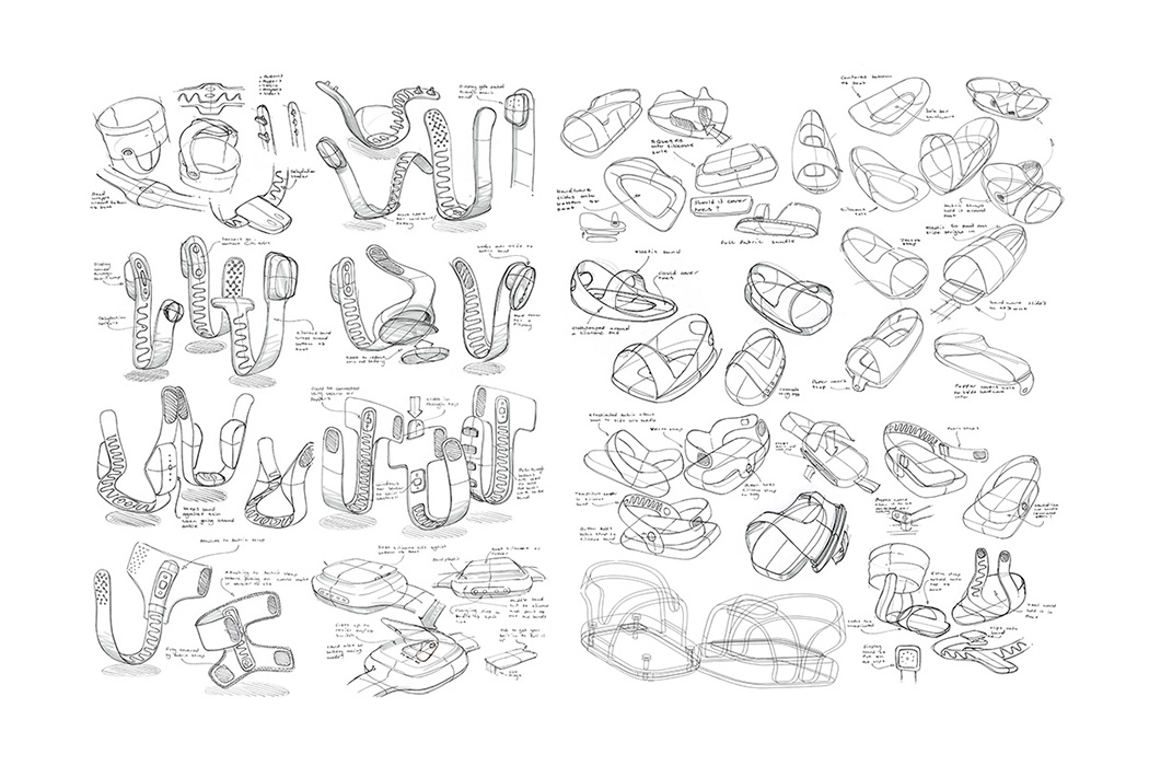
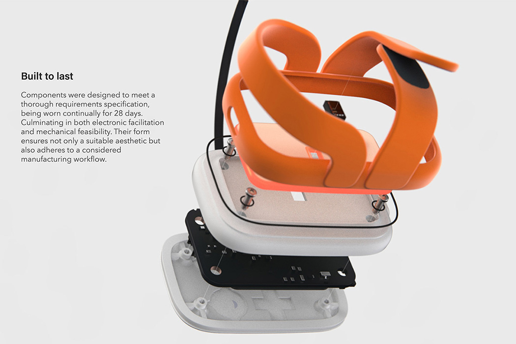
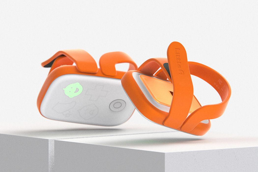
A big challenge the designers faced was to create a device that could run in conditions without access to electricity for the full neonatal period of 28 days. The components and features were designed keeping these criteria in mind. The device shaped like a strap-on shoe comes with a silicone strap and an ABS case for holding the electronics. It comes with an ON/OFF switch which gets triggered as soon as the shoe is worn. And within the strap and the case is included the temperature sensors and SPO2 sensors that monitor the health of the baby regularly.

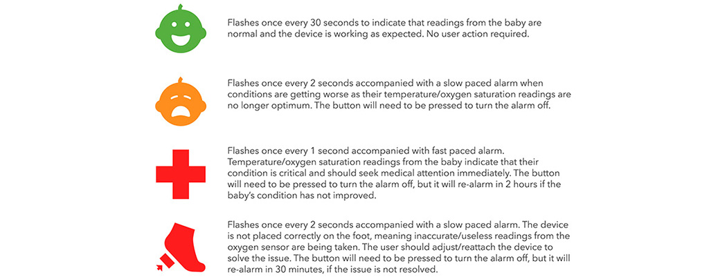
The design of the device is made to appear friendly, non-intrusive, and trustworthy while still communicating an appropriate sense of urgency when necessary. All the while, removing any obvious association with any illness, which might be the case with a design that is more medical in appearance. Thereby minimizing the anxieties that a caregiver could have while putting a never before seen device on their newborn’s foot. The device also boasts a simple user interface using a traffic light system, icons, and distinctive audible sounds to make it effective for anyone to learn how to use it quickly and take immediate action in case of emergencies. A device that is user-friendly, durable, reliable, and can be conveniently carried along, this product is a true healthcare innovation!

Designer: Cambridge Consultants

04 

Slim and geometric, this hair dryer is the easiest to store!

The Dyson Supersonic hair dryer has set the bar rather high when it comes to the visual qualities of hair dryers, however I think it’s fair to say that this concept, named RED, may give Dyson a run for their money in the aesthetics department!

Designed with the ambitions of creating a visually striking product firmly in mind, every last detail of RED has been considered in great detail, from the tactile buttons through to its balanced proportions, this attention to the aesthetics has led to a beautiful product. But RED isn’t all about looks, it has a secondary feature that elevates its functionality and desirably even further… and that’s its ability to collapse. Storing hairdryers isn’t something that is always the most straightforward, with their awkward and bulky form demanding a large void to reside within. RED has solved this issue by featuring a collapsible handle that neatly rotates to allow the hairdryer to take on a geometric and more storage-friendly form.

Designer: Chris Barnes