How to Embrace Earthy Tones in Architecture and Interior Design

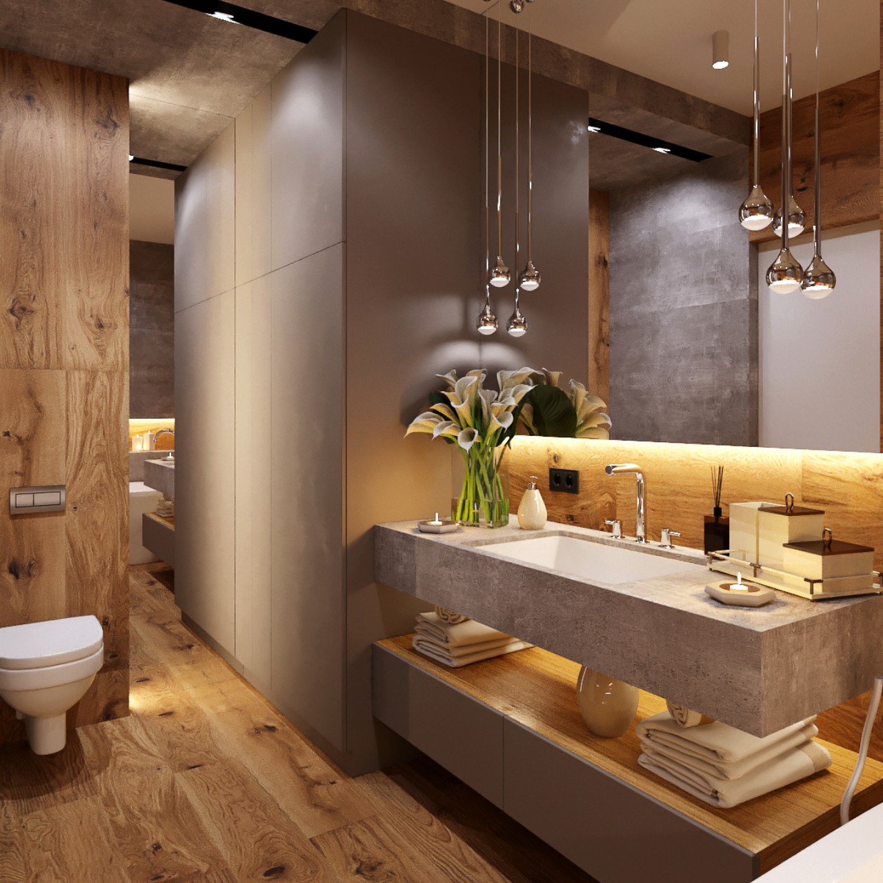
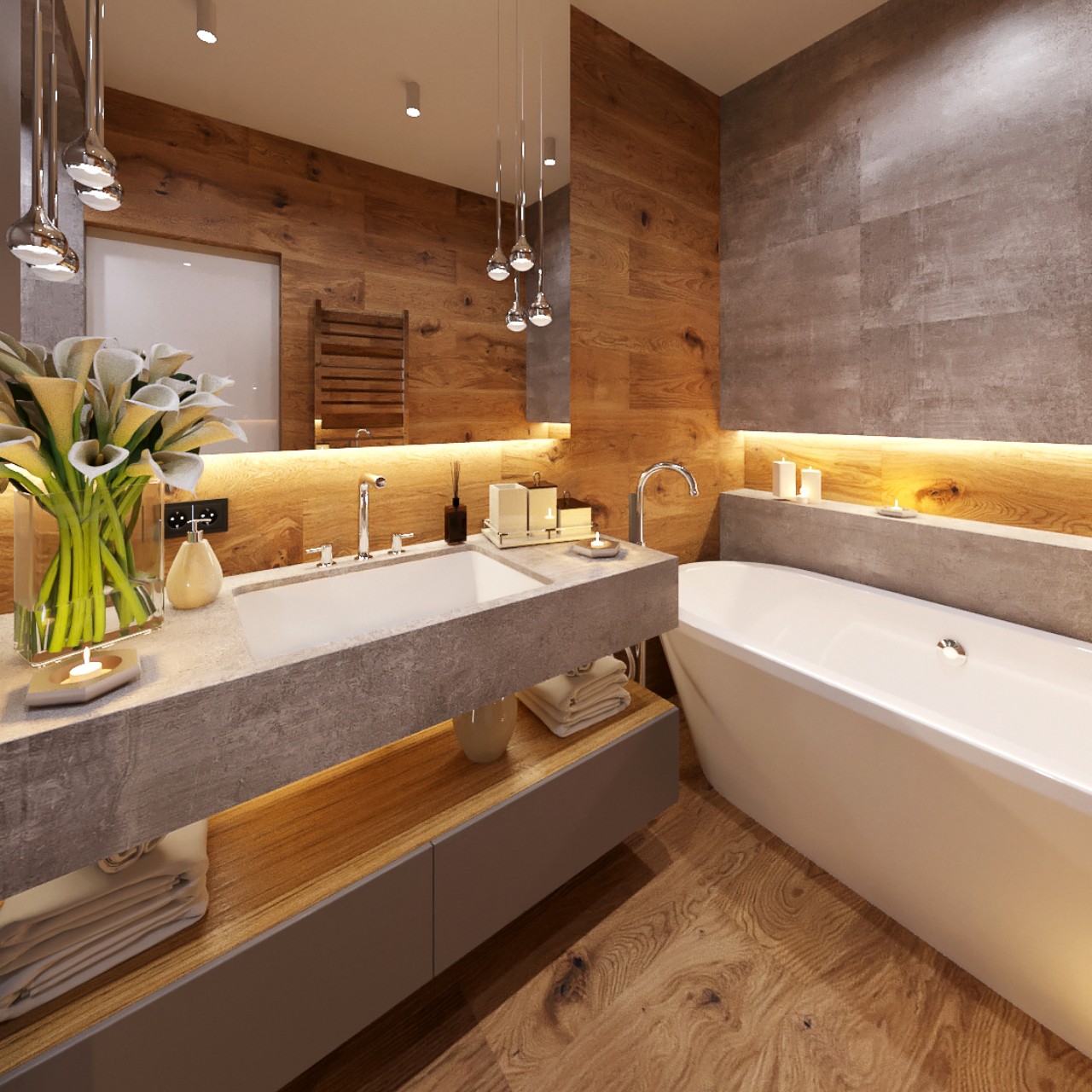
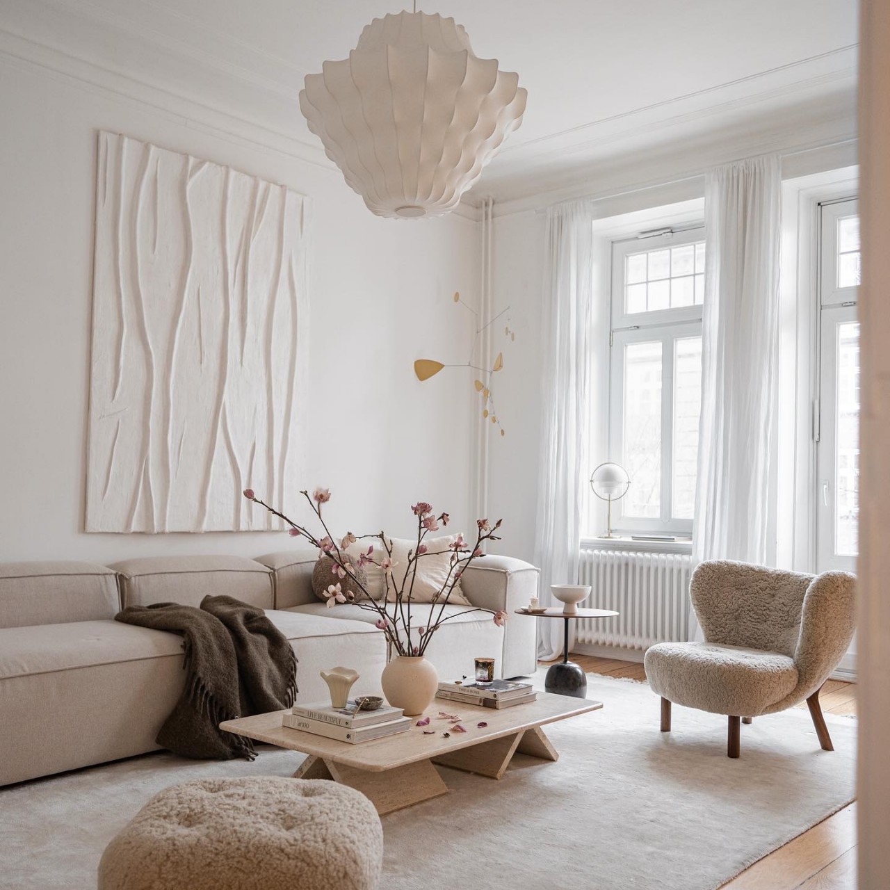
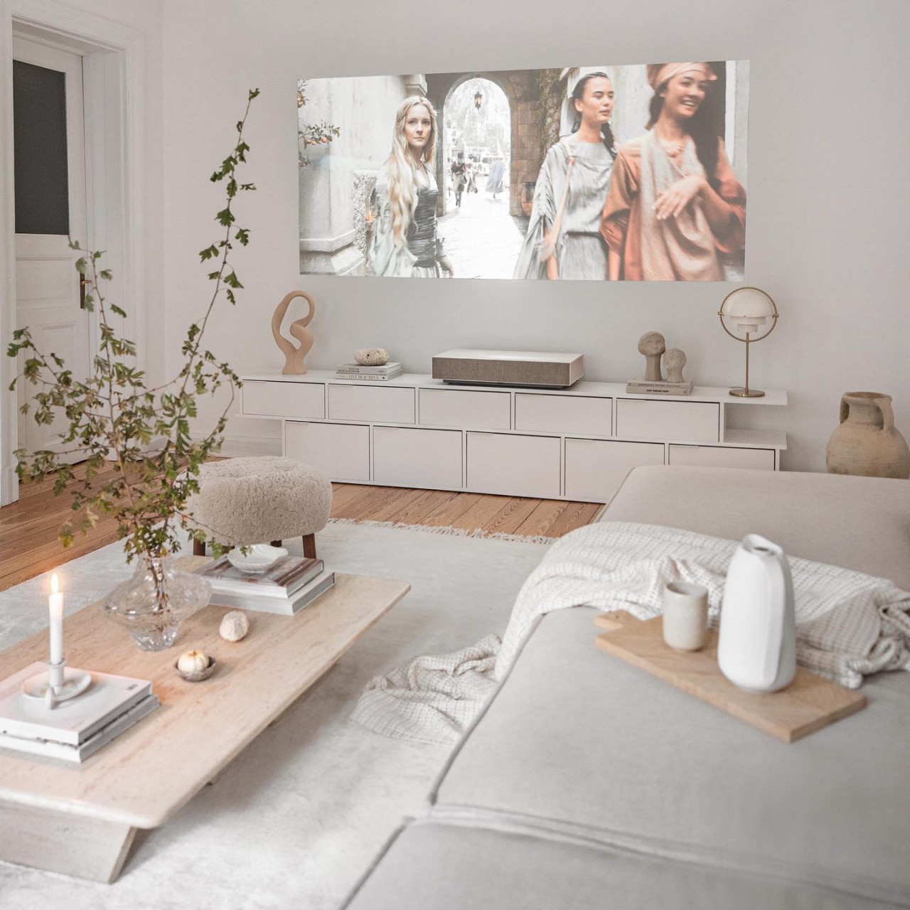
Earth-toned colors, inspired by nature, bring a harmonious, inviting, and organic feel to any space. From the hues of warm terracottas and bricks to the cool tones of natural stone, these colors create a soothing, grounded effect. By incorporating materials and hues that reflect the natural world, you can infuse your home with the tranquil and balanced essence of earthy tones. Here’s how to weave these colors and textures into architecture and interior design.

Designer: Emerging Objects
1. Rammed Earth Construction

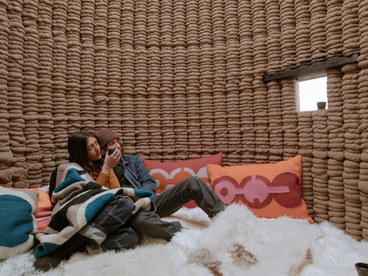
Rammed earth brings a natural, warm aesthetic to a home with its rich, tactile texture, creating a beautiful connection with the environment. Its earthy tones blend effortlessly with natural materials, enhancing the organic look of a space. Additionally, rammed earth regulates the internal temperature and humidity and promotes a comfortable living environment.
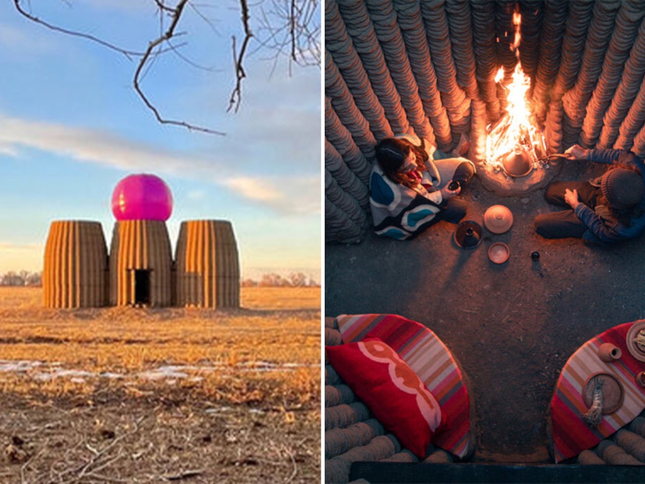
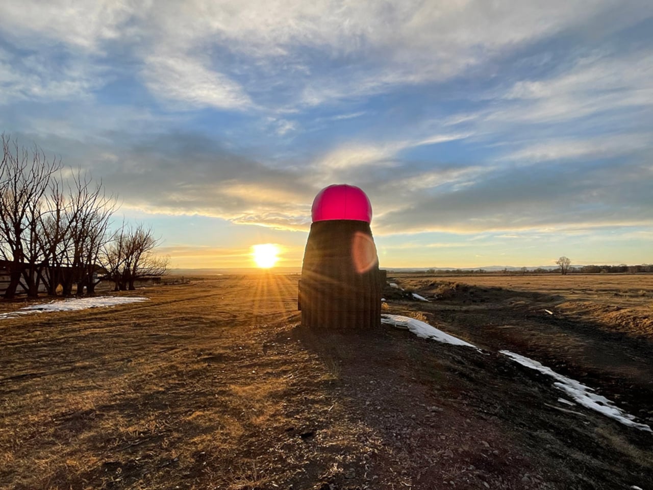
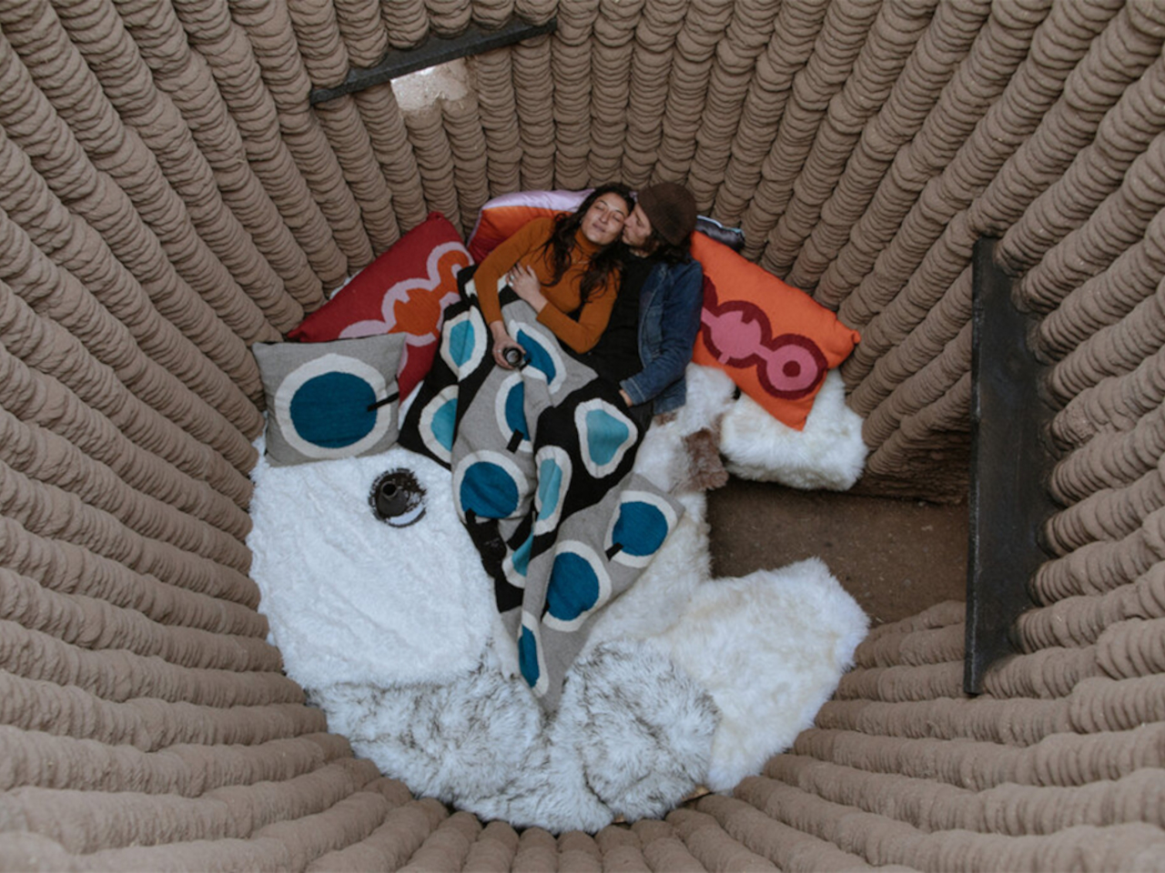
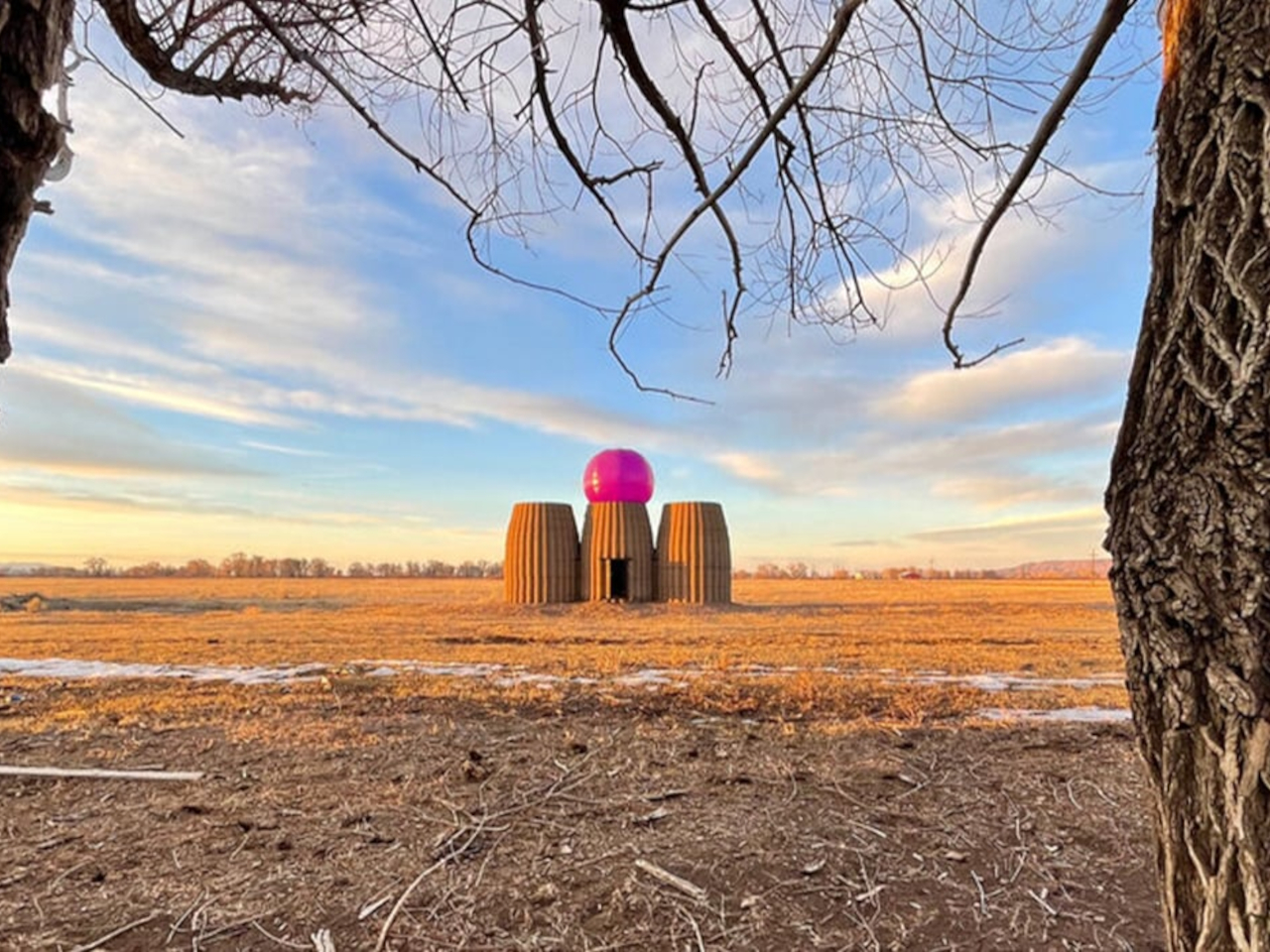
Casa Covida blends ancient earth-based construction techniques with modern 3D printing technology. Created by Emerging Objects in Colorado’s San Luis Valley, this prototype home uses a robotic arm to 3D-print a mix of sand, silt, clay, and water. The structure features a central space with a customizable inflatable roof, a sleeping area with beetle-kill pine furniture, and a bathing space with a metal tub surrounded by river stones. Named to reflect both the pandemic era and the concept of cohabitation, Casa Covida explores the synergy between traditional materials and contemporary tech, highlighting how ancient techniques can be revitalized with modern innovations.

2. Exposed Brick Design

The warm tones of brick, ranging from rich reds and oranges to muted grays, add a rustic vibe and tactile quality, enhancing the organic feel of both indoor and outdoor spaces.
Designer: Wallmakers

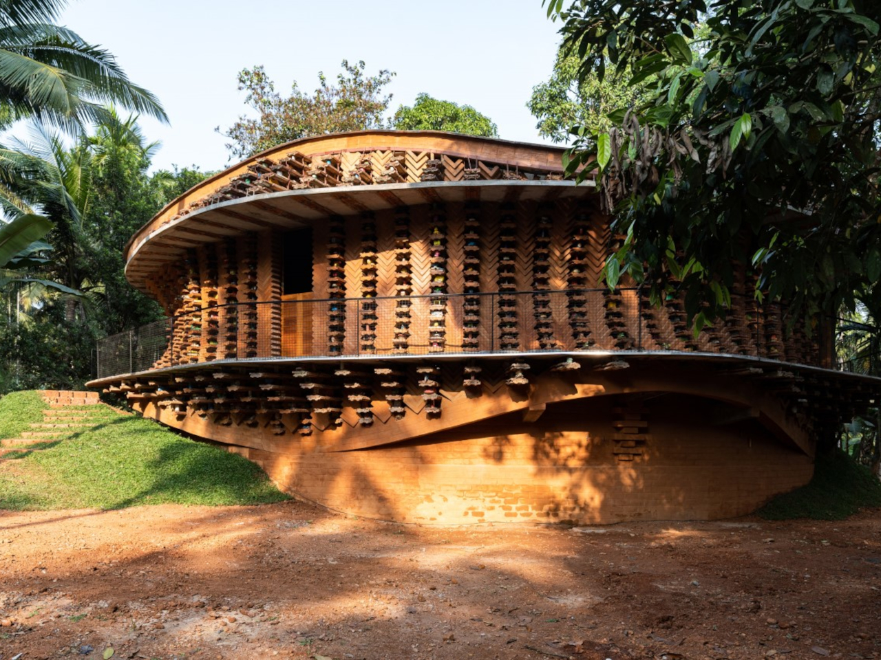
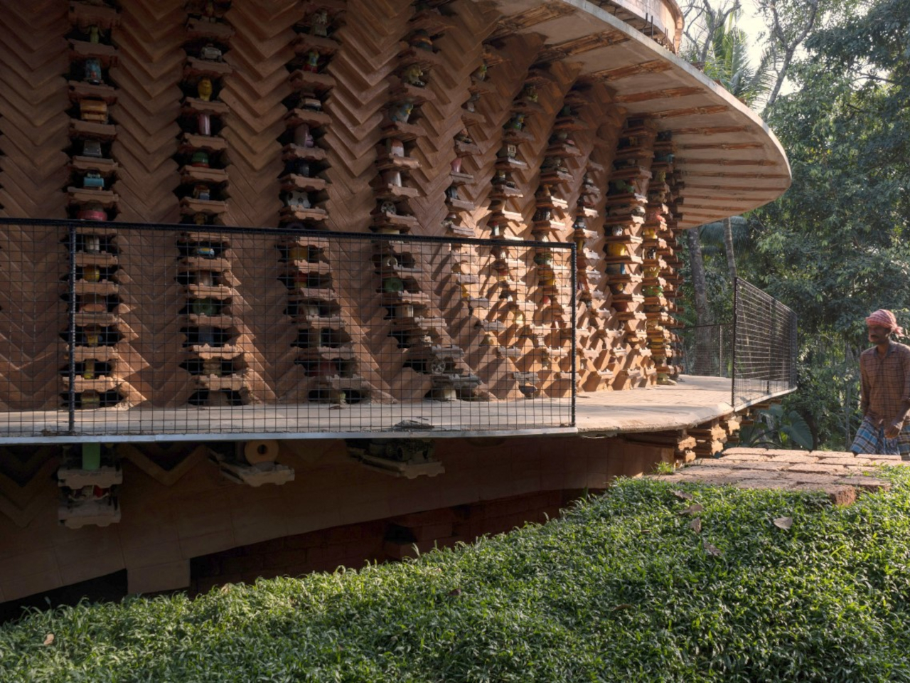
Toy Storey, designed by Wallmakers in Kerala, India, is a circular home that ingeniously repurposes around 6,200 discarded toys as structural and decorative elements. The residence features a striking facade that integrates compressed stabilized earth blocks (CSEB), Mangalore tiles, and recycled toys in rich earthy tones. Its circular layout, central courtyard, and composite CSEB-Toy Jaali wall enhance ventilation and insulation, while a basement adds functional living space. Toy Storey blends tradition with modernity and challenges conventional architecture and consumption, celebrating sustainability and creativity with a nod to childhood nostalgia and environmental awareness.
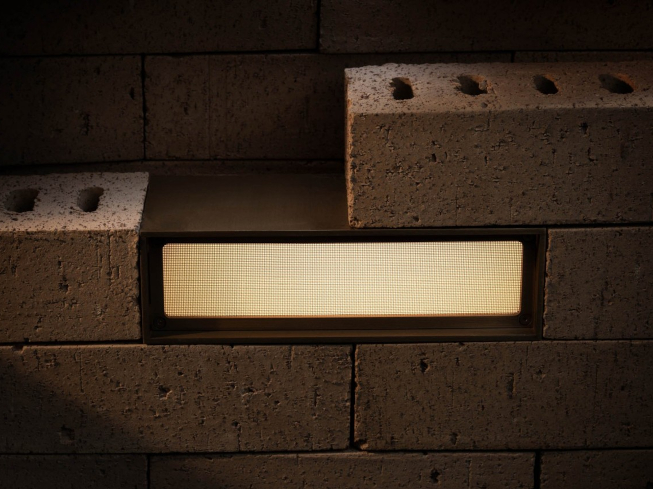
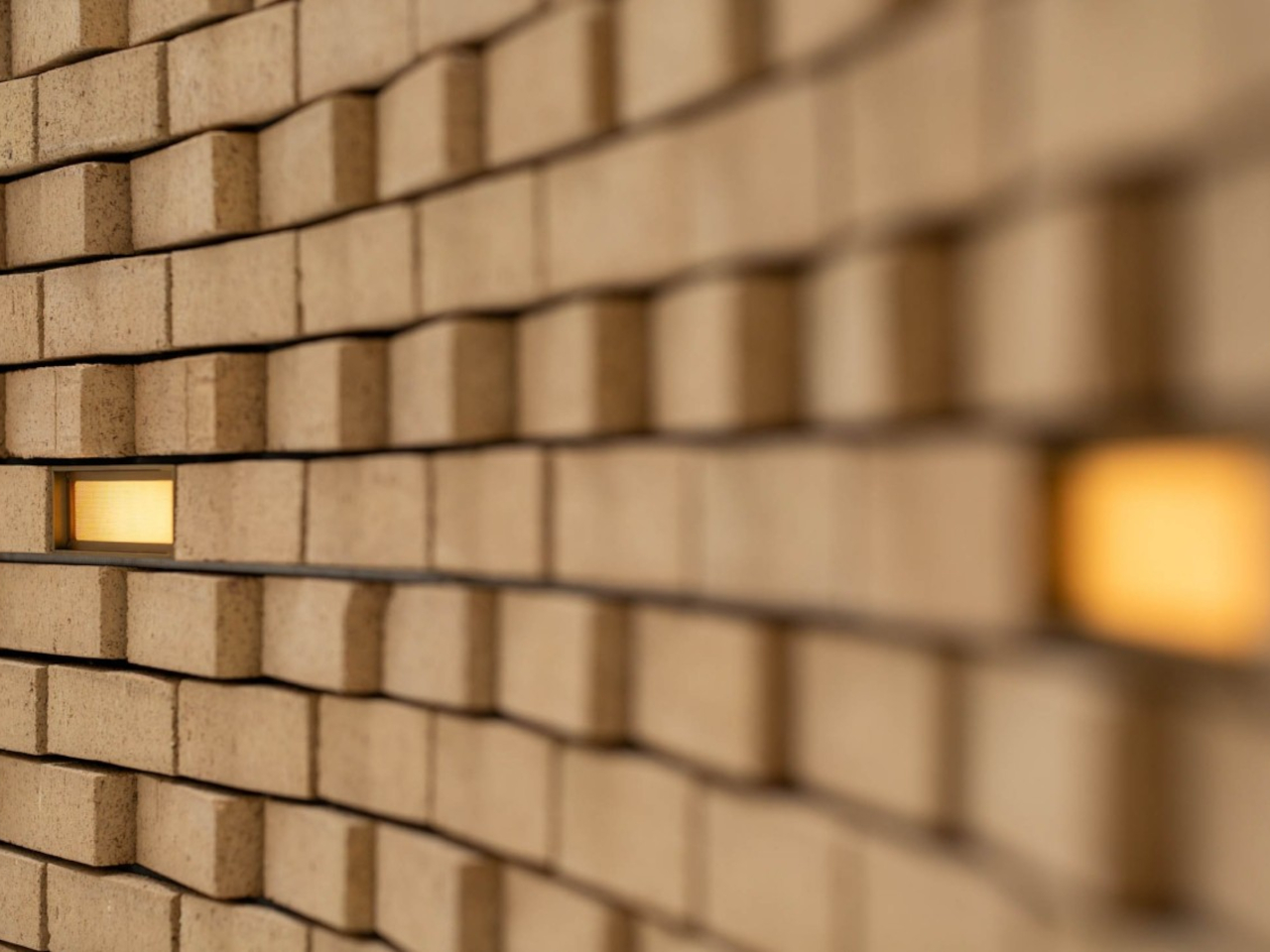
Designer: Omar Gandhi Architects, Filo Timo, Aaline

Wall lamps are mounted on walls to enhance the indoor or outdoor ambiance. Innovative designs like the OG Brick embed lights directly into the wall, creating a seamless effect with earthy hues that blend naturally with brick surfaces. Available in finishes like stainless steel, black powder-coated, and electroplated brown, these lights offer a warm, magical glow. The durable metal frame and color-matching mesh ensure that the lamps integrate effortlessly into their surroundings, adding style and subtle illumination to any space.

3. Integrate Wood

The warm tones of wood, from light beiges and honey to deep browns and rich reds, create a cozy, organic ambiance, while its grain patterns add a rustic feel to interior and exterior spaces.
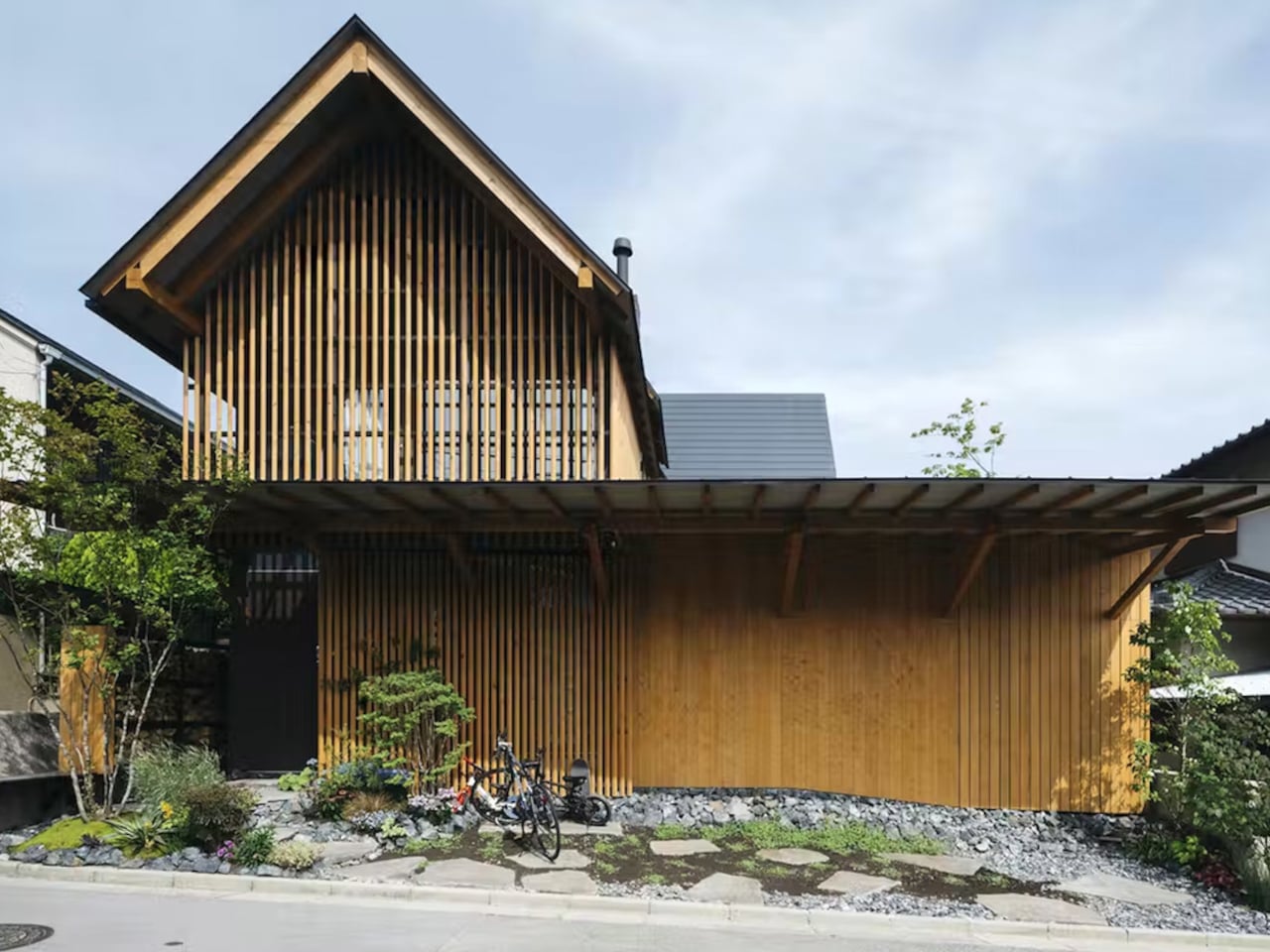
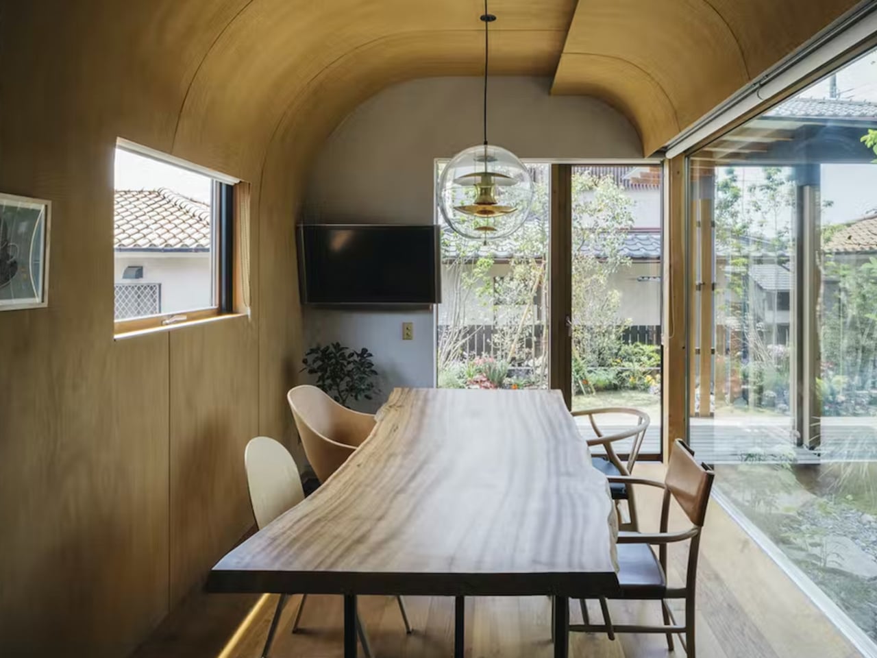
Designer: Atsushi Kawanishi Architects

Designed by Atsushi Kawanishi Architects, Nightingale House in Osaka is a wooden residence that seamlessly blends indoor and outdoor spaces. Covering nearly 1,400 square feet, it features six patios, three interior gardens, and two exterior gardens, with large windows and timber surfaces highlighting earthy tones. The home’s three triangular roofs complement the mountainous backdrop, while its warm, minimalistic design offers a tranquil, Japanese-inspired living experience.
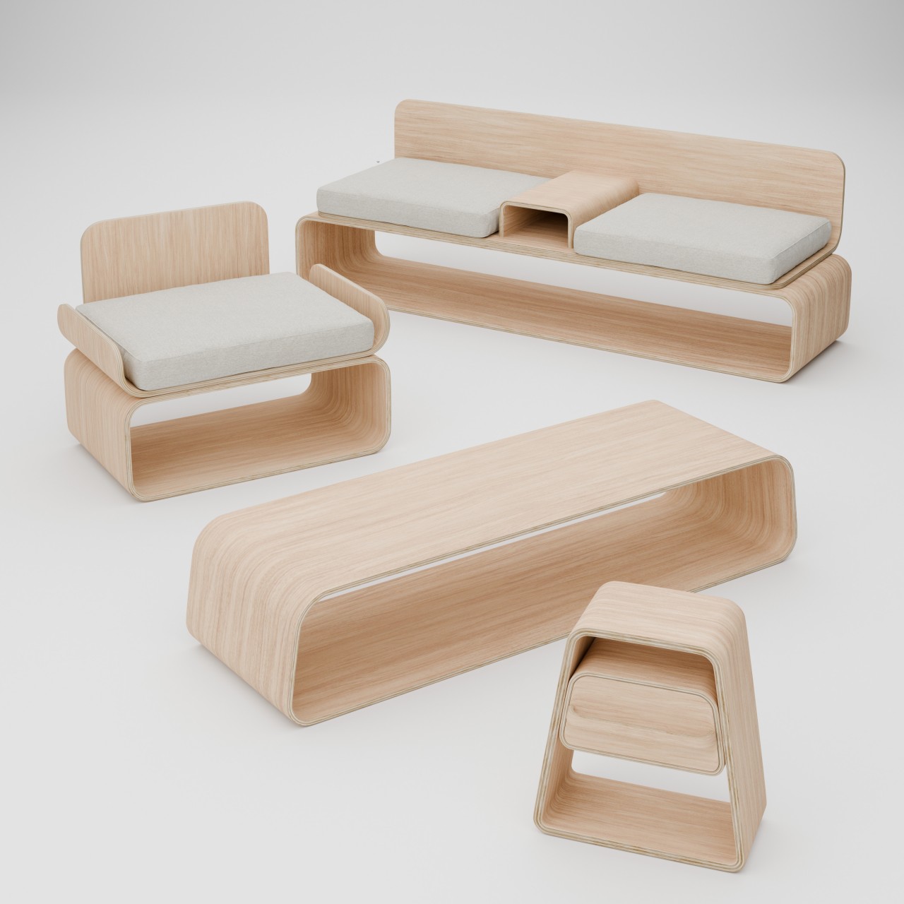
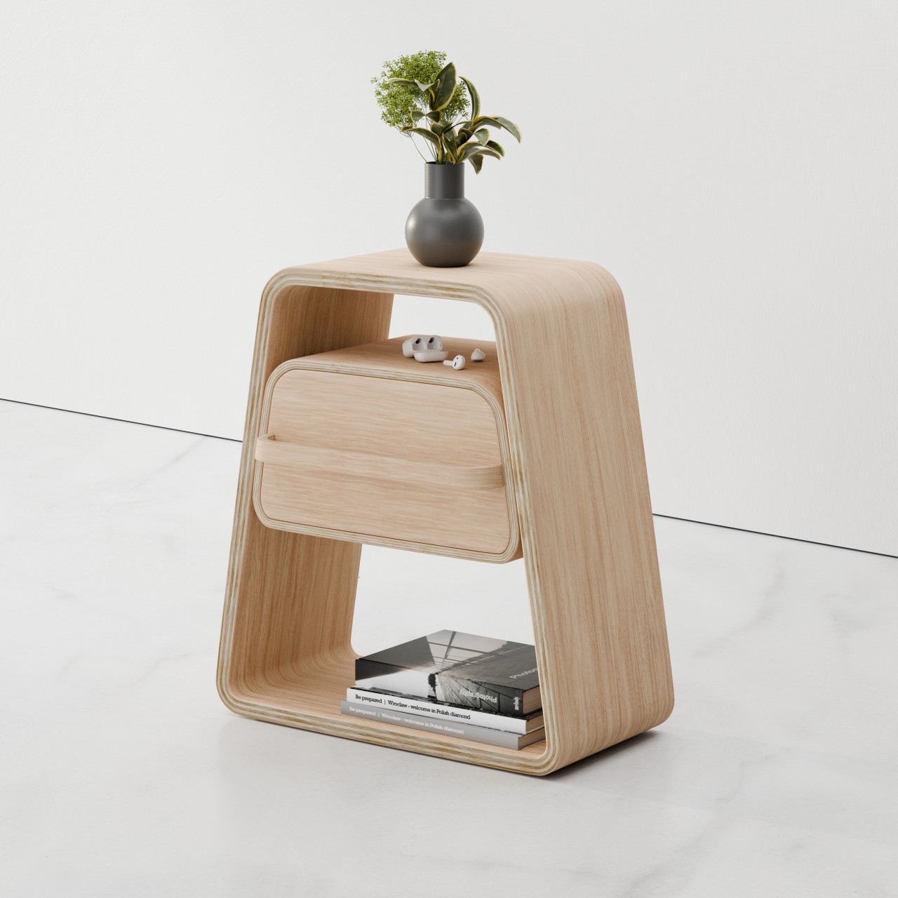
Designer: Julian Topor

The KURVE furniture collection maximizes space with minimalist, curved plywood designs that combine aesthetics with functionality. The KURVE chair features a backless, curved base made from a single sheet of plywood, while the KURVE Couch includes a central console and extra storage underneath. The KURVE table, a simple wooden trapezoid, is ideal for wall placement and organizing items like shoes and keys. The KURVE Night Stand, also a trapezoid, offers additional storage with a drawer positioned below the top. Each piece cleverly integrates storage into its design without complex mechanisms.

4. Use Natural Stone

Natural stone offers a diverse color palette and unique textures, with tones ranging from soft grays and beiges to rich browns and deep blues, creating an earthy, organic appearance. Its inherent patterns and variations, including veining, enhance its natural appeal and rugged charm.
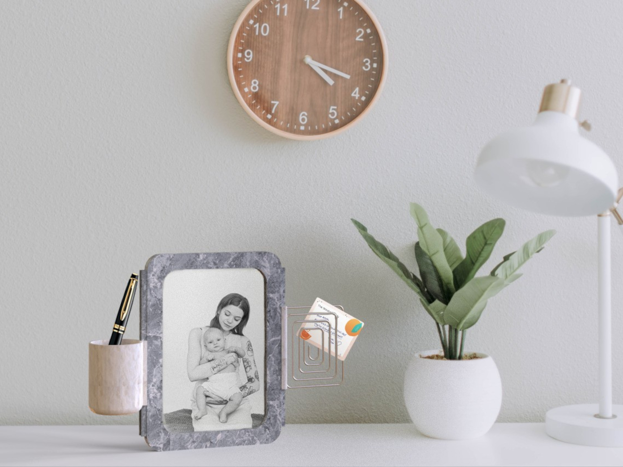
Designer: Burcu Nehir Tum

The MEMORABLE picture frame combines the timeless elegance of marble with versatile functionality in earthy hues. Its modular design features a rail system for attaching interchangeable modules such as a pen holder, vase, or note holder and allows for customized use. Marble’s unique patterns and durability provide both stability and a refined look. The frame supports two modules at a time and can be paired with additional frames for expanded display. While the rail system is limited to certain modules and its compatibility with landscape orientations is uncertain, the frame’s earthy tones and practical design add sophistication and organization to any desk.

5. Introduce Nature-Inspired Wall Colors

Earthy tones on the wall draw inspiration from soil, rock, and sky. These versatile and timeless colors provide a sophisticated look while fostering a connection to nature, creating a serene and harmonious environment.
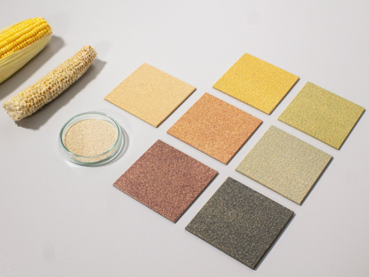
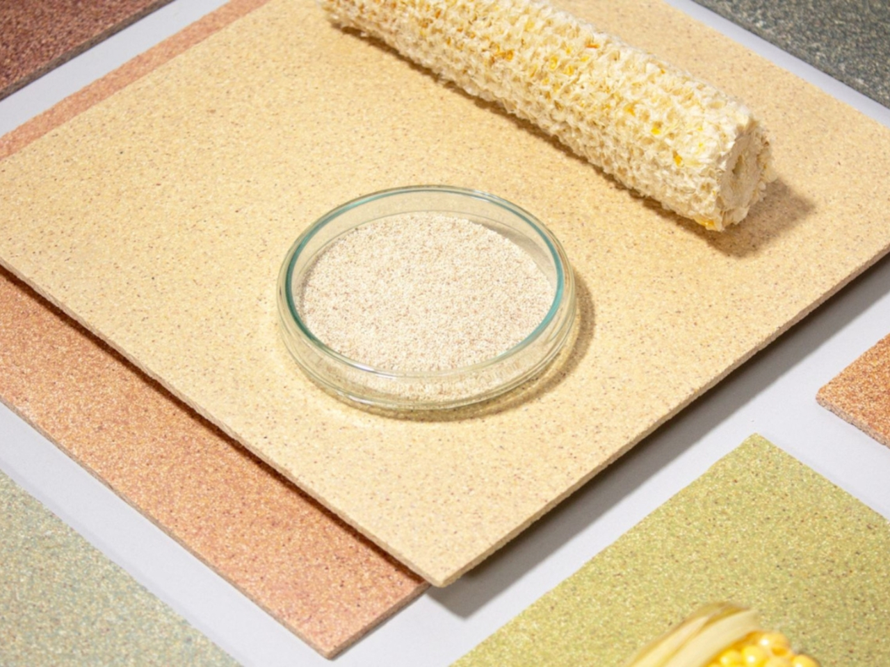
Designer: StoneCycling and Studio Nina van Bart

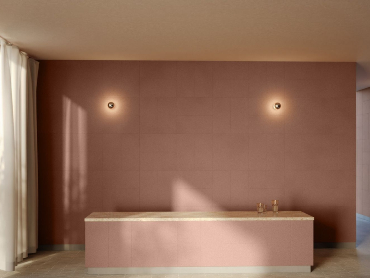
CornWall is an innovative, eco-friendly wall cladding made from organic corn cobs, heated to 150°C to form strong bonds. This process uses solar energy, reducing carbon footprints. Unlike traditional materials like ceramic or HPL, CornWall absorbs more CO2 and is 100% reusable due to its demountable anchoring system. Available in colors like Dark Blue, Mustard Yellow, and Terracotta Pink, CornWall offers a sustainable alternative that transforms waste into stylish, functional interior design.

6. Beautify with Woven Materials

Woven materials like rattan introduce earthy hues of brown and beige, while their intricate weaves and textures add warmth and enhance the organic feel of a space. They bring a handcrafted aesthetic that fosters a strong connection to nature.

Designers: Ching Cheng Chang and Xu Da Zzan

Rattan, known for its flexibility, durability, and water resistance, is traditionally used in woven baskets and rustic decor. Originating from palm species in Asia, Australia, and Africa, rattan adds warmth and texture to spaces, though it’s rarely seen in modern furniture. The Mua Lau Lounge Chair challenges this norm with its blend of rattan and bent metal piping. It uses rattan for visual appeal and as a cushion replacement, offering a unique springiness and comfort. Named after a Taiwanese treat, the chair combines a crisp outer shell with a plush interior, delivering both style and a surprisingly comfortable seating experience.

7. Add a Green Thumb

The varying shades of green from plants enrich the overall aesthetic, offering a fresh and lively experience that complements earthy tones. Additionally, colorful flowers provide vibrant pops of color, enhancing the space with natural beauty.
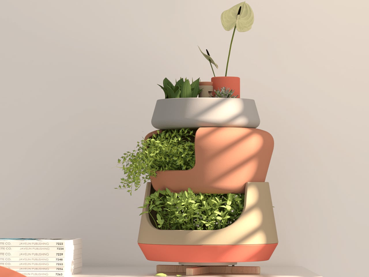
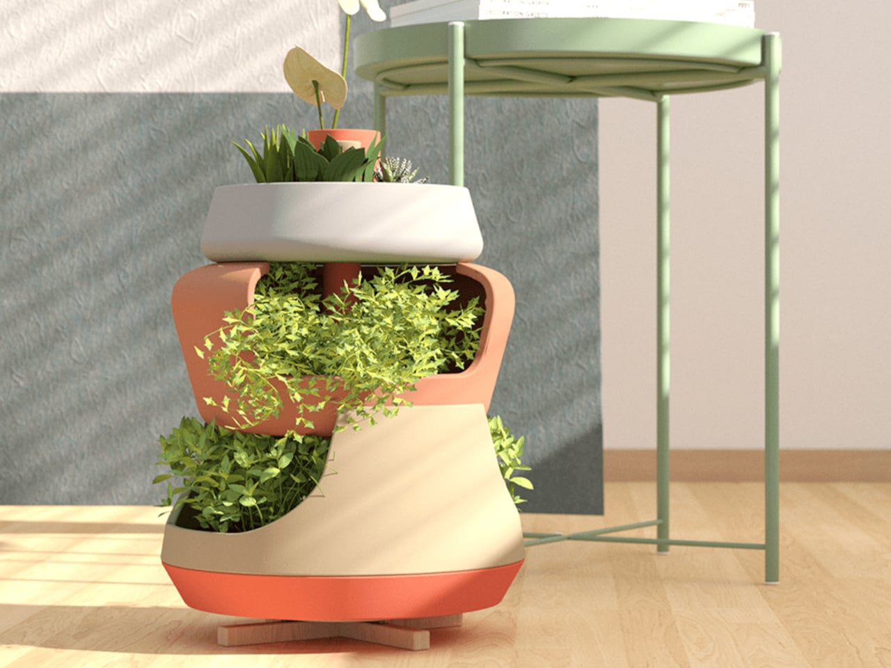
Designer: Camila Saulino and Alibek Atahanov

The ToThem planter is a modular vase system designed for small spaces, featuring a playful and integrated design with distinct, earthy-colored shapes. It organizes and nurtures multiple plants efficiently with a manual irrigation system and a water reuse feature for optimal watering and drainage. Ideal for herbs, succulents, and flowers, ToThem blends functionality with aesthetic appeal, transforming any compact space with its warm, earthy tones.

These tips will help you use earthy tones to evoke warmth, create a comfortable space and establish a connection with the natural world. Studies indicate that such hues are ideal for homes and workspaces, as they minimize stress and enhance focus and concentration.

The post How to Embrace Earthy Tones in Architecture and Interior Design first appeared on Yanko Design.
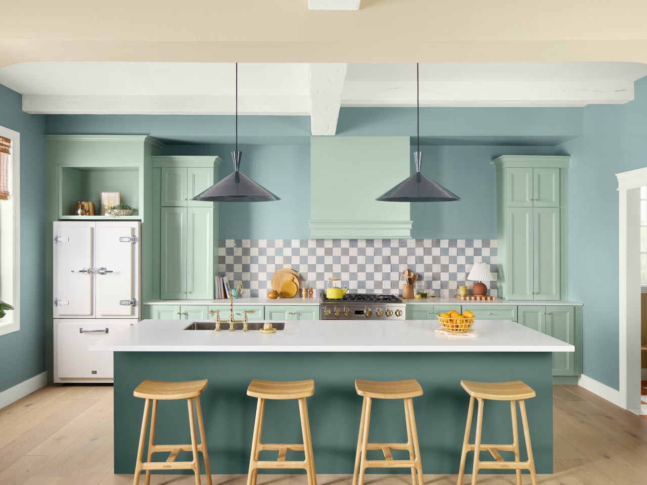
Embrace Calm With “Quietude”: HGTV Home by Sherwin-Williams’ 2025 Color of the Year

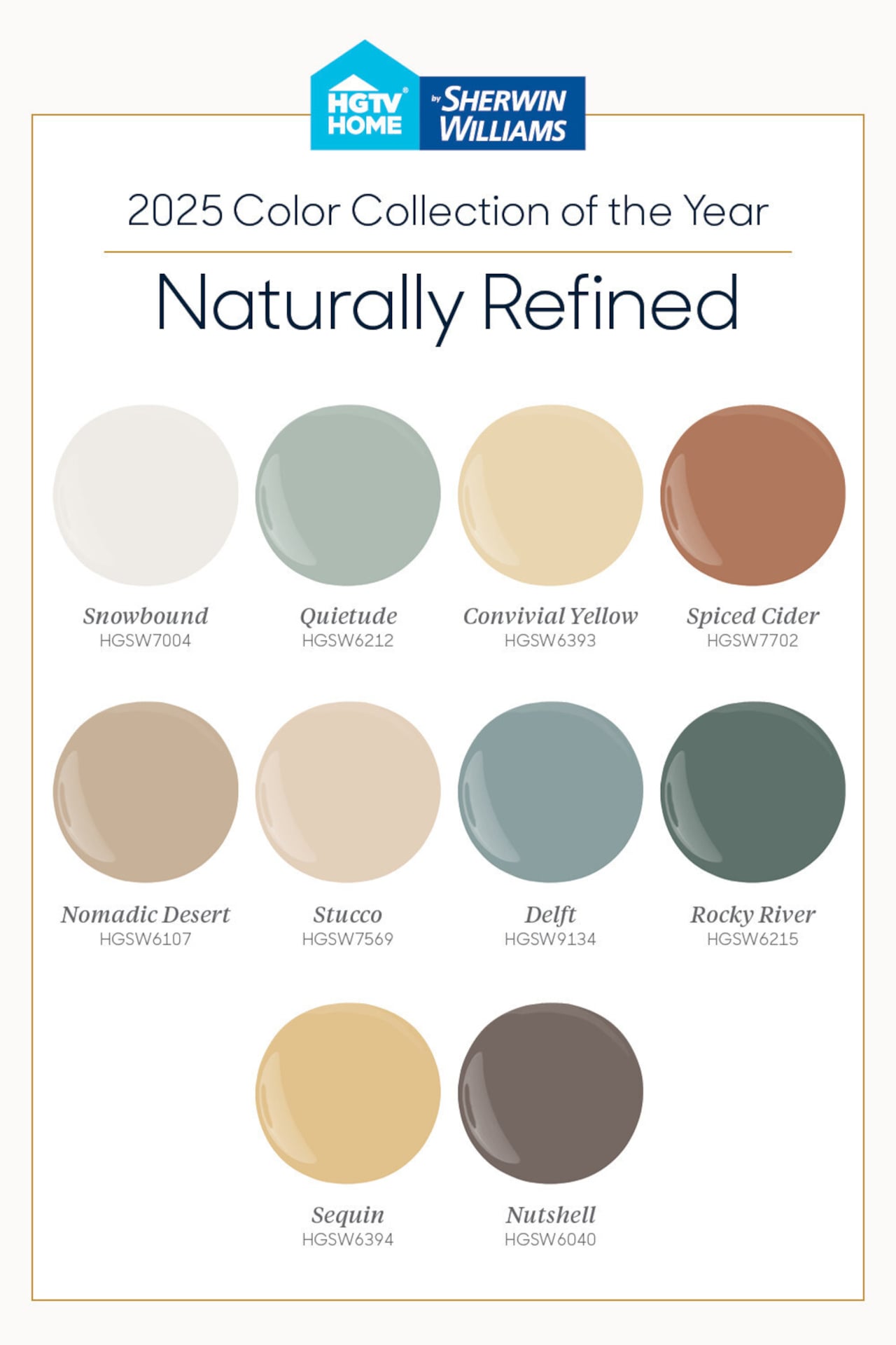
The 2025 Color Collection of the Year from HGTV Home by Sherwin-Williams is “Naturally Refined,” with Quietude (HGSW6212) named the Color of the Year. The “Naturally Refined” palette offers a luxurious and cozy feel through 10 versatile shades that can be mixed and matched to create a harmonious design scheme within the interiors.

Designer: Sherwin-Williams

What is HGTV Home® by Sherwin-Williams?

Introduced in 2011, HGTV Home by Sherwin-Williams merges HGTV’s design acumen with the renowned paint quality of Sherwin-Williams, which was established in 1866 and is based in Cleveland, Ohio. Sherwin-Williams is a leading name in the global paint and coatings industry while HGTV is known for its home design expertise, and collaborates to offer a range of premium paints and curated Color Collections for a harmonious home aesthetic. This exclusive collection is available solely at Lowe’s locations throughout the U.S. and Canada.

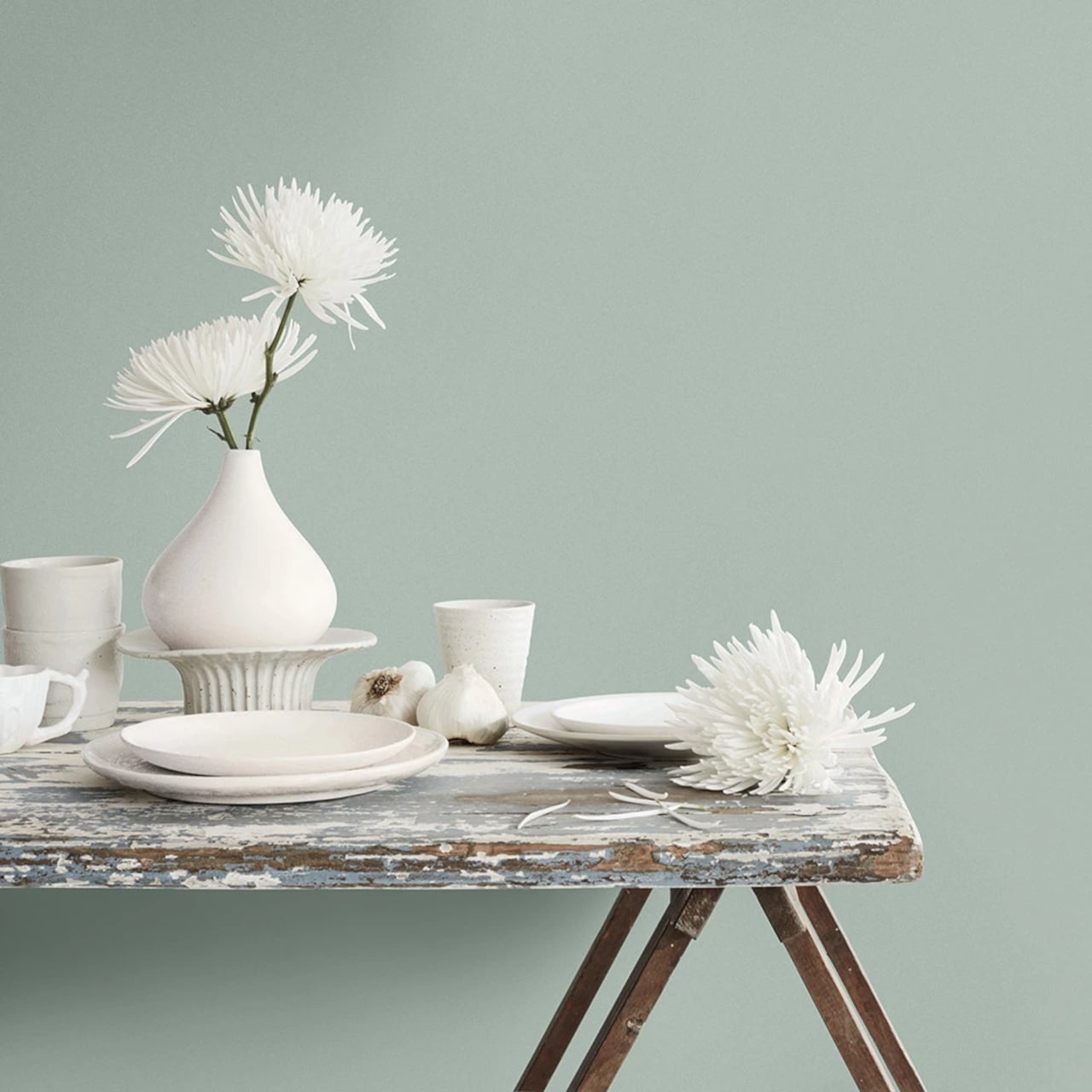
The “Naturally Refined” collection, with its 2025 Color of the Year “Quietude,” delivers a calming sage green and timeless elegance that is perfect for creating a tranquil atmosphere.

The different colors in the “Naturally Reined” collection include:

1. Snowbound (HGSW7004)

Snowbound is a warm, sophisticated white, that enhances natural light and works well on walls and ceilings. It is a versatile color that complements bold and subtle accents and creates a balanced atmosphere in any space.

2. Quietude (HGSW6212)

Quietude, a soft green with subtle blue undertones, is ideal for creating a tranquil and soothing environment. It can be used to enhance relaxation or achieve a calming effect. This shade works well on accent walls, as well as in textiles and decor.

3. Convivial Yellow (HGSW6393)

Convivial Yellow is a pale yellow hue with warm undertones, which adds a bright and welcoming touch to your home. Perfect for kitchens, breakfast areas, and living spaces, it infuses warmth into the common areas and children’s rooms.

4. Spiced Cider (HGSW7702)

Spiced Cider is a rust-inspired hue that adds warmth and depth to home decor. It can be used on accent walls, furniture, or textiles to create a cozy atmosphere and pairs well with neutral tones for a balanced look in living areas, dining rooms, and home offices.

5. Nomadic Desert (HGSW6107)

Nomadic Desert is a warm tan hue with blushed undertones that create a cozy atmosphere. It can be used on the walls in living rooms and bedrooms, providing a warm backdrop that complements furniture and textiles

6. Stucco (HGSW7569)

Stucco, with its elegant linen-like neutrality, creates a polished look on the walls throughout your home. This shade can be used to enhance architectural elements such as trim and molding while adding a classic touch to both furniture and textiles.

7. Delft (HGSW9134)

Delft is a mid-tone blue with a neutral undertone, making it an interesting choice for both traditional and contemporary interiors. It works well on accent walls and harmonizes with warm and cool hues, making it ideal for furniture, upholstery, and accessories.

8. Rocky River (HGSW6215)

Rocky River integrates a deep green blend of moss and emerald, creating a dramatic and calming effect when used on accent walls. This color elevates the look of the furniture and textiles, adding a natural, elegant touch to your decor.

9. Sequin (HGSW6394)

Sequin adds a warm, uplifting glow with its goldenrod undertones to accent walls, living cum dining areas, and kitchens, and creates a cheerful environment in children’s rooms.

10. Nutshell (HGSW6040)

Nutshell is a warm chocolate brown color that, enhances spaces with its cozy tone when used on accent walls, furniture, and flooring. Additionally, it pairs well with light hues for a balanced aesthetic and is suitable for trims and moldings.

Introducing Quietude (HGSW6212) as the 2025 Color of the Year

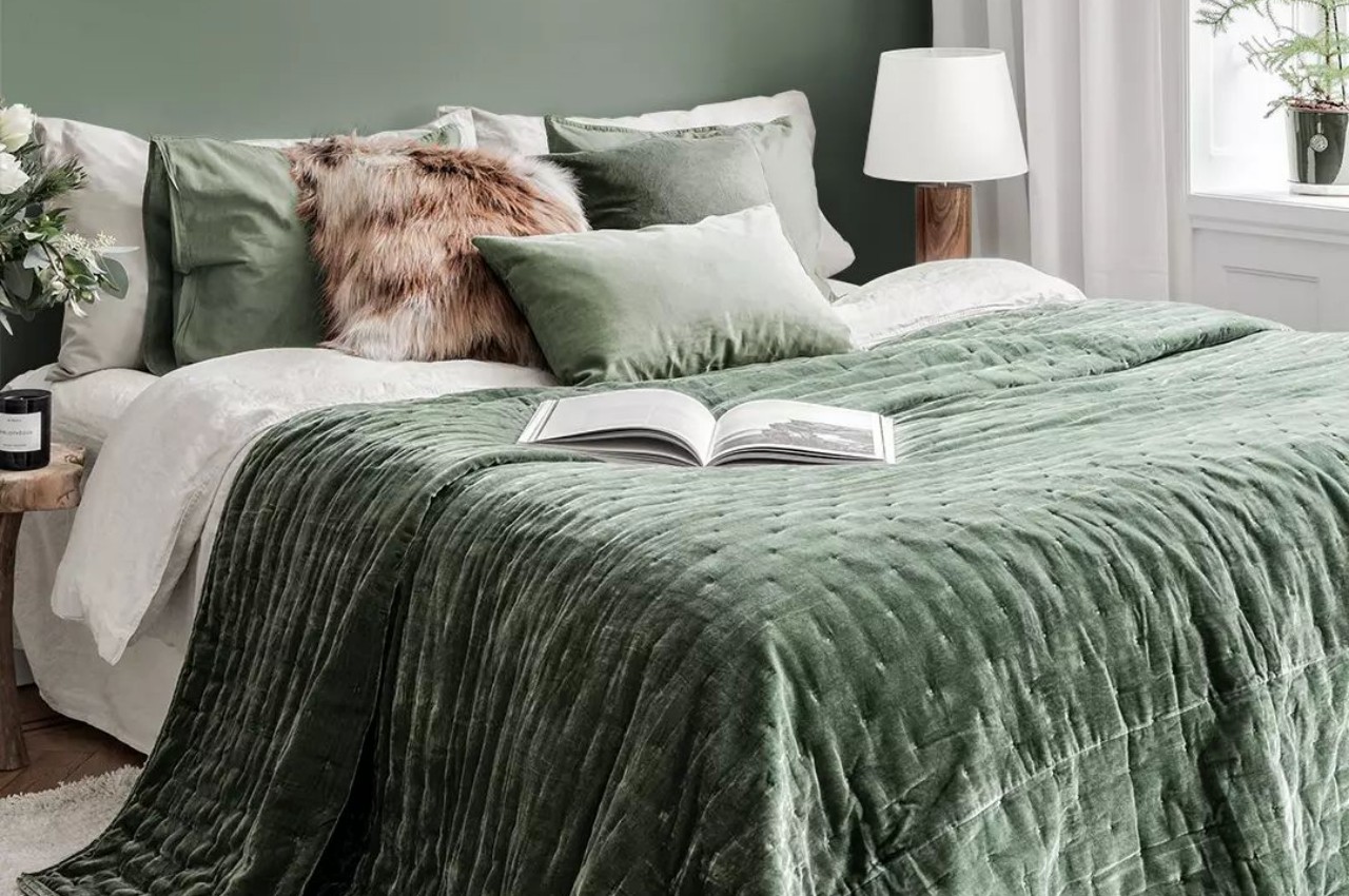
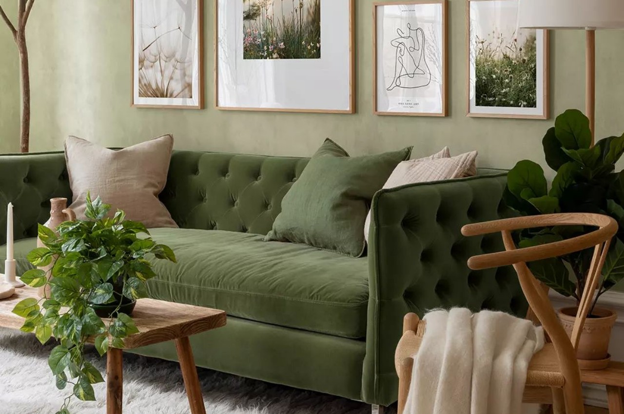
Quietude combines a cool sage green with a touch of blue to craft a soothing and serene space. Suitable for indoor and outdoor areas, its timeless charm inspires us to embrace a slower lifestyle and appreciate the simple moments in life.

Explore some cutting-edge products that embody the essence of Quietude.

• Earphones cum Earrings

Designers: Rick Kim & Milmul Studio

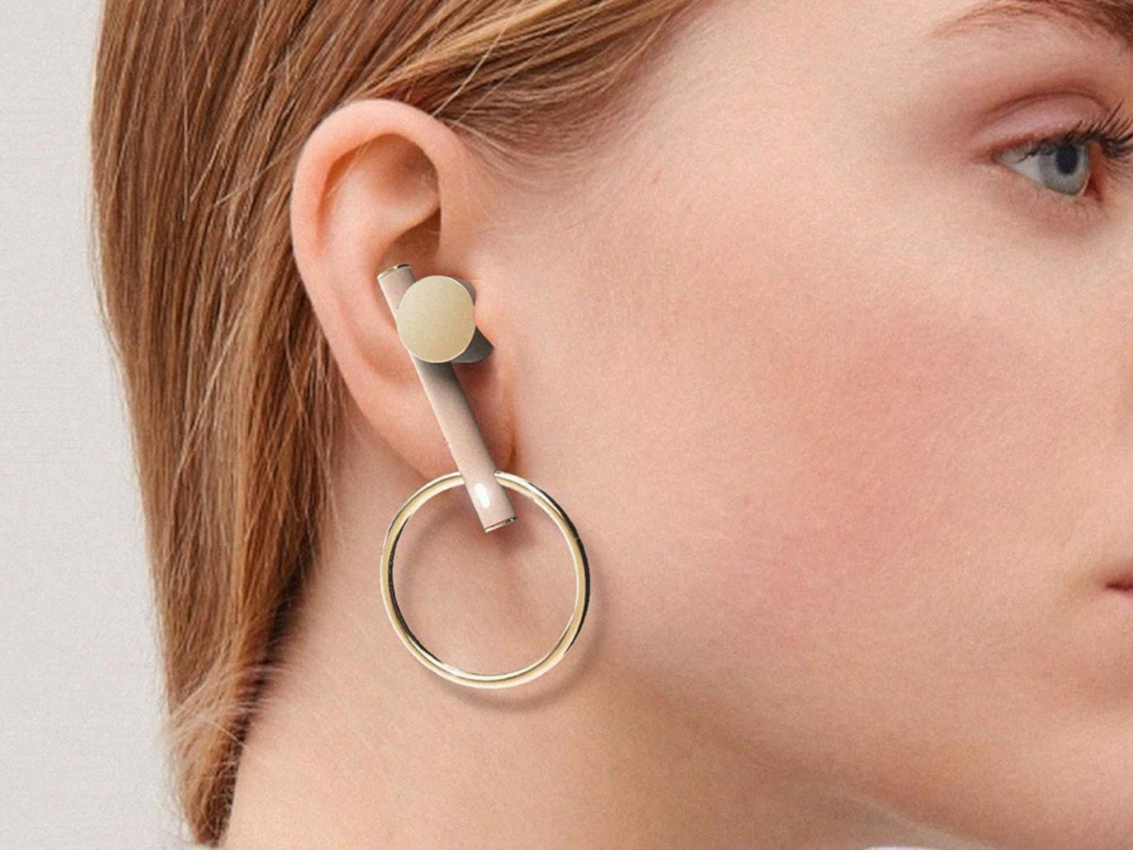
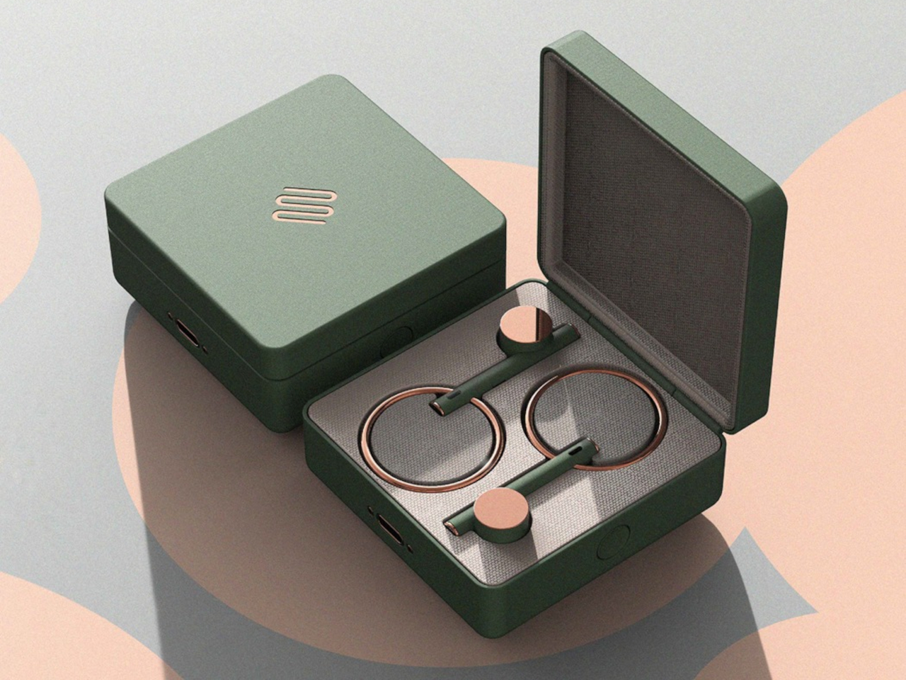
The YoonJy Earphones blend style and functionality by integrating earphones with jewelry. Featuring a sleek metal hoop that doubles as an earring, these earphones merge minimalistic design with a harmonious color scheme, allowing users to enjoy both accessories without compromise.

• Travel Suitcases

Designer: Monos

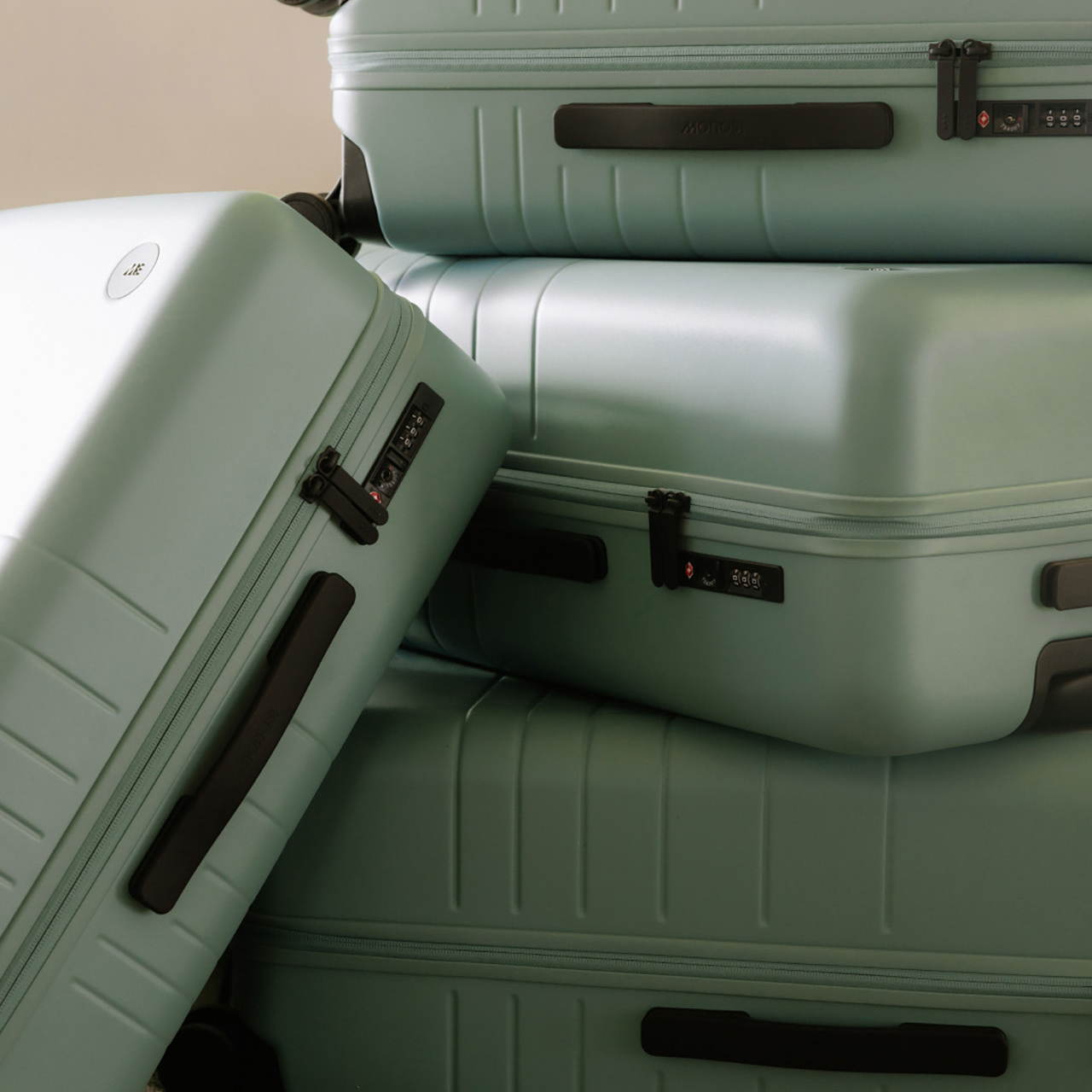
For dedicated travelers, Mono offers top-notch suitcases inspired by the Japanese concept of ‘Mono no aware.’ Their luggage combines style and functionality, featuring designs like the cupcake-inspired Monos x Magnolia Bakery and the sophisticated Terrazzo. Constructed with aerospace-grade polycarbonate and 360° spinner wheels, Monos suitcases include anti-microbial, recycled polyester linings, TSA-approved locks, and adjustable handles. The Carry-On Pro models add a fold-out compartment for convenient storage of electronics and essentials.

• Eco-Friendly Furniture

Designer: Philippe Starck and Kartell (and A.I.)

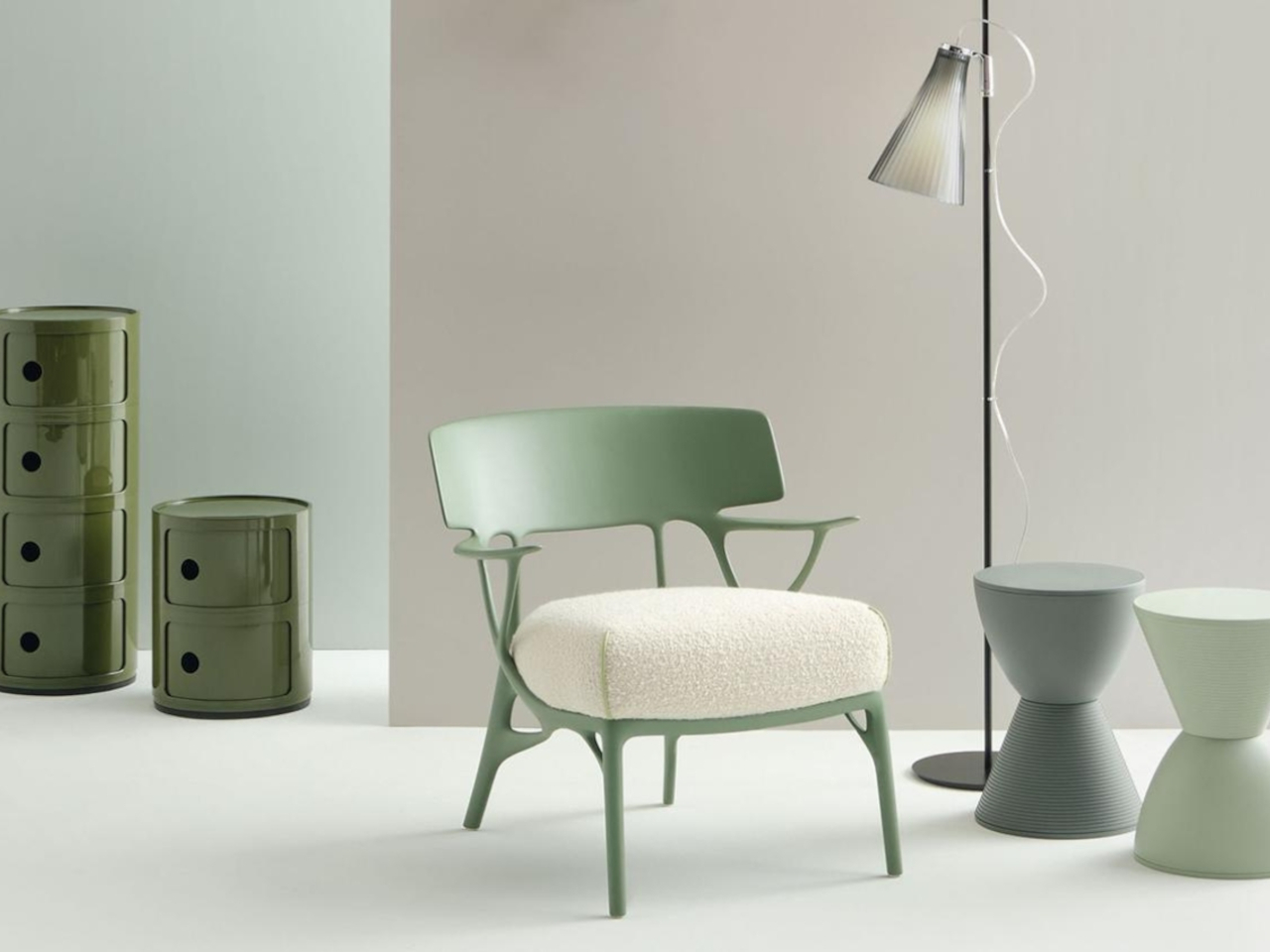
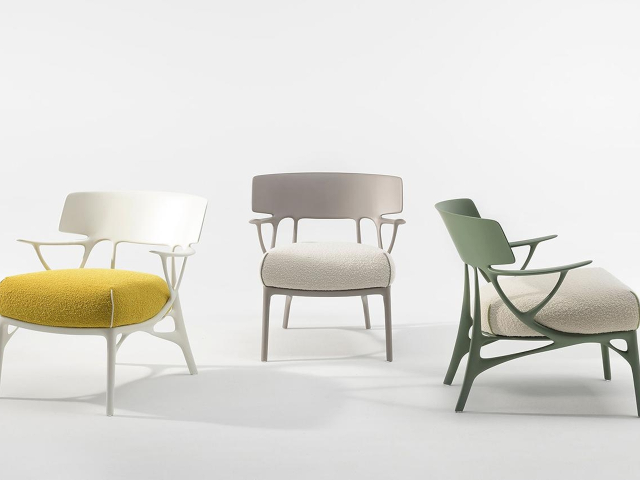
The A.I. Collection by Kartell and Philippe Starck combines artificial intelligence with design to produce eco-friendly furniture in earthy colors. The line features the versatile A.I. Lounge, the regal H.H.H Her Highest Highness chair, and the minimalist A.I. Console, all optimized for sustainability and reduced waste through A.I.-driven prototyping and planning.

• Mobile Phones

Designer: HONOR

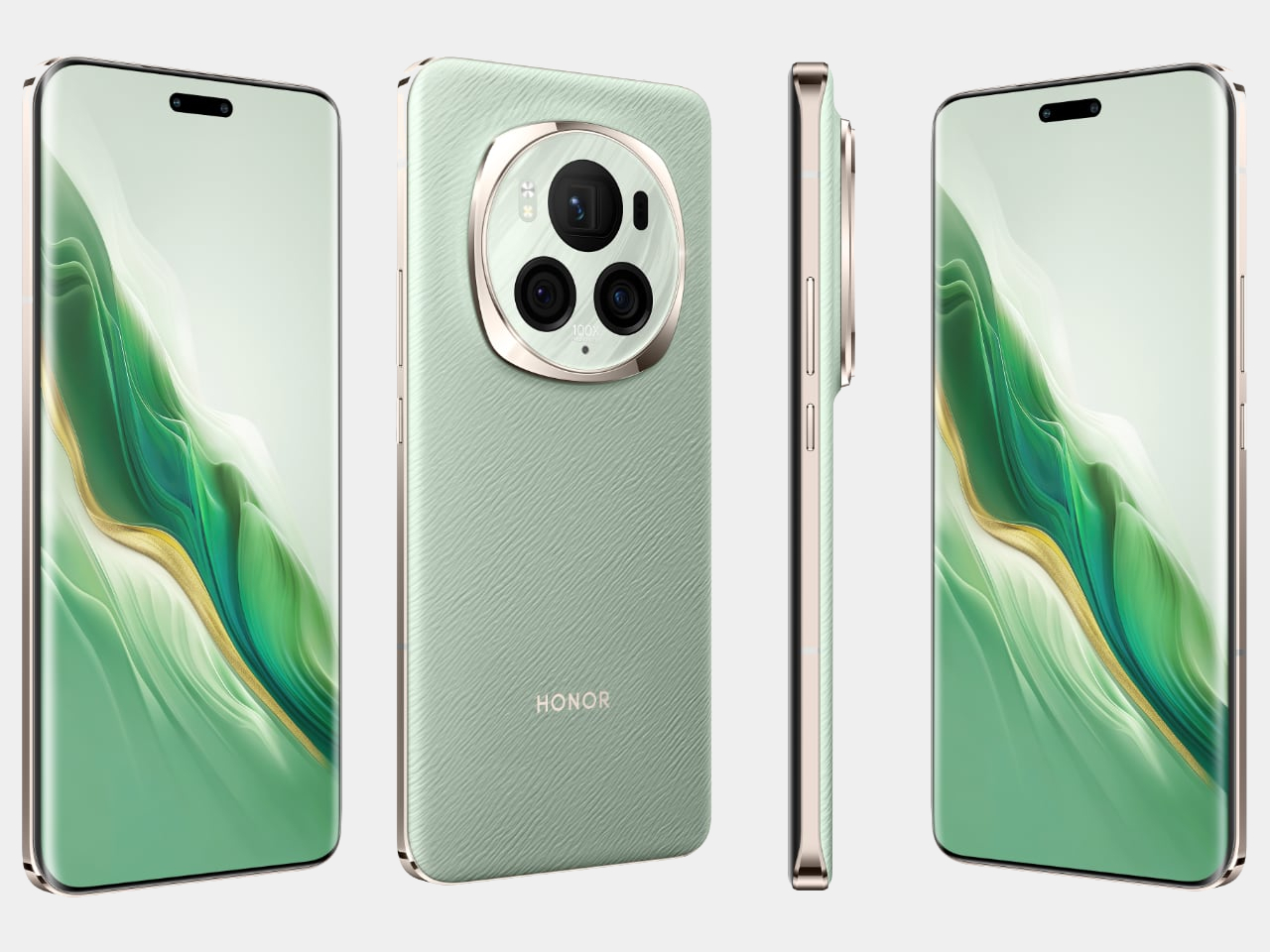
At MWC 2024, HONOR unveiled the Magic6 Pro smartphone and the MagicBook Pro 16 AI PC. The Magic6 Pro features advanced AI-driven photography with a 180MP Telephoto Camera, a 50MP Ultra-Wide Camera, and a variable aperture 50MP main camera. It integrates a 6.8-inch LTPO Eye Comfort Display, a Snapdragon 8 Gen 3 processor, and a long-lasting Silicon-carbon Battery with rapid charging. The MagicBook Pro 16 enhances cross-OS compatibility with AI.

• Headphones

Designer: Fairphone

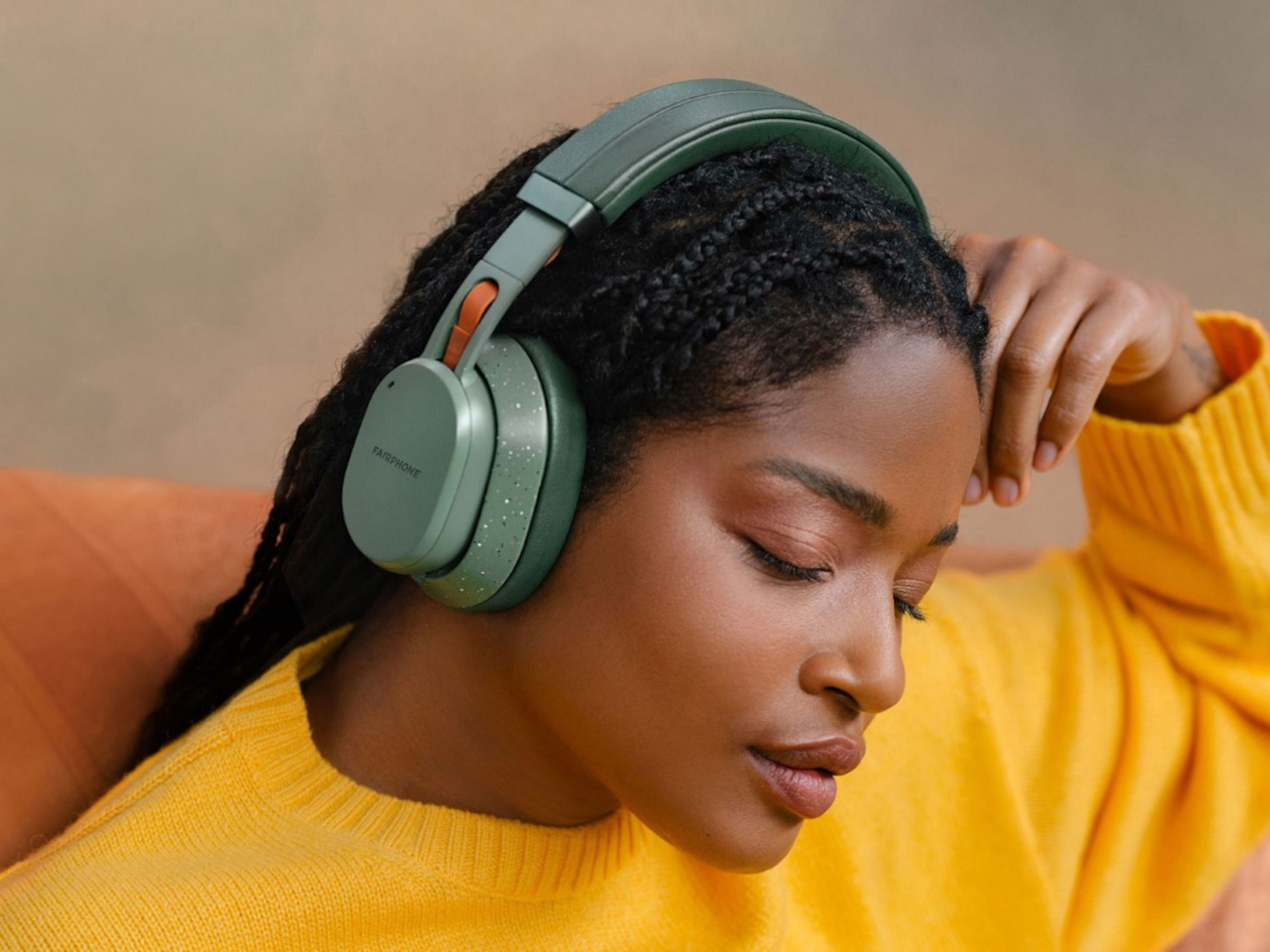
The Fairbuds XL wireless headphones from Fairphone feature a modular design that allows users to replace parts for extended use. They offer active noise cancellation, transparency mode, and up to 30 hours of playback with advanced 40 mm dynamic drivers for high-quality sound. Made from recycled materials, including vegan cushions, they come in Green or Black and support both wired and wireless connections.

• Industrial Furniture

Designer: Lockengloet

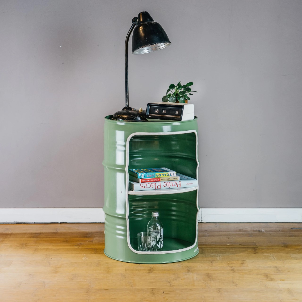
Lockengeloet, a Hamburg-based studio, transforms discarded oil barrels into unique, urban-industrial furniture. Sourced from the Port of Hamburg and never used for oil, these barrels are upcycled into coffee tables, nightstands, and minibars, with scrap metal repurposed into wall clocks. The studio uses recycled materials for about 80% of its products and operates with renewable energy from Greenpeace.

• Recycled Materials

Designer: POLIMAIR

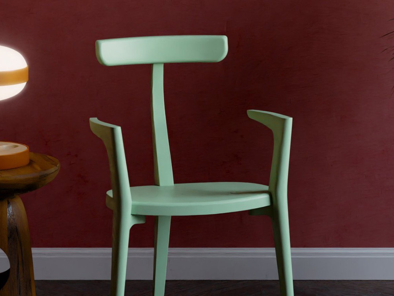
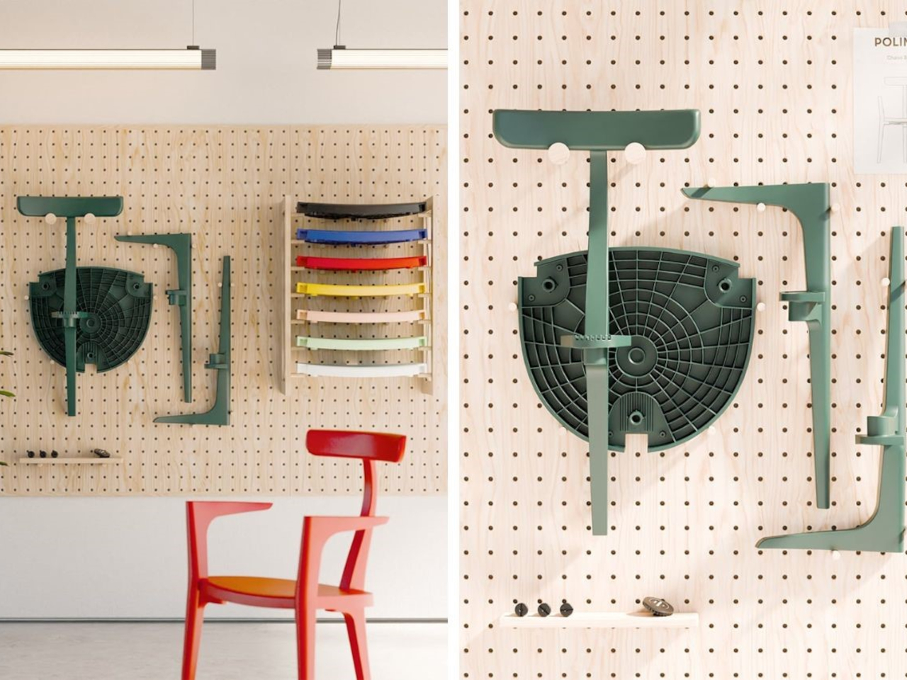
The Beluga Chair, designed by Arthur Gaudenz and crafted from recycled French fishing nets, is a groundbreaking sustainable furniture piece. Its mono-material design eliminates the need for additional components, reducing waste and CO2 emissions.

• Accessories

Click Here to Buy Now: Jewel Vase Mirror Stand ($59)

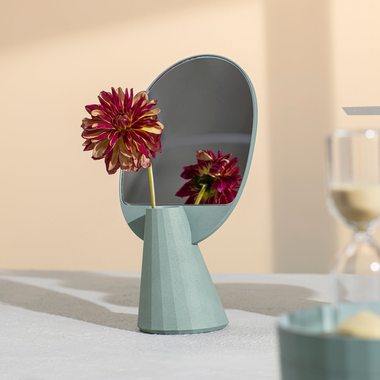
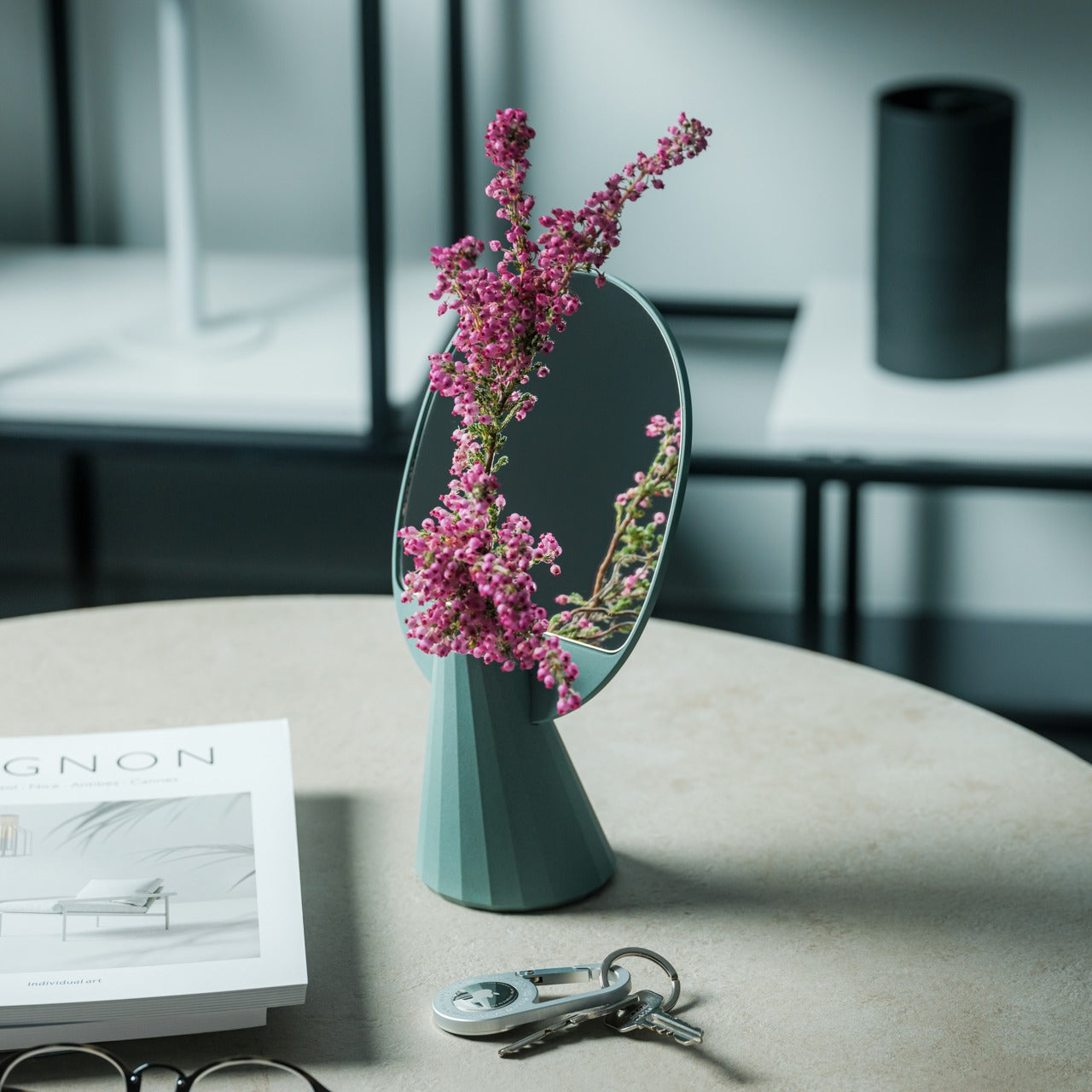
This versatile mirror serves as both an accessory stand and a vase, adding natural beauty to your space. Its minimalist, polyhedron design enhances any item placed before it, from a single flower to other small treasures, and pouring water into the vase becomes a calming ritual. Crafted from durable bioplastic with a significant amount of rice husks, this unique piece brings elegance and eco-friendly charm to any desk, table, or shelf.

In addition, HGTV Home by Sherwin-Williams now offers an easier way to choose paint colors through a partnership with Palazzo, an AI visualization tool co-founded by Venus Williams. All you need to do is upload a photo to see how colors from the 2025 Color Collection of the Year look in your space.

The post Embrace Calm With “Quietude”: HGTV Home by Sherwin-Williams’ 2025 Color of the Year first appeared on Yanko Design.
Basic Element of Interior Design: Color

Color theory guides the use of light and color for interior designers, helping them create attractive and functional homes. Understanding the basics, like the color wheel and combinations, is crucial for enhancing aesthetics and it enables designers to create visually pleasing, cohesive, and harmonious spaces. This theory also aids in developing effective color schemes without overwhelming the space.

Designer: Snappy Living

What is the importance of Color Theory?

Color theory is an invaluable tool in home design, aiding in the creation of a visually appealing space. Designers use it to select color combinations that bring rooms to life. Additionally, color theory helps balance warm and cool tones, create contrast, and introduce a sense of drama or calmness using different colors. It also guides the choice of lighting for each space, considering how different lighting types affect color perception in specific environments.

Designer: Philippe Starck

Eight fundamental principles of color theory can be incorporated into interior design.

1. Color Wheel

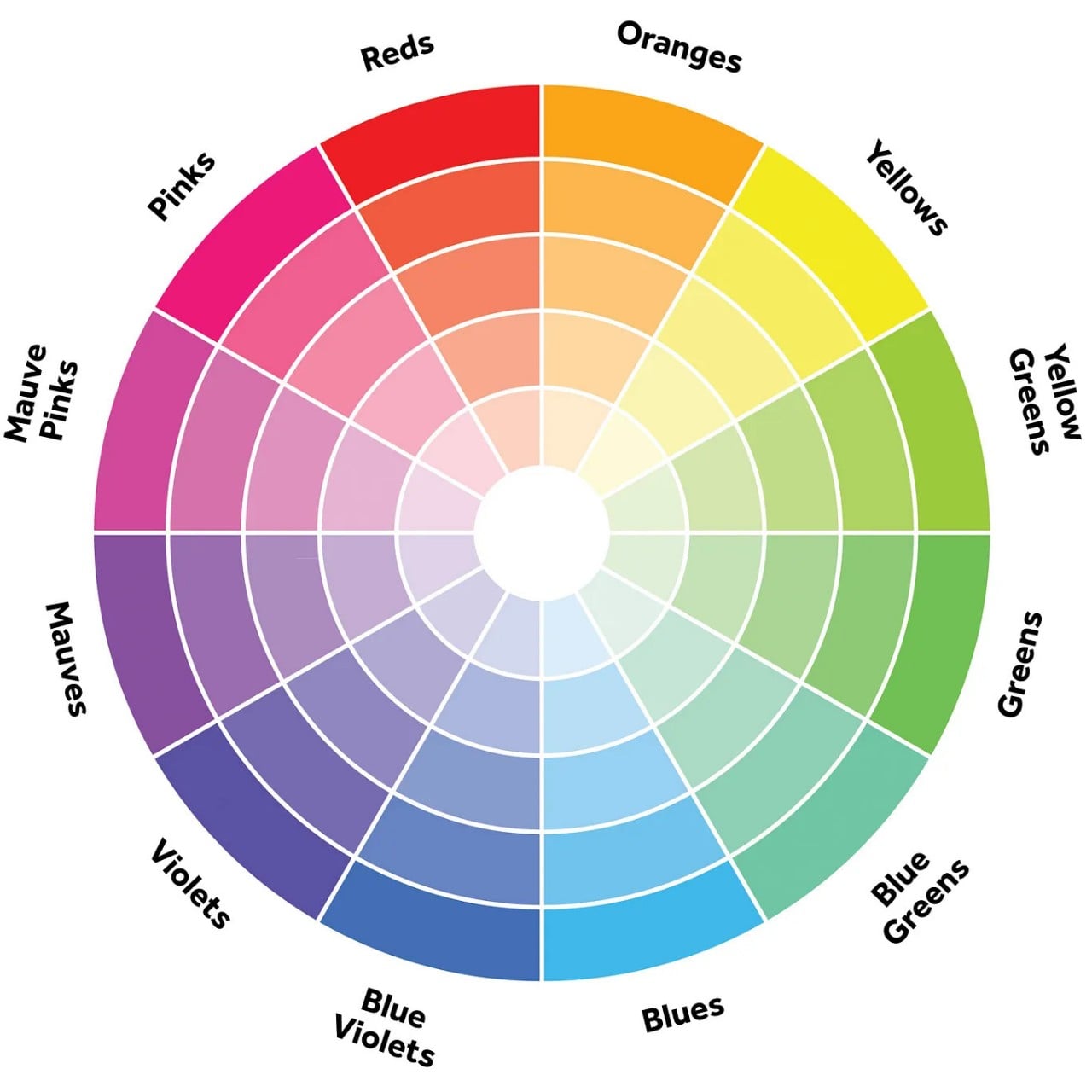
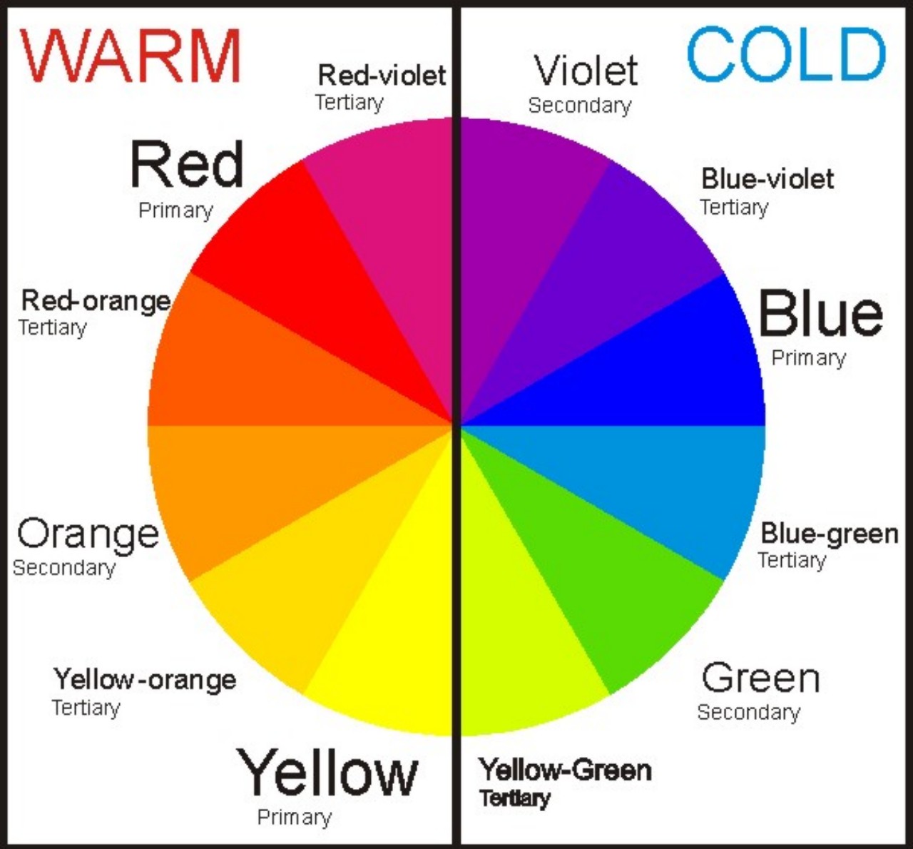
The color wheel serves as a visual depiction of the entire color spectrum, illustrating the interactions between different colors. The conventional color wheel comprises 12 segments, each corresponding to one of the primary hues like red, orange, yellow, green, blue, purple, and their respective shades. Grasping the fundamentals of color theory enables the creation of breathtaking compositions that mirror the beauty and grace found in nature.

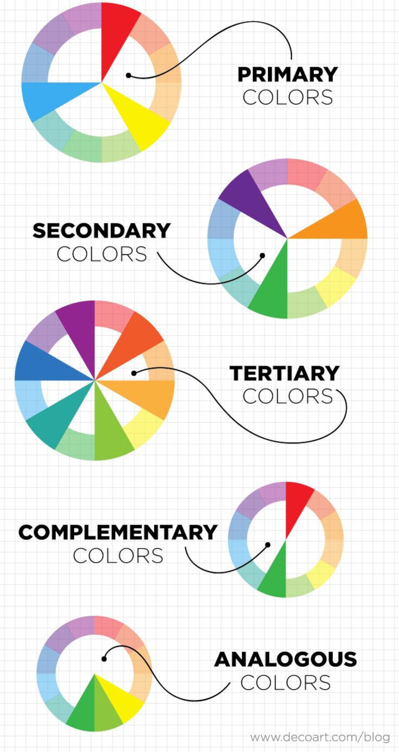
The different types of colors include:

Designer: DecoArt

• Primary Colors:

The primary colors are red, yellow, and blue which cannot be produced by blending other colors.

• Secondary Colors:

The Secondary colors include hues of orange, green, and purple which results from the combination of two primary colors.

• Tertiary Colors:

Tertiary colors emerge by blending one primary color with one secondary color.

• Complementary Colors:

These colors are situated opposite each other on the color wheel and yield a striking contrast when used together in design.

• Split Complementary Colors:

Just like complementary colors, split complementary colors include two additional hues from either side of their complement, for instance, hues of orange, yellow, and blue.

• Analogous Colors:

Harmonious in nature, analogous colors are adjacent to each other on the color wheel, producing a pleasing effect when incorporated into home decorating designs.

• Monochrome Colors:

Monochrome colors employ different tints and tones within a single hue and are primarily used to establish a serene ambiance in various room decor schemes.

• Neutral Colors:

Colors like white, black, grey, beige, and brown serve as neutral elements that can be incorporated throughout an entire room or utilized as accent pieces to infuse a sense of balance into an already vibrant color palette.

2. Dimensions of Color

To precisely describe colors, one must consider these attributes of color.

• Hue

Designer: Maggie Maggio

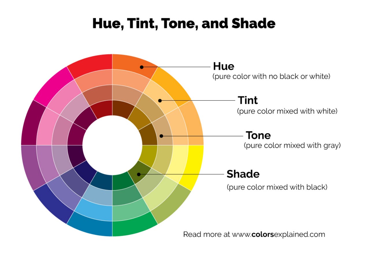
Hue, the most noticeable characteristic, is determined by the color’s position on the visible spectrum, with an infinite variety represented on the color wheel as pure colors without tint or shade.

• Value

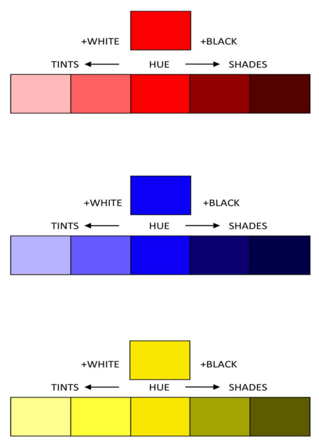
Value, the lightness or darkness of a color, is determined by adding black or white to the pure hue. Tints (lighter values) and shades (darker values) result from this adjustment. These variations impact the perceived size and character of a space, with bright values creating spaciousness and dark values evoking coziness.

• Tints

Image courtesy of: Colors Explained

A tint is a color lighter than the normal value of pure hues on the color wheel, created by mixing a pure chromatic color with white or a lighter hue. While the color wheel illustrates hues with 50% white added, a room dominated by light tints may feel cold unless skillfully handled.

• Shades

Shades are darker tones created by mixing pure chromatic colors with black or darker hues. The color wheel illustrates normal value hues with 50% black added to produce shades. However, a room dominated by dark hues might feel gloomy and confined unless handled skillfully. Like tints, incorporating value contrasts and skillful transitions can enhance a dark color scheme.

• Intensity

Intensity, also known as saturation or chroma, indicates the purity of a color. A color with high intensity appears bright, while a low-intensity color is more neutral or muted. Colors are at their purest in their unmixed state, straight out of the tube.

• Tones

Tones, often linked with intensity, refer to a subdued or neutralized version of a hue. Created by combining white and black, tones can be lighter or darker than the original hue, possessing a more nuanced quality than tints and shades. Vibrant colors are called “jewel tones,” while subdued colors are known as “muted tones.”

3. Color Temperature

Image courtesy of: beata

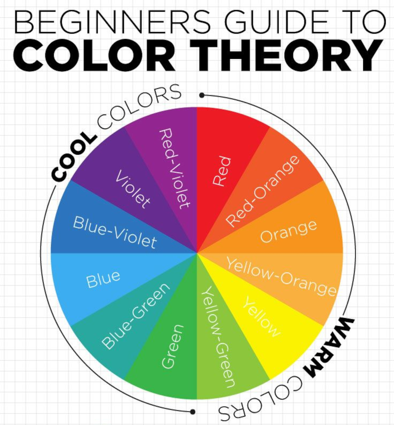
The color temperature plays a crucial role in interior design, influencing the ambiance of a space. Cool tones, such as blues and greens, contribute to a serene atmosphere, whereas warm hues like reds, oranges, and yellows infuse warmth and energy into the interiors. Neutral shades, like beige or gray, serve as a harmonious middle ground between these contrasting extremes. Designers can attain the desired effects in their projects by skillfully blending tints and shades with varying temperatures.

4. Color Combinations

Designer: DearCustomDesigns

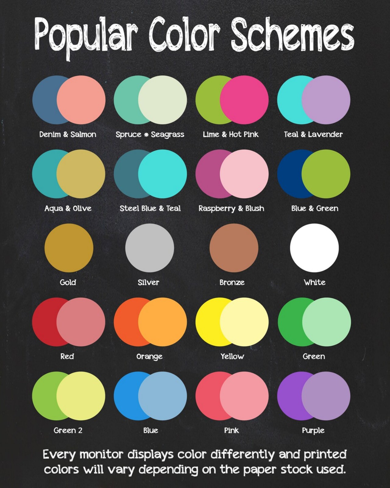
By blending colors of varying temperatures, designers can create visual interest and a unique atmosphere in any home project. Cooler and warmer tones can be contrasted, and complementary pairs like pink and green or yellow and purple can add vibrancy. Neutral shades provide a balance between extremes. With careful consideration, designers can use color combinations to achieve their desired atmosphere.

5. Color Mixing

Color mixing is the art of combining primary colors (red, blue, and yellow) to create a range of secondary and tertiary shades. In interior design, color theory is essential for stylishly blending hues and crafting visually appealing compositions. Mastering color mixing allows designers to optimize their palettes, leading to the creation of unique and distinctive color combinations.

6. Color Scheme

Different color schemes evoke various moods, from lively to calming.

• The monochromatic scheme uses tones of a single hue, creating a unified and timeless look.
• The analogous scheme combines three similar hues for balanced contrast.
• The complementary scheme pairs colors opposite on the wheel for high contrast without overwhelming.
• The triadic scheme blends three evenly spaced colors, adding energy without overpowering.
• Tetradic color schemes encompass four distinct hues, forming two pairs of complementary colors equally spaced on the color wheel.
• Square color schemes, on the other hand, consist of four separate hues positioned at 90-degree angles from each other on the wheel.
• Split-complementary combines three hues, consisting of a base hue and two adjacent opposites.

Designer: Inside Decors

7. Contrast Colors

The contrast in design involves opposites, adding visual interest through distinctions in color, values, or intensities. Sharp or vivid contrast signifies large differences, while low contrast indicates small variations. Achieved through complementary colors or value contrast, it emphasizes light and dark without progressing through middle values. This dynamic element contributes balance, relief, and drama to a scheme, best when paired with restraint in color variety.

8. Psychology of Color

Colors profoundly affect our moods and emotions. Cool hues bring relaxation, while warm hues generate energy. Reds signify excitement, blues induce calmness, oranges suggest creativity, and yellows increase optimism. Designers can create tailored atmospheres in home projects by carefully selecting colors to meet clients’ unique needs.

Designer: Deavita

Designers can leverage these color theory principles to create beautiful and functional home designs.

The post Basic Element of Interior Design: Color first appeared on Yanko Design.
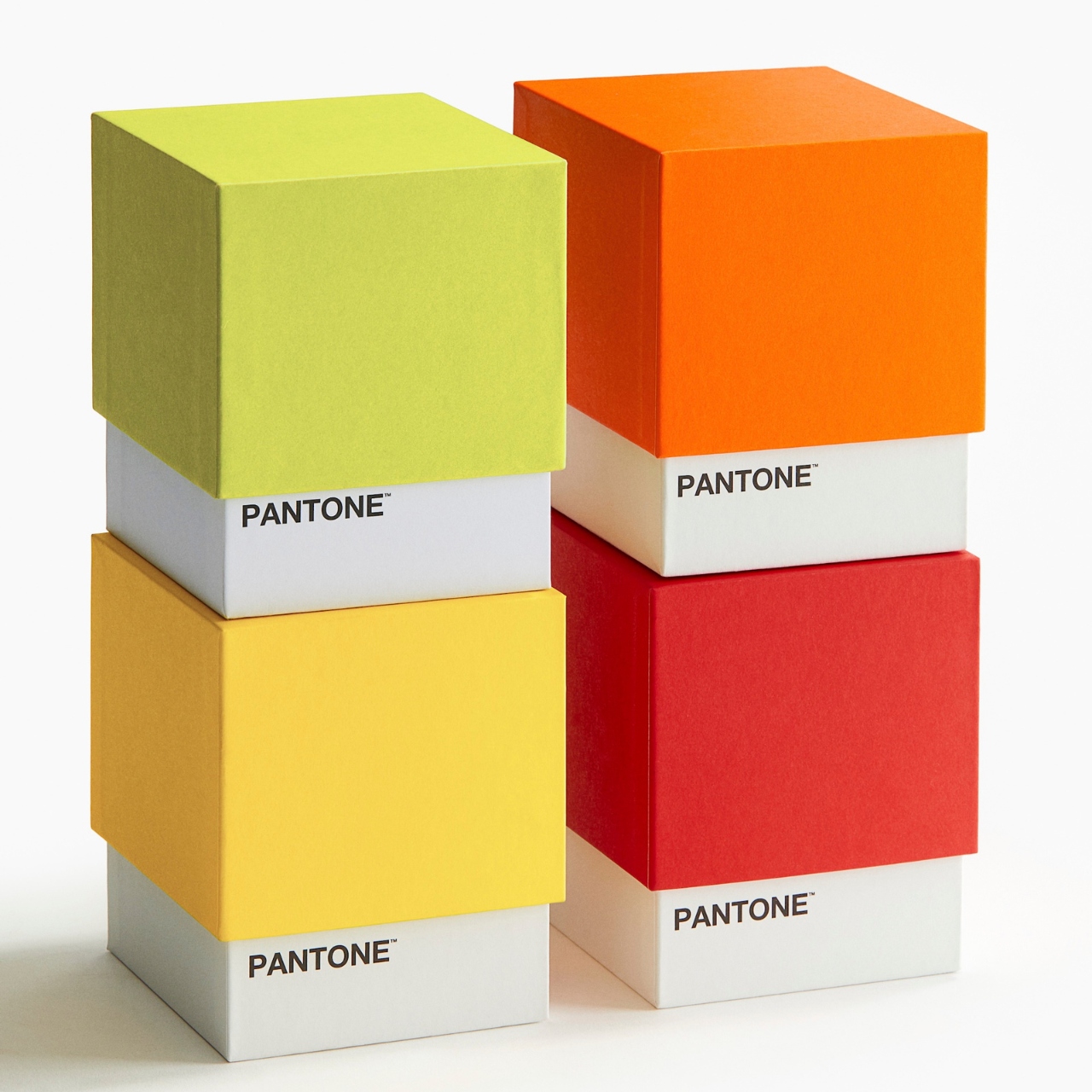
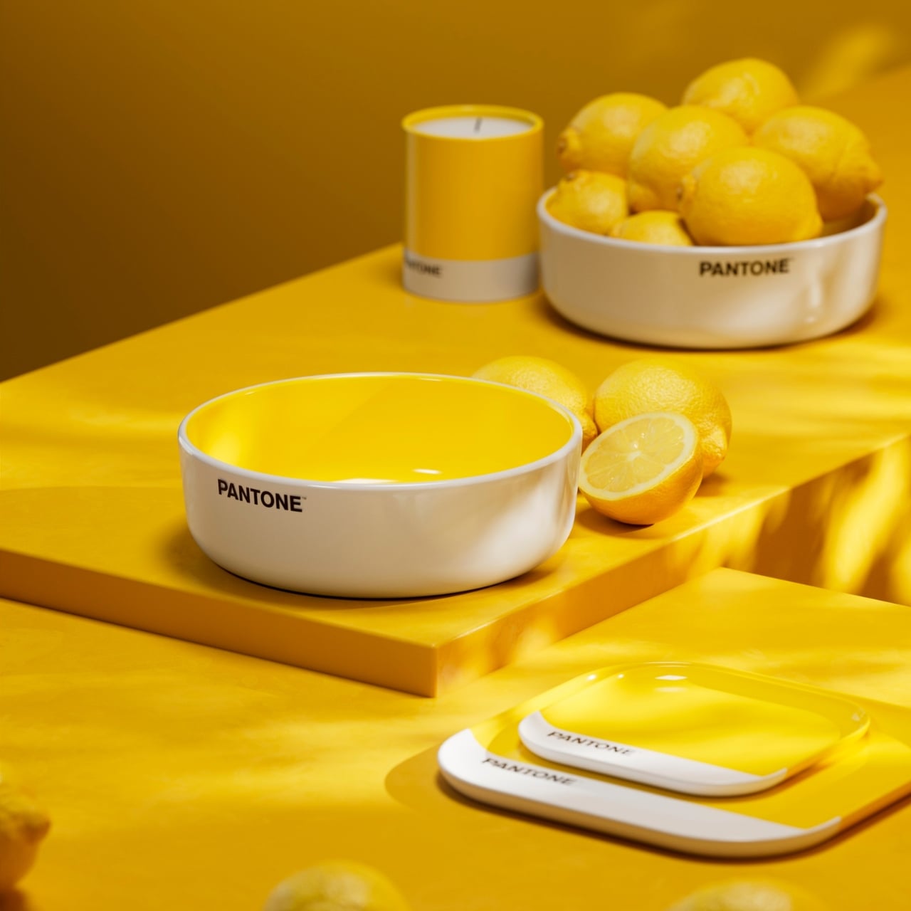
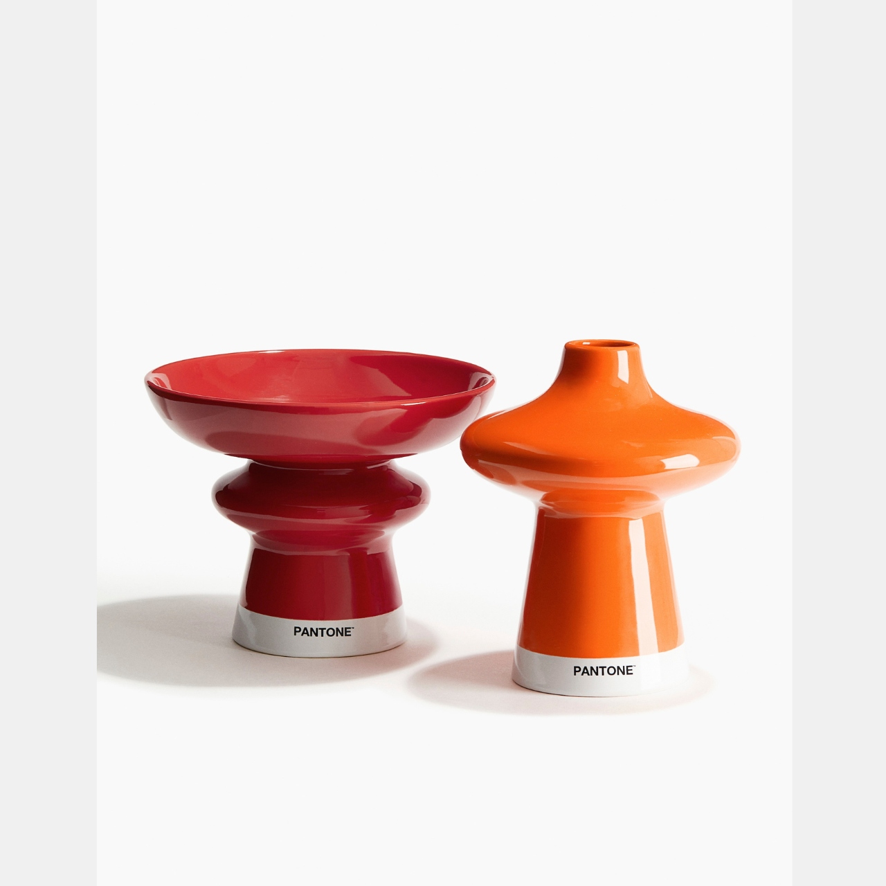
H&M and Pantone bring even more colorful accessories to your table

When it comes to decorating our homes with furniture and accessories, there are two kinds of people: the minimalist and monochromatic kind or the maximalist and colorful aesthetic. There can also be some sort of cross-over between the two but mostly, that’s the two general kind of homeowners. I am more of the latter as I have a lot of stuff and I want to keep my surroundings colorful and vibrant. This new collaboration between H&M Home and Pantone will definitely appeal for those who are like me.

Designer: H&M Home and Pantone

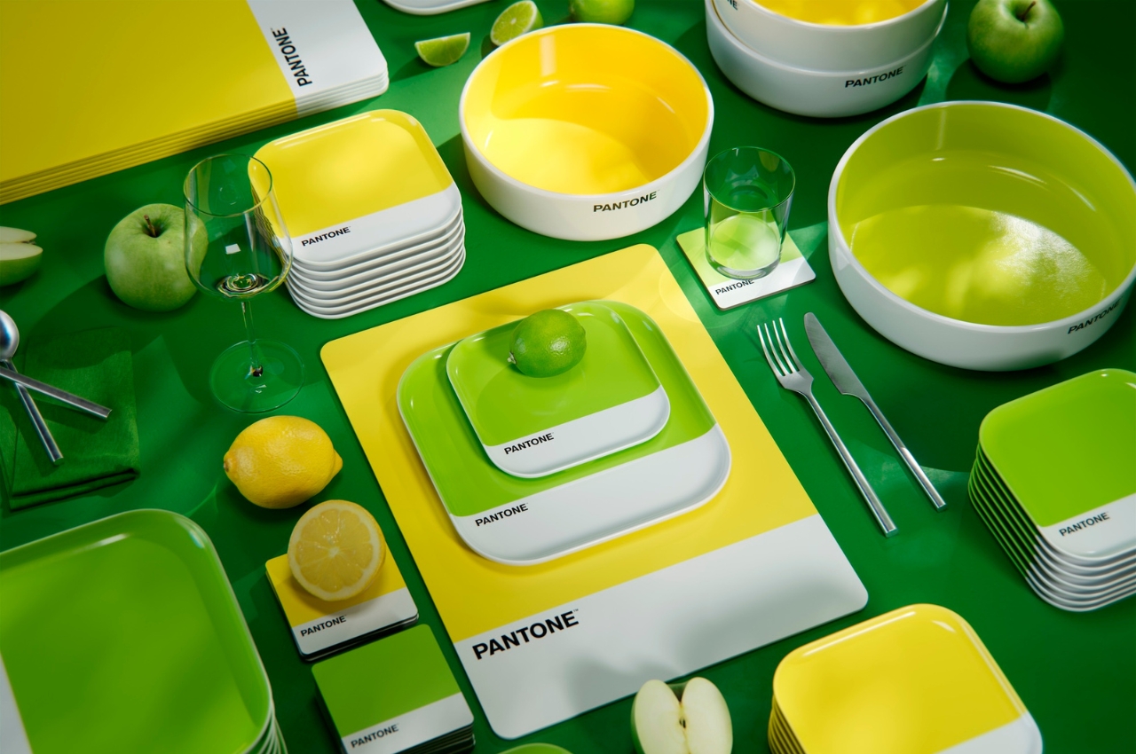
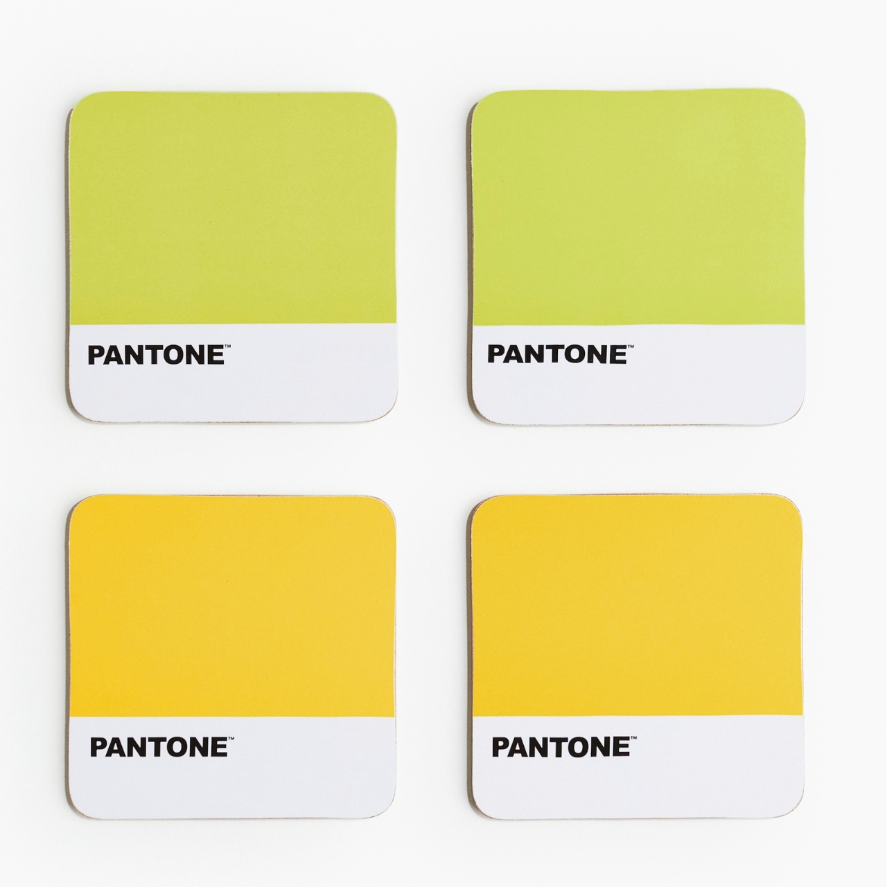
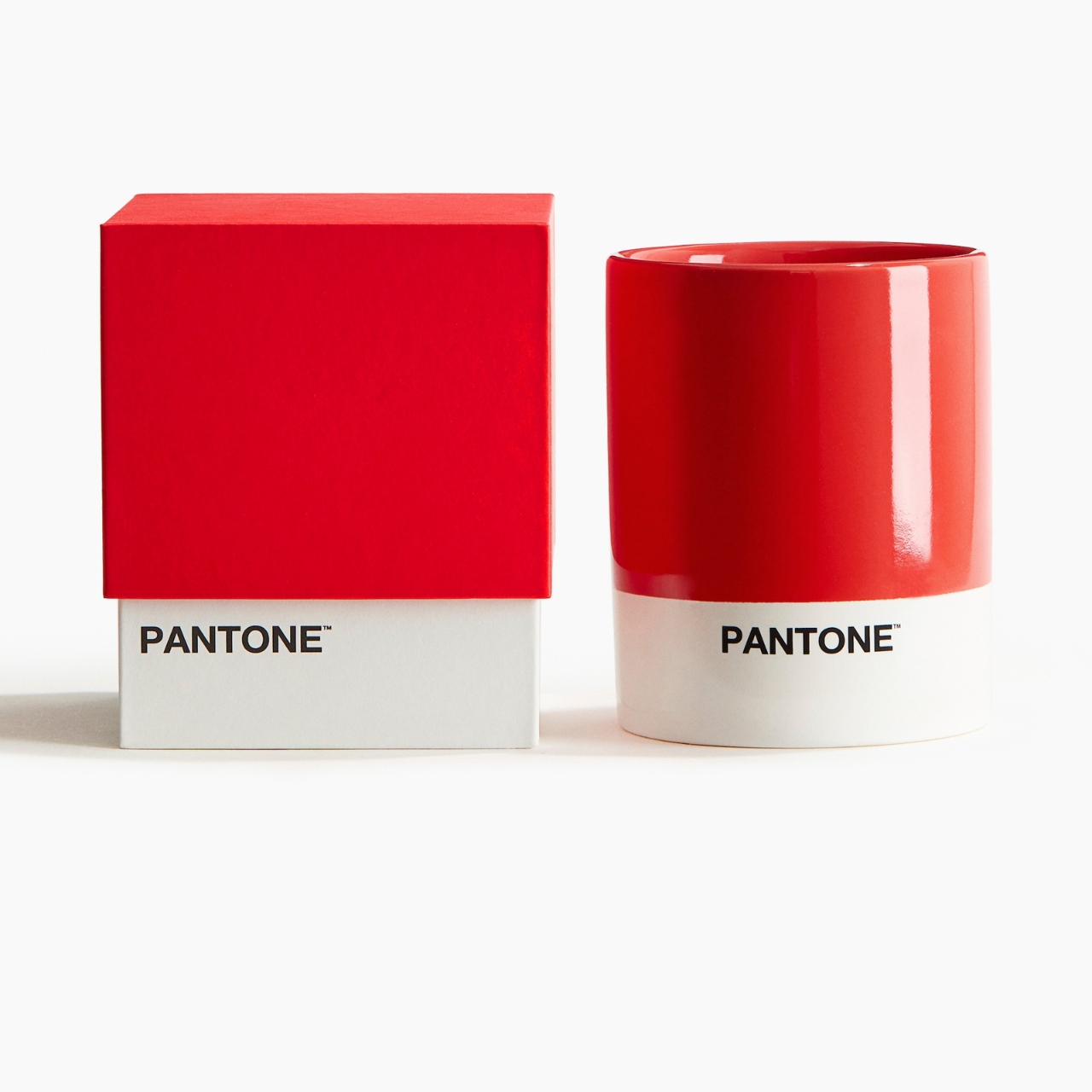
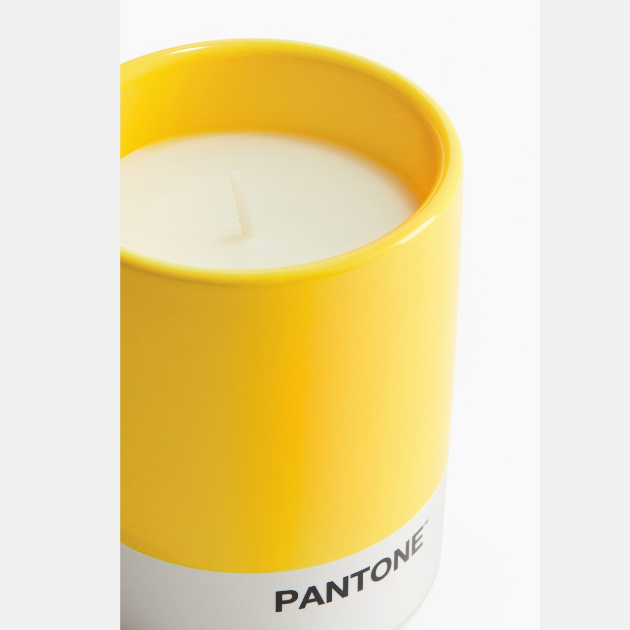
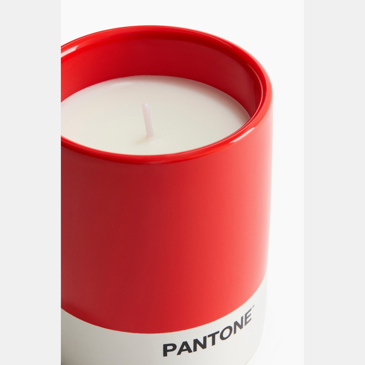
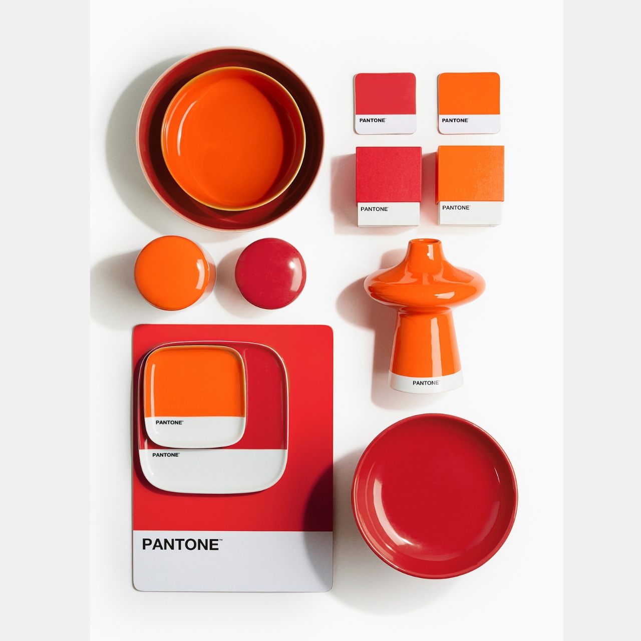
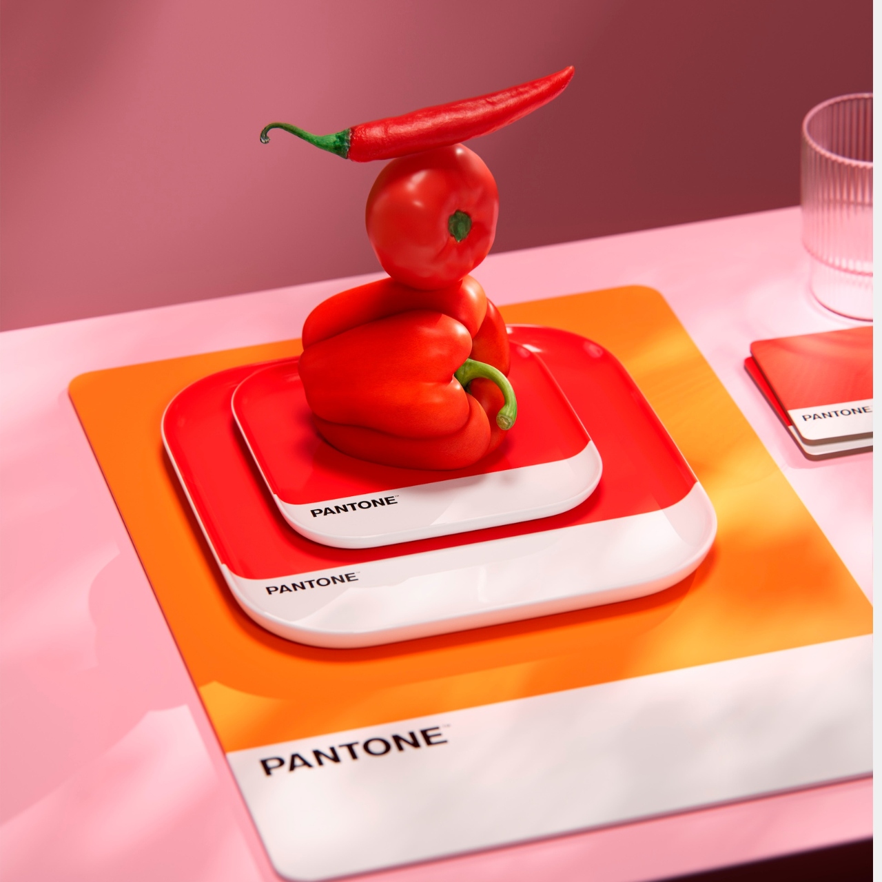
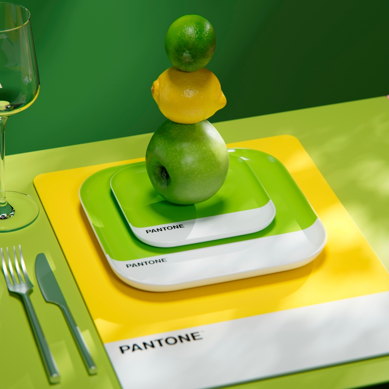
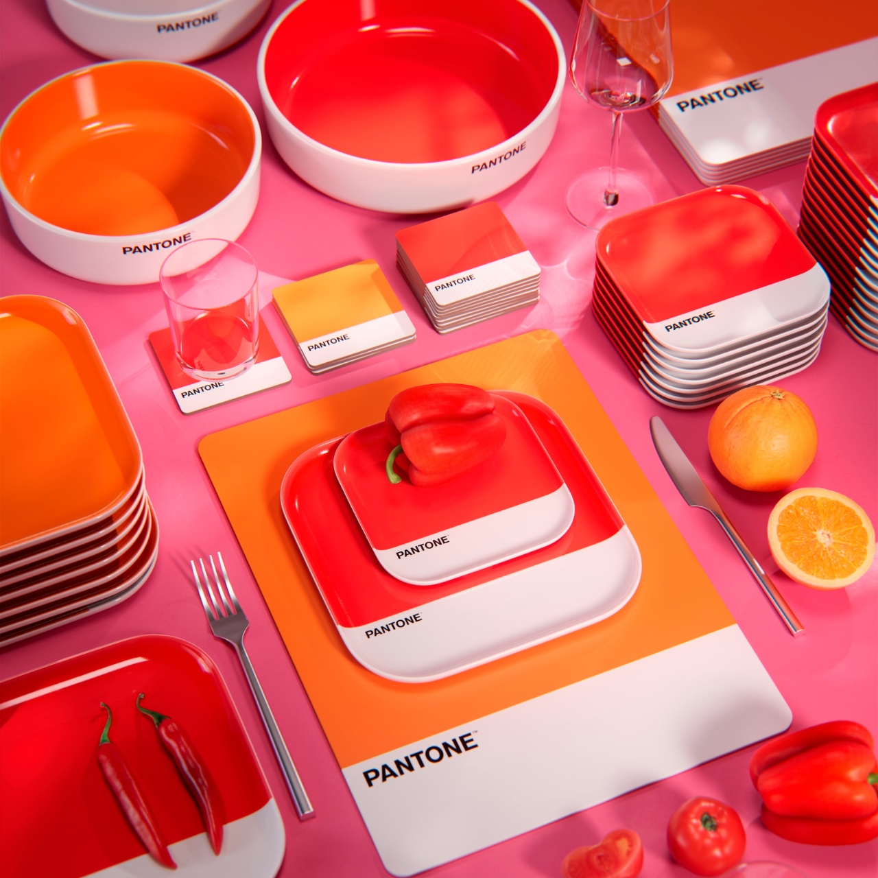
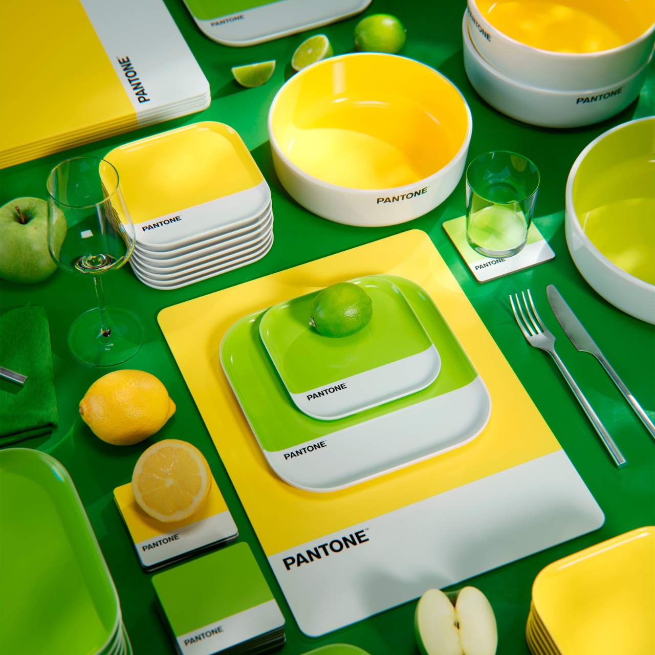
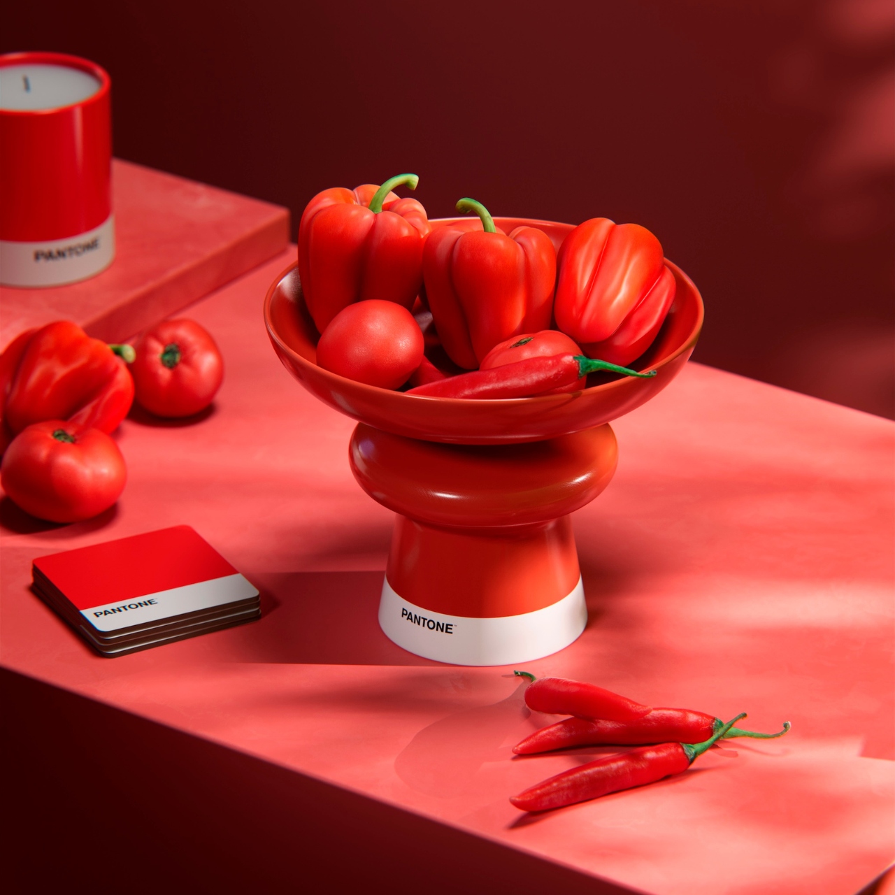
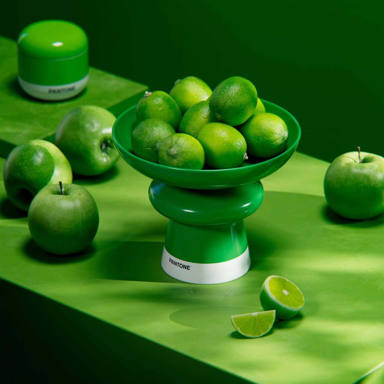
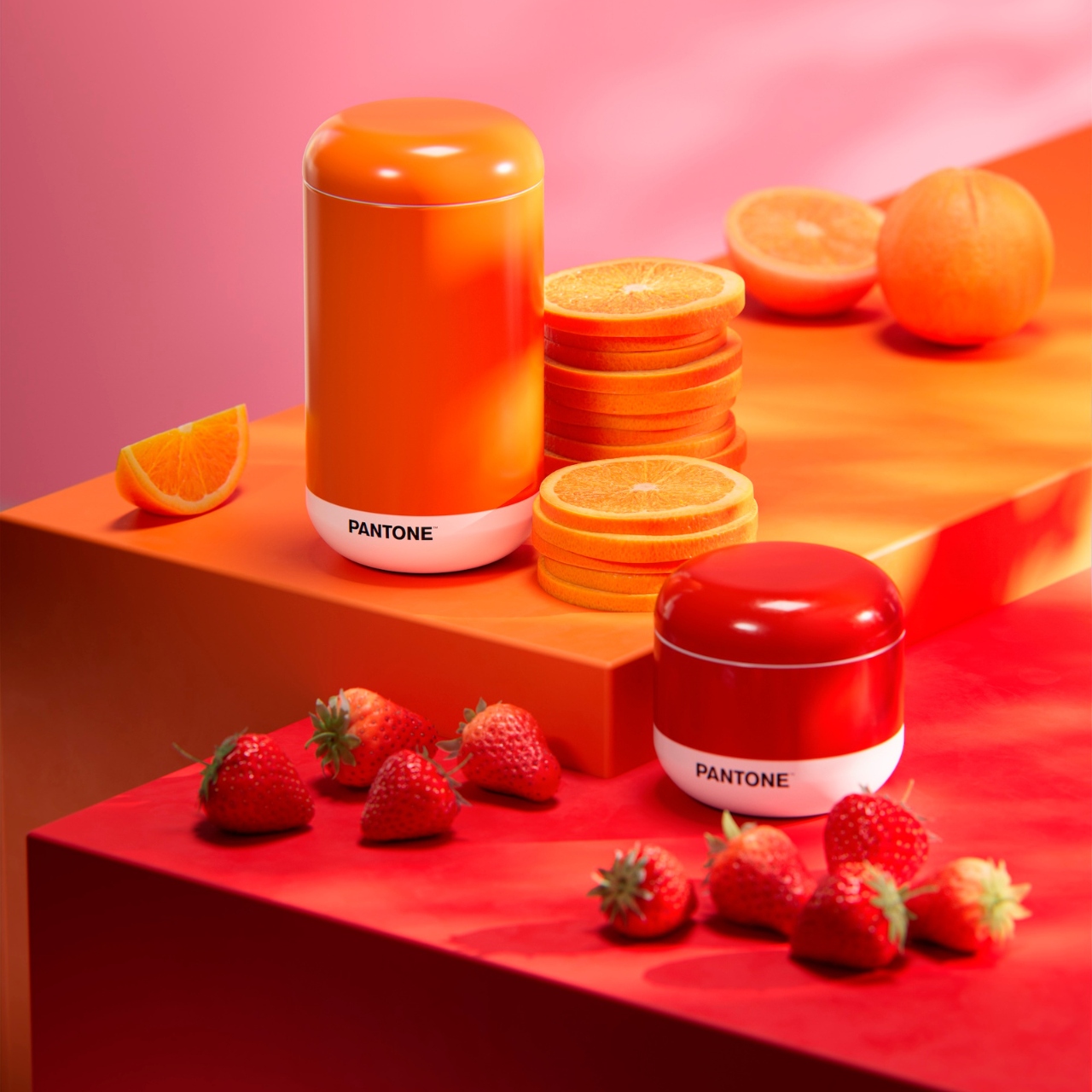
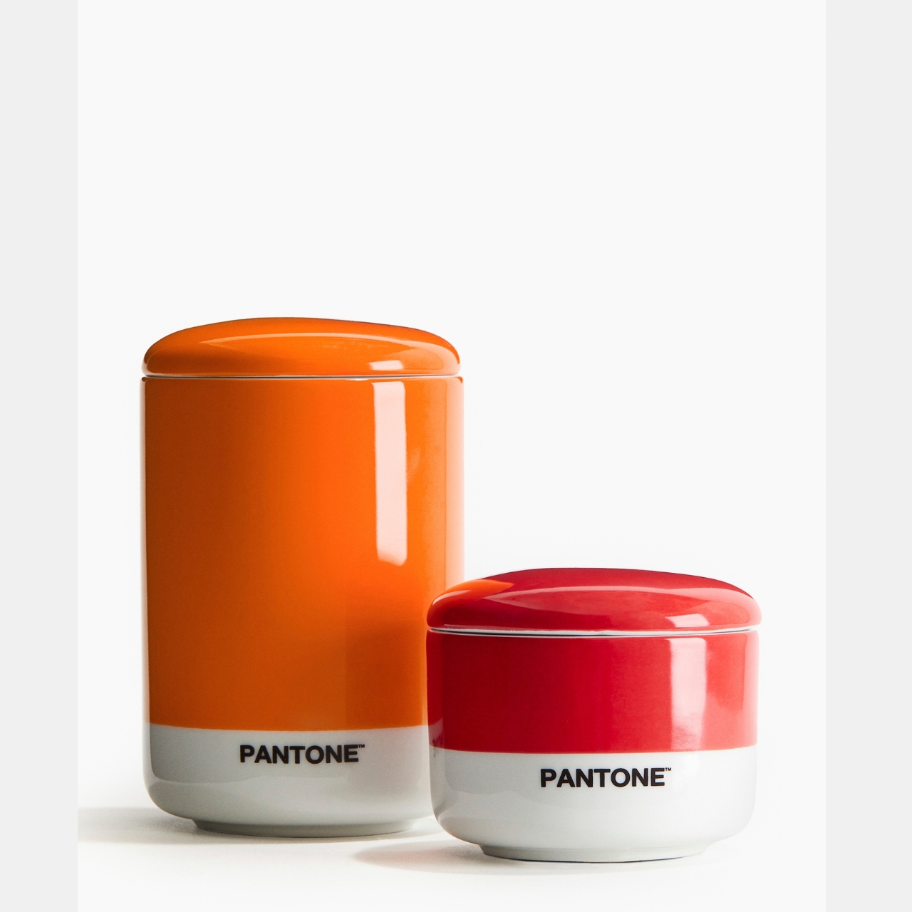
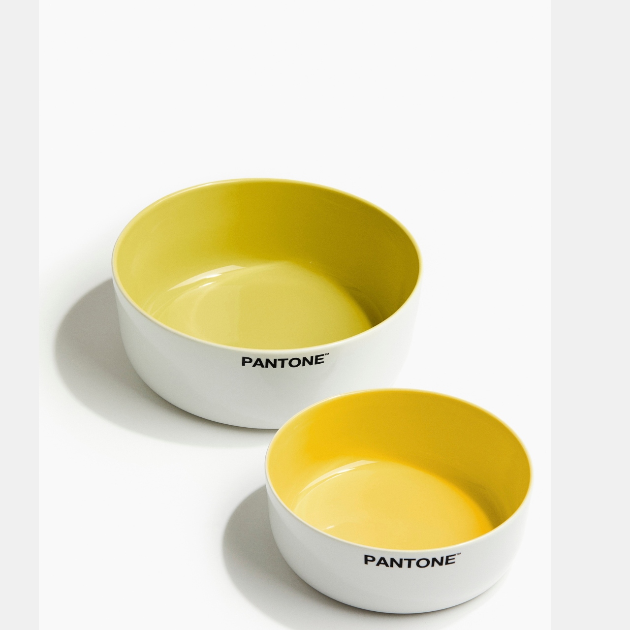
This is actually the second time that these two brands have collaborated and this time around, the colors just keep on coming. The H&M Home 🖤 Pantone Collection comes in two palettes: Zesty & Fresh and Sweet & Juicy. The collection includes different food serving and food storage items like serving bowls, placemats, footed trays, coasters, salt shakers, etc. Just like the previous collection, you also get different colors of scented candles that come in the pantone palette looking box.

Unlike the previous collection that had more “calm” colors, these two collections are brighter and more vibrant and has more color options for those who want to mix and match or stay with their color of choice. The Sweet & Juicy has spicy red and strong orange colourways, representing excitement and passion and love and anger, respectively. This is the more intense option if that’s your aesthetic. The Zesty & Fresh collection meanwhile has a more refreshing vibe, with the fresh lime bringing balance, joy, and serenity while the bright yellow is more of joy and happiness but also enhances communication and wisdom, as per the color experts.

The collection includes the following dining and kitchen accessories: small and large plates, serving bowls, coasters, placemats, and container jars. The scented candles available are Mandarin Gelato (orange), Pink Grapefruit (red), Lemon Verde (yellow), and Green Basil (green). The collection is now available in selected stores and at their online store. My wallet is thanking me that this is not available where I live.

The post H&M and Pantone bring even more colorful accessories to your table first appeared on Yanko Design.
Top Ten Color Trends For 2024

In 2024, we can expect a bolder approach to life, as color experts anticipate that colors will be more personal than ever, allowing individuals to express themselves. Whether opting for bold or softer hues, there are no rules but it is all about personal feelings and resonating with the moment. With the primary theme of 2024 centering around home well-being, homeowners are keen on creating spaces that radiate a calm and serene environment. Hence, the featured color trends play a crucial role in establishing environments that offer respite from the fast pace of day-to-day life.

What factors should you consider when picking a color?

Consider the lighting, existing furniture colors, and the desired mood that you aim to achieve when choosing a paint color. Lighter tones, like creamy white and neutral hues of grey, create a brighter and more spacious feel, while darker shades such as deep purple and warm orange or red make a bold statement, fostering a cozy atmosphere. Also, when choosing the suitable colors for your home, consider its psychology, as it explores how colors influence human behavior and emotions and can impact mood and decision-making, subject to individual preferences and cultural influences.

Check out the trending colors of 2024 and make sure to choose the colors that are best suited for your home.

1. Cool Blue

Image courtesy of: archideaphoto

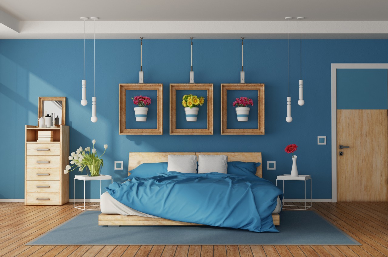
Blue is a timeless color that maintains popularity because of its natural connection with the blue skies and calm water. Some of the airy and watery tones include refreshing aqua blues, teal, turquoise, and serene shades that aim to create tranquil spaces. Additionally, blue has evolved into a contemporary neutral for modern homes, offering versatility to mix and match across various design styles and applications. The best part about using blue color is that lighter shades of this color have an inherent lightness that uplifts the décor of any room with ease.

2. Versatile Purple

Image courtesy of: archideaphoto

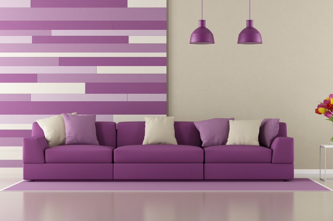
Across fashion and interiors, purple shades, once linked with wealth and royalty, are now infused into contemporary aesthetics, bringing a fresh dynamic to color schemes. The color purple exudes calmness and luxury, with deeper shades of purple adding playful depth for a sense of opulence in the interior decor. Soft and muted shades of purple are gaining popularity and complement hues of pinks, greens, and blues as they bring an element of dynamic energy into the interiors. Dark mauves are emerging as a significant color trend in 2024, possessing a versatile quality that reads as neutral yet remains lively and bold. Its compatibility with many colors makes it an easy and versatile hue to work with. With its profound and rich undertones, the color purple radiates sophistication and charm

3. Peach Fuzz

Image courtesy of: Pressmaster

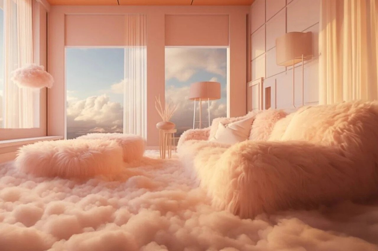
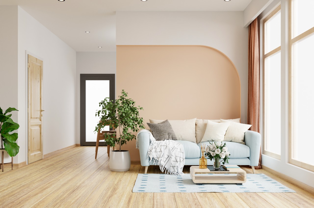
In 2024, the trend is all about pinky peaches, with Pantone naming 13-1023 Peach Fuzz as the Color of the Year. Pantone’s Peach Fuzz stands out as a warming color that offers comfort and connectivity. In a world that can feel harsh, the preference for soothing, soft, and warm colors that offer comfort is evident. Whether used as a textured rug or an accent wall in a dining room, it brings a convivial atmosphere to spaces, capable of complementing traditional neutrals and standing out in vibrant color schemes. This pinkish-orange hue can instantly cozy up your bathroom, bedroom, or living room during your next home makeover.

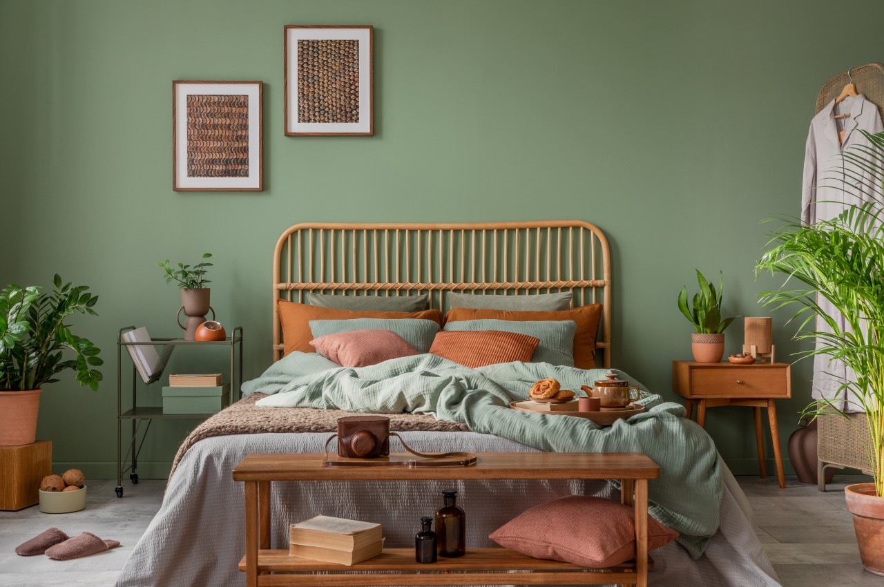
4. Earthy Greens

Image courtesy of: FollowTheFlowStudio

Shades of green are expected to maintain their immense popularity in interior design as individuals continue to embrace biophilic design, seeking a heightened sense of wellness inspired by nature. Green imparts a grounding and warm ambiance to spaces, crafting contemporary and atmospheric room designs. The color green contributes depth to a space and blurs the boundaries between the exterior and interior. In addition to earthy tones, rich greens are anticipated to gain prominence along with darker shades that exude elegance. Emerald green, a jewel tone that is both saturated and not overly bright, is making a major statement, bringing a rich mood and depth of color to various spaces. Note that dark green, when paired with complementary colors, can introduce balance, drama, or a sense of tranquility to a room.

5. Warm Neutrals

Image courtesy of: vanitjan

There is a renewed love for neutrals, especially in bedroom trends, which fosters a restful ambiance and a comforting sanctuary. Pairing warm creams with soft terracotta or deep red tones adds depth, while incorporating layers of texture within neutral schemes brings tactility. Note that warm off-whites and cream tones are becoming the go-to neutrals for 2024 and designers as well as homeowners currently favor these warm neutrals to counterbalance the coldness induced by LED lighting. Whether applied to walls, ceilings, woodwork, or furniture, these comforting and warm neutrals are suitable for diverse design styles, imparting timeless charm and a sense of relaxation to all spaces.

6. Tone-on-tone Color

Image courtesy of: bialasiewicz

Tone-on-tone palettes revolve around a single core hue, incorporating various shaded tones within that spectrum for a harmonious color scheme. You can use diverse paints on your walls and seamlessly complement them with furniture, textiles, and accessories. Anticipate the prominence of monochromatic color schemes in both indoor and outdoor spaces, where the blending of colors from the same family exudes sophistication and an effortless sense of chic.

7. Black

Image courtesy of: hemul75

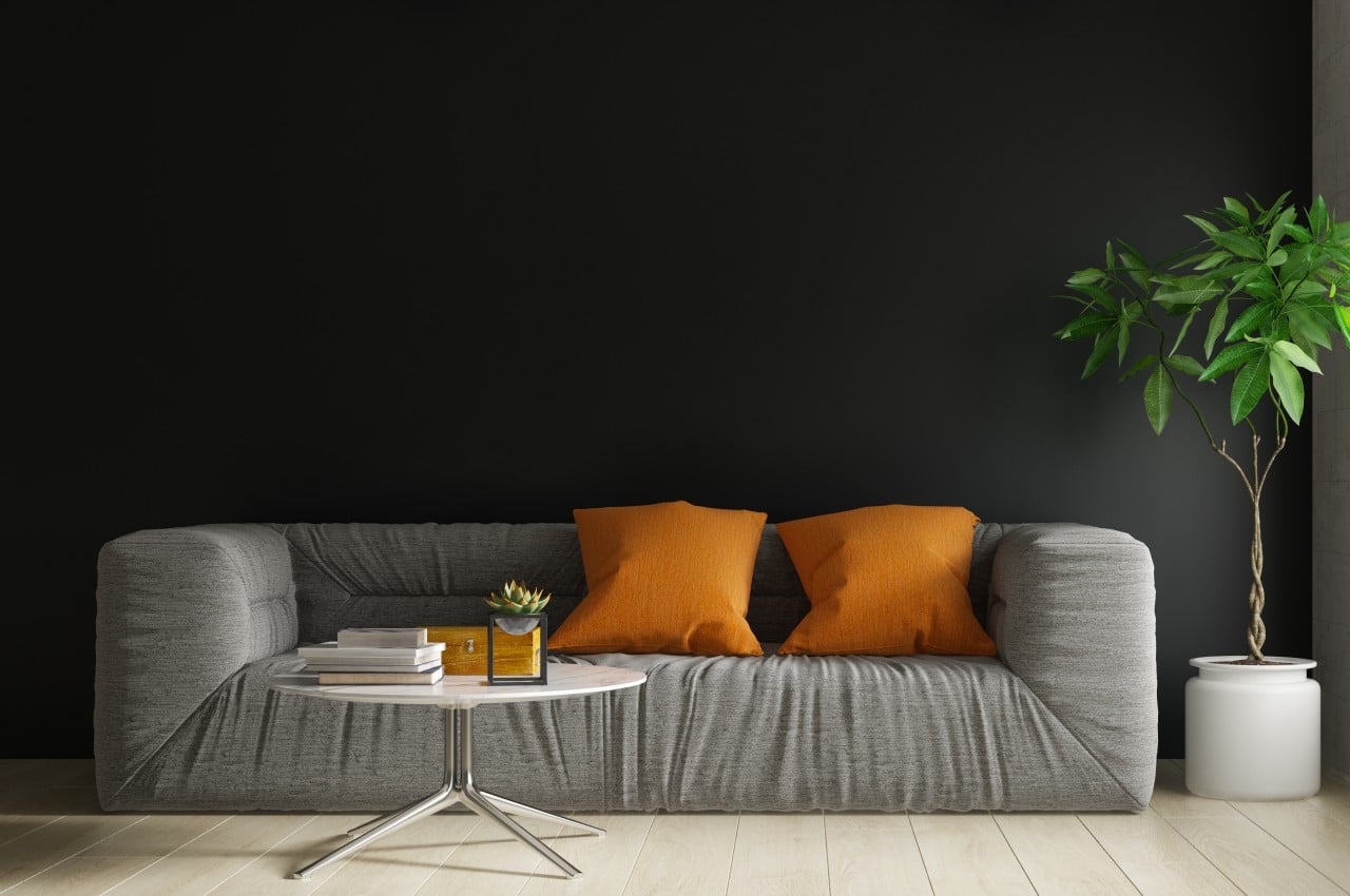
Darker black tones are gaining prominence as the primary color choice, serving as a bold accent and becoming the focal hue for smaller spaces, while the appeal of a softer black shade lies in its inviting, versatile, and timeless qualities. This bold and strong color is highly versatile, making it easy to incorporate into any style of decor.

8. Soft Pinks

Image courtesy of: dit26978

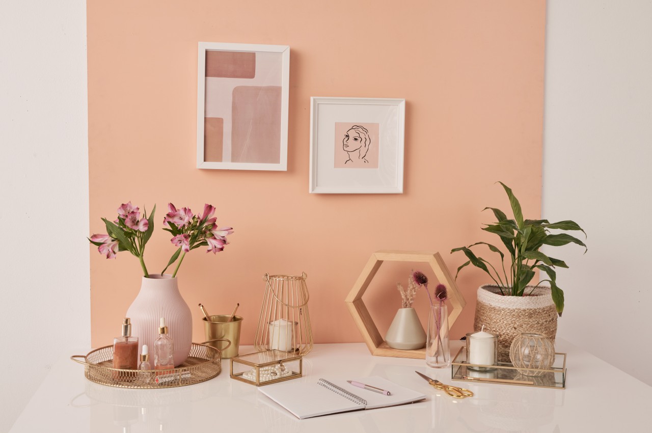
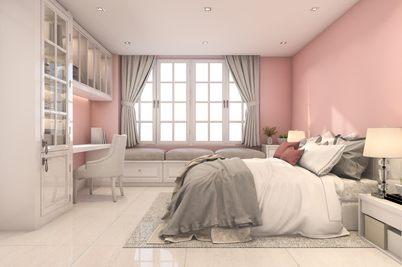
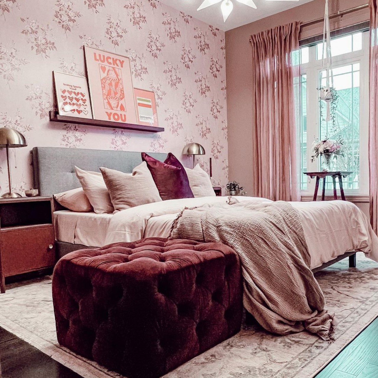
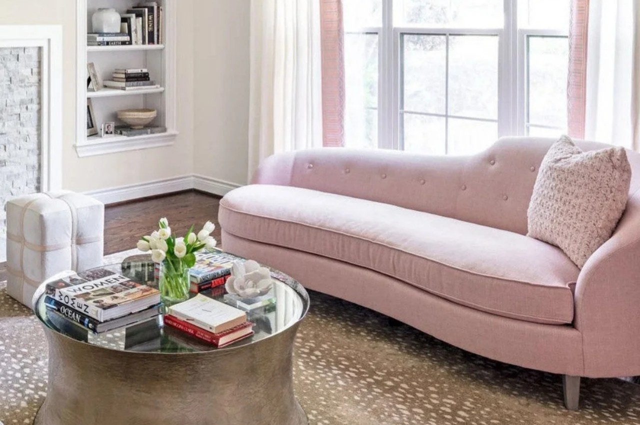
Pink is being used in modern ways, making it more interesting, especially when different shades are combined to create a sophisticated atmosphere. The gentle blush of soft pink makes it a perfect neutral choice for smaller rooms or spaces with limited natural light, as its warm undertones contribute to elevating the color and adding depth. Soft pink is ideal for establishing a tranquil atmosphere in the home, introducing subtle hues that effortlessly harmonize with a wide range of other colors.

9. Rich Brown

Image courtesy of: hemul75

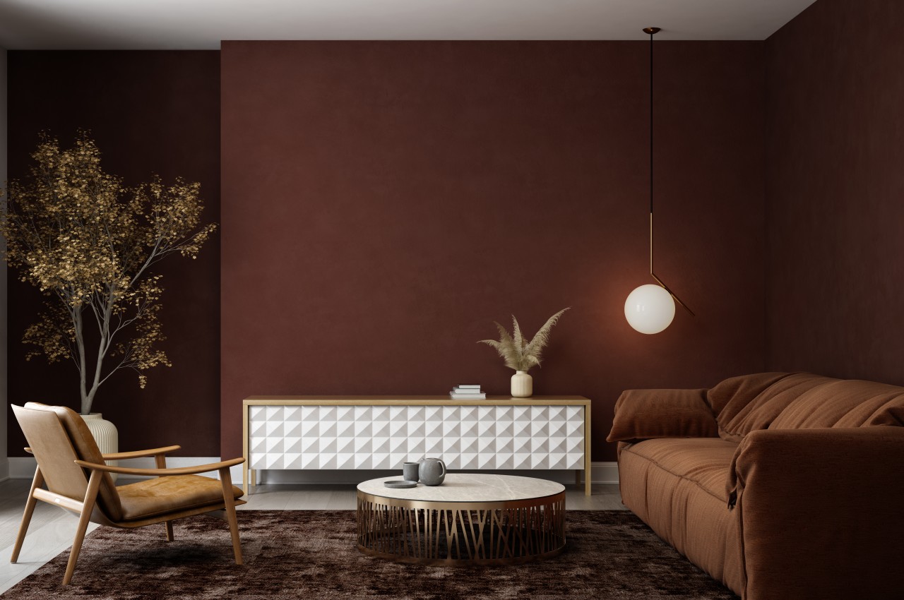
Embrace a luxurious blend of warm earthy tones, crafting a design environment that exudes both a grounded and welcoming atmosphere. One such color is rich brown which infuses depth and sophistication into the design narrative. The inviting richness of brown is perfect for traditional and contemporary themed interiors, making it an ideal backdrop for a cozy space. Throughout 2024, earthy browns are expected to continue dominating our homes as there is a growing inclination to connect with nature for enhanced well-being

10. Soft Terracotta

Image courtesy of: lytvynliliia

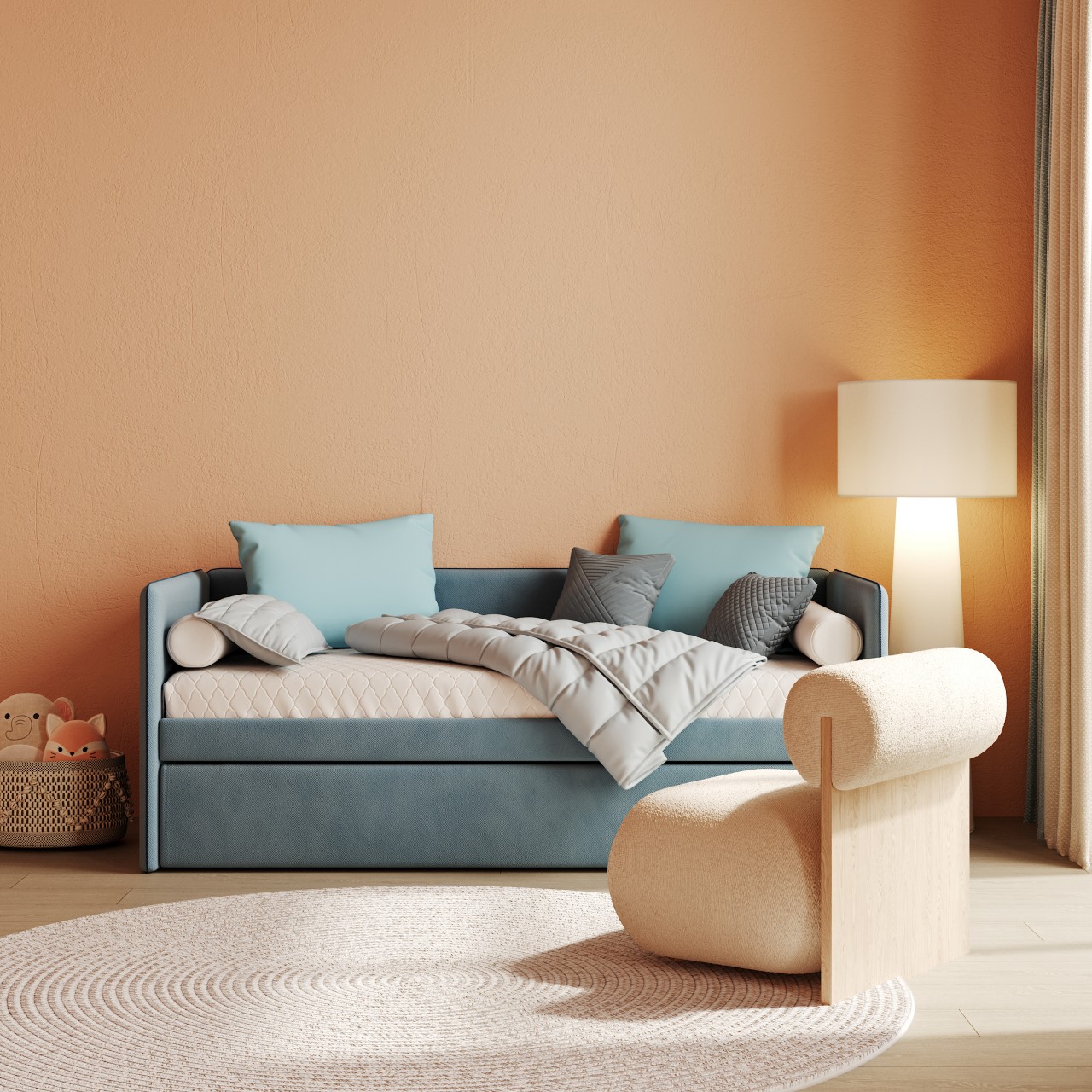
Terracotta infuses warmth into spaces, capturing attention and creating an inviting, cozy indoor ambiance while subtly evoking the essence of the outdoors. Soft terra-cotta tones are becoming increasingly popular, especially in spaces like living rooms and kitchens, where they enhance positive interactions and conversations. This inviting shade not only refreshes a space but also functions as a sophisticated neutral for those exploring alternatives to whites, beiges, and creams. The best part of introducing earthy terracotta hues is that it fosters a sense of comfort in the home and introduces a burst of vibrant energy while retaining a gentle aesthetic.

The post Top Ten Color Trends For 2024 first appeared on Yanko Design.
Analogue Pocket Classic retro gaming handheld puts the color in Game Boy Color

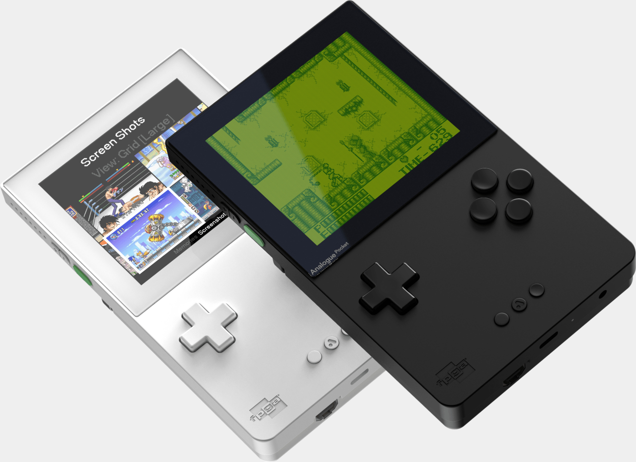
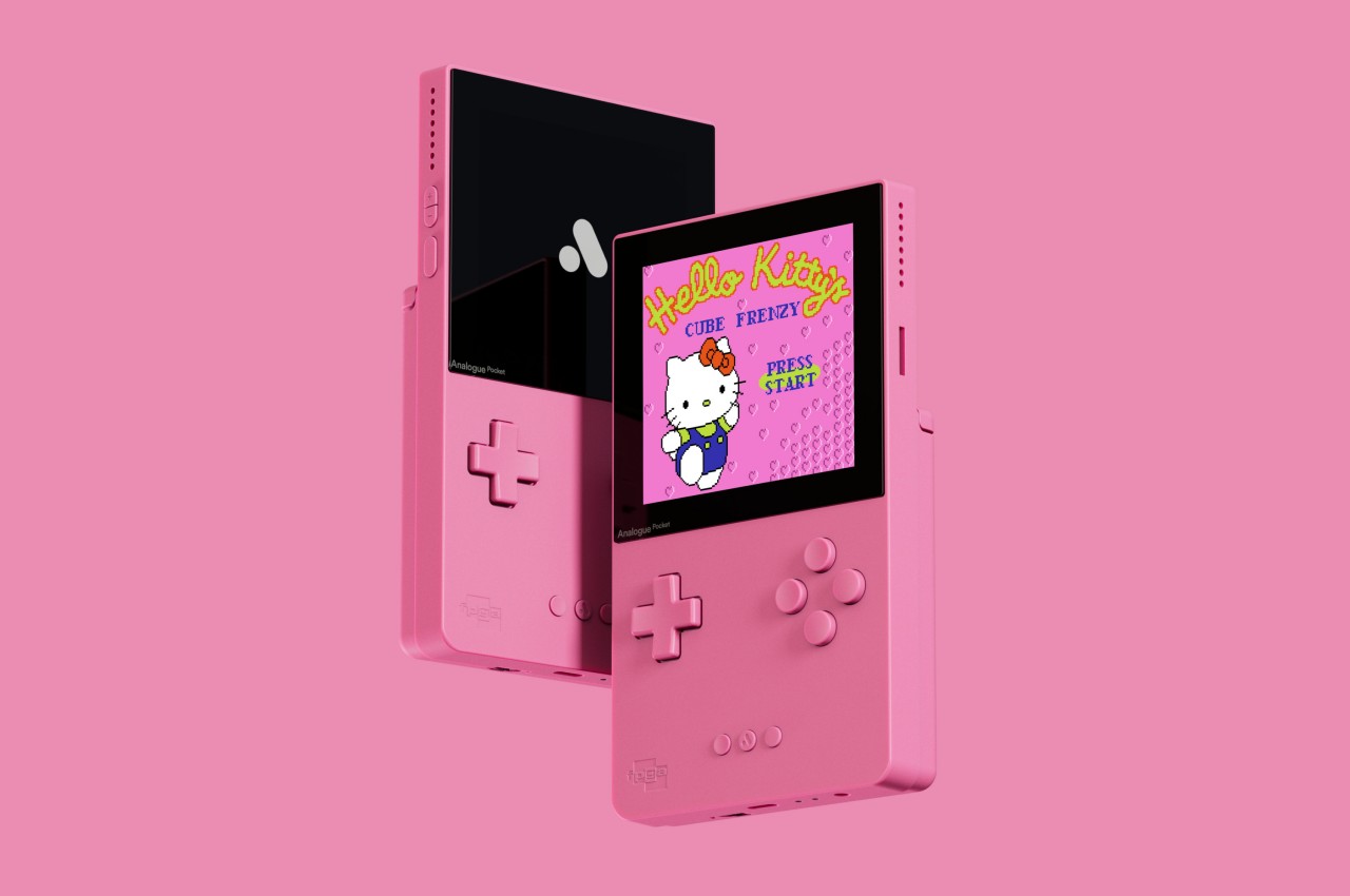
Just because you’re trying to design a retro interpretation of an old design doesn’t mean you have to copy the original inch for inch. In fact, it might even be illegal in some cases to be an exact replica of the product you’re trying to pay homage to. It’s definitely a good opportunity to address the flaws of the past or to implement designs that were intended but couldn’t be implemented because of the limitations or tastes of ages past. It wouldn’t make sense, for example, for a modern recreation of the Game Boy Color to display the extremely limited palette of the original in this day and age. Fortunately, Analogue had the sense to equip its retro gaming handheld with modern capabilities while staying faithful to the original’s essence. So faithful that it, in fact, even tried to recreate the playful colors of the Game Boy Color while also expanding that selection with almost all the colors of the rainbow and then some.

Designer: Analogue

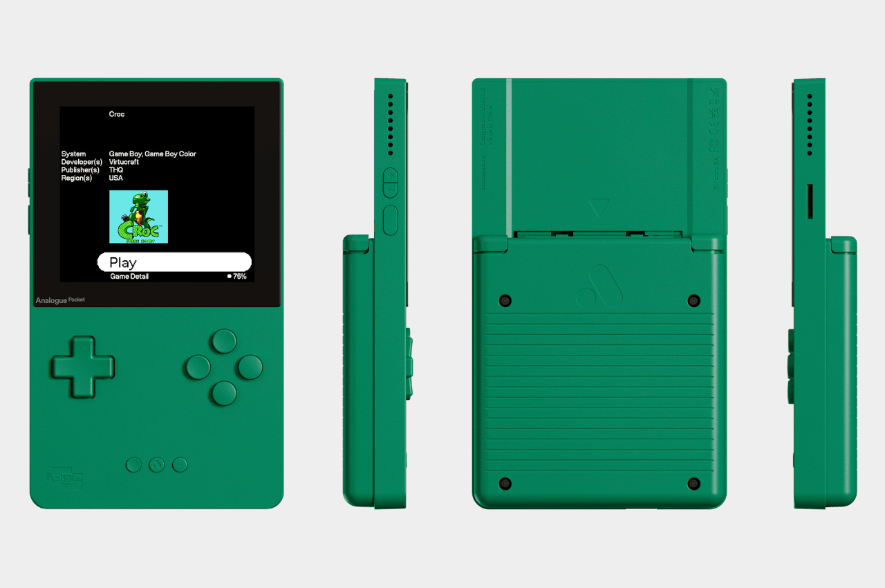
Even by yesteryear’s standards, the Game Boy Color’s chunky design clearly earmarked it as a toy for kids. Those kids, however, have now grown up, and many of them want to relive those fun-filled days but probably with something that doesn’t look like it was plucked out of a time capsule. The Analogue Pocket is an attempt to feed this hunger while also making the design and the heritage accessible to a lot more people. Its more modern and sleeker aesthetic easily appeals to gamers of all ages but still exudes that charm that made the GBC an icon. Still, the retro handheld seemed to be missing one particular element that would really set it apart from other Game Boy Color recreations.

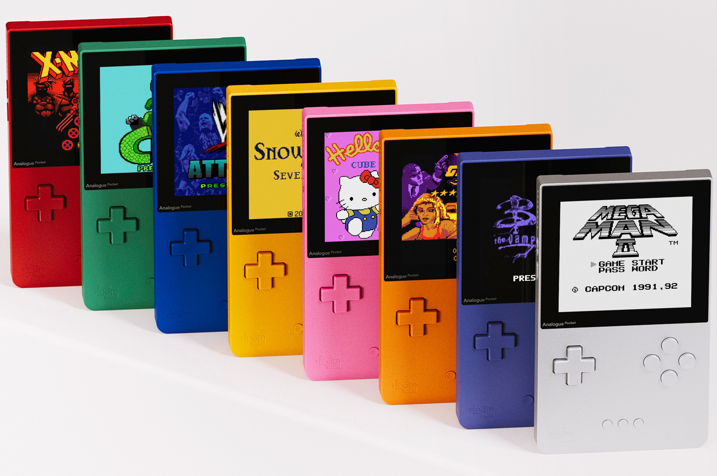
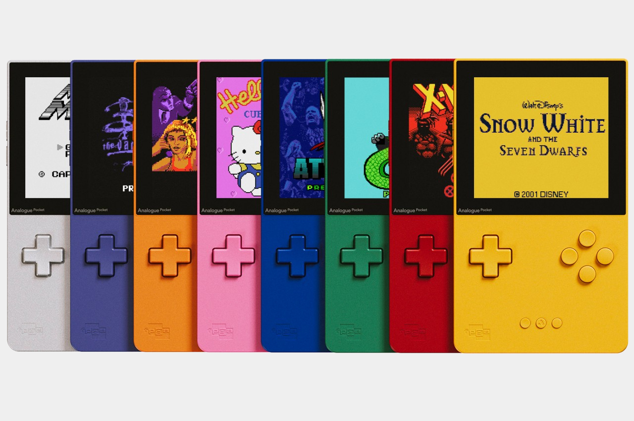
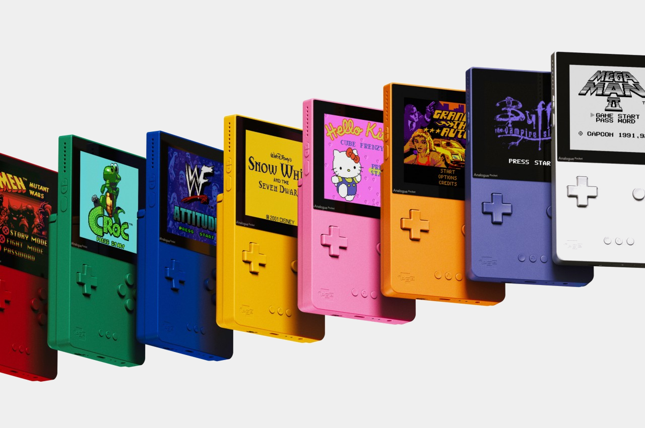
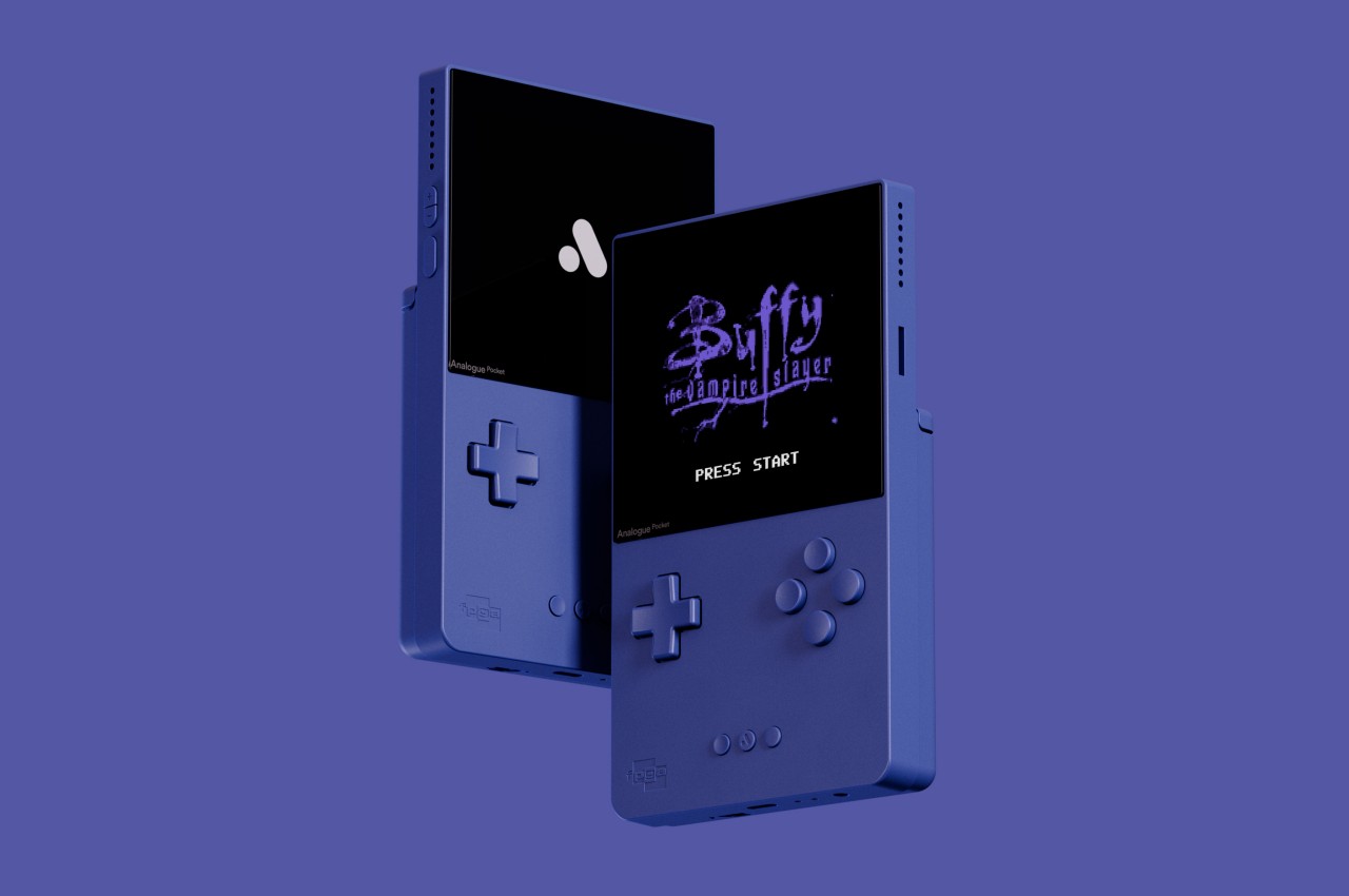
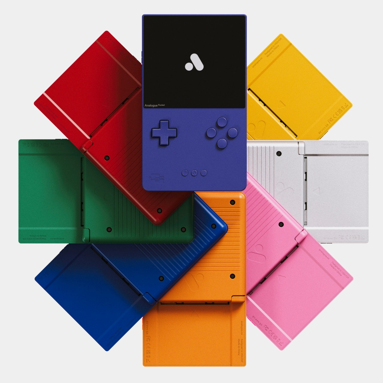
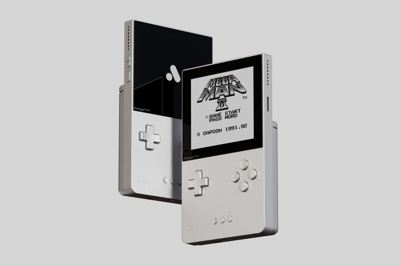
That missing piece of the puzzle was delivered by the “Classic” edition of the Analogue Pocket, which basically gives the device a colorful paint job. The very first GBC was a rather boring and very industrial gray, but the market eventually exploded in a variety of colors, including a transparent one. The Analogue Pocket Classic brings back not just one or two or five of these but offers no less than eight hues. That’s on top of the plain black, white, transparent, and glow-in-the-dark editions that came out in the past.

The full palette includes Indigo, Red, Green, Blue, Yellow, Pink, Orange, and Silver, all of which Analogue boasts have been color-matched to the original models. It might just be a change of hue, but it immediately gives the Pocket a vibrant character befitting of a gaming device. With these accurate colors and the overall design of the handheld, there is very little doubt that this retro revival truly captures the spirit of the Game Boy Color as faithfully as it can without tripping over legal landmines.

The story doesn’t end on a high note, unfortunately, with all variants of the Analogue Pocket now declared to be completely sold out. That’s true for this colorful yet limited run of the “Classic” edition as well as the original models. It’s uncertain if these will ever return to shelves, and collectors will have to stay on their toes while waiting for hopeful news in the coming days.

The post Analogue Pocket Classic retro gaming handheld puts the color in Game Boy Color first appeared on Yanko Design.
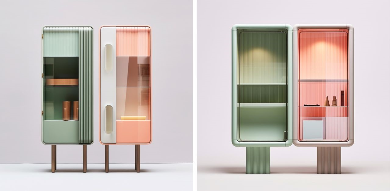
AI-enabled Furniture Design Process Results in Sleek, Pastel-hued Showstoppers for your Space

In an era where artificial intelligence (AI) is seamlessly permeating across all industries, the world of art and design is experiencing a dynamic shift. For artists and designers, the emergence of AI prompts a choice: to perceive it as a looming threat or an innovative boon. However, the view one adopts hinges on their individual artistic vision and perspective.

Designer: Amin Saadat

The synthesis of these cabinets into an animated amalgamation represents a profound intention—a showcase of the designer’s vision brought to life in a captivating manner. This dynamic animation not only celebrates the beauty of these cabinets but also encapsulates the essence of their design, unveiling a narrative that speaks volumes about the intention and creativity behind each piece.

From my standpoint, AI stands as a remarkable tool designed to amplify the skills of designers, relieving them of the tedium associated with certain tasks. This liberation enables designers to center their focus on the essence of their work—the ideation, creative process, and the immersive experience their final masterpiece evokes.

Nonetheless, AI, like any technological development, has both advantages and disadvantages. In some cases, AI may not accurately grasp a designer’s vision, thereby generating annoyance and redundancy. Nonetheless, if designers can learn to communicate their concepts in a way that AI can understand, the design process becomes not only streamlined but also surprisingly efficient.

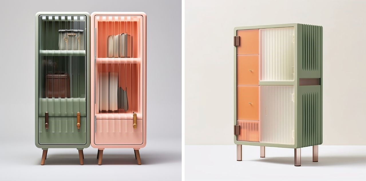
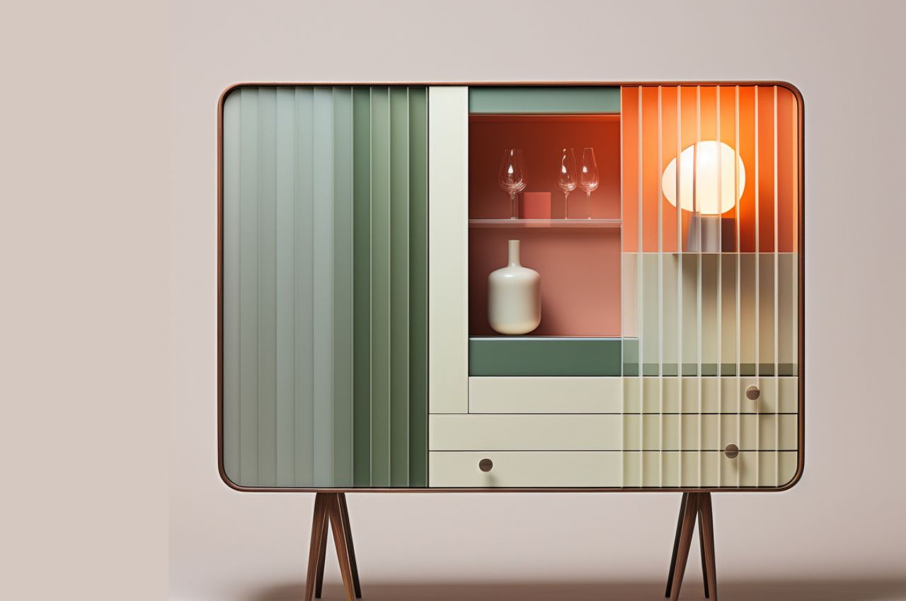
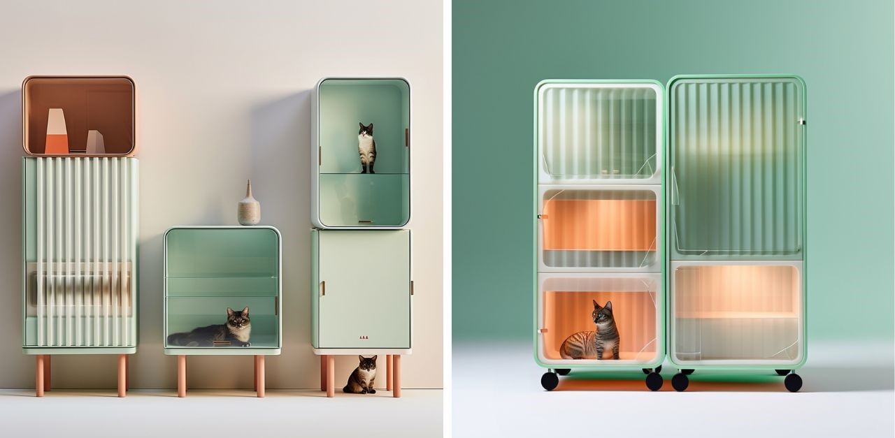
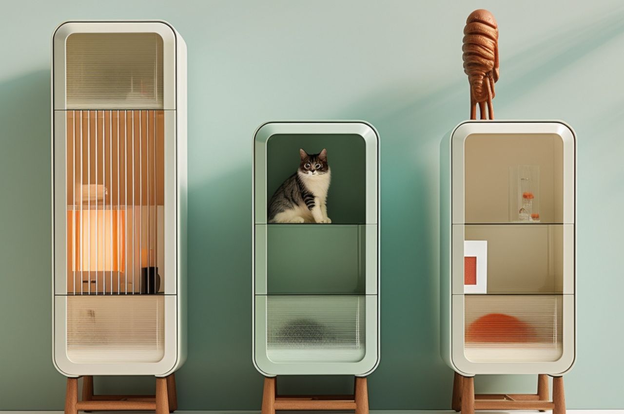
A testament to the potential harmony between human creativity and AI’s computational capabilities is the captivating cabinet collection that radiates joy and vitality into any space. These exquisite cabinets seamlessly blend the playful nature of AI with the intricate nuances of product design, resulting in pieces that transcend utility to become awe-inspiring works of art themselves.

This versatile cabinet collection encompasses permutations suitable for diverse spaces, from vibrant living rooms to playful kid’s rooms, adapting flawlessly to various interior designs. Its fluted glass doors and elegant golden brown accents harmonize perfectly with mid-century aesthetics, while the clean, minimalist designs complement Scandinavian or contemporary styles seamlessly.

The marriage of AI and product design emerges as a playful synergy, elevating the aesthetic experience to new heights. This curated selection of cabinets embodies an animated vitality, each piece narrating a unique story while collectively resonating with a harmonious and vibrant identity. These cabinets stand as a testament to the fusion of cutting-edge technology and artistic ingenuity.

As we acknowledge AI as a tool within the broader design process, it becomes evident that the precision of design achieved through AI is consistently evolving and expanding. Leveraging the remarkable Midjourney inpainting feature, these cabinets have been meticulously redesigned down to the minutest detail, ensuring an impeccable outcome that exudes satisfaction and a unified, playful identity.

In conclusion, the integration of AI into the design landscape is an exciting journey of innovation and transformation. As designers and artists embrace the possibilities AI presents, we bear witness to the refinement and evolution of design precision. The delightful cabinet collection serves as a testament to this progress, reflecting the convergence of human ingenuity and technological prowess.

The post AI-enabled Furniture Design Process Results in Sleek, Pastel-hued Showstoppers for your Space first appeared on Yanko Design.
How the world’s whitest paint can keep buildings cool while also saving the planet

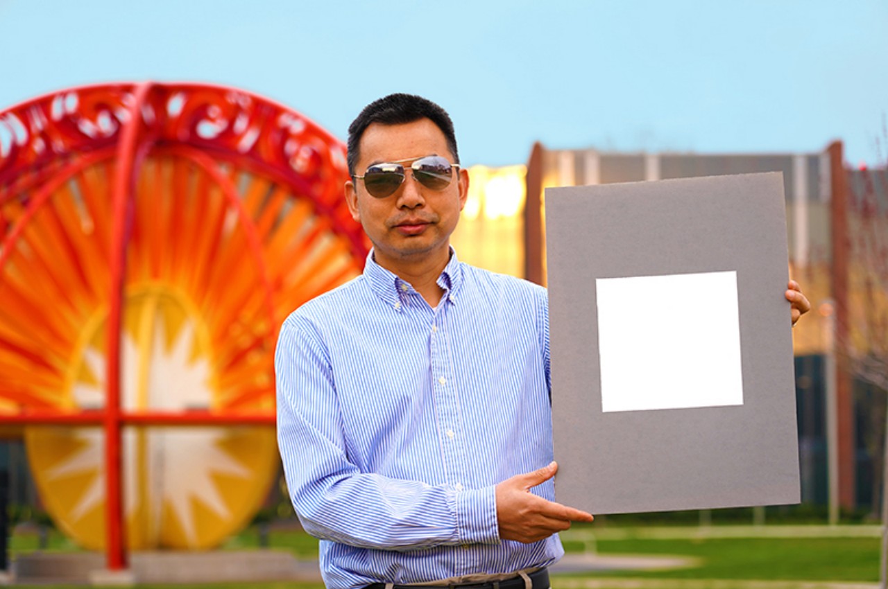
White is the new black, at least in terms of being the cool color, especially when it comes to minimalist product designs. That said, it can apparently also be literally cool, at least in one form that could also save the world if adopted as a global standard. Pure white isn’t a color you often paint on houses and buildings, but you might actually be tempted to coat your dwelling with the world’s whitest paint for its “extra features” and not because of its aesthetic value (depending on your tastes). Apparently, this ultra-white material is so white that it actually reflects sunlight and the heat that it brings, allowing the surface and, consequently, the building to keep naturally cool, reducing the use of air conditioning machines and electricity, and saving the planet in more ways than one.

Designers: Xiulin Ruan, Purdue University Engineers

Although psychology can play an important role in the choice of colors, so can physics, especially when considering how certain colors and materials can have an effect on the light that touches and bounces off it. Black is black because it absorbs light and doesn’t reflect it back to our eyes, while white is the opposite, reflecting all the colors of the spectrum. When it comes to sunlight, however, it isn’t just light that is reflected but also heat that is sent back to the atmosphere.

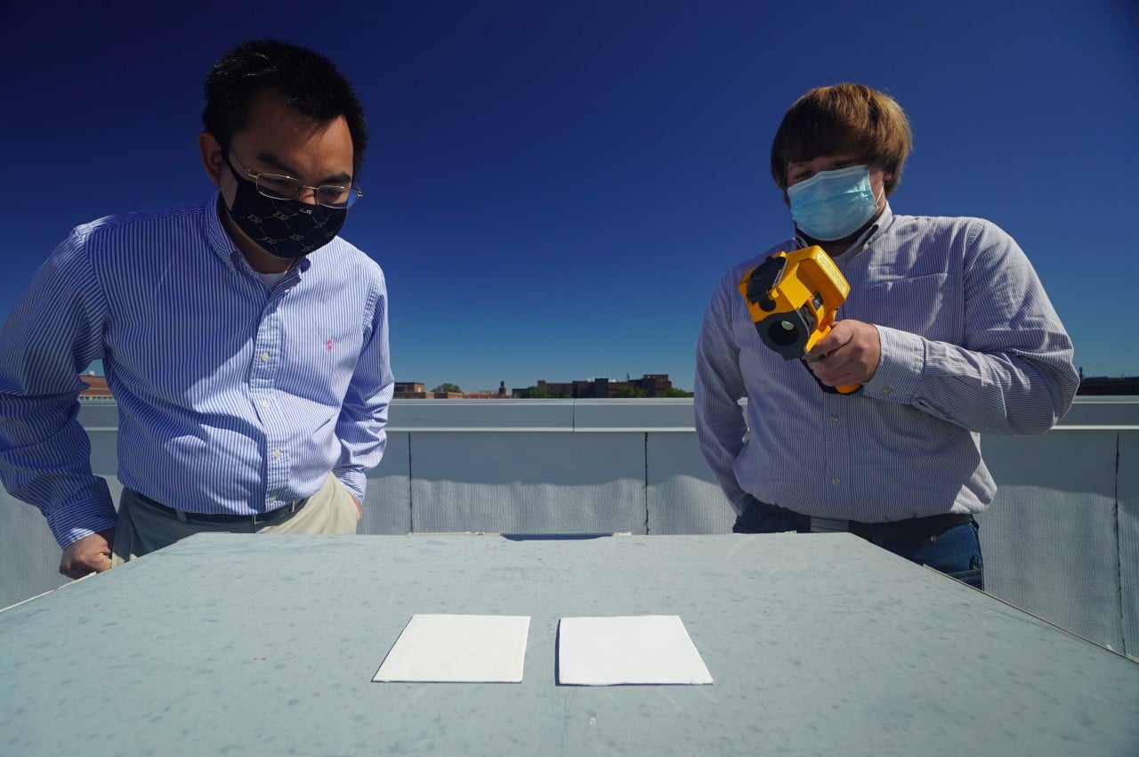
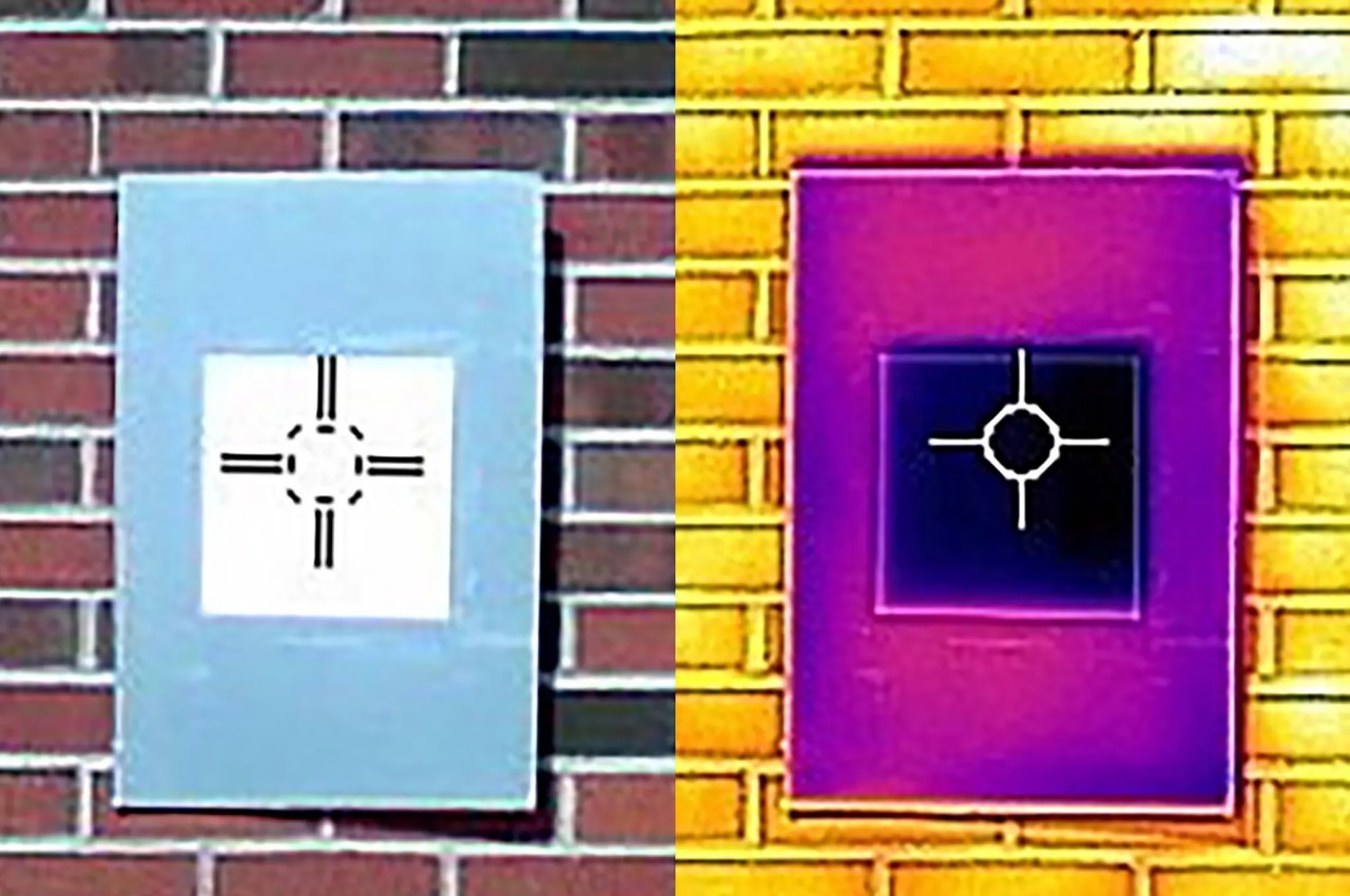
This is the kind of effect that Purdue University researchers were aiming for in order to create a more sustainable way to keep surfaces, roofs, and buildings cool without having to use electrical or chemical methods. In this case, the paint’s ability to reflect sunlight is so good, up to 98.1%, that it can effectively cool down the surface it’s on by as much as 18°F (-7.8°C). This means that a building is less likely to absorb heat from sunlight, which effectively translates to savings in energy and money by reducing the need for cooling machines inside.

The whitest paint on Earth also has a second effect that could help save our planet. Because it reflects the heat coming from the sun, it can effectively offset the greenhouse effect that heats up the planet. Best of all, that waste heat doesn’t just get moved to the surface of the atmosphere but goes outside the planet and into outer space.

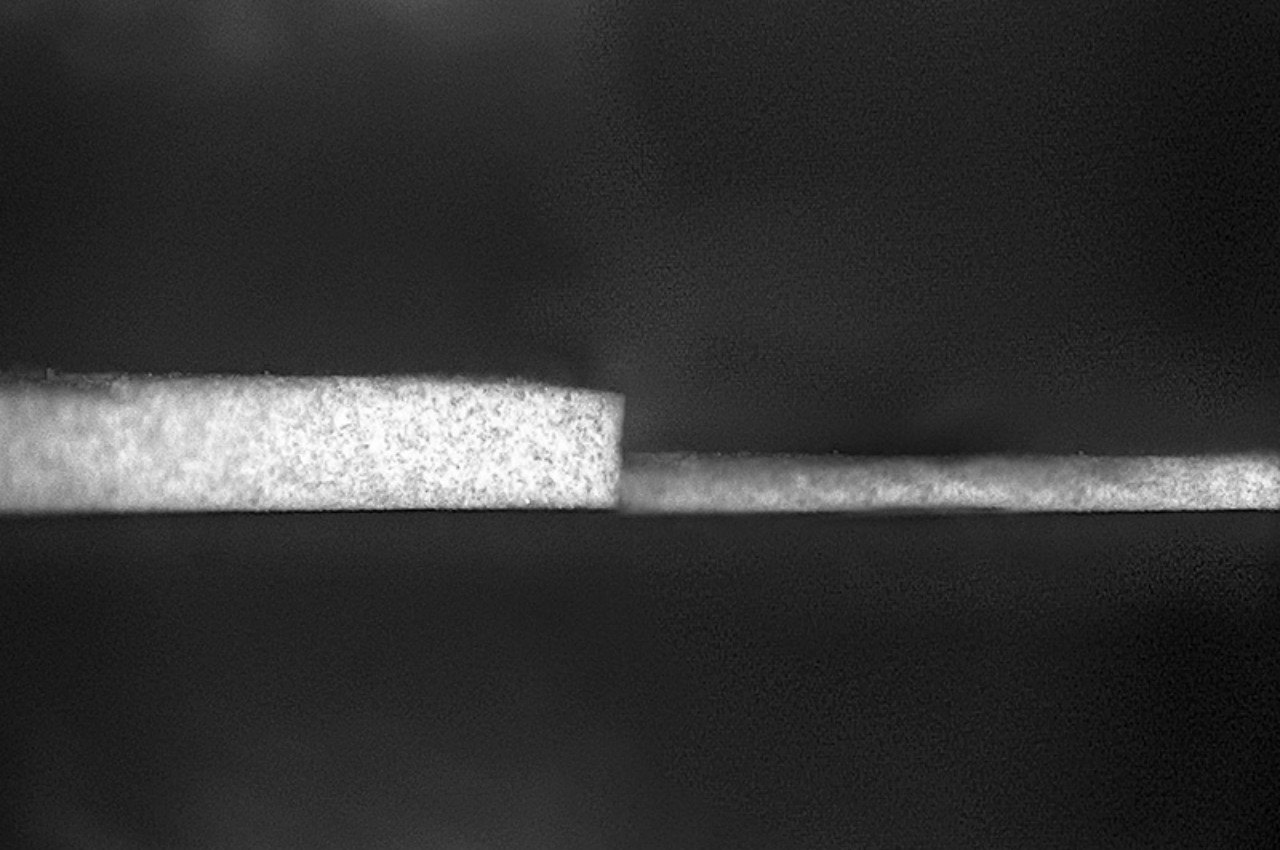
Purdue University researchers have created a new formula for the world’s whitest paint, making it thinner and lighter. The previous iteration (left) required a layer 0.4 millimeters thick to achieve sub-ambient radiant cooling. The new formulation can achieve similar cooling with a layer just 0.15 millimeters thick. This is thin and light enough for its radiant cooling effects to be applied to vehicles like cars, trains and airplanes. (Purdue University photo/Andrea Felicelli)

This seemingly magical super-reflective property of the world’s whitest paint is thanks to barium sulfate, the same chemical compound used in white photo paper and cosmetics. Because it scatters the light it reflects, it doesn’t blind anyone who wants to bear witness to its all-white beauty. There are still ways for the paint to be improved, especially when it comes to its quality and durability, but there seem to already be many manufacturers and industries interested in putting this innovative whitest paint that could save you money and the planet in the long run.

The post How the world’s whitest paint can keep buildings cool while also saving the planet first appeared on Yanko Design.
Playful coffee table concept brings Piet Mondrian’s three colors to your home

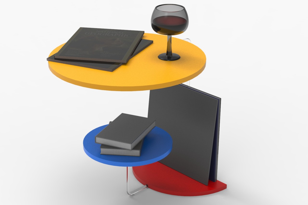
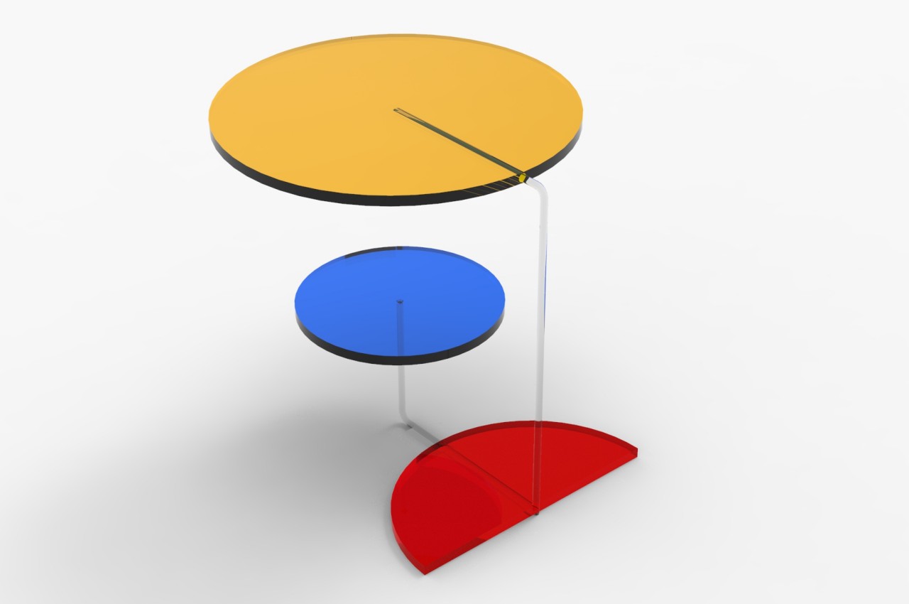
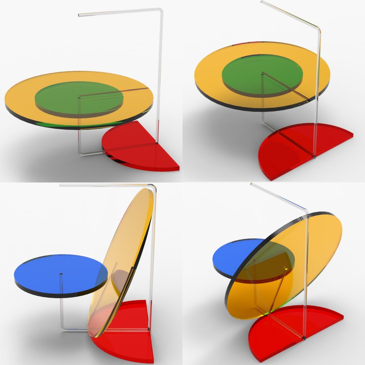
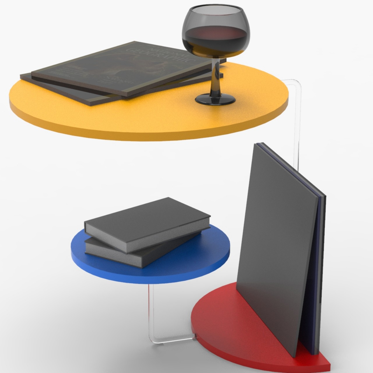
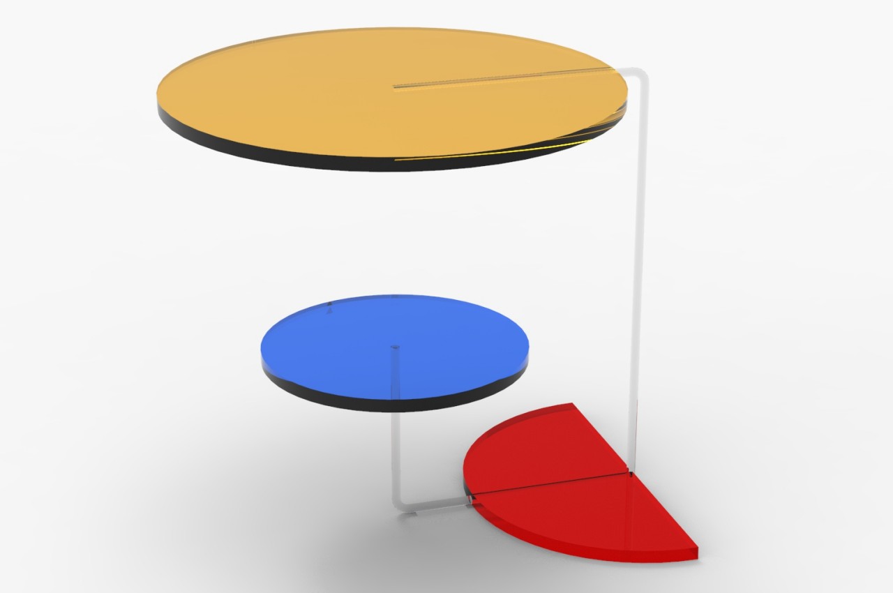
Coffee tables, sofas, side tables, and shelves have all become points of interest and pride these days. Since they usually become the visual centers of a room, owners take the opportunity to use furniture that either reflects their interests and personality or, at the very least, shows off their design tastes. The variety of designs for tables and chairs can range from the ultra-minimalist to the highly elaborate, each with its own advantages and disadvantages. You don’t have to go overboard, however, just to make a memorable impact. This table, for example, is nothing but a few circles, one of which isn’t even full, and three colors, but the asymmetric combination gives it a vibrant and playful character, especially once you start looking at it from different angles.

Designer: Miguel Pinheira

Rendered on KeyShot: Click Here to Download Your Free Trial Now!

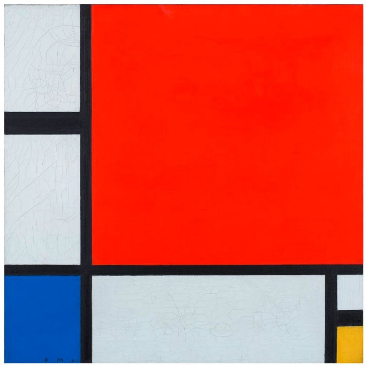
Dutch artist Pier Mondrian showed that it doesn’t take much to leave a lasting impression. His famed “Composition with Red, Blue and Yellow” simply used three colors, aside from black and white, and asymmetrical shapes to create a masterpiece that would be remembered for decades. This harmony of contrasts and economy of colors are what inspired this peculiar table design, resulting in a piece that, while artistic, also conveys some of that tension between elements in a lively manner.

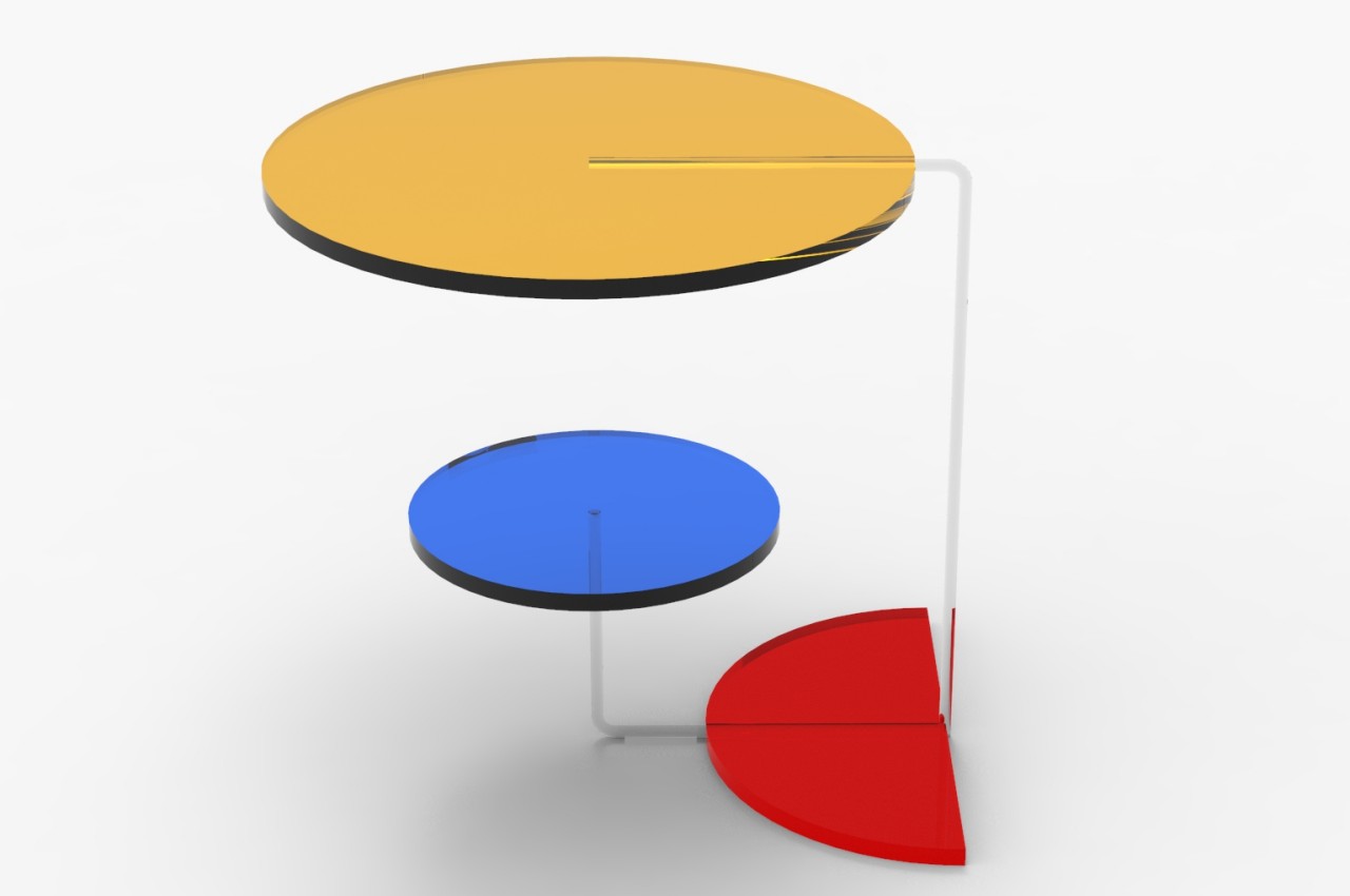
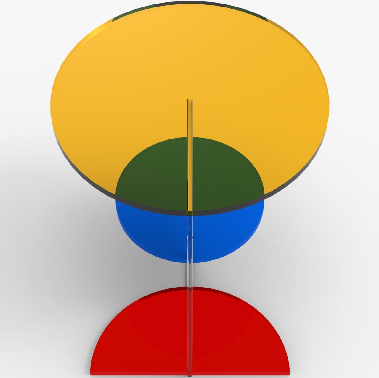
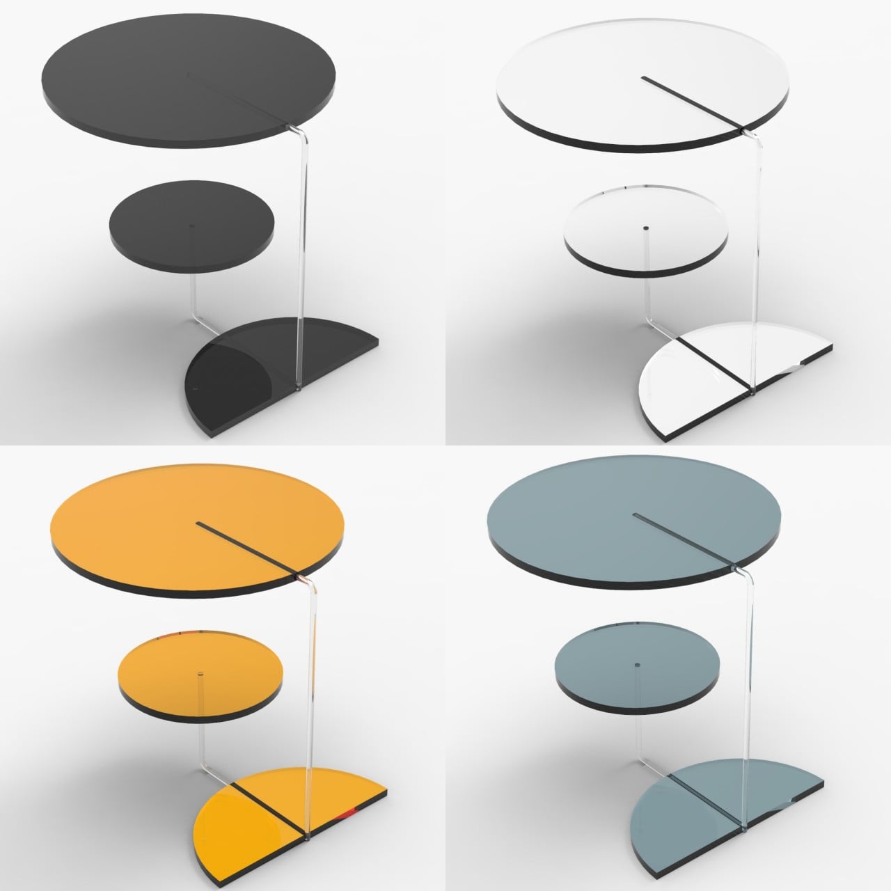
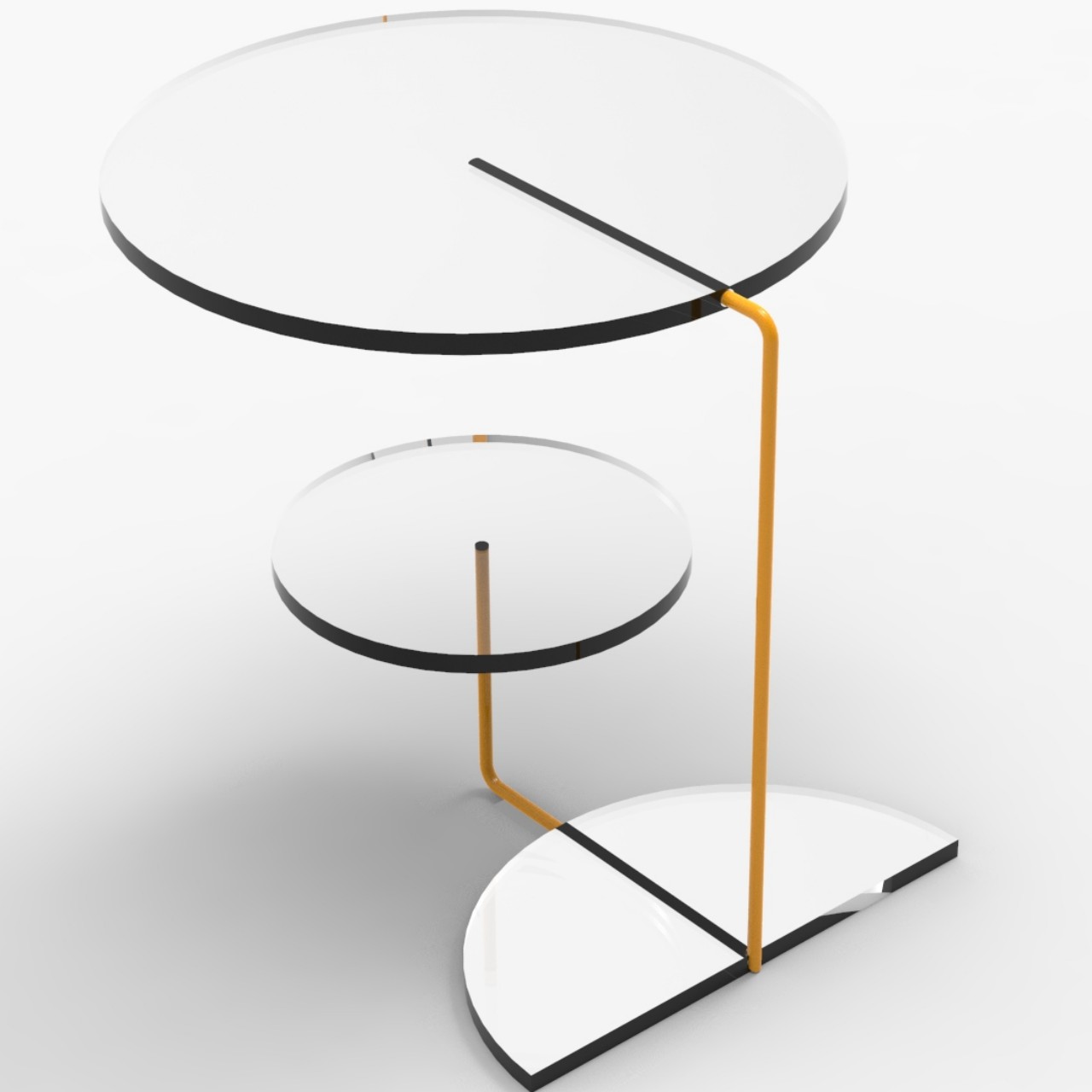
Instead of squares, the RYB Coffee Table uses two circles and a half circle joined by transparent rods that make the circles look as if they’re floating on air. The three pieces serve different functions, like a tabletop, a secondary table, and a magazine or vinyl record holder. The top circle can even be removed and placed in a different position, making the design a bit modular.

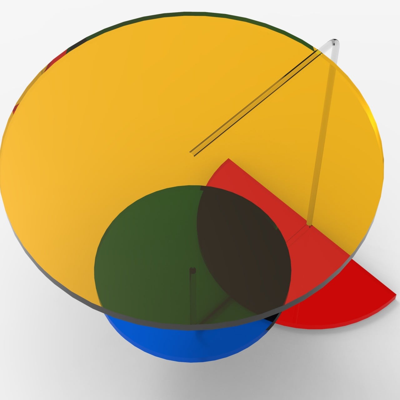
While the main parts can be made of different materials and use a monochromatic scheme, the best effect is achieved with translucent or transparent material and sticking to the original red, yellow, and blue triplet. This particular combination really brings out the table’s personality, making it look like hard candy or stained glass. Even better, looking at the different pieces through each other can bring out other colors, like green resulting from mixing yellow and blue.

In terms of functionality, however, the RYB Coffee Table is probably better as a side table, though it will still manage to grab anyone’s attention, regardless of its location. Its arrangement makes it look a little unbalanced visually, which could make some people hesitate to put anything fragile on top. That’s also why it’s probably better off to the side rather than as a centerpiece, lending a bit of vibrancy and life to the room without getting in the way.

The post Playful coffee table concept brings Piet Mondrian’s three colors to your home first appeared on Yanko Design.
What is color psychology in interior design

Color can set your home’s tone and energy level; you may have noticed that some spaces feel restful while others feel energized. As per scientific studies, colors have energy and different emotions are attached to each hue. Hence, color has the potential to calm stress, stimulate creativity, foster visual thinking, and create an experience. In addition, color can have a long-lasting effect on us, and it is one of the essential tools of interior design that can set up a specific atmosphere and mood within a given space. Since hues impact the room’s mood, strategically using colors can create the energy and mood we seek.
Designer: Klik Architekti

What is Color Psychology?

Color psychology is a study between color and human behavior about how color can affect a person’s mood, well-being, productivity, and creativity. This study is based on the scientific effect of different hues on the brain. According to physics, color is how our brain and eyes react to different wavelengths of light reflected from objects. The seven spectrum colors include VIBGYOR or violet, indigo, and blue, which are cool colors with a short wavelength. Green is a medium wavelength and restful, while yellow, orange, and red are warm colors with a larger wavelength. Cool colors are relaxing and meditative and are ideal for bedrooms. Pastel shades promote relaxation, while warm colors such as cream, beige, etc., are suitable for common areas of the house, such as the living room, dining area, and balcony.

Color Basics

The basic colors are primary colors like red, yellow, and blue, as these colors cannot be produced by mixing other colors, but with these colors, one can create any color. The secondary colors are located between the primary colors and include shades of green, orange, and purple. Intermediate colors are produced by mixing different proportions of secondary colors.

Color Psychology in Interior Design

Color can make or break the look of the space, where the color of the walls, ceiling, furniture, upholstery, and flooring determine any room’s color scheme. It is always crucial for the end user to decide the color scheme of the place, as each person reacts differently to a particular color. One can use a burst of color or apply it to the whole walls and create the right ambiance in each space. Another method is to pair it with light, softer color upholstery and accessories for a less overwhelming, far more pleasing aesthetic.

Here is the psychology behind some of the most common colors used in interior design:

Red

One of the most vibrant and intense colors of the color spectrum, red is an attention-grabbing hue and an excellent color that intensifies the room’s energy. This color is highly recommended in a couple’s bedroom, as it stimulates intimacy and passion and provokes strong passion. In addition, it triggers ambition and energy, so it is highly recommended for the home office or study area. Introduce it on one wall or an accent chair to make sure living room areas feel warmer.

Designer: Morgan Lovell

Yellow

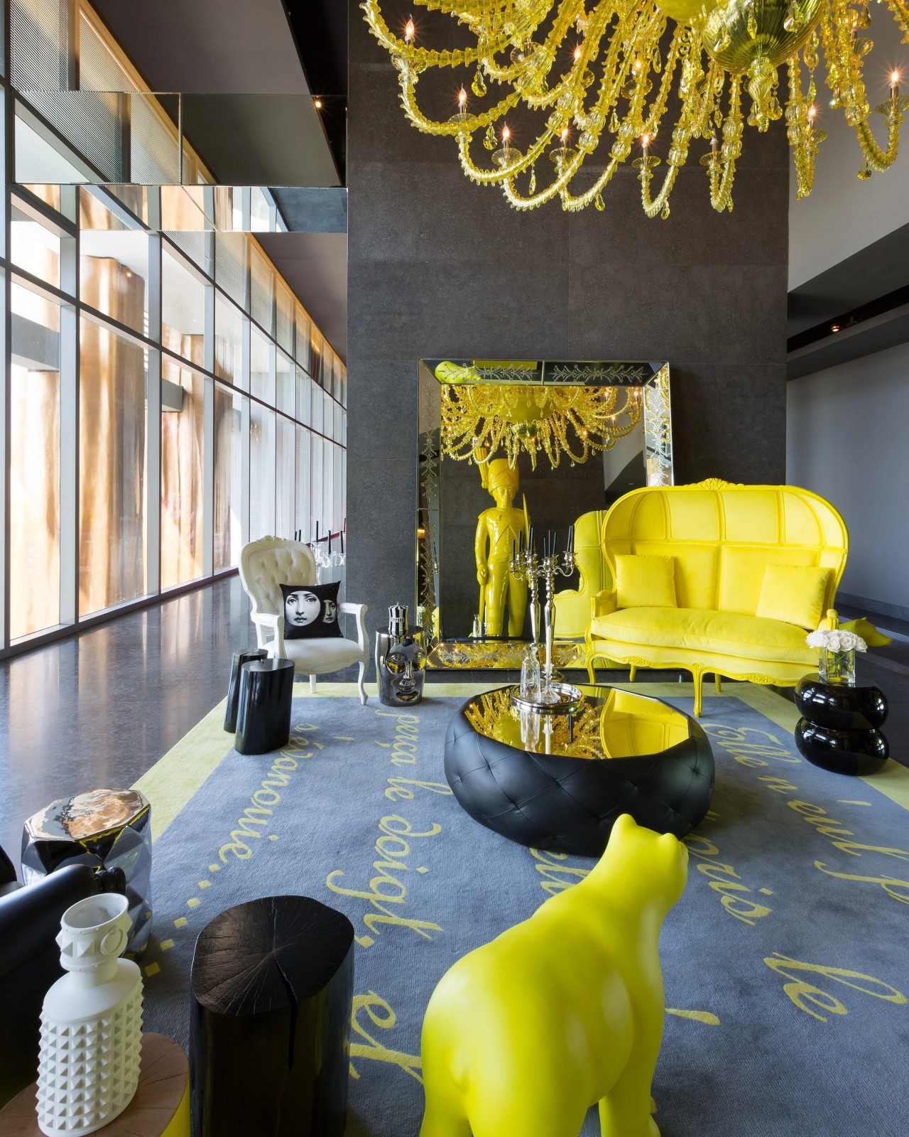
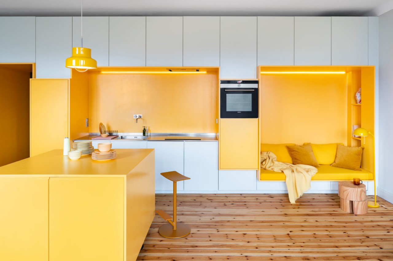
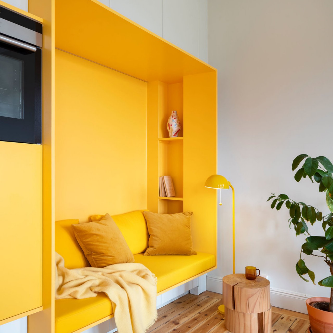
Capture the positive hues of sunshine and happiness with yellow color. The sunny and energetic hues of yellow uplift the spirit. It creates a warm and welcoming ambiance and infuses lightness into the space. The psychology of yellow color is joy and optimism, but it is not a relaxing color because its brightness can be overpowering in large doses. Therefore, selectively use yellow color and style the space with statement pieces of yellow furniture and accessories. It is best suited for Boho or maximalist interiors.

Designer: Lookofsky Architecture

Blue

Blue is the hue of the sea and the sky. It creates a calm, serene, and relaxing environment and substantially impacts our well-being. Light blue shades have a soothing and healing effect on the mind and promote good sleep. It helps us to relax better and is perfect for areas like the bedroom, living room, and bathroom where one wants to rejuvenate. Blue is a soothing color and goes well with other color tones like red, grey, and lilac, to name a few.

Designer: Richardson Sadeki

Green

It is a cheerful color that immediately draws one towards nature and symbolizes freshness, harmony, and growth. It fosters the feeling of abundance while having a soothing and relaxing impact on children and adults. It improves the child’s focus and offers a sense of security. Popular emerald, jade, and sage green hues suit areas like the kitchen and study room. This color exudes an organic vibe and adds life, depth, and dimension to the space. Living in an urban city apartment is a great way to reduce anxiety and bring the freshness of nature indoors.

Designer: Poster Store

Purple

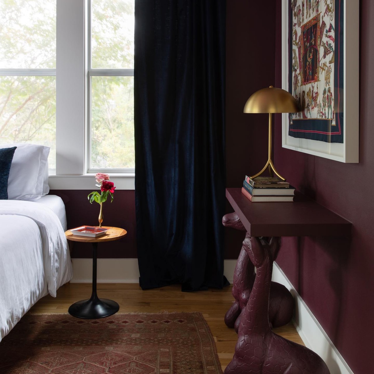
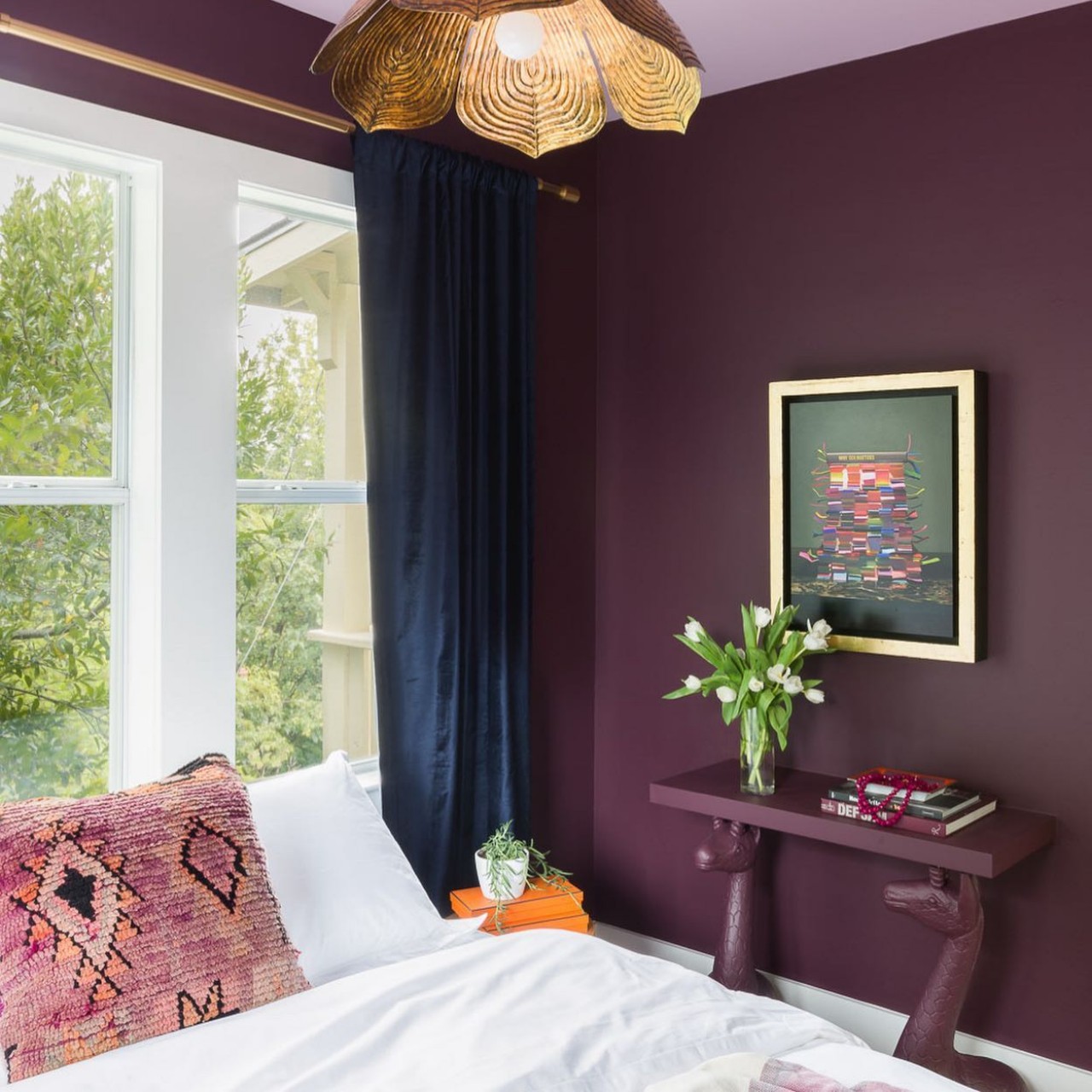
Purple is a spiritual and imaginative color and is formed by mixing red with blue. It is associated with elegance and royalty and fosters creativity. Purple is a symbol of luxury and depth and is perfect for the home’s living room and entertainment areas. Purple is a powerful color, so limit the use of purple to accent pieces of furniture or an accent wall.

Designer: Allison Crawford Design

Orange

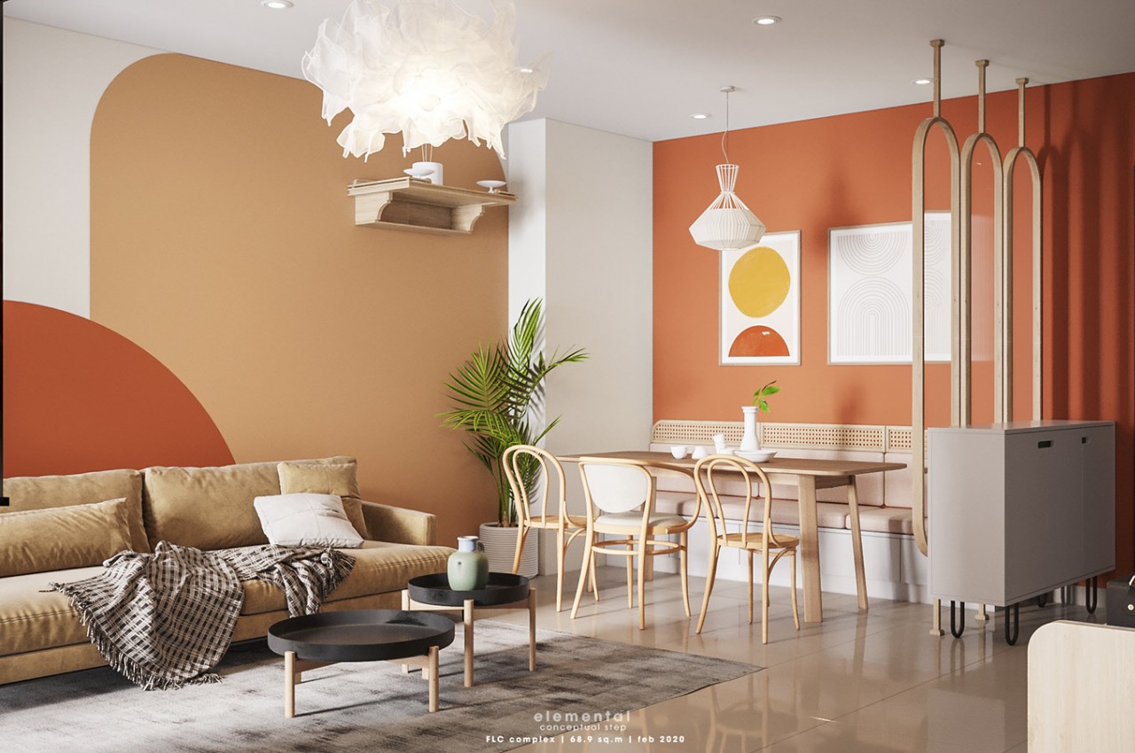
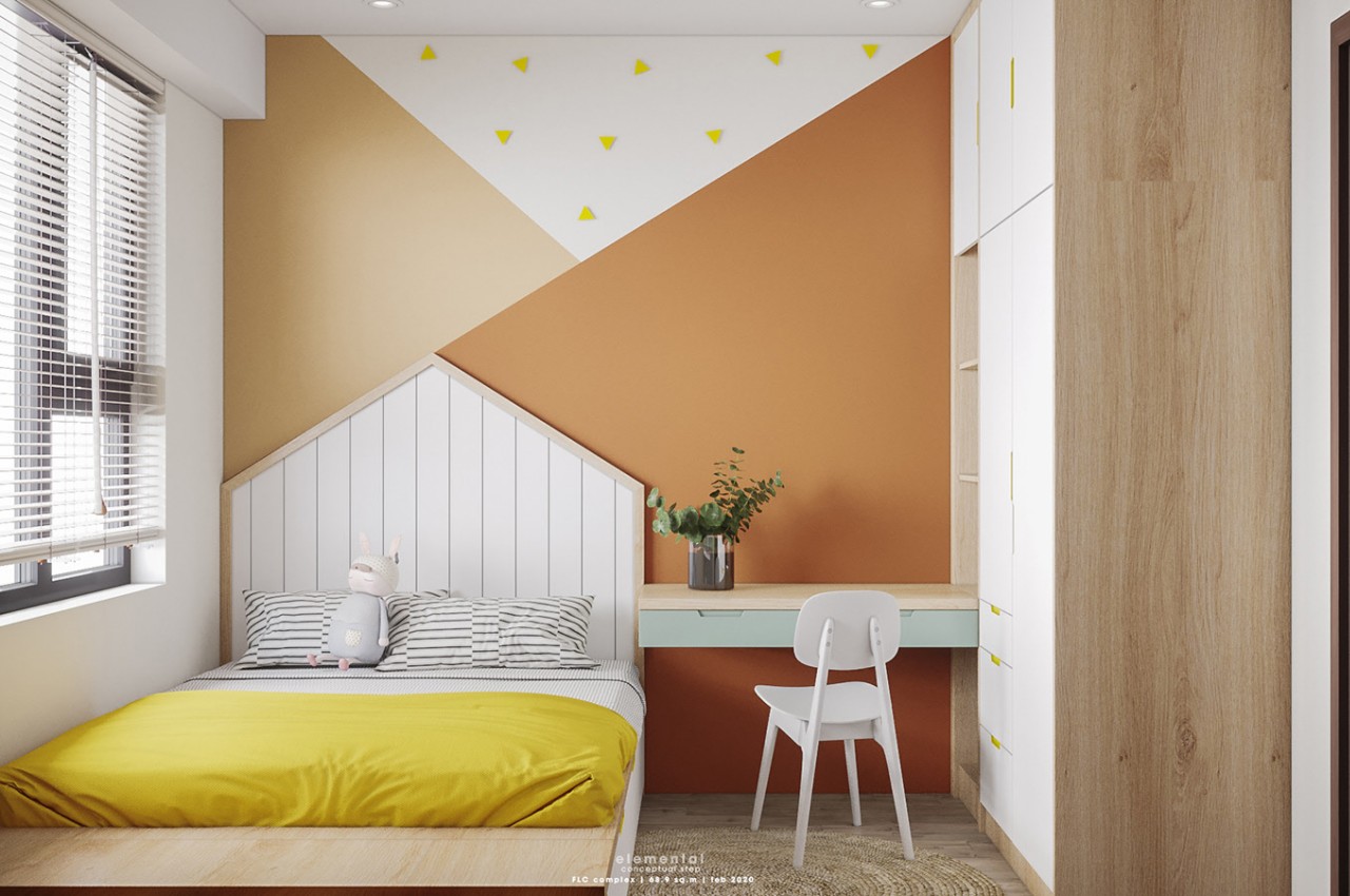
Bright and punchy, the orange color is socially inviting and promotes a sense of cheerfulness. The psychology of orange is that it is a fun and energetic color that boosts creativity and encouragement in young people. Since orange is a bold color, consider peach, as it is a softer hue of orange. It is perfect for areas like the gym and the bedroom.

Designers: Hang Vu, Elemental Design

Brown

Brown is considered a neutral and natural hue that adds an element of coziness and works well with modern and traditional spaces. Associated with all things earthy, brown imparts a relaxing vibe and evokes the feeling of warmth, comfort, and earthiness.

Designer: Natalia Bohachova

Pink

When light falls on pink, it radiates a subtle glow, making the space look brighter and better. Pink instigates the feeling of love and compassion. It is known to be a feminine color that instantly adds softness, uplifts the mood, and adds brightness. It is also associated with the beauty and fragrance of pink flowers that are found in nature. Magenta is a darker hue of pink. It can be used as a pop color and in the textures and patterns of cushions and throw pillows.

Designer: Ashley Stark

Black

Black is an elegant and dominating color with a contemporary appeal. It’s a dramatic color that infuses sleek sophistication and simplicity into a modern design. The psychology of black color is that it adds drama and symbolizes power.

Designer: Bummer Lamb

Gray

Grey is a neutral color that exudes elegance, style, and sophistication into any space. The color also offers a sense of security and creates a calm and serene vibe.

Designer: Nicoleta Jelihovschi

White

White is a color that stands for purity, cleanliness, and innocence. For some, white may look sterile and cold, so one can incorporate pops of color to energize the space. Perfect for minimalist interiors, beach houses, and outdoor patios, white combines well with wood and glass. White color creates a bright and airy look and makes the space look larger than it is.

Designer: Johanna (scandinavian.interior)

Choose your colors wisely and ensure they make you feel comfortable and aesthetically pleasing. This is because the surrounding colors determine the feelings a space can evoke.

The post What is color psychology in interior design first appeared on Yanko Design.