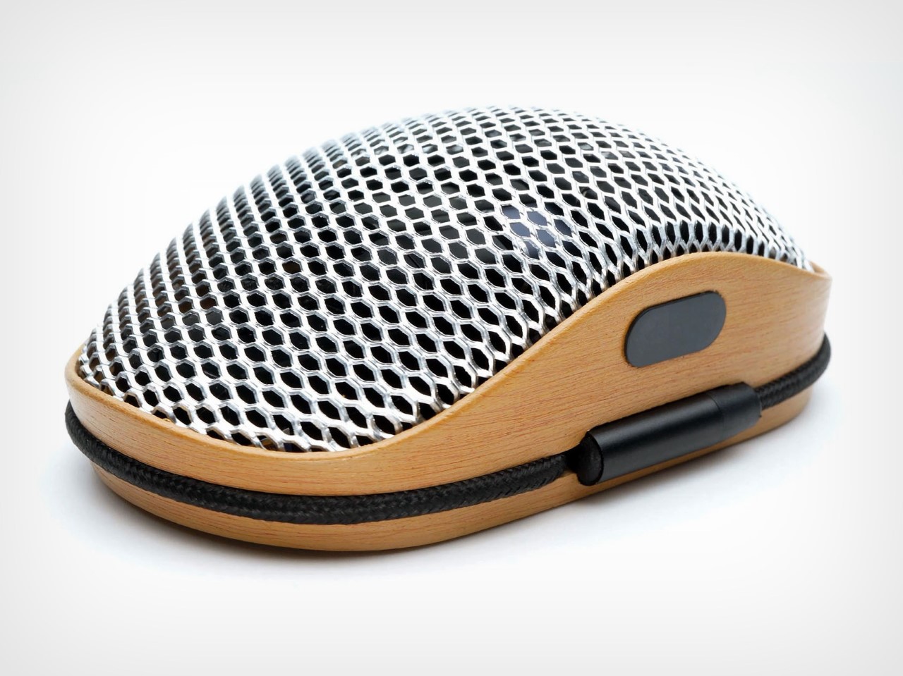
This Steampunk Magic Mouse Competitor has a built-in SD Card Reader, and even Charges Normally

We could spend a lot of time bashing the new USB-C Magic Mouse for repeating the same charging port mistake as its predecessor, but let me just take a minute to ask a few questions about mice in general. Wireless or not, why does a mouse ONLY serve as an input device? Personally, it has the capability to do much more than move a cursor, right? So why is it that in all these years the only improvements to mouse design are only upgrading their Bluetooth chipsets and making them more responsive?

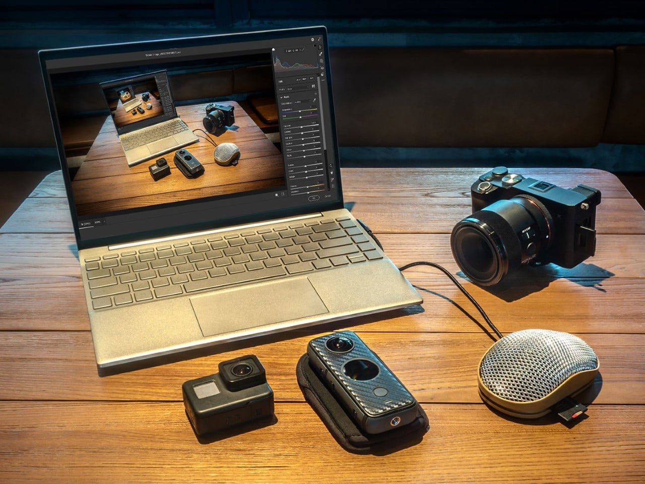
A winner of the Red Dot Award for best Design Concept, the D Mouse comes with a few unusual design choices that may seem weird at first, but make a world of sense if you try to think about how these changes make a mouse ‘better’ than existing ones. Built with an unusual design that employs stainless steel mesh on top and wood on the bottom, the D Mouse looks extremely different from existing plastic mice – because it is. This one comes with NFC pairing, a built-in SD card reader, and in-device storage of up to 1 terabyte, transforming the mouse into a data storage and processing device too.

The best part? It has its own cable integrated into the mouse that wraps around the base, and charges normally – unlike the Magic Mouse that needs to be overturned to charge. Even after an entire decade of people pointing it out.

Designer: Tride Design
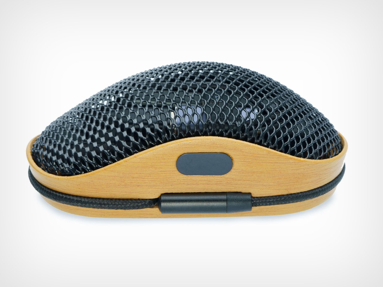
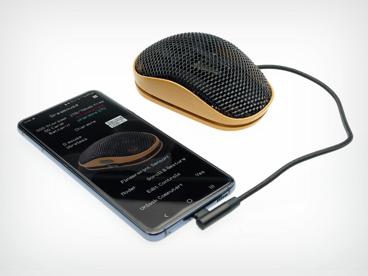
The D Mouse is notably a wired mouse, relying on a built-in braided USB-C cable to connect to devices – although it does have Bluetooth 5.0 too. The wired design makes sense considering the D Mouse also works as a data storage and transfer device, given that wired transfers are far more secure and rapid than wireless transfer. Unwrap the cable, plug the mouse in, and it becomes a cursor that also stores data for you. The mouse has up to 1TB of SSD storage on-board, which is fairly helpful if you want to stash important files that nobody goes looking for. After all, who searches for files on a mouse, right?!
The rest of the mouse has a fairly unique but familiar design. The silhouette of the D Mouse is like your everyday ergonomic peripheral, albeit with a metal and wood construction instead of plastic (98% of the materials are recycled). A steel mesh on the top provides a very tactile surface to rest your hand, while still being breathable because of the open mesh. The mouse clicks silently, and instead of the scroll wheel, there’s a scroll-bar right near the thumb for touch-sensitive scrolling.
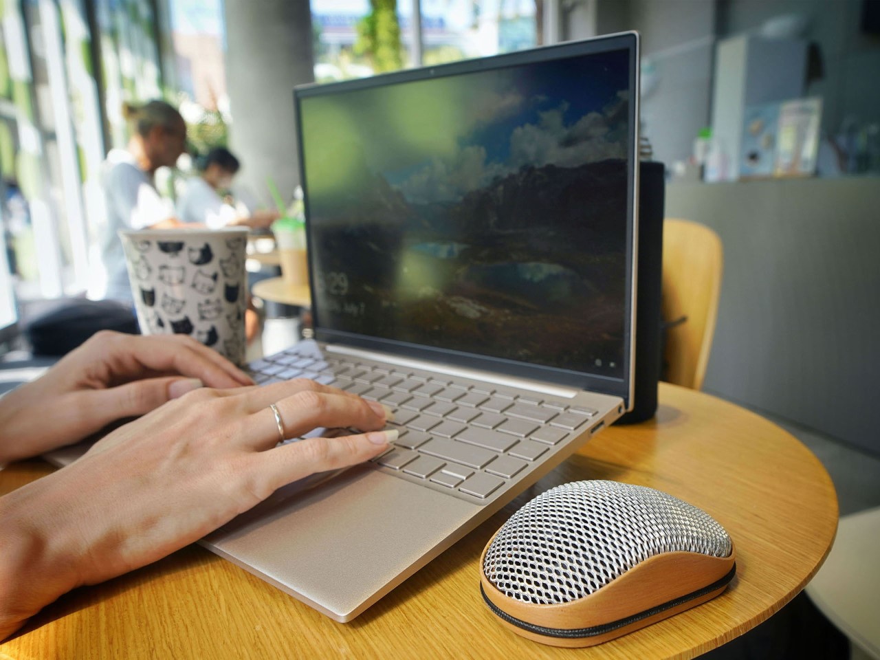
The mouse has a built-in card reader, along with internal storage that makes it perfect for creatives wanting to carry their files and access them on multiple devices without dongles and such. In this case, the D Mouse IS the dongle, working both wired and wirelessly, depending on how many files you have to transfer. It’s got an integrated fan that keeps the mouse (as well as your palm) cool while in use, and if you’re a gaming fanatic, there’s LED lighting too.

The D Mouse is a winner of the Red Dot Award: Design Concept for the year 2024.
The post This Steampunk Magic Mouse Competitor has a built-in SD Card Reader, and even Charges Normally first appeared on Yanko Design.
Smartphone touchpad concept tries to solve one of the biggest problems with big phones

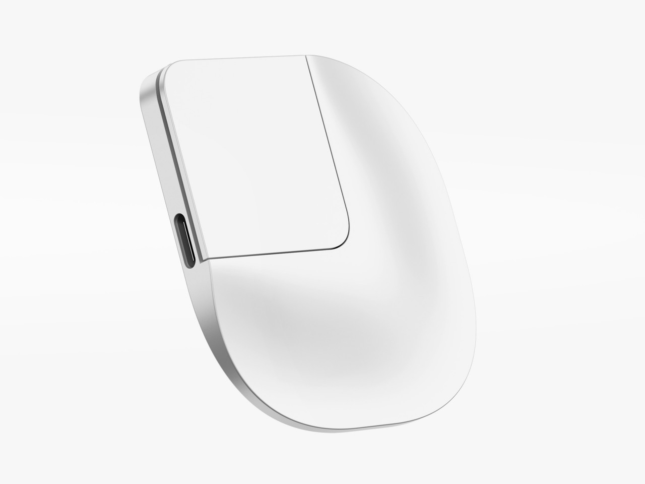
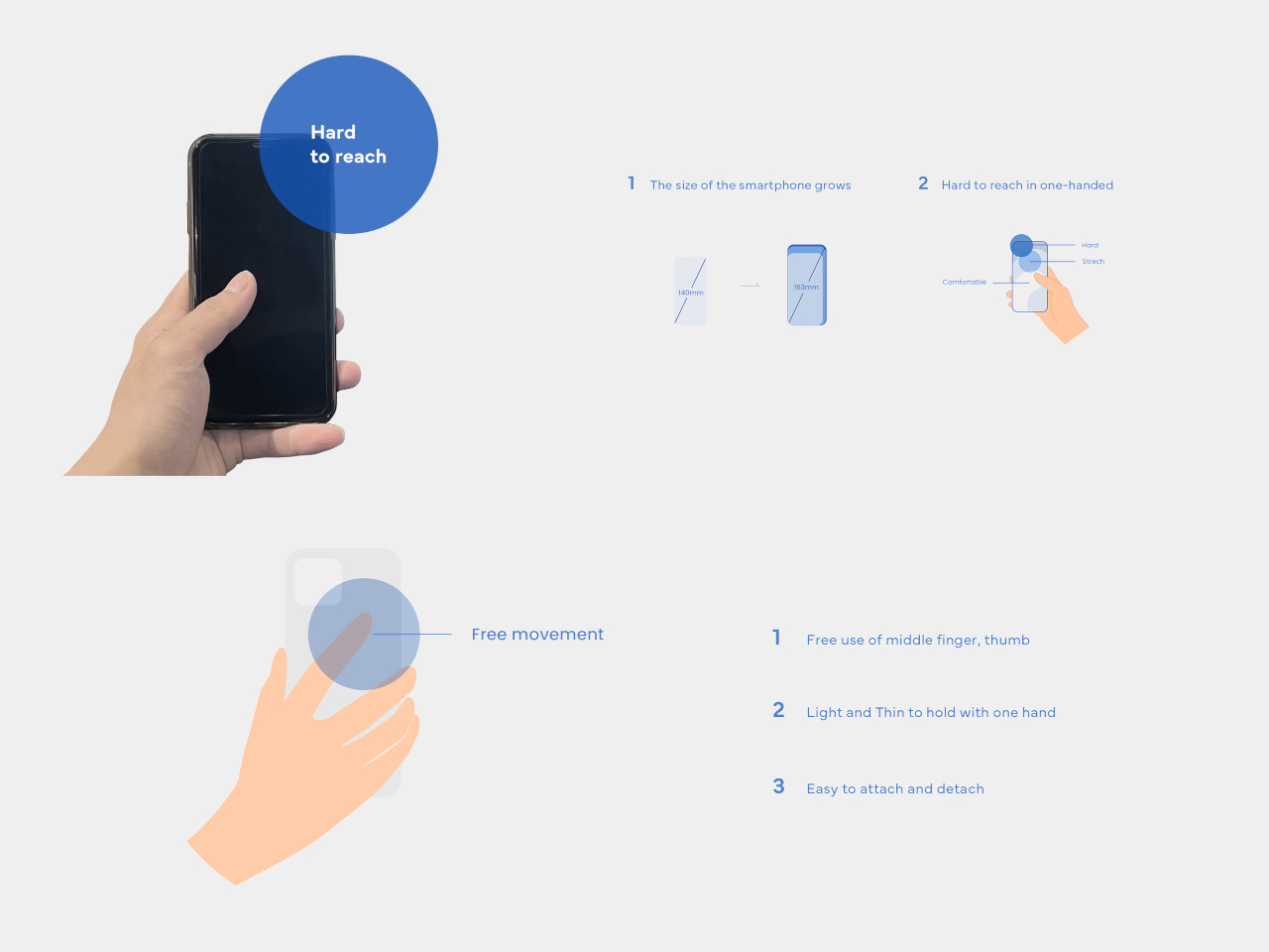
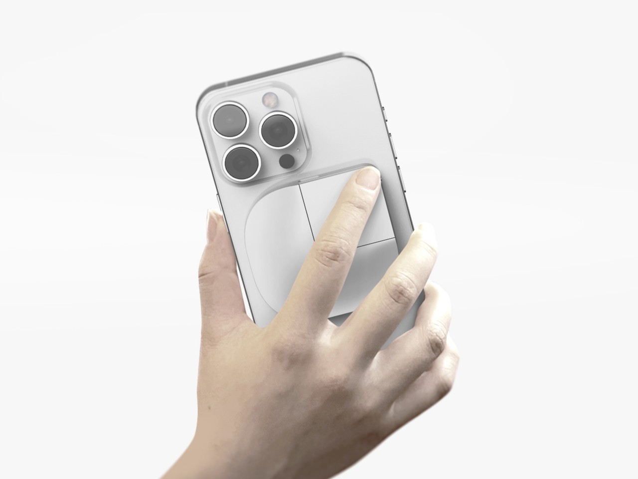
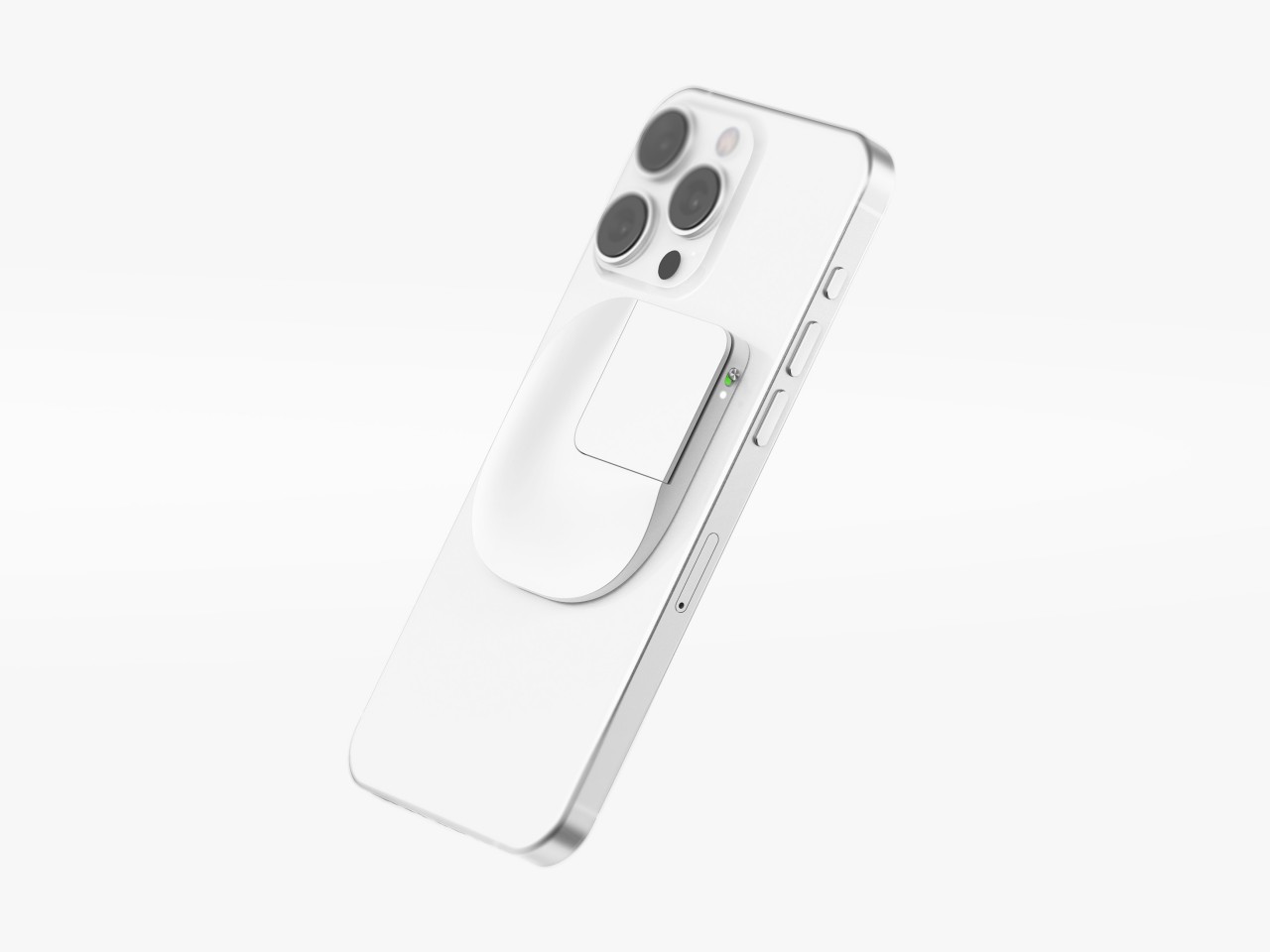
Almost everyone wants smartphones with big screens because of how much content they can see, but those same people probably don’t like using big phones because they require both hands to use comfortably and securely. Some manufacturers have introduced “one-handed mode” features that shrink the screen to a smaller size temporarily, but not only is that actually more cumbersome, it is also less accurate because of the small area you have to hit with your large finger. We don’t have problems using computers with gigantic monitors because we have computer mice that offer precise and accurate control, even if we’re not touching the screen itself. That’s the kind of control that this concept design is trying to bring to smartphones, practically putting a miniature Apple Magic Mouse on the back of large phones.

Designer: Geontak Oh

The computer mouse is actually a very weird and unintuitive tool that has become second nature to most people by now. You are indirectly controlling the screen, moving a detached piece of hardware whose only connection to the computer is an arbitrary one. Before touch screens were a thing, it was really the only way to interact with a graphical user interface, so it’s a bit ironic that we might need something similar to do the same on touch-enabled devices like smartphones.

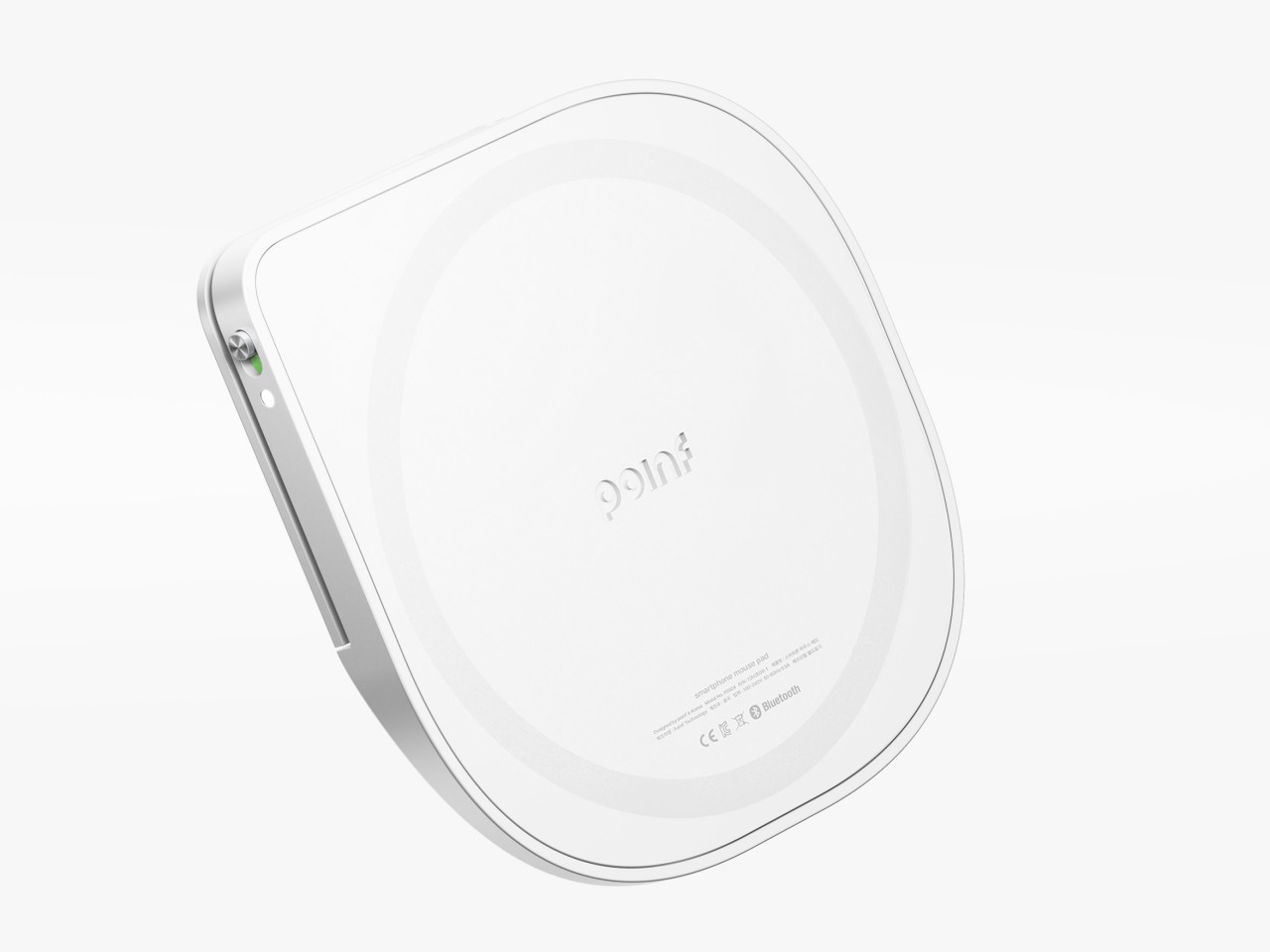
Poinf is a design concept that tries to solve the problem of using a large smartphone with one hand. With the way we hold our phones, the thumb is the only finger we can use to tap on the screen, which is next to impossible if the screen is too big for our stumpiest finger to reach. But what if you could use a different finger to do that? And what if that finger is always on the back of your phone anyway?

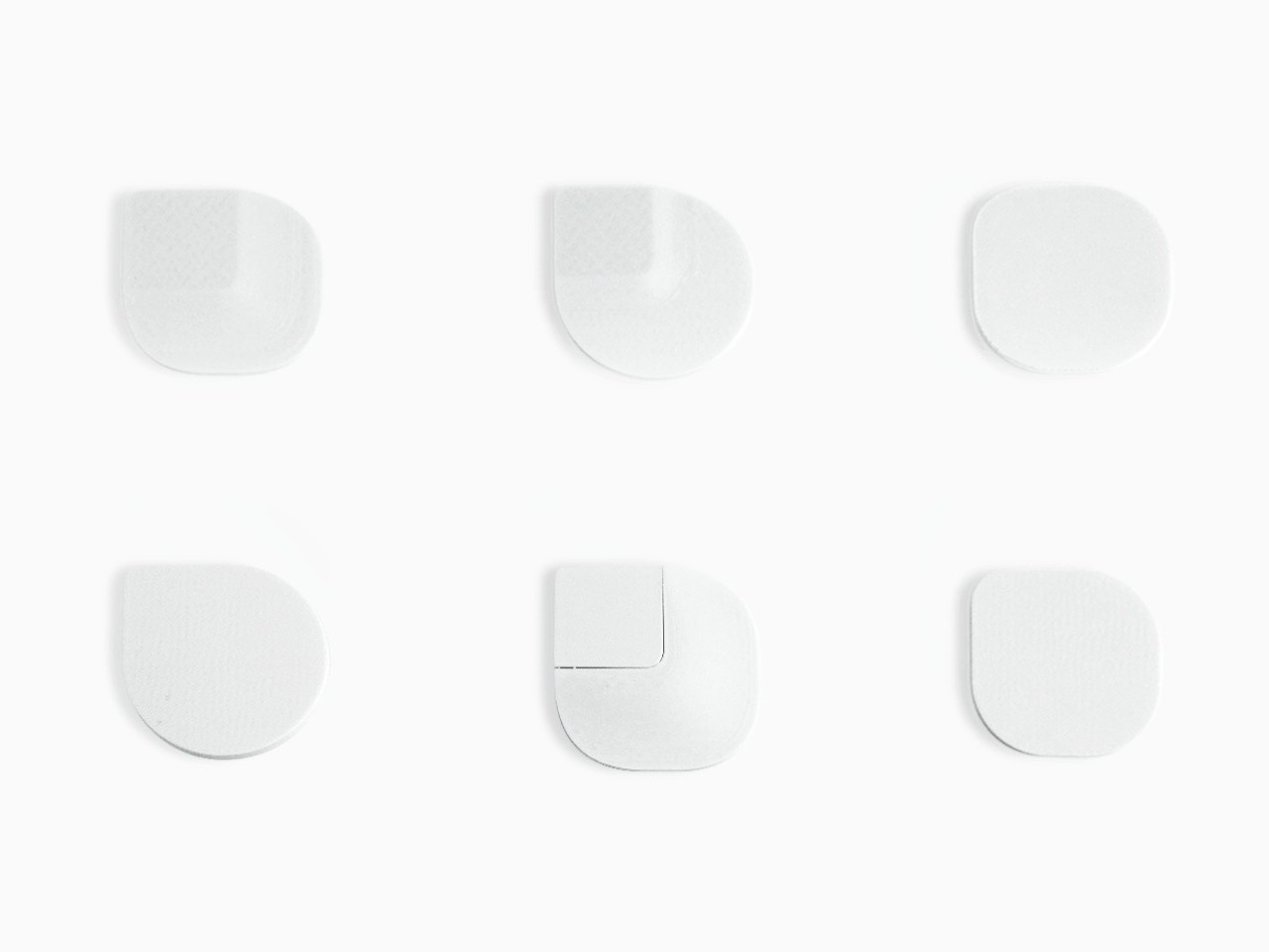
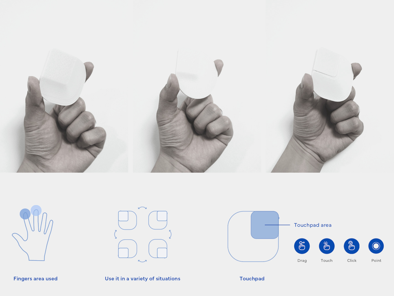
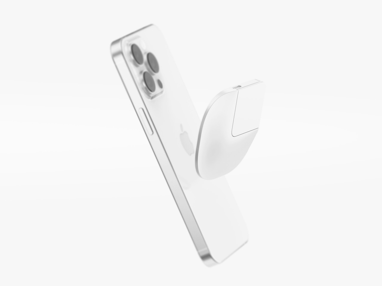
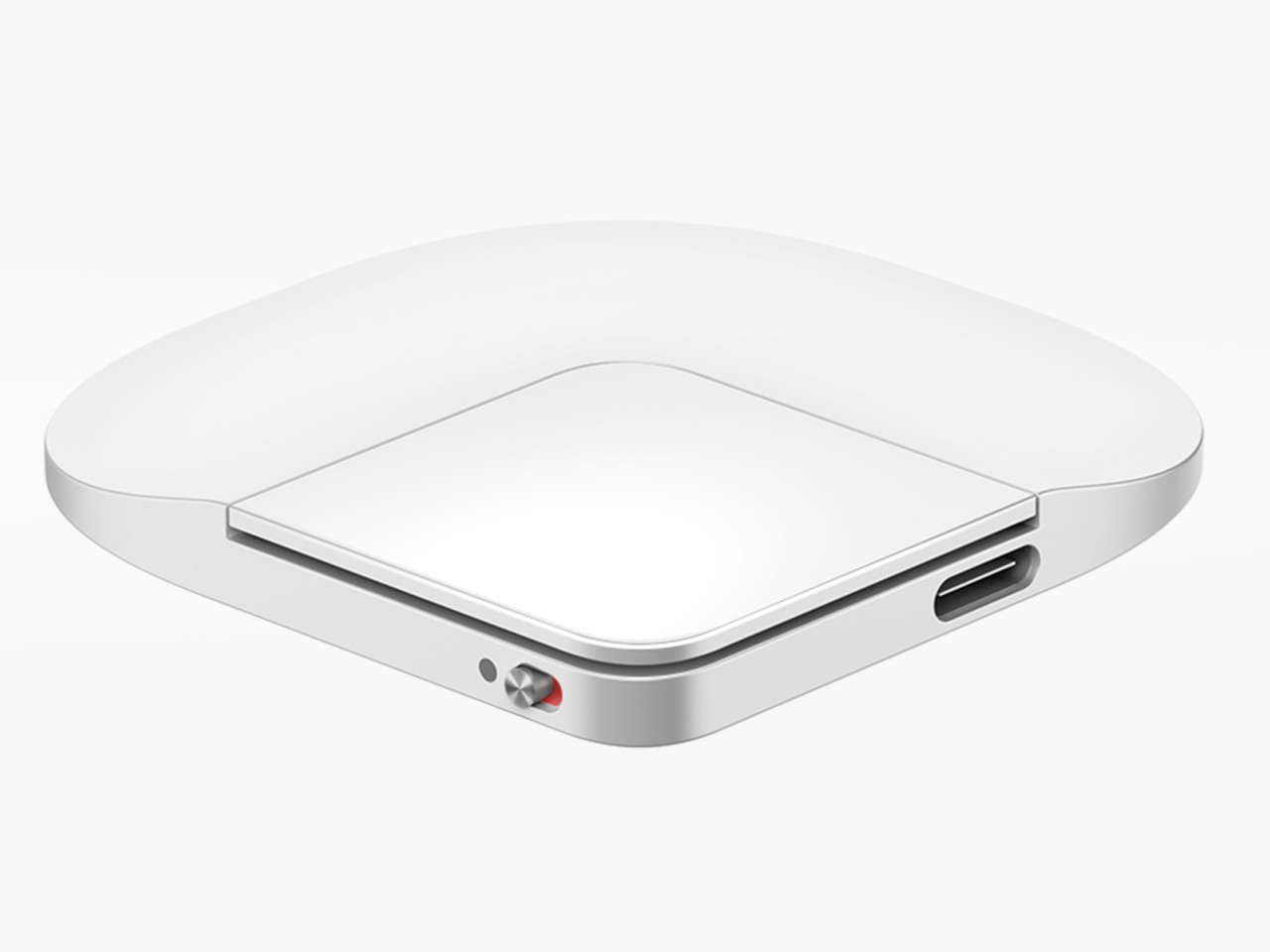
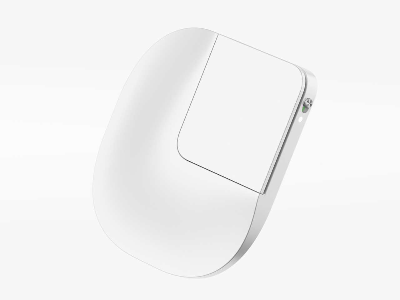
The idea is to put what is practically a small, squarish touchpad on the back of the phone, held there using MagSafe or other magnetic technology. The actual interactive part is a small quadrant of the slim device, an area that can be easily reached by your index or even middle finger. You slide your finger across the surface, pushing around the equivalent of a cursor, and use tapping gestures to “click” on user interface elements. You can easily detach Poinf when you don’t need it, so it doesn’t get in the way of “normal” smartphone use.

Poinf is definitely an intriguing solution to a very old problem, but it also brings a few issues of its own, particularly with usability. Moving a cursor by moving a finger on the back of the screen could require some mental gymnastics, severely affecting your speed and efficiency in the process. Of course, your brain can eventually adjust, like how it has come to accept the computer mouse, but it will take time and effort before that becomes second nature. Additionally, however, you also lose access to important touch gestures like pinching to zoom or quick scrolling, so you’ll have to do double work to teach yourself a new action vocabulary for this rather niche control mechanism. In the end, you might give up and just use the phone with both hands anyway.

The post Smartphone touchpad concept tries to solve one of the biggest problems with big phones first appeared on Yanko Design.
Foldable mouse concept takes inspiration from foldable phones

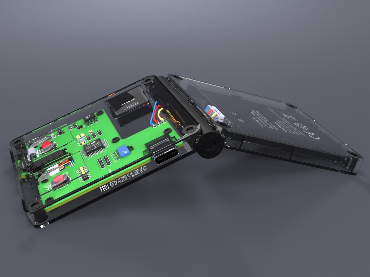
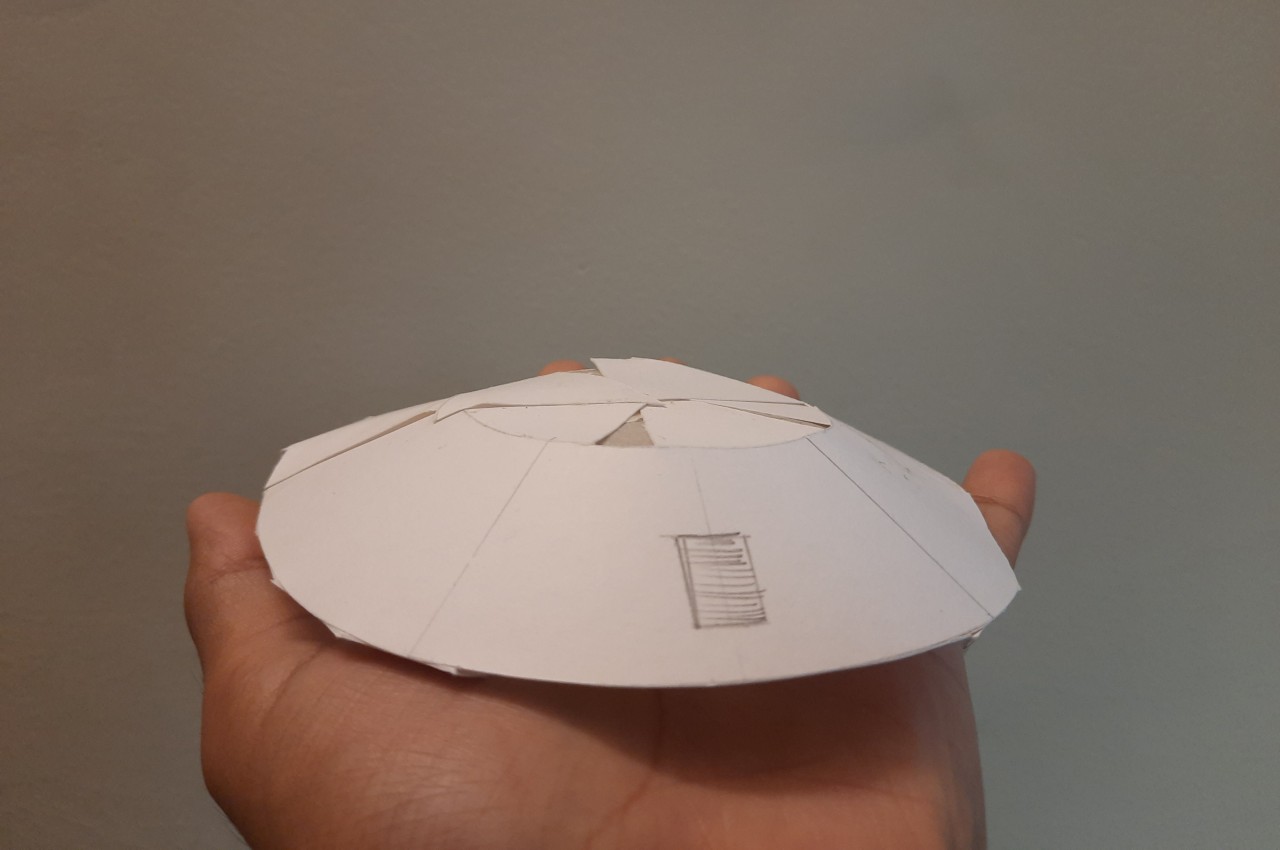
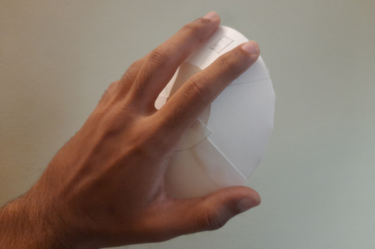
Laptops are designed to be used as complete, standalone portable computers that don’t need to connect to any external device to use. At least until you run out of battery and have to plug into a wall socket. That said, the design of laptops isn’t exactly great at ergonomics, whether it’s the cramped and flat keyboard or the centrally-positioned touchpad. That’s why some people still opt for at least a regular mouse, but those aren’t exactly portable especially the more common, bulky designs. This mouse design concept, however, prioritizes portability and compactness over anything else, and it takes a page out of the design of today’s foldable clamshell phones to pull off a rather intriguing yet also questionable design.

Designer: Antoine Brieux (NAK Studio)

Foldable computer mice do exist, but they’re really stretching the definition of the word. Perhaps the biggest example is Microsoft’s Arc Wireless mouse, which is basically just a flat box that you “fold” into a curve to use. It’s more than bending than actual folding, but that’s for a very good reason that we’ll see later.

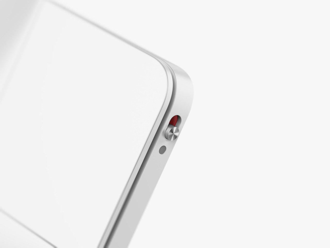
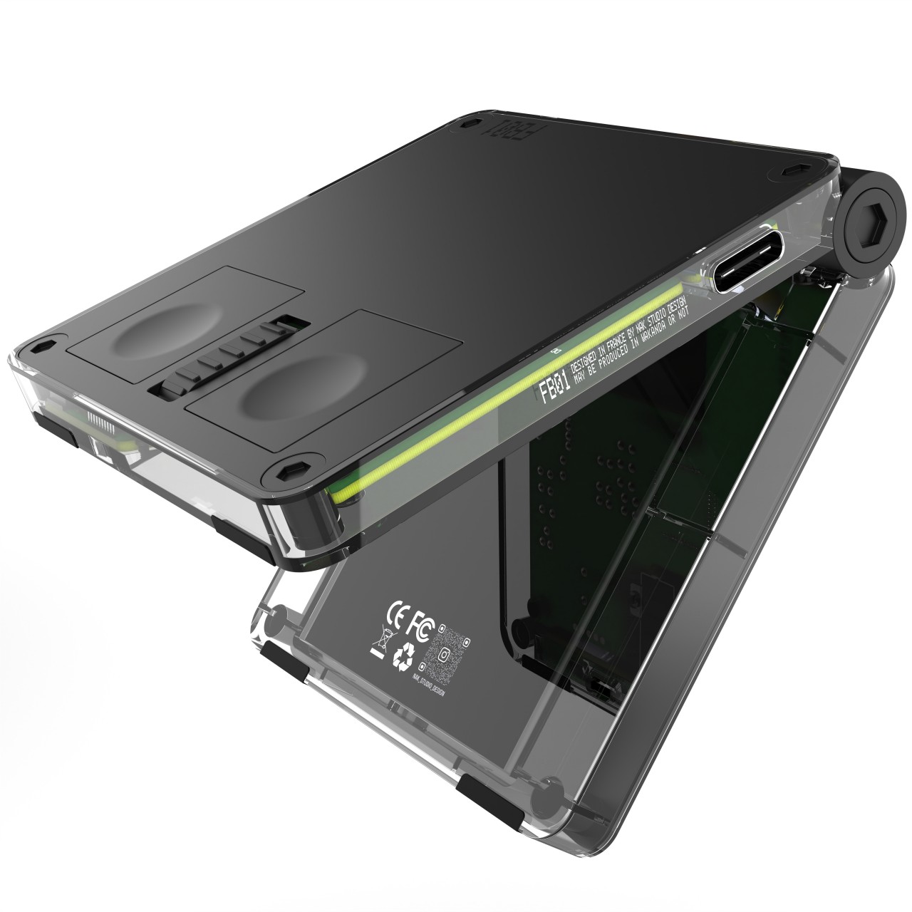
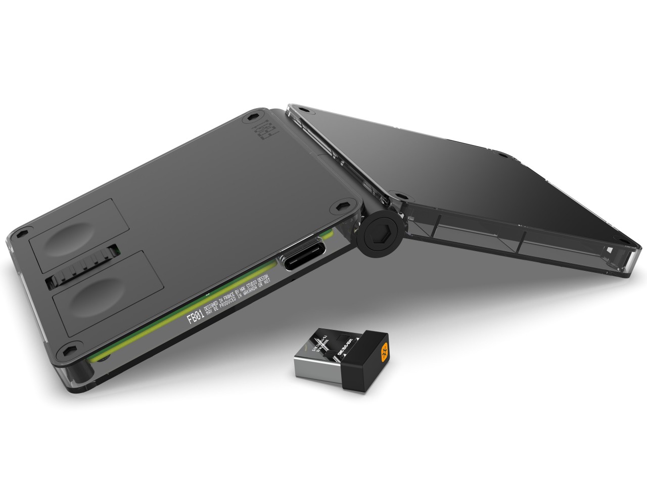
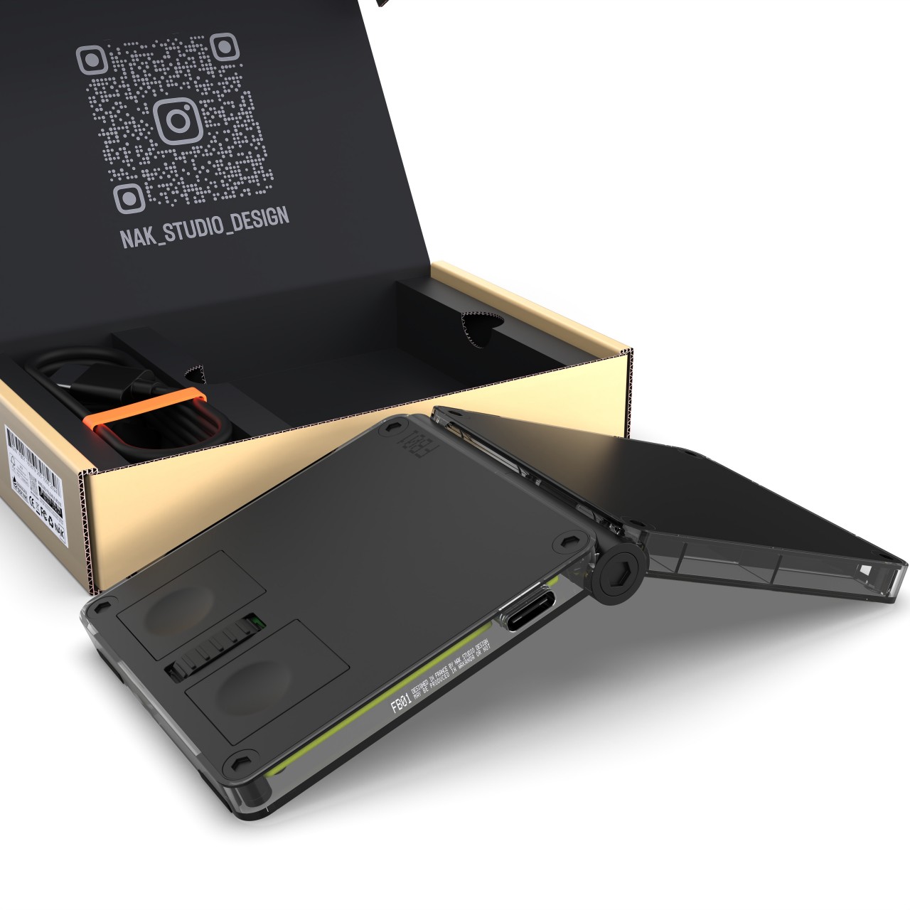
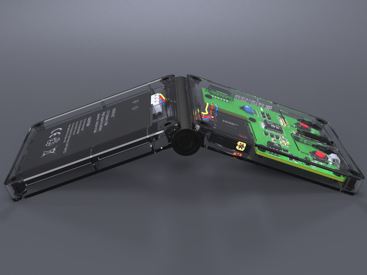
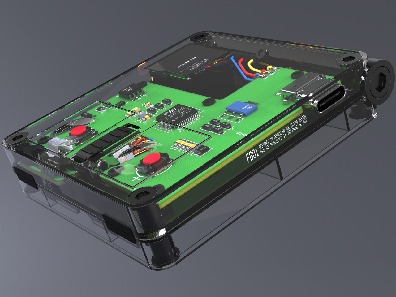
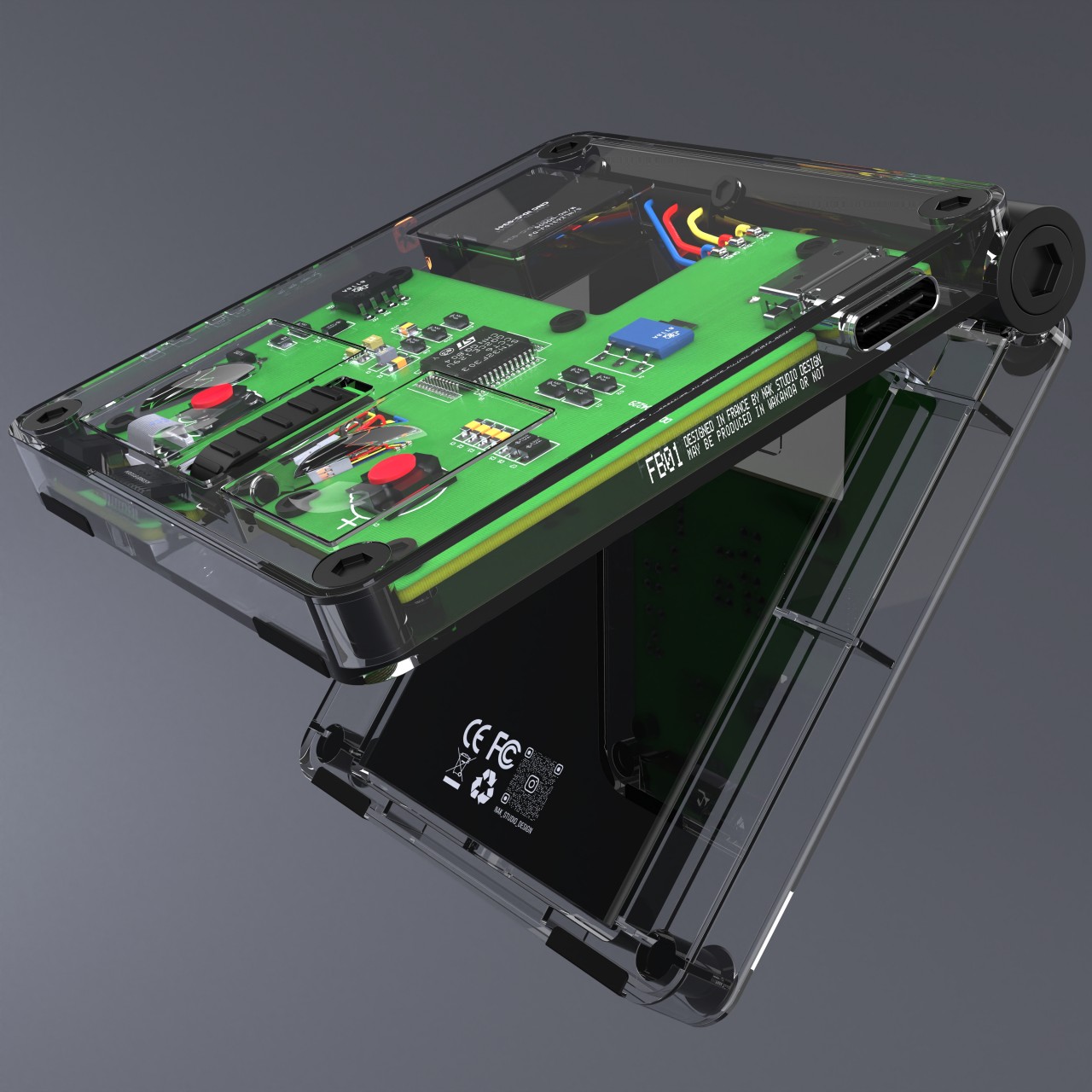
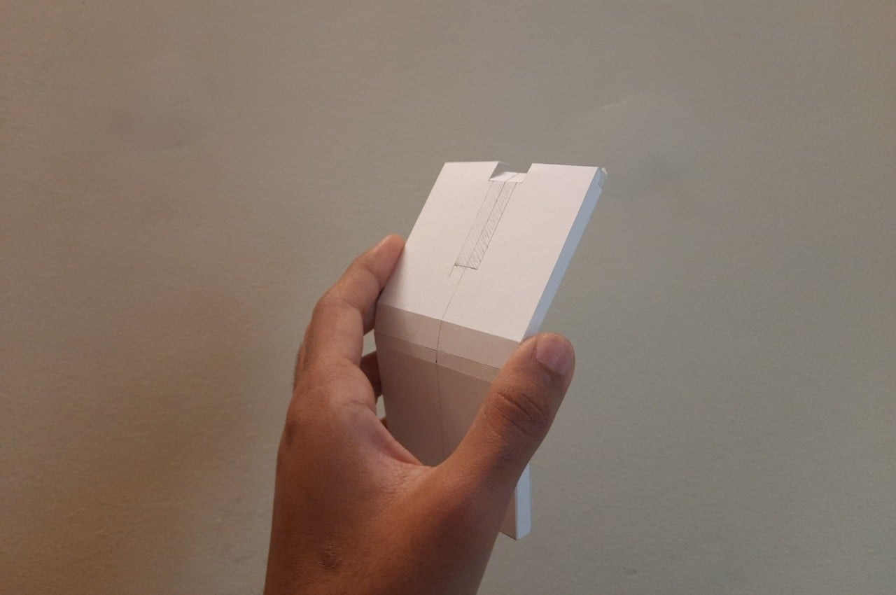
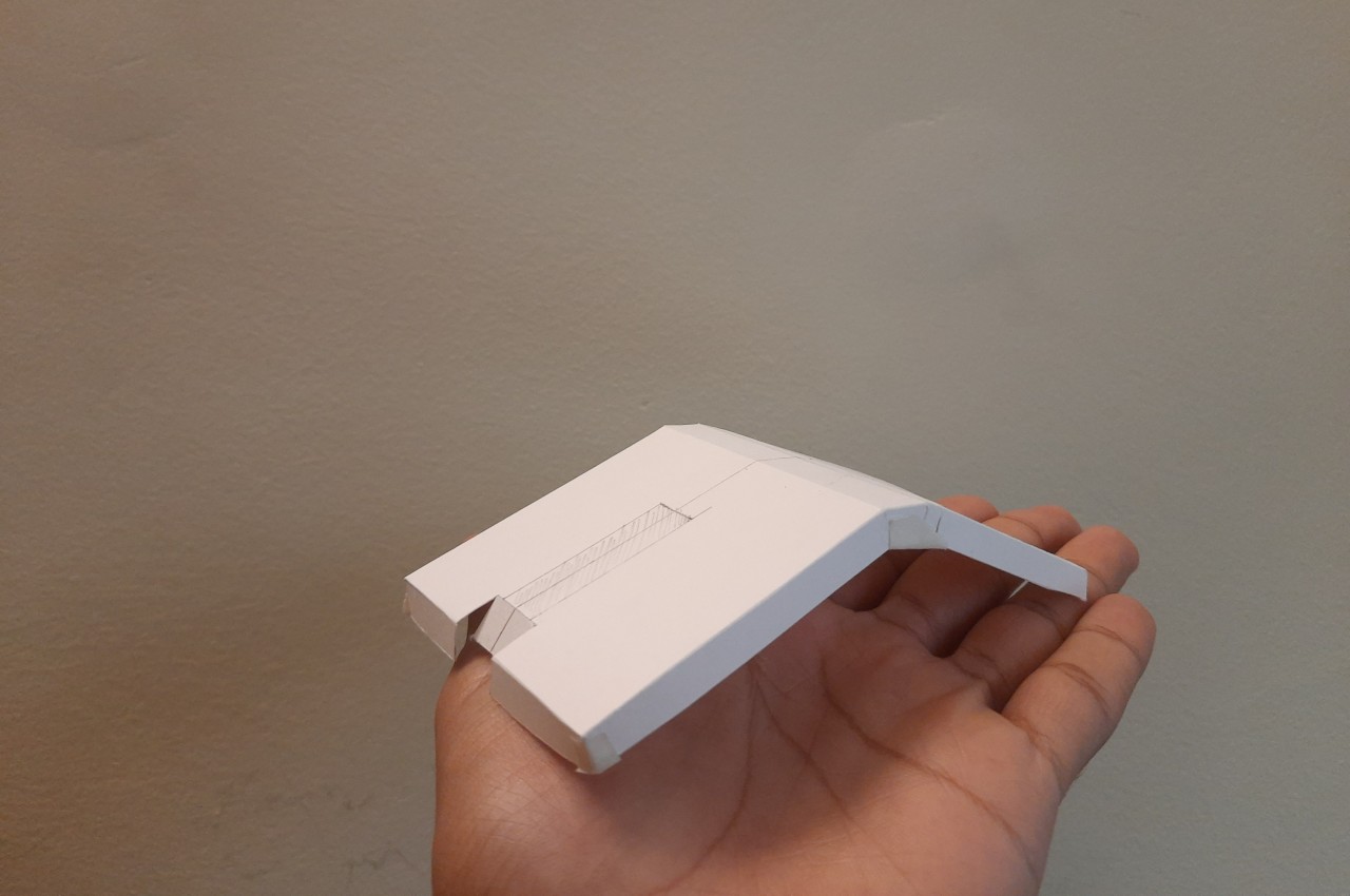
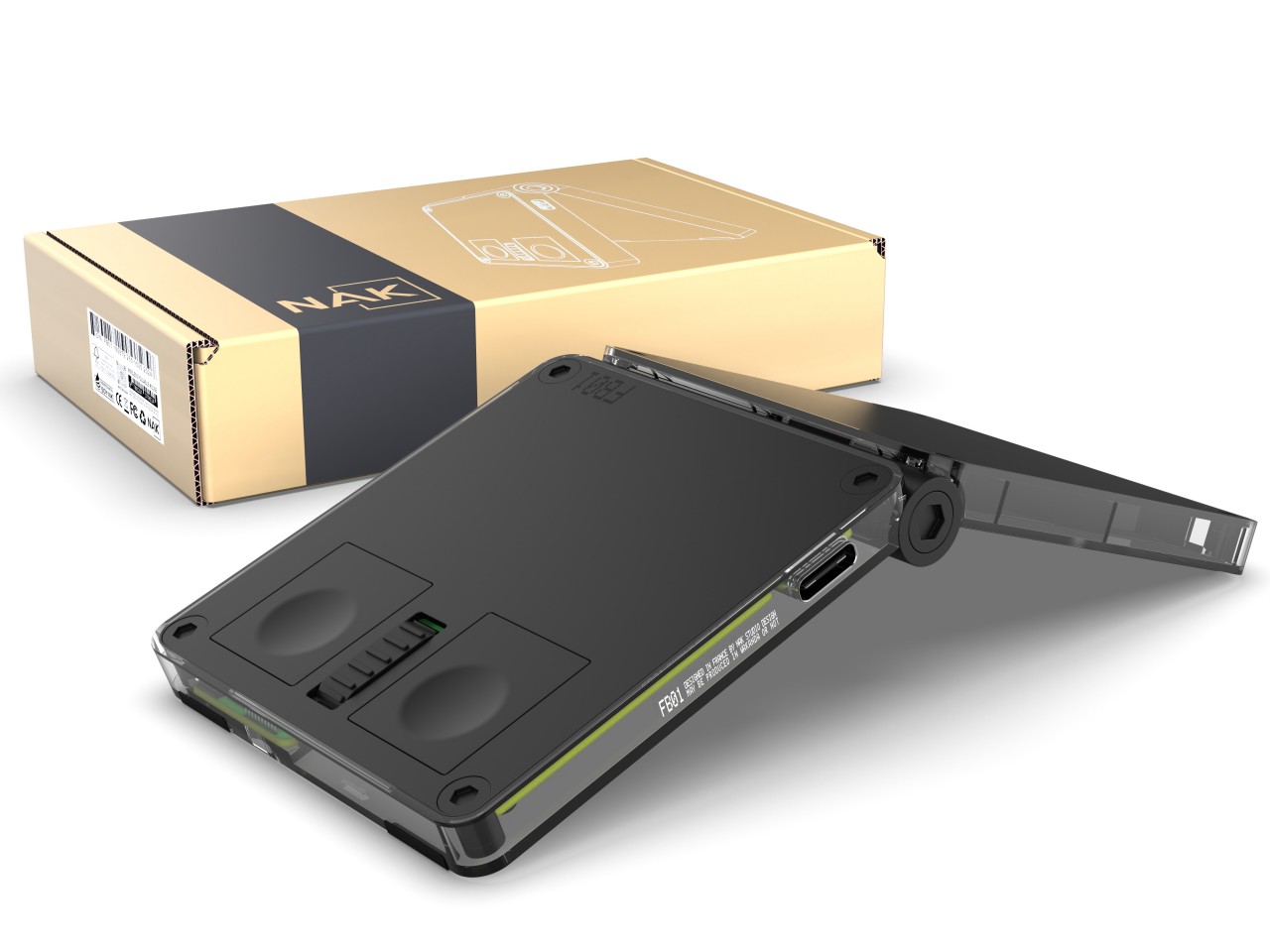
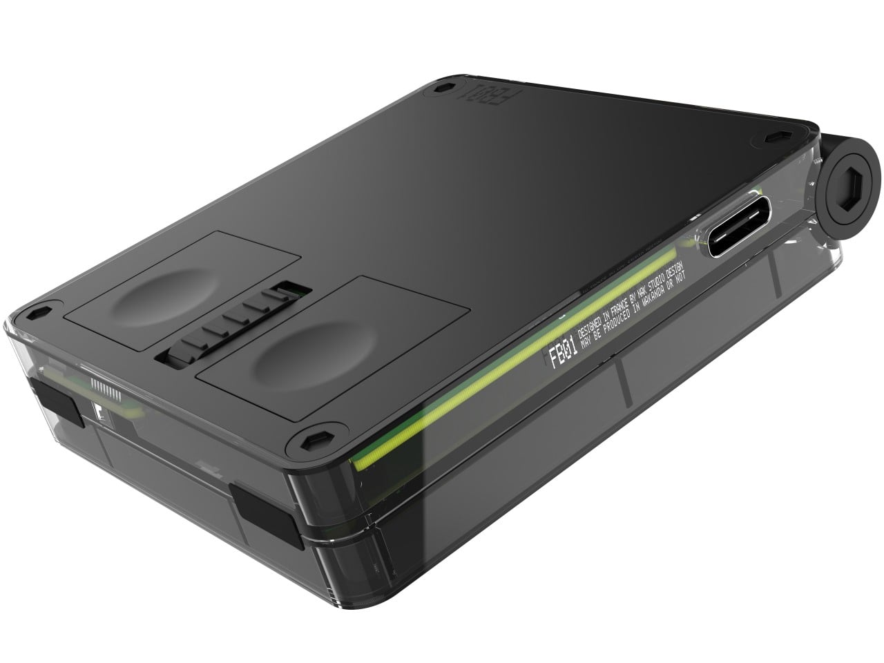
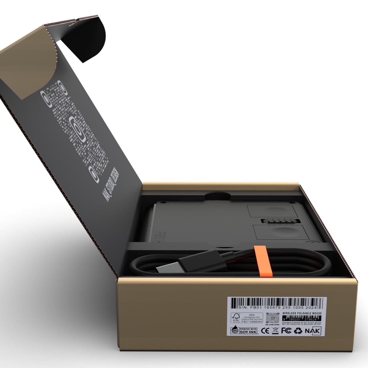
In stark contrast, this “Emergency Foldable Mouse” really does fold in half, not unlike the phones like the Samsung Galaxy Z Flip 6. In its “deactivated” form, it’s more like a square compact or pocket mirror, though its flat edges and sharp corners clearly mark it as some sort of gadget or tool. When closed like this, the mouse automatically turns off and then turns on again the moment you open it.

Unlike a foldable phone, however, this mouse doesn’t unfold completely flat and instead stays at a fixed obtuse angle. After all, this is a mouse and it would be difficult to use it if it laid completely flat on a desk. That said, even that configuration isn’t comfortable, as users of Microsoft’s own foldable mice will attest to. Yes, your hand arcs over the mouse for a more ergonomic hold, but unlike the gentle curve of the Foldable Arc Wireless, you have two edges potentially biting into your skin. Even the designer admits that the design is clearly not for ergonomics but for the object itself.

Admittedly, it carries an aesthetic that will probably appeal to many computer users, especially collectors. The clear plastic version will definitely catch people’s attention, but even an opaque aluminum object with such an angular bend will pique anyone’s curiosity. If anything, the Emergency Foldable Mouse challenges the standard mouse design with an eye toward portability, an area that isn’t as widely explored as ergonomic mouse designs.

The post Foldable mouse concept takes inspiration from foldable phones first appeared on Yanko Design.
AI-powered modular mouse has some nifty tricks to level up your presentations

The nature and location of work today have changed considerably, especially after the introduction of work-from-home arrangements, but there is one thing that still remains the same. People still hold in-person meetings, which often involve making presentations, be it in front of colleagues or before clients. Despite how common this activity is, the tools used especially by presenters haven’t evolved that much except for teleconferencing equipment. Many of the devices needed for an effective presentation often come as separate products, so this concept tries to integrate not just two but four tools into a single design that, at first glance, looks like a normal mouse.

Designers: TianRun Chen, ZiLong Peng, Yanran Zhao, YueHao Liu

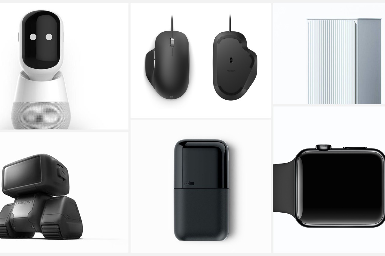
Many computer users use a mouse, even if they actually prefer using laptops. It’s almost an indispensable tool for on-the-go knowledge workers, including those who often find themselves speaking in front of other people in a room. Unfortunately, these people would also find themselves grabbing a presenter and a laser pointer during those presentations, making their work lives needlessly complex. There are some thin, portable mice that try to integrate a laser pointer, but these are still rare, not to mention not ergonomic in their designs.

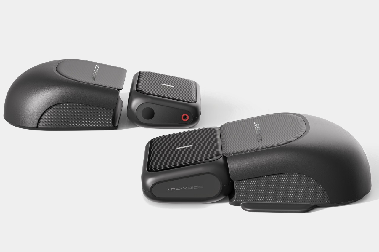
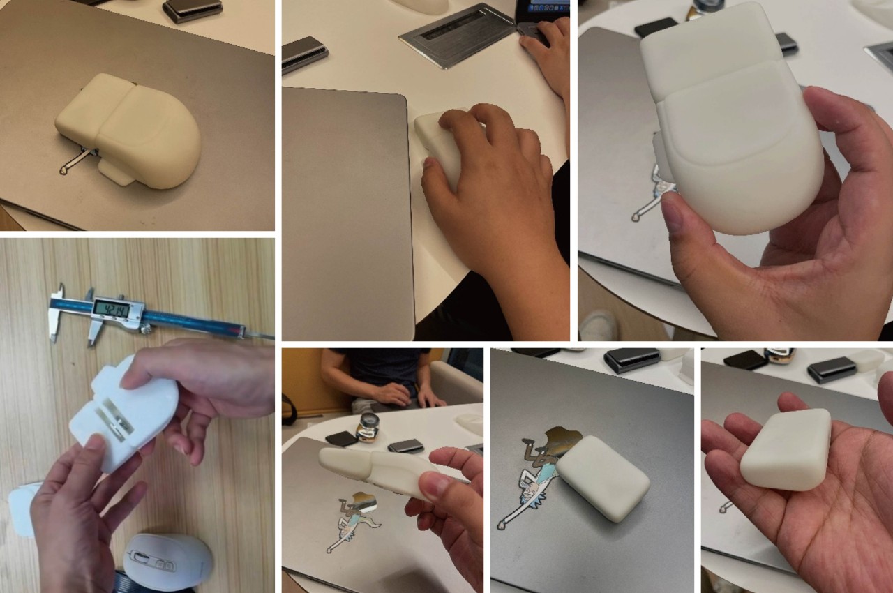
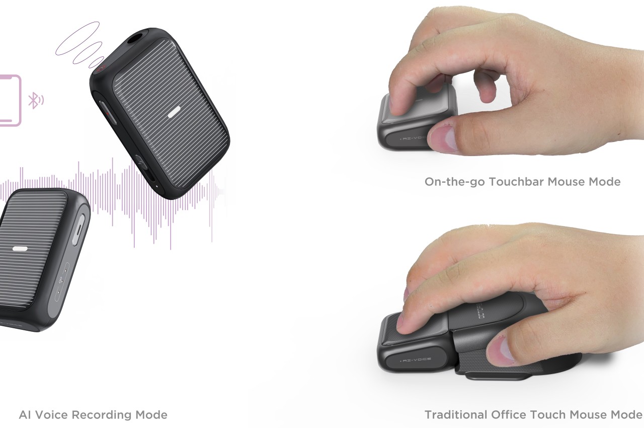
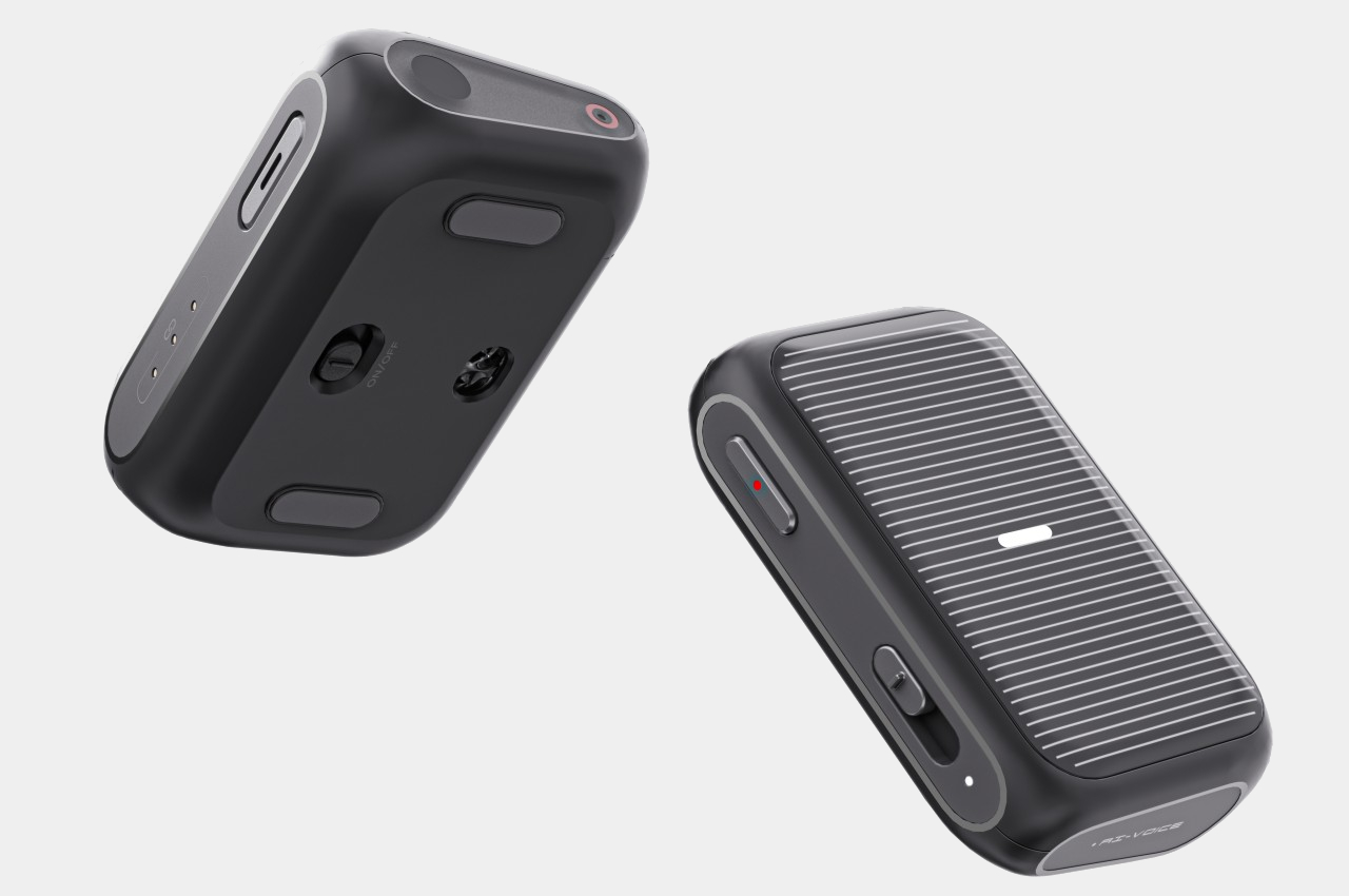
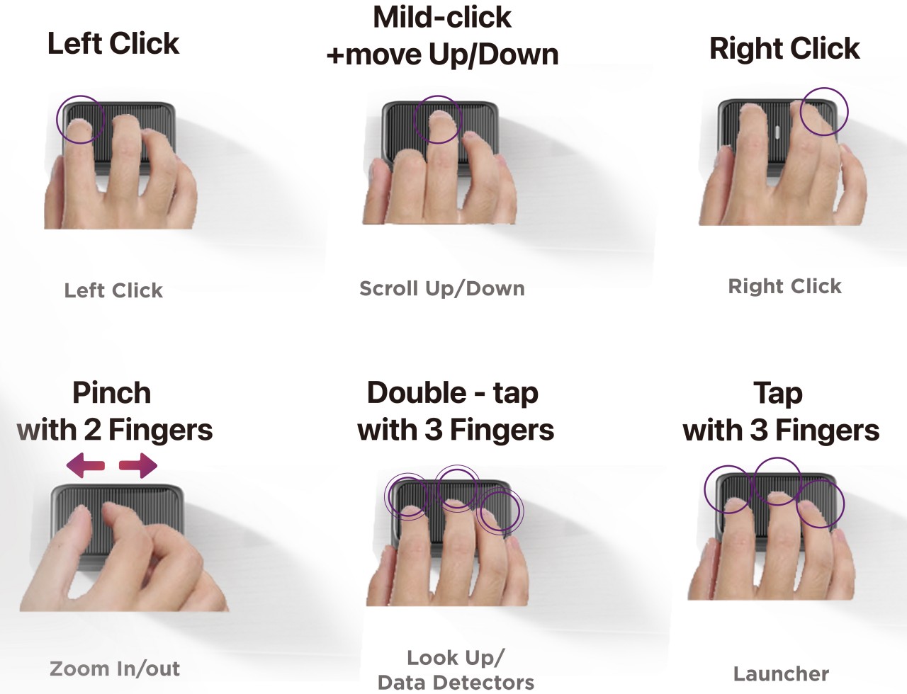
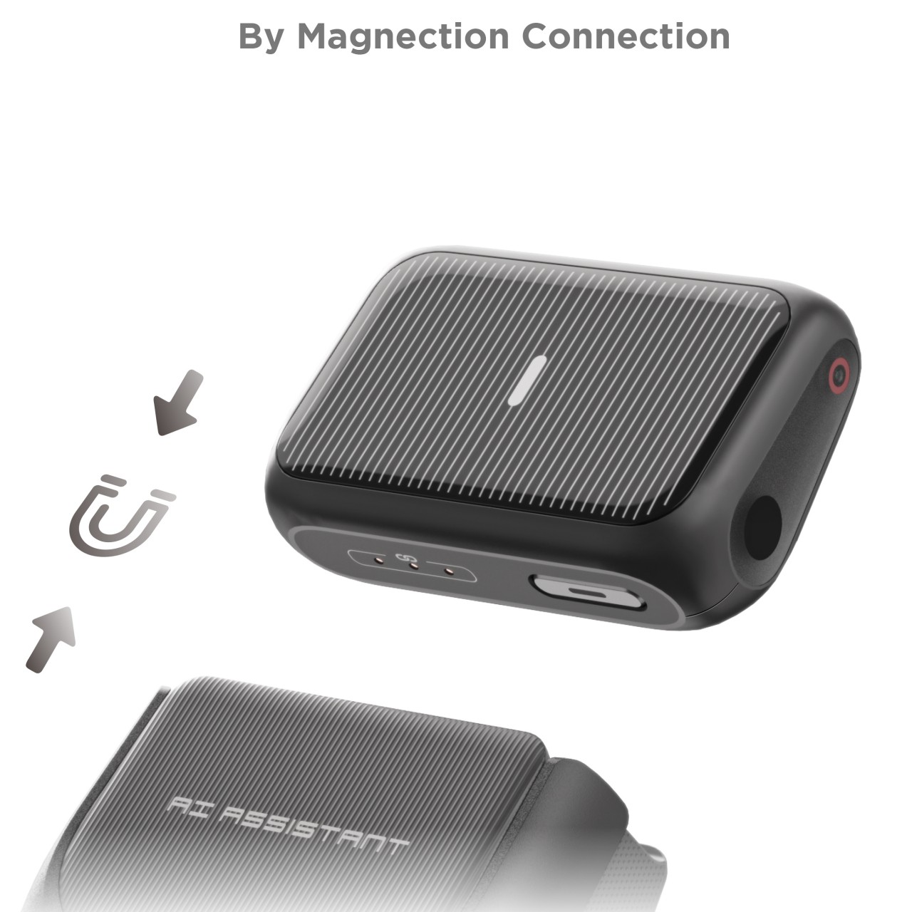
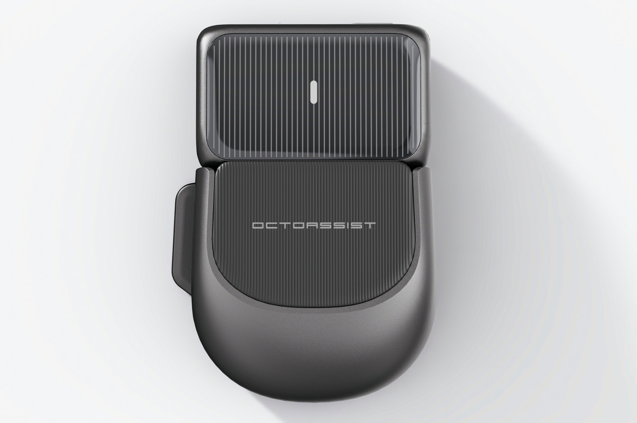
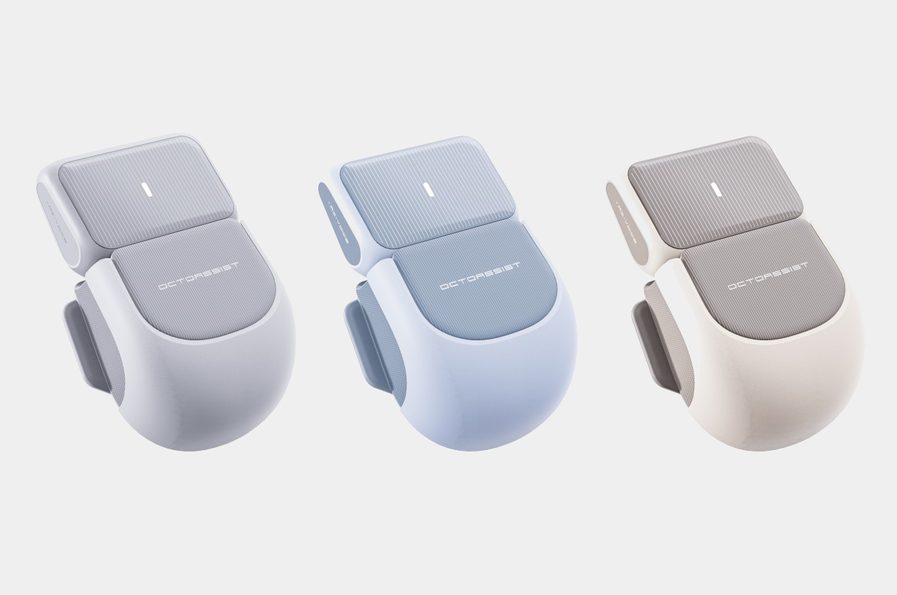
The OctoAssist concept design has a rather intriguing solution that deconstructs the design of the computer mouse in order to provide more functionality. At its core, it sports a modular design where the main “module” is actually the front third of a conventional mouse, where the buttons would normally be located. This module is actually a touch-sensitive device that you can use on its own as a mini touchpad that supports gestures like pinching and three-finger taps. It can magnetically connect to a “base” that provides the ergonomic shape of a mouse, while potentially also offering additional battery power in its rather large body.

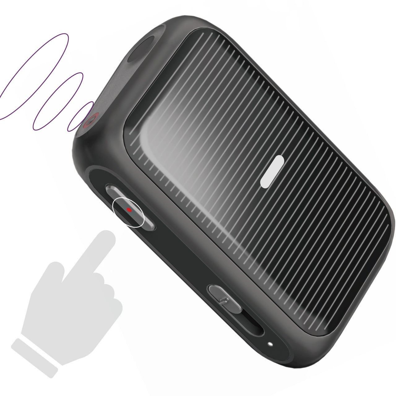
The core module also has a built-in laser pointer and, thanks to its touch-sensitive surface, can be used to easily control presentations with the same hand. It also has a voice recorder so you can have the entire presentation or meeting preserved for documentation purposes. But why stop there when you have today’s ubiquitous AI available to almost everyone? That AI, built into the device, can also summarize the meeting and generate notes in a flash, impressing everyone in the room with your technological wizardry and efficiency.

From a regular office mouse to a miniature touchpad to a presenter to an AI secretary, the OctoAssist offers plenty of features, though perhaps a bit too much as well. The AI-powered summary and notes are definitely convenient, but they could weigh the core module down not just with complexity but also with hardware and battery consumption. It does offload the AI processing to a connected smartphone, but that can sometimes cause lags and even data loss. Regardless, it’s definitely an interesting concept that might even be plausible, presuming a manufacturer sees profitable value in an all-in-one design instead of selling multiple devices that do those tasks separately.

The post AI-powered modular mouse has some nifty tricks to level up your presentations first appeared on Yanko Design.
A Mouse That Enhances Your Gaming Experience Inspired By Star Wars

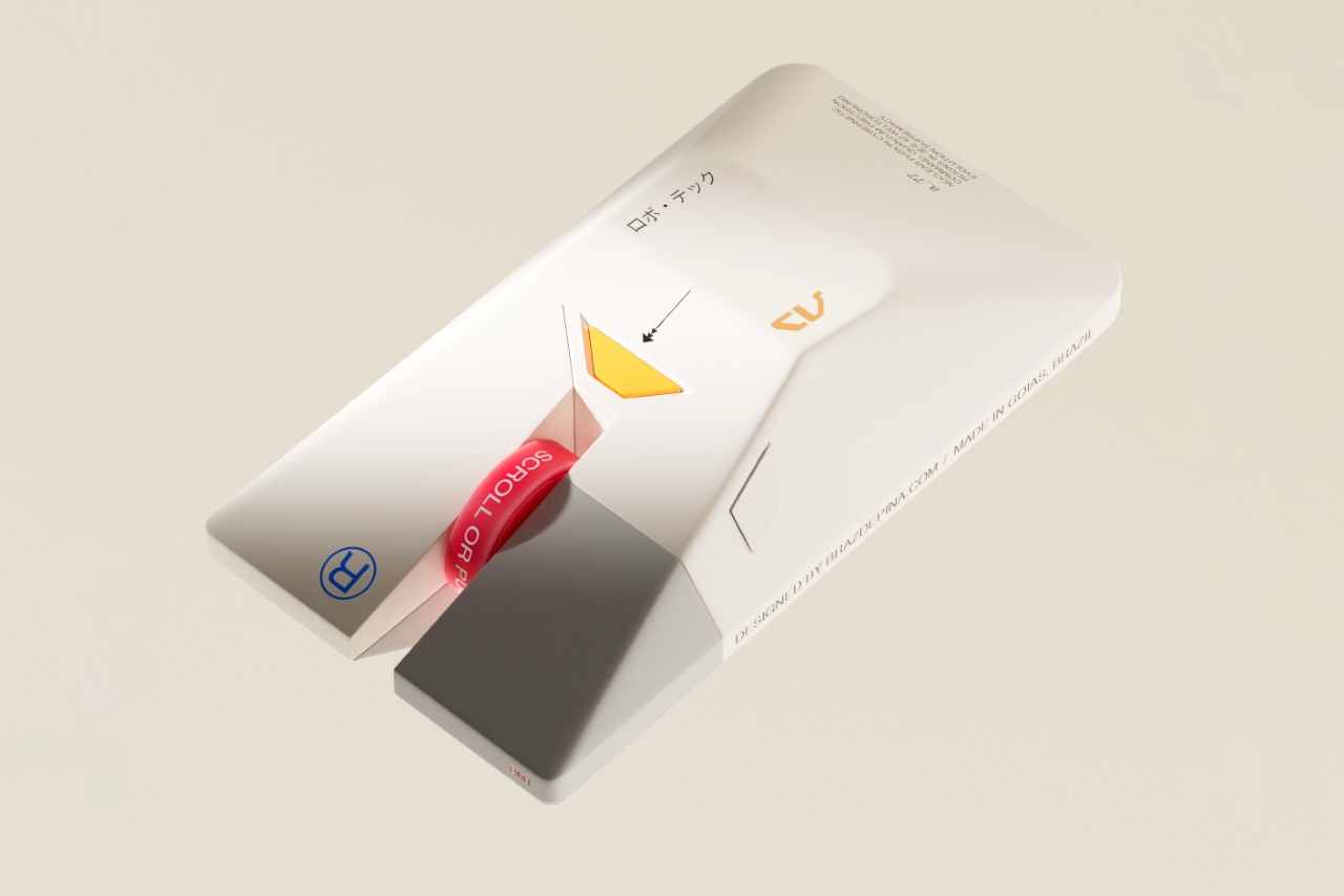
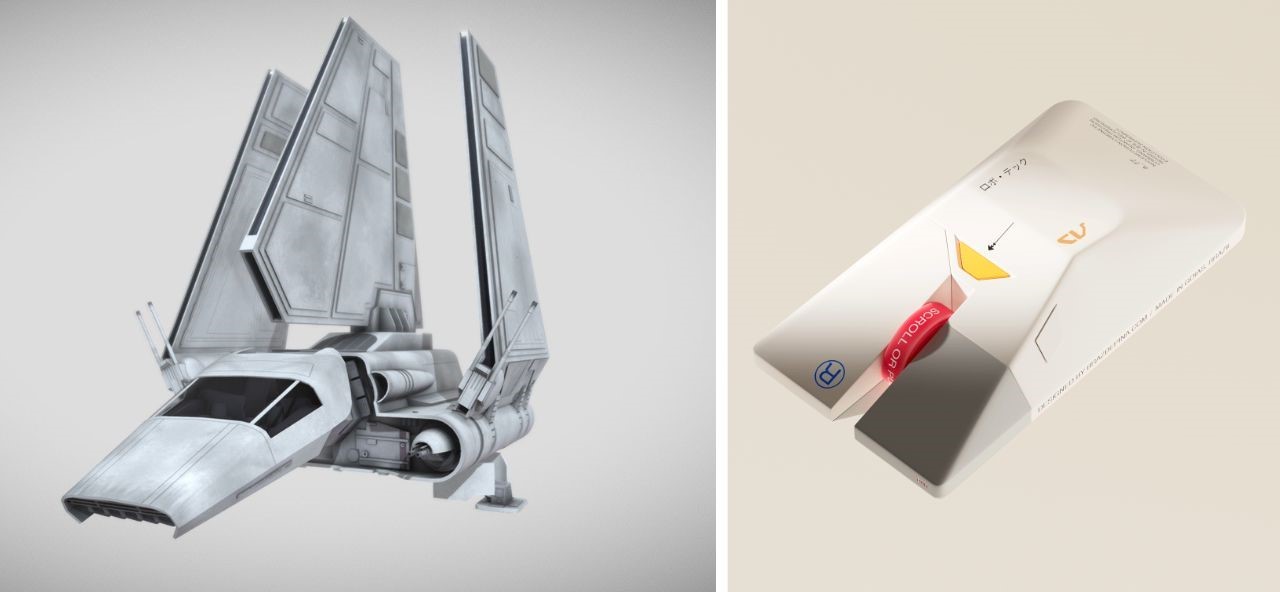
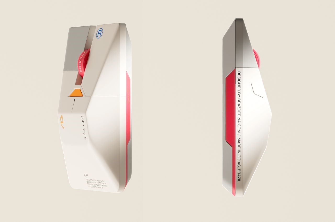
As a design website, we’ve had the distinction of covering practically every computer mouse there is. Regular mice, ergonomic mice, vertical mice, gaming mice, inflatable mice, even origami mice… so the BM1 doesn’t come as any massive surprise in terms of the visual design department. Modeled on the Lambda-class T-4A Shuttle from Star Wars, the mouse balances ergonomics with a rather inventive design that pays tribute to one of the greatest cinematic universes of all time.

Designer: Braz de Pina

Crafted by a visionary designer with a profound love for the Star Wars universe, the BM1 Mouse pays homage to one of the saga’s most iconic vessels – the Lambda-class T-4a shuttle. With its sleek contours and unmistakable resemblance to the Imperial Shuttle, this mouse beckons adventurers to embark on a journey through the stars, where every click and scroll resonates with the pulse of interstellar warfare.

For the legions of Star Wars aficionados and gamers alike, the BM1 Mouse offers an unparalleled experience, seamlessly blending the allure of the Galactic Empire with the thrill of virtual conquests. At first glance, the echoes of the Lambda-class shuttle resonate through the sleek contours of the mouse, with its central body mirroring the iconic vessel’s silhouette (if you exclude the wings).

The fusion of form and function reaches its peak with the mouse’s primary features – the left and right clicks, reminiscent of the cannons adorning the front of the Imperial Lambda. Each click resonates with the exhilaration of battle, offering gamers an immersive experience akin to piloting a starfighter through the vast expanse of space.

Beyond its striking resemblance to the Imperial Shuttle, the BM1 Mouse boasts a visual identity that exudes sophistication and ergonomic brilliance. Chamfered edges provide not only aesthetic appeal but also enhance grip and comfort during prolonged gaming sessions. The streamlined shape evokes a sense of speed and agility, reminiscent of the starships that dominate the Star Wars universe.

Not to be overlooked is the mouse’s scroller – a distinctive feature that commands attention with its futuristic design. Easy to spot and effortless to use, the scroller serves as a tool for navigation in the digital realm, guiding users through galaxies far and wide with precision and ease.

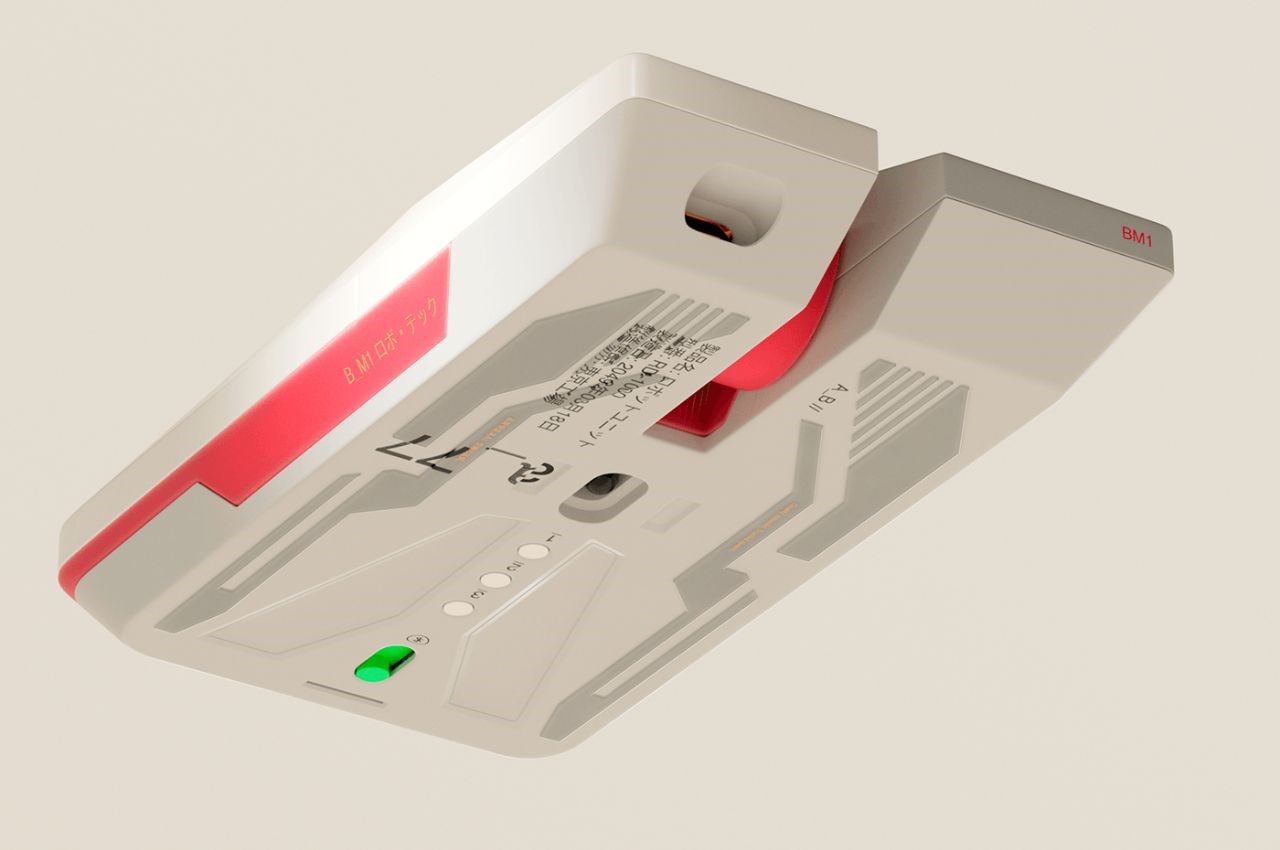
Moreover, the visual cues and font selection evoke a sense of futurism, drawing parallels to the technological marvels of the Star Wars universe. The color palette, a delicate fusion of greys, whites, and vibrant primary hues, further accentuates the mouse’s futuristic appeal, transporting users to a realm where technology and imagination converge.

A closer look at the mouse’s underside reveals a flat base adorned with sleek depressions, reminiscent of the underbelly of a spaceship preparing for flight. This attention to detail not only enhances the mouse’s aesthetic appeal but also reinforces its identity as a vessel for digital exploration and conquest.

The post A Mouse That Enhances Your Gaming Experience Inspired By Star Wars first appeared on Yanko Design.
Computer mouse design has to be scratched and deteriorated to show its true self

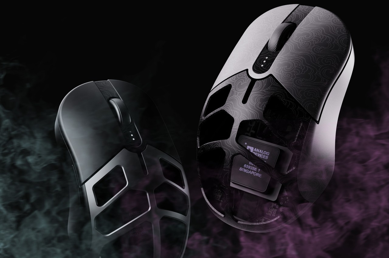
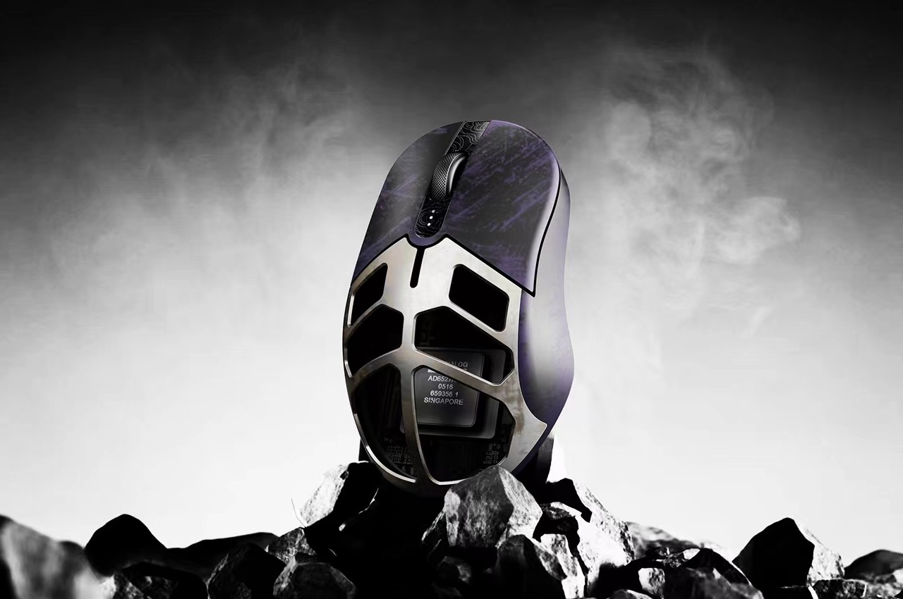
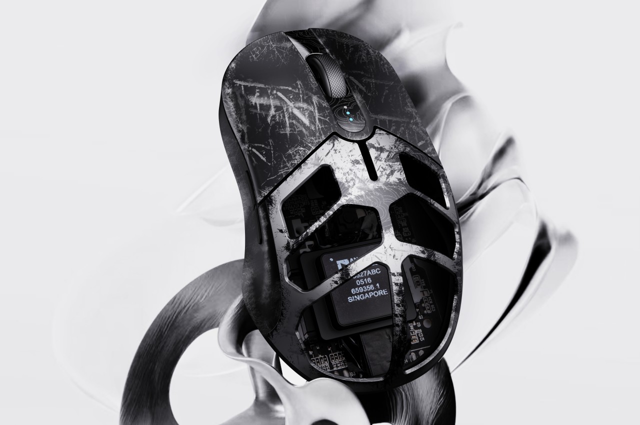
We see plenty of designs that try to address one of the computer mouse’s biggest problems, that of ergonomics. Truth be told, however, it’s unlikely that it will change en masse and for good, considering how the horizontal shape of this device has been so ingrained in our consciousness for decades. Of course, that doesn’t mean that there’s no room for experimentation, especially when it comes to adding some value to a traditional mouse design. That can be through its shape, its texture, or even its materials. The latter is something that this curious concept tries to play with, suggesting a computer mouse that you intentionally want to get scratched or quickly deteriorate just so that you can see the secret color or design hidden underneath its skin.

Designer: Liang Yao (苦 口)

Physical products age and deteriorate over time, but those that provide some utility tend to grow old and wear down faster. Not all materials, however, age as gracefully as leather or brass, materials develop unique patinas from their use. Wood can chip, metal gets scratched, and plastic fades or gets discolored. Normally, you wouldn’t want your stuff to even get dinged, let alone scratched, because it then loses its value, but this computer mouse concept is the complete opposite.

“Scratch-off” is a design that adds an extra layer on top of the mouse’s actual design that’s not meant to last forever. Just like those lottery scratchcards, the temporary material on top reveals a prize or a dud when you scratch it off. Of course, you won’t intentionally scratch this mouse’s surface, but it adds a bit of thrill and excitement as you slowly see the hidden design underneath.

This actually brings a lot of opportunities for branding and advertising, with logos or markings hidden underneath the outer layer of the mouse’s surface. Of course, it could be a long burn depending on the kind of material used. After all, it might take weeks or even months before the mouse’s outer cover gets scratched off or peeled completely. In some cases, however, there might even be a marketing gimmick where you intentionally damage the mouse’s surface to reveal some visual gem underneath, hopefully in a safe manner.

The concept, however, does raise the question of the material that should be used to implement this outer layer. It has to be easy to scratch or fade, but not too quickly like some plastic sheet that will defeat the entire purpose of anticipating the product’s deterioration. At the same time, however, it has to be a hygienic material that won’t leave flakes behind, considering how your hand will always be making contact with the mouse.

The post Computer mouse design has to be scratched and deteriorated to show its true self first appeared on Yanko Design.
Ergonomic mouse concept oddly looks like a familiar home appliance

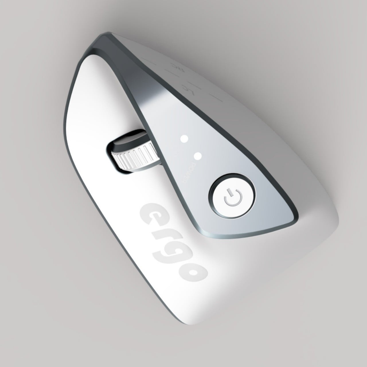
Computer mice have been around for decades, and despite their form making no objective sense, they remain the most basic and most common pointing device that we now use intuitively. The core design of the mouse hasn’t changed significantly since its inception, which unfortunately means they’re still one of the biggest causes of repetitive strain injury or RSI for many people. Ergonomic mice are starting to gain traction, particularly the vertically oriented designs that promise a more natural and comfortable grip for your hand. This device concept builds on that same premise, but the execution is a bit puzzling considering how it looks less like a mouse and more like a miniature clothes iron.

Designer: Pranav Kuber

The rationale behind vertical mice is that the normal orientation of human hands has the palms facing inward rather than downward. With a regular mouse, users are forced to keep their hands at an unnatural angle, whether or not they’re moving the mouse at that moment. Of course, a vertical mouse would still need to provide the basic functions of a conventional mouse, which includes left and right buttons as well as a scroll wheel.

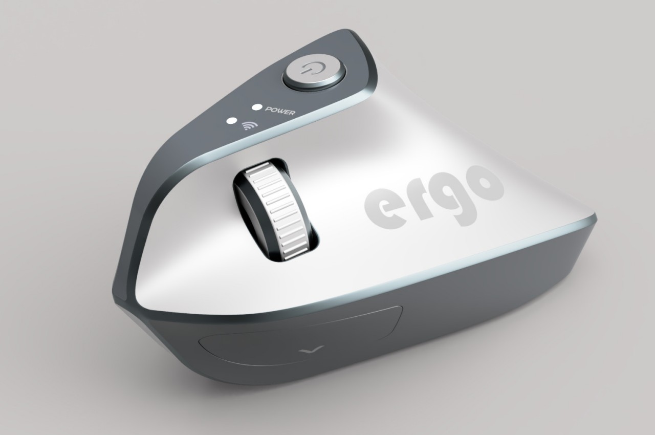
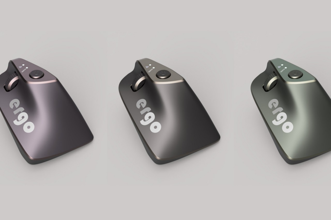
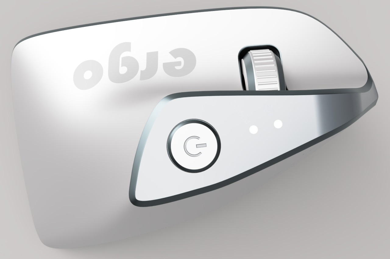
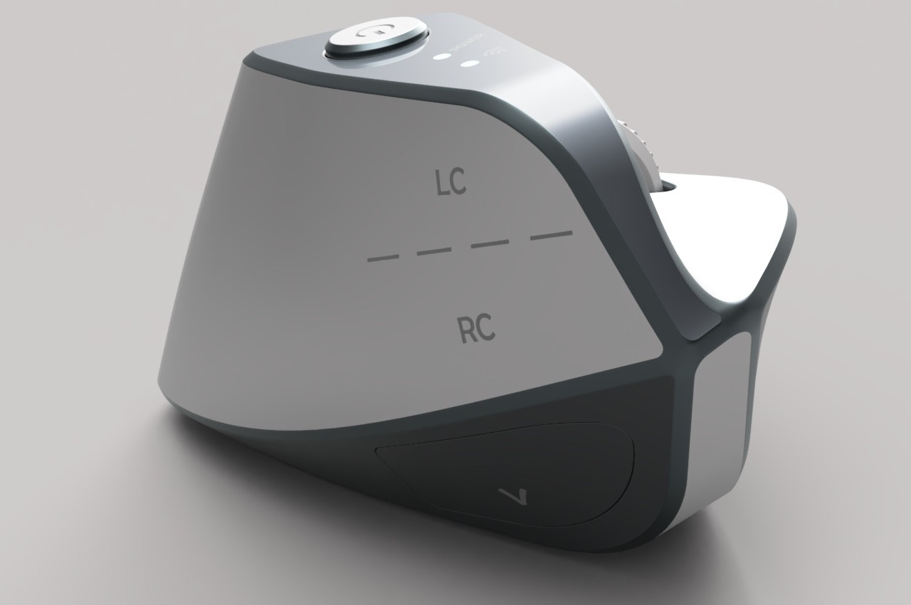
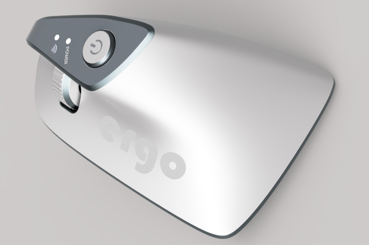
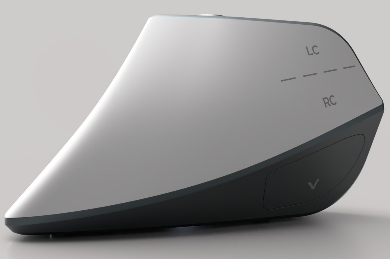
At first glance, the Ergo ergonomic mouse concept is just like any other vertical mouse now available for purchase, but examining its form and silhouette generates a slightly different image. The top plane’s wide surface tapers sharply toward the front, while the wide middle section looks rectangular when viewed from above. If not for the actual bottom of the mouse, which merges two vertical sides like the keel of a ship, the Ergo looks almost like a clothes iron, albeit one without a handle to grip.

Aside from the peculiar shape, the mouse design also raises a few other questions. The buttons on the outer or right side are clearly marked, but they don’t look like buttons you can physically click at first glance. The position of the mouse wheel on the opposite side is even more puzzling, as it will require a lot of swinging movement from the thumb that could actually put more strain on its joint. The rather wide rear might also make it harder to grasp the mouse, potentially resulting in more discomfort in the long run.

The post Ergonomic mouse concept oddly looks like a familiar home appliance first appeared on Yanko Design.
Ergonomic mouse concept gives left-handed users the comfort they deserve

The vast majority of computer products are designed to favor the biggest groups of users, sometimes to the exclusion of the minority. We’re not speaking about accessibility for persons with physical disabilities, but that is especially true for them as well. Even just the common keyboard and mouse are designed with the presumption that they will be used by right-handed people. And while ambidextrous mice do exist, those tend to sacrifice comfort for the sake of a symmetrical design. That doesn’t have to be the case, as this concept design tries to prove, promising both comfort as well as proficiency, regardless of which hand you hold it with.

Designer: Sameeraj Dronamraju

There has been an increasing awareness and demand for ergonomic mice, sadly due to the equally rising cases of computer-related injuries. But while there are plenty of ergonomic designs now available, most of them only cater to right-handed users. You’d be lucky if the manufacturer produced a left-handed design, but most don’t because of the costs involved in another product with only a few minor differences.

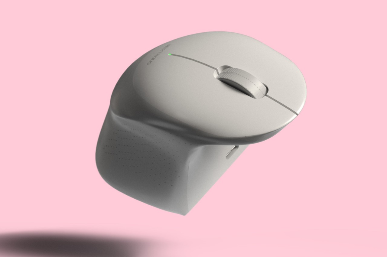
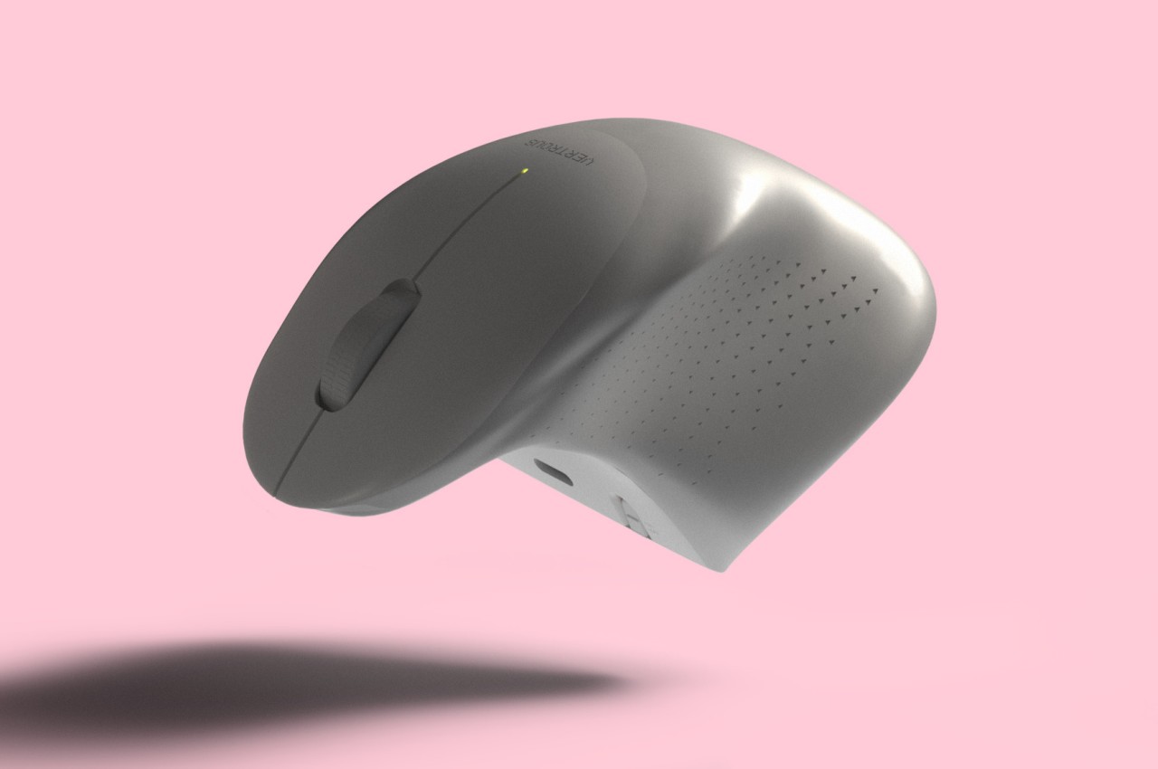
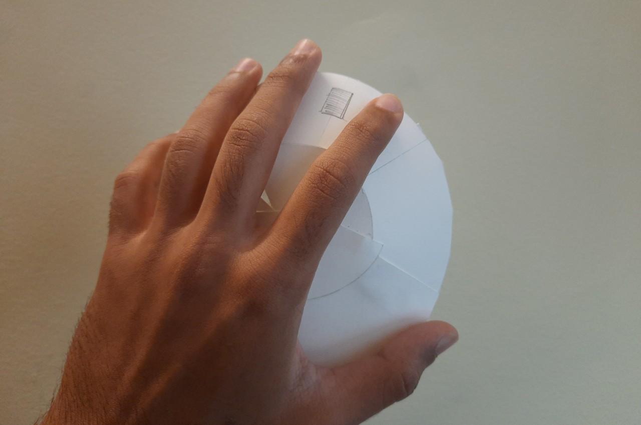
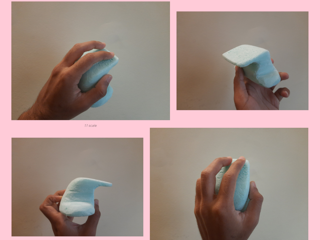
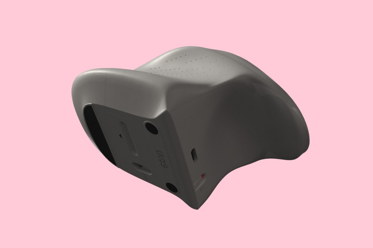
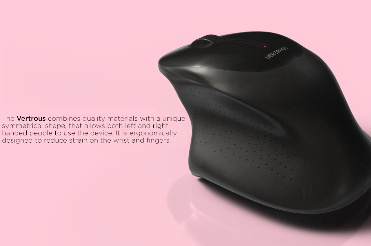
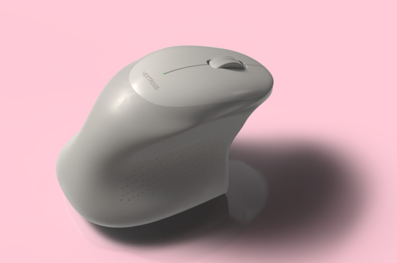
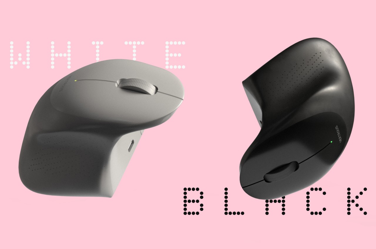
The proper solution would be to mix ergonomics and symmetry to create a mouse that is comfortable to hold for both kinds of people. Vertrous, a portmanteau of “vertical” and “ambidextrous,” takes its cue primarily from the plethora of ergonomic mice now in existence, most of which adopt a vertical design that attempts to reduce the strain placed on the wrist by offering a more natural grip. But rather than have your hand holding it sideways, you almost grip it like a claw, with your index and middle fingers still resting on top.

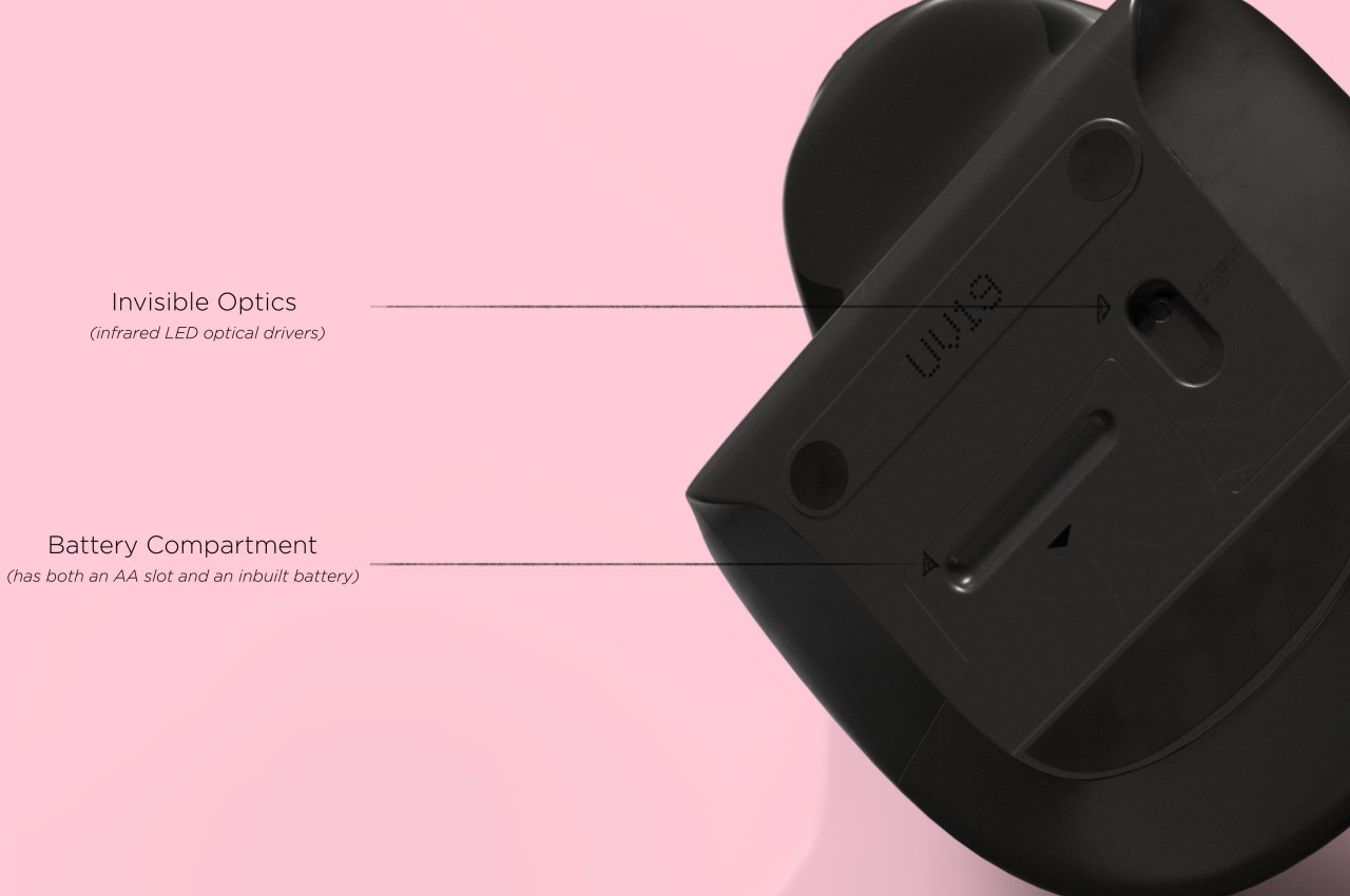
At the same time, the mouse’s shape is more or less equally balanced on both sides. Great care is taken to ensure that textured areas are found on both sides, so no one hand has the advantage over the other. That said, there are some features that can really be found in only one place, like the power button, but that’s really a minor detail that has no significant impact on the use of the mouse itself.

While Vertrous does present an interesting solution, there are still some considerations left unanswered by the design. For example, gripping the mouse like a claw could actually end up being more uncomfortable and strenuous than a regular mouse. The symmetrical design also leaves out features like extra buttons that would normally be found only on one side, an absence that many power users will feel acutely. These aren’t flaws per se but more like points for further improvement, paving the road for the day that we finally land on a standard ergonomic mouse design that will really leave no one out, whichever hand they prefer to use.

The post Ergonomic mouse concept gives left-handed users the comfort they deserve first appeared on Yanko Design.
A Lightweight Gaming Mouse That Elevates Your Gameplay Experience With Its Personalization Features

News for all the gamers around who are looking for a mouse upgrade! GravaStar, a renowned name in innovative gaming accessories, has recently introduced two amazing gaming mouse designs that promise to revolutionize the gaming experience. The Mercury M1 Pro and Mercury M2, the latest additions to GravaStar’s lineup, are now available for pre-order, capturing the attention of gamers worldwide with their advanced technology, ergonomic features, and customizable options.

Designer: GravaStar

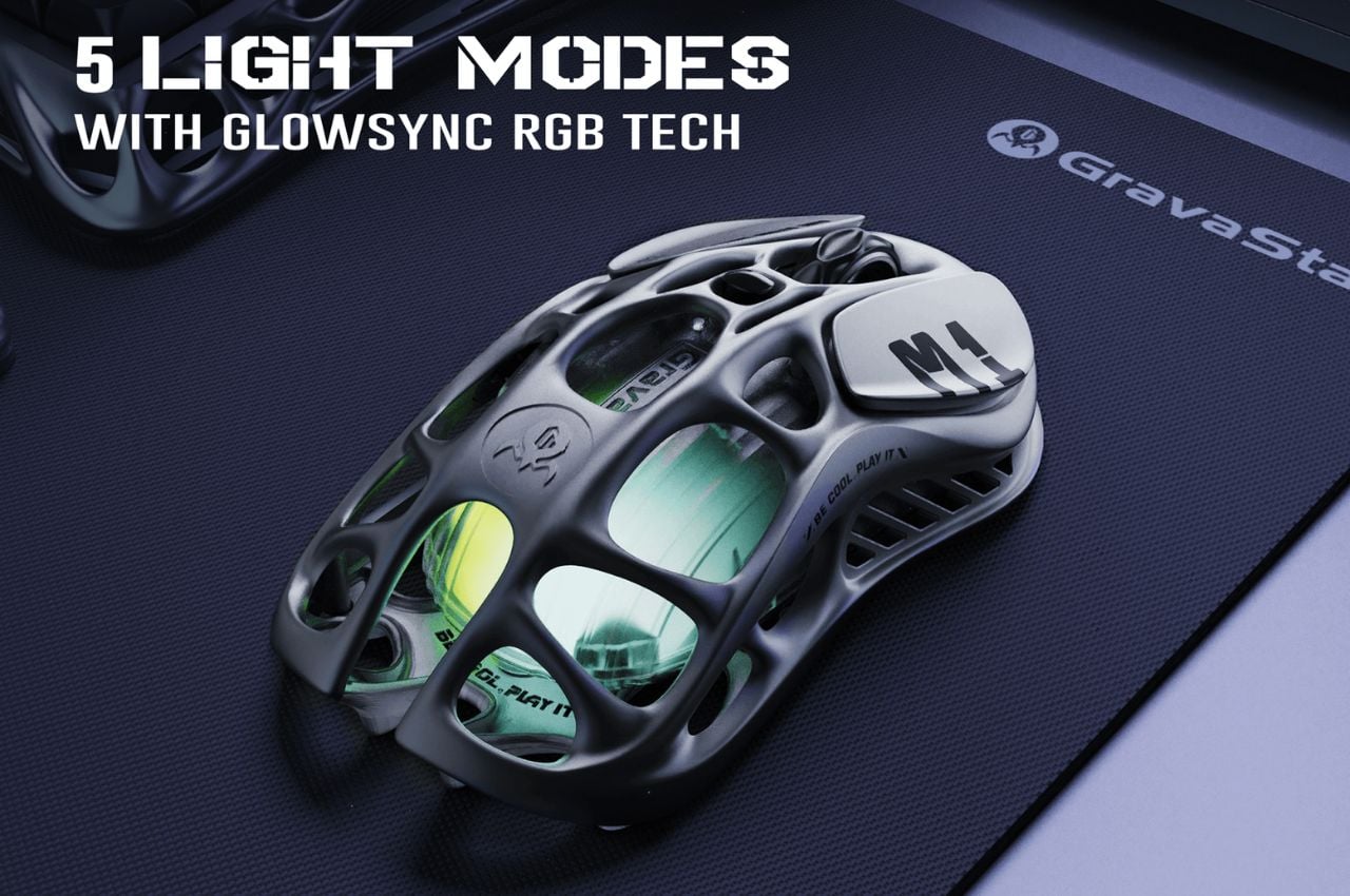
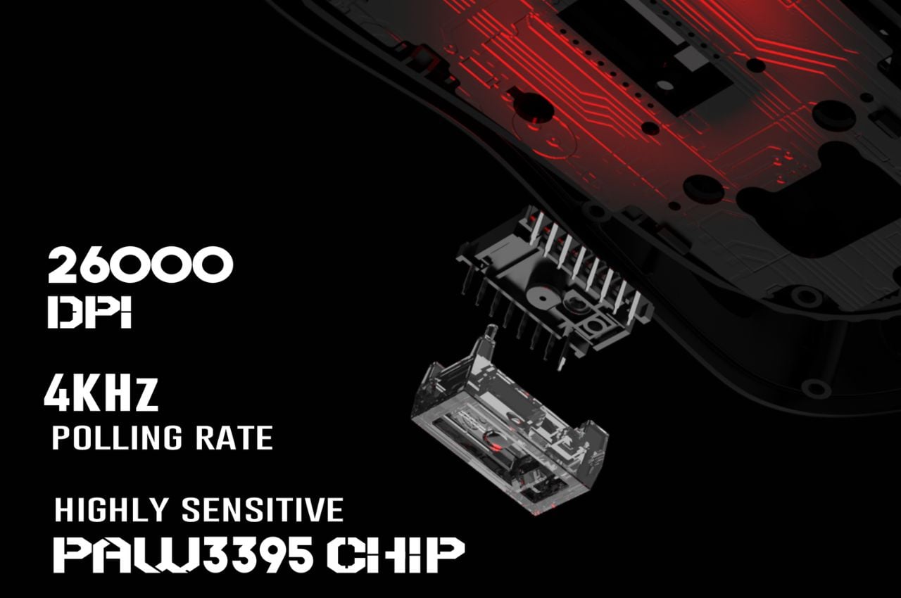
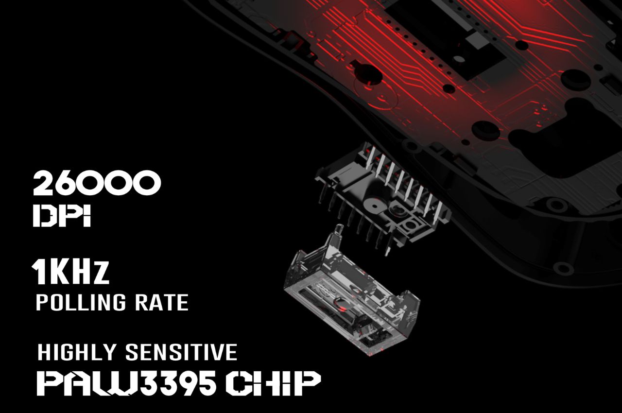
The Mercury M1 Pro stands out with its robust yet lightweight magnesium alloy body, available in two stylish versions: the Silver Mist, equipped with both 1K and 4K dongles and the Gunmetal Gray, featuring a 1K dongle. The gaming mouse boasts a high-precision 26,000 DPI sensor powered by the PAW3395 chip, ensuring unparalleled accuracy in every movement.

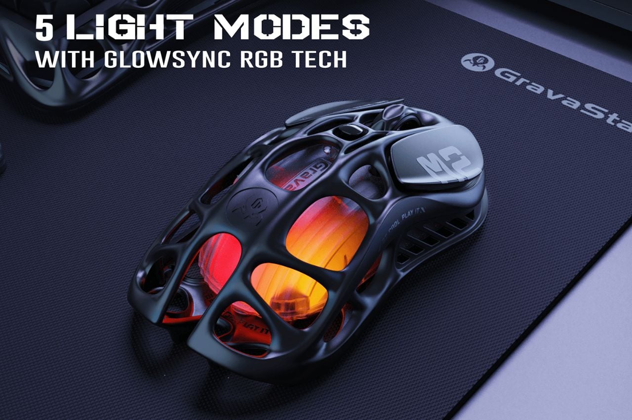
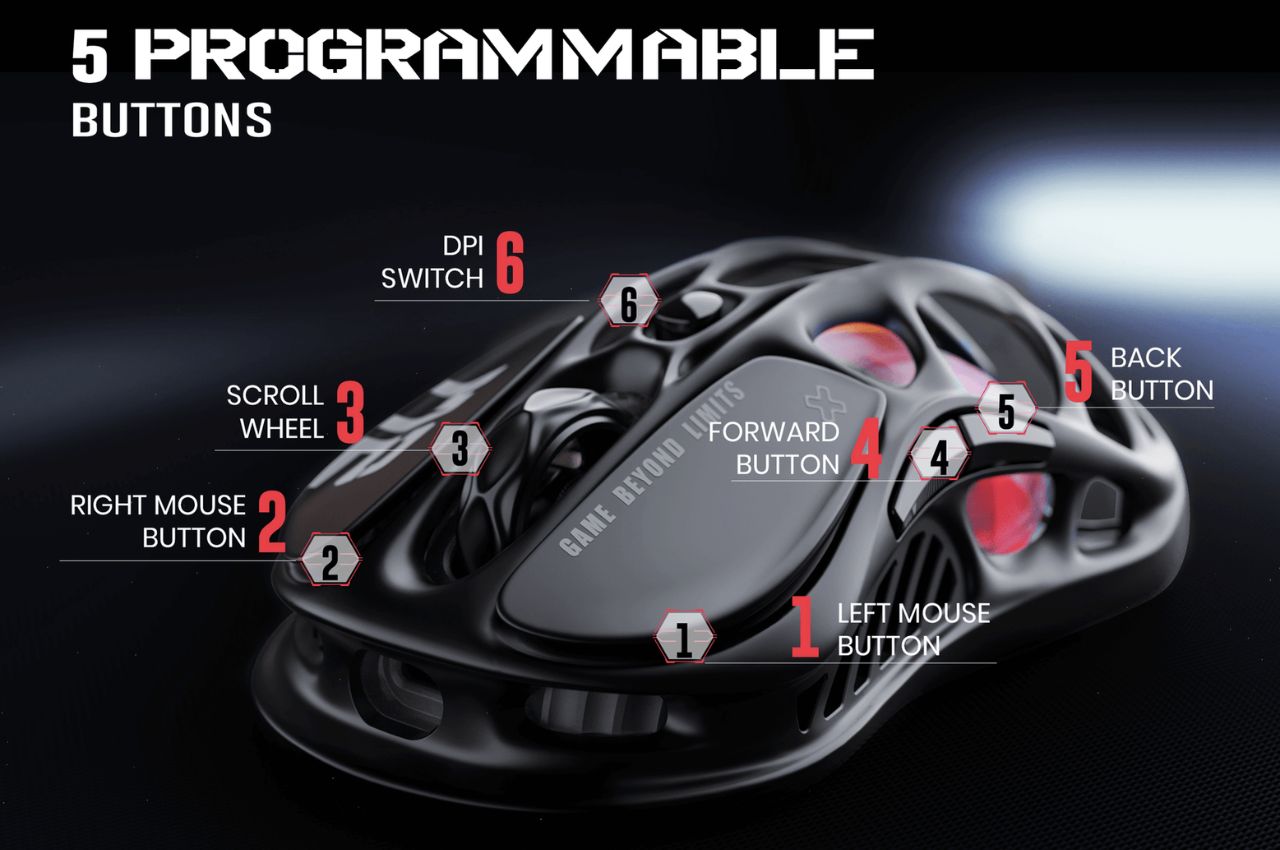
The TUROSPEED Wireless Technology embedded in the M1 Pro guarantees a stable and reliable connection, essential for intense gaming sessions. The mouse’s customization options include GLOWSYNC RGB lighting and five programmable buttons, allowing gamers to tailor their experience to their unique preferences.

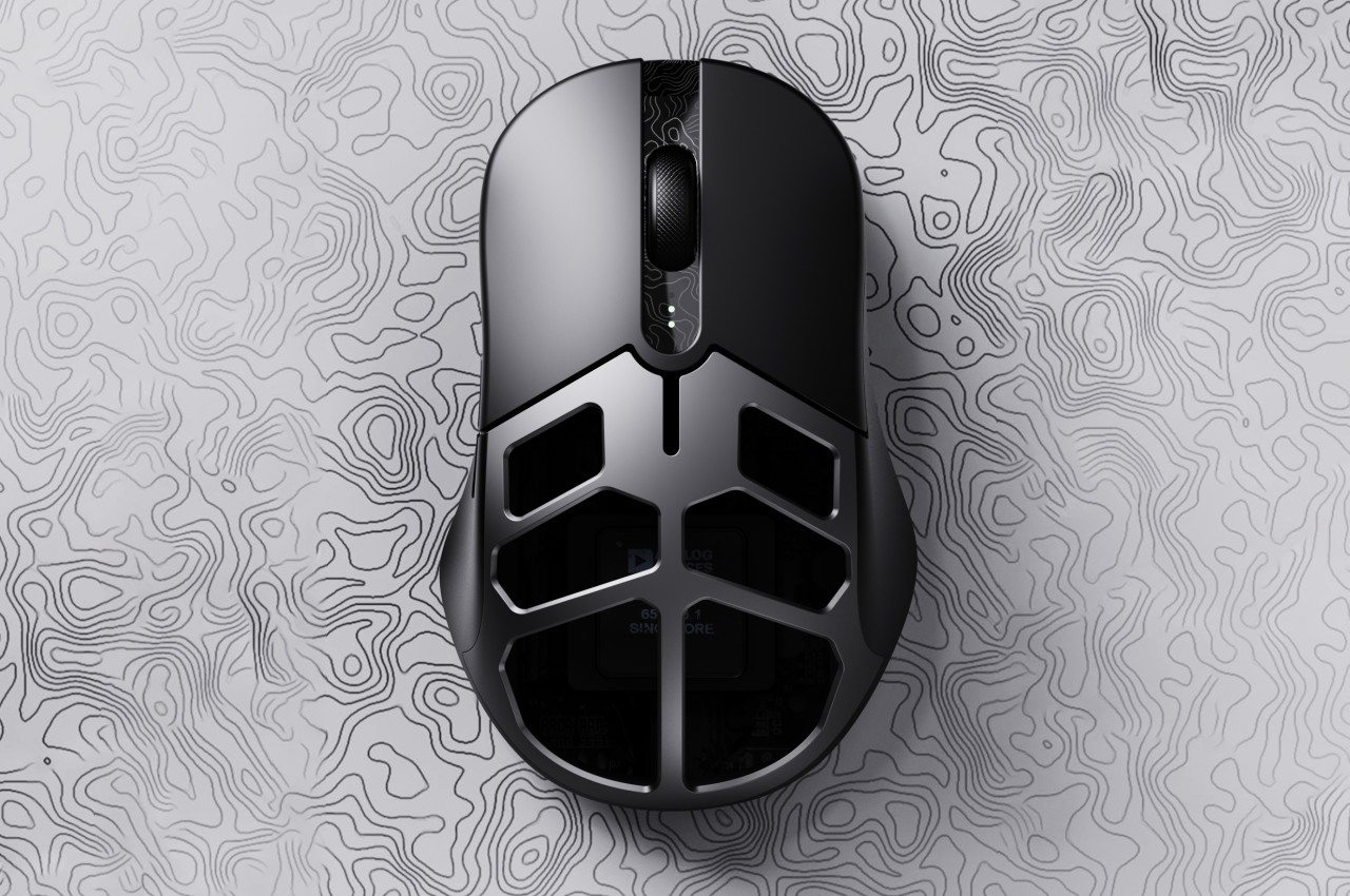
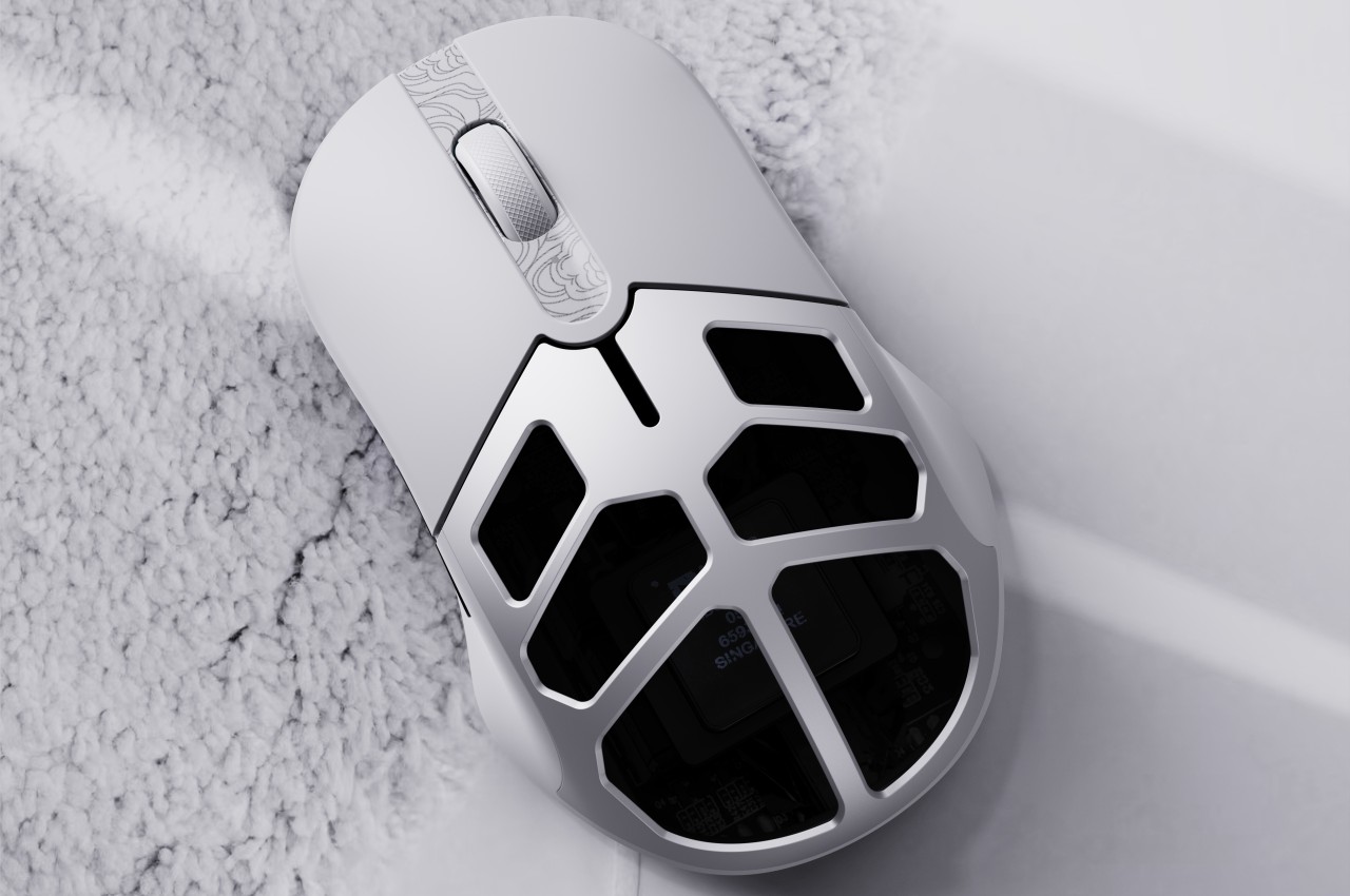
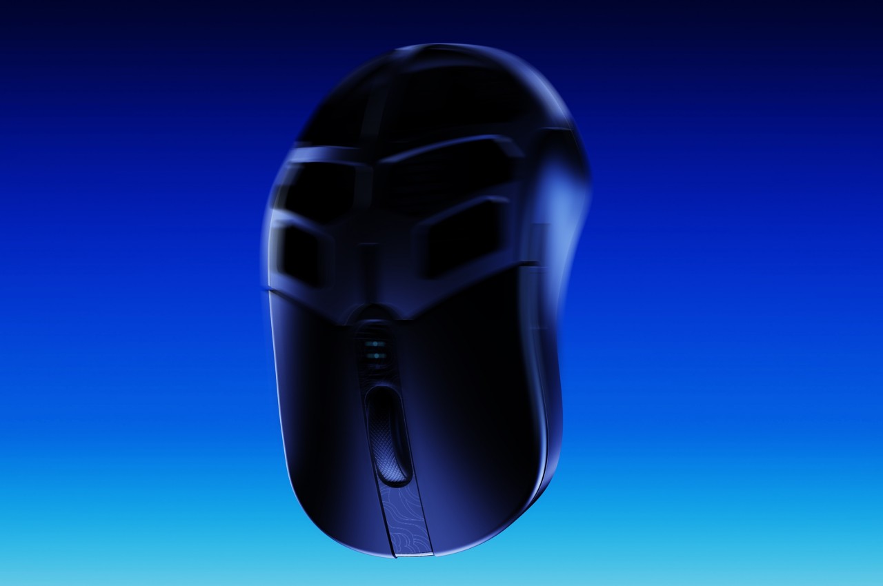
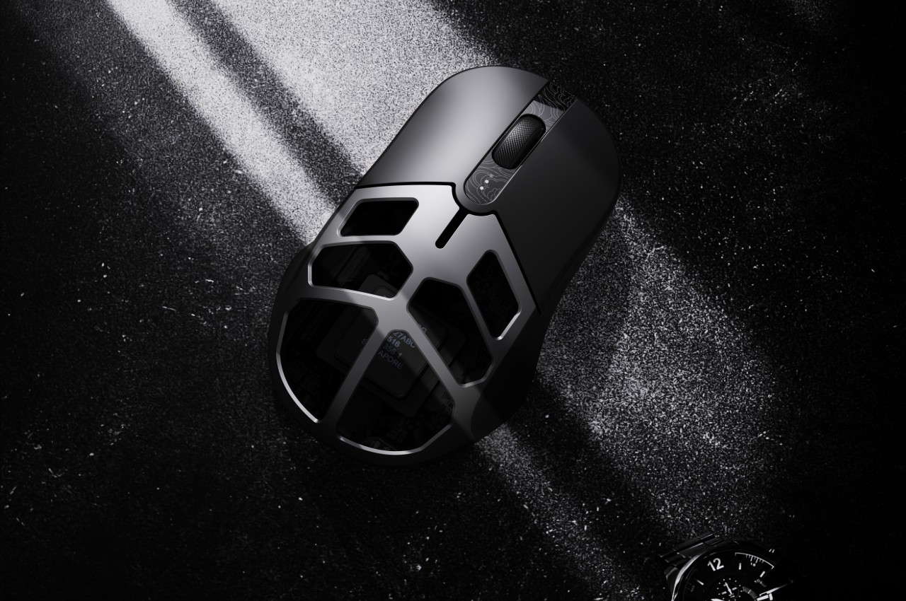
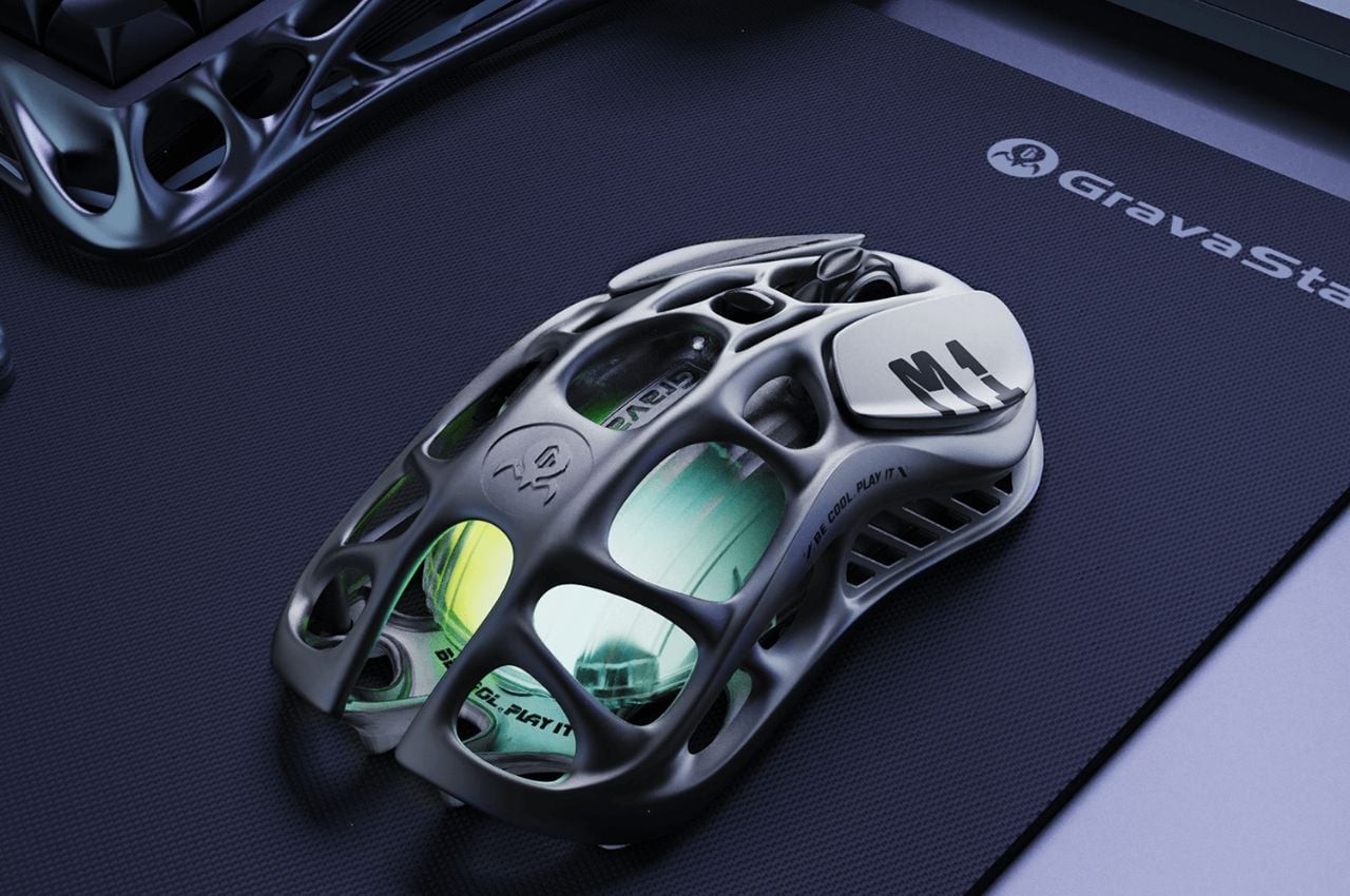
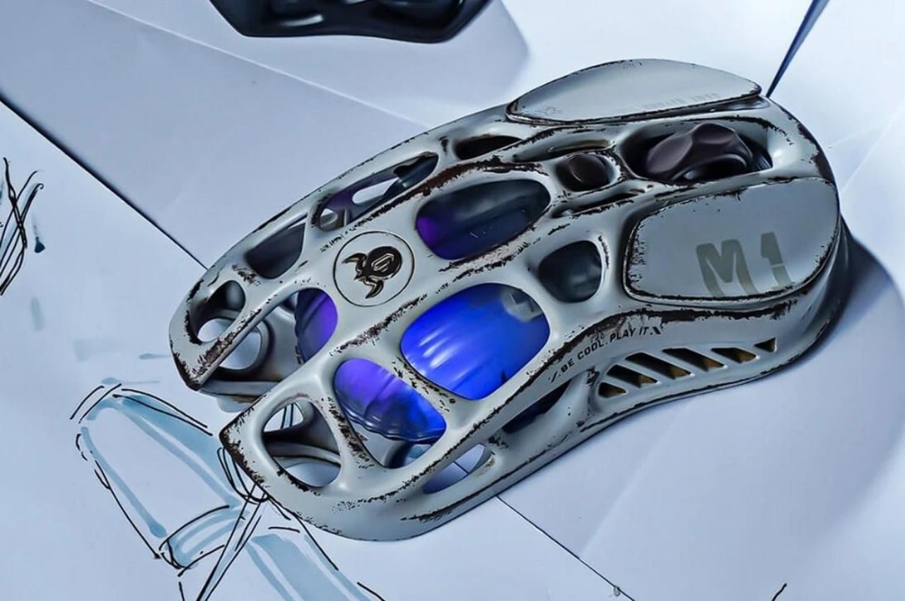
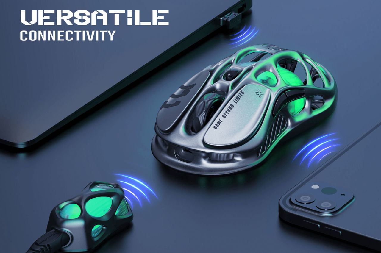
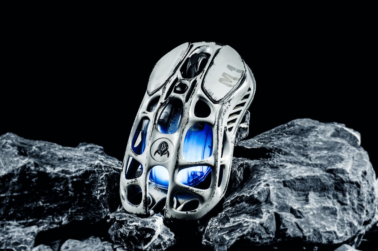
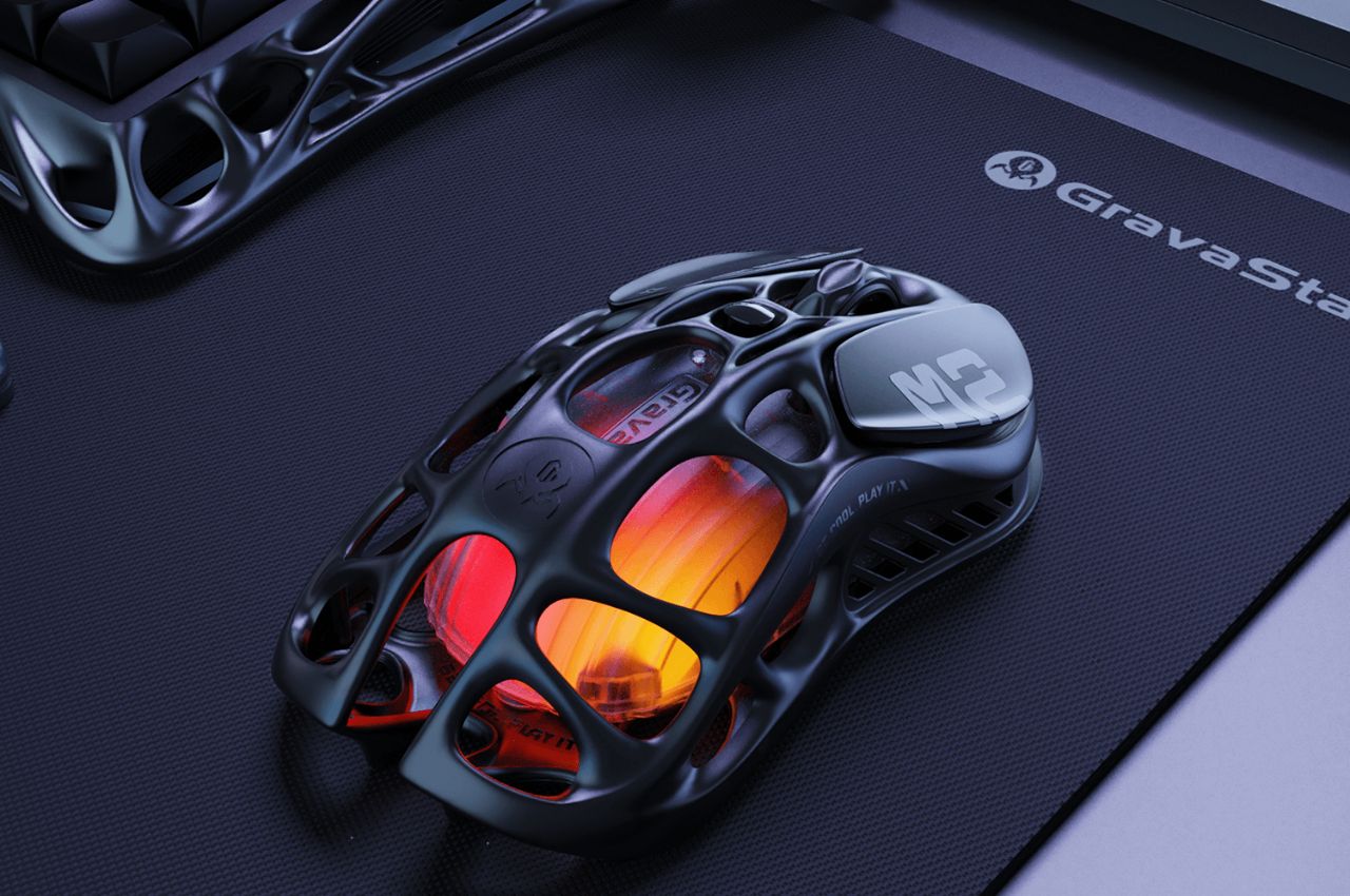
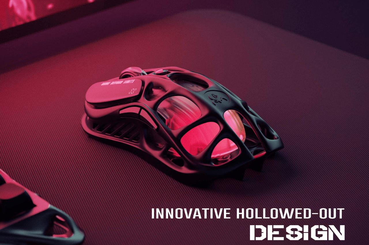
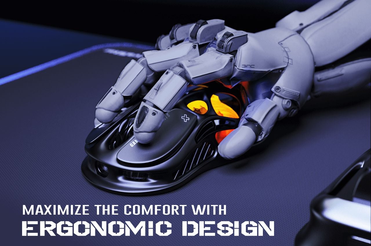
The Mercury M2 takes a different approach with its distinctive hollowed-out design, reducing the weight to a mere 79 grams. This innovative design not only makes the mouse lighter but also enhances airflow, keeping your hand cool during extended gaming sessions. Like its counterpart, the M2 features a high-accuracy 26,000 DPI sensor, a 1K Hz polling rate, and offers versatile connectivity options, including 2.4G, Bluetooth, and wired connections.

The M2’s adaptability extends to its customizable features, including five LIGHTSYNC RGB modes and programmable buttons. Gamers can seamlessly switch between different modes to match their gaming environment and style.

The Mercury M1 Pro and M2 gaming mice by GravaStar boast an impressive set of specifications tailored to meet the demanding needs of gamers. Crafted with a magnesium alloy construction, these mice combine strength with a lightweight design. The high-precision 26,000 DPI sensor, powered by the PAW3395 chip, ensures unparalleled accuracy in every movement. The incorporation of TUROSPEED Wireless Technology guarantees a stable and reliable connection during intense gaming sessions.

The innovative hollowed-out design of the mice not only reduces weight for enhanced maneuverability but also improves airflow, keeping hands cool during extended gameplay. Operating at a 1K Hz polling rate, these gaming mice provide a responsive and lag-free experience. Beyond their technical prowess, these gaming mice embody the vision of Yong Huang, the creative mind behind GravaStar, who meticulously designed them with a focus on merging performance and aesthetics. Far from being mere peripherals, the Mercury M1 Pro and M2 exemplify GravaStar’s commitment to producing durable, lightweight, and highly customizable gaming devices that resonate with the discerning preferences of gamers.

As gamers eagerly await the release of the Mercury M1 Pro and M2 gaming mice, it’s evident that these devices go beyond being simple tools. They reflect GravaStar’s dedication to enhancing the gaming experience through innovative design and personalization. Whether opting for the sleek Silver Mist or the robust Gunmetal Gray, users are choosing devices poised to elevate their gaming to new heights with precision, comfort, and style.

The post A Lightweight Gaming Mouse That Elevates Your Gameplay Experience With Its Personalization Features first appeared on Yanko Design.
This curved vertical ergonomic mouse helps lessen fatigue on your hand

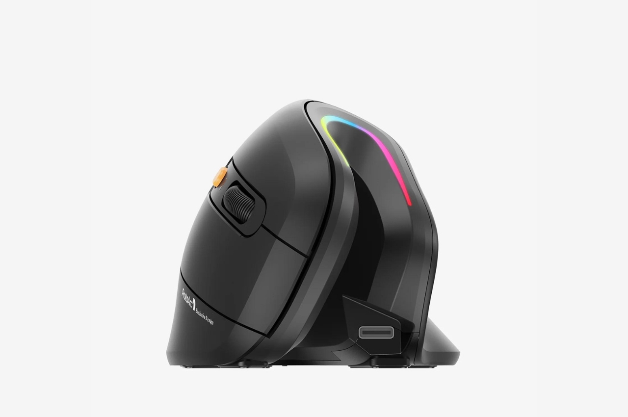
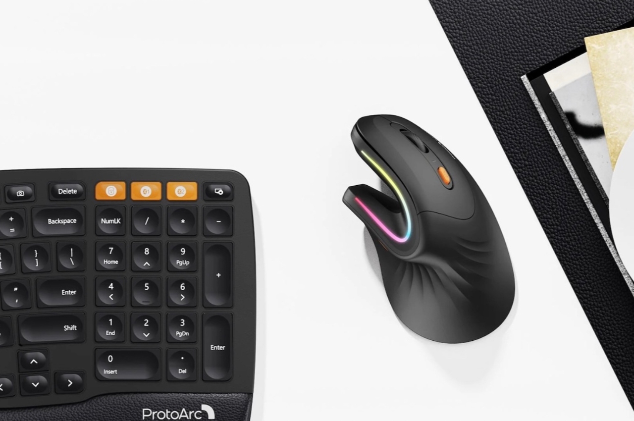
As someone who has not used a mouse since I switched to Mac years ago, the idea of mouse fatigue is foreign to me. But I do know a lot of people who spend more than half of their day in front of the screen and with a mouse to guide them most of the time and they testify that it can take a toll on your hand and fingers. There are several ergonomic options out there but this one from Protoarc seems to be unique and even more ergonomic than the usual ones out there.
Designer: Protoarc

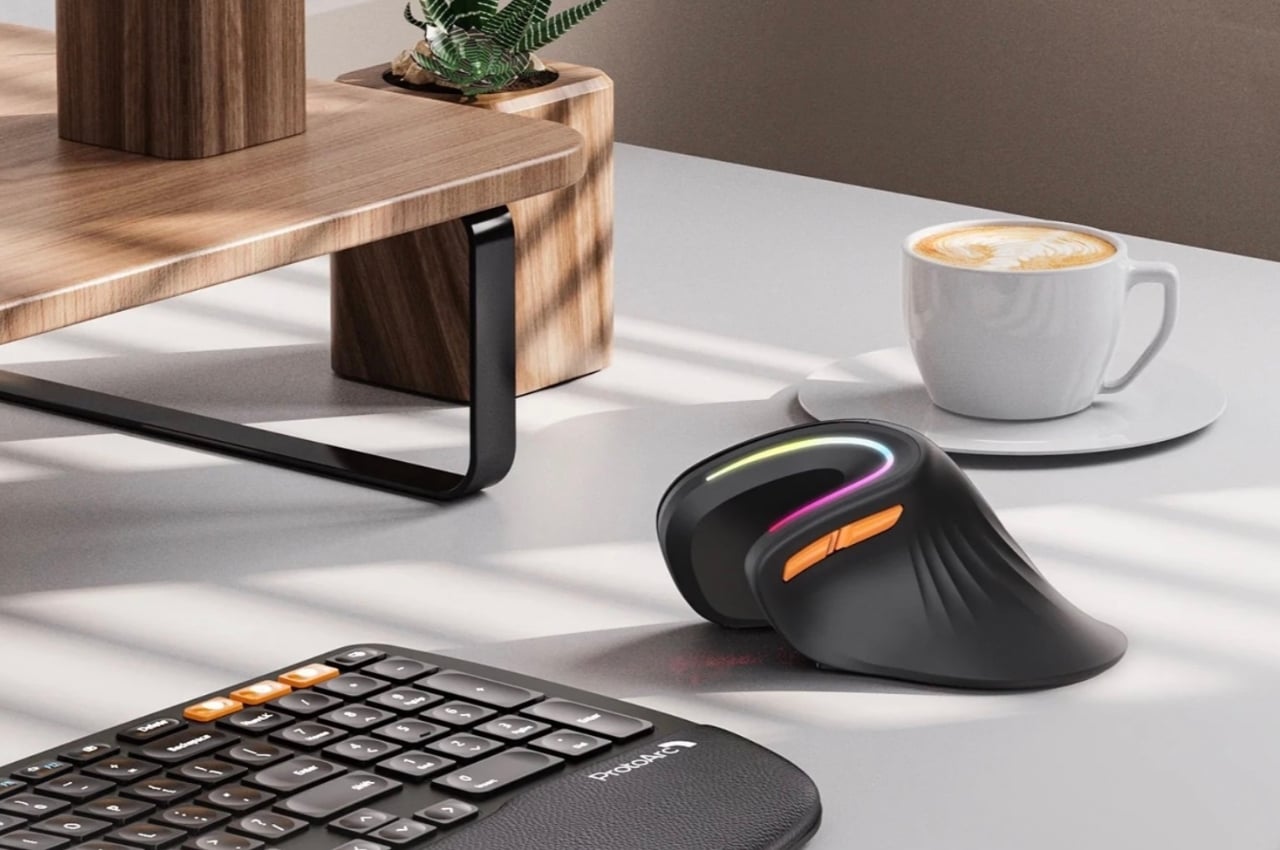
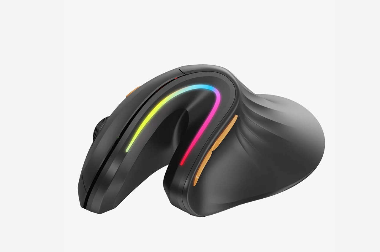
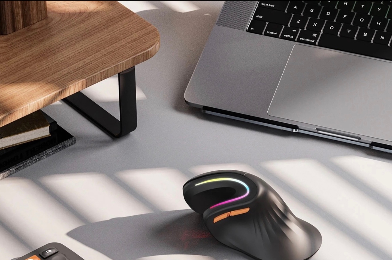
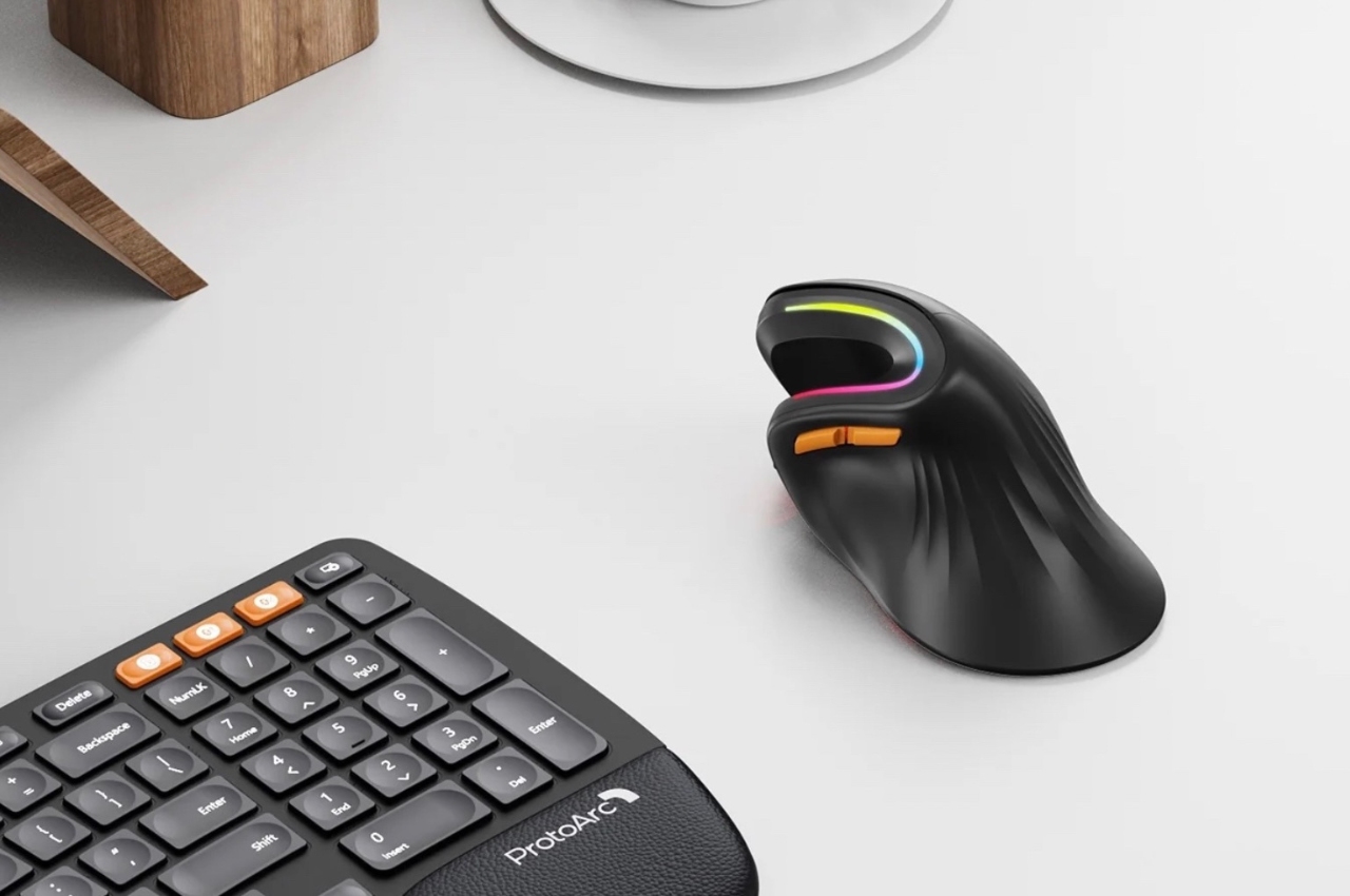
The EM11 RGB Wireless Ergonomic Vertical Mouse lets you have a more relaxed position when using the device, especially if you’ll be using it for long periods. The ergonomics vertical grip gives you a more natural position for your hand and will also supposedly give you fatigue resistance because of the way you use it and the way it’s designed. It should be able to reduce the strain on your arm, wrist, and hand and also is more convenient with its back and forward thumb buttons.

If you’re using multiple devices, the mouse is able to switch connection mode through low bluetooth with up to 3 devices and with three different available DPI for high precision control. And if you prefer something a bit more stable, you can also connect it to your computer through a USB receiver. It also has four different RGB light modes to match your mood while working or playing: neon, monochromatic, streamer, breathing. The battery life is also pretty impressive as it can last up to 90 days on a single charge.

With a lot of people staying in front of screens more hours every day, whether for work or for play, it’s really important to have ergonomic devices like these so we lessen the fatigue on our body. If I was still using a mouse, I would probably use something like this as the design seems more natural than your usual mouse devices.

The post This curved vertical ergonomic mouse helps lessen fatigue on your hand first appeared on Yanko Design.