Huawei’s latest Tri-Fold Smartphone Concept creates an IMPOSSIBLE Task for Phone Case Makers…

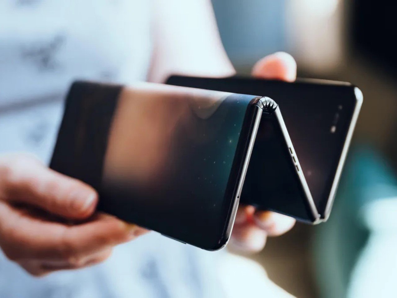
A photo of TCL’s tri-fold smartphone concept

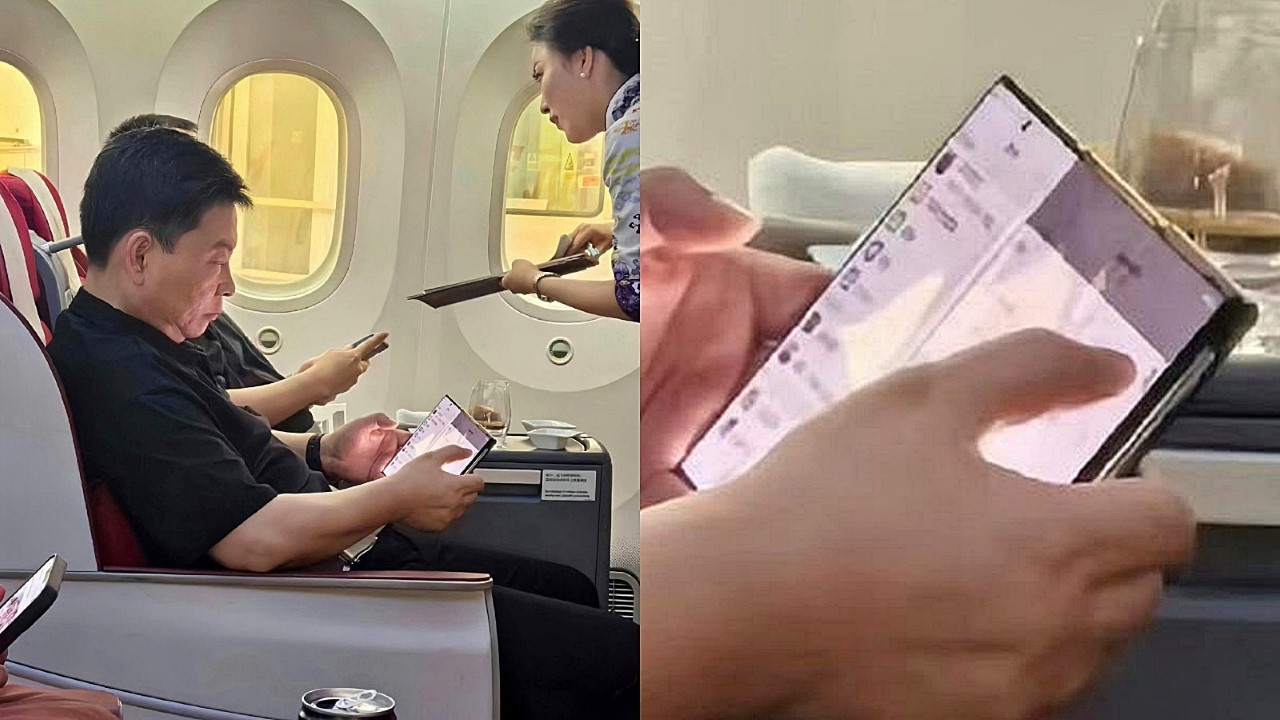
Spotted in the wild in the hands of Huawei CEO, it seems like the Tri-Fold smartphone may just end up becoming a reality. Whether we need one is an entirely separate question (has that truly ever stopped tech companies?), so let’s ask ourselves something more relevant – How would you design a protective case for this new breed of smartphone?

A brief recap on the phone itself – photos of Richard Yu, CEO of Huawei, emerged last week holding a strange smartphone. It was a foldable, but unlike conventional flip or fold phones, this one had three panels with two hinges (sort of like this wild Samsung concept from 2020). Dubbed the tri-fold, this phone managed to get quite a bit of coverage on the internet, with people speculating tech specs, launch dates, and even one Twitter (or X) user wagering a price of $4000 USD. Nevertheless, when I saw the phone, I had three distinct thoughts in this exact order.

A. Wow, that’s an impressively thin tri-fold phone.
B. Is there really a market for this?
C. There’s absolutely no way you can make a case or screen guard for this phone.
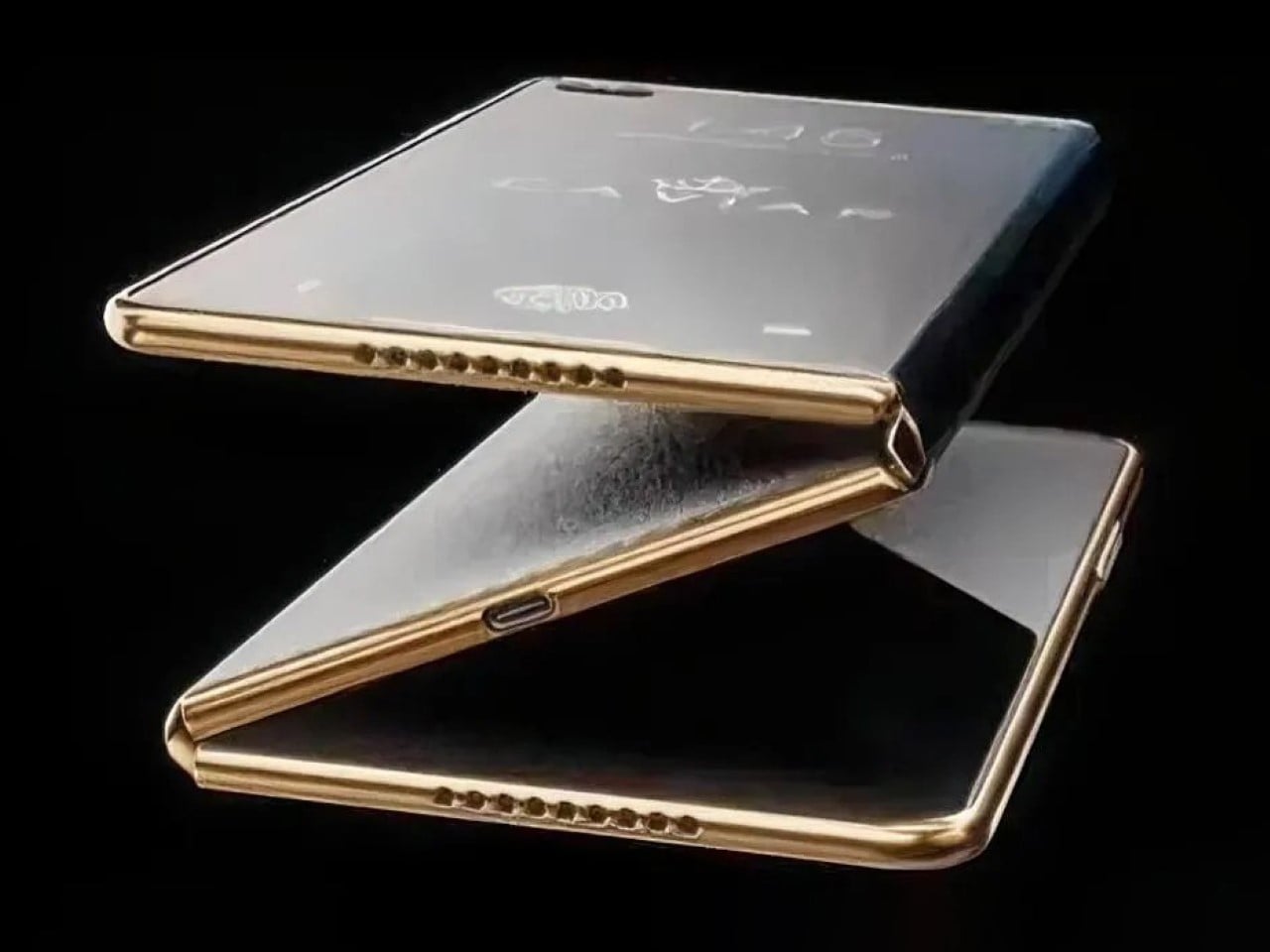
I’ve made an illustration below of what the phone would look like if you went about designing a case for it (and why the case wouldn’t work), and I’ve also taken the liberty of designing what I believe is the only possible case style you can make for such a phone.

With regular foldables, the obvious way to make a case is to design a two-part case that protects the bumper around the front, and the entire back. Regular smartphones have two displays, one front-facing one, and another folding one, and it’s important to remember that the case should never obstruct the display. With Huawei’s Tri-Fold, however, you’ve actually got one single display zigzagging from the front to the inside. Look at the image above and you’ll understand what I mean. Designing any sort of case (with as many parts as possible) complicates the phone’s usage rather than protecting it. Think of the obvious 3-part case that snaps onto all three panels and you’re faced with two massive problems – firstly, the case obstructs the screen when you look at how it fits on the middle panel. Secondly, shutting the case would mean having it sandwiched within the phone’s panels and probably press/damage the display… sort of like shutting your laptop screen with a charging cable, USB drive, or even your keys kept on the keyboard.

An impossible case design shown in red, and the only plausible case design shown in green.

The only real way you can make ANY sort of protective case for the Tri-Fold is to design one single part that fits only on the rear of the back panel. This means the first two panels don’t get any form of protection (because they can’t, really), leaving more than 60% of your phone vulnerable to drops, etc. The most you can really do is add a bumper protector to the front that only covers the edges, but that still leaves the middle panel (the most crucial panel in my opinion) to damage. It’s safe to say that screen protectors are out of the question too – something that still wasn’t a problem for regular two-fold smartphones, because you can still shield the front-facing screen with a plastic or tempered glass protector.
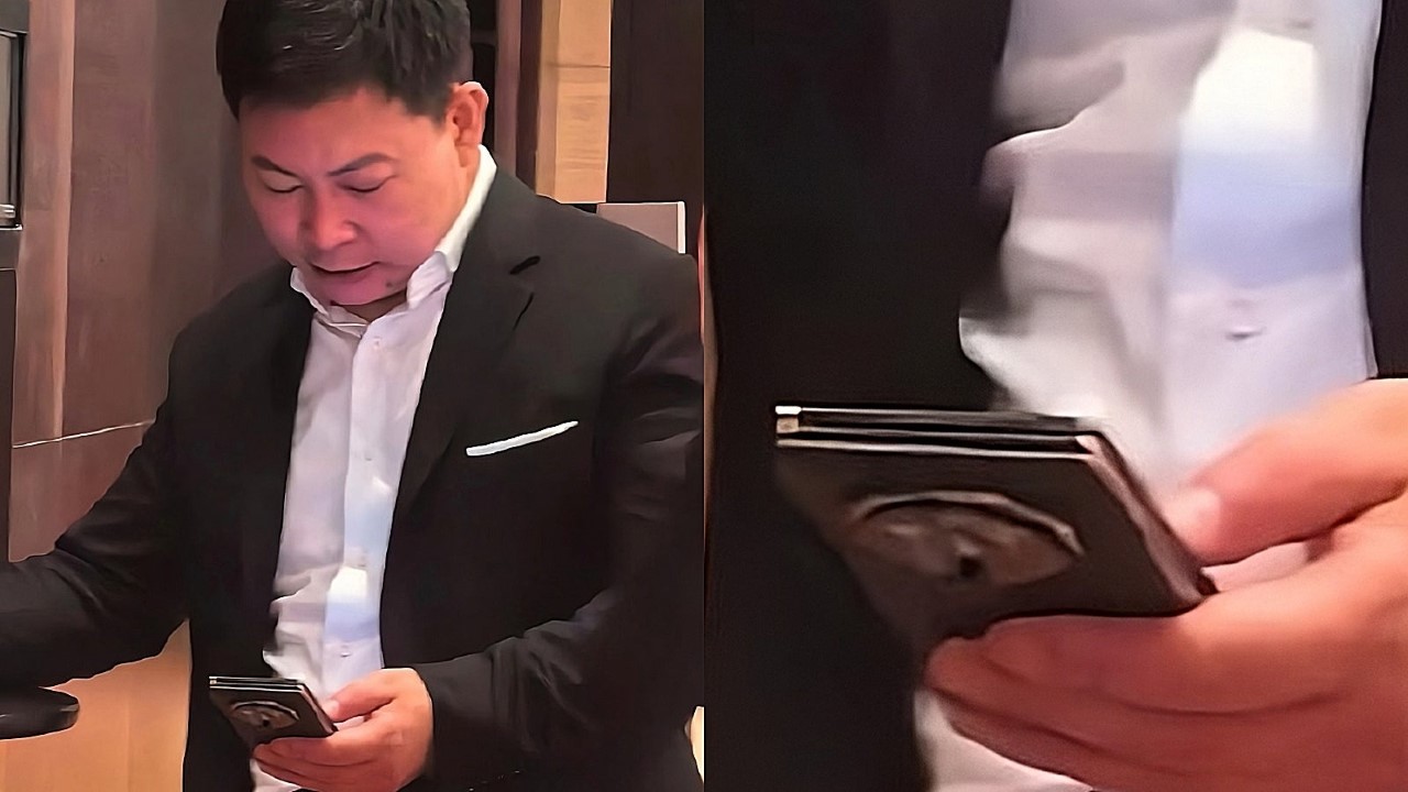
Huawei CEO Richard Yu pictured holding a prototype of Huawei’s alleged tri-fold smartphone

That basically puts a lot of pressure on Huawei to make sure this phone is rock-solid… which is already a pretty big challenge considering they also need to make the phone slim, and ensure that those hinges work with 100% reliability. The hinges are a separate issue too, given that so much depends on both hinges working flawlessly every time to ensure you have a flat screen when you open your phone completely. The one standout positive with this phone is that at least it gives you a more palatable aspect ratio when opened completely, as compared to the current foldables that give you a weird square display that doesn’t really work well with landscape OR portrait media. For now, details on the Huawei Tri-Fold are incredibly scant, although PhoneArena does a pretty good job speculating and gathering as many rumors to paint a full picture of this absolutely wild device. Whether it’s a good idea to make a dual-hinge tri-fold phone with an alleged $4000 price tag is still an entirely different debate.
The post Huawei’s latest Tri-Fold Smartphone Concept creates an IMPOSSIBLE Task for Phone Case Makers… first appeared on Yanko Design.
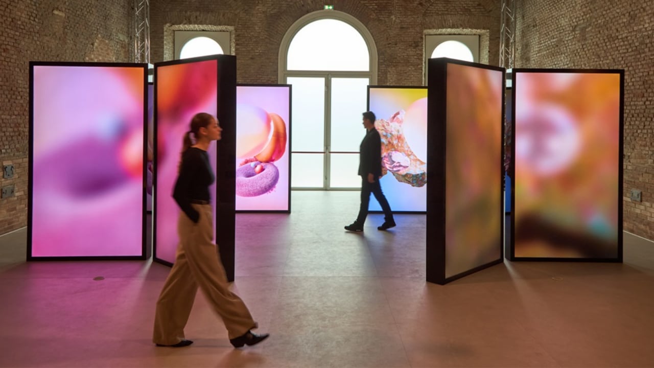
Samsung’s Visual Display of Essential, Innovative, Harmonious Design at Milan Design Week 2024

At Milan Design Week 2024, Samsung Electronics unveiled its “Newfound Equilibrium” exhibition. This impressive showcase is all about Samsung’s forward-thinking design philosophy, which they call “Samsung Design Identity 5.0: Essential∙Innovative∙Harmonious.” It focuses on drawing inspiration from people and shaping the future. Samsung has over 1,500 designers spread across seven global studios, all working to keep their design language fresh and relevant for their customers.

Designer: Samsung

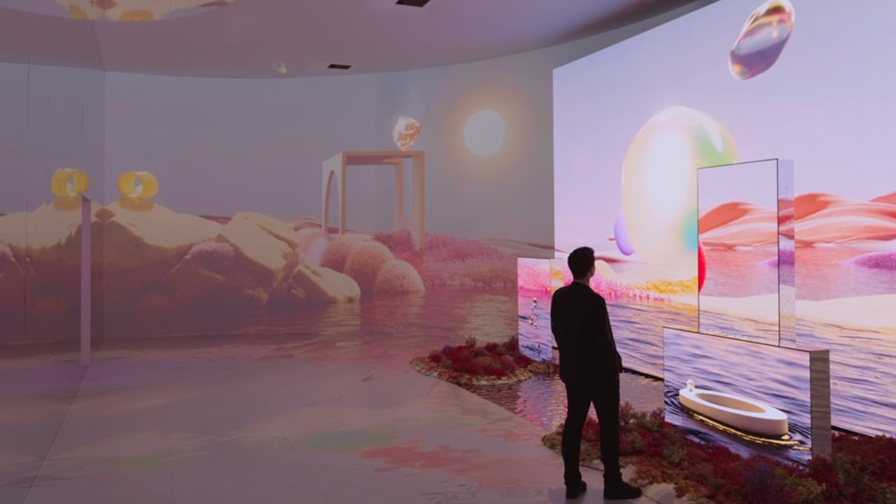
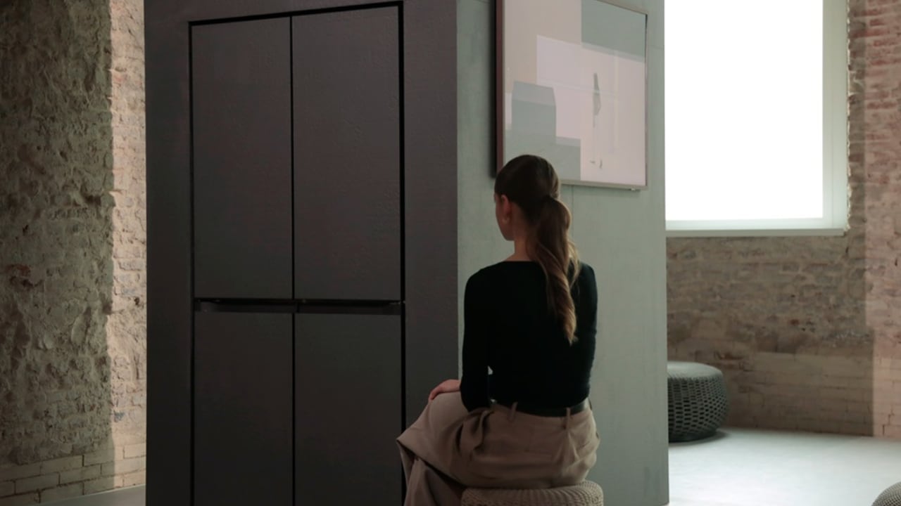
INNOVATIVE, the second exhibition space of Samsung Design’s Newfound Equilibrium

The exhibition is in the Leonardo da Vinci National Museum of Science and Technology in Milan, specifically in Le Cavallerizze. This place is a mix of 16th-century architecture and modern design, showing off Samsung’s knack for blending old and new.

Leonardo da Vinci National Museum of Science and Technology in Milan, Italy, where Samsung Design’s Newfound Equilibrium exhibition is being held.

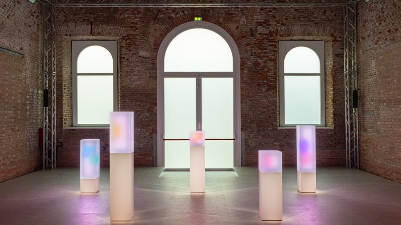
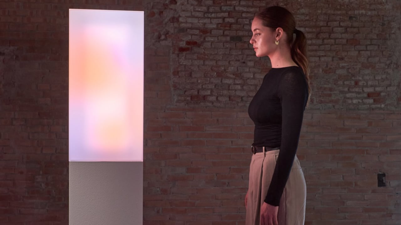
First up in the exhibition is the “Essential” area. This is all about getting back to basics and focusing on what really matters. It’s shown in the sleek design of the Galaxy S24 series and some really practical home appliances like the all-in-one washer and dryer. There are also some awesome minimalist installations with translucent cubes and playful lighting that really get the point across.

ESSENTIAL, the first exhibition space of Samsung Design’s Newfound Equilibrium

ESSENTIAL, the first exhibition space of Samsung Design’s Newfound Equilibrium

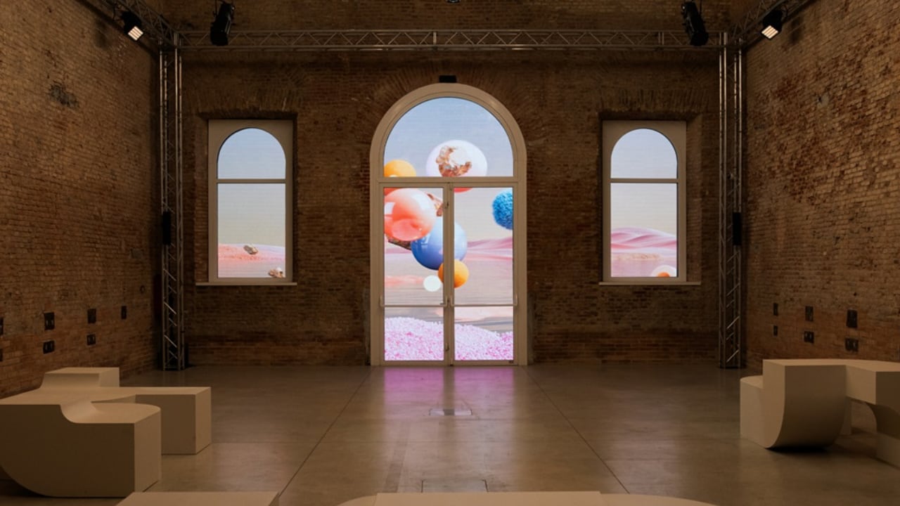
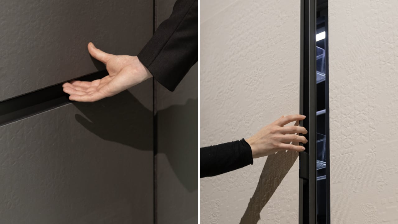
Next, we move to the “Innovative” section. Here, Samsung shows off its drive to make everyday life better with functional advancements. There are interactive displays that change based on how close you are to them, just like Samsung’s smart TVs and vacuum cleaners that adapt to your needs. This part really shouts about Samsung’s ambition to push tech boundaries.

A display shown at INNOVATIVE, the second exhibition space of Samsung Design’s Newfound Equilibrium, displays forms that shift from solid to ethereal textures as guests move closer or farther away.

INNOVATIVE, the second exhibition space of Samsung Design’s Newfound Equilibrium

INNOVATIVE, the second exhibition space of Samsung Design’s Newfound Equilibrium

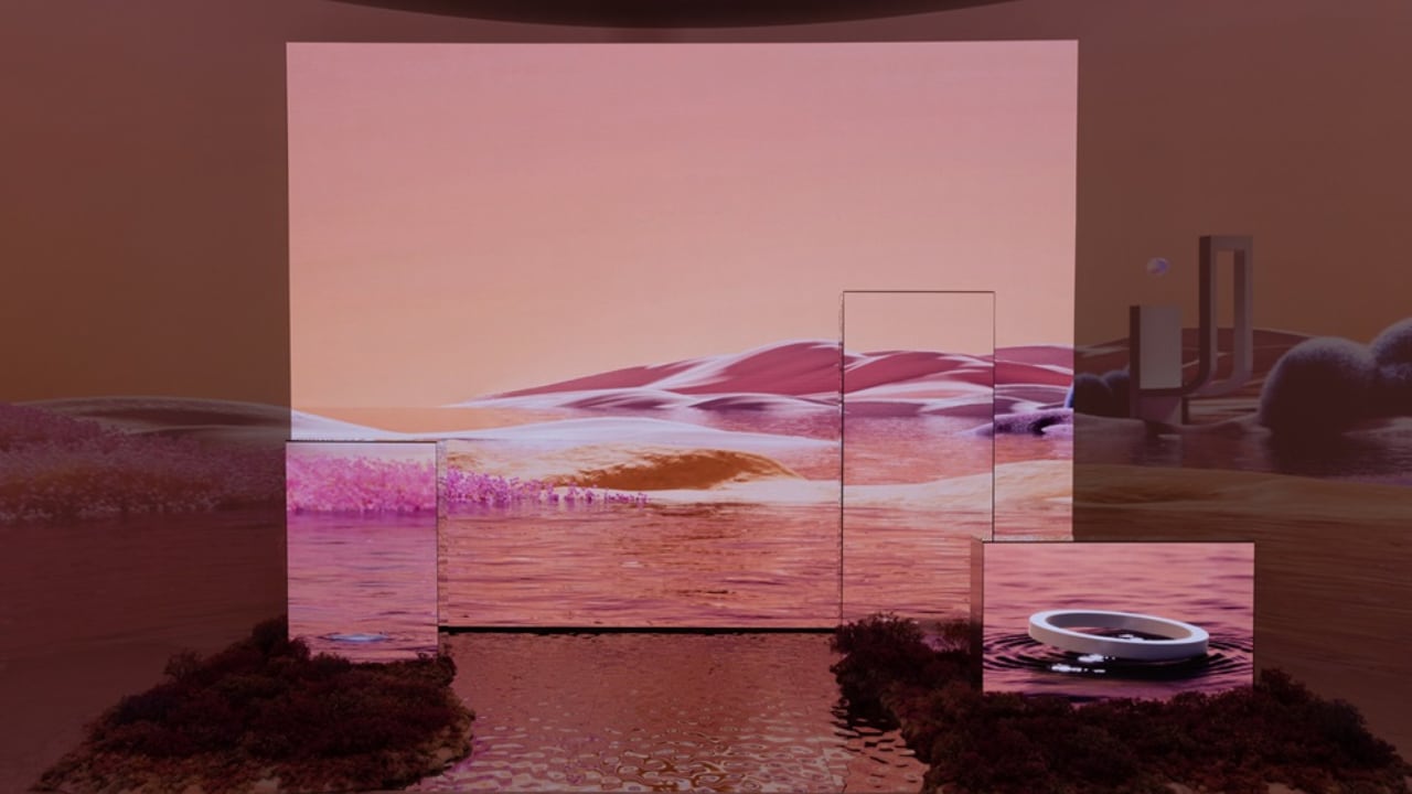
Then there’s the “Harmonious” section. This is all about how tech can blend into daily life, like the SmartThings ecosystem and the Music Frame that enhance your home without taking over. There are interactive LED displays that mimic natural events, inviting visitors to imagine a world where tech fits in naturally with human and environmental needs.

HARMONIOUS, the third exhibition space of Samsung Design’s Newfound Equilibrium

The exhibition wraps up with the “Infinite Dream” and “New Dawning” spaces, which celebrate the blend of modern tech with traditional craftsmanship, through collabs with artisans like MUTINA and ALPI.

INFINITE DREAM, the fourth exhibition space of Samsung Design’s Newfound Equilibrium

In a nutshell, the ‘Newfound Equilibrium’ exhibition at Milan Design Week 2024 shows off Samsung’s big ideas about the future of tech and design. It’s about tech and design, living together, and making life better for people all over the world. Samsung’s ongoing commitment to thoughtful and progressive design is clear, and it’s really exciting to see what they’re doing to make tech a force for good in our lives.

Bespoke creations that blend modern technology with traditional craftsmanship are showcased at NEW DRAWING, the concluding exhibition space of Samsung Design’s Newfound Equilibrium.

The post Samsung’s Visual Display of Essential, Innovative, Harmonious Design at Milan Design Week 2024 first appeared on Yanko Design.
This modular handheld console puts force feedback at the forefront

Alternative handheld gaming console designs featuring unique styles are steadily growing in popularity. Take the PocketMan P1 concept as a close example of that trend; an all-chrome hybrid handheld with the form factor of a GameBoy Color mixed with the performance and wide functionality of a Nintendo Switch or a Steam Deck. At the same time, advanced haptics and force feedback are growing more popular in mainstream gaming – especially with the PlayStation 5 dominating the current console market – and it makes sense that designers are inevitably going to try to one-up the incredible DualSense controller with their own designs.

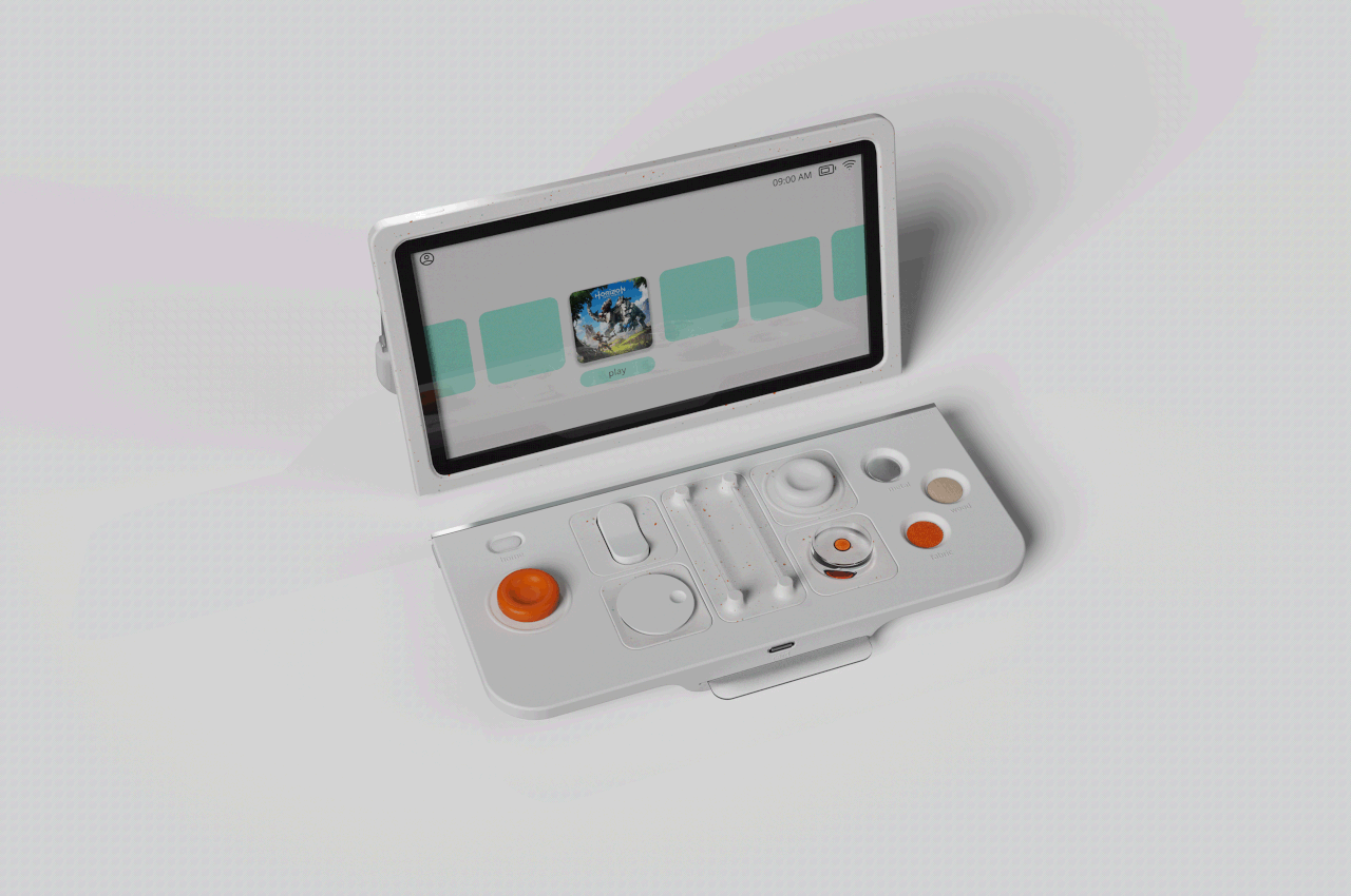
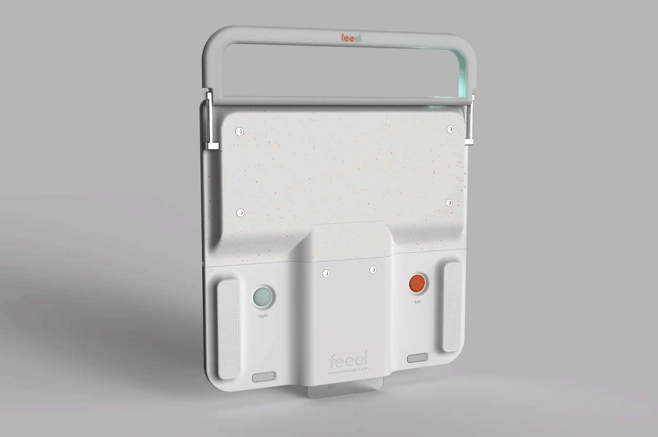
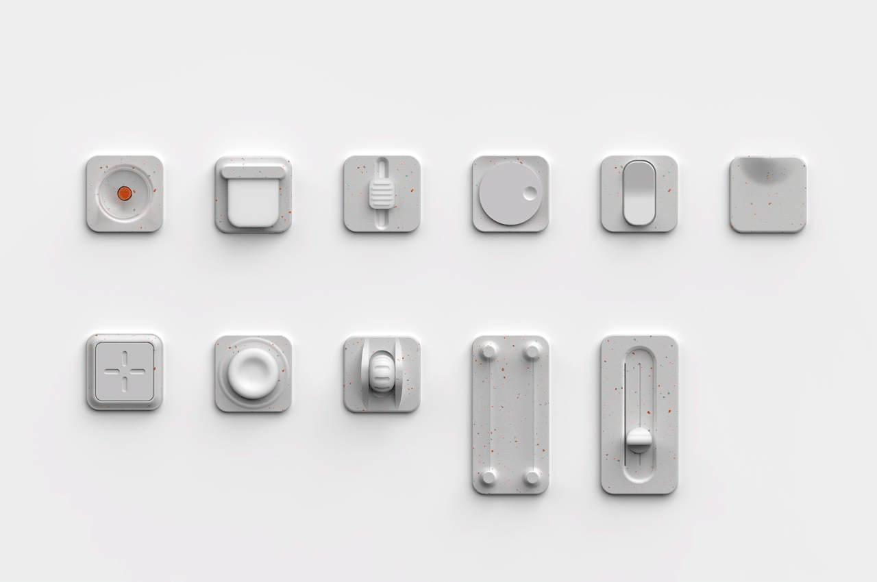
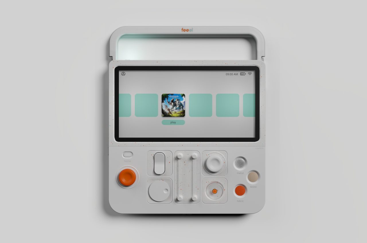
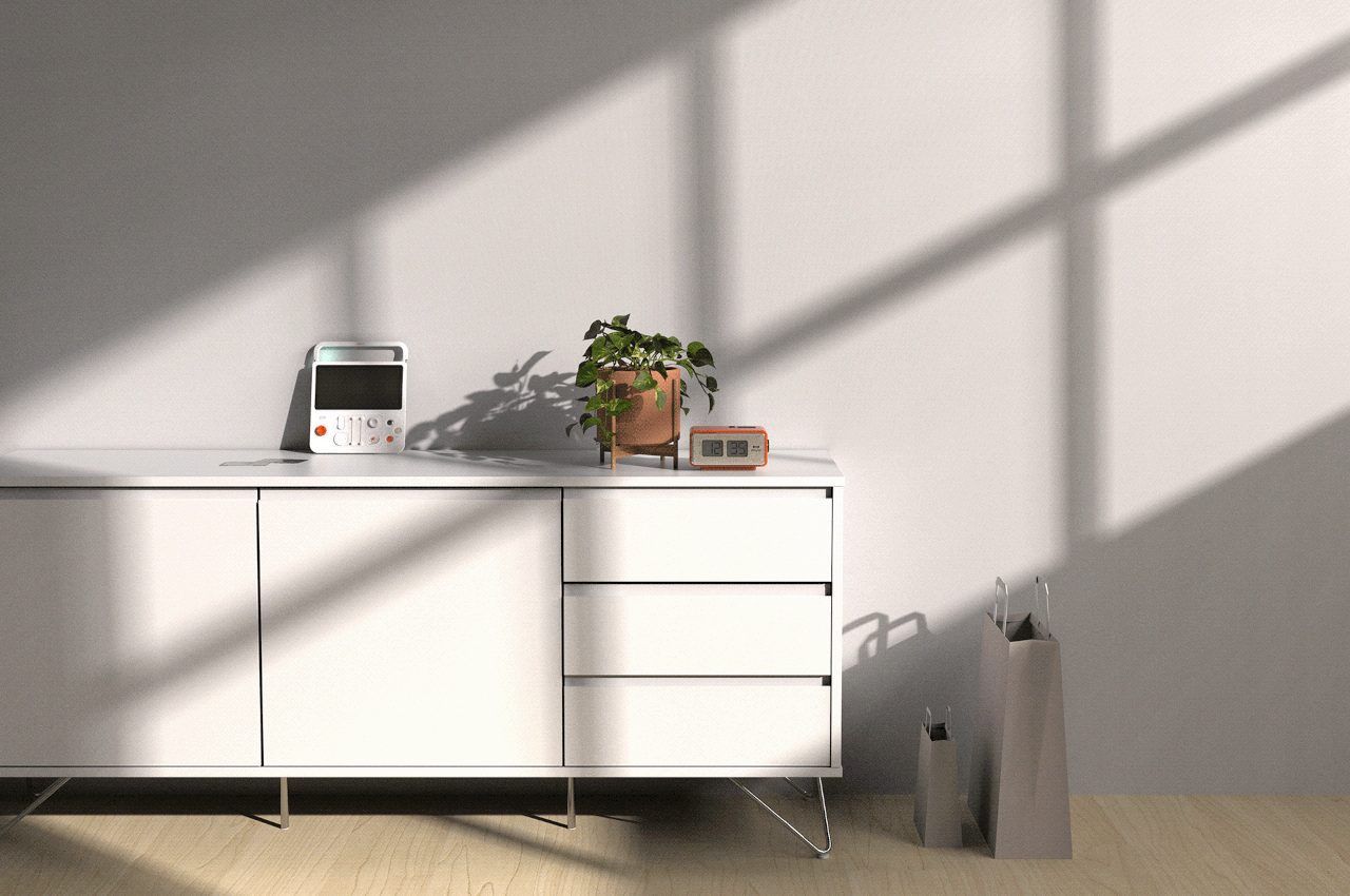
Enter the feeel handheld gaming system. No, that wasn’t a typo. Conceptualized in a recent BA thesis by Jasmin Kappler, a student at the University of Applied Sciences Potsdam, the feeel is a concept handheld designed to maximize the sensory experience of the user by conveying precise haptic feedback through specific material-based interactions. It’s also extremely customizable, with up to six slots to switch between configurable buttons and toggles, meanwhile its orange-and-gray color scheme and carrying handle is accented with a birthday cake-inspired pattern that harkens back to the days when school children would hide Nintendo handhelds and old Pokémon cartridges in literal lunch pails.

Designer: Jasmin Kappler

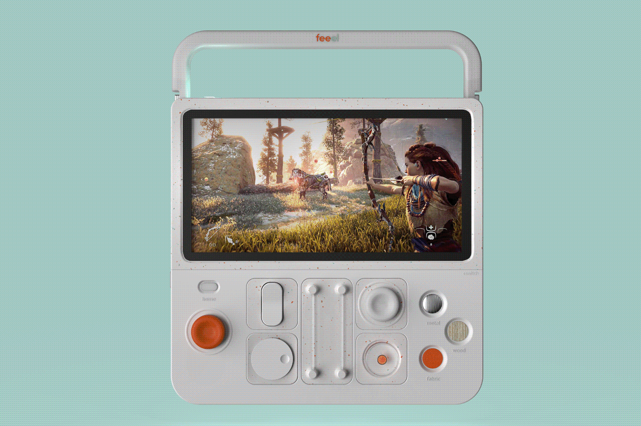
The feeel’s unique haptics system is based around three buttons on the front of the device – one made of metal, one wood, and another fabric. When chopping down a log or nocking an arrow in a bow in a game, for instance, the wooden button is meant to exhibit force feedback meant to feel more “real” due to the physical qualities of the material conveying the haptic effect. Asking a user to do an extra action (in this case, pressing an optional button) may not be the most practical way to implement haptics into a console or controller, but here it clearly serves as a great way to test the edges of current haptic technology.

Kappler clarified the intention of the thesis on her website, saying, “The question arises how the sense of touch can be better addressed by the control system, so that players can more easily achieve an immersion. How can tactile perception be trained and improved through video games? The aim of this bachelor thesis is to answer these questions and to implement them in a concept for a handheld game console.”

Kappler’s concept shows an icon of Horizon Zero Dawn as well as other games that probably wouldn’t be able to play on an actual handheld – at least, not without serious AI tech and/or cloud streaming functionality. In that sense, it feels less like a Nintendo throwback and more like a modern emulator or Steam Deck-a-like. However, its modular design makes it stand out from those devices in a way that feels distinctly like a Nintendo console.

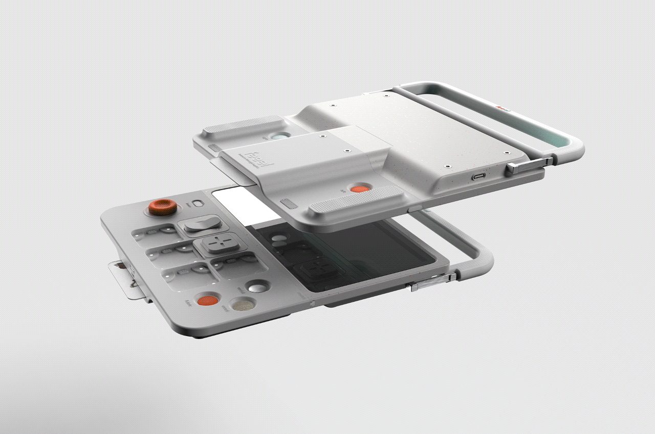
Take the screen, for instance. It can detach from the body/controls to allow for tabletop play. The feeel’s controls are also completely reconfigurable, like the PlayStation 5 Access Controller, featuring six different magnetic zones where a number of dials, knobs, sliders, and buttons can be placed and programmed for use in a wide variety of games. This is a great way to let the user define their own experience, and it’s nice to see more console designs move in this direction as accessibility and modularity become more commonplace.

The post This modular handheld console puts force feedback at the forefront first appeared on Yanko Design.
ROOT Humidifier doubles as a dehumidifier and air purifier

ROOT Humidity Conditioner Release

Humidity conditioners are essential, but there aren’t really many devices with such function. A concept product design was introduced a few years ago by VLND, an Industrial Design Studio based in South Korea. The product design was even recognized at the International Design Excellence Awards, receiving a Bronze prize in the United States.

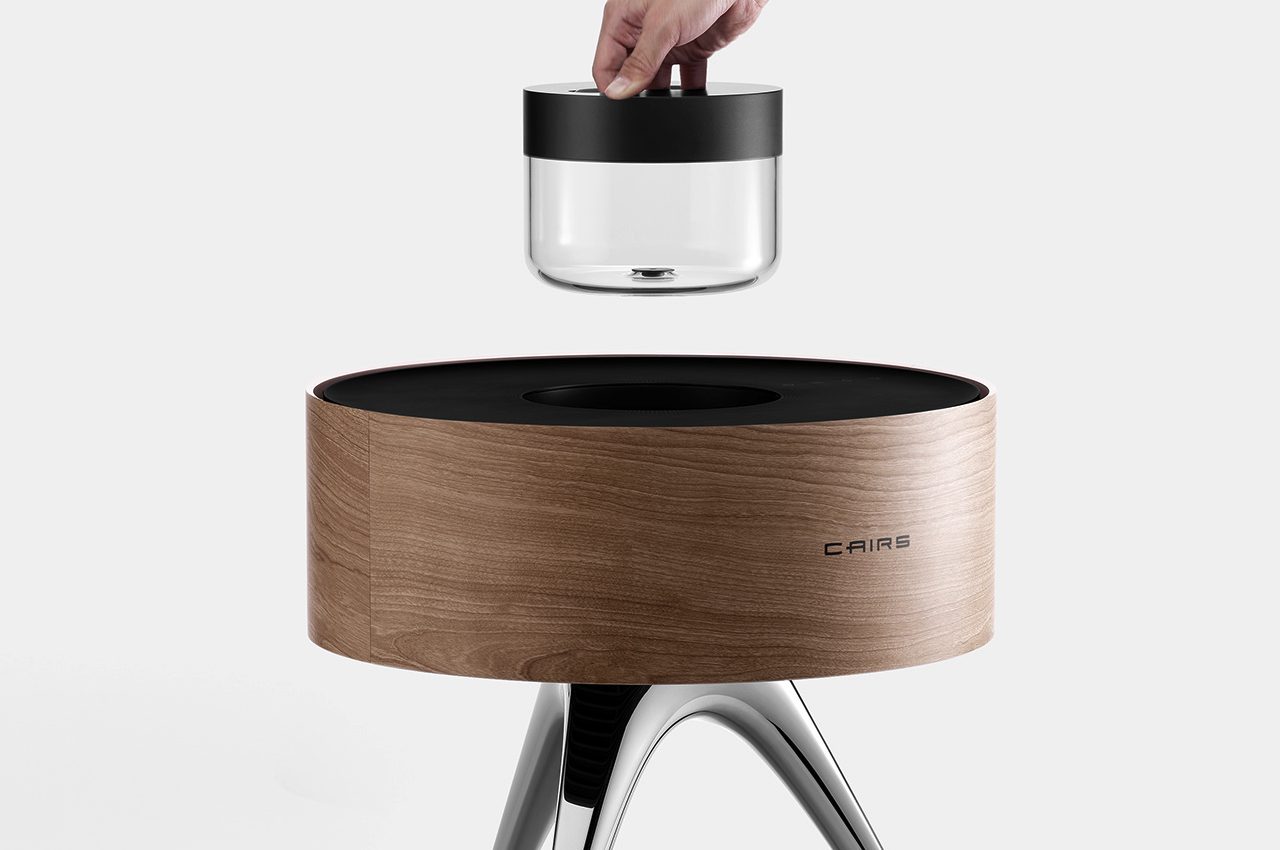
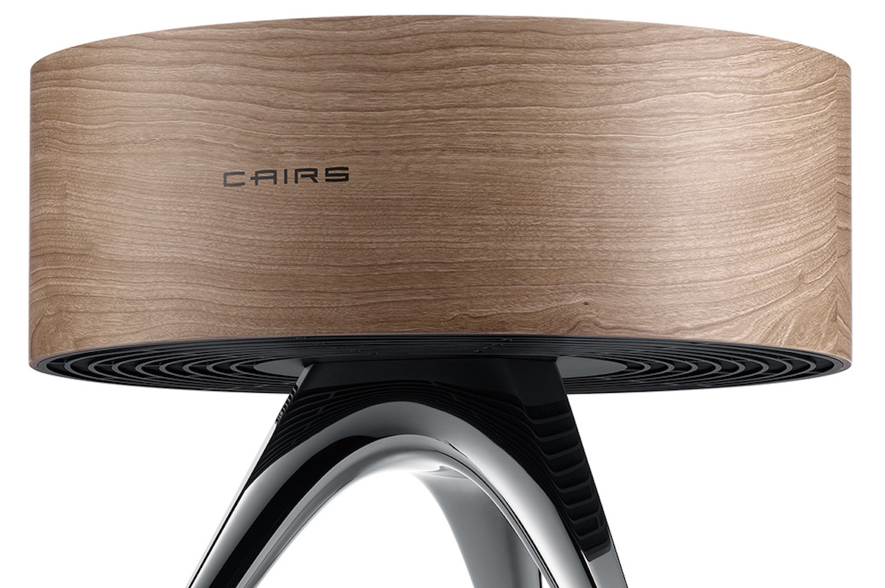
Called ROOT, this Humidity Conditioner for CAIRS is ideal for places that have dry winters and humid summers. A humidifier must be available to keep the humidity at an ideal level, especially indoors. Having such a device can prevent dry skin during winter and the uncomfortable and sweaty feeling during summer.

Designer: VLND Studio

Concept ROOT Humidity Conditioner

ROOT Humidity Conditioner for Cairs

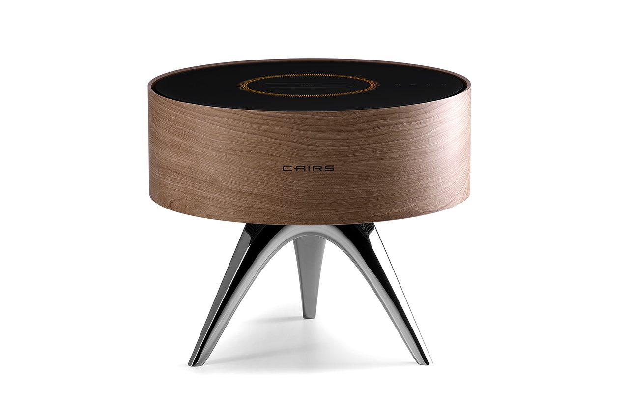
ROOT does the job of keeping the optimum level of humidity. It also works as an air cleaner and purifier, which we really need, especially these days. An air purifier dehumidifier is a home appliance that many people can benefit from. It sucks in air from the bottom and then releases the purified air from the top.

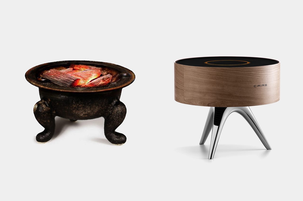
The design is based on a traditional Korean brazier. The ROOT is a modern iteration, but instead of providing heat, it helps main the correct humidity level. Its purpose is the same as it helps create a comfortable surrounding for the people.

ROOT Humidity Conditioner Concept Design

ROOT is both a humidifier and a dehumidifier, detecting the humidity level and functions depending on what needs to be done. If the humidity is high, it starts to dehumidify. When humidity is low, it then begins to humidify. It comes with a water tank that may be filled depending on the humidity. You need to empty out the water when it’s filled with too much moisture in the air.

ROOT Humidity Conditioner Details

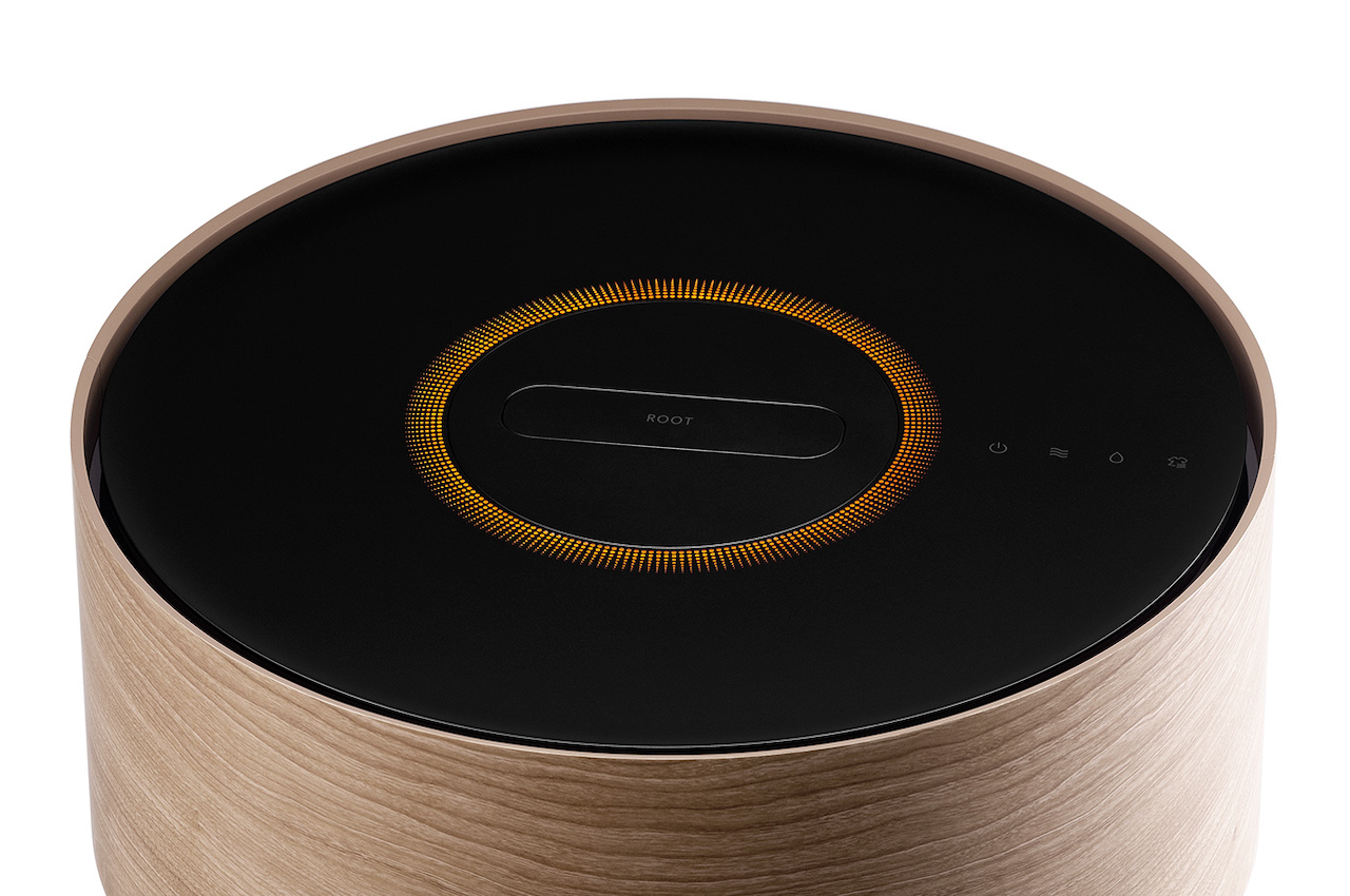
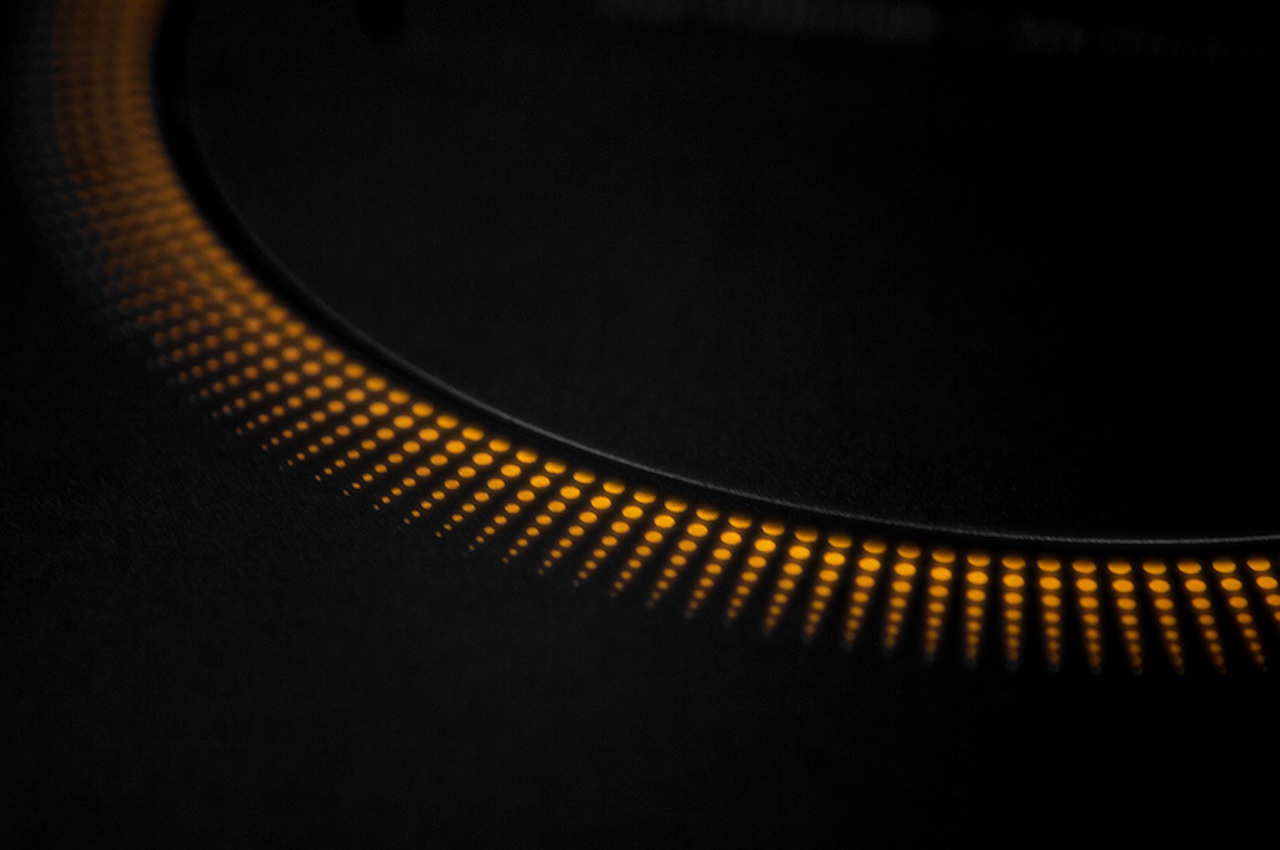
When the air is dry, you then need to fill the water tank for it to function and do the opposite of humidifying the surrounding. The top of the ROOT features some fine holes. There are lights that indicate the status of the device. Depending on the air quality, the brightness will be adjusted. When the lights blink, you may want to check the water tank to see if it is full or empty.

ROOT Humidity Conditioner Concept

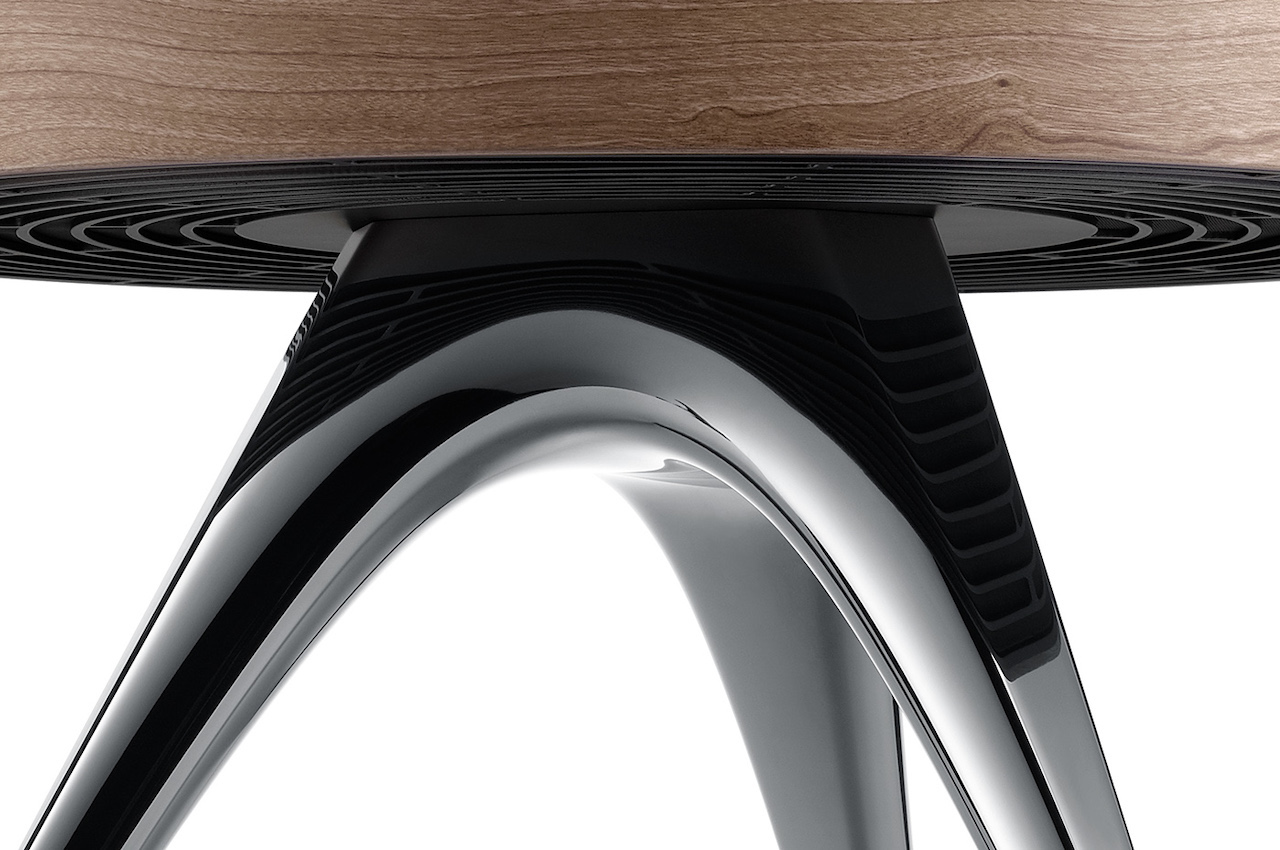
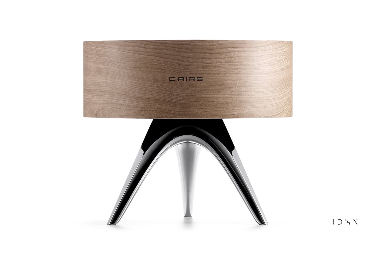
The ROOT is designed to be placed in the center of a space instead of just being placed near the wall. It will perform better if it’s in the middle of the room. The design of this device is something like a furniture item. It doesn’t look dull, but it’s also not overwhelming. It is one interesting piece that can complement the home interior with its industrial minimalist style. The wood texture gives that natural look and feel while the chrome legs offer a bit of a luxurious feel.

ROOT Humidity Conditioner

ROOT Humidity Conditioner Design

ROOT Humidity Conditioner Design Concept

The post ROOT Humidifier doubles as a dehumidifier and air purifier first appeared on Yanko Design.

MOUSHI Sushi Mouse will either motivate you to work or make you more hungry

Moushi Mouse Where to Buy

Working from home used to be fun and exciting for many people. The past two years of pandemic brought about by the COVID-19 have transformed schools, businesses, and workplaces into more personal spaces as going remote or virtual is highly encouraged. For many of us, it can get tiring and boring so it’s about time we spice things up a little.

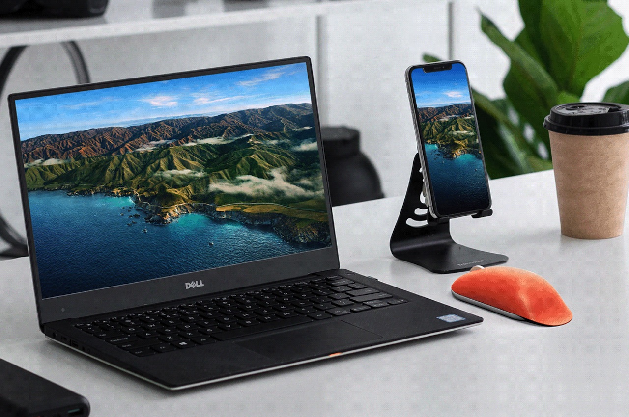
Your work-from-home setup should reflect not just your style. It should also be comfortable and with the correct elements so you can remain productive and positive even after years of remote work. Of course, you start with getting a powerful computer, and then there’s the office desk and maybe an ergonomic chair. Get the best keyboard your money can buy. But for the mouse, we recommend getting something fun and Kawaii like the Moushi.

Designers: Junsik Oh and Cheolhee Lee

Moushi Mouse Design Concept

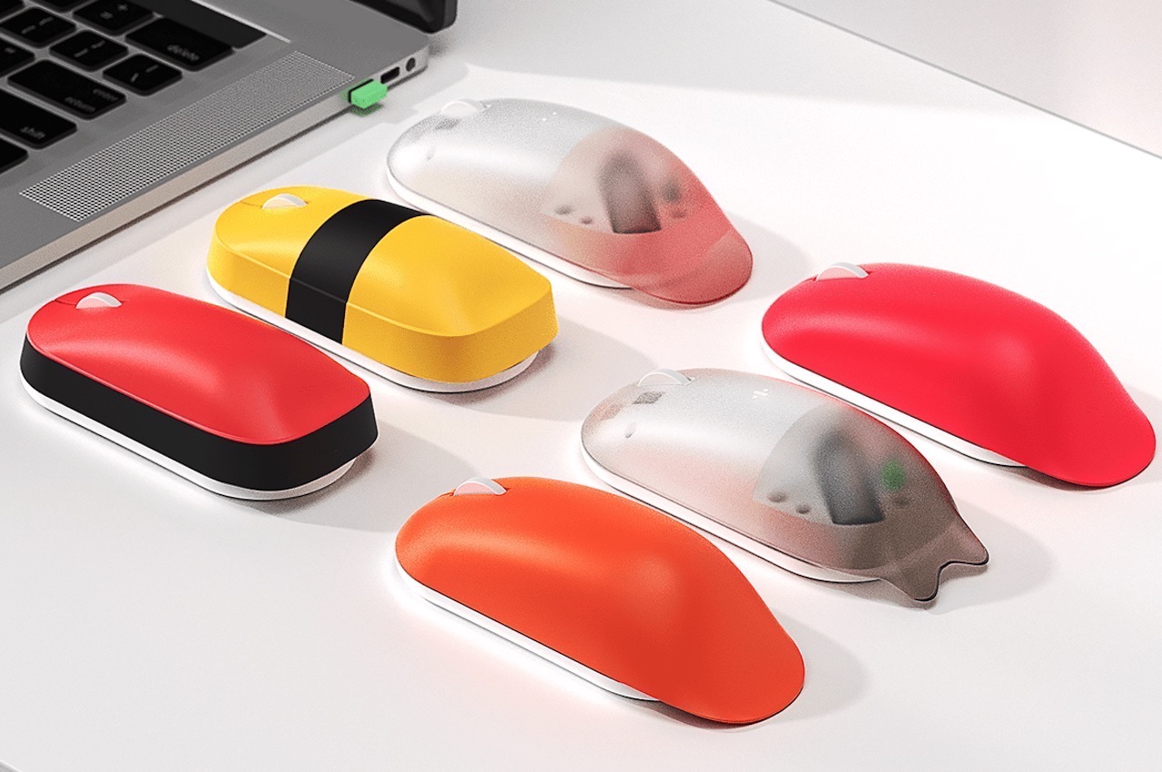
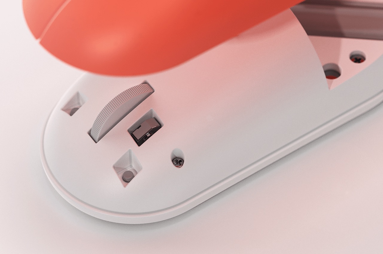
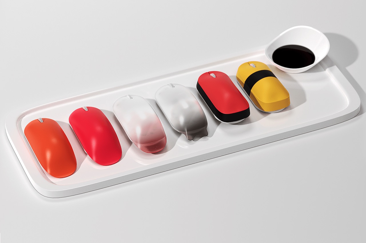
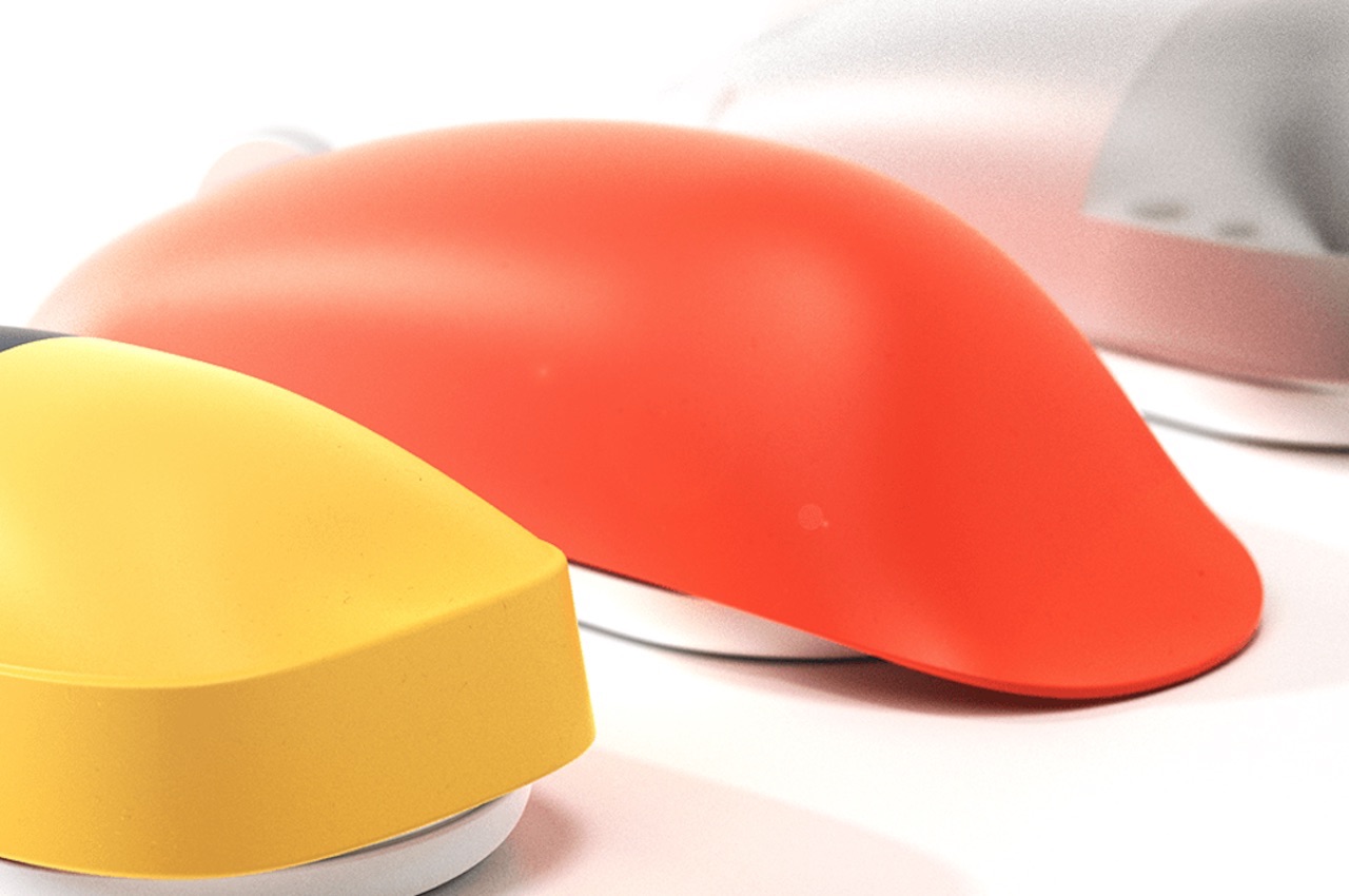
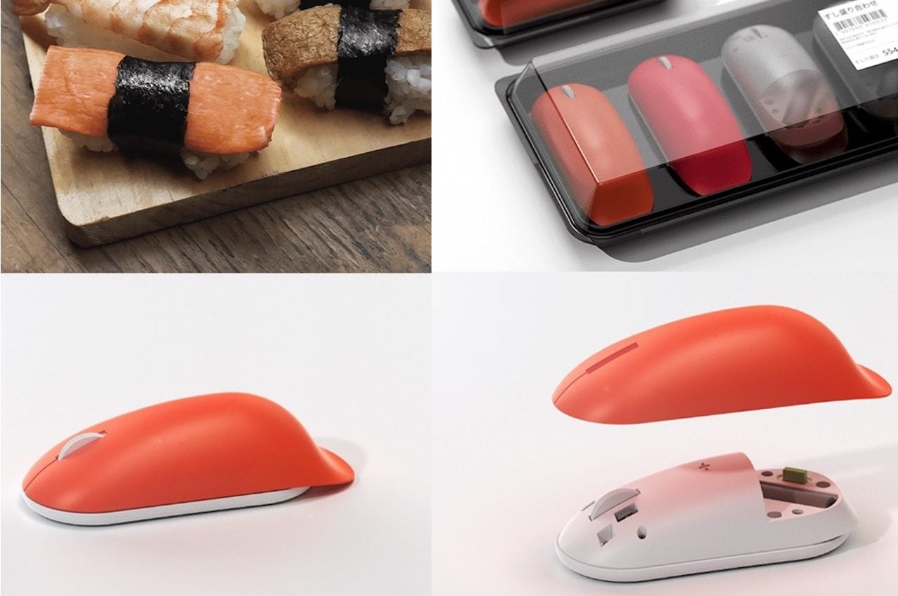
The Moushi concept is your very own mouse sushi. The name doesn’t sound right but sushi lovers will definitely take interest. It can be a challenge to keep things light and energetic around the house but small things like this mouse (the accessory, not the animal) can add some joy to your day.

1

Moushi Mouse Concept Design

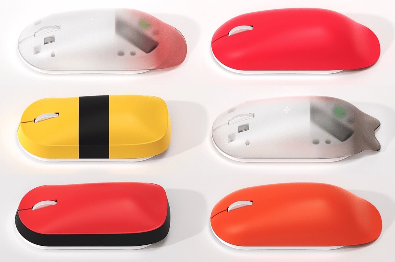
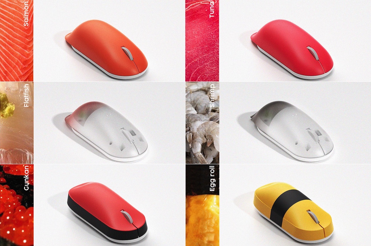
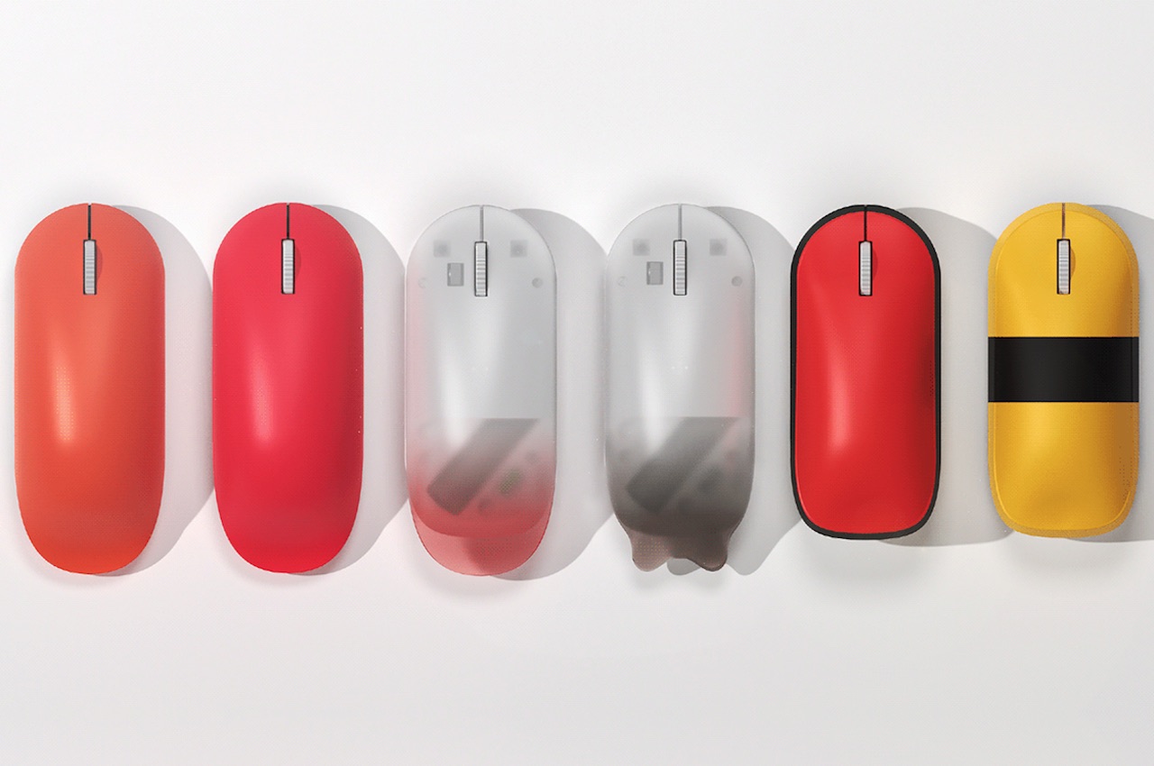
You like sushi? Get the Moushi in Tuna, Salmon, Flatfish, Shrimp, Gunkan, or Egg roll. Depending on your mood and taste, you can change the cover of the sushi mouse. There’s always a way to make the desk “delicious” but make sure you clean up after eating all those takeout sushi rolls.

Moushi Concept Design

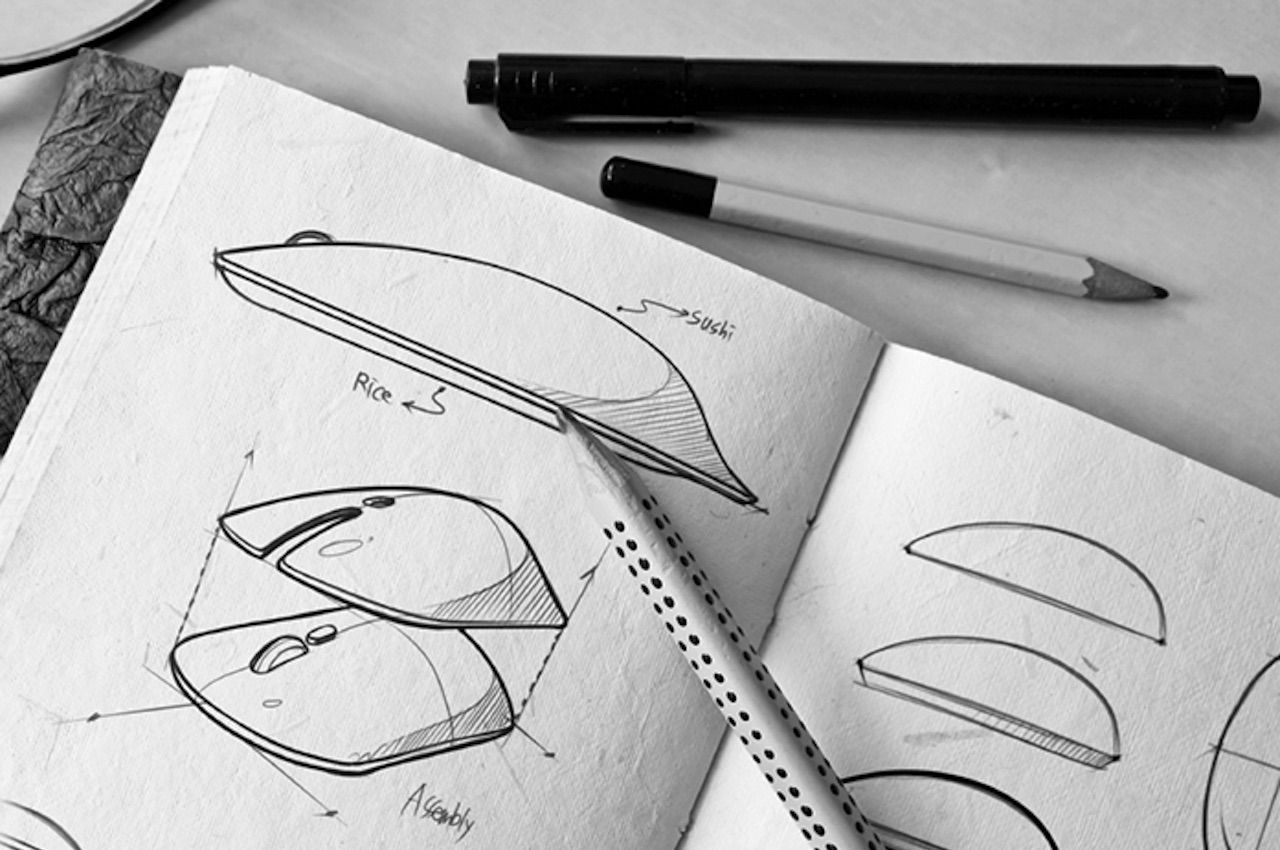
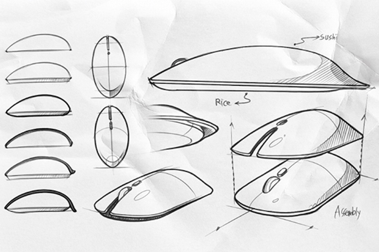
Making real sushi can be complicated and time-consuming. It requires skills but for the Moushi, you don’t need to have a special talent. But then you need to understand there is an assembly method similar to how sushi is made—part by part and with a lot of patience.

Moushi Concept Images

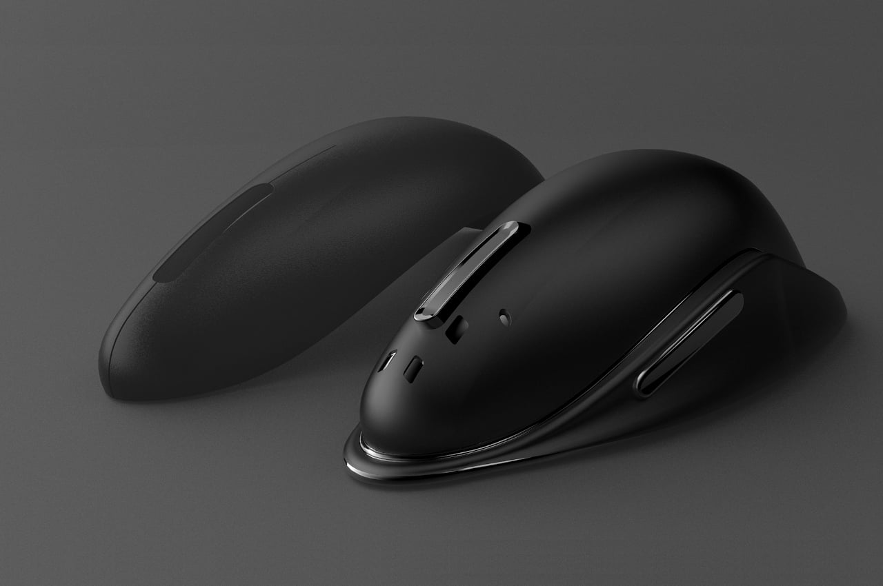
Industrial design students Junsik Oh and Cheolhee Lee worked on the Moushi last year. From a few sketches, they tried working on a 3D model to finally achieve a convenient form for the mouse. The proposed item is something we really want to see in the future.

Moushi Image

Moushi Mouse Concept

If people see food on the desk, that will get them motivated to finish work fast and be rewarded. Eating sushi everyday may not be advisable but seeing different sushi each day can make work seem more bearable especially if you are a foodie. The Moushi will make work-life more “delicious”. Come on, add some quirk to a rather boring day at the home office.

Moushi

Moushi Mouse Render

Moushi Mouse

Moushi Mouse Sketch

The post MOUSHI Sushi Mouse will either motivate you to work or make you more hungry first appeared on Yanko Design.
This killer whale-inspired mouse concept wants to kill the friction of work

A few things in nature evoke a feeling of smoothness and flow, and, ironically as it might at first sound, the large orca is one of them.

Many people depend heavily on computers, which means also depending heavily on keyboards and mice. These critical input devices, however, are also often the biggest sources of frustration for many people, particularly when it comes to ergonomics, comfort, and usability. Fortunately, people have started to become more discerning about the designs of the products they buy, and designers have also become more critical about well-crafted objects. Some are even daring to think outside the box, using Mother Nature as the source of inspiration and direction for some of these unnatural things.

Designer: Arjun Vallabheshwar

Flowing water has always been a metaphor for smoothness and frictionless movement, even back in ancient times. Most of the creatures that live in it have naturally developed the ability to also swim smoothly through the water and have likewise become associated with ideas such as fluidity and even grace. That applies not just to small fishes but even to massive whales.

Next to dolphins, orcas are probably one of the most familiar mammals of the sea. They’re objects of fascination and even love, despite their more common name of “killer whale.” As designer Arjun Vallabheshwar notes, the orca combines both grace and power when it dashes to catch its prey, and the water has no choice but to make way for it.

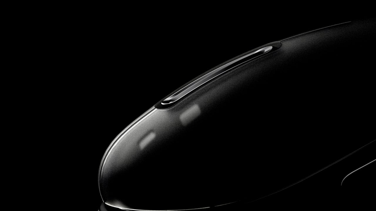
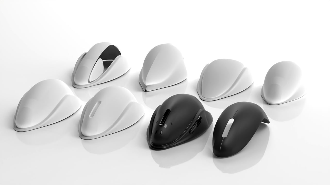
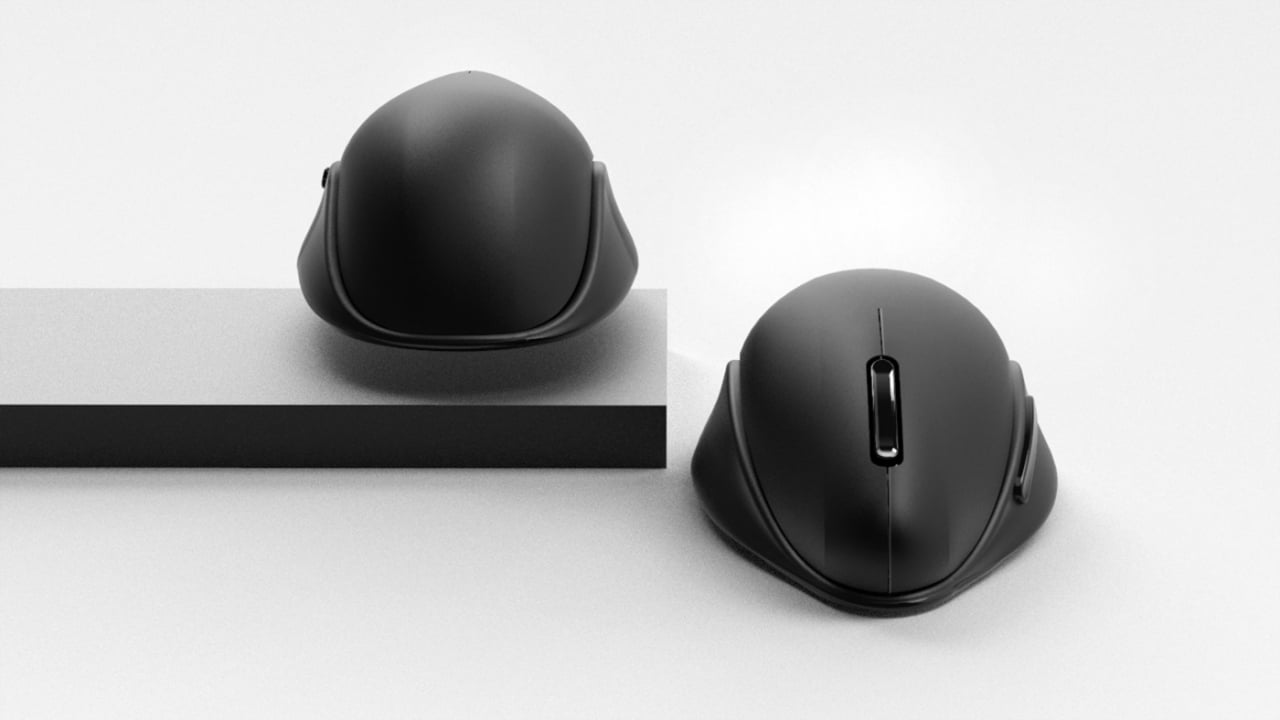
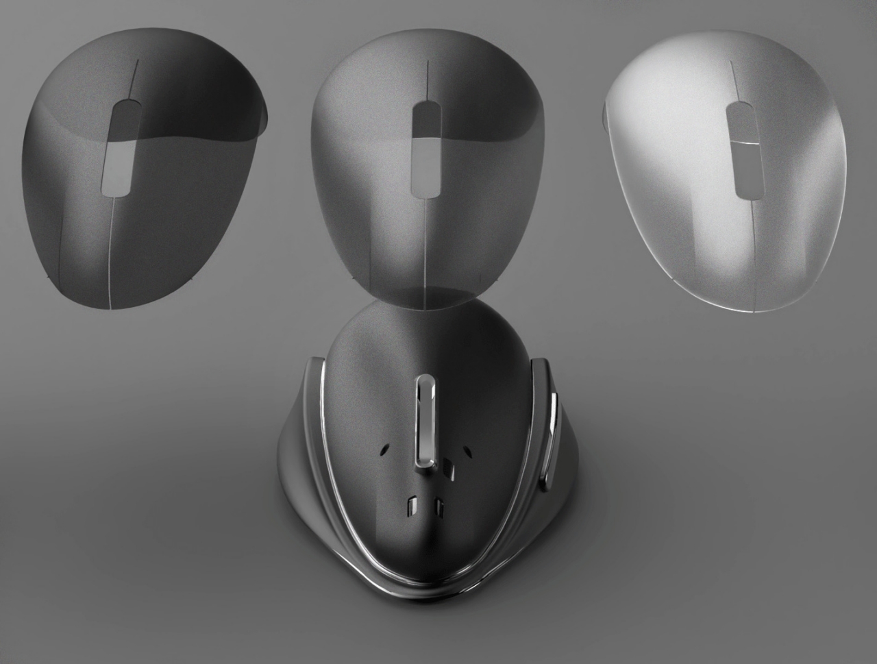
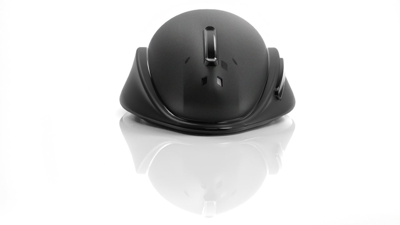
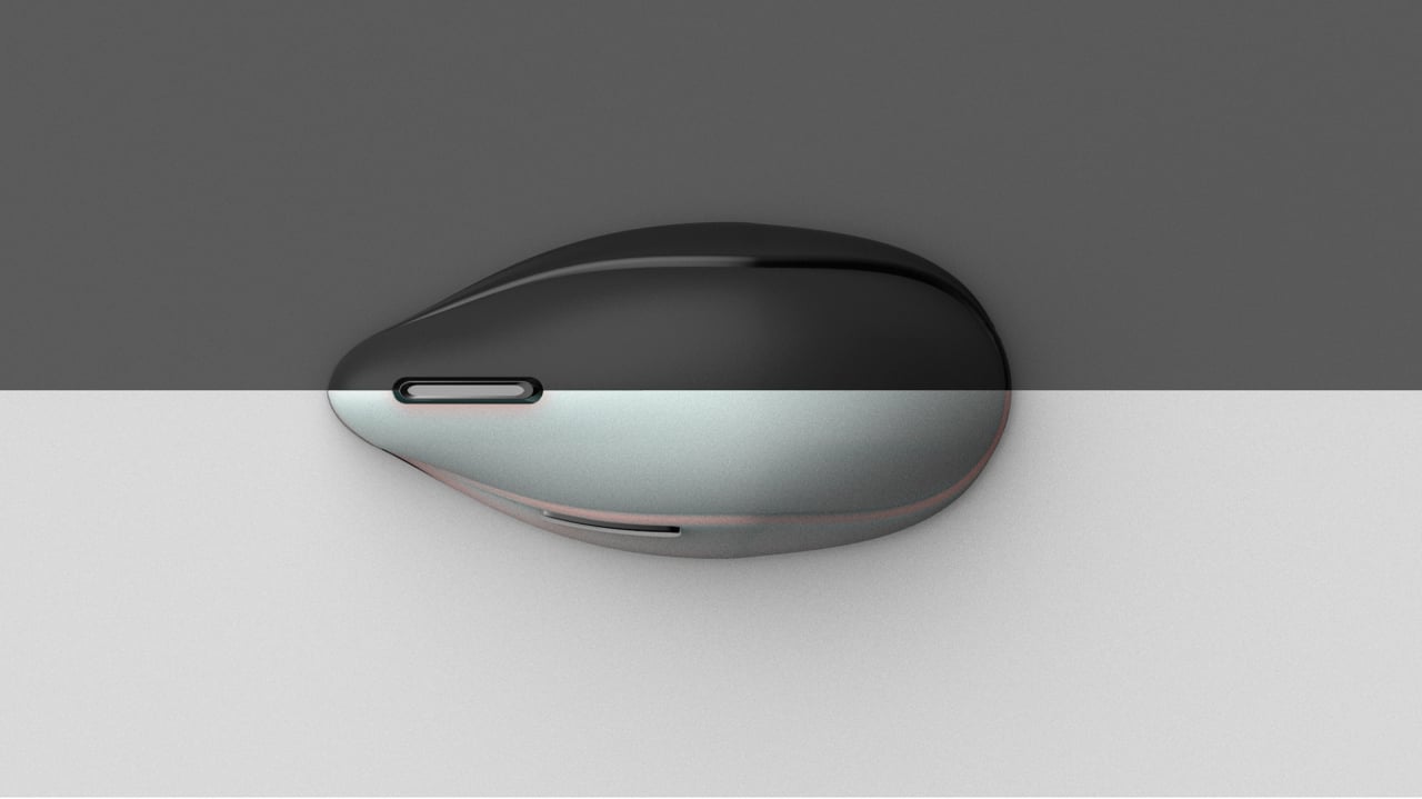
Therefore, the orca felt like an almost natural source of inspiration for a mouse, especially considering how they share a similar basic shape and color scheme. An orca’s body evolved to be perfectly hydrodynamic, and this mouse concept adopts a similar form, with a pointed “snout” and a wider and higher back. The concept also includes what can be described as the whale’s fins, providing a structure where the thumb and the pinky can rest comfortably.

The design does make one wonder if the sloping top of the mouse is actually ergonomic since it could cause the user to raise their wrist higher than normal. Nonetheless, the mere form of the mouse already makes it look like it’s ready to glide through your day and, perhaps, even inspire a stress-free outlook to your work.

The post This killer whale-inspired mouse concept wants to kill the friction of work first appeared on Yanko Design.
iPhone 16 Pro concept has so many changes it’s almost unrecognizable

What makes an iPhone an iPhone? Of course, only Apple can really tell, but there are a number of design cues that easily identify a phone as an iPhone, few of which remain in this concept.

We’ve seen our fair share of design concepts for future phones. Some base their ideas too closely on what is plausible, while others dare to go beyond what is possible. Concepts like these mix dreams and observations with a pinch of wishful thinking on top. Very few have actually hit the mark completely in predicting what will come to pass in a year or two, but one particular design looks both enamoring and alien that it leaves you wondering if Apple will even dare walk down this path.

Designer: Petar Trlajic

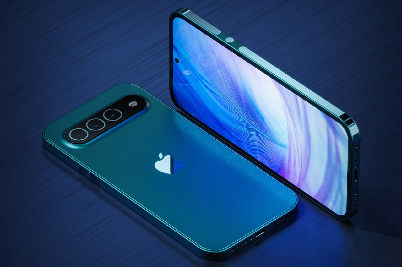
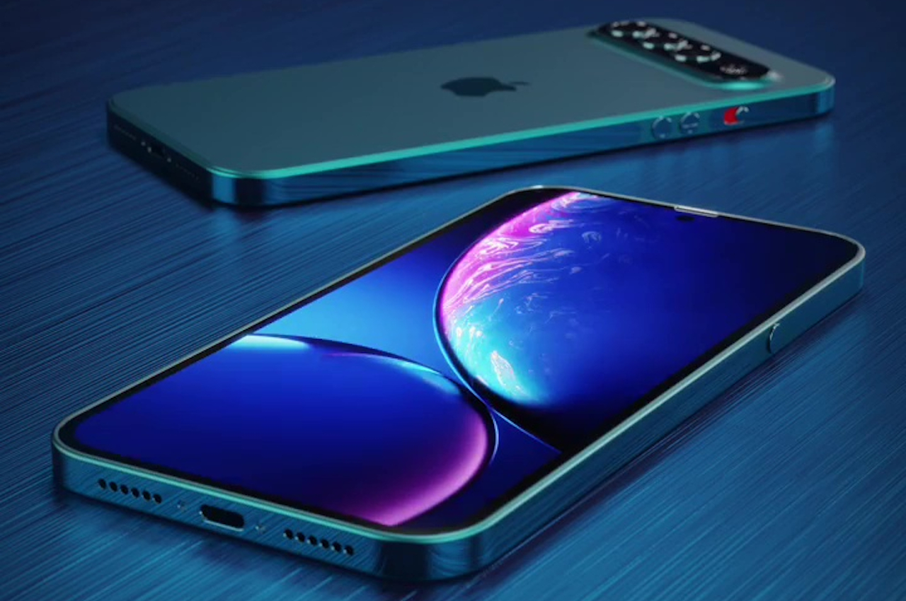
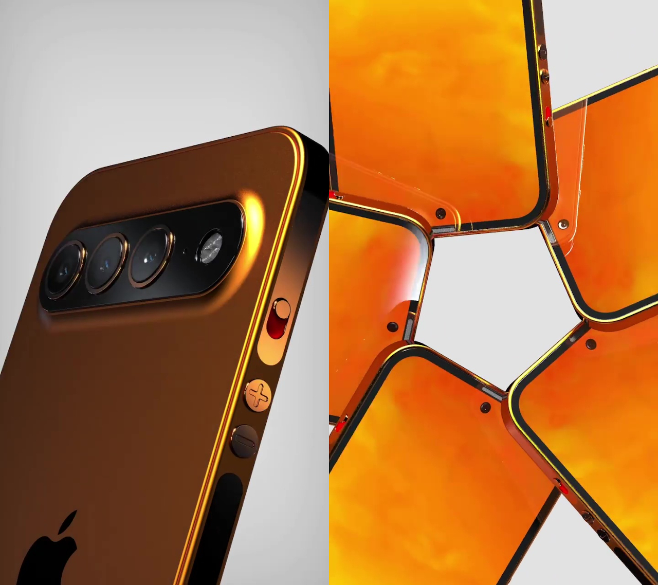
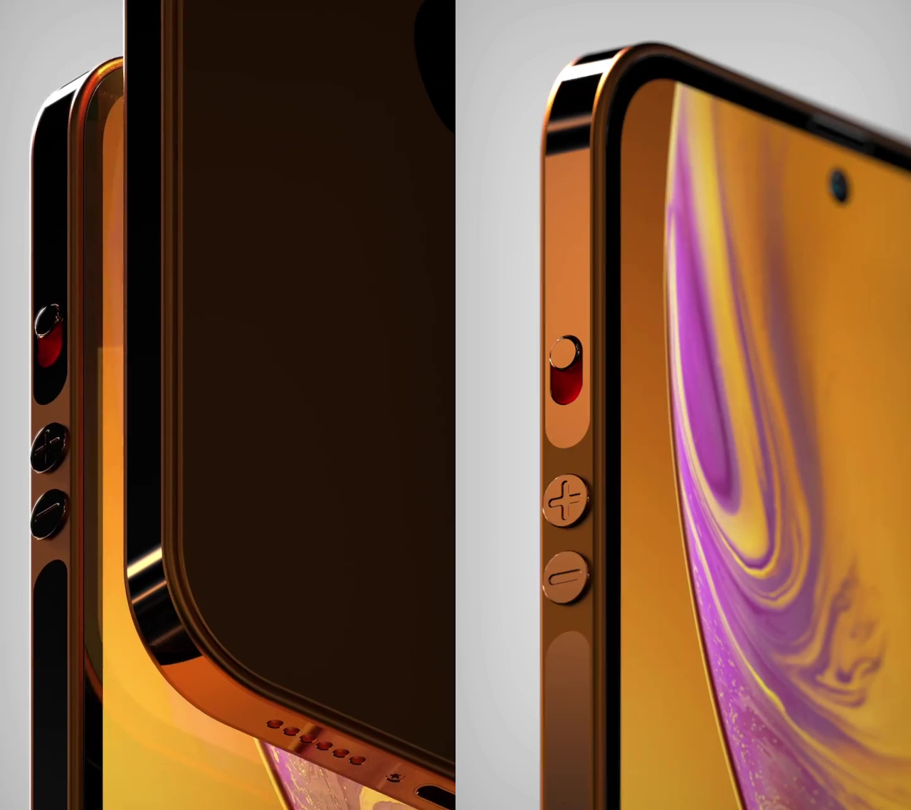
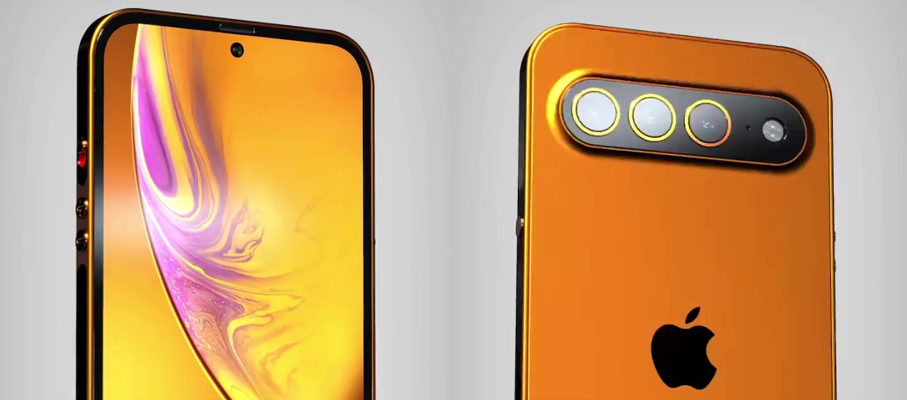
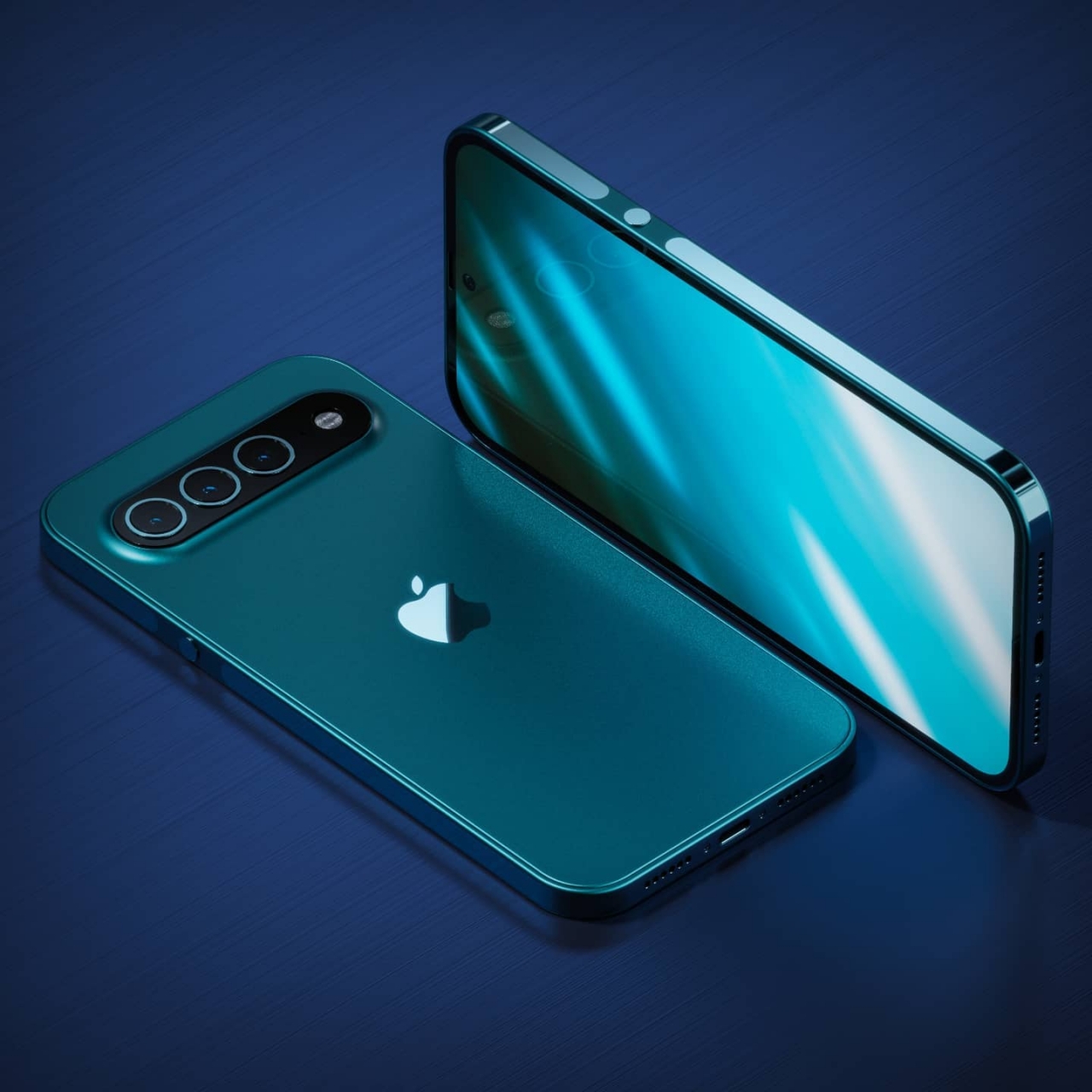
To be fair, this future iPhone concept is beautiful if you take it in isolation. It is almost all screen, without the notch that has been a stubborn presence on iPhones since the iPhone X in 2017. It still shows Apple’s typical materials, at least before it added wireless charging, like a metal finish on the iPhone’s back. Flat sides are also present, though with a bit more curve rather than the hard chamfered edges of current iPhones.

Things get a bit strange from there, though. One of the biggest and most striking differences is the camera design and location. Once upon a time, Apple did arrange cameras in a single row, but that was limited to just two sensors in a corner. This concept puts three cameras smack in the middle of the iPhone’s rear, something uncharacteristic for Apple, which will undoubtedly draw parallels to the Pixel 6’s “visor” design.

Even small details have changed as well, like the circular buttons that are more reminiscent of the older iPhones. There is also a reflective strip running around the edges that seem to be made of a different material than the rest of the iPhone’s body. It’s unlikely to be plastic, which rules it out as antenna lines. The punch-hole camera is also new, but there are already rumors that Apple will actually switch to this design this year or in 2023.

If not for the iconic Apple logo, few will probably identify this as an iPhone at first glance. That’s not to say Apple will never adopt this design, just that it probably won’t within the next two or three years. That’s probably why AppleDesign christened this concept as the iPhone 16 Pro, suggesting it is probably far into the future, if it even happens at all.

The post iPhone 16 Pro concept has so many changes it’s almost unrecognizable first appeared on Yanko Design.
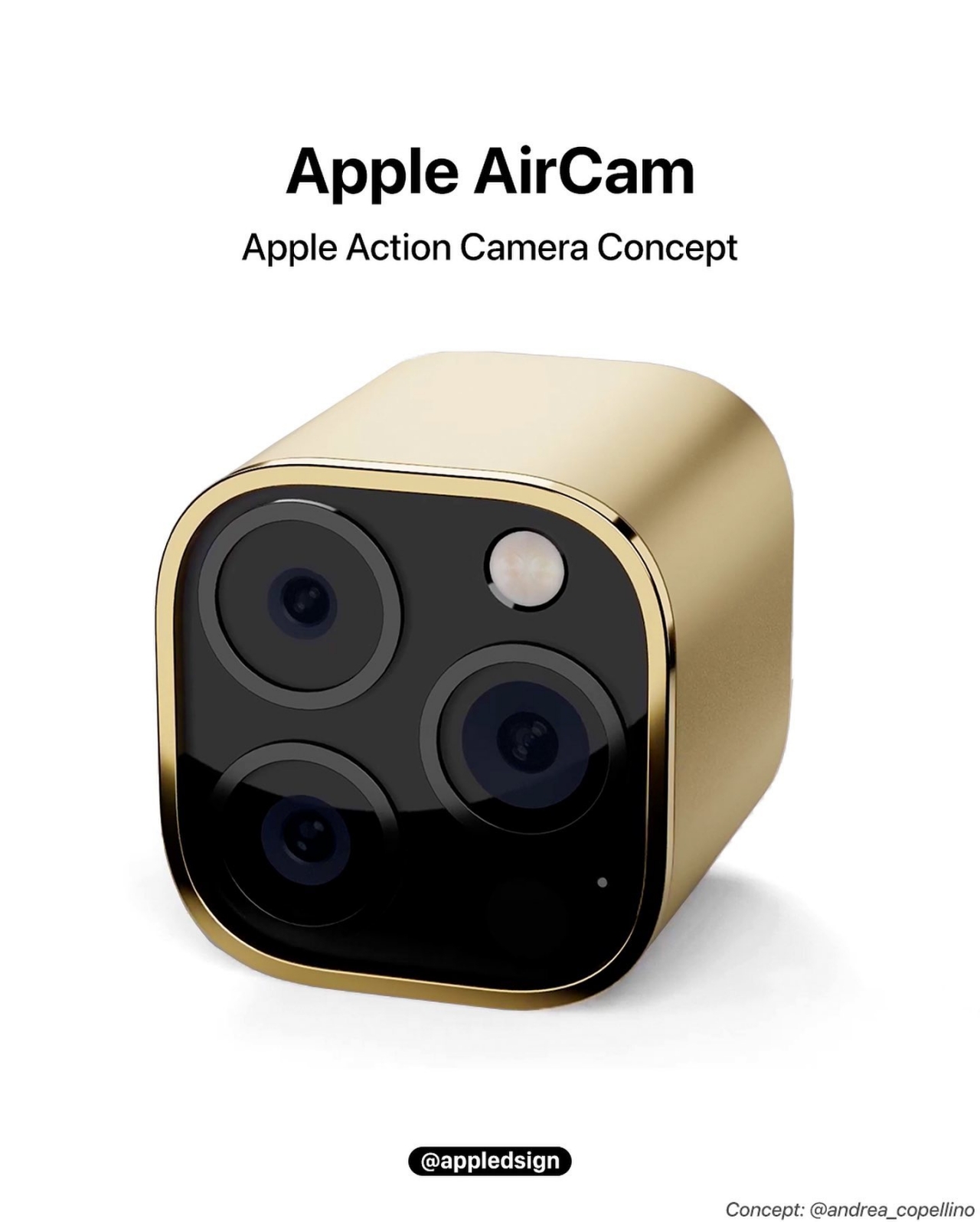
Apple AirCam concept sounds logical but is unlikely to happen

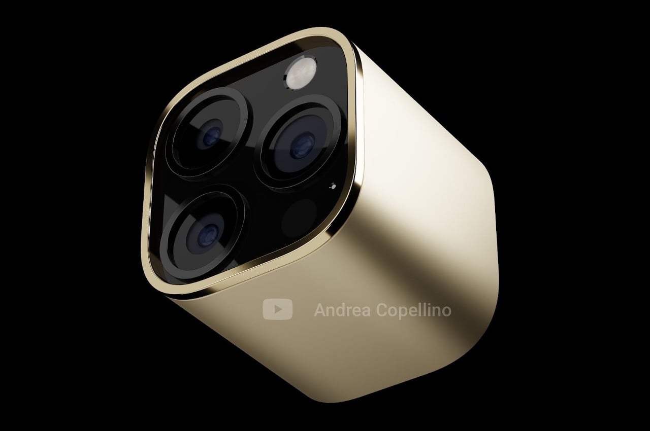
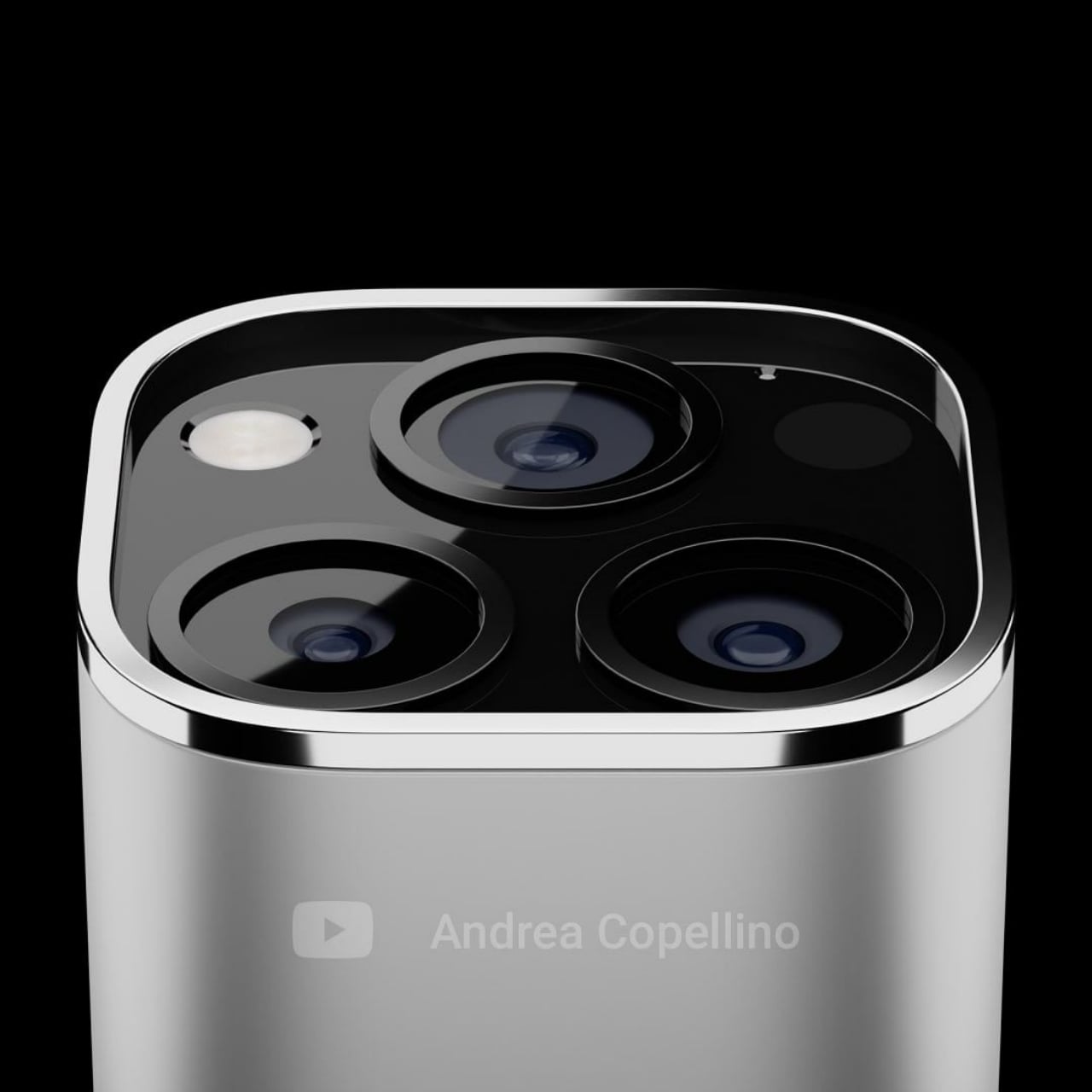
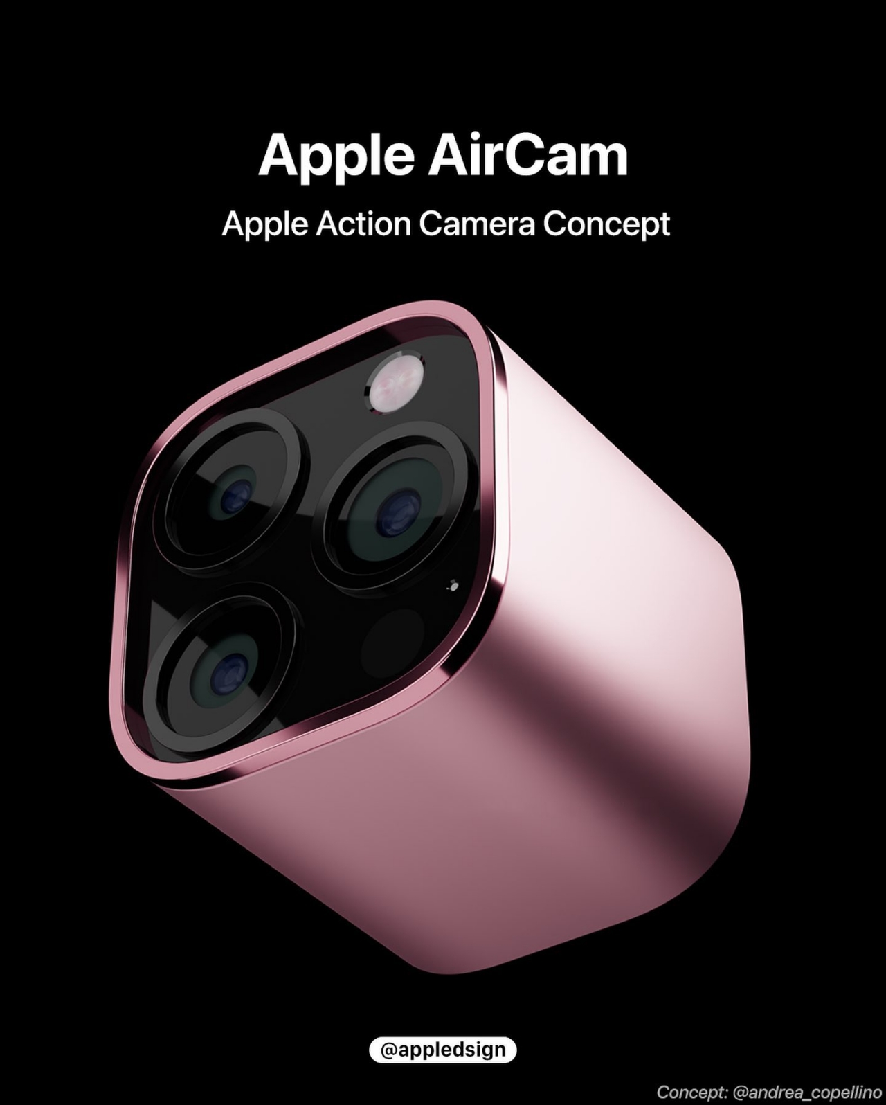
A concept for a standalone camera tries to think the way Apple does but might still come up short of providing a convincing USP to become an actual product.

There is no shortage of dreams and wishes that people have when it comes to Apple products. On the mobile front alone, the list spans from simpler requests of a larger battery to wishful thinking about foldable iPhones. There is also no shortage of creative designers coming up with concepts that seemingly reflect Apple’s language and principles, like this AirCam idea that almost checks all the right boxes.

Designer: Andrea Copellino

This wouldn’t be the first time someone came up with the idea of a standalone camera that would make GoPro shake in fear. An earlier “ActionCam” concept was actually closer to the popular action camera than to any of Apple’s accessories, though it did have some design cues similar to an AirPods case. The complexity of the device, however, easily marked it as a pipe dream, something that this newer concept is trying to avoid.

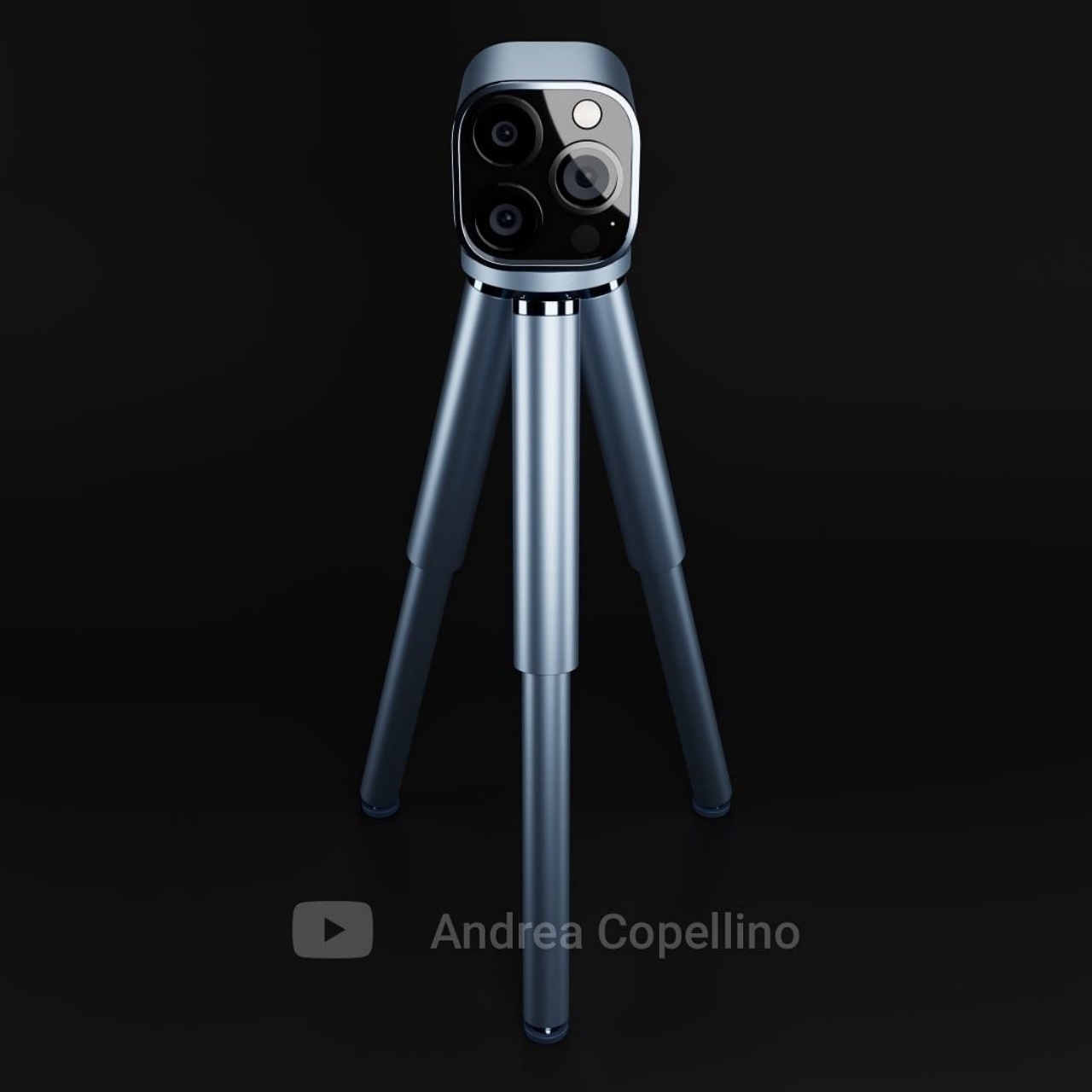
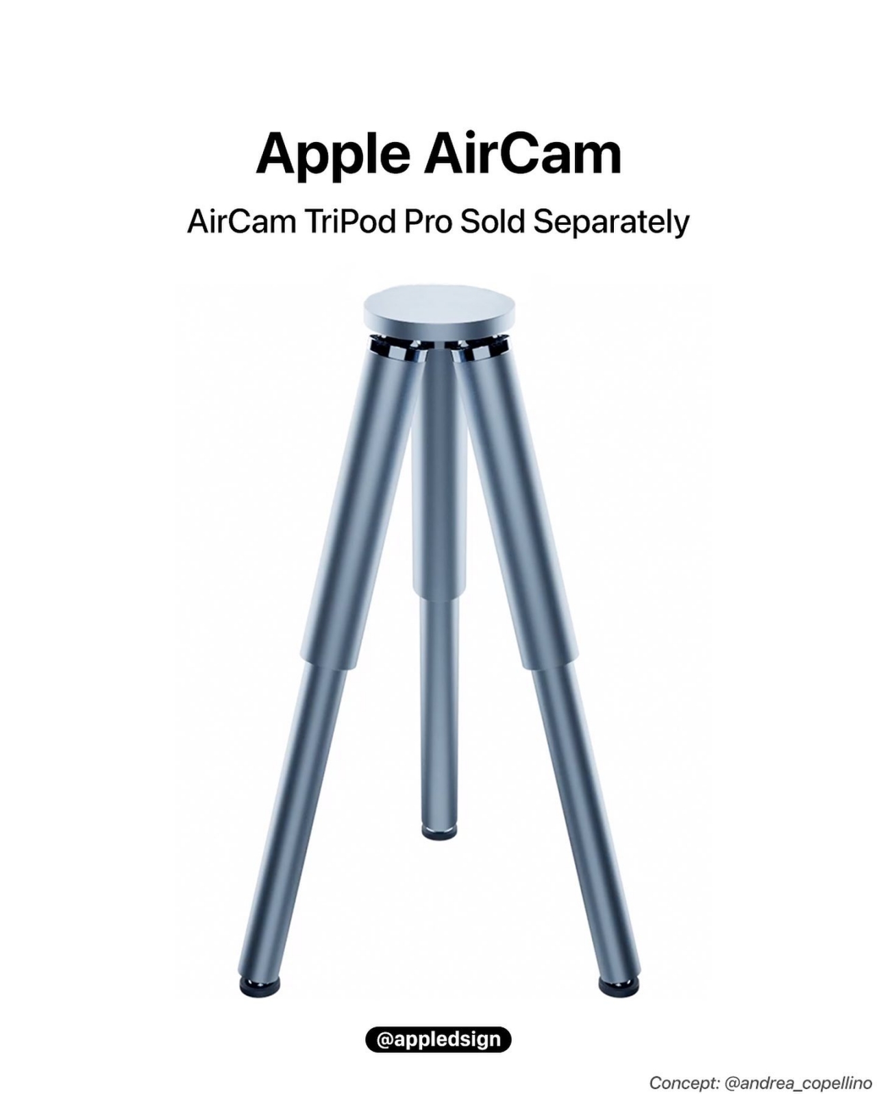
In coming up with the design concept for an Apple camera, designer Andrea Copellino tried to stick to known Apple design principles like simplicity and compactness. The squarish camera definitely hits those marks almost to an extreme degree. It has no display of its own, for example, requiring the use of an iPhone or an iPad as a separate viewfinder. Such a design isn’t exactly unheard of, though more often employed on 360-degree cameras than action cams.

The designer’s justification for the existence of something like an AirCam would be to offer a higher-quality camera not just for content creators but for future users of Apple’s future AR glasses. In theory, this would allow Apple to address a very specific market segment, one that requires dedicated camera hardware, without adversely affecting its other products.

That said, Apple is unlikely to create its own standalone camera for the very same reason of simplicity. An Apple AirCam wouldn’t exactly be simpler to use and would be difficult to handle without another paired device, something that would also go against Apple’s philosophy. The company is also more likely to improve its iPhone’s camera as much as it can and market that extensively rather than come out with a first-party accessory that basically admits that it isn’t up to snuff.

Photos also courtesy of AppleDesign.

The post Apple AirCam concept sounds logical but is unlikely to happen first appeared on Yanko Design.
This modular wall storage concept is perfect for tiny homes

Thanks to the power of magnets, a blank wall can become a safe haven for all your things if you’ve already run out of places to store them.

The price of housing and living spaces has gone up considerably in the past decades, resulting in people trying to make do with more cramped accommodations. Conversely, the surge of interest in tiny homes has also spurred some creative thinking in new storage solutions with minimal footprints. In both these cases, traditional products like containers and cabinets just don’t cut it. Fortunately, a few new designs have started appearing lately, including one that lets you use the wall for something more functional and less decorative but still aesthetic.

Designer: Francesco Brunetti

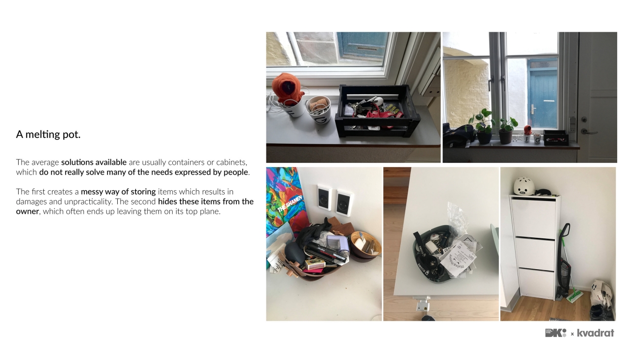
Typical containers store items in a messy way that potentially damages these objects, while cabinets don’t provide quick access or visibility to the things they hide inside. More importantly, these solutions often take up floor space which is already in short supply in small living quarters, even one to two-room apartments. That’s why some have considered unconventional spaces like stairs and walls as the next frontier in storage solutions, but few offer the same flexibility as shelves and drawers.

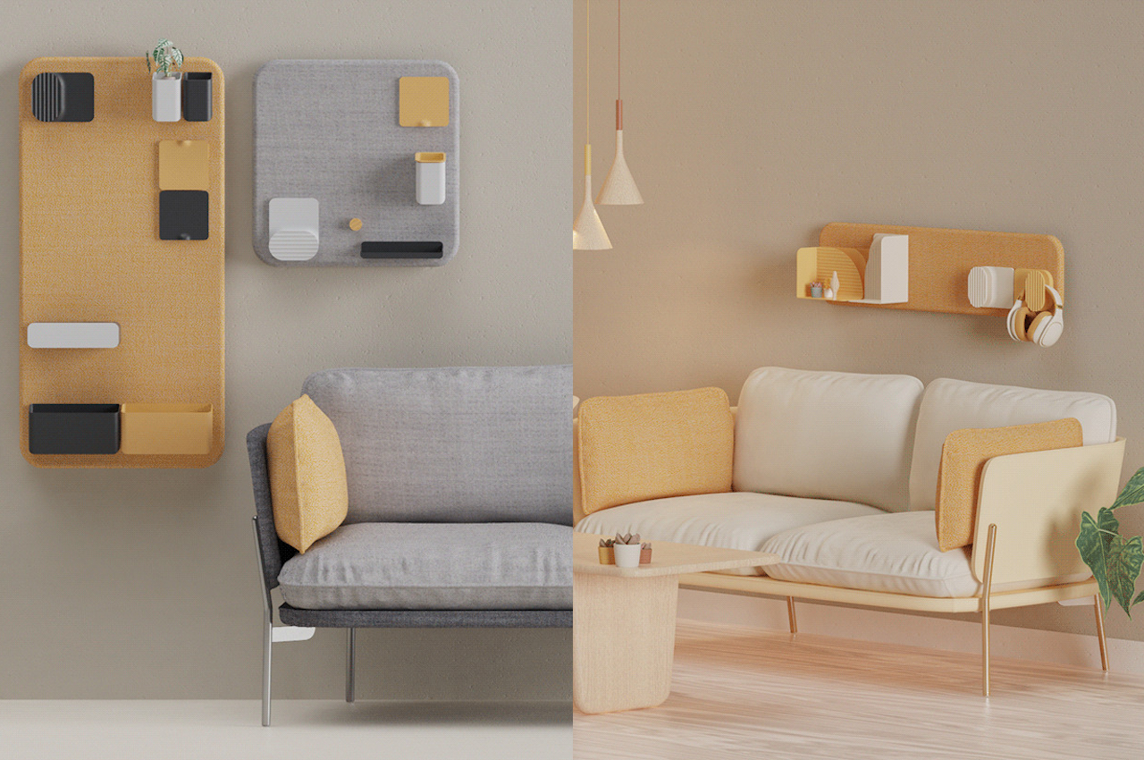
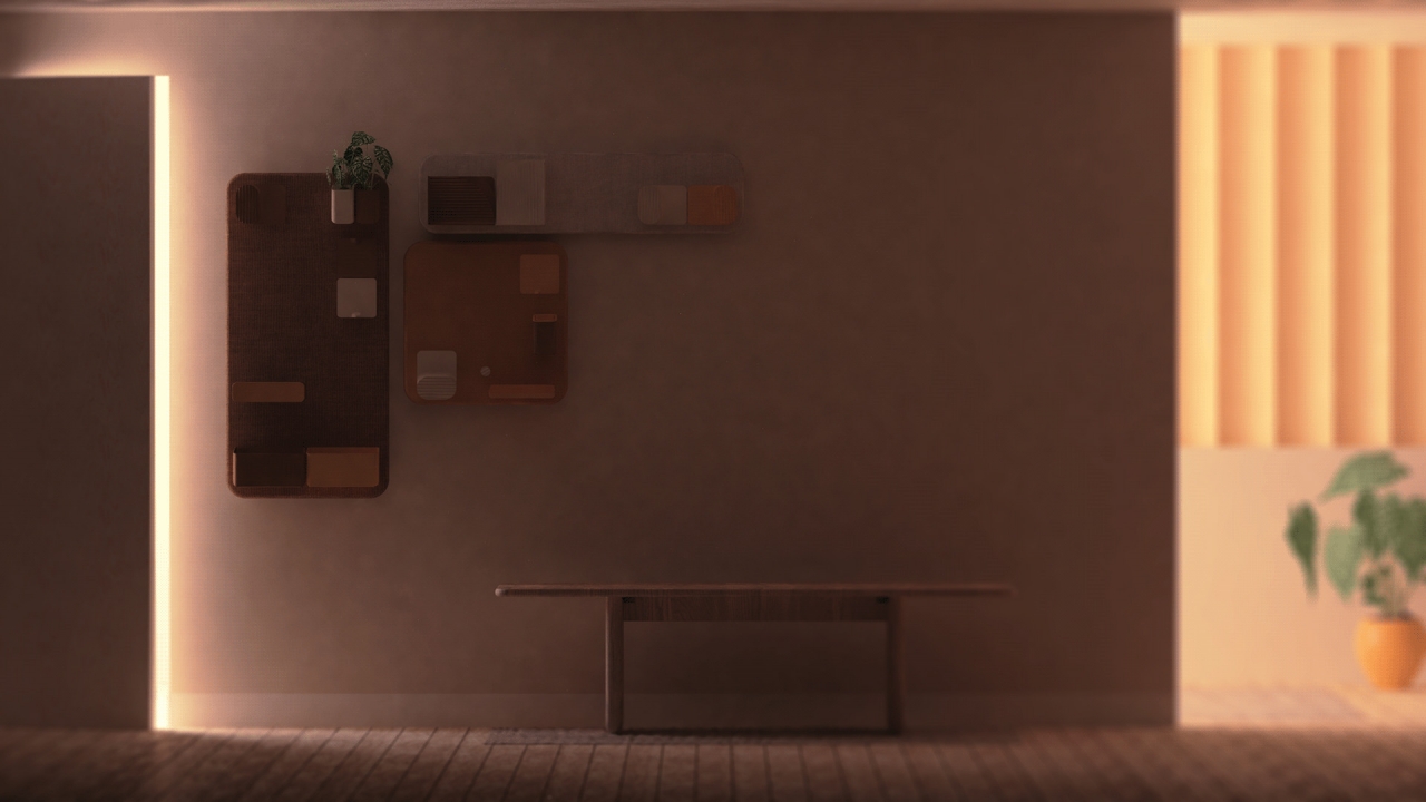
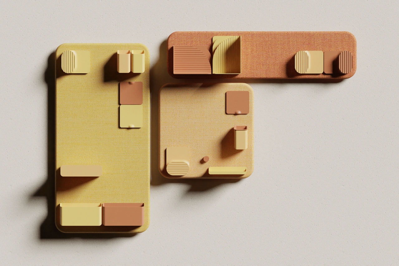
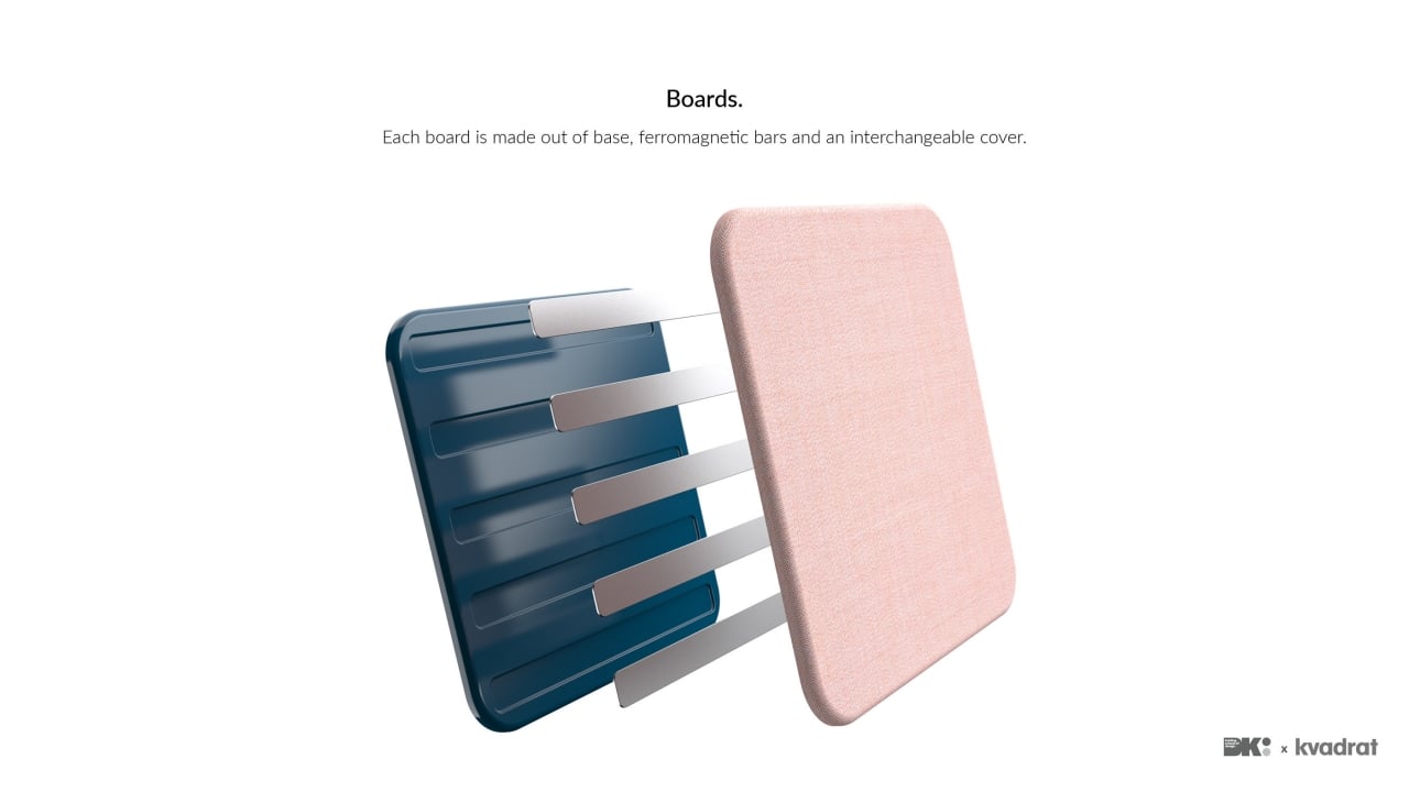
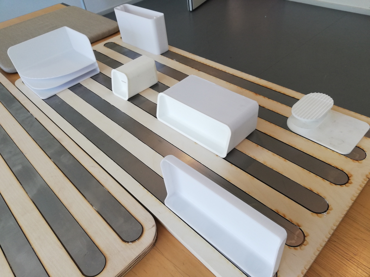
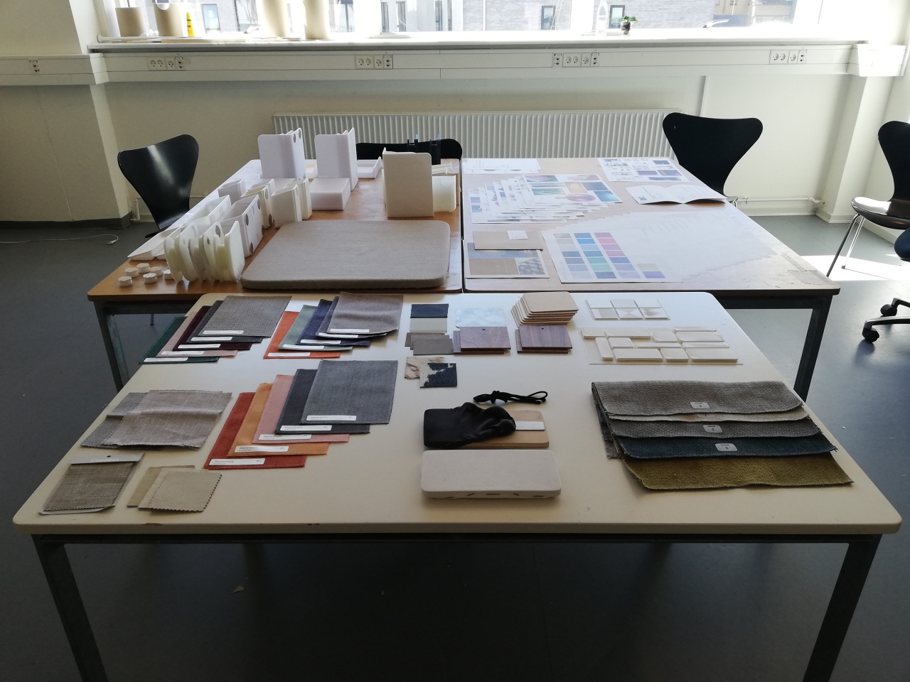
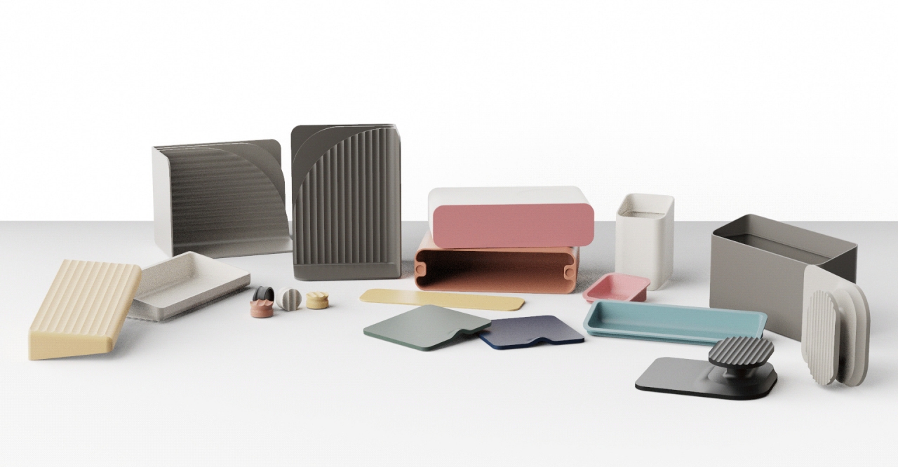
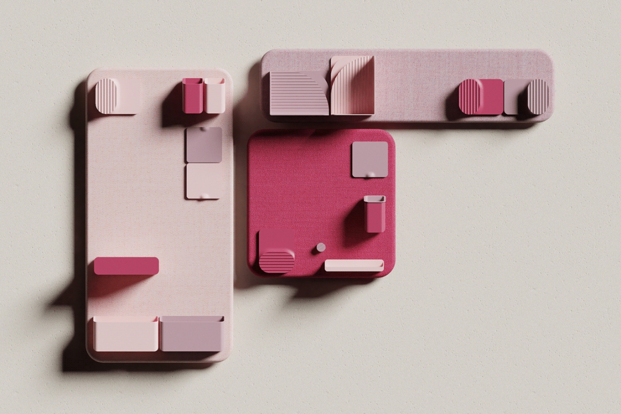
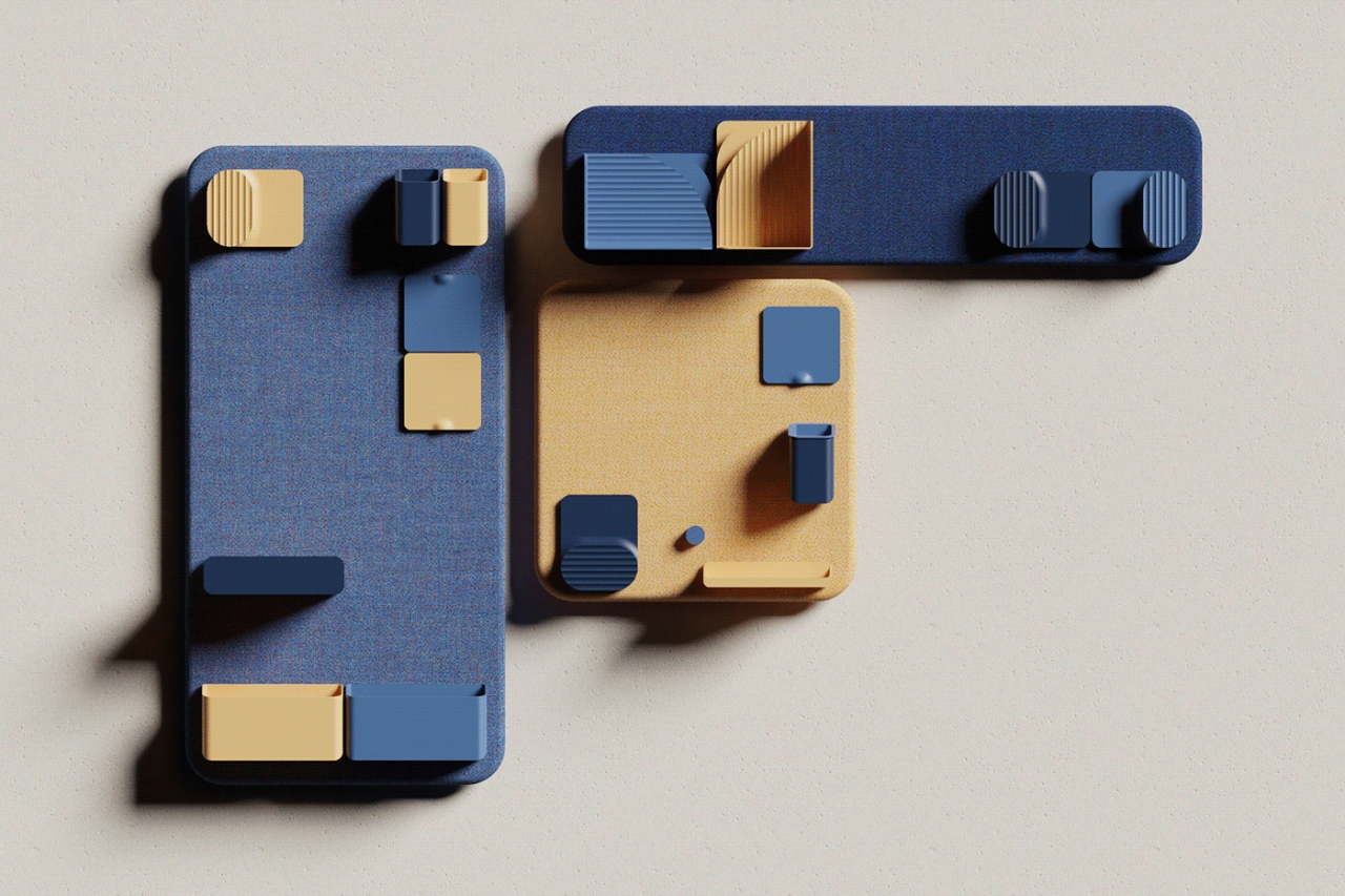
That’s where Brunetti’s Wall-it concept comes in, a storage solution that is can also be a decorative wall piece. Rather than limiting what you can hang on your wall to the manufacturer’s specifications, Wall-it lets owners decide where and how to hold different kinds of objects. This modular capability is thanks to the power of strong magnets that not only let you decide which containers to attach but also which boards to use.

dav

dav

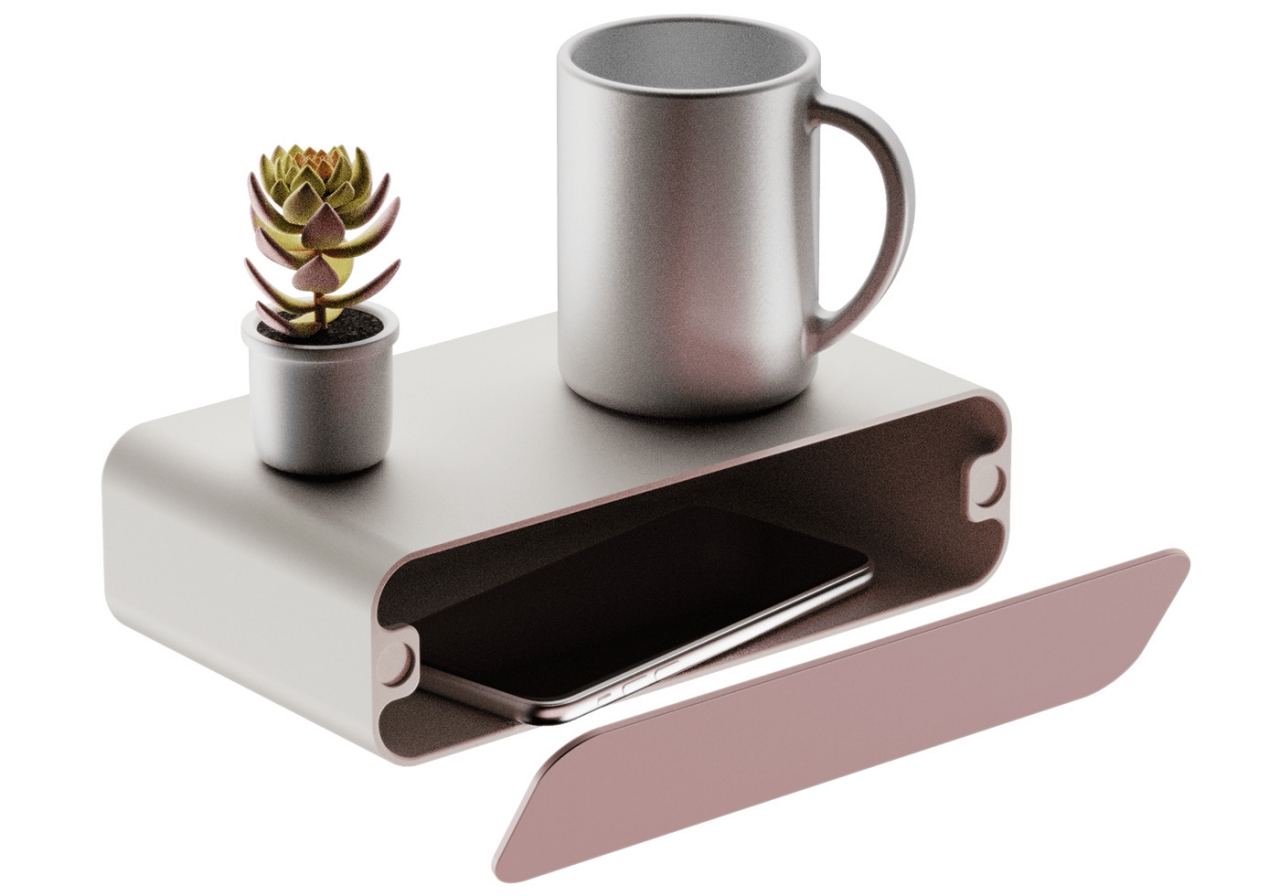
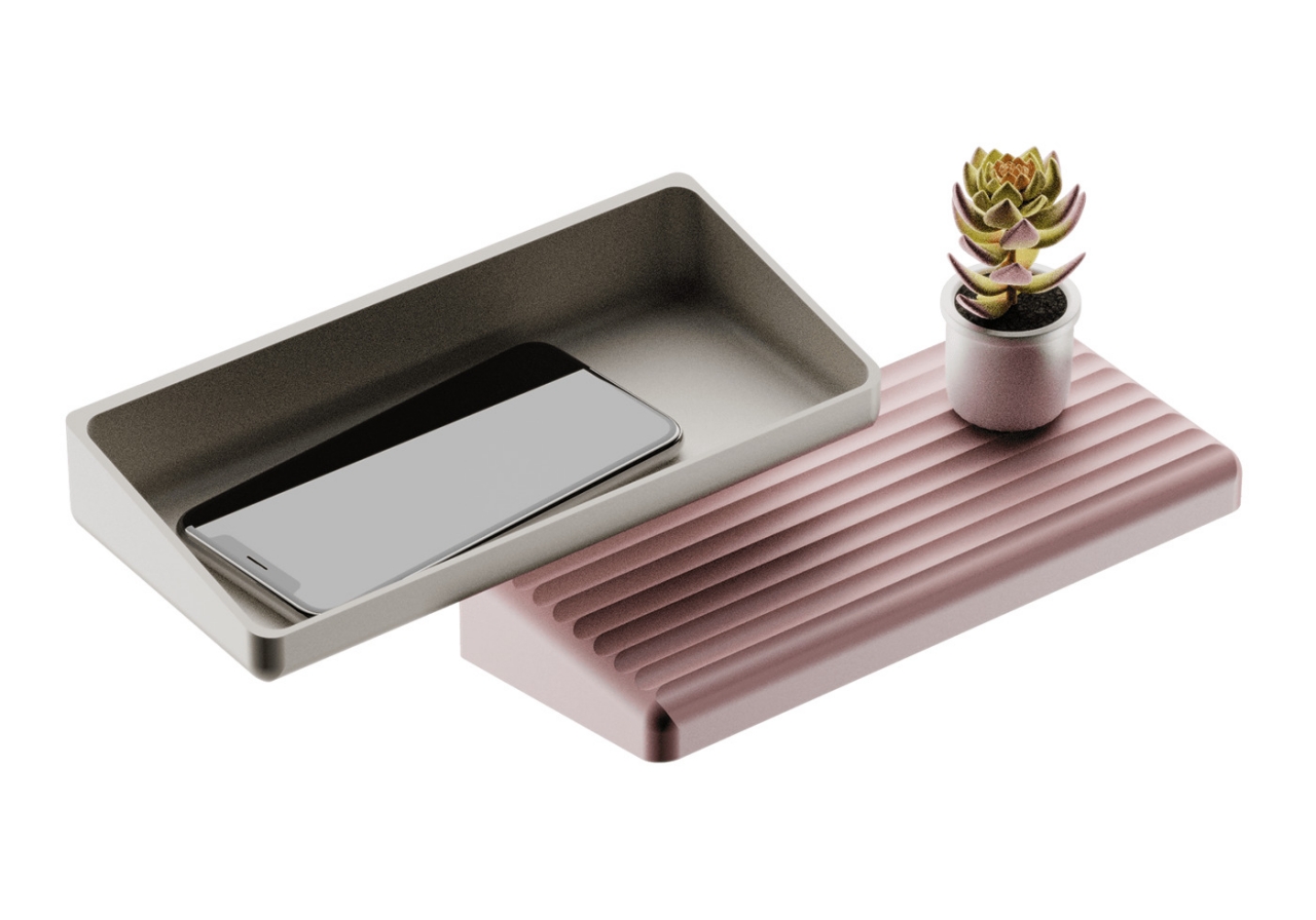
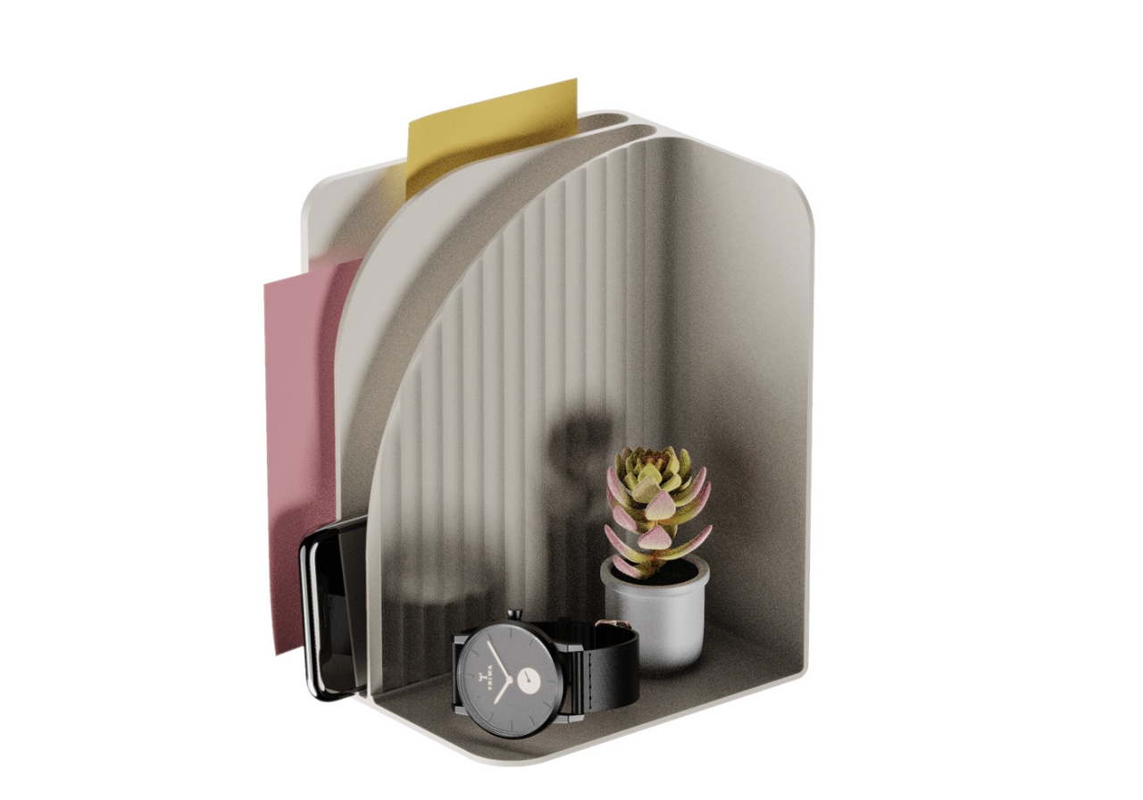
This is also where the aesthetic and decorative aspect of Wall-it comes in. The concept has room for over a dozen different accessories that can be used for different kinds of objects, like a hook for headphones and a box for smartphones. Users can mix and match not only the types of containers themselves but also the colors of the board and the accessories. You can choose to match their colors with the rest of the room or make them stand out visually with different hues.

There’s also a sustainable element to Wall-it, thanks to the materials that have been chosen for this concept. Bio-based PLA thermoplastic is significantly more recyclable than regular plastic, and the epoxy used to join the magnets with PLA can be dissolved by acidic solutions. Wall-it, therefore, presents a family of storage solutions that not only saves space but also saves the environment in the long run.

The post This modular wall storage concept is perfect for tiny homes first appeared on Yanko Design.
This gamepad concept ditches conventions to bring comfort to your A-game

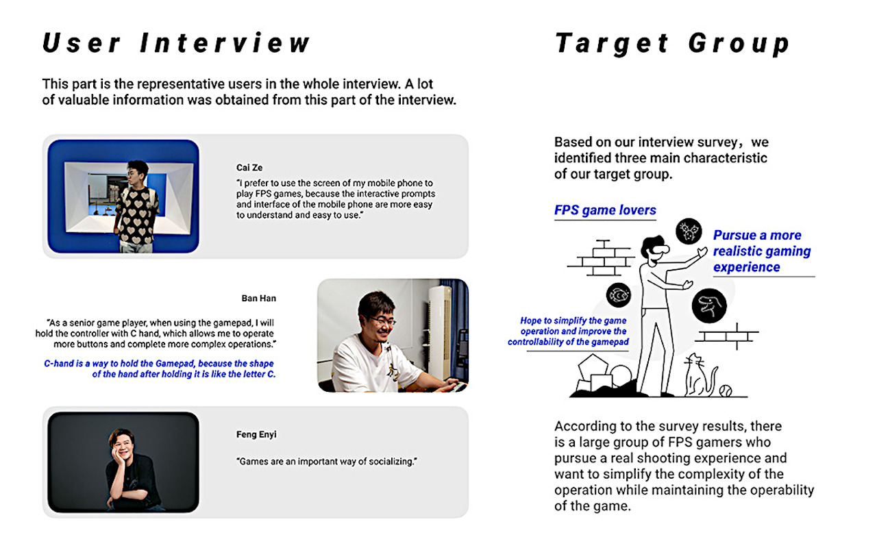
Many gamers complain about the inconsistent button layouts of game controllers, but one thing that has remained the same is the basic design players have learned to live with even if they don’t like it.

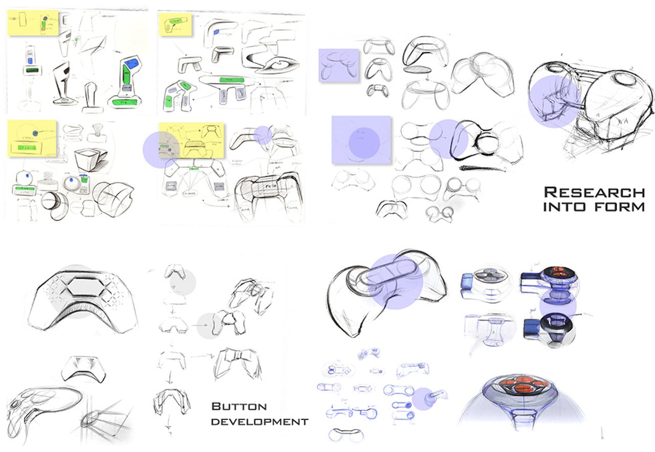
Gamepads have been around since the earliest days of video game home consoles, and they have changed little, but at the same time, have evolved significantly over the decades. For the past years, however, the basic shape of game controllers has changed little, even with all the research into ergonomics and professional gaming. Designers, however, are always coming up with ways to push the envelope, and one idea, in particular, pretty much changes almost everything about gamepads.

Designer: TongZheng

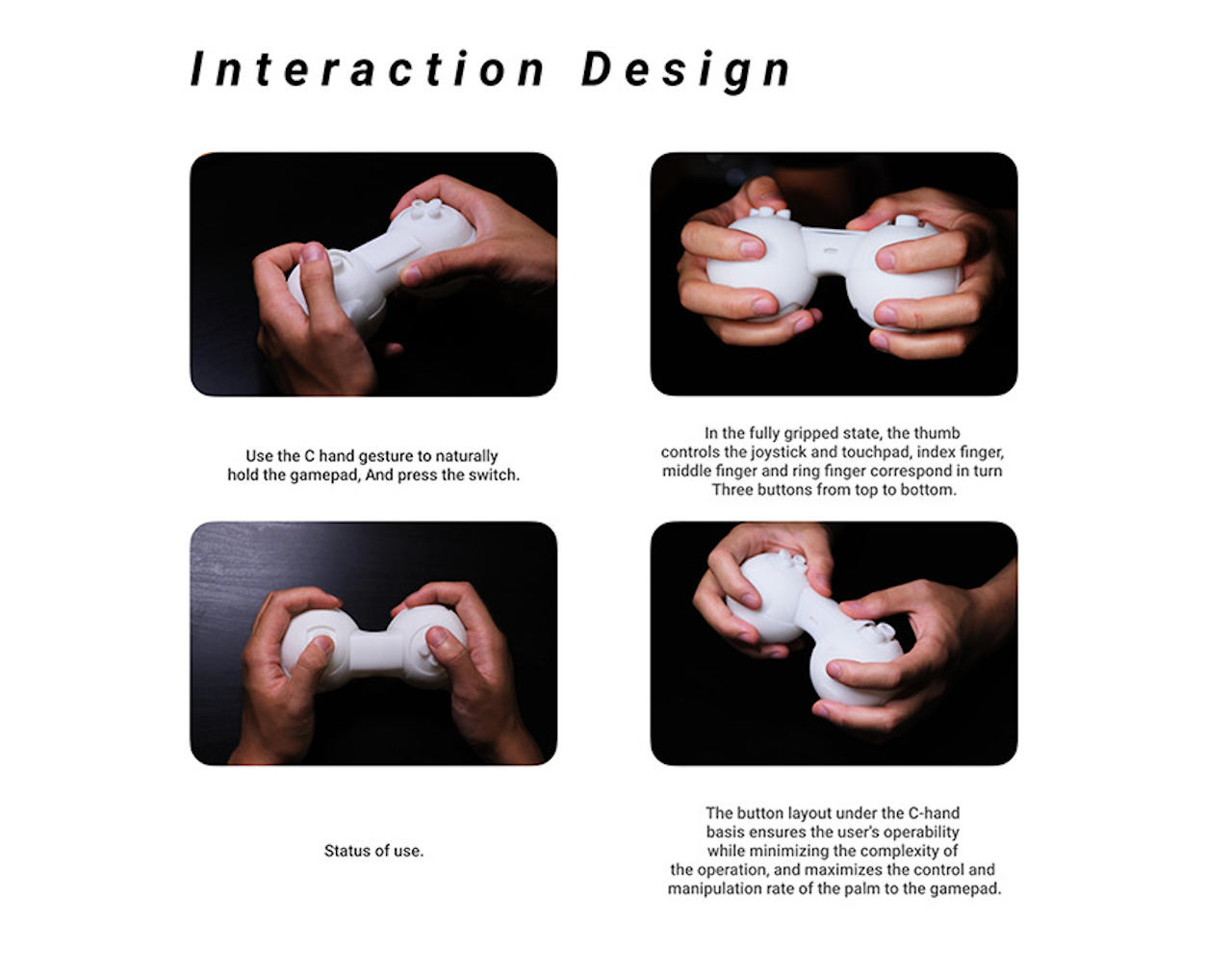
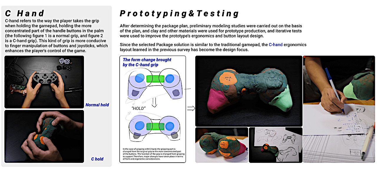
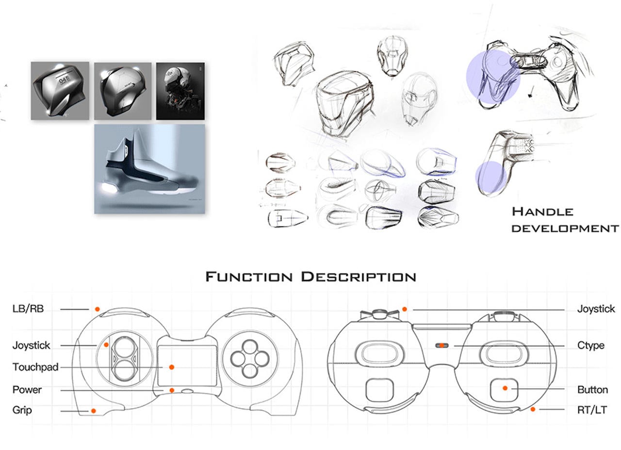
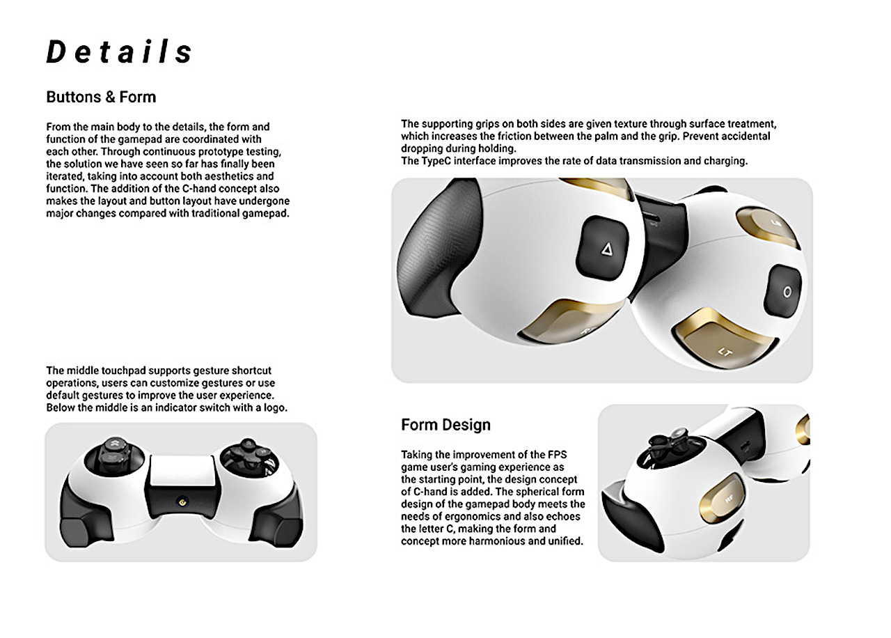
As controllers have evolved, gamers’ habits have grown along with them. Some games have started to require more interaction, requiring the addition of more buttons. More buttons, however, means changing the way you efficiently and comfortably hold a gamepad, leading to the birth of what is now called the “C-Hand” grip.

This C-Hand allows gamers to utilize almost all their fingers to push all available buttons and joysticks on a gamepad. Unfortunately, the current designs used by almost all controllers aren’t exactly conducive to this kind of grip. The “wingtips” of the controller that make it easier to hold the controller “normally” get in the way, and the constant switching between buttons and joysticks is a recipe for disaster for thumbs.

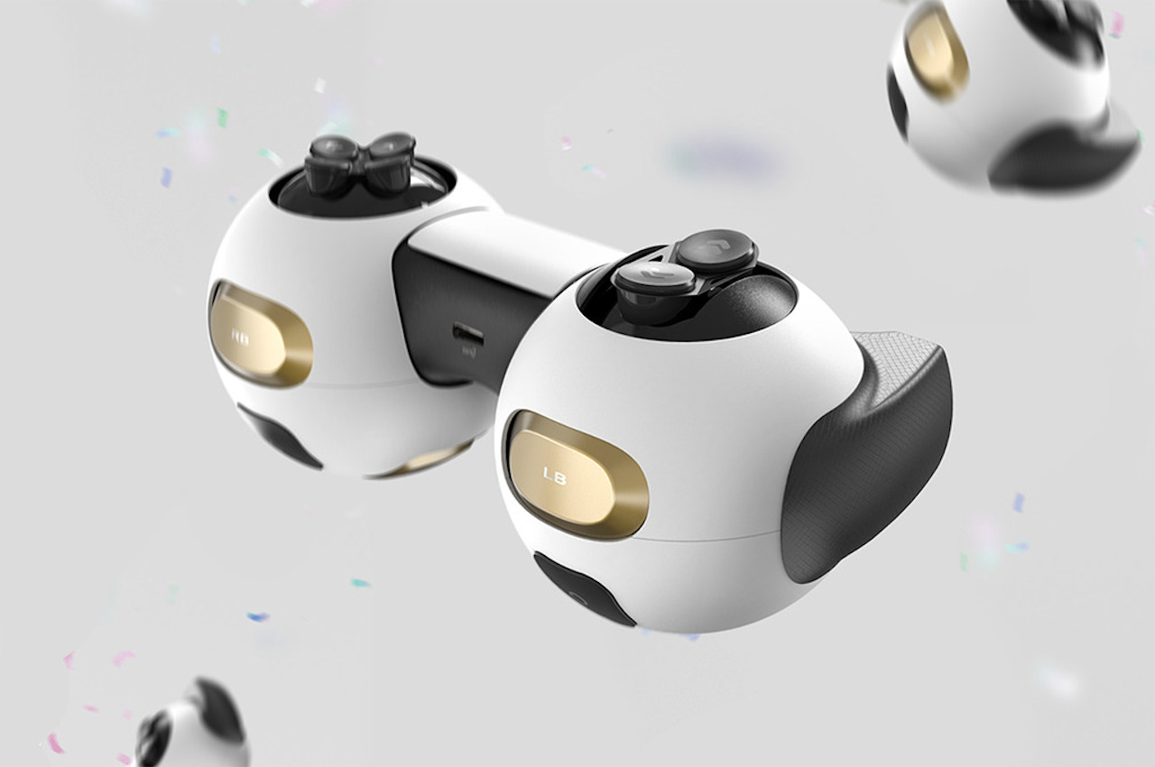
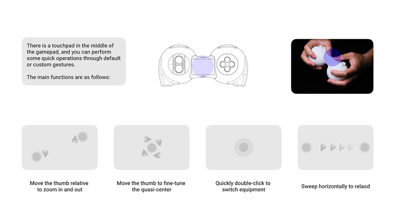
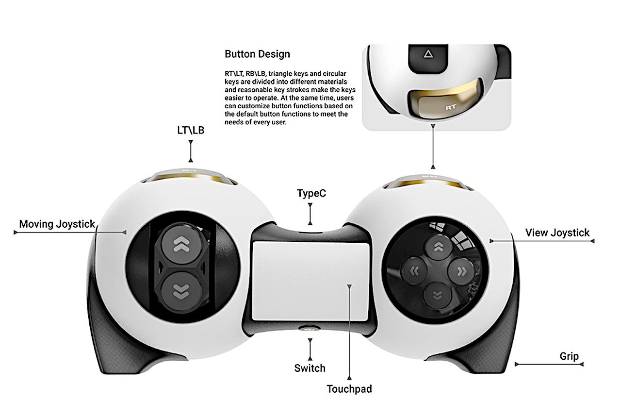
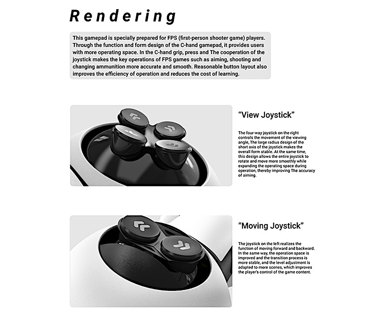
The C-Gamepad concept was born from the need for a controller that’s designed from the ground up specifically for this popular hand position, especially with its spherical shape and small protrusions for stability. This design, however, also moves some of the buttons around in order to reduce the number of thumb-switching gamers have to do. The biggest change, however, is the joysticks which are transformed into balls and lose the “stick” part.

Unlike regular joysticks, however, only the right side is able to move in four directions to adjust the view, while the left “joystick” is locked to moving characters forward or backward only. While this covers most actions within a game, it might leave other common movements out, like strafing to the sides. The biggest drawback to this new controller design, however, is the lack of familiarity with existing gamepads, but it might be a learning process gamers would be willing to go through if it means getting an edge over the competition.
The post This gamepad concept ditches conventions to bring comfort to your A-game first appeared on Yanko Design.