Revive nostalgia with this camera projector that resembles stacked stones while displaying your best memories

The art that most people can relate to is photography. It is something incredibly personal, much like any form of art. One takes a photo with great thought and emotion, which they will later treasure and discuss.

The only recollections that one can have that are closer to the actual event are those captured in photos. It is the only tangible form of expression of your recollection. Sometimes even the slightest details are captured, which your mind might overlook and forget about, but just a quick glance at a particular picture might bring back a thousand memories associated with it. This new camera-projector concept enhances the intention behind creating such memories.

Designer: Josh Schwefel

Since its creation in the 19th century, photography has advanced significantly. What for some people began as a hobby is now incorporated into our daily life. With the development of technology, photography has changed over time, from recording moments to producing works of art.

With every advancement in technology, from film cameras to digital cameras and from DSLRs to mirrorless cameras, photographers have advanced their trade. The development of smartphones and AI-powered editing software has made photography more widely available than ever.
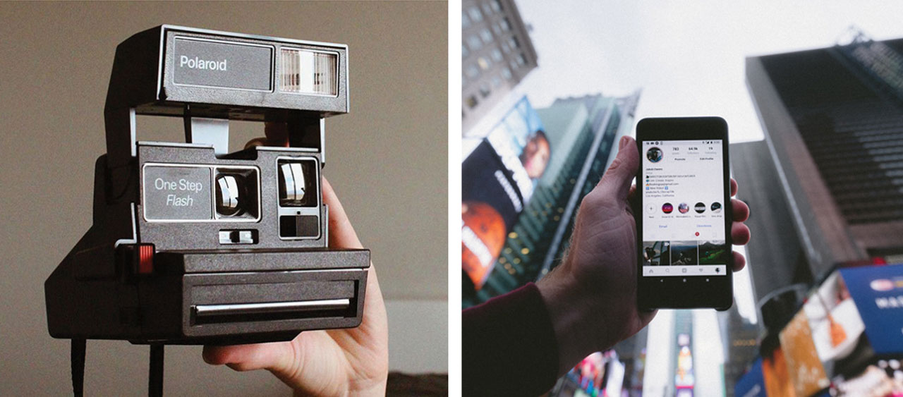
Smartphones don’t provide a unique aesthetic to videos produced, since we are so used to having them the interactions are less intentional. The goal of this project is to force user intention in digital creation and nurture communal growth through sharing of memories

Intentional photography has become increasingly popular as it allows photographers to capture the beauty of life in its simplest forms. Whether it’s capturing a sunset, a family gathering, or just everyday moments, intentional photography helps us appreciate and remember the little things that make life meaningful. Having said that, with the sabotaging evolution of technology, people have started taking these moments for granted. Because one can click unlimited shots without any restrictions, the value of each one is lost.
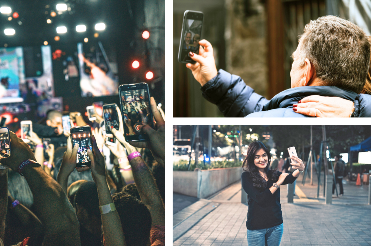
Curation is an important part of photography, as it helps us to create art that speaks to us on a deeper level. We can use our photos to tell stories, express emotions, and trigger memories. By carefully selecting our photos and arranging them in an aesthetically pleasing way, we can create images that are unique and meaningful. With the dominating involvement of social media, people have started curating moments just to capture and share them online. There is a relatively superficial approach to capturing. The actual nostalgic value lies in the candid and natural shots.

What differentiates a professional from others is the analog approach toward photography. They believe setting up a few shots is more satisfying than taking a ton of photos because it makes them really think of what they’re capturing. The wait between taking the photos and seeing them is what excites them the most.

Have you ever sat down with your grandparents and browsed through your photos of when you were a baby? Those albums were the real memories that initiated conversations. Bringing those albums as compilations for modern times and improving the nostalgic qualities.

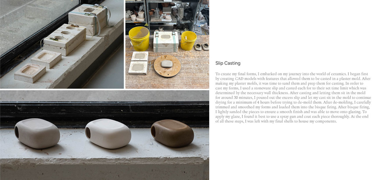
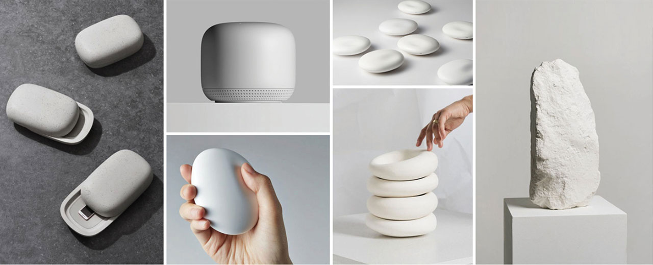
Since the intention of this project is to incorporate the tangible aspect, the material of the product is of utmost importance. Natural ceramics have the value of nostalgia, softness, and warmth that this project requires. It is ergonomic and a sense of touch builds a holistic experience.
The capturing device’s interactivity and functionality could be changed to encourage intentional use. Currently, we disregard the process as something that happens every day. Still, if constraints are put in place, such as restricting users’ daily recording time, the intention behind documenting is further increased. Features that make the experience more analog are by separating sight and sound elements.
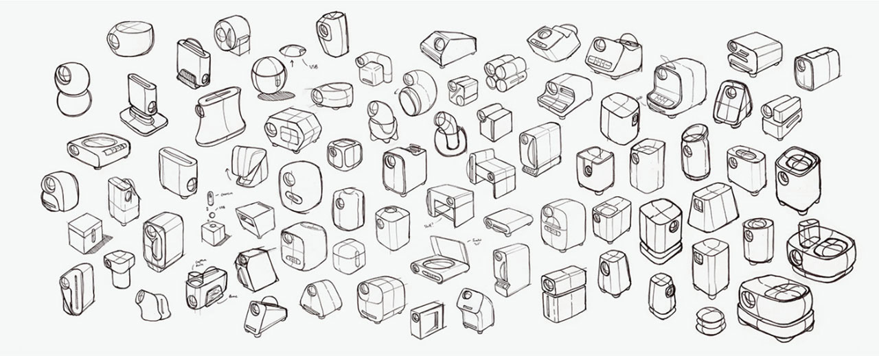
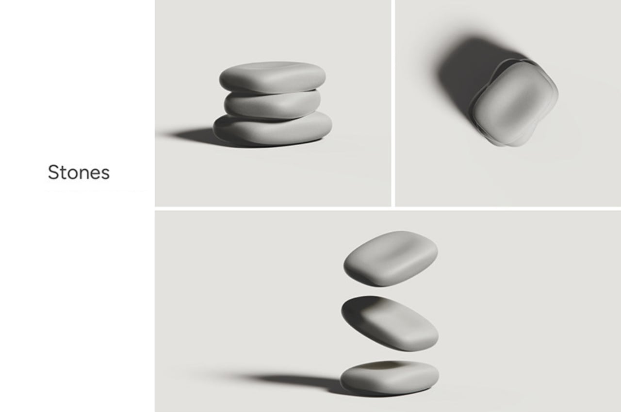
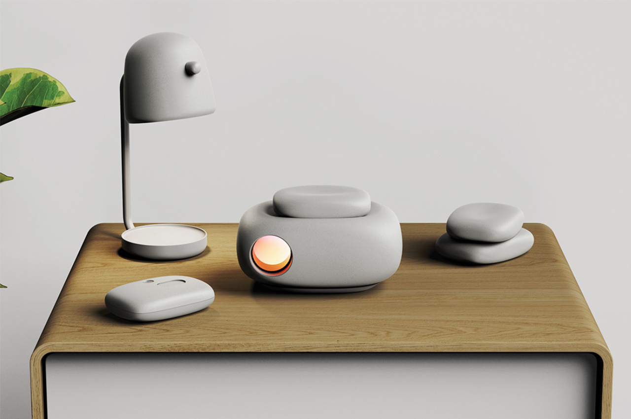
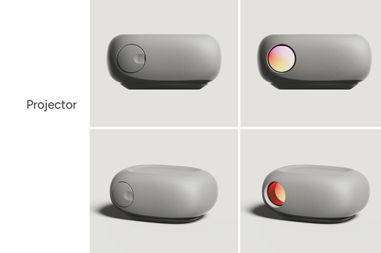
After developing 3 prototypes, an organic shape conquered the hearts! Resembling a stone, the projector sits on any countertop and acts as a base for the USB pebbles. This design was most appreciated as the memories were stored in a decorative manner looking like stacked pebbles which add value to the interior design while serving as a topic of conversation. Its natural organic shapes complement the ceramic material as well which makes it perfect!

The product comprises 3 components:

  1. The projector: All of the system’s products have a home in it. The organic form prevents the item from appearing tech-y. For both aesthetic and safety reasons, it comes with a lens cap. A small foundation that enables users to tilt the projection a few degrees to align it with their wall. The stone is perched atop the disheveled area. consists solely of a power port. The stones and camera both have storage for all data. Allow for flexibility in positioning with minimum ports.(image 10)
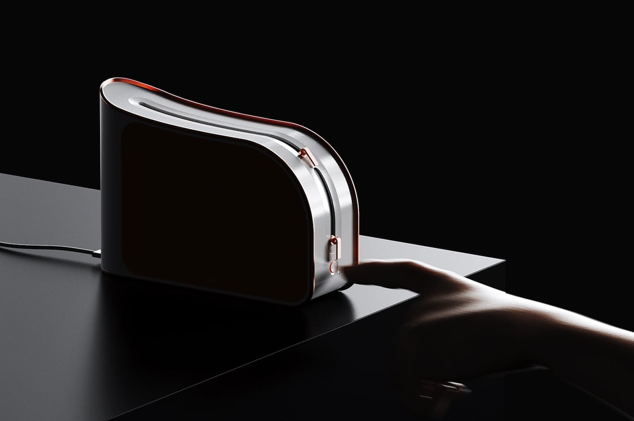
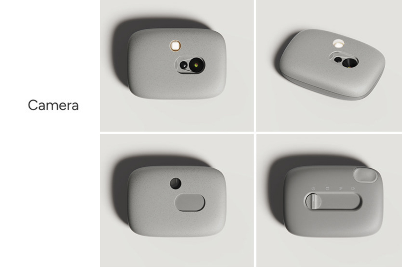
  2. The camera: The basic purpose of a camera, which was once taking individual pictures, has changed. When audio is being recorded, a picture will also be taken in addition to the sound byte. A photo will be overwritten and the video will play over the audio if a video is recorded without any sound. On this device, users won’t be limited to taking solely images. For each picture, there is a 10sec recording time limit for both audio and video. A mode slider and a capture button are the user’s two points of engagement. Simply sliding to the selected setting activates the camera and slides back the lens cover to expose the sensor and microphone. The camera is set on top of a stone to sync the data, and NFC is used to send the files. Through the projector, the camera is wirelessly recharged.(image 11)
  3. The stones: Between the camera and projector, which hold all the data, are the USB stones. They act as the projector’s interface for basic operations like play, pause, fast forward, rewind, etc. Users are instructed to press in that location by the dished surface on top. Additionally, it has a pleasant shape in the hand, which invites consumers to take it up and feel it. The three sizes of the stone signify three different storage options. Small content lasts for two weeks, medium for a month, and large for three months. After using up all the available storage, users can also buy more stones.(image 12)

As well thought this project is it might be a task to convince the audience to develop this patience and use it on a regular. Social media overpowering all underlying emotions might sabotage the quality of this project. Since the evolved polaroid cameras give out instant photo results with similar film photography qualities. The flexibility of capturing stills can also be considered as sometimes the photographic art is expressive in itself and in case if someone clicks a still, it should not get overwritten as that would develop resentment, losing its purpose.
The post Revive nostalgia with this camera projector that resembles stacked stones while displaying your best memories first appeared on Yanko Design.
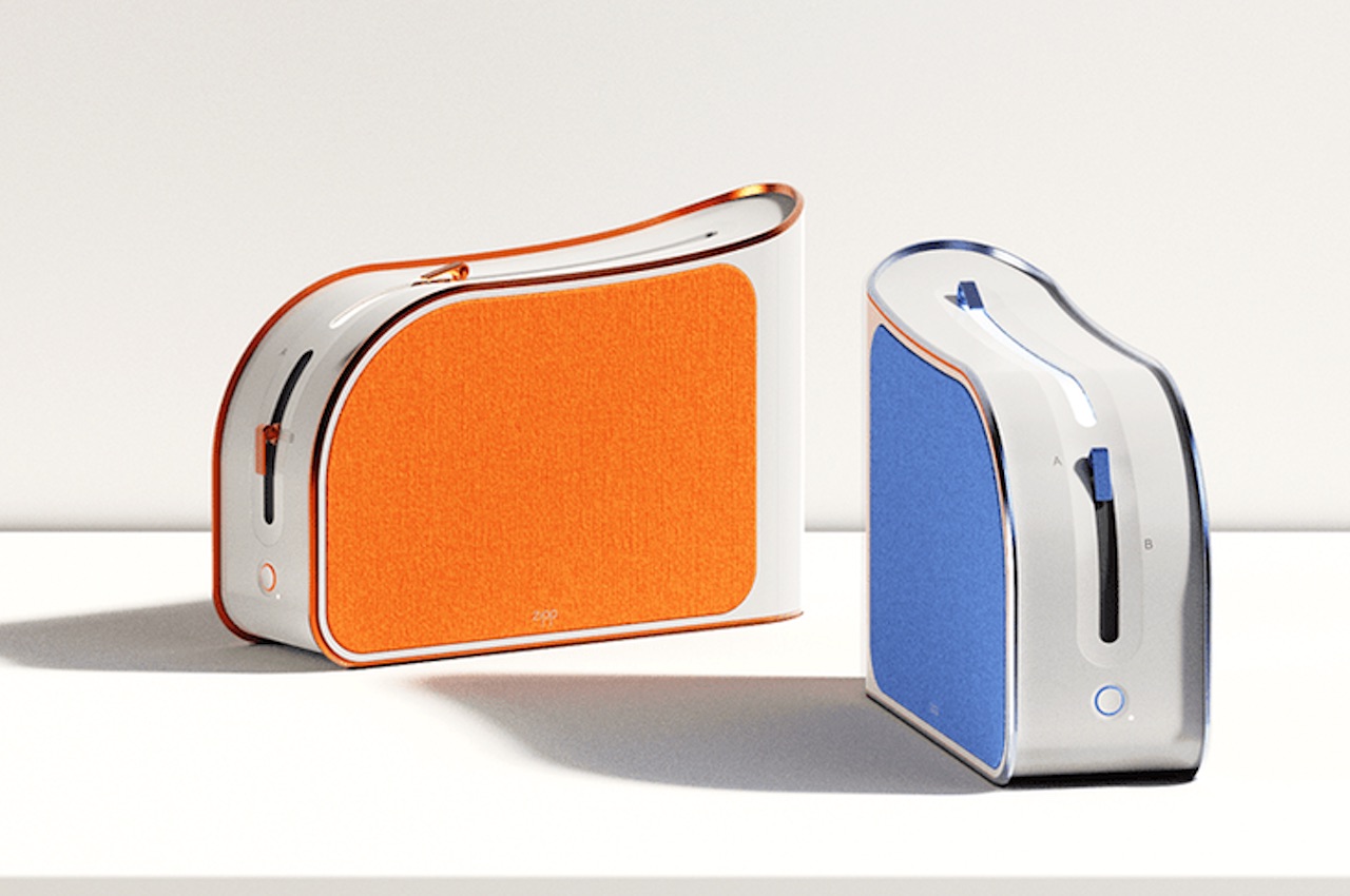
ZIPP Speaker Concept transmits sound to the user only

ZIPP Design

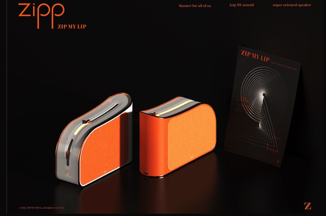
ZIPP isn’t a new lighter design even though we know it can remind you of one. This product is something from ZIP MY LIP, a concept brand described to be with manners.

Okay, so this is just a concept but the idea is that this super-cardioid speaker will only transmit sound to the user. This means it’s not exactly a loudspeaker for everyone in the room to hear. It is only meant to transmit sound to one user so others won’t hear.

Designers: Da-yeon Choi, Yeonhong Kim, Tae Rim Kim, Hanbom Jang, and 김 서연

ZIPP

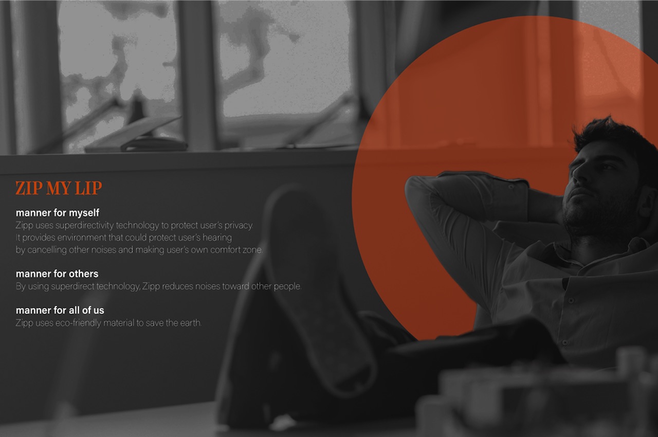
ZIPP is designed to protect the privacy of the user. Others are also protected from the possible noise. It affords good manners to many including yourself, others, and all of us. The super directivity technology helps protect a user’s hearing by proving a comfort zone, as well as, canceling other noises. Zipp reduces noise toward other people. The eco-friendly materials used on the Zipp are a good start as we move to save the planet from future destruction.

ZIPP Concept Design

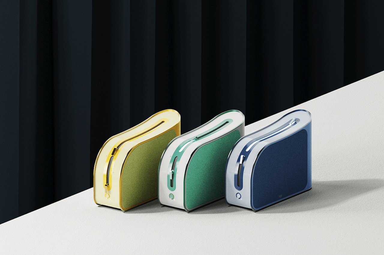
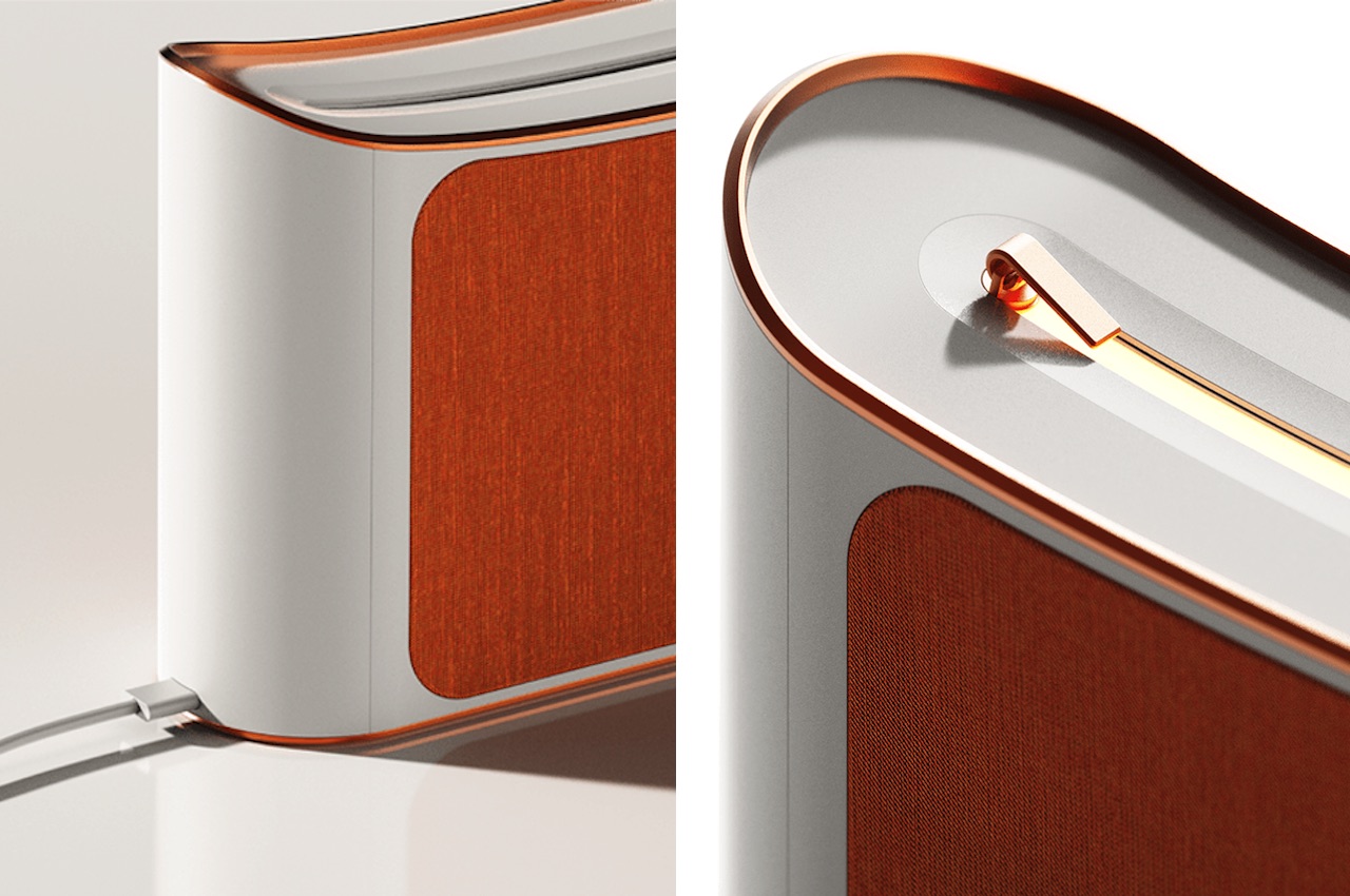
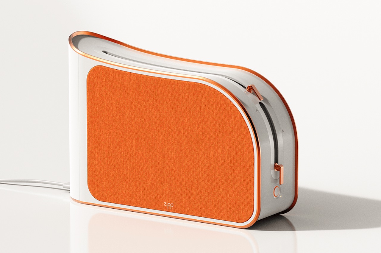
The Zipp looks like an uneven, hard pouch bag. It has a zipper-like feature on the edge that we’re assuming is where the sound direction or volume can be controlled. Both sides have speaker fabric in different colors: orange, yellow, green, or blue. There is a power button on the side and a cable port on the other. It can be assumed it will feature USB-C already.

The idea of Supercardioid audio isn’t really popular but there is such a thing. Some people may have heard about supercardioid microphone but the technology can be applied in speakers. The design alone of this product is one-of-a-kind but what makes it more special are the features.

The concept speaker by several Korean designers has potential. We can only hope this design gets picked up. If not exactly the same, then maybe just the idea of a personal and private speaker will be implemented. Or even if not the exact technology, just the product design can be used.

We’ve been seeing a lot of interesting speaker concepts lately. The most recent ones that made an impression were the TURNING AI Speaker, that Small Transparent Speaker, the Rum Project, and the BRIONVEGA TOTEM RR231 Stereo System. The ZIPP is different in many ways but it commands the same attention for its uniqueness and innovation. The aesthetics of the speaker alone tells us the ZIPP can be really a speaker. We like the idea but we’ll have to wait for the actual product to see if the design will work.

ZIPP My Lip Design

ZIPP Details

The post ZIPP Speaker Concept transmits sound to the user only first appeared on Yanko Design.

The wireless shark hair dryer is a fin-tastic conceptual design!

This conceptual wireless shark fin hair dryer was designed for children but I will happily admit that I would love to have one too! Usually, children are not allowed to use hair dryers by themselves because the wires can be dangerous, so a wireless hair dryer with a playful form can solve that issue for us. Wires can also endanger adults so I am declaring this to be a universal design, bring on the shark fins…I meant fans.

The dryer’s ergonomic build is based on the form of an actual shark fin. The shark fin is the dryer and the wireless charging pad has been shaped to form waves – despite not being based on a more joyful fish like the clownfish, the shark fin and waves evoke a sense of childhood nostalgia. The front of the handle has a switch that allows the user to adjust the heat between two levels and also a function that enables a cool blast of air to set your style. There are three glowing lights on the rear side of the handle which indicate when the dryer is on and what battery level it is at. A simple lightning motif on the base marks where the charging cord should go when the wireless device battery is running low. The minimal design and muted colors appeal to users of all age groups.

The ridges of the ‘waves’ base seamlessly blend with the dryer when at rest giving it the look we all recognize from movies, books, and aquariums – the peeking fin! This wireless shark fin hair dryer is a classic innovative product that everyone is bound to love. Anyone else’s brain singing baby shark?

Designer: Sangheum Park


A medical device that gives you doctor-free monitoring from top to toe!

I am guilty of going to the doctor for the smallest concern because there is no way for me to analyze what requires immediate attention. I am sure that I am not the only one who Googles symptoms and then descends into panic. It would be so much easier if there was a device like Kala, conceptual health monitoring smart kit that provides a complete non-invasive medical check-up.

A quick look at how much time, money and stress this could save us – 1/5th of doctor’s consultation time is spent on non-medical issues and there are more than 13.5 million GP appointments that do not require medical attention, most of these can be attributed to the human nature of worrying and because there is no other way of ruling out how we feel. Devices like Kala that use existing technology in innovative ways can pave the way to make monitoring devices digital, smaller, non-invasive and most importantly, accessible.

Over 60% of the world’s deaths are caused by heart disease, stroke, cancer, respiratory disease, and diabetes. The first step in diagnosing these ailments requires simple tools like a stethoscope, thermometer, blood pressure pump, and self-glucose monitor – Kala includes all of these and more. It tests lung functions, temperature, blood glucose, blood oxygen, stethoscope, electrocardiogram (ECG), blood pressure which can reduce panic doctor visits and save time on follow-ups too.

Kala uses artificial intelligence to read and translate data from the device into understandable diagnostics for the user. The smart device is trained to recognize normal and abnormal values – so it cannot diagnose diseases but it can warn you when something does not seem right about your vital statistics. It has been designed keeping in mind that apart from regular check-ups at home it also serves for emergency check-ups, hence the results are in a simple green or amber color for the user to quickly grasp what’s happening and take action if needed. It is crucial in eliminating anxiety while waiting on an appointment date and lets you monitor your health at home which can save many of us from the spiral of overthinking a small allergy or heartburn. It is also a great way to find out if it is a concerning situation and then taking the right call which can also end up saving time in many cases.

One of the coolest features is that it is independent of smartphones and the internet which is a major advantage thanks to the built-in AI but also has the sync-to-your-phone feature to look back at results. If you don’t have a smartphone that is fine too, it includes a built-in thermal printer so you don’t have to rely on any other external factors to do a well-rounded test and keep the results – this is especially helpful in lesser developed regions where users may not have smartphones to sync and track their health data. The parts are made from stainless steel which retains a clean and sterile surface. The rest of the box uses recycled plastic. One of these devices can help an entire community where medical facilities might be scarce, it makes good health accessible to everyone.

Kala is the future of having an efficient and accessible health management system for individuals, communities, and reduce the load on medical facilities.

Designer: Maximos Angelakis

This reusable protective case is egg-cellent for your next grocery haul!

What is the biggest fear we have when buying groceries? The guy bagging them will inevitably place something on top of the eggs and the rest of your stuff will be covered in egg slime. Surely, I can’t be the only one who has experienced that, so when I saw the Egg Guardian case I got super eggcited – get it?

Now, this is a conceptual design made for a research project about sustainable food packaging but I know we all want this to come to life ASAP because it is just ‘eggcellent’! The Egg Guardian was aimed at reducing packaging waste and protecting the eggs from bad grocery packing strategies. It is designed to be made from aluminum because of the material’s recyclable qualities, durability, and ease of cleaning. It will also be created to fold into a flat sheet when not in use so that it can be carried around or stored without trouble.

I love it when a design is simple and yet has eggstraordinary (I can go on and on) impact on packaging and food waste management.

Designer: Stephanie Alexander

This packaging design knows the heart of every cheese (lover!)

Okay, I am going to cut straight to the chase…or shall I say let’s cut to the cheese? I apologize in advance for puns, I hope they stink less than blue cheese! This old Amsterdam cheese cover brie-longs with your cheese because it understands the matters of the heart. No, it literally does – this cover is built in a way that it showcases the heart of your cheese and also protects it. The conceptual cheese cover is appropriately named ‘El Corazon’ which translates into ‘the heart’.

The center of the old Amsterdam cheese is usually served as tapas or aperitif (small savory dishes that complement beverages) and therefore deserves to be displayed like the showstopper of the snack bar that it is. The case also prolongs the cheese’s life in the refrigerator while turning into a functional showcase when needed. The goal of designing this cheese cover was to keep it simple yet effective while preserving the contents and also showing them off. The concept was tested with a prototype made using SolidWorks, CAD, and 3D printing, ensuring that your cheese always feels gouda about itself!

Designers: Mike Broekman, Erik Veenstra and Smaac Agency.

A Japanese charm redesigned to keep you healthy by syncing with the earth!

Omamori (お守り) are traditional good luck charms in Japanese culture that protect the wearer of the charm. The Japanese word “mamori” (守り) means protection, while prefix “o” gives the word an external movent connotation, transforming it to “your protection” and there are Omamoris for every area of life: love, health, luck, trips, success, protection. The concept of Kenkō is a futuristic take on the traditional Omamori, it does not cure illnesses or ward off evil spirits but it helps you stay healthy by being in sync with the earth’s electromagnetic frequencies. It is ergonomic, travel-friendly and minimal while still being a powerful force.

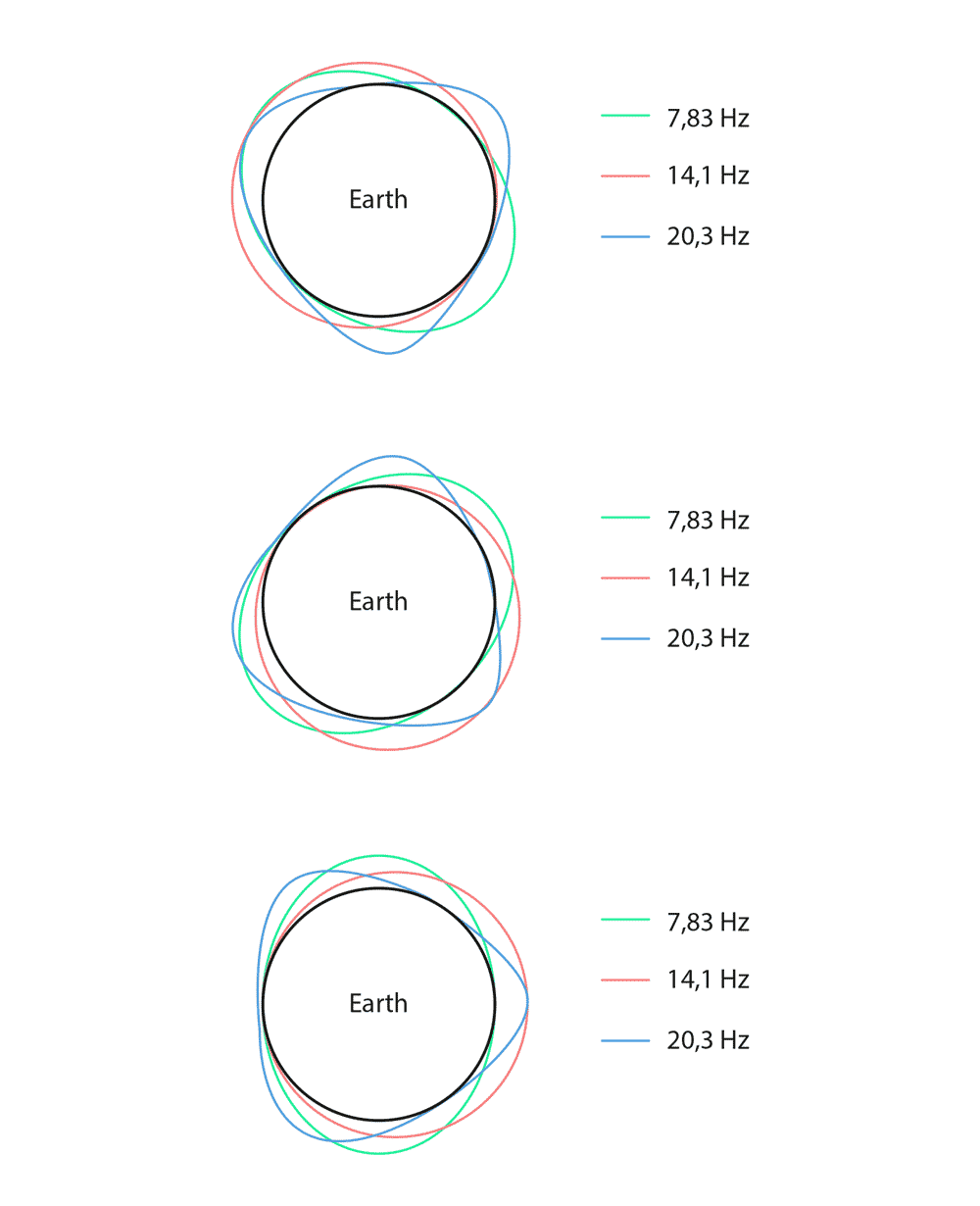
The earth is constantly emitting 7,83 Hz (also known as the earth’s breath, who knew that?!) along its surface which is believed to allow living beings to regulate their physiological functions. Scientific studies show that the earth’s natural magnetic fields have a positive influence on our brains. With the rapid development of electronic communication technologies, our bodies are getting confused between the natural and artificial frequencies which are dwindling our inherent ability to be in sync with nature. This concept device is aimed at increasing focus, coordinated neural activities, improve sleep and circadian rhythms, stabilize blood pressure and stimulate osteoblasts. Kenkō will be created to produce a 7,83Hz signal, reproducing the natural frequency using technology which will help human bodies re-establish their intrinsic relationship with being healthy naturally. It will have an LED light strip that glows when you switch on the device. Electrosmog caused by Wi-Fi and smartphone frequencies can no longer disturb the sync between the natural rhythm and your brain with Kenkō’s 1.5m protection radius around you. It is also designed to be pocket-sized so you can carry it everywhere like the traditional Omamori is meant to be but with a sleek touch of tech!

Designer: Daniele Peruzzo

A Fidget spinner enabled travel tool to keep your travel anxiety at bay!

How many of us have travel anxiety? It could be restless tapping of your feet while waiting at the boarding gate or in-flight fidgeting with the controls, we have all been there. This cool conceptual tool is not only a travel essential but also a fidget spinner that doesn’t look like it came with a happy meal. While most multipurpose tools are a combination of cutters, this titanium variant brings a lot more functionality than opening up like Wolverine’s claws!

When you are traveling there are so many tiny details that might slip our mind, especially when we are backpacking and cannot rely on fancy hotel services or big city solutions. I am sure we have all gotten beers or wine from a local shop only to come to our room and find that we don’t have a tool to open either – that’s when Tspin comes to the rescue. Or the time when we remember to buy the international sim card but forget that little pin to open the slot – another worry that is taken care of by Tspin with its dual nano-Sim card-holder and yes, that little pin! And a major thing if you’re traveling solo – a smartphone stand so that you can be in some of the pictures too or watch Netflix while waiting on your train. It also has a carabiner clip that definitely looks much sleeker than the one in your camping kit.

For all of us who wear glasses, this becomes an everyday carry item with its tiny screwdriver to tighten the frame whenever we need it. It also works as a cable wrapping tool – whether you are traveling or not, your earphones will tangle themselves and this little tool saves us from that frustrating man vs cable fight. Our only word of advice, this titanium concept tool may or may not be bulletproof so don’t go all David Guetta on it!

Designer: T’spin

This Apple Pencil-based dropper is a DJ that drops data instead of beats!

Remember the simpler childhood days of using the dropper to pick a color and spill it *carefully* on another sheet? We then advanced from papers to MS Paint and I doubt any of us were able to master that virtual dropper. Now we are in the Apple era but the nostalgia of the simple dropper is not lost and that was the inspiration for the iSpoid – a conceptual dropper that picks up data instead of colors and we are here for this!

The motion of using a dropper to transfer colors was reinterpreted with the data delivery interface with an Apple pencil-like tool which has been christened as iSpoid for this concept project. The group of Korean designers who came up with this conceptual product wanted to make data transfer and data sharing between devices as easy and joyful without the stress of connecting via Bluetooth, hard drives, and the quest for finding the right device to AirDrop. The product development phase involved sketching, brainstorming about usability and making the device itself as physically similar to a dropper as possible – if you observe the form, its a hybrid between the color dropper and the Apple Pencil. The action is instinctive with this device, you position the dropper on the file, press the bubble on top and watch the 3 lights on the tip light up indicating the file has been picked. You then drop it on the desired device and the lights will dim down just like releasing color from a dropper, but here it is the data.

Keeping the aesthetics of Apple, the iSpoid also has a conceptual magnetic charger where you can mount the tool in a vertical position on the sleek stand. The package design and shape are inspired from a measuring cylinder. The concept delivers on its aim to create a minimal, user-friendly, functional device that makes co-working more efficient. Will data scientists like to be called data artists after this?

Designers: Chi-Eun Jang, Hyeokryul Kwon, Jaegeun Kim, Jeongmin Lim.