This contemporary and spacious home rests peacefully above the treetops of rolling hills in Texas

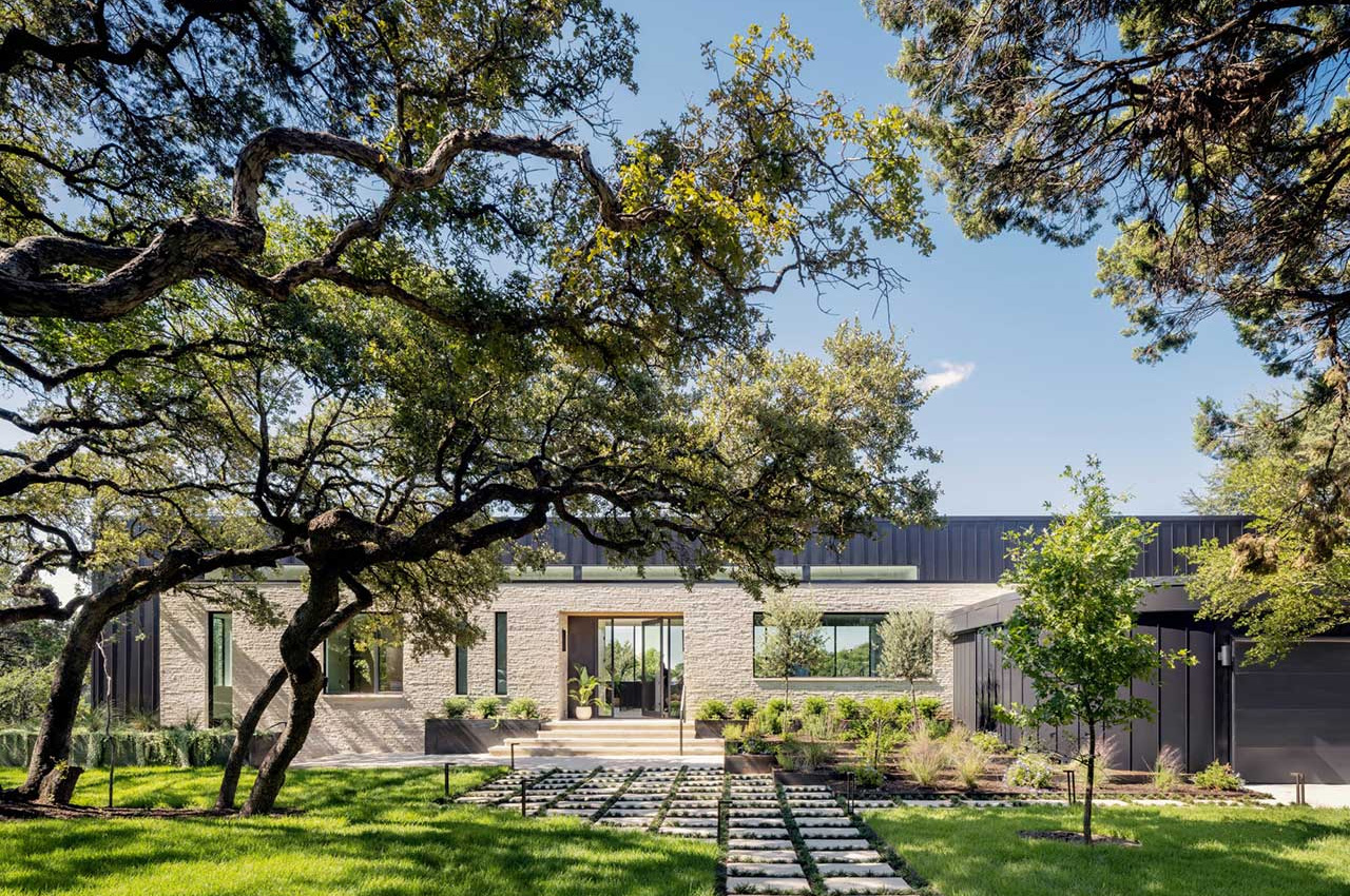
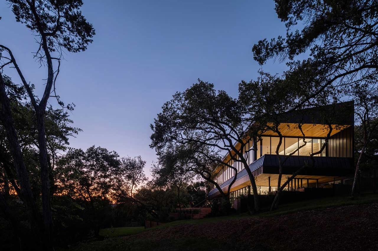
Devin Keyes of Keyes Office of Architecture designed the Live Oak Ridge Residence in the rolling and lush hills of West Lake Hills, Texas. The modern contemporary style home is nestled among the treetops, offering stunning views of the surrounding hills, while also ensuring that privacy is maintained. The home has been accentuated with ample amounts of covered outdoor space to help combat the strong Texan heat – including the presence of a swimming pool just a few steps away from the house.

Designer: Keyes Office of Architecture
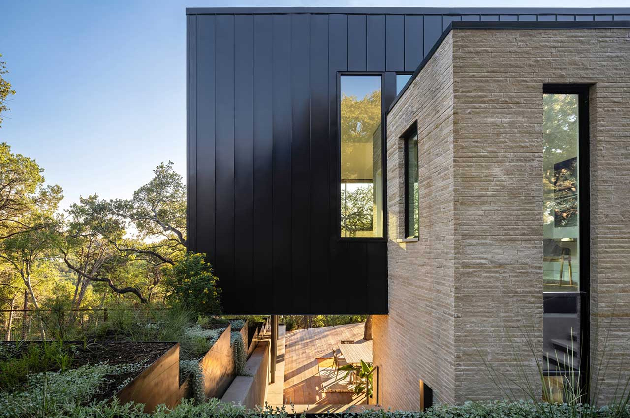
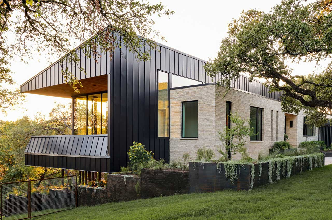
The home’s exterior is built using pale limestone and black metal panels that seamlessly complement one another to create an aesthetic that is visually intriguing and enrapturing. The volume clad in pale limestone functions as the entryway from the street, and as a hub for the private sections of the home. The kitchen is also located within the stone volume, with one end amped with views of the hills, and the other end with views of the front yard. The soffits have been clad in cedar wood, which gracefully match the decking surrounding the pool.
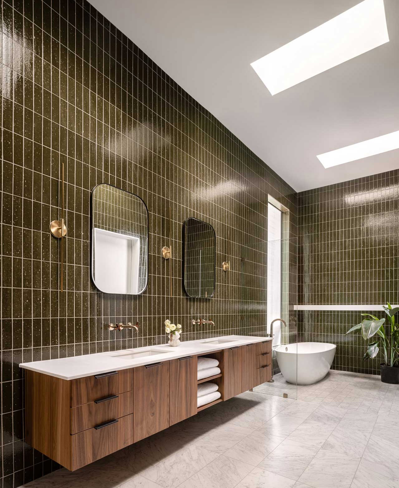
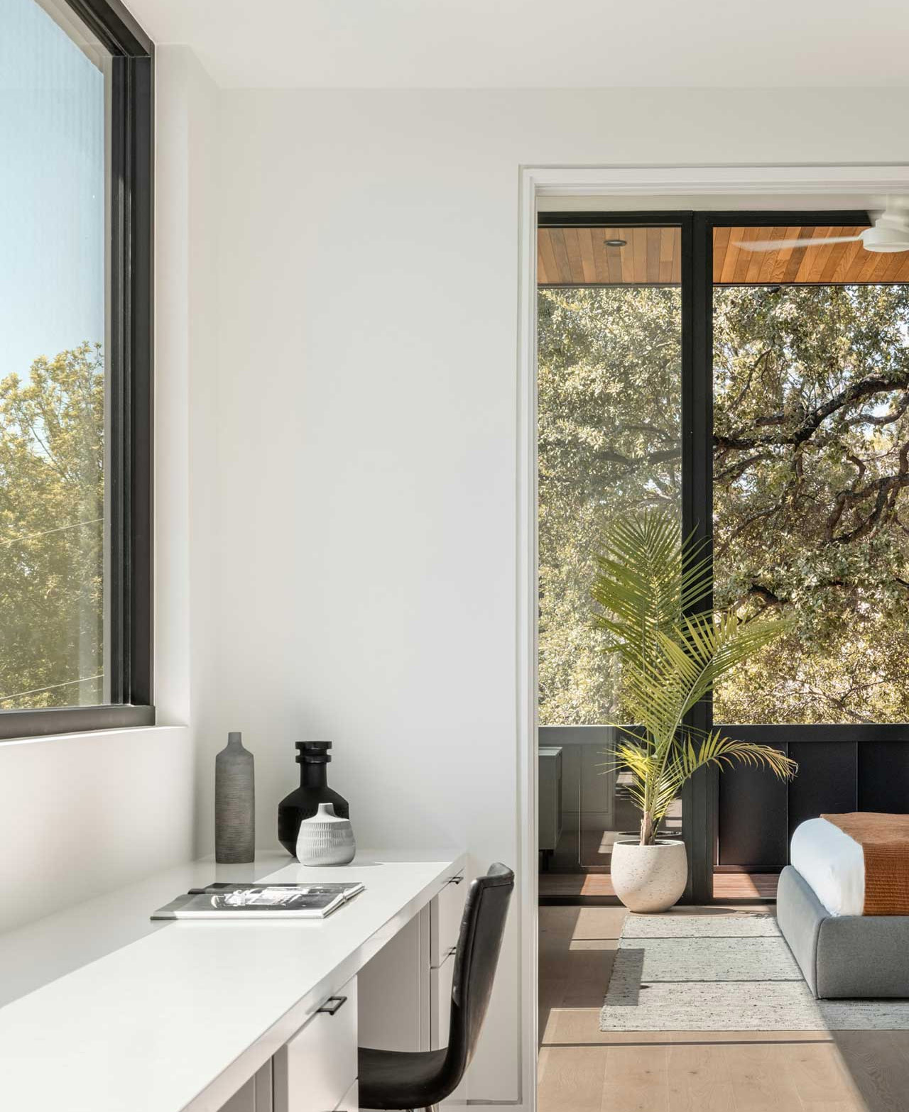
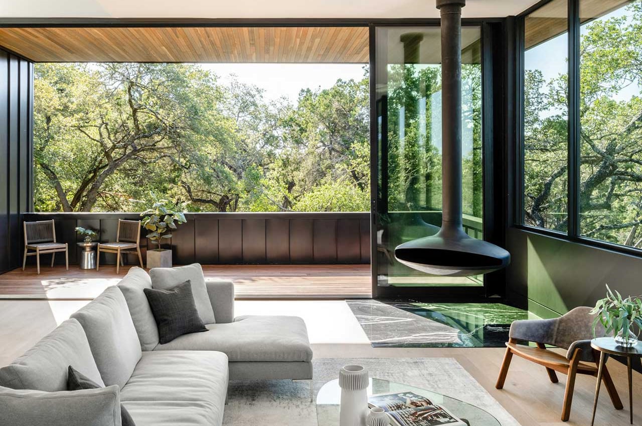
The interiors of the home are warm, welcoming, and spacious. The lower level features a series of bedrooms and an elegant living room with two glass walls. This space opens up to the outdoor entertaining spaces quite seamlessly. The upper story functions as the main living space, equipped with a kitchen, dining room, living room, seating area, primary bedroom suite, guest quarters, and an outdoor balcony. The balcony is connected to the main bedroom and makes for a good spot to catch the sunrise.
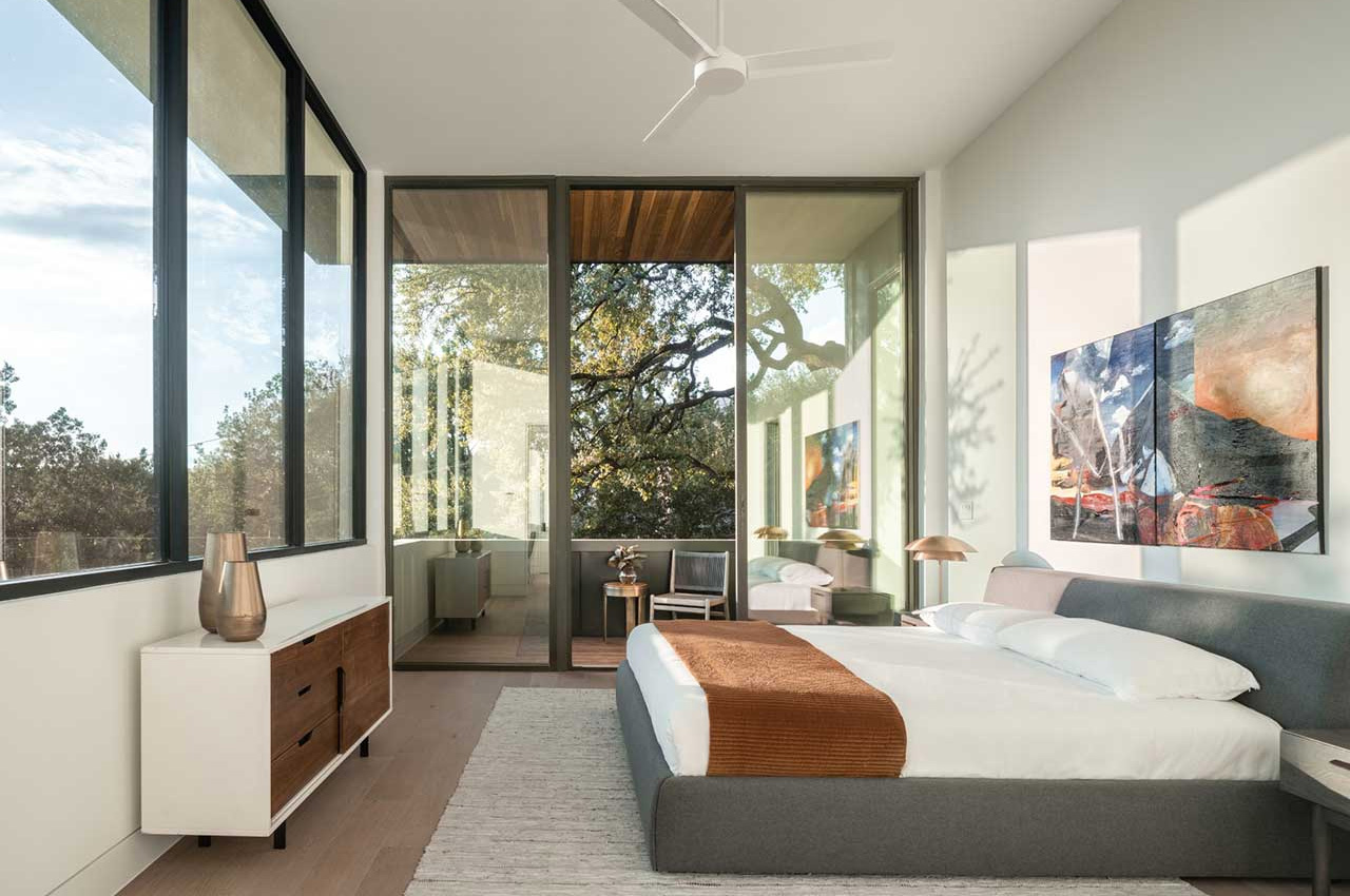
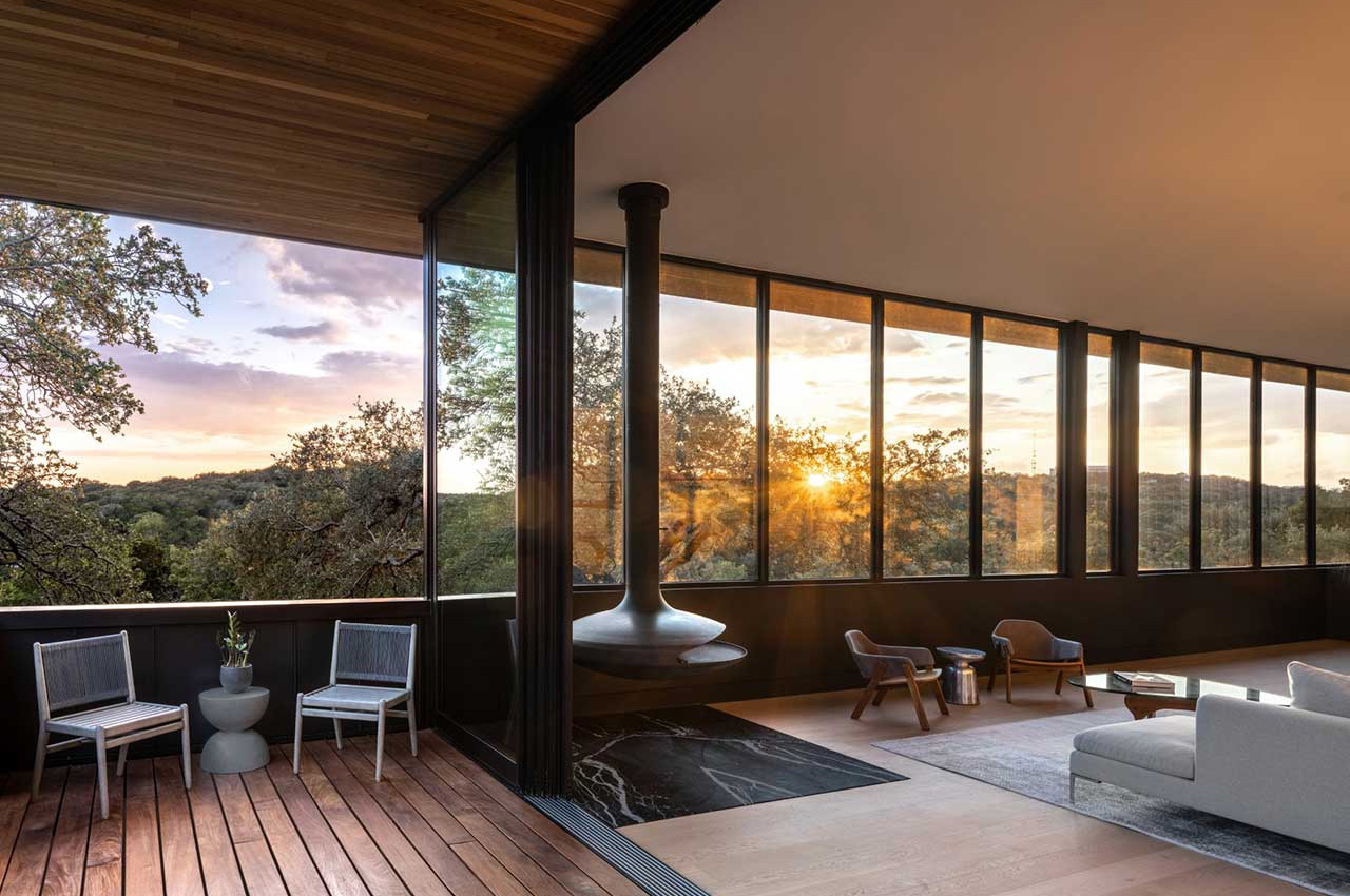
The living room is enhanced with large windows that allow natural light to stream into the interiors, creating a space that is open and free-flowing, while also providing access to scenic views. Clerestory windows at the front of the house also help with this. These smart details and thoughtfully designed interiors create a home that is calm, tranquil, and a sort of safe haven from the aggressive heat of Texas. It’s a beautiful home amongst lush trees that looks like a fish out of water in Texas, but somehow just fits right in.
The post This contemporary and spacious home rests peacefully above the treetops of rolling hills in Texas first appeared on Yanko Design.

Modern iPhone 4 concept shows what the iconic Apple smartphone would look like if it were released today

Designed by Nathan Basset who goes by Reddit username G8M8N8, this beautiful handset merges nostalgia and innovation into one delightful package. “iPhone 4 is objectively the best-looking iPhone,” said Nathan, who designed this new-age iPhone based on its 2010 predecessor’s design language. I’m not one to invoke Steve Jobs’ name at every instance, but I do feel like this is the kind of phone he’d be proud to look at. It has the iPhone 4’s design language through and through but builds on its specs and details in a way that makes it futuristic. You’ve still got the classic aluminum frame with glass on the front and the back, but no raised camera bump like the one you’d see on the iPhone 14. The modern iPhone 4 has two large camera lenses that rest against the flat surface, gently protruding outwards. There’s no Home button, or any button for that matter… all you’ve got are flush control surfaces and a mute switch. There’s a Dynamic Island on the front, and what looks like a USB-C on the bottom. If the iPhone 4 was rebuilt again using the rumors of the iPhone 15 as a reference point, this is what we’d get… and I can’t help but think that Jobs would quite like it.

Designer: Nathan Basset

The phone comes in two color variants – Black, and White, just like the iPhone 4. Glass panels cover the front and the back, although, unlike its predecessor, this one isn’t a slave to bezels. The screen on the front pushes its way to the absolute limits, creating an absolutely seamless display with just a hint of a bezel on the sides. In true iPhone 4 fashion, the bezels on the white phone are white too. There’s a small cutout in the bezel on the top to make space for the receiver, which is a little more visible in the white variant.

The two-camera layout is a tribute to the iPhone 4’s lack of a Pro variant. In doing so, this model sticks to the basics too, however with larger camera modules that let more light in to the larger sensors, capturing pictures with much more clarity and vivid detail.

In keeping with the rumors of a button-less iPhone 15, this model ditches buttons too for pressure panels on the side for power and volume control. The only real hardware element is the mute switch, which is rumored to go on the iPhone 15 too, but Nathan decided to retain it for this concept because Jobs would have probably fired entire teams to ensure the mute switch remained untouched.

Flip over to the bottom and you’ve got yet another symbol of ‘Ghost of iPhone future’ – the USB-C charging port. Sitting between two stereo speakers, the USB-C charging port is perhaps the one biggest change to come to the future iPhone. Included in this concept just for good measure, it acts as a symbol of the future, while reminding us of the iPhone 4, which was the last iPhone with the original 30-pin connector. There’s no headphone jack on this concept, sadly. 🙁

The post Modern iPhone 4 concept shows what the iconic Apple smartphone would look like if it were released today first appeared on Yanko Design.
This treehouse is built from felled trees to prove the importance of effective woodland management

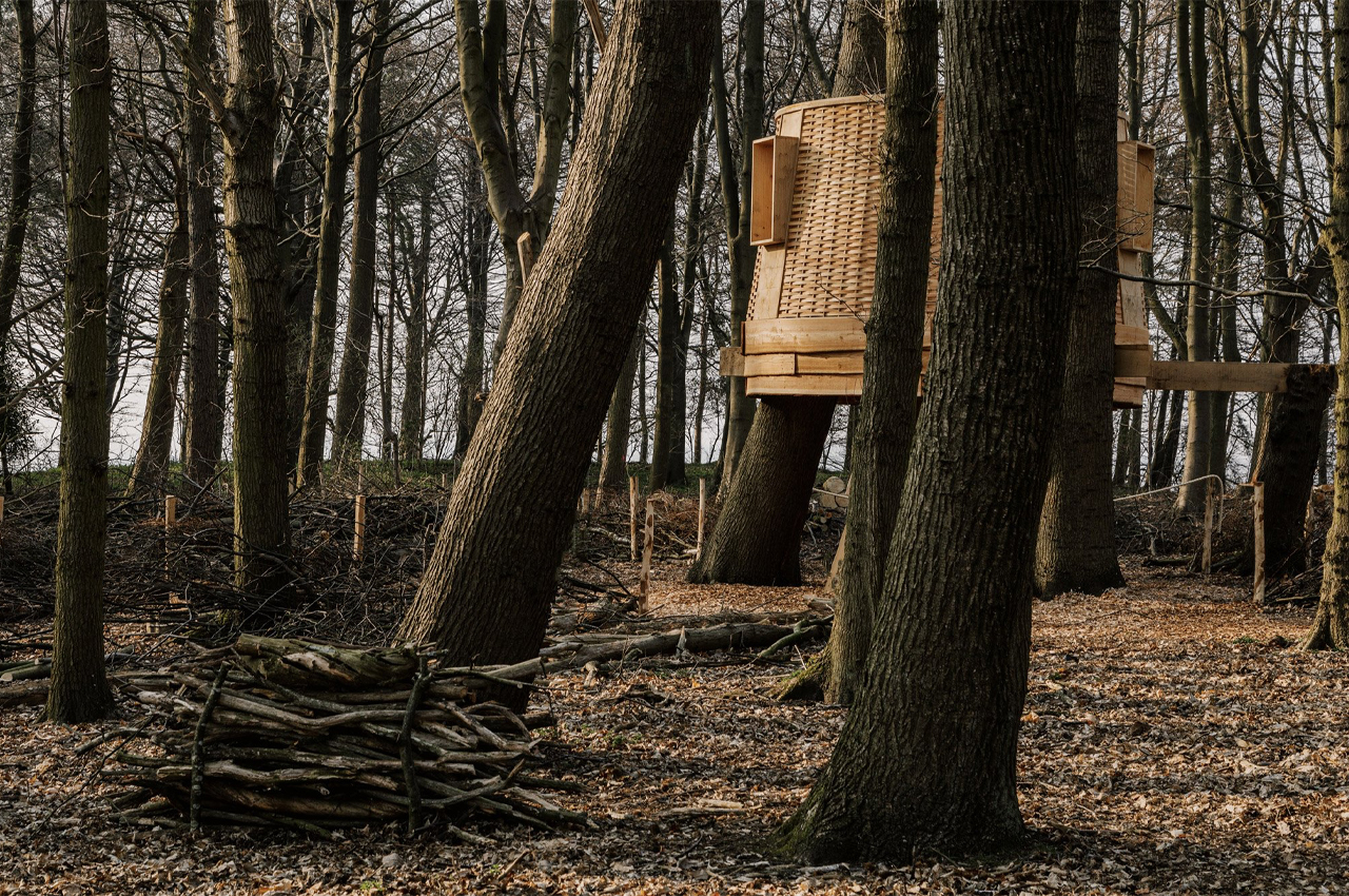
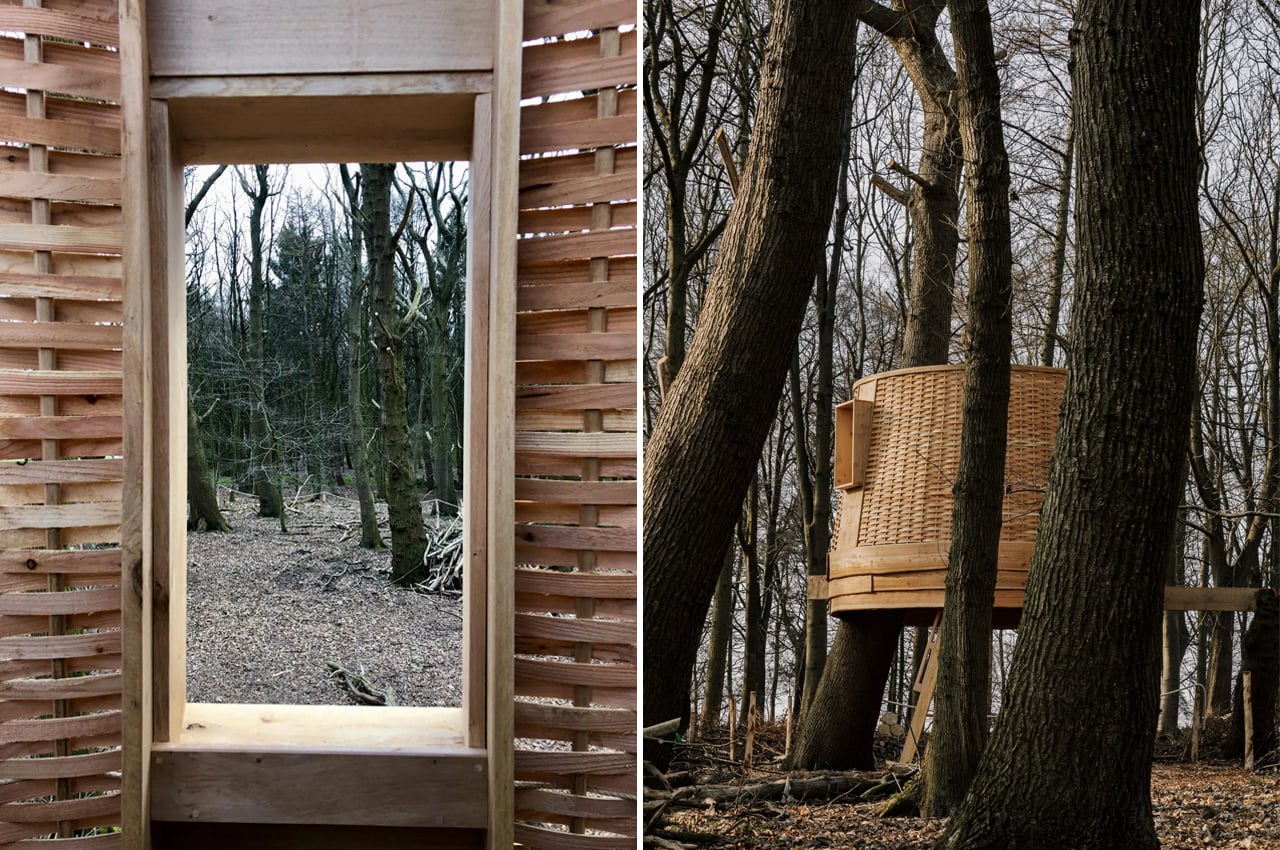
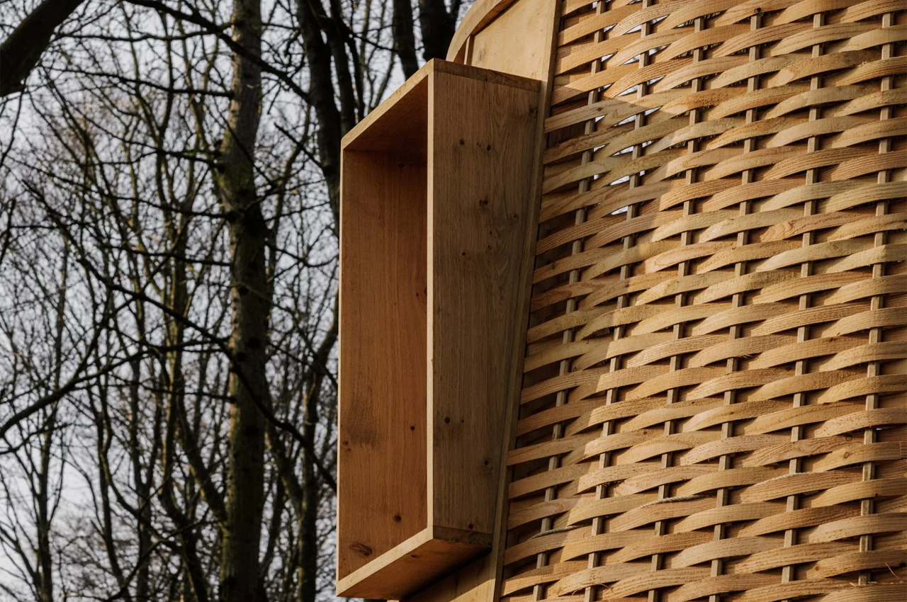
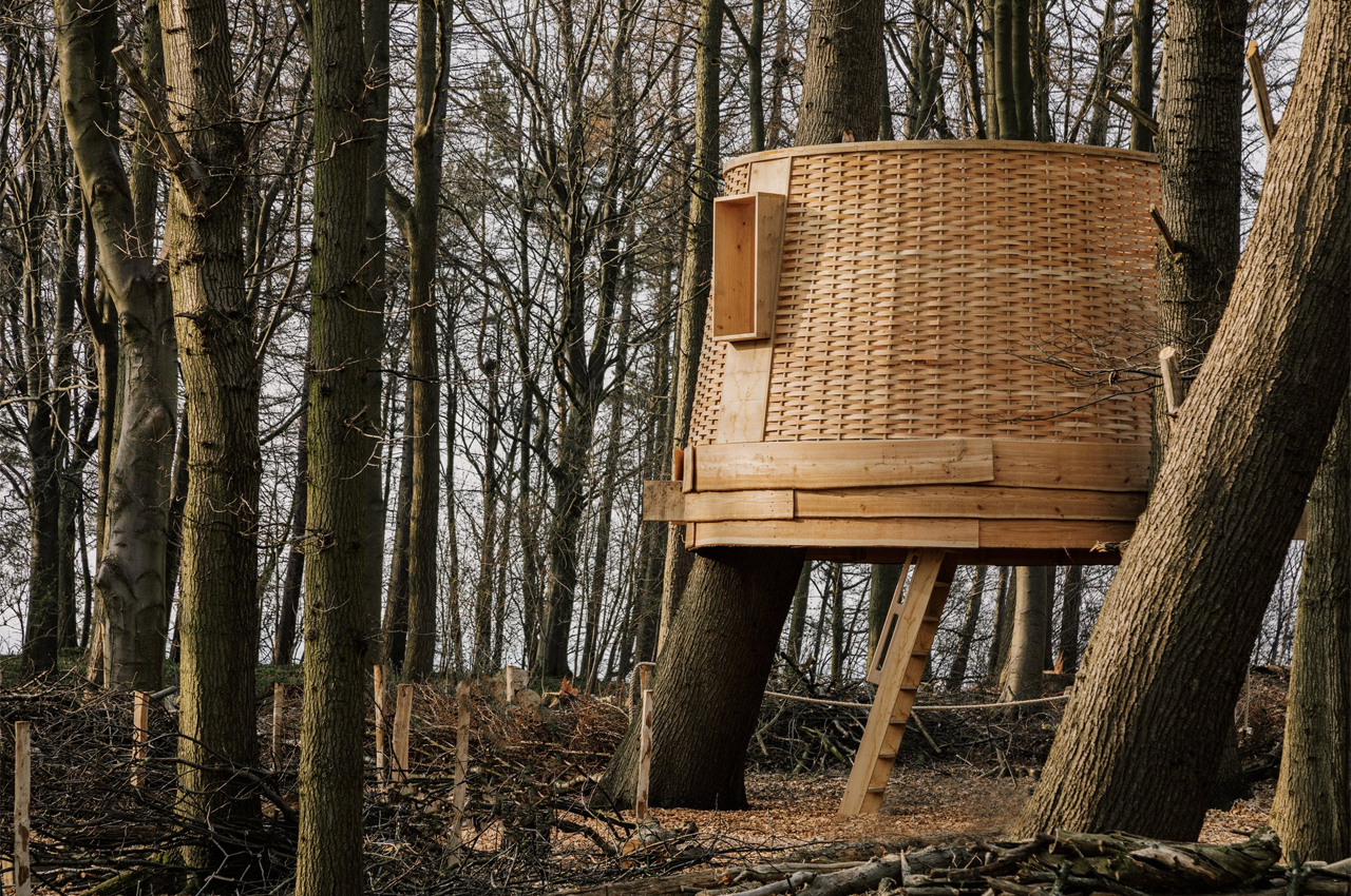
The Sylvascope is a wooden treehouse built for The Harewood Biennial 2022 exhibit where designers and artists explore why craft is a radical act.

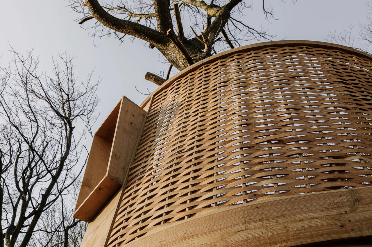
The Harewood Biennial 2022 is a contemporary art exhibit that takes place on the estate of the Harewood House located in Leeds, United Kingdom. The exhibit is meant to explore forms of radical acts within the scope of design and craft. Spread over 100 acres of land, artists and designers embrace radical acts through their own interpretations, from organic architecture to mycelium-based furniture. For Sebastian Cox, a London-based fine furniture maker, his idea of radical acts took shape in the form of a treehouse. Dubbed Sylvascope, the treehouse is a nest-like space constructed by cutting trees down, Cox’s chosen radical act.

Designer: Harewood x Sebastian Cox

Describing the inspiration behind this radical act, Cox describes, “We are planting trees at a rate not seen before in history. The area of woodland in Britain is now back at the level it was in the 14th Century. Despite this, biodiversity within woodlands is declining. How do we save our woodland wildlife? It seems not necessarily by planting more trees–we need to manage our woodland.” In an effort to explore how cutting down trees can help diversify the woodland creatures that populate the forest, the trees used to give rise to Sylvascope came from felled trees located on-site.

Built almost entirely from trees harvested onsite, the Sylvascope treehouse is located in the nucleus of the Harewood Estate to show what managed forests look like. Through this radical act, Cox hopes to help facilitate the growth of brambles and herb undergrowth to boost the area’s biodiversity. Along with cutting trees down, Cox is also planting new seeds and trees in different sections of the forest to provide diverse nesting grounds for different animal species.

“We often think a healthy woodland is one that looks pleasing – with tall trees and a welcoming, leaf-littered woodland floor, easy to navigate with no brambles or undergrowth. But this kind of woodland is not favorable to most of our woodland wildlife,” Cox explains, “When we fell some trees in a woodland, and let light into the woodland floor, other plants, and with the insects, mammals, and birds, can thrive. It seems cutting trees can be more useful than just planting them. Only 41% of Britain’s woodlands are managed, so management should be an equal priority to planting.

The post This treehouse is built from felled trees to prove the importance of effective woodland management first appeared on Yanko Design.
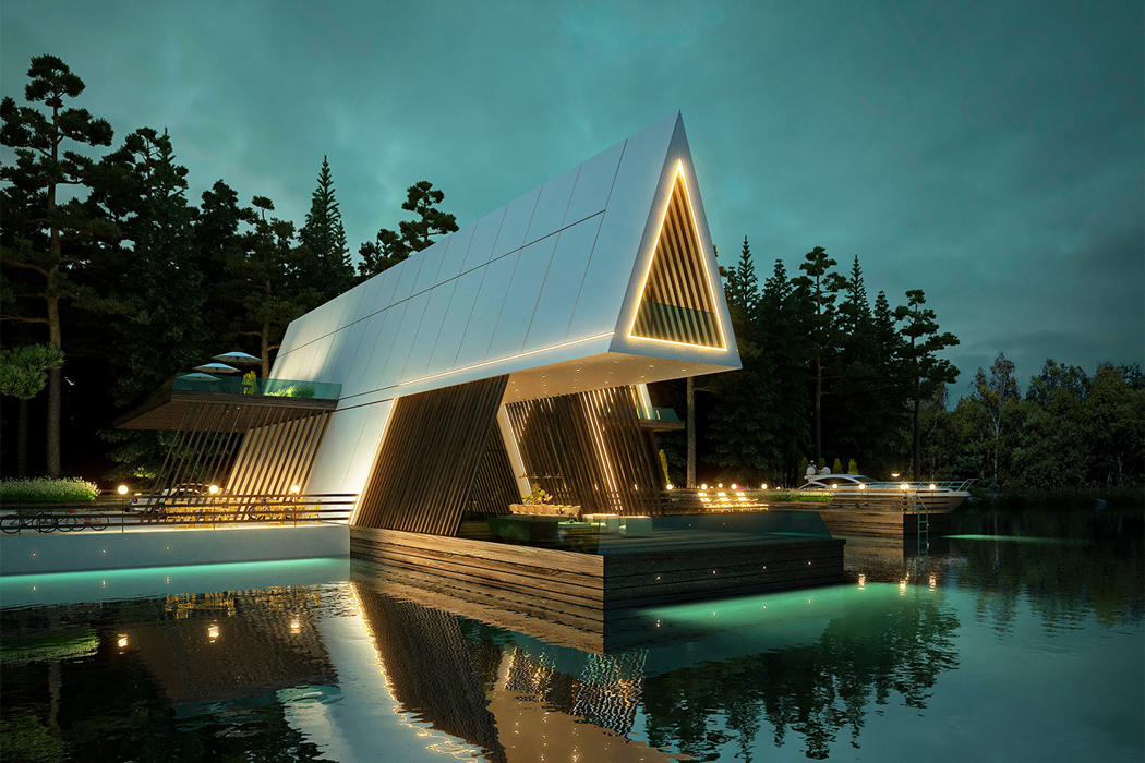
This triple A-frame cottage uses a cantilevered design to reinterpret traditional cabin architecture!

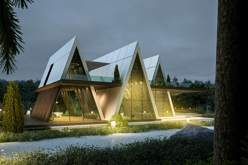
Nothing has felt more tempting this past year than scrolling through the many cabin designs that have kept our timelines busy. We’ve seen modular and mobile cabins, sustainable ones, cabin-inspired houseboats, even the traditional A-frame cabin has seeped into our daydreams. Reinterpreting the A-frame cabin through a contemporary perspective, designer Amin Moazzen conceptualized Cabin of Hope, a 3D visualization of a cantilevered triplex cabin designed to function as an escape from today’s world.

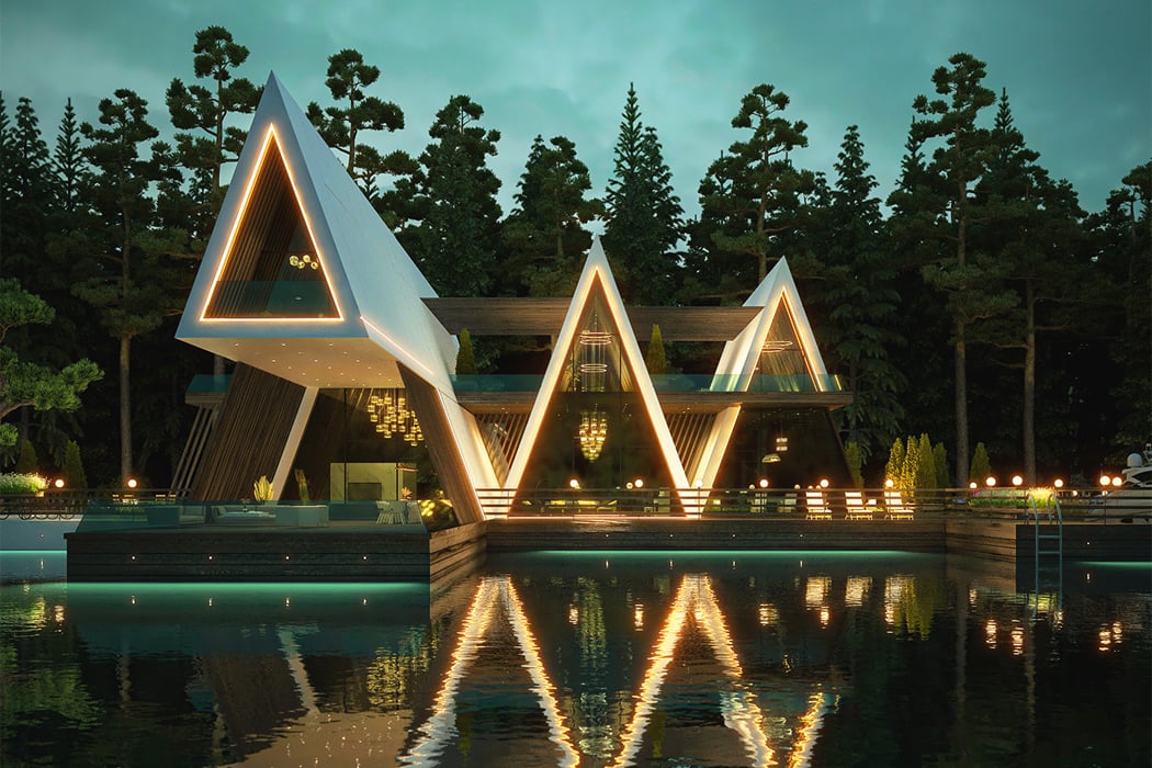
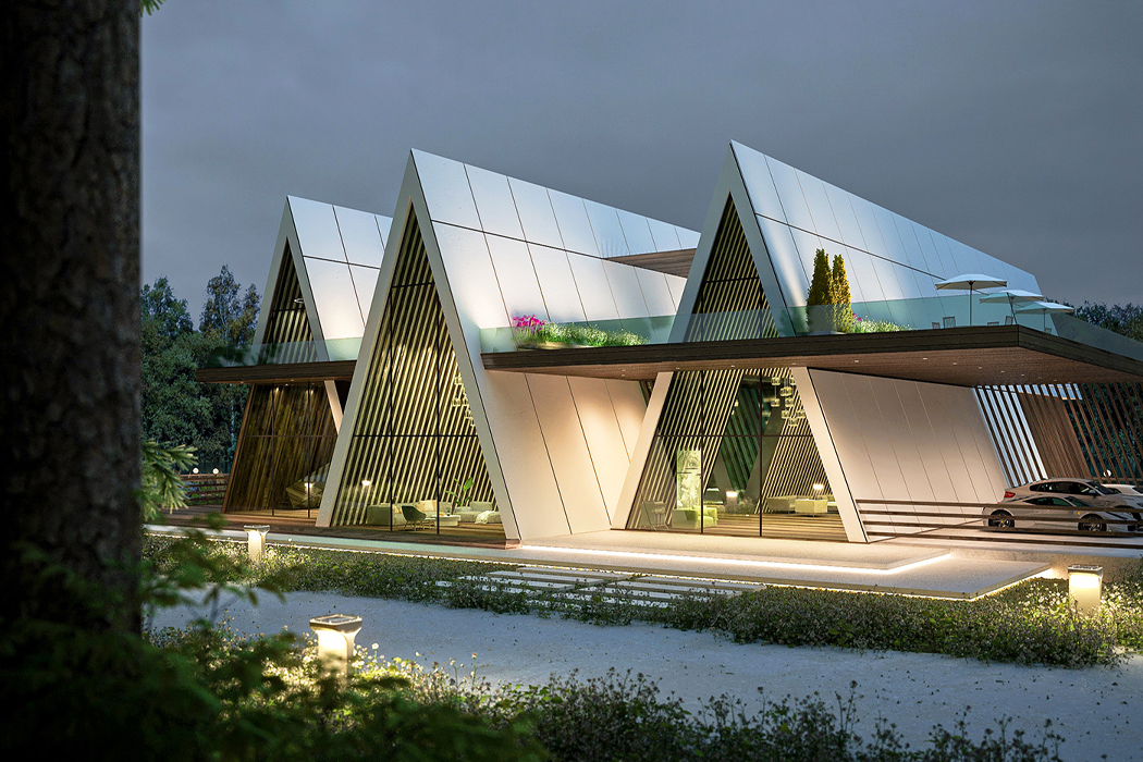
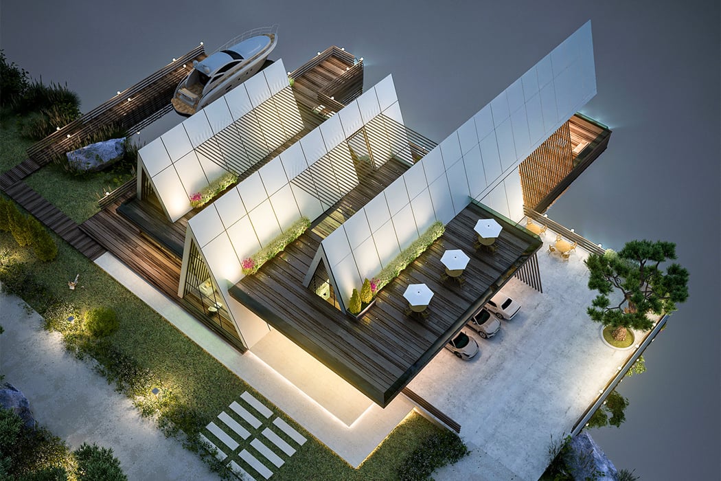
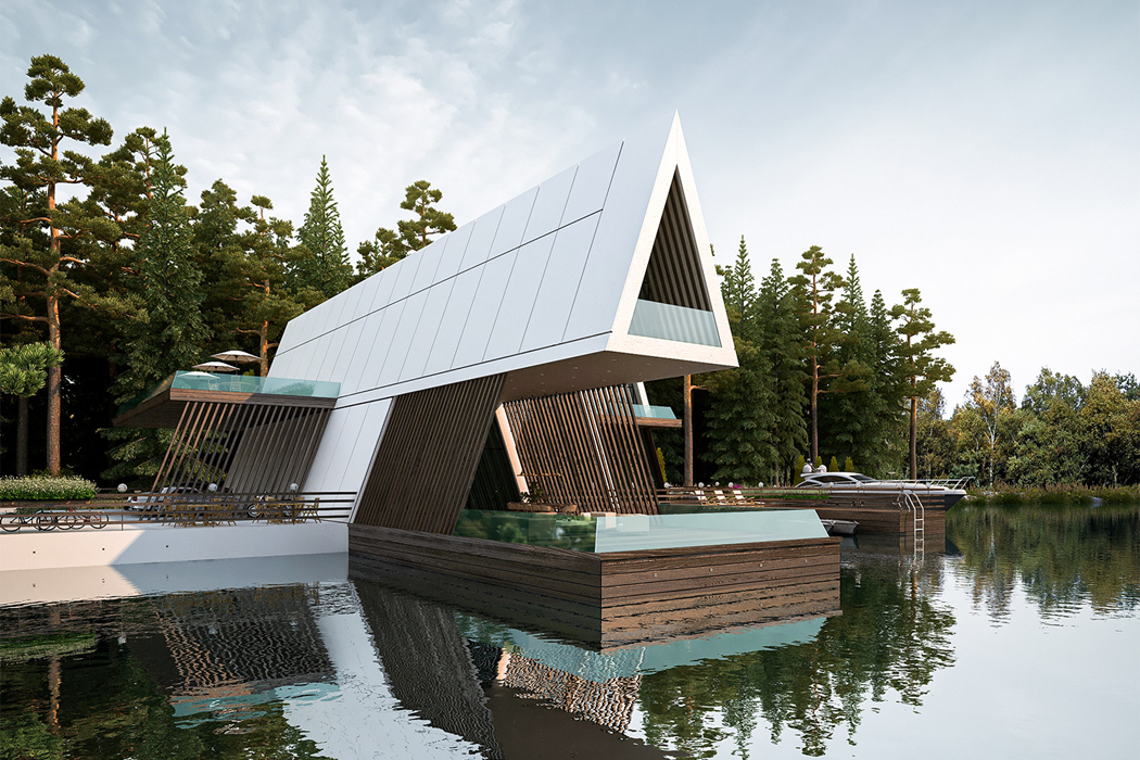
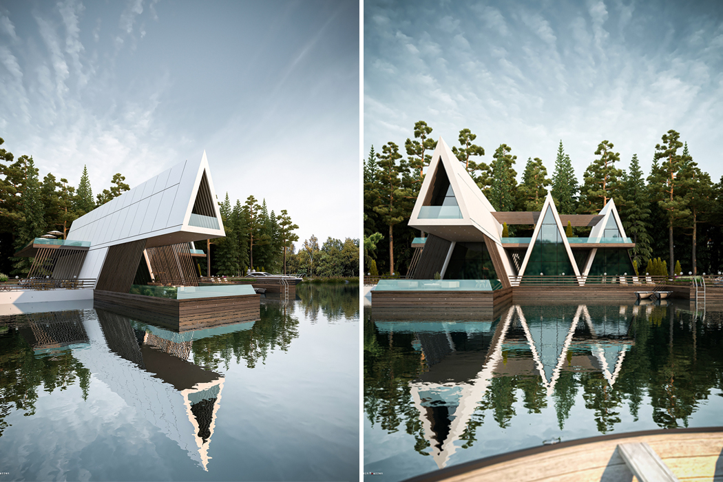
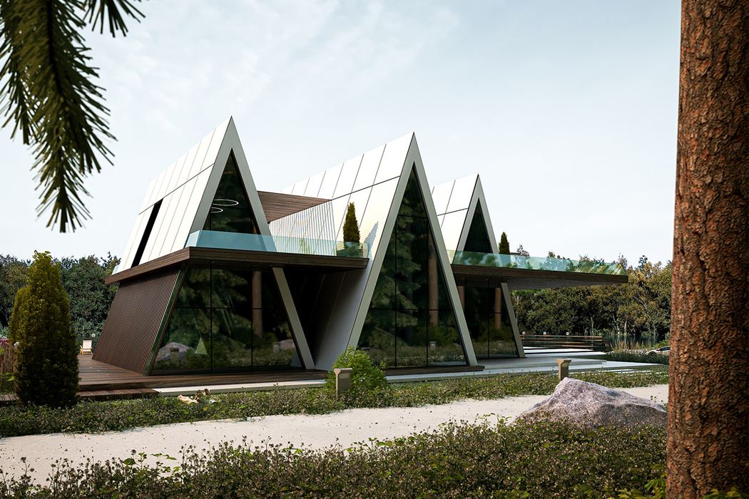
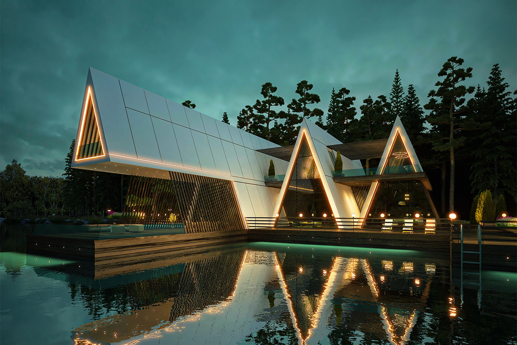
Moazzen’s Cabin of Hope fuses indoor and outdoor living with its main cantilevered A-frame structure that opens up to a veranda overlooking the nearby lake. Shaped like a zig-zag, all three A-frame structures that give rise to the Cabin of Hope are connected at the cabin’s wooden deck base and interwoven outdoor walkway. To achieve an air of contemporary design, Moazzen blended the traditional aspects of cabins like wooden foundations and exposed beams with more modern edges like LED window frames and optic white finishes that cool down the wood’s smokier accents. Dark wooden beams line the angled walls inside each A-frame cabin, further showcasing Moazzen’s commitment to bridging classic cottage elements with notes of contemporary escapism.

While the warm interior lights and bright exterior LEDs make Cabin of Hope shine and morph it into a lantern in the dark, the cabin triplex’s showcase is the cantilevered A-frame that protrudes out over the lake. Joined together by the cabin’s surrounding deck, the separate bi-level A-frame structures function as their own individual wings, the largest one pulling away and towards the lake’s horizon.

Designer: Amin Moazzen

Cabin of Hope’s cantilevered triplex structure reinterprets the traditional cabin through a contemporary perspective.

One of the three A-frame structures that give rise to Cabin of Hope overlooks the lake and functions as a veranda for guests.

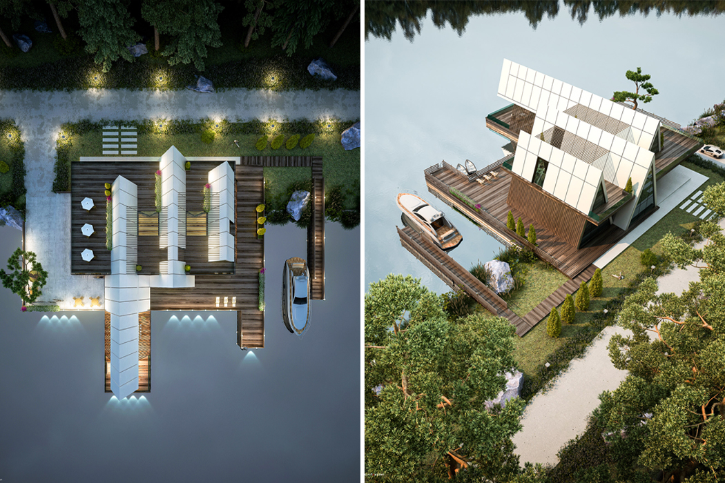
The other side of Cabin of Hope reveals all three A-frame cabins at ground level, situated atop the base wooden deck.

An aerial view shows the cabin’s top floor deck that works to connect all three wings of Cabin of Hope.

From above, Cabin of Hope appears as three separate long homes, but they’re all connected by an outdoor walkway.

Wooden beams enhance the cabin’s traditional aesthetic by cooling down their rustic appearance with optic white side paneling.

All-rounder Minimalist Cape

The new best thing to protect us from the elements is this radical innovation called The Mavari, a reversible contemporary cloak crafted with a unique triple layer fabric. The purpose is, of course to protect us from the unpredictability of Mother Nature.

We asked the designers, what made the Mavari so special and this is what they said, “The reversible cloak is waterproof, windproof, absorbent, breathable and features antibacterial properties that allow you to dry after a swim. You can even change in-and-out of a wetsuit! It also provides shelter from the cold and light rain and helps us stay dry all day.” In short, it is an all-weather friend and a MUST HAVE for both men and women!

Buy it here.

Designer: Mavari [ Buy it Here ]

-
Yanko Design
Timeless Designs - Explore wonderful concepts from around the world!
Shop CKIE - We are more than just concepts. See what's hot at the CKIE store by Yanko Design!
(All-rounder Minimalist Cape was originally posted on Yanko Design)

Related posts:

  1. The Camp All-rounder
  2. For the Minimalist on the Run
  3. Minimalist Juicer