Control panel concept brings buttons and knobs to your creative workflow

With great power comes great complexity. We’re way past the time when only TVs and entertainment systems needed remote controls. Now with multiple smart home appliances, devices, and apps, the need for a single place to control all these becomes even more important. You could use your smartphone, but switching between a master control app and your other apps puts unnecessary steps in between.

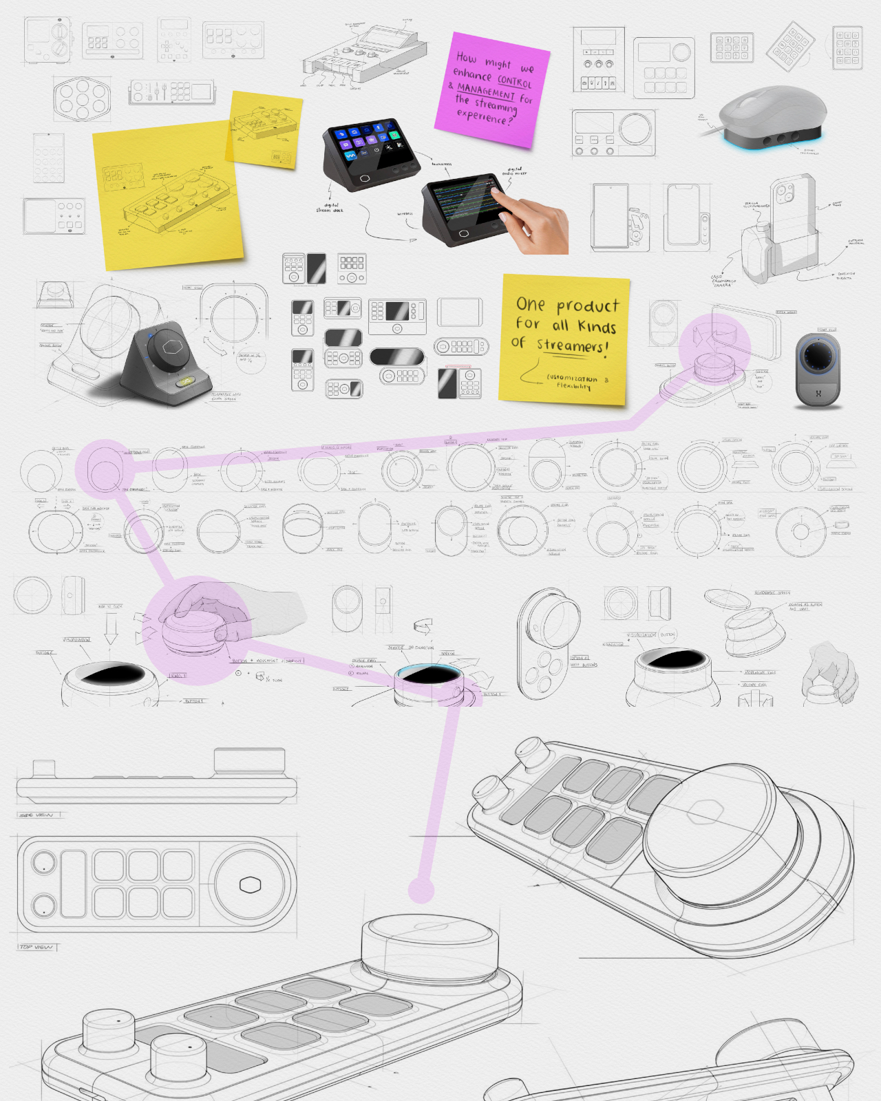
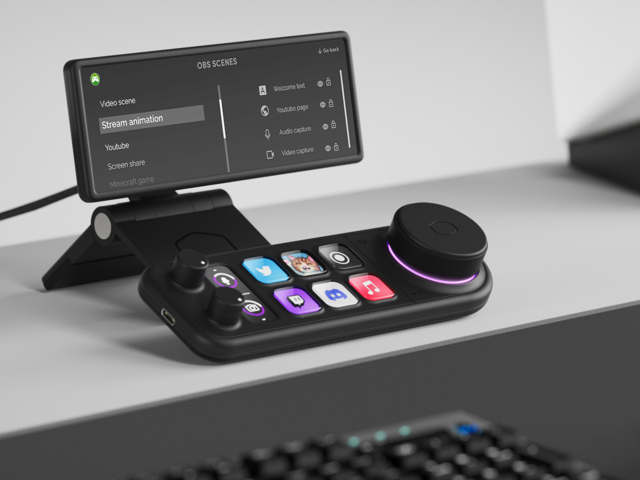
The Stream Deck paved the way for a specialized control panel for, as you might have guessed, live streaming, but its use has now expanded to other places as well. There are now more players in this somewhat niche market, many of whom simply try to copy the pioneering product. This design concept, however, envisions something a little different, offering not only more precise controls but also more flexibility to cater to almost any need.

Designers: Mariana Aréchiga, Isaac Saldaña, Ricardo Zerón

Cooler Master just launched its innovative modular MasterHUB, but there are still other ways to skin the proverbial feline, as they say. In theory, modular design might be able to adjust to almost any use case, but that also sometimes brings unnecessary complexity for people who need a powerful yet compact tool. They might need all the bells and whistles, but they will still probably appreciate the dials and buttons.

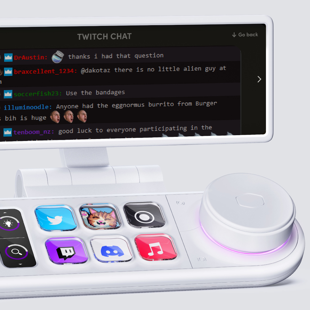
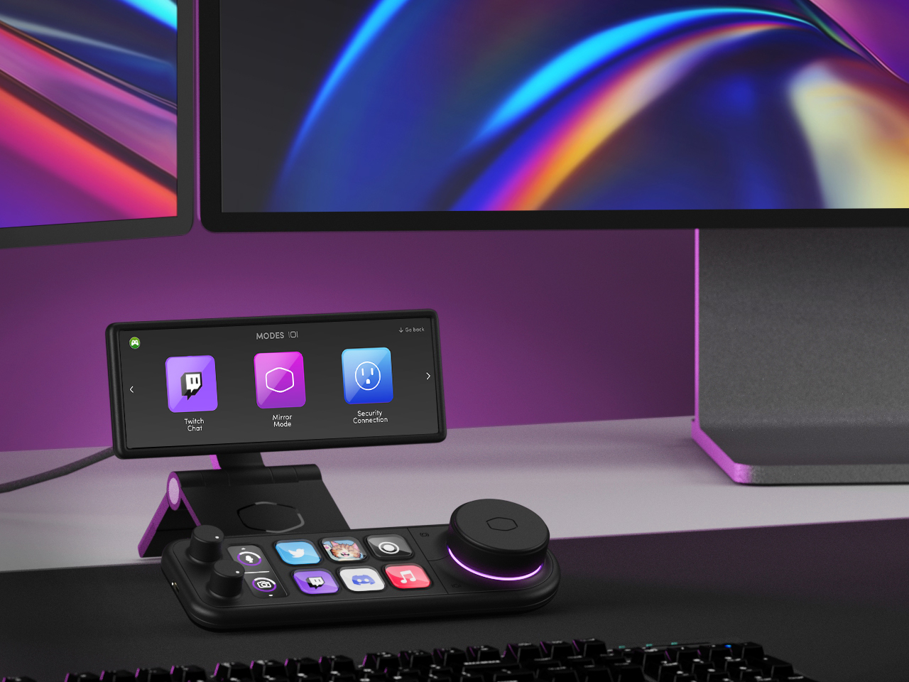
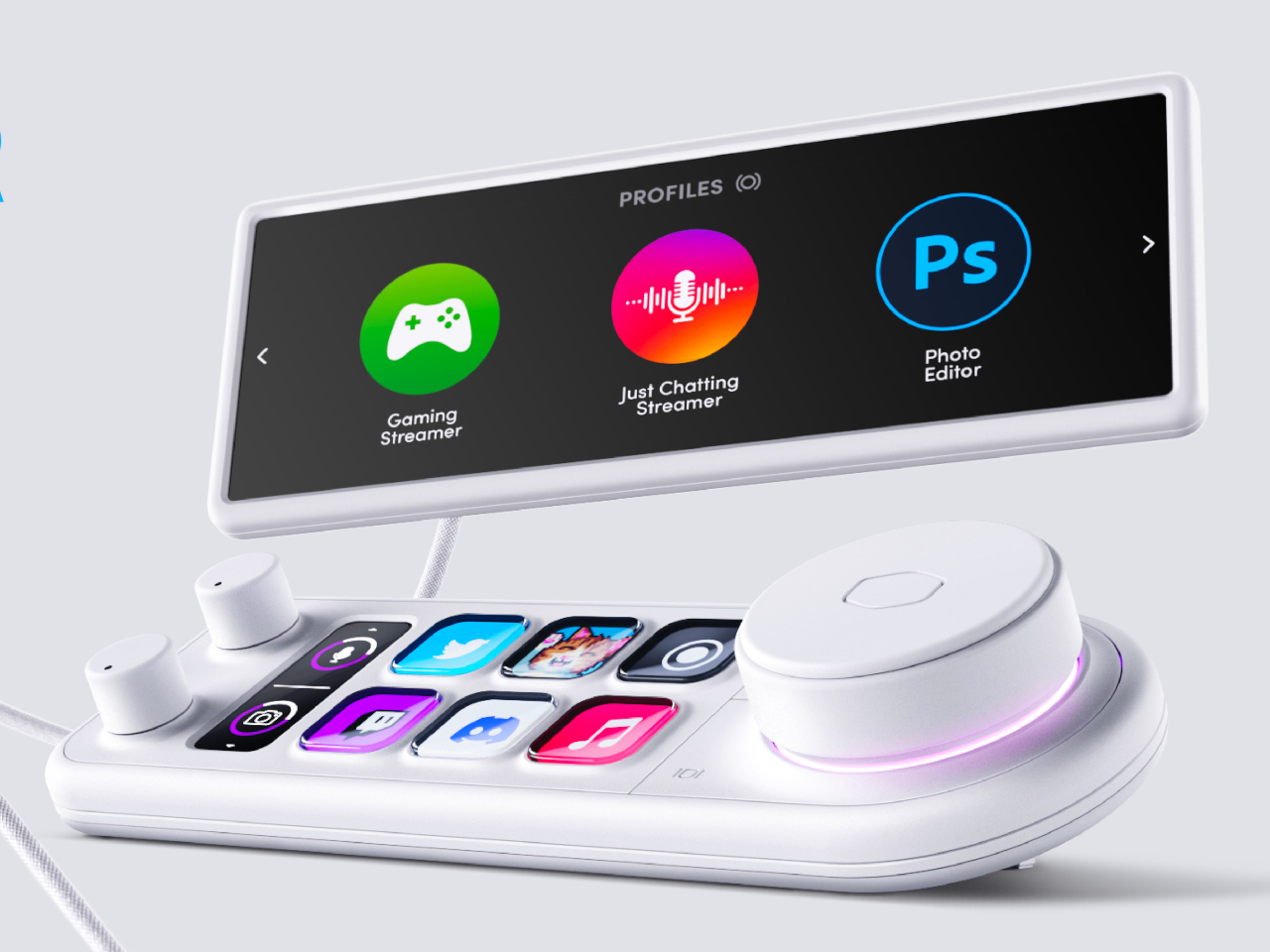
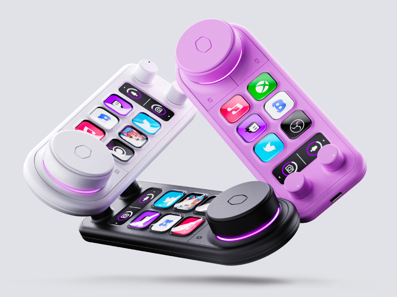
The Master Deck concept tries to condense the power of the MasterHUB into a simpler form that still has the basics you need. There are six dynamic buttons whose icons can change depending on the app or mode. There are two dials on one side that can be used for incremental changes, with a display strip beside it that shows what setting it’s set to affect. On the opposite side is a large “master control” dial with a hexagon-shaped button at its center for confirming actions.

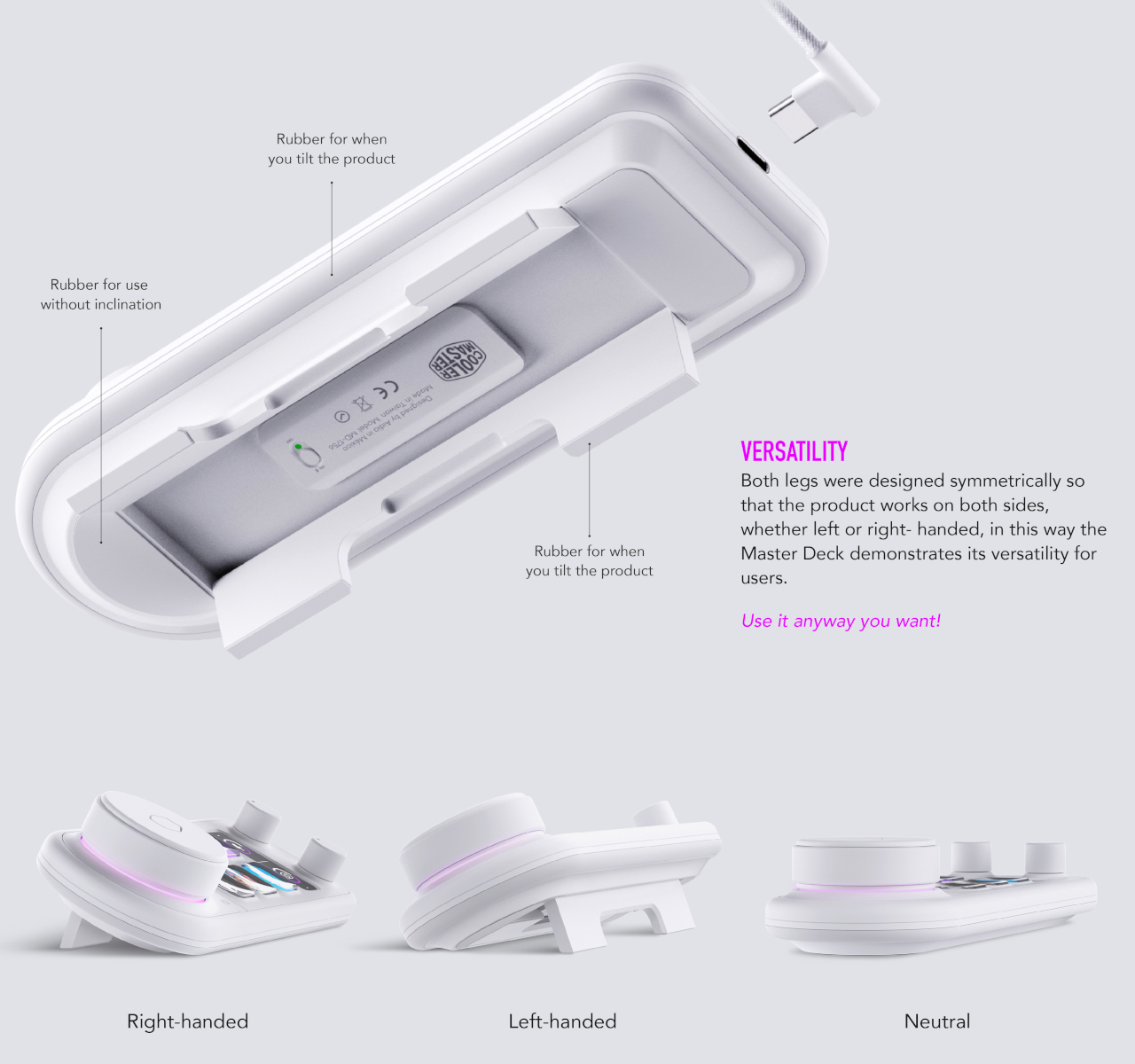
Those, however, aren’t the only things that make this concept design unique. The foldable legs beneath it, for example, allow you to set it up at an angle in either direction, supporting both right-handed and left-handed people. It would also function wirelessly, letting you set it up anywhere on your desk as needed. There’s also the idea of making the design available in different colors to match different aesthetic tastes, not just the typical white and black of other products in the market today.

The concept also comes with a sidekick display panel that, with the right stand or dock, can be placed anywhere on your desk or even on your monitor. This can act as a second screen for displaying stream chats, the currently active settings, or other pieces of information you want to see at a glance. Even without this, however, the Master Deck concept is already a step up from other Steam Deck alternatives, offering more flexibility without the added complexity.

The post Control panel concept brings buttons and knobs to your creative workflow first appeared on Yanko Design.

Analogue 3D console lets you enjoy classic Nintendo 64 games in 4K

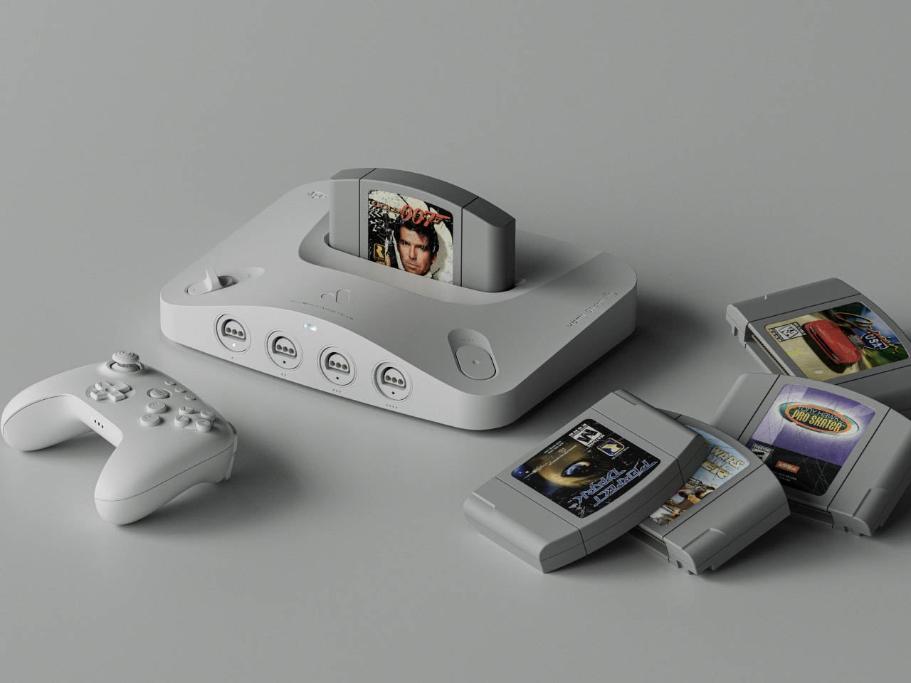
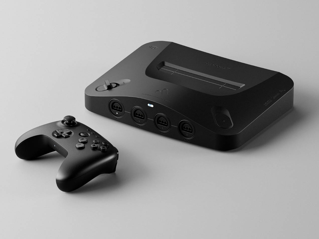
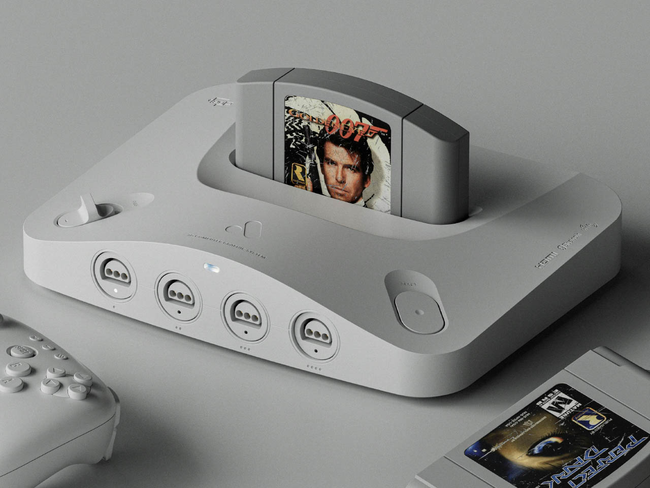
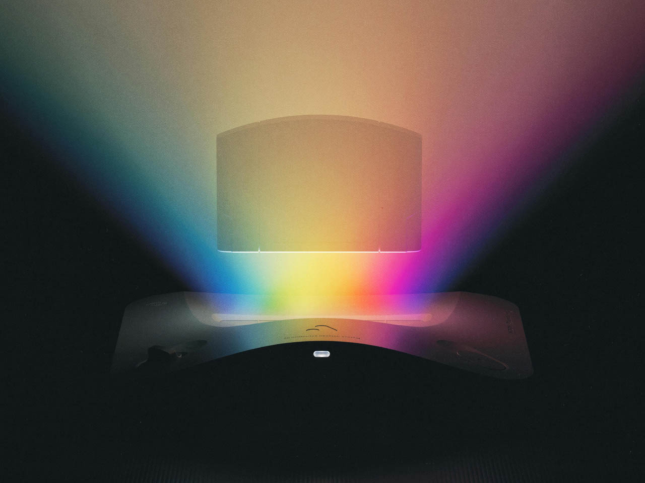
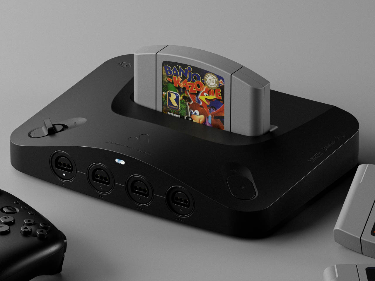
Want to reexperience the Nintendo 64 as it was meant to be without any compromises in gaming experience? One is the graphics that are hard to emulate on modern screens in 4K via HDMI. Then Analogue 3D has got you covered if you’ve got the game console cartridges and controllers stashed in your library. It’ll come with an in-built bespoke 4K-upscaler and original display modes for a lag-free method to enjoy your classic titles how you want.

Analogue who previously created versions of the Game Boy, NES and Sega Genesis, has finally revealed that the long-awaited clone console will arrive in Q1 2025, and you can preorder it from 21 October (11 AM ET onwards) for $250. This console powered by 3DOS (the evolution of AnalogueOS) comes with features including support for saved states and capturing screenshots.

Designer: Analogue

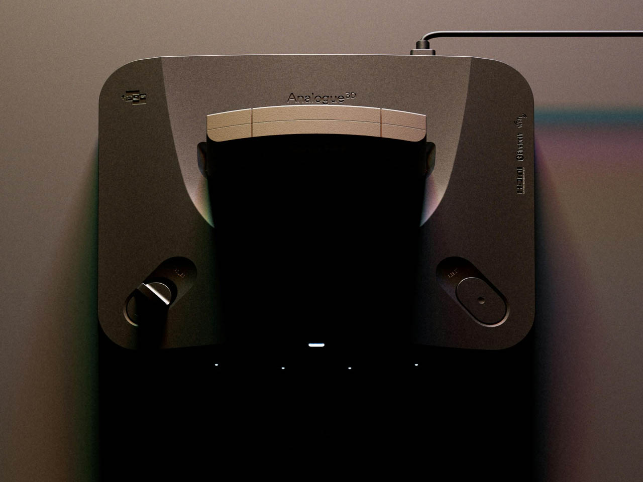
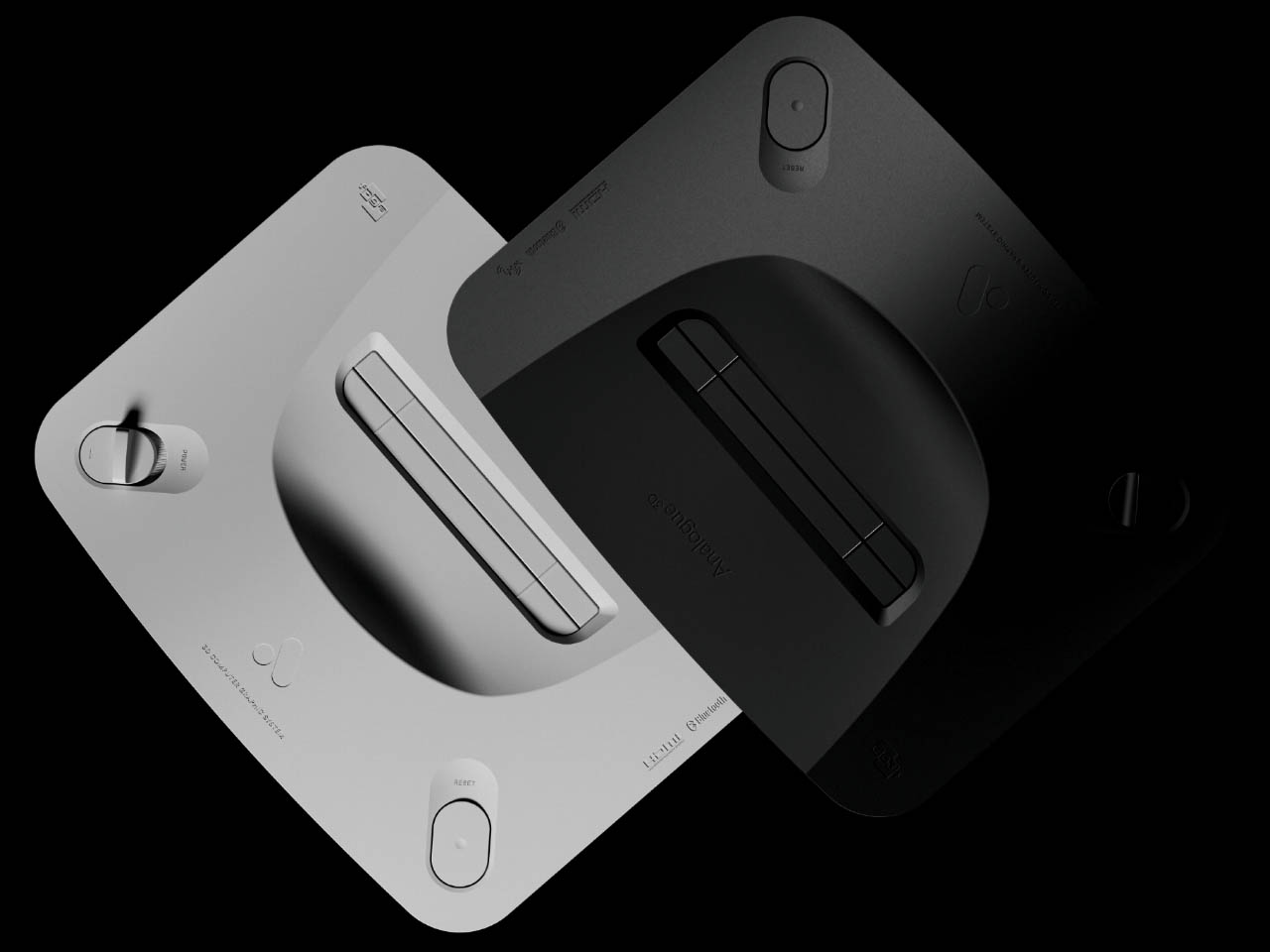
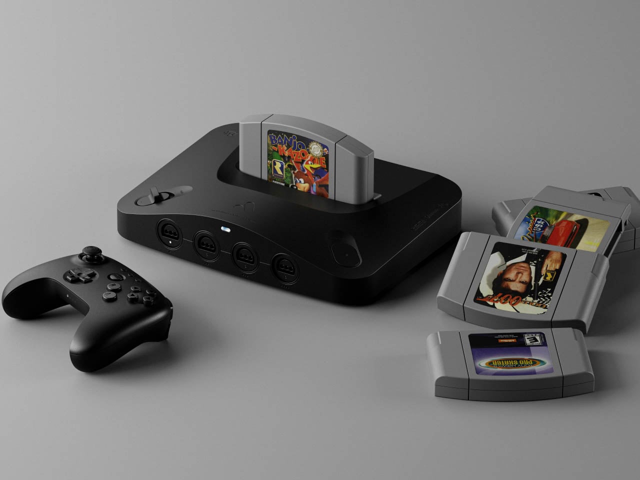
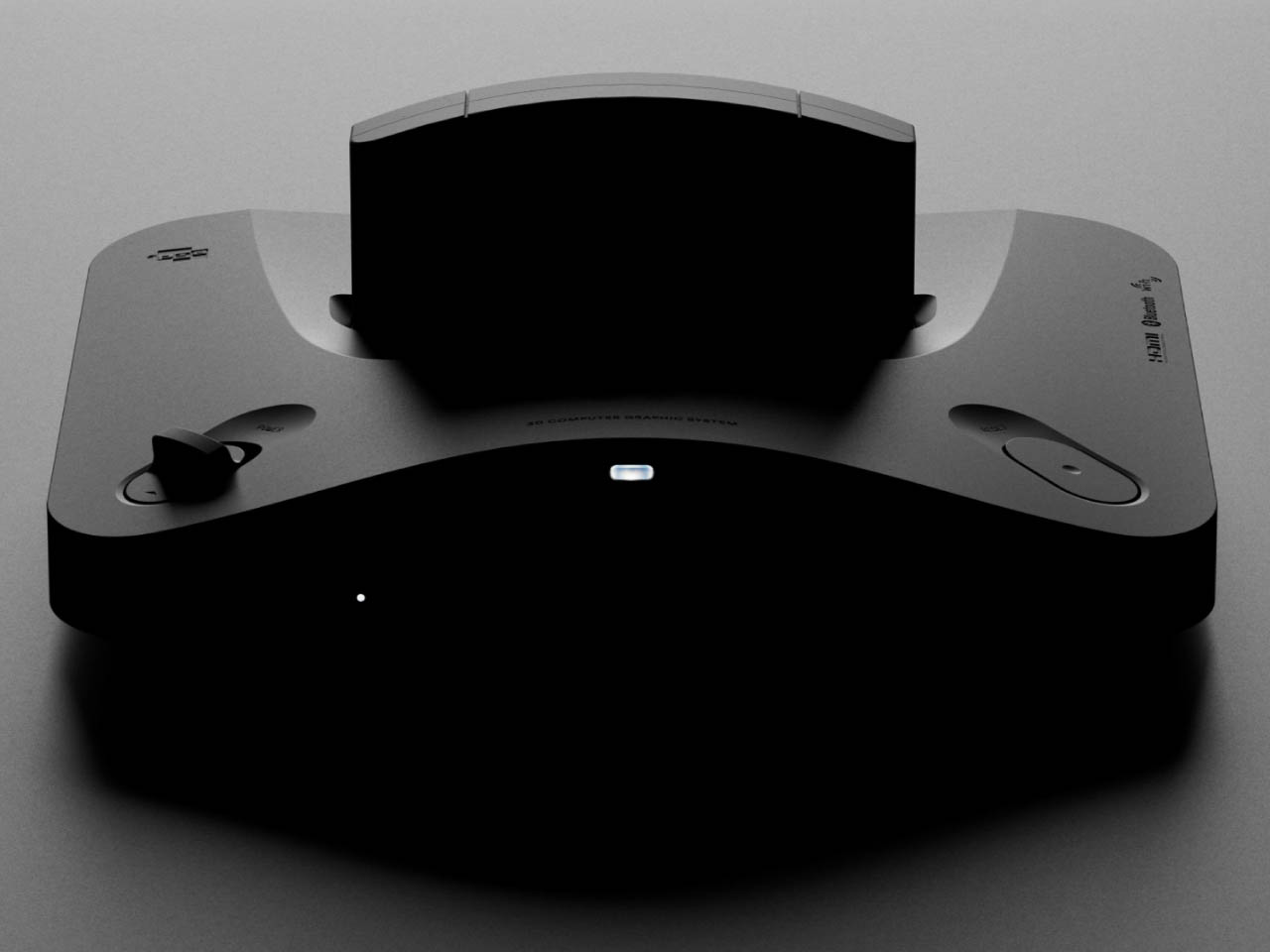
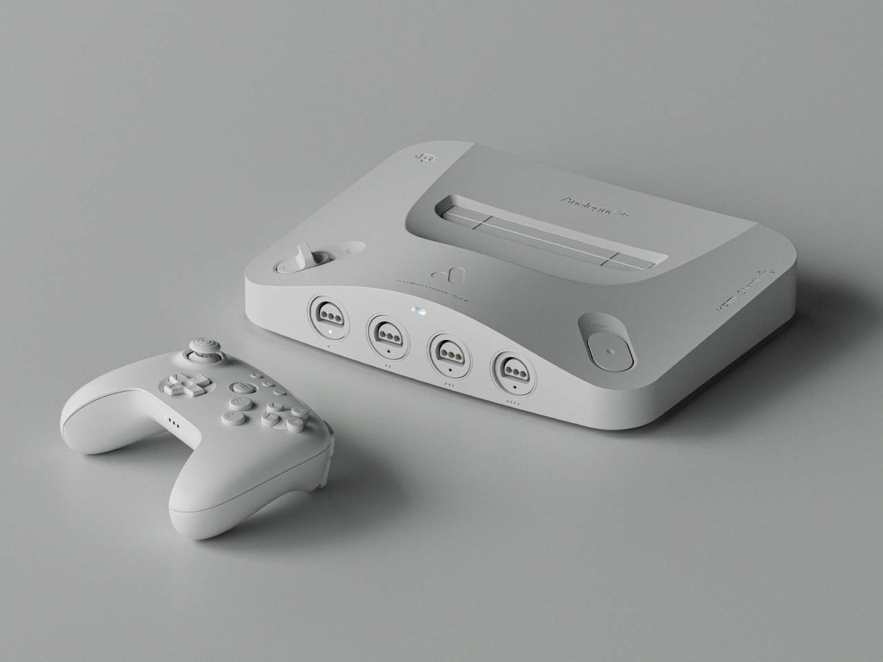
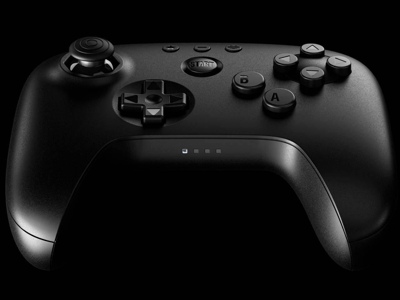
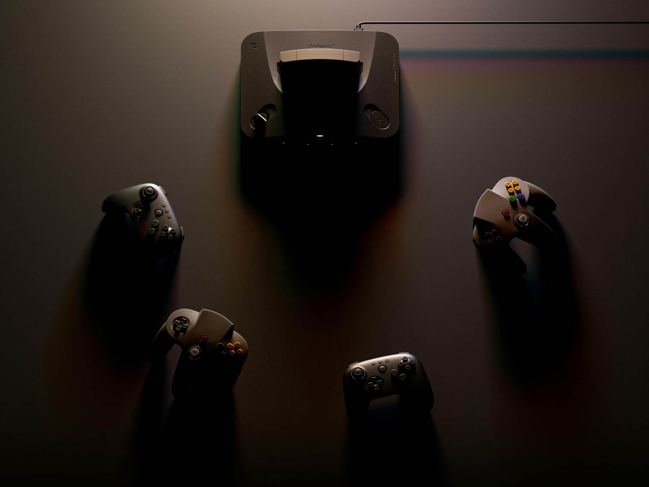
The original Nintendo console’s vibe is intact with power and reset buttons. In case you’ve got no controller to go with the 3D console or want a modern compatible controller to play, they’ve got you covered there as well. They’ve collaborated with 8BitDo to redesign a N64 controller that’s got all the buttons to make you go crazy. As I mentioned, it’ll work fine with old cartridges and has an expansion pack built-in. It will be safe to say, the console can save your game progress and might even have the trickery to import your old saved progress back from the late 90s.

The 8BitDo N64 controllers will cost $40 a piece and the complete package will cost $290. These modern controllers will have a Hall effect stick and will be compatible with Switch, PC and Android as it has support for D-input and S-input modes. Since we are talking Analogue here, you will only get the console in two colors – black or white – and controllers from their website or via third-party resellers. Given the N64 can be a big hassle with emulators, the Analogue 3D is a big win since you’ll play right from the source. Therefore, you can expect a glitch-free experience playing titles like Super Mario, FIFA 99, or The Legend of Zelda.

The post Analogue 3D console lets you enjoy classic Nintendo 64 games in 4K first appeared on Yanko Design.

GameSir Tarantula Pro controller has a clever solution to button layout problems

Although there were a handful of gaming consoles at one point in history, the industry has more or less settled upon two major platforms, both of which have their own game controller design. The continued success of the Nintendo Switch gave rise to a third brand and a third controller layout, though it closely resembled the Microsoft Xbox controller layout except for one important aspect: the face or “ABXY” buttons. This means that the same wireless controller could be used for both the Nintendo Switch and Xbox-compatible games (presuming it supported both technologies), but you have to remember to switch layouts and, more importantly, not be confused by the letters on the buttons. Thankfully, this controller design has a curious fix for that.

Designer: GameSir

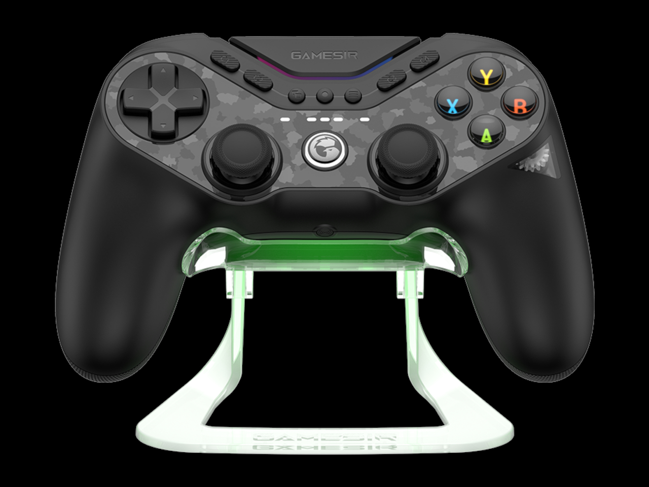
Truth be told, it’s not that hard to change button layouts for controllers that support switching back and forth between different platforms. What’s tricky, however, is to remember which layout is active at the time, which is hard to determine simply by looking at the controller. After all, even if you swap the function of the A and B buttons, the markings on them remain the same. That is unless you use the GameSir Tarantula Pro.

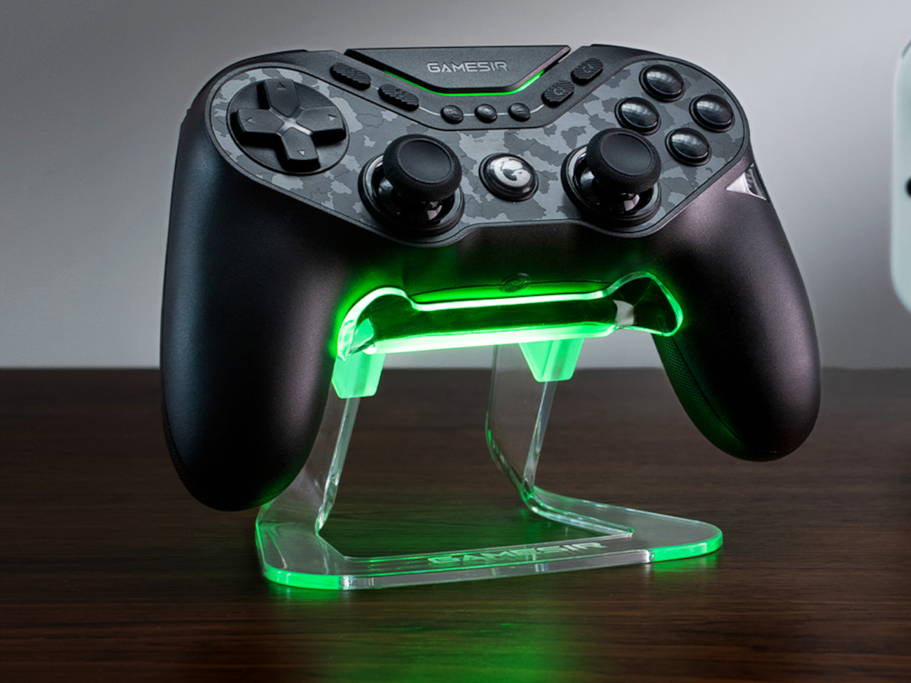
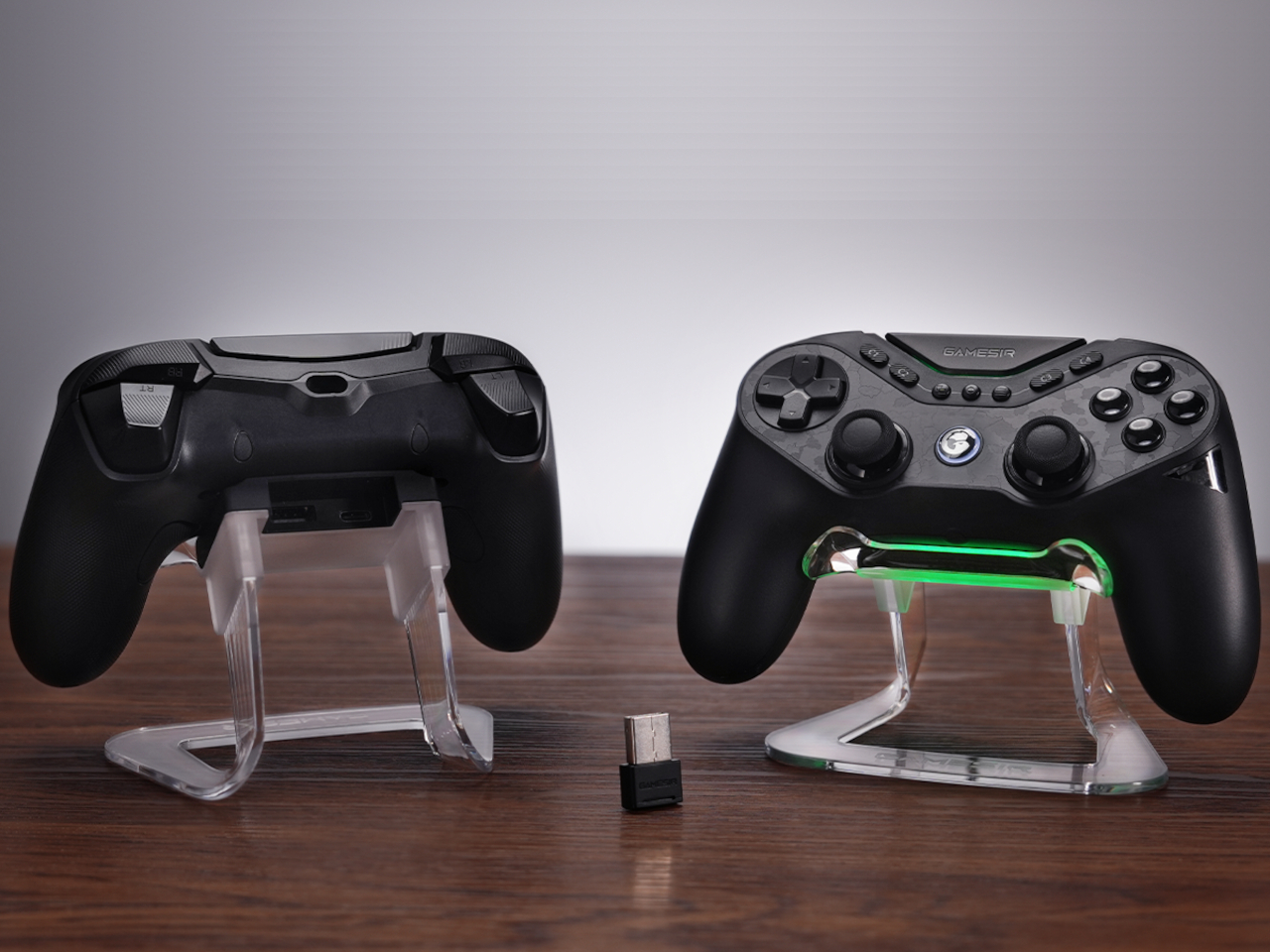
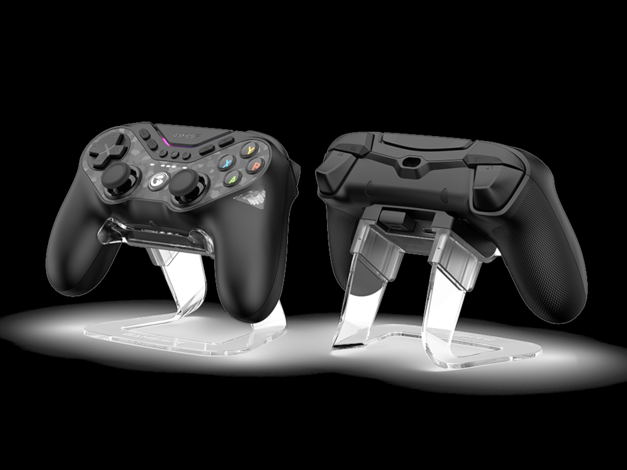
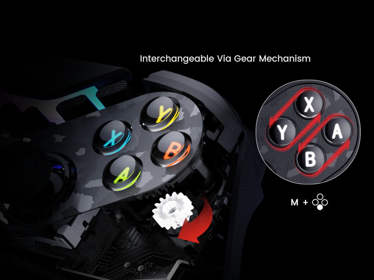
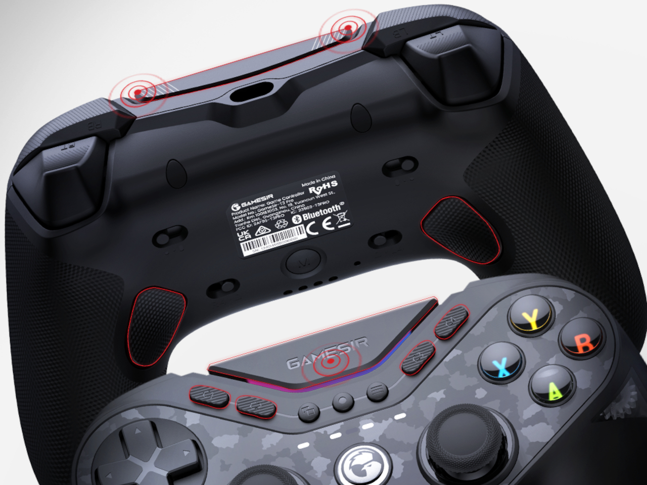
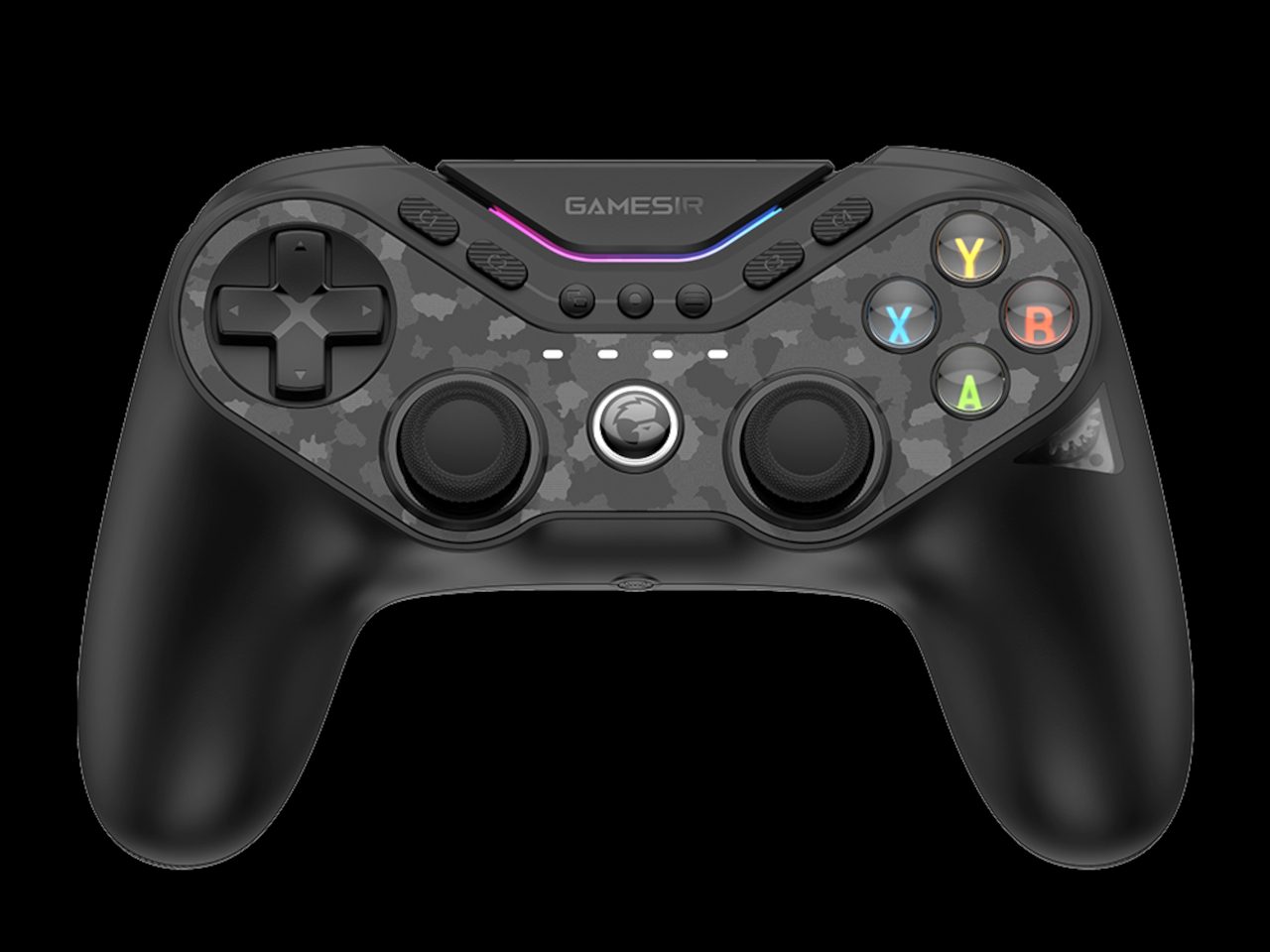
At first glance, the controller looks like any PlayStation-style controller, just overloaded with decals, RGB lighting, buttons, and switches. It has, however, a rather unique mechanism where a sequence of buttons activates a gear that changes the letters and layout on the face buttons from the four colors of an Xbox-compatible controller to the monochrome style for the Switch. You can even peek at the gear that turns to make this switch, no pun intended, through a small transparent window on one of the right-side handles.

Beyond this, the GameSir Tarantula Pro is actually full of additional features, like no less than 9 buttons you can map to different actions, four switches on the back for turning certain functions on or off, and, of course, some RGB lighting to add flavor to your gaming. That said, the compatibility of the controller is limited to PC, Nintendo Switch, iOS, and Android. No Xbox officially on the list, despite supporting that standard Xbox ABXY layout.

Even more ironic is that the controller itself is shaped like a stereotypical PlayStation controller, with long vertical handles and joysticks at the center. This is still one of the biggest schisms between consoles that prevent the design of a universal controller. Unfortunately, it’s also something that a shifting mechanism can’t easily solve just yet.

The post GameSir Tarantula Pro controller has a clever solution to button layout problems first appeared on Yanko Design.

Stream Deck Studio goes overboard with 32 customizable LCD keys for broadcasters

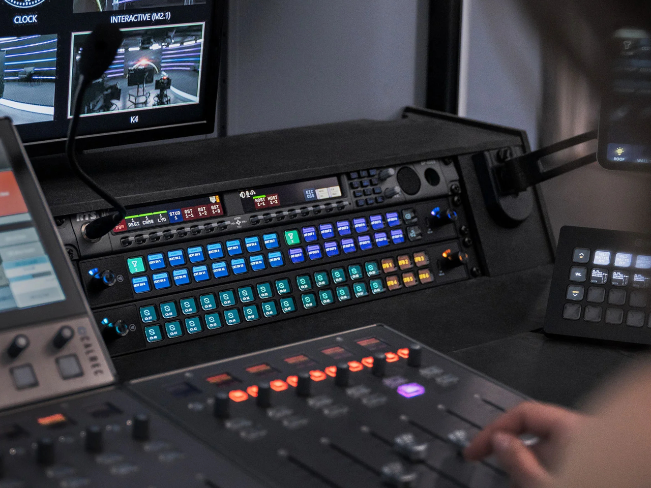
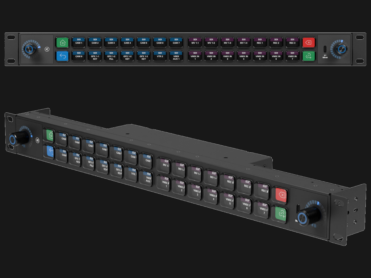
The very first Stream Decks were, as the name implied, made for streamers, content creators who thrived on live Internet video platforms like Twitch and YouTube. Over time, the device spread to more creative professionals who use the programmable buttons to make their workflows less cumbersome. That said, these tools benefited people working in mostly digital environments, such as those using computers. Realizing that even traditional broadcasting workflows could use an upgrade, a new kind of Stream Deck was made, one that had a ridiculous number of LCD buttons to customize, not to mention a stackable design to double or triple that number if it weren’t enough.

Designer: Elgato

The idea behind the Stream Deck and its kind is pretty simple. Rather than a sequence of keystrokes that are hard to remember across different apps and services, it offered buttons that could be mapped to almost any function. Even better, those buttons are actually LCD keys, so they can have dynamic icons that identify their purpose and change depending on the app in use.

That kind of flexibility is critical in a smooth and fast digital workflow, whether it’s changing settings on a live stream, stitching up videos, or changing digital brushes. Traditional broadcasting also has use for so many controls, but those buttons and dials are often fixed and permanent. The Stream Deck Studio brings the flexibility of Elgato’s mainstream devices to this professional setting where speed is of the essence.

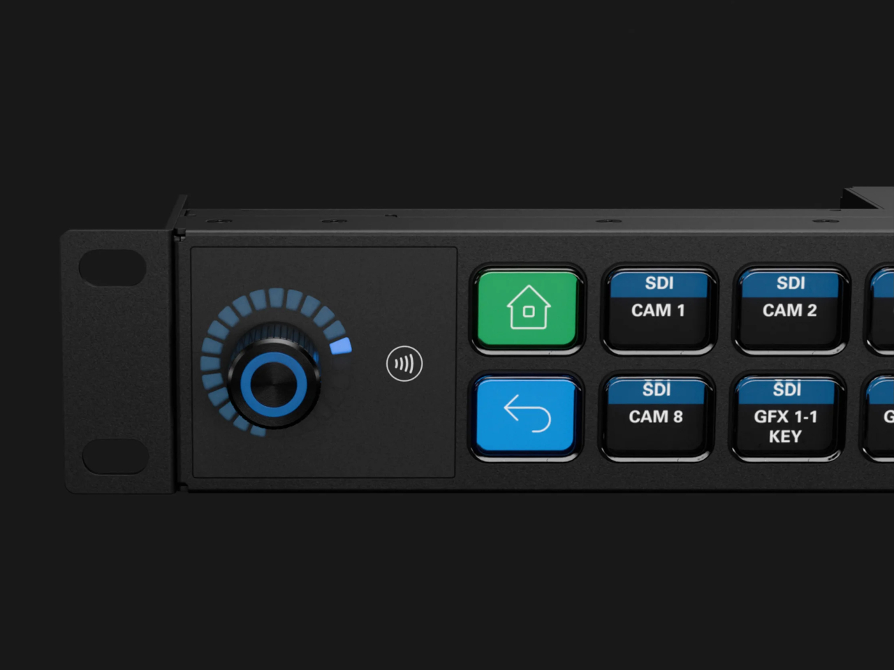
Unlike the boxy Stream Decks, the Studio is a long 19-inch bar with two rows of 16 keys flanked by a dial on each end. This is the largest Stream Deck product to date and is obviously not meant for regular desktop use. The shape of the device, however, fits perfectly with broadcast studio racks. In fact, you can also stack and connect two or three of them, for a whopping 96 buttons and six dials.

Like any other Stream Deck product, the keys and dials are programmable, but there’s a slight catch this time. The Studio was developed together with Bitfocus, whose Companion software is already a popular alternative to Stream Deck’s own app, with tweaks for broadcast media. The new Buttons software was made specifically for the Stream Deck studio, though it requires a recurring subscription. Then again, the $900 price tag makes the Stream Deck Studio a no-go for individual creators anyway, but offers studios and other companies the same kind of flexibility and power that the Stream Deck offers, except on a larger scale.

The post Stream Deck Studio goes overboard with 32 customizable LCD keys for broadcasters first appeared on Yanko Design.

Cooler Master MasterHUB Controller Review: Complete Control Over Your Creative Pursuits

PROS:


  • Innovative modular design puts users in control

  • Incredible flexibility in software customization

  • Future-proof design for extended functionality

CONS:


  • Essential stand is a separate purchase

  • Can't fit all 5 modules on the base

  • Aesthetics and texture feel a bit cheap

RATINGS:

AESTHETICS
ERGONOMICS
PERFORMANCE
SUSTAINABILITY / REPAIRABILITY
VALUE FOR MONEY

EDITOR'S QUOTE:

The Cooler Master MasterHUB's modular design redefines the control panel category and empowers creative professionals to design their own tools for a smoother and effortless workflow.

Generative AI is getting better at creating images and videos, but if you want professional-looking, not to mention correct, content, someone still has to put in the work. Software tools are also becoming more powerful and more sophisticated, but sometimes that creates even more complexity, with more features hidden behind incomprehensible sequences of keys. That’s not even considering how a single person might have to juggle different apps, each with their own set of functions. There are now tools like customizable keyboards or buttons that try to alleviate some of that pain, but there really isn’t a “one size fits all” solution. Instead, Cooler Master takes a different approach by providing not a single tool but a toolkit, allowing creators, streamers, gamers, and power users to build their own control panel that adjusts to their needs and workflow rather than forcing them to adapt to simply pushing buttons on a box. Given the novelty of this proposal, we took the MasterHUB for a spin, a roll, and a push to see if it can really take a load off creators’ already heavy shoulders.

Designer: Cooler Master

Aesthetics

If you judge the Cooler Master MasterHUB solely based on its appearance, you will probably be disappointed. Right out of the box, the different modules look pretty ordinary, even uninteresting. Sure, you have a variety of physical controls, more than competing brands that offer only programmable buttons with tiny displays, but the quality of the design and the material themselves are nothing to write home about.

The MasterHUB is a completely black affair, which seems to be the standard for control panels like this. It’s also mostly made of plastic, and not the premium kind either. Different areas of the modules have different textures, with some smooth and reflective, while others have a rougher matte surface. To be fair, this particular market isn’t exactly known for stylish designs and premium materials, so it’s in good company as well.
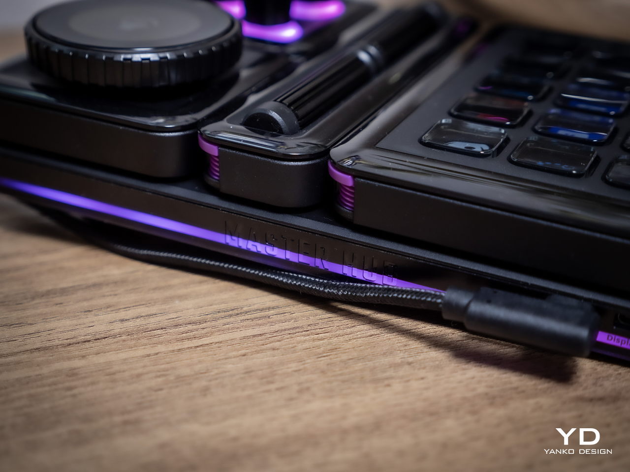
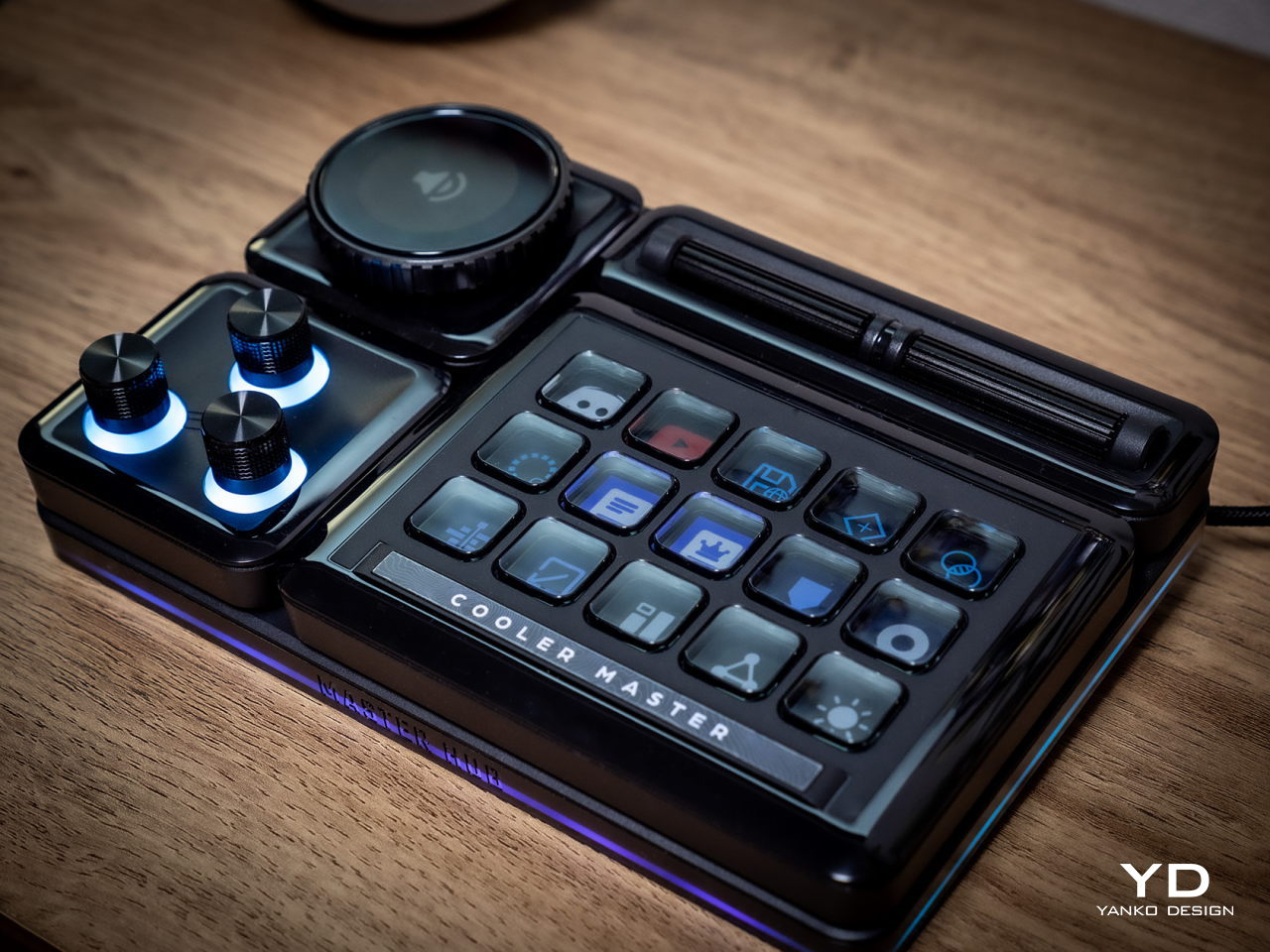
Cooler Master does make up for it with plenty of LED colors, whether on the display of the dial and the buttons or beneath some of the controls. You have a great degree of freedom when it comes to customizing the MasterHUB’s RGB lighting, except for one module that oddly doesn’t have any kind of lighting. Hopefully, it’s just some oversight, because there’s really no logical reason for this inconsistent design.

In the final analysis, the Cooler Master MasterHUB isn’t exactly something great to look at, but its true value lies in its performance. Unfortunately, it shouldn’t be a choice between form or function, when you can and should have both. And with something as big as the MasterHUB always in your field of vision, something more aesthetically pleasing could do wonders for your mind as well.

Ergonomics

The MasterHUB is already a league above other keyboard decks and controllers for offering a more tactile experience that goes beyond pressing buttons. Some actions, like scrubbing through timelines or changing the size of a brush, just feel more natural if you use a dial, a slider, or a roller instead of repeatedly mashing a single button. It isn’t just about intuitive controls either, as having your fingers actually manipulate something tangible adds a certain depth and enjoyment to the action.
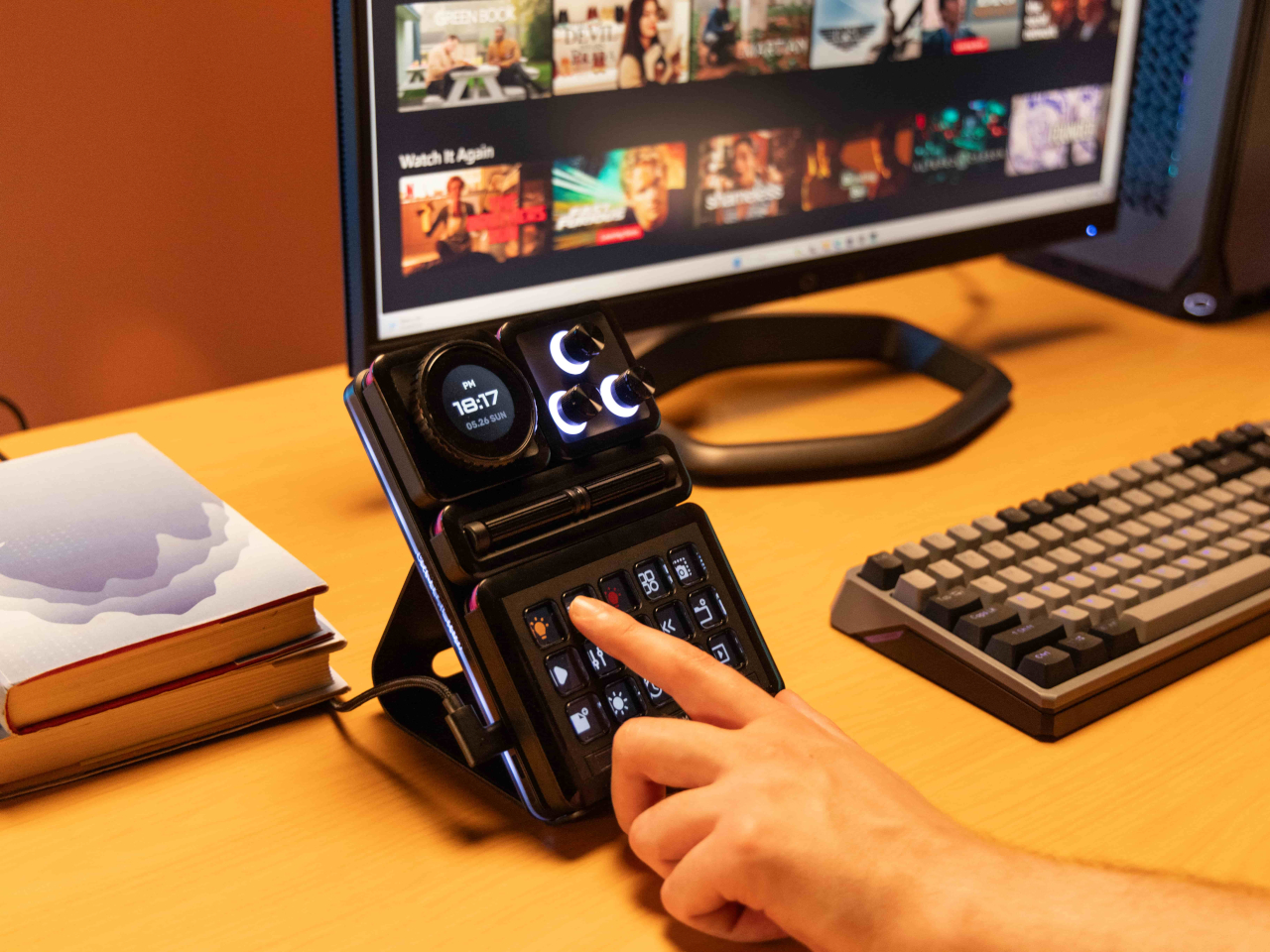
At the same time, however, Cooler Master’s default package isn’t exactly ergonomic because it practically lies flat on your desk. There’s a low magnetic foot included in the box, but that barely lifts the controller at a comfortable angle. This can be especially problematic when you need to see the icons on the buttons or the display. There is a stand available, but it’s a separate purchase rather than a part of the entire ensemble. Depending on how you use the MasterHUB, it might not be a deal-breaker, but it’s still something that logically would be included or even built into the base.

Performance

The Cooler Master MasterHUB immediately sets itself apart from the likes of the Stream Deck and the Loupedeck with its modular design. While some brands and models might offer knobs in addition to buttons, it doesn’t stop there nor does it presume it knows best what creators need. Just like LEGO, it provides the building blocks for you to arrange your own setup, whether that means using two 15-key modules or having two Encoder dials.
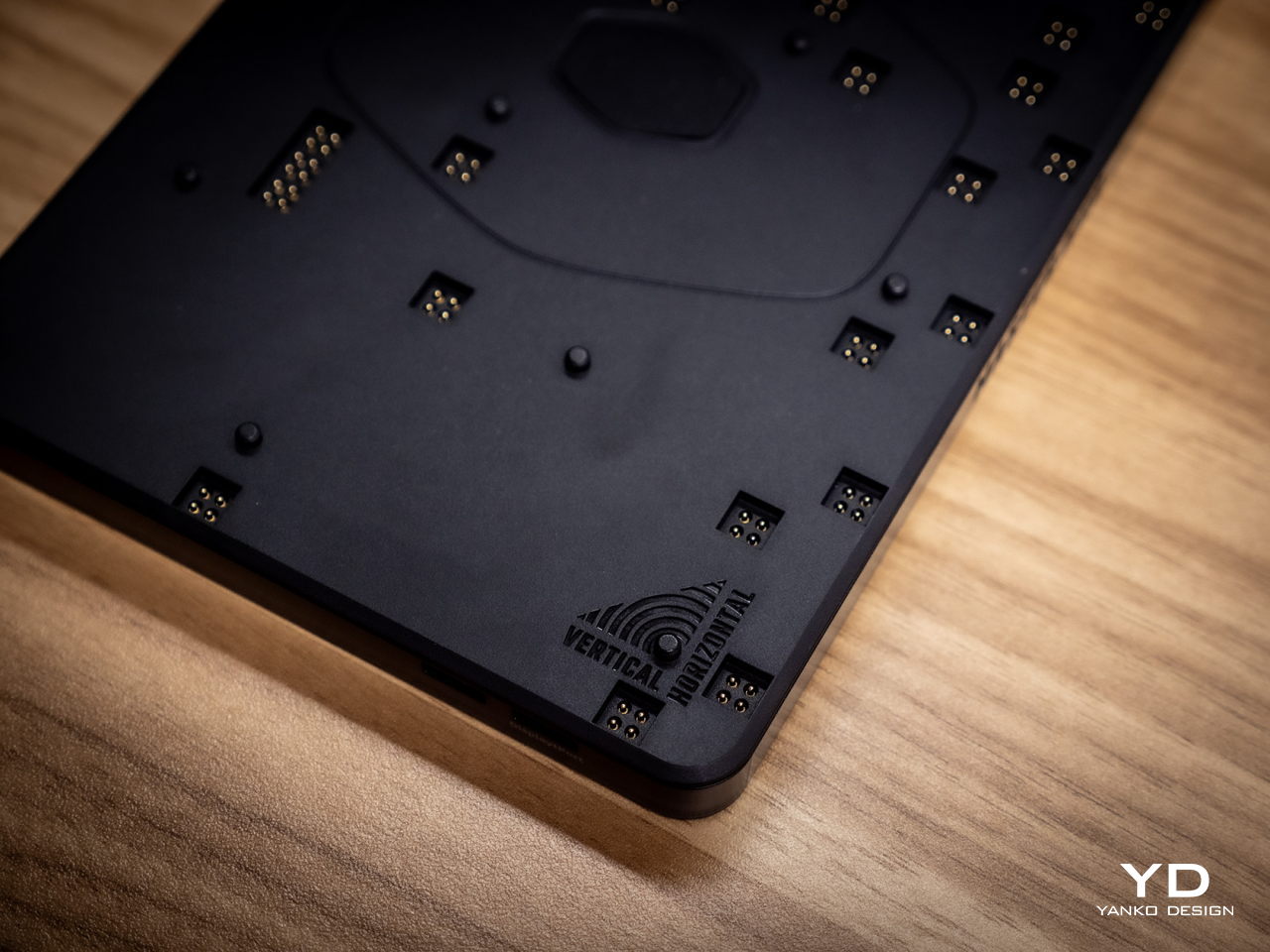
The MasterHUB currently has six modules, starting with the innovative Base module that makes all of these possible. This unassuming flat box holds the pogo pins that connect the other modules to one another as well as magnets that keep them in place. Of course, you can set the base horizontally or vertically, adding another layer of customization.
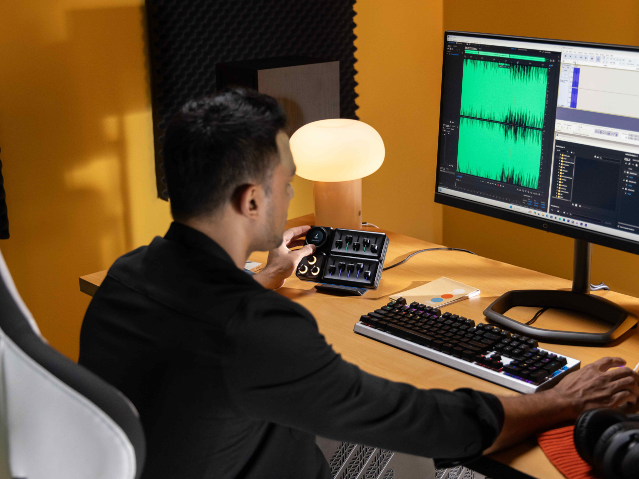
In theory, you’re free to put any of the other modules in any position as long as they’re connected to those pins and held down by magnets. In practice, however, you’ll probably want to have the modules fit snugly inside the boundaries of the base, which means you have a limited number of arrangements considering the sizes and shapes of those modules. You can’t also fit all five other modules on the Base, so you’ll have to choose which ones you need for a given task.
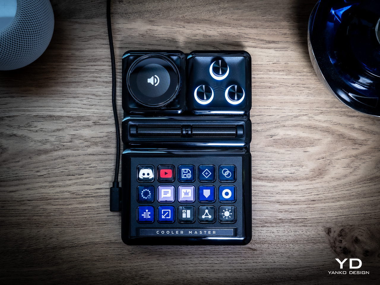
The 15-key IPS module is probably going to be familiar to users of other control panels. Each key can be mapped to almost any action or combination of actions, a.k.a. macros, through the MasterHUB software. You can also select different icons or make your own to assign to that key. On an amusing note, pressing each key makes the icon shrink while it’s depressed and jumps back to its normal size once you release the button, adding a bit of visual feedback to the action.
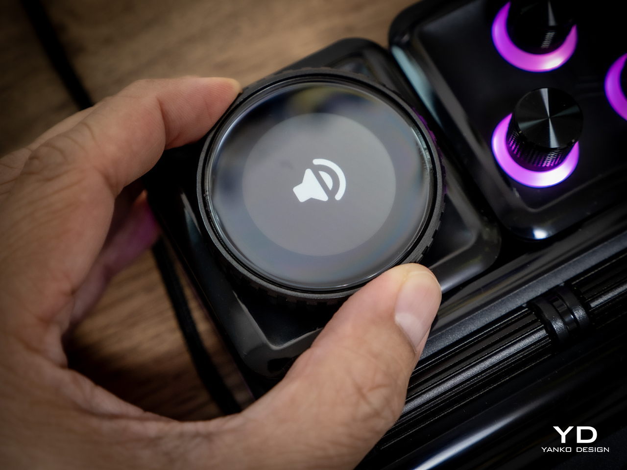
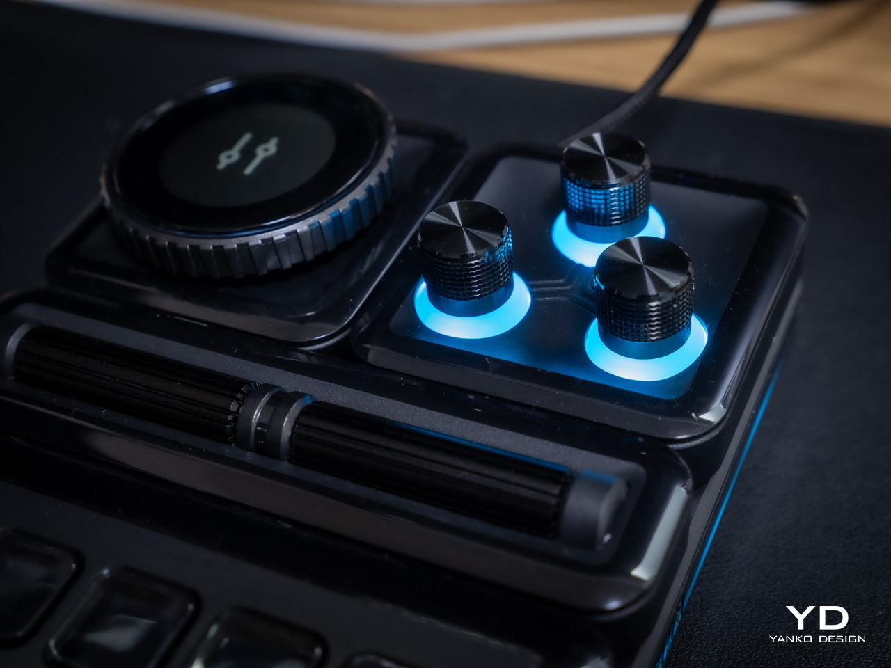
There’s a 3-knob module you can use to adjust minor settings like lighting, opacity, and the like. For bigger or major adjustments, you might want to use the Econder with an IPS display module, which is just another way of calling a big dial with a circular screen in the middle. Just like with the buttons, the display can be customized with complete freedom.

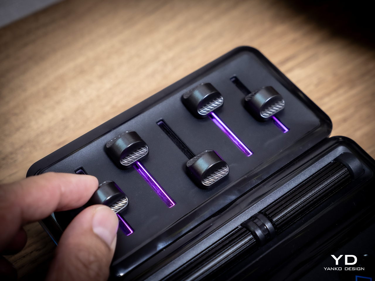
The 5-Fader module is not a common sight on controllers like these, but it’s a standard device for many tools related to multimedia work. Perhaps the most unusual of the group is the 2-Roller module, which is perfect for scrolling or going through undo and redo histories quickly. These five pretty much offer everything you need to work with almost any creative suite, though you can’t fit them all at the same time, as mentioned earlier. You can, however, use as many of the same modules you can fit, as long as you buy those additional modules, of course.
If the modular hardware was already impressive, the MasterHUB software doesn’t disappoint either. It has almost limitless possibilities in how you can set up and control the device, almost to the point of being overwhelming and confusing. Some things, like visually dragging and dropping actions to the controls, are easy, but some require digging through layers of options. The user interface could do a bit of polish, and thankfully that’s easier to pull off than a hardware upgrade.

Even if it doesn’t have a head-turning design, the Cooler Master MasterHUB’s functionality is pretty mind-blowing. If you’re a creative who juggles multiple apps, a streamer who needs to have every control under their finger or a gamer who can’t afford the latency of a string of keyboard combos, the flexibility that this modular controller offers is unbeatable. The power it offers is both outstanding and overwhelming, so it’s kind of exciting what Cooler Master will cook up next for future modules and software improvements.

Sustainability

Despite its heft, the MasterHUB is thoroughly made of plastic. It might be resilient, but it’s not completely durable nor hardened against accidents. It’s also not a sustainable material, though Cooler Master thankfully uses post-consumer recycled or PCR plastics for some of its products, though it doesn’t indicate if the MasterHUB benefits from this program. It might also be good if it used other materials like rubber, both for protection and tactile properties, though it could still do so in future iterations.
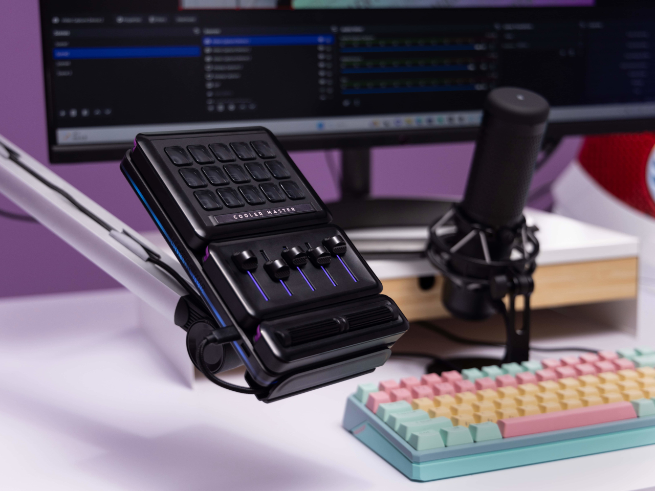
The MasterHUB’s modular design does bring one indirect advantage over the likes of the Stream Deck, which is that it’s more future-proof. Cooler Master could put out revised and improved versions of the modules, expand the selection of modules or even add new features that it didn’t have at launch. In fact, there are DisplayPort ports on the Base module, teasing the possibility of new features. Of course, that will all depend on Cooler Master actually continuing to push the envelope in the foreseeable future.

Value

Cooler Master definitely struck a chord with creators, streamers, and gamers with the modular design of the MasterHUB. It offers not only flexibility but also power, putting users in complete control of their workflows. Even Logitech’s new MX Creative Console barely scratches the surface of what this control panel is capable of, especially when you consider the possibilities of future modules and features.
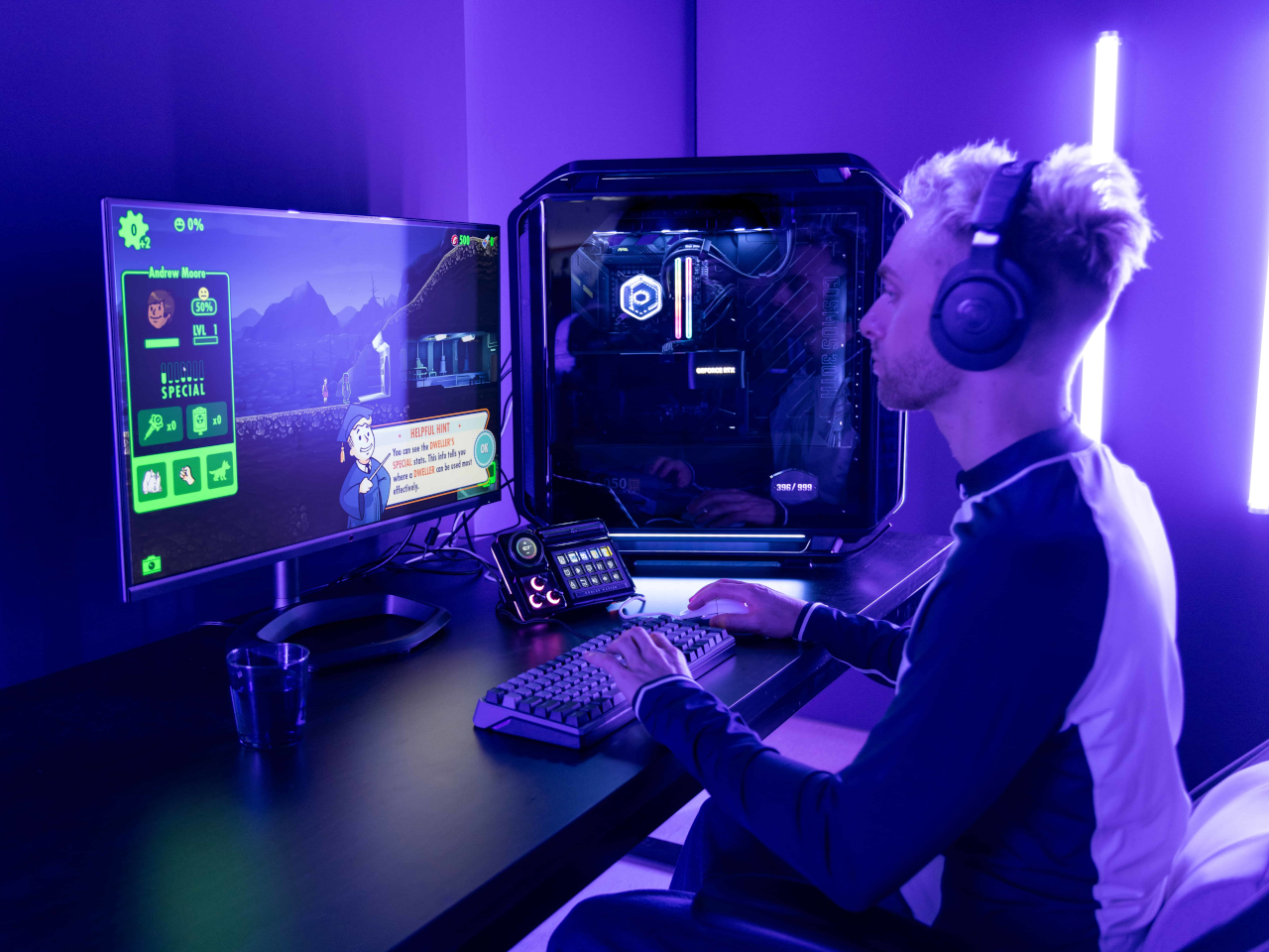
That said, the MasterHUB isn’t an inexpensive kit, which is probably to be expected considering how much more it offers compared to similar products. That’s why you’ll probably want to take advantage of discounts, like the current pre-order campaign that’s offering the basic kit, which includes only the 15-key IPS, 5-Fader, and 2-Roller modules, for only $299 instead of the $399 SRP. If you really want more flexibility, the Pro bundle adds the Encoder with IPS display and 3-Knob modules for $399, a rather steep $150 discount from the $549 SRP. Whichever bundle you pick, though, the stand will cost an additional $17 (SRP $19) if you want it.

Verdict

With great power comes great responsibility, or in this case, more keyboard shortcuts. Content creation shouldn’t be a dreadful and tiring task, and tools should be making people’s lives easier, not harder. As software becomes more sophisticated, the need for better and more efficient controls also increases. Rather than forcing users to shoehorn their workflows into a grid of LCD buttons and a few dials, the Cooler Master MasterHUB offers professionals and hobbyists the freedom to design their own tools and define their own strategies that let them focus on the most important task: creating their best content.
The post Cooler Master MasterHUB Controller Review: Complete Control Over Your Creative Pursuits first appeared on Yanko Design.
Xbox introduces appealing transparent controller and stunning customization options for Elite Series 2

Microsoft has always believed in giving gamers more options when we talk of accessories. This is true for the gaming controllers under the Xbox line, and we’ve seen plenty in the past. These include the Dune: Part Two, Deadpool Edition and the Remix Special Edition controller. Other unofficial options like the Assassin’s Creed Valhalla-themed controller and Do3D’s limited edition gamepads.

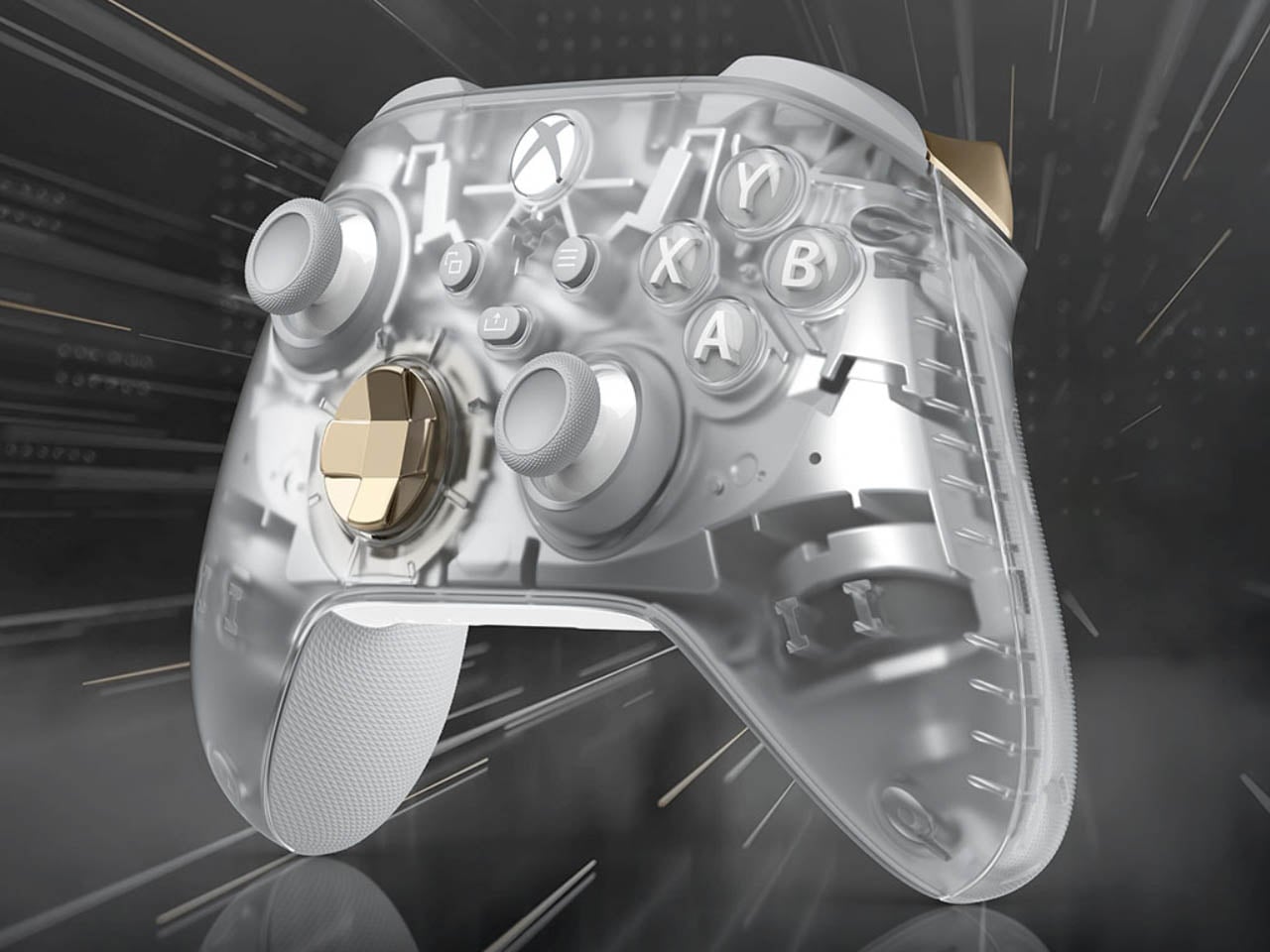
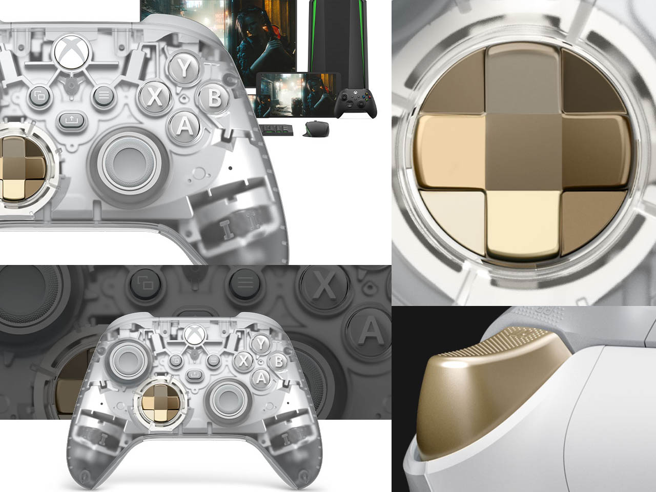
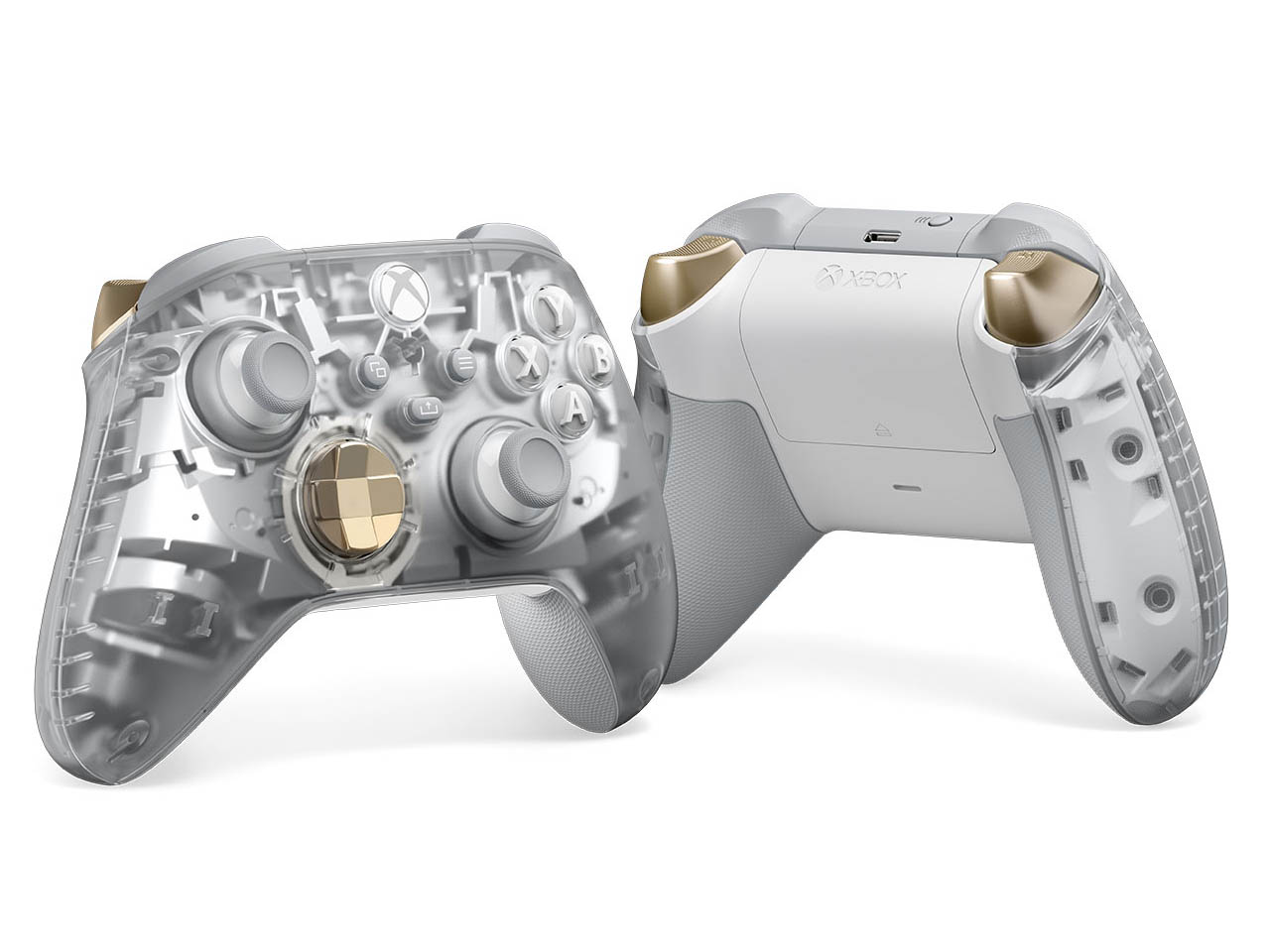
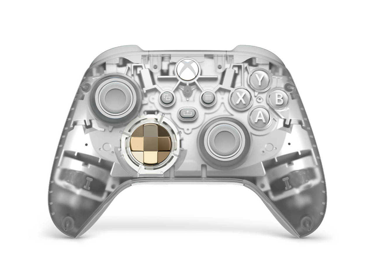
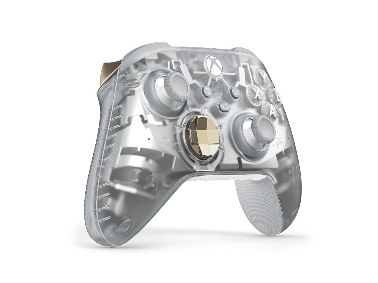
A more recent themed controller from Microsoft’s dedicated portal for experimentation, the Xbox Design Lab, really caught our attention for its translucent cool blue theme. Yes, I’m talking about the Xbox Wireless Controller – Sky Cipher Special Edition. On the same lines, Microsoft has not revealed the Ghost Cipher Special Edition Xbox Wireless Controller.

Designer: Microsoft

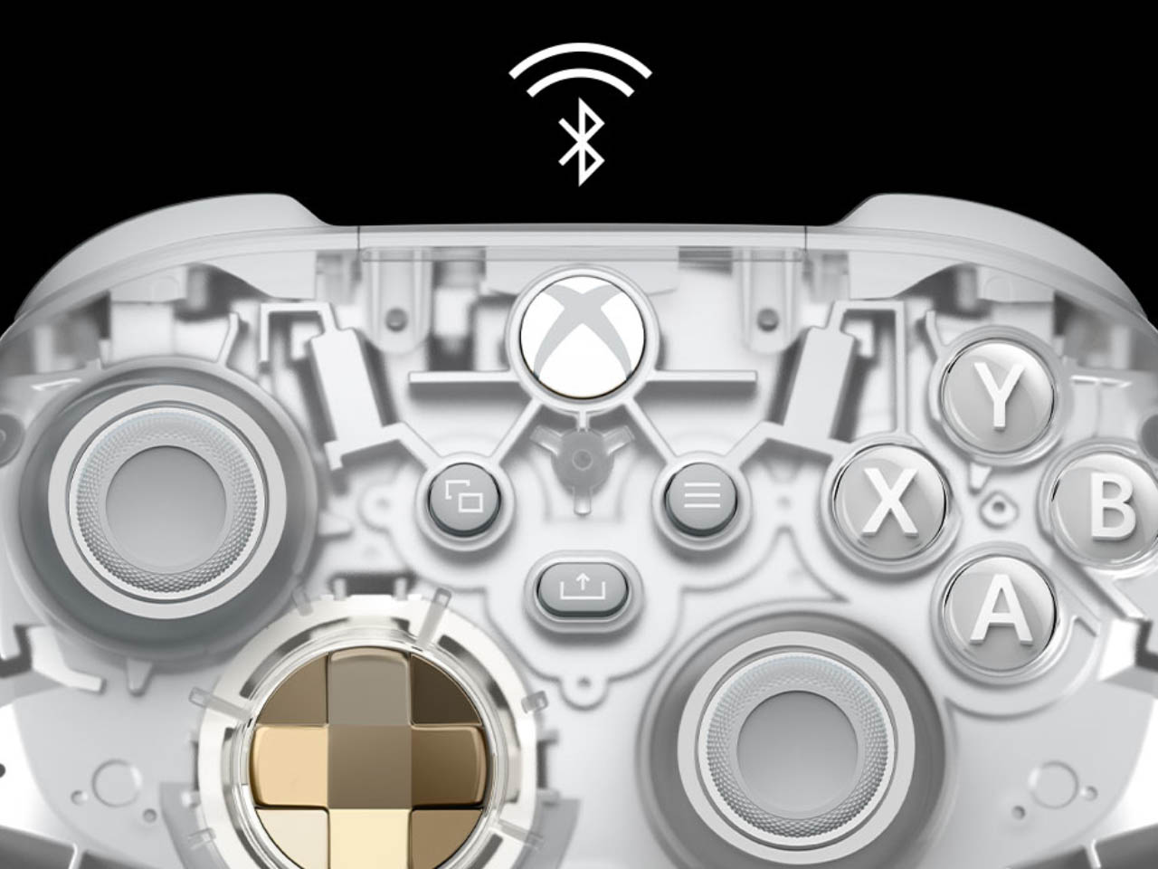
The gamepad has a transparent outer shell to expose all the innards in their bare form and working dynamics. The craze for transparent and semi-transparent gadgets is slowly taking over the tech community and I love it to the core. The Ghost Cipher Special Edition gamepad contrasts the see-through aesthetics with, a silver interior, grey joystick, and bronze accents on the triggers and D-pad for a very futuristic appeal. The buttons and the Xbox logo in white add a sophisticated charm to the mix.

This clear design will lure millennials who’ve seen the era of translucent iMacs, as well as Gen-Z who are accustomed to Nothing’s transparent design language. Coming at $70, the special edition controller is up for pre-order with a release slated for October 8. Expanding the Cipher Series are two new chromatic D-pad and paddle metallic designs called Energy Chroma and Sunset Chroma which create a hypnotic gradient that shifts colors based on the angle of viewing.

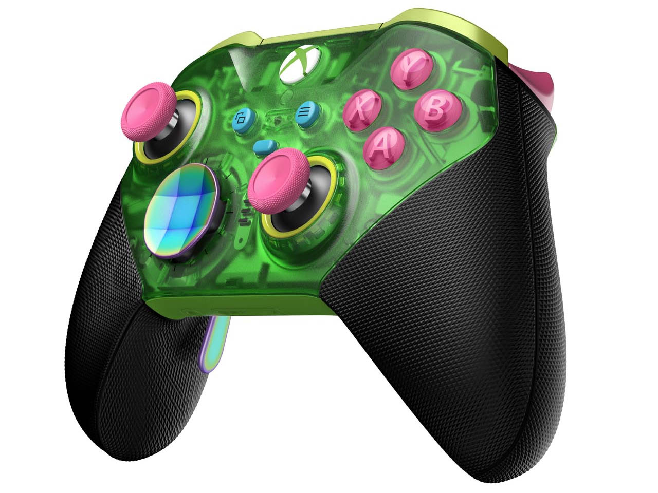
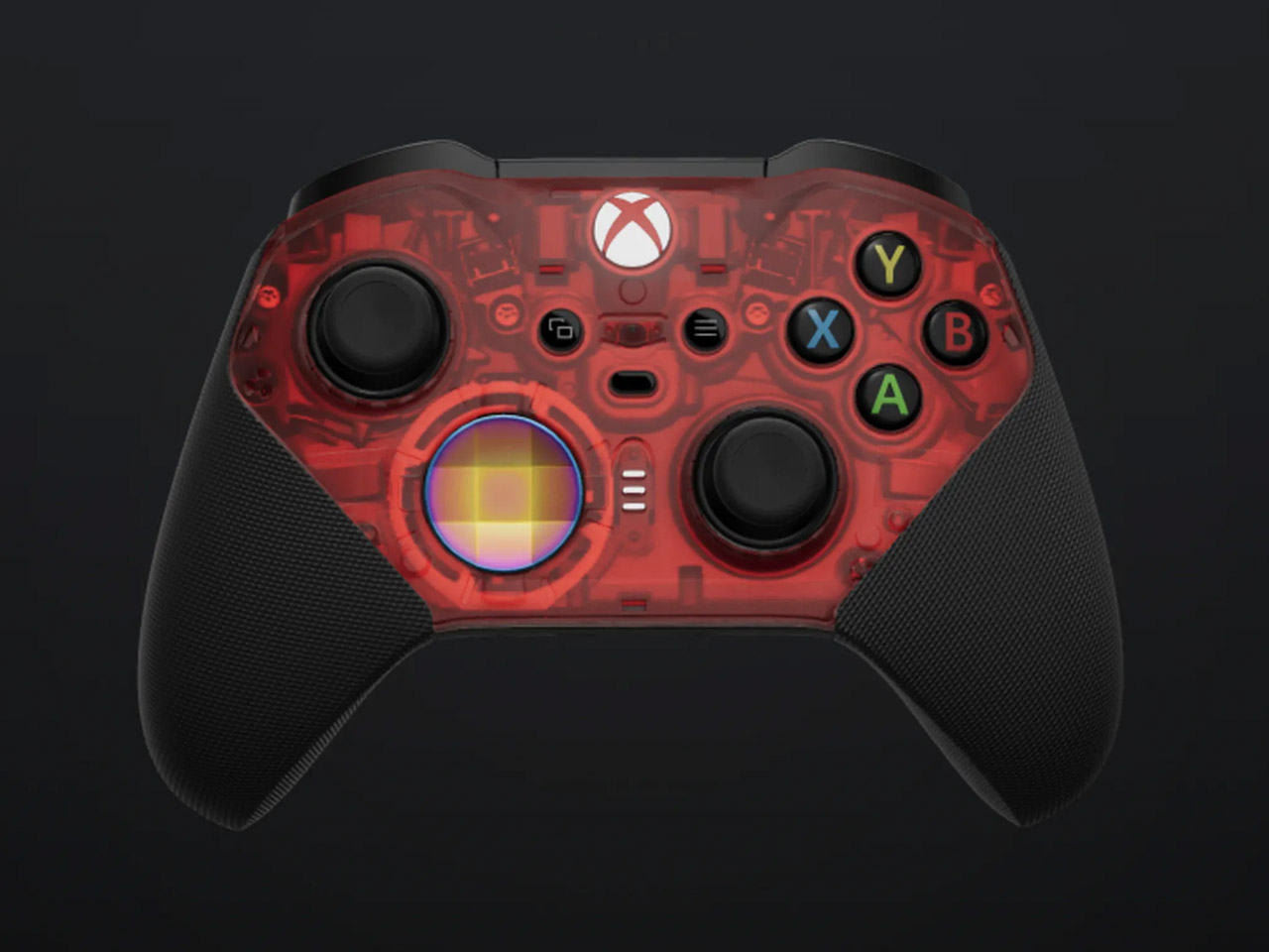
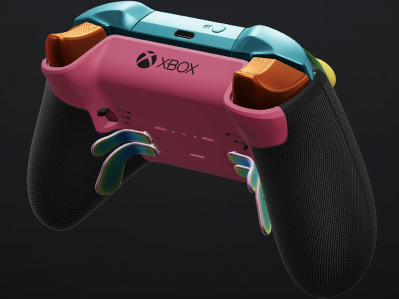
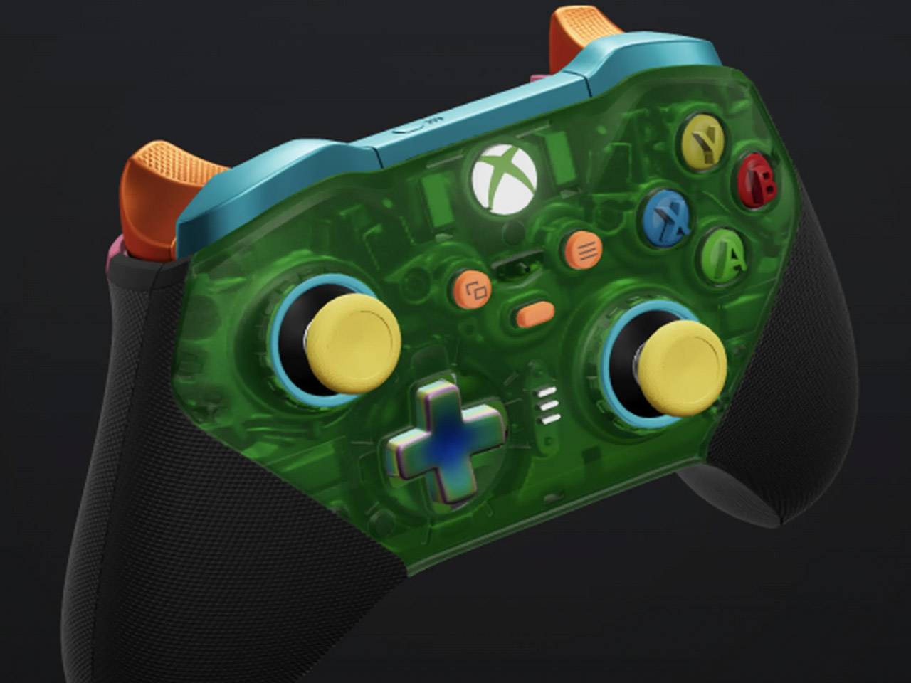
That’s not it as Xbox Design Lab has crafted shells for Elite Series 2 as well. Carrying translucent aesthetics these faceplates – Ghost Cipher colorless, Velocity Cipher green, Candy Cipher pink, Pulse Cipher red, Astral Cipher purple and Surf Cipher teal contrast with black handles to pep up your controller’s look. You can mix and match the color of the buttons and triggers for complete freedom of customization.

According to the Design Lab, these controller mod kits draw inspiration from the “90s and early 2000s, the Cipher Series brings six stunning transparent top case designs. These vibrant, candy-colored top cases encapsulate the controller’s metallic frame, showcasing both its external beauty and the advanced engineering within the Elite Series 2 controller. These customizations for the Elite 2 controller start at $150 and give you complete freedom to facelift your controller.

The post Xbox introduces appealing transparent controller and stunning customization options for Elite Series 2 first appeared on Yanko Design.

Logitech MX Creative Console offers designers more controls to help them create more

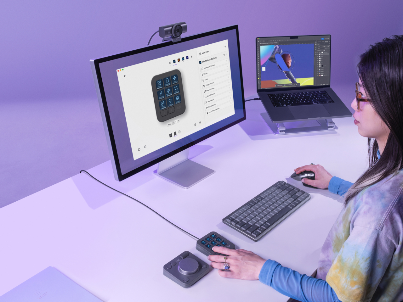
As consumers become more discerning and sophisticated, the tools needed to create content have also become more powerful and complex. Yes, there is now generative AI to help kickstart the creative process, but the final work is still done by human hands. The common keyboard and mouse are no longer enough for these tasks, and having your fingers dance over keyboard shortcuts is sure to result in strain and injury over time. Following the current trend of using Stream Deck-like devices for more than just streaming, Logitech has just launched its own tool that gives creative professionals an extra set of keys to help them spend less time fiddling with controls and more time actually creating.

Designer: Logitech

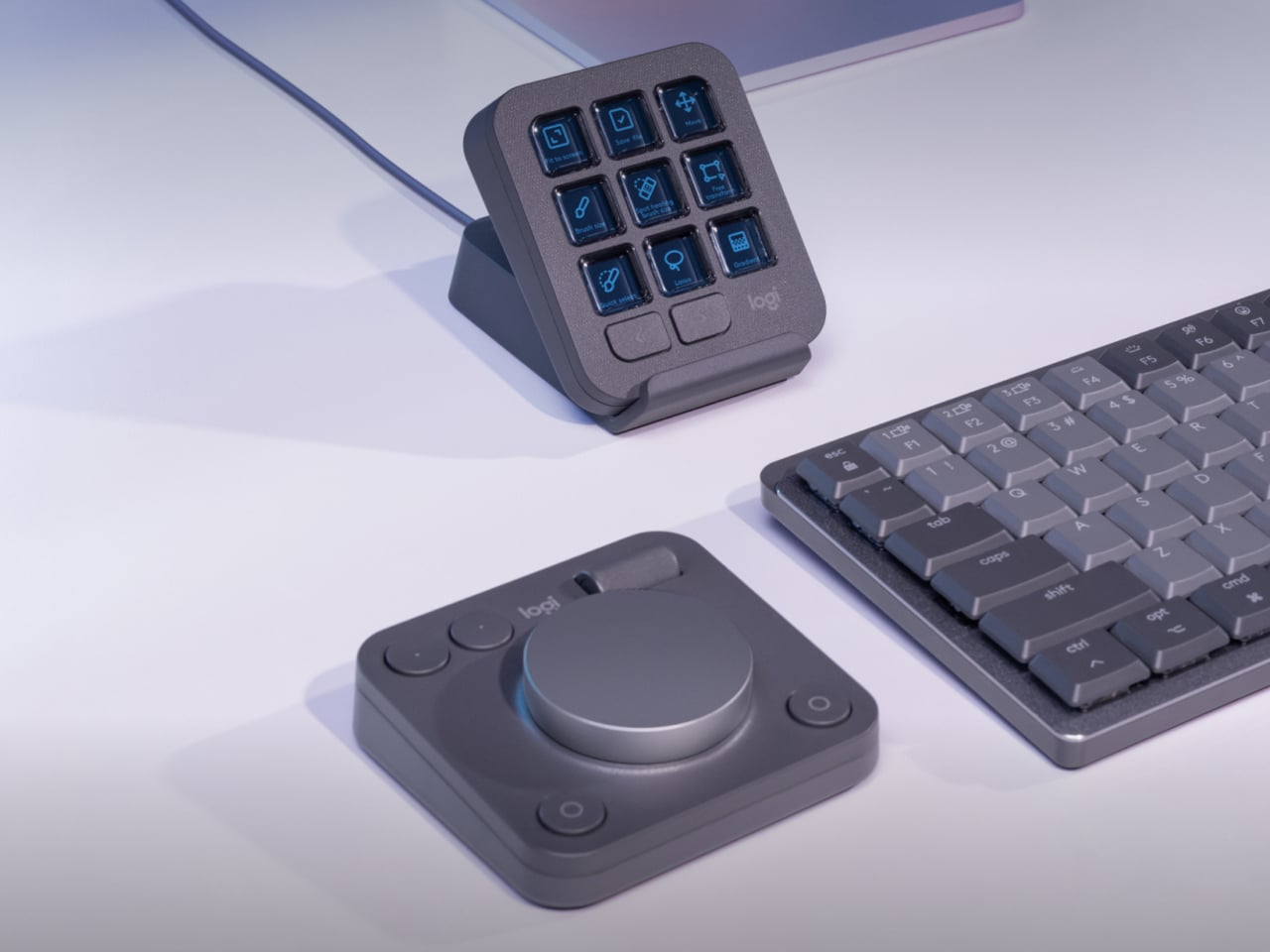
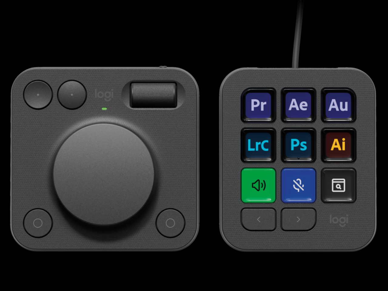
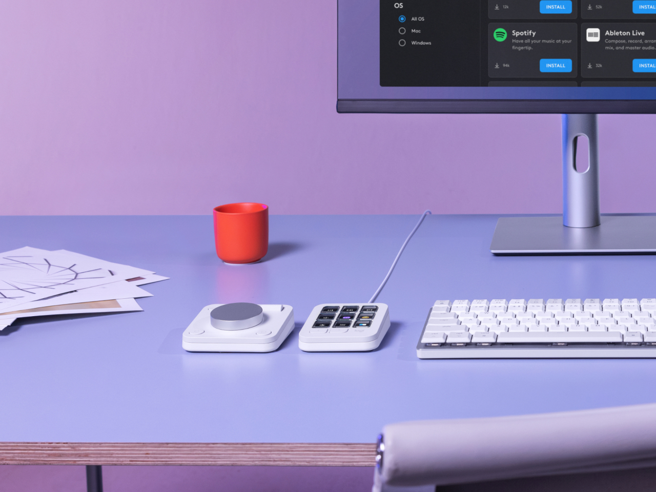
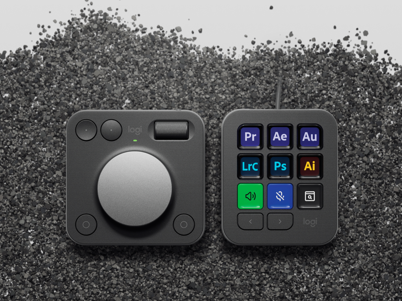
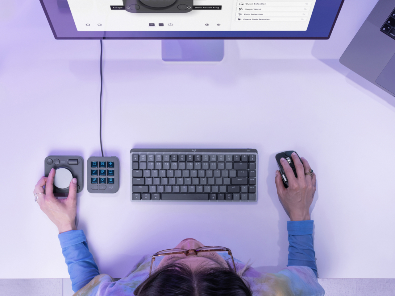
The Logitech MX Creative Console is a duo of connected devices. One is a dial pad with an honest-to-goodness physical aluminum dial that gives users more precise control over scrubbing through timelines, changing brush sizes, or any other setting that needs fine movements. There’s also a small roller for scrolling through other things, as well as two pairs of buttons for selecting things or moving forward and backward.

The other half of the duo is a keypad with 9 Display Keys, each of which can be configured for a different action and a matching icon. This lets creators and designers assign their most used shortcuts to these iconified buttons, freeing their minds from having to memorize all those key sequences, creating a more natural flow that, thanks to their physical and direct interactivity. It still relies on a bit of muscle memory, but far less than combinations of keys that don’t make sense as far as mnemonics are concerned.

Logitech isn’t just aiming for designers with such an assistive tool but also appealing to their growing sense of responsibility to the environment. Parts of the MX Creative Console use post-consumer recycled (PCR) plastic, 72% for the Graphite colorway and 55% for the Pale Grey version. The aluminum used for the dial is also made with a lower carbon footprint, using renewable energy rather than fossil fuels. Packaging still has some plastic, but the paper parts are made from sustainable and controlled sources.

Truth be told, Logitech is a bit late in the game, with many creators already using the popular live-streaming tool Stream Deck for the same purpose, though the addition of the physical dial is a big boost for professionals. At the same time, Cooler Master just recently launched the MasterHUB, a creative console with a modular design that really puts users in control. That said, the Logitech MX Creative Console does cost only $199, making it an accessible option for creators who need a boost to get into the zone.

The post Logitech MX Creative Console offers designers more controls to help them create more first appeared on Yanko Design.

Acer Project DualPlay Laptop Concept puts a unique twist to gaming on the go

PC gaming has experienced a huge boost thanks to the advent of handheld gaming PCs like the Steam Deck, the ASUS ROG Ally, and the Lenovo Legion Go. But while these offer a more mobile gaming experience, they still pale in comparison to dedicated gaming laptops when it comes to performance, battery life, and heat management. Gaming laptops have been around for years, of course, but they, too, are experiencing a renaissance, whether they’re becoming slimmer and sleeker or, in this case, taking on a completely different design. Rather than completely overhauling the laptop or even doing away with it, the Acer Project DualPlay concept instead transforms this familiar design into something that adapts to the latest gaming trends, including playing the same game with a friend who’s right beside you.

Designer: Acer

The days when PC and console gaming camps were divided across keyboard or controller lines are long gone. Those on PS5 and Xbox now feel the need to grab a keyboard to communicate with friends, while some PC gamers now swear by gamepads, especially those playing on handheld PCs. The trends may have changed, but the design of gaming laptops has not caught up to this shift, which is why the Acer Project DualPlay concept changes the formula a wee bit by embracing both playing styles in the same device.

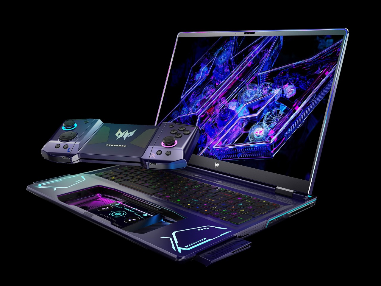
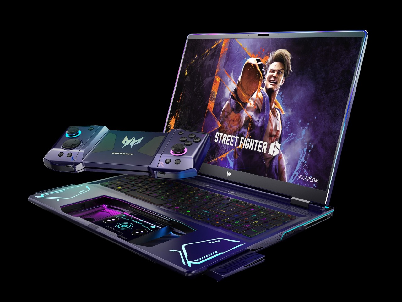
When you press a certain “release” button on top of the keyboard with two fingers, the laptop’s extra-large touchpad pops out and becomes a wireless controller, not unlike those you’d usually connect and bring with you in a separate case or pouch. This dual system lets gamers quickly switch between keyboard and controller without missing a beat and without having to worry about forgetting to bring the controller or having no space for it in the bag.

“DualPlay,” however, has dual meanings here. That detachable controller can actually be separated into two joysticks, not unlike the concept of the Nintendo Switch Joy-con, allowing two people to compete or cooperate in the same game without having to fight over the controls. It brings back the social feeling of playing with someone beside you that home consoles offered, except you’re no longer limited to doing that at home.

The Acer Project DualPlay gaming laptop concept has other surprising features that really take gaming to the next level. Releasing the controller also pops out two high-fidelity 5W speakers from the sides, delivering audio that’s not impeded by desks or other obstacles. There’s also an overabundance of dynamic RGB lighting not only around the keyboard but also around the screen, flanking the detachable controllers, the infinity mirror lighting bar on the back, and even the controller’s joysticks. It definitely looks like a gaming laptop from the future, though it remains to be seen if it is far too ahead of its time as well.

The post Acer Project DualPlay Laptop Concept puts a unique twist to gaming on the go first appeared on Yanko Design.

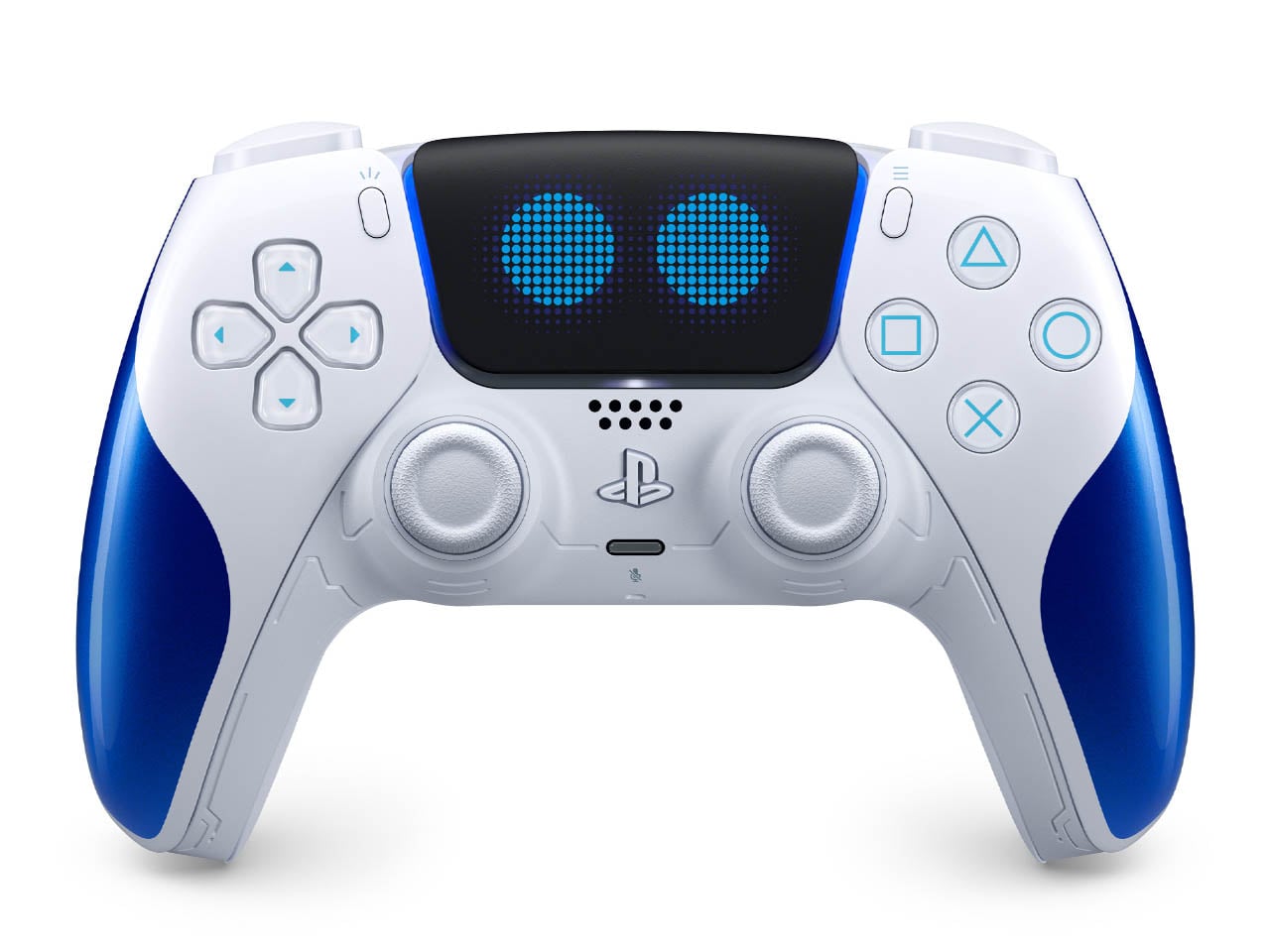
Sony Astro Bot-Edition PS5 Dual Sense controller is a livened-up peripheral with Googly Eyes

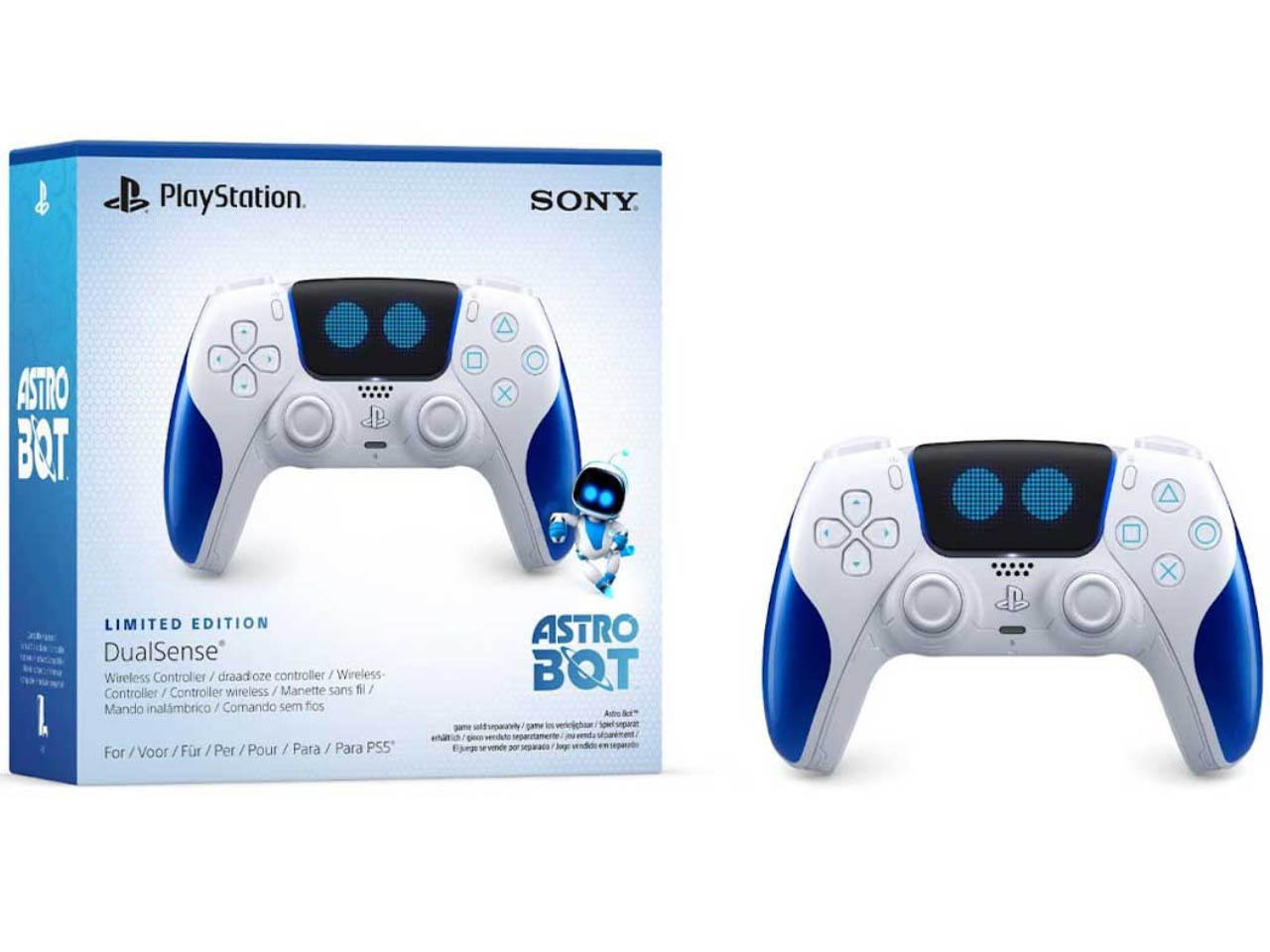
Astro Bot, the Mario-like adventure game for PS5, developed by Sony Interactive Entertainment and team Asobi, is all set to arrive on September 6. On the same day debuts, the limited-edition Astro Bot controller, based on the reliable DualSense controller by Sony. The lively peripheral will cost a bit more than the normal wireless DualSense version, but it does come with some perks that’ll excite gamers.

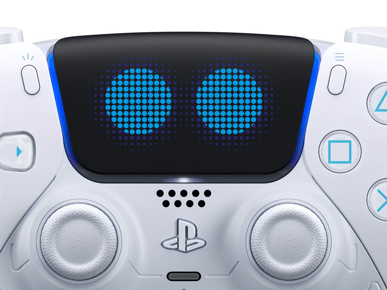
The pint-sized robot featured in the game has become a modern-day PlayStation mascot, and to have a controller that blinks its googly eyes is exciting for fans. This limited edition Astro Bot PS5 DualSense gamepad is priced at $80 and will be available for pre-orders from August 9 at PlayStation Direct in the US and UK at select retailers.

Designer: Sony

This special gamepad is unsurprising as Sony has previously launched themed controllers including the limited edition PlayStation 5 Spider-Man Miles Morales console. According to the Japanese consumer electronics giant, the themed wireless controller “is a work of art” and we can see why. The touchpad has robotic blue eyes that seem like blinking, while the handles and buttons have signature blue hues.

Another interesting thing is the number of textures (like grass, metal, sand, water, or glass) that the player feels through the haptic feedback. The adaptive trigger response further enhances the overall experience. Things like the feeling of the thruster rattle when the Barkster bulldog jetpack is deployed, the power-ups going through your fingers, or the impacts of the one-on-one battles in the boss fights. This Dual Speeder gadget can be felt as the motion-controlled input for the spaceship too.

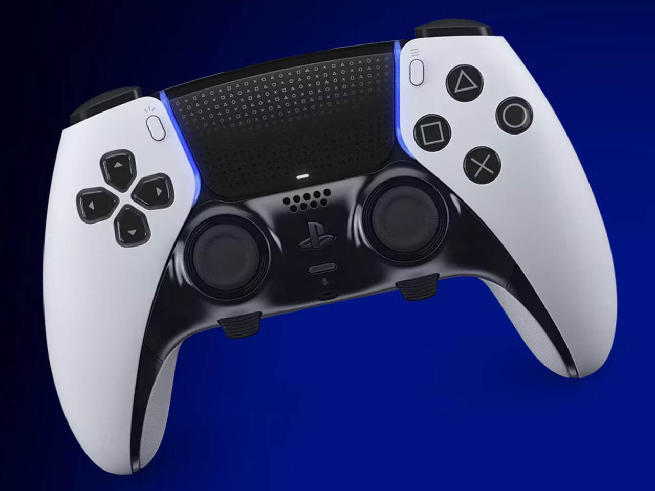
The sensory feeling is matched with the sound effects for a complete experience of the upcoming title. The blue accents on the handles and buttons are carved in a sci-fi theme which makes owning this controller special. If you too love Astro Bot, it’ll be a wise decision to hit the pre-order button when the floodgates open. For those who already own the standard DualSense version, it would make more sense to go for the feature-loaded DualSense Edge controller.

The post Sony Astro Bot-Edition PS5 Dual Sense controller is a livened-up peripheral with Googly Eyes first appeared on Yanko Design.
8BitDo SN30 Pro Gold and Silver controllers are as heavy as they look

It seems that we’re seeing a rather curious design trend in the gaming market. Once filled with plastic-encrusted designs, there are a few coming out with more stylish cases, be it for the device itself or for its accessories. Analogue just recently launched its CNC aluminum limited edition Pocket, but 8BitDo was actually a few steps ahead of it. Although one’s eleventh anniversary isn’t actually associated with metal (it’s Turquoise, by the way), the famed maker of throwback controllers released metal versions of its widely popular SN30 Pro, giving fans of the brand a collectible they can actually use and, in case of an emergency, even throw like a deadly weapon.
Designer: 8BitDo

Game controllers are made to be light enough not to cause hand strain but still have enough weight to feel substantial and improve gameplay. Gamers have come to expect that bulkier controllers that follow the Xbox and PlayStation designs would be heavier than most, especially controllers that are patterned after the designs of yesteryears. Not so this variant of the SN30 Pro, itself designed after the super lightweight Super Nintendo gamepad, mostly because most of its body is made of metal.
The Gold and Silver editions of the SN30 Pro aren’t just cheap paint jobs, though you might be forgiven for making that presumption given the resemblance to powder-coated metallic paint. It’s true metal, or as 8BitDo calls it, metal zinc alloy, and it’s used not just for the main body but for almost every part visible to the eyes. That includes buttons, triggers, and, yes, even the joysticks. The gold edition gets a matte paint finish while the silver version undergoes electroplating. The cables aren’t metal, though, which is probably for the best.

More than just visual oddities, the SN30 Pro Gold/Silver Edition controllers also have one other advantage over their plasticky older siblings. They’re built to last, at least more than the common controller, as metal will not warp or deform over time. It’s also less likely to crack when accidentally dropped, though you might dent this here and there. And drop it you might indeed, given how heavy it is 381g. For comparison, the normal SN30 Pro weighs a mere 114g and even the Xbox Wireless Controller is just around 287g.

Not all that glitters is gold, as they say, and despite the luster and heft of these limited edition controllers, their feature set might leave gamers sorely disappointed. They’re definitely more like functional collectors’ editions rather than serious gaming weapons (unless you throw it like one), and the $99.99 price tag definitely cements, or rather forges, that image.

The post 8BitDo SN30 Pro Gold and Silver controllers are as heavy as they look first appeared on Yanko Design.