Artistic unibody chair concept is simple, stackable, and stunning

All chairs have a common, standard purpose, but there is no hard rule to follow when it comes to their design. As long as they offer a stable seating surface, and in most cases, some form of back support, they qualify as an acceptable piece of furniture, even if the actual experience can be a bit uncomfortable at times. It’s only by convention, for example, that most chairs have four legs or are made of different pieces, and some designs try to push the boundaries of what’s physically possible when it comes to the composition and form of chairs. This concept, for example, does away with the standard makeup of this kind of furniture and instead embraces a single flowing form that, surprisingly enough, works just as well in terms of practical use.

Designer: Deniz Aktay
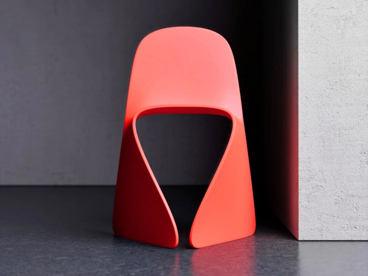
Bending a single sheet of material, be it metal or plastic, into a less trivial form isn’t exactly easy, especially when you have to make sure that it is stable enough to sit on. You need not only balance but structural integrity as well since it will be something that humans expect to be safe to use. Some designs tend to overcomplicate things to meet those goals, but this chair concept goes in the completely opposite direction with its extreme simplicity.

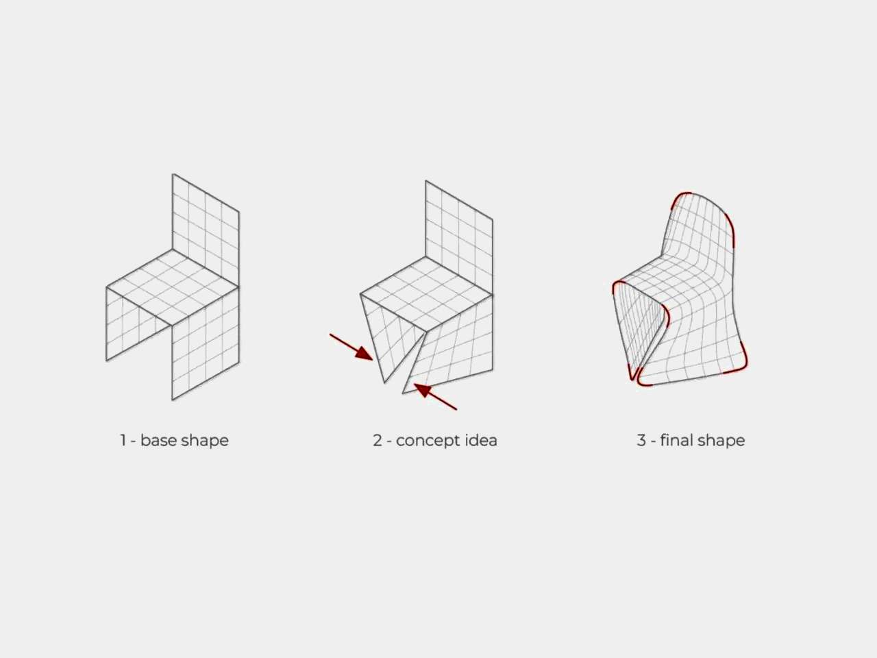
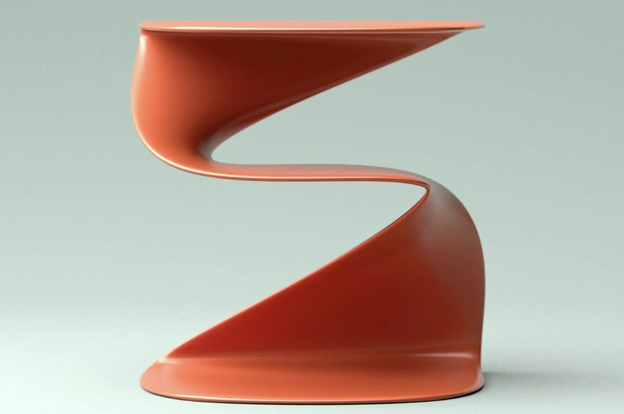
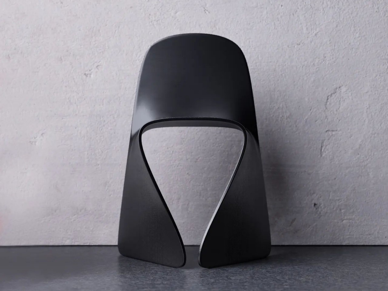
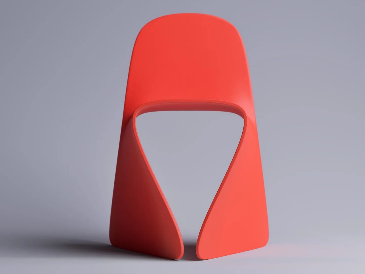
Named after the last Greek alphabet, the Omega design concept simply takes a single folded sheet of material and bends it at the sides and back to create the two wide legs and backrest of the chair. There are no sharp angles in this design, giving the seamless form a smoother and more organic appearance. While it is aesthetically pleasing, it isn’t just an art piece, and at least based on the concept, it is just as functional as your stereotypical four-legged plastic chair.
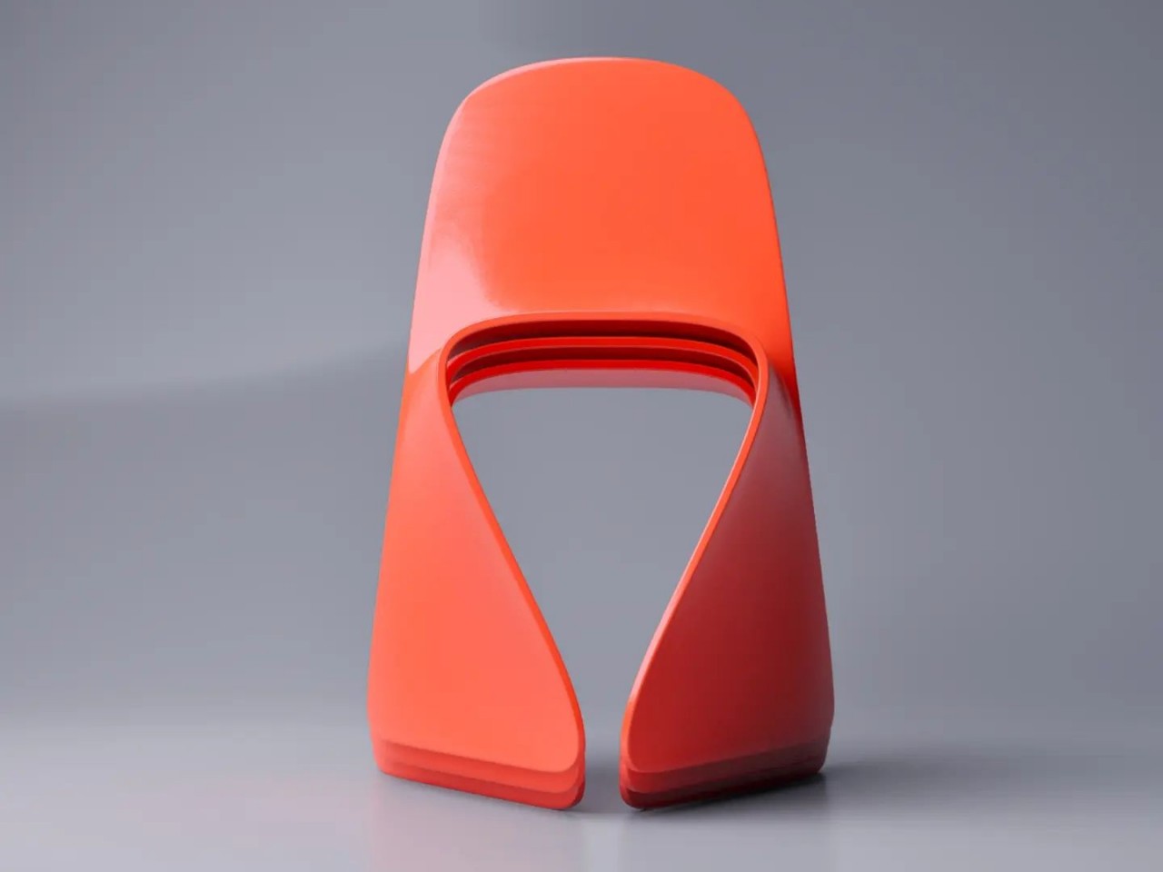
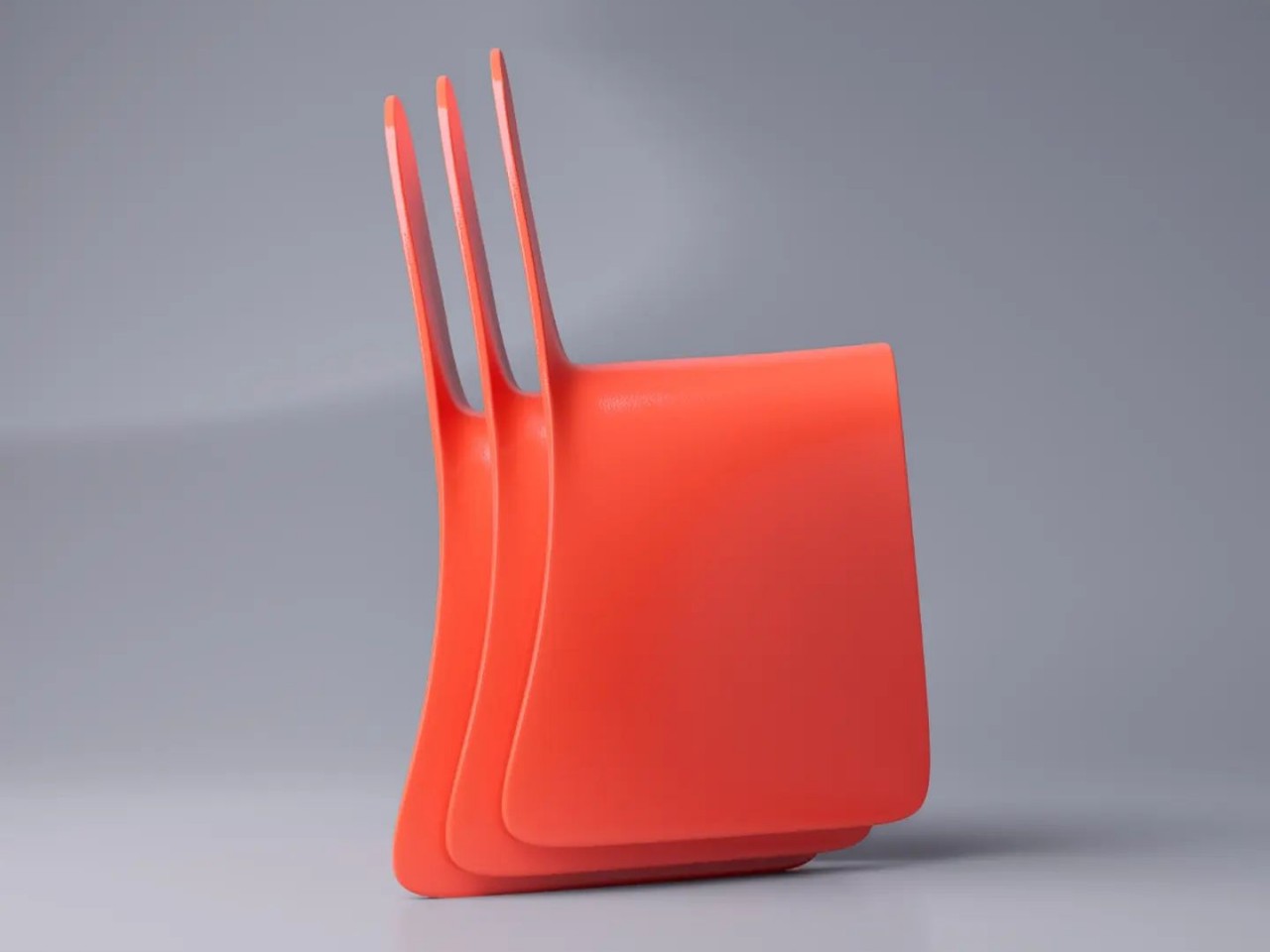
In particular, the design of the Omega chair allows it to be stacked together, rather unexpected given its nontrivial shape. It doesn’t even take up more space than most stackable chairs, which makes the design practical for widespread production and use. It definitely offers an interesting alternative to common mass-produced designs as it offers both a compact shape as well as an attractive appearance.

On the surface, the Omega design also looks sturdy, with the legs angled inward to cover a bigger surface area than a normal straight edge. There might, however, be some concerns with the comfort of the seat itself, as the curved sides could make some slide off too easily. The backrest might also be too short for comfort, with the top edge digging into people’s backs when they lean backward. Nonetheless, it’s a beautiful and simple design that could be improved on for an even more comfortable and ergonomic experience.
The post Artistic unibody chair concept is simple, stackable, and stunning first appeared on Yanko Design.
This Minimal Metallic Coffee Table Takes Inspiration From the Simple Shape of a Safety Pin

A well-designed coffee table is the ultimate pick me up your living room needs. Once you pick the perfect coffee table, setting up your living room becomes child’s play, because you’ve already set the tone and decided on the theme with the table, now you simply need to build on it, and create a space that truly reflects you and your interior design style. I’m no stranger to beautifully designed coffee tables, I come across a gazillion different ones every week on the internet. And I do have an exceptionally soft corner for them. However, if you add Deniz Aktay’s magical touch to my favorite piece of furniture – well, then you have the perfect coffee table.

Designer: Deniz Aktay

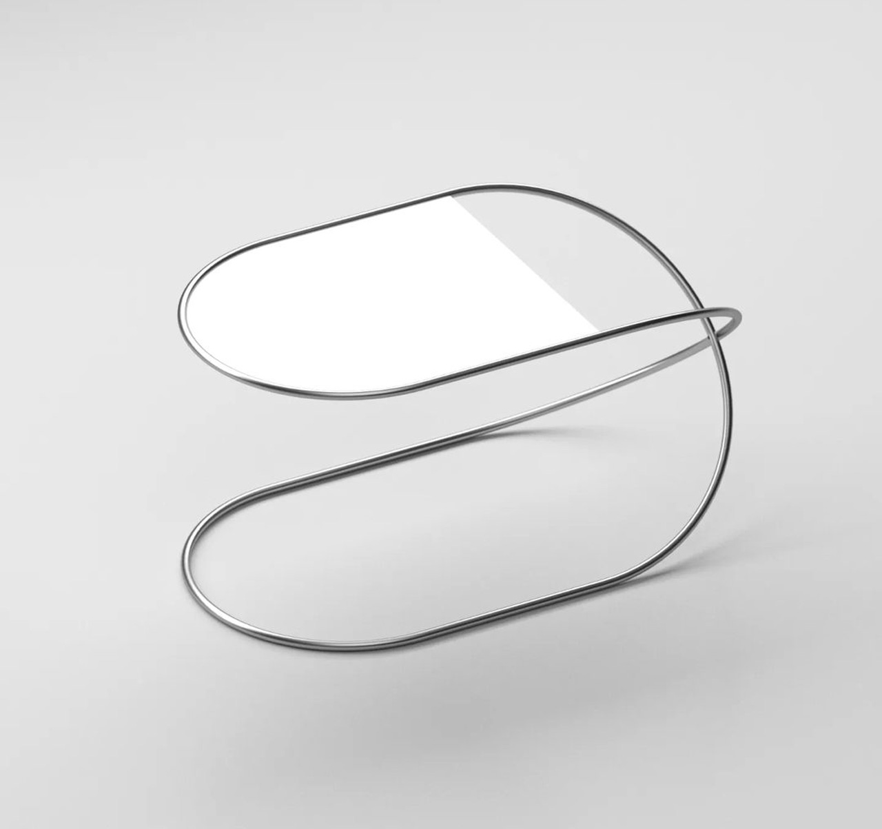
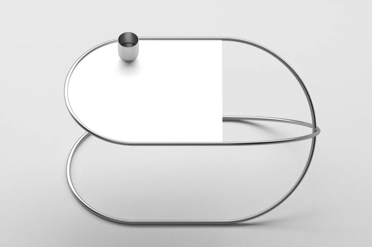
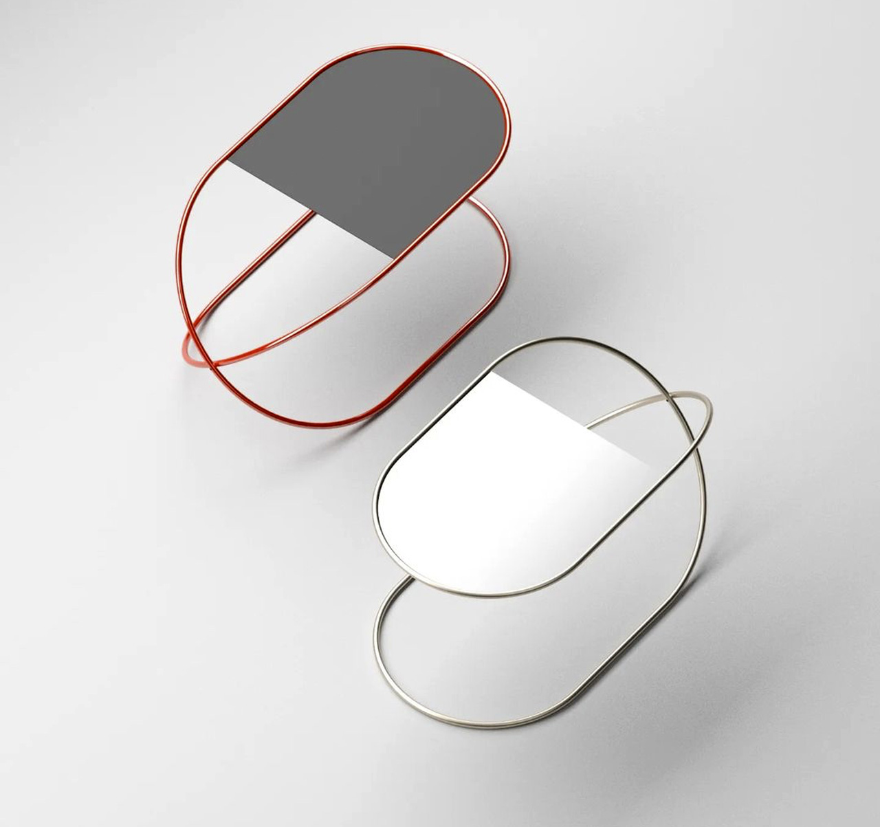
I’ve covered a ton of Deniz Aktay designs simply because they are oh-so-simple, elegant, and yet packed with massive functionality. The simplicity will almost make you wonder ‘Why didn’t I think of this?’, but unfortunately for us and luckily for Aktay, no one else can conjure these designs up except him. And his latest design the ‘Whisk’ coffee table is no exception to this. Aktay recently posted the Whisk coffee table to his Instagram page, around two days ago. Simple, and minimal, yet oozing a geometric exuberance, the Whisk coffee table features an artfully shaped metal tube that forms the major body of the design and transforms it into a major eye-catcher.

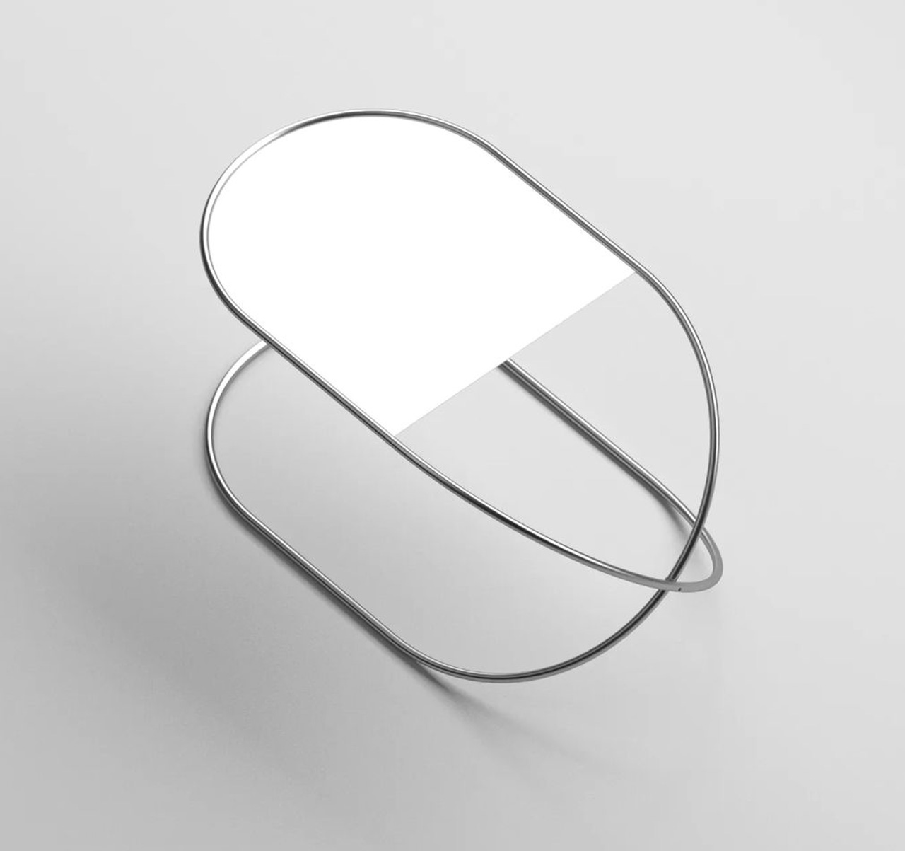
The simple twisted metallic form of the coffee table brings to mind the image of a whisk, which could be why Aktay named the furniture piece the same. Or if you look closer it also looks like a contorted safety pin! The interloping metallic tube supports a tabletop that rounds at one end and forms a rectangular on the other end. The tabletop fits niftily and strategically into the tube, creating elements that perfectly complement one another, and yet provide an interesting geometrical contrast as well.

Although the Whisk coffee table is a compact and small design with a minor footprint, it speaks volumes through its sharp, form, and metallic excellence. It’s the kind of coffee table that you could fit effortlessly into any part of your home, and I do believe it could work well as a side table too, owing to its minimum form.

The post This Minimal Metallic Coffee Table Takes Inspiration From the Simple Shape of a Safety Pin first appeared on Yanko Design.
Eccentric side table puts a mythical beast in your living space

Furniture may have started out as purely functional objects, but they quickly transformed into decorative pieces that add some flavor to a given space. Sometimes that flavor is ornate and grandiose. Other times it can be unadorned yet elegant. Eye-catching features don’t always have to come from embellishments and accents. Sometimes, just the shape of the furniture can already be a conversation starter, especially if they come in weird forms or distinct appearances. This side table, for example, is reminiscent of an elusive mythical monster rising from the depths of a lake, but despite its odd shape, it actually has a few useful functions beyond just holding your coffee mug.

Designer: Deniz Aktay

The Loch Ness monster, sometimes affectionately called “Nessie,” is one of the most famous mysteries that have filled books and cameras over the decades, right next to Bigfoot and UFO sightings. It is commonly speculated to be an amphibious creature that raises its long neck above the water from time to time, leading to its now iconic silhouette.

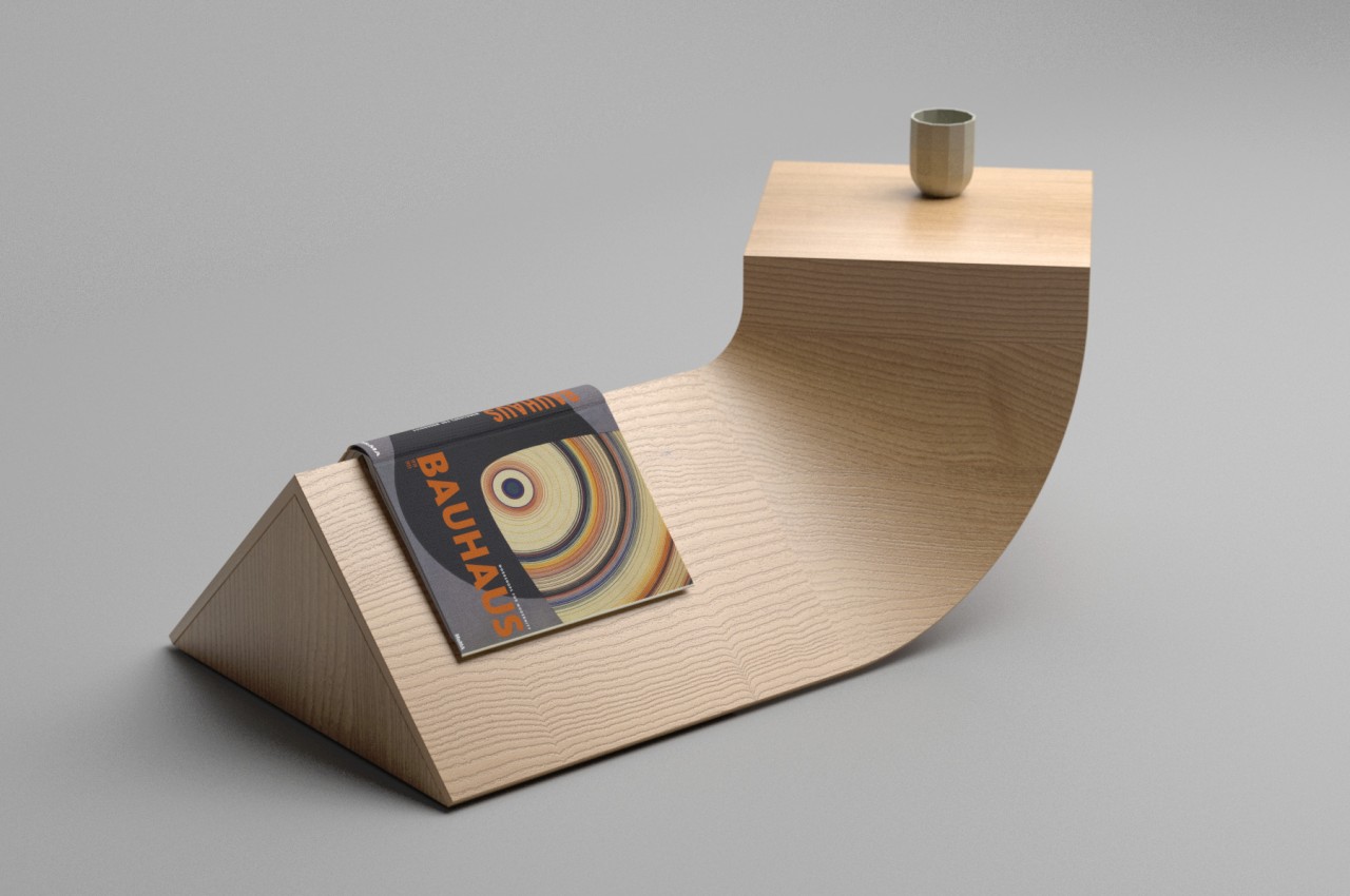
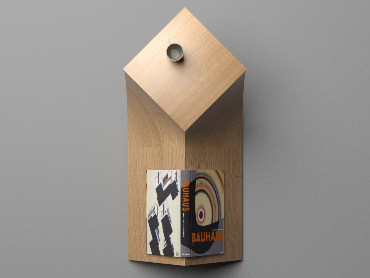
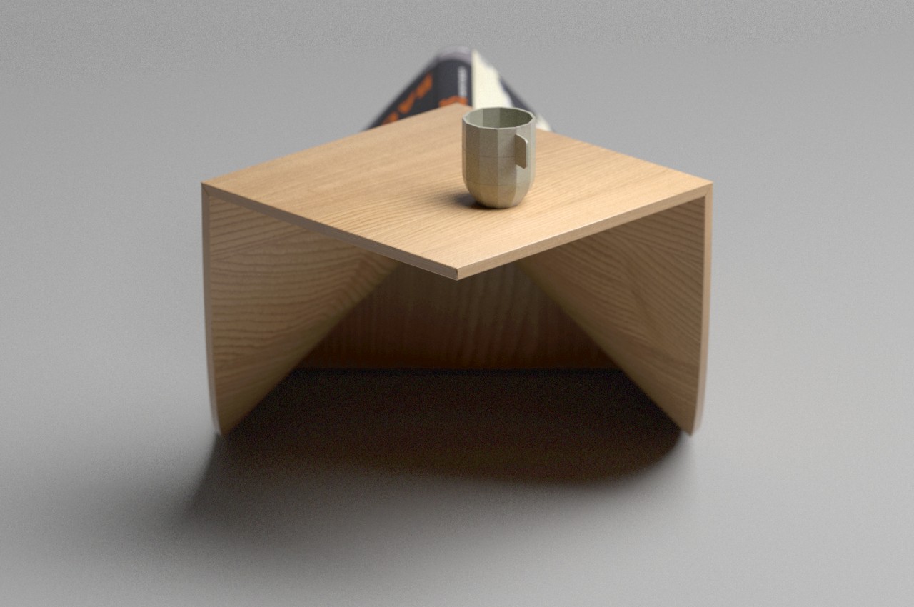
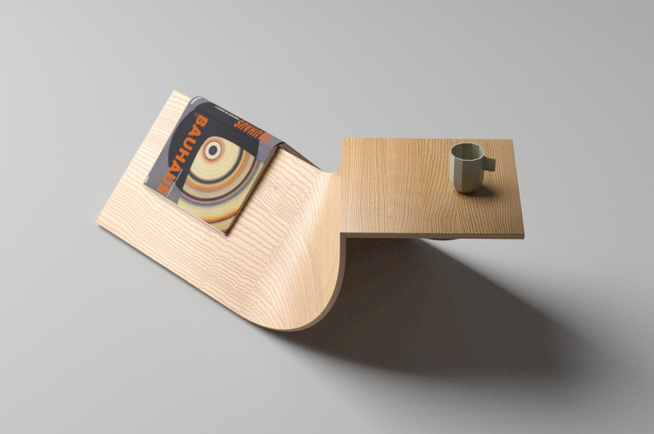
Nessie is a side table whose name and shape leave no doubt as to its inspiration. What is also clear is that it’s a fine example of woodwork craftsmanship, considering the difficulty in producing its unconventional form. It is practically made of two planks of wood that curve upward to join a square tabletop at two of the latter’s adjacent edges. Since such a composition would normally topple over, a wooden triangular prism serves as the counterweight on the opposite end.

Despite its rather unusual shape, reminiscent of an animal sticking its neck up, each part of the side table’s design serves a particular purpose. The long triangular block, for example, acts as a bookmark for more than just one reading material. The empty space beneath the table top can also serve as a hiding spot for other items like small storage boxes.

As far as side tables go, Nessie definitely takes up more space and requires some planning on where to put it. That said, it isn’t wasted space either since every part serves a function. It might even be possible to extend the design to create some storage space inside the triangular end, with a door that easily lifts to reveal its contents.

The post Eccentric side table puts a mythical beast in your living space first appeared on Yanko Design.
Slithering sculptural table with smart storage surfaces is inspired by the king cobra

If you’ve ever even remotely spent time in the design world on Instagram, then you’ve for sure come across Deniz Aktay. His simple, minimal, yet genius furniture pieces have slowly but surely taken the IG world by storm. The success of his designs lies in the fact that they’re oh-so-simple, elegant, and yet packed with massive functionality. The simplicity will almost make you wonder ‘Why didn’t I think of this?’, but unfortunately for us and luckily for Aktay, no one else can conjure these designs up except him. He’s created wonders – from a unique bookshelf that functions as a side table to a coffee table design with intriguing layers. And, we’re currently drooling over the Cobra table.

Designer: Deniz Aktay

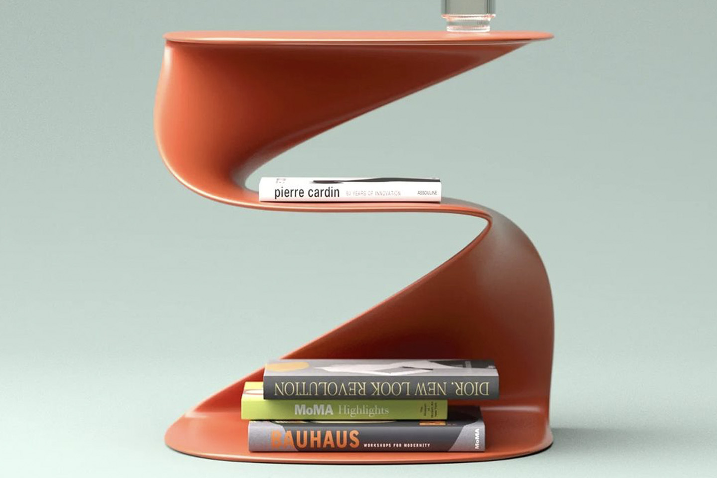
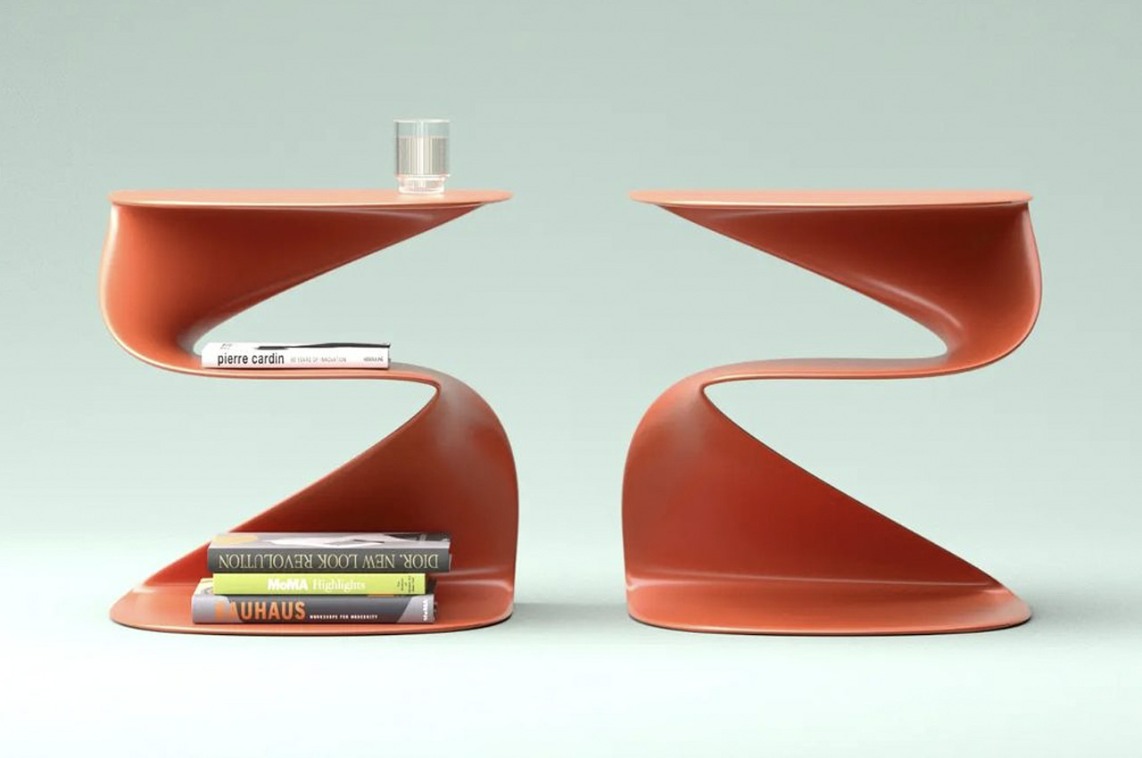
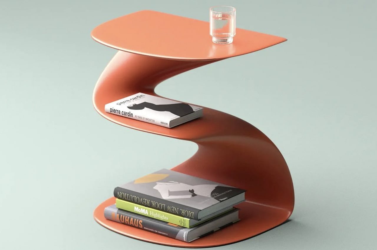
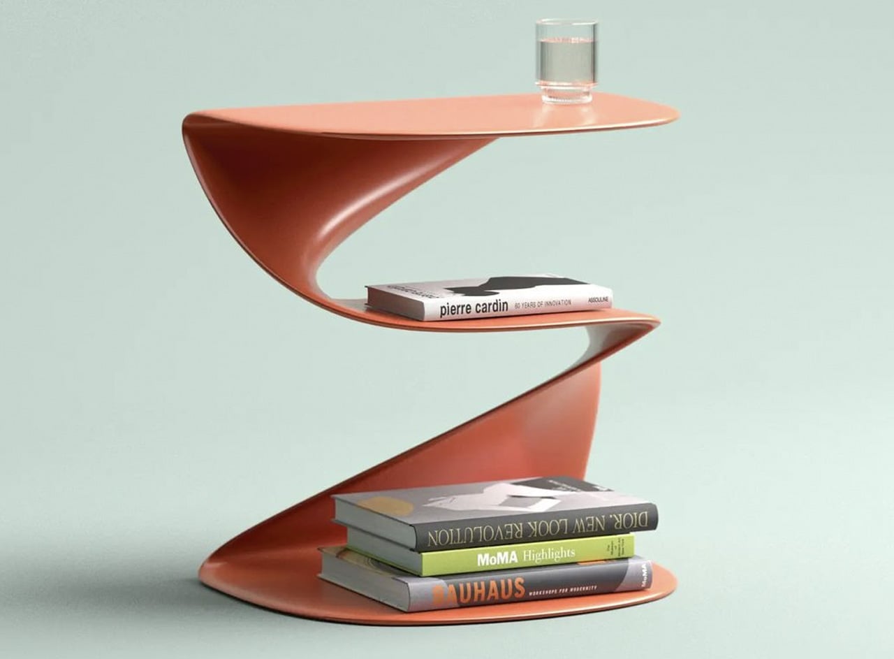
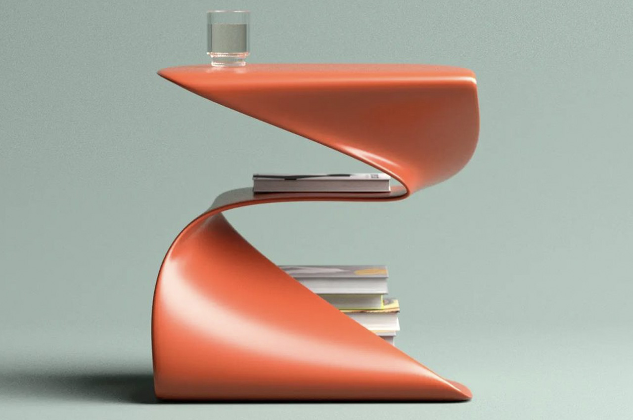
As its name signifies, the inspiration behind the Cobra table was simple – it was a cobra. While designing the Cobra table, Aktay had the intention of creating something that is artistic and sculptural, but also functional. And the Cobra table checks all three of these boxes! The Cobra table could function as a small center table, or a more suitable side table. It doesn’t have much of a footprint, and it has a snake-inspired form that is accentuated by a rather meandering shape.

The smartly designed table features three storage levels. The different levels slither from the bottom to the top, much like a majestic king cobra! This gives the table quite a sculptural feel and a dynamic and free-flowing form. The base and the tabletop function as storage spaces, as well as the intermediate surface in between them. At first, you may assume that the surface in the center has no function, but Aktay has left no component of the Cobra Table useless. The three storage floors are excellent for storing books, magazines, documents, and other souvenirs. The topmost surface can also hold glasses or plates if you like snacking in your living room.

The table is a beautiful bright orange, which heightens its uniqueness and quirkiness. Aktay does prefer to utilize bright and bold colors for most of his designs, colors that you may not usually associate with pieces of furniture. The orange color he picked for this table is an example of that, but also an example of how a simple color can completely illuminate and uplift a design!

The post Slithering sculptural table with smart storage surfaces is inspired by the king cobra first appeared on Yanko Design.
This twisting sculptural furniture design provides a new identity to conventional bookshelves

A bookshelf is an excellent way to enhance a space, however, it can be a rather straightforward and boring one too. Bookshelves when imagined and designed as part of a room aren’t given much importance or imparted with any exceptional qualities. At first glance, a bookshelf’s main function is to organize and declutter your space and provide a pleasant backdrop for your room. But what if you were to re-imagine this furniture piece, transforming it into an avant-garde style statement, rather than just a bunch of wooden shelves attached to a wall? Well, that’s exactly what Deniz Aktay did with Hullabaloo.

Designer: Deniz Aktay

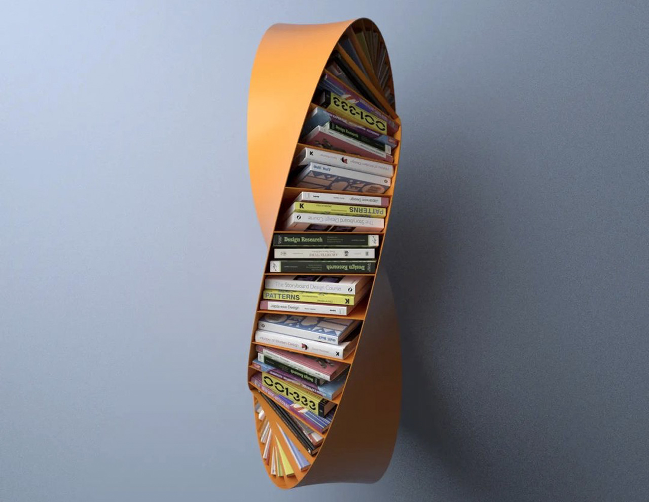
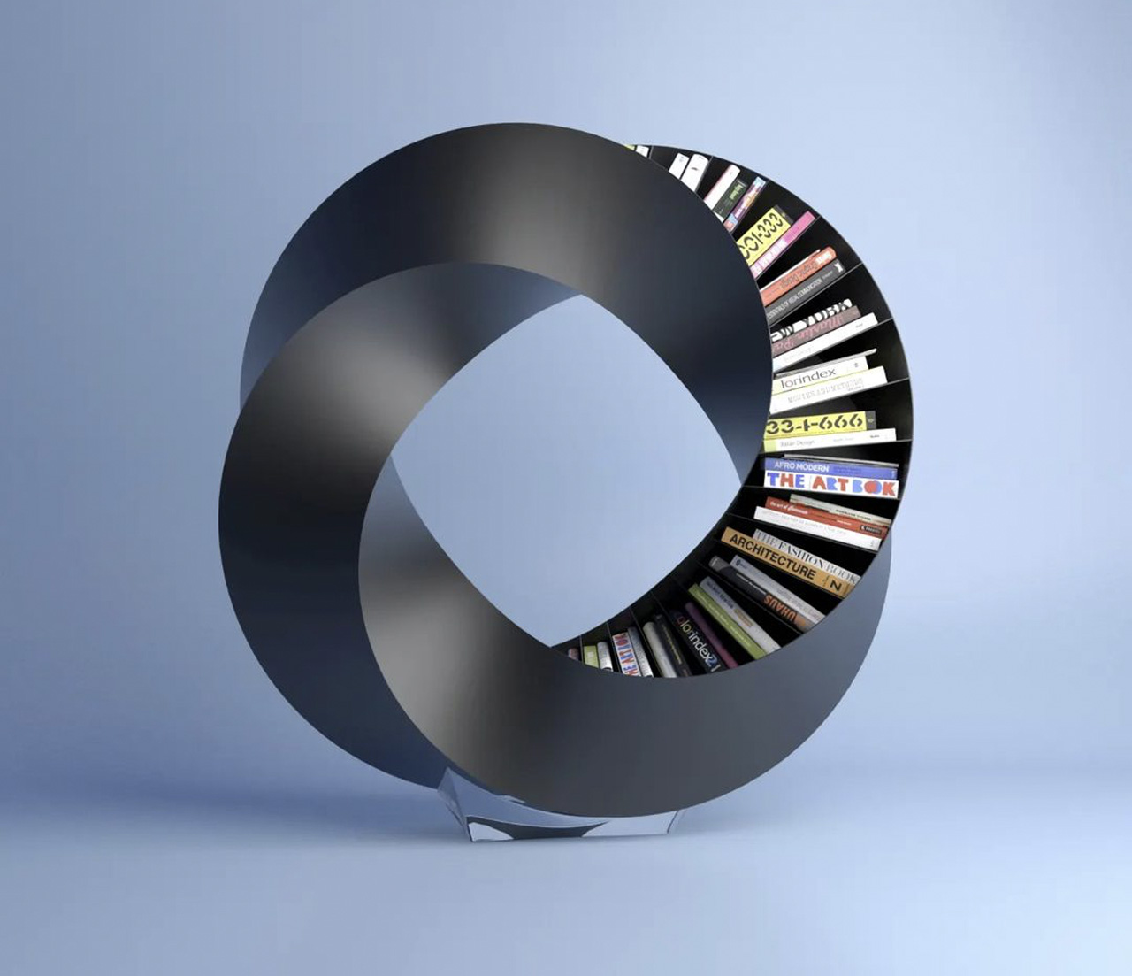
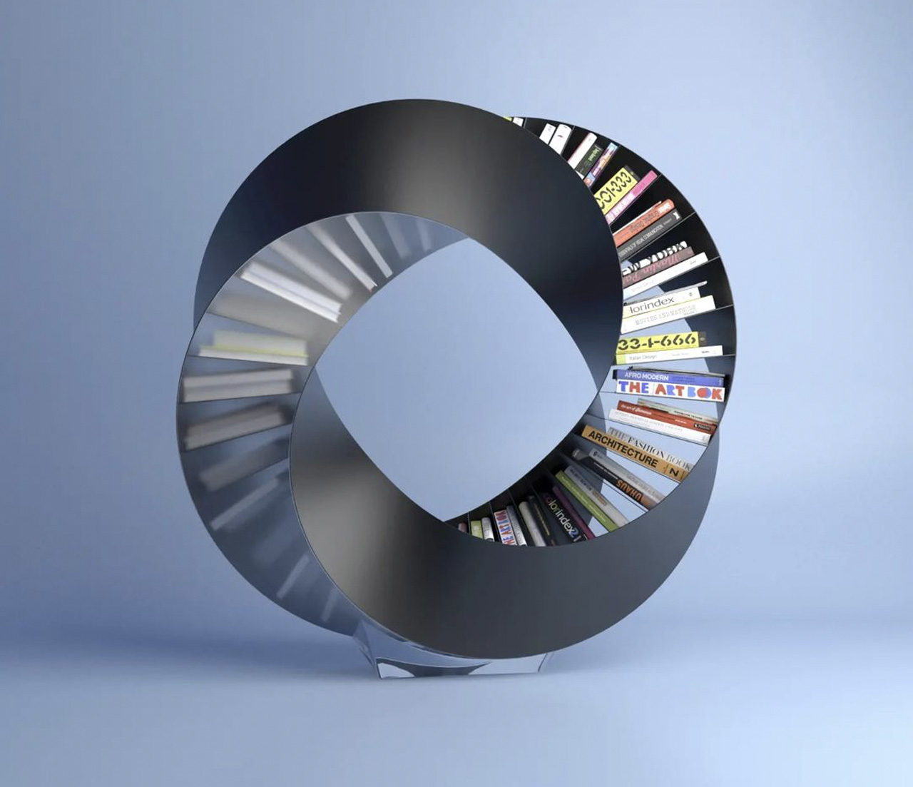
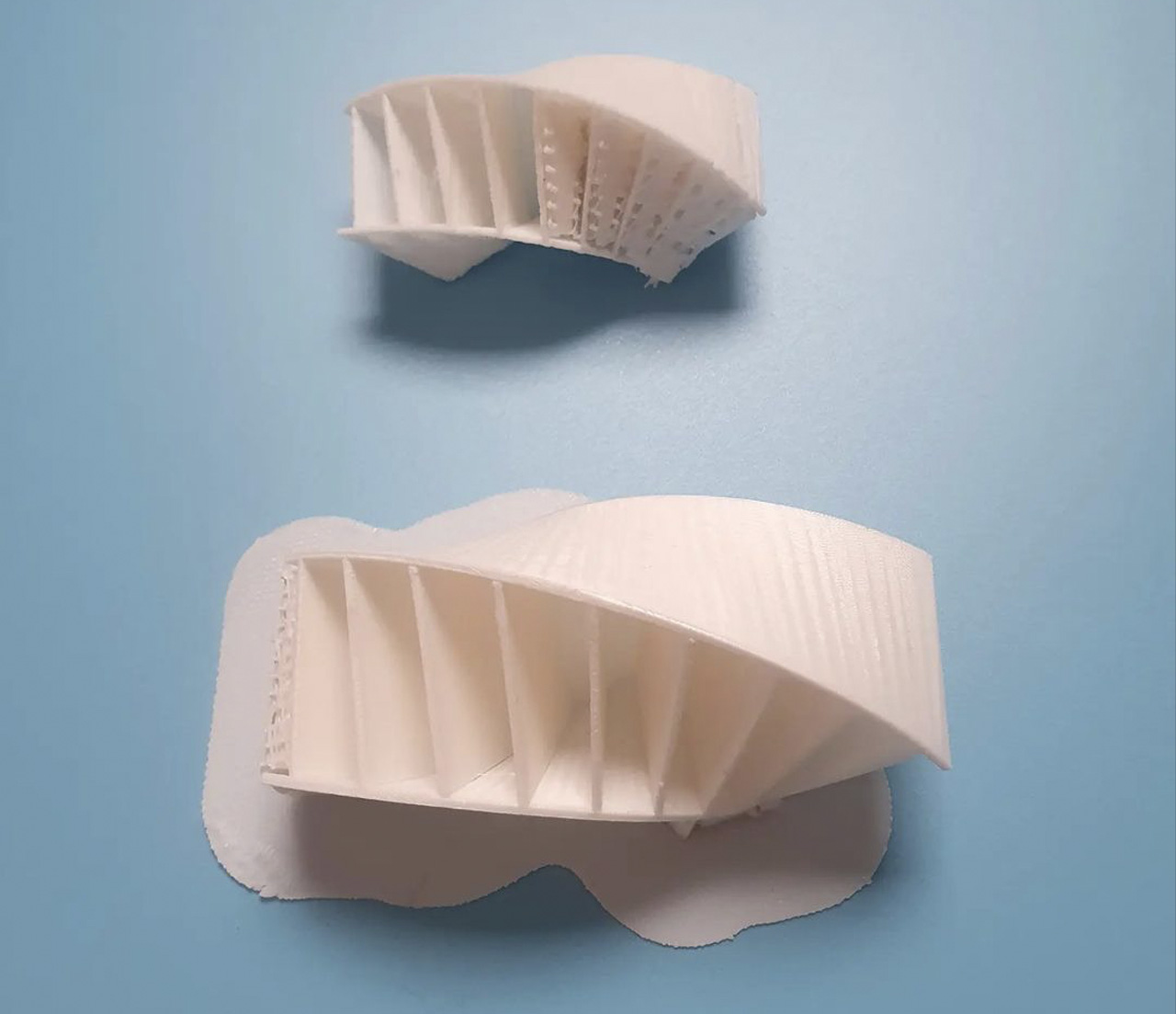
The Hullabaloo is a stand-alone bookshelf that twists and turns in an eclipsing fashion. It’s built by arranging four cuboidal quadrants and twisting them, in order to create a full circle. Aktay calls it ‘a double bent Möbius strip’. In order to make it functional, and a great storage solution, he had to open each quadrant on one side, to create two similar quadrants. A translucent back provides the design with a  captivating sense of mystery, in turn motivating you to walk around the piece to get a better look at it.

We often hear the saying that ‘form follows function’. In this case, the function is fit into the form to create this spectacular furniture design, that seems more like a sculpture. The best part is that the shape doesn’t reveal itself in one glance, it takes you multiple glances from various angles to get a holistic idea and proper understanding of the piece. The aesthetics of the Hullabaloo have been given ample attention and then the function has been effortlessly yet carefully tucked into the spiraling quadrants.

The Hullabaloo is great for spacious spaces that have enough area to hold and host such a significant piece. It could function as a centerpiece or focal point of such a space, allowing you to walk around it and truly take in its form and striking aesthetics. However, if you’re someone who resides in a smaller space or tiny home, then the Hullabaloo may not be the best option for your living space.

The post This twisting sculptural furniture design provides a new identity to conventional bookshelves first appeared on Yanko Design.
This graceful coffee table will make you want to wrap yourself up in a comfy blanket

Coffee tables often serve as centerpieces in a living room, providing a visual focal point for anyone entering that space. It may indeed sometimes serve as a table for resting coffee or tea cups, and it’s also a place where homeowners display their favorite books, magazines, or other reading materials, whether or not they’re actually reading them. Given this purpose, coffee tables are designed to be eye-catching or at least visually pleasing to enamor guests without being overbearing. To some extent, this design concept for such a table does capture one’s attention, but it also evokes feelings of coziness and warmth that will almost make you feel like curling up beside it, along with a good book and a hot cup of cocoa.

Designer: Deniz Aktay

The “standard” design of coffee tables comes in rectangular or circular shapes, the former for space efficiency, while the latter aims for visual impact. From those two shapes, designers try to create interesting forms and combinations that serve to attract attention without becoming an obstacle to the table’s functionality. We’ve seen quite a few designs in this regard, ranging from super minimalist metal furniture to stunningly elaborate pieces of sculptural art.

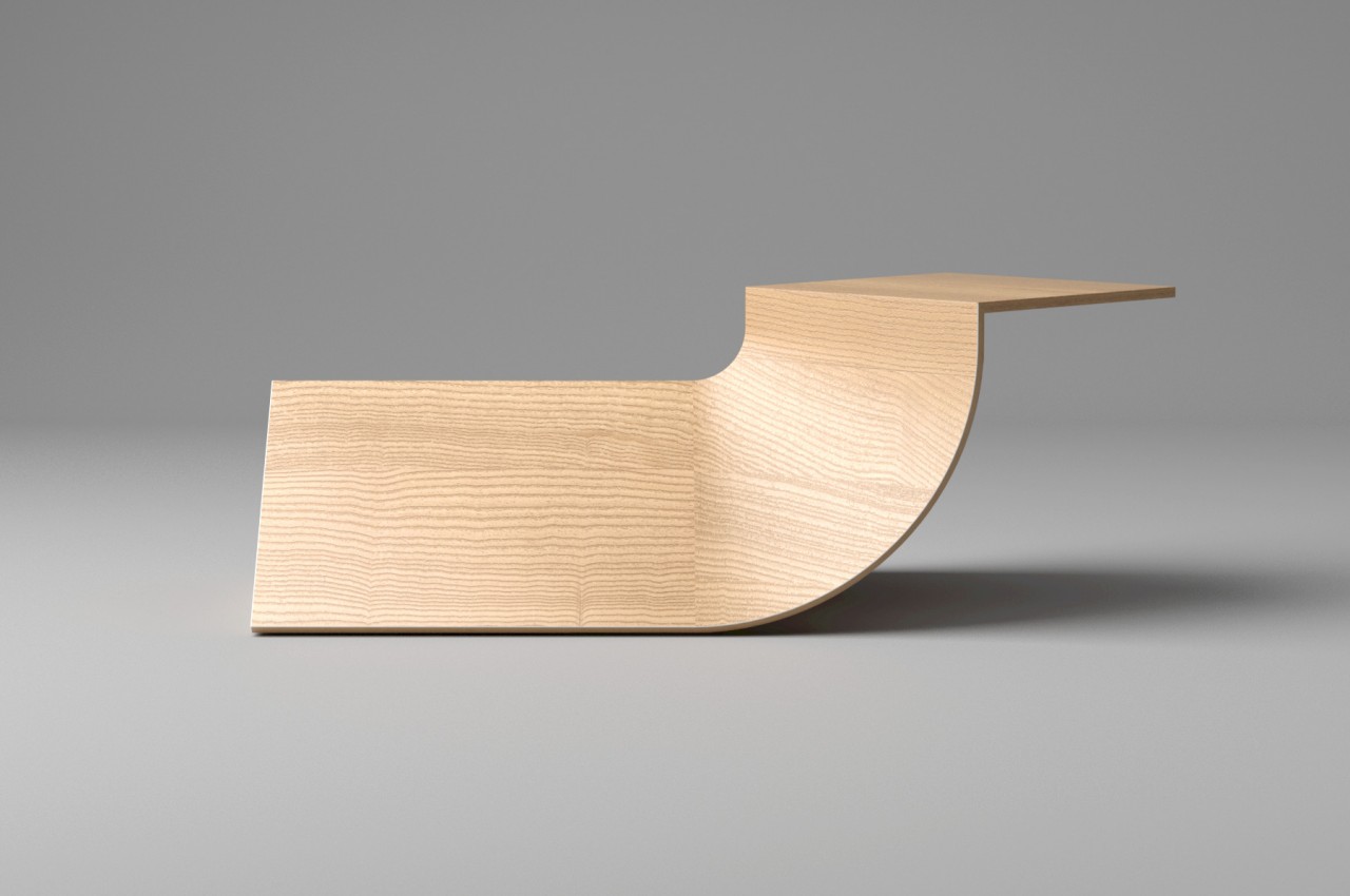
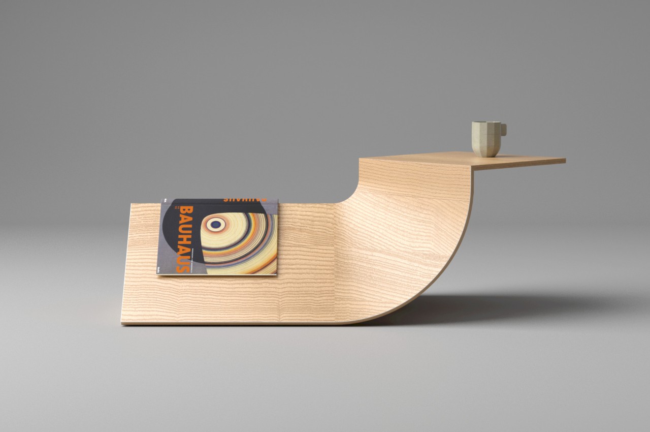
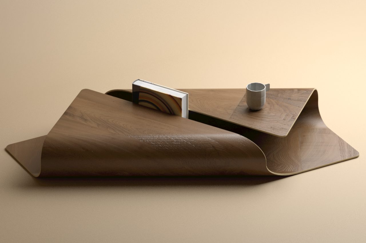
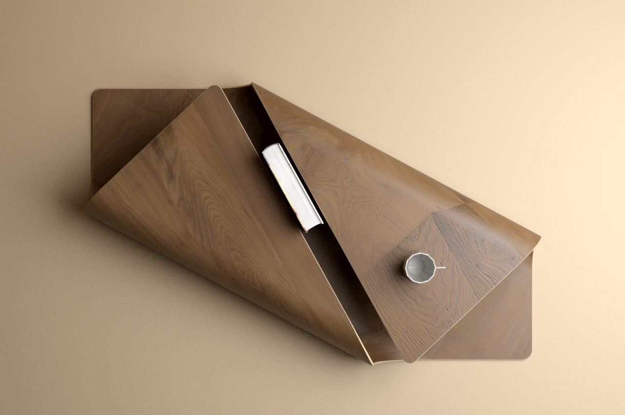
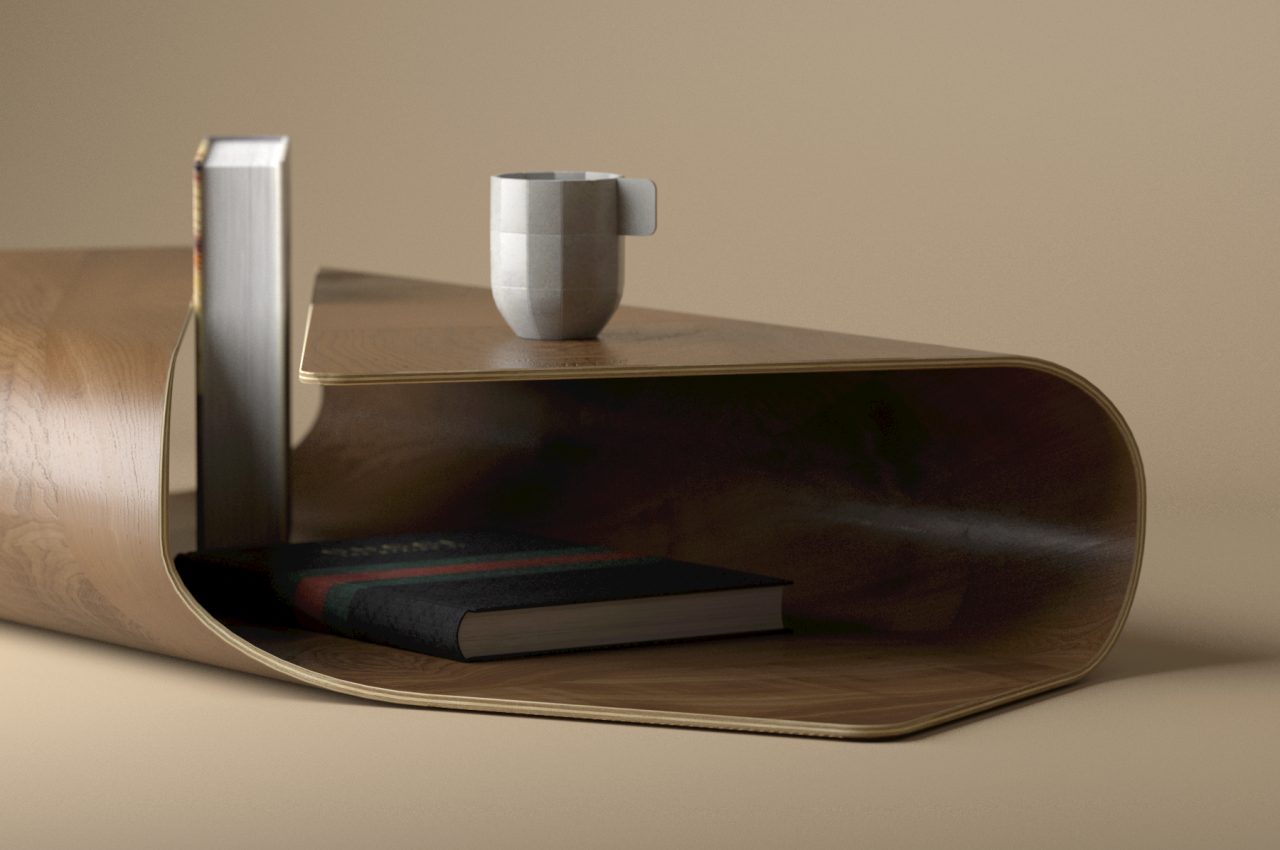
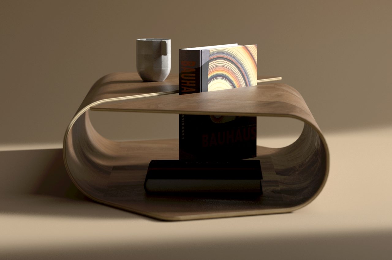
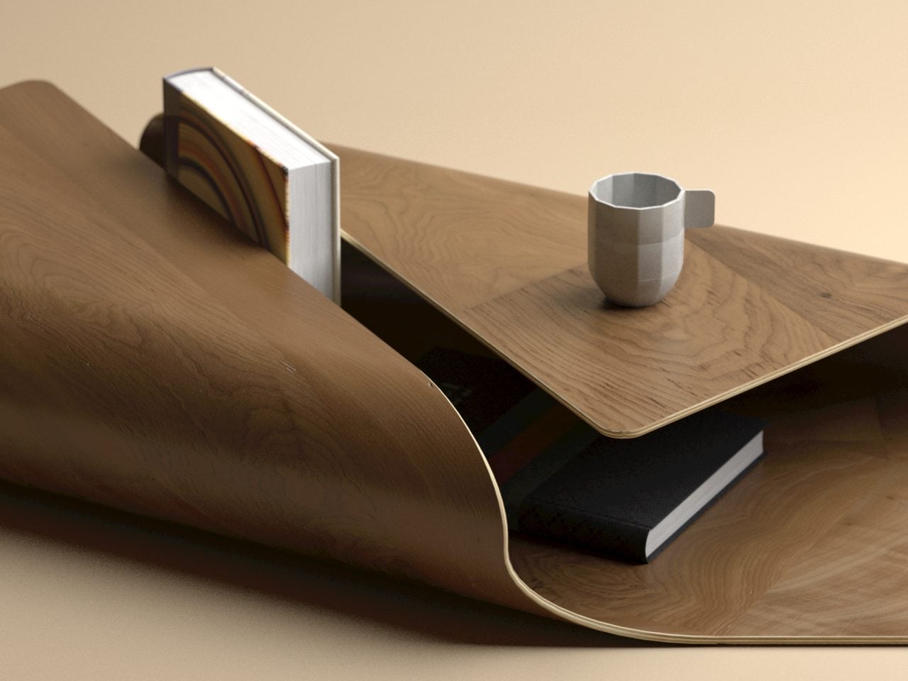
The Cocoon is a design that embraces all those elements in a rather simple way. At its core, it is just a flat wooden plane where two opposite edges are raised and curved to almost meet, creating an elevated surface that acts as the tabletop. The gap between these two edges becomes a rather unique slot to display part of a book, while the space underneath can be used as storage for small items or other reading materials.

The very form of the coffee table itself is already quite stunning, but the images and emotions it conjures up are just as appealing. The word “cocoon” often evokes feelings of having a snug home or blanket wrapped around you to give comfort. Some people do love this arrangement when relaxing and reading books, so the imagery is quite fitting. Alternatively, the design might also remind one of burritos.

Given how this design needs to bend wood at a rather large radius, it might be difficult to pull off in practice. The coffee table will also take up more floor space than typical tables, though you can always use the open area inside to hide things you wouldn’t be able to otherwise. Regardless of whether it’s a practical design to turn into a real product, it’s undoubtedly a beautiful one that creates a notable presence in a room without being overpowering.

The post This graceful coffee table will make you want to wrap yourself up in a comfy blanket first appeared on Yanko Design.
This quirky red cuboidal coffee table effortlessly stores your books and magazines as well

I don’t think we always tend to pay a lot of attention to coffee tables when in reality we really should. I personally think a good coffee table can really light up a room. It instantly draws attention and sets the theme for the entire living room. Once a stunning coffee table has been set, you can start building the rest of the space around it – a comfy sofa, cute side tables, exquisite lighting, and elegant decorative pieces, are all brought together by the right coffee table. And one such coffee table I recently came across is the ‘Bookpet’ coffee table.

Designer: Deniz Aktay

But here’s what makes the Bookpet extraordinary, and sets it apart from other coffee tables – it’s not simply a coffee table, it is a ‘coffee-book table’. Let me elaborate. First things first, the Bookpet is designed by Deniz Aktay, which is instantly enough for you to know, that this design is surely more than meets the eye. Aktay’s prolific designs have enigmatically taken over the online design world, and the Bookpet is no different.

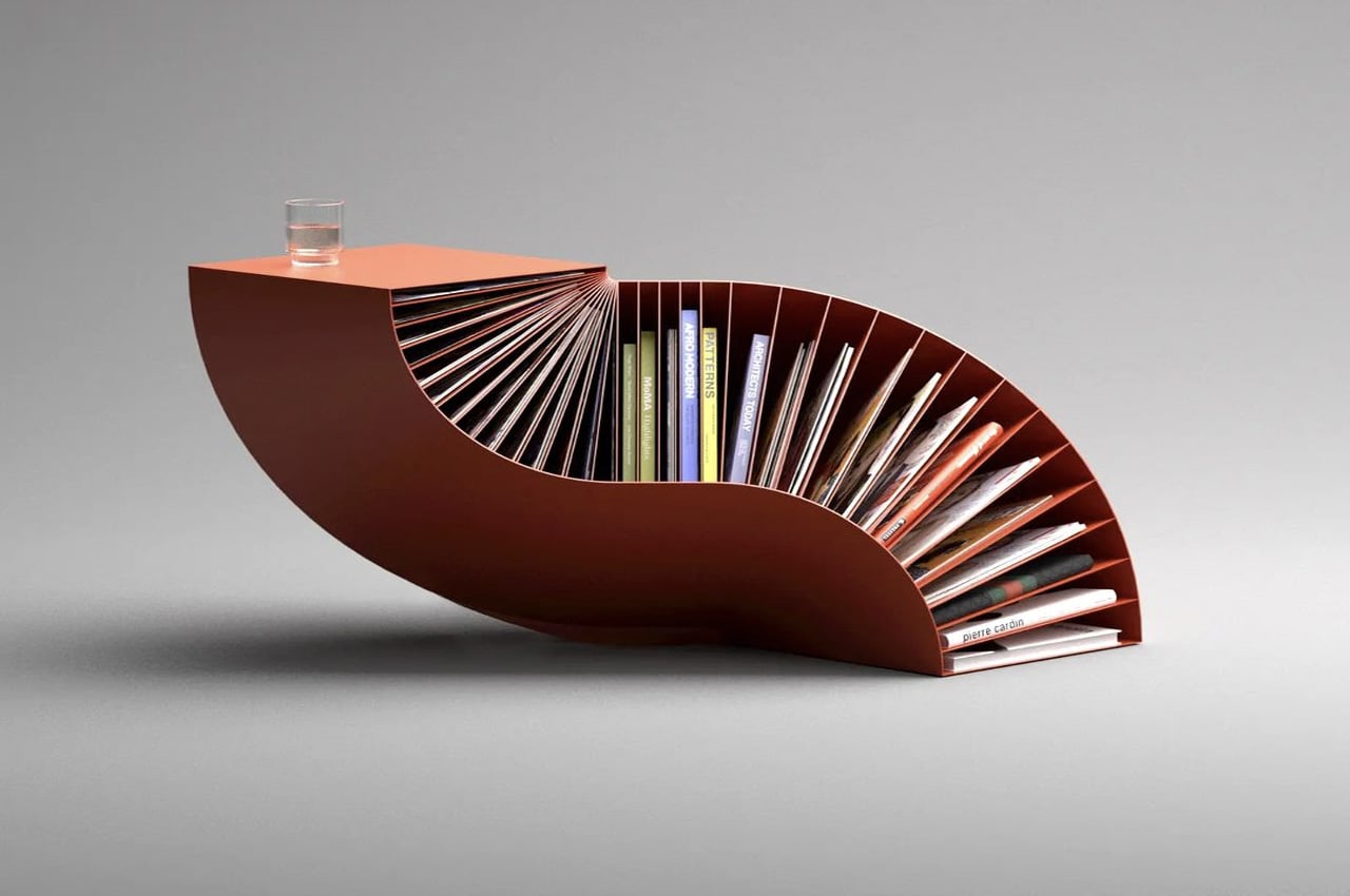
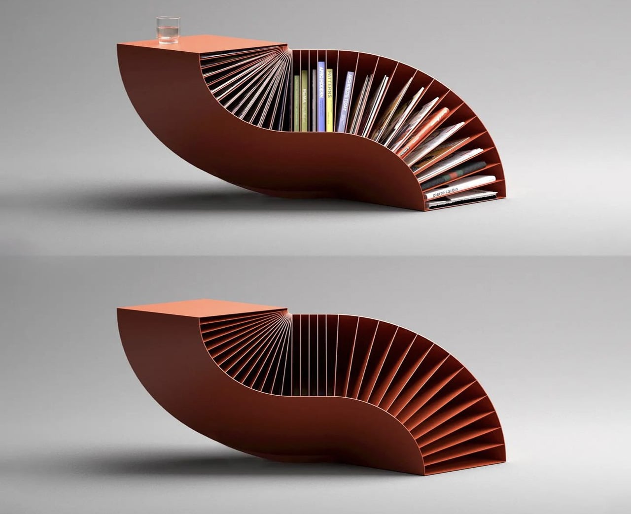
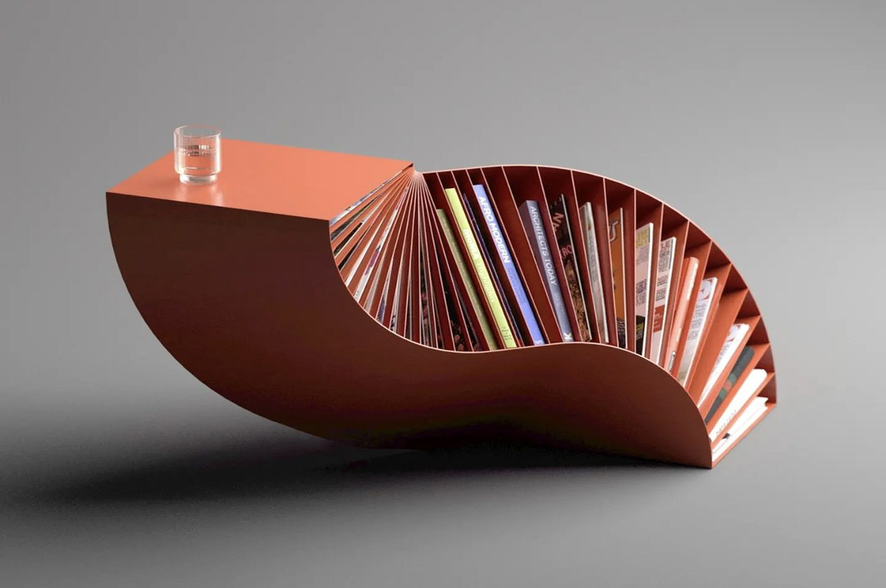
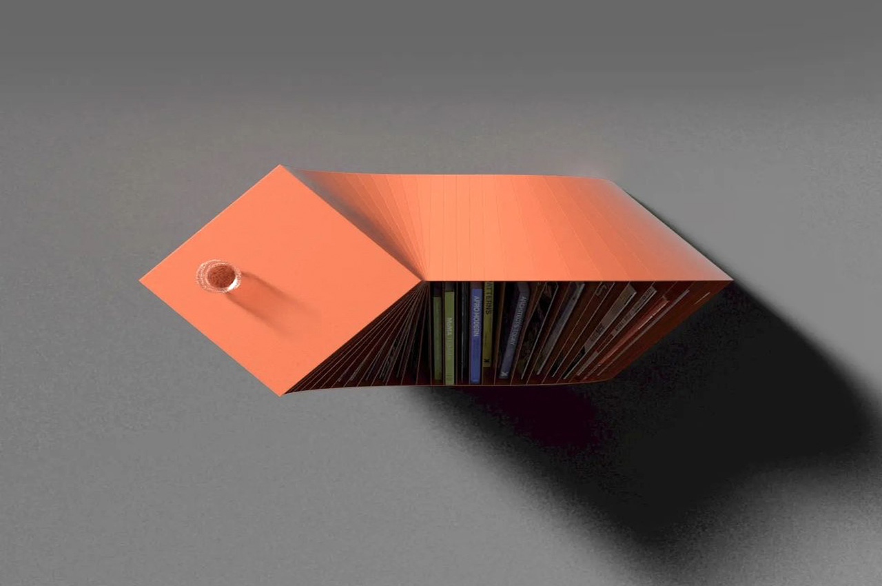
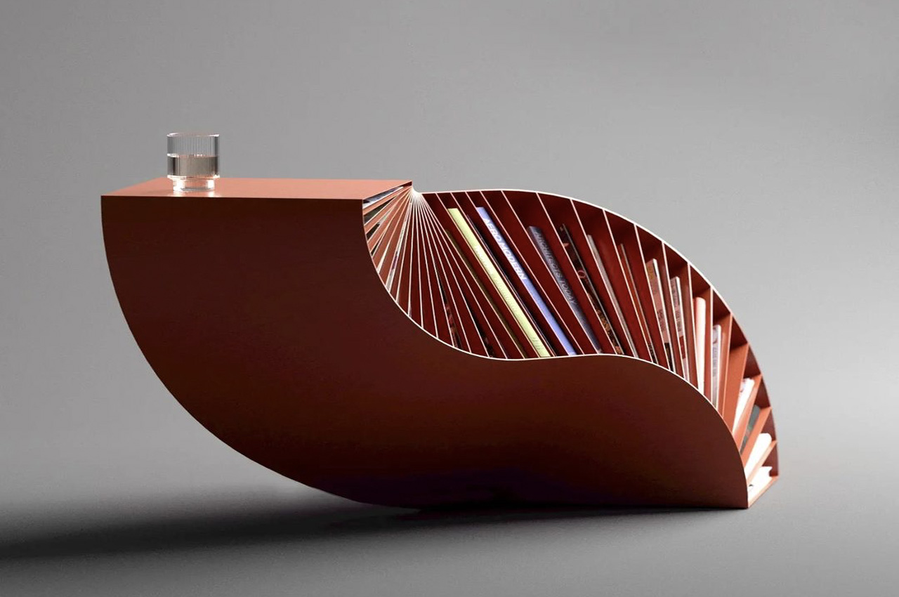
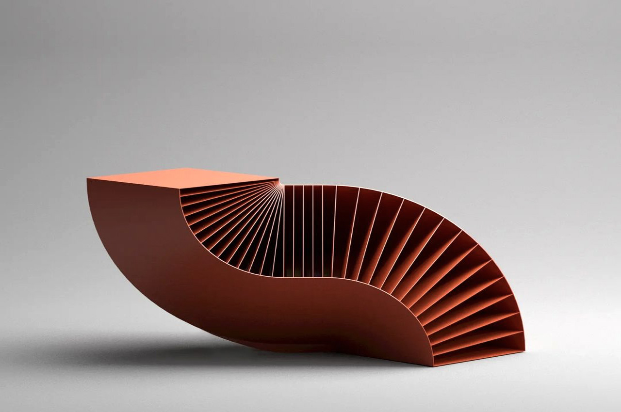
Besides functioning as an eye-catching and visually intriguing coffee tablet, the Bookpet also serves as a great storage space for books and magazines. The Bookpet features a sculptural shape that evolves from a double-bent cuboid. The free-flowing and flexible structure of the piece seems to twist and turn through the air,  looking almost like a Dachshund or sausage dog to me for some reason!

The cuboidal form of the furniture allows for a sturdy tabletop at one end, which functions as the coffee table part of the design, whereas the rest of the piece has been integrated with little slits and nooks that can perfectly hold your favorite books and magazines. Bookpet has a compact and space-friendly size, allowing it to be ideal for tiny homes, and modern apartments with space constraint woes. Despite having a tiny structure, Bookpet manages to pack immense functionality in its little body, as it serves as not only a coffee table but as a book/magazine rack as well.

The post This quirky red cuboidal coffee table effortlessly stores your books and magazines as well first appeared on Yanko Design.
This quirky sideboard is like a loyal pet that brings your favorite book forward

Most people have plenty of reading materials scattered around the house, whether they’re actual books or collections of magazines. No one reads all of these at the same time, of course, and some might have favorites among the ones they’ve already read. Keeping books organized is relatively easy if you have the right storage options for them, like shelves and even side tables. Keeping track of your current book or favorite magazines, however, might be a bit trickier. You can have one place to store books and another to enthrone your special stuff, but that means keeping two pieces of furniture. To simplify things while making your room look a bit more interesting, this rather cute design gives the sideboard a literal twist that gives the furniture a personality not that different from a friendly pet.

Designer: Deniz Aktay

Although originally intended to store tableware and other culinary items, sideboards have become multipurpose furniture that serves as a dedicated space for anything you need to keep. Traditional designs are really no different from cabinets with drawers and doors, but there is definitely more than one way to make these room accessories, especially if they serve as accents to make a space look more interesting. After all, if a piece of furniture is going to stand at the side and occupy a lot of space, it might as well make your room look appealing.

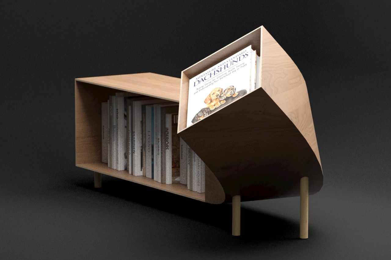
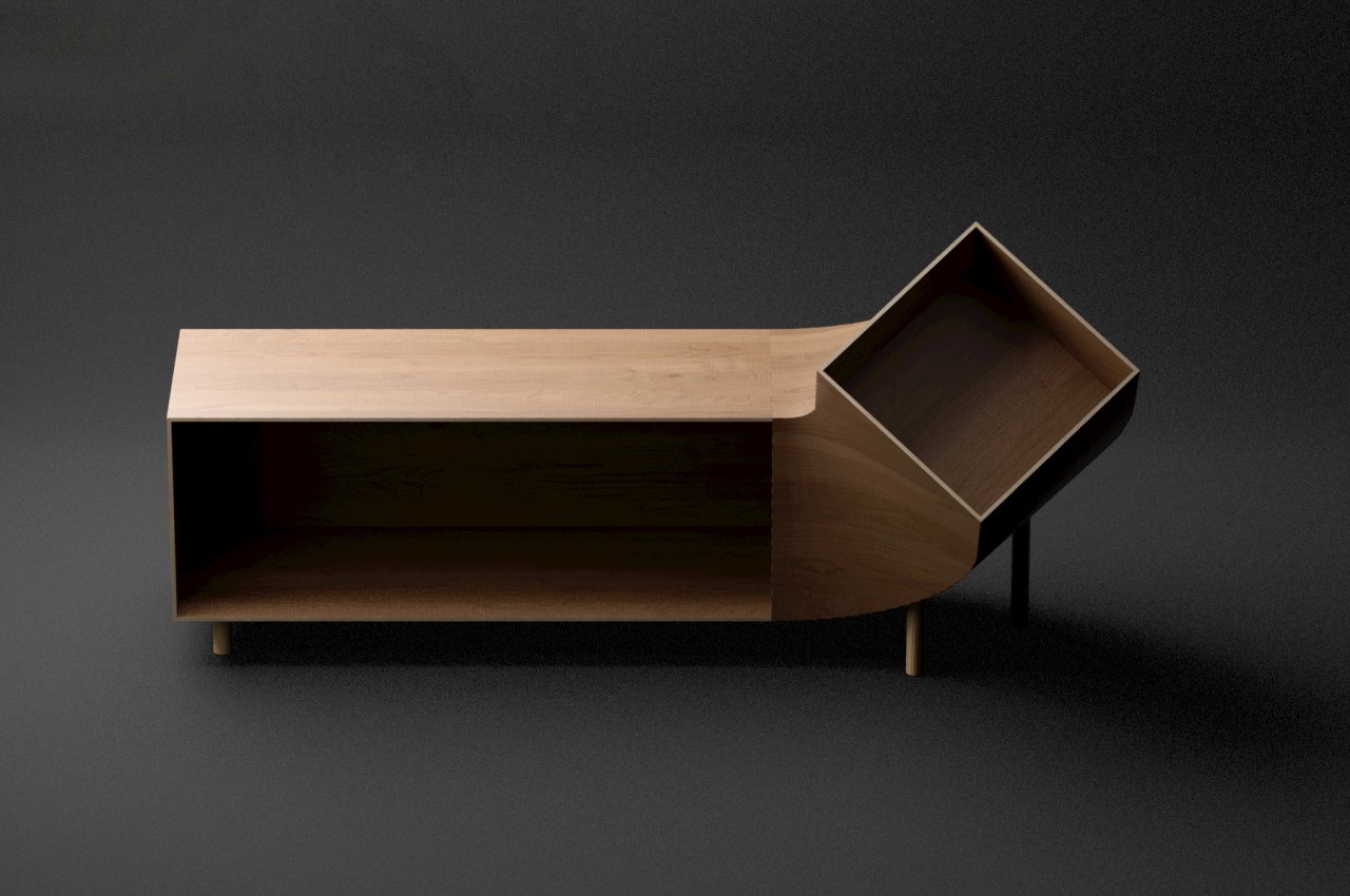
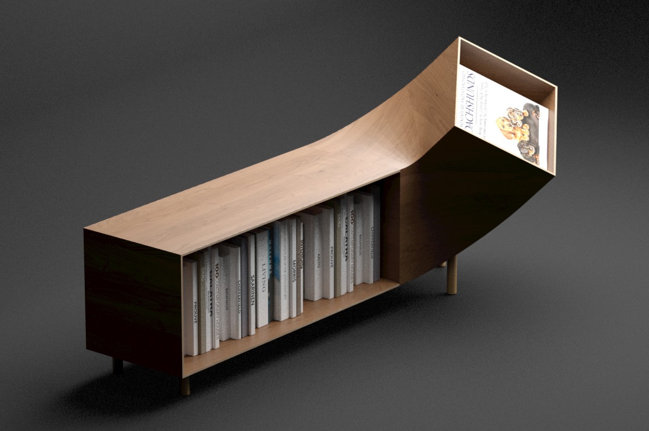
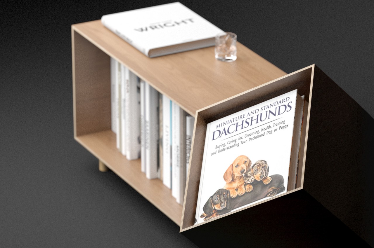
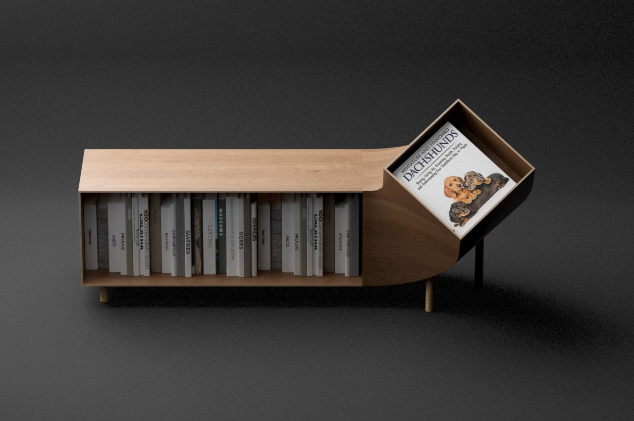
The Dachshund trades the multipurpose compartments of a typical sideboard for a single, open area. Although it’s certainly possible to put anything in this space, it is designed particularly to hold a row of books or magazines. In essence, it’s like a single for reading materials expressed as a low sideboard. That alone wouldn’t really be enough to catch anyone’s attention, but the sideboard’s body twists upward on one end to add a bit of flavor and functionality.

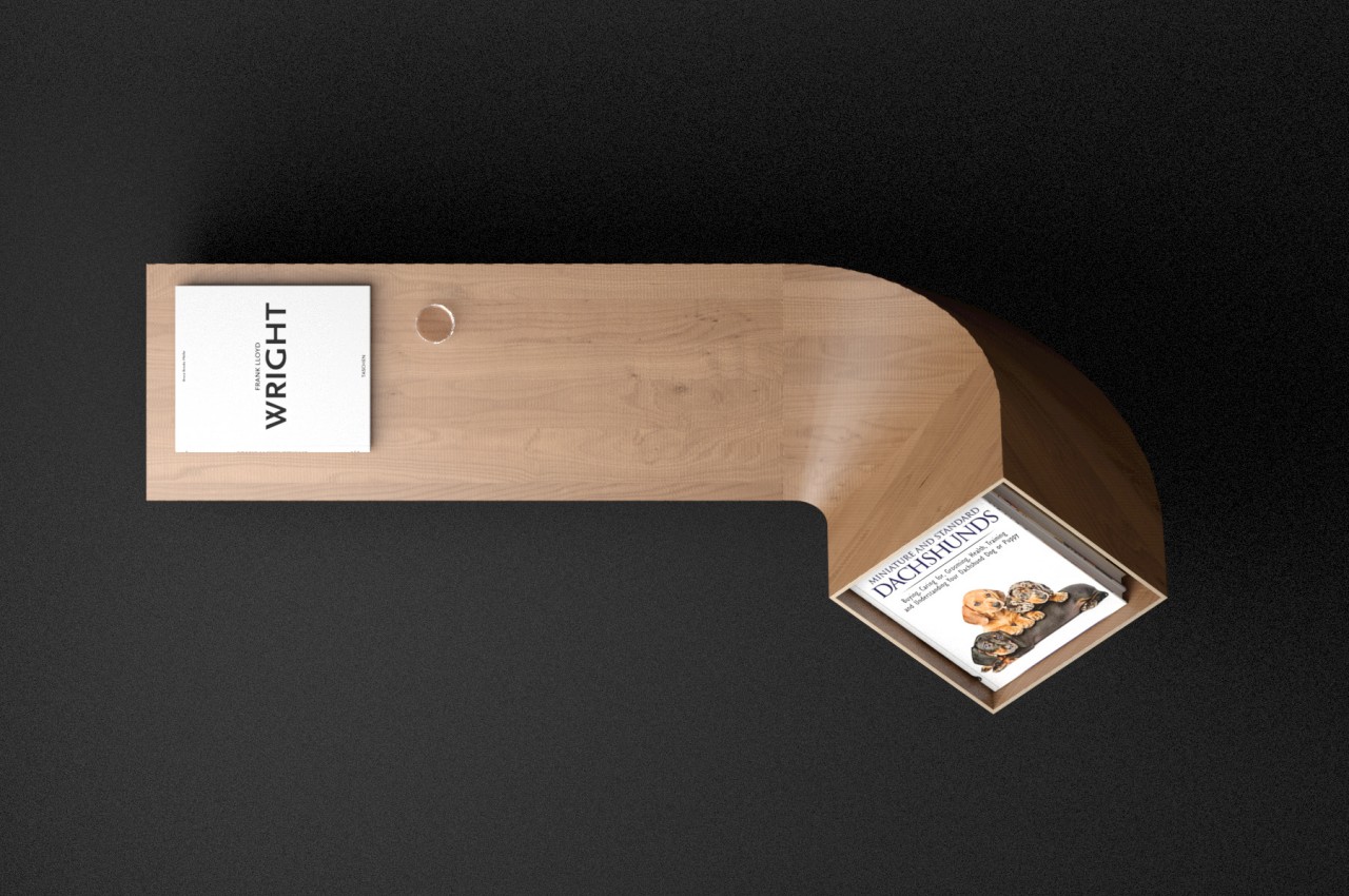
This twisted end has a somewhat shallow box that can be used to hold a few items. The most natural thing to put inside it would be the book or magazine you’re currently reading, making it easy to access without having to pull it out from a pile. Alternatively, you can also enshrine your favorite or most beautiful book, setting it apart for everyone to see. Of course, you can also just put decorative items to complement whatever decor or theme you might have going in the room.

The Dachshund sideboard puts a simple twist on a standard design to create a memorable sight and a new experience. The furniture’s form is akin to a pet, like the canine namesake, that wags its tail or, more appropriately, brings you your newspaper or, in this case, your book. The smooth curve of that part is also something that’s difficult to pull off with wood, making this unusual piece of furniture a fun yet elegant addition to your interior.

The post This quirky sideboard is like a loyal pet that brings your favorite book forward first appeared on Yanko Design.
This two-piece side table is a balancing act expressed in contrasting elements

We all try to achieve a certain degree of balance, whether it’s in our lives or at least in the items we possess. There’s almost something natural about being in a state of equilibrium, and our eyes and minds find well-balanced objects to be pleasing and almost calming. Of course, neither life nor nature is as simple as that, and we often find ourselves beset by conflicting and opposing factors. Finding a stable middle ground between two sides is a major part of life’s journey, and this curious side table makes that struggle visible and real in a design that is both mind-boggling and practical as well.

Designer: Deniz Aktay

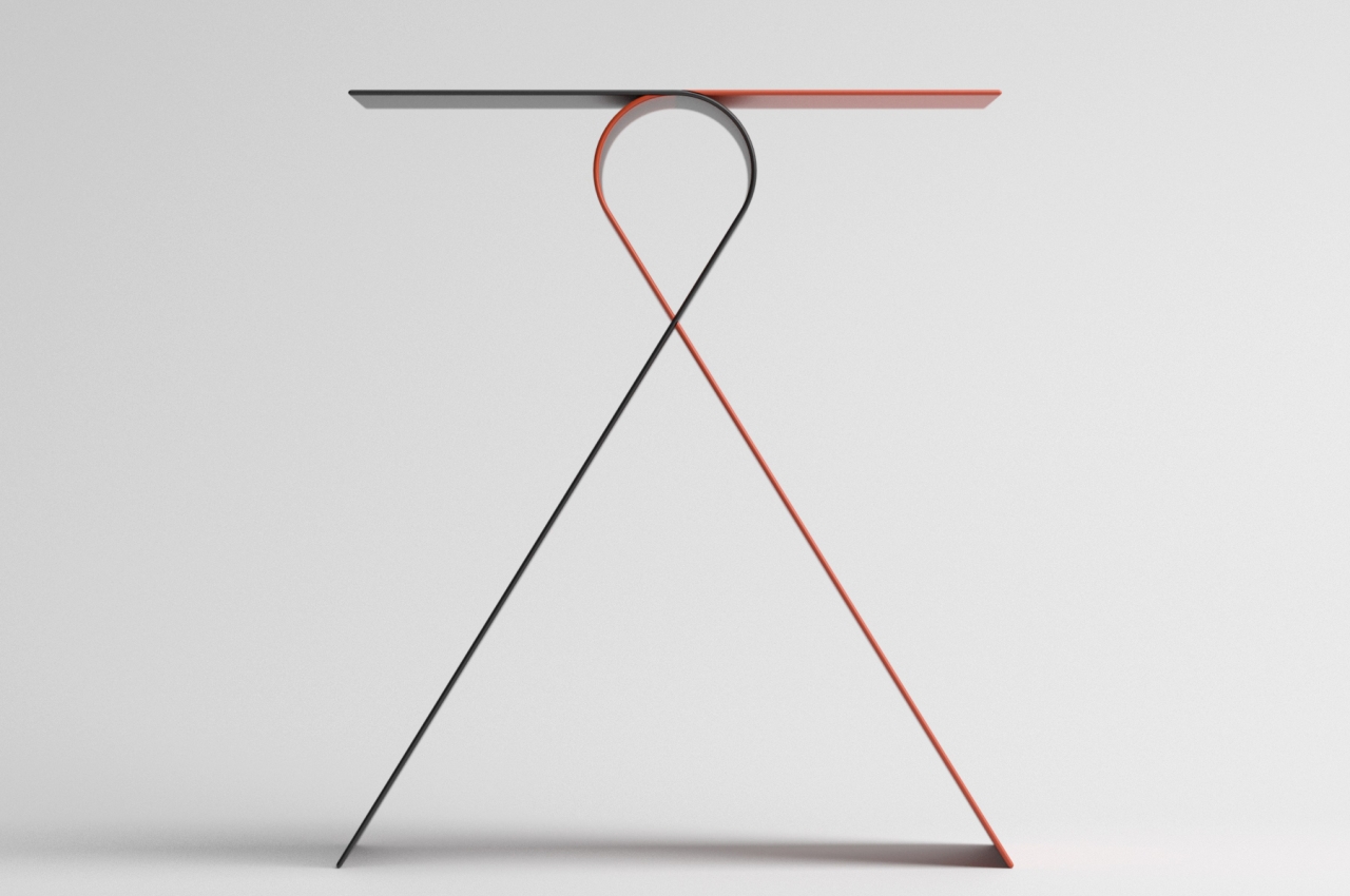
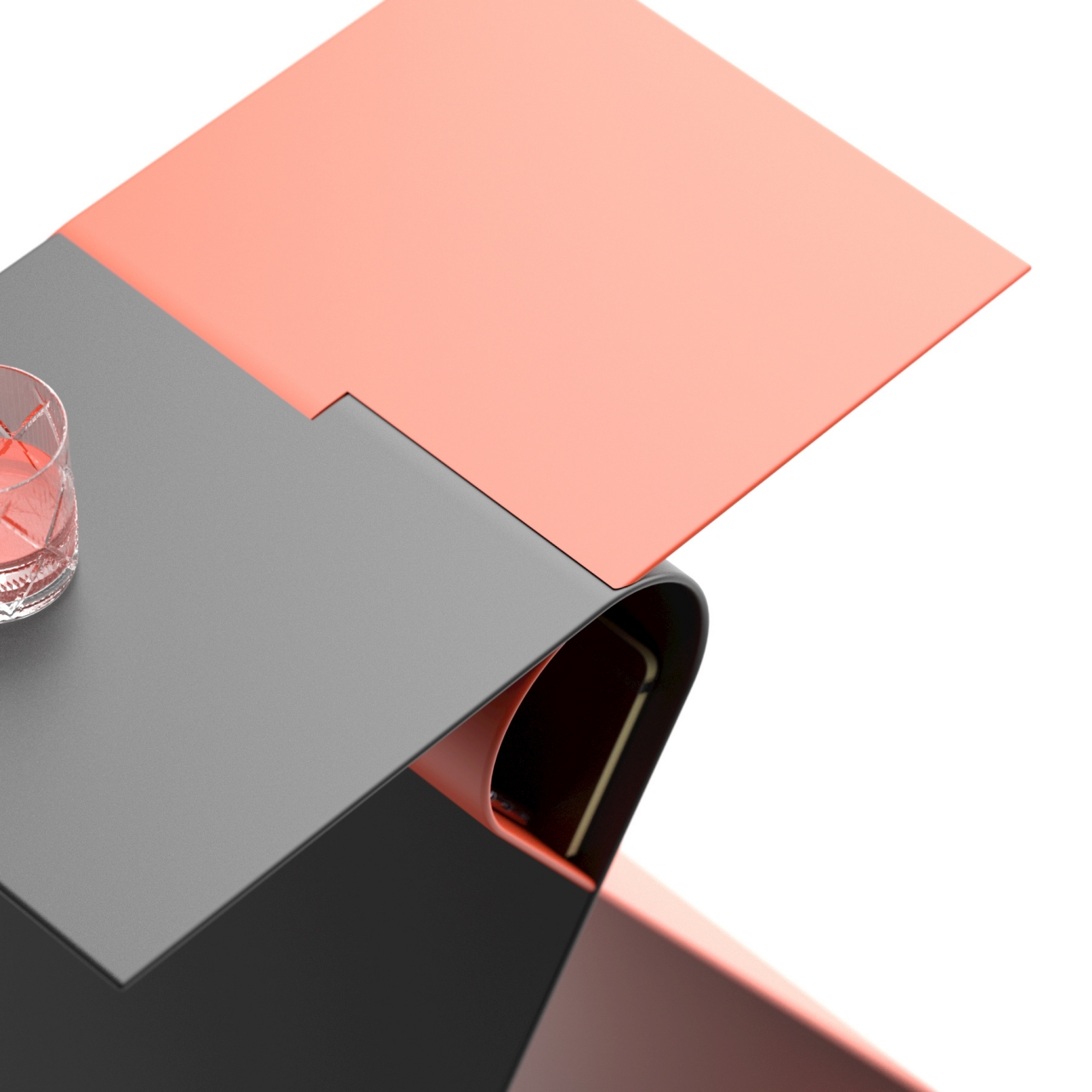
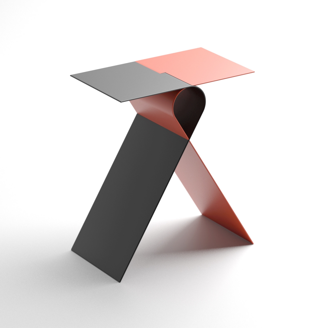
At first glance, the Shaolin side table almost looks unstable and unreliable. The tabletop is a simple flat rectangular piece that rests on top of a curve that forms the head of a ribbon-like shape. Of course, the imbalance is only an illusion, but it’s enough to make one pause in the uncertainty of whether the tabletop will topple over on one side or the other. It’s like the balancing act that martial artists like the table’s namesake perform.

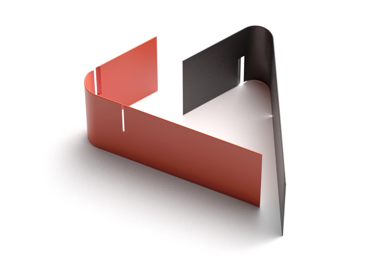
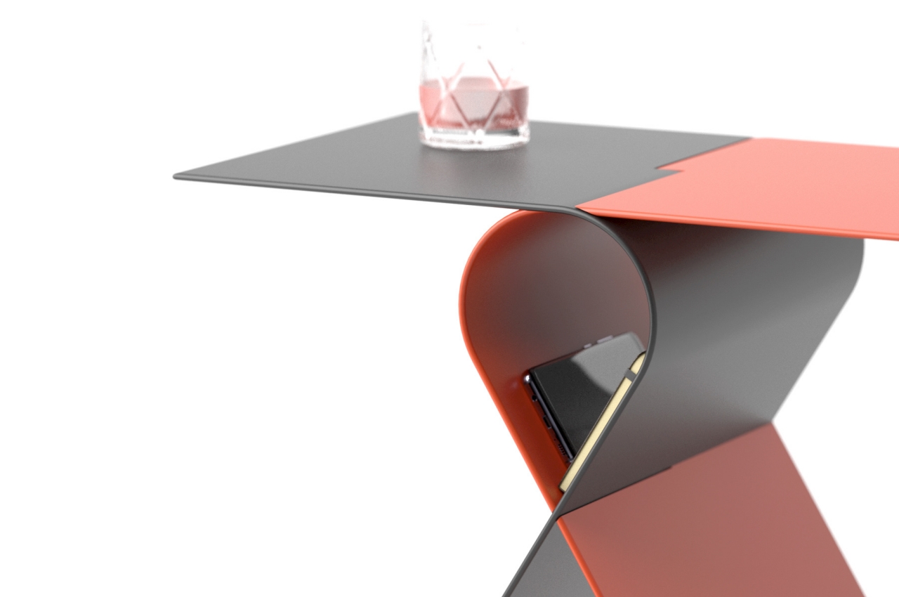
In reality, the two parts of the table are not its top and its legs but rather the two halves that make up its left and right sides. These boomerang-shaped sheets of metal interlock perfectly to the point that they support each other to make the table stand and carry the weight of whatever is put on top. It’s almost like it’s the tension of the forces between the two pieces that makes it possible for the table to be so well-balanced.

In addition to its form, the colors of the side table also create a contrast that balance each other in the end. The red and black motif is often used as complementary hues in visual design. Computer scientists might even recognize the association with a certain “red-black tree” that is considered to be a self-balancing data structure.

It’s also almost metaphorical that the overlapping and opposing forms create a small space in the middle where you can safely place some of your important stuff. Of course, given the inclined sides, it won’t be a good place to put things that will easily break when that balance is perturbed. It’s still a convenient location for books, a phone, and other transient objects that make their way to your hands as you try to juggle and balance the sometimes opposing demands of life.

The post This two-piece side table is a balancing act expressed in contrasting elements first appeared on Yanko Design.
This eye-catching side table is like a geometric puzzle for your stuff

Just by their name, you’d almost think that side tables are like sidekicks to your furniture. They serve a useful purpose, for sure, but they’re not exactly critical unless you really designed a room around them. They’re sometimes even hidden in corners where only their tops are seen and accessible. Of course, it’s entirely possible to have side tables become the center of attraction, especially if they look good enough to warrant moving away from the sidelines. They can also do more than just be pieces of furniture you place items on top, just like this side table that provides more than one functionality with a very unique visual. In fact, its unusual form warrants it to be a living room centerpiece, which means it can be more than just a table on the sides.
Designer: Dezin Aktay

Compared to a coffee table or a desk, a side table is almost always a smaller piece of furniture where you place cups, books, magazines, or even your phone on top. Given the scarcity of space in most homes and rooms these days, however, such a single-function object almost feels like a waste. That’s why some side table designs and concepts incorporate some sort of storage below the tabletop, turning the side table into a side shelf of sorts.

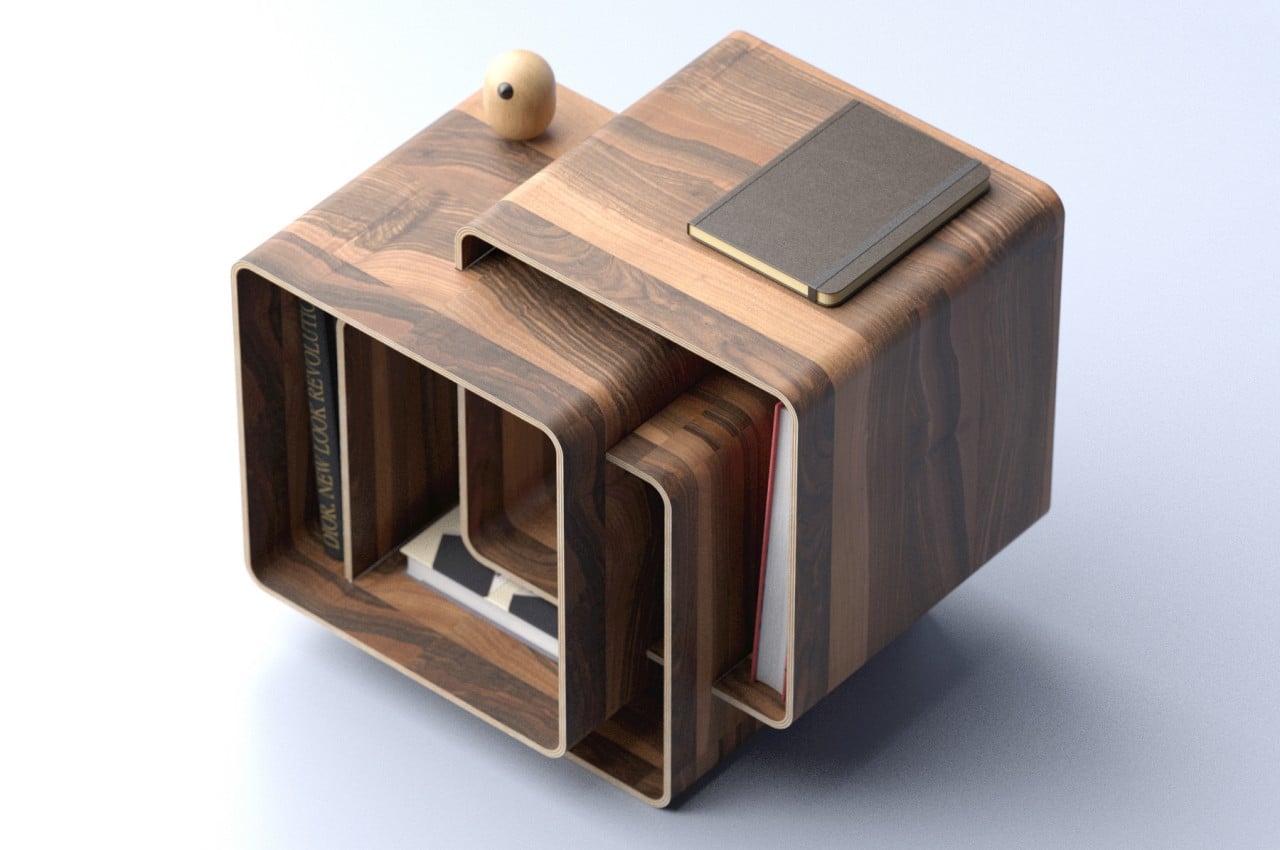
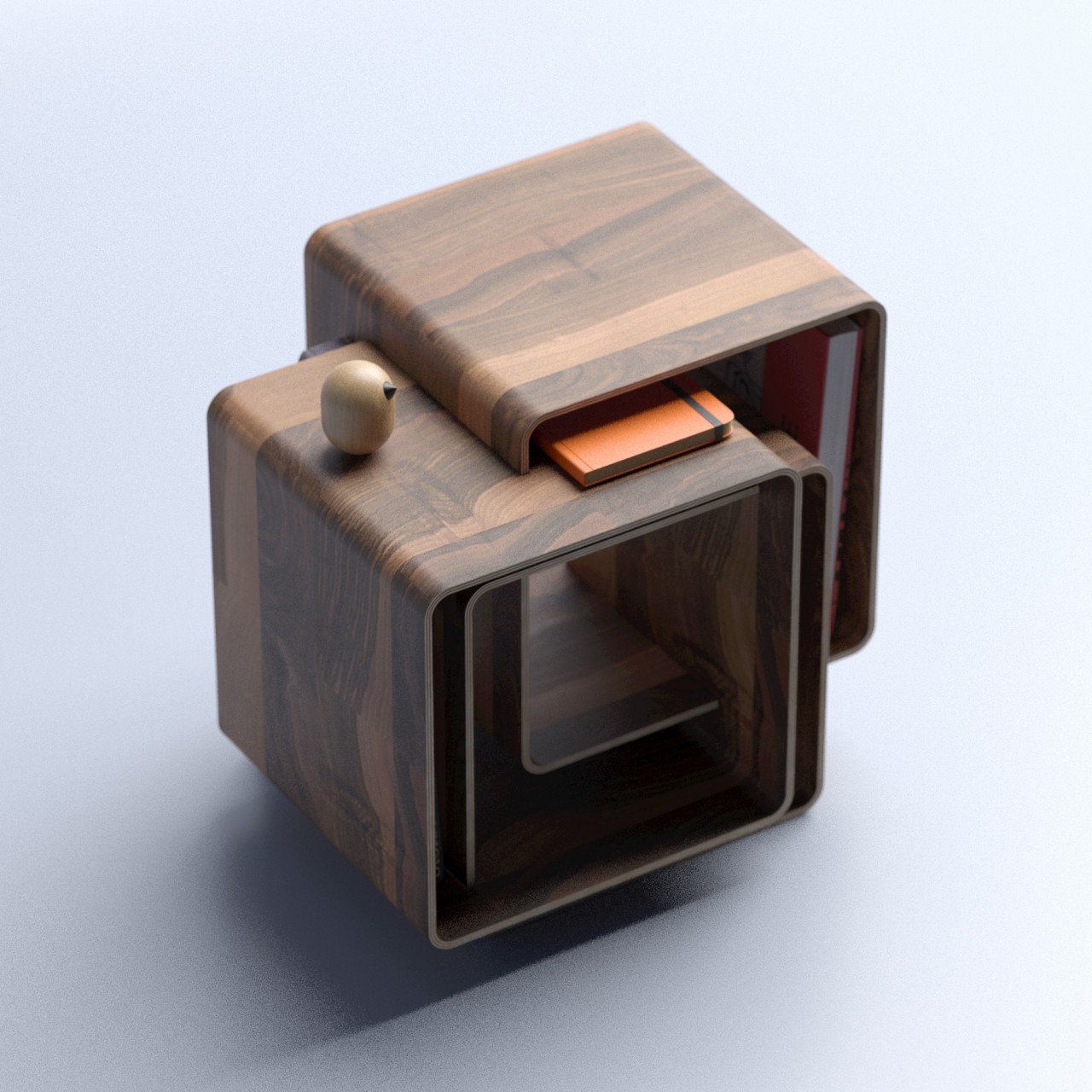
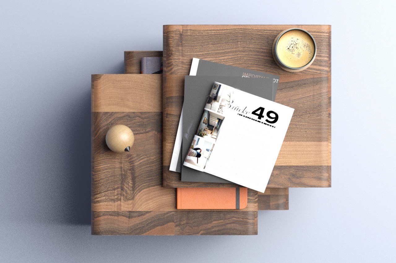
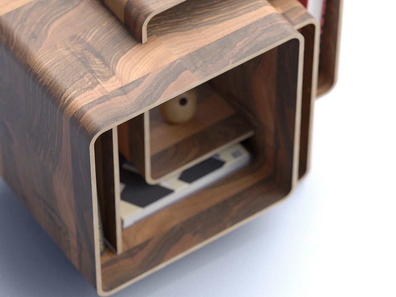
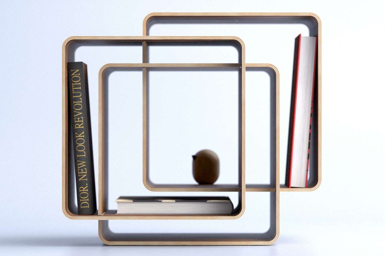
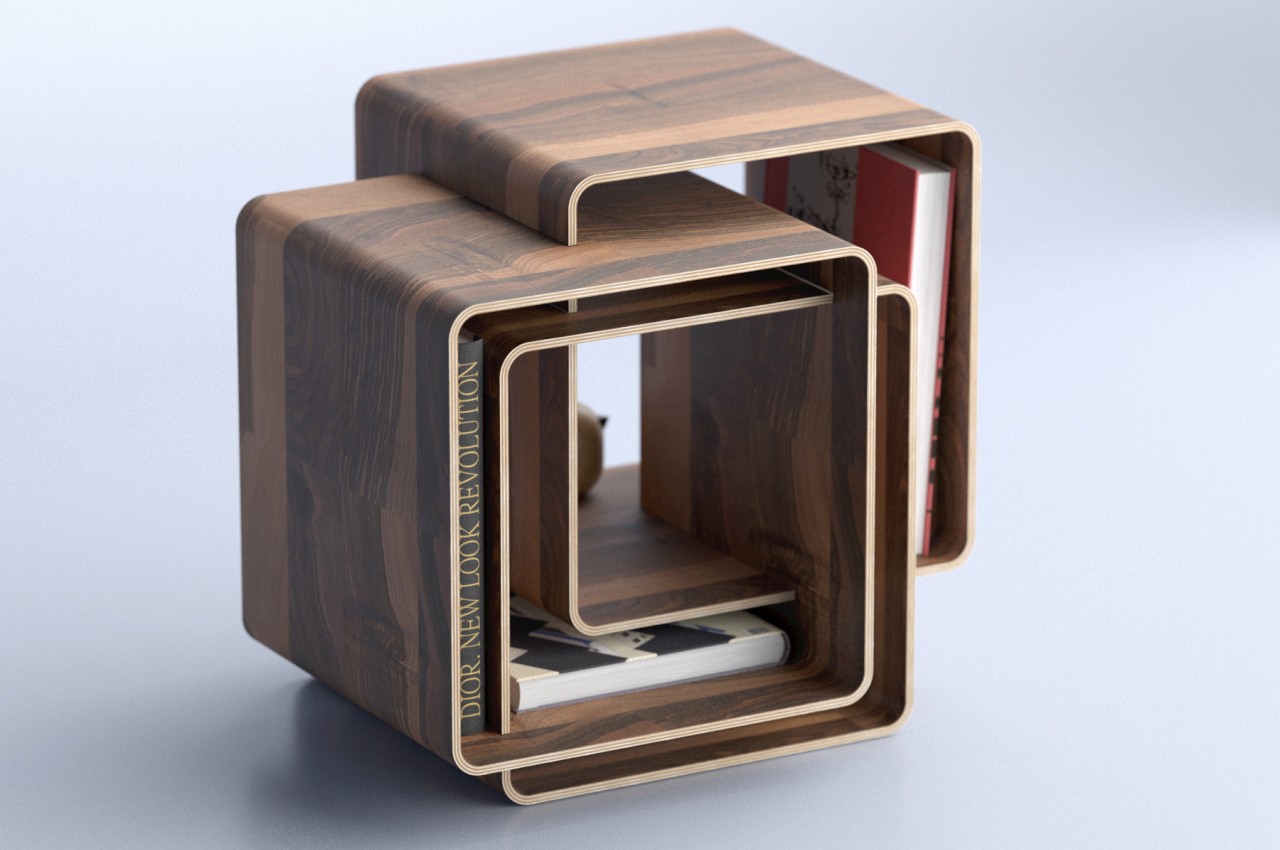
Linked does exactly that while also thinking outside the box when it comes to design, almost literally. Inside of a straightforward rectangular shelf or even a cylindrical body, the side table is actually composed of three hollow boxes. But rather than have these boxes arranged in an organized and regular fashion, they are instead interconnected with different offsets, creating what almost looks like a random composition of shapes, lines, and spaces.

These spaces are, of course, where you can place objects inside. There is actually only one space in the middle than can be big enough for anything other than books or smaller items. All other open areas are narrow, thin, or have an irregular L-shape that makes them less convenient for other objects. That said, filling these up with objects of different sizes also adds to the whimsical personality of the table. Given that you’ll be placing items where they fit best, you might find the overall aesthetic a bit disorganized or even chaotic.

The Linked side table’s wooden boxes make it perfect for almost any room arrangement, regardless of the motif you’re aiming for. Given its uneven shape, it might not be conducive to keeping it at the sides only. It can, of course, also function as a central table, both visually and functionally, one that can keep more than just your drinks or reading materials within easy reach.

The post This eye-catching side table is like a geometric puzzle for your stuff first appeared on Yanko Design.