The Medallion Chair has remained an iconic part of Dior’s visual imagery all the way back since 1947 when Christian Dior first got Victor Grandpierre to decorate his salon. It cemented its place in Dior’s design language in the 1955 Diorama and the 1958 Miss Dior perfume campaigns, becoming a signature element in the brand’s visual imagery, like the ‘Bar’ jacket or Cannage pattern. This year, Dior asked 18 renowned designers and studios to put their personal spin on the Medallion Chair for Salone del Mobile 2021… among them was Nendo, who’s reinterpretation managed to catch our eye for exactly the opposite reason – the fact that it was so minimal you’d probably never spot it!
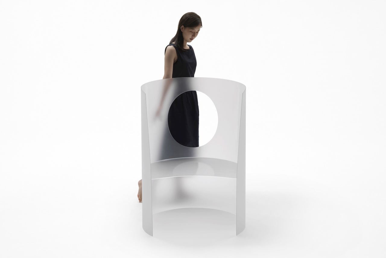
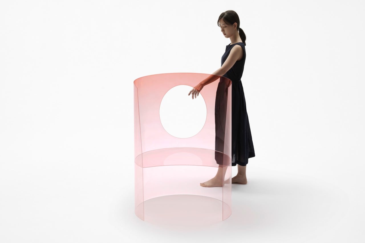
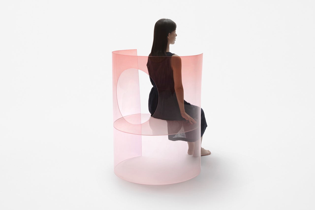
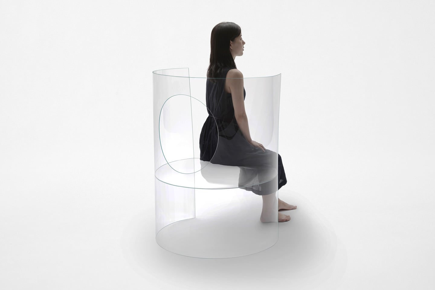
Nendo’s Chaise Medallion 3.0 plays around with forms, surfaces, gestalt, and minimalism on a level that’s beyond compare. It’s every bit as visually iconic and memorable as the original Medallion Chair, but flips the entire chair’s design inside out… literally. Challenging every notion of what a chair should look like, Nendo’s redesigned chair is worthy of being a modernist prop in Dior’s studios. It comes fabricated from curved sheets of 3mm thick glass that can support the weight of a person (even though it doesn’t look like it could). The chemically hardened glass is incredibly transparent (to the extent that you’d probably walk right past it) while being scratch-resistant and having higher flexural strength. Its fragile, all-transparent design makes it almost look precious, transcending it beyond simple furniture.
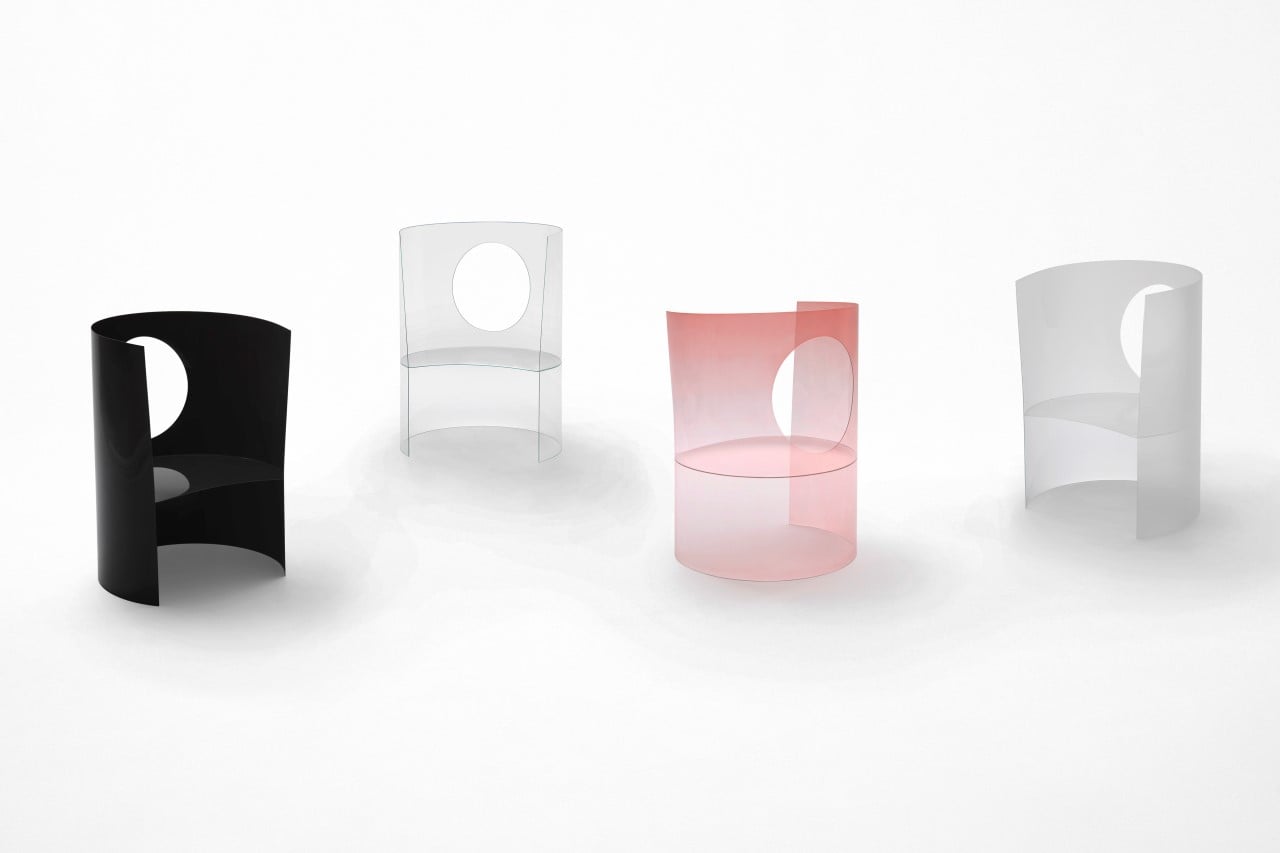
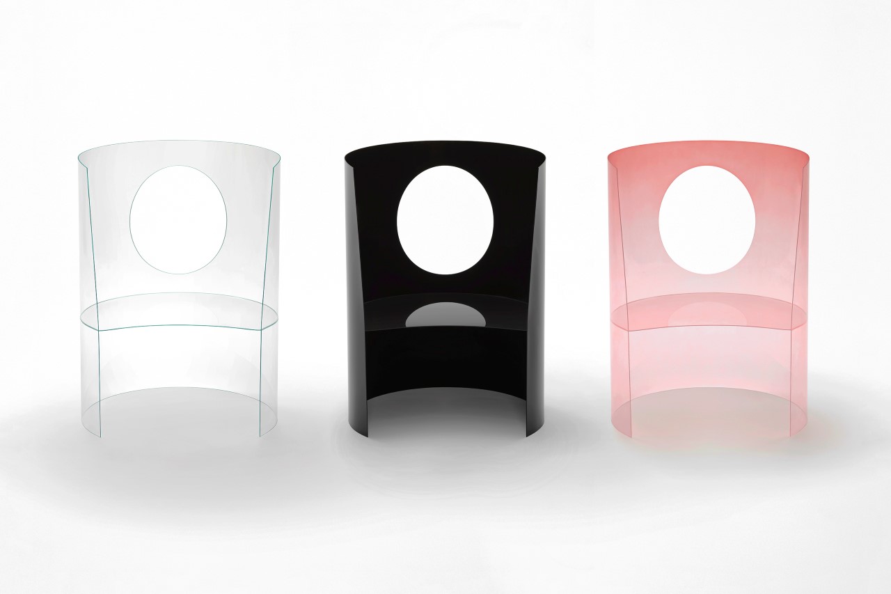
The minimalist reinterpretation immediately makes sense when you see that medallion-shaped cutout in the chair’s backrest. Playing on the positive and negative aspects of the chair’s form, Nendo’s redesign inverts the classic and simplifies it to its bare minimum. It’s a medallion chair without essentially being a medallion chair. Just the way a silhouette of a logo is still the logo, while essentially being a stencil or a silhouette. It’s a common graphic design trick that not many people use in 3d forms and products, but Nendo does it exceptionally well, almost giving us a masterclass in gestalt and minimalism.
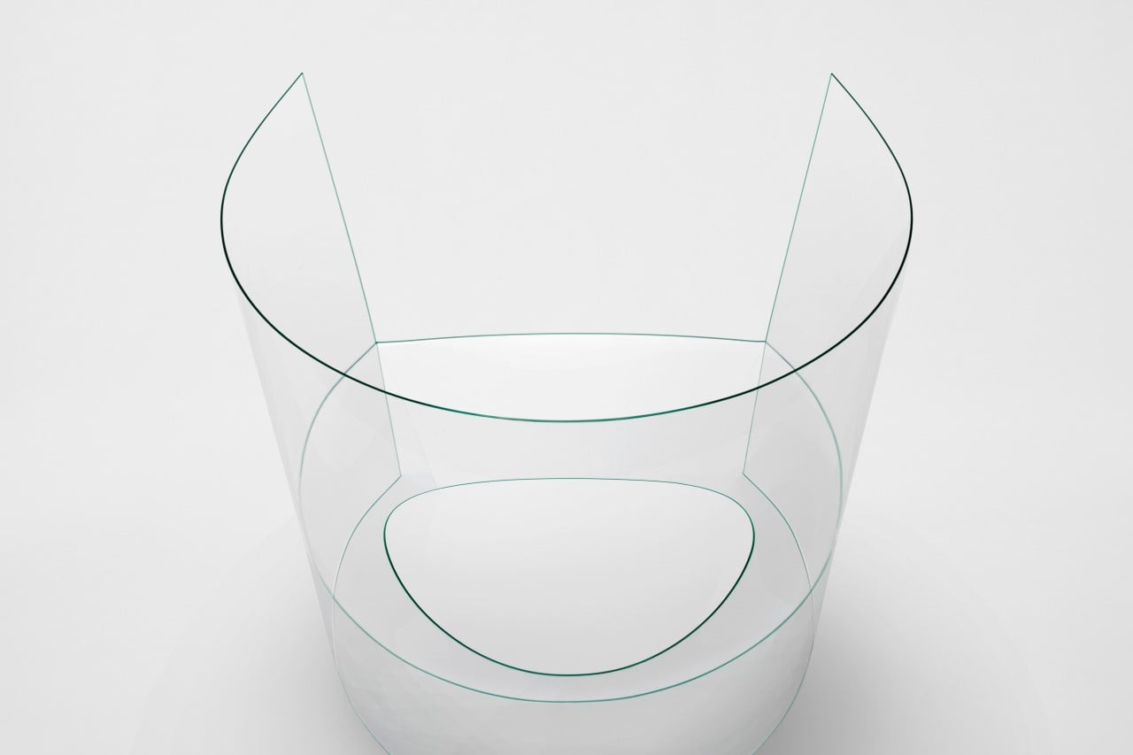
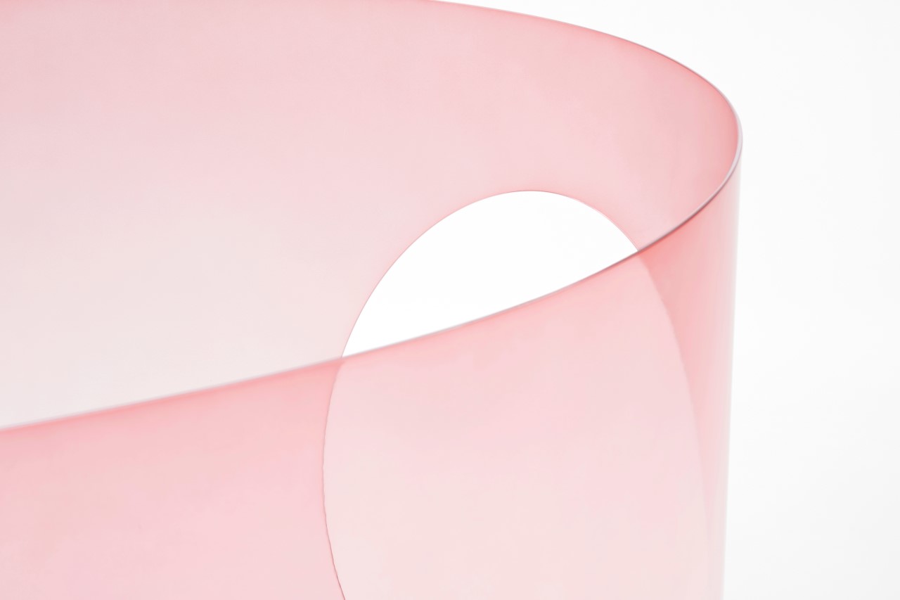
Having made appearances as an icon or a prop in multiple of Dior’s perfume advertisements, the chair’s redesign in glass feels like the most natural progression, making it look quite like a perfume bottle itself. It comes in similar color-ways too, including an all transparent design, a frosted design, an opaque black variant, and a pink ombré that’s highly evocative of the Dior brand and its perfume lineup. Nendo’s Chaise Medallion 3.0 will be displayed at this year’s Salone del Mobile alongside as many as 30 other redesigned Medallion chairs. Be sure to spot it!
Designer: Nendo for Dior
