DIY designs have been taking the design world by storm! Especially with COVID-19 restricting us to our homes, building things purely with our hands, putting our sweat and grit into it, and watching a design roar to life in front of our eyes, has become the new pass time for many of us. But these DIY designs are more than just your run-of-the-mill products made using discarded water bottles, and paper! These are innovative, complex, and highly functional product designs that cater to a variety of our needs, but are also really simple to put together. It’s the best of both worlds. From a DIY digital hourglass to a DIY wooden bicycle – each of these nifty designs will get your creative juices flowing, your hands moving, as well as definitely add some value to your life. Which of these unique DIY designs would you try building at home?!
1. OpenBike


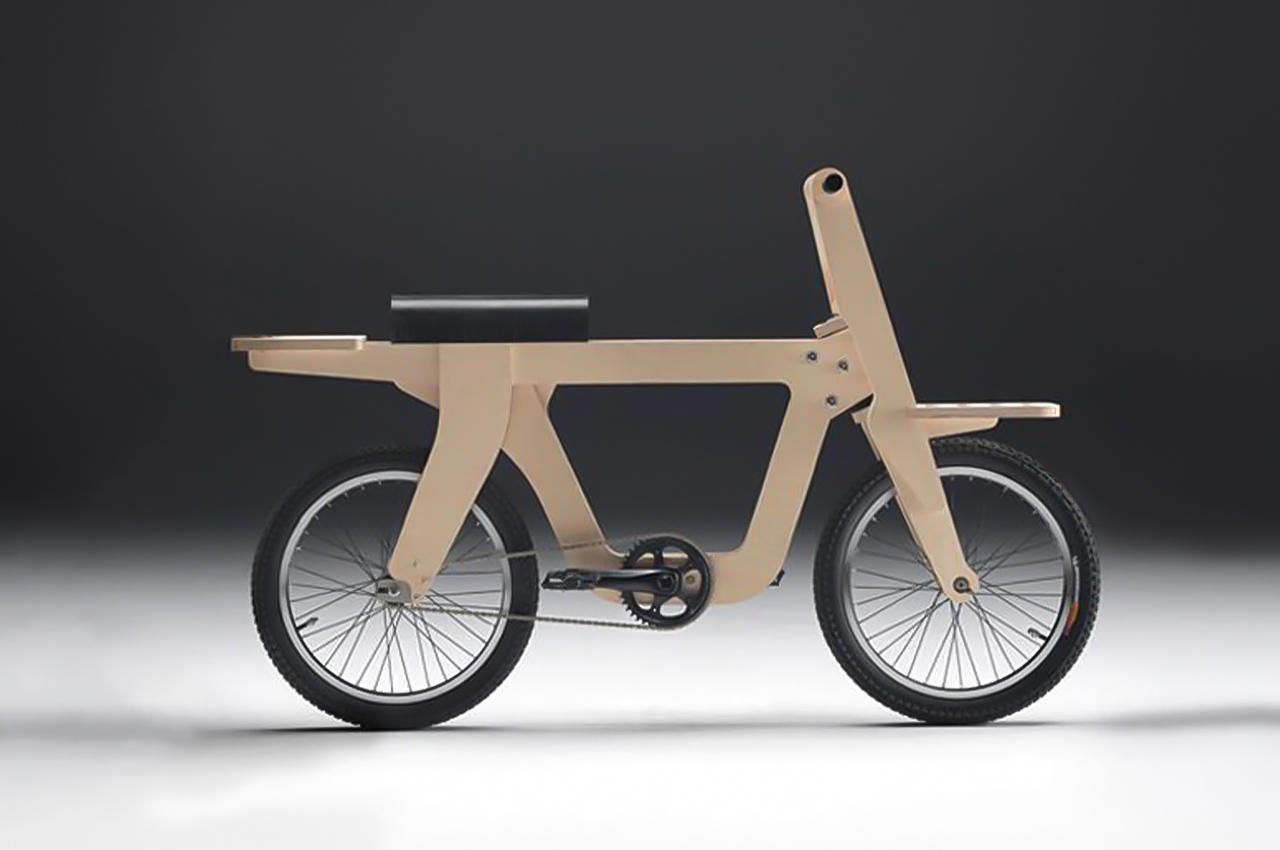
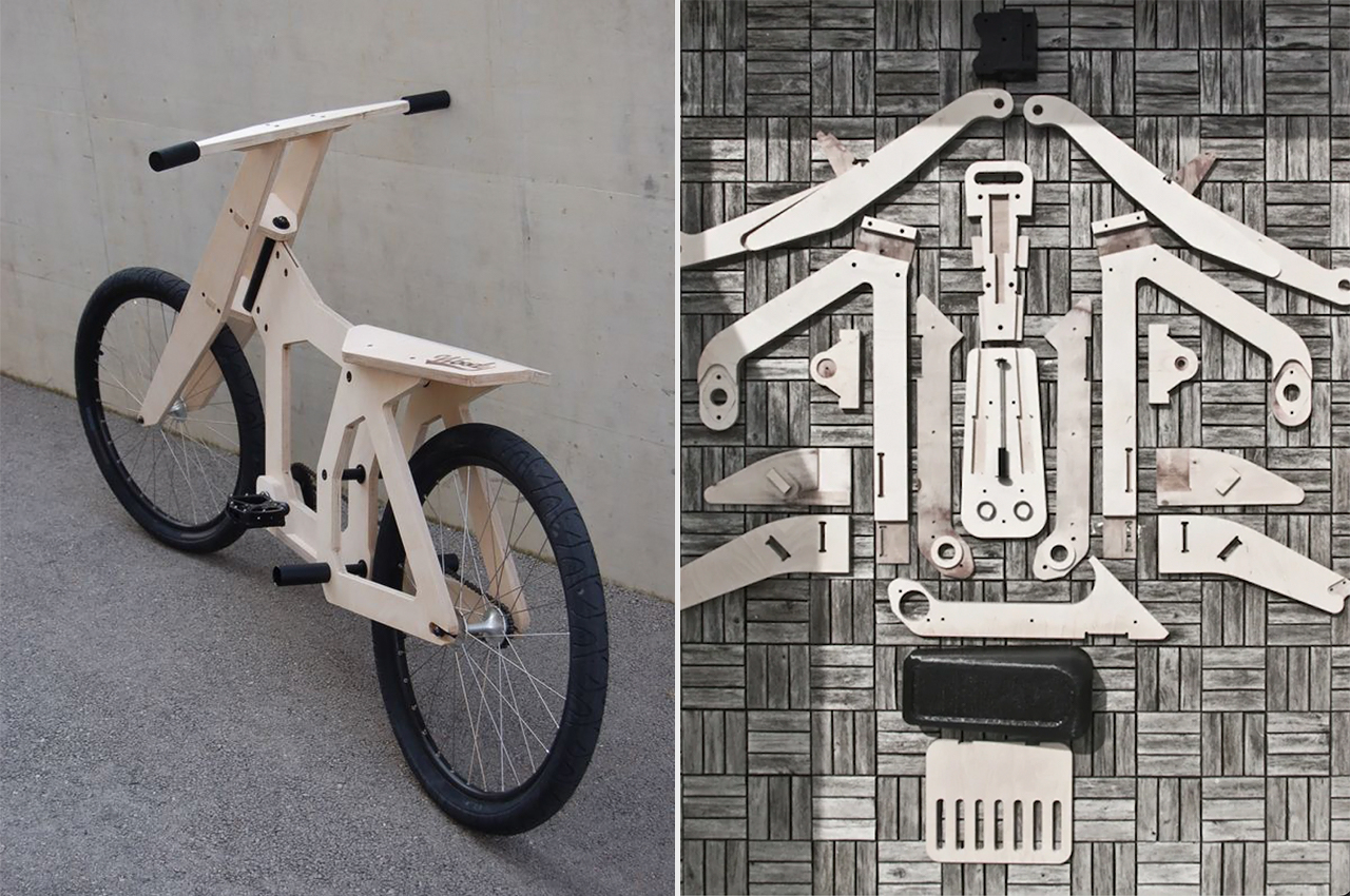
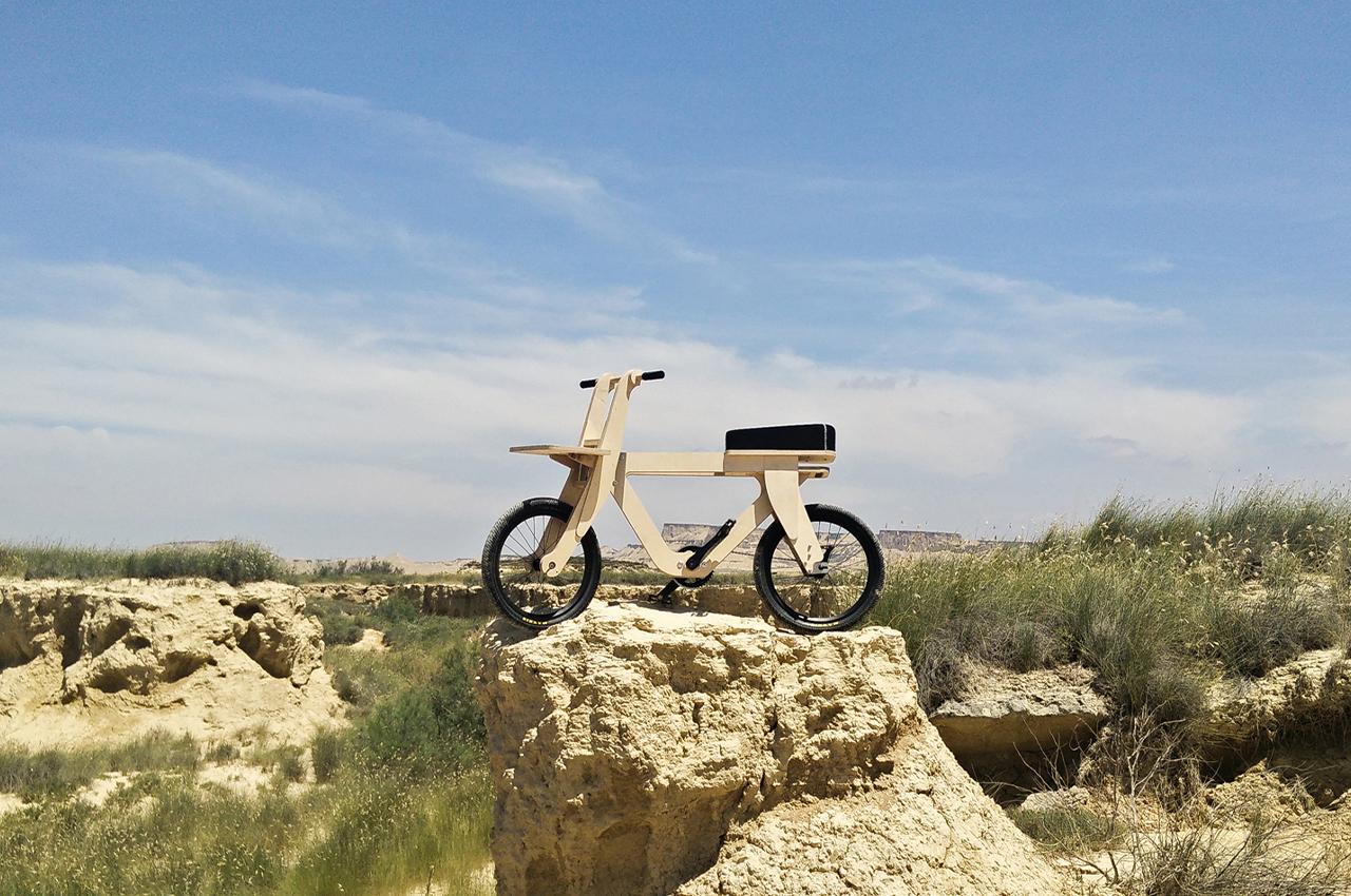
This bicycle made of plywood was created with the intent to get more people to focus on sustainability. The open-source design is called ‘Openbike’ and despite the obvious problems that come with a bike made from plywood, it is still an affordable and lightweight alternative for those who want to live on a budget but are also eco-conscious. You can download the files to build your own bike here!
Why is it noteworthy?
“This is not about bicycles! Open your eyes, this is about you, about your attitude towards the future. Do you think that the pollution of the cities will disappear by itself? Do you think traffic jams are caused by others?” reads the Openbike website which makes the mission statement of the design very clear – they’re not claiming to offer the durability or a thief-proof bike but rather shift your perspective on affordability and sustainability.
What we like
- Reduces carbon emissions in cities by empowering people with technology
What we dislike
2. Desco


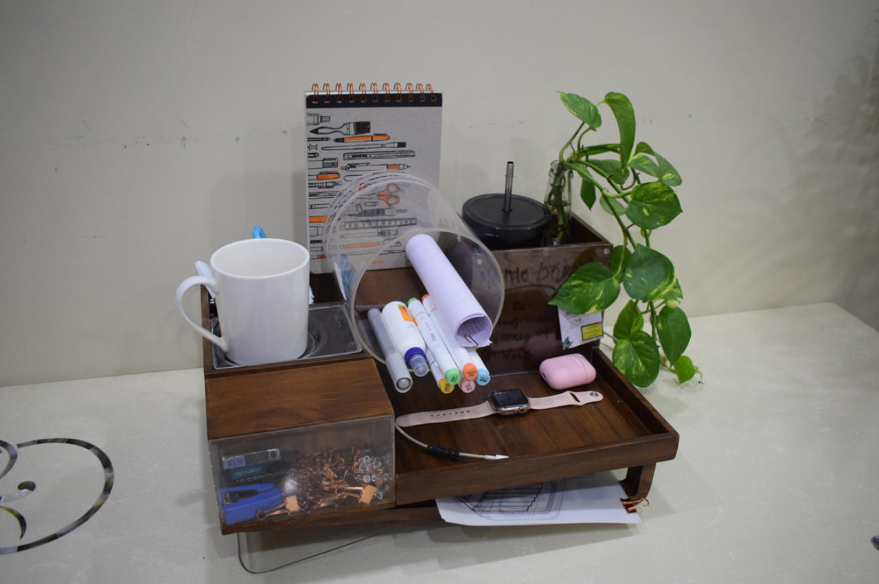
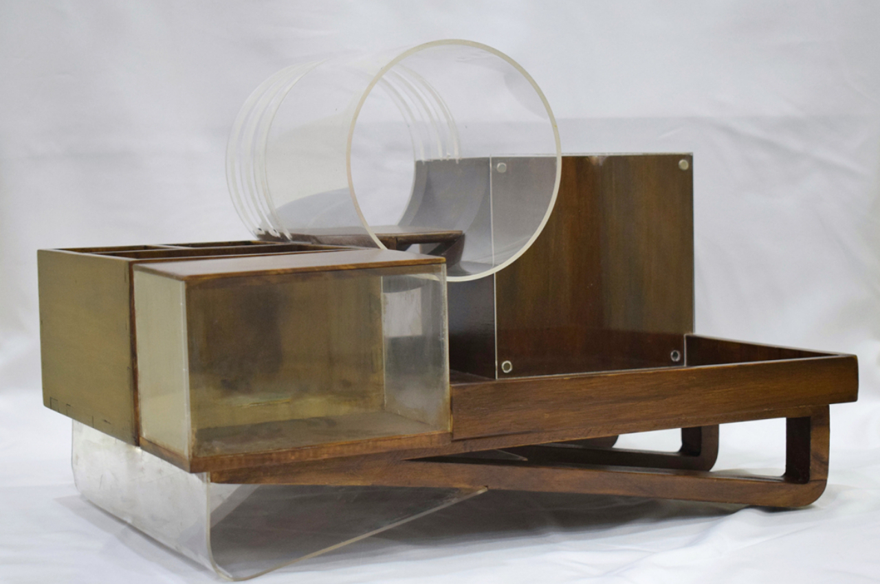
It’s almost difficult to see Desco as an organizer, given how it visually looks disorganized on its own. It utilizes different shapes that seem to be haphazardly thrown together, as well as lines that cut through each other at odd angles.
Why is it noteworthy?
Unlike traditional desk organizers, you almost have to stop and think which items go where because, despite its seemingly random design, each nook and cranny of the Desco actually serves a specific purpose. That large acrylic circle in the middle, for example, has slits that are designed to hold notebooks, while the space going through the pipe shape can hold pens and even rolls of paper. The slanted foot has space for a few sheets of paper, while the acrylic surface of one of the wooden boxes can be used as a tiny wall for sticky notes. There is also plenty of space for all kinds of tools and knick-knacks, including a tray for your phone, earbuds, or smartwatch. There’s even a surface that can be used to keep your favorite mug within arm’s reach.
What we like
- Despite its jumble of shapes, Desco still adheres to minimalism as far as the surfaces themselves go
- The transparent acrylic gives an illusion of floating in the air
What we dislike
3. The Digital Sand Clock


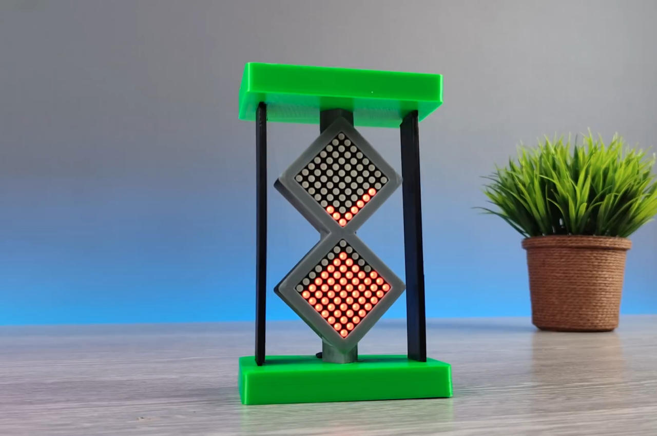
This isn’t about having a screen that displays a sand clock, which would be boring and too easy to make. This DIY project actually tries to mimic the experience of using an actual hourglass, including turning it upside down or sideways, as well as watching the “sand” drop little by little. Naturally, it doesn’t use any sand at all but utilizes LED lights to convey the same visual effect.
Why is it noteworthy?
The Digital Sand Clock isn’t just a hardware project, though. There is also a bit of coding involved, especially in animating how the LEDs light up to mimic falling sand. That part is actually what makes the entire endeavor rather impressive, given how it can use motion (technically an accelerometer) to control the “movement” of the sand, and the lights adjust accordingly as if they were actually movable solid objects.
What we like
- It is a demonstration of how far we’ve come in enabling such creations without being at the mercy of large companies and production plants
- It is a source of inspiration for budding designers and engineers who want to take a whack at this more democratic way of creating things
What we dislike
- The project involves a lot of components and work – hence it may not appeal to everyone
4. That Stool


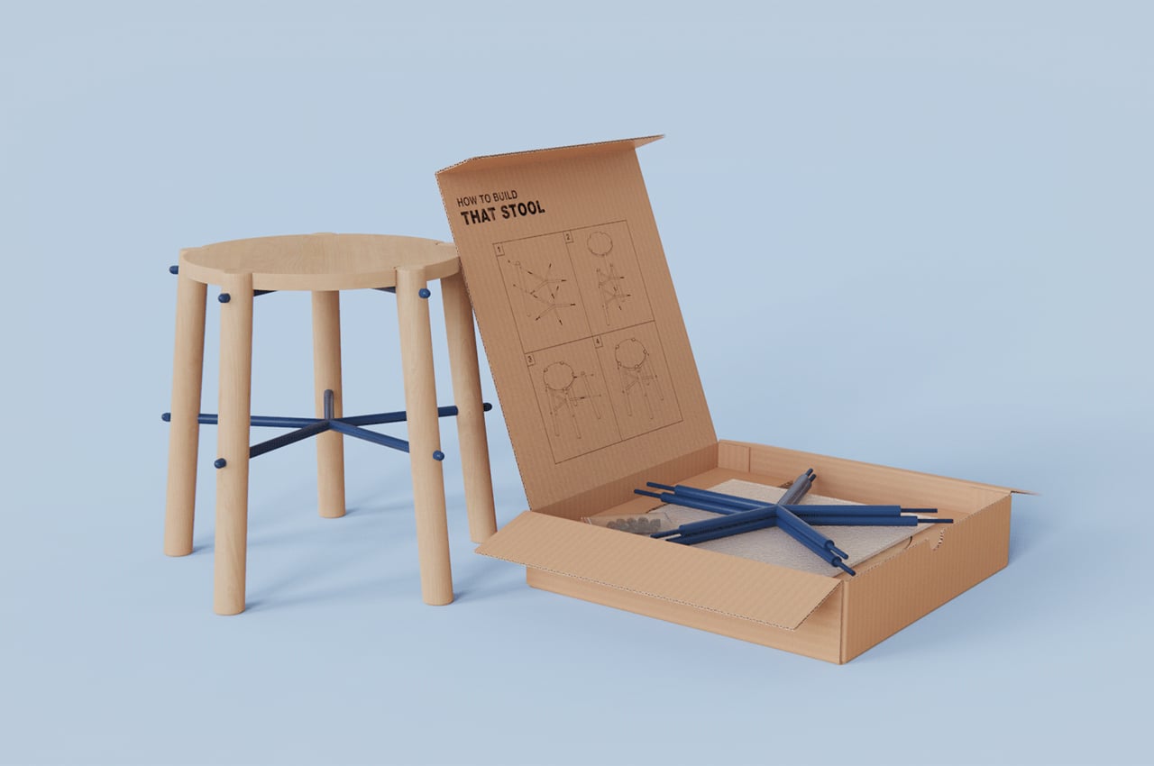
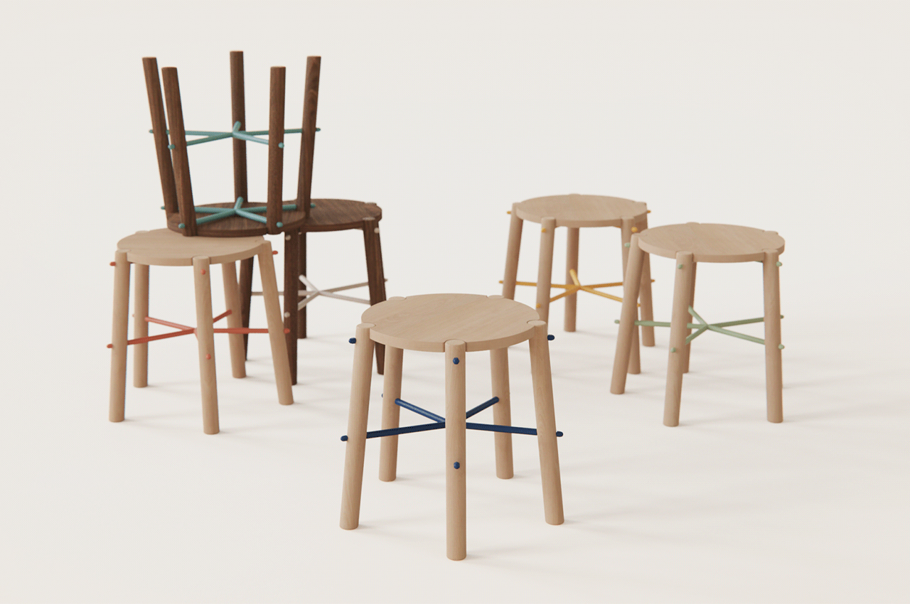
Small stools can come in handy anywhere. From empty art studios to crowded offices, stools can make the simple difference between sitting on the floor and having a seat. They especially come in handy when they’re designed for easy assembly and storage. Developed by Alondra Elizalde, That Stool is a flatpack DIY small stool designed with easy assembly to provide a practical means of having a stool anywhere, at any time.
Why is it noteworthy?
That Stool is comprised of only a few parts: a seat rest, five legs, a couple of star-shaped spindles, and some connecting nuts and bolts. All contained within a flatpack corrugated cardboard box, the parts of That Stool are easy to assemble with no additional hardware required. Following the imprinted instructions on the underside of That Stool’s top cover, users will first attach each leg to the corresponding screws on the star-shaped spindles. From there, connecting fasteners secure the legs and spindles in place, providing a sturdy bolster for the seat rest to mount.
What we like
- Assembled in only four steps without any additional hardware
- Can be used anywhere, at any time
- You can build it yourself!
What we dislike
- Looks like any other regular stool on the market
5. The Absolem keyboard


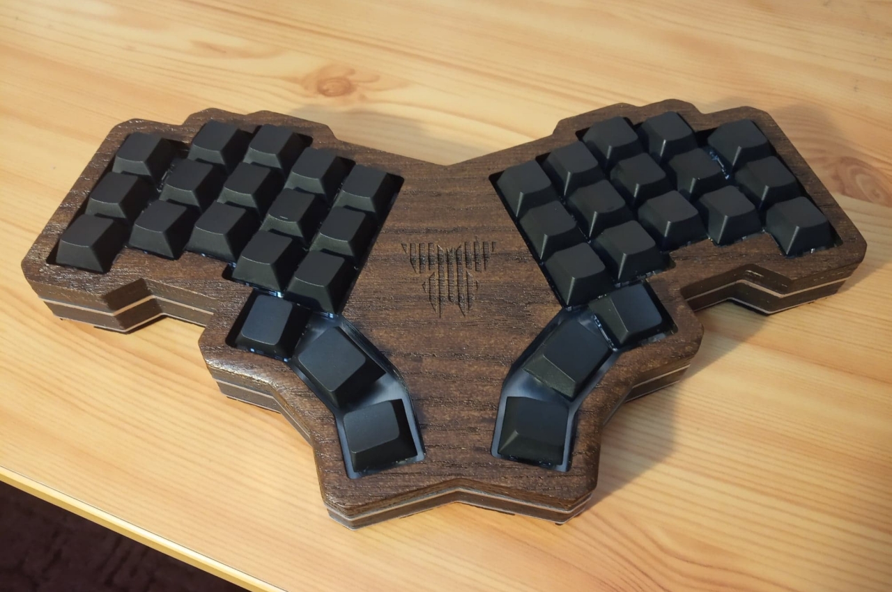
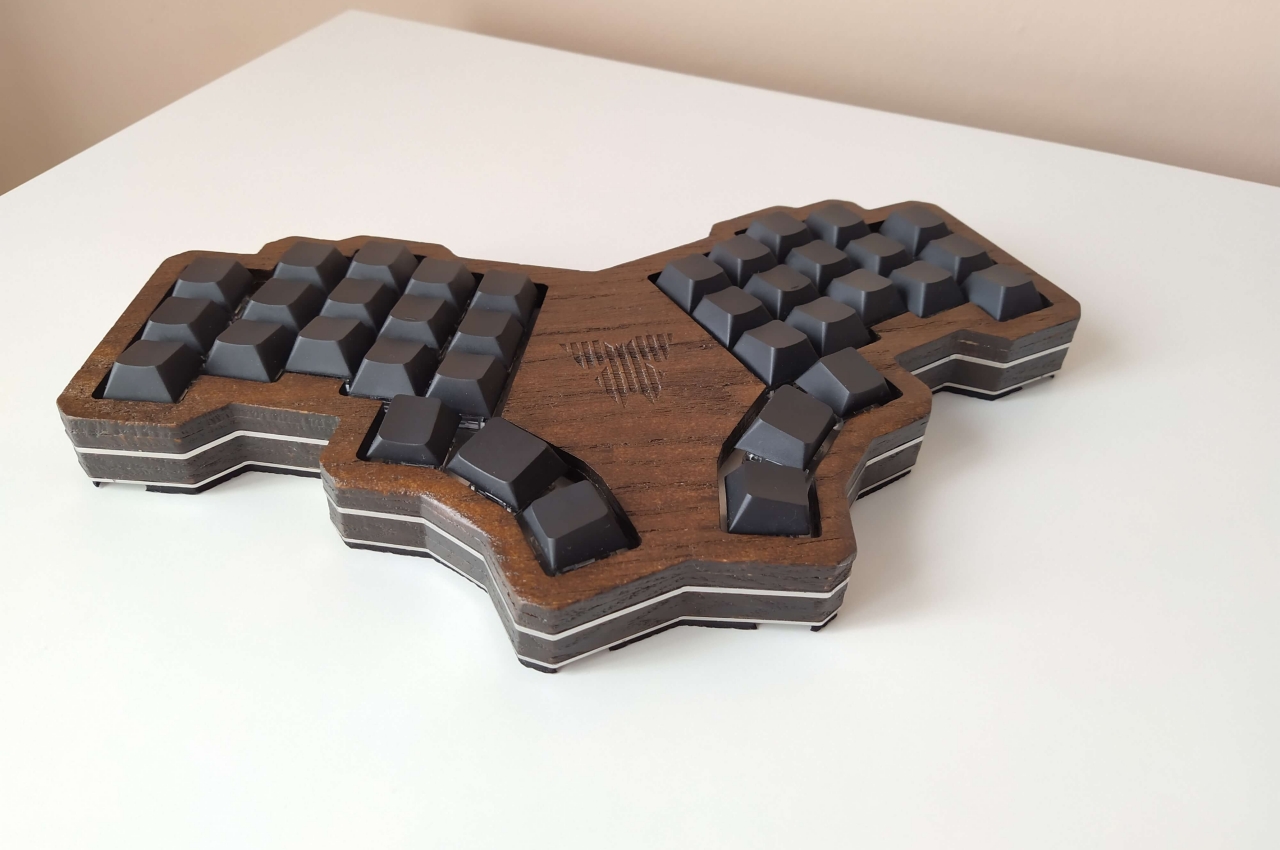
There are times, however, when creative people think outside the box and go to town with new concepts and experiments. Those often end up looking unpolished or straight out of a sci-fi show prop, but this eye-catching butterfly-shaped keyboard won’t look out of place on a minimalist wooden workspace.
Why is it noteworthy?
The designer, a software engineer by profession and modder by hobby, initially wanted to create something that would have ended up looking completely different. The ultimate goal was to have a reduced number of keys, 36 in total, plus a few extra keys that would allow switching between letters, symbols, and function keys. At first, he settled on a “3D” design that had those extra keys hidden underneath an elevated surface for the split 36 keys.
What we like
- Acute attention to detail
What we dislike
- Uses plenty of plastic and electronics, including neoprene, so it’s not exactly a sustainable design
6. GRIP


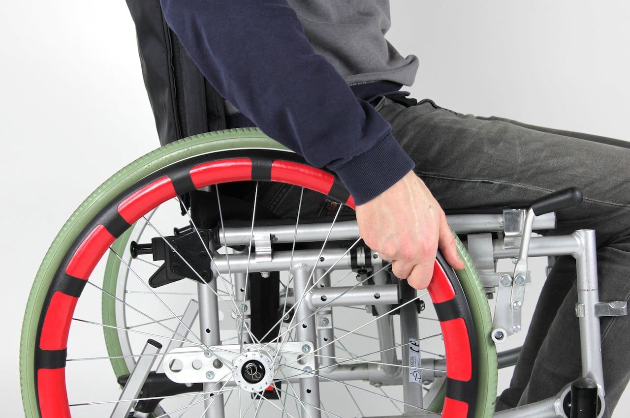
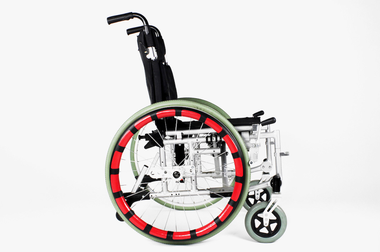
GRIP is a project by three designers: Lorcan Looney, Bryce Cormack, and Leah Deegan. They wanted to engage with common problems in the world by providing practical solutions. The Grip goes beyond aesthetics as the main aim is to enhance the “grip” of the wheels for wheelchair users.
Why is it noteworthy?
Grip is mainly a rim cover that provides ease and comfort to the users. It’s a “comfortable and durable hand protecting cover” that allows you to push the wheelchair more easily. With the cover, the problem of fingers being trapped between the wheel and the push rim is eliminated. The Grip is not a product being sold in the market. It’s something you can actually do on your own as a downloadable template and instructions are provided by the designers. The step-by-step guide is easy to follow so you can assemble the Grip with easily accessible materials and components.
What we like
- Reduces hand strain and deterioration
- Inclusive design
What we dislike
7. The Stair Cubby


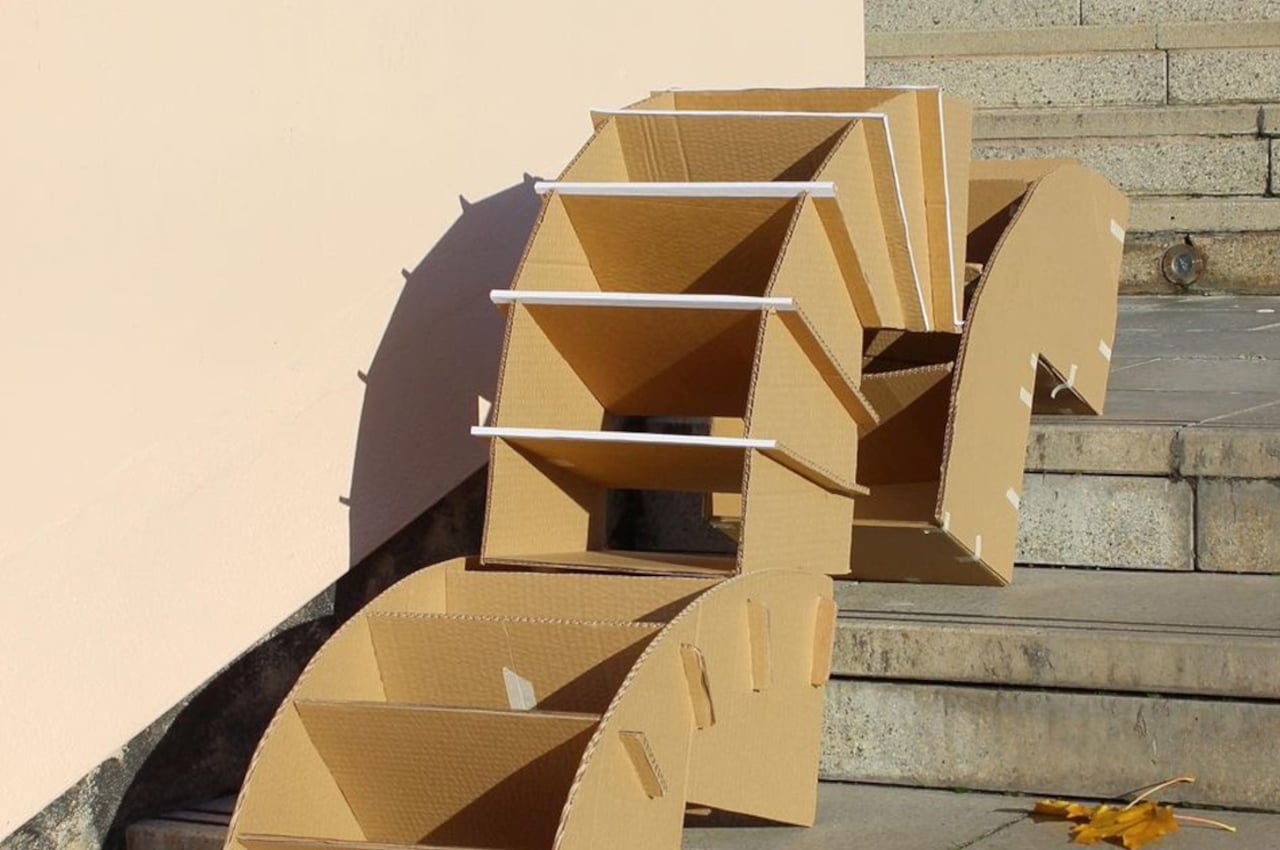
The Stair Cubby, as it was christened, can be assembled without the use of tools, with tabs simply going into slots and held down with pegs. The cubby is designed to sit on two steps of stairs, but the panel on the back can slide up and down to adjust to different stair heights. The storage has five open-access cubbies for shoes, books, and any other item that can fit inside, keeping things organized and out of harm’s way.
Why is it noteworthy?
Staircase bins need to take into account the particular shape of stairs, but not all stairs are made equal, so they have to be a bit more flexible or at least configurable. Given how in-demand these storage solutions might be, they also need to be durable and sustainable. These two product design students from Nottingham Trent University in the UK hit both birds with one sheet of plywood.
What we like
- Can be assembled without the use of tools
- Great for homes with space constraints
What we dislike
- We’re not sure how well it would hold heavier objects
8. The Atlas


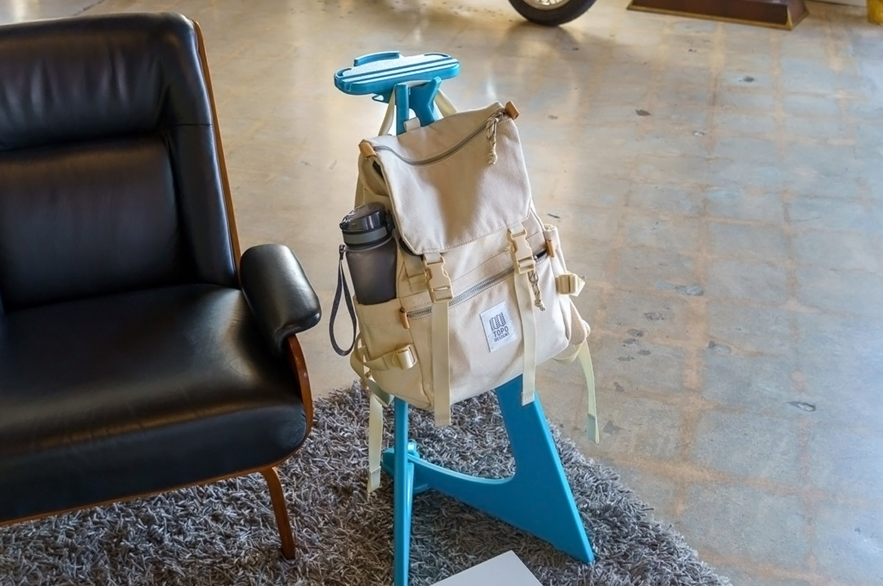
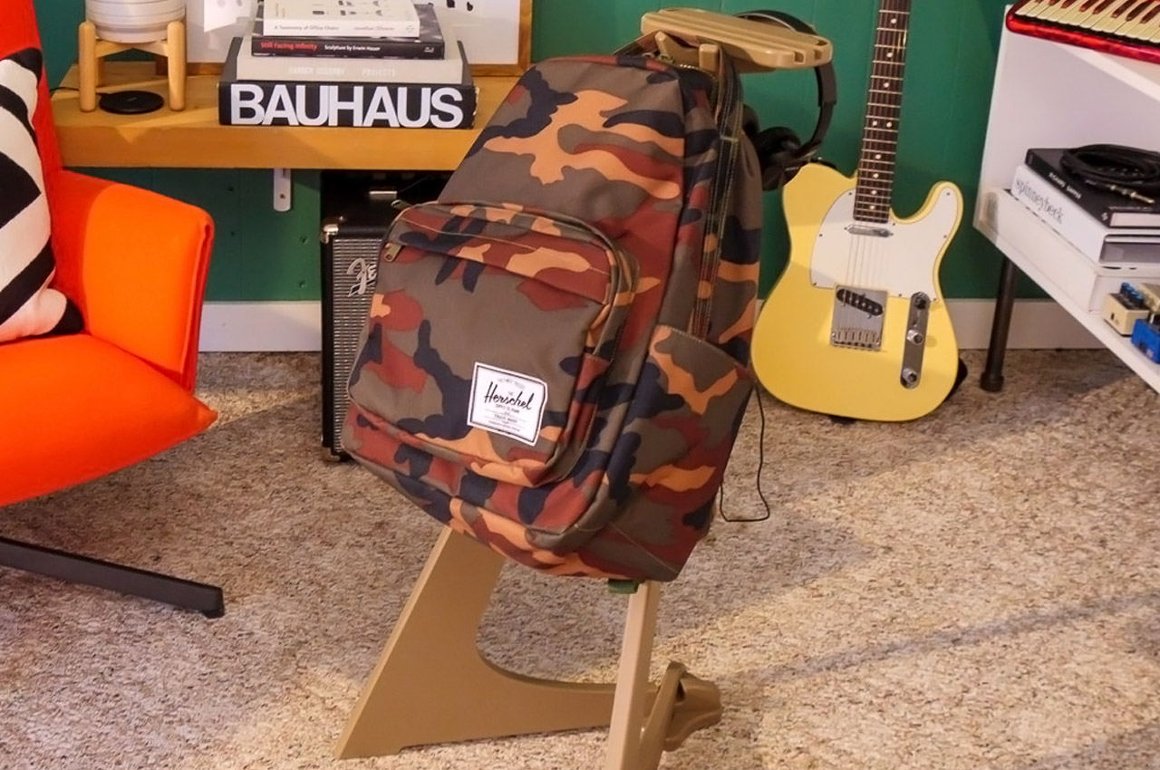
Your backpack is as much a part of your apparel as your coat is or your cap or sunglasses for that matter. As a society, we’ve come to accept keeping bags on the floor, and having their bottom surface collect dust and dirt over the years. You wouldn’t do it with any other part of your outfit, so why is it okay to keep your bag on the floor? That’s a question the guys at Addio Design Collective found themselves asking too. With that very design brief, they created the Atlas Backpack Stand – a new category of furniture that serves the purpose of a side-table as well as a stand for hanging your backpacks, so they don’t have to touch the floor.
Why is it noteworthy?
The Atlas isn’t a conventional side-table. It comes almost with the proportions and shape of an easel, sporting an A-shaped frame. It comes with a slightly inclined design too, keeping the stand stable and preventing it from tipping over due to your bag’s weight. On top, two tiny hooks let you hang your backpack, bag, duffle, suitcase, purse, or tote, while a flat surface acts as a storage area for your phone, AirPods, sunglasses, etc. It’s a stand designed around your backpack and your EDC and can sit perfectly near your work table.
What we like
- It suspends your bag above the ground, keeping it from getting dirty
- Makes it easy to access stuff inside your bag without having to bend down
What we dislike
- A bit of a niche product – may not appeal to everyone
9. The Penkesu Computer


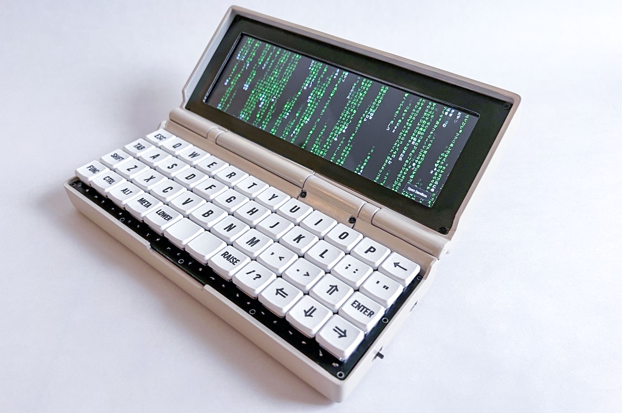
Every day, the world is greeted with half a dozen or so “hacks” that try to solve a problem or even solve a problem no one thought was even a problem, using only off-the-shelf materials assembled together in garages or basements. Not all of them turn out to be useful or even attractive, but some do pique our interests, like this DIY pocket computer that actually works like a regular computer.
Why is it noteworthy?
Called the Penkesu Computer after its creator, the ultra-compact device that resembles a bulky communicator from the good old Nokia days has a distinctive charm despite its unpolished looks. While you probably wouldn’t use it for serious work, the wide but short laptop has the makings of a cyberpunk prop, specifically a cyberdeck that’s often used by characters to access the net or other computers. If you’re into that genre and style, the Penkesu Computer will definitely tickle your fancy, and it will undoubtedly turn heads if you use it in some cafe.
What we like
- Penk Chen has generously provided the exact list of materials and components to buy, as well as the pattern for 3D printing the enclosure
What we dislike
10. The Chonky Palmtop


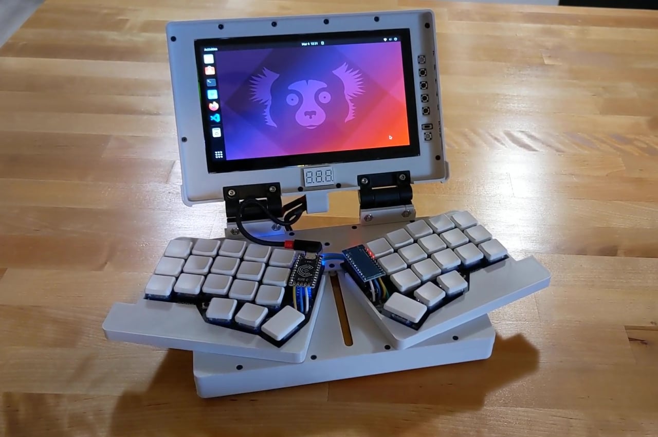
Tiny laptops, sometimes called palmtops, have the advantage of portability over normal notebooks, but they are terrible when it comes to comfort while typing. You can only cram so many keys in such a small space, forcing designers and users to perform finger acrobatics to activate additional keys. That’s not even considering yet the ergonomics of bending your wrists to fit your fingers in such a cramped space. That is the problem that this bulky “palmtop” tries to address by miraculously fitting a slightly more comfortable keyboard in a 7-inch space.
Why is it noteworthy?
This contraption isn’t called the Chonky Palmtop for no reason. Unlike other DIY laptop projects, this one makes no qualms about being a large plastic brick. It’s not going to be usable on your palm, though you probably won’t use it like that anyway. After all, what makes this special is how it tries to make typing a bit more comfortable on a laptop of this size.
What we like
- It splits the keyboard into two halves, adopting a layout that is similar to those ergonomic keyboards you’d find in the market
What we dislike
- You may not want to use a computer of this size for your everyday needs
The post Best DIY designs for you to build at home first appeared on Yanko Design.
