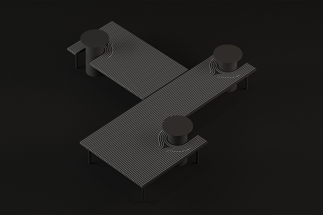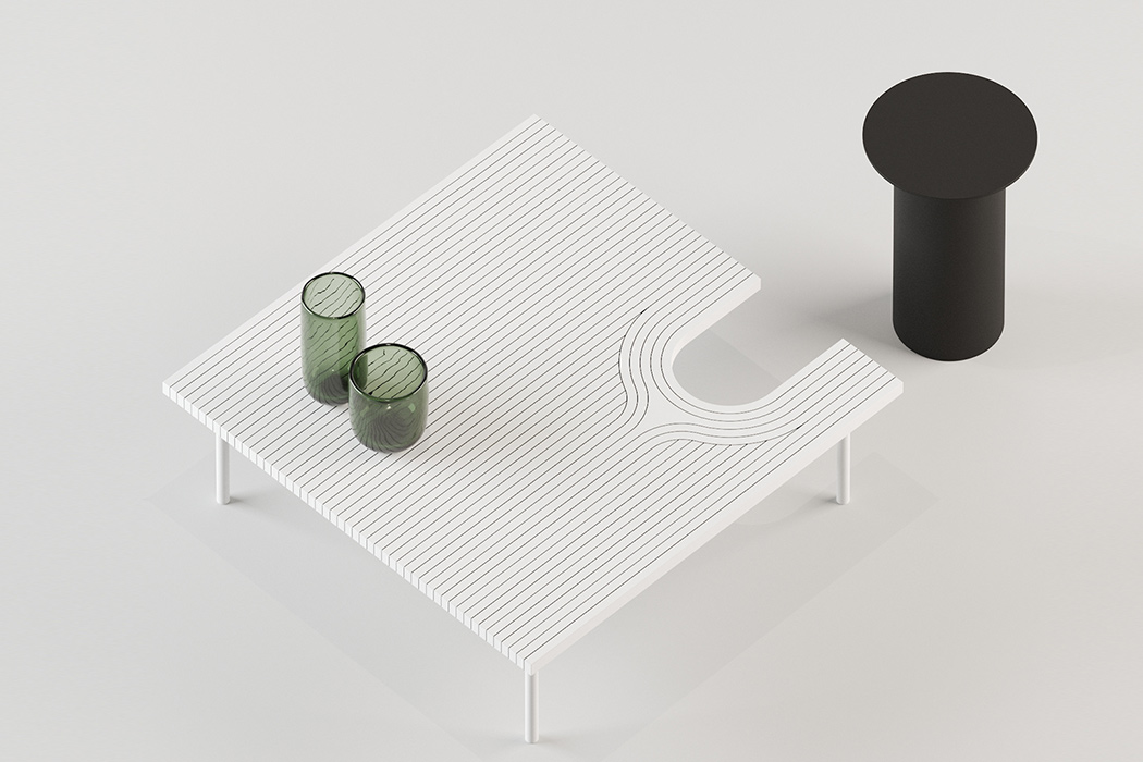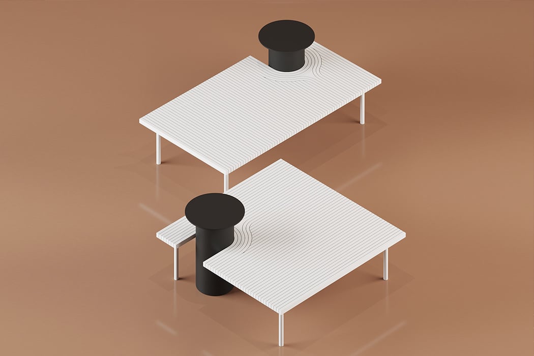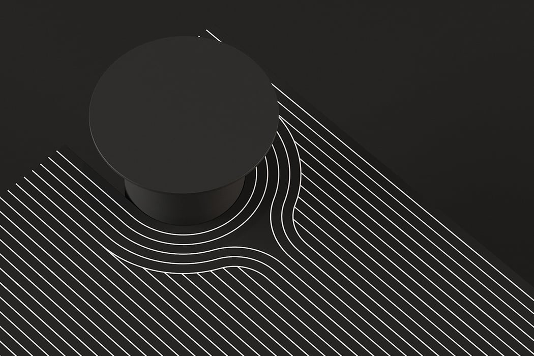
Interstellar’s black hole comes to life in this minimal black and white furniture design!

The original 2001 Space Odyssey had us traveling to Jupiter by the 2001 – while that part of the future did not come true, what did happen was we made space travel sustainable with Space X Dragon Crew’s reusable spacecraft and now we plan on mass travel with SpaceX’s Starship carrying 100 passengers. With tickets to space being priced in millions, we can at least share our love of space with designer Dmitry Kozinenko’s Spacetime furniture!

The minimal furniture collection uses clean lines focused around an elevated seat, bringing to mind the stunning visuals of the Gargantua black hole portrayed in Christopher Nolan’s Interstellar. The story goes like this -Eugénie von Tunzelmann, a CG supervisor at Double Negative, generated a flat, multicolored ring – a stand-in for the accretion disk – and positioned it around their spinning black hole. Something very, very weird happened. ‘We found that warping space around the black hole also warps the accretion disk, so rather than looking like Saturn’s rings around a black sphere, the light creates this extraordinary halo.’ This warping halo brings to mind the lines showcased in this design. The furniture itself boasts of low tables that work as a coffee table as well as a bench, given the changing width of the design. The elevated stool is also easily detachable, creating a statement with its matte finish. Now if only there were a magnetic force actually pulling this stool to the table, the black hole analogy would be complete!

Available in white and black, this intense furniture collection is almost hypnotic in design, paying homage to one of the greatest sci-fi movies where a genuine advancement in our understanding of gravitational lensing happened based on the calculations and simulations done for this movie.

Designer: Dmitry Kozinenko
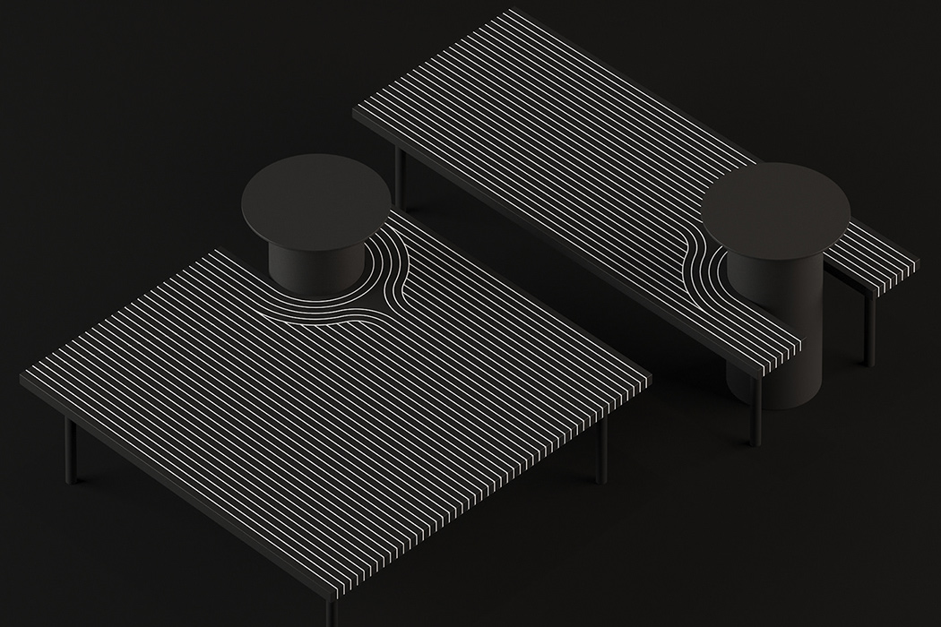
Sunny tables and wall mounts brings shadow work into play

Only when you are looking to upgrade your furniture, that you come to appreciate the hard work that independent designers and design studios put in. You could go for mass-produced IKEA (and the likes), or exclusive, thought-provoking designs like the ‘Sunny’ metal furniture collection.

What the designer Dmitry Kozinenko has attempted to do here, is to give us a collection that has elements that mimic the ‘sharp shadows on a bright sunny day’, and hence the extended metal shadows to the collection. Clever!

Designer: Dmitry Kozinenko

The Superglue chair revisits how chairs should be perceived

superglue_chair_1

One seat, two armrests, one backrest, four legs. These elements come together to make a chair, and whether you perceive them together or individually, there’s a fairly large chance you’ll know you’re looking at a chair/seating-device.

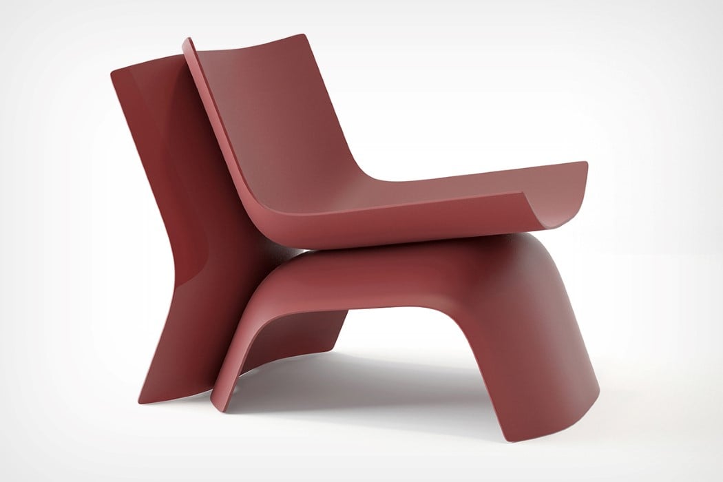
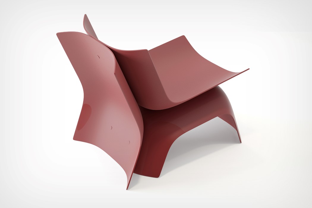
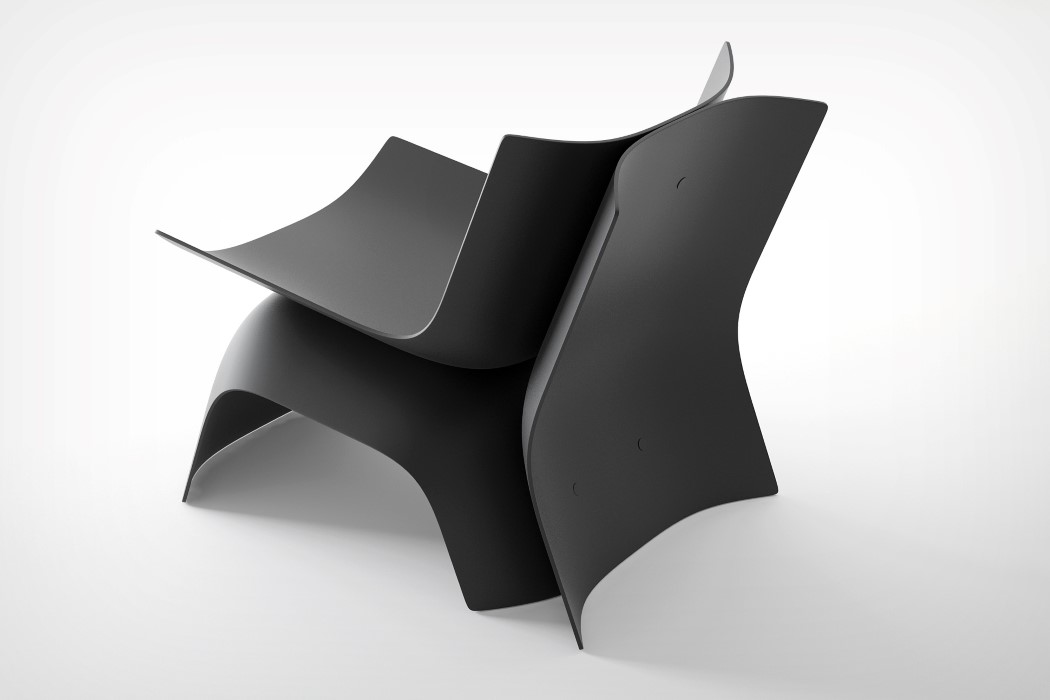
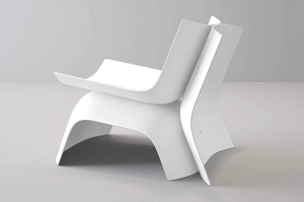
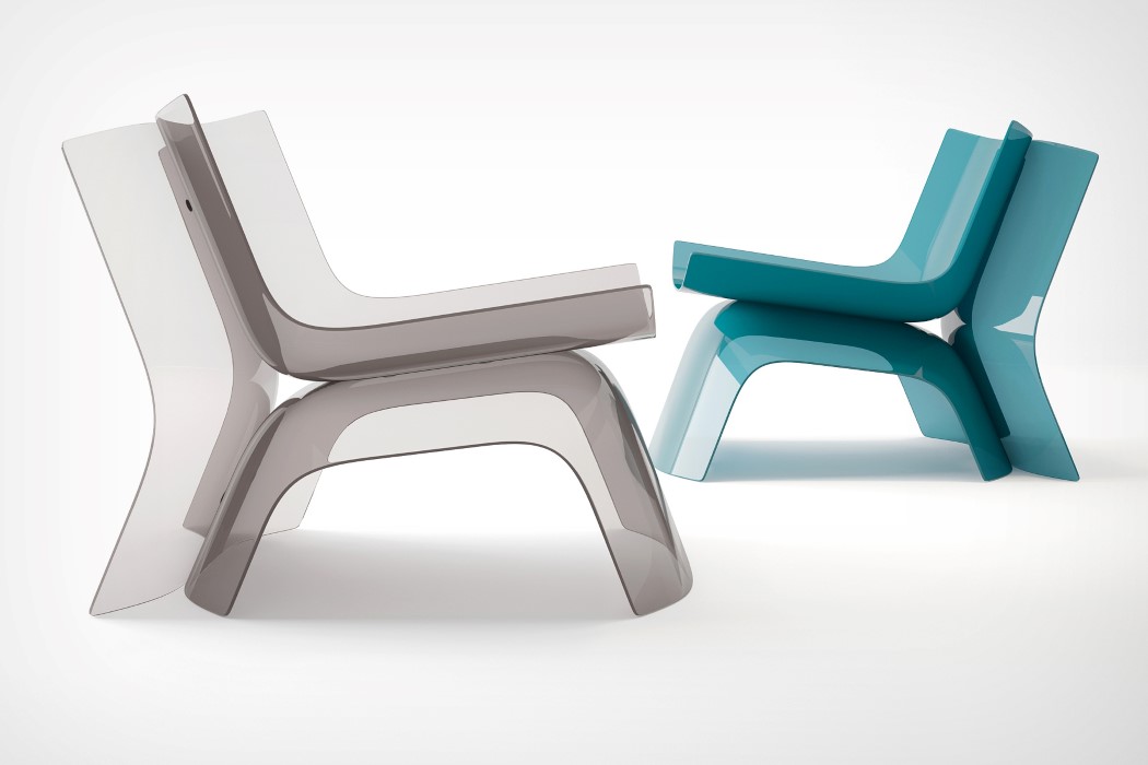
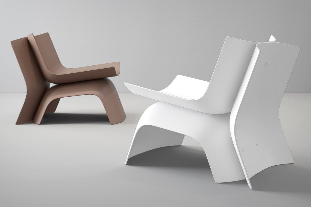
That isn’t quite the case with the Superglue chair by Dmitry Kozinenko. Comprised of 3 sheet metal parts joined together by flat rivets, you’d never guess that they would come together to form a chair. Even when they do come together, it’s difficult to isolate which part plays what role, only because the chair’s unique design allows it to function as a chair without visually conforming to the standards of chair-design. The Superglue chair does have a seat and backrest, which are quite suitably comfortable, thanks to their concave design. In fact, you’ve even got two armrests on either side of the seating area. The chair’s backrest is fortified by the two steel sheets riveted together, and the chair stays extremely stable, thanks to the third sheet steel member that doesn’t come shaped in the form of 4 legs, but rather provides, in its own unique way, a total of six contact points (three edges) between the chair and the floor.

Designer: Dmitry Kozinenko
superglue_chair_2

superglue_chair_3

superglue_chair_4

superglue_chair_5

superglue_chair_6