Dieter Rams-inspired iPhone Standby Mode Dock comes from an alternate timeline

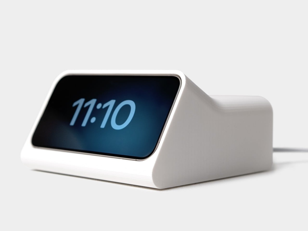
Have you ever wondered what would happen if two people from different time periods or locations met and worked together? Short of breaking the laws of time and space, we can only take a guess based on the works and ideas they left behind, though some “what if” collaborations feel more natural than others. The legendary industrial designer Dieter Rams, for example, has influenced generations of designers, some of whom became legends themselves and even carried on the spirit of his design philosophy. Perhaps nowhere is this association more pronounced than in the Ive-era Apple designs, particularly those that embraced minimalism to their very core. We might not need to imagine what a Rams-Ive collab would look like based on this rather simple yet intriguing iPhone dock that utilizes Standby Mode to become a modern version of the Braun DN 40 alarm clock that Rams designed.

Designer: Scott Yu-Jan x OVERWERK

Although probably best known for his Ten Principles of Good Design, Dieter Rams’ industrial designs not only became Braun products but also served as the inspiration for the likes of the original Apple iPod or the first Sony Walkman. His designs espoused a “less but better” philosophy, a foundation of modern minimalism, and among them was the DN 40 electronic, a funnel-shaped alarm clock that, as you might have guessed, did that and only that. There are dozens of alarm clocks today, of course, including an iPhone if you charge it horizontally to activate Standby Mode.

Inspired by this concept, musician OVERWERK created an initial prototype that simply housed a circular iPhone MagSafe charger to hold the phone at a specific angle similar to Rams’ design. It was basic, functional, and a bit cumbersome and wasteful. To take out the iPhone that sits flush inside the body, you have to press on one end of the phone to raise the opposite end and then pry it out. The rest of the clock’s chassis also held no purpose since there were no electronics to put in there as well.
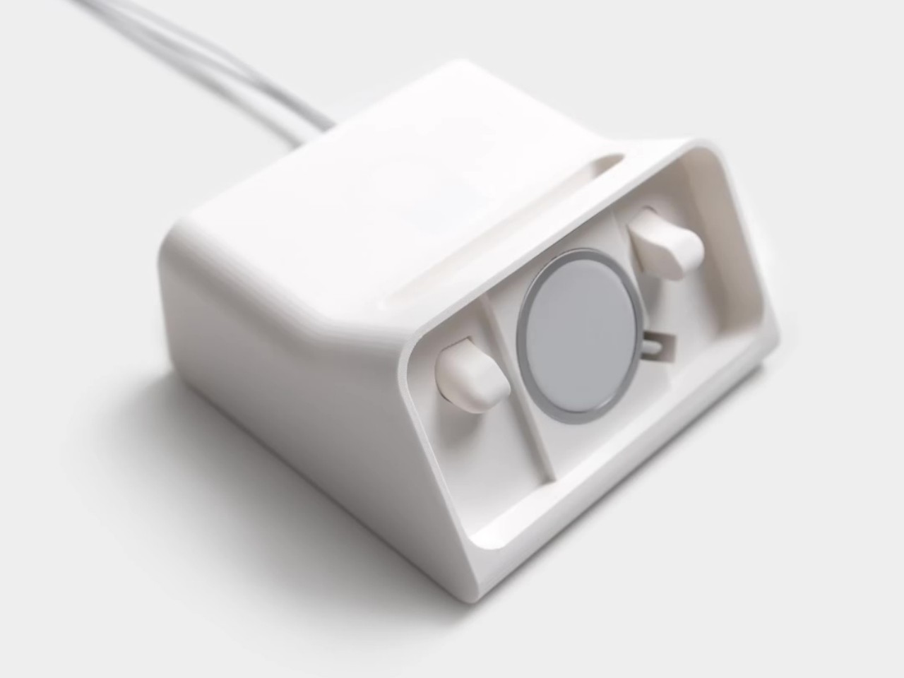
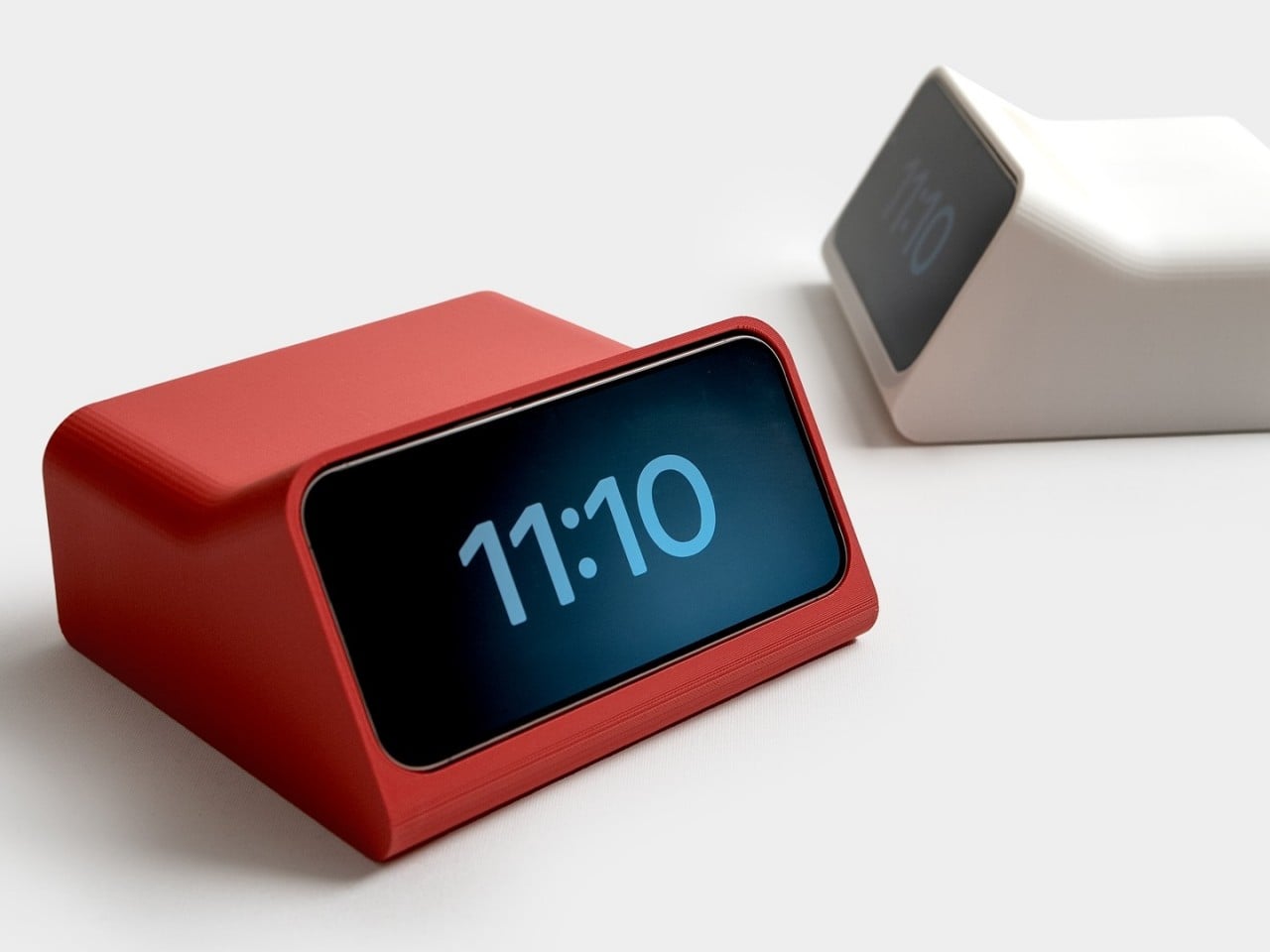
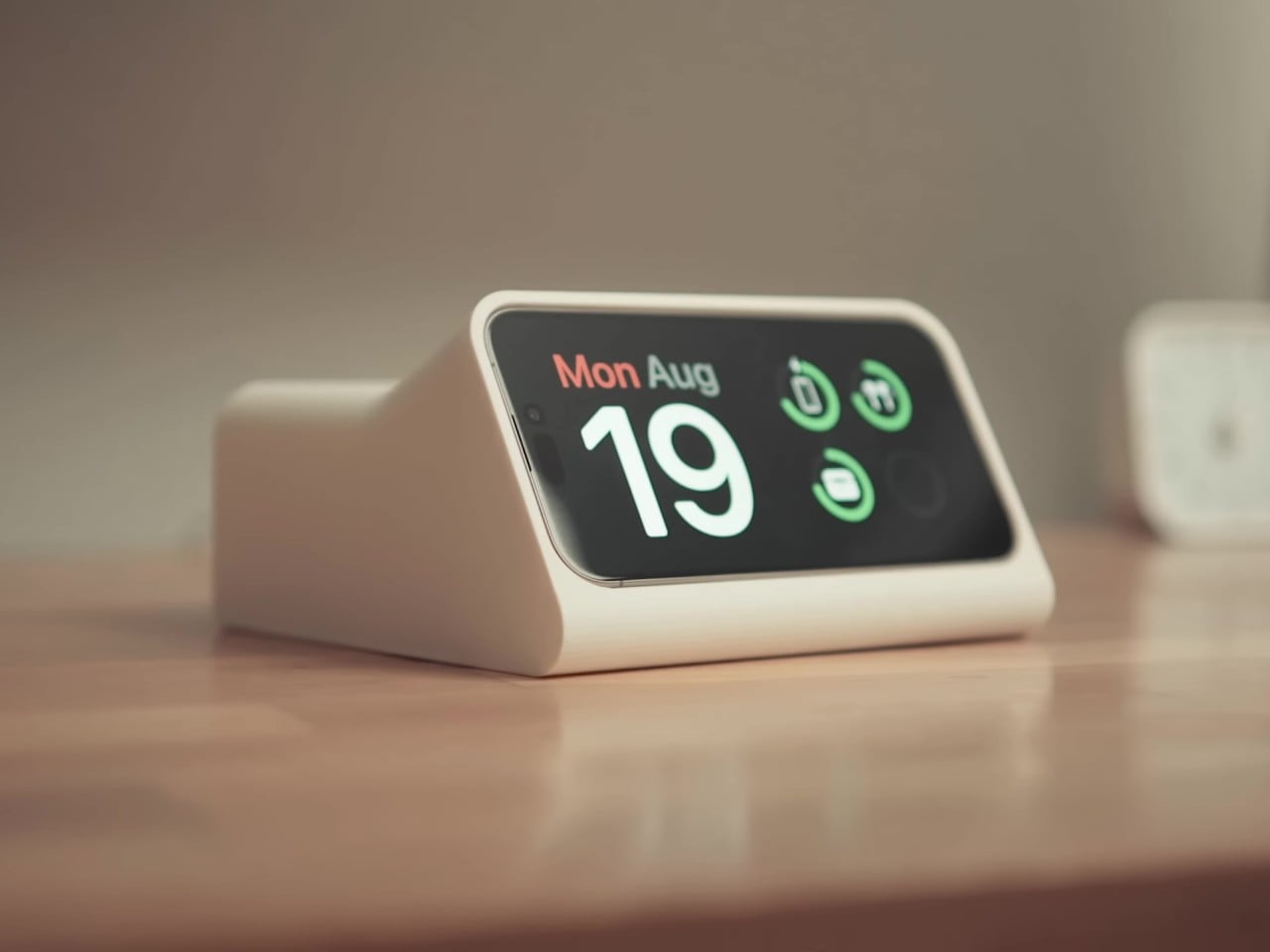
Working together with designer and YouTuber Scott Yu-Jan, the design took an interesting turn and, thus, the iPhone DN 40 Dock was born. Two simple yet crucial changes were made to the original design, including adding an ejection button at the top that pushes the iPhone forward, detaching it from the MagSafe charger. Yu-Jan also added a space for the small Apple Watch MagSafe charger underneath the top cover at the back, allowing you to charge your AirPods on top. As a bonus, charging the AirPods case has a satisfying feeling when you simply put it down on top of the clock and it slides into place thanks to the power of magnets.
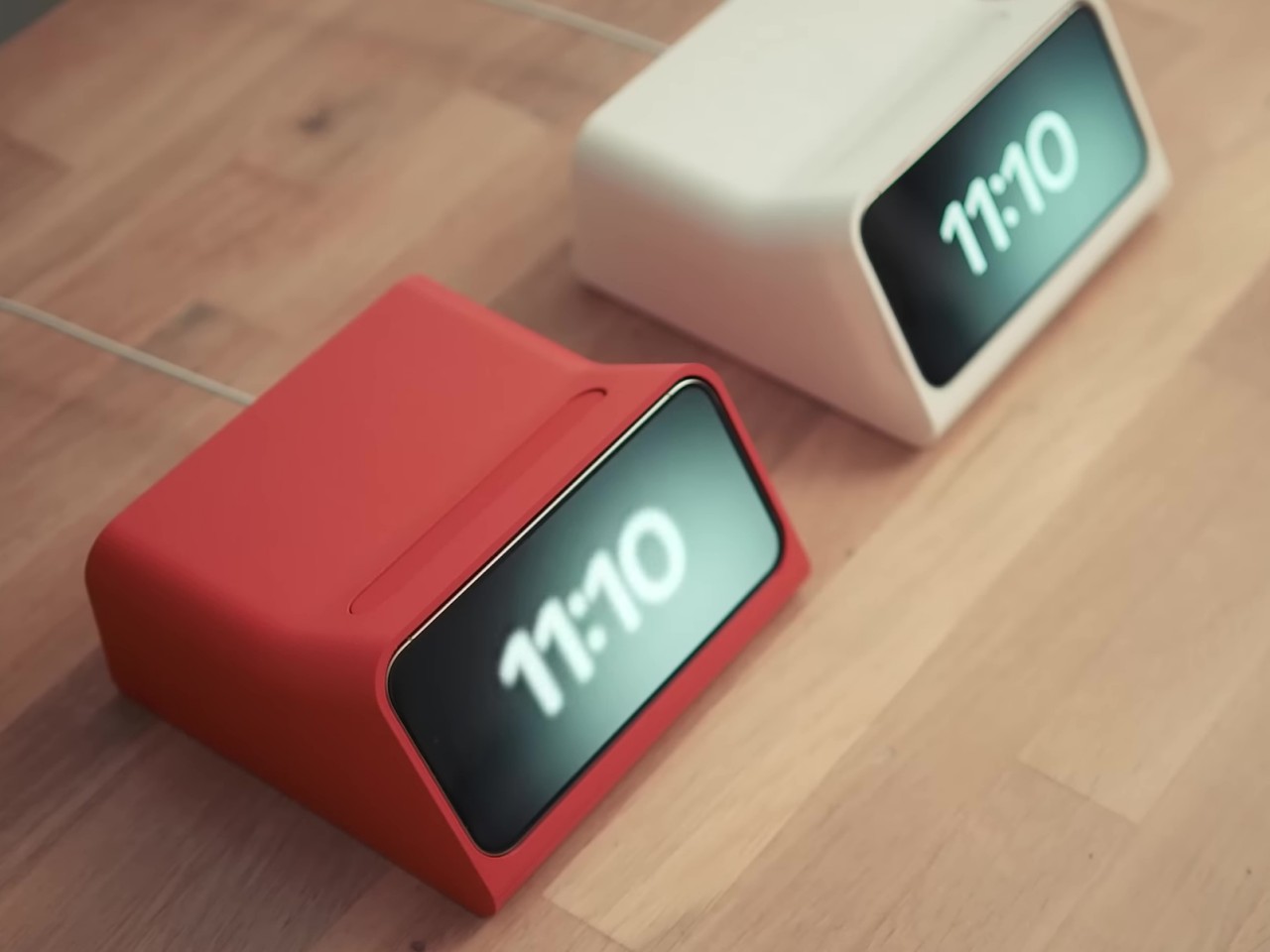
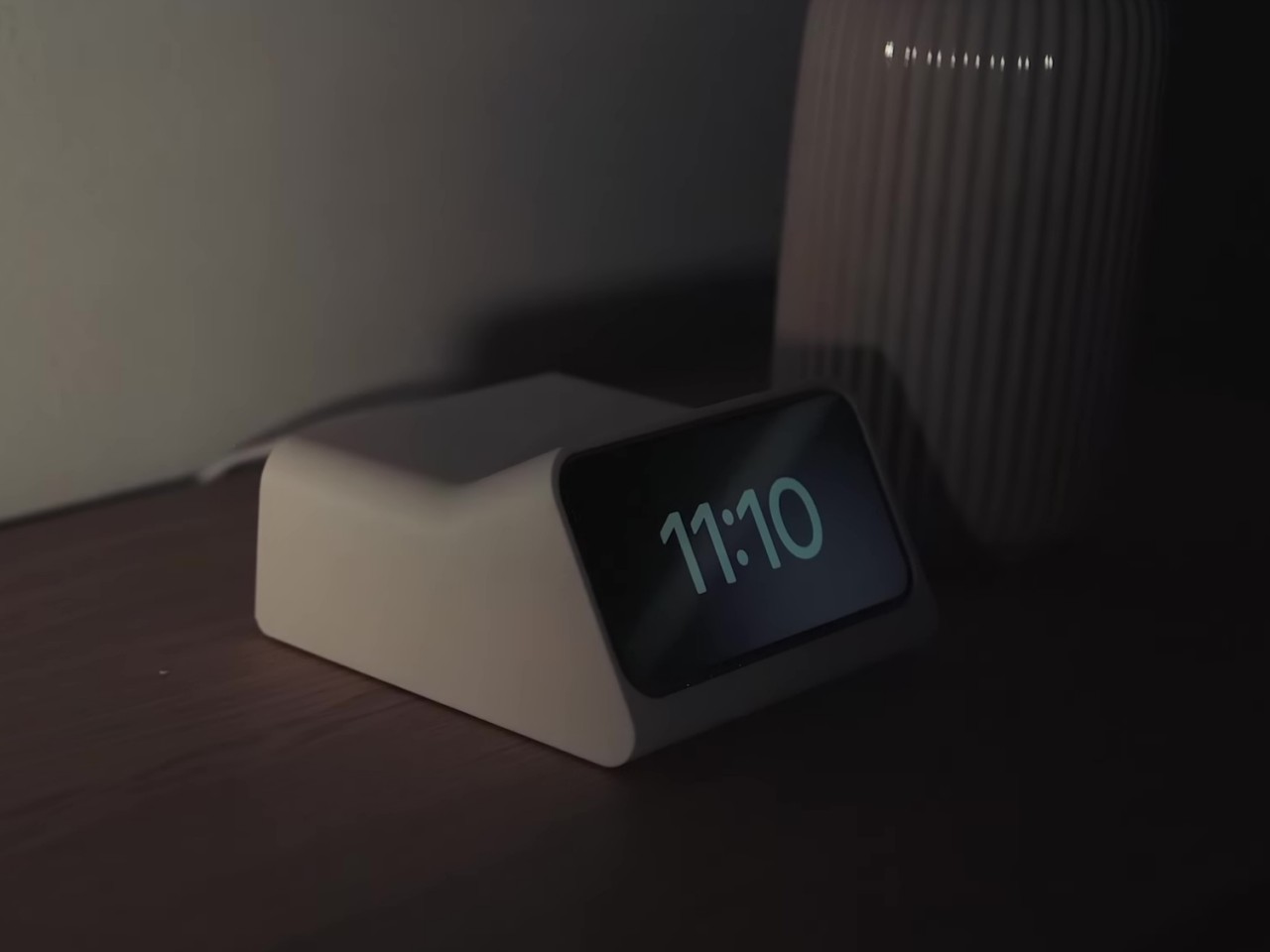
The result of this collaboration between two modern-day designers is a design object that feels like a collaboration between Rams and Ive, two designers with great respect for one another but never got the chance to work together. It has the minimalism of the original DN 40 clock but is made even simpler because you only need an iPhone and MagSafe chargers. You do need a 3D printer to make your own, though, and you might need to modify the design since this was made specifically for an iPhone 15 Pro. Fortunately, the design files are freely available so anyone can now have their own Rams-inspired iPhone Alarm Clock by their bed or desk.

The post Dieter Rams-inspired iPhone Standby Mode Dock comes from an alternate timeline first appeared on Yanko Design.
iPhone Standby Mode on Steroids: The Vobot gives you a Multi-Hub Display Dock for Widgets and Tools

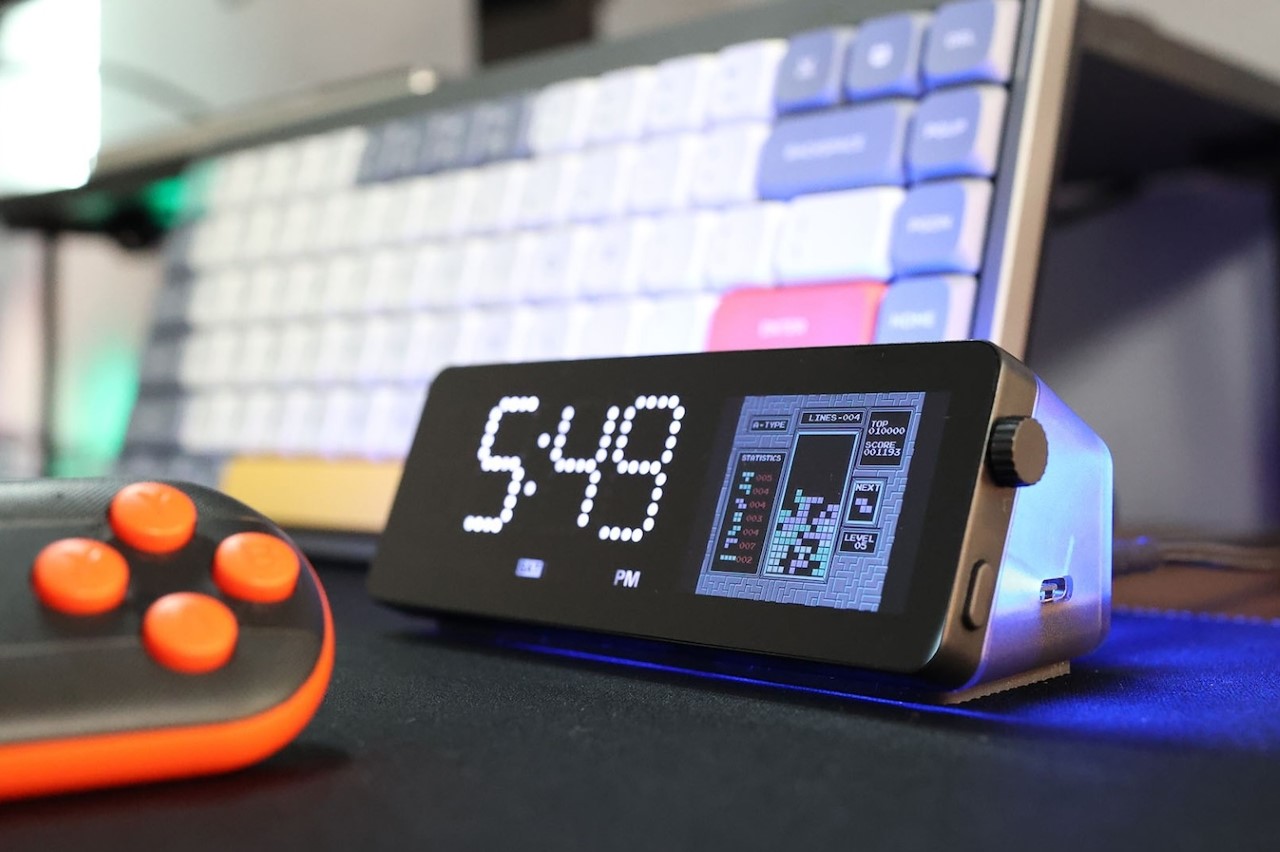
Sure, your iPhone can show you the time or the game score or even photos of your holiday when it’s docked horizontally during charging… but can it give your laptop HDMI and LAN connectivity? Can it track crypto prices? Does it let you code your own apps/widgets? And hey, can it play DOOM? Well, Vobot can. A compact desktop display that doubles as a multiport hub for enhanced productivity, the Vobot puts fun and function together. It has 7 ports for enhanced connectivity and charging (up to 90W), but its magnum opus is the display on front, which does everything from being a clock, weather forecast indicator, Pomodoro timer, Todoist task tracker, Crypto or stock ticker, or even a screen-mirroring display. The best part, you can code your own apps for it, so unlike the iPhone’s Standby Mode, the Vobot can be exactly what you need it to be.

Designer: Mocreo Pvt. Ltd.

As the folks behind the Vobot say, it’s first and foremost a mini dock. With 7 ports to supercharge your laptop/desktop, the Vobot offers connectivity and power to your device. It sports a 4K@60Hz HDMI port, a Gigabit LAN port, one USB-A 3.0 port, and two USB-C 3.0 ports. There’s one single USB-C input port that powers the Vobot (the Vobot comes with its own adapter, and doesn’t have a battery of its own)… so in essence, it’s every bit a multiport USB hub… but the screen on the front is what radically changes things.

Think of that screen on the front of the Vobot as a dedicated secondary display. It’s split into two parts – the part on the left is a dot-matrix seven-segment LED display that’s dedicated to showing the time and day, while the right half is an LCD IPS screen that can be controlled using a knob and button interface on the right side of the device (reminiscent of a watch’s crown). When plugged in and running, the Vobot’s screen becomes your custom control center. The left half shows you the time, while the right half unlocks productivity in a variety of ways. The Mini Dock has its own built-in app gallery, including a weather widget, a Pomodoro timer, a Todoist task manager, calendar, stock/crypto tracker, PC monitor, indoor air detector, game emulator, WiFi status checker, screen-mirroring applet, and a lot more.

The vast app gallery means the right half of the Vobot mini dock’s display becomes your work and your life’s control panel. You can track productivity, review the stock market, watch YouTube videos on the side, check your PC’s performance or thermals, or even code your own IoT apps. With MicroPython programming, you can add new features to the dock that serve your needs, from doing things like monitoring cameras around your smart home, to checking your home’s power consumption. Create games that you can play using your laptop keyboard or a game controller (which comes along with the mini dock), or just build something as simple as a subscriber counter or notification center for your phone.

The Vobot Mini Dock boasts compatibility across Windows, Linux, and MacOS machines, but there’s also support for Android and iOS devices. Each Mini Dock ships with a 100W power adapter, and a tiny gaming controller that lets you play games on the dock’s built-in emulator. A quick-start guide briefs you through the dock’s features, and an online app store lets you access apps by other creators, or make your own to boost productivity… or should I say, pro-dock-tivity!

The post iPhone Standby Mode on Steroids: The Vobot gives you a Multi-Hub Display Dock for Widgets and Tools first appeared on Yanko Design.

AYANEO AG01 graphics dock puts a retro-style spaceship on your desk

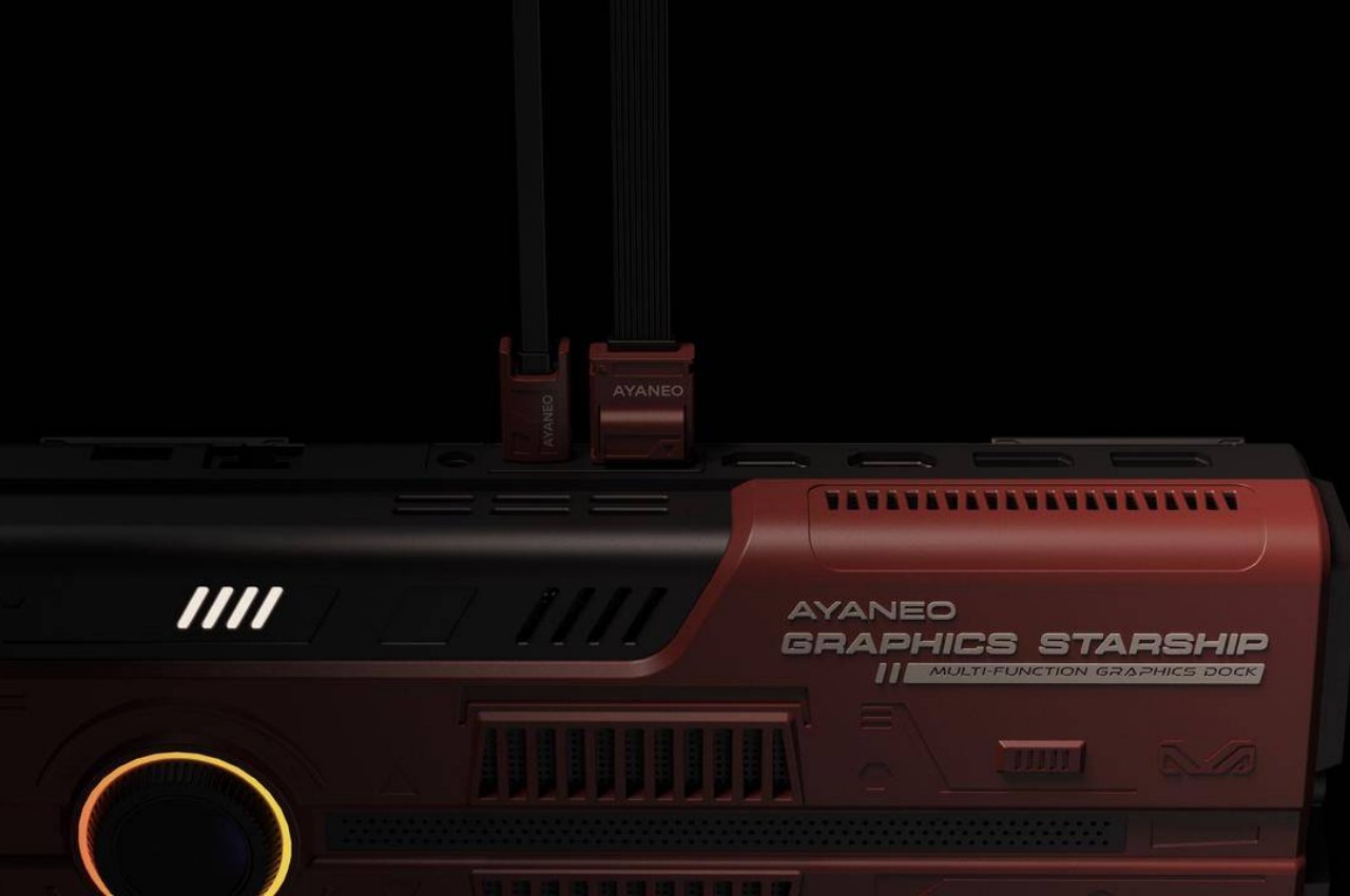
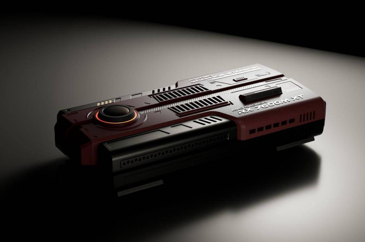
Nostalgia is a very powerful (and lucrative) emotion, but the retro designs don’t necessarily have to be just based on past products. In fact, they don’t need to be based on real things at all. Retro designs only need to incorporate elements from the past, whether that’s a historical past or a fictional one. The latter especially applies to what has become known as retro-futuristic styles that try to blend past and future in a way that makes some sense in the present. This upcoming graphics dock, intended to give handheld gaming PCs a performance boost, is one such example, bringing a unique visual accent to your workspace by taking on the appearance of a miniature spacecraft with the blocky and rugged aesthetics of the past.

Designer: AYANEO

Although external graphics enclosures have existed for a while now, it was only with the advent of handheld PCs that they started to become smaller and slightly more portable. The purpose remains the same, providing significantly more powerful graphics capabilities than the portable computer can manage, but in a form factor that can also be carried around in a bag if desired. Many of these so-called graphics docks take on the form of uninspiring rectangular bricks, but the AYANEO AG01 bucks the trend with a design that is almost literally out of this world.

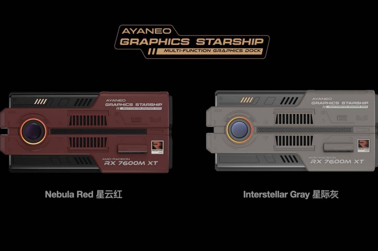
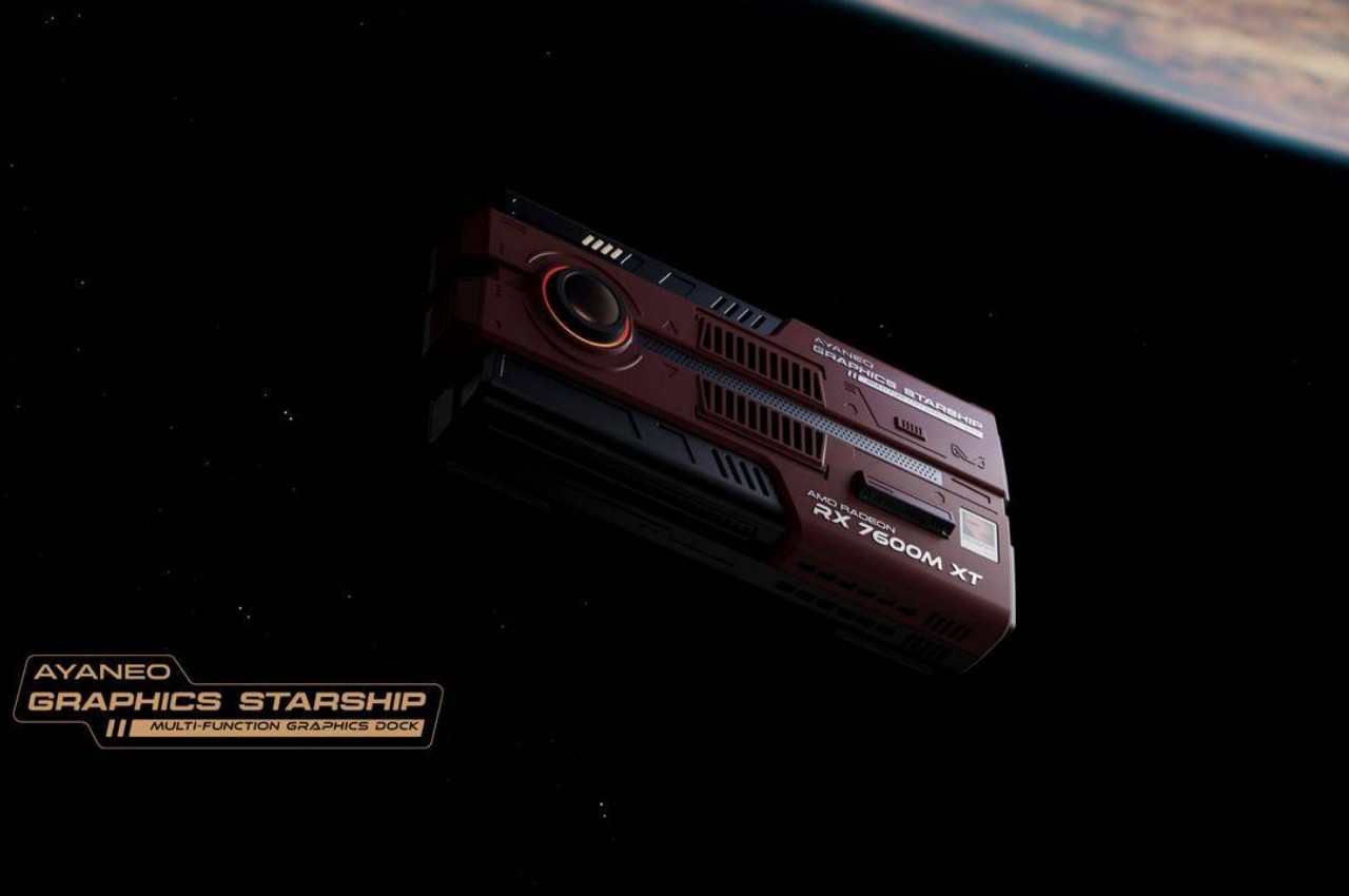
As part of its next batch of REMAKE products, AYANEO is including its very own graphics dock with a design that doesn’t really resemble any existing product from the past. The company describes it as a starship, though it might not immediately strike one as similar to those from hit sci-fi shows like Star Trek or even Star Wars. It has a more blocky shape, not unlike other graphics docks, but with an overabundance of panels and grilles. Its rough edges and dark color scheme contrast with the usual smooth curves and lighter motifs of futuristic spacecraft. This is a spaceship that humans would first produce for exploration and perhaps even militaristic action. Space-efficient, rugged, and a little menacing.

Underneath that retro-futuristic shell, however, is a very typical graphics dock, one that even houses a slightly dated AMD Radeon RX 7600M XT graphics from last year. There’s a plethora of connectivity options, including USB4 and the newer Oculink technology. It does also function as a typical data hub when connected to a computer, which means USB ports and even an Ethernet jack for faster network connectivity. Although technically compatible with any computer that supports external GPU via USB4, the AYANEO AG01 is specifically designed for the brand’s handheld gaming computers that have a significantly weaker GPU compared to laptops.

There’s also some RGB lighting, but that’s curiously limited to the ring around the dome on one end of the dock and three “vents” near it. It’s a purely aesthetic element, though one that admittedly looks too modest for what should be a space-faring vehicle. Availability details about the AYANEO AG01 are still unknown at this point, but the graphics dock’s unique design will surely catch the fancy of many collectors, whether they have an AYANEO handheld PC or not.

The post AYANEO AG01 graphics dock puts a retro-style spaceship on your desk first appeared on Yanko Design.

This adorable miniature Macintosh is actually an innovative multi-functional docking station

Laptops have become so powerful that they’ve started to rival some desktops, except for the part that they’re forever limited in how many devices you can attach to them. At most, you’ll probably have five to seven, depending on how thin the laptop tries to be. It’s not really unusual for many owners to expand their portable computer’s capabilities using hubs and docks, especially now with the use of USB-C and the related Thunderbolt technologies almost everywhere. These accessories, small as they may be, still take up space on your desk and can be a source of distraction. So why not put an eye-catching and enviable design on that dock, turning it into a unique homage to the original Apple Macintosh, one of if not the first to blaze a trail for personal computing.

Designer: RayCue

Click Here to Buy Now: $169 $249 (32% off). Hurry, for a limited time only! Raised over $145,000.

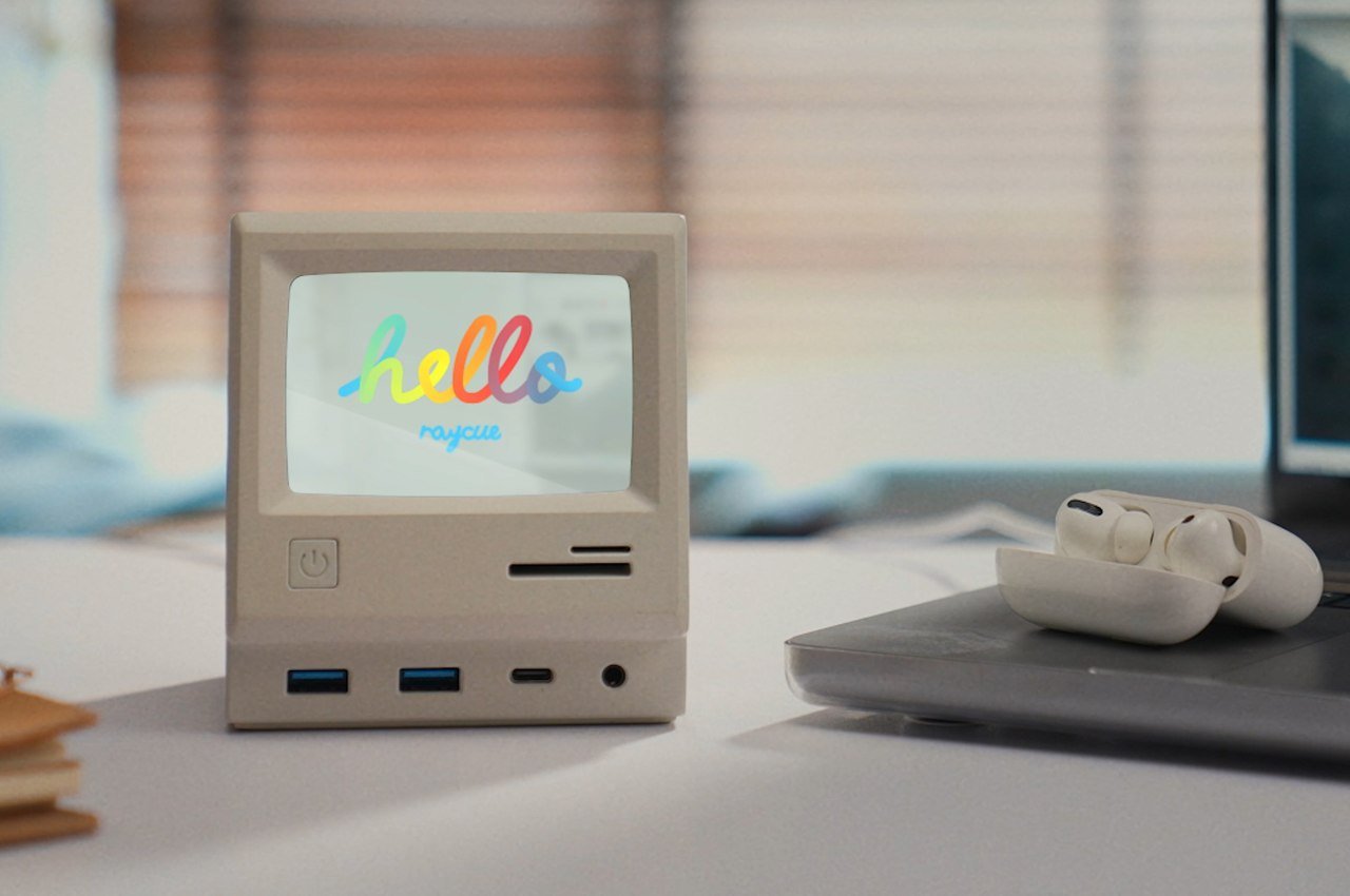
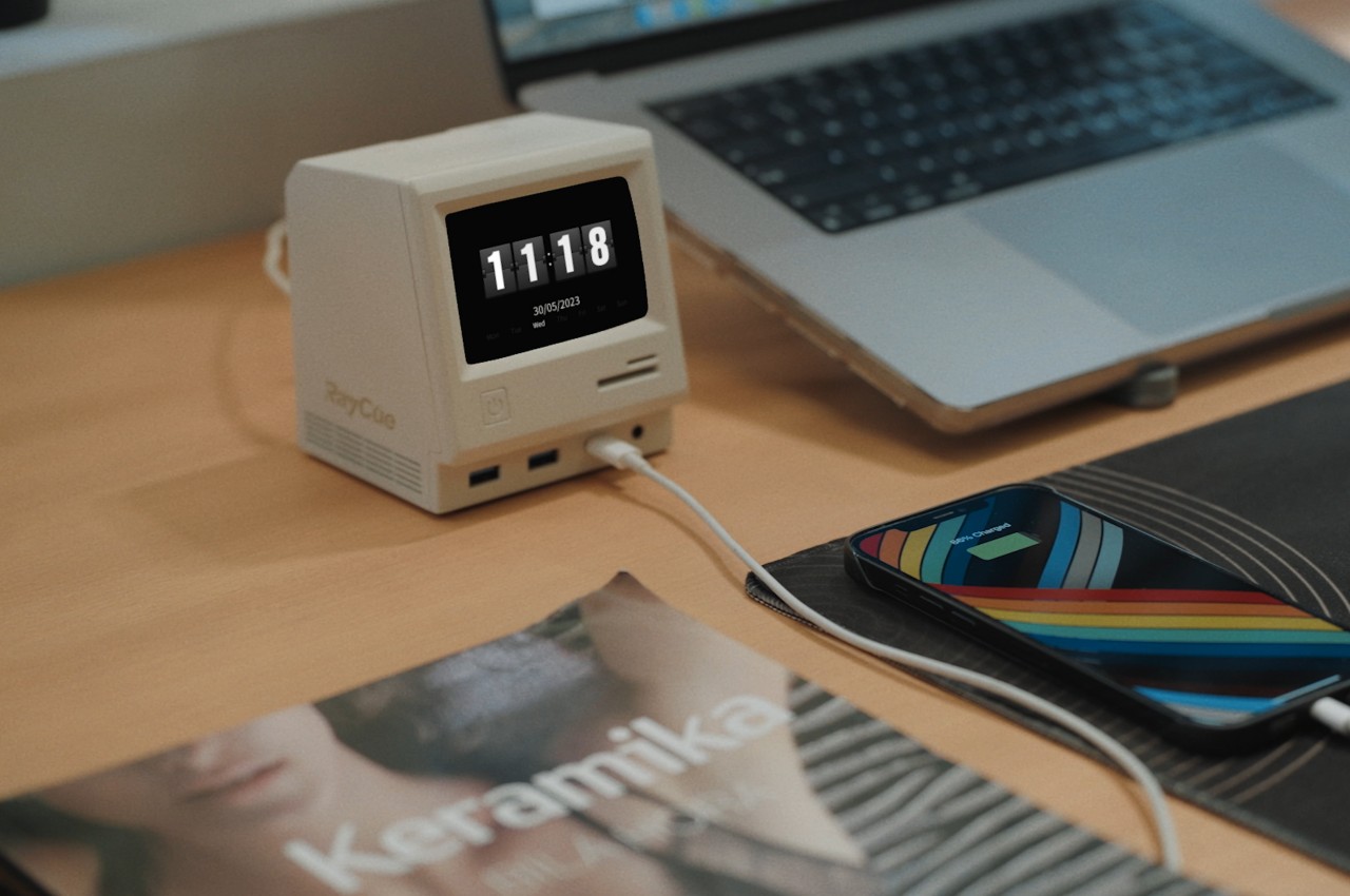
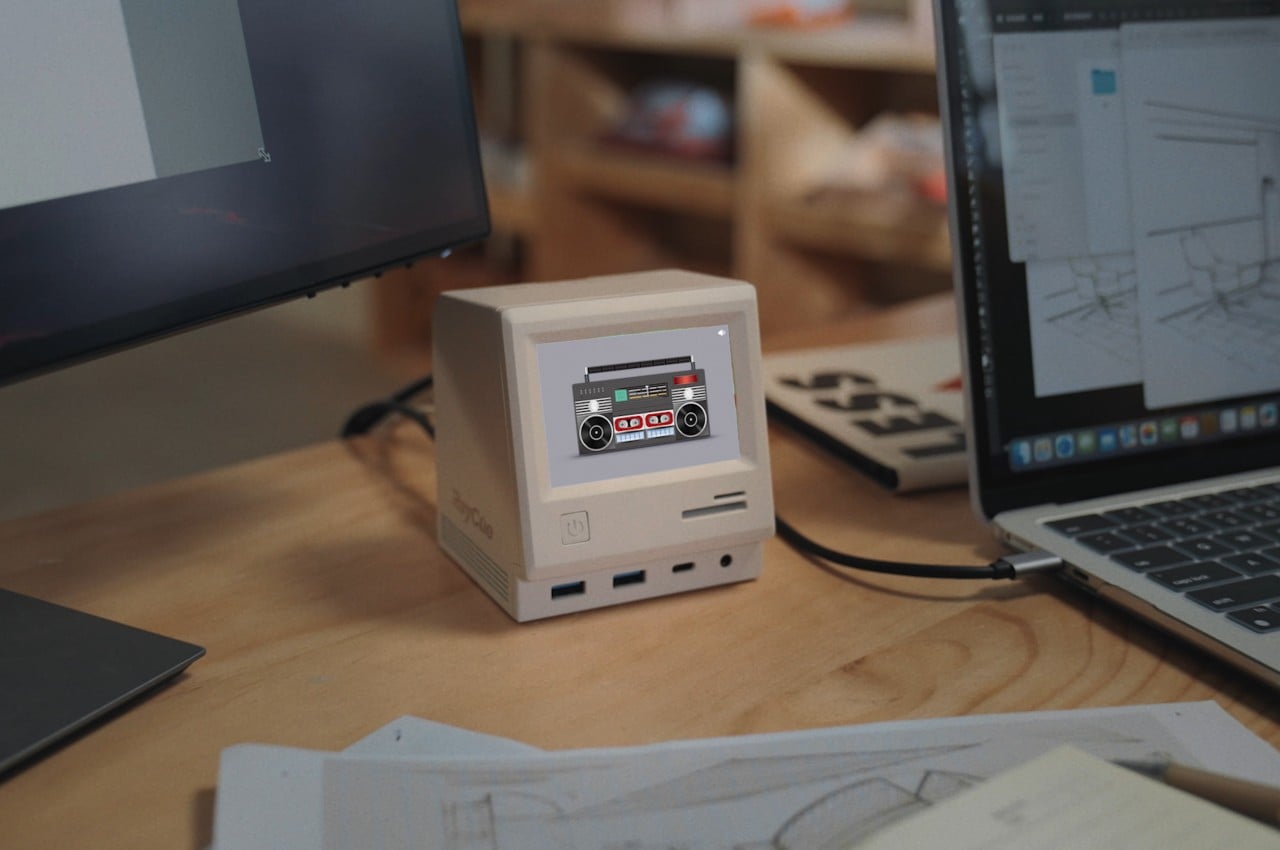
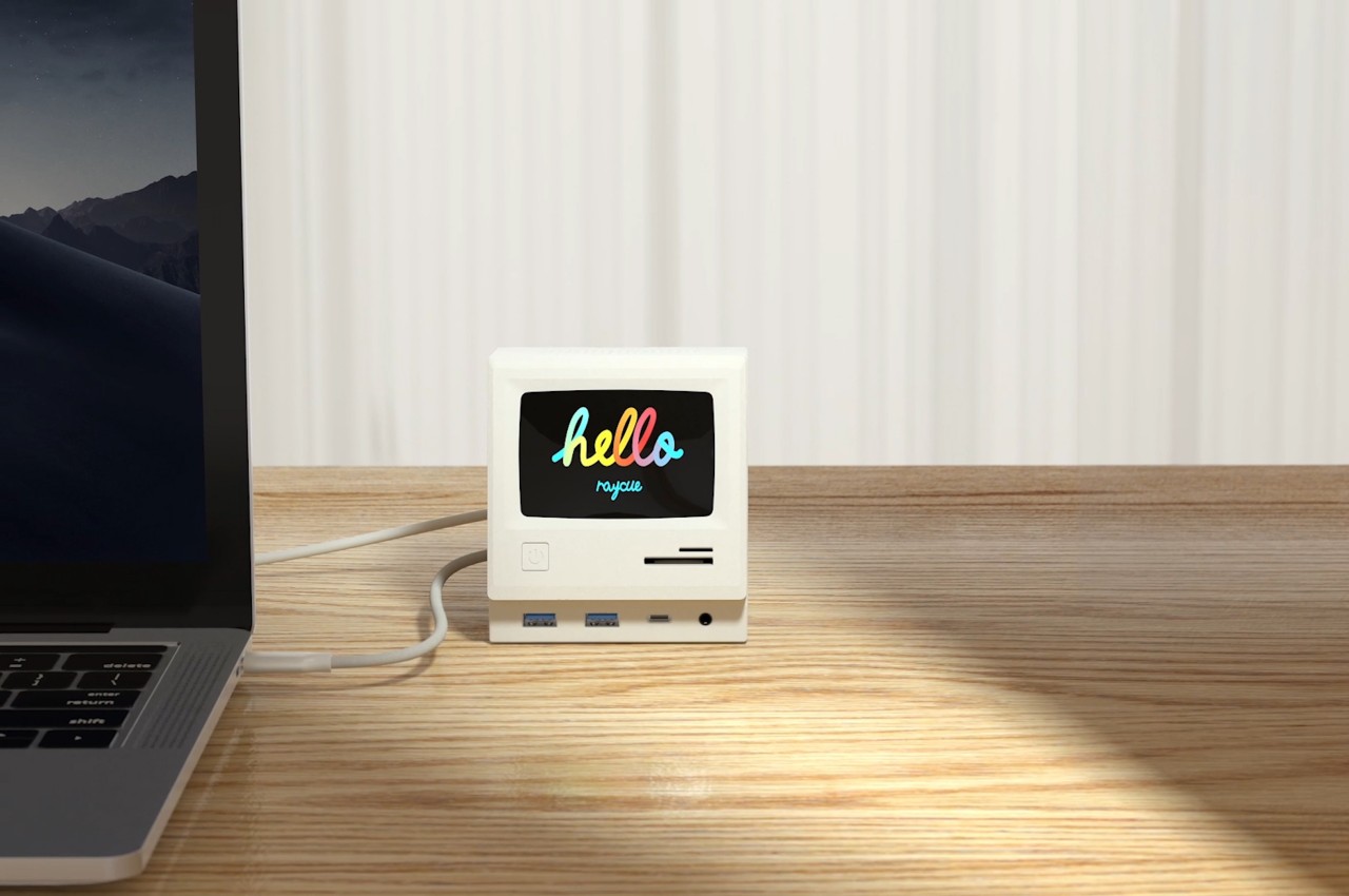
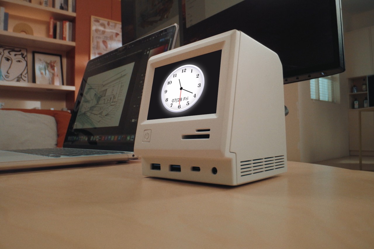
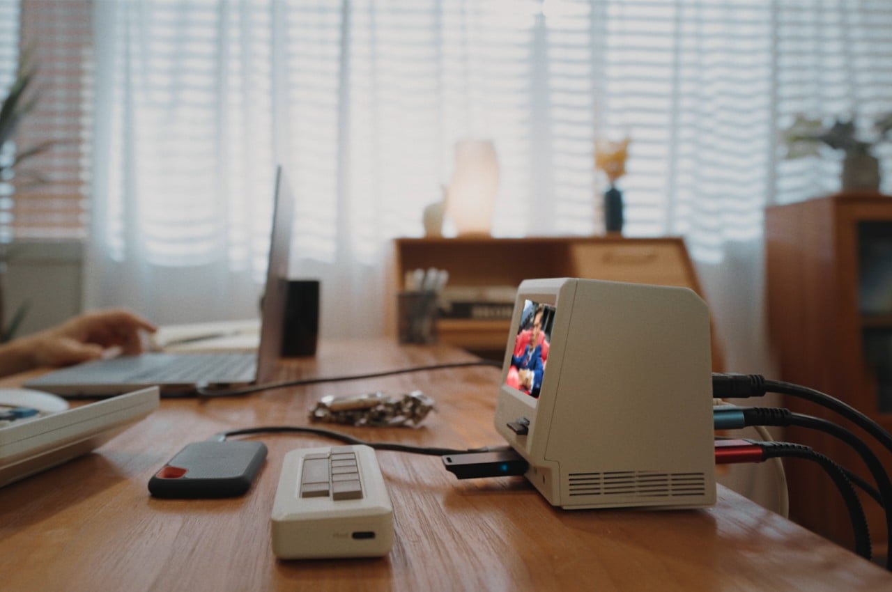
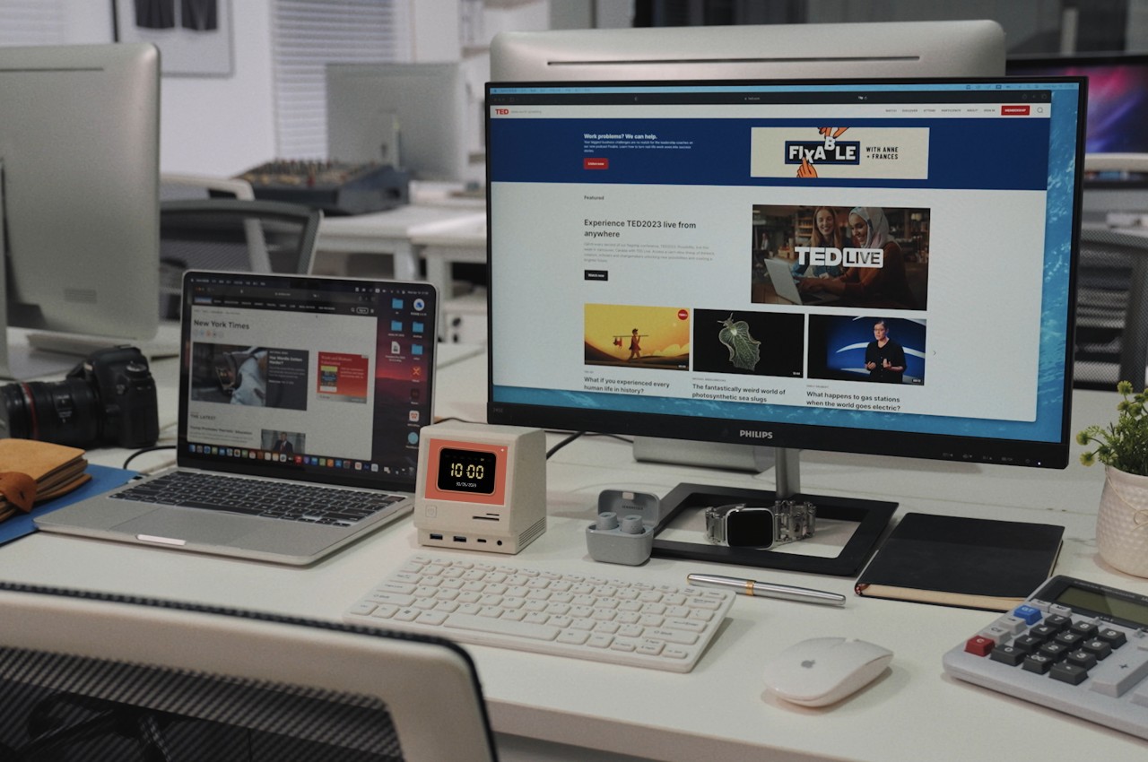
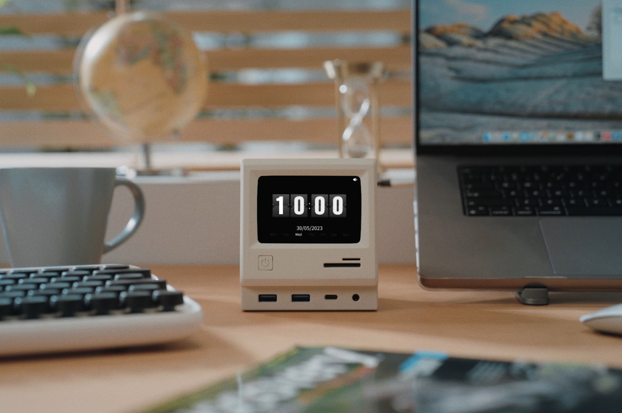
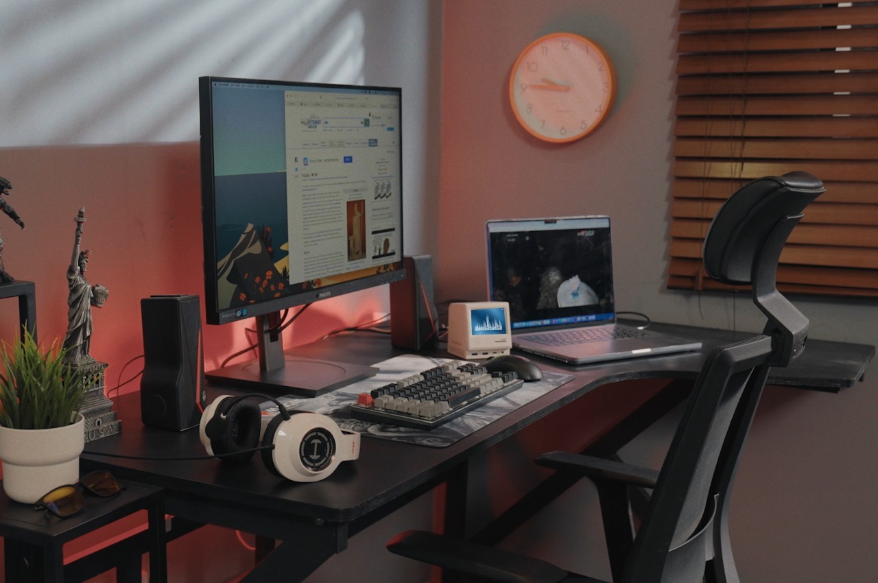
You’d be forgiven for mistaking this docking station as a fancy desktop toy, given how cute and attractive it is. The RayCue 128K is basically inspired by the design of the pioneering Macintosh from 1984, from its chunky and boxy design to its off-white paint job. There’s even a keyboard-like partner that uses the same motif to complete the faithful recreation. That design alone already makes it a worthy addition to your desk, bringing life and fun to your work, but it’s more than just a piece of eye candy. It is, after all, a docking station, but it goes above and beyond the call of duty compared to your standard docks.

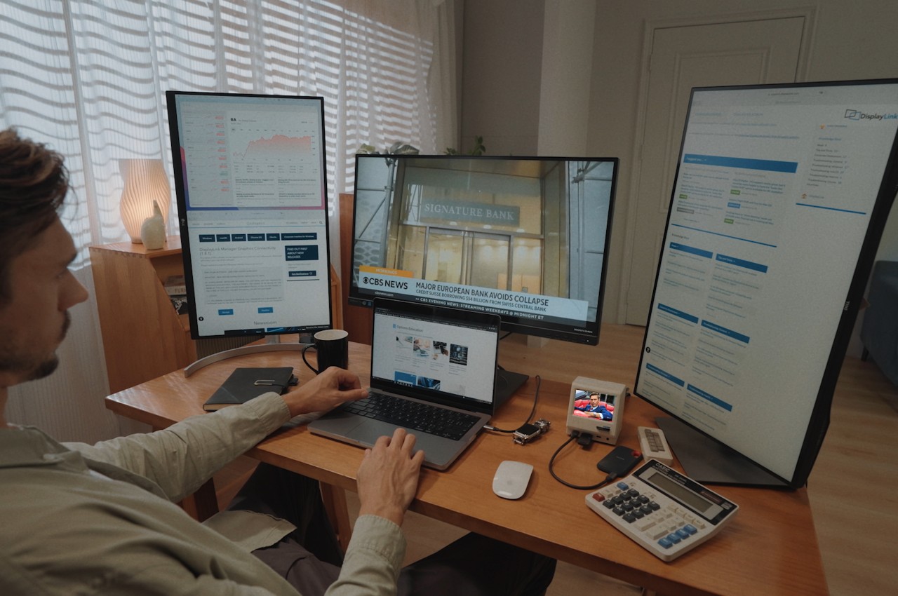
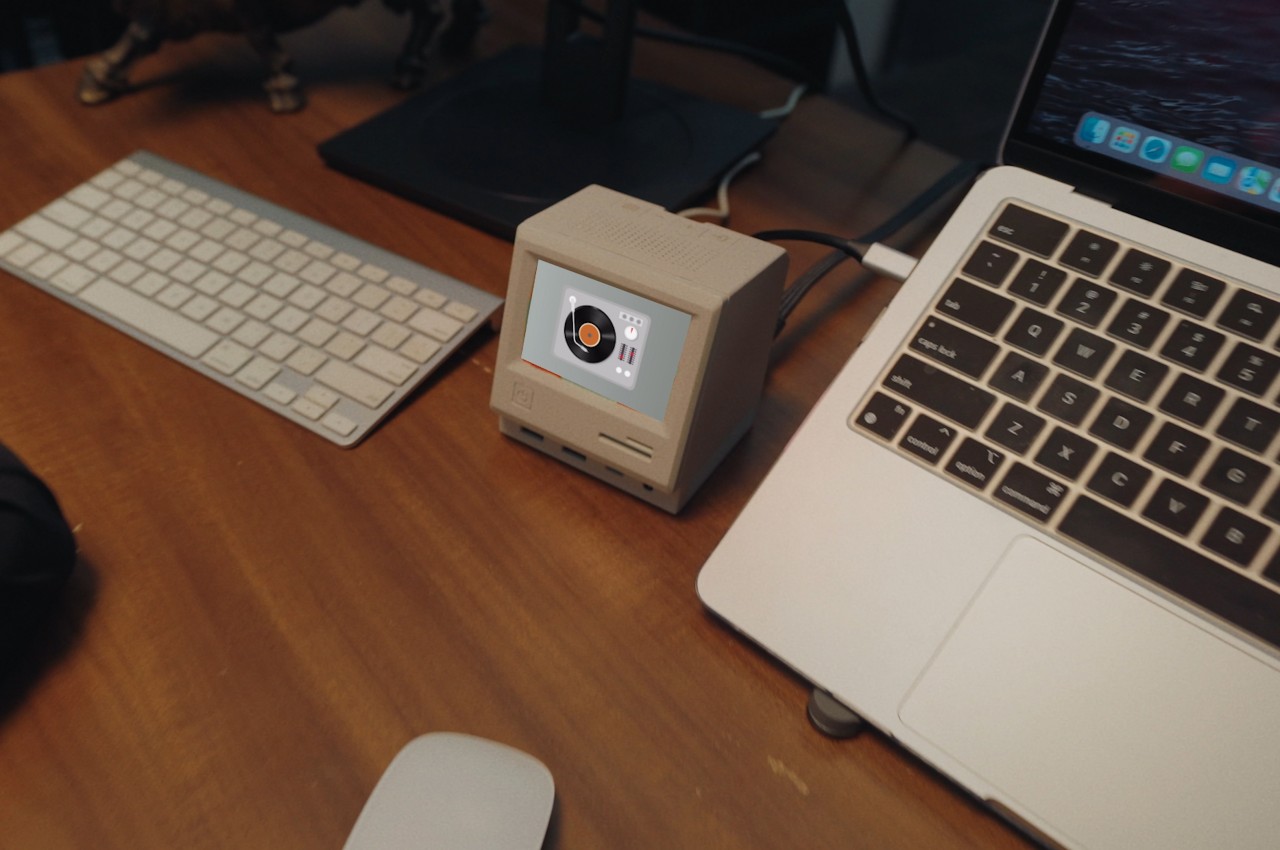
The RayCue 128K Pro, for example, boasts 14 ports of different kinds, including three different types of USB ports, SD/TF card readers, an Ethernet port, a 3.5mm headphone jack, and not one, not even two, but three 4K 60Hz HDMI ports. As if that number wasn’t already impressive, these video out ports support DisplayLink Apple MST (multi-stream transport), making it possible to connect that many extra monitors to your MacBook. With a powerful DC-in capable of accepting up to 130W of power, the RayCue 128K can charge not only your laptop but also other devices for a total of 100W of output.

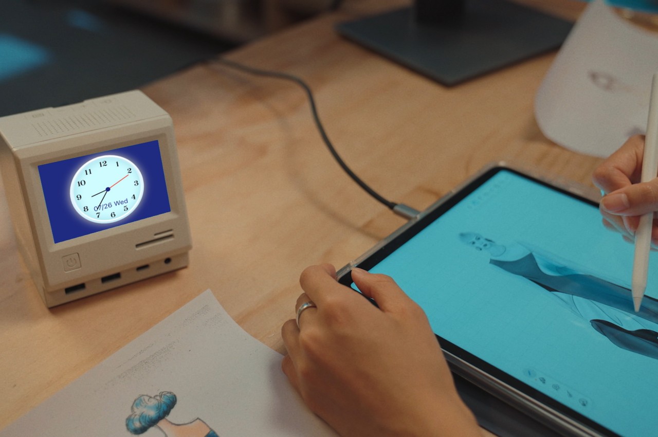
But as they say on TV, “there’s more!” The screen on the RayCue 128K isn’t just for show and is, in fact, a 3.5-inch IPS color screen that can display the time, calendar, media information, and even photos, turning the dock into a true decorative accessory to enhance your working experience. It doesn’t end there either, since the box also hides a Bluetooth Speaker, making it a jukebox to help keep your focus. It’s going to keep you entertained and productive and might even turn you into the envy of your friends.

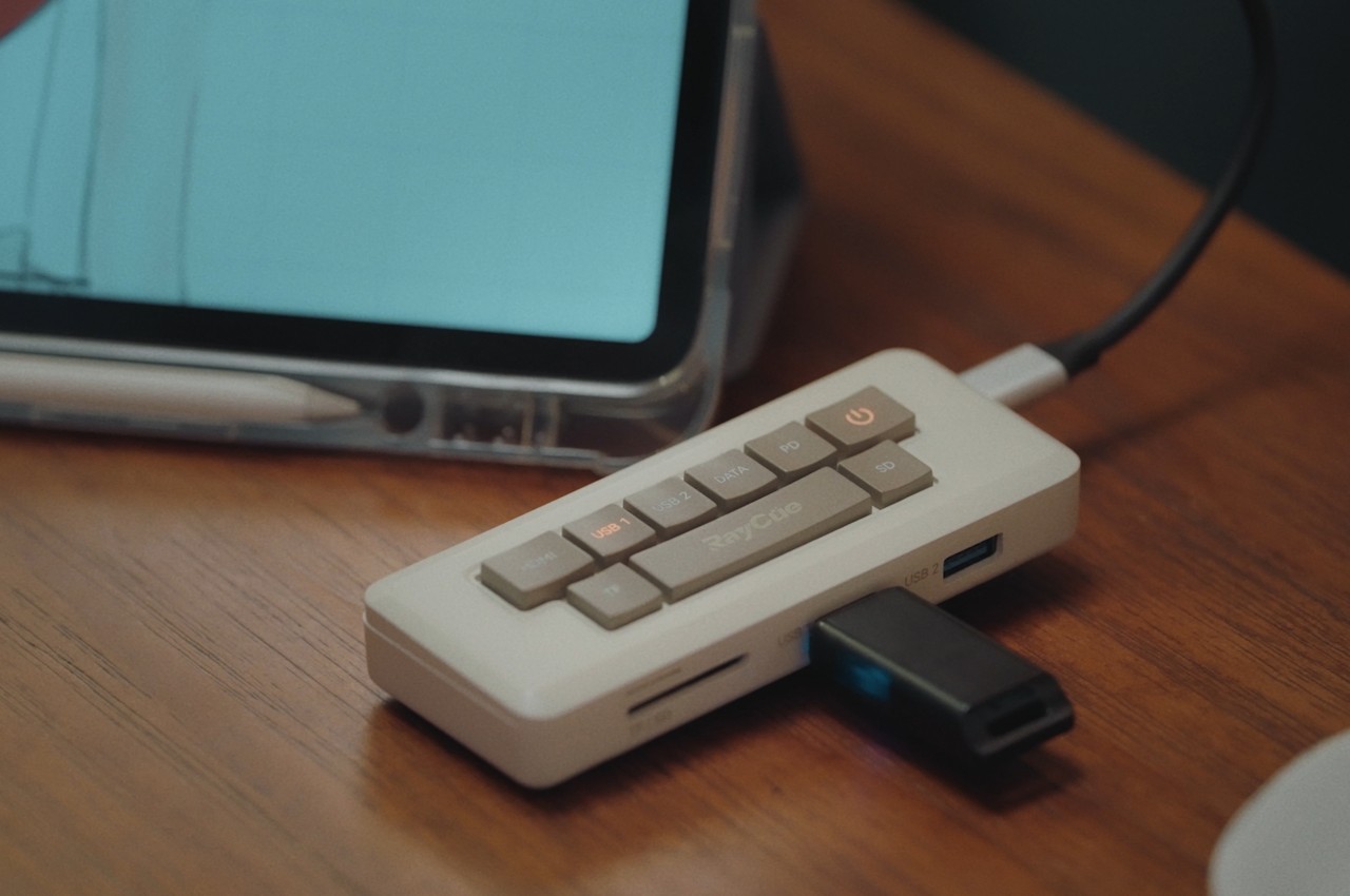
Given how it works, you can’t really take the RayCue 128K with you wherever you go. That’s where the RayCue 128K Pocket comes in, a portable 7-in-1 hub that comes in the form of a miniature Macintosh keyboard. It might not have all the bells and whistles of the Pro dock, but it still has plenty to offer, including a 4K 60Hz HDMI port and card readers. If you’re going to put a docking station on your desk, you might as well put something that offers the best impact and experience. With the RayCue 128K Pro and Pocket, not only are you getting a powerful dock and hub, you’re also getting an adorable yet functional decoration that gives a nod to the personal computer that started it all.

The post This adorable miniature Macintosh is actually an innovative multi-functional docking station first appeared on Yanko Design.

Satechi Triple 4K Docking Station gives MacBook Air possibility of connecting three external displays

In the tech-savvy world, no matter how well-equipped you are with new gadgets and accessories, eventually, you’ll be left yearning for more in just a few months. A good example is the flexibility to add not one but two or even three external displays to take productivity to a whole new level.

Now that Apple users have the option of M1 or M2-powered Macs, the longing for clawing further the flexibility of a multiscreen setup for a dedicated workstation setup is more than ever. To the party arrives Satechi with its reliable accessory set to change how Apple users interact with their peripherals. It’s already sounding lucrative, isn’t it?

Designer: Satechi

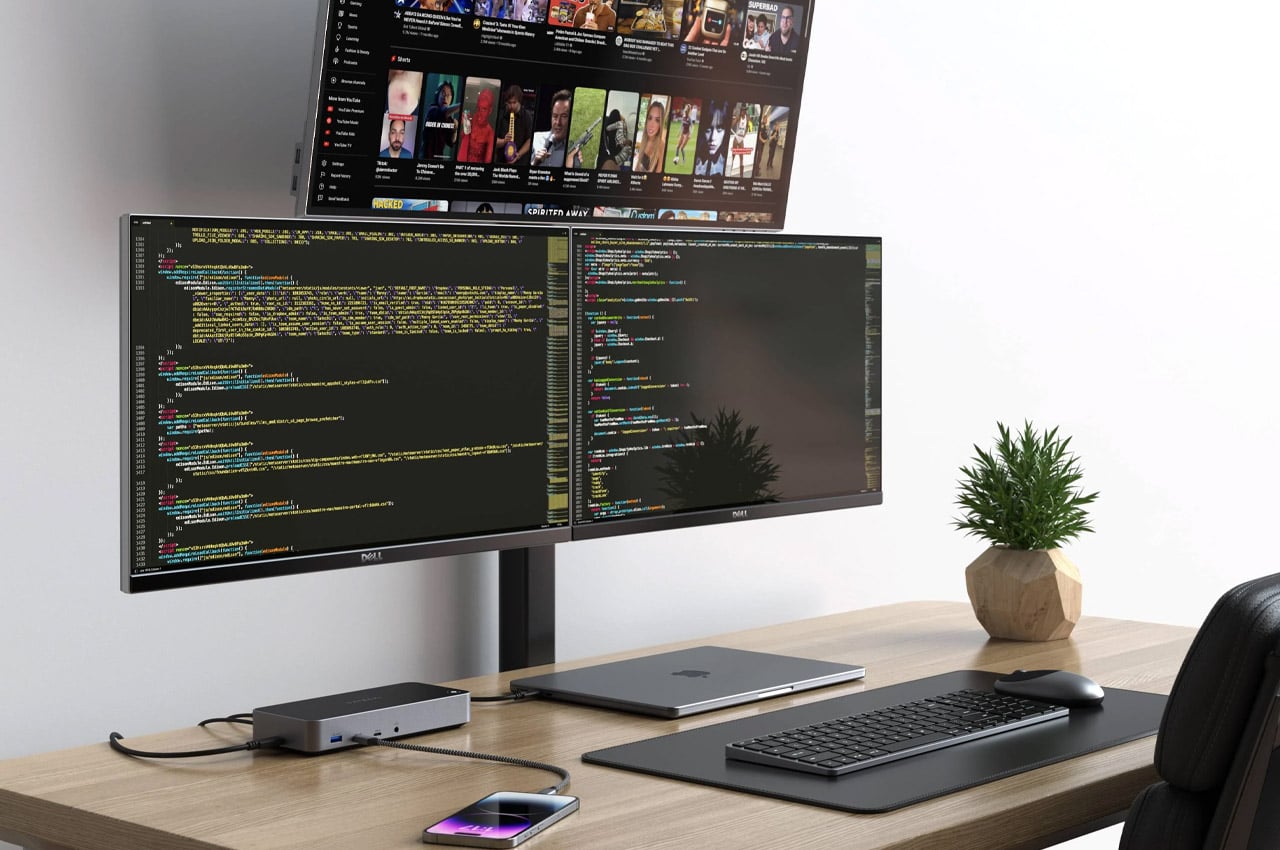
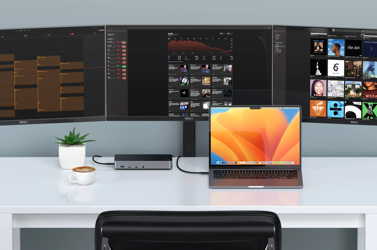
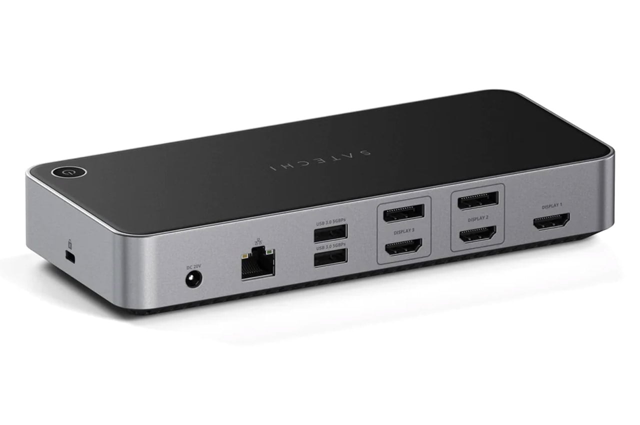
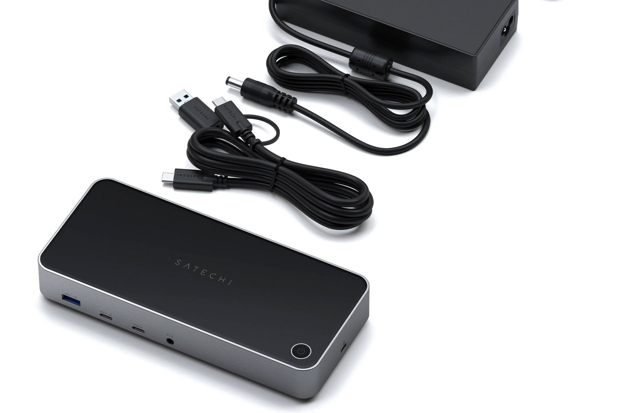
Just in time for the 15-inch MacBook Air, Satechi has announced a docking station to turn your Mac into a full-blown workstation. This will come in handy for power users who want to have the flexibility to extend their workstations with extra displays. Dubbed Triple 4K Docking Station (quite on point), the accessory is perfect to expand the inherent limitations of the Mac. For the M1 which is limited to a single monitor or even the M2 which can be extended to two screens, the dock makes complete sense as it bypasses the inherent limitations.

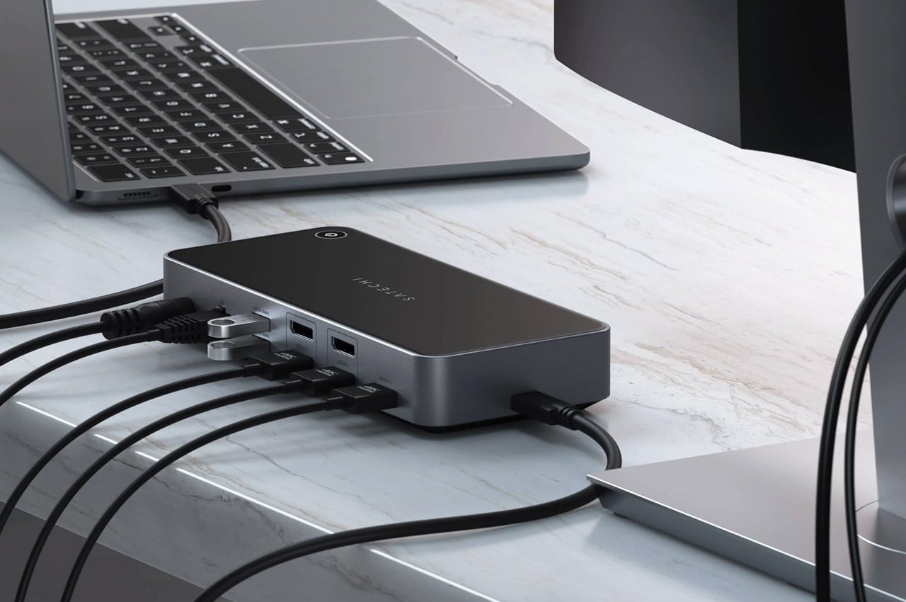
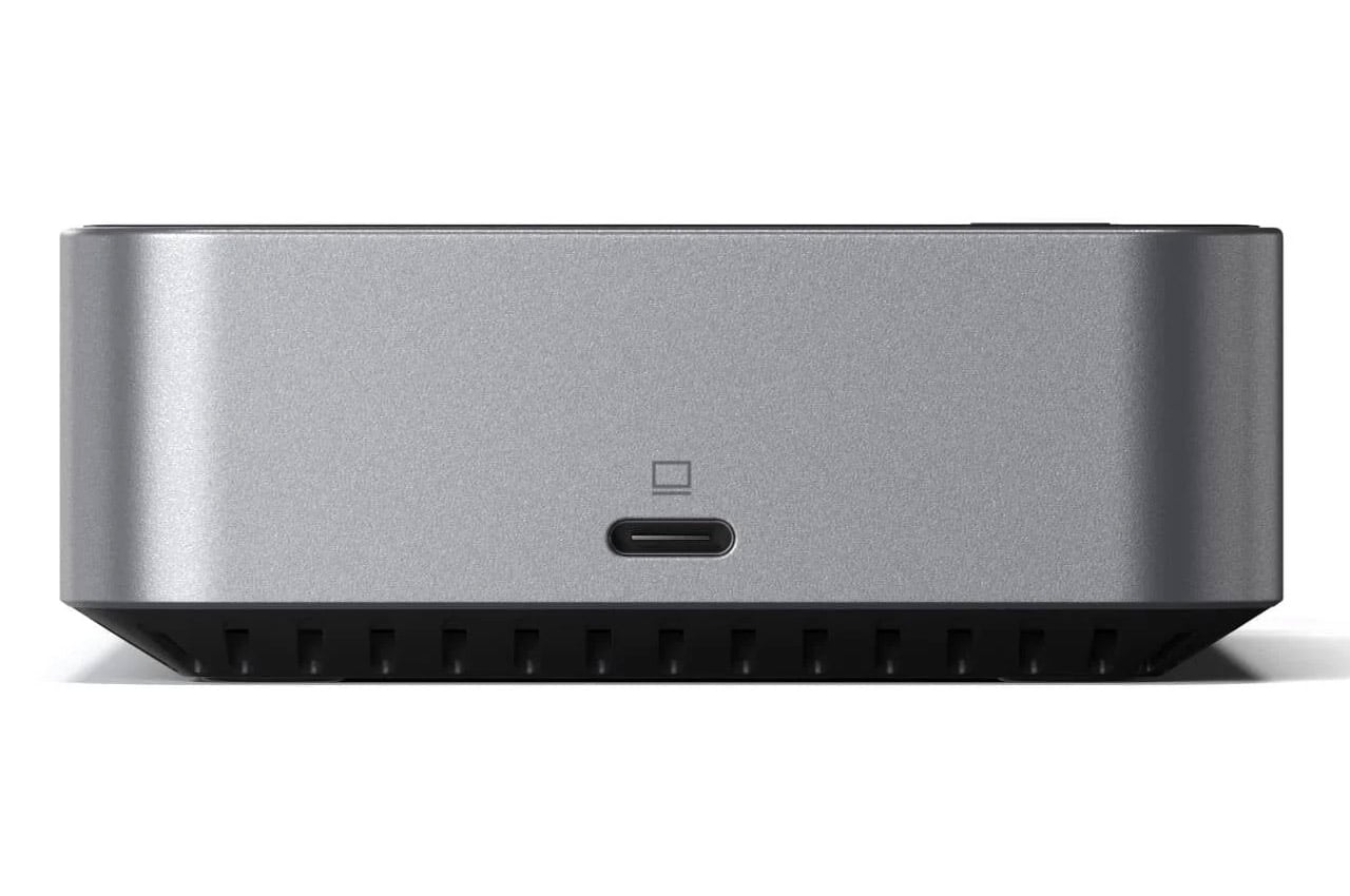
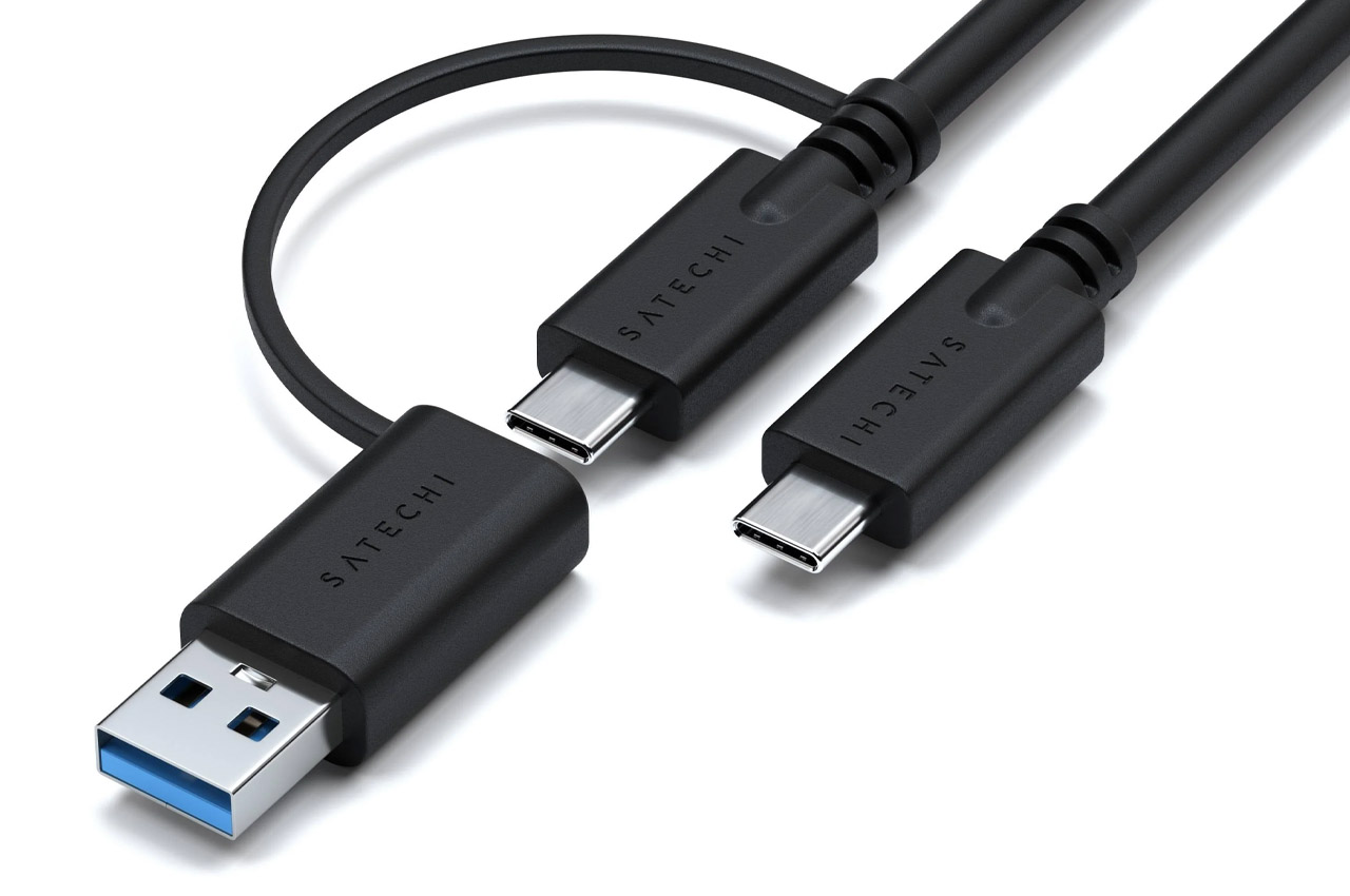
Extending to three extra displays, the dock provides a 4K HDMI port at 60Hz, and a pair of HDMI slots or the DisplayPort outputs. Also, there are a couple of 5Gb/s USB 3.0 ports and Gigabit Ethernet ports on the rear. On the front, there’s a USB-C host connection slot, USB-C slot, USB 3.1 port and a 3.5mm headphone jack.

To make sure all the connected peripherals are adequately powered, Satechi has opted for a stellar 130W power supply. Also, the side host comes with an impressive 100W pass-through charging to keep any laptop charged all day long.

Satechi Triple 4K Docking Station is compatible with both Windows and Mac systems. You can get the dock for $300 right away to extend the possibilities of work.

The post Satechi Triple 4K Docking Station gives MacBook Air possibility of connecting three external displays first appeared on Yanko Design.

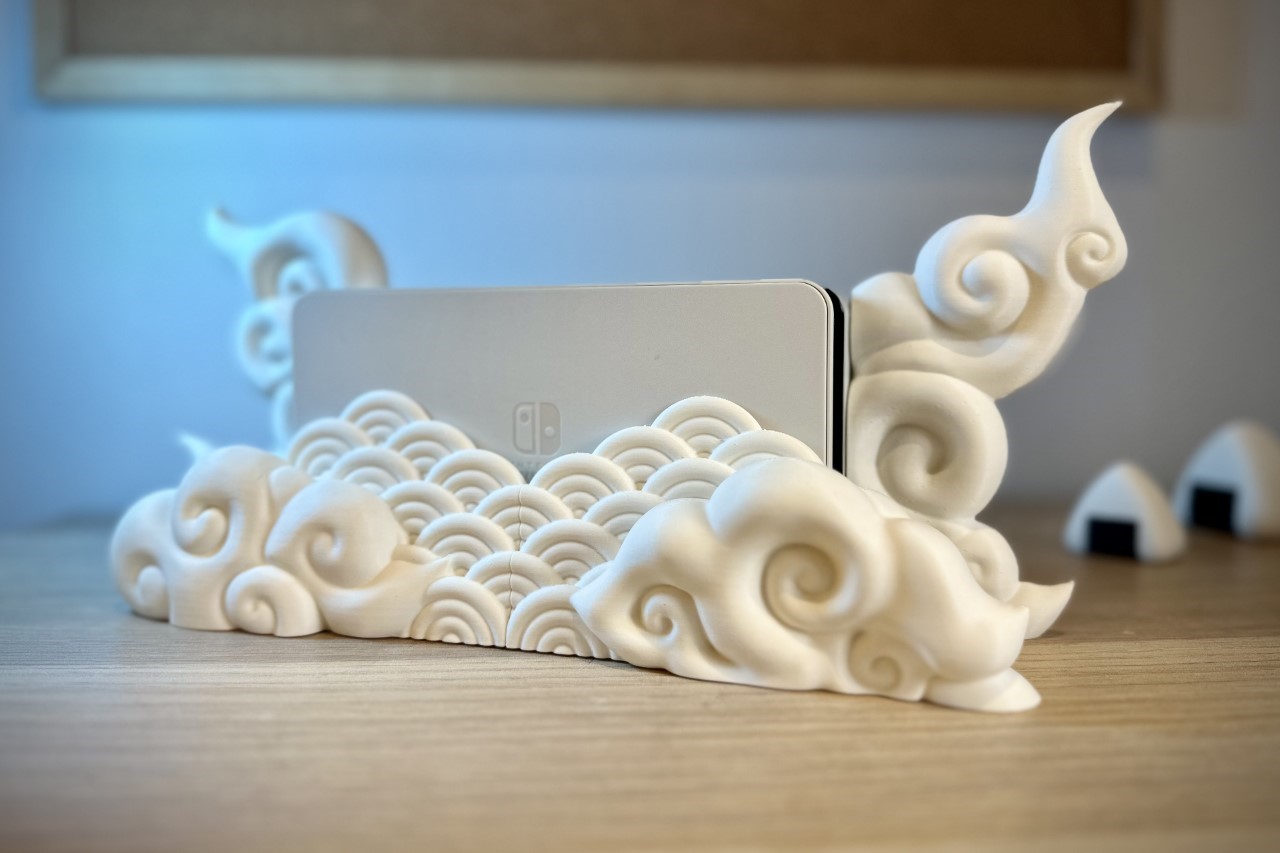
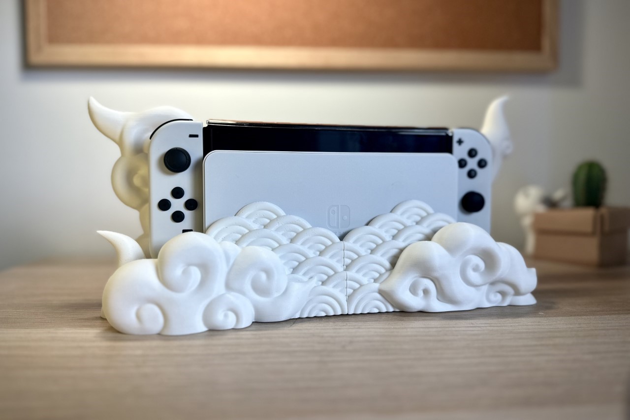
Gorgeous 3D-printed Nintendo Switch dock makes your gaming console rest on Japanese zen clouds

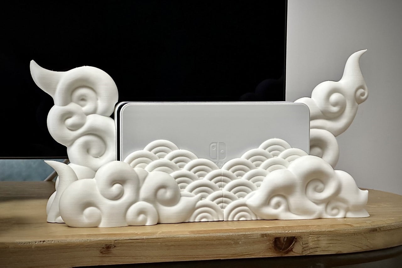
With a two-part design that snaps together right around your existing Switch dock, this rather whimsical 3D print from Holoprops elevates your gaming console in an aesthetic sense! Designed to make it look like your Switch is nestled amongst Japanese clouds, Holoprops’ dock really turns your piece of tech into beautiful sculptural home decor. Moreover, the model is also carefully designed to make sure it doesn’t obstruct the airflow of the Switch while it’s docked or the cables at the back.

Designer: Holoprops

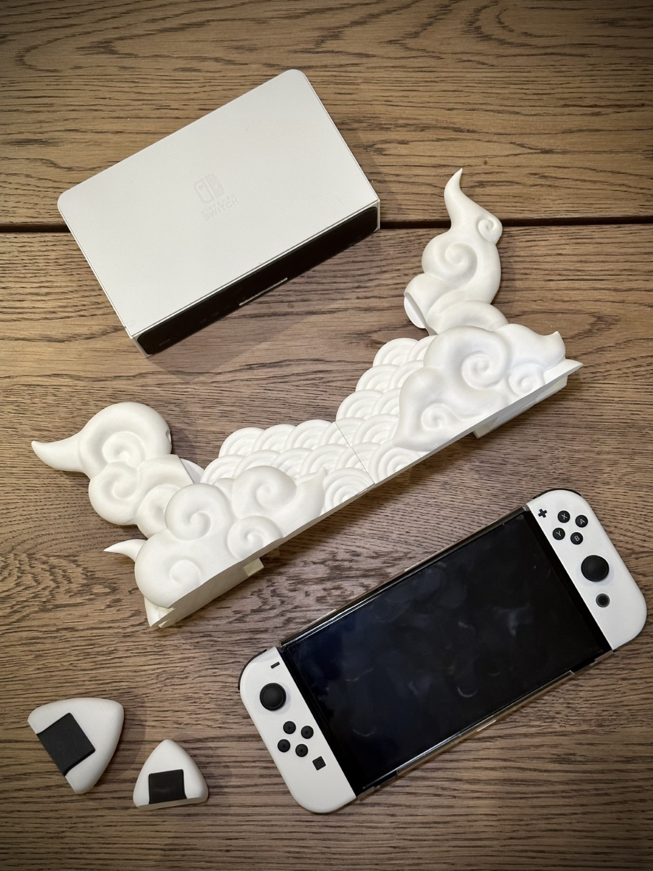
The Japanese Cloud Dock takes inspiration from the ‘Kumo’, or the Japanese cloud motifs often found in arts, prints, and even in traditional clothing (the Kumo patterns can be popularly found in kimono designs). The dock comes in two parts and can be printed without any support structures. Once printed, the two parts simply snap into place, creating a single sculptural unit that can fit both the Switch Classic and Switch OLED variants.

The Japanese Cloud Dock does give the Nintendo Switch a unique aura, taking it from gaming device to home decor in a way that really adds a certain element of fantasy to your home. You could place it on your coffee table, TV console, or anywhere you would keep your Switch dock, and its blank canvas is also perfect for a nice custom paint job!

While the dock isn’t readily available for purchase, the 3D STL file can be bought on Cults3D for a small sum of $3.37 (with instructions on how to print it effectively too). You can then print your file in any color, using single or multi-color filaments, or even making it translucent for a more dreamy effect. If you want to kick things up a notch, try adding a few LEDs underneath to really make your console shine! Once purchased, the 3D file is yours to keep, and you can print as many units as you want. Holoprops even will allow you to sell your prints (all you need to do is contribute to their Patreon page).

The post Gorgeous 3D-printed Nintendo Switch dock makes your gaming console rest on Japanese zen clouds first appeared on Yanko Design.

Anker Docking Station Monitor Stand frees some more room on your desk

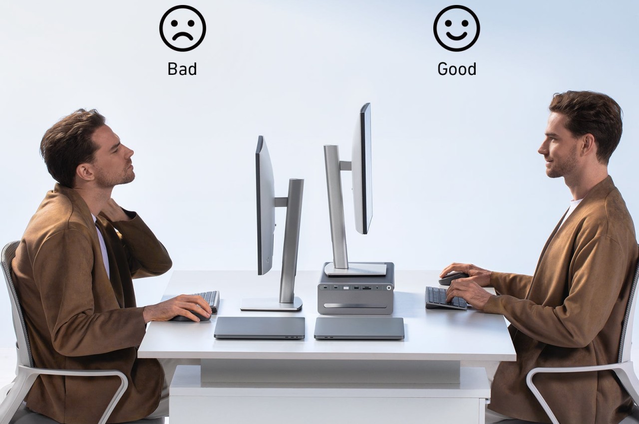
Organizing your desk can be one of the most stressful chores of your life, especially if you have a mix of both analog and digital tools that you need to get stuff done. In addition to keeping everything in its proper place, cable management can become a necessity if you don’t want to let your desk look like a jungle. That’s not even considering yet the ergonomics involved, particularly when it comes to the proper monitor height to save your neck end eyes from strain. With so many factors to consider, it might come as a surprise that there could be one product that addresses all three at the same time, but that is exactly what Anker is proposing with its upcoming Docking Station that lets you get work done by getting unnecessary stuff out of the way.

Designer: Anker

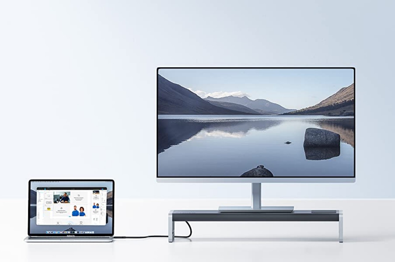
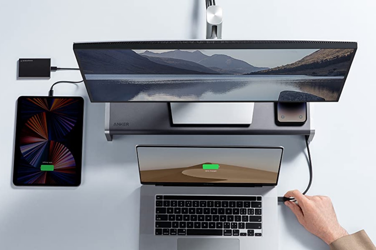
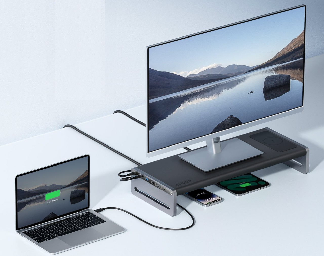
There are plenty of monitor stands in the market today designed to elevate computer screens to a more ergonomic height. Most of these do that and only that, which could be fine if you simply need something that props your monitor up a little higher. The new Anker 675 USB-C Docking Station, however, offers a lot more and helps get most of those pesky cables out of sight and out of mind, allowing you to deal with only the ones that you really need.

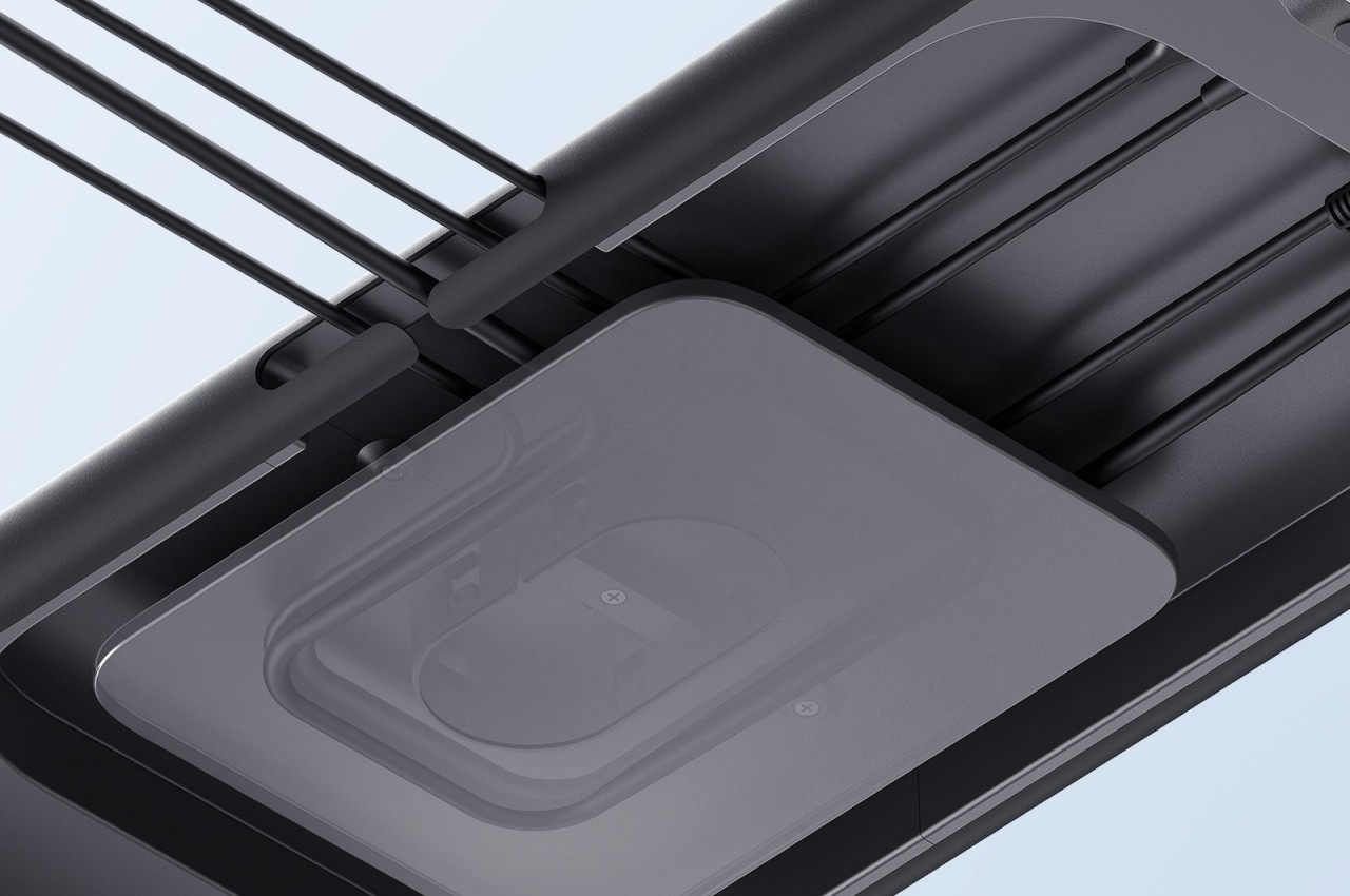
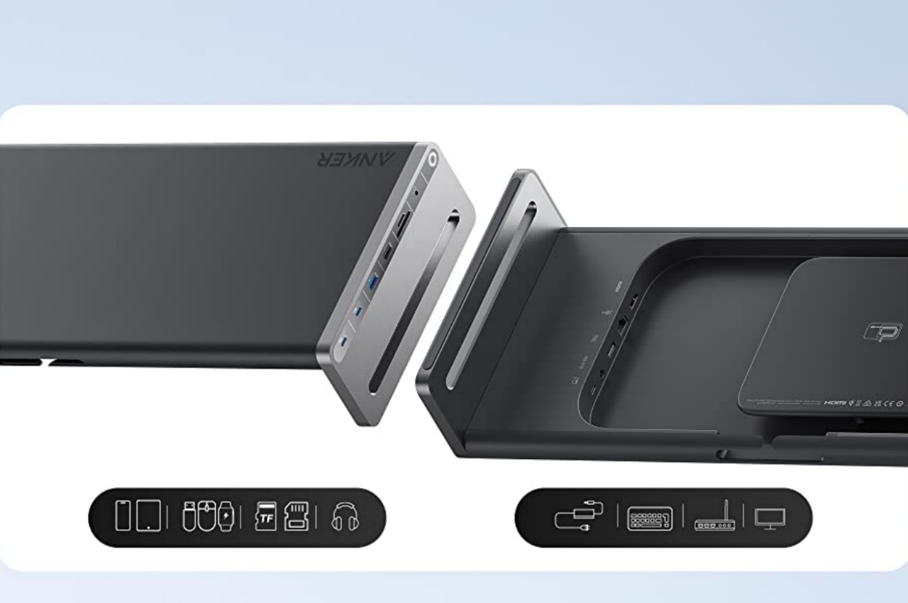
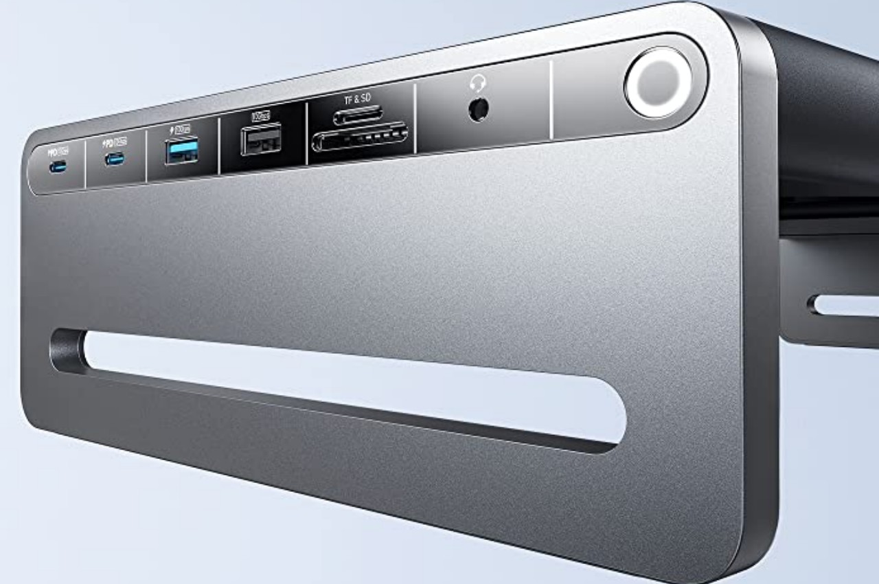
As its name suggests, this Anker Docking Station is really a hub of ports, and it definitely has plenty of those to go around. You won’t be lacking USB-A and USB-C ports, but there is also an HDMI port for your computer screen. There’s even a data card reader, so you won’t have to connect a separate peripheral for those one-off SD or microSD cards from cameras and devices. The most frequently accessed ports are placed on the left side of the dock for quick access, while others are hidden beneath the surface to prevent your hands from tripping over them. And as a bonus, there’s a wireless charging pad on the right side that supports most modern phones.

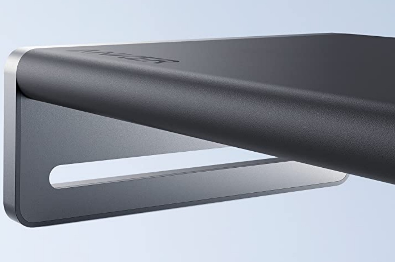
Unlike typical computer docks, the Anker 675 is a stylish accessory that won’t look out of place on your minimalist desk design. Made of aircraft-grade aluminum alloy, it’s surface can support a wide range of monitor sizes. The curved edges and corners give it an aesthetically pleasing form, which is just the break that your eyes and mind need when dealing with the pressures and stress of work life. Additionally, the empty space it leaves below is a perfect storage space for documents or even other devices that you want to keep within arm’s reach, even if they’re not immediately needed.

Keeping your desk tidy doesn’t always have to be a chore, even with all the cables running to and fro devices. The Anker 675 USB-C Docking Station Monitor Stand offers just the right amount of cable management to get these wires out of your hair while leaving some breathing room for the rest of your tools on your desk. Anker’s new product launches on January 30 for $250.

The post Anker Docking Station Monitor Stand frees some more room on your desk first appeared on Yanko Design.

This USB docking station has a novel way to keep your desk cable-free

In the past, the biggest source of clutter on people’s desks was paper that’s strewn around or stationery that hadn’t been returned to its proper storage. While those can still cause a mess on any surface, they’re relatively easier to tidy up by putting them back where they belong. As computers become more common in offices and homes, the cables that come to and from these machines have become even more problematic in maintaining a clean and neat worktable. It’s not as easy to get rid of these without losing functionality unless you go completely wireless, which carries its own set of drawbacks. Cable management solutions try to hide these essential eyesores from sight, but this docking station gives it a bit of a twist to make sure it doesn’t sacrifice accessibility in the process.

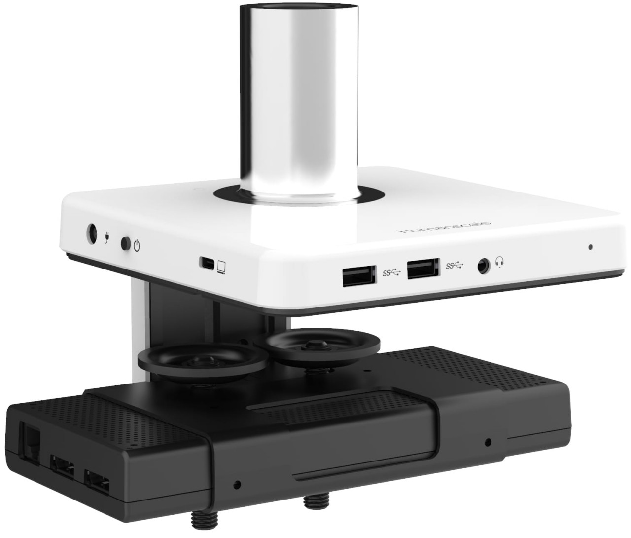
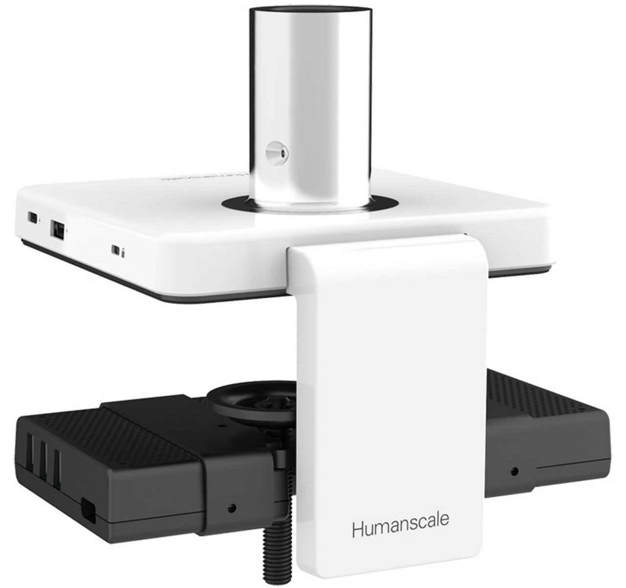
Designer: Humanscale Design Studio

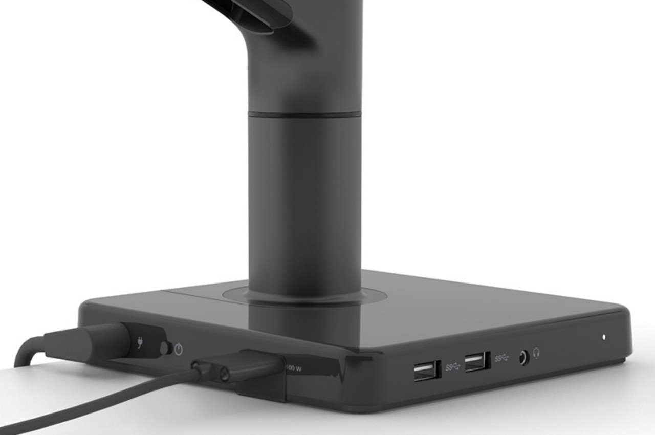
Most cable management solutions don’t simply organize computer and accessories cables to prevent them from going in different directions. Plenty of them, including those built into desks, also hide them from sight to keep them out of mind. There are USB docks and hubs that go under desks for that same purpose, but it comes at the cost of making it harder to actually plug and unplug peripherals quickly. Having the hub on the table, however, keeps things in the same place but isn’t as presentable as craftily hidden cables.

Humanscale’s M/Connect 2 works on the principle that not all of these cables and USB devices aren’t created equal. Some are rarely removed once they’re plugged in, like power cords, monitor cables, and even wired keyboards. Others, like dongles and external drives, do get inserted and removed multiple times, sometimes in a single day. This USB docking station’s solution is to actually split the ports between these two kinds of cables and hide those that don’t change often.

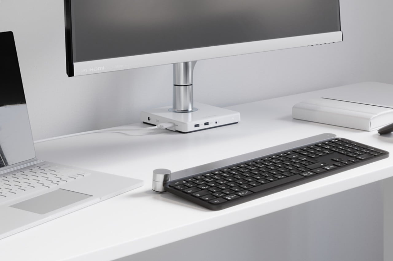
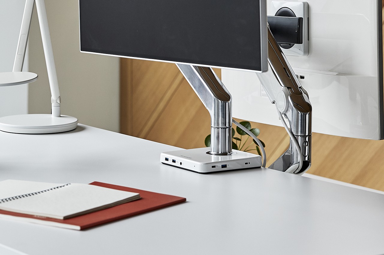
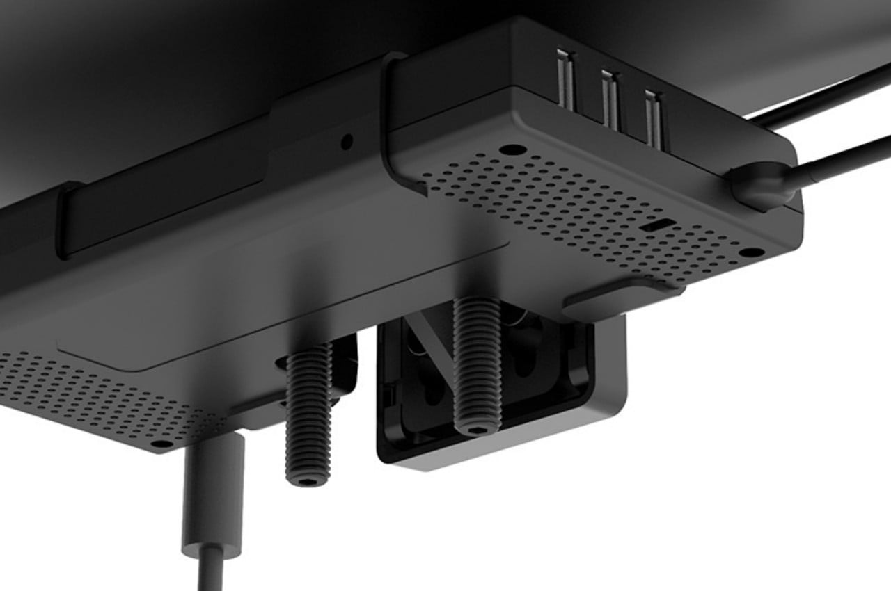
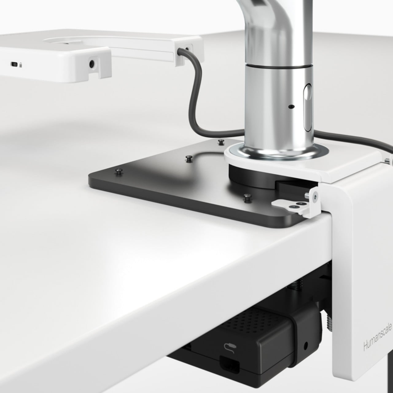
M/Connect 2 is designed like a clamp that attaches to an edge of a desk, preferably on the back, with ports above and below the table. The ports that are on the half underneath the desk are for cables and wires that can be conveniently hidden from view. The top half is practically a USB and Thunderbolt hub that provides the necessary ports for more transient devices and peripherals. This part is also modular so that the hub can be removed for repairs without having to disassemble the entire contraption.

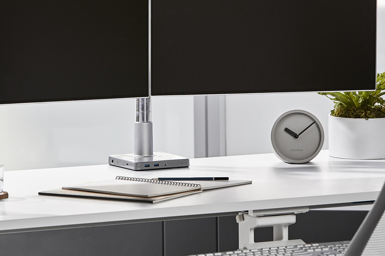
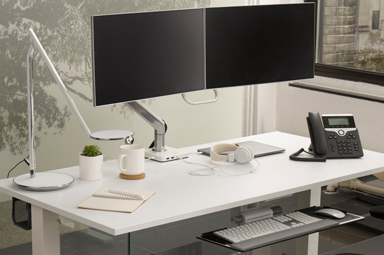
Another thing that makes the M/Connect 2 different from other docking stations is that it can be used in conjunction with a monitor arm to further reduce the amount of desk space that your computer accessories occupy. It can be used without such a monitor, too, making it a very versatile piece of equipment. Of course, it also looks quite elegant on top of any desk, which helps add to the ambiance that this innovative cable management system provides.

The post This USB docking station has a novel way to keep your desk cable-free first appeared on Yanko Design.

This cute robot is the perfect dock for your faithful smartphone companion

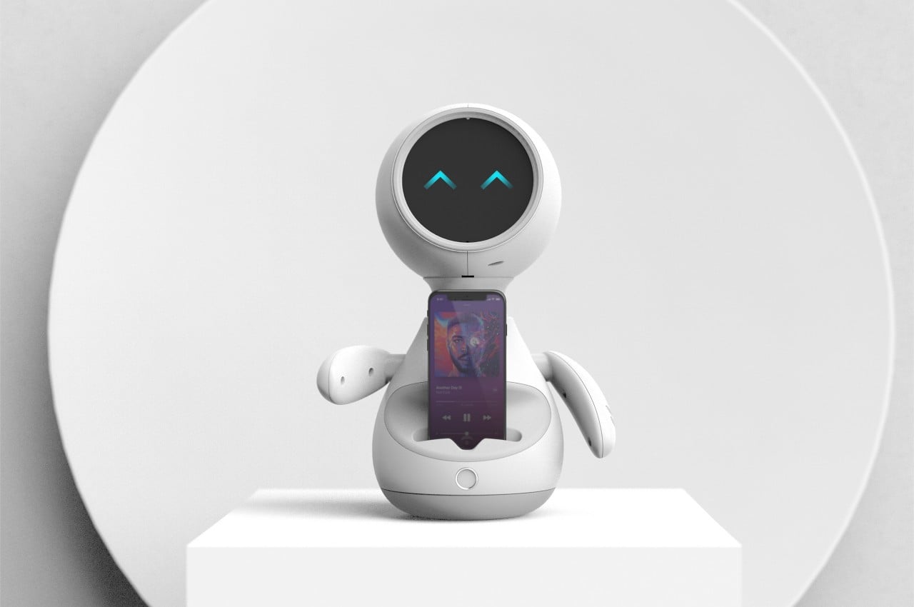
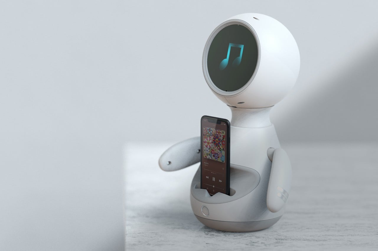
We shouldn’t really be holding our phones all the time unless we’re actually working on or with our phones. The chances for distraction are too high when you have your mobile device too near, but the FOMO (Fear Of Missing Out) syndrome is just too strong for some people. There are plenty of stands and docks that welcome your phone with open arms, but most of these feel too technical or even clinical to assuage our apprehensions. In contrast, this little desktop robot is more than just welcoming; it’s almost as if it’s embracing your smartphone to give its owner a bit of emotional support through features and expressions that seem to convey your smartphone’s feelings while separated from your hands.

Designer: Jinkyo Han

There is no shortage of accessories that provide a temporary home for your transient smartphone. Some are simple stands that prop up the device so that the screen is always visible, while others give the chance to recharge your phone while resting. There are even some that can turn a phone into something like a smart home display or smart speaker with a screen. The Robot concept named Ribo isn’t as sophisticated as that, but it does offer a more emotional and human experience instead.

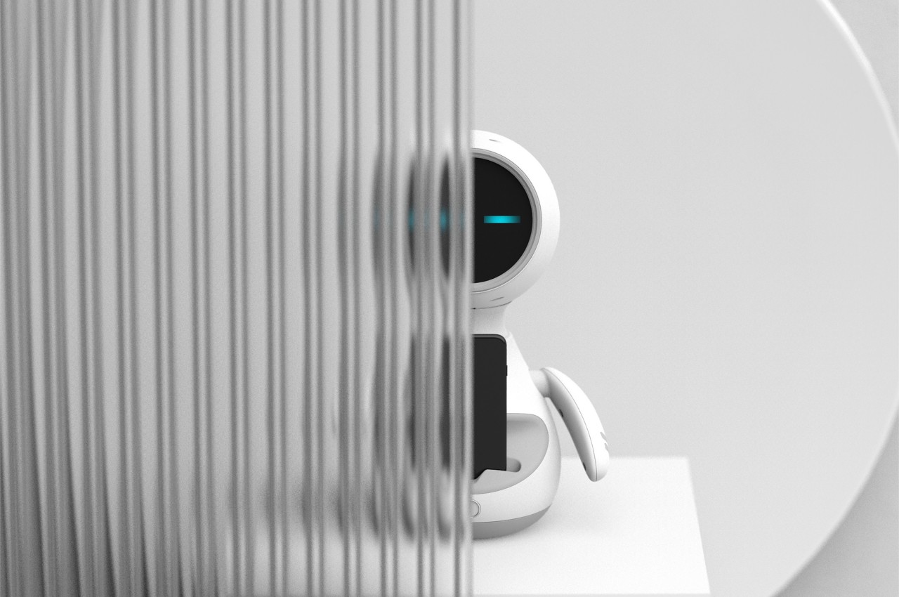
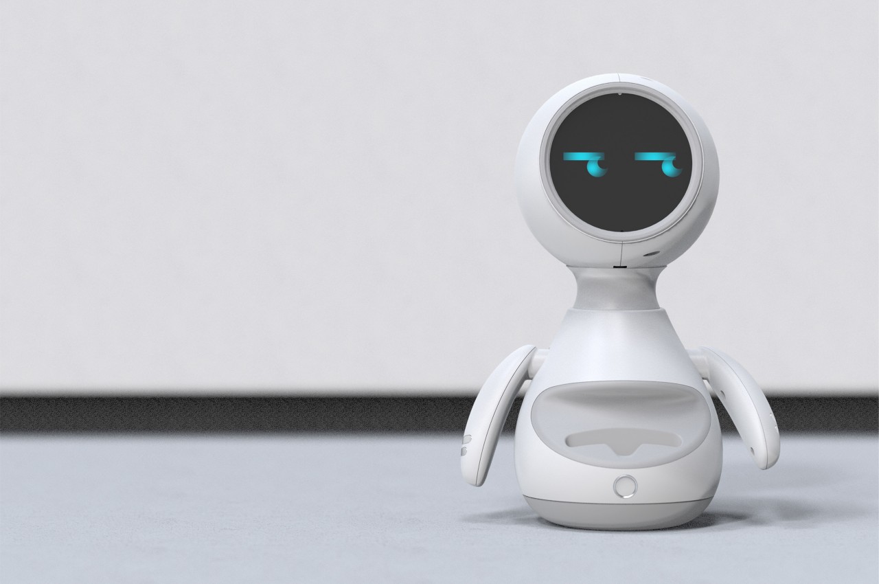
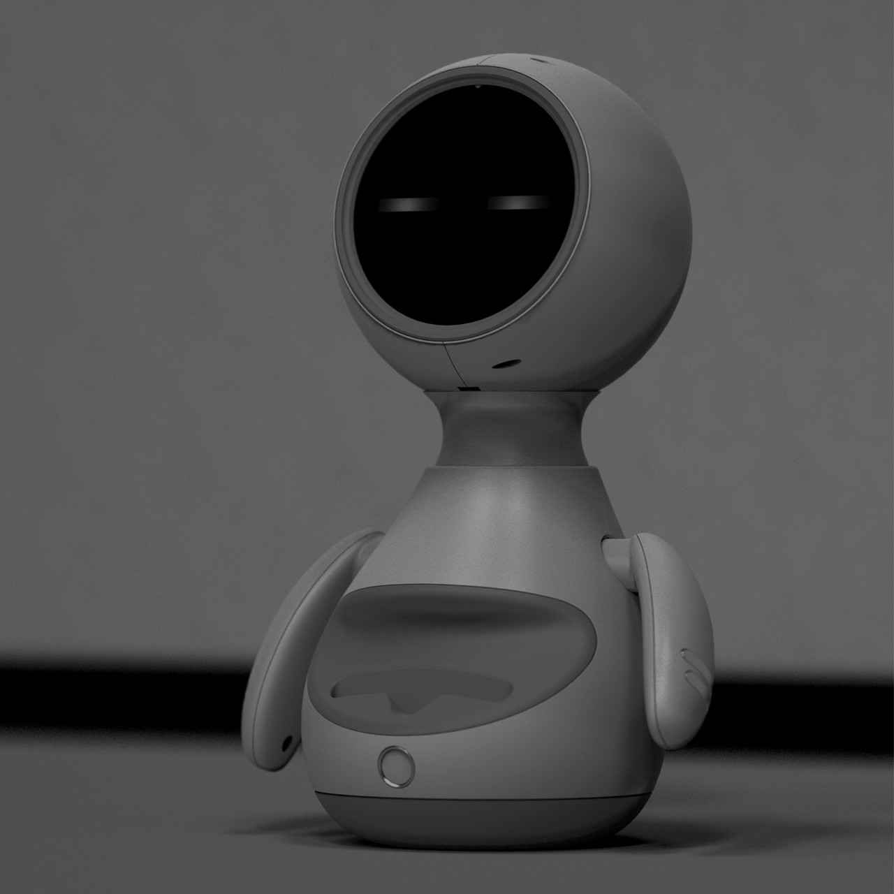
Looking like a cute small robot with its legs missing, Ribo is half a desktop pet and half a smartphone dock. On its own, it seems to be capable of expressing emotions just through its eyes displayed on a circular screen that makes up its entire face. The screen seems to be capable of displaying just one color, but shapes are more than enough to convey the emotion that the robot is trying to convey.

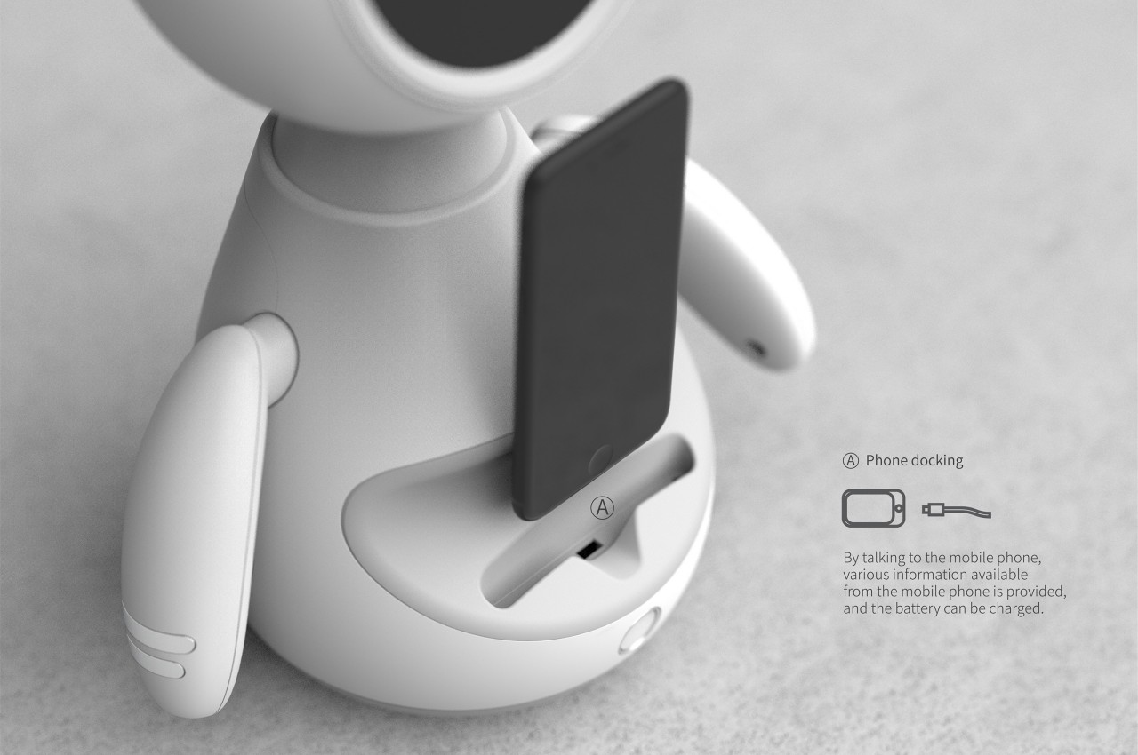
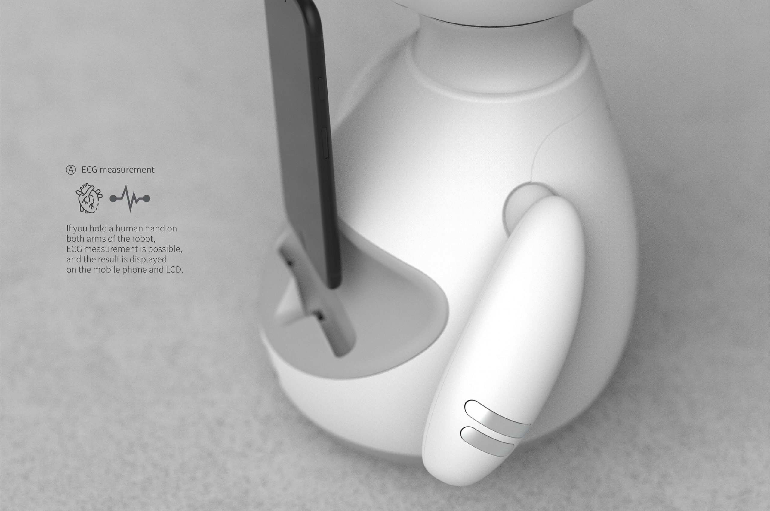
The “tummy” of the robot is where you can slot your smartphone in. There’s a slot where you can inconspicuously insert a charging cable so that you aren’t constrained by what part the robot offers. Bring your own cable, so to speak, allowing Ribo to become not just a home for the phone but also a charging station when needed. The robot does have another function that isn’t so clear in its design. If you hold both of its hands in yours, it can take ECG readings that will be displayed on your phone.

In terms of technical functionality, Robot Ribo might seem like a step back compared to smart docks with wireless charging and advanced features. What the design brings to the table, however, is a more personal and more approachable connection with technology. Thanks to its anthropomorphic form and humanized “face,” the robot makes technology feel a bit less cold and uncaring, especially with a function that can check your heart’s state by holding hands with the robot. It might look like an inconsequential detail, but it can have a huge impact on how humans approach technology, just like how many home and service robots are getting adorable and human-looking designs.

The post This cute robot is the perfect dock for your faithful smartphone companion first appeared on Yanko Design.
This wireless charger concept keeps distracting notifications and people at bay

People are returning to offices, or at least to some sort of hybrid work arrangements, but the global events of the past two years have made people more acutely aware of their well-being even when working at the office. Distractions aren’t just a Work From Home problem. They have also been a regular occurrence even before the pandemic hit, and people, including managers, have been trying to fight those for years. Smartphones, most especially, have become both necessary and detrimental to work, with their incessant notifications and temptations to check them every so often to cure FOMO. Fortunately, we could also harness the power of technology to help solve those problems while also helping to promote good digital practice while at work.

Designer: Pranjal Uday

There are many elements in an office environment that can cause a dip in our well-being, but smartphones are often at the root of many of those. In addition to the distractions they push in our way, they also tempt most of us to swipe our break time away on social media or even just idle browsing. We could just leave our phones in a drawer or on our desks when we walk away to take a break, but some fear they’d miss truly important work calls because of that.

Other people in the office offer both distraction and comfort, depending on when they actually try to connect with you. Because we often spend our time on our phones, even during break hours, we often miss the opportunity to have meaningful social interactions with the people around us, furthering our downward spiral into screen addiction. In order to hit two birds with one stone, a wireless charging dock concept tries to give you more time away from your phone by making you worry less about it.
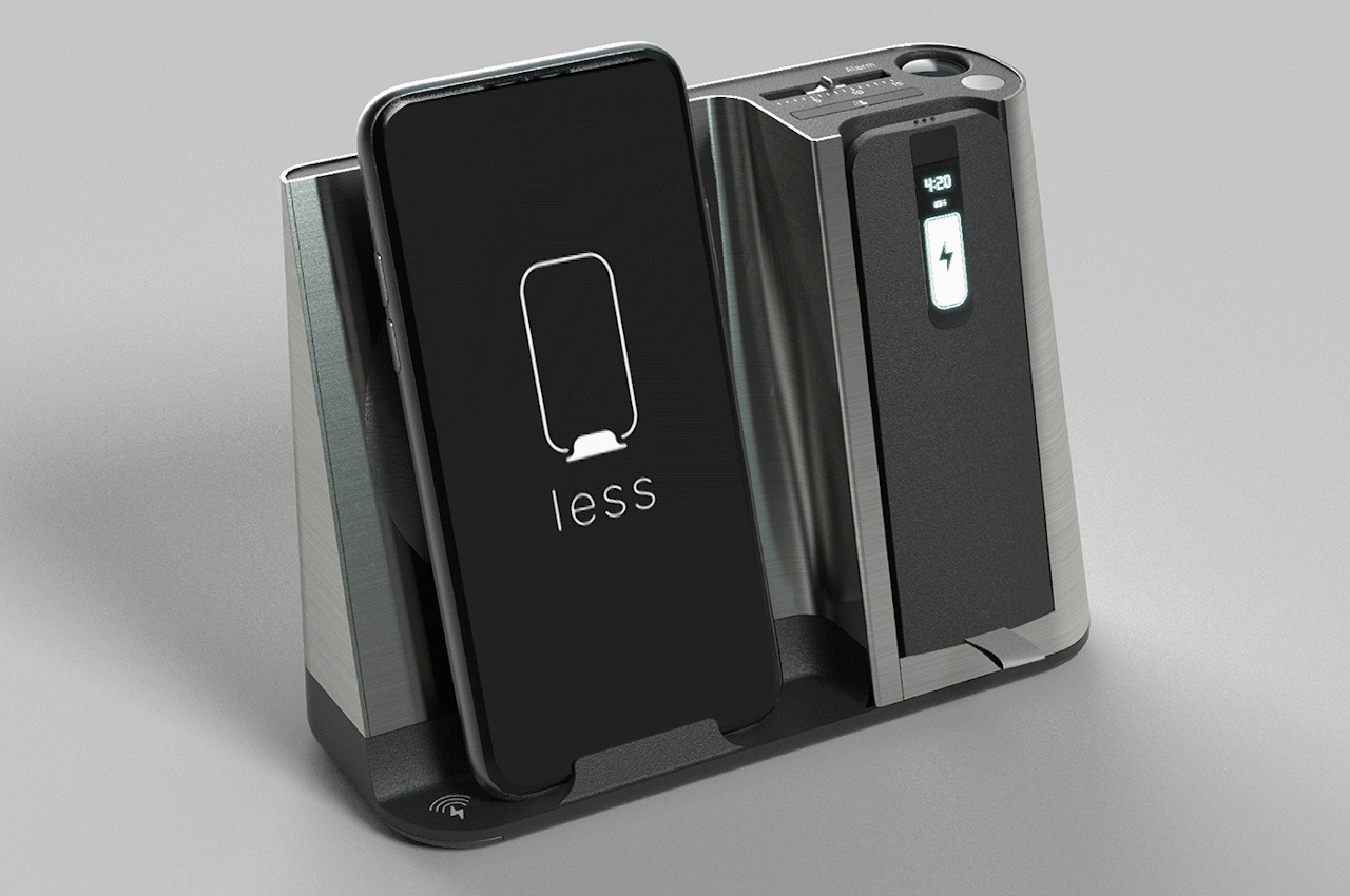
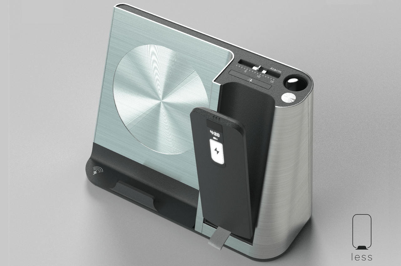
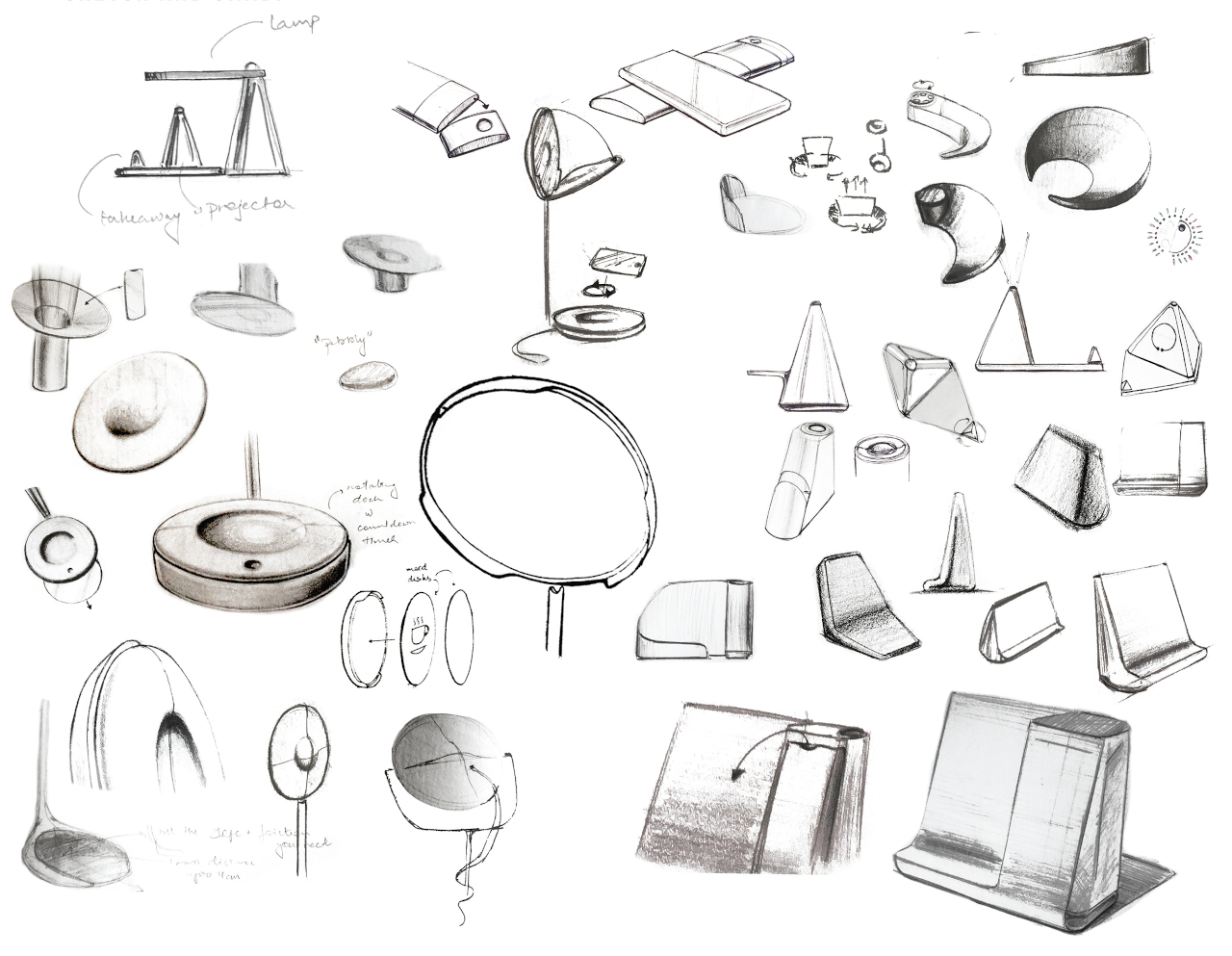
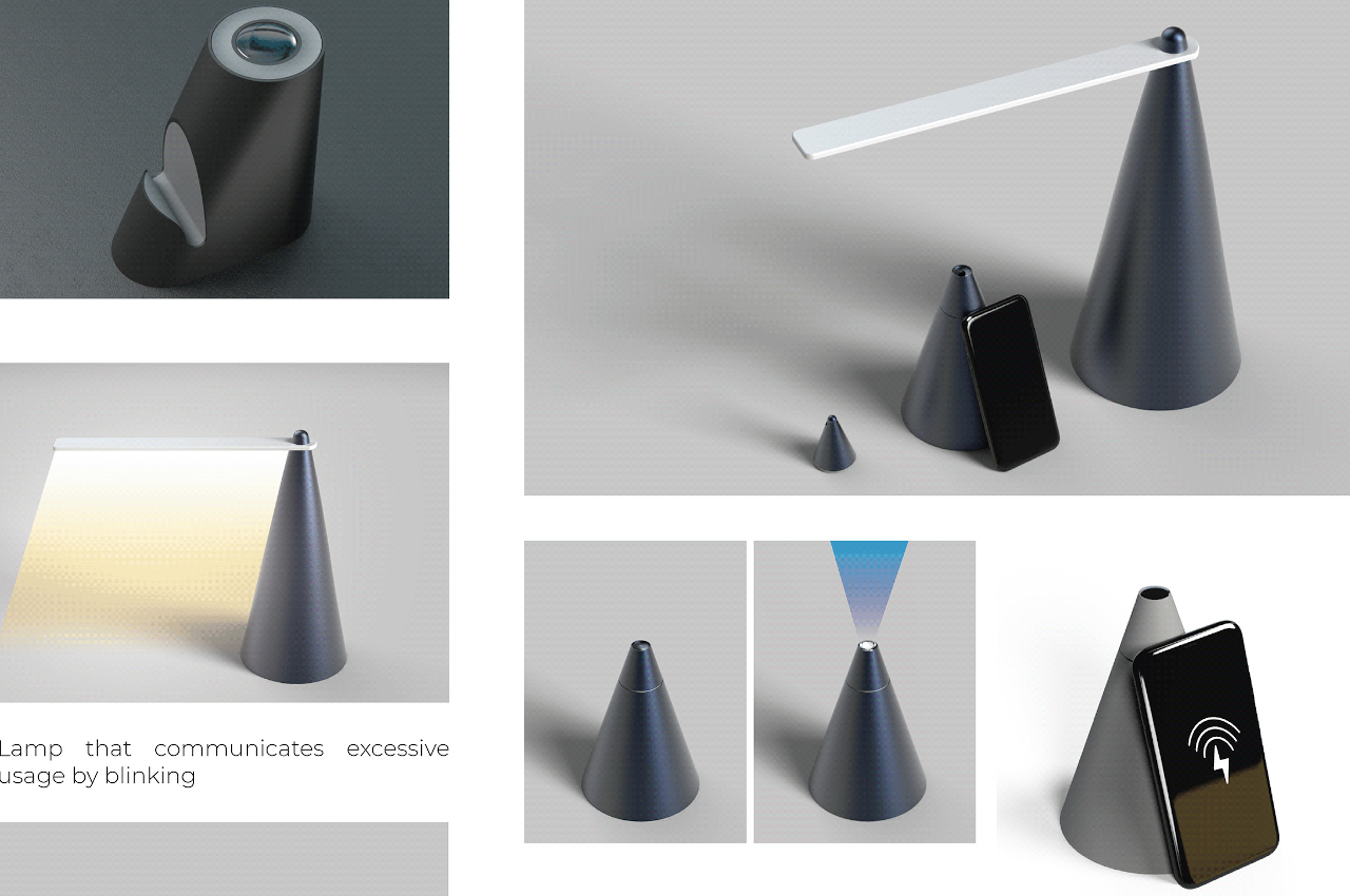
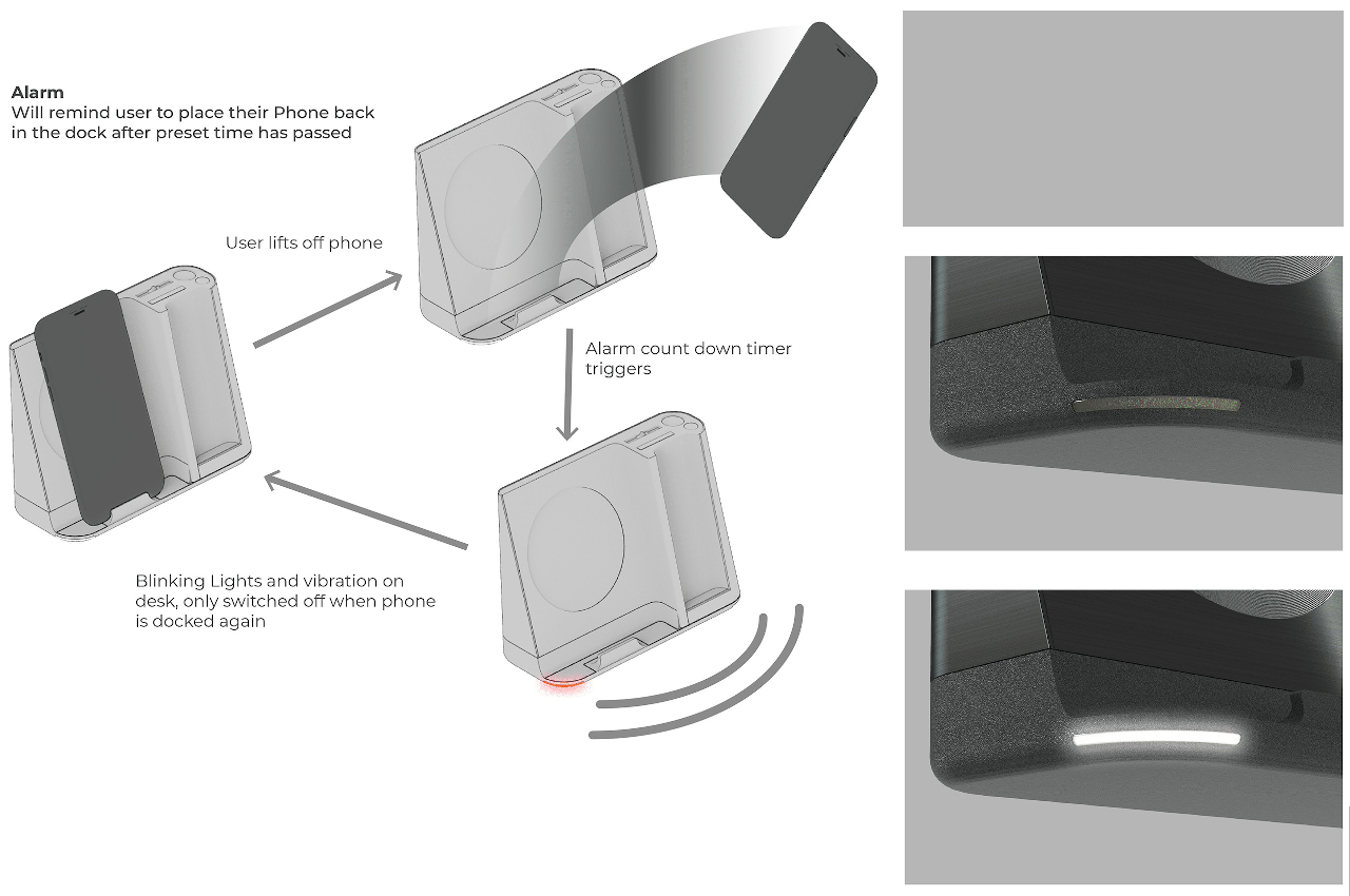
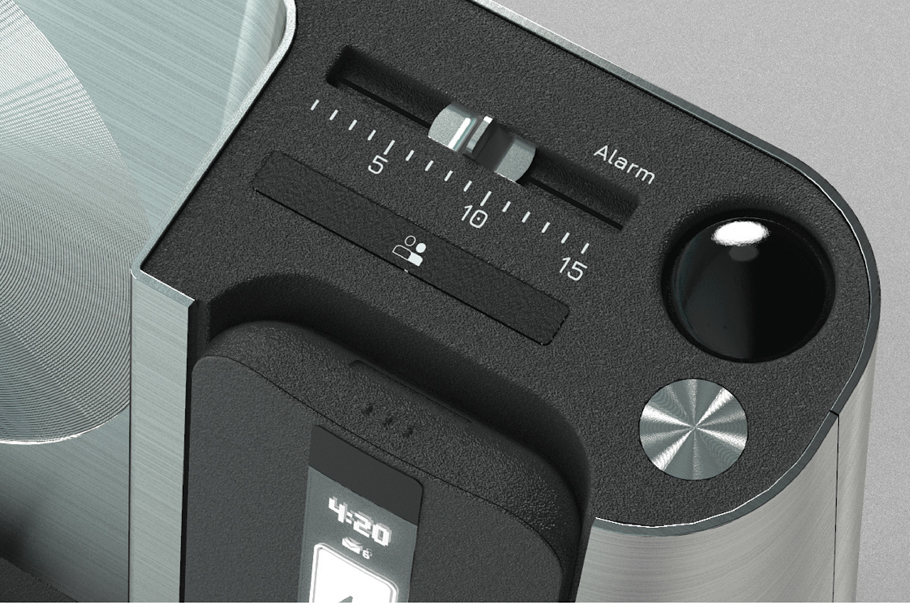
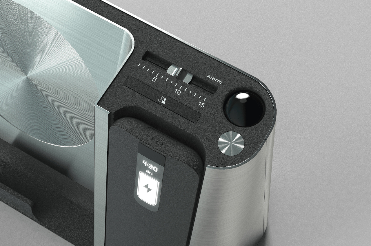
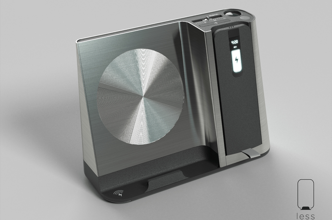
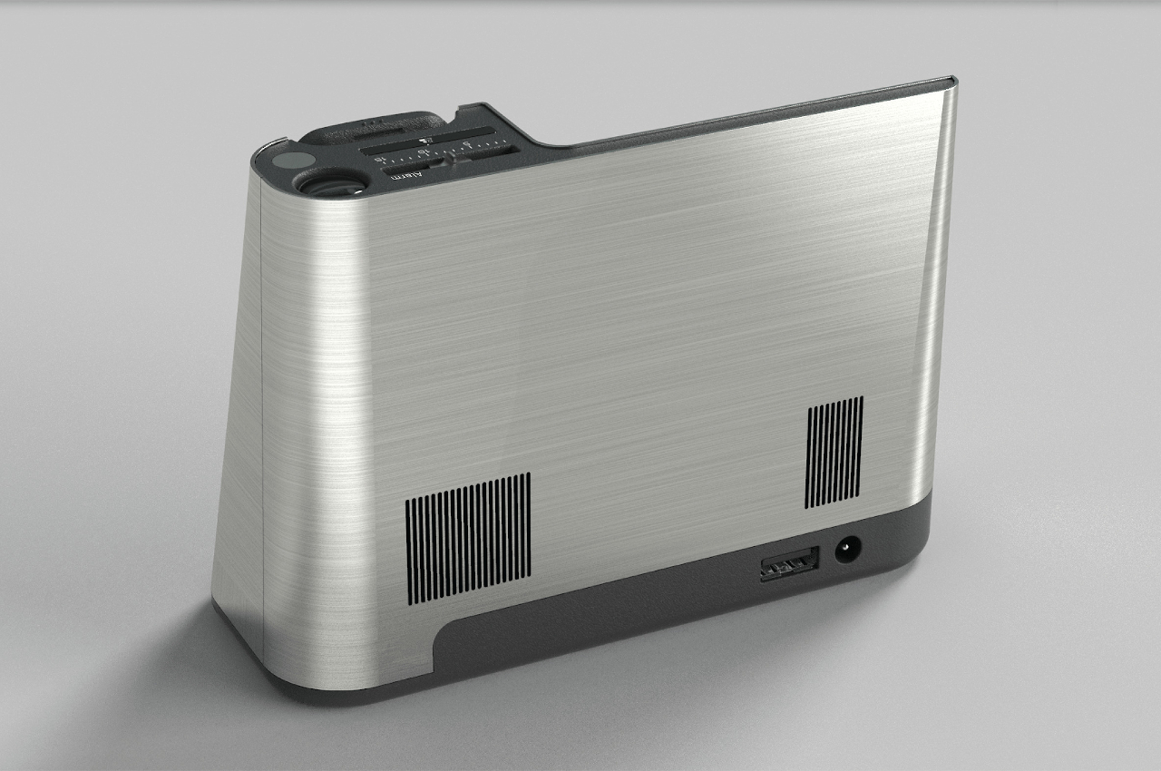
There are plenty of wireless charging docks in the market today, and while they all perform as advertised, they don’t offer more. In an office environment, there is a potential for these docks to become multi-functional equipment, like how Less can be used to charge your phone and keep you away from it as much as possible. For one, it has a timer that will remind you with flashing lights and vibrations when you have removed the phone from the dock for too long. The only way to stop the timer is to put the phone back into the dock.

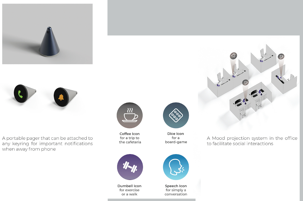
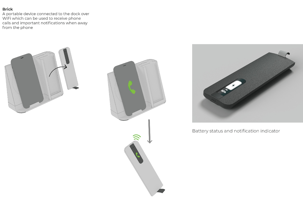
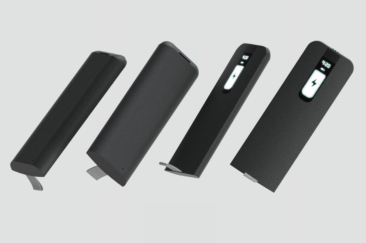
There’s also a “Brick” accessory that you can pull out of the dock and take with you when you walk away from your desk. While it looks like a blank remote control, it’s actually a Wi-Fi phone that can let your receive calls and notifications even while you’re away, as long as you’re on the same Wi-Fi network. Of course, it’s up to you to decide which calls and notifications to let through in order to filter only the most important people.

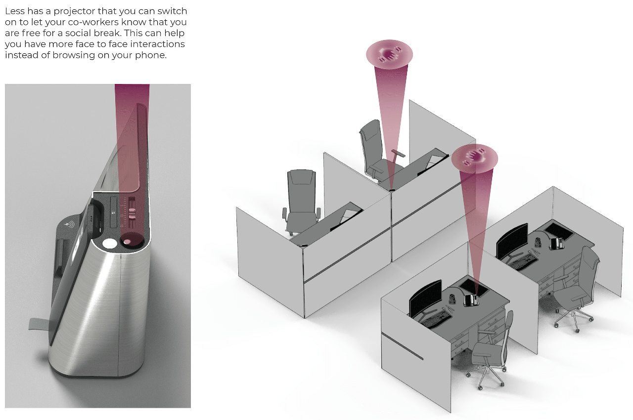
Last but not least, Less has a projector that shines a light informing people around you that you’re free for a “social break.” Alternatively, the projector could also be used to signal that you shouldn’t be disturbed, effectively keeping people away from you unless absolutely necessary. While primarily designed for an office scenario, it’s not hard to imagine how this kind of phone dock can also be useful at home, especially for WFH setups that are exposed for everyone at home to see.

The post This wireless charger concept keeps distracting notifications and people at bay first appeared on Yanko Design.