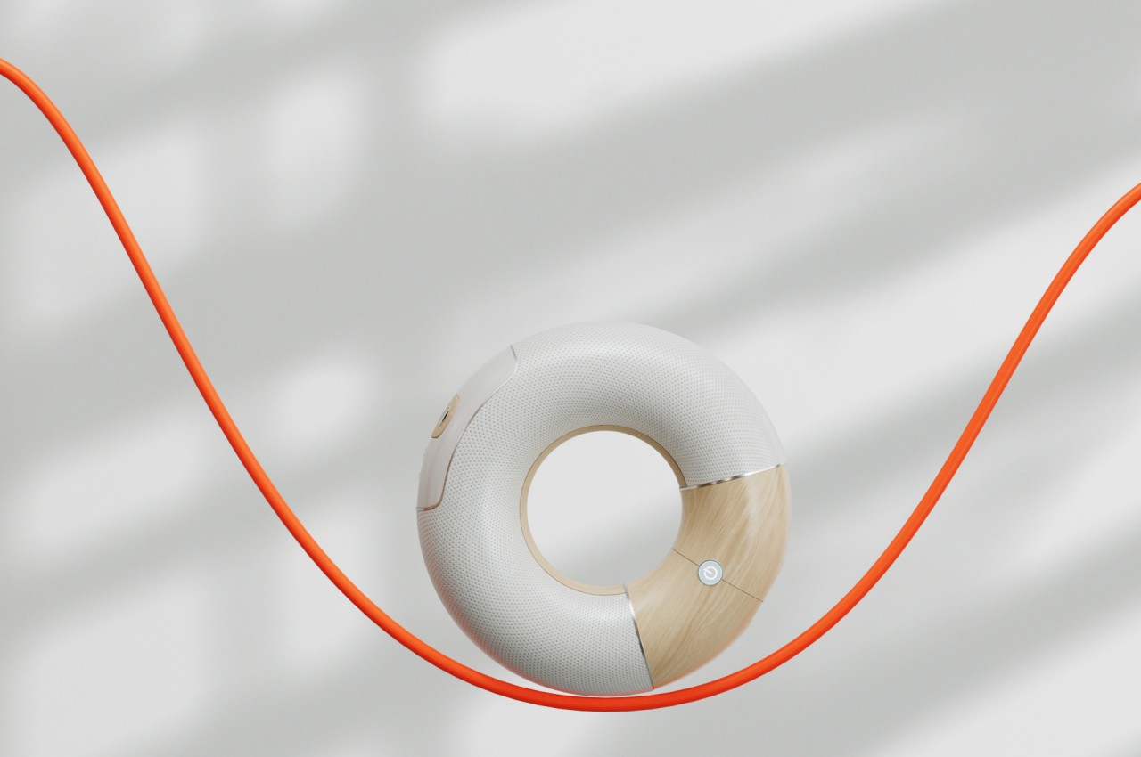
Donut-shaped Bluetooth speaker concept inspires a more playful way to enjoy music

Wireless speakers have become all too common now thanks to multiple factors, from the rise of voice-activated smart home assistants to the popularity of streaming services to the demise of the headphone jack from smartphones. These audio devices have also outgrown their initial designs which seemed to be limited to blocks or cylinders, adopting more fluid forms that are almost artful than technical. Of course, there is no need to go to opposite extremes to have a good speaker design, as this concept proves with a simple and clean shape that immediately strikes one as something that isn’t your regular wireless speaker while, at the same time, clearly tries to deliver the basics of an omnidirectional audio source.

Designer: Fran Rossi, Javier Bianchi
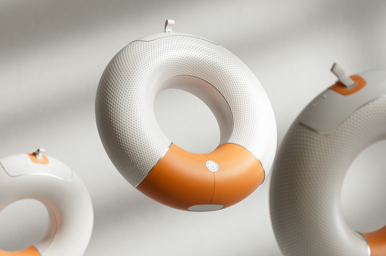
Many wireless speakers today try to deliver sound in 360 degrees to cover the entire room, which is especially needed if it’s meant to respond to voice commands coming from anywhere in the area. Thanks to the likes of the Amazon Echo, Google Home, and Apple HomePod, cylindrical shapes seem to have become the most common design for wireless speakers. Of course, there are conical or even spherical speakers, but these aren’t the only round objects that can be used to the same effect.
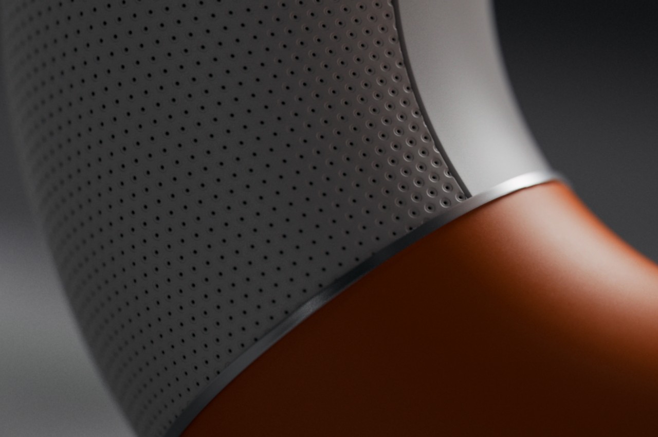
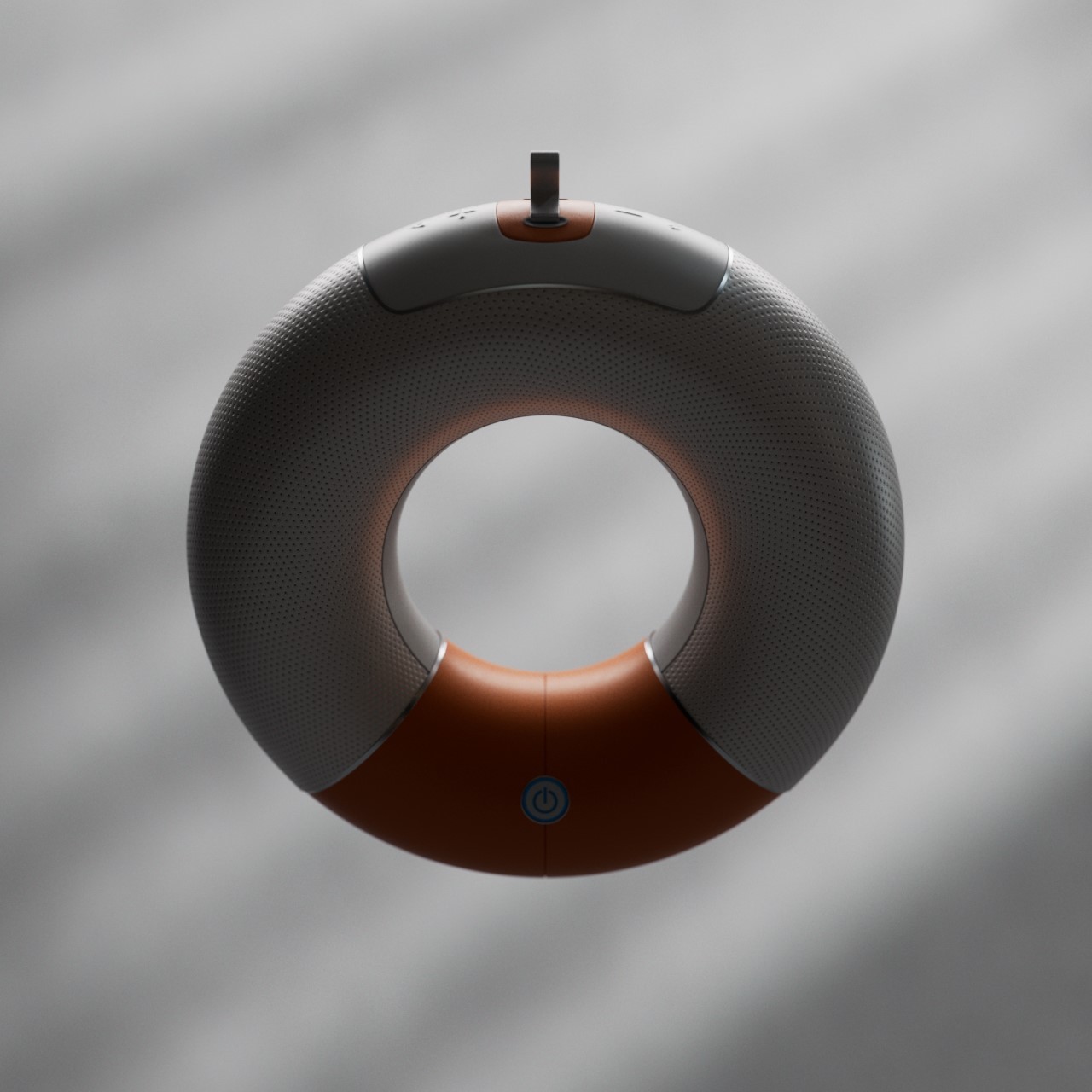
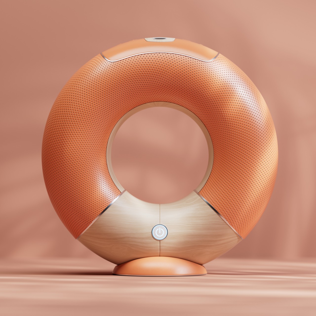
Orbit adopts a lesser-used shape that, along with a sphere or ball, is immediately associated with fun things. A torus can be a donut, a wheel, a piece of candy, or even a floatation device, and the way it can roll on a floor and wiggle and spin before falling down flat is often a game played by children. That playful charm is further emphasized the by concept’s choice of colors and materials, with a bright orange accent against a cool white body, and reflective plastic instead of fabric. It looks almost like a toy, though its functionality is far from being child’s play.

1

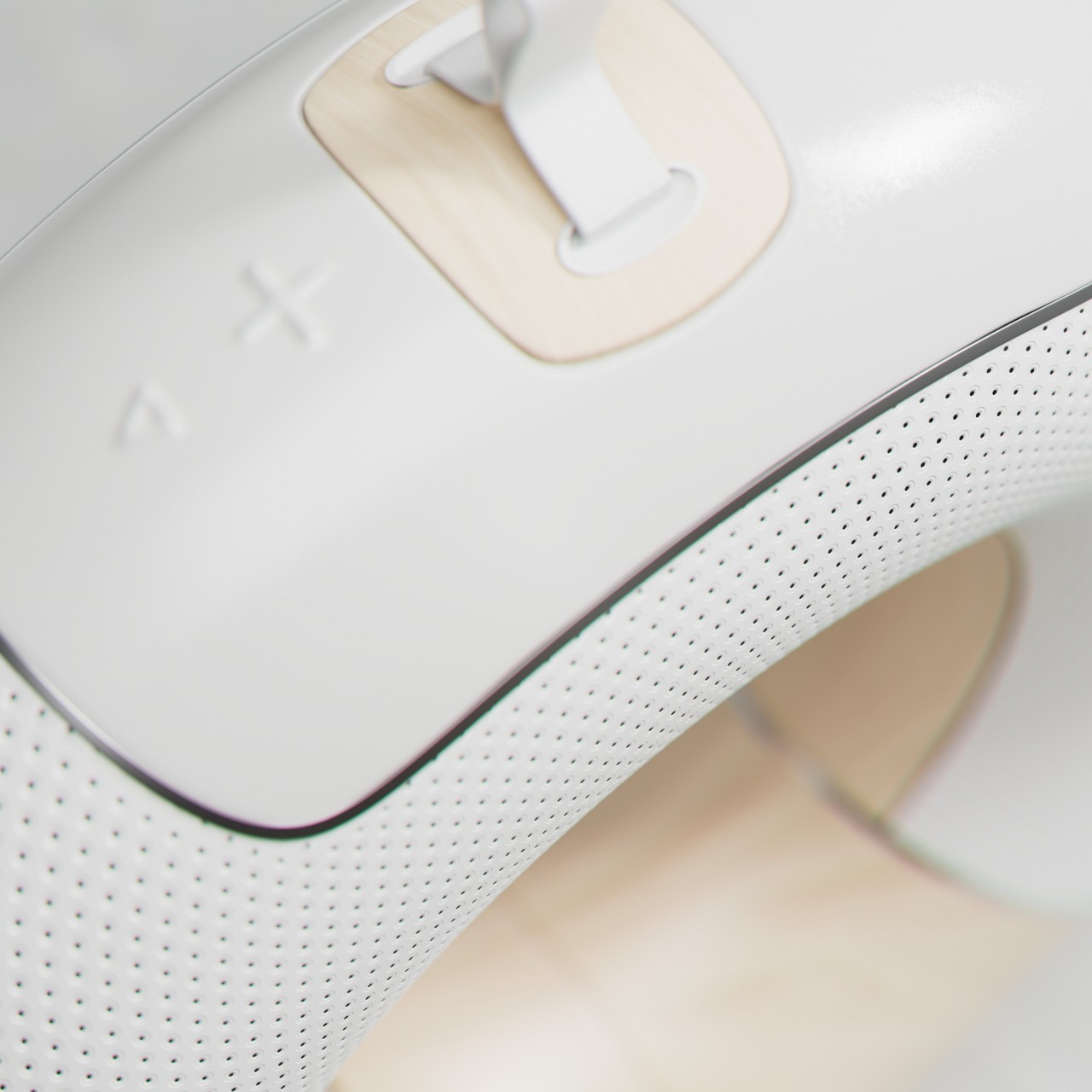
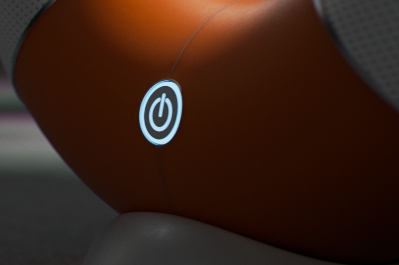
Thanks to its ring shape, it can also transmit audio 360 degrees, though it also has more freedom on where the sound is sent. When standing, it can bounce the sound off the ceiling, though it can also be placed down on its back for a more conventional horizontal output. The Orbit is almost a perfect torus, so it requires a stand to, well stand up. Its other functions, however, are all built into the device itself, like the large backlit power button in front and the embossed playback controls on top.

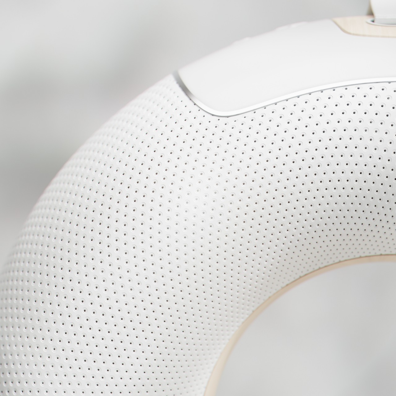
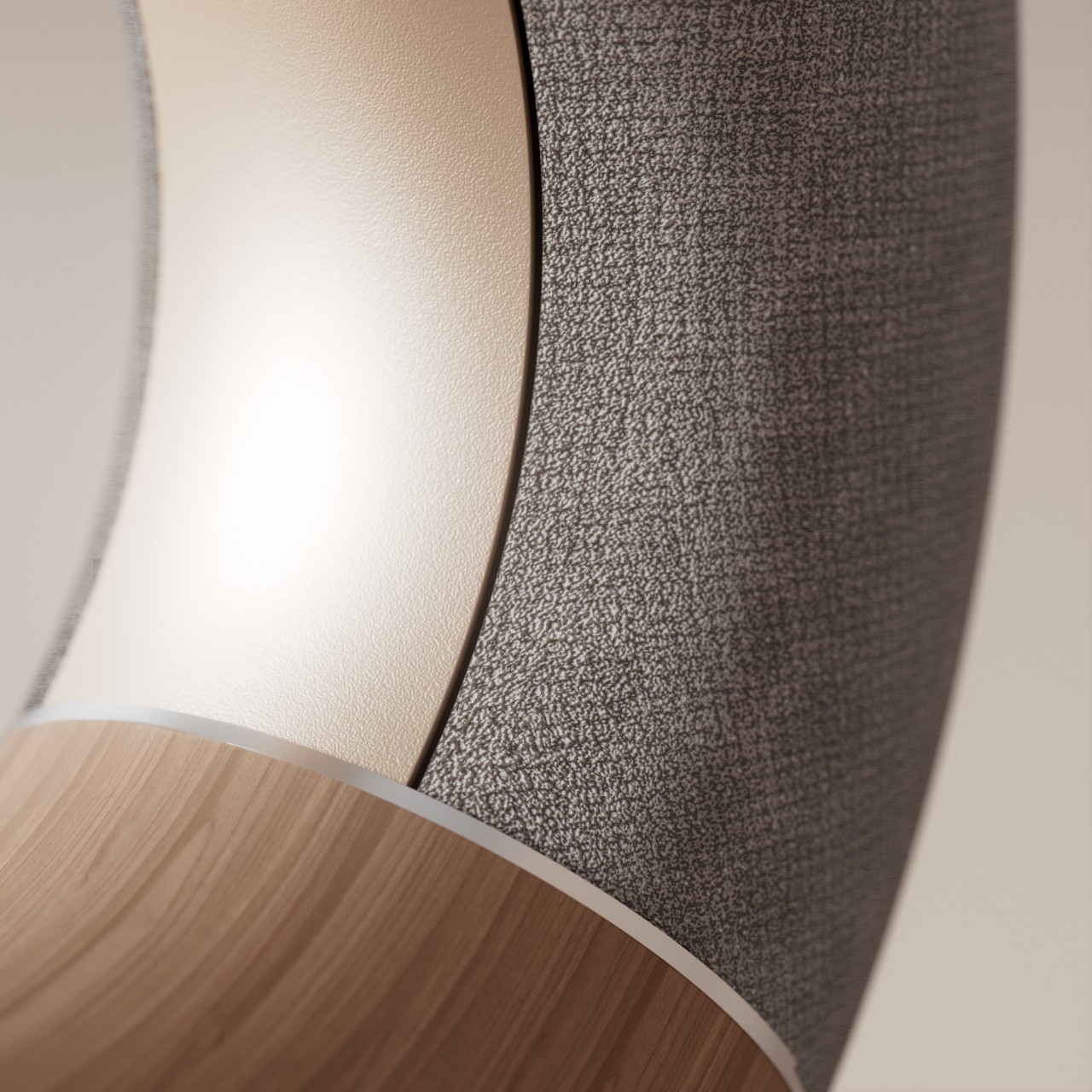
Despite the playful nature of its shape, small variations to the design can result in a totally different character. Covering the entire ring with dark gray fabric and switching the accents to wood or gold gives it a more luxurious appeal that could proudly stand as an art object in your living room. Switching up the colors and materials also generates different imagery, turning what looks like a simple design into a highly flexible and customizable one.
The post Donut-shaped Bluetooth speaker concept inspires a more playful way to enjoy music first appeared on Yanko Design.

Grubhub is delivering Dunkin’ donuts in New York City

If you're craving donuts but can't step outside to get them, some extra relief might be at hand. Grubhub is rolling out the option to order from Dunkin' through its apps, starting with Seamless customers in New York City. It'll reach other markets...

The Cleo ‘indoor-friendly’ drone flies using a single propeller unit

A crossover between a drone and a donut (I wonder why the word why they missed on the opportunity of calling it a dronut), the Cleo is a drone that’s designed specifically for indoor use. Unlike most drones that require to be flown in an open, empty space, preferably away from obstacles, the Cleo has no such problem. The dronut (I’m just going ahead and using the term) boasts of an indoor-friendly design, featuring a thick, protective outer rim, and a single propeller unit with two propellers spinning in opposite directions. Cleo’s relatively monolithic design fits in a pocket without needing to be disassembled or folded, and there’s nothing externally fragile that you have to protect, like a propeller arm. The Cleo is easy and safe to grip, and can literally be grabbed in mid-air. Its small size also makes it an incredibly portable drone that quite literally fits in most jacket pockets.

Cleo comes with an in-built HD camera, and a battery life of 12-15 minutes, a pretty impressive feat for a drone its size. Made to be used indoors, Cleo definitely has consumer applications, but the designers and developers also see Cleo being used for security, surveillance, and 3D mapping indoors too. Future iterations of Cleo may even feature obstacle avoidance and indoor navigation systems, making it perfect for the security industry.

Designer: Cleo Robotics

Donuts Made from Spaghetti… YES PLEASE

Donuts are usually the domain of sweet eats for early morning gobbling. You can get some savory donuts though, like the bacon maple variety that the fancy gas station up the street from me gets fresh every morning. They are as yummy as you would expect something with bacon on it to be. In Brooklyn, you can now get donuts made of spaghetti.

Yes, it’s a pasta donut and it sounds yummy. Pop Pasta’s special donut is a bastardization of a classic Neapolitan dish known as the spaghetti pie. The donut is baked with cheese and other goodies, and they’re meant to be eaten at room temp or warmed up. They look super yummy and I want one right now.

#spaghettidonut #donut #poppasta

A post shared by pop_pasta (@pop_pasta) on

Getting ready for @shwickmarket tomorrow! #poppasta #popularpasta #spaghettidonut

A post shared by pop_pasta (@pop_pasta) on

[via Laughing Squid]

Donut-shaped Pool Table: Bakery Billiards

This is a pool table that Homer Simpson would love. It was made by designer Cléon Daniel, and it looks delicious. I don’t think you could play a game on it without getting hungry.

donut_pool_table_1zoom in


Like donuts in a bakery, this pool table was made completely by hand. It also introduces some new challenges to the game of billiards. The hole in the middle is large enough for you to stand in, which gives you an interesting angle for those tricky shots.

donut_pool_table_2zoom in


The table’s bumpers mimic the imperfect wavy edge of frosting on a real donut, so good luck with your usual trick shots. This would make for a crazy billiards game that might last all day. It is a super fun design though.

donut_pool_table_3zoom in


[via designboom via Gizmodo]

Alien Facehugger Fritter: Creepy Cruller

This Alien facehugger fritter looks all kinds of disgusting. It is absolutely terrifying. It probably fights you with every bite and swallow, twitching and finally being still when it hits your stomach. Donut? More like Do-not!

facehugger_fritter_1zoom in


I didn’t say I wouldn’t eat it. Just that it looks scary and slimy. This freaky pastry was made by Oak Lawn, IL-based baker Timmy Hanno, aka archiehemmingway. He is a mad baking genius. He made this scary raspberry fritter as a gift for his girlfriend, who is a huge fan of the Alien films. So she loves her some face-hugging action.

He had previously made her a raspberry-filled xenomorph donut seen below, which is also terrifying.

facehugger_fritter_2zoom in


[via Geyser of Awesome]

Krispy Kreme Bacon Hot Dog Donut: I CAN HAZ?!

Normally I like to keep my sweet foods segregated from my salty foods. It’s one of my things. One of the few exceptions I make to this rule is dipping my breakfast sausage into syrup, that is some fine eatin’ right there. Krispy Kreme and single-A baseball team the Wilmington Blue Rocks have a food concoction that I might make another exception to my segregation rule for.

kk-dogzoom in

This hot dog is crammed inside a Krispy Kreme donut and topped with bacon. Bacon really makes everything better.The hot dog as it’s called looks more like a small sausage to me, which would make more sense. Toss one of those breakfast sausages into this thing and I’m all in. The image also looks like the dog is slathered in raspberry jelly.

heavy-bzoom in

If the snack item is popular at the ballpark, it might find its way into the Krispy Kreme stores around the country.

[via Ksat]

Dunkin Donut Wedding Cake: The Cheapest, Best-est Wedding Cake Ever

The wedding cake business is a racket. When my wife and I got married, I seem to remember the extravagant wedding cake cost something like 2,000 smackeroos. And while it looked beautiful, it actually didn’t taste that great. It certainly didn’t taste as good as a glazed donut, but I’m a simple man with simple needs when it comes to my sweets. Now, there’s finally a wedding cake for the rest of us.

donut wedding cake

Dunkin Donuts Bahamas worked with the Swiss Pastry Shop to create this epic wedding cake using carefully stacked piles of their glazed donuts, and it’s just perfect. Not only does it eliminate the need for slicing the cake and getting that messy frosting all over the bride and groom, but I’m sure it cost way less than a traditional wedding cake.

donut wedding cake 2

Sure there’s still a regular white cake on the top, but the little donut couple on top excuses them from their digression from the donut theme. And while this particular cake was made by professional pastry chefs, you could probably accomplish something pretty similar with a few dozen from your local donut shop.

Now, how to work Munchkins into the design…

[via Laughing Squid]

Evernote 4.0 for Android sweeps in new home screen, list UI (video)

Image

'Tis the season for major Android app remakes, this time with Evernote going for a much appreciated adaptation to a more swipe-friendly universe. The 4.0 update of the note-taking app has a new home screen that lets you swipe out a hidden menu to get to your notes without having to always jump backwards -- one of our pet peeves. Much of the overall navigation now leans towards swipes over buttons, and the list views for notes and notebooks are a good deal simpler. Combined with new contextual action bars, the revamp puts the text, audio and photo recorder much more at home in the Android 4.0 era than earlier versions. It still requires just Android 1.6, so nearly anyone can take a look by visiting the Google Play link below.

Continue reading Evernote 4.0 for Android sweeps in new home screen, list UI (video)

Evernote 4.0 for Android sweeps in new home screen, list UI (video) originally appeared on Engadget on Wed, 16 May 2012 13:21:00 EDT. Please see our terms for use of feeds.

Permalink   |  sourceGoogle Play  | Email this | Comments