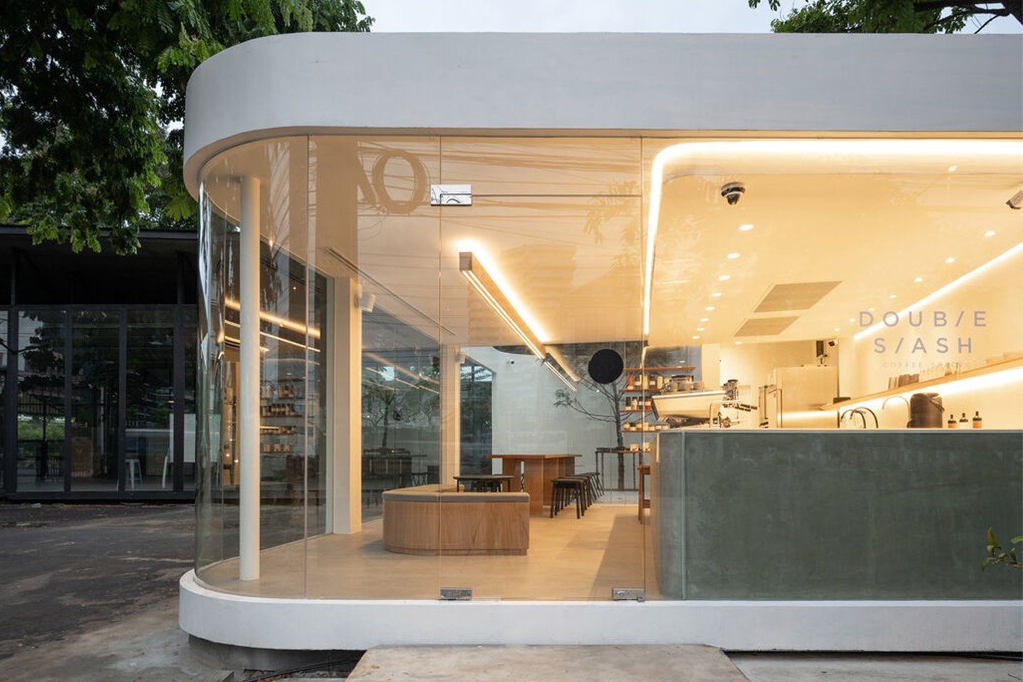
Nestled in the bustling and hectic city of Bangkok is an adorable coffee shop called the Double Slash // Coffee Space. Designed by Spacy Architecture, the cafe is inspired by the international style that grew popular during the Art Deco period in the 1930s. The cafe borrowed the period’s aerodynamic design, functioning as a space that is simple yet free-flowing and dynamic. It is marked by flowy lines and seamless movements.
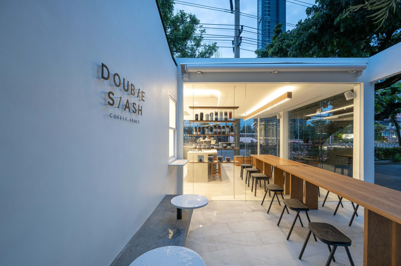
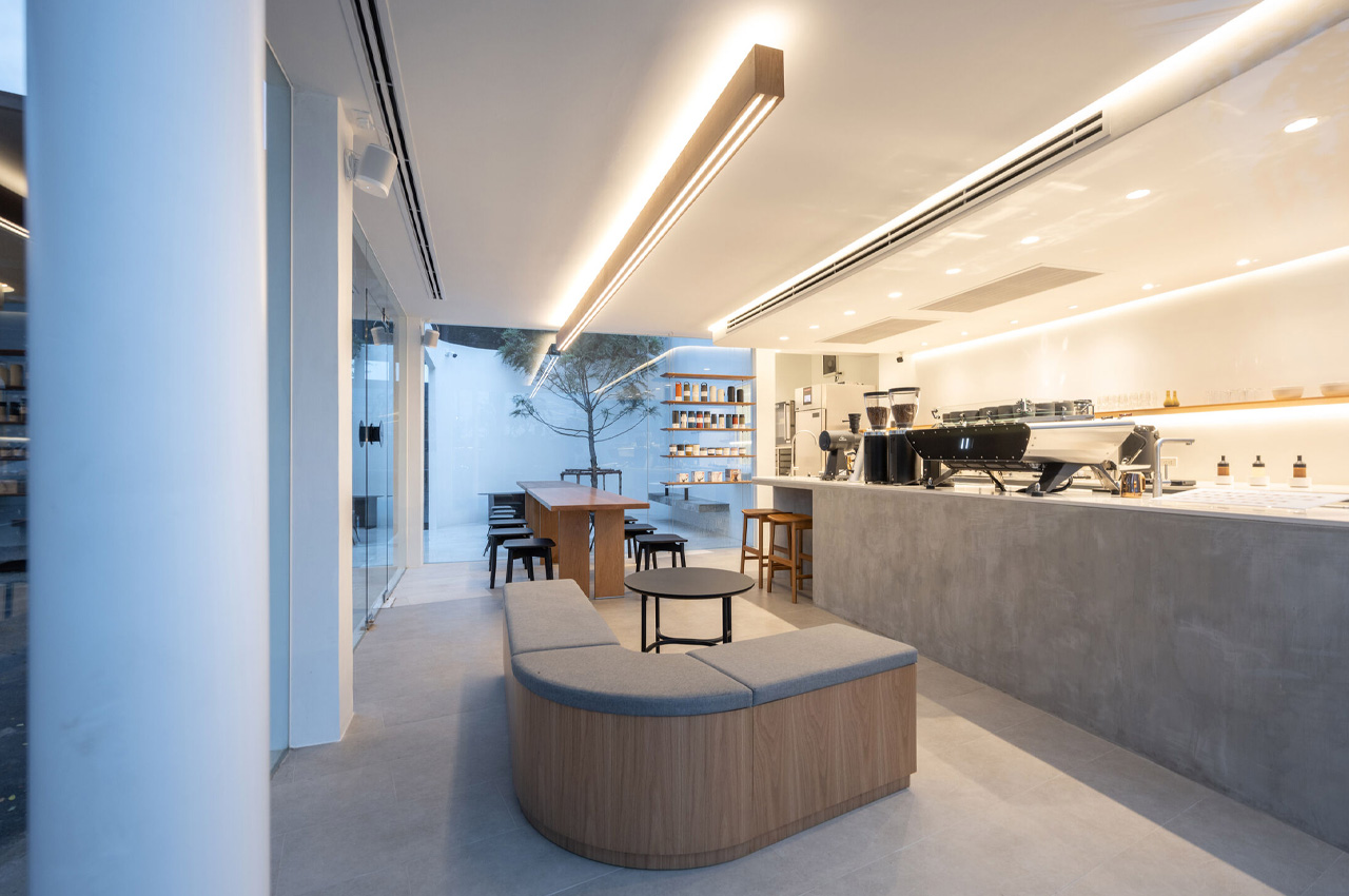
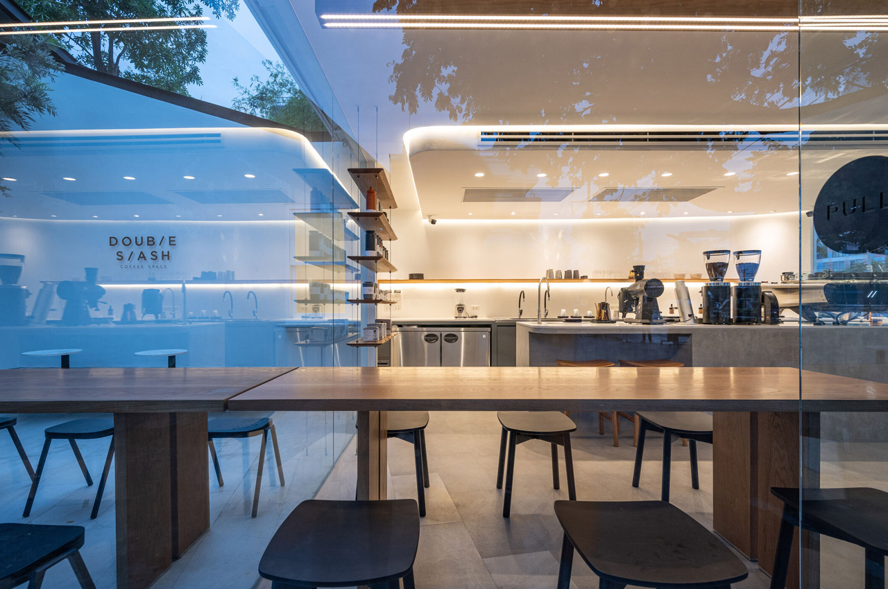
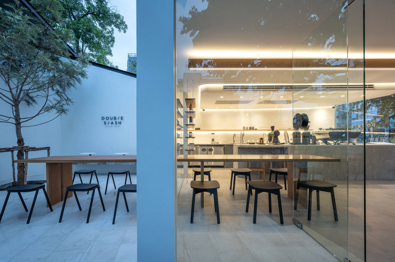
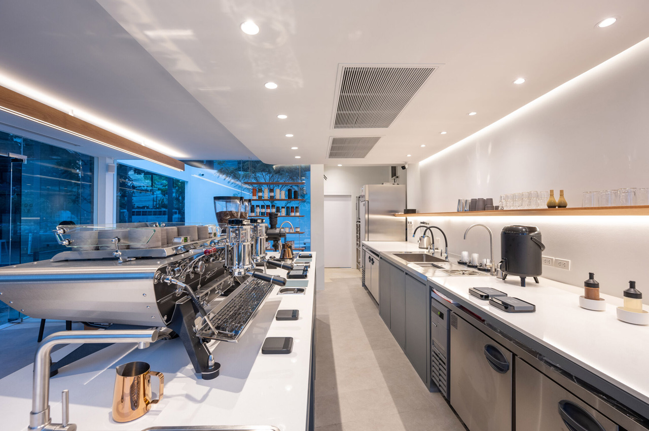
The coffee shop is fitted into a horizontal framework with a minimal, clean, and tassel-free design. It is devoid of unnecessary ornamentations and is defined by flowy curving forms and angular planning orientation. The structure is topped by a flat roof, with glass panels and floating corners, creating a clear connection between the interiors and the exteriors. The transparent facade of the cafe makes the space seem cozy and homely, and the interiors are bright and warm, which instantly invite you in for a cup of joe. The light installed within the cafe is indirect, so it doesn’t seem too harsh or uncomfortable.
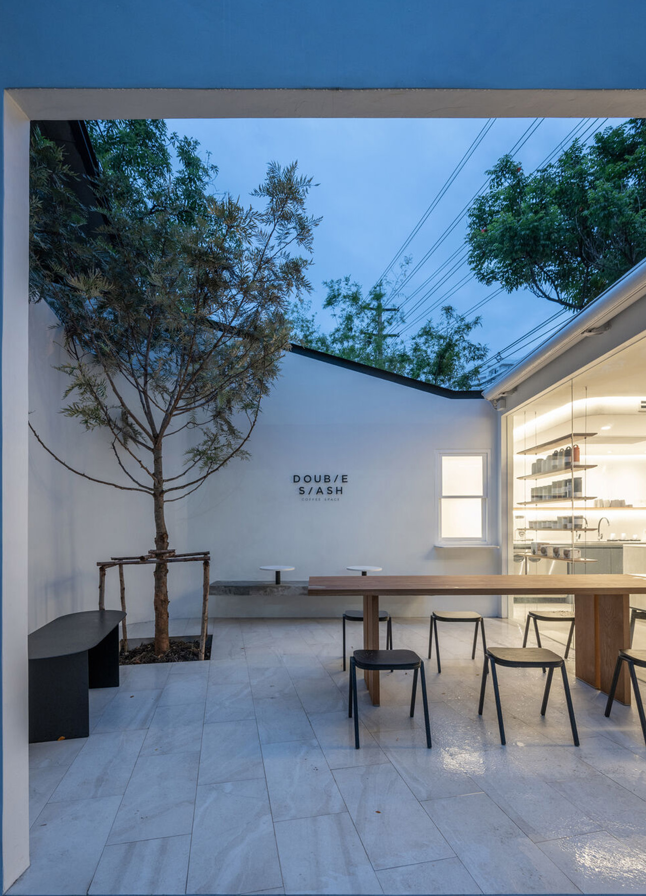
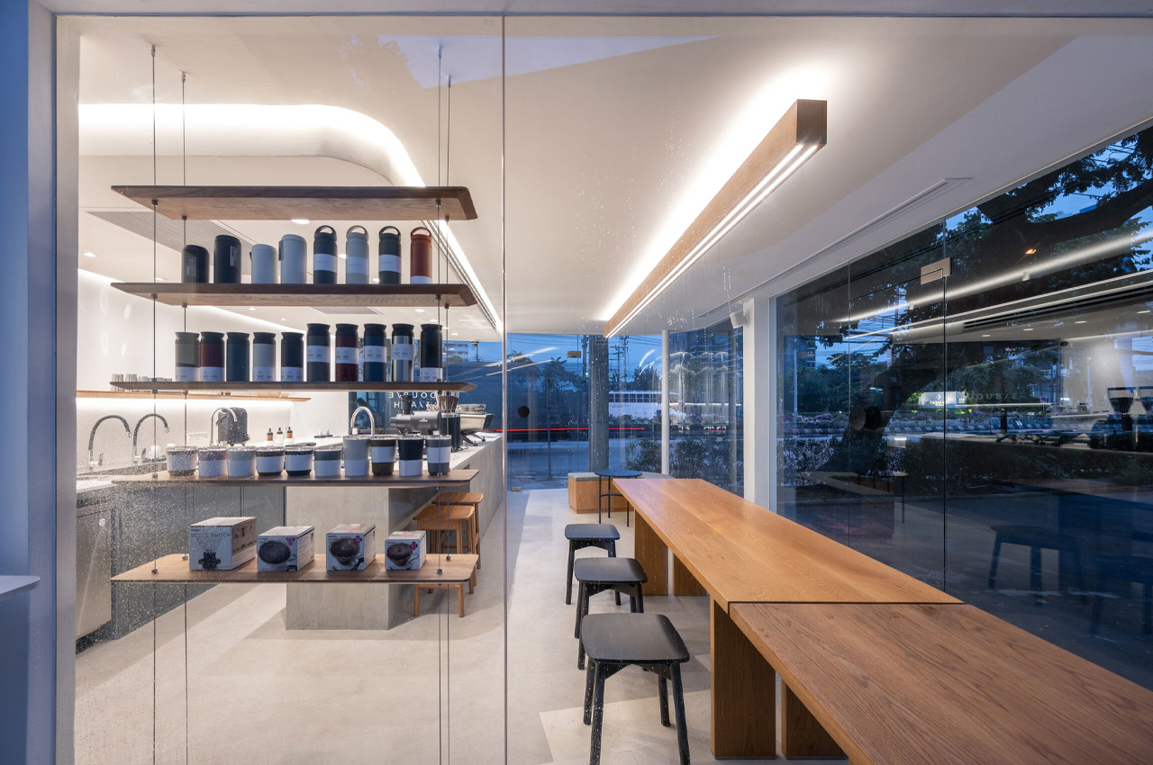
The floor features a two-toned oblique pattern, and the interior and exterior seating areas are separated via a discreet glass panel. The connected wood tables create a visual connection between the indoor and outdoor sections. Concrete finishings on the counter and wooden elements provide a raw naturality to the space. The original space was founded by an industrial designer who spent years practicing forest tradition in Isan, Thailand. “Double Slash” comes from what he usually uses to create space amongst his ideas while working. These parallel oblique lines are not only the common written symbols used by him, but they also symbolize flow, movement, and continuity.
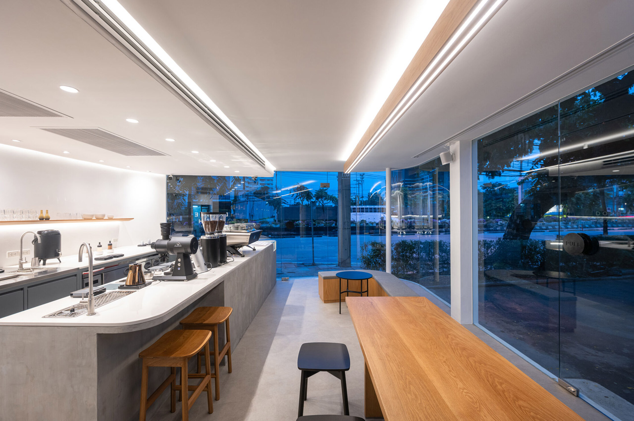
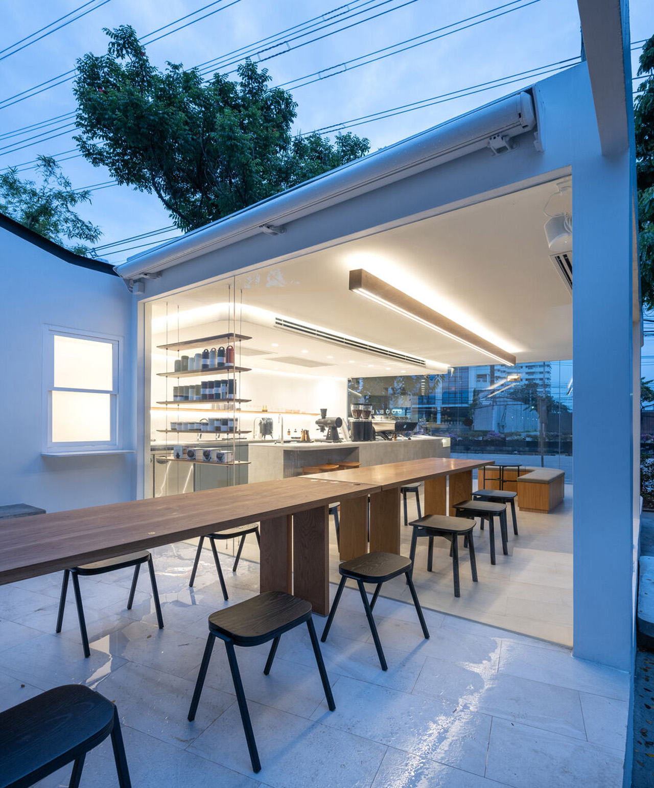
The intention and aim behind designing this tranquil coffee shop was to create a cafe that serves as a space of contemplation and mindfulness in the otherwise chaotic city of Bangkok. It attempts to provide the citizens of Bangkok with a quaint spot to relax, unwind, and grab a cuppa. The visual language and brand identity of the cafe were created to support this persona – one of peace, fluidity, and spaciousness.
The post Minimal cafe with glass panels + floating corners is a tranquil haven to grab a cup of joe in hectic Bangkok first appeared on Yanko Design.