Wall-mounted drawers offer storage that leaves your floor clear and free

Storage containers are inescapable facts of life, especially in this day and age where we collect so many material possessions. These vessels can range from plastic boxes to wooden furniture like shelves and cabinets, all of which trade floor space for that storage capacity. Unfortunately, floor space is also becoming a luxury these days, and we can’t simply expand the area in proportion to our growing storage needs. We need to be smarter about the way we use storage and what we use for storage, and no, stacking them up to the ceiling isn’t a viable solution nor a safe one. These drawers, in contrast, do offer a better alternative by taking advantage of the free space that we have found on our walls.

Designers: Camille Paillard and Romain Voulet
Storage boxes are a common sight in many households. They’re simple, convenient, and often stackable. They also take up precious floor space, and stacking them so high can become a safety hazard if left unchecked. Ideally, we’d “Marie Kondo” our excess possessions, but we’ll always still end up with stuff we can’t simply throw out. We obviously need more storage, but we also don’t have more floor space to use. What we do have, however, is plenty of free wall space that isn’t even taken up by decorations.
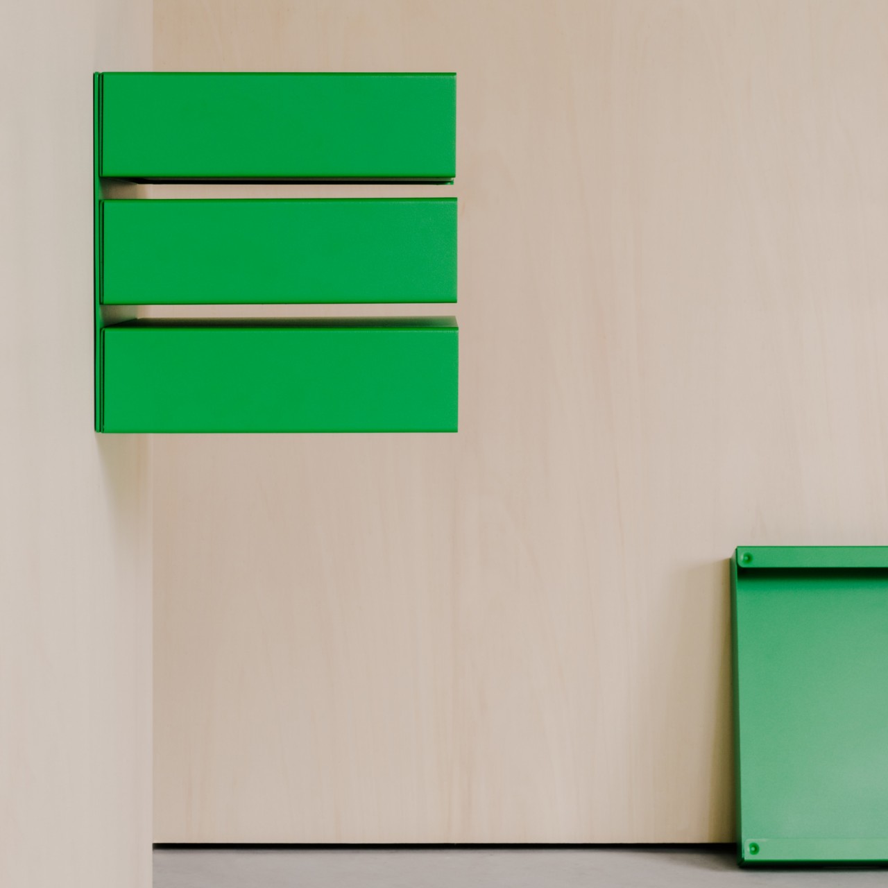
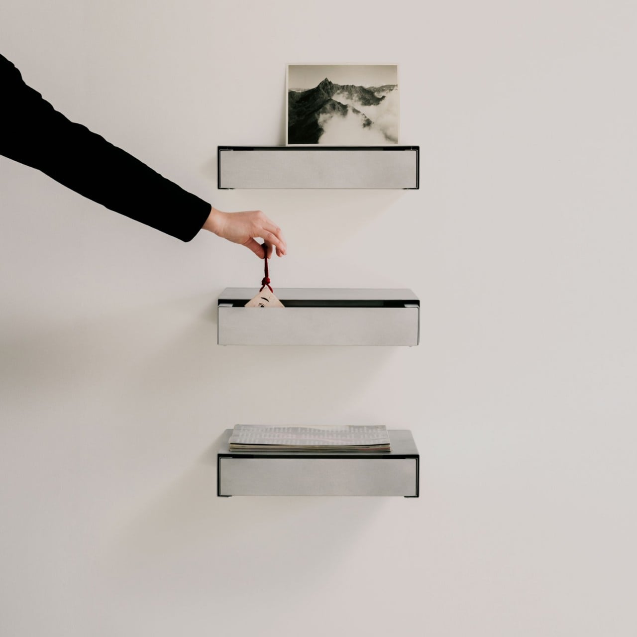
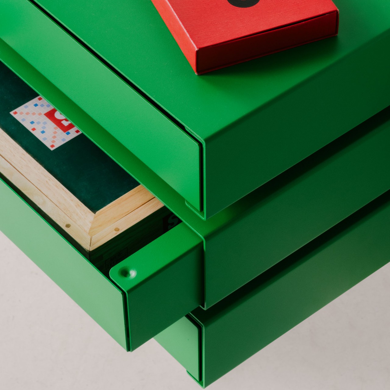
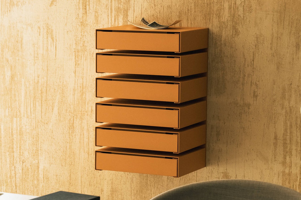
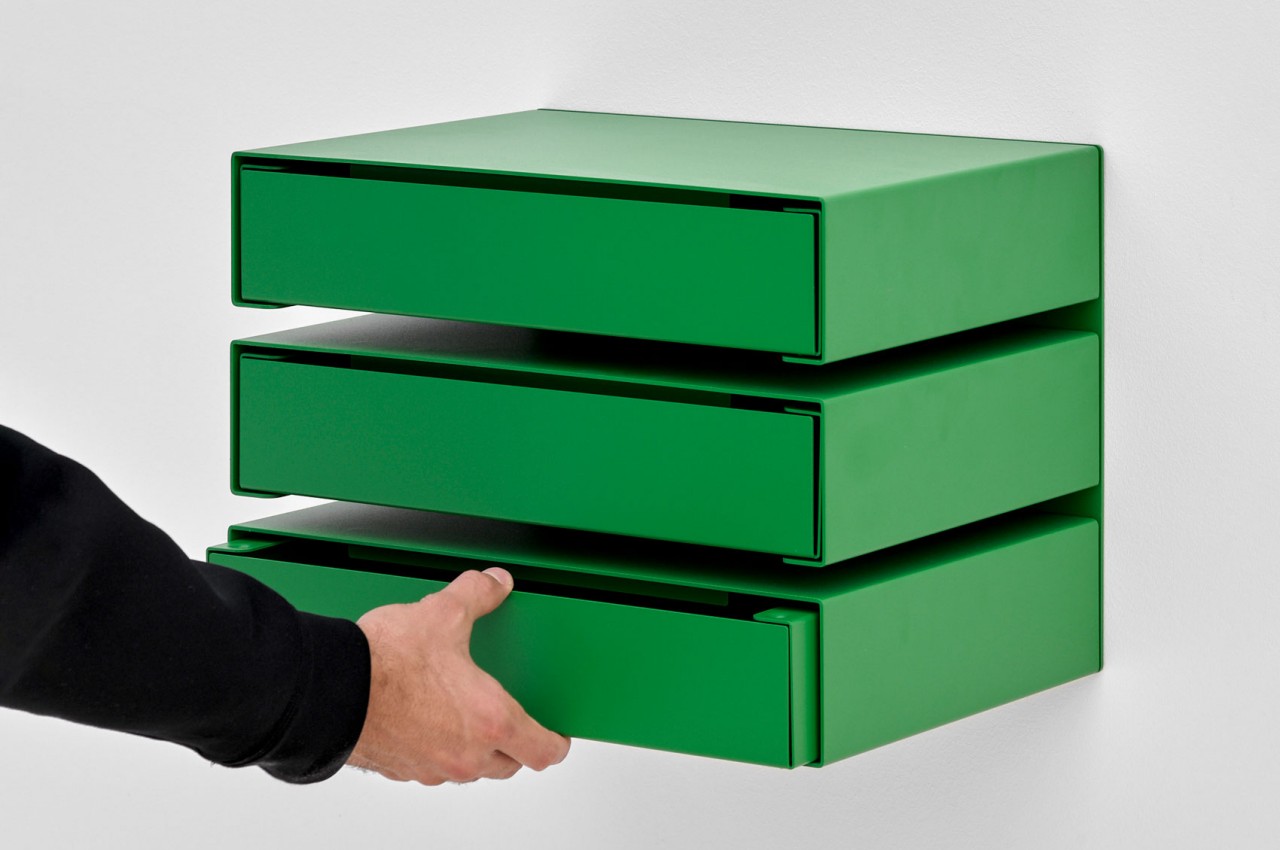
The KGT Wall Units evolved from metal storage boxes that could be individually stacked just like any conventional storage box. As the name implies, these boxes are mounted on a wall rather than lying on the floor. In this manner, they actually behave more like drawers rather than boxes, but the function and purpose are the same: to hide your possessions from view.
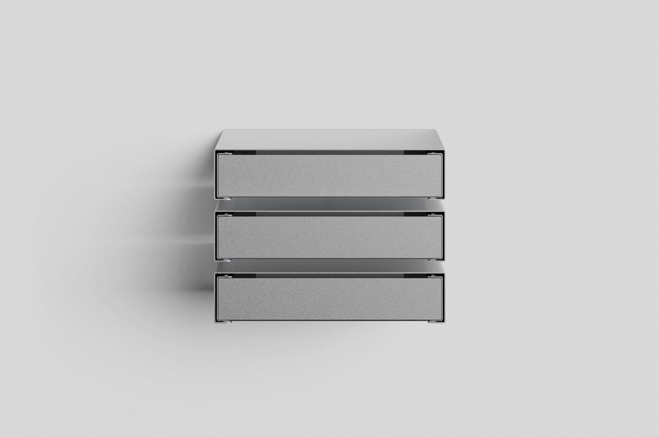
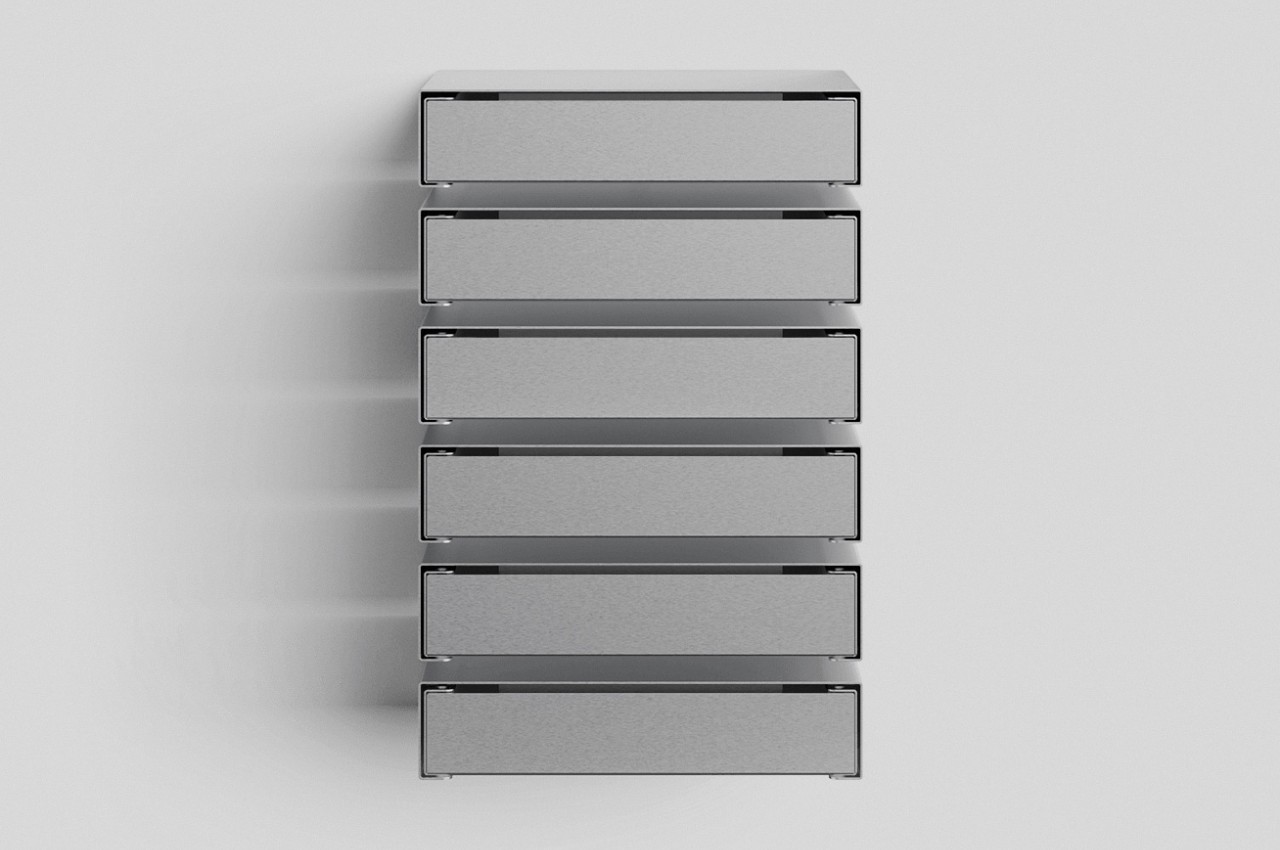
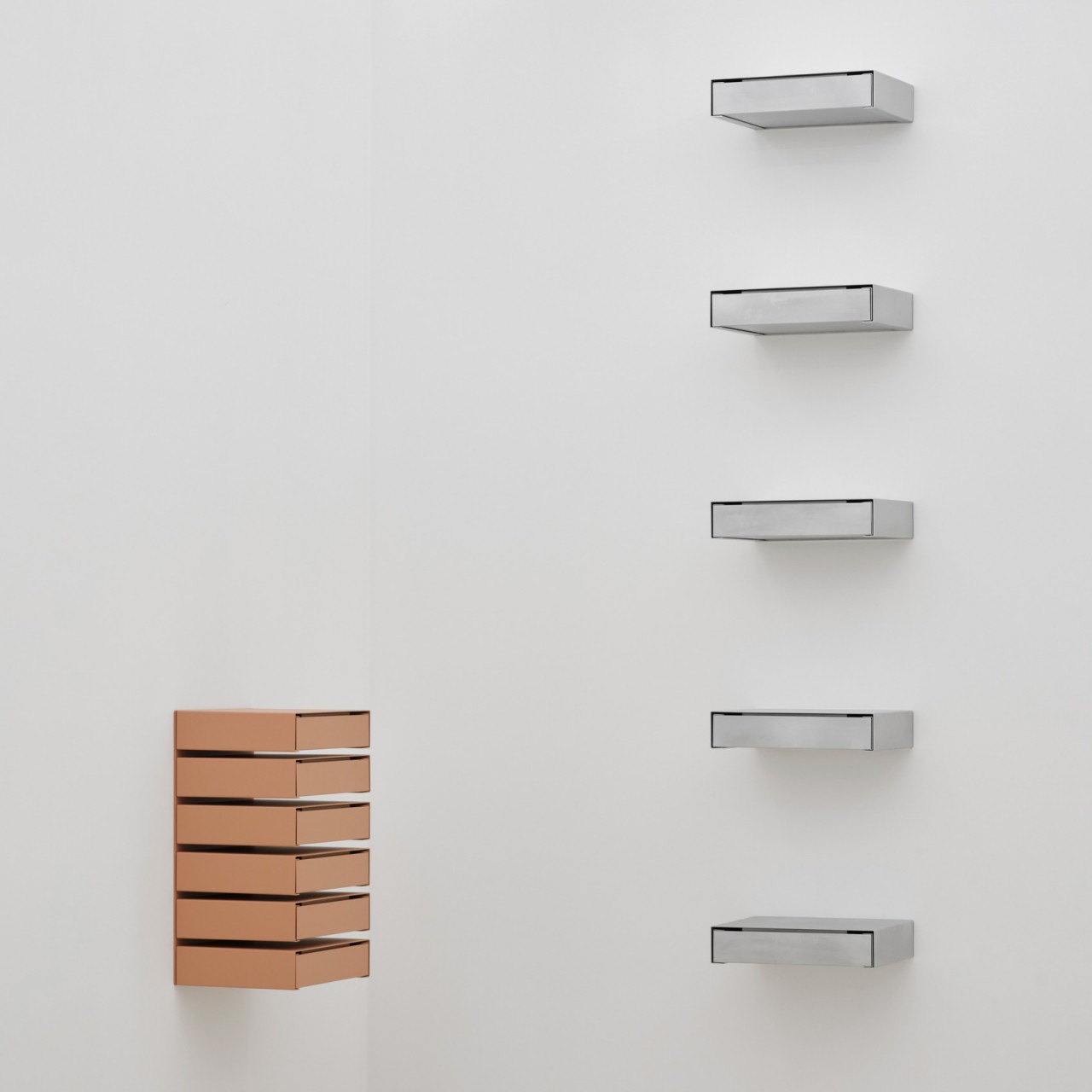
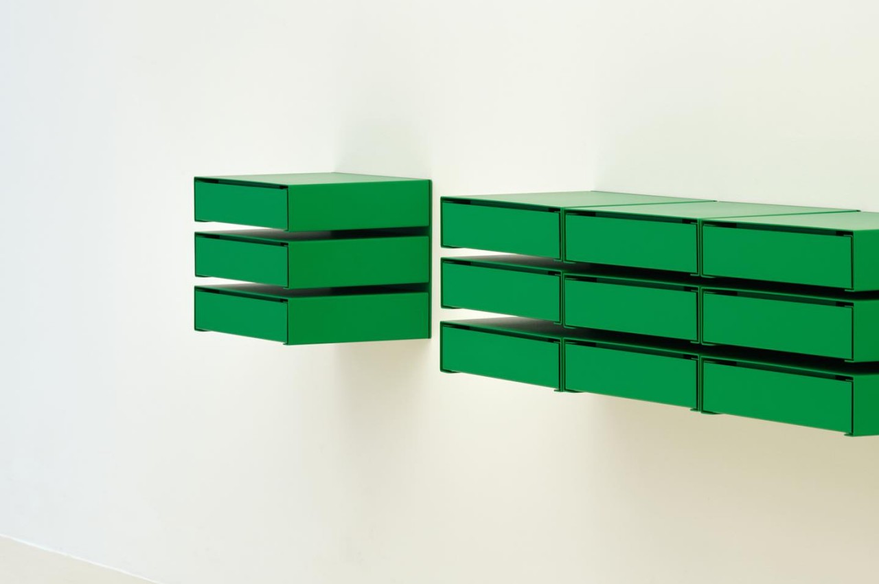
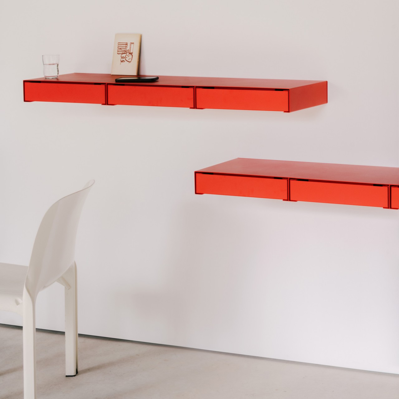
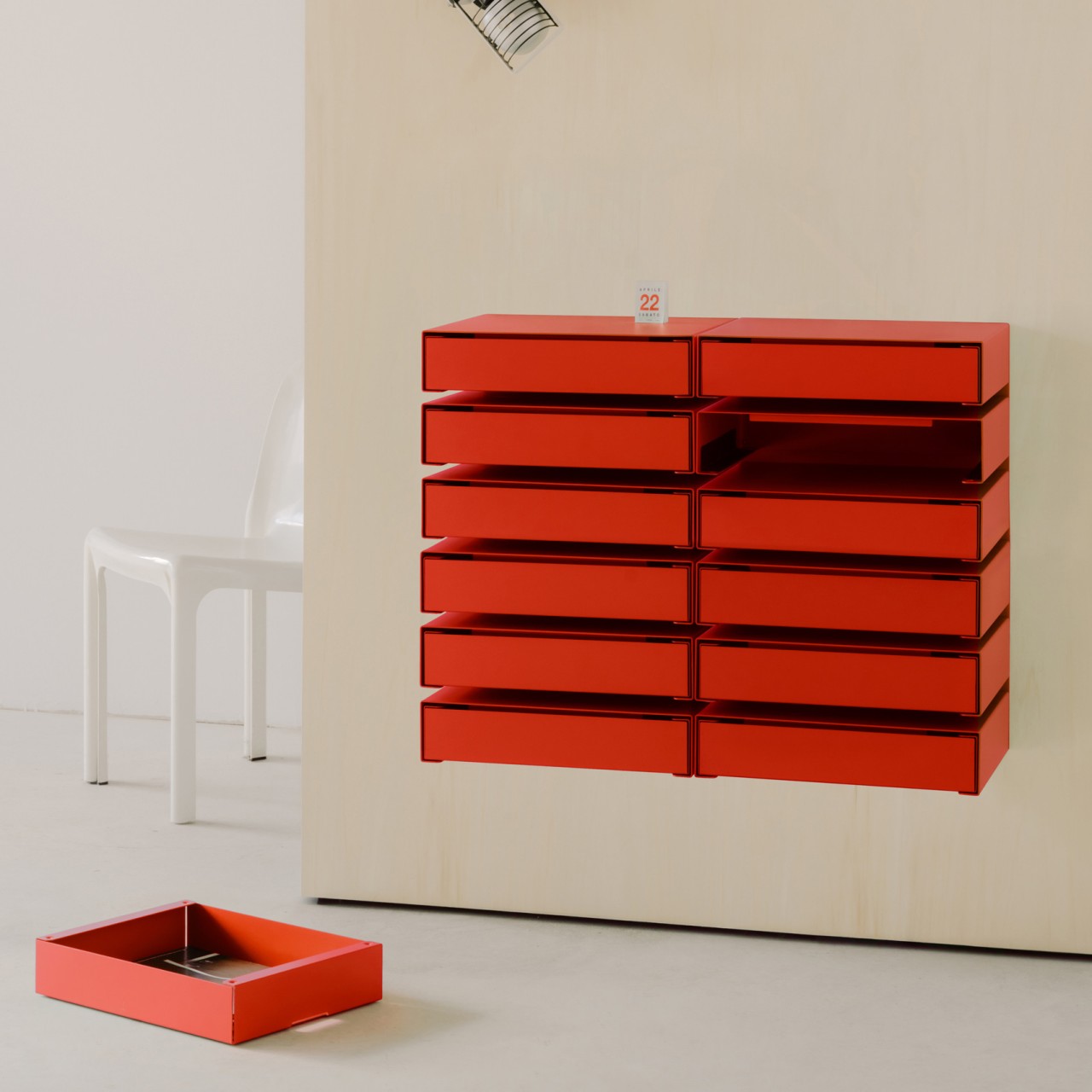
Of course, these can’t be stacked like normal boxes because they have to be screwed to a wall for stability. In fact, each unit has a fixed number of drawers, either one, three, or six in a vertical arrangement. There is one other variant where the drawers line up side-by-side, creating a long horizontal row instead. Of course, there’s no limitation on how you combine those units and how many you use. You could even have a whole stack of three six-unit drawers for a total of 18, or 18 individual drawers, presuming you have enough vertical clearance.
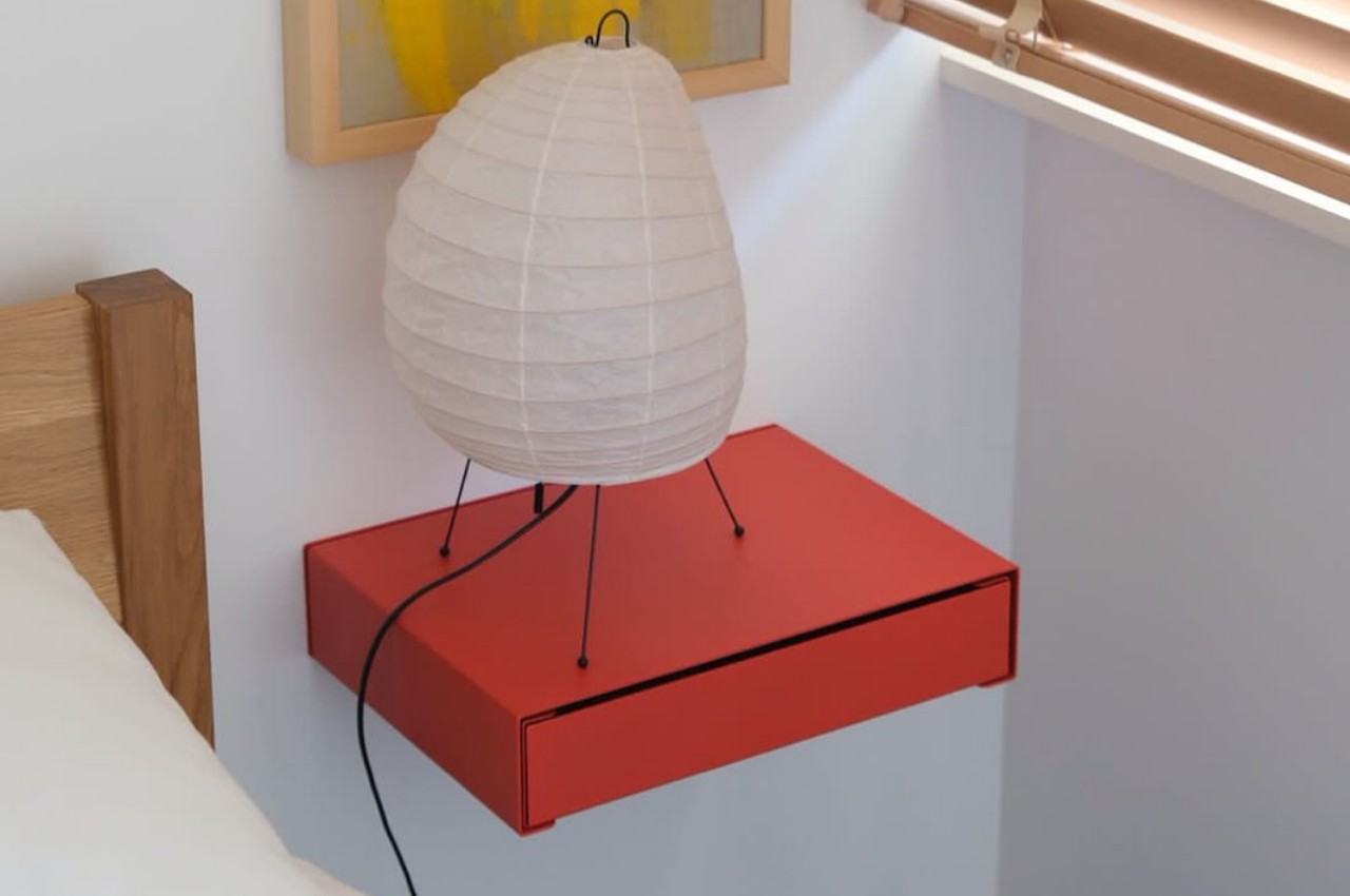
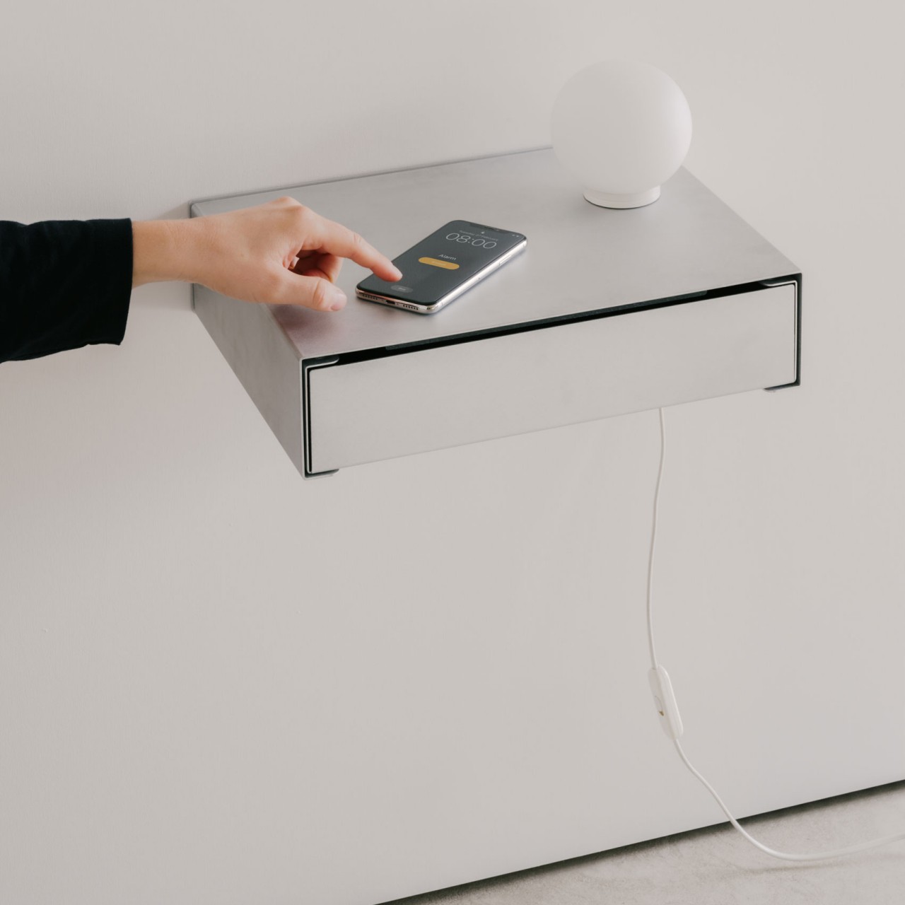
More than just their practical utility, however, these wall-mounted drawers add aesthetic value to a space, something ordinary stacked boxes don’t often provide. The gaps between each drawer bring some negative space that visually balances the unit, and the top of each unit becomes yet another space to utilize for things you want people to see. With a powder-coated finish, these seemingly floating drawers provide more than just smart storage but also visual interest to your space, all without cluttering your floor even further.
The post Wall-mounted drawers offer storage that leaves your floor clear and free first appeared on Yanko Design.
Unusually creative cabinet opens by tilting forward!

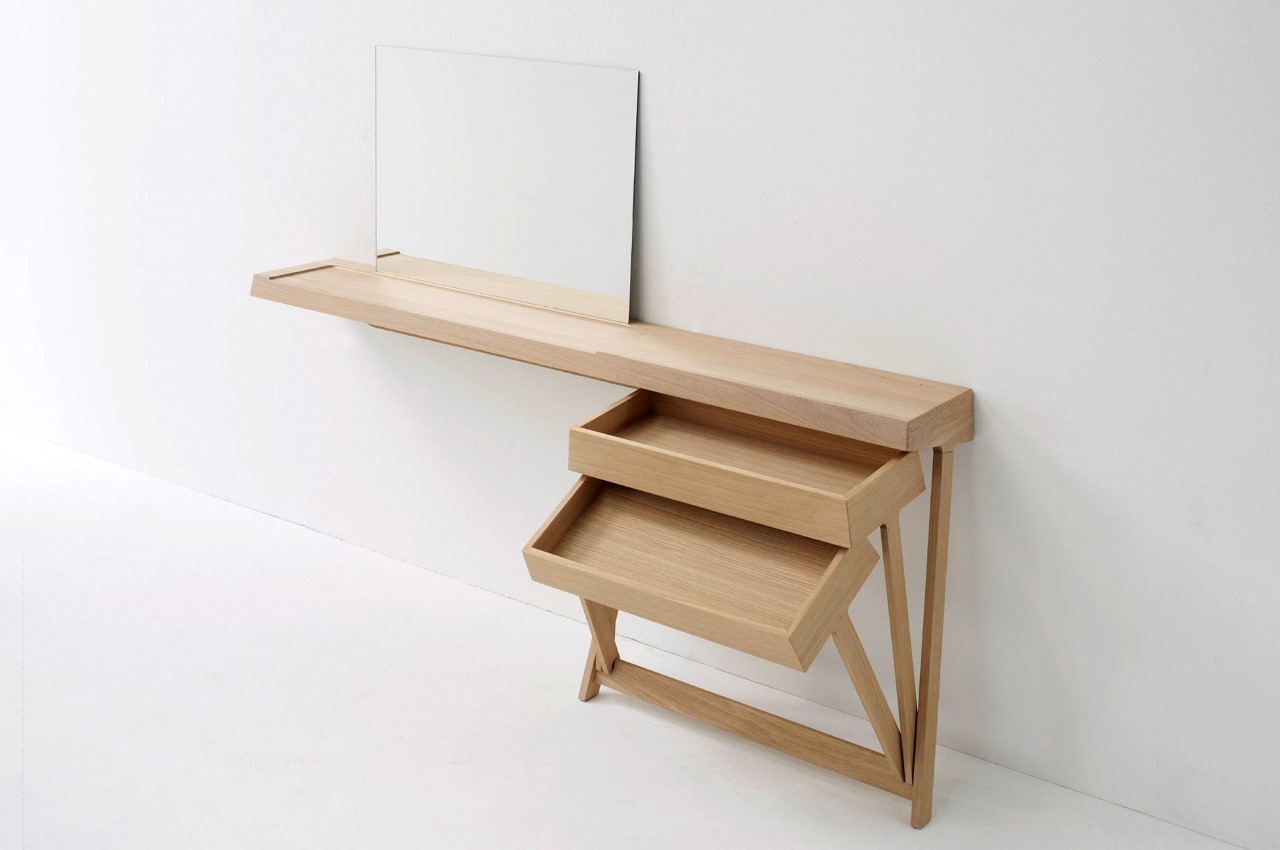
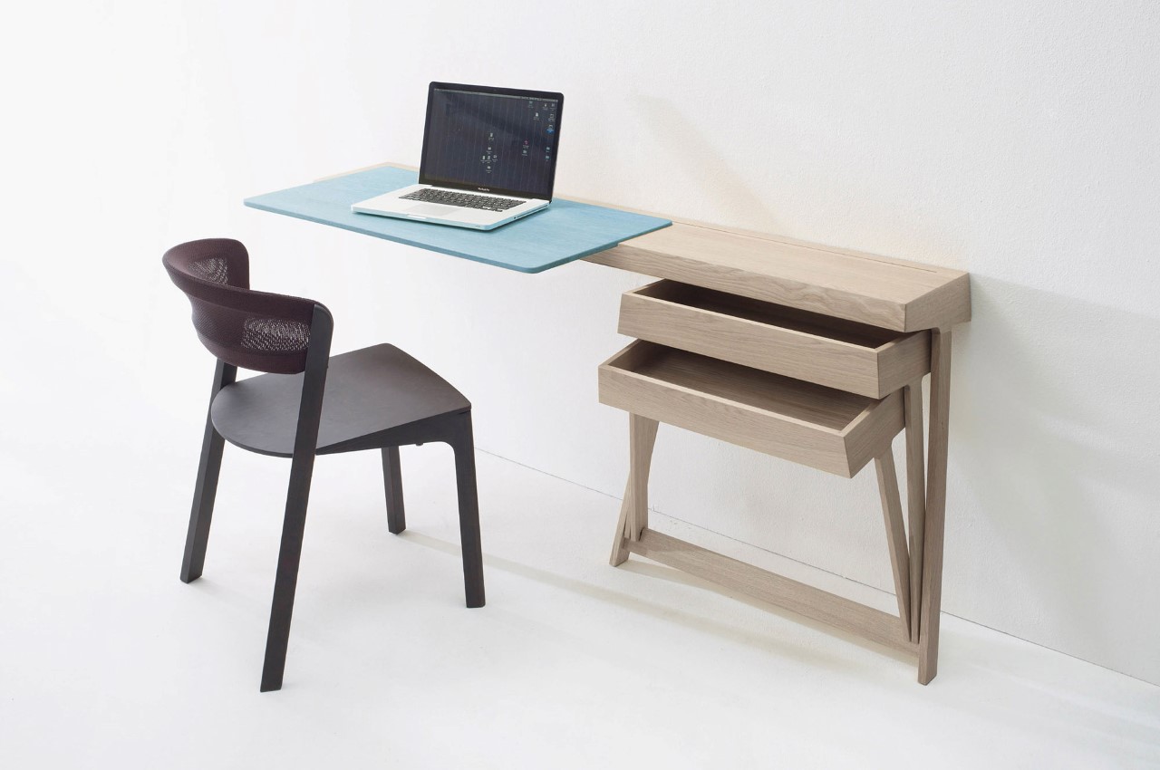
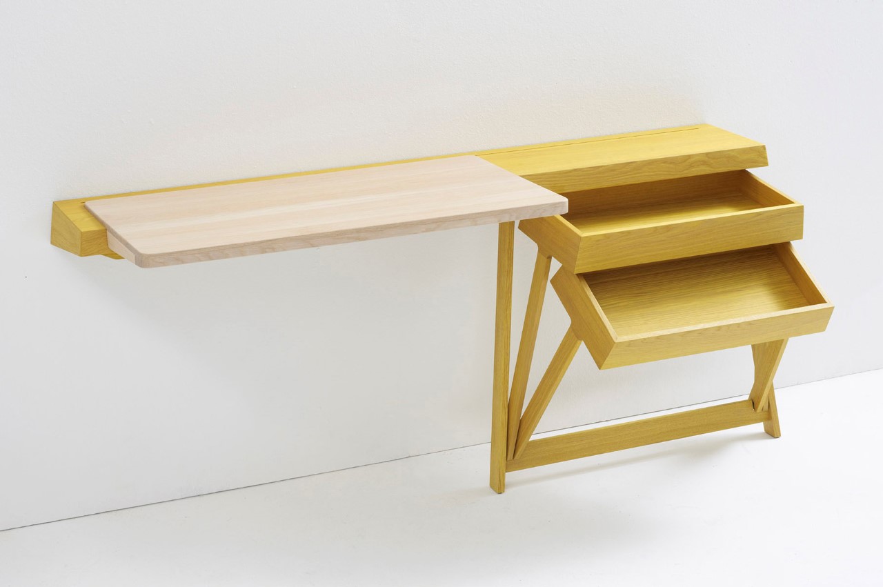
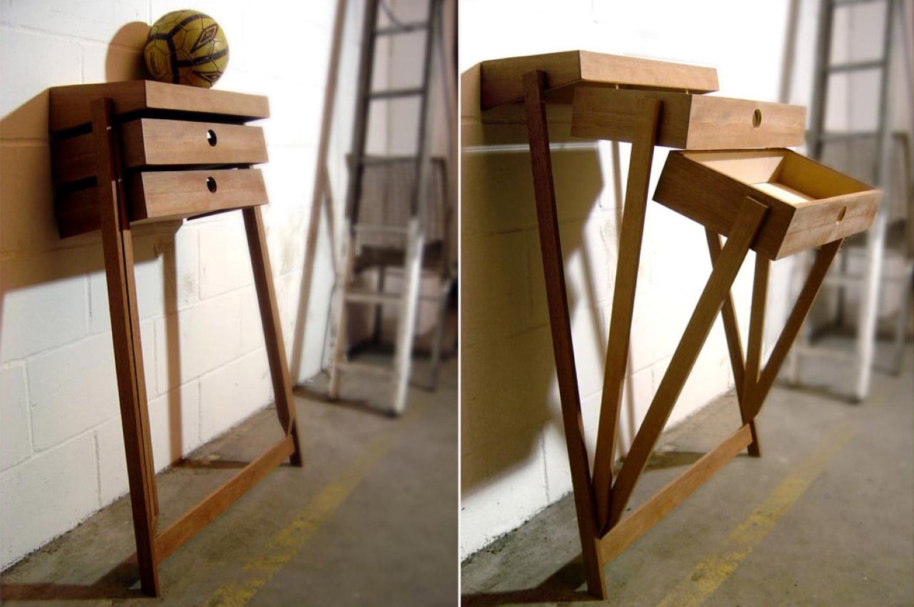
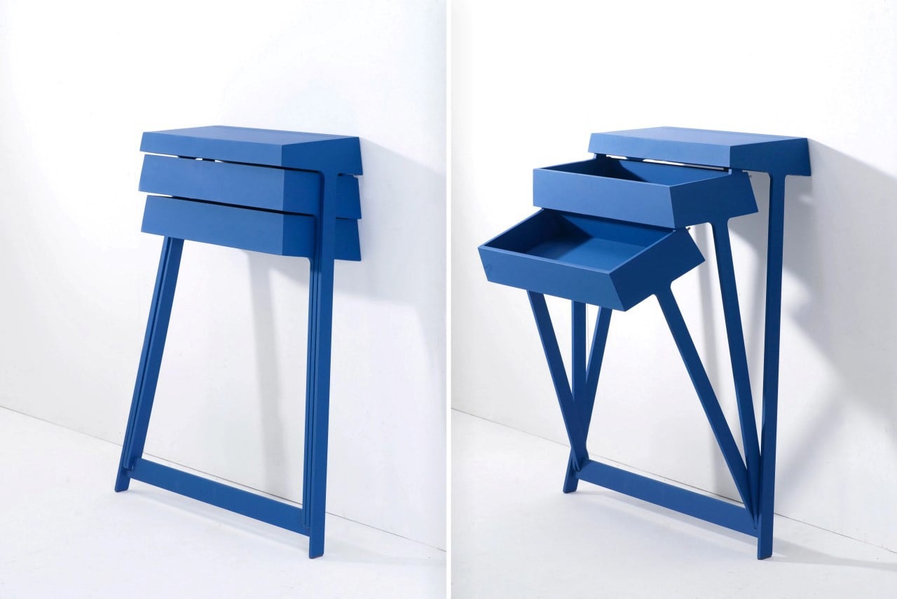
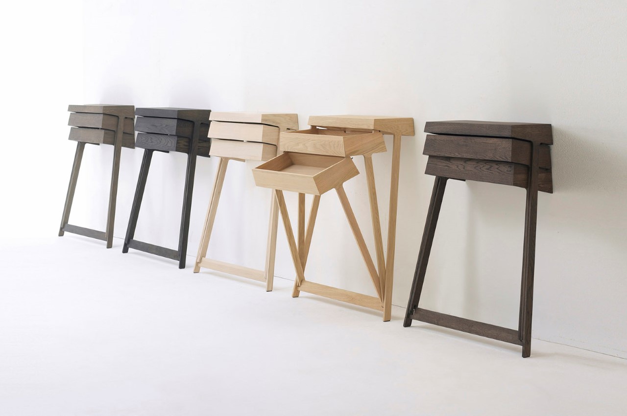
The Pivot rightfully uses gravity as a design feature! Instead of sliding drawers, a nifty little pivot joint at the base of this cabinet allows individual drawers to open by tilting forward. It’s clever, fun, and makes it easy to access your belongings without having to dig around! Just don’t expect it to be hyper-organized though!

Designer: Raw Edges Design Studio for Arco

The Pivot is an incredibly fun chest of drawers designed to be used independently or as a part of a desk. The pivoting mechanism is convenient and easy to use, allowing the drawer to slide open with little to no effort since gravity does most of the work. There are no sliding components, no bearings and railings, and nothing that would cause the drawers to get jammed, forcing you to yell “PIVOTTT”! (I couldn’t NOT make that joke)

Its simplicity extends beyond the cabinet’s unique pivoting detail. The cabinet comes with a wall-mounted design, and sports just two legs, sort of like an easel. It’s definitely interesting to look at and probably a lot of fun to interact with!

Retain your chilled drink’s temperature with this drawer equipped mini-fridge!

Working away in your home office space and need a refreshing beverage, but too lazy to go all the way to the kitchen? Watching a movie, and want a chilled beer, but too invested in the film to actually budge? For all those of you who live alone, and don’t really have someone to grab something for you from the fridge, you know the pain of walking over to it when you’re completely engrossed in something. Well, product designer Taewoo Kim created ‘Drawer’, a mini-refrigerator that promises to be within the reach of your fingertips!

Inspired by an actual drawer, Kim’s mini-fridge snugly fits underneath desks! Looking more like a piece of furniture, than a home appliance, Drawer can be easily placed under a desk or any other convenient nooks and crannies in your home. Its furniture-like aesthetic allows it to easily merge with the interiors of your home. With sufficient space to store beverages, bottles and some food items, Drawer is perfect for a single person household wherein refrigerable items are a few. Handle free, you only need to push the door of the mini-fridge to access it.

However, Drawer’s most interesting feature would be its cooling cup holder! Similar to a drawer in your desk that you tug out, the cooling cup holder can be pulled out to reveal a cup holder that keeps your drinks chilled at all times. You can work away, or watch a movie, with your chilled drink easily accessible. No more picking up your drink to find that its back to a gloomy room temperature. Air vent holes can be found on either side of Drawer, so you can easily push it against the wall and save up on a whole lot of space.

Drawer’s cooling cup holder has literally won my heart! The thought of having a chilled beverage always by my side, without having to move my body gives me goosebumps, and I can’t wait for this concept to turn into a reality!

Designer: Taewoo Kim

New Wave Minimalist Handle

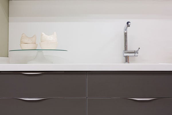
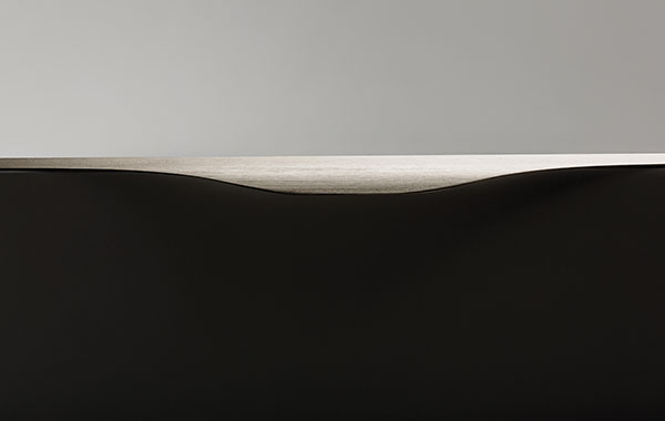
If you’re looking to give your kitchen or bathroom cabinets a minimalist facelift, then look no further than the Noma handle by Viefe! With a slim profile of just 1.2mm thick aluminum, it’s the next best thing to a built-in recessed handle and almost completely unnoticeable. Its elegant wave form is easy to grip with the fingertips and can be positioned on the sides or top depending on the users preference. Designer: Viefe

-
Yanko Design
Timeless Designs - Explore wonderful concepts from around the world!
Shop CKIE - We are more than just concepts. See what's hot at the CKIE store by Yanko Design!
(New Wave Minimalist Handle was originally posted on Yanko Design)

Related posts:

  1. For the Minimalist on the Run
  2. Minimalist Juicer
  3. What A Wave


The Same, But Different

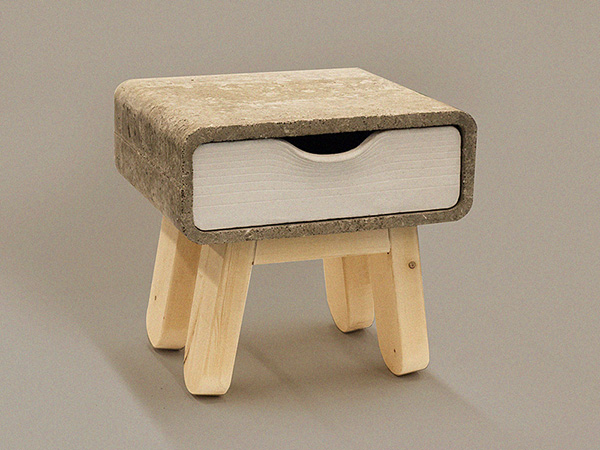
Metropolis is a project designed to express two opposing bedside tables- one representing day and the other night. The overall shape of the tables are the same, but the details and colors are in complete contrast. Day is portrayed as more calm, friendly and inviting… while the night has more of a extroverted, polarizing, even sinister character.

Designer: Brian Khouw

-
Yanko Design
Timeless Designs - Explore wonderful concepts from around the world!
Shop CKIE - We are more than just concepts. See what's hot at the CKIE store by Yanko Design!
(The Same, But Different was originally posted on Yanko Design)

No related posts.


Just Mobile talks about working with Apple and why it manufactures in Taiwan exclusively

Just Mobile talks about Apple product certification, previews its AluRack, AluBase and HeadStand

For the average Joe that have managed to stay out of the Apple circle, the Just Mobile brand might not immediately ring a bell, but chances are you would've come across one of its peripheral designs at some point. The only problem is unless you knew the company in the first place, you'd easily assume that the aluminum or even plastic knock-offs are just based on generic designs, because there are simply too many of them. It's no wonder Just Mobile co-founders Nils Gustafsson and Erich Huang take imitations of all forms very personally (especially the ones they and their lawyers see at CES), but fortunately, we were spared from prolonged ranting when we visited the duo's office in Taichung, Taiwan recently. What we were treated to instead was an insight into how an accessory maker works with Apple and why Just Mobile manufactures exclusively in Taiwan, as well as getting a preview of the upcoming AluRack, HeadStand and AluBase that are due out this month.

Continue reading Just Mobile talks about working with Apple and why it manufactures in Taiwan exclusively

Filed under: ,

Just Mobile talks about working with Apple and why it manufactures in Taiwan exclusively originally appeared on Engadget on Mon, 08 Oct 2012 10:11:00 EDT. Please see our terms for use of feeds.

Permalink   |   | Email this | Comments