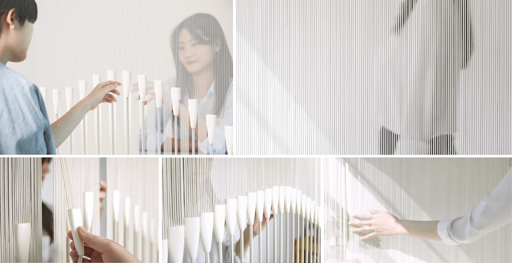
This interactive partition system separates spaces physically, but unites people with playfulness!

Inspired by a detail found on Korean drums (where you adjust the drum’s tautness by interacting with the strings on its side), the Gyozip is a partitioning system that’s more focused on creating something that isn’t socially destructive. Rather than separating people in a literal sense, the Gyozip is a physical separator, but it’s also a canvas where people on both sides of the partition can interact with it, creating art in the process.

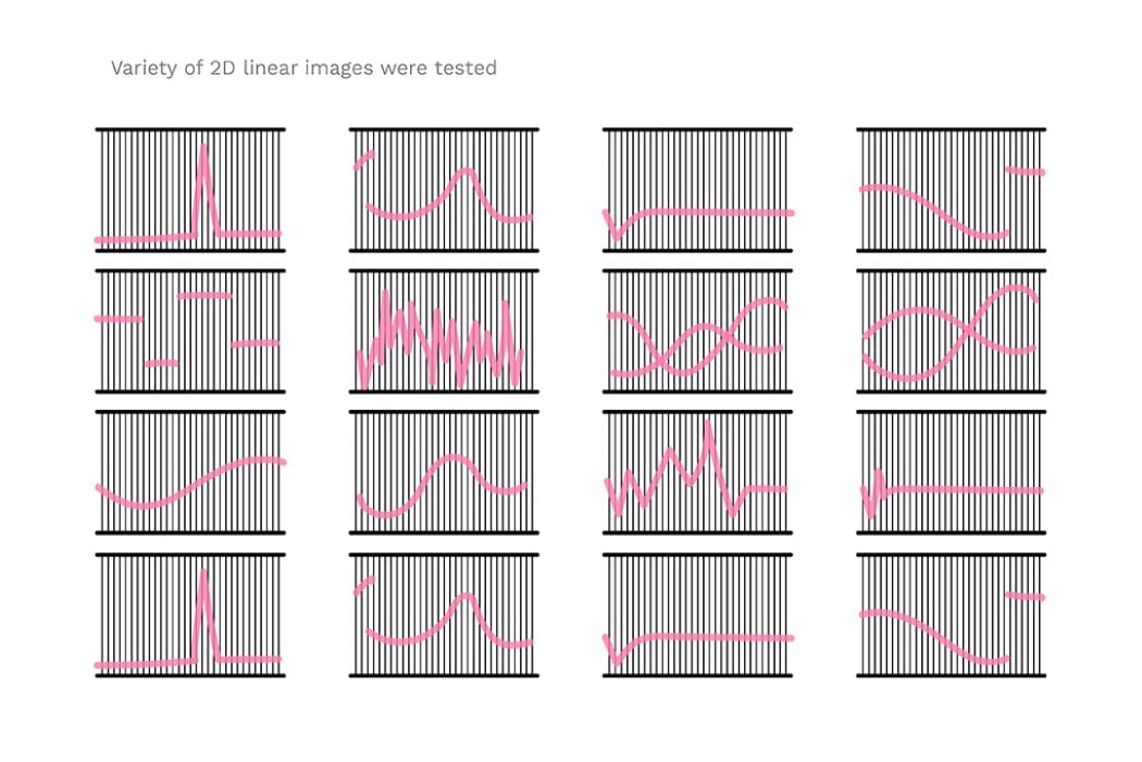
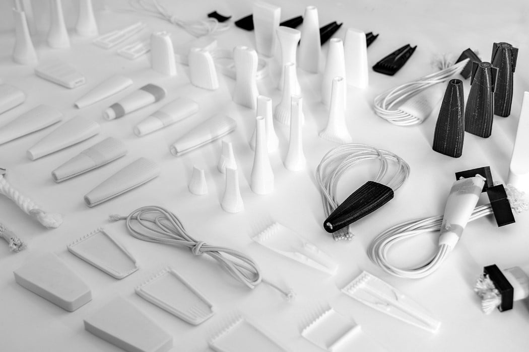
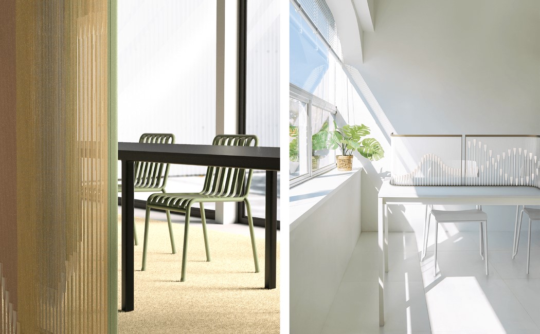
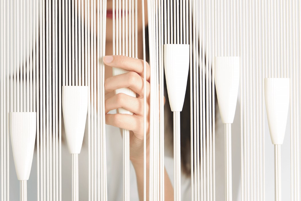
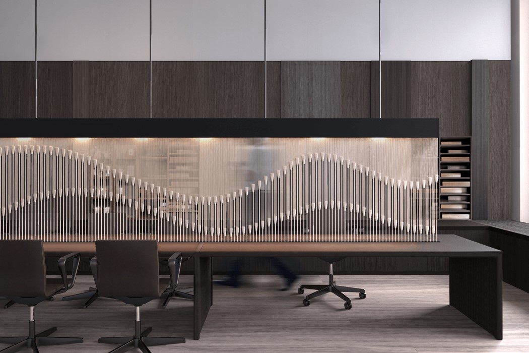
The Gyozip features an outer frame with multiple cords running vertically, and conical channels that slide up and down, either separating the cords or clustering them together. These conical channels help either distribute or accumulate the cords, changing how they look from afar. Arrange the channels in a variety of patterns and the Gyozip looks less like a partition and more like an art installation that serves the functional purpose of dividing a space. However, it still encourages social interaction between people on either side, inviting them to participate in the playful process of creating art on the Gyozip’s dynamic surface!

Designer: Ji Yoon Kim
This beetle-inspired table spreads its wings to double its tabletop surface!

In an unusually beautiful case of nature-inspired design, the Elytra table by Radhika Dhumal expands in size by ‘spreading its wings’! The table comes inspired by beetles and they way their wings nest perfectly around their body. The table itself comes with perfectly natural bug-like proportions that fits in well as garden decor, and uses two ‘wings’ to expand in surface, much like the beetle.

Elytra’s design is dominated by rounded forms that give it a friendly, pet-like demeanor, and feature four legs that are positioned in a way that gives the Elytra its unique, animalistic stance. The table’s surfaces are split into four broad parts, including a wooden ‘head’ and ‘body’ as well as two glass-inlay wings that can be opened out expand the table’s surface to store an extra few cups of tea, a planter or two, and perhaps a notebook to doodle your ideas on!

Designer: Radhika Dhumal

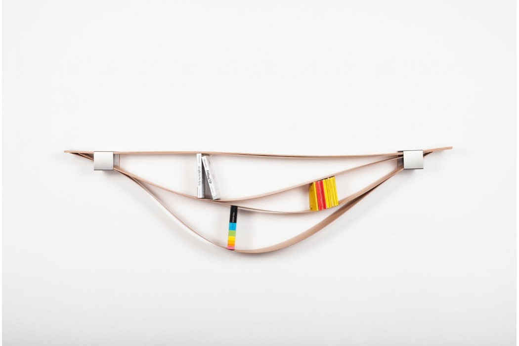
The Chuck bookshelf is unique, simple, dynamic, and an artpiece in itself

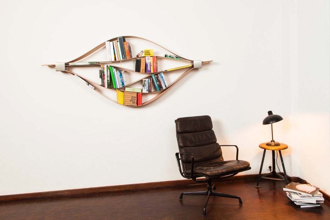
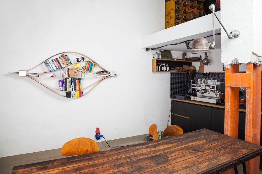
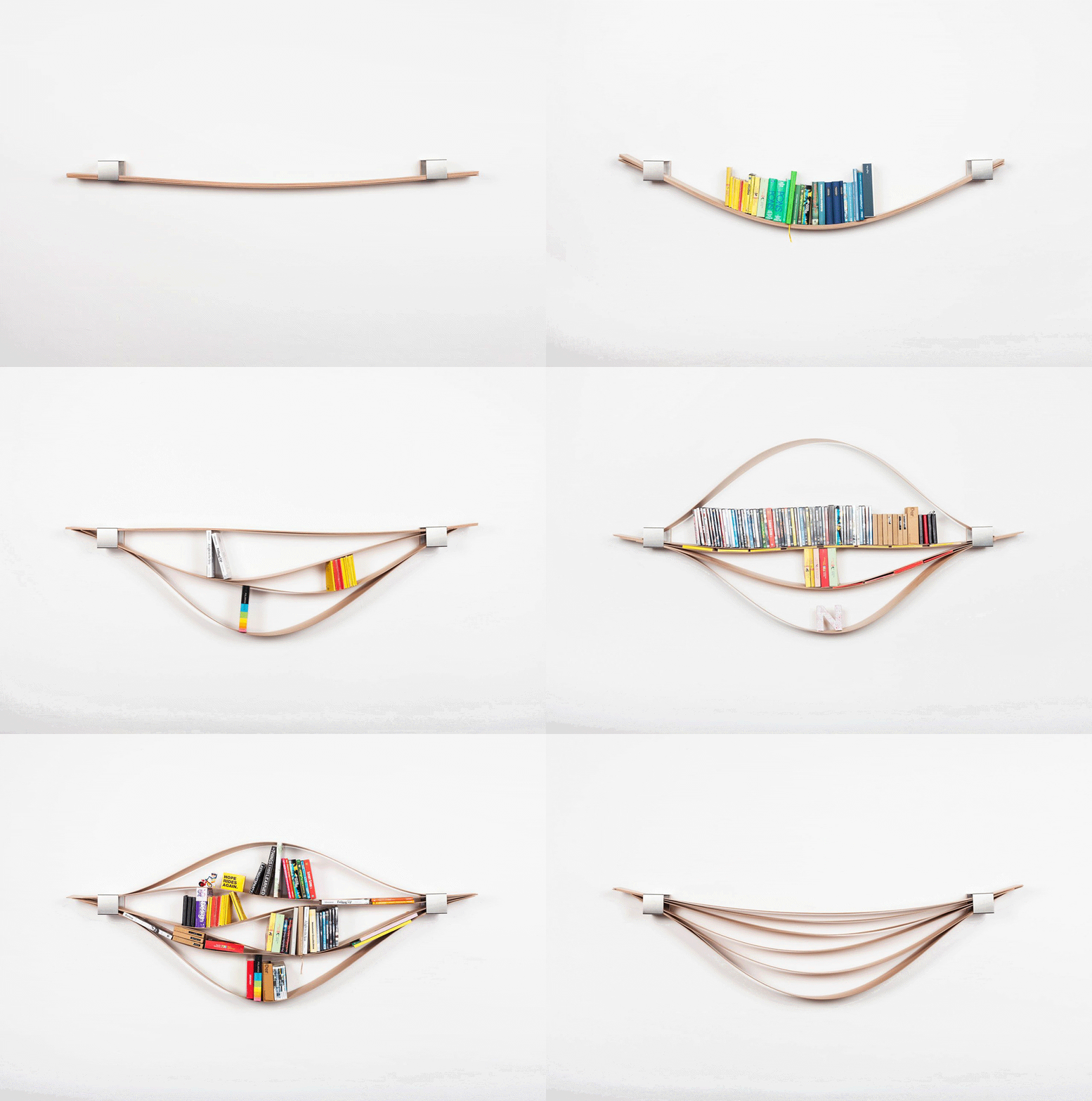
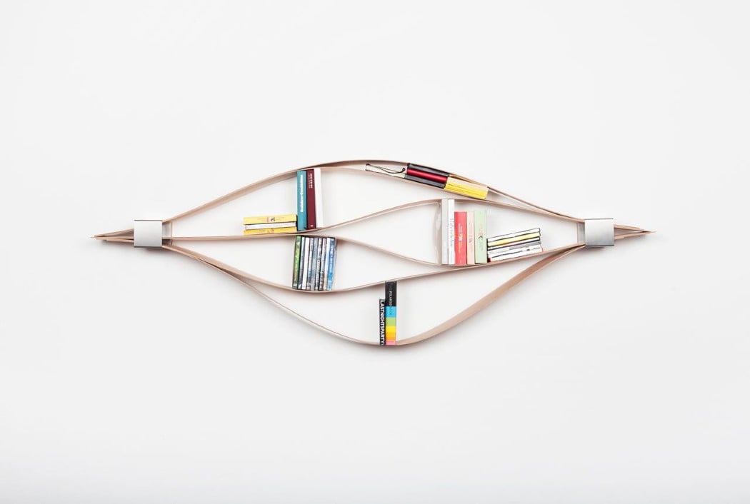
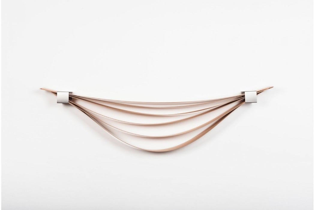
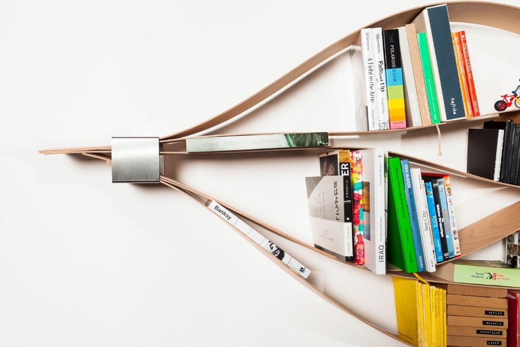
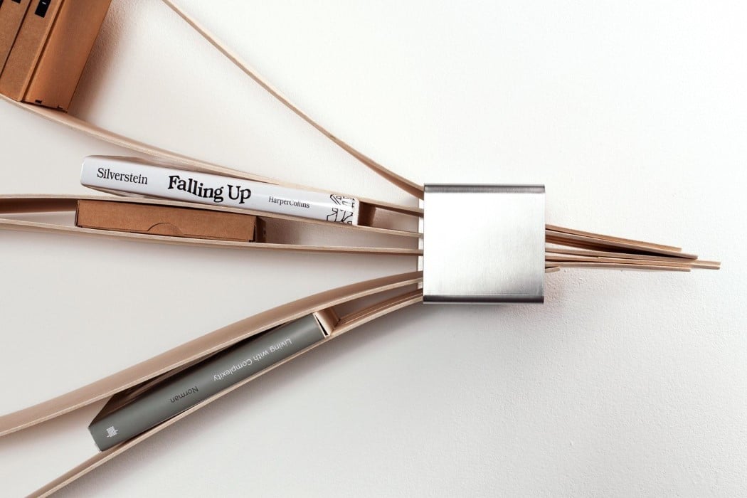
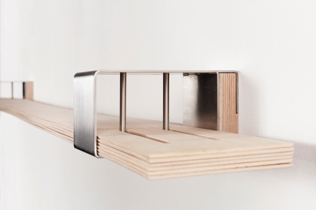
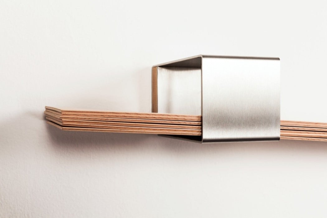
The Chuck, a Red Dot winning bookshelf, ticks all my boxes for innovation and design. It’s simple in its construction, easy to use, fun to interact with, can store books/media of different types and sizes, has the capacity to look strikingly different every time you make a change to it, and is very capable of being the most interesting piece of furniture in your room. With two metal members on either side holding together six strips of wooden veneer, the Chuck bends and flexes as you place books on/between the veneer sheets, creating undulating waves of wood that store your books, CDs, plaques, and objets d’art.

The way these items are placed on the wooden slats affects the overall form of the bookshelf, literally turning it into an installation that transcends traditional furniture, and that’s unique to your arrangement style. Items can be placed vertically, or horizontally, or sometimes even diagonally on Chuck, giving you the freedom to express yourself not only with your book collection, but also with the way you arrange them. The Chuck also has no defined constraints for how big or small the books need to be, giving you more freedom and flexibility (literally too) to use the storage it provides, and in doing so, create a piece of art from a humble piece of furniture!

Designer: Natascha Harra-Frischkorn

Click Here to Buy Now

chuck_bookshelf_2

chuck_bookshelf_3

chuck_bookshelf_44

chuck_bookshelf_5

chuck_bookshelf_6

chuck_bookshelf_7

chuck_bookshelf_8

chuck_bookshelf_9

chuck_bookshelf_10

chuck_bookshelf_11

Click Here to Buy Now