This Compact E Ink Phone Promises to Simplify Your Digital Life

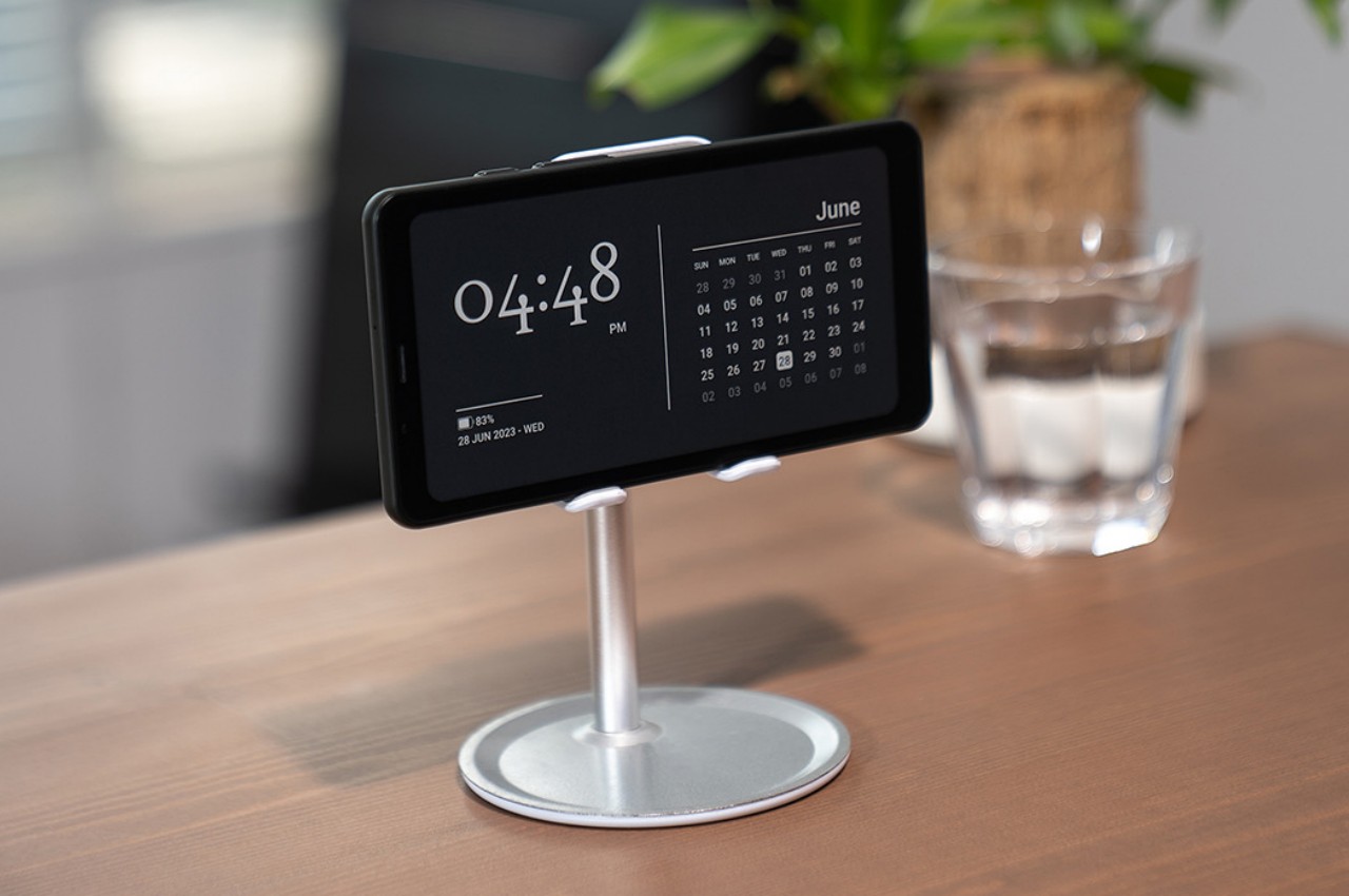
This year’s been exhausting, hasn’t it?! Especially the last few weeks have been emotionally and mentally draining, and it isn’t just the news, but more specifically, it’s the information overload we’ve been subjected to. Even for a device small enough to fit in our pockets, the smartphone is capable of creating a lot of ‘noise’ in the form of news, texts, calls, notifications, ads, and a lot of data clutter that can overwhelm our brains. This data clutter and relentless bombardment of information is what led to the creation of the Mudita Kompakt, a phone that prioritizes mindful living over doomscrolling.

Created by the minds behind CD Projekt (think The Witcher, Cyberpunk 2077), Mudita Kompakt reflects co-founder Michał Kiciński’s personal journey toward a more balanced life. After years in the gaming industry, where endless connection was the norm, he sought a solution to keep people both connected and grounded. That drive led to Mudita’s mission to design devices that encourage simplicity, privacy, and a conscious digital experience.

Designer: Mudita

Click Here to Buy Now: $316 $465 (32% off). Hurry, only 2/900 left! Raised over $336,000.

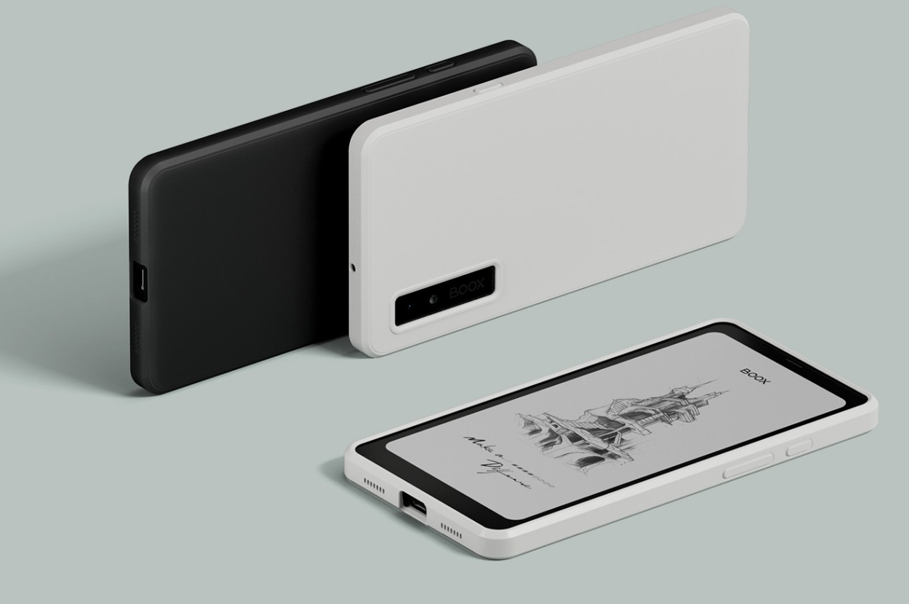
The Mudita Kompakt keeps things refreshingly simple. Its 4.3-inch E Ink display is easy on the eyes and demands very little power. That’s right—this phone’s battery can last up to six days, which, in today’s daily-charging world, feels almost revolutionary. Inside, it packs a quad-core MediaTek processor, 3GB of RAM, and 32GB of storage (expandable via memory card). Sure, these aren’t flagship specs, but that’s really not the point. It’s all about cutting the clutter and retaining only the things that ‘spark joy’ here. Mudita keeps it lean, pre-loading only the most basic apps like phone, SMS, a calculator, and a voice recorder—none of those attention-demanding apps or bloatware that love to ping you at all hours.

For a phone, the Mudita Kompakt offers dual-SIM capabilities, with 4G LTE compatibility. You can make and receive calls on either SIM and even make/receive VoLTE or Wi-Fi calls, offering connectivity without much of a compromise. Given its entire premise is to stay disconnected from the clutter of the internet, it clearly doesn’t come with 5G, but that’s more of a feature than a bug, truth be told. There’s even support for eSIMs, which is perfect for carriers that don’t traditionally offer SIM cards.

For a phone that strives to be different from the status quo, it still makes a conscious effort to retain features that are cutting-edge… only if they matter to Mudita’s overarching ethos. You may not have a flashy screen and 5G connectivity, but the Kompakt DOES come with a fingerprint sensor to unlock your phone, ensuring biometric-grade security feels reassuring. Surprisingly enough, the phone comes with NFC support too, allowing you to use existing NFC tags around the house, as well as ensuring future compatibility with NFC-ready apps that Mudita may introduce down the road.

What’s remarkable about the Kompakt is its genuine intent to keep users focused on the real world, not the screen. It features an Offline+ mode activated by a physical switch, cutting off cell networks, Wi-Fi, and Bluetooth, and even disabling the mics and camera for a true offline experience. Think of it as Airplane Mode on steroids, with no features that cause you to linger on your phone for too long. You can read existing messages (you won’t receive new ones), browse through your gallery, or listen to music without any distractions. All these actions have heavy intent behind them, so you’re less likely to end up in a doomscrolling spiral.

Tailored for E Ink®

On the design front, the Mudita Kompakt feels compact, sturdy, and unassuming. It boasts an IP54 rating, meaning it’s resistant to dust and splashes, so it can hold up to daily wear without needing a bulky case. While it does include a modest 8MP camera, this isn’t about capturing every detail of your day—just the moments you truly want to remember. Photos get displayed in greyscale on your E Ink display, adding a rather retro touch to your photography chops. And for the rare occasion you need to recharge, it’s conveniently equipped with wireless charging and a USB-C port, keeping up with modern conveniences.

The Kompakt’s software is built on a custom OS based on the Android Open Source Project. The twist? There’s no Google lurking in the background, collecting data. Mudita promises three years of software updates to keep things smooth, even though this isn’t the kind of phone that’ll be weighed down by big updates. That’s another angle to the Kompakt’s appeal: minimal fuss, minimal distraction, and maximum control over what you interact with.

Of course, going minimalist does have its trade-offs. There’s no Google Play Store here, so you won’t find a wide selection of apps. Mudita provides basic offline maps, a music player, and a few utilities like a meditation timer, voice recorder, an e-reader, and even a chess app that promises you won’t find yourself getting bored. You can, however, sideload other Android apps, although compatibility isn’t guaranteed. For those of us used to feature-packed smartphones, adjusting to a stripped-down OS could be tricky. But that’s the appeal—it’s a purposeful move away from digital noise, offering just enough functionality to meet core needs without temptations. A true digital detox, if you will.

Another perk of the Kompakt is privacy. Since it doesn’t sync with most cloud services, your data stays on your device. Sure, it may feel a bit old-fashioned to manage contacts and files through Mudita’s desktop app, but for privacy-minded users, this setup grants peace of mind. It’s a minor detour to ditch the endless cloud syncs and data-hungry services tracking your every move. The Kompakt is available starting at $316 for early adopters, with a 14-day money-back guarantee just in case the Kompakt feels like too much of a culture shock. Mudita offers Global and North American versions of the Kompakt, so it’s compatible with networks worldwide. Just don’t expect it to work everywhere yet—currently, it’s only shipping to select countries in Europe, the U.S., Canada, Australia, and New Zealand. Oh, and just in case you were wondering… it has a 3.5mm audio jack!

Click Here to Buy Now: $316 $465 (32% off). Hurry, only 2/900 left! Raised over $336,000.

The post This Compact E Ink Phone Promises to Simplify Your Digital Life first appeared on Yanko Design.

Amazon Kindle Colorsoft Signature Edition finally catches up with the eReader trend

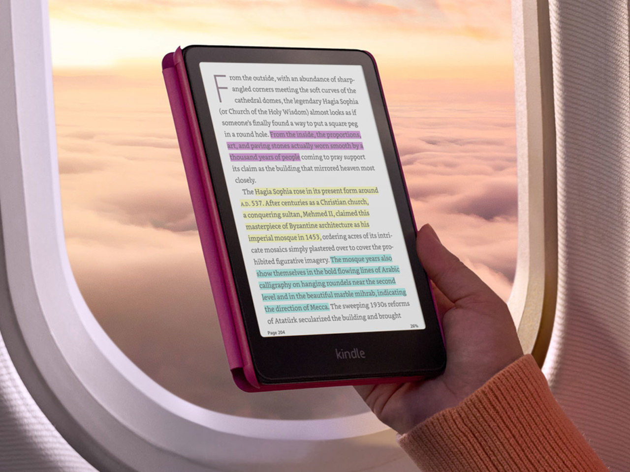
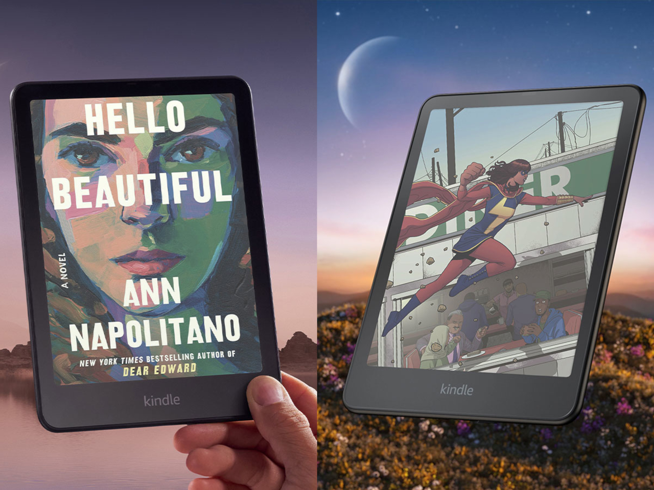
The eBook reader, a.k.a. eReader, market has grown considerably since the very first Kindles, now encompassing a more varied range of devices and capabilities. There are plenty that are really Android tablets in disguise, and some have gone beyond the blacks and grays of conventional E Ink devices. Despite all these advancements, Amazon’s devices are still the household name in this market, but the Kindle seems to have fallen behind its rivals in features. It wasn’t until late 2022, for example, that Amazon launched its first pen-enabled Kindle, the Scribe, and now it’s making another step forward with its first-ever Color E Ink device, the Kindle Colorsoft Signature Edition.

Designer: Amazon

Color E Ink isn’t a new technology, but Amazon has been very slow to embrace it. On the one hand, its core audience and the bulk of its library are centered around plain text eBooks anyway so it might not have been a high priority. But with more electronic documents embracing color and eReaders offering functions beyond just basic reading, it was definitely high time for a Kindle to follow suit.

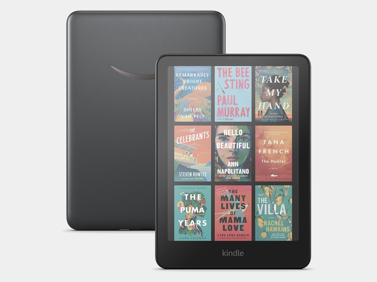
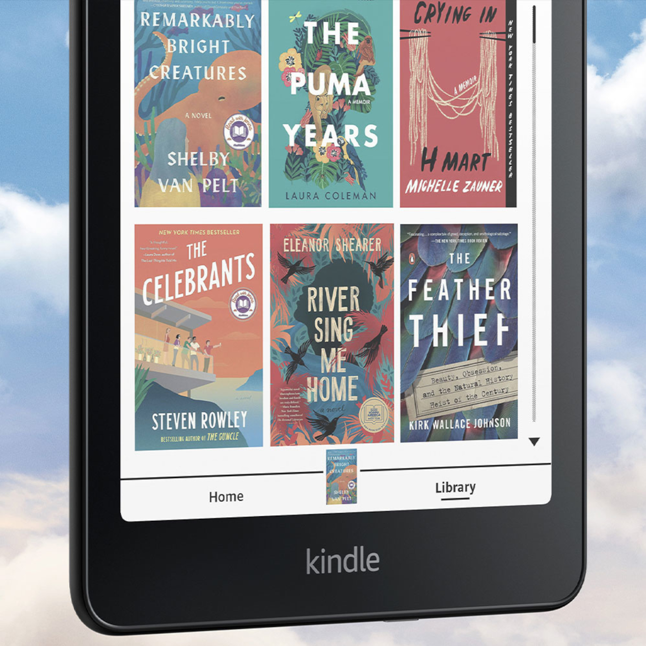
The Kindle Colorsoft Signature Edition brings Amazon’s eReader family up to snuff, slapping a 7-inch E Ink Kaleido screen on a very familiar design. Of course, it also comes with a few Kindle innovations, like custom-formulated coatings between display layers to enhance the typically dull colors of Color E Ink, micro-deflectors to minimize stray light, and an oxide backplane for better image quality and faster page turns. There’s also 32GB of storage on board and support for wireless charging, the latter a rarity in this device category.

With a $279.99 price tag, the Amazon Kindle Colorsoft Signature Edition is quite pricey compared to other Color E Ink devices, such as the BOOX Go Color 7 and Bigme B751C, both of which have a more open Android operating system. In this regard, the Kindle Colorsoft probably only makes sense for people already hooked or locked into Amazon’s ecosystem, which includes comics and other colored documents.

Amazon also launched new editions of its existing Kindle devices, upgrading the pen-enabled Kindle Scribe with the ability to make in-book annotations using the stylus. The new Kindle Paperwhite also promises even faster page turns with a larger 7-inch display that still manages to be its thinnest Paperwhite. On the flip side, Amazon has officially discontinued the Kindle Oasis, the last of its kind in the Kindle family to have physical page-turn buttons.

The post Amazon Kindle Colorsoft Signature Edition finally catches up with the eReader trend first appeared on Yanko Design.

ASUS Project DALI concept slaps a color E Ink display on the back of laptops

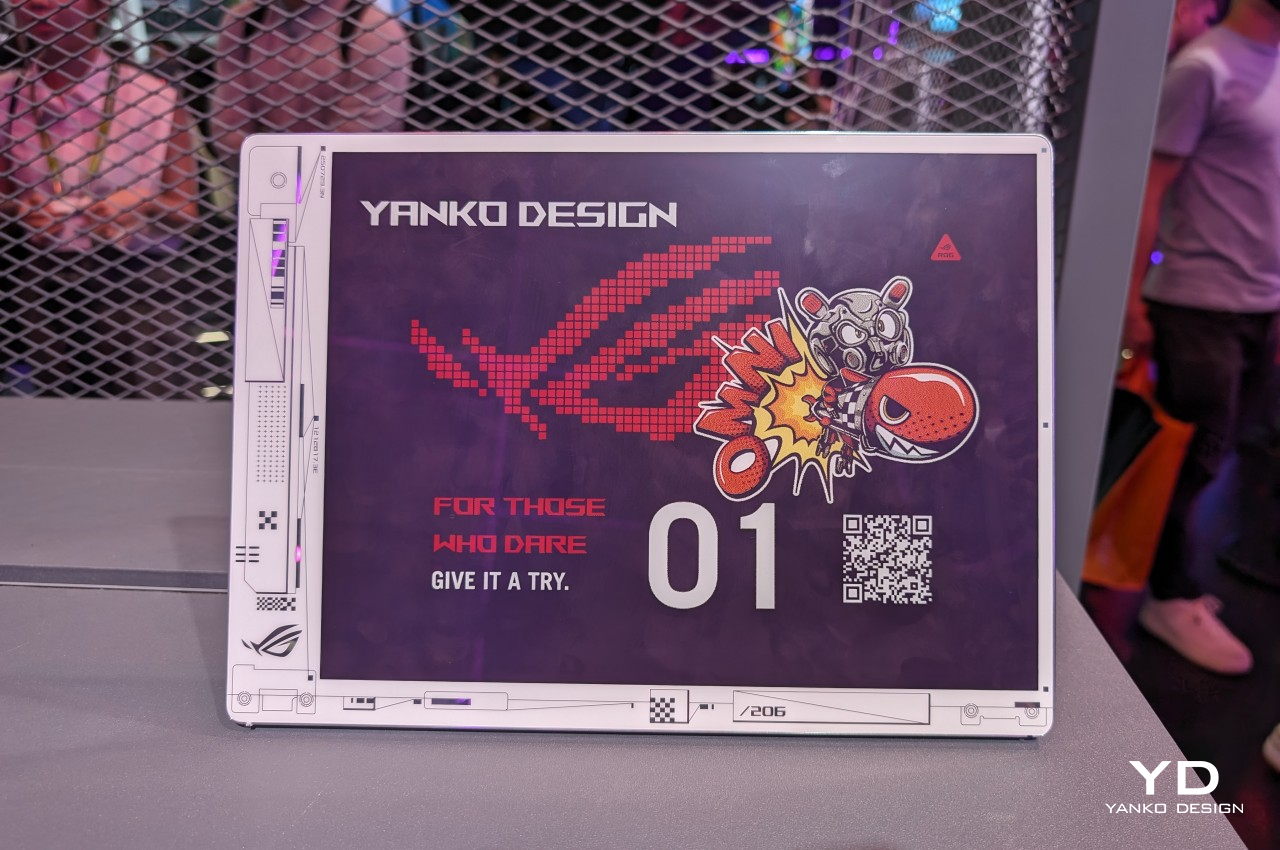
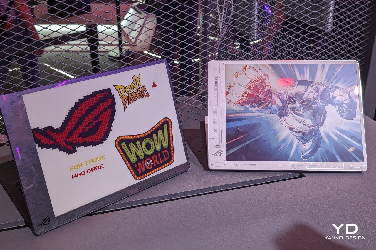
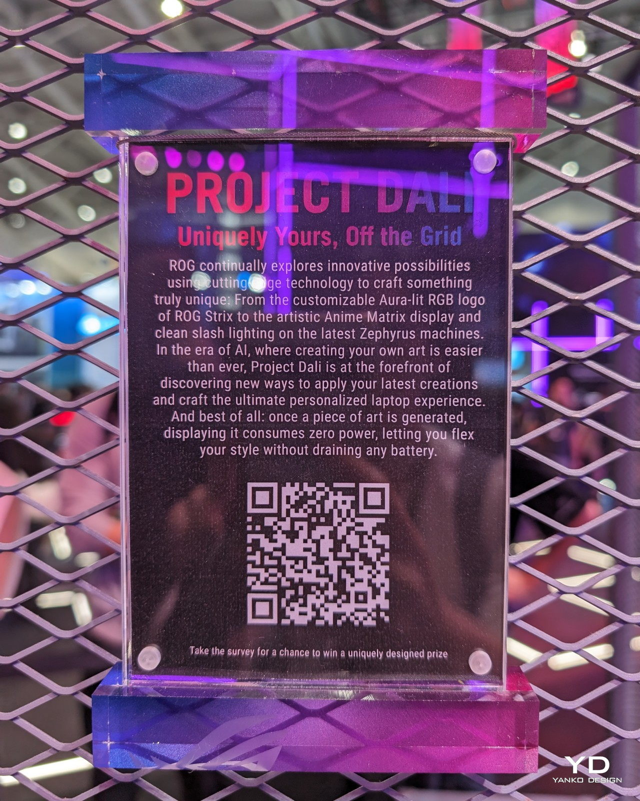
As much as laptop makers wax philosophical about the power of their hardware and the beauty of their screens, what most people will probably admire the most about their products will be the laptop covers. Like with smartphones, this is the most visible part of a laptop and, therefore, also the most expressive. You can almost tell a lot about the laptop owner from the design and stickers they have on their laptops or, conversely, from the lack of any embellishment. Unfortunately, there hasn’t been any easy way to cater to the varied tastes of laptop owners, at least until now. At Computex 2024, ASUS is showing off one of its latest concept designs that lets owners change the design of their laptop covers with a press of a key, and it won’t cost either power or money to keep changing it on a whim.

Designer: ASUS

You could, in theory, put a second LCD screen on the back of your laptop for a dazzling display of images or even captivating videos, but that would put a drain on your laptop’s battery, especially if you need to keep that cover display visible even when the laptop is closed and shut down. As with any problem involving power-hungry LCDs and OLEDs, the solution is using ePaper Display or EPD, like E Ink’s popular panels for eBook Readers. And wouldn’t you know it, E Ink has the perfect technology for that, and ASUS is slapping it on its Project DALI laptop concept to make laptops more personal without having to stick anything to it.

Although it’s primarily being used for signage installations, the E Ink Spectra 6 brings a touch of color to the eye-friendly and battery-conservative E Ink screen. It’s not going to match the vibrant colors of even the crudest LCD, but it has one very important advantage. Once you change the image displayed on it, it will no longer consume any power and can display that image for a long, long time. In other words, it’s perfect for a semi-permanent display that doesn’t change much, something like what the back of your laptop could have.

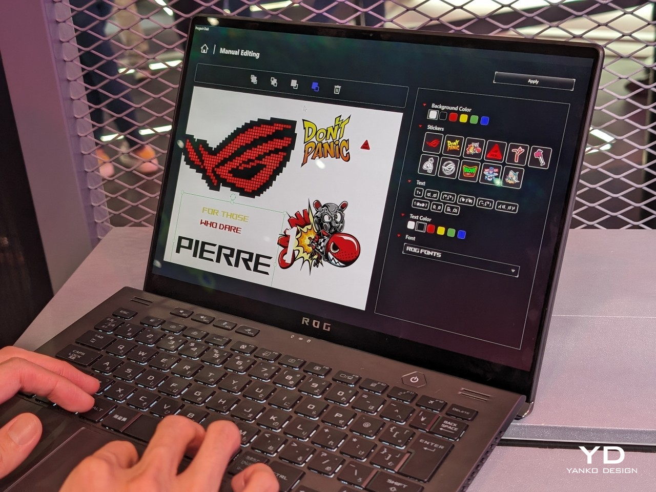
Project DALI puts this technology to offer an unprecedented level of personalization to laptop owners, something you can’t even imagine doing with stickers or skins. With ASUS’s special software, you can either select from a few preset designs or make your own, allowing you to express your tastes, interests, and personality the way you want it. Best of all, you can change it any time you want, and it will only cost you a bit of time and effort, not money from buying new stickers or energy from cleaning off those pesky adhesive residues.

ASUS Project DALI is hardly the first to put an E Ink display on the back of a laptop, as Lenovo also demonstrated a similar idea back in January at CES 2024. DALI, however, uses a newer Spectra 6 technology with higher color DPI, though the number of supported hues is, of course, still limited. Unfortunately, there is still no word on whether Project DALI will become an official ASUS product, but it’s bound to win plenty of fans once it does.

The post ASUS Project DALI concept slaps a color E Ink display on the back of laptops first appeared on Yanko Design.

Bigme HiBreak E Ink smartphone takes another stab at eye-friendly mobility

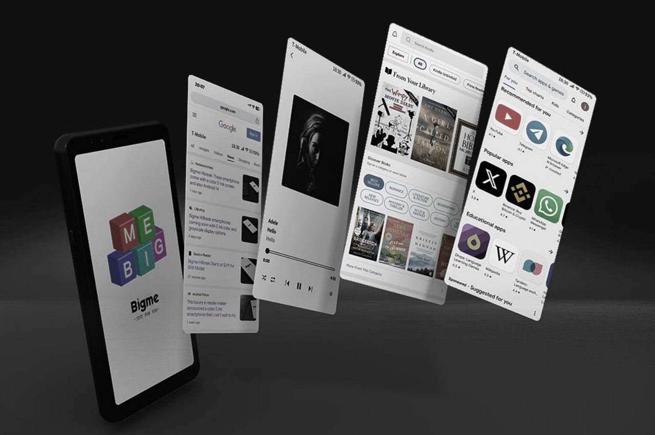
As powerful and as helpful as smartphones have become, they have also become sources not only of distraction but also of poor health. Staring at screens all day is bad enough, but they can also affect our sleep if used late into the night. Unfortunately, it’s almost impossible for many people to detach from their phones or even reduce their use, so a few designers and manufacturers have tried to come up with alternatives like minimalist phones. eReader maker Bigme is proposing a different kind of answer, one that smashes an eBook reader and a smartphone in one pocketable design, creating a phone-sized E Ink device that is actually a functional phone.

Designer: Bigme

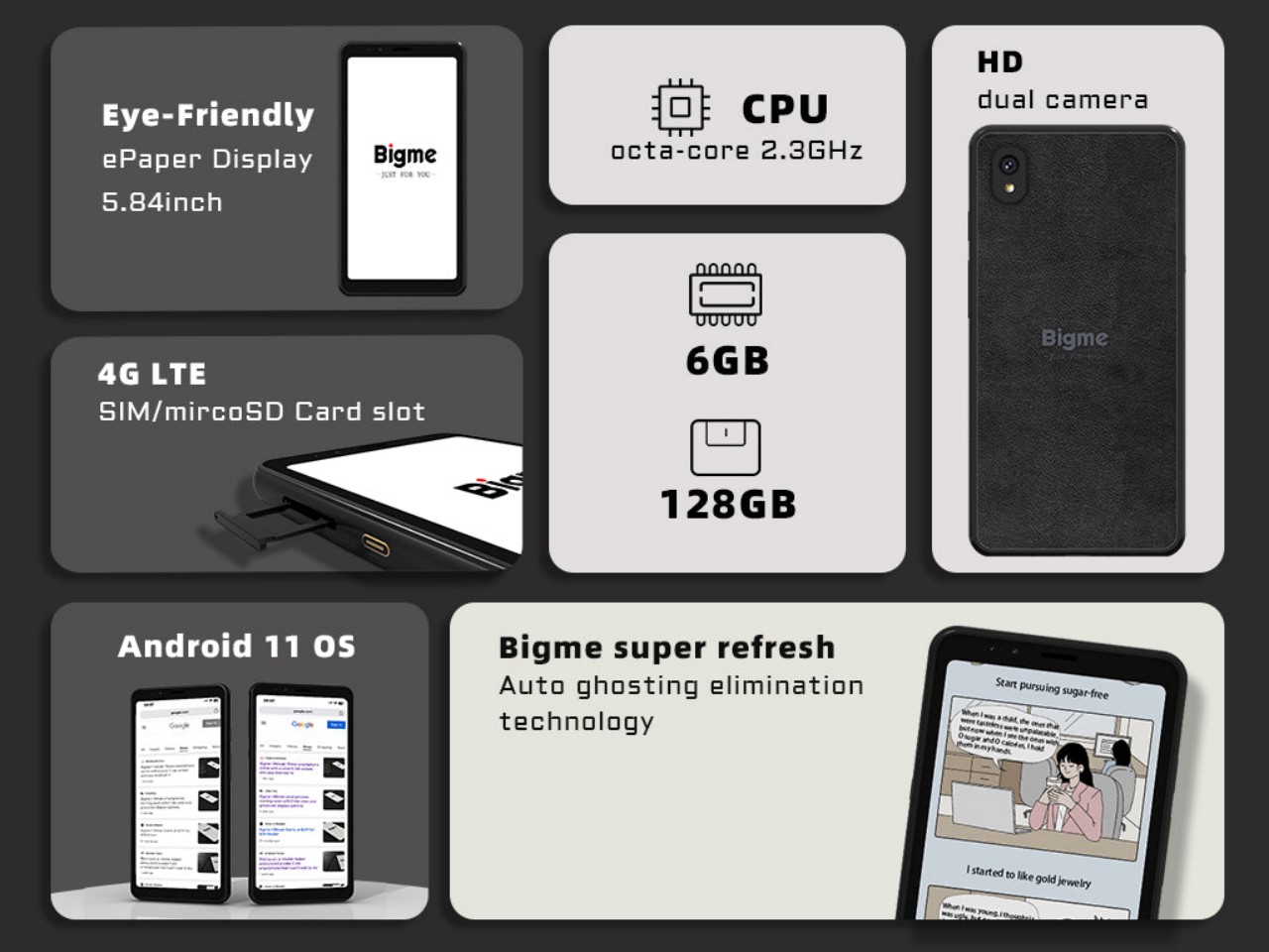
This isn’t the first time we’ve seen a phone-sized eReader. We reviewed the Onyx BOOX Palma a while back and found it to be quite capable as a pocket reader. But despite its phone-like looks, it’s technically a tiny Wi-Fi-only device. In contrast, the Bigme HiBreak can plug in a SIM card and connect to 4G LTE networks. Yes, 4G LTE speeds only, which is probably fine because the device’s screen won’t be able to catch up with the network speed anyway.

1

The HiBreak comes in two flavors with different 5.84-inch E Ink screens. One is a pure black and white screen like a traditional eReader, while the other supports a few colors at a lower resolution than black and white. Despite the advancements in E Ink technology, the ultra-slow refresh rates of these panels will take the fun out of scrolling and swiping through social media, which is probably for the best. What it offers, instead, is a gentler reading experience, especially if you’re the type who likes to read text-only documents on the go.

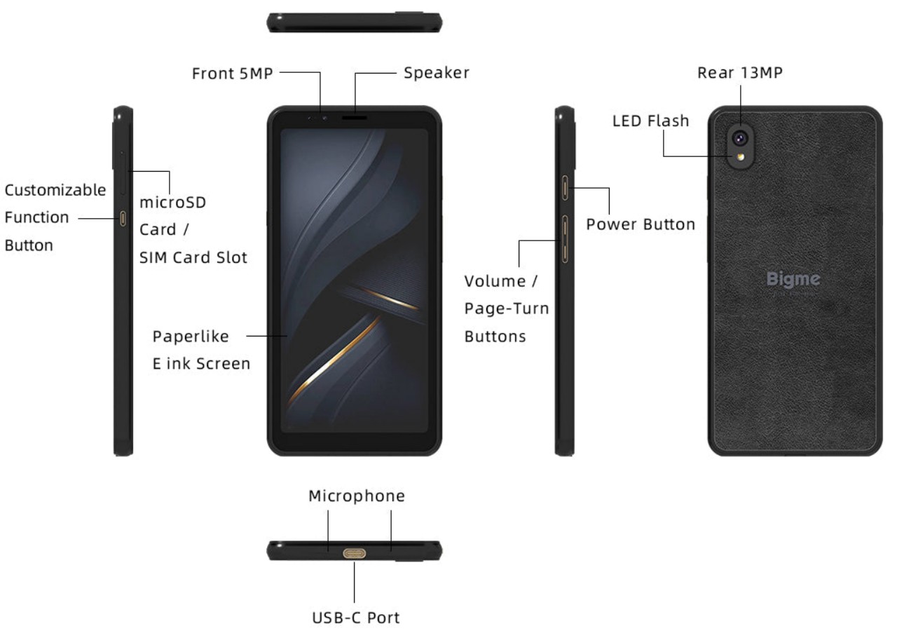
Of course, the Bigme HiBreak is a true smartphone, one that runs Android 11 on practically mid-range hardware. It does have Google Play support, so you can install any app available that supports that old OS version but don’t expect the experience to be as smooth as on a regular phone. On the flip side, that 3,300 mAh battery is going to last you for days rather than just hours. It has a 13MP main camera, more for “scanning” documents than taking pretty pictures, and a 5MP front camera for emergency video calls.

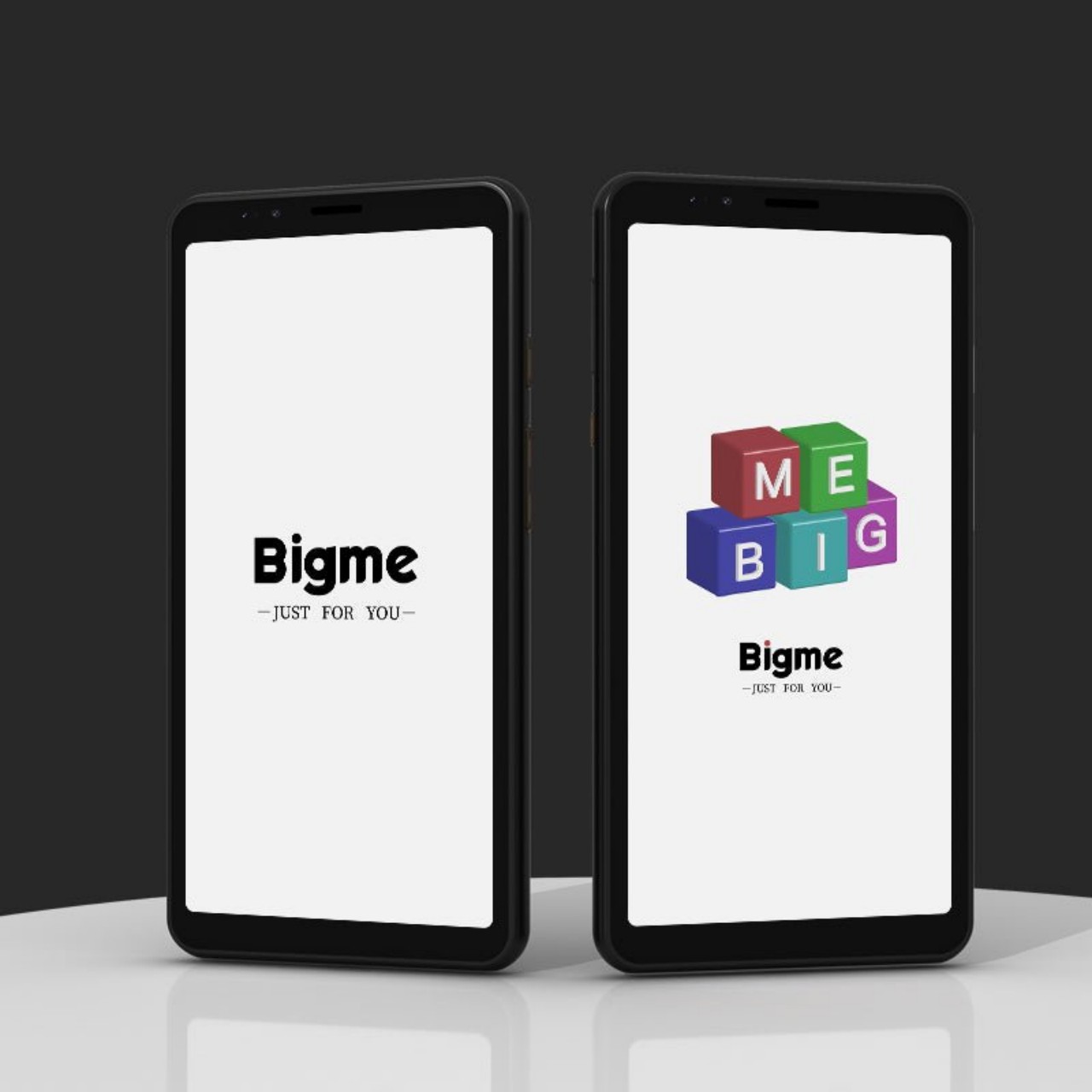
In terms of aesthetics, the Bigme HiBreak is truly a shrunken-down eReader, complete with wide bezels and a rather plain design. It’s almost like it’s intentionally uninspiring in order to cut down on your smartphone use unless that use is for lots of reading. But while it does solve the problem of eyecare, a device that runs a full Android stack with cellular connectivity won’t do any wonders for those distracting notifications unless you decide to ignore them since they won’t look that nice on the E Ink screen anyway.

The post Bigme HiBreak E Ink smartphone takes another stab at eye-friendly mobility first appeared on Yanko Design.

This portable E Ink typewriter reveals its guts to spirit you away to novel worlds

NaNoWriMo, short for National Novel Writing Month, has come and gone, but the joy and chore of churning out words never ends. Most people use a computer these days for writing any sort of content with words. Some might even use a smartphone to give their thoughts some form when a computer isn’t available. These devices are, of course, sufficient and practical, but that doesn’t mean they offer the best typing experience. They can become sources of distraction as well as cause of eye strain, both fatal for serious writers. Fortunately, there is now a class of devices that promise distraction-free typing, and this latest addition to that roster takes it up a notch with a design that will spark curiosity and flights of the imagination, hopefully, to better cajole those words out of your brain and onto a digital sheet.

Designer: Freewrite

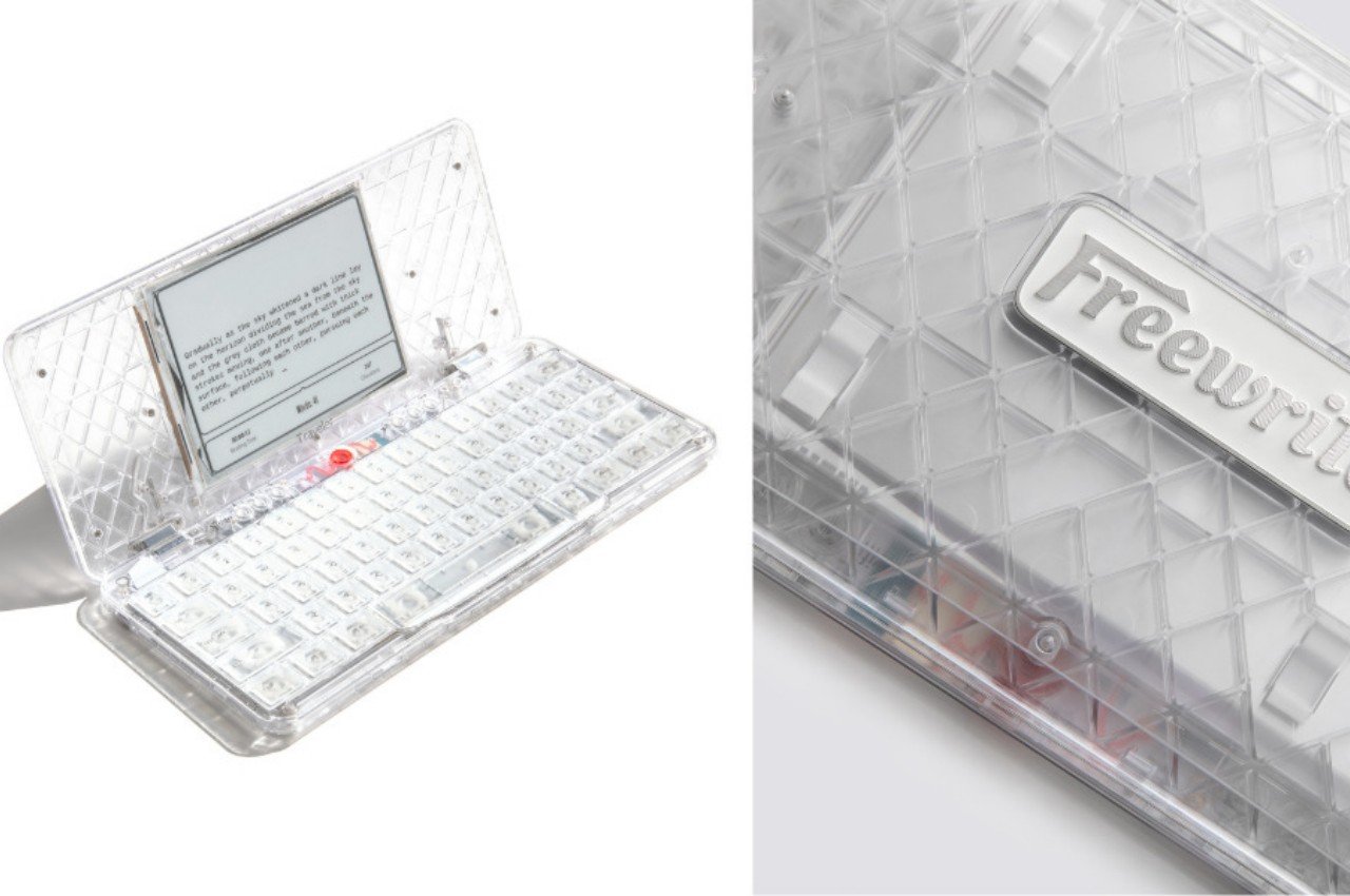
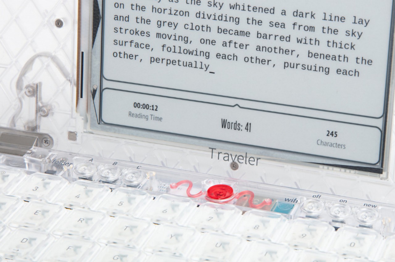
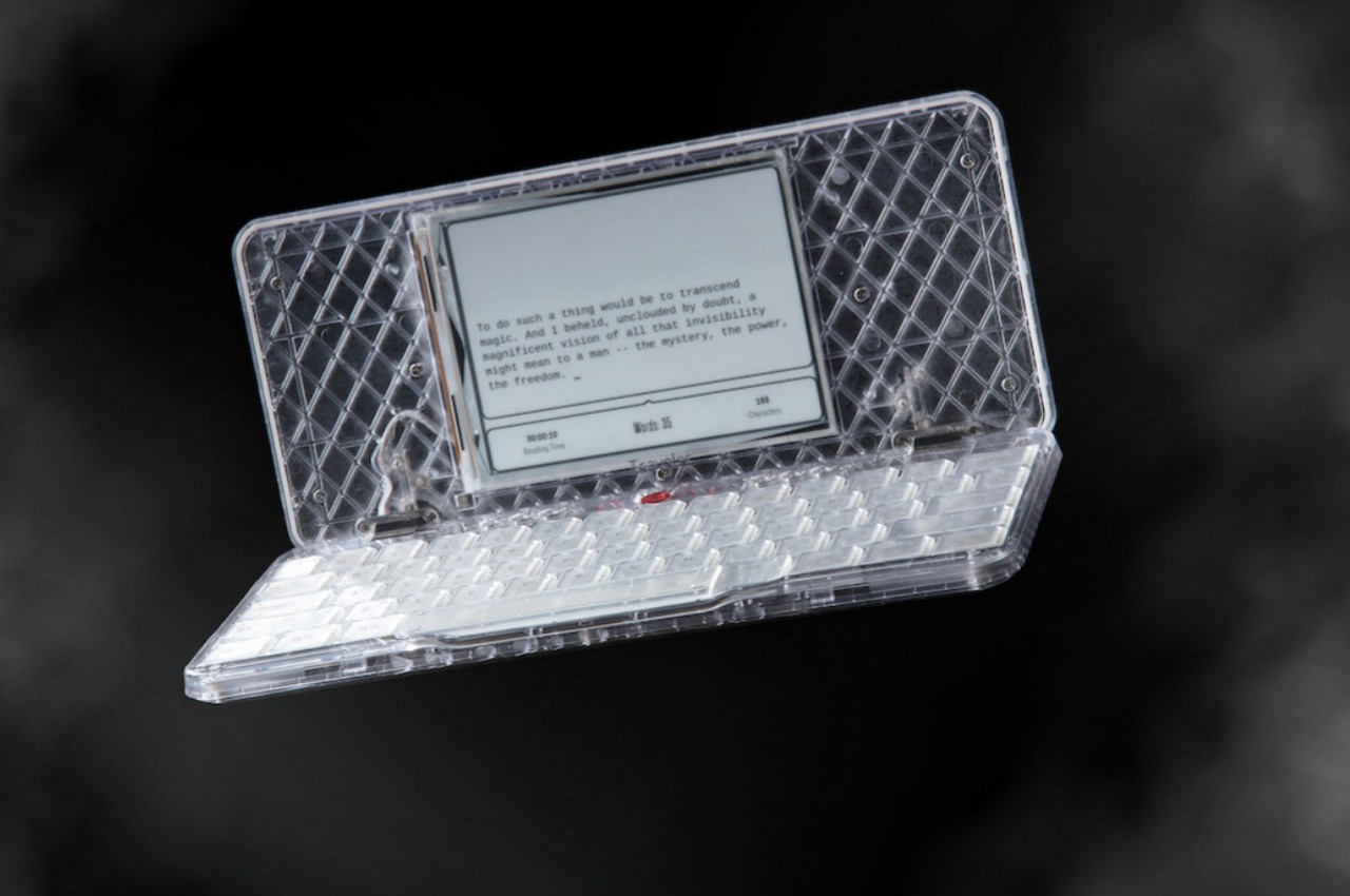
The Freewrite Traveler is hardly a new gadget. In a nutshell, it is a portable digital typewriter that uses an eye-friendly E Ink screen for displaying the words you type. Unlike a laptop or phone, it doesn’t have any other function, which means there are no notifications or inessential features to distract you from the task of writing. It’s meant to deliver the joy of uninterrupted writing while still offering conveniences like a comfortable mechanical keyboard, saving files on the cloud, and a portable design.

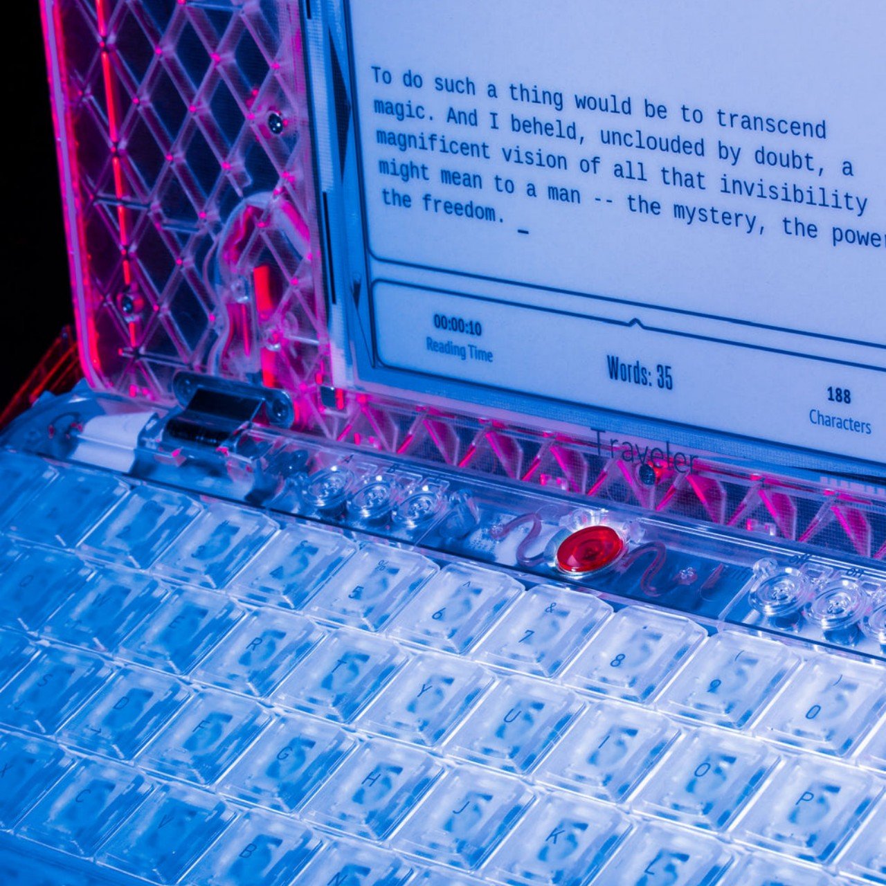
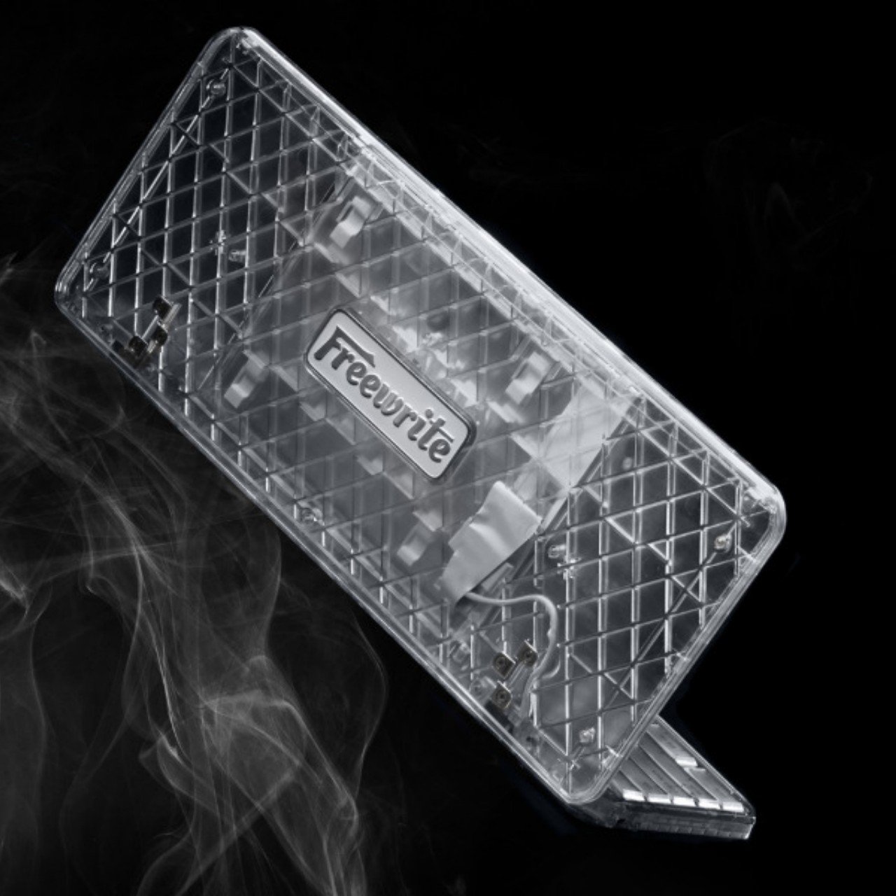
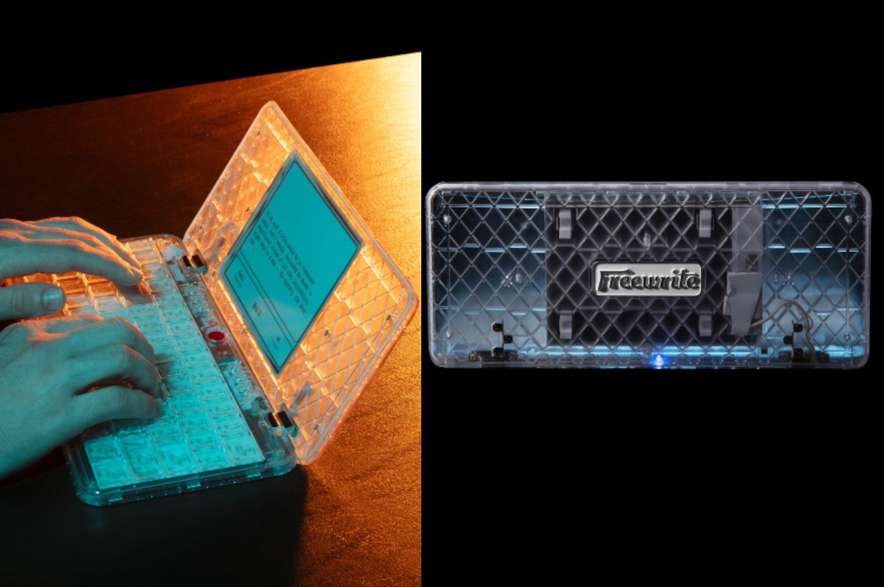
The “Ghost” builds on this solid foundation and adds a design twist that, while not exactly necessary, could help lead your mind to new ideas. It takes inspiration from products that flaunted transparent or translucent shells, including old Game Boy models, the candy-like iMacs, or even Crystal Pepsi. As its name implies, the Freewrite Traveler Ghost sports a transparent shell that lets you take a peek at the electronics that make the device tick.

It’s admittedly gimmicky, but one shouldn’t underestimate the subconscious effects of such gimmicks on our creativity. Humans have always been interested in discovering what lies within, even if it consists of a jumble of wires. The play of light on the translucent white case also gives our eyes plenty of interesting visual points that, in turn, could help trigger the brain and spark new ideas. At the very least, it could offer a nice visual break while you stretch your fingers and arms after a long period of typing.

Granted, not everyone will be keen on spending a solid $600 on a device that does one thing and one thing only, but that limitation is also the very same appeal of the Freewrite Traveler. And when you’re a writer stuck in a rut or are easily thrown off your groove by distractions, every little bit counts to get you focused and inspired, even if it means staring at the indecipherable mess of modern electronics.

The post This portable E Ink typewriter reveals its guts to spirit you away to novel worlds first appeared on Yanko Design.

E-ink wall frame lets you read your newspaper’s front page

Believe it or not, there are still newspapers around and there are people (and not all of them old) who still prefer reading through this “old school” way of getting news. There has been a countdown to the demise of the printed versions of these publications but they are still alive and kicking. But we have to admit that there is so much new technology out there and these news organizations need to be able to adapt or eventually go the way of the dinosaurs.

Designer: Alexander Klöpping

The newest device that can help you consume news in a blend of digital and sort of analog way is Project E Ink which is basically a frame that you can hang on your wall. But instead of just having a static piece of art on this device, it will display the first page of the newspaper that you’re subscribed to so you can read the most important pieces of news for that day while drinking your coffee and staring at your wall. And from its name, it uses electronic ink.

The newspaper front page reader is a 32-inch screen which is the same size of an actual newspaper front page when it is unfolded. There are no other buttons on the device and it is not a touchscreen that you can swipe through. All it shows you is the front page of the newspaper and it will be refreshed every day. The battery can last for weeks since that’s one of the advantages of e-ink. It weighs just 17.6 pounds so there should be no danger of it falling off your wall.

At $3,050, it is an expensive piece of newspaper but should appeal to those looking to have a conversation and statement piece on their walls rather than as an actual way of consuming news. The creators also encourage people to subscribe to their favorite newspapers since they’re not really affiliated with any of the publications. You can subscribe to their online portal for content management at €60 annually.

The post E-ink wall frame lets you read your newspaper’s front page first appeared on Yanko Design.

Onyx BOOX Note Air3 C E-Reader Review: Solid Basics

PROS:


  • Simple, Elegant, Lightweight Design

  • Crisp, comfortable, and fast color E Ink display

  • Perfect size for comics, magazines, and A5 documents

  • Google Play Store pre-installed

CONS:


  • Quite pricey

  • Reduced battery capacity

  • No keyboard folio like the Tab Ultra C

RATINGS:

AESTHETICS
ERGONOMICS
PERFORMANCE
SUSTAINABILITY / REPAIRABILITY
VALUE FOR MONEY

EDITOR'S QUOTE:

With a crips color E Ink display and a more affordable price tag, the BOOX Note Air3 C delivers the essential modern e-reader experience without unnecessary cruft.

The current generation of e-book readers has torn down the walls separating it from typical Android tablets. In fact, except for the display and customized home screen, these devices are pretty much Android tablets using E Ink panels instead of LCDs or OLEDs. While this empowers e-readers to be able to do more things, there’s also the risk of going overboard with features that may burden the user, both literally as well as figuratively. Fortunately, there’s quite a wide range of options for those who want different things from an e-reader, ranging from the most basic to the most powerful, but that also makes it harder to choose the right one for your needs. The new Onyx BOOX Note Air3 C promises the middle ground between these two extremes, so we give it a good test to see if it really offers a new experience or is just a rehash of a recent product.

Designer: BOOX

Aesthetics

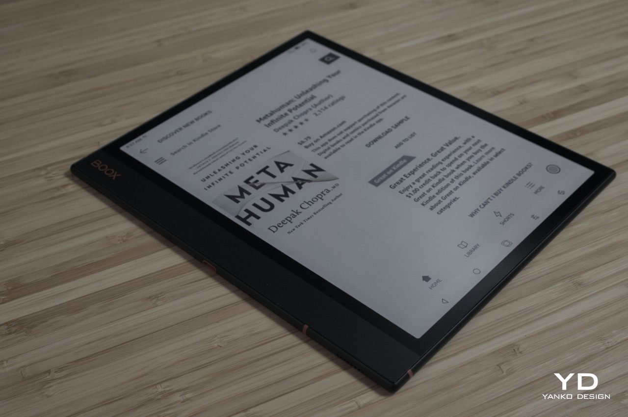
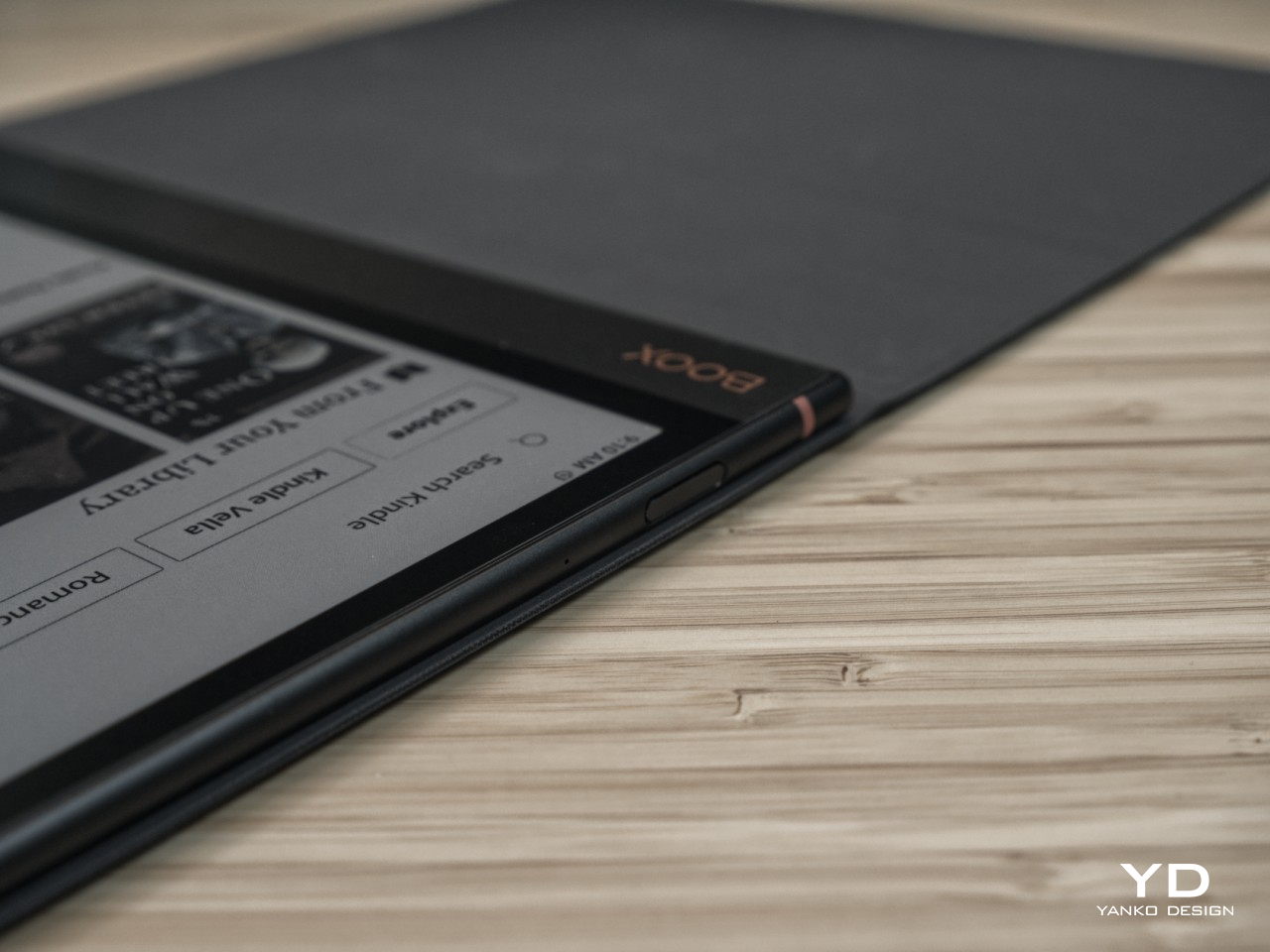
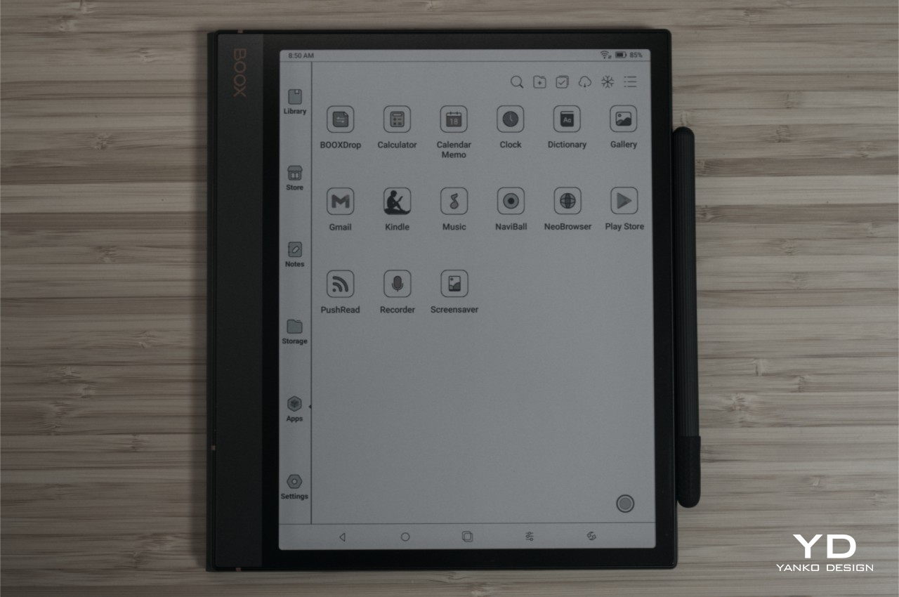
Although BOOX is probably better known for blurring the lines between e-readers and tablets, it can also be credited with changing the face of e-readers for the better. While these devices started out as simple yet uninspiring small slabs of plastic, the current generation can stand with their heads held up high, proudly displaying their more elegant designs. The BOOX Note Air3 C carries this tradition with a minimalist yet elegant appearance that attempts to resemble the appearance of a thin book. In addition to the wide bezels surrounding the display, the left side has a very wide margin similar to the spine of a book. Of course, you can flip the e-reader around if you prefer that margin to be on the right side, and the UI will rotate as well.

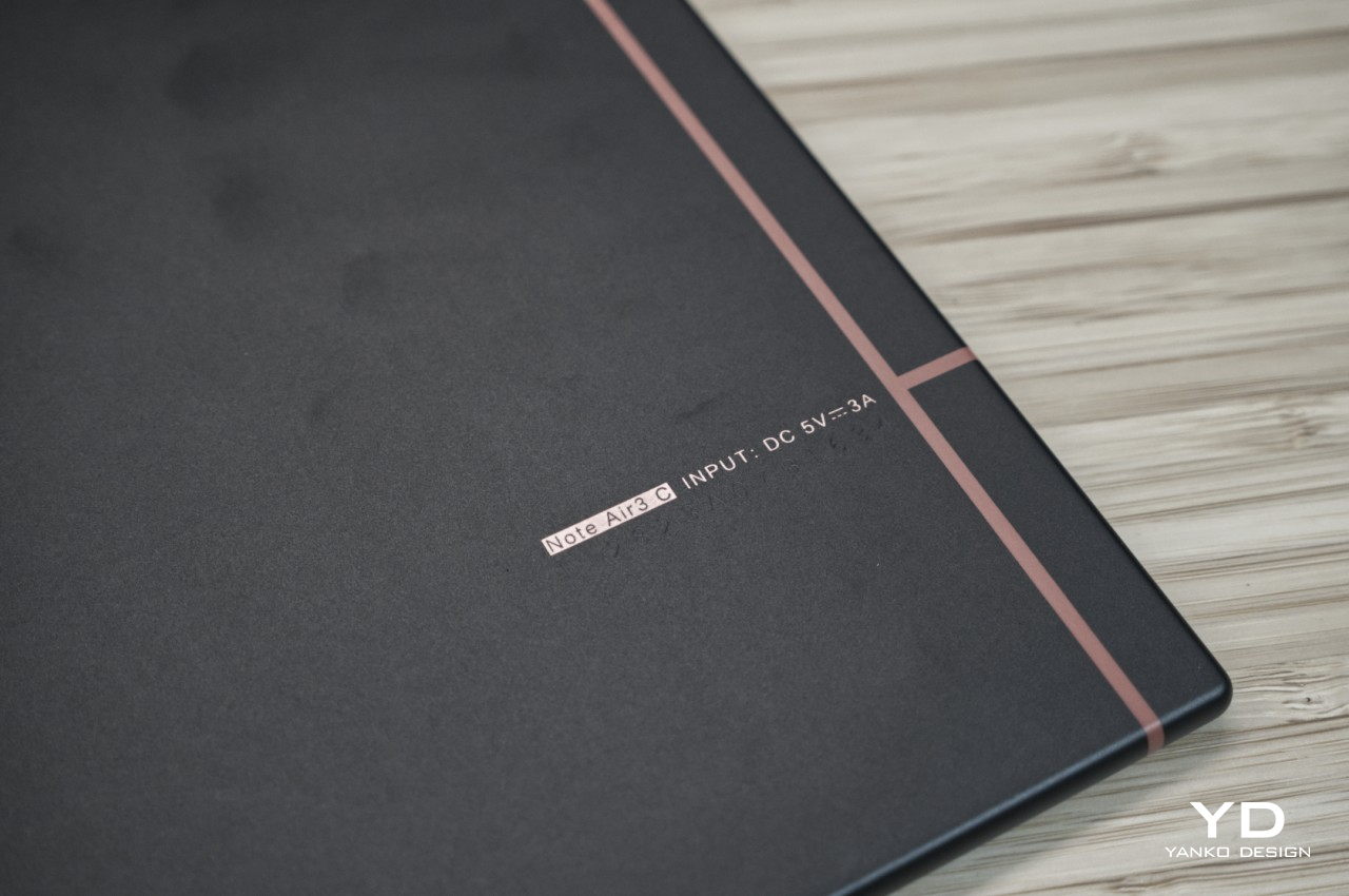
The overall design of the BOOX Note Air3 C is mostly flat, from the front to the back to the edges. It’s the trend in tablets these days, so it gives the device a more modern appearance compared to the curved backs of typical e-readers. It’s arguable whether this design is more ergonomic, as we’ll see later, but there will be little debate that it looks premium. It also feels premium, with a light yet solid aluminum chassis that is sure to stand the test of time and your bag. There are very few markings on the device, most of them on the “margin” side and its edge. There isn’t much visual noise that will distract you from what matters the most: reading on the screen.

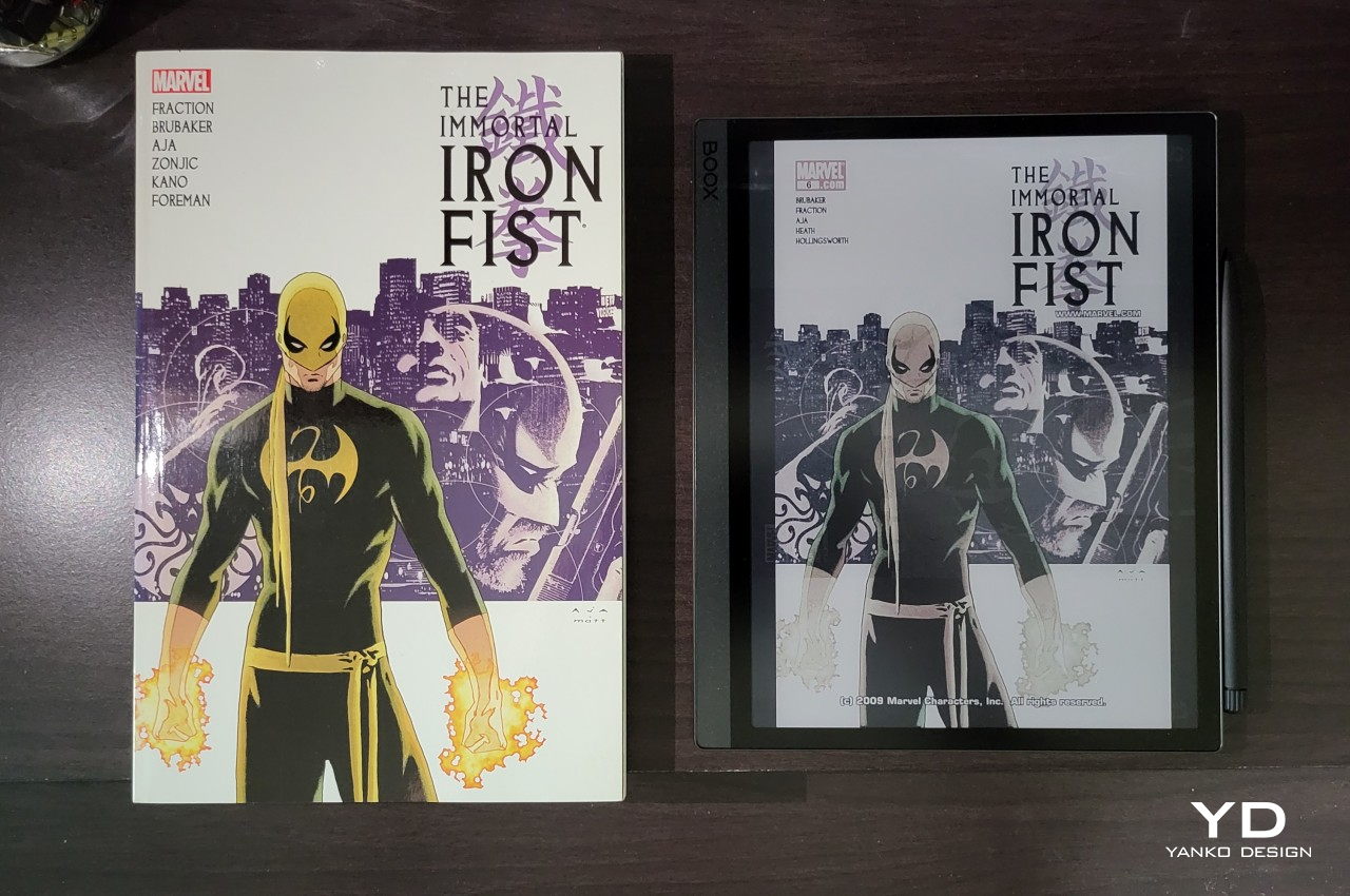
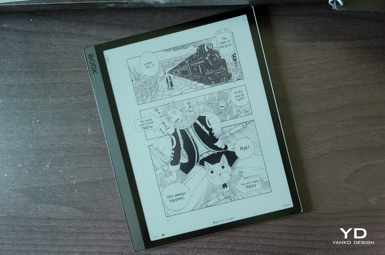
That 10.3-inch screen size is admittedly still a novelty among e-readers, most of which are designed to easily slip inside small bags or hold comfortably in bed above your head. It is, however, also the perfect size for viewing most reading material, including comics, manga, and magazines. Some papers, particularly those in A4 size, will look a bit compressed, but the crisp and sharp Kaleido 3 E Ink panel still makes such content comfortable to read. Of course, it’s a color E Ink panel, which looks fantastic on the matte screen. Of course, colors are limited and muted compared to regular tablets, but we’re talking about eye-friendlier e-paper displays here anyway.

All in all, the BOOX Note Air3 C presents a minimalist design that really contains the basics for an e-reader. There isn’t even a camera, a.k.a. document scanner, unlike its BOOX Tab Ultra C look-alike. Save for the minimum branding accents, it has very few distractions in terms of appearance and even controls, allowing you to be fully immersed in what you’re reading instead.

Ergonomics

The Onyx BOOX Note Air3 C is by no means a small device, especially when compared to common e-readers like the Amazon Kindle. While that does mean it has more screen space for comfortable reading, it also means it’s larger and heavier than your typical e-book readers. That, in turn, has implications on how comfortable it is to use, especially for long periods of time.

With a weight of 430g and a size of 226 x 193 x 5.8 mm, it is almost comparable to a 5th-gen iPad Air (2022) but also considerably lighter. That still means it’s going to tire out your arms when you hold it up too long and it will hurt a lot when you accidentally drop it on your face while lying in bed. There’s still an ongoing debate on whether flat edges are more ergonomic because they don’t easily slip from your hand or if curved is the way to go because it’s kinder to your skin.

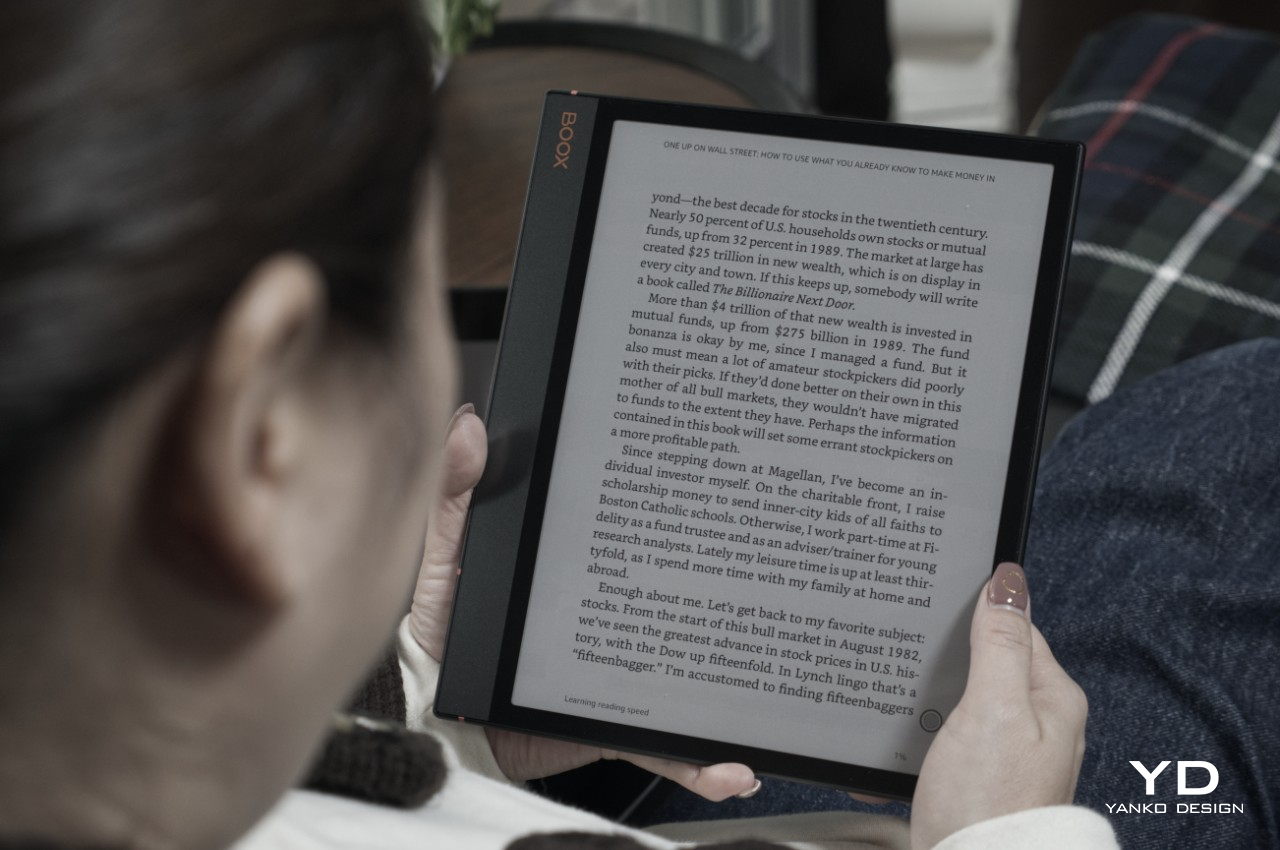
Where the BOOX Note Air3 C really shines is in the comfort it brings to your eyes thanks to E Ink technology. Unlike typical LCD or OLED screens, it doesn’t shine light directly toward your eyes and uses front lighting instead. It is gentler on the eyes and solves most of the blue light problems that screens have (if you don’t turn on the front light), so it’s definitely a significantly better option for those who love reading all the time. Like most of BOOX’s devices, you also get to select the level of brightness and the warmth of the light that you’re comfortable with, allowing you to fine-tune the reading experience to your personal tastes.

Performance

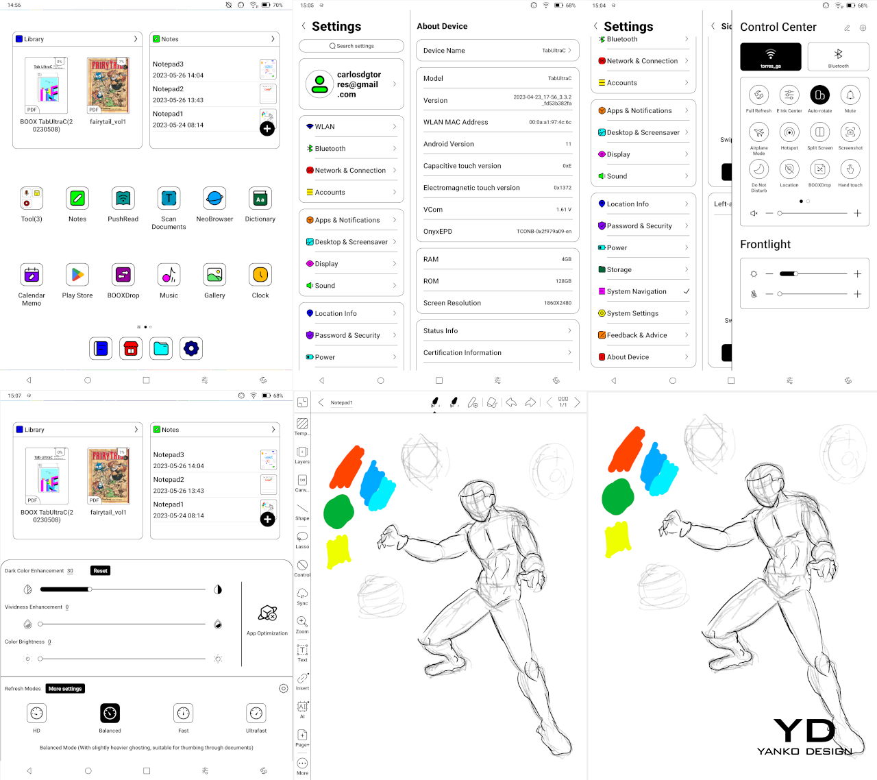
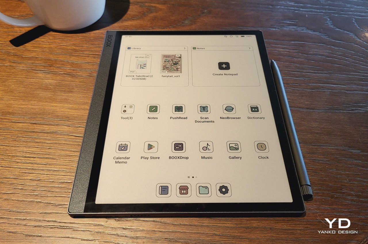
Similar to the latest generations of BOOX devices, the BOOX Note Air3 C is really an Android tablet at heart, both in hardware and in software. It’s powered by a 2.4GHz octa-core processor, most likely a Qualcomm Snapdragon 600 series, with 4GB of RAM and 64GB of storage. The screen is a 10.3-inch E Ink Kaleido 3 panel with a 300 ppi pixel density for black and white content and 150 ppi for colors, pretty much the gold standard for now. It has a Wacom digitizer layer for input with a stylus, which we’ll get to later. Rounding up the specs is a microSD card slot, built-in speakers and mic, Wi-Fi and Bluetooth connectivity, and a fingerprint scanner on the power button.

If most of these sound familiar, you might have already seen or even bought the Onyx BOOX Tab Ultra C. They’re almost identical, save for the smaller 3,700 mAh battery and the lack of a camera that serves as a document scanner. The latter is honestly something that felt quite superfluous on the BOOX Tab Ultra, so it’s a bit encouraging that an unnecessary feature was removed to help cut down on costs. Cutting the battery capacity in half, however, is a bit too drastic, even if it results in a lighter build. Battery life is still a lot better than regular tables, running for days rather than just hours, but it won’t last more than 2 or 3 days of constant use, especially when running a lot of apps.

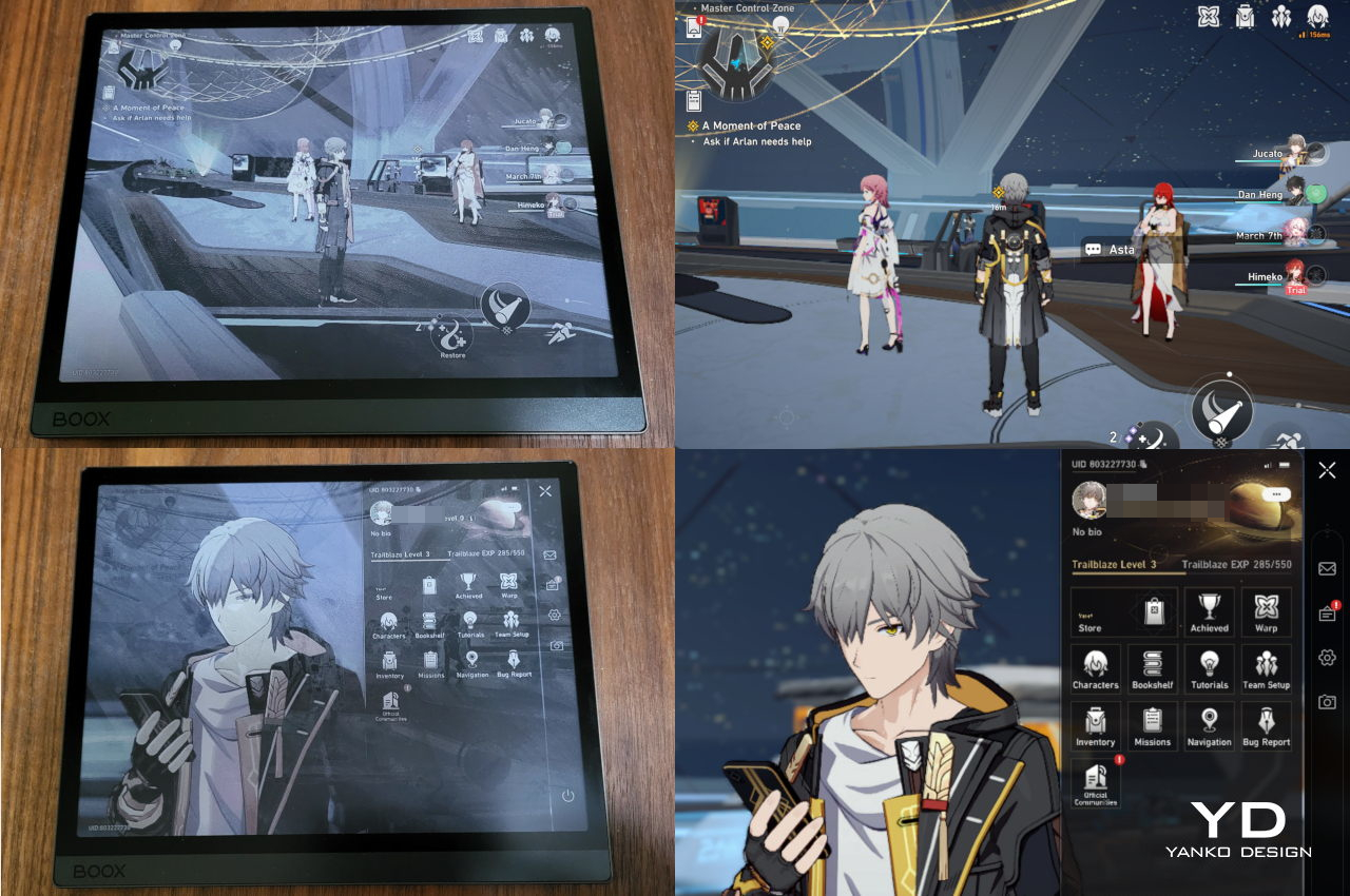
Those apps will mostly come from the Google Play Store, thanks to being a certified Android 12 device. That means you have access to the same library of apps available to tablet owners, whether or not they make sense to use on an E Ink screen. Performance won’t be the same of course, especially for apps with fast-changing content like games and videos, but you can run them at least. It also means that you won’t be lacking sources for content since you can install the likes of Amazon, Kobo, and more. And yes, you can do your Web browsing, social media, or even work on this device. The built-in speakers are serviceable but not that great, so you’ll want to pair it up with wireless earphones if you really want to enjoy audiobooks or podcasts.

Of course, the real star is the Kaleido 3 E Ink screen, which shows clear, crisp, and sharp text, especially in black and white. Colors are naturally not vibrant and look more like pastels, but that’s on par with current technology. The screen is quite responsive and fast, thanks to the BOOX Super Refresh technology, and it is really at the top of its class. The BOOX Note Air3 C offers the usual four speed modes where you get to trade quality for quick refreshes. Thankfully, the custom user interface lets you choose the mode on a per-app basis rather than just as a global switch.

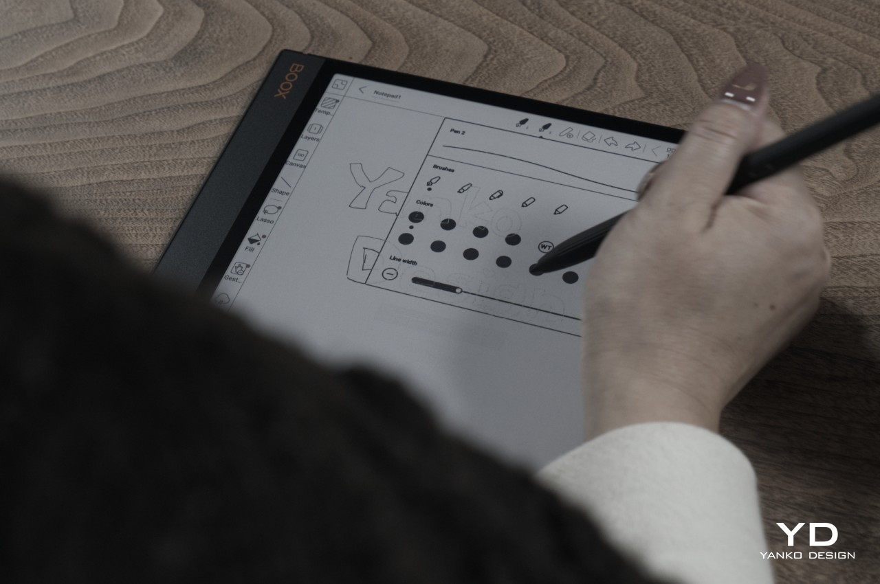
The BOOX Note Air3 C ships with the Pen 2, the version of BOOX’s Wacom-compatible stylus that doesn’t come with a dedicated eraser on the opposite end. Thanks to using a standard technology, however, you can use different kinds of Wacom styluses if the free one isn’t your cup of tea. On built-in apps as well as a few chosen ones like OneNote, the stylus is smooth, fluid, and accurate. Unfortunately, any other app outside those will reveal the lag that is more a limitation of the slow E Ink screen rather than a flaw in Wacom technology. Hopefully, BOOX will open up its pen optimizations to all apps soon.

Another big difference from the BOOX Tab Ultra C is a lack of pogo pins for connecting a keyboard folio cover. In fact, BOOX doesn’t have such an accessory for this model, which means people who want to type will have to make do with a Bluetooth or USB-C keyboard instead. It’s not a huge deal-breaker per se, but it does change the narrative a bit. While the BOOX Tab Ultra C seems almost geared for productivity, including typing documents, the BOOX Note Air3 C goes back to the roots of enjoyable reading, just with a few productive apps on the side.

On the one hand, the feature set of the BOOX Note Air3 C doesn’t sound so sensational, especially compared to the discontinued BOOX Tab Ultra C and the new BOOX Tab Ultra C Pro. On the other hand, it actually checks all the right boxes and delivers on its promise without excessive features that few people actually use or even ask for. It performs admirably, with just a few kinks here and there, offering a solid E Ink tablet experience without unnecessary cruft that comes at a literal price.

Sustainability

Onyx hasn’t really scored well in this department and, unfortunately, it is keeping its track record. It’s definitely comforting to see it use more metal and less plastic in its devices, though that seems to only be true for its larger readers. It at least has been quite restrained in its packaging and doesn’t ship with a charger, so material and e-waste are reduced. It still uses plenty of plastic, though, so that knocks off a few marks from its grade.

The BOOX Note Air3 C is, fortunately, built to last thanks to its durable body and solid build quality. There’s no formal dust or water resistance, of course, but that’s also not surprising for this line of devices. When accidents do happen, repairs are going to be quite difficult considering there won’t be many shops offering services. You’ll have to gamble on sending the unit back to Onyx or the few authorized service providers they have around the world.

Value

At $499.99, the BOOX Note Air3 C is hardly inexpensive as an e-reader or even as an Android tablet. That price does include the BOOX Pen 2 and a folio cover, so you do save a bit in the long run. It’s still not something you’ll be buying on a whim and will definitely require some decision-making. How many of the things you read are magazines, comics, manga, or other kinds of content that are easier to read on a larger screen? How many of those would require color to really enjoy? And why would you choose it instead of Onyx’s other e-readers that come in a variety of sizes and prices?

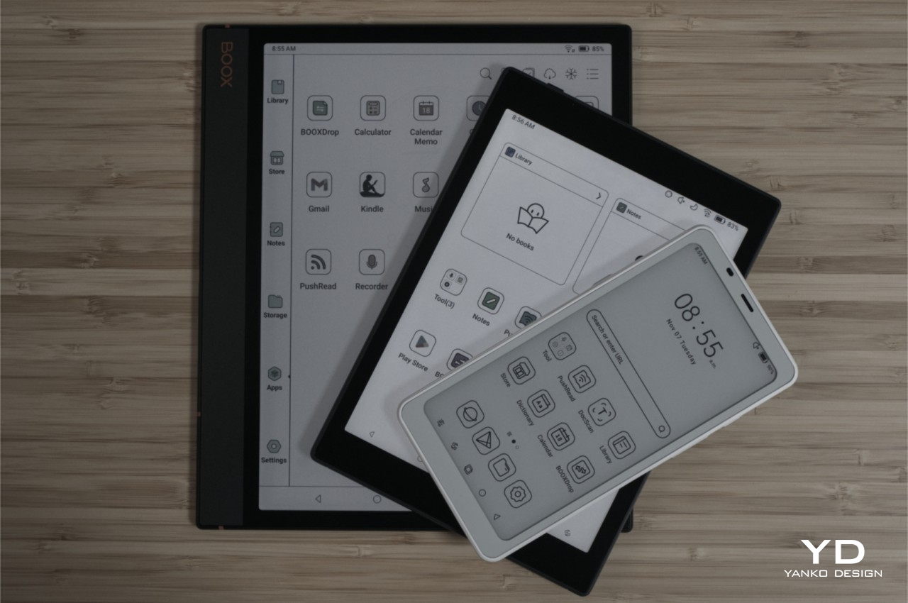
It all boils down to having the right ratio of features and price, bringing the core features you need for an E Ink device, including a few hues of color, without bumping the cost up too much. The BOOX Tab Mini C might be good for reading anywhere, anytime, but it might be too small for some types of content. The new BOOX Tab Ultra C Pro, on the other hand, has all the bells and whistles, practically replacing the BOOX Tab Ultra C, but has a significantly higher asking price as well.

Verdict

Where there were once just three or so e-book readers in the market, we now have a wide variety of brands and models to choose from. While that’s great for the market and users, it can also make things a bit more complicated when choosing to buy one. Onyx itself has quite a selection, and its newest lineup expands the roster even further. With the discontinued BOOX Tab Ultra C, the new BOOX Tab Ultra C Pro, and the smaller BOOX Tab Mini C, you will definitely wonder what the new BOOX Note Air3 C can offer to make a difference. The answer: a solid E Ink experience with a reasonable price tag.

The BOOX Note Air3 C doesn’t simply heap on features just for the sake of having them there. It carefully distills the experience down to the basics but delivers it in a way that’s almost perfect. You get a well-performing Android tablet with a fast and sharp color E Ink screen wrapped in a subdued but elegant design. Yes, it could use a bit more battery, though that would have also made the device heavier as well, and yes, the price tag is a bit hard to swallow. But if you’re looking for a long-term investment in an e-reader that’s going to last you for years, then the BOOX Note Air3 C is definitely something you should consider adding to your cart.

The post Onyx BOOX Note Air3 C E-Reader Review: Solid Basics first appeared on Yanko Design.

Onyx BOOX Tab Mini C: Color, Productivity, and Fun in a More Convenient Package

PROS:


  • More comfortable and portable size

  • Excellent color E Ink display

  • Google Play Store pre-installed

  • Impressive performance and battery life

CONS:


  • A bit pricey

  • Design looks a little bland

RATINGS:

AESTHETICS
ERGONOMICS
PERFORMANCE
SUSTAINABILITY / REPAIRABILITY
VALUE FOR MONEY

EDITOR'S QUOTE:

The Onyx BOOX Tab Mini C is a coming-of-age for E INK tablets, combining the best features in a more ergonomic and convenient size.

If you thought that eBook readers have gone the way of the dodo because of smartphones and tablets, you probably haven’t been paying attention to the tech market in the past two or so years. As people become more weary of the harmful effects of screens on their eyes and bodies, especially at night, the desire for E Ink devices has started to grow stronger. And just in time, these devices have started growing out of their humble roots, blurring the lines between extremely simple eReaders and powerful tablets. Leading this new wave of innovation is Onyx BOOX, which has been pushing the boundaries of what these devices are capable of in terms of power and size. Its latest BOOX Tab Mini C tries to distill all these new features down to a more manageable size, so we take a deep dive to see whether it successfully pulls off this hat trick or if it cuts too many corners along the way.

Designer: BOOX

Aesthetics

It’s hard not to compare the BOOX Tab Mini C with its older, larger sibling, the BOOX Tab Ultra C. Just by the name alone, you can already tell they’re related and you might easily write off the Tab Mini C as the smaller version and nothing more. There’s some truth to that, of course, but you’d be doing yourself a disservice if you stop there because you could be missing out on a device with a lot of potential. The two E Ink readers do have notable differences and, fortunately, most of them work in the Tab Mini C’s favor. Most, but not all.

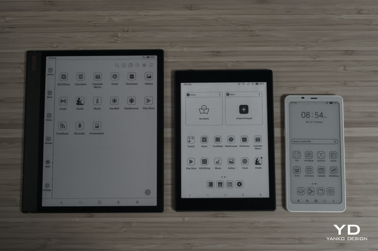
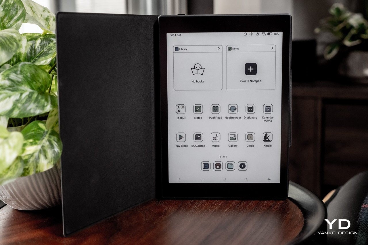
The biggest difference is, of course, the size, with the BOOX Tab Mini C’s 7.8-inch display coming in a more familiar size for eBook readers. Of course, that’s just the display size, because the actual size of the device is a lot larger. That’s thanks to the substantial bezels around the E Ink screen, which sadly makes the device look more like an unappealing blast from the past. The AG glass cover does lie flat across the front, making it look a little modern, but it’s nothing compared to the sleeker look of the BOOX Tab Ultra C or, closer to its size, the new BOOX Page.
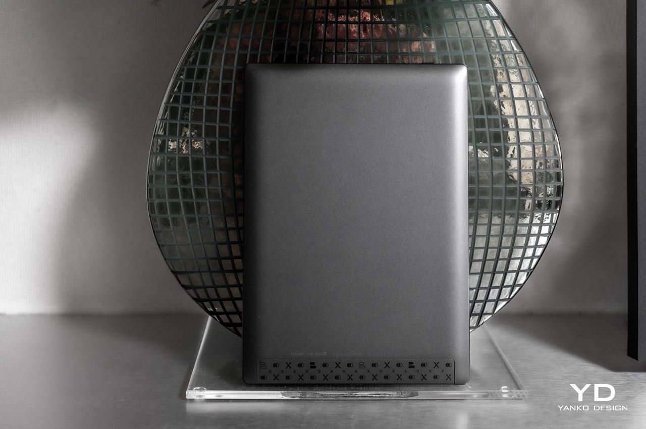
The back of the device is also very different from some of the more current selection of BOOX devices, sporting a somewhat old-school design where the edges are inclined and curved rather than completely flat. This makes the device look and feel thicker, though it also has the benefit of giving your hand a bit more comfort, as we’ll see later. Unfortunately, this along with the wide bezels make the BOOX Tab Mini C look a bit unflattering and uninteresting, if not for the E INK display that, by default, shows its colors even when the device is locked or powered off.

Ergonomics

Size does matter, especially when it comes to portable devices like phones and tablets. It defines what you can and can’t do with the product, at least on a comfortable level, and it dictates how portable and convenient it really is. That’s definitely the case with the BOOX Tab Mini C, which addresses one of the biggest pain points of the BOOX Tab Ultra C, no pun intended.

Weighing only 310g, the BOOX Tab Mini C makes the device easier to hold for longer periods of time, especially with just one hand. It’s a little over the size of an iPad mini, but significantly lighter than its Ultra sibling. The curved edges of the tablet’s back help with that comfort, too, letting it settle into your hand with fewer sharp edges to cut into your skin. In short, this is the ultimate color E Ink reader in terms of comfort and portability, ensuring that you’ll want to have it in your hand all the time.
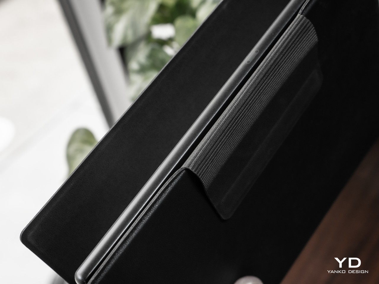
When it comes to comfort, its selling point is, of course, that 7.8-inch Kaleido 3 E ink display. It doesn’t strain the eyes as a regular LCD or OLED screen would because it doesn’t shine light in the direction of your eyes. It doesn’t even have backlighting but instead employs front lights that let you pick not only the brightness but also the temperature warmth, mixing it up to your comfort depending on what you’re reading. And since it supports 4,096 colors rather than shades of gray only, this eye-friendly benefit applies not only to ebooks but to every piece of digital content as well, from comics to PDFs to webpages and, if you’re really up to it, social media. It’s the ultimate reader’s dream, now in a more convenient package.

Performance

What sets Onyx BOOX’s devices apart from the older generation of eBook readers is the fact that they’re really Android devices, both in terms of hardware and software. Nowhere is that more evident than in the BOOX Tab series, including this newest arrival. You could even call them Android tablets with E Ink displays and you wouldn’t be off the mark.

In terms of specs, the BOOX Tab Mini C would be the equivalent of a mid-range Android tablet, powered by an unnamed octa-core Qualcomm Snapdragon processor with 4GB of RAM and 64GB of storage. Interestingly, these are the very same specs as the larger Tab Ultra C, save for half the internal storage capacity. It even has the same dedicated graphics processor that is responsible for the display’s unbelievably fast performance. You do have options of whether to prioritize speed over quality, but the Tab Mini C is able to deliver satisfactory results on every level.
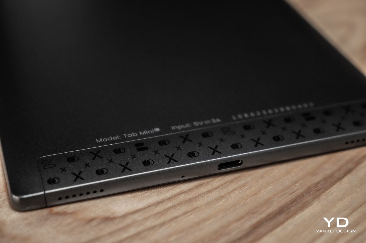
The small eBook reader slash Android tablet houses a large 5,000 mAh battery, which, truth be told, isn’t that significantly lower than the 6,300 mAh on the Ultra model. Battery life is what you’d expect from an E Ink device, lasting for days or weeks rather than hours. The one caveat is that it’s actually shorter than your average eBook reader, depending on how many non-reading apps you use. It’s a powerful device that can run almost any Android app, but that comes at the cost of battery life, especially if you leave some of those running in the background.

Rounding up the specs is Bluetooth 5.0, which you will mostly use for hooking up wireless earbuds, USB-C for charging, and Wi-Fi 802.11b/g/n/ac for Internet connectivity. There’s also a gyro sensor that’s useful for automatically rotating the user interface depending on the device’s orientation. Unlike its larger sibling, there is no rear camera for document scanning. The BOOX Tab Mini C ships with a stylus, though the BOOX Pen Plus is the kind that doesn’t have an eraser on the opposite end of the tip.

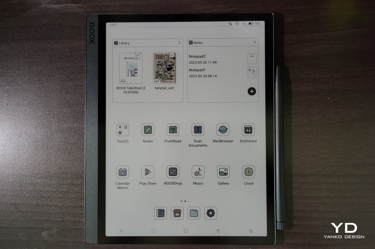
The Tab Mini C runs Android 11 with Onyx BOOX’s special skin running on top. It’s not exactly the latest Android release, but that’s not surprising for the brand either. Although Onyx does support devices for about five years with regular updates, they rarely upgrade the Android version during their lifetime. The Onyx BOOX OS, as it is sometimes called, has changed a lot since the early days, and this most recent incarnation brings it closer to being a more familiar Android interface without completely removing the eReader experience. It even comes with Google Play Store already pre-installed, so you’re just a few simple steps away from installing your favorite Android apps. The device comes with Onyx’s own Neoreader, which is quite impressive for its wide support of file formats and a plethora of features. You aren’t limited to that, however, and you can install any kind of eBook app or library you want, including Amazon Kindle, Kobo, Comixology, and more.
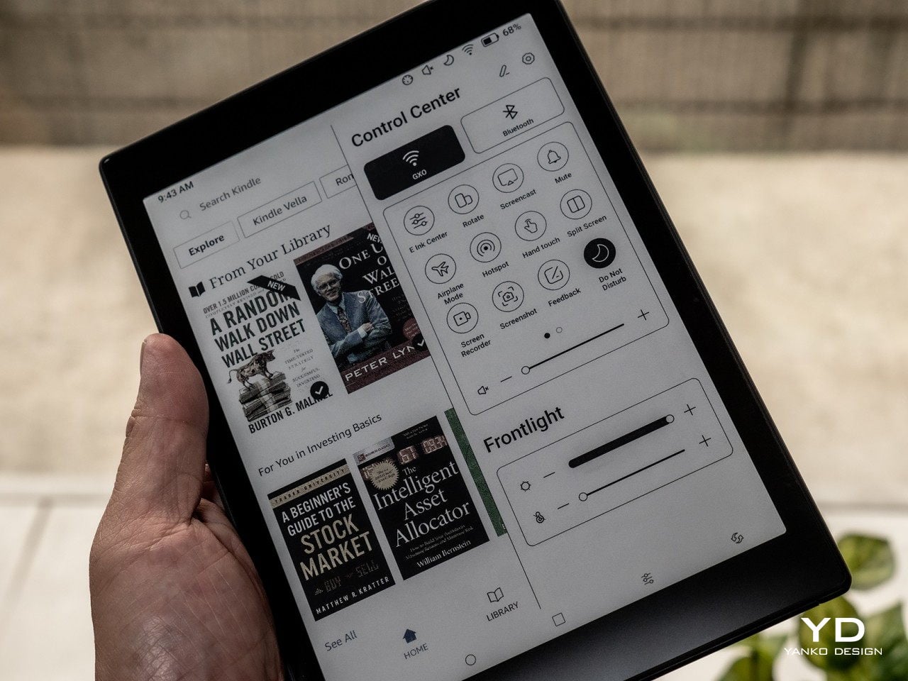
The device’s crowning glory is really that color E Ink display, now available in a more convenient size. With a pixel density of 300 ppi for black and white and 150 ppi for color, text always comes out crisp, regardless of their color. Those colors are also vibrant, at least as far as 4,096 colors go, and they’re well-saturated and not washed out. The 7.8-inch size is perfect not just for reading books but also for comics, manga, magazines, and PDFs, hitting the sweet spot between small and large screen sizes. That said, it isn’t an ideal size for A5, much less A4, documents, which is where larger devices like the BOOX Tab Ultra C shines. It’s not that big of a sacrifice, though, especially if you’re getting convenience and comfort in return.

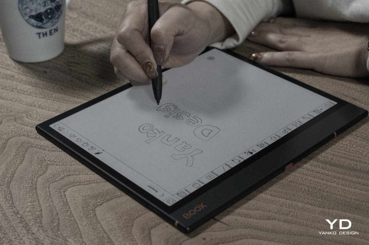
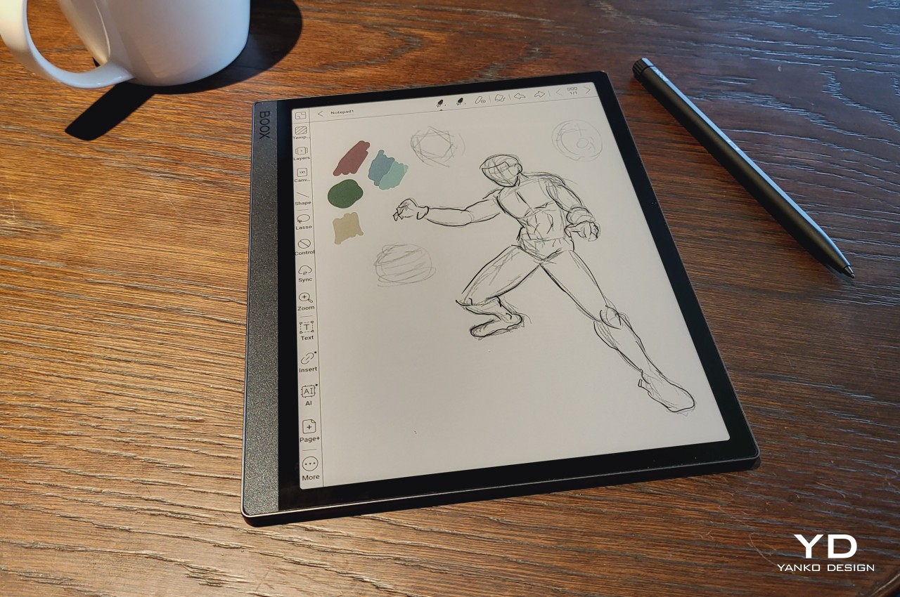
The BOOX Tab Mini C is more than just a reader, though, especially with that stylus it ships with. The BOOX Notes app and Neoreader’s built-in annotation capabilities transform it from a consumption device to a learning tool and more. Writing on the screen is smooth and fluid, and the matte glass surface adds a bit of toothiness and resistance that makes it almost feel like writing on paper. It only supports the most basic colors, of course, but true colors are viewable on regular screens once you export the note as a PDF or image. One important caveat, however, is that the pen’s smooth performance really only applies to BOOX’s first-party apps and a few choice ones like OneNote, Evernote, and the WPS Office Suite. There is a considerable lag when using other apps, which is something that avid note-takers might want to consider.

Sustainability

Although Onyx has been playing the eReader game for a long time, it hasn’t yet jumped on a trend that is gripping big device manufacturers. Given the ubiquity and relative affordability of these kinds of devices, it almost behooves Onyx to also have a strong sustainability commitment in place. Unfortunately, we have yet to see that happen, though it’s also reassuring that it is at least doing some minor steps in that direction, intentionally or otherwise.

Using aluminum-magnesium alloy for its casing, for example, helps reduce the amount of plastic each device uses, and keeping the packaging to a minimum also helps a bit. Onyx doesn’t ship with a charger either, so that’s another point in its favor. Long-term software support helps keep the device running smoothly and securely for years, though eReaders, even Android-based ones, aren’t as high-maintenance as their full tablet counterparts anyway. Unfortunately, it doesn’t have much going for it when it comes to repairing and servicing its products, forcing owners to send in their devices to a few authorized service providers spread in a few countries. We’re still keeping our fingers crossed that Onyx BOOX will step up soon and be a role model in this industry.
Value

The Onyx BOOX Tab Mini C is definitely a smaller version of the Tab Ultra C with very few differences, and you might ask why you would favor it over the “fuller” version at all. That said, the question works the other way around as well, where you might ask why you’d even want a larger and heavier tablet if you can have one that is lighter, more comfortable, and more convenient to carry around. It all boils down to what you’d use an E Ink device for.

The BOOX Tab Ultra C is clearly marketed more as a productivity device, one whose reading capabilities are put at the service of learning and working. It’s best for A5 or even some A4 documents, which is what most academic or scientific papers come in, not to mention magazines and periodicals. The larger screen size is also conducive for having two documents or apps side-by-side, and it supports a decent-sized keyboard for typing out notes, emails, and the like.

While it’s possible to do all those on the BOOX Tab Mini C as well, it isn’t as conducive for these use cases with its smaller display. Split screen, for example, will feel very cramped, and since there’s no official keyboard folio case, you’ll have to arrange for a separate Bluetooth keyboard for your typing needs. The hardware is very much capable of doing almost everything, but the smaller and lighter device feels best for reading and writing on the go rather than working on a desk.

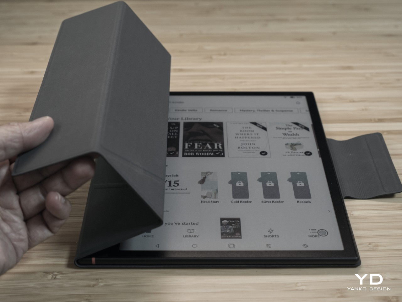
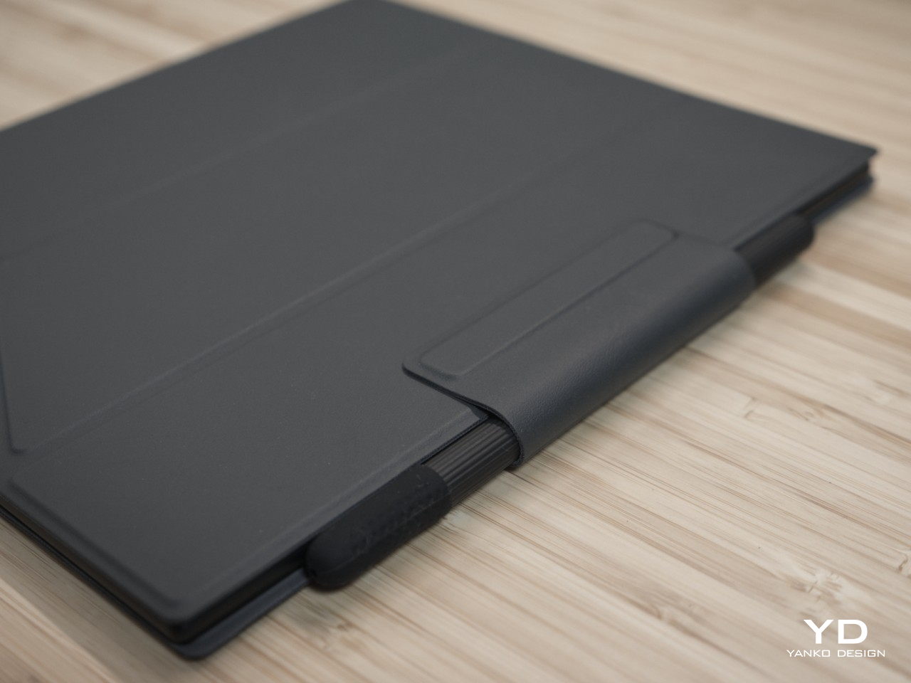
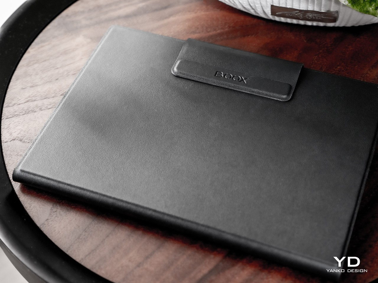
As far as price goes, the Tab Mini C isn’t exactly inexpensive, though that $449.99 price tag, fortunately, includes a magnetic folio case. Compared to other E Ink devices, it’s quite pricey, but it is also in a class of its own. There are very few color E Ink readers that come in this compact size, and the closest competitors are either using older E Ink Kaleido technology or are even more expensive. At the moment, there is pretty much no contest when it comes to a pocket-book size color eReader, making the BOOX Tab Mini C one of a kind.

Verdict

There is thankfully a resurgence in consuming text content that goes beyond scrolling through social media, whether it’s reading ebooks or tons of articles on the Web. This trend, however, has also made people more aware of how common screens wreak havoc on our eyes and our health, especially at night. ePaper Displays are becoming more popular because of this, to the point that there are even computer monitors that use it on the side or in their entirety. For readers of all kinds, however, a portable E Ink device is a better choice and investment.

Of these, the Onyx BOOX Tab Mini C probably represents the culmination of all the innovations available in this segment to date. Its 7.8-inch E Ink Kaleido 3 display brings a splash of color in a more ergonomic and comfortable size, while tablet-like hardware and a Google-enabled Android platform bring all the power and functionality you need on a portable device. Yes, it’s a bit on the pricey side and its design isn’t exactly inspiring, but these thankfully tend to get out of the way once you start immersing yourself in a world of text and colors that bring joy to your life without straining your eyes.
The post Onyx BOOX Tab Mini C: Color, Productivity, and Fun in a More Convenient Package first appeared on Yanko Design.
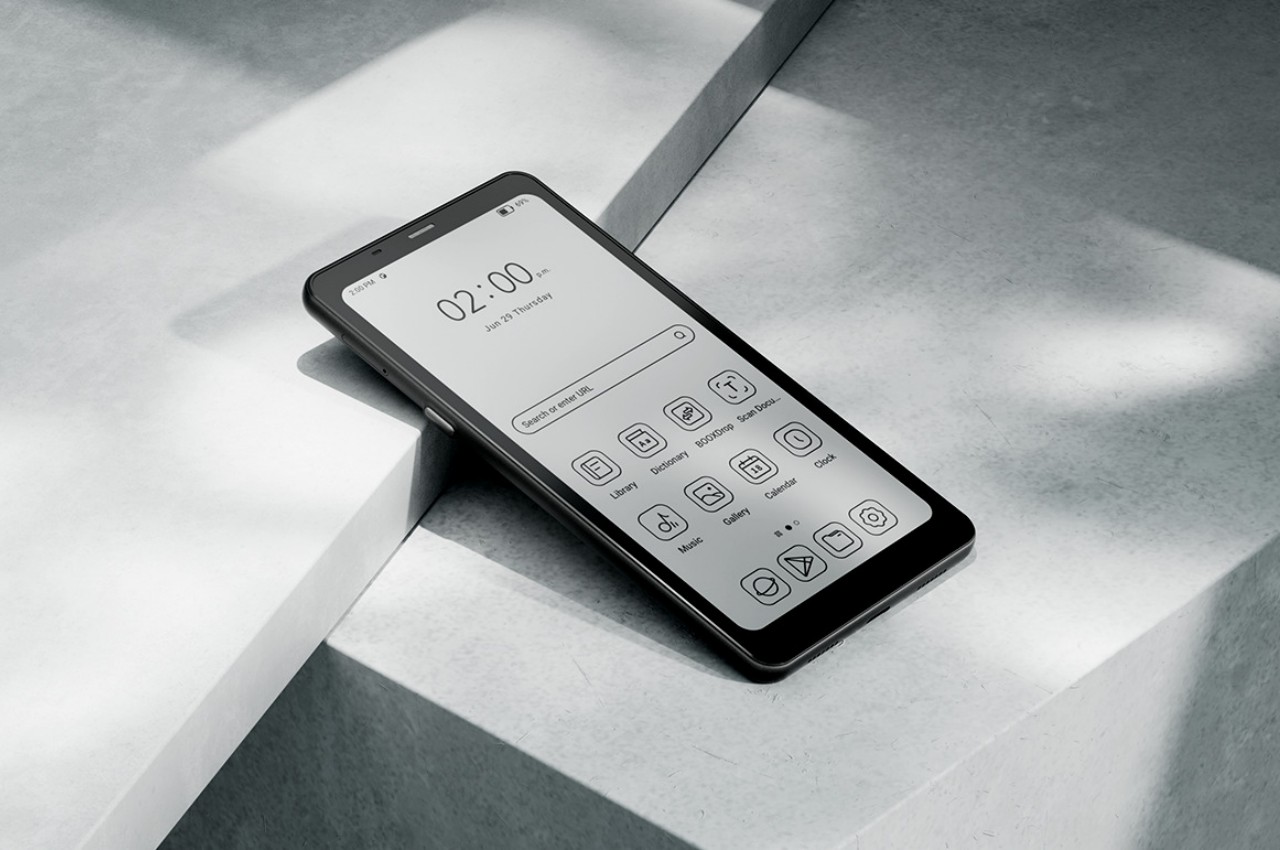
Onyx BOOX Palma is a mobile e-Reader that you can literally slide into your pocket

E-Book readers have become more diversified in the past few years, but there seems to be a trend of making them a lot bigger than what people are used to. Of course, there are uses for tablet-sized devices, like the Onyx BOOX Tab Ultra and Tab Ultra C that we reviewed previously, but the power and productivity they offer comes at the price of some portability and convenience. In fact, some people might even consider the typical Kindle sizes of eReaders to already be too big, especially if they can’t fit inside small handbags or pouches. Trying to cast its net even wider, Onyx BOOX has come up with a solution for this group of readers, one that can easily fit in anywhere almost like a smartphone, without being an actual smartphone.

Designer: BOOX

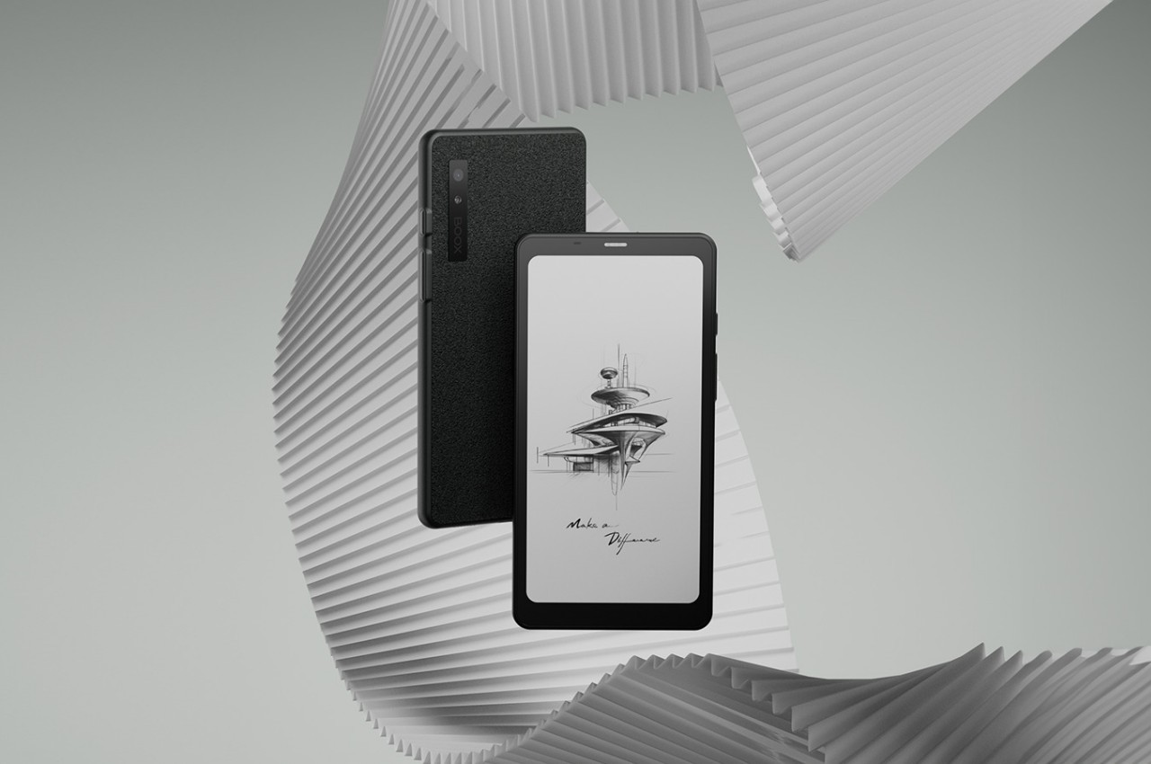
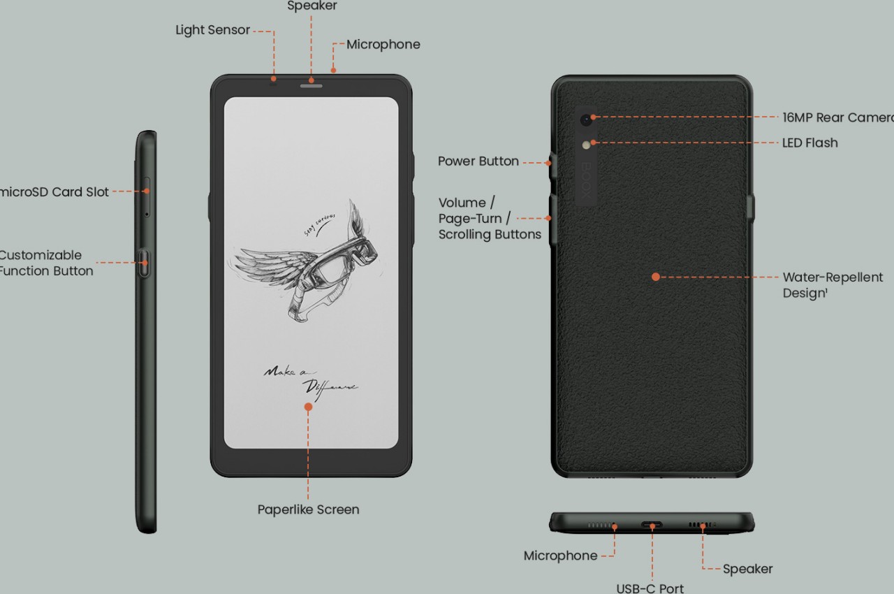
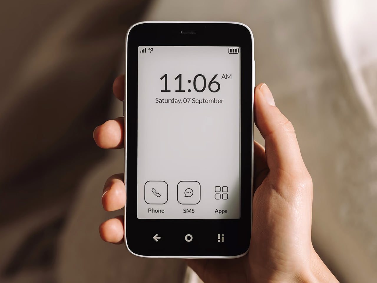
Let’s get one thing straight right off the bat. The BOOX Palma may look like a smartphone and may sometimes even act like a smartphone, but it is not a smartphone. At least not in the traditional sense of smartphones. You can send messages or make calls but only through Internet services like social apps and instant messaging. The smartphone look-alike is completely bereft of cellular connectivity, so you’ll have to rely on Wi-Fi for any and all online activities. To some extent, you can consider the BOOX Palma as a phone-sized tablet, albeit one with an eye-friendly and battery-friendly E Ink screen.

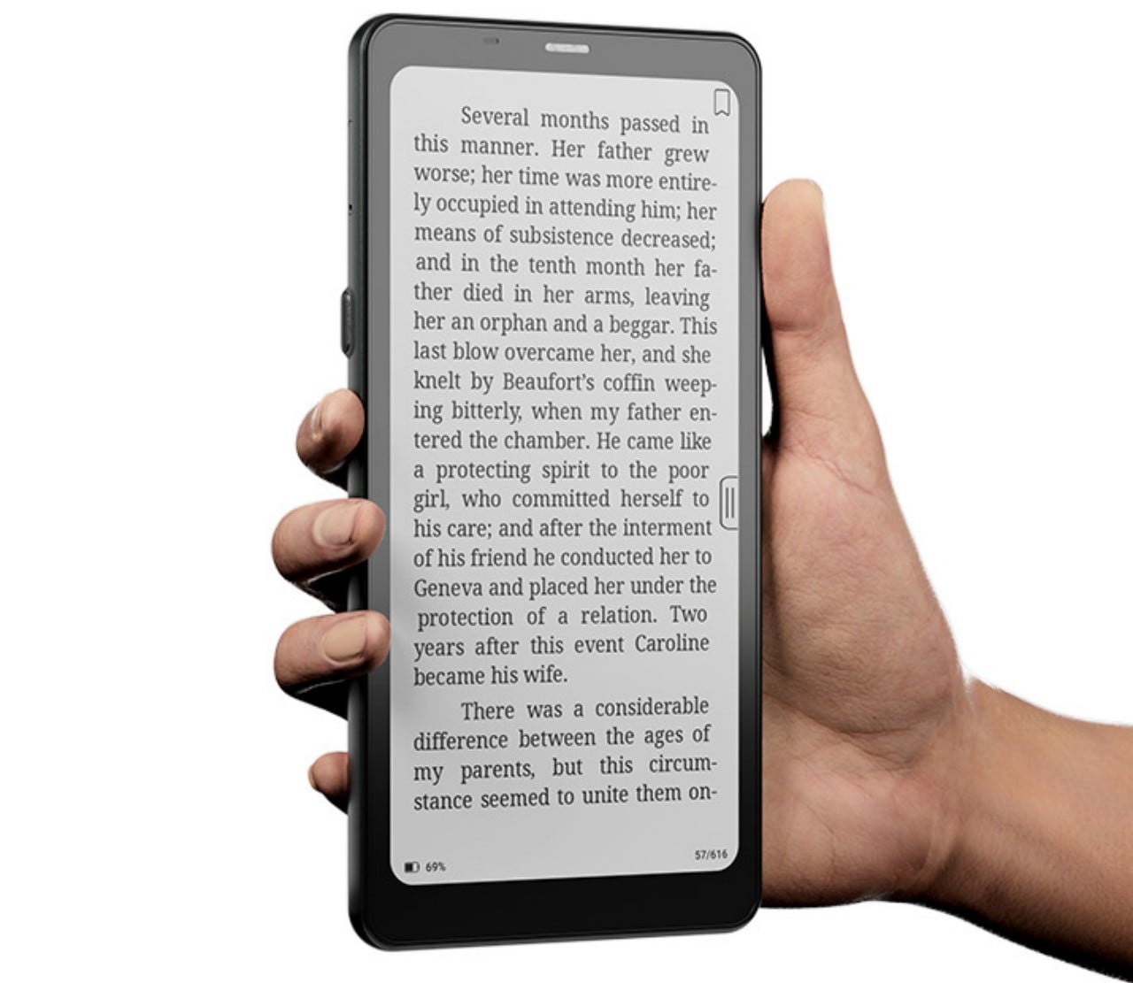
That 6.13-inch E Ink touch screen bears a sharp 300 PPI density, which means you get crisp letters on all your reading materials. It’s an E Ink Carta 1200, though, so you won’t be seeing colors outside shades of gray and black; standard fair for an e-Reader. It has a water-repellent design on its back, which also gives it a distinct appearance and a better grip. If you’ve ever dreamed of a literal pocket e-book, the BOOX Palma fits the bill perfectly and then some.

Just like Onyx BOOX’s other devices, the device runs the brand’s own flavor of Android 11, and this one thankfully also supports Google Play Store. With an octa-core processor and 6GB of RAM, this means you can run plenty of your favorite apps on it, whether they’re for reading, browsing the web, or even social media. The usual e-Paper caveats apply, aside from the lack of color. Refresh rates are terribly slow compared to the LCDs and OLEDs of typical smartphones, but that doesn’t mean you can’t use them for things other than reading, depending on your level of patience.

But what need would you have for an E Ink phone that isn’t a phone, especially when there are more “standard” devices from Onyx’s own fleet even? The brand is trying to sell the image of a new way of life, a distraction-free lifestyle with an eye-friendlier e-Paper device. You might be able to install almost any Android app you want, but the display technology puts limits on your use of them. It also forces you to disconnect while you read, at least when you’re not within range of a Wi-Fi access point. The Onyx BOOX Palma is an admittedly charming device with a unique proposition, but it remains to be seen if it will be worth its $279.99 price tag.

The post Onyx BOOX Palma is a mobile e-Reader that you can literally slide into your pocket first appeared on Yanko Design.

Onyx Boox Tab Ultra C Review: Delightful Heavyweight

PROS:


  • Currently the best of class colored E Ink display

  • Google Play Store pre-installed

  • Elegant, minimalist design

  • Decent performance and battery life

CONS:


  • Too heavy for holding with one hand for a long time

  • Expensive

  • Optional keyboard cover is a dirt magnet

RATINGS:

AESTHETICS
ERGONOMICS
PERFORMANCE
SUSTAINABILITY / REPAIRABILITY
VALUE FOR MONEY

EDITOR'S QUOTE:

A handsome device with a gorgeous eye-friendly screen, the Onyx Boox Tab Ultra C pushes the envelope of what E Ink devices are capable of, making it worth its price and weight.

E Ink devices have long grown past the simplistic and often unattractive slabs of plastic they can shove inside purses and bags, though there are definitely still plenty of those around. Even Amazon has added the ability for readers to also be curators and creators, adding the all-powerful pen to at least one of its Kindles. Other manufacturers, however, have really pushed the envelope of what these eye-friendly gadgets are capable of, blurring the boundary between simple eBook readers and multi-functional tablets. Onyx is one of the most prolific brands in this space, and its recent Boox Tab Ultra, which we reviewed last year, redefines this device category. Now it has taken that to the next level by adding a splash of pastel colors to the Boox Tab Ultra C, and we take it for a spin to see how much farther it has gone to break free of stereotypes and expectations.

Designer: Onyx

Aesthetics

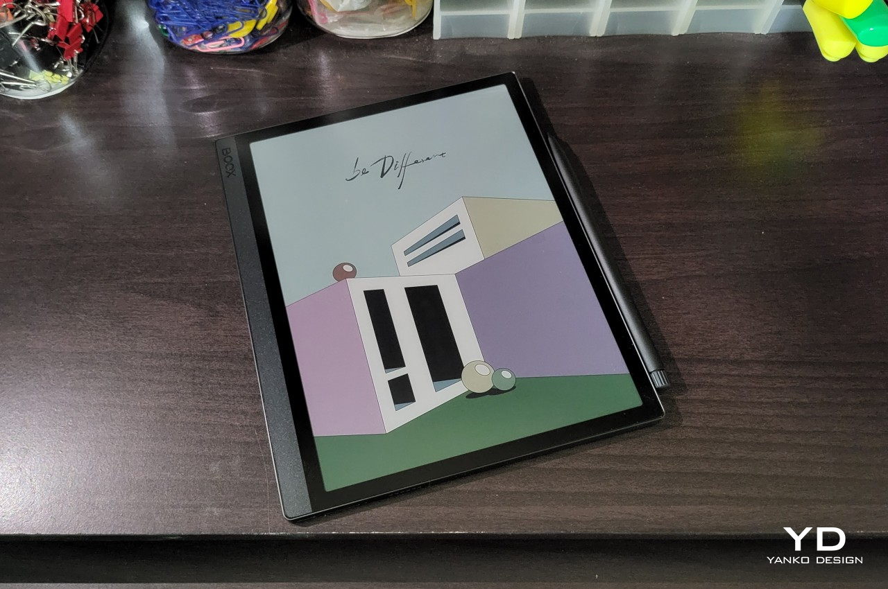
From the very first moment you take it out of its box, you immediately sense that the Onyx Boox Tab Ultra C is nothing like a typical eBook reader. There’s that heft you wouldn’t have expected from this class of device, especially since many of its kind are uninspiring pieces of plastic. More importantly, however, its visual design will strike you as something more refined and stylish, something you won’t be ashamed to bring out in a board meeting. Even compared to colorful tablets like the iPad Pro, the Boox Tab Ultra C can stand proud with its minimalist yet elegant design.
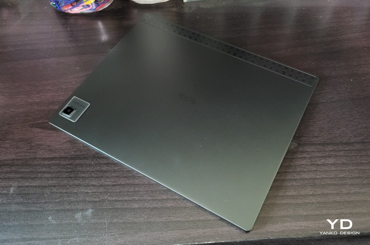
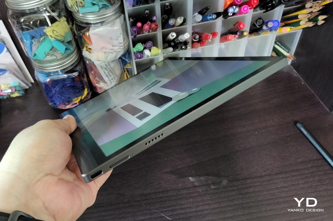
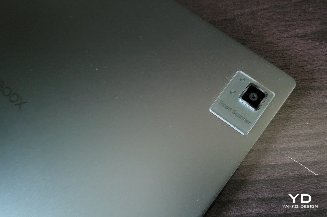
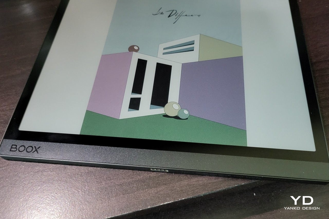
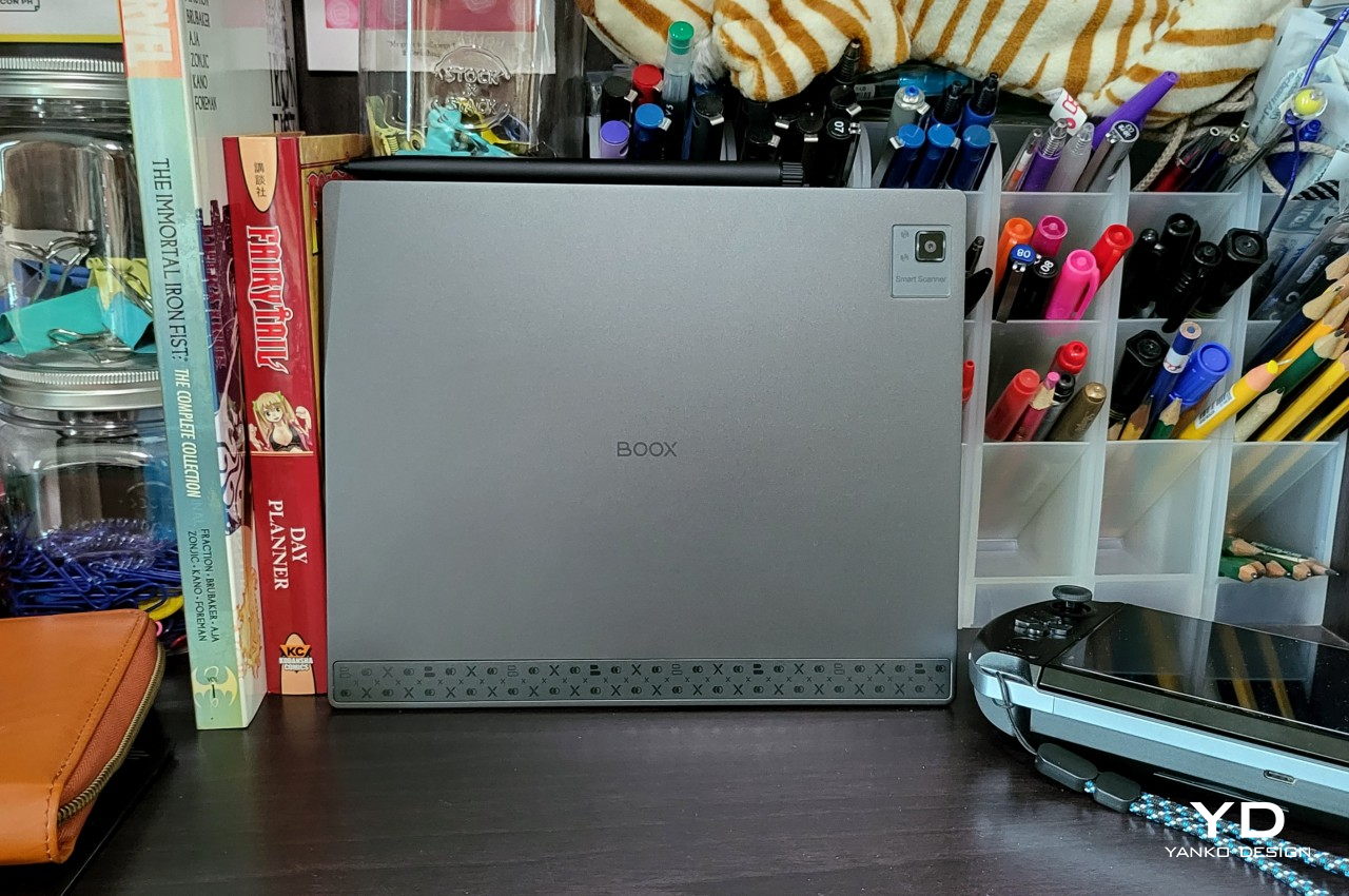
The E Ink Kaleido 3 screen that sets this device apart from both eReaders and regular tablets sits flush with the bezel, allowing the protective glass to be one continuous and flat surface that leaves no obstruction for your finger or your pen. In line with modern mobile design trends, the sides are completely flat, with only the corners curving where the edges meet. The back is equally flat, save for a rare 16MP “document scanner” camera sticking out in a corner.

Camera Output

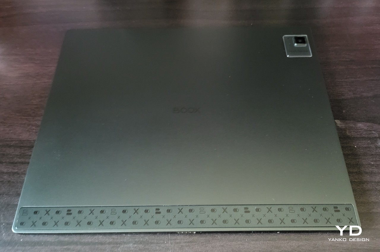
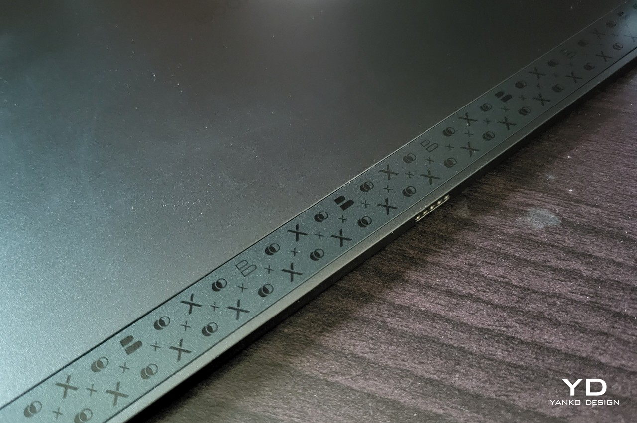
Branding is minimal and unobtrusive, with only the “BOOX” name on the “spine” and the back of the device. There is an unusual strip of matte plastic with decals on that same side, giving the tablet a bit of personality while also providing a better grip. Otherwise, most of the Boox Tab Ultra C’s body is made from sturdy and aesthetic aluminum, another point of departure from regular eReaders.

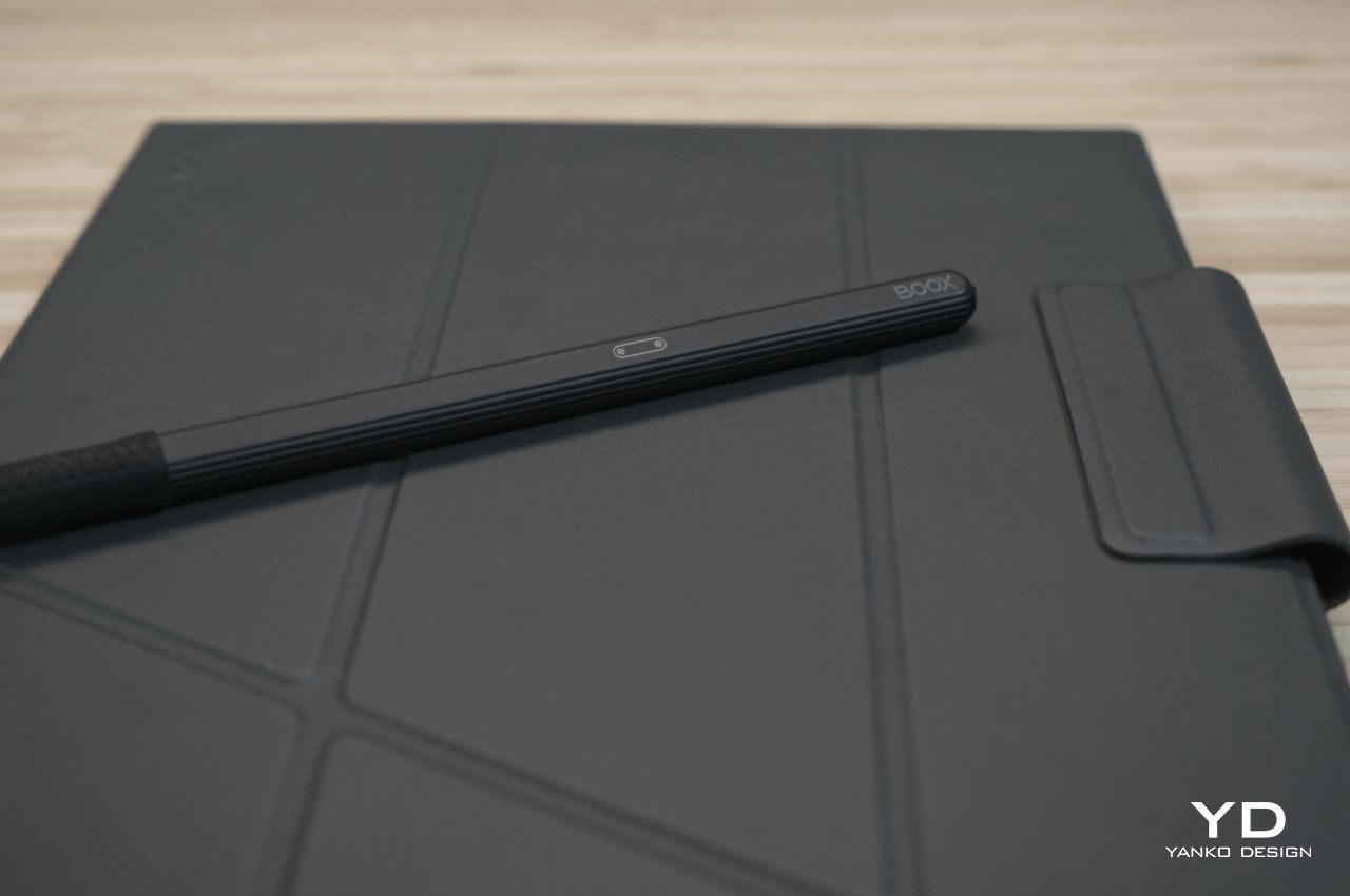
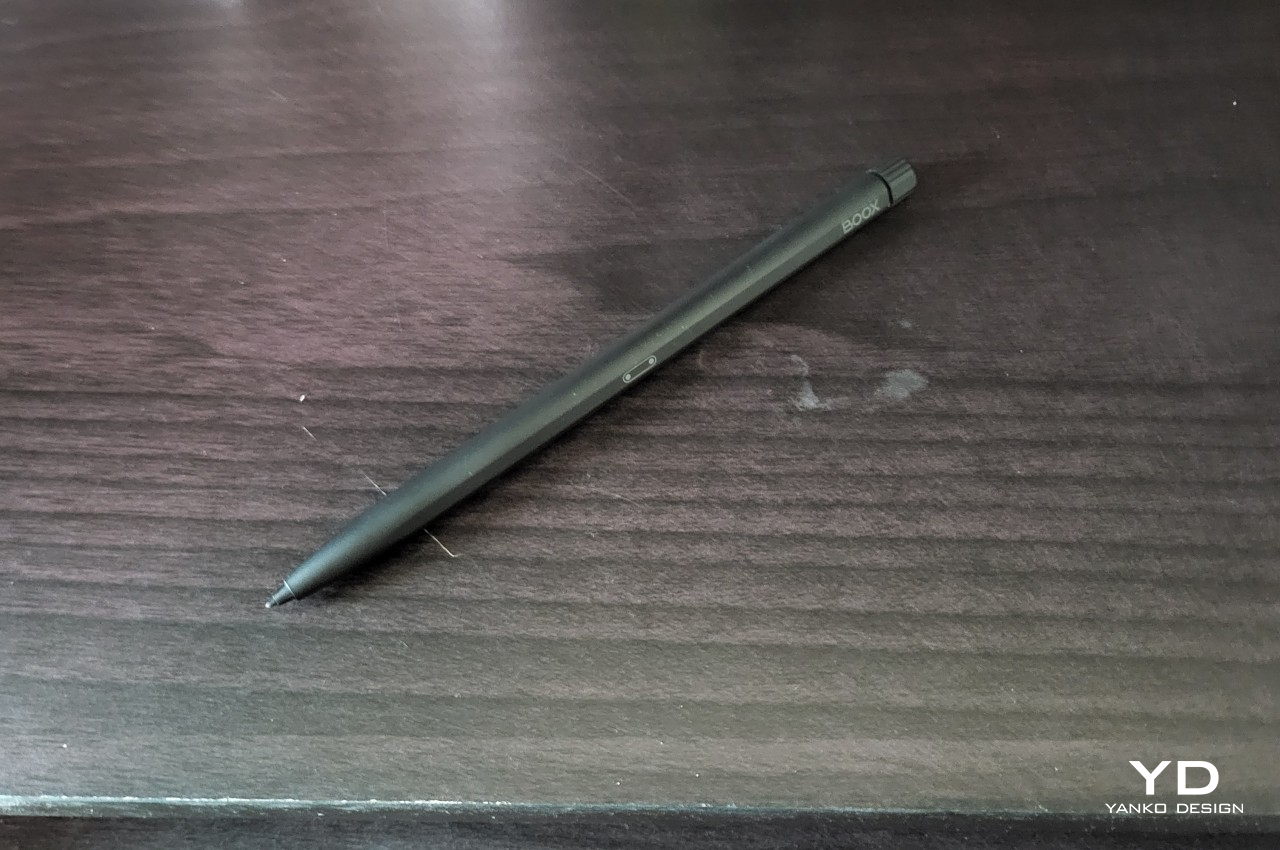
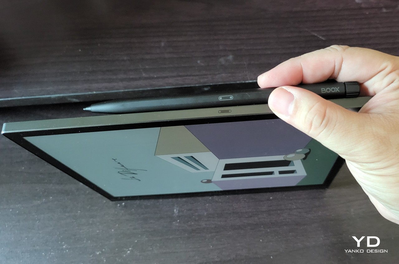
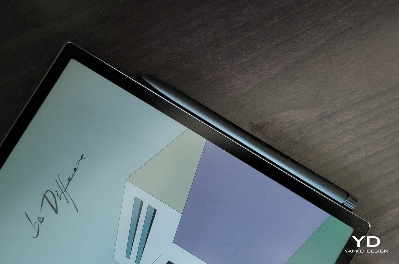
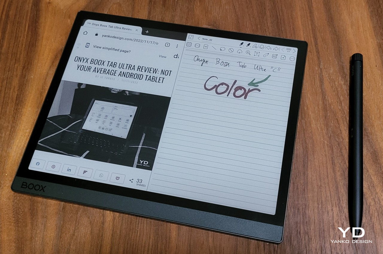
Onyx ships the device with a Pen 2 Pro that matches its color and build quality. This aluminum stylus magnetically latches onto one edge of the Boox Tab Ultra C, so you won’t have to fumble with a separate holder or sheath. The barrel is mostly round, save for the flat edge that sticks to the tablet and also prevents the pen from rolling off a flat table. The ridged cap of the pen is, unfortunately, only for show. It functions as an eraser in the built-in Notes app, but you can’t twist or turn this part, despite what its design suggests.

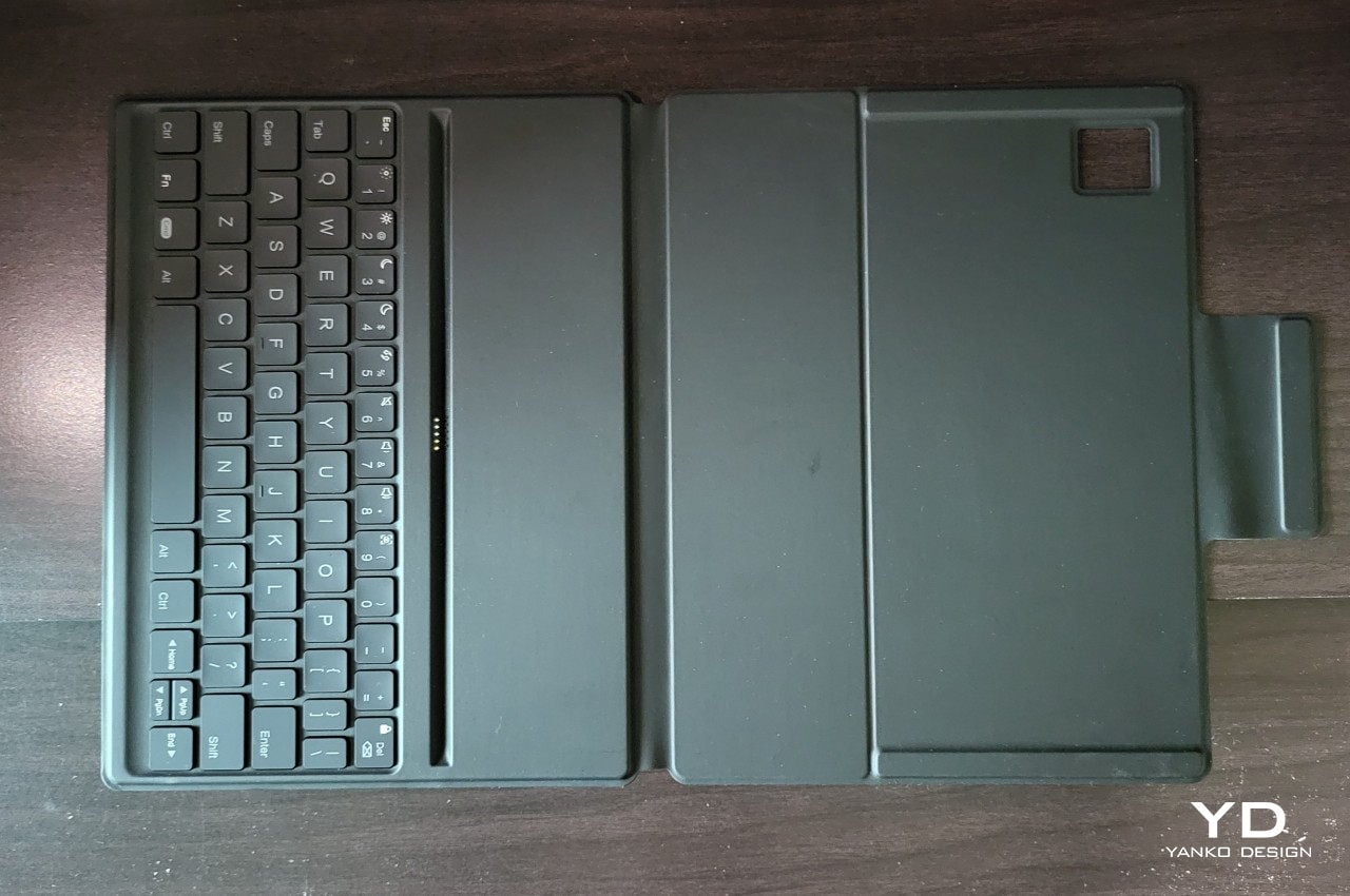
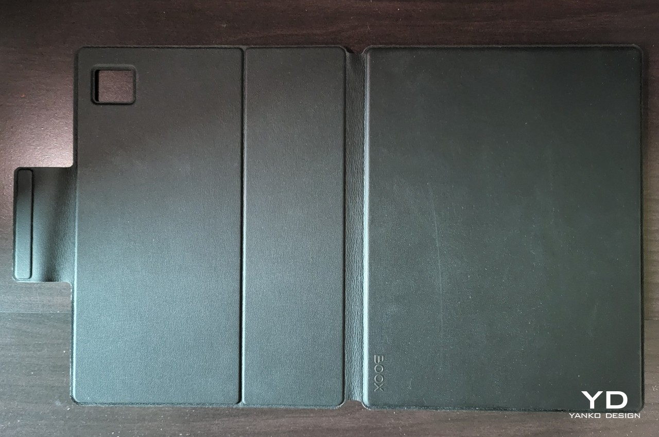
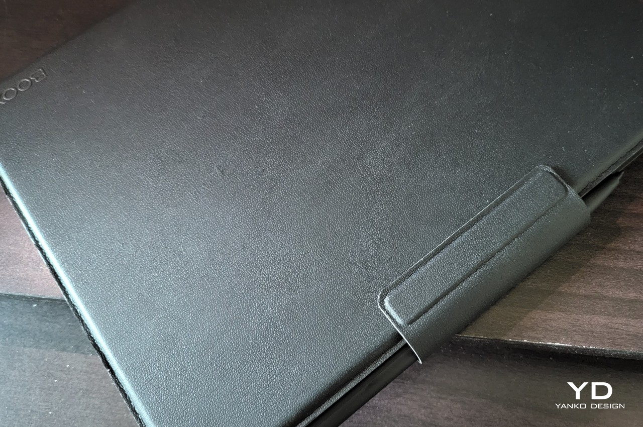
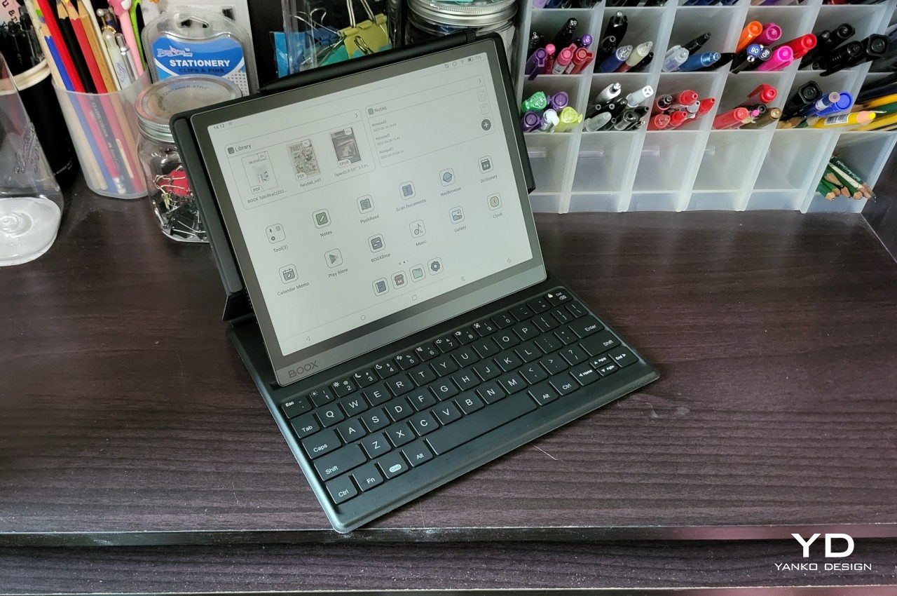
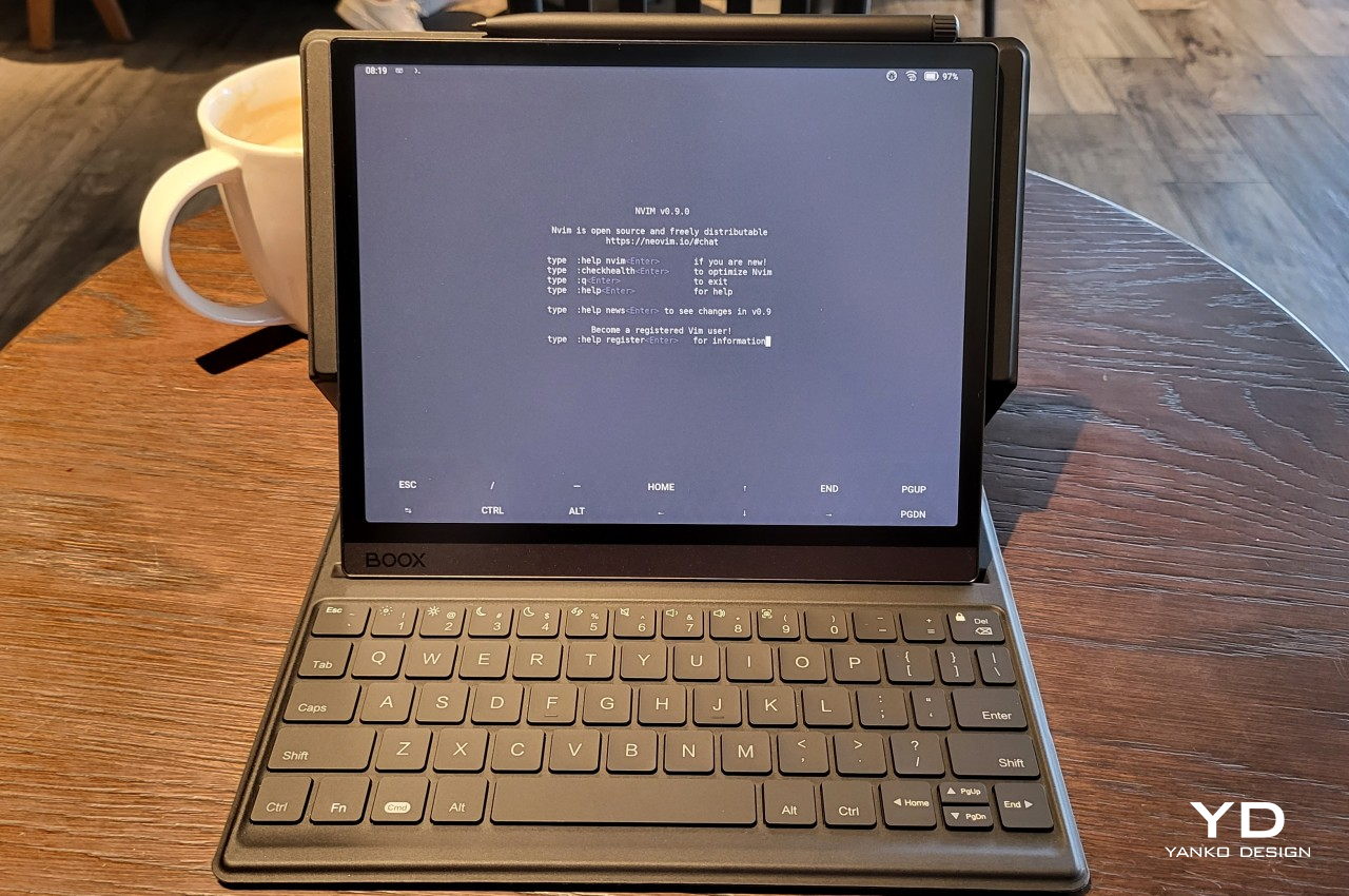
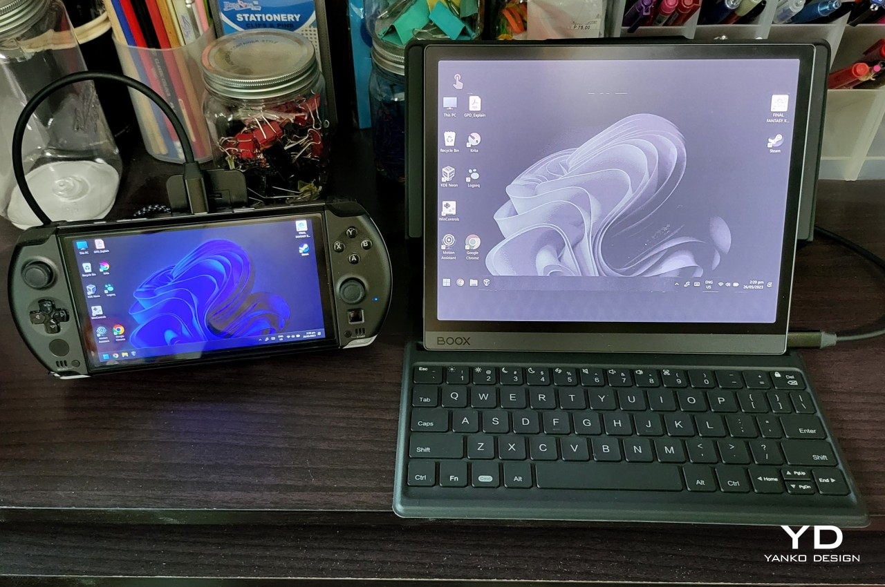
Onyx sells an optional magnetic keyboard case that really drives home the fact that the Boox Tab Ultra C leans more toward the tablet side of the fence. The keyboard connects to the tablet via Pogo pins, so you won’t have to worry about flaky Bluetooth or dead batteries. The cover is supposedly made with artificial leather, but it feels more like rubbery silicone than any premium material. It doesn’t attract fingerprints as advertised, but it’s a dirt and dust magnet instead, making that “feature” moot.

Ergonomics

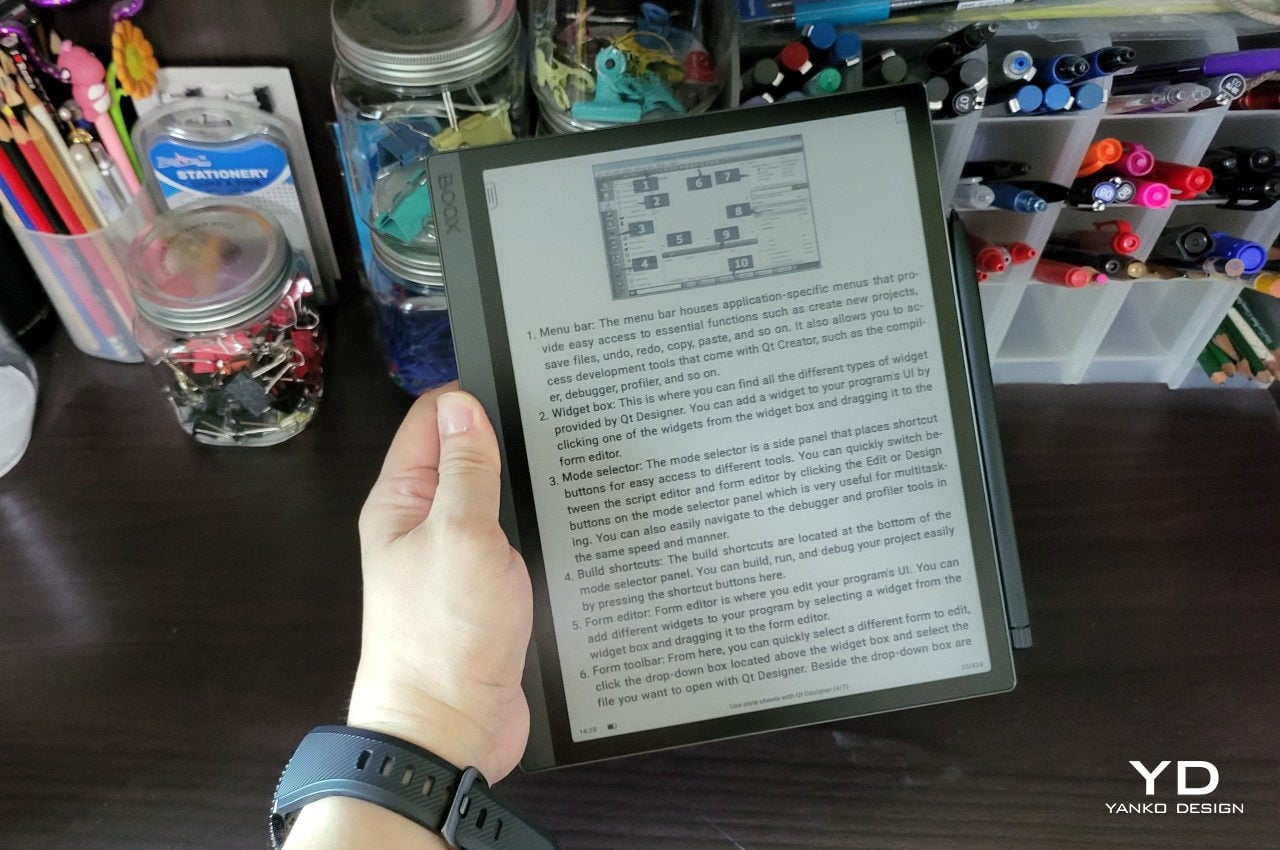
The first thing you’ll notice when you lift the Boox Tab Ultra C from its box is that it is substantially heavy. At 480g (1.06 lbs), it is probably one of if not the heaviest E Ink reading devices you can get your hands on, at least within the same 10-inch size category. Part of that is due to the use of more durable but also heavier aluminum, and part of it is simply due to the amount of hardware inside. More on that in a bit.

What this means, however, is that the Boox Tab Ultra C is uncomfortable to hold unsupported with one hand for a long period of time. Some might even already feel some strain for just a few minutes, let alone half an hour of continuous reading. Admittedly, leisurely reading books isn’t the core purpose of this device anyway. Instead, it’s a device that brings together the power and flexibility of an Android tablet with the comfort and longevity of an E Ink screen, making it more of a productivity tool than a mere eBook reader. It is, in a way, closer to an iPad Pro or a Galaxy Tab S8 in function and closer in weight class as well.

The Pen 2 Pro that Onyx ships in the box is light and well-balanced, making it a great tool for writing and sketching. The flat edge of the barrel is a natural resting spot for the fingers, adding to the pen’s grip. There are no buttons to be wary of, though that also means there is no additional functionality available. The top of the pen only works as an eraser, at least in apps that can recognize it as such.

The Boox Magnetic Keyboard Cover adds protection to the tablet, but at 408g (0.9 lbs), it also doubles the tablet’s overall weight. It’s definitely something you’ll want to take off if you’re not using the keyboard or carrying the Boox Tab Ultra C around. Thankfully, the magnets align the tablet and the cover perfectly, so you won’t lose too much time putting it on again. Like almost all keyboard covers of its kind, there’s only one viewing angle, which isn’t exactly the best ergonomic position. For typing on the go and away from your desk, it’s practically the only feasible position anyway.

Performance

It may have an E Ink screen on top, but the Onyx Boox Tab Ultra C is an Android tablet at its very heart. Powered by a Qualcomm Snapdragon 662 with 4GB of RAM and a generous 128GB of expandable internal storage, it is the equivalent of a mid-range Android tablet, at least from two or so years ago. It’s no racehorse, of course, but it’s definitely the most powerful chipset to grace an E Ink device. This is especially important since the Boox Tab Ultra C comes with Google Play Store pre-installed, which means you have access to all the Android apps you can ever want.

Thanks to this potent combination, the Boox Tab Ultra C is possibly the most capable E Ink tablet in the market to date. Onyx’s custom UI is snappy and responsive, and apps launch quickly and perform quite decently. Those coming from regular tablets might point out the small pauses when using apps, but this is more due to the ePaper panel refreshing its contents rather than sluggishness on the tablet’s part. Those used to regular eReaders will definitely come off impressed by the device’s smooth performance.

The tablet comes with a 6,300 mAh battery, which is definitely plenty for an E Ink device. That said, the tablet’s actual uptime is going to be shorter than your typical eReader if you tend to use more apps outside of basic reading and note-taking. With access to so many apps, you might be tempted to run wild, especially since the device is more than capable of supporting those. The stereo speakers are plenty loud, for example, and the Ultrafast refresh mode even makes YouTube usable. You can even play some games if you’re up to some grainy graphics and plenty of ghosting.

The Boox Tab Ultra C’s killer feature is, of course, its 10.3-inch Kaleido 3 E Ink screen, the current king when it comes to colored ePaper displays in the consumer market. When displaying Black and White content, the screen boasts a high 300dpi pixel density. With color, the density dips to 150dpi, which is actually still higher than previous colored E Ink technologies. What this means is that content will always be sharp and crisp, whether colored or grayscale. Of course, not all content is the same, so Onyx provides controls that let you mix settings to your tastes. With warm and cool brightness settings, you can also tweak the display to your comfort, ensuring that you don’t lose the eye-friendly benefits of E Ink even with all the color and power the device offers.

Sustainability

Onyx deserves props for choosing aluminum over plastic for the Boox Tab Ultra C’s body, even if its other models haven’t made the switch yet. Its packaging is also simple and compact, though it still has the customary plastic wrappings and sections. Onyx doesn’t ship a charger with the device, though it comes with a USB-A to USB-C cable for charging and data transfer purposes. Unfortunately, this is the bare minimum effort that consumer electronics companies are supposed to make, and we’re hoping that Onyx will differentiate itself further with a stronger sustainability commitment soon.

The slight upside is that Onyx’s devices are made to last, both in hardware and especially in software. People don’t switch eBook readers as often as, say, phones and tablets, and the Boox Tab Ultra C is no different. This particular tablet has just enough power to carry it for years, which is also how long Onyx usually pushes out software updates. For its purpose and design, you won’t be going after the most resource-intensive apps anyway, so you’re unlikely to chase after new specs and features for a long while.

Value

As powerful and as impressive as the Onyx Boox Tab Ultra C is, it’s probably not going to be everyone’s cup of tea, just as not everyone might be in the market for a regular tablet. Even those who have been dreaming of reading colorful comics and magazines ever since the earliest days of eBook readers might be on the fence about whether to grab this particular device or not.

While its A5-sized screen is great for reading magazines, PDFs, comics, and documents, it isn’t the most convenient thing to read on, especially if you consider its heft. The biggest deal breaker, however, is the $600 price tag attached to the device, making it one of the most expensive eReaders out there. And that’s not yet considering the $110 magnetic keyboard cover that turns the device into a convenient and eye-friendly productivity tool.

That’s not to say that there’s no market for the Onyx Boox Tab Ultra C because it happens to be one of the company’s recent successes. You just have to approach it with the right frame of mind, not as a large colored eReader but as an Android tablet with a colored E Ink display. From that perspective, the device is actually on par with mid-range devices, at least those that truly offer notable functionality wrapped in a decent design. In that regard, the Boox Tab Ultra C checks all the right boxes, delivering unmatched value for its price.
Verdict

We have all become dependent on device screens, whether it’s the computer we use for work, the phone we use to connect with people, or the TVs we use to chill. As vibrant and as beautiful as those screens may be, they have an adverse effect on our health, especially our eyes. E Ink devices like eBook readers have long been hailed as the solution to that, but those have only benefited avid readers, at least until now.
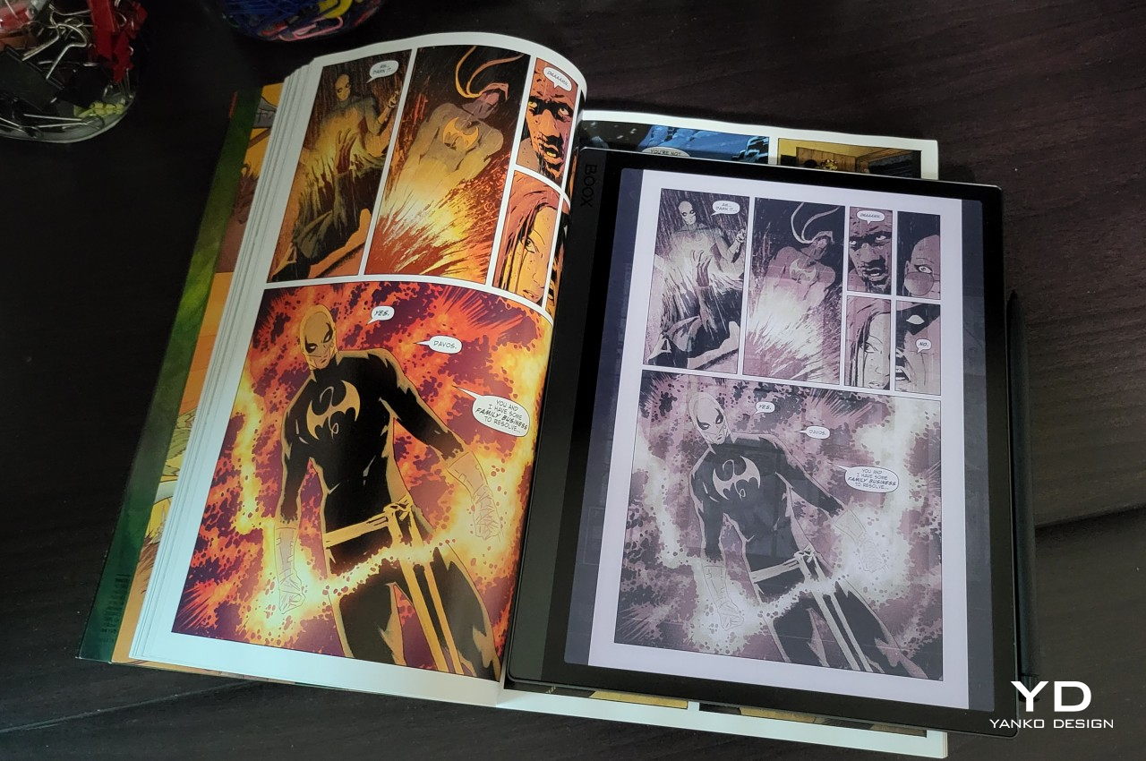
The Onyx Boox Tab Ultra C brings that same eye-saving technology to an Android tablet that will satisfy your reading craving and then some. Although its weight is no small matter, and its price is a bit on the expensive side, it easily pays for itself with all the things you can do on it that go beyond just consuming content. Whether you’re a huge comics buff, a budding artist, a novelist, or even a programmer, the Onyx Boox Tab Ultra C has got you covered, and your eyes will definitely thank you for it.

The post Onyx Boox Tab Ultra C Review: Delightful Heavyweight first appeared on Yanko Design.