This Kinetic Sculpture Provides an Elegant Metaphorical Reflection on Environmental Impact through Dots

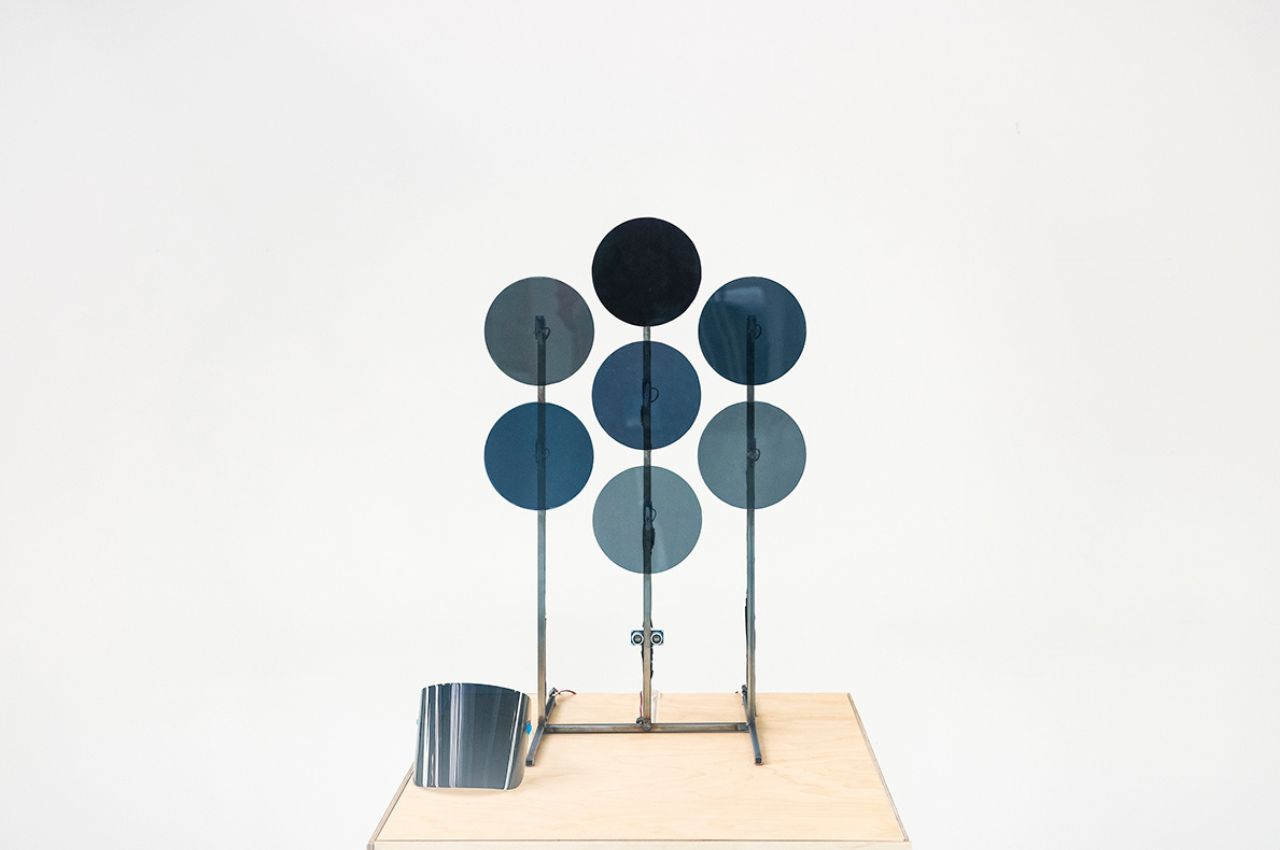
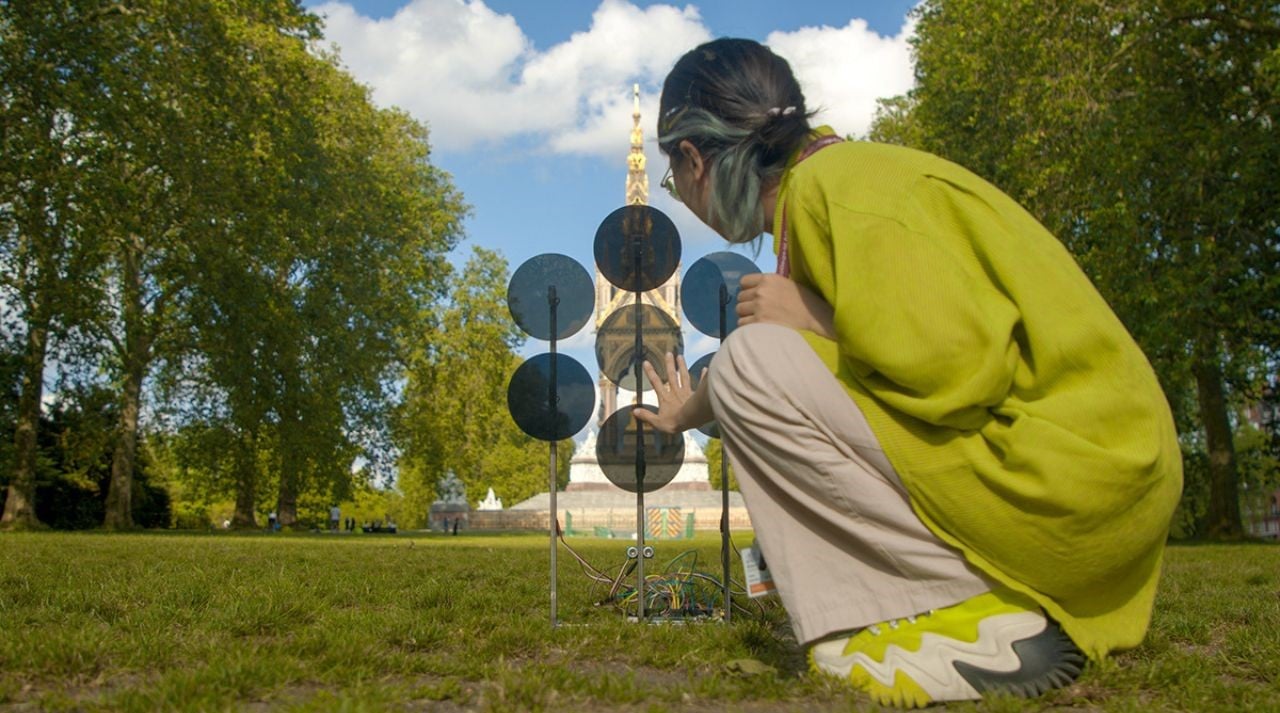
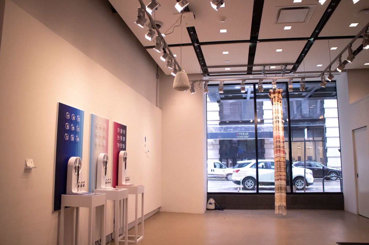
Our contemporary lifestyles have undeniably left a negative mark on the environment. Despite the ongoing discussions and awareness campaigns, it seems that these efforts have failed to significantly influence the lifestyle choices of the masses. “The Dots,” an interactive installation by Jack Lee, serves as a metaphorical representation, showcasing the undeniable impact of human activities on the environment and its related issues. Through the fusion of kinetic art and technology, this captivating artwork offers a thought-provoking visual narrative that urges viewers to reflect upon their responsibility towards the environment.

Designer: JACK LEE

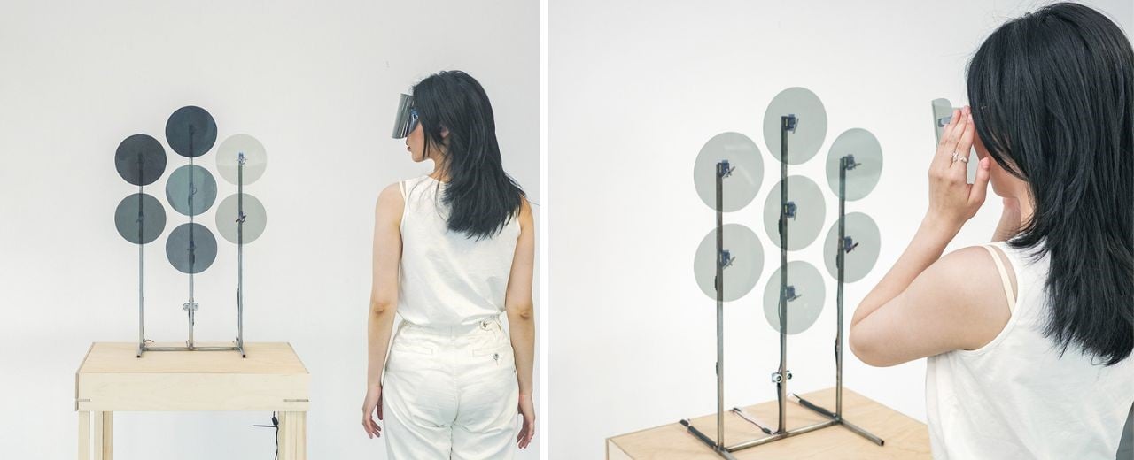
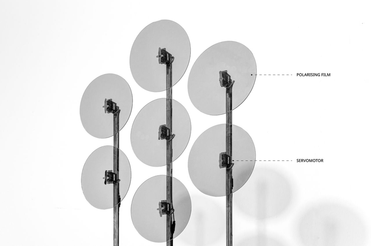
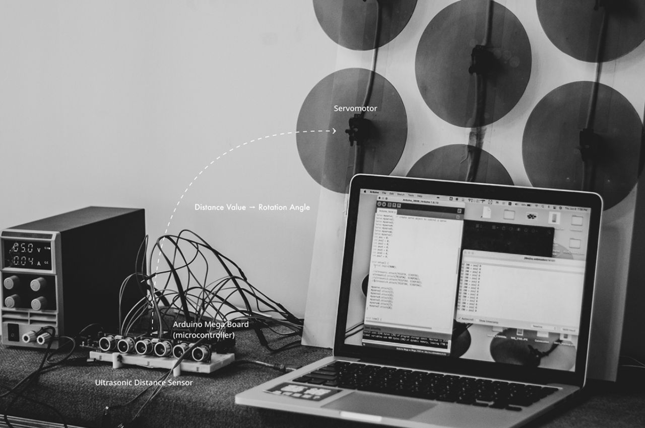
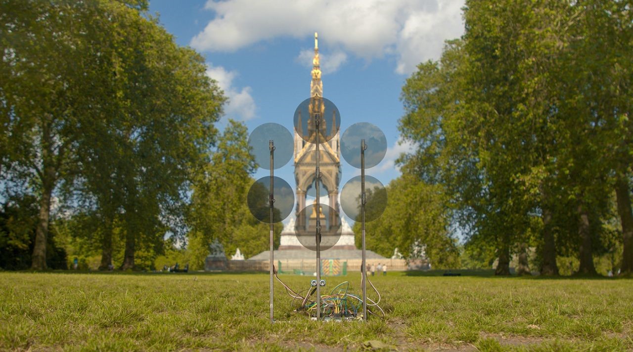
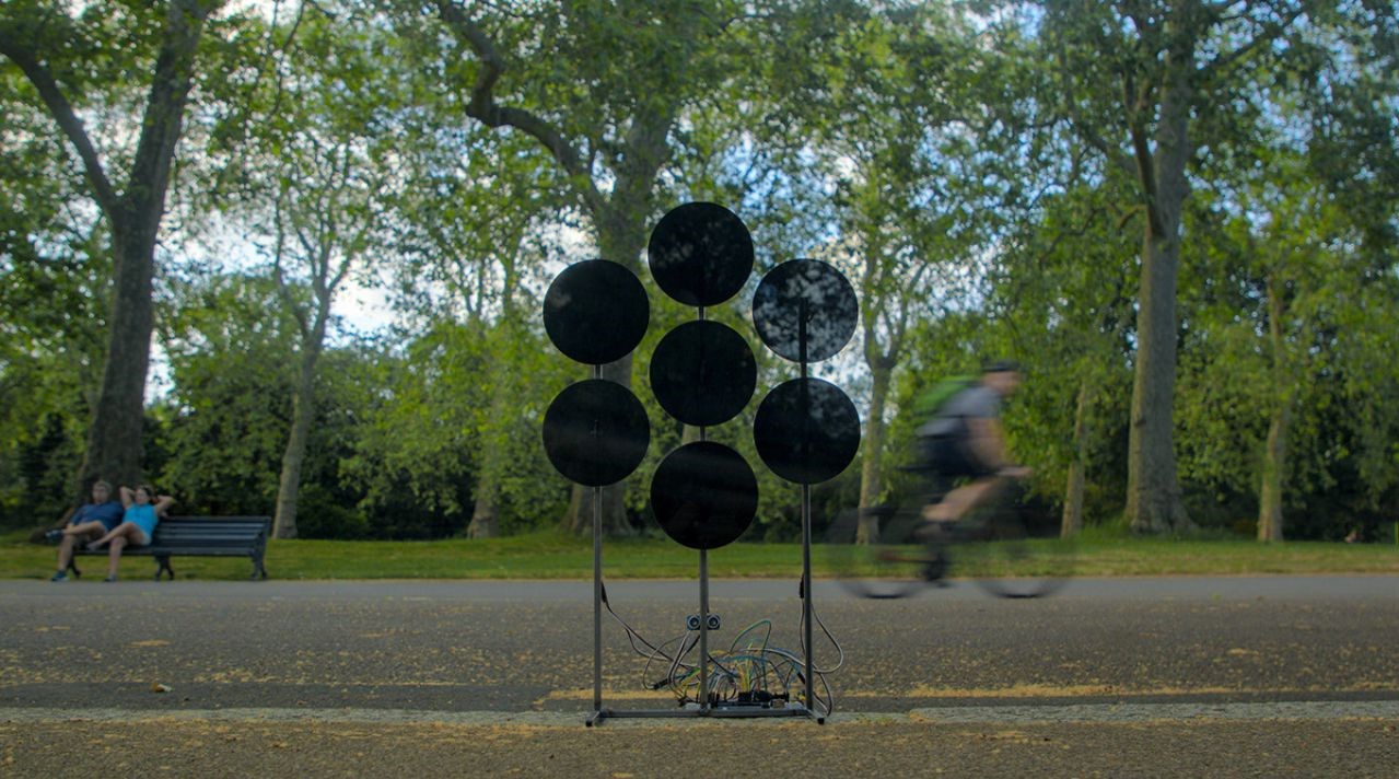
At the heart of “The Dots” installation are meticulously arranged polarised panels, cleverly designed to create mesmerizing visual effects through physical manipulation. By employing servo motors and sensors, the transparency of these panels dynamically adapts to the proximity of the viewer, revealing a captivating visual story. Jack Lee’s creation exemplifies the essence of his “Matters” project series, catalyzing contemplation and encouraging viewers to consider their impact on the environment.

Global environmental issues often appear too vast, abstract, and disconnected from individuals’ daily lives. While the public is generally aware of their existence, it is challenging to establish a personal connection with these issues. However, the power to shape the Earth’s environment, whether positively or negatively, lies within the hands of each individual.

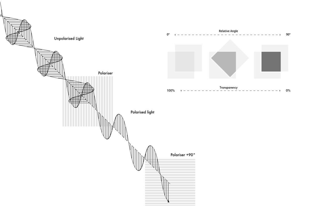
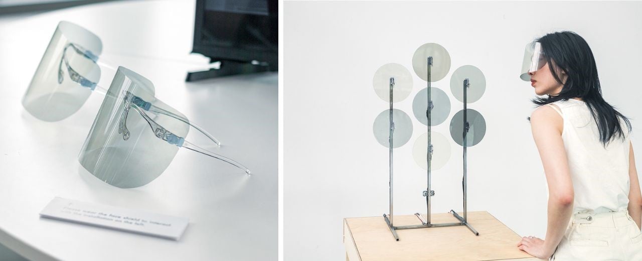
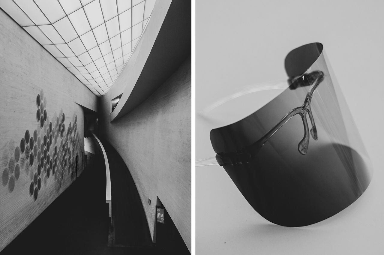
The polarising film used in “The Dots” plays a pivotal role in creating its visual effects. This film is applied to both the surface of the panels and the viewer’s face shield, creating a unified polarised environment. Polarisation is a property of light that describes the direction in which its waves vibrate. The film is specially designed to filter and manipulate the polarisation of light passing through it.

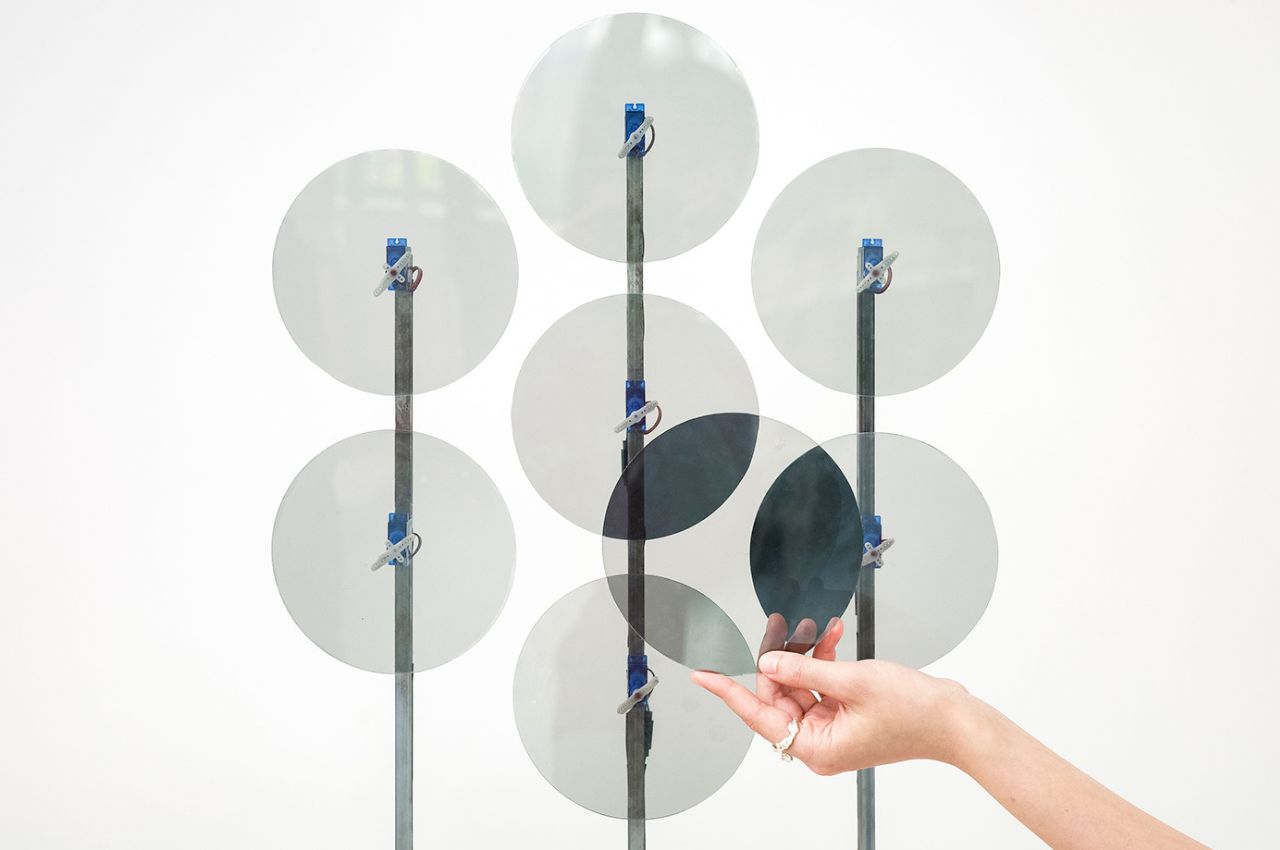
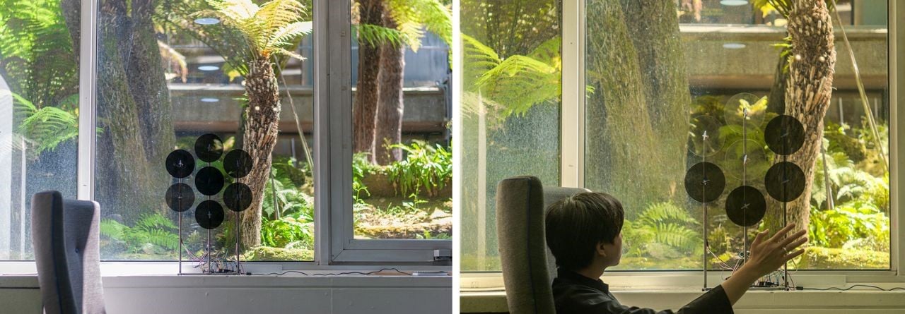
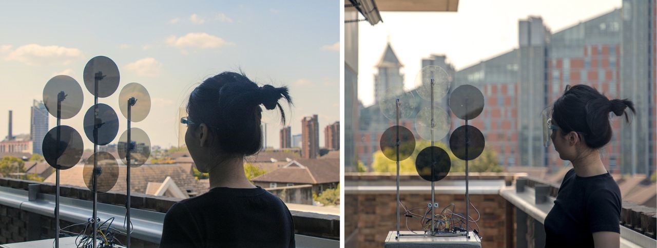
As the panels rotate, the relative angle between the polarised film on the panels and the viewer’s face shield changes. This change in angle alters the transmission of light through the panels, affecting their transparency. When the polarization angles align, the panels become more transparent, allowing more light to pass through. Conversely, when the polarisation angles are misaligned, the panels appear darker and less transparent.

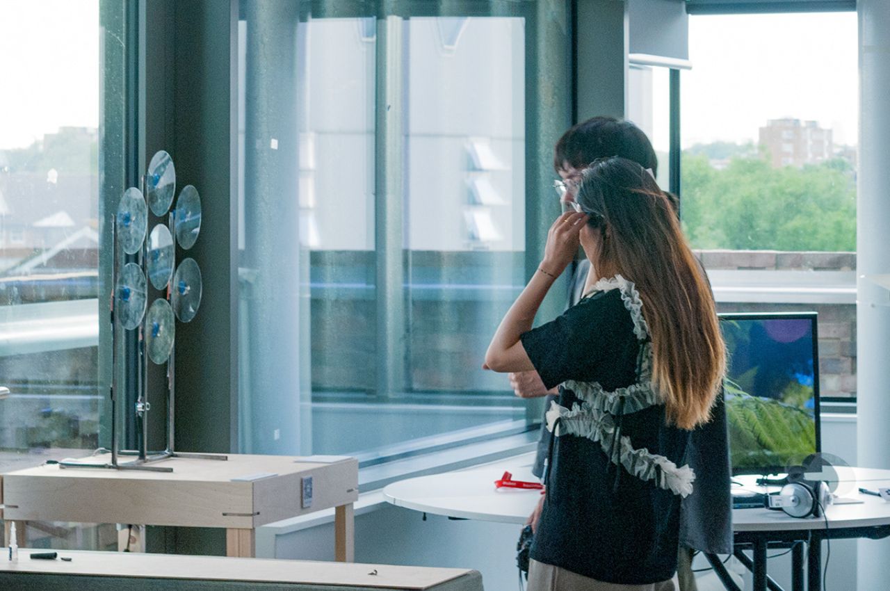
This dynamic interaction between the viewer’s perspective and the polarised panels creates captivating visual transformations, enhancing the immersive experience and reinforcing the connection between the viewer and the artwork.

The installation consists of seven precisely arranged circular panels, forming an intriguing hexagonal grid. Guided by servo motors controlled by an Arduino board integrated with an Ultrasonic distance sensor, each panel gracefully comes to life. The panels’ surfaces are coated with a delicate layer of polarised film, similar to the material used in a specially designed face shield that the audience wears.

As the panels elegantly rotate, a mesmerizing metamorphosis unfolds. The transparency of each panel dynamically shifts, influenced by the relative angle between the viewer’s glasses and the panels themselves. This captivating interplay between movement and perception creates a visual symphony, where the degree of rotation echoes the distance between the audience and the installation.

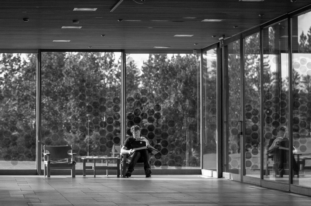
“The Dots” installation serves as a significant initiative toward environmental awareness, but there is room for further development. Currently, viewers require additional equipment like the viewer’s glasses to fully experience the installation. While this adds an extra effort that may deter some individuals, it is crucial to consider inclusivity and accessibility. Finding ways to make the experience more easily accessible can ensure a broader reach and engage even the “lazy” population who might otherwise prioritize ease over environmental concerns.

Looking into the future, “The Dots” holds immense potential for engaging and inspiring audiences in various settings. Beyond its current artistic context, the concept and technology employed in this work can be extended to broader applications.

In public spaces, such as museums or interactive exhibitions, “The Dots” can serve as an immersive experience that encourages public engagement and dialogue. By inviting viewers to reflect on their individual responsibility for the environment, the installation prompts discussions and actions toward a more sustainable future.

Moreover, the technology and techniques used in “The Dots” can inspire innovations in architectural design and urban planning. By integrating similar interactive elements into buildings and public spaces, it becomes possible to create dynamic environments that respond to human presence and encourage eco-friendly behaviors.

Overall, the future application of “The Dots” extends beyond its current art form, presenting opportunities for environmental education, public engagement, and sustainable design solutions. By harnessing the power of interactive technology art, this installation has the potential to contribute to a more conscious and environmentally responsible society. It reminds us that our individual actions, no matter how small, can make a difference in shaping a better future for our planet.

The post This Kinetic Sculpture Provides an Elegant Metaphorical Reflection on Environmental Impact through Dots first appeared on Yanko Design.

Wheel-like device concept puts a unique spin on monitoring environmental changes

The world is rapidly changing in more ways than one. While technologies are advancing at a fast pace, so is our planet’s state fluctuating at a somewhat worrying rate. It’s hard to ignore how the climate seems to be less reliable in the past years, throwing predictions and statistics into chaos. At the same time, however, it may have given us more insight into how nature really works, where balance is less static and more like an ever-changing dance. Keeping track of the many environmental factors that affect our health and comfort can be overwhelming and a bit distant for most people, so this curious device tries to represent those environmental markers in a more visual way that drives home the need for equilibrium in our living spaces.

Designers: Johnny Jiasheng Chen, Safiya El Ghmari, Betania Locatti, Rafael Bojorquez (Forenext Design Studio)

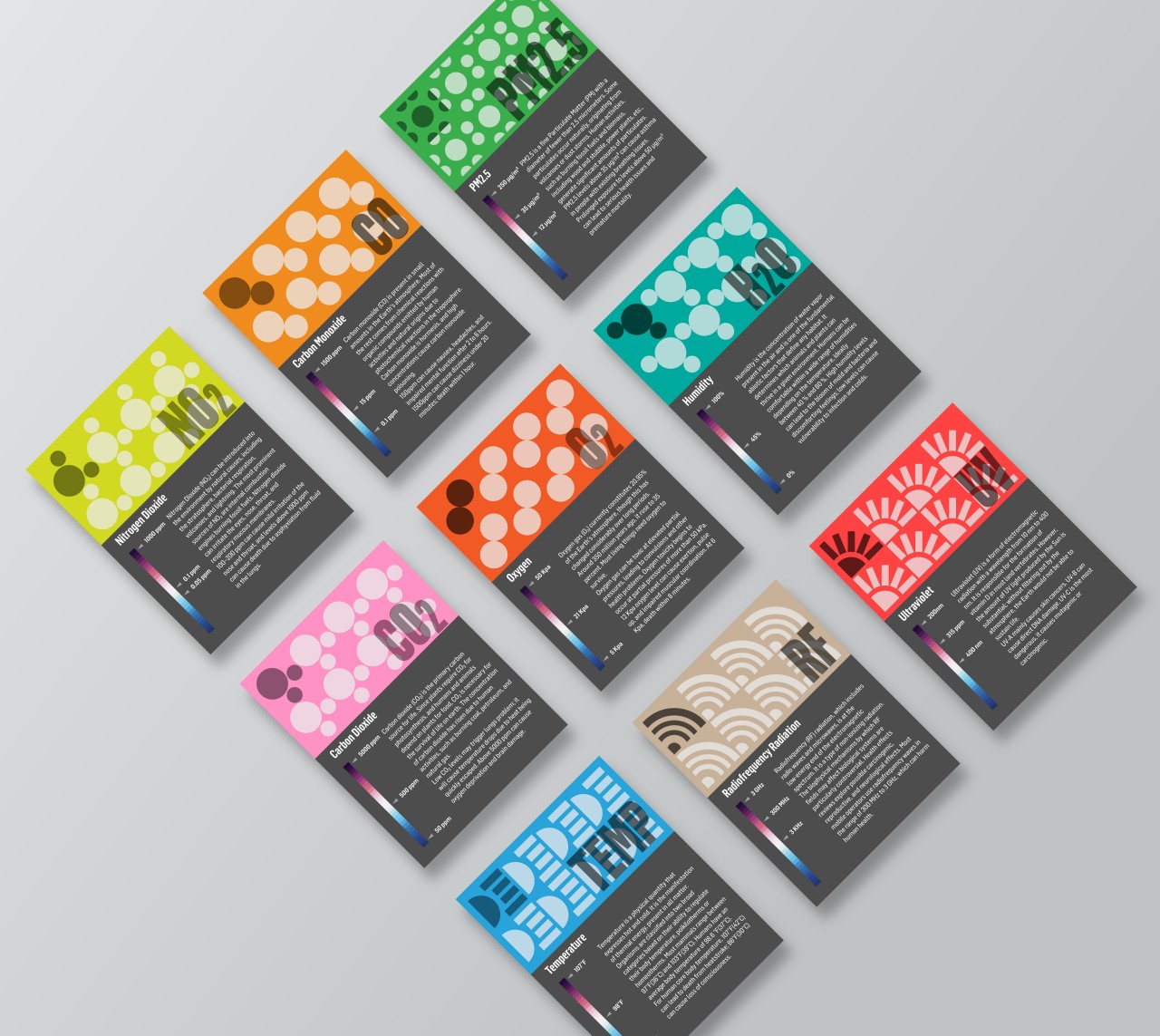
Given the health scare we had in 2020 through 2022, many people have become more interested in knowing the quality of the air around them. It isn’t just about viruses and bacteria floating in the air but also environmental factors such as humidity, carbon dioxide, pollution, and even ultraviolet radiation. There are some public services or indoor devices that can give a report on these pieces of data, but most people won’t be able to make heads or tails of the figures they present. More importantly, they don’t always present what should be the ideal amount given your specific location or setting.

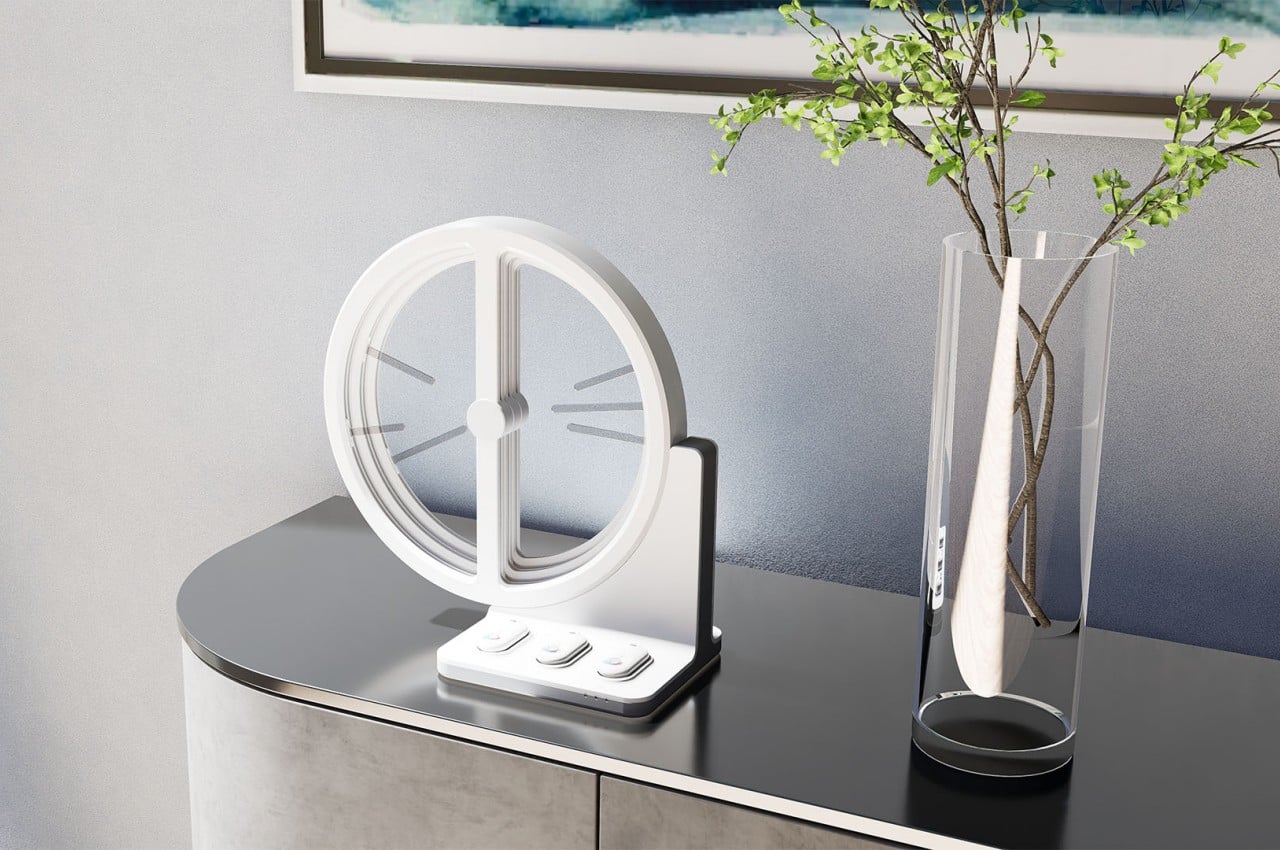
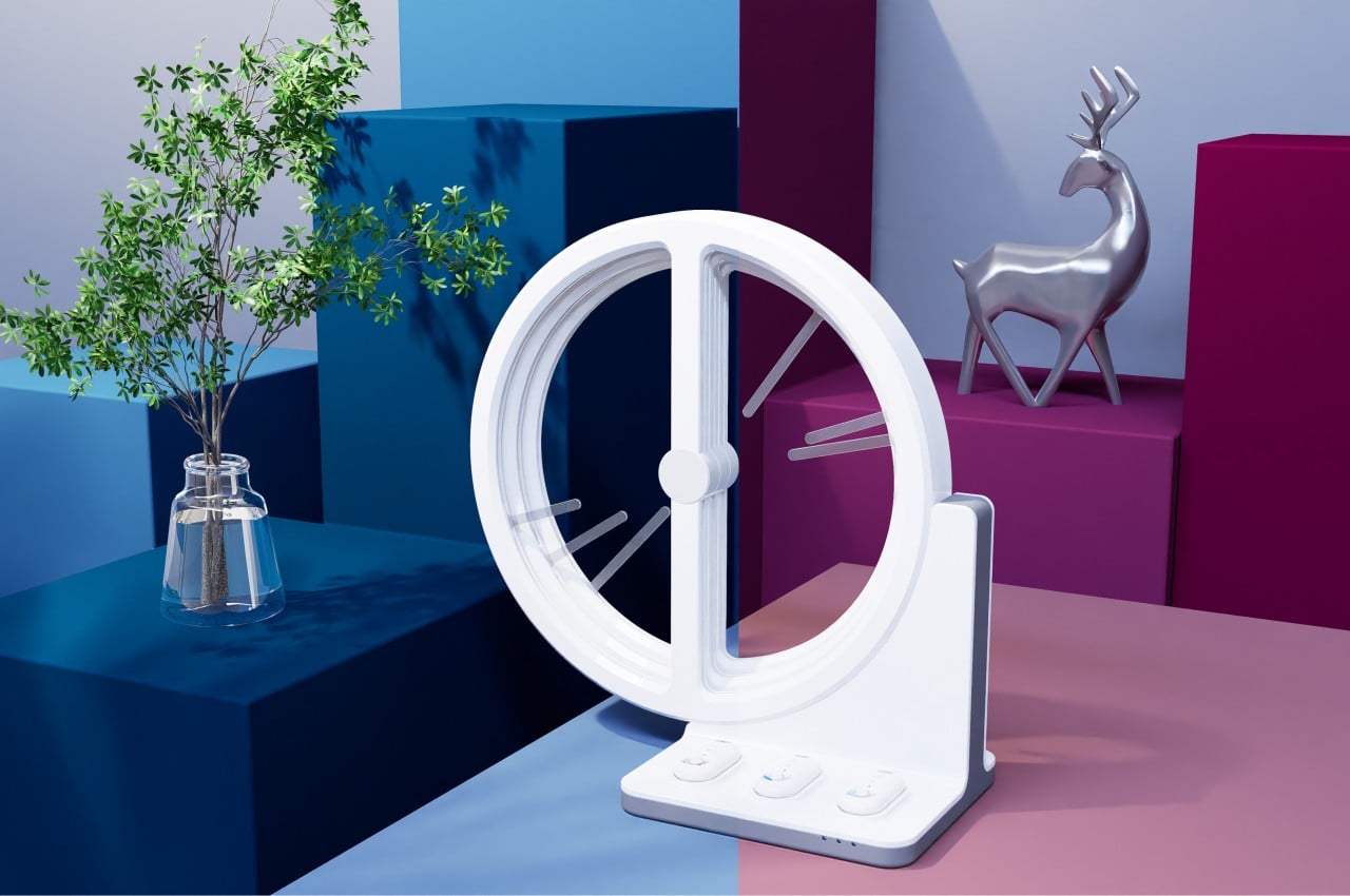
Plan B, which is short for “Plan Balance,” offers a different way of interpreting those very same figures. It revolves around the concept of balance, where too much or too little of something could be bad for our health. At the same time, however, it also acknowledges that our situation rapidly changes, so what might be in balance today won’t be the same tomorrow.

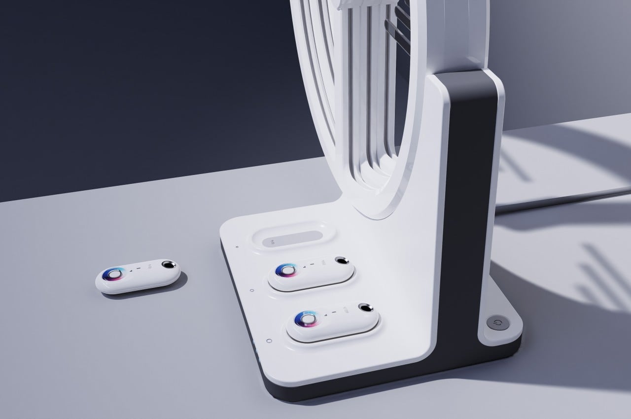
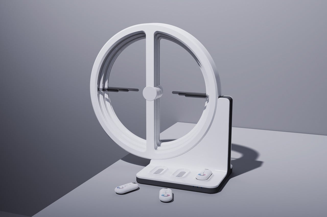
At the heart of the Plan B device is a dial composed of three layers that can keep track of at most three elements, including carbon dioxide, oxygen, humidity, temperature, and the like, depending on which ones the user wants to monitor. Each dial has a left and right half, each taking data from a different source. The left side sources information from public services, while the right side gets its data from the three portable sensors below it. The pointers on each side move depending on how much or how little there is of each element. When the two pointers point to each other in the middle, they form a horizontal line that symbolizes balance has been reached.

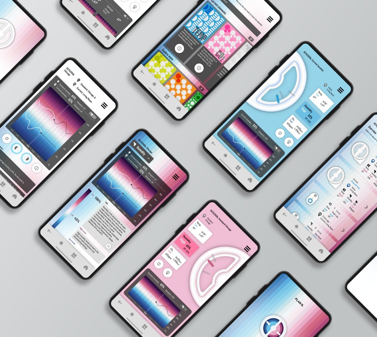
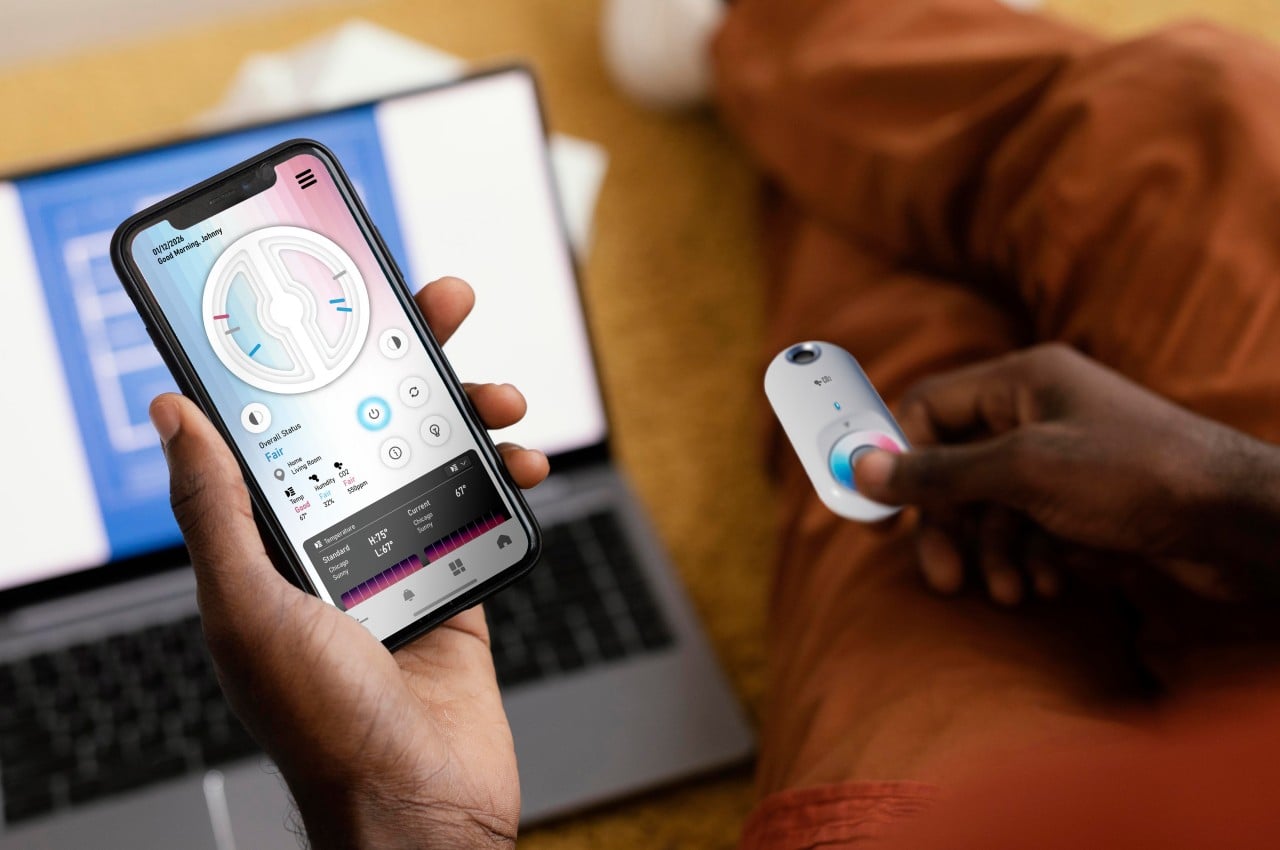
Plan B is a unique way of looking at how the rapidly changing climate affects our environment, but it also shows the traditional figures in the companion app. Admittedly, not all environmental markers need to be balanced (you want as low PM2.5 as possible, for example), so the visual might not work perfectly for all cases. At the very least, it can compare your indoor environment with what is outside or what should be ideal, allowing you to quickly make changes to increase your comfort and your safety.

The post Wheel-like device concept puts a unique spin on monitoring environmental changes first appeared on Yanko Design.

The Best of MWC 2022 – Product Design in a Mobile World

The Mobile World Congress this year is unsurprisingly filled with phones and Metaverse references, but producers and consumers are thankfully becoming more aware of the deeper impact these products have in our lives and on the planet.

Next to CES, MWC is an auspicious time for companies to show off their wares, especially those related to smartphones, tablets, and even the new “Metaverse.” Despite the onslaught of COVID-19 since 2020, the smartphone market shows no signs of declining, at least to a significant degree. After two years, MWC 2022 sees a return to face-to-face exhibits and interactions that almost feels surreal given previous events. It’s not as jam-packed and as frantic as before, but that’s not the only thing that’s different this year. There’s also an increased consciousness of the role that thoughtful product design plays in improving people’s lives, both directly and indirectly through sustainable products.

Like every year, a few of these designs and products manage to grab our attention more strongly than others. Some through their design, others through their commitment to the environment, while others are just plain fun or useful. Without further ado, here is Yanko Design’s Top 8 picks for MWC 2022, ranked!

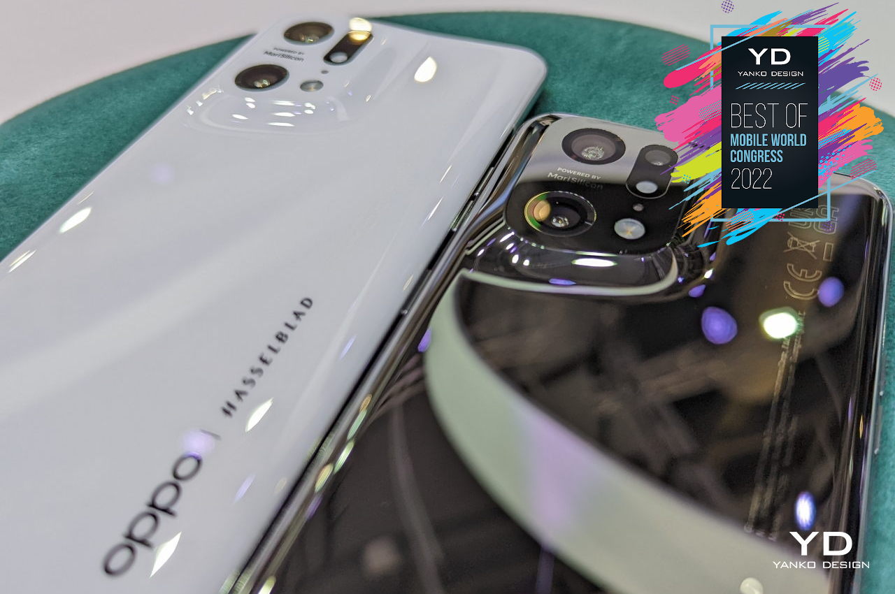
1. OPPO Find X5 Pro

They say that beauty is in the eye of the beholder, and some smartphones are regarded to be beautiful, mostly from the standpoint of people who love gadgets and tech products. They are well-designed, of course, but few would probably be standout to a designer as a thing of beauty. The OPPO Find X5 Pro breaks out of the mold in more ways than one.

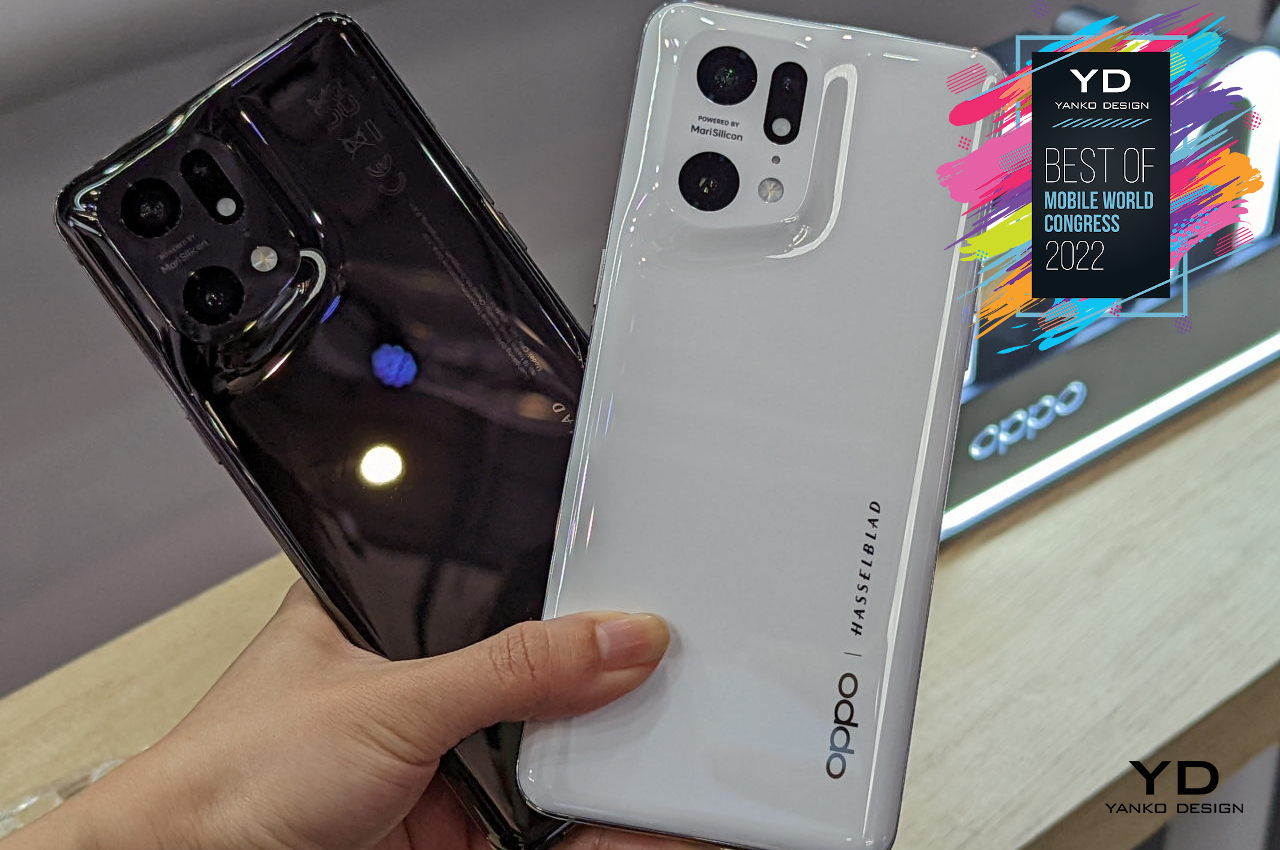
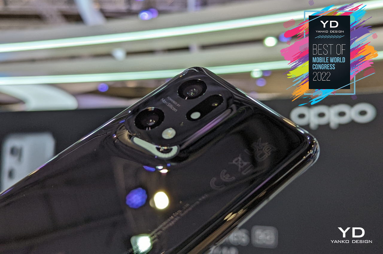
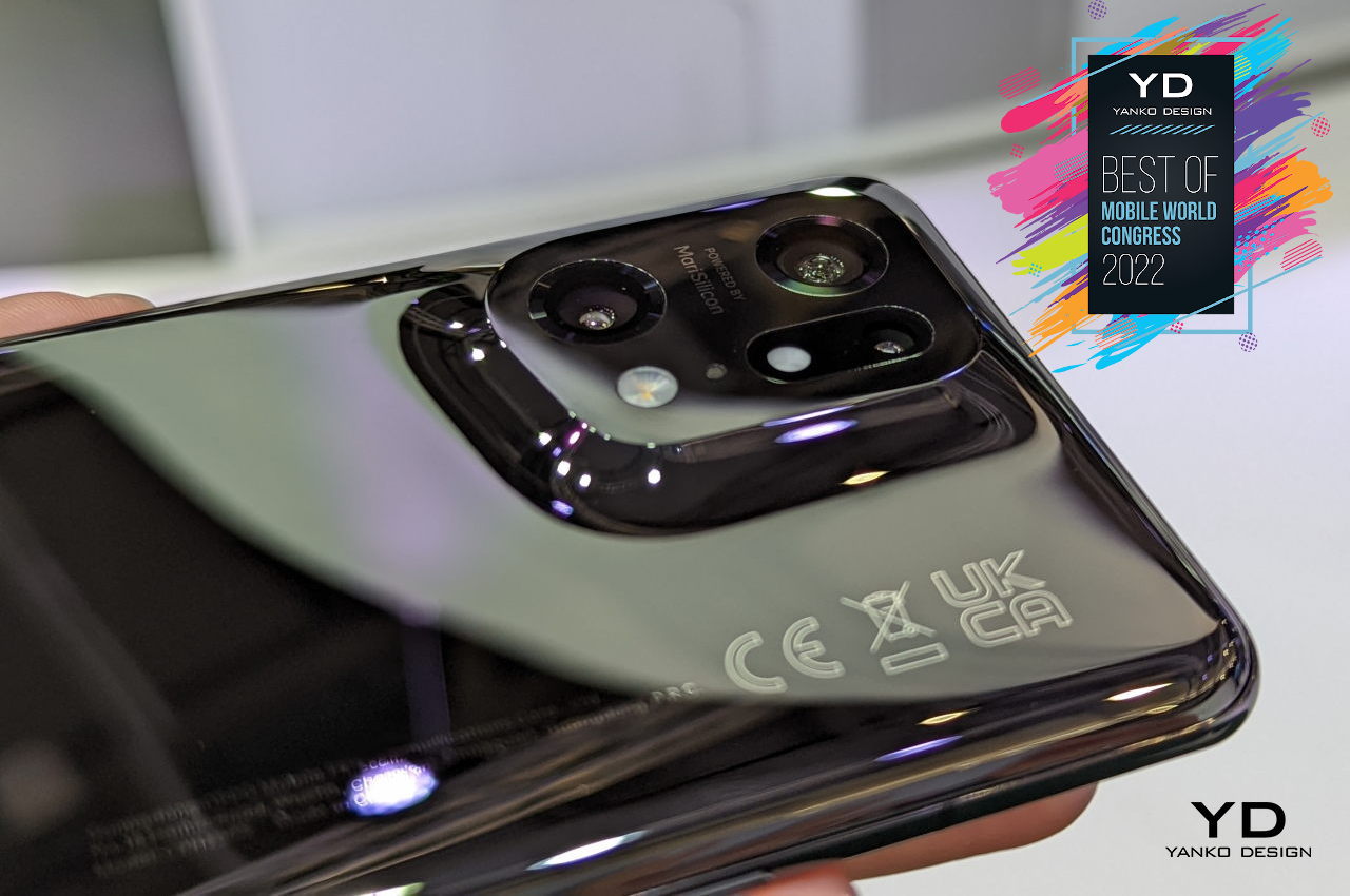
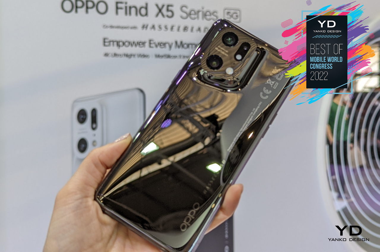
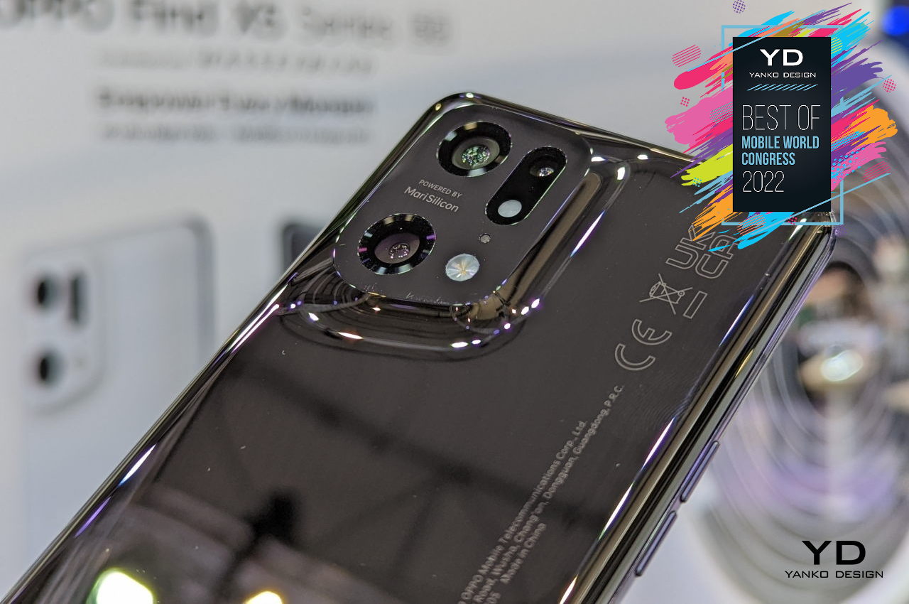
The phone’s design takes minimalism to heart without going overboard and ditching features. The cameras are still there, but they aren’t as in your face as most camera bumps are these days. The structure rises so smoothly and so softly from the surface of the phone, like a dune in a desert after a sandstorm. You have a single continuous form that looks and feels unbroken, even with the camera holes and branding.

OPPO’s choice of ceramic material also brings joy to the hands. The white colorway exudes an atmosphere of peace, while the black finish pulls you into its dark depths and into a meditative state. Both are sleek and clean, even if the black does become a fingerprint magnet. Wiping off those smudges can itself even become a mindfulness practice.
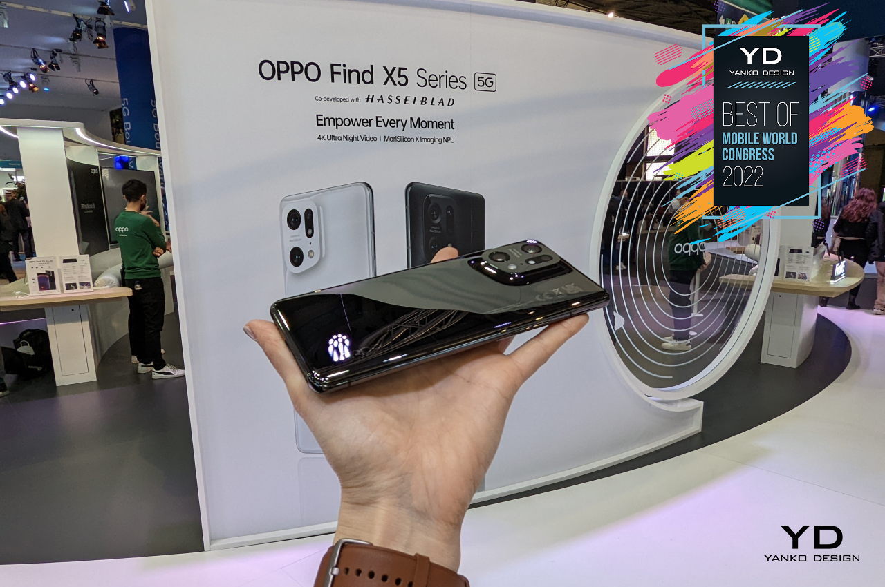
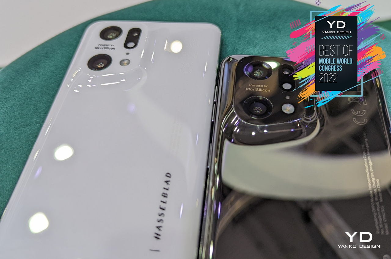
What makes the OPPO Find X5 Pro’s understated beauty even more compelling is its relevance. We live very busy lives in an ever-changing world that’s still recovering from two chaotic years. Smartphones have become our faithful companions and weapons in navigating this world, but they have also become sources of stress and, in some cases, addiction. OPPO’s “futuristic” design actually goes back in time and back to the basics, offering an oasis of calmness and comfort for the eyes, the hands, and the mind.
Designer: OPPO

2. Realme GT2

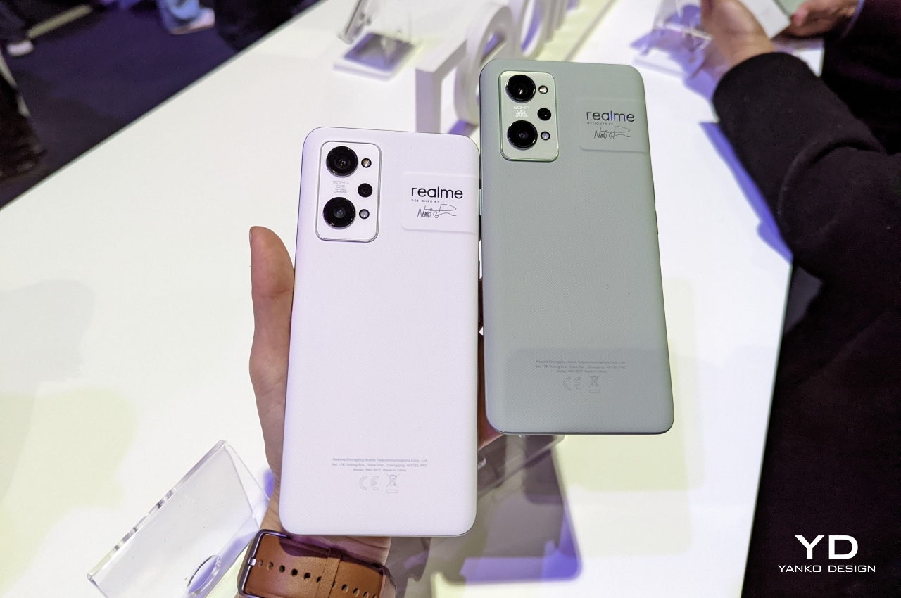
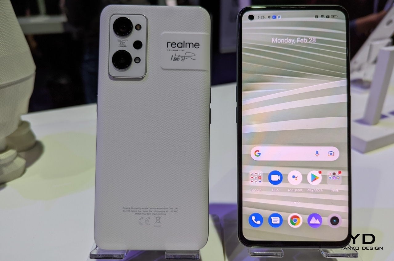
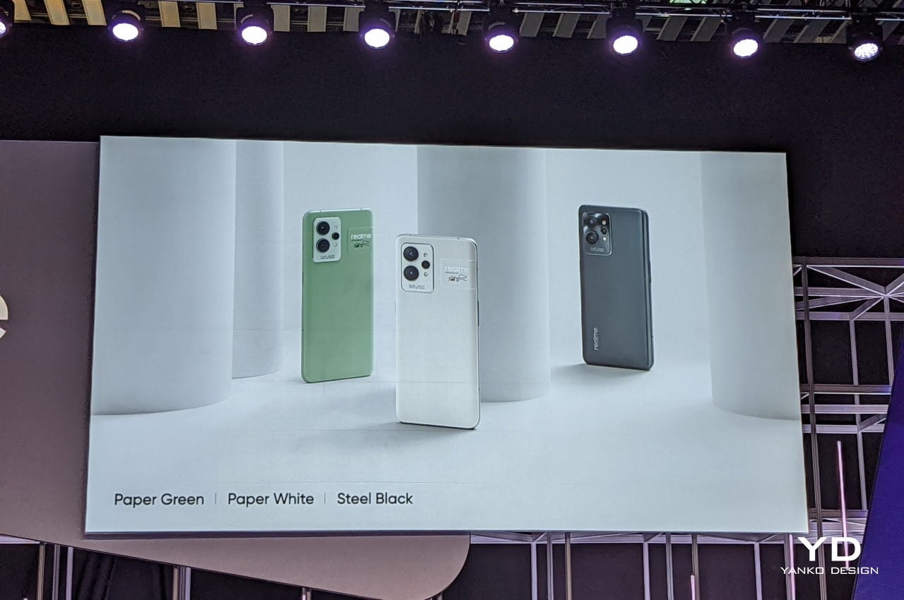
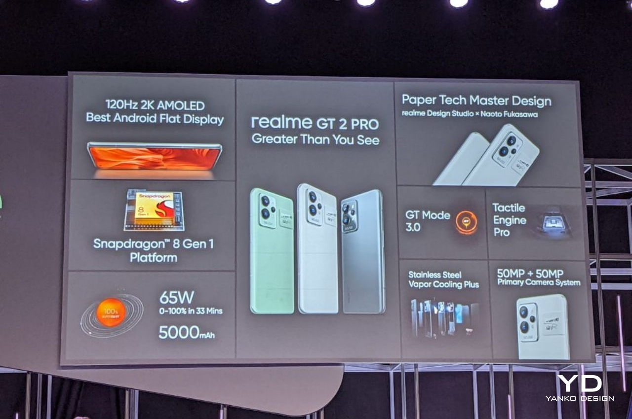
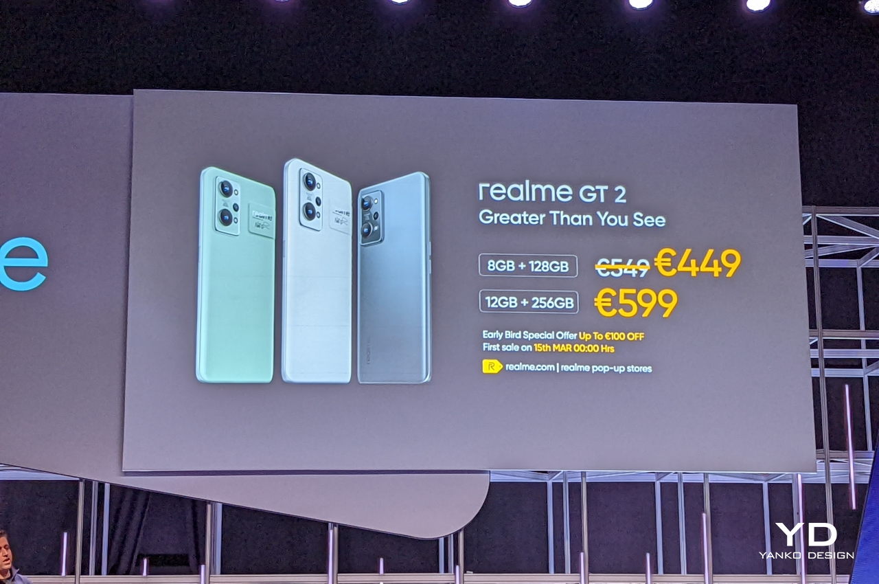
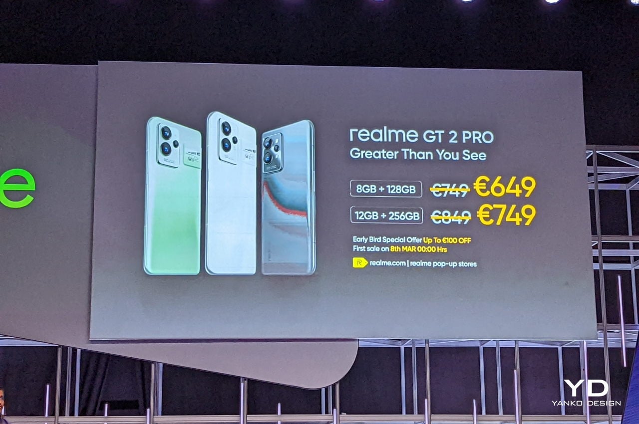
Realme gets the silver medal for the GT2 and GT2 Pro phones not in the uniqueness of their designs but for the boldness of their statement. True, the Paper White and Paper Green models of these phones do have unique patterns and textures that try to recreate the look and feel of paper, but that pales in comparison to the message that the design is trying to send.
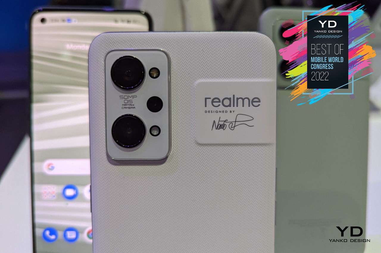
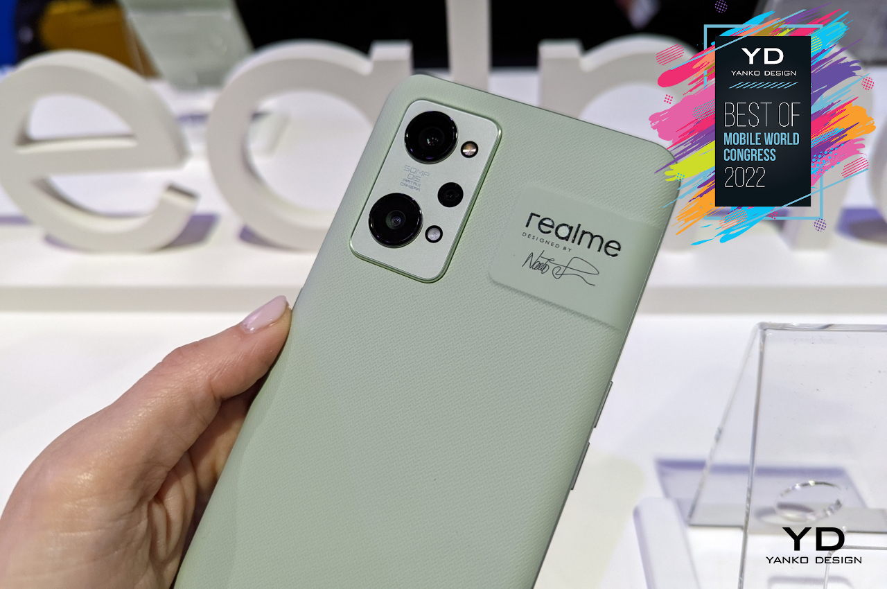
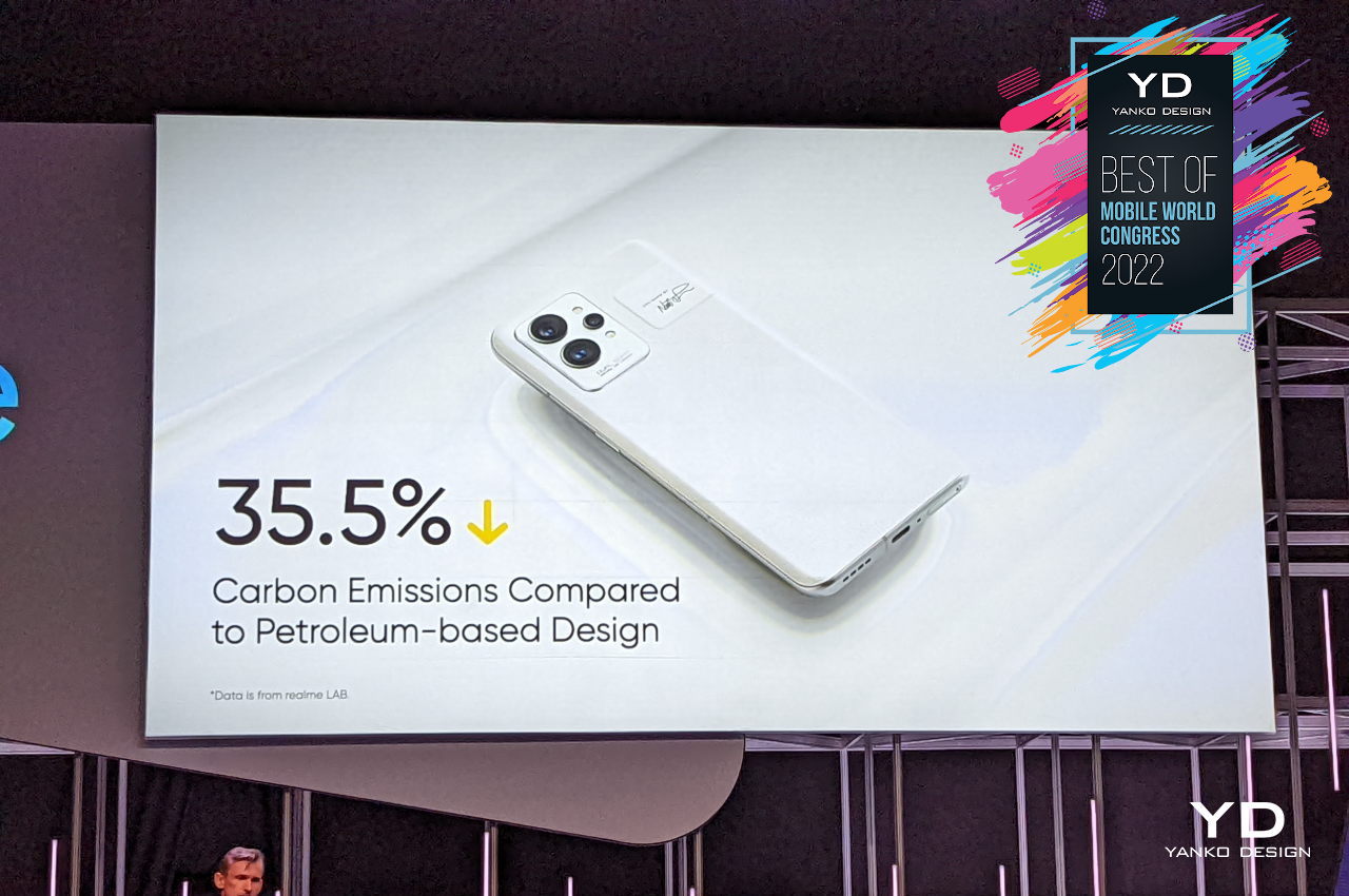
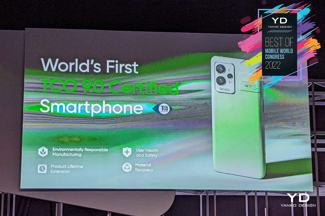
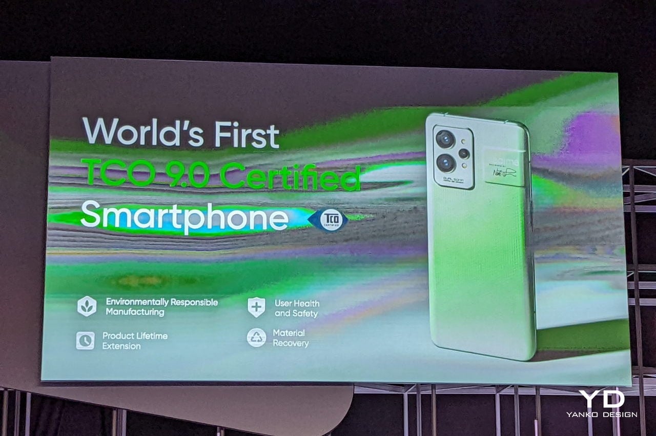
Taking inspiration from paper and other sustainable materials, Realme adopted a bio-based polymer to create the shell of these two colorways. Although the phone is far from being recyclable, the novel material significantly reduces the carbon emission overhead of producing these phones. The Realme GT2 is only the second of two phones boasting a TCO 9.0 certification for its positive impact on the environment.
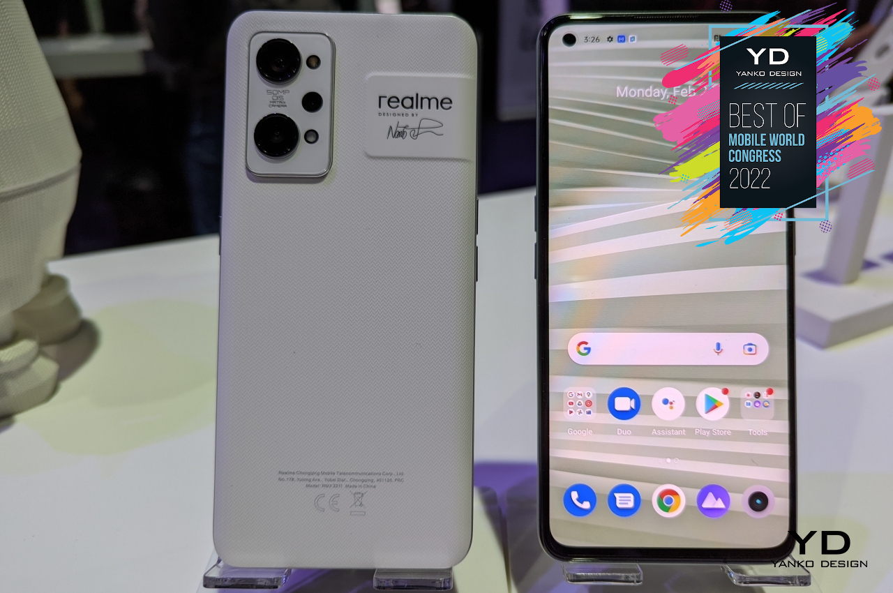
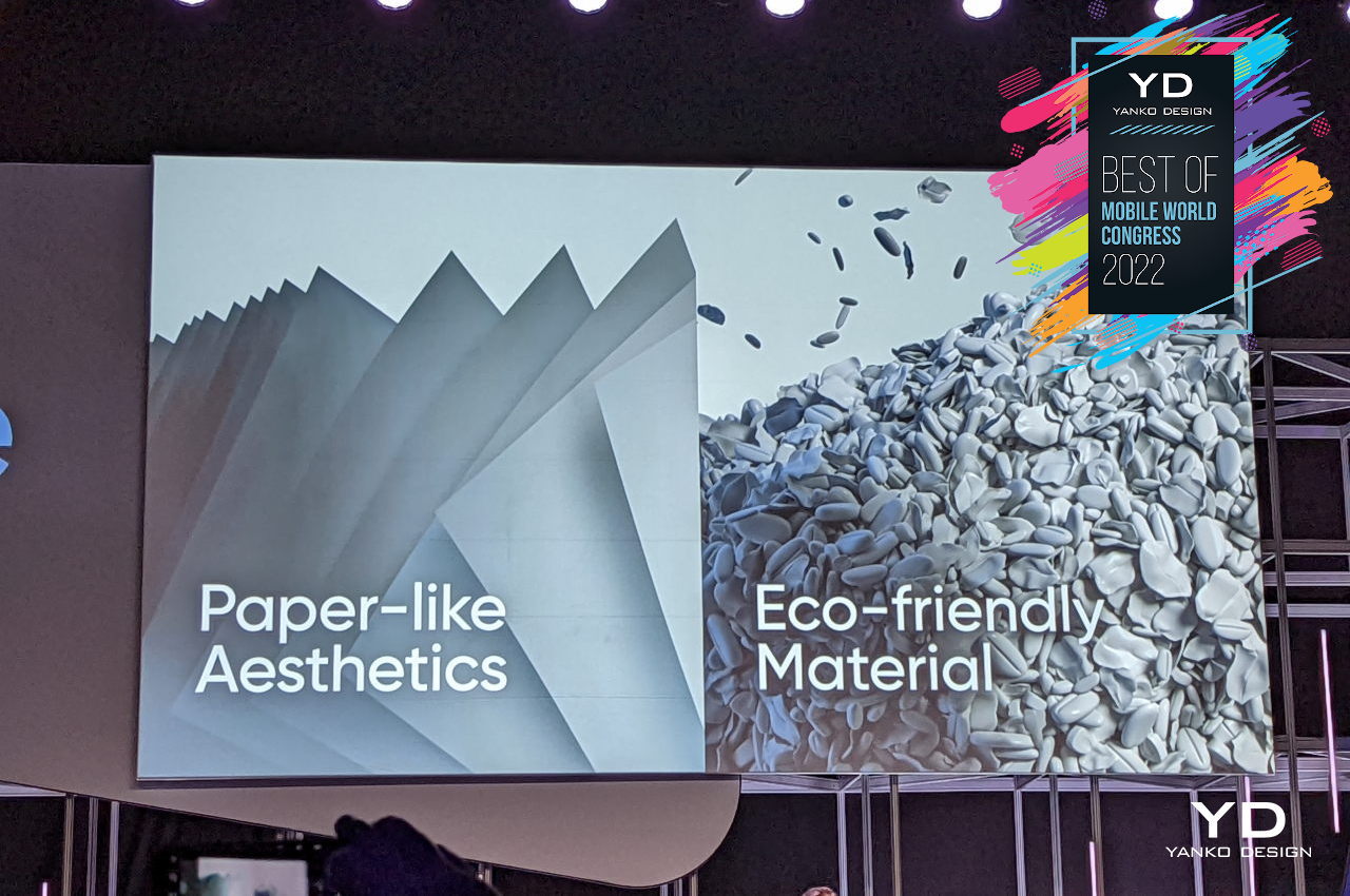
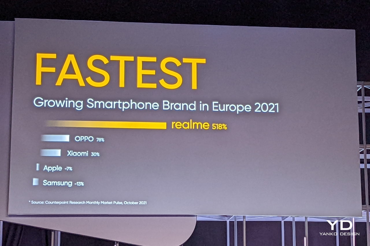
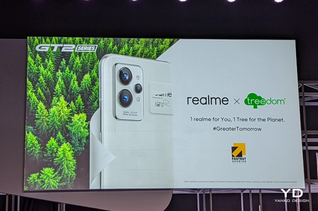
This bio-based polymer might be a one-off thing, but Realme is at least making a lot of noise about its other efforts to create a greener tomorrow. Like many smartphone makers these days, it is reducing the amount of plastic in its packaging and increasing its use of sustainable materials. With the Realme GT2 series, it’s also committing to planting a tree for every phone sold. As one of the fastest-growing smartphone brands in the market, it has a big responsibility in creating awareness and doing its part to help protect the environment. It deserves major props for getting the ball rolling in this arena.
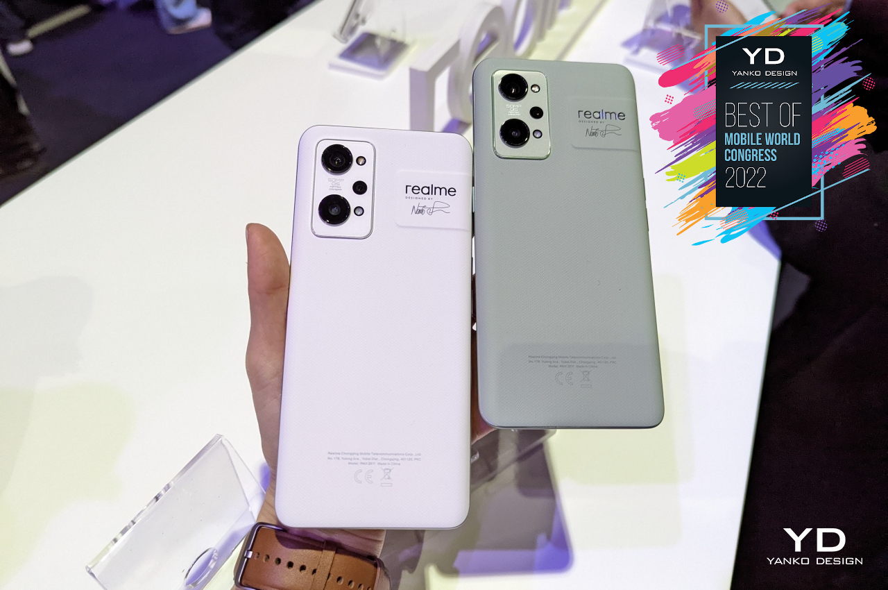
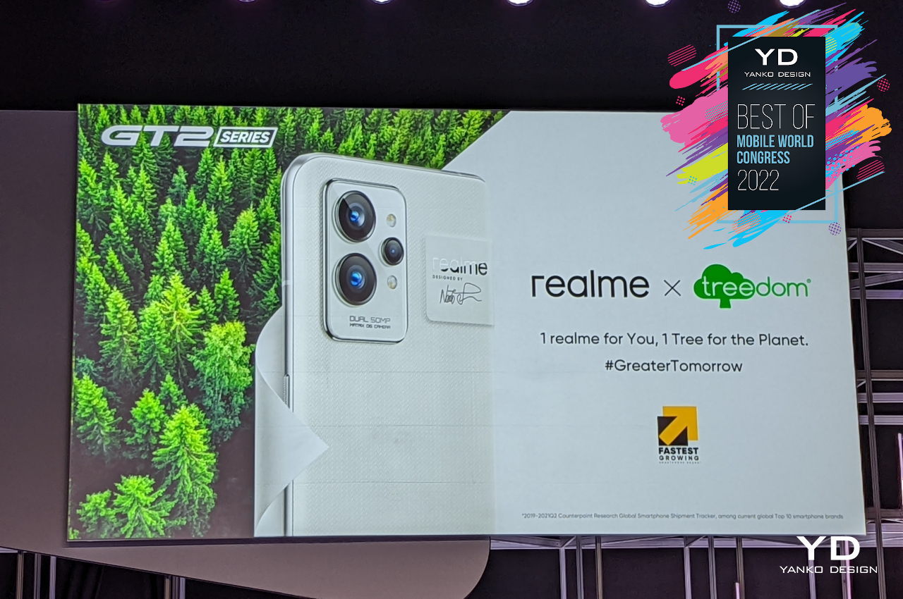
Designer: Naoto Fukasawa for Realme

3. TCL Ultra Flex

Foldable phones are going to be around for a while, even if they won’t become the future. The new experiences it enables are both exciting and challenging, especially for designers. We’re still a few hundred steps away from the perfect foldable screen, which makes it the perfect time for designers and manufacturers to play around with new ideas and test out prototypes.

Samsung and LG aren’t the only ones having fun with deformable screens, of course. TCL is right up there with some even crazier ideas that actually become working prototypes. It hasn’t sold any of that technology yet, though, or at least the flexible screens it has been developing. That gives it at least more time and leeway to bring more ideas to light, including this one it showed off at MWC 2022.
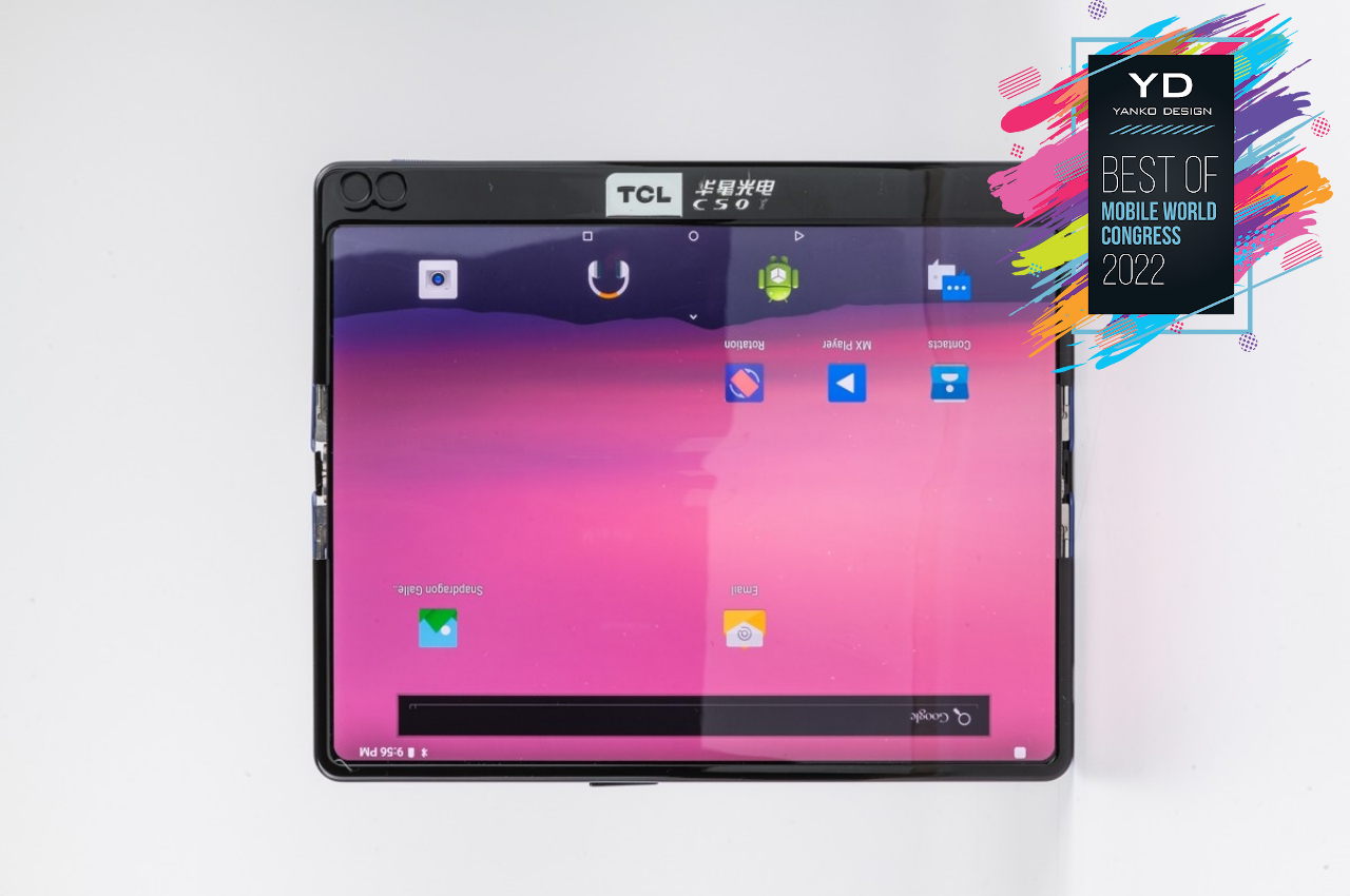
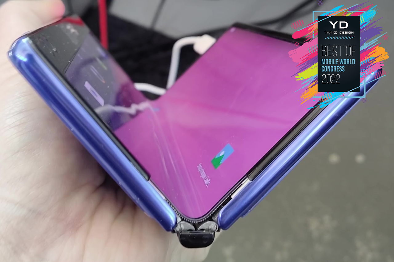
Foldable phones seem to have adopted Samsung’s “innie” design, where the flexible screen folds inward like a book, protected by the phone’s external frame. It’s not the only way to fold, of course, but it is currently the winner, despite requiring an extra screen on the outside to make the phone usable even when folded. Some think that allowing a screen to fold in and out would be the ideal option, leaving the owner to decide which method is best, and that’s exactly what the TCL Ultra Flex tries to do.
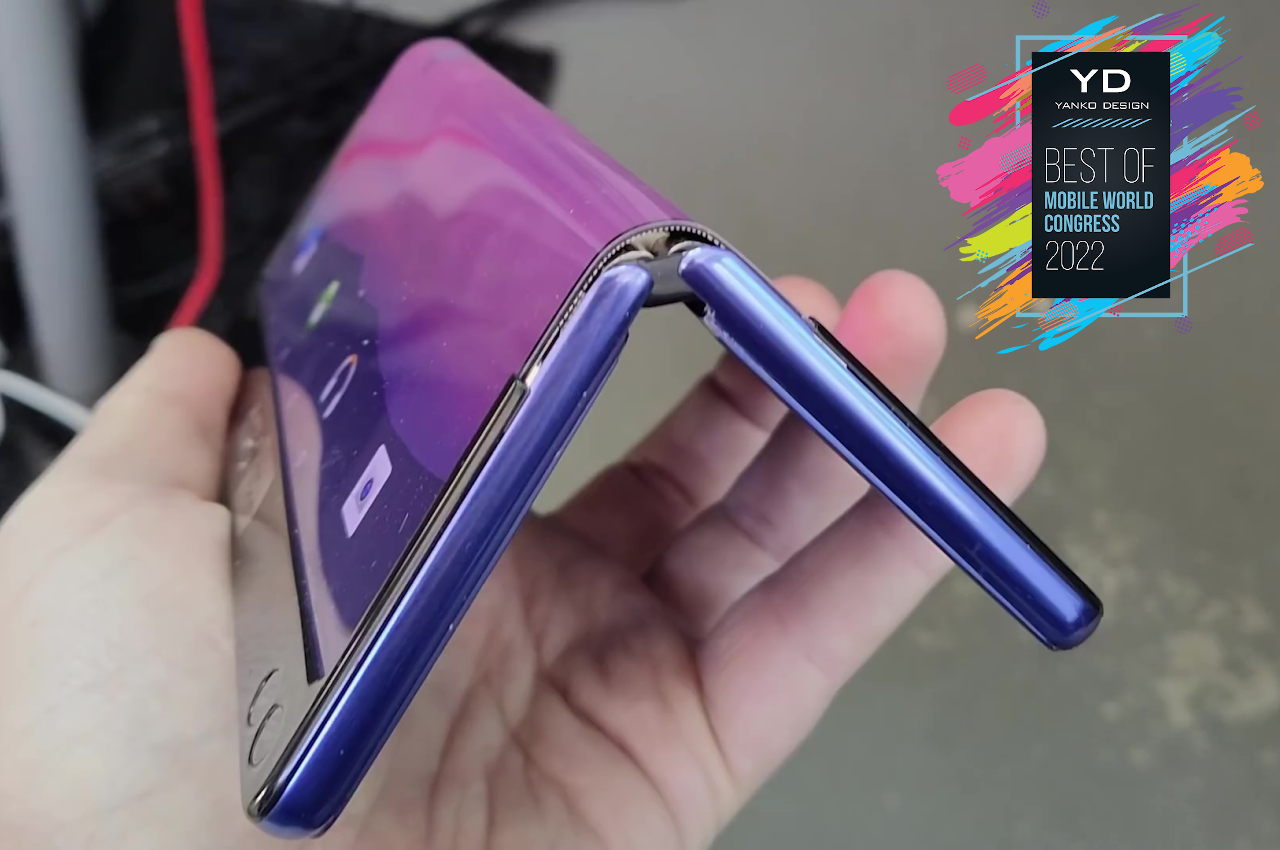
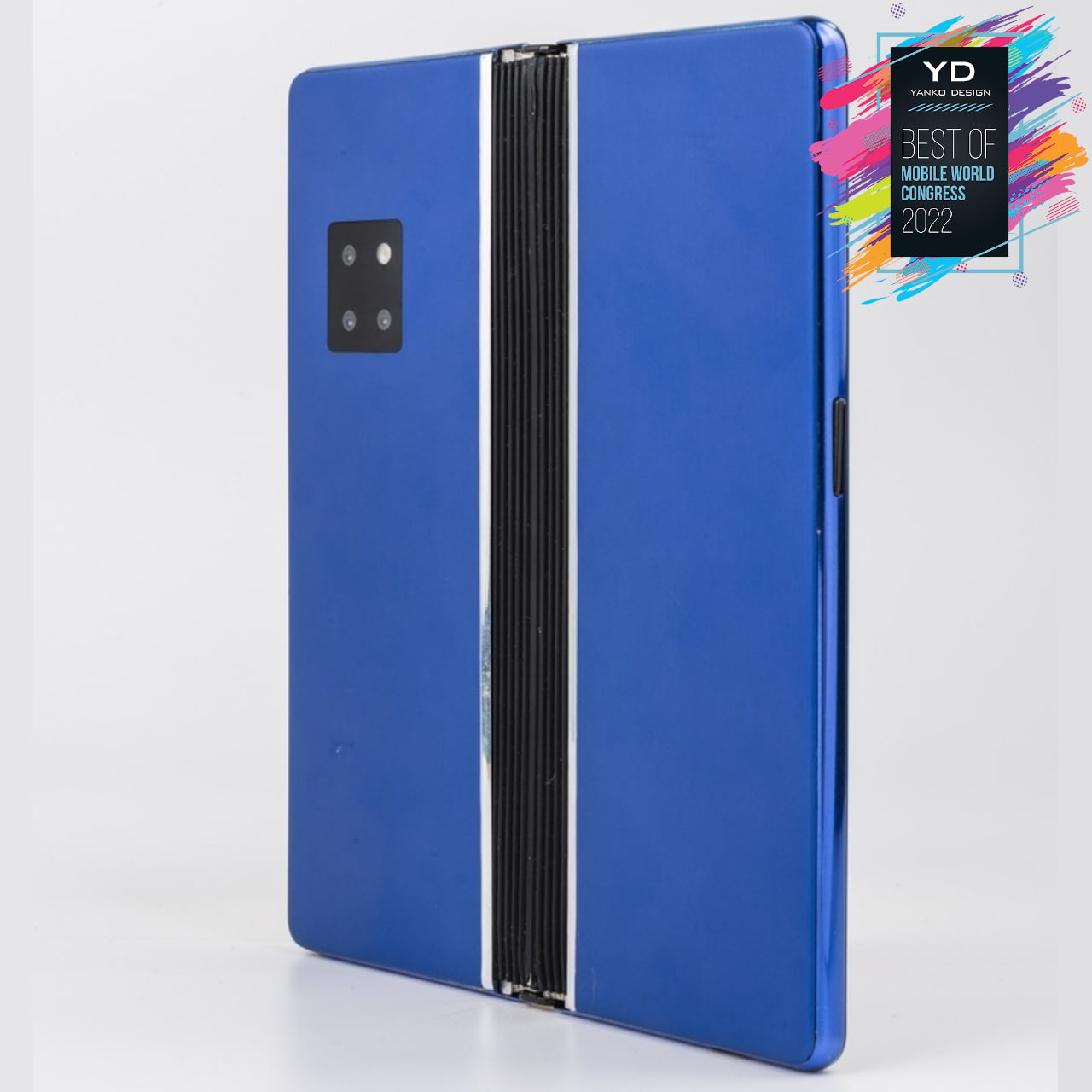
As a prototype, it’s not exactly the prettiest nor the most usable, but it does try to prove that it can be done. Of course, there remain many questions about its durability, not to mention its economy, but there’s plenty of time for the company to figure that out. Once it does, TCL will have the opportunity to shape the foldable device market and, consequently, shape the new experiences that these devices will offer.

Designer: TCL

4. Huawei MatePad Paper

Tablets are making a comeback, especially from the Android side. These increasingly larger slates are getting more powerful to the point that they are being positioned as laptop replacements. Tablets, however, do have new competition in the form of more powerful and more talented e-book readers, often called eReaders. Huawei, however, is putting a different spin on that idea and is targeting a very specific and probably niche market.
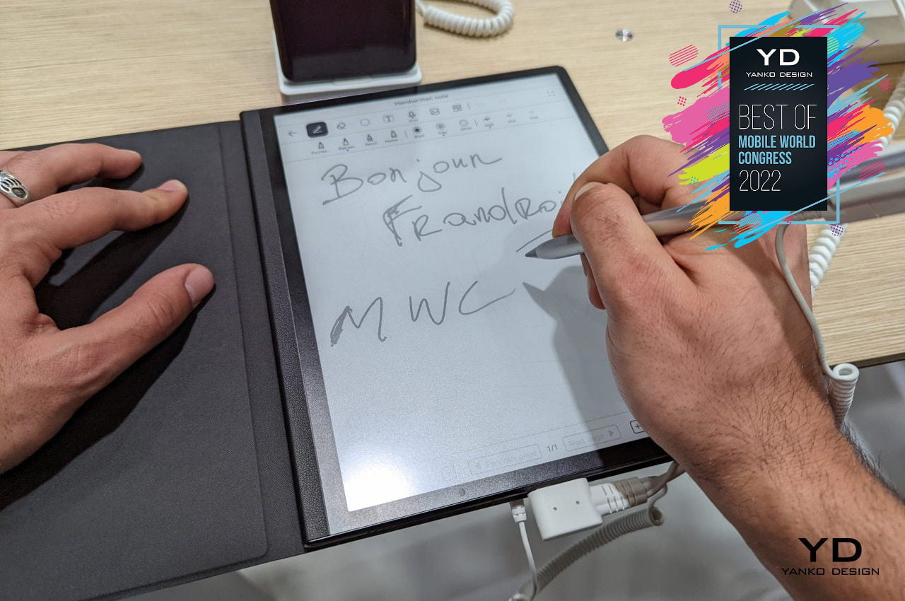
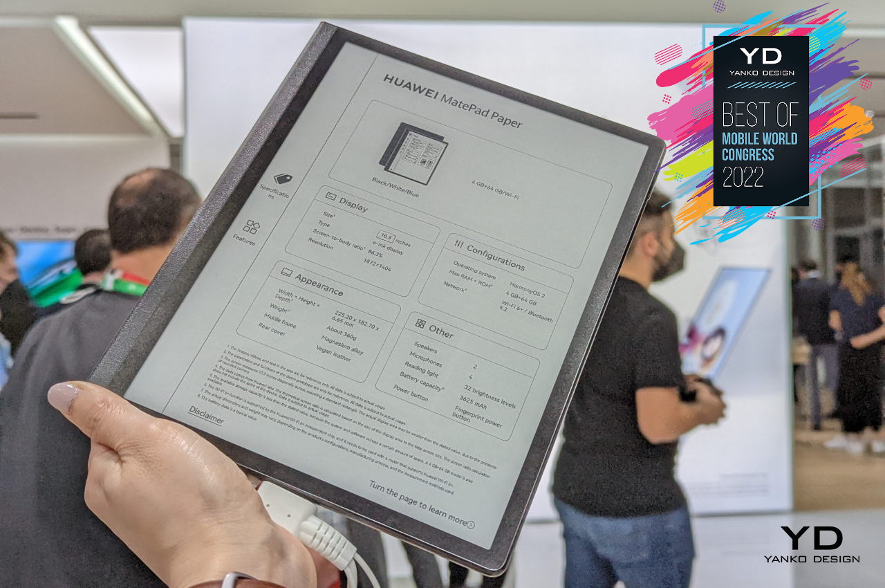
The Huawei MatePad Paper does come with the trappings of a typical e-book reader, one that uses the popular E-Ink display to give your eyes and the device’s battery a well-deserved reprieve. What makes this new contender different is that reading is actually just its secondary purpose. Its primary goal is to replace your paper notebook instead.

That is definitely a tall order, especially with so many expectations coming from die-hard pen and paper users. You can really only do so much to try and replicate the feel of pen or pencil writing on a material like paper using a plastic stylus nib and glass. Huawei has made a good approximation, but the MatePad Paper’s features try to make up for whatever flaw there is in that experience.
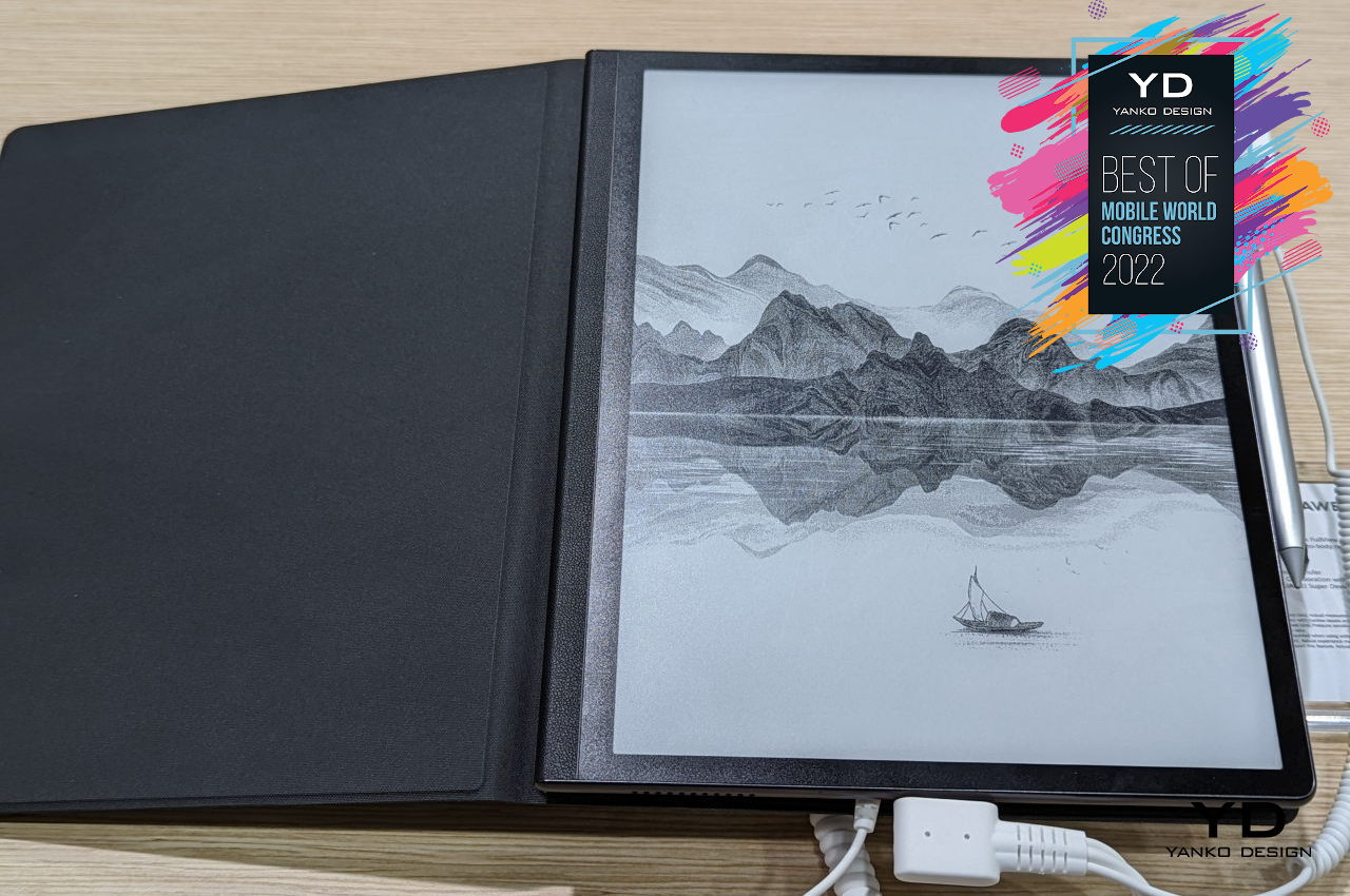
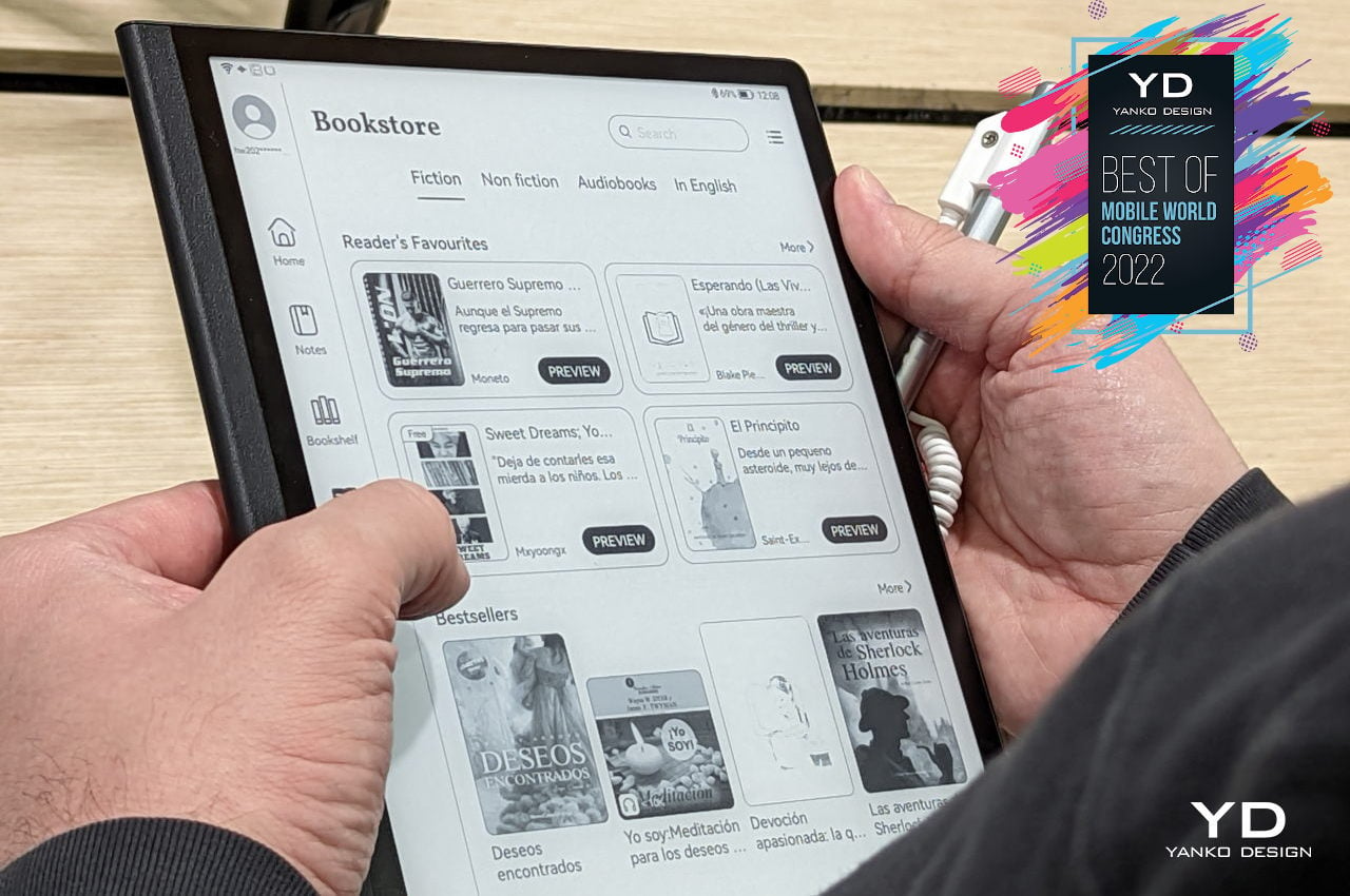
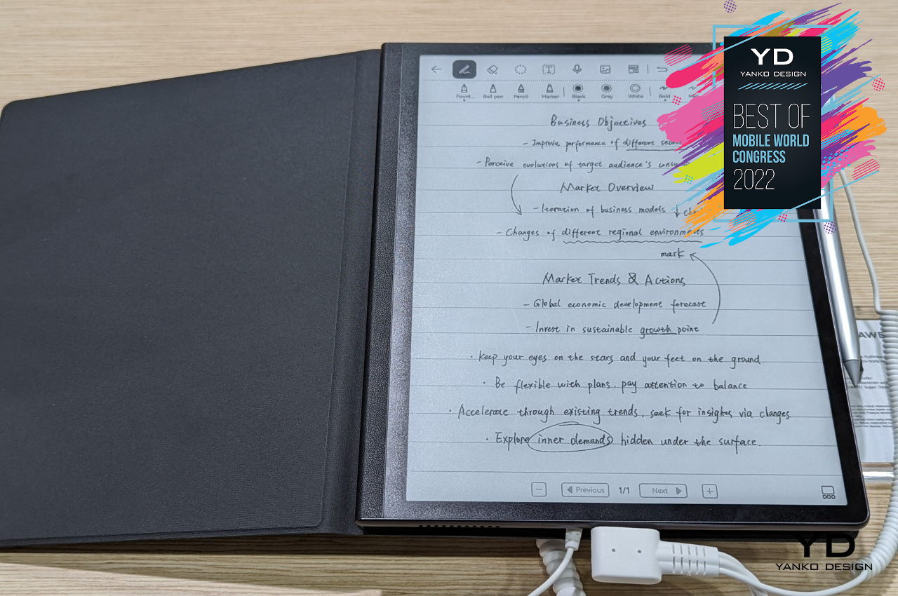
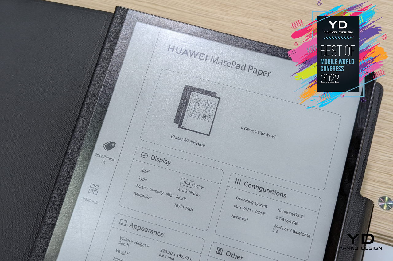
The Huawei MatePad Paper is designed primarily to be a notebook, and the software it has reflects that purpose. In addition to typical note-taking, it even has features for creating your own digital journal and copying content directly from a Huawei laptop. It can also record audio while you’re jotting down notes and play it back later when you need more than just a visual reminder. Its lightweight and portable design makes it an almost perfect companion to keep your design ideas and references, and its simpler functions, at least compared to a tablet, leave very little room for distractions as well.
Designer: Huawei

5. HTC Viverse

The Metaverse is everywhere, at least when it comes to marketing and buzzwords. Just like the early days of the cloud, the term is still a bit hard to qualify and quantify in its current form. This, of course, leaves the doors wide open for any interpretation, implementation, and vision. Despite its name, Meta, formerly known as Facebook, doesn’t have a monopoly on the Metaverse (at least not yet), and its rival in the VR space is putting down some stakes on the ground to claim a bit of that space.
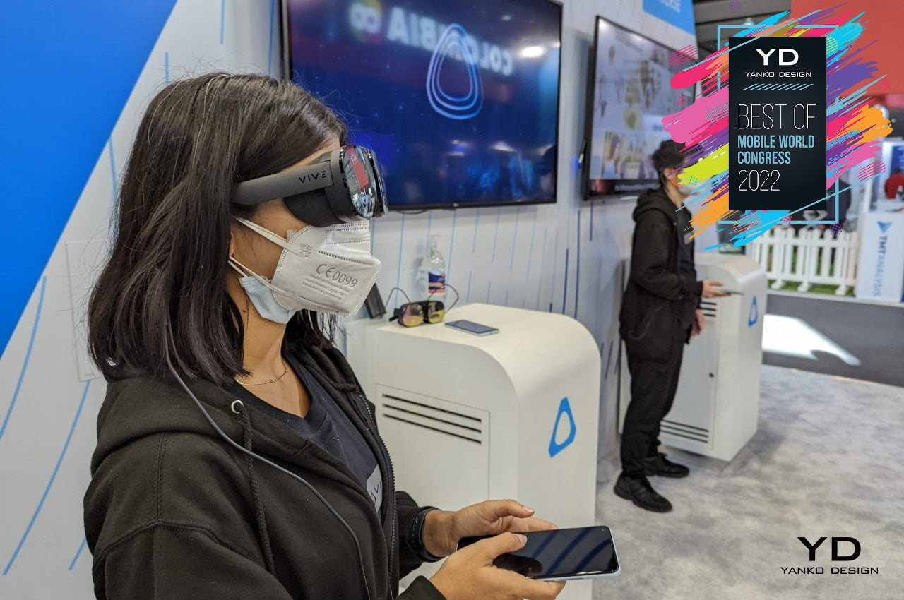
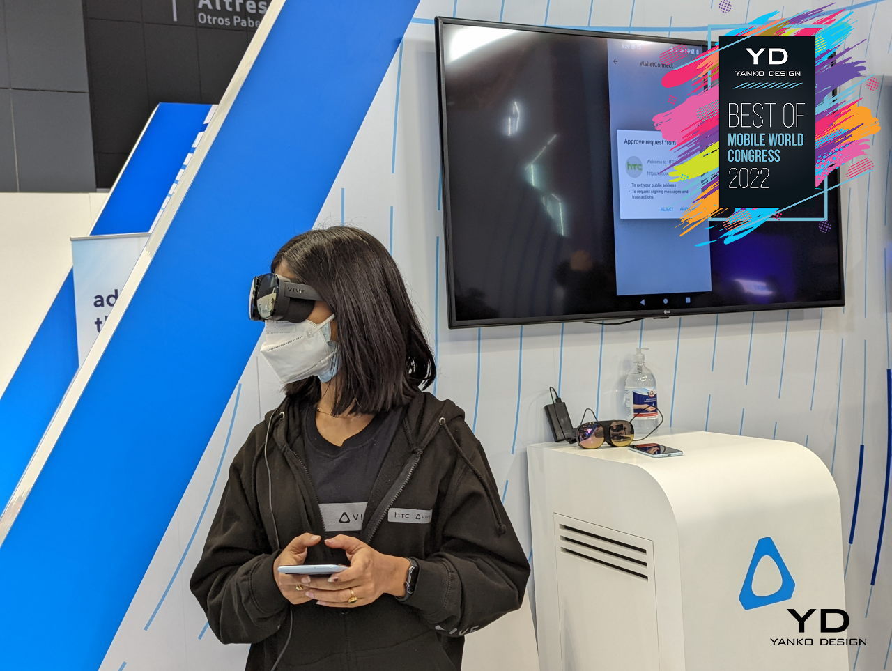
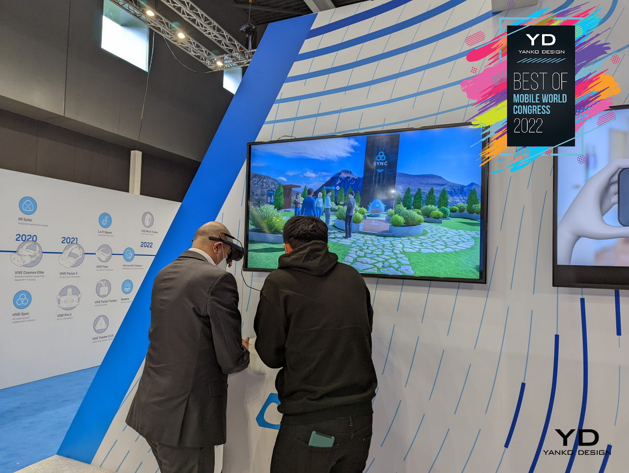
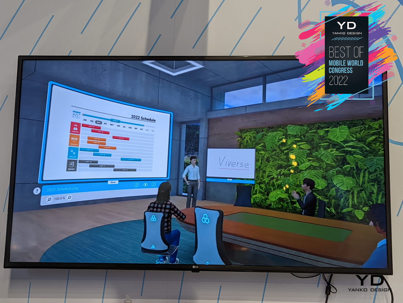
HTC’s Viverse is still a work in progress, but its ambition is no less grand than others. Its Vive VR platform already laid the groundwork for some Metaverse-compatible experiences, like holding events and meetings in virtual worlds. It is also envisioning more interactive experiences, like buying or paying for goods using cryptocurrencies and, of course, buying NFT art.

What makes the Viverse more encompassing is that HTC isn’t stopping with its Vive VR platform. Ideally, the Metaverse experience will extend to almost any device with a screen, like a smartphone, a tablet, or even a computer with a web browser. Without this seamless cross-platform experience, the Metaverse will be limited to a few people that have no problems wearing headsets or eyewear all the time, which doesn’t really sound Metaverse-like.
Designer: HTC Vive

6. Lenovo ThinkPad X13s

Let’s face it, most laptop designs don’t exactly excite, especially when they look like any other laptop in the market. Although there are a few that do stand out, they are far and few in between. When Lenovo announced a host of new laptops at MWC 2022 this week, we almost gave it a pass, but one new entry piqued our curiosity in more ways than one.

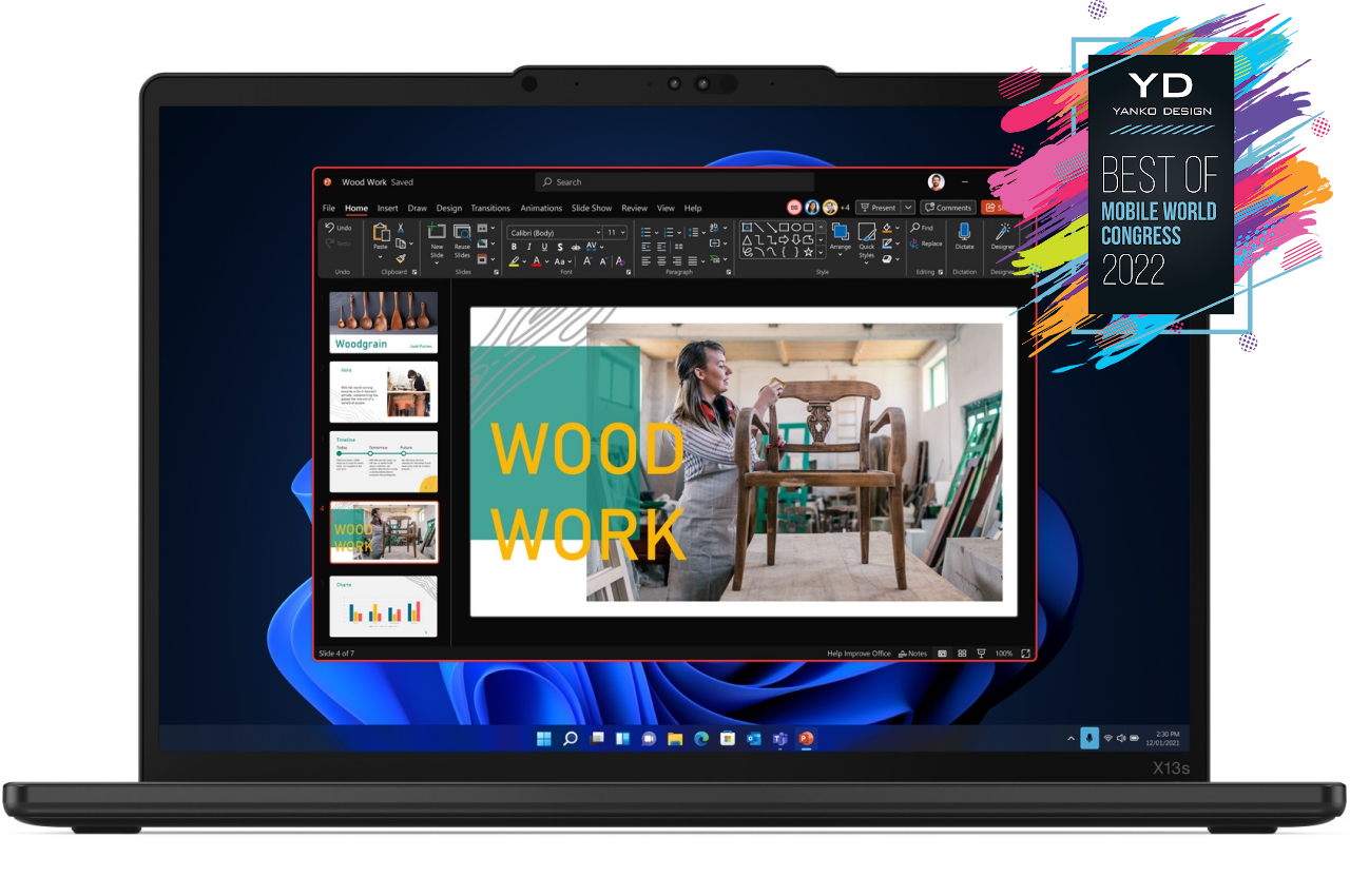
The Lenovo ThinkPad X13s has the distinction of being the first ThinkPad to be powered by an ARM Snapdragon processor, a glowing recommendation considering the strength of Lenovo’s brand. With the attention that Apple’s M1 chip has been getting since it launched, there has been a great deal of interest in seeing more Windows laptops running on this platform.

What this means for designers is that the ThinkPad X13s will last longer than most other laptops on a single charge. This translates to longer working times away from a power outlet and more freedom to work the way they want. There are still some problems with app compatibility with Windows on ARM, but staples like Adobe’s suite and ZBrush are completely supported already.

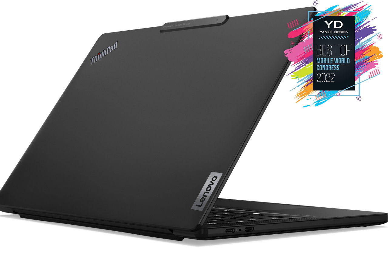
The ThinkPad X13s also has a rather intriguing design that could be best described as a “reverse notch.” Instead of going the way of the latest MacBook Pro, Lenovo opted instead to have a bit of a lip at the top of the screen to accommodate the camera and security hardware. That said, the bezels around the screen are still on the thick side, so there doesn’t seem to be anything gained from that unusual design.

Designer: Lenovo

7. Prinker

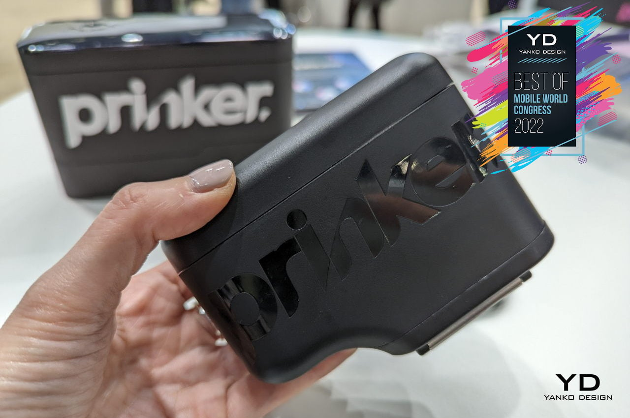
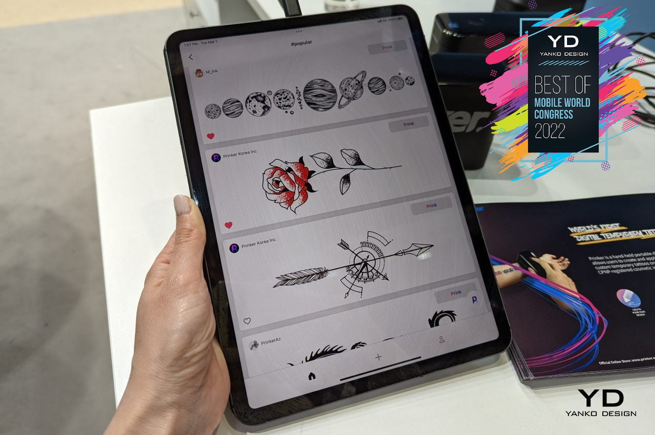
We’ve already seen the Samsung-backed Prinker make its debut back in CES 2022 last January, and it has returned to once again show how well-thought design can also be fun and whimsical. Basically a handheld inkjet printer in the shape of a gigantic ink cartridge, Prinker offers almost endless fun in putting temporary tattoos on almost any part of your body.
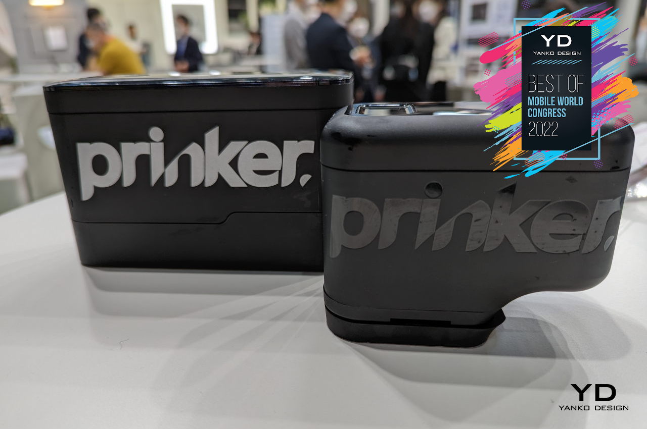
What makes this product special is that it combines existing ideas and technologies in a way that creates a totally new experience, the marks of a great product design. Plus, it’s also fun and safe, a win-win situation for young people craving to add a bit of personalization and identity, even at the wildest of parties.
Designer: Prinker (Samsung)

8. Fauna

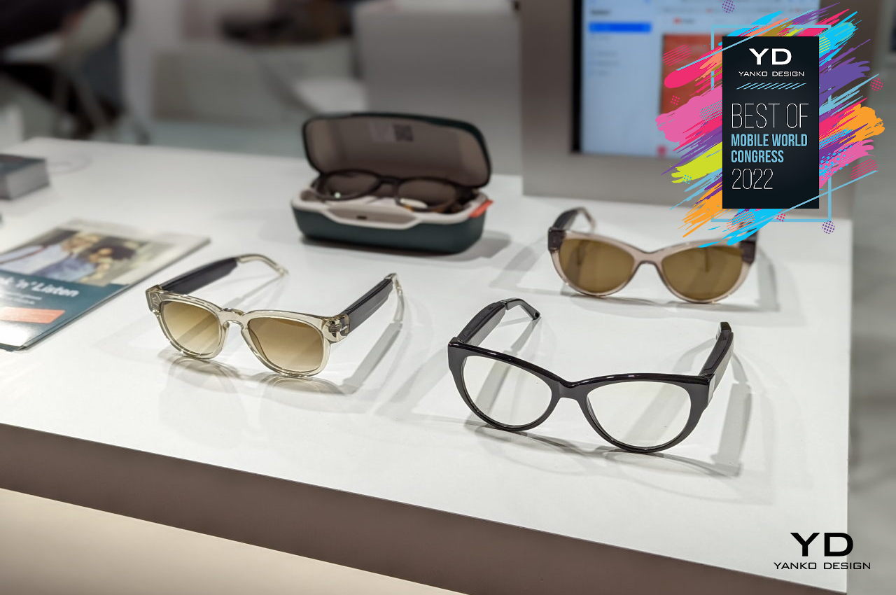
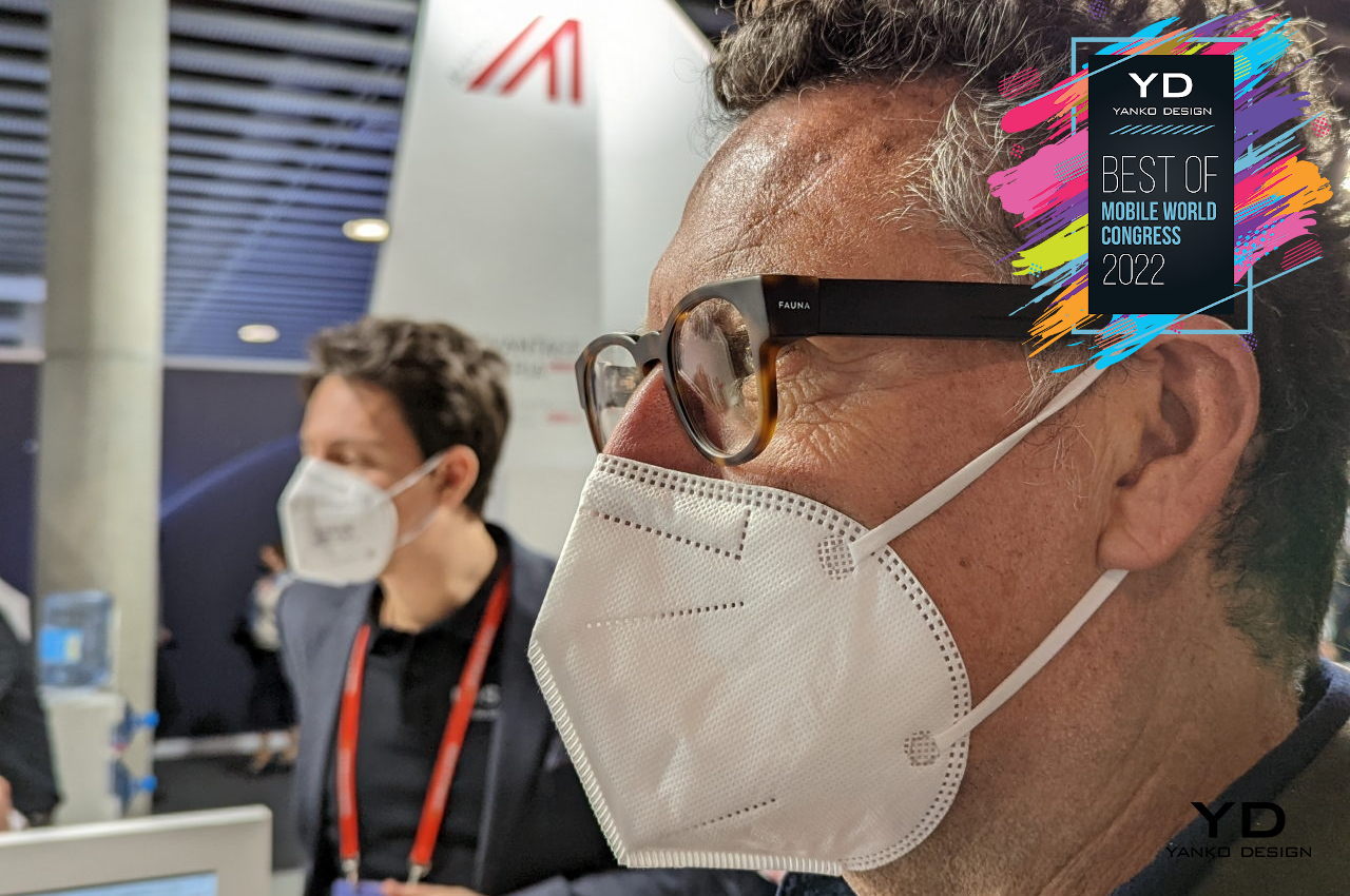
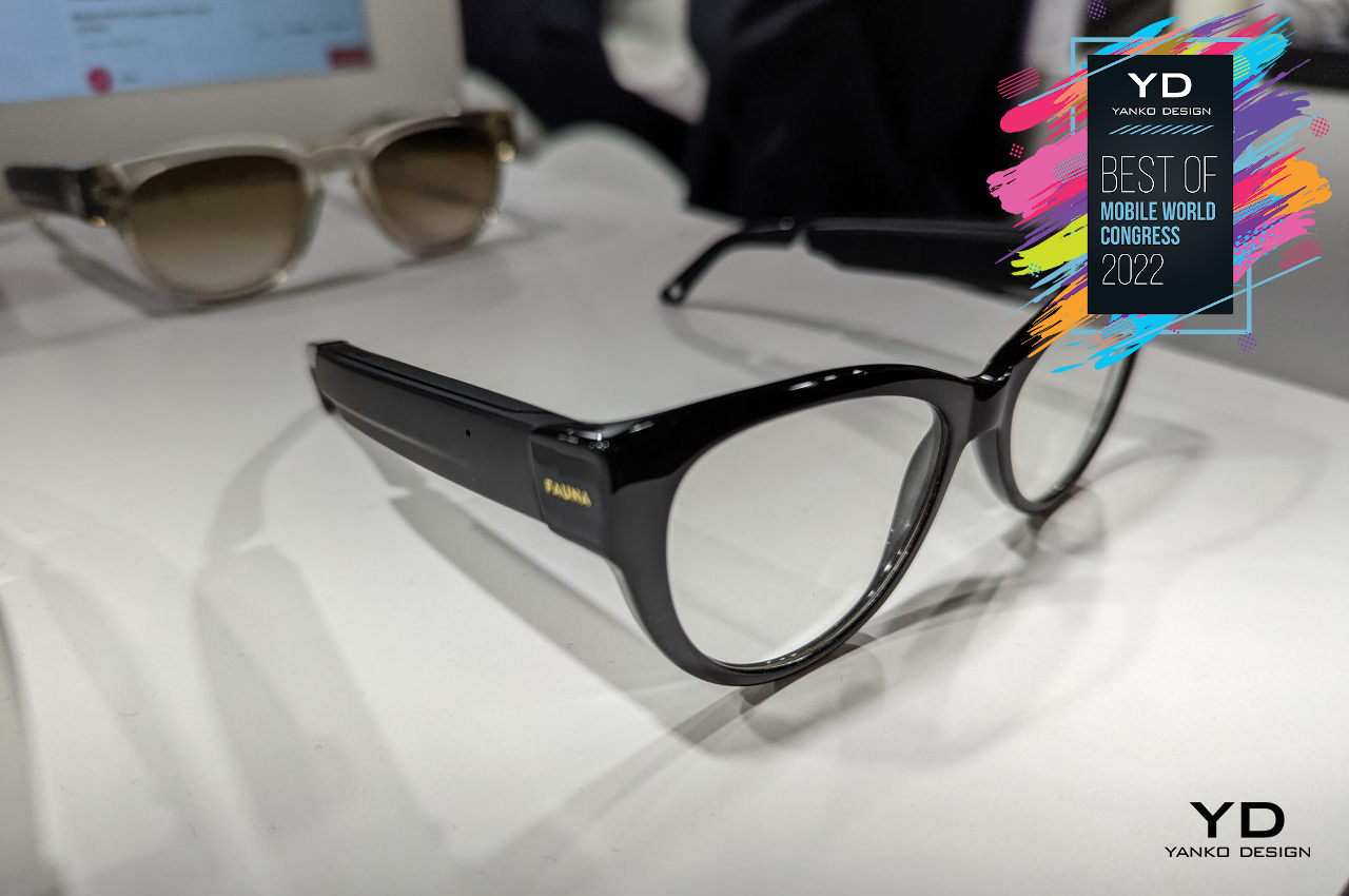
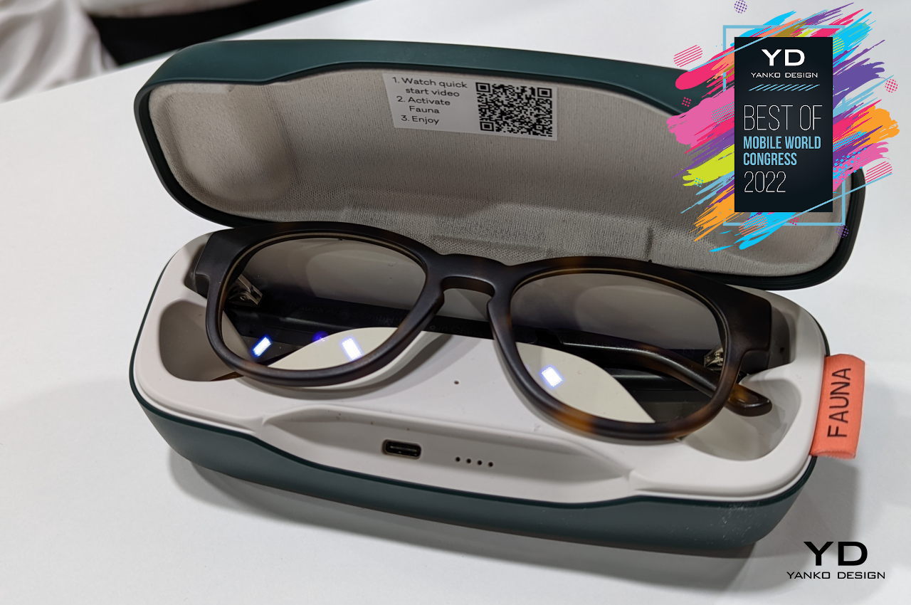
Sometimes, the best solutions are also the simplest and the most inconspicuous. That’s the kind of solution that Fauna’s audio sunglasses try to offer, solving multiple problems with a single and stylish product. Part eyewear and part open ear headphones, Fauna lets you enjoy your music while keeping safe and looking great, all at the same time.
This kind of integrated solution will be critical in the next few years, especially as technology becomes even more deeply embedded in our lives. Ordinary objects like eyeglasses, rings, and even clothing will soon be connected to a network thanks to technologies like 5G (or 6G even), flexible screens, and wearable circuitry. These, in turn, will pave the way for the so-called Metaverse to become as normal and as ordinary as the real universe.
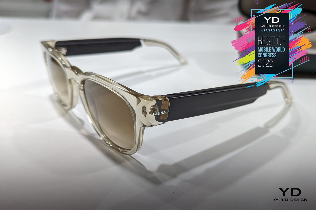
Designer: Fauna

Wrap-up

Mobile technology and consumer devices have grown by leaps and bounds ever since the iPhone first came out more than a decade ago. Smartphones, tablets, and the accessories built around them have become almost unavoidable parts of modern life. There are no signs of things slowing down, which doesn’t bode well for humanity and the planet in the grand scheme of things. Fortunately, there are signs of things shifting for the better as well.
Just like at CES 2022, we saw positive indicators that both manufacturers and consumers are becoming more aware of how these devices have indirect effects on lives and the environment. From focusing on mental health in addition to physical fitness to embracing and promoting sustainable practices, the design of products, both physical and digital, are seemingly taking a turn for the better. While foldable phones, the Metaverse, and dozens of identical devices will continue to flood the market, there is at least some hope that the people pushing these products and technologies have grown more conscientious of the role they play in building a better future.

The post The Best of MWC 2022 – Product Design in a Mobile World first appeared on Yanko Design.
Realme GT2 Pro takes a bold step towards making phones more sustainable

Young brand Realme is trying to make a difference not just in the smartphone market but also in the future of our planet.

If you’ve been following the smartphone market closely, you’ll be familiar with how many smartphones are being shipped not just every year but every quarter. This numbers games for smartphone manufacturers, however, also translates to something less encouraging for the environment. Consumer electronics are some of the biggest offenders when it comes to carbon emissions during their manufacturing, use of unsustainable materials in both production and packaging, and e-waste. Given how ingrained smartphones are in our modern lives, it’s nearly impossible to simply wipe them out from existence. Instead, smartphone makers are taking steps to reduce their negative impact on the environment, and a young rising star in that market is making a lot of noise about its efforts to go greener.

Designer: Naoto Fukasawa (for Realme)

The Passion of Youth

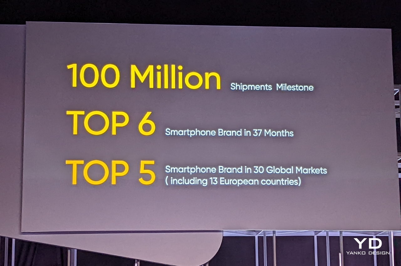
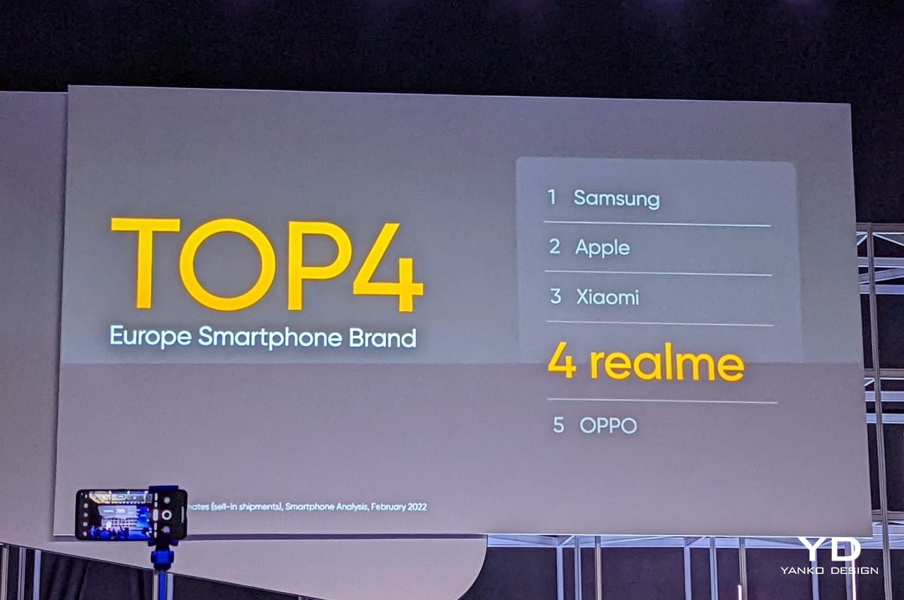
Compared to the likes of Samsung or even its parent company OPPO, Realme is a baby. Although it traces its roots back to 2010, it was only in 2018 that Realme formally become a brand. Since then, however, its popularity and sales have skyrocketed to the point that it has entered the top five phone brands in some markets and categories.

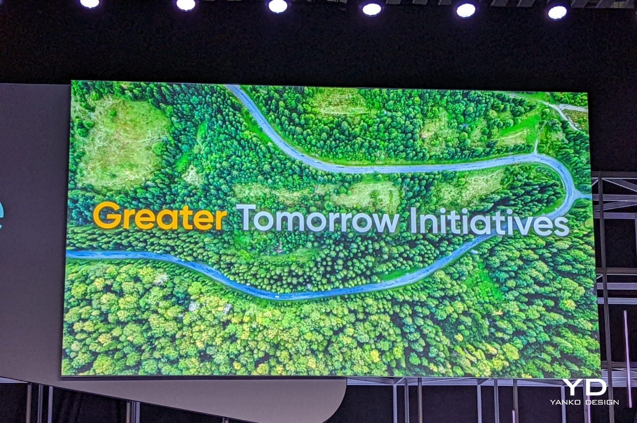
This, however, also meant that it is selling millions of phones since 2018 and is, in fact, reached its 100 million shipments milestone. While those are bragging rights for business, it also means that Realme is now a major contributor to the planet’s declining health. Rather than resigning to that fate, the company is embarking on several projects that try to minimize its impact as part of its “Greater Tomorrow” Initiatives for its GT brand.

For one, it promises to plant one tree for every Realme GT2 phone it sells. Although it doesn’t give out exact numbers for the GT series, that could still translate to millions of trees each quarter. Its boldest move, however, might be seen on its new Realme GT2 Pro phones, specifically the two new color options that try to mimic paper in more ways than one.

Greater Than Specs

The Realme GT2 Pro is designed to be a beauty, both outside and within. Of course, you won’t exactly see beauty in the internals of a phone, but the experiences they empower help towards longevity and sustainability. Holding to a working phone longer than two years helps reduce how many of them or their components end up in landfills.

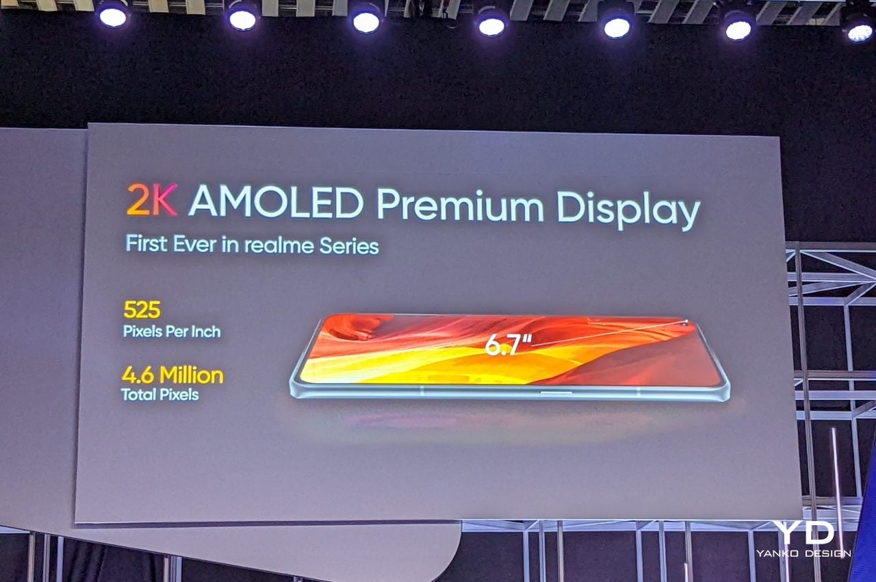
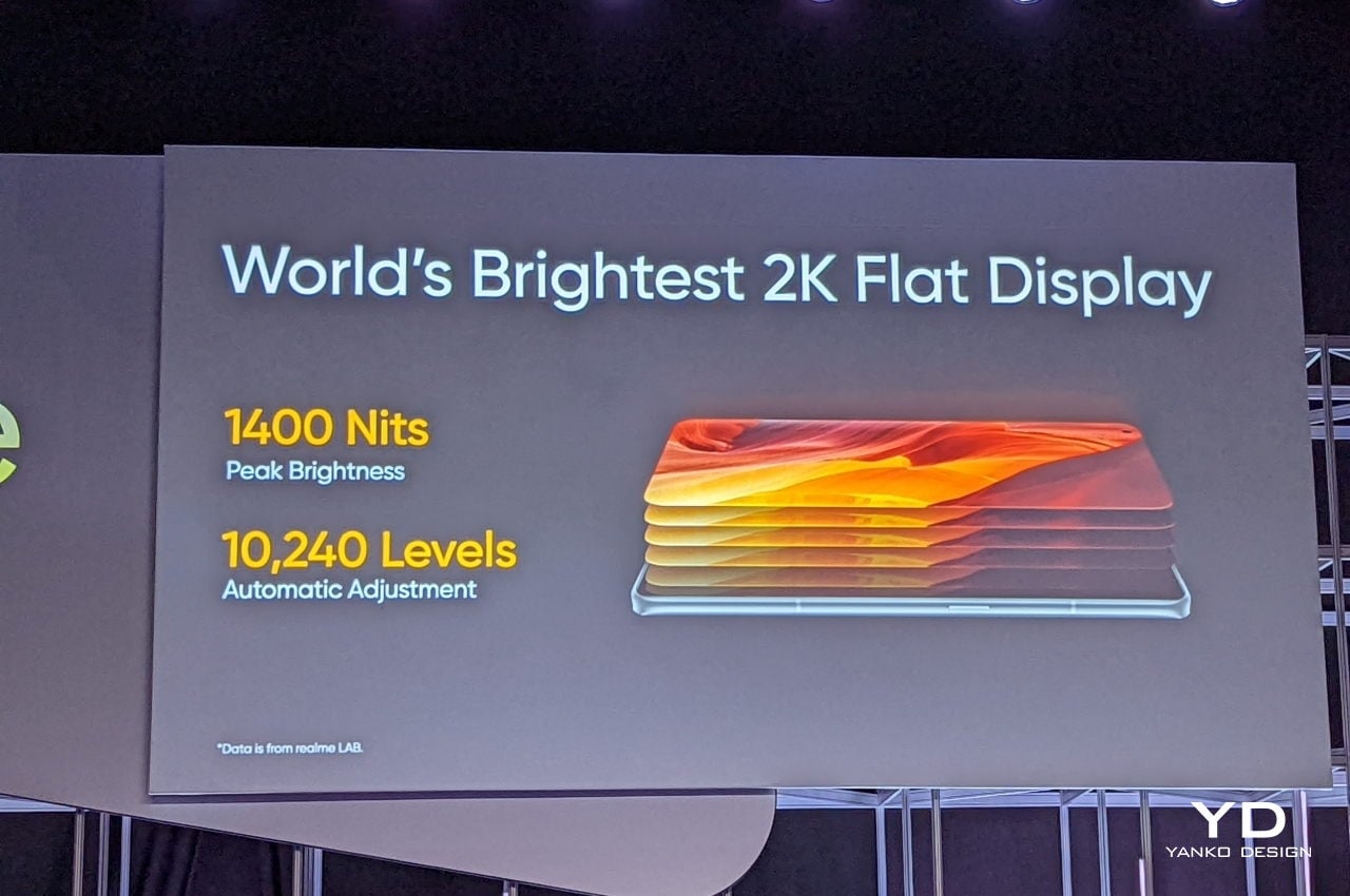
The phone does have some of the best specs available this year so far, but it’s the screen that Realme is really proud of. It’s a 6.7-inch bright 2K AMOLED display that, unlike most high-end phones this year, opted for a flat panel. The pendulum has swung back towards flat designs, and a flat display is sometimes preferred over those that curve at the edges for ergonomic reasons.

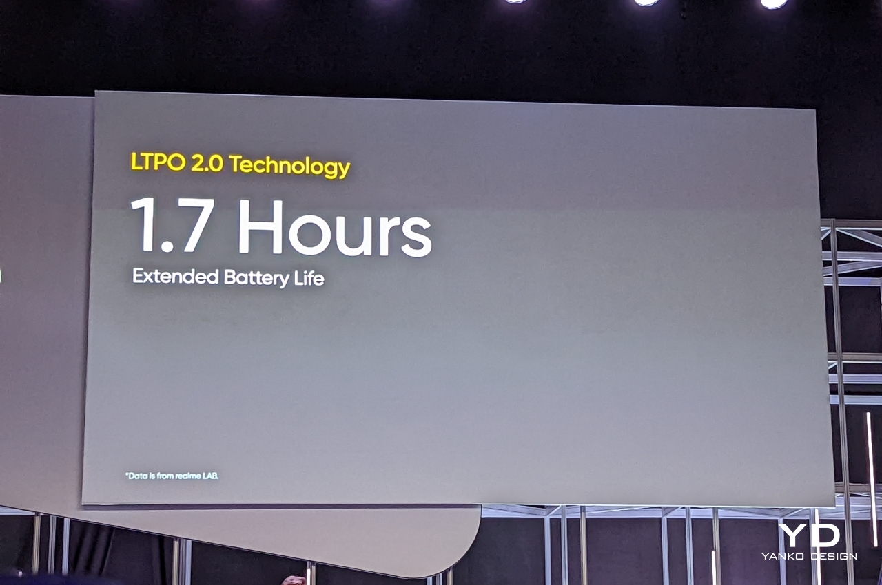
The screen also uses LTPO or Low-Temperature Polycrystalline Oxide 2.0 technology, which promises reduced power consumption. This, in turn, translates to longer battery life, about 1.7 hours more, according to Realme. This means owners will have to charge their phones less, which reduces the carbon footprint of the phone in small but significant ways.

Paper in Spirit

When people talk about recyclable materials, many will probably have paper in mind. Although the trees cut down to make them do have an impact on the environment, paper itself has fewer negative effects considering its biodegradable composition. Plus, it can be reused again and again, sometimes in different forms.

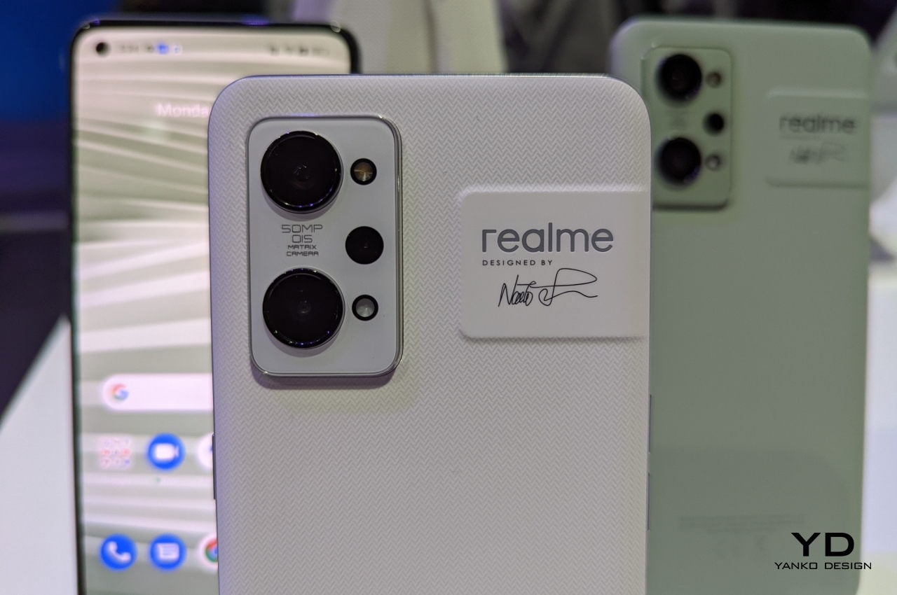
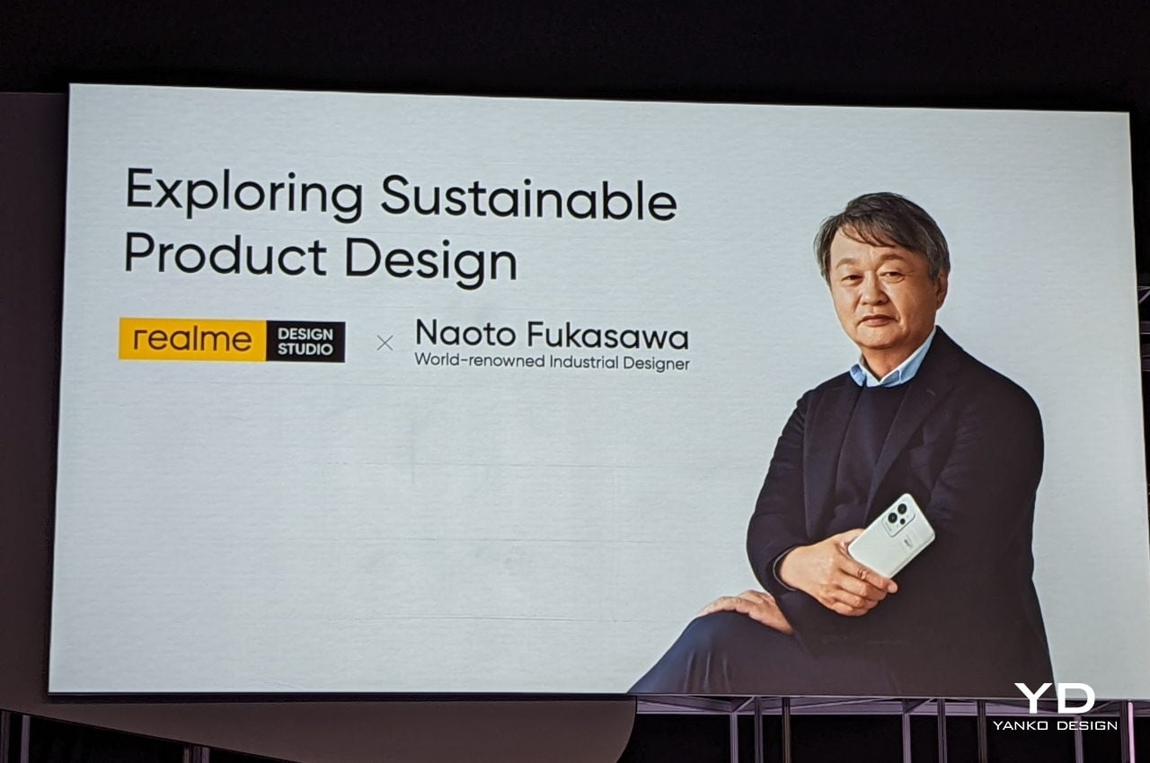
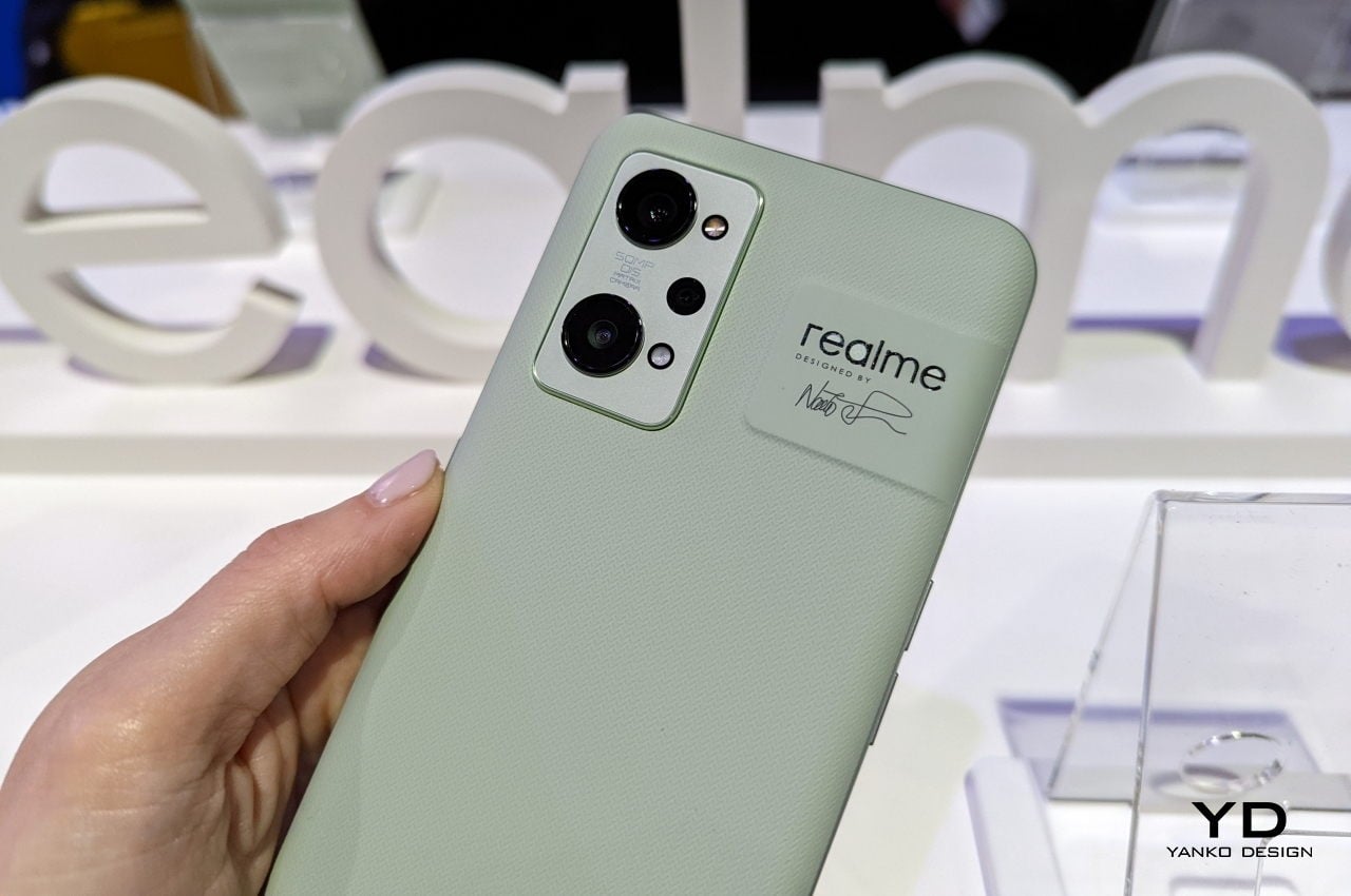
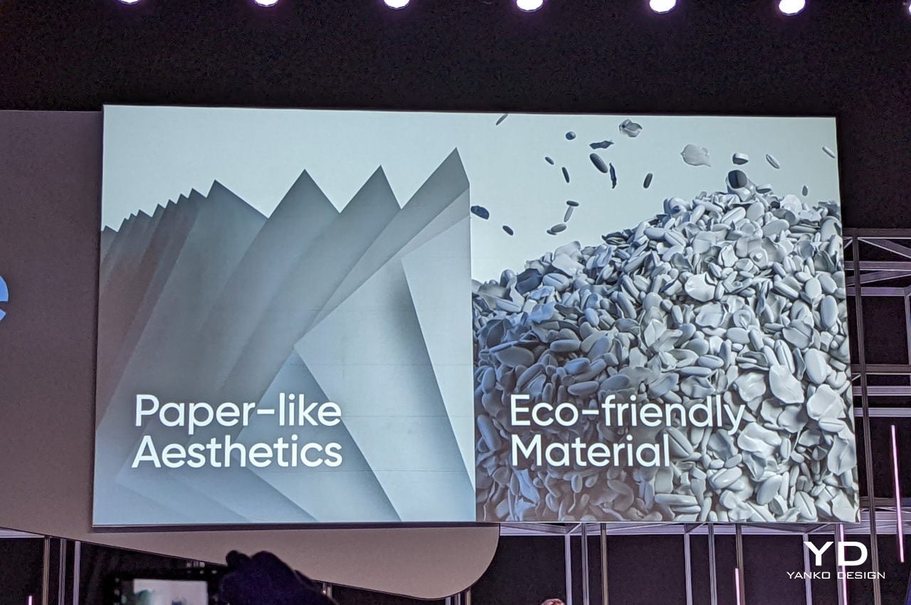
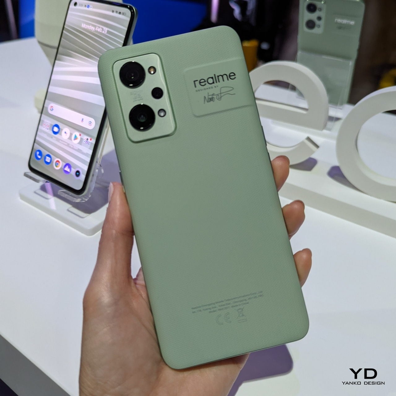
Realme took inspiration from paper in more ways than one. Enlisting the help of famed industrial designer Naoto Fukasawa, the phone maker sought to recreate the look and feel of paper on the glass back of a phone. That alone is an achievement, bringing a sense of comfort and familiarity to the hands while holding the Realme GT2 Pro, but it isn’t just paying lip service to sustainability. Two of the phone’s models, Paper White and Paper Green, are actually more related to paper than glass and plastic.

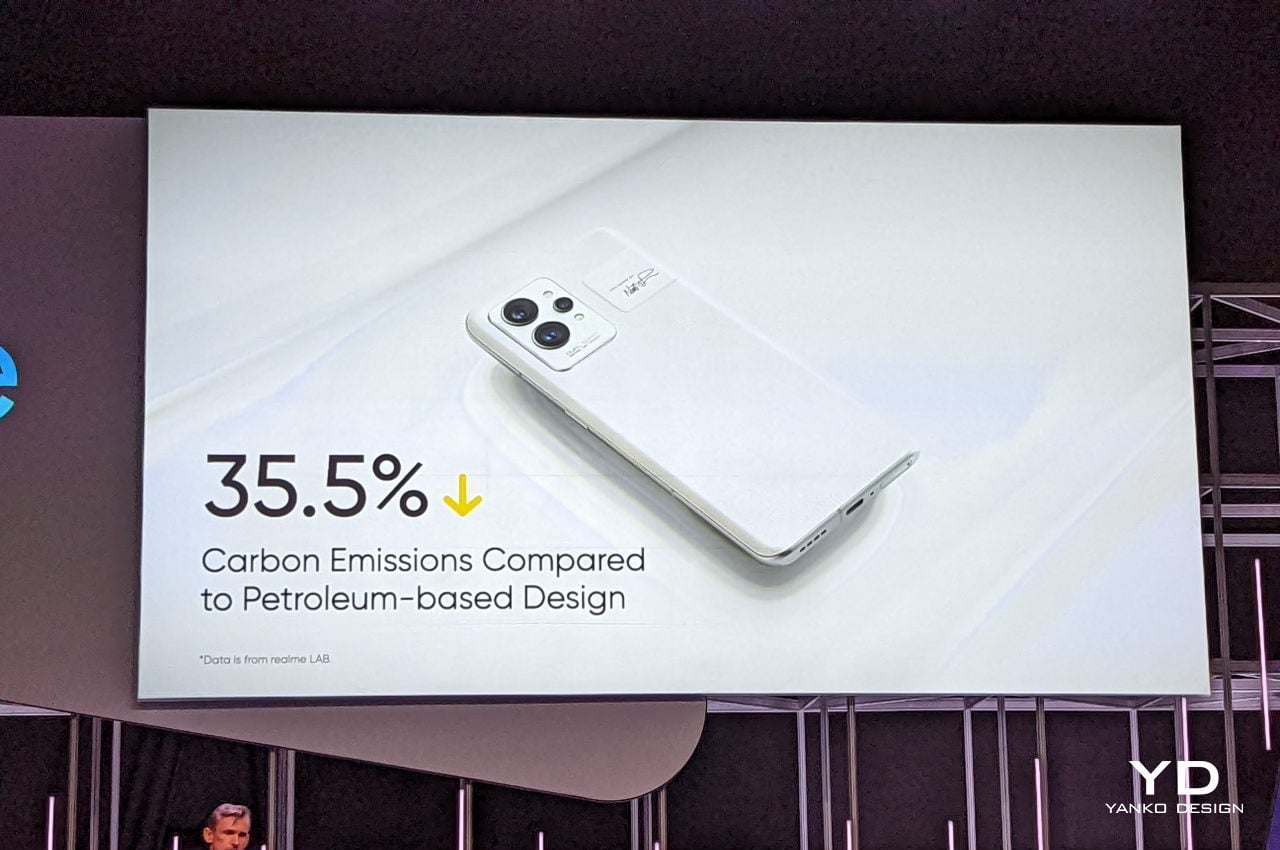
The company boasts of having the world’s first phone to use a bio-based polymer for its smartphone. Compared to others of its kind, this new material is advertised to have reduced carbon emissions by as much as 35.5% when creating the phone. In fact, the Realme GT2 Pro is boasted to have achieved TCO 9.0 Certification for its positive ecological impact. To date, only the Realme GT2 and the Fairphone 4, the most repairable phone in existence, have achieved this certification.

Many smartphone makers are taking steps to also reduce their negative impact on the environment. Some have started small with packaging, while others like Samsung have started to use recycled plastics in their phones. Realme is taking even bigger steps by embracing a new kind of material that, in theory, should still be as durable as regular glass and plastic. Unfortunately, not all Realme GT2 Pro models use this bio-based polymer material, which means we still have ways to go before we reach that green milestone.

Feast for the Eyes

Almost anyone that has bought a smartphone these days has probably paid attention to the phone’s cameras. More than just trivial or whimsical features, these have become some of the most important aspects of a smartphone. Creatives and designers may have even come to depend on their phones’ cameras to quickly capture an object, an inspiration, or a fleeting idea before it escapes.

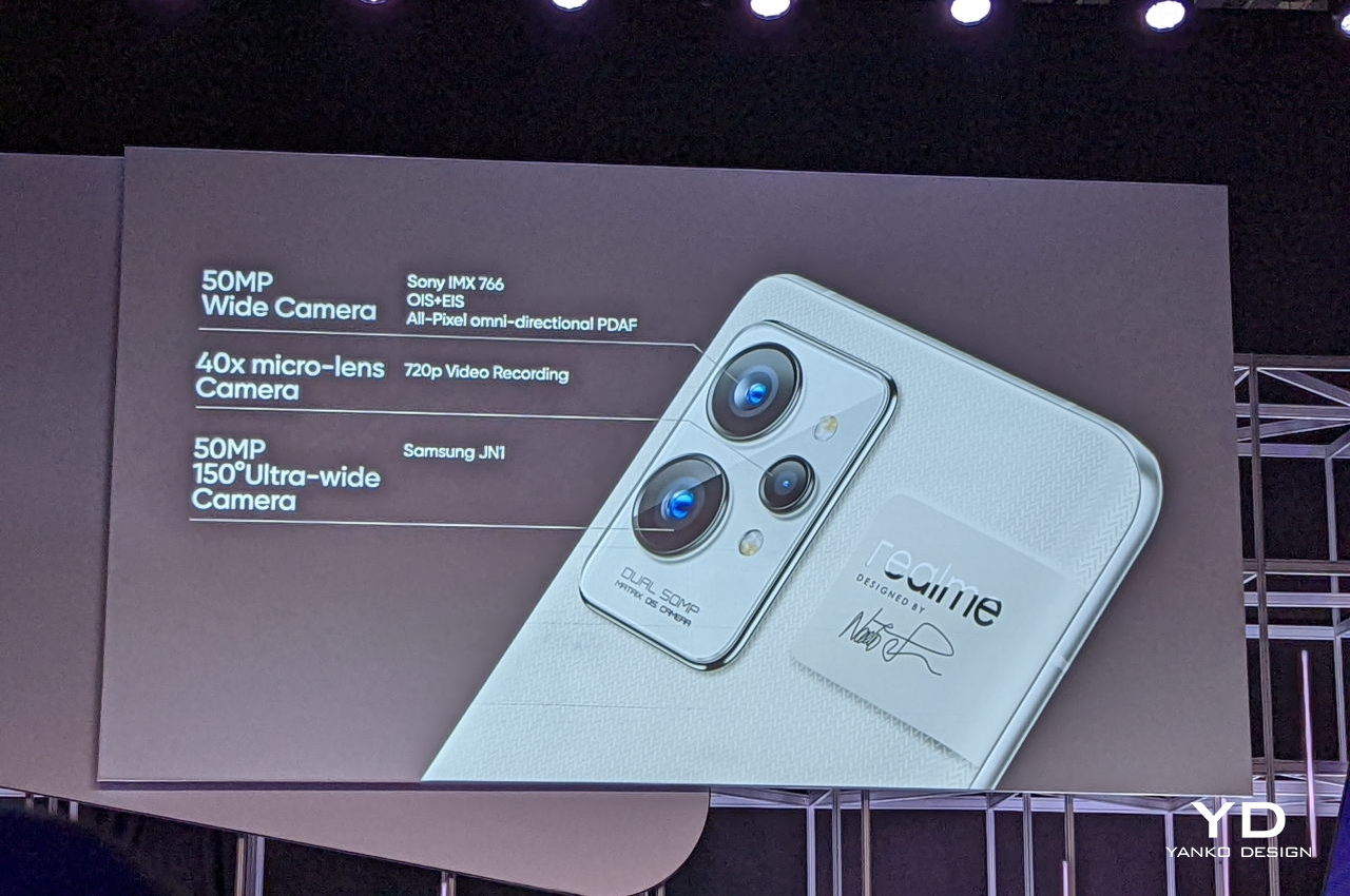
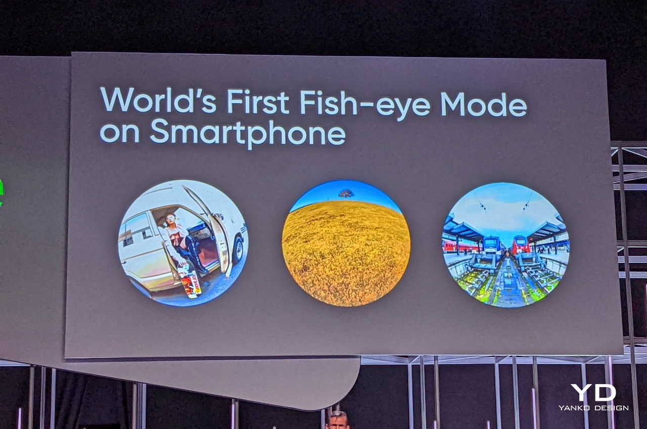
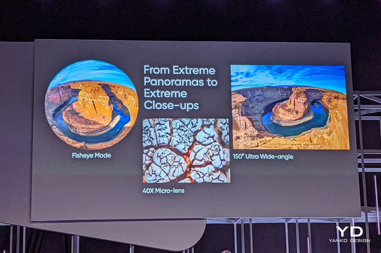
The Realme GT2 Pro definitely tries to meet the market’s demands with its three cameras, though, to be honest, it sounds like only two are really useful. The 50MP ultra-wide camera has an extreme 150-degree angle, which enables certain effects or modes that are just not possible with other ultra-wide cameras. There’s also a low-res macro camera that now boasts of a 40x magnification, which could be useful for taking close-up shots of patterns that occur in nature.

Greater Than You See

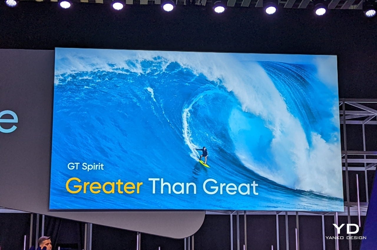
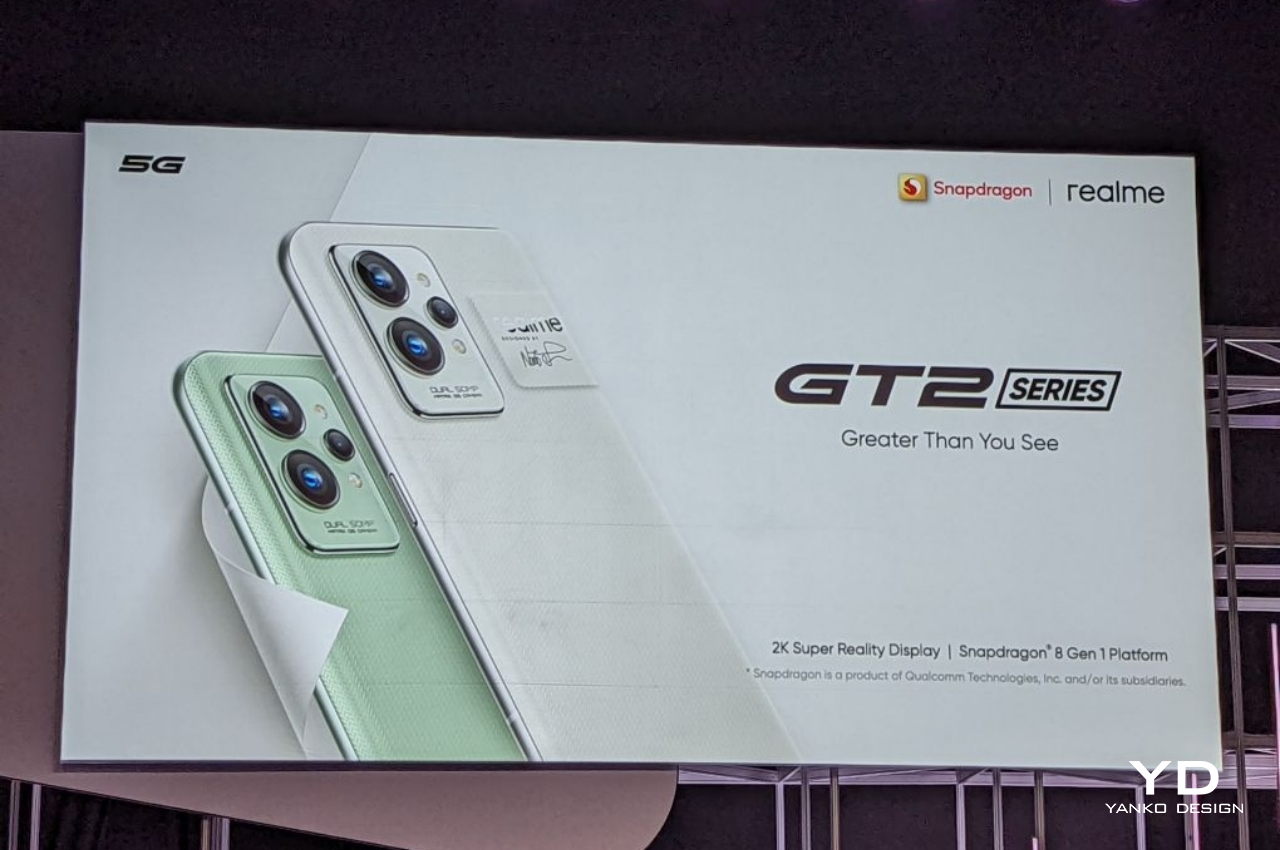
Realme’s tagline for its GT phone series suggests that there is more than meets the eye, and it definitely works in this case. At first glance, the Realme GT2 Pro might not be much of a looker, and its spec sheet doesn’t exactly stand out from the rest of the high-end premium phones so far this year. It’s only when you take a closer look and notice the minute patterns on the phone’s back and its paper-like texture that you can actually tell it’s a different breed entirely.

You also won’t see, outside and inside, the unstated history of the phone’s design, which is also one of the biggest achievements of the Realme GT2 series. In the grand scheme of things, its use of a bio-based polymer material might seem small and almost insignificant, especially considering the ratio of other phones to these new models, but the first small step is often also the hardest. Hopefully, Realme will find much support, especially in sales numbers, for its daring innovation to encourage it to take the next steps towards that Green goal.

The post Realme GT2 Pro takes a bold step towards making phones more sustainable first appeared on Yanko Design.

Salmon Eye floating aquaculture exhibit really looks like a dead fish’s eye

There is perhaps no better way to get people talking about protecting marine life than with a giant fish eye floating on water, staring accusingly at the heavens.
Many of us are already dreaming about exploring the vastness of space and colonizing planets, but some scientists will point out that we have barely conquered the depths of our planet’s waters. Perhaps that for the best if “conquering” also means polluting and ruining the seas and oceans. Protecting aquaculture even while being dependent on them for food has always been a struggle, and a new exhibit wants to raise interest and awareness through a floating structure that is both beautiful and a little bit creepy, at least if you’re flying overhead.
Designer: Marketex Marine

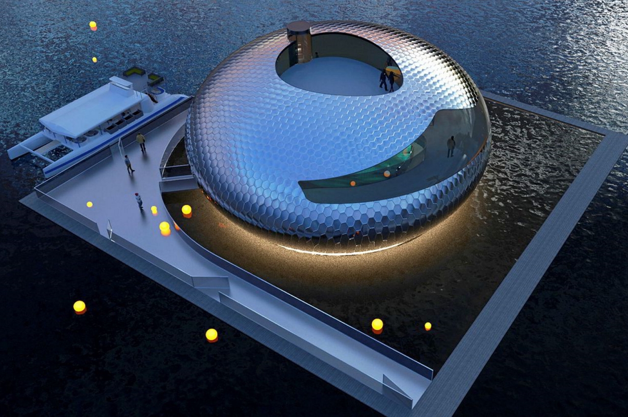
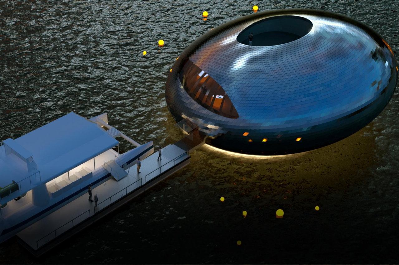
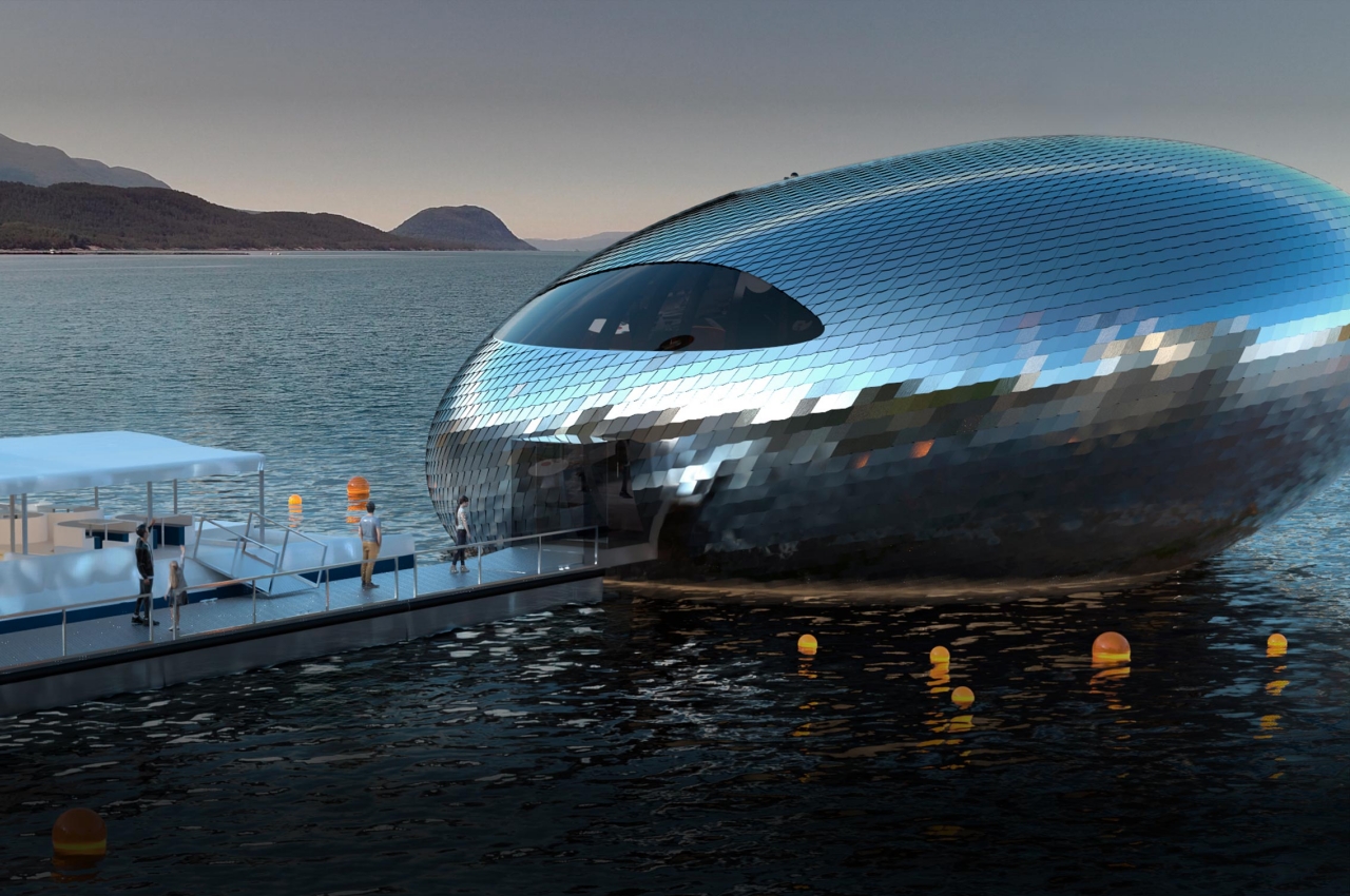
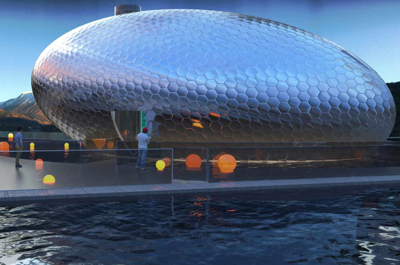
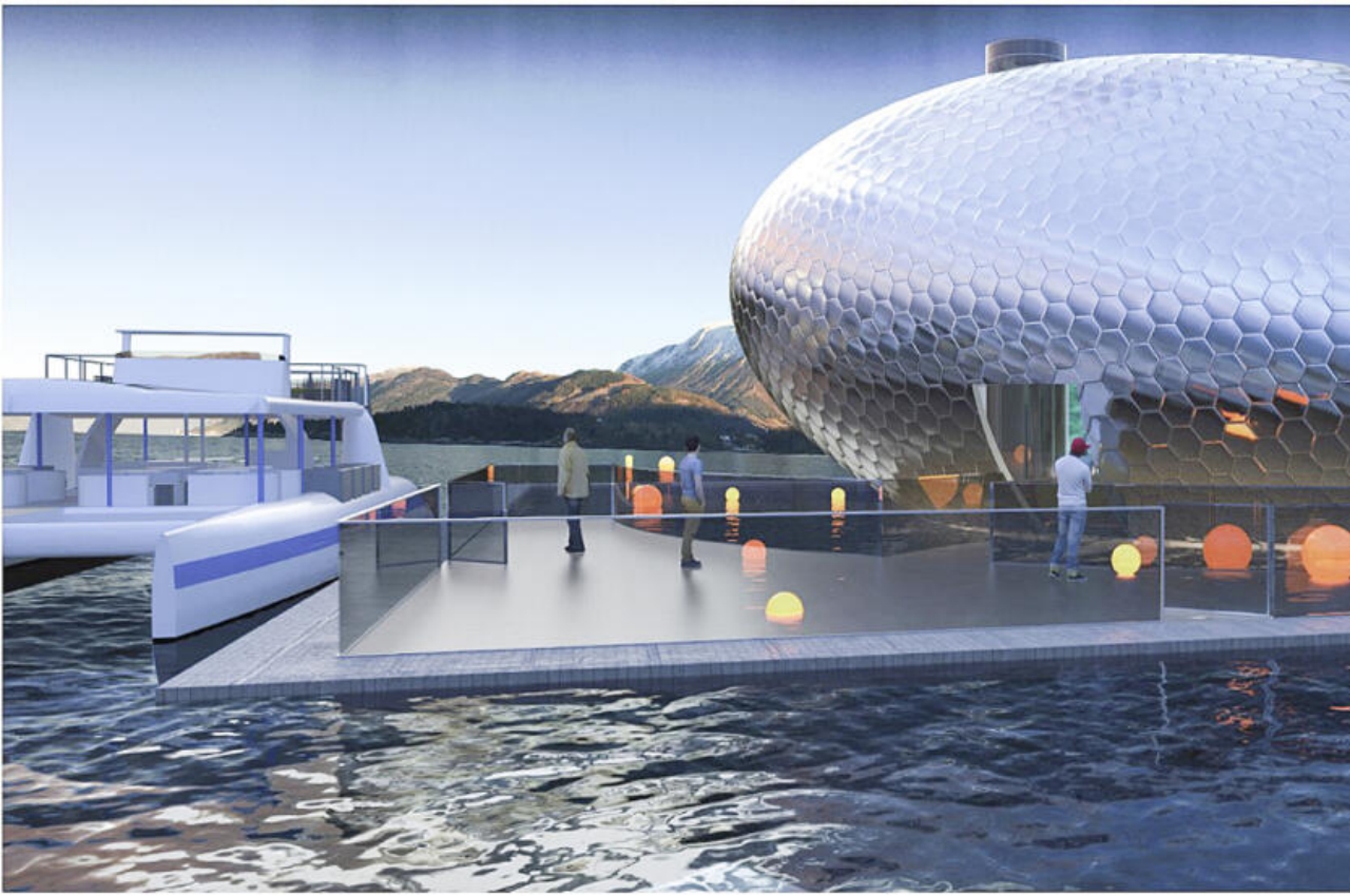
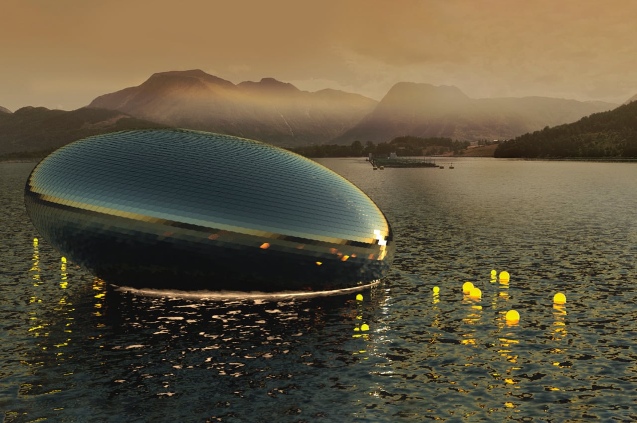
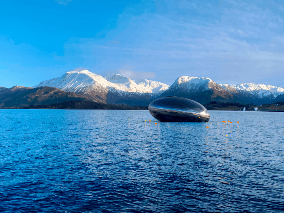
The “Salmon Eye” is true to its name in more ways than one. It is a combination of a pontoon and a unique elliptical upper structure that is designed to look like a fish’s eye, particularly a salmon’s. This shape, however, will only really be visible if you’re seeing it from a bird’s eye view. Ironically, the floating exhibit can only be reached by water.

On the outside, however, the structure will be covered with 9,500 high-grade stainless steel plates designed to look like scales. They’re also colored like salmon skin to further strengthen the association with its namesake. This material ensures that the exhibit is eye-catching, pun totally intended, no matter which angle you view it from except perhaps from the bottom of the fjord.

The structure will look especially futuristic when it reflects the light coming from the sun and nearby sources, especially as it floats on the Hardangerfjord. This is Norway’s second-longest fjord and the world’s fifth-longest, making it a natural tourist attraction every year. It is also noted to have Norway’s highest concentration of salmon farms, making the fish an extremely important part of the local ecosystem.

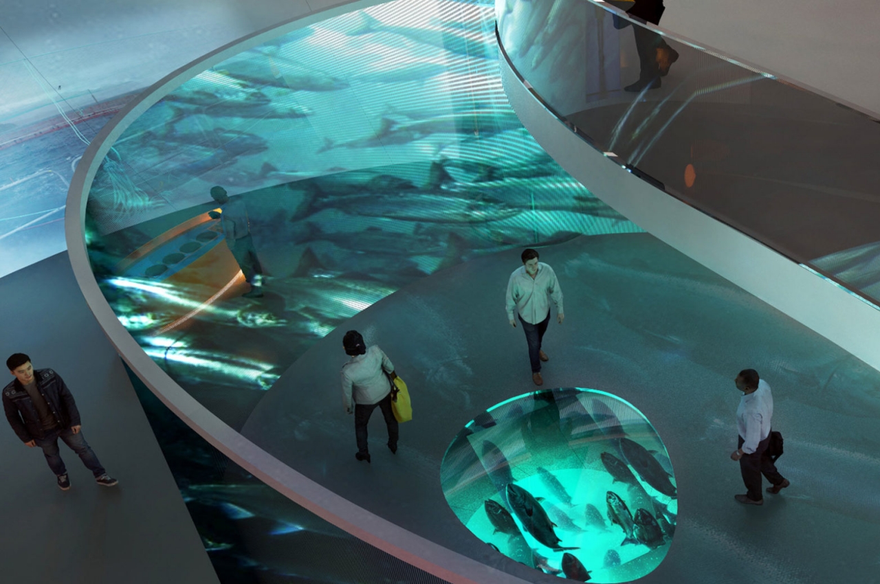
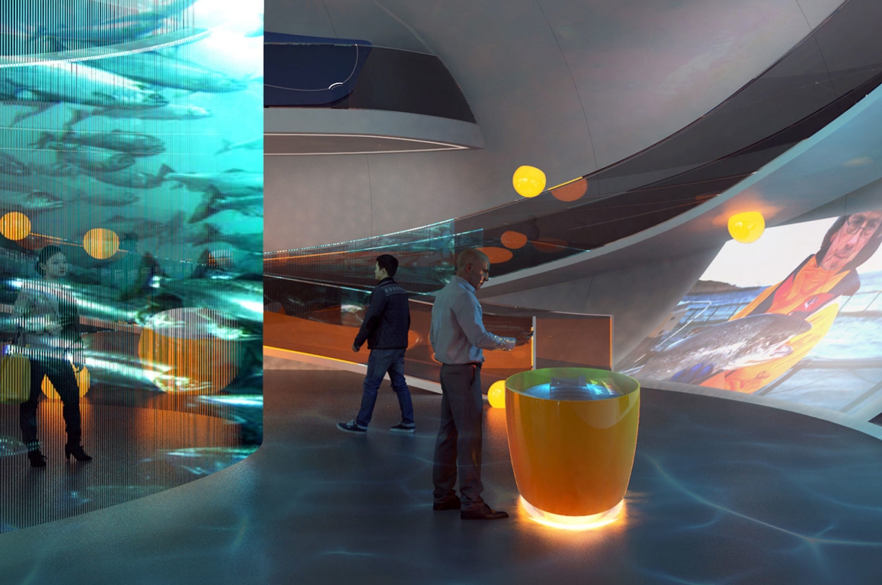
That is why the exhibit is not only named after the fish but also tries to raise global awareness on the impacts of current aquaculture practices on salmon. Projections on the walls inside the exhibit let visitors learn more about food production in the sea and local challenges and solutions. In addition to interactive wall projections, there are also interactive displays that are, perhaps to no one’s surprise, shaped like a roe.

The post Salmon Eye floating aquaculture exhibit really looks like a dead fish’s eye first appeared on Yanko Design.

This recycled concrete brick features small cavities, creating a safe nesting site for solitary bees

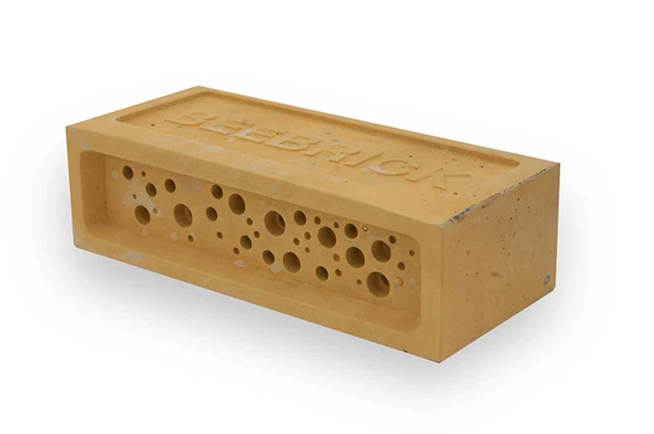
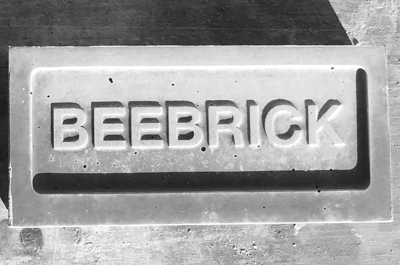
The Bee Brick Bee Home is a concrete brick with built-in cavities that provide safe nesting sites for solitary bees in your garden or community park.

There’s nothing more complicated than our relationship with bees. We admire them from afar and certainly can indulge in the fruit of their labor, but all bets are off once they get too close. Once they decide that your home’s shingles provide the perfect conditions to build a nest, let terror reign.

Designer: Green&Blue

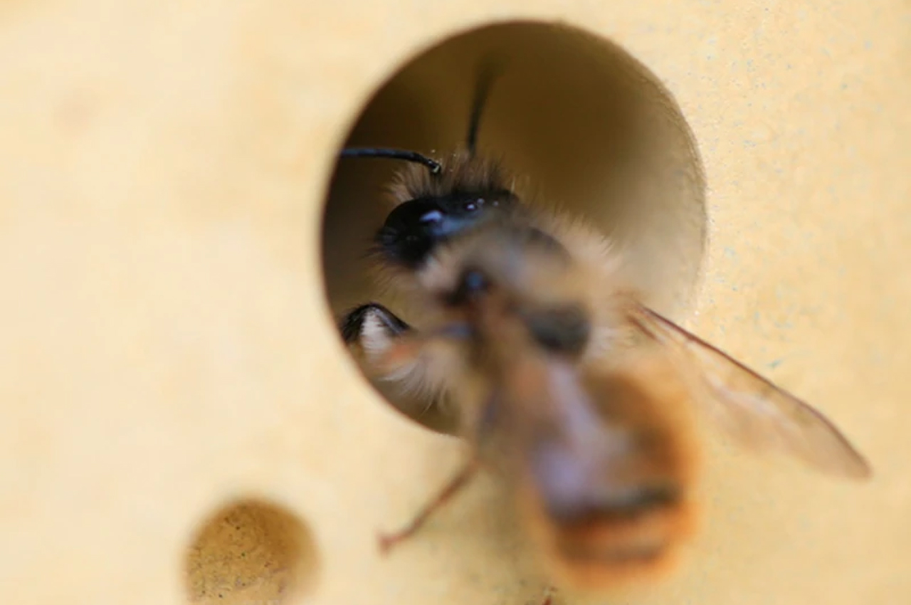
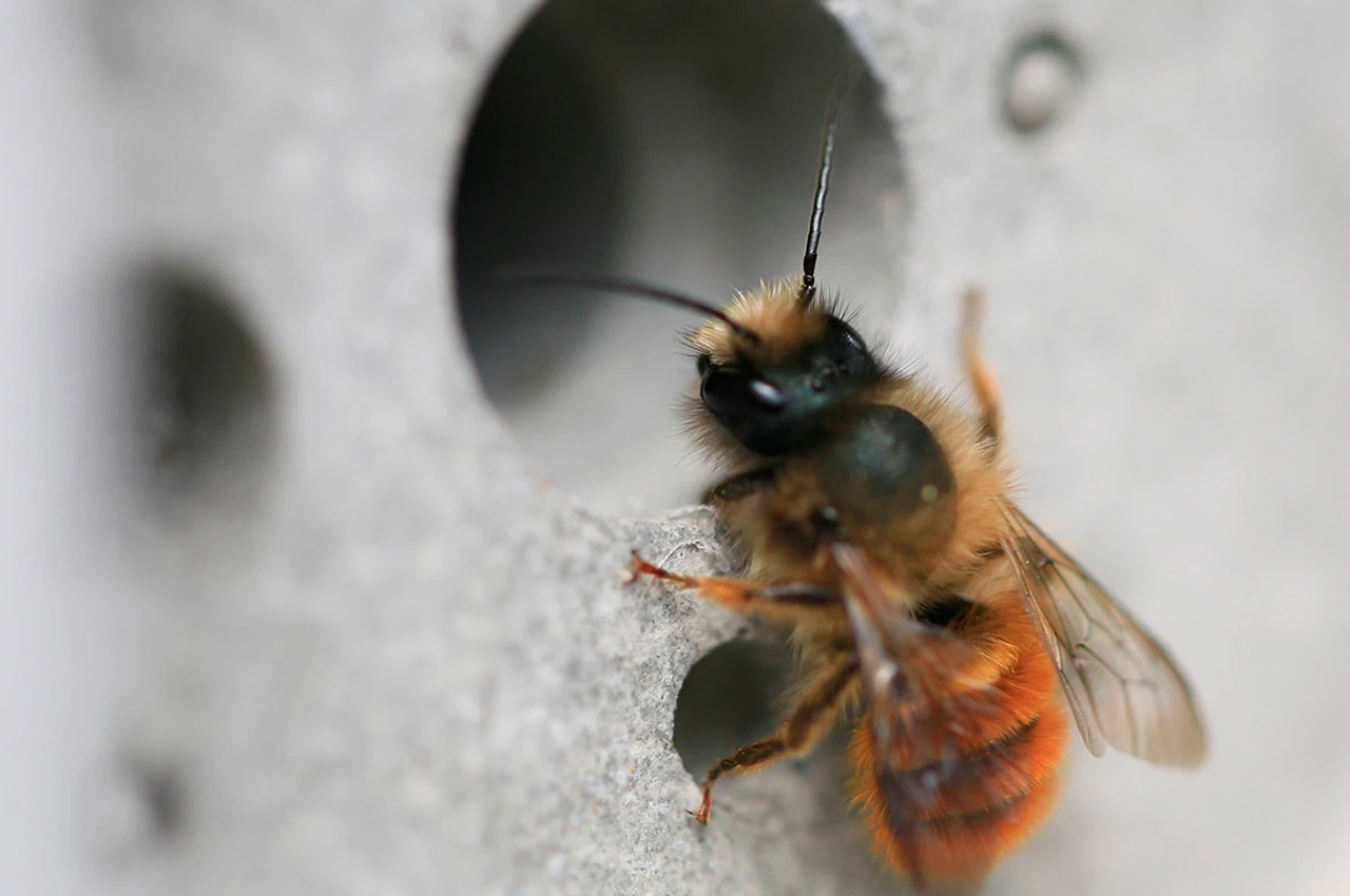
For all that they might provoke, our fear can be misguided and even unwarranted. Bees are some of the most important and hardworking caretakers of our planet’s ecosystems. Solitary bees, in particular, are known for being non-aggressive as they have no hive or queen to protect, so they won’t sting potential threats.

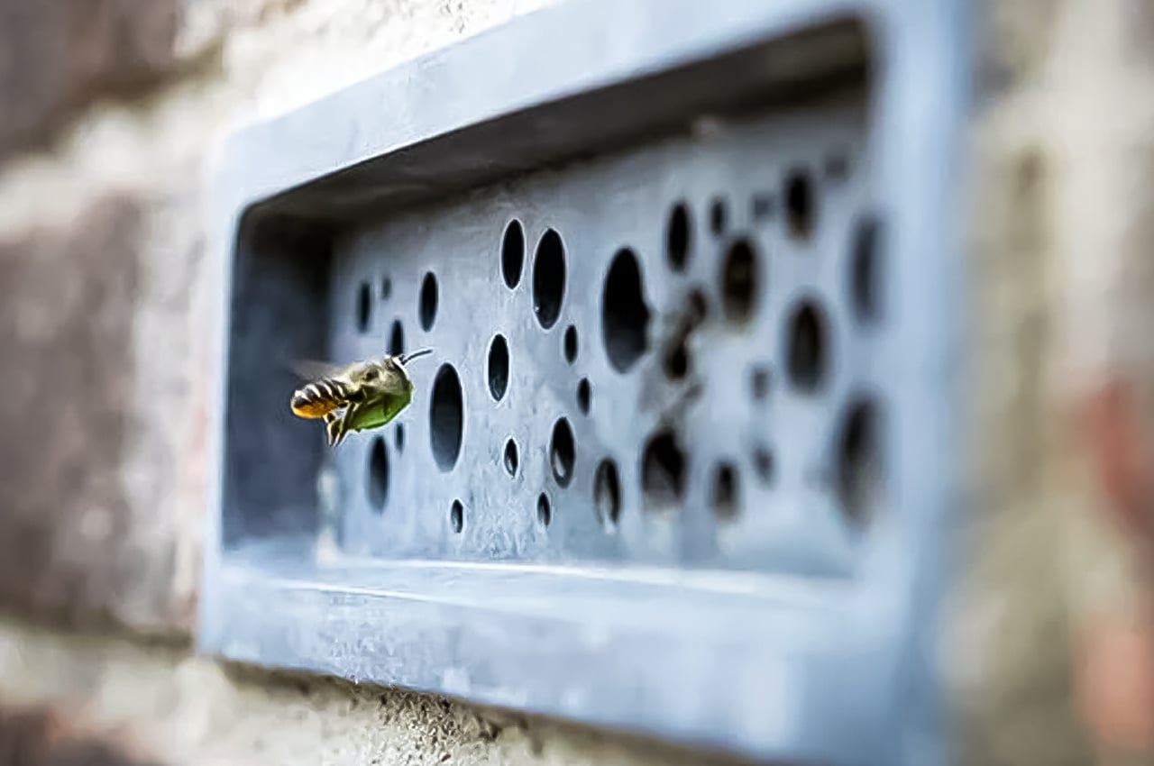
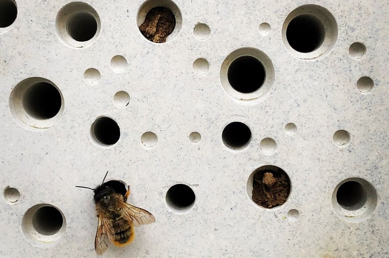
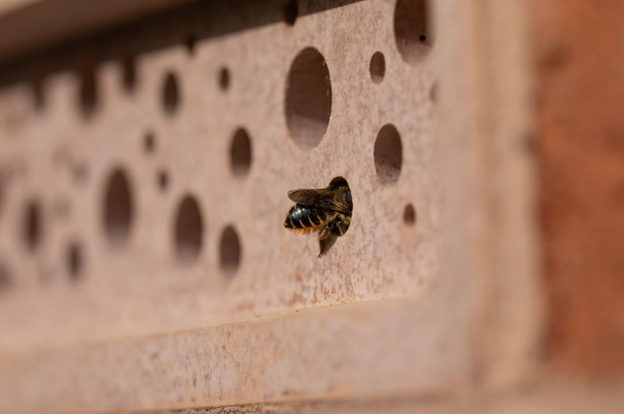
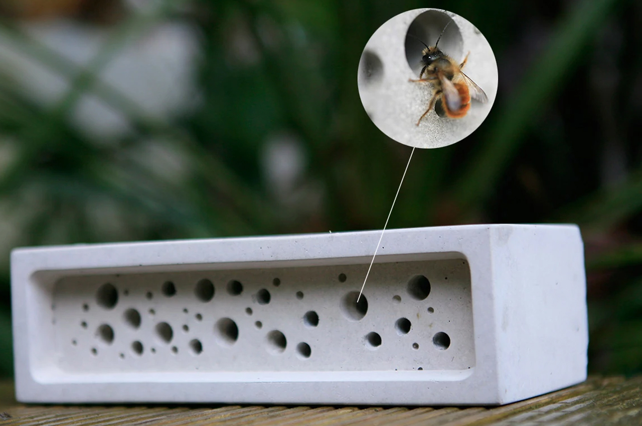
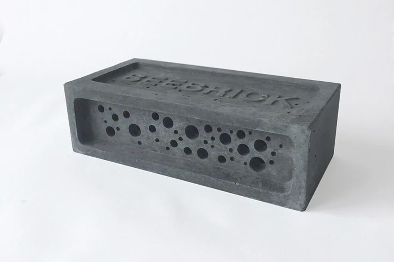
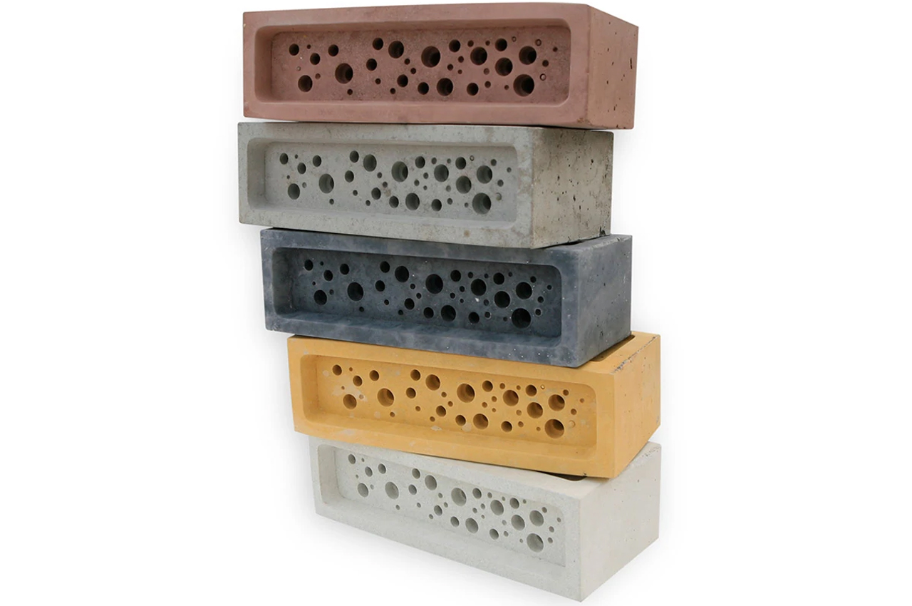
Creating a means for solitary bees to have a nesting site and to help our declining bee population, Green&Blue designed the Bee Brick Bee House, a concrete brick, made from 75% recycled material, with built-in cavities for red mason and leafcutter bees to have a safe nesting site.

The Cornwall-based design studio, Green&Blue devotes the bulk of its designs to wildlife and nature initiatives–the Bee Brick Bee House is no different. Designed for gardeners, and wildlife enthusiasts alike, the Bee Brick Bee House can be integrated into any garden, brick shelter, or outdoor space where bees frequent. In fact, a new planning requirement in Brighton and Hove calls for all new buildings that rise above five meters to integrate bee bricks into their build, as well as bird nesting boxes suitable for swifts.

Since the Bee Brick Bee House is a functional, concrete brick, it can be integrated into any brick structure the same way a traditional brick is used for building. The brick’s cavities provide a safe space for solitary bees to nest and populate. Speaking to this, Green&Blue designers suggest, “Bee houses can be a simple way to do something to help our declining bee population, alongside bee-friendly planting and other wildlife-friendly measures.”

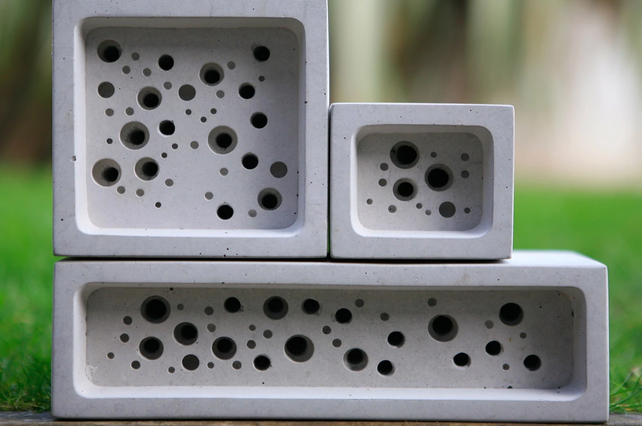
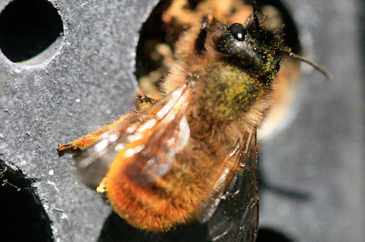
The cavities vary in size to accommodate all kinds of bees. 

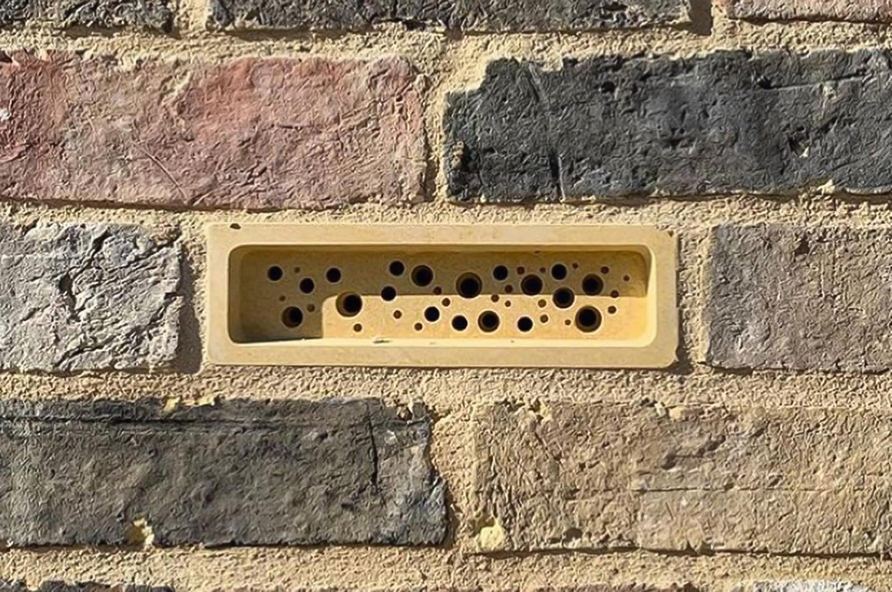
The concrete brick can be integrated into any building’s structure. 

The post This recycled concrete brick features small cavities, creating a safe nesting site for solitary bees first appeared on Yanko Design.

Adidas and Parley build a recycled plastic tennis court to float over the Great Barrier Reef

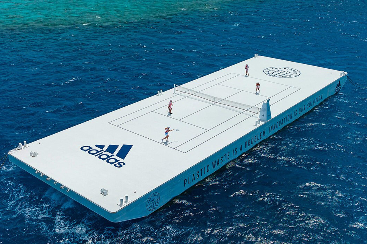
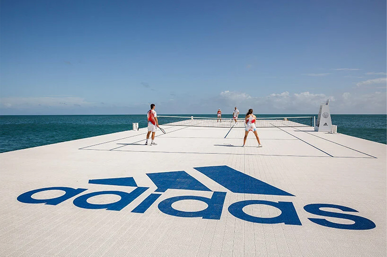
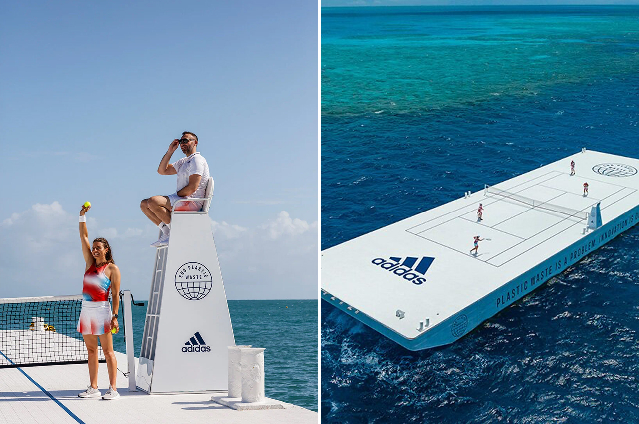
Parley for the Oceans, an environmental nonprofit, teamed up with Adidas to design and construct a tennis court made from recycled materials to float above the Great Barrier Reef in an effort to raise awareness about plastic waste in our oceans.

Founded in 2012 by Cyrill Gutsch, Parley for the Oceans is a nonprofit environmental organization that collaborates with a network of global creators, thinkers, and leaders in a united effort to protect our planet’s oceans. Joining forces with Adidas, the massive clothing brand with headquarters in Germany, Parley designed and built a full-size, sustainable tennis court in the middle of the great barrier reef. Entirely built using recycled materials, Parley for the Oceans is particularly focused on raising awareness about plastic entering our oceans.

Designers: Parley x Adidas

Considering its iconography in regard to climate change, it seems fitting that Parley and Adidas chose the Great Barrier Reef as the location for their recycled tennis court to float above. Stationed atop a barge that makes routine trips across the reef for environmental marine construction projects, the recycled tennis court hosted a few matches between some of Australia’s biggest tennis stars. Following the matches, Parley and Adidas donated the tennis court to a local Townsville school.

Upon collaborating with one of the biggest clothing brands in the world, Parley announced the launch of a new high-performance apparel line designed in part with Parley’s recycled ocean plastic. Inspired by the colors found on the Great Barrier Reef, the 2022 tennis apparel line from Adidas marks a step towards the company’s goal in helping end plastic waste and eliminating the use of virgin polyester from their products by 2025.

Describing the company’s use of recycled plastic, ​​Shannon Morgan, senior director of Adidas’ Pacific branch, says, “We collect plastic from coastal communities before it ends up in the oceans and [we] turn it into yarn. You will see our athletes on the field at the Australian Open from Monday with these garments made with that yarn. We are using a sporting event, the largest on our continent, to truly show the beauty of the coral reef.”

The post Adidas and Parley build a recycled plastic tennis court to float over the Great Barrier Reef first appeared on Yanko Design.

Nuro next-gen self-driving delivery car will protect pedestrians with an old-fashioned airbag!


Airbags have been cited to save the lives of people inside a car, and Nuro thinks they might also be able to save people outside of one.

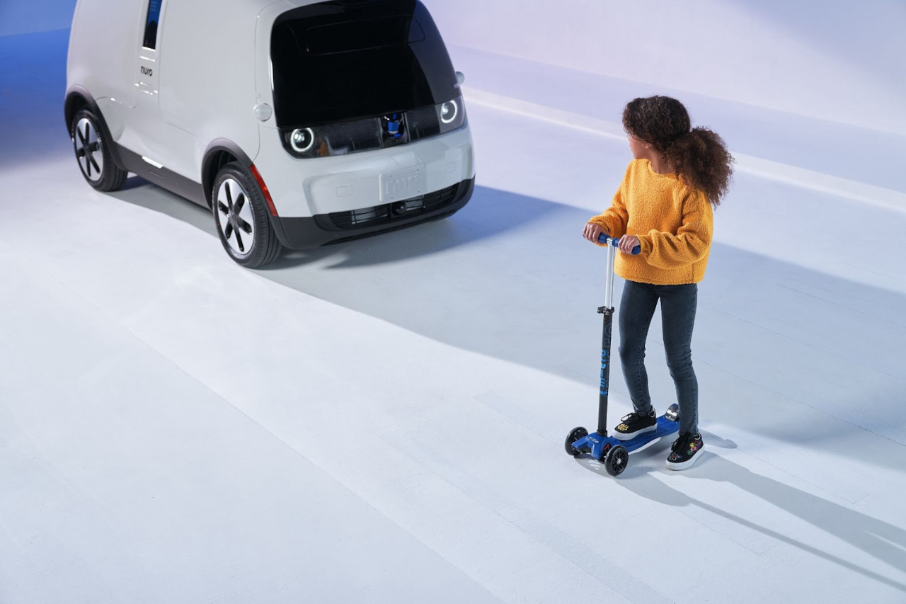
Autonomous, self-driving cars have long been a dream of both car manufacturers as well as many drivers, but they also sound like the stuff of sci-fi horror for other people, especially those outside of the robot vehicle. Although it’s a long time coming, these driverless cars will eventually be found on highways as well as neighborhood streets, whether ferrying people or groceries. Nuro is more interested in the latter, and its latest prototype design makes a big commitment not just to the safety of people but also that of the environment.

Designer: Nuro

Nuro has been around for quite a while, but it might not be getting as much attention as self-driving cars from bigger brands like Tesla. That might be due to its focus on a very specific market for delivering goods, not humans, from the store to your doorstep. In a way, that also works in its favor because it can fine-tune its features and performance in ways that more general-purpose autonomous vehicles can’t.

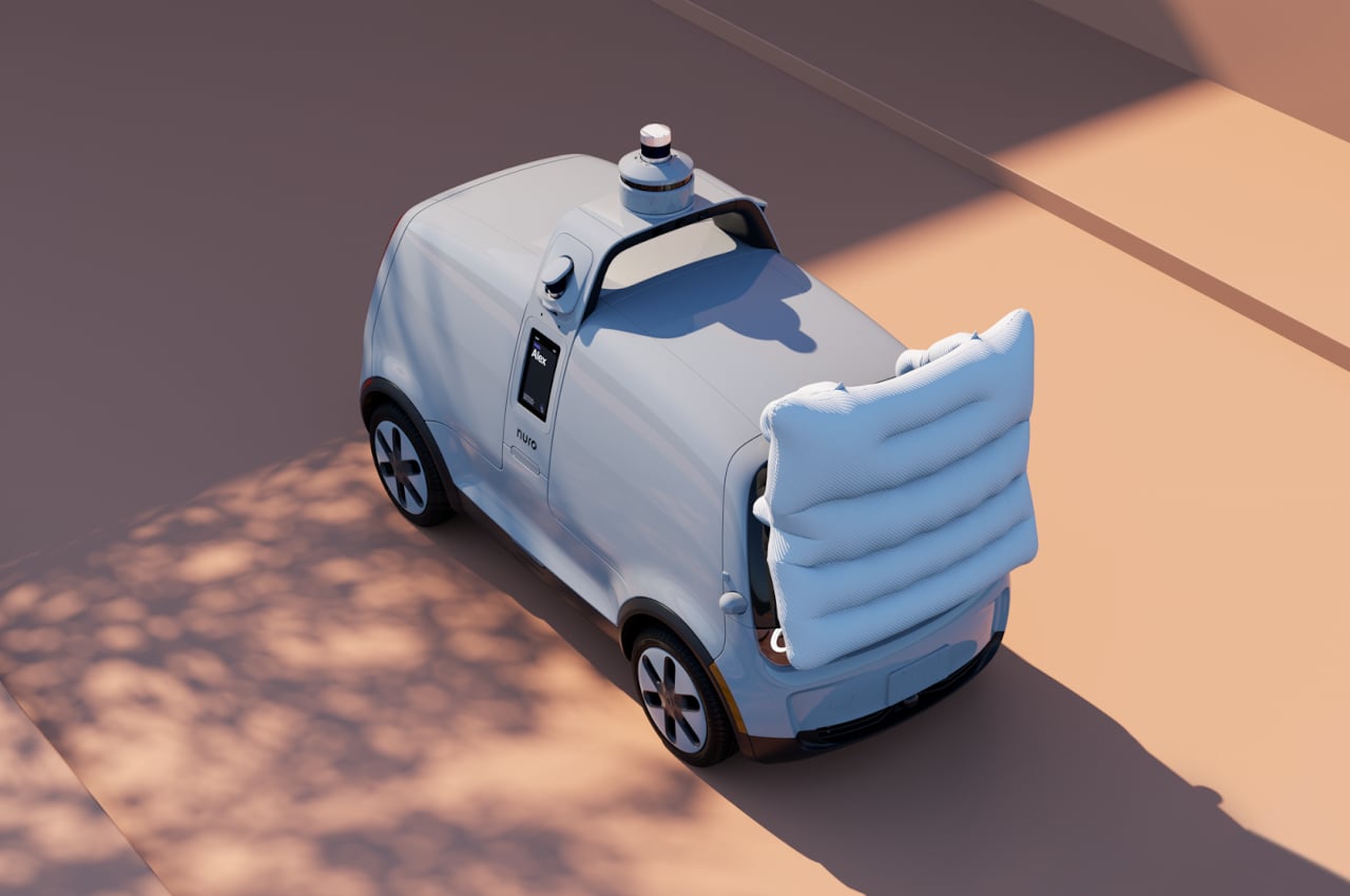
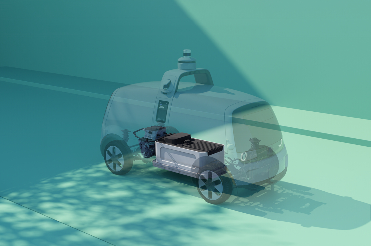
For example, Nuro’s latest-gen version of its driverless R2 pod adds a new safety feature for pedestrians that sounds both absurd and genius in its simplicity. While it will try to avoid any accident as much as it can, it will also deploy an external airbag in front of the vehicle when it can’t. This is designed to help reduce the force of impact and hopefully reduce the number of injuries to pedestrians. That, of course, will still depend on how fast the vehicle was traveling in the first place, and this latest iteration can apparently go up to 45 mph.

Nuro is also making big promises when it comes to sustainability and protecting the environment. It will be impossible at this point to go all out on using renewable materials, but it will at least try to make sure to reduce its impact on the environment. More importantly, Nuro says that the new electric vehicle will use 100% renewable electricity from wind farms in Texas, reducing the carbon footprint even for day-to-day operations.

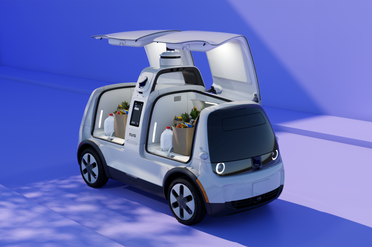
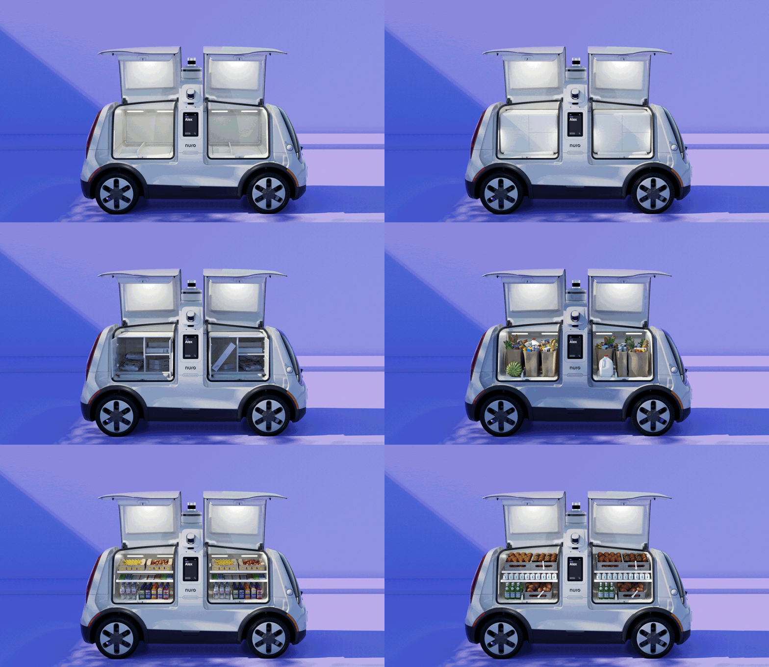
This third-gen autonomous delivery vehicle also has more space for groceries, food, and other items. Nuro says that all these upgrades are designed not just to make deliveries faster and more efficient but also to free up more time for humans to spend on more important things, like family and friends. That said, pre-production of the manufacturing facility that will make these driverless delivery robots has only just begun, so it might be a while before we see these on the road.

The post Nuro next-gen self-driving delivery car will protect pedestrians with an old-fashioned airbag! first appeared on Yanko Design.

This donut-shaped EDC is designed to cut through plastics to help streamline the recycling process!

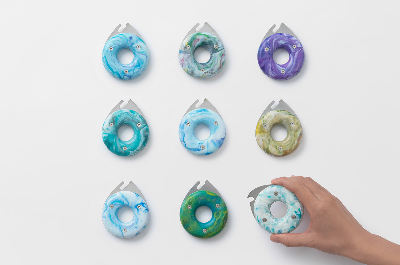
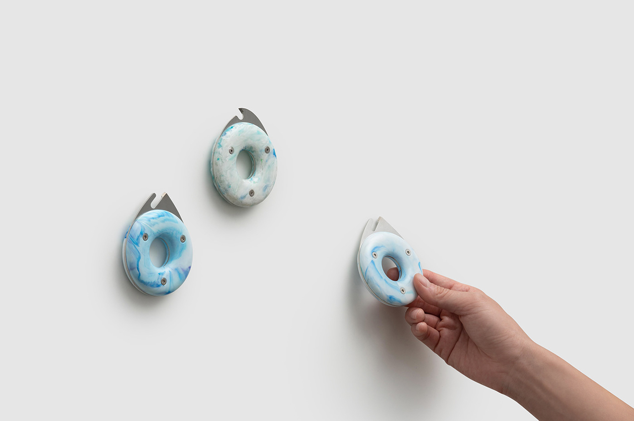
The Donut Cutter is an EDC water bottle slicing tool designed to cut through hard plastics and streamline the recycling process.

PET is the most common thermoplastic polymer resin in production today. Used in fibers for clothing, thermoforming for manufacturing, and most often in containers for foods and liquids like water bottles, PET is used to produce most of the plastic-based products in circulation today. Since PET plastics aren’t biodegradable, they end up in landfills following their use where they’ll remain for 500 to 1,000 years until they fully degrade.

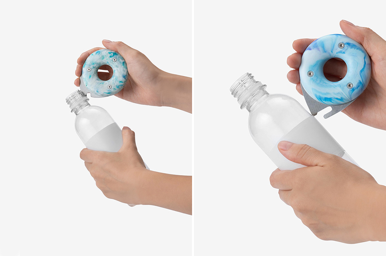
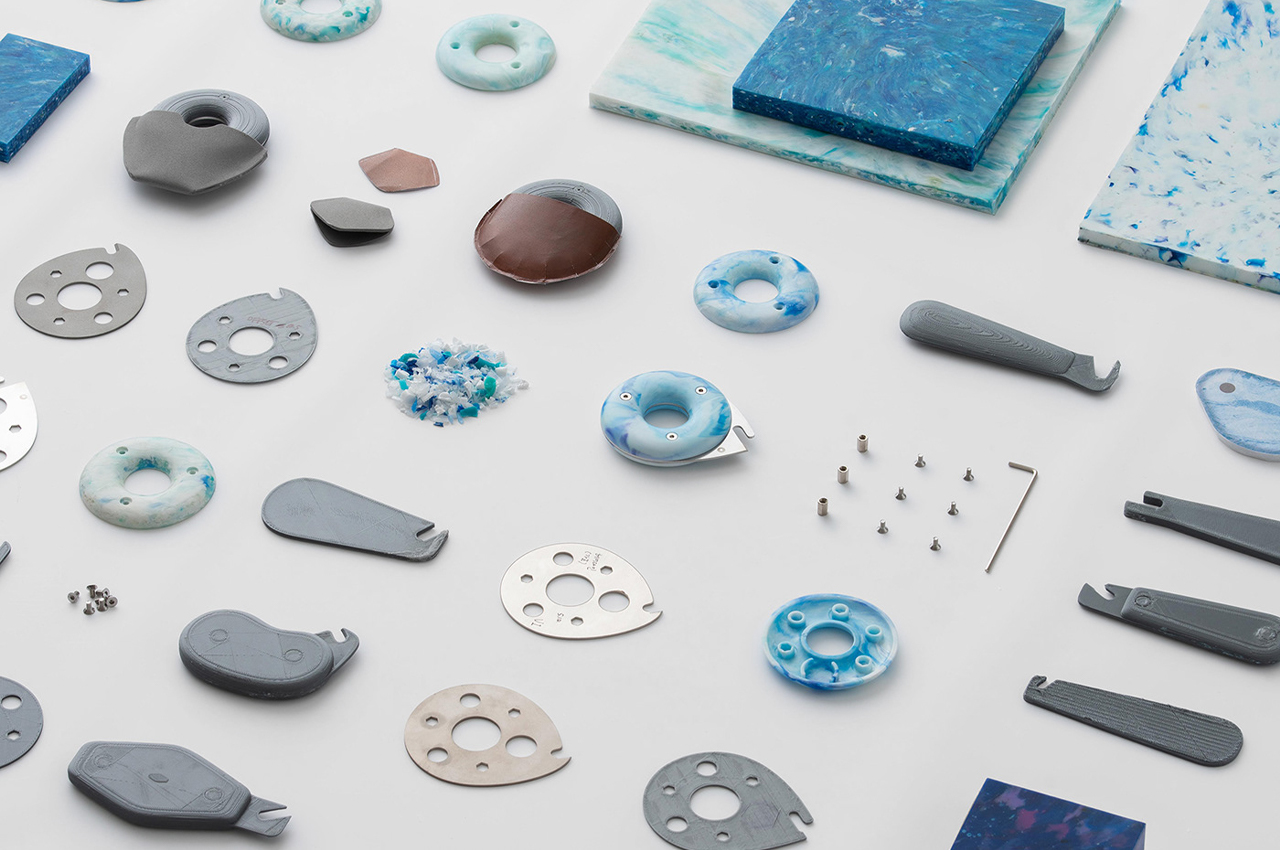
With plastic water bottles being some of the biggest contributors to PET plastic waste in landfills, industrial design studio BKID Co. constructed an EDC Donut Cutter that carves right through the bottle cap, neck ring, and plastic label to streamline the recycling process and prevent hard plastics from harming wild and aquatic life.

We’ve all seen the tragic photographs of turtles stuck in plastic yokes and birds choking on bottle caps. While PET plastics are certainly the most common form of thermoplastic polymer resin today, they’re also the most damaging to the planet.

BKID’s Donut Cutter slices right through every and any plastic water bottle partly in response to the life-threatening effects that in-tact plastic waste has on wildlife. Made from high-density polyethylene (HDPE), bottle caps and neck rings have a tougher, more durable feel compared to the actual water bottle, but the Donut Cuter carves right through those as well.

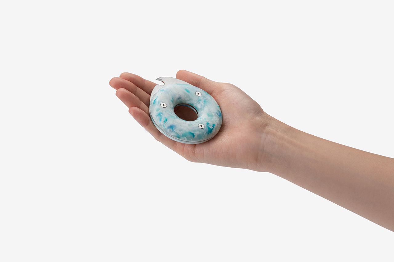
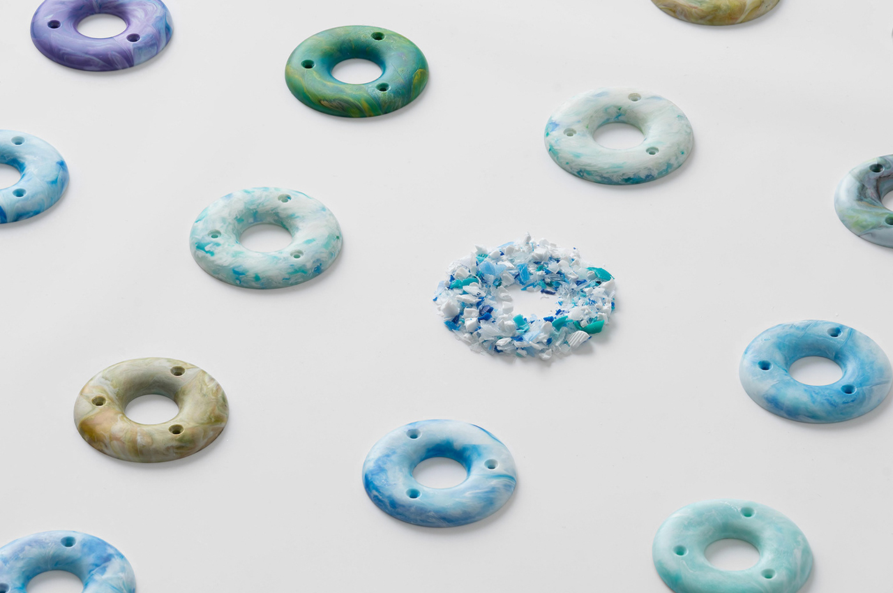
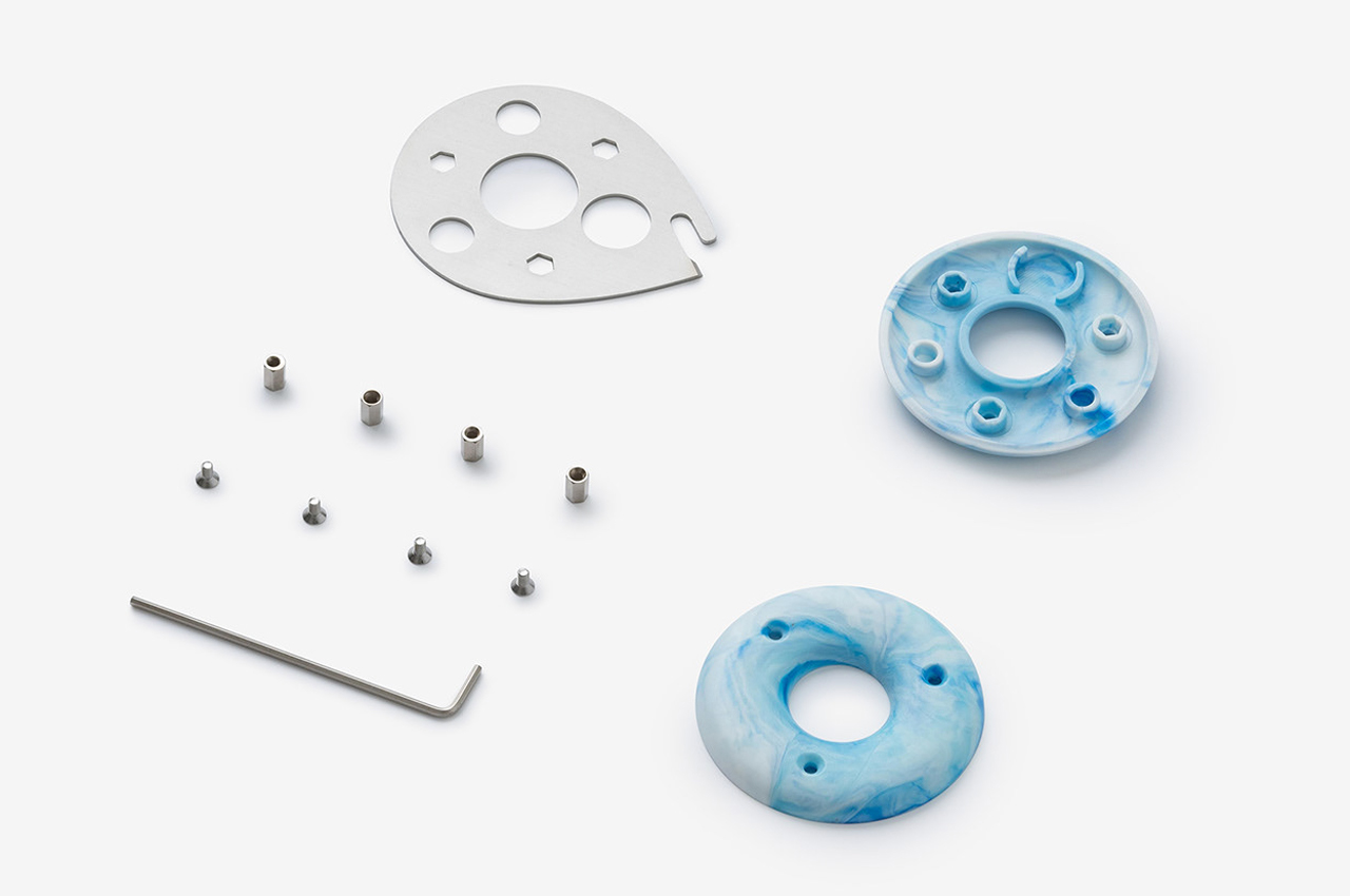
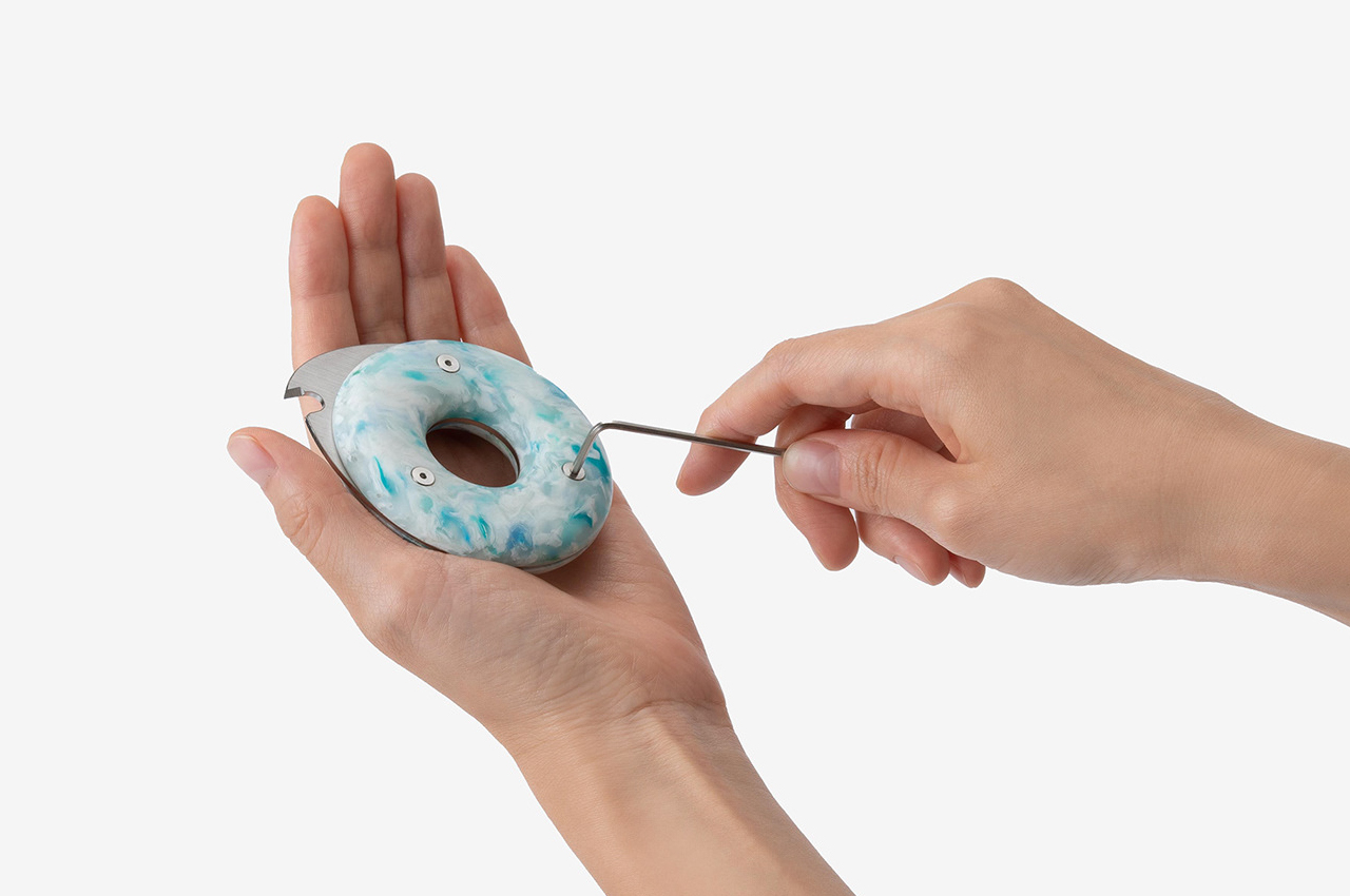
Compact enough to fit inside your pants pocket, the Donut Cutter is similar in size to other EDC items like pocket knives and multipurpose tools. Designed with a circular shape, the Donut Cutter is named after its main finger loop that makes handling the EDC plastic cutter intuitive and safe.

Designer: BKID Co.