How to Choose the Best Ergonomic Chair: Top Features You Can’t Ignore

An “ergonomic chair” is designed to accommodate a wide range of individuals but must be tailored to the user’s body dimensions, workstation, and tasks for true ergonomics. Prolonged sitting, despite requiring less physical effort than demanding tasks, poses significant health risks such as back pain, stiff necks, and leg numbness, strain muscles, ligaments, and tendons, increasing the risk of discomfort and injury. Corrections are necessary for better ergonomics and to prevent discomfort or injury. Here are features to consider when selecting an ergonomic chair.

Designer: Stan Deng
1. Seat Height

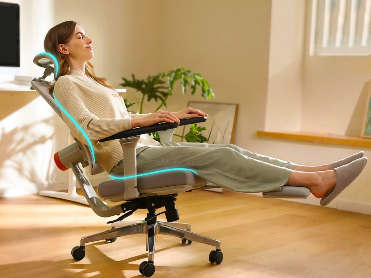
An adjustable seat height is essential for comfort, allowing your feet to rest flat on the floor ensuring that most individuals can keep their feet flat on the ground, maintain horizontal thighs, and align their arms evenly with the desk height. Note that a seat height range of 16 to 21 inches is usually comfortable for most people.
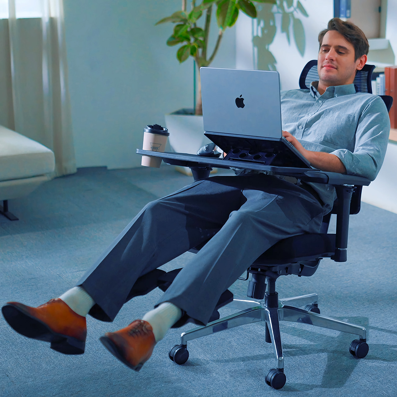
The NEWTRAL MagicH chair adapts to the user with an auto-following backrest and headrest, providing support whether sitting upright, leaning forward, or reclining. It accommodates various sitting styles, ensuring comfort and promoting healthy posture. The Pro model includes a foldable footrest and 4D Extended Armrest for comprehensive support, with adjustable features tailored to individual needs, enhancing overall comfort and preventing injuries.

2. Seat Width and Depth

The seat dimensions should ensure comfort by accommodating individual height and body shapes. It should maintain a depth that leaves 2 to 4 inches between its edge and the back of your knees to avoid excessive pressure.
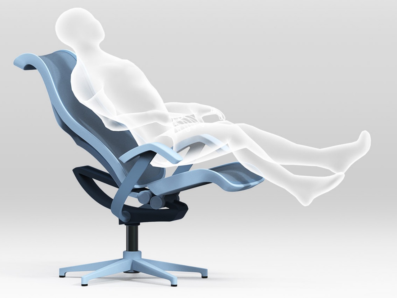
Designer: Yubin Lee and Minkyoung Song

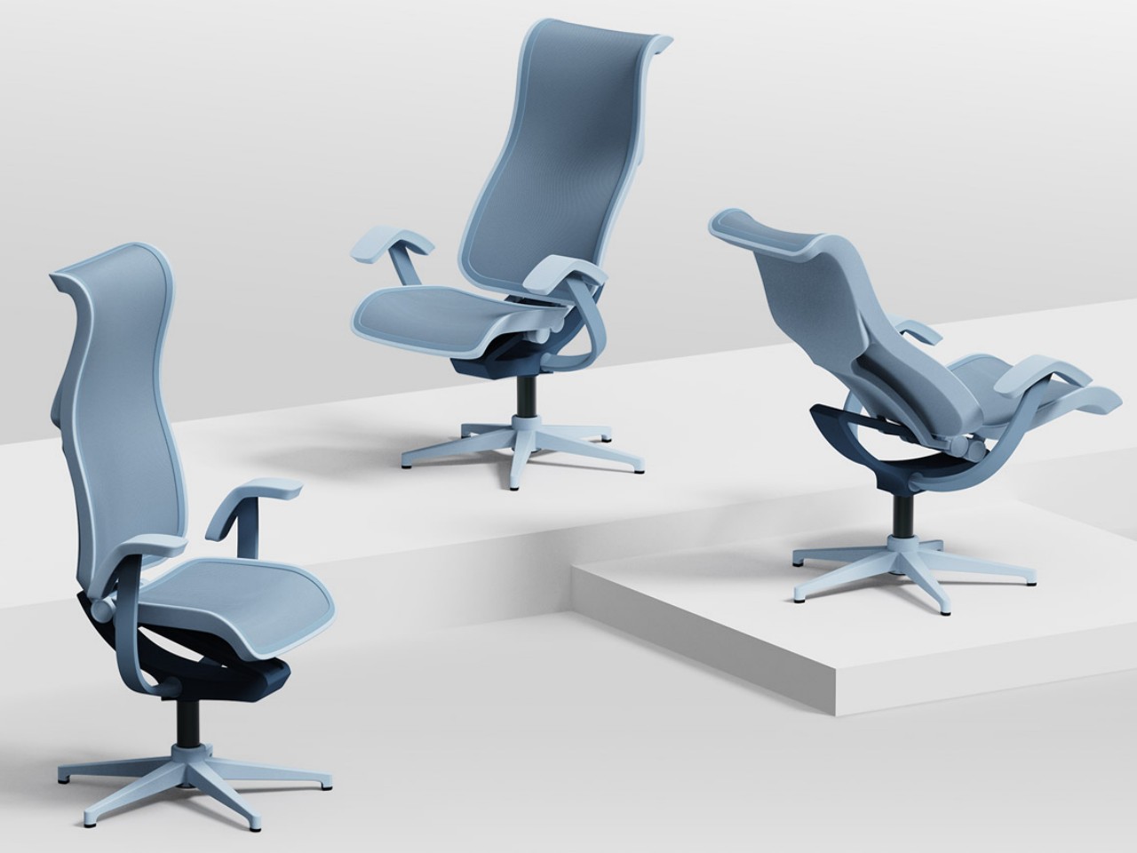
The Routine Chair by Yubin Lee and Minkyoung Song is a smart, ergonomic chair that adjusts the headrest, armrests, and reclining angle based on an app-controlled schedule. Designed for optimal comfort and productivity, it offers three modes—work, chill, and rest—automatically adapting to the user’s routine. Competing with top brands like Herman Miller, this innovative chair ensures seamless comfort and support, making it ideal for professionals in a digital work environment.

3. Seat Tilt

In office chairs, the tilt mechanism plays a crucial role in maintaining a healthy, properly aligned spine and back. The tension and strength within the tilt mechanism ensure adequate support for your back.
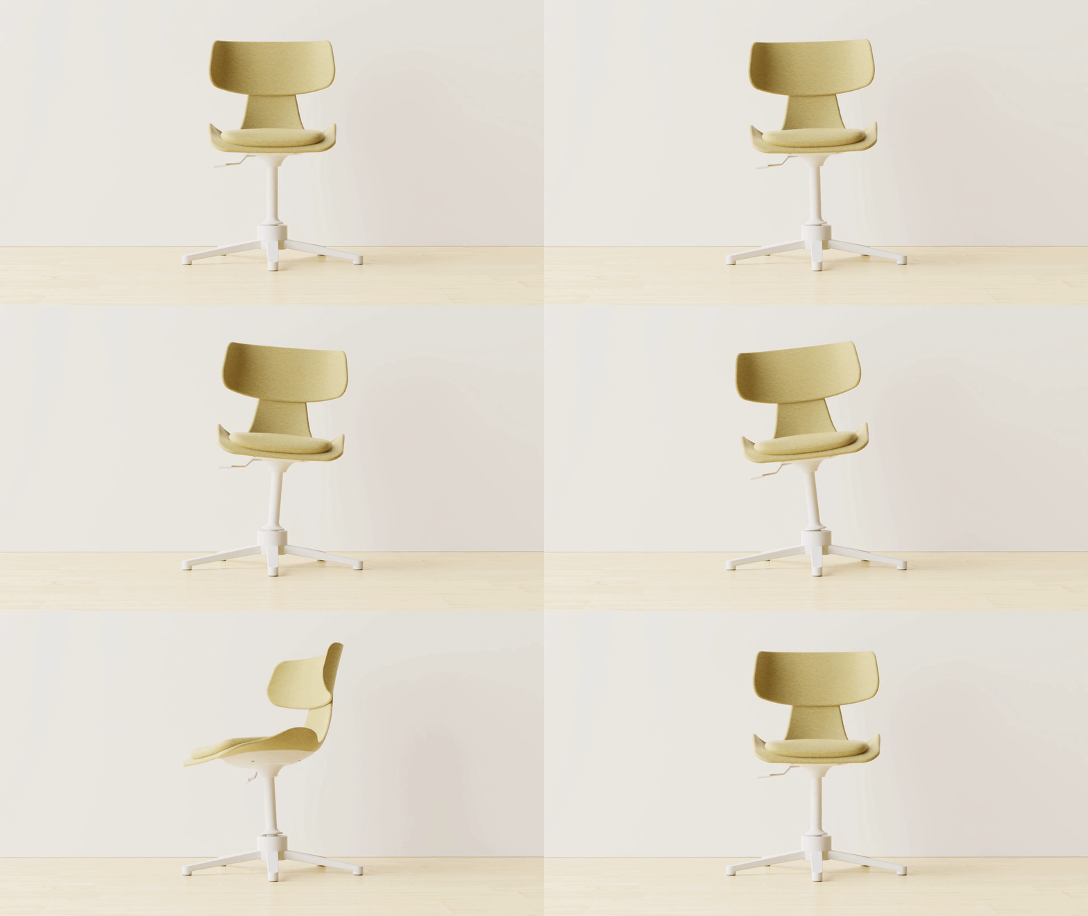
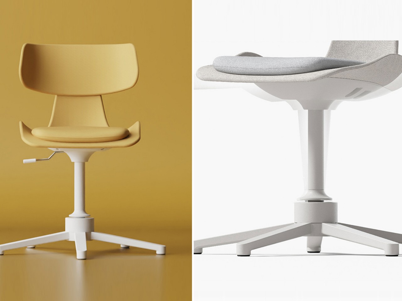
Designer: 250 Design

The 5° Chair by Seoul-based design firm 250 Design is tailored for those who naturally lean back in chairs. With 360° rotation, forward and backward tilting, and lateral movement up to 5 degrees, it offers dynamic seating for office or home use. Designed to support prolonged sitting, its cushioning molds to the body’s contours, while angled wave springs reinforce the legs for multidirectional tilting. This compact chair, ideal for small spaces, replaces traditional wheels with a swivel and spindle mechanism, ensuring stability and support without sacrificing mobility.

4. Backrest Lumbar Support

Lower back support is vital in an ergonomic chair to maintain the natural curve of the lumbar spine. An essential feature of ergonomic chairs, lumbar support maintains the spine’s natural curve, reducing stress and preventing slumping. Adjustable backrests ensure optimal alignment for user comfort.
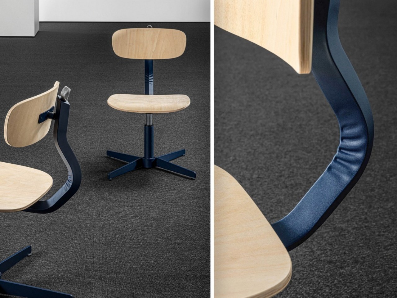
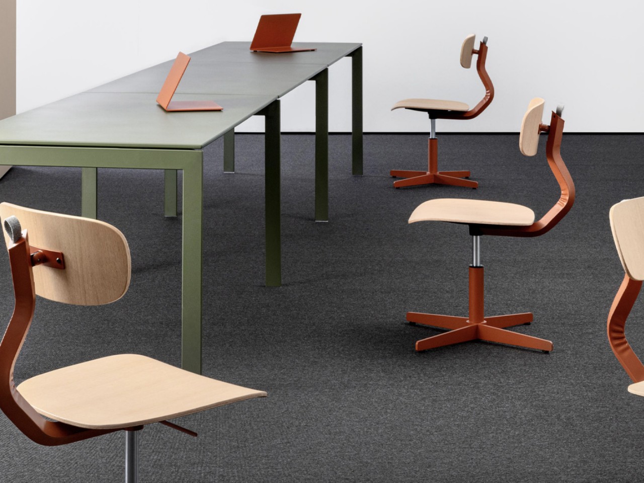
Designer: AMDL Circle for Mara

The Typo Office Chair by AMDL Circle, designed for Mara, excels in providing comfort, ergonomics, and aesthetics, all essential for productivity. Its playful yet ergonomic design boasts a curved timber base and backrest, complemented by a colorful metal structure. This intentional blend of materials not only enhances comfort but also adds personality to the chair, turning what might seem like a mistake into a defining feature.
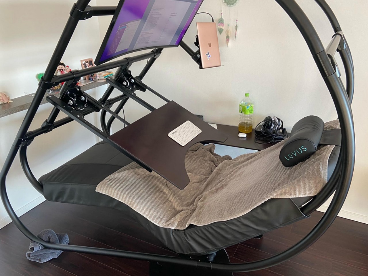
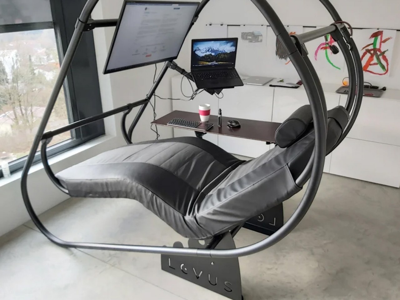
Designer: LEVUS

The LEVUS offers a reclined work setup, perfect for reducing back pain and discomfort for those who spend long hours at a computer. Ideal for both home and office use, it features an adjustable, lightweight aluminum structure that supports multiple monitors and includes an adjustable headrest, mouse station, and keyboard table. The ergonomic design reduces vertical spine pressure, making it a comfortable choice for gamers, creators, and office workers alike. Easy to assemble and designed for ultimate comfort, the LEVUS transforms traditional workstations into ergonomic havens.

5. Backrest Recline

The backrest of an ergonomic office chair, ideally 12 to 19 inches wide, should support the natural spine curve with proper lumbar support easing pressure on spinal disks and muscles by distributing upper body weight. If the chair has a combined seat and backrest, it should offer adjustable angles and a locking mechanism to prevent excessive backward movement.
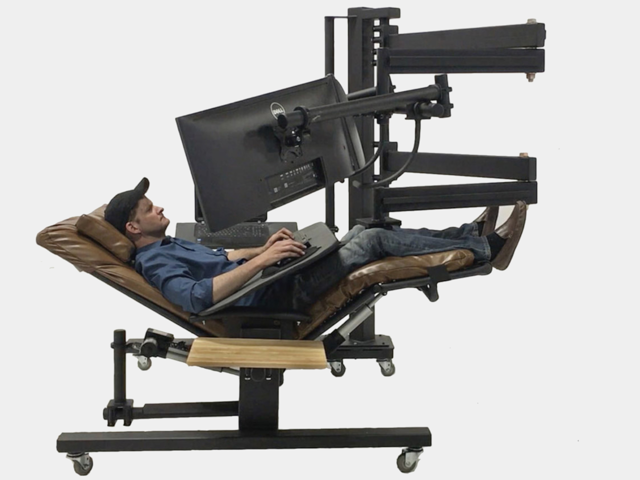
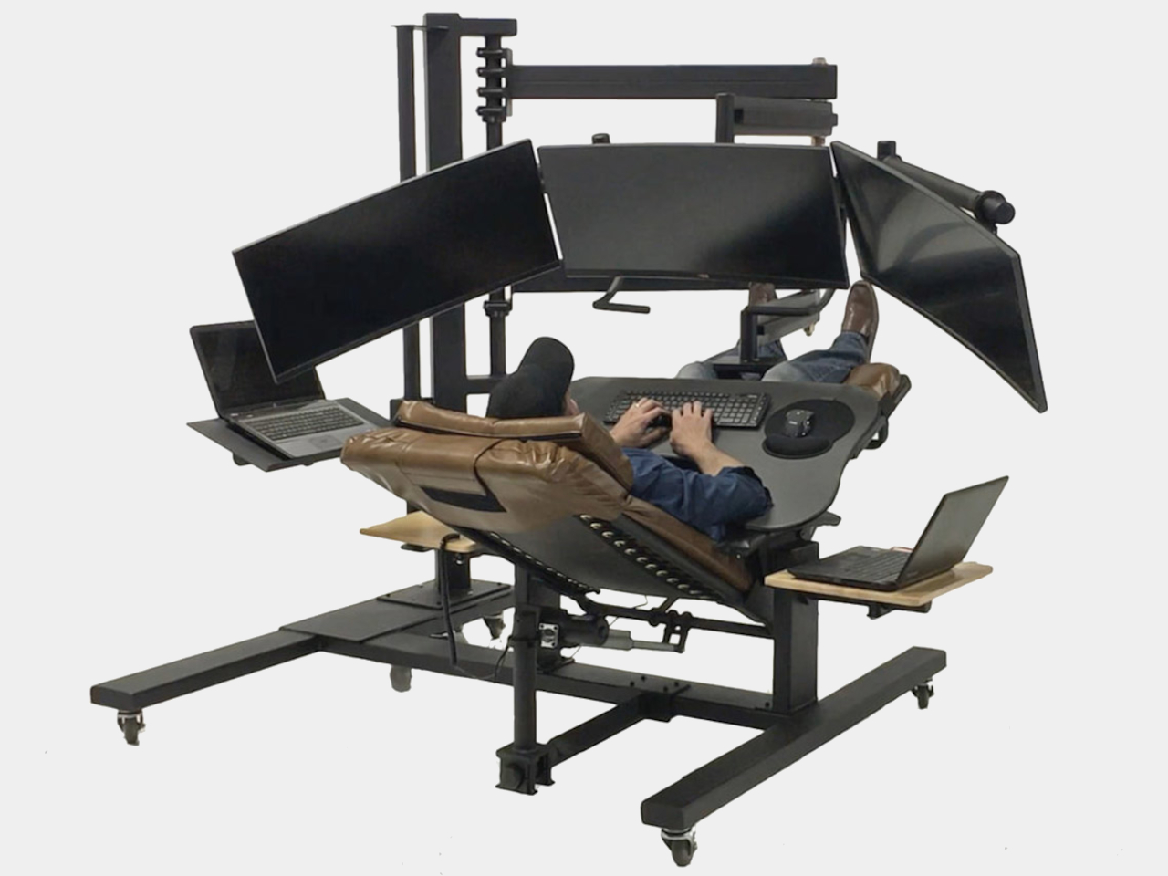
Designer: ErgoQuest

In the dynamic landscape of offices and remote work, traditional chairs and desks often strain the spine with vertical pressure, despite the advent of standing desks. The LEVUS chair offered a reclined design as a solution, but ErgoQuest’s ZGW-0b zero-gravity reclining workstation takes innovation further. Engineered to alleviate back and neck pain, it allows for customizable work angles from zero to ninety degrees, featuring the motorized ErgoQuest ZGC-1 chair and accommodating up to four monitors on a sturdy steel mast. Packed with conveniences like side tables and a padded keyboard tray, it prioritizes comfort and productivity. The ZGW-0b represents a new paradigm in work setups, blending laziness with postural wellness for enhanced efficiency.

6. Armrests

Armrests provide valuable support during typing or using the mouse by taking the weight off your arms, reducing strain on the shoulders and upper arms. Adjustable armrests allow vertical movement to position them correctly and promote shoulder relaxation.
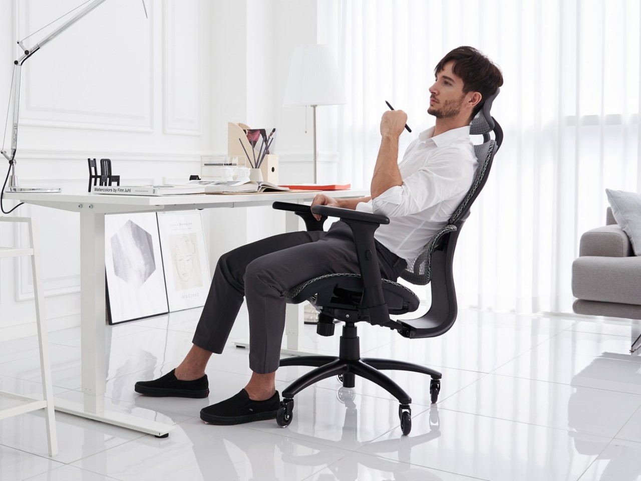
Designer: Nouhaus Design

The Nouhaus Ergo3D is no ordinary ergonomic chair; it’s a high-back marvel with dynamic lumbar support, 4D adjustable armrests, and a class-4 hydraulic gas-lift main pillar, all for a fraction of the price of similar models. Designed to exude luxury by Nouhaus, it offers personalized spine support and cranium comfort, thanks to its unique features like the ‘Just-For-Me’ Lumbar Support System and adjustable headrest. Clad in breathable HD ElastoMesh fabric, it ensures comfort during long hours of use.

7. Headrest

Supporting the back of the head and upper neck, it alleviates tension in the shoulders and upper torso.

8. Materials

The material covering the seat and back of the office chair should be adequately padded for extended sitting comfort, with breathable cloth fabric being preferable, while options like leather or velvet are commonly found in high-end models.
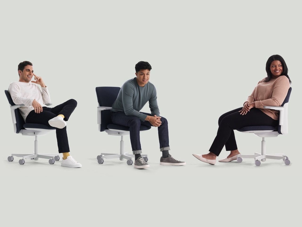
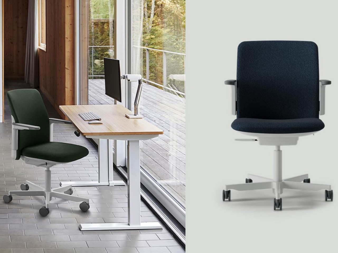
Designer: Todd Bracher

The Path Task Chair by Humanscale stands out for its sustainability, using 22 pounds of recycled materials, including ocean plastic and fishing nets. Made in the USA in a solar-powered plant, it minimizes carbon emissions and water use. The chair features FormSense Eco Knit for self-adjusting lumbar support and a Gravity Mechanism that adjusts recline support without knobs or levers. Designed by Todd Bracher, it combines innovative materials and mechanics with a sleek design, fitting seamlessly into any home or office. Available in various colors, the Path Task Chair exemplifies sustainable and ergonomic seating.

9. Wheels

Soft rubber wheels are ideal for hard surfaces, while hard wheels are better suited for carpeted floors.
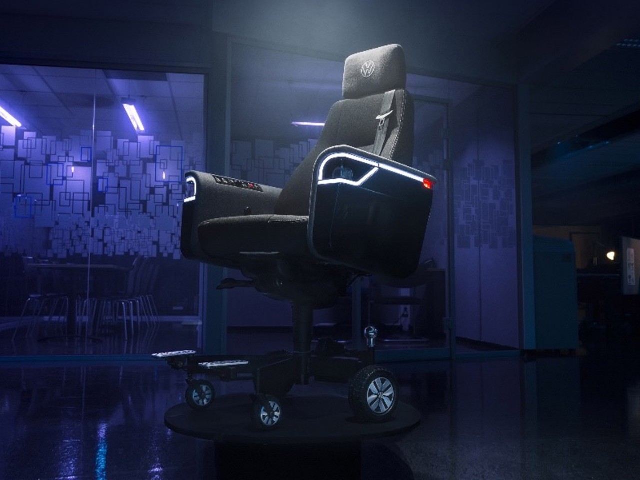
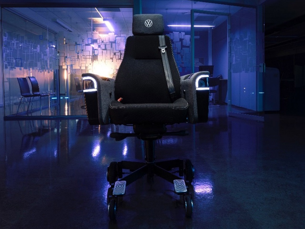
Designer: Volkswagen and Try

Volkswagen’s surprising venture into office furniture yields a unique mobile office chair, blending automotive innovation with functional design. Crafted by their Commercial Vehicles division in collaboration with Try, this electric chair boasts a top speed of 12.4 m/h and a range of 7.5 miles. Complete with a rear-view camera, 360-degree sensors, and an entertainment system loaded with feel-good songs, it caters to both practicality and comfort. With storage compartments for gadgets and a trailer hitch for paperwork, it’s a whimsical yet functional addition to any workspace.

10. Swivel

For proper posture, any traditional or ergonomic chair should rotate effortlessly, enabling the user to access various areas of their desk without strain.

These tips will certainly assist you in buying the best ergonomic chair for your office or home.

The post How to Choose the Best Ergonomic Chair: Top Features You Can’t Ignore first appeared on Yanko Design.
Laptop briefcase concept transforms into a desk and laptop stand

We might call them laptops, but these portable desktops are not really great for being used on your lap. Never mind the heat that will cook your thighs and other body parts, it leaves you in a painful posture that might leave your neck and wrists cursing you. That said, sometimes we can’t exactly choose the location where we need to open up a laptop to get something done quickly, and there may or may not be a table available to set it down. This briefcase-like concept tries to alleviate some of that discomfort by providing not just a home for the laptop but also a slightly more ergonomic height even when you use it on a table.

Designer: Shivaprasad Vijayan

Laptops are convenient and powerful when you need a computer on the go, but their very design wasn’t exactly made with ergonomics in mind. You crane your neck and hold your hands at an unnatural angle, and that’s when you have it on a desk without any other accessories. And while laptops are portable in a sense, the need for a large power brick, a mouse, and any other peripherals means you’ll need to carry more than just the laptop itself.

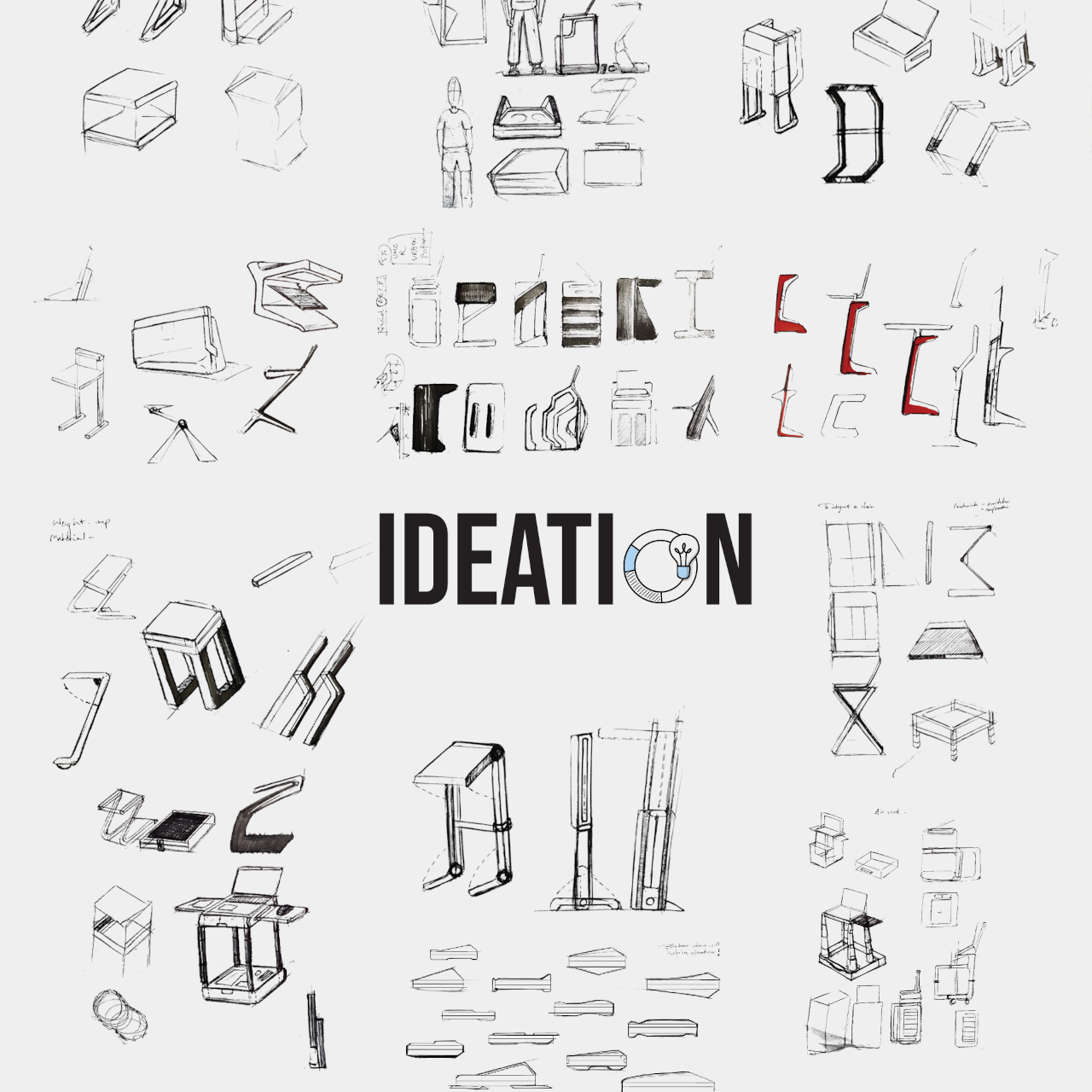
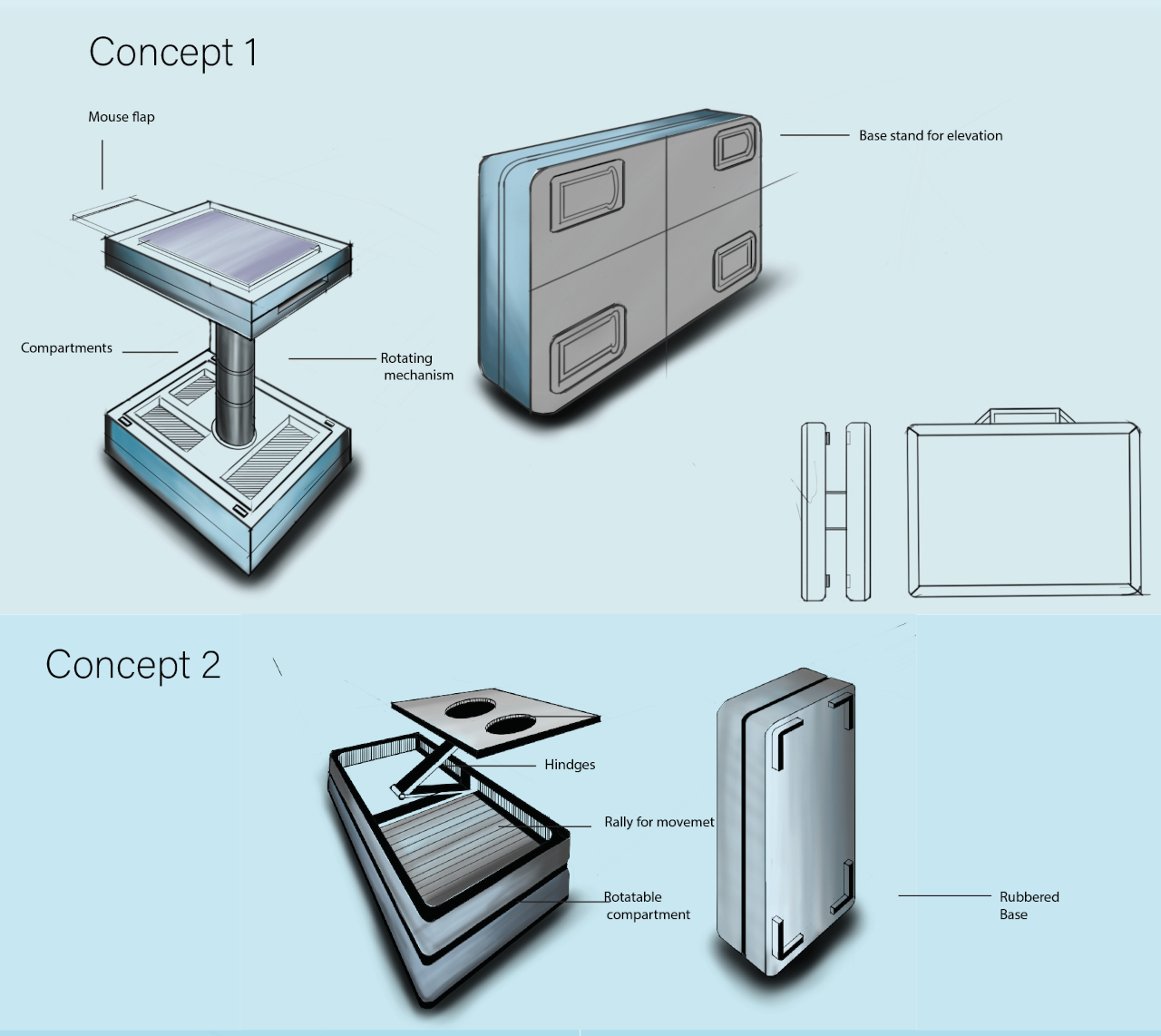
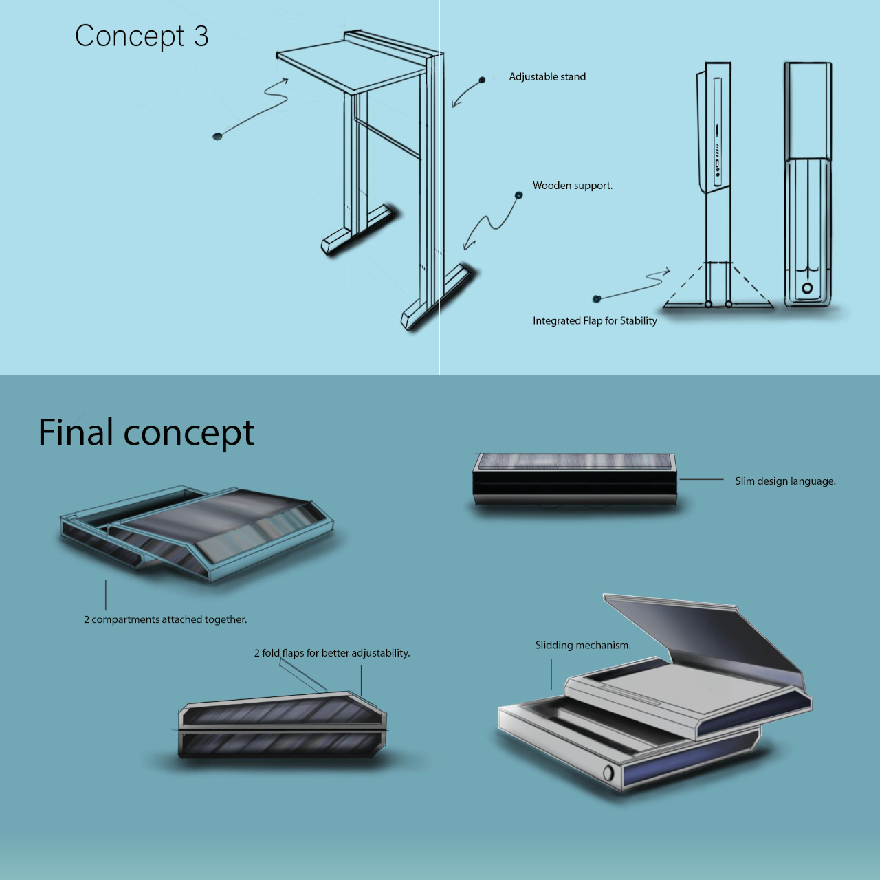
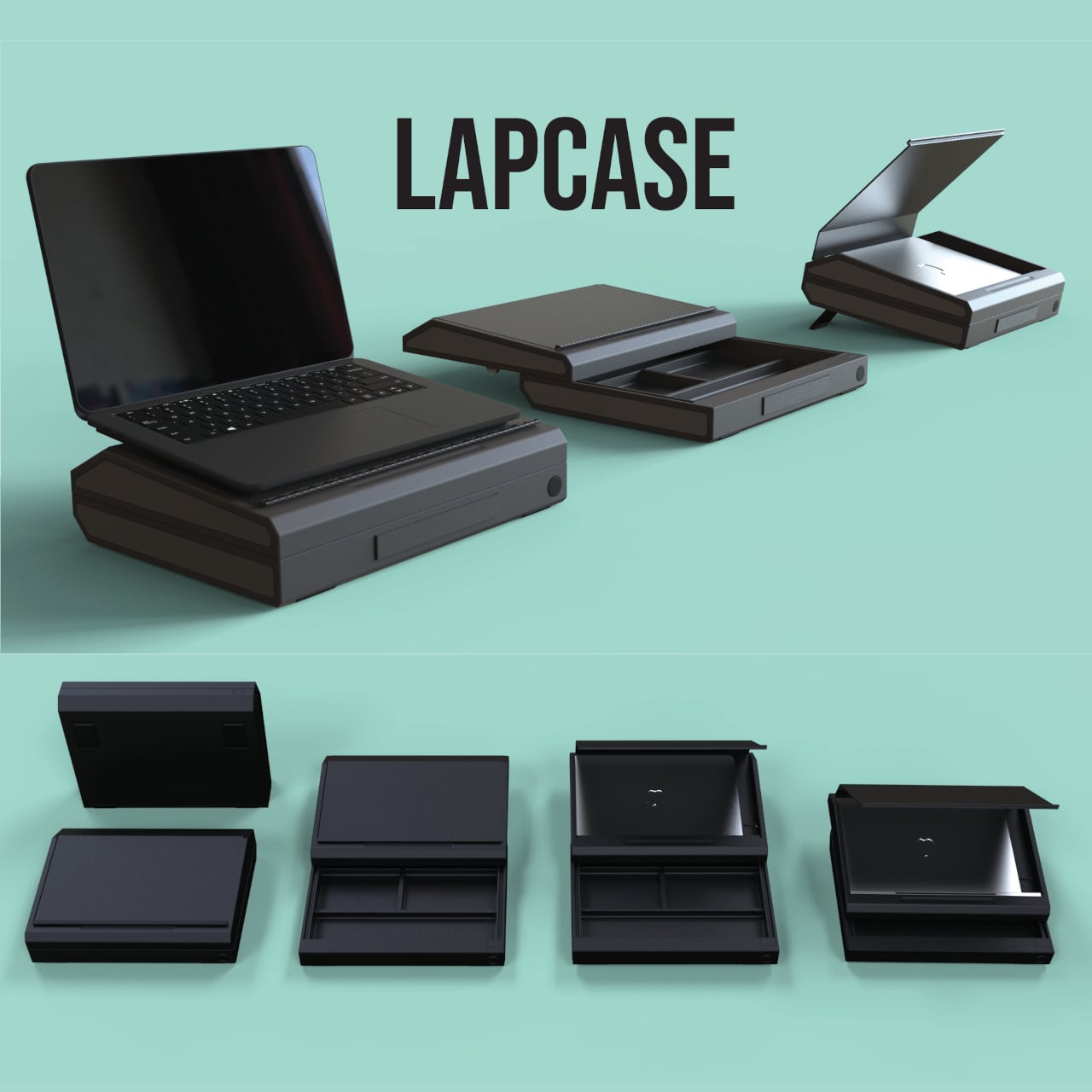
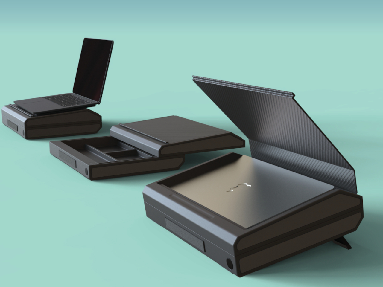
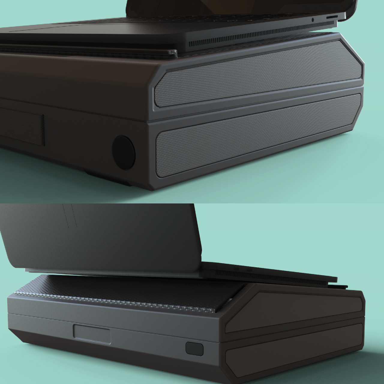
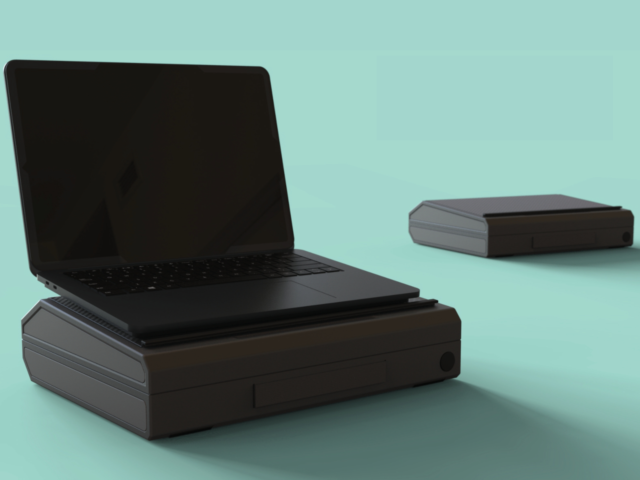
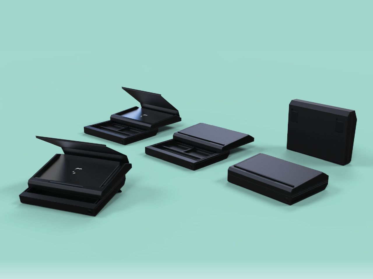
LAPCASE is a concept that tries to resolve all the issues attached to a laptop’s usability when on the go, at least to some extent. It’s a laptop bag, technically more like a briefcase, that has room not just for the laptop but for all accessories you might need to bring along with it. It doesn’t just have pockets but actual dividers that organize those peripherals while also keeping them from getting tangled and protecting them against bumps and shocks.

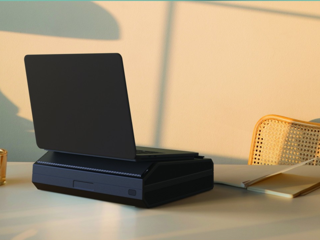
The most important part, of course, is the laptop compartment at the top which is covered by a two-fold magnetic flap. This cover is set to an angle so that the laptop’s back is raised slightly when placed on it. The idea is to rest the laptop on top of the bag when using it, which raises it higher when placed on your lap or raises the screen to a slightly ergonomic height when on a table.

The concept definitely has merit, but there are a few drawbacks to the execution. For one, you will require an external keyboard whenever you use it on a table, as the laptop’s own keyboard will be too high for comfortable typing. And then there’s the issue of the case itself being too bulky, especially at a time when people are trying to actually carry smaller laptop bags. Then again, you are practically carrying a mobile office, so it might be a trade-off worth paying for the convenience of bringing everything you need whenever you leave the office.

The post Laptop briefcase concept transforms into a desk and laptop stand first appeared on Yanko Design.

ASUS ROG Ally X Gaming Handheld Review: What the OG Ally should have been

PROS:


  • More RAM, Double Battery Capacity

  • Two USB-C Ports

  • More ergonomic design despite heavier and thicker chassis

  • Higher performance with lower thermals

CONS:


  • Windows 11 is still awkward to use on touch screens

  • Comes in black colorway only

RATINGS:

AESTHETICS
ERGONOMICS
PERFORMANCE
SUSTAINABILITY / REPAIRABILITY
VALUE FOR MONEY

EDITOR'S QUOTE:

The ASUS ROG Ally X is a clear upgrade over the original, addressing complaints without losing what made the ROG Ally great.

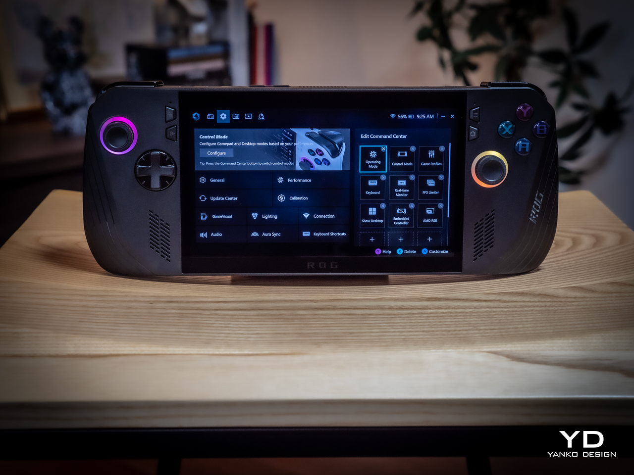
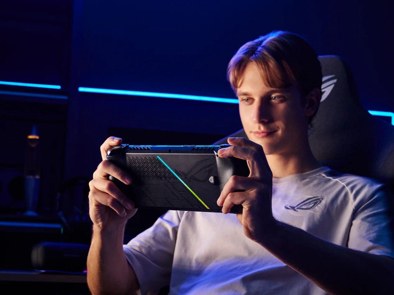
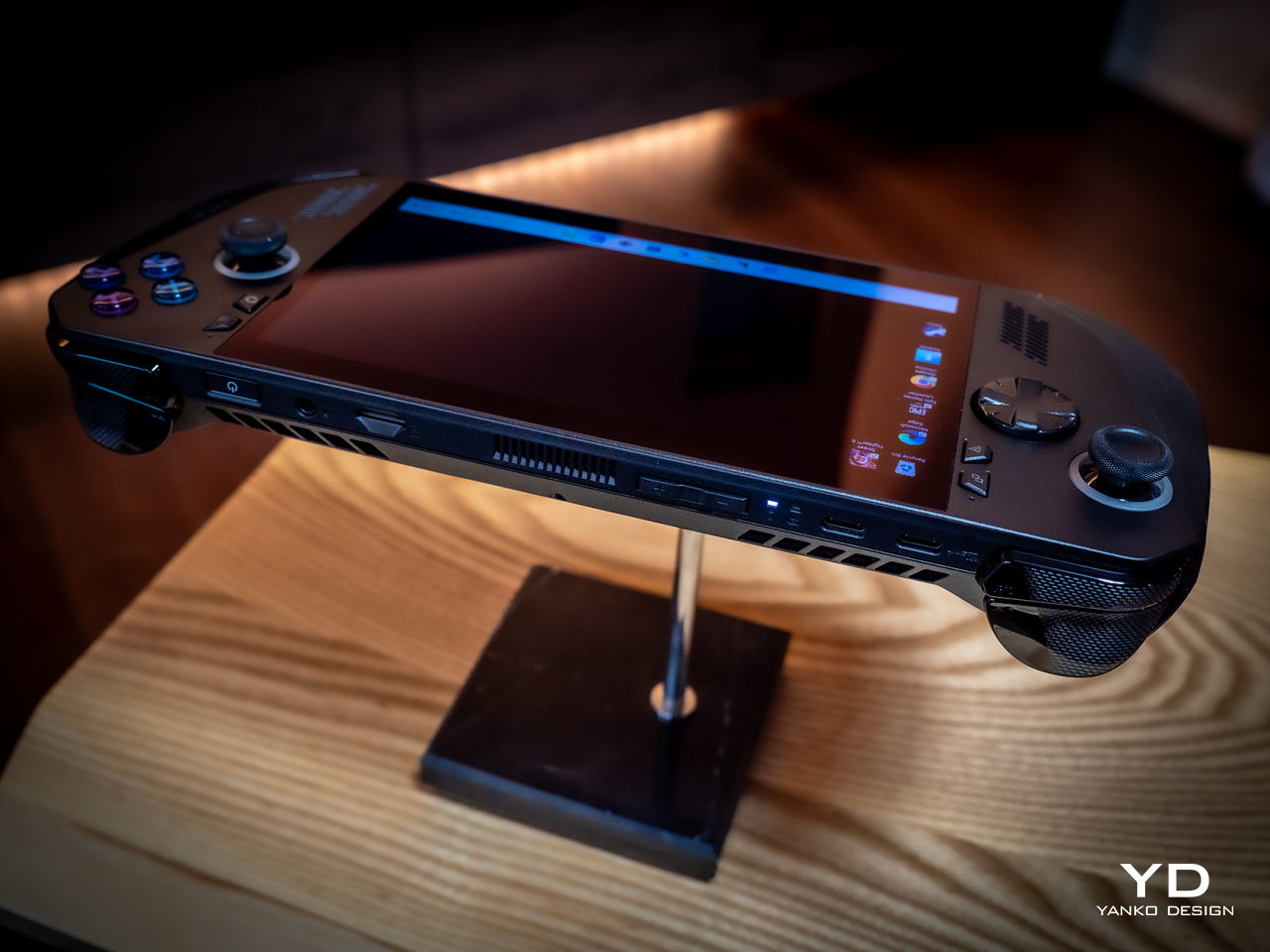
They say hindsight is 20/20, but not everyone gets the opportunity to make a redo of their past actions. That’s especially true when it comes to consumer electronics, where every product involves no small amount of investment and risk. And yet ASUS surprised us at Computex 2024 last month when it revealed not a generational upgrade to its first-ever gaming handheld PC but what is, instead, a redo of the original. The ROG Ally X definitely brings a few much-needed upgrades, but it also feels like this is what should have been launched in the first place last year. That’s why we took this handsome black handheld for a spin to see if it’s really worth its weight in gold or if waiting for the real next-gen design is a better choice.

Designer: ASUS Republic of Gamers

Aesthetics

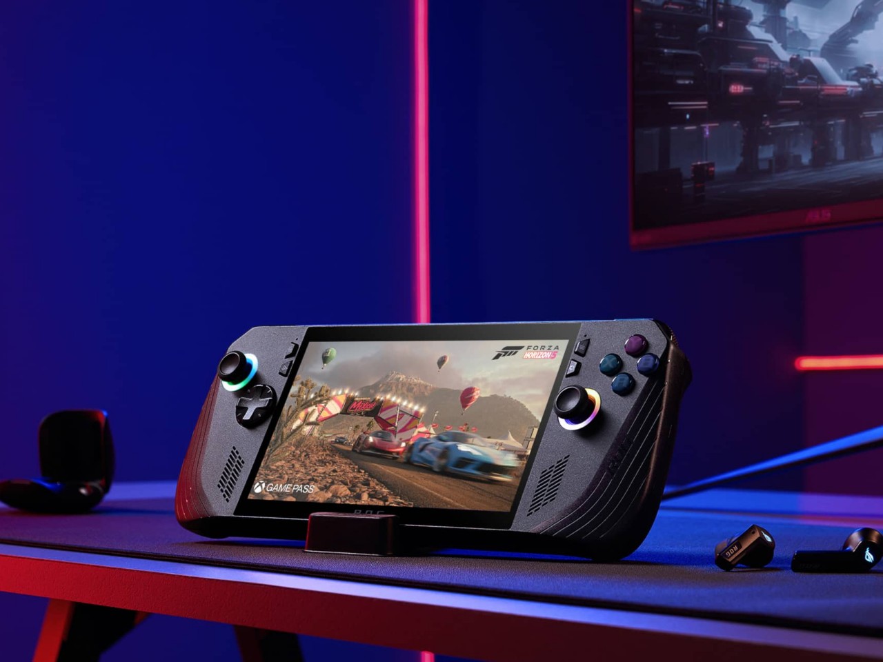
Simply looking at the ROG Ally X on its own, you might easily mistake it for a black version of the original ROG Ally. Of course, there are subtle yet significant changes here and there, but the fact that it’s able to keep its design identity is still a laudable achievement. On the flip side, there will be no mistaking it for a ROG Ally 2 that’s yet to come, as it shares that DNA so closely with the first model.

Whether the ROG Ally had a more angular and more aggressive appearance despite its white coating, the ROG Ally X is rounder, curvier, and a bit gentler. This has consequences for the device’s ergonomics, which we’ll get to later, but it also exudes a slightly different character compared to its progenitor. It manages to be a bit more welcoming, almost comfortable, without losing its cyberpunk aesthetic thanks to those RGB lighting accents.

The color choice might prove to be a bit controversial, though. Not because no one likes black but because there’s no other choice. Just like how the ROG Ally came only in white, the Ally X is a black-only design. In a way, it stands out less from the crowd, making it less distinctive. But it also invites less visible stains and dirt on a device that will most likely see a lot of action outdoors. Truth be told, gamers are more likely to slap some skins on these devices than stick with the original coating, but having some choice would definitely help improve its appeal.

Ergonomics

Ergonomics for computers often lags behind performance and aesthetics, but it is even more critical for one that you’ll hold in your hand rather than use on a table. More than just the aesthetics, it’s actually this aspect of the ROG Ally X that sees the most changes, at least externally. Suffice it to say, the handheld is finally designed to let you hold it in your hands for longer periods of time, which translates to more playtime overall.

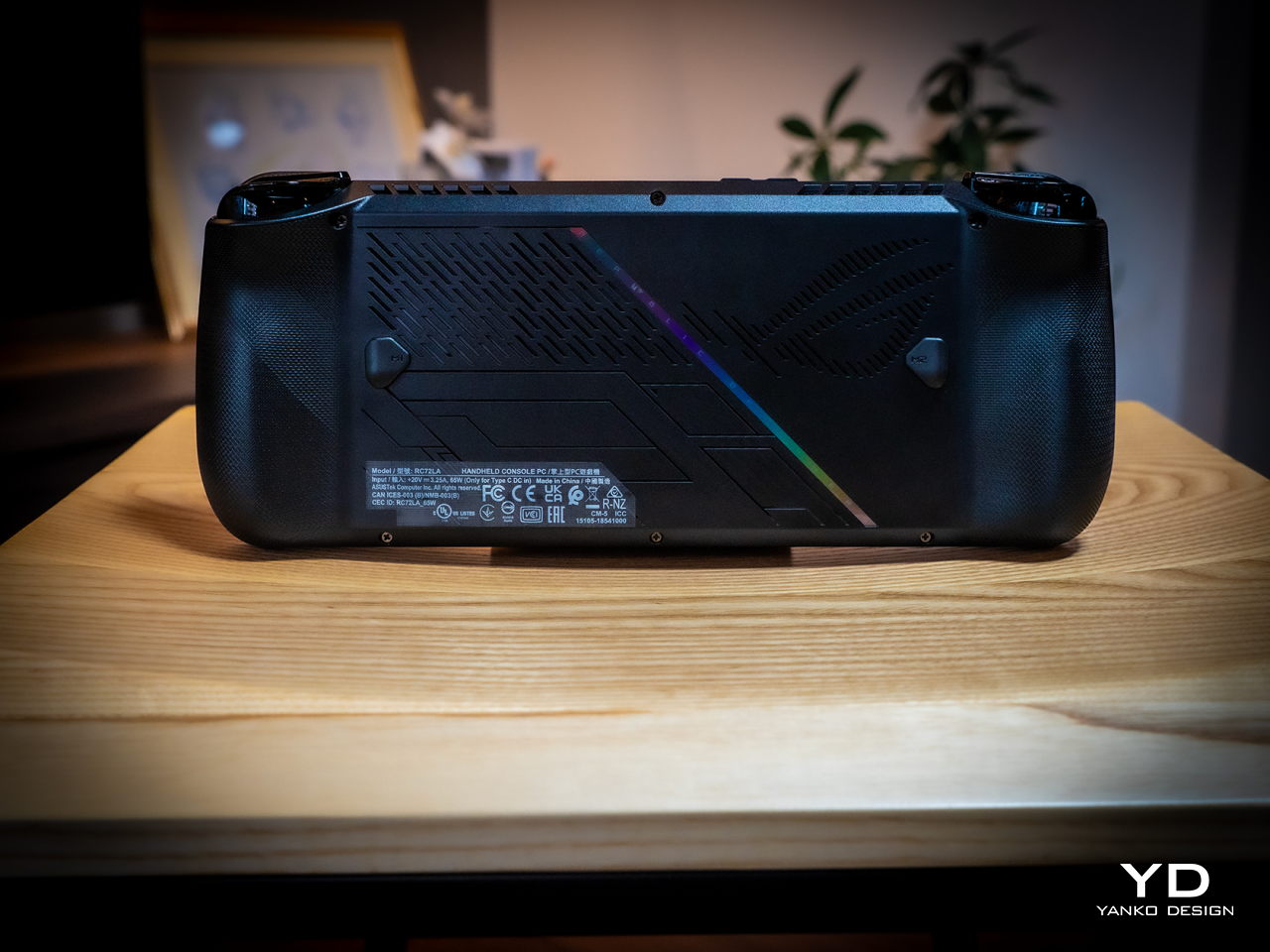
Because of internal changes, the ROG Ally X is chunkier and heavier at 1.45 inches thick and 1.49 lbs compared to the OG Ally’s 1.28 inches and 1.34 lbs. Ironically, the handheld is actually more ergonomic now despite the added bulk and heft thanks to key changes in the grip design and button. The sides, for example, are now more rounded than angular so they don’t cut into your palm. The grips themselves have a more natural contour that’s easier to hold, though they’re still shallower compared to the Steam Deck’s design. Depending on your hand size, you might not have enough room for a good grip just like on the ROG Ally.

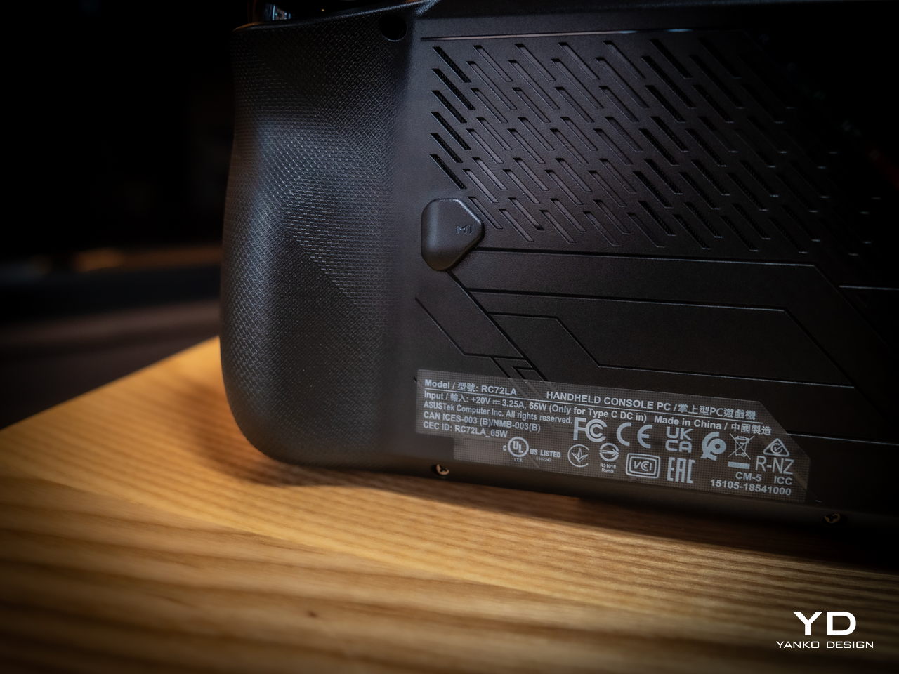
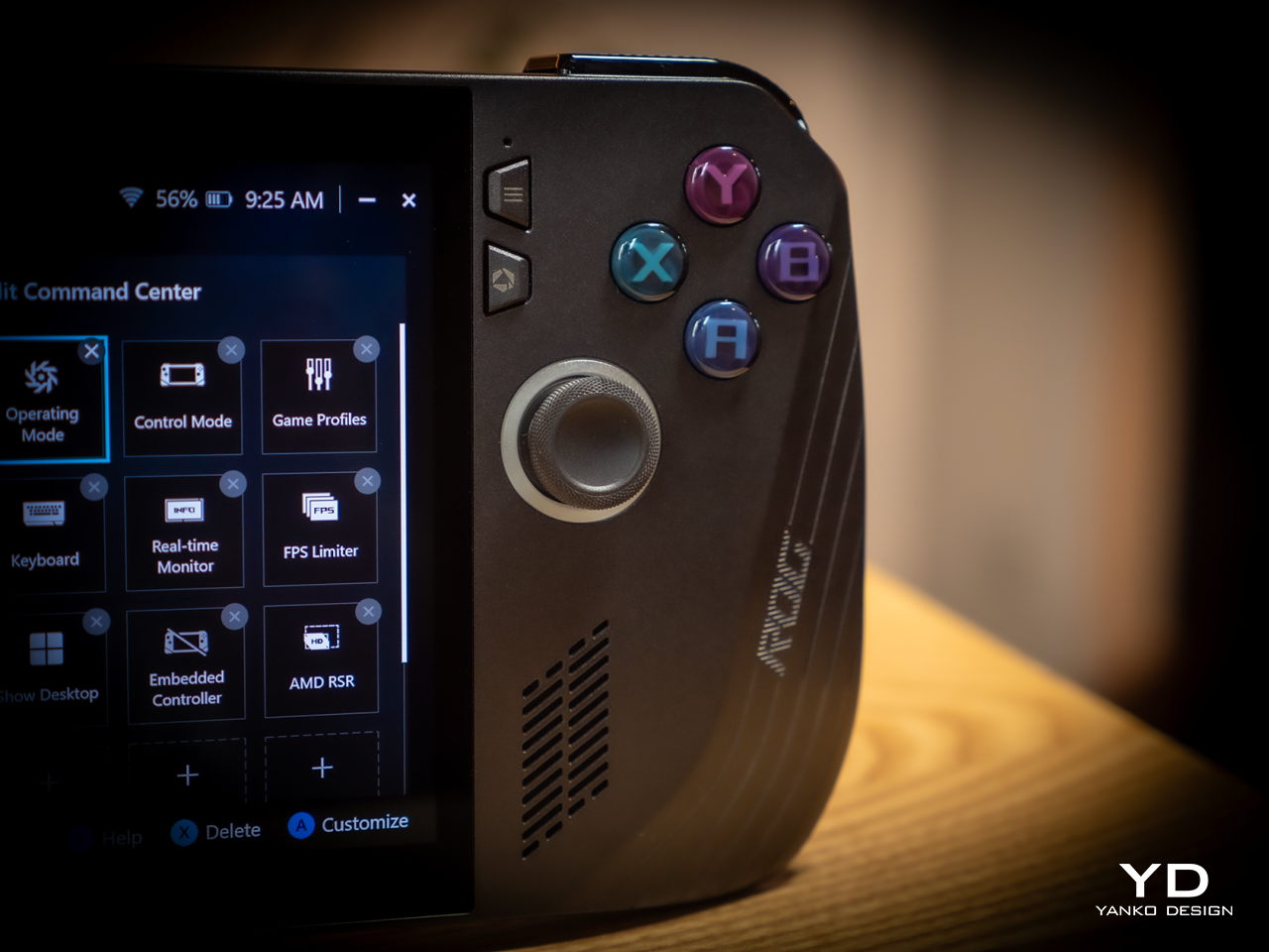
The buttons and sticks feel more solid, too, and give better resistance and stability than the rather loose and flimsy controls of the previous half-generation. The back buttons are smaller and placed higher to address complaints of frequent accidental presses that come too naturally when holding the device. Ironically, players with smaller hands might find it harder to reach them now. Thankfully, their function is usually optional in most games, which is why owners of the ROG Ally were fine with disabling those.

Performance

There are, of course, also upgrades internally, but not enough to call this the ROG Ally 2. It still uses the same AMD Ryzen Z1 Extreme processor, for example, which is capable but not exactly top-notch. What carries its performance forward is the new 24GB LPDDR5 RAM clocked at 7,500MHz, a rather big jump from the previous-gen 16GB 6,400MHz RAM. It’s almost unbelievable how much more RAM boosts overall performance, especially when neither the CPU nor the integrated GPU are starved for memory. More disappointing, however, is the fact that ASUS didn’t go all out to put a solid 32GB in there, but that would have probably raised the already higher price tag.

Another big upgrade is the 80Wh battery that’s double the capacity of the meager 40Wh of the OG Ally. This alone accounts for the increase in weight and thickness, and it’s a price many gamers are only too willing to pay. Of course, your mileage will vary, but this allows you to either tack on a few more hours to your game time or, alternatively, crank up the settings higher and still get the same uptime. You can also charge the battery at the maximum 100W that both USB-C ports support, but the included charger only goes as far as 65W.

And yes, you read that right, USB-C ports. Plural. ASUS has done away with the proprietary XG Mobile port for connecting an external GPU and replaced it with a USB-C port with support for USB4, Thunderbolt 4, and DisplayPort 1.4 with FreeSync. This means you can still connect an external graphics dock, but now you have more options if you don’t need to. Unfortunately, both ports are located at the top, so you have less wiggle room when connecting angled cables or thick adapters.

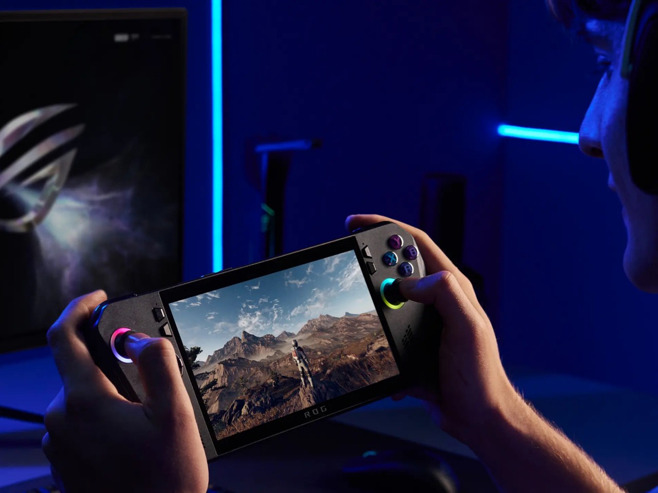
The ASUS ROG Ally X retains most of what its predecessor has, including the aforementioned processor. The 7-inch 120Hz IPS LCD is still the same, which means it’s still bright and vibrant, at least for an LCD panel. The speakers are supposedly upgraded a little, but you’ll hardly notice the difference. The microSD card slot is still located at the top, which might worry some who have experienced fried electronics on the first ROG Ally.

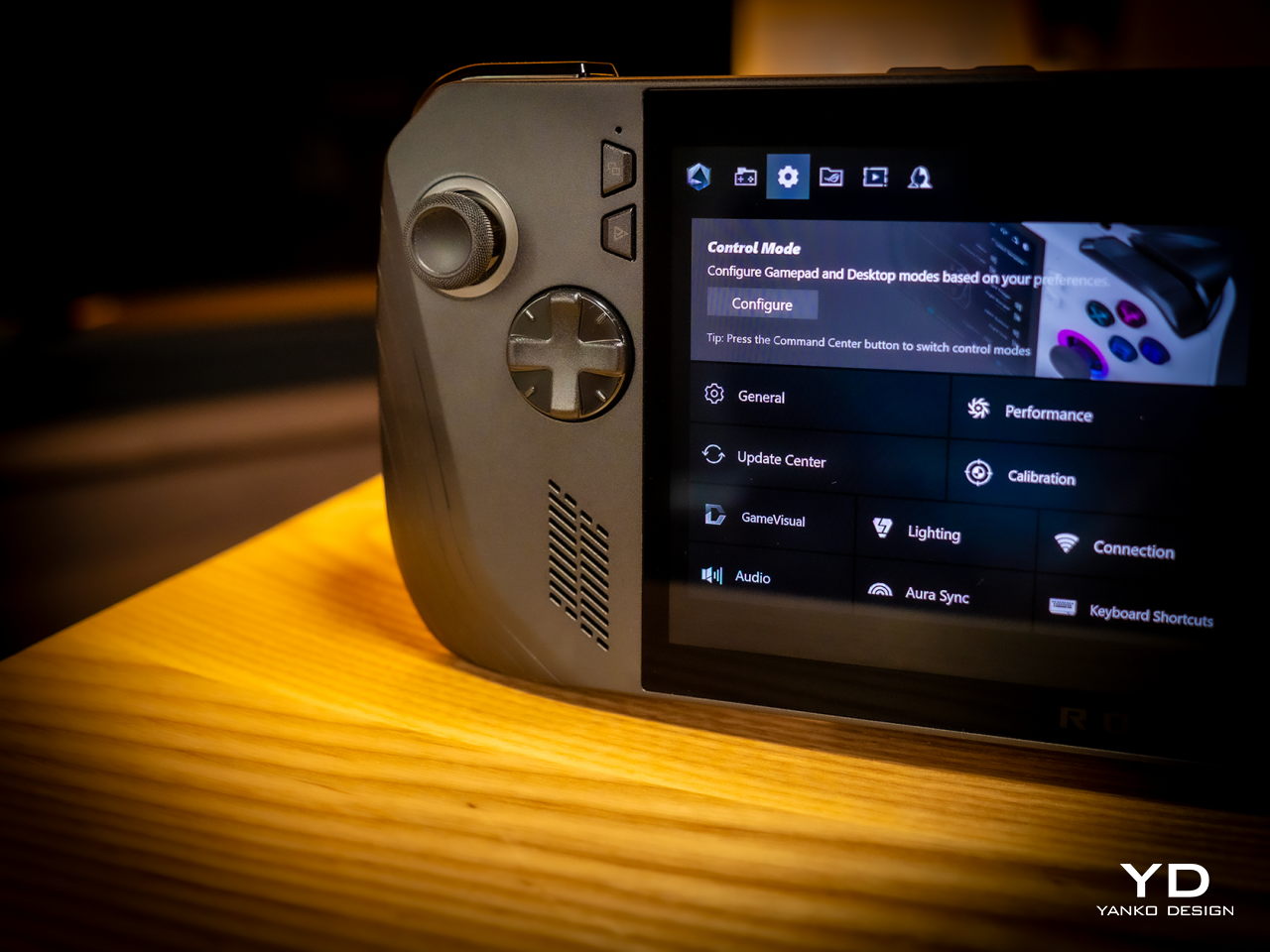
What all these changes and similarities boil down to is a more powerful computer that delivers a better gaming experience overall. Despite all that power, however, the ROG Ally X still runs cooler than its predecessor thanks to an improved cooling system that pulls heat away from the screen more effectively. This is actually important when you consider that this screen is the primary way you’ll be interacting with the Windows 11 operating system. Unfortunately, even with ASUS’ custom software, Windows is still largely a mouse and keyboard-driven platform, which means navigating through menus and windows is still a pain.

Sustainability

Unfortunately, this is one area left completely unchanged between generations. Like the majority of designs in this still nascent market, the ROG Ally X has that typical mixture of metal and plastic, both taken from new materials rather than recycled. It might take a few more generations before they start catching up to their larger gaming laptop cousins.

The same can be said for repairability and even upgradability. You can’t even upgrade the SSD storage, making that microSD card expansion slot even more critical, at least for non-game files. Again, the market is still in its infancy, so we’re holding out hope that the situation will improve over time. After all, some lesser-known brands are already providing easy access to SSD storage for upgrading, so there’s little reason why giants like ASUS can’t do likewise.

Value

It’s clear as day that the ASUS ROG Ally X is a big step forward, fixing the flaws of the ROG Ally in a half-step upgrade. But are those enough to warrant its $800 price tag that makes it one of the more expensive options in the market? As always, the answer isn’t as clear-cut, but the scales might not be tipping in the Republic of Gamers’ favor.

The original ROG Ally was by no means a terrible device even considering the ergonomics, and its current $650 price tag (or even $550 on discount) makes it a more viable starting handheld for those who aren’t sold on the Steam Deck. There’s definitely no reason for ROG Ally owners to upgrade this early, either, so only those who have been on the fence until now might find the ROG Ally X more convincing. But there are also other options in the market, like the Steam Deck that started it all or the Lenovo Legion Go with its Switch-like removable controllers. Then again, you can’t go wrong with the ROG Ally X either, especially if you have the cash to spare.

Verdict

It’s rare for manufacturers to push out a version 1.5 product, especially one that almost makes the original feel inadequate. At the same time, such a strategy weakens the appeal of the “half-step” upgrade, particularly because of the price difference between the two generations. That’s the limbo that the ASUS ROG Ally X practically finds itself in. Taken on its own, it’s a fine gaming kit that offers commendable performance in a more ergonomic design, but it’s no ROG Ally 2. If you’ve been undecided about getting your first ROG Ally, now might be a good time to grab one, especially if a good deal comes up to sweeten that price a bit.

The post ASUS ROG Ally X Gaming Handheld Review: What the OG Ally should have been first appeared on Yanko Design.

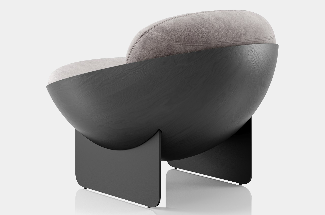
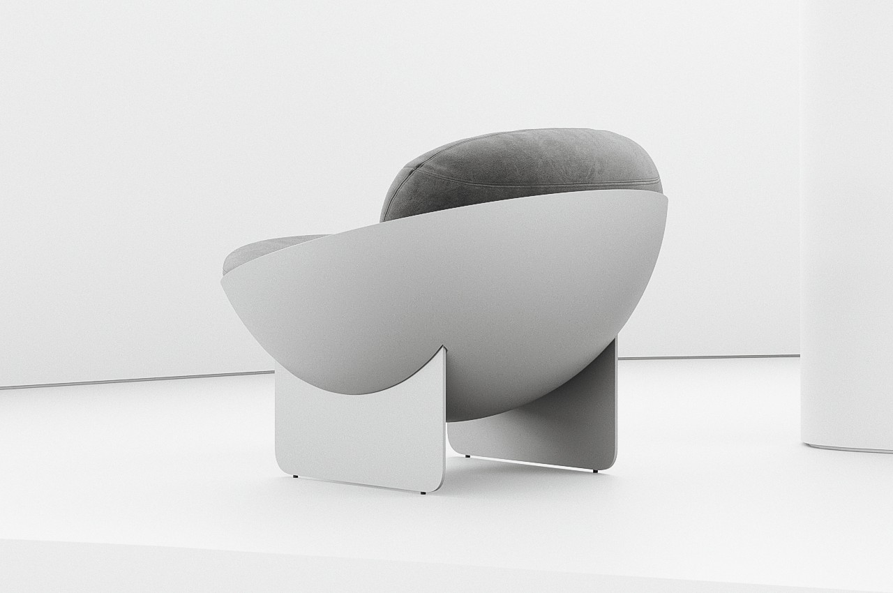
Bowl-shaped chair concept offers geometric beauty at the expense of ergonomics

Just like a table, the most basic requirements for a chair are quite simple. It needs to be strong and stable enough to actually sit on, but comfort and convenience seem to be more open to interpretation than any other design element. Some brutalist designs look a little painful to sit on, meeting only the bare minimum of a chair, while others let your body literally sink inside its plushy cushions and make it difficult to pull yourself out quickly. And then there are designs like this concept that espouse simplicity and minimalism to convey a sense of beauty, but the end result, while visually successful, also raises concerns about its actual usefulness and comfort.

Designer: Mauricio Coelho

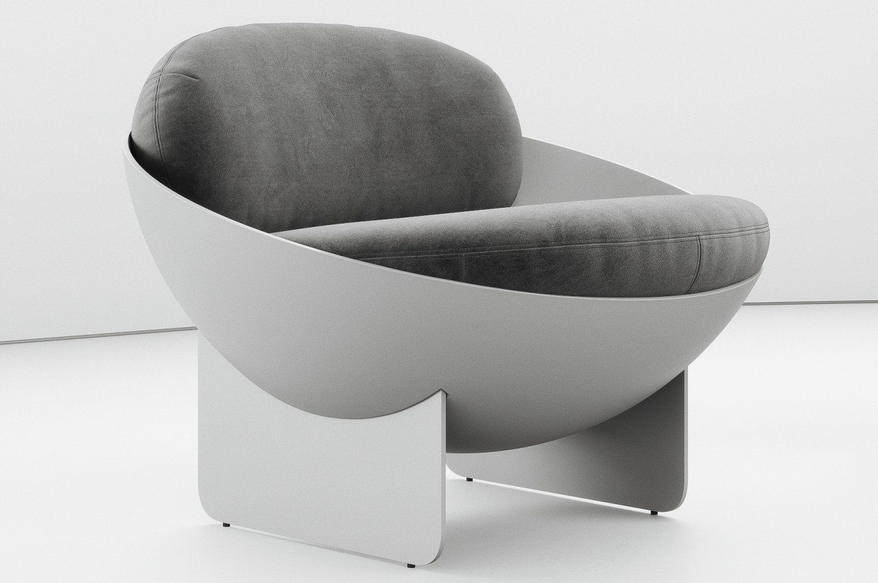
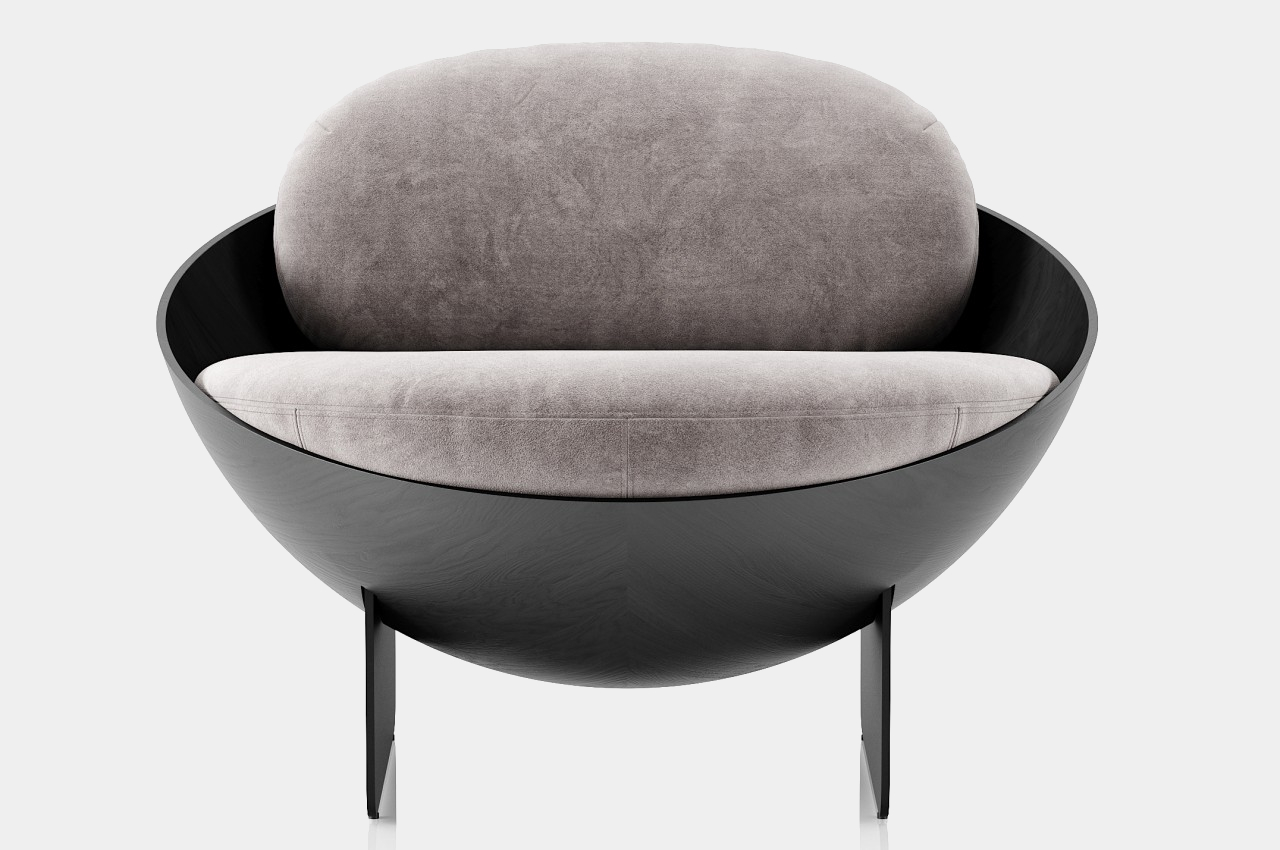
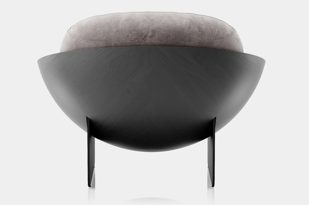
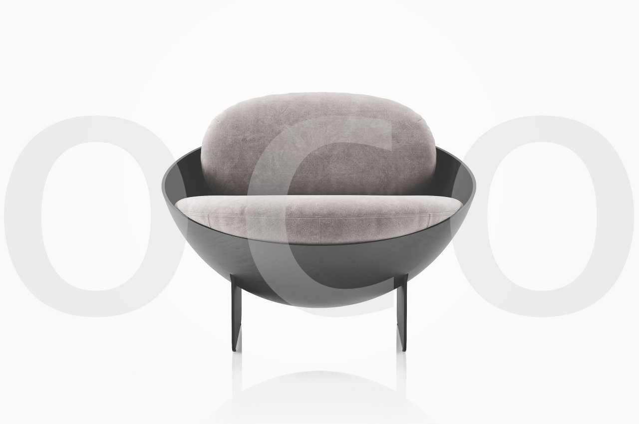
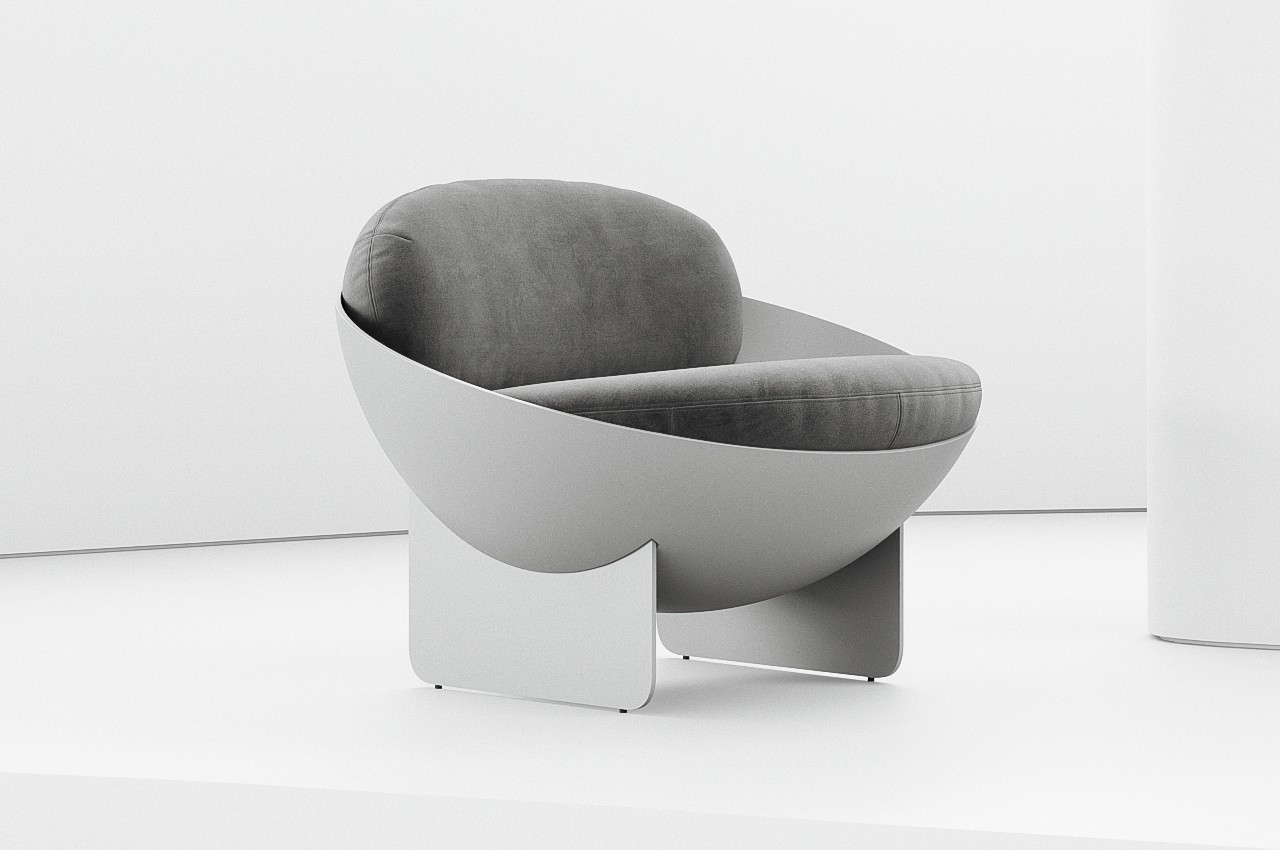
A chair isn’t a simple form that can be expressed in a single shape. After all, there are a few interconnecting planes needed to give it legs and an actual seat. A backrest is common but not obligatory, and armrests are even more optional. The Oco chair concept comes close to that simplicity of form while still providing a visually interesting piece, and it accomplishes that by employing a shape you wouldn’t always associate with a chair.

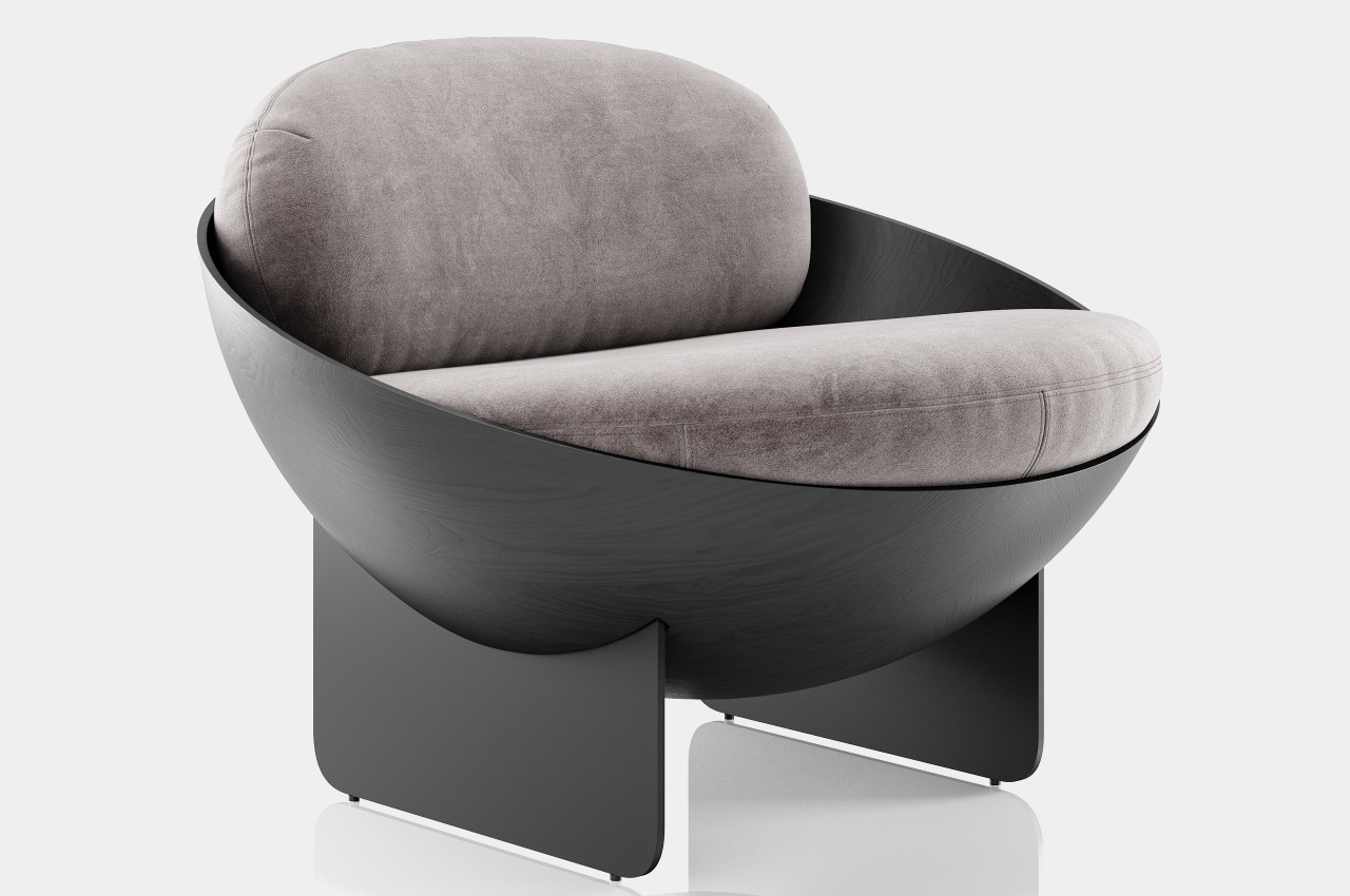
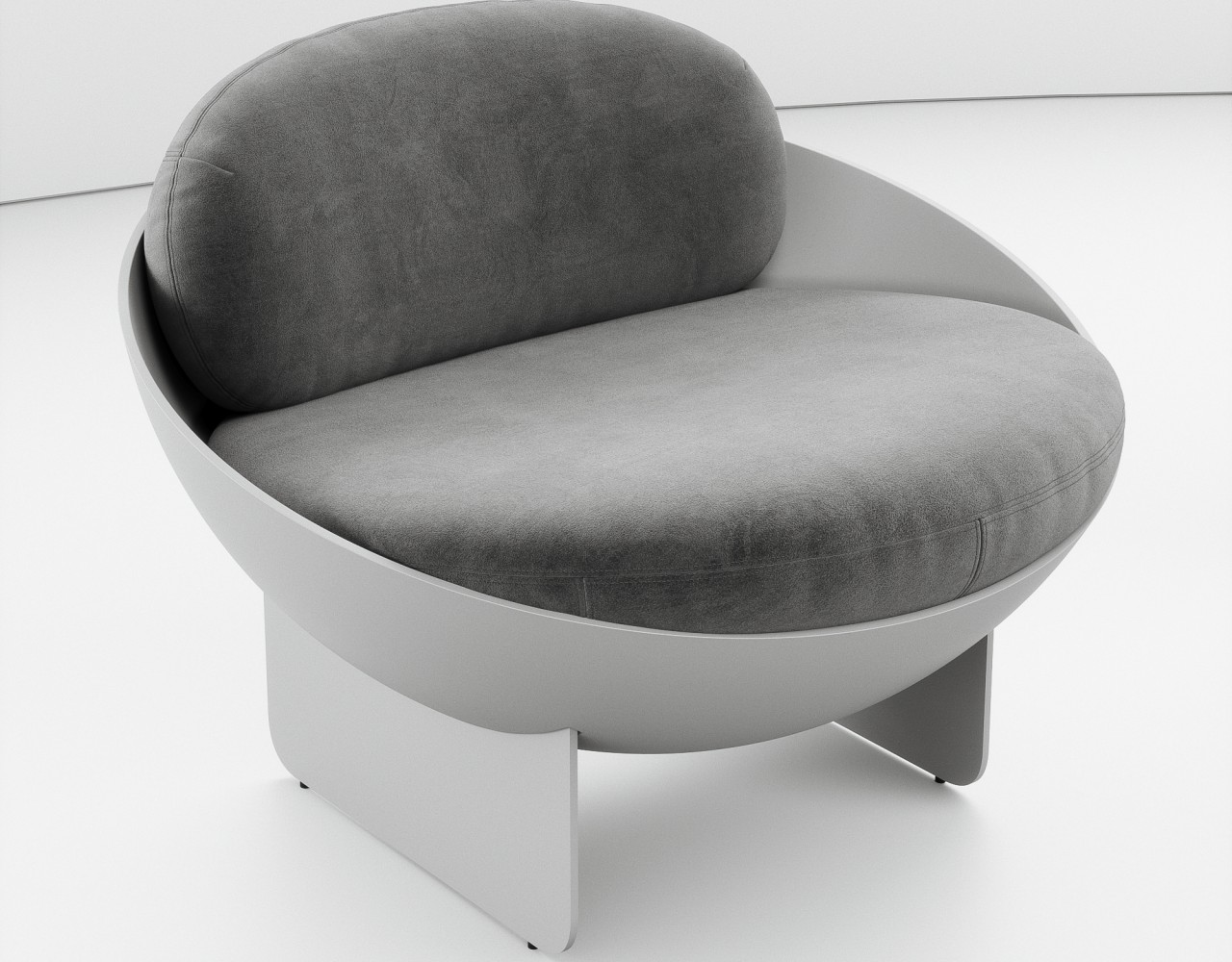
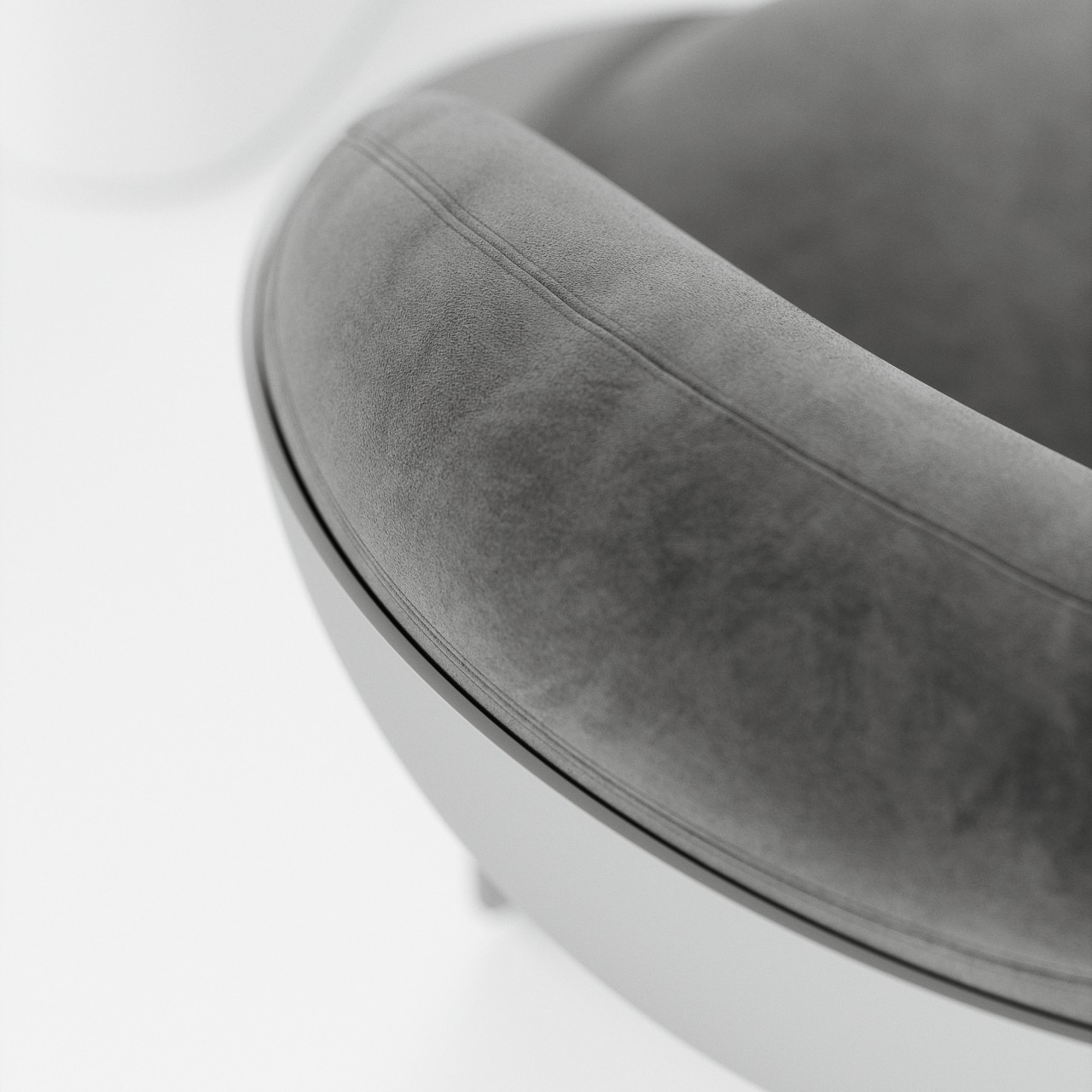
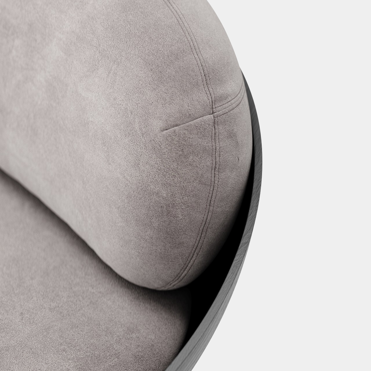
Bowl-shaped chairs are uncommon probably for a reason. A hollow half-sphere might not be the most comfortable thing to sit in unless you fill that space with cushions like what the Oco chair does. With extremely thin planes for legs, the bowl almost looks like it’s floating in mid-air. Made using carbon steel and fiberglass, the chair brings structural stability while also providing some subtle material details, like the wood-like grains of the spherical body.

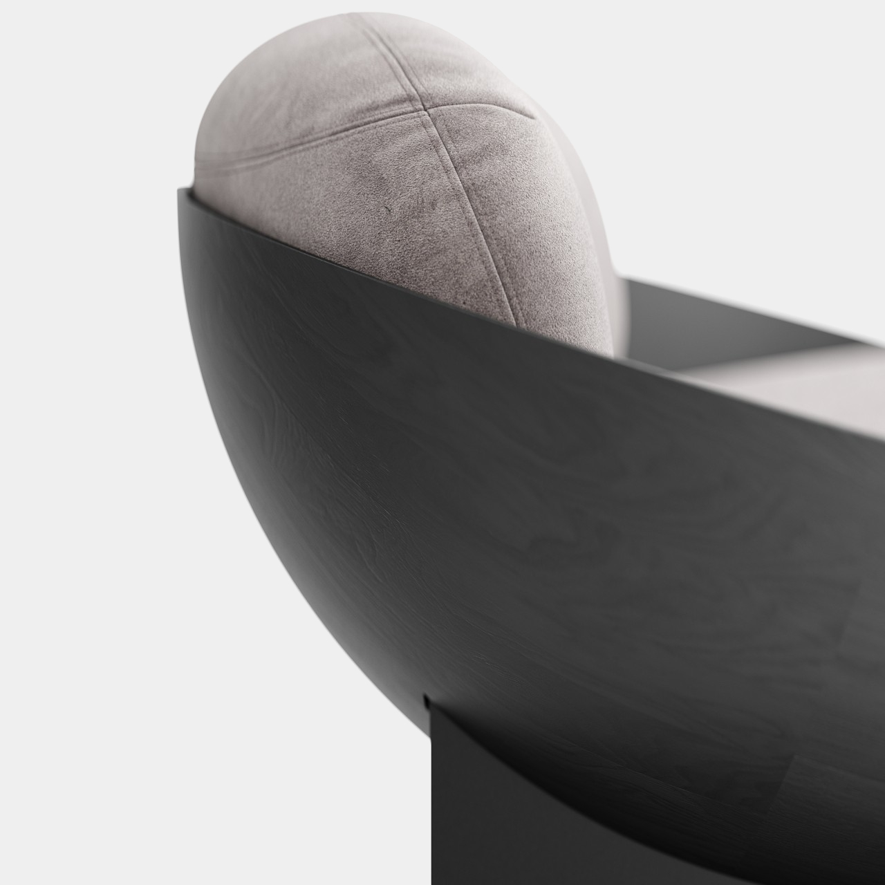
But while it is indeed a sight to behold, closer inspection might make you rethink the comfort it promises. The thick cushions do look plus, but they might not provide enough support for the person’s back. Or at the very least the back cushion doesn’t have enough height to support someone leaning back, forcing them to sit upright without proper support, straining their body over time.

The bowl’s edges are also left exposed, which could scratch, cut, or press on a person’s skin, especially on the back of the legs and forearms. A few slight modifications, like lining the edges with soft fabric or changing the angle of the bowl could help improve the ergonomics of the design without ruining the simple geometric beauty that this concept wishes to convey.

The post Bowl-shaped chair concept offers geometric beauty at the expense of ergonomics first appeared on Yanko Design.

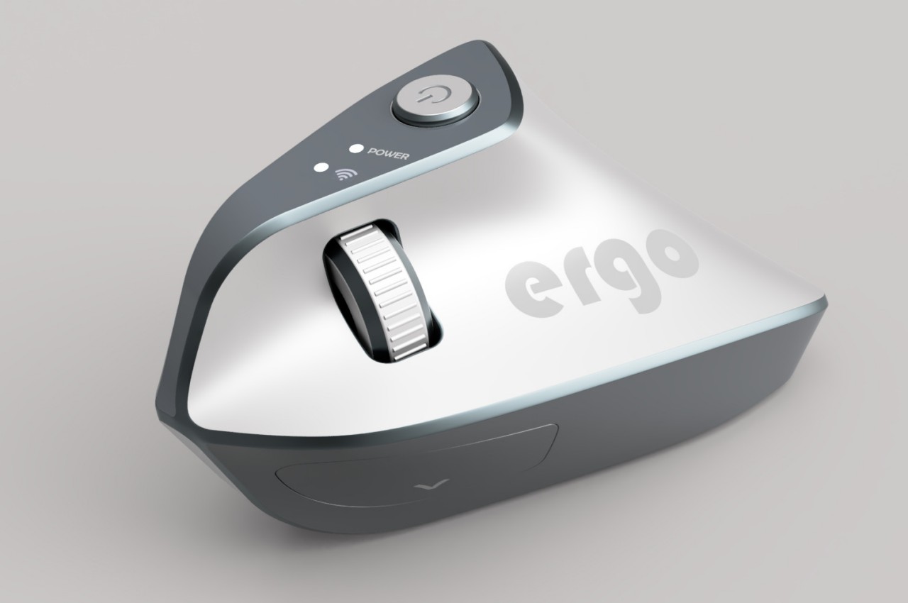
Ergonomic mouse concept oddly looks like a familiar home appliance

Computer mice have been around for decades, and despite their form making no objective sense, they remain the most basic and most common pointing device that we now use intuitively. The core design of the mouse hasn’t changed significantly since its inception, which unfortunately means they’re still one of the biggest causes of repetitive strain injury or RSI for many people. Ergonomic mice are starting to gain traction, particularly the vertically oriented designs that promise a more natural and comfortable grip for your hand. This device concept builds on that same premise, but the execution is a bit puzzling considering how it looks less like a mouse and more like a miniature clothes iron.

Designer: Pranav Kuber

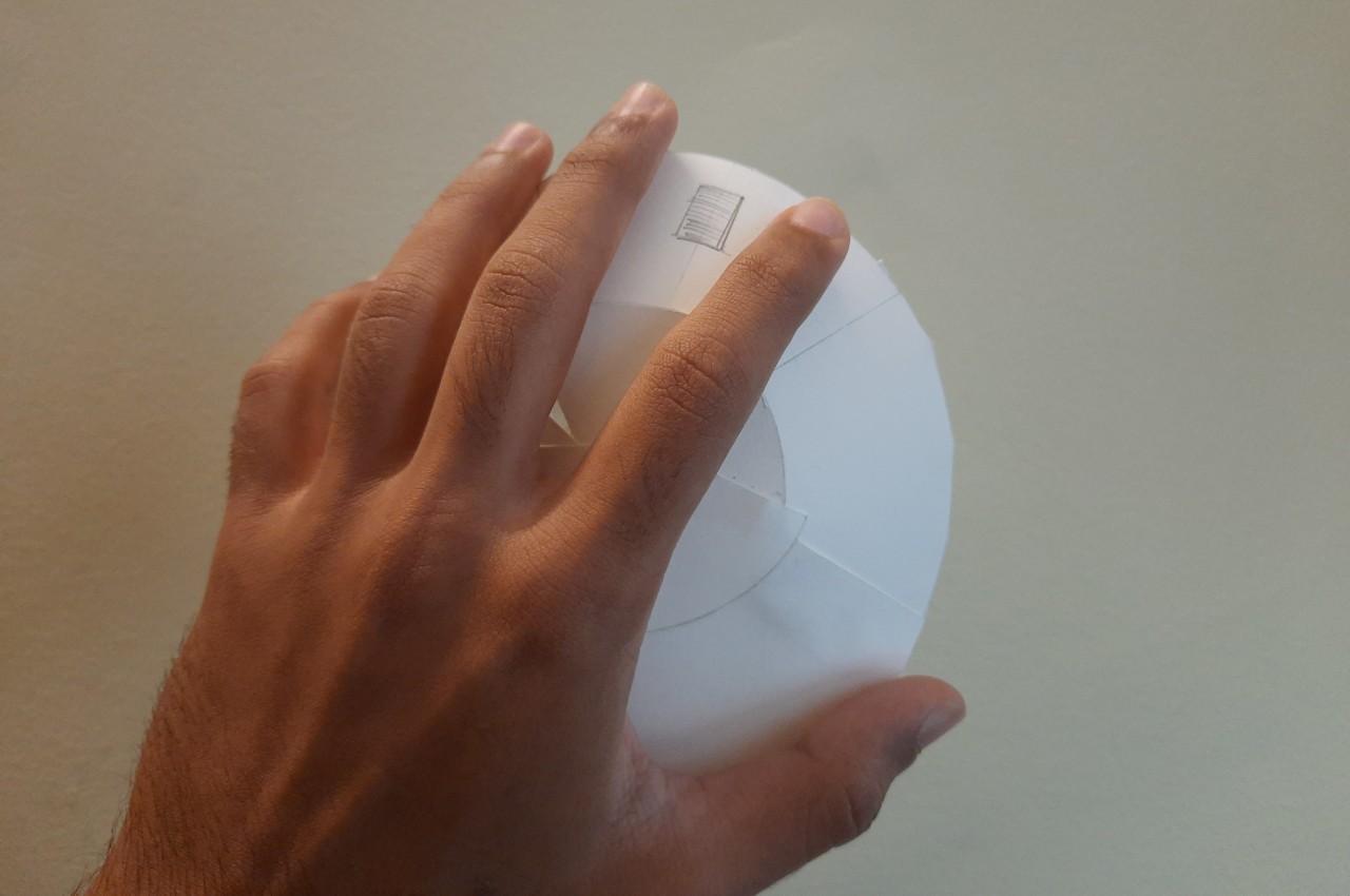
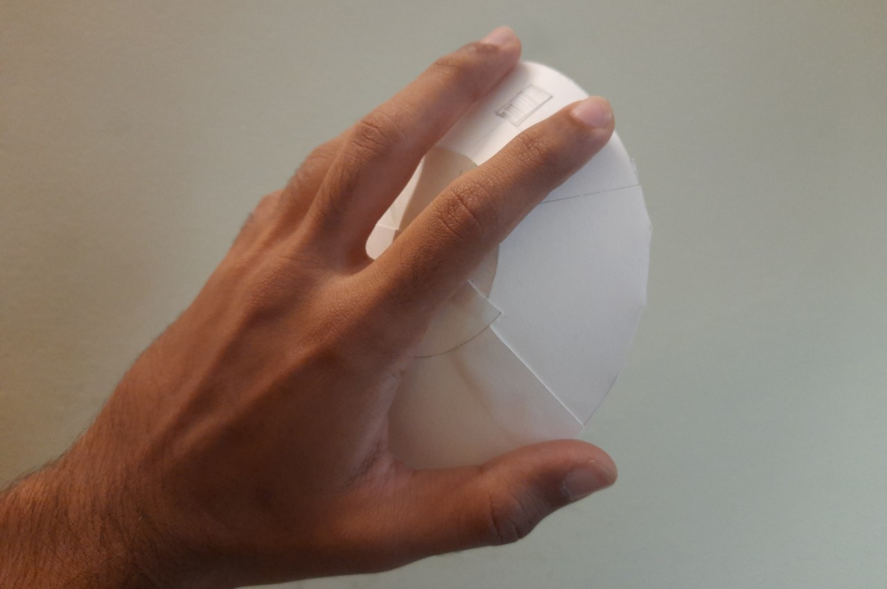
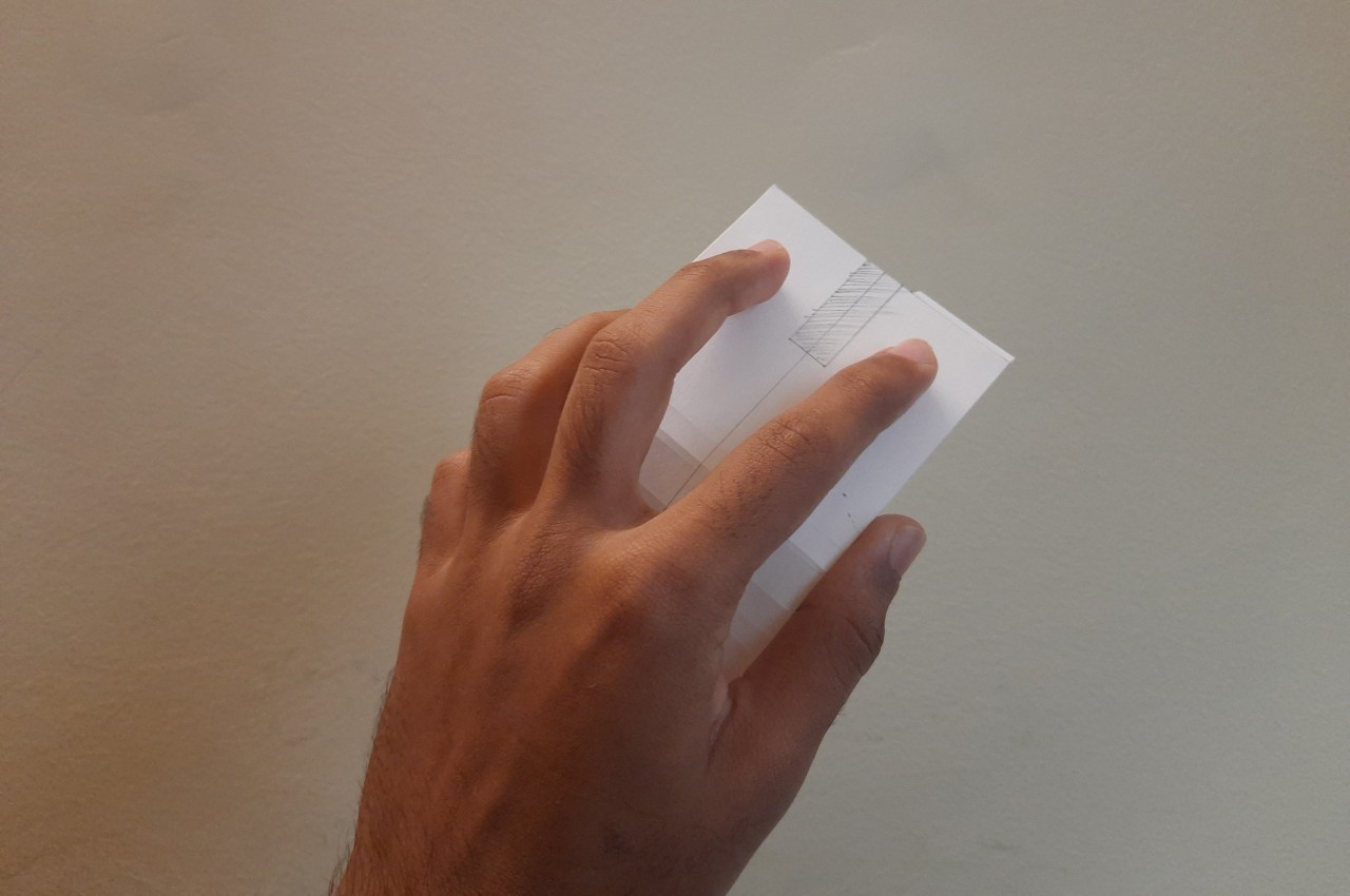
The rationale behind vertical mice is that the normal orientation of human hands has the palms facing inward rather than downward. With a regular mouse, users are forced to keep their hands at an unnatural angle, whether or not they’re moving the mouse at that moment. Of course, a vertical mouse would still need to provide the basic functions of a conventional mouse, which includes left and right buttons as well as a scroll wheel.

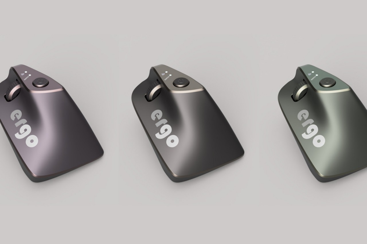
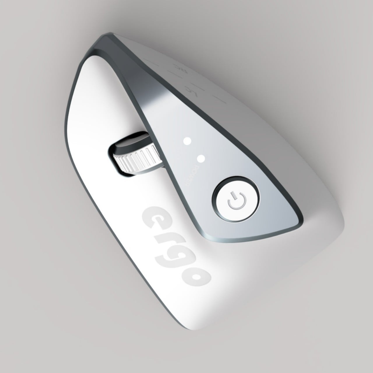
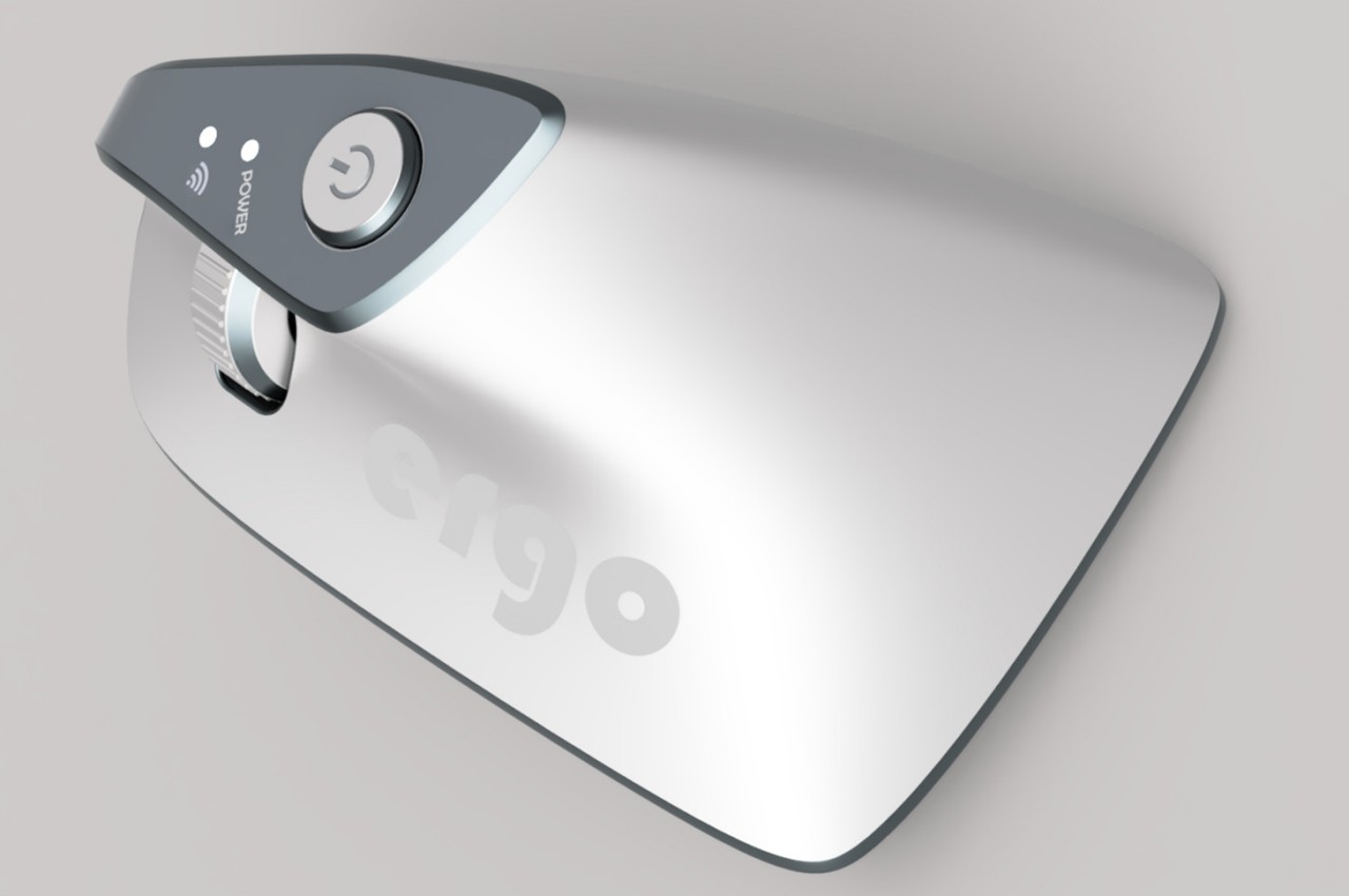
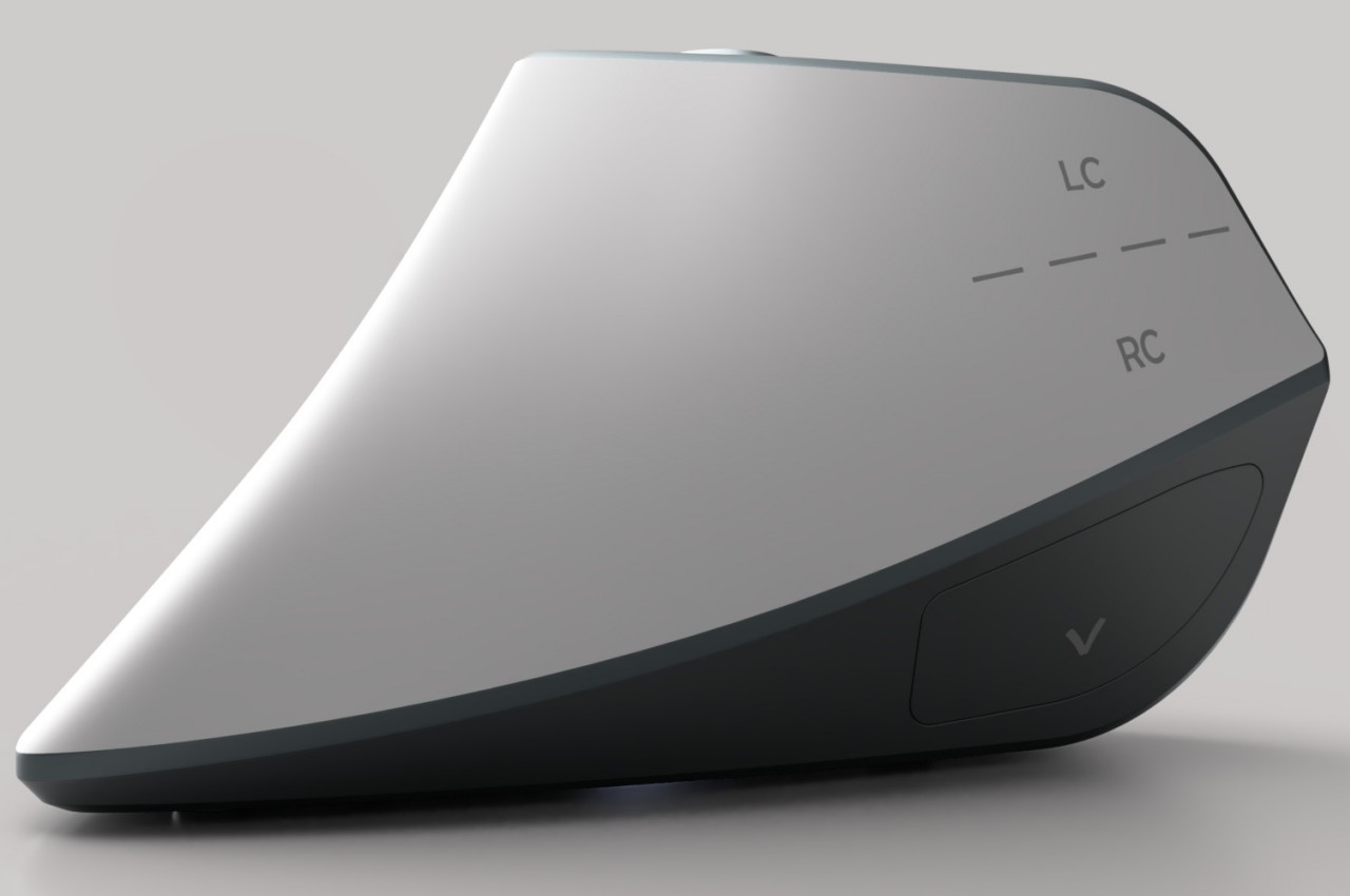
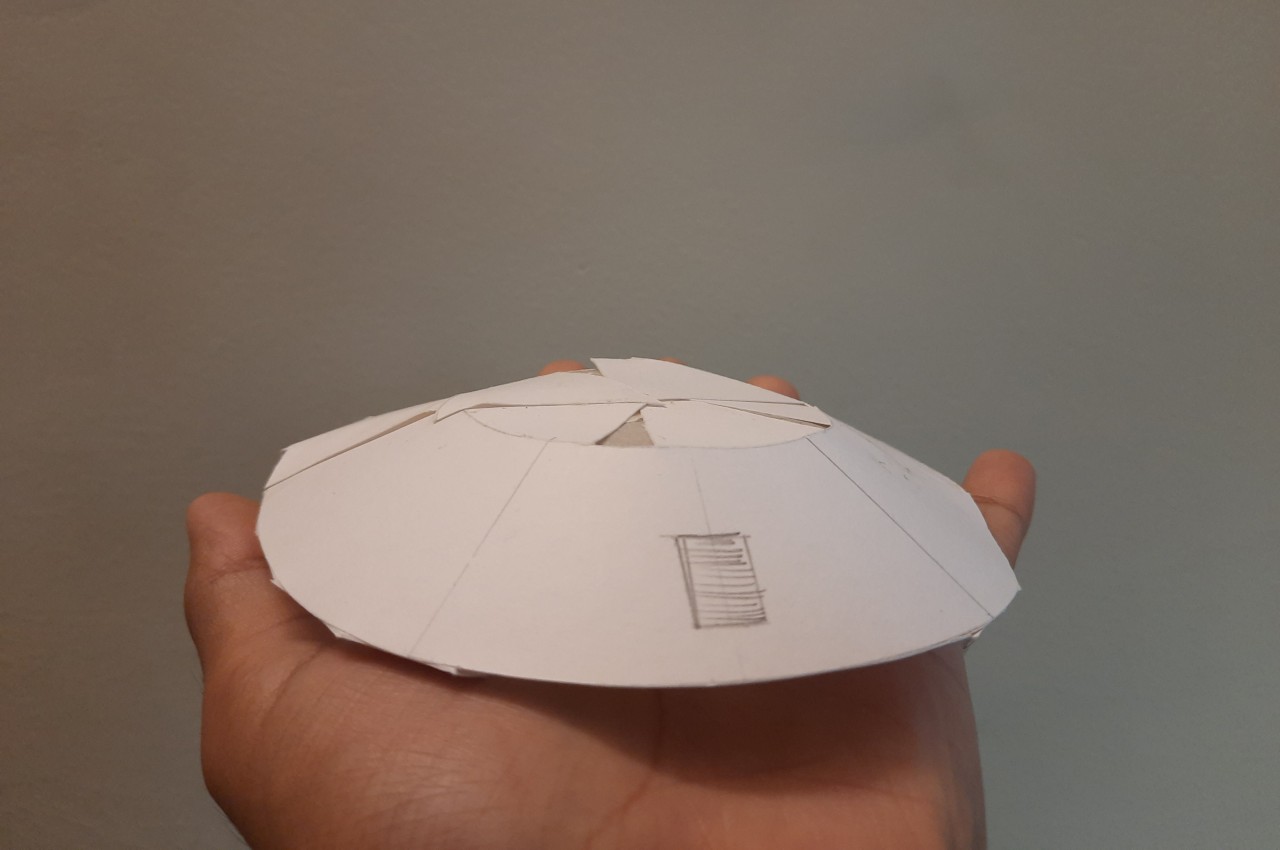
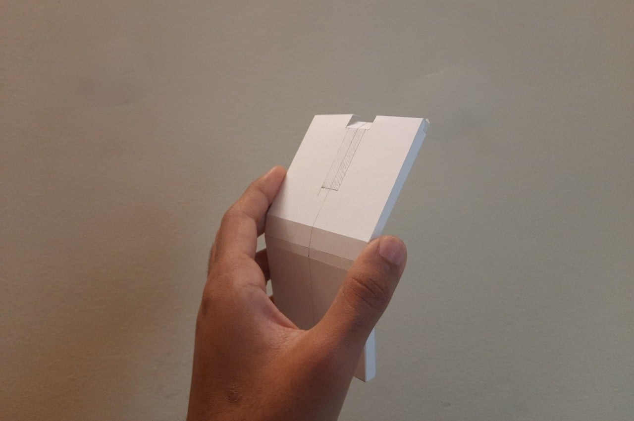
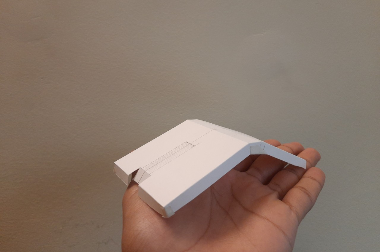
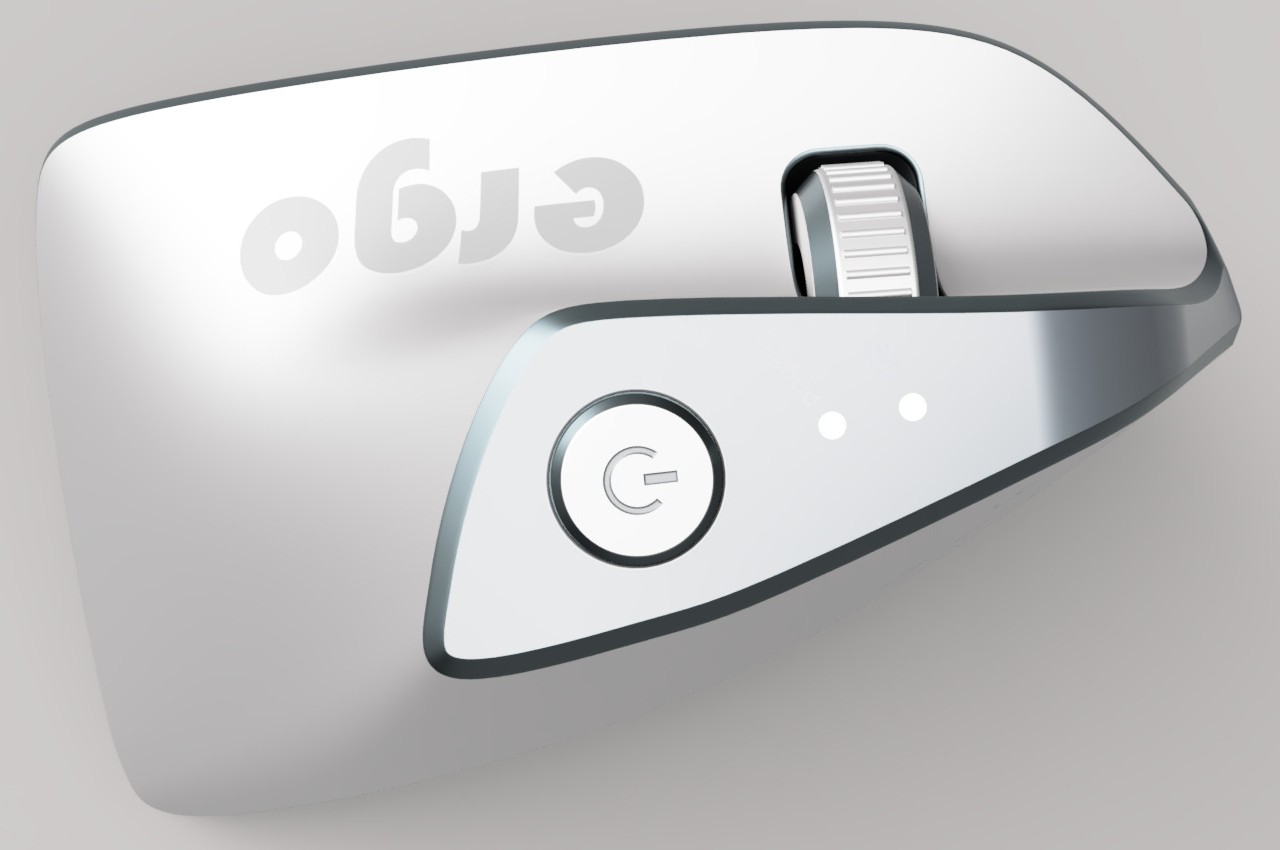
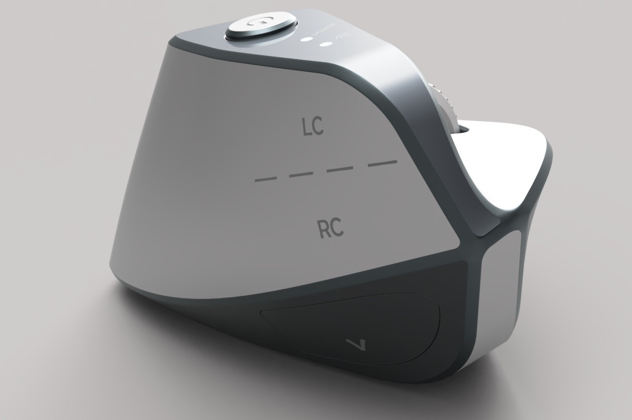
At first glance, the Ergo ergonomic mouse concept is just like any other vertical mouse now available for purchase, but examining its form and silhouette generates a slightly different image. The top plane’s wide surface tapers sharply toward the front, while the wide middle section looks rectangular when viewed from above. If not for the actual bottom of the mouse, which merges two vertical sides like the keel of a ship, the Ergo looks almost like a clothes iron, albeit one without a handle to grip.

Aside from the peculiar shape, the mouse design also raises a few other questions. The buttons on the outer or right side are clearly marked, but they don’t look like buttons you can physically click at first glance. The position of the mouse wheel on the opposite side is even more puzzling, as it will require a lot of swinging movement from the thumb that could actually put more strain on its joint. The rather wide rear might also make it harder to grasp the mouse, potentially resulting in more discomfort in the long run.

The post Ergonomic mouse concept oddly looks like a familiar home appliance first appeared on Yanko Design.
Ergonomic mouse concept gives left-handed users the comfort they deserve

The vast majority of computer products are designed to favor the biggest groups of users, sometimes to the exclusion of the minority. We’re not speaking about accessibility for persons with physical disabilities, but that is especially true for them as well. Even just the common keyboard and mouse are designed with the presumption that they will be used by right-handed people. And while ambidextrous mice do exist, those tend to sacrifice comfort for the sake of a symmetrical design. That doesn’t have to be the case, as this concept design tries to prove, promising both comfort as well as proficiency, regardless of which hand you hold it with.

Designer: Sameeraj Dronamraju

There has been an increasing awareness and demand for ergonomic mice, sadly due to the equally rising cases of computer-related injuries. But while there are plenty of ergonomic designs now available, most of them only cater to right-handed users. You’d be lucky if the manufacturer produced a left-handed design, but most don’t because of the costs involved in another product with only a few minor differences.

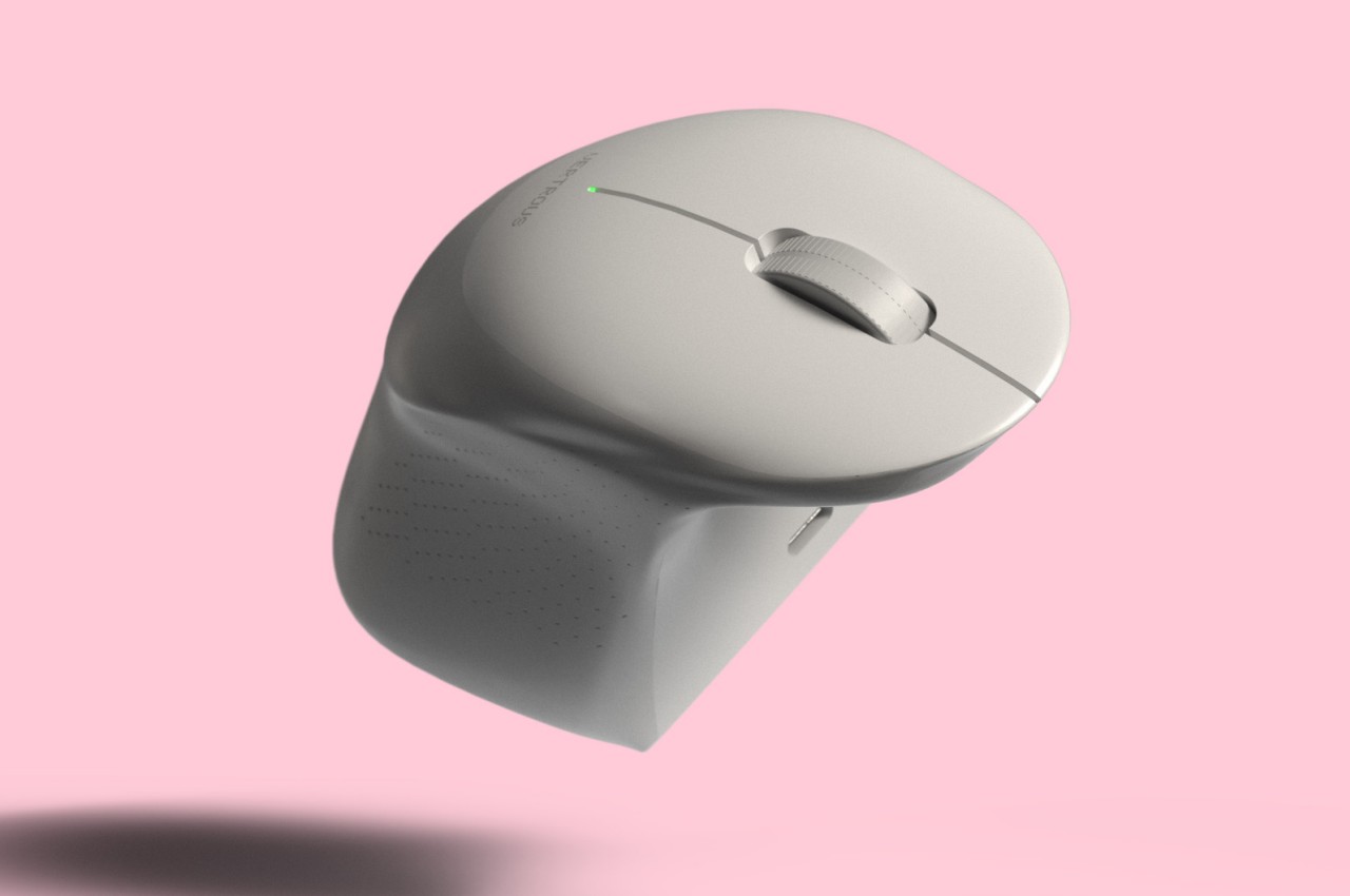
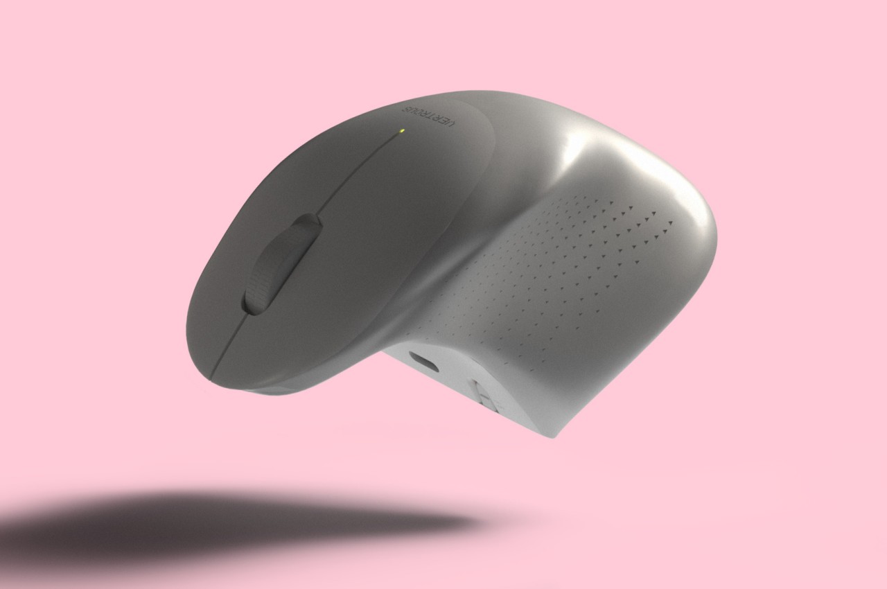
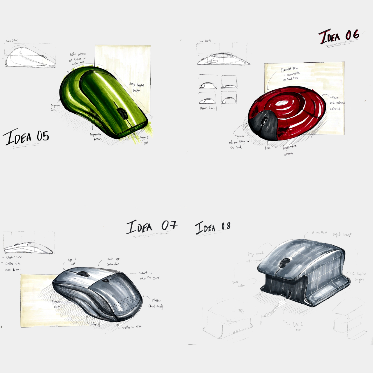
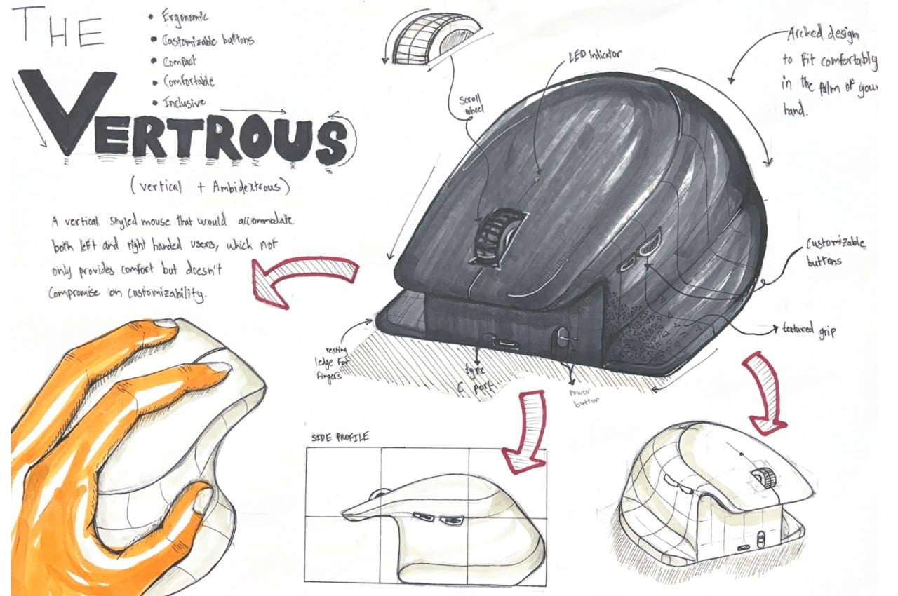
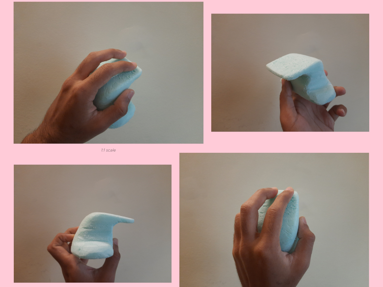
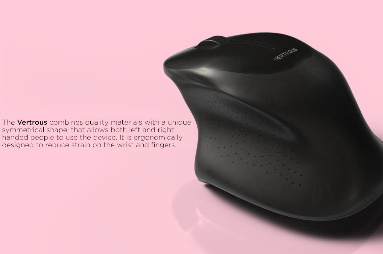
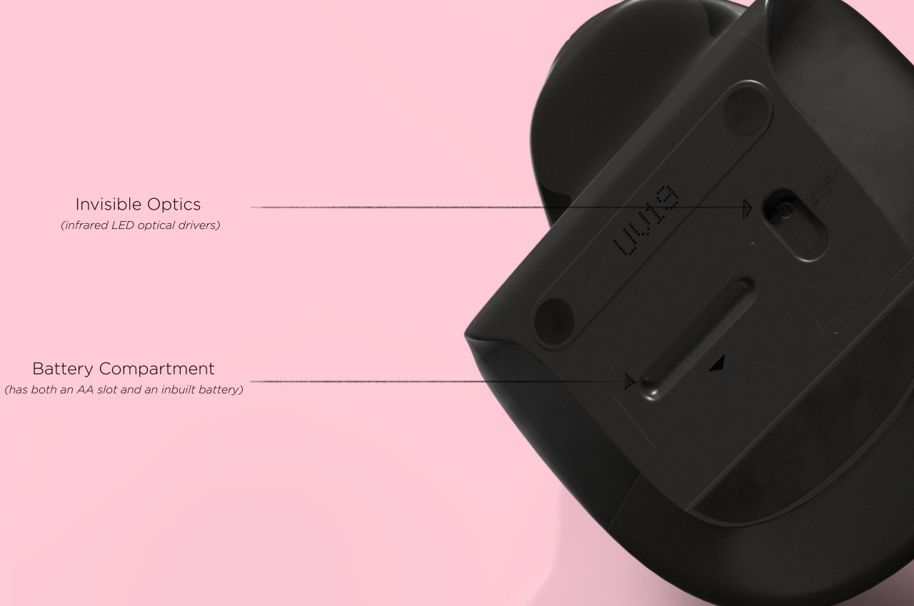
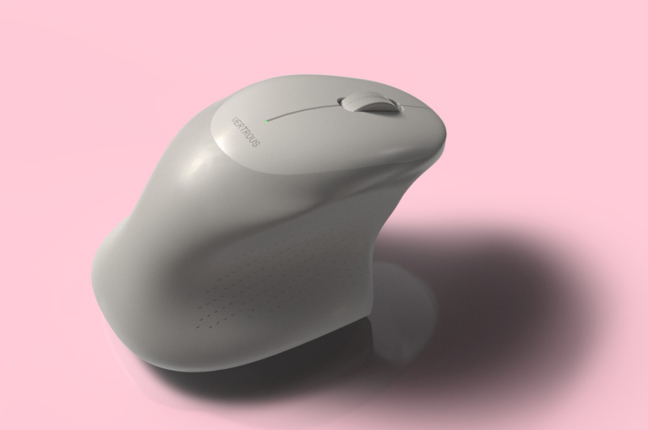
The proper solution would be to mix ergonomics and symmetry to create a mouse that is comfortable to hold for both kinds of people. Vertrous, a portmanteau of “vertical” and “ambidextrous,” takes its cue primarily from the plethora of ergonomic mice now in existence, most of which adopt a vertical design that attempts to reduce the strain placed on the wrist by offering a more natural grip. But rather than have your hand holding it sideways, you almost grip it like a claw, with your index and middle fingers still resting on top.

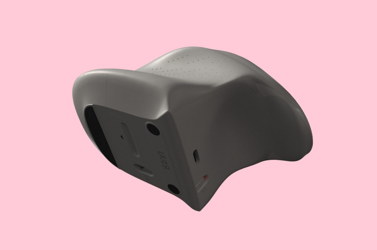
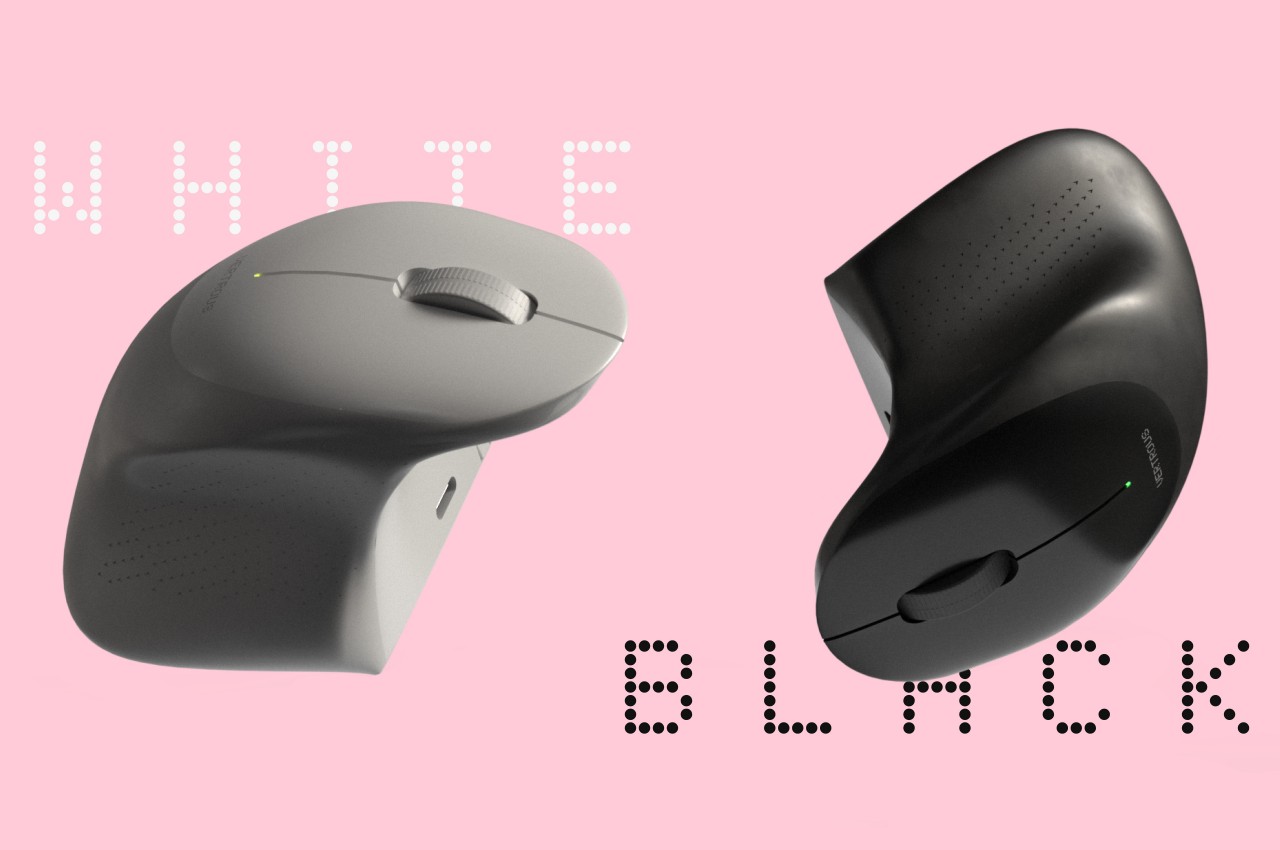
At the same time, the mouse’s shape is more or less equally balanced on both sides. Great care is taken to ensure that textured areas are found on both sides, so no one hand has the advantage over the other. That said, there are some features that can really be found in only one place, like the power button, but that’s really a minor detail that has no significant impact on the use of the mouse itself.

While Vertrous does present an interesting solution, there are still some considerations left unanswered by the design. For example, gripping the mouse like a claw could actually end up being more uncomfortable and strenuous than a regular mouse. The symmetrical design also leaves out features like extra buttons that would normally be found only on one side, an absence that many power users will feel acutely. These aren’t flaws per se but more like points for further improvement, paving the road for the day that we finally land on a standard ergonomic mouse design that will really leave no one out, whichever hand they prefer to use.

The post Ergonomic mouse concept gives left-handed users the comfort they deserve first appeared on Yanko Design.

Apple Vision Pro Air Typing experience takes a small step toward usability

It’s truly mind-blowing to see virtual objects floating before our eyes, but the magic and illusion start to break down once we try to manipulate those objects. Input has always been a tricky subject in mixed reality, either because we can’t see our actual hands or we can’t feel what we’re supposed to be touching, which is physically nothing. Until the perfect haptic feedback gloves become a reality, we have to make do with tricks and workarounds to make input less awkward and more convenient. That’s especially true with typing on air, and Apple is apparently using some special techniques to offer a more usable experience on the Vision Pro mixed reality headset.

Designer: Apple (via Brian Tong)

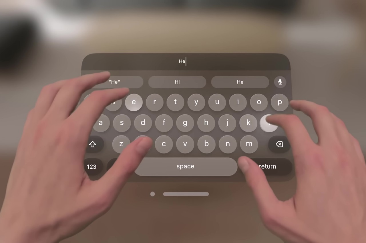
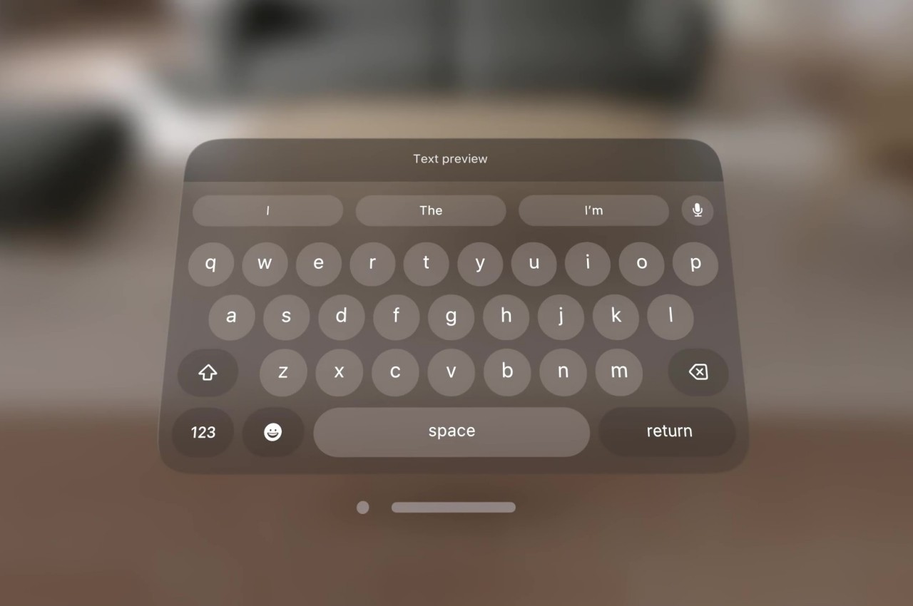
Apple’s first teaser for the Vision Pro headset and visionOS platform didn’t show typing of any sort. It focused, instead, on icons, windows, and menus, virtual 3D objects that are easier to interact with using hand gestures. Of course, sooner or later you will be faced with the need to input text, and the usual method of voice recognition won’t always cut it. visionOS, fortunately, does include a virtual floating keyboard like other VR systems, but the way you use it is quite special and, to some extent, ingenious.

For one, you can interact with the keyboard like you would any part of the Vision Pro’s interface, which is to look at the UI element to focus on it and then use hand gestures. In this case, pinching a letter is the equivalent of selecting it, just like what you’d do for menu items or icons in visionOS. It makes the gesture grammar consistent, but it’s also an awkward way to type.

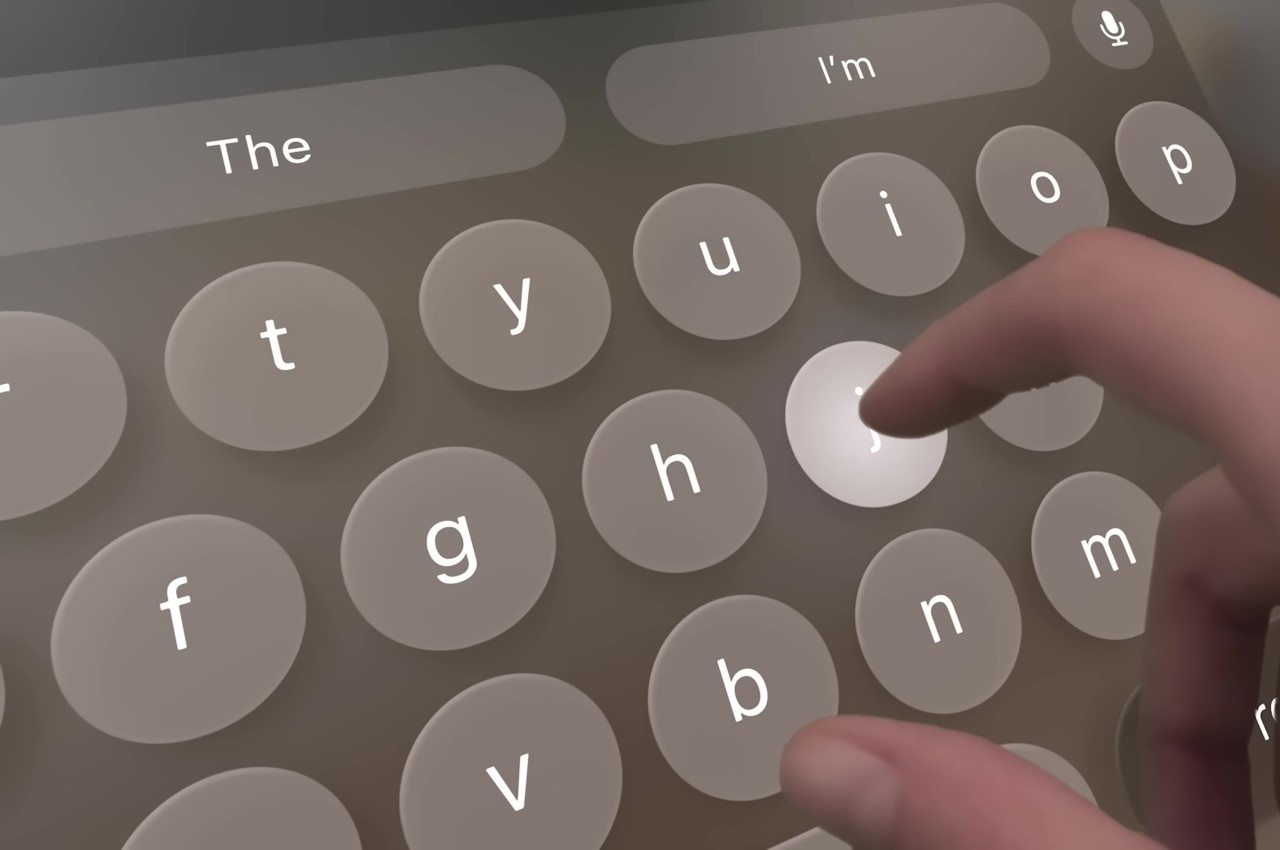
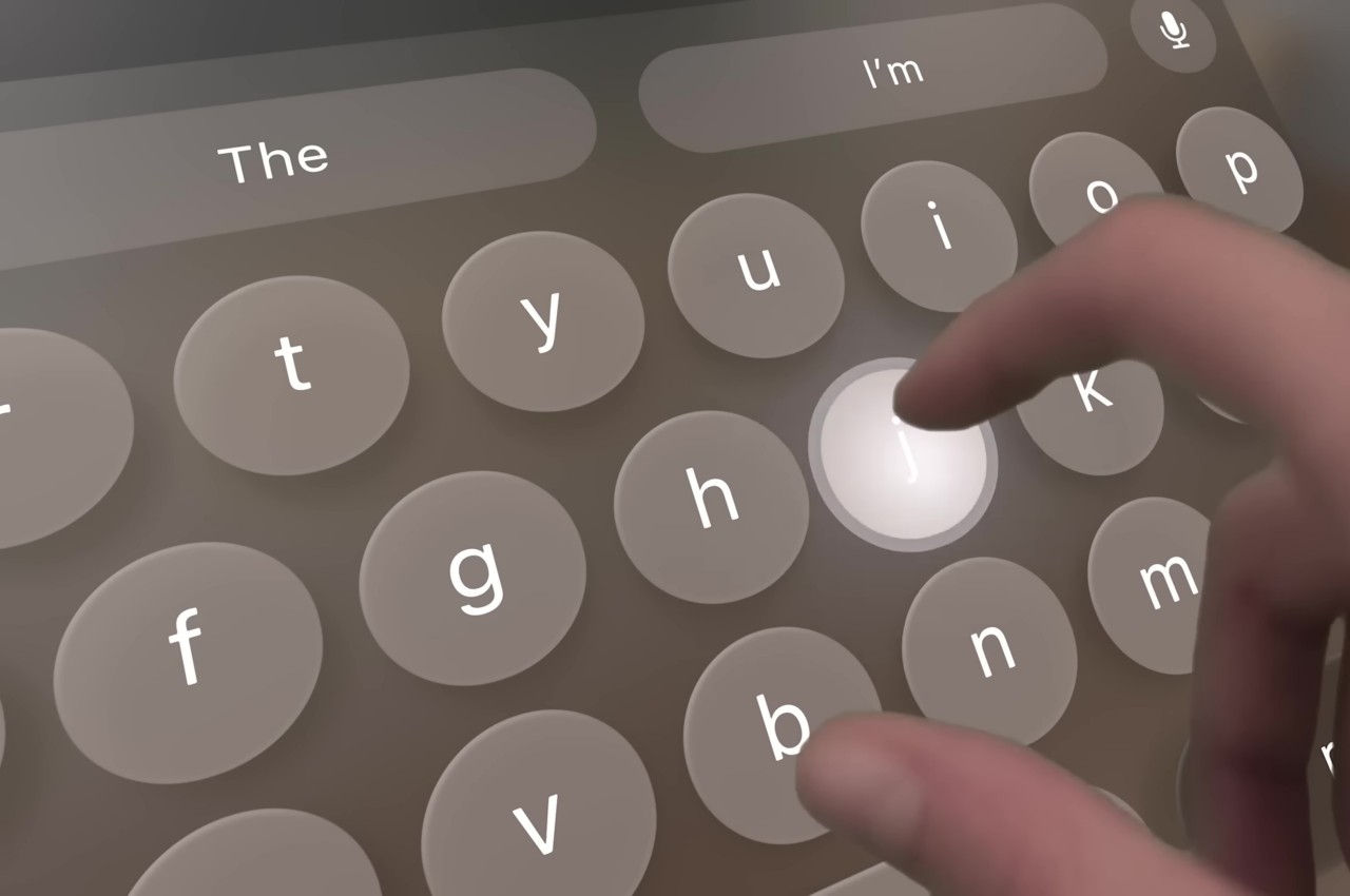
You can also “peck” at the keys with your fingers, making you feel like you’re typing on air. The difference that the Vision Pro makes, however, is that it tricks your eyes into believing you’re actually pressing down on those keys. Thanks to Apple’s flavor of spatial computing, hovering your real-world finger on a virtual key makes that key glow, and tapping on it results in an animation that looks like the key is actually moving down, just like on a real keyboard. There’s also a haptic sound, similar to the clicking sound effect you’d normally hear on an iOS virtual keyboard, to complete that audiovisual illusion.

Of course, your fingers aren’t actually hitting anything physical, so there’s still a disconnect that will probably confuse your brain. The visual effect, which is really only possible thanks to spatial computing, is still an important step forward in helping our minds believe that there’s a “real” three-dimensional object, in this case, a keyboard, right in front of us. It’s not going to be the most efficient way to input text, but fortunately, you can connect a wireless keyboard to the Vision Pro and you’ll be able to see your actual hands typing away on it.

The post Apple Vision Pro Air Typing experience takes a small step toward usability first appeared on Yanko Design.

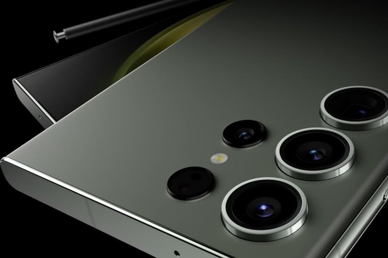
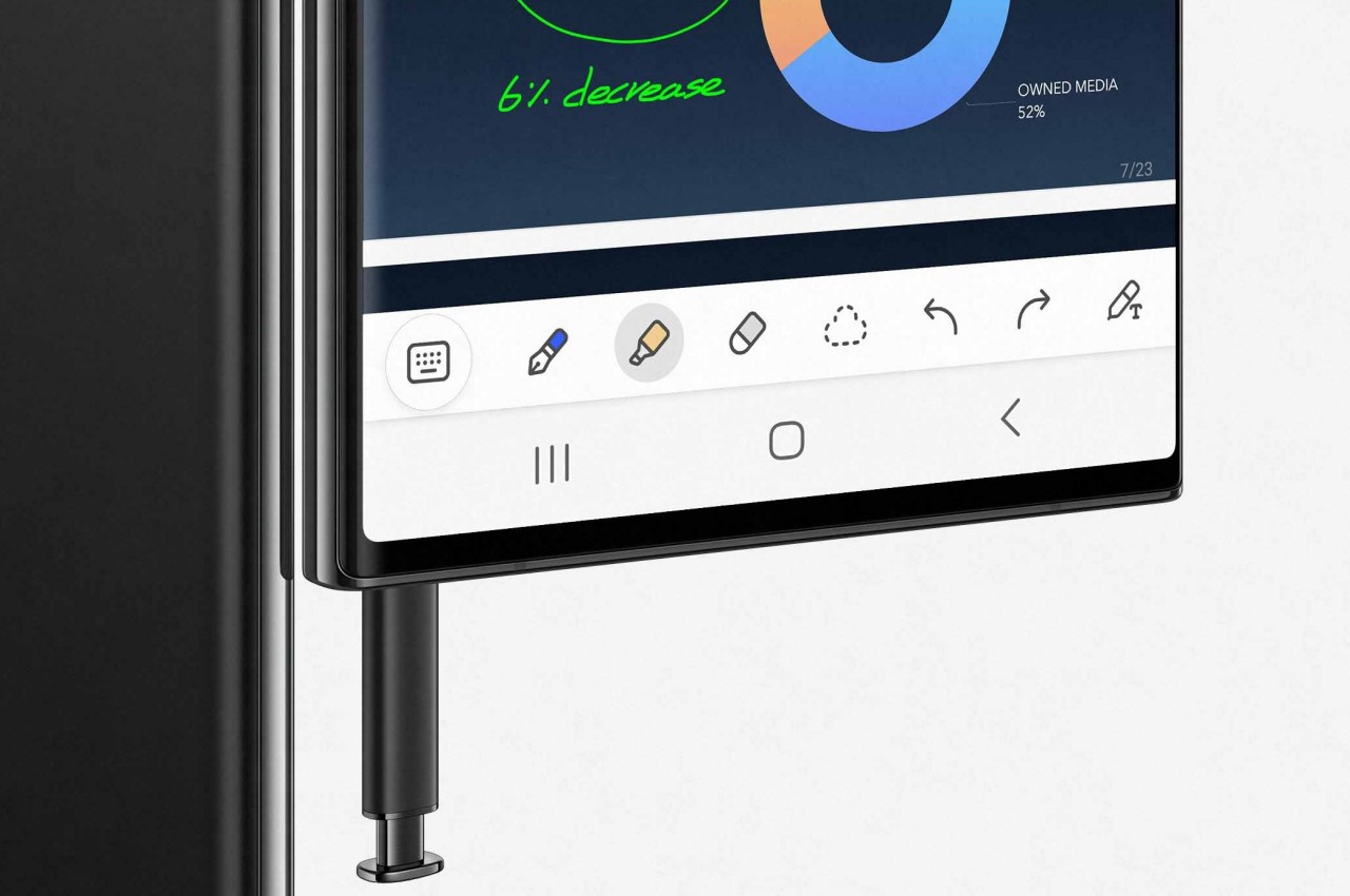
Samsung Galaxy S24 Ultra flat screen design will improve the S Pen experience

Samsung has quite a large number of smartphone models in the market, but few have reached notable fame more than the Galaxy Note series. And yes, that includes the one that burst into flames. Although that brand of stylus-bearing smartphones has officially been retired, its spirit lives on in the “Ultra” model of Samsung’s Galaxy S flagship. Call it by any other name, these devices were designed with one unique feature that very few phones have to date: an active stylus for scribbling notes and even making art. That said, there is perhaps some irony that these phones’ screens aren’t designed to take full advantage of that feature, at least in some edge cases, literally. That might finally change with the Galaxy S24 Ultra next year which will be ditching a rather old design convention to hopefully give the S Pen an edge, pun intended.

Designer: Samsung (via David Martin)

Once upon a time, smartphone screens whose edges curved to the side were regarded as a sign of premium and stylish design. There was indeed a hint of elegance, not to mention manufacturing excellence, at seeing the screen disappear to edges, not unlike an infinity pool. It was also a visual trick to make at least the side bezels disappear, though in reality they’ve just been pushed down nearer to the frame. Today, however, that design seems to be showing its age and the trend is leaning more towards completely flat screens and edges.

On stylus-enabled smartphones like the Galaxy Note line and the more recent Galaxy S Ultra models, those curved edges are more liabilities than assets. Technically, a part of the screen “falls off” the edges and can’t be reached by the S Pen without sliding off. Depending on the app, that might be precious screen real estate wasted, and there have been awkward moments when the tip just slips off and ruins your momentum.

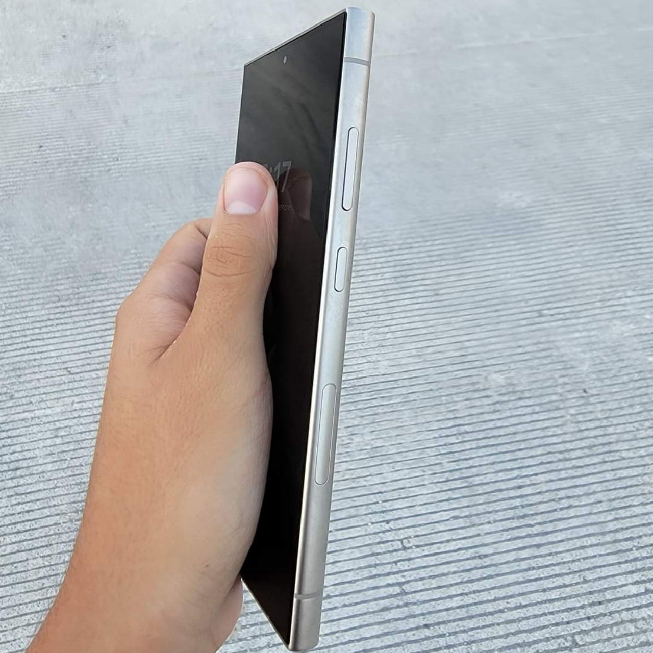
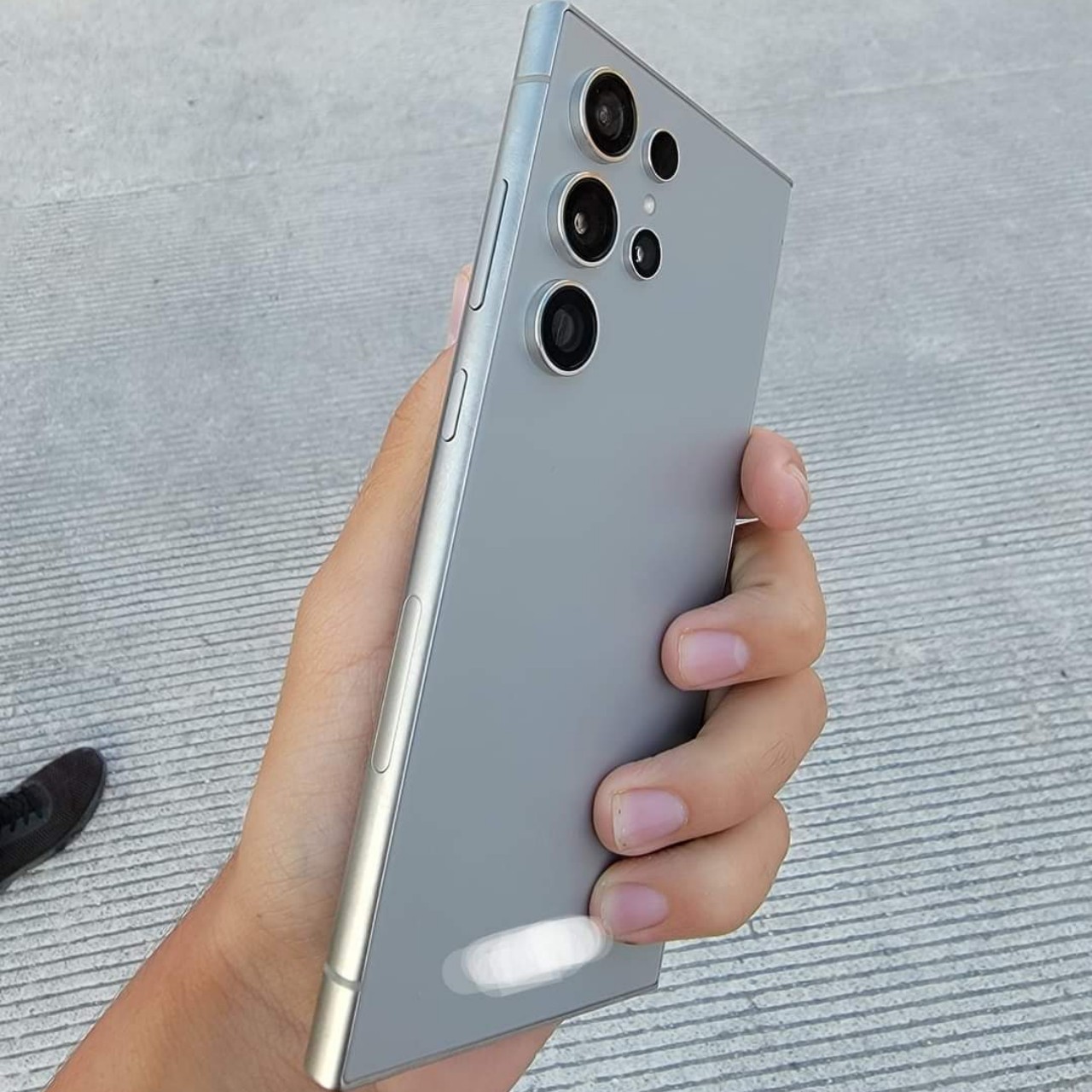
According to recently leaked photos, the Galaxy S24 Ultra next year will finally address one of the pain points of avid S Pen users. The screen seems to be completely flat on all sides this time around, which means that owners will have access to the full width of the screen. This design actually benefits all types of content since there will be no interface elements or images that will look distorted at the edges.

The rest of the phone, however, will retain the design from this year’s Galaxy S23 Ultra, at least based on those same photos. That meant it would still have curved left and right edges, while the top and bottom are completely flat. There’s also no change in the camera design, though the hardware is, of course, expected to see some upgrades. This goes in line with leaks last month that the Galaxy S24 series will take a more iterative approach to its design, largely keeping the same aesthetic while slapping flatter screens on top.

The post Samsung Galaxy S24 Ultra flat screen design will improve the S Pen experience first appeared on Yanko Design.
How this multifunctional under desk footrest keeps you comfortable and healthy even after hours of sitting

There’s no escaping the fact that most of us spend hours every day sitting, whether we’re working at a desk, playing on a couch, or even just relaxing after a tiring day. It might sound ironic since we’re sitting most of the time, but our bodies tend to feel sore even after just a few hours of that sedentary position. Our backs feel a bit painful and even our legs start to experience some tension. These are usually several factors, including bad posture and poor blood circulation, which means that single-purpose products can’t really address all these issues. Fortunately, this innovative modular footrest checks all the right boxes, bringing relief to your body, promoting good posture, and even helping save the environment, all in a single, elegant, and portable package.

Designers: Danylo & Nazar Ozhho

Click Here to Buy Now: $89 $149 (40% off). Less than 72 hours left! Raised over $160,000.

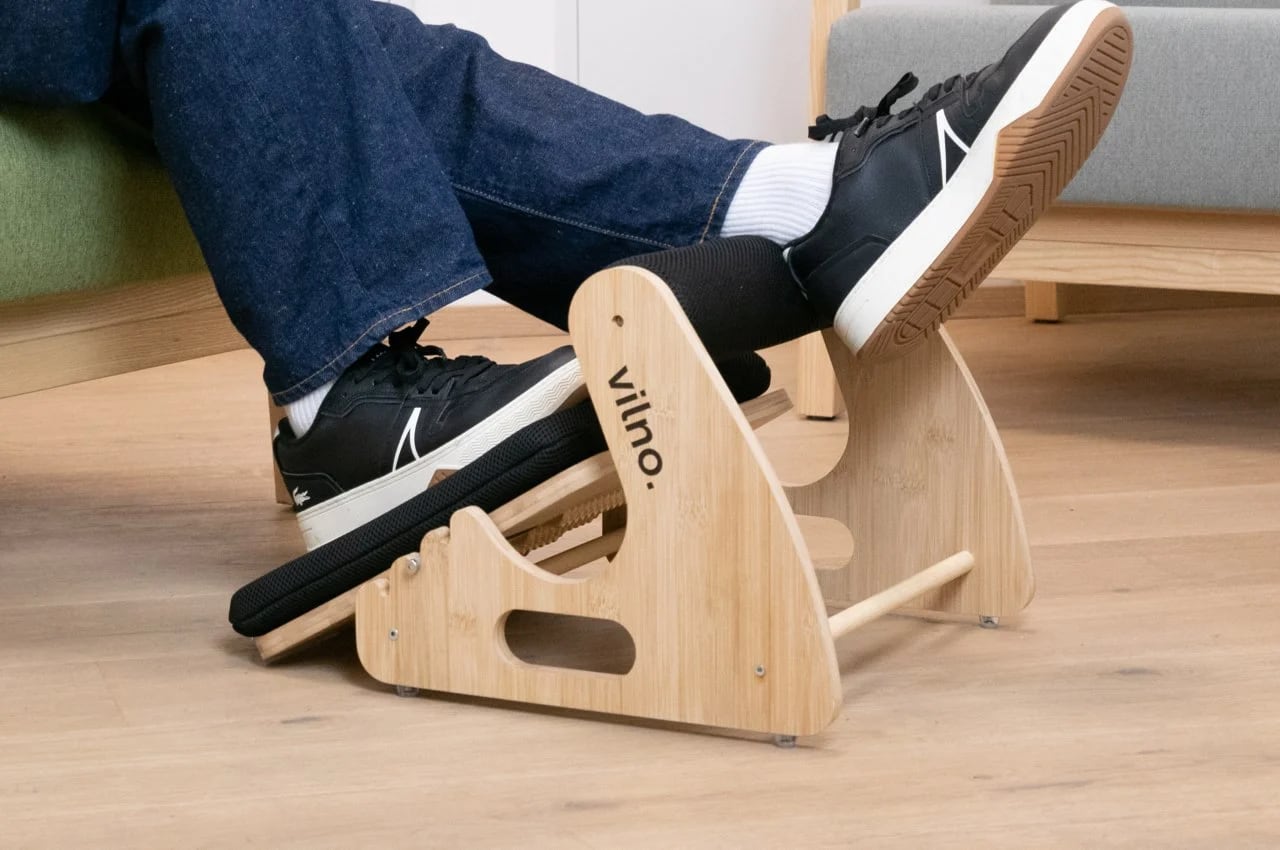
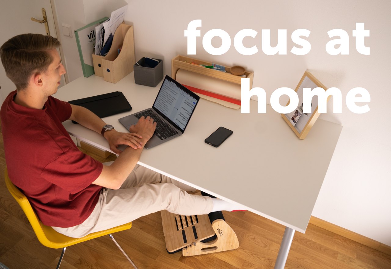
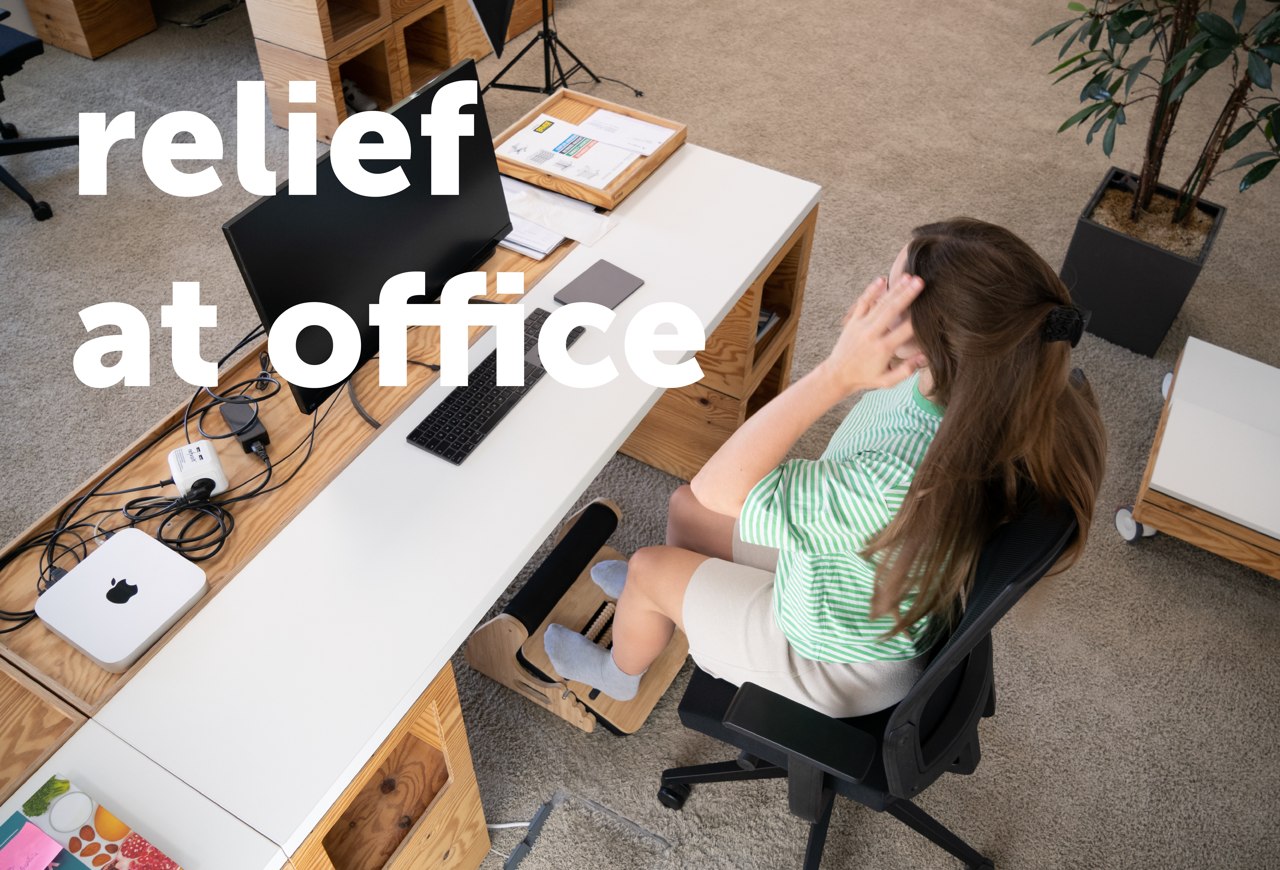
It may have “footrest” in its name, but the VILNO FootRester™ is definitely more than just that. In fact, it’s a 3-in-1 product that combines the best of a footstool, a foot massager, and, of course, a footrest, in a modular design that also looks incredible in any setting, whether it’s in the office or at home. It checks all the right boxes, all at the same time to provide a pain-free sitting experience whether you’re working, gaming, or just spending hours in front of a computer or at a desk.

Workday Pain Relief – FootRester™ lifts your legs so hips and knees are aligned, for less pressure on the lower body.

Eliminate Foot Tension – FootRester™ provides a supportive and comfortable resting surface for your feet. An elevated position helps to relieve pressure and reduce strain on the muscles and tendons in your feet.

Activate your Muscles During Sitting – Small movements activate the muscles in your legs and feet, preventing them from becoming static and stiff.

Force yourself to Sit Upright – FootRester™ elevates your legs. It creates a more natural spine, hips, and legs alignment. This positioning with stretching helps to prevent slouching or leaning forward.

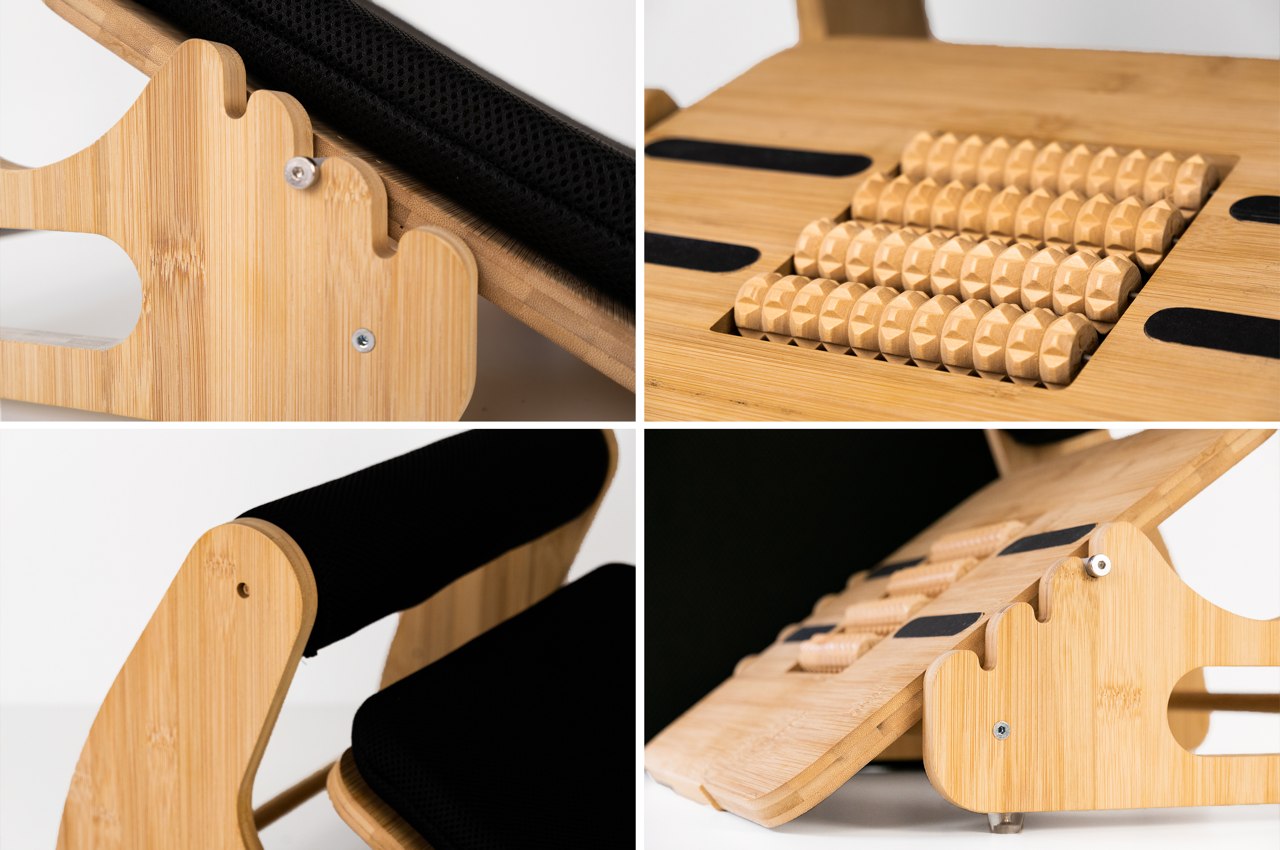
The cylindrical footrest, for example, not only provides a soft and comfortable place to rest your legs, it also elevates your legs in order to get you into a better posture that forces your spine, hips, and legs into a more ergonomic alignment, reducing the pain-inducing strain on your back. The adjustable bottom platform holds a memory pillow that will feel like heaven for your feet on one side, and foot massage rollers on the other side stimulate your feet to reduce tension and help you relax. It doesn’t stop there, however, because that same panel can rock back and forth, creating small movements that activate the muscles in your legs and feet to help promote blood flow and prevent them from getting stiff.

Given these features, you might be surprised at the VILNO FootRester’s elegant simplicity that belies its capabilities. Crafted from bamboo, the 3-in-1 footrest not only looks beautiful but is also durable as well. The covers for the foams are also easy to remove and machine washable, ensuring that they stay clean and hygienic for a long, long time. And with built-in handles, the footrest is easy to carry around the house or the office so you won’t have to sacrifice your health and comfort just because you have to sit somewhere else.

Sitting for hours is an unfortunate but inescapable fact of modern life, but that doesn’t mean you just have to grit your teeth and bear with the body pain that it creates. Designed by passionate innovators from Ukraine, the VILNO FootRester™ finally offers a solution that promotes good posture and relieves pain in your legs and feet, wrapped in a handsome wooden design that will make you the envy of the office.

Click Here to Buy Now: $89 $149 (40% off). Less than 72 hours left! Raised over $160,000.

The post How this multifunctional under desk footrest keeps you comfortable and healthy even after hours of sitting first appeared on Yanko Design.
How to stay healthy while working with this automatic sit-stand desk

We are very dependent on our computers for both work and personal activities, but these computers were never designed with proper ergonomics from the very start. Keyboards and mice are the primary causes of hand and wrist injuries, while laptops force us to strain our necks. That’s not to mention how a sedentary lifestyle can also be the cause of many health issues ranging from obesity to diabetes. Buying ergonomic computer equipment and accessories is a luxury only a few can afford, especially those who can only use what their work provides. Working from home offers more flexibility, but desk space is sometimes even more constrained. Fortunately, it’s not that difficult or expensive to start practicing proper posture at work, thanks to this minimalist yet powerful laptop stand that lets you quickly switch between sitting and standing at the push of a button.
Designer: Creatio Design

Click Here to Buy Now: $179 $219 ($40 off). Hurry, for a limited time only!
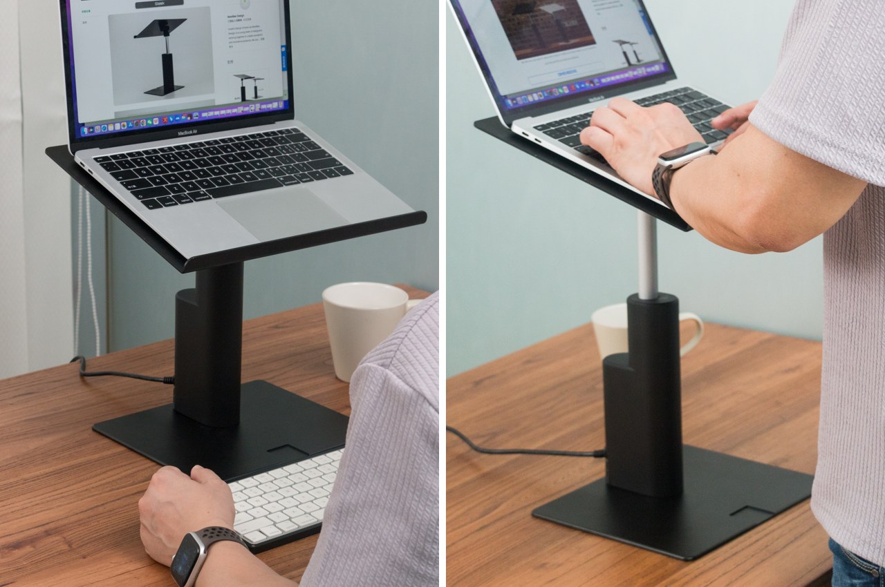
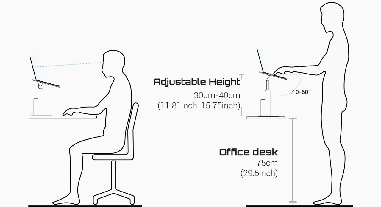
There is plenty of advice to stand while you work, but in reality, it’s impossible to keep that up for long periods of time. In the end, most of us will often switch between standing and sitting positions multiple times, which also means adjusting computers and tools for one or the other arrangement. That means wasted time and energy that could even discourage people from making the effort. That’s where the Maxtand E-Power sit-stand desk comes into play, offering smooth switching in just 6 seconds.

At its lowest point, the Maxtand E-Power, or MTEP, for short, raises your laptop to a comfortable level and frees you to use a more ergonomic keyboard and mouse while sitting down. With a push of a button, its innovative controlled seamlessly and quietly raises your laptop up to anywhere between 11.81 and 15.75 inches so you can work standing up at the height you’re most comfortable with. Distinct buttons for up, stop, and down make the Maxtand E-Power so easy to use that you spend less time fiddling with it and more time doing work.

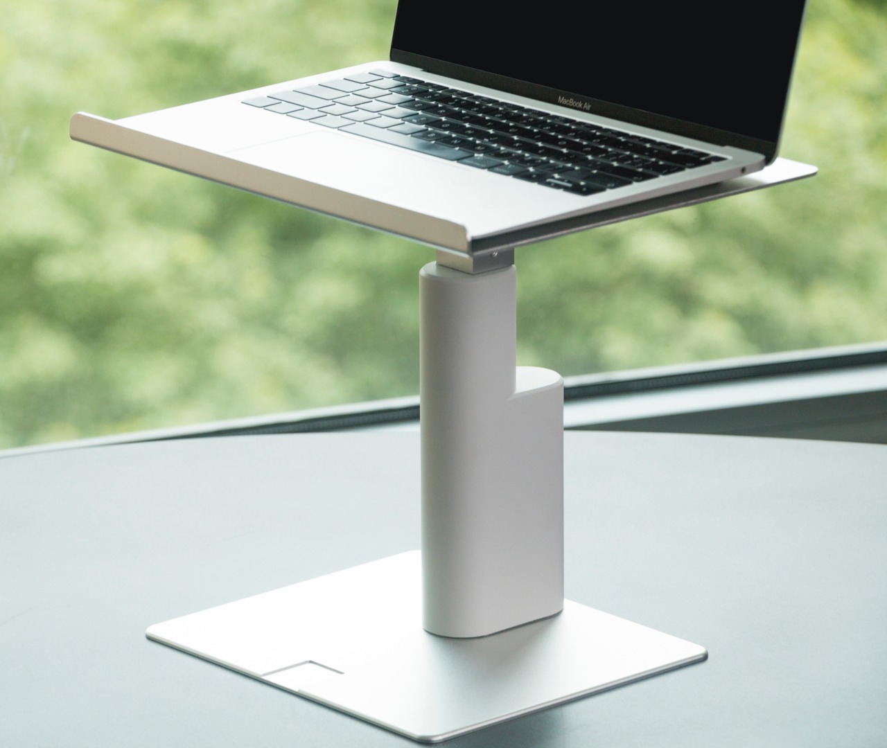
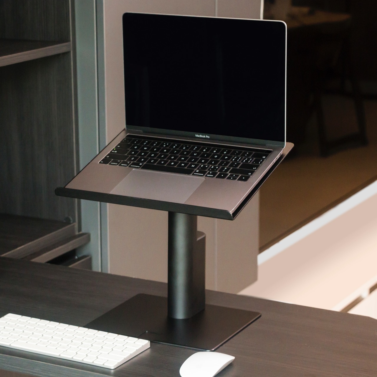
More than just its automatic sit-stand capability, the MTEP offers the utmost flexibility so you decide how you want to work. The top panel measures 12.6×9.84 inches and can hold loads of up to 33lbs, more than enough to hold any laptop. It can even be made to lie flat, so you can use it as a keyboard stand while you have your monitor raised using a different stand or arm. You can also replace the panel with a VESA-compatible adapter plate to mount your screen and have the Maxtand E-Power lift it to a height that won’t strain your neck.

Best of all, the MTEP’s simple yet elegant appearance makes it blend well with any desk, and its minimalist design means it won’t take up much space either. And because of that small size, you can even bring it with you and set up an office anywhere, and you only need to plug it in if you want to adjust the height. At the same time, its high-quality aluminum material and sturdy construction give you the confidence to work the way you want with the tools that you have. This is especially important when working at home, where you have even more freedom to design your workspace in a more ergonomic fashion. So say goodbye to body pains and health problems with the Maxtand E-Power sit-stand desk, going for only $159 right now on Kickstarter.

Click Here to Buy Now: $179 $219 ($40 off). Hurry, for a limited time only!

The post How to stay healthy while working with this automatic sit-stand desk first appeared on Yanko Design.