Louis Vuitton Celebrates Their 20 Year Collaboration With Frank Gehry At Art Basel Paris 2024

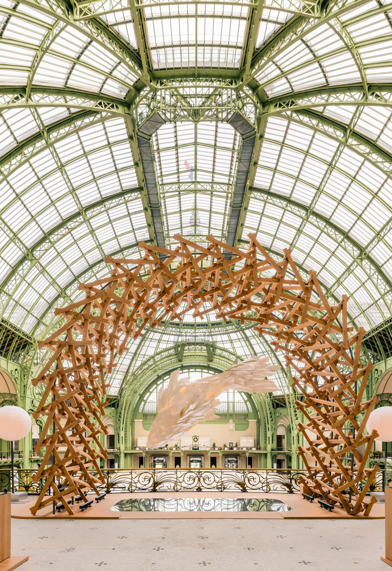
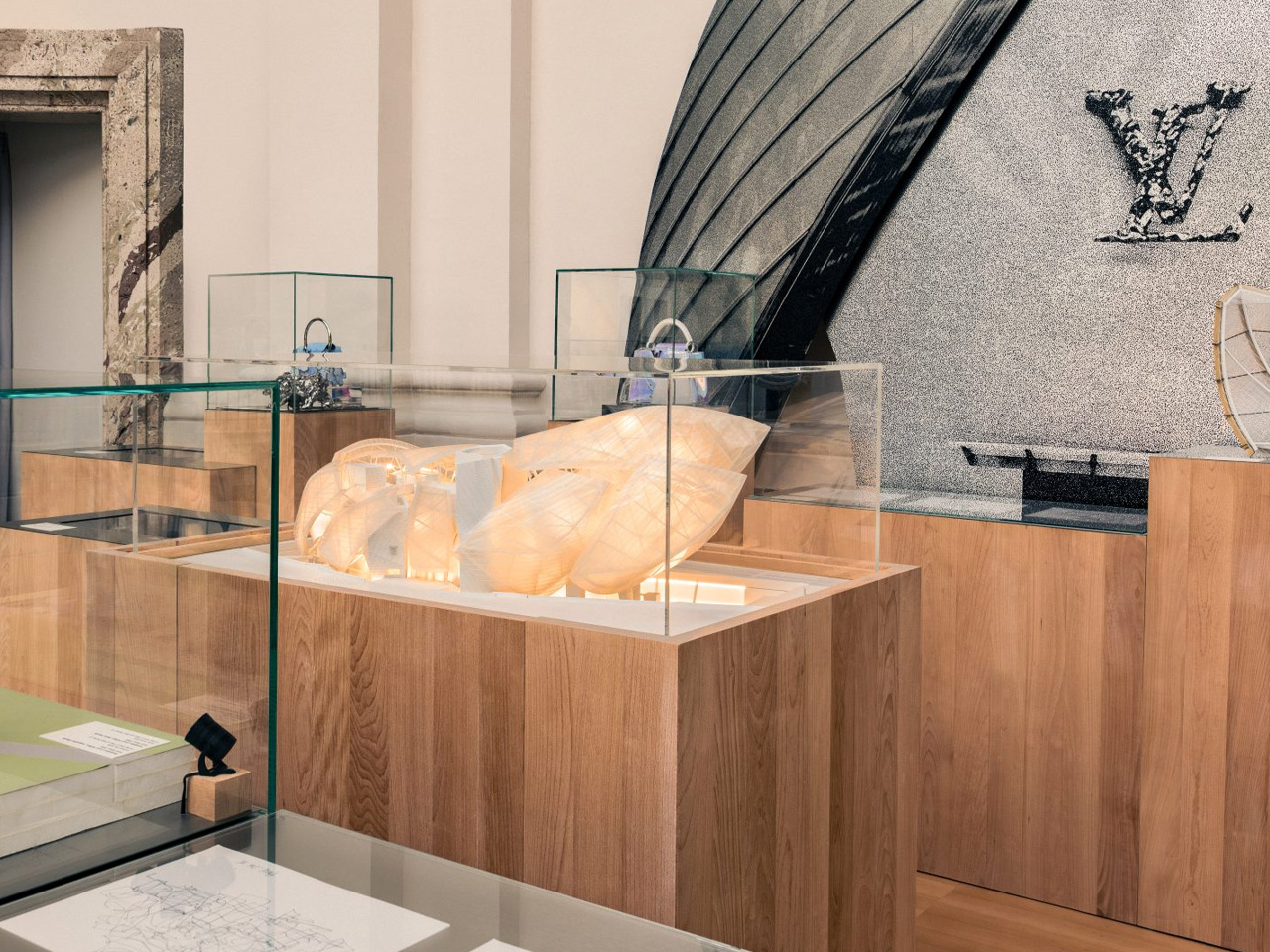
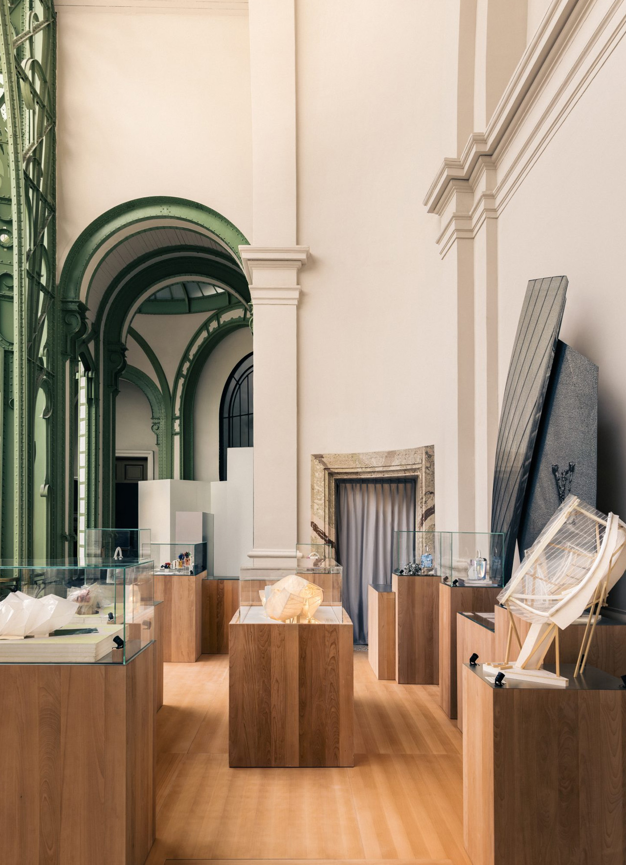
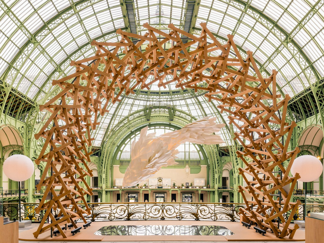
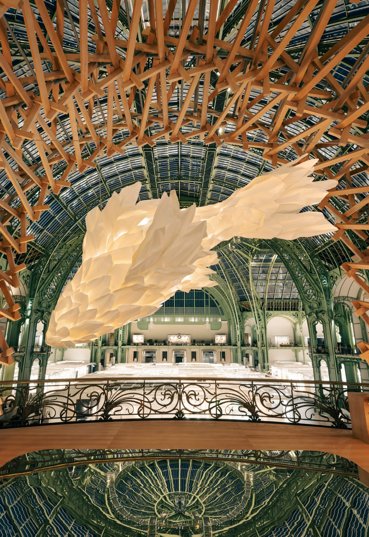
For the 2024 edition of Art Basel Paris, which took place from October 18th to October 20th, Louis Vuitton celebrated Frank Gehry and his incredible works. They displayed his massive white fish lamp and other creations inside the Grand Palais. Frank Gehry and Louis Vuitton have collaborated for over 20 years together. Gehry was the brains of the architectural wonder, the Maison Louis Vuitton Seoul, which showcases a stunning glass-covered exterior and fluid lines. Gehry also made a collection of stoppers for the Les Extraits perfume bottles in 2021, and in 2023, Vuitton displayed Gehry’s debut collection of handbags at Art Basel Miami. So it is no surprise, that the brand decided to embellish the Balcon d’Honneur with his lighting design. A wooden arch that Gehry displayed at Gagosian New York is placed around the monumental fish lamp. The arc is built from slats placed in geometric patterns.

Designer: Louis Vuitton x Frank Gehry

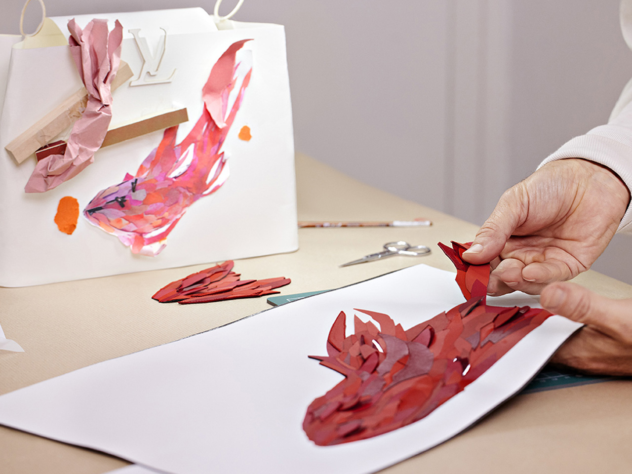
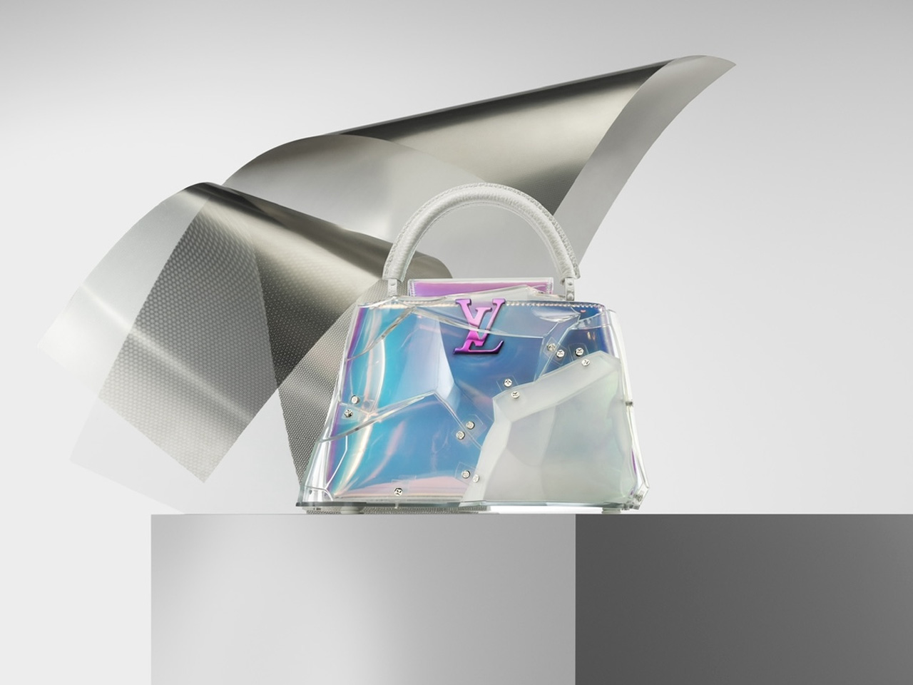
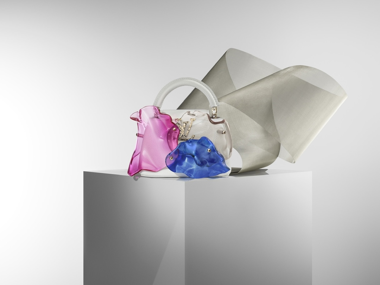
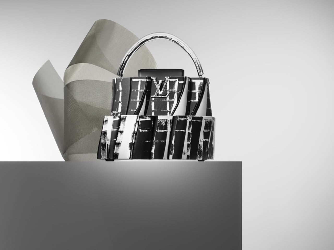
The white fish lamp isn’t the only work by Gehry that has been displayed. The lamp is teamed up with many of his collaborations with Louis Vuitton, including the aforementioned handbag range from Art Basel Miami. These beautiful bags are protected by glass, giving visitors a clear and concise vision of them. The bags draw inspiration from the architect’s style and design philosophy, which is marked by flowing lines and ballooned shapes.

The Capucines Mini Blossom and Mini Puzzle bag have been displayed, and other bags such as the Capucines MM Concrete Pockets BB Analog, and BB Shimmer Haze – bags that are inspired by architecture he has designed such as the Guggenheim Museum in Bilbao, Spain, the Walt Disney Concert Hall in Los Angeles, the IAC Building in New York City, and the Museum of Pop Culture in Seattle.

Louis Vuitton’s Monogram canvas trunk is iconic, and Frank Gehry designed his version of it in 2014. The collection is called the Celebrating Monogram, and it was unveiled for the Maison’s 160th anniversary. The trunk is called the Twisted Box, and it truly does have a twist, it almost looks kind of deformed, yet appealing. Visitors will get an opportunity to glimpse this unique and iconic trunk design as well.

The post Louis Vuitton Celebrates Their 20 Year Collaboration With Frank Gehry At Art Basel Paris 2024 first appeared on Yanko Design.

Lexus concept car displayed as a light sculpture in Miami exhibition

When you’re visiting car exhibit shows, you expect to see nothing but cars on display. The brands have to figure out how to make it a bit more exciting and innovative since looking at cars can become repetitive and if you’re not really a car enthusiast, it can get boring. But when you’re displaying a car at an art and design exhibition, then you can expect a more non-traditional way to look at the vehicle.

Designer: Marjan van Aubel

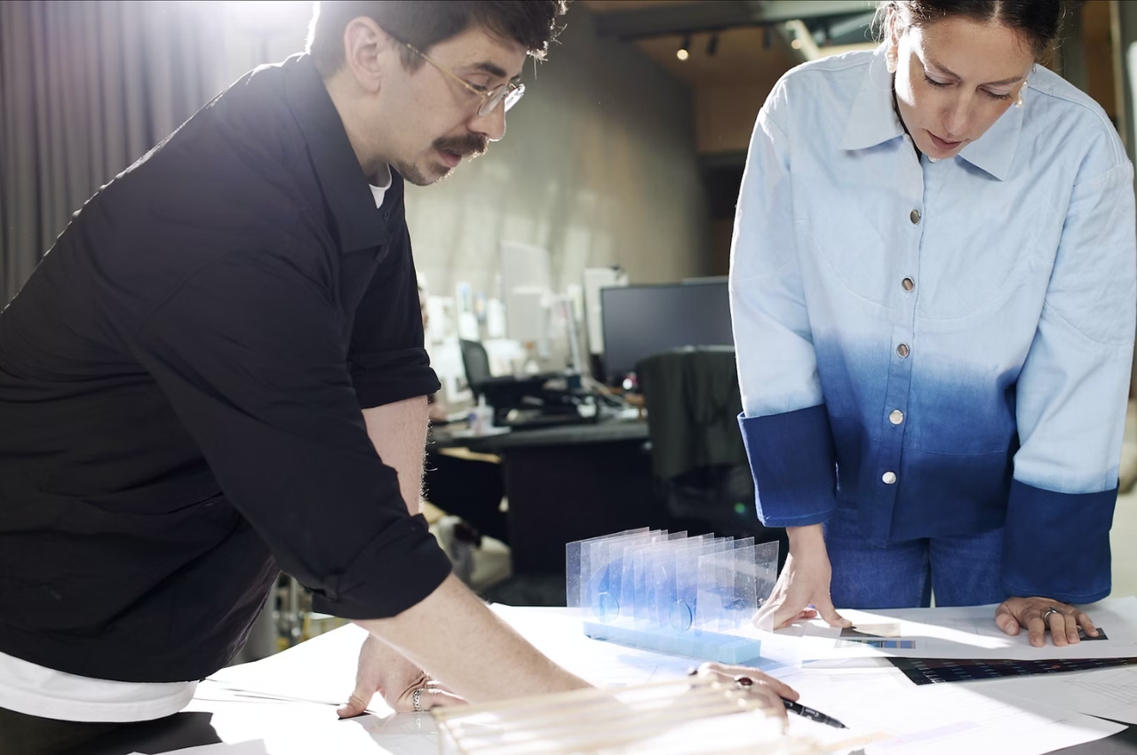
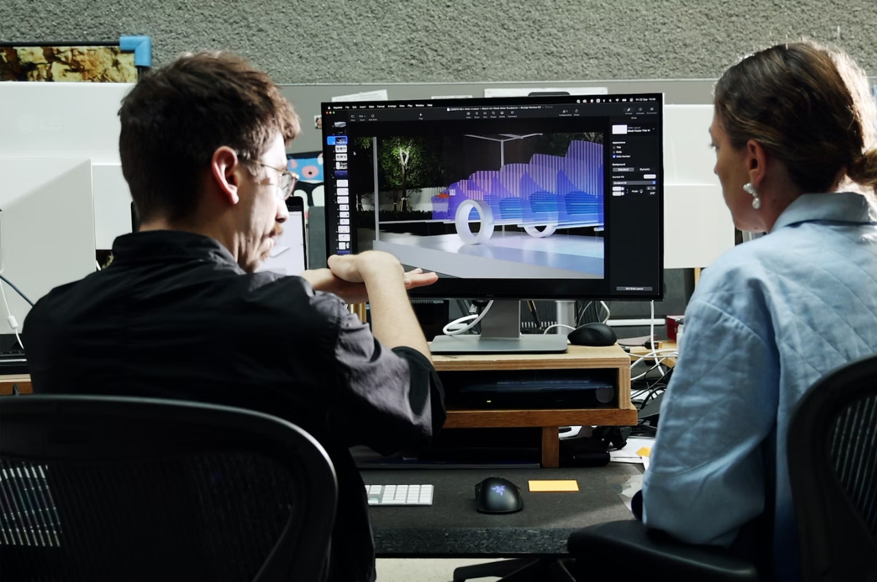
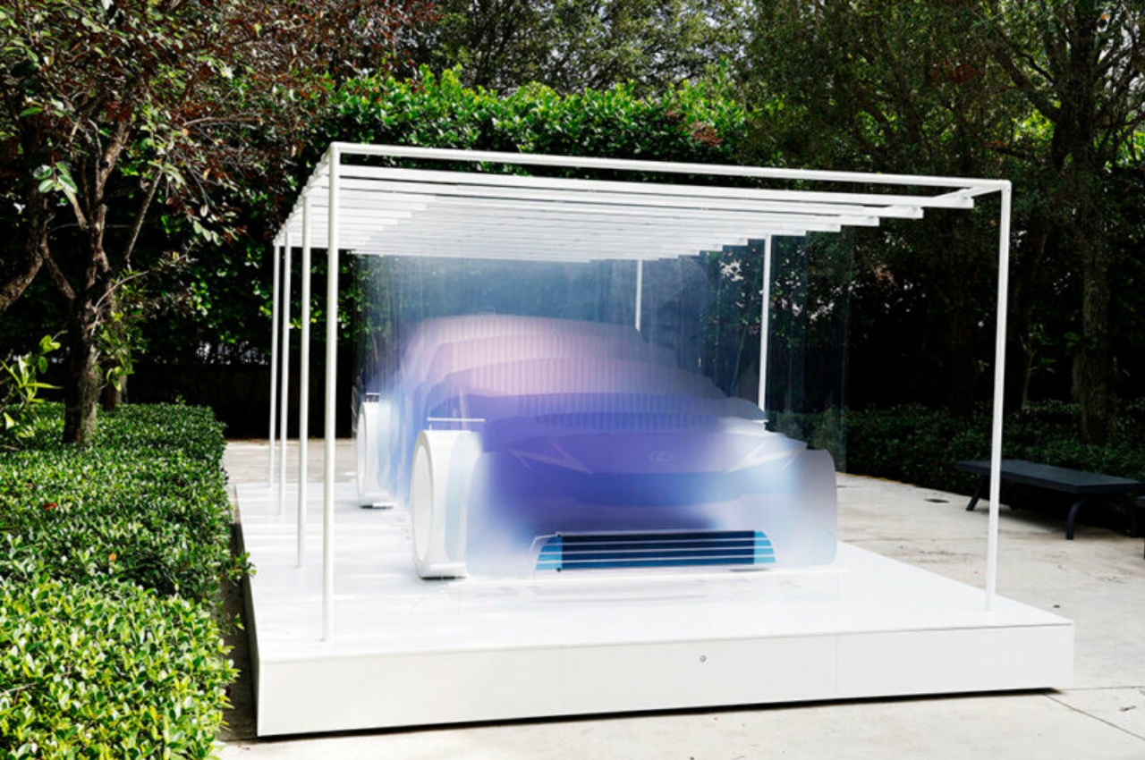
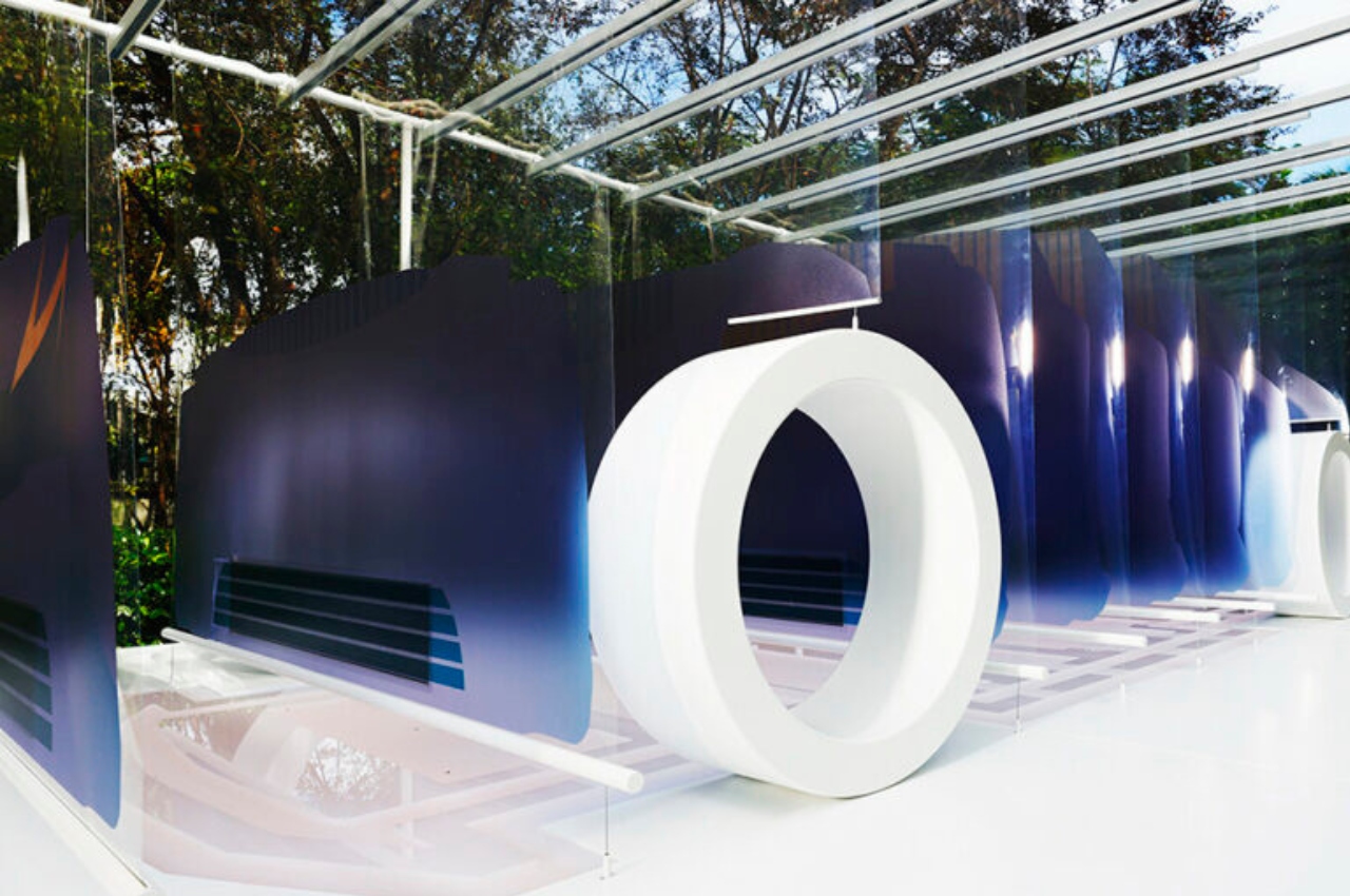
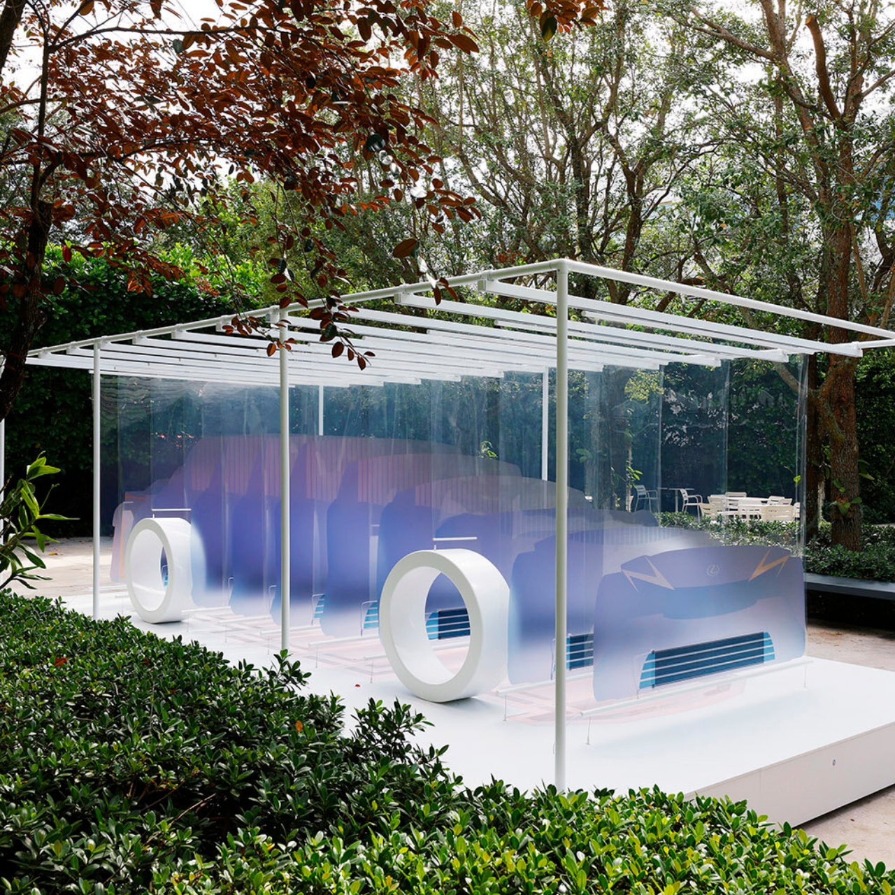
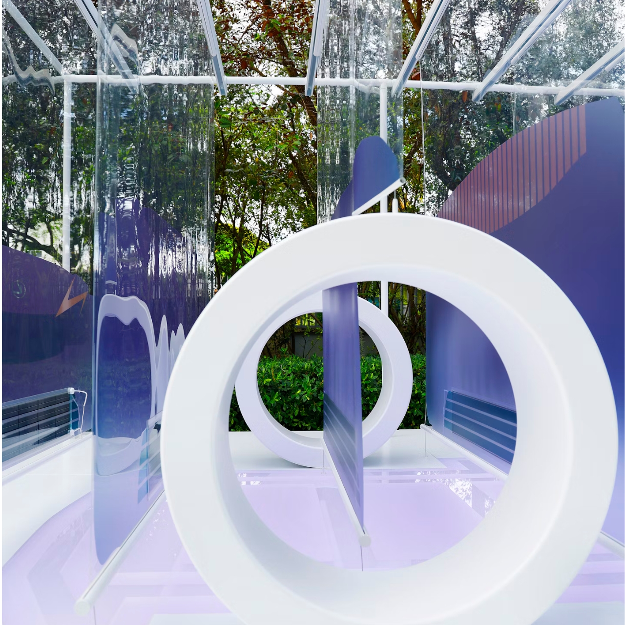
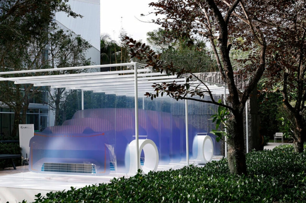
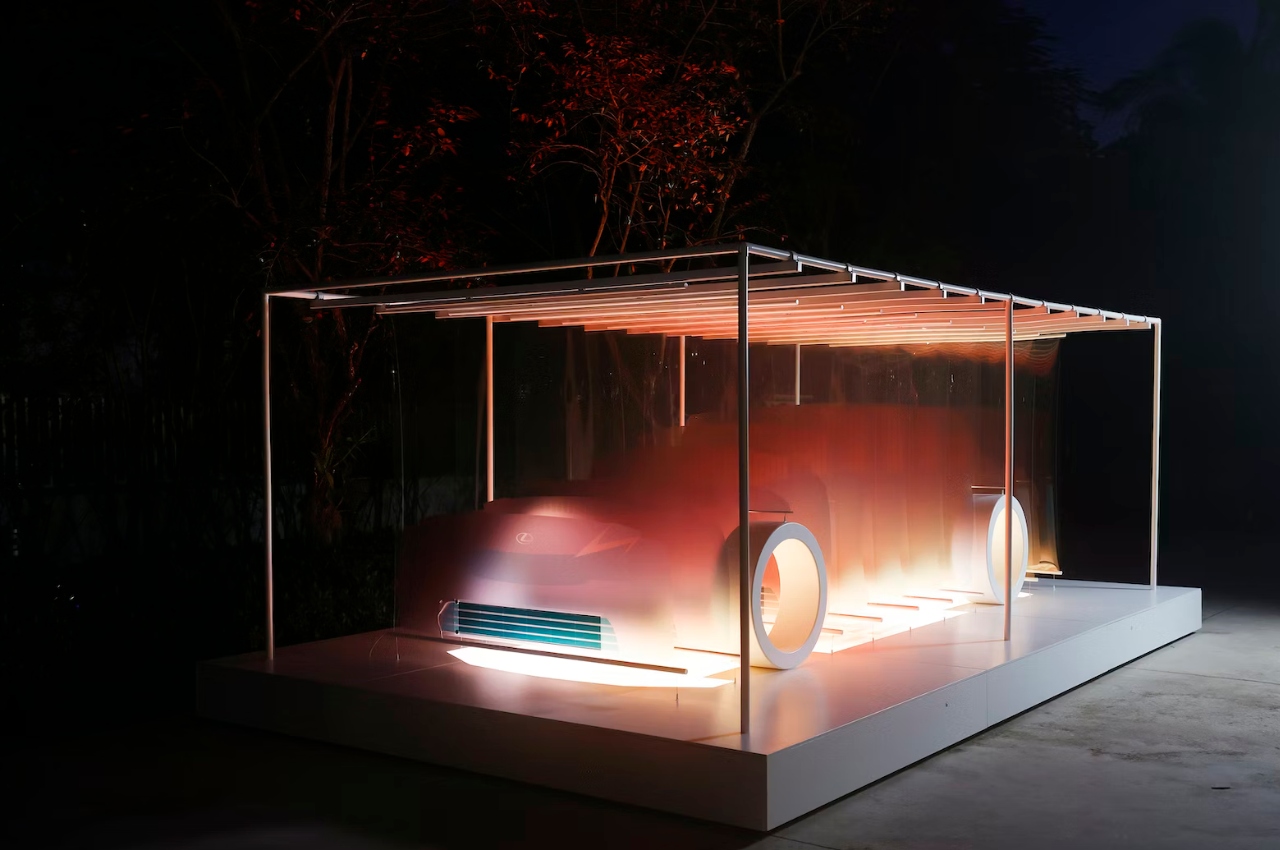
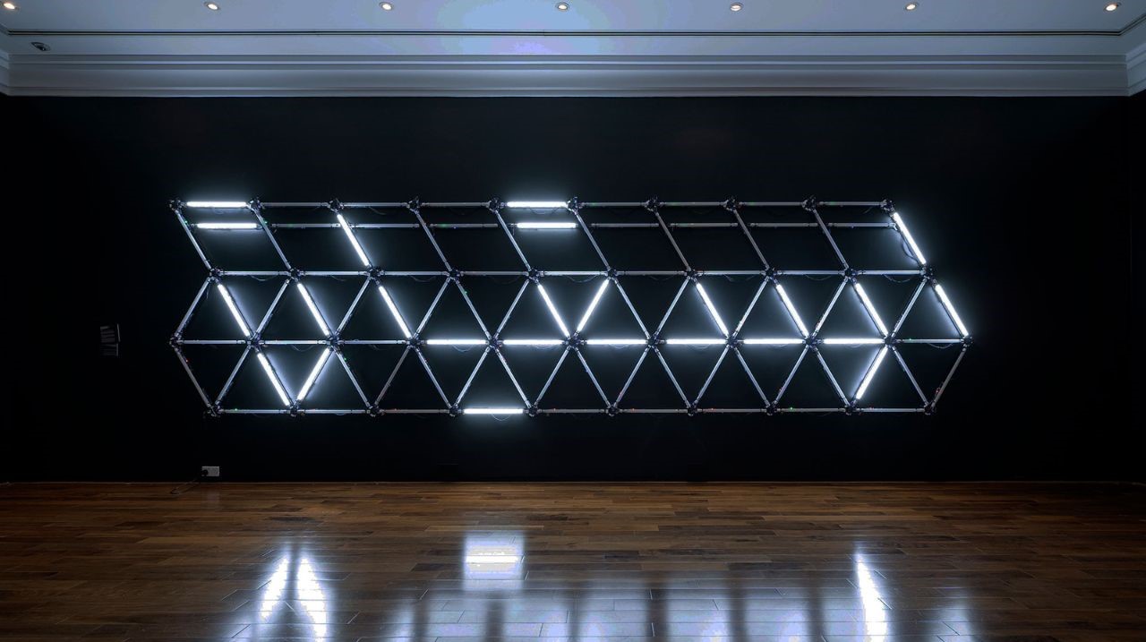
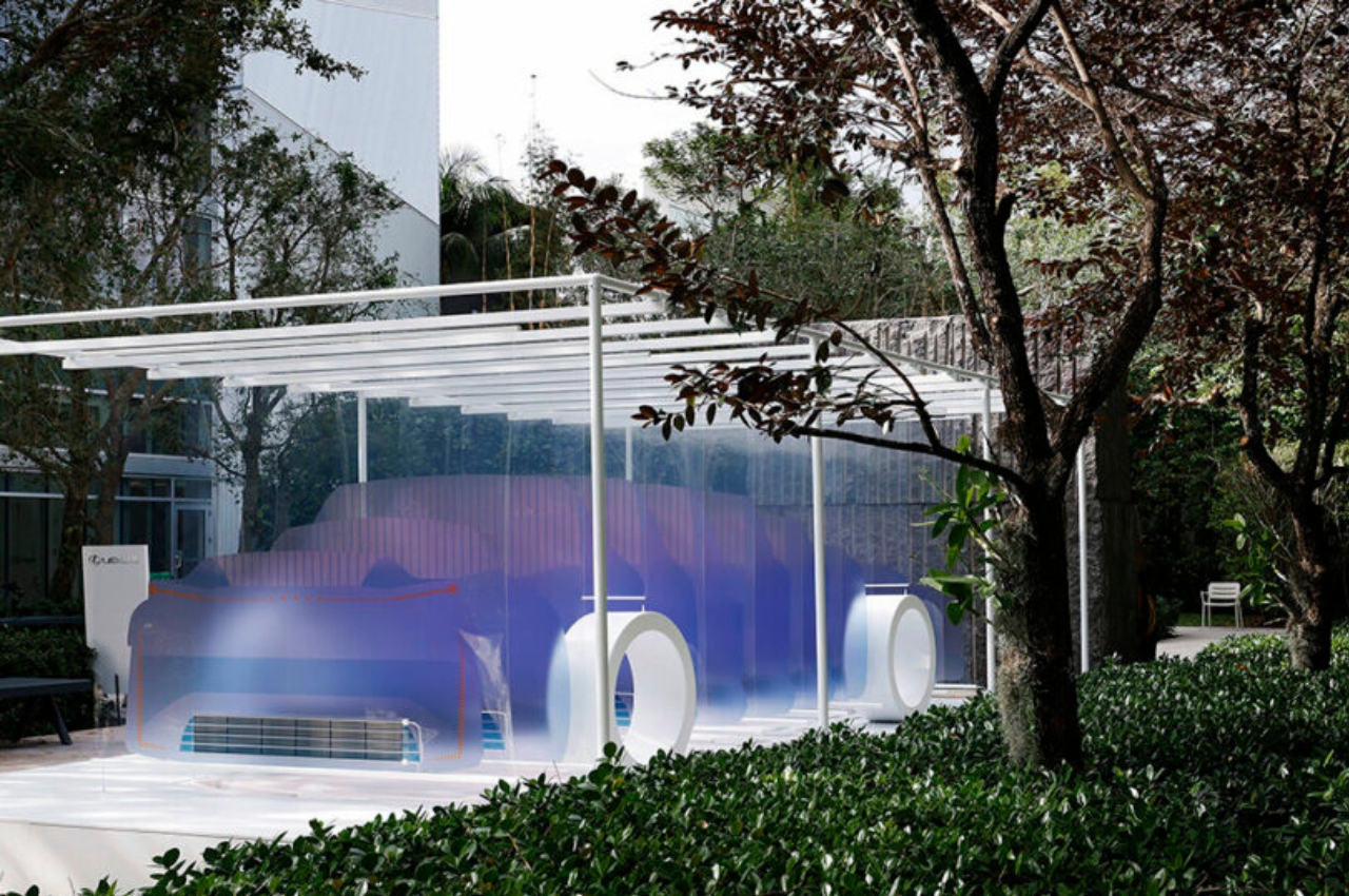
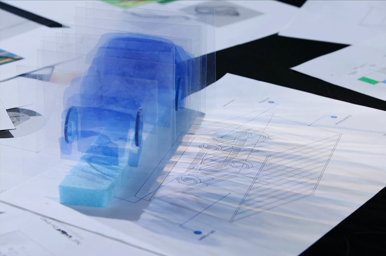
An installation to celebrate the Lexus LF-ZC Battery Electric Vehicle Concept Car is now on display at the Miami Art & Design Week. The “sculpture” is called “8 Minutes and 20 Seconds” which is the time it takes for light to reach earth. So instead of the usual car display, what you get is a self-illuminating 3D skeleton of the concept car itself. It’s made from organic transparent photovoltaic (POV) sheets and is powered by solar energy. Each cell gives off a spectrum of color and movement and they are transparent to give off the maximum effect of light and patterns.

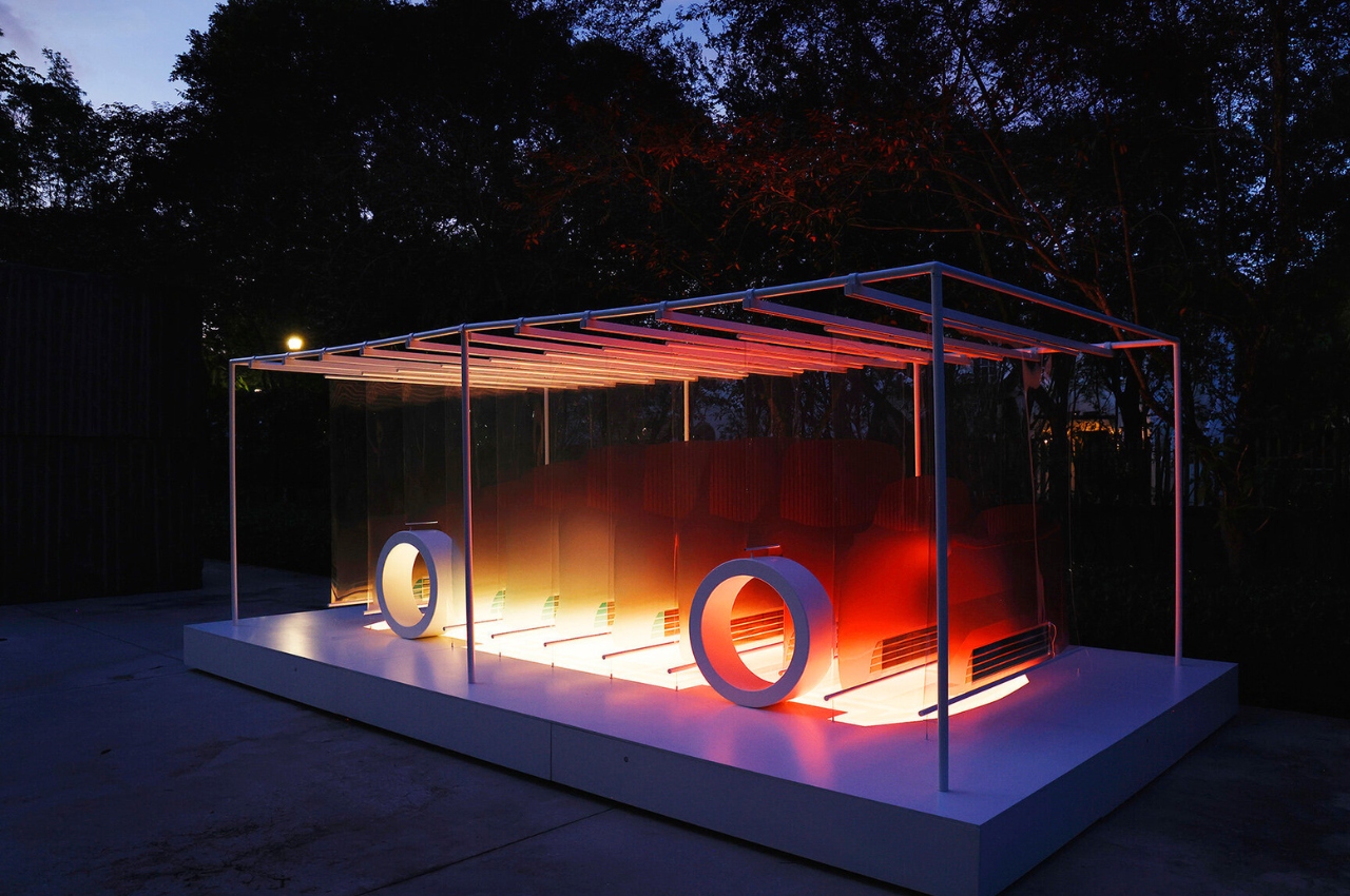
The EV Skateboard, which is where the engine will be located, is highlighted with an LED panel. It is the main feature of the car so this is where eyes will be drawn. Depending on where you’re standing, you’ll get a different perspective of the sculpture. There are also motion sensors which will let the car respond to those walking around, triggering a ripple through the LED light panels. You will also hear bamboo chimes since the concept car uses bamboo materials as well.

Every 10 minutes, you’ll get a crescendo of sound and light patterns. Since the sculpture is located in a garden setting, the color temperature also shifts along with the natural circadian rhythms of its surroundings. It’s a pretty interesting thing to see this in person and to experience a different kind of display for cars, even if it’s still just a concept car.

The post Lexus concept car displayed as a light sculpture in Miami exhibition first appeared on Yanko Design.

Top 10 Artworks Showcased at Ars Electronica Festival by Debutant VCU Arts Qatar

In the ever-evolving landscape of art and cultural production, the intersection of creativity, technology, and diverse cultural influences continues to be a rich source of inspiration. The Qatar campus of Virginia Commonwealth University’s School of the Arts, known as VCUarts Qatar, has emerged as a vibrant hub for this convergence. Established in 1998 through a partnership with the Qatar Foundation, VCUarts Qatar bridges the gap between the global art and design community and the Middle East’s rich cultural tapestry. This year, VCUarts Qatar made its debut at Ars Electronica, the renowned festival of art, technology, and culture, with an exhibition titled “Meta-Functions of Cultural Production.”

Designer: Meta-Functions of Cultural Production (VCUarts Qatar)
“Meta-Functions of Cultural Production” is not just an exhibition; it’s a window into the multifaceted world of cultural production and preservation, as seen through the eyes of undergraduate and graduate students and student-faculty collaborations. It reflects the diverse creative ecosystems of Qatar and the broader SWANA (Southwest Asia and North Africa) region, offering a kaleidoscope of perspectives on the metafunctionality of cultural production.

What sets this exhibition apart is its celebration of interdisciplinary collaboration. Students and faculty at VCUarts Qatar are pioneers in hybrid forms of creative practice, boldly straddling the realms of art, design, science, and technology. “Meta-Functions of Cultural Production” serves as a testament to the innovative and highly collaborative approaches fostered within this academic community.

The selected works on display tackle complex issues and challenges by offering critical insights and fresh perspectives. Visitors are invited to explore and decipher meaning through various cultural forms and contexts embedded within systems of communication, behavior, and interaction.

The exhibition features 10 of the remarkable works that encapsulate these themes:

1. Electric Calligraphy
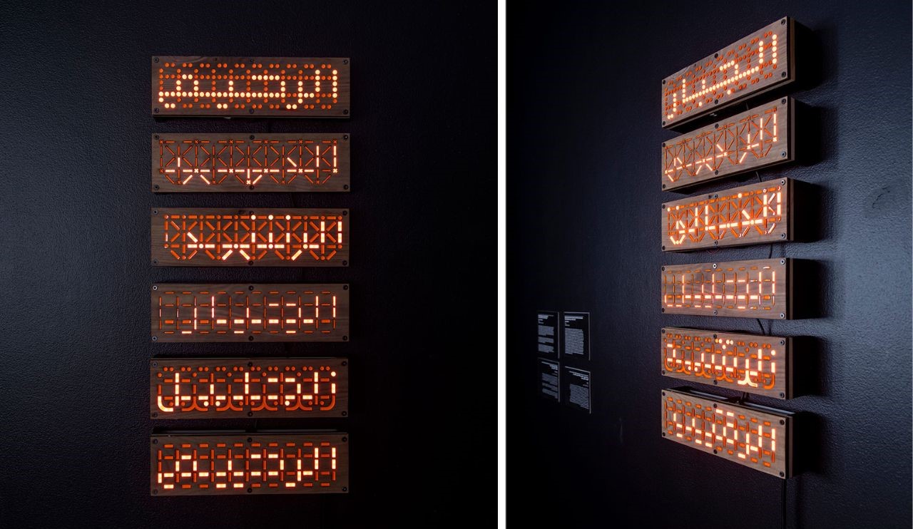
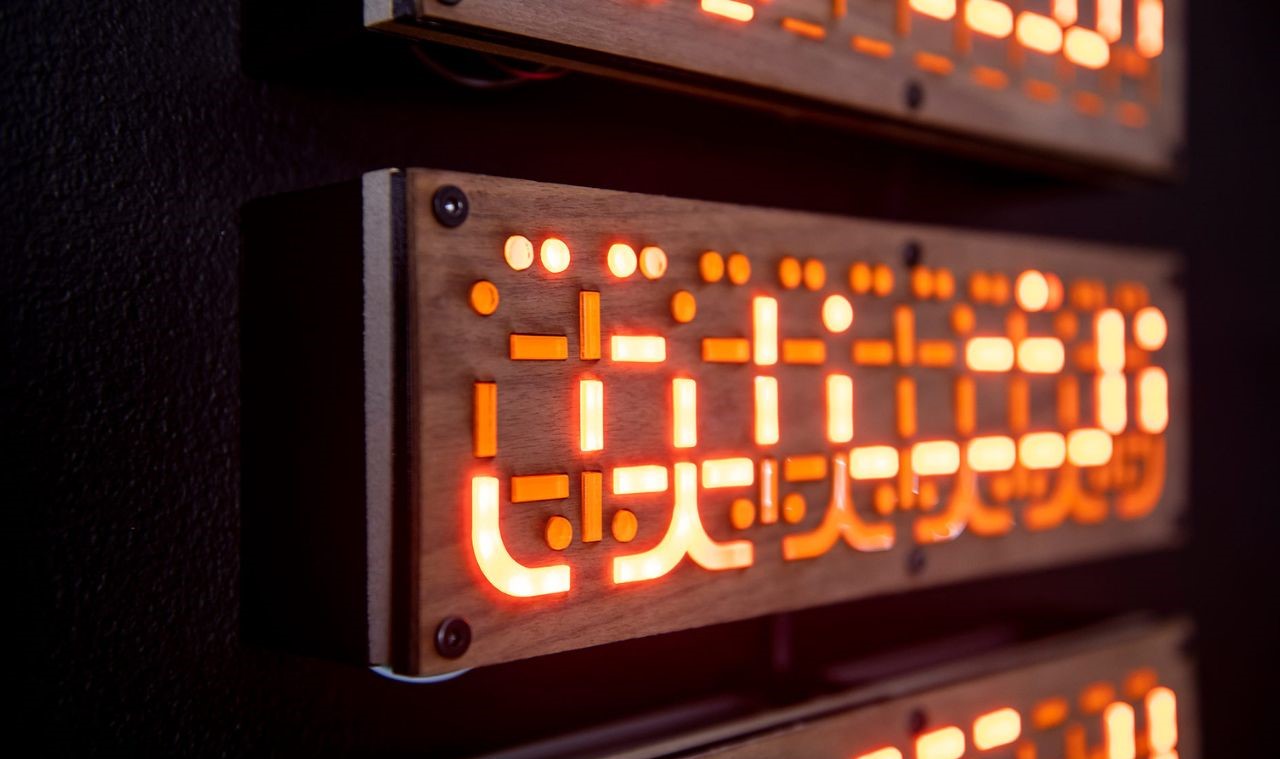
Created by Lana Abou Selo, Fatima Abbas, and Levi Hammett, this series innovatively revisits the Arabic script’s evolution within Latin-based technological boundaries. This series of typeface designs offers a fresh perspective on contemporary type design. By utilizing light-guided, segmented, and modular calligraphy, it introduces a contemporary avenue to honor their profound meanings.

2. Fast Paced Life
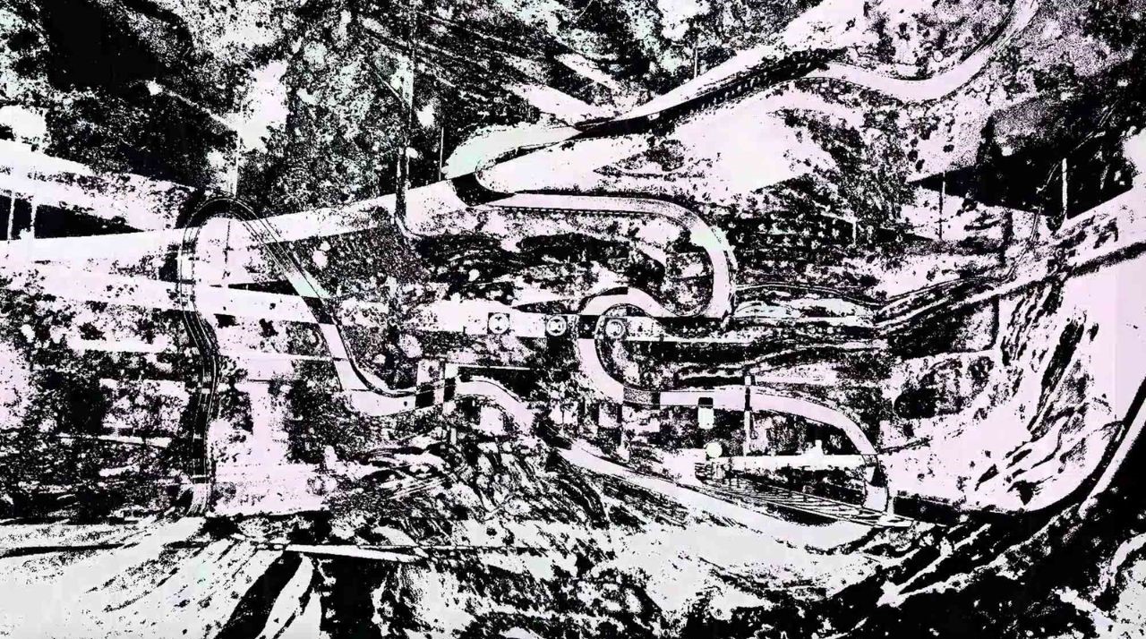
Ghayda Abduljalil’s mixed-media audio-visual installation examines mindless habits in modern society that provide momentary satisfaction, such as social media scrolling and fast fashion consumption. This project combines videos, scanned objects, paintings, poetry, and soundscapes to explore the complexities of modern living. Through diverse mediums, it conveys the emotions of interruptions, multitasking, and overwhelming experiences.

3. Morphing Memories
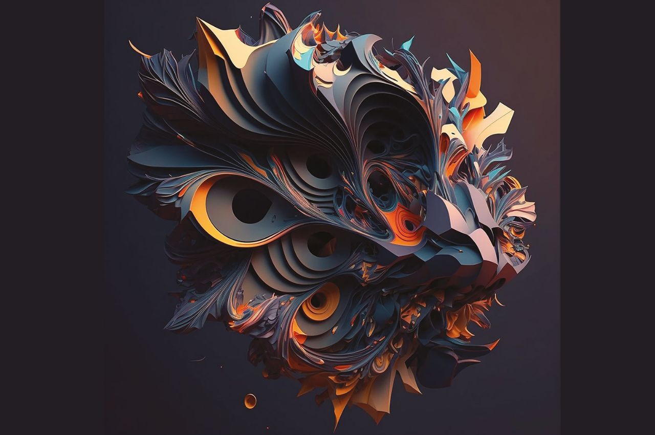
Jameela AlHumaidi’s AI-driven generative artwork merges blind-contour art and technology. It utilizes a database of hand-drawn portraits to explore the intersection of individual facial traits and AI’s creative potential. This project births a unique abstract art form, celebrating the elegance of minimalist lines and the synergy between human artistry and artificial intelligence.

4. Nanoabaya
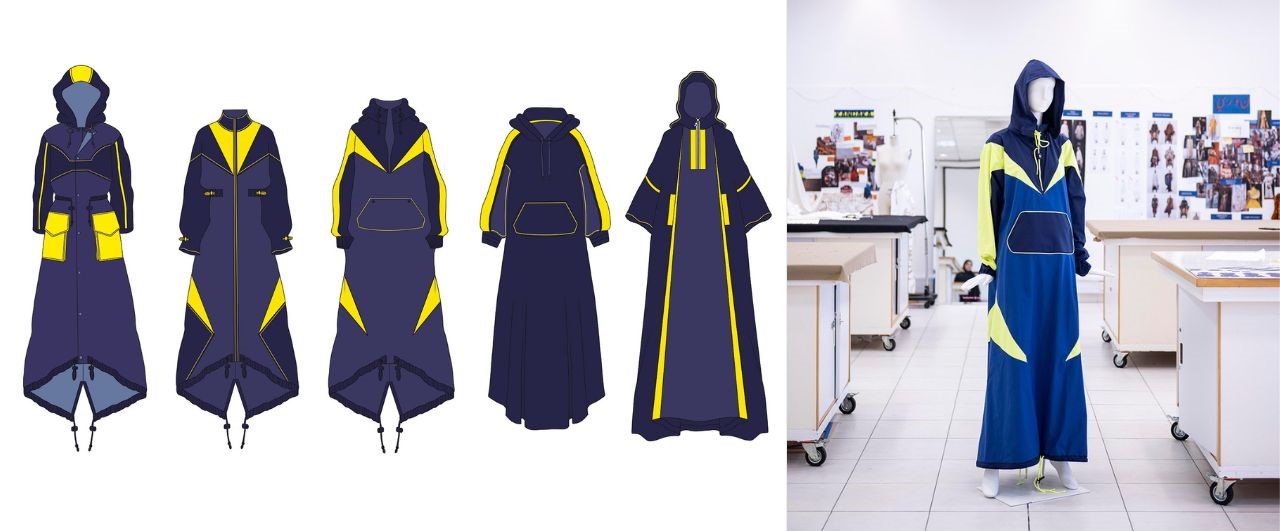
Designed by Noor Rashid Butt in collaboration with Physics Professor Khaled Saoud. This innovative garment employs nanotechnology to enhance Vitamin D synthesis while protecting against harmful UVB rays, ideal for extreme summer conditions. Additionally, it provides thermal insulation, ensuring the wearer’s comfort by blocking heat particles—a fusion of fashion and science.

5. Preceding Emptiness

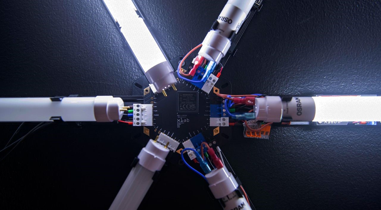
Levi Hammett, Mohammad Suleiman, Hind Al Saad, and Fatima Abbas present a groundbreaking light installation that reimagines Arabic typography. Breaking free from Latin typography’s influence, it pioneers unconventional language display technologies. Words transform into a landscape where innovative technologies forge fresh typographic forms, creating a harmonious blend of tradition, technology, and typography.

6. Rays of Essence

Created by Hind Al Saad, Sara Khalid, Joshua Rodenberg, and Fatima Abbas. Through an interactive experience, it melds digital tools with heritage, inviting viewers to engage with and shape Arabic letterforms through light. This innovative approach transcends calligraphy, offering a limitless canvas to explore our cultural identity.

7. Sacred Silence
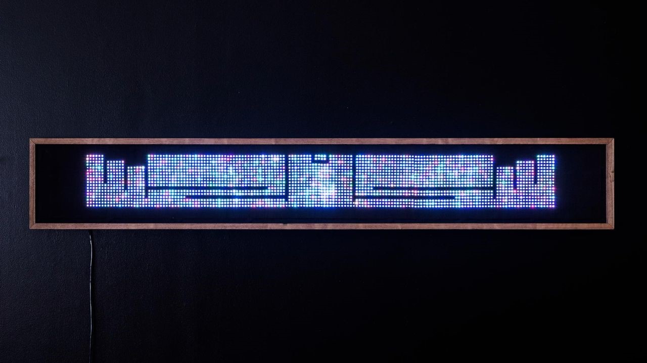
Basma Hamdy, Shima Aeinehdar, and Selma Fejzullaj explore the Arabic letter “noon” (ن) in their project. The project delves into the significance of the Arabic letter ‘noon’ (ن), positioned at the midpoint of the alphabet. It holds spiritual importance in Islam, opening Surat-al-Qalam in the Quran. This reversible and symmetrical letter symbolizes reflection and reversibility, embodying the interplay between inner spirituality and outward tranquility, inviting contemplation and self-discovery.

8. Stimulated Fashion
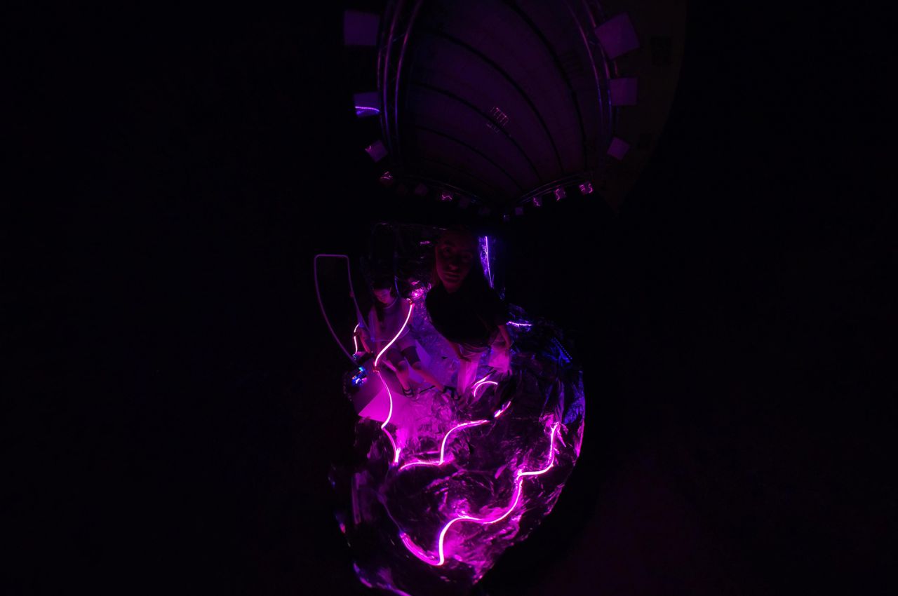
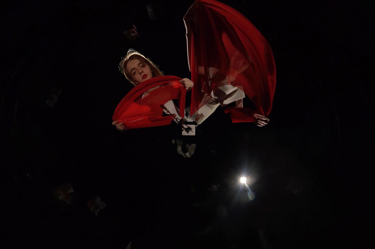
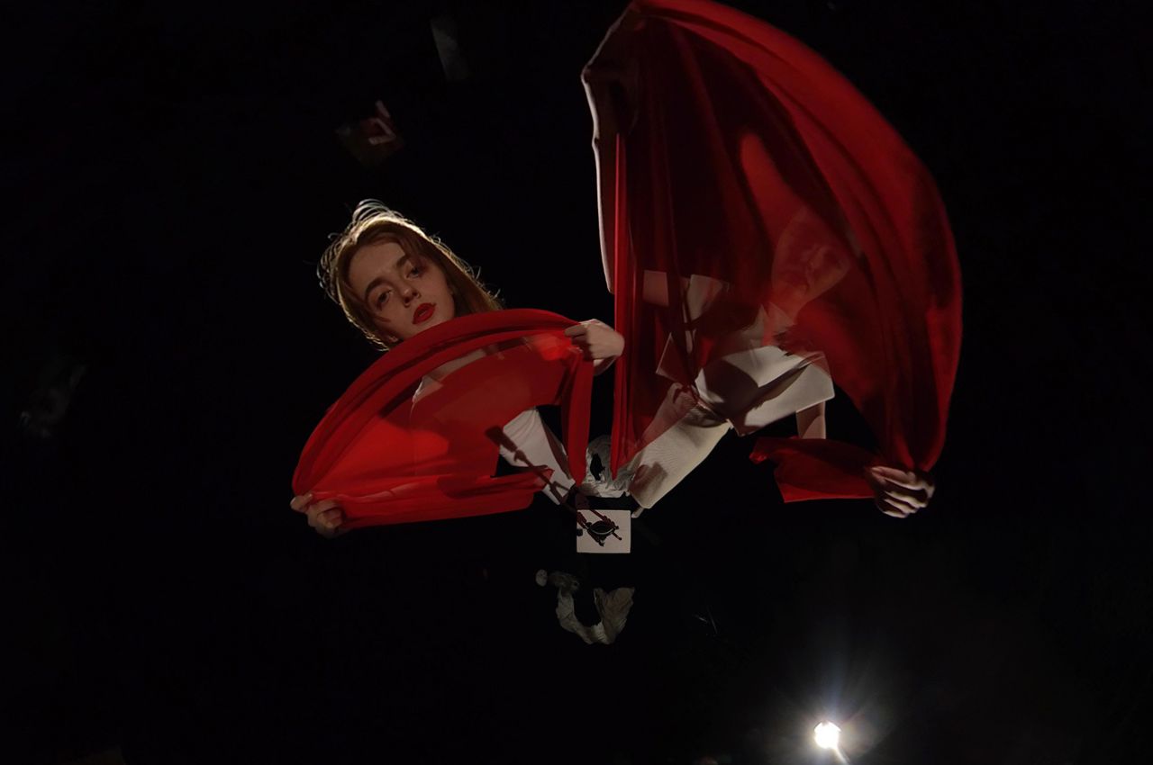
This project is an immersive video created by students in the Art Foundation’s Time Studio. It comprises 12 collaborative films, each offering a 30-second 360-degree experience, highlighting Fashion Design Senior collections. These collections weave captivating narratives, merging fashion, cutting-edge technology, and filmmaking. They invite viewers into distinct worlds, where creativity knows no bounds.

9. Stitch by Stitch
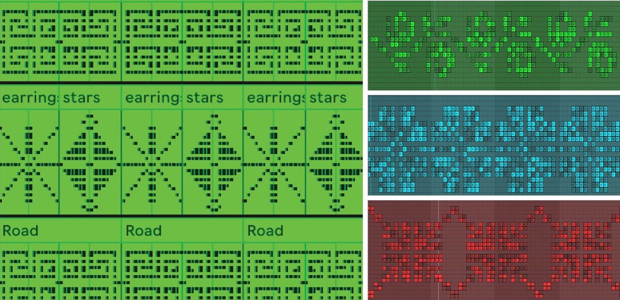
Naima Almajdobah’s “Stitch By Stitch” project seeks to preserve and reinterpret traditional Palestinian textile patterns using modern techniques and mediums, including visual communication and sonification. It spans three interconnected phases: experience, translation, and dissemination. Modern techniques, including visual communication and sonification, help bridge the past and future, safeguarding Palestinian customs and traditions while connecting generations.

10. Transformative Distortions
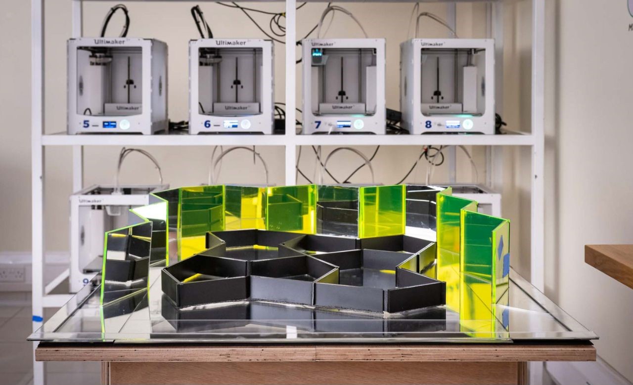
Jood Elbeshti’s project delves into the intriguing concept of morphing a stable square into a dynamic entity through motion. This artistic exploration challenges the traditional notion of stability and order. This innovative concept, initially rooted in interior architecture, explores novel connections between body, mind, and space. Its adaptability extends to larger residential solutions and foldable housing, offering responsive living environments that redefine traditional design paradigms.

“Meta-Functions of Cultural Production” at Ars Electronica serves as a testament to the power of interdisciplinary collaboration, technology, and culture in the hands of emerging artists and scholars. The selected works challenge preconceived notions and invite visitors to embark on a journey of exploration, interpretation, and meaning-making within the intricate web of cultural production. As VCUarts Qatar continues to bridge the gap between East and West, it demonstrates that art and culture are truly universal languages capable of fostering cross-cultural exchange and understanding. This exhibition is a vivid reminder that the pursuit of truth in cultural expression is a collective endeavor that transcends boundaries, embracing the richness of human diversity.

The post Top 10 Artworks Showcased at Ars Electronica Festival by Debutant VCU Arts Qatar first appeared on Yanko Design.
Arup’s exhibition at London Design Festival showcases a regenerative future where people and nature co-exist

The London Design Festival is an annual event that takes place in the capital of the United Kingdom. It promotes London as a pioneering design capital globally, and this year the festival celebrated its 20th anniversary! ‘Arup’ was a key partner this year, and was involved in a myriad range of activities and projects. Arup’s Foresight team presented an exhibition on the topic of ‘Regenerative Futures’. The team explored what a regenerative society could look like in the future. They showcased their explorations through a series of props from designers and researchers who work in regenerative design themselves.

“The concept of regenerative design calls for a long-term transformation to combine the needs of people with those of the planet by re-thinking and redesigning the world around us. ” Which is exactly what Arup succeeded in doing – they’ve created designs that help humans and nature co-exist seamlessly.  Other regenerative companies featured in the exhibition were – EOOS NEXT, Blast Studio, Lulu Harrison, Rachel Horton-Kitchlew, Green&Blue, SPACE10, and Studio MOM.

Designer: Arup

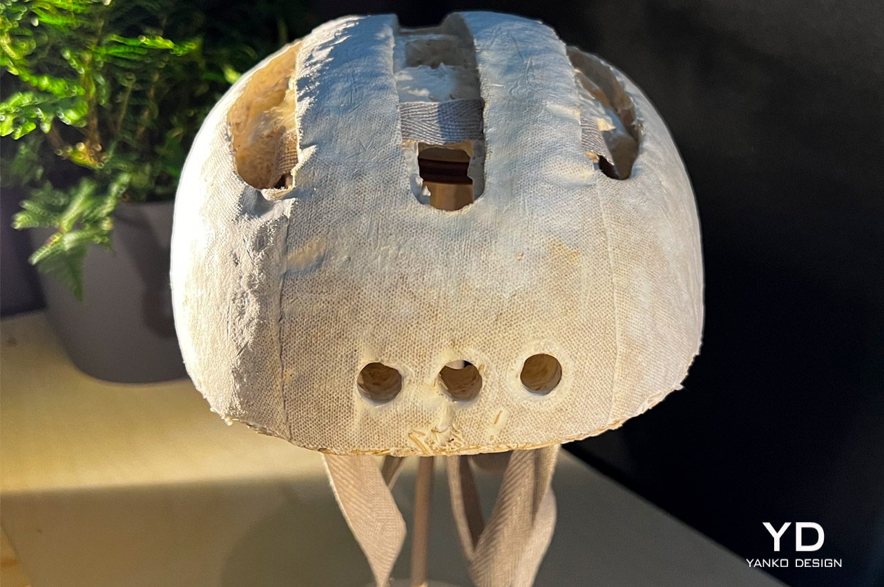
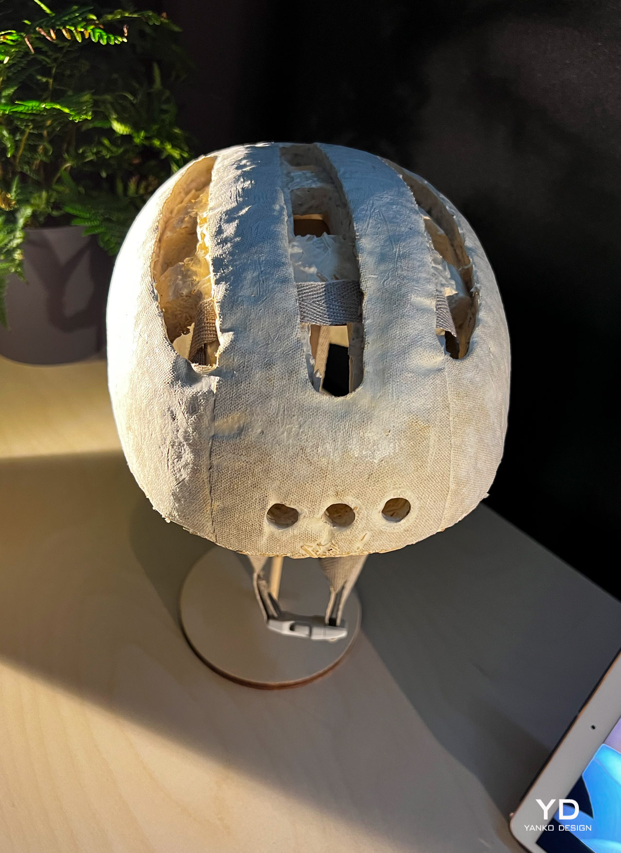
Arup and Studio MOM collaborated to create MyHelmet – a mycelium bio-manufacturing. In Arup’s imagined regenerative future -Mycelium has become incredibly popular, and the market for it has even exceeded that of concrete! In fact, the global mycelium market is valued at $6.17 trillion this year and will reach $9.72 trillion by 2070. This helmet showcases the versatility of this material. Mycelium has found immense functionality in the field of fashion, food, product design, and even the built environment industry!

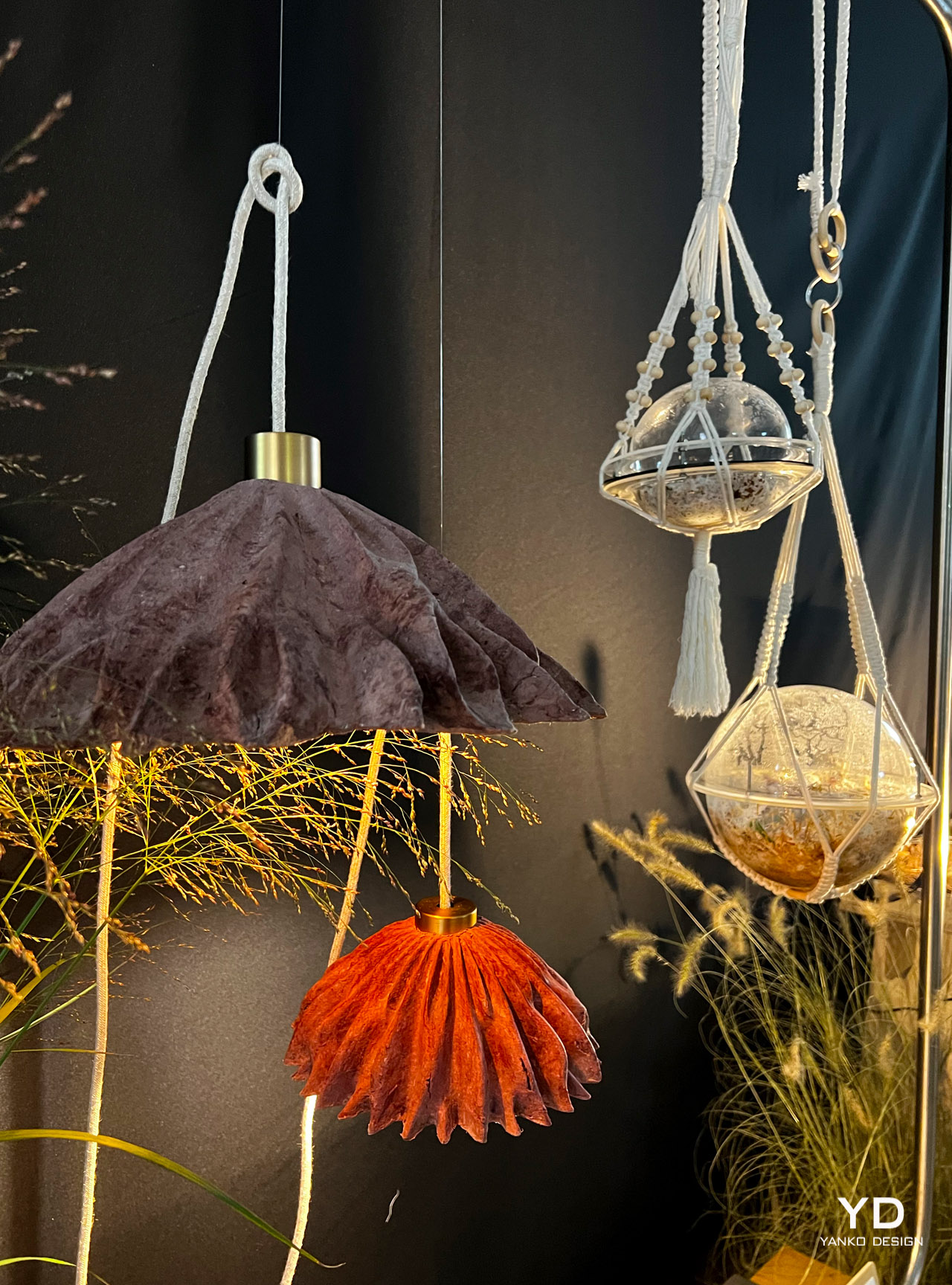
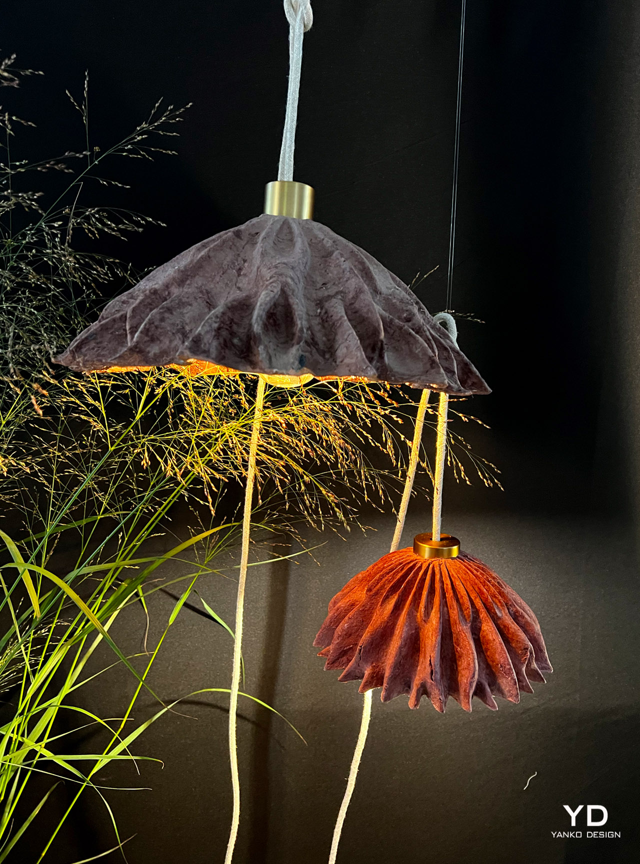
The Blast Studio created the ‘Coral Lamp’ from waste coffee cups! Since the ‘Stop-single-use’ campaigns in favor of banning single-use coffee cups haven’t worked in the past, this waste stream is utilized as a valuable material resource in the future. By transforming coffee cups into beautiful lamps – the reusability and potential of an otherwise harmful material have been showcased.

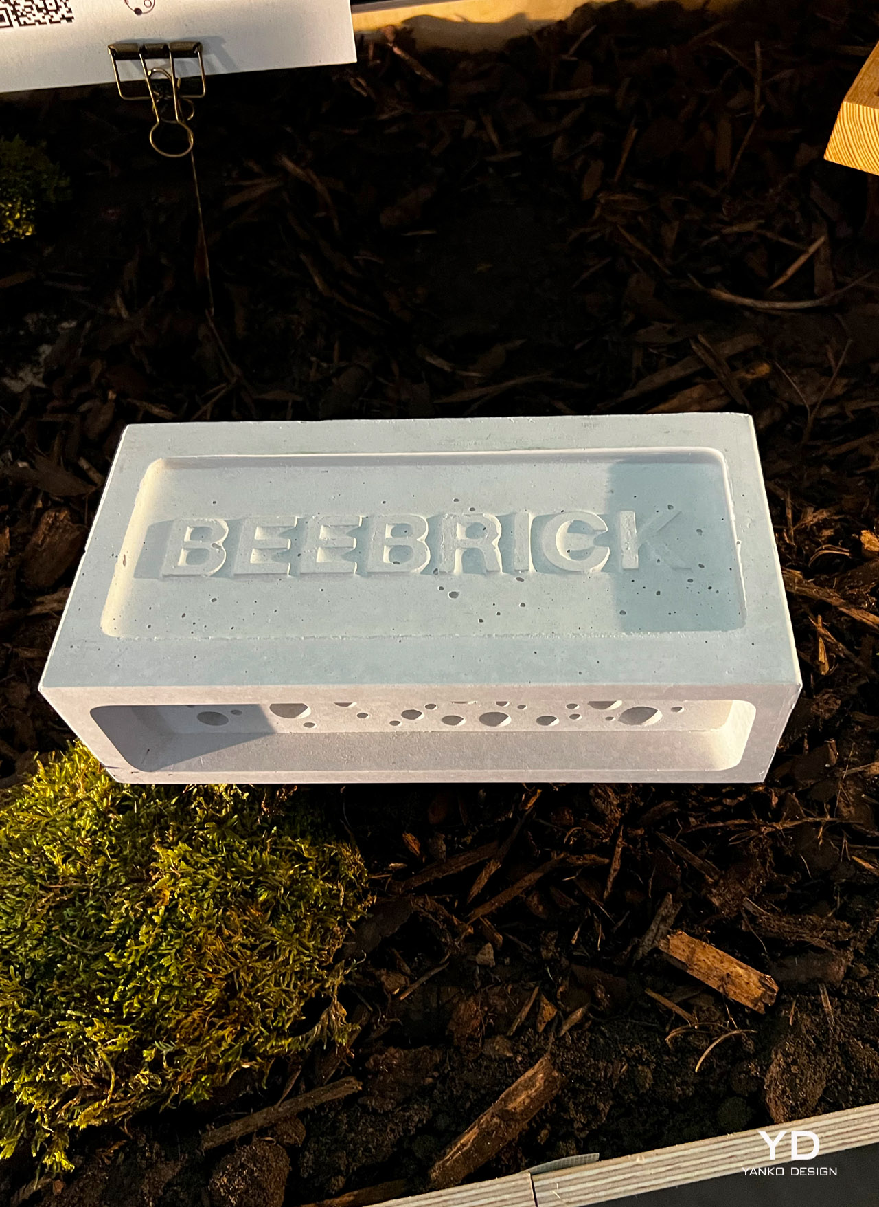
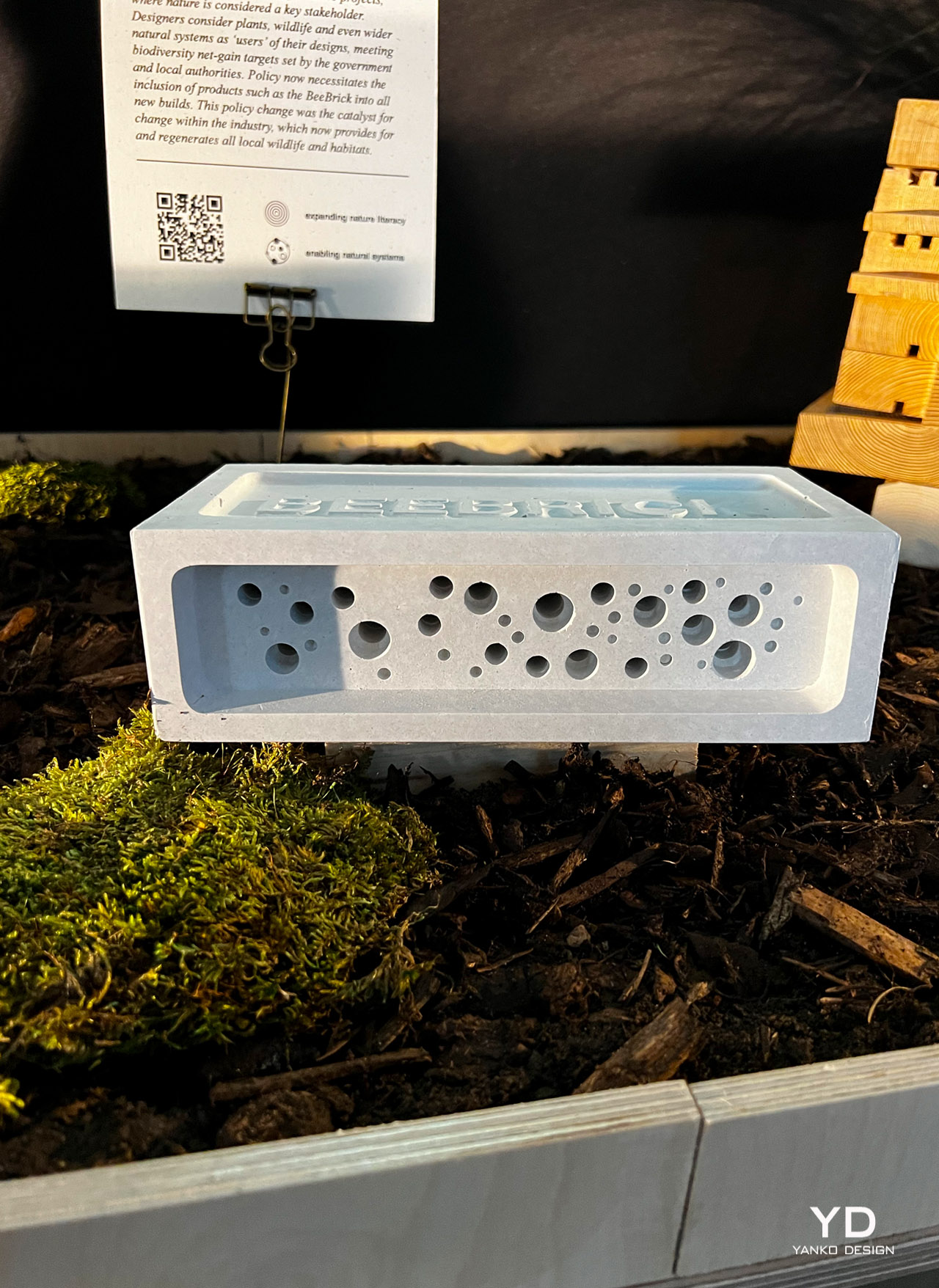
Designed by Green&Blue, the BeeBrick is a safe urban nesting for solitary bees. In the future, designers consider plants, animals, and large natural systems as actual ‘users’ of their design. According to rules and policies, products such as BeeBrick have to be included in all new builds. These policies now provide habitats for all local wildlife!

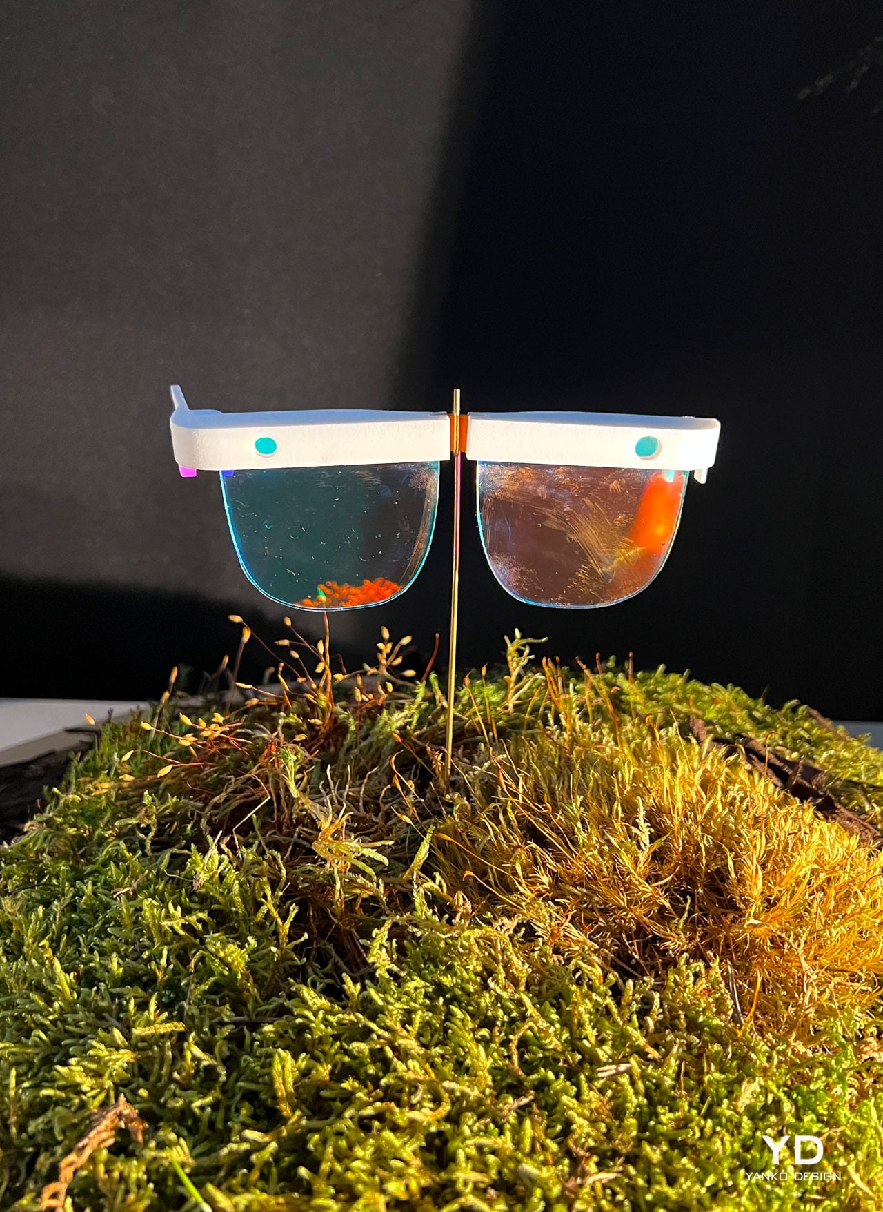
In the future, Augmented Reality technology has developed even further – allowing physical and virtual environments to merge seamlessly, through a viewing mode called ‘Mirrorworlds’. Foresight at Arup created these AR glasses which allow designers to interact with nature, and receive feedback in real-time while conducting fieldwork! The developed AR tech allows designers to easily comprehend contextual nature-based data, enabling them to deliver more net-positive outcomes.

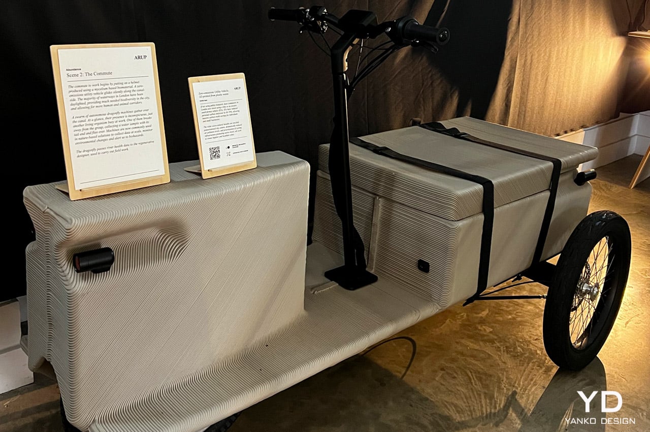
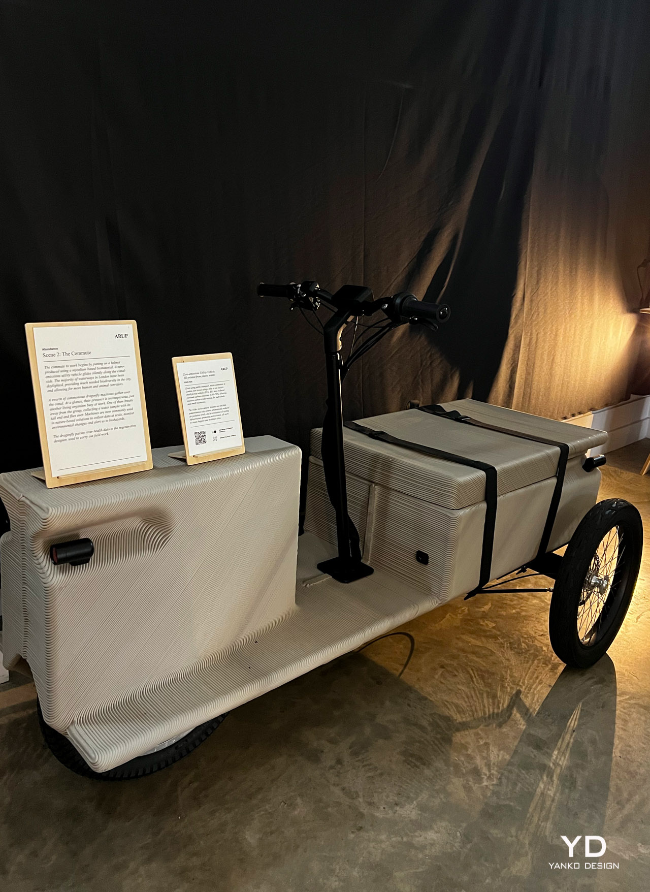
EOOS NEXT designed a zero-emissions utility vehicle that is used as a form of transport by commuters every day. It is 3D printed from plastic waste. When they aren’t using public transport, commuters travel using a bike, or an electric small-format vehicle (EVs). This has reduced personal carbon emissions by 60-70%, allowing humongous carbon credit savings for individuals and small businesses.

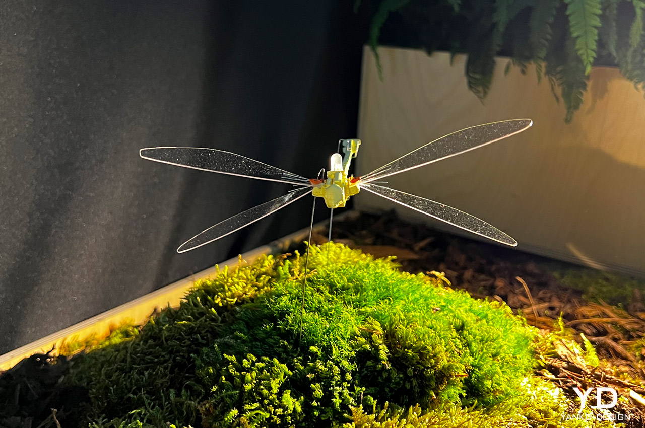
Foresight, also designed, a ‘Dragonfly’. This Dragonfly functions as an autonomous data collection machine. No one really pays attention to them in the future. They are simply regarded as living organisms busy at work! They are used in nature-based solutions, to collect data, and deliver it to regenerative designers, so they can utilize it for their fieldwork. These dragonflies also monitor changes and alert biohazards.

The post Arup’s exhibition at London Design Festival showcases a regenerative future where people and nature co-exist first appeared on Yanko Design.
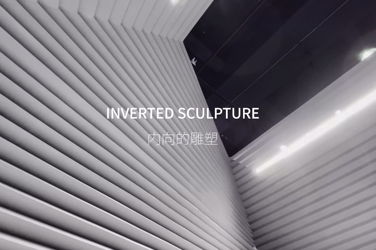
Inverted Sculpture design can be disassembled and used in a different exhibition

Two years into the pandemic, we are happy to see live events being held in most parts of the world. We remember in early 2020 when conferences and exhibitions were being canceled left and right due to the threat of coronavirus. We’re glad to know live exhibits and physical events have successfully been staged in the past few months.

There will be more and we hope the pandemic will really be over soon. There are some changes now because of requirements like proper social distancing. We feel that more changes and developments will be introduced in the future as more companies and brands join such exhibits.

Designer: Atelier Alter Architects

Atelier Alter Inverted Sculpture 11

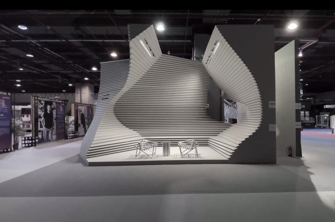
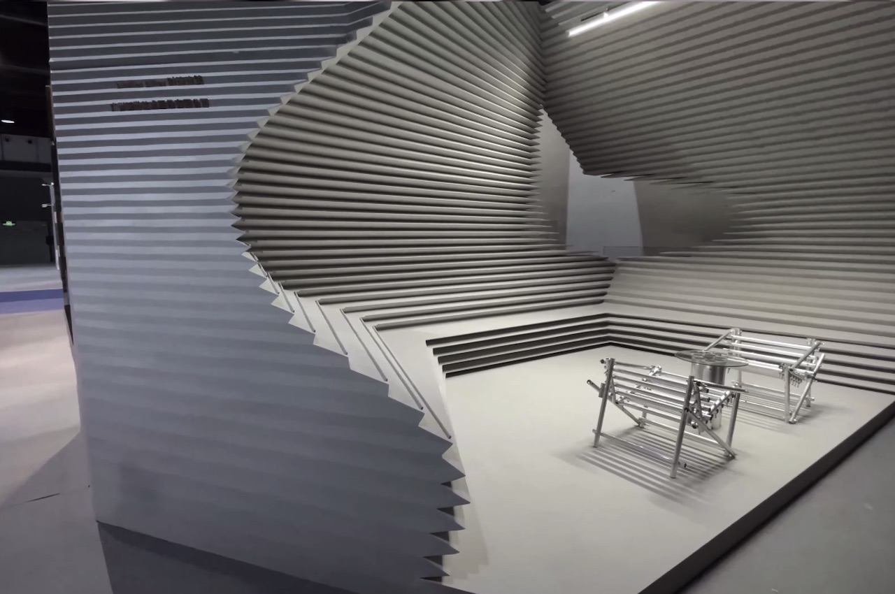
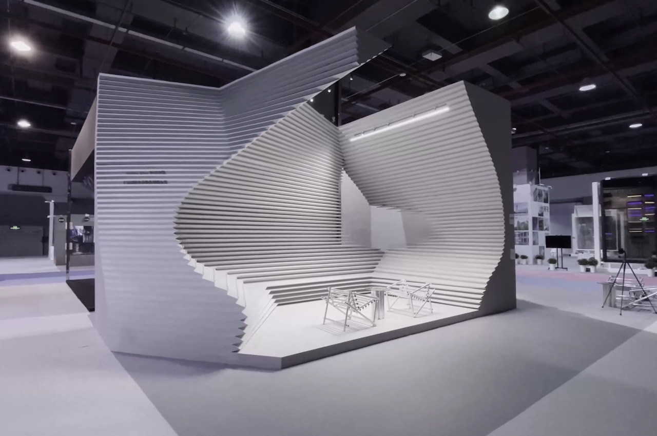
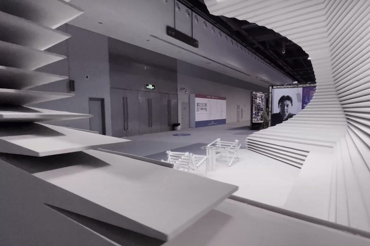
One significant change could be the design of booths or pavilions. To make things more sustainable and reduce waste, a team at Atelier Alter Architects has come up with a pavilion design that can be re-used with a different function and moved to a different place. This solution is for the common problem of construction waste after an event is over.

Atelier Alter Architects managed to create a structure that could be easily dissembled and then moved to a different location. The idea is the structure comes with single parts that may be customized according to requirements. The whole system can be used to function as a booth with lounge seats for guests and potential clients.

Atelier Alter Inverted Sculpture

Atelier Alter Inverted Sculpture 2

Officially called the ‘Inverted Sculpture, this exhibit space is ideal for eco-conscious brands that want to reduce waste. Of course, zero waste is a challenge to achieve, but, at least we have more sustainable and greener options as innovations are being introduced. The platform alone can be considered a work of art already. Add the items and products a brand needs to showcase, and you get a visual treat.

Atelier Alter Inverted Sculpture 8

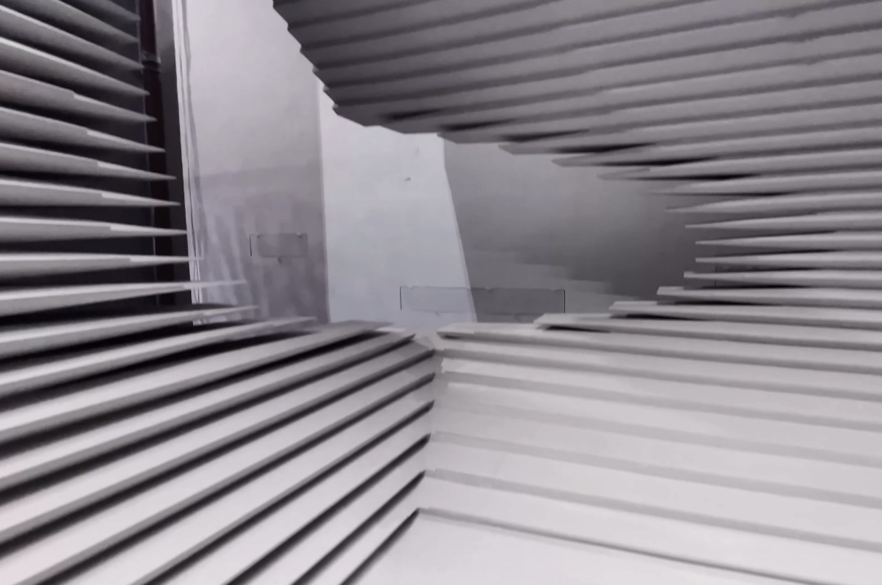
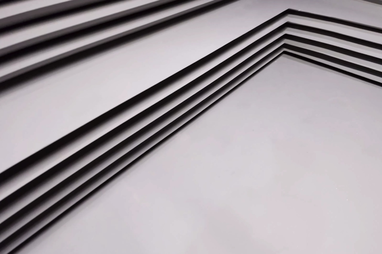
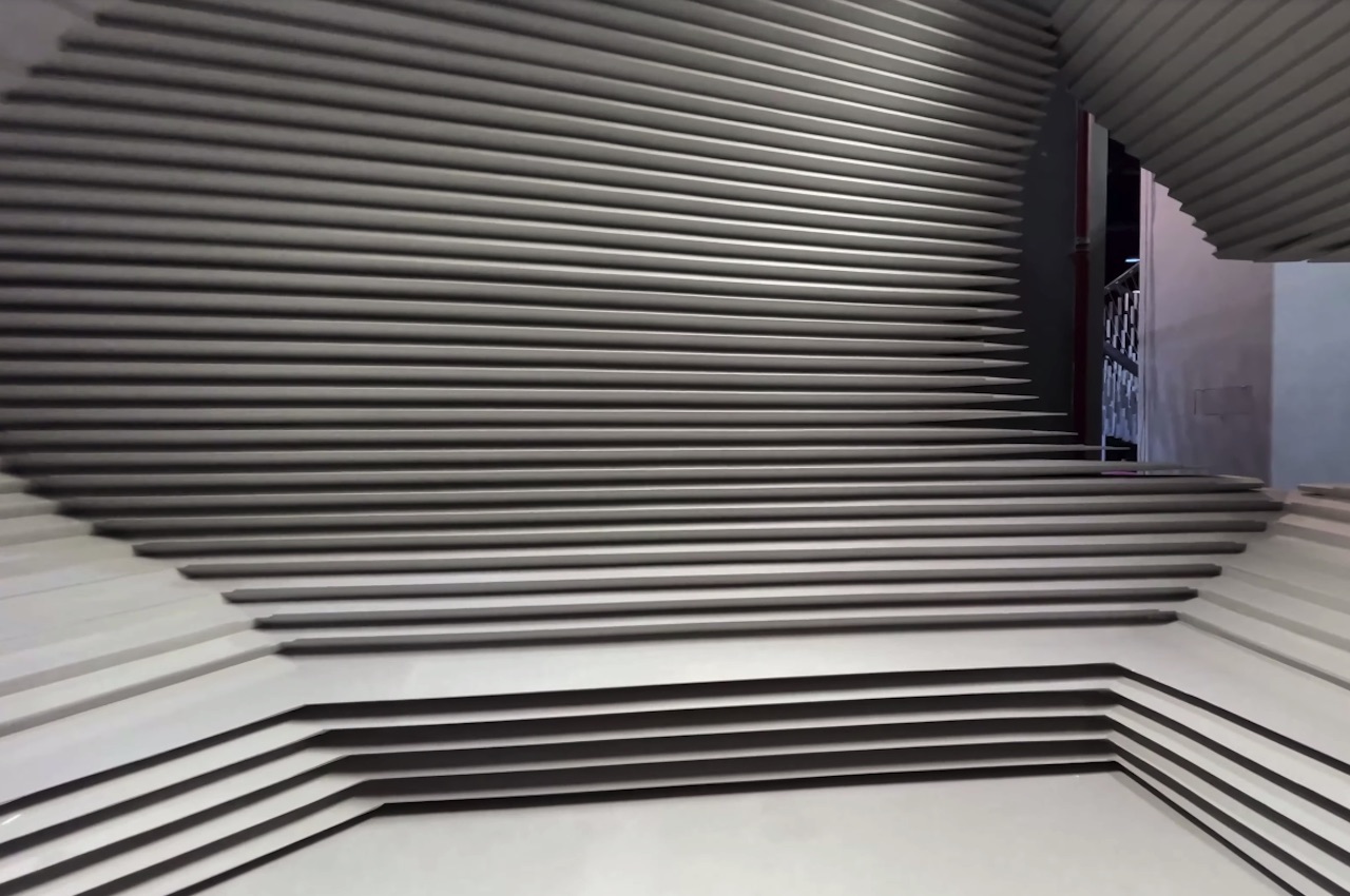
The system features widely distributed folded skin made of glass reinforced concrete (GRC) and steel frame. The duo-purposed exhibition pavilion sample here is only 24 sqm. The height of the platform can be set, but we suggest promo materials are placed at seat level. When used outdoors, a cantilevered roof helps block the sunlight.

Atelier Alter Inverted Sculpture 3

Atelier Alter Inverted Sculpture 4

Atelier Alter Architects is based in Beijing, China, and has already done a few projects. Its designers, engineers, and architects show a different approach to architecture. The company’s works are believed to offer everyone an “objective field to think, feel, and live.” Its goal is to make people embrace their role as observers in the society, responding to the world’s dynamism. Every work by Alter Architects is aimed not to be imitated but to be criticized and really make people think.

Atelier Alter Inverted Sculpture 5

Atelier Alter Inverted Sculpture 7

Atelier Alter Inverted Sculpture 9

Atelier Alter Inverted Sculpture 10

The post Inverted Sculpture design can be disassembled and used in a different exhibition first appeared on Yanko Design.
Salmon Eye floating aquaculture exhibit really looks like a dead fish’s eye

There is perhaps no better way to get people talking about protecting marine life than with a giant fish eye floating on water, staring accusingly at the heavens.

Many of us are already dreaming about exploring the vastness of space and colonizing planets, but some scientists will point out that we have barely conquered the depths of our planet’s waters. Perhaps that for the best if “conquering” also means polluting and ruining the seas and oceans. Protecting aquaculture even while being dependent on them for food has always been a struggle, and a new exhibit wants to raise interest and awareness through a floating structure that is both beautiful and a little bit creepy, at least if you’re flying overhead.

Designer: Marketex Marine

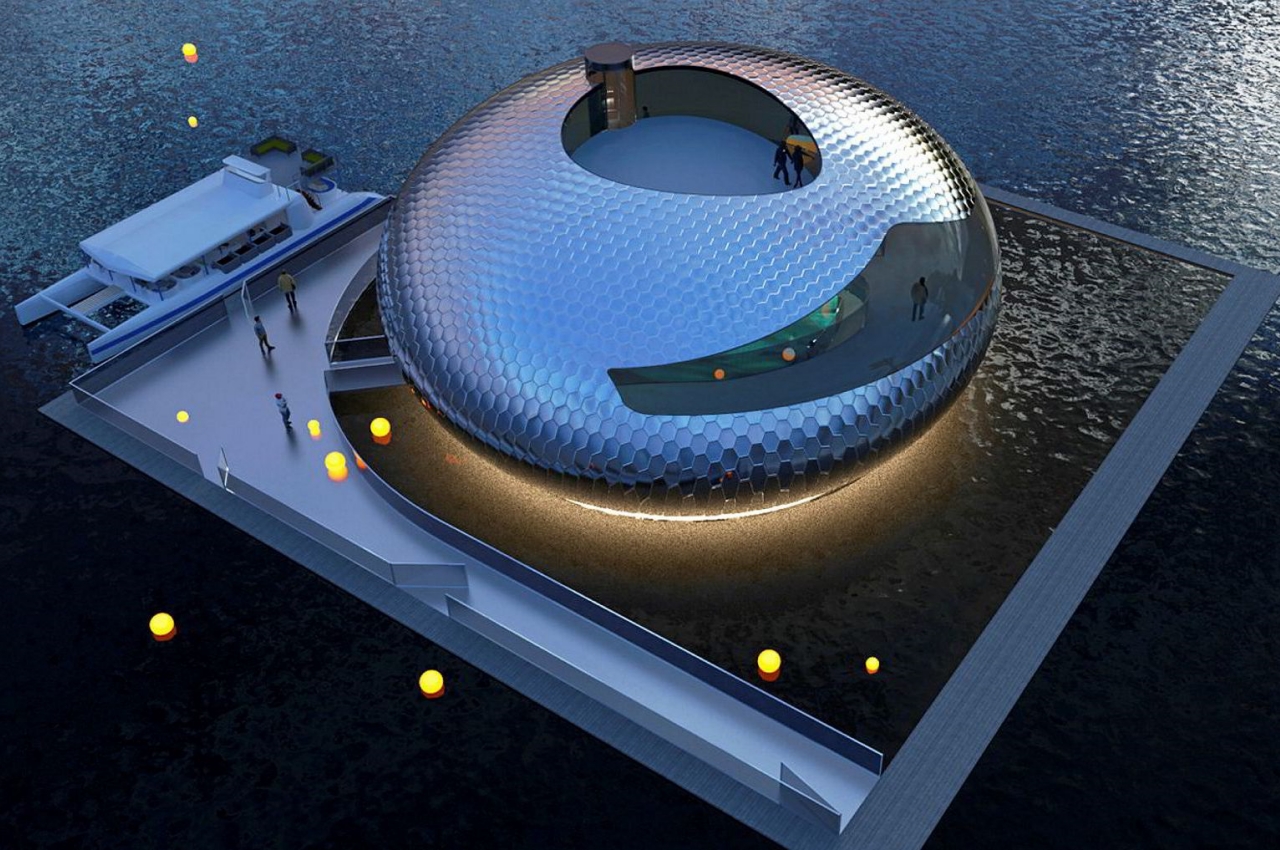
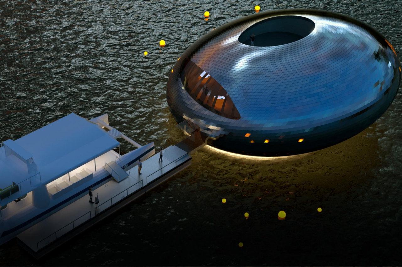
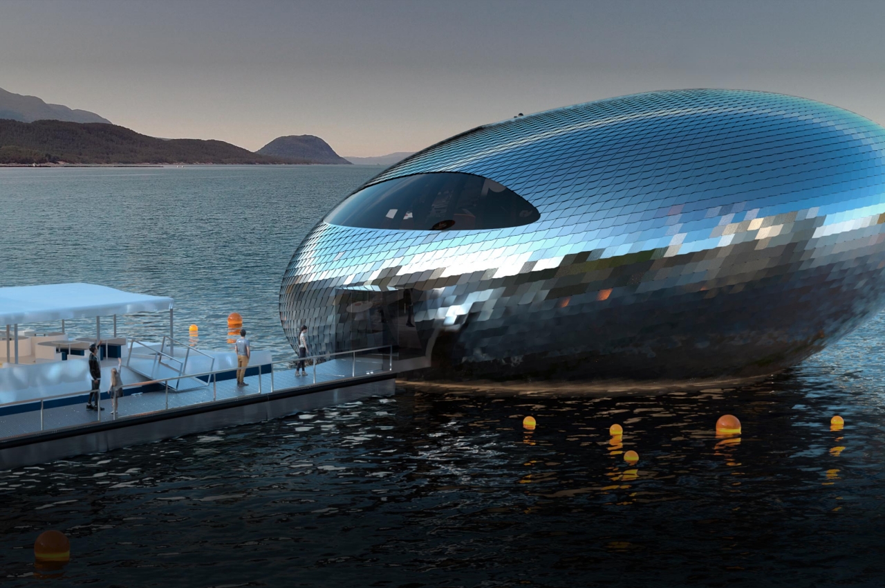
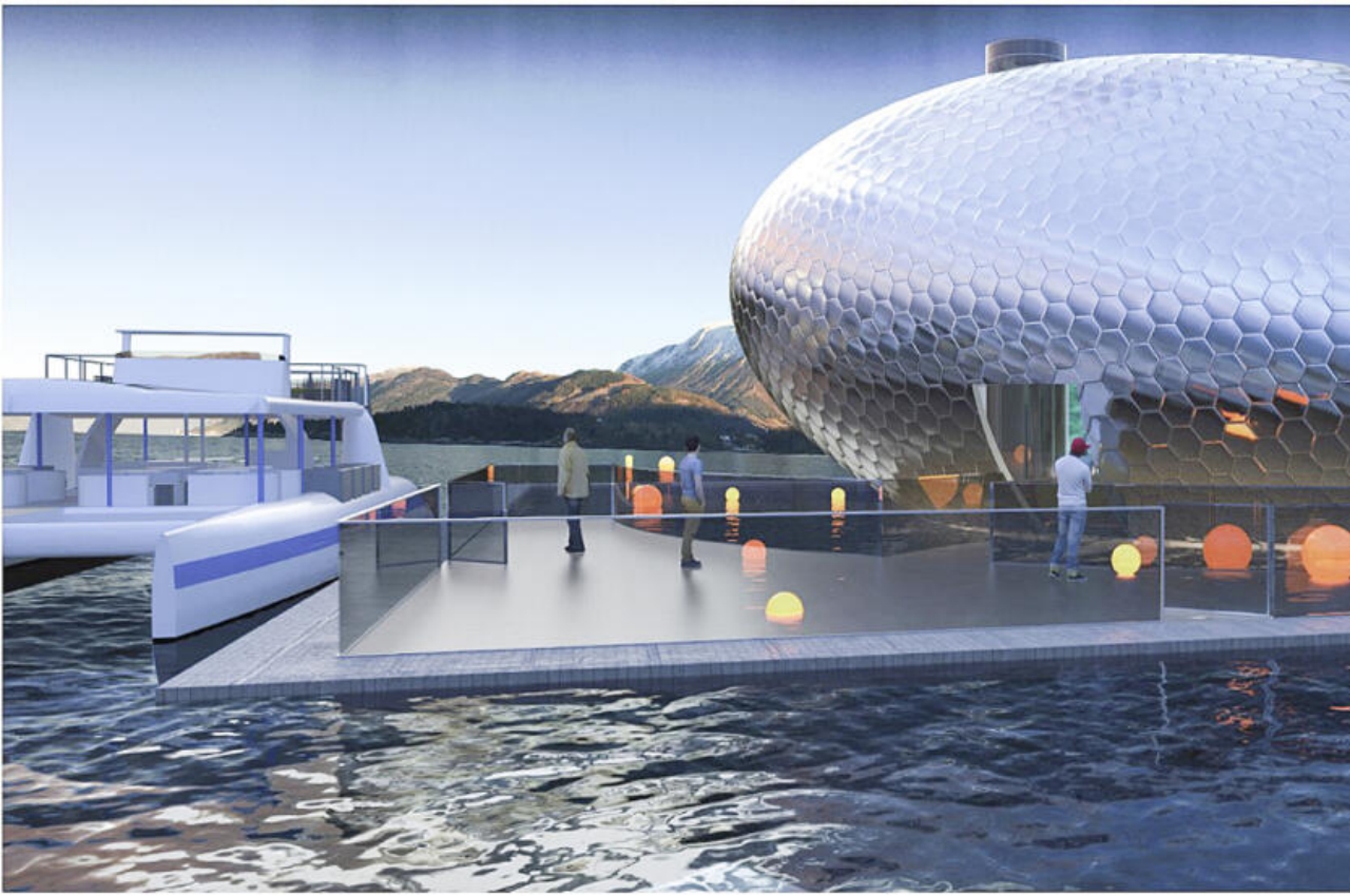
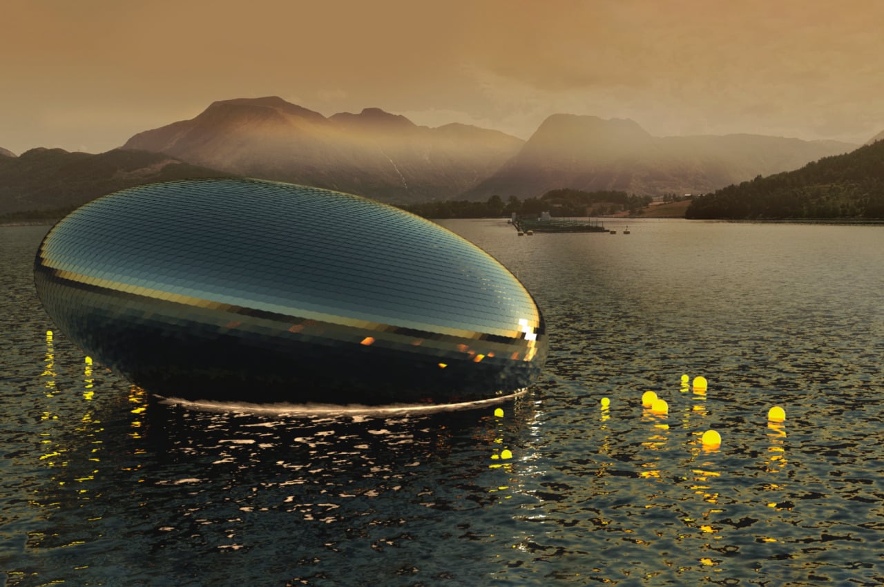
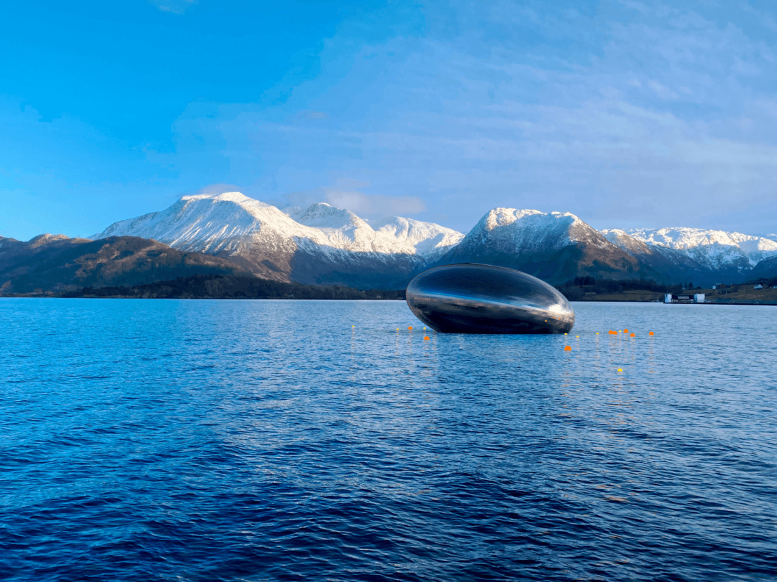
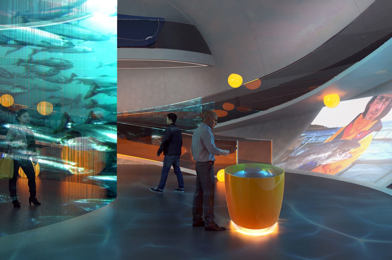
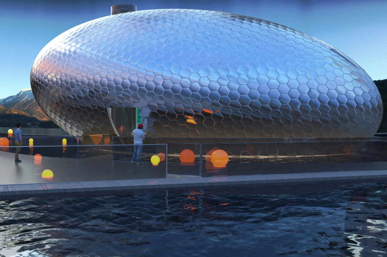
The “Salmon Eye” is true to its name in more ways than one. It is a combination of a pontoon and a unique elliptical upper structure that is designed to look like a fish’s eye, particularly a salmon’s. This shape, however, will only really be visible if you’re seeing it from a bird’s eye view. Ironically, the floating exhibit can only be reached by water.

On the outside, however, the structure will be covered with 9,500 high-grade stainless steel plates designed to look like scales. They’re also colored like salmon skin to further strengthen the association with its namesake. This material ensures that the exhibit is eye-catching, pun totally intended, no matter which angle you view it from except perhaps from the bottom of the fjord.

The structure will look especially futuristic when it reflects the light coming from the sun and nearby sources, especially as it floats on the Hardangerfjord. This is Norway’s second-longest fjord and the world’s fifth-longest, making it a natural tourist attraction every year. It is also noted to have Norway’s highest concentration of salmon farms, making the fish an extremely important part of the local ecosystem.

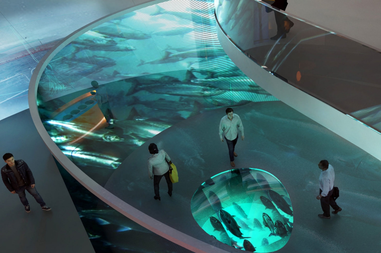
That is why the exhibit is not only named after the fish but also tries to raise global awareness on the impacts of current aquaculture practices on salmon. Projections on the walls inside the exhibit let visitors learn more about food production in the sea and local challenges and solutions. In addition to interactive wall projections, there are also interactive displays that are, perhaps to no one’s surprise, shaped like a roe.

The post Salmon Eye floating aquaculture exhibit really looks like a dead fish’s eye first appeared on Yanko Design.
LEGO master builder Mitsuru Nikaido creates detailed animal sculptures that will shock and awe you

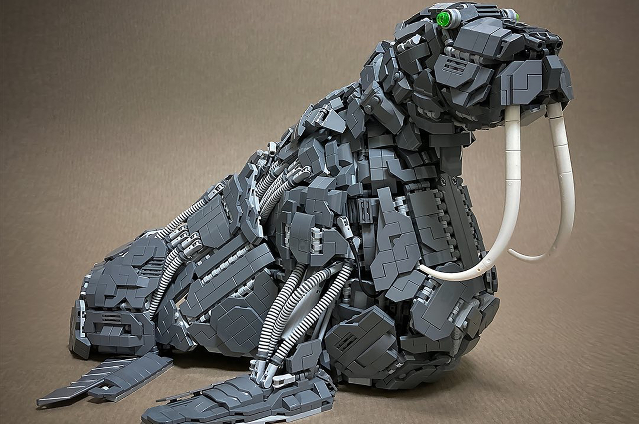
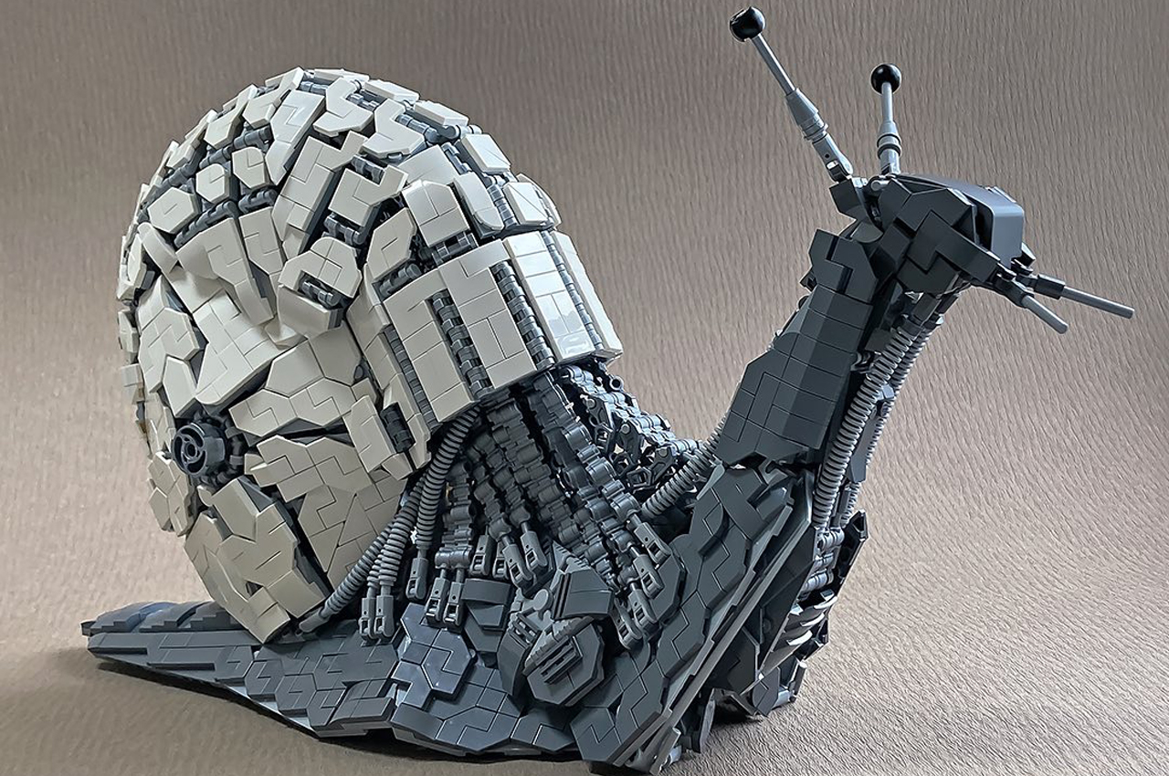
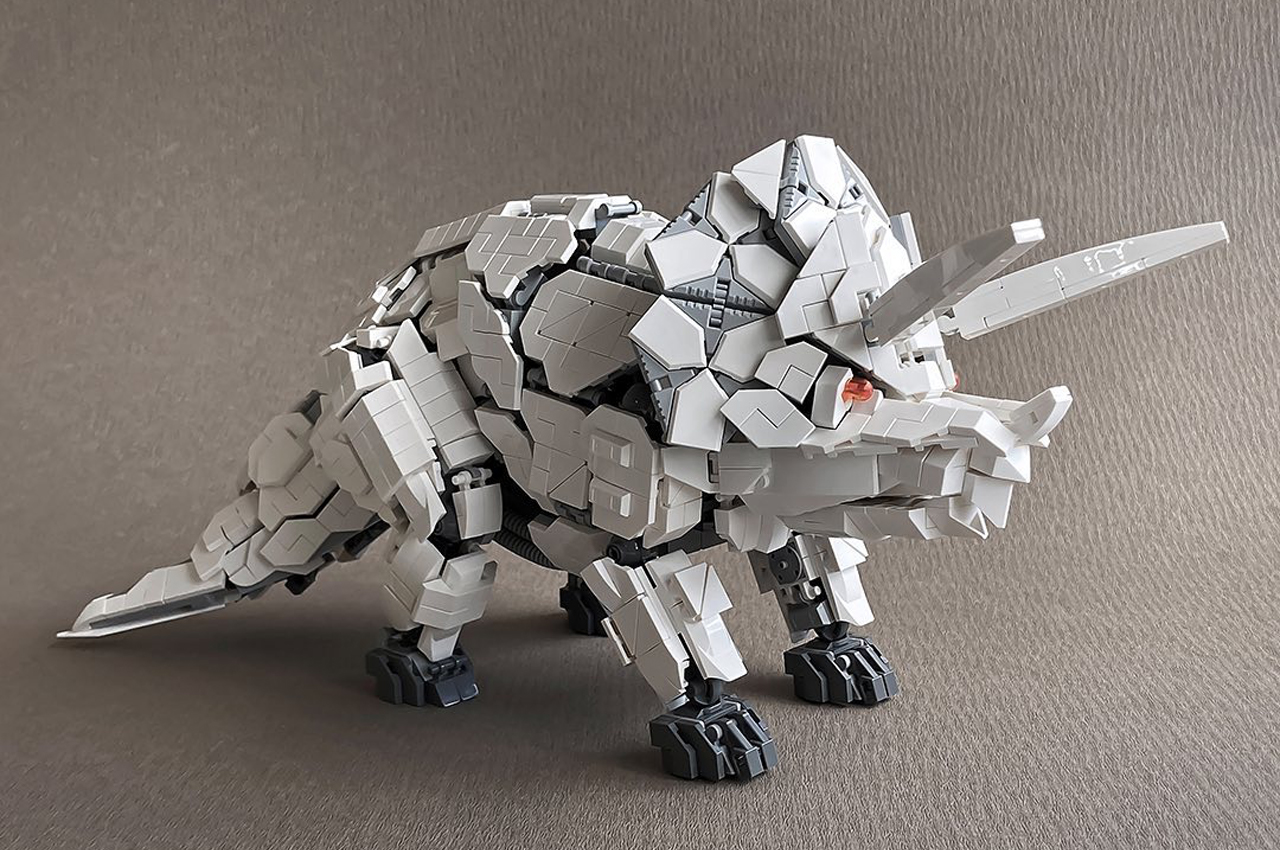
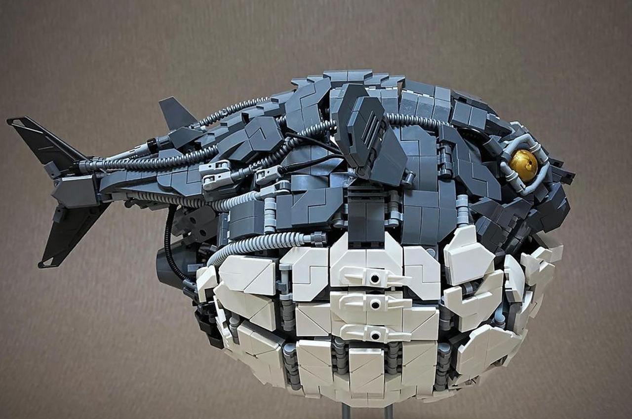
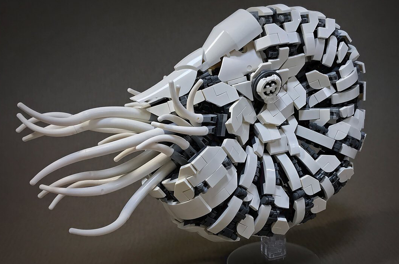
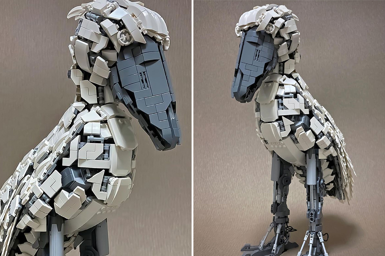
Mitsuru Nikaido, a Kurashiki-based artist, makes sculptures of different animal species from LEGO building blocks.

Mitsuru Nikaido has been creating intricate sculptures out of LEGO building blocks for years. Backed with a wide-ranging and diverse portfolio, Nikaido feels most inspired to build his sculptures in the shapes of different animal species.

Designer: Mitsuru Nikaido

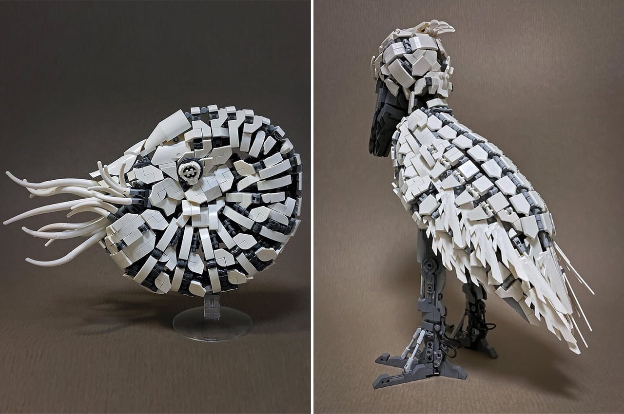
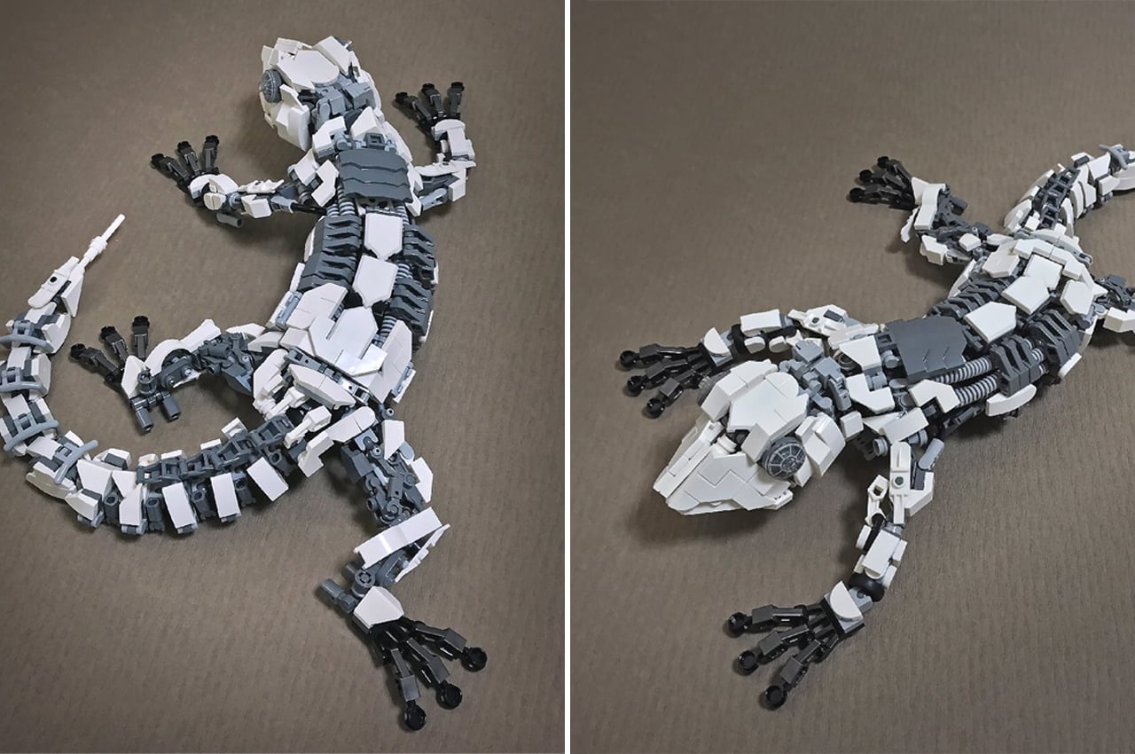
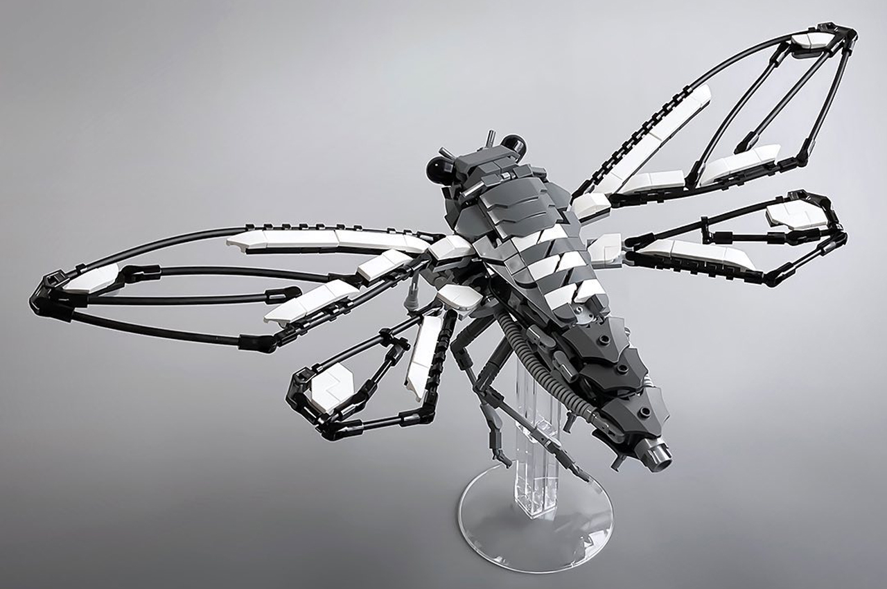
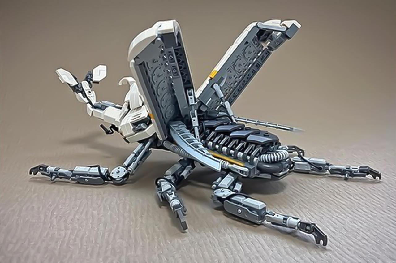
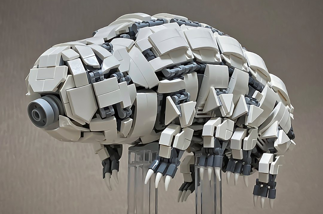
When constructing his sculptures, the Japanese LEGO enthusiast tends towards a cyberpunk aesthetic and gray-scale color palette to highlight his signature style. His varied collection includes LEGO sculptures of walruses, Huntsman spiders, crayfish, cicadas, triceratops, beetles, shoebills, and even microscopic water bears.

Based in Kurashiki, Nikaido mostly utilizes the gray-toned LEGO bricks, only relying on brightly-colored bricked to accentuate an animal’s defining feature, like a pair of electric eyes or a lustrous beak. While any one of Nikaido’s sculptures can impress without any movement, some of his works feature spring-loaded limbs, like flexible joints and a wagging tail, that shine a spotlight on the potential of LEGO building blocks.

Nikaido mostly exhibits his sculptures on his social media channels, and a select few of his pieces of artwork are for sale on his website. Alternatively, interested viewers can see his sculptures on display at the LEGO House in Denmark.

Nikaido’s Mecha Cicada creation.

Nikaido’s Mecha Beetle creation.

Nikaido’s Mecha Water Bear sculpture.

The post LEGO master builder Mitsuru Nikaido creates detailed animal sculptures that will shock and awe you first appeared on Yanko Design.
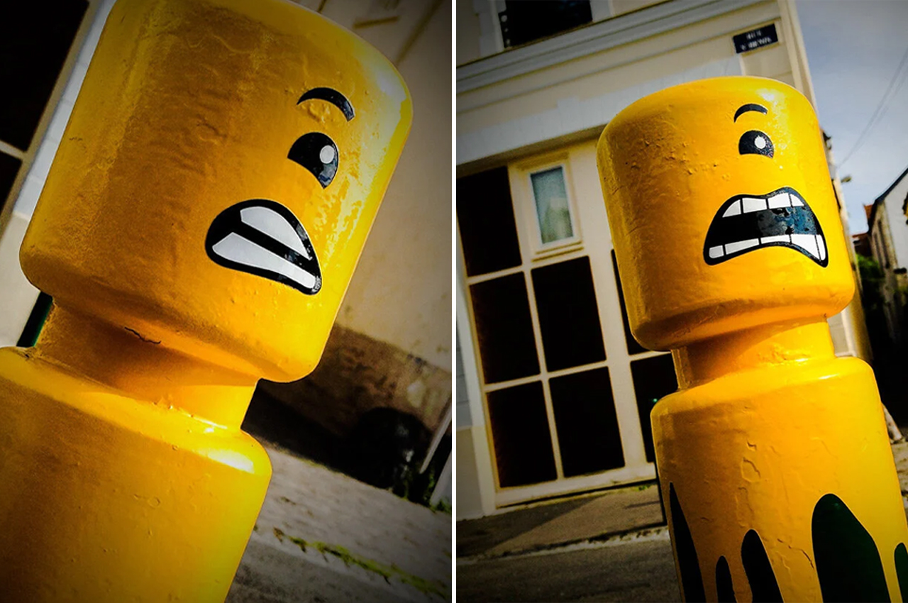
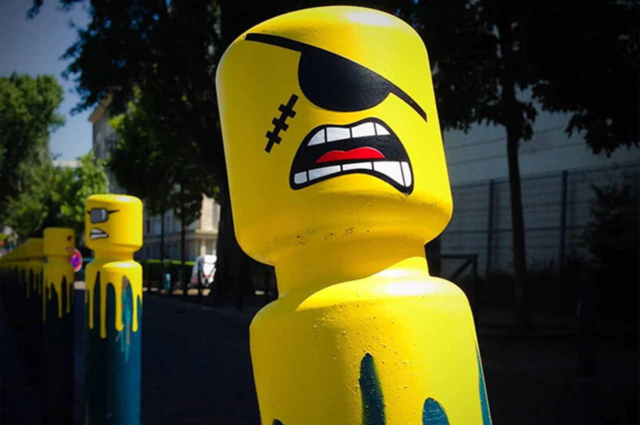
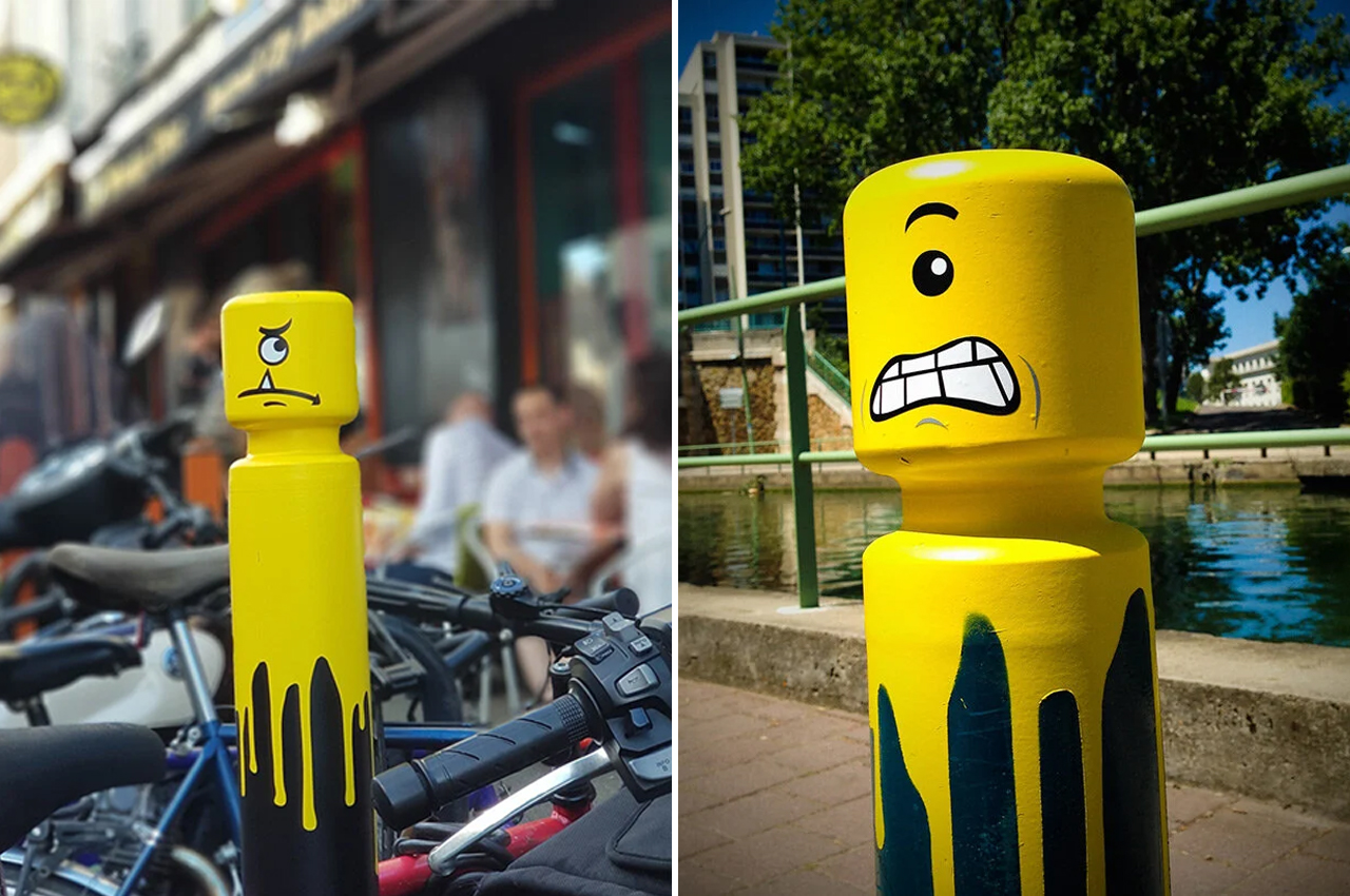
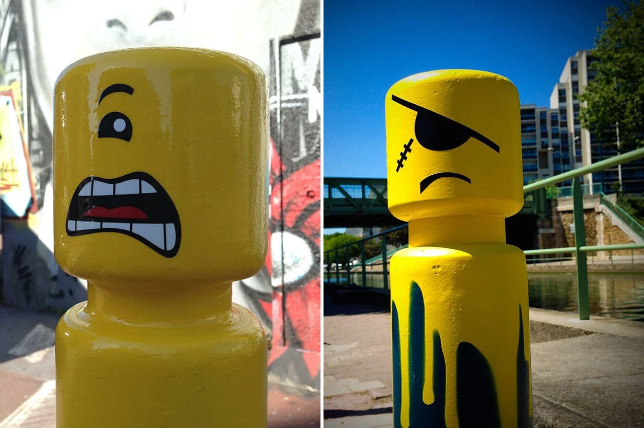
LEGO and Minion-inspired creatures take over the French street bollards with artist Le CyKlop!

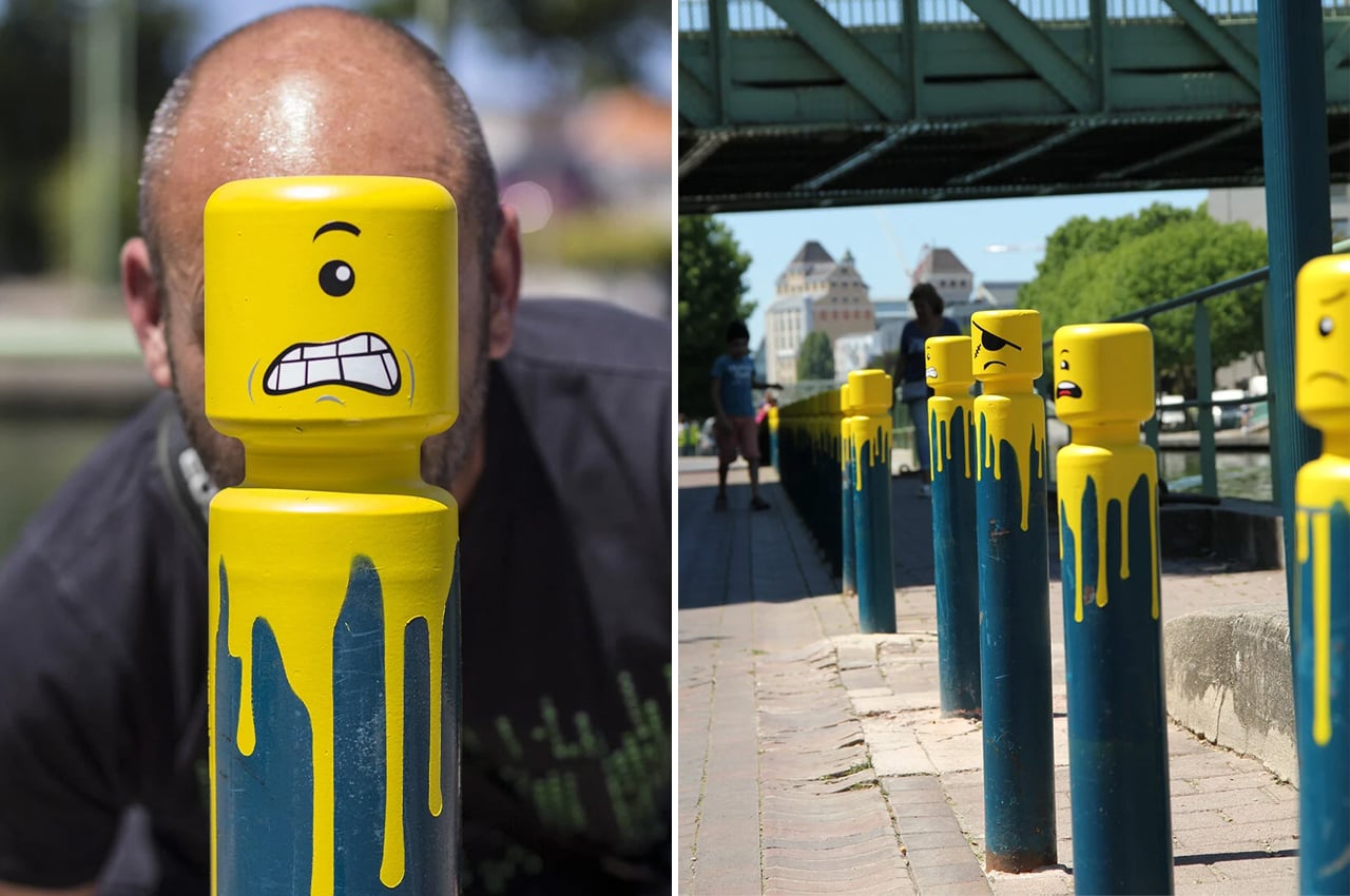
French street artist Le CyKlop transforms city bollards into anthropomorphic, LEGO-inspired caricatures using yellow spray paint and his own sticker designs, dubbing the urban art Angry L’éGO.

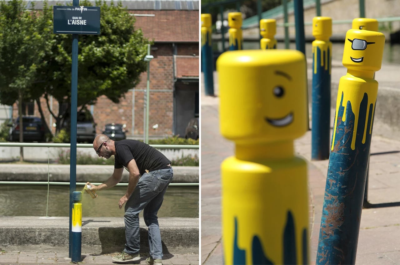
Cities across the globe are home to unconventional local celebrities who turn sidewalks and building facades into blank public canvases where they can stamp their own artful print. In Paris, urban street artist Le CyKlop transforms the cobblestone avenues into LEGO-inspired city sets. Using his own sticker designs, Le CyKlop spray paints the tips of street bollards in yellow, finishing them off with anthropomorphic stickers that make each bollard look like one-eyed LEGO characters, dubbing the public art Angry L’éGO.
Beginning in 2014, Le CyKlop, a French street artist, has transformed bollards into LEGO figures throughout France. Le CyKlop has brought LEGO-inspired street art to different communes like Pantin, Colombes, and Montreuil.

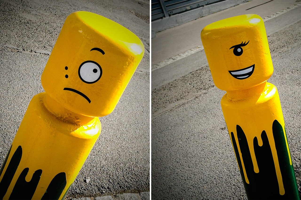
After first picking out the bollards that he thinks could use some bright yellow makeup, Le CyKlop spray paints them so it looks like they’ve been turned upside down and dipped in yellow paint. Then, Le CyKlop pops some stickers onto the bollards, giving each one a distinct cyclops-inspired facial expression ranging from happiness to mischievous, and from fear to anger.

Le CyKlop found inspiration for his urban art through Greek mythology and the iconic building blocks brand LEGO. Describing his spray paint street art, Le CyKlop notes, “In my work, I try to break free from conventional supports such as walls or canvas, to invest in the objects. By putting an eye on them, I try to make them come alive, to give them a soul and to give birth to a form of fantasy.”

Designer: Le CyKlop

This sustainable interlocking system lets vendors reuse, reshape, and reduce the stall waste at festivals


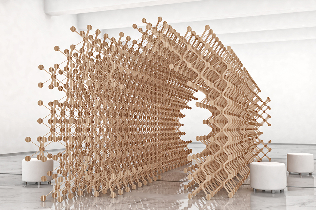
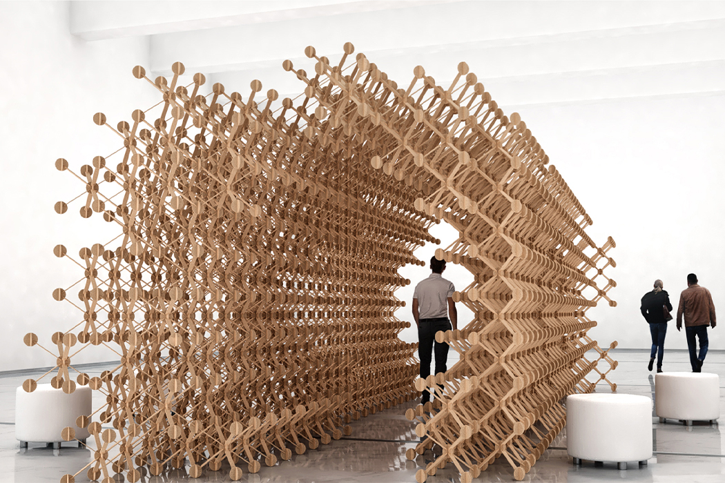
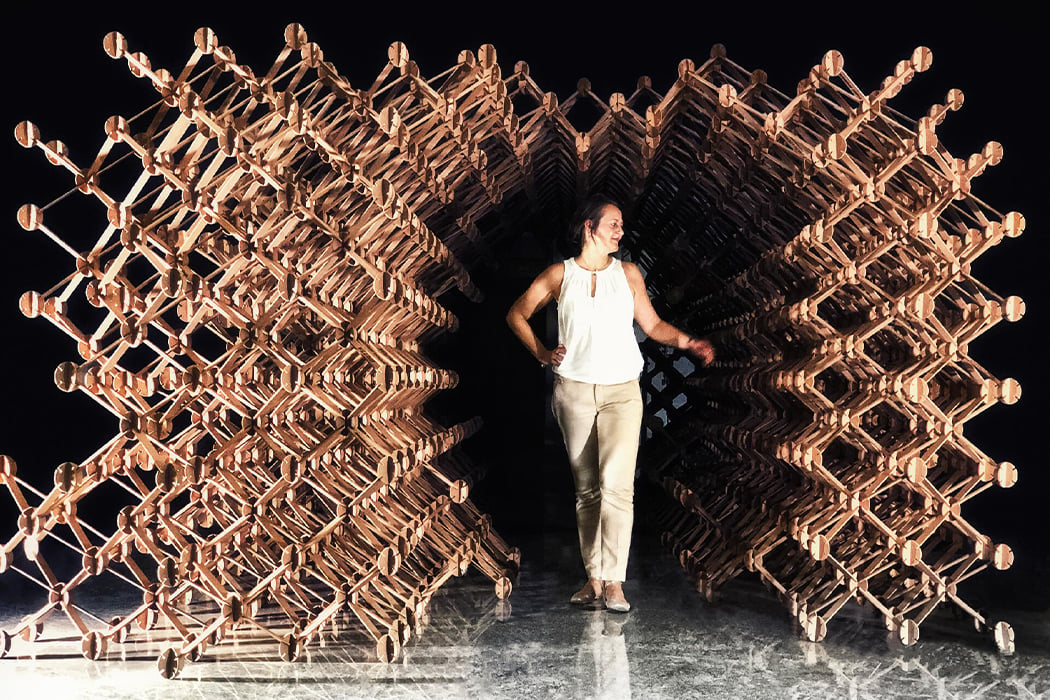
Picture this, you are at a festival that is bustling with stalls – you are trying different food, shopping for little items, taking pictures of the experiential booths. But have you ever come back to the scene after the festival is over? After the festival is over it is basically a giant waste site of all the dismantled temporary stalls. Plexus was designed to eliminate the waste generated by these exhibitions without taking away from their charm!

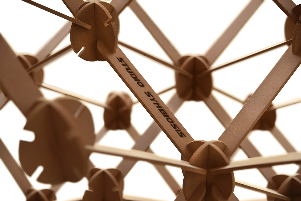
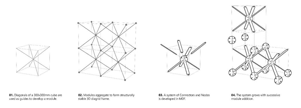
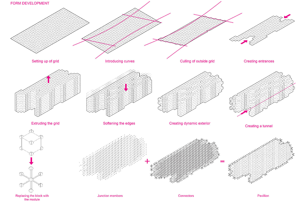
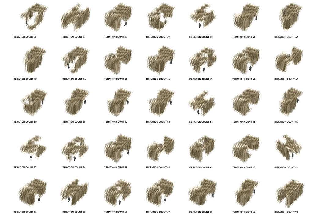
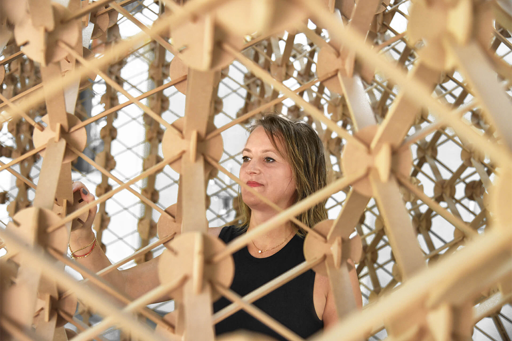
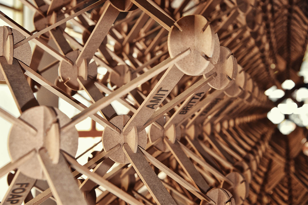
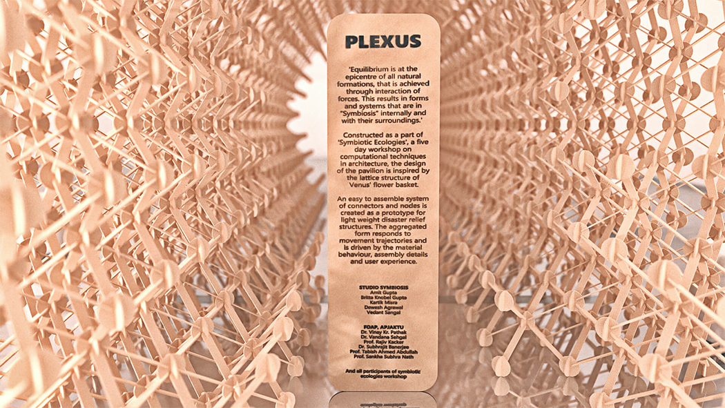
Vendors never really re-use the stalls as they might have a different need in terms of sizes and themes depending on the event. However, constantly investing in new stalls not only creates waste but is also costly. Plexus is a waste-reducing prototype that was made keeping in mind the needs of vendors as well as the environment. The unique construction of Plexus reminds me of tazzos. It is a network of two components – nodes and connectors – that lets you make 1000 stall variations with different shapes and sizes. The adaptable system is designed on a cellular automata model and can be flat-packed in crates for easy shipping. “Cellular automata are mathematical models designed to construct the complexity of natural systems displayed in a diverse naturally occurring phenomena. This complexity model consists of simple systems resulting in dynamic field behavior when interacting with each other,” explains the team.

Plexus draws inspiration for its amorphous frame from nature from the lattice-like body of a Venus flower basket giving it an easy plug-and-play feel. “It is designed as an intricate network, whereby a series of simple components, based on aggregation principles, can result in a new design of the display booth for every exhibition, and also a new brand image. Designed as a universal model, this system can adapt to nonstandard stall sizes and to a differentiated product range,” said Britta Knobel Gupta and Amit Gupta, Founding Partners, Studio Symbiosis.

Events like festivals, fairs, and exhibitions are where vendors can market their product directly to the consumers – it is a place ripe with opportunities for business. With Plexus, vendors can reduce waste drastically without changing the way they participate in these events. Since it is reusable and can be molded into different forms which allow vendors to keep things fresh and creative without adding on extra costs.

Designer: Studio Symbiosis


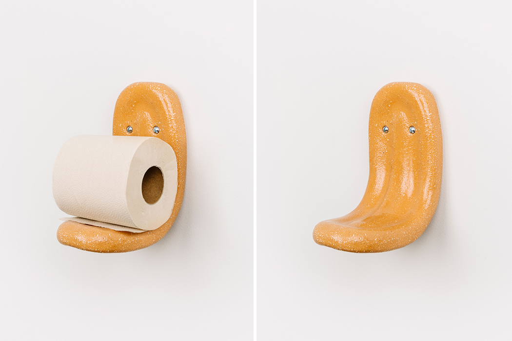
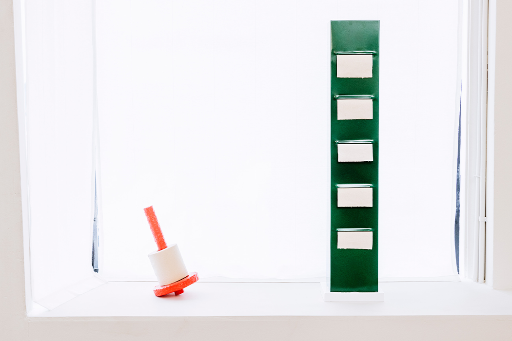
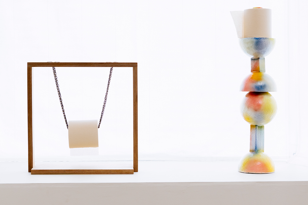
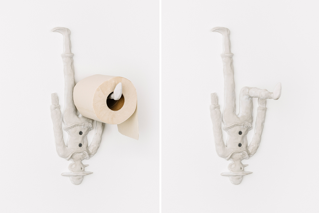
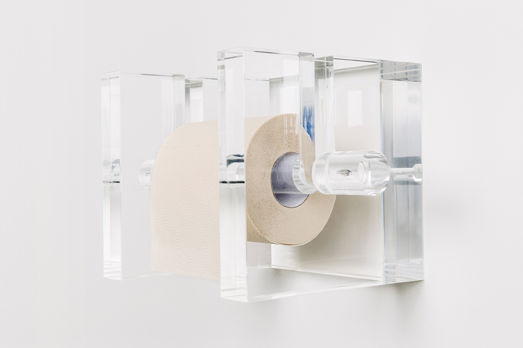
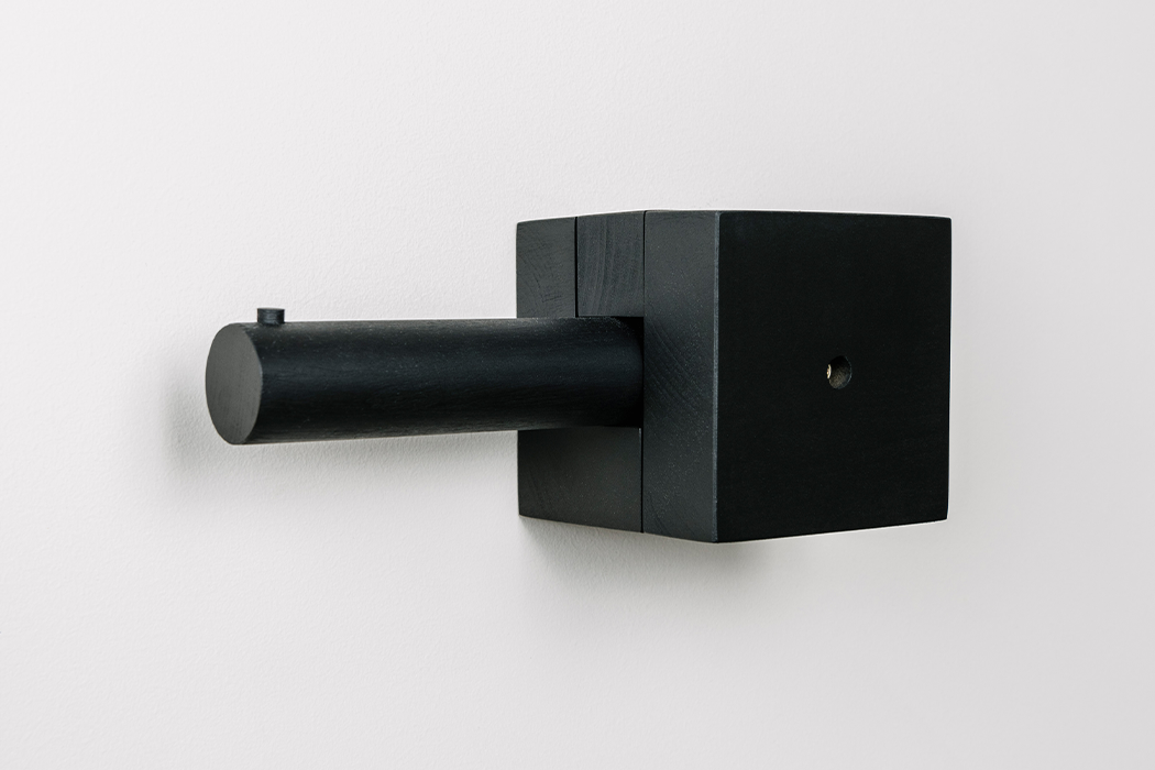
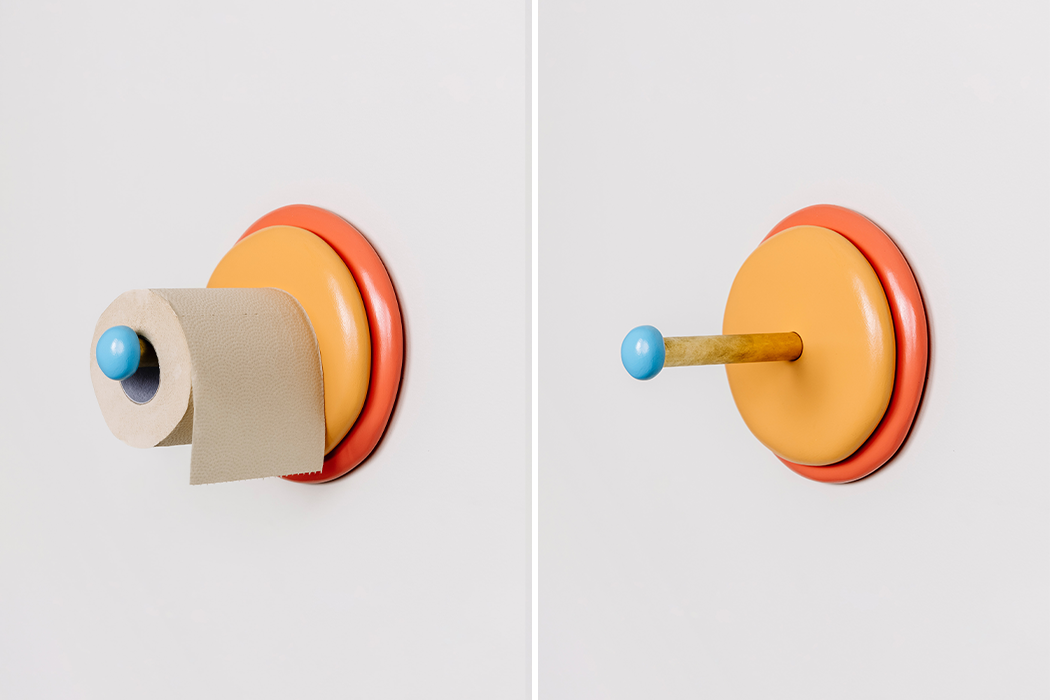
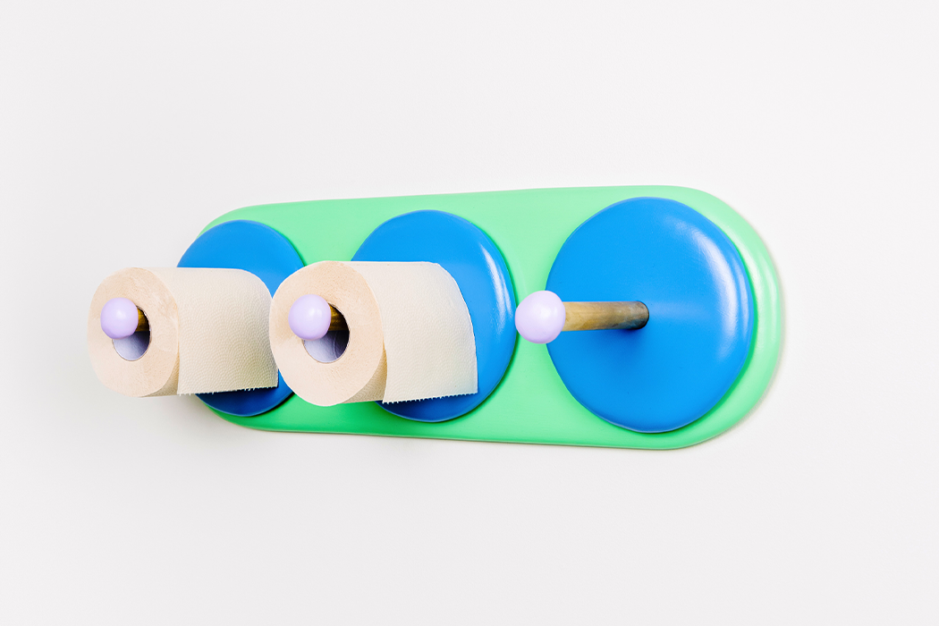
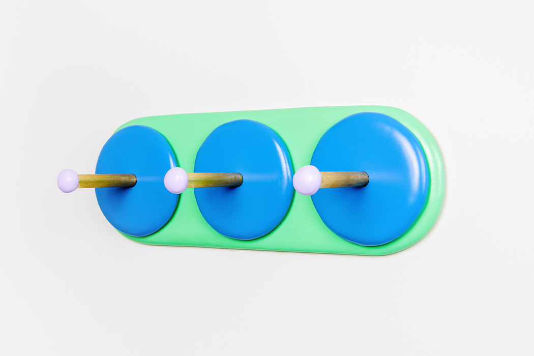
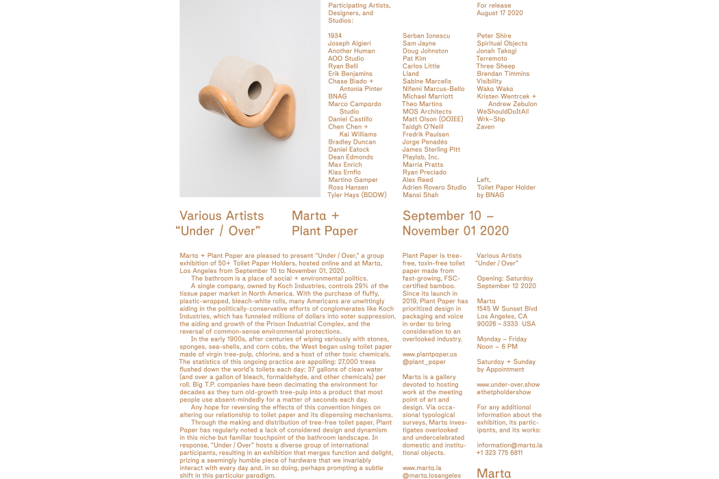
From quirky to downright eccentric, 50 designers get creative with their take on toilet paper holders!


Toilet paper is 2020’s hottest commodity. Everyone wants a piece – in fact, at one point near the start of quarantine, some of us were willing to fight one another for just a piece. That’s all to say, assuming that it’s a household item we use everyday, toilet paper is more important than we sometimes feel comfortable acknowledging.

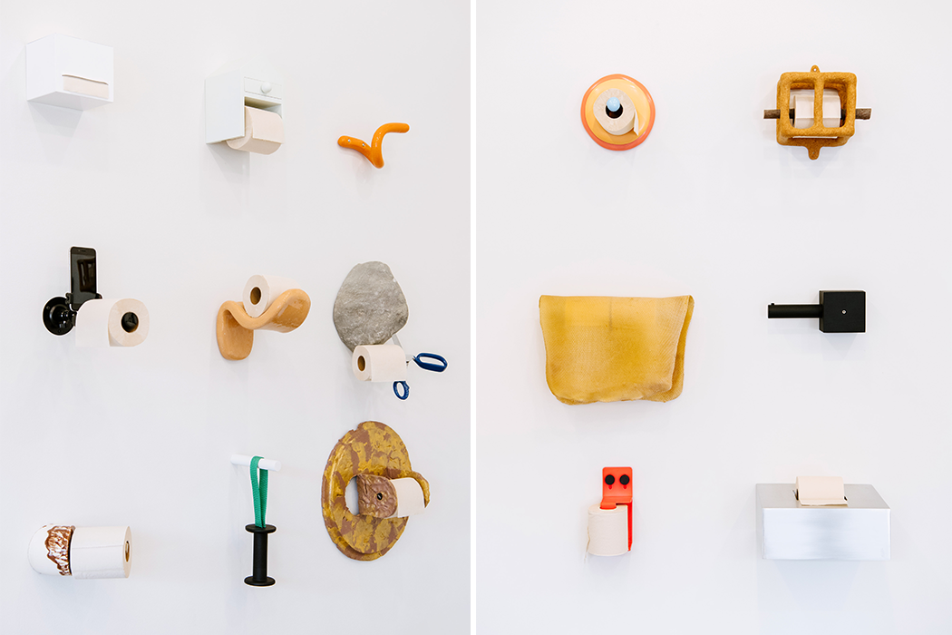
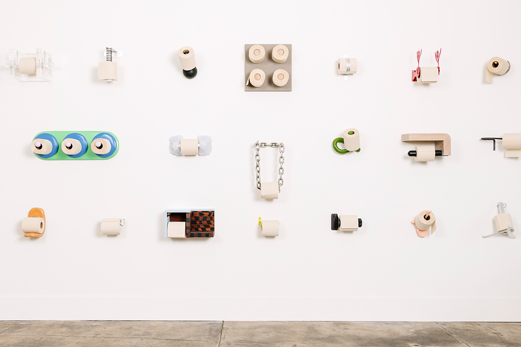
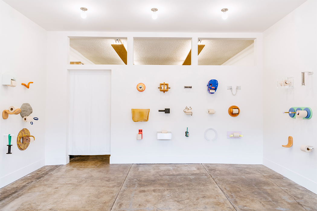
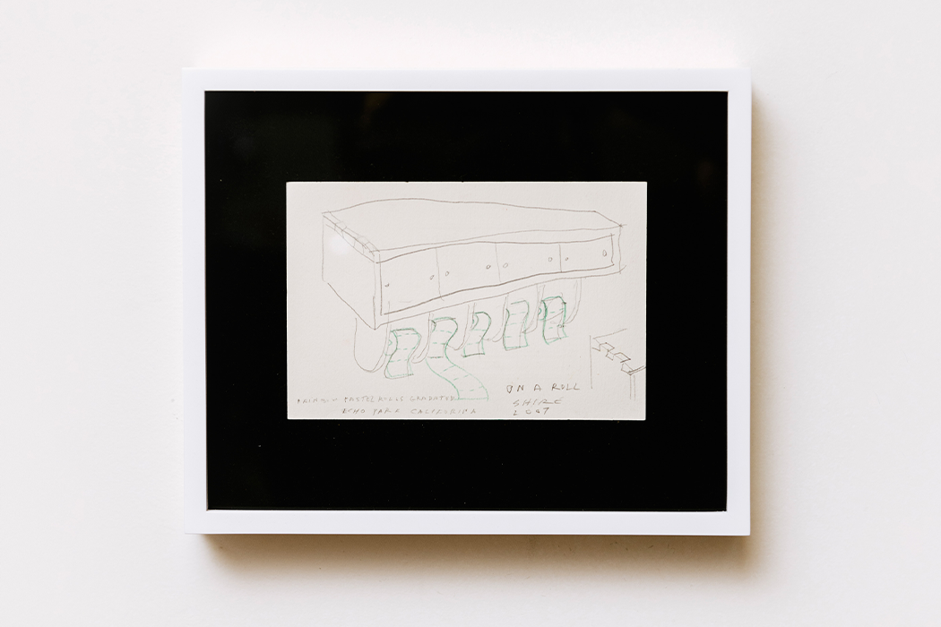
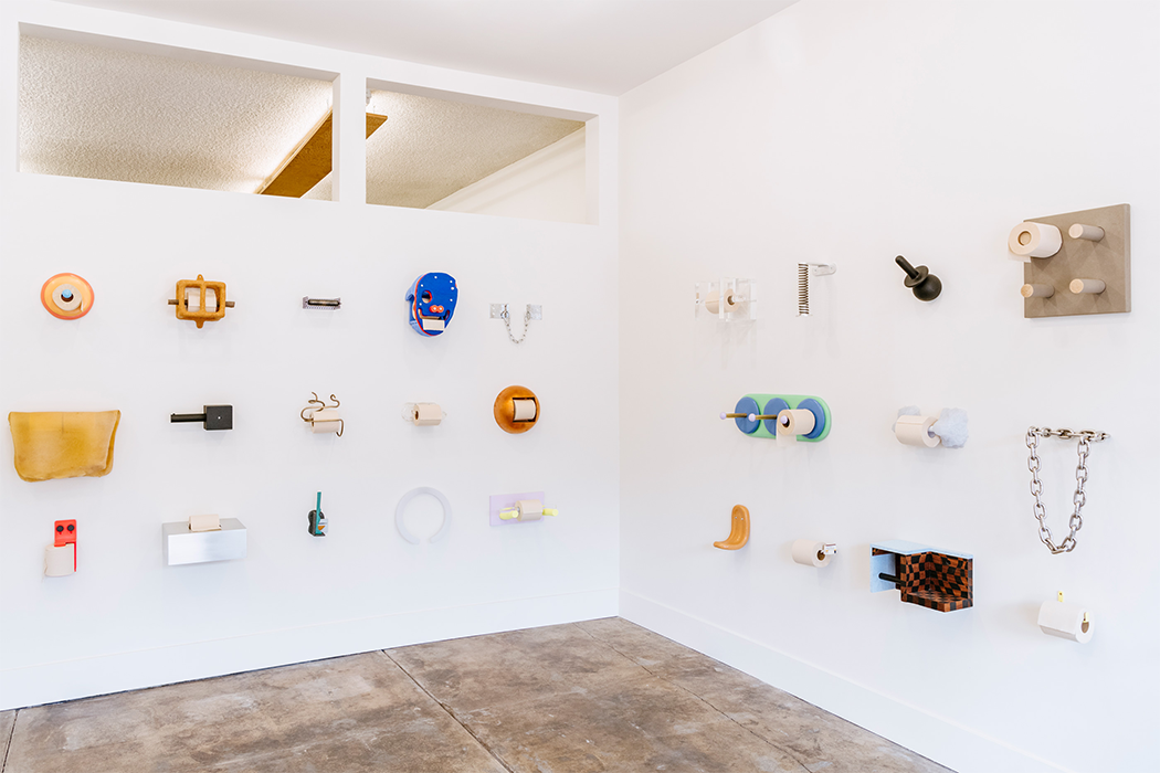
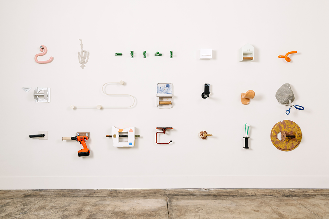
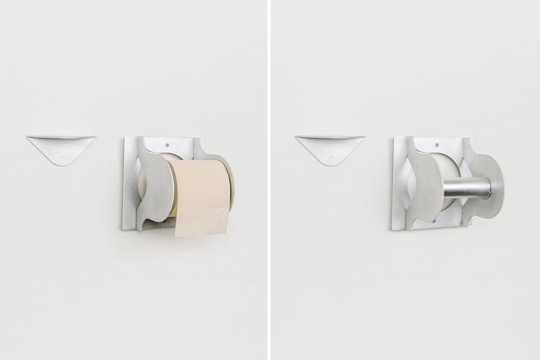
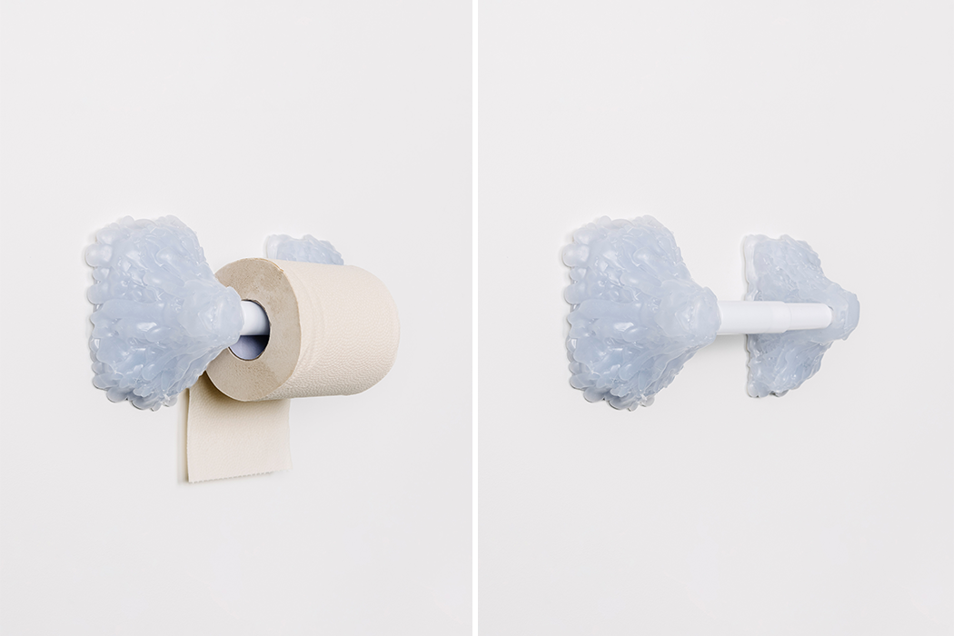
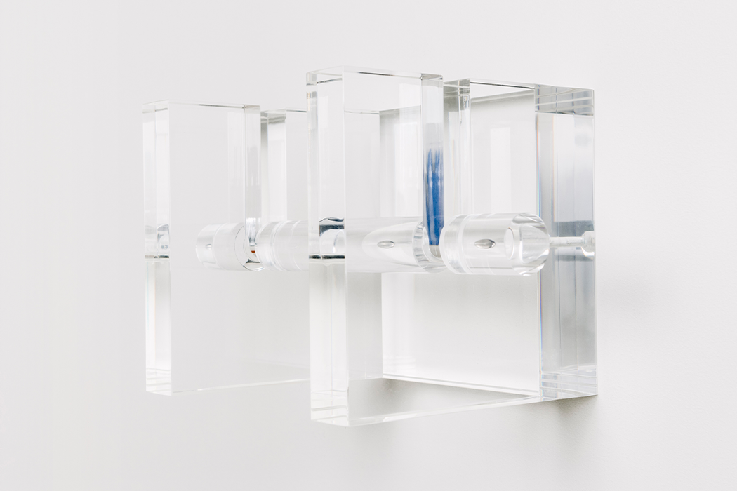
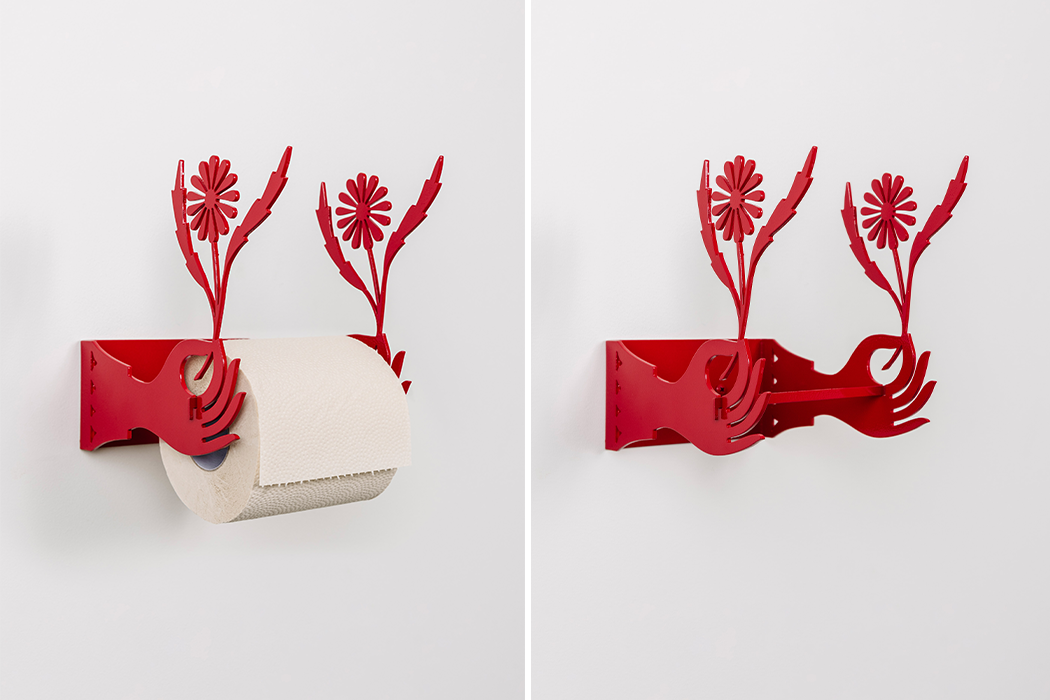
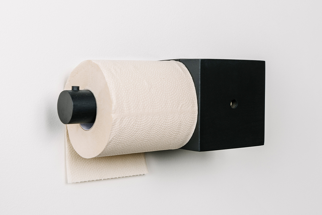
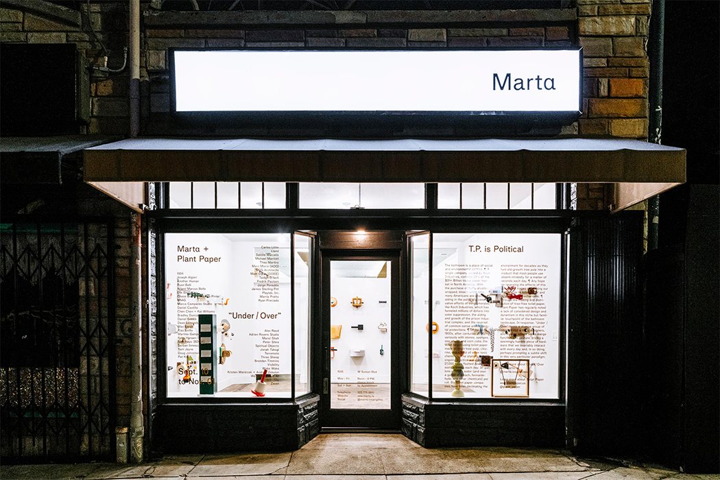
In Echo Park, an east side neighborhood in LA, the Marta gallery showcased more than fifty different toilet paper holder designs as part of an exhibition called, “Under/Over,” that responded, in short, to the recent toilet paper shortage that reached the far corners of the USA. As a result of anxious pre-quarantine shoppers hoarding loads of toilet paper, the paper goods aisles in plenty of grocery stores were emptied out for weeks at a time. This prompted a unique design showcase where artists of varying mediums were given a space to get creative with their distinct take on the toilet paper roll holder.

The curators behind this exhibition, Heidi Korsavong, and Benjamin Critton recognized the comedy behind this anxious hoarding but also sought to comment on the environmental implications of our silent dependence on toilet paper. 37 gallons of water are needed in order to produce a single roll of toilet paper. That’s a lot of water down the drain and once we flush, it’s out of sight, out of mind. We give toilet paper little to no thought unless it reaches the point of a dire need for it and when we’re actively trying to avoid getting to that point, toilet paper turns into somewhat of a luxurious expectation no matter where we might find ourselves sitting…with our dire needs.

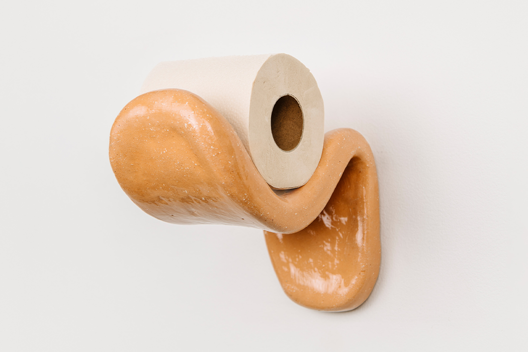
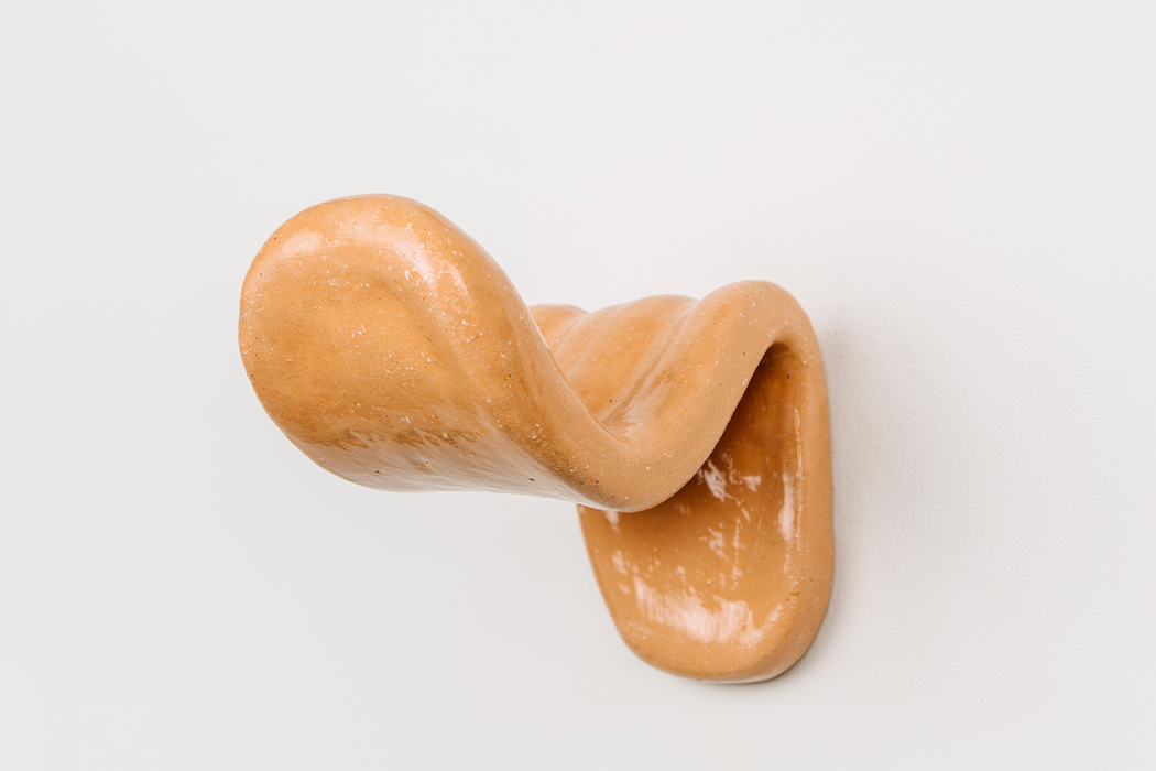
The designs ranged from chic, clean aesthetics that prioritized minimalism and style to more intimate and culturally significant interpretations that rubbed shoulders with folk art. My personal favorite turns the toilet paper holder into a mammoth-sized, shining-wet, orange tongue. The designs that adorned the walls of Marta Gallery spoke to the idle, yet inherent autonomy that could bring the need for toilet paper from afterthought to center stage. This provides much-needed commentary on our collective claim to environmental provisions, such as trees for toilet paper. “Under/Over,” begs the question, When did we expect toilet paper to be there the same way we expect our bodies to produce the need for it? The cycle of destroying virgin forests in order to create toilet paper for human needs might never end, but we can get creative with slowing it down in the meantime. The exhibition’s curators proved that getting creative in the meantime will always be worthwhile.

In order to provide an ecological alternative from which to jump off, the toilet paper presented at “Under/Over” was made entirely from organic bamboo pulp, in collaboration with Plant Paper, in order to incorporate an appeal for ecologically moral alternatives to the everyday toilet paper roll. The founders of Marta Gallery, Heidi Korsavong and Benjamin Critton aimed to inspire a sense of enchantment in the exhibition’s attendees with the hopes that upon leaving the toilet paper-lined gallery walls, they’d feel capable of producing their very own toilet paper holder, to go along with their very own need for it. Further, Critton says, “Our hope is that the sheer presence of some of these pieces prompts delight or reflection in such a way that someone might question their implicit ‘collaboration’ with the companies supplying them their toilet paper.”

Check out the exhibition in Echo Park by scheduling an appointment between September 10 and November 1, 2020, or scroll through the designs below, feel inspired, and get creative in the meantime!

Curators: Heidi Korsavong and Benjamin Critton.