NakedPack uses edible, soluble food packaging to give you a complete meal

One of the most wasteful and mostly non-biodegradable things we have lying around is food packaging. But if you buy your food or ingredients in “traditional” supermarkets or from the usual brands, you know that sustainable packaging is not their utmost priority. There are product designers and creators out there that are concerned about such things and so they are coming up with alternatives to the usual way food is packaged and eventually consumed.

Designer: Naama Nicotra

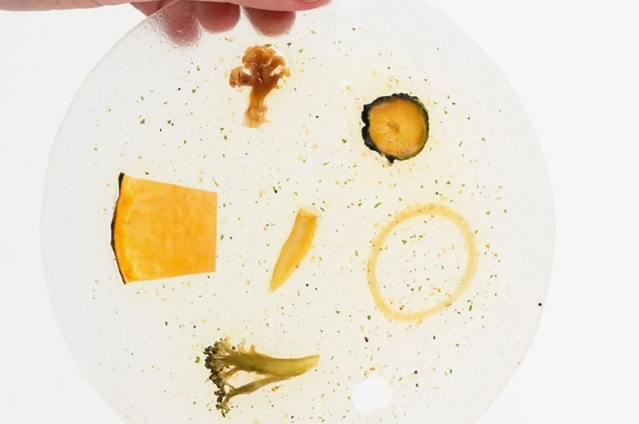
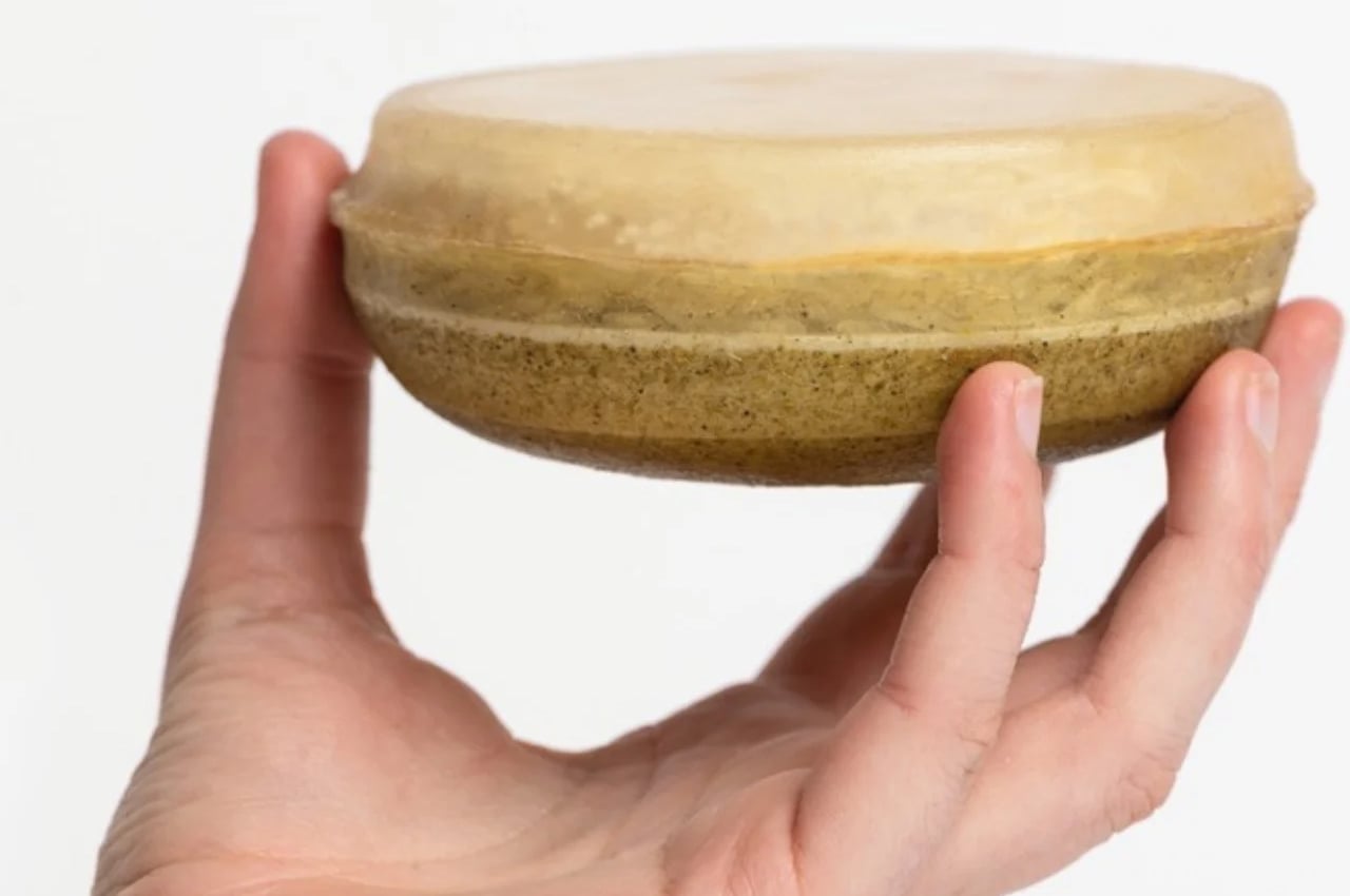
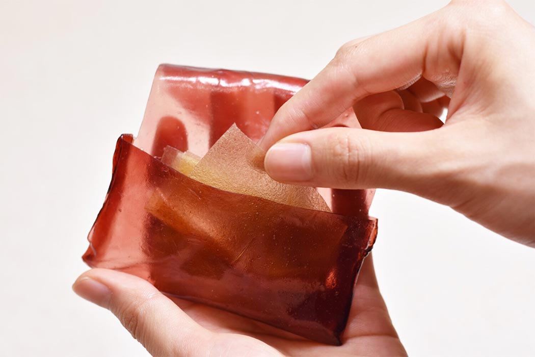
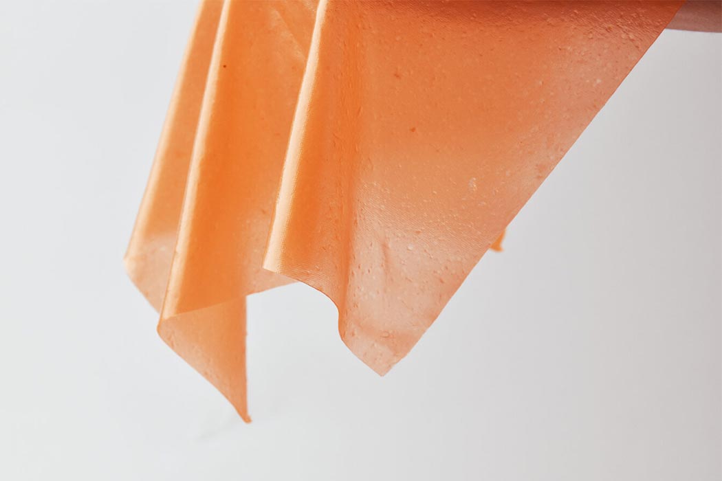
To address this particular issue, the designer came up with packaging that is not just eco-friendly but is actually edible. The material used is algae but don’t worry, you will not be consuming something that sounds or looks not so edible. The packaging material uses agar, an ingredient produced from algae. And what you get is packaging that is edible and soluble, from all these bio-plastic materials that do not contribute to global waste.

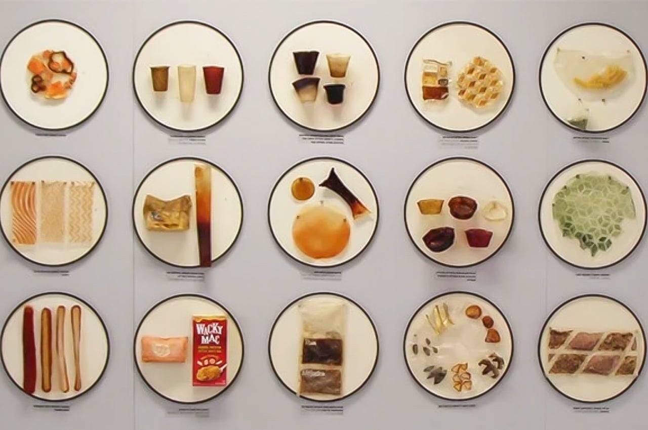
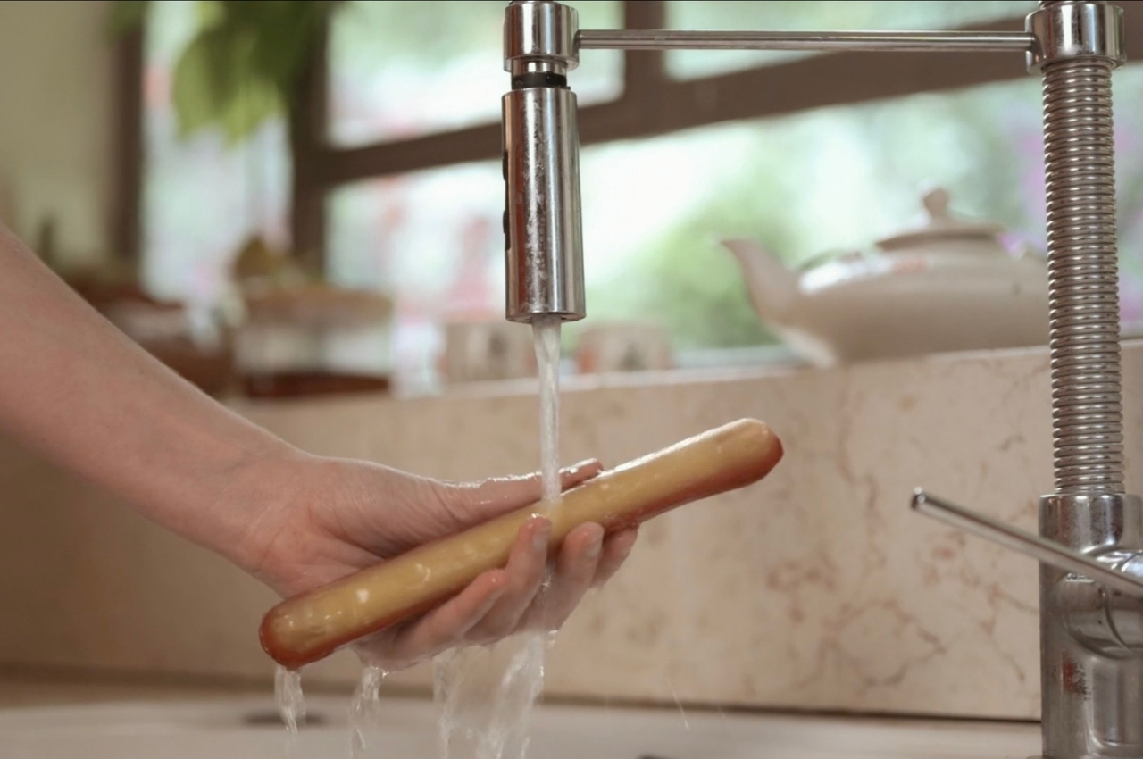
Basically, the NakedPack food wrap series is made up of food packaging and the actual food inside them, meaning you will be able to consume the entire thing as it’s just one serving. You have to rinse it and sometimes boil it before you are able to eat the entire thing. The idea is that nothing goes to waste and everything you need, including the ingredients and flavors, are already part of the whole package. There are currently five dishes in the series but the potential for more is there.

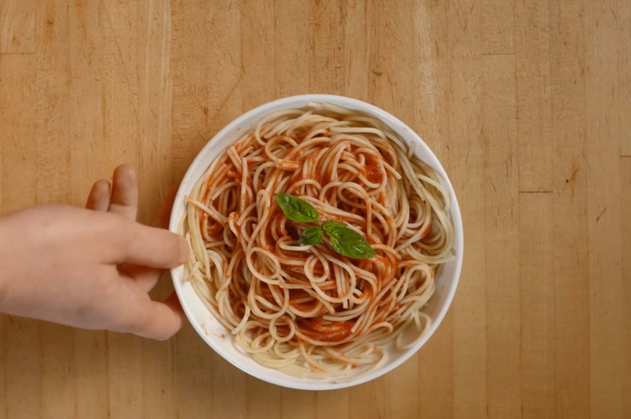
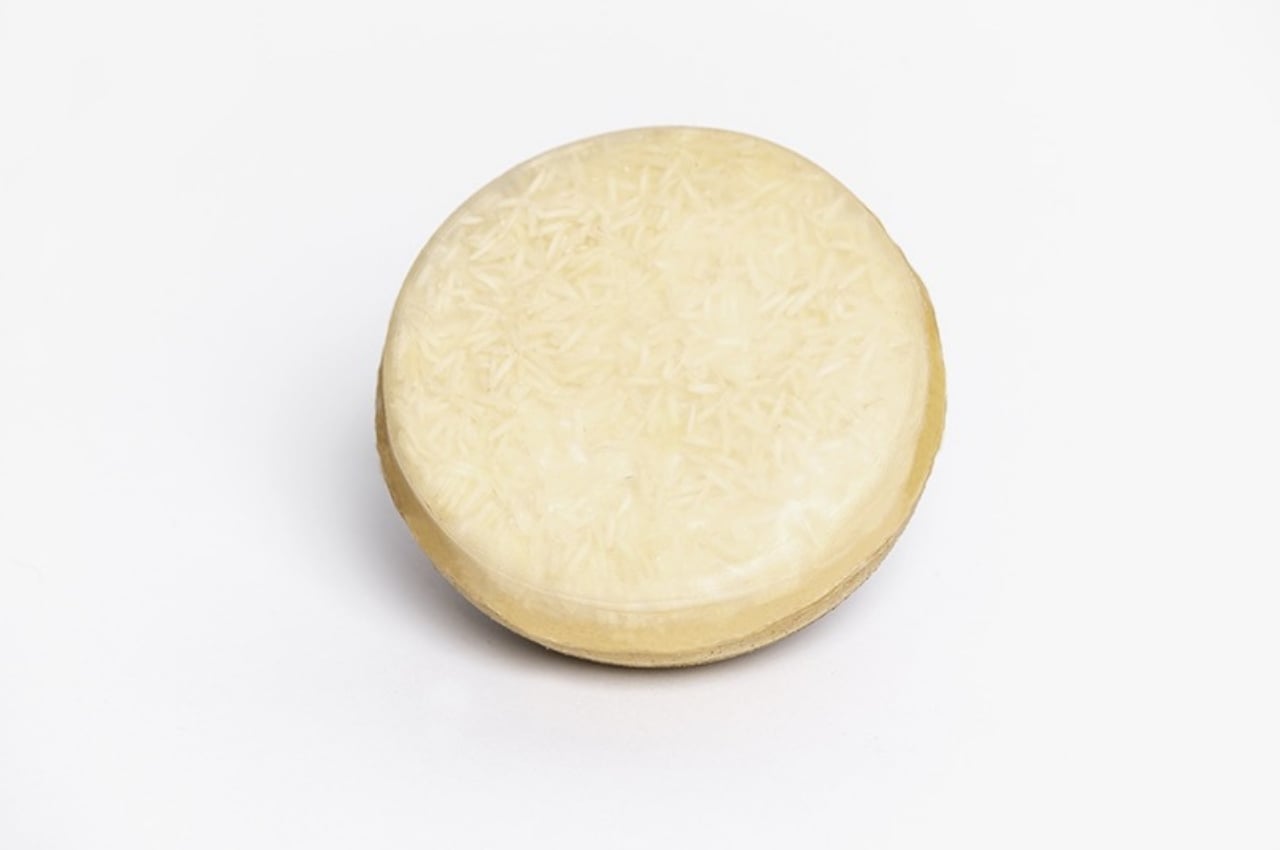
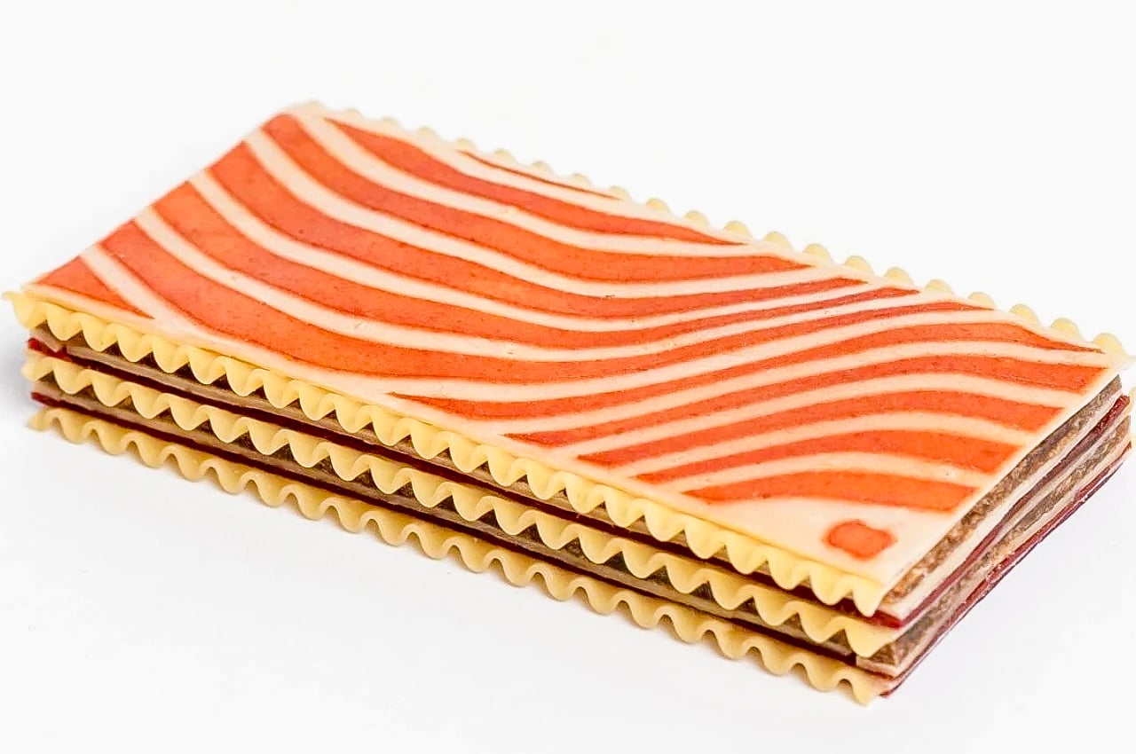
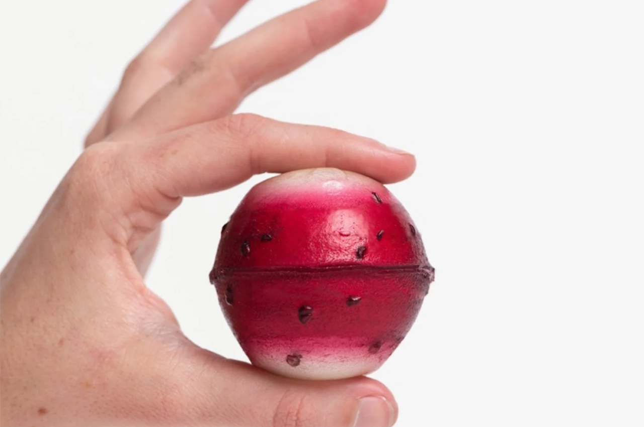
The naked soup is made from vegetable stock and dry-frozen vegetables which you just have to rinse and boil. The spaghetti is wrapped in bioplastic that is actually tomato sauce so once you boil it, you get your whole pasta with sauce dish. The curry dish has a Thai vegetable curry wrap with white rice inside so you already get a complete meal. The vegan lasagna has several ingredients including vegan cheese, tomato sauce, flat lasagna, and sheets of Beyond Meat. You even get a dessert with vanilla ice cream wrapped in raspberry sauce and this one actually looks like a fruit.

The NakedPack food wrap series is actually pretty interesting and can be used as an example of how packaging need not always be wasteful. My only concern here is the actual taste as that is a very important factor in whether I would get something. In terms of appearance, it’s not really appealing or instagrammable, but not everything you eat has to be, right? The important thing is that it tastes good and it’s sustainable, so at least for this one, they got the latter down pat.

The post NakedPack uses edible, soluble food packaging to give you a complete meal first appeared on Yanko Design.

Food packaging designs that make your next takeaway experience easy, ergonomic and eco-friendly!

When it comes to food packaging designs, there are certain criteria that have to be met, especially in the case of takeaway boxes. A good takeout box must store the food carefully without anything spilling or leaking over, must keep it warm, and not to mention must be easy and ergonomic enough to carry or transport around. And in this eclectic mix of requirements, if you can manage to throw in an appealing aesthetic and good looks, you have a hit on your hands! Another criterion that is being focused on a lot these days is Sustainability! Sustainable and eco-friendly designs really seal the deal, as ignoring and paying no heed to the needs of the environment is no more an option. So we’ve curated a collection of myriad takeout boxes, ranging from easily portable and ergonomic ones to environment-friendly ones as well. Enjoy!

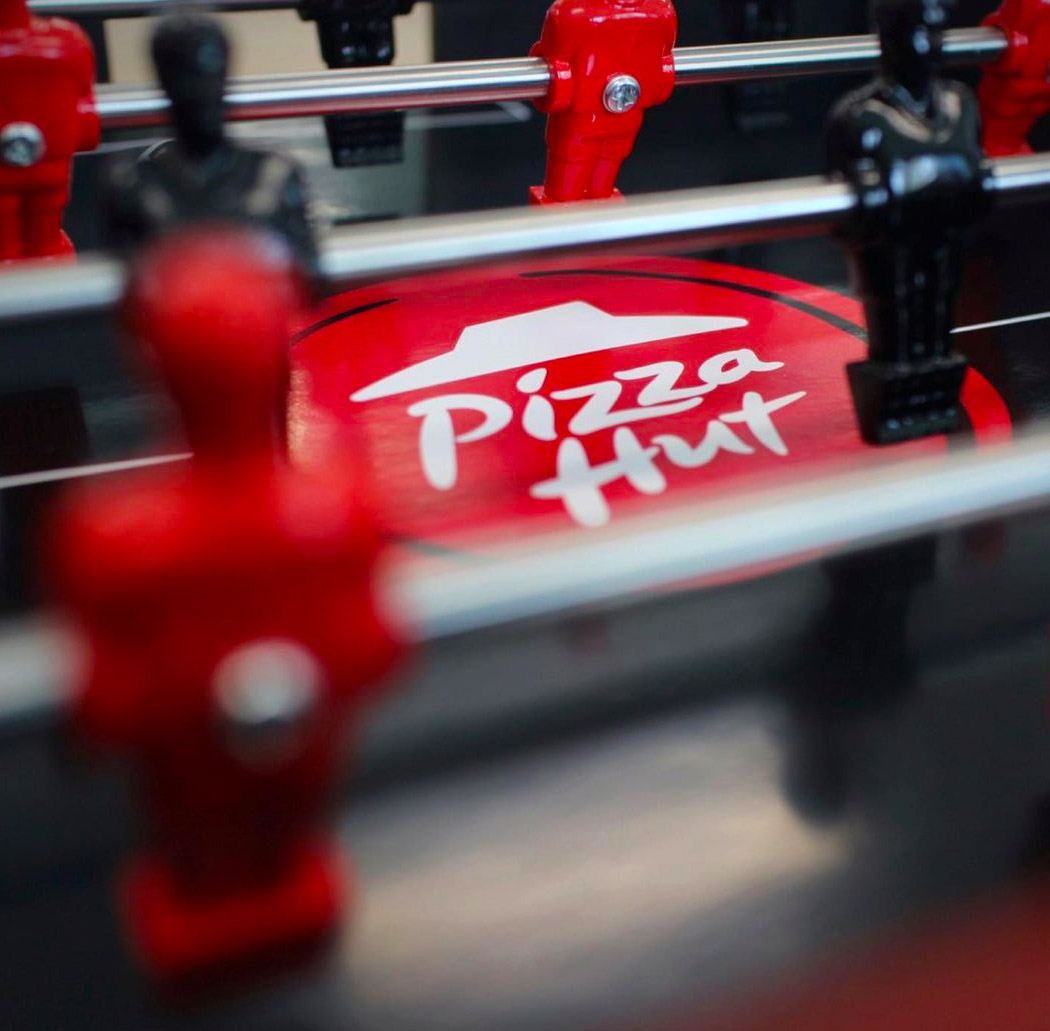
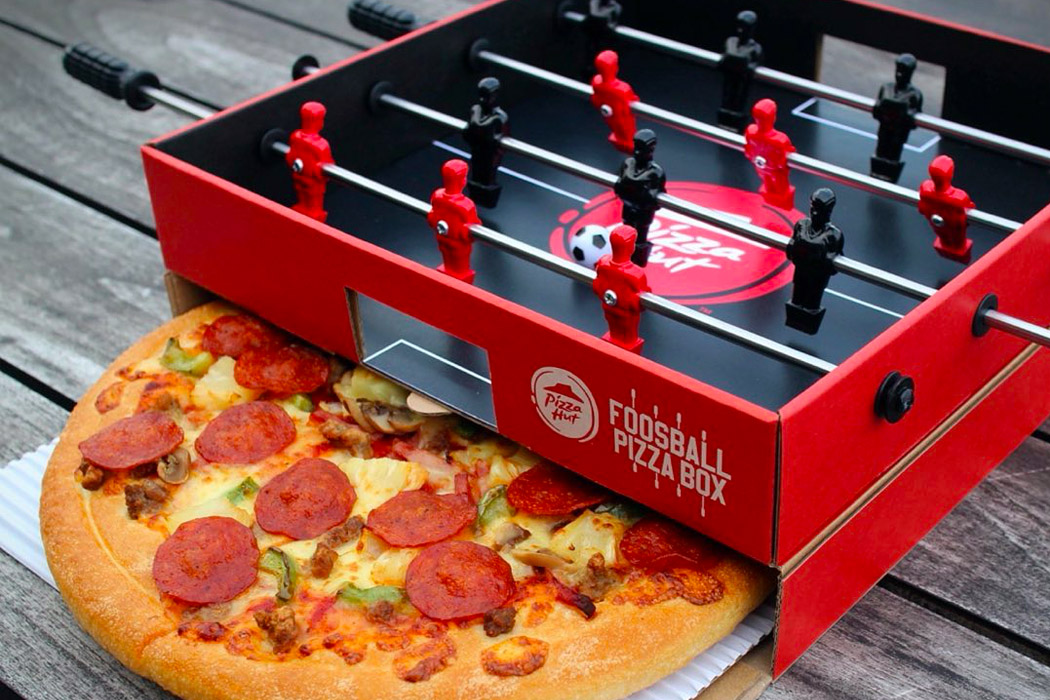
Pizza Hut + Ogilvy designed a limited edition pizza-box with a foosball table built into the lid! The Foosball Pizza Box was created as a warm-up for the Europa League which begins October 22nd (Get it, Warm-up? Pizza?). Wendy Leung, marketing director of Pizza Hut explains, ‘the Pizza Hut Foosball Pizza Box was a great opportunity to remind football fans that pizza goes best with their football. Launched at a time when everyone’s stuck in their houses, the box hopes to drum up enthusiasm, interest, and positivity. While diehard fans are just waiting to go out and support their teams or play their own games of street football, the Pizza Hut Foosball Pizza Box provides a great safe alternative, allowing you to battle it out with your friends in the comfort and safety of your own homes. Winner gets an extra slice, perhaps? And if there’s a tie, just equally divide the pie!
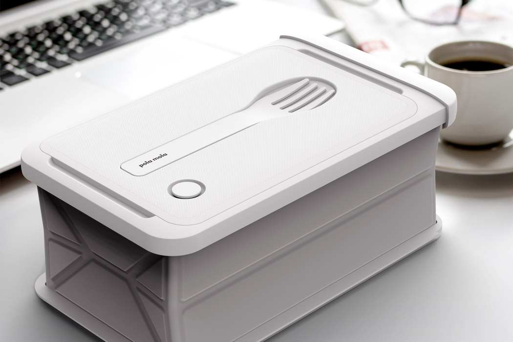
Molabox is like if the tiffin box had its own Macbook Air moment. It comes with a collapsible silicone construction and a svelte metallic outer case that, when collapsed, makes it look like you’re carrying an SSD around with you. However, when you want to store food in the Molabox, it expands to its true height, giving you enough storage for a good meal, along with cutlery, and even a partition too, in case you want to carry two separate items… but most importantly, the Molabox doesn’t contain any disposable parts or virgin plastics. The case is made from recycled aluminum, while the Molabox’s lid and reusable cutlery are entirely crafted from recycled plastic. It works perfectly as both a lunchbox and a takeaway box!
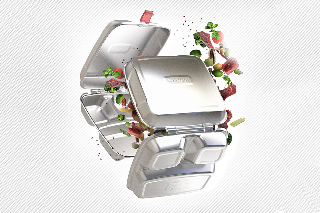
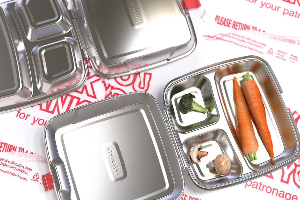
Styrofoam has a 24-hour lifespan but it is formed with materials that can last for 500 years, can you imagine the landfills at the rate we consume this product? “We need to stop and think about the environmental costs of our lifestyle,” says Dungan when talking about the notoriously single-use packaging that has been adopted worldwide. The box itself is so widely recognized that it has transcended continents and languages, so Dungan’s design aims to leverage its easy recall value while delivering a stronger message on sustainable living. The product is rightly called Leftovers and hopes to be a design that disrupts the normalization of polystyrene before it can become a mass-scale direct solution to the problem, the first step is to educate. For convenience and functionality, it is also dishwasher safe and recyclable. The redesigned box has a stainless steel body that enhances its functionality as a reusable food container while also bringing attention to how one small change can reduce the amount in our trash can.
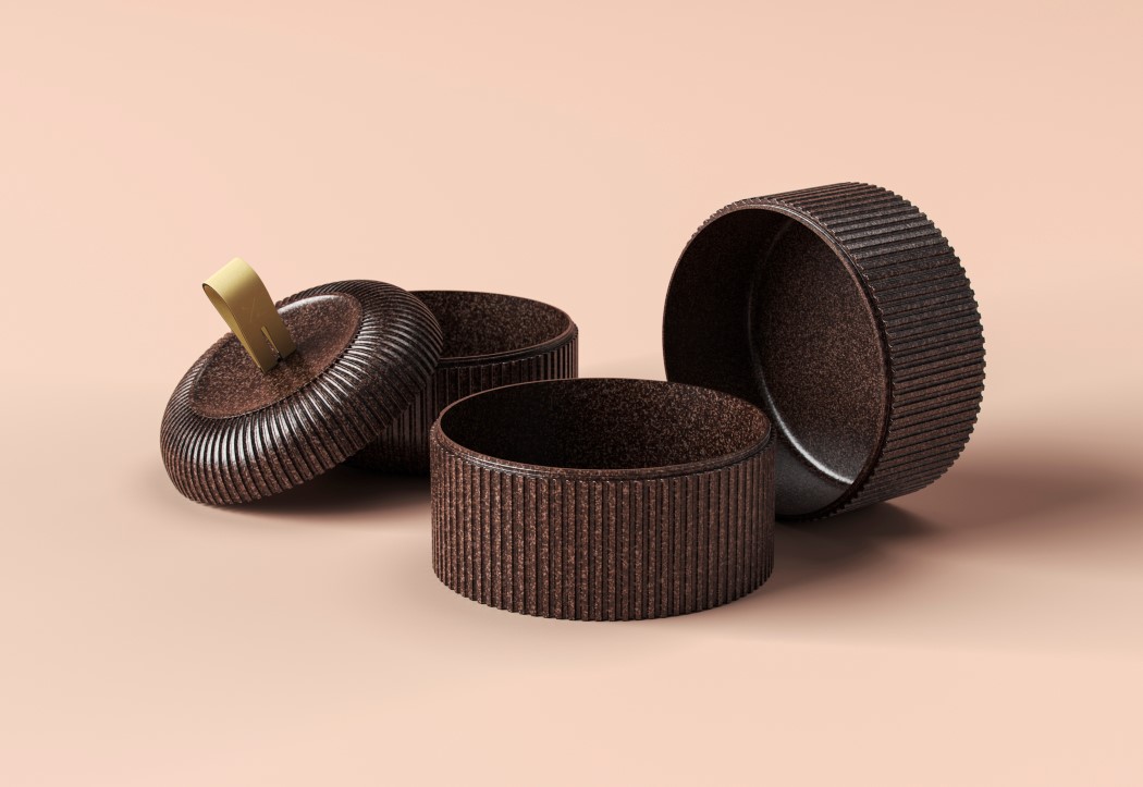
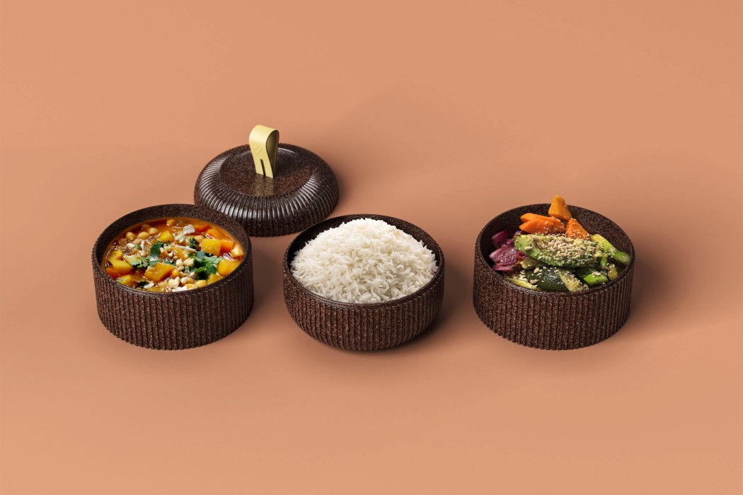
Created as a part of the Wallpaper* Re-Made project, these bio-composite containers are modeled to look like bento-boxes with a modular design that stacks up as your order increases, resulting in one larger box rather than multiple smaller boxes. This unique format provides a useful alternative to plastic containers (as it’s waterproof and leakproof too) and eventually reduces components by removing elements like lids (since the containers stack over and cover each other). Materials used to craft the packaging meet a range of criteria too, being heatproof, lightweight, recyclable, and insulating. The bio-composite polymer used to mold the containers themselves are made from cocoa-bean shells (a by-product of the cacao industry) by designer Paula Nerlich. The outer bag that carries the containers is made from all-natural materials too, including mycelium to insulate the interiors, a bioplastic known as Nuatan to provide a robust outer shell, a natural leather derived from pineapple leaves called Piñatex for the outer container’s lid, and Lexcell, a neoprene-free natural rubber used for the handles and straps on the bag and the Bento containers.
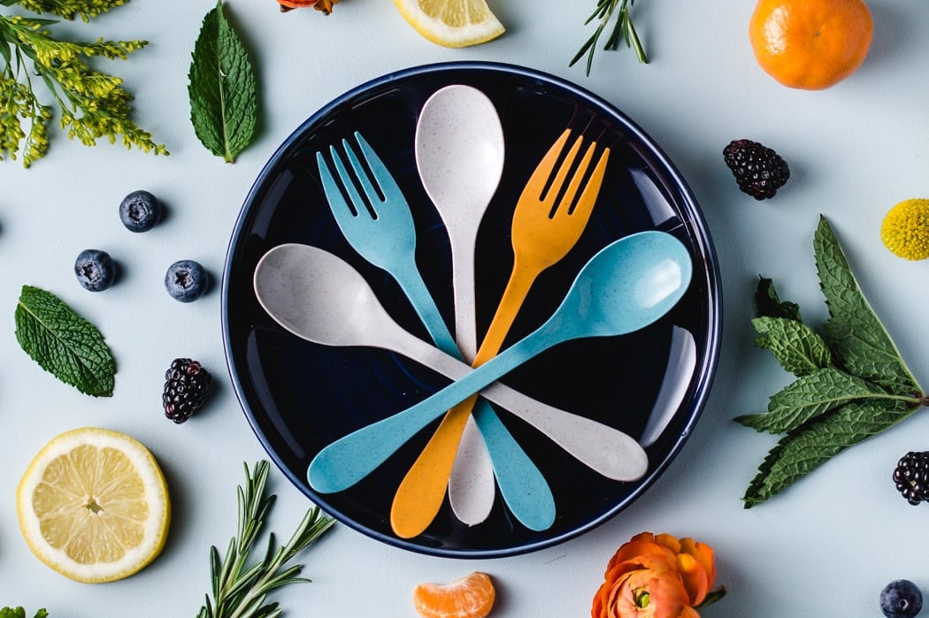
The Knork Eco has a pretty transparent objective. To A. remove non-biodegradable single-use plastics from our life-cycle, and to B. replace them with cutlery that’s eco-friendly, biodegradable, and more importantly, much more robust and comfortable to use than those horrible disposable forks and spoons. The Knorks are made from a specialized material called Astrik, which combines sugarcane starch along with bamboo fibers. The result is a moldable polymer that’s sturdy, looks and feels like glossy plastic, is food-safe, dishwasher safe, and can biodegrade in 2 years. The Knork Eco is a spoon+fork set made from Astrik. It looks and feels exactly like plastic, and can do everything plastic can. The Knork cutlery comes in its own chic case made from the bamboo-polymer too, allowing you to easily carry it around with you wherever you go because the Knorks are much more reliable and robust than most plastic spoons and forks. They come with a larger cross-section, making them thicker and stiffer, and even integrate a broader handle with a finger-rest, allowing you to use them with the dexterity of metal cutlery.
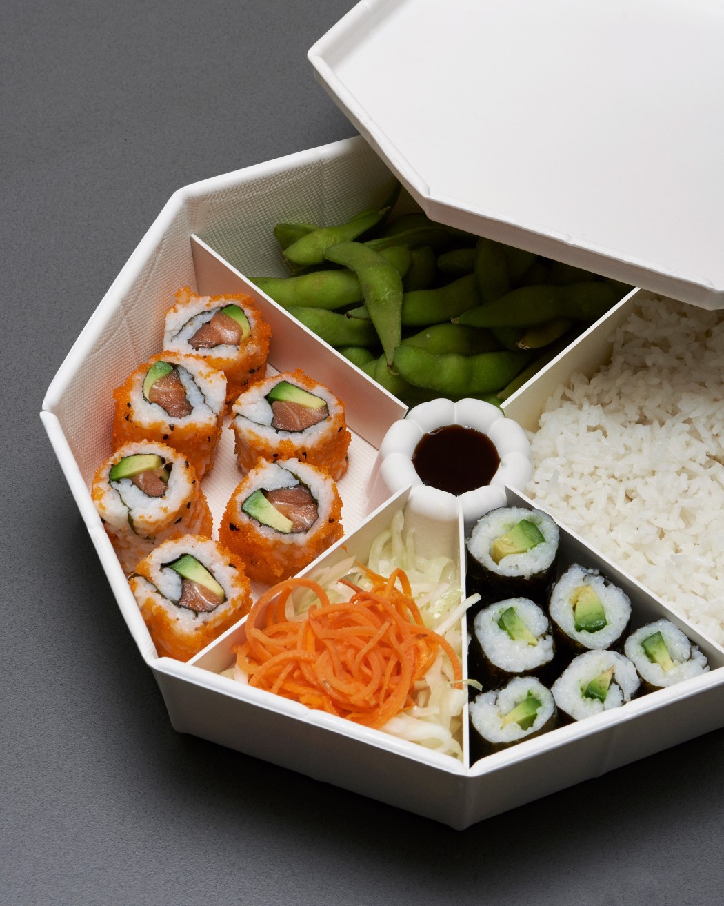
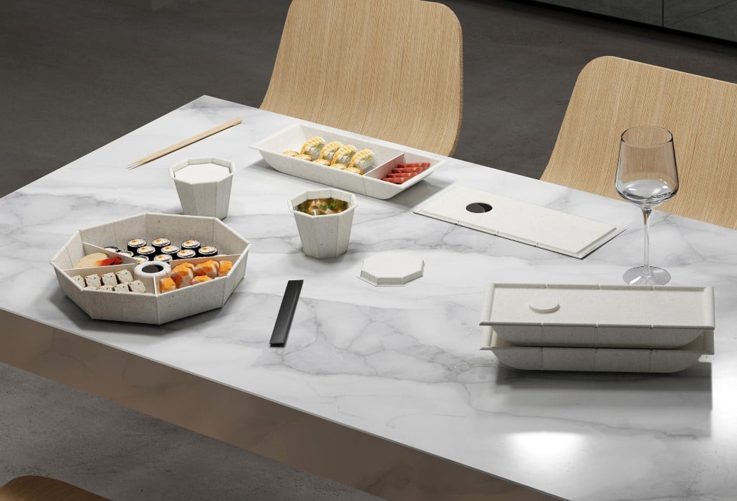
Meet the ‘One Size’, a template for parceling Asian food in a way that accommodates for tiny portions, solids, and liquids, and is above all biodegradable. Made from a molded cellulose material that can easily be composted (so you don’t need to separate the food and packaging while throwing it out), the One Size features a small single-person tray, a torus-shaped family-meal tray, and glass and lid for soups, curries, and gravies. The trays can be used to store individual food items, or portions of food using small cellulose walls as dividers, so you’ve got a bento-box-styled takeaway container that’s singular in nature. The single-person box can be slotted to create up to four separate compartments, while the family-meal box can be divided into eight segments, creating smaller containers within the larger container, without the carbon footprint. The boxes come with a glass and lid too. The glass holds any liquid-based dish, while the lid itself doubles up as a miniature dish for wasabi or soy sauce. Piasek’s design is made from molded cellulose, which primarily comprises recycled paper or natural fibers (think of your egg-carton), pressed into the shape of the packaging.
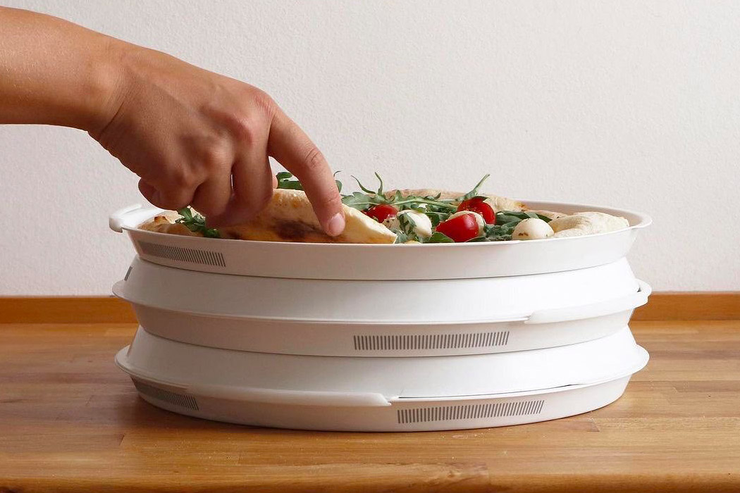
Finally, a round pizza box and it’s reusable + sustainable! Designed by Marlene Bruch and Luise Hombach, the PIZZycle is an eco-friendly pizza packaging concept aims to be an alternative to cardboard pizza boxes while taking a stand against the age-old debate of square vs round boxes. The common single-use boxes are left with food residue and therefore are deemed as non-recyclable waste – so if you really want to recycle that cardboard box you have to clean it. By being part of a deposit system, PIZZycle offers value to pizza restaurants, their customers as well as the environment. The packaging is composed of two identical, round shells, following the shape of a pizza. The box can be carried easily, cleaned in the dishwasher, and stored efficiently.

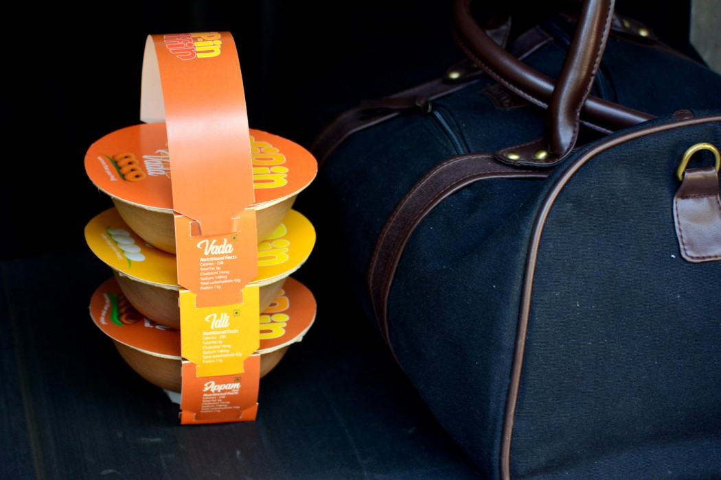
The Dip-In Tiffin was designed primarily for dry/semi-dry foods. Since the packaging isn’t air-tight, it tends to exclude foods that are gravy-based, limiting its options, but making it great for dry snacks like doughnuts, sandwiches, etc (the Indian context uses savory doughnuts and fermented rice-cakes). The tiffin’s main vessel is created using a dried, thermoformed Areca leaf, an eco-friendly alternative to conventional disposable plates. These vessels hold semi-dry, saucy, and oily foods really well too, offering a more reliable alternative to brown paper bags/boxes. The Areca bowls are covered with a simple branded paper sleeve, and slots along the sleeve allow multiple boxes to be suspended to each other vertically, resembling the tiffin. The solution was devised mainly for airports, which see patrons quickly grabbing meals and eating them within hours of checking in. It doesn’t use any glue, staples, or seals either, making it safe, and the all-natural makeup of the packaging means it can easily be disposed of after use!
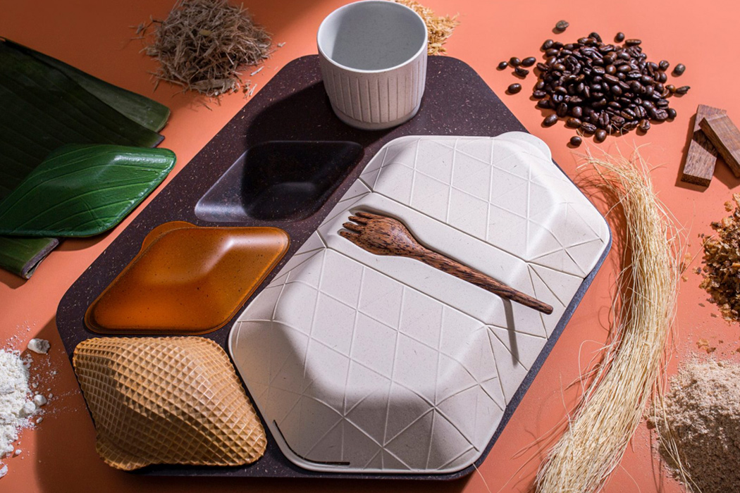
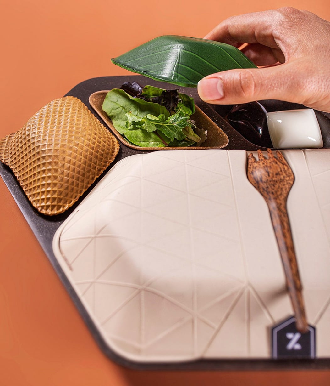
PriestmanGoode designed a line of eco-friendly and sustainable in-flights products as a part of their new exhibition at London’s Design Museum called ‘Get Onboard: Reduce. Reuse. Rethink’.  Their green inflight meal service has completely transformed the conventional meal tray we are so used to receiving on a flight. “We’ve used a wide range of materials for our design concepts,” says Rowan. And they’ve kept their word. Each element is either partially edible, reusable, soluble, or biodegradable. They’ve ditched plastic meal trays for partially edible ones made from coffee grains and husks mixed with a lignin binder. The miscellaneous food containers that fit into the tray have been made from wheat bran. Banana leaf or algae have been combined with rice husk to create lids for side dishes like salad. Whereas a wafer has been used as a dessert lid, hence the materials symbolically reflect the food. Instead of having several pieces of single-use cutlery, the handy ‘spork’- a combination of a fork and spoon- made from coconut wood has been adopted. The usual plastic containers for milk or sauces have been abandoned in exchange for edible pods created from soluble seaweed. This design philosophy and concept can be used for takeaway boxes as well!
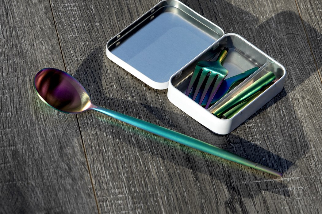
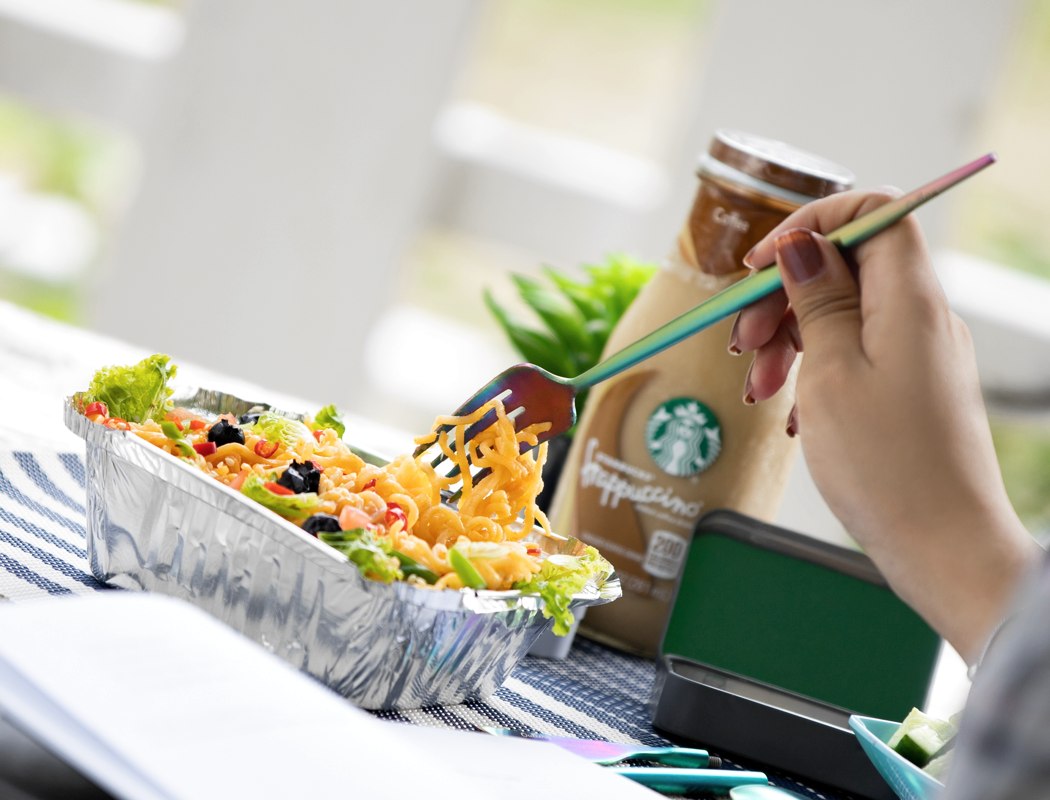
It’s that time of the season where you put your money where your mouth is. We have heard enough about plastic pollution and how we keep adding on to the trash. This applies mainly to the food industry where takeaways equal to the use of plastic cutlery. Wooden spoons, knives, forks, and sporks seemed to the better alternative, but nothing in comparison to sustainable and re-useable stainless steel flatware. However, the problem of plastic cutlery still persists and you as a consumer can be the change. Use the Pocket-Sized Reusable Cutlery & Chopsticks by Outlery. For those who don’t know them, Outlery is an Eco-Conscious company and have crafted this collapsible and portable set of cutlery and chopsticks, that fit into tin boxes. The three-part kit, screws on in a jiffy and can be used on the go. Easy to clean and maintain, you can carry the box with you, wherever you go.

Product Packaging designs so innovative, they make it impossible to say a no to the products!

In today’s consumer-centric world, packaging designs hold a very important place! A unique and attractive packaging design is what captures the interest and attention of your consumer. It pulls the consumer towards the product and even drives them to purchase it. Hence, allocating time, effort, and energy to create an appealing packaging design is extremely crucial, and designers are leaving no tables unturned in doing this. The result is – innovative, interesting, and attention-grabbing packaging designs that are hard to miss, and we’ve collected a few for you to admire!

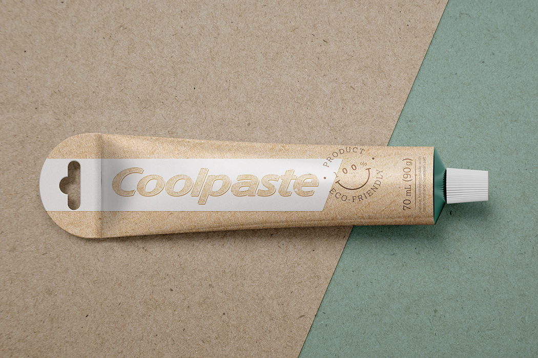
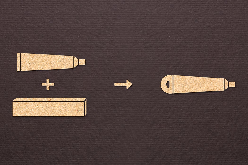
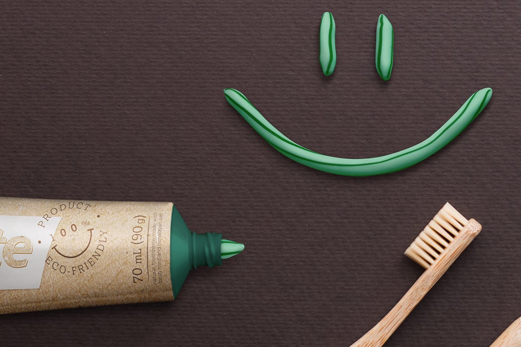
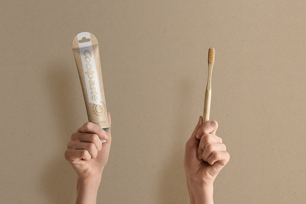
An academic project gave birth to Coolpaste – the eco-friendly alter ego of our trusty old toothpaste. The aim was to develop a sustainable packaging design for toothpaste in a way that didn’t affect their durability while being transported or stacked on shelves. For the purpose of the project, Colgate toothpaste was used as the object of study. Coolpaste not only got a physical makeover that was better for the environment, but the graphic elements of the product were also refreshed to reflect the goal of the project. The paper box was eliminated after an in-depth point-of-sale study without affecting the integrity of the toothpaste.

milk_packagin_01

milk_packagin_02

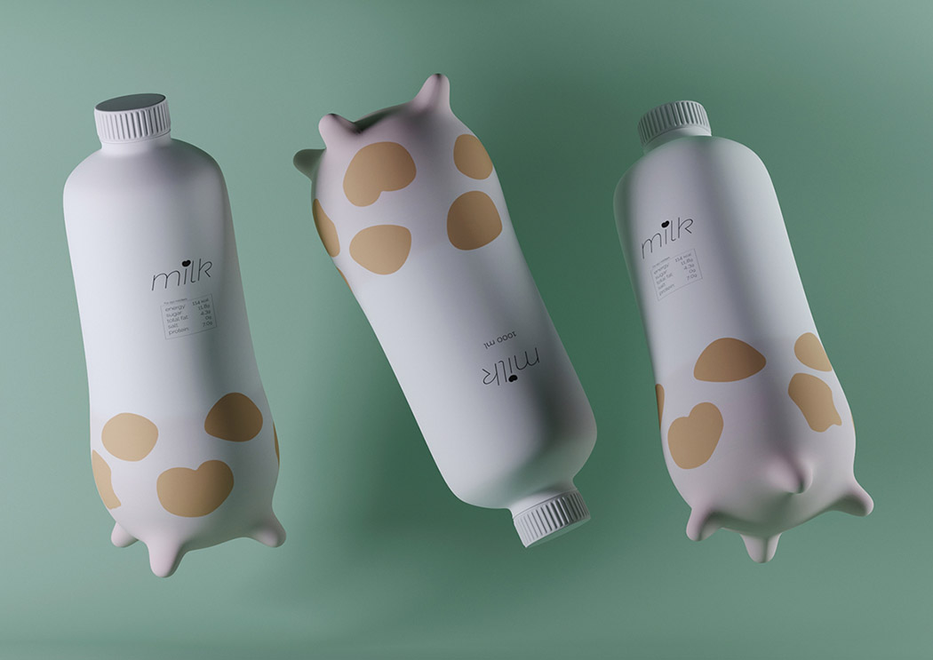
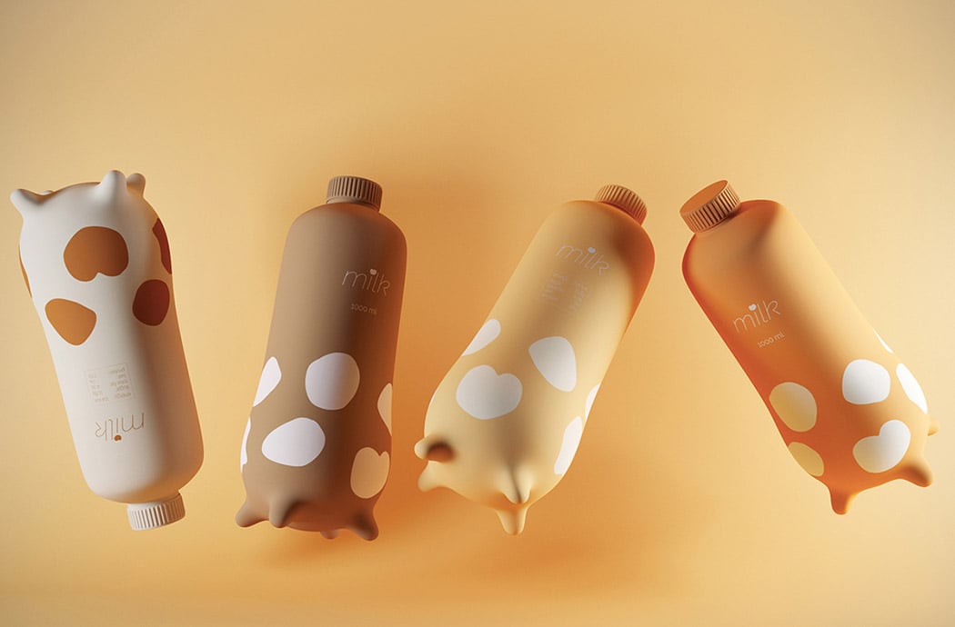
We’re always in the mooooood for a good packaging design and this one is udderly the best! Quite simply, it’s shaped like a cow’s udder which is not only freakin’ cute but ergonomic. Four little teats give it a little stability and something to hold on to when you’re pouring a cold glass of milk! Available in different cute shades, I honestly wouldn’t mind a glass of milk every morning, if I get to see this cow-inspired carton every day!

cytological_packing_material_layout

cytological_packing_material_07

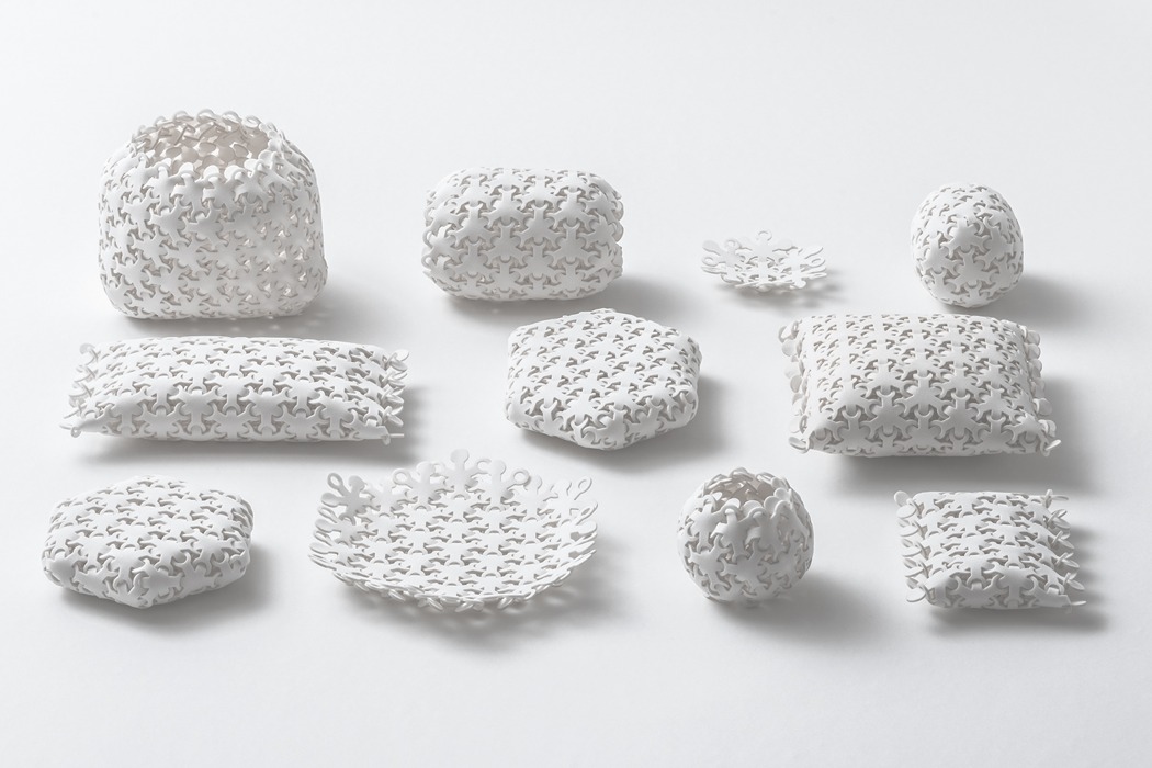
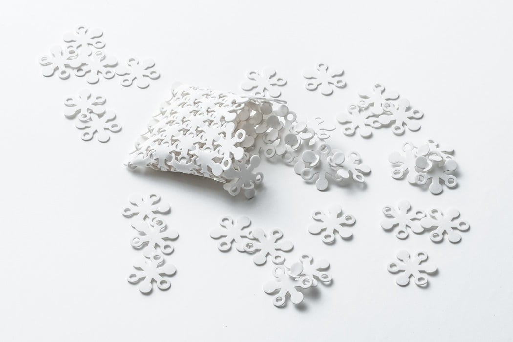
This series of distinctive forms have been created through the repetitive combination of the same six-pointed shape; by rearranging the shape in different configurations and patterns, a wide range of shapes and forms can be created! The hugely flexible, sponge-like form can be used to hold objects ranging from fruit and vegetables to protect them from drops, through to pens and pencils when it is configured into a striking pencil case!

The Srisangdao rice grows in Thailand in a controlled environment and every year only a limited quality is produced. Because of how special the rice is, the environment where it grows and how it is stored is given the utmost care making sure there are no chemicals hampering the quality. To showcase Thung Kula Ronghai’s efforts of growing this gorgeous grain, a designer reimagined the packaging as a tribute to the process with a purpose that went beyond preserving rice. The packaging is created using chaffs, a natural waste product from husking, which very literally incorporates the process which the designers wanted to celebrate through this product. The box has simple yet meaningful art surrounding the Srisangdao rice – it is die-formed with an oversized rice grain embossed on it which is the main artistic element.

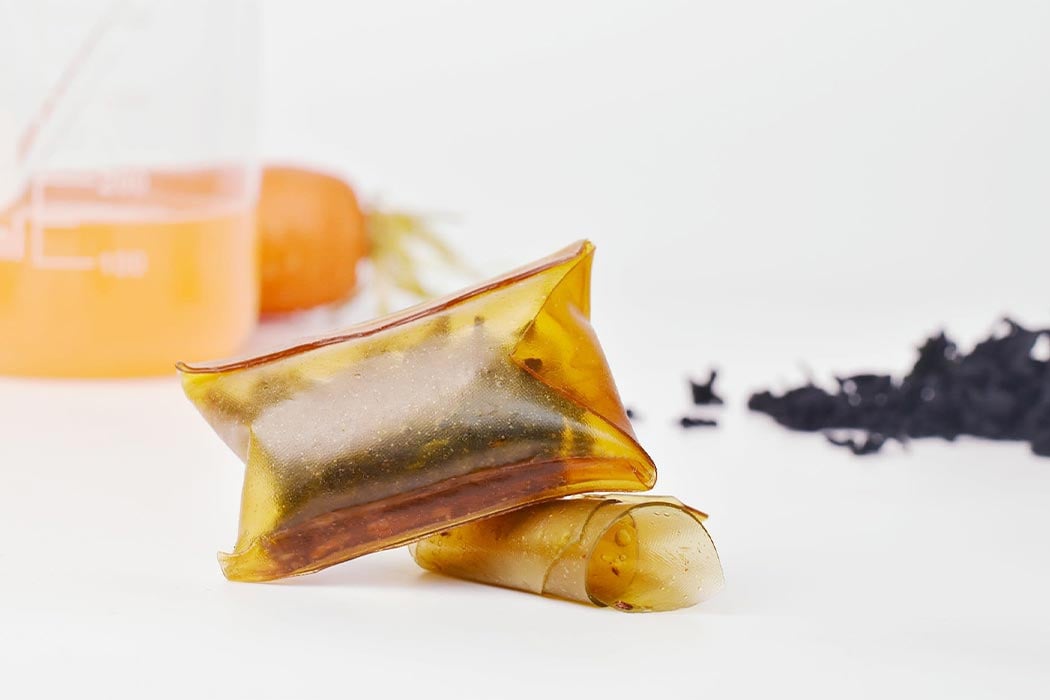
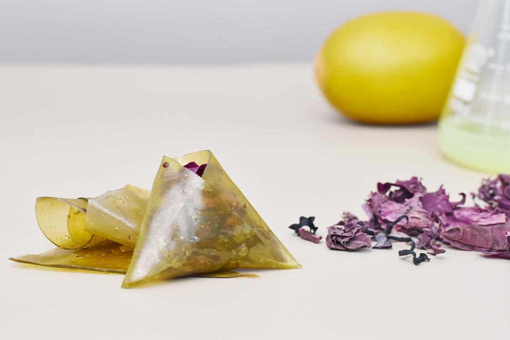
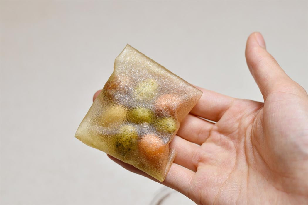
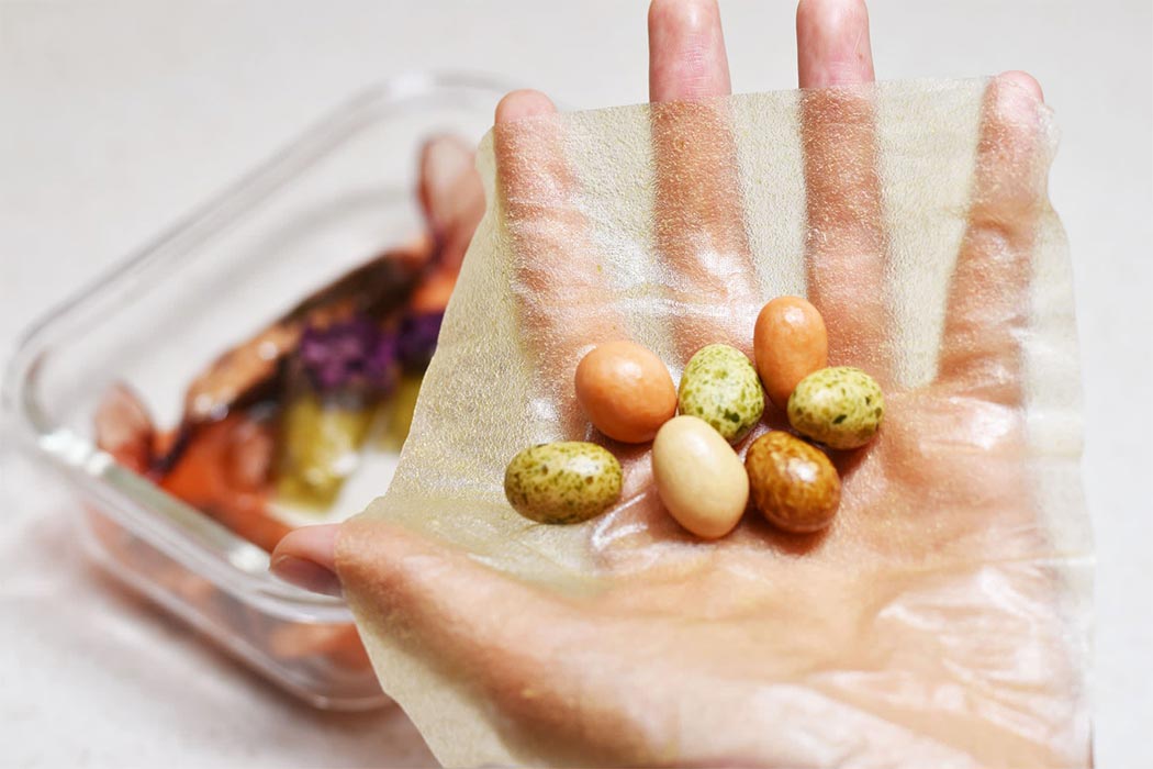
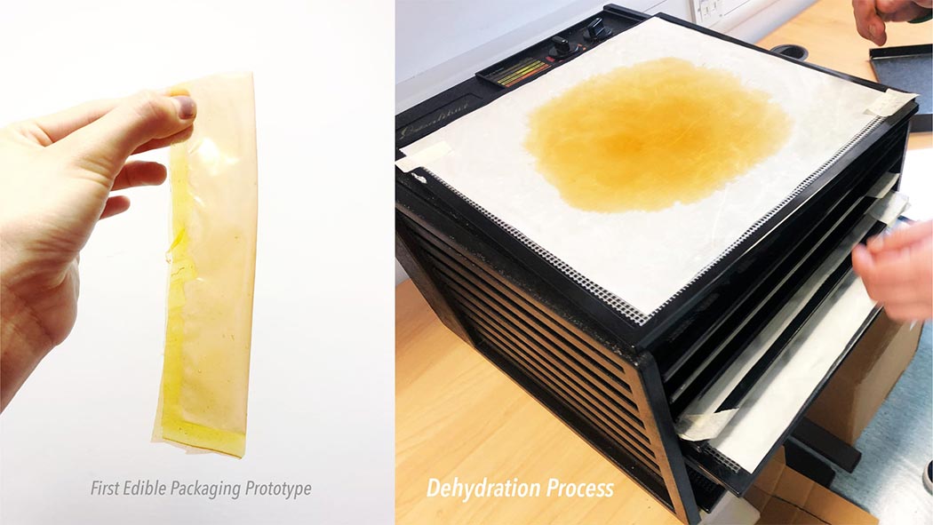
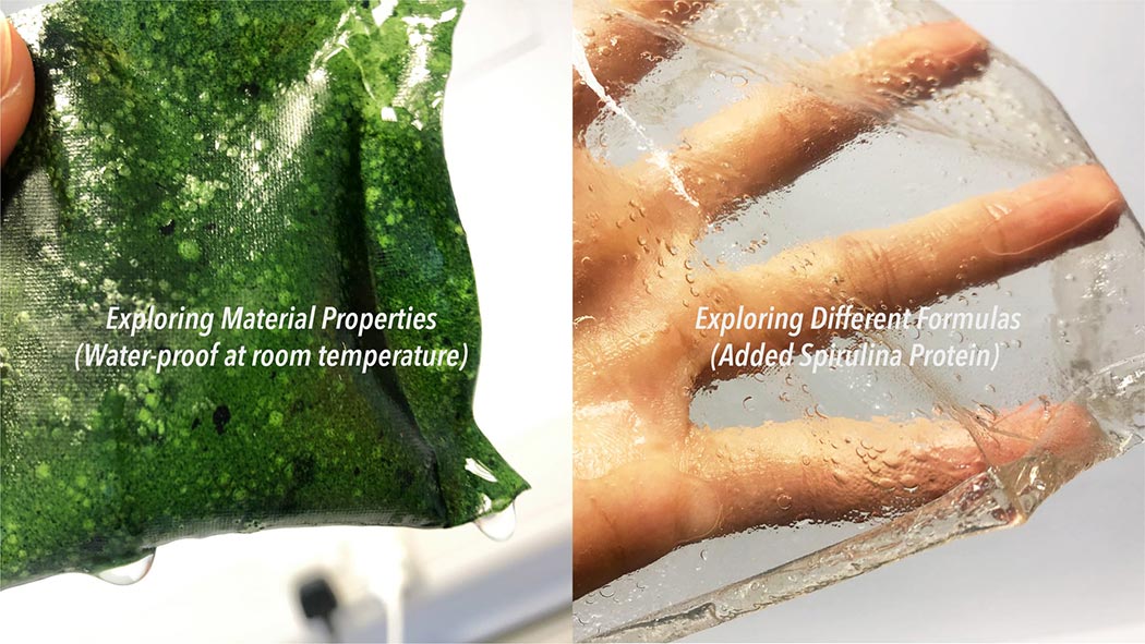
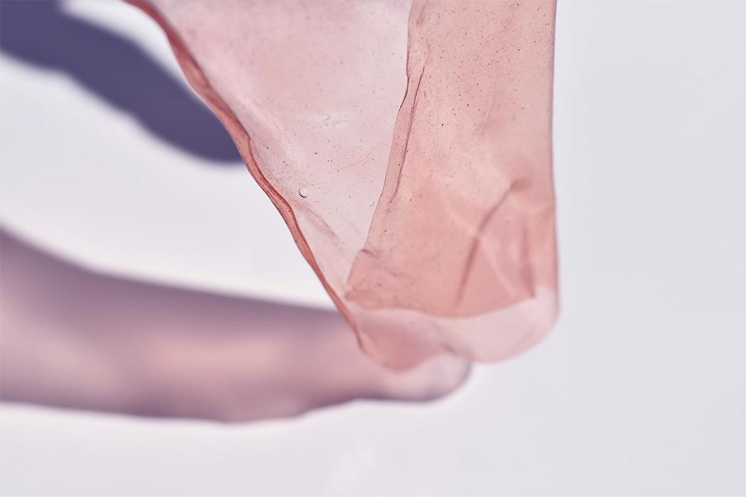
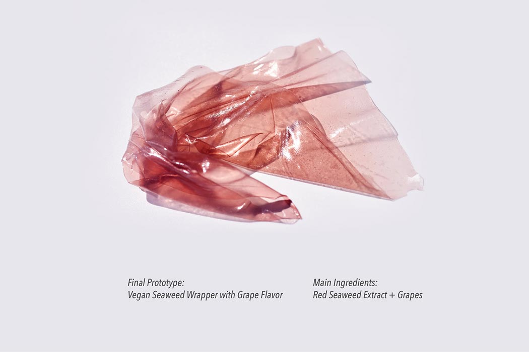
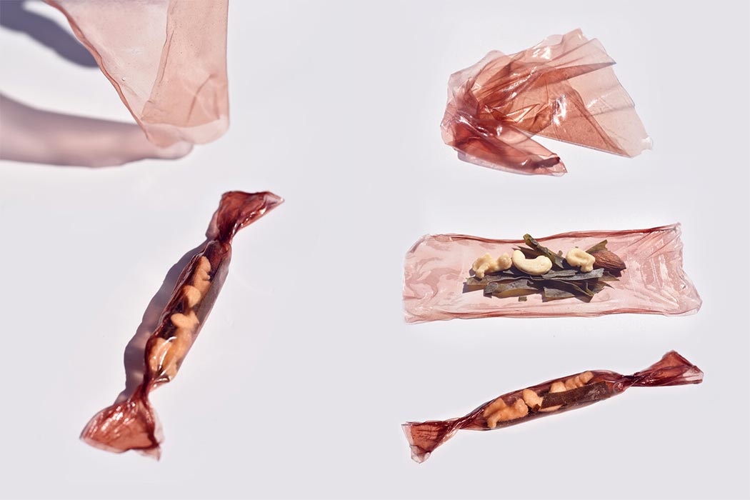
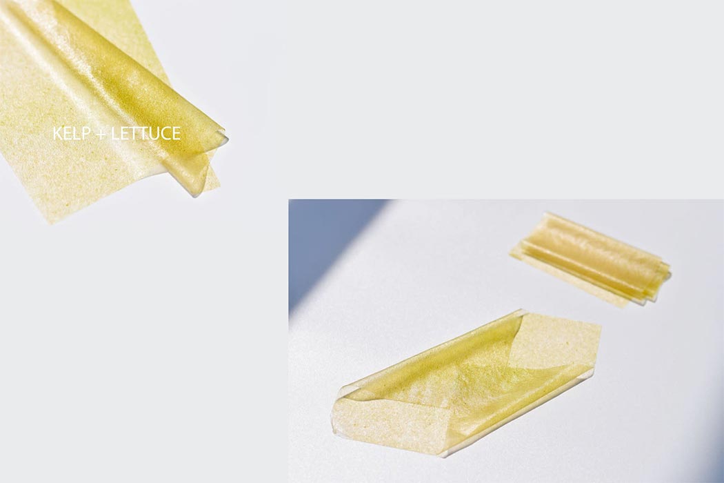
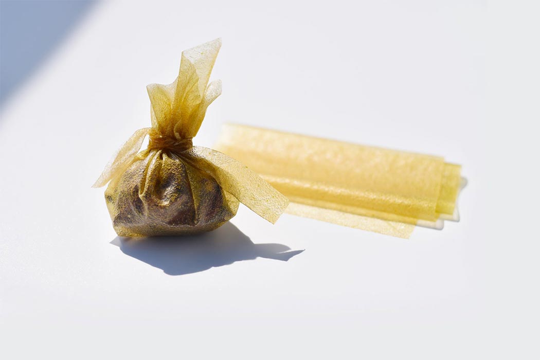
Made from seaweed and vegetable extracts, these low-cal wrappers can be used as edible packaging for snacks and dissolvable pouches that add extra nutritional value to your food like vitamins, minerals as well as polysaccharides that support your gut health. The seaweed extract is then dehydrated and the prototypes are examined in different temperature settings as well as tested for waterproof properties

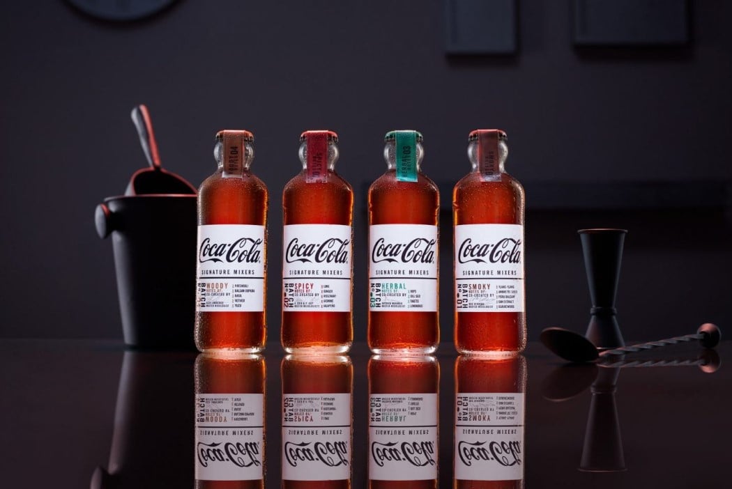
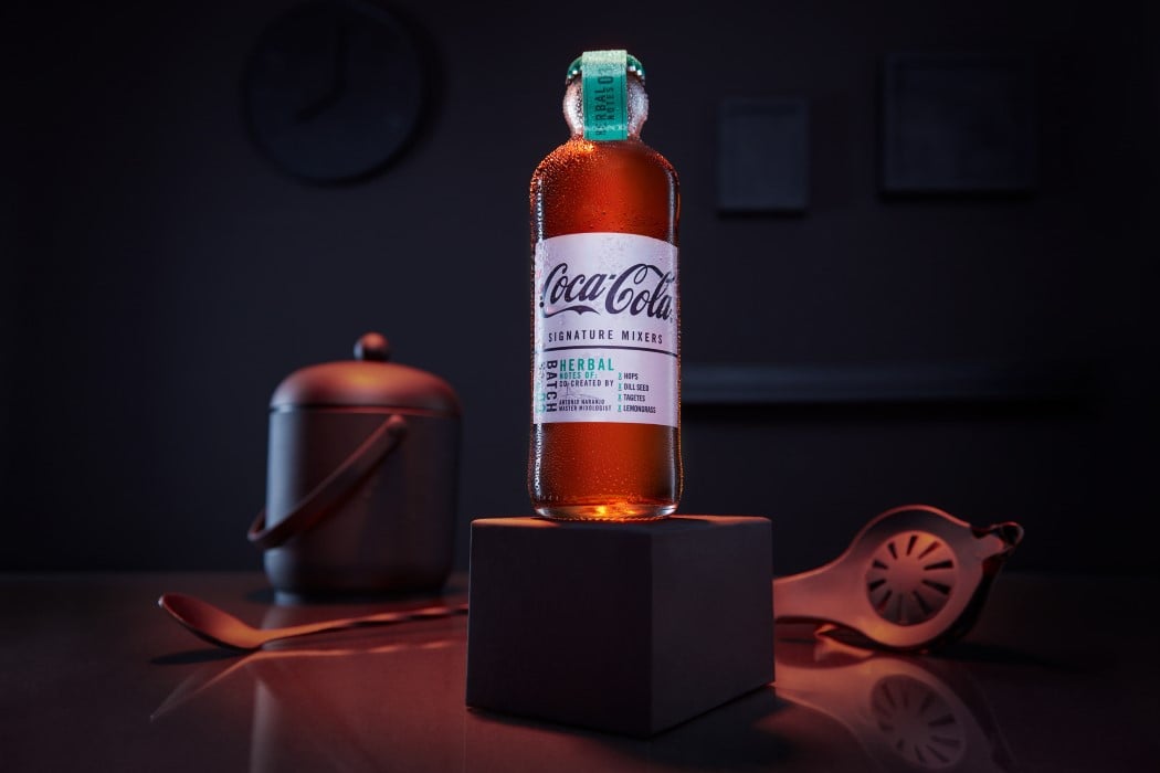
Referred to as the Hutchinson bottle (designed way back in 1894), the straight-sided bottle with a bulbous neck is now being reissued as the packaging for Coca-Cola’s series of mixers. The bottle design possesses an aesthetic that complements its bar-friendly category, making it the perfect choice. Available in four distinct flavor profiles, Woody, Spicy, Herbal, and Smoky, and designed to be used with dark spirits like whisky and dark rum, the bottles come with a white label and a taped cap, quite a deviation from the soft-drink’s otherwise red-heavy design, but more of a hat-tip to the drink’s association with mixology.

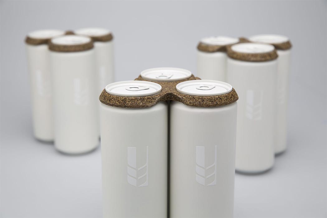
‘Trebodur’ is an organic material made entirely from brewers’ spent grain! Brewers’ spent grains are the residues that accumulate from barley malt during the process of lautering while making beer. So what binds the material to give it strength? The contained proteins in the spent grains act as a natural binder, now that’s a self-sufficient material! Creators Niko and Tillmann did extensive research and several experiments with natural fibers and binders. Being 100% biodegradable, Trebodur is a perfect choice for creating products that are used and thrown at large events or even in PR packages. It can be used for all kinds of packaging products and become a substitute material for paper and plastic packaging.


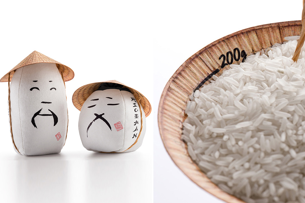
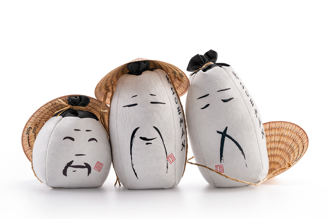
Rice is what home would feel like on a plate and that is what Backbone Branding conveyed with their reimagined packaging design. The goal was to evoke an emotional response for the rice farmers while also being functional as a product that is to be sold in health stores. The new design was minimal, familiar, and reminded us of the humans behind harvesting rice. With these elements at the core, the new packaging used minimal black graphic lines to show the different emotions one feels during the process – the faces radiate confidence, pride, satisfaction, empathy, and even tiredness.

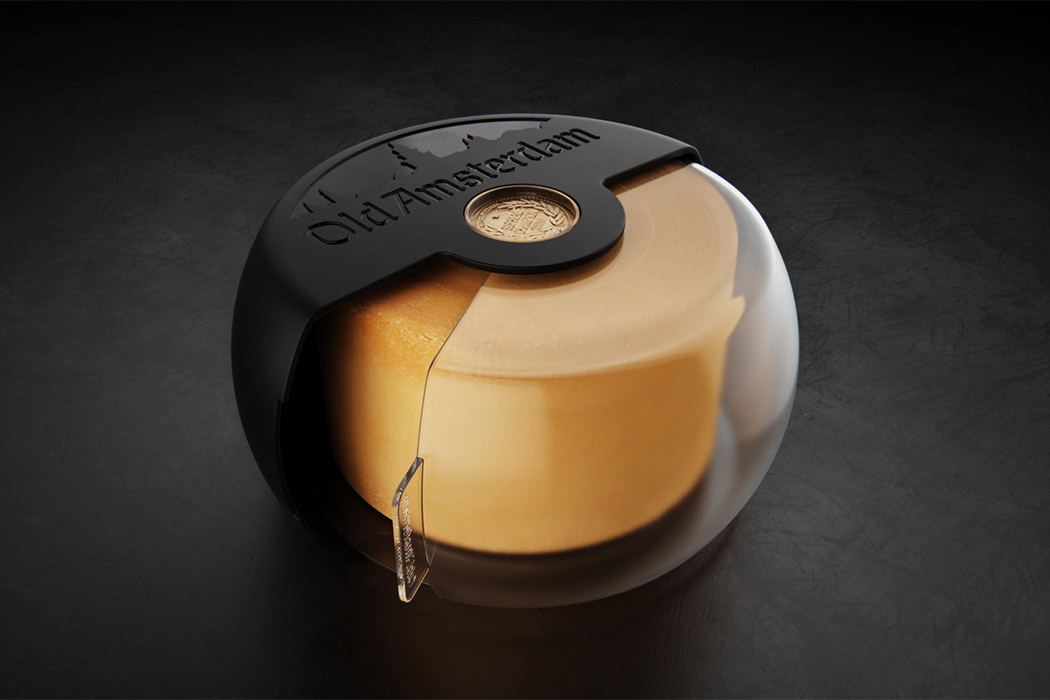
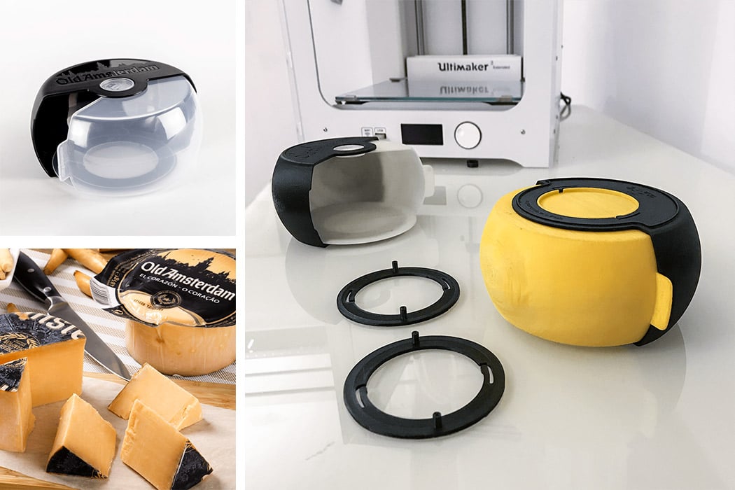
This old Amsterdam cheese cover brie-longs with your cheese because it understands the matters of the heart. No, it literally does – this cover is built in a way that showcases the heart of your cheese and also protects it. The conceptual cheese cover is appropriately named ‘El Corazon’ which translates into ‘the heart’. The center of the old Amsterdam cheese is usually served as tapas or aperitif and therefore deserves to be displayed like the showstopper of the snack bar that it is. The case also prolongs the cheese’s life in the refrigerator while turning into a functional showcase when needed.

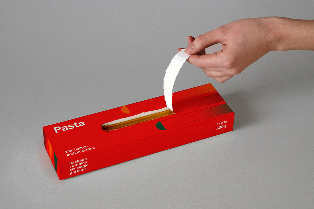
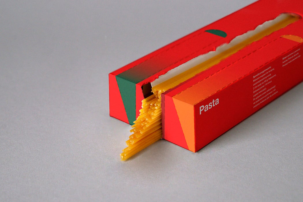
Lurtcevich took an ordinary rectangular box, the usual kind in which spaghetti is normally sold. However, she created six smart partitions using a single sheet of paper. The bright red pasta-filled box comes with six trapezoidal sections heaped with spaghetti, one section equates to one portion of spaghetti. So, Lurtcevich’s packaging holds six servings of pasta, enough for an intimate get-together you might have at your home! The opening of each measured section is outlined with perforations, three on the front and another three on the back of the box. Open the packaging along the perforated lines, by slowly pulling it towards you. Fish out the portion of spaghetti you need and get cooking!

Edible food packaging made from seaweed has the potential to offset carbon emissions entirely!

I don’t even know where to begin with the problem of plastic pollution – it is a heavy one and in literal terms, the amount of plastic on this planet is almost the same as the weight of the entire human population. Let that sink in. Single-use plastic makes for more than 50% of the plastic waste problem and if we continue at the rate we are going right now, there will be more plastic in the ocean than fish by 2050. According to the UN Environment, one million plastic drinking bottles are purchased every minute around the world, while up to 5 trillion single-use plastic bags are used worldwide every year (read more here). In total, half of all plastic produced is designed to be used only once and then thrown away – this is a serious problem and Wenwen Fan of the Royal College of Arts is using her design abilities to do her bit in providing a solution.

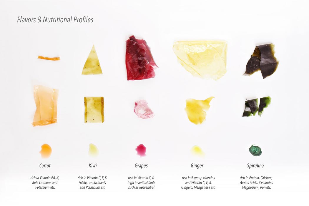
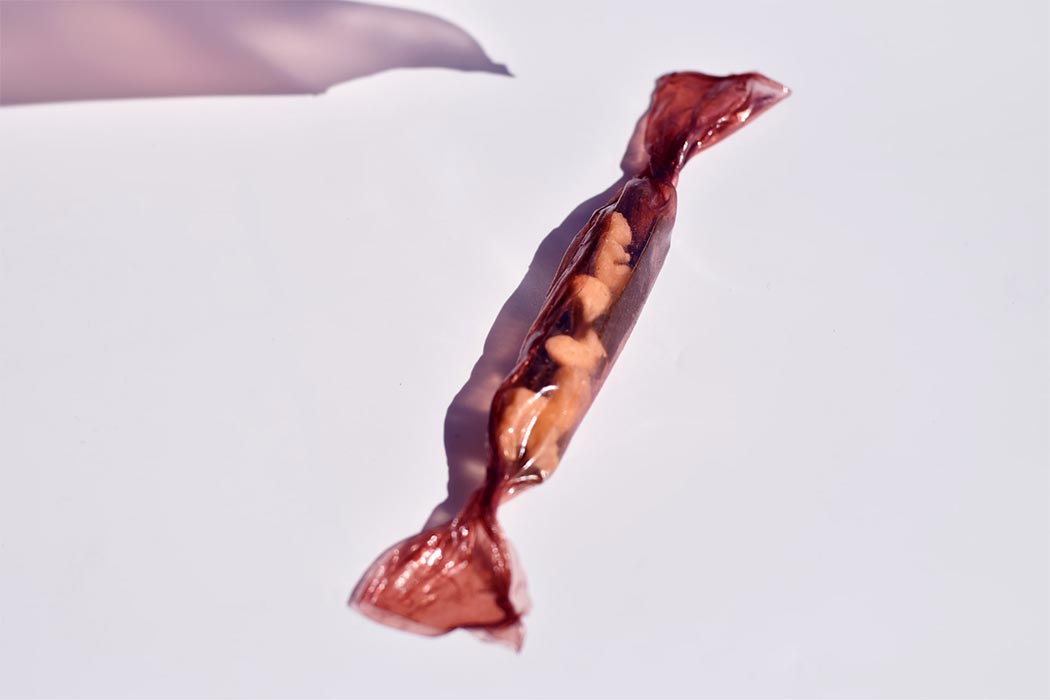
Seaweed is touted as green gold by scientists who are exploring its uses as a sustainable alternative for single-use plastic. What makes it interesting is that it can be edible and has high nutritional value too! It is already a staple in Asian diets and also in skincare routines, so it was time to push the boundaries and turn these into vegan wrappers. Made from seaweed and vegetable extracts, these low-cal wrappers can be used as edible packaging for snacks and dissolvable pouches that add extra nutritional value to your food like vitamins, minerals as well as polysaccharides from that support your gut health. The seaweed extract is then dehydrated and the prototypes are examined in different temperature settings as well as tested for waterproof properties. Turtles eat seaweed and they live to be 100 so why not!?

“As a multidisciplinary experience designer, I am passionate about designing a cohesive, integrated set of experiences for behavior change. From embedding AR into an immersive Alzheimer’s simulation experience to creating sustainable edible packaging from seaweed, I believe a good experience design should be context-driven, behaviorally informed, and culturally relevant,” says Fan. The wrappers can customize for different flavors and nutritions for a more personalized product combination on Seaweed U which will be an online platform dedicated to the product. It is an ingenious way of packaging food while also being a source of soluble fiber – I see this design as a win-win with the only hurdle being the scale of mass production should a big brand adopt this packaging design. Seaweed U encourages a more convenient, playful, and pleasurable diet solution as well as reducing plastic pollution from the food industry.

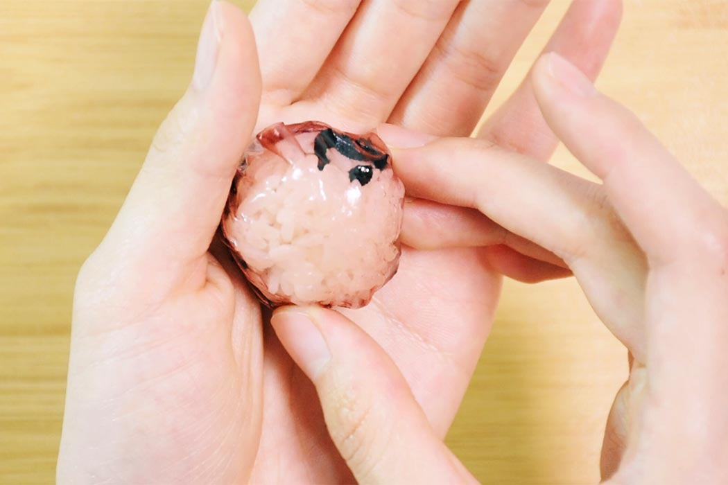
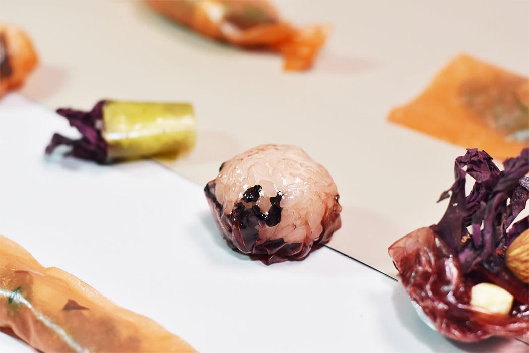
There are three suggested scenarios in using these seaweed wrappers: Trick or Treat, The Lazy Pouch, and Super Chef. Trick or Treat is a healthy snack made from fruity-taste seaweed skins. Through combining a more familiar food palate like nuts and berries with the nutritional skins, it enables people to enjoy seaweed through daily snacking without being held back by the green and slimy texture. The Lazy Pouch is a single-serve, dissolvable pouch with different types of seaweed like wakame, dulse, and kelp, etc. that offers a convenient and quality meal supplement for those living a fast-paced lifestyle. Super Chef offers a creative DIY food experience in the kitchen where people can play with this versatile material in combination with ordinary ingredients to make unique dishes like transparent onigiris, ice cream raviolis, and colorful spring rolls.

We all know eating a more plant-based diet has a direct impact on climate change and seaweed can be of great help. According to scientists, building seaweed farming networks on just 9% of the world’s ocean could offset carbon emission entirely – that can buy us more time to focus on the larger plastic problem. Seaweed U aims to help people feel comfortable with different superfoods that add immense benefits to their health as well as the health of our planet.

Designer: Wenwen Fan

Sustainable rice packaging becomes an artistic tissue box in afterlife

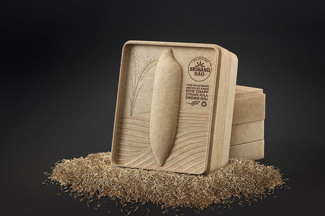
The Srisangdao rice grows in Thailand in a controlled environment and every year only a limited quality is produced. Because of how special the rice is, the environment where it grows and how it is stored is given the utmost care making sure there are no chemicals hampering the quality. To showcase Thung Kula Ronghai’s efforts of growing this gorgeous grain, a designer reimagined the packaging as a tribute to the process with a purpose that went beyond preserving rice.

The packaging is created using chaffs, a natural waste product from husking, which very literally incorporates the process which the designers wanted to celebrate through this product. The box has simple yet meaningful art surrounding the Srisangdao rice – it is die-formed with an oversized rice grain embossed on it which is the main artistic element. The grain graphic is complemented with wave-like lines and smaller embossed design of the crop in full bloom. The designer has also burn-stamped the logo of the rice mill from the Thung Kula Ronghai region on the box. A thoughtful detail that really completes the picture is the rice inside comes in a miniature sack just like the traditional one. All these pieces put together truly bring out the different elements of the rice’s identity and lifecycle.

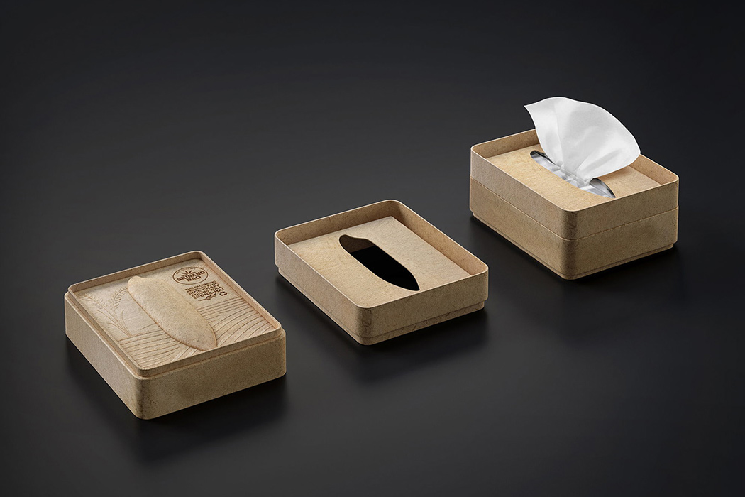
What makes this organic packaging more interesting is the fact that it can be used as a tissue box after it has served its purpose of storing rice. It is completely eco-friendly as well as recyclable and generates minimal production waste. To see how a simple rice packaging can completely be reimagined and redesigned to tell a story while still providing value after its main job is done is an inspiration to continue being creative.

Designer: Somchana Kangwarnjit

Cup Noodles made eco-friendly with this 100% paper packaging design!

Who doesn’t love a cup of steamy instant noodles? And who hates the fact that the container is so toxic? Low-quality plastic and harmful polystyrene make the cup that holds your noodles – and we all know what happens when heat and plastic mix. The packaging is not only bad for the environment but can leave minuscule toxic residue in your noodles which can be dangerous for your health, especially if you consume them often as these particles build up in your system over time.

A study shows that in 2018 alone 103 billion packets of instant noodles were sold worldwide. The global demand for it is soaring because it is easy to cook, saves time and is budget-friendly which makes it extremely popular among young people. You can imagine the waste produced by 103 billion packets and cups so we as a society must strive to create a sustainable future by tackling the packaging challenges of one of the world’s biggest industries.

Fortunately, we have an answer – 100% paper noodle packaging created by Australian student Emily Enrica. Her design is called Paper Noodle which will stick in your memory because it is so easy. Her packaging is made from paper pulp which is 100% biodegradable, recyclable, microwave safe and FDA tested food safe. The design of the box is ergonomic which makes it comfortable to hold even when the contents inside are hot. The belly band of the box is made of debossed paper pulp too. It comes with a cover label that keeps the noodles sealed. Even the spoon is made of paper pulp further reducing waste. Now that is a cup of noodles – serves you and the environment!
Designer: Emily Enrica