Minimalist stool combines wood and webbing to create a fresh and fun look

We probably don’t always think about how chairs and stools look as long as they’re comfortable. After all, you don’t exactly see their visual design when you’re already sitting on them. You won’t always be sitting on a particular chair all of the time, however, and those moments when these pieces of furniture are empty can have an impact on your space’s overall ambiance. They can make or break the particular theme you’re going for or enhance the atmosphere inside a room. They can even be conversation starters, depending on how distinctive it looks. This stool, for example, might not look like the most comfortable or stable thing to sit on, but it’s hard to deny how it injects a bit of character into an area with its color combinations and raw vibe.

Designer: found/Founded
Compared to chairs, stools don’t seem to be inherently designed for long periods of use. They don’t have backrests or arms to make you feel comfortable, but they do make up for it by making it easy to sit down on one and then get up again quickly. It’s as if this kind of seat was made for more transient and very temporary situations where you just need a few minutes to rest or chat but never to lounge or work.

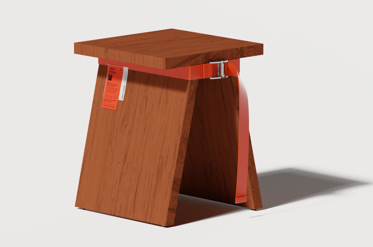
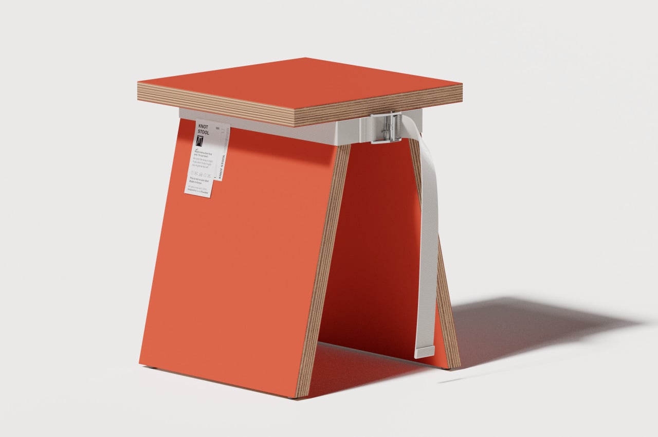
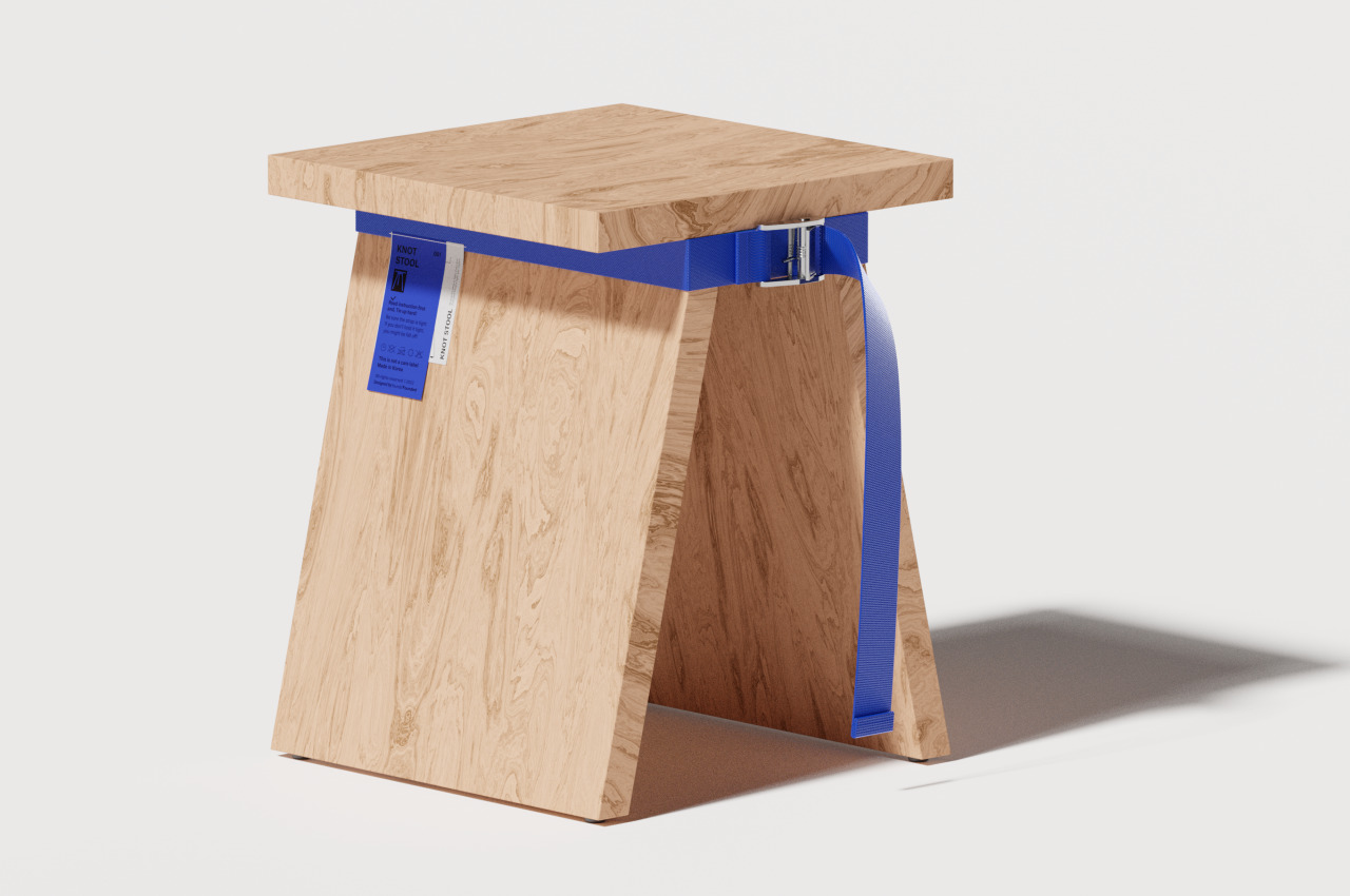
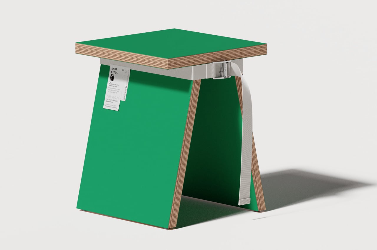
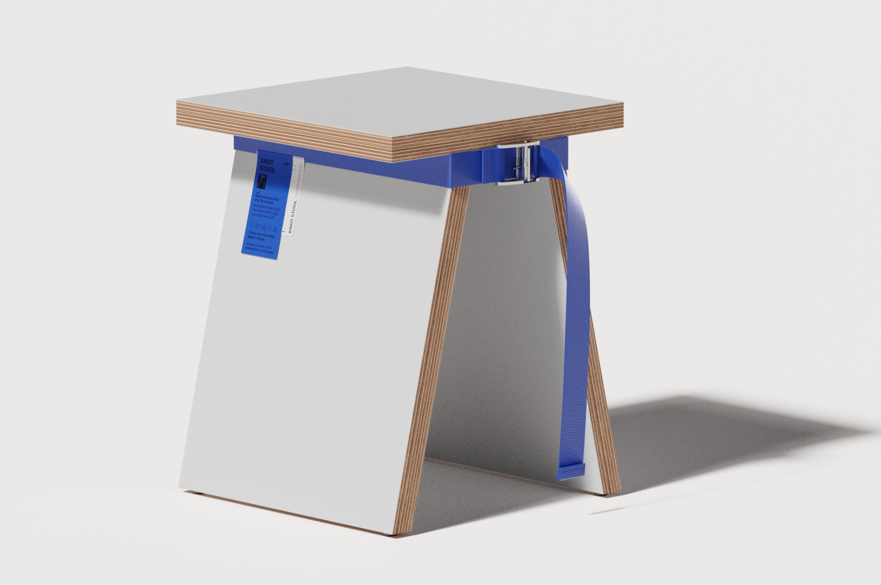
The KNOT Stool seems to take that image to the extreme. It is flat all around with nary a curved surface or corner that would have made it look more inviting. You can even directly see the layers of wood that make up its parts, giving it an almost brutalist aesthetic if not for the painted surfaces. Two slanted legs make up the entire support, but their thin profiles don’t really inspire much confidence.
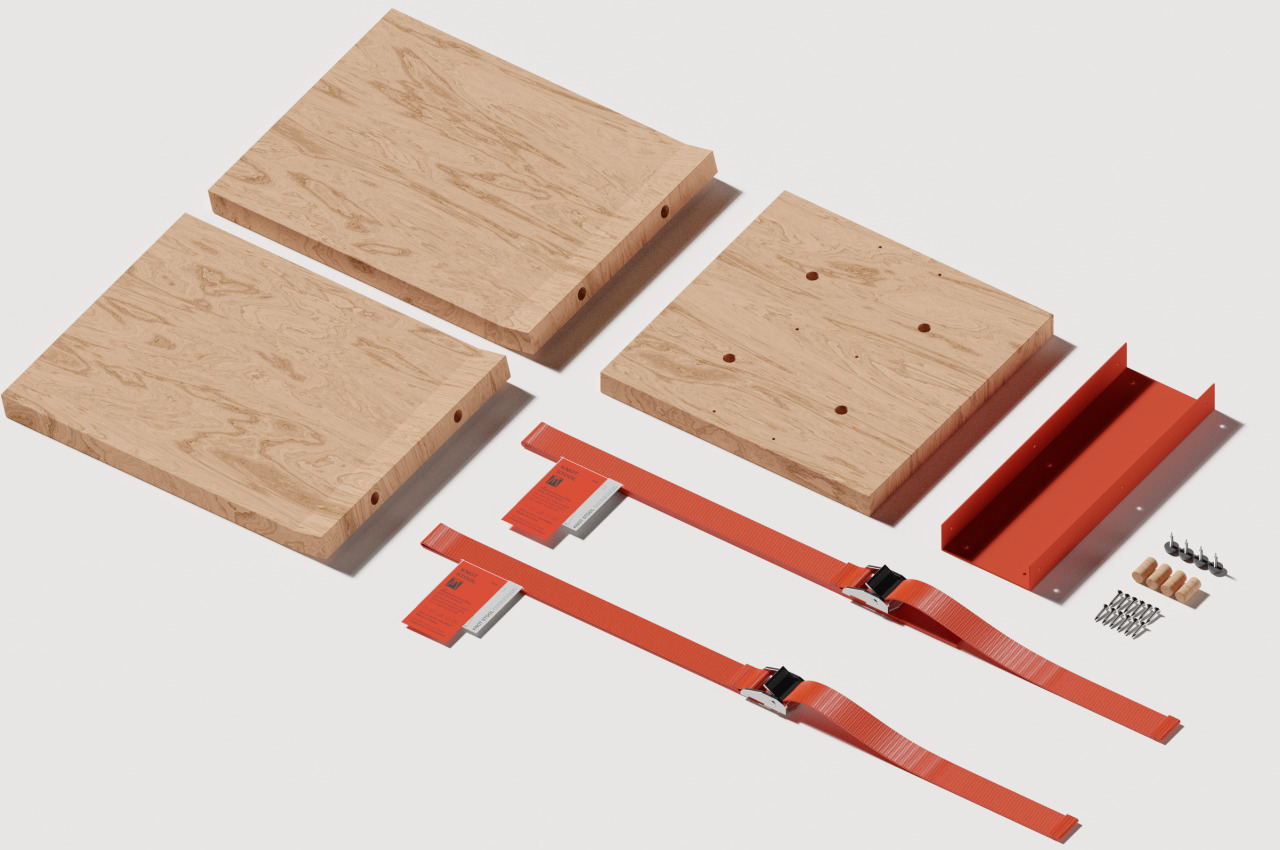
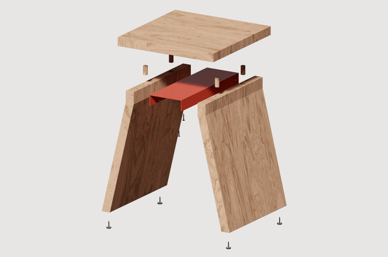
It’s probably still a usable stool, but it seems to be designed more for viewing rather than sitting. The three wooden pieces can be painted in the same or different colors, for example. The decorative webbing strap that wraps around the top of the stool’s legs can also come in complementing or contrasting colors, not to mention being made of different materials.

The result is a stool that looks more fun than ergonomic and more decorative than utilitarian. Of course, it might still be possible to sit on it for a bit, or it can be used to hold other objects if you’re not that confident about its stability. Regardless of the purpose it will ultimately serve, the KNOT Stool is clearly not a typical stool, especially in the way it adds a bit of whimsical fun to your interior.
The post Minimalist stool combines wood and webbing to create a fresh and fun look first appeared on Yanko Design.
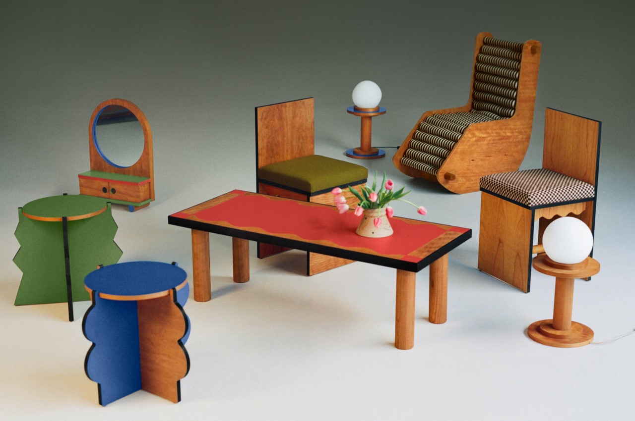
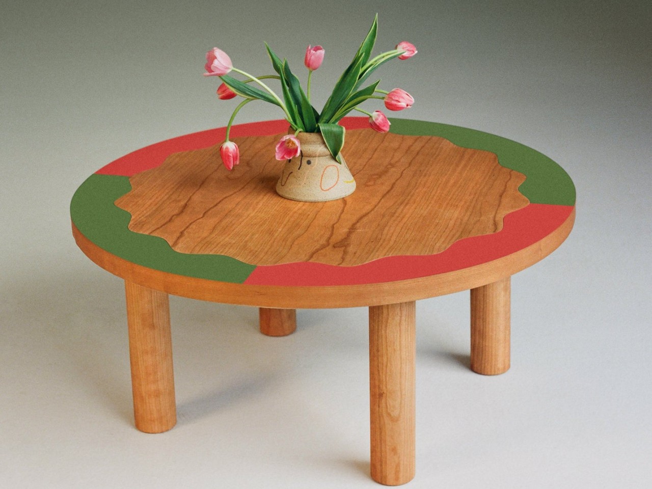
Frunchroom is a delightful furniture collection that looks like part of a dollhouse

Furniture is mostly seen as functional objects rather than just for show. After all, you sit on them or place items on them, and they feel like a waste of space if they remain unused for long periods of time. At the same time, however, furniture has always served a decorative purpose, which is why many antique pieces have ornate engravings or designs. Furniture has the ability to create a specific mood or atmosphere in a room. Even an interior filled with minimalist tables and chairs exudes a sense of cleanliness and tidiness. Others, however, prefer a livelier ambiance, especially in a living room, and this furniture collection definitely brings a whimsical spirit that feels like it came straight out of a dollhouse.

Designer: Adi Goodrich

The living room is one of the most important parts of the house, mostly because it’s a nexus of any and all sorts of activities. It’s often one of the first areas that guests see, and it is where they are first entertained. It’s also a place where family and friends gather for games or entertainment, and it sometimes even acts as a makeshift bedroom for someone crashing over. As such, it’s almost always where the majority of fancy decorations and furniture are located.

For those hailing from south-side Chicago, this area is also called the “Frunchroom.” It’s the front room of a house where homeowners keep their most prized possessions and where some of the best memories are made. It’s no surprise, then, that a furniture collection bearing that same name would be just as memorable and fun, calling to mind the whimsical forms of furniture meant to be used as toys, here supersized for actual human use.

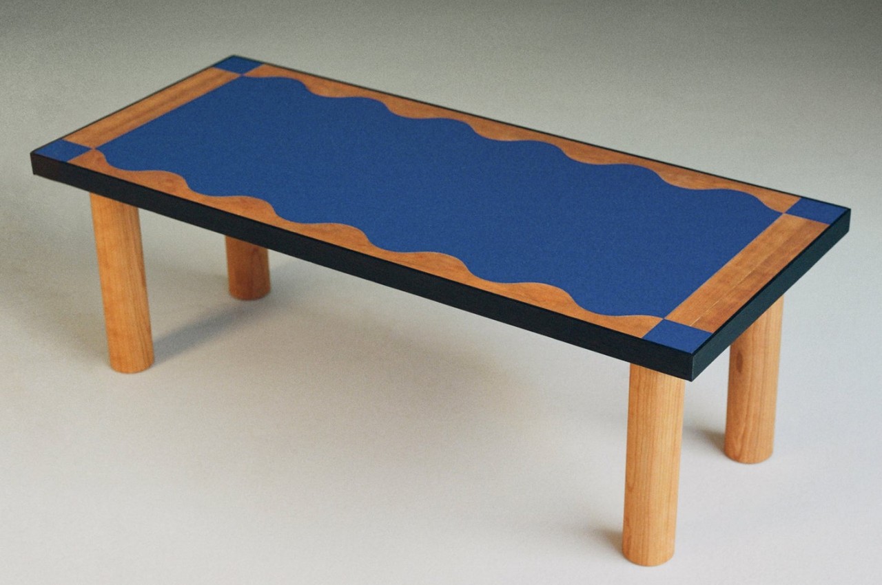
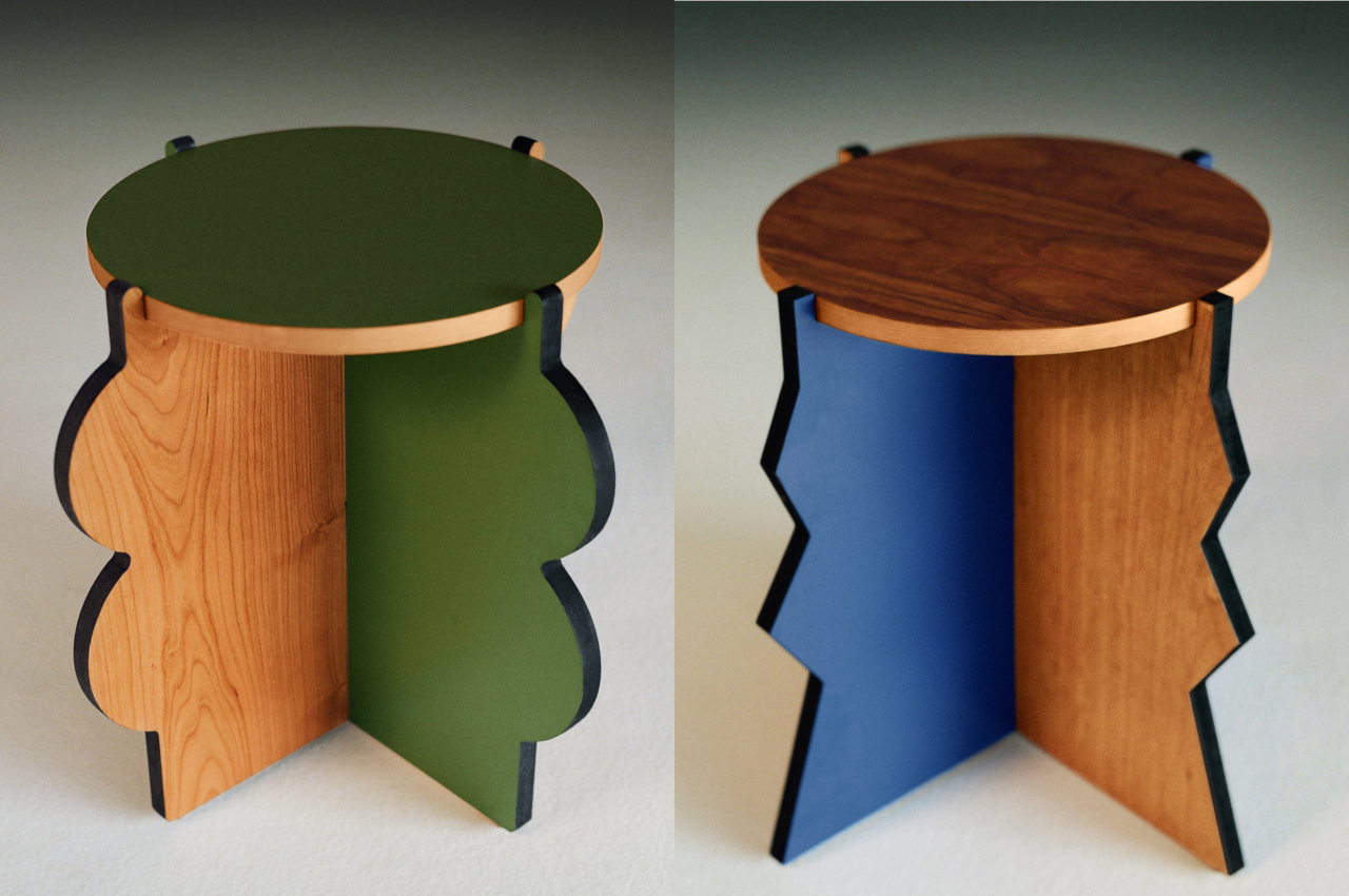
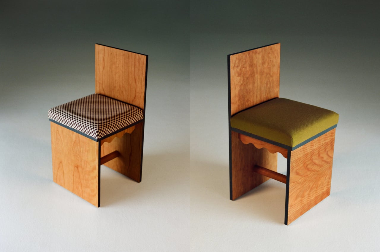
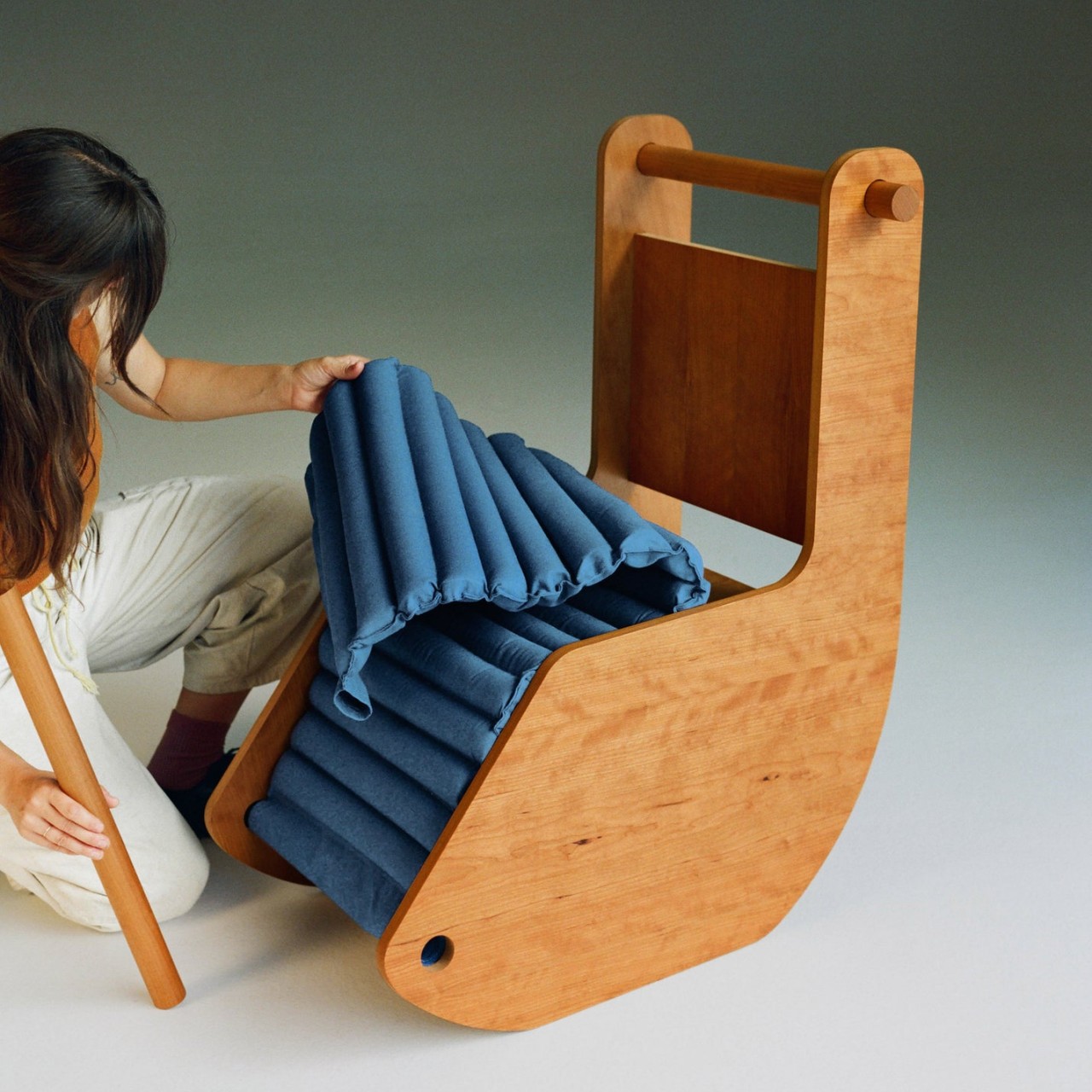
The Sketti side tables, for example, have legs that look like they were cut out by children for an art project. The Reading Chair’s unusual ridged upholstery is a bit hard to wrap one’s brain around, and fortunately, it can also be removed. The Duality dining chair really does the part of evoking opposite images and feelings with its flat outer sides and scalloped underside. The combination of colors, pretty much the foundational red, green, and blue hues, strike a sharp contrast to the earthy tones of the furniture’s wooden surfaces.

Frunchroom puts a playful twist to your typical home furniture, one that is sure to enliven any living space. At the same time, the very origins of the set tell of different stories and people that the designer encountered, becoming a sort of personal diary given functional form. It makes for the perfect centerpiece of the house where memories are both remembered and made, hopefully, ones that evoke as much fun and whimsy as these furniture pieces.

The post Frunchroom is a delightful furniture collection that looks like part of a dollhouse first appeared on Yanko Design.

Google Gboard Bar is a ridiculous keyboard that you can actually build yourself

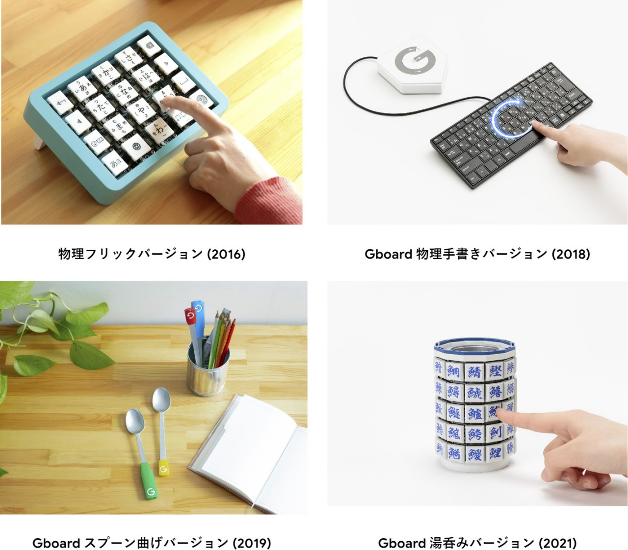
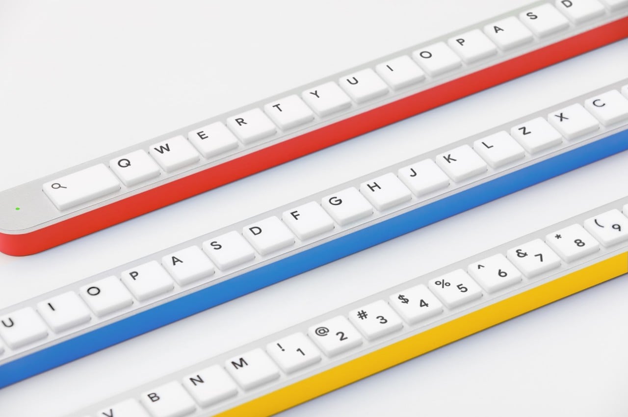
The computer keyboard hasn’t changed its design significantly ever since it was first invented. Its layout, in particular, has remained the same typewriter arrangement with just a few variations. It’s definitely not the most ergonomic, nor is it the most efficient. Fortunately, there have been a few attempts to substantially reinvent the keyboard, though they remain niche and, at times, a bit expensive. With today’s technologies, however, it is certainly easier to create your own keyboard, which is what a few lovely Googlers in Japan have attempted to do. But rather than a simple reorganization of the keys, this Gboard Bar, named after the virtual keyboard on Android and iOS, reimagines the venerable keyboard from the ground up, leading to a design that’s just out of this world and, perhaps, even out of your desk.

Designer: Google

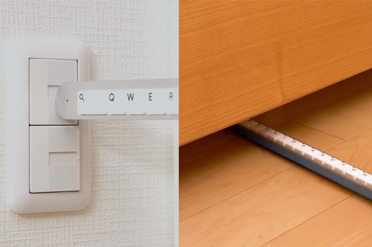
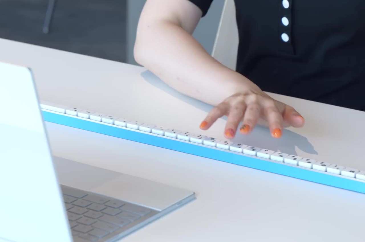
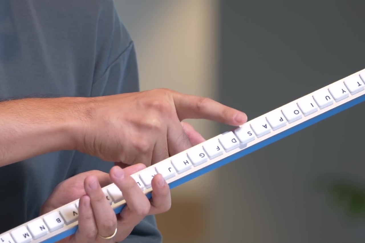
If you haven’t caught on to it yet, we’ll save you the trouble of figuring out that this Gboard Bar is pretty much an April Fools’ joke out of time. It’s sort of a pun that plays on how “bar” is the next syllable in the Japanese word for “keyboard.” So rather than focusing on the “key” part as they’ve always done for years, Google designers and engineers opted to move on to the next level. The result is a keyboard that’s 1650mm long or just under 65 inches or 5 feet 5 inches.

Of course, they have reasonable justifications for such an absurdly long keyboard. It saves you time from having to search for the right key in two dimensions (up and down) like on a traditional keyboard. With the Gboard Bar, you only need to search sideways to hit the right key. As long as you have a desk that’s wide enough, which most office workers have, you can save space by having a keyboard that sits neatly below stacks of papers and folders littering your desk. Pair programming, where two programmers share a single computer, becomes even easier with this keyboard. Who says only pianists can do a duet on keyboards?

There are also practical benefits to this design outside of actual typing, according to its designers. No longer will you have to fight with your cat over the keyboard because there’s nothing for it to lie on. The keyboard can also be a practical tool to reach for a distant switch or push items from underneath a couch. With the proper add-on, the keyboard can be used to catch real bugs rather than just programming bugs.

It’s definitely a ludicrous idea that will never work in real life, but that’s not going to stop anyone from having fun with it. These Googlers have even generously made the schematics and even the firmware for the Gboard Bar available for everyone to use in case they want to recreate this absurd device to their hearts’ delight. Who knows, maybe someone will actually find it more usable and invent new keyboard designs that will really turn the computing world upside-down.

The post Google Gboard Bar is a ridiculous keyboard that you can actually build yourself first appeared on Yanko Design.

These alien-looking floor lamps are both cute and creepy

There’s no better conversation starter than lamps that look like they’re out to get you and embrace you.

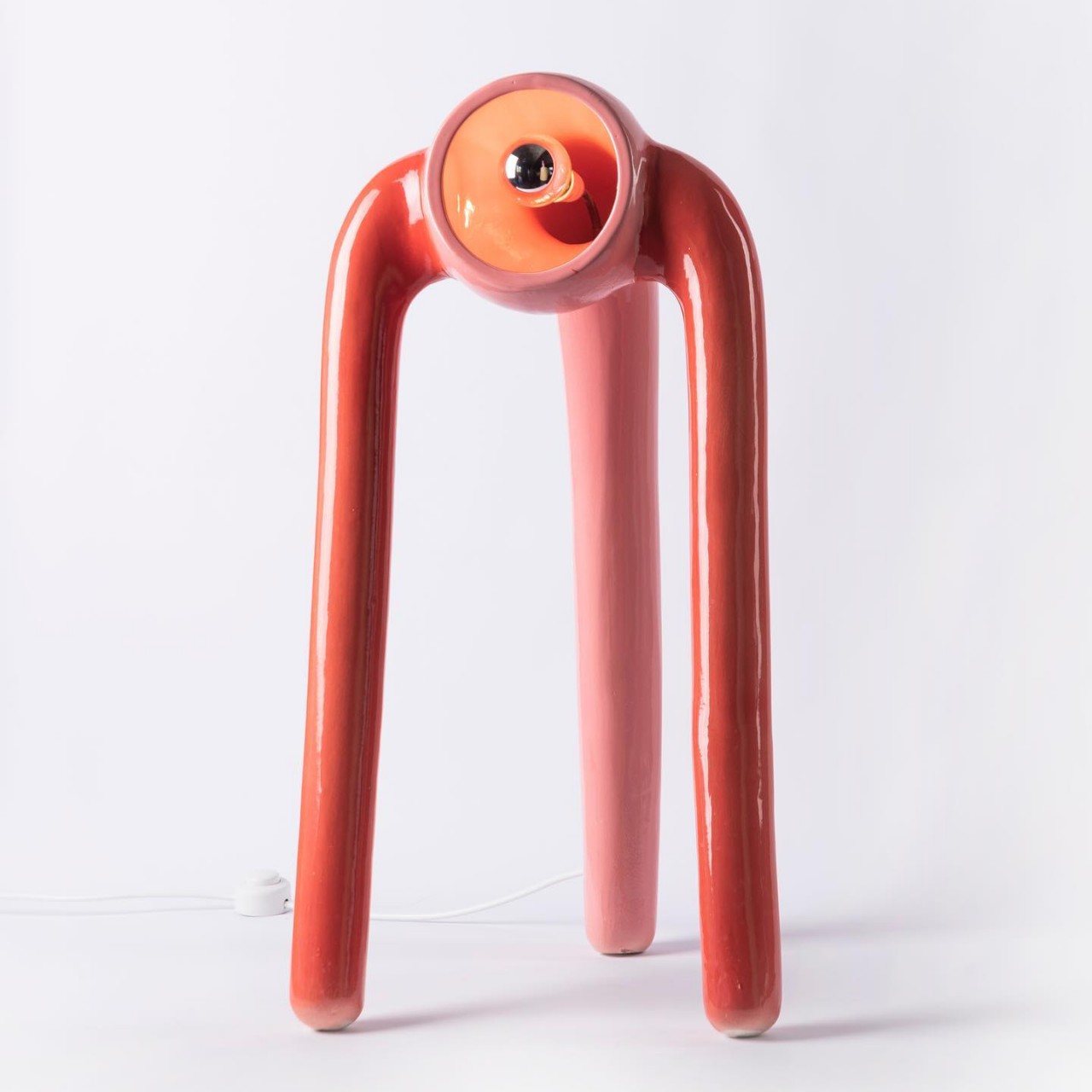
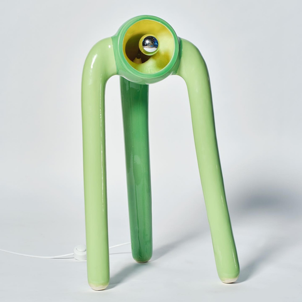
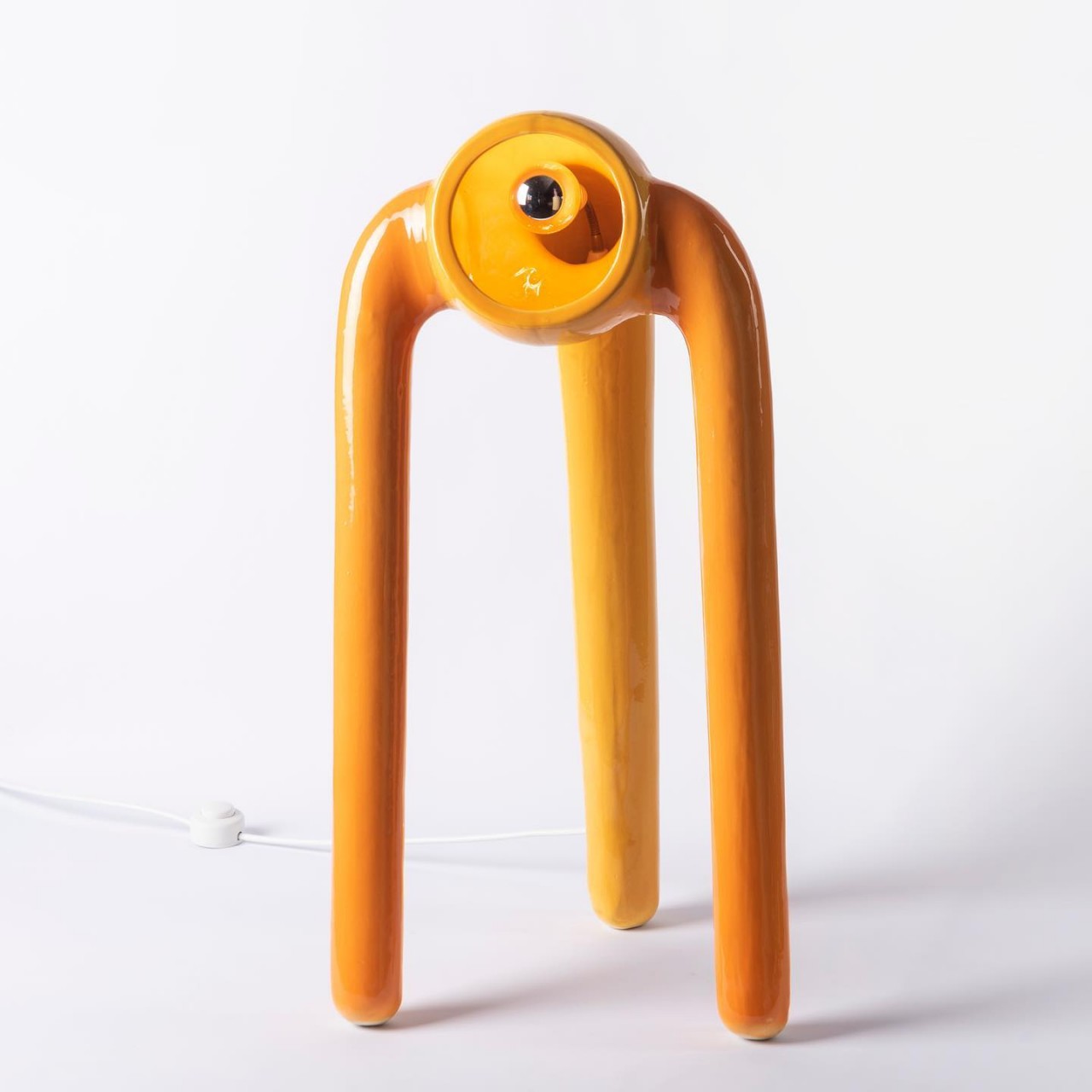
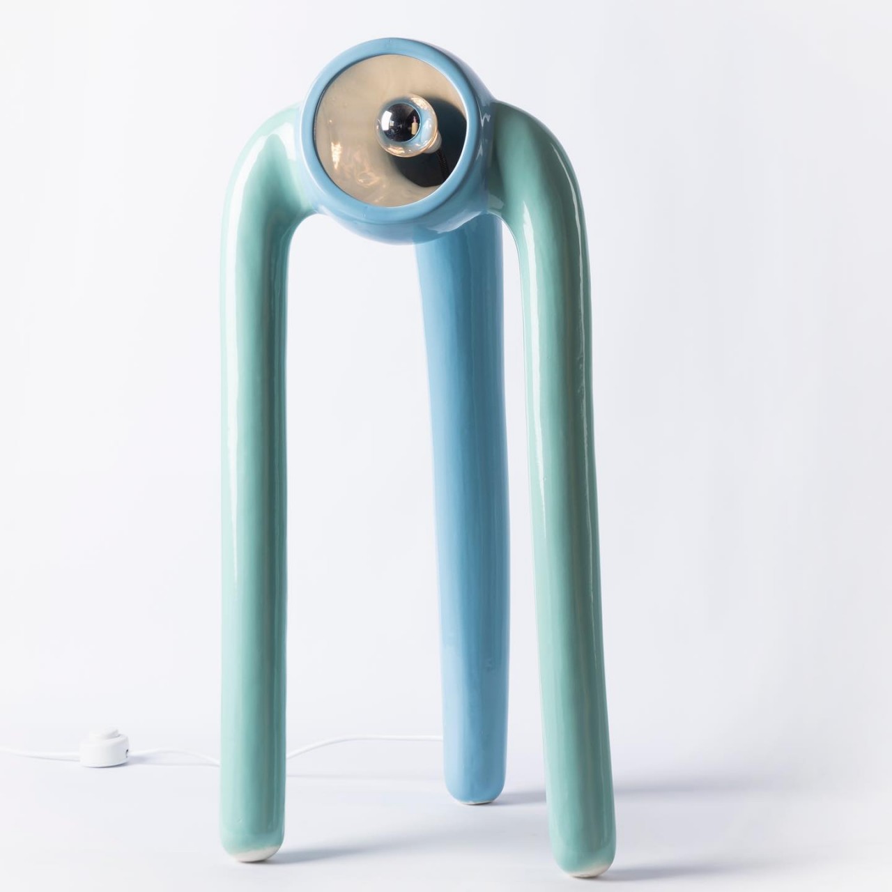
Most lamps are purely functional fixtures, especially at home, where they are used to provide adequate lighting to a space. Some lamps, like chandeliers and pendant lamps, are also decorative pieces that accentuate a room. There is, however, also a class of lamps that are more for show than function, serving a purpose beyond illumination. Sure, they can probably still light up a room to set a mood, but they can be forgiven if they don’t. “The Pink Robots Won” definitely falls under the category of decorative lighting that may or may not brighten up a room sufficiently, but these lamps will definitely get people talking and maybe even gushing because of their eclectic forms that inspire both awe and unease in equal measures.

Designer: Marcelo Suro

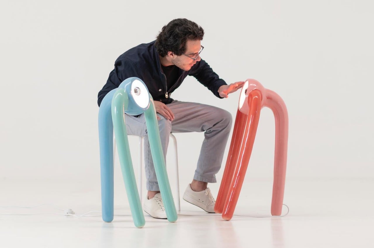
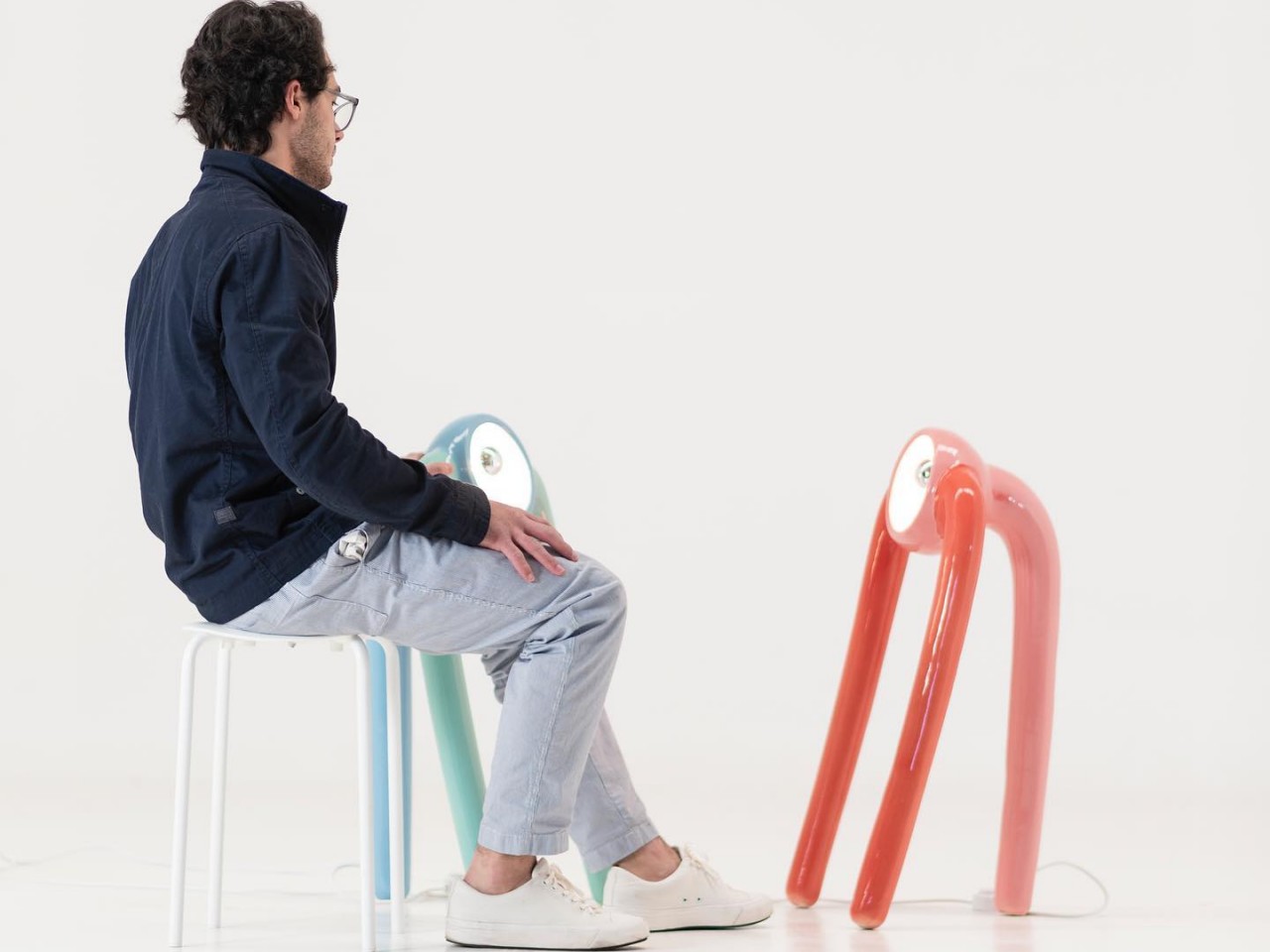
Nothing sparks the imagination more than an object that is both unnerving and adorable at the same time. Not everyone would describe E.T. as “cute,” but most find the creature interesting because of that well-balanced contrast. These self-standing ceramic floor lamps also evoke the same emotions, leaving viewers confused about whether they’re appalled or attracted to their alien forms.

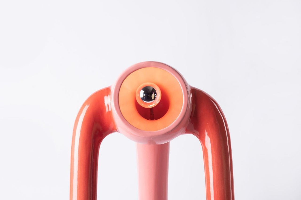
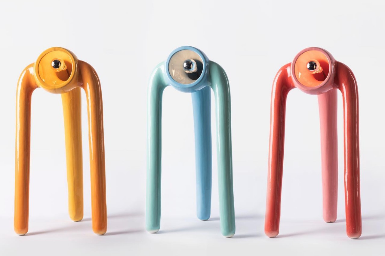
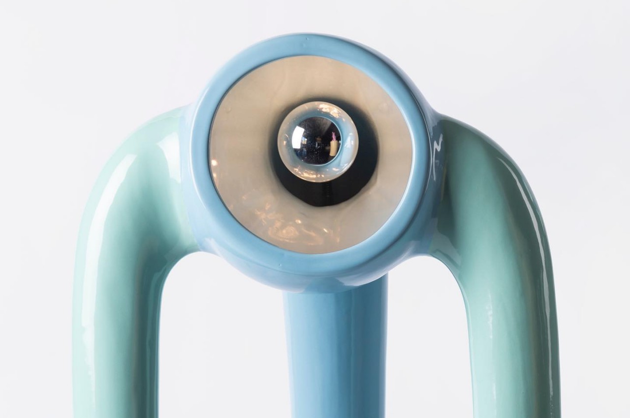
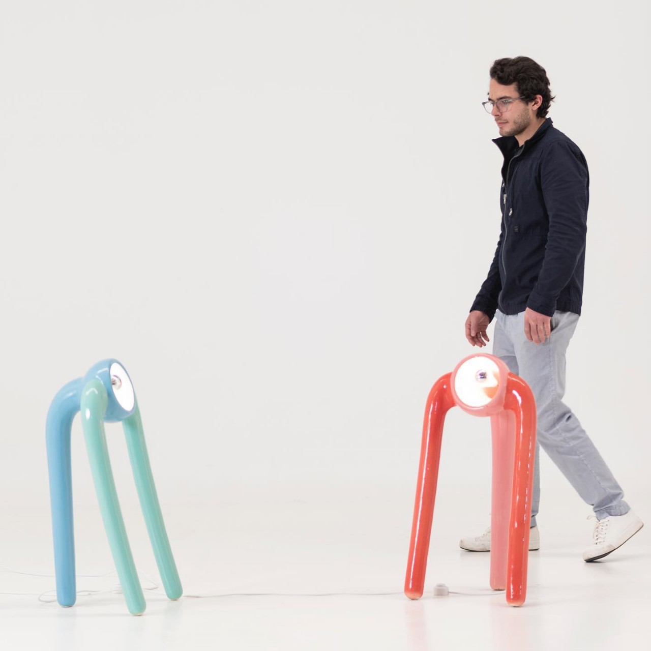
On the one hand, the lamps look like they are single eyes with three tentacles dangling down, probably reminding some pen and paper gamers of the monster known as the Beholder. On the other hand, they also look like alien creatures standing precariously on three legs, with a curious eye on the lookout for people passing by. Either interpretation gives The Pink Robots Won a life of its own, so far removed from typical floor lamps that simply stand still.

The lamps are also an exercise in ceramic techniques, particularly in creating uneven shapes that are still balanced enough so that they don’t simply topple over or break. There’s almost an element of dynamism in the design of the creatures, creating further ambiguity in the viewer’s mind. Is the single-eyed alien simply leaning back, or is it about to topple backward? The confusion sparks the imagination, perhaps pushing people to create a mini-narrative in their heads about the eyeball with legs and its misadventures among humans.

The Pink Robots Won is full of contrasting elements, including the choice of materials and colors. Ceramic is naturally seen as a very fragile material, and the mere thought of these lamps falling over will probably send owners flying to their rescue. At the same time, however, the choice of pastel colors gives it a more playful character, reinforcing that image of a cute otherworldly creature coming out to play.

These ceramic floor lamps will definitely liven up a room, even though their upward angled lights create ambiance more than illumination. They creatively try to create the semblance of a living creature, even if an unnatural one, through a static piece of appliance. Compared to most lamps, it definitely has character and charm, though don’t be surprised if you find yourself looking over your shoulder often as if someone or something is watching your every move.

The post These alien-looking floor lamps are both cute and creepy first appeared on Yanko Design.

Giant Inflatable Cheeseburger Sprinkler: Waterburger

Summer is upon us, and you know what that means: making your kids play outside so they stop wrecking the house and driving you crazy. And to aid you on your mission of prolonged sanity comes this giant cheeseburger water sprinkler. Available on Amazon (affiliate link), the inflatable burger will provide hours of backyard fun while you get a little peace and quiet indoors, presumably with the patio door locked.

The burger includes stakes to keep it in place and the sprinkler on top spins around as it sprays, so there’s no escaping its watery wrath. And why would I want to? It’s hot out and my air conditioning broke last summer.

You know, I have fond memories of running through the sprinkler as a child. I also have fond memories of running through the sprinkler as an adult, as recently as last weekend. You’re never too old for some sprinkler and slip ‘n slide action – that’s my motto. It’s important to stay young at heart because God knows the rest of my body is already giving out on me.

[via DudeIWantThat]

“Food Crayon” lets you playfully garnish your dishes with ingredient-flavored shavings! Move over, SaltBae!

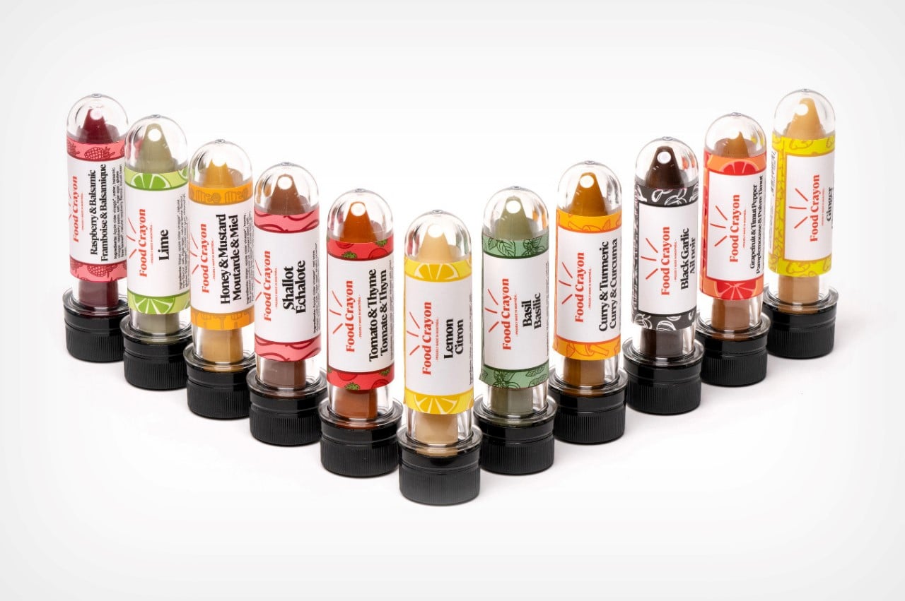
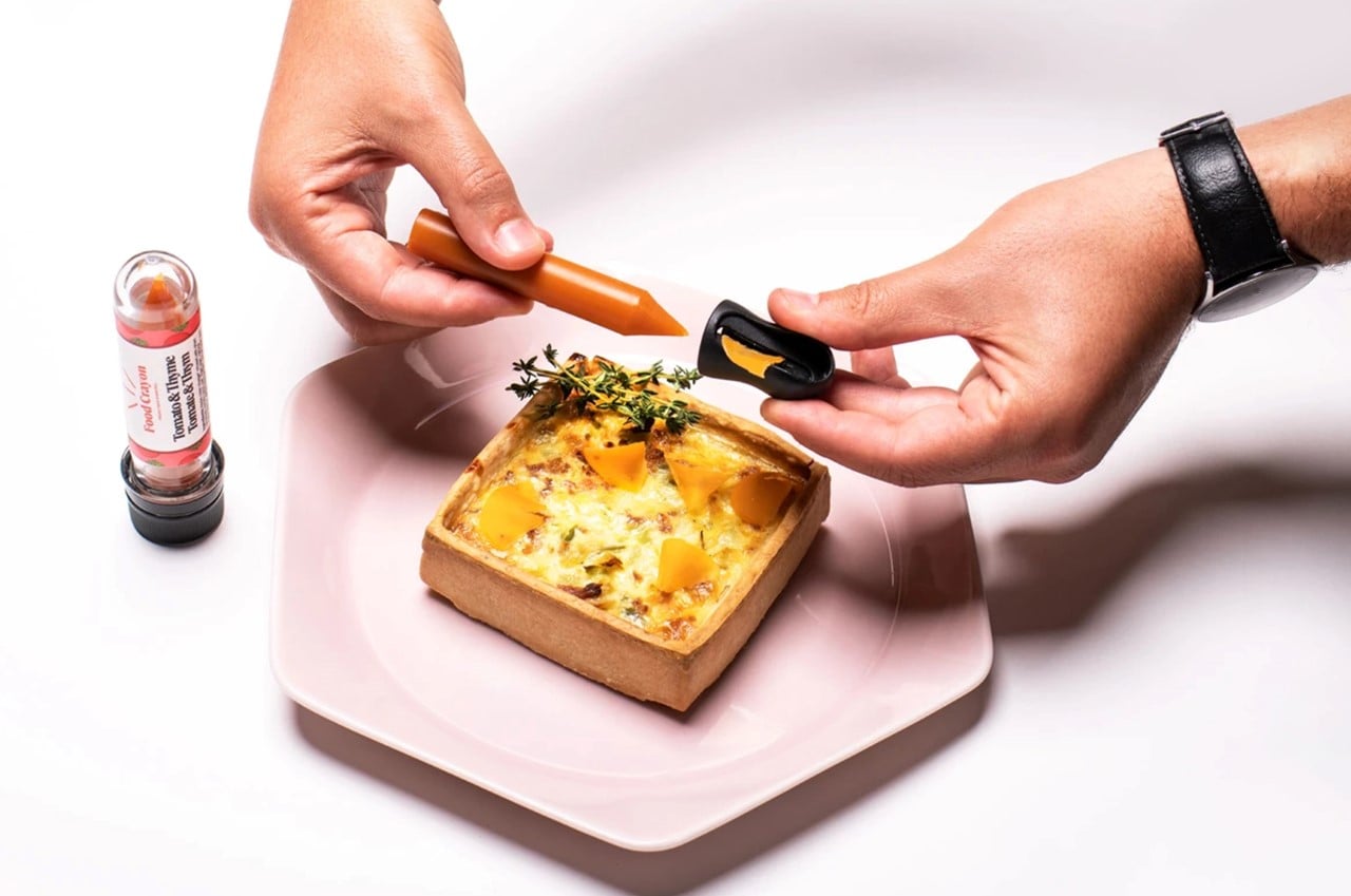
Instead of sprinkling fresh herbs or grating parmesan shavings over your food, these flavor-packed crayon-shaped edible sticks let you garnish your food in a playfully fun way!

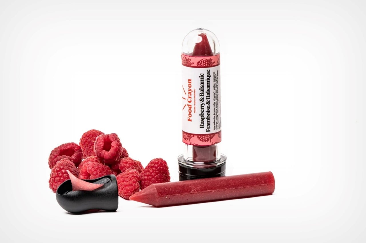
The wacky idea for crayon-based garnishing comes from Montreal-based Nadia Lahrichi, who runs the company along with her brother, Kamil, and mom, Veronique. Together, they call themselves the Foodie Family and with their combined backgrounds in cooking, biochemistry, and marketing, they’re reinventing how we interact with our food! The Food Crayons really don’t need much explaining – traditional crayons are made from wax and dye and are formed into the crayon shape… Food Crayons, on the other hand, are made from food ingredients suspended in an edible substrate, agar-agar. Commonly used as a gelling agent, and a vegan alternative to animal-based gelatine, the agar-agar helps bind the ingredients into the crayon shape. Once the crayon’s been cast, they can easily be shaved over food, flavoring it in an absolutely engaging and exciting way!

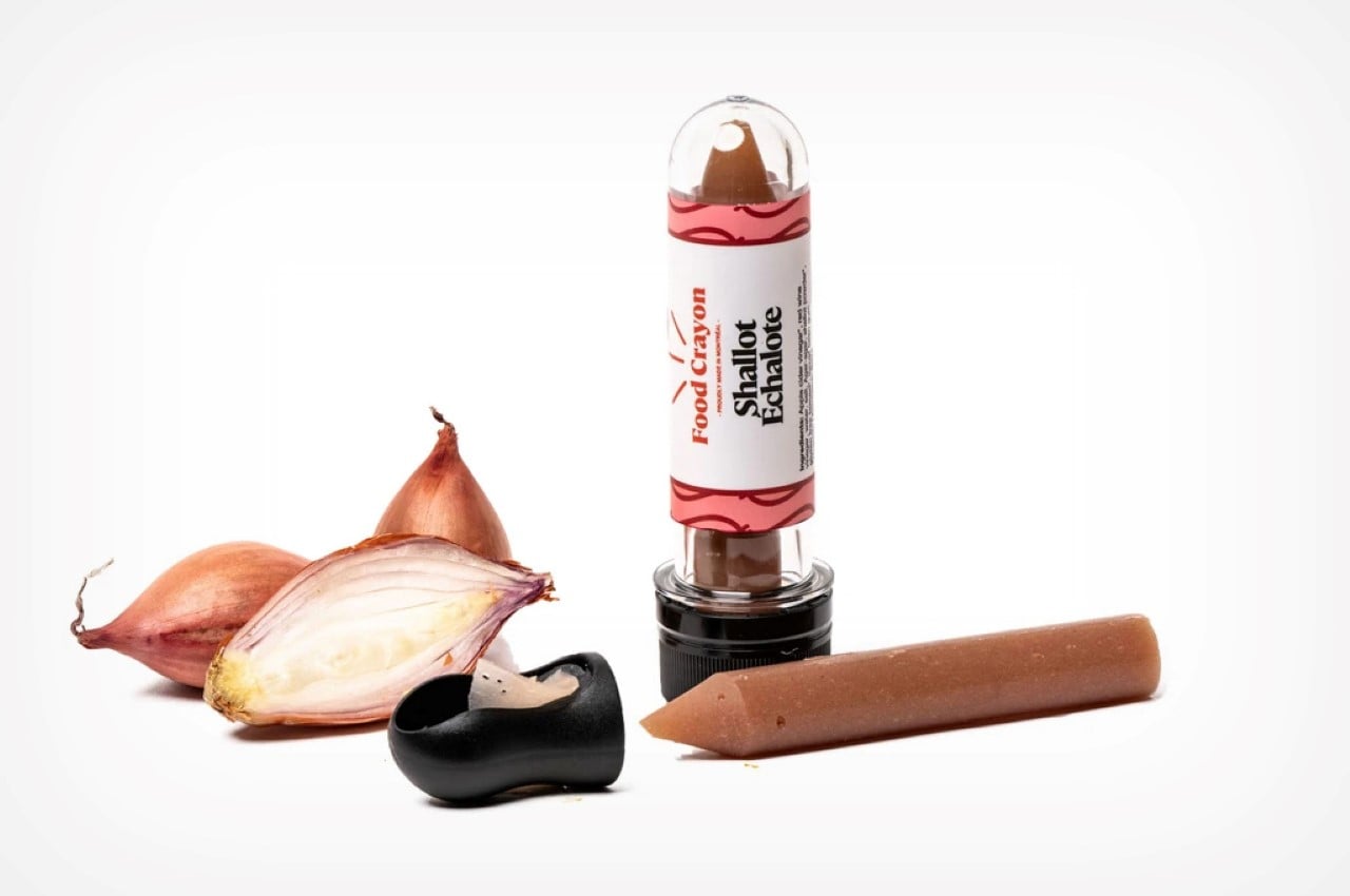
The gastronomic crayon sticks come in a variety of flavors – both sweet and savory. Perfect for seasoning your dish with, they add a touch of brightness without you needing to grate, shred, julienne herbs, grind peppercorns, or even prepare sauces, compotes, and vinaigrettes. The flavors include classics like basil, lemon, ginger, and shallot, to more exotic ingredients like porcini mushrooms or black garlic, and even interesting combos that include chilli and garlic, balsamic and figs, curry and turmeric, or honey and mustard. Perfect for upgrading your dishes, the creators recommend adding 5-10 shavings on top of your food. It’s an incredibly fun way to make food taste better, and the crayons barely occupy space on your kitchen spice rack!

All the flavors are plant-based, gluten-free, and vegan (barring the honey mustard). You could buy individual crayons, or create your own box-set of colors/flavors to choose from. Food Crayon even sells a neat little sharpener to do the trick, so you don’t have to borrow one from your kid’s stationery set.

Ultimately, the same way a crayon adds a dash of vibrancy to a blank paper, the Food Crayons bring about vibrancy to your regular meals or drinks, giving them a zing or a pep that’s difficult to miss. Yes, I said drinks, because the company just released a Piña Colada-flavored crayon too! Don’t judge me if I directly chomp right into that one…

Designer: Food Crayon

Unusually creative cabinet opens by tilting forward!

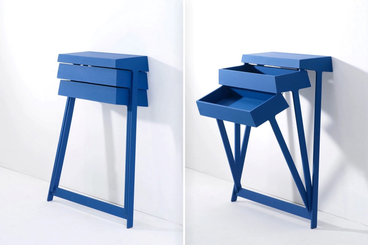
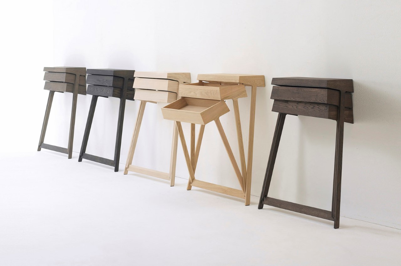
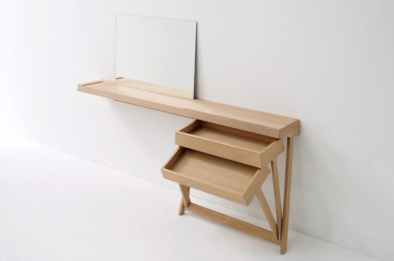
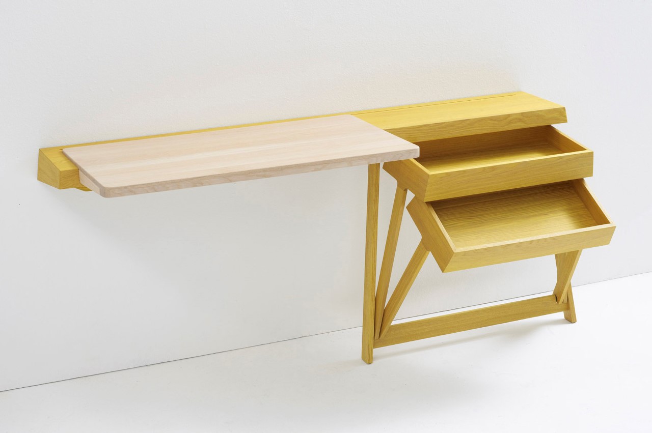
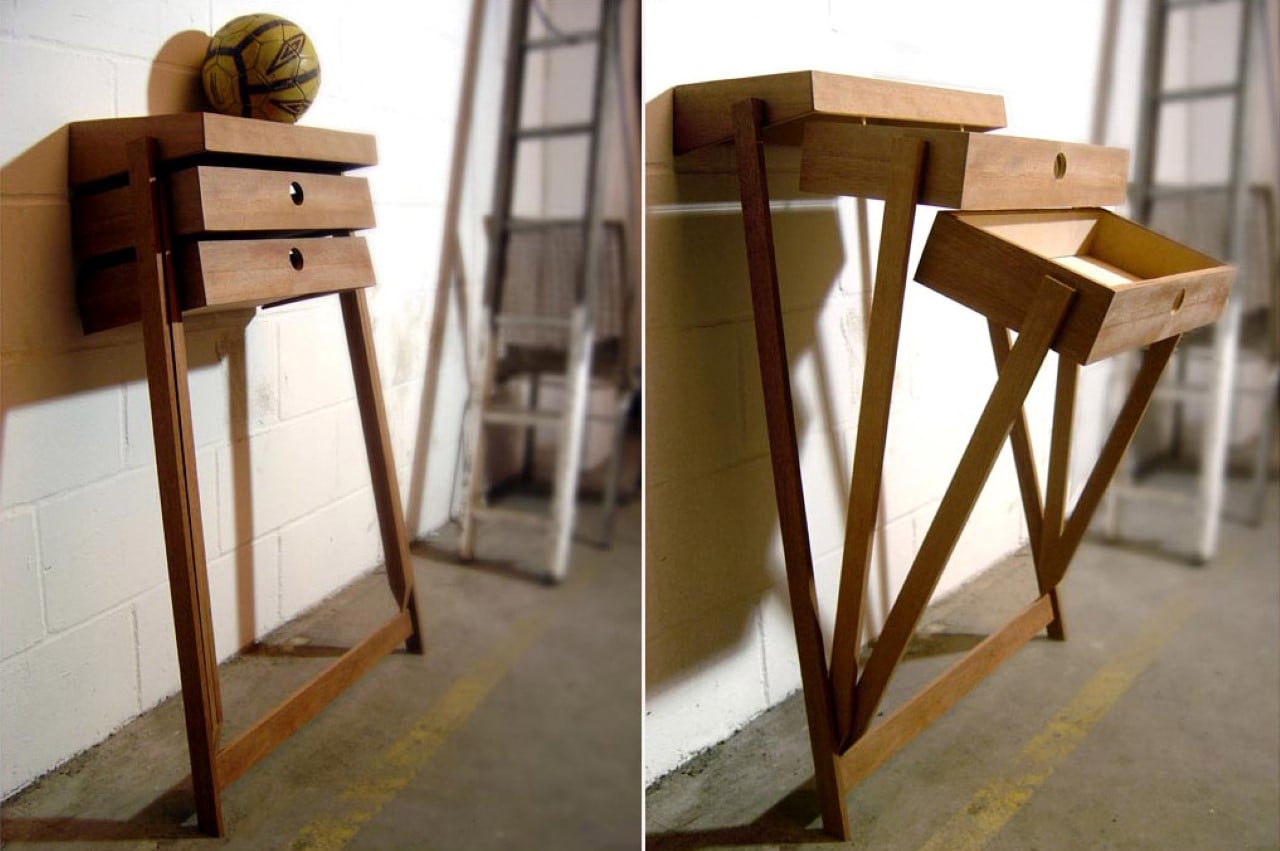
The Pivot rightfully uses gravity as a design feature! Instead of sliding drawers, a nifty little pivot joint at the base of this cabinet allows individual drawers to open by tilting forward. It’s clever, fun, and makes it easy to access your belongings without having to dig around! Just don’t expect it to be hyper-organized though!

Designer: Raw Edges Design Studio for Arco

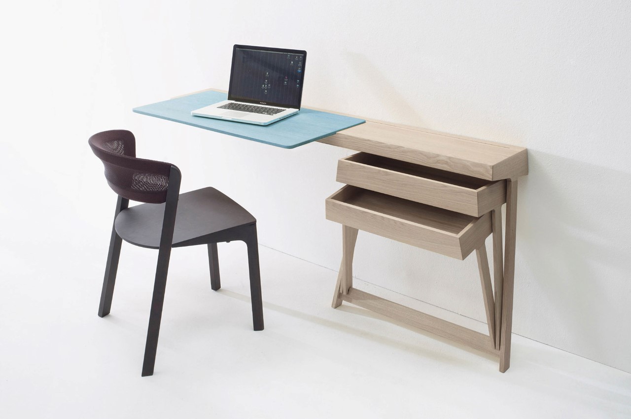
The Pivot is an incredibly fun chest of drawers designed to be used independently or as a part of a desk. The pivoting mechanism is convenient and easy to use, allowing the drawer to slide open with little to no effort since gravity does most of the work. There are no sliding components, no bearings and railings, and nothing that would cause the drawers to get jammed, forcing you to yell “PIVOTTT”! (I couldn’t NOT make that joke)

Its simplicity extends beyond the cabinet’s unique pivoting detail. The cabinet comes with a wall-mounted design, and sports just two legs, sort of like an easel. It’s definitely interesting to look at and probably a lot of fun to interact with!

This mood-sensing radio plays news based on how you’re feeling when you wake up


“Well begun is half the work done!” says Varenya Raj, the designer behind Nidra, a radio that helps people monitor their mood when they wake up.

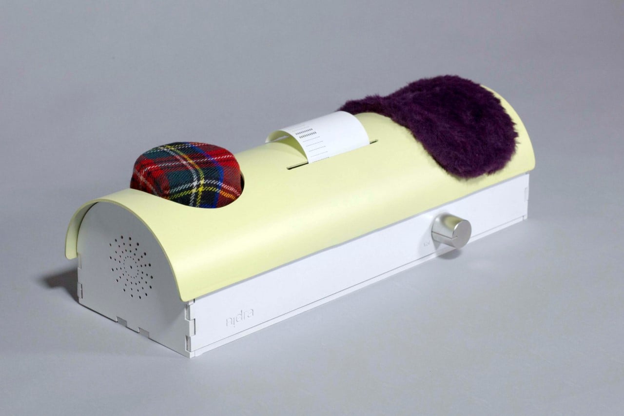
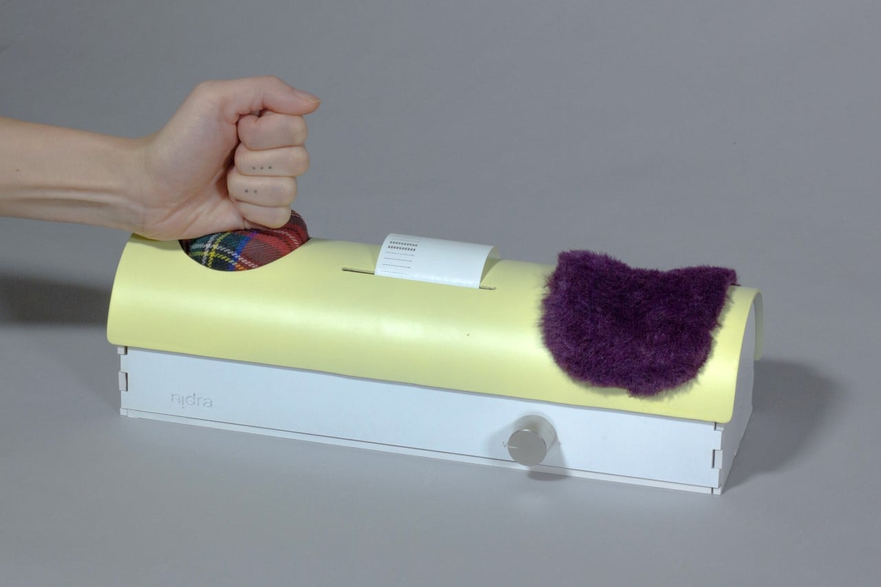
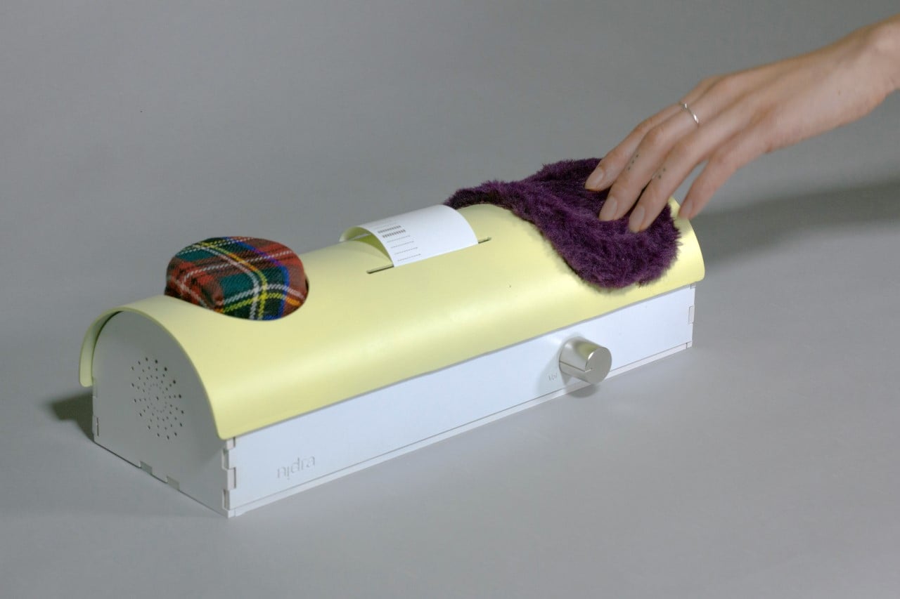
Right off the back, Nidra looks quite unlike most bedside radios. It sports a half-log-shaped design with a plush button on one end, a soft carpet on another, and a printer in between. The idea behind the Nidra stems from starting your day off on the right note. If you wake up in a less-than-ideal mood, whack the cushion as you would at a game of whack-a-mole, and Nidra plays out positive news. If you’re in a pretty good mood when you wake up, gently stroke the velvety carpet, and Nidra plays news across different categories. At the end of the month, the radio prints out a little docket letting you know where your mood’s been over the last 30 days, helping you chart your sleep schedule as well as mental and emotional wellbeing.

Designer: Varenya Raj

Nidra - Mood-sensing Radio by Varenya Raj

The idea for Nidra stemmed from the concept of ‘time being equal to money’. Created as the ultimate productivity tool (because you’re much more productive and focused when you’re in a good mood), Nidra’s aim was to help office-goers have a better overview of their overall mental health. Needless to say, Nidra’s appeal has vastly evolved thanks to the pandemic, and it’s now more of a general mental-health tool. Strike it on your bad days for a pick-me-up, stroke it on your good days for general news, and Nidra charts how you’ve felt over the past month. It prints out a tiny slip for you to analyze and hopefully retrospect over, so your next month is better than your last.

Nidra - Mood-sensing Radio by Varenya Raj

Nidra - Mood-sensing Radio by Varenya Raj

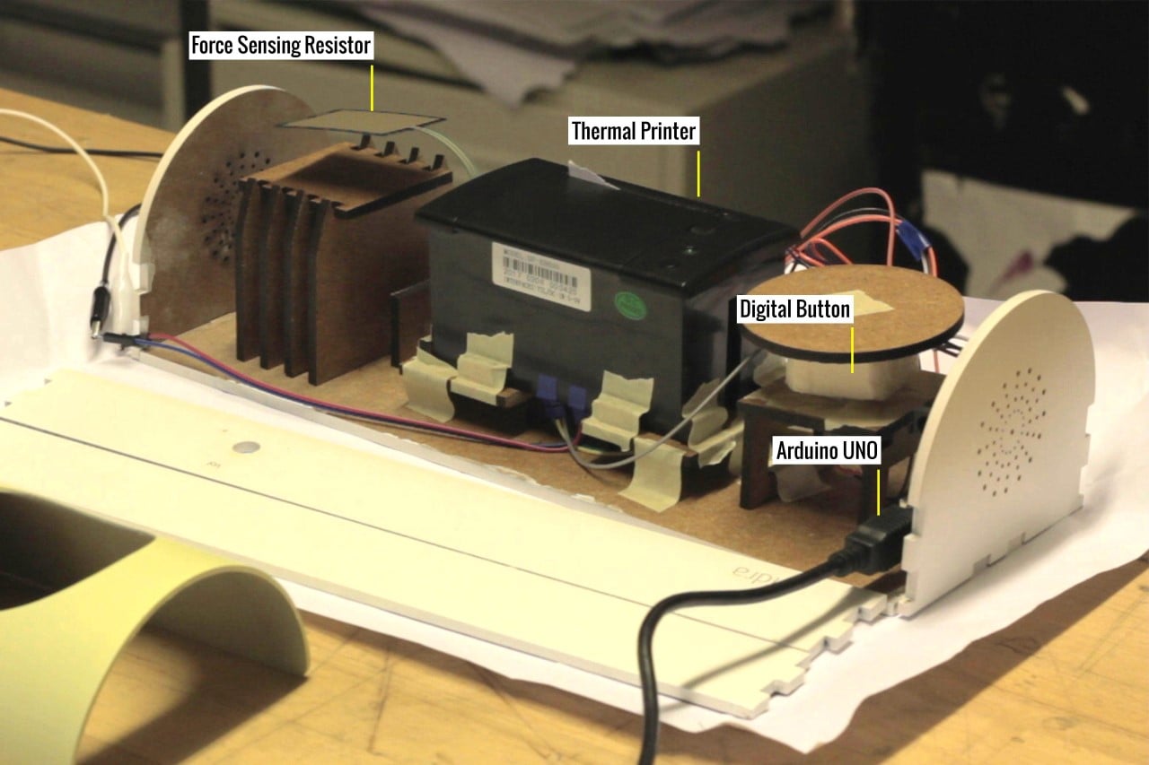
On the inside, the Nidra contains a button, a force-sensing resistor, a thermal printer, a speaker, and an Arduino UNO computer that powers the device. The button’s designed to be pretty large and cushioned, so you could easily slam it while half-asleep, while the FSR comes with a soft, fluffy cloth similar to dog-fur. Depending on which part of Nidra you interact with, the interactions are inputted and received by the Arduino PC which processes it and appropriately chooses an RSS-based news feed to read out. A tiny button on front of the device lets you control Nidra’s volume too!

Nidra - Mood-sensing Radio by Varenya Raj

Did you know you could make complex rotating gears with just magnets?! Watch to see how they work!


You see gears in action and they’re pretty easy to fathom. Metal wheels with interlocking teeth – rotate one wheel and the other wheel rotates in the opposite direction. Change the size of one wheel and it affects the speed at which the other wheel rotates. That’s basically how any simple gearbox on an automobile/bicycle works, translating rotations from a motor or your feet into rotating wheels. What happens when you replace the teeth with magnets? The video above wonderfully explains how gears can work without the mechanical action of interlocking teeth… in fact, they can work without even touching each other! These magnetic gears are pretty interesting and whimsical to look at!

DIY Magnetic Gears Video

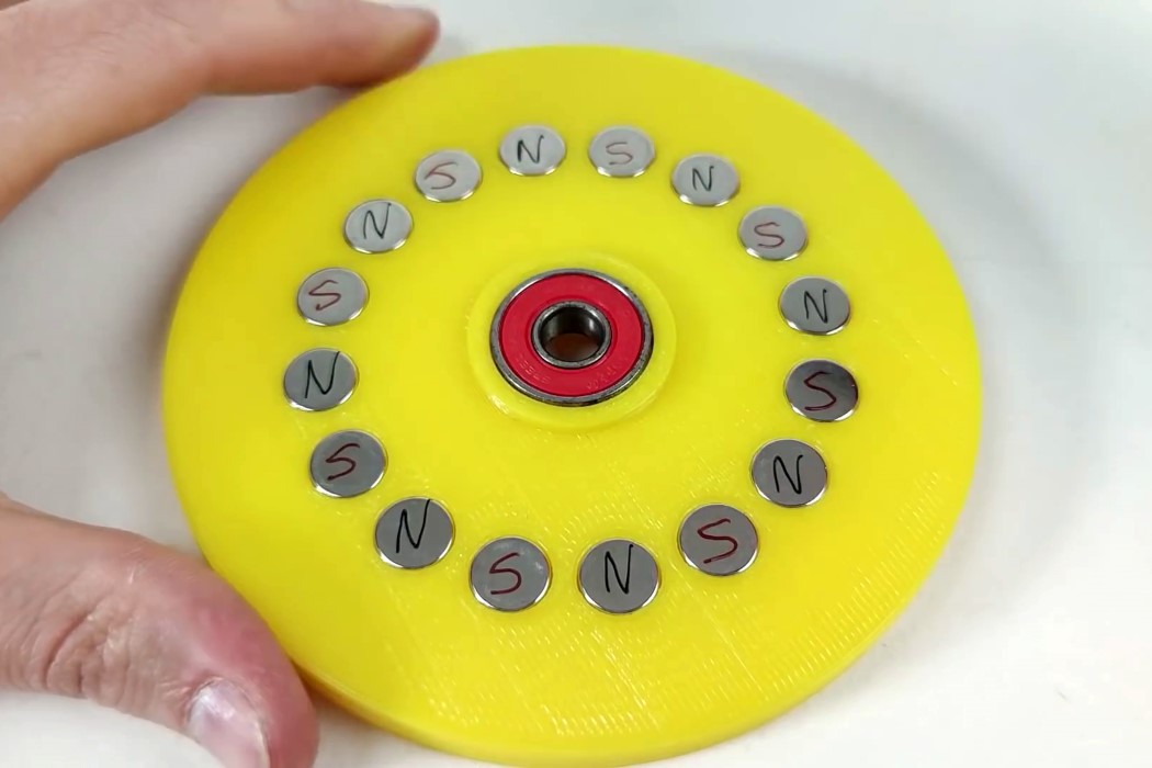
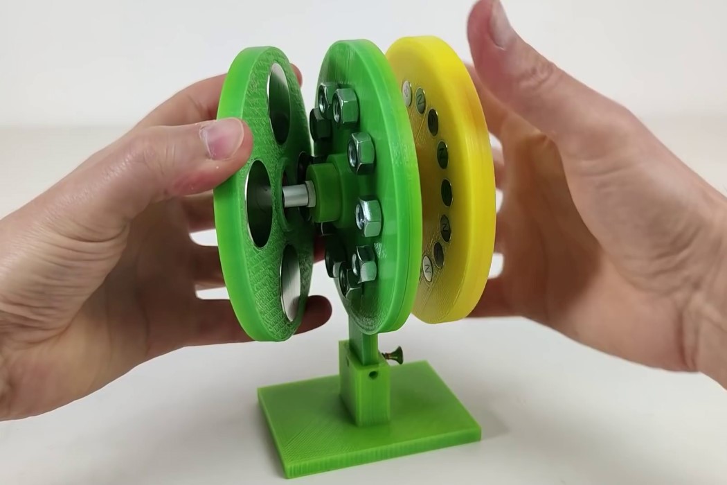
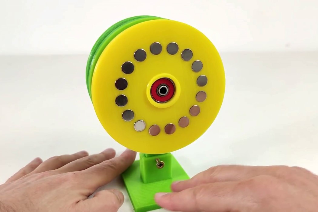
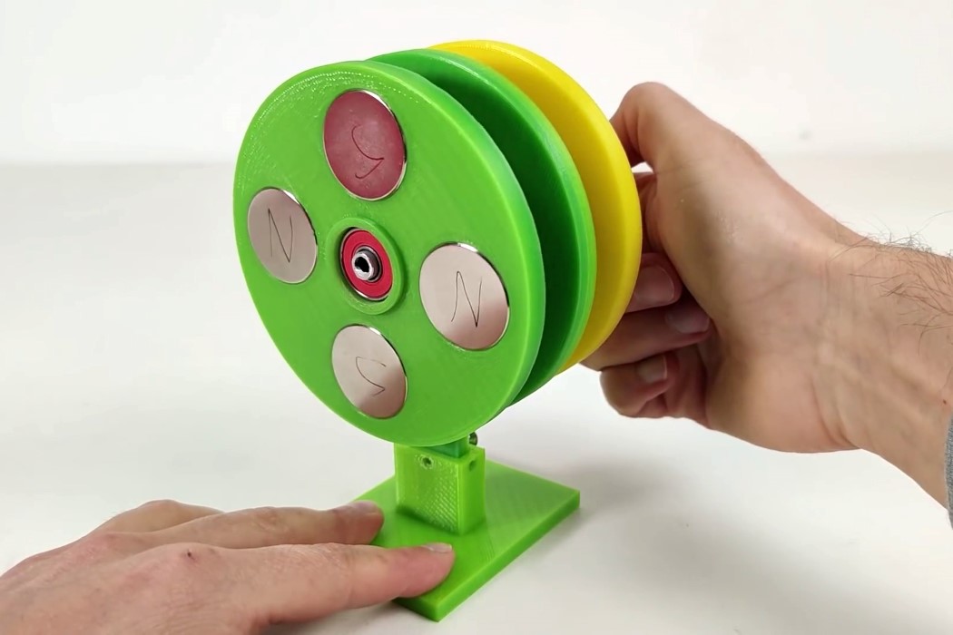
YouTuber Magnetic Games shows how these gears work by putting them together from scratch. With 3 3D-printed wheels, the apparatus comes to life. One wheel holds 32 magnets (16 on each side), while the other houses 8 magnets (4 on each side). A third stationary wheel comes with bolts attached in each hole (helping the magnetic attraction pass from one wheel to another), and the apparatus is set up with the wheels on a common axle.

DIY Magnetic Gears Video

Rotating one wheel causes the other to turn in the opposite direction. The wheel with more magnets rotates at a slower pace, while the wheel with less magnets rotates with a higher speed (sort of like a larger gear and smaller gear). Obviously, the magnetic resistance isn’t comparable to the physical resistance of metal gears (you couldn’t really use these in a car or bicycle), but it DOES highlight a unique relationship between gears and magnets – something I knew nothing of until now! Plus, think about it this way, less physical contact = less wear-and-tear…

DIY Magnetic Gears Video

DIY Magnetic Gears Video

Via TheAwesomer

Tiny Axe-Throwing Game Played with Real, Miniature Axes

Because danger comes in all shapes and sizes (including miniature), this is the Small Viking Axe Game available from Firebox for $116. It’s a real axe-throwing game played with tiny, but still very sharp, axes. I can already close my eyes and see myself wrapping my bloody hand in a t-shirt and yelling for my wife.

As a huge fan of both miniature weaponry and throwing sharp objects, this game is a no-brain purchase for myself. Will my wife try to intercept the package and hide it from me? If she knows what’s best for me, most definitely.

The set includes a wooden target with string for hanging (preferably outdoors), three miniatures axes with burlap carrying sack, nine replacement shafts, one shaft replacement tool, and a rulebook. Obviously, I don’t need a rulebook and will make up the rules as I go along. Presumably, something along the lines of ‘last one to bleed, wins, but does have to drive all the losers to the hospital.’