These vases were (almost) completely designed and made by algorithms and machines

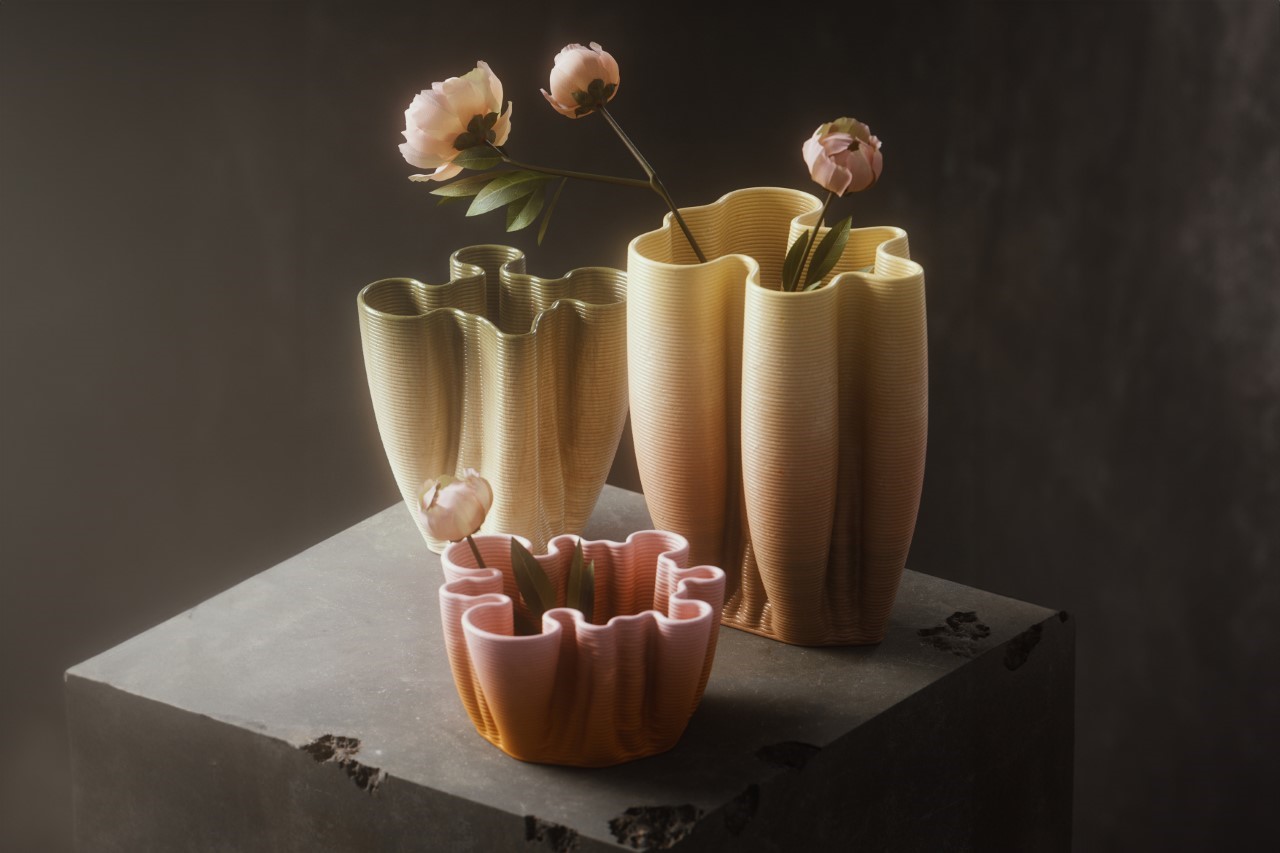
From the conceptualization to the actual production, the Differential Growth Vases hardly had any significant human intervention. The vase shape was determined by a differential growth algorithm, while a 3D printer manufactured the vase. Although designer Tim Zarki orchestrated the project and came up with the very idea in the first place, the machines pretty much took over the execution of both the concept and fabrication phases, displaying two things – AI-based creativity, and the ability to have humans step away from creative roles with a fair amount of success.

Designer: Tim Zarki

Differential growth might sound like a fancy term, but it’s a way of explaining how cells multiply. The process can be understood through a series of rules that are repeatedly applied to points in space (called nodes) connected into chains by lines (edges) to form paths. In short, the cells adopt a pattern (based on their DNA) and create within that particular pattern, resulting in growth that follows a template set by previous cells. You can see this in how plant branches grow, how cells expand, how rivers meander, etc. Zarki put the same sort of algorithm to the test with the vases, setting a base shape and having the algorithm expand it. The result is nothing like any pottery you’ll ever see…
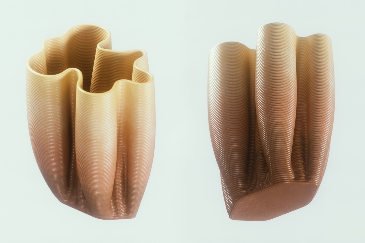
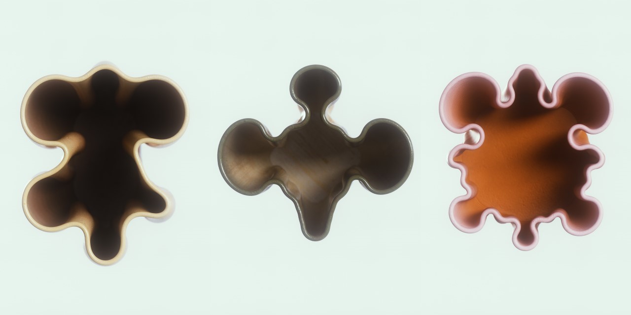
While most vases are created using a potter’s wheel, resulting in a rotationally symmetrical design, these vases have undulating designs created by the algorithm. The best way to understand how the algorithm works is to look at the shape of the base of the vase, and the final shape at the top. The vase’s vertical growth shows the transition between these two shapes, helping you understand how the algorithm works. There’s never a set final pattern, as the algorithm creates something new each time. This means each vase ends up looking unique. Zarki experimented with three overall designs, although the possibilities are quite literally endless, much like how no two plants grow the exact same way, or no two fingerprints look the same.
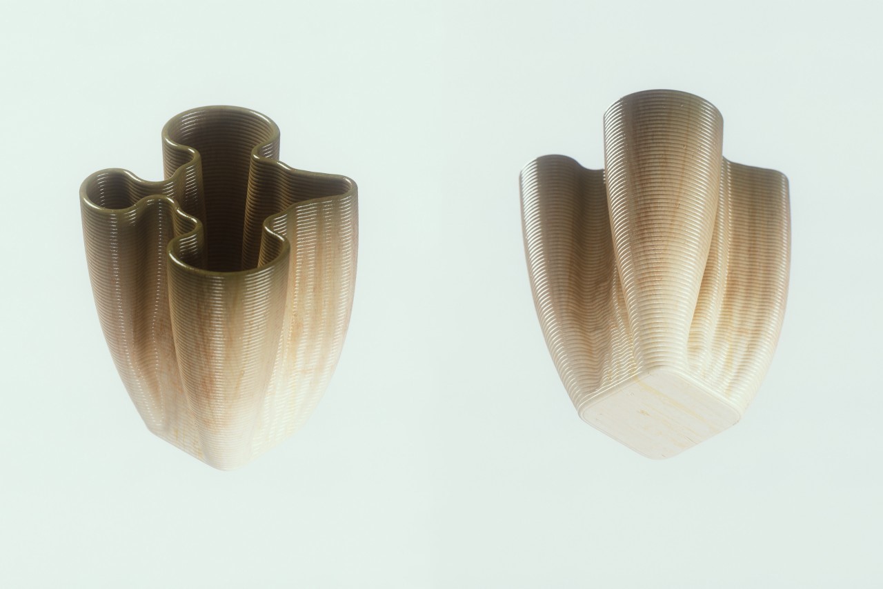
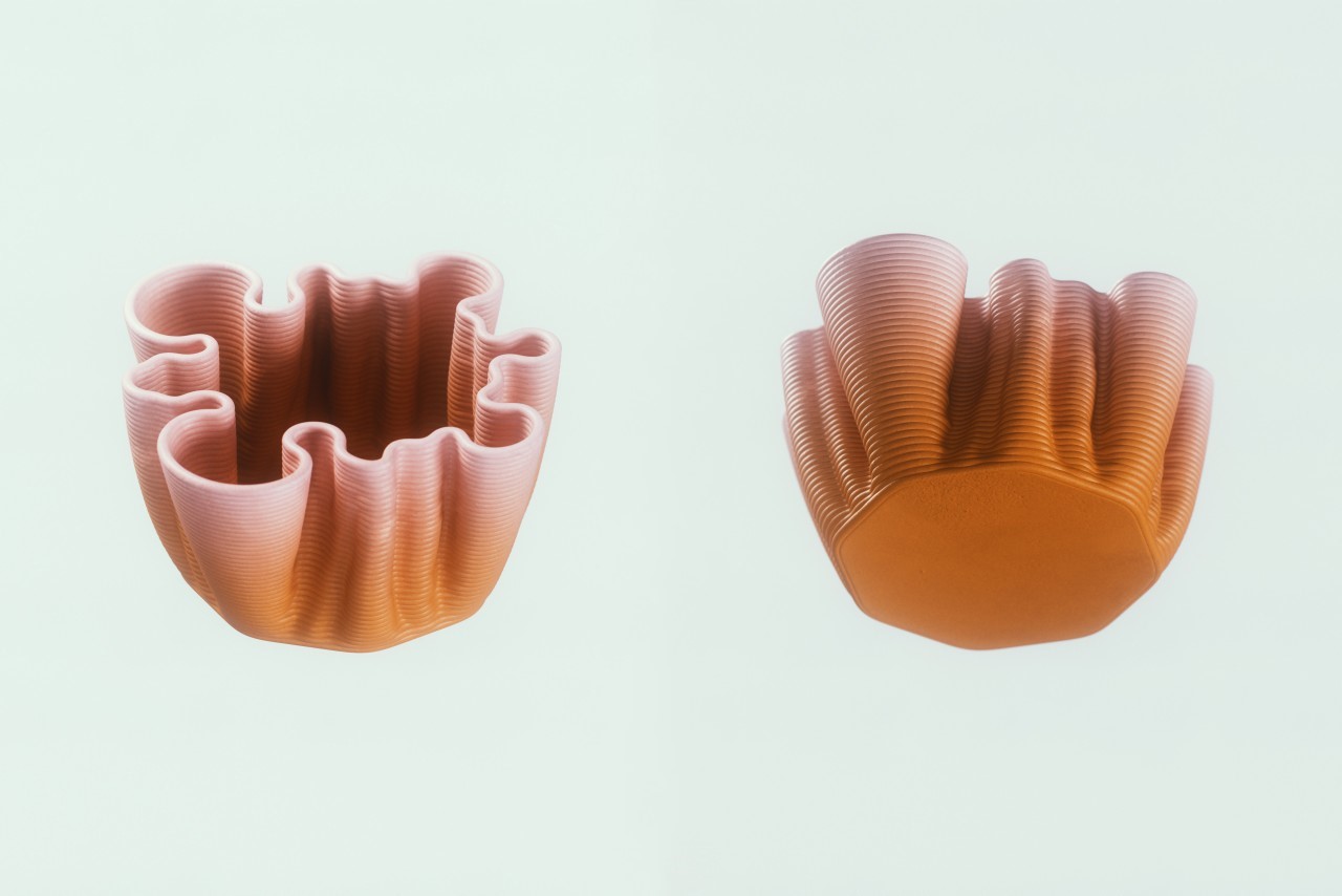
The final forms were then fed into a slicer software, that helps prepare them for 3D printing. The slicer creates a path that the printer’s nozzle has to follow, and once ready, the printer gets to work, slowly, but steadily printing the vase. As is evident, this entire process is nothing like the current conventional pottery methods, but with this project, Zarki hopes to challenge convention. By eliminating standard processes, and to quite an extent the human too, these vases show how oddly appealing a world would be to live in if AI designed more… obviously with humans playing a final role in determining whether the design is aesthetic or not!
The post These vases were (almost) completely designed and made by algorithms and machines first appeared on Yanko Design.
The Secret to Stronger, Lighter Tools: Meet the Hand-Plier with a Durable, Hollow Design

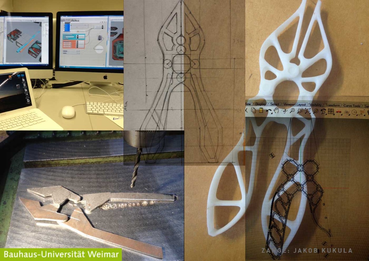
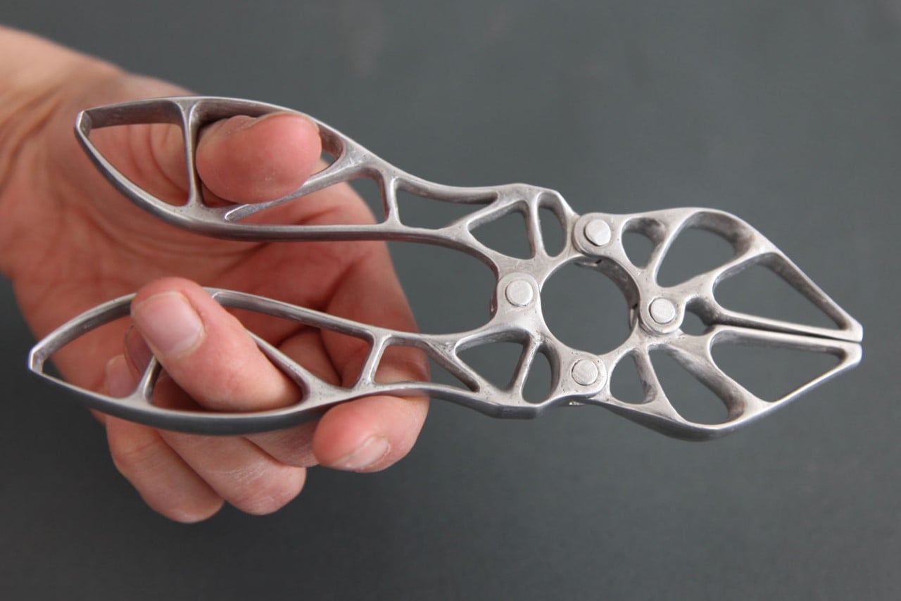
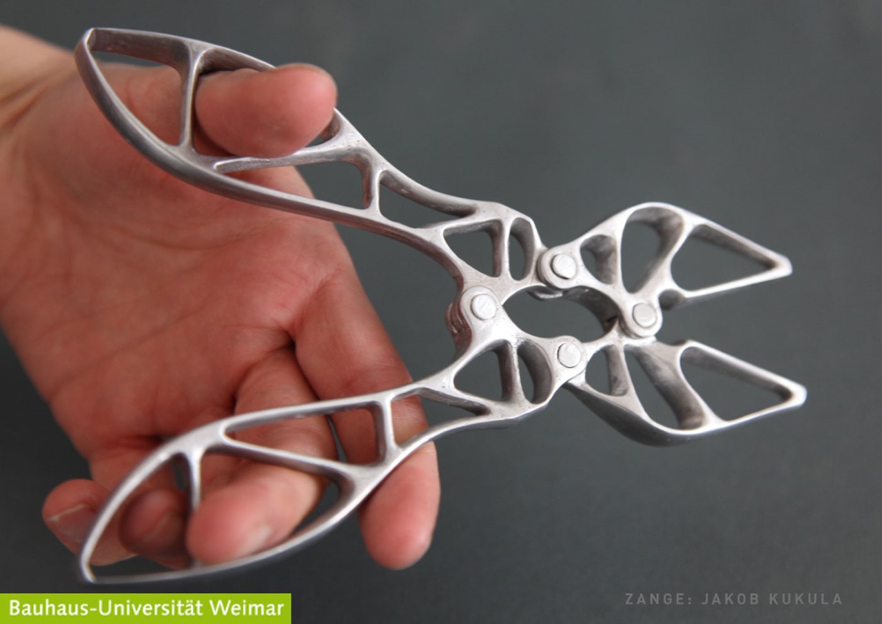
Following in the footsteps of this generative-designed adjustable wrench by Desktop Metal, the Alu-Zange is an aluminum prototype for a pair of hand-pliers with maximum strength in a minimal material footprint. Designed by Jakob Kukula, former student at Bauhaus University, Weimar, the Alu-Zange pushes the boundaries of product functionality using SKO, or Soft-Kill Option, an evolutionary approach for topology optimization that uses algorithms to determine the least amount of material required to retain 100% product functionality. In a way, SKO works exactly how nature does, optimizing the shape and structure of the skeletons of animals, giving them an evolutionary edge in their own way.

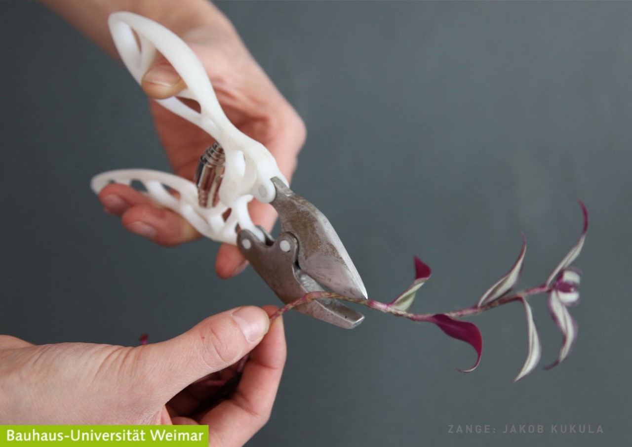
The Alu-Zange was the result of an SKO-based university project, but its practical design has applications that extend beyond the confines of a school curriculum. The hand-plier comes with a design that’s ergonomic and functional, but boasts of a lightweight design thanks to how little material it actually uses. To ensure that the slim plier has no points of failure, it comes with a four-point linkage system that lets you grip objects with the handles. easily. Moreover, the handles have a grippy, broad design that can either be held the conventional way, or in a secure manner by sliding your thumb and finger into the hollow elements in the grip’s design.

Designer: Jakob Kukula

The Alu-Zange’s unique design is the result of a generative algorithm that helps determine the form with the best strength-to-weight ratio possible. Obviously, ergonomics and usability play a main role here, which is where Jakob’s design abilities come in. The unique linkage system between the grip and the plier jaws is a unique touch too, and I could totally see it having its own function as well, like gripping or breaking open things… but I’m getting ahead of myself here. What’s remarkable here is how incredibly skeletal the plier looks, showing that you don’t need to make workshop tools rugged. You just need to be efficient with how you allocate material.

Purely for the purpose of this university exercise, Jakob fabricated his concept from plastic and aluminum, although the real tool would be made from cast iron or tool steel. It’s possible to 3D-print this design, although casting seems like the best bet too, given how the form has no complicated contours that would make molding and de-molding difficult. The hinge could still be a single pivot mechanism if you ask me, but I’m honestly curious to see how this 4-point linkage would work.

The post The Secret to Stronger, Lighter Tools: Meet the Hand-Plier with a Durable, Hollow Design first appeared on Yanko Design.

AI-generated Hìtëkw Tennis Racquet – YD x KeyShot Inspiration Hub Design of the Month #2

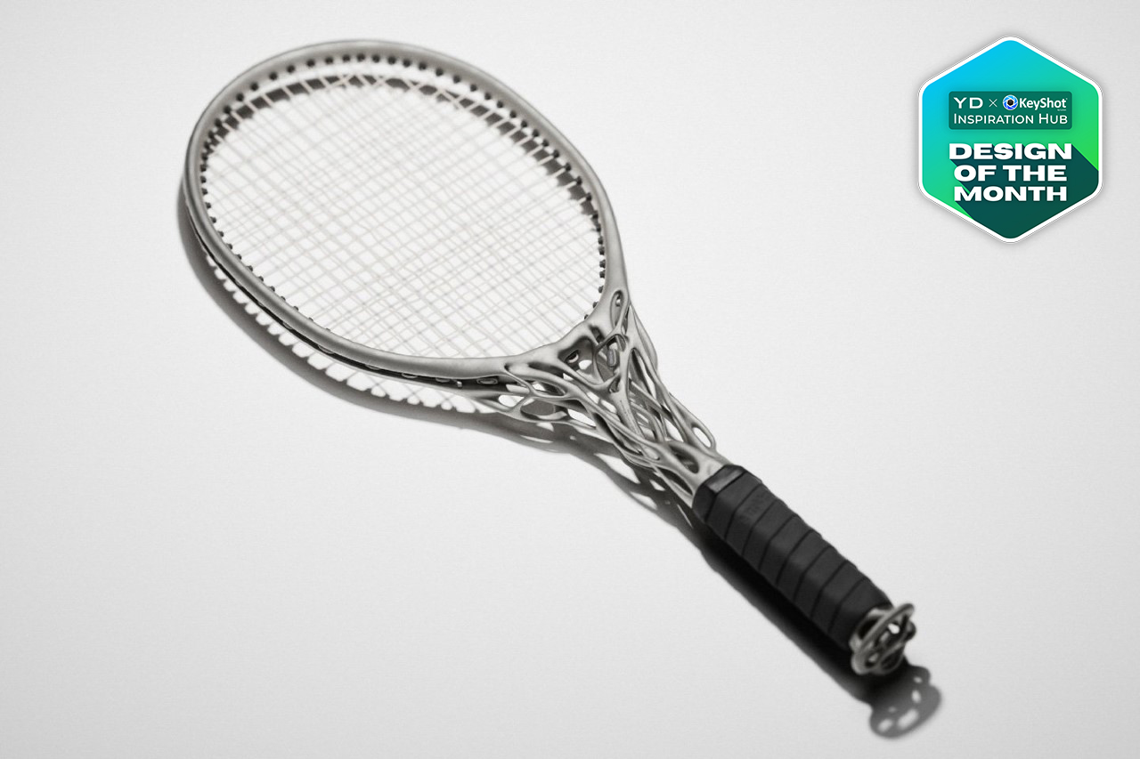
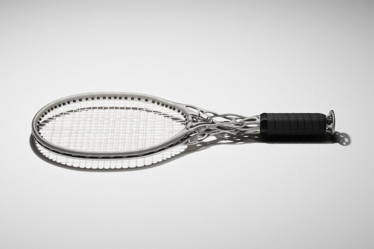
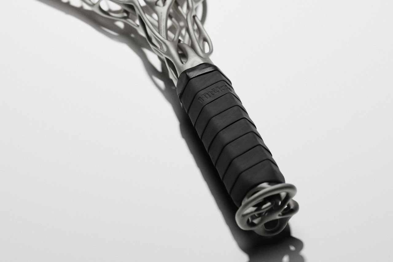
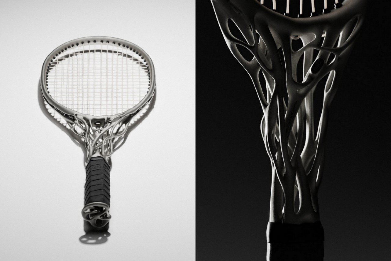
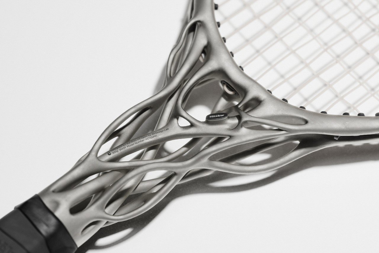
The second-ever YD x KeyShot Inspiration Hub Design of the Month goes to the Hìtëkw, a rather interesting-looking tennis racquet with an even more interesting back story. Designed using a combination of AI-based tools as well as generative design, the Hìtëkw boasts of a futuristic visual aesthetic that’s never been seen before… and that isn’t all. The redesigned racquet is lighter and stronger too, as a result of this AI-powered makeover!

Designer: All Design Lab

Click Here to view all designs on the YD x Keyshot Inspiration Hub website!

All Design Lab experimented with using OpenAI’s Dall·E2 to generate concept directions for the racquet’s design, only to realize that almost the AI could only work on a dataset of existing images; and nobody had ever made a racquet like the Hìtëkw before, which made it difficult for the AI to really think outside the box. This became the starting point for All Design Lab’s creative brief, which was to completely redesign the racquet’s silhouette itself.

To create new racquet archetypes, the All Design Lab team relied on new CAD tools. The designers created their rough form in Gravity Sketch, a VR-based 3D program that lets you sketch and sculpt in virtual reality, before taking the product to a generative algorithm to optimize the racquet’s unique frame for strength and reliability. The result was the Hìtëkw, a racquet that’s stronger and lighter than its competitors, with a distinct visual edge thanks to its organic, 3D-printed generative metal design.

“Rackets have become more lightweight and durable through new materials and advanced manufacturing techniques”, the All Design Lab team mentions. “Yet the potential is still there to envision an even lighter and stronger racket that takes advantage of new design techniques, specifically, advanced CAD processes such as generative design tools.”

If you don’t know what the YD x KeyShot Inspiration Hub is, it’s best to think of it as the ultimate destination to find the most inspirational design work, as well as to have your own work featured so that it can be seen by a global audience of thousands of designers and creatives… an ever-expanding encyclopedia of good design and great rendering, if you will.

The hub helps fulfill YD and KeyShot’s broad goal of recognizing exemplary work from a distance and helping amplify it without having to rely on an algorithm, unlike with portfolio sites and social media. It relies on YD’s two-decade-long year history of curating great ideas, concepts, and case studies and ties it to KeyShot’s powerful position as the design industry’s most powerful and preferred rendering software.

The Inspiration Hub’s jury panel will hand-pick and highlight an outstanding design each week, also awarding a ‘Design of the Week’ and ‘Design of the Year’, featuring them at the top of the hub’s page while giving winning designs a permanent badge and entering them into the Inspiration Hub’s ‘Hall of Fame’. Hall-of-Famers will also be featured on Yanko Design’s Instagram page and will win exciting prizes from KeyShot. If you think your design has a chance to get featured on the hub and win, submit your design with us here.

Learn more about how to participate by visiting the hub, and also get your hands on a free trial of KeyShot 11.

Click Here to view all designs on the YD x Keyshot Inspiration Hub website!

The post AI-generated Hìtëkw Tennis Racquet – YD x KeyShot Inspiration Hub Design of the Month #2 first appeared on Yanko Design.

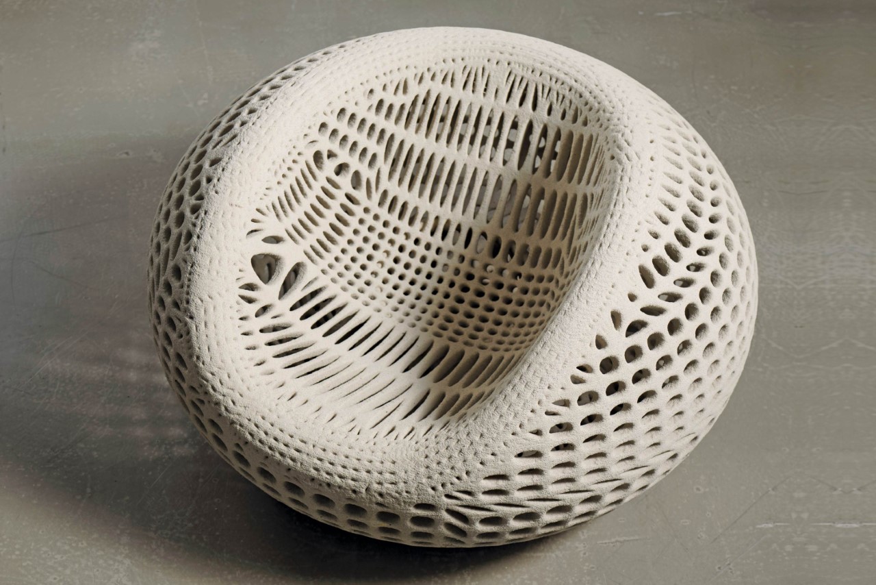
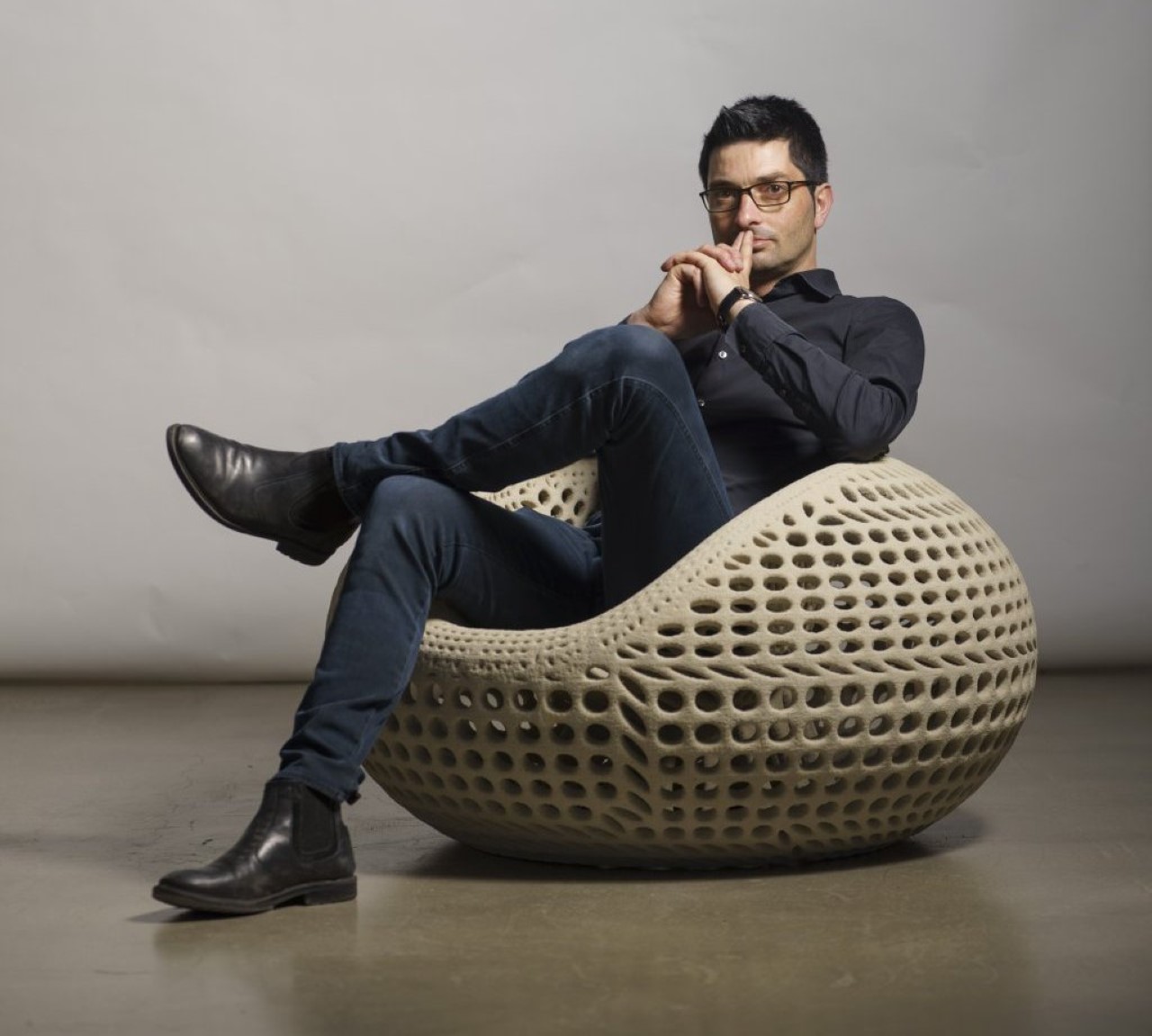
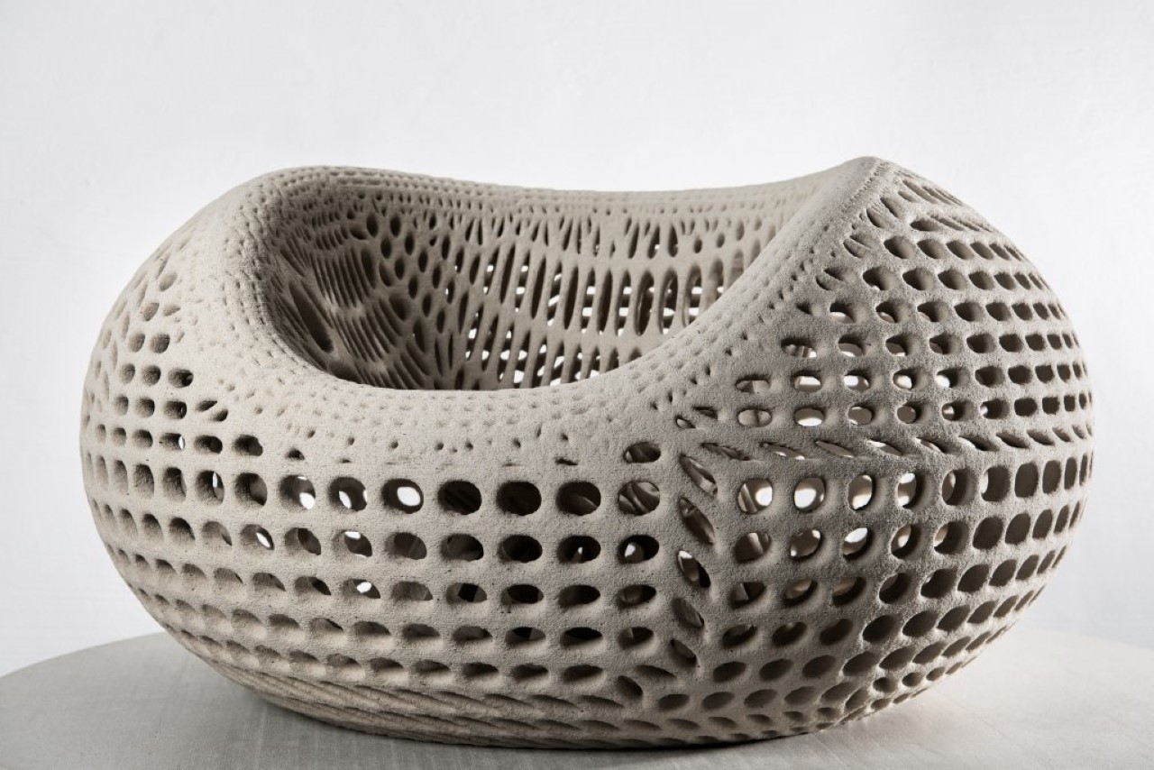
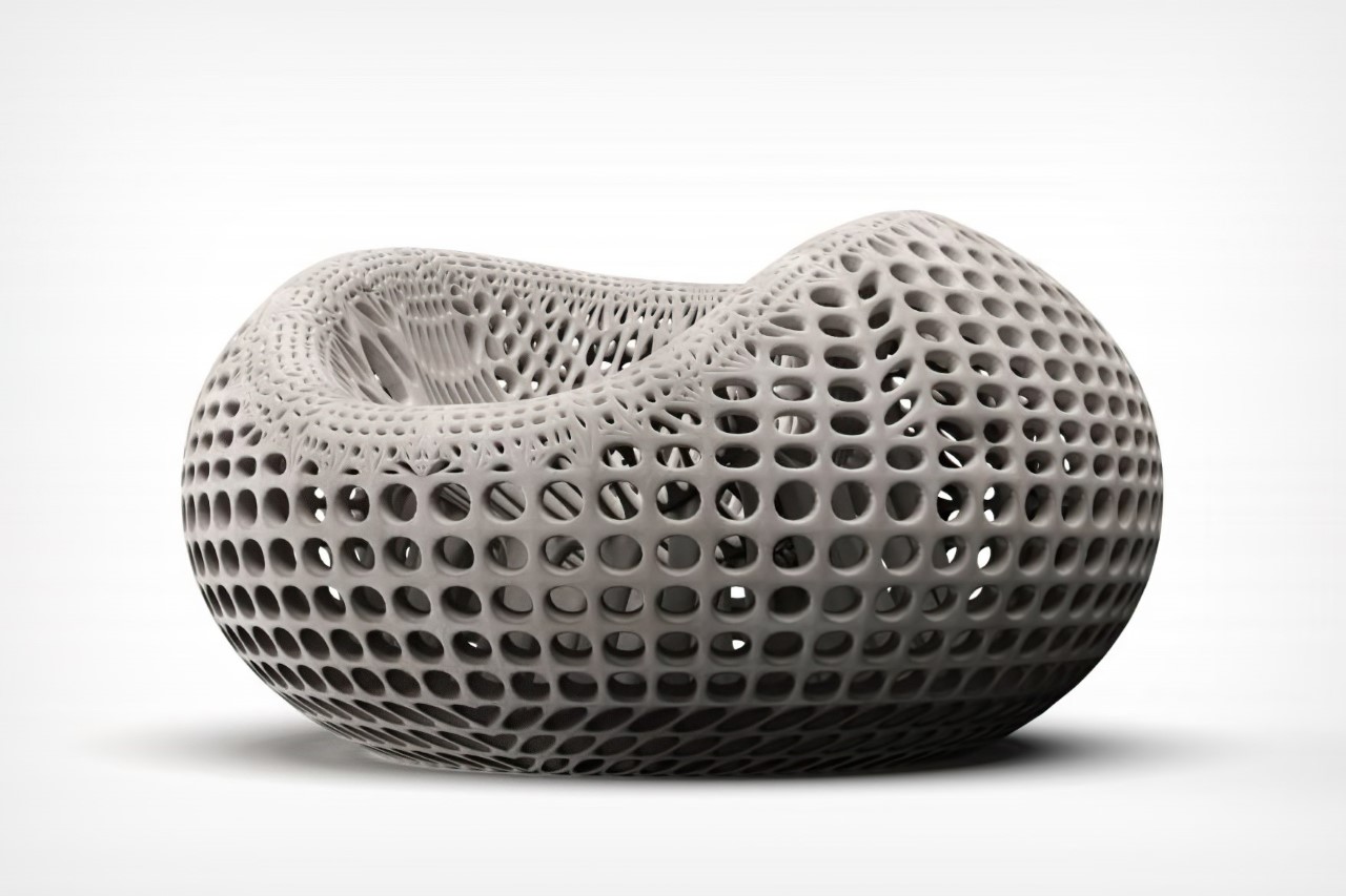
3D-printed concrete chair uses generative design for strength and a distinct hollow aesthetic

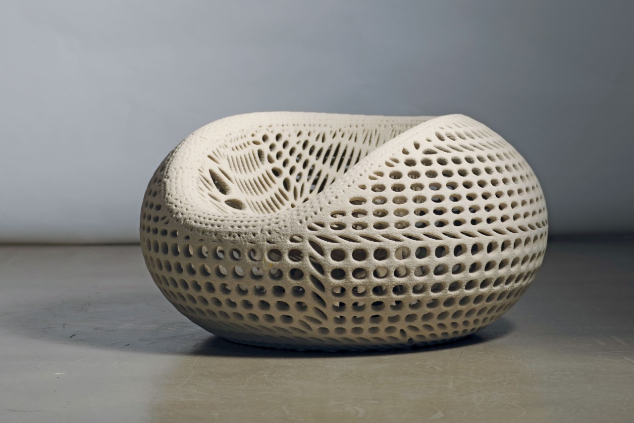
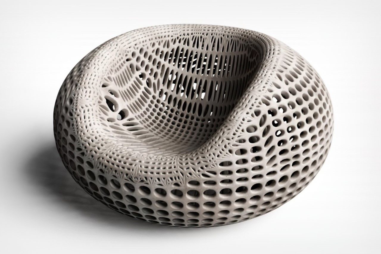
If the CHAIR N°ONE looks like a 3D wireframe come to life, it’s absolutely intentional. Designed by Martin Oberhauser of Studio Oberhauser, the CHAIR N°ONE is the first series of design chairs 3D printed in concrete by selective cement activation. The process involves selectively binding pieces of cement similar to the kind seen in resin 3D printing. The result is a spectacular chair that’s entirely hollow yet structurally sound. Made sustainably using recycled glass as a base material along with concrete, the CHAIR N°ONE has an appeal so unique, it transforms concrete from being a utilitarian material to one with immense sculptural and aesthetic potential.

Designer: Studio Oberhauser

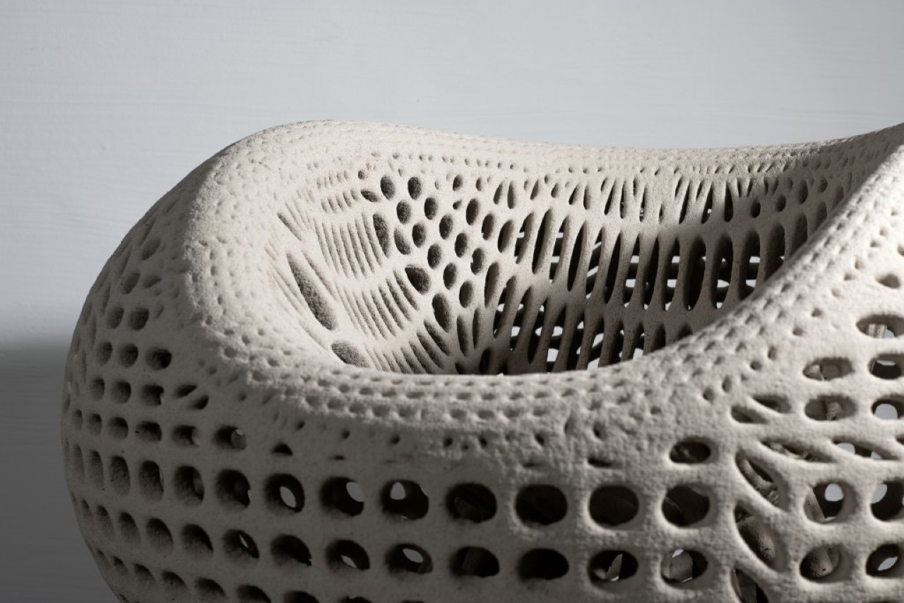
The hollow, almost organic design of the CHAIR N°ONE can be attributed to its use of parametric design to achieve a form that’s equal parts durable and lightweight. Inspired by “intricate bionic structures”, the chair has an almost coral-like beauty to it, featuring a perforated exterior and a hollow interior. The chair’s form, however, remains blob-like and contours wonderfully to the human body. You’ve got a comfortable backrest as well as two armrests, almost like a hard, rigid beanbag.

The way selective cement activation works is very similar to other forms of 3D printing. Fine layers of a dry cement-sand mixture are solidified locally by applying water. This way, layer by layer, complex 3D objects can be created with a high degree of geometric freedom. The CHAIR N°ONE also uses crushed, recycled glass as a base material, providing an element of sustainability to the chair’s overall design. “The cement printing compounds can be chosen based on indoor or outdoor use of the CHAIR N°ONE, making the chair a universally usable piece of artistic design furniture”, says Martin Oberhauser.

The CHAIR N°ONE is a winner of the Red Dot Best Of Best Award for the year 2022.

The post 3D-printed concrete chair uses generative design for strength and a distinct hollow aesthetic first appeared on Yanko Design.

This futuristic car was almost entirely designed by computer algorithms

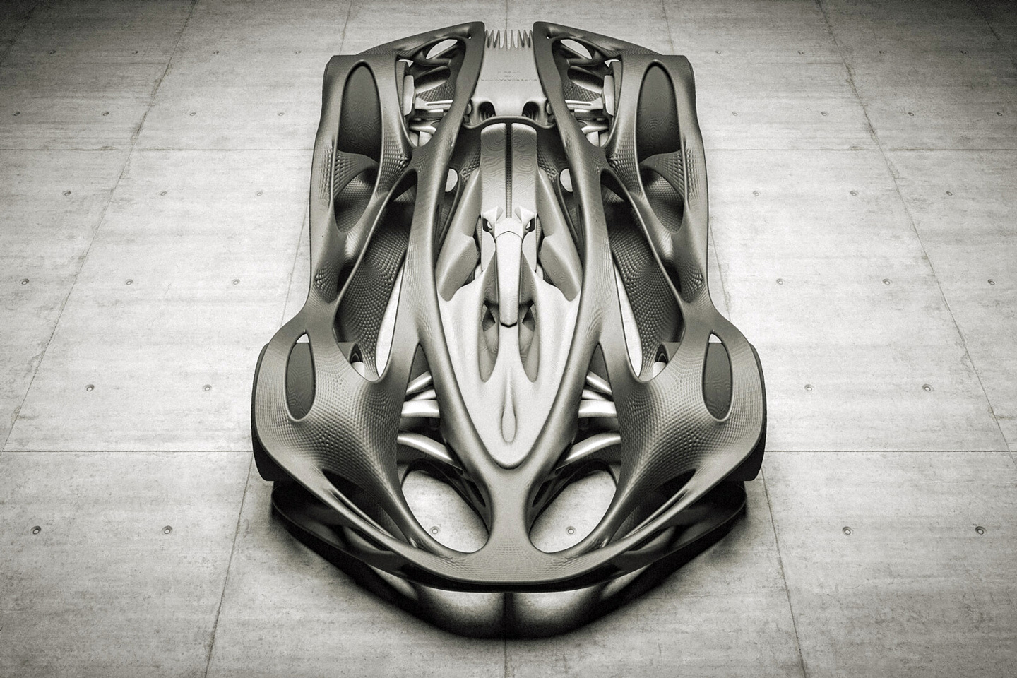
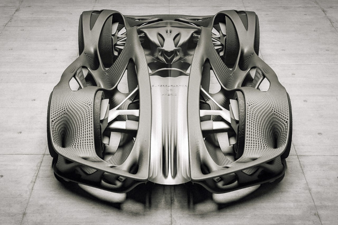
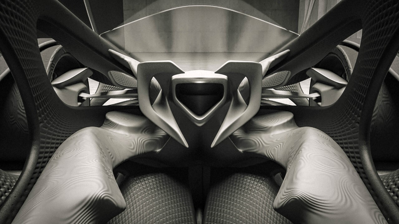
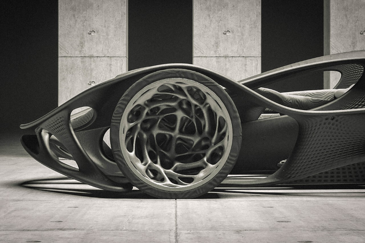
Using a technique called parametric design or generative design, automotive designer Ayoub Ahmad created the HV-001 by defining a set of conditions and allowing 3D algorithms to create an organic-looking automobile to fulfill those conditions. If the design looks almost like a skeleton, that’s no coincidence because natural evolution works the same way too – it designs skeletons based on a certain set of conditions. Humans have strong heels and tailbones for standing and sitting, birds have lightweight skeletons for flying, and goats have strong skulls for occasionally headbutting.

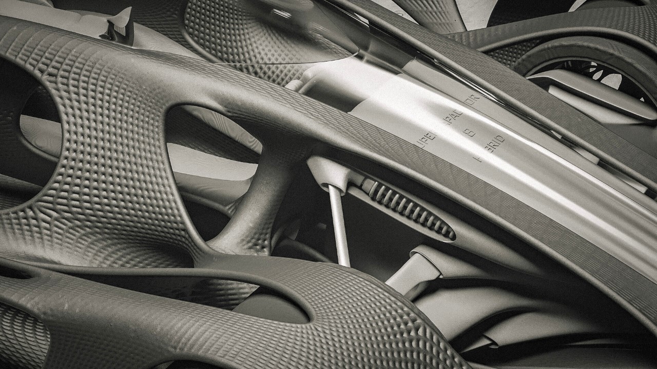
The car’s chassis itself becomes its body, with an exoskeletal framework that’s so organic and beautiful, it would be a shame to hide it under a fascia. The HV-001’s unique exterior tries to achieve strength and aerodynamism with as little material as possible, resulting in open spaces where material isn’t necessary, and connective pillars in places that take on gravitational stress, physical loads, or mechanical pressure. As far as surfaces go, the HV-001 opts for an almost mesh-like surface that has its own dimples or negative spaces to remove unnecessary material and reduce the car’s weight, making it more energy-efficient.

Designer: Ayoub Ahmad

The car’s uniquely skeletal design isn’t unlike the Formula 1 perfume bottles Ross Lovegrove designed in 2019 (he used parametric design too). With such intricately complicated forms, it’s almost axiomatic to rely on 3D printing to build out your creations. The car’s design definitely hints at being 3D printed, with the number of undercuts, contours, and complex surfaces all across its exoskeleton. The unique organic design isn’t just limited to the car’s chassis – its wheels have organic 3D printed rims, and the car’s cockpit (even its steering wheel) echoes the same organic generative design language. I wasn’t kidding when I said the HV-001 was almost entirely designed by algorithms!

The three most common parameters that define such designs are A. Strength, B. Minimal material/weight, and C. Aerodynamics to limit drag and boost efficiency. Simply looking at the car’s contours help you understand what path the air would take as the car cuts through it. The vehicle has a defined contour running along the sides, and an abundance of air intakes and outlets to keep the vehicle cool even when it hits maximum speeds. Fins on the back help cut and channel air too, and the lack of a traditional exhaust system is enough to make an educated guess that the HV-001 is powered by an electric or hydrogen-powered drivetrain. The car is conceptual, however, and is most likely just a form exercise by designer Ayoub Ahmad, a Dubai-based automotive designer.

The post This futuristic car was almost entirely designed by computer algorithms first appeared on Yanko Design.
3D-printed metal fixture uses computational generative design to give this desk its strength as well as an iconic character

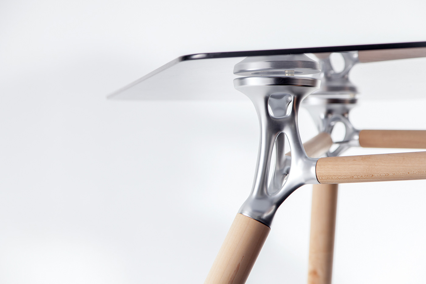
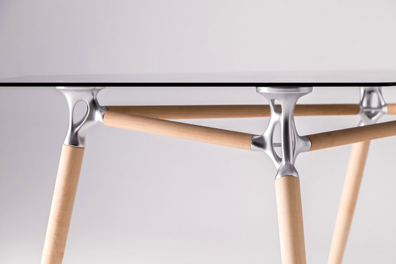
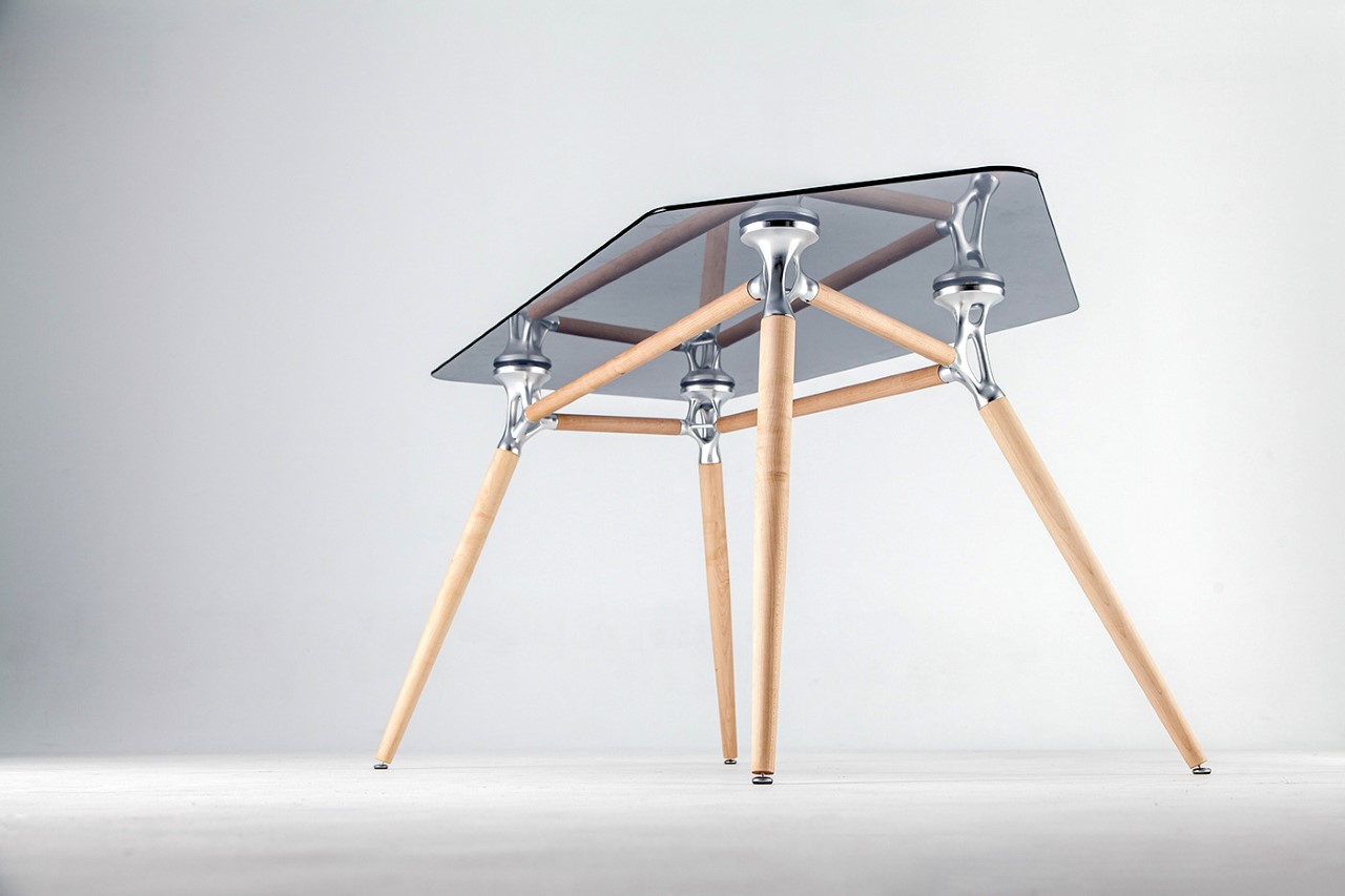
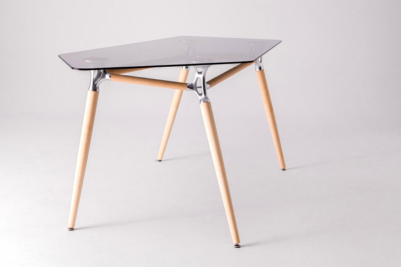
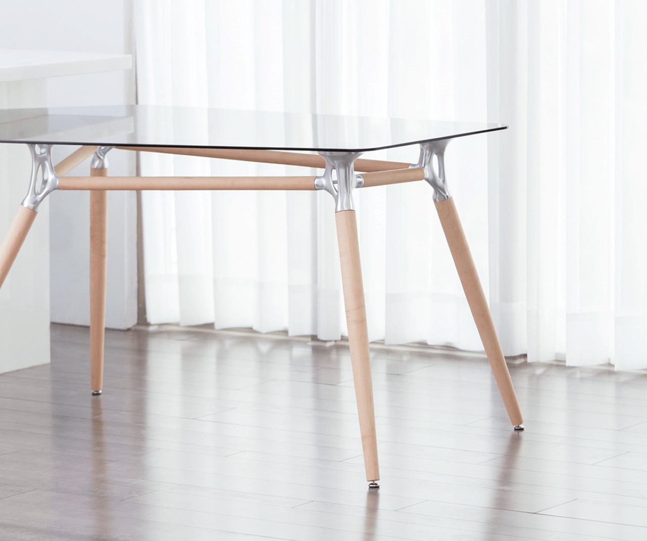
The Generative Desk is rather simple to look at. All you really see is a glass surface, 8 wooden columns, and four metal fixtures that bring the desk together. However, behind that simplicity is a fair bit of computational design that gives the desk its minimalist-yet-unique character, as well as its strength. The metal fixtures used to connect the wooden columns and support the glass panel were created using a process called generative design. Built by algorithms, the metal element’s organic design was arrived at by simply feeding inputs and information into the CAD software, and allowing it to create a form that was strong enough to take on high loads, while using as little material as possible. If the metallic fixtures look even remotely organic (like bones), it isn’t an accident… generative design relies on the same principles that guide natural evolution, by building something that is purely designed to be functional and durable.

The fixtures are 3D-printed out of metal, before being sanded or sand-blasted for their matte finish. Their hollow design is engineered to take the weight of the glass panel as well as anything you may put on top of it, while cutting down on as much material as physically possible. This gives the Generative Desk its quirky organic character that’s difficult to ignore, while the 3 different materials come together to play their parts.

Designer: Yin Man Chan

This entire shoe can be made in a single 3D print cycle

I hate to make this reference just because it’s such a massive design and fashion faux pas, but the Armis picks up where the Crocs left off. The Crocs, as much as their appeal plummeted in mere years of them being around, revolutionized the ability for a shoe to be unibody. Aside from the strap, an entire Crocs shoe could be made inside a single injection-mold, and while it’s physically impossible for the Armis Slide to be made using a mold, it builds on the same theory… that one machine makes the entire piece of footwear, from toe to heel.

The Armis is a piece of slip-on footwear that gets made in a single 3D-printing cycle. Its design comes with two broad parts – the inner generative-designed mesh (it reminds me of the Adidas Futurecraft), and the outer covering, split into multiple parts that strategically shield your foot. The shock-absorbing inner mesh comes custom-designed to suit each individual wearer’s foot pressure-graph, allowing it to be soft in certain areas and harder at other regions. Based on this user data, a generative design algorithm creates the inner mesh and readies the shoe’s overall design by laying the outer shell on top. Once the final CAD file is ready, the entire shoe can be printed in one single sitting using resin-based 3D printing, hopefully bolstering what designer Shun Ping Pek calls the 4th Industrial Revolution.

It’s difficult to say how a shoe of this nature would be repaired if it ever got damaged, but I’m assuming there’s definitely an elastomer or an additive out there that can dramatically prolong the life of a shoe like this (I mean look at how incredibly resilient Crocs are). My personal concern is… what happens when you walk on gravel?!

Designer: Shun Ping Pek

A skeleton-inspired generative designed frame makes this drone incredibly lightweight yet strong

The bones are perhaps the best example of nature’s way of providing a structural framework that’s strong and robust, yet minimal. This same structural framework, if tweaked slightly, can cause humans to break pieces of brick with their fist, while also being light enough to let birds fly… two attributes that the Skeleton Drone looks at attaining through its generative-design skeletal structure.

It would be unrealistic to expect a drone to break through a brick but you get what I’m talking about, right? There aren’t many things that are more painful than a drone that collides with a wall and shatters to smithereens, right? The Skeleton Drone’s structural makeup prevents the creation of those weak-points. Its inherent generative design solves any strength and stress issues, while drastically cutting down on volume. I mean even the drone’s body, which usually comprises a computer, a battery, and a camera, is reduced to a bare minimum, making it both physically and visually light, but just as, if not stronger, than any drones out there on the market!

Designer: Hong Zhi

Amazon just announced a musical keyboard… for coders.

You’d probably think Amazon got its target audience slightly wrong with this one, but that title couldn’t be more accurate. Amazon’s newest reveal is a musical instrument, but it isn’t for musicians… it’s for developers. This is the AWS DeepComposer, a machine learning-driven keyboard aimed at coders and developers, giving them a creative, hands-on way to approach machine learning, and probably knock out a few jams while they’re at it.

“AWS DeepComposer is a 32-key, 2-octave keyboard designed for developers to get hands on with Generative AI, with either pretrained models or your own”, says Julien Simon from Amazon Web Services. Generative AI works a lot like generative design does, wherein the AI uses parameters and experience to create something new and advanced. Introduce machine learning to it and the AI gets better over time, creating more polished, refined, and accurate results. Amazon’s AWS DeepComposer isn’t a musician’s tool, but Amazon hopes it could be in the future. Coders and developers can help train the AI by using the keyboard to play tunes and have the AI support it with genre-specific music. Developers can either choose from genre-models, or develop new genres of their own within the AWS DeepComposer console. The keyboard also works as a MIDI controller within DAWs or digital audio workstations, allowing you to quickly and effectively jam out tunes, creating layered compositions built by a combination of human and AI creativity. Who knows, the next deejay at Coachella could be an artificial entity…

This is Amazon’s third machine learning teaching device, along with the DeepLens camera that the company introduced in 2017 and the DeepRacer racing cars debuted last year.

Designer: Amazon Web Services

With its generative-design, the Helyx Drone accelerates faster than the Tesla Roadster

Mirroring the design process you’d see in a Formula 1 racecar, where aerodynamics, weight, and strength play incredibly key roles in the design process, Helyx is a drone that’s built for racing, and boasts of a unibody chassis that’s designed entirely using organic generative design. With a skeleton that feels almost animalistic, the Helyx quadcopter is incredibly light, weighing just 87.5 grams, and boasts of a max speed of a staggering 208km/h with an acceleration of 0-100km/h in 1.2 seconds. To put that into perspective, the Helyx Drone accelerates faster than the Tesla Roadster, which takes nearly 1.9 seconds to reach 100km/h. The top speed of 208km/h also makes the Helyx one of the fastest drones in the world.

While a lot of Helyx’s credit goes to the spectacular engineering, its generative design monocoque gives it a distinct advantage over most other drones. The Helyx’s body combines all aspects critical to drone design, with structural pillars, landing gears, bumpers, and load distribution built right into the drone’s singular skeleton. 3D printed using the HP Jet Fusion printer (probably out of carbon fiber), the drone was tested by FPV champion Guiseppe Renaldi in perhaps one of the most stunning, dizzyingly fast videos above.

Designers: Sigma Ingegneria, Tommaso Pardini & Andrea Rocchi.