Google’s Little Signals devices will deliver notifications in a subtle way using our plants

Living in an always-on world can be both a blessing and a curse. It’s a blessing because you will never miss an email, a message, or a call because you have notifications on your smartphone, smartwatch, or your smart speaker. But it’s also a curse as it can be very distracting or even triggering for some. Sure you can just turn off notifications if you don’t want to be disturbed or bothered but of course, you might miss some important things. There should be a delicate balance between the two and Google seems to be looking for that.

Designers: Seed Studio and Map Project Office

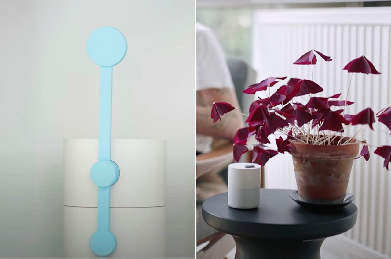
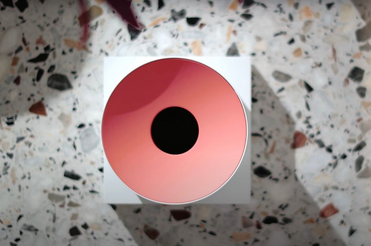
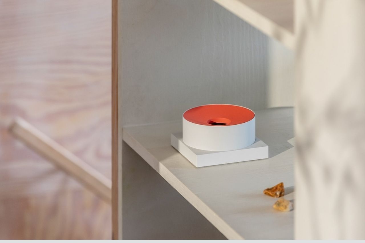
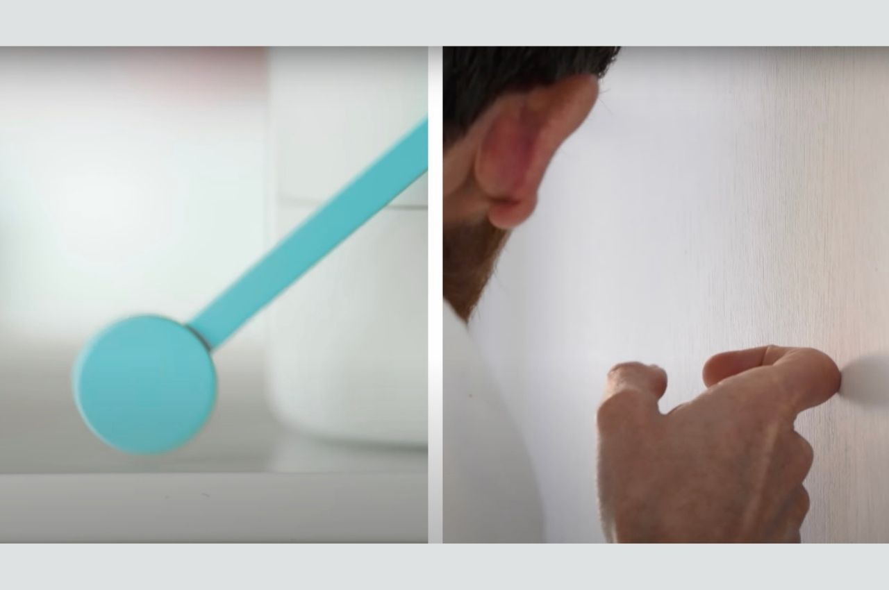
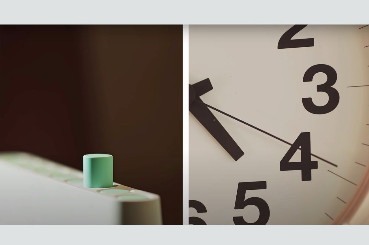
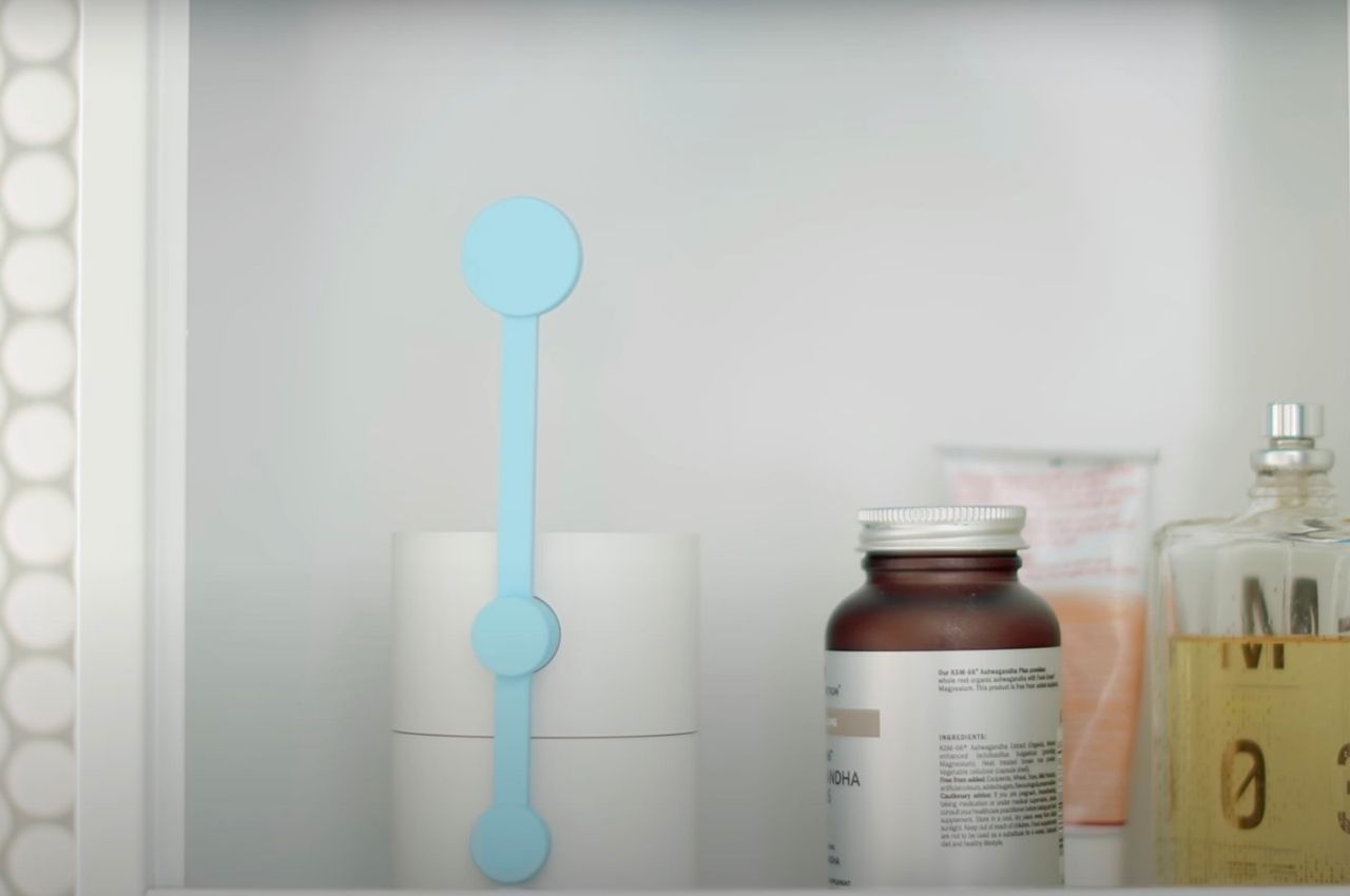
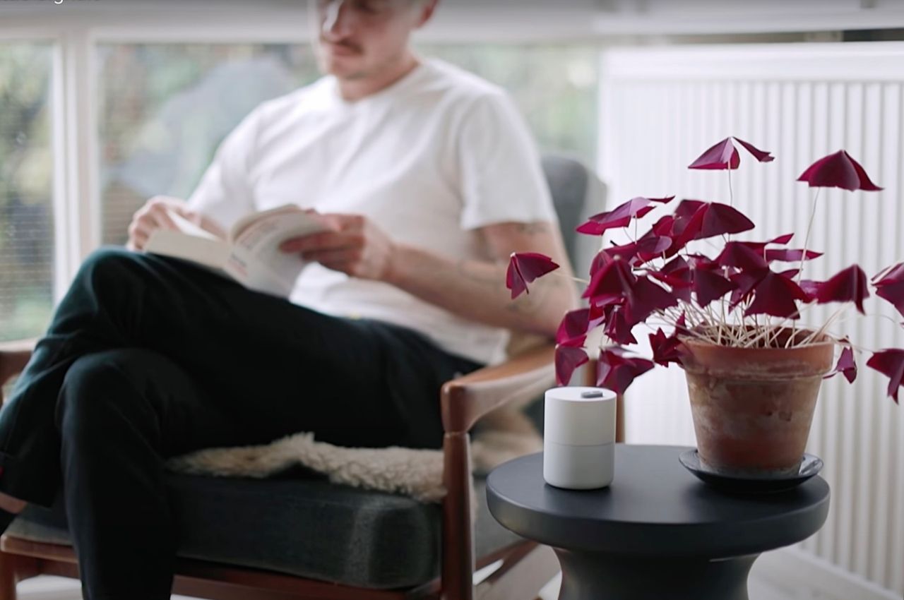
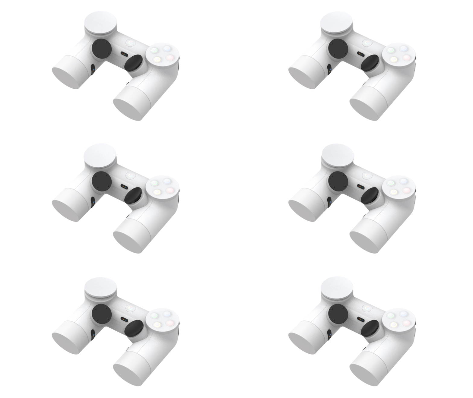
What Google has come up with is something called the Little Signals series, a set of devices that aims to bring distraction-free notifications. They came up with a way to integrate ordinary, everyday sounds that are part of your environment to still bring you alerts but not get distracted or bothered by them. There are six devices in this experimental project for distraction-less alerts: Air, Button, Movement, Rhythm, Shadow, and Tap. Each one has different options that users can choose from which will best fit their lifestyle and needs.

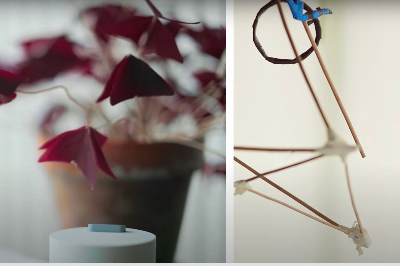
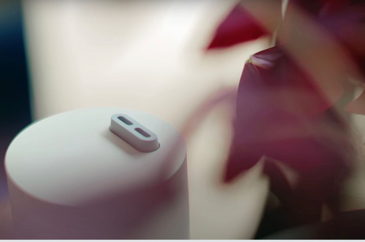
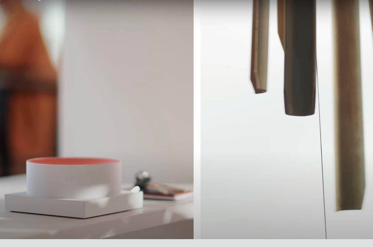
The Air device seems the most interesting one if you are a plant parent. It uses patterns like blow, wiggle, or spin that will affect nearby plants or objects that will be affected by “air” when you receive a notification. Of course, if you’re not paying attention much, you might miss the signals but at least there’s a way to make it less in your face. The Button device meanwhile is a bit more noticeable as it will pop up, twist, or give off a subtle chime sound. It is orange so it is will catch your attention.

The Movement device has seven different actions you can choose from like move, bounce, push, and can even create a “graph” to let you know you have a notification. The Rhythm one seems the most “calming” among the devices as it gives off ambient sounds and can be controlled with the wave of a hand. If you don’t need it to give you notifications, you can just flip it over. I would personally choose this one if it ever goes to market.

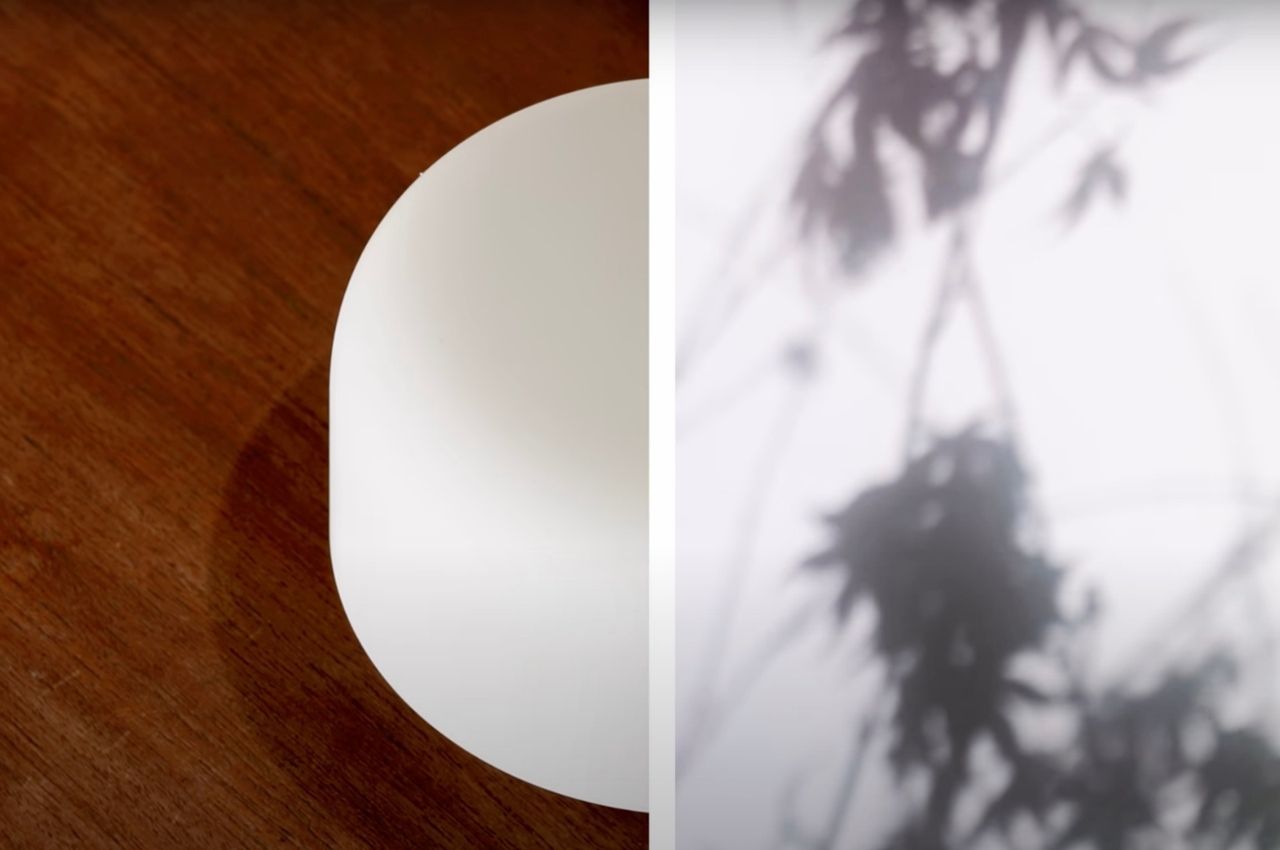
Shadow, like its name says, casts movements of shadow when you receive notifications. The shadow itself is able to breathe, shake, stretch, and rotate so it can subtly grab your attention. Lastly, Tap will be able to knock, wave, spin, and point for various notifications. Design-wise, these devices seem to match the Google Home line and are also pretty subtle in appearance, matching their functionalities and how we can interact with these devices.

The post Google’s Little Signals devices will deliver notifications in a subtle way using our plants first appeared on Yanko Design.

Google-inspired Designs that we wish the tech giant would make already in 2021!

The term Google is pretty self-explanatory! There’s nothing that we can really say about the tech giant, that it hasn’t already said for itself via its products. Google is always surprising and delighting us with its groundbreaking products – from the Google Pixel phones to their Nest Smart Speakers. Google’s cutting-edge technology and innovative design philosophies have been a major source of inspiration for designers and creators all over the world. And, we’ve curated some of the best Google-inspired designs that we have come across! From a Google Pixel smartwatch concept to a Google Glass-inspired bicycle accessory – this collection of designs will have you wishing that Google transforms them into a reality soon! And all this while seamless merging your home interior scheme.

This Google Chromecast design is designed to be a media hub. Designed with the stylings of the Apple TV box, Heyninck’s Chromecast 3 box looks pretty nifty, and in many ways follows Google’s product and CMF language. The box connects to a television via a single USB-C connection that has the ability to pull power as well as push media (I assume the cable branches into USB and HDMI ports at its other end.) Being a more budget-friendly option to the Apple TV, this Chromecast design brings to the forefront the ability for your remote to also function as a gaming controller. WHile Apple’s remote does it already, its about time Google brings this to its Chromecast and allow us to put that big screen TV through some quick gaming in a jiffy!


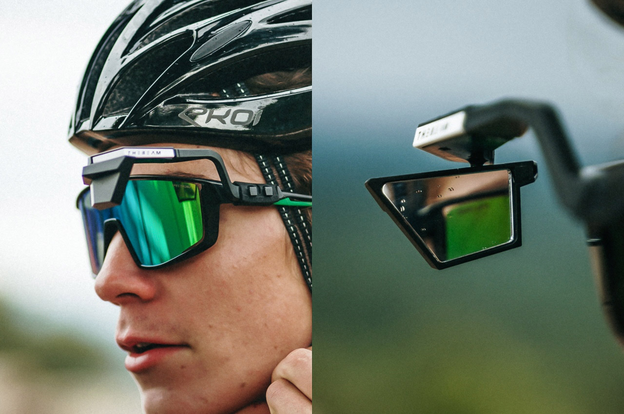
It preserves your aerodynamics while giving you an easy-access rear-view mirror… and it fits right on your spectacles/sunglasses like a rather futuristic, life-saving accessory. Designed to allow you to look behind you without physically glancing over your shoulder as you ride a cycle or motorbike, the CORKY X has an aesthetic that looks rather familiar if you’re a tech enthusiast. Modeled roughly on the form factor of the Google Glass, CORKY X gives you a different kind of HUD. Fitted with a small mirror, the eyewear accessory lets you instantly look behind you simply by glancing out of the corner of your eye.

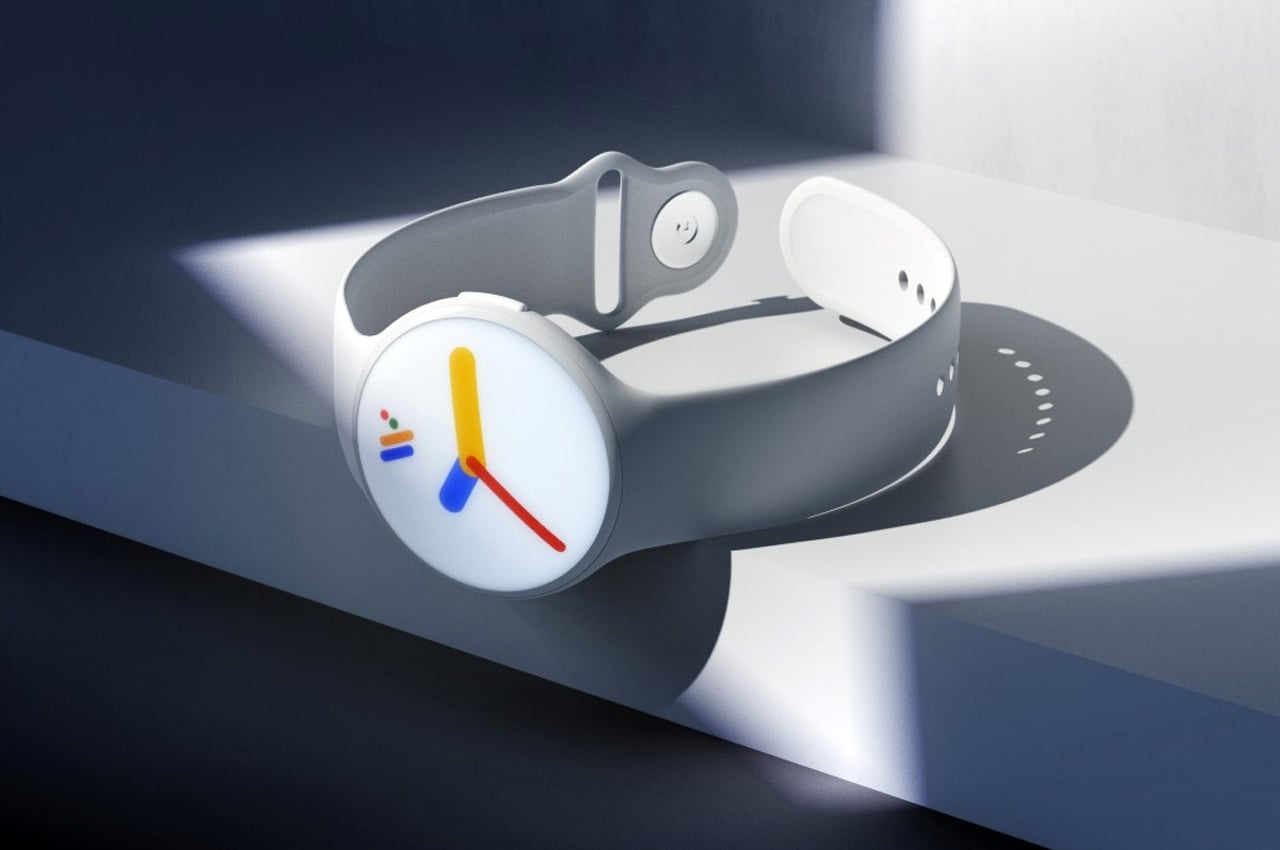
The Pixel smartphone went onto redefine what a pure Android experience could look like, becoming the gold standard in the Android OS experience. James Tsai’s Google Pixel Smartwatch concept does the same for the Android Wear OS. Embodying Google’s playful-serious aesthetic, the Pixel Smartwatch concept comes in a traditional round format, and in a variety of quirkily named colors. The Android Wear OS logo displays clearly on the always-on display of the watch, transforming into a colorful set of watch hands every time you look at it to read the time. The watch comes with Google’s top-notch voice AI, all of Google’s native apps, and a heart-rate monitor on the back, which ties in well with Google’s plan of acquiring Fitbit and their entire fitness-tech ecosystem.

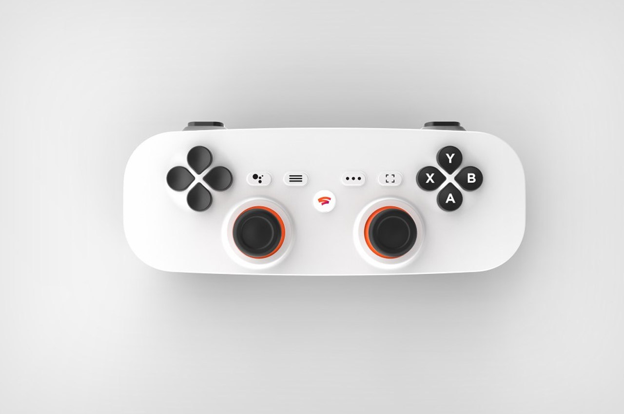
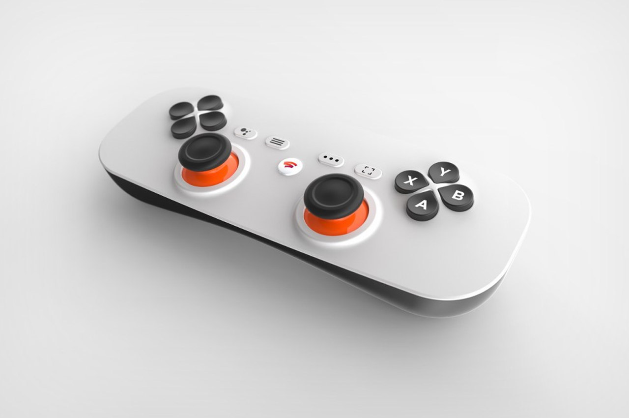
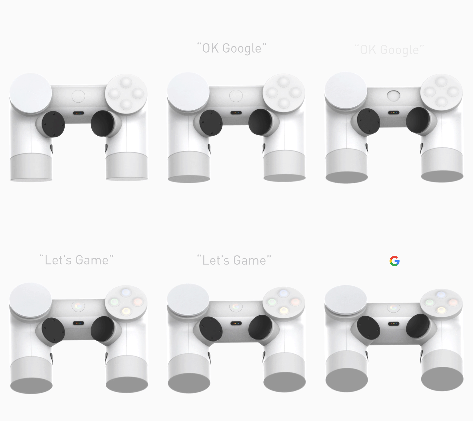
Designer Devin Sidell’s re-envisioned the Stadia controller as an NES-style bar-shaped controller that’s easy to slide into pockets and backpacks. Its slim profile feels almost like a remote and comes with all the functionality you need. Devin hasn’t taken away from the Stadia controller’s abilities, but rather just streamlined the form to make it more portable. In your hand, the Stadia Bar Controller concept feels a lot like a single Joy-Con from a Nintendo Switch (albeit slightly thicker).

Prosser is back for yet another prediction/leak which he feels is right on point. It’s the Pixel 6 and 6 Pro, which Google is slated to release this year… with Google’s first homemade silicone chip on the inside to rival Apple’s M1, and more noticeably, a whopper of a camera bump. I wouldn’t really call this a bump because it’s so wide and protruding, it’s practically a shelf. Like I could literally place a SIM card on top of it and it wouldn’t fall off. Objectively speaking, the band protrudes at least 2-3 millimeters from the phone’s back, making it look almost like a belt or a shelf emerging from the phone. Subjectively, it kind of makes the phone look like a criminal – serves them right for stealing the ‘Pro’ nomenclature from Apple!

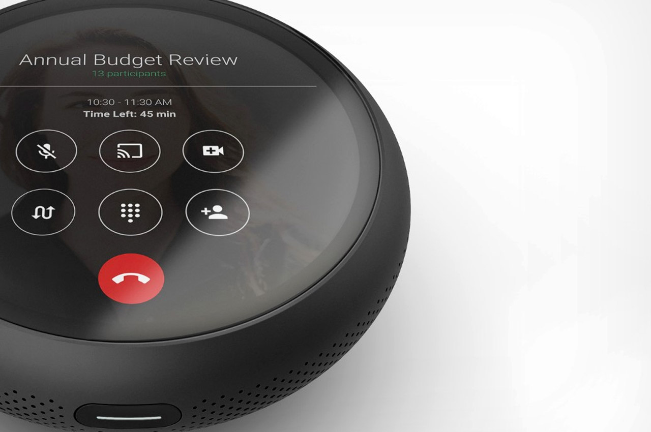
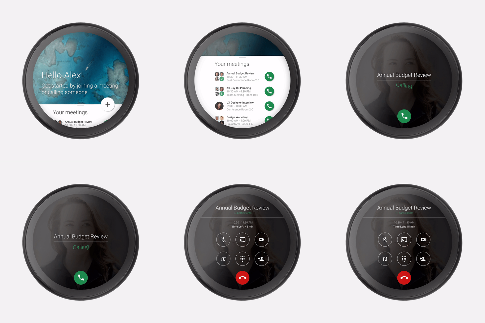
The Google Us is a conceptual smart assistant designed to aid teleconferencing. Made to look like a part of Google’s existing smart hardware family, the Google Us is black, and shaped like a Home Mini, with a touchscreen. It runs a stripped-down version of Android and uses Google Hangouts to enable meetings and collaborative conversations by pairing with other smartphones and Us speakers running on the Hangouts platform. You can simply make group calls and conduct structured, timely meetings through the touchscreen interface on the device, much like a smartphone, but with a better focus on maintaining daily schedules and delivering crisp audio to both parties, thanks to Google’s efforts in audio engineering and far-field microphone technology.

Waqar Khan’s renders give us a clue of what a folding Pixel would look/feel like. Schematically, it’s no different from Samsung’s first folding phone; although with significant developments made in the world of flexible OLED displays, maybe the ‘Pixel Fold’ could avoid the pitfalls of the Galaxy Fold that came 2 years before it. The renders show a clean matte body (like last year’s Pixel device) along with the presence of a fingerprint reader on the back. That particular detail could be a creative call on Khan’s part, given that in-screen fingerprint readers seem to be quite the norm with Android phones over the past year.

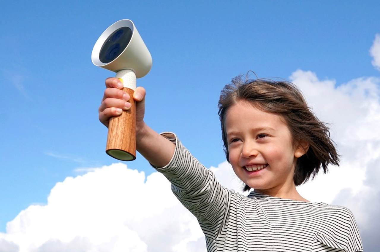
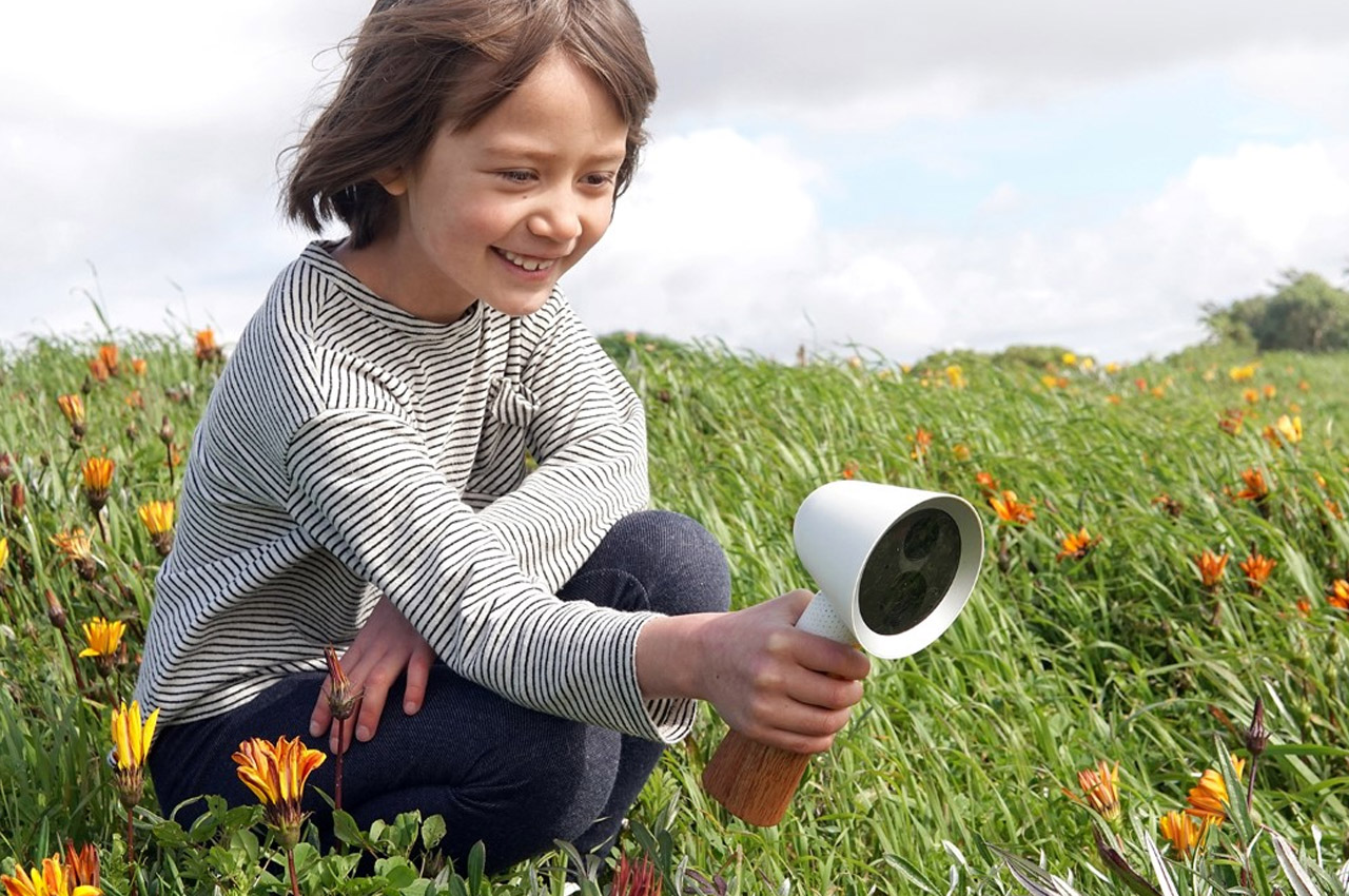
The Spot fulfills the role of a toy, encyclopedia, and bedtime storybook, all in a single handheld device. The camera allows children to capture objects, living things, and phenomena around them, while inbuilt A.I. helps children understand what they are by using optics, object recognition, and machine learning. The in-built AI weaves explanations into storylike narratives, pushing the child to be empathetic, curious, and at the same time, get answers to every question they have, while machine learning helps pick up on the child’s interests and learning pace, adapting to the needs of each child. It’s like a Google Lens for children!

Google's Stadia Controller gets a radical redesign!

Google's Stadia Controller gets a radical redesign!
Designed for an absolutely robust grip, the Playdream has all the necessary controls, from the buttons to a redesigned D-Pad, to the triggers, Google button, and even two extra buttons on the inside of the grip. The ingenuity of the Playdream controller is in the way it ditches the status-quo (and its clever play on the word Daydream too!). Putting aside the standard organic styling popularized by Nintendo, Sony, Microsoft, and the likes, Playdream sets its own benchmark. The design is radical, but inviting and playful too… just like the Google brand!

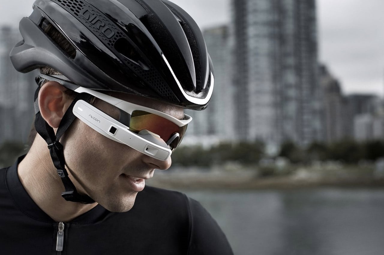
Google did create the first wearable with the Google Glass, but honestly, with its $1500 price tag, it sounded like a failure at the get-go. Google also has a tendency to fumble with hardware. Their Project Ara met a sad end last year too. However, Intel picked up on the Glass project where Google left off, with its Recon Jet smart eyewear. Much like the Glass, but with much more style and a lot of refinement, the Recon Jet has the aesthetic of a modern Bluetooth earpiece but sits in front of your eye. It isn’t really an AR or VR device, but it puts a small screen in front of your eye, feeding you information from a small corner… so that you can still see everything around you. I’d like to call this Partial VR.

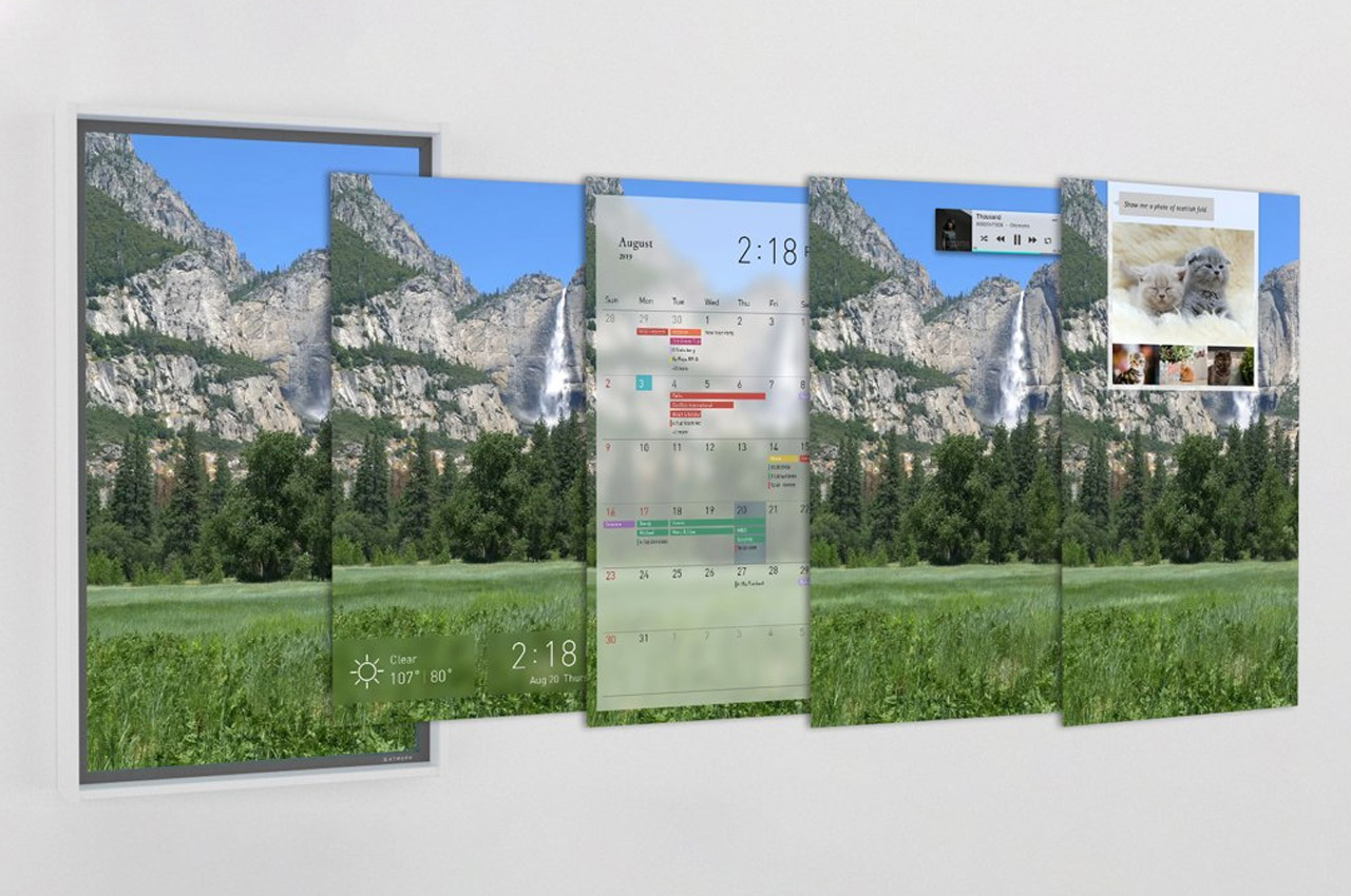
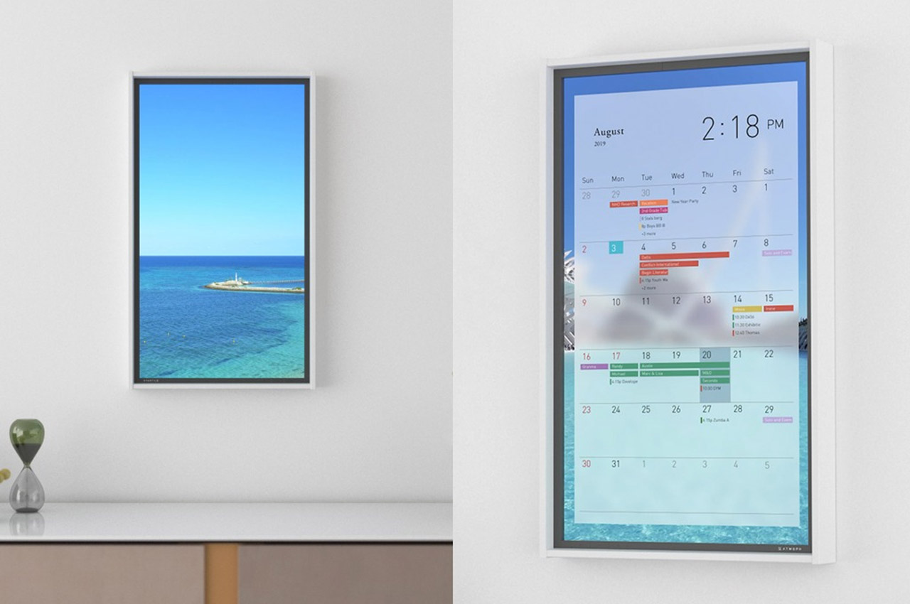
The Atmoph Window 2 isn’t really a window, but it behaves a lot like one. This smart high-definition display is capable of quite a few things, including playing from a library of 1000 videos of sceneries that you’ll love. The Atmoph Window 2 is the perfect example of a product that’s absolutely unique, even though it uses technology and hardware we’re so familiar with. The scene-shifting smart-window also displays the time, weather, as well as your calendar tasks, keeping you in touch with reality as you stare for hours into the Finnish Laplands, and even comes with Google Home compatibility, allowing you to execute simple voice tasks like “Hey Google, show me Hawaii and play some Hawaiian music”.

Google-inspired designs that every techie would love to see come true in 2021!

Google is always surprising and delighting us with its groundbreaking products – from the Google Pixel phones to their Nest Smart Speakers. Google’s cutting-edge technology and innovative design philosophies have been a major source of inspiration for designers and creators all over the world. And, we’ve curated some of the best Google-inspired designs that we have come across! From a Google Pixel smartwatch concept to a PixelBook Pro laptop concept – this collection of conceptual designs will have you wishing that Google transforms them into a reality soon!
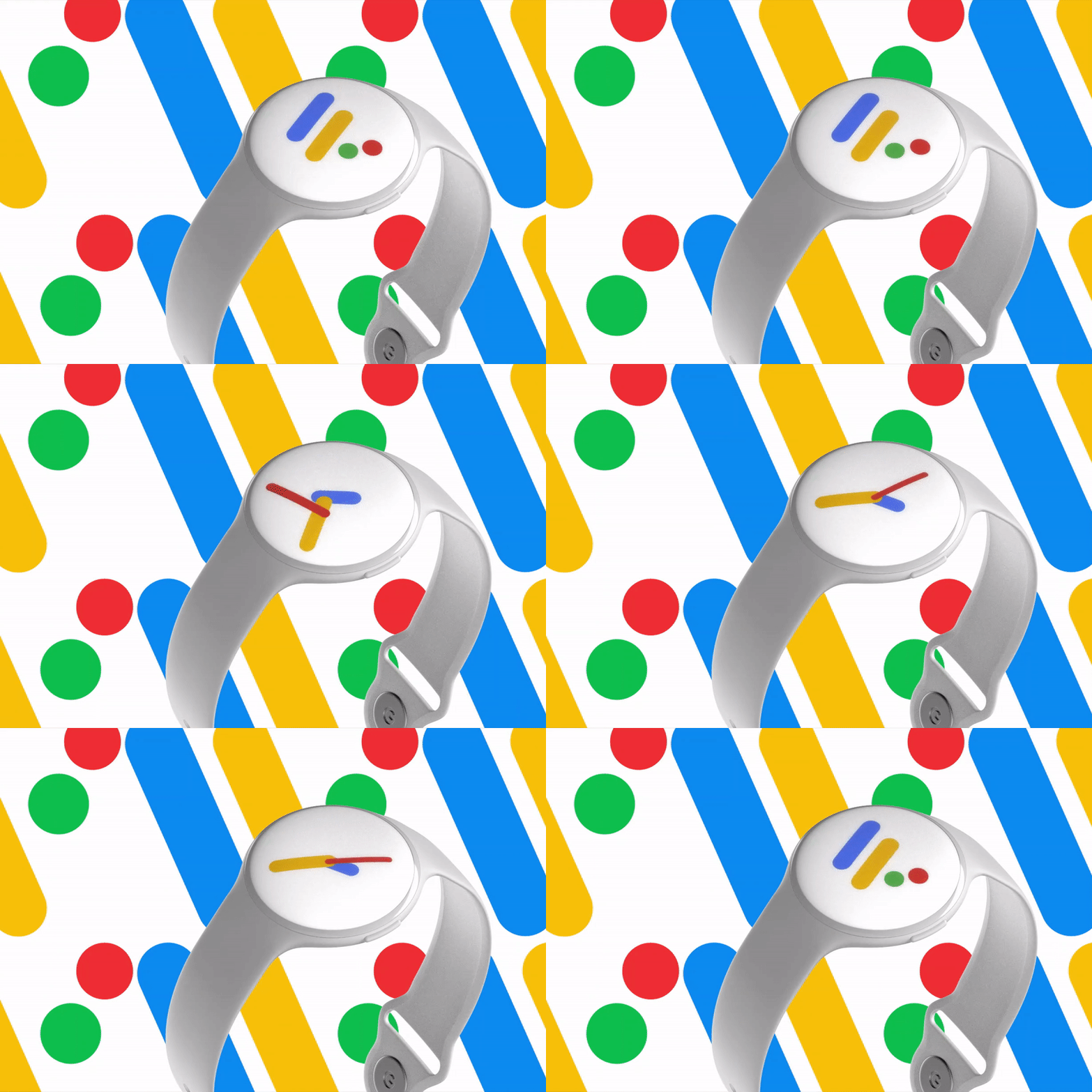
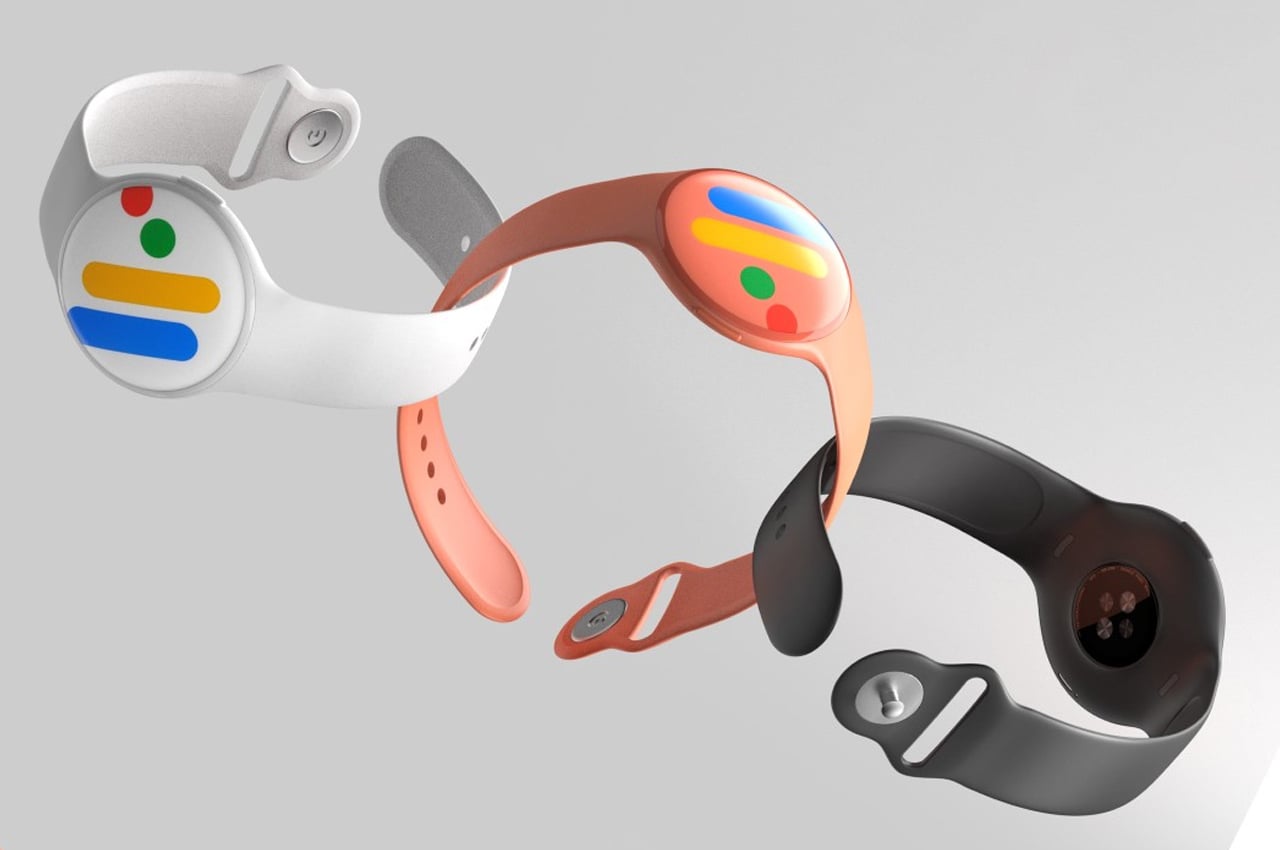
The Pixel smartphone went onto redefine what a pure Android experience could look like, becoming the gold standard in the Android OS experience. James Tsai’s Google Pixel Smartwatch concept does the same for the Android Wear OS. Embodying Google’s playful-serious aesthetic, the Pixel Smartwatch concept comes in a traditional round format, and in a variety of quirkily named colors. The Android Wear OS logo displays clearly on the always-on display of the watch, transforming into a colorful set of watch hands every time you look at it to read the time. The watch comes with Google’s top-notch voice AI, all of Google’s native apps, and a heart-rate monitor on the back, which ties in well with Google’s plan of acquiring Fitbit and their entire fitness-tech ecosystem. I wouldn’t be surprised if this wearable concept were entirely waterproof too, just to fire shots at Apple!
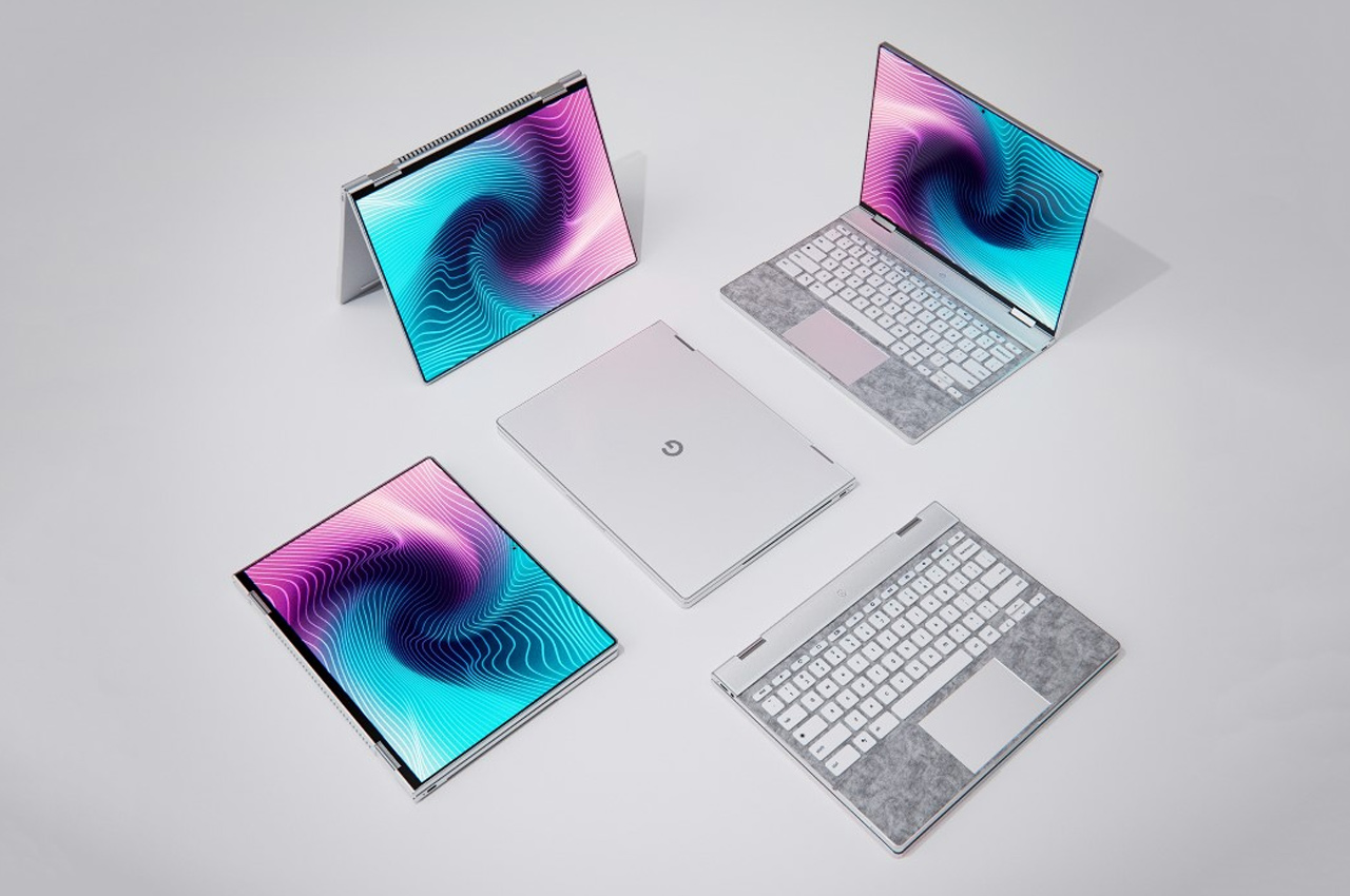
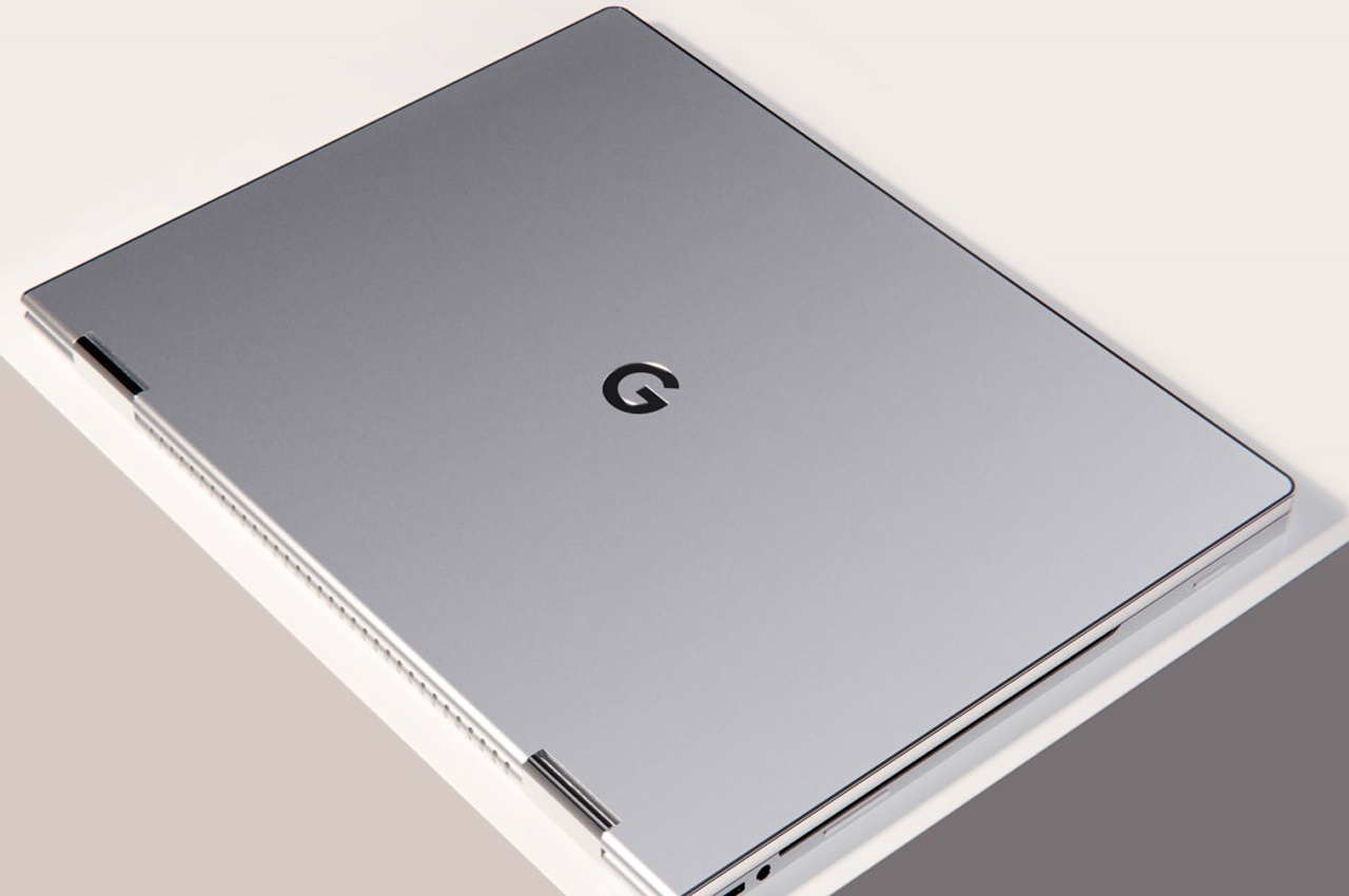
 The PixelBook Pro concept, created by India-based designer Ayush Singh Patel (who coincidentally happens to share his birthday with Google too), is an ode to the very best elements of all laptops and phones, combined into one product… If Google is a search-aggregator that finds the best results based on a query, the PixelBookPro is a Chromebook that aggregates the greatest elements of consumer tech into one well-made device. On the UI front, it feels every bit like a Chromebook – robust, reliable, great for an entire day’s worth of regular computing, but on the design front, you’ll notice that it shares the flexibility of the Lenovo Yoga series (with a similar hinge detail), the general silver aesthetic of the MacBook line (even with a silver G on the back of the screen), a flat metal edge that’s highly characteristic of the iPad Pro (and even the upcoming iPhone 12, according to rumors), an Alcantara-fabric base surrounding the keyboard as found in Microsoft’s Surface Pro, ASUS ROG-inspired cooling vents on the back, and Bang & Olufsen audio-drivers above the keys as found in HP’s Envy and Pavilion laptop series.
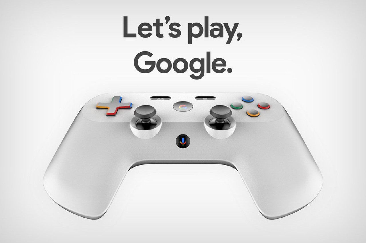
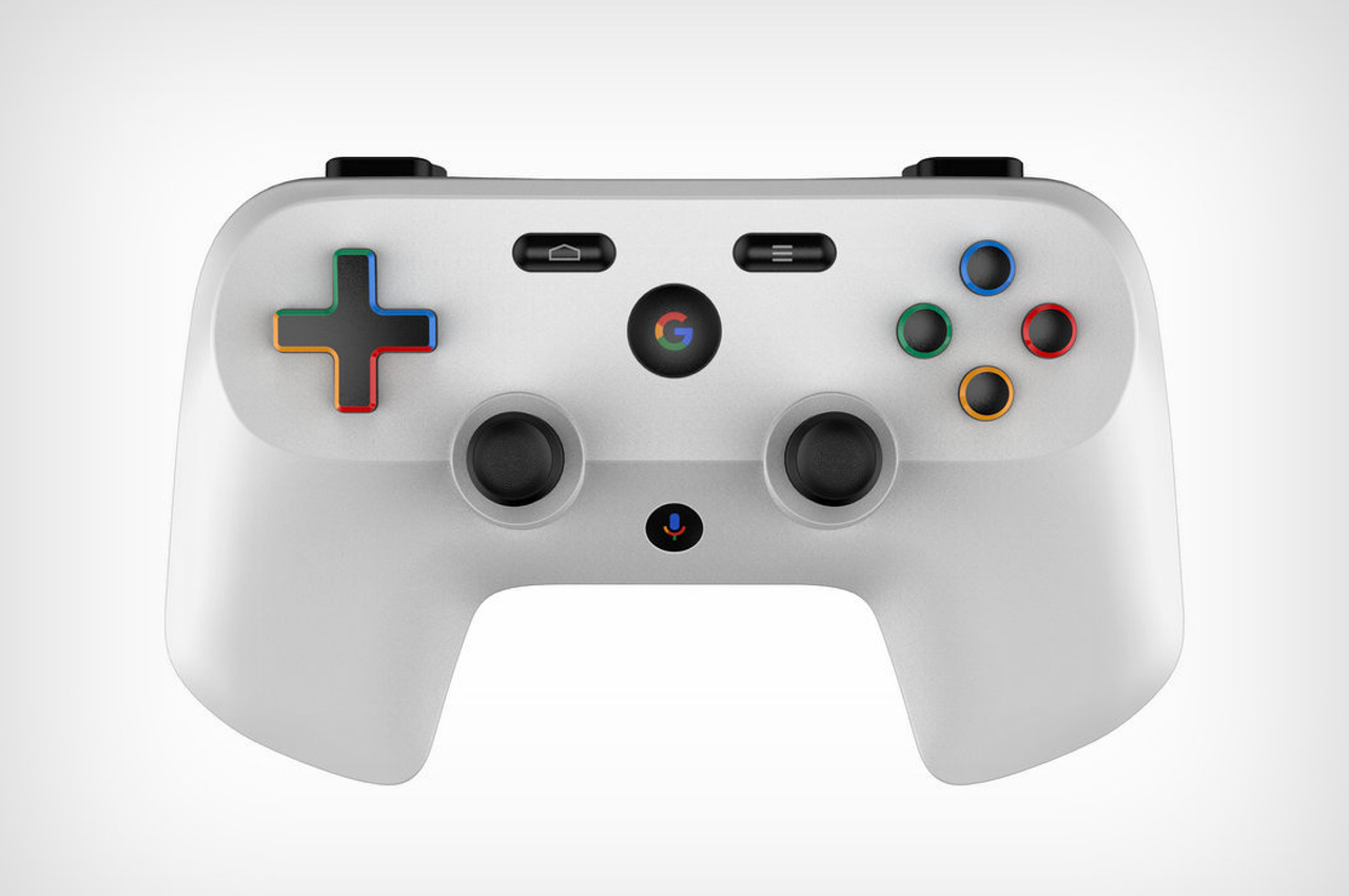
Here’s a look at the Project Stream controller, a visualized concept based on Google’s patented design… a concept, if executed perfectly, that could tank XBox and PS sales, and even kill the gaming laptop industry. The Project Stream (I made the mistake of calling it Steam a bunch of times. I wonder why Google hasn’t caught onto that glaring possibility) helps integrate quite a few community features into the gaming experience too. For starters, since you’re gaming on the cloud and having the game streamed to you in real-time, you can stream your game to other people too. The controller has a chat/voice button built into it, aside from a Stream button, home button, options button, and your regular control sticks, action keys, a directional pad, shoulder buttons, and triggers.
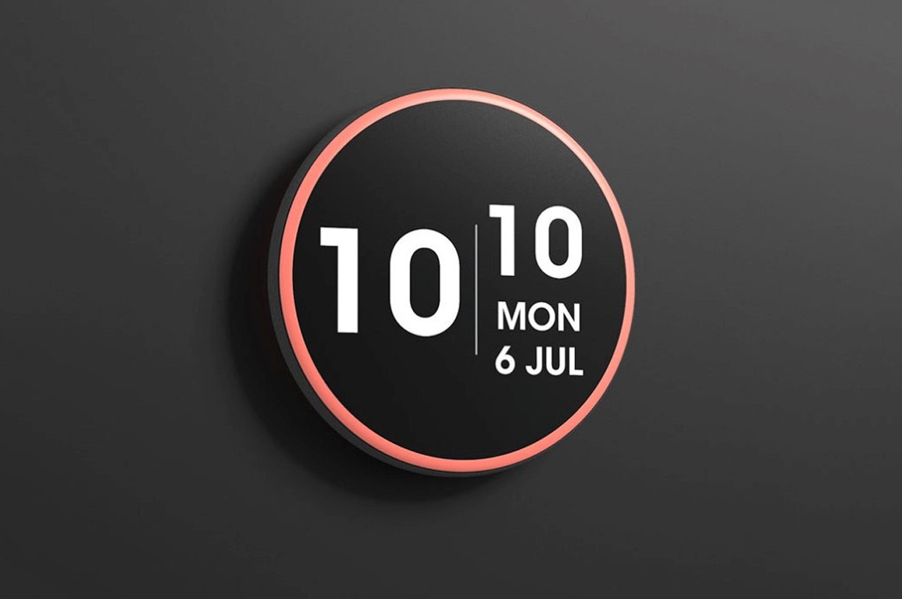
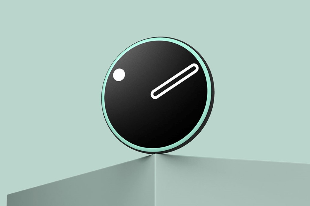
If you’ve got Google‘s slew of products around your home, there’s a lot of information you can access right at your fingertips, from the time of the day to the weather, weekly forecast, indoor temperature, your appointments, new email notification, to mention a few. The Google Nest Clock concept gives you a display to view that information on the wall of your house, offering a better alternative to browsing through your phone, or asking your Google Nest Home smart speaker and having it narrate things in audio back to you. The Google Nest Clock concept builds on the design format of the Nest thermostat, but strips away the thermostat functions and just makes it a sleek, elegant-looking clock. With a variety of clock-faces and the ability to layout crucial information for you, from the weather to what the traffic looks like on the way to work, the Nest Clock provides the experience of having a smart display you can speak of commands to.
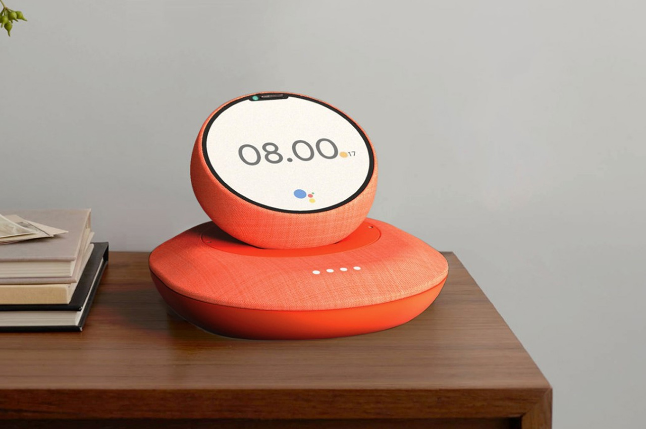
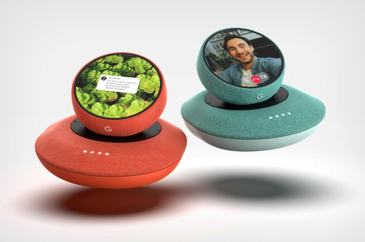
Chris Barnes’ conceptual Google device caters to the niche audience that needs connectivity the most but struggles to keep up with technology or to avoid the complications associated with advanced tech. The Google Home Phone is a fusion of the Google Home smart-speaker (now the Nest Audio smart-speaker) and the Google Pixel), but its spiritual ancestor is, in fact, the landline phone. Designed to be a smart device with a dockable receiver or ‘phone’, the Google Home Phone lets the elderly connect with their relatives and friends who are also a part of the Google ecosystem. Once set up, the Home Phone works like a smart speaker, allowing you to ask for help, access information, or contact people, while the detachable ‘handset’ functions as the receiver on a landline, allowing you to lift it off the base and talk to people, not just using audio, but using video too!
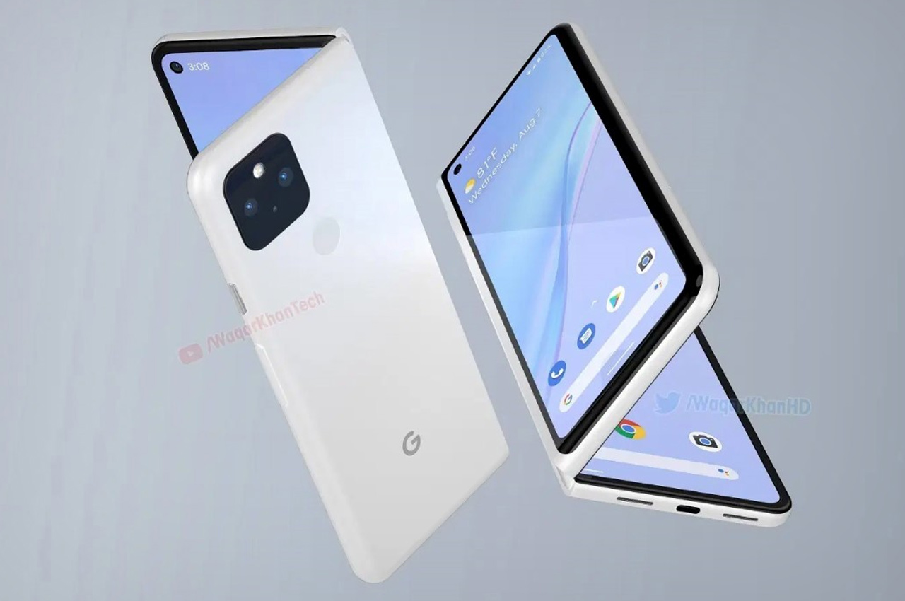
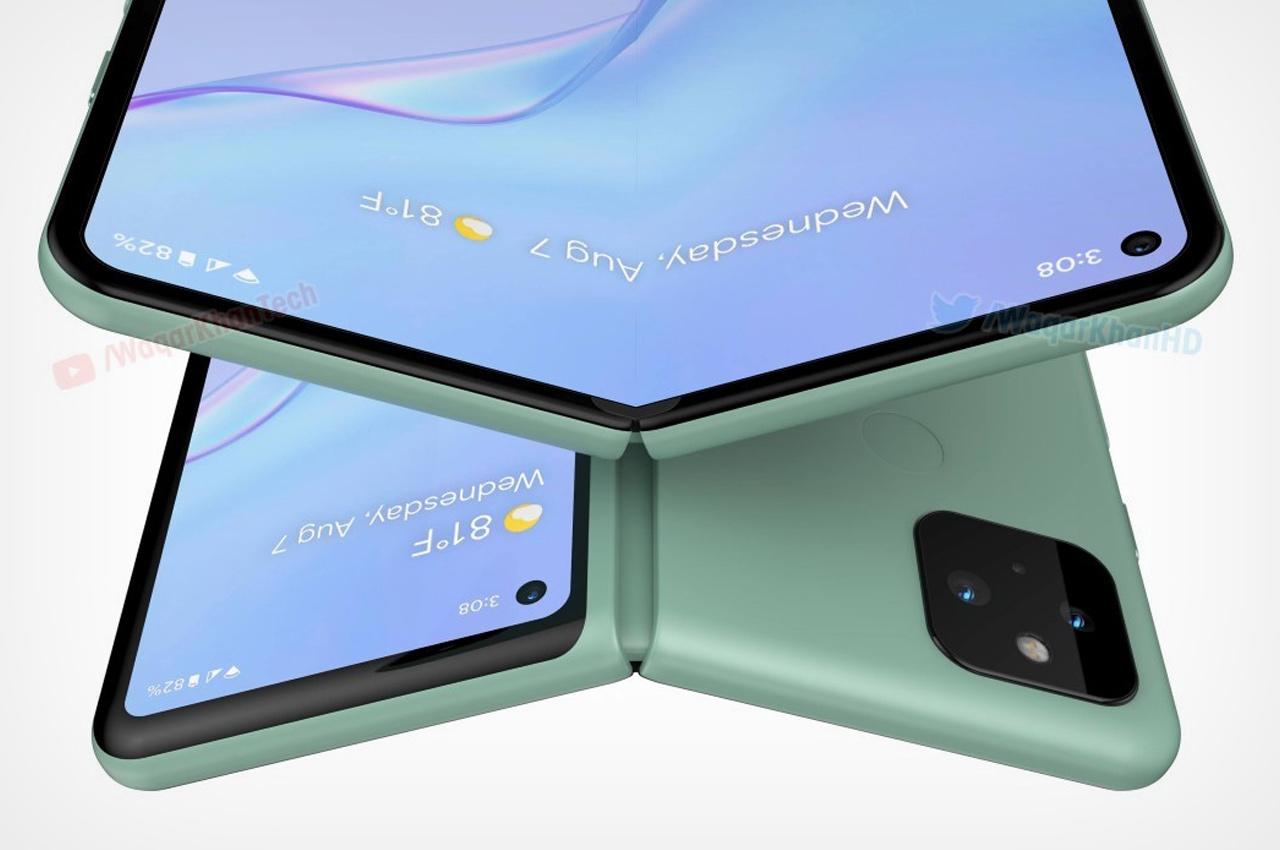
Waqar Khan’s renders give us a clue of what a folding Pixel would look/feel like. Schematically, it’s no different from Samsung’s first folding phone; although with significant developments made in the world of flexible OLED displays, maybe the ‘Pixel Fold’ could avoid the pitfalls of the Galaxy Fold that came 2 years before it. The renders show a clean matte body (like last year’s Pixel device) along with the presence of a fingerprint reader on the back. That particular detail could be a creative call on Khan’s part, given that in-screen fingerprint readers seem to be quite the norm with Android phones over the past year.
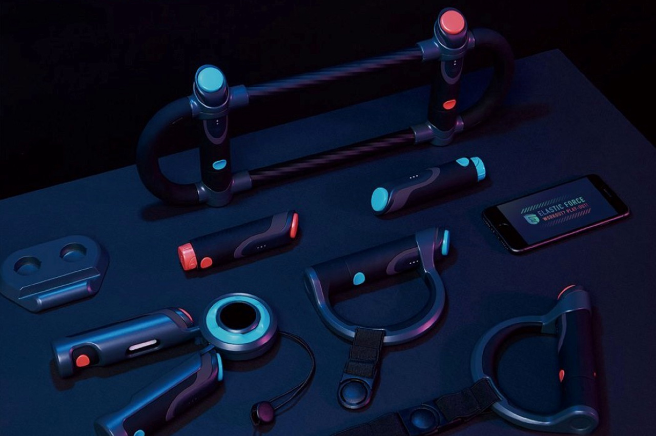
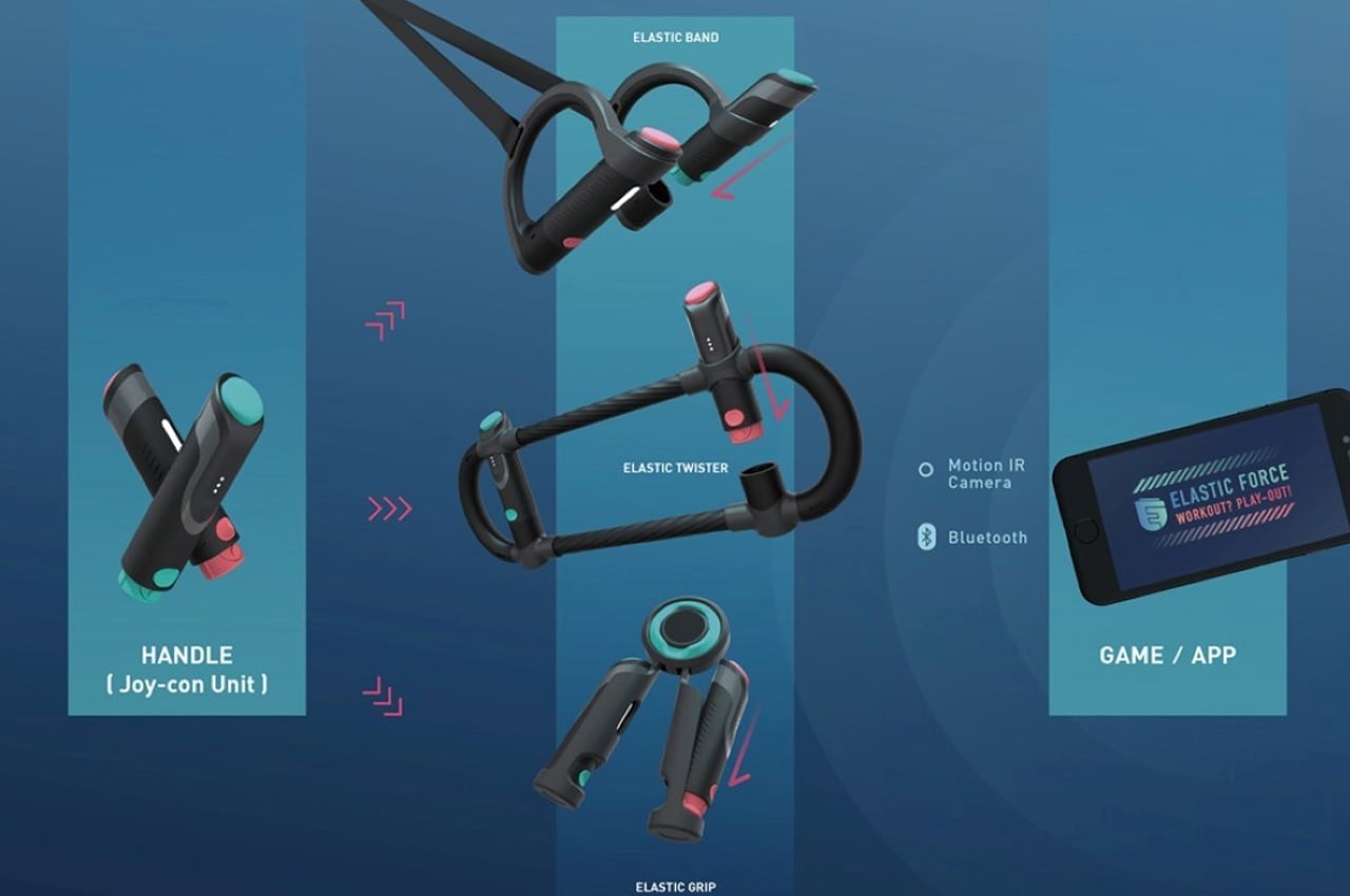
As we’re experiencing the eventual explosion of mobile gaming thanks to Apple Arcade, Google Stadia, and Xbox Game Pass, Elastic Force hopes to give mobile gaming its Wii moment. A series of accessories designed to bring physicality to digital gaming, Elastic Force relies on resistance training as a gaming control. In short, the more force you apply, the more control you exert in the game. Instead of simply mashing buttons together, Elastic Force’s accessories invite you to perform actions like pulling, lifting, twisting, and squeezing to control aspects of the game. Sure, it makes the game more difficult, but it adds a sensory element to gaming, immersing you more. Ultimately, you interact both mentally and physically with the game, exercising not just your mind and eyes but your body too… and the positive reinforcement of the game makes you enjoy it all too!
sight_01

sight_04

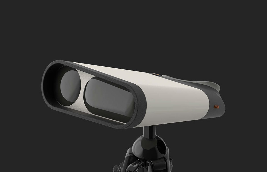
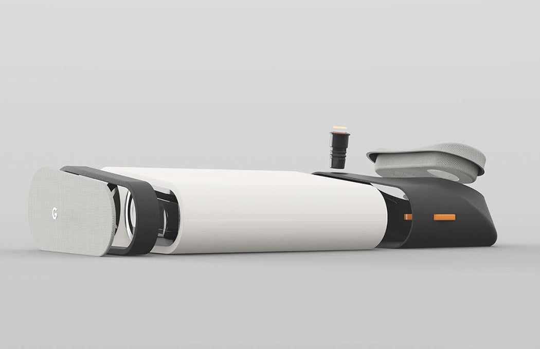
Simply called Sight, this personal telescope was inspired by Google’s existing line of sophisticated electronics. A sports a robust yet minimalistic form with expert ergonomics, including a comfortable, padded viewing eyepiece located on top rather than behind the unit. It harnesses the latest tech to optimize the magnification experience including a dual-lens system with First Light Adaptive Optics (FLAO) for enhanced clarity. In a myriad of cool color combinations including their Very Silver and Really Blue, there’s also one for every stargazer’s unique style.
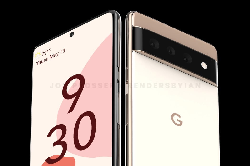
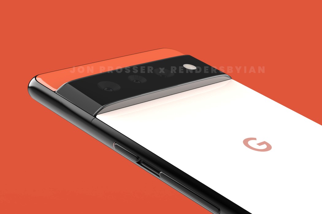
Prosser is back for yet another prediction/leak which he feels is right on point. It’s the Pixel 6 and 6 Pro, which Google is slated to release this year… with Google’s first homemade silicone chip on the inside to rival Apple’s M1, and more noticeably, a whopper of a camera bump. I wouldn’t really call this a bump because it’s so wide and protruding, it’s practically a shelf. Like I could literally place a SIM card on top of it and it wouldn’t fall off. Objectively speaking, the band protrudes at least 2-3 millimeters from the phone’s back, making it look almost like a belt or a shelf emerging from the phone. Subjectively, it kind of makes the phone look like a criminal – serves them right for stealing the ‘Pro’ nomenclature from Apple! However, that really isn’t an indictment on the phone’s design itself, it gives the Pixel a strong new character, which makes sense because this is a new era for the Pixel.
modi_light_layout

modi_light_02

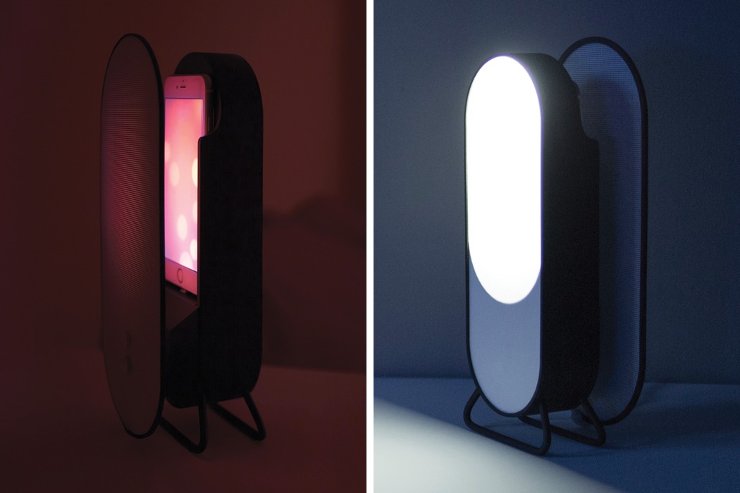
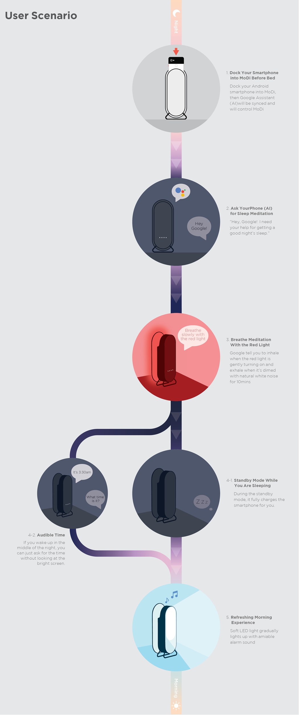
It’s called MoDi and it transforms your precious device from something that disturbed your sleep cycle into a sleep aid that combats smartphone addiction. Placed next to your bedside, you first dock your smartphone in MoDi. (Placed in its holder, the glow from the screen is diffused through a screen, creating an ambient light.) Engage the sleep system by using your voice. MoDi will guide you through a breathing meditation to put your body and mind at ease. You’ll begin to calm and slowly drift off to sleep. If you happen to wake up in the middle of the night, you can ask for the time rather than glance at a bright screen which could end up keeping you awake for hours. At your scheduled wake-up time, a soft LED will slowly brighten along with your designated alarm sound. It’s smart tech to kick off your day and help you wind down!