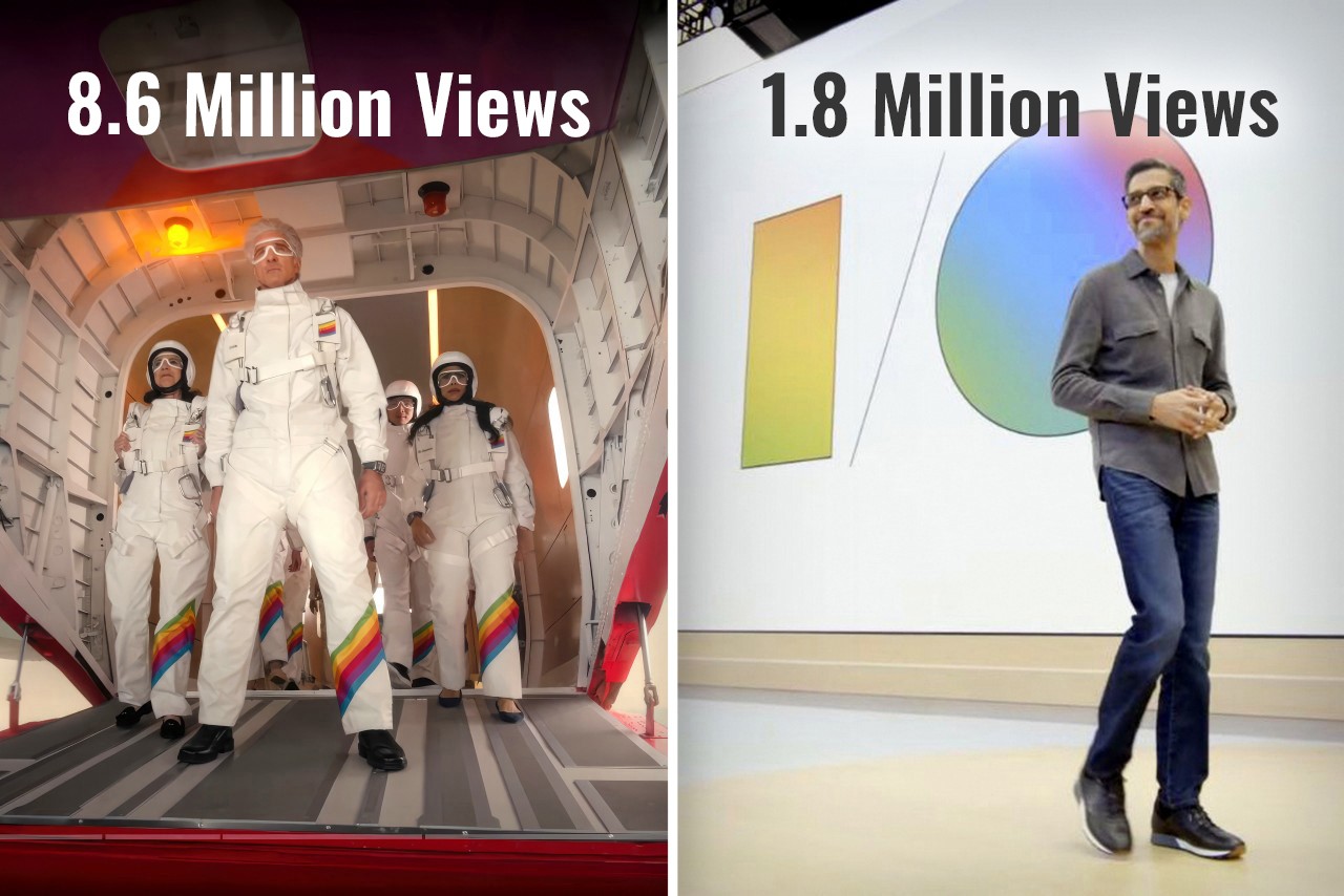
Exactly ten years ago, Google co-founder Sergey Brin jumped out of an airplane and parachuted down into a live event to present Google I/O. Cut to 2024, and Google arguably had one of the most yawn-inducing I/O events ever… but Apple, on the other hand, hat-tipped Brin by having senior VP of Software Engineering Craig Federighi jump out of a plane and parachute down into the Apple headquarters, kicking off the Worldwide Developer’s Conference (WWDC) event. If you were fortunate enough to sit through both Google’s I/O event for developers, and yesterday’s WWDC, chances are you probably thought the same thing as me – How did Google become so boring and Apple so interesting?

Google’s Sergey Brin skydiving into the I/O event wearing the radical new Google Glass in 2014
The Tale of Two Keynotes
Practically a month apart, Google and Apple both had their developer conferences, introducing new software features, integrations, and developer tools for the Android and Apple OS communities respectively. The objective was the same, yet presented rather differently. Ten years ago, Google’s I/O was an adrenaline-filled event that saw a massive community rally around to witness exciting stuff. Apple’s WWDC, on the other hand, was a developer-focused keynote that didn’t really see much involvement from the Apple consumer base. Google popularized the Glass, and unveiled Material Design for the first time, Apple, on the other hand, revealed OSX Yosemite and iOS 8. Just go back and watch the keynotes and you’ll notice how vibrant one felt versus the other. Both pretty much announced the same things – developer tools, new software versions, feature upgrades within first-party apps, and a LOT of AI… but Google’s I/O got 1.8 million views on YouTube over 3 weeks, and Apple’s WWDC sits at 8.6 million views in just one day. (As of writing this piece)
How Apple held the attention
Broadly, having seen both events, I couldn’t help but describe them differently. Google’s keynote seemed like a corporate presentation. Apple’s keynote felt like an exciting showcase. The language was different, the visuals were different, but most importantly, the scenes were different too. Google’s entire I/O was held in person, while Apple did have an in-person event, but the keynote was televised, showing different environments, dynamic angles, and great cinematography. Both events were virtually the same length, with Google’s keynote being 1 hour and 52 minutes long, while Apple’s was 1 hour and 43 minutes. Honestly, after the 80-minute mark, anyone’s mind will begin drifting off, but Apple did a much better job retaining my focus than Google. How? Well, it boiled down to three things – A. a consumer-first approach, B. simplified language, and C. a constant change of scenery.
Notice Apple’s language throughout the presentation, and you’ll see how the entire WWDC rhetoric was user-functionality first, developer-feature second. Whether it was VisionOS, MacOS, iOS, WatchOS, iPadOS, or even TV and Music, Apple’s team highlighted new features that benefit all Apple users first, then mentioned the availability of SDKs and APIs to help developers implement those features in their apps too. One could argue that a Worldwide Developer Conference should inherently be developer-first, but hey, developers are going to watch the keynote regardless. The fact that 8.6 million people (mostly Apple users) watched the WWDC keynote on YouTube shows that Apple wanted to make sure users know about new features first, then developers get their briefing. The fact that a majority of viewers were users also boils down to Apple’s language. There was hardly any technical jargon used in the Keynote. No mention of how many teraflops are used by Apple’s GPUs while making genmojis, what version number Sequoia is going to be, or what Apple Intelligence’s context window is, or whether it’s multimodal. Simple language benefits everyone, whether it’s a teenager excited about new iMessage features, a filmmaker gearing to make spatial content using iPhones or Canon cameras, or a developer looking forward to building Apple Intelligence into their apps. Even Apple Intelligence’s user-first privacy features were explained in ways everyone could understand. Finally, Apple’s production quality helped visually divide the keynote into parts so the brain didn’t feel exhausted. All the different OS segments were hosted by different people in different locations. Craig Federighi and Tim Cook made multiple appearances, but shifted locations throughout, bringing a change of scenery. This helped the mind feel refreshed between segments… something that Google’s in-person keynote couldn’t benefit from.
Where Google dropped the ball
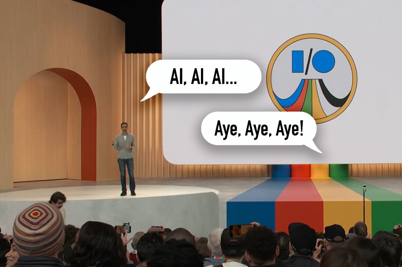
A keynote that’s nearly 2 hours long can be exhausting, not just for the people presenting but also for the people watching. Having the entire keynote on one stage with people presenting in person can feel exactly like an office presentation. Your mind gets exhausted faster, seeing the same things and the same faces. Google didn’t announce any hardware (like they’ve done in past years) to break the monotony either. Instead, they uttered the word AI more than 120 times, while being pretty self-aware about it. The lack of a change of scenery was just one of the factors that made Google’s event gather significantly fewer eyeballs.
Unlike Apple’s presentation, which had a very systematic flow of covering each OS from the more premium VisionOS down to the WatchOS, Google’s presentation felt like an unplanned amalgamation of announcements. The event was broadly about three things – Google’s advancements in AI, new features for users, and new tools for developers – but look at the event’s flow and it feels confusing. I/O started with an introduction where Pichai spoke about multimodality and context windows, then progressed to Deep Mind, then to Search (a user feature), then Workspace (an enterprise feature), then Gemini (a user feature again), then Android (which arguably was supposed to be the most important part of the event), and then to developer tools. An Android enthusiast wouldn’t be concerned with DeepMind or Google Workplace. They might find Search interesting, given how core it is to the Google experience, but then they’d have to wait through 2 more segments before the event even GOT to Android. Search and Gemini are highly intertwined, but they weren’t connected in the keynote – instead, there was an entire 13-minute segment on Workplace in between.
If all that wasn’t fatiguing enough, Google’s I/O tended to lean into technical jargon describing tokens, context windows, and how the multimodal AI could segment data like speech and videos, grabbing frames, finding context, eliminating junk data, and providing value. There was also a conscious attempt at showing how all this translated into real-world usage, and how users could benefit from this technology too, but not without flexing terms that developers and industrial-folk would understand.
Although it’s natural to read through this article and conclude that one company did ‘a better job’ than another company, that isn’t really the case. Both Apple and Google showcased the best they had to offer on a digital/software level. However, the approach to these keynotes has changed a lot over the last 10 years. While Google’s I/O in 2014 had a lot of joie de vivre, their 2024 I/O did lack a certain glamor. Conversely, Apple’s WWDC had everyone at the edge of their seat, enjoying the entire ride. Maybe you got tired towards the end (I definitely did mid-way through the Apple Intelligence showcase), but ultimately Apple managed to deliver a knockout performance… and that’s not me saying so – just look at the YouTube numbers.
The post What Apple’s WWDC got right… and what Google’s I/O got wrong first appeared on Yanko Design.


 Now that enough people have completed a special puzzle, Google announced that its annual developer event will return to the Shoreline Amphitheatre in Mountain View. Google I/O will run from May 12th - 14th, a few days later than its timing in 2019. I...
 When Francesco Grilli and his peers were working on the 4G standard, they had a few ideas as to what the popular use cases might be. Video calls over the internet, perhaps, or rich messaging content, they thought. "In the end, none of that really hap...
 Every year, Android gets a chance to reinvent itself on smartphones with new features and new design flourishes. The same can't be said of Android Auto, Google's phone-powered in-car interface: It's tremendously helpful for drivers, and its feature s...
 A better, faster, stronger Google is in store for 2019. During its I/O developer conference on Tuesday, the company unveiled dozens of updates to every corner of the Google ecosystem; from search and Google Assistant to the next generation of Android...
