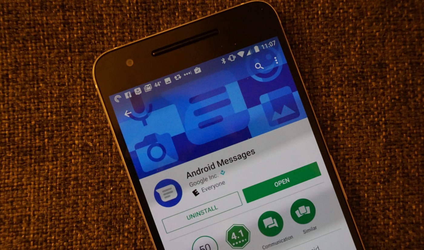
 Despite how common texting is, its integration on Android has always lagged slightly behind, as Google appeared to focus on other things. Sometimes it wrapped the feature into other services/apps like Google Voice and Hangouts, but lately, the main A...
Google’s Android texting app has a new name
 Despite how common texting is, its integration on Android has always lagged slightly behind, as Google appeared to focus on other things. Sometimes it wrapped the feature into other services/apps like Google Voice and Hangouts, but lately, the main A...

