The quirky calendar designs of 20 A’ Design Gold Award-winning Katsumi Tamura

Lauded as the most awarded designer on the A’ Design Award roster, and even sitting on top of the World Designer Ranking with 13 Platinum Awards, 20 Golden Awards and as many as 44 awarded designs bringing his total to 218 points, Katsumi Tamura is a multiple award-winning Professional Designer from Tokyo / Japan specialized in Graphic Design. Tamura’s design awards go to his quirky calendars that don’t just sit on your desk, they adorn it. With a playful demeanor and an eye-catching appeal, Tamura’s calendars are functional works of art. Styled as everything from furniture to animals, to even buildings, Tamura’s calendars are designed to be interactive. They don’t just sit on your table for an entire year before being replaced with a new calendar. They add beauty and fun to your workspace, they encourage you to engage with them, examine them from all angles, and even show them off to other people.

With 44 A’ Design Awards among many other prestigious awards (including Red Dot, iF, and IDA Awards) under their belt, Tamura’s body of work really speaks for itself. His explorations with paper and the ability to turn something as mundane as a calendar into an objet d’art is remarkable. Tamura’s company good morning inc. has seen its fair share of exposure, courtesy these multiple awards. Scroll down as we dip into Tamura’s take on how to reimagine looking at dates on a piece of paper. Whether it’s Tamura’s laser-like focus in his domain, or Dr. Hakan Gursu‘s ability to span different design categories, A’ Design Awards provides a brilliant amount of diversity, catching projects from all walks of life, across countries, cultures, and design backgrounds. You can read more publications on the A’ Design Award by clicking here.

Click Here to submit your entries for the A’ Design Awards 2019-20 program! Last day to submit your work is the 28th of February!

Designer: Katsumi Tamura


The 2018 Tri-Leg Calendar by Tamura involves interlocking triangles that form a tripod-esque design that can either stack into one another, sit independently, or be propped vertically like a tall tower. The choice is yours!


The 2013 Town Calendar looks at architecture for inspiration, turning your days into a literal diorama.


The 2013 Rocking Chair calendar is one of my favorites! It uses the month-cards in a unique way where the passive cards sit where your cushion would be, while the active card rests against the structure to form the backrest, and face you as you look at it. You could try giving the rocking chair a push too!


The 2018 Puzzle Calendar uses various cuts in circular, triangular, and square-shaped cards to create a game where you can go wild by creating your own structural calendar. Just like each month is different, and your year is different from someone else’s, your calendar is unique too!


The 2012 Zoo Calendar takes your favorite animals from the zoo and transforms them into months on a calendar, turning your desktop into an urban attraction! We won’t judge you if you play with them while no one’s looking. We promise.


The 2013 Module Calendar is both fun and self-explanatory. It provides a framework for building your own vertical towers, much like LEGO. Create blocks or skyscrapers… the choice is yours.


The 2015 Arc Calendar was created for the YUPO corporation using their environmentally friendly synthetic YUPO paper, which is known for its remarkable color-representation properties. The calendar is printed on a single sheet and folded (no glue required) to form an arc-shaped design that introduces depth to create a foreground, middle-ground, and a background, making each month look like a 3D landscape.


The 2013 Farm Calendar builds on the success and the cute-appeal of the 2012 Zoo Calendar. It takes inspiration from various farm animals, realizing them into standing 3D prototypes with the month information etched on each animal’s torso. Don’t miss the adorable barn that comes with the set!


The 2018 Swing Calendar is perhaps the most inventive of the set, featuring an actual swing made out of paper. It relies on the same format as the 2013 Rocking Chair Calendar, but explores a type of furniture that is truly more eye-catching. And yes, you can interact with and push this one too!


The 2018 Windmill Calendar requires a bit of periodic assembly, with four fan blades that have the months printed on each of them. Rotate the windmill’s fan to make sure the active month’s blade is upright and easy to read. Give the fan a 90° rotation every month, and at the end of 4 months, just replace the fan element with another one that has the next set of months printed on it. It would make for a great desktop showpiece, wouldn’t it??

Click Here to submit your entries for the A’ Design Awards 2019-20 program! Last day to submit your work is the 28th of February!

Showcase your markers in a compact design that keeps you organized

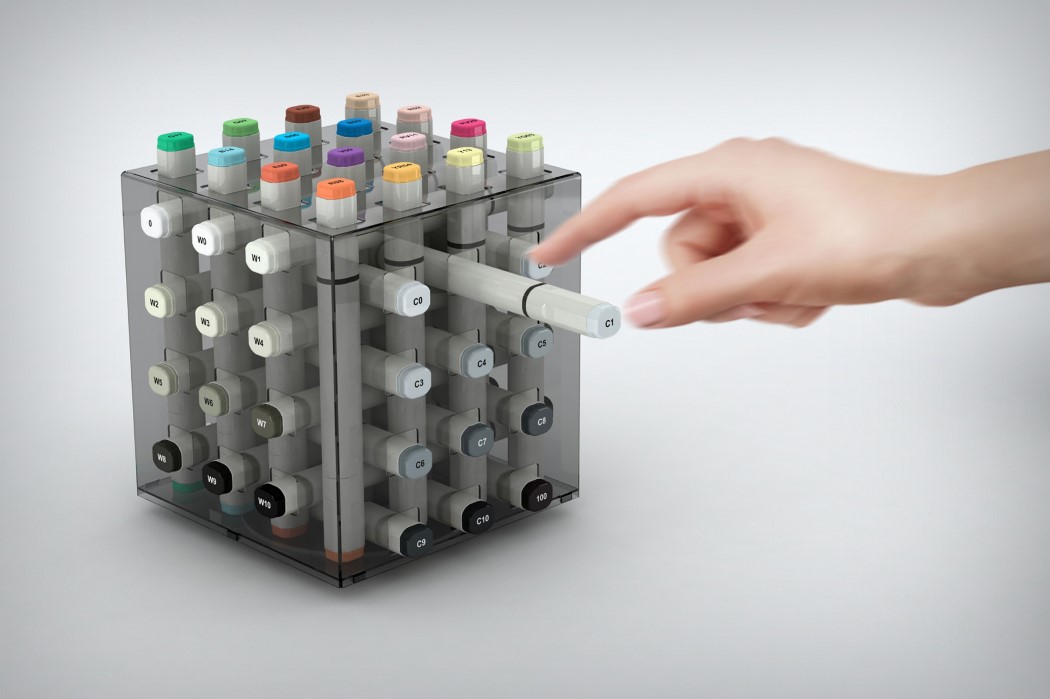
I can’t honestly grasp how I don’t have this in my workspace already. Just a simple tinted transparent acrylic cube, the Fume acts as a rather beautiful pen-stand for your alcohol markers (something designers swear by). Its design doesn’t just have them laid out in an interesting format, it even allows you to segregate them by hue into three zones… One for color, one for warm grays, and one for cool grays. Love!
Designer: Hakan Gürsu of Designnobis

“Through its rotating feature, one can reach every marker pen easily and pull them out to use. After using the pen, it can be placed back to a desired outlet by either vertically or horizontally. Being a package at the same time, the stand can restore 40 marker pens at a time,” Gürsu told Yanko Design.

Owl be there for you!

owl_bits_1

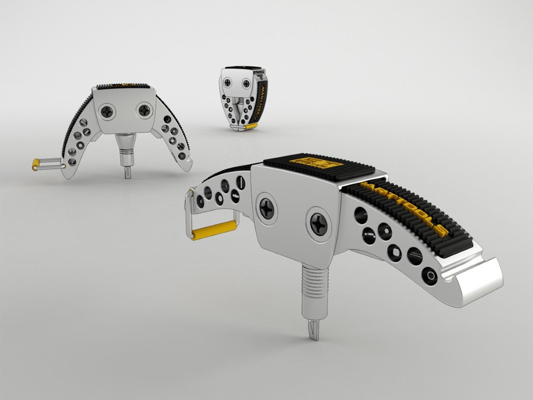
It’s rare that EDC or multitools get described as cute, so the Owl Bits is a rare, lovable case-study in ‘cute multi-tool design’.

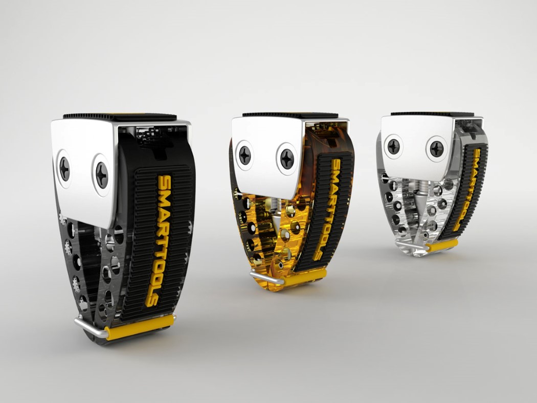
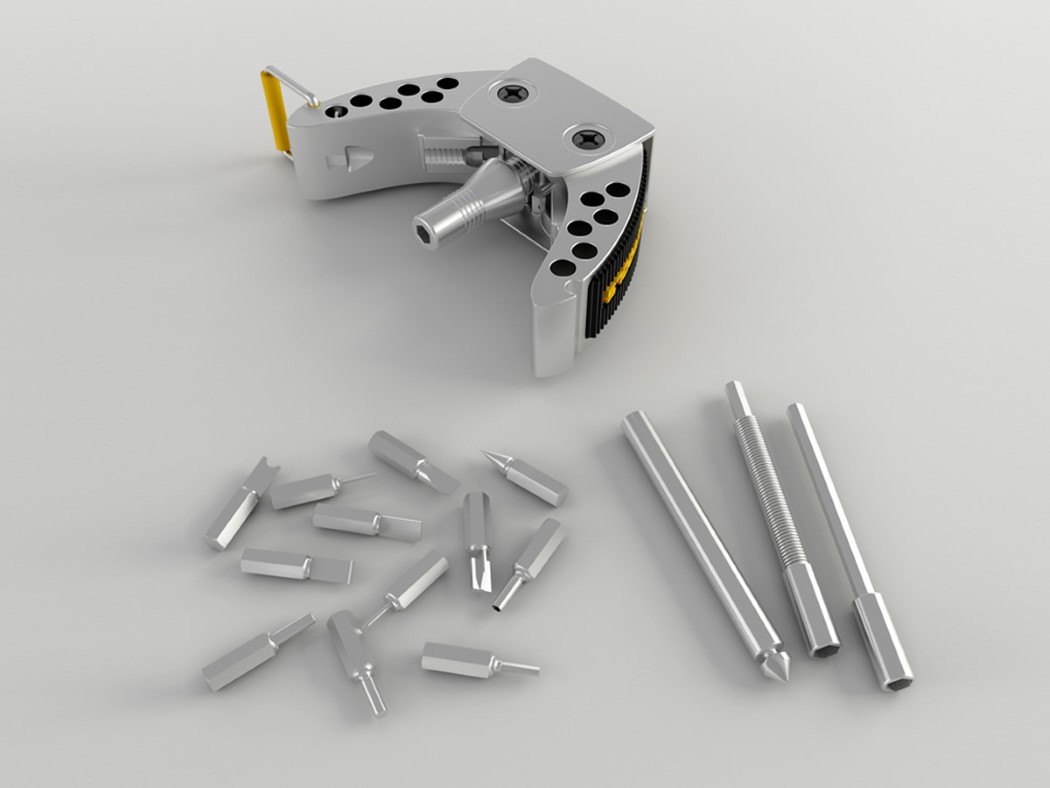
The bird-inspired form comes with two wings and big eyes that serve as hinges for said wings. Open the wings out and you’ve got yourself a screw-driver that’s easy to rotate, thanks to its perpendicular grip. The wings come with multiple screw-bits inside them that can easily be removed and docked in place where you’d imagine the owl’s feet to be.

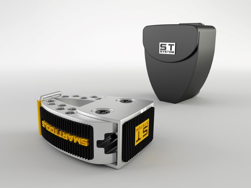
Crafted from stainless steel, plastic, and built with rubber grips, the Owl Bits comes in a compact design that occupies no more space than a measuring tape. It comes with its own carrying case too that packs hex sockets as well, making this avian species quite the mechanic’s best friend!

Designer: Hakan Gursu (Designnobis)

owl_bits_2

owl_bits_3

owl_bits_4

owl_bits_6

owl_bits_5

A’ Design Award Spotlight: The designs of Hakan Gürsu

Dr. Hakan Gürsu of Designnobis (Ankara, Turkey) stands at the top of the World Designer Rankings with 281 points from the 75 Awards and 8 Runner-up Awards he’s secured at the A’ Design Awards and Competition over the past 7 years. His awarded works have even been responsible to a great extent for putting his country Turkey at the 5th position in the World Design Rankings.

Over the years we’ve talked about the kind of exposure the A’ Design Awards can get your work, and there’s no better example than Dr. Gürsu. We’ve seen and covered a portion of Dr. Gürsu’s work and we continue to do so every year. He secured 5 Awards last year, 8 in the year before that, and a staggering 16 A’ Design Awards in 2014. The A’ Design Award and Competition has been a significant contributor to his successful career and has helped get his designs and innovations noticed all around the world!

Hakan’s awarded works span various categories, from stationery, to social design. From home appliances to makeshift homes… and this really goes to show the diversity and range of the A’ Design Award and Competition. Ranging from concept to actual product, the A’ Design Award and Competition welcome all kinds of entries across their vast span of categories. Below is a small round-up of our favorites from Dr. Gürsu’s award winning body of work. We hope this inspires you to create award-winning work for yourself and your country too!

Click here to Register Now and get your design evaluated for the 2017-18 A’ Design Award and Competition by submitting your entries!

01. Satellite Grater
adesign_hakan_1

adesign_hakan_2
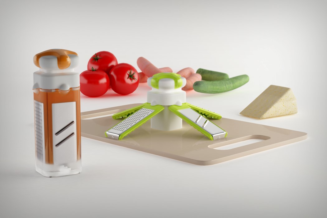
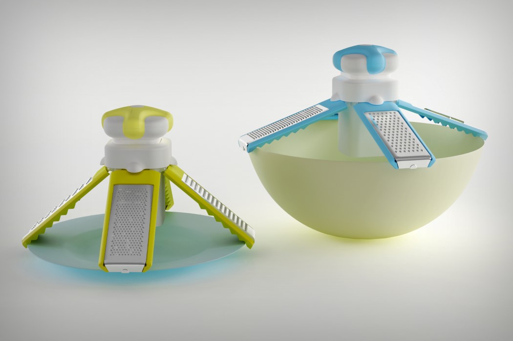
Inspired by the satellites we send into the cosmos, the Satellite Grater’s design integrates various blades into its four legged design that when opened, stands on a work-surface, or can easily rest on a bowl or plate. When closed, the entire grater fits into a chic looking box and additional blades get stored in the hollow space between the four legs. Individual blade plates are detachable and can be washed separately, making the entire storage and maintenance process a dream!

02.Fume Marker Pen Stand and Package
adesign_hakan_3
I can’t honestly grasp how I don’t have this in my workspace already. Just a simple tinted transparent acrylic cube, the Fume acts as a rather beautiful pen-stand for your alcohol markers (something designers swear by). Its design doesn’t just have them laid out in an interesting format, it even allows you to segregate them by hue into three zones… One for color, one for warm grays, and one for cool grays. Love!

03. Tentative Post Disaster Tent
adesign_hakan_4

adesign_hakan_5
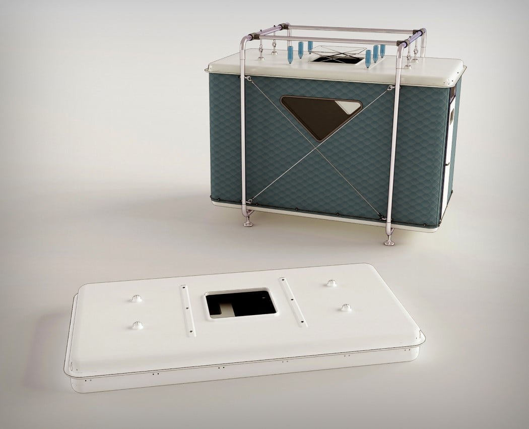
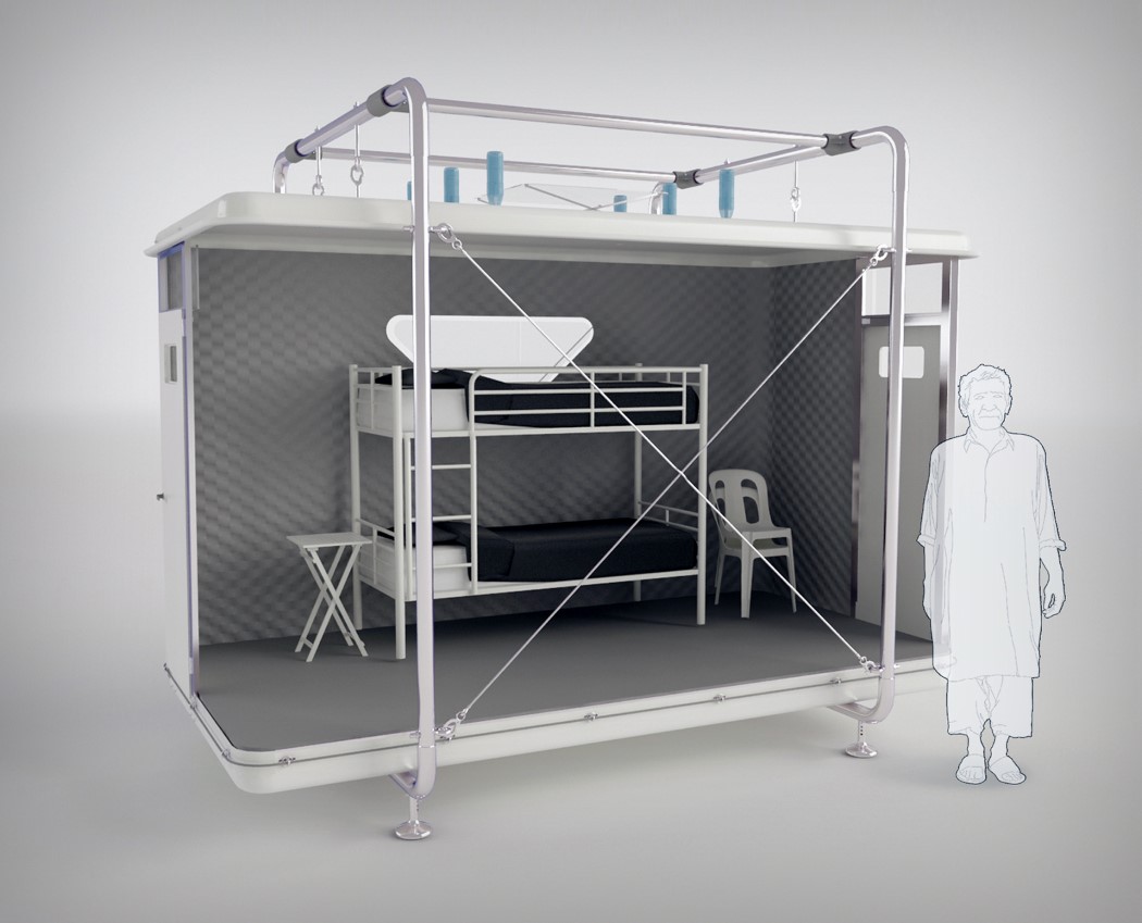
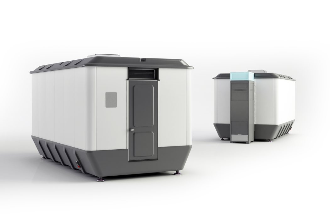
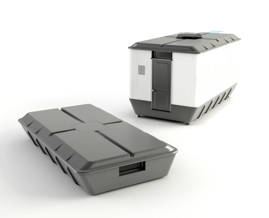
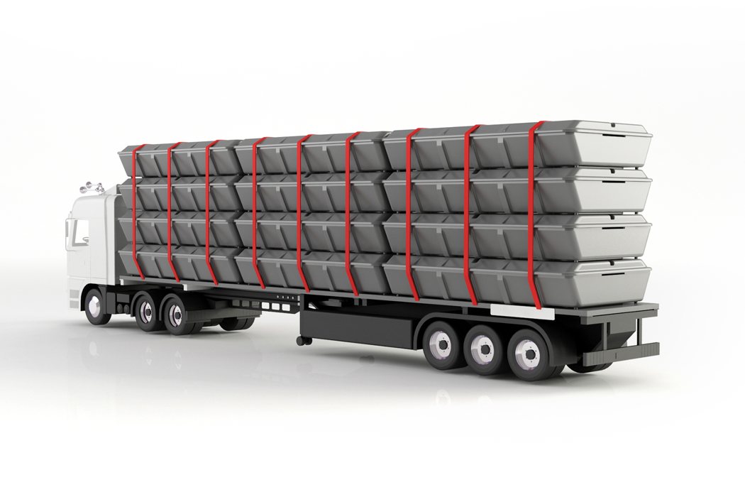
Inspired after earthquakes in Turky, by the need to have a shelter that can be rapidly deployed and set up, Hakan developed the Tentative Post Disaster Tent. Designed to comfortably house two adults, or even a small family of 3-4, the tent comes in a collapsible flat-pack design that makes for easy transportation. In fact, a single semi can carry north of 24 of these units. The tent comes with collapsible furniture all stored inside it and can be assembled (by means of a metal exo-structure) in a matter of minutes.

04. Shelter Pack Post Disaster Shelter
adesign_hakan_6
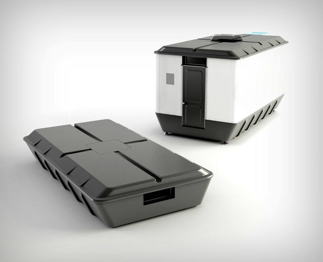
The Shelter pack builds on the previous concept. It’s slightly thicker, but this allows it to be assembled without the need of a metal outer structure. Plus, the Shelter Pack even comes with a tiny bathroom of its own! You can read our original article on the Shelter Pack here.

05. Lollypop Pencil Sharpener
adesign_hakan_7

adesign_hakan_13
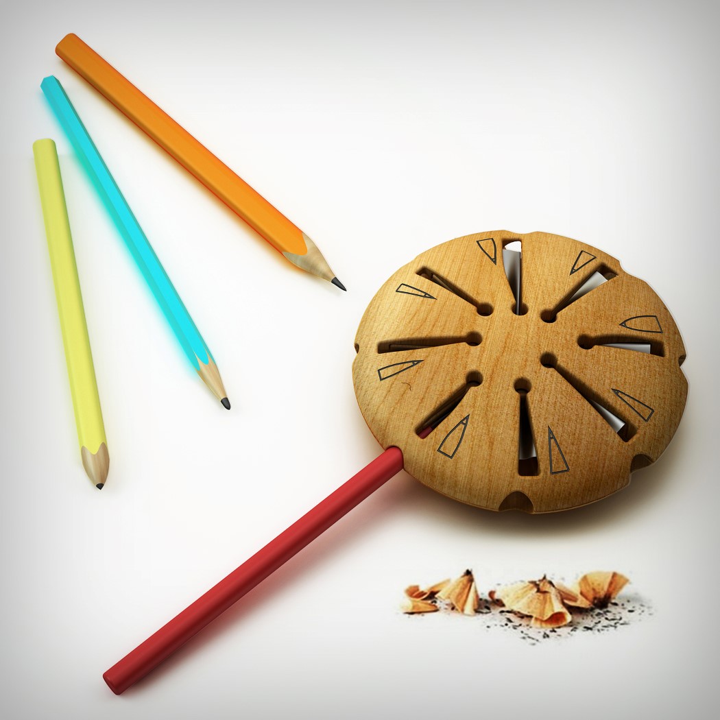
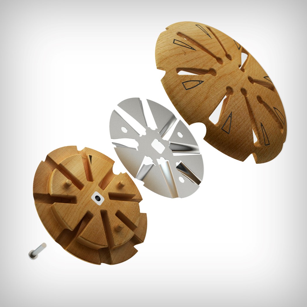
The Lollypop Sharpener certainly does look fun and unique. Designed to, well, look like a lollypop when you put the pencil inside it, the sharpener comes with a sheet metal ring comprising several different designs for people who want to sharpen their pencils in different contours. Boy, I’d love to try this!

06. Panfold Camping Pan
adesign_hakan_8

adesign_hakan_14
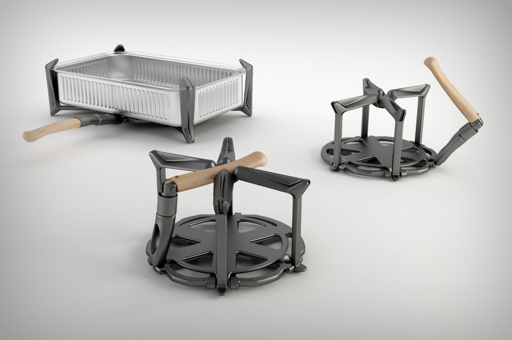
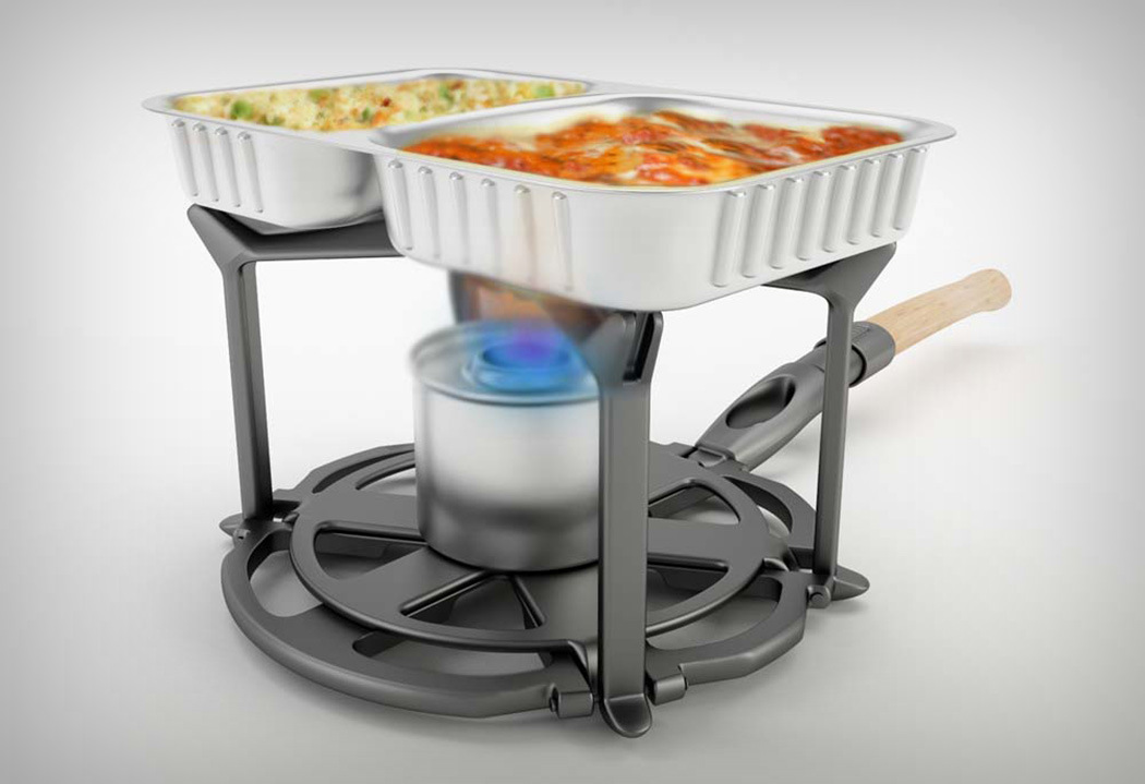
Made to be a dually-useful portable cooking solution, the Panfold is an innovative, portable cookware system that makes preparing hot meals easy from anywhere. The design consists of an aluminum alloy cast body, foldable legs, locking ring and foldable wooden handle while using aluminum foil box as a food carrier. You can either use it as a pan for a larger aluminum box, or even as a miniature stove-top for small boxes. Pretty neat, right?

07. Steam Tea Maker
adesign_hakan_9
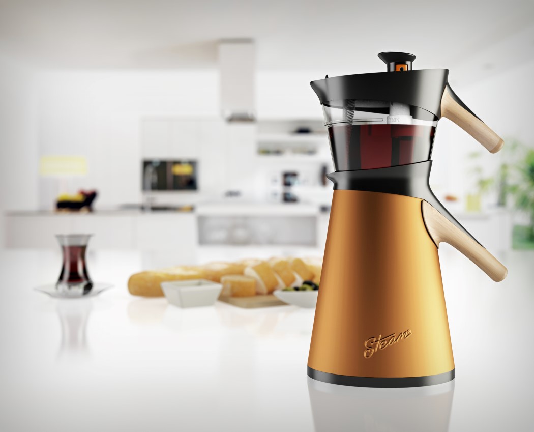
Rather than brewing tea the regular way, the Steam tea maker uses two vertically stacked kettles to brew tea. How does it do that? It uses a lower kettle (filled with water) to heat the upper kettle, while steam from the lower kettle travels upwards into the transparent upper brewing kettle. The condensate from the steam then brews the tea leaves for a full-flavored brew. Once you reach your desired strength/color, just press a switch on the top to prevent more steam from seeping in. The transparent upper container makes it easy to monitor your brew while together with the lower kettle, it adds an element of flair to the kitchen!

08. Restpoint Airport Seating
adesign_hakan_10
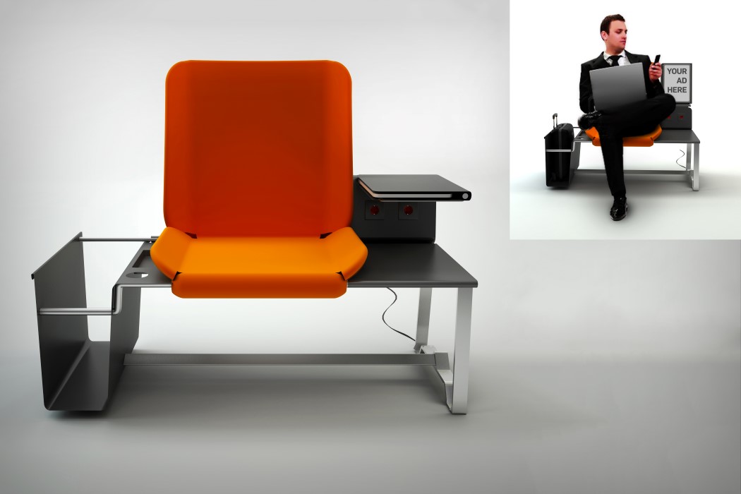
I’d look forward to long airport waits if the Restpoint were around. Designed not as seating but specifically as seating for an airport, the Restpoint makes it easier and more convenient to wait for your flight. A seat with a backrest allows you to rest your weary body while a slide-in compartment lets you stow away your cabin luggage safely right beside you. What sweetens the deal is the mini workspace complete with plug-points to your left, so you can quickly shoot out those important mails and presentations before getting on your flight!

09. Mini ST Toolset
adesign_hakan_11
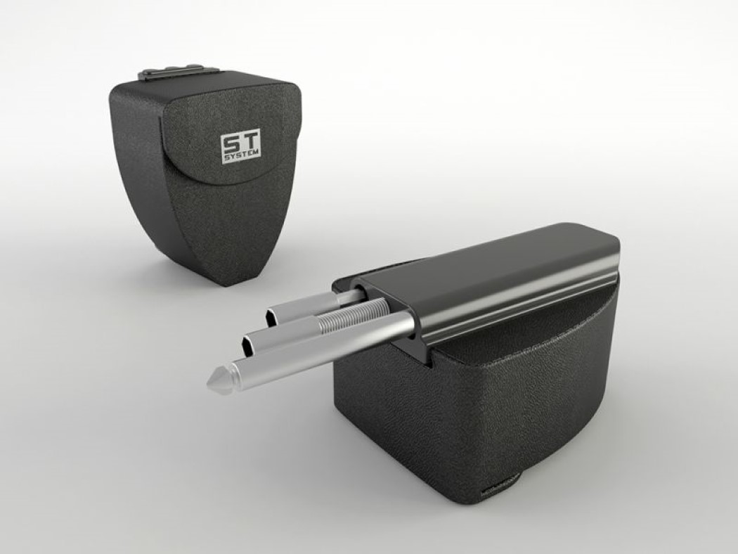
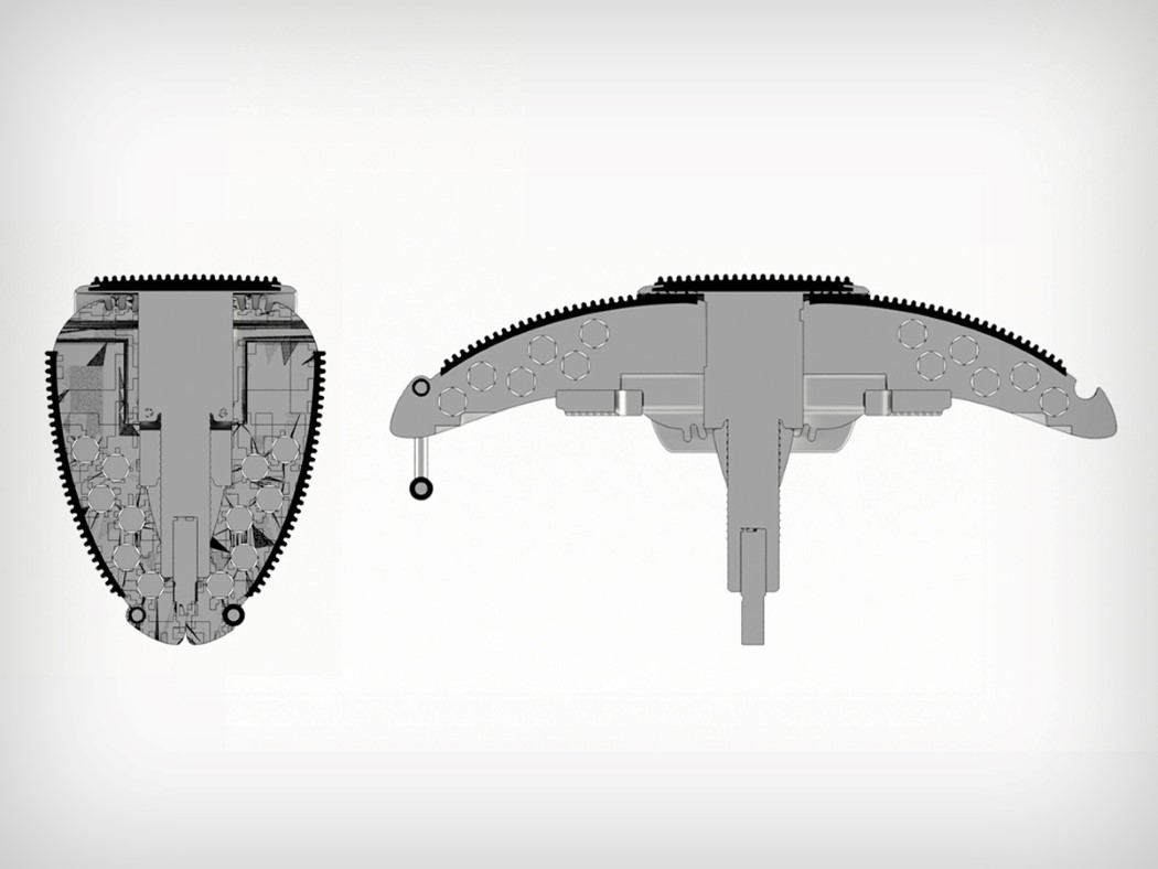
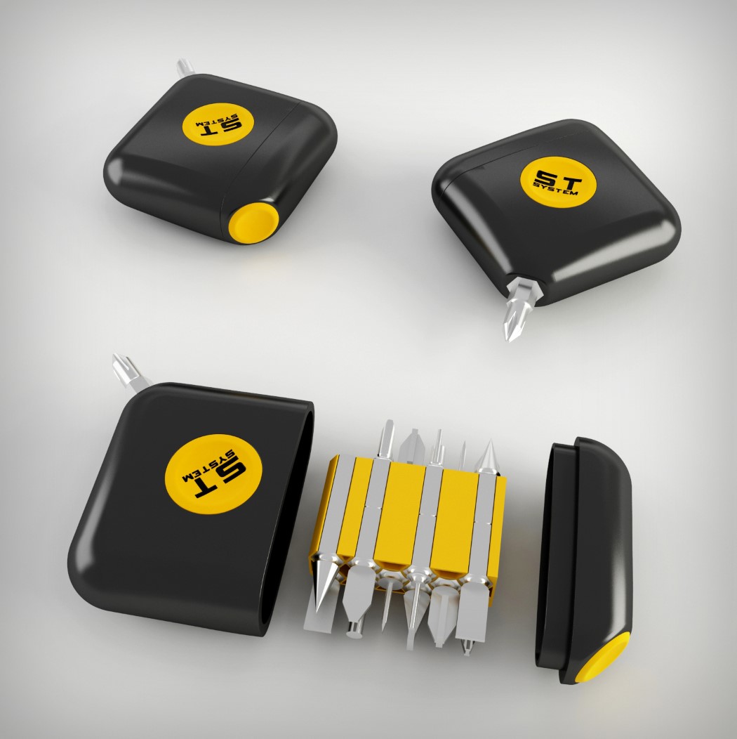
Quite the handy little tool-set is the Mini ST. Armed with just the correct heads, the tool set comes as small as a measuring tape and can fit right into your pocket. The good thing is its shape, that makes a great handle when you attach a head to a corner. Why’s that? Because its flat design is much easier to rotate than your conventional cylindrical handles.

10. Taxi Station
adesign_hakan_12
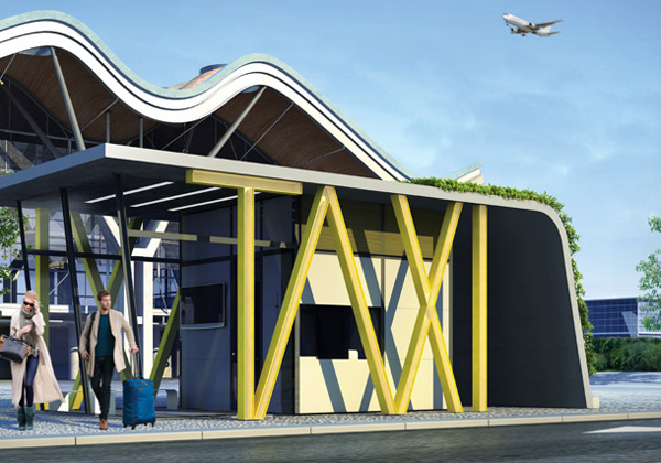
There’s a little bit of humor behind the design of the Taxi Station. Its starkly obvious design stems from various failed attempts at getting taxis to stop. I for one have tried everything from screaming TAXI at the top of my lungs, to flailing my arms around like a complete lunatic. The tragedy is that sometimes all of that goes unnoticed (which is what made Uber such a favorite for me). However, the Taxi stand’s glaringly obvious lighting that spells out TAXI is bound to catch any taxi driver’s eye. Now maybe I can avoid getting tennis elbow in my enthusiastic attempts at catching cabs.

You can view all of Hakan’s winning work on his A’ Design Profile here. Click here to view all winning designs from A’ Design Award and Competition!

Tea for Two!

reverence_tea

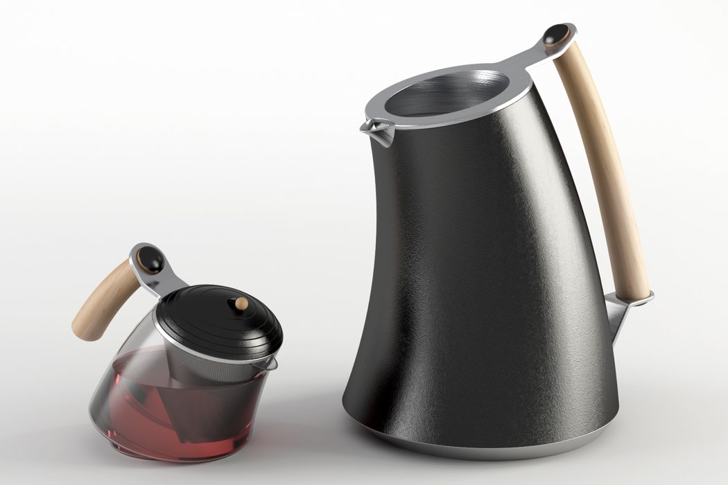
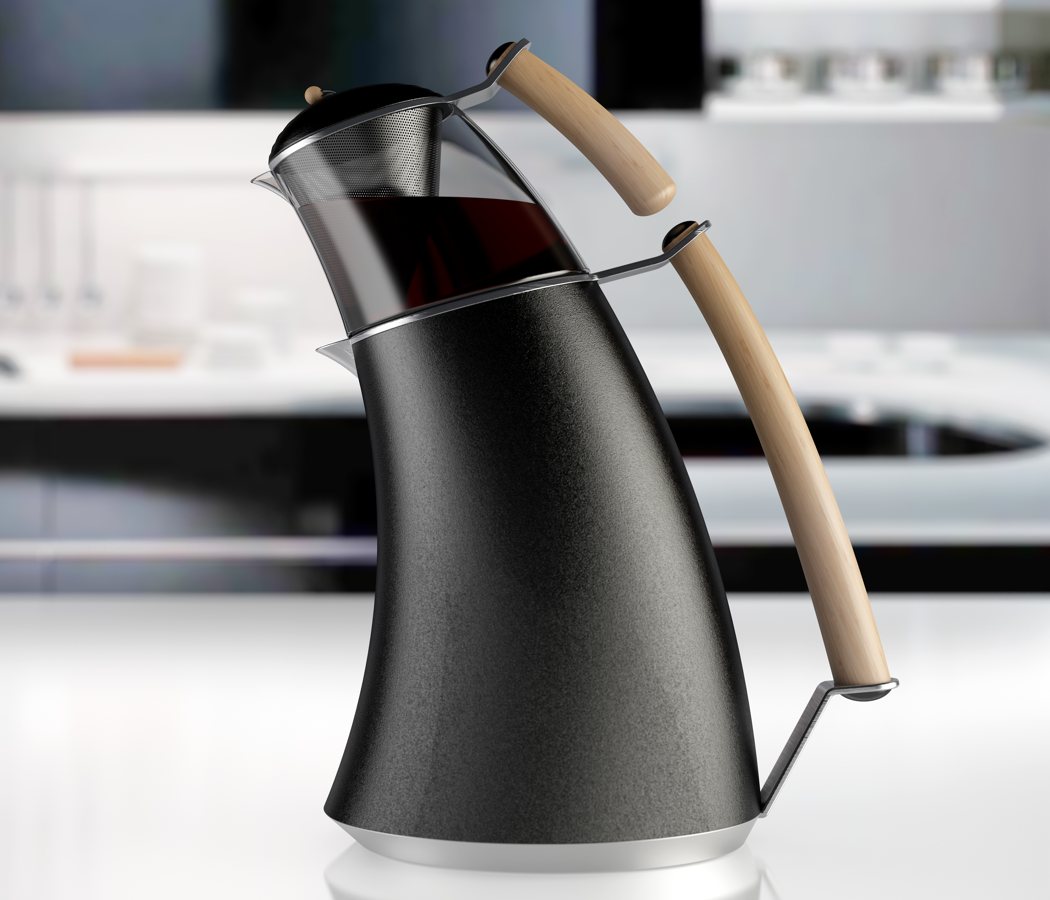
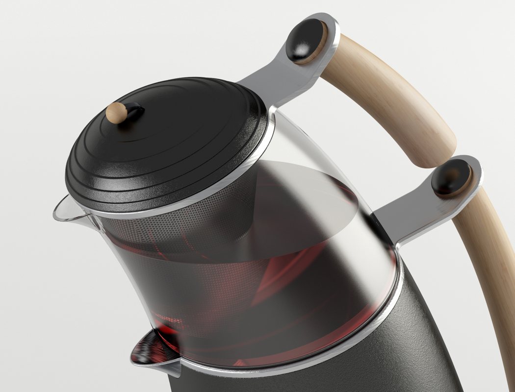
The Reverence tea brewer can be interpreted in two opposing ways. To some, it may look lopsided, leaning forward and ready to fall, creating a visual tension, to others it may look calm, brooding, almost bowing down in prayer or thought. Either which way, it makes the viewer feel a certain way, and that’s what makes it memorable.

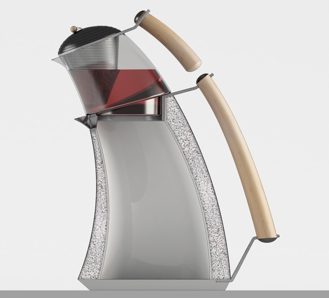
Designed as a single unit but with two separate jars, the base jar is opaque and constructed out of perlite, giving it insulating properties. The water within is heated in an oven, post which it is stored in the lower chamber for further use. To brew the tea, one simply pours the water into the upper chamber with the tea leaves, allowing it to infuse the tea flavor over a period of 5-10 minutes. They say different ways of preparing tea result in tea that tastes dramatically different (I say that too, really). I wonder what tea will taste out of the Reverence tea brewer!

Designer: Hakan Gürsu

reverence_tea2

reverence_tea3

reverence_tea4

House.zip

shelter_pack_1

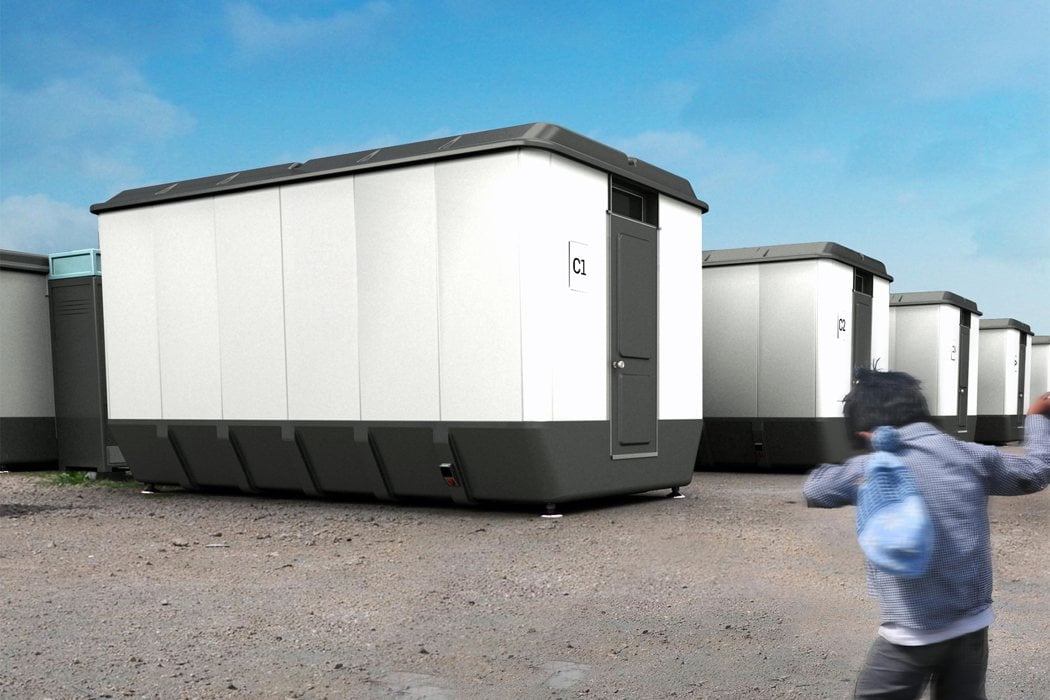
If you really look at architecture, it’s nothing but vertical walls between a floor plane and a ceiling plane. If those walls were collapsible, your entire house wouldn’t be more than a meter in thickness. The ShelterPack is a disaster relief home that fits a bedroom (with 4 beds), bathroom, fully equipped kitchen, and a dining space (with furniture) into a slab just about 80 centimeters in height. The entire apartment can be set up in just a few hours by elevating the ceiling, and putting the walls in place.

The ShelterPack is ideal for places struck by disaster. When compressed, each pack is small enough to be carried in a semi-automatic truck. In bulk! Imagine giving comfortable homes to a 100 refugees/victims with just two such trucks!

The ShelterPack was awarded the Golden award at the A’ Design Awards 2016.

Designer: Hakan Gürs (Designnobis)

shelter_pack_2

shelter_pack_3

shelter_pack_4

shelter_pack_5

Arachnid Aesthetic Lighting

Scorpion_1

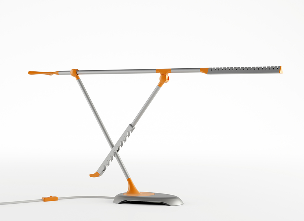
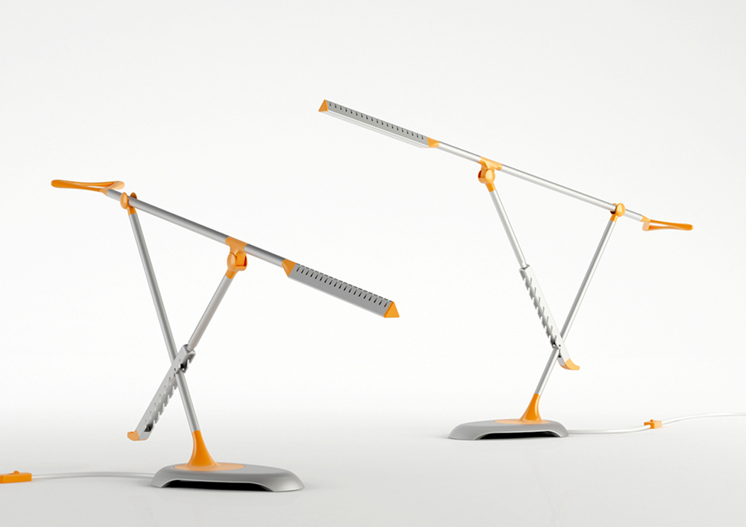
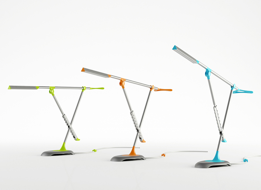
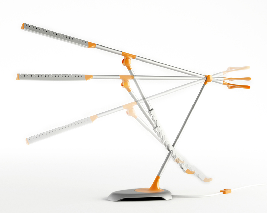
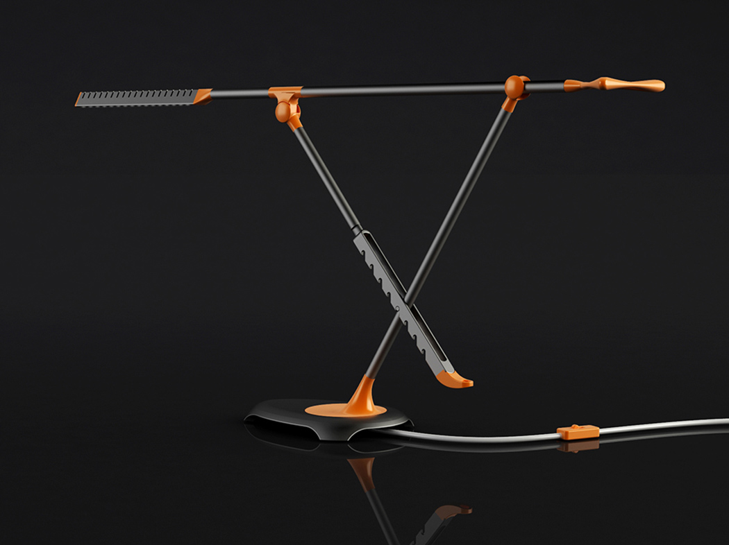
Named for its arachnid-like aesthetics, the Scorpion Lamp a desk lamp offers users a huge range of adjustability. Thanks to its clever construction, the product can grow from 30cm all the way to 65cm. Thanks to a ball point joint that connects the lamp body and base at the bottom, user can turn the lamp 360 degree. It’s also really easy to adjust with the help of an ergonomic handle. The lamp is designed with minimalist and contemporary design approach consists of cast and extruded aluminum parts, aluminum pipes, injected ABS joining parts and 18 3,5 watt LED lamps.

Designer: Hakan Gürsu of Designnobis

Scorpion_2

Scorpion_3

Scorpion_4

Scorpion_5

Hand Tools for Micro Living

HandTools_00

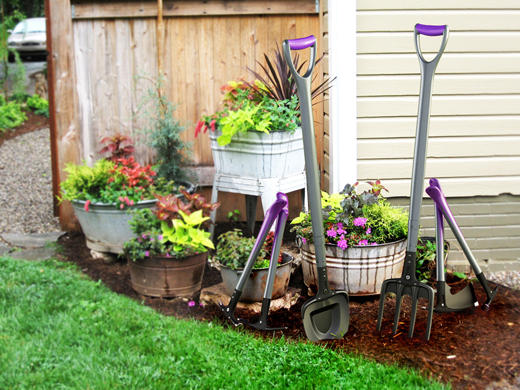
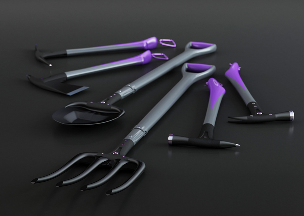
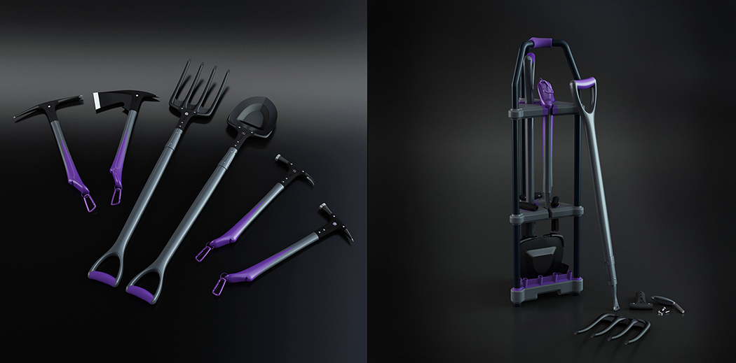
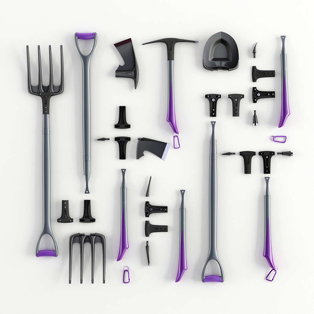
Bored of heavy, cumbersome traditional hand tools? Modular Hand Tools was designed as an innovative set consisting of modular pieces that make it easy to operate and even easier to store. The set contains a lug, 2 handle types, 3 body apparatuses with dual ends and 7 different head pieces. Together they can create up to 12 alternative tools in total. Better yet, they’re easily nestable in an upright stand for easy organization. They’re lightweight, compact and users will enjoy getting creative by shaping the tools according to their own needs!

Designer: Hakan Gürsu of Designnobis

HandTools_01

handtools_02

HandTools_03

Jazzing Up For Pure Water

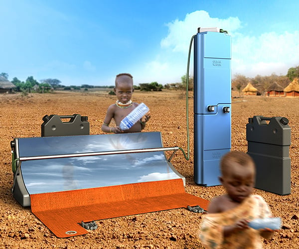
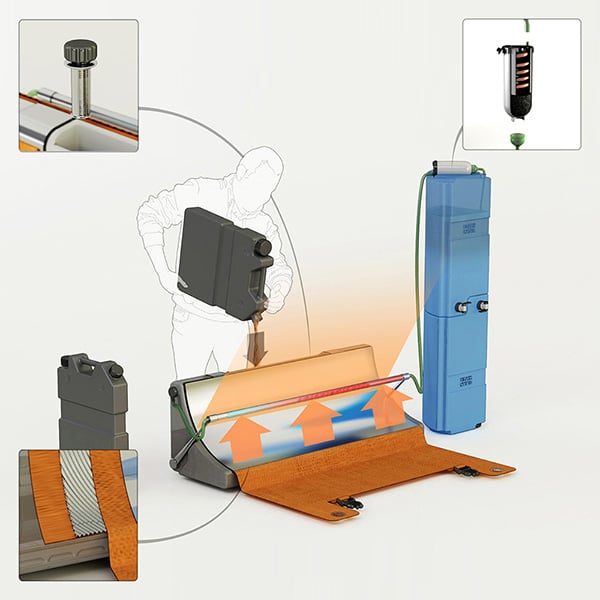
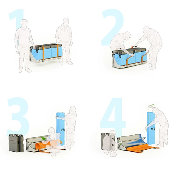
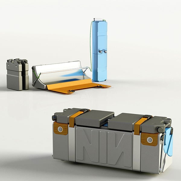
Designed to be a portable solar powered water treatment system, the Parabosol uses parabolic mirrors that boils water to a temperature of up to 400 Celsius. This system also integrates sand and carbon flirtation processes to game, thus making drinking water as safe as possible. Approximately 1 billion people globally don’t have access to potable water and the tragedy of losing population to water-borne diseases is quite sad. Using solar power to create a viable filtration system that can be used in remote areas is quite cool.

Details:

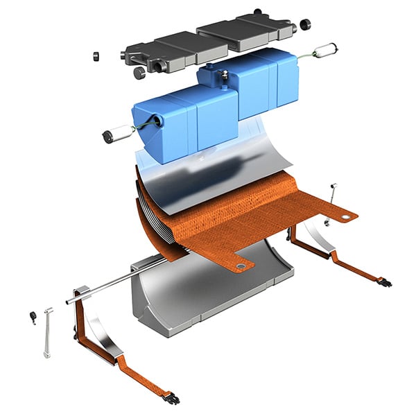
  • The system purifies water by using additional filtration, which is done by sand filter and by carbon filter.
  • First, the sand filter catches the sand particles and then the carbon filter is used to remove odor and dissolved gases from water.
  • Between the two filtrations, the sand filtered water collected in water container within a focused parabolic mirror where purification is made.
  • Steam coming from the tank behind parabolic mirror condensate in bronze spine placed above carbon filter.
  • The system consists of one contaminated water container, one purification container and two clean water containers.
  • Parabosol can clean up to 170 liters of water in a single use.

Designer: Hakan Gürsu of Designnobis Studio

-
Yanko Design
Timeless Designs - Explore wonderful concepts from around the world!
Shop CKIE - We are more than just concepts. See what's hot at the CKIE store by Yanko Design!
(Jazzing Up For Pure Water was originally posted on Yanko Design)

Related posts:

  1. Just Pure Water
  2. Pure Safe Water In The Tropics
  3. Jazzing Up Push Pins


Obvious TAXI Station

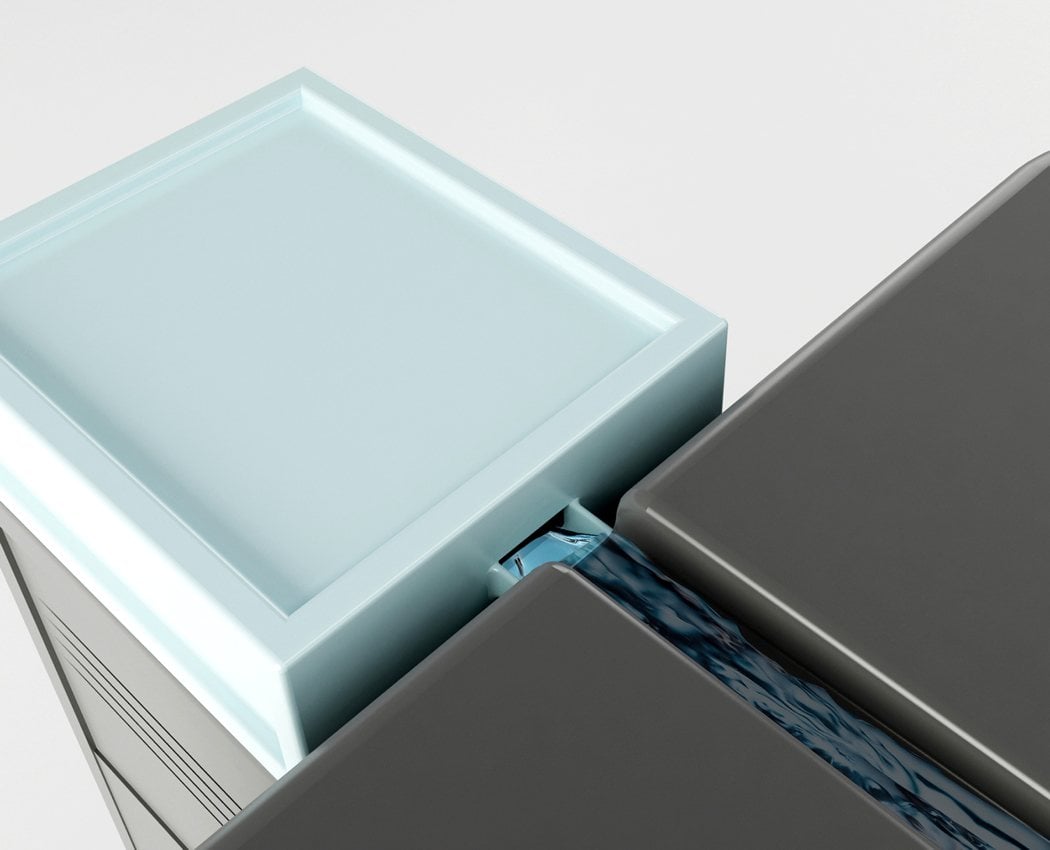
How about a taxi stand that offers a waiting lounge, office space, personal cabins for drivers, lavatory, changing room, storage area, kitchen and resting area! Sounds utopia but plausible, thanks to the universal language and modern architecture incorporated. Electrical and lighting systems are assembled within the installation floor, which is hidden, between ceiling and the roof. Moreover a system is in place to collect rainwater and use it within the infrastructure. Very Impressive!

Designer: Hakan Gürsu

-
Yanko Design
Timeless Designs - Explore wonderful concepts from around the world!
Shop CKIE - We are more than just concepts. See what's hot at the CKIE store by Yanko Design!
(Obvious TAXI Station was originally posted on Yanko Design)

Related posts:

  1. The Obvious Turn
  2. Taxi Hauling
  3. Micro Taxi