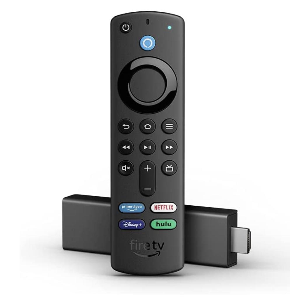
Unlocking the Full Potential of Your TV with the Amazon Fire TV Stick 4K: A Comprehensive Review

The Fire TV Stick 4K by Amazon is a streaming device that allows users to access a wide variety of content on their television, including movies, TV shows, music, and games. This useful device is about the size of a USB flash drive and plugs directly into a TV's HDMI port.

One of the best value propositions of the Fire TV Stick 4K is its ability to stream content in 4K Ultra HD resolution, which offers a much higher level of detail and clarity than standard HD. This makes the device a great choice for those who own 4K TVs and want to take full advantage of their display capabilities.

The Fire TV Stick 4K also supports high dynamic range (HDR) content, which provides more vivid colors and a wider range of brightness. This feature can be particularly beneficial for viewing TV shows and movies with many action or special effects.

The device is powered by a quad-core processor and comes with 8GB of storage. This gives it enough power to run smoothly and handle multiple apps at once without freezing or lagging.

One of the best features of the Fire TV Stick 4K is the Alexa Voice Remote. This remote allows users to control the device with their voice, making it easy to search for content and control playback without ever having to navigate through menus. The remote allows users to control other compatible smart home devices, such as lights and thermostats.

The Fire TV Stick 4K also includes a wide variety of apps and services, including popular streaming platforms such as Netflix, Prime Video, YouTube, and Disney+. This allows users to access a wide range of content in one place, without having to switch between different apps or devices.

Additionally, Amazon Fire TV Stick 4k can be used as a gaming device as well, with a good number of games available for downloading and streaming. Games range from simple and casual to high-end and graphically-intensive ones.
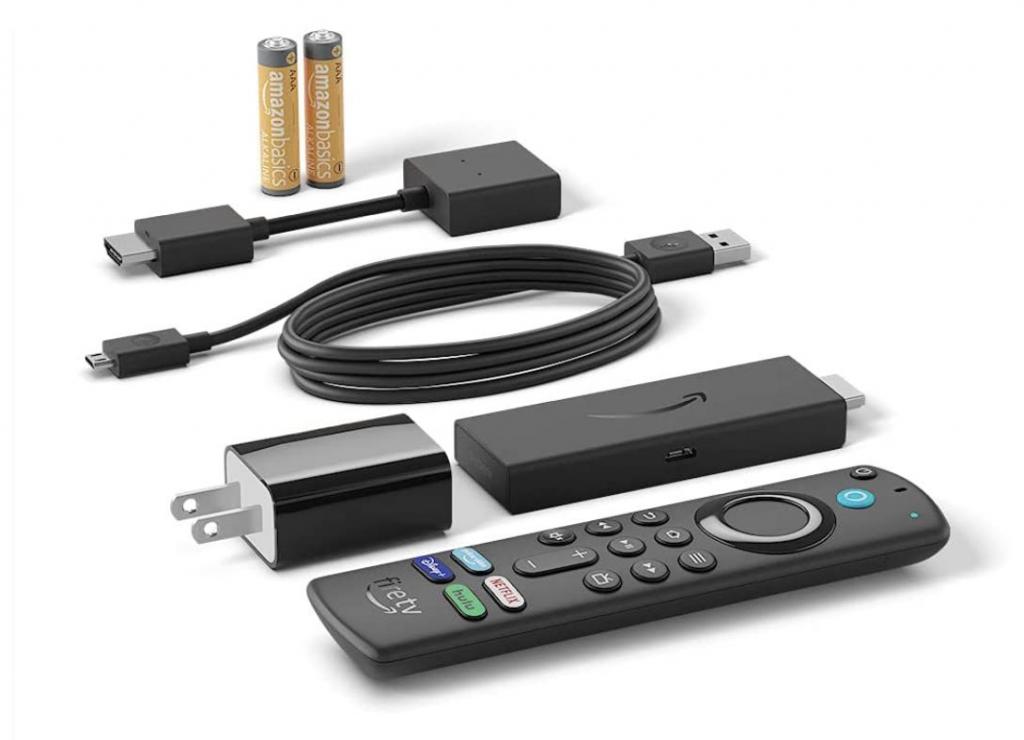
Here are a few pros of purchasing the Amazon Fire TV Stick 4K:

  1. 4K Ultra HD and HDR resolution: The Fire TV Stick 4K allows you to stream content in the highest resolution currently available on the market, which can enhance your viewing experience significantly, providing more detail and clarity.
  2. Alexa Voice Remote: This remote allows you to control the device using your voice, making it easy to search for content and control playback without ever having to navigate through menus, it also allows you to control other compatible smart home devices.
  3. Wide range of apps and services: The Fire TV Stick 4K includes a wide variety of apps and services, including popular streaming platforms such as Netflix, Prime Video, YouTube, and Disney+. This allows users to access a wide range of content in one place, without having to switch between different apps or devices.
  4. Affordability: The Fire TV Stick 4K is a cost-effective solution for those who want to upgrade their TV to 4K Ultra HD and HDR. It is less expensive than many other 4K streaming devices.
  5. Gaming: The Fire TV Stick 4K also offers some gaming capabilities, with a good number of games available for downloading and streaming, giving you the ability to enjoy a good gaming experience as well.
  6. Easy to setup and use: The Fire TV Stick 4K is very easy to set up, it is small and portable, easy to take with you when you travel, and easy to navigate.
  7. Versatility: The Fire TV Stick 4K allows you to access multiple apps, games and services on one device, making it a versatile solution to access a wide variety of content.

Here are a few cons of purchasing the Amazon Fire TV Stick 4K:

  1. Limited storage: The Fire TV Stick 4K comes with only 8GB of storage, this may not be enough for users who want to download a large number of apps and games, although it is enough for streaming.
  2. Limited compatibility: The Fire TV Stick 4K is only compatible with TVs with an HDMI port. If your TV does not have an HDMI port, you will not be able to use this device.
  3. Limited customization: The Fire TV Stick 4K has a more limited user interface than other streaming devices. This can make it less flexible for some users in terms of customizing the layout or installing third-party apps.
  4. A limited number of apps available compared to other streaming devices: Some apps may not be available on the Fire TV Stick 4K, particularly those that Amazon has not made compatible with its platform.
  5. Require a stable internet connection: The Fire TV Stick 4K requires a stable internet connection to stream content and play games, so a poor internet connection can affect performance and experience.
  6. Dependence on Amazon ecosystem: If you are not an Amazon Prime user, some features of the Fire TV Stick 4K may not be available to you, and some apps or streaming platforms may have a limited content selection.
  7. Limited voice command capabilities: While the Alexa Voice Remote allows you to control the Fire TV Stick 4K with your voice, its capabilities are limited compared to those of a standalone Alexa device.

Overall, the Amazon Fire TV Stick 4K is a powerful and versatile streaming device that offers a great way to access a wide variety of content in 4K Ultra HD and HDR resolution. The Alexa Voice Remote and the support for multiple apps and services make it a great choice for both casual viewers and hardcore cord-cutters.

The Fire TV Stick 4K has many pros, such as its 4K Ultra HD and HDR resolution, Alexa Voice Remote, a wide range of apps and services, affordability, gaming capabilities, and ease to use. The device can help you get the most out of your TV with high-quality streaming, games, and smart home integration.

However, like any other product, it also has some cons, such as limited storage, limited compatibility, limited customization, a limited number of apps, dependence on a stable internet connection and Amazon ecosystem, and limited voice command capabilities.

In conclusion, If you are looking for an affordable and easy way to upgrade your TV to 4K and HDR, and you are comfortable with the limitations and the dependence on the Amazon ecosystem, the Amazon Fire TV Stick 4K is definitely worth considering, you can buy it here.

The post Unlocking the Full Potential of Your TV with the Amazon Fire TV Stick 4K: A Comprehensive Review appeared first on Walyou.

3-in-1 iPhone 6 Wallet Case by Qlio Hands on Review

review 3-in-1 iPhone 6 Wallet Case Qlio

Need to protect your iPhone 6/6S?  We got to test out this new wallet case by Qlio, and… yes! We loved it.

With so many new cases flooding the market on a weekly basis, it’s hard to keep up and even harder to find one you like. That’s why we love to get these cases and try them out, letting you know what we think about them. Wallet cases are all about making your life easier and it seems that this case by Qlio will do just that.

The case seems to be made out of quality materials; it feels nice and durable. It comes in 3 different colors, we got the grey one to test out. Personally, I think it’s the best color. The case combines both fabric and synthetic leather, making it look more luxurious and modern. Inside of the case you have specially designed pockets to hold your essentials such as cards and money. The case combines magnetics to give it an even slicker look. It closes using magnets and the phone attaches to the case via the magnets, making it more techy and kinda cool.

A great feature on this case is your ability to detach your iPhone from the case when the need arises. For example, taking a picture. I’ve never seen this kind of ability in wallet case before so it was a nice surprise to stumble upon while test-driving the case.

A good case in my opinion is one that protects my iPhone while providing that slick look that I love so much, without adding too much bulkiness. I think that the Qlio nalis all of those demands. For more great cases for the iPhone 6 check out our list on iPhone 6/6S Premium Cases.

SpiderBuds Sapphire, Amber & Jade Series: Hands-On Review

SpiderBuds Sapphire, Amber & Jade Series- Hands-On Review

Finding the right balance for your on-the-go audio experience isn’t always as easy a feat as it may seem. Today, I am testing out three of the Spiderbuds earphones to see just how they compare.

Spiderbuds corded earbuds come in three different series with some varied features and sound quality.

Features for all three series:

  • In-line microphone & remote.
  • Track control.
  • Metal housing.
  • 10MM driver.
  • Passive noise cancelling.
  • Comfortable ear tips in three sizes, small, medium and large.

Specs:

  • Frequency: 20HZ – 20KHz.
  • Impedance: 320 HMS.
  • Input Power: 5mW.
  • Max Output Power: 10mW.
  • Jack type: 3.2mm gold plated.
  • Driver: 10mm.

The Sapphire Series, retail cost $19.99

This series of Spiderbuds is the more basic of the three. They are metal earphones with noise cancelling, an in-line microphone, and an in-line remote that can save you from digging your device out of your pocket or bag.

The pair I received for testing had a black cord with red metallic cased earbuds. It also came with  the standard alternative sizes for a better fit. While these looked and felt fantastic to wear, the sound itself felt solid, but not stellar. However, it is a great bargain for the MSRP of just under $20 and is a strong competitor in that line.

Pros:

  • Good all-around sound quality, even better with bass centric tones.
  • Selection of four different colors.

Cons:

  • There is no volume control with the in-line mic & remote.
  • Has a standard cable.

The Amber Series, retail cost $24.99

Spiderbud’s Amber Series is their mid-priced option that offers a step up from their Sapphire Series. Like its two sister products, these are also noise-cancelling earbud headphones.

The pair of earphones I received from the Amber line for this hands-on review were nearly entirely black with gray earbud tips. The most useful element of the Amber Spiderbud in-ear headphones is the flat cord. All in all, this is a solid choice for price point.

Pros:

  • Very good all-around sound quality.
  • Tested better than the other two series with vocals and voice, including listening to eLearning and using the earbuds with conversations on smartphone.
  • Has a flat cable.

Cons:

  • There is no volume control with the in-line mic & remote.
  • Availability in only two different colors, including black.

The Jade Series, retail cost $29.99

The Jade Series is the top of the line for Spiderbuds earphones. Arriving in the cool green Alien-inspired packaging, the earbuds themselves were also green tipped with a metallic finish and black cord.

Aside from being noise cancelling, they are also well-equipped to be your choice for mobile use. These in-ear headphones feature an in-line microphone, as well as an in-line controller that allows you to adjust the volume, change tracks, and operate the basic functions of your phone calls.

This is a great value for the MSRP of just under $30.

Pros:

  • Very good all-around sound quality.
  • Tested better than the other two series with country music and classic rock.
  • Has volume control with the in-line mic & remote.

Cons:

  • Has a standard cable.
  • Availability in only two different colors, including black.
  • Cats may think it’s a toy and break the cord (true story).

How they were tested:

Everyone has different types of gadgets and uses for earbuds. They were tested on two different Android smartphones, three tablets, a Windows-based laptop, and even a desktop computer to ensure compatibility.

The recorded sounds came from iTunes, Google Play and YouTube and were tested with the following genres: Hip hop, Rhythm and Blues, Blues, Classic Rock, Metal, World, Classical, eLearning, downloaded movies and games.

Durability:

One of the biggest complaints I’ve seen with earbuds is that some may fall apart if dropped or used too frequently. Keeping in mind the typical wear and tear for this type of product, each of the three series went through the same durability challenge. They were dropped, thrown, and placed on the bottom of a backpack filled with books. The second step was for continued usage, so they were placed in ear with removal by tugging or pulling. Upon completion, each set of earbuds was tested again for sound quality. The housing remained intact, the cords did not pinch or fray, and there were no broken parts. All passed with flying colors.

The overall construction for the Spiderbuds is excellent. As for sound quality, they are good for the money spent, unlike others in the same price range.

Be social! Follow Walyou on Facebook and Twitter. If you are looking for more related articles check out our Hands on Reviews section here.

Miggo Protective Case Is your Camera’s New Best Friend

miggo hands on review

I have to admit it, my first interaction with Miggo was on kickstarter, I’ve seen it while browsing for cool and new gadgets to cover here on Walyou and I remember that my first thought once stumbling upon it was “Damn, I need it”.


We got to review two great products by Miggo, the Strap & Wrap and the Grip & Wrap.

Miggo is a patent pending camera straps, their products are meant to change the way you think about camera bags. Their line of products is aimed to make it easier for you to carry your camera while giving it a great protection from impacts and scratches.

Strap & Wrap

Many times I found myself avoiding taking my DSLR  camera since I couldn’t carry it easily or I just didn’t want to get dragged with the camera’s big bag that basically didn’t fit my bag. Eventually I just took the camera without the bag,  placing it in my daily bag hoping that nothing bad will happen to it. That’s why I was super excited to test out Miggo’s Strap & Wrap. It’s a simple yet innovative solution you basically strap&wrap and you are good to go. Miggo also acts as a protective case so you can also carry comfortably your DSLR across your torso and keep it safe. It’s super easy to use, you just screw the case to the bottom of your camera, you can also use the safe cord which gives your camera a secondary “safety net” so it would detached from the case and this is pretty much it – you are good to go. To close the case you simply wrap it across the camera and that’s it! Available for $49.99, for more details go to Miggo.

Grip & Wrap

If you have a small DSLR this Grip and Wrap is perfect for you. This is a small and elastic camera cover that totally replaces your old bulky bag with style! The Grip and Wrap comes in 7 different colors and patterns and I think it’s a great deal for your money.

Available for $39.99, this camera case packs all of Miggo’s best qualities. To be honest I liked this one better since it’s more compact, geek chic looking and faster to use. It was very easy and effortless to place the camera inside, close open and take my shot. One nice added value is the inner pocket you have on the strap so you can place your lens there while taking some photos, and in case you were wondering you can also connect a tripod while using Miggo.

Buttom line

These straps are super handy, instead of carrying around the bulky case you currently have, this is a super modern and very on the go way to carry your camera much more easily while protecting it of corse and keeping it safe. Miggo’s products are made out of Neoprene and Lycra. Each of these cases come with 2 years warranty, a safety cord will keep your camera secured to the strap and a well designated pocket on the case for your lens cap when not in use. The bottom line is that Miggo gets the job done, their solution provides a great way to carry your camera, if you travel a lot, this can be a great product for you.

Be social! Follow Walyou on Facebook and Twitter, and read more related stories about the Foream X1 Is a Wearable Camera with Social Sharing, or Xiaomi Yi Action Camera Gives GoPro Hero a Run for Its Money.

Turn for the Better With WingLights

thumb

Bicycles are a fantastic way to get around when the weather is good and the biking infrastructure is safe, With cities around the world improving their streets, biking is also becoming more popular. Bicycles are definitely an old transportation method, with nearly 200 years since their verifiable invention. Even with such a long history, there is still one component issue that hasn’t really been solved: turn signals. In most places, the law expects to complete difficult turning maneuvers using only one arm to steer their bike, while the other waves foolishly in the wind indicating the direction they intend to travel. This is even more ridiculous for night riding, as an outstretched arm is not really visible.

Luckily, a company called CYCL has come up with a solution: WingLights. These tap-on tap-off indicator lights are the perfect way to maintain control during your turns while being confident that your intentions are clearly understood.

The lights are super easy to install, with absolutely no tools requirements. They come with bar-end inserts to slip into the ends of handlebars. They have a rubber grip that expands when the end is twisted, holding them firmly in the handlebar.


The bar ends are meant to be left in the ends of the handlebars, with the lights themselves easily snapping on and off with a satisfying magnetic click. This is perfect for locking your bike up in a city, where anything worth more than $5 will get stripped within minutes. The indicator lights are directional, so they also have small pegs on the lights and slots on the bar ends to help you line them up perfectly for the best visibility.


If you’ve ever put bike lights in your pocket, you know they have a tendency to turn on when they bump into everything else in there. CYCL has thought of that as well, and ship the lights with a handy carrying ring that can be clipped anywhere.

The lights themselves work great when riding. If you’re used to signaling with your arms, expect a week or so before the buttons become second nature. They are extremely bright and are visible even in daylight. They are both powered by two CR2032 batteries. Non-rechargeable batteries are a downer, but since these lights are only on for a few moments at a time, they should last a long time before they need changing. Plus the lights time out if you accidentally leave them on, so you won’t end up draining your battery if you accidentally leave them on.

It’s hard to find anything wrong with these lights, they are an extremely well thought out product solving a real need for cyclist safety. They are well constructed have thought of everything, even offering extra bar ends on their own in the near future for people with multiple bicycles. WingLights are available in Carbon Black, Electric Red (red and silver) and in red and black (Nite Rider). CYCL currently sells the WingLights for $49.99.  If a bicycle is a part of your daily commute, WingLights are a must-have.

Be social! Follow Walyou on Facebook and Twitter, and read more related stories at Smart Pedal Tracks Your Rides via GPS, Prevents Bike Theft and The Yerka Project: unstealable bike for the big city.

Rwatch R10 Is a Versatile Watch Phone for Active People

Rwatch R10 Watch Phone 01

Getting a watch phone gives active people an excuse to leave their smartphones at home while working out. Rwatch R10 is an affordable watch phone with functions that make it a great gym buddy.

1. Contents of the Box
2. Design and Build Quality
3. Connectivity
4. Menu and Navigation
5. Battery Life
6. Price and Availability
7. Conclusions

Contents of the Box

Rwatch opted to pack the R10 watch phone into a simple white cardboard box, with the company logo (and what I presume is their motto in Chinese) on the front side, and the device’s specs on the back side.

As for the actual contents of the box, there is a user manual and a USB cable for charging, besides the watch itself.

Even though people can rely on intuition to use the R10, it’s good to see that Rwatch hasn’t provided documentation solely in Chinese, and that English instructions are also available.

Design and Build Quality

The R10 seems very solidly built, but the very soft silicone strap is somewhat contrasting. Maybe a hard TPU strap would’ve worked better with the solid body of this smartwatch.

Click to view slideshow.

On the left side of the device, there is a tiny speaker, along with the microUSB port that’s used for charging. The Rwatch R10 isn’t waterproof, and yet the microUSB port is protected with a rubber cover from dust and other things that might cause it to malfunction. On the right side, there is a silver power button, which contrasts with the otherwise black design of the watch, as well as a microSIM card slot, which is also protected by a rubber cover. The power button definitely looks better on the silver version of the R10, and I really wish the manufacturer painted this to match the color of the device.

Another important aspect is the display. Rwatch equipped the R10 with a 1.54-inch color display with a 240×240 resolution. Given the 220ppi density, you won’t get to see any individual pixels unless you focus a lot. The display is protected by 2.5D glass that much like the rest of R10’s body attracts fingerprints quite easily. As for the touchscreen, it is responsive, provided that you don’t have big fingers.

Connectivity

The R10 relies on Bluetooth 4.0 to sync data with your smartphone. When using a SIM card to place calls and send texts, the watch phone uses 2G networks, but that should suffice for these purposes. Implementing 3G or 4G might have been a lot more difficult, and frankly, high speed connections are useless if there’s no software to make use of them.

Click to view slideshow.

Using a QR code that’s displayed by the phone when accessing a menu item, people can download the companion app. However, the website the app is hosted on is very slow, so I would recommend getting the app straight from Google Play Store.

The app is pretty basic, as it displays only fitness and sleep statistics, and the heart rate. While the heart rate sensor seems to work on the smartwatch itself, I never got the app to display any value. The manufacturer might have to look into that, as the heart rate monitor is one of the major selling points of the Rwatch R10.

Menu and Navigation

The menu proves the versatility and the complexity of this smartwatch. Spanning over three screens, the R10’s functions cover different needs. Unfortunately, only three functions are displayed on the main screen, when using the digital watch face: Calls, Pedometer and Bluetooth settings. A Menu button is also displayed there, along with the Connect/Disconnect option.

Bluetooth Dialing: Should you decide not to insert a microSIM card into the R10, to make it truly independent, you can always have the calls sent from the smartphone to the smartwatch over Bluetooth. While you shouldn’t expect crystal clear sound quality from this device, it is good enough to hear the other person and to make yourself understood.

SIM Card Calling and Texting: In tandem with a microSIM card, the R10 shows its true capabilities. Calling and sending texts is fairly easy, but you shouldn’t do either of these when walking on the street or when driving.
Heart Rate Monitor: This is one of the functions that has to be started and stopped manually. While the heart rate sensor works in real time, the refresh rate on the smartwatch isn’t that great, as the value is diplayed about once a second. The fact that the display doesn’t stay on when the heart rate monitor is running is also a major downside.

Fitness and sleep tracking: Both these functions are achieved using an accelerometer. A gyroscope could’ve been useful, too, so that the display turns on when doing a wrist gesture. Currently, users have to press the Power button to see what time it is. Back to sleep and fitness tracking, these are done using simple estimations, so you shouldn’t expect extreme accuracy. To keep track of these over a longer period of time, you will need to use the companion app.
Compass: If you’re into trekking and don’t have any GPS software on your smartphone, a compass might prove useful. Calibrating it might take a while, but after that, it works rather accurately.
Find Phone: Assuming that you have misplaced your phone, but it’s still in Bluetooth range, you can find it using this function.

Remote Camera: Gone are the days when you had to ask someone else to take a picture of you and your friends. Now you just have to access this function from the smartwatch, place the smartphone within Bluetooth range and control the camera’s shutter remotely.
Music Playback Control: The smartphone’s music player can be controlled using the R10’s playback control function. The options are pretty limited, but as an avid music listener, I found this feature to be very useful. Besides moving to the previous or next track, you can also pause or play the current song. Another useful feature is the fact that the artist and the song title are displayed.
Phonebook and Call Log: Having the log handy can save you the time you would otherwise spend looking through the 1,000 entries of the phone book.

Battery Life

A 3.7V / 380mAh Li-Po battery keeps the smartwatch going. Of course, battery life depends on the usage patterns of each person, but without a SIM card inserted in the slot and with several notifications a day, you should expect around 2 days of use.

Price and Availability

GearBest currently sells the Rwatch R10 for $54.99, but the coupon code GBRR10 lowers the price by $9, to $45.99.

That seems a decent price to ask, considering the versatility of the watch phone and the solid built.

Conclusions

The Rwatch R10 is far from being the perfect smartwatch, as it lacks some functions. However, at this price point, the watch phone has a lot to offer. Besides the ability to take or place calls, and send text messages using an included microSIM, the R10 also sports a heart rate monitor and a compass, which definitely set it apart.

Be social! Follow Walyou on Facebook and Twitter, and read more related stories about the I5 Plus waterproof smartband review, or the Uwatch UX smartwatch.

I5 Plus Smartband Takes Simplicity to the Extreme

Iwown I5 Plus 04

While some wearable manufacturers prefer to make overly complex devices, Iwown teaches everyone a lesson in simplicity with its I5 Plus waterproof smartband.

1. Contents of the Box
2. Design and Build Quality
3. Connectivity
4. Menu and Navigation
5. Battery Life
6. Price and Availability
7. Conclusions

Contents of the Box

At a first glance, it might look like something is missing from the box, but in fact, there’s everything needed to get started. Upon opening the box, a logical question could arise: “Shouldn’t there also be a USB cable included?” Well, no, since the main part of the smartband also includes a USB plug.

Inside the box, you will find just the smartband and a user manual. Instructions on how to set it up and how to use it are available in both English and Chinese, fact that indicates the manufacturer’s desire to market this product internationally.

Design and Build Quality

The back of the Iwown I5 Plus looks a bit like it was made in a rush. Other than that, the smartband is impressively well built. The TPU band has a slot for the USB plug and two other holes for securing the main unit into place. Check out the following slideshow to get an idea about how the item looks.

Click to view slideshow.

It really would be something if all wearables priced this low were made out of so sturdy materials. The only thing that worries me is what would happen to the main unit if pressure is applied onto it while it charges. That being said, when it’s “plugged” into the bracelet, there are no chances the USB plug could ever get damaged. Add to that the fact that the smartband is IP67 certified, which means it is dust- and waterproof, and you have a rather impressive product.

Connectivity

As most wearables out there, the I5 Plus connects to smartphones via Bluetooth. In terms of operating system compatibility, it works with iOS 7.0+ or Android 4.3+.

Click to view slideshow.

The companion app, called Zeroner, is about as simple as the smartband itself. However, judging by the 2.3/5 score it has on Google Play Store, I’d say that most people aren’t happy with it, with the most cited reasons being bugs, connectivity issues with various smartphones, and loss of data after unexpected resets. Fortunately, I didn’t experience any of these problems, and the overall experience was very pleasant.

Right after launching the app, you need to set up an account using an e-mail address and a password, to make sure that your statistics get synced, should you want to pair the smartband with another device.

Menu and Navigation

If it’s versatility you’re after, Iwown’s I5 Plus might just be up your alley. Navigating through the menu is done by swiping to the left or to the right, while confirming a selection is done by pressing the touch screen for three seconds. Here are some of the things it can do.

Display time and date: There is no way to manually set the time and date, but the smartband syncs these details when getting paired with your smartphone using the companion app. To see the current time, you either have to tap the display or do a wrist gesture, as you would if you wore a conventional timepiece. On the other hand, to see the current date, you need to swipe up or down when the time is displayed.

Sleep and fitness tracking: Using the included accelerometer, the I5 Plus can tell when you’re sleeping (moreover, it can distinguish deep from light sleep), and when you’re moving around. When it comes to fitness, it counts calories, number of steps and distance. Of course, no fitness tracker out there is extremely accurate, so these are more like estimations. To make sure sedentariness doesn’t get to you, you can set sedentary reminders or move alerts, as Iwown calls these.

Push caller ID and notifications: When your phone rings, the caller ID will get displayed on the smartband’s screen. Similarly, when you’re getting notifications from certain apps, they are transmitted to the I5 Plus, provided that the Bluetooth connection is not broken. According to the Zeroner app, you can be alerted using vibrations whenever you’re getting a text, or when receiving messages on Facebook, Twitter, WhatsApp or Skype. You’ll have to enable notifications for each of these apps in Zeroner.

Alarm clock: This is yet another feature that’s handled using the companion app. You can set up as many alarms as you want, and you can even establish a pattern for them, depending on the day they fire up.

Battery Life

The I5 Plus allegedly features a 75mAh battery that should keep the smartband up and running for up to a week. The manufacturer recommends charging the device for half an hour prior to using it. From my experience, the battery can last a week, but that will depend a lot on how the smartband is used. Setting up a lot of alarms and getting a ton of notifications will cause the battery life to drop dramatically.

Price and Availability

At $16.36, which is as much as it costs on GearBest, the I5 Plus competes against Xiaomi’s Mi Band. On the upside, this one has a display, but the lesser companion app and the poorer battery life rank it lower than Xiaomi’s wearable.

Conclusions

Iwown’s I5 Plus packs quite a few features for its small price. That makes it a good choice when compared to its mainstream counterparts, considering that the latter cost a few times more. It remains to be seen how and if this smartband stands the test of time, but so far, the

Be social! Follow Walyou on Facebook and Twitter, and read more related stories about the I5 Plus waterproof smartband, or the Mifone W15 smartwatch.

Mlais M7 Smartphone Wraps Lollipop in a Compact Body

Mlais M7

The M7 is the most feature-rich phablet coming from Mlais, and could have been an extraordinary phone, if it weren’t for certain issues.

1. Contents of the Box
2. Accessories
3. Design and Build Quality
4. Technical Specs
5. Connectivity
6. Software
7. Performance Assessment
7.1. Benchmarks
7.2. Sound Quality and Reception
7.3. Image Quality
7.4. Battery Life
8. Price and Availability
9. Conclusions

Back in April, when I first wrote about the M7, it surely seemed like Mlais was on a winning streak with its affordable, yet fine performing products. Using it for a bit over 3 weeks revealed that this smartphone has several issues that could turn consumers away from it.

Contents of the Box

Mlais M7 comes in the same turquoise box as the M52 and the M4. Since this is the most feature rich smartphone made by this company, I definitely would have wished to see some more special packaging. Differentiating the products is essential in any business, and using the same packaging for all the line can lead to confusions.

Furthermore, the contents of the box are the same as in the case of the other two smartphones. Besides the device itself, there’s also a USB to microUSB cable, a 5V/1A charger, and a user’s guide.

These are the standard contents for all Mlais smartphones, so a bit of differentiation wouldn’t have hurt here, either. The phone maker could partner up with an earphone manufacturer in order to provide a decent solution for listening to music. That would be fit of the flagship the M7 wants to be.

Accessories

When it comes to the number of accessories, the manufacturer only supplies two: a flip cover similar to the one for the M52, and tempered glass to better protect the display.

Click to view slideshow.

As seen above, you can buy flip covers (which is purchased separately) that match the phone in terms of color (just in case you don’t want your phone to look like a harlequin).

Click to view slideshow.

The functionality of the flip cover has been preserved from the previous phones, which means that the small window can be used for displaying the clock (either in digital or analog formats), or for music playback.

The plastic case the tempered glass comes in also includes dry, as well as wet wipes for cleaning the display prior to applying the glass. Bear in mind that the phone comes with a screen protector pre-applied, so you will have to remove that one before installing the tempered glass.

Design and Build Quality

The M4 already had a metal frame, but the M7 took things even further. The entire phone feels solid, and the buttons are no longer flimsy, as they were in the case of Mlais’ previous phablet. The front features all the usual suspects: the display has at the bottom the three capacitive buttons you’ve come to expect in an Android smartphone, but only Home is contoured. The other two become visible when touched, due to the white backlight.

There are no buttons on the right side of the phone, which can only mean one thing.

Both the volume rocker and the Power button are placed on the left side of the phone, which is a bit weird. The manufacturer explained that Lenovo and Huawei also did this, so Mlais is not the first one to move them all to one side. However, I found this to be very uncomfortable, especially when taking screenshots.

At the bottom you can only see the microphone.

The microUSB port that’s used for charging and data transfers can be found at the top, along with the 3.5mm audio jack.

The back side of the phone sports the main camera, a single LED flash, and the fingerprint scanner, which is something I’m not a huge fan of, even though I cannot deny its usefulness. Under the hood you can also see the 2600mAh battery.

Here’s a closer look to the aforementioned details, along with the two SIM card slots and the microSD slot.

Below you can see the external speaker, along with the LTE antenna.

Overall, I’d say that the M7 is very well built, not to mention that at 149.5*76.8*8.6mm it is more compact than most of its competitors. That’s right, Elephone P7000, I’m looking at you! On top of that, Mlais’ latest phablet does not bend like the P7000 does.

Technical Specs

Mlais has decided to use the same Mediatek chipset that powers the M52, namely the 64-bit MT6752, which includes an octa-core CPU clocked at 1.7Ghz and a Mali T760 M2 GPU running at 600Mhz. Even though the M7 has 3GB of RAM (which is 1GB more than the M52), there are not that many situations when this much RAM comes in handy. The more memory there is, the more apps you can run at the same time, but it wouldn’t hurt to also take battery consumption into consideration. As for storage, the M7 is equipped with 16GB of ROM that can be expanded by up to 64GB using a microSD card.

The sensors Mlais used for the cameras are a 13MP Sony IMX135 on the back and an OmniVision 5648 in the front. In other words, the quality of the pictures taken with the main camera will be superior to M52 and M4’s main camera, while selfies won’t differ at all, since it’s the same sensor at play there.

Connectivity

Apart from NFC (or HotKnot) and Wi-Fi ac, the M7 has everything you could need in terms of connectivity: 4G LTE in the B1/3/7/20 (800/1800/2100/2600) bands, Bluetooth 4.0, Wi-Fi b/g/n, GPS and A-GPS. I found most of them to work satisfactory, apart from the Bluetooth and the Wi-Fi, which either took a long time to connect, or dropped the connection every so often.

GPS accuracy could have been better, as 4 meters (12 feet) can make the difference between driving on the road and jumping into a lake. Still, I supposed that drivers are able to correlate their visual input with what they’re getting from the navigation software.

Software

Mlais M7 is running a vanilla version of Android 5.0 Lollipop with just a couple of differences that pertain to some specific characteristics. Below you can see the home screen and the app drawer as they looked like after the first boot.

The first difference is represented by off-screen gestures, whose settings look as below. Besides the predefined gestures, users can also customize their own, so that drawing a certain letter launches a certain app.

The second difference is represented by the fingerprint scanner settings. Users can save up to 5 different fingerprints, and even though the set up takes a while, I am extremely impressed with how fast and how accurate the press touch ID scanner is. Mlais really did a great job in this department, and I hope they won’t make any changes in their future smartphones.

Assuming that your skin has no problems and that you want your phone to be secure, using a fingerprint for the lock screen is as good as it gets.

Performance Assessment

To see how the M7 performs, I ran a set of benchmarks, whose results you can see below. Besides that, I used the phone as my daily driver for more than 3 weeks, and reached to the conclusion that despite its better looks, it provides poorer performance than its brother, the M52.

Benchmarks

With an AnTuTu score of 47265, the M7 isn’t bad at all, but some users even got 49K with the M52, which makes you wonder if the extra GB of RAM matters at all. Had the resolution been higher, as in Meizu M1 Note’s case, for example, the AnTuTu score would’ve been much lower, so I can see why Mlais sticks with this resolution. On the downside, the resolution may be the exact reason some users pick a phablet over another one.

I ran the Epic Citadel benchmark on the M7 using all three settings: High Performance, High Quality, and Ultra High Quality, and you can see the results below.


Below are the results for the GFX OpenGL benchmark.

Mediatek chipsets are known to have GPUs that pale in comparison to the ones included in Qualcomm SoCs, yet 3DMark Ice Storm Ultimate still thinks that M7’s GPU is impressive.

NenaMark 2, on the other hand, is an outdated benchmark that shows very similar results for a bunch of smartphones, so I wouldn’t take it very seriously.

At first, I thought that the M7 gets overheated only when running GPU-intensive tasks, but I soon discovered that it also does that when playing videos, and even during 20-minute calls. That’s a major drawback, and the fact that the manufacturer was aware of it and still decided to launch the device will cause some people to raise an eye brow.

Sound Quality and Reception

The external speaker of the M7 is decent, even though I found it to lack bass and depth. The earpiece, on the other hand, is a completely different story. During phone calls at maximum volume, I could hear sound crackling coming out of it. Considering that taking and placing calls is one of the most basic things to do on a phone, be it a smartphone or a feature phone, facing such a problem could be a deal breaker. Other than that, it is loud enough to understand what the other person is saying.

Image Quality

The 13MP Sony IMX135 sensor that M7’s rear camera is based on represents a major step forward from the M52 and M4’s IMX219, especially since the resolution is no longer interpolated. That means that you get to shoot photos using the camera’s native resolution.

Click to view slideshow.

Battery Life

The first time I ran the GeekBench 3 battery test, I did it with no SIM card installed, and with all wireless connections turned off. Prior to that, I charged the M7 using a Xiaomi 16000mAh power bank, and I measured the capacity with one of these gadgets. The meter indicated a capacity of a bit above 2500mAh, with the mention that charging stopped at 95% and didn’t go up. The second time I did that, the battery charged up to 97%, again with the phone turned off. With the phone turned on, the battery usually charges fully, which makes me think that either there is a hardware problem that prevents the battery from charging to 100% when the phone is turned off, or the battery is poorly calibrated. Under the previous conditions, I obtained 4h55m of screen-on time in GeekBench 3. After installing a SIM card and several apps (which included Battery Doctor), I obtained 5h25m, which is slightly better, but still very disappointing.

Price and Availability

When it was first announced, Mlais M7 had a MSRP of $189.99, but over time, various resellers offered the phablet for $159.99 during flash sales and activities. Considering the specs, this is definitely a smartphone worth buying, but before placing an order, there are a few things you should consider.

Conclusions

Mlais M7 could have been a great Android smartphone, if it weren’t for the overheating, sound crackling, Wi-Fi instability and poor battery life. These are issues that affect even basic functionality, which means that the manufacturer should improve quality control, to make sure that devices such as the one that I reviewed don’t end up to the end consumers. Mlais has made good products that provided excellent value for money, and it’s disappointing to see that their most feature-rich smartphone ended up like this.

Be social! Follow Walyou on Facebook and Twitter, and read more related stories about the Mlais M52 hands-on review, or the Mlais MX Base launch date.

Ulefone Be Pure: A Pocket-Friendly Mid-Ranger

Ulefone Be Pure

Using an old generation chipset definitely seems like a step taken backwards, but Ulefone Be Pure has plenty of features that could lure you in.

1. Contents of the Box
2. Accessories
3. Accessories
4. Technical Specs
5. Connectivity
6. Software
7. Performance Assessment
7.1. Benchmarks
7.2. Image Quality
7.3. Battery Life
8. Price and Availability
9. Conclusions

Contents of the Box

The white box Ulefone Be Pure comes in couldn’t be described otherwise as basic. There’s not much on it, other than the manufacturer’s logo in the front and the specs of the device on the back.

Besides the phone itself, the box includes a user’s guide in English, a charger rated for 5V/1A, a USB to microUSB cable for charging and data transfers, and a 3.8V Li-Po battery rated with a capacity of 2,000mAh.

Accessories

Since this is a lower-end model, Ulefone did not create many accessories for it, and other OEMs did not show any interest, either. At the time of writing, the only available accessory was a windowed case made from PU leather that cost around $9.

Design and Build Quality

Design-wise, Be Pure doesn’t bring anything revolutionary to the table. It measures 144×71×8.89mm and weighs 130g, fact that makes it quite pleasant to hold in hand. The 5″ display also helps with the portability, not to mention that, considering the HD resolution, the 293ppi pixel density is quite OK.

Below the display there are the three capacitive buttons we came to expect in an Android smartphone. The white backlight of these buttons is quite pleasant, and doesn’t distract the users’ attention.

The smartphone’s perimeter is metallic, and all the buttons and connectors are located where you would expect them to be. At the top, Be Pure has a 3.5mm audio jack for earphones, shortcut keys (a la Pressy or Xiaomi Mi Key), or IR transmitters, along with a microUSB port for charging and data transfers.

At the bottom, there’s only a hole for the microphone. The volume buttons are found on the left side, while the power button is placed on the right side of the smartphone.

Under the back cover, you can notice the two SIM slots, a microSD slot and various antennas. Below the back camera there seems to be room for a dual LED flash, but in fact, only one LED is present.

Ulefone advertises the external speaker as having 3D Sound, and while the output doesn’t disappoint in clarity, you shouldn’t expect an authentic surround effect from such a small speaker.

Technical Specs

Powering Ulefone Be Pure is Mediatek’s MTK6592M chipset that includes an octa-core CPU clocked at 1.4Ghz, along with a Mali450 GPU running at 600Mhz. These specs may have been great last year, but some of the recent apps and games will definitely unveil this 32-bit chipset’s limitations.

Running multiple apps at the same time is not recommended on this device, since it only has 1GB of RAM. The internal memory of just 8GB won’t allow you to install many games, anyway, and you also need to take into account that some of that storage is occupied by the operating system.

Connectivity

As expected from the MT6592M chipset, there’s no 4G connectivity in the Be Pure. Apart from that, the smartphone has Wi-Fi b/g/n, Bluetooth 4.0, GPS and A-GPS, as well as Hot Knot, which is Mediatek’s own version of NFC.

From my experience, most connectivity options worked just fine, with the exception of GPS, which is known to have issues in devices based on Mediatek’s chipsets. However, there are fixes that could be used for improving GPS accuracy.

Software

The manufacturer is promoting a “pure Android experience” with this device, hence the Be Pure name. Below are screenshots of the home screen and app drawer taken shortly after the first boot, and these images attest the lack of bloatware.

The device is running Android 4.4.2, even though Ulefone showed Android 5.0 Lollipop in some of the promotional images. The fact there’s no OTA update to Lollipop is a disappointment, and while Mediatek is to blame for not sharing the source and the drivers, I also think Ulefone’s move is misleading, and could be interpreted as false advertising.

Rooting the Be Pure is quite easy, and can be done in just a few easy steps using the Kingo Root software for Windows.

Performance Assessment

While it’s real-life performance that matters, there are still plenty of people out there who rely on synthetic tests and benchmarks to pick one smartphone over another. Granted, the Be Pure isn’t as blazing fast as its 64-bit counterparts, but I did not experience any hiccups, either.

Benchmarks

Considering the outdated chipset, the benchmark scores shouldn’t surprise anyone. Be Pure gets a bit over 28,000 points in Antutu, where it ranks above HTC One, but below LG G3.

GeekBench 3 results show more of the same, with some mediocre single-core performance. Multi-core performance doesn’t impress, either.

Vellamo Mobile Benchmark emphasizes Be Pure’s low performance, even when compared to devices that were launched two or three years ago.

I consider Quadrant to be a very outdated benchmark, considering the devices it compares the Be Pure to, but in case you are interested, here are the results, along with 3D Mark score.

GPU performance doesn’t seem to be very bad, as the device scored an average of 53.6 frames per second in Epic Citadel.

The result seems to be even better in Nenamark 2, where Be Pure managed to get 54.3 fps.

And finally, here are Be Pure’s GFX OpenGL scores.

Image Quality

Some praised Ulefone Be Pure’s camera as being one of the best available on sub-$130 smartphones. To be frank, I wasn’t as impressed with it as others, and found photos taken with the 13MP back camera to lack sharpness. On top of that, there were plenty of blown-out highlights in most of the pictures taken.

Click to view slideshow.

The manufacturer even admitted on the product’s Web page that the resolutions are interpolated, and the cameras have in fact 8 and 2MP, respectively.

Battery Life

I tested the battery using the GeekBench 3 battery benchmark, and the result baffled me.

Be Pure is getting 8 hours straight of screen-on time, which is quite impressive for a 2000mAh battery. MTK6752, the Mediatek chipset that powers most of the current Chinese flagships, is said to be more power-efficient than the 32-bit SoCs, but this particular smartphone seems to prove otherwise.

In real-life scenarios, you can expect around two days of stand-by time with Wi-Fi turned on at all times, and a bit over 6 hours of screen-on time. Obviously, using GPS software or gaming will lower battery life considerably.

Price and Availability

Ulefone Be Pure is available in dark blue and white on GearBest for $129.99, or for $112.98, if you apply the coupon code BEPURE at checkout.

Conclusions

While this phone may have some redeeming aspects, such as the metal frame, the pixel density and the battery life, from the price perspective, it doesn’t stand a chance against 64-bit smartphones with metal body designs that cost less than this one. Not everyone is looking to own a flagship, and not everyone can afford one, but when it comes to buying a mid-ranger, it’s probably better to look at models that aren’t based on old chipsets.

Be social! Follow Walyou on Facebook and Twitter, and read more related stories about Xiaomi Mi 4i, or Huawei P8 Lite.

Mifone W15 Makes a Decent First Smartwatch

Mifone W15 Color Options 03

If you’re new to wearables and would rather take baby steps than go straight for the most expensive and feature-rich model, the Mifone W15 is a decent way of putting notifications and fitness stats around your wrist.

1. Contents of the Box
2. Design and Build Quality
3. Connectivity
4. Menu and Navigation
5. Battery Life
6. Price and Availability
7. Conclusions

Contents of the Box

The white box the Mifone W15 comes in is as basic as the smartwatch itself. Users will find inside everything they need to get started. On the front side of the box there is an oval window the smartwatch can be seen through, along with icons detailing its functionality. Truth be told, the company making this smartwatch could use some proper copywriters, as the last line of the description doesn’t sound right, even though it gives an idea about what the smartwatch can do.

The back of the box has a stylized watch drawn on it with a big smiley face. I assume that’s Mifone’s way of telling customers that it’s a smartwatch with personality. On the lower left corner, Mifone placed a QR code that doesn’t take users to its website (assuming that the company even has one, in the first place), but instead displays a description of the product.

Included in the box are the watch itself, a USB to microUSB cable for charging the device (there are no data transfers involved), and a user’s guide written in Chinese and English. Considering that some Chinese products don’t come with any English documentation (take Xiaomi’s most products, for example), it’s great to see that this one does.

Design and Build Quality

There is a clear contrast between the front and the back of the watch. The touchscreen is covered in 2.5D sapphire glass, and despite the thick bezel, everything looks quite elegant. The metallic part of the watch’s body complements the display quite nicely. What seems out of place there is the plastic bottom, but given this product’s price, I’m sure that making the whole body out of metal would’ve made it a lot more expensive.

A screen protector is pre-applied on the 1.44-inch display, but I’d suggest removing it. Not only does it have bubbles, but it also makes swiping a bit more difficult. Besides, there’s no point in using a screen protector, especially since the sapphire glass display has an oleophobic coating that even keeps fingerprints away. The only thing you may worry about is dust, but that certainly isn’t such big of a problem.

On the right side, the smartwatch has a microUSB port for charging, a power button for turning the device on/off or for getting it out of standby, and five holes for the speaker.

The manufacturer takes pride in having created an anti-allergic strap from the European food-grade standard material (TPSiV). The strap looks nice and feels very durable, the only detail that could be adjusted being the locking mechanism.

On the back, the device has a metal piece with the company’s logo, along with a hole for reseting the smartwatch, should it become unresponsive.

Overall, build quality is good, but replaceable straps and a back that doesn’t feel cheap could have made it even better.

Connectivity

Mifone W15 relies on Bluetooth 3.0 to convey notifications and carry phone calls to iPhones, Windows Phone and Android devices.

The above images include the pairing process and the permissions the smartwatch has when communicating with the smartphone.

Menu and Navigation

Mifone advertises 10 functions for this smartwatch, but navigating through the menu could have been easier. When out of standby, the wearable displays an analog clock face, as seen in the below picture.

Another option is to have time displayed in a digital format, as exemplified in the following image. While this may look less classier than the analog face, it does have its perks, as it provides quick access to the pedometer, and to Bluetooth options. Taping on the clock gets you to the menu, which has the options listed below.

Bluetooth: In this menu section, users can turn Bluetooth or or off, and can manage connections to smartphones.
Settings: From here, users can change time and date, switch between the two included languages (English and Chinese), reset the pedometer, pick the type of notification (ring or vibration). On top of that, restoring settings and taking the smartwatch back to factory mode is possible from here.
Step: Mifone W15 also works as a pedometer, and takes into account the number of steps, the distance and the burned calories. In my experience, this wasn’t very accurate, as even slight arm movements triggered the counter.

Call: A log of dialed, missed and received calls is provided here. While some of the smartwatch’s other functions don’t require Bluetooth connectivity, this one does. When connected over Bluetooth, the device can be used for answering or rejecting calls. Call quality is decent, but speaking on a wearable takes away from the privacy.
Phonebook: Assuming that the smartwatch is connected to a smartphone, the latter’s phonebook will be synchronized with the wearable, for quick access to contacts. However, navigating through the phonebook may prove difficult, especially if you have a great number of contacts.
Music: The manufacturer advertises the smartwatch as a remote for the phone’s music player. However, I was only able to play music on the smartwatch itself, and the included speaker, while not bad, won’t blow any minds. Besides, you need to take into account the fact that you might disturb others.

Alarm: Users can set several alarm, and whenever one of them is triggered, the smartwatch will vibrate. I found the vibration to be quite loud, which means that it’s guaranteed to wake you up, but it might also wake up the person you’re sleeping with.
Rec: The watch also includes a microphone that can be used for recording sounds from the user’s immediate vicinity. Playing back the recorded audio is only possible on the watch, as transferring the files is not possible. Keep in mind that the device only has 128MB of internal storage, so you might want to delete some recordings before making others.
Stopwatch: This function is pretty self-explanatory. It will undoubtedly come in handy for people who enjoy running and beating records.
Help: In case users don’t have the device’s manual handy, the Help section in the menu will help them get started. Instructions on how to navigate through the menu and how to pair the smartwatch to a smartphone are provided here.

Battery Life

Even though the manufacturer claims that charging the smartwatch takes three hours, from my experience, I’d say that the charging time is a bit over two hours. The 405mAh keeps the device working for almost two days, so you won’t have to worry about charging it every single night.

Price and Availability

GearBest currently sells the Mifone W15 smartwatch for $39.99. The coupon code GBMIFONE lowers the price to $32.99, which really is a very decent price for a wearable with so many features.

The wearable is available in black, sapphire blue, orange, chocolate and purple. Mind you, not only the color of the strap differs from one version to another, but also the plastic back of the watch.

If it’s diversity you’re looking for, the Mifone W15 can provide you that, at least as far as color options are concerned.

Conclusions

Considering its price, the Mifone W15 is a decent way to get started in the world of wearables. The build quality has some impressive aspects (2.5D sapphire glass, metal frame), as well as some details that could have been improved (a metal back and the ability to switch straps). Changing the way users navigate through the menu could also use some improvements, as that can become frustrating at some point. Also, it would have been great if the smartwatch really acted as a remote for the smartphone’s player, as advertised. For a bit over $30, that might be a lot to ask for, but I’m sure people wouldn’t mind paying a few dollars more to get that functionality. Users need to realize that at this price, their expectations should not go though the roof.

Be social! Follow Walyou on Facebook and Twitter, and read more related stories about the U Watch Ux smartwatch, or the Iwown I5 Plus smart wristband.