ROG Pelta headset offers versatile connectivity, rich audio, and long battery life for gamers, with comfort and performance across multiple platforms.
The post ROG Pelta Headset: Versatile Audio for All Gamers first appeared on Trendy Gadget.
ROG Pelta headset offers versatile connectivity, rich audio, and long battery life for gamers, with comfort and performance across multiple platforms.
The post ROG Pelta Headset: Versatile Audio for All Gamers first appeared on Trendy Gadget.
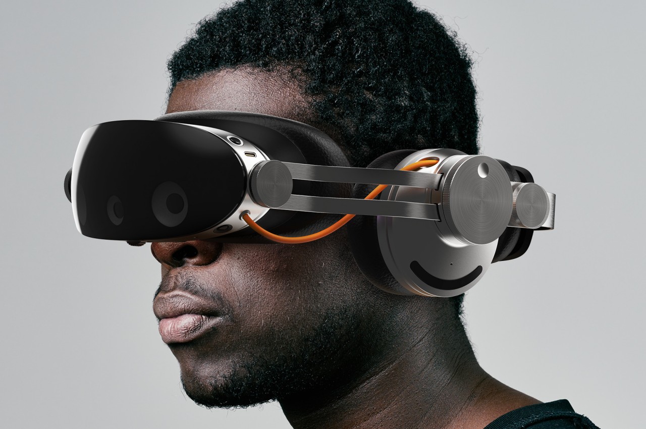
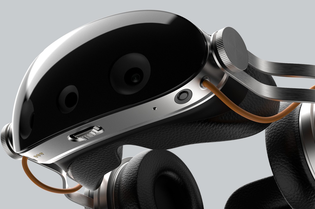
Thanks to the Apple Vision Pro, mixed reality is back in the news along with the hardware that will enable people to experience them. We have yet to hit the Holy Grail of headset design that will allow people to wear these devices on their heads for long periods, but brands like Apple and Meta definitely have that goal in their sights. MR headsets are getting lighter and slimmer, but that will always come at the cost of sacrificing some functionality that has to be offloaded to some other product you will have to buy and use separately. This concept design, however, goes in the other direction and tries to actually include everything you need for a more believable mixed reality experience, including the oft-neglected audio for your ears.
Designer: Dohyuk Joo
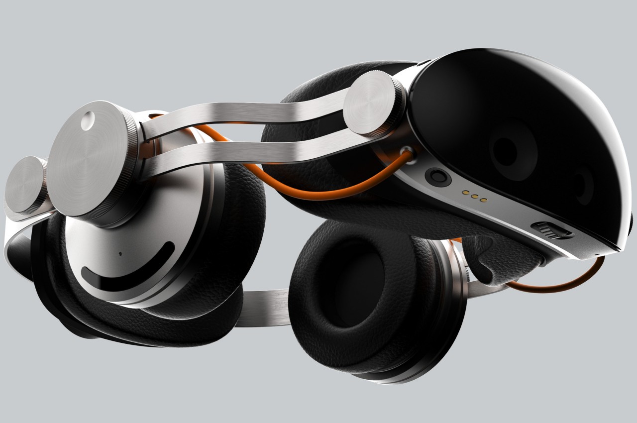
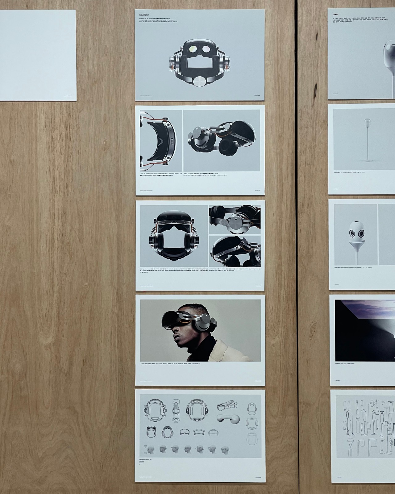
It’s harder to fool the eyes, which is why most of the focus in developing these mixed reality headsets is on the optics. But we don’t experience the real world with just our eyes, and a more immersive virtual world will also need to do more than just feed us visual data. Just like in the real world, audio is either taken for granted or at least takes second place only, but this headset design tries to balance the scales, even if it means going back to the days of bulky headsets.
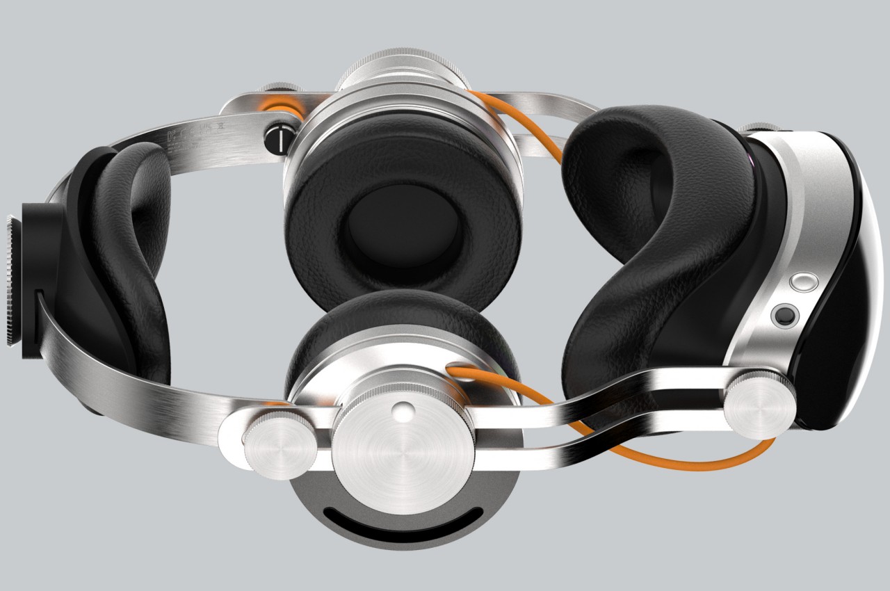
WavVision, whose name tries to embody the combination of sound and sight, attempts to be an all-in-one mixed reality solution for our eyes and our ears. In a nutshell, the headset includes over-ear headphones to deliver audio, particularly spatial audio, that would complete the immersion of existing in a virtual space. This wouldn’t be the first headset to attempt that combination, but it is definitely one of the few that make it painfully obvious. The Meta Quest 3, for example, does have built-in speakers but uses an open-ear design that simply directs the audio waves toward your ear.

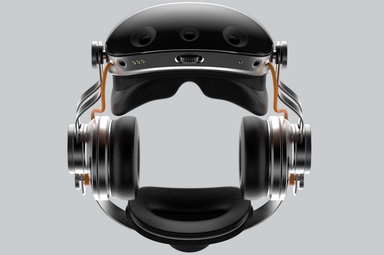
In addition to having over-ear cups built into the design, the very form and construction of WavVision go against the dominant trend in this niche market. The frame is made from thick steel plates bent to loosely follow the shape of the head. It’s a material that suggests quite a bit of weight and sharpness, which is the opposite of what headsets today are aiming for. It gives the design a distinct industrial aesthetic, which is intentional but also questionable.
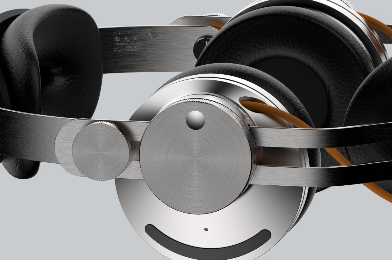
One of the reasons why headsets don’t include dedicated headphones is because the audio experience could probably be delivered by more dedicated hardware that’s specially designed for performance as well as comfort. Building that part into the headset only weighs the product down, both literally as well as in terms of costs. Conversely, an integrated design ensures a unified appearance and, at least theoretically, a more complete experience. Admittedly, few of the mixed reality brands today seem to be paying that much attention to the audio aspect, but if Apple will be playing this game for long, it will undoubtedly dip its toes in that area sooner or later.
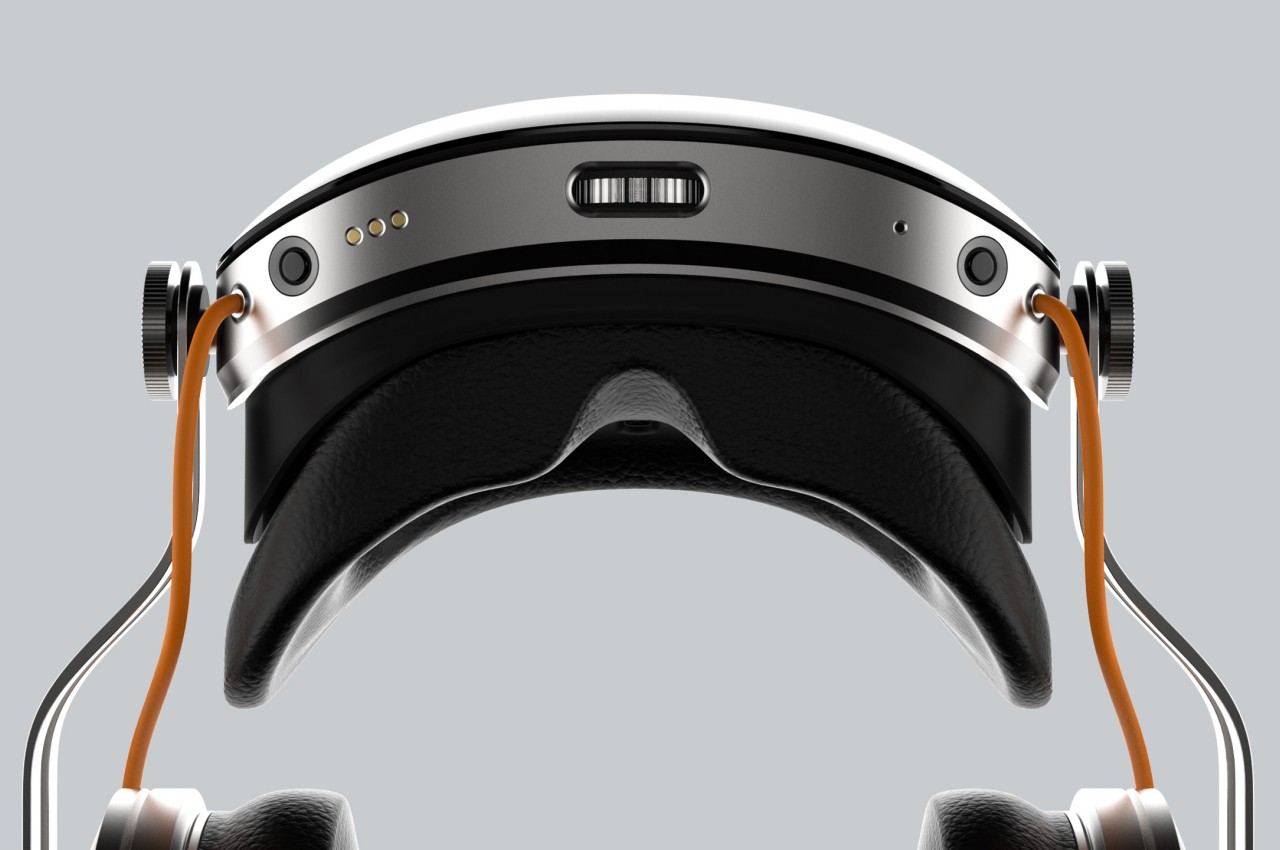
The post Mixed reality headset bucks design trends for a complete audiovisual experience first appeared on Yanko Design.
Apple has entered a new product category with the Vision Pro. The expensive eyewear, positioned to transport us into the future of VR, is an expensive deal to begin with at $3,499. So, ripping something of that value apart to just reveal how repairable it is and to what it packs within that makes it worthy of making Apple a new category giant may seem obnoxious to us.
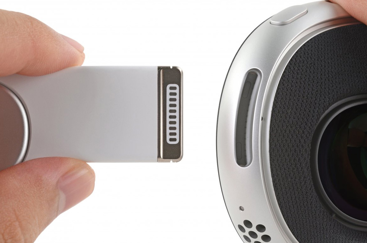
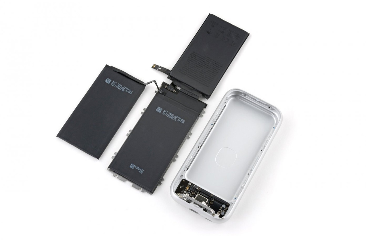
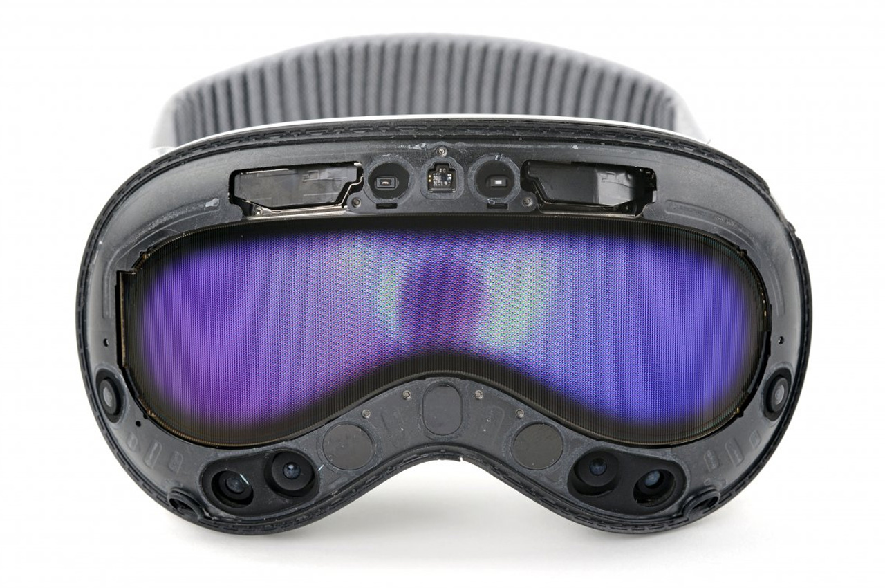
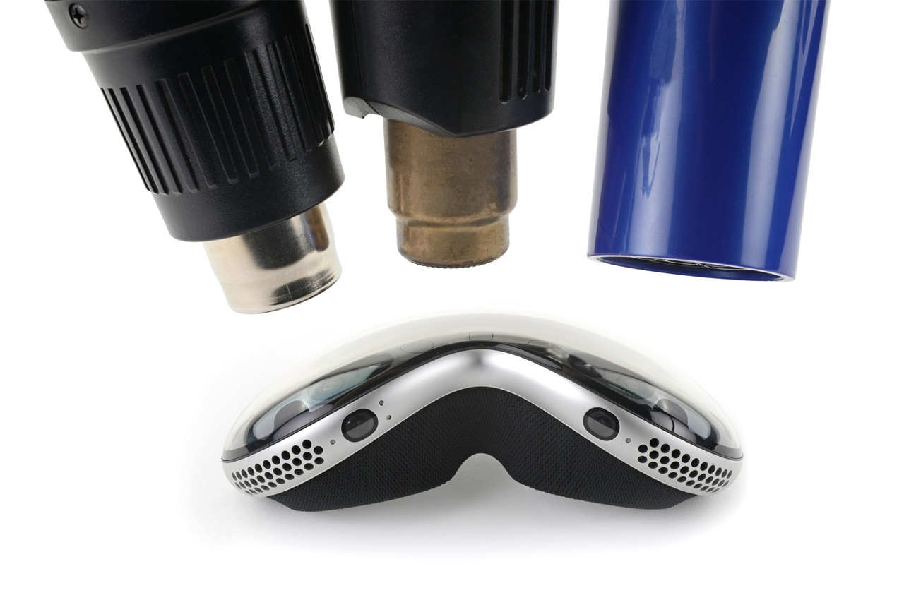
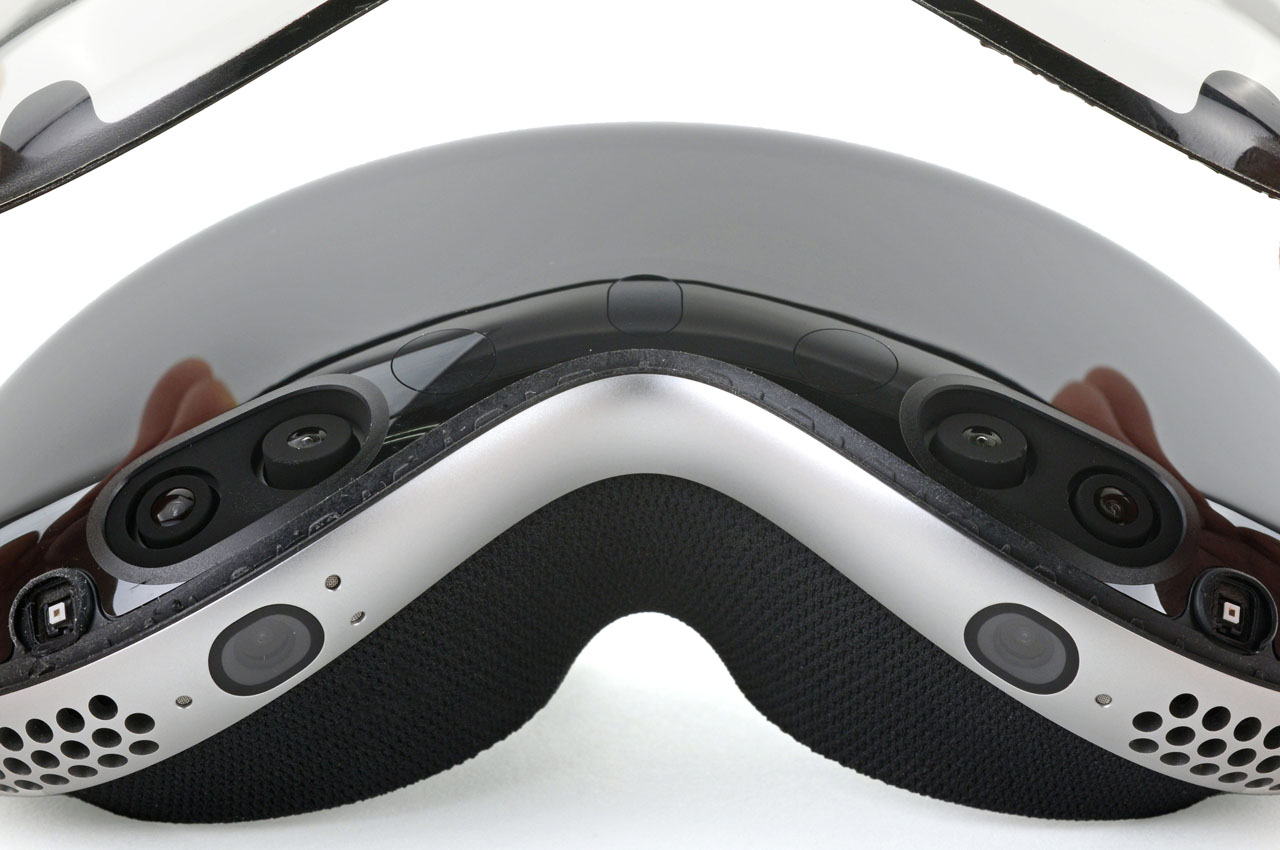
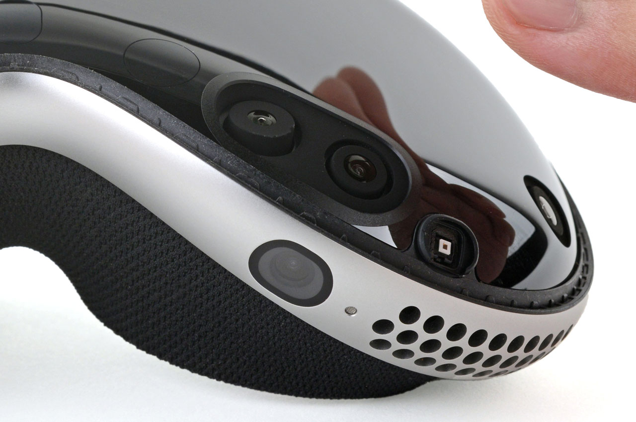
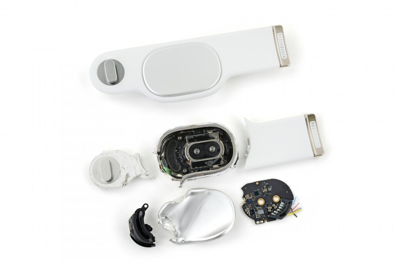
But that’s little of a deterrent for the folks at iFixit, who pride in tearing down the latest gadgets to see how easy or difficult it is to repair them and examine what makes it a favorite. In that scheme of things, iFixit has put its heating guns and prying tools to use to tear open Apple’s new tech marvel. What they see is pretty straightforward: a few easy-to-remove parts and then complicated screws, connectors, and seals to get past before fully revealing the impressive cameras and more.
Designer: iFixit
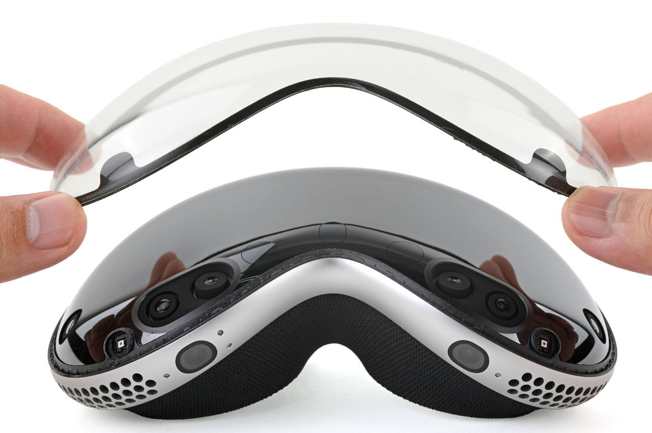
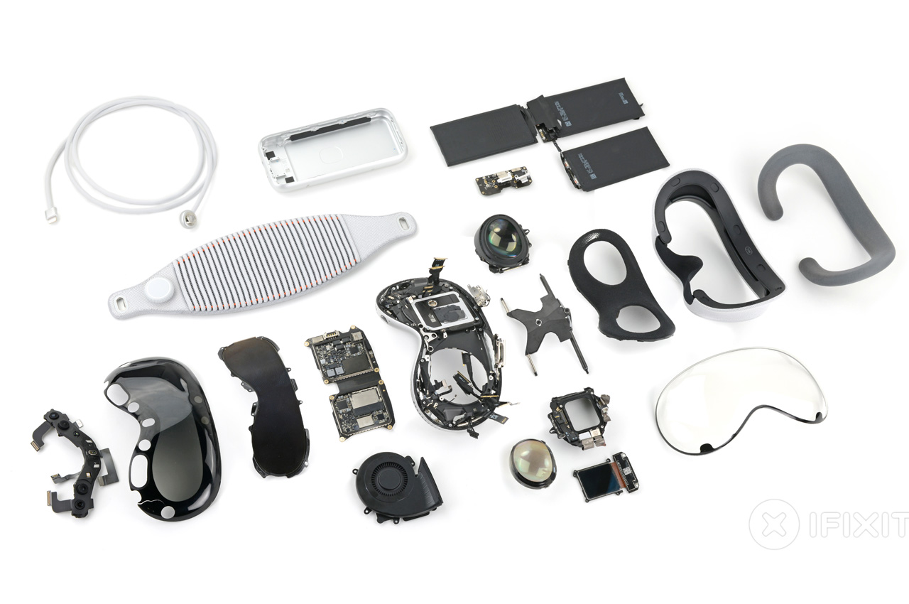
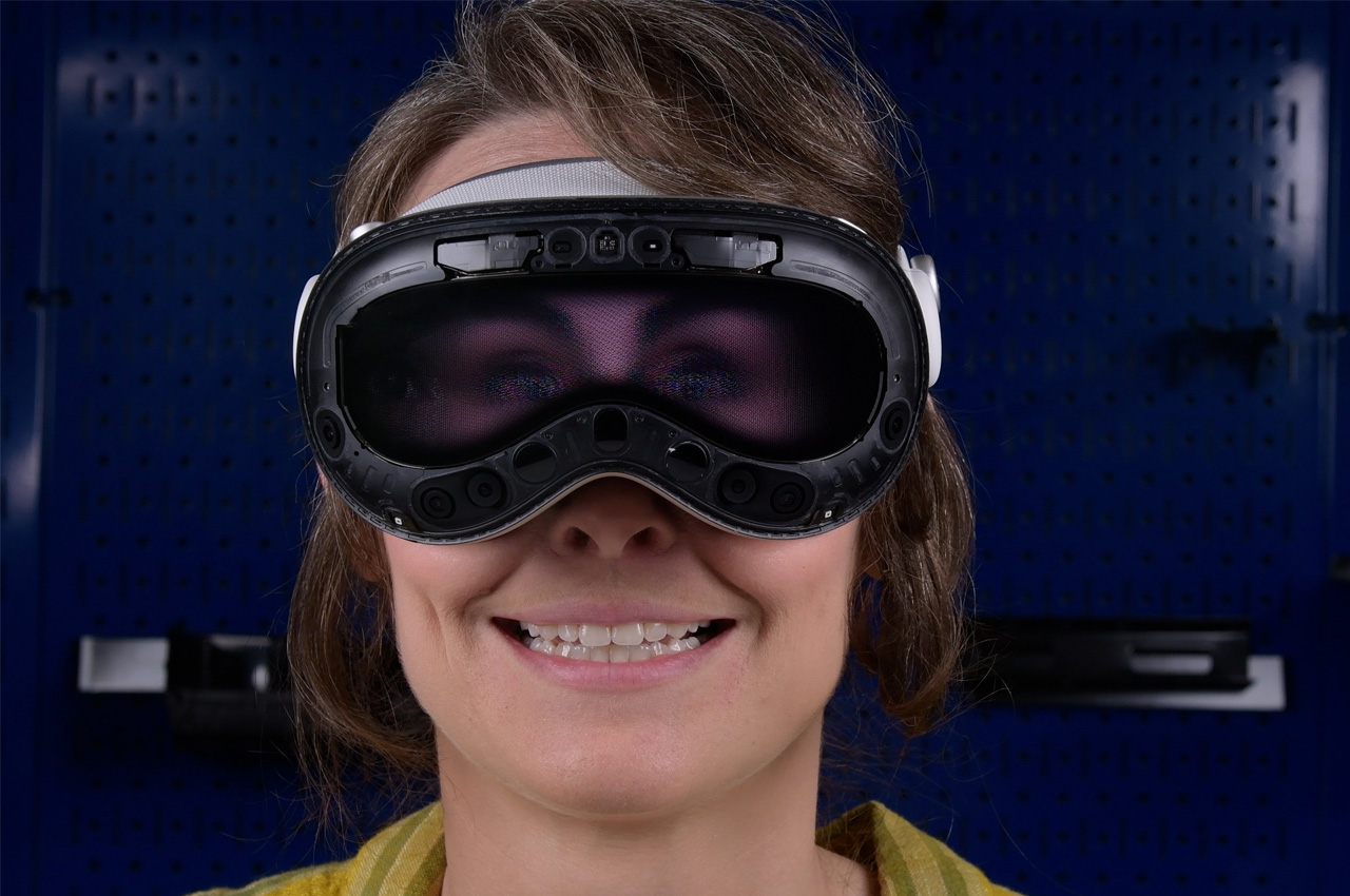
Between the easy take offs and the intricate connectors, the Vision Pro – iFixit teardown reveals – has some unbelievable tech crammed. Some of this is never seen before, especially the advanced EyeSight display which it is discovered uses several videos of the wearer’s eyes simultaneously.
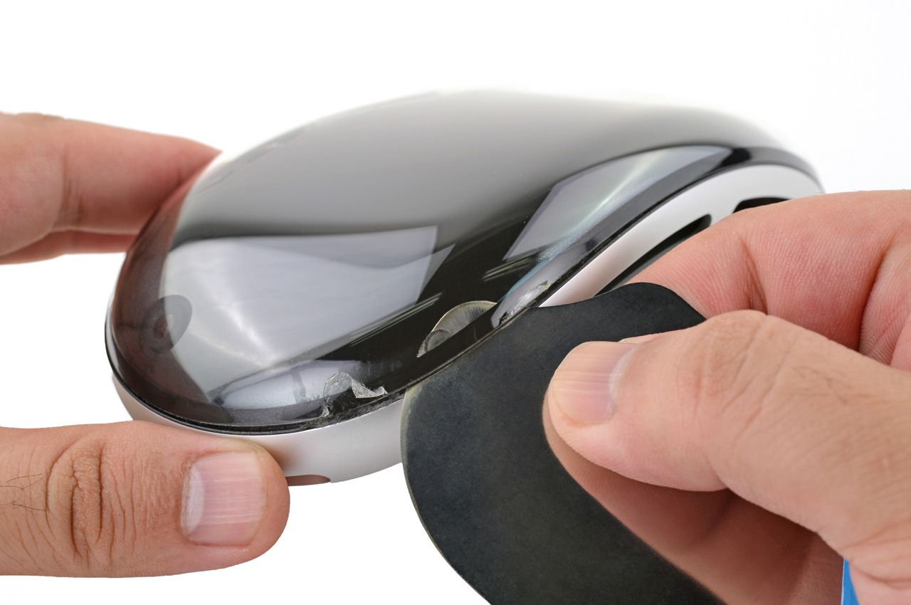
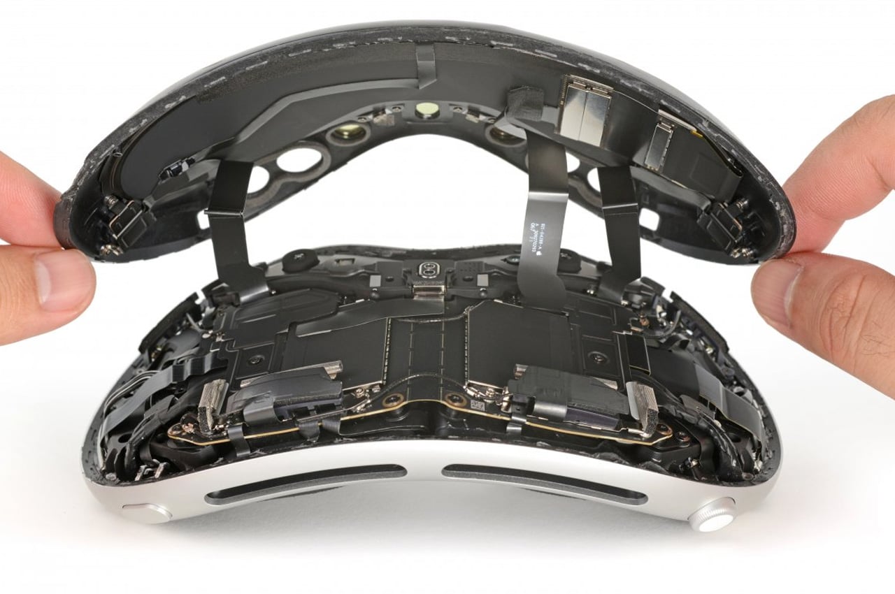
As the iFixit video runs through the teardown it shows Apple’s new AR/VR headset is similarly detailed and intriguing as the other Apple devices. So, the process of tearing it down is not easy and required a heat gun, screwdrivers, prying tools, and lots of effort. But as you’ll see, the effort is worth appreciating.

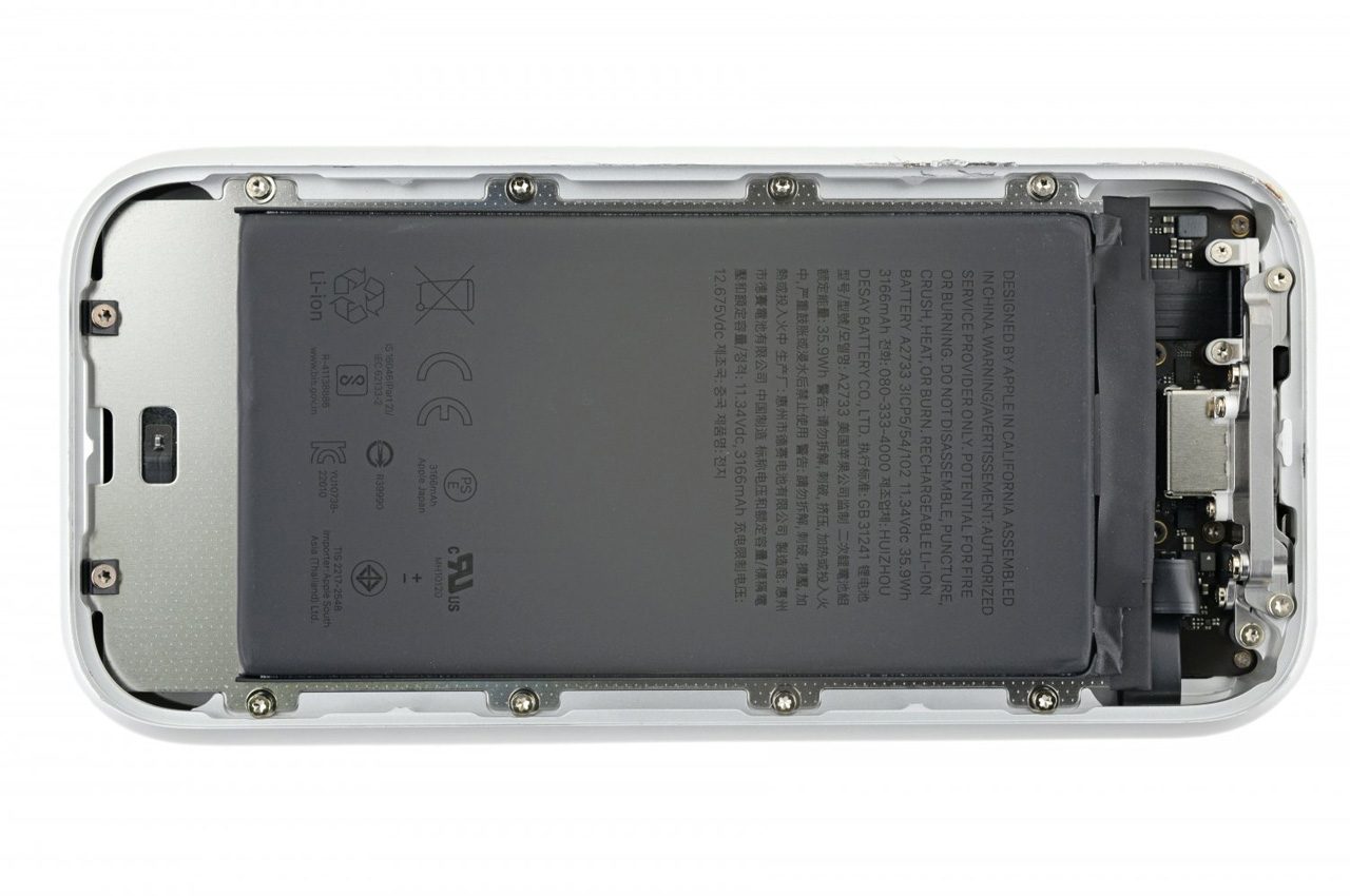
First up, the video suggests the customizable face cushion, light seals are easy to pull off, while the power chord has to be turned to unlock. The device’s knit band pops easily off the headgear stems, from the integrated latch. Stem with speakers disassemble the eye housing swiftly as well leaving the cameras, sensors, battery, R1 chip, and EyeSight display to take a look into.

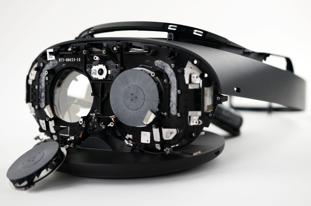
This is according to iFixit the first scratch of the detailed teardown that would be revealed in the near future. The initial teardown however shows that the Vision Pro is inside out what we have heard of. It has some high-end tech within its small form factor, but it will require some elbow grease to repair.

The post Apple Vision Pro iFixit teardown reveals what’s inside and how it works first appeared on Yanko Design.
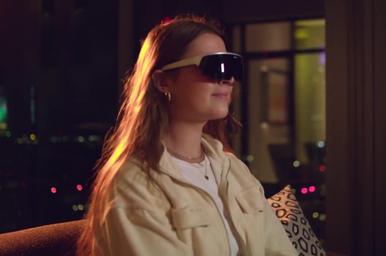
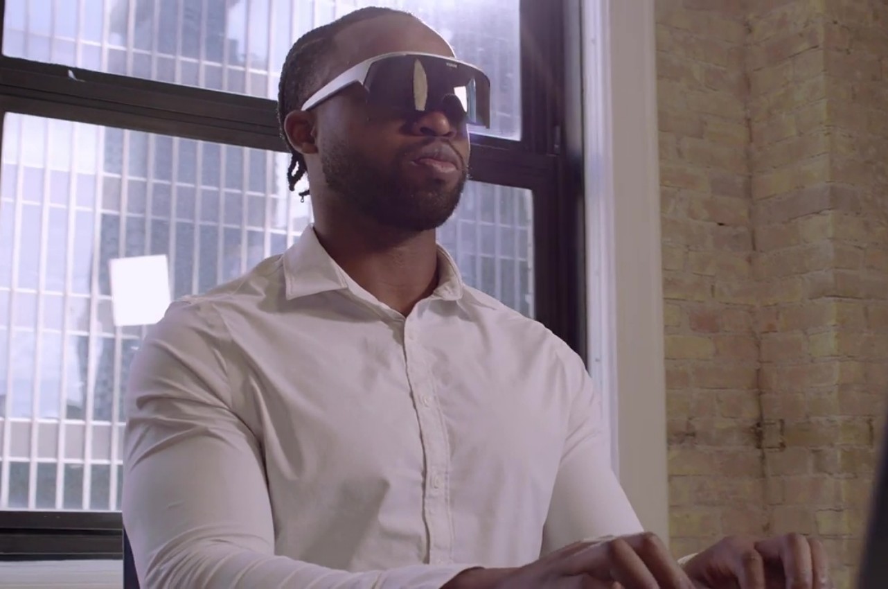
Although it’s definitely the latecomer, Apple is unsurprisingly stirring up a storm with the launch of the Vision Pro. Mixed reality, or spatial computing as Apple named it, is en vogue once again, and many companies are making a lot of noise to demonstrate how they’ve been playing the game long before the Vision Pro was even announced. That boast comes with the implication that they can offer a better experience and a more accessible product, like this visor-like Visor headset that’s trying to be a better Vision Pro than the Vision Pro with a more open platform, a more stylish design, and most importantly, a more affordable price tag.
Designer: Immersed
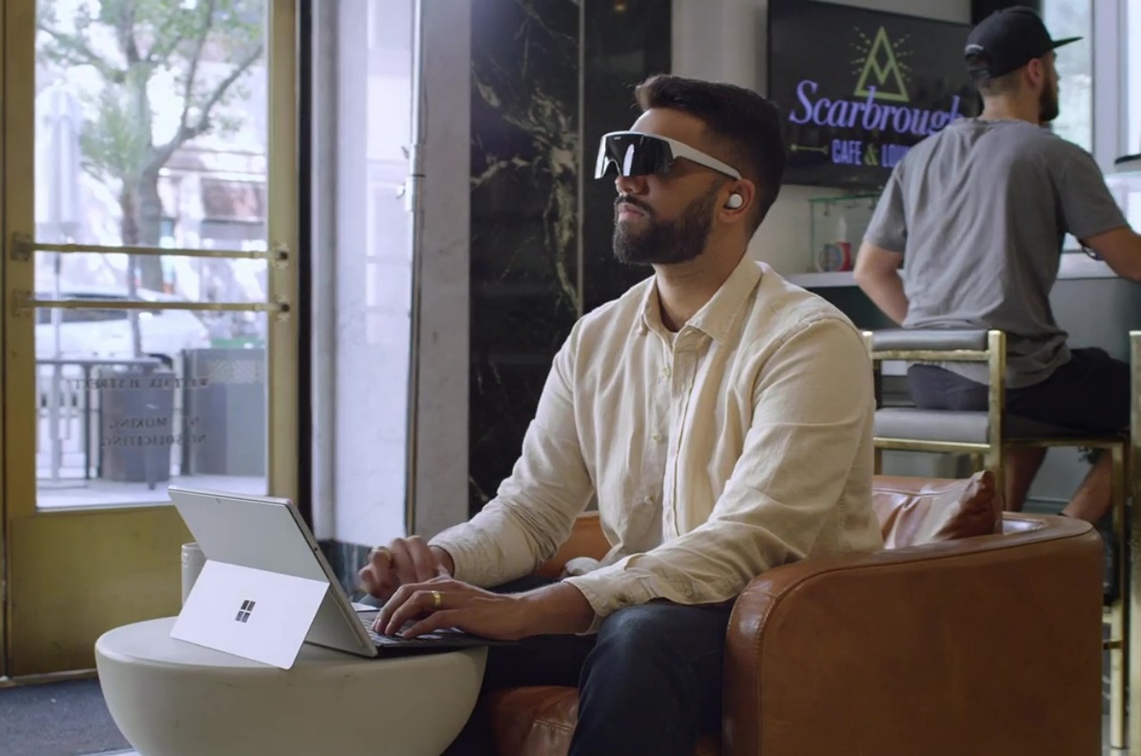
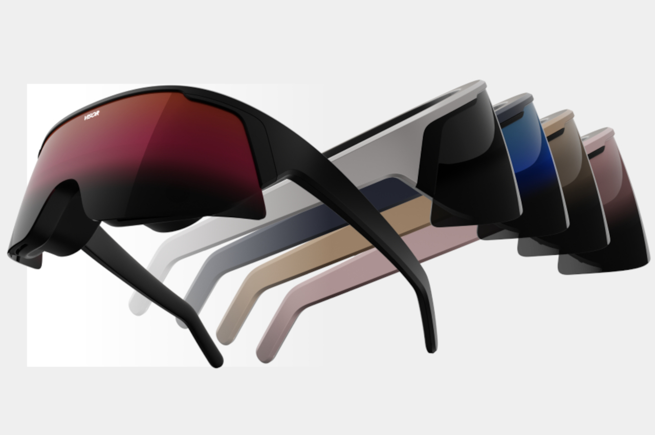
Although the Apple Vision Pro is definitely more stylish than other mixed reality headsets, it’s still a headset that leaves nothing to the imagination about what you’re wearing or doing. Visor, on the other hand, looks more like its namesake, at least outwardly. Despite the spectacle-like design, it actually bears 4K micro OLED displays per eye, a lot more than what the Visor Pro boasts. And yet the headset itself manages to weigh only 200g, more than half what the Meta Quest 3 weighs. And yes, it has an external battery to help keep the weight down.
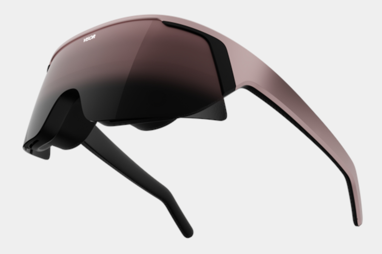
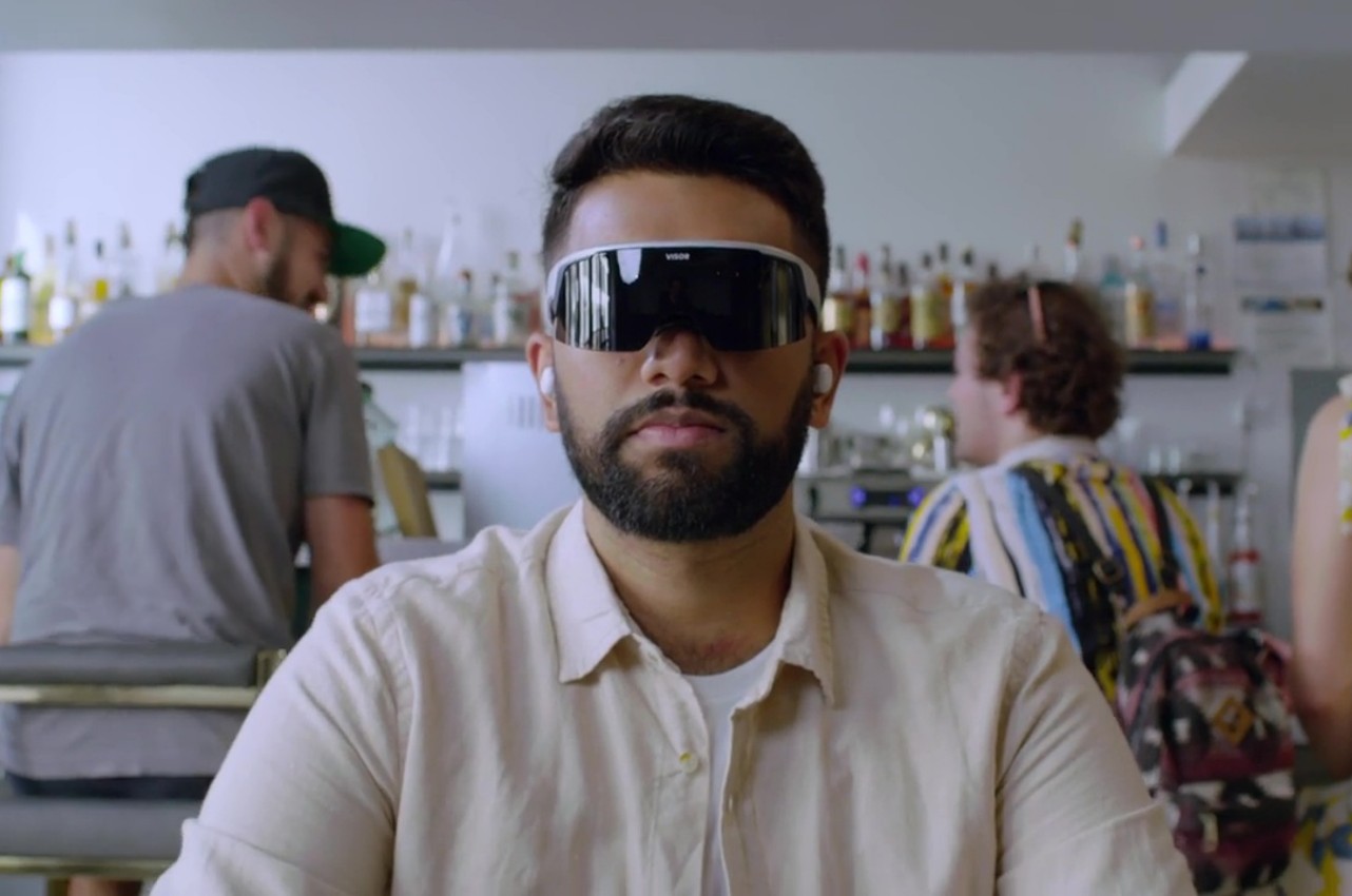
Beyond just the design of the device itself, the Visor offers a completely different experience from the likes of the Vision Pro or even the new Xreal Air 2 Ultra that was announced at CES 2024 earlier this month. It neither runs its own operating system nor does it just mirror the screen of a computer. Instead, it harnesses Immersed’s mixed reality software that it has been developing for years that practically gives you virtual monitors spread across your vision, resulting in a wider field of view compared to the common smart glasses implementation.
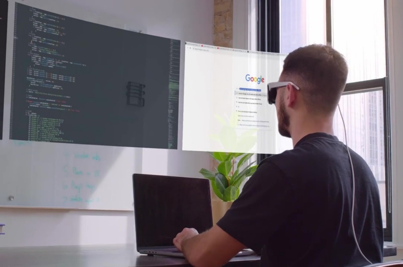
What this means in practice is that you can keep on using the software and operating system you’re already familiar with without any limitations. In fact, Immersed says it won’t even block attempts to make SteamVR work with its device, even though its focus is more towards productivity and professional use. Visor doesn’t even have an app marketplace, but it will release development tools for sideloading apps later on.
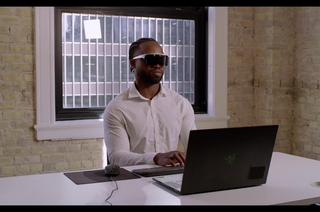
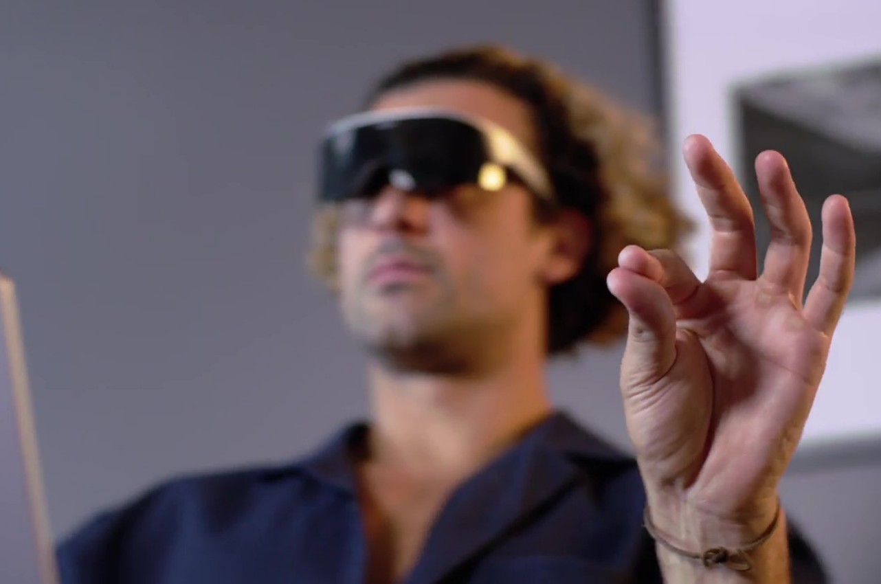
If Visor’s $399.99 price tag sounds too good to be true, that’s because it somewhat is. That cheap figure actually requires you to also buy a “Membership Plus” subscription that will cost $59.99 a month for 12 months or $39.99 for 24 months. The good news is that you won’t lose access to the basic features of the device if you decide not to renew after that period. Alternatively, you can buy the device alone for a full $999.99, without any of the extras, which is still a lot cheaper than the Apple Vision Pro. Whether it can deliver all these promises, however, is something we’ll have to see in due time, no pun intended.
The post Visor mixed reality headset promises a more accessible Apple Vision Pro first appeared on Yanko Design.
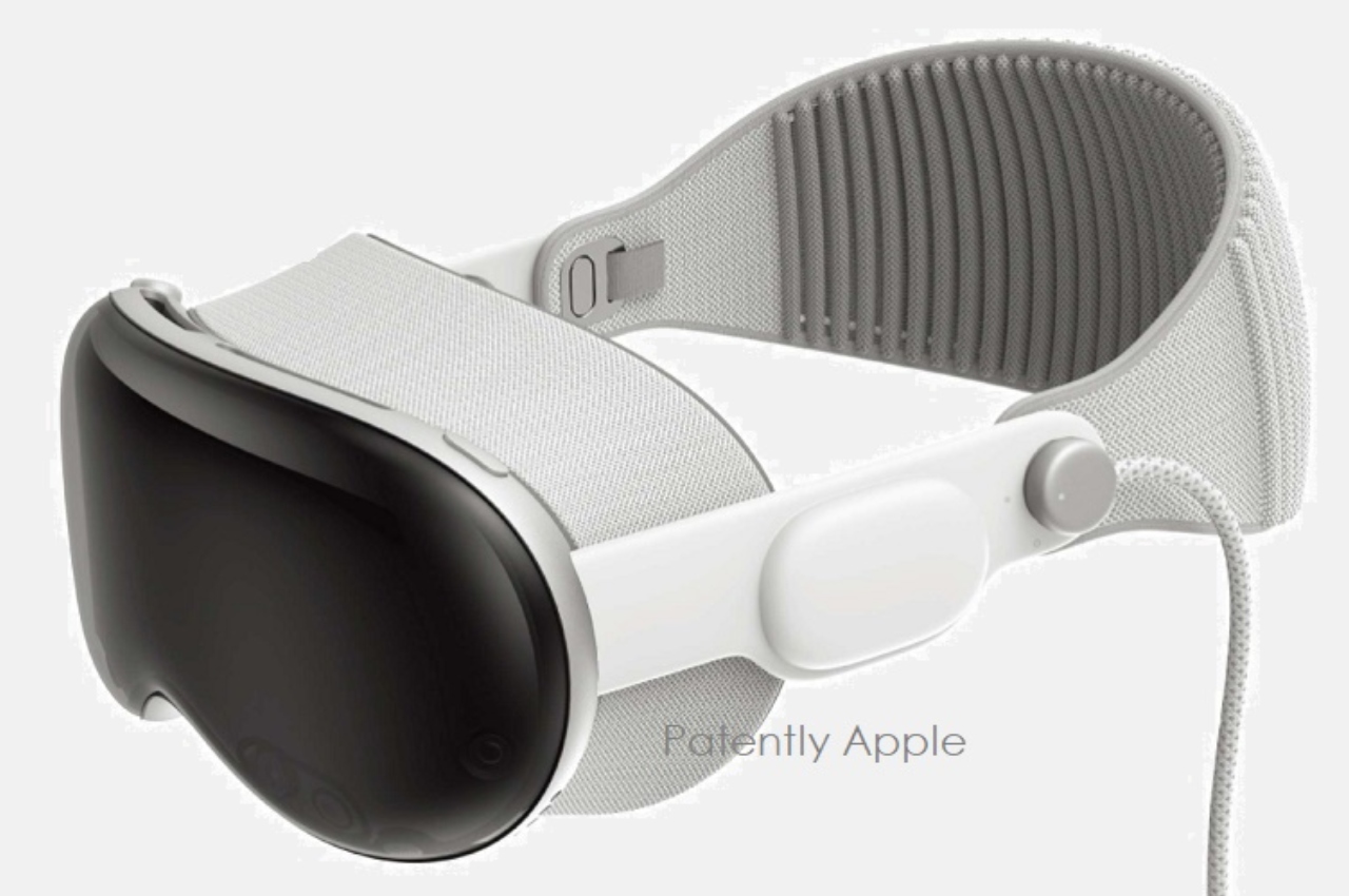
If you’re one of those that are excited for the upcoming mixed reality headset from Apple called Vision Pro, you’ll be pleased to know that they have won 70 more design patents that may be used as official accessories. With the headset set to make its debut in early 2024, those who will be early adapters are also looking at what else they can add to enhance the experience of using it. And if you like protecting your gadgets, they may be releasing an official cover for it too.
Designer: Apple
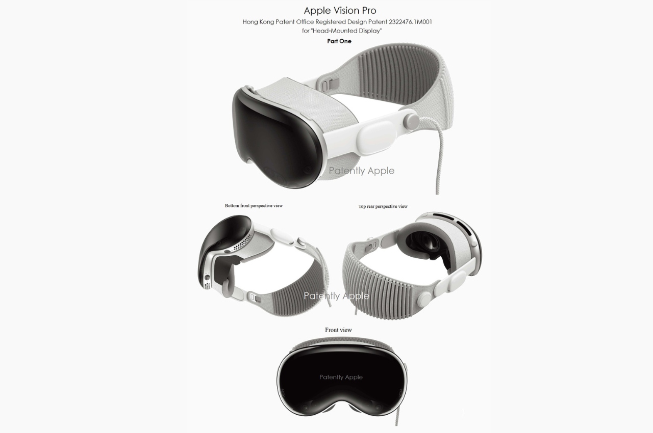
One of the patents that Apple has reportedly won is a cover for their upcoming “spatial computing” device. It uses a soft-touch woven fabric material and is designed to fit in with the device design-wise so that it won’t be too bulky or too out of place. The main function is for it to protect the most vulnerable parts of the gear. It will help you avoid scratches and debris in the front and sides of your headset but it also leaves the back part and the Light Seal clear so it won’t interfere with your viewing and computing experience.
The cover will be able to make sure the EyeSight display will be protected while not hindering the user from actually seeing what needs to be seen. There is also a tab on the left side which will make it easy to remove it in case you don’t need the cover while using the headset. Based on some product renders, the cover does seem to be integrated well into the Vision Pro and maybe even making it cooler.
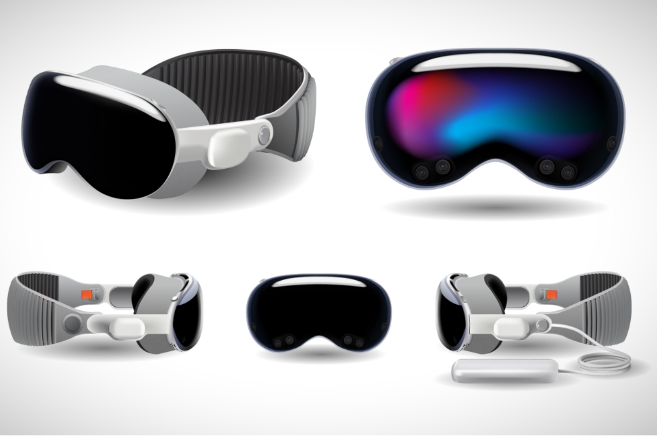
We can expect a slew of accessories for the upcoming Apple device that should make AR and VR more accessible and usable for the average person. Whether they’re “official” ones from Apple or from popular third-party accessory brands like CASETiFY, expect to be flooded with these add-ons even before you decide whether you’re getting a Vision Pro or not.
The post Apple Vision Pro first accessory might be a protective cover first appeared on Yanko Design.
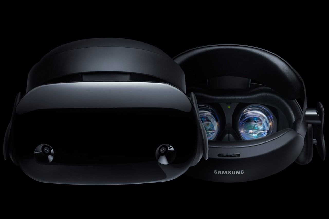
Although it was a bit late to the game, it was unsurprising that the Apple Vision Pro mixed reality headset blew people’s minds the moment Apple officially revealed its existence and features. It has definitely caused many players in the market to rethink their designs and strategies, including Samsung who was supposedly close to announcing its own XR or eXtended reality hardware. The initial expectations were along the lines of a full headset not unlike the (Facebook) Meta Quest 3 or Samsung’s own defunct HMD Odyssey, but it seems that Samsung was “inspired” by its biggest rival to go back to the drawing board. While still largely a mystery, some of the pieces are falling into place, laying the foundations for what will soon be called Samsung Glasses.
Designer: Samsung
There is still some debate on what specific area of the umbrella eXtended Reality (XR) space Samsung’s headset will be aiming for. Based on a recently leaked prototype, it would have leaned more on the virtual reality side of the equation, with outward-facing cameras to allow wearers to see a glimpse of the world outside. This is the conventional HMD or Head-Mounted Device design and something Samsung is already familiar with. But with rumors of Samsung reviewing the device in lieu of the Apple Vision Pro, you can expect some big changes in terms of design.
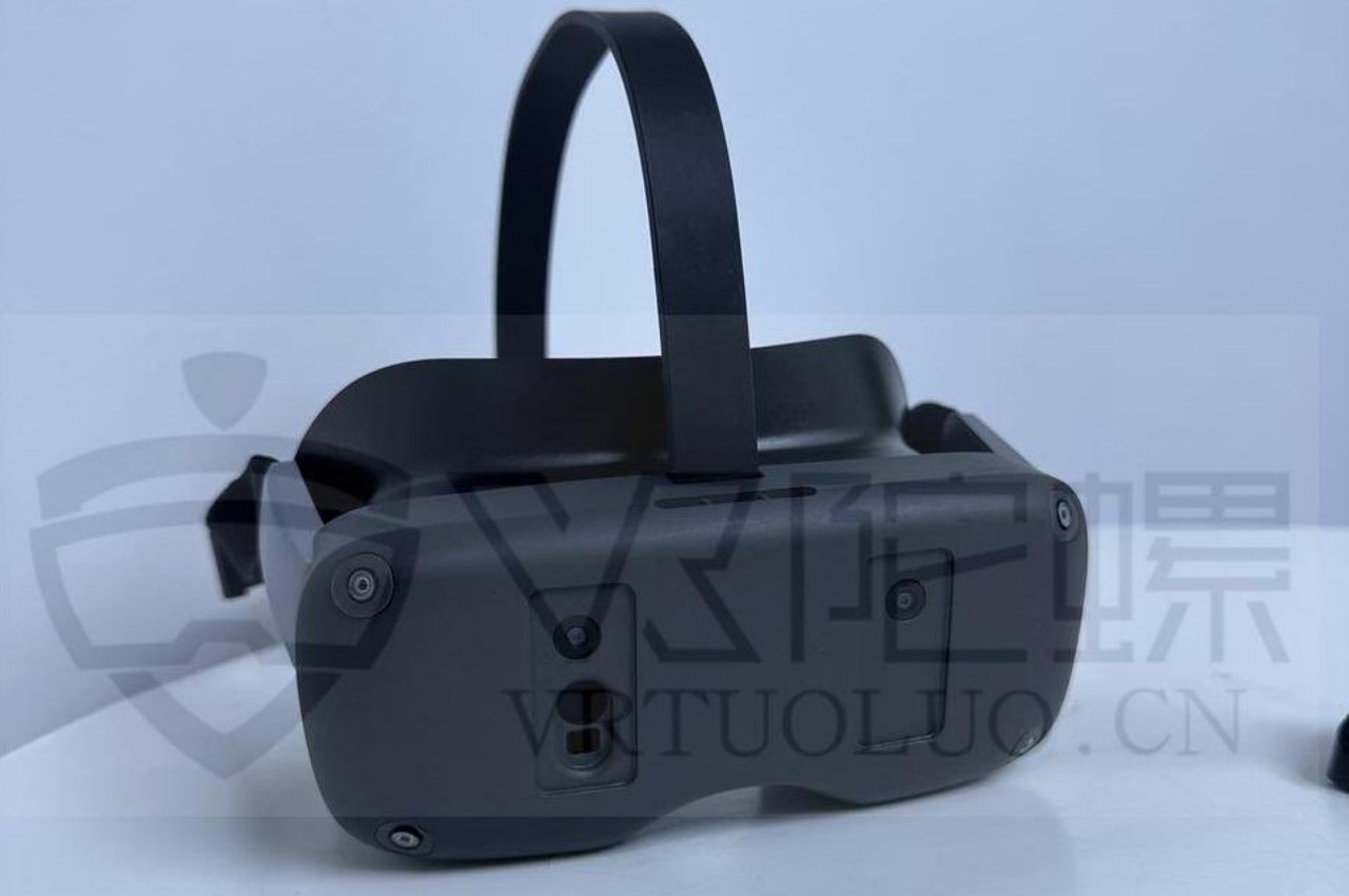
Image courtesy of Brad Lynch
A recent trademark filing in the UK reveals that Samsung is calling dibs on the “Samsung Glasses” name. The description, which covers VR, AR, MR, and XR, isn’t exactly telling, but it does suggest it will take on a form closer to smart glasses. Considering the necessary hardware involved, it won’t be something simple like Ray-Bans or Google Glasses, more like, well, the Apple Vision Pro or the Meta Quest Pro. While not completely comfortable or portable, this design at least opens the door to AR and mixed reality more than a typical VR headset.
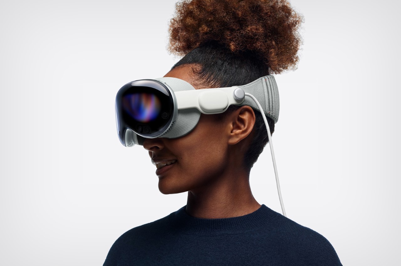
Apple Vision Pro
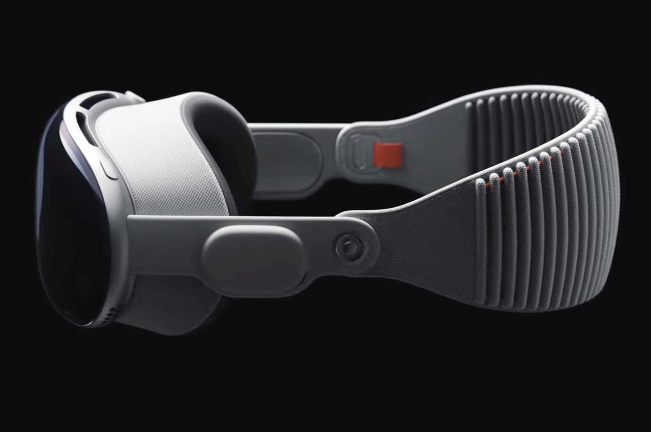
Apple Vision Pro
In addition to the usual processors and electronics needed to drive such a mixed reality headset, Samsung Glasses will succeed or fail depending on the optics it uses. The prototype mentioned above lists micro OLED displays, pancake lenses, and cameras for eye and hand tracking, all of which contribute to a more immersive experience when viewing and manipulating digital objects. Samsung was reportedly planning on using a 2022 processor to power this headset, but Apple’s challenge has it mulling over a more capable chip it could use instead.
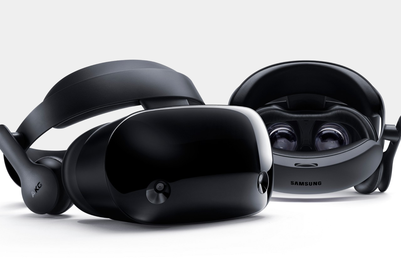
Samsung Odyssey+
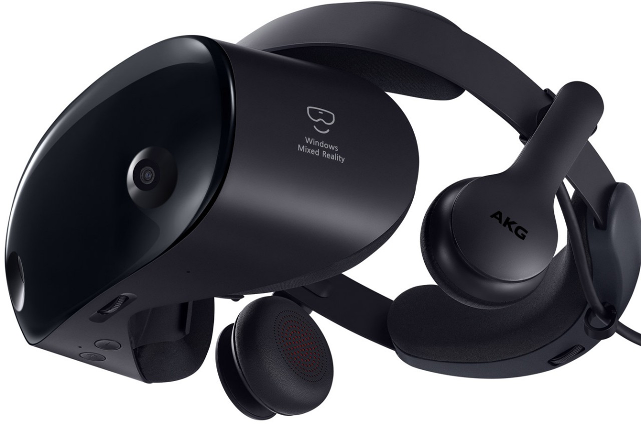
Samsung Odyssey+
One thing that Samsung might be doing differently from Apple is having the battery built into the headset, though mounted on the rear rather than the front. While this naturally adds to the weight of the device, its location attempts to at least balance the load on both sides. It also makes the Samsung Glasses a bit more portable since it doesn’t have to rely on an external battery connected via a cable.
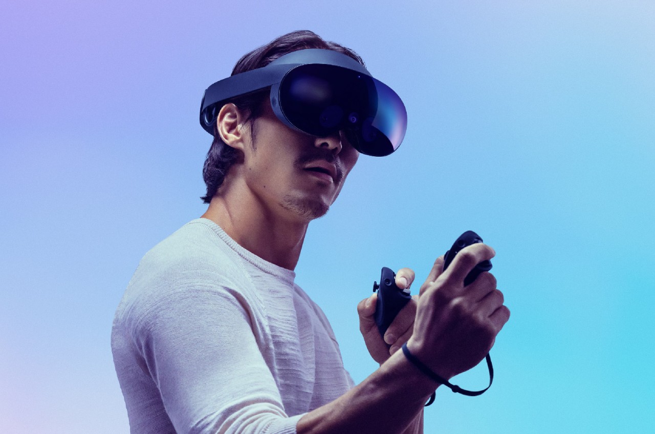
Meta Quest Pro
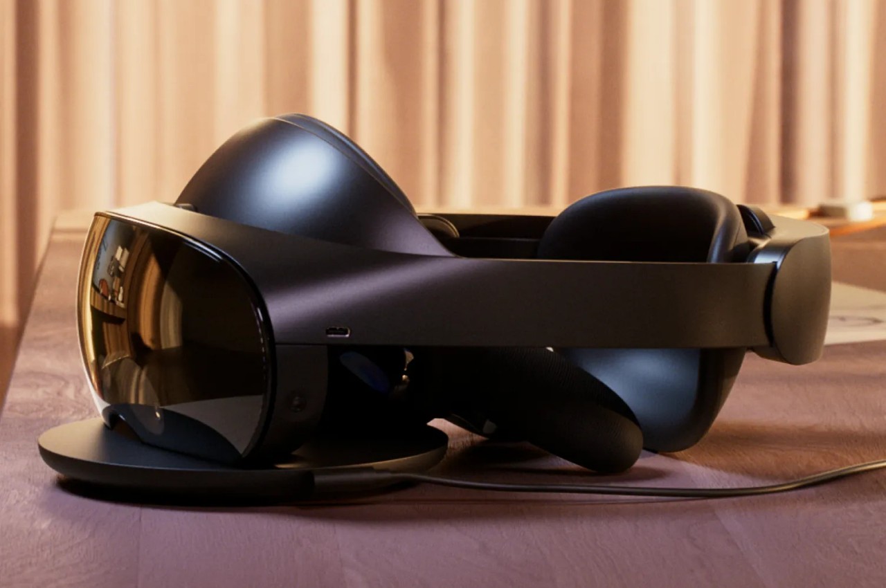
Meta Quest Pro
With the Apple Vision Pro’s market launch nearing, Samsung really doesn’t have much time left to put out its own take on the eXtended Reality space. Insider sources claim that the date has been pushed back to mid-2024, in contrast to Apple’s launch sometime between January and April. That’s not to say that Samsung is taking it slow, as developers are allegedly told to finish their XR apps by November. There will be an internal launch next month, so we might get a few more unofficial sneak peeks of the device.
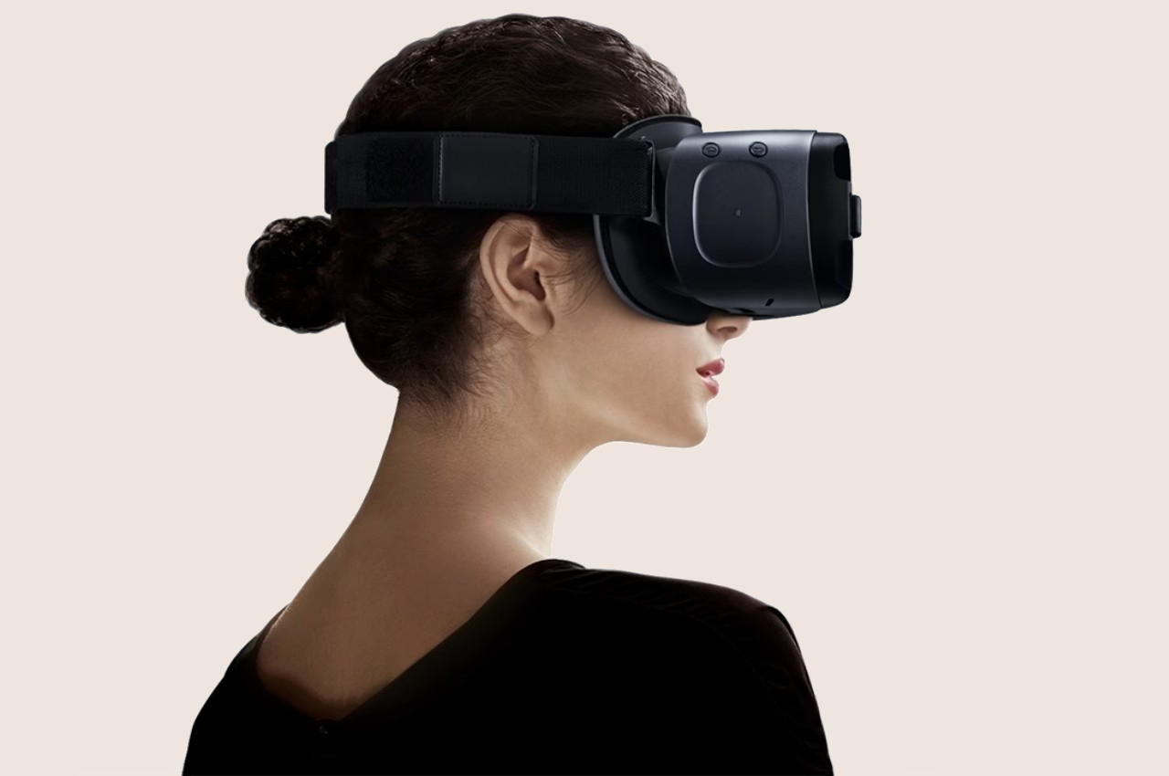
Samsung GearVR
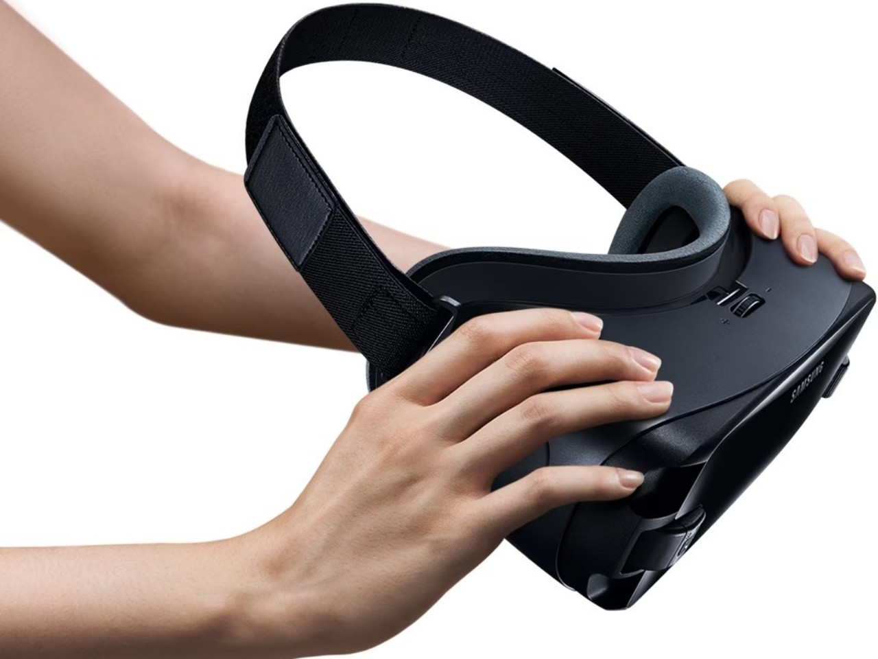
Samsung GearVR
Of course, most of these are still conjectures based on a variety of unofficial sources, so there is still plenty of room to hope for a better device. Conversely, Samsung’s track record with the Gear VR and, later, the HMD Odyssey doesn’t inspire much confidence. The design of the headset is critical for comfort, but it will be the software that will determine whether such a piece of hardware will actually entice buyers in the long run.
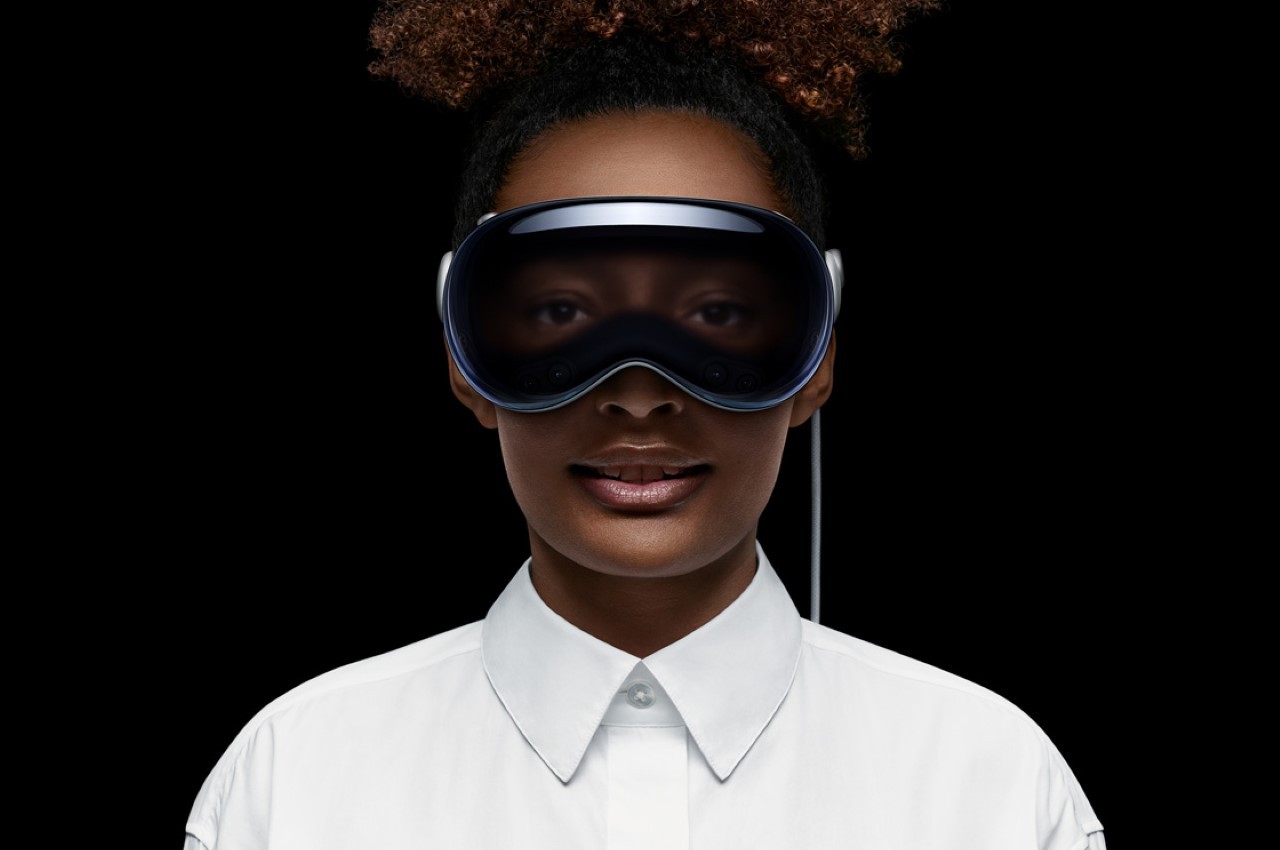
Apple Vision Pro
The post Samsung Glasses Mixed Reality Headset: What We Know So Far first appeared on Yanko Design.
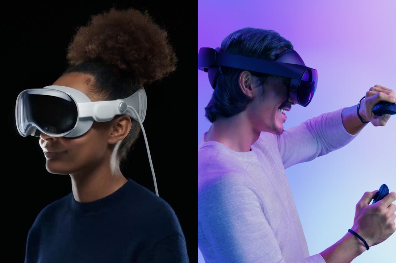
Apple finally took off the veils from its much-anticipated entry into the mixed reality race, and the Internet was unsurprisingly abuzz with comments on both sides. Naturally, comparisons were made between this shiny newcomer and the long-time market leader, which is now Meta, whether you like it or not. Given their already tenuous relationship, the launch of the Apple Vision Pro only served to increase the rivalry between these frenemies. It’s definitely not hard to paint some drama between the two tech giants vying for the same mixed reality or spatial computing market, whichever buzzword you prefer to use. But is there really a direct competition between these two products, or do they have very different visions with almost nothing in common except for having to put a screen over our eyes? We take a deeper look into the Apple Vision Pro and the Meta Quest Pro to see where they differ not only in their design but also in their vision.
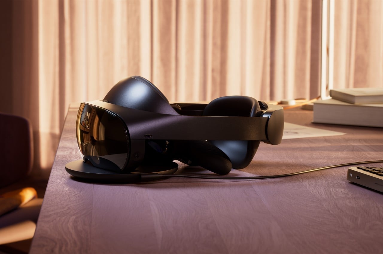
Let’s start with the older of the two, one that dates back to the time when Facebook was also the name of the company. Originally created by Oculus, the Quest line of VR headsets soon bore the Meta name, though not much else has changed in its core focus and the way it works. In a nutshell, the Meta Quest Pro, along with its siblings and predecessors, falls under the category of virtual reality systems, which means it gives you a fully enclosed experience confined within virtual walls. It practically blocks off the rest of the real world while you’re wearing it, but the Quest Pro now has a “passthrough” feature that lets you see the world around you through the headset’s cameras, but the quality is definitely lower than what your eyes could naturally see.

In terms of product design, the Quest Pro doesn’t stray too far from the typical formula of consumer electronics, which is to say that there’s plenty of plastic material all around. To be fair, Meta aimed to make the Quest hardware more accessible to more people to help spread its adoption, so it naturally had to cut a few corners along the way. The choice of materials was also made to lighten the gear that might be sitting on your head for hours, but it also doesn’t remove the less-than-premium feel, nor does it completely alleviate that heft.

To its credit, the design of the Quest Pro does help make the headset feel a little less burdensome by balancing the weight between the front and back parts. While the front has most of the hardware and optics that make the Quest Pro work, the back has the battery that powers the device. Having that battery present still adds to the overall weight of the machine, but Meta opted to prioritize mobility and convenience over lightening the load.
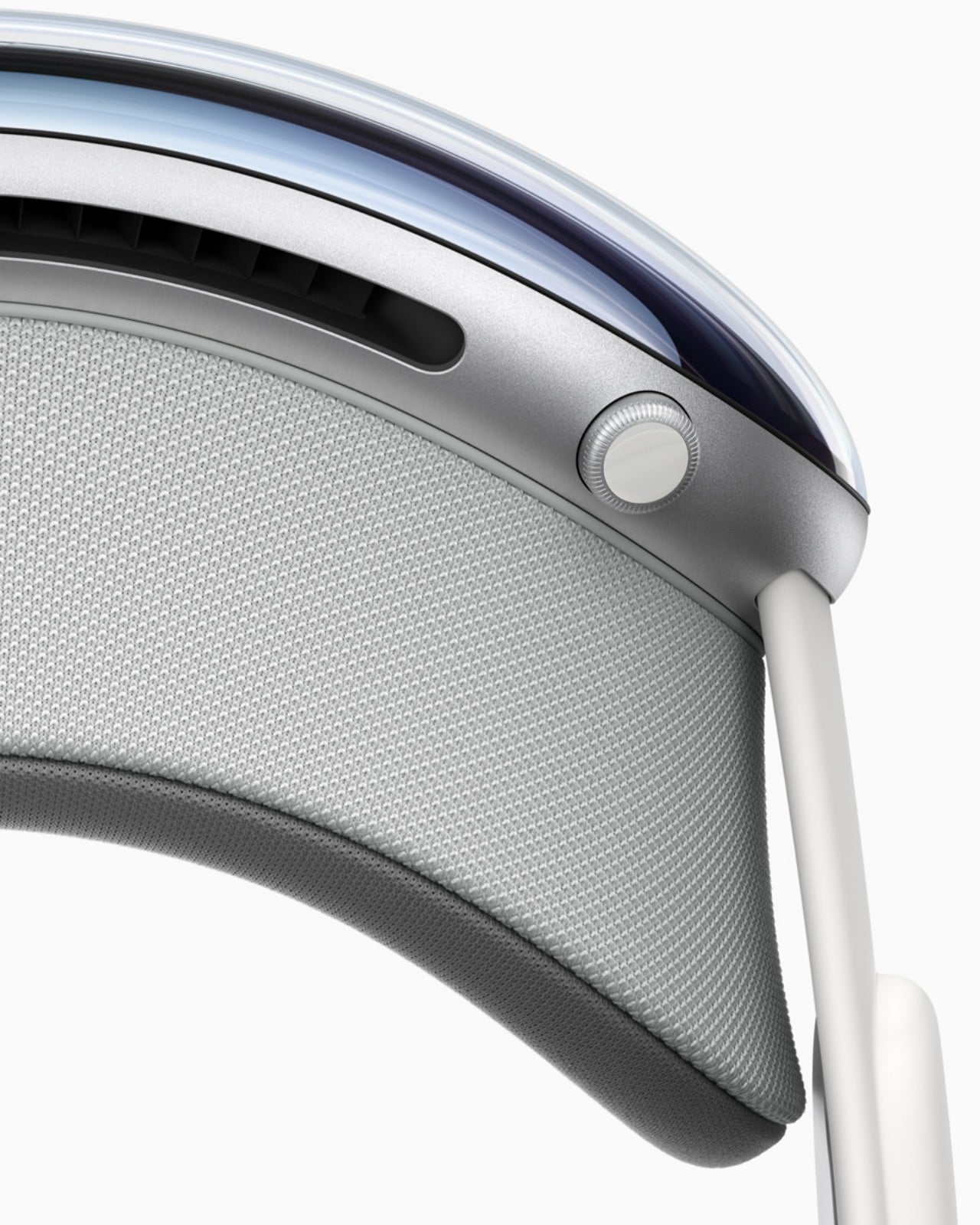
The Apple Vision Pro, in comparison, takes an almost completely opposite approach from the Meta Quest Pro or all other headsets in general. In typical Apple fashion, the company paid special attention to design details that make the hardware both elegant and comfortable. The Vision Pro makes use of premium materials like laminated glass and woven fabrics, as well as heavier components like aluminum alloy. It’s a device that looks elegant and fashionable; an undeniable part of Apple’s hardware family.

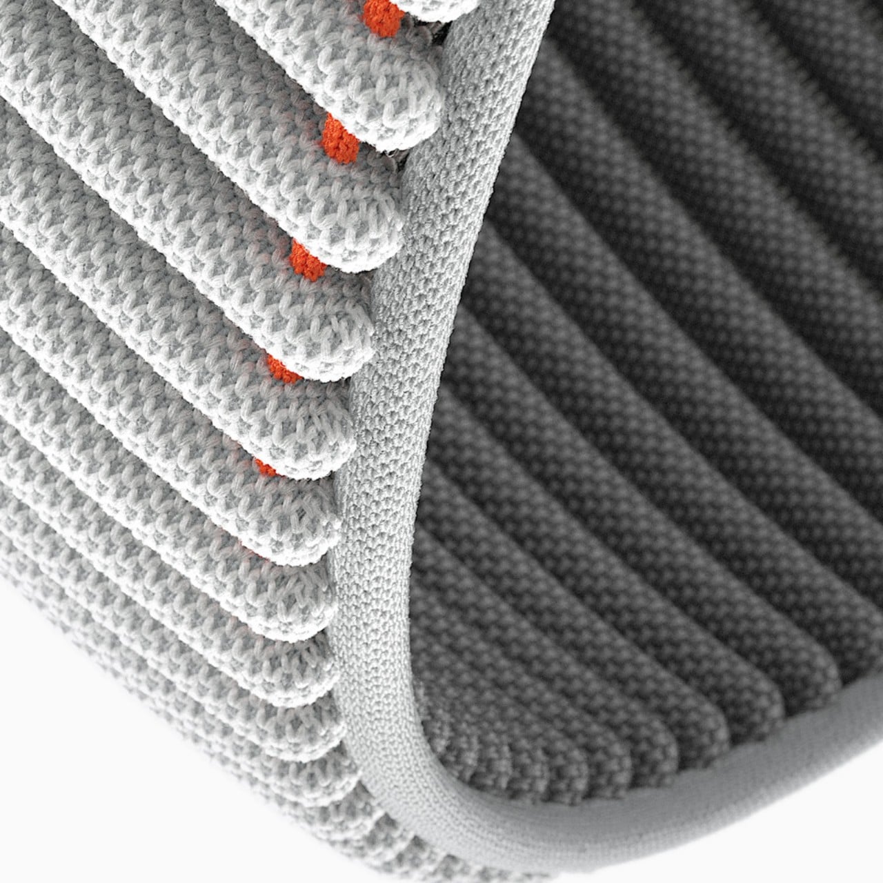
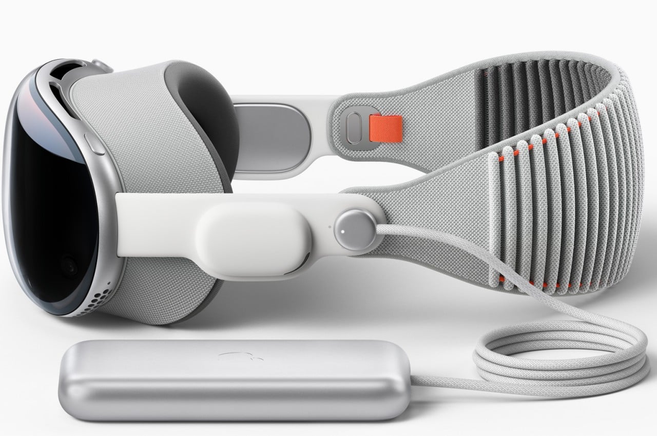
Apple’s answer to the battery problem is both simple and divisive. The Vision Pro simply doesn’t have a battery, at least not on the headset itself. You’d have to connect an external power source via a cable, though that battery can be shoved inside your pocket to get it out of the way. It doesn’t completely hinder mobility and even opens the doors for third-party designs to come up with other ideas on how to solve this puzzle.
The biggest difference between Apple’s and Meta’s headsets, however, is in their use and purpose. The Vision Pro is closer to being an augmented reality headset compared to the Quest Pro, blending both virtual and real worlds in a single, seamless view. The Vision Pro also has the ability to block out or at least dim everything aside from the virtual window you’re using, but that’s only a side feature rather than a core function.
At its most basic, the Meta Quest Pro is really a virtual reality headset while the Apple Vision Pro is designed for a form of mixed reality now marketed as “spatial computing.” To most people, the two are almost interchangeable, but those sometimes subtle differences set these two worlds apart, especially in how they are used. It’s certainly possible to mix and match some features and use cases, but unless they’re specifically designed to support those, the experience will be subpar.
The Meta Quest Pro, for example, is the first in its line that can be truly considered to have AR functionality thanks to its higher fidelity “passthrough” feature, allowing you to see virtual objects overlaid on top of the real world. That said, its core focus is still on virtual reality, which, by nature, closes off the rest of the world from your sight. Looking at the world through cameras is really only a stopgap measure and can be a little bit disorienting. That’s not even considering how most of the Quest ecosystems experiences happen in virtual reality, including the use of “normal” computer software, particularly ones that require using a keyboard and a mouse.
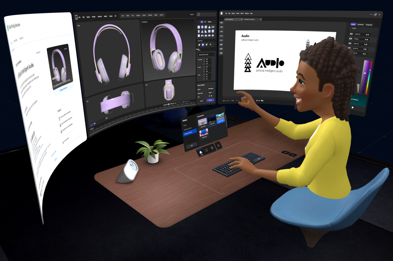
On the other hand, the Apple Vision Pro was made specifically for mixed reality, specifically spatial computing, where the real and the digital are blended seamlessly. In particular, it puts those applications, including familiar ones from macOS and iOS, in floating windows in front of you. visionOS’s special trick is to actually have the real world affect those virtual objects, from having them cast shadows to tweaking the audio to sound as if they’re bouncing off the furniture in the room. The Vision Pro can emulate the enclosed view of a VR headset by darkening everything except the virtual window you’re using, but it’s unavoidable that you’ll still see some of the real world “bleeding” through, especially in bright ambient light.
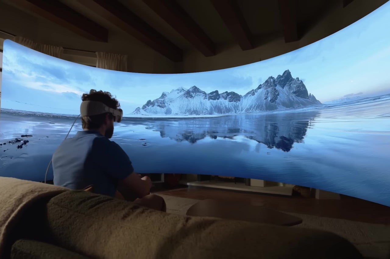
The Vision Pro’s and visionOS’s capability to blend the real and the virtual is no small feat. Not only does it enable you to use normal applications with normal computer peripherals, it also makes better use of real-world space. It lets you, for example, assign specific applications and experiences to parts of the house. Apple’s technologies also create more natural-looking interactions with people, even if your actual body parts are invisible or even absent. All these don’t come without costs, though, and it remains to be seen if people will be willing to pay that much for such a young technology.
The Meta Quest Pro hails from a long line of VR and AR headsets, and nowhere is this more obvious than in the way you interact with virtual objects. The headset is paired with two controllers, one for each hand, which are pretty much like joysticks with buttons and motion sensors. Make no mistake, the technology has come a long way and you no longer need to have external beacons stationed elsewhere in the room just to make the system aware of your location or that of your hands. Still, holding two pieces of plastic all the time is a very far cry from how we usually manipulate things in the real world or even from the way we use computers or phones.
Apple may have acquired the holy grail of virtual computing with its more natural input method of using hand gestures without controllers or even gloves. There’s still a limited vocabulary of gestures available, but we’re almost used to that given how we have been using touch screens for the past decade or so. At the same time, however, the Vision Pro doesn’t exclude the use of more precise input instruments, including those controllers, if necessary. The fact that you can actually see the real objects makes it even easier to use any tool, which expands the Vision Pro’s uses considerably.
Although it’s easy to paint the Apple Vision Pro and Meta Quest Pro as two sides of the same eXtended Reality (XR) coin, the philosophies that drive their design are almost as opposed to each other as the companies themselves are. Meta CEO Mark Zuckerberg was even quoted to have pretty much said that while downplaying the Vision Pro’s innovations. In a nutshell, he doesn’t share Apple’s vision of the future of computing.
It shouldn’t come as a surprise that Zuckerberg’s vision revolves around social experiences, something that might indeed be better served by a fully virtual reality. Not only does it make out-of-this-world experiences like the Metaverse possible, it can also make inaccessible real-world places more accessible to groups of people. Meta’s marketing for the Quest Pro mostly revolves around fun and engaging experiences, content consumption, and a bit of creativity on the side.
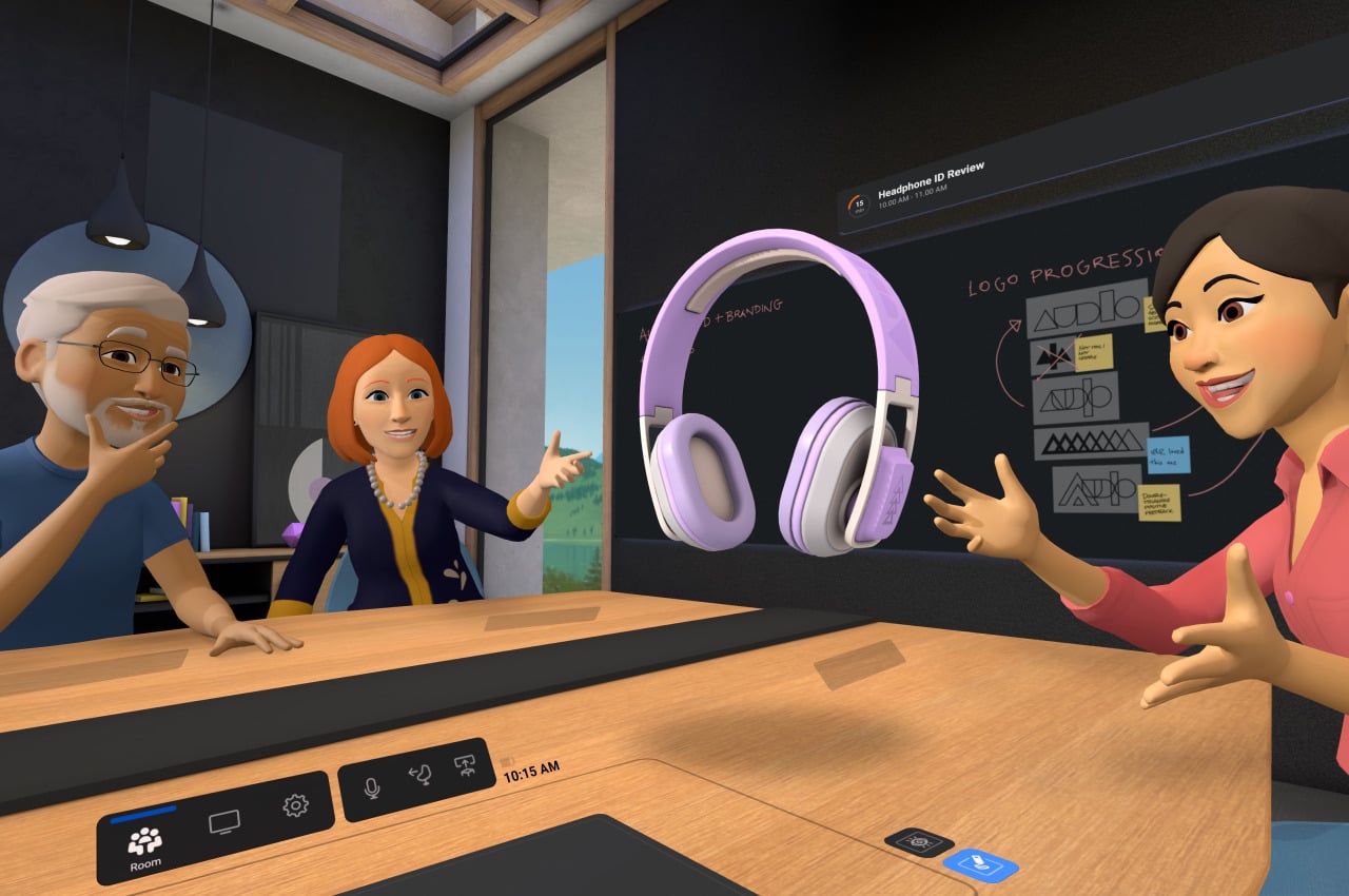
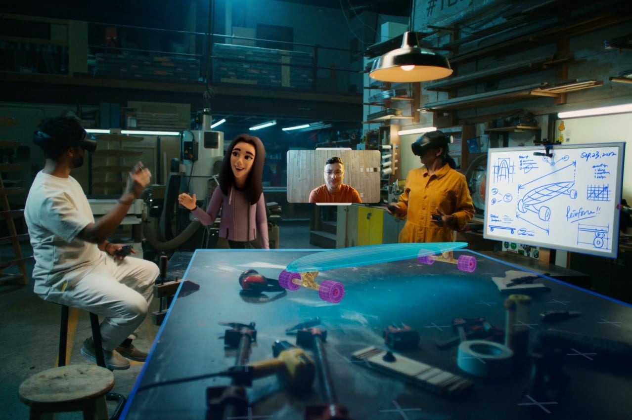
The Apple Vision Pro, on the other hand, seems to be about empowering the individual by breaking computing free from the confines of flat and limited screens. There are, of course, features related to connecting with other people, but most of the examples have been limited to FaceTime chats more than huddling around a virtual campfire. It has already been noted repeatedly how Apple’s presentation was bereft of any mention of social media, which some have taken as a knock against Facebook. Of course, social media is now an unavoidable part of life, but it exists only as just another app in visionOS rather than as a core focus.
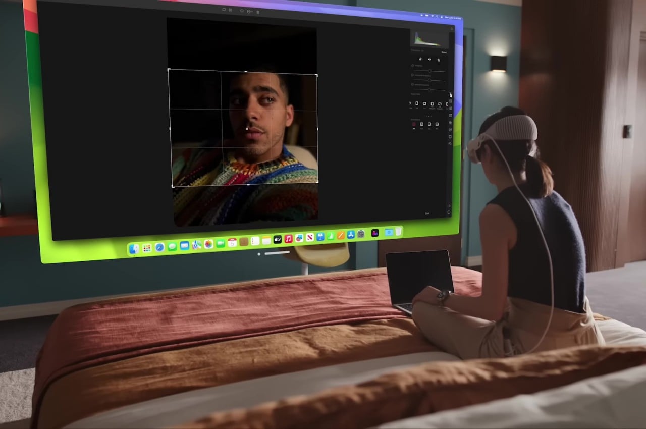
Ironically, the Vision Pro is perhaps even more social than the Quest Pro, at least as far as more natural connections are concerned. Instead of fun yet comical avatars, people will get to see a life-like semblance of your bust during meetings, complete with eye movements and facial expressions. And when someone needs your attention in the meatspace, the Vision Pro will project your eyes through the glass, making sure that the other person knows and feels that you’re actually paying attention to them.


It’s hard to deny how impressive all the technologies inside the Vision Pro are, and it’s easy to understand why Apple took this long to finally let the cat out of the bag. As mentioned, however, these innovations don’t come without a cost, and in this case, it is a very literal one. Right off the bat, Apple’s inaugural spatial computing gear is priced at $3,499, making it cost twice as much as the average MacBook Pro. It might be destined to replace all your Apple devices in the long run, but it’s still a very steep price for an unproven piece of technology.
The Meta Quest Pro is, of course, just a third of that, starting at $1,000. Yes, it uses less expensive materials, but its technologies are also more common and have stood the test of time. The Quest platform has also gone through a few iterations of polish, with developers creating unique applications that play to the hardware’s strengths. That said, although the Quest Pro sounds more dependable, insider insights at Meta have painted a somewhat uncertain future for the company’s Metaverse ambitions. Apple’s announcement might then serve to light a fire under Meta’s seat and push it to pick up the pace and prove that its vision is the right one.
As expected of the Cupertino-based company, Apple turned heads when it announced the Vision Pro. It blew expectations not just because of the quality of its design but also because of the ambitious vision that Apple revealed for the next wave of computing. Right now, it may all sound novel and gimmicky, and it will take some time before the technology truly takes root and bears fruit. Spatial computing has the potential to truly revolutionize computing, but only if it also becomes more accessible to the masses.

The Vision Pro isn’t a death knell for the Meta Quest but more of a wake-up call. There will definitely be a need for an alternative to Apple’s technologies, especially for those who refused to live in that walled garden. Meta definitely has a lot of work to do to reach the bar that Apple just raised. Whether those alternatives come from Meta or it might come from other vendors, there’s no doubt that the extended reality market just burst to life with a single “One More Thing” from Apple.
The post Apple Vision Pro vs. Meta Quest Pro: The Design Perspective first appeared on Yanko Design.
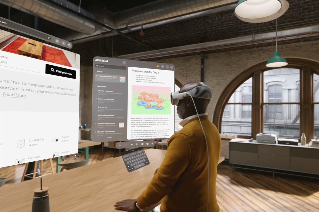
Apple made waves earlier this month when it finally revealed its long-awaited foray into the world of mixed or extended reality. That the company has had its eyes on this market is hardly any secret. In fact, the delayed (at least by market standards) announcement has had some wondering if it was all just wishful thinking. At WWDC 2023, Apple definitely showed the world that it means serious business, perhaps too serious even. The Apple Vision Pro headset itself is already a technological marvel, but in typical Apple fashion, it didn’t dwell too much on the specs that would make many pundits drool. Instead, Apple homed in on how the sleek headset almost literally opens up a whole new world and breaks down the barriers that limited virtual and augmented reality. More than just the expensive hardware, Apple is selling an even more costly new computing experience, one that revolves around the concept of “Spatial Computing.” But what is Spatial Computing, and does it have any significance beyond viewing photos, browsing the Web, and walking around in a virtual environment? As it turns out, it could be a world-changing experience, virtually and really.
Designer: Apple
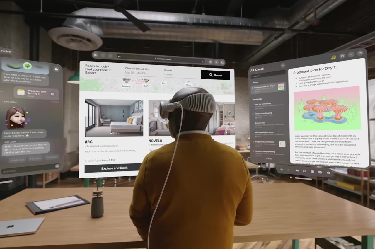
Anyone who has been keeping tabs on trends in the modern world will have probably already heard about virtual reality, augmented reality, or even extended reality. Although they sound new to our ears, their origins actually go far, far back, long before Hollywood has even gotten whiff of them. At the same time, however, we’ve been hearing about these technologies so much, especially from certain social media companies, that you can’t help but roll your eyes at “yet another one” coming our way. Given its hype, it’s certainly understandable to be wary of all the promises that Apple has been making, but that would be underselling the concept of what makes Spatial Computing really feel like THE next wave in computing.
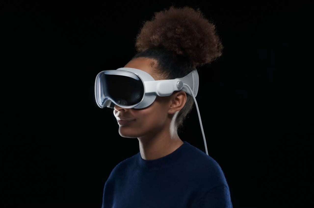
It’s impossible to discuss Spatial Computing without touching base with VR and AR, the granddaddies of what is now collectively called “eXtended Reality” or XR. Virtual Reality (VR) is pretty much the best-known of the two, especially because it is easier to implement. Remember that cardboard box with a smartphone inside that you strap to your head? That’s pretty much the most basic example of VR, which practically traps you inside a world full of pixels and intangible objects. Augmented Reality (AR) frees you from that made-up world and instead overlays digital artifacts on real-world objects, much like those Instagram filters everyone seems to love or love to hate. The catch is that these are still intangible virtual objects, and nothing you do in the real world really changes them. Mixed Reality (MR) fixes that and bridges the two so that a physical knob can actually change some virtual configuration or that a virtual switch can toggle a light somewhere in the room.
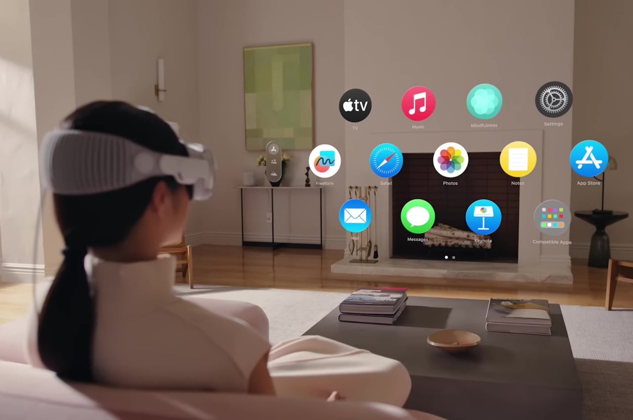
In that sense, Spatial Computing is the culmination of all these technologies but with a very specific focus, which you can discern from its name. In a nutshell, it turns the whole world into your computer, making any available space into an invisible wall you can hang up your apps’ windows. Yes, there will still be windows (with a small “w”) because of how our software is currently designed, but you can hang up as many as you want in the available space you have. Or you can just have one super gigantic video player taking up your vision. The idea also makes use of our brain’s innate ability to associate things with spaces (which is the theory behind the “Memory Palace”) to have us organize our room-sized computer desktop. In a sense, it makes the computer practically invisible, allowing you to directly interact with applications as if they existed physically in front of you because they practically are.

Of course, you could say that even Microsoft’s HoloLens already did all that. What makes Spatial Computing and Apple’s implementation different is how the virtual and the real affect each other, much like in mixed reality. There is, for example, the direct way we can control the floating applications using nothing but our own bodies, whether it’s with hand gestures or even just the movement of our eyes. This is the fulfillment of all those Minority Report fantasies, except you don’t even need to wear gloves. Even your facial expressions can have an effect on your FaceTime doppelganger, a very useful trick since you won’t have a FaceTime camera available while wearing the Apple Vision Pro.
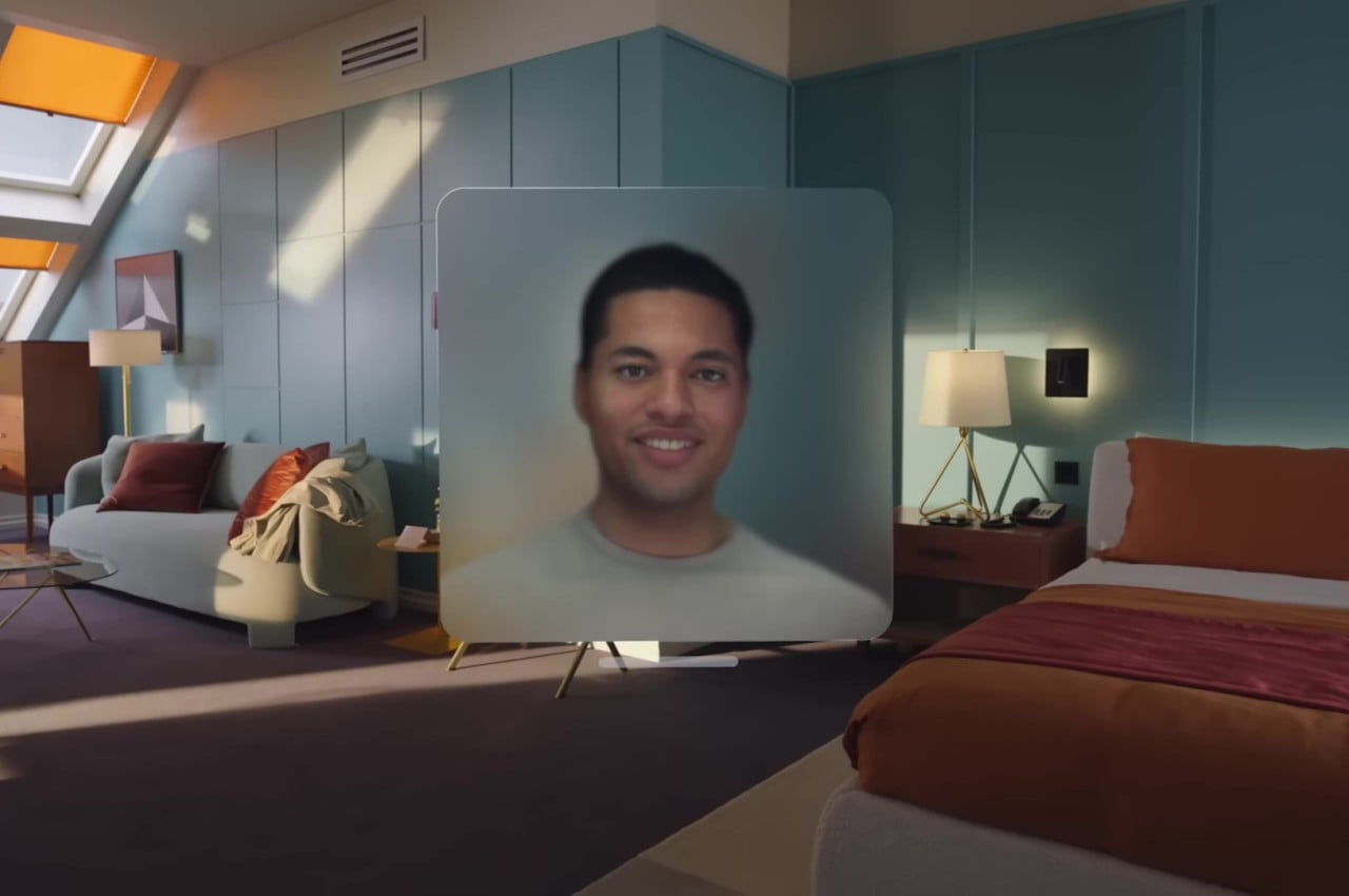
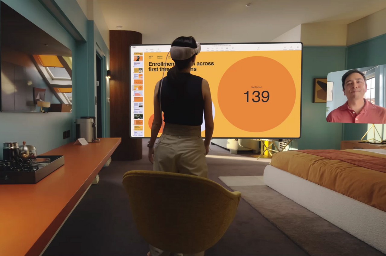
Apple’s visionOS Spatial Computing, however, is also indirectly affected by your physical environment, and this is where it gets a little magical and literally spatial. According to Apple’s marketing, your virtual windows will cast shadows on floors or walls, and that they’ll be affected by ambient light as well. Of course, you’ll be the only one who sees those effects, but they make the windows and other virtual objects feel more real to you. The Vision Pro will also dim its display to mimic the effect of dimming your lights when you want to watch a movie in the dark. It can even analyze surrounding objects and their textures to mix the audio so that it sounds like it’s really coming from all directions and bouncing off those objects.

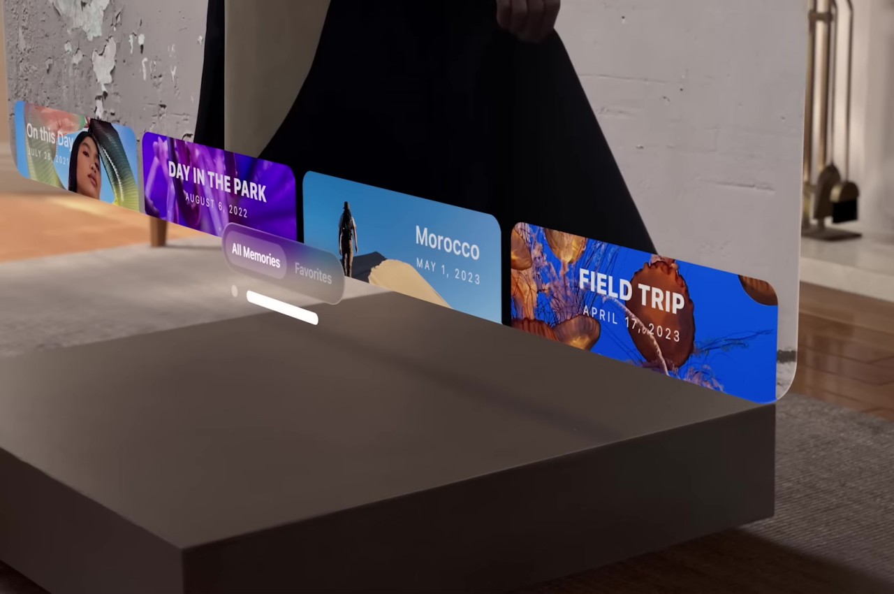
The number of technologies to make this seamless experience possible is quite staggering; that’s why Apple didn’t focus too much on the optics, which is often the key selling point of XR headsets. From the sensors to the processors to the AI that interprets all that data, it’s no longer surprising that it took Apple this long to announce the Vision Pro and its Spatial Computing. It is, however, also its biggest gamble, and it could very well ruin the company if it crashes and burns.
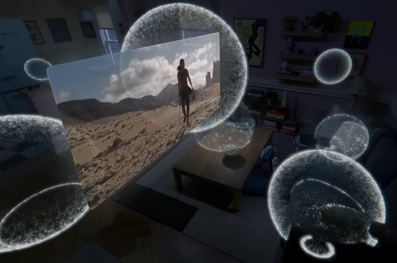
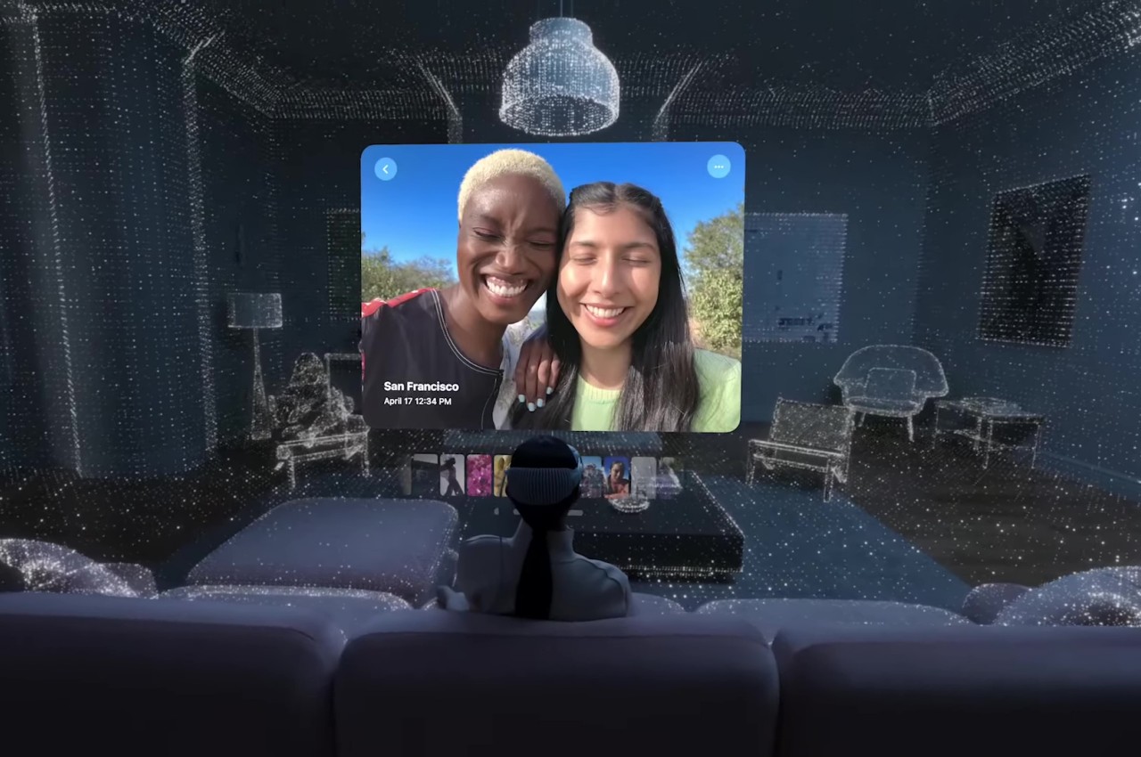
Spatial Computing is going to be a game-changer, but it’s not a change that will happen overnight, no matter how much Apple wants it to. This is where computing is heading, whether we like it or not, but it’s going to take a lot of time as well. And while it may have “computing” in its name, its ramifications will impact almost all industries, not just entertainment and, well, computing. When Spatial Computing does take off, it will even change the way we design and create things.
Many designers are already using advanced computing tools like 3D modeling software, 3D printers, and even AI to assist their creative process. Spatial Computing will take it up a notch by letting designers have a more hands-on approach to crafting. Along with “digital twins” and other existing tools, it will allow designers and creators to iterate over designs much faster, letting them measure a hundred times and print only once, saving time, resources, and money in the long run.
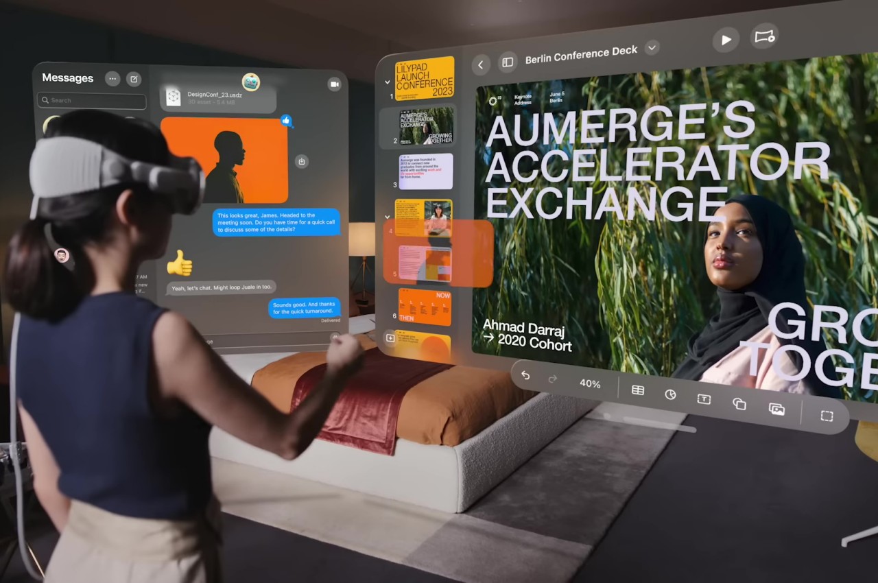

Spatial Computing also has the potential to change the very design of products themselves, but not in the outlandish way that the Metaverse has been trying to do. In fact, Spatial Computing flips the narrative and gives more importance to physical reality rather than having an expensive, one-of-a-kind NFT sneaker you can’t wear in real life. Spatial Computing highlights the direct interaction between physical and virtual objects, and this could open up a new world of physical products designed to interact with apps or, at the very least, influence them by their presence and composition. It might be limited to what we would consider “computing,” but in the future, computing will pretty much be the way everyone will interact with the world around them, just like how smartphones are today.
As grand as Apple’s Vision might be, it will be facing plenty of challenges before its Spatial Computing can be considered a success, the least of which is the price of the Vision Pro headset itself. We’ve highlighted those Five Reasons Why the Apple Vision Pro Might Fail, and the biggest reason will be the human factor.
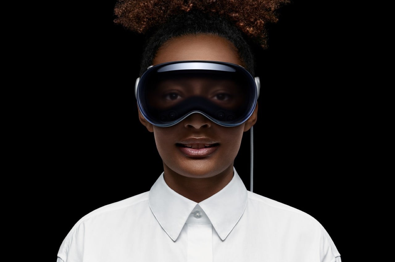
Humans are creatures of habit as well as tactile creatures. It took years, maybe even decades, for people to get used to keyboards and mice, and some people struggle with touch screens even today. While Apple’s Spatial Computing promises the familiar controls of existing applications, the way we will interact with them will be completely gesture-based and, therefore, completely new. Add to the fact that even touch screens give something our fingers can feel, and you can already imagine how alien those air hand gestures might be for the first few years.
Apple surely did its due diligence in ergonomic and health studies and designs, but it’s not hard to see how this won’t be the most common way people will do computing, even if you make the Vision Pro dirt cheap. Granted, today’s computers and mobile devices are hardly ergonomic by design, but there have been plenty of solutions developed by now. Spatial Computing is still uncharted territory, even after VR and AR have long blazed a trail. It will definitely take our bodies getting used to before Spatial Computing almost becomes second nature, and Apple will have to stay strong until then.
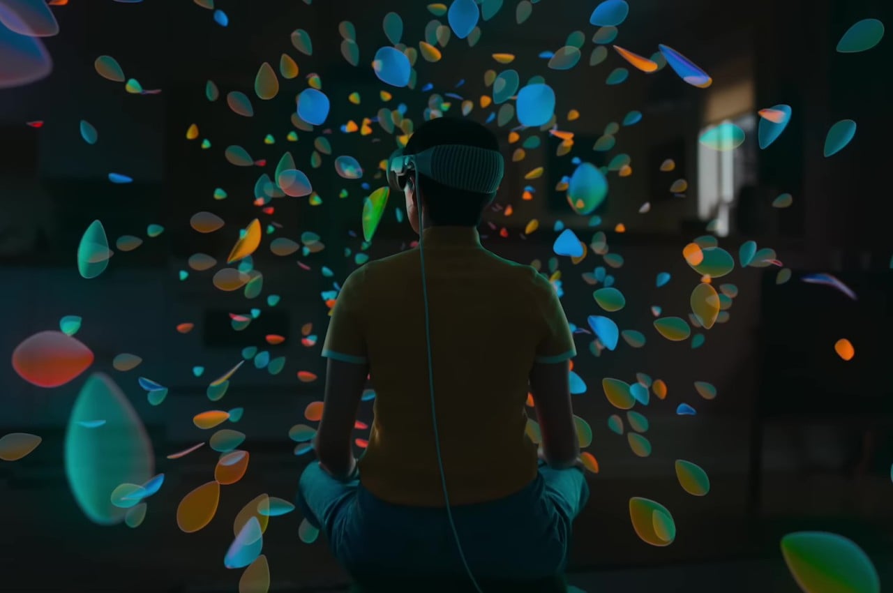
As expected, Apple wasn’t content to just announce just another AR headset to join an uncertain market. The biggest surprise was its version of Spatial Computing, formally marketed as visionOS. Much of what we’ve seen is largely marketing and promises, but this is Apple we’re talking about. It might as well be reality, even if it takes a while to fully happen.
Unlike the entertainment-centric VR or the almost ridiculous Metaverse, Spatial Computing definitely feels like the next evolution of computing that will be coming sooner rather than later. It’s definitely still at an early stage, even if the seeds were planted nearly two decades ago, but it clearly shows potential to become more widely accepted because of its more common and general applications. It also has the potential to change our lives in less direct ways, like changing the way we learn or even design products. It’s not yet clear how long it will take, but it’s not hard to see how Apple’s Vision of the future could very well be our own.
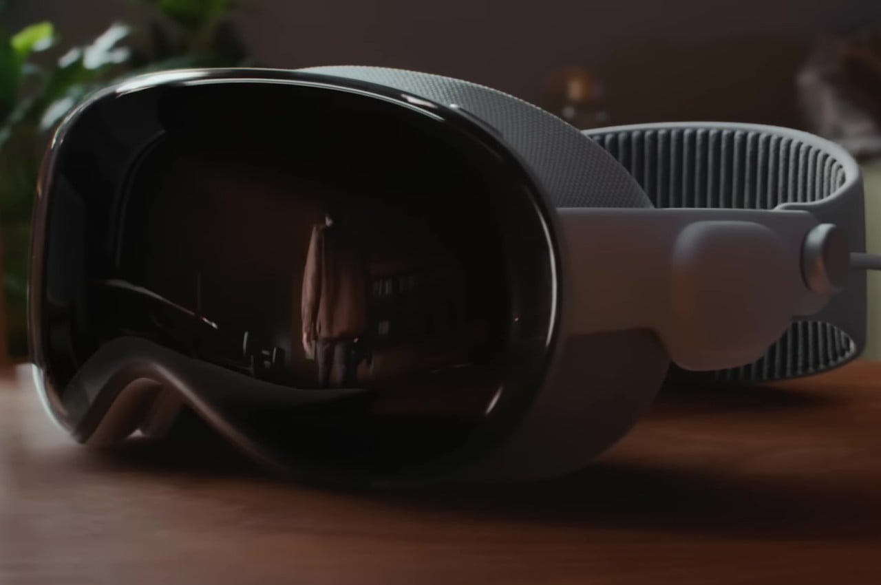
The post What is Spatial Computing: Design in Apple’s Vision of the Future first appeared on Yanko Design.
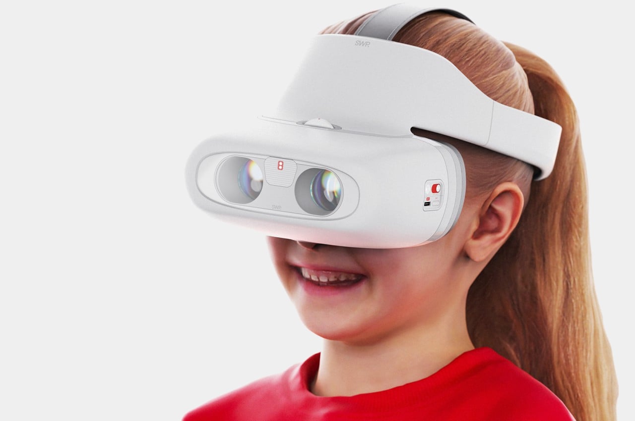
Some diseases and physical disorders don’t really care whether you’re young or old, but unfortunately, treatment does. You can’t, for example, perform surgery on extremely young or extremely old people, which severely limits what you can do before it gets too late. Some defects like strabismus, more popular under the moniker “crossed eyes,” can become a big problem for adults and a long-lasting emotional wound for kids. Some types of strabismus can, fortunately, be corrected by wearing special types of glasses, but that treatment can be inefficient and costly over time. It doesn’t have to be that way, though, especially if you stretch the design a bit, like this device that looks like a VR headset but is actually a wearable treatment for kids afflicted by this vision disorder.
Designer: Haechan Ryu
There are a few vision disorders that can be corrected by wearing special glasses, particularly ones that use a prism to redirect the way light enters the eyes. For those affected with strabismus, this can help train the eyes until they get back to a more natural position. The problem is that glasses with prisms have fixed angles, and as the wearer’s eyes adjust, the eyeglasses have to be replaced as well. Of course, surgery is out of the question for kids, so a more efficient and cost-effective treatment is needed.
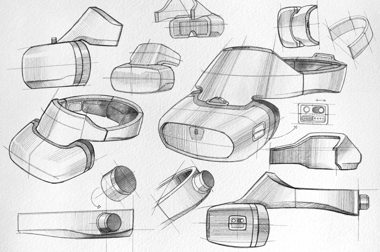
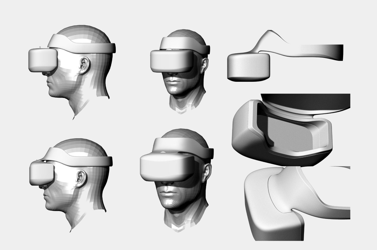
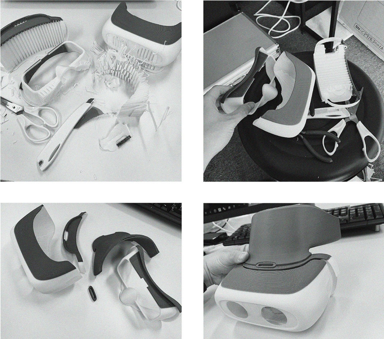
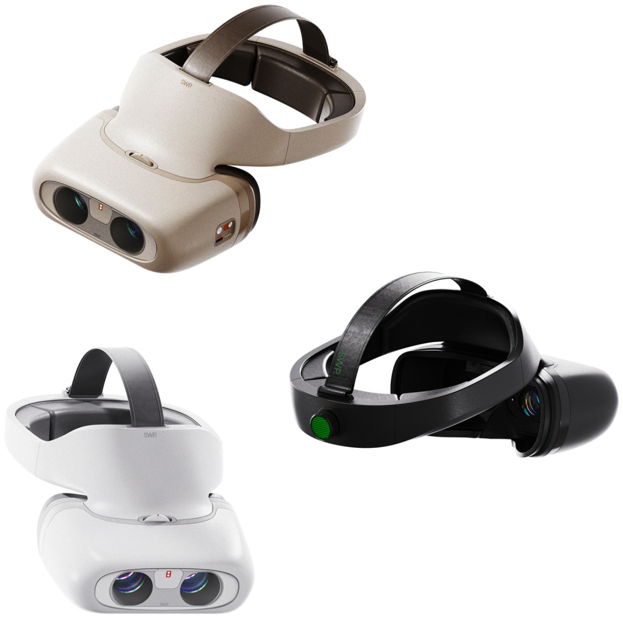
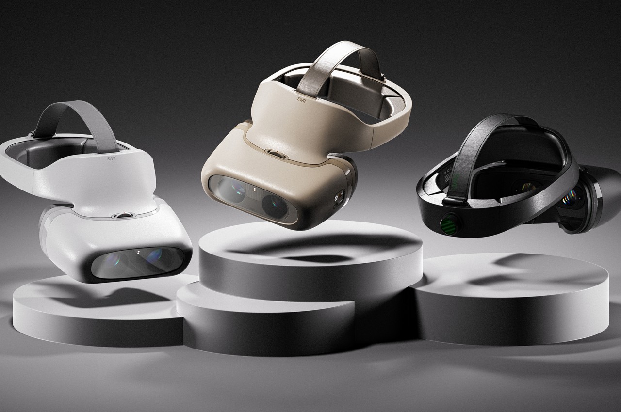
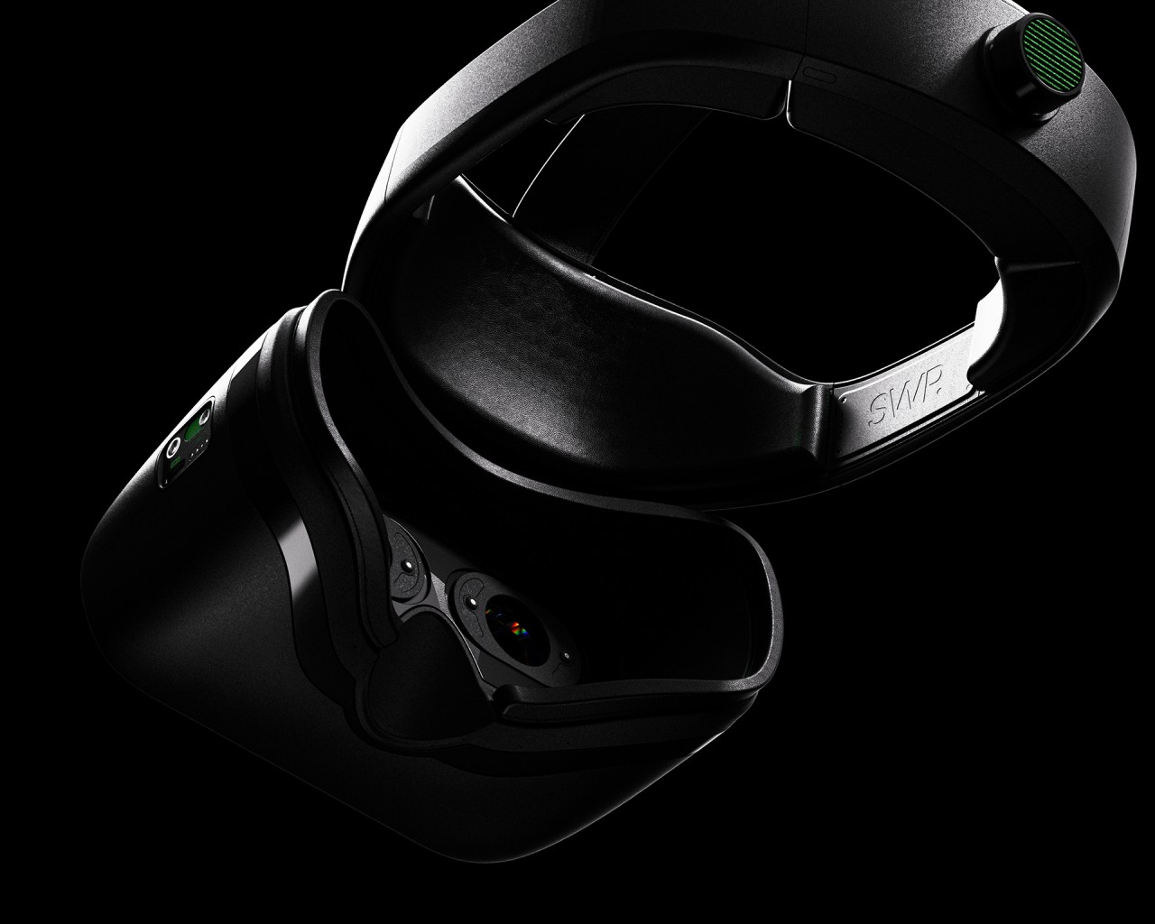
SWP, which is an acronym for Simplicity With Professionalism, tries to offer that solution with a design that might look a little familiar now, even for kids. From the outside, the device is very similar to a virtual reality headset like the Meta Quest or HTC Vive. In fact, it might also be using some of the same designs and mechanisms as a regular headset, particularly with the way two lenses can be adjusted on the fly.
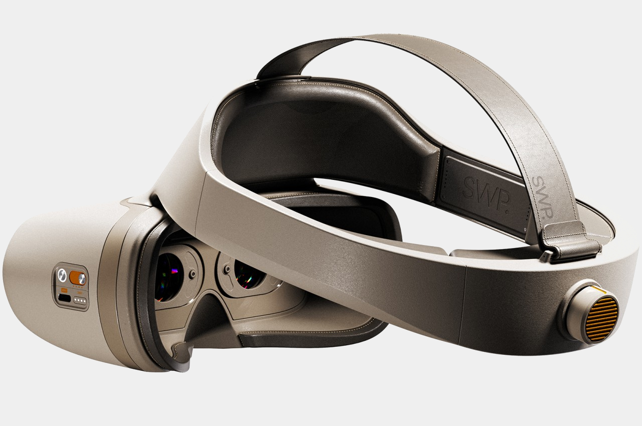
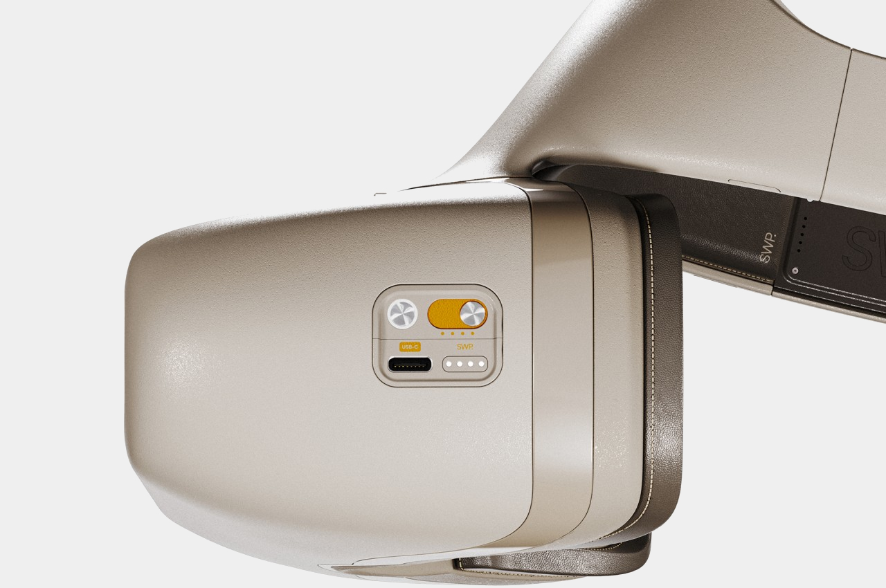
In SWP’s case, there is a motorized prism inside the visor that can adjust the angle to adapt to the severity of the wearer’s strabismus. A dial in front can adjust the spacing of the lens for the eyes while the inner lenses rotate inside to exercise the eyes and correct that angle over time. Rather than replacing the eyeglasses every time the strabismus angle changes, one only needs to change the headset’s settings to continue the treatment.
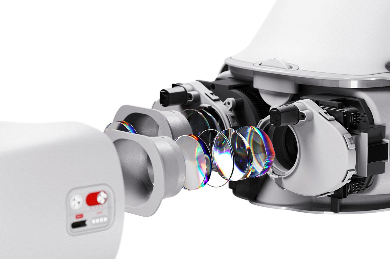

Making SWP look like a VR headset isn’t accidental, of course. The form offers a more distributed weight balance, so it won’t be too heavy for kids to wear. Of course, it will also be considerably lighter because it has fewer internal components to cram into that small space. It might even make kids feel special for wearing such a device that grownups play with, helping them become more accepting of the treatment that will help correct their vision until it becomes normal again.
The post Headset-like device concept envisions a non-invasive treatment for cross-eyed kids first appeared on Yanko Design.
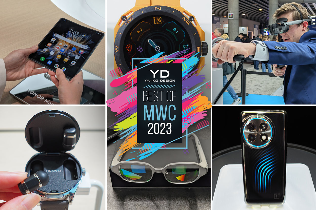
Mobile devices have long been a part of our modern lives, from the smartphones that are always in our hands to the smartwatches on our wrists to even the laptops that have become our reliable mobile work partners. Despite almost two decades since the iPhone paved the way for modern smartphones, these devices have mostly been seen as geeky products that are more obsessed with specs and features rather than the humans using them. Trends, however, have started to change, and the players in this industry have started paying closer attention to the value of design, almost to the point of making it the next buzzword. MWC 2023 is unsurprisingly filled with the latest mobile innovations and thought experiments, but it is also showcasing the growing design awareness among brands. This year, we’ve taken a tour of what’s up for show in Barcelona to bring you Yanko Design’s top picks for the Best Product Designs at MWC 2023.
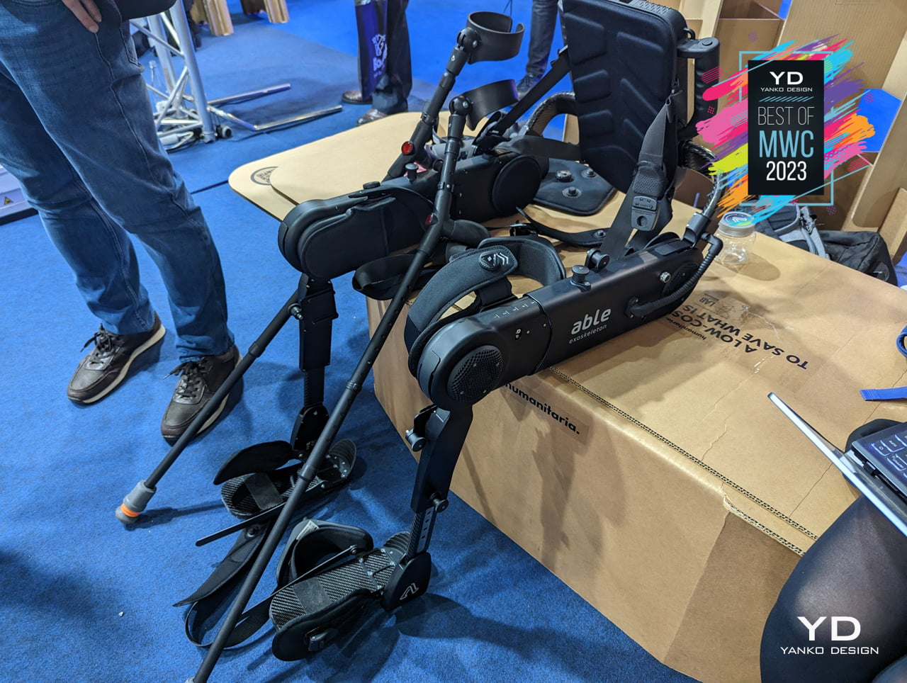
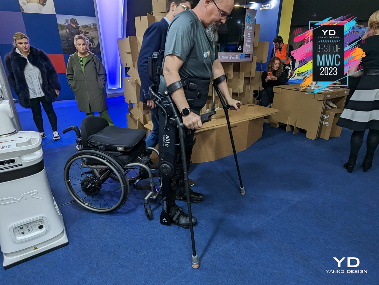
We easily take our physical capabilities for granted until we suddenly see ourselves deprived of some of them. Some people, however, are not so lucky and might be born with some disability or encounter a tragic accident sometime in their lives. With today’s technologies, they shouldn’t have to be forever confined to a wheelchair or worse, and thankfully there are now many companies utilizing modern tools and techniques to improve the lives of people with disabilities.
Designer: ABLE Human Motion

ABLE Human Motion, for example, is dedicated to helping people with walking disabilities enjoy life to the fullest. We’ve seen exoskeletons designed to give well-bodied people more strength to lift or move stuff, but ABLE Human Motion’s exoskeletons are instead made to give people back what they might have lost. Best of all, you won’t feel embarrassed wearing something sleek and well-designed, especially if it makes you look like some armored superhero in the process.
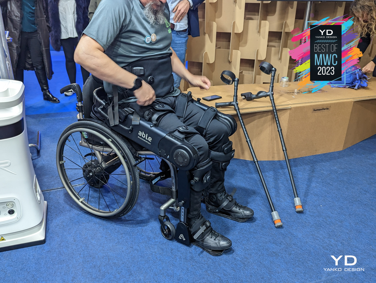
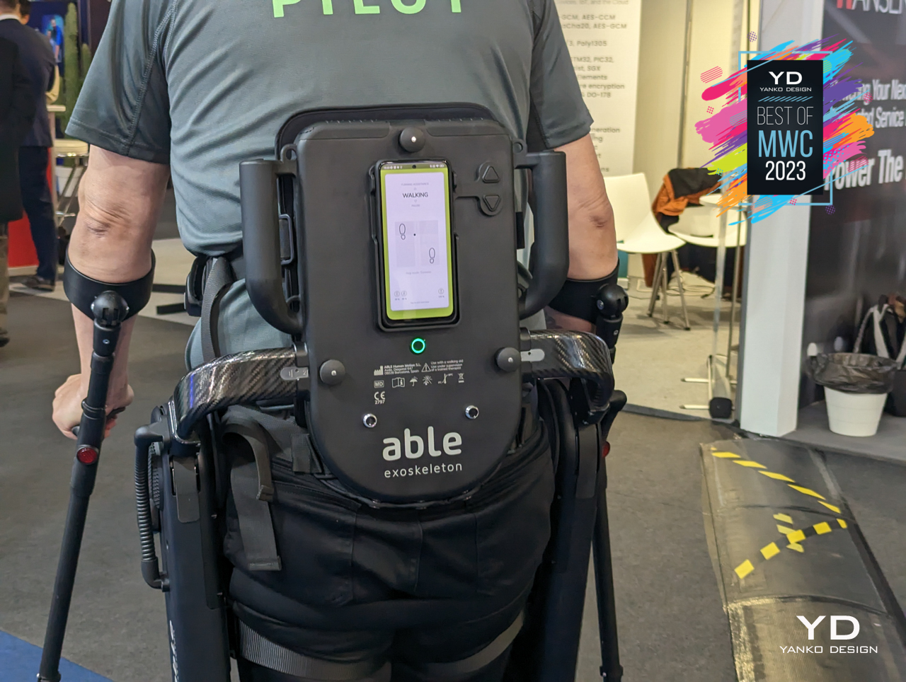
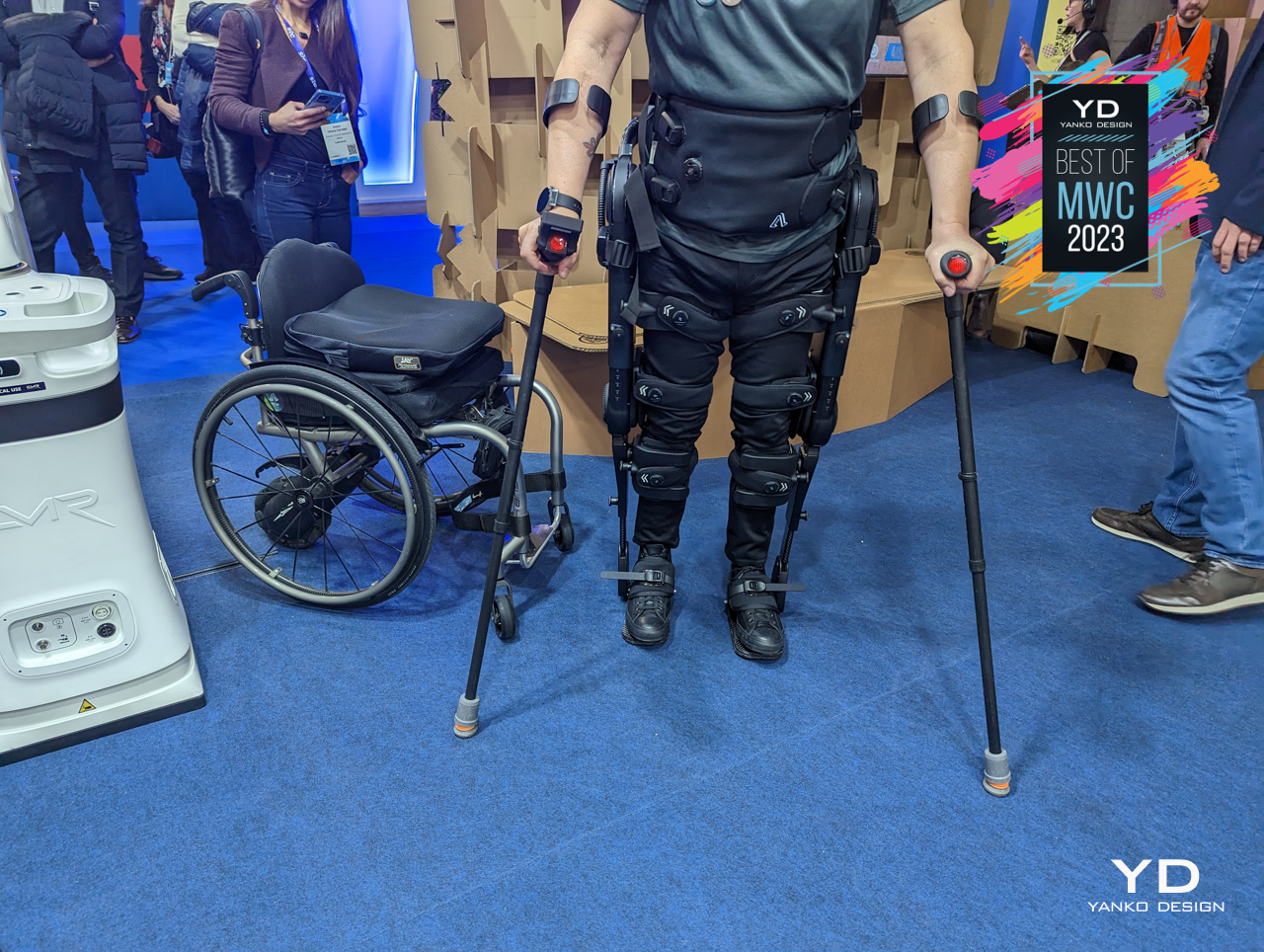
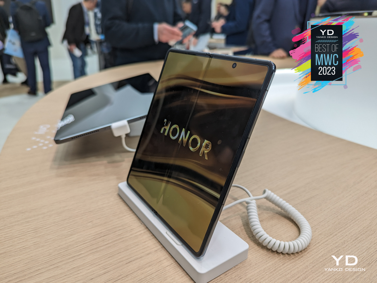
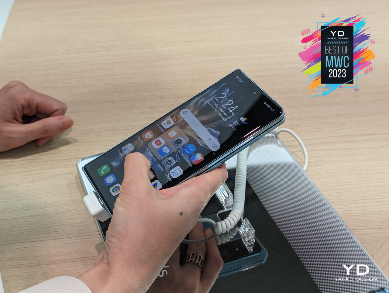
It might still baffle people as much as awe them, but foldables are slowly but surely becoming more common in the market. Samsung still remains the most familiar brand in that niche market but was never the only one. Due to some rather colorful circumstances, however, Huawei’s foldable phones barely made it outside of China. Fortunately, its former subsidiary is helping bring its legacy to the global market, and it’s posing a challenge to Samsung’s dominance.
Designer: Honor
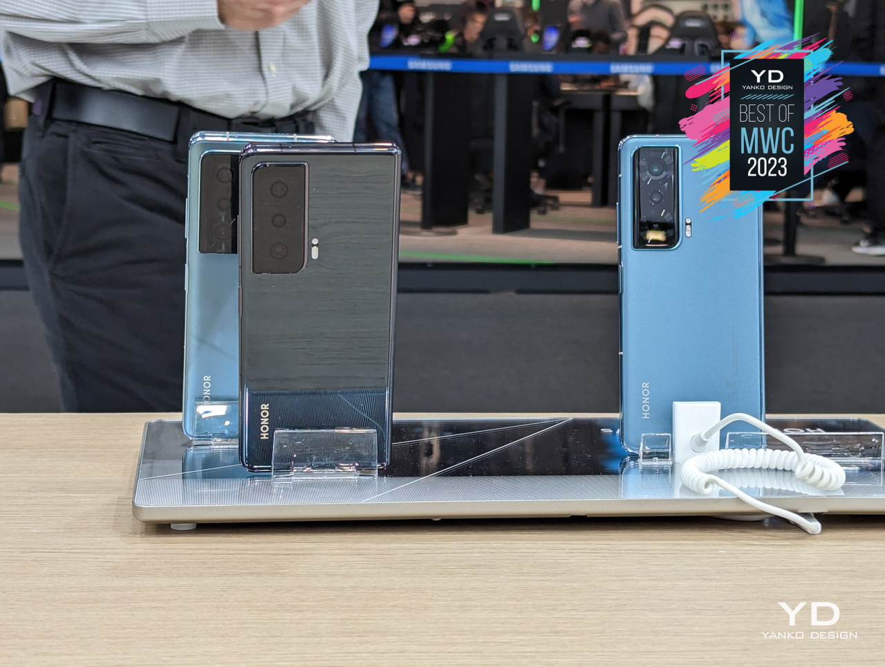
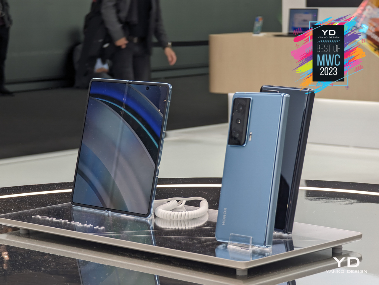
The Honor Magic Vs, an updated version of the brand’s first foldable, carries a mix of specs and features that definitely stir things up a bit. Unlike the Galaxy Z Fold, there is no gap when the phone is folded shut, a trait that is becoming more common among non-Samsung foldables. Its external display is interestingly curved at one edge only, making it visually distinct from other horizontal foldables. It isn’t perfect, of course, but another player in the market creates variety and good competition that will only help foldables grow.

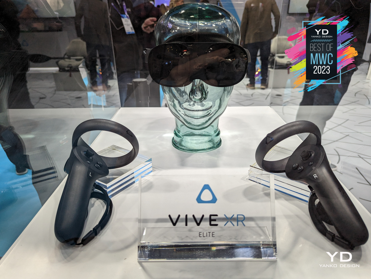
Meta seems to be playing with fire when it comes to its metaverse vision and even its Quest line of VR hardware. It might have the luxury of playing around, but HTC is all-in on the extended reality or XR industry, whatever buzzword you might call it. On the heels of the Meta Quest Pro, HTC unveiled its own standalone Vive XR Elite headset, offering a design that seems to take us closer to that ideal minimalist eyewear painted by science fiction and Hollywood.
Designer: HTC Vive
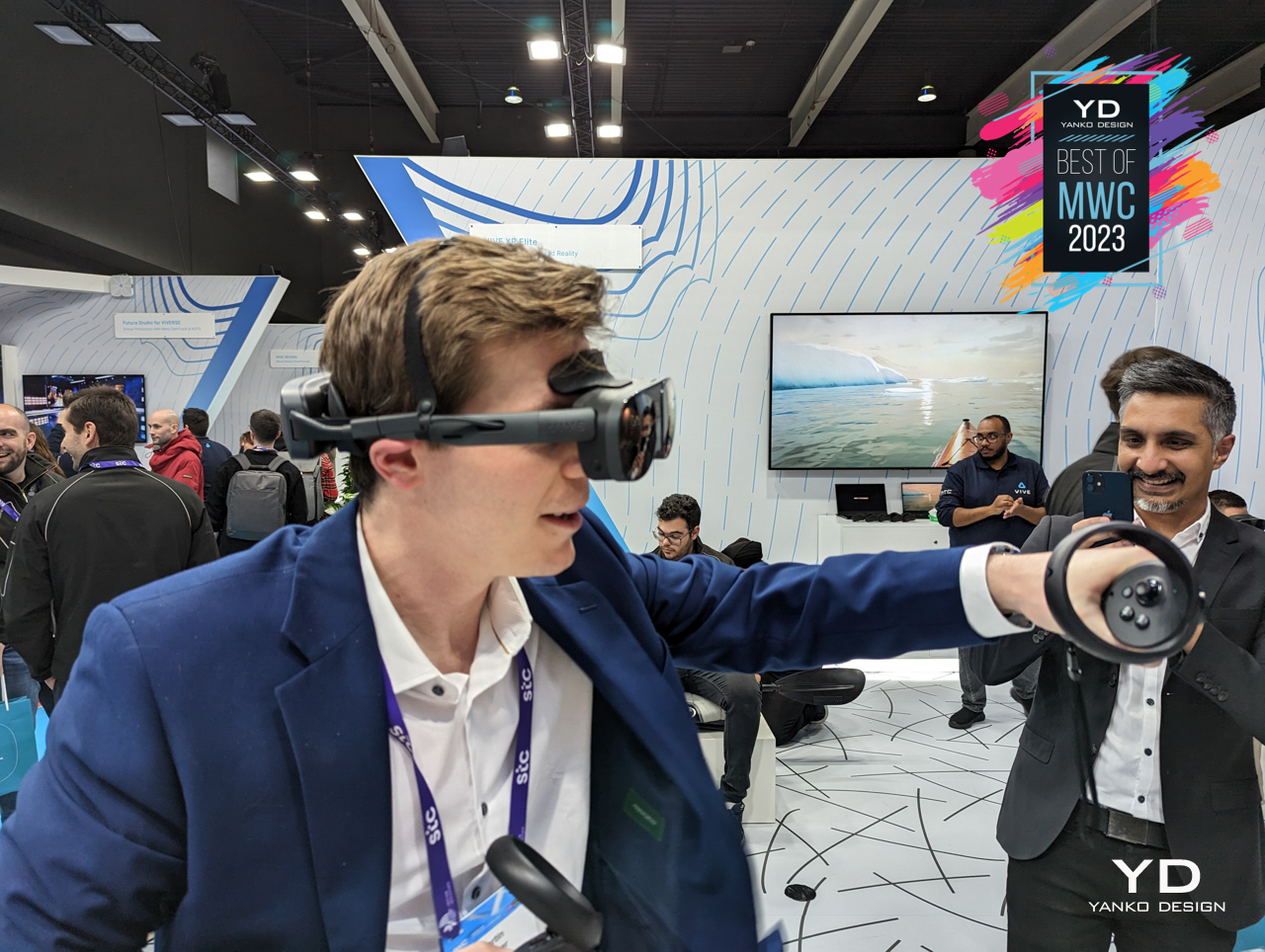
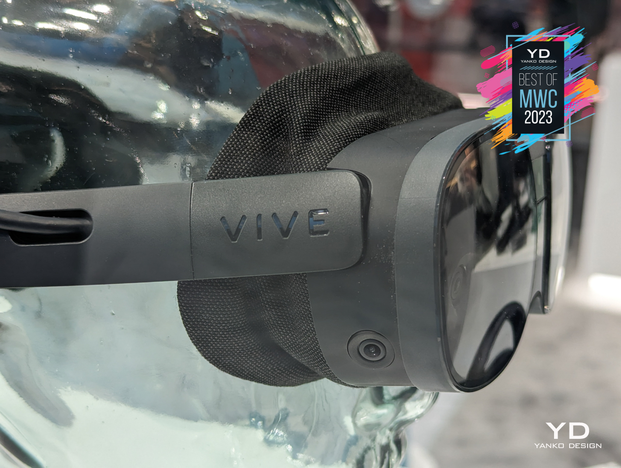
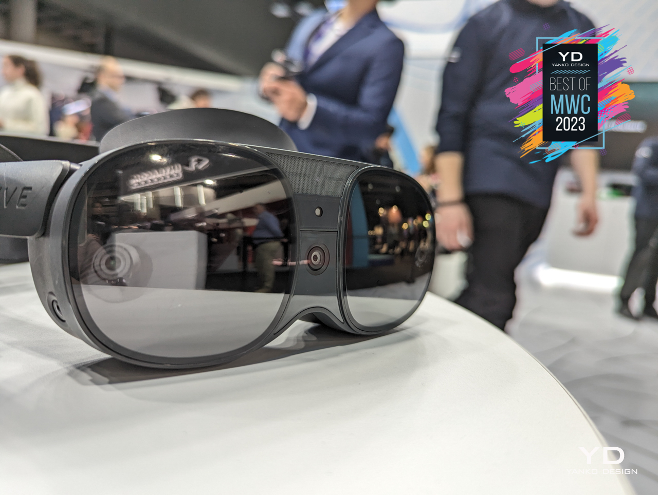
As the product’s name suggests, the HTC Vive XR Elite takes the headset beyond just virtual reality, sprinkling a bit of augmented reality into the mix. Its more impressive feat, however, is being able to cram even better hardware inside a more compact design that makes you feel like you’re wearing large glasses rather than ski goggles. It’s still far ways off from sleek Tony Stark shades, but it represents a significant step forward in a market that has seemingly stagnated of late.
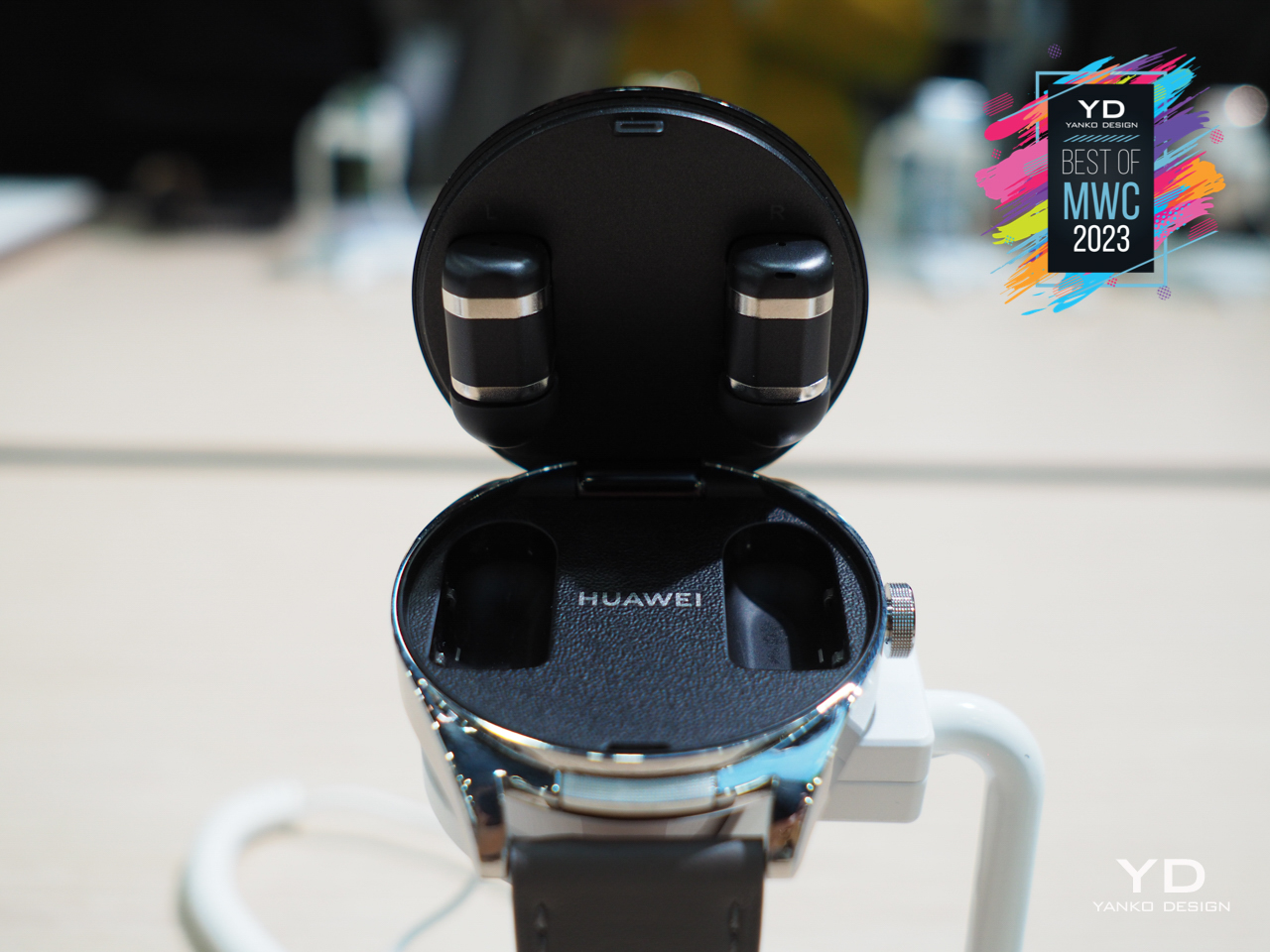
The popularity of wireless earbuds only confirmed what we had known all along, that most humans have become terrible at remembering even the simplest things. Now people are likely to lose one of two buds, forget the charging case at home, or forget to charge the buds before going out. These accessories aren’t smart enough yet to remind you of all those things, so one stopgap measure it make sure they’re always with you all the time, always charged, and ready to go when you need them.[/caption]
Designer: Huawei
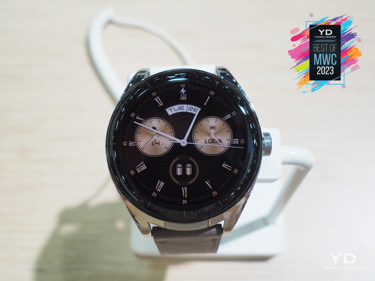
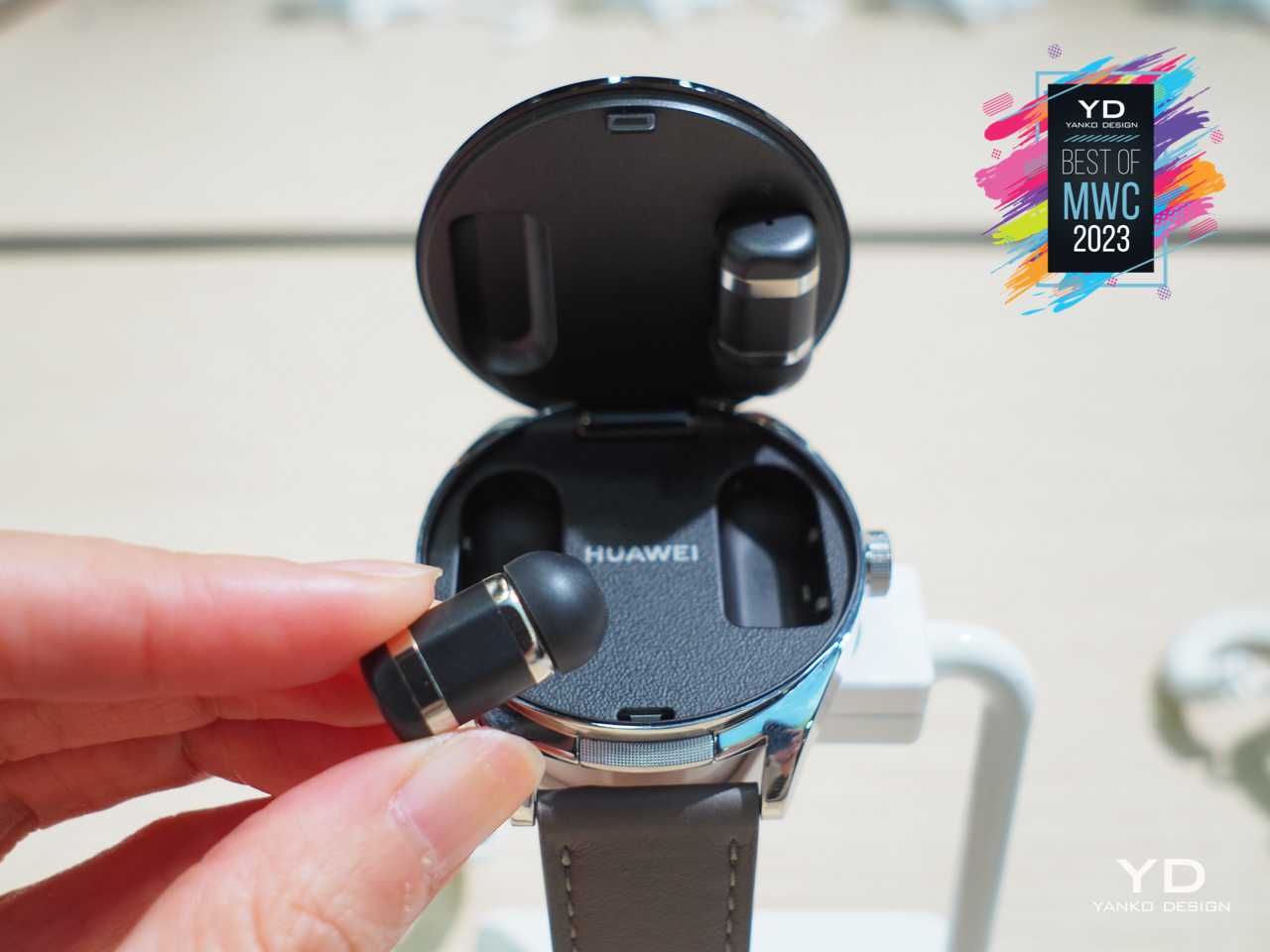
The new Nokia 5710 XpressAudio solves that by turning the phone into the buds’ charging case, but obviously, that can’t happen with our very thin smartphones. Huawei’s solution is to put the buds inside a smartwatch instead, creating a locket-like cover that reveals teeny earbuds charging inside. Sure, the design makes plenty of compromises, and it looks almost comical to a certain degree. It’s hard to deny, however, that the novelty certainly has appeal, especially if you’re the type to fancy yourself as a secret agent with spy tools hidden inside their timepiece.
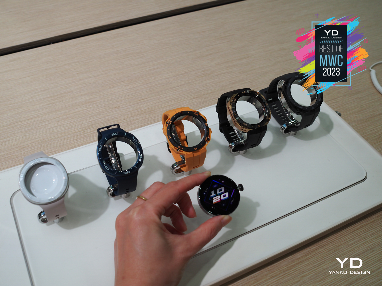
Although many decry how smartwatches present fake luxury, there are definitely benefits in having the ability to change a watch face to fit your style or even your changing mood. That’s only true for the display, though, since you’re practically stuck with whatever watch body you purchased. At most, you can swap out straps for other colors or materials, but the chassis for the watch itself remains unchanged.
Designer: Huawei
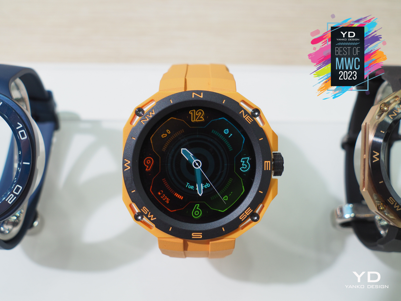
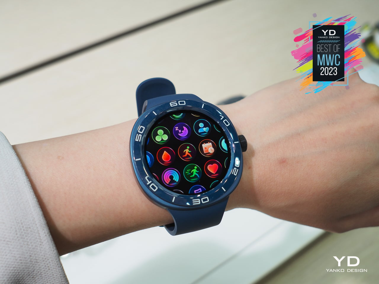
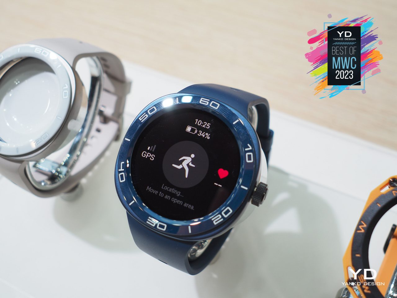
The Huawei Watch GT Cyber tries to change the status quo by letting you swap out cases as well. Granted, the available cases all look more like stylish tanks, but the idea itself is probably something worth exploring. It does require a healthy ecosystem of case makers to meet the varied tastes of consumers; otherwise, it remains a design experiment with no future in sight.
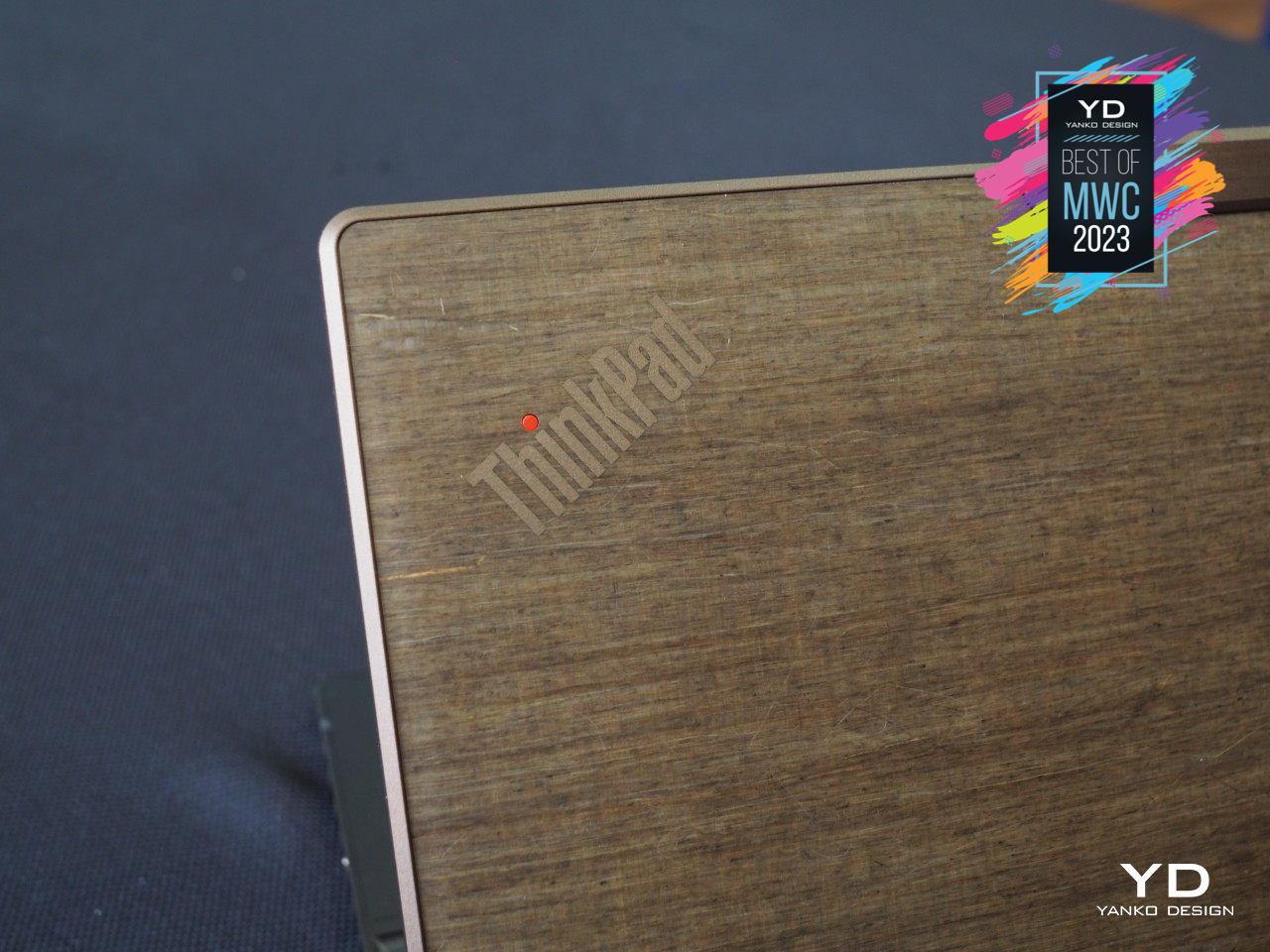
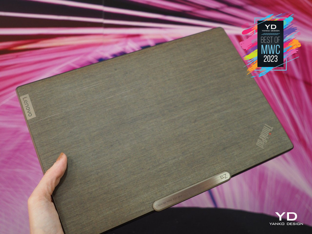
Unless you’re going for a gaming heavyweight, chances are you’d want a laptop that’s sleek and stylish, almost like a luxury item you’d want everyone to drool over while you work in public. Plenty of laptops do fit that bill with their brushed metal or shiny covers, but nothing grabs the attention better than something that’s not common fare as far as laptops go. That “wow” factor is definitely what the new ThinkPad Z13 Gen 2 is going for, particularly with its brown, fabric-like cover that’s sure to turn eyes and heads around you.
Designer: Lenovo
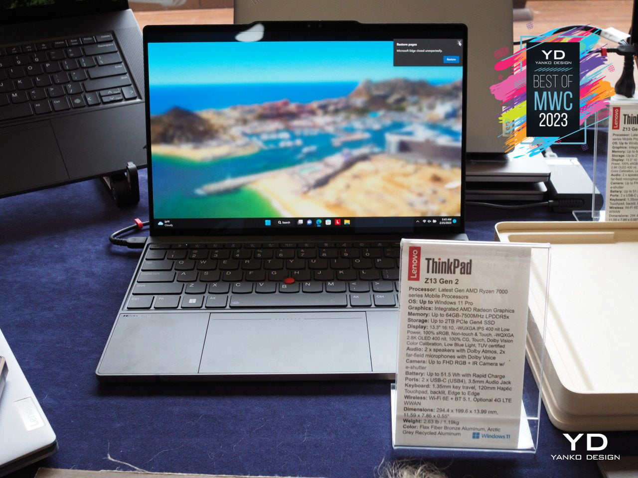
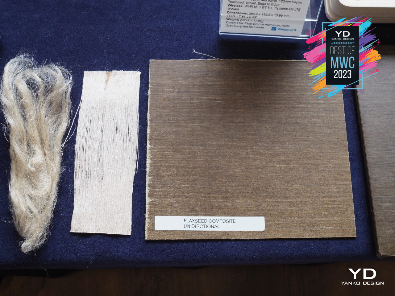
This material, however, isn’t just eye-catching. Made from 100% agricultural product harvested from Flax plant fibers, this woven Flax material increases the new laptop’s sustainability prospect while also making it stand out with its unique elegance. This material is bonded to the top cover, which itself is made from 75% recycled aluminum. Thankfully, the ThinkPad Z13 Gen 2 isn’t just a pretty face, either, and it possesses the best that Lenovo has to offer for businesses and consumers alike.
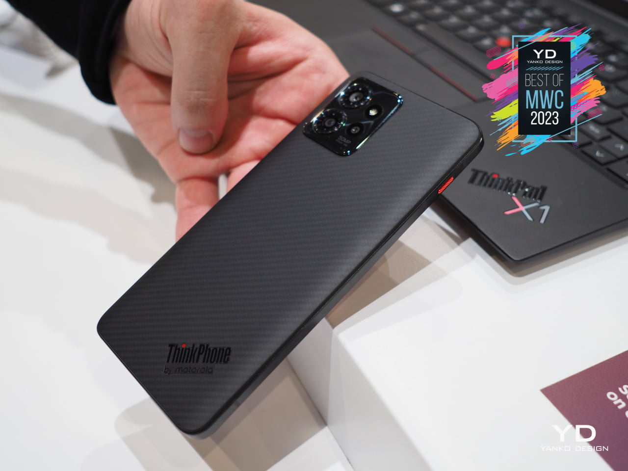
Motorola is one of the oldest names in the mobile phone market, predating even the smartphones that now rule the land, but now it is also under the ownership of yet another giant that has the lion’s share of the PC market. Given its history and pedigree, it was really only a matter of time before these two worlds collided in a very particular way, so the arrival of a ThinkPad-branded Motorola phone was both surprising but also long overdue.
Designer: Lenovo
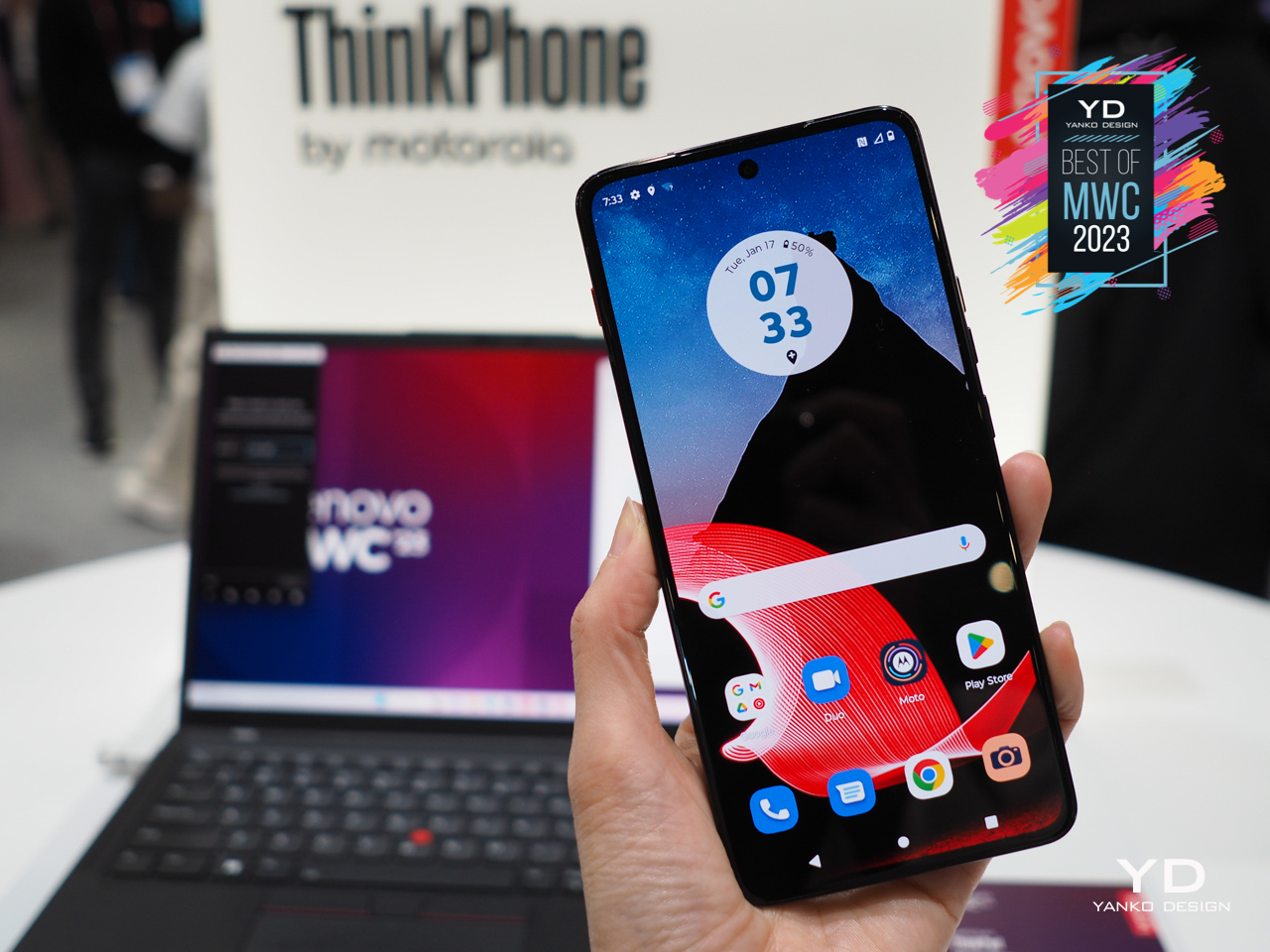
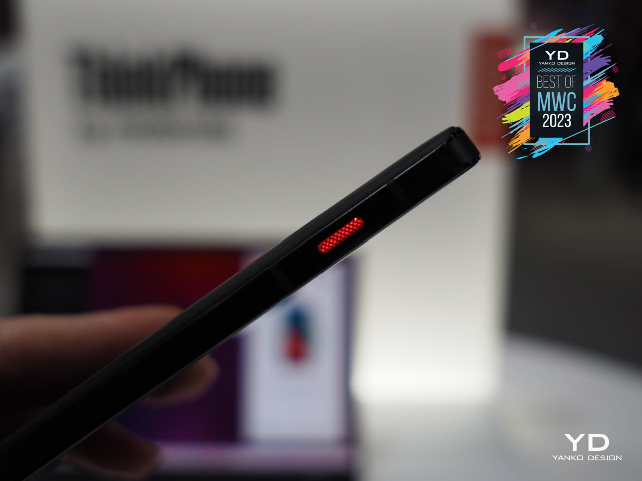
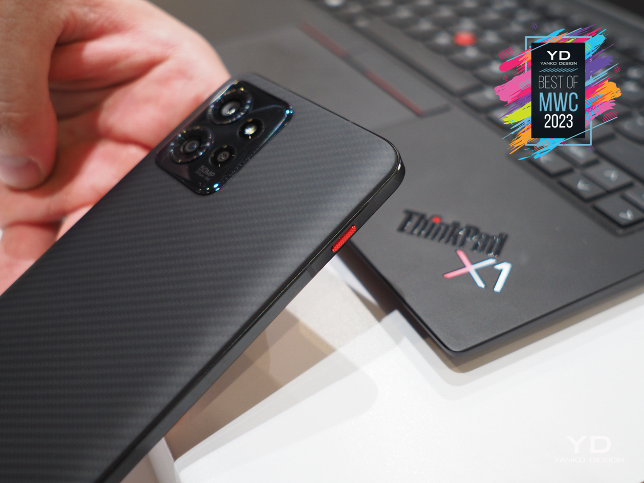
Unlike a typical smartphone, even those made by Motorola, the ThinkPhone wants to make its association with the popular laptop brand obvious. From the iconic branding to the diagonal patterns running across its back, this phone wants to stand out visually among the rest of the crowd as something meant for serious business. It also has plenty of integration features with Lenovo’s ThinkPads, so its intention to be a mobile partner to those laptops is also unambiguous and clear.
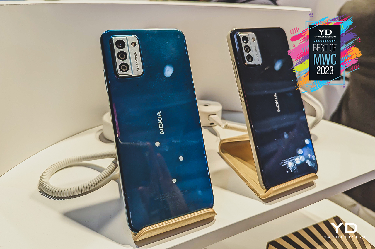
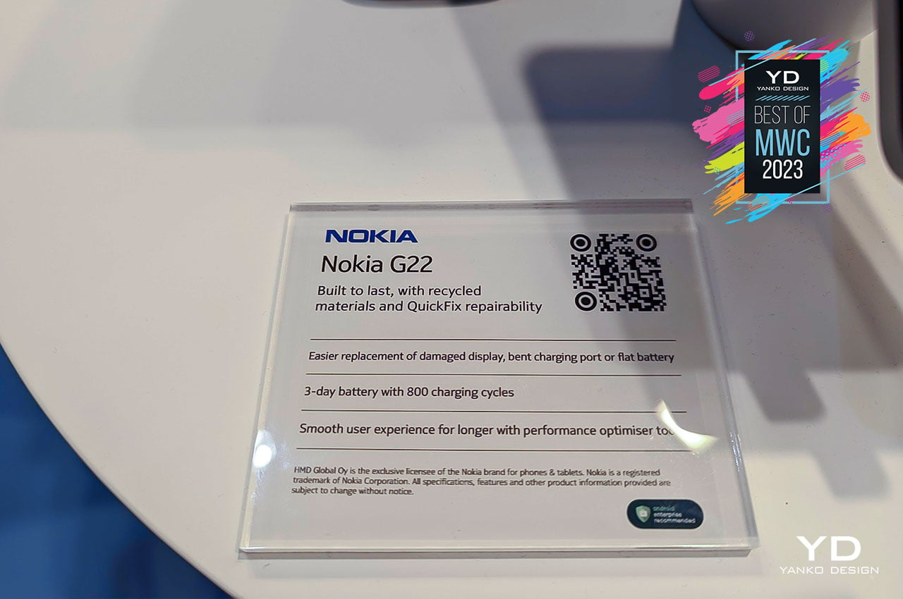
Today’s smartphones are beautiful and powerful pieces of technology, but all that becomes pointless when the battery dies out, or the screen gets cracked beyond use. Repairing phones is expensive and difficult, but it doesn’t exactly have to be that way; just that the current mobile industry has been set up that way. There are few champions of longer-lasting and easier-to-repair phones, and HMD Global just joined that club with the new Nokia G22.
Designer: HMD Global
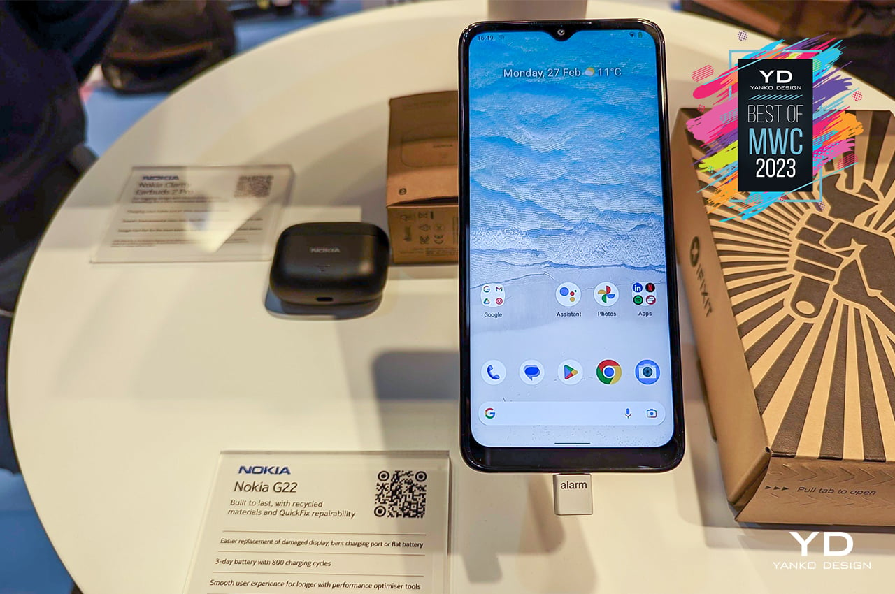
Unlike the excruciatingly tedious and nerve-racking processes you’d see in teardown videos, it only takes a guitar pick and a screwdriver to open up this phone. Five minutes is all you need to pull out the battery and 20 minutes to replace a broken screen. It’s not exactly a trivial process, at least not yet, but it’s exponentially better than what we have as “standard” today. Hopefully, this trend will catch on so that we can have beautiful phones that last for years, no matter how many times you accidentally drop them.

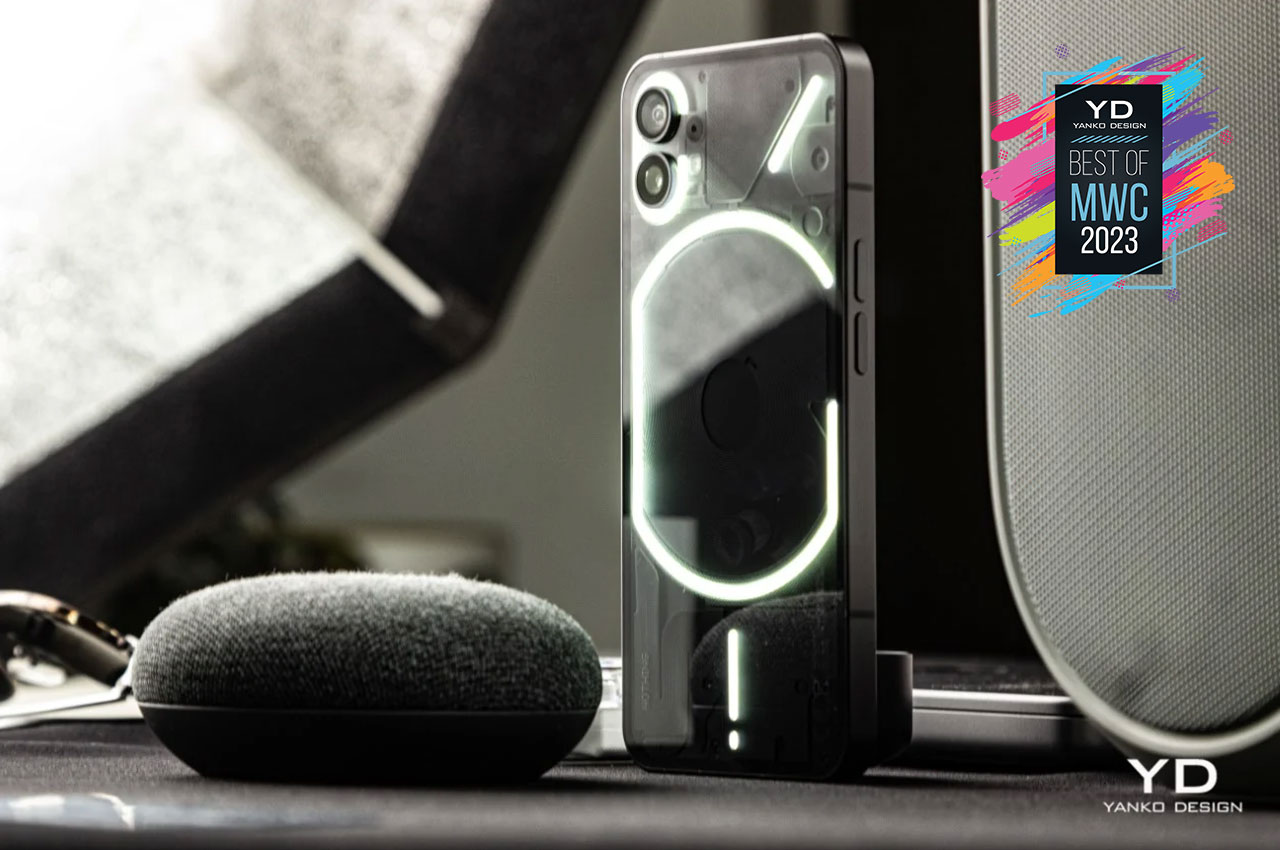
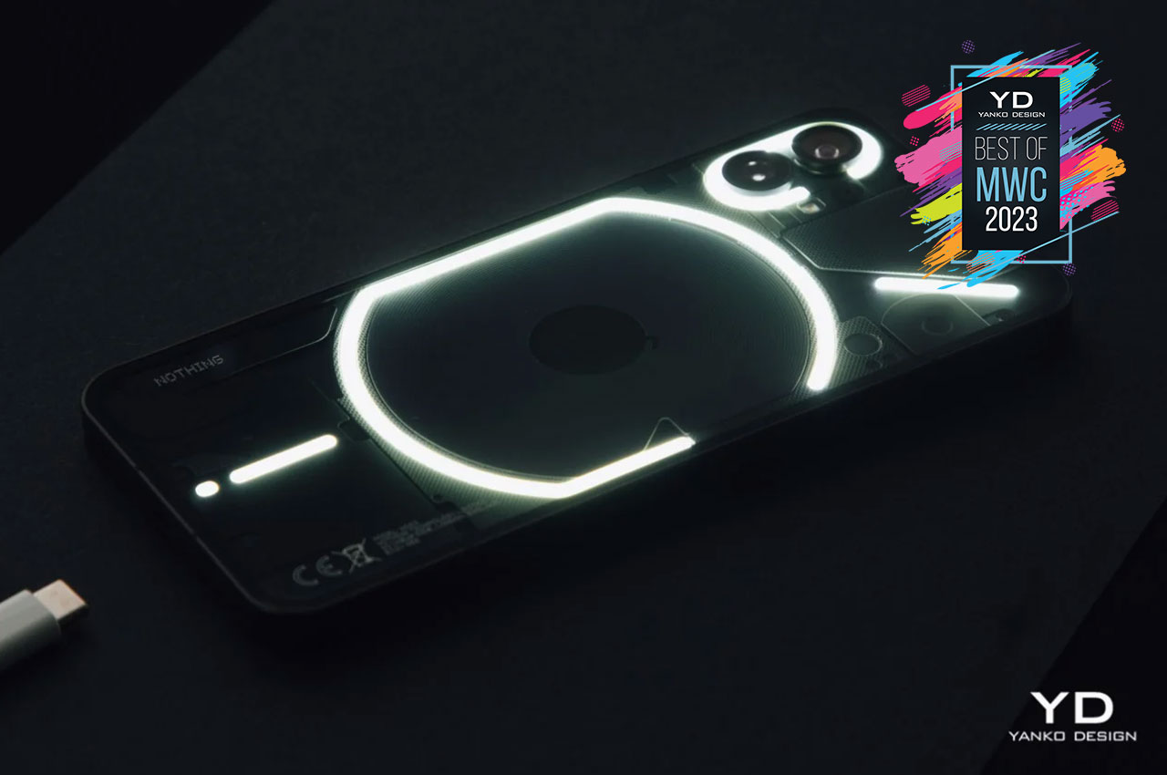
The phone (1) gets an honorary mention here for doing what no other phone company has managed to do with their debut product… make a big, industry-wide splash. While industry giants merely dismissed the Nothing phone (1)’s Glyph Interface as just a gimmick, it was surprising to see companies like OnePlus, Realme, and Unihertz copying the lighting feature on their own phones, announced at MWC this week. Major win for Nothing and its founder, Carl.
Designer: Nothing
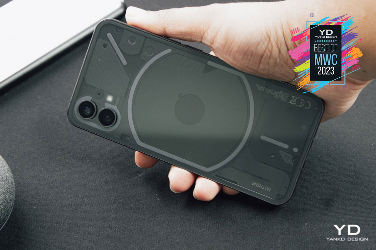
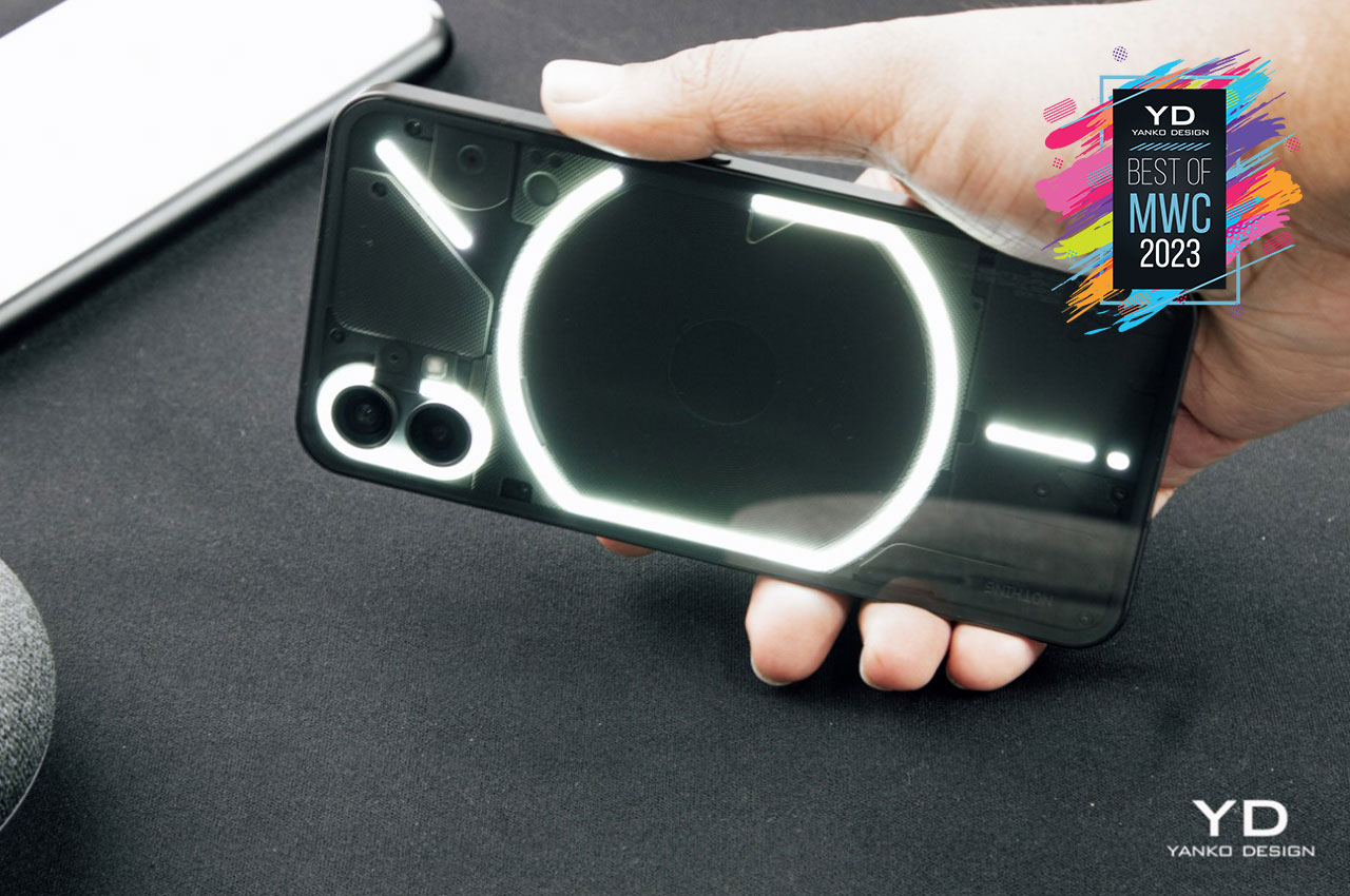
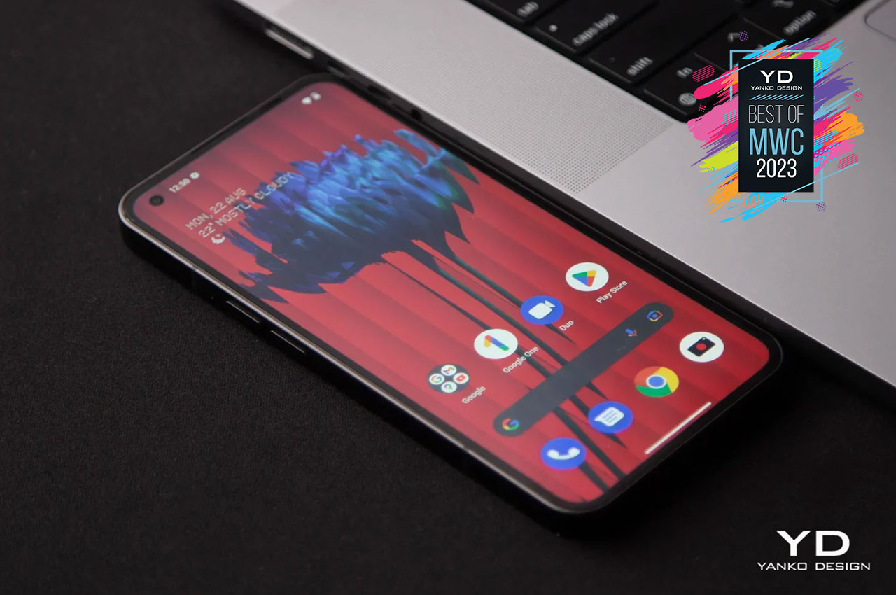
The phone (1) is just the beginning for this new fledgling brand, and it gets the award for its impact, but also for holding its title of being the Flagship killer. Available now at just $299, the phone (1) is an absolute steal, with its drop-dead gorgeous design, more-than-average chipset, and impressive battery-life upgrade thanks to the new NothingOS 1.5 update. Of course, the transparent back and Glyph Interface still have our thumbs up, and we can’t wait to see what future devices will look like.
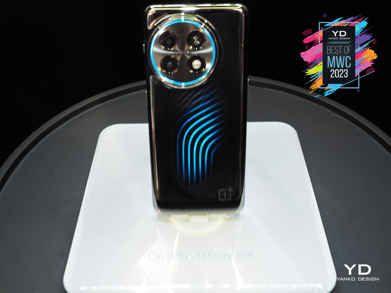
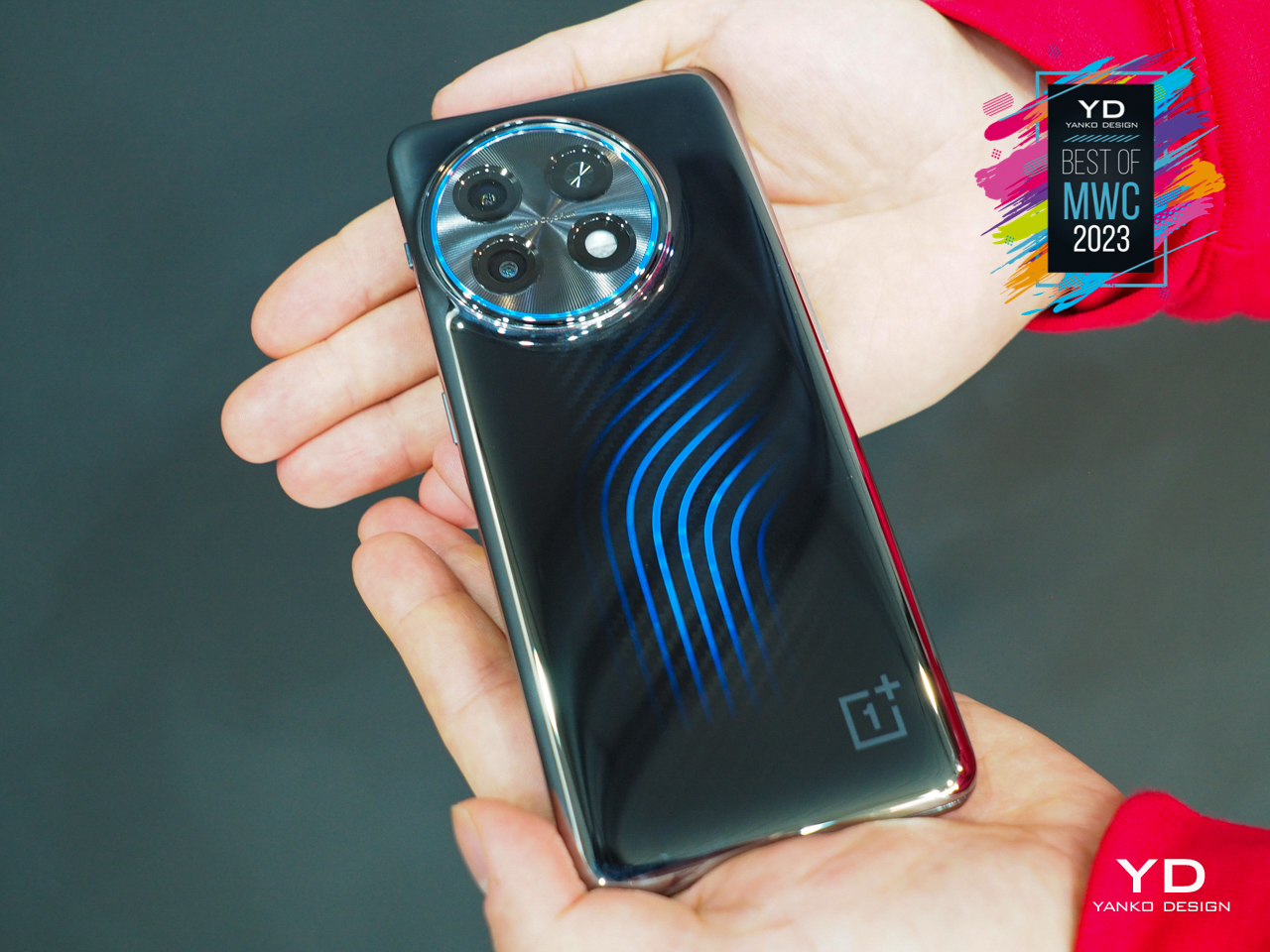
OnePlus’s claim to fame was that it Never Settled for mediocrity, trying to push the limits of what a smartphone can deliver without pumping the price up too much. Although it couldn’t stem the tide of market prices forever, it continues to be the outlier among its peers. It’s also one of the few brands willing to make seemingly crazy and outlandish experiments that may or may not become a real product. After the disappearing camera act of the OnePlus Concept One, the company is setting its sights on something cooler, literally and figuratively.
Designer: OnePlus
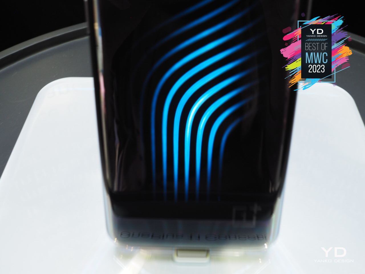
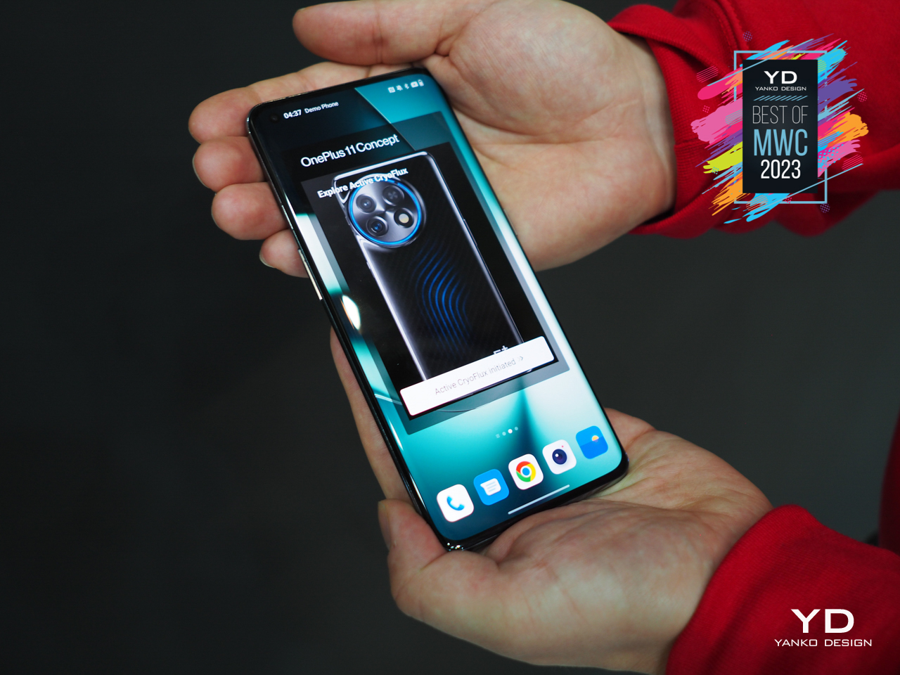
In a nutshell, the OnePlus 11 Concept’s Active CryoFlux is like PC liquid cooling for phones used to create a stunning visual effect. The concept phone’s clear back becomes something like a light show as the icy blue cooling liquid flows through pipes and around the circular camera bump. It’s definitely quite the sight to behold, and OnePlus naturally makes big claims about its effectiveness in keeping a phone cool, allowing it to maintain good frame rates longer. If it does become a retail model, it will definitely appeal to mobile gamers that might want something a bit different from the usual RGB designs.

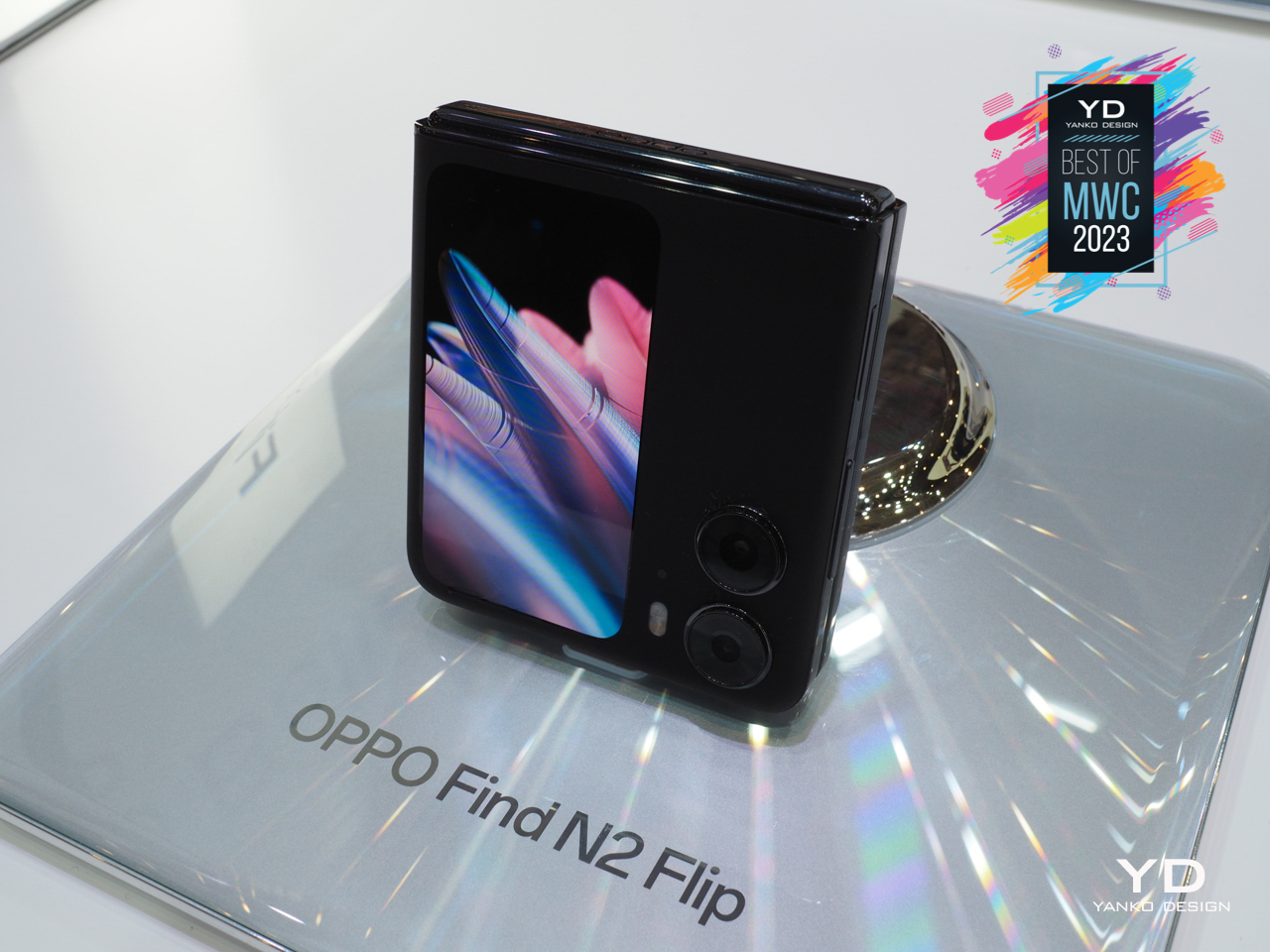
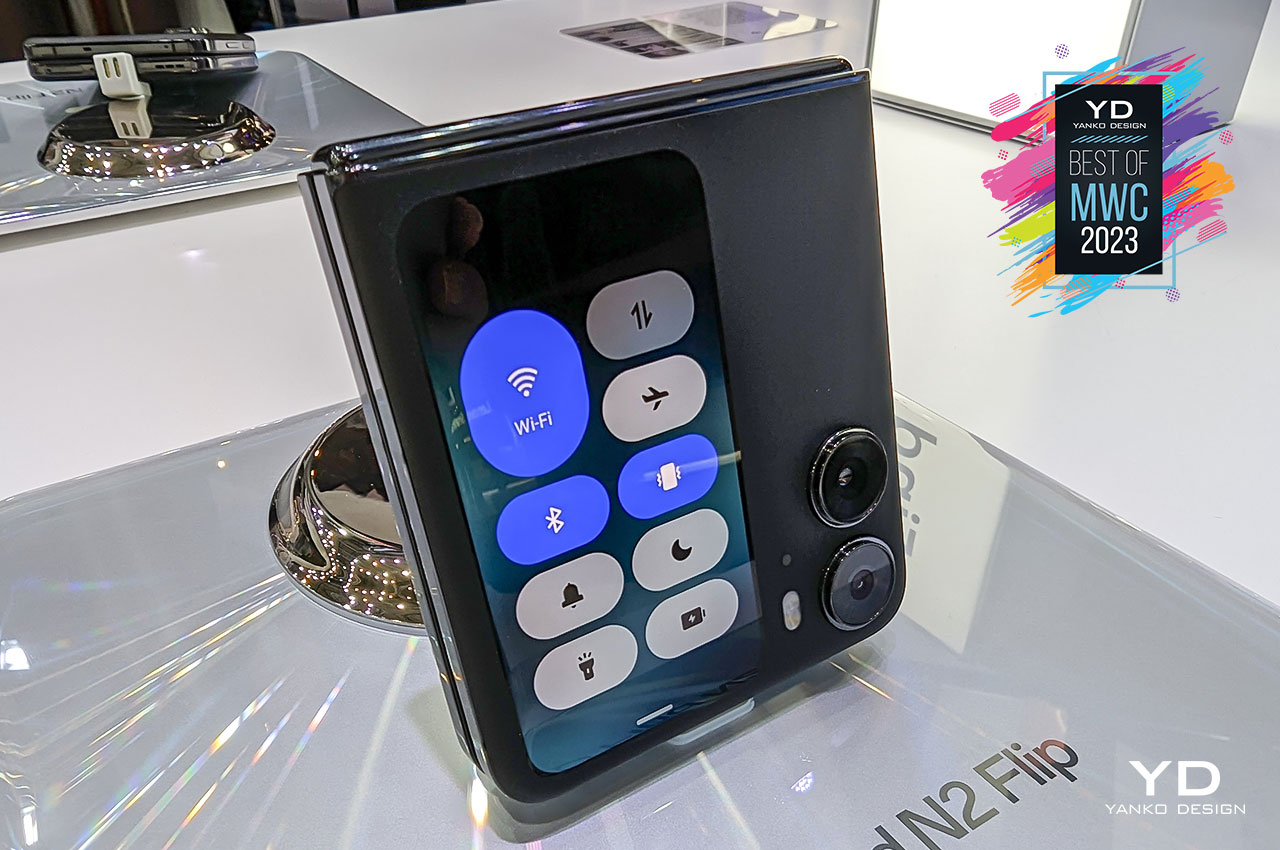
Although book-type horizontal foldable phones are definitely jaw-dropping the first time you see them, even Samsung admits that the clamshell-type foldables are more popular and approachable. Whether it’s because of their more familiar form or because of their more accessible price tag, the likes of the Galaxy Z Flip are expected to make up the majority of sales in this category. Ironically, there are even fewer players on this court, which makes OPPO’s belated challenger also more significant.
Designer: OPPO
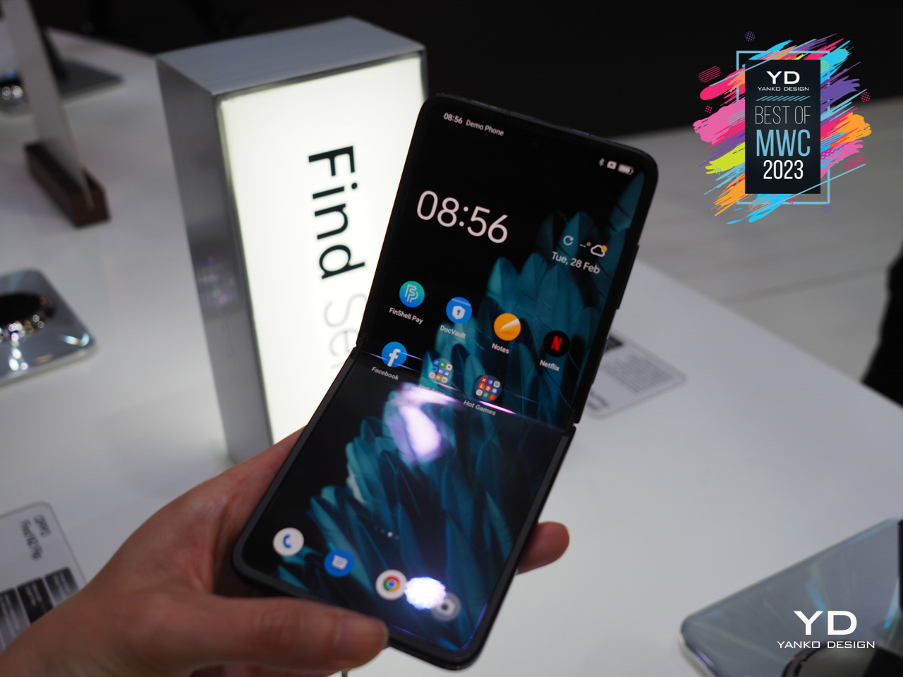
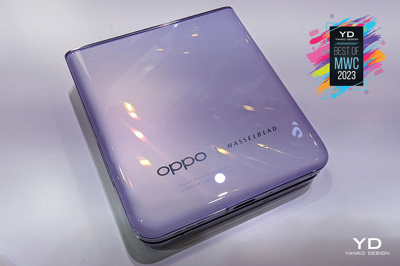
Like its horizontal sibling, the OPPO Find N2 Flip pushes the envelope with what you can do with this kind of foldable. It offers a larger external screen and a more competitive set of cameras, packed together with flagship-level hardware and a nearly crease-less display. There are a few kinks here, and some missed opportunities there, but for a first attempt, it’s definitely a laudable move forward for the entire market segment.
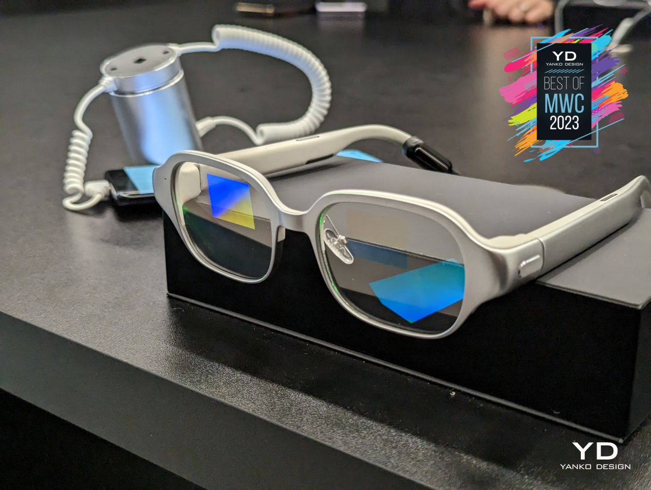
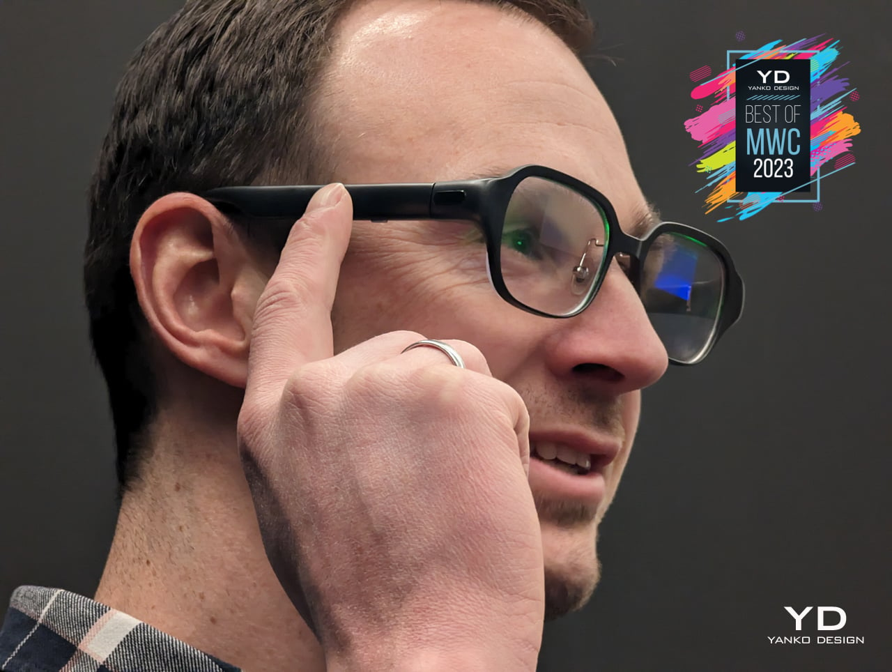
The high-profile failure of the Google Glass made many companies a bit warier of turning regular specs into AR-equipped devices, but that dream never really died. The industry now seems to be better prepared for this kind of wearable, and some are setting expectations right. It’s not going to be the hi-tech secret agent device of fiction, but the OPPO Air Glass 2 definitely takes the cake for being one of the most discreet smart eyewear around.
Designer: OPPO
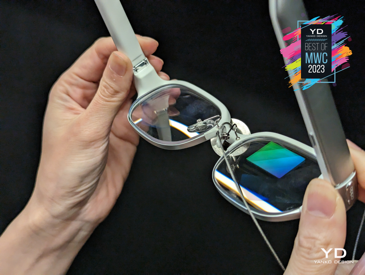
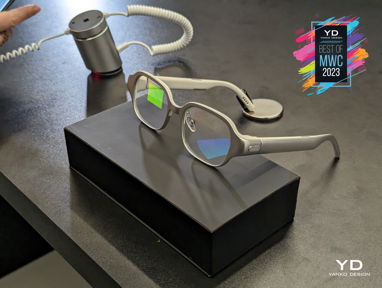
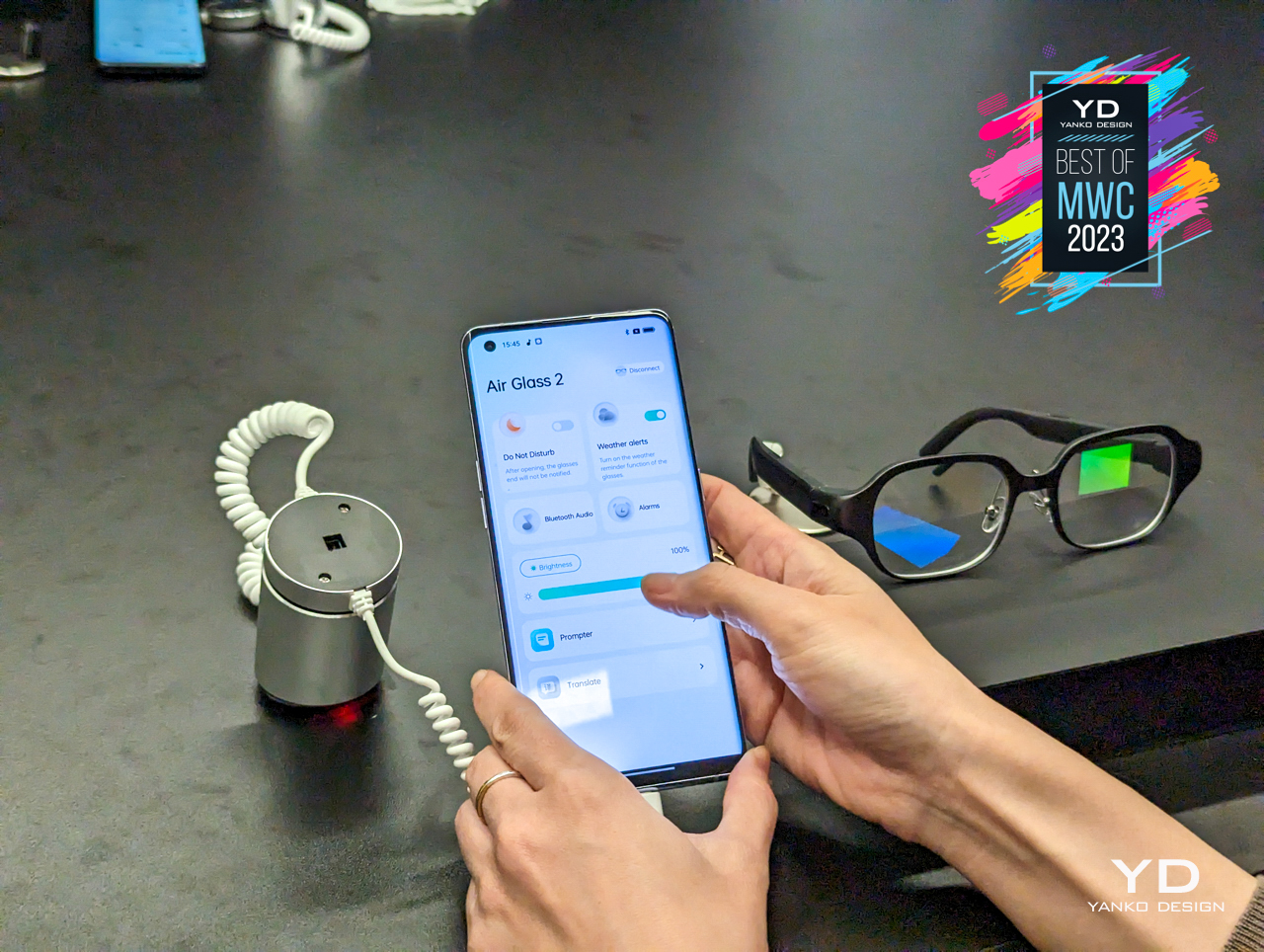
Lightweight and sleek, the OPPO Air Glass 2 focuses (no pun intended) on a set of features that is more relatable rather than fancy, including real-time translation and captioning, navigation, and, of course, some messaging. The display seems like it’s embedded in the lens itself, but you can actually change it to use corrective lenses for those with eyesight problems. It’s admittedly less sensational than other AR glasses, but it is ultimately more practical and more approachable for regular consumers.
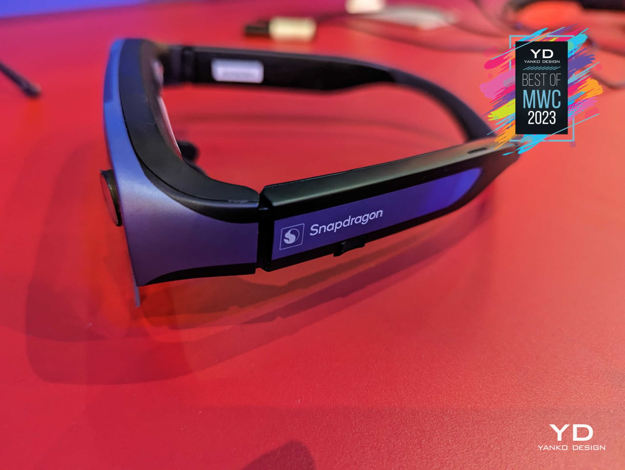
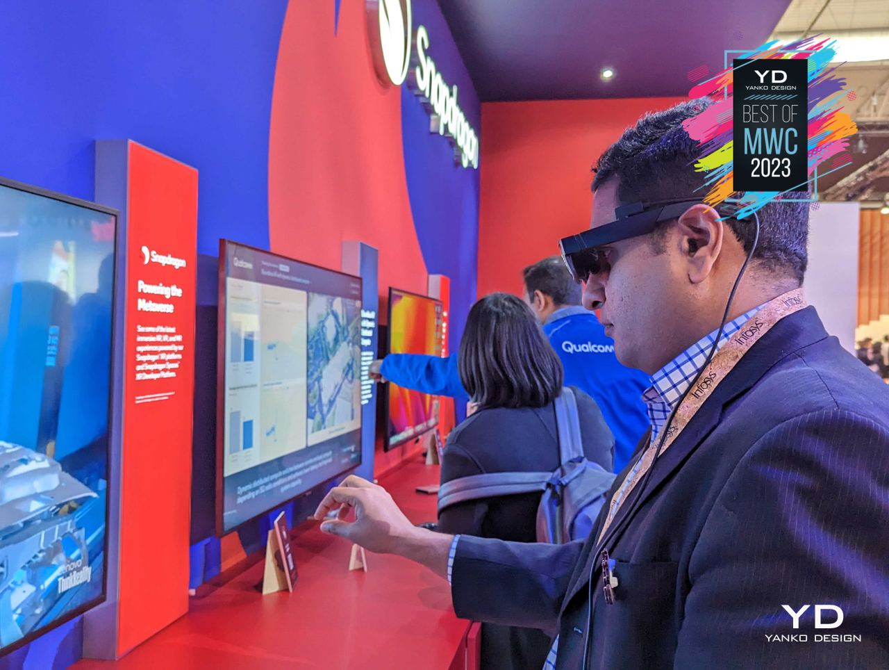
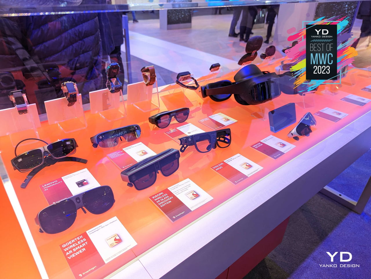
Although the rhetoric around the metaverse seems to have died down a bit, companies are still pushing the envelope in making the technologies empowering it more accessible. That means more headsets and glasses that try to deliver an extended reality experience without weighing us down or making us look laughable in public. There are quite a number of devices now that offer these capabilities without tying you down to a stationary desktop or laptop, and many of these standalone VR, AR, or XR wearables are unsurprisingly powered by Qualcomm’s processors.

Designer: Qualcomm
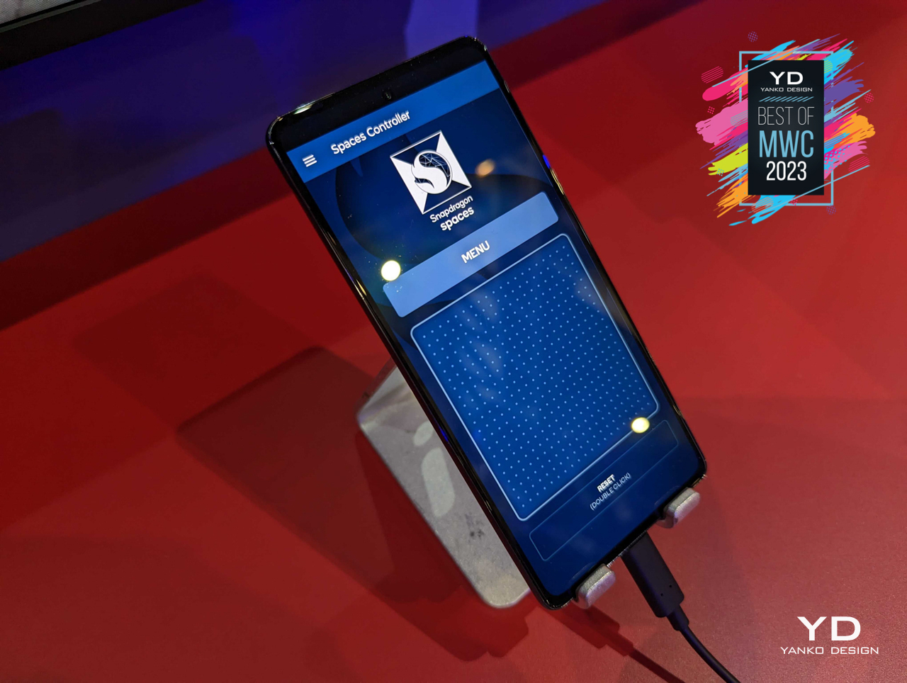
Qualcomm is the world’s leading silicon maker for mobile devices, but the large Snapdragon family doesn’t just cover smartphones, tablets, or even laptops. It also powers wearables, from smartwatches to this new generation of headsets and eyewear that carry their own computing power inside of them. As these devices get sleeker and more fashionable, it won’t be surprising to see Qualcomm’s Snapdragon AR and XR dominating this market as well, powering the gear that will make the metaverse, or whatever its name will be, our next real universe.
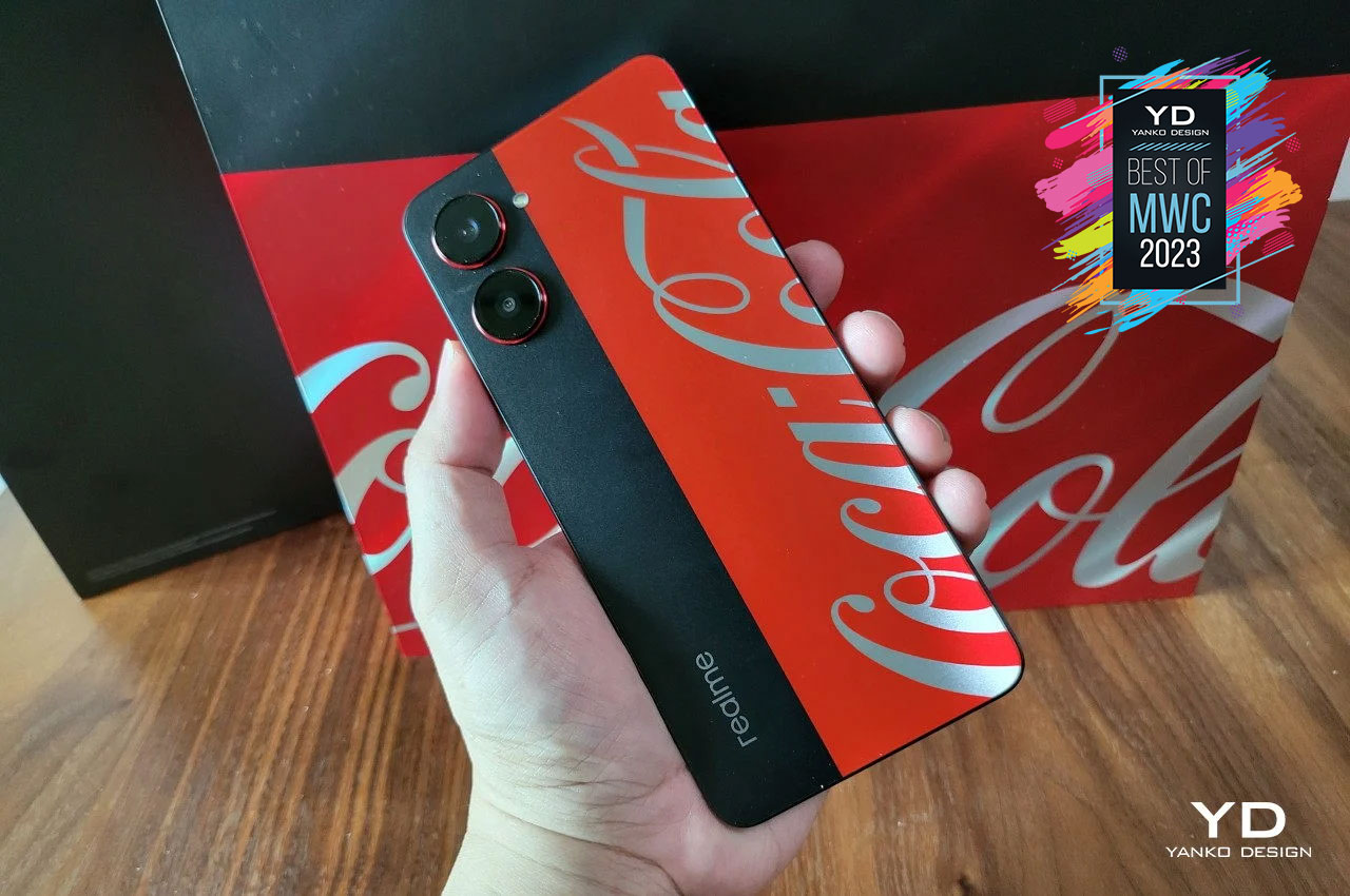
Smartphones are no longer just hi-tech tools to make our lives easier, they have also become tools for self-expression. People slap on stickers, skins, and cases not just for protection but also for show, displaying their favorite colors, characters, brands, and much more. Some smartphone makers have tried to tap into this trend, and realme just one-upped everyone else with a partnership you never saw coming.
Designer: realme
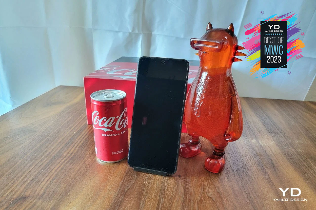
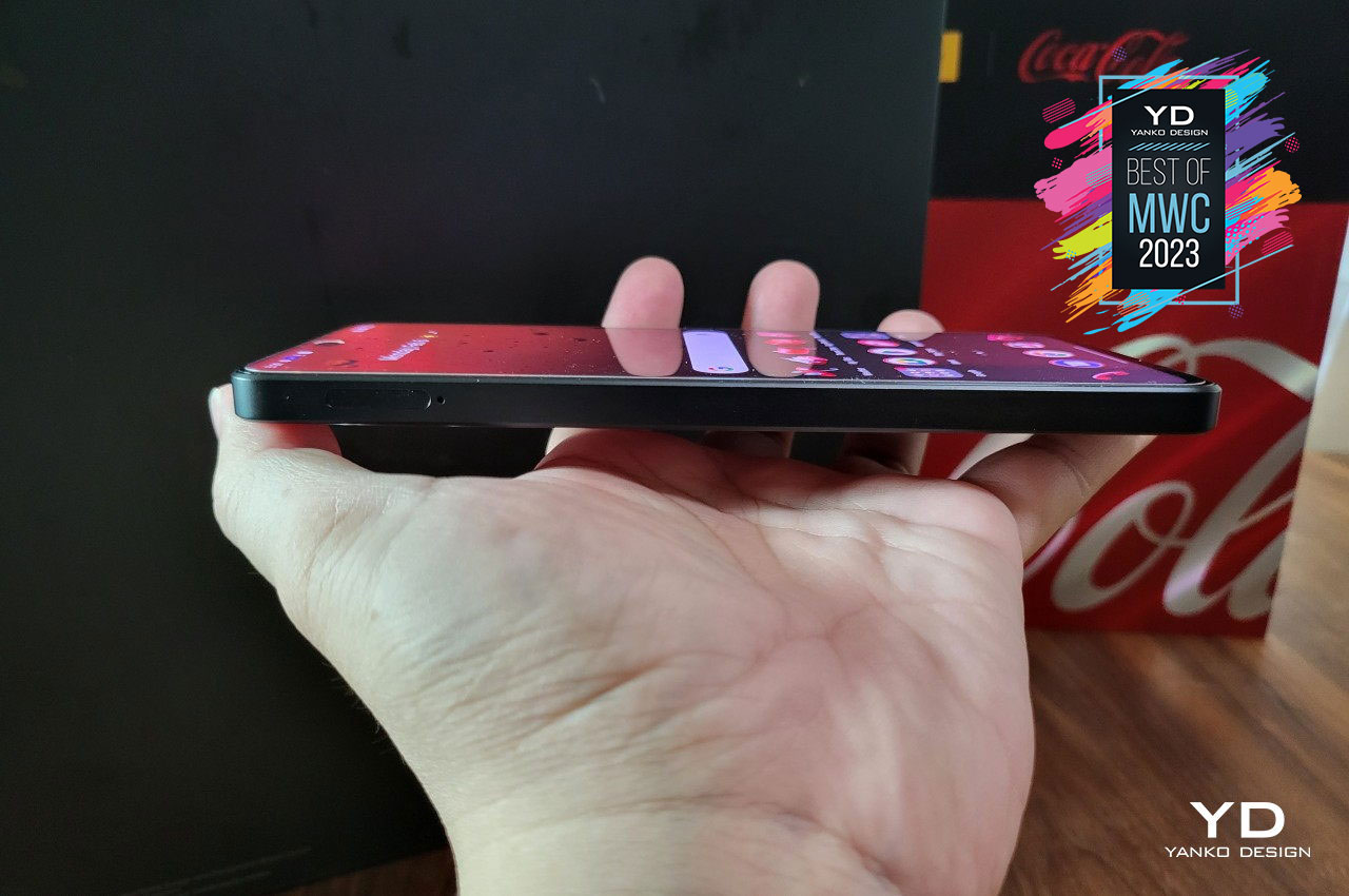
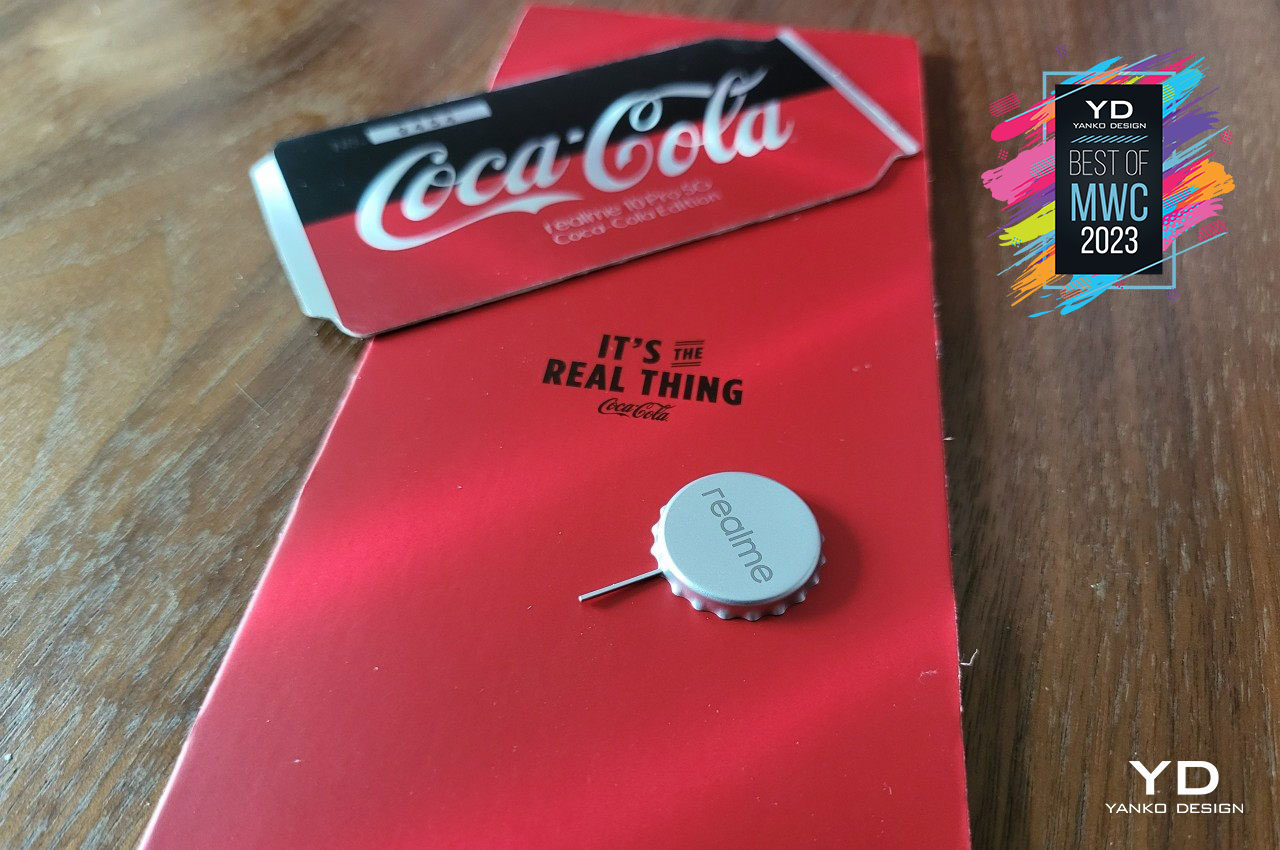
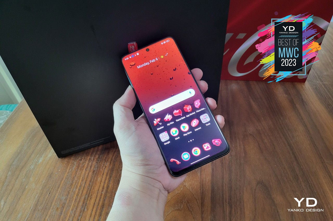
You can definitely try to force some associations between smartphones and the world’s most popular beverage, but the realme 10 Pro Coca-Cola Edition is definitely special even without that. The mere fact that it’s weird and quirky speaks to the youthful and energetic vibe that both brands are aiming for. The phone itself is actually well-designed, and the attention to detail extends even to the smallest thing, like a SIM tray ejector in the shape of a bottle cap. It doesn’t hurt that the hardware is quite competitive as well, so die-hard Coca-Cola fans won’t feel left behind if they get their hands on this limited edition collector’s item.
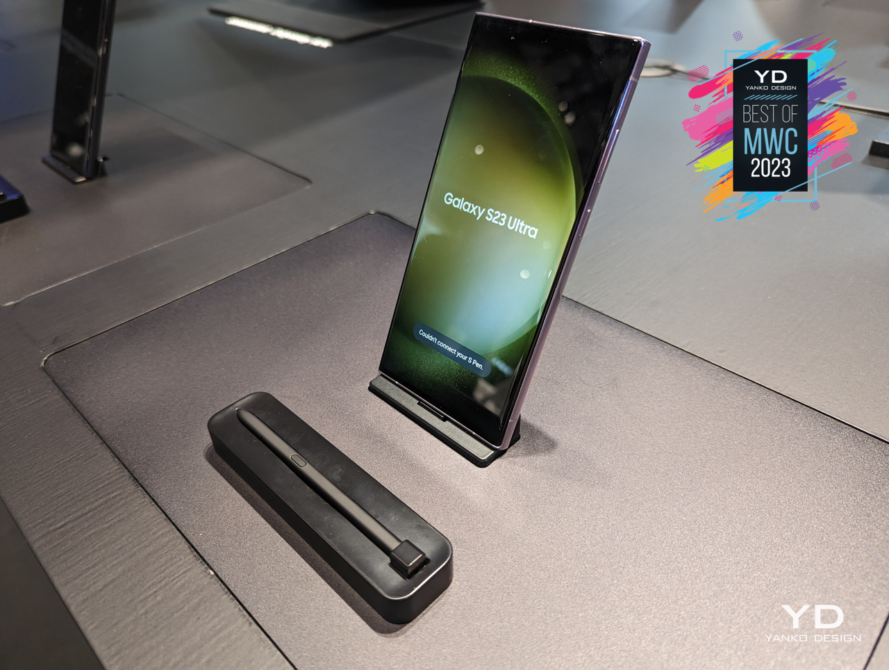
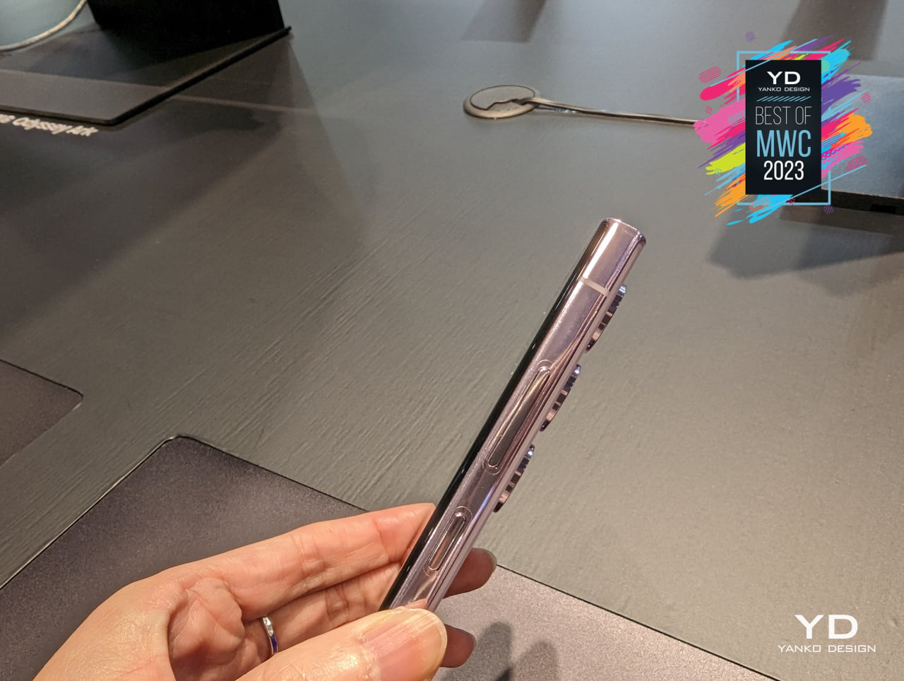
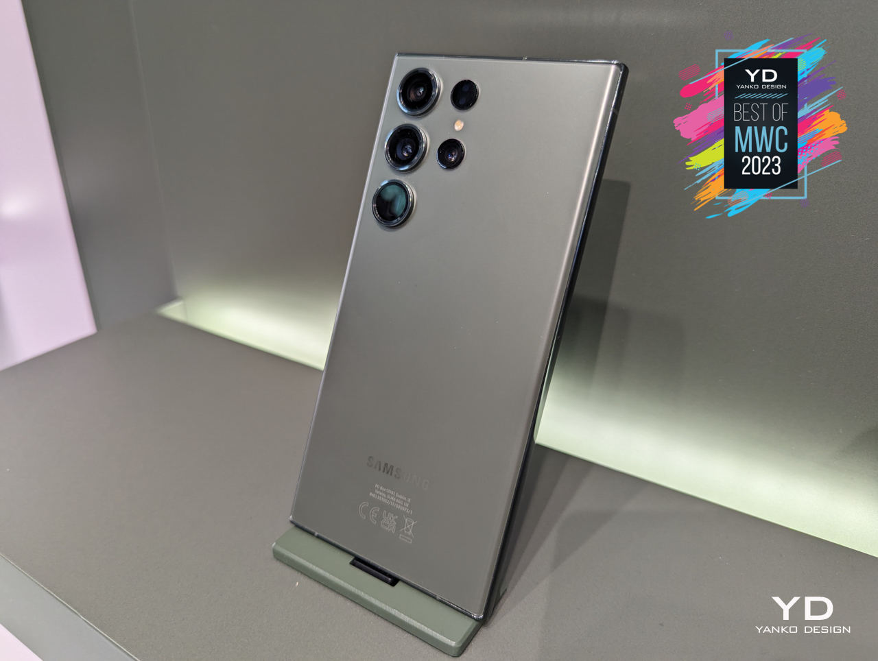
There are definitely many people that dislike how it diverges from the “vanilla” Android experience, but there’s no denying that Samsung is pretty much the leader of the Android market across many tiers. That doesn’t mean they always put out a winning flagship, like the ill-fated Galaxy Note 7, but they do have notable designs every so often. Although the Galaxy S23 series offers upgrades across the board, it looks almost similar to its 2022 predecessor, which is actually part of what makes it great.
Designer: Samsung
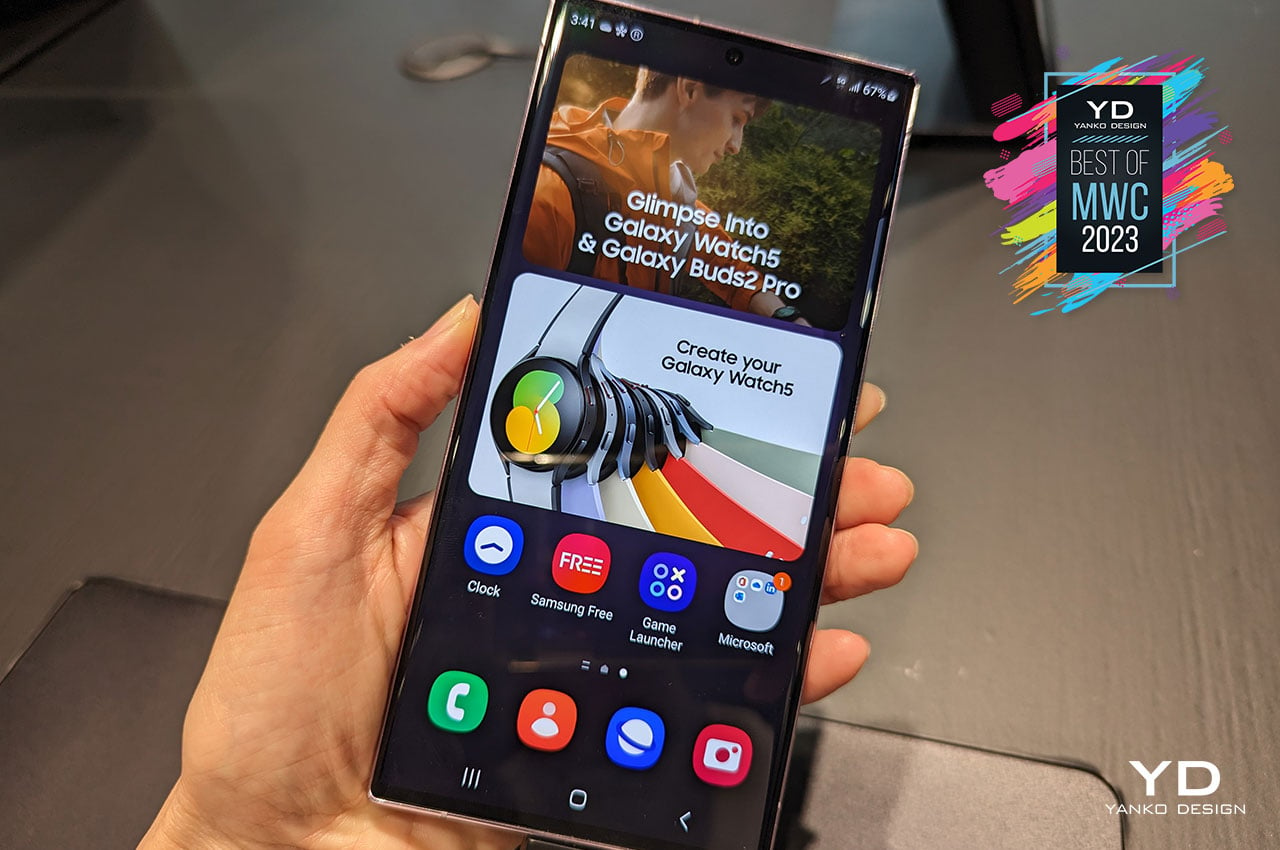
Rather than coming out with something different for the sake of being different, Samsung seems to have settled down on a more familiar and more stable design language that will become its DNA, at least in 2022 and 2023. This strategy has made the iPhones easily identifiable, even if you miss the telltale logo on the back. Additionally, the Galaxy S23 is a refreshing dose of minimalism at a time when smartphone camera bumps have become obnoxiously big. Hopefully, Samsung will stick to this classic look, even for just one more round.
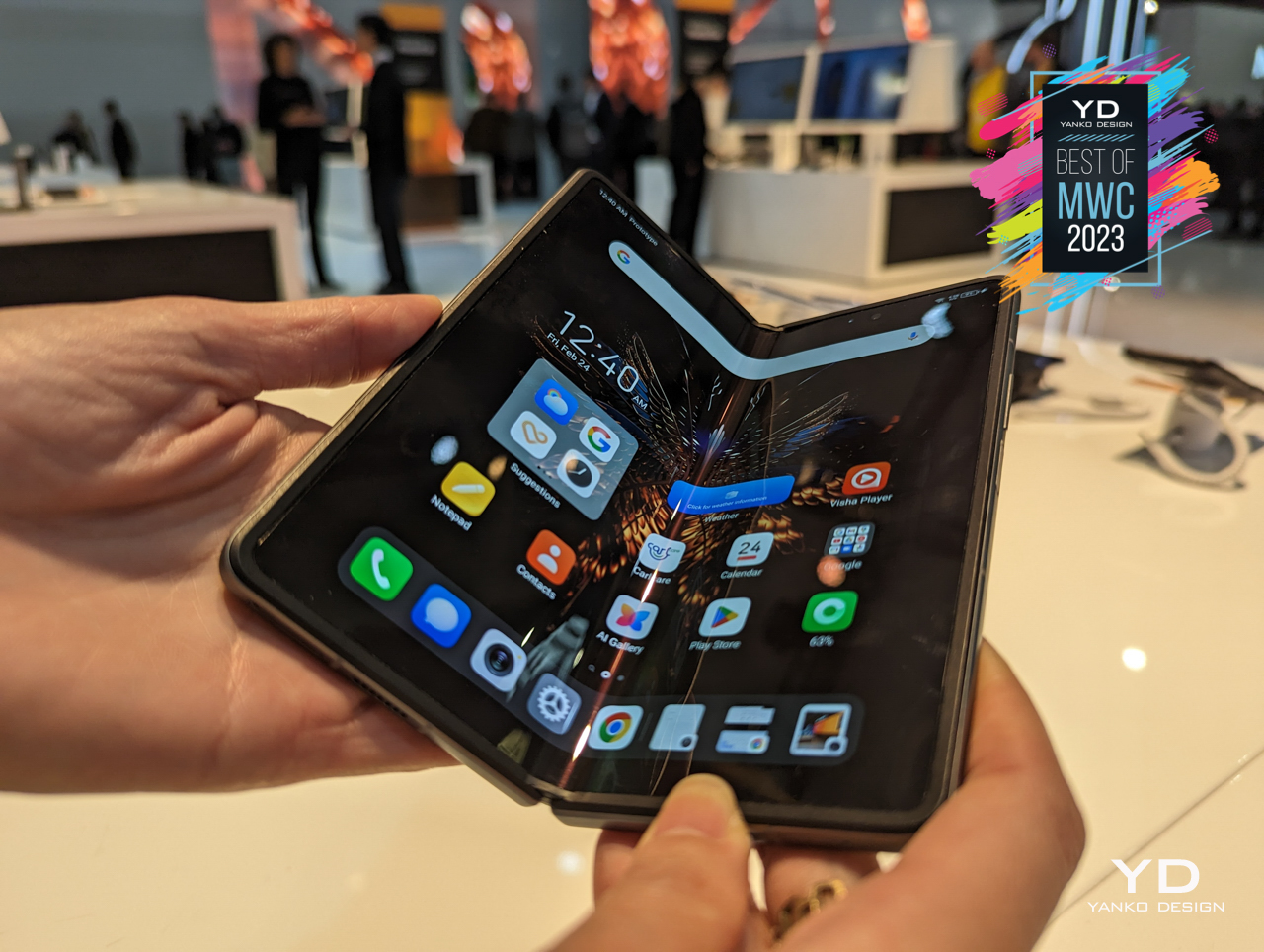
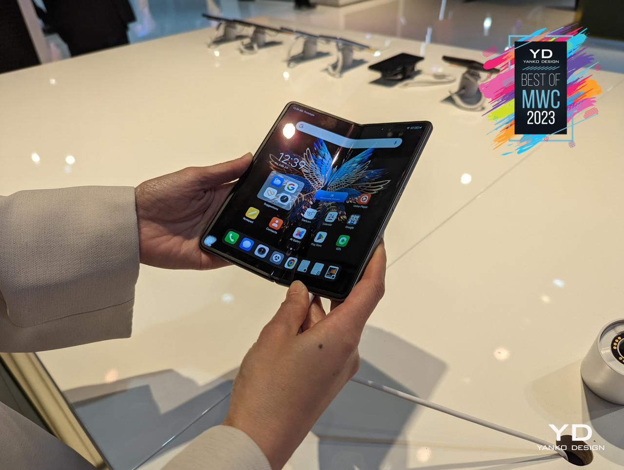
You know that foldable phones have made it big when even brands you might have never heard of start launching one. Tecno is a relatively younger and smaller player in the global scene, but it’s making a leap of faith by launching its first-ever foldable phone internationally from the get-go. The formula for horizontal foldables hasn’t exactly changed in the past four years, so it’s interesting to see newcomers that can bring fresh ideas to the table.
Designer: Tecno
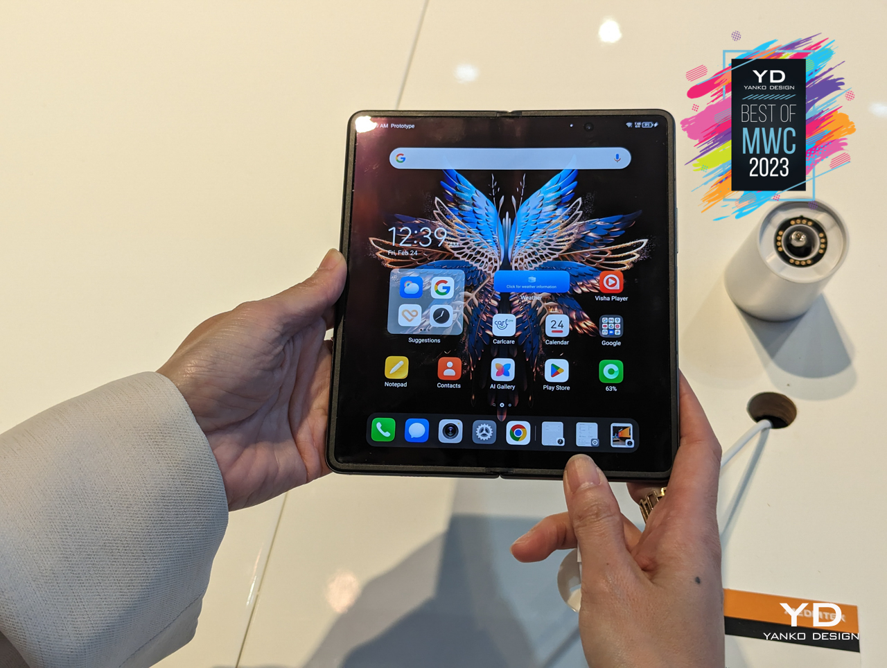
The Tecno Phantom V Fold’s defining feature is pretty much its camera design, something you won’t see on any of its kind. The constrained spaces of foldable phones have pretty much limited where you could place components like camera sensors, so it is quite surprising that Tecno managed a feat that bigger brands have failed to accomplish. Whether that will be enough for it to grab sales, only time will tell, but it has definitely raised the bar for future foldables.
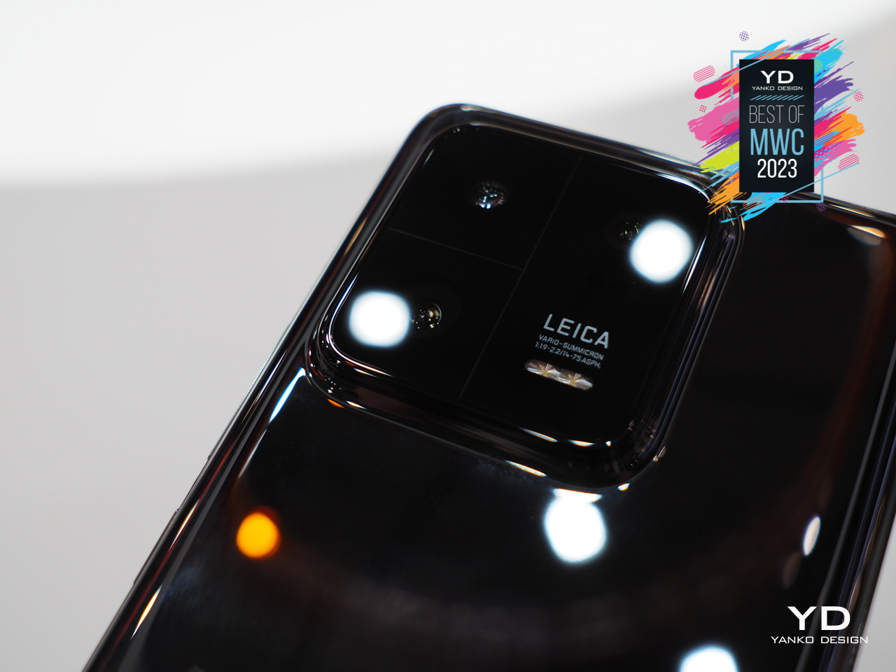
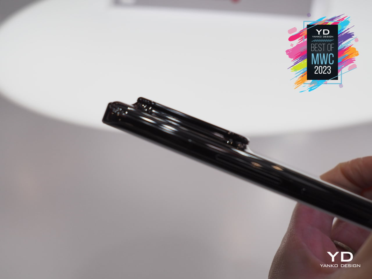
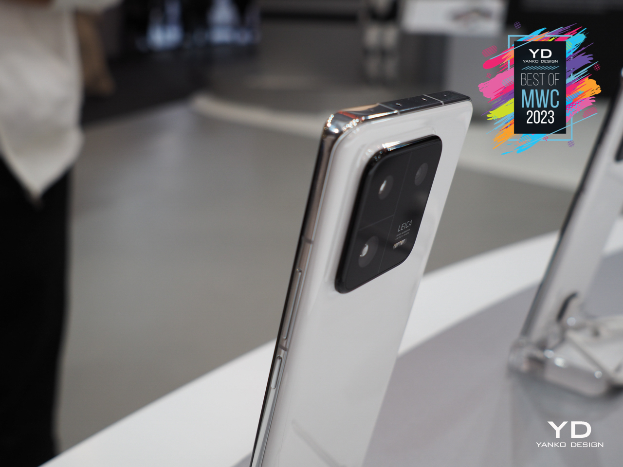
Although we interact with our phone’s screens nearly 100% of the time, it’s really their backs that give them their character. Some manufacturers have taken that to heart perhaps a bit too much, creating camera and back designs that are truly eye-catching, though not always in a good way. Less sensational and simpler designs can sometimes be more memorable, and the new Xiaomi 13 Pro tries to walk the fine line between the two extremes with a unique yet minimalist design.
Designer: Xiaomi
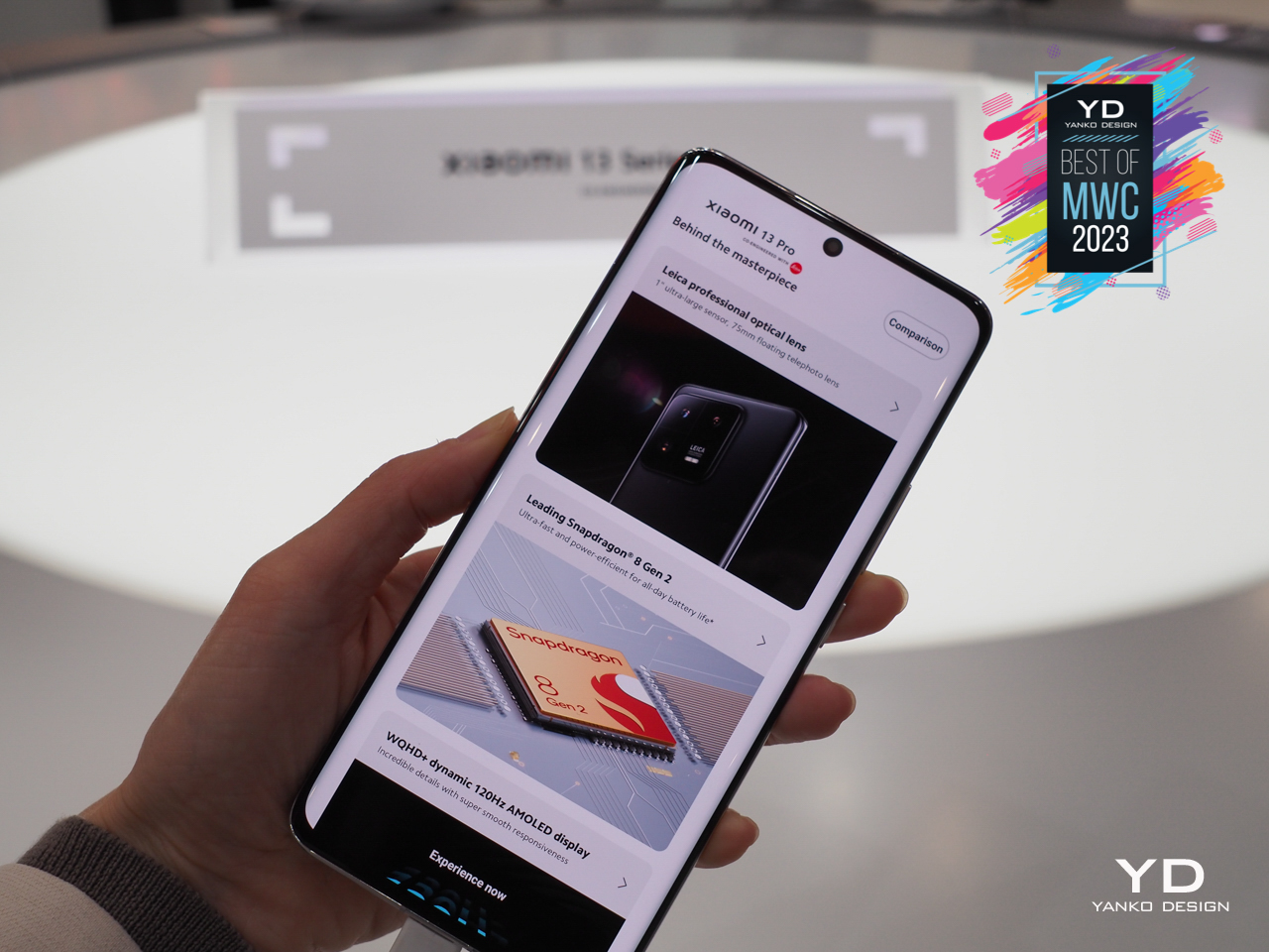
The phone’s camera bump is admittedly big, but it tries to create the illusion of a smaller size by visually dividing it into three parts. That also has the effect of emphasizing each camera’s unique strength, especially because of their association with Leica. The back cover is also made from “medical-grade bio-ceramic material,” and while you won’t be able to see the difference, your hand will appreciate the softer touch. Of course, the Xiaomi 13 Pro also has premium specs, so you’d be getting your money’s worth both in looks and in performance.
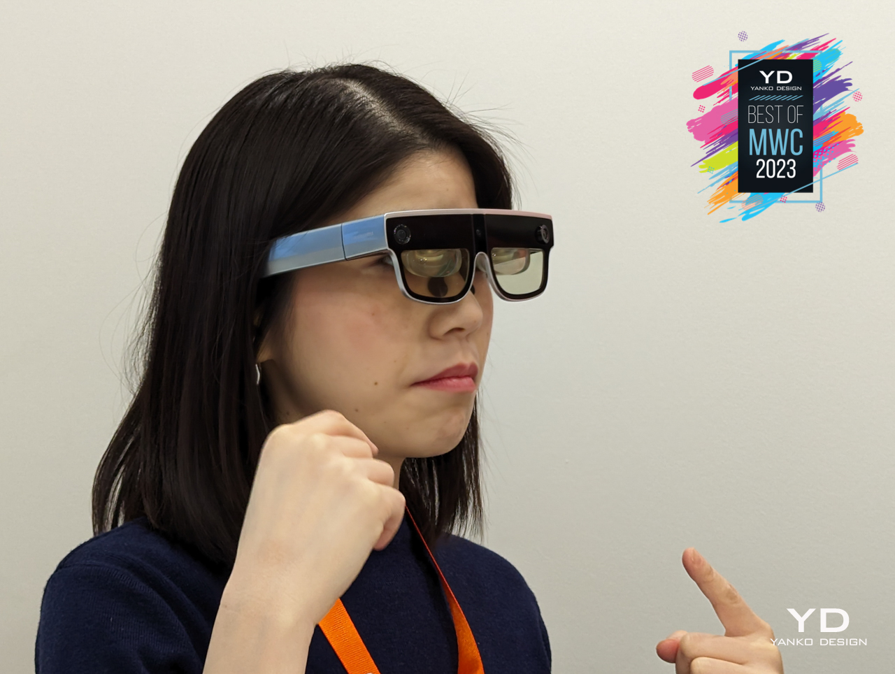
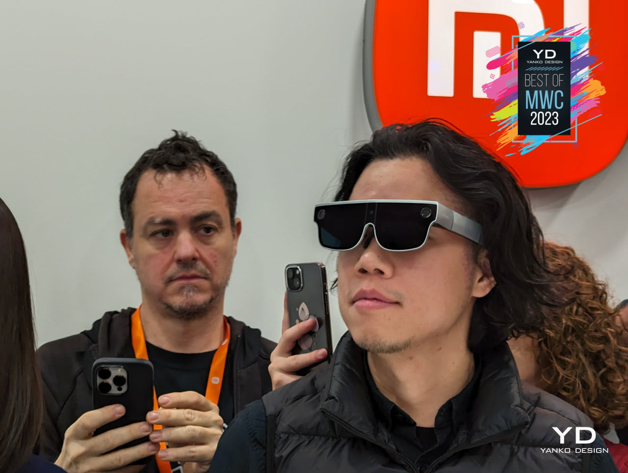
It seems that one of the most numerous mobile devices at this year’s event is smart eyewear. From full-on headsets like the HTC Vive XR Elite to more discreet glasses like the OPPO Air Glass 2, there is no shortage of wearables that offer all kinds of mixed reality experiences. This market segment is starting to get crowded, to Xiaomi is quickly making its presence known with an AR headset that could be one of the lightest of its kind.
Designer: Xiaomi
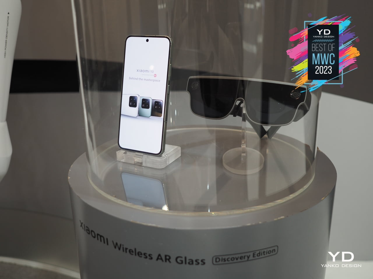
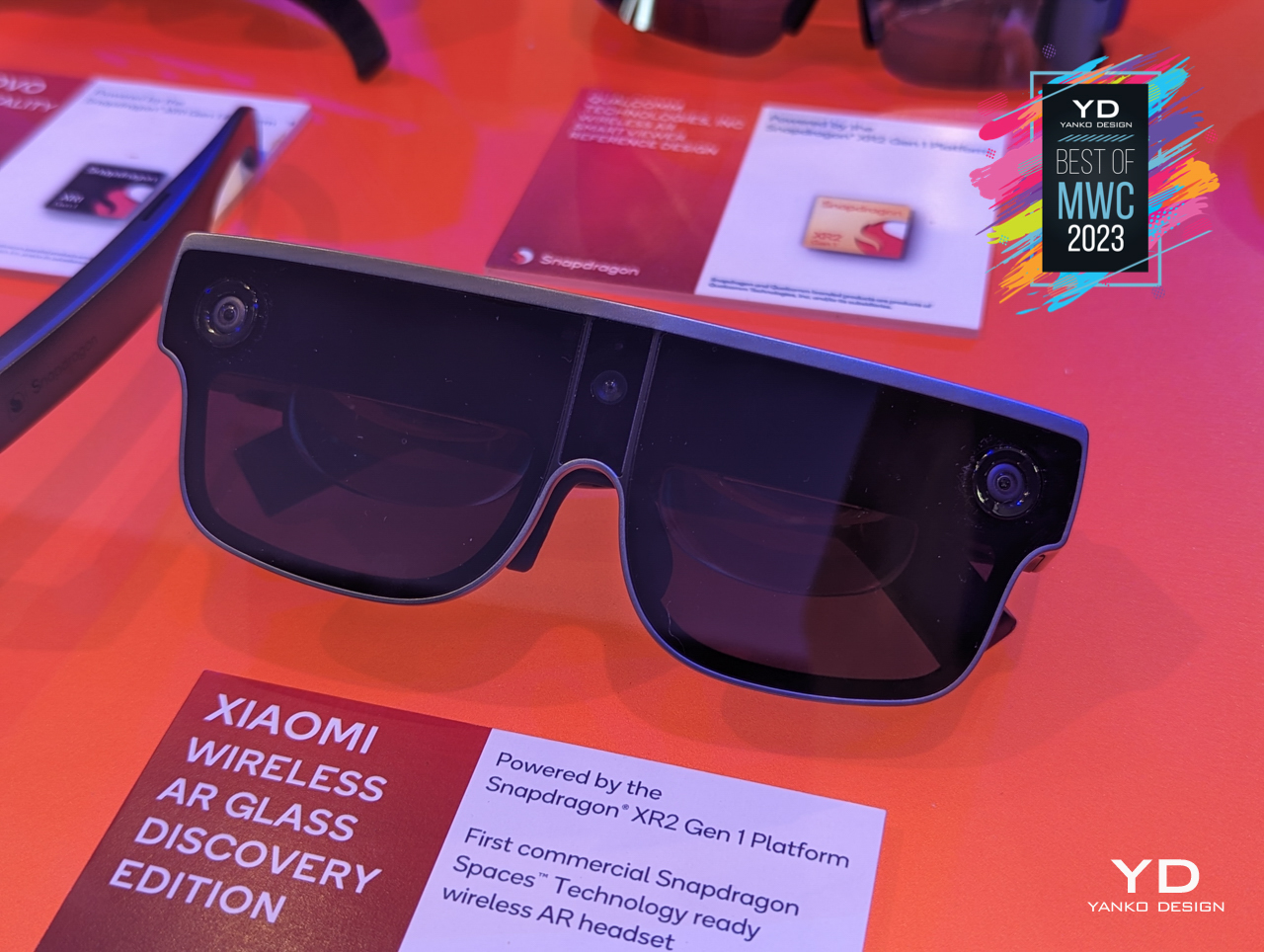
The Xiaomi AR Glass Discovery Edition might be a mouthful, but it practically encases the Qualcomm Snapdragon XR2 Gen 1 inside a magnesium-titanium alloy and carbon fiber frame. That’s the same powerful processor that runs in the bulkier Meta Quest Pro but in a lighter body that only looks like oversized sunglasses. It still has to make room for hardware, of course, especially since it functions standalone without connecting to a computer. It’s still lighter than most AR and VR headsets but promises nearly the same capabilities without burdening your head too much.
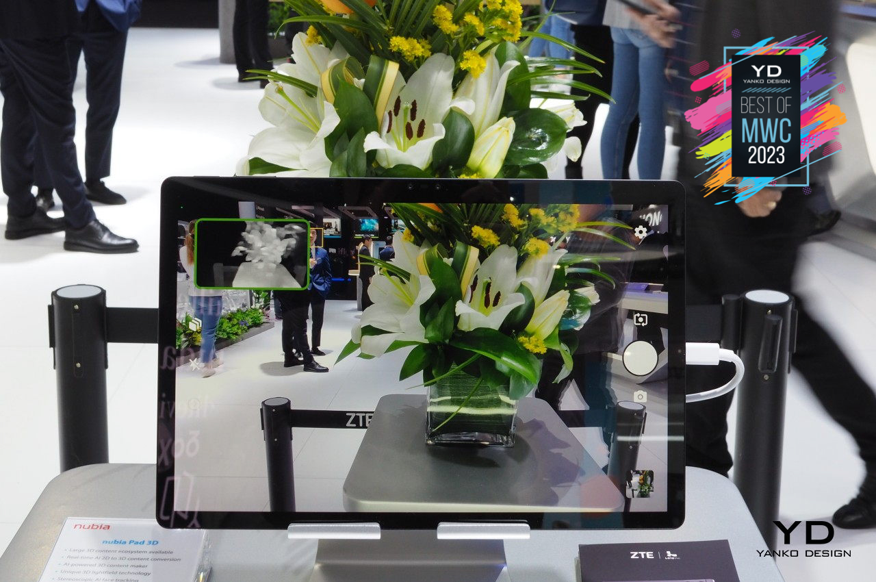
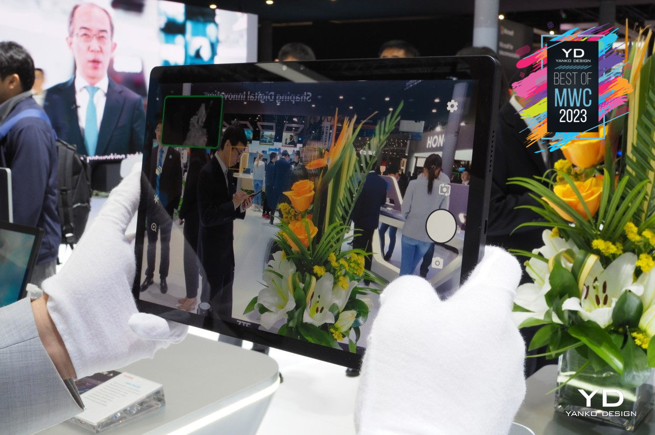
3D is becoming more than just something you see in movies or games. With the advent of mixed reality technologies and experiences, the role that 3D objects play has become a little more significant. Most people presume that enjoying 3D content would require wearing a headset or at least some special glasses like those you’d use in cinemas. There are now some TVs and even a few laptops that will let you see “real” 3D content without having to wear those glasses, but ZTE is presenting something that is more portable and potentially more usable by everyone.
Designer: ZTE
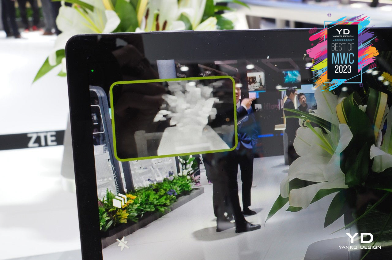
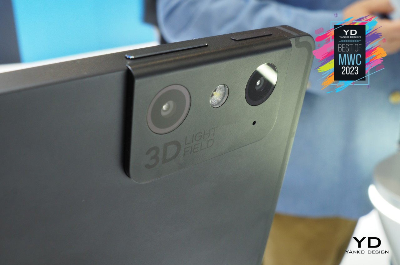
The nubia Pad 3D is perhaps the first tablet of its kind to enable viewing stereoscopic 3D content without any eyewear. It leverages Leia’s technology and ecosystem to power its features, not just for viewing 3D content but also transforming plain 2D content, like streamed videos, into something you view in 3D. The large 12.4-inch slate has dual cameras front and back to also allow users to become creators as well, generating 3D visuals from real-world objects or even their faces.
The post Best of MWC 2023: Mobile Gets Design-Conscious first appeared on Yanko Design.