Could the Apple MacBook Air 2021 finally come in the iMac’s candy colors?


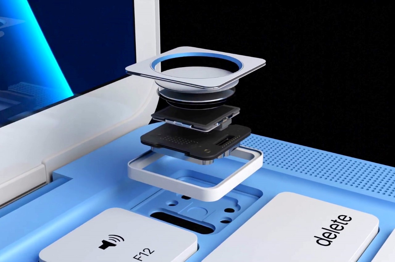
After the iMac got a refurbish this year at Apple’s Spring Loaded event, with a new slim 11.5-millimeter design, an M1 architecture, and those beautiful candy colors, it only seems natural that Apple carry that approach to its other Macs. Designer and visualizer, Devam Jangra’s put together a view to show us what candy-colored MacBook Airs could look like, and I won’t lie… I really like it!

If the colorful iMacs were a hat-tip to the candy-colored iMac G3 computers from 1998, these vibrant MacBook Airs most certainly pay a tribute to the old iBook G3s from 1999. It’s certainly been a while since Apple’s experimented with colored laptops – their latest foray was 6 years ago, with the rose-gold MacBook Air. Jangra’s concept video definitely shows why Apple should be less reticent and more open to creating colorful MacBooks… they spark joy, don’t they?!
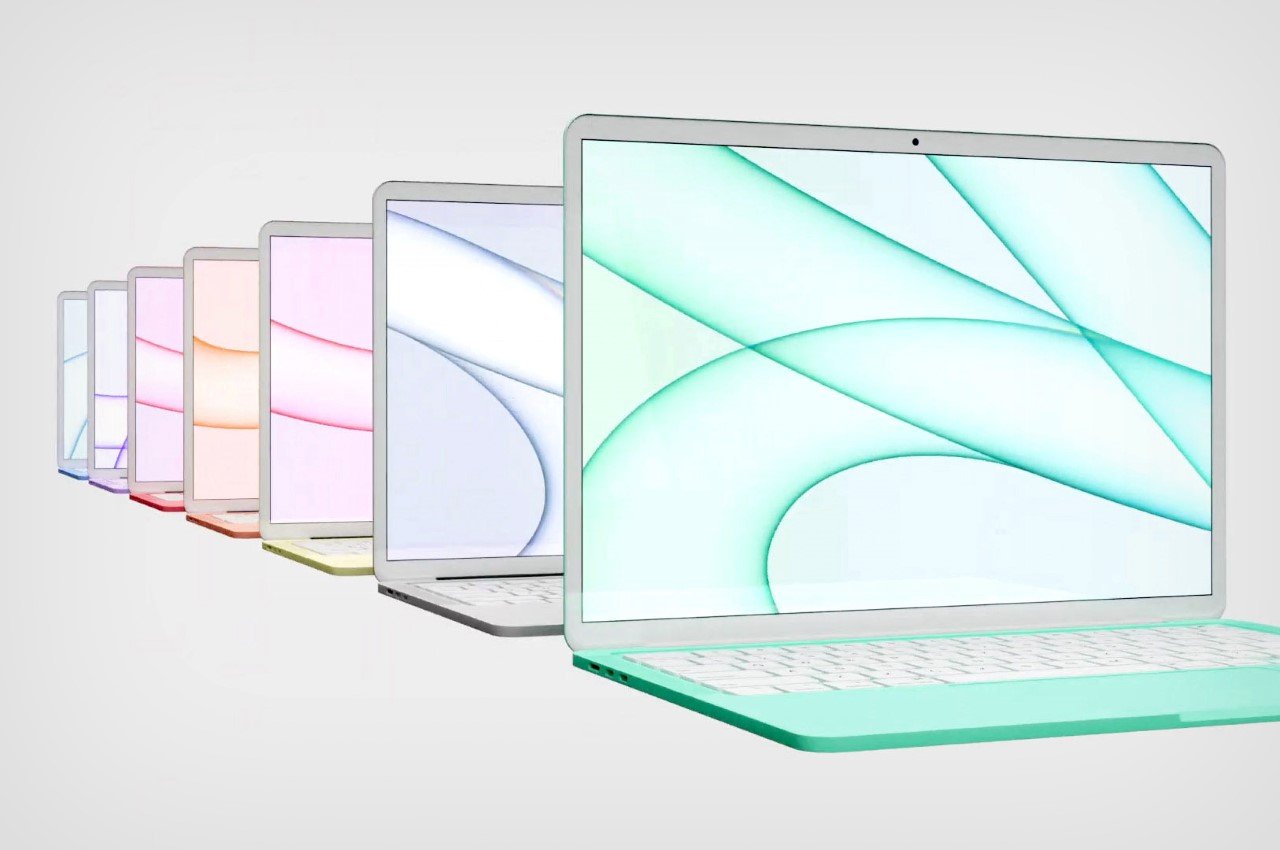
Rumors of colored MacBooks have been in the air for a little over a month now. In a video back in May, famed leaker Jon Prosser stated that the company would reveal a MacBook lineup “very close if not identical to the shades that you see on the stands for the new 24-inch iMacs.”
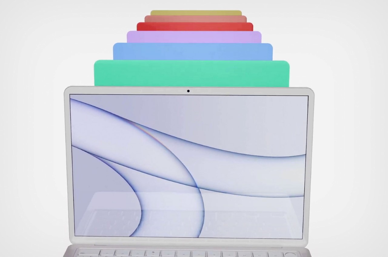
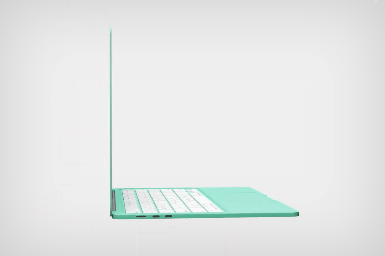
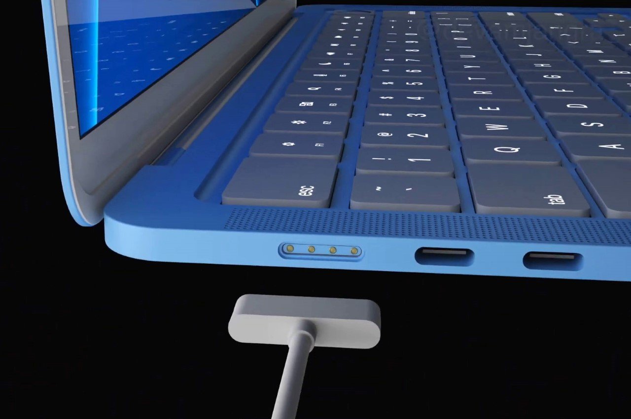
Another noteworthy feature that’s rumored to make a comeback apart from the candy colors, is MagSafe charging. Apple ditched the crowd-favorite technology a few years back for Thunderbolt charging, but if the leaks are credible, the wildly loved snap-on magnetic charging port is due to make a comeback. Jangra’s video showcases this too, while also putting two USB-C ports beside the charging port for good measure. The MacBook Air even comes with the iMac Keyboard-inspired TouchID key on the top right corner.
There’s really no saying if and when Apple would launch these. While the rumors DO come from credible sources, we’ve already had 3 Apple keynotes this year, and the only one left is the keynote in September/October, when Apple unveils their new iPhones, AirPods, and the Watch. That being said, maybe we could see this debut sometime next year, along with Apple’s highly anticipated M2 chip! I wouldn’t mind me some candy-colored iPads too!

Designer: Devam Jangra
Click below to read more!

Here’s what the M1 iMac would look like if Apple ditched the white bezels and large chin for a 100% display

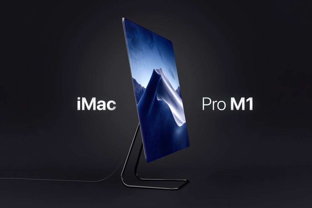
Needless to say, some people were quite annoyed with Apple’s latest M1 iMac design. Notably, YouTuber MKBHD found it outright ugly, mentioning that sure, it was slim… but those white bezels, that massive chin, and the lack of a black version made the iMac look too chirpy and playful. For a computer that was capable of incredible heavy-lifting, it didn’t quite look the part. Designer Virgile Arlaud decided to take that feedback and create his own iMac concept. Arlaud’s iMac Pro M1 concept addresses every single pain-point MKBHD had with Apple’s original design

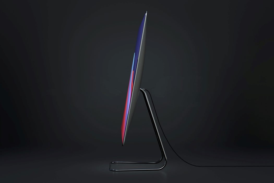
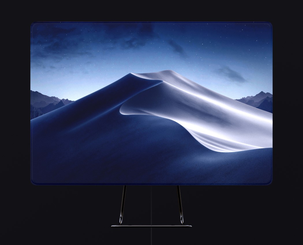
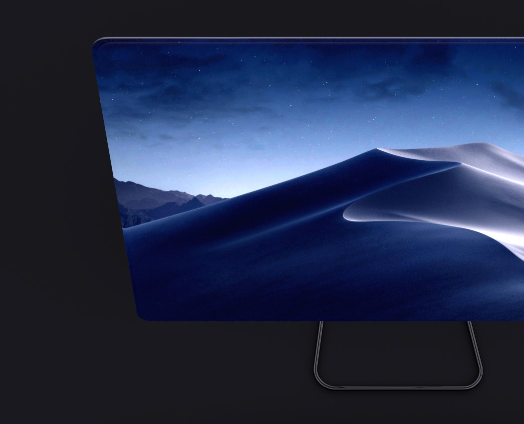
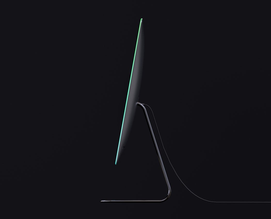
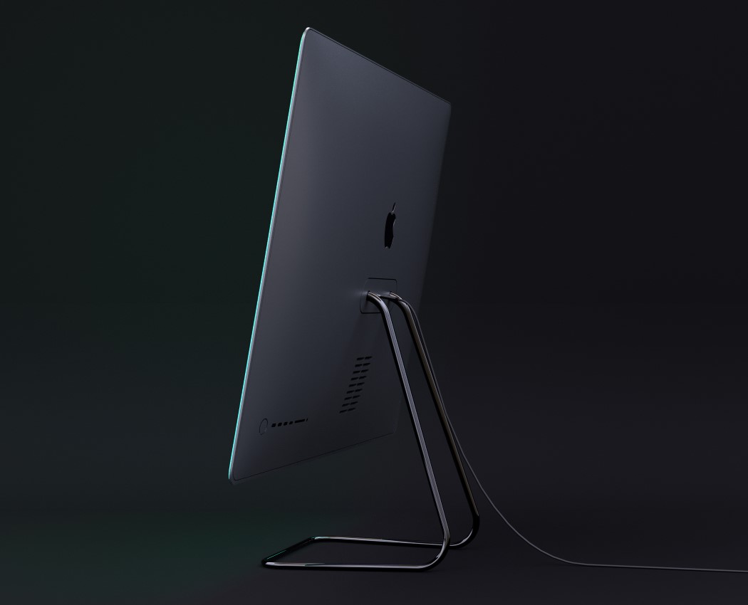
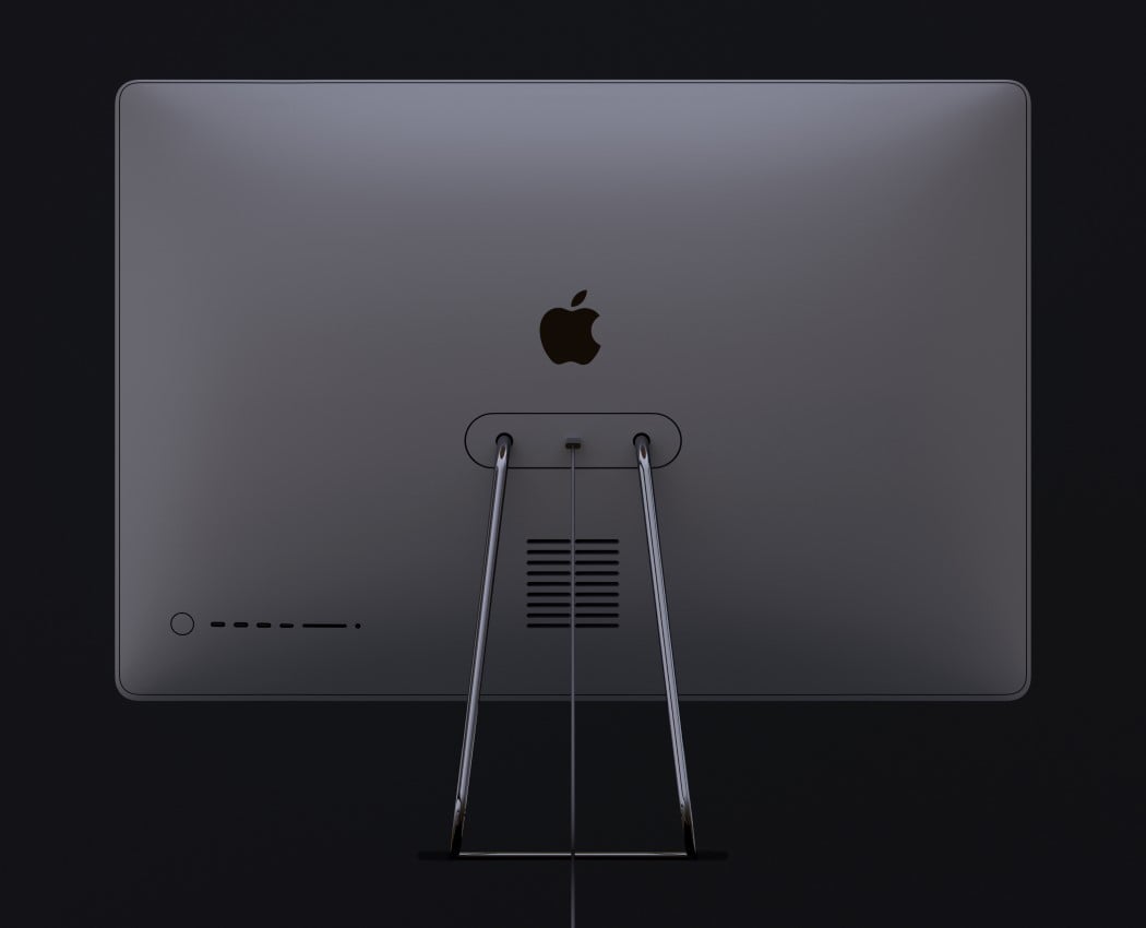
Instead of opting for a radical overhaul, Arlaud’s iMac Pro M1 concept takes the classic iMac Pro design and gives it minor yet significant visual upgrades. The conceptual all-in-one computer sports the crowd-favorite wedge-shaped profile with that slightly bulbed back. However, it absolutely gets rid of the bezels and chin on the front, sporting a gloriously infinite edge-to-edge display that’s an absolute pleasure to look at. Sure, the M1 may be the highlight of this computer, but that screen is the icing on the cake. If the M1 works behind the scenes to give you a great computing experience, that 100% screen on the front amplifies it, surrounding the user in Apple’s incredible, unmatchable UX.

This design direction obviously has some major pros, along with a few small yet unavoidable cons. Firstly, the lack of a bezel gives the iMac Pro M1 no space for a webcam, which played a pretty important role in Apple’s own iMac. The webcam ran 1080p video and used the M1’s processing power to run ISP algorithms for an incredible video. One could argue that the presence of a webcam is a pretty trivial feature in the workhorse that is the iMac, and that an iPhone running face-time would make a pretty decent replacement. One wouldn’t be wrong.

The absence of a chin also means that the iMac Pro M1 concept would lose out on that speaker array found in the original 2021 iMac. The down-firing speakers would have to be replaced with back-firing ones, and I’m no expert, but there would definitely be a small loss in sound quality and clarity. That being said, there are quite a few innovations that allow the screen to act as a speaker… so while Arlaud’s concept doesn’t really illustrate where a speaker would sit, I’d like to believe that this concept has that feature.

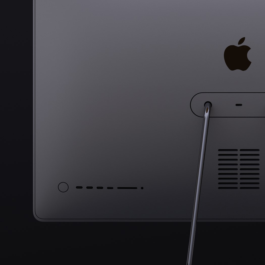
What’s really nice about this iMac Pro M1 concept is that it takes an “if it ain’t broken, don’t fix it” approach to the computer’s overall design. There’s really no need for an all-in-one computer to be 11mm thick (we’re not carrying it around in our pockets), so that slightly bulbous back and the seamless wedge-shaped design really feels like a nice design format that doesn’t need an overhaul. It even sticks to its original inspiration – Dieter Rams’ LE1 speaker design for Braun! The M1 chip sits somewhere within the curved back of the iMac Pro, along with vents for cooling, a USB-C power input, and a whole host of ports on the back, including two USB-C and two Thunderbolt ports, a card-reader, and the old-favorite 3.5mm jack. Let’s also not forget that slick, pipe-shaped stand that’s definitely another hat-tip to the iconic Braun LE1 speaker!

Designer: Virgile Arlaud