What if Instagram Went Spatial? Unofficial UI on Apple Vision Pro Shows How

Unofficial Instagram UI for Apple Vision Pro

The internet sure has a short memory. It’s barely been 3 months since Apple debuted the Vision Pro and it pretty much looks like we’ve entirely forgotten about it. However, people experimenting with the developer kit seem to be incredibly impressed with its underlying tech (some even let out audible gasps when they tried the Vision Pro out). So while the hardware device is still a while away from officially hitting the shelves, it’s safe to say that developers are excited to build spatial-ready versions of their apps, platforms, websites, and games. Earlier last month we looked at an unofficial Spotify UI for the Vision Pro, and it seems like we’ve now got a taste of what Instagram would look like through Apple’s headset.

Designer: Ahmed Hafez

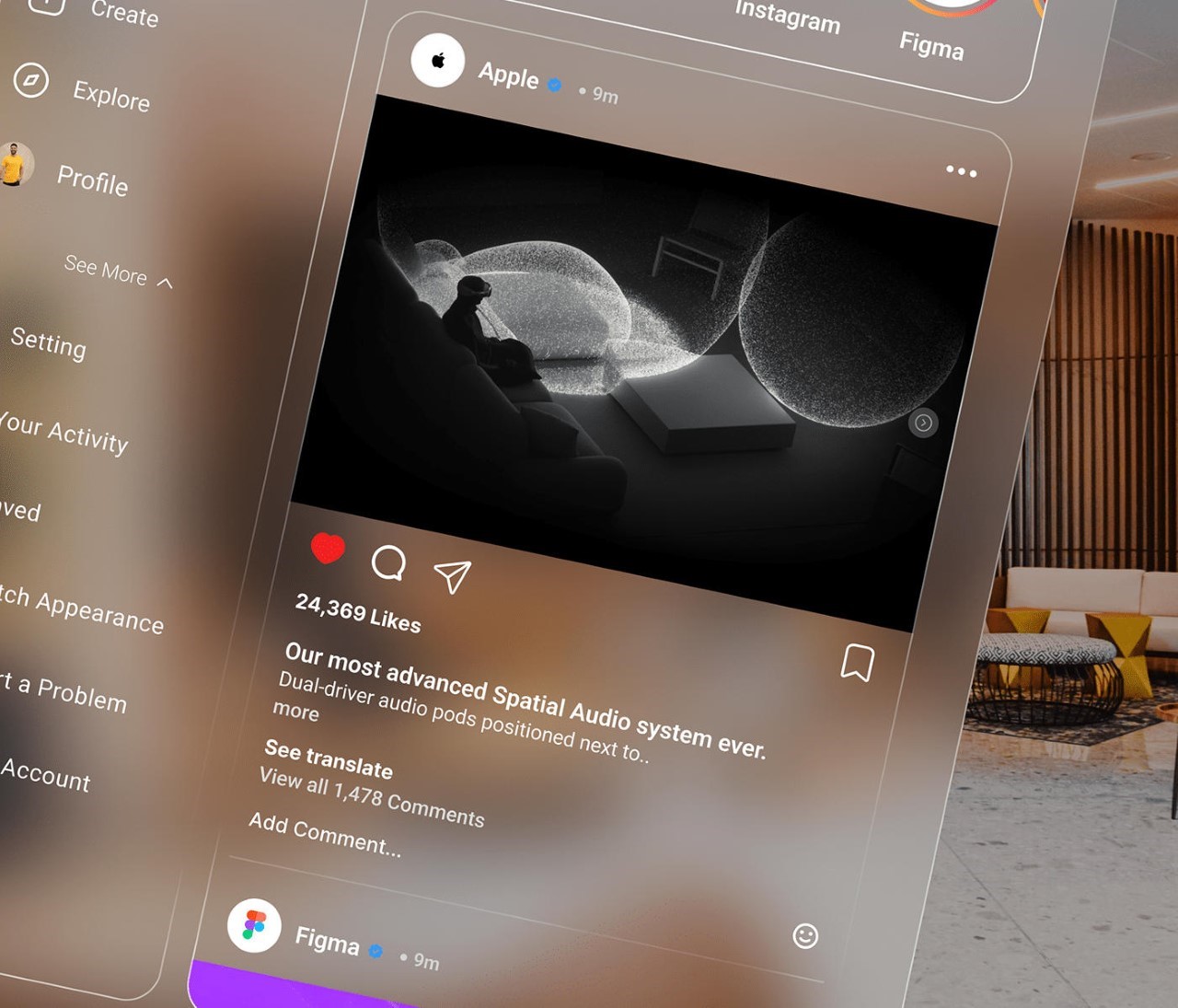
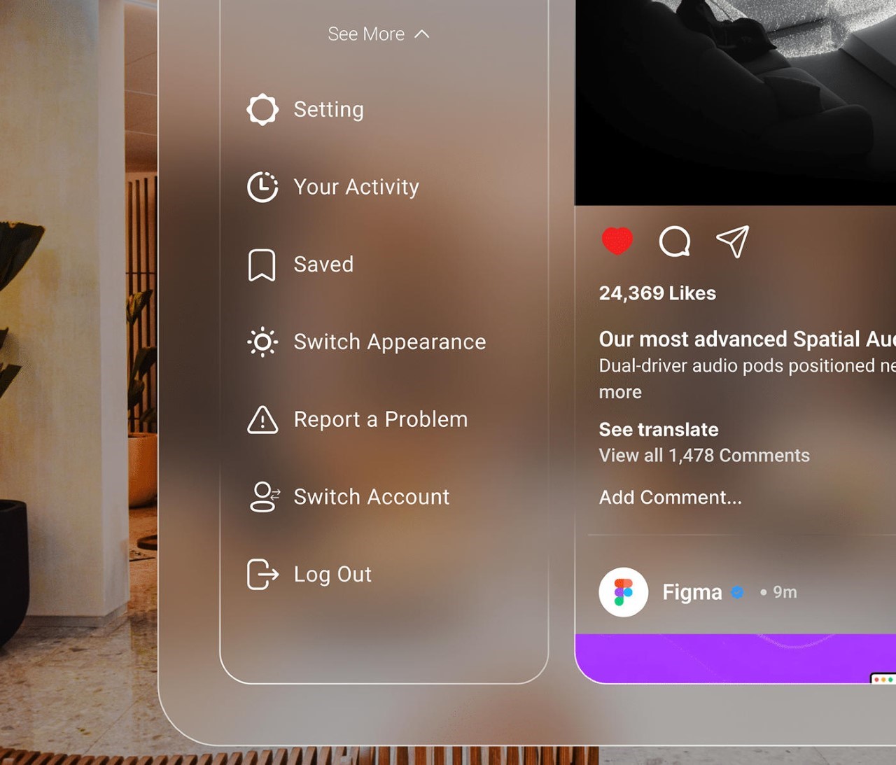
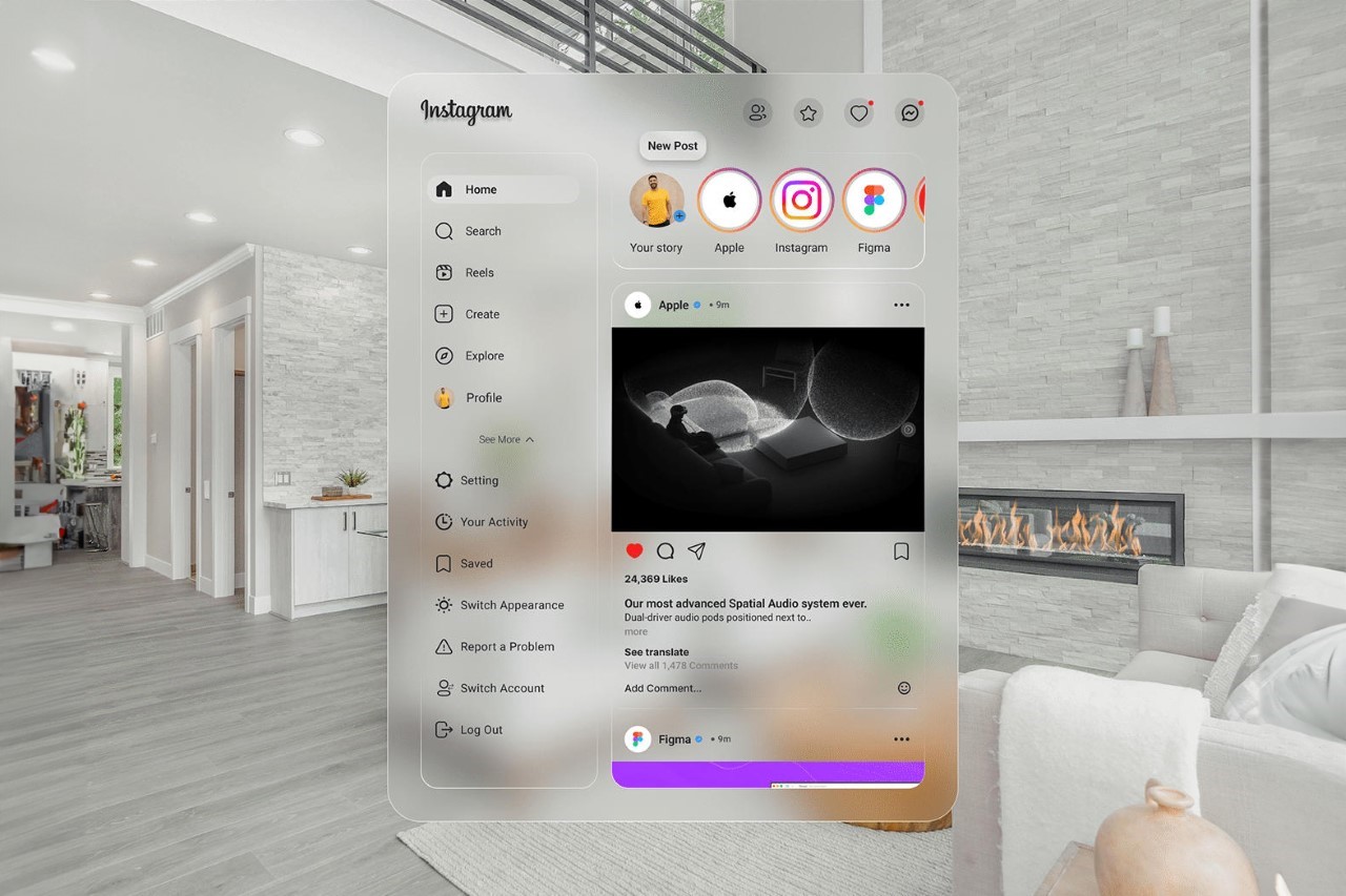
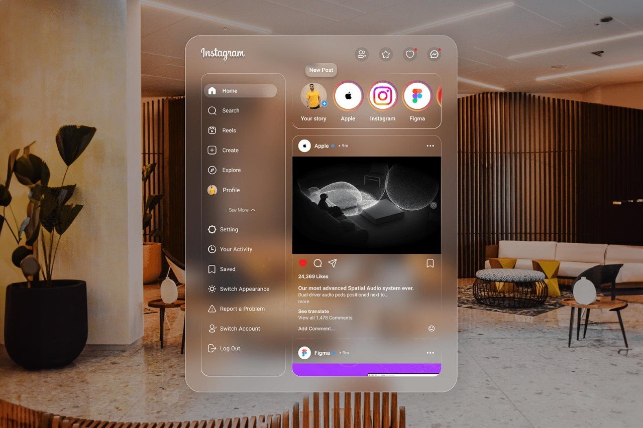
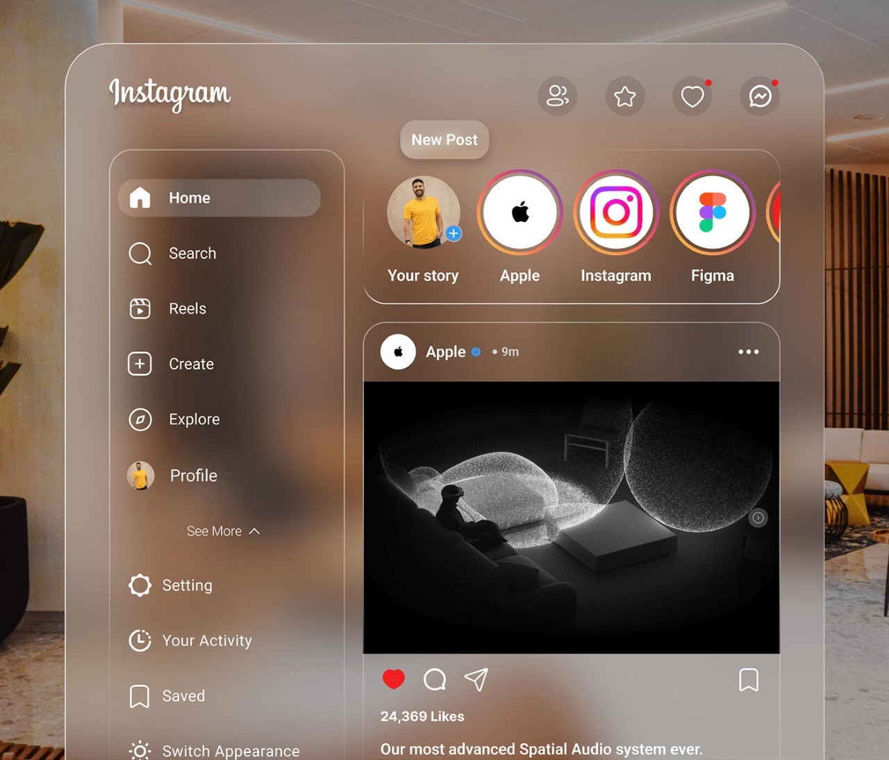
Visualized by Cairo-based designer Ahmed Hafez, this Instagram UI comes with neutral frosted glass elements that allow the content to stand out against the background. This approach works rather wonderfully in the spatial world as the contrast allows you to easily see text and elements whether you’re in an illuminated space or even a dimly lit one. Theoretically, it looks like Apple may have ended the “light-mode/dark-mode” UI debate by just making everything frosted.

The interface looks a lot like Instagram’s desktop (and even now its iPad) interface. It’s wider than its mobile counterpart, and comes with menus on the left and content on the right. You can view stories on the upper carousel, or even move higher up to access follow requests, close friends, notifications, and DMs.

The fix for the light vs. dark issue is present in the interface too. While the glassy elements don’t change color, you can alternate between white or black text for better visibility. The interface, however, isn’t traditionally landscape. It’s still quite vertical, which is perfect for spatial computing because you can merely move it to the side and have other tabs/apps open – a promise that Apple made rather clearly with their WWDC keynote.

The Vision Pro is still at least half a year away from formally being available to consumers, although rumors say that Apple’s seeing quite a few roadblocks with its production and plans on cutting the number of production units drastically from its original 400,000 units down to 150,000. That being said, the company isn’t giving up on the idea any time soon, and the Vision Pro is mainly paving the way for a Vision Air device that will be much more affordable. Before that happens, though, it’s important for developers to create a strong app ecosystem to justify the shift from physical computing to spatial computing. This fan-made IG interface is the first step in that direction!

Unofficial Instagram UI for Apple Vision Pro

The post What if Instagram Went Spatial? Unofficial UI on Apple Vision Pro Shows How first appeared on Yanko Design.

A “Threads from Instagram” App Existed Back In 2019… And It Was NOTHING Like Twitter

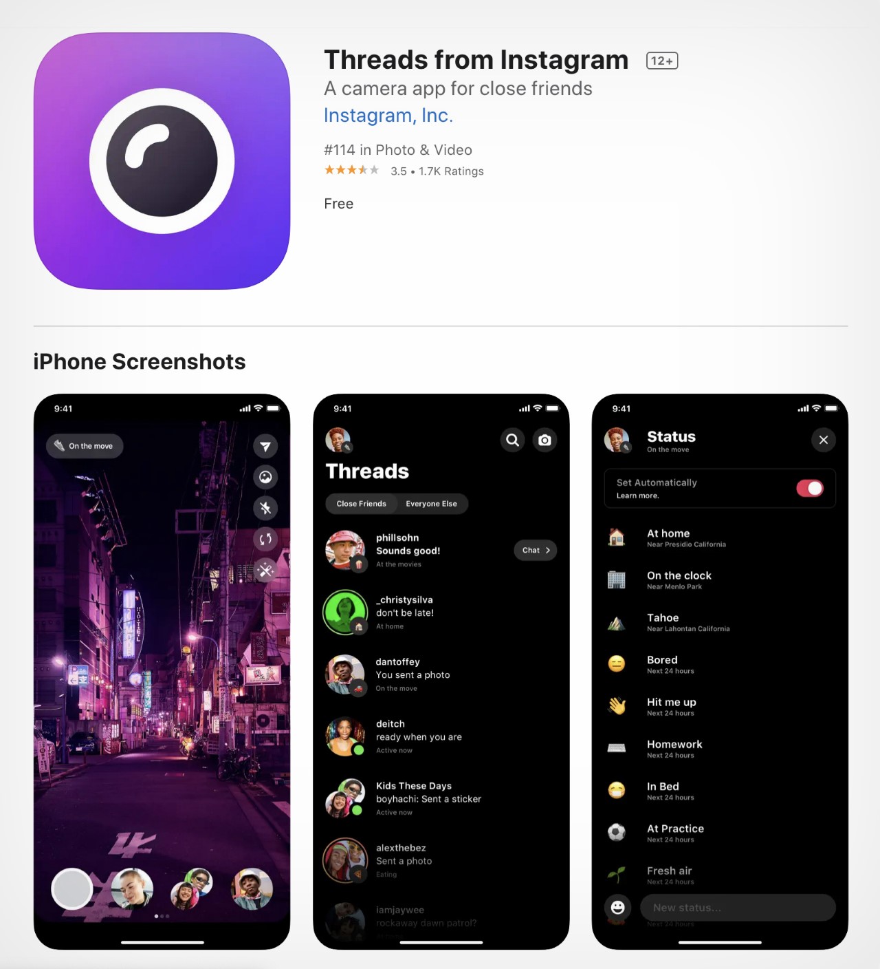
Before Zuckerberg launched the world’s most exciting and fastest-growing social media app, he struggled to make Threads relevant. Yes, “Threads from Instagram” was an app that launched in October 2019, but shut down in 2021 following just thousands of downloads and an abysmal performance. Here’s what the original Threads app was all about, why it failed, and more importantly, what it says about Zuckerberg and Meta’s culture of innovation and stealing ideas.

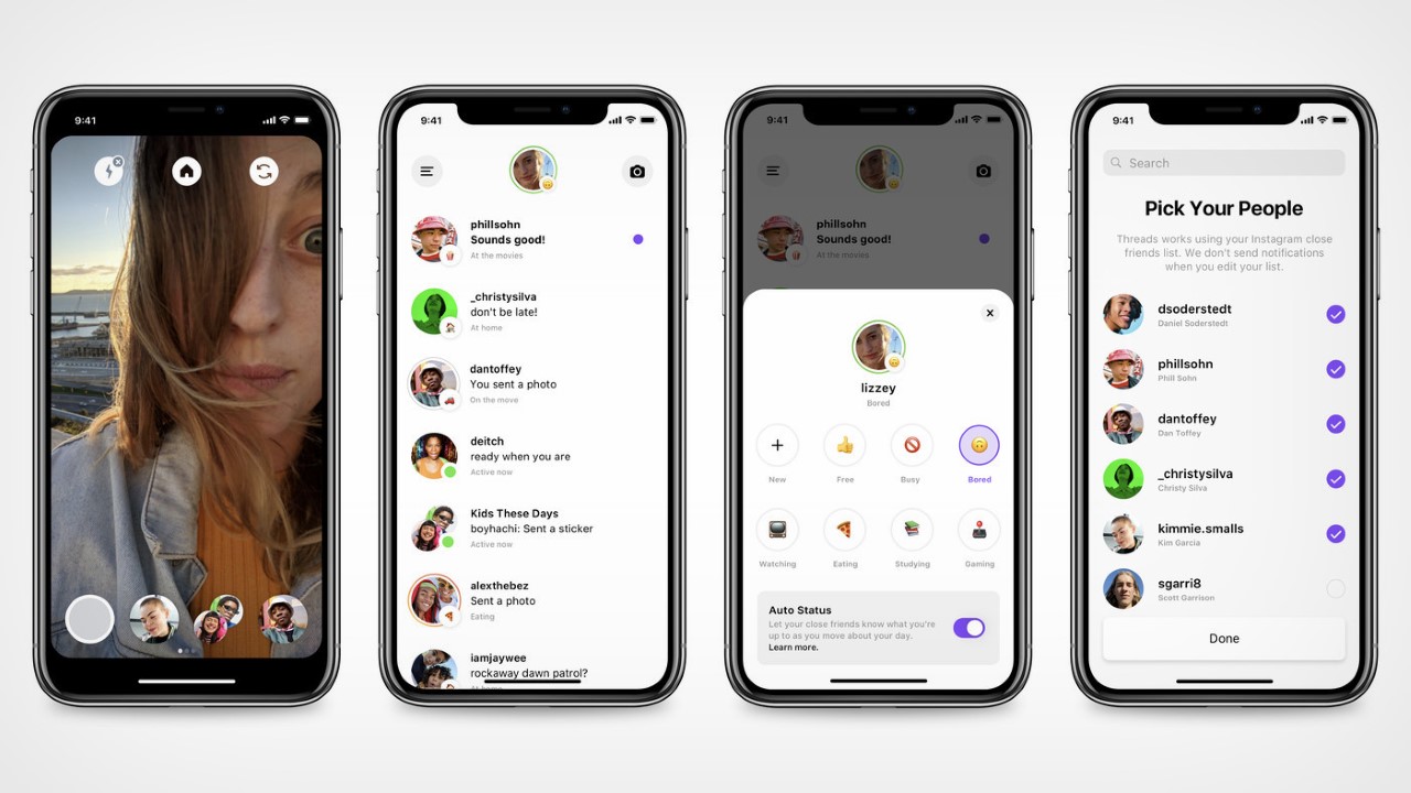
It sure sounds surprising, but not many people will remember Threads from back in the day. I barely remember it too, but it was Instagram’s way of making the network more social again. The team realized that as IG was slowly descending into irrelevance (this was before Reels were a thing), people were mainly using the app to DM each other rather than to actually view content. Nobody was tagging friends in posts anymore – they were simply sharing posts and memes with their close friends, creating a microcosmic network in the messages section rather than in the actual home feed. People loved using IG’s filters too, but instead of mass-publishing their content on stories or on their profile, they were much more comfortable sharing it with 3-4 tight-knit friends instead. Seeing this, Mosseri-led Instagram decided that this was worthy of a new app entirely. An IG without the Insta or the Gram. Just DMs and AR filters… or simply, a Snapchat clone.

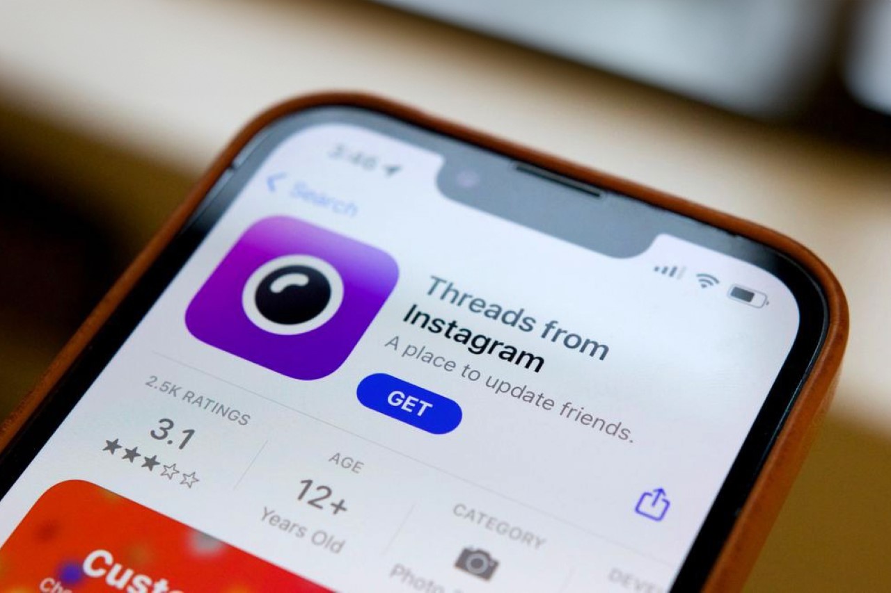
This Threads app was also tied inextricably to your IG. In a way, it was pretty much a stripped-down version of IG that just had a camera, AR filters, and DMs… exactly like Snapchat. You could chat with friends or other people on IG, and you could use your Instagram’s Close Friends feature to share videos of yourself or stuff around you with your immediate social circle. The app debuted in 2019, but took nearly 6 months to actually catch any momentum. It barely had any users, and had roughly 2.5k ratings on the app store, making it Meta’s worst-performing app. Instagram finally shuttered it in 2021, but little did Mark and Mosseri know that Threads would have its ground-shattering glow-up just 2 years later.

A screenshot of the original ‘Threads From Instagram’ App Store profile.

It seems like Zuckerberg knew he wanted to make a microblogging platform back in 2021, and Threads was perfect for this ‘phoenix rebirth’. TechCrunch reported in July of 2021 that Facebook (back when it was still called Facebook) was testing out twitter-like features on some public pages. A year later, Zuckerberg made a joke about acquiring Twitter and was legally forced to buy it. The timing couldn’t be more perfect for Zuckerberg, as he saw Musk slowly running Twitter into the ground. Smelling blood in the water, Meta began building out its Twitter clone in January this year, and just as Musk made an announcement that Twitter was limiting how many posts its users could see per day, Zuckerberg forced the launch of Threads in its ‘new app who dis’ avatar. The Threads app caught on like wildfire (even though it was riddled with quite a few dark design patterns), and currently sits at over 100 million users in a record time of 10 days. To give you a sense of how big a deal that is, Twitter has 500 million users…

While it isn’t clear whether Threads will be able to ride this wave of success and internet dominance (whether people continue using Threads after 1 year is still anyone’s guess), it really does prove that Meta, led by Zuckerberg, has cultivated a reputation for ripping off successful ideas than actually coming up with them. Like every overgrown company (i.e., monopoly), Meta defeats competition either by acquiring, or by stealing. Aside from building Facebook, it’s difficult to think of anything that Zuckerberg has built successfully from scratch. Instagram was acquired in 2012, and Whatsapp and Oculus in 2014. Zuckerberg tried hard to acquire Snapchat too, but after sensing resistance, merely copied the ephemeral ‘Stories’ feature. Reels were introduced in 2020 to combat TikTok, which couldn’t be acquired because it was owned by Chinese company ByteDance. Meta tried hard to launch Internet.Org in third-world countries but faced huge resistance, and even tried and failed at launching Libra Coin, its own crypto-based payment network (also rebranded as Diem). Even their hardware efforts were a flop, with the Portal camera that barely made a dent, the RayBan partnership that seems to have been forgotten, and the Meta smartwatch that never even saw the light of day.

Threads, however, reinforces Meta’s corporate tendency to blatantly copy winning ideas. It’s definitely being touted as the company’s latest success story, but it builds entirely on an existing microblogging platform, which was pretty much ripped off in the process. The name “Threads” isn’t new either, but its personality certainly is…

The post A “Threads from Instagram” App Existed Back In 2019… And It Was NOTHING Like Twitter first appeared on Yanko Design.

The ‘Threads’ App is FILLED With Deceptive Dark Design Patterns – We Spotted More Than TEN

Aside from probably the launch of ChatGPT, I can’t ever recall a recent time in which the internet was THIS excited. While I personally believed that Zuckerberg’s new Threads app was doomed to be a hit and miss, it seems like I was dead wrong – the app saw more than 10 million users sign up in just 1.5 hours, with the number climbing up to 75 million as per a recent announcement from Zuckerberg. The reason? FOMO, along with the fact that the Threads app was designed to be incredibly intuitive. You didn’t need to make an account – if you were on Instagram, the account was already made for you. A simple click would import all your followers, your profile settings, and profile-picture and bio. However, veiled underneath that ease and convenience were a few patterns that designers and tech nerds were all too familiar with. These patterns, referred to as Dark Design Patterns, are known to manipulate and influence a user into doing something against their will.

If you’ve used the Uber app, you’re familiar with how notorious it is to cancel a ride while the app is searching for one. The ‘Cancel Ride’ button is greyed out, but the ‘Continue Searching’ is black and highly visible. Hit the Cancel button and Uber asks you at least twice if you’re sure you want to cancel. Amazon does the same thing with its Prime subscribers. Try canceling your Prime subscription and chances are you’ll just give up because Amazon’s made it so incredibly hard to cancel an active Prime membership.

The Threads app almost immediately displayed a whole bunch of dark patterns with its user interface. We spotted at least 11 of them, and we’re sure there are a lot more to come. Here are some highly evident dark tricks the Threads app is using to ensure you stay on the platform as long as you possibly can… and supply Meta with even more data than before.
1. In order to first make your Threads account, you need to log in through Instagram. The Threads app doesn’t let you create an account WITHOUT having an Instagram account. It does so to make the transition for Instagram users incredibly easy… but in doing so, it also ensures that people NEED to have both Instagram and Threads accounts active at all times. There’s no Threads without Instagram, so if you gave up your IG for any particular reason, you’re in a tough spot.

2. While onboarding users was designed to be easy, the Threads app does something notorious to ensure users don’t leave too. If at any point in time you feel the need to ‘delete’ your Threads app, it means you’ll have to delete your Instagram too. Sounds bizarre, right?! Well, the settings panel in the Threads app mentions that “deleting your account apply to both Threads and Instagram”, taking the ability to selectively delete your accounts right out of your hands.

3. As a form of consolation, Threads does allow you to ‘deactivate’ your account. This takes your Threads profile offline… but the data still exists on Meta’s servers, and it still remains tied to your IG at all times to help Meta build that dataset on you.

4. The reason why joining Threads was so easy was because your account was already created for you in advance. Prior to the launch, a Threads section on your Instagram page would give you a QR code and tell you that your IG handle was already reserved for you on Threads. It’s easy because the app is literally being handed to you on a silver platter with your username already pre-selected. This dark pattern becomes even darker because if your IG accidentally gets hacked, the hacker gets you Threads account with it, with little to no effort.

5. However, if you’ve somehow resisted joining Threads, don’t worry because Instagram makes it incredibly easy for others to share Threads content on the IG app – as a post, a story, or even a DM. This means that there’s really no escaping Threads content even if you made the conscious decision to not sign up for it. The fact that it’s so easy to share you Threads on Instagram just makes it grow faster, and in doing so, trap more users easily. Don’t think it’s a dark pattern? Well, think of it as being incredibly anti-competitive to all of Thread’s newer rivals like Mastodon or Blue Sky.

6. The Threads app conveniently copies all your profile settings from Instagram, but requires you to manually set your notification settings all over again. Moreover, just like Facebook and Instagram are often filled with bogus notifications, the Threads app will send you a ping every time someone you know joins Threads… a classic dark pattern to have you constantly checking the app every few minutes.

7. The Threads app doesn’t just copy profile settings, it basically mirrors all your IG data, providing Meta with yet another avenue for advertising. Sure, the Threads app doesn’t have ads or sponsored content, but don’t be surprised if you get ads on Instagram for stuff you speak about in Threads.

8. Perhaps one of the most malicious dark patterns lies in how much data the app collects on you. Even though Threads is just a microblogging platform, the app has access to your health data, financial data, and even your location. In fact, ex-CEO of Twitter Jack Dorsey shared a snippet of the amount of data the app collects on you and it’s shocking. If you’re in the EU, you probably don’t have access to Threads for this exact reason, because the European Union has some incredibly strict laws on data gathering.

9. And even though Threads makes it very easy to share stuff to Instagram, your IG followers can’t view your thread unless they install the app and make their account. The most they can see is a snippet, which lures them into signing up.

10. The above is reinforced by the fact that Threads doesn’t have a desktop website either. Even though its competitor Twitter does, and even though Instagram does too, Threads can ONLY be accessed by installing an app, and logging in. That’s how Meta coerces you into installing an app that you then can’t remove… and an app that then constantly gathers data on you.

11. This one verges more on speculation at this point, but Threads rather visibly lacks DMs. It’s true that Meta is building out the feature as of now, but there’s a high chance those DMs will also be connected to your Instagram DMs. Famously a few years ago, Meta merged IG DMs with Messenger in order to facilitate cross-platform messaging (and in order to revive Messenger, which saw a slow but steady decline). While there’s no concrete evidence to back this, it’ll be interesting to see if Meta chooses to centralize Threads and Instagram DMs into one channel, creating yet another dark pattern. All we can do right now is wait and watch…

The post The ‘Threads’ App is FILLED With Deceptive Dark Design Patterns – We Spotted More Than TEN first appeared on Yanko Design.
Yanko Design and KeyShot announce the winners of the Material Design Challenge

With hundreds of entries over the 3-week competition time period, the YDxKeyShot Material Design Challenge finally came to a close with the winners being announced this week. The three winning entries showcase an incredibly versatile approach, proving exactly how capable KeyShot 11’s Material Graph and material designing abilities are.

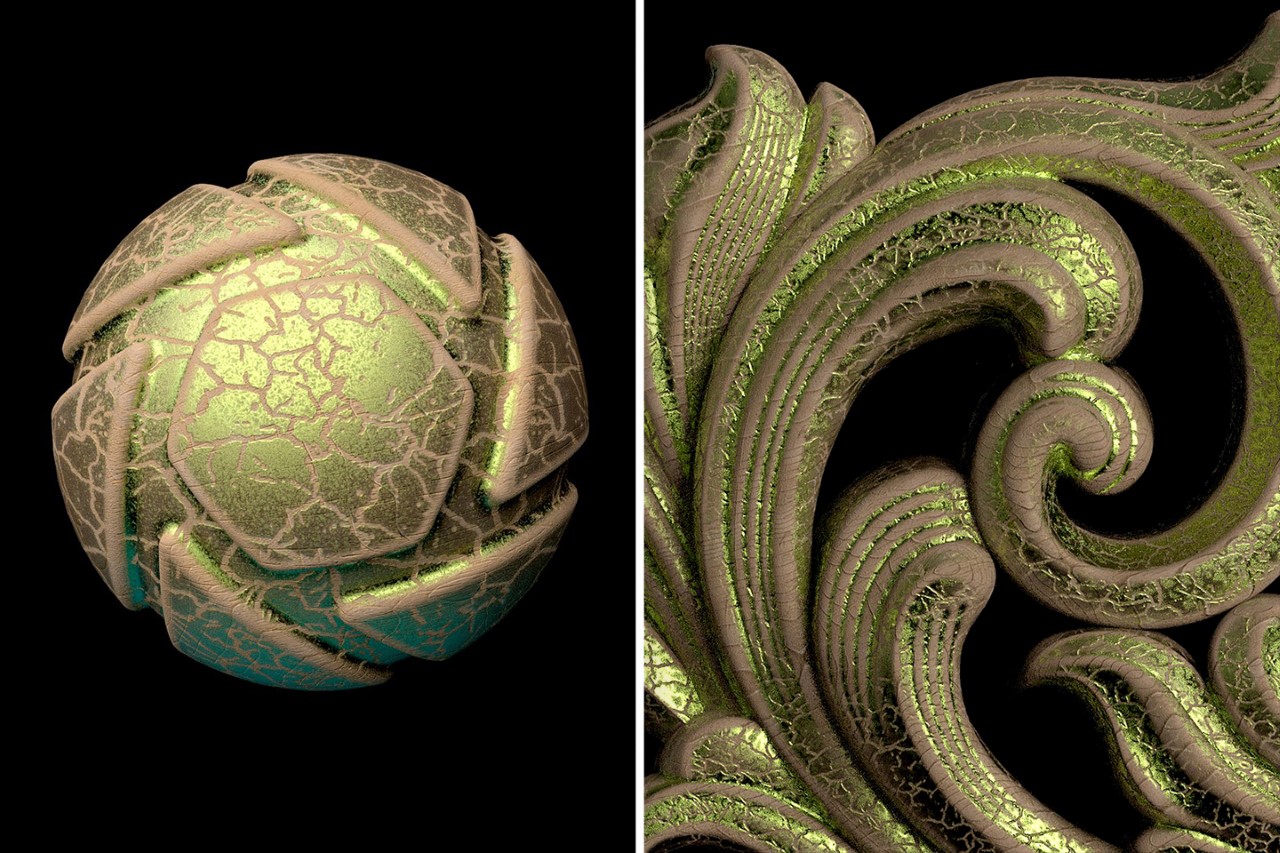
The three winners distinctly stand in three separate categories. The Gold winning entry from Shahin Fathi explores the ability to put a realistic froth of bubbles on top of products, the Silver winning entry from Colin Ginn explored a unique parametric ‘chocolate chip cookie’ material with a lot of versatility, and the Bronze winning entry came from Nacho Riesco, who created an alluring cracked gold-leaf on wood texture that has great potential in furniture, interior, and even fashion rendering applications.

The judges declared Shahin the unanimous Gold Winner, but there were a few strong contenders for Silver and Bronze positions. Ultimately, the judges rated the entries on creativity as well as potential to be used across various industries. We congratulate the winners and are extremely grateful to everyone who participated!

Click Here to know more about KeyShot 11


Gold Winner – Shahin Fathi


Shahin Fathi (also known on Instagram by Predexign) was unanimously selected as the winning entry for its sheer creativity and impeccable execution. Jury member Sarang Sheth said, “Loved the idea and execution. This is exactly the kind of material I was expecting to come out of this competition.” The bubbles really push KeyShot 11’s textures to the limit. They’re incredibly realistic, and a simple drag and drop of the material onto a 3D object turns it into a foamy mass that has tonnes of applications in bathware, drinkware (think beer froth it coffee crema), and potentially even outdoor water scenes!
View Shahin’s winning entry below.


View this post on Instagram


A post shared by Shahin Fathi (@predexign)

Silver Winner – Colin Ginn


Colin Ginn secured the silver prize for his unique parametric chocolate chip cookie material. While the jury definitely found the material unique, they were impressed by the execution, the fact that it’s entirely parametric, and even the development animation that Colin created on his IG post. Jury member Janis Sne mentioned, “Collin did an outstanding job on this material challenge. I am very impressed by just looking at Collin’s Keyshot node material setup. He also made a great presentation, with a short animation of the texturing, that I highly appreciate. I think this designer really thought through everything and you can feel this love & passion into each 3D image.” The jury collectively also agreed that there was immense potential to adapt this material into a rocky, muddy ground material.
View Colin’s winning entry below.


View this post on Instagram


A post shared by Colin Ginn (@colin_ginn)

Bronze Winner – Nacho Riesco


The bronze prize was awarded to Nacho Riesco for his ‘cracked gold leaf on wood’ material. The material combined the best of both worlds, a realistic wooden texture and a cracked gold film on top. Jury member Preeti Jesudoss appreciated the “worn edges and organic-looking cracks” on the material and the jury collectively believed that the material also could potentially be used in creative art direction and even in fashion design applications.
View Nacho’s winning entry below.

Click Here to know more about KeyShot 11

The post Yanko Design and KeyShot announce the winners of the Material Design Challenge first appeared on Yanko Design.
KeyShot and Yanko Design invite designers to create innovative new materials for the popular rendering software

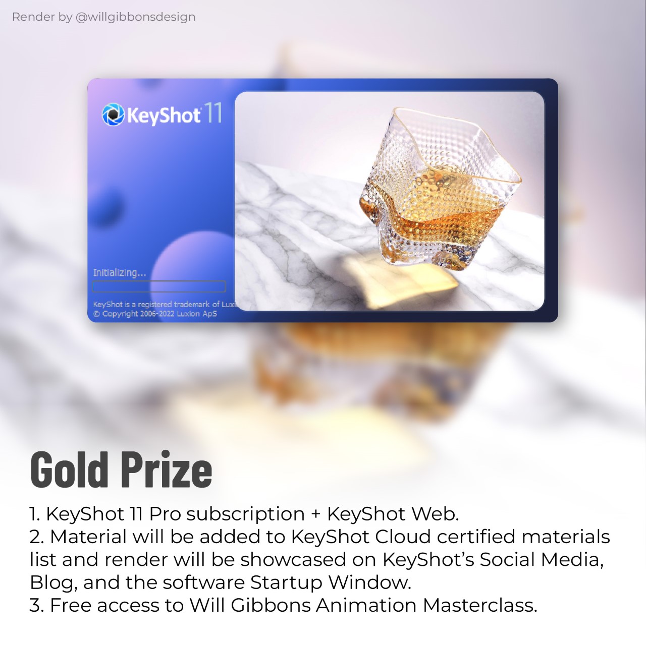
We’re thrilled to announce the “YDxKeyShot Material Design Challenge”, a unique opportunity for designers to explore KeyShot 11’s powerful Material Graph and 3D Paint features to create the materials of their dreams. Winners will not only be awarded free KeyShot 11 Pro licenses, but will also get to see their material on the KeyShot Cloud certified materials list. Winning renders will even be showcased on KeyShot’s startup window to thousands of KeyShot users across the world!

This is your chance to design the material of your dreams, creating something you wish everyone could use in their renders. The challenge is pretty simple. Design your own material – you could use KeyShot’s procedural textures, image files from the internet (free use non-copyrighted), or click images of your own and edit them to create your own resources. The YDxKeyShot Material Design Challenge has no rules – just have fun and keep creating! Looking for a nice carbon fiber material? Create your own! Found a nice terrazzo texture at your local cafe? Click a picture and turn it into a material! Need a smudgy, scratched glass surface for that photoreal smartphone render? Here’s the perfect opportunity to make it and share it with the world.

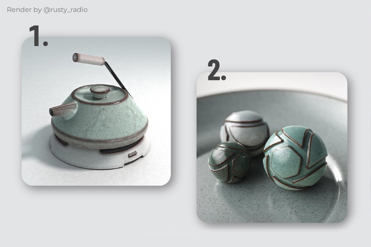
Once you design your material, how you present it matters too. Apply your material to an appropriate product and create a render that highlights your material in the best way possible. For example, if you designed a wooden material, apply it to a piece of furniture. If you made a ceramic material, showcase it on a ceramic object that’ll wow everyone! You can create as many render images as you want (or even a video), exploring the product in different angles, or even up close if your material is detailed. Also, don’t forget to show us what the material looks like on Keyshot’s iconic Material Ball!

The YDxKeyshot Material Design Challenge will be judged by Janis Sne – 3D Sportswear Designer at RKTFT Studios and Nike, Preeti Jesudoss – Senior Creative Head at Asian Paints, and Sarang Sheth – Editor-in-Chief at Yanko Design. To participate, upload your renders on Instagram (a few renders of a product, and one of the material ball) and tag + follow the @yankodesign and @keyshot3d accounts while also using the #YDxKeyShot hashtag. You can get your hands on the material ball 3D model and a free trial of the latest KeyShot 11 rendering software by downloading it on KeyShot’s website. To unlock the trial, use the Trial License Code KSYANKO22 during installation. Participants in the KeyShot x Yanko Design Challenge must be above the age of 18.

Here’s all the information you need:

The Design Brief
Design/Build a material for KeyShot.

How to Participate
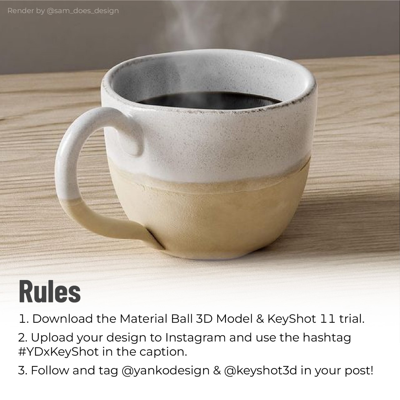
Step 1: Download the Material Ball 3D Model and the KeyShot 11 trial.
Step 2: Upload your design to Instagram + Follow @yankodesign and @keyshot3d
Step 3: Tag @yankodesign and use the hashtag #YDxKeyShot in the caption.

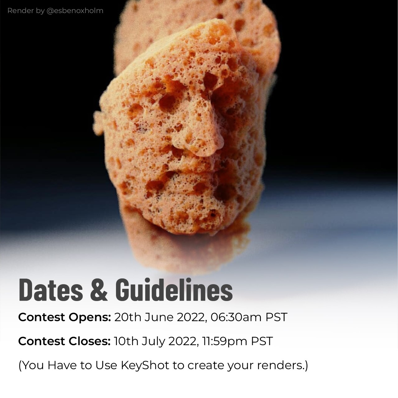
Contest Opens: 20th June 2022, 06:30am PST
Contest Closes: 10th July 2022, 11:59pm PST

Gold Prize: KeyShot 11 Pro subscription + KeyShot Web. Material will be added to KeyShot Cloud certified materials list and render will be showcased on KeyShot Blog, Social Media, and Startup Window. Free access to Will Gibbons Animation Masterclass.
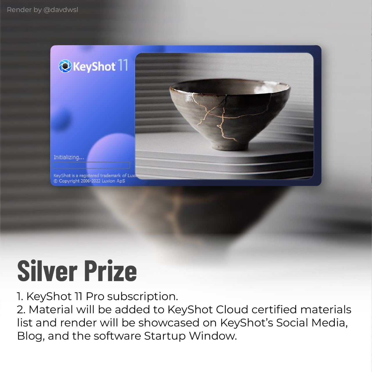
Silver Prize: KeyShot 11 Pro subscription. Material will be added to KeyShot Cloud certified materials list and render will be showcased on KeyShot Blog, Social Media, and Startup Window.
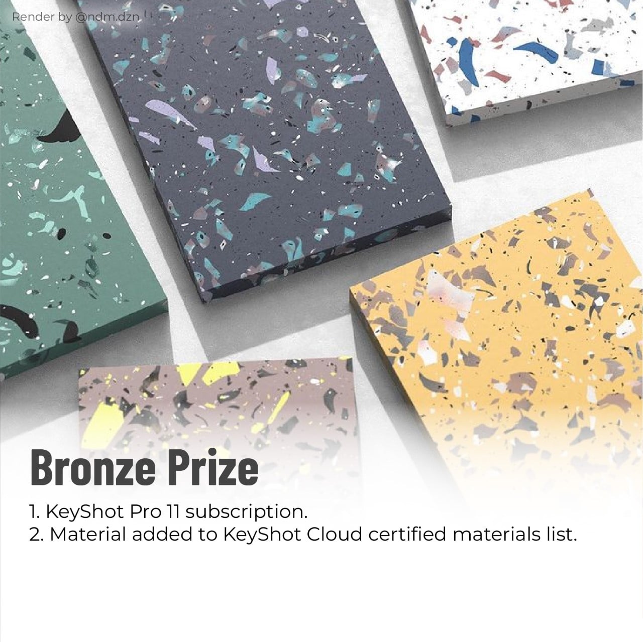
Bronze Prize: KeyShot 11 Pro subscription. Material will be added to KeyShot Cloud certified materials list.

You Have to Use KeyShot to create your renders.

Click Here to Download the Keyshot Material Ball 3D file

Click Here to Download a free trial of KeyShot 11 (Use the Trial Code KSYANKO22 after installation)

The post KeyShot and Yanko Design invite designers to create innovative new materials for the popular rendering software first appeared on Yanko Design.

Award-winning automotive + architecture design with an Instagram-inspired gallery to showcase the users style!

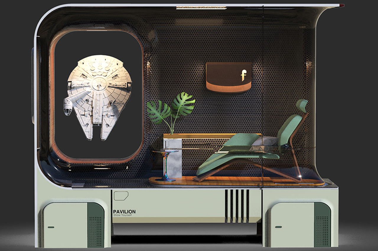
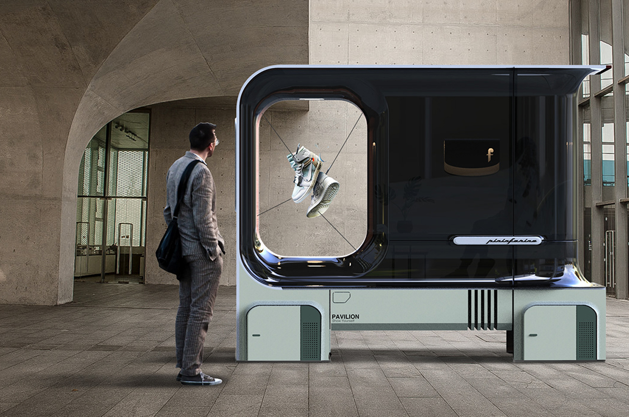
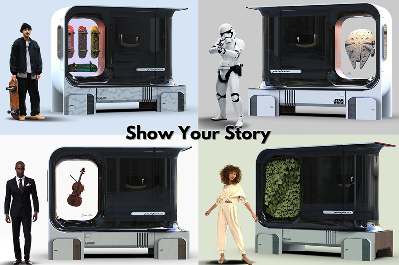
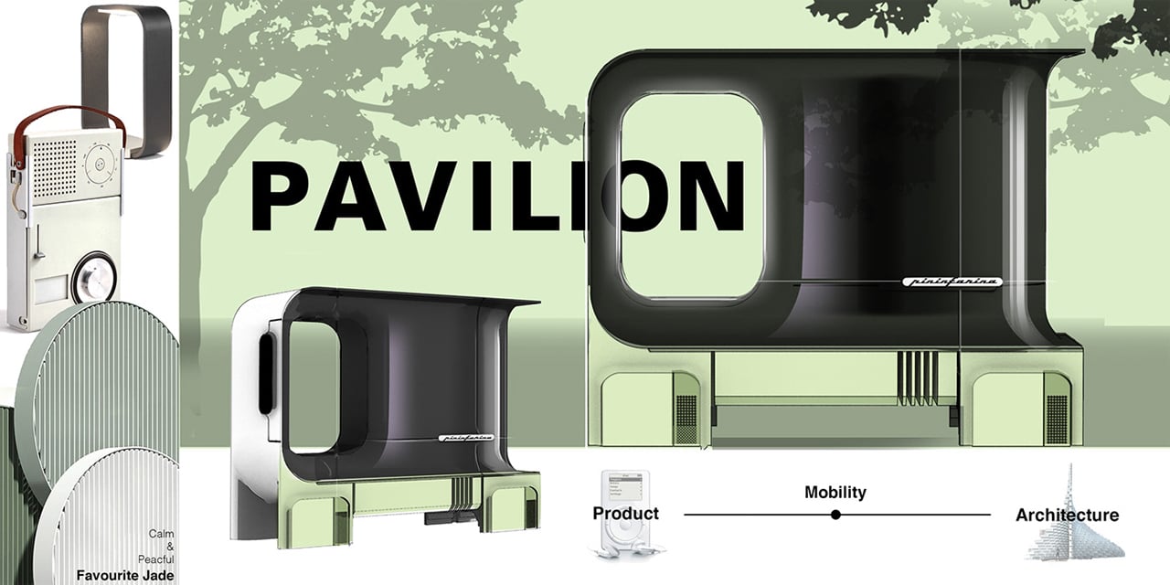
Pavilion is a flexible, architectural space designed as a moving vehicle where users can generate personal galleries to be displayed to the world.

The need to express yourself is real. From the dawn of time, self-expression has been the catalyst for works of art and cultural landmarks that help define the human experience. Today, social media undoubtedly plays a major role in newfound modes of self-expression and bridging culture and craft across the world.

Inspired by the ways humans express themselves, Junu Kim was recently recognized by DesignWanted with an award at Pininfarina’s “New Dreams for a New World” competition for his architecture and Instagram-inspired Pavilion, a car concept that doubles as an ‘Ego Gallery.’

Serpentine Pavilion in London’s Kensington Garden selects and presents architectural artworks on a yearly basis, meant to exhibit each architect’s unique vision and artistic philosophy. Motivated to scale that showcase down to an automobile concept, Junu Kim’s Pavilion allows anyone to display their personal gallery on a moving vehicle for the world to take in their distinct personality, in a similar fashion to the Serpentine Pavilion.

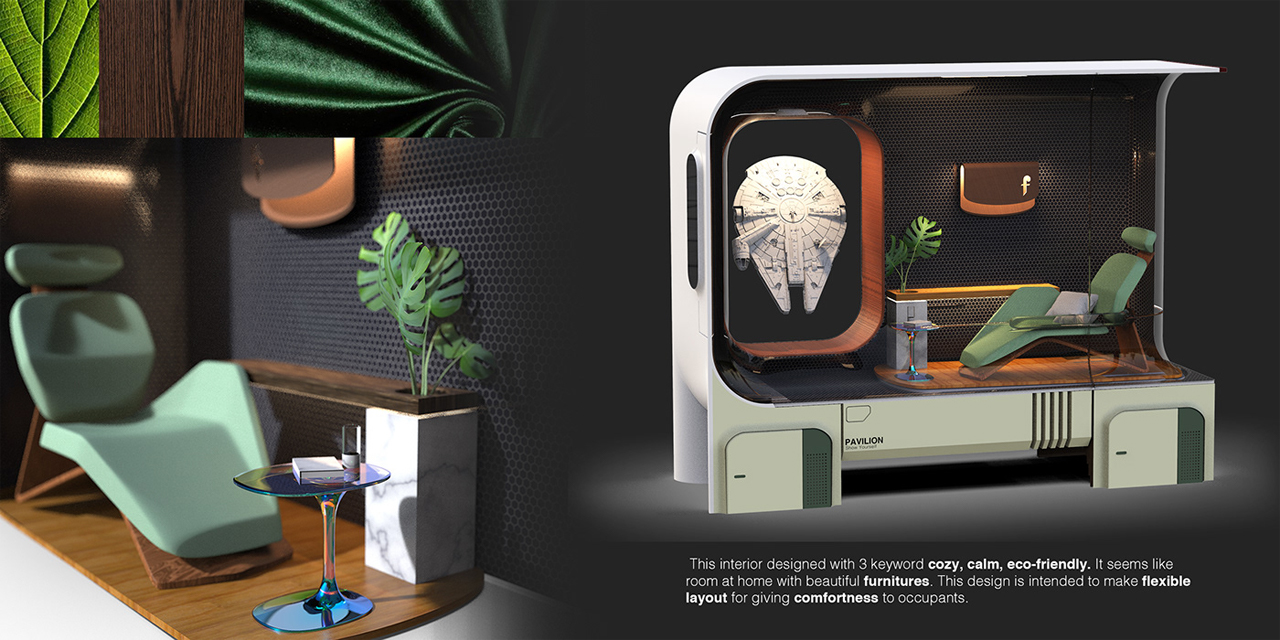
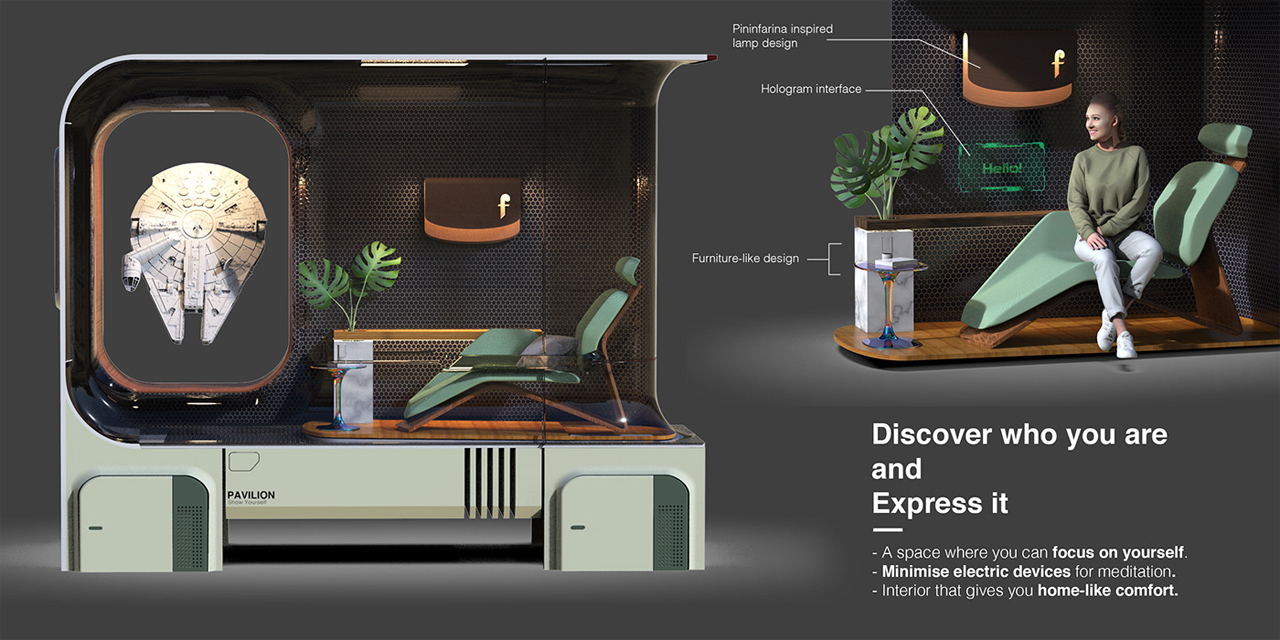
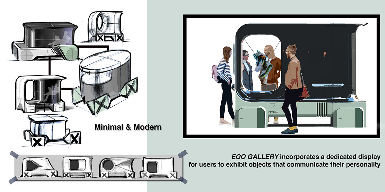
Closely resembling a storefront window, Kim’s Pavilion would allow users to display objects and 3D images for onlookers to understand their personality as if they were scrolling through their Instagram grid. Envisioned in jade green, the automobile is a transparent four-wheeler that features a seating compartment for one person and a display case for each user’s gallery that’s bordered with wooden paneling.

Inspired by Dieter Rams’ take on modern architecture, Kim’s Pavilion features round edges and dramatic lines that flow seamlessly together. Equipped with everything from hologram interfaces and furniture constructed from marble, Kim’s Pavilion concept is the type of car designed for the future.

Designer: Junu Kim

Samsung’s Bespoke Design Contest reveals the three winning refrigerator designs from over 1,500 submissions!

The top three winning refrigerator designs of Samsung’s Bespoke Design Contest have been revealed after over 1,500 custom designs were submitted.

Samsung household appliances have been trusted by homeowners for years. In an effort to make their collection of refrigerators more unique to their consumers’ tastes and to reflect the appliance’s standard of dependability, Samsung hosted their Bespoke Design Contest with Wallpaper* Magazine. Between July 7 and August 4, 2021, 1,581 designs were submitted to the contest, a number narrowed down to three one-of-a-kind designs that were voted on by the public.

The contest’s top 50 designs were hand-selected by a panel of judges comprised of Wallpaper* editor-in-chief Sarah Douglas, Senior Vice President and Head of Design for Samsung Digital Appliances Harry Choi, Senior Vice President and Head of Samsung Design Europe, Felix Heck, interior designer Kelly Hoppen CBE, and artist Yinka Ilori. Following their announcement, Samsung invited their followers to vote for the contest’s top 15 designs by “liking” their posts on Samsung Bespoke’s Instagram.

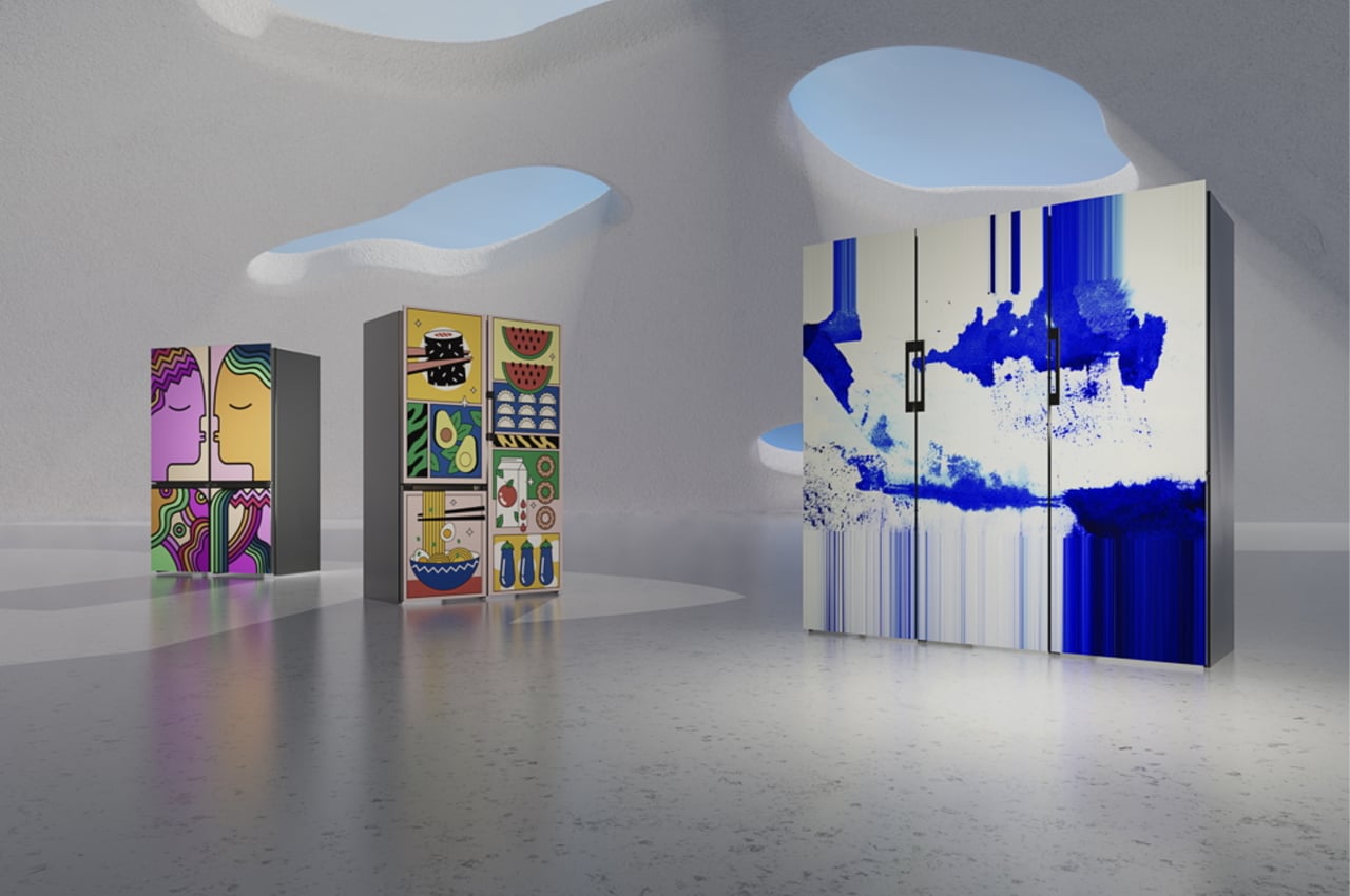
At the top of the podium, Rita Louis’s “Lost Landscape” looks to walks in nature for inspiration. Taking cues from the subtle nuances of natural landscapes, Louis bedecked her off-white modular refrigerator system with splatters and thick brushstrokes of royal blue paint. Lauded for its “artistic, light and inspiring,” personality, “Lost Landscape” was voted for with enthusiasm from Samsung, Wallpaper*, and the general public.

Right beside Rita Louis’s creation, “Foodie” by Weronika Slifierz takes a different approach to custom design. Borrowing the color scheme of popular illustrations from the ‘90s, Slifierz coated her refrigerator in cartoons of food imagery. Sushi, watermelon, avocados, ramen, and a good ole’ carton of OJ grace the double doors of Slifierz’s refrigerator, serving to wet the tastebuds before a good, healthy meal, which Slifierz believes we should all indulge in every day.

“Nestled,” from Ioana Sabau was inspired by the company that food brings. Describing this, Sabau explains, “food brings people together, and…the time we spend in the kitchen can be [time spent] connecting with each other.” Noting the project’s particular use of abstract colors, Heck remarks, “The colors, the scale, the symmetry, and the cute, cartoony abstraction create a uniqueness and beauty that make me feel positive [about] this beautiful little love story.”

Designer: Samsung Bespoke Design Contest

KeyShot and Yanko Design team up for a Design Challenge. Participate for a chance to win an Apple iPad & AirPods Pro

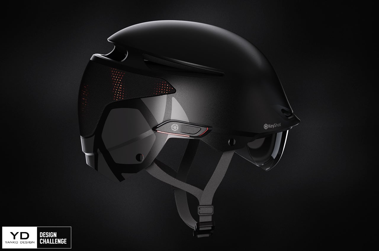
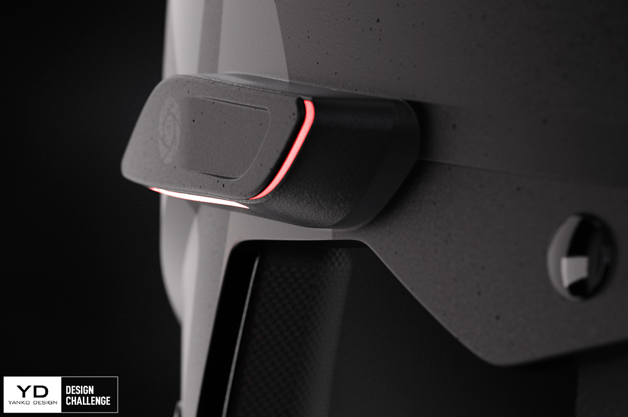
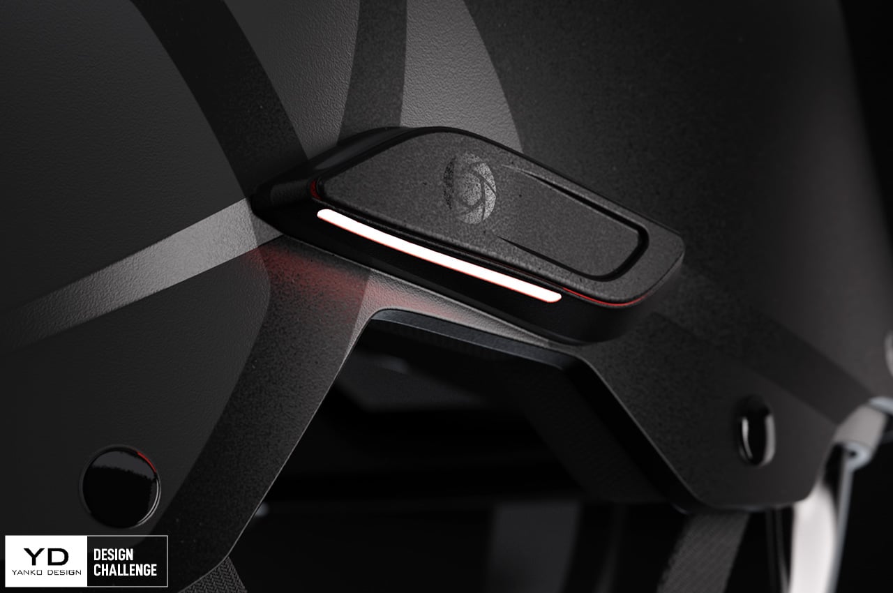
We’re thrilled to announce our partnership with KeyShot over our first ever Design Challenge! The premier YDxKeyShot Design Challenge has a broad brief and some exciting prizes! Your mission, should you choose, is to add your own spin to the ENVOY Helmet to make it safer. You can find images of the ENVOY Helmet below, and use this link to download the ENVOY Helmet 3D file for free.

Click Here to Participate Now! Hurry, Contest Closes on 19th September 2021, 11:59 pm PST.

The ENVOY Helmet by KeyShot’s design team, comes with 3 standout features – a hard-shell design, a detachable visor on the front, and a dynamic LED panel on the back that helps alert riders/drivers of your presence. The redesign could be as simple as creating new patterns for the LED matrix and experimenting with different CMF for higher visibility and better safety, or you could add your own features too, like a HUD, an inflatable life-vest, the sky is quite literally the limit.

To participate in the YDxKeyShot Design Challenge, upload your renders/animations/designs to Instagram and tag + follow the @yankodesign and @keyshot3d accounts while also using the #YDxKeyShot hashtag. You can get your hands on a free trial of the latest KeyShot 10 rendering software by downloading the software on KeyShot’s website and using the Trial Licence Code KSYANKO21 while installing the software to unlock all the features. Participants in the KeyShot x Yanko Design Challenge must be above the age of 18.

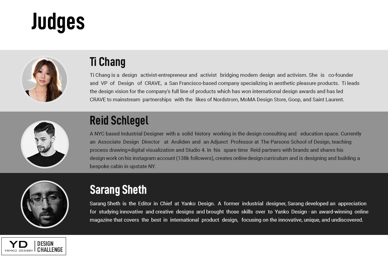
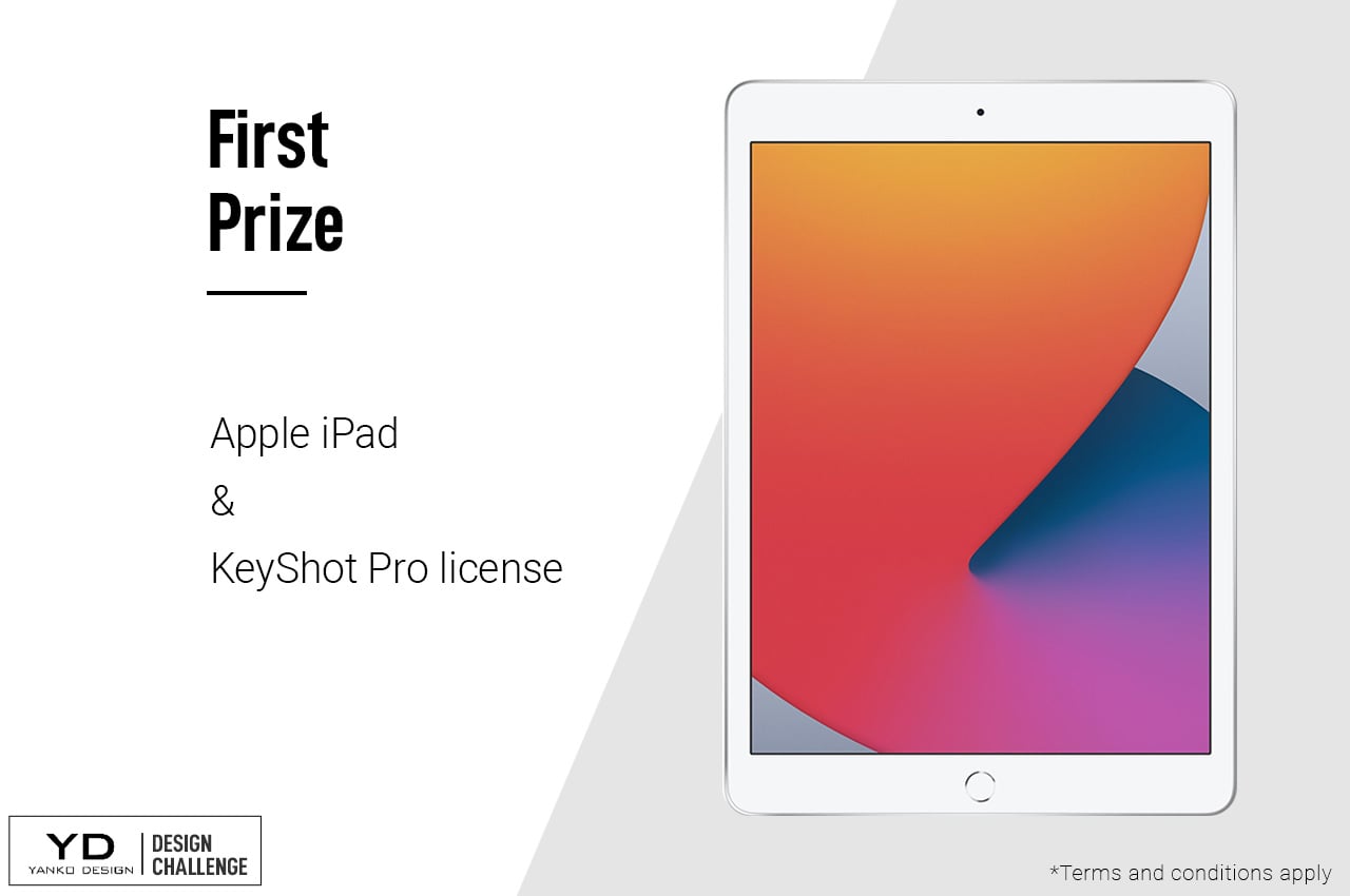
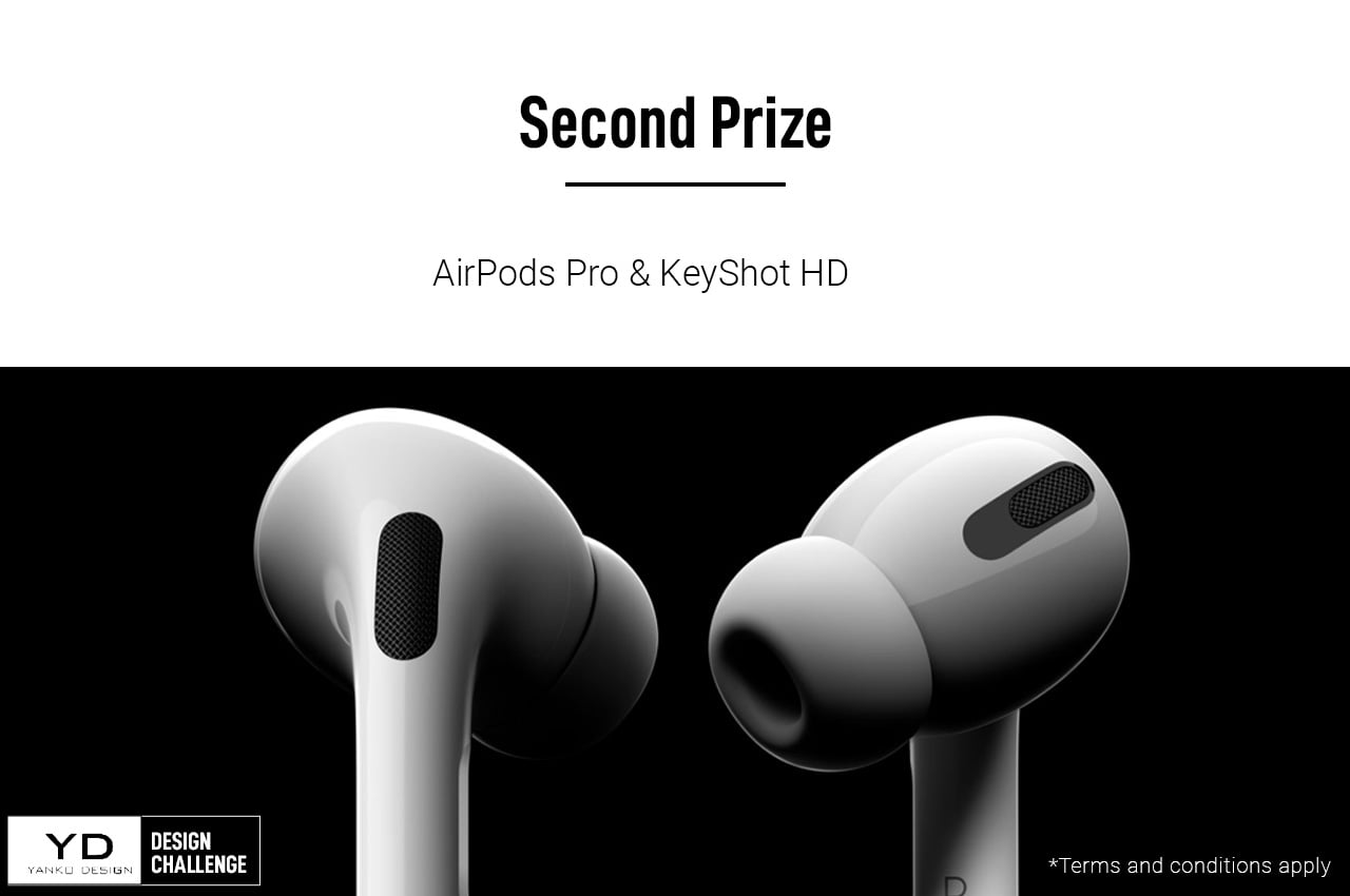
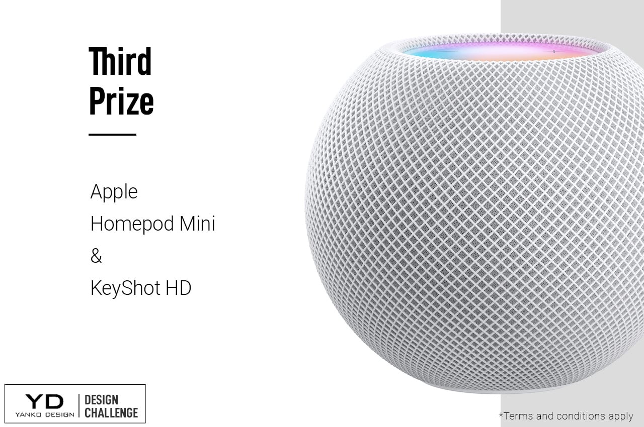
The Design Challenge will be judged by Ti Chang – Designer and Founder of Crave, Reid Schlegel – Educator and Designer at Aruliden, and Sarang Sheth – Editor in Chief at Yanko Design. The challenge will see three winners who will receive licenses to KeyShot, along with a 10.2-inch Apple iPad (first prize), Apple AirPods Pro (second prize), and an Apple HomePod Mini (third prize). The deadline to submit your designs is 19th September 2021, 12:00 PST. Hurry!
Here’s all the information you need:

The Design Brief
How can you make the ENVOY Helmet safer?

How to Participate
Step 1: Download the ENVOY Helmet 3D assets
Step 2: Upload your design to Instagram + Follow @yankodesign and @keyshot3d
Step 3: Tag @yankodesign and use the hashtag #YDxKeyShot in the caption.
Contest Opens: 6th September 2021, 12:00 am PST
Contest Closes: 19th September 2021, 11:59 pm PST

First Prize: 10.2-inch Apple iPad + KeyShot Pro License
Runner Up 1: Apple AirPods Pro + KeyShot HD License
Runner Up 2: Apple HomePod Mini + KeyShot HD License

You Have to Use KeyShot to create your renders.
Click Here to Download the ENVOY Helmet 3D Assets

Click Here to Download a free trial of KeyShot 10 (Use the Trial Code KSYANKO21 after installation)

Click Here to Participate Now! Hurry, Contest Closes on 19th September 2021, 11:59 pm PST.