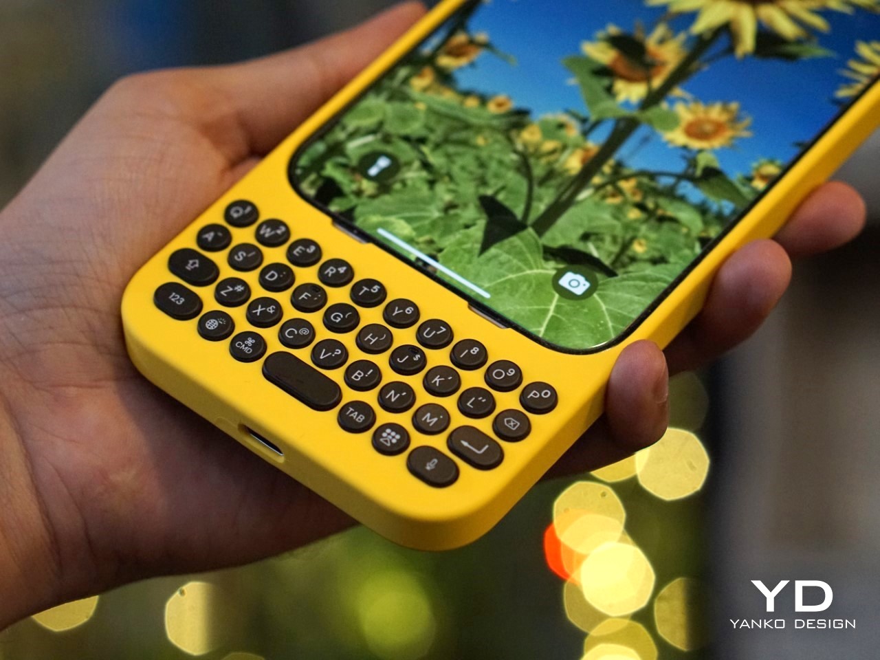
In an Era of Touchscreens, Why Clicks’ iPhone Keyboard Case is a Touch of Genius

I’m going to say what we’ve all thought at some point: typing on touchscreen keyboards is a pain. Sure, it’s the norm now, but after years of mashing glass, I still long for the satisfying click of real buttons. The typos, the autocorrect mishaps, the constant toggling between letters, numbers, and emojis—it’s enough to make even the most seasoned smartphone user want to throw their phone across the room. And I’m not alone. Despite the dominance of touchscreens, there’s a growing group of people who just miss the feel of tactile keys beneath their thumbs. Enter Clicks, a physical keyboard for iPhones, and perhaps the best attempt yet at bringing back the tactile typing experience many of us crave.

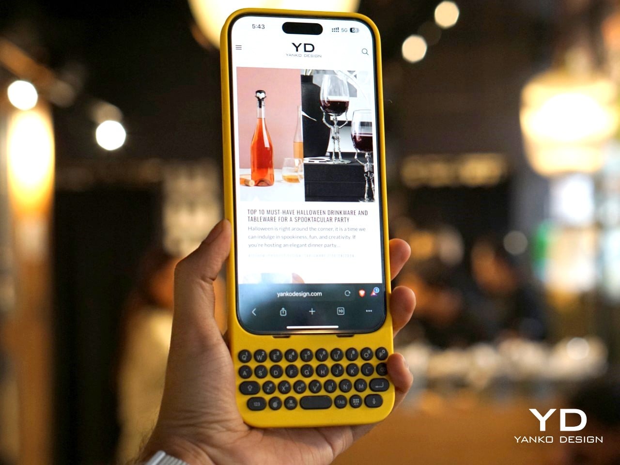
But make no mistake, Clicks isn’t some relic from the past—it’s a modern accessory that embraces the best of what physical keyboards have to offer while blending seamlessly with today’s tech. And that makes it a fascinating piece of tech in a world that’s overwhelmingly gone touch-only.
The Market Demand for Tactile Keyboards

If you’ve ever lamented the loss of physical keys on phones, you’re far from alone. Many users, from former BlackBerry enthusiasts to those who simply struggle with touchscreens, have voiced their frustrations for years. Kevin Michaluk, affectionately known as CrackBerry Kevin from his early days as a BlackBerry champion, shared how he frequently heard from people who missed the days when they could type without staring at their screens. “I knew the demand was there because I’m the guy who gets emailed and tweeted constantly about, ‘Kevin, when is there going to be a new phone with buttons?’” he said. It’s a request that never stopped, even as BlackBerry transitioned to focusing on software.
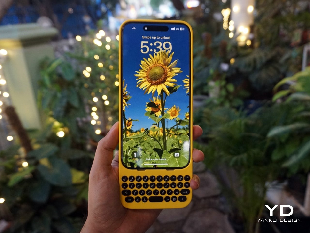
What’s surprising, though, is that Clicks’ appeal isn’t just about nostalgia. Sure, former BlackBerry fans are part of the mix, but there’s also a new audience—those who never experienced physical keyboards on phones before. For many, Clicks offers a different kind of productivity. “It’s not about trying to bring back the past, but rather finding a balance between modern tech and tactility,” Kevin noted. In other words, it’s not just about what we lost with the shift to touchscreens, but what we could gain by bringing physical keys back.
Designing for the Modern Smartphone User

The team behind Clicks understood that making a physical keyboard for the iPhone had to be about more than just hitting the nostalgia button. They needed to design a product that felt like a natural extension of today’s smartphones. That meant looking beyond just adding keys and instead focusing on how users actually interact with their devices.
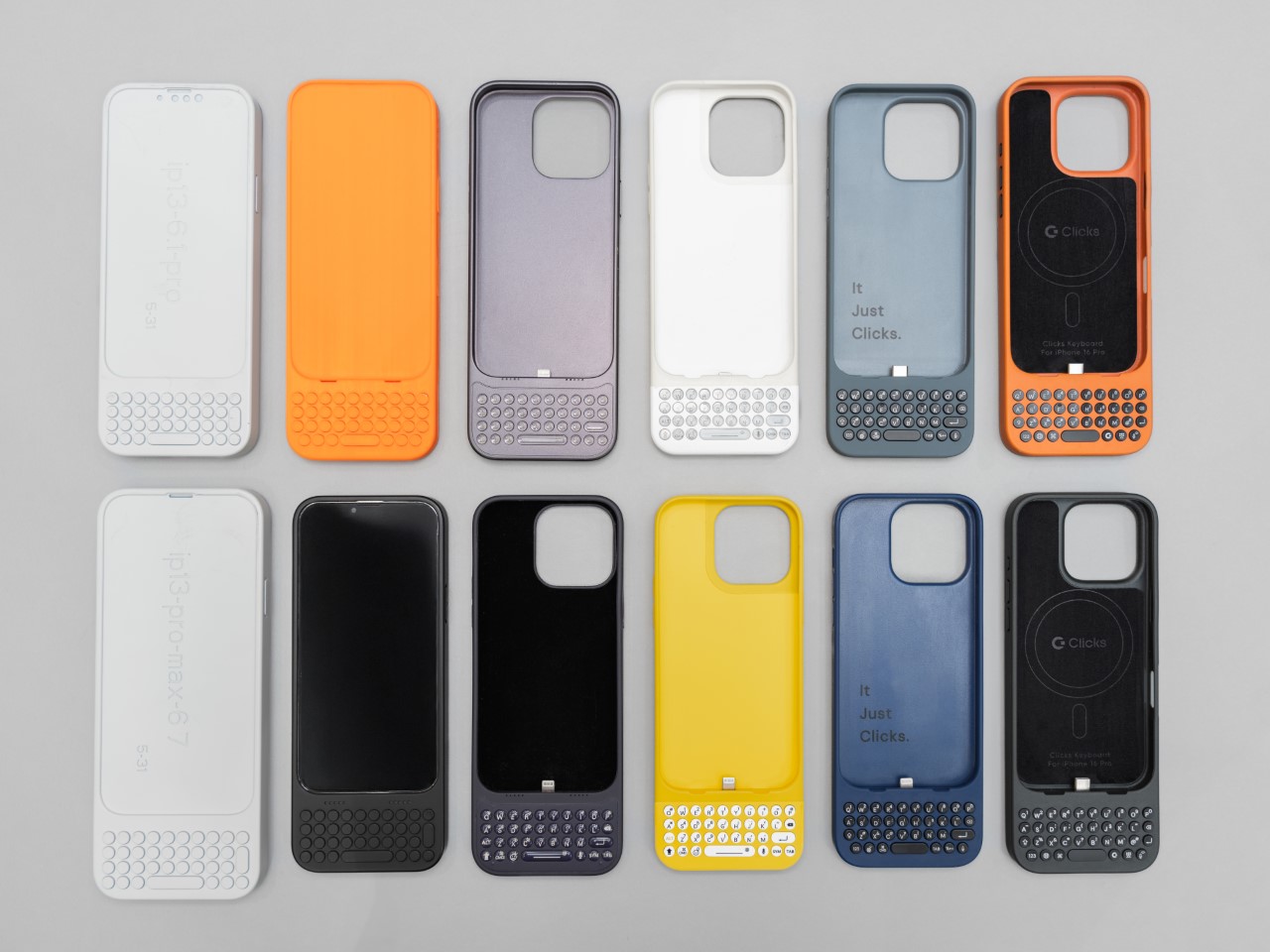
 

Image Credits: Clicks
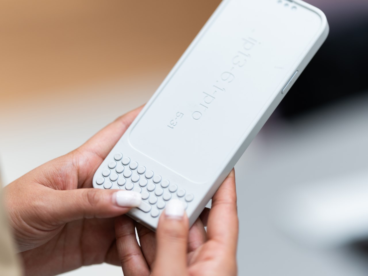
Image Credits: Clicks

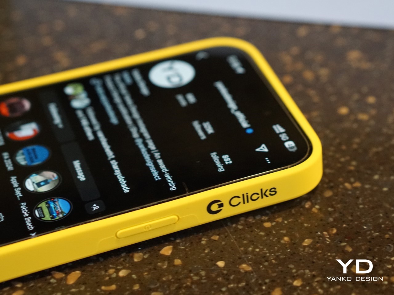
For Clicks, this meant a painstaking design process that involved multiple iterations and constant refinements. From the start, the team knew they wanted to build something that was as much about form as it was about function. “We thought, what would Apple do if they built a keyboard for the iPhone?” Kevin recalled. That meant focusing on clean lines, premium materials, and a seamless integration with the iPhone’s software.
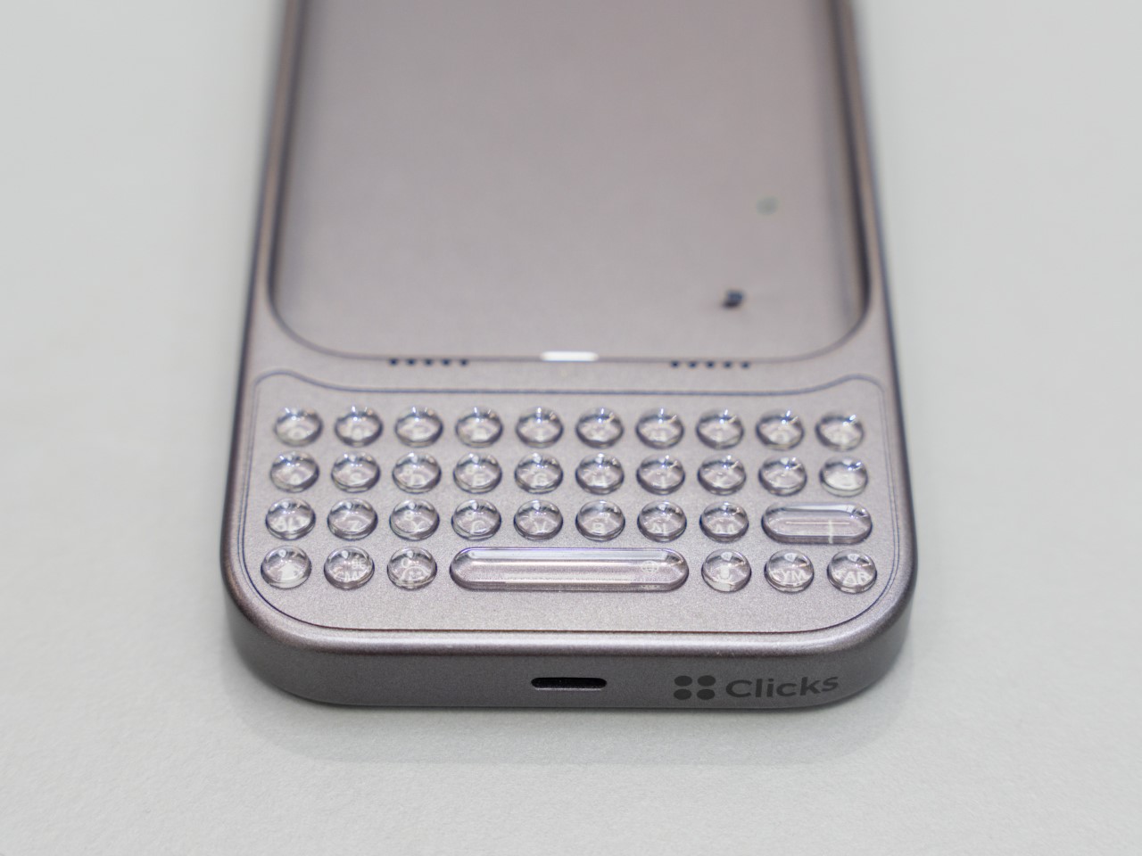
Image Credits: Clicks

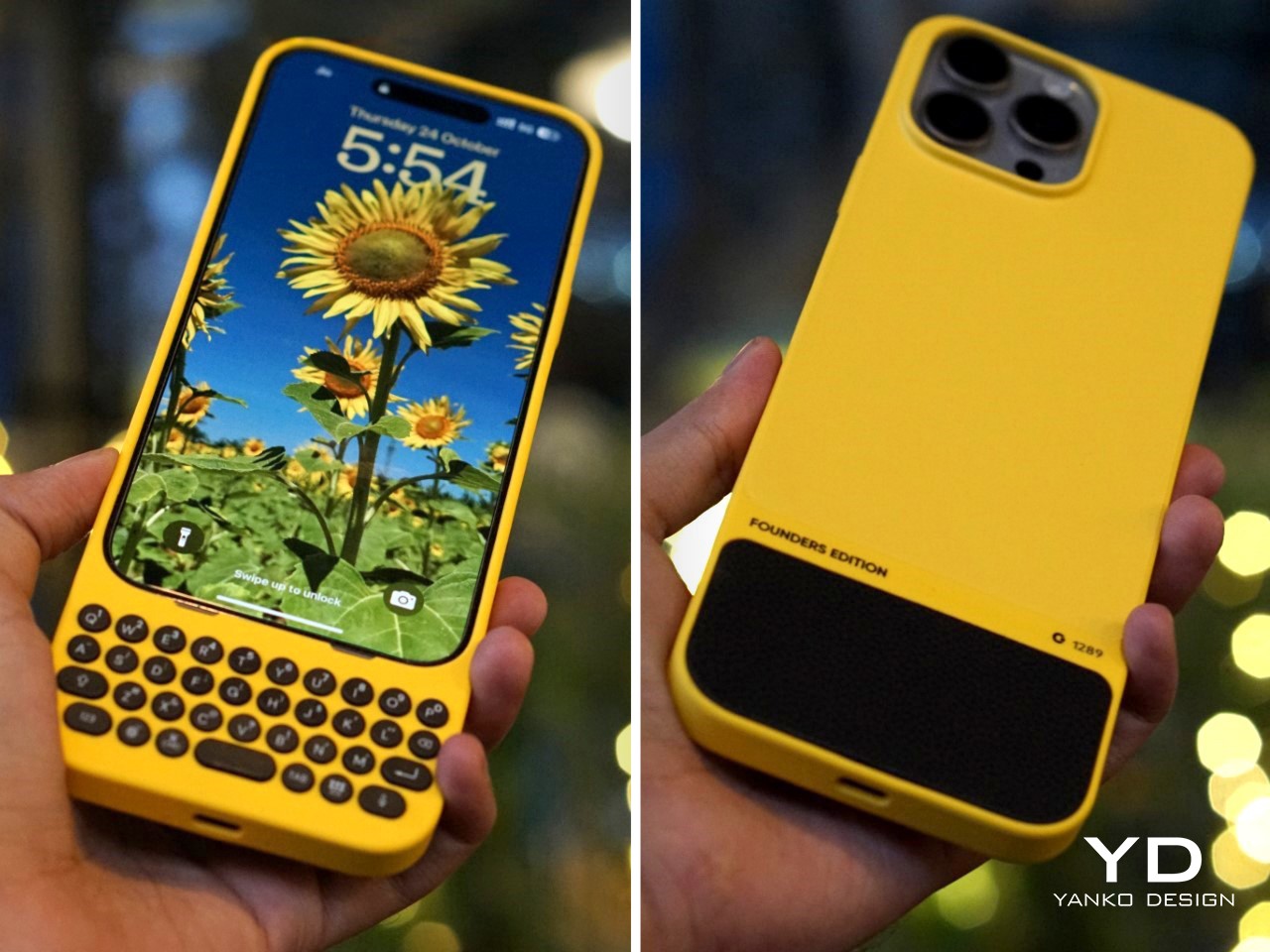
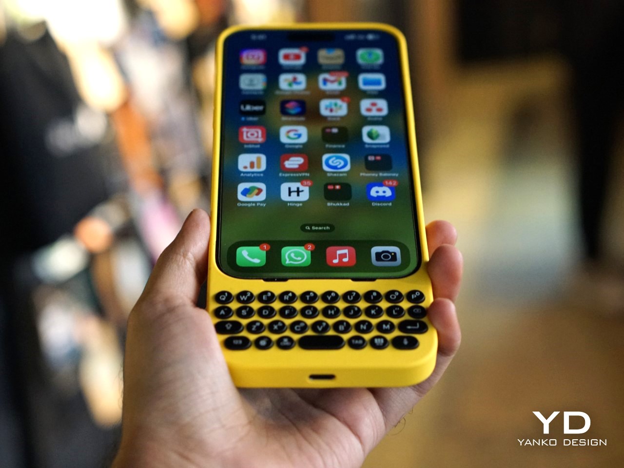
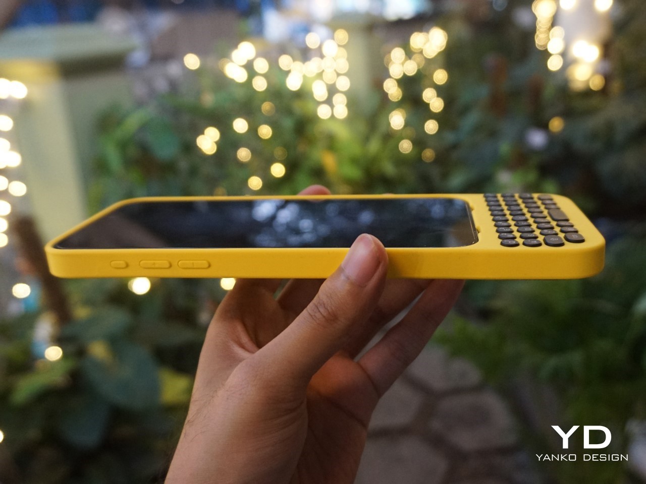
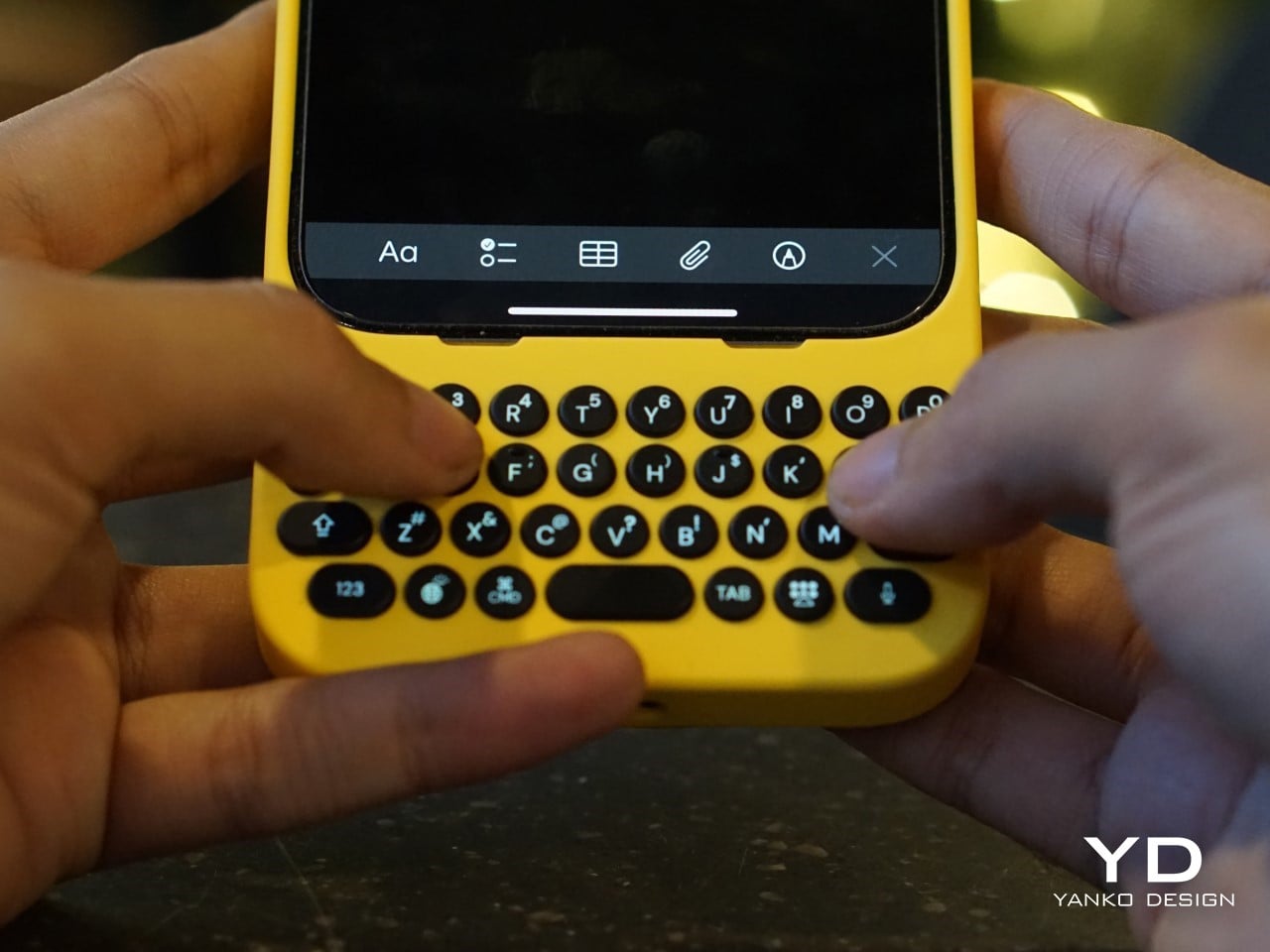
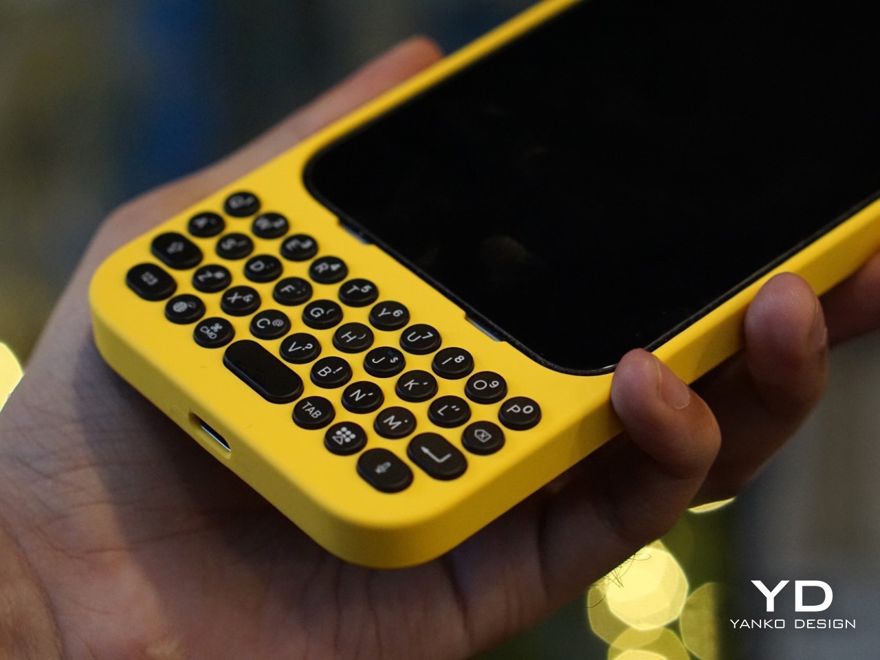
The result is a device that attaches to the bottom of an iPhone, offering a full QWERTY layout while leaving most of the screen visible—a big plus for those of us tired of losing half the display to a virtual keyboard. But achieving this wasn’t easy. One of the biggest challenges, according to Jeff, was balancing the tactile feel of the buttons with the need for backlighting. “Backlighting makes a product like this much more complicated than if you didn’t have it. We had to redesign the pushers and domes several times to get the perfect click while also avoiding light bleed,” he explained. It’s the kind of obsessive attention to detail that sets Clicks apart from gimmicky keyboard cases.
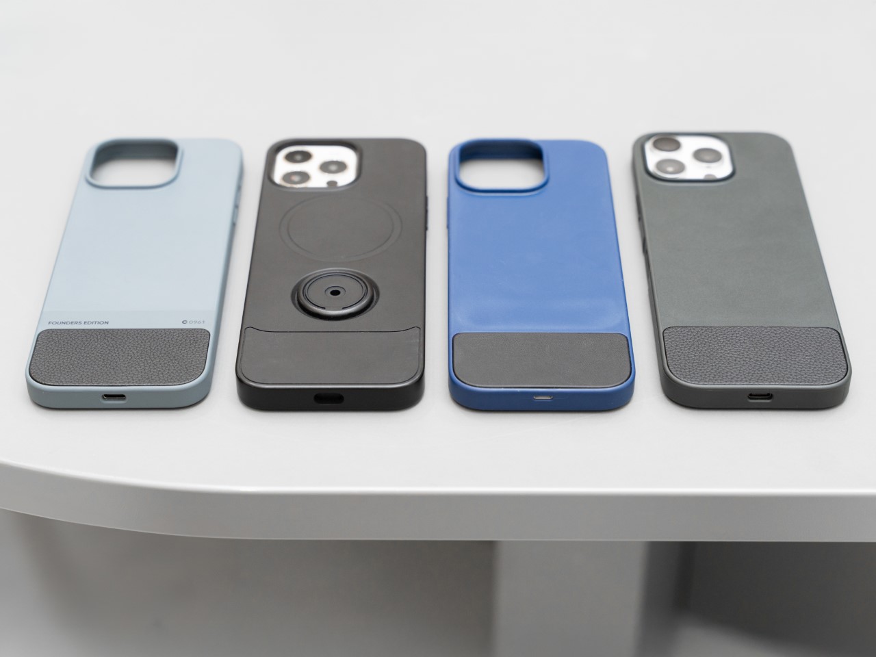
Image Credits: Clicks

A New Generation of Button Enthusiasts

While Clicks may look like a throwback at first glance, its user base tells a different story. Nearly half of Clicks users have never used a phone with physical keys before, according to Kevin, and that’s a surprising twist. For many of these new users, the attraction isn’t just about typing—it’s also about the added functionality that physical keys can bring to their smartphone experience.

Sure, there’s a bit of a learning curve. Typing on physical keys isn’t exactly the same as tapping on glass. It takes a bit of practice to build up the muscle memory needed to reach those higher typing speeds. But the payoff? A typing experience that feels far more intuitive and natural. Jeff pointed out that, “If you put in the time to develop the skill of typing on buttons again, you get to that moment where you can type without looking, and it’s amazing—it’s like magic again.” It’s an experience that resonates with people who use their phones as serious productivity tools, whether they’re composing long emails or just firing off quick texts without constantly peering down at the screen.

And then there’s the added bonus of reclaiming screen real estate. For users who are tired of virtual keyboards consuming half of their display, Clicks offers a breath of fresh air. It’s a little like trading in a cramped studio apartment for a place with a view—you suddenly have room to stretch out and breathe.
Accessibility Benefits and Inclusivity

One of the most unexpected success stories for Clicks has been its popularity among visually impaired users. For people who can’t rely on visual feedback, the tactile feel of physical keys makes all the difference. Kevin mentioned that the team has received heartfelt feedback from users who found that Clicks transformed their experience with smartphones. “What’s been most emotional for us is hearing from the accessibility market. People are saying, ‘You’ve changed my life,’” he shared.
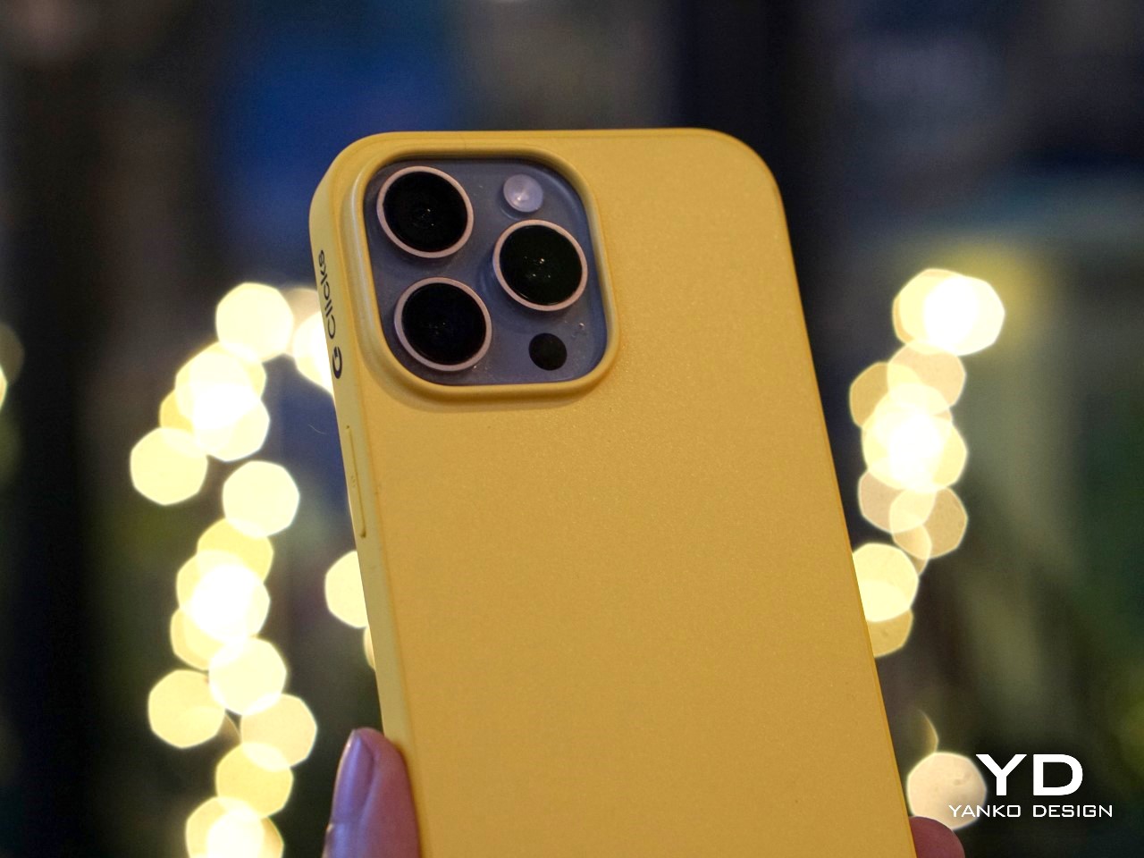
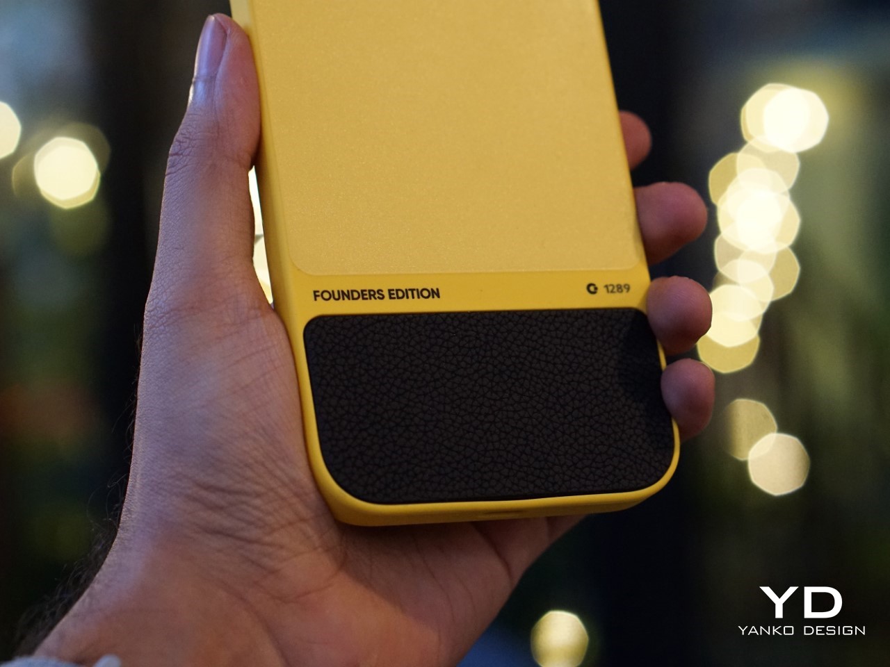
But what really stands out is that Clicks didn’t set out to be an accessibility device. Instead, it was designed as a premium, stylish product that anyone would want to use. This has resonated with users who don’t want their device to scream “medical aid.” As Kevin put it, “We wanted to make something that felt trendy, culturally relevant—something that anyone would be proud to use.”

It’s a reminder that good design isn’t just about how a product looks or feels, but also how it makes people feel. In this case, Clicks has managed to strike a balance, creating a device that offers practical benefits without sacrificing style.
Challenges of Designing for a Modern Smartphone Market

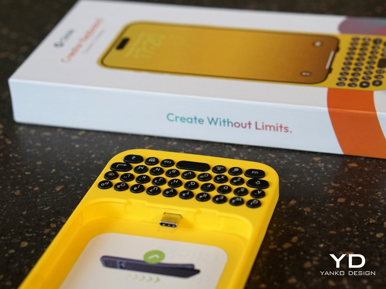
Creating a physical keyboard for today’s smartphones isn’t without its hurdles. The Clicks team faced challenges like achieving MFI compliance (Apple’s strict certification for accessories) and adapting to the iPhone’s transition from Lightning to USB-C. Kevin explained that this shift forced the team to make tough decisions about functionality. “With USB-C, we had to choose between charging and data transfer. We prioritized charging because that’s what most users needed day-to-day, but we’re always working on ways to improve,” he noted.
Another design dilemma was how to maintain a high-quality typing experience without making the device too bulky. Early prototypes experimented with different button layouts, from larger space bars to various key sizes. Jeff described how they refined the design through constant user feedback: “We tested several versions with different button materials and layouts, and made over 100 refinements before we got to the final version that shipped.”

The focus was always on making Clicks feel like a natural extension of the iPhone, rather than a clunky add-on. That’s why the final product opts for solid buttons with a satisfying tactile click, rather than cheaper, translucent keys that could have compromised the overall feel.
The Future of Physical Keyboards in a Touchscreen World

While Clicks is currently focused on iPhones, the team hasn’t ruled out expanding to other devices. “You can’t not think about it,” Kevin teased when asked about potential Android versions. The demand is there, and as long as there are users who prefer tactile input, there’s room for innovation. But for now, Clicks is focused on refining its product for iPhone users and building a community of dedicated users who love what the product offers.

What’s clear is that Clicks taps into a larger trend—a realization that perhaps the touchscreen revolution went too far in eliminating physical controls. We’re seeing it in other areas too, like the backlash against touch-only controls in cars. People want that tactile feedback, and Clicks is betting that the same is true for smartphone users.
What’s Next for Clicks?

So, where does Clicks go from here? The team is already working on future iterations, refining everything from button feel to software integration. Kevin emphasized that they’re committed to making each version better than the last: “We always aim to build the best product we can, and we’ll keep pushing the boundaries of what’s possible.”

But even as they look forward, Clicks has already made a mark. It’s proven that there’s a market for people who don’t want to compromise on their typing experience—those who believe that sometimes, the future needs a bit of the past. And as I type this out on my own touchscreen keyboard, struggling yet again with autocorrect, I can’t help but think they might just be on to something.

The post In an Era of Touchscreens, Why Clicks’ iPhone Keyboard Case is a Touch of Genius first appeared on Yanko Design.
Chic and Conscious: The Vegan Leather Lyden DS iPhone 16 Case Redefines Style

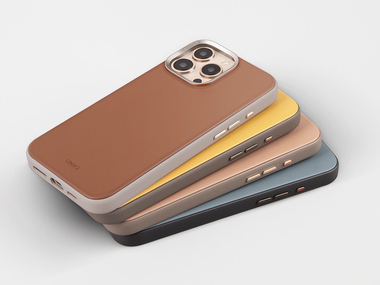
The Lyden Duo Series (Lyden DS) iPhone 16 case takes smartphone protection to a new level, focusing on essential functionality and a refined design. Built with practicality and user experience at its core, this case aligns perfectly with those seeking a personalized touch that enhances their iPhone’s usability. This case provides reliable protection and an essential accessory for daily use.

Designer: Uniq

Click Here to Buy Now: $29.90.

Unlike generic cases, the Lyden DS iPhone 16 case focuses on every detail. The latest version includes a well-placed cutout for the new capture button, ensuring no feature gets sacrificed for style. This small but significant change directly improves how users interact with their devices, allowing seamless access while maintaining the elegant look that defines the Lyden DS series. With usability at the forefront, the case makes convenience a breeze while offering complete protection.

The case delivers function and tactile pleasure. Its form-fitting design holds the iPhone securely without adding extra bulk. Thanks to the premium vegan leatherette, its sleek finish ensures durability while offering a soft texture that enhances the overall experience of carrying and using your device. This design approach acknowledges the way we balance utility with personal expression.

Luxurious Vegan Leatherette Material

A key feature of the Lyden DS iPhone 16 case is the luxurious vegan leatherette material, merging elegance with durability. This material withstands the challenges of daily use while maintaining a refined appearance, offering more than basic utility. It’s designed for those who appreciate sophisticated aesthetics and value reliable protection.

Choosing vegan leatherette is an ethical decision, prioritizing sustainability over mere aesthetics. As consumer preferences evolve, there is a growing shift towards sustainable alternatives. The cruelty-free nature of this material makes it a responsible choice, catering to users who prioritize sustainability without compromising on quality or aesthetics. It aligns with a broader movement towards ethical consumerism, where luxury coexists with conscious choices.

The soft texture of the material enhances both the tactile experience and the visual appeal, making it a pleasure to use every day. Carrying your iPhone in a Lyden DS case means choosing a product that’s practical and aligned with a lifestyle that values refined, responsible materials.

MagClick™ Magnetic Charging Compatibility
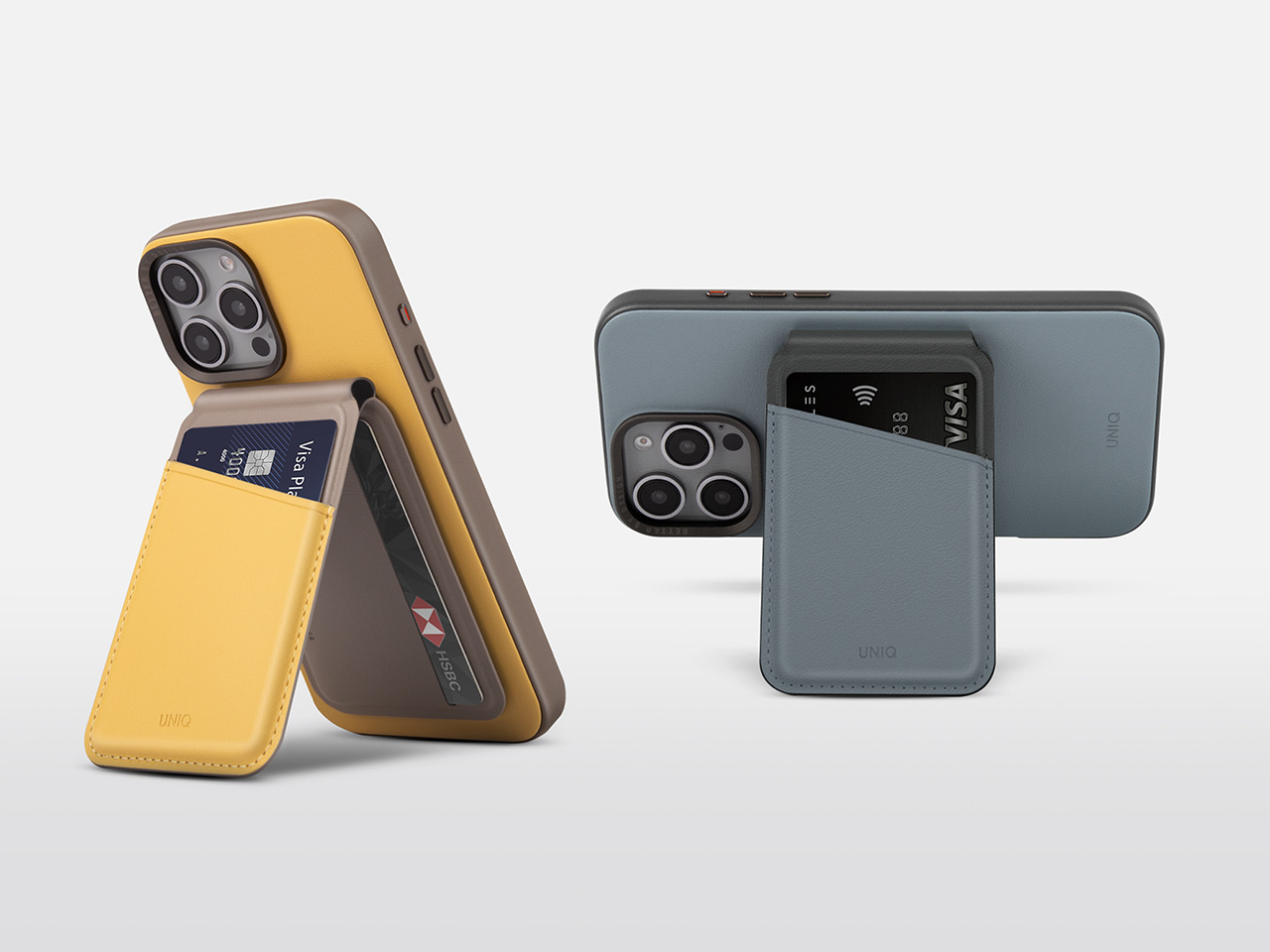
The Lyden DS case features MagClick™ magnetic charging compatibility, seamlessly enhancing convenience. Modern life demands efficiency, and the Lyden DS case delivers by integrating magnetic technology. It allows users to charge their devices easily without tangled cables or cluttered spaces.

Magnetic charging simplifies device interaction. The secure magnetic connection holds the phone in place, reducing wear from constant plugging and unplugging while keeping the setup tidy and efficient.

MagClick™ compatibility makes wireless charging easy without compromising the device’s aesthetics. The Lyden DS iPhone 16 case merges advanced technology with an elegant design, enhancing the user’s daily routine.
Protection and Design Features

When it comes to protection, the Lyden DS iPhone 16 case excels. Its raised edges protect the screen and camera, ensuring they remain free from scratches and damage during daily use. Unlike bulky cases that detract from the iPhone’s sleek design, the Lyden DS case manages to protect without compromising on elegance.

Every feature of the case is crafted to fit the iPhone 16 perfectly. From precise cutouts for all buttons and ports to the specific design adjustment for the new capture button, the Lyden DS enhances usability. Users access all of the phone’s functions effortlessly, enjoying the best iPhone technology without any limitations imposed by the case.

The Lyden DS case further ensures design and function are never at odds. The lightweight yet robust materials provide reliable protection that feels natural and comfortable in hand. It creates a case users don’t have to think about, one that integrates seamlessly with the phone and becomes an extension of the device itself.

Accessories That Complement

The Lyden DS series extends beyond the iPhone case, offering a cohesive collection of accessories designed to create a unified experience. Featuring an AirPods case and a magnetic card holder, each piece in the collection is crafted from the same luxurious vegan leatherette. This ensures all your tech accessories maintain a consistent, stylish aesthetic that speaks to refined taste.

The AirPods case combines function and elegance. It protects the charging case while ensuring easy access, with precise cutouts for easy access and compatibility. Compatible with wired and wireless charging, it adds versatility to any tech setup.

The magnetic card holder adds thoughtful practicality to the Lyden DS accessory lineup. With its secure magnetic attachment, it provides a practical way to carry essential cards without needing a bulky wallet. RFID-blocking technology adds security, while the foldable stand allows for hands-free viewing, enhancing everyday convenience. These accessories complement each other, making them aesthetically pleasing and highly practical.

Explore the New Era of Smartphone Style and Function

The Lyden Duo Series enhances how you interact with your tech. The premium vegan leatherette brings understated luxury to a practical, everyday accessory, while features like MagClick™ magnetic charging and the dedicated capture button cutout address the needs of modern smartphone users. It’s a case that embodies style and substance, offering more than mere protection.

This cohesive approach extends to the full lineup of accessories that harmoniously enhance the iPhone experience. Whether it’s the sleek AirPods case or the magnetic card holder, each piece adds value, convenience, and a touch of luxury to your daily tech routine. Embrace the Lyden Duo Series and transform your smartphone experience—where function meets style, and each accessory is meant to be part of your lifestyle.

Click Here to Buy Now: $29.90.

The post Chic and Conscious: The Vegan Leather Lyden DS iPhone 16 Case Redefines Style first appeared on Yanko Design.

Astropad Bookcase turns iPhones into slightly more ergonomic e-Readers

E-book Readers, a.k.a. e-Readers, are becoming popular again thanks to the introduction of new technologies like Color E Ink, as well as the proliferation of new brands like Onyx BOOX, Bigme, and reMarkable. That said, some people prefer to stick to the slightly large screens of their smartphones rather than carry a separate device, but that kind of digital reading experience brings its fair share of discomfort. Even disregarding eye strain, reading for long periods on a smartphone means potentially blocking part of the screen or giving your hand cramps in the long run. This iPhone accessory offers a solution that tries to make reading on a phone slightly more comfortable, even if it only addresses one very specific problem.

Designer: Astropad

While smartphones and tablets are banishing bezels, e-Readers are insistent on keeping them around. It isn’t because they can’t make screen borders incredibly thin but because they want to offer an ergonomic design where one or two hands can comfortably hold the device without worrying about accidentally touching the screen or blocking part of the content. Without that kind of “margin,” holding a smartphone can become awkward and uncomfortable for an extended period of time.

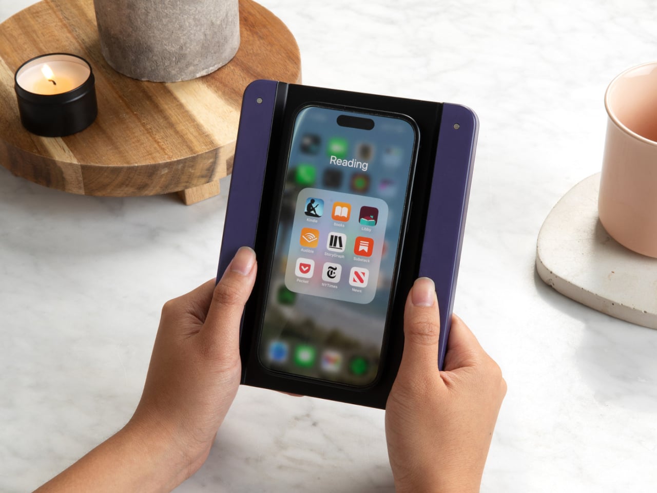
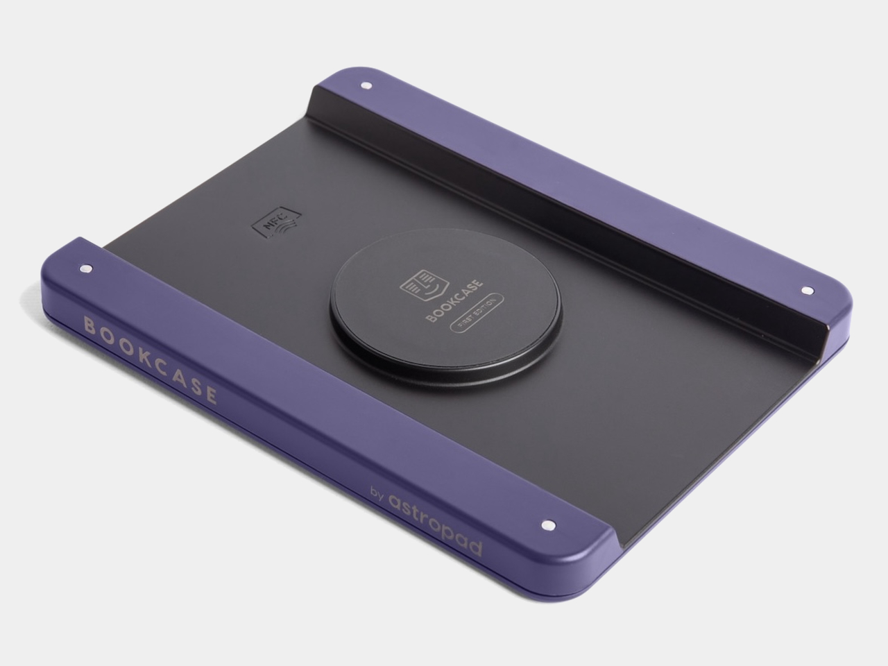
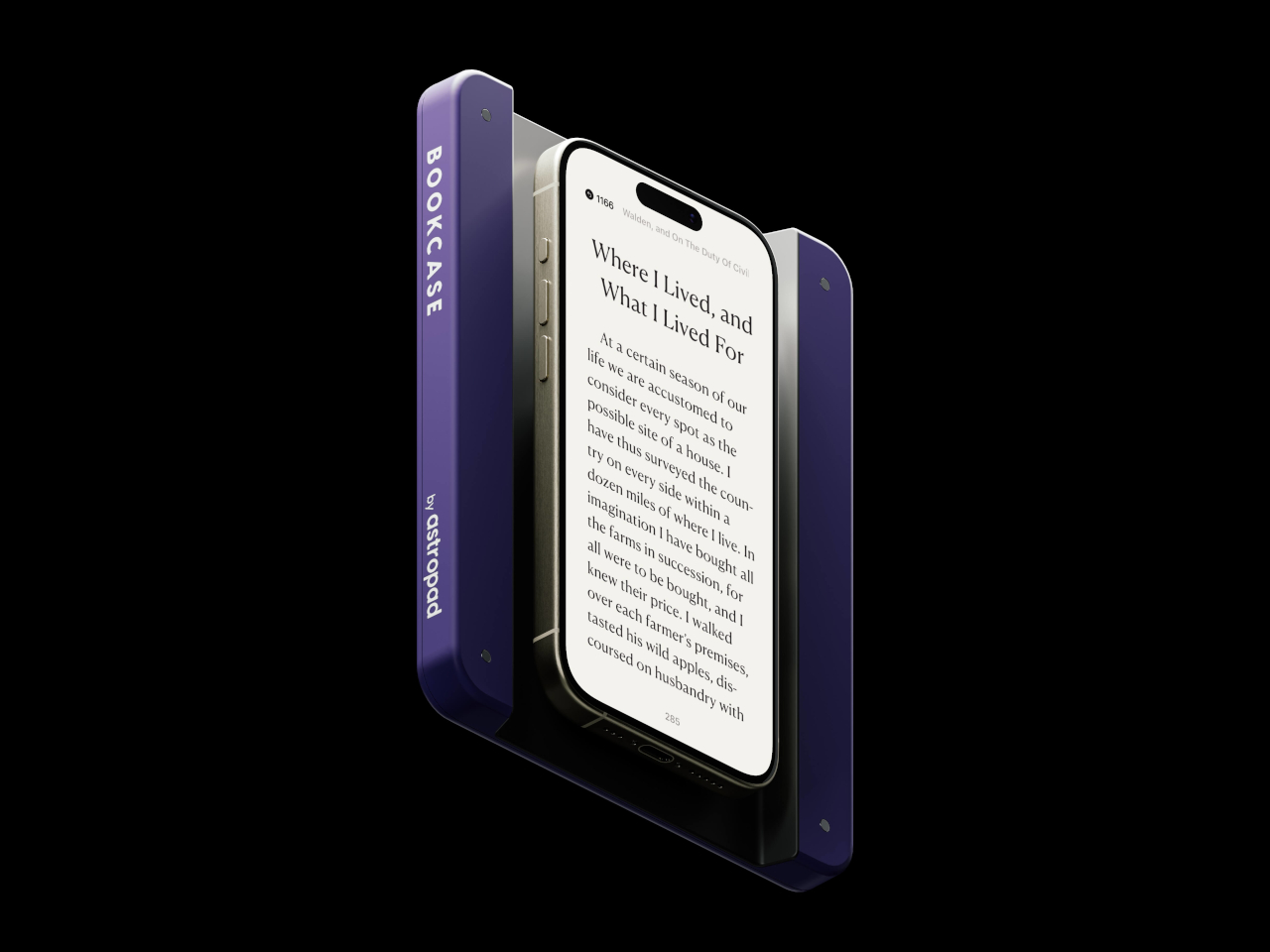
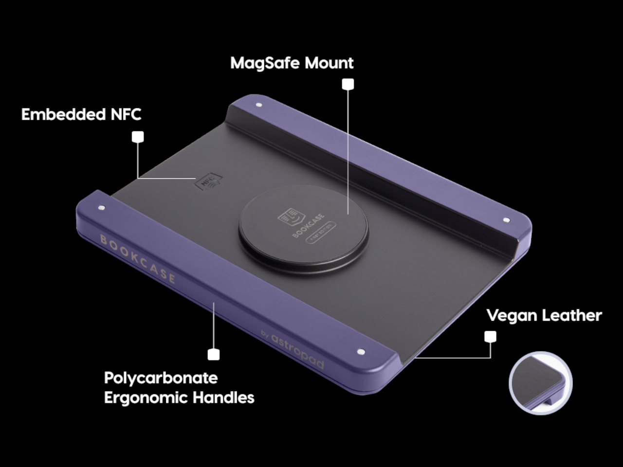
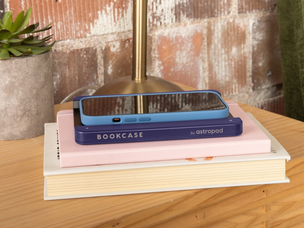
Astropad Bookcase is an accessory that adds handles to the sides of a phone without forcing owners to put on a protective case. A MagSafe-compatible phone attaches to the middle of the tray-like accessory when you want to read, giving your hands something stable to grasp. And when you’re done, you simply detach the phone, put away the Bookcase, and be on your merry way. The accessory is made with lightweight polycarbonate that makes it feel like you’re adding nothing to the smartphone, and it uses vegan leather to add a bit of style and elegance to the design.

The Astropad Bookcase has a few gimmicks that make the e-Reading experience a bit smoother. A companion app, for example, can automatically launch your favorite e-Reader app the moment you attach the iPhone to the Bookcase thanks to an NFC chip inside the MagSafe mount. Although it’s primarily compatible with iPhone 12 and later models, the package includes a MagSafe conversion kit to support older iPhones as well as Android phones.

While the Bookcase does solve one part of the smartphone ergonomic problem, it doesn’t fully address the reasons why it’s not ideal to read on a smartphone for too long. For one, there are no convenient physical buttons that would let you turn the page without having to swipe or tap on the screen, similar to how some apps allow you to use the volume buttons for the same purpose. And there’s no escaping the fact that LCD and OLED screens, regardless of advertised advanced technologies, cause eye strain over prolonged use compared to eye-friendly E Ink displays.

The post Astropad Bookcase turns iPhones into slightly more ergonomic e-Readers first appeared on Yanko Design.

These Awesome Apple Intelligence Features Are Coming to iPhones Next Week

Happy Mobile Monday to our Yanko Design readers! This week, we’re diving into an exciting new chapter for Apple as they roll out Apple Intelligence, launching next week. These new features will be available for iPhone 16, iPhone 16 Plus, iPhone 16 Pro, iPhone 16 Pro Max, iPhone 15 Pro and iPhone 15 Pro Max. Let’s look at how these features will enhance our daily experiences, making our devices smarter and, frankly, more enjoyable to use.

Designer: Apple

Writing Tools: Making Communication Effortless

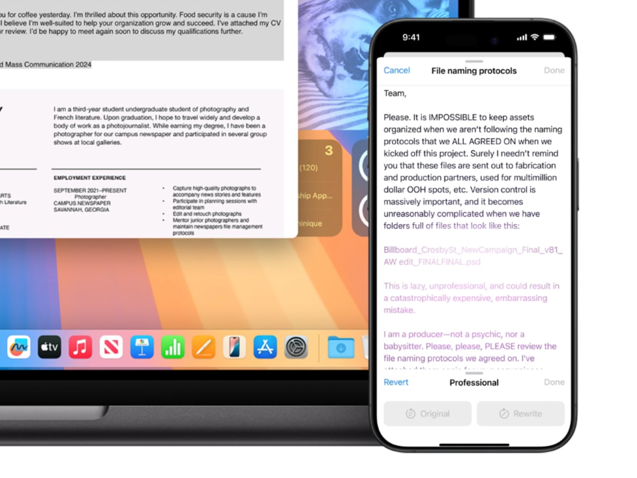
Apple’s Writing Tools fix grammar, polish your sentences, and fundamentally change how we interact with written communication on our devices. Picture those times when you’re drafting an important email and need to strike that tricky balance between being polite and assertive. The AI built into Writing Tools can take what you’ve written and enhance it—making it sharper, more concise, and clearly communicating your intent without stressing over every word. For those hectic mornings when every minute matters, these tools help save time and mental energy, letting you focus on what counts.

The beauty of these tools is how seamlessly they integrate throughout the Apple ecosystem. If you’re jotting down a quick note, sending a text, or drafting a work email, Writing Tools are there, and they are always ready to assist. Picture managing work emails, your child’s school schedule, and dinner plans all at once. The AI can summarize long message threads into key points, create quick response templates, and ensure your tone stays consistent—all without needing you to jump between apps.

For those who enjoy making lists or drafting detailed summaries, Writing Tools can transform lengthy paragraphs into bulleted lists or tables with just a click. It’s perfect for work presentations, project reports, or even just organizing your own thoughts quickly.

Upgraded Siri: A More Intuitive Assistant

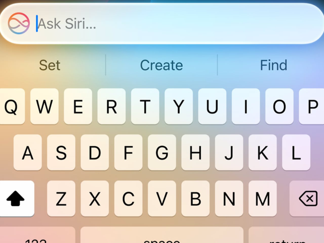
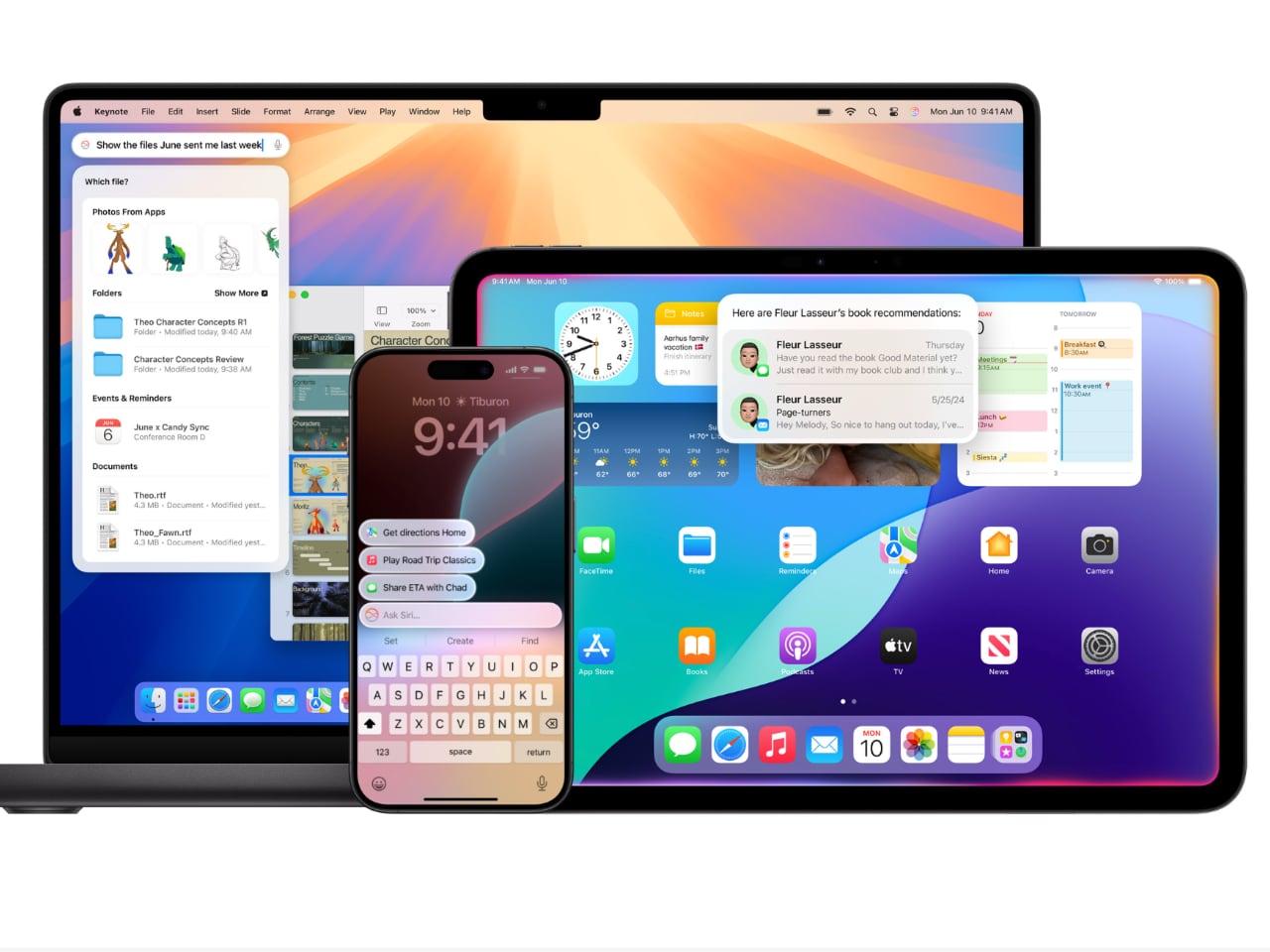
The upcoming Siri upgrade features a new interface and a complete reimagining of how Siri fits into our daily routines. One of the biggest changes is Siri’s ability to take written commands. Picture being in a quiet place—a library, a meeting, or even a shared workspace—where speaking out loud to Siri isn’t appropriate. Now, you can type your command to Siri and get the help you need. It’s a new level of convenience for those times when silence is golden.
But Siri’s upgrades go beyond typing. The new language model means Siri is better at understanding more nuanced requests. Picture planning a trip and asking Siri for the best route that includes multiple stops. Siri’s new capabilities make it better at understanding complex phrasing and personal context, so it gives directions that are accurate and tailored to what you need. It feels natural, as Siri understands, even if you’re not 100% precise.

Another significant enhancement is tech support integration. Siri can now handle more complicated queries, acting like a first-line tech assistant. If you need to troubleshoot an Apple TV issue or reset a Wi-Fi setting, Siri is there to walk you through it step by step. This saves you from having to Google answers or read lengthy manuals—Siri has your back, providing real-time assistance when you need it most.

Smart Reply: Quick Responses, Whenever You Need Them

Smart Reply is Apple’s answer to the fast pace of modern communication. It’s made for those moments when you’re overwhelmed and just don’t have the time to craft a full response. Imagine being on a crowded train, managing incoming texts while trying not to miss your stop. With Smart Reply, your iPhone offers pre-generated, context-aware responses that fit the situation. You can quickly reply with “Sure, let’s do it!” or “I’ll get back to you soon,” without needing to type it all out.

These Apple Intelligence-suggested replies are based on the context of the conversation, which significantly reduces response time. Gmail users might be familiar with something similar. Whether it’s a quick work confirmation or a friend making lunch plans, Smart Reply helps keep the conversation moving without the stress of coming up with the perfect response.

Smart Reply provides efficient assistance for quick replies or acknowledgments but knows when to step aside for more complex conversations requiring a personal touch. For complex questions or sensitive discussions, the AI lets you take the lead, ensuring your personal touch isn’t lost. It’s about enhancing your workflow without taking over the parts that matter most.

Call Recording and Transcriptions: Never Miss a Detail

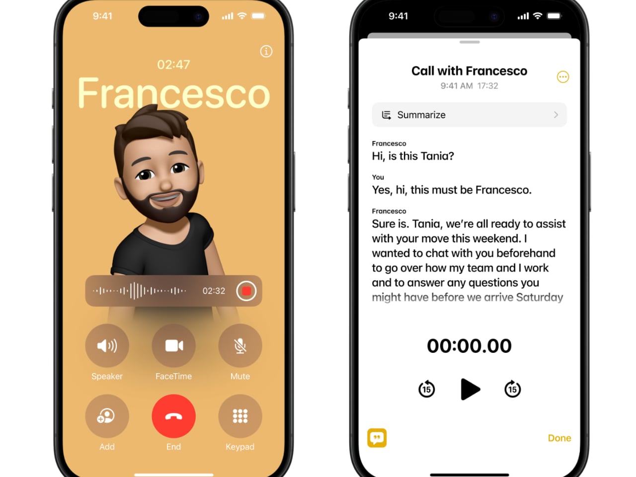
The new Call Recording and Transcriptions feature is a major upgrade, especially for anyone who needs to capture details accurately. Now, you can hit record during a call—whether it’s a regular phone conversation or FaceTime audio—and every detail will be saved as both audio and a written transcript. This is a huge win for people who need to remember every detail, from journalists conducting interviews to business professionals hashing out client agreements.

Think about those calls where important points are being discussed—deadlines, project requirements, or the finer details of an agreement. Instead of scrambling to take notes and potentially missing something, you can record the whole conversation and have a transcript saved directly in the Notes app. It makes going back to check on specific topics or quotes simple and quick—no more playing the entire conversation back and forth to find that one key moment. It’s about ensuring you never miss a beat, even when things get hectic.

For those with newer models like the iPhone 15 Pro, there’s an added convenience: real-time transcription and call summaries. Picture having a transcript generated in real-time while you’re still on the call, ready for reference once the call ends. It’s like having a personal meeting assistant that captures every nuance without you needing to lift a finger.

Notification Summaries and Summaries in Mail and Messages

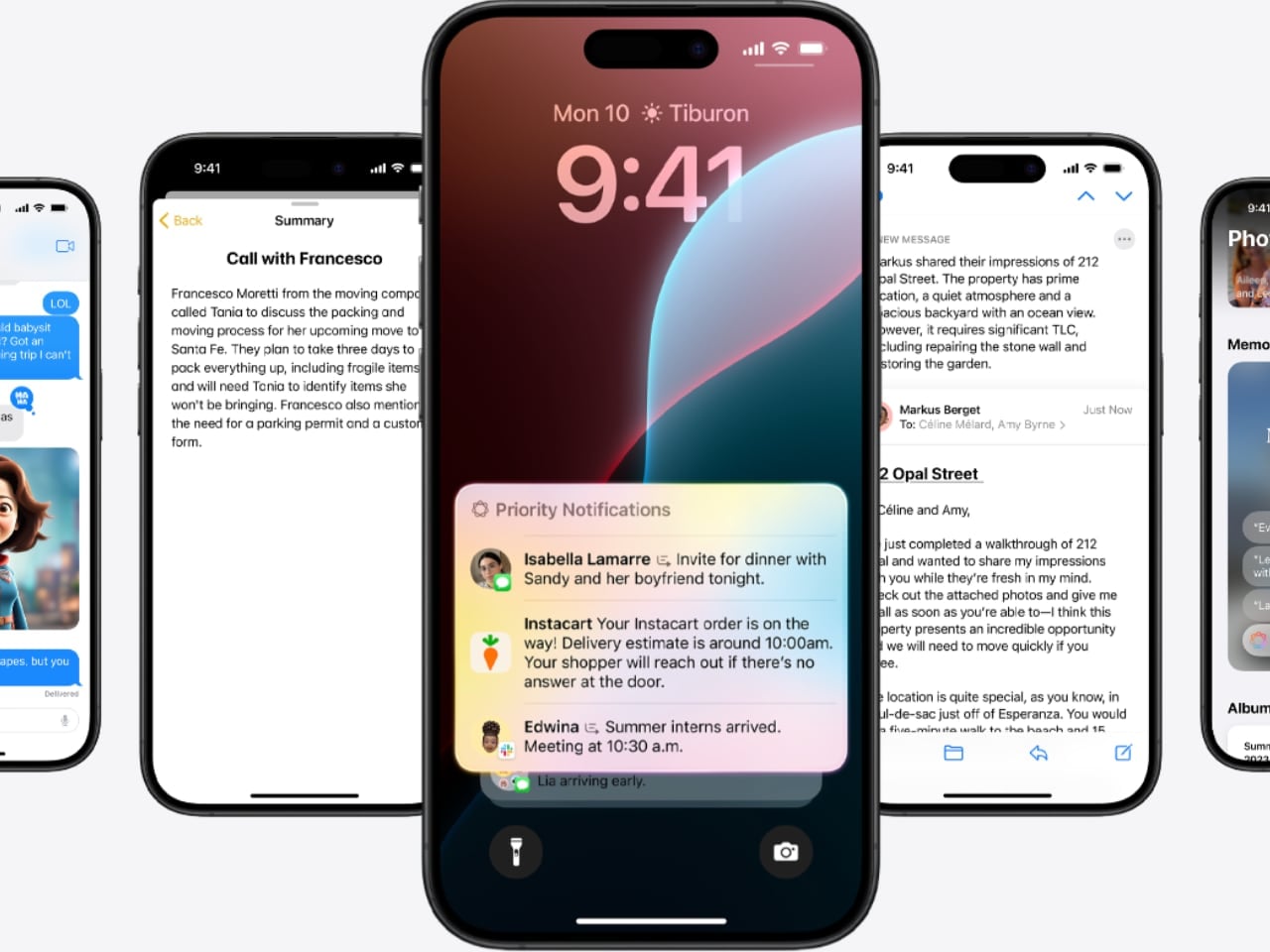
Managing notifications can sometimes feel like a full-time job, but Notification Summaries are here to lighten the load. Apple Intelligence uses AI to group related notifications together, so instead of being hit with multiple reminders—like payment due, confirmation received, and receipts—you’ll get one clean, consolidated notification. This reduces clutter and keeps you informed without the constant barrage of pings. Your iPhone becomes a tool that serves you, not something that distracts you.

This summarizing power extends into Mail and Messages as well. Think of a long email chain where multiple people have chimed in. Instead of scrolling through every response, you get a neat summary that tells you what’s happened so far. Group messages benefit from this, too—especially when conversations go off-topic. Apple Intelligence boils it down so you can stay updated without sifting through the less relevant bits.

Photos Updates: Capture Moments, Your Way

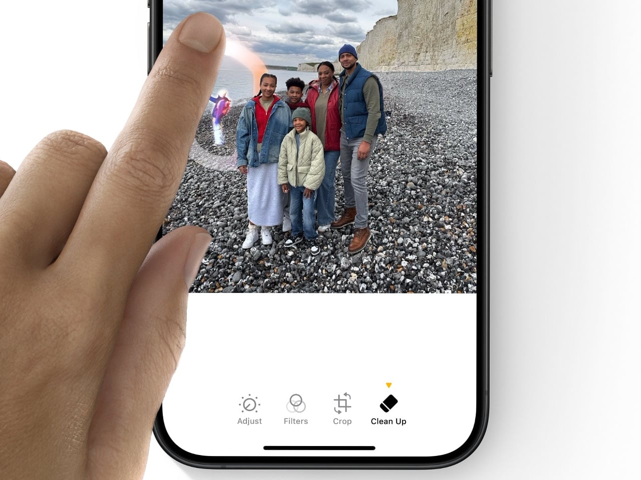
The Photos app is getting smarter, too, with new AI-driven enhancements that make editing and managing your library a breeze. The new “Clean Up” tool, which works a lot like Google’s Magic Eraser, is one that I use daily. Picture capturing a gorgeous sunset, only to find that a stranger walked right through your shot. With just a tap, that stranger is gone, and your photo looks as perfect as you remember it. It’s a simple way to enhance your photos without needing to be an editing pro.

Searching your photos is also getting a lot easier. Now, you can use natural language to find what you want. Instead of scrolling through endless thumbnails, you can say, “photos of me and Dad at the beach last summer,” and your iPhone will bring those exact pictures to the front. It turns what used to be an exhausting hunt into a quick, pleasant moment of reminiscing.

Apple is also bringing “Memory movies” to the Photos app. You can prompt the AI with something like “last year’s birthday party,” it will create a video collage of the best photos and clips from that event. It’s about more than just storing memories; it’s about reliving them. The Photos app is evolving from a place to dump pictures into a tool that repeatedly helps you cherish those moments.

Intelligent Interruption in Focus Mode: Stay Informed Without the Noise

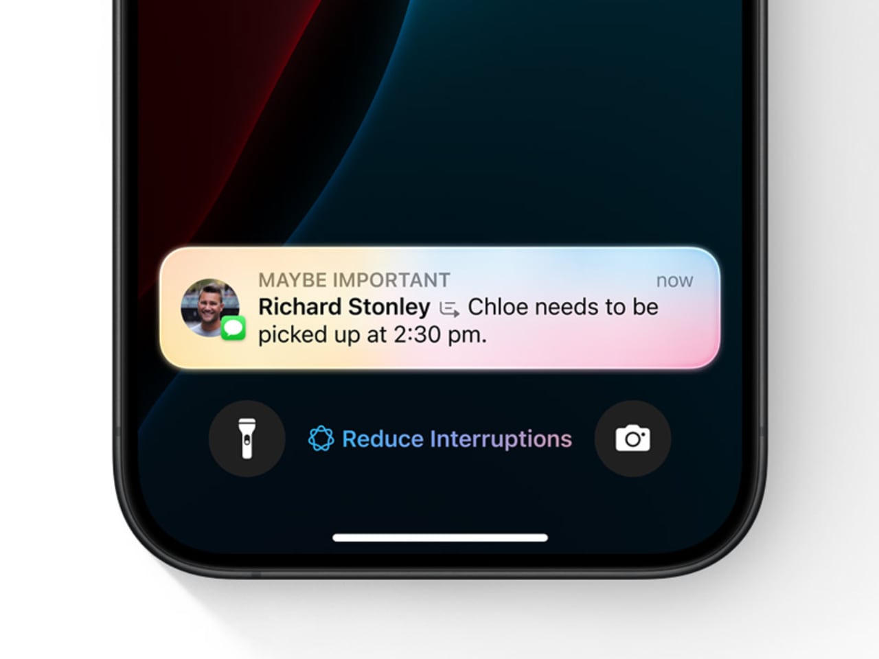
Focus Mode has been a great way to reduce distractions, but sometimes it can be too strict. Intelligent Interruption fixes that by letting genuinely important notifications get through, even when Focus Mode is on. This is extremely useful if you’re on a tight work deadline and don’t want any disruptions—except, say, an emergency message from your child’s school. With Intelligent Interruption, Apple Intelligence decides which notifications are crucial enough to break through the silence.

Apple’s AI learns what’s important to you over time, so it knows when to step in and when to back off. It could be an urgent email from your boss or a notification from a health app reminding you to take medication. This makes Focus Mode smarter, letting you maintain productivity while also keeping you in the loop when something really matters.

This kind of personalization is what makes Apple Intelligence so effective. By letting in the truly critical stuff, it keeps you productive and responsive, giving you peace of mind that you won’t miss anything important, even when you’re deep into work.

Non-AI System Upgrades: Enhancing the Overall Experience

Even without the AI bells and whistles, iOS 18.1 has plenty of new features to make your iPhone experience smoother. The redesigned Control Center is now more customizable than ever. You can arrange your connectivity shortcuts—like WiFi, Bluetooth, AirDrop, and cellular data—in whatever way makes the most sense for you. It’s all about making what you use most easy to reach, and if you ever decide you don’t like your setup, you can reset it back to the default with just a tap.

There’s also a new feature for file management. Now, you can drag and drop files while mirroring your iPhone to a Mac, making it seamless to move content between devices. Imagine starting a project draft on your phone and then dragging it onto your Mac for further editing—it’s the kind of fluid experience that makes working across devices feel less like a hassle and more like a true ecosystem.

Expanded NFC chip functionality is another welcome addition. Third-party apps can now use your iPhone’s NFC capabilities for things like transit cards or hotel room keys, turning your phone into an even more versatile everyday tool. And if you’re using an iPhone 16, there’s a new capacitive Camera Control button that lets you jump to selfie mode instantly—perfect for capturing those candid moments without fumbling around.

What’s Not Quite Here Yet

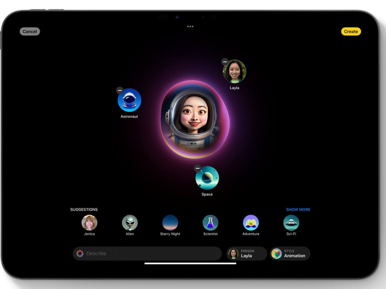
While iOS 18.1 has plenty to be excited about, it’s just the beginning. Apple is already working on more features that are expected to roll out soon. Upcoming tools like Image Playground and Genmoji will let you create custom images and emojis, bringing a whole new level of personalization to how you express yourself. Imagine generating an emoji that perfectly captures your mood—it’s all about making tech a little more you.

Siri is also in for more updates down the road. Features like Visual Intelligence will allow Siri to give you information about your surroundings just by snapping a picture—whether that’s identifying a landmark, a plant, or something else entirely. And while Apple Intelligence will initially only be available in U.S. English, there’s hope that expansion into other languages and regions isn’t far behind.

These upcoming features are just a glimpse of what’s to come. For now, iOS 18.1 lays the foundation for a more intelligent and user-friendly iPhone experience, blending convenience with a deeper understanding of how we live our lives. It’s all about making your iPhone not just a tool, but a smarter companion. Stay tuned—this is just the start of what Apple Intelligence can do.

The post These Awesome Apple Intelligence Features Are Coming to iPhones Next Week first appeared on Yanko Design.

This Retro iPhone Case turns it into a Makeshift Old Windows PC with Clippy and Internet Explorer

Quite literally the opposite of Back to the Future, this iPhone 16 Pro case is more like “Forward to the Past”.

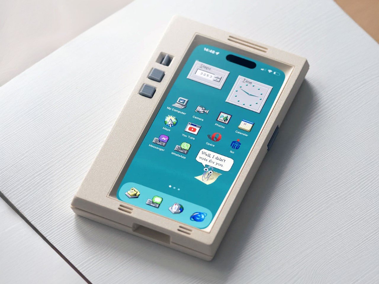
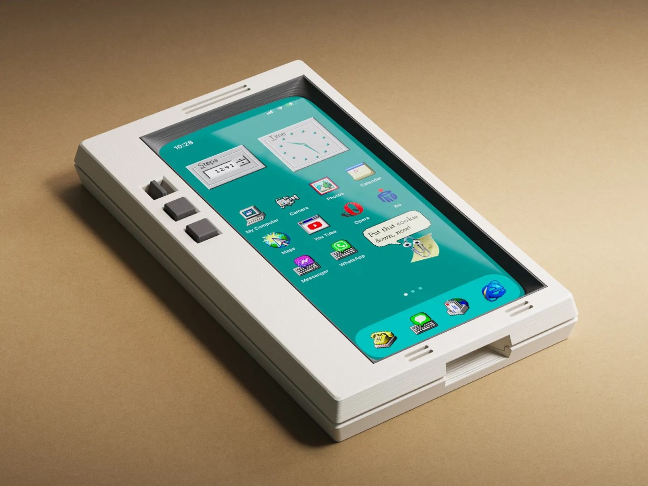
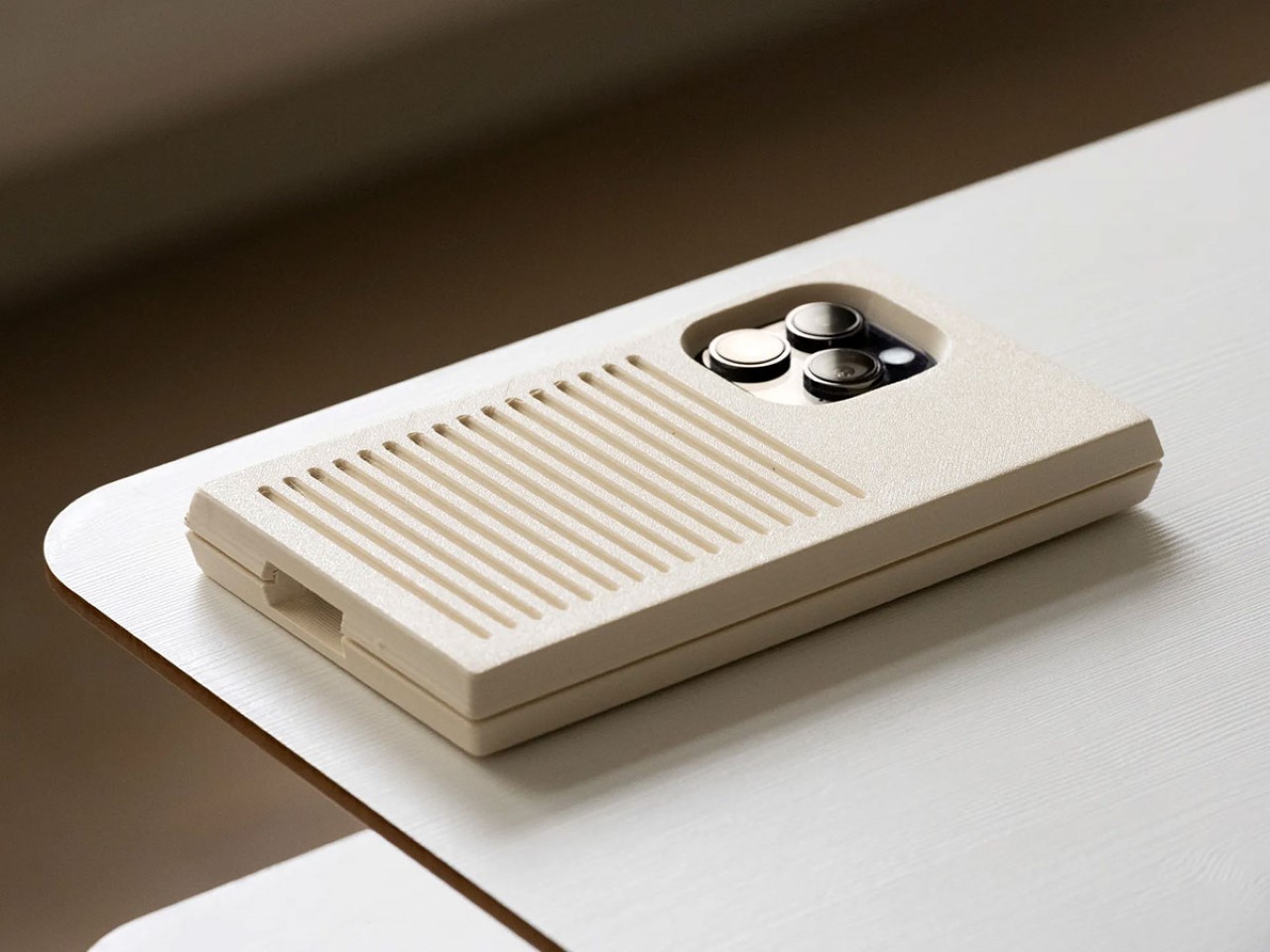
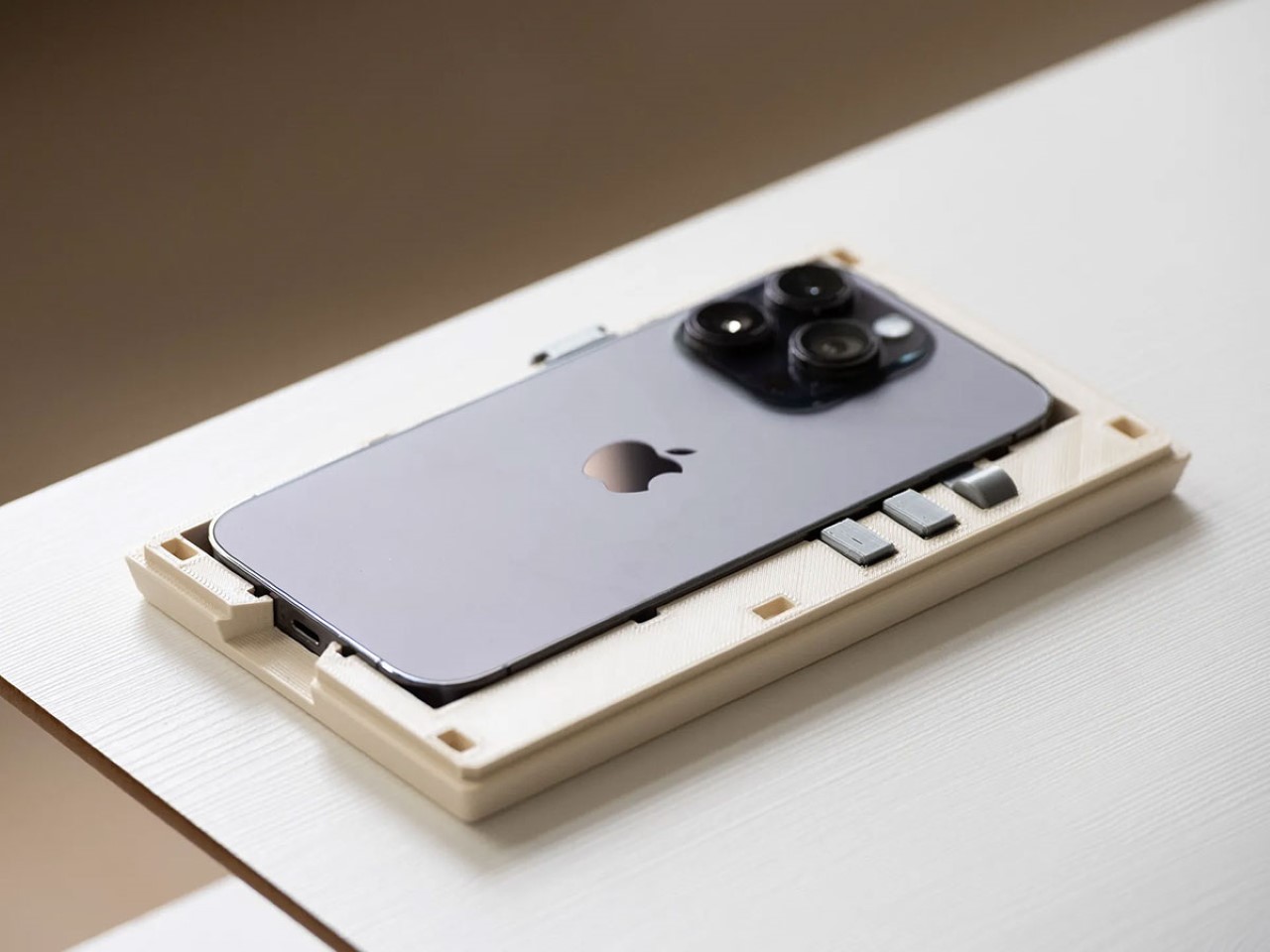
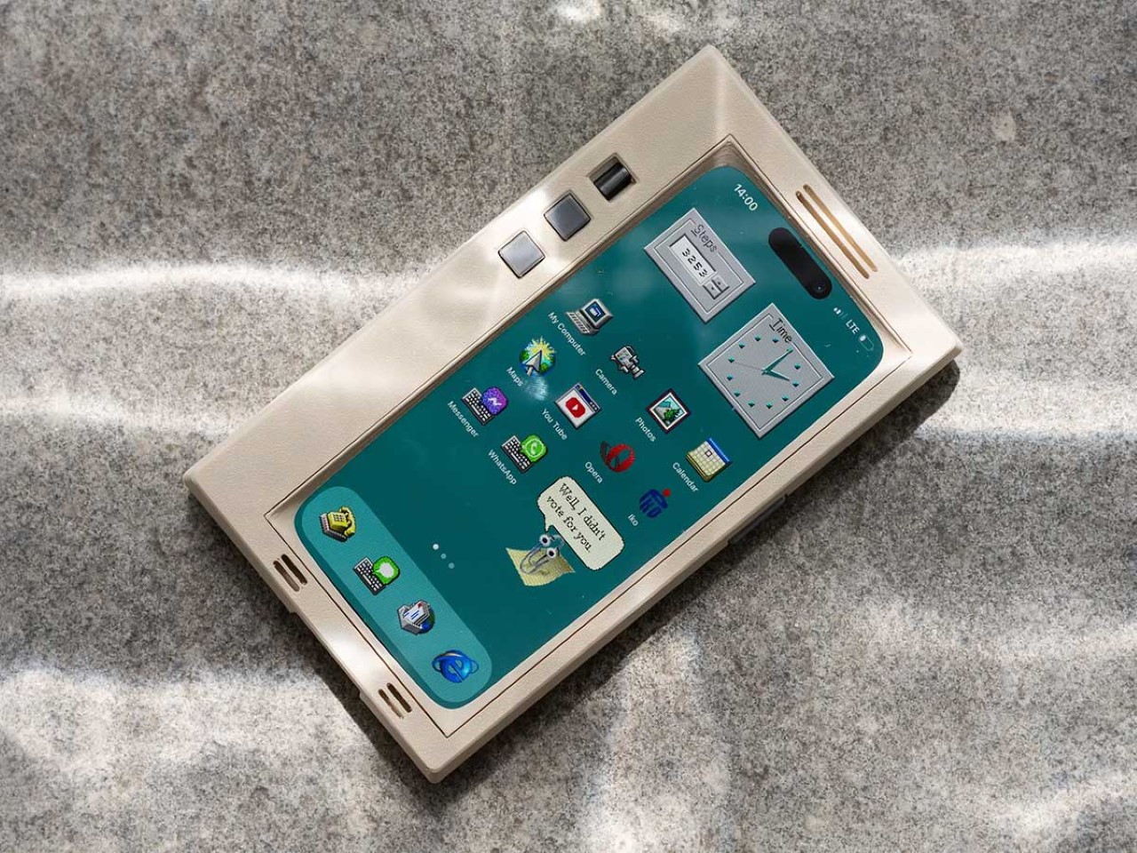
When you buy a phone, chances are you spring for a case immediately for one of two reasons – to either protect your phone, or to personalize it. However, Printables user Retron Print may have invented a new reason to add a case to your phone. Meet the iPhone Retro Case – a case that takes your cutting-edge smartphone and transforms it into a marvel of old-school technology. The two-part case sandwiches your phone in between, turning it into an old-timey CRT monitor (albeit with a functional main camera and dynamic island). To complement the case’s old-school design, Retron Print also equipped the phone with a retro home screen and custom icons and widgets. Although I’d personally love to have the iPhone stick to a Macintosh-based system, this one is unabashedly Windows, with a non-functional Clippy icon on the screen. Quite a downgrade from Siri and Apple Intelligence, no?

Designer: Retron Print

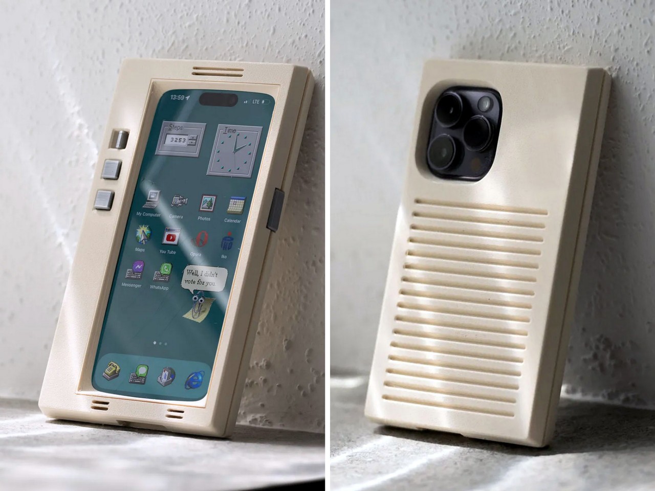
The beauty of the case is that it justifies every aspect of its retro design without compromise. Look at monitors from times of yore and they often had thick, chunky bezels. While most monitors came with a ‘chin’ which would either house a floppy disk reader or just control buttons, this retro case shifts the asymmetric chin to the side, with front-facing buttons that actually work. Built cleverly into the case’s mechanism are buttons that face forwards, but trigger the action and volume buttons on the side of the iPhone. The detailing’s prebuilt into the case’s design, and all you need to really do is 3D print and then assemble.

On the front, the case features an oval frame reminiscent of old CRT monitors, although it doesn’t obstruct the screen in any way. It’s a small but meaningful detail that gives the case a distinctly vintage vibe. Around the back, long, deep grooves evoke the look of classic desktop computers and also provide better grip. These thoughtful design elements ensure that while the case embraces nostalgia, it still offers the user a modern experience with improved functionality and tactile appeal. Meanwhile, speaker systems are accounted for too, with slots on the top and bottom that let you listen to audio from your iPhone.

When it comes to color options, Retron Print suggests using filament in shades like sandy beige, gray, or light brown to fully capture the retro essence. These muted tones are reminiscent of the classic electronics from decades past, enhancing the nostalgic appeal. This attention to detail extends to the print process itself. The case’s front and back panels are best printed on a textured print plate, adding an extra dimension to the overall look and feel, while the buttons should be printed on a smooth plate to maintain their tactile nature.

For those eager to bring a bit of retro flair to their iPhone, the case is available for iPhone 14 and iPhone 15 models. You can purchase the STL files for just $10 on Printables.com and print the case yourself, although this just includes the retro case’s 3D files and not the wallpaper and app icons. When it comes to color options, Retron Print suggests using filament in shades like sandy beige, gray, or light brown to fully capture the retro essence. These muted tones are reminiscent of the classic electronics from decades past, enhancing the nostalgic appeal.

However, commercial use of this model is restricted. To sell prints of this design, users must become a member of the Retron Print Commercial Club, ensuring that the creator, AndrzejG, receives credit and support for their work. This stipulation ensures that while the model is available for personal use, it remains protected against unauthorized distribution.

The post This Retro iPhone Case turns it into a Makeshift Old Windows PC with Clippy and Internet Explorer first appeared on Yanko Design.

iPhone 17 concept dreams of an interesting direction Apple will never take

Apple is both famed and notorious for its meticulous attention to detail and it has been hailed as a champion of product design in the tech industry. It rarely makes big changes to its design language, but when it does, it holds on to that aesthetic for years. It held onto the notch for six years before giving way to the island on the iPhone 15, and it still uses the square camera design it first introduced on the iPhone 11 back in 2019. That’s not to say that the iPhone 17 next year couldn’t be different from this year’s iPhone, and this concept tries to explore designs that could make sense but will probably never happen under Apple’s watch.

Designer: Mohamed Mahdy

Apple has championed minimalism for its most recent products, barely adding any vibrant colors or textured finishes to its iPhones and MacBooks, save a small number of special editions. It has left the doors wide open for case makers to offer those flavors to people who do want them, but it has reserved for itself classier aesthetics. Of course, it’s not like Apple has never embraced more eye-popping hues before, as proven by the candy iMac G3, the colorful iPhone 5c, and the current generation of vibrant flat-screen iMacs.

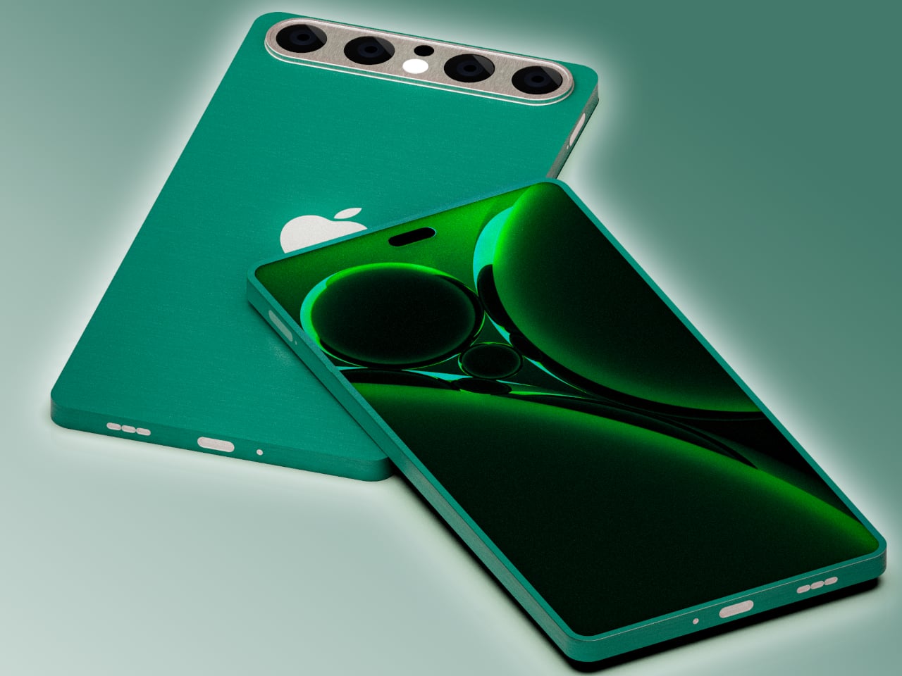
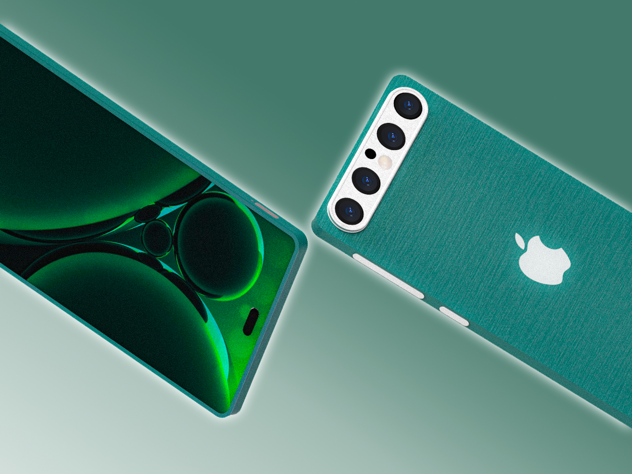
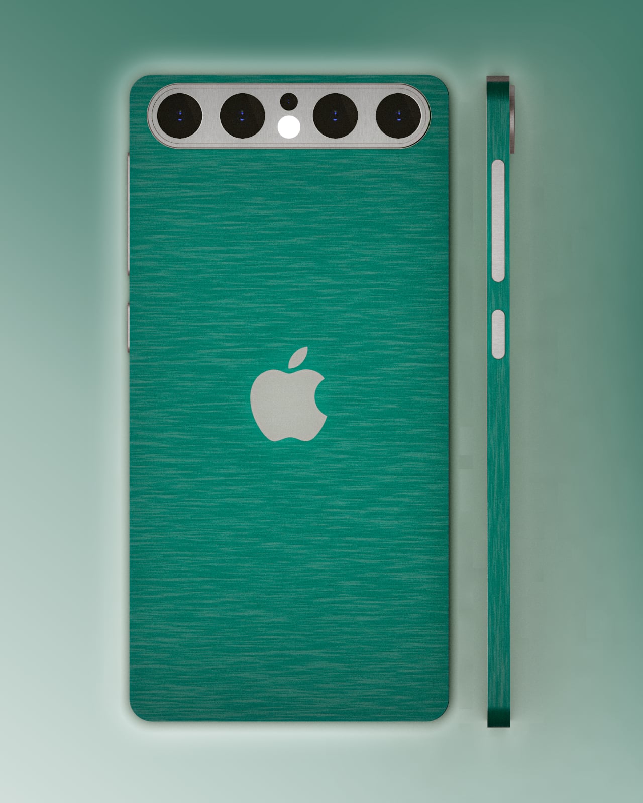
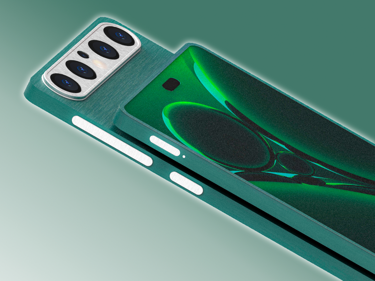
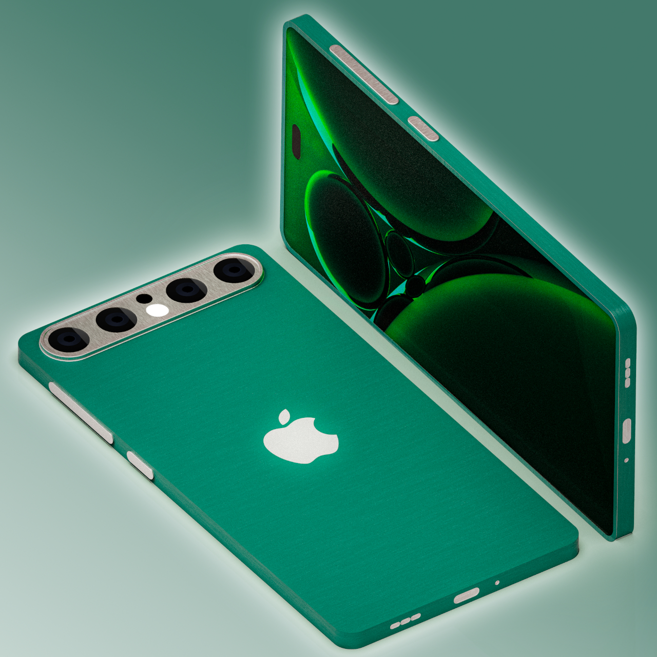
This Apple iPhone 17 conceptual design dares to venture into unknown territory with a design that, almost doesn’t look like Apple if not for the telltale logo. It does have the flat design of the current iPhones, but rather than a smooth and featureless chassis, it adds a bit of texture that looks almost like fabric. This can perhaps be an opportunity for Apple to use more sustainable recycled materials rather than just plain metal.

The biggest deviation, however, is the camera design, a pill shape that runs across the width of the phone. It has four cameras, something that has yet to happen on any iPhone, arranged in a row with the LED flash and 3D time-of-flight sensor in the middle. This design is one possible solution to the design puzzle that Apple will have to face when it does add another camera sensor to next year’s iPhone. It also fixes the wobbling problem that most smartphones have because they push the thick camera bump off to the corner.

Interesting as it may seem, it does feel unlikely that Apple would go this far if it ever does finally change the iPhone 17’s design. The changes are far too great and the benefits are far too few. It’s still an interesting thought experiment, of course, one that does try to at least stick to the general design of current iPhones. Chances are, however, that the company won’t be ready to make such a drastic leap, even with sustainability and ergonomics at stake.
The post iPhone 17 concept dreams of an interesting direction Apple will never take first appeared on Yanko Design.

iPhone 16 iFixit teardown reveals a huge step forward in sustainability
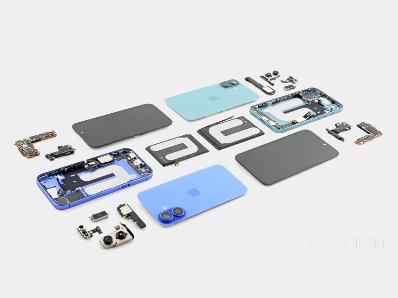
Today’s smartphones may be more advanced and more powerful than ever, but they still suffer from the same ailments that their ancestors experienced more than two decades ago. Screens get cracked, charging ports get worn down, and batteries die. Unlike the mobile phones of the past, however, the complex designs of modern smartphones make it impossible to even just replace a bloated or dying battery. Of course, companies have always defended this practice as protecting their brand and their intellectual property, but thankfully they’ve started turning around, and Apple just made what is perhaps the biggest step in that direction, short of simply letting owners pop off the iPhone 16’s back, pop out the old battery, and pop in a new one.

Designer: Apple (via iFixit)

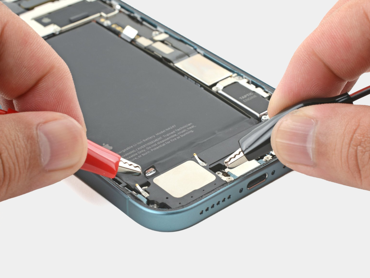
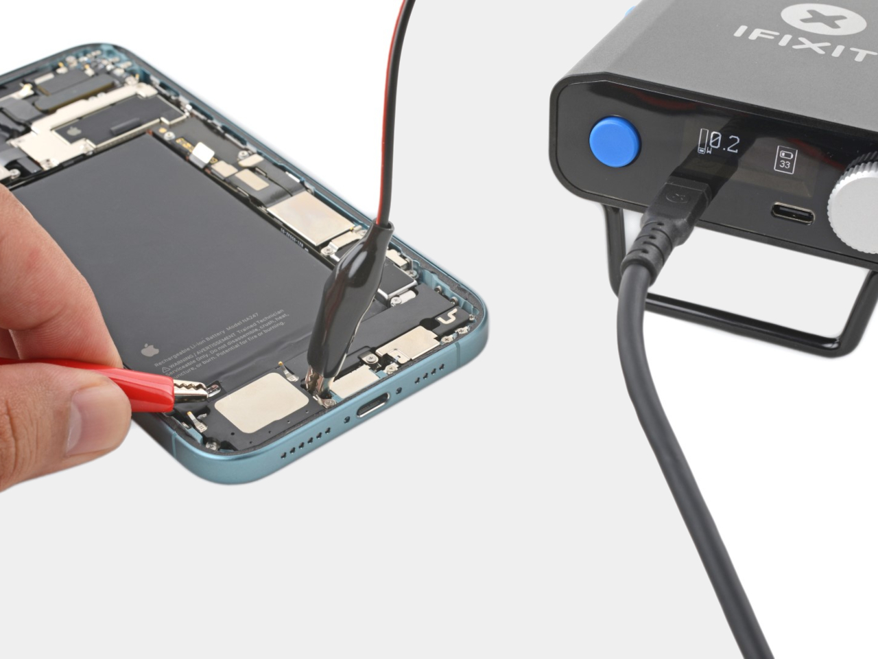
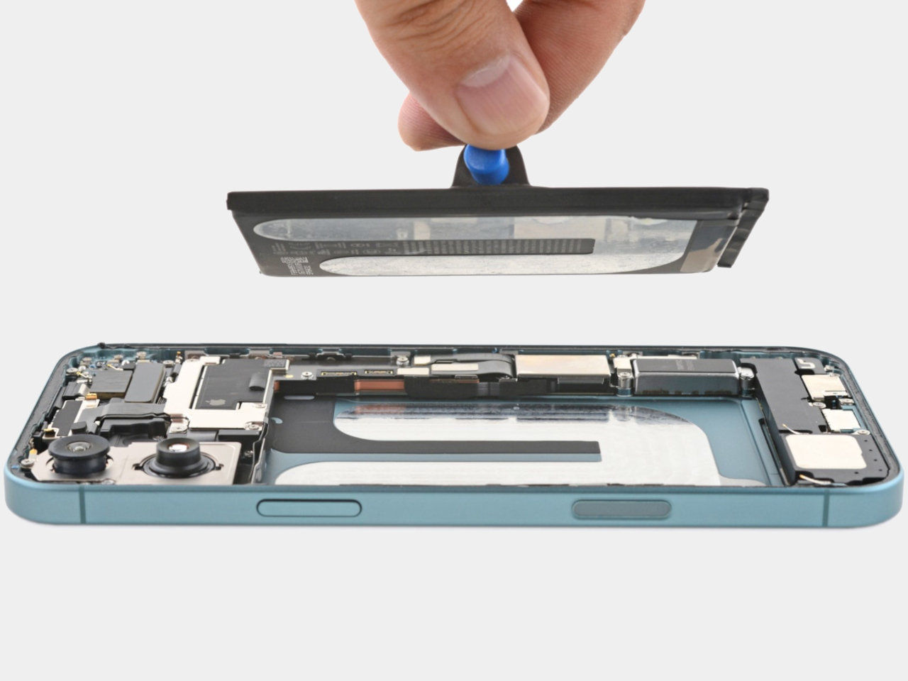
The new “feature” that has the Internet abuzz involves the removable of those unwieldy “pull tabs” that doubled the work since you’d often still have to resort to some isopropyl alcohol at the end of the process. Instead, Apple’s new adhesive can dissolve under low electrical current, which means you can hook up the back of the exposed iPhone 16 or 16 Plus to an ordinary 9V battery and have that adhesive go away in a minute and a half. The voltage actually determines the length of waiting, and iFixit’s test showed that a 20V charge would have the battery ready to be removed in just 20 seconds.

This makes battery replacement significantly easier and less error-prone, though you’ll still have to do some alcohol cleanup to completely remove adhesive residue before installing a new battery. Considering batteries are one of the first things on a smartphone to die from natural wear and tear, they are also the most common parts that need to be repaired or replaced. This major improvement in repairability also improves the iPhone 16’s overall sustainability, as it reduces CO2 emissions in the long run.
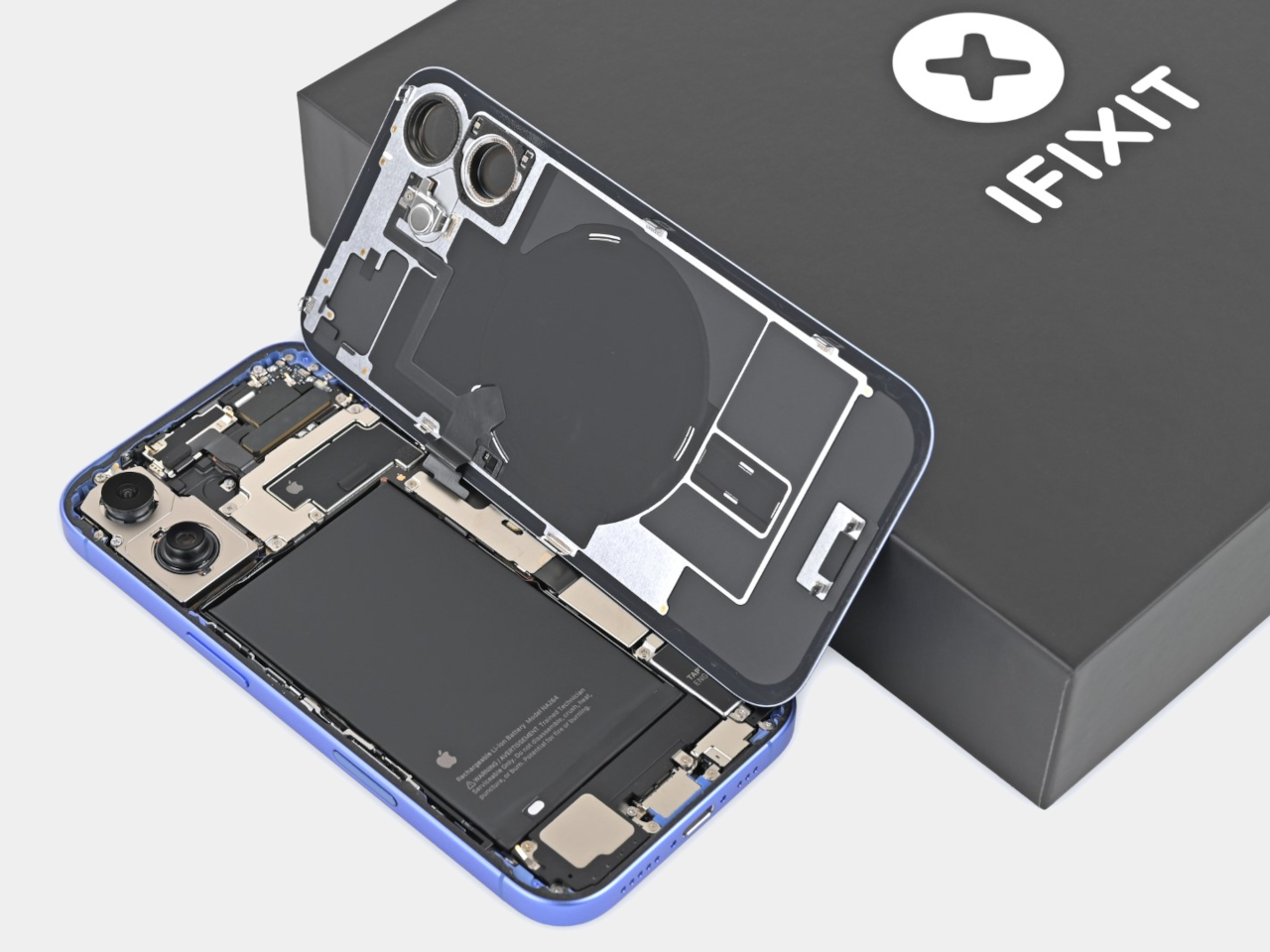
The catch is that this groundbreaking adhesive is only available on the iPhone 16 and iPhone 16 Plus. The more advanced Pro models, ironically, still use the pull tab system, but Apple did make a little change to make that process less nerve-wracking. The shells of these batteries are now made of hard steel instead of soft pouches, so the chances of accidentally puncturing these sensitive and volatile batteries are now lower, which is very important since you’ll still need to pry them off without that magical dissolving adhesive.

The rest of the iPhone 16 teardown is pretty uneventful, which also means that Apple has retained its improved DIY repair experience this year. This helped the iPhone 16 garner a 7 out of 10 on iFixit’s repairability scale, which is pretty high for a “regular” smartphone that doesn’t promote the same kind of repairability and sustainability as the Fairphone. Hopefully, this new material will eventually land on the iPhone Pro models next year, becoming a major sustainability feature of all iPhones moving forward.
The post iPhone 16 iFixit teardown reveals a huge step forward in sustainability first appeared on Yanko Design.

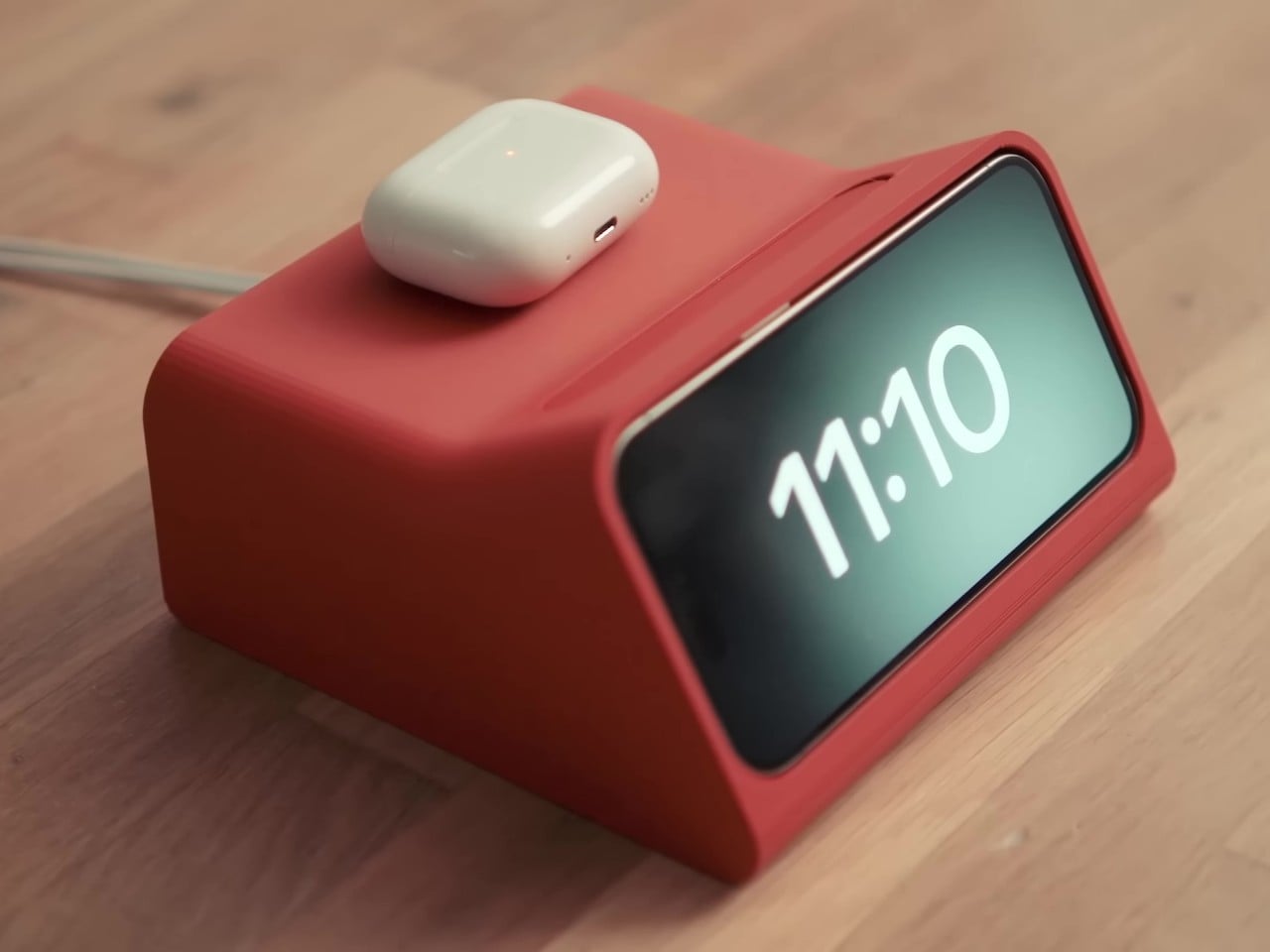
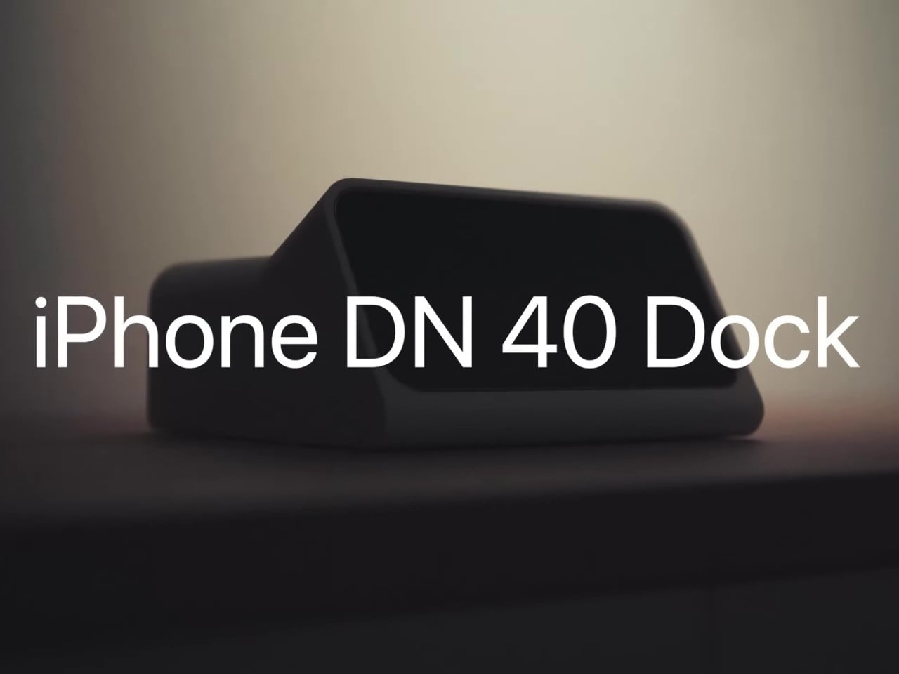
Dieter Rams-inspired iPhone Standby Mode Dock comes from an alternate timeline

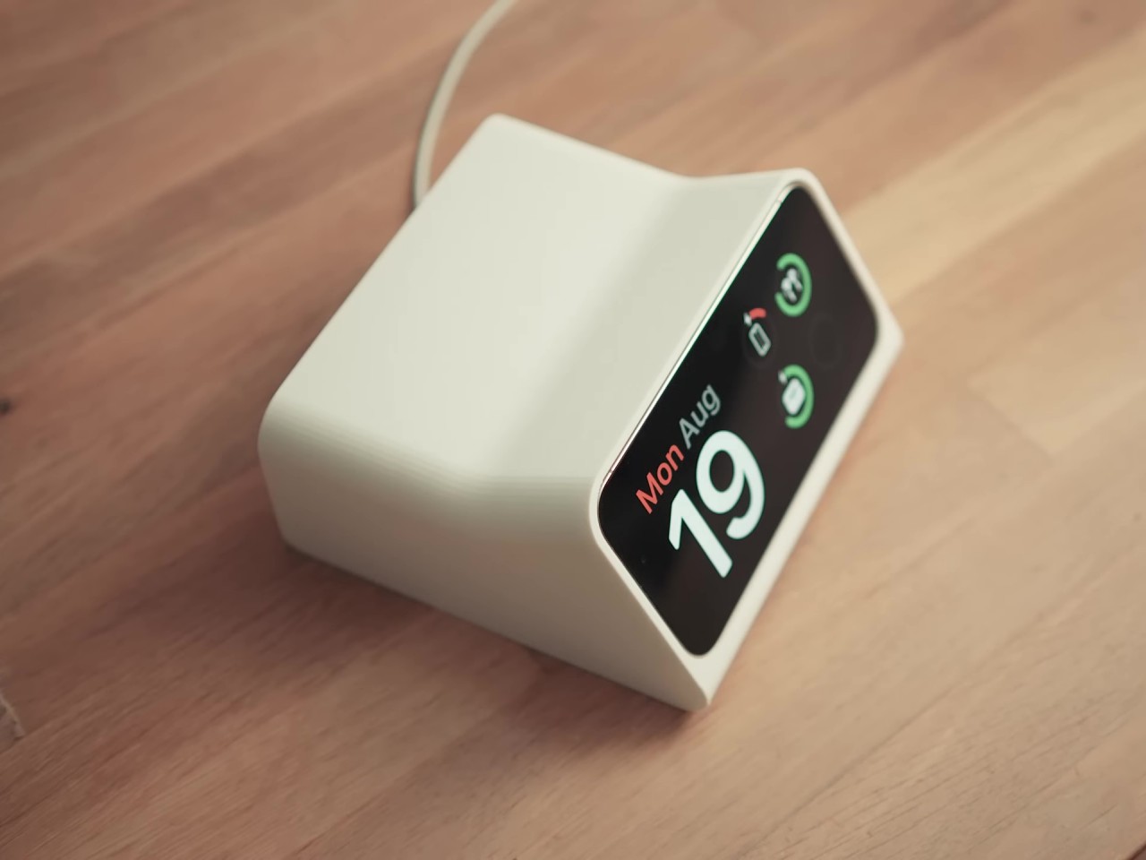
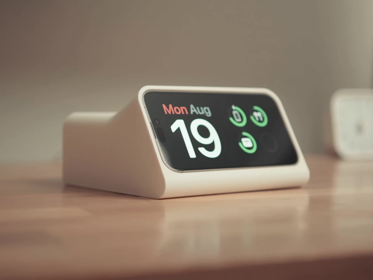
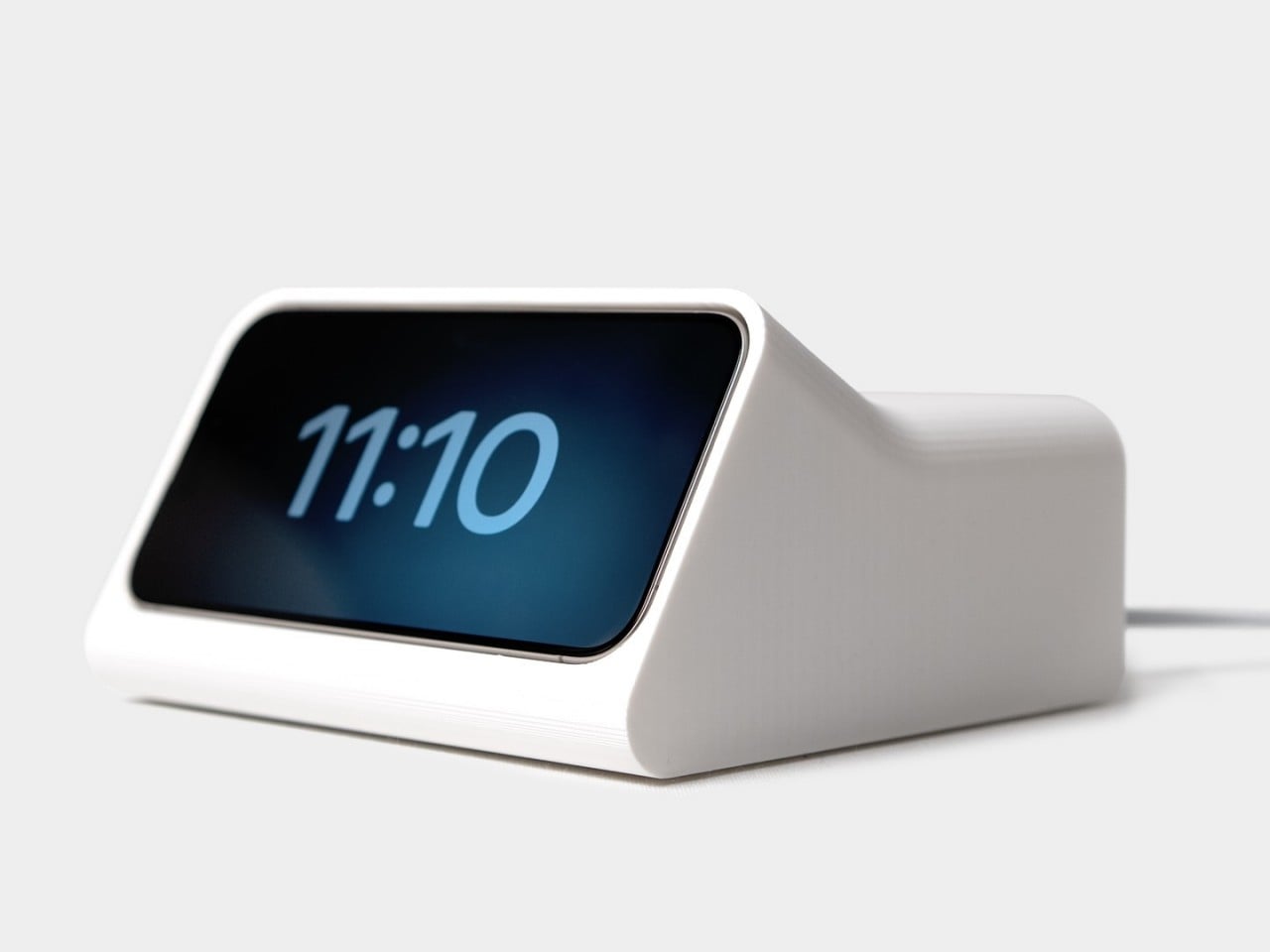
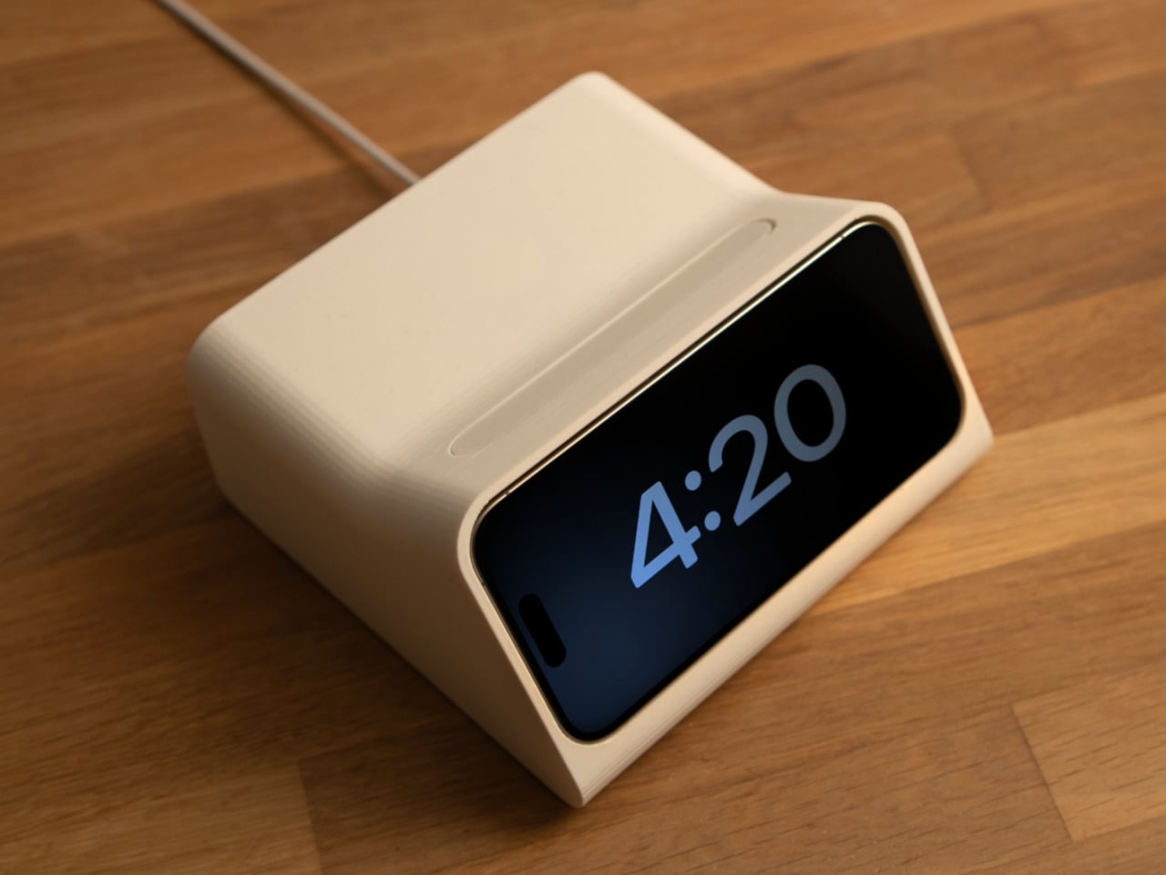
Have you ever wondered what would happen if two people from different time periods or locations met and worked together? Short of breaking the laws of time and space, we can only take a guess based on the works and ideas they left behind, though some “what if” collaborations feel more natural than others. The legendary industrial designer Dieter Rams, for example, has influenced generations of designers, some of whom became legends themselves and even carried on the spirit of his design philosophy. Perhaps nowhere is this association more pronounced than in the Ive-era Apple designs, particularly those that embraced minimalism to their very core. We might not need to imagine what a Rams-Ive collab would look like based on this rather simple yet intriguing iPhone dock that utilizes Standby Mode to become a modern version of the Braun DN 40 alarm clock that Rams designed.

Designer: Scott Yu-Jan x OVERWERK

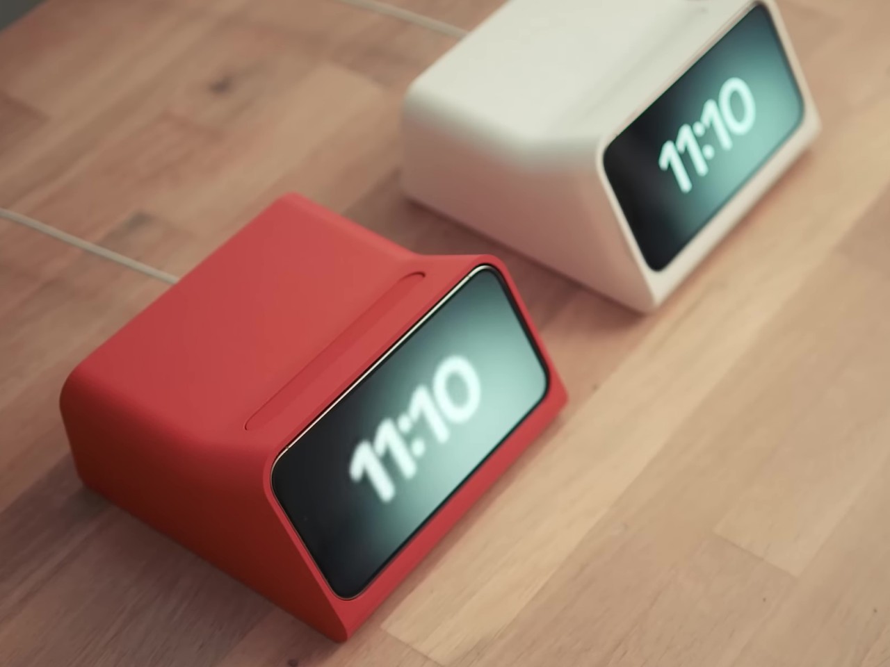
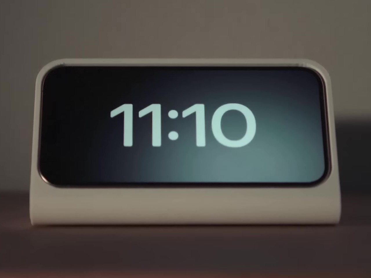
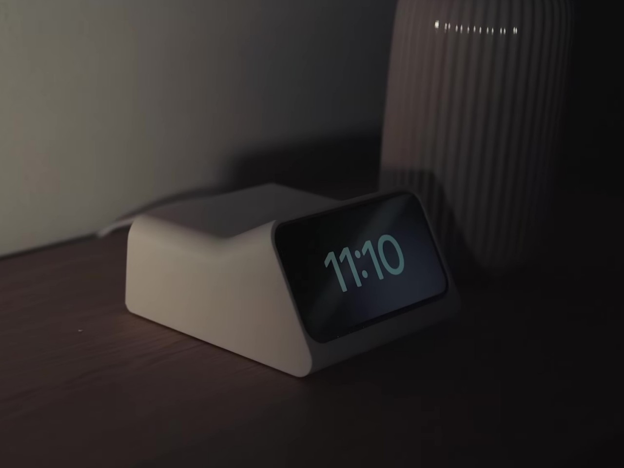
Although probably best known for his Ten Principles of Good Design, Dieter Rams’ industrial designs not only became Braun products but also served as the inspiration for the likes of the original Apple iPod or the first Sony Walkman. His designs espoused a “less but better” philosophy, a foundation of modern minimalism, and among them was the DN 40 electronic, a funnel-shaped alarm clock that, as you might have guessed, did that and only that. There are dozens of alarm clocks today, of course, including an iPhone if you charge it horizontally to activate Standby Mode.

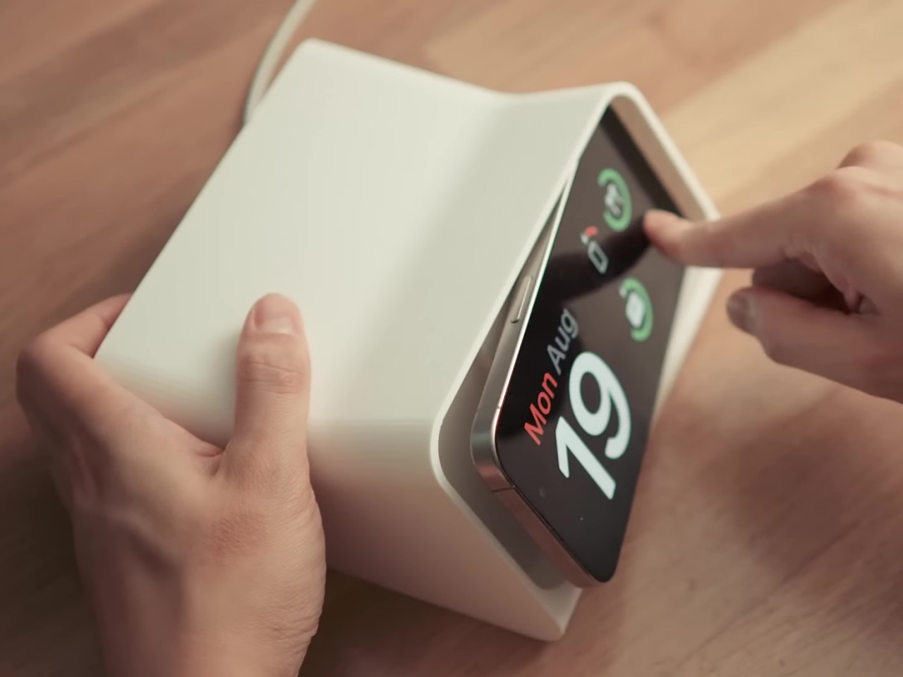
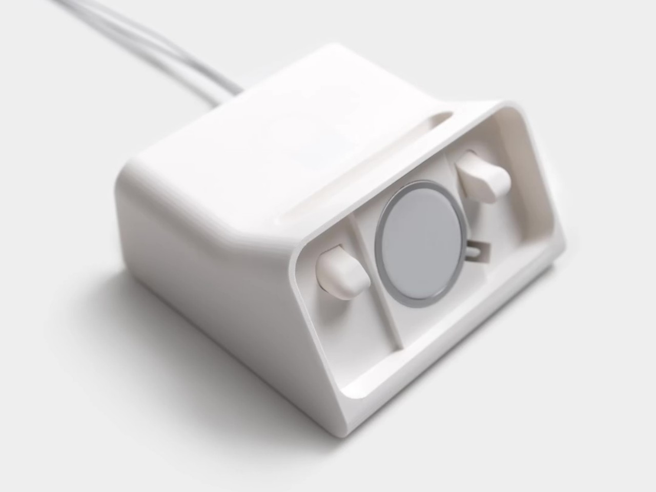
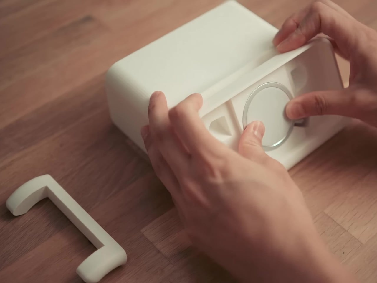
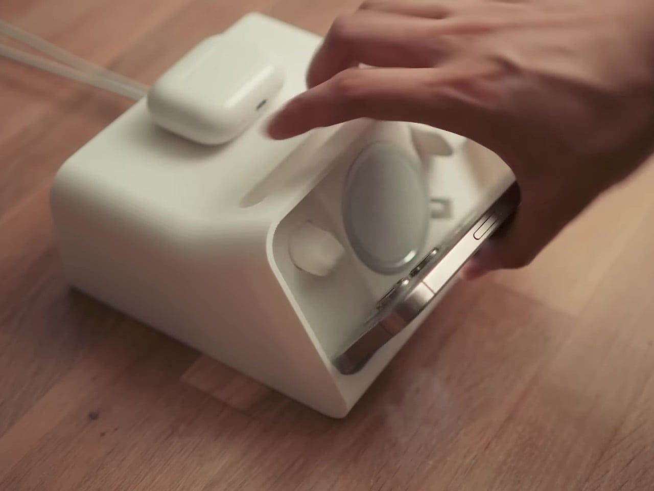
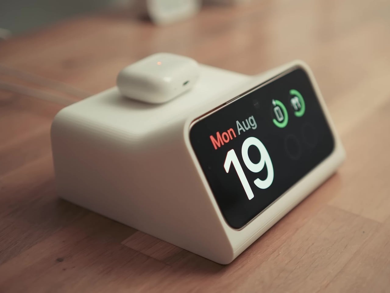
Inspired by this concept, musician OVERWERK created an initial prototype that simply housed a circular iPhone MagSafe charger to hold the phone at a specific angle similar to Rams’ design. It was basic, functional, and a bit cumbersome and wasteful. To take out the iPhone that sits flush inside the body, you have to press on one end of the phone to raise the opposite end and then pry it out. The rest of the clock’s chassis also held no purpose since there were no electronics to put in there as well.

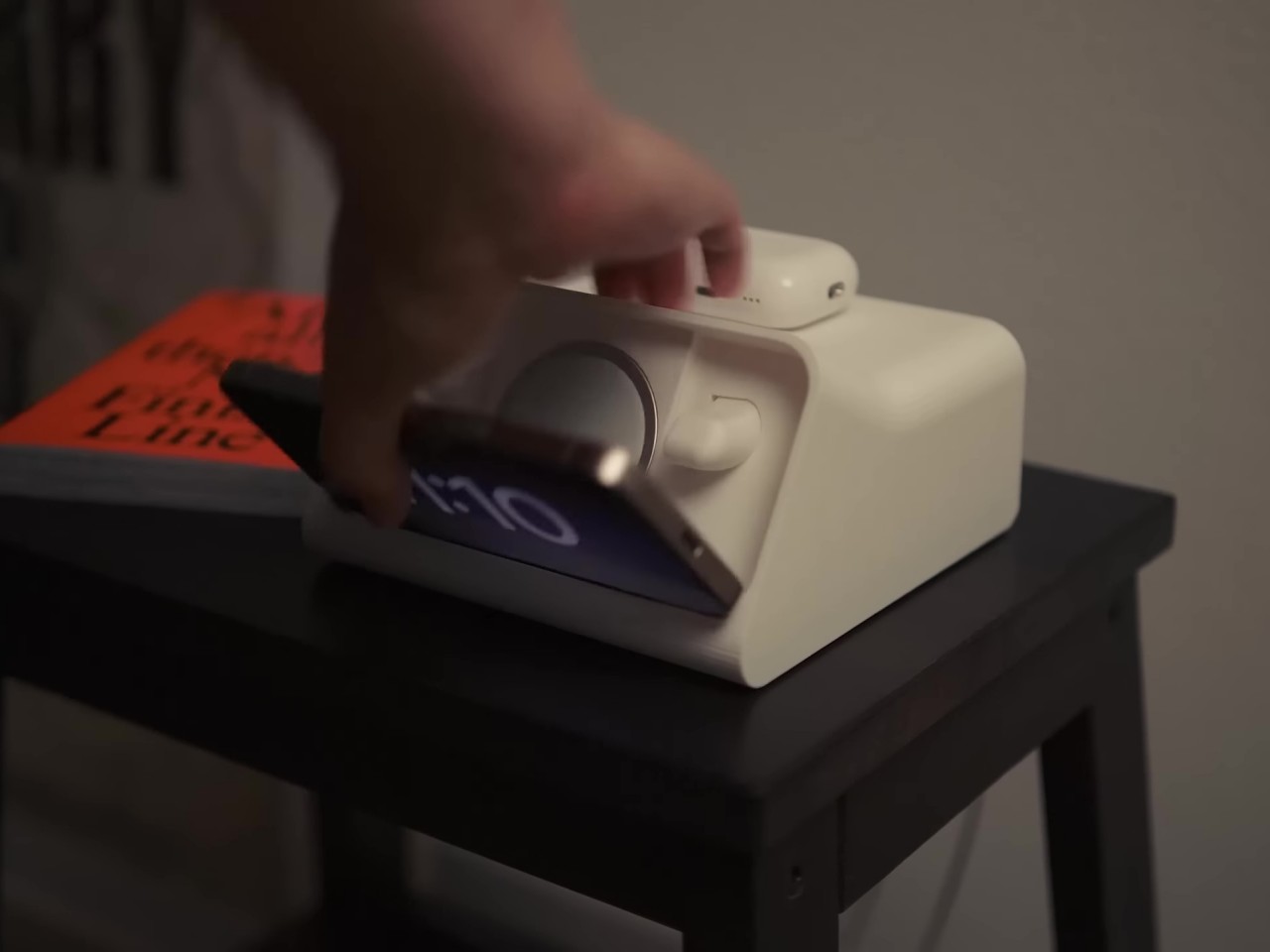
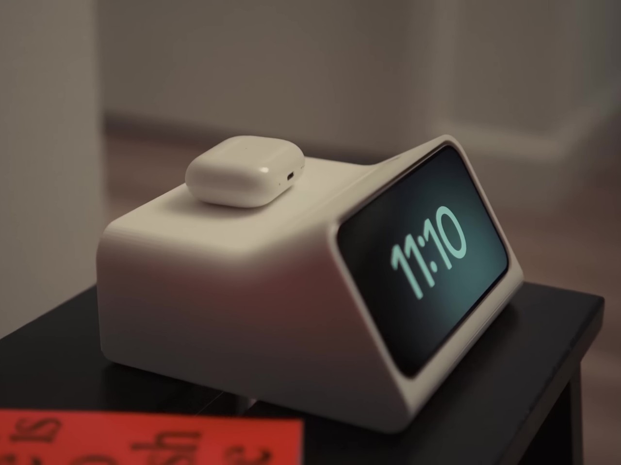
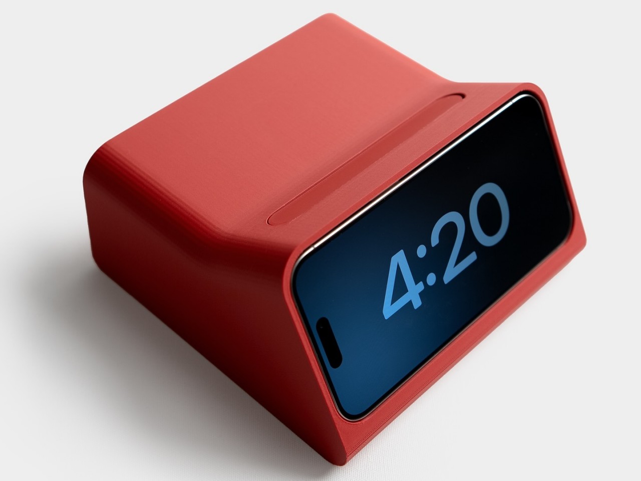
Working together with designer and YouTuber Scott Yu-Jan, the design took an interesting turn and, thus, the iPhone DN 40 Dock was born. Two simple yet crucial changes were made to the original design, including adding an ejection button at the top that pushes the iPhone forward, detaching it from the MagSafe charger. Yu-Jan also added a space for the small Apple Watch MagSafe charger underneath the top cover at the back, allowing you to charge your AirPods on top. As a bonus, charging the AirPods case has a satisfying feeling when you simply put it down on top of the clock and it slides into place thanks to the power of magnets.

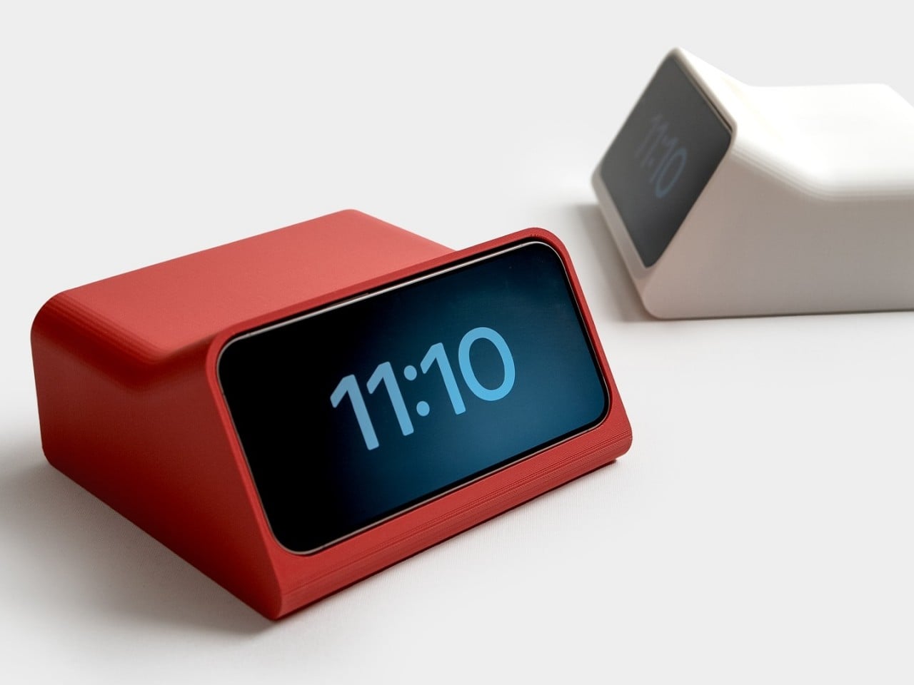
The result of this collaboration between two modern-day designers is a design object that feels like a collaboration between Rams and Ive, two designers with great respect for one another but never got the chance to work together. It has the minimalism of the original DN 40 clock but is made even simpler because you only need an iPhone and MagSafe chargers. You do need a 3D printer to make your own, though, and you might need to modify the design since this was made specifically for an iPhone 15 Pro. Fortunately, the design files are freely available so anyone can now have their own Rams-inspired iPhone Alarm Clock by their bed or desk.

The post Dieter Rams-inspired iPhone Standby Mode Dock comes from an alternate timeline first appeared on Yanko Design.

Upgrade your iPhone 16 Pro with TORRAS’ Shatterproof Screen Protector with the World’s Thinnest Black Border

The iPhone just launched the day before yesterday and if you’re lucky enough to have ordered one, trust me – there’s nothing more heartbreaking than seeing your brand-new phone get a scratch on the screen. Honestly, this feeling even applies to older iPhones. As much as Apple touts its phone’s Ceramic Shield display, it’s still fairly breakable (and very expensive). That’s where TORRAS’ $29.99 screen protector comes in handy. The GlassGo X is shatterproof, has an anti-fingerprint coating, and attaches to your phone using TORRAS’ 2-step process that produces perfect, bubble-free results. Pair it with the company’s Ostand 360° Spin Phone Case and your iPhone 16 Pro gets the best of all words – all-around protection as well as convenience in the form of a 360° grip and stand.

Designer: TORRAS

Click Here to Buy Now: $23.99 $29.99 (Use coupon code “yanko1620” to get 20% off on the screen protector). Hurry, deal ends in 48-hours.

The GlassGo X Screen Protector comes crafted from military-grade shatterproof glass. I usually find myself cringing at the use of phrases like military-grade, but the glass has a remarkable 9H hardness and is inherently shatterproof… which means it absorbs any impact without showing signs of wear and tear. Despite the extra protection, TORRAS has nailed the balance between durability and touch sensitivity by finding the sweet spot when it comes to materials and thickness, keeping the smooth interaction you expect from your iPhone.

Sporting narrower black borders, the GlassGo X compliments the iPhone 16 and 16 Pro’s immaculate minimal-bezel display. It’s designed to be as invisible as possible while giving you 100% screen coverage. No awkward gaps around the edges—this protector covers every inch of your display. Plus, it’s got an anti-fingerprint coating, so you won’t be constantly wiping off smudges.

One of the best parts? The 2-step installation makes applying it a breeze. Gone are the days of air bubbles that ruin the perfect look. TORRAS has engineered a setup that allows air to escape easily, giving you a flawless, bubble-free fit. And, with two protectors in each package, you’ve got a backup just in case you encounter problems installing the first phone. Or if you’ve bought an additional phone for your partner, it’s nice to have a ‘twofer’.

We’ve covered TORRAS’ Ostand cases in the past, and the iPhone 16 and 16 Pro series get their own 360° cases too, with a slim, built-in ring that pops out as well as rotates on an axis (a remarkable feat of engineering that we covered in-depth at CES this year). Designed for durability, style, and practical use, it features a curved back and rounded corners that provide all the protection in a streamlined form factor without any of the bulk. Speaking of streamlined, the cases also have a cutout for Apple’s Camera Control sapphire-crystal button with a flowing cutout design that makes the user interaction seamless. The real kicker, though, is the 40% stronger magnets within the ring, which hold on to MagSafe accessories and Qi2 chargers like an absolute pro.

The Ostand case comes in four color options—Nude, Black, Clear, and Grey—so you can match it to your style. Whether you’re going for a minimal look or something a little more rugged, TORRAS has you covered. Pair it with the GlassGo X and you’ve got top-tier protection without adding bulk or interfering with your phone’s sleek design.

Click Here to Buy Now: $23.99 $29.99 (Use coupon code “yanko1620” to get 20% off on the screen protector). Hurry, deal ends in 48-hours.

The post Upgrade your iPhone 16 Pro with TORRAS’ Shatterproof Screen Protector with the World’s Thinnest Black Border first appeared on Yanko Design.