Apple’s new iPhones don’t look different, but they’re made to feel different

If you were entering the Keynote expecting that Apple, as a trillion dollar company, or as a company that just crossed a ‘decade since launching its biggest product’ would showcase something remarkably different and obviously innovative, you, like me, realized you were wrong.

While other companies, in a bid to outdo the beast, push for curved screens, folding phones, in-screen fingerprint sensors, or even bezel-less designs, Apple’s proved before that its vision of the smartphone aesthetic is probably at its current peak (reinforced as brands very brazenly copy the notch) and isn’t going to change any time soon unless the change somehow makes the iPhone perform better. (So no transparent or bending iPhones any time soon, or even front-facing cameras under the screen until the company can ensure that there’s not a single trade-off anywhere)
apple_iphone_keynote_2018_1

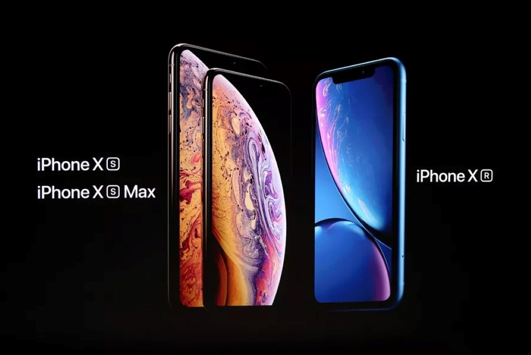
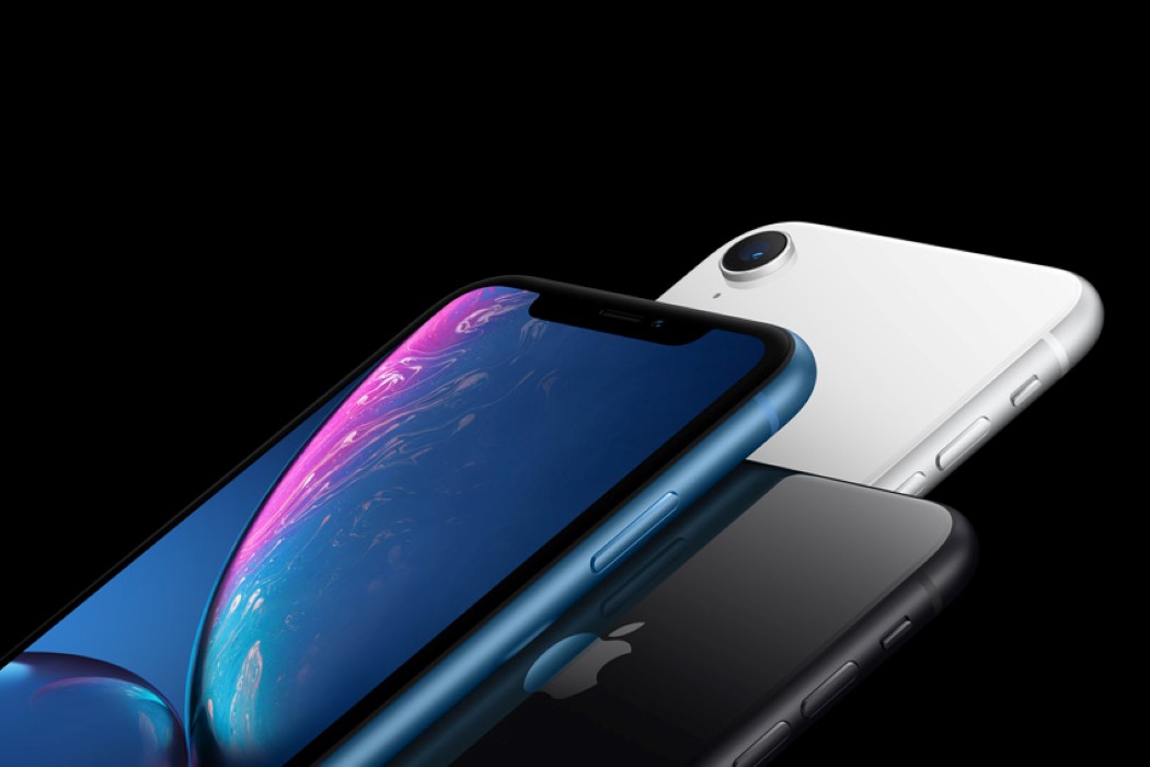
The iPhone XS, iPhone XS Max, and iPhone XR (yeah, there are three of them), instead focus on reinforcing last year’s popular design (the anniversary iPhone was the most popular phone in the world last and this year, and reported a staggering 98% customer satisfaction), and more importantly, focus on making the best iPhone better.

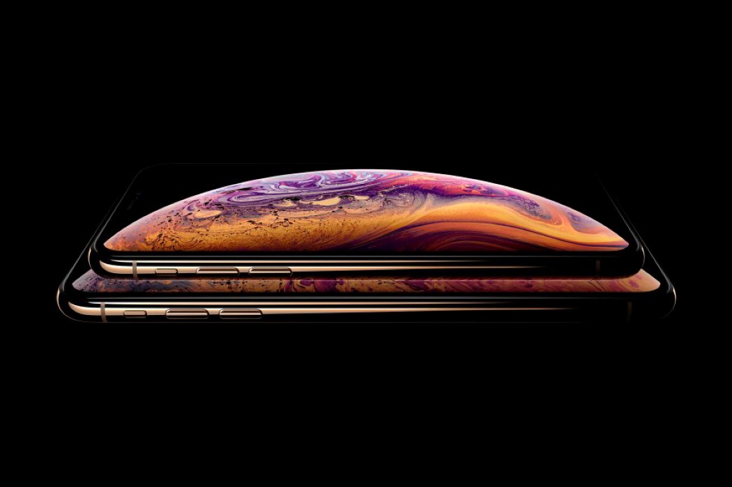
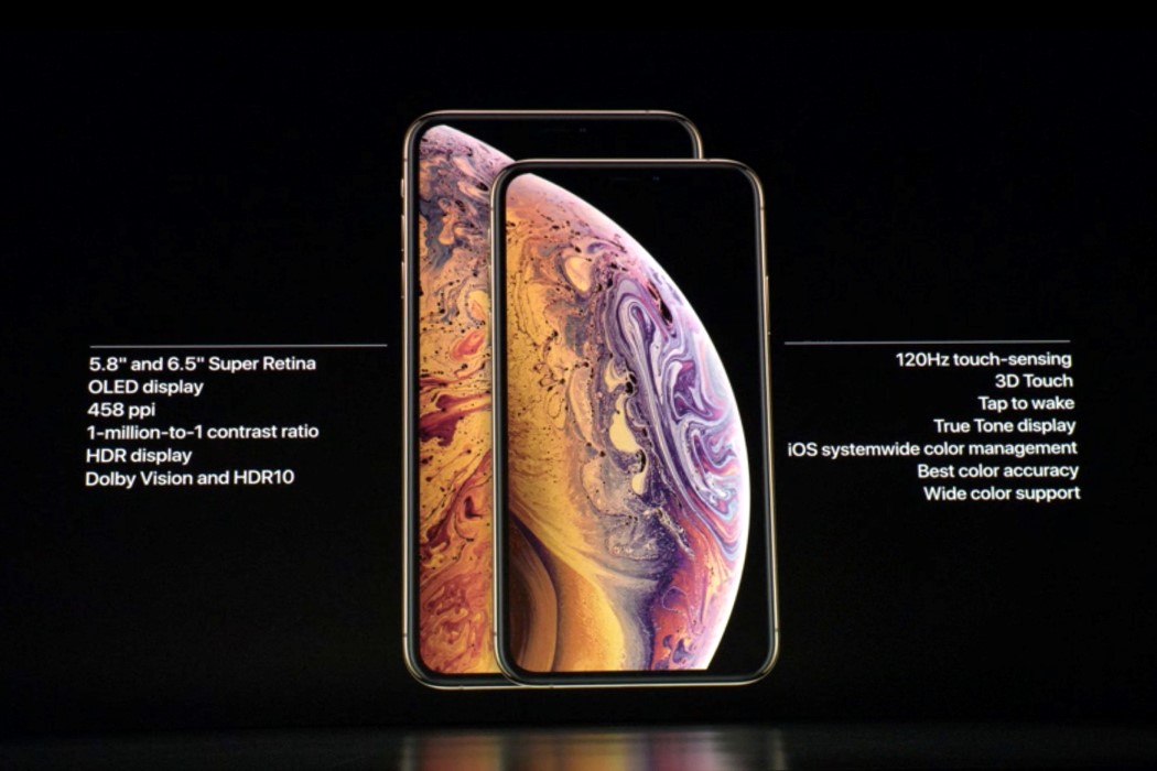
The new iPhone now comes in three variants, including a budget iPhone XR that was made to broaden the company’s reach, because as the most valuable company in the world, Apple isn’t particularly concerned with profits anymore rather than spreading its gospel. The two other iPhones are touted as the best iPhones in the world, with Apple’s signature splash of hyperbole. They feature better screens, better battery life, a much more advanced A12 Bionic processor that’s a staggering 7-nanometers with over 6.9 billion transistors distributed between a 4-core GPU, 6-core CPU, and a Neural Engine that can collectively process 5 trillion operations per second. There’s ARKit 2, better waterproofing, staggering 512gb of storage, and a harder, stronger construction (with more impact-resistant glass on the front and back and a stainless steel band around the sides).
apple_iphone_keynote_2018_2

apple_iphone_keynote_2018_6

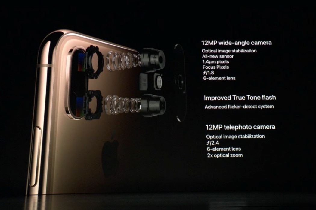
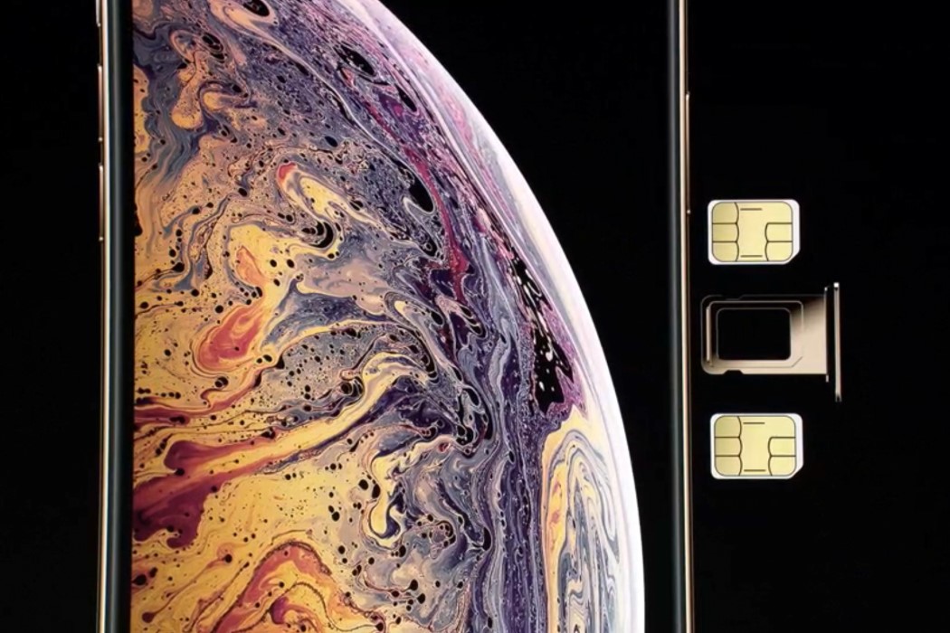
There’s no reason for Apple to build a phone that looks dramatically new, but rather a strong reason to build a phone that outperforms its predecessor. The new iPhone has a better camera and the A12 chip allows for some incredible image processing, as well as an industry first with a camera that can click now and focus later. The iPhone, at the very peak of computational photography, literally allows you to increase and decrease the focal length in a picture AFTER you’ve clicked it, giving you MUCH more control over the kind of images you take… and oh. Apple finally built an iPhone that boasts of a dual-sim feature!

The new flagship iPhones come in two sizes, screens that are much bigger and immersive than the iPhone 8 and 8 plus relatively. The budget iPhone XR features a world-first LCD Retina display and a single camera system on the back that still manages to give the user immense control and incredible quality, while coming in a variety of colors like the age-old iPhone 5C… all iPhones feature the pretty-much-iconic-now notch that houses FaceID, Apple’s facial-recognition-based-security feature.

apple_iphone_keynote_2018_3

apple_iphone_keynote_2018_4

apple_iphone_keynote_2018_5

My heart does go out to Jonathan Ive, who seemingly has less and less to do with the industrial design and aesthetic of the iPhone, as his perceived role gets reduced to merely being the voice behind the hypnotic videos (some joke that his official title is actually Chief Keynote Narrator). Somewhere down the line, the industrial designer in me hopes to see more visual upgrades, or even the reintroduction of features like TouchID (into the screen or on the back), but there’s a larger role for technology-driven-design to play in the progression of an iPhone.

So maybe it’ll take a while before that promised transparent iPhone or the flexible iPhone, and there possibly will be another company to beat Apple to the finish line there, but Apple knows well how to lose battles but win the war. It does so by creating phones that may not look exceedingly different, but they’ll perform monumentally better than any smartphone out there!

Designer: Apple

Apple’s new iPhones don’t look different, but they’re made to feel different

If you were entering the Keynote expecting that Apple, as a trillion dollar company, or as a company that just crossed a ‘decade since launching its biggest product’ would showcase something remarkably different and obviously innovative, you, like me, realized you were wrong.

While other companies, in a bid to outdo the beast, push for curved screens, folding phones, in-screen fingerprint sensors, or even bezel-less designs, Apple’s proved before that its vision of the smartphone aesthetic is probably at its current peak (reinforced as brands very brazenly copy the notch) and isn’t going to change any time soon unless the change somehow makes the iPhone perform better. (So no transparent or bending iPhones any time soon, or even front-facing cameras under the screen until the company can ensure that there’s not a single trade-off anywhere)

apple_iphone_keynote_2018_1

The iPhone XS, iPhone XS Max, and iPhone XR (yeah, there are three of them), instead focus on reinforcing last year’s popular design (the anniversary iPhone was the most popular phone in the world last and this year, and reported a staggering 98% customer satisfaction), and more importantly, focus on making the best iPhone better.

The new iPhone now comes in three variants, including a budget iPhone XR that was made to broaden the company’s reach, because as the most valuable company in the world, Apple isn’t particularly concerned with profits anymore rather than spreading its gospel. The two other iPhones are touted as the best iPhones in the world, with Apple’s signature splash of hyperbole. They feature better screens, better battery life, a much more advanced A12 Bionic processor that’s a staggering 7-nanometers with over 6.9 billion transistors distributed between a 4-core GPU, 6-core CPU, and a Neural Engine that can collectively process 5 trillion operations per second. There’s ARKit 2, better waterproofing, staggering 512gb of storage, and a harder, stronger construction (with more impact-resistant glass on the front and back and a stainless steel band around the sides).

apple_iphone_keynote_2018_2

apple_iphone_keynote_2018_6

There’s no reason for Apple to build a phone that looks dramatically new, but rather a strong reason to build a phone that outperforms its predecessor. The new iPhone has a better camera and the A12 chip allows for some incredible image processing, as well as an industry first with a camera that can click now and focus later. The iPhone, at the very peak of computational photography, literally allows you to increase and decrease the focal length in a picture AFTER you’ve clicked it, giving you MUCH more control over the kind of images you take… and oh. Apple finally built an iPhone that boasts of a dual-sim feature!

The new flagship iPhones come in two sizes, screens that are much bigger and immersive than the iPhone 8 and 8 plus relatively. The budget iPhone XR features a world-first LCD Retina display and a single camera system on the back that still manages to give the user immense control and incredible quality, while coming in a variety of colors like the age-old iPhone 5C… all iPhones feature the pretty-much-iconic-now notch that houses FaceID, Apple’s facial-recognition-based-security feature.
apple_iphone_keynote_2018_3

apple_iphone_keynote_2018_4

apple_iphone_keynote_2018_5

My heart does go out to Jonathan Ive, who seemingly has less and less to do with the industrial design and aesthetic of the iPhone, as his perceived role gets reduced to merely being the voice behind the hypnotic videos (some joke that his official title is actually Chief Keynote Narrator). Somewhere down the line, the industrial designer in me hopes to see more visual upgrades, or even the reintroduction of features like TouchID (into the screen or on the back), but there’s a larger role for technology-driven-design to play in the progression of an iPhone.

So maybe it’ll take a while before that promised transparent iPhone or the flexible iPhone, and there possibly will be another company to beat Apple to the finish line there, but Apple knows well how to lose battles but win the war. It does so by creating phones that may not look exceedingly different, but they’ll perform monumentally better than any smartphone out there!

Designer: Apple

Apple’s new iPhones don’t look different, but they’re made to feel different

If you were entering the Keynote expecting that Apple, as a trillion dollar company, or as a company that just crossed a ‘decade since launching its biggest product’ would showcase something remarkably different and obviously innovative, you, like me, realized you were wrong.

While other companies, in a bid to outdo the beast, push for curved screens, folding phones, in-screen fingerprint sensors, or even bezel-less designs, Apple’s proved before that its vision of the smartphone aesthetic is probably at its current peak (reinforced as brands very brazenly copy the notch) and isn’t going to change any time soon unless the change somehow makes the iPhone perform better. (So no transparent or bending iPhones any time soon, or even front-facing cameras under the screen until the company can ensure that there’s not a single trade-off anywhere)

apple_iphone_keynote_2018_1

The iPhone XS, iPhone XS Max, and iPhone XR (yeah, there are three of them), instead focus on reinforcing last year’s popular design (the anniversary iPhone was the most popular phone in the world last and this year, and reported a staggering 98% customer satisfaction), and more importantly, focus on making the best iPhone better.

The new iPhone now comes in three variants, including a budget iPhone XR that was made to broaden the company’s reach, because as the most valuable company in the world, Apple isn’t particularly concerned with profits anymore rather than spreading its gospel. The two other iPhones are touted as the best iPhones in the world, with Apple’s signature splash of hyperbole. They feature better screens, better battery life, a much more advanced A12 Bionic processor that’s a staggering 7-nanometers with over 6.9 billion transistors distributed between a 4-core GPU, 6-core CPU, and a Neural Engine that can collectively process 5 trillion operations per second. There’s ARKit 2, better waterproofing, staggering 512gb of storage, and a harder, stronger construction (with more impact-resistant glass on the front and back and a stainless steel band around the sides).

apple_iphone_keynote_2018_2

apple_iphone_keynote_2018_6

There’s no reason for Apple to build a phone that looks dramatically new, but rather a strong reason to build a phone that outperforms its predecessor. The new iPhone has a better camera and the A12 chip allows for some incredible image processing, as well as an industry first with a camera that can click now and focus later. The iPhone, at the very peak of computational photography, literally allows you to increase and decrease the focal length in a picture AFTER you’ve clicked it, giving you MUCH more control over the kind of images you take… and oh. Apple finally built an iPhone that boasts of a dual-sim feature!

The new flagship iPhones come in two sizes, screens that are much bigger and immersive than the iPhone 8 and 8 plus relatively. The budget iPhone XR features a world-first LCD Retina display and a single camera system on the back that still manages to give the user immense control and incredible quality, while coming in a variety of colors like the age-old iPhone 5C… all iPhones feature the pretty-much-iconic-now notch that houses FaceID, Apple’s facial-recognition-based-security feature.
apple_iphone_keynote_2018_3

apple_iphone_keynote_2018_4

apple_iphone_keynote_2018_5

My heart does go out to Jonathan Ive, who seemingly has less and less to do with the industrial design and aesthetic of the iPhone, as his perceived role gets reduced to merely being the voice behind the hypnotic videos (some joke that his official title is actually Chief Keynote Narrator). Somewhere down the line, the industrial designer in me hopes to see more visual upgrades, or even the reintroduction of features like TouchID (into the screen or on the back), but there’s a larger role for technology-driven-design to play in the progression of an iPhone.

So maybe it’ll take a while before that promised transparent iPhone or the flexible iPhone, and there possibly will be another company to beat Apple to the finish line there, but Apple knows well how to lose battles but win the war. It does so by creating phones that may not look exceedingly different, but they’ll perform monumentally better than any smartphone out there!

Designer: Apple
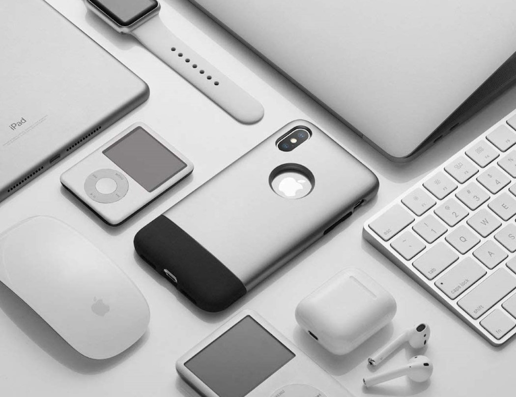
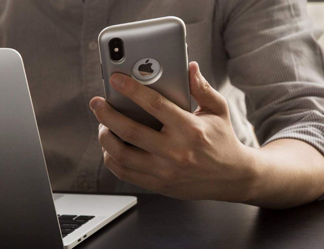
A case for the true iPhone fan!

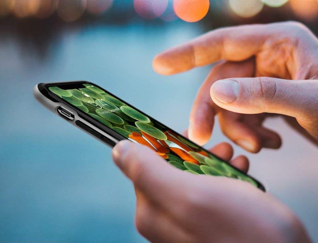
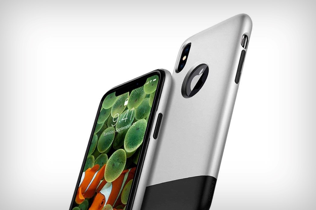
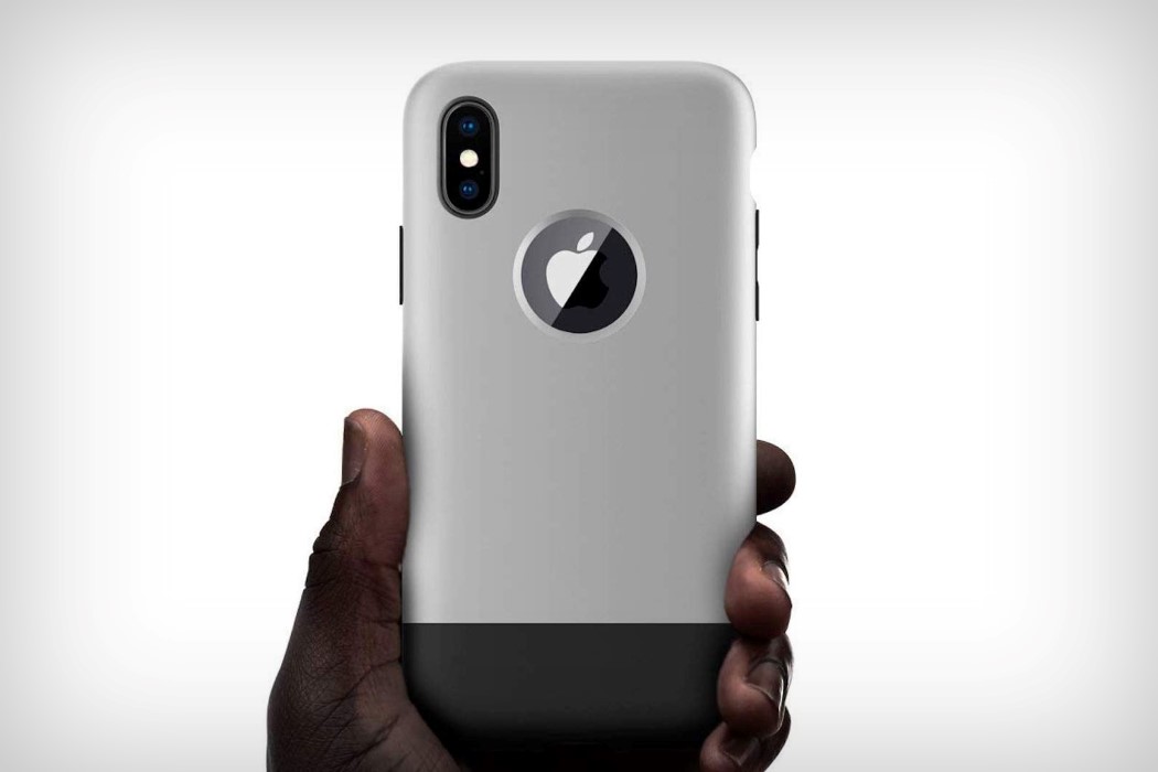
The pinnacle of technology wrapped in the aesthetic of the groundbreaking product that kickstarted this journey, the Spigen Classic One case for the iPhone X is a true walk down memory lane. Designed to look and feel exactly like the iPhone 2G that Steve Jobs launched in 2007, the case for the iPhone X is a nostalgic revisit that will take you down memory lane.

With its signature dual-colored finish and curved body, you’d get the best of both worlds… a high-end smartphone wrapped in a beautifully ergonomic body that was designed to fit well into hands. The curved body isn’t just palm-pleasure, but also protects the phone from accidental drops, thanks to its PolyCarbonate and TPU construction; besides Spigen’s cases go through rigorous drop-tests.

The case is arguably the perfect combination of the best of both worlds, giving you a taste of the future and the past, simultaneously. Oh, and it’s wireless-charging compatible too!

Designer: Spigen

Click Here to Buy Now

spigen_iphone_classic_1

spigen_iphone_classic_2

spigen_iphone_classic_3

spigen_iphone_classic_4

spigen_iphone_classic_5

Click Here to Buy Now

Water-inspired case for a water-resistant phone

baseus_water_case_1

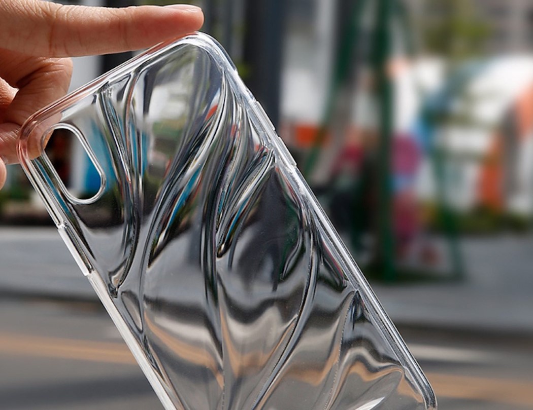
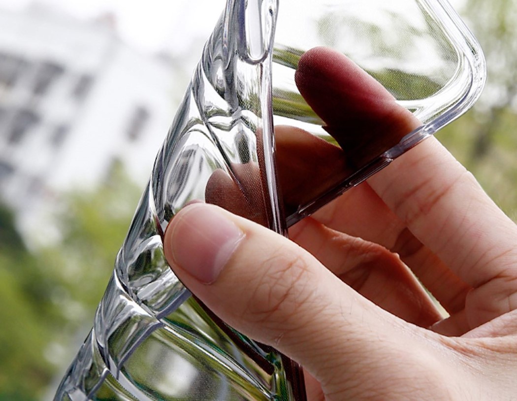
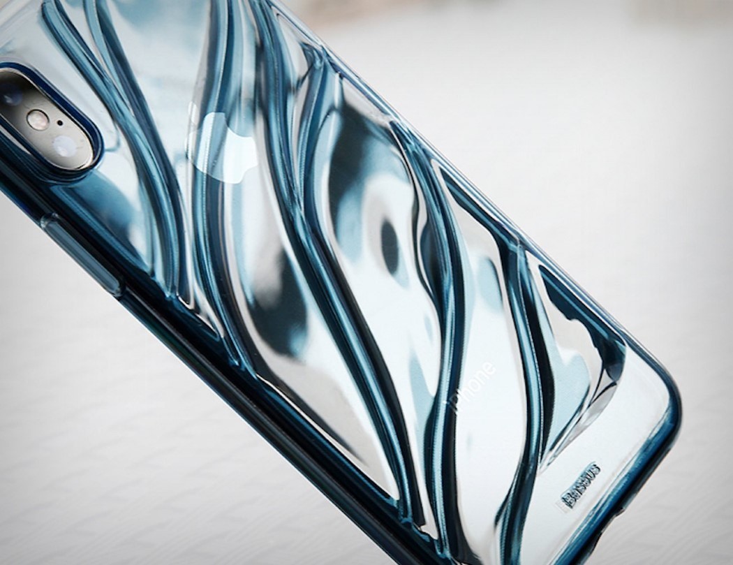
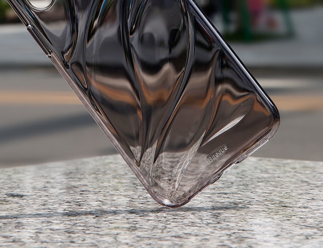
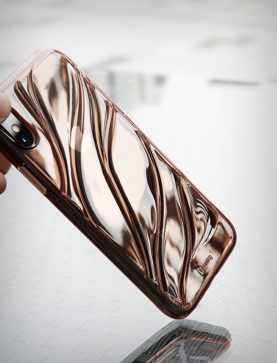
The iPhone X is water resistant, but this flowy water-inspired case sure looks irresistible! Made from soft thermo-polyurethane, and designed using watery, flowy forms on the back, the case looks and feels amazing as it protects your phone and gives it a look and texture that’s a class apart… much like Ross Lovegrove’s Ty Nant water bottle design!

The case comes in a variety of tints, all being transparent, making it look like your iPhone X is enveloped by water. The case’s soft nature gives it a good grip, while also prevents it from bumps and dents, and the texture on the back makes for a rather fun, tactile experience!

Designer: Baseus

Click Here to Buy Now

baseus_water_case_2

baseus_water_case_3

baseus_water_case_4

baseus_water_case_5

Click Here to Buy Now

Olloclip wants to make the best iPhone camera ‘better’

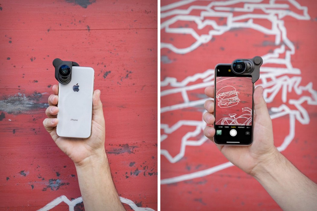
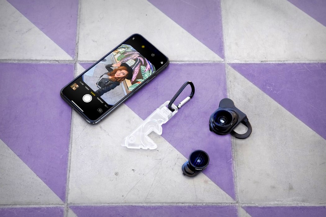
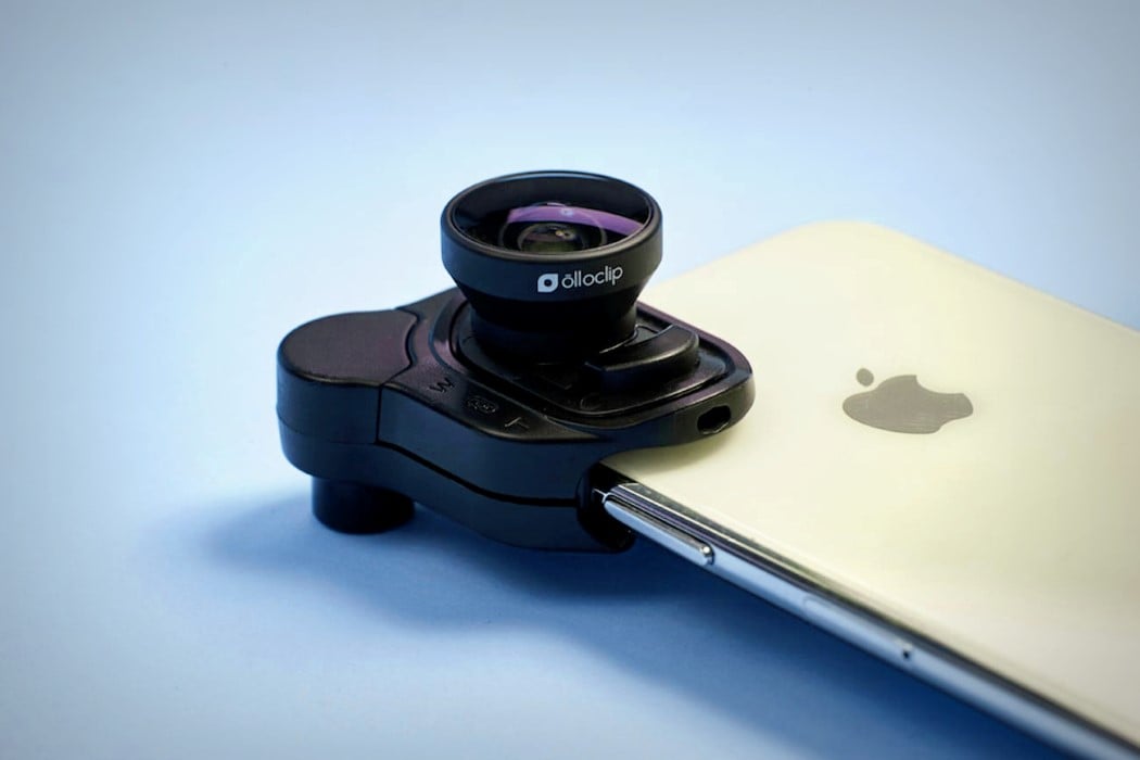
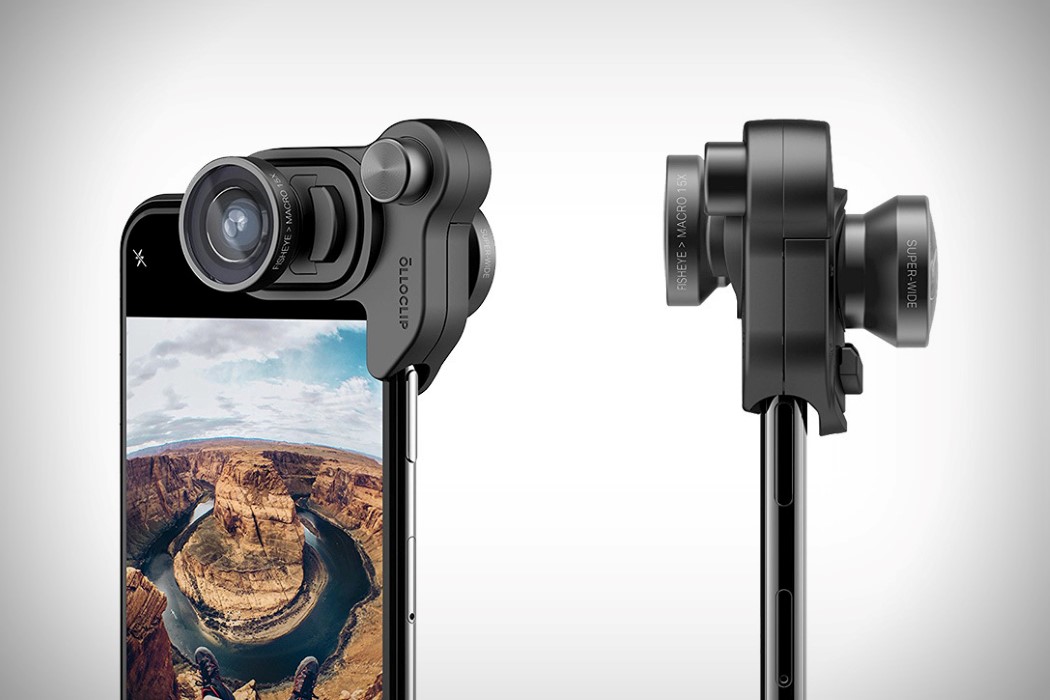
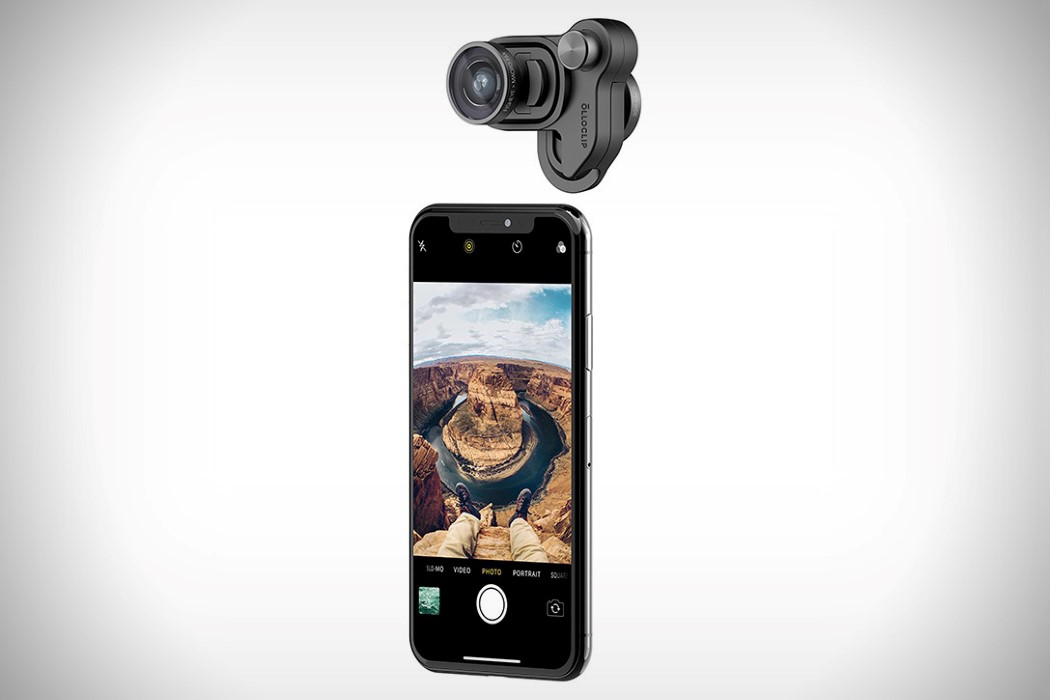
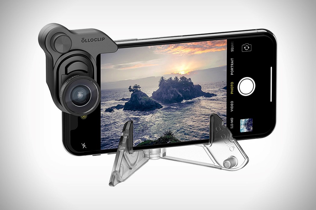
One of the very first companies to start making external professional lenses for smartphones, Olloclip recognized that one day, the camera would stand at the very top of a phone’s feature list, and that the largest amount of visual data generated on any given day, will be from a smartphone (by an incredibly long stretch). Their lenses boast of top-notch quality, and their purely-for-iPhone focus has allowed them to make incredibly accurate mounting systems, letting their lenses do the talking as they remarkably enhance the capabilities of the iPhone’s camera. The Mobile Photography Set for the iPhone X comes with a mount and phone-stand (that cleverly lock into each other, making it easy to carry) that’s incredibly simple and fast to set up. The mount clips satisfyingly onto the phone, precisely aligning with your camera, making sure your lenses are snapped on with precision and accuracy, allowing for crisp, distortion-free photos.

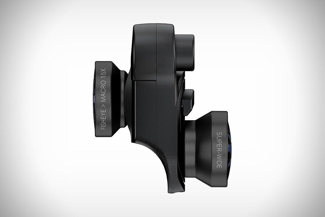
The mount comes with two lenses, a super-wide angle (120°), and a 180° fisheye, which converts into a 15X macro lens if you screw the top off. The lenses work well with both back and front-facing cameras, upping their game, and providing razor-sharp images because of the perfect lens-alignment. Made for the most popular phone of 2017-18, the Olloclip Mobile Photography Set can be easily carried around with your phone and is, just like the iPhone X, a perfect combination of portability and performance.

Designer: Olloclip

Click Here to Buy Now

olloclip_connect_x_1

olloclip_connect_x_2

olloclip_connect_x_3

olloclip_connect_x_4

olloclip_connect_x_5

olloclip_connect_x_6

olloclip_connect_x_7

Click Here to Buy Now

Bellroy’s iPhone case wants to stay slim but be functional

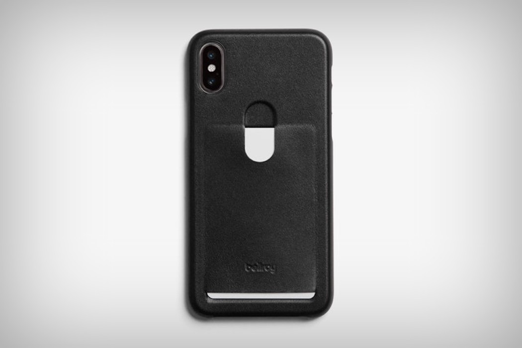
card_leather_iphone_case_1

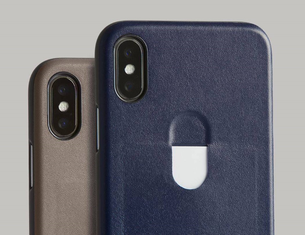
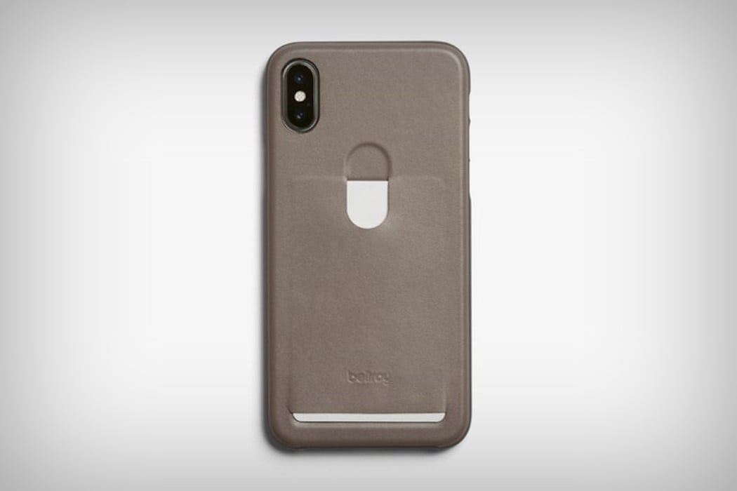
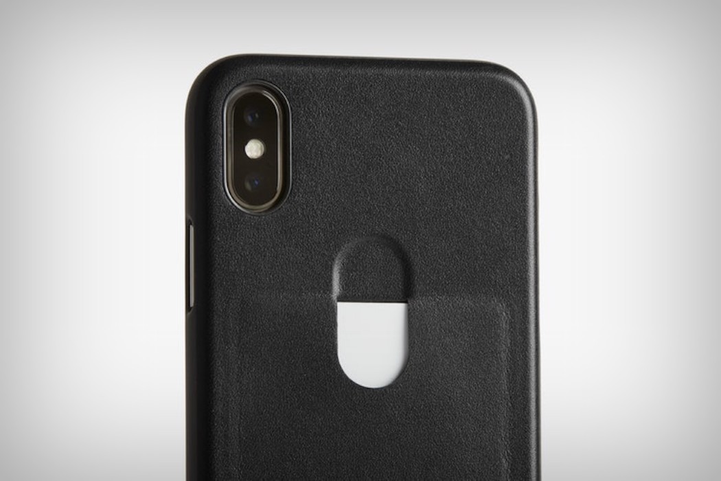
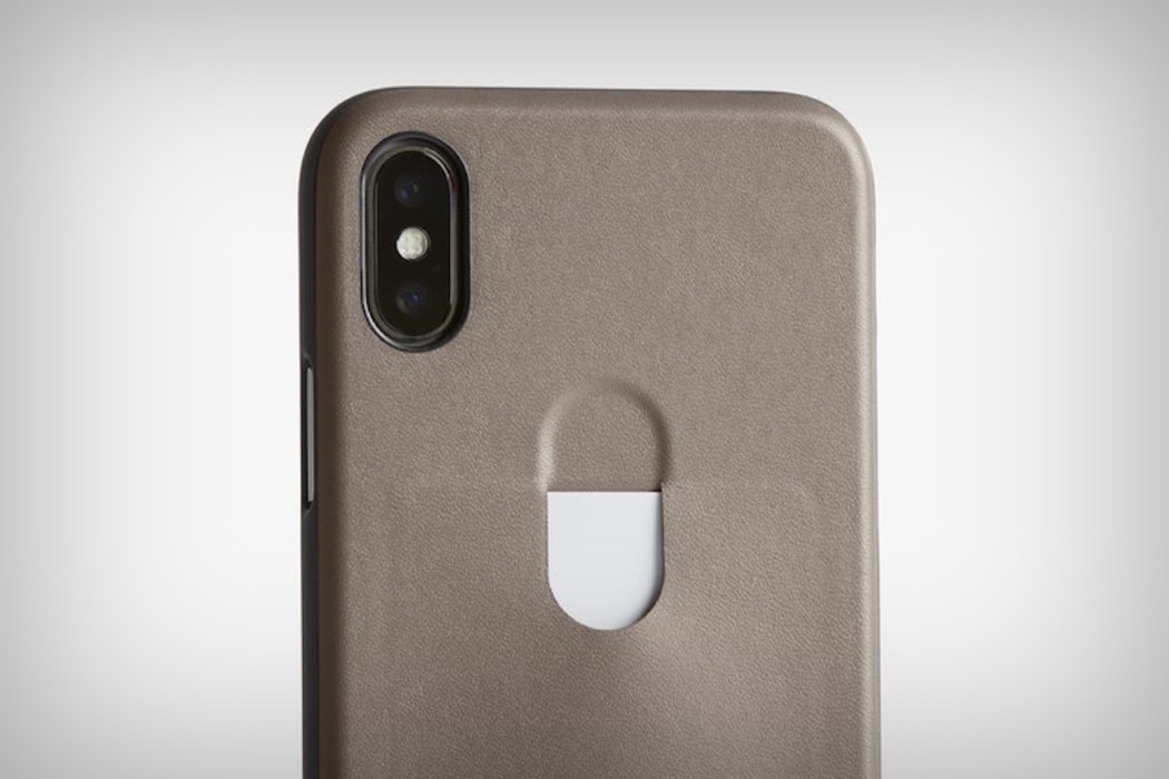
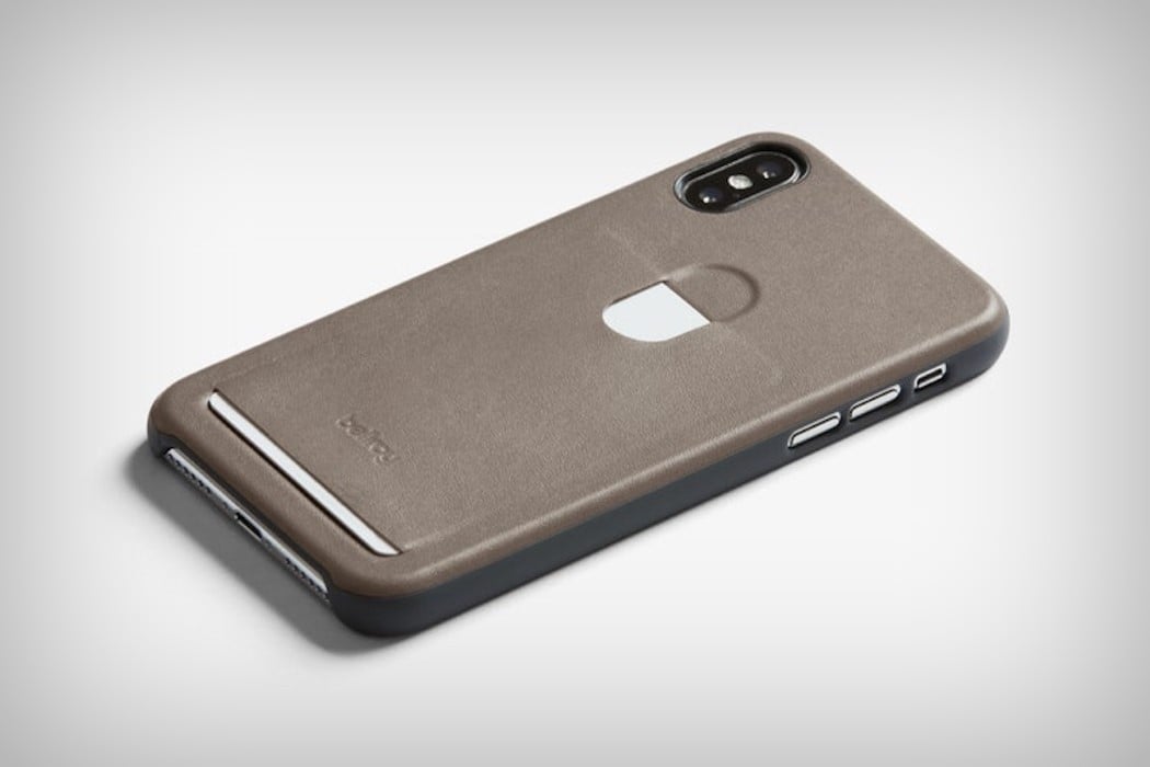
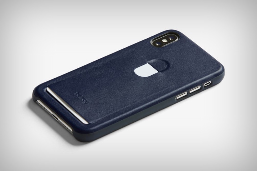
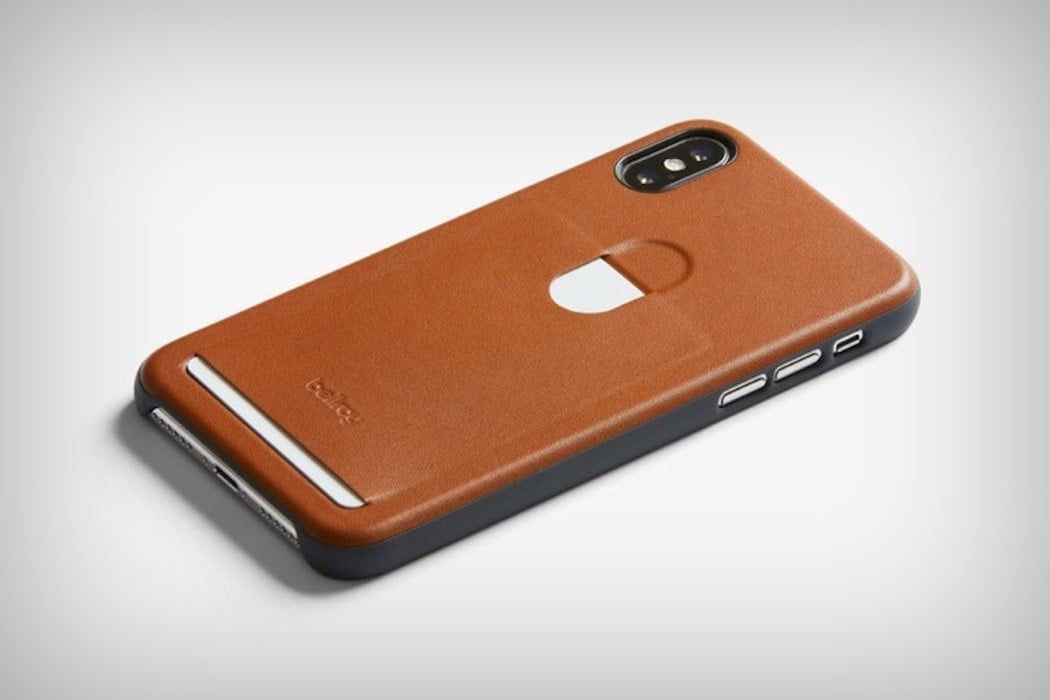
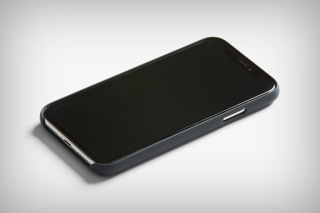
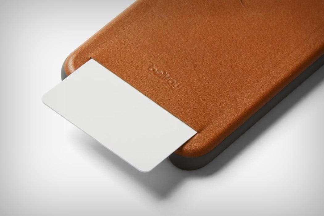
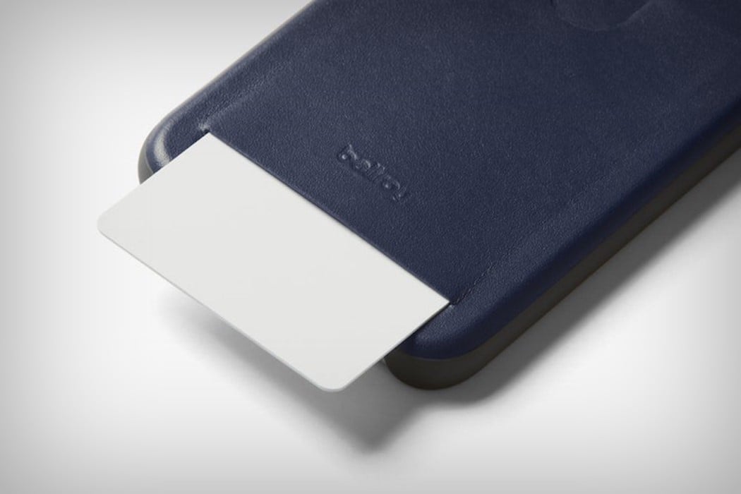
Simple, sensible, and sufficient, much like most Bellroy products, the Leather iPhone X case looks dapper, and puts the space under your phone’s camera to use by letting you store a favorite card in it, be it a business card, or your go-to payments card. A protective case for the iPhone X, Bellroy’s leather case takes little away from the iPhone’s premium-ness by giving it a flex-polymer bumper around the sides, and a full-grain leather back, available in brown, gray, black, and navy blue. Focusing on making sure the case doesn’t accidentally transform into a full-fledged wallet, the leather case keeps a simple slim profile, and comes with a slot that fits one card in, making you put your needs ahead of your wants. Accessing the card is as simple as sliding your thumb on the capsule-shaped detail at the back and watching the card make a clean exit from the slot at the base. Stash a business card in, or a payments card, or your work ID. The Bellroy Leather Case promises to protect your phone, keep things classy, and be extremely handy!

Designer: Bellroy

Click Here to Buy Now

card_leather_iphone_case_2

card_leather_iphone_case_3

card_leather_iphone_case_4

card_leather_iphone_case_5

card_leather_iphone_case_6

card_leather_iphone_case_7

card_leather_iphone_case_8

card_leather_iphone_case_9

card_leather_iphone_case_10

card_leather_iphone_case_11

Click Here to Buy Now

The perfect iPhone’s imperfect geometry

iphone_notch_1

I’ll admit, I hate the notch. I see it as a necessity, and I acknowledge its presence (with red-hot hatred), and I’m sure you do too, but I promise you from this moment onward, you’ll look at it differently. Very differently.

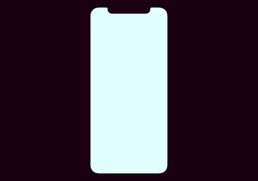
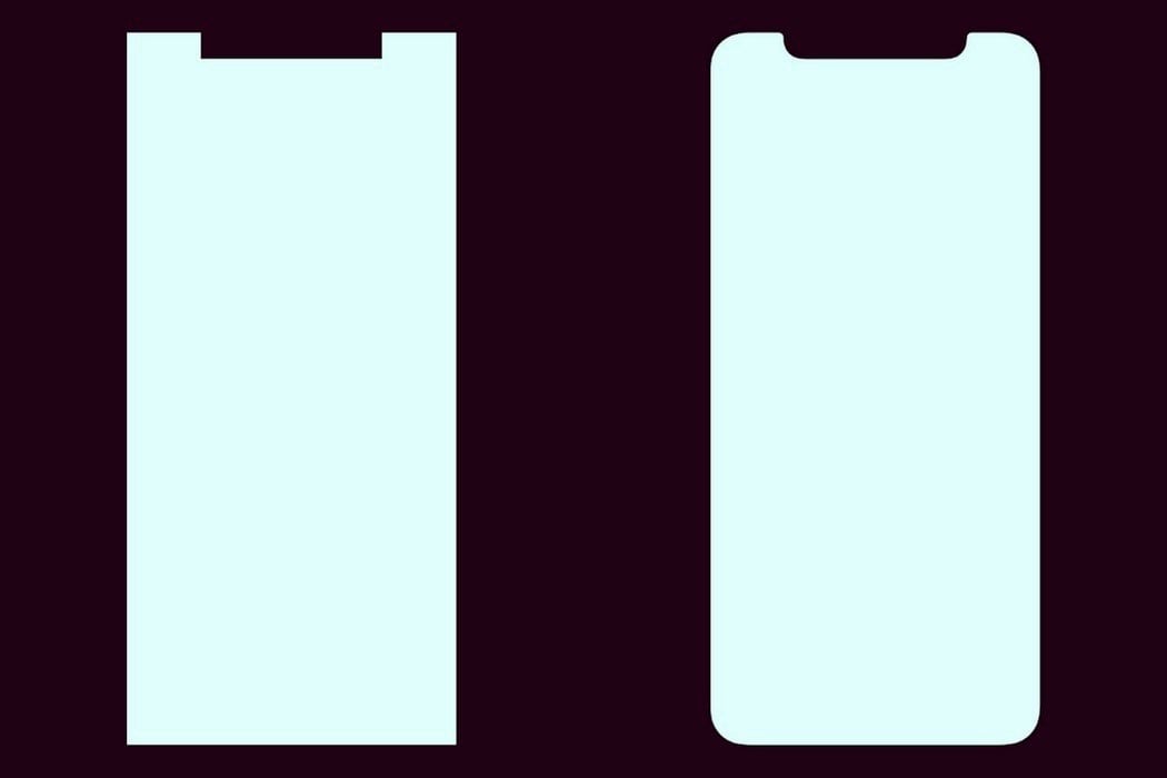
What’s the notch? Or even the screen for that matter? A couple of straight lines meeting at right angles which are then rounded off, or beveled to look aesthetic. That’s what your eyes will have you believe, and honestly, as an industrial designer, that’s the most obvious solution. But when has Apple ever been the company to do the ‘obvious’? Interaction Designer Brad Ellis (and a few designers before him) picked up on a certain detail while closely analyzing Apple’s official design resources. Not a single radius was a true radius, and the notch you look at was in fact, an inverted trapezoid.

iphone_notch_2

That right there above you, is the screen schematic for the iPhone X. Below you is the screen schematic placed beside its most simplified form, aka, the form you’d build before applying radii. Let’s move on.

iphone_notch_3

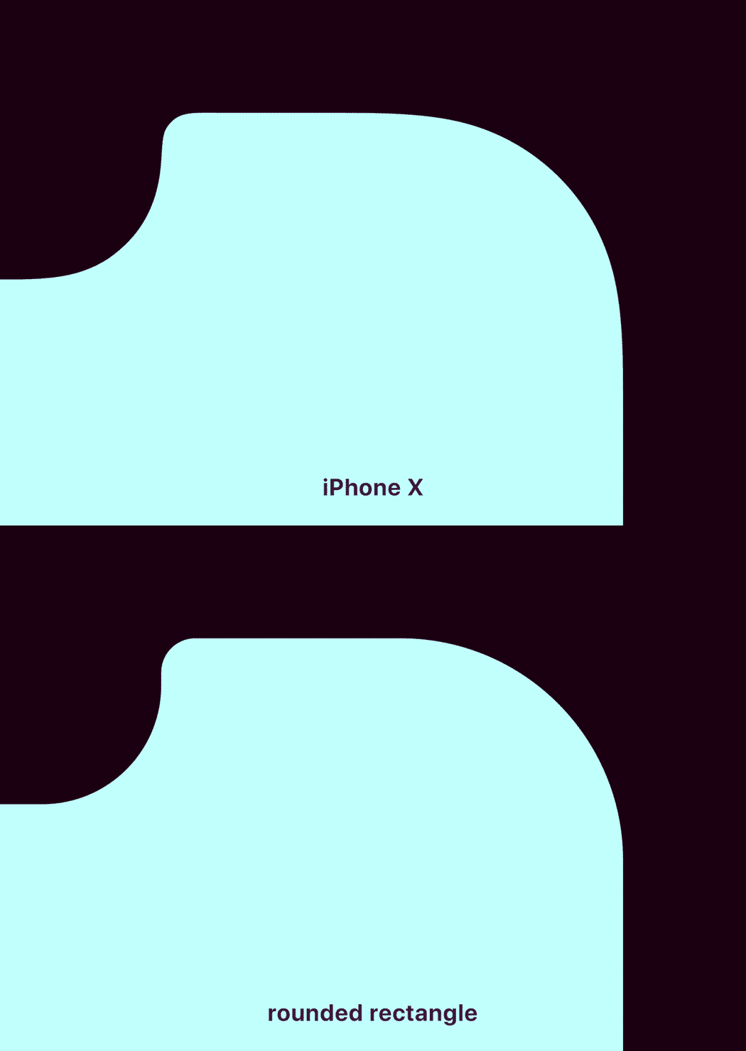
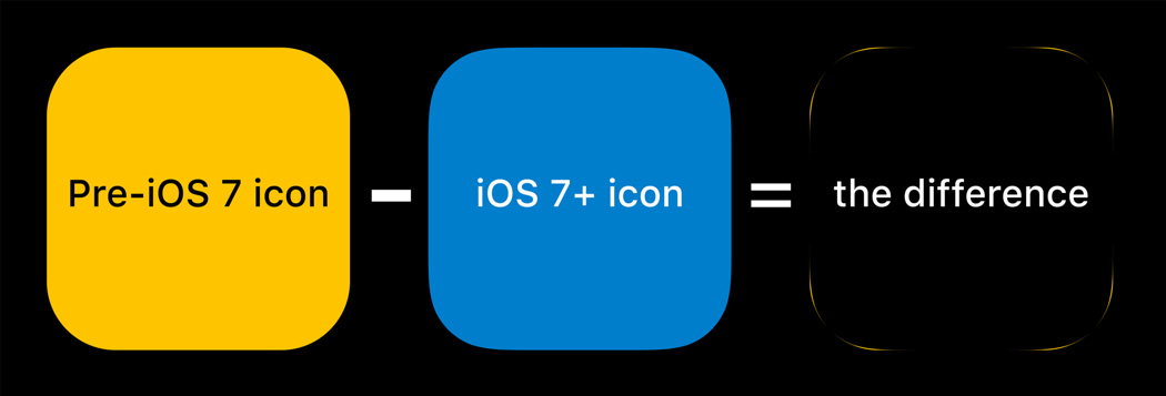
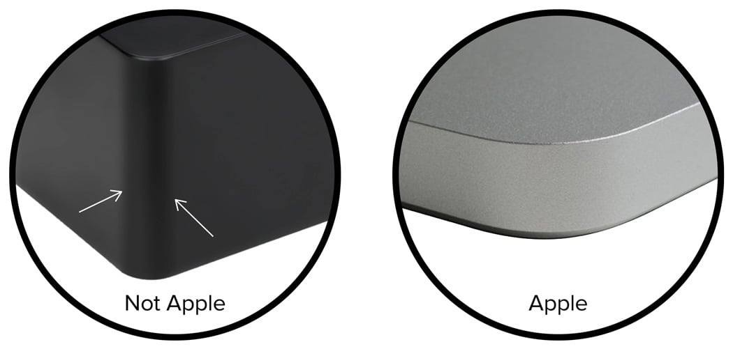
Look closely at the image below and the gif below. There is a difference in curvature, and Apple moves very far from simple fillets/radii. What you’re looking at is a Squircle, a shape that Apple has increasingly begun adopting as an alternative to basic fillets. They do this not only because they’re a company devoted to the art of aesthetic beauty, but also to stand out from the rest. The Squircle, unlike two lines with a curved corner, is much easier on the eyes. “A ‘secret’ of Apple’s physical products is that they avoid tangency (where a radius meets a line at a single point) and craft their surfaces with what’s called curvature continuity.”, says Industrial Designer, Mark Stanton. Squircles can be found on most of Apple’s products today, from the corners of their Macbooks, to the iPad, to the iPhone, to even the Apple Watch. It made its digital debut in iOS7, when icons started employing the Squircle instead of the rounded rectangle. You’ll find some images below to show you the subtle yet rather important difference.
iphone_notch_4

iphone_notch_5

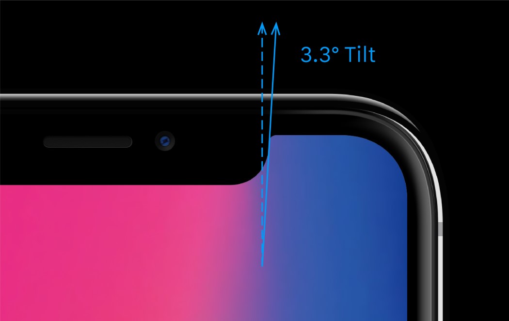
Now onto the notch. Inverted trapezoid, as I called it earlier. The notch on the iPhone X employs zero vertical lines. In fact, the line you think is vertical, is actually at a 3.3° tilt (so if you’re a UX designer, make sure you watch out! P.S. be sure to use only Apple’s official design resources for your work!), thanks to Apple’s need to be visually pleasing. Because of the curve falloff, one curve doesn’t complete before the next one starts — they blend seamlessly into each other. As a result, no tangent line on this edge actually hits a perfect vertical.

iphone_notch_6

The Squircle, it can be argued, is probably the reason why Apple’s products look so visually pleasing. The highlights on the corner of the iPhone’s Piano Black variant follow through beautifully with visual continuity that one takes for granted, but is actually the result of a lot of sweating at Apple’s design labs. While I admit that the notch on the iPhone X is far from ideal, Apple’s work with geometry and details is definitely worth taking a page from. It has consistently pushed out products that embody a certain ethos of being a class apart, and has streamlined that approach to reflect in not just the hardware, but also the software. The result? Products that look subconsciously simple and beautiful but are often far from it… and now you know why!

iphone_notch_9

iphone_notch_8

Image Credits: Brad Ellis & Mark Stanton
You can read the original piece by Brad on Medium and Mark’s breakdown on Hackernoon

Get a Qi-compatible Wireless Charging Pad Cheap

Want a quick and easy way to charge your phone? This Qi Wireless Fast Charging Pad can keep your wireless devices fully juiced easily and reliably. Featuring premium design and fast charging parameters, this Qi charging stand will give your Qi-compatible phone a fast boost without needing to scramble around for a full wall charger.

With an influx of hot new Qi-compatible phones like the iPhone X on the market, this charger is one of the most popular phone accessories of the season. Equipped with built-in charging intelligence to prevent devices from overheating or short-circuiting, this simple and inexpensive stand will maximize your device’s battery at optimal speed.

This wireless charging pad will help maintain your phone’s short-term charge and long-term health. The Qi Wireless Fast Charging Pad is yours for just $10.99 in the Technabob Shop.