Apple has had its fair share of product successes, but none have been as impactful as the iPod. The iPod truly made Apple a consumer tech company, taking it out of its little box of being a niche computer manufacturer. It practically changed the music industry overnight, ostensibly killing the CD and the Walkman while simultaneously pushing a generation towards digital downloads. It also singlehandedly forced the entire music industry to pivot from selling entire albums to selling singles. As the iPod rapidly became a household device, it also spawned an entire industry of tech-accessory manufacturers who made speakers and docks specifically for the iPod… but most importantly, it allowed tech and fashion to collide in a way that nobody had ever experienced before… fundamentally changing how Apple would make products in the future. Andrea Copellino’s iPod Nano concept captures that very spirit of the iPod in a fresh new design that breaks the mold all over again.
Nostalgia can be an incredibly powerful emotion (case in point, the 2019 Moto RAZR), although Copellino’s redesign doesn’t capitalize on the old iPod’s iconic design. Instead, it challenges it with a fresh relook at what a music player from Apple could look like – and I’ll be honest. I like it for a bunch of reasons.
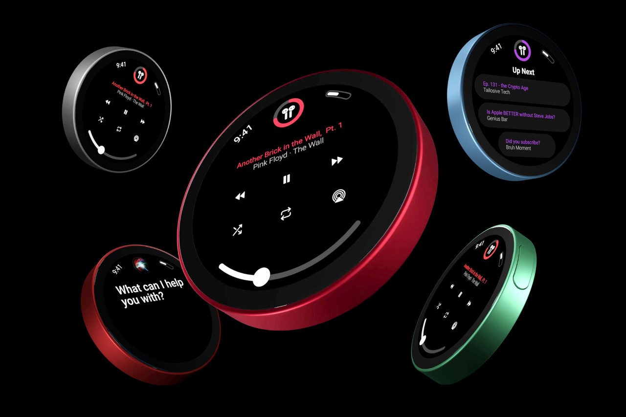
As Apple gradually began phasing out the iPod, it increasingly began looking like the iPhone (in fact the iPod Touch was almost indistinguishable from earlier models of the iPhone). Copellino sidesteps this problem by giving the iPod a complete refresh and making it circular. The new iPod Nano paves its own path forward with a fresh new design that’s instantly distinguishable from the iPhone. It sports a circular UI that Copellino designed from scratch too, borrowing elements from the Apple Watch. It also comes with a circular display that looks just marginally smaller than the one used on the HomePod Mini.
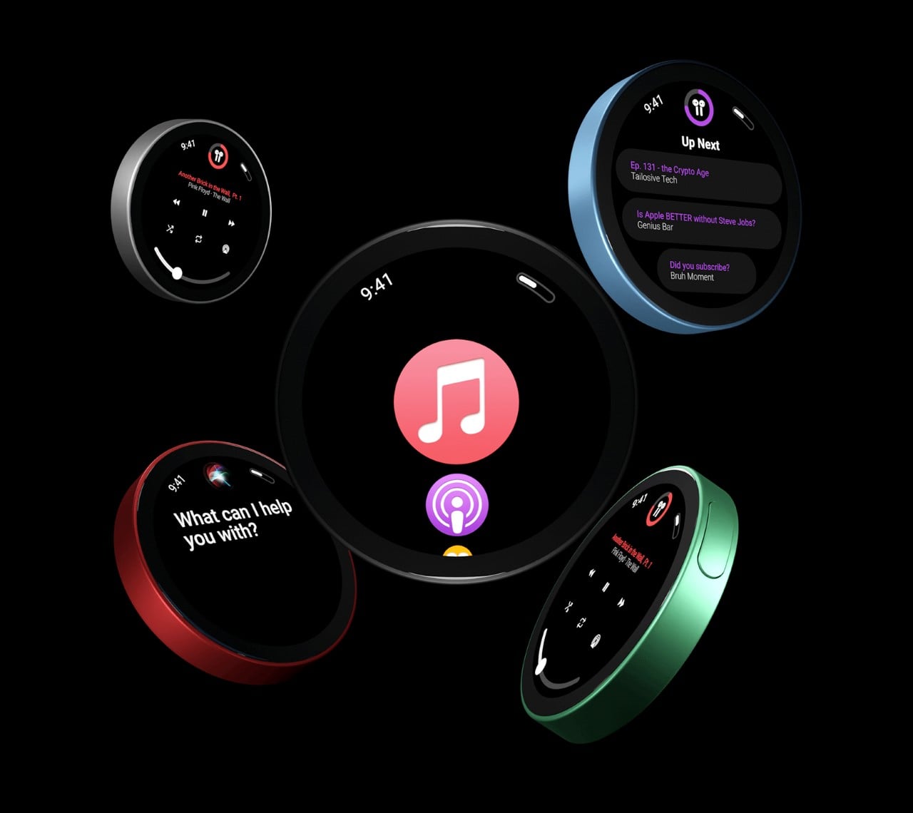
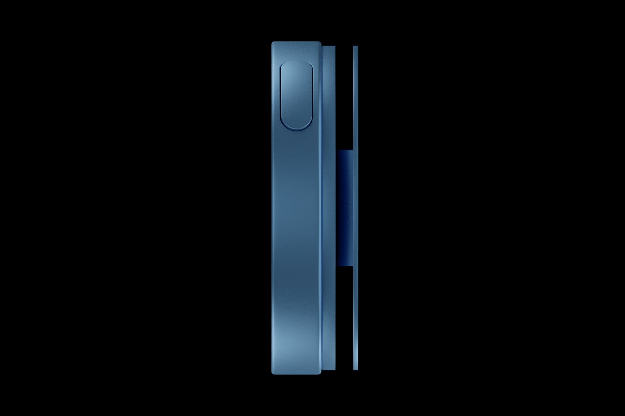
What I really enjoy about the new iPod Nano is that it looks different but feels the same. Classic iPods came with round jog-wheels that established a circular interaction, and the new iPod Nano’s circular display just carries that forward. Its puck-like design is comfortable to hold and comes with a clip on the back that makes it easy to secure your music player around your pocket.
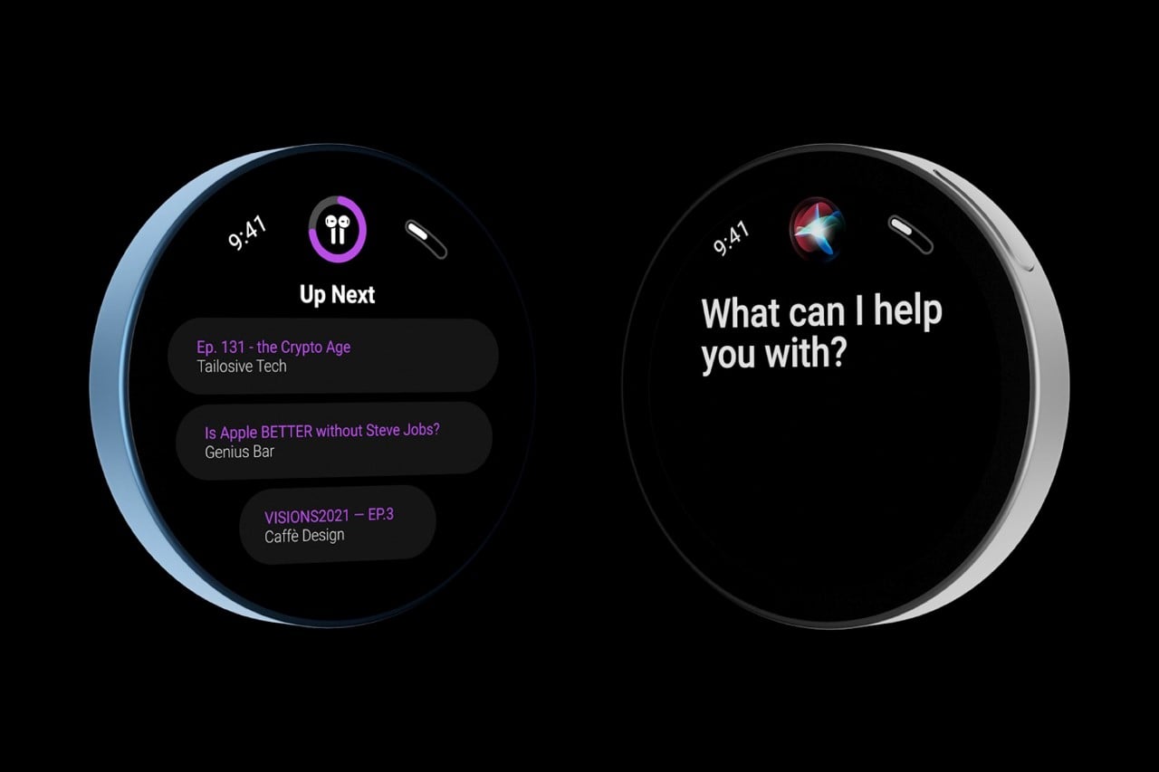
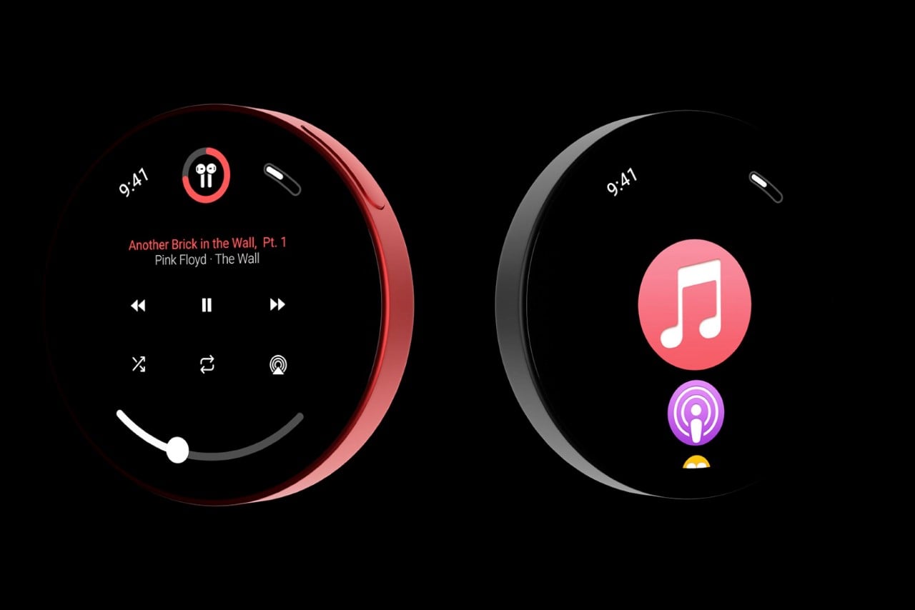
The iPod Nano concept has a bunch in common with the iPhone (although its drastic design change really sets it apart)- it runs Apple Music, Podcasts, Siri, among a bunch of other apps. It’s entirely portless too, working seamlessly with the AirPods, Pro, and Max, and charges wirelessly. Ingeniously enough, the iPod Nano is exactly the same width as Apple’s MagSafe charger, allowing it to line up perfectly while charging. Magnets on the back of the iPod let it snap to the charger perfectly, ensuring alignment every time.
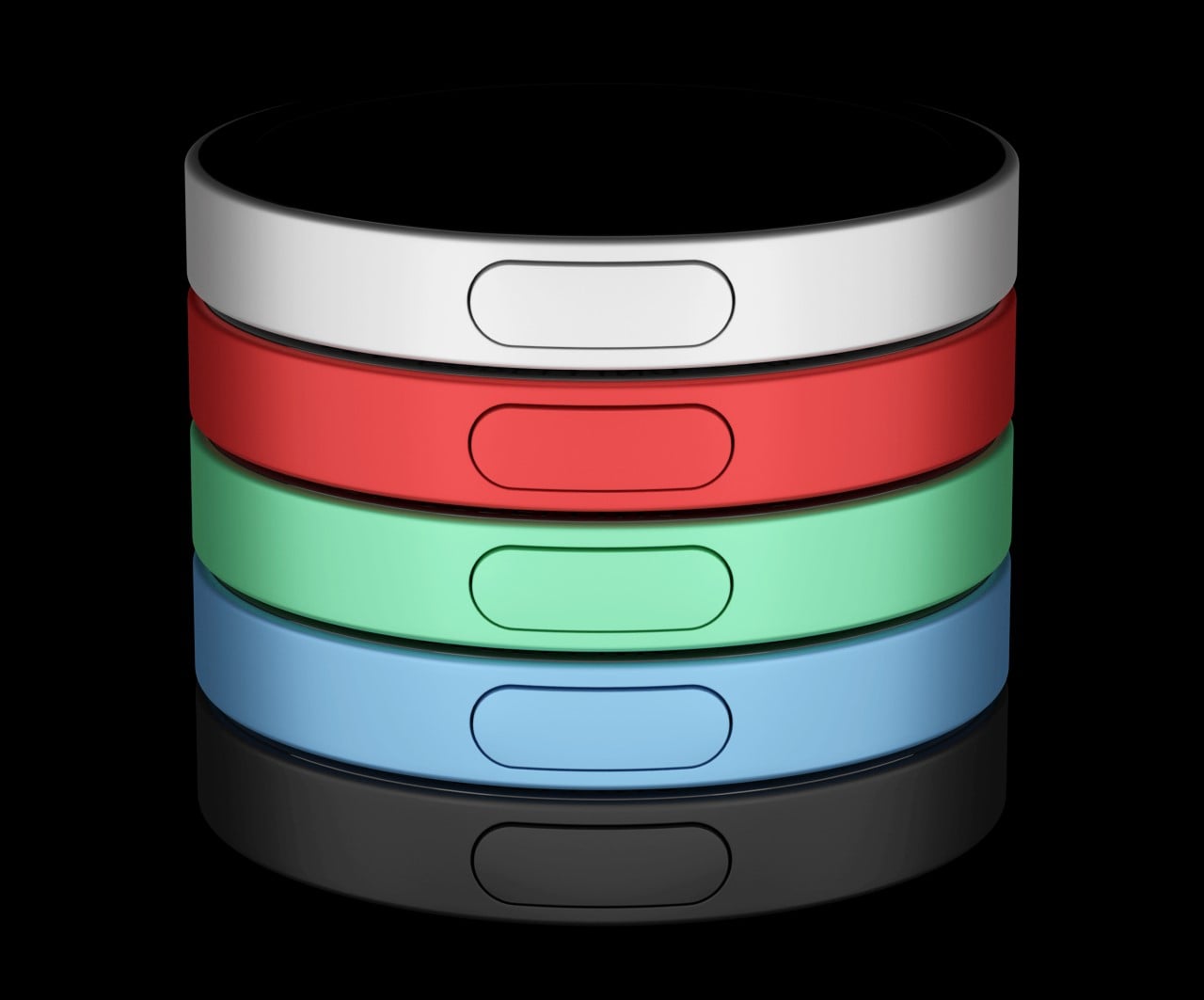
Is Apple going to relaunch the iPod? Probably not, although Copellino’s earlier concept looks a lot like something Apple WOULD launch. This circular iPod Nano is more of a design exercise or a fan-concept, although there’s definitely a dramatic appeal to it. I could totally imagine an alternate universe with colorful billboards of human silhouettes holding circular touch-sensitive iPod Nanos, and people lining up outside Apple stores to buy them!
Designer: Andrea Copellino
The post Maybe a circular Apple iPod isn’t such a crazy idea after all… first appeared on Yanko Design.


