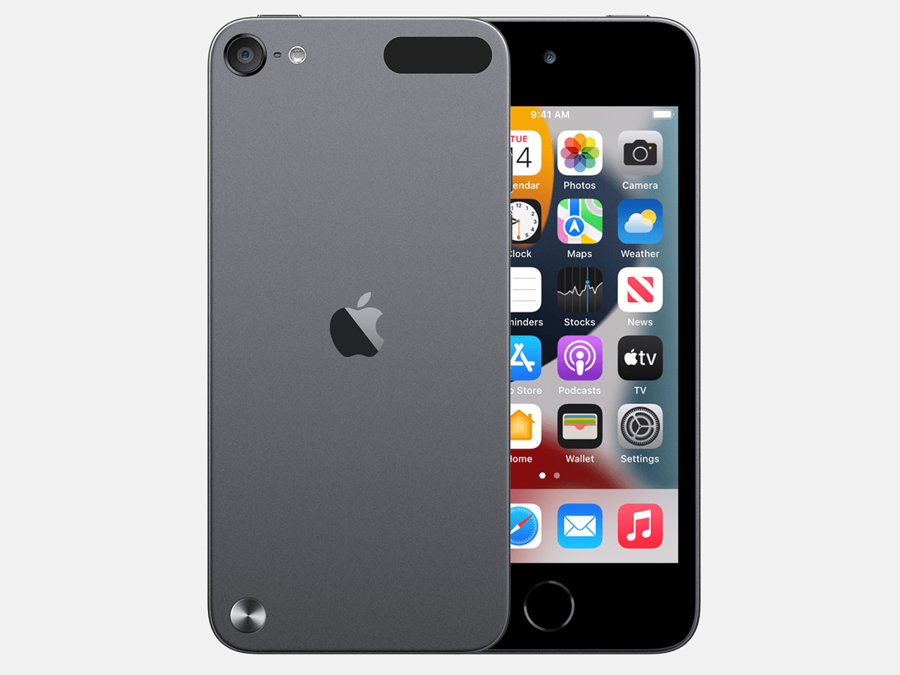
What if iPod Touch survived till today? Perhaps, it would have had evolved into a niche entertainment device–it was a niche product when it existed. Anyway, the music player is in the grave without a chance for resurrection, but that’s a little impediment for creators. No wonder, two designers believe the iPod Touch can be redesigned in the iPhone 16 design language, and this is what it would be. Read on!
Easily saying, if the iPod Touch continued to date, it would have been an iPhone-styled entertainment device with a focus on high-quality entertainment. It would have played games, streamed media in all forms, and would have been thriving on the integrated Apple ecosystem syncing seamlessly across smart home devices, Apple Watch and yeah, the AirPods.
Designer: ID JUAN and sy wong
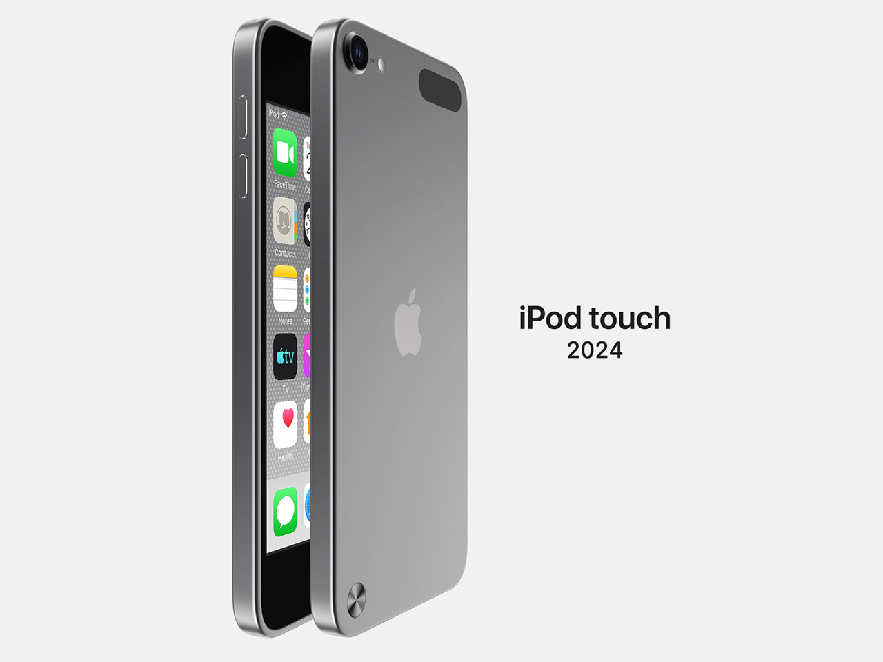
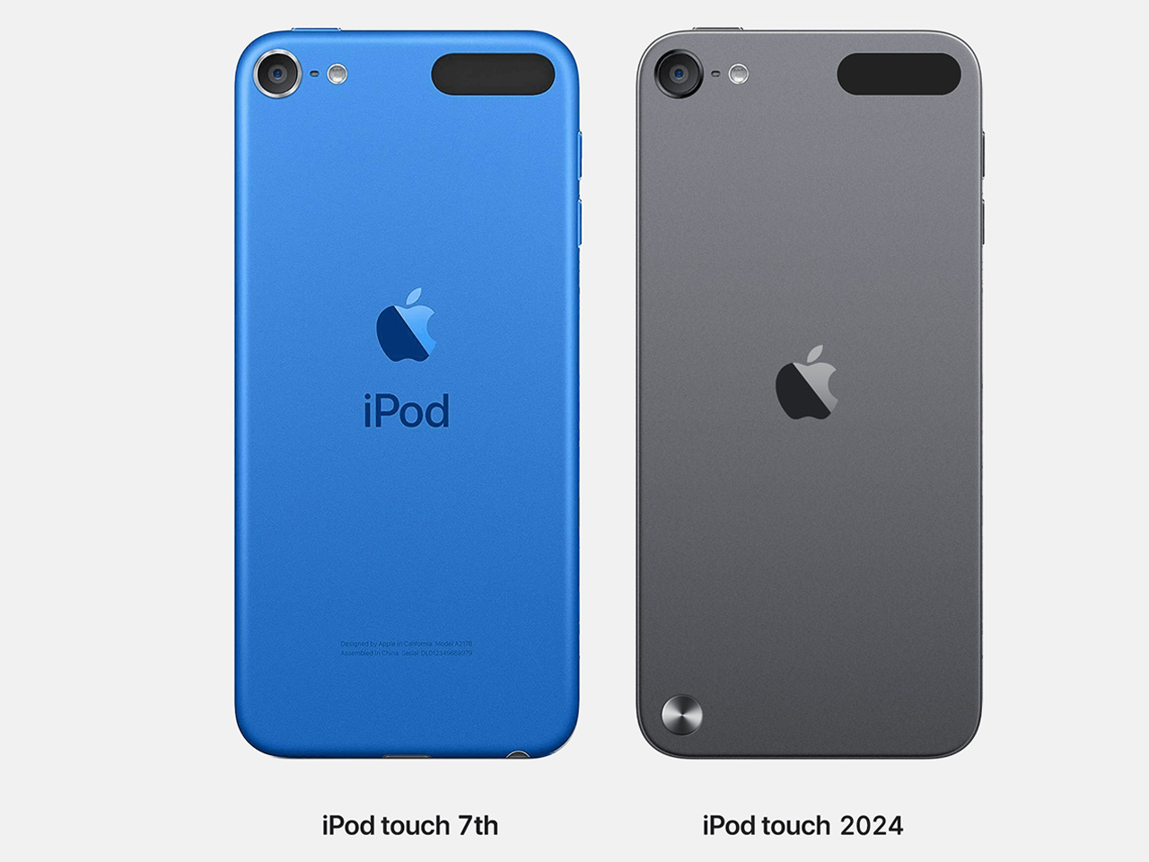
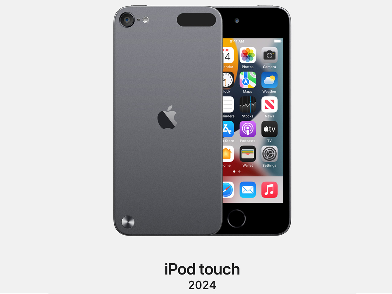
This is far from how JUAN and wong have envisioned the iPod Touch (7th generation), which has been off the shelves and discontinued for the better part of three years now. The idea of their iPod Touch is pretty much the same device with slight hints of the latest iPhones, the iPhone 16 lineup. So, the overall dimensions of the 7th generation iPhone Touch remain unchanged.
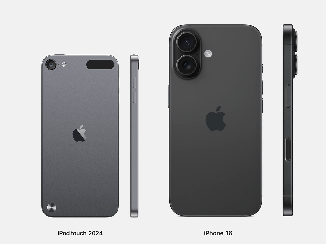
The reworked iPod Touch retains the 4-unch Redina display on the front. But in the back, the iPhone look is pretty evident with the single Apple logo in the center. No iPod branding or any additional text information toward the bottom. The designers note that “the pop-out loop hanger button” has been revived to make that evident distinction of the iPod Touch from iPhones and iPads.
Taking a slight dig at Apple’s complacency or rigidness, if you may, to shift to the universal USB-C type charging slot, the designers have stuck with a Lightning connector for charging. Assuming if it were made, the iPod Touch would feature a Lightning connector because Apple “probably has plenty of stock still available.”
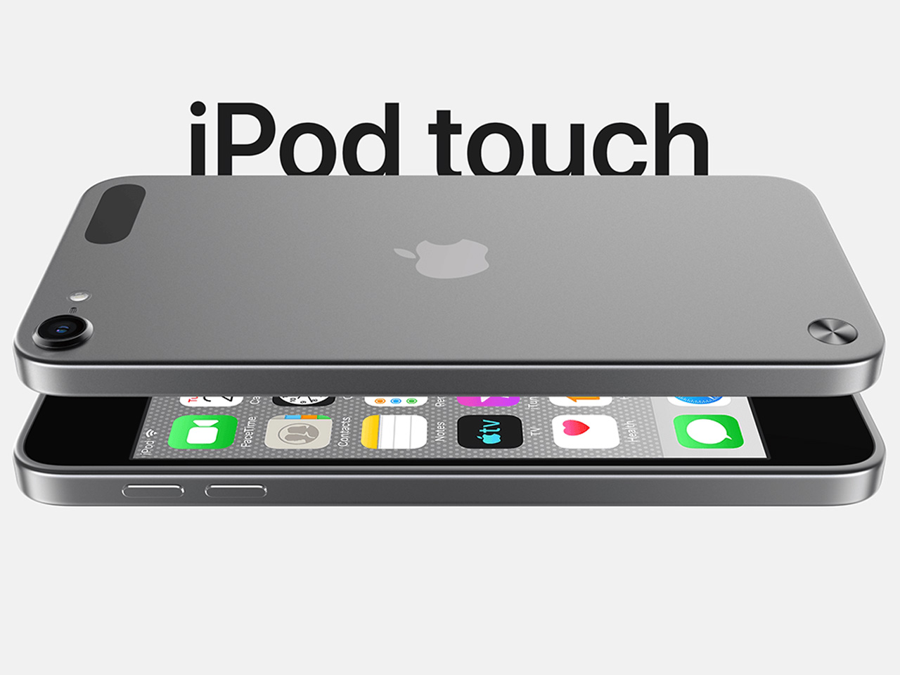
Despite AirPods being the most obvious choice to be used with the iPod Touch, JUAN and wong have not parted with the good old 3.5 headphone jack. Continuing on the back, the plastic antenna cap is visible. iPhones and iPod now have it in their frame, but the iPod is happy with it in the back. This would, the designers suggest, add to the iPod Touch’s identity and also be cost-effective to pull off!
The post Designers reimagine iPod Touch in iPhone 16 design language first appeared on Yanko Design.
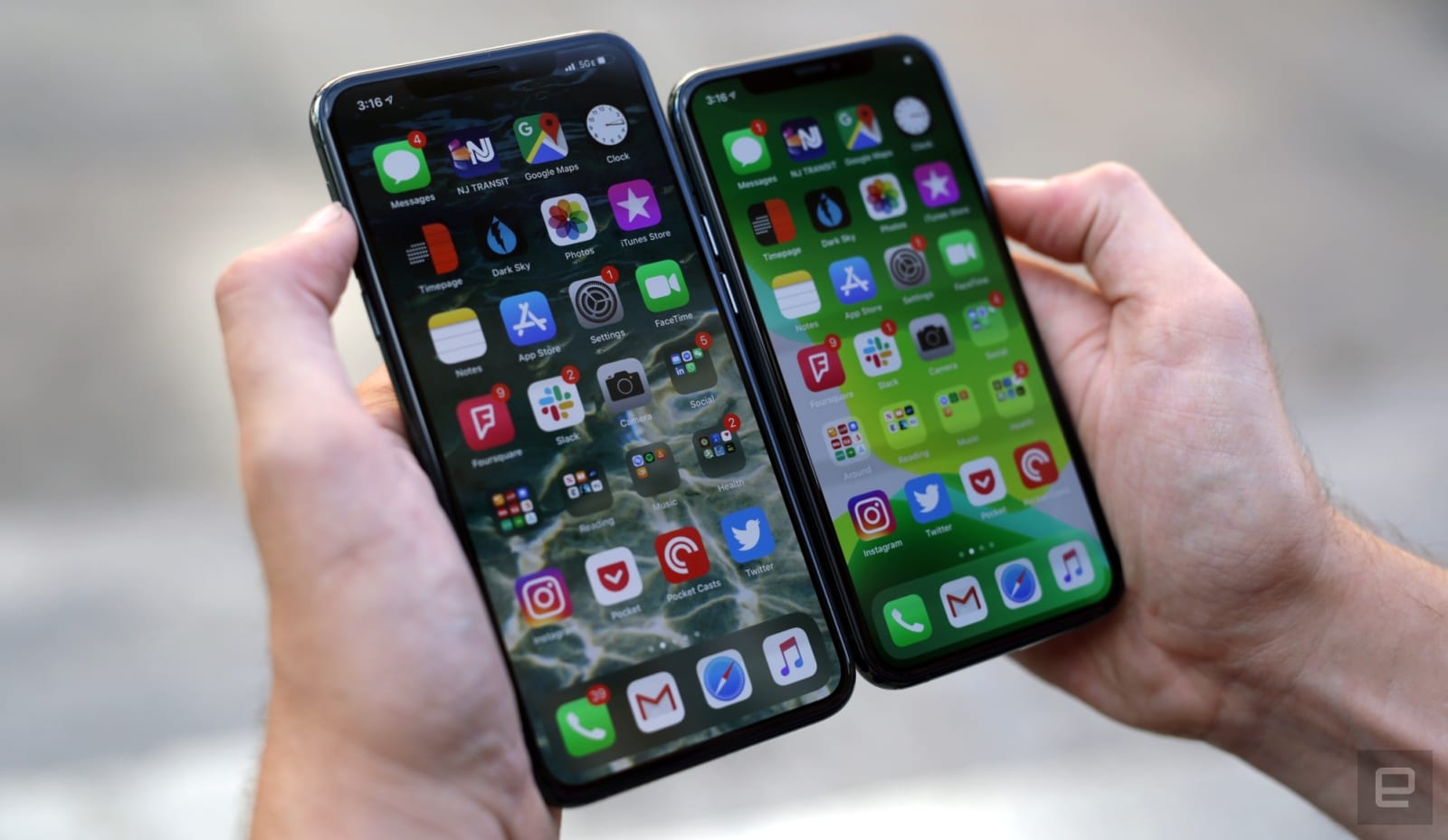 That inadvertent confirmation of iOS 13.3's imminent release was on the mark. Apple has released the new software (plus iPadOS 13.3), whose centerpiece is an improvement to Screen Time parental controls. You can set limits on who your kids can call,...
 The releases of iOS 13, watchOS 6 and macOS Catalina are likely just a couple of months away, but that isn't stopping Apple from giving the current versions a big sendoff. The tech behemoth has released iOS 12.4, HomePod 12.4, tvOS 12.4, watchOS 5.3...
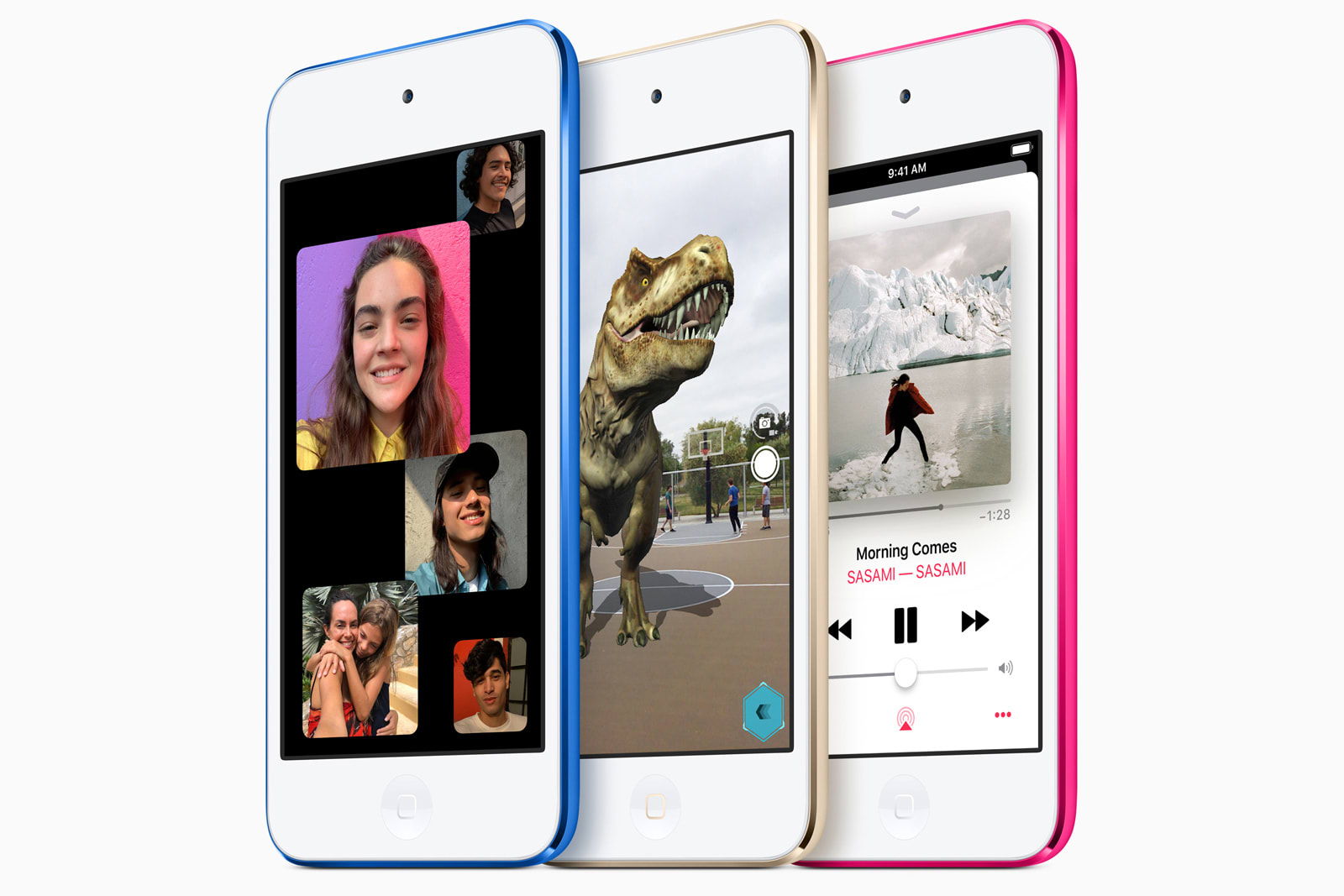 No, your eyes aren't deceiving you -- after four long years, Apple has updated the iPod touch. The new version packs a much faster A10 Fusion chip that can keep up with modern iOS experiences like group FaceTime calls and augmented reality, not to me...


