A legacy updated!

rolls_royce_coupe_1

Rolls-Royce is more brand than car. Yes, they make some stunning automobiles (sometimes painted with real diamonds), but they’re selling you the idea of luxury rather than a product). The company is known for its large, unassuming cars, with their perfect paint-jobs, stellar interiors, and the Spirit of Ecstacy, but what if they were also known for their automotive design??

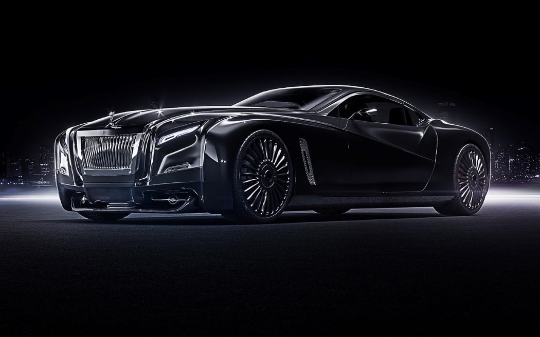
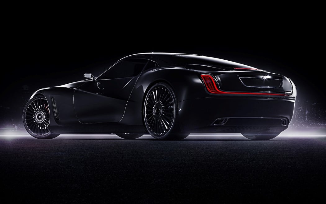
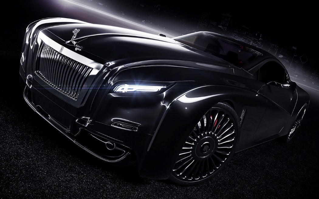
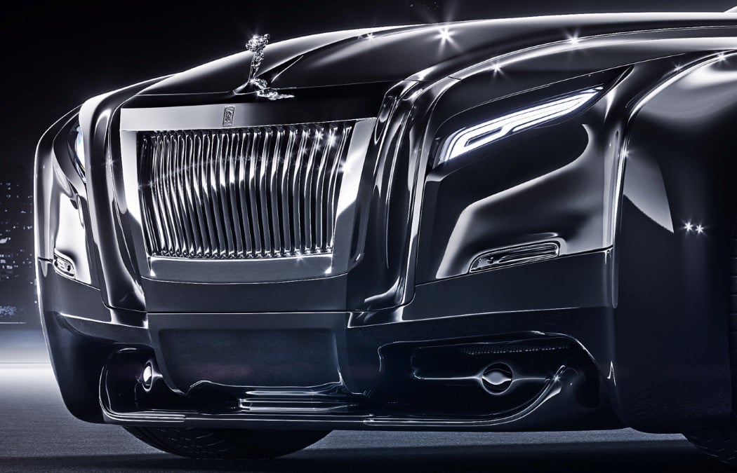
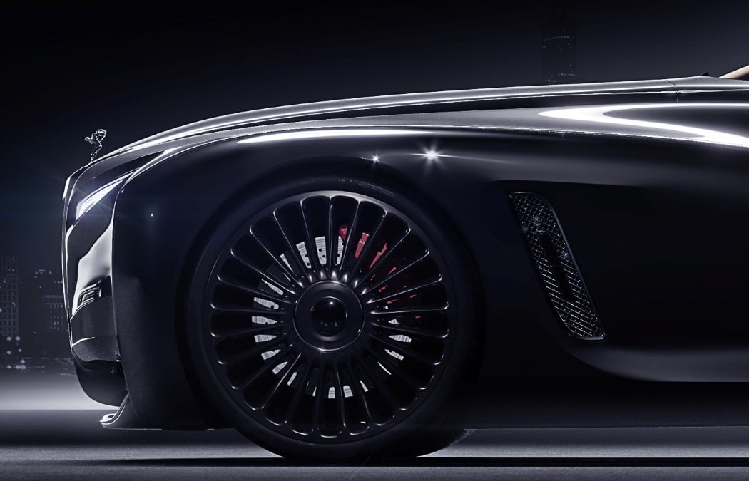
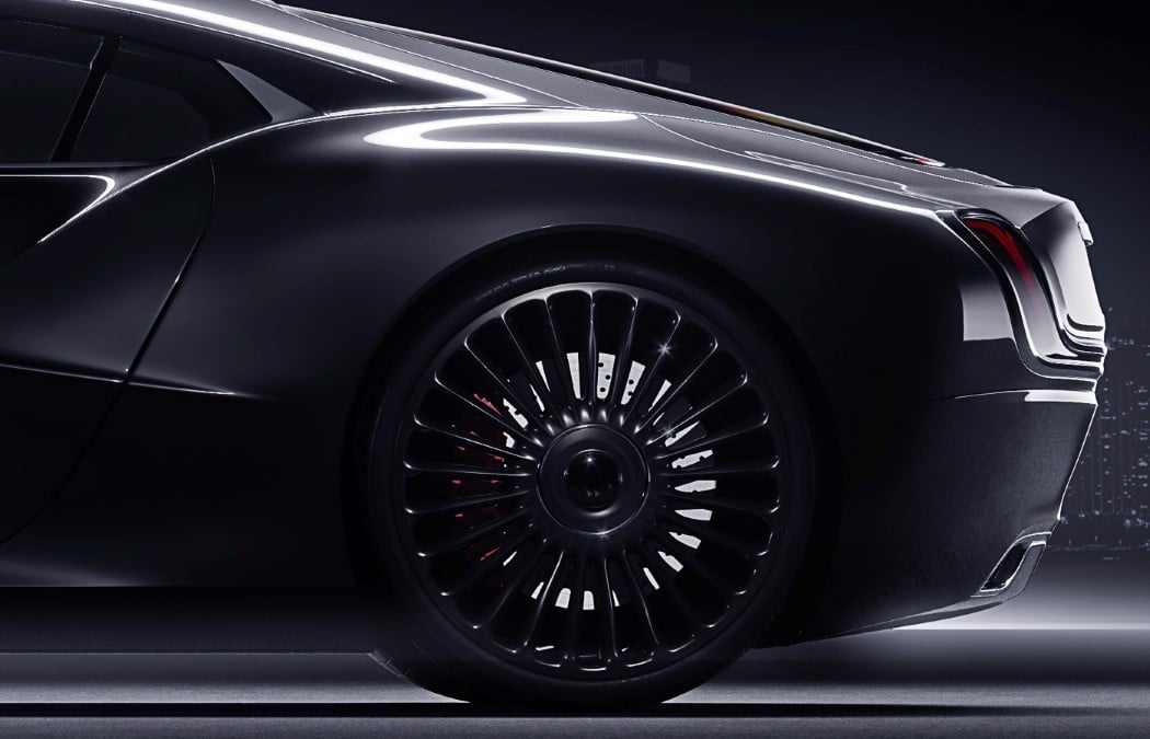
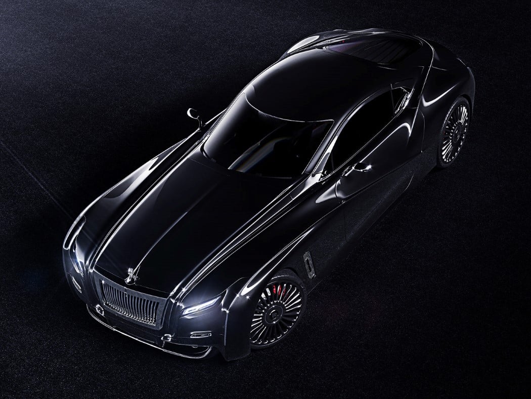
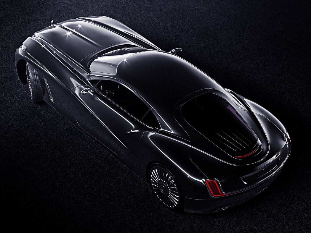
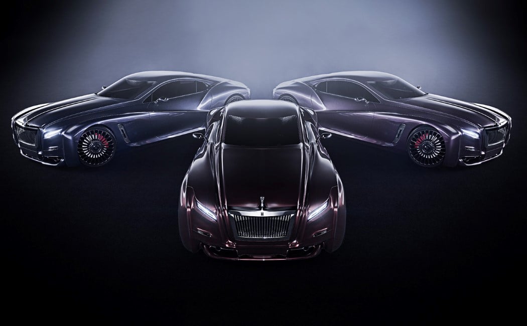
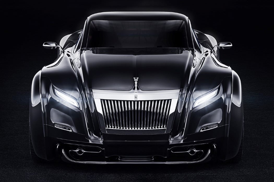
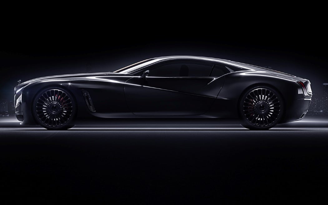
Ivan Venkov thinks RR needs an aesthetic refresh. Their work is remarkable but is far from contemporary, he says. The conceptual RR Coupé builds on the design of theSilver Cloud, but gives the entire automobile a series of visual tweaks that make the car look like Rolls-Royce 2.0. Take for starters the headlamps, that opt for the angular, aggressive approach as opposed to Rolls-Royce’s standard horizontal headlamp. All the curves are indicative of flowiness, that deviate from the blockish designs of Rolls-Royce. The result is a car that may be body-heavy, but looks aerodynamic thanks to the use of flowing lines (that side profile steals my heart!).

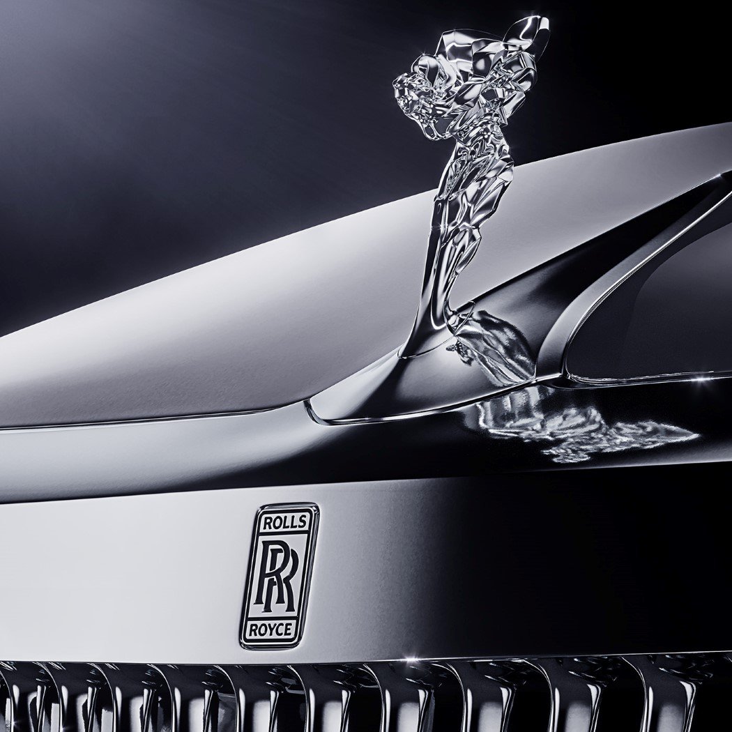
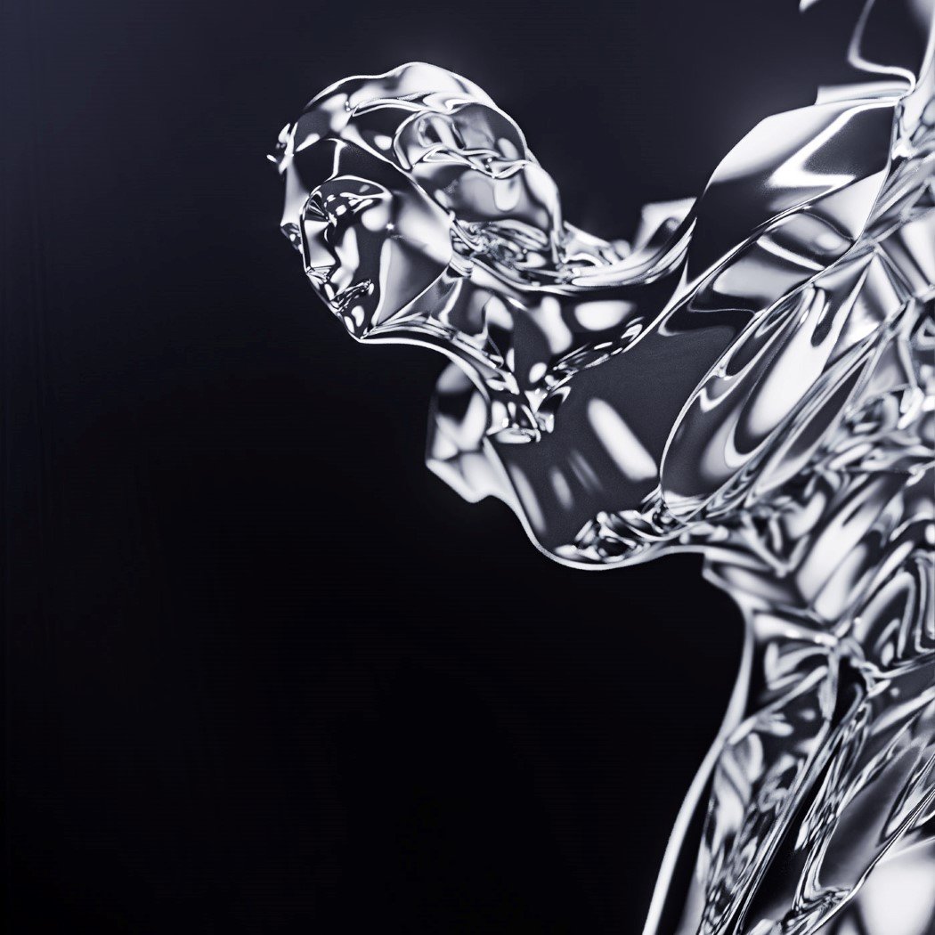
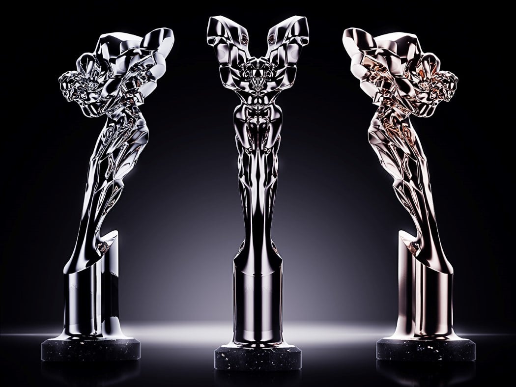
The rims of the concept car get a chariot-like appearance, saying luxury without literally having to, and my personal favorite is the little lady on the front. The Spirit of Ecstacy gets her avatar updated too. While the older statuette was probably the most flowy/organic thing on the entire car, with the billowing clothes, the new Spirit is definitely more edgy and sculptural, looking modern/contemporary, rather than something you’d see in a museum.

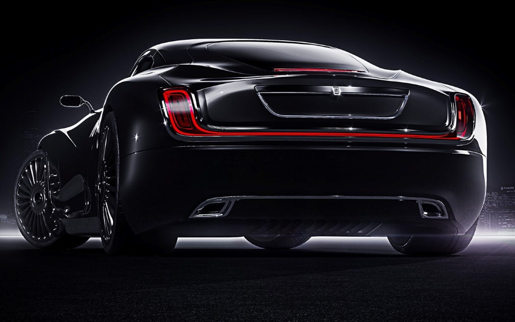
Every inch of the RR Coupé is redesigned, from its remarkable continuous taillight to the angular headlamps, to the Spirit of Ecstacy. What’s remarkable is that even though so much has changed, the Rolls-Royce flavor isn’t lost. If nothing, it’s enhanced, and holds the ability to capture more hearts, don’t you think??

Designer: Ivan Venkov
rolls_royce_coupe_2

rolls_royce_coupe_3

rolls_royce_coupe_4

rolls_royce_coupe_5

rolls_royce_coupe_6

rolls_royce_coupe_7

rolls_royce_coupe_8

rolls_royce_coupe_9

rolls_royce_coupe_10

rolls_royce_coupe_11

rolls_royce_coupe_12

rolls_royce_coupe_13

rolls_royce_coupe_14

rolls_royce_coupe_15

A wolf in Ferrari’s clothing

ferrari_con2_1

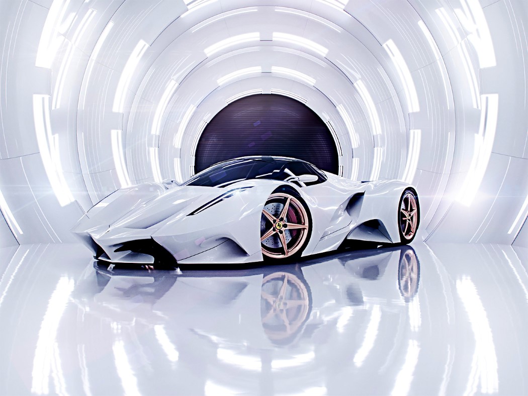
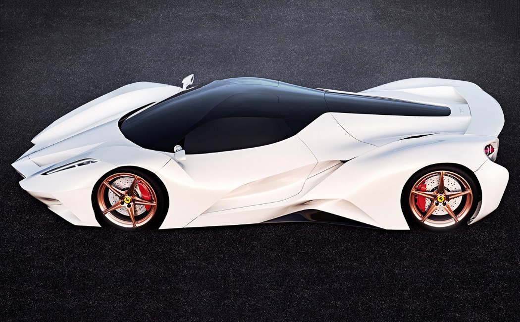
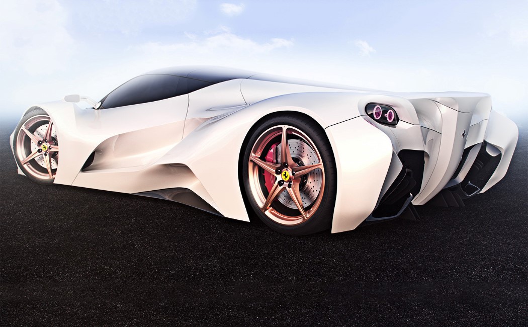
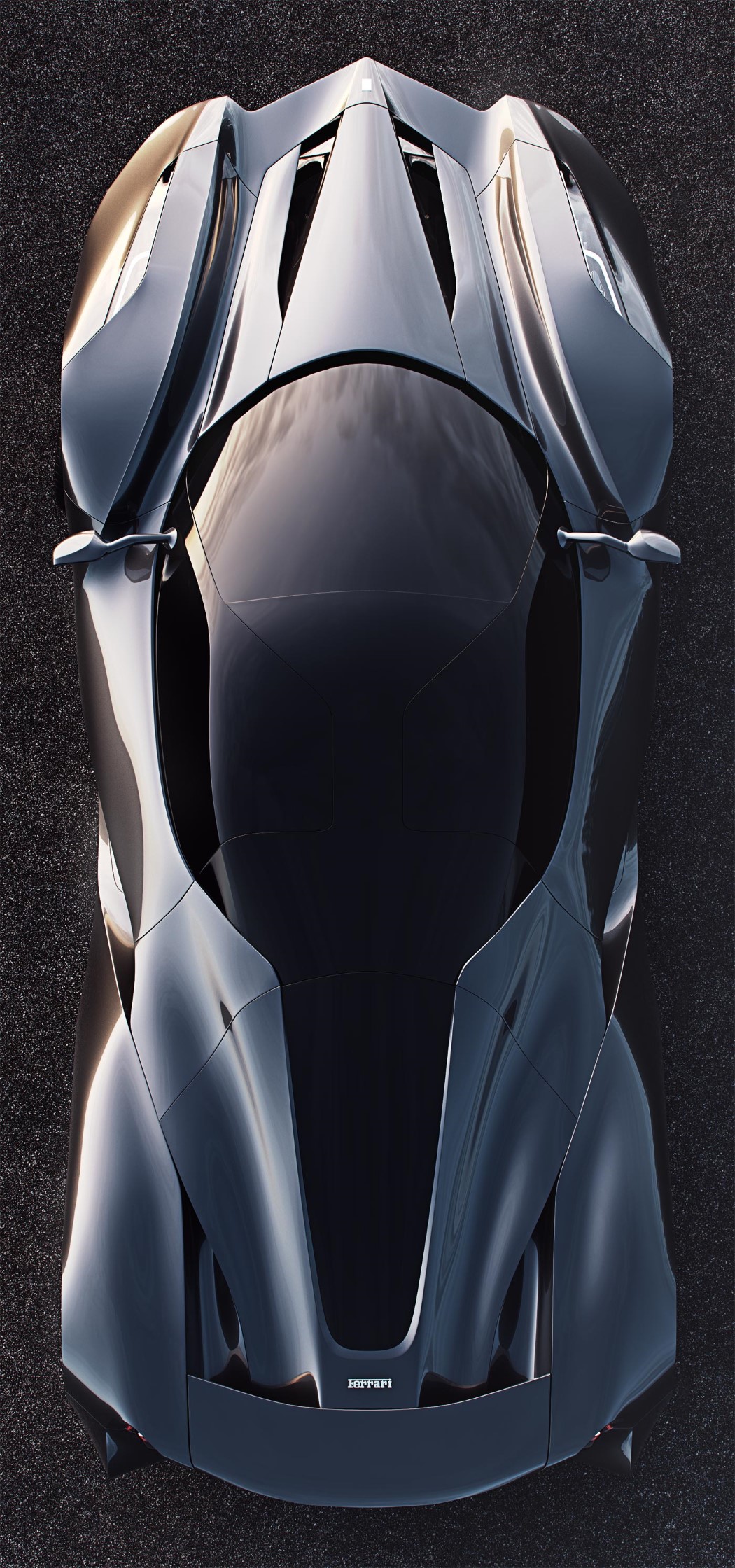
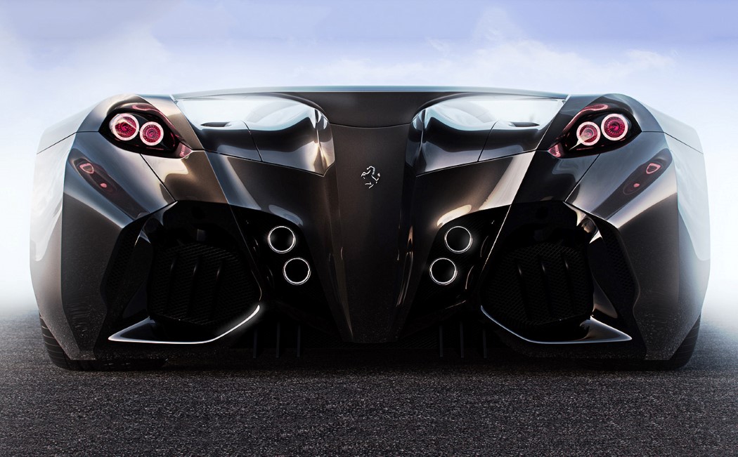
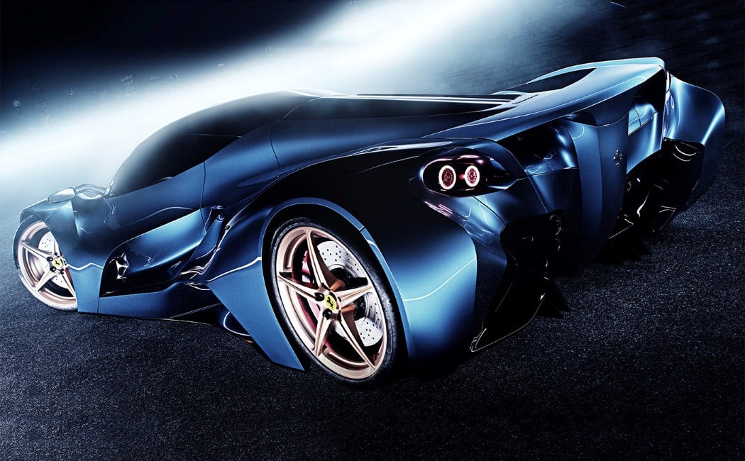
The only thing Ferrari about this concept car is the logo on the front and back!

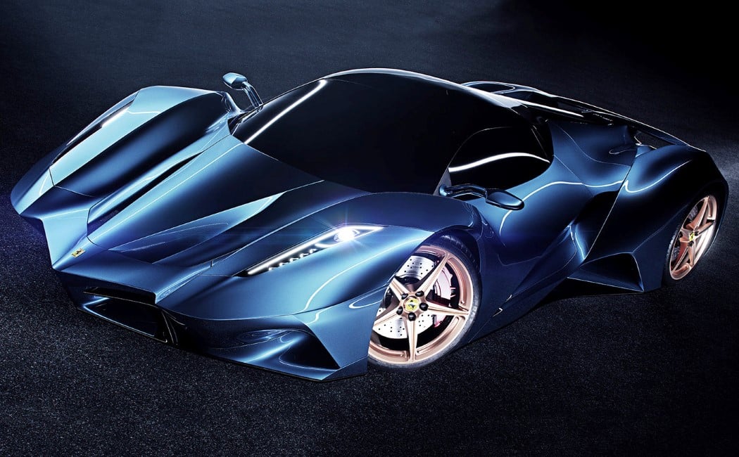
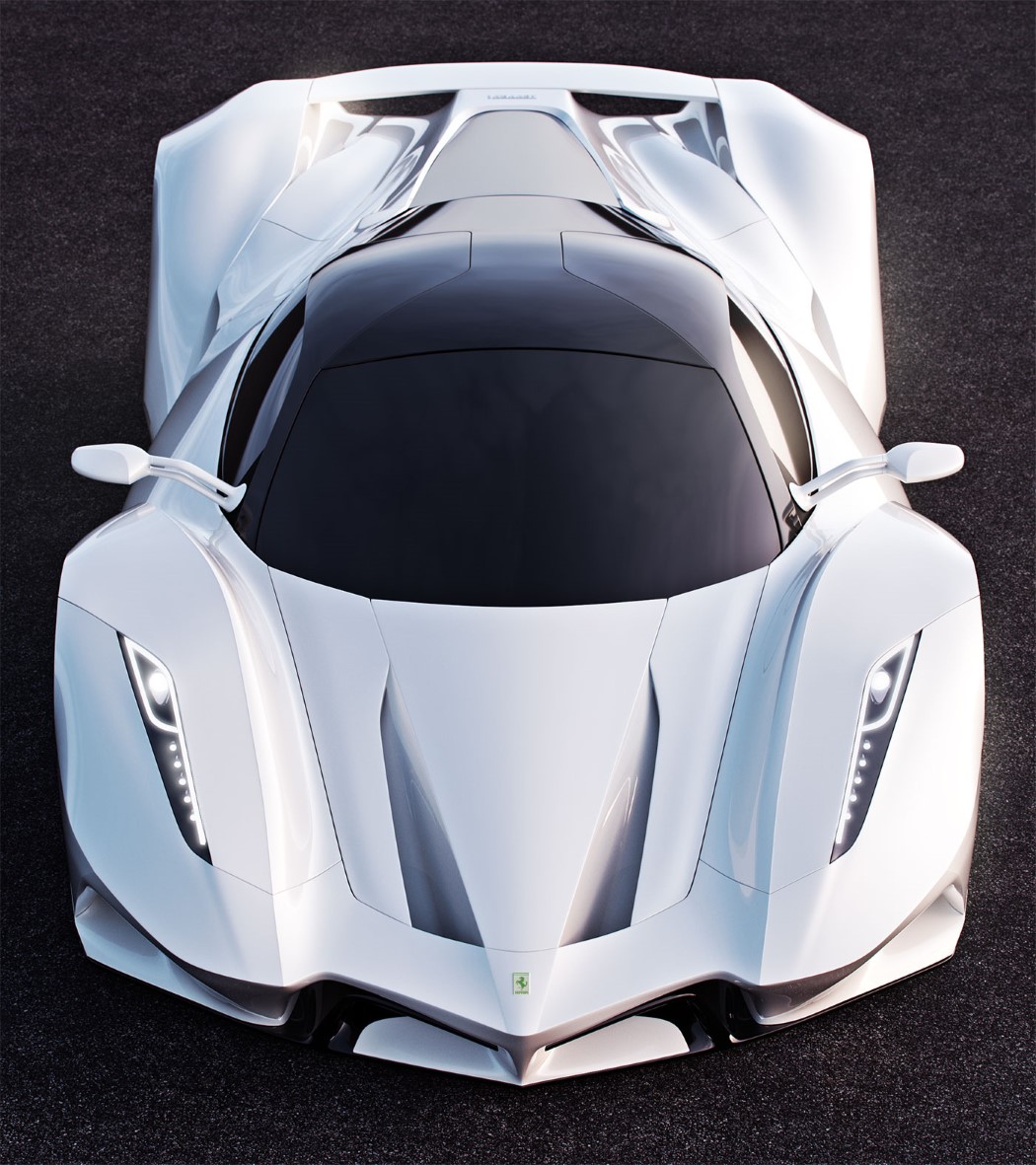
Not many designers exercise the right to say “Hey, let’s just completely forget what we know about a company’s visual language and make an entirely new one from scratch”. Designer Ivan Venkov decided to reimagine Ferrari as a completely new company, fully putting Ferrari’s and Pininfarina’s 60 year design language aside to develop something more aggressive and edgy. The result is something that looks like it could make a Lamborghini or a Pagani run for its money!

The concept car even does away with Ferrari’s love for red as a car body color… however if you notice, the rims are in fact rose gold, with the Ferrari insignia on them!

Designer Ivan Venkov

ferrari_con2_2

ferrari_con2_3

ferrari_con2_4

ferrari_con2_5

ferrari_con2_6

ferrari_con2_7

ferrari_con2_8

This Mercedes concept is fire!

merc_coupe_1

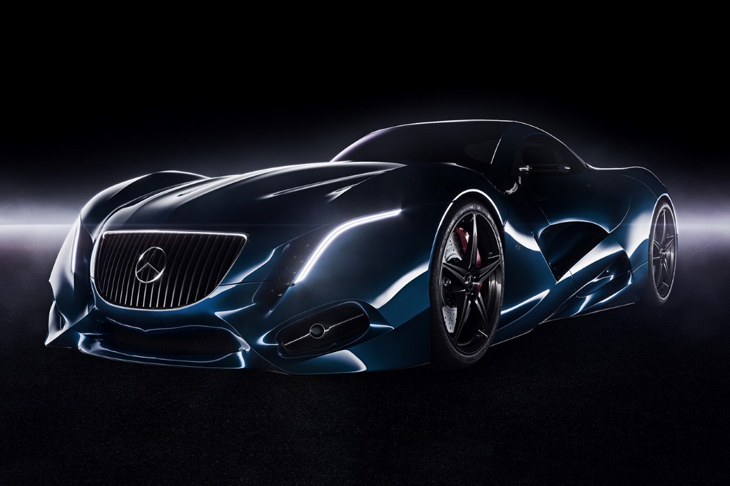
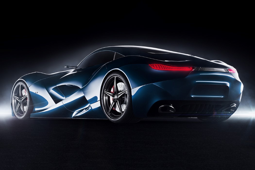
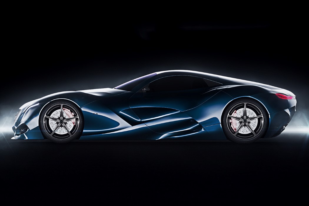
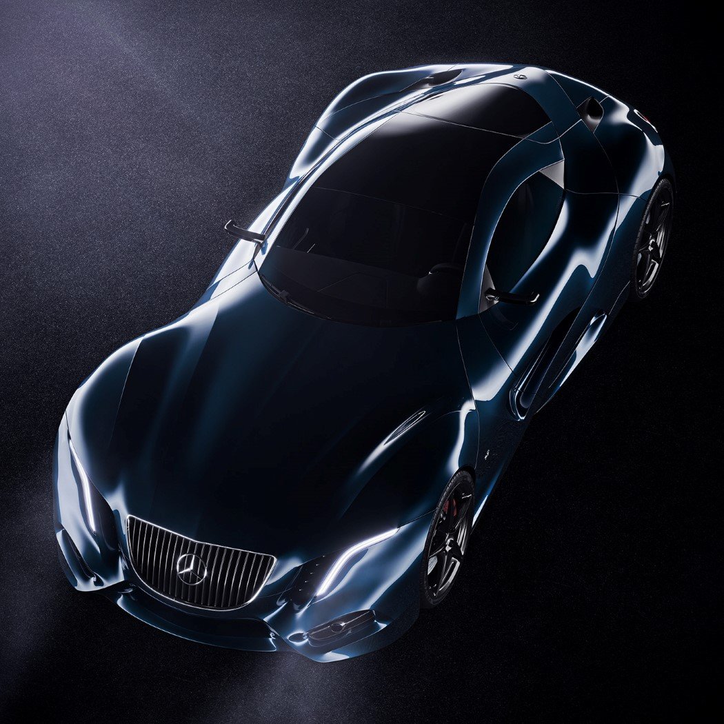
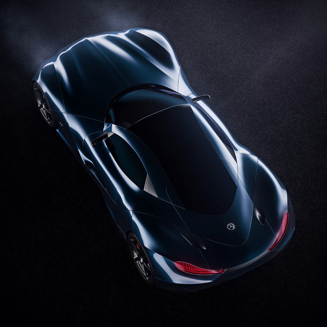
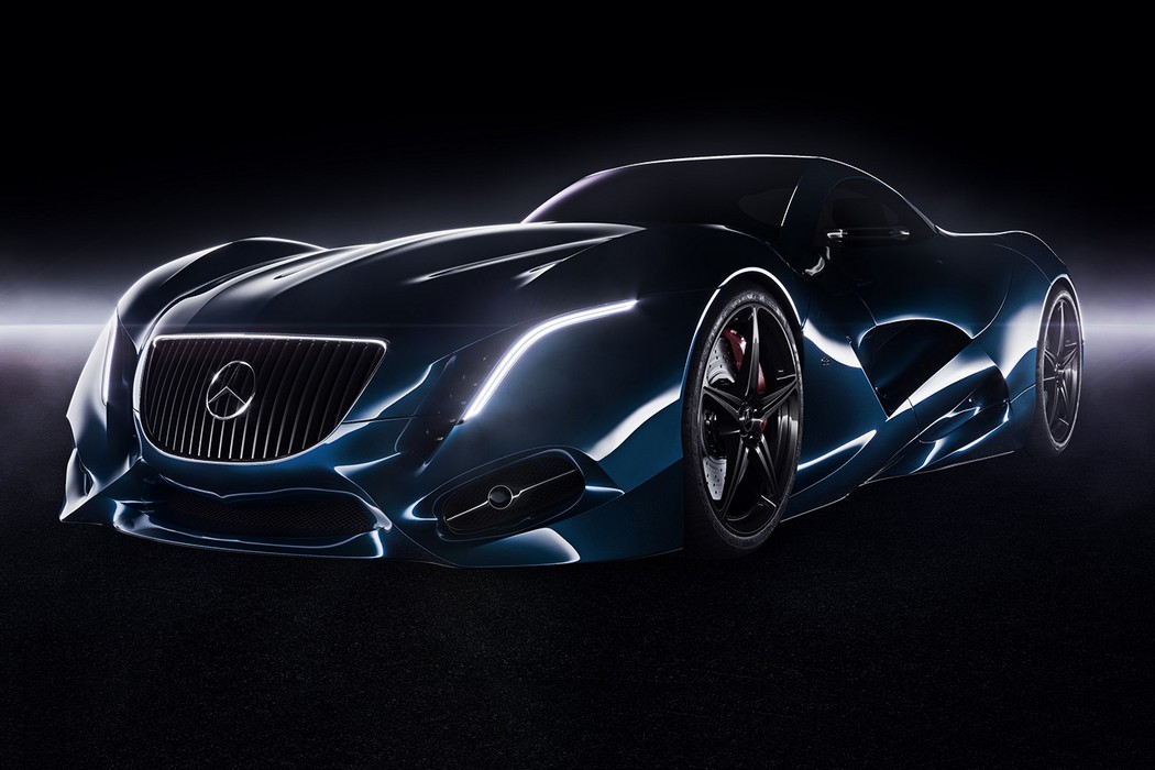
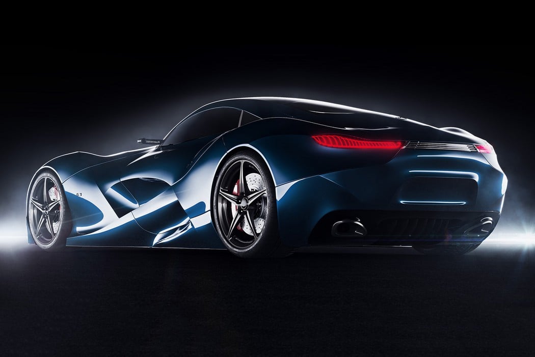
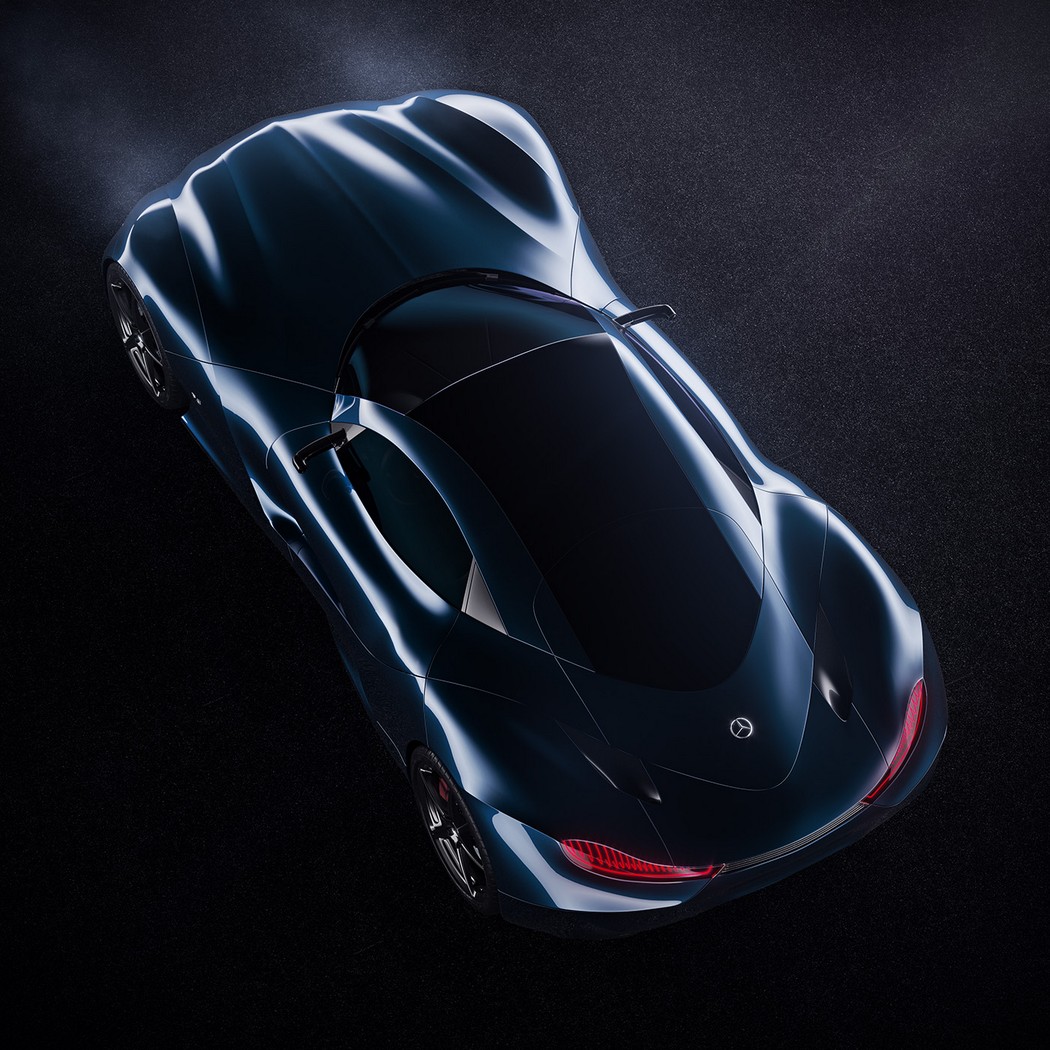
Mercedes has been teasing us with the AMG Project One for way too long! However, until then here’s something that’s truly electrifying! This Merc coupe concept by Ivan Venkov has a certain electric quality to it, don’t you think?

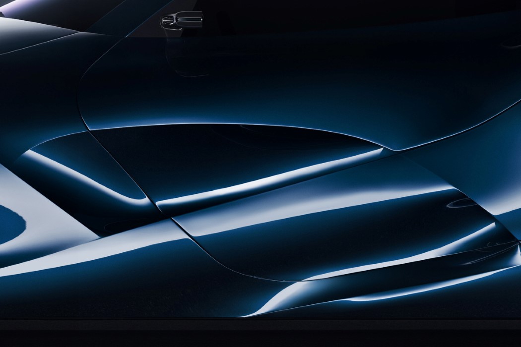
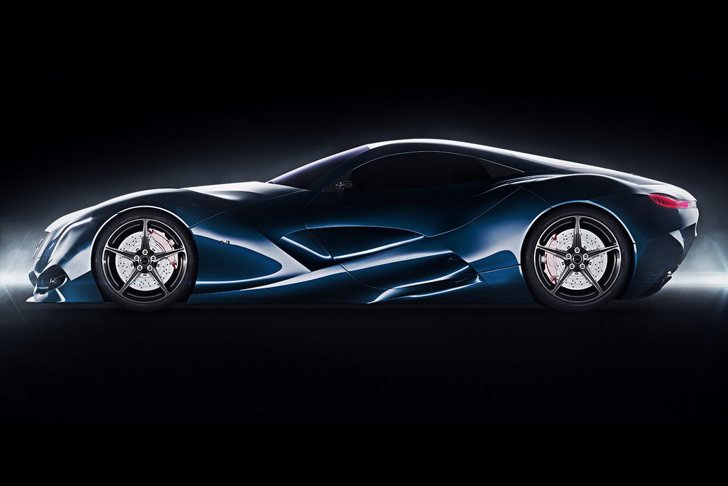
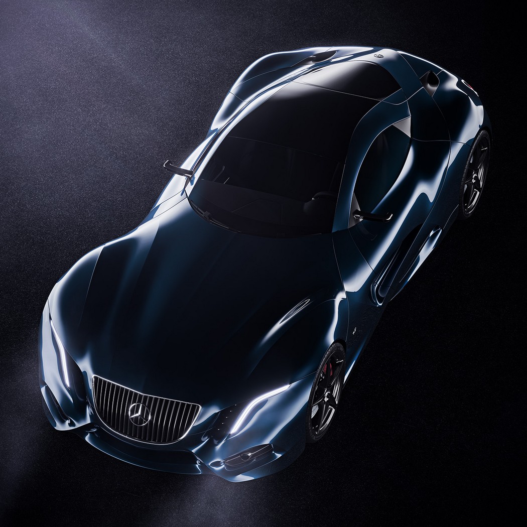
The virtual absence of straight lines makes the car look voluptuous and aerodynamic at the same time. A quality we saw last with the AMG F1 Road Car. Plus the reflections off the body are so incredibly mesmerizing, they look blinding yet beautiful. Plus, with those aggressive looking headlamps, if looks could kill… we’d certainly be dead by now!

Designer: Ivan Venkov

merc_coupe_2

merc_coupe_3

merc_coupe_4

merc_coupe_5

merc_coupe_6

merc_coupe_7

merc_coupe_8

merc_coupe_9

The Marvelous Merc!

mercedes_coupe_concept_1

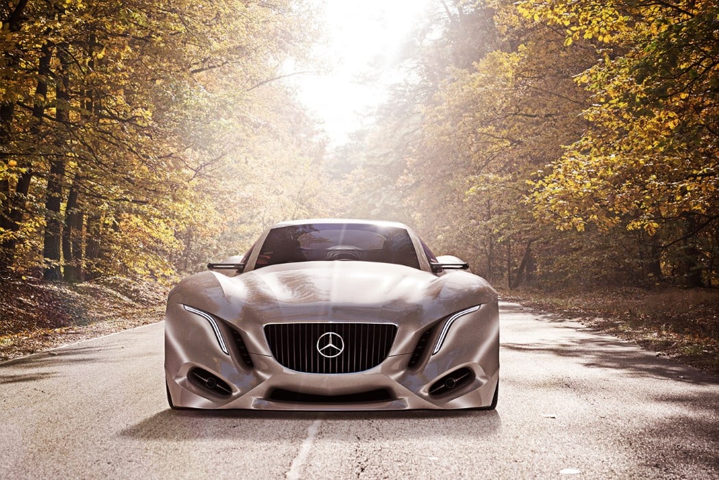
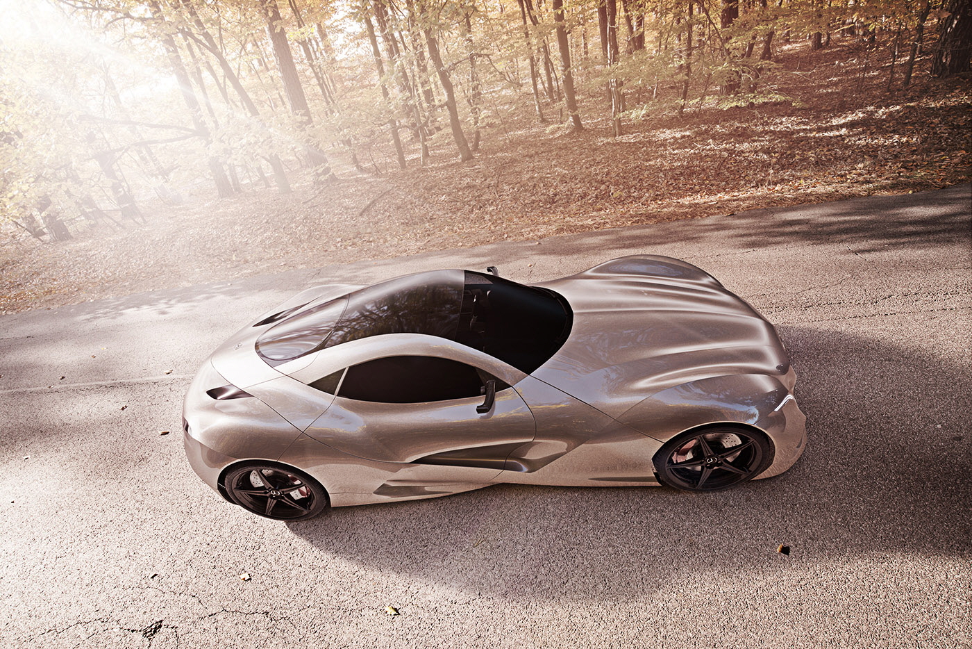
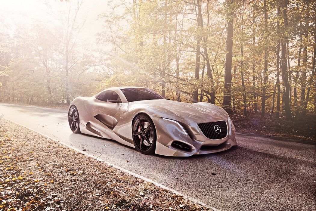
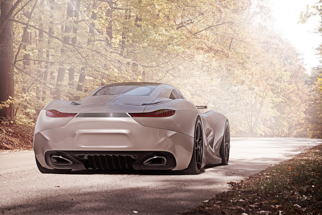
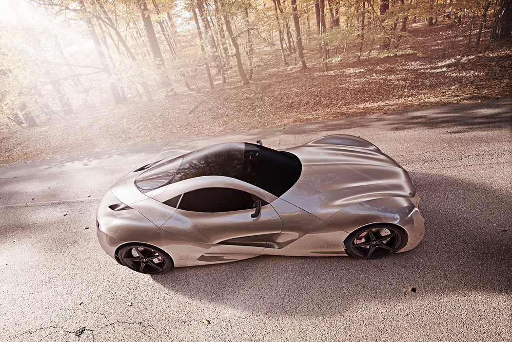
Are you seeing that, Yanko fam? Isn’t that the most curvilinear car you’ve ever seen? The Mercedes Concept I is a rather sculpted conceptual coupe design that has the correct curves in the correct places. Designed to bridge the gap between regular and extravagant automobile designs, the Concept I sure has a tendency to grab eyes and drop jaws. It’s a good thing I’m typing out this article instead of talking because my jaw’s already sweeping the floor!

Designer: Ivan Venkov

mercedes_coupe_concept_2

mercedes_coupe_concept_3

mercedes_coupe_concept_4

mercedes_coupe_concept_5

mercedes_coupe_concept_6

mercedes_coupe_concept_7

mercedes_coupe_concept_8

mercedes_coupe_concept_9

mercedes_coupe_concept_10

Does your bike even flex, bro?

flex_bike_1

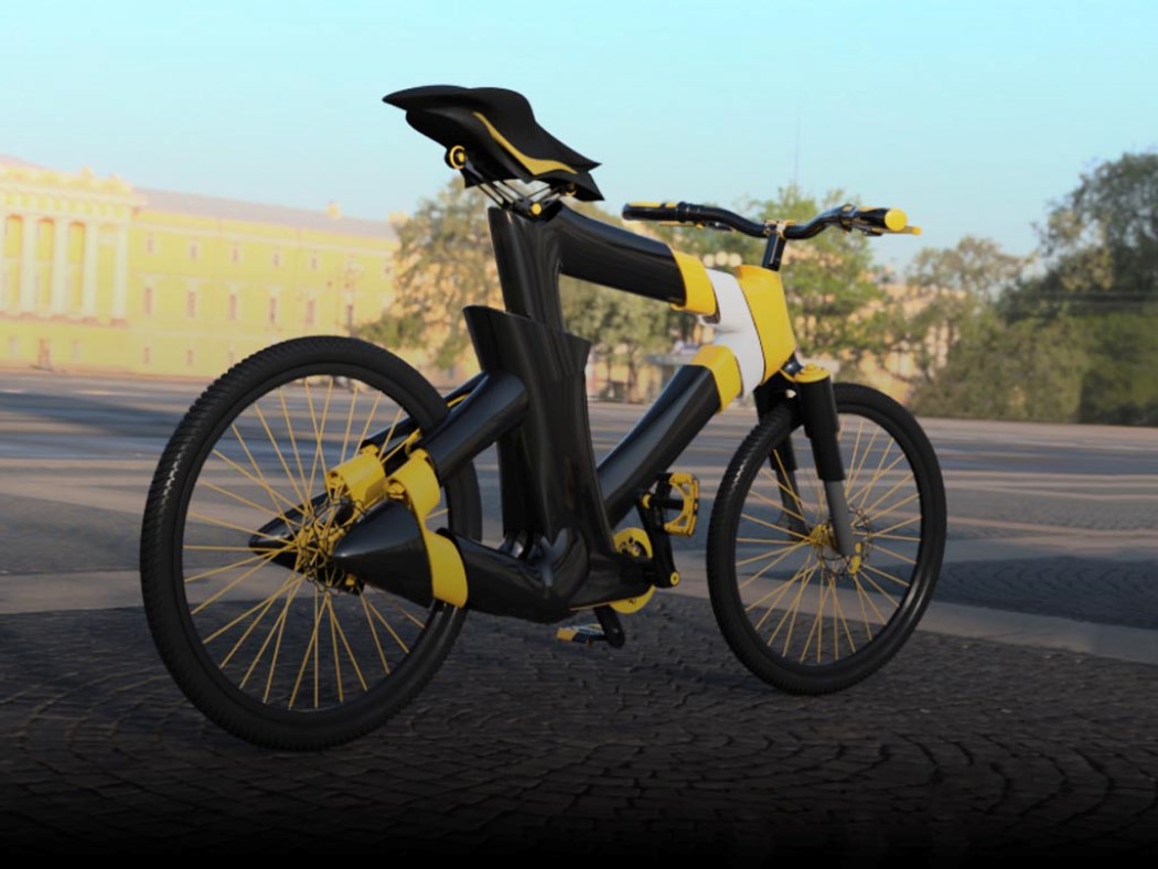
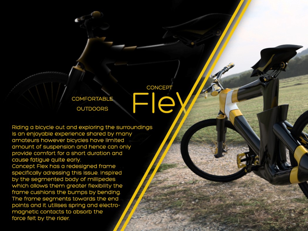
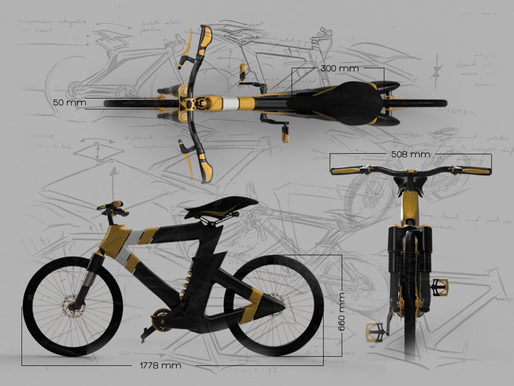
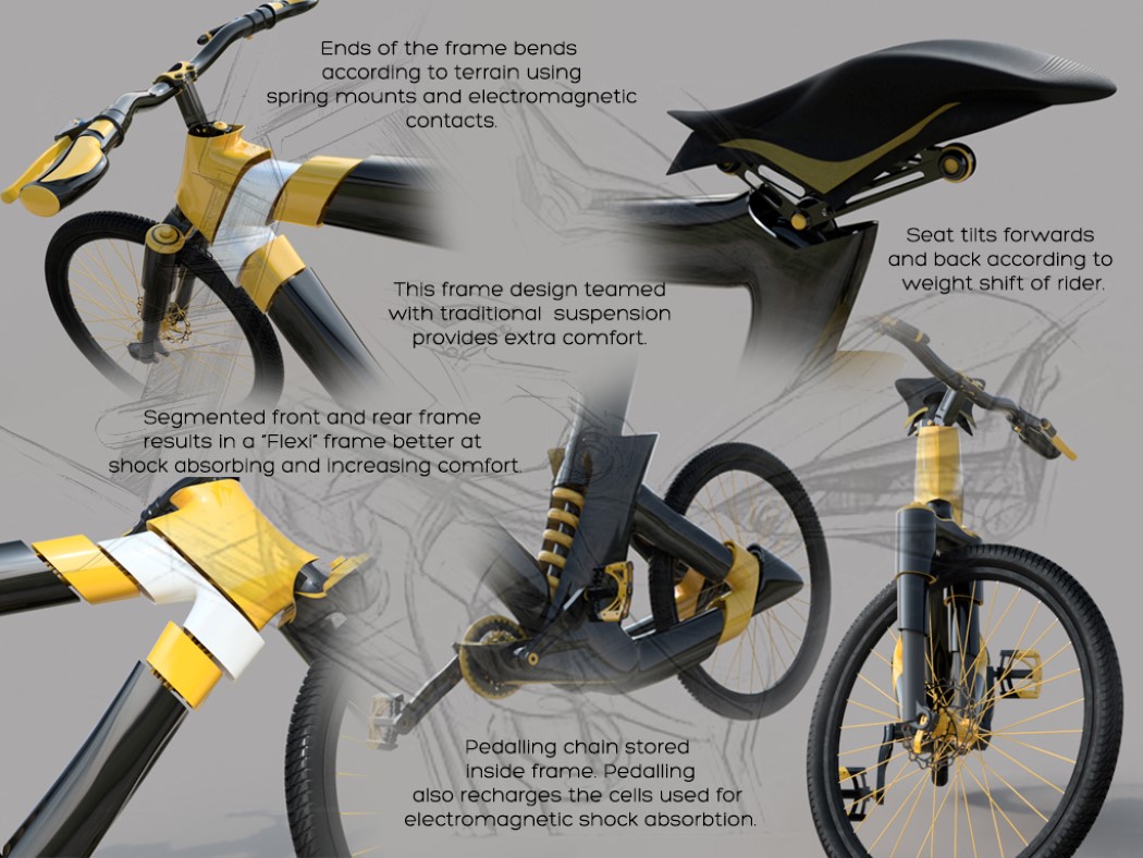
Take a look at the Flex Bike’s frame and tell me what looks unusual. Spotted it? You’ll notice that it’s split at quite a few spaces. Not just that, the split parts aren’t aligned effectively. Well, my dear friend, that’s all for a higher purpose. The Flex Bike’s frame has this rather unique design because the frame IS the suspension! Yes, the frame has a segmented, flexible design (it takes inspiration from the Millipede’s exoskeleton) that bends and absorbs shock at multiple points, giving you the velvety smooth ride you would get from sitting in a posh car! Even the bike seat has a pivot and a spring, allowing it to give you the most comfortable seating experience over long rides. Impressive, don’t you think?

Designer: Ivan Venkov
flex_bike_2

flex_bike_3

flex_bike_4