Shred paper in style

We love to see a design that challenges the visual norm that we have become familiar with, and that is certainly what this concept does! At first glance you would be forgiven if you were left wondering what its functionality is, but on further inspection its paper-shredding abilities become evident! The appropriately named ‘Doughnut’ paper shredder isn’t just shaped the way-it is for the sake of aesthetics, it uses its bold and friendly form to elevate its functionality; the curvaceous top protects the user’s fingers from the vicious blades that are concealed within, whilst also guiding the paper into the correct position.

What makes this example of industrial design so desirable is its ability to work in both the domestic and professional environment; as opposed to carrying an unappealing and visually geometric aesthetic that can jar with the décor of a home, it instead blends in and becomes one with its surroundings!

Designer: Jaekyu Jung

“It’s completely safe to use for anyone. A shape of the doughnut top it can protect your fingers from the shredder blades inside,” Jung told Yanko Design.

1:6 scale prototype made by a piece of papers with PLA 3d printing.

This complete pill-shaped object is actually a hairdryer

Form and function marry well in the conceptual BR555 portable hairdryer. Inspired by the Braun 550 series – from 1976 – the new-age BR555 is designed to fit in your travel case. The power of the Sirocco fan, used in its construction, is good enough to work noiselessly as well dry your hair efficiently.

The design is very fluid if you ask me, it can be used as a travel piece, but at the same time it can fit well into any bathroom or dressing table. I like the fact that it has a completely folding form, and giving the dryer a completely compact footprint and making it easy to store it.

Designer: Jaekyu Jung

“Hairdryer products have more time not to be used than when they are used, so we have been considering designs that can harmonize in space such as bathrooms and dressing rooms,” Jung told Yanko Design.

“This hairdryer adopts a Sirocco fan. The Sirocco fan makes less noise. It features storage and portability by applying a structure that rarely folds the steering wheel among the Sirocco type. Minimalistic intake pattern, expressing the beauty and space harmony as a beauty product.”

“I disassembled a couple of hairdryers to see how that works also how the internal structure looks like and designed for and then tried to make a 1:1 prototype model to check the scale. The 90° is cordless and is powered by Li-ion battery, the body is made of ABS plastic and has a high polished finish. Its foldable design reduces baggage space making it ideal for both traveling and everyday use.”

A Flat-Pack Light?!

Products can be functionally beneficial and aesthetically beautiful without having to be complicated. Fold Lamp proves just this. Destined for a life within a domestic dining room, the magnesium lamp is elegantly suspended from the ceiling, introducing a gentle glow to the room.

However, elegant aesthetics aside, it’s the consideration to the manufacture of the product that makes this project so intriguing. Constructed out of a single piece of magnesium that has been efficiently metal-stamped, Fold Lamp doesn’t require any additional hardware! So, what benefit does this have? Well visually distinctive form aside, in the unfolded orientation, it can significantly reduce shipping expenses from international manufacturers!

Designer: Jaekyu Jung

Below: Prototype

The Antenna Speaker encourages interaction

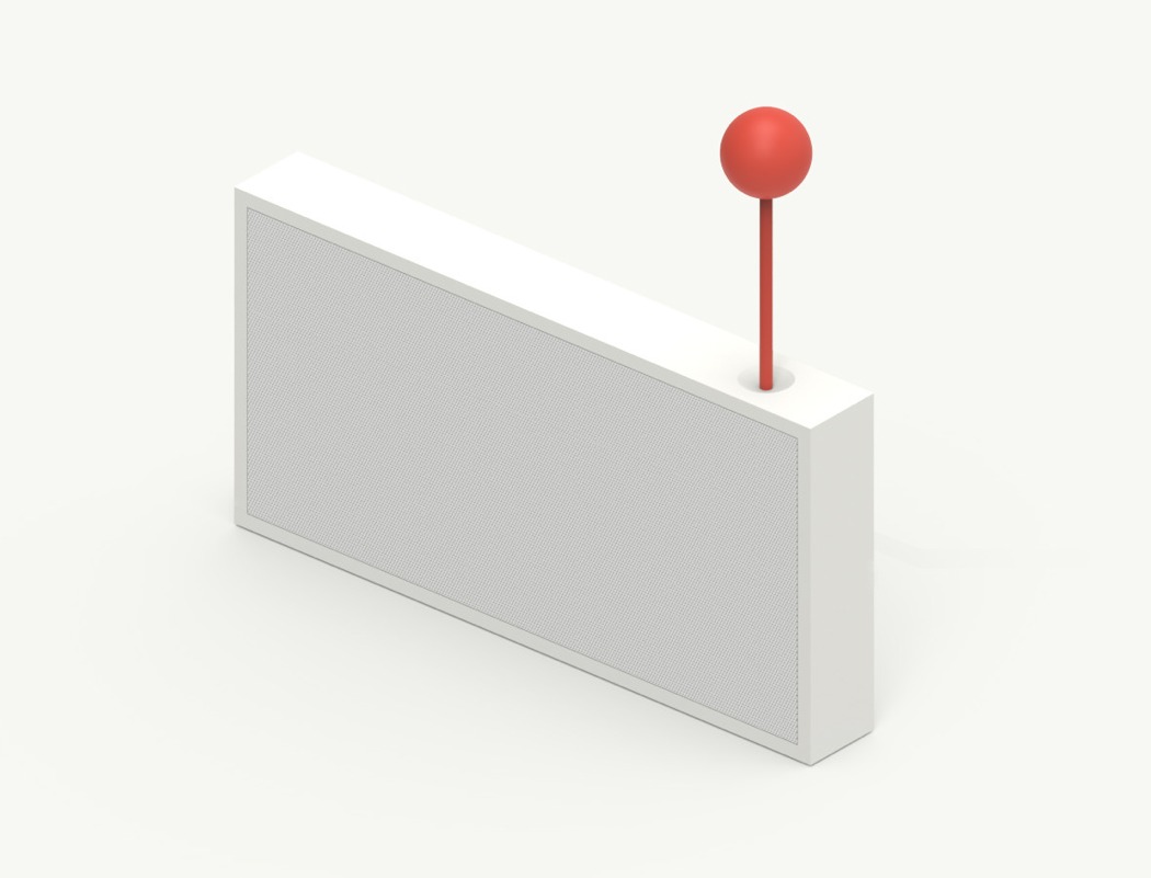
There is something about interacting with a physical product that makes the experience feel more connected, an app falls short of matching this quality. Antenna is a Bluetooth speaker and radio that has made full use of physical interaction and has maximized intuitive usability in the process!

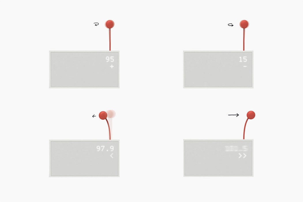
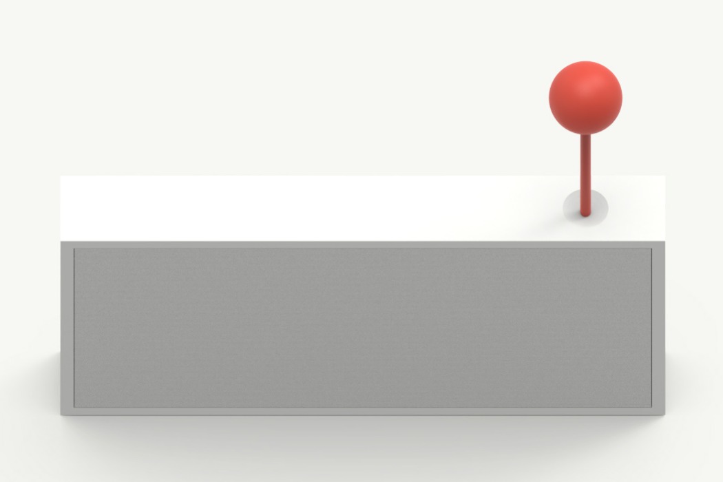
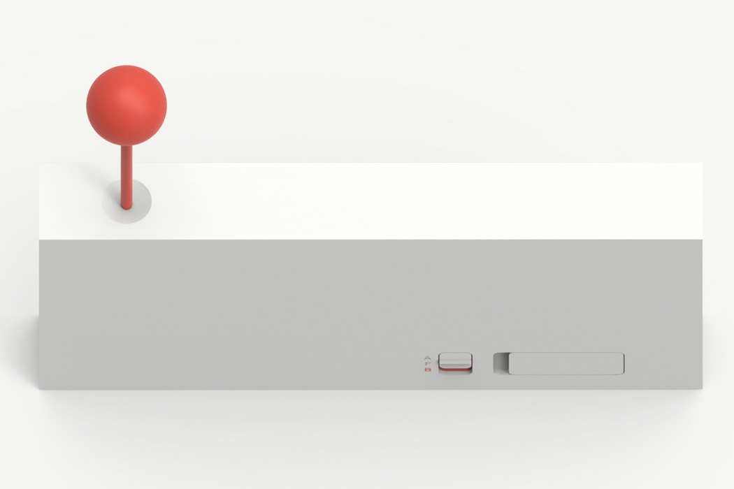
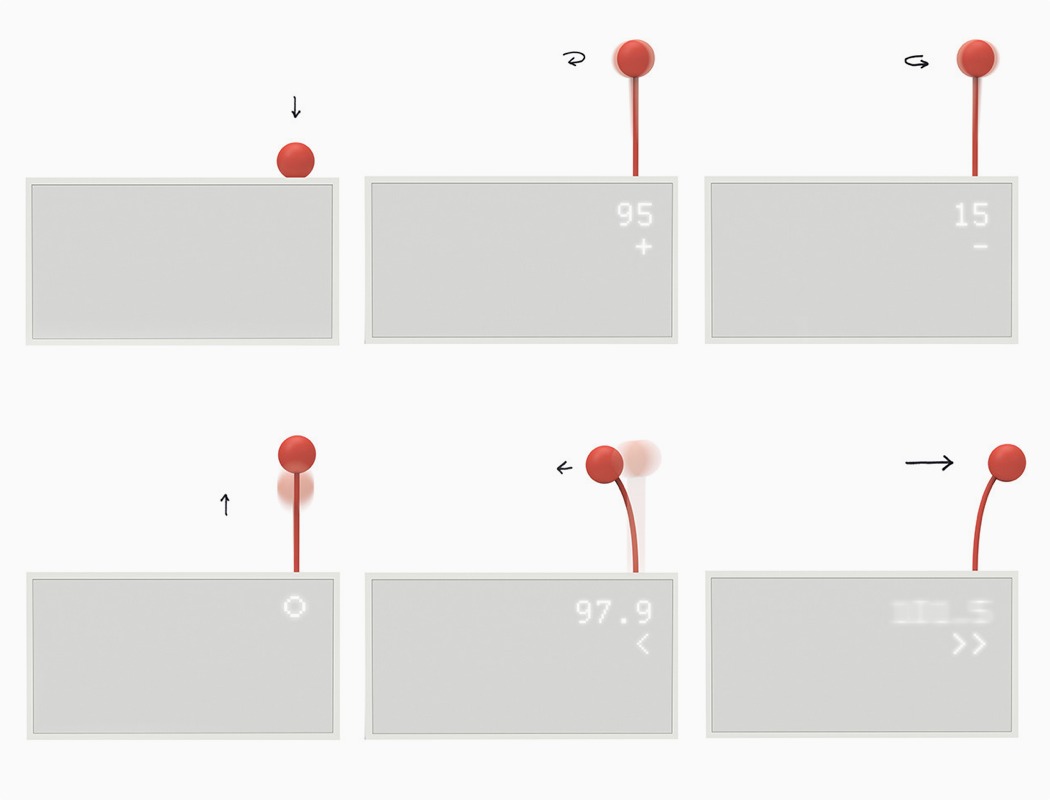
The buttons, switches and dials that clutter the design of many radios have been replaced by a single ‘antenna’. The device is controlled through a series of actions that each revolve around the brightly colored antenna; by pushing, pulling and rotating the ball, common commands including the volume and frequency can be adjusted.

There is something so intriguing about the simplistic design; the over-sized dial brings an element of playfulness to the product, giving it a fun and appealing aesthetic that encourages physical interaction. It’s great to see a speaker that doesn’t rely on an impersonal smart-phone application.

Designer: Jaekyu Jung

“The ‘antenna’ provides the means of controlling the power, frequency and volume. To turn the power on, the user must grasp the ball gently and pull it upwards. To manually adjust the frequency, the user must lightly push the controller to the left or right. For automatic frequency adjustment, the controller must be pushed left or right for an extended period of time. To adjust the volume, the user must hold the ball and turn it to the left or right. At the front of the radio is a speaker with hidden lighting for frequency, and volume information review,” explains Jung.

With its adjustable ring position, losing an earphone is a thing of the past!

As technology advances and popularity increases, the size of wireless earphones is dramatically decreasing. Whilst this not only makes the devices appear visually very similar to each other, more significantly it makes them extremely easy to lose! Both of these issues have been addressed with Pretzel, a unique and intriguing concept that certainly looks like a more practical alternative for the real world!

Pretzel’s distinguishing feature is the ring that sits on the external side of each device; the positioning of this soft-touch ring is adjustable so that it does not impede on the earphone’s comfort. A fabric loop elegantly attaches to each ring, connecting the devices together in a distinctive and visually interesting manner. Each of the earphones carries a simplistic and fuss-free aesthetic which has been enhanced through careful attention to detail at the CMF stage of the design process; texture and color separate the loop from the earphones, leading to a beautifully tactile and complete product.

Designer: Jaekyu Jung

The watch that combines time-telling and mystery

dodecagon_watch_1

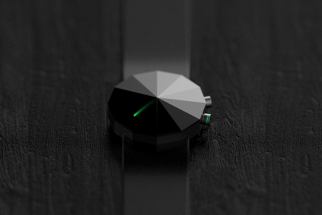
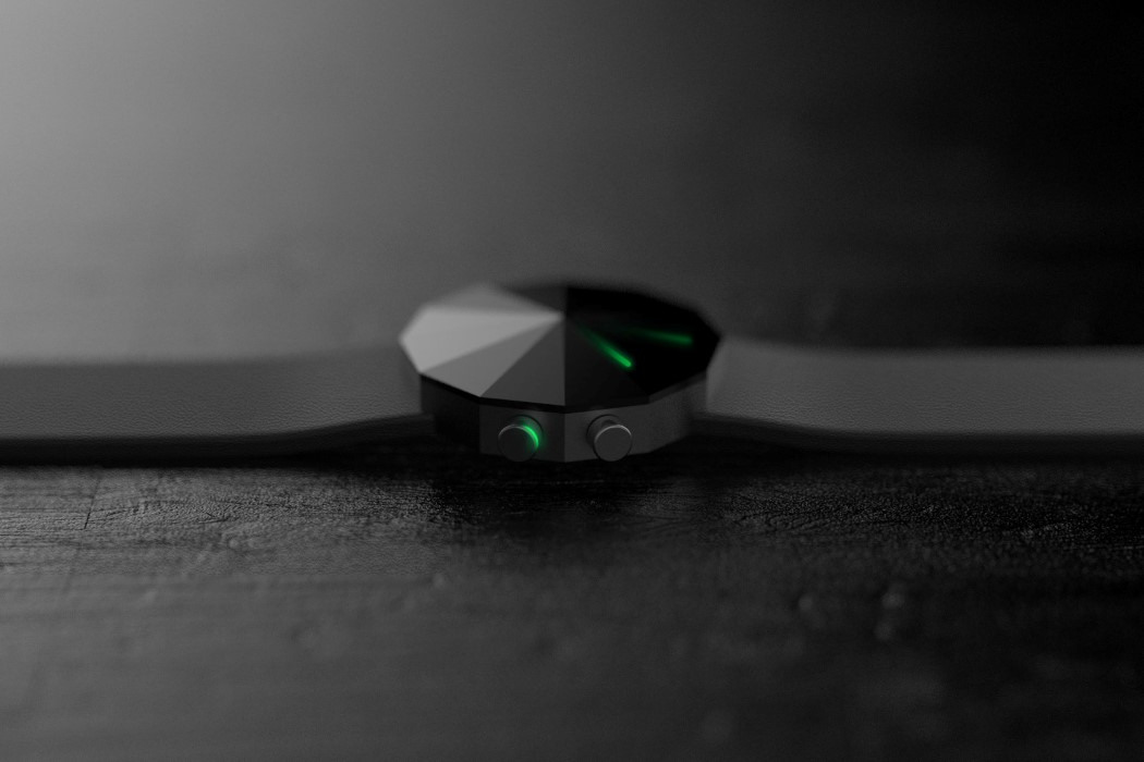
Taking inspiration from the twelve-sided polygon, the Dodecagon Watch uses the geometric shape and a commonly found density/opacity trick to create a watch that’s literally different and mysterious at the same time.

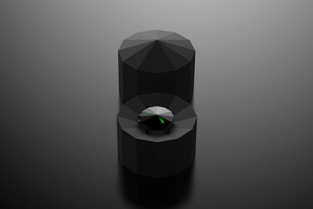
The crystal sitting atop the watch comes with a black tint which grows darker as the glass gets thicker. The dodecagon, being thickest at its center, therefore obstructs your view of the center of the dial. What you DO see, however, is the trail of light from glowing watch-hands at the end which points to the time. With a vibe that feels mysterious, ghostly even, the watch tells you time through these glowing hands that seem to appear from the darkness… and as a result, creating a visual that’s absolutely stunning to look at! Oh my lord, will you look at that minimal, beautiful packaging?!

Designer: Jaekyu Jung for Weekend-Works.com

dodecagon_watch_2

dodecagon_watch_3

This vase is a living Snapchat filter!

pixel_vase_1

This vase turns everything into low-res, 8-bit-ish mosaic awesomeness! Using a rather cleverly patterned/faceted acrylic piece, the Pixel vase just warps your perception of everything behind it, turning real life into a bunch of pixels. It’s a clever technique that not only brings dynamism to something as static as a flower-vase, but also is bound to delight people who see it (especially for the first time)!

I can’t help but imagine the creative possibilities for something like this! Could this be the new evolved form of minimalism? Not actually being minimal, but rather taking something and ‘minimizing’ its resolution to make it seem pixelated. What do you think?!

Designers: Jaekyu Jung & JCH Works.

pixel_vase_2

pixel_vase_4

pixel_vase_3