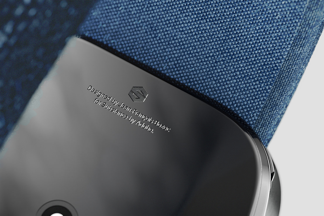
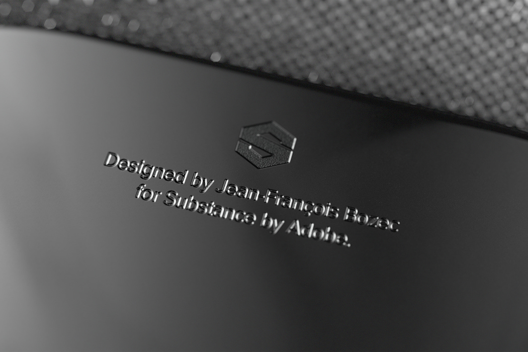
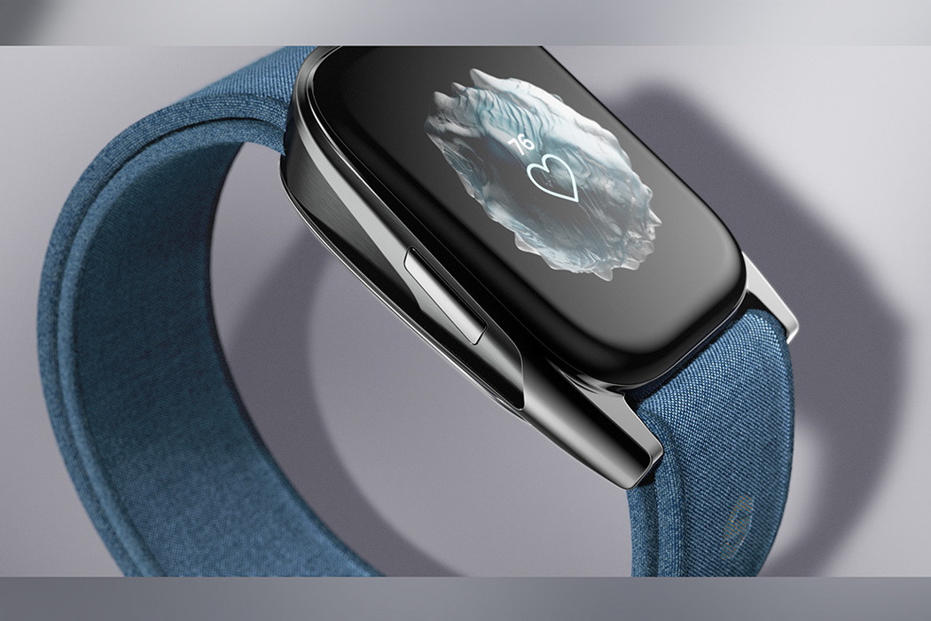
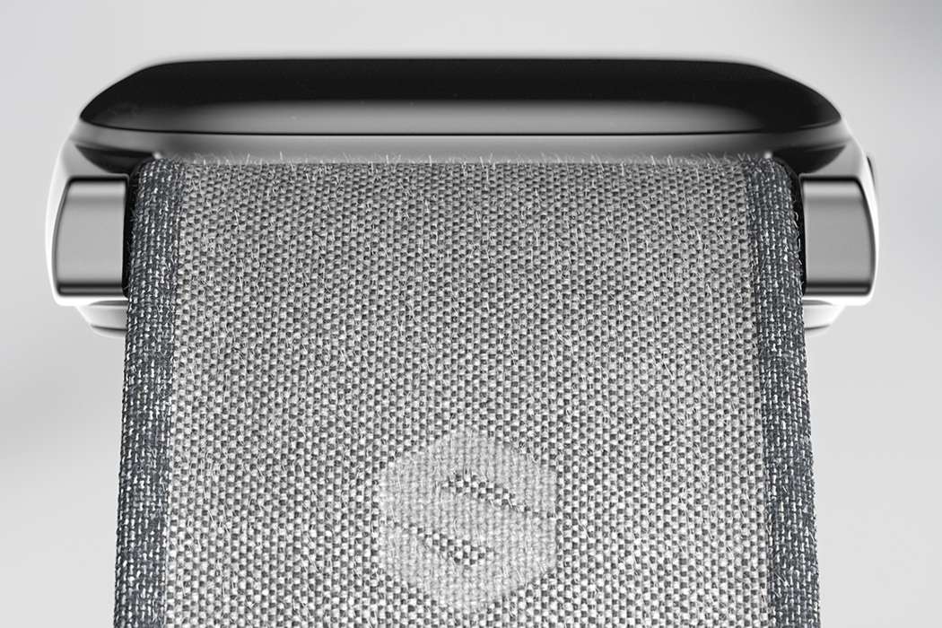
In collaboration with Adobe, this watch design uses CGI to highlight the textures of crystals and landscapes!

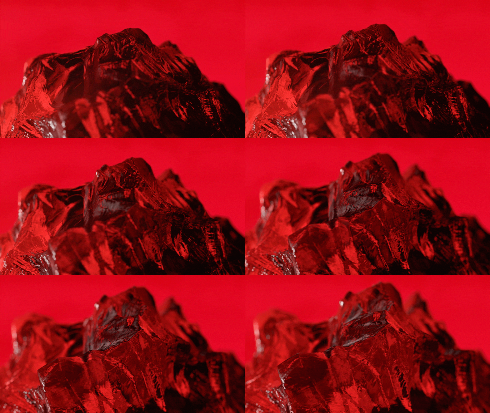
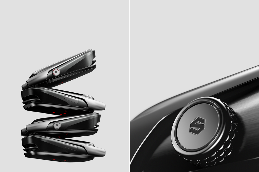
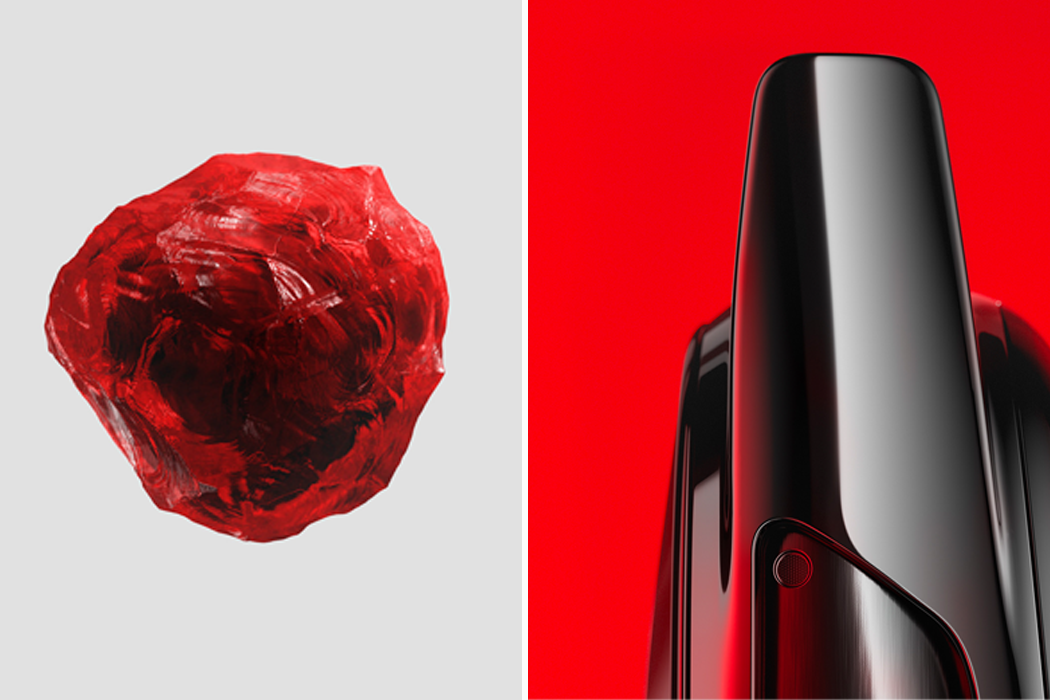
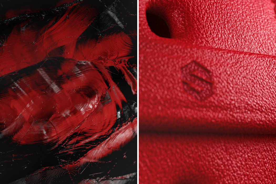
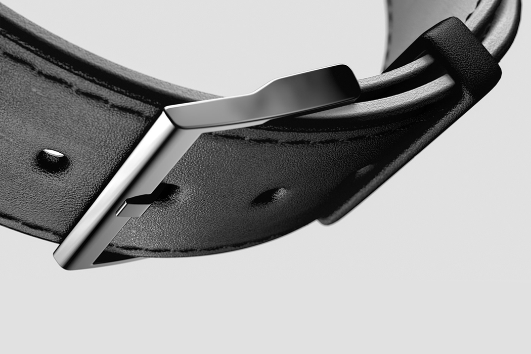
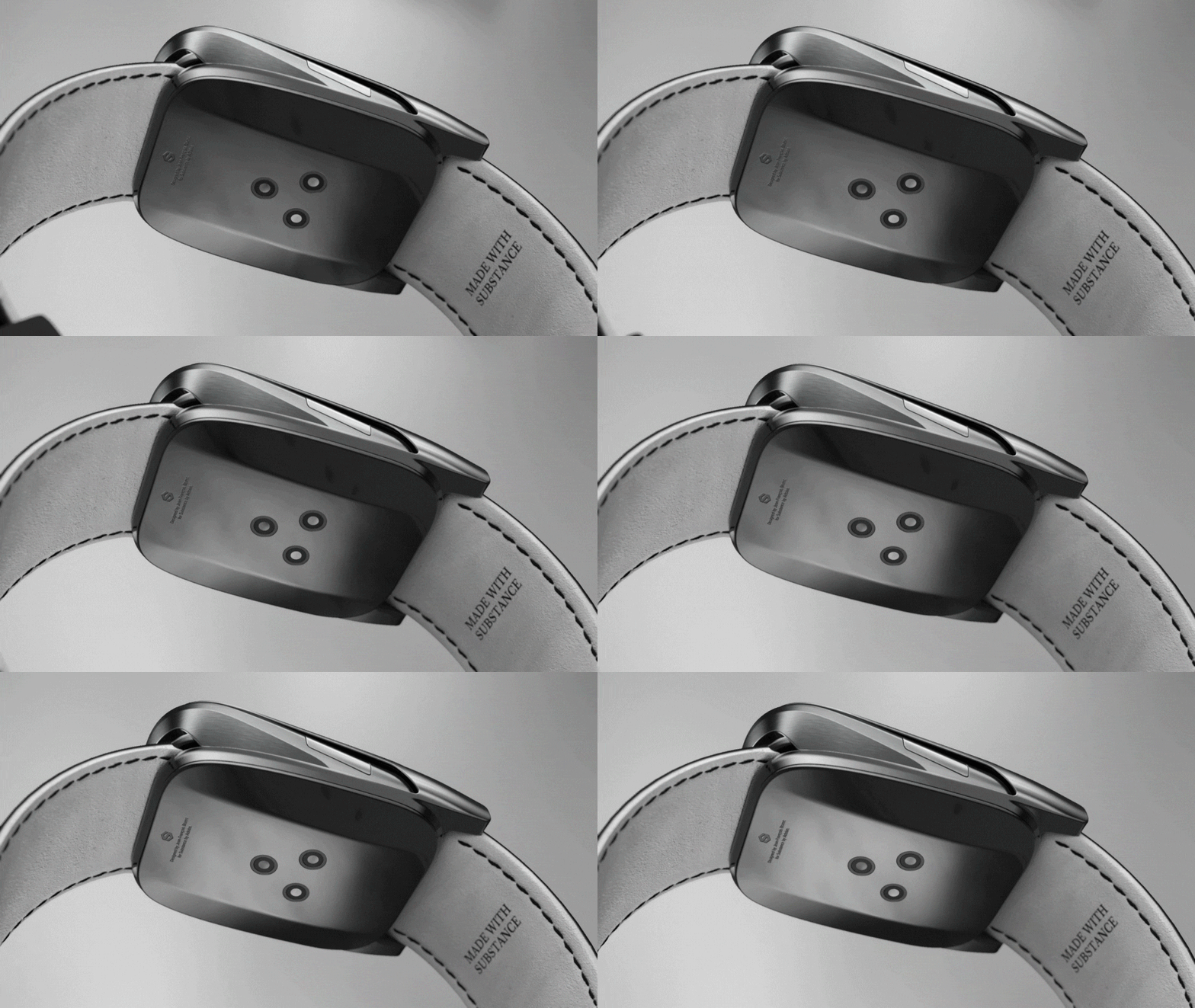
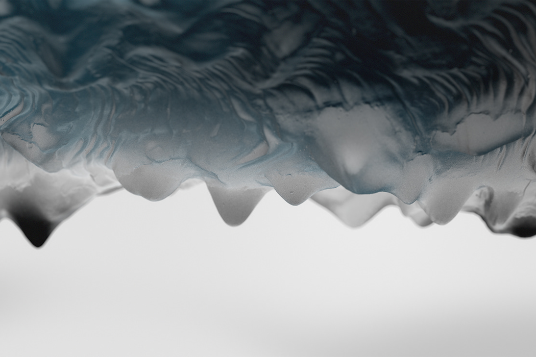
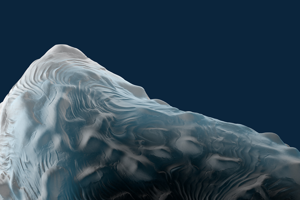
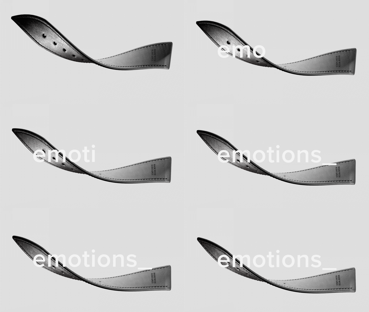
The texture of wearable designs, like watches, has the ability to grab our attention before we even fully understand the designing the first place. I know I’m not the only one who can’t help but reach out to run my fingers over all the different fabrics as I pass them by in department stores. The texture of a product’s exterior is what tells our brain whether or not we’re interested in learning more about it. In collaboration with Adobe, Jean-François Bozec sourced inspiration from surfaces of raw materials like obsidian crystals, natural aluminum, and upturned leather, when designing the Obsidian Watch, his latest 3D visual concept.

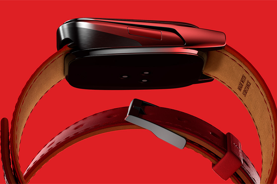
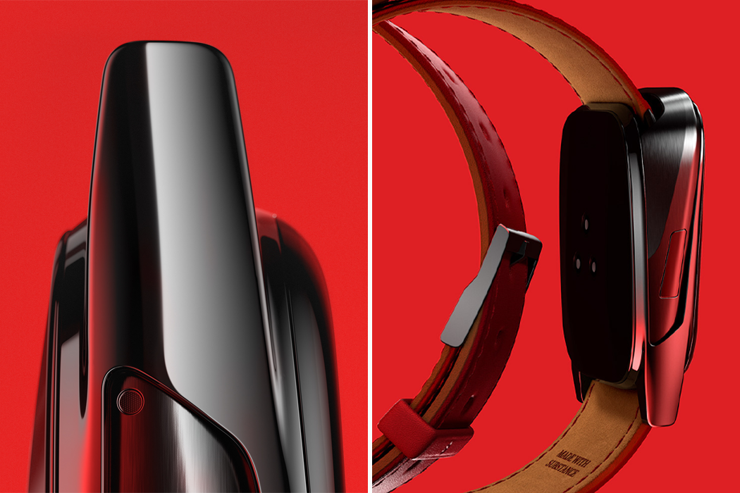
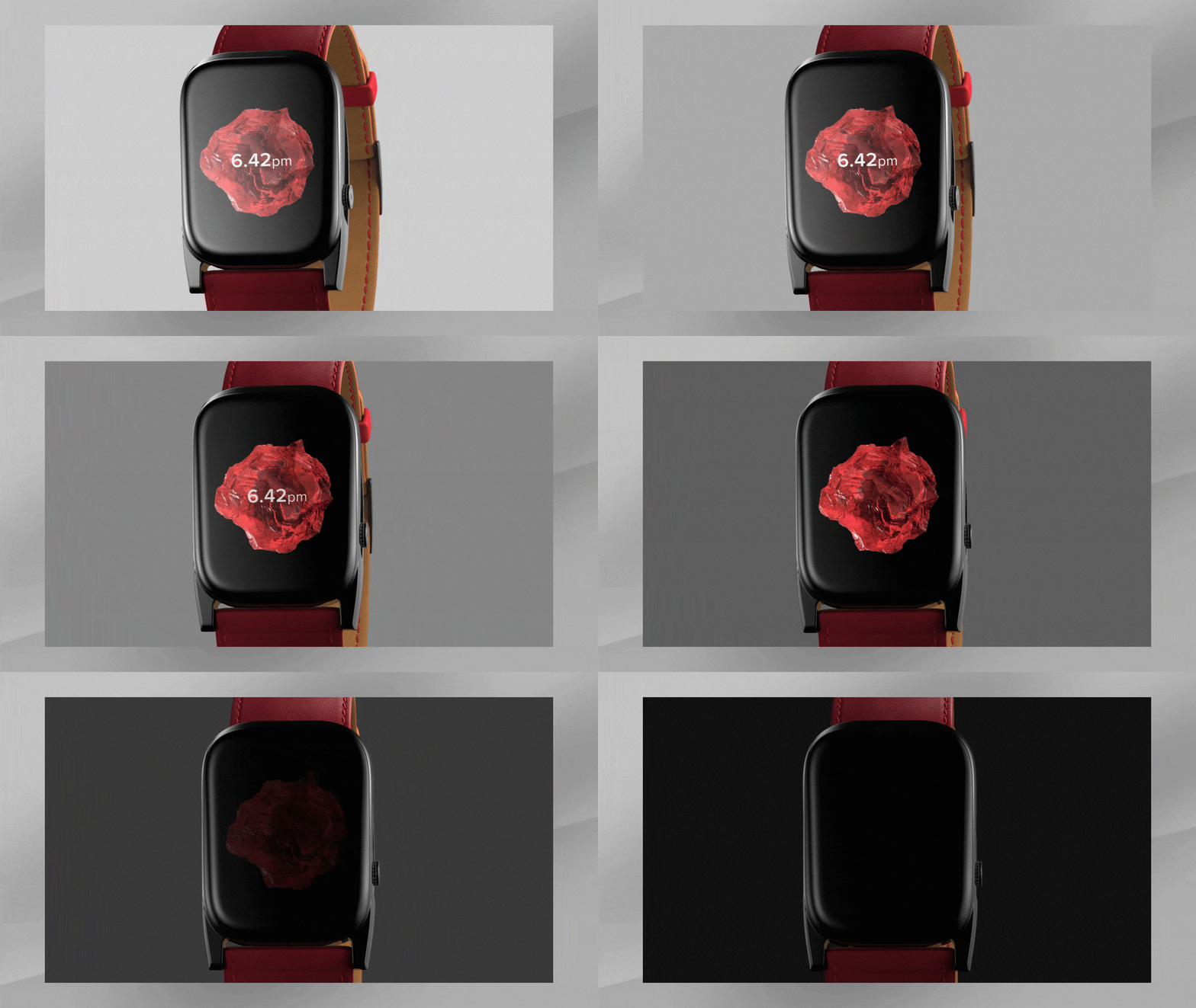
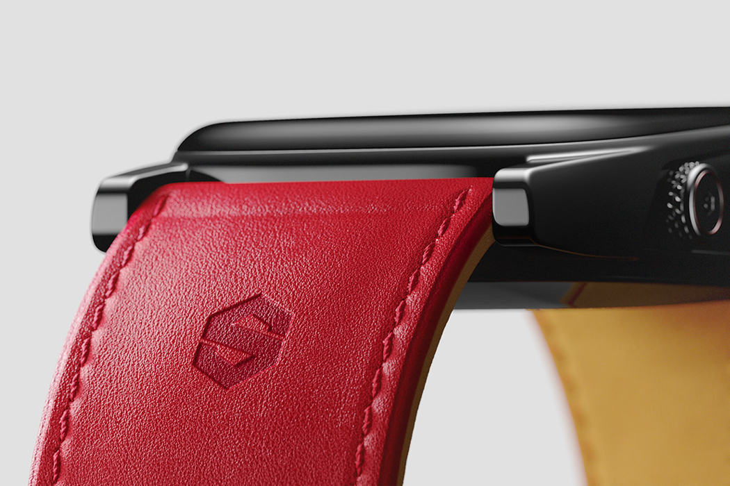
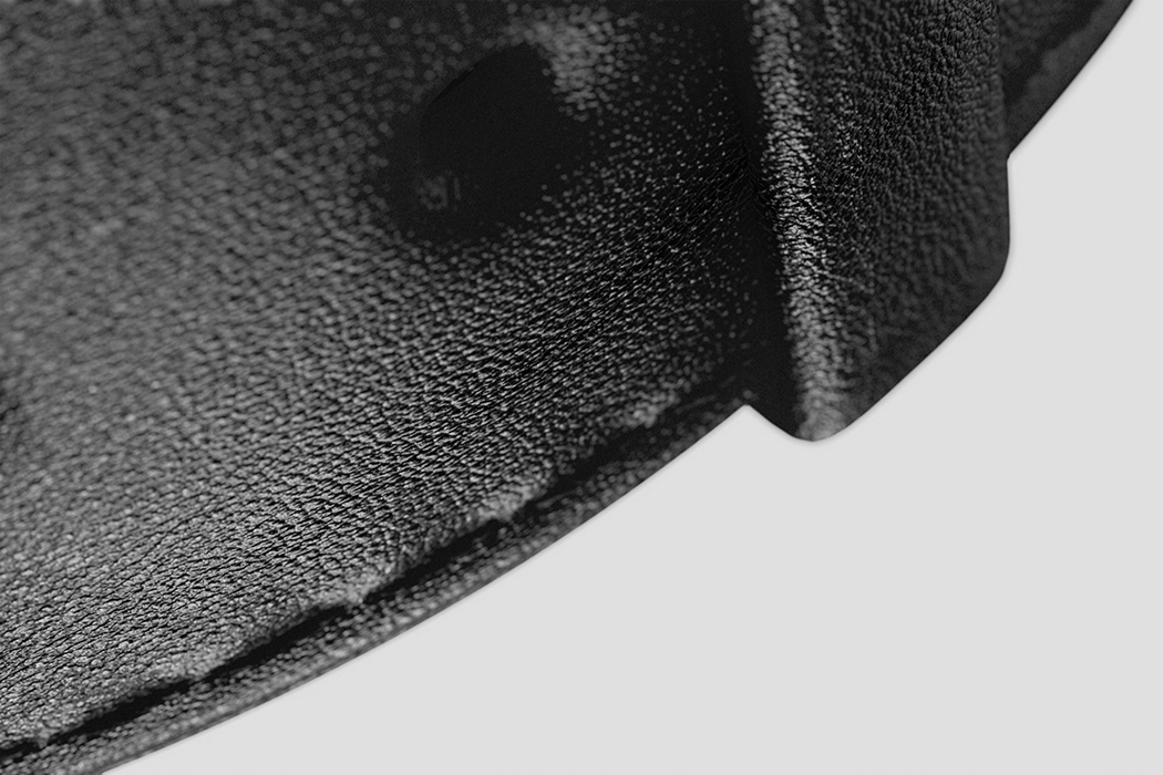
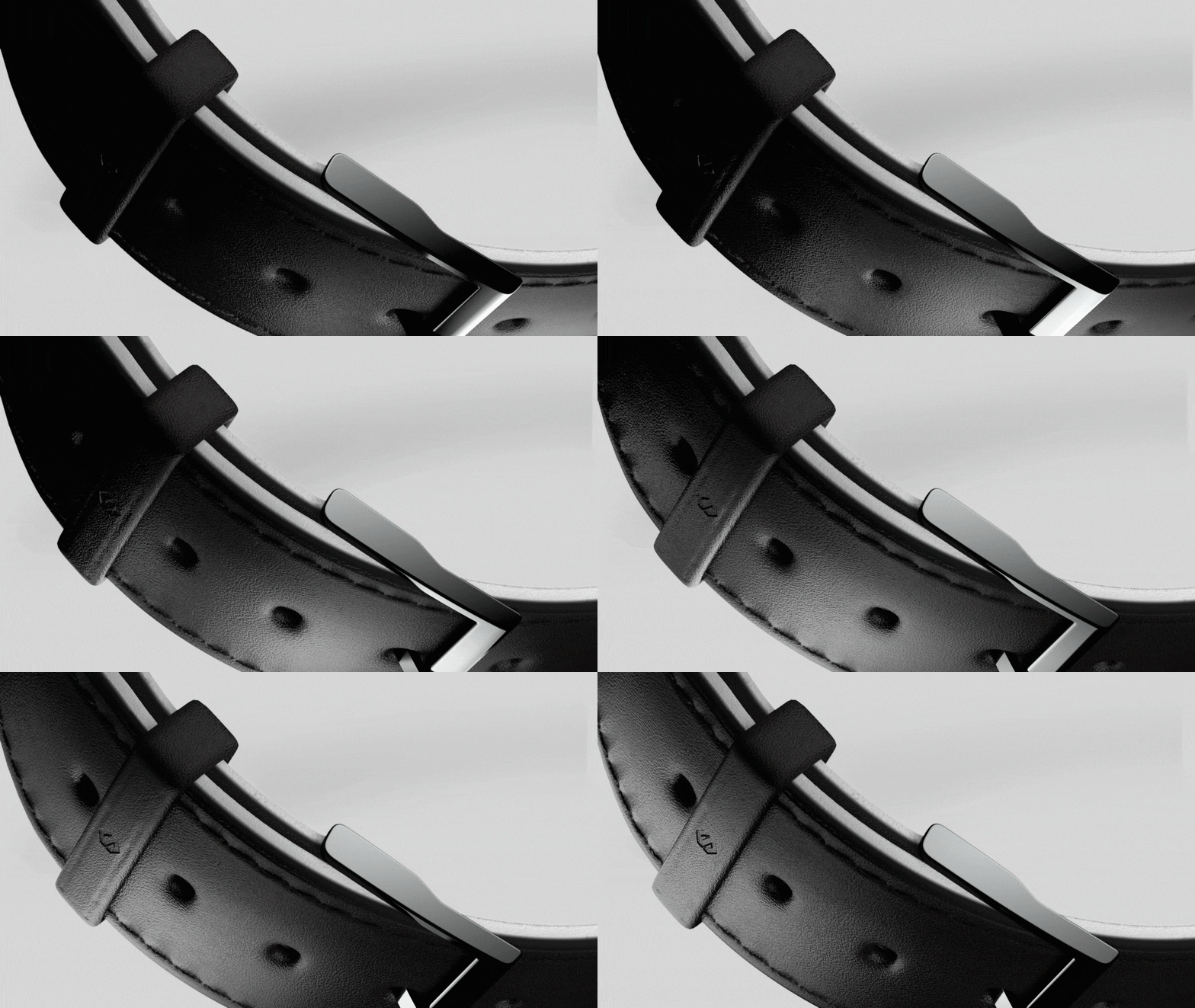
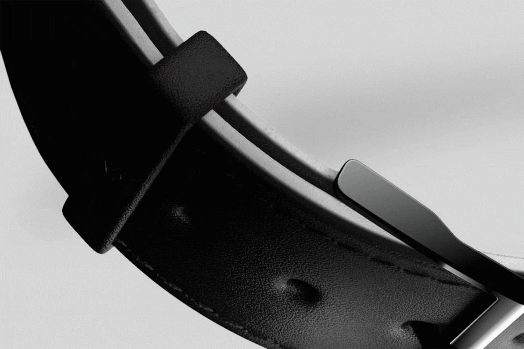
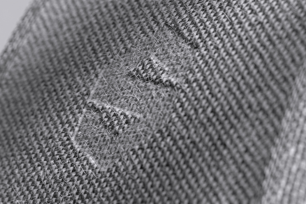
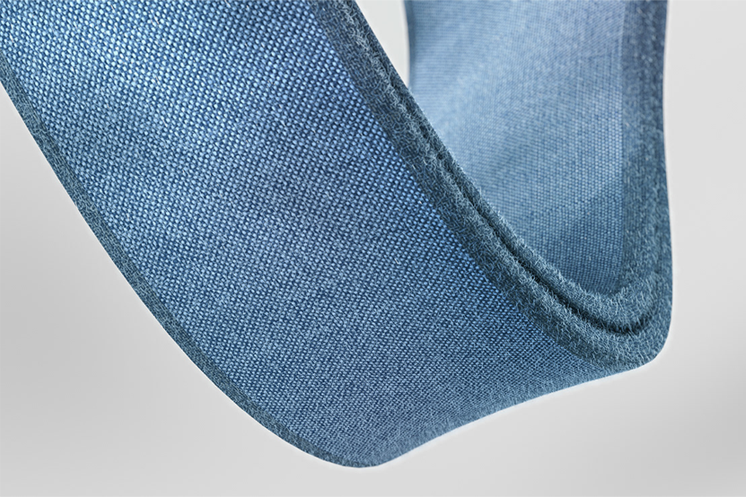
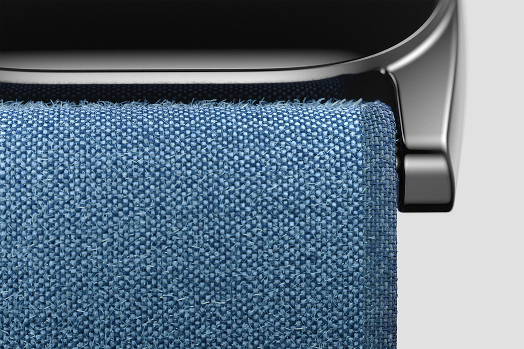
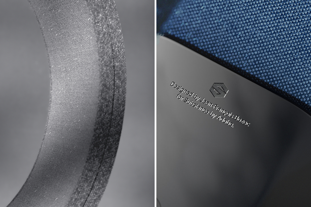
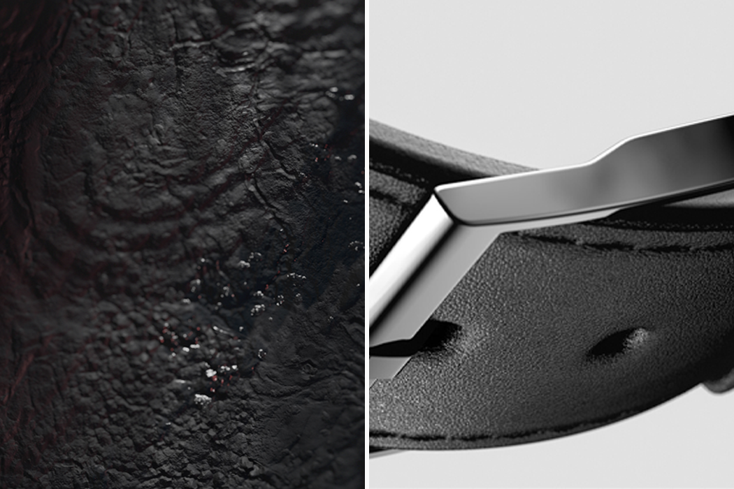
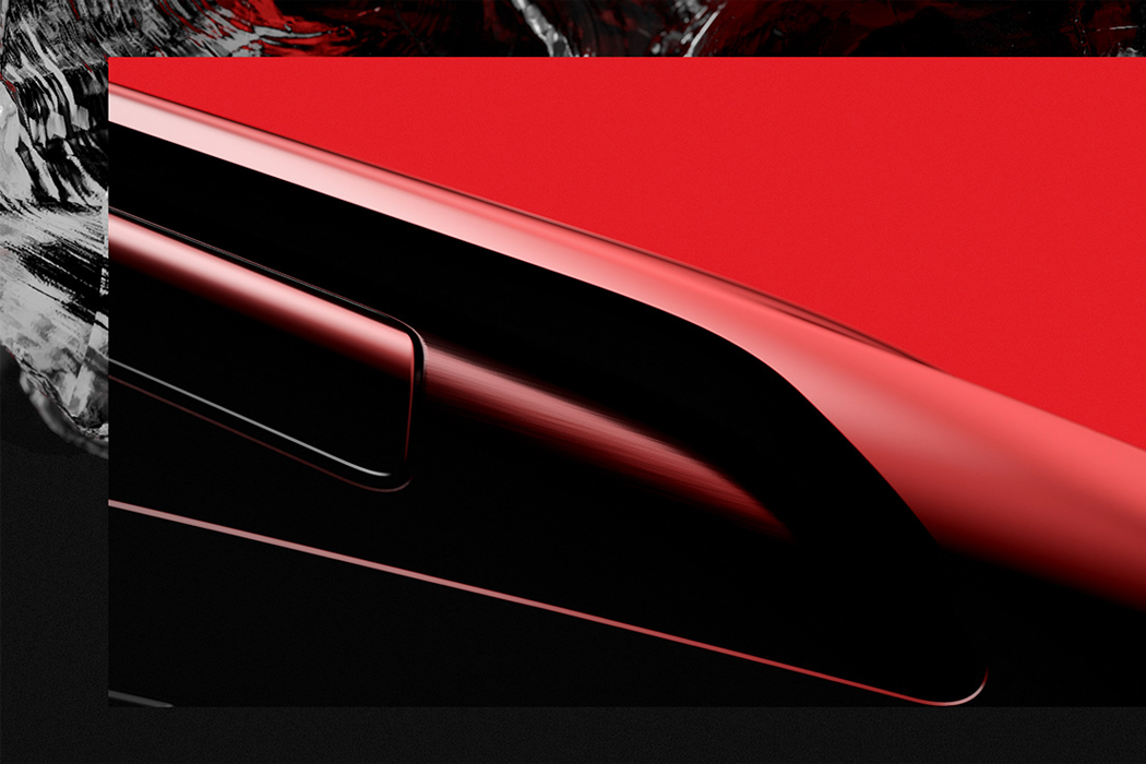
The digital interface on the Obsidian Watch is raised with a gradual pitch that gives it an air of reserved elegance to match the subtly intricate textures of its watch bands. The iridescent nature of red obsidian is presented in Bozec’s design through the dual-toned case. The watch’s case creates shadowed layers and was inspired by the matte textures of aluminum and iron. When strapped onto a vermillion red, plush leather watchband – the shadows remind those who wear the watch of its obsidian origin. In addition to crystals, Bozec felt equally as inspired by snow-covered mountains and other natural elements like stones. In order to evoke the image of snow, Bozec turned to CGI to develop a fabric for the watchband that mimicked the tightly-packed nature of snow, as he explains “CGI was the ideal way to materialize the intimate emotions born of the rawness of nature. The irregularities of the geological formations inspired the creation of the leather band. In the same manner, the fabric loop band stemmed from the lightness and softness invoked by the snowy environments.”

In addition to texture, through his 3D concept, Bozec also explored technology’s role in influencing how people think and feel. Bozec goes further to say, “My goal was to transpose feelings provided by [a] substance…on a smart and non-intrusive wearable device.” With the current influx of smart technology, too often a product’s textural design is sacrificed for the sake of preserving the user’s technological experience – Bozec set out to create a compromise. While Bozec considers the Obsidian Watch project more of an “emotional visual experiment,” than a full-fledged product design concept, the truth is that it could get away with being both.

Designer: Jean-François Bozec
This Logitech gaming mouse concept was designed specifically for Google Stadia!

As we enter a new era of ‘everywhere gaming’, French designer Jean-François Bozec decided it was best if gaming gear began evolving to reflect that fact. Meet the Logitech G, a Stadia-ready gaming mouse concept that fuses Logitech’s gaming-series design language with Google’s crisp, clean DNA. The Logitech G is an ambidextrous gaming mouse (perhaps the first of its kind) that comes outfitted with all the extraneous trigger buttons you need, and even throws in a Google Assistant button right beneath the scroll wheel.

Just like Google’s Stadia controller, the Logitech G works using WiFi (with a dedicated WiFi button on its base) for seamless, low-latency gaming across any kind of gaming device. A MicroUSB port on the front allows you to supply power when in dire need (or you could just connect it to your PC as a wired peripheral controller). The ambidextrous design is an interesting one, because of the way it lays out buttons on the side of the controller for more nuanced gameplay. That being said, they’re positioned in an interesting mirrored way that lets you use either your thumb or your ring and pinky finger to trigger them during gameplay. The mouse comes in Stadia’s classic controller-color variants, with a black offering, and a stormtrooper-esque white variant with black buttons. Too bad it’s a concept, though!

Designer: Jean-François Bozec

The charging pad of this Montblanc digital pen functions as its paper!

Digital pens are all the craze right now. The traditional pen and paper duo have been abandoned for the more convenient digital pen and tablet pairing. However, to actually use a digital pen, you need to ensure that you always have its corresponding tablet/device in hand. If not, they’re basically useless. Product designer Jean-François Bozec has come up with the concept of the ‘Note by Montblanc’. It is Montblanc’s first advanced digital pen but manages to go beyond your usual digital pen. Bozec harmoniously integrated AI with a high end ‘smart’ writing instrument, while maintaining Montblanc’s signature design DNA and philosophy. The result was the NotePen; the culmination of Montblanc’s brand expertise with an upgrade. Created from aluminum and stainless steel, it is guaranteed to fit perfectly into the user’s hand.

Designer: Jean-François Bozec
Designed to be compatible with tablets, smartphones, laptops, speakers, smartwatches and its charging pad, the NotePen can be paired with all devices, functioning as a swift, intuitive and precise writing instrument. Jot down your deepest thoughts, sketch your brightest ideas, pen down all your musings in an instant with the NotePen, with your notes easily accessible on all the connected devices.

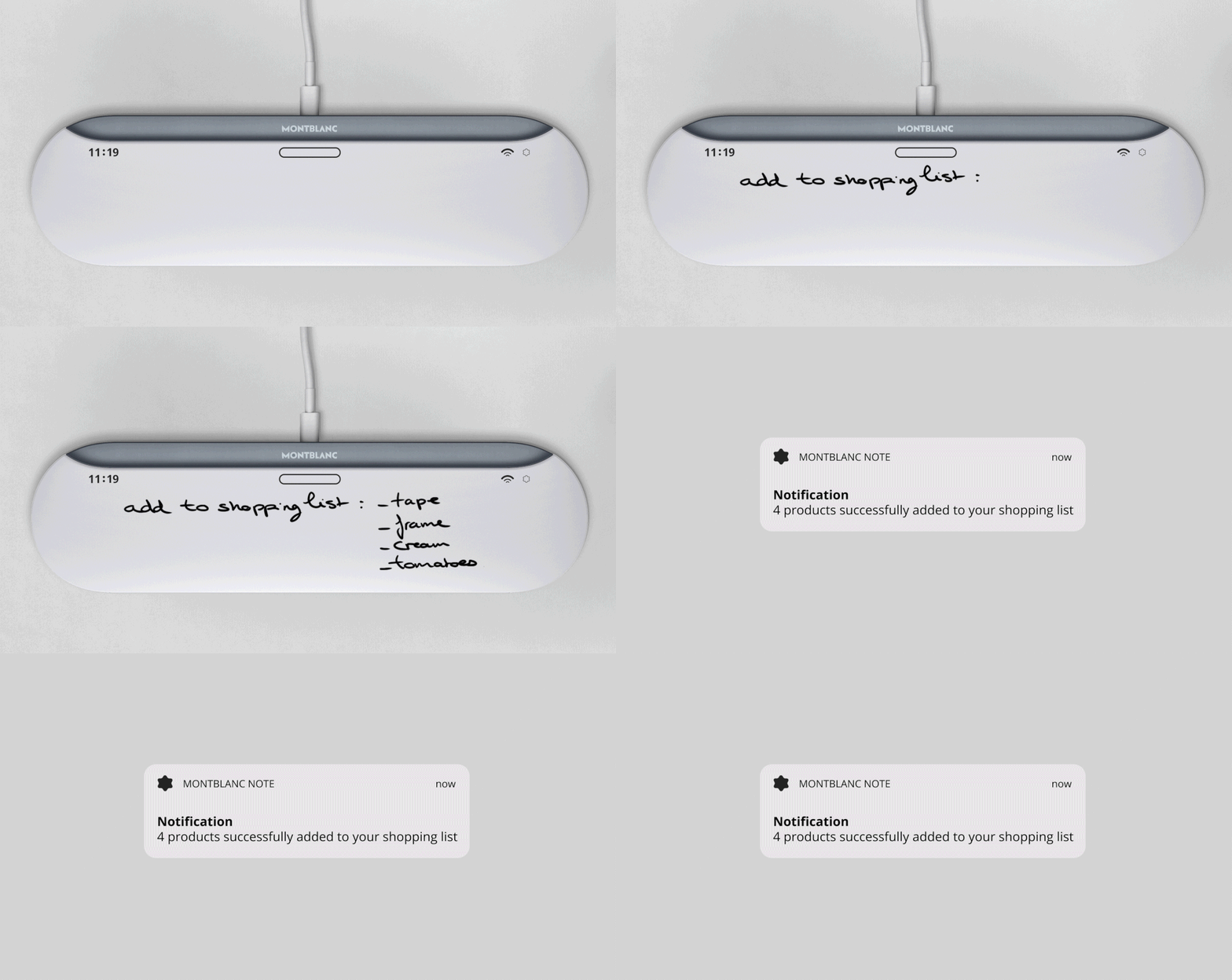
Note by Montblanc has been paired with an innovative charging pad called the NoteCharge. Magnetized, the NotePen is immediately attracted to the pad, attaching itself to the top of it, once they are brought together.

Besides tablets and smartphones, the NotePen can be used to write on the E-ink screen of the NoteCharge. Once you’ve made your notes, tap on the pen and directly transfer your data to the cloud of your preferred device. Check your notes anytime anywhere on your cloud-based device. The battery percentage is also displayed on the screen of the charging pad.

Amped with the Invenses 9 axis chip, it allows you to express your ideas on a screen as you would on a proper sheet of paper. The chip ensures there are no delays and latencies in the transfer of ideas from your mind to the tangible screen. The touch-sensitive area which allows you to control your pen is customizable, enabling you to alter it according to your needs and the preferred tools of your choice.

Available in three impressive colors; Rose Gold, Sage Green and Abyssal Blue, Note by Montblanc is simple but sophisticated, lightweight but effectively strong, a single pen but with infinite possibilities.

Now here’s a concept phone we love

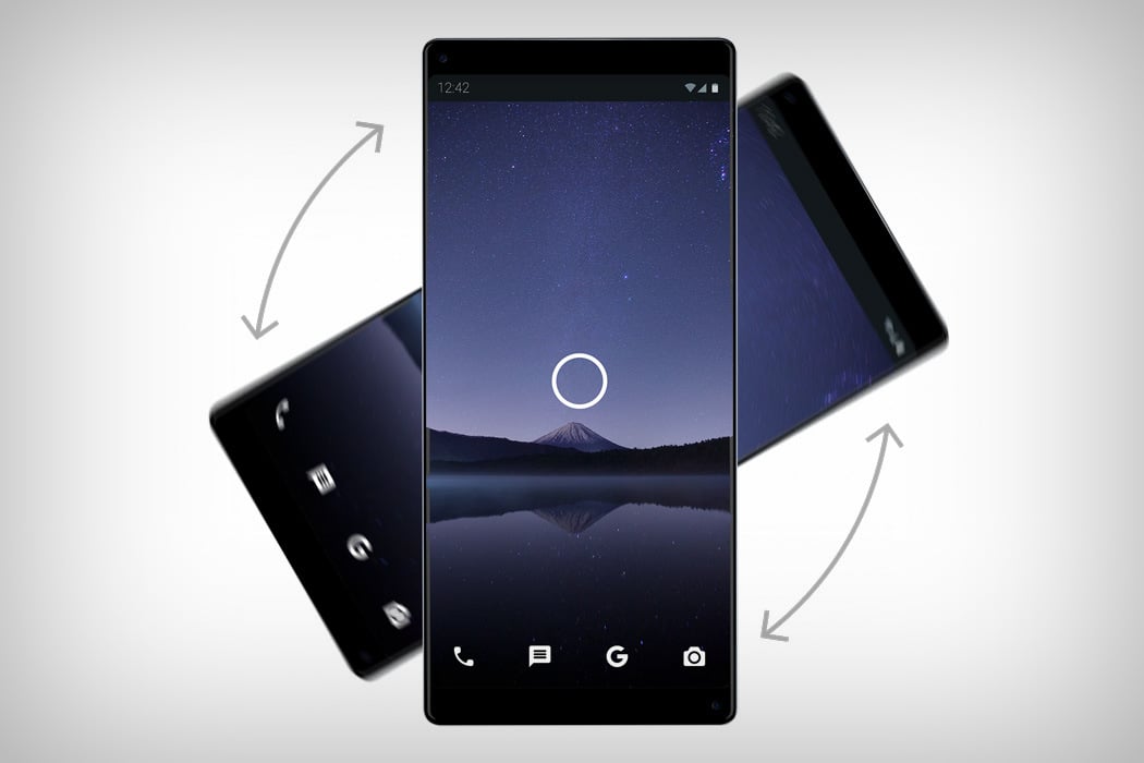
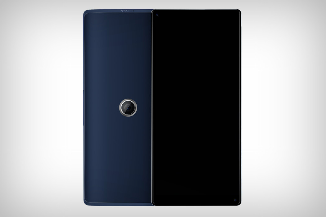
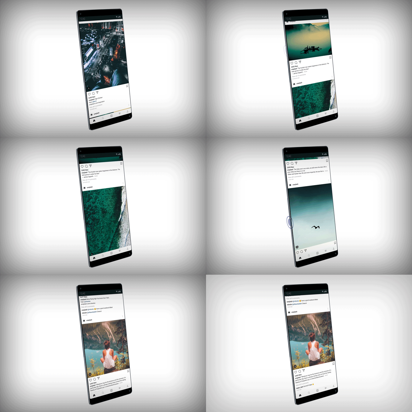
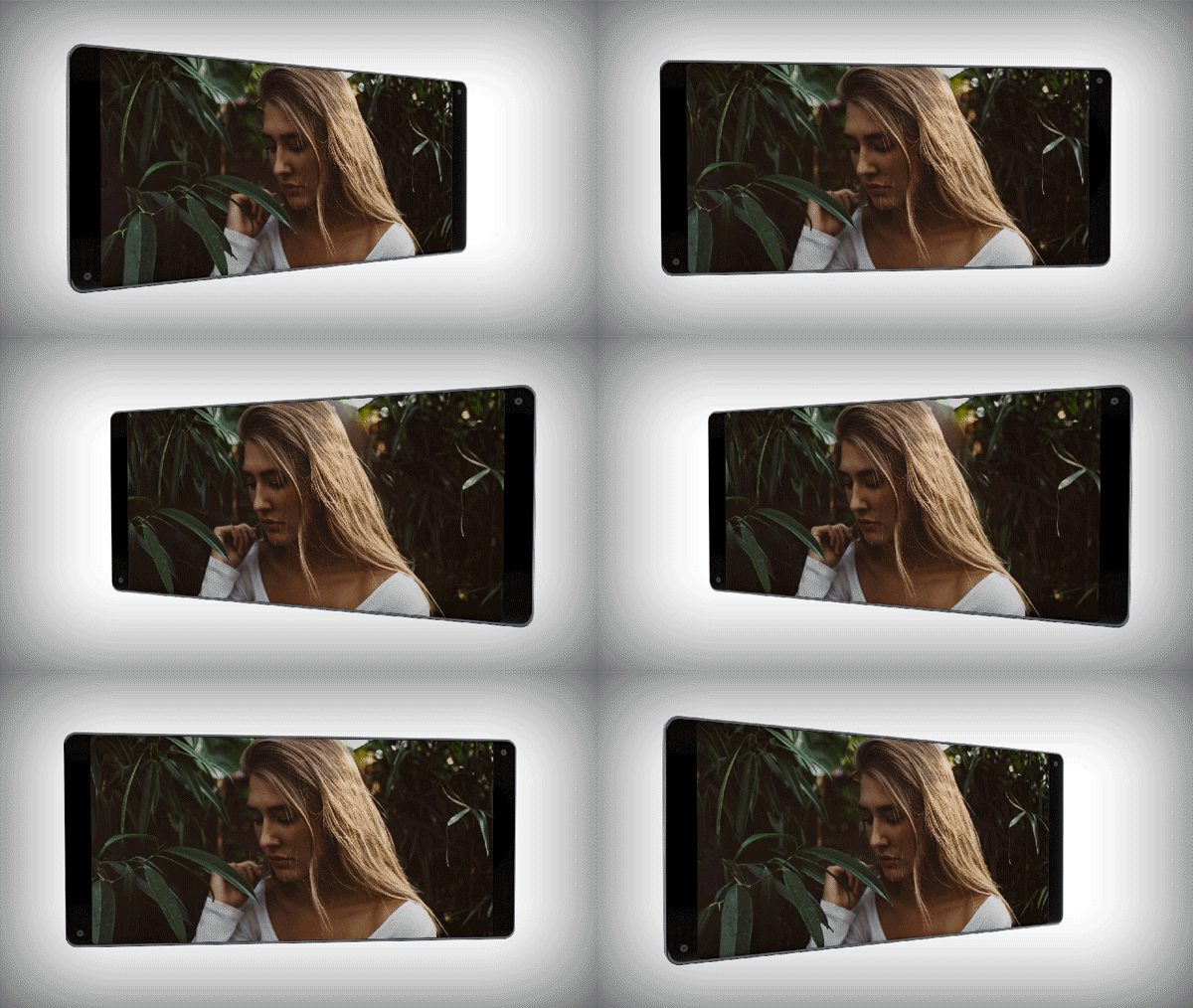
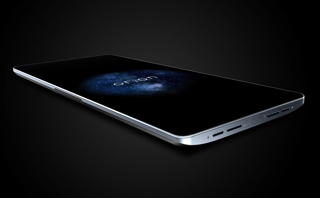
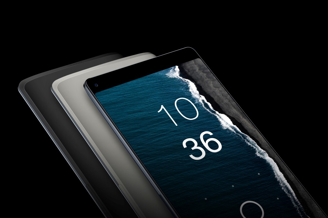
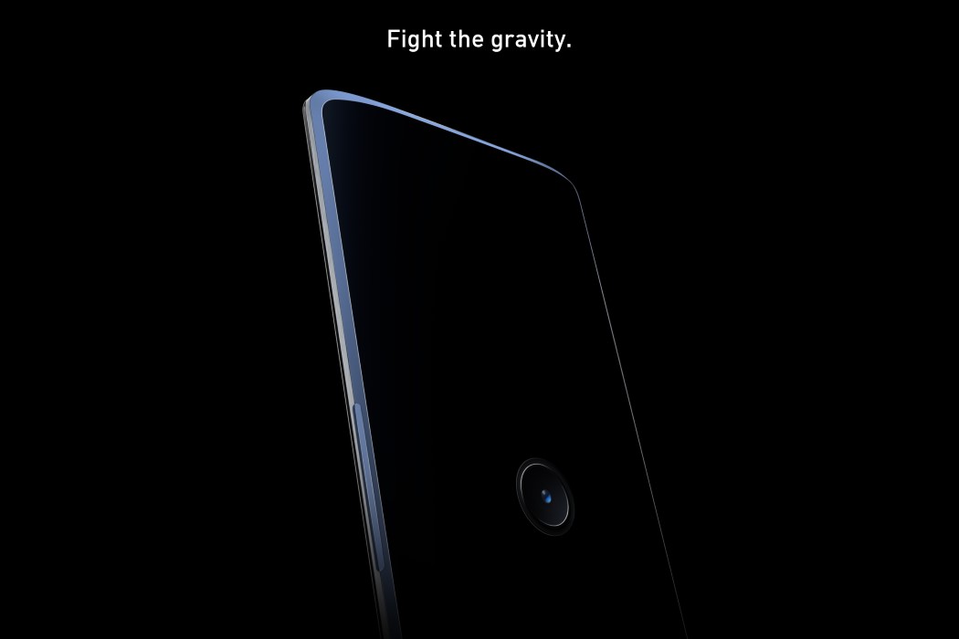
Here’s a phone concept I can rally behind because it seems like it pushes a good idea forward, that if implemented correctly, can make some pretty great phones. The Gravity Phone by Julien Lanoy and Jean-Francois Bozec challenges the concept of a bezel-less phone having a top and a bottom. If phones are streamlined to look exactly the same if held upwards or downwards, why can’t we just make phones that know no upside-down or right-side-up? The Gravity Phone is a redesign that embraces complete symmetry. Hold it any way and it’s the right side up. The back echoes the same philosophy too, with a camera that’s centrally located so it can be used either way. While most people would grumble about a centrally located camera, I think it’s a pretty nifty idea, because given how we currently hold our phones in portrait mode, the placement of a camera app’s shutter button is so incredibly out of thumb’s reach, it makes the app counter-productive. Shift the camera down, the hand shifts down too, and your thumb can hit that shutter button with ease.

Made to look truly seamless, the Gravity Phone takes some pretty neat design decisions. It has no home button (Android), and ditches the fingerprint sensor too, since that’s where the camera sits now. The phone therefore relies on facial identification, done by not one, but two cameras on the front. If you notice, there’s a camera on each of the bezels on the top and bottom, allowing the phone to be held in any orientation. To make the phone just a bit more unique, its side edges are touch sensitive too, allowing you to scroll without having your finger on the screen, blocking the content you’re reading. Speaking of the screen, Gravity implements the 3D screen feature we saw with Amazon’s Fire phone. How does it do that? Using the two front facing cameras to gauge and depth sense your face and point of vision!

If only more designers made concept phones with this kind of attention to detail!

Designers: Julien Lanoy & Jean-Francois Bozec.

gravity_phone_1

gravity_phone_2

gravity_phone_3

gravity_phone_4

gravity_phone_5

gravity_phone_6

gravity_phone_7