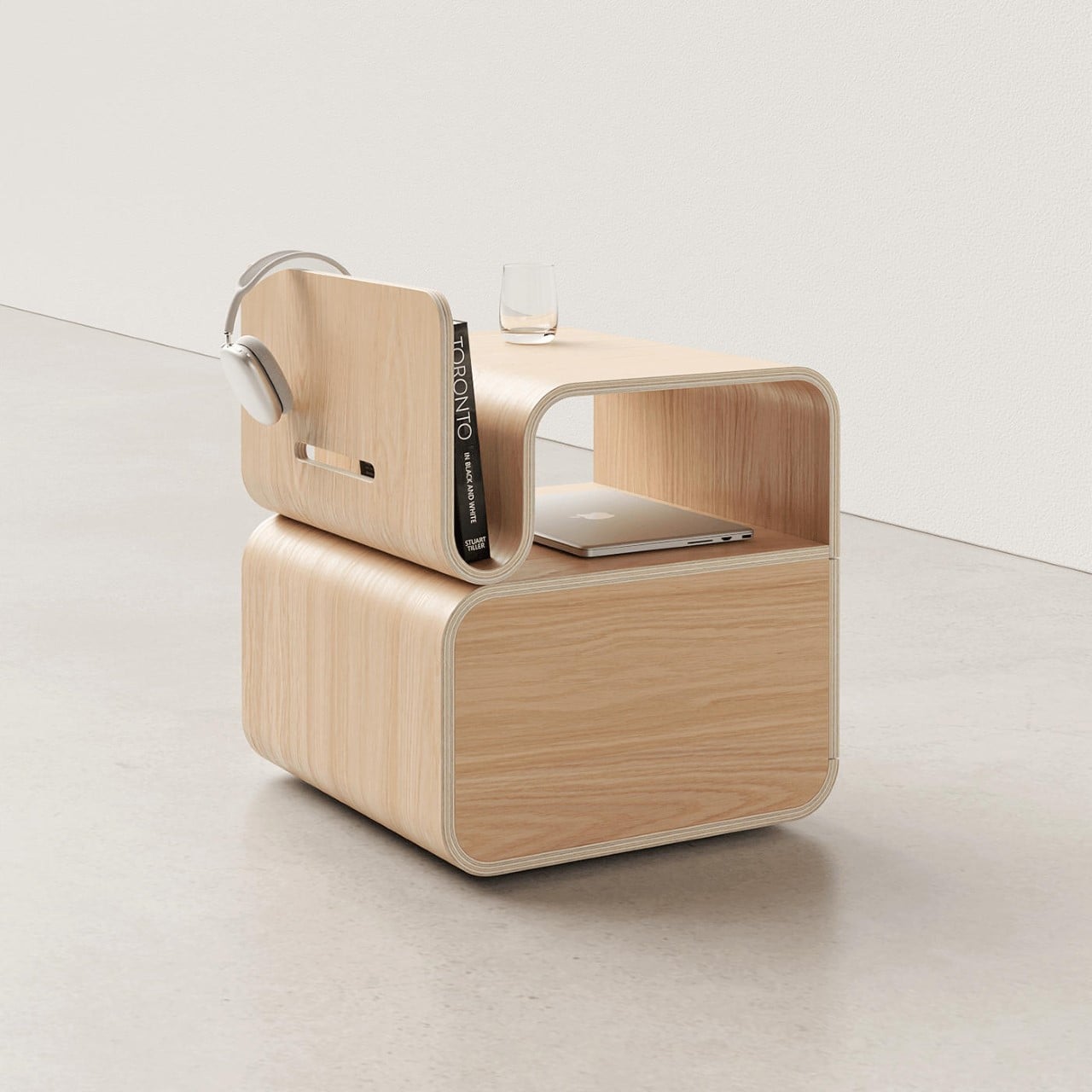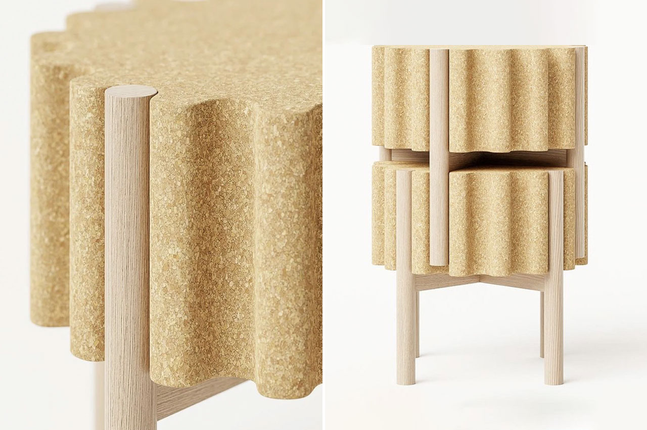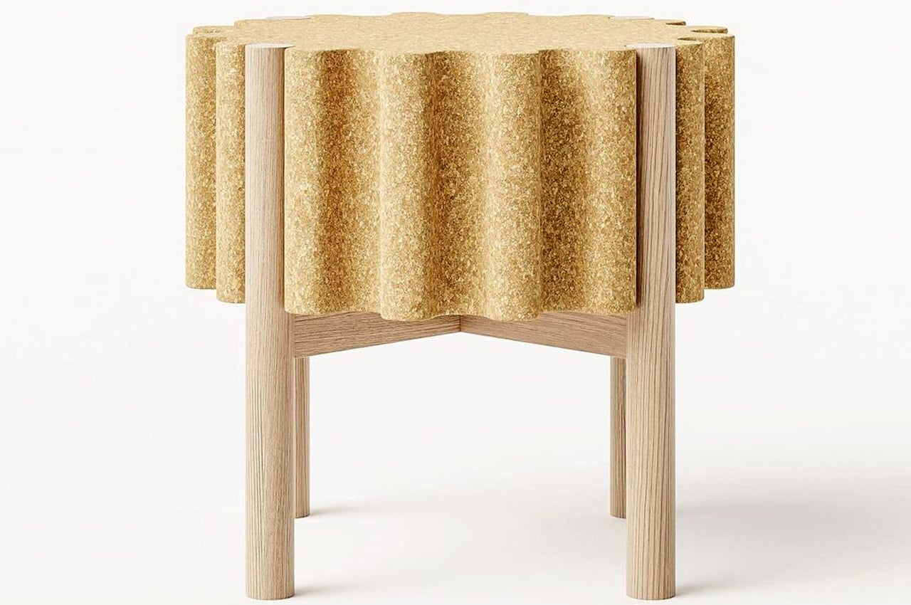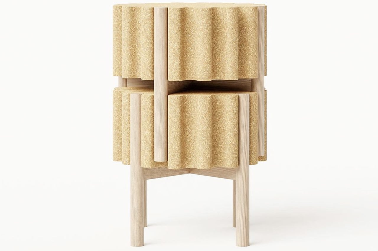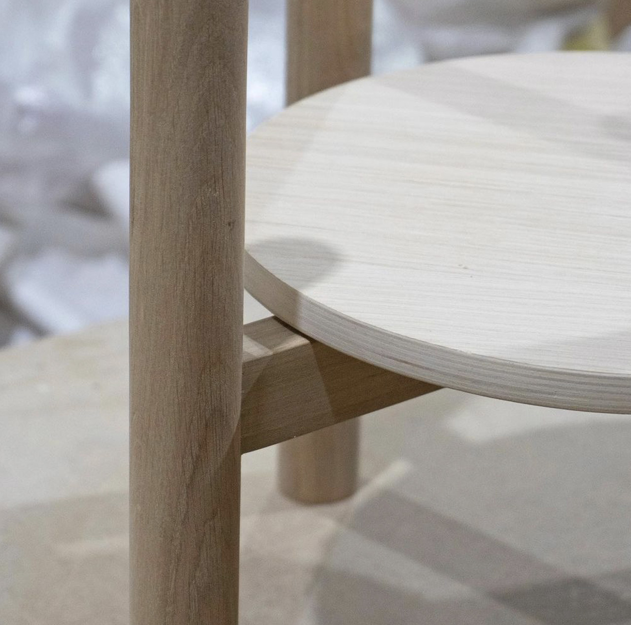
Bent wooden stool requires no screws or hinges to assemble from flat packaging

Flat-packed furniture has become quite the sensation, satisfying both the need for easy-to-assemble mass-produced products as well as a craving for the trendy minimalist design. There are, however, certain limits to those designs, especially because of the need to be flat and tightly packed. Putting them together also sometimes requires a bit of patience and know-how, particularly when small parts and screws are involved. This stool concept design challenges those conventions, however, by using mechanisms that require no extra parts, no screws, and even no glue, yet still delivers a multifunctional piece of furniture that looks unique and distinctive, unlike most mass-produced flat-packed products.

Designer: Joao Teixeira
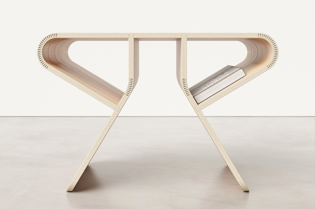
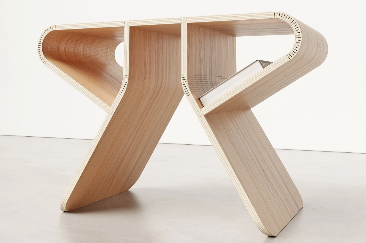
The easiest method to join two separate pieces after they have left the factory would be to either screw or glue them together. The former entails more complicated parts while the other often employs chemicals harmful to the environment. There are, however, techniques that simply use shapes and the force of physics, particularly gravity, to keep two parts together. The dovetail joint, which looks like two puzzle pieces getting wedged together, is one such mechanism, and it is the technique employed by this Flat Stool design.
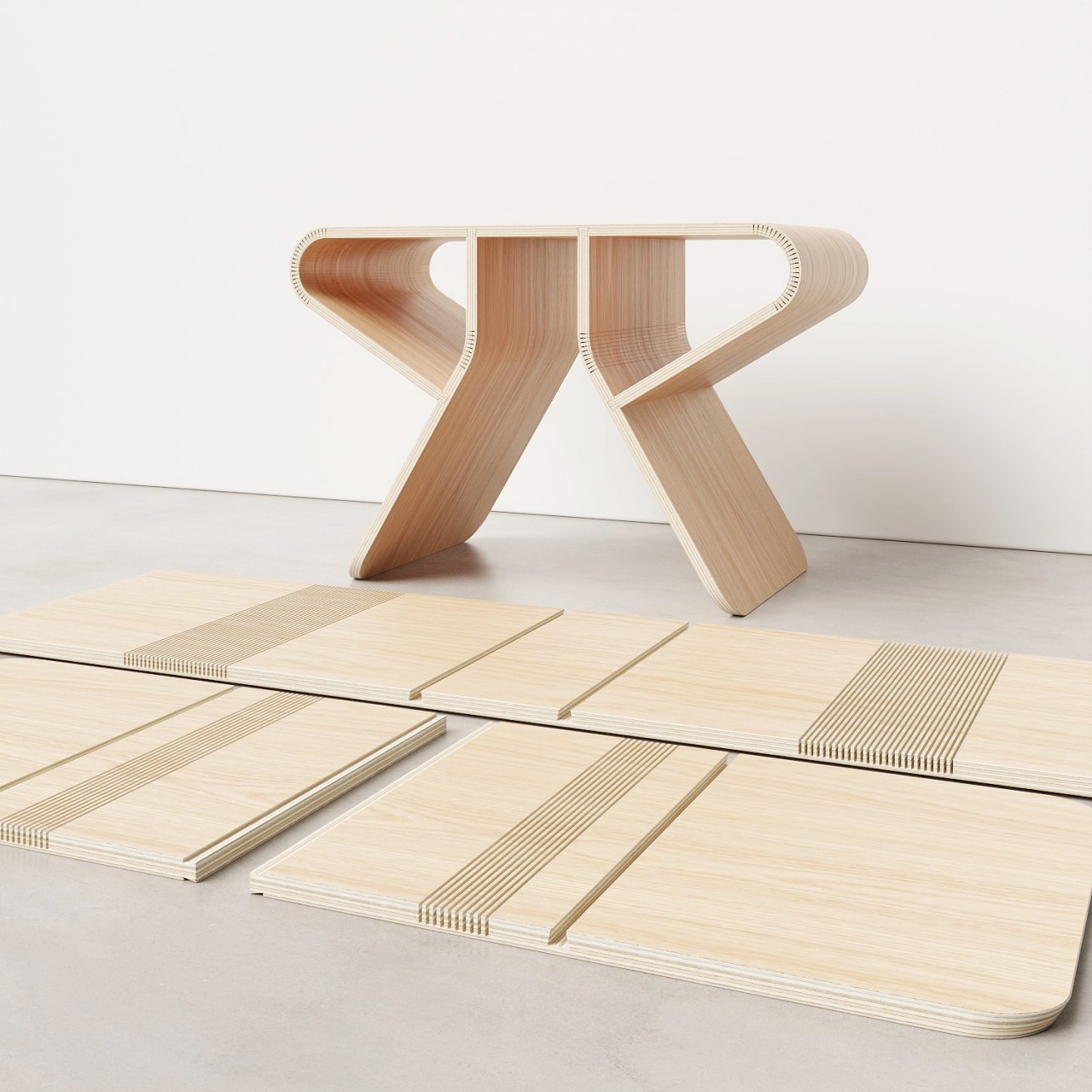
That in itself is already impressive, but the stool’s real claim to fame is how its sides can curve and bend despite being flat-packed. You’d usually have to resort to tricks like hinges, which you have to screw, to change a wooden plank’s direction, but the Flat Stool uses a rather unconventional design to do the same. Specifically, it uses kerf bending on those bent areas to create a gentle curve that makes it look like the piece was shipped that way right from the start.
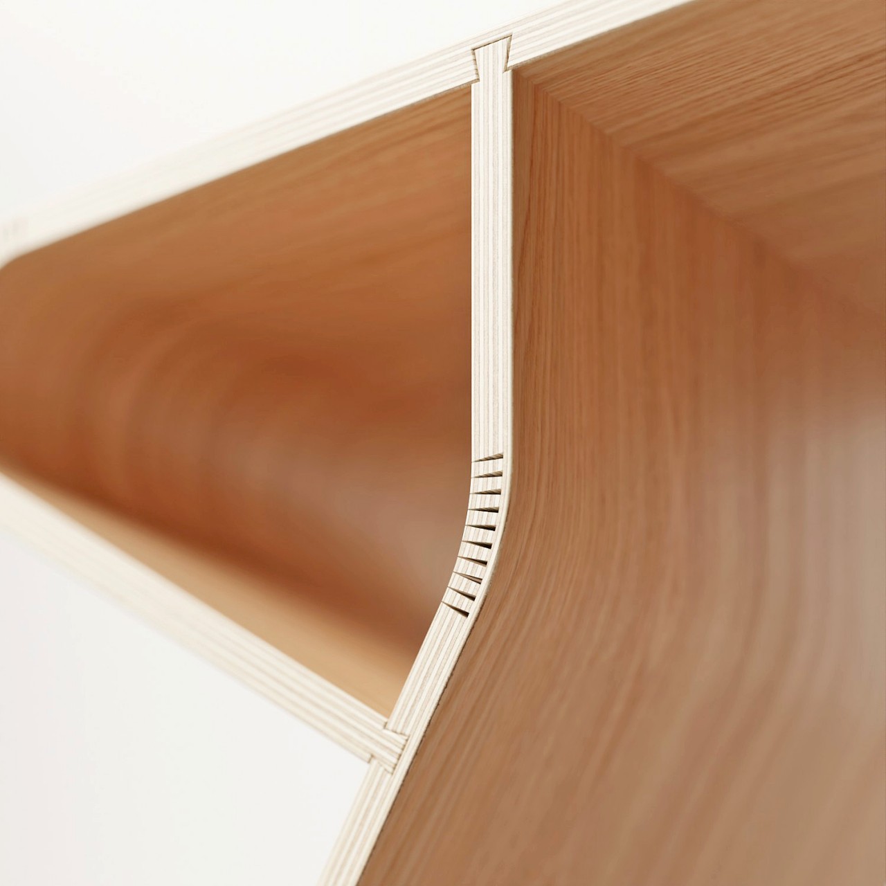
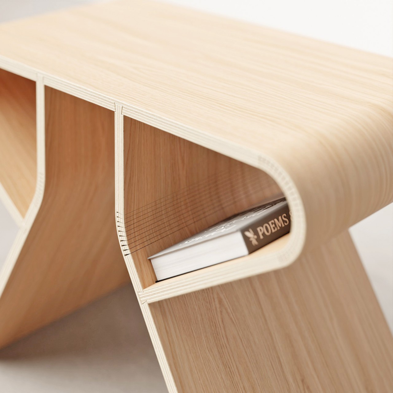
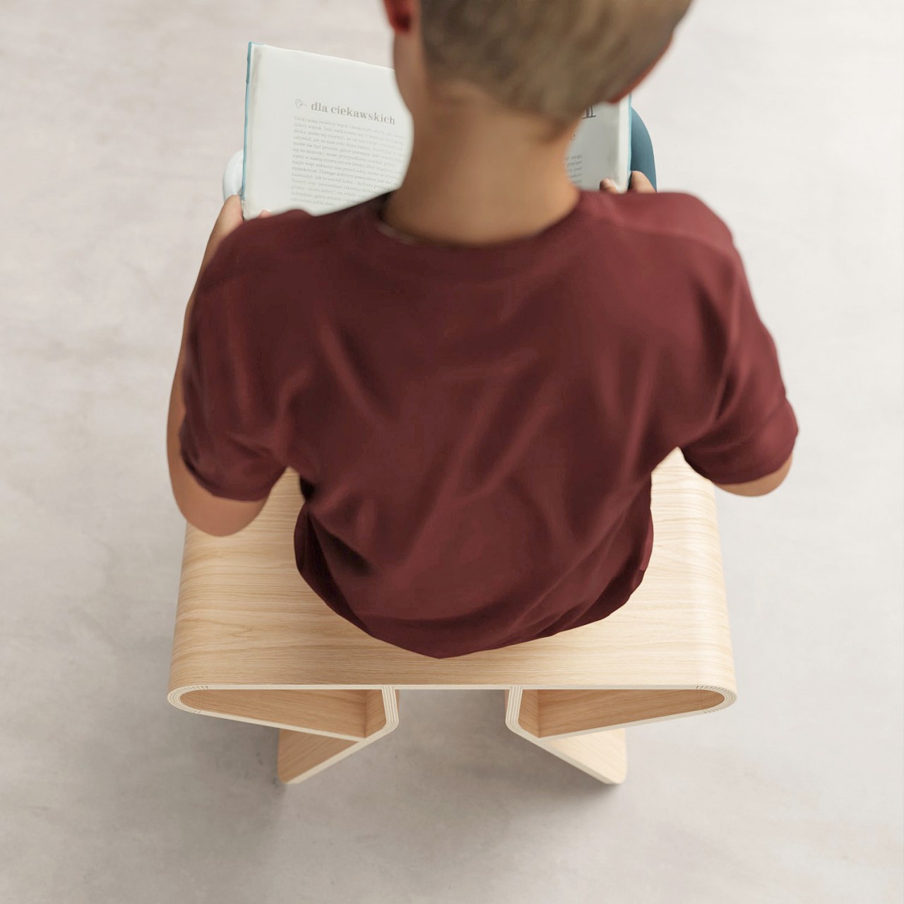
The effect is a stool whose sides bend down and inward, attaching to the middle of the slanted legs that also have a kerf bend to them. This creates a loop on both sides, an empty space that can serve as a holding space for books, phones, or other objects that don’t need a flat, horizontal surface to lie on. As a bonus, the kerfs and ribs of the stool are exposed and visible for everyone to see, creating visual accents that make the stool look more interesting.
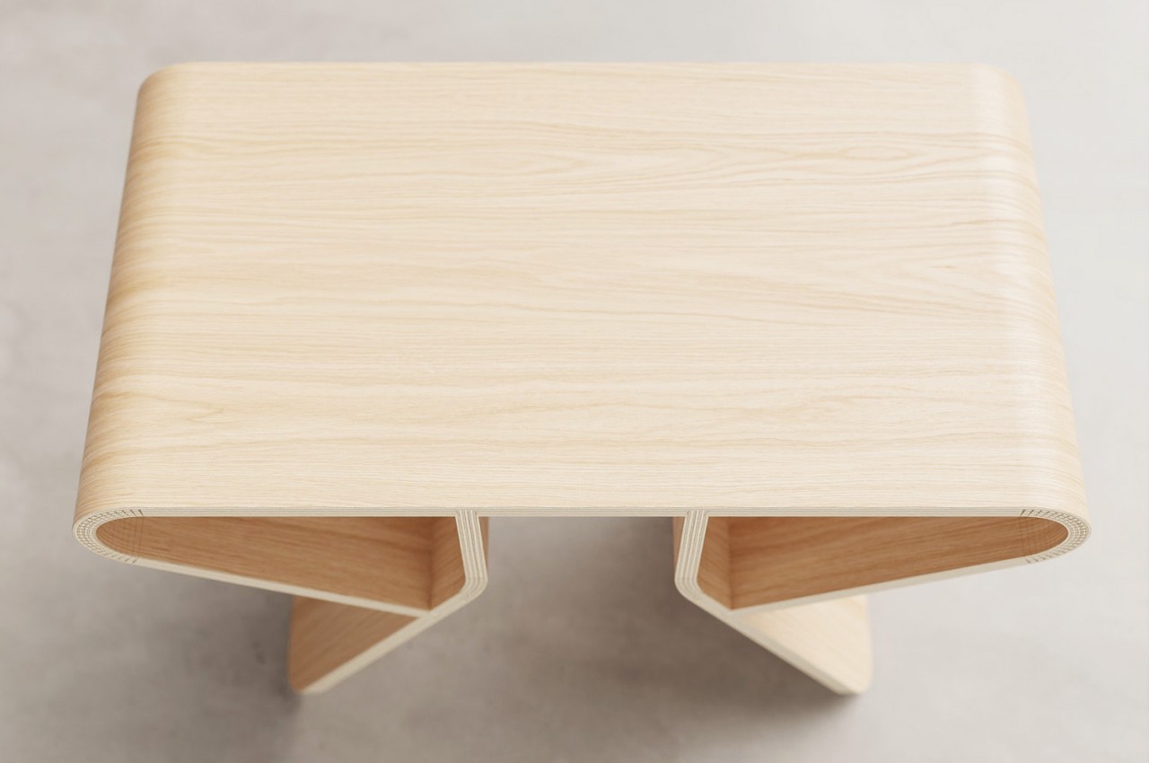
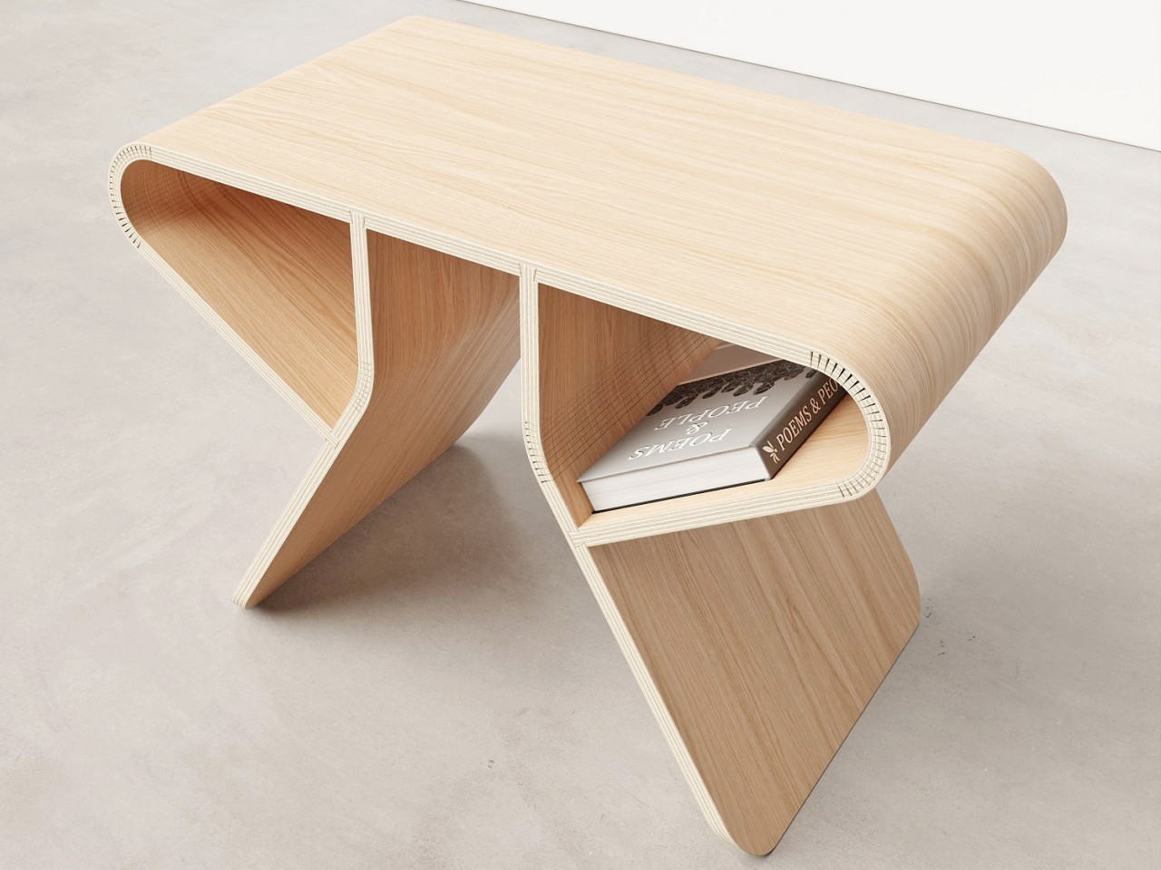
Admittedly, some might have concerns about how long the dovetail joints will hold over time as the wooden contacts between the joints wear down. The kerfs might also look a bit worrying, especially on the legs, given the decrease in the mass of the wooden boards. Nevertheless, it’s an interesting concept that tries to think outside the flat-packed box to provide a design that isn’t as flat, literally and figuratively.
The post Bent wooden stool requires no screws or hinges to assemble from flat packaging first appeared on Yanko Design.
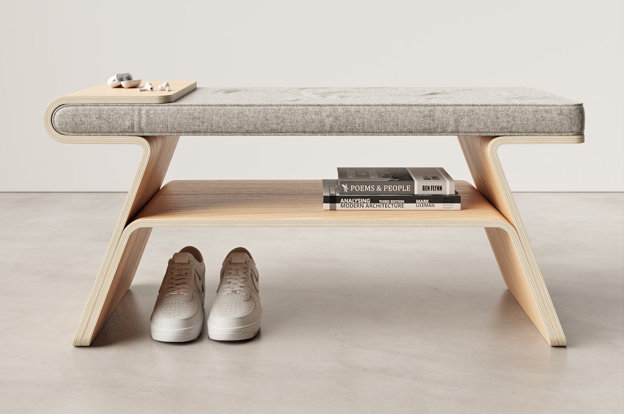
This wooden shoe rack doubles as a bench and a tray for transient bodies and objects

A lot of the clutter and missing items in our homes are caused by having no proper place to put our stuff. Whether they’re keys or shoes, small objects can lead to big messes when left anywhere and everywhere. Sometimes, it’s not enough just to have a place to put them; you also have to be smart in where you actually place these objects’ homes. Things that you take with you outside but not indoors are often best left near the door, but that space might not always be the best location for shelves. This design concept offers a rather elegant solution to this multi-layer problem, providing a more permanent fixture for temporary things like shoes, keys, earbuds, and even your own tired body.

Designer: Joao Teixeira

Shoe racks are not an uncommon sight inside houses, apartments, and living spaces. More often than not, their placed by the door to make it easy to put shoes on when leaving and have a convenient spot to leave them after you’ve taken them off. Due to the space these pieces of furniture occupy, however, they usually serve a single purpose only and have almost no other use except for shoe storage. It’s practically wasted space, especially if you don’t have that many shoes there to begin with.

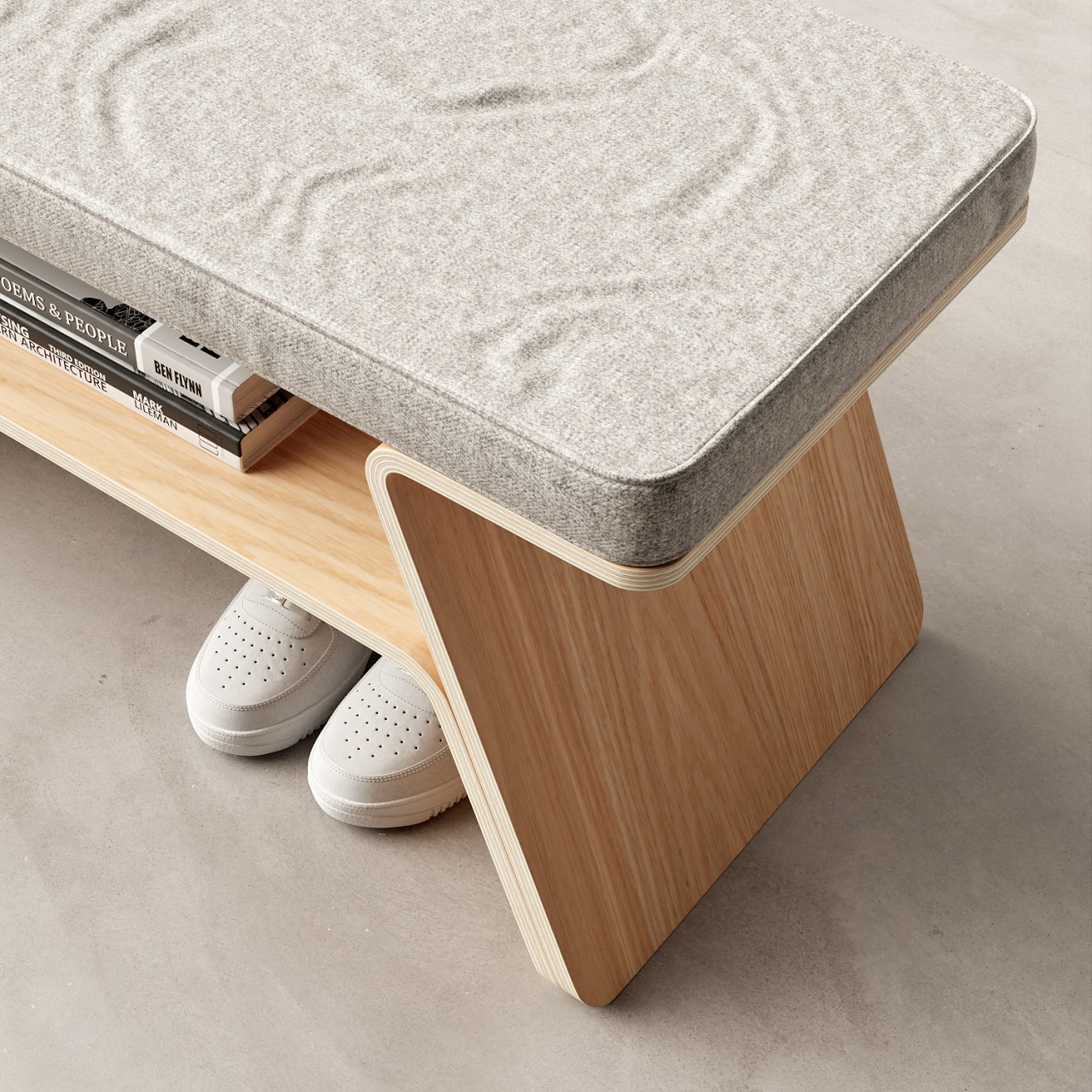
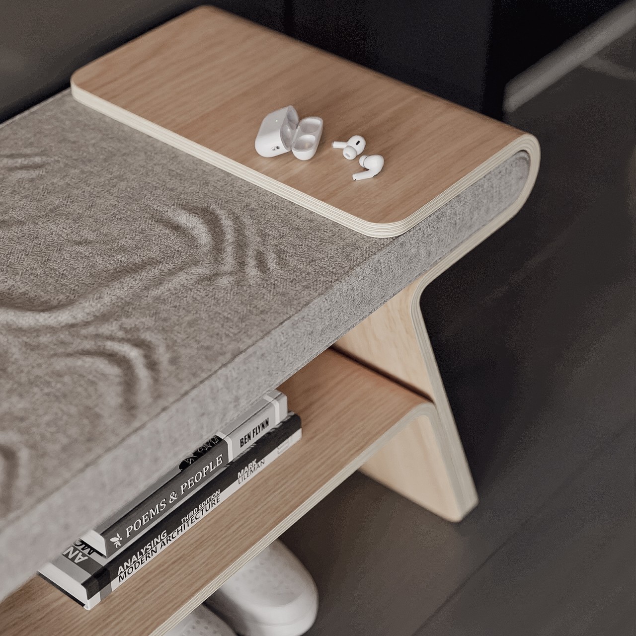
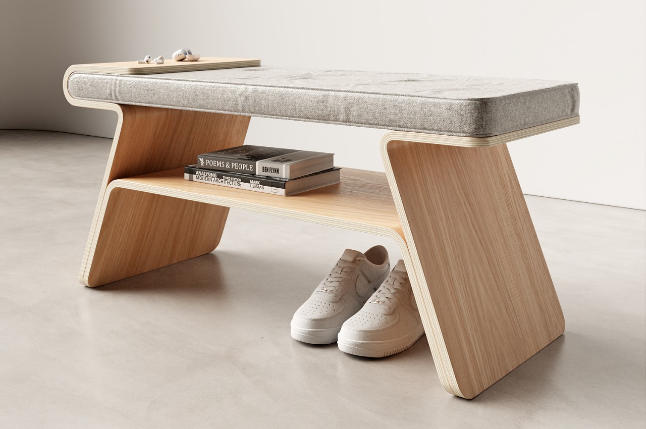
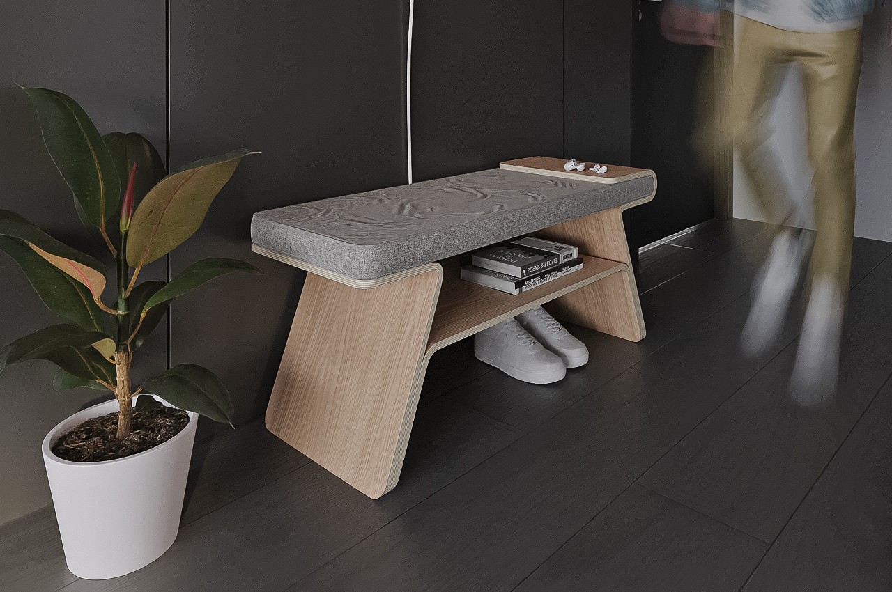
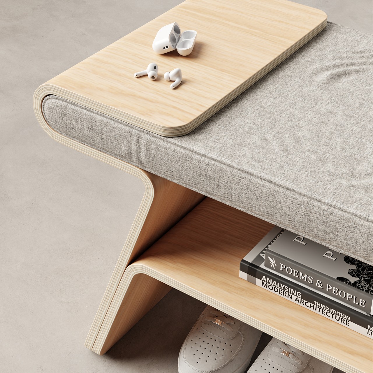
Inspired by traditional Japanese architecture like torii gates, “Tokyo” is a shoe rack that goes above and beyond the call of duty, at least if you want it to. It actually serves two other functions in addition to holding your shoes. The cushioned top serves as a comfy bench, perfect for when you need to sit down to take a breather or put on shoes. There is a small tray on one side that lets you put down your phone, keys, and other knick-knacks for a while. Given the multi-functional design of the concept, it’s something that can easily be placed near the door or against any wall. Yes, it will take up a length of space, but you’re getting three for the price of one.

What’s even more impressive is how this design implements those three functions in a beautifully minimalist manner. Like many of Joao Teixeira’s furniture concepts, it involves using bent planks of plywood to achieve simple yet sophisticated-looking forms. In this case, the two legs are bent at opposite angles, but one of them extends upward and curves embrace the cushion, creating a completely flat and solid surface to act as a temporary holding area for small objects. Structural support is provided by a pseudo three-centered arch, also made from bent plywood, that creates a shelf for larger things.

Admittedly, Tokyo hardly looks like any typical shoe rack, which makes it an ideal piece of furniture to place anywhere. The large empty space at the bottom can be home for taller shoes and boots, while the shelf can hold sandals, loafers, sneakers, and similar footwear. Of course, it could also be used to hide books, foldable umbrellas, or other things you might want to quickly grab before you rush out the door. Either way, this shoe rack and bench in one provides a convenient and charming place for shoes and small items, not to mention a comfortable way to catch your breath after coming back home.

The post This wooden shoe rack doubles as a bench and a tray for transient bodies and objects first appeared on Yanko Design.
This Single-Piece Bent Plywood Lounge Chair Also Has Its Own Built-in Magazine Rack

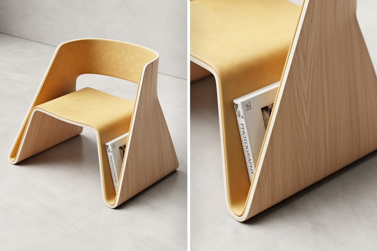
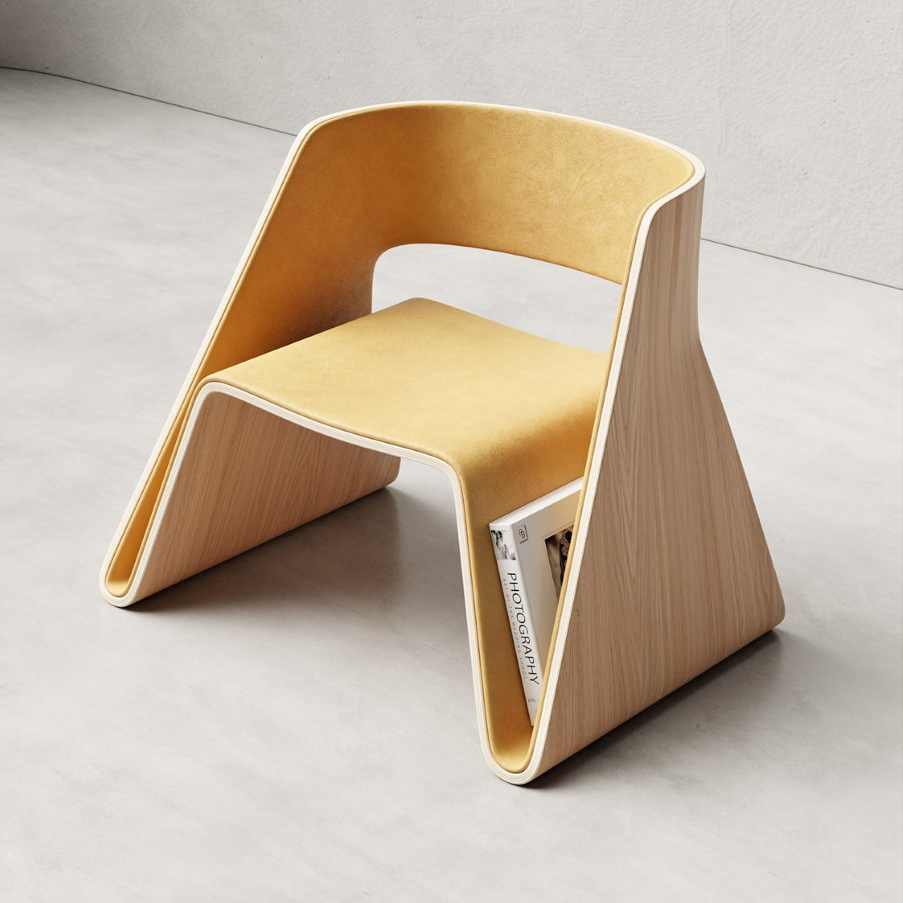
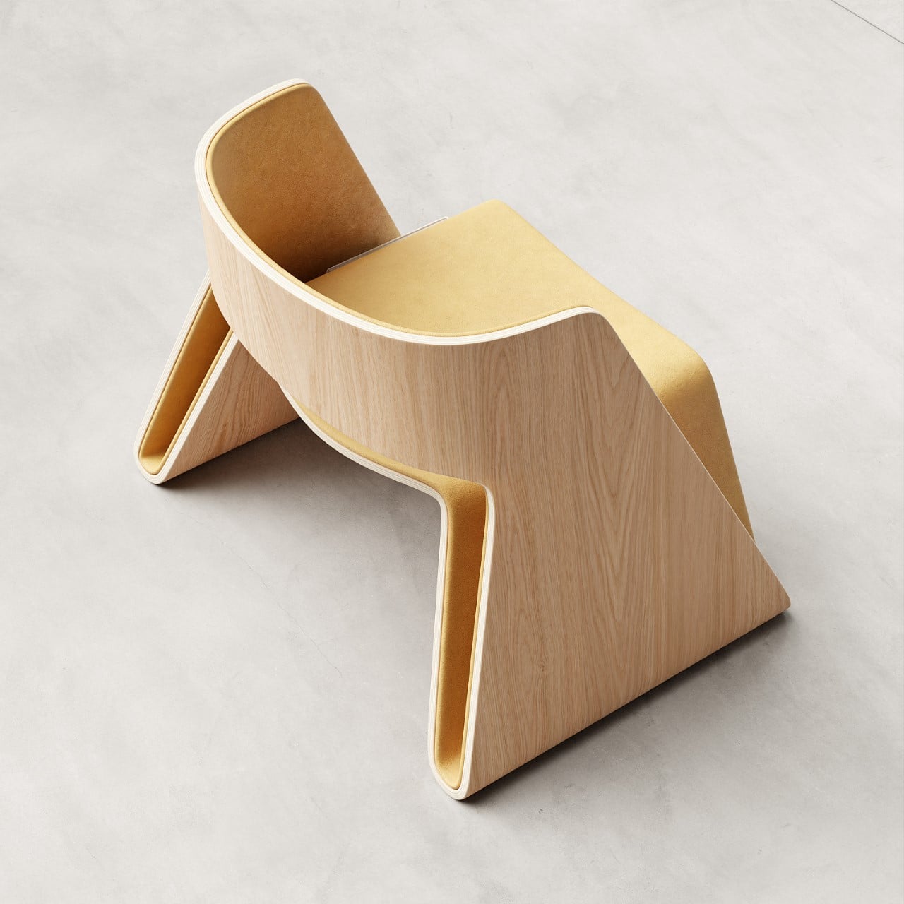
It’s difficult to appreciate how simple yet complex the Void chair is. Look at it and you realize that it’s entirely made from one singular piece of plywood that’s been contorted into this beautiful shape. The plywood bends to form the seat, legs, and backrest, also giving you an easter-egg in the form of two hidden pockets that let you store books and magazines. The ‘simple-looking’ chair, however, isn’t so imple to produce. It requires to be cut from a large plywood sheet, then heat-treated to make it pliable, and formed into its unique shape using molds and vices. The result is a lounge chair that really highlights the capabilities of bent plywood as a viable (and classy) material, and of designer João Teixeira’s creative abilities.

Designer: João Teixeira (Teixeira Design Studio)

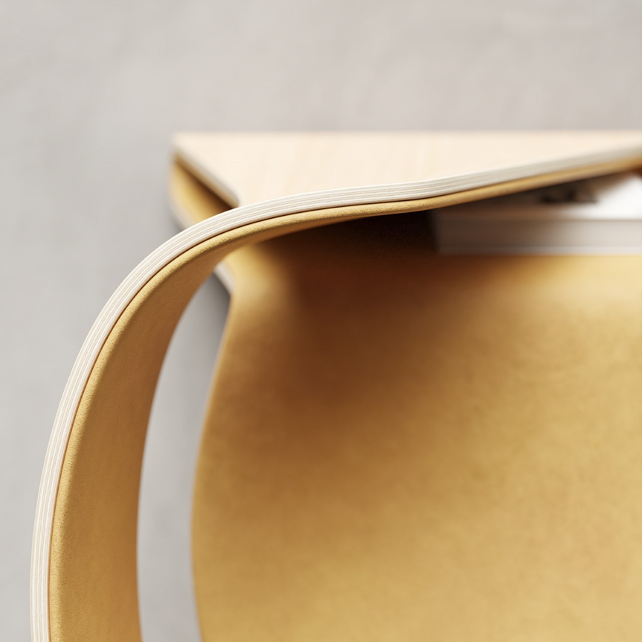
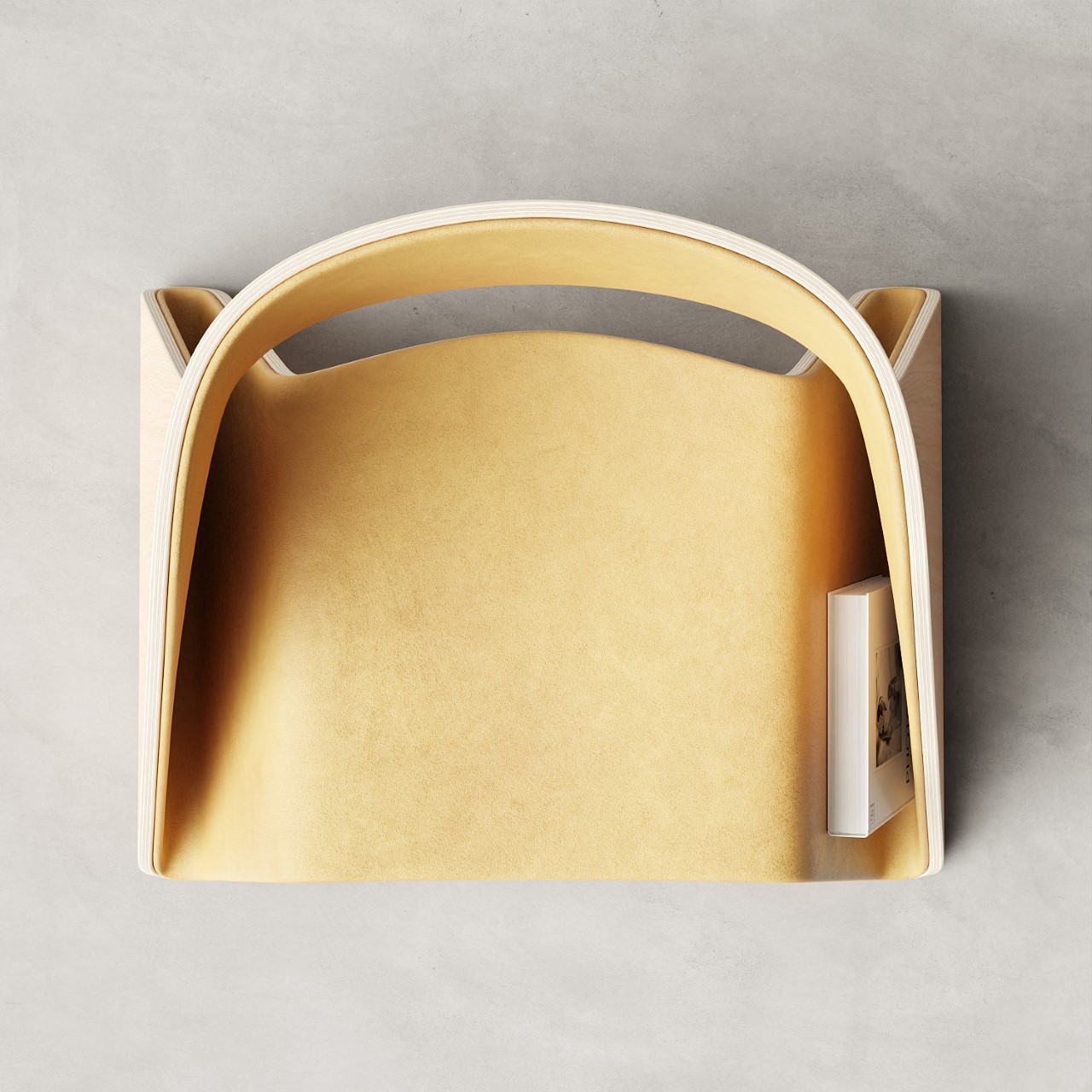
The Void lounge chair gets its name from the void created in the center while it gets cut out as a flat piece. The flat version of the chair is then ‘folded’ into its shape using a series of heating and bending processes, and the void eventually gets closed, becoming the small gap between the seat and the backrest.

A closer look at the Void lounge chair’s actual void.

The bending process results in the creation of two pocket areas within the chair’s legs. Rather than just closing them off or leaving them as a visual detail, Teixeira adds function to them, turning them into book-holders that you can use to store books, newspapers, magazines, or even vinyl discs. The slim profile of these holders keeps the books upright and has them right at your fingertips whenever you want to just sit and read for a bit.

The chair’s upholstery is continuous too, ging from the seat to the backrest via these book slots. I’d imagine that area would gather dust with time, but its cushioned design is much better than dropping your books directly onto plywood and having their corners or binding get bent, damaged, or crushed in the process.

The result is a lounge chair that’s minimalist in form and material, but maximalist in its expressiveness. The simple lounge chair adds a unique calming effect to your interiors without distracting too much from other elements of decor. It’s perfect for a living room around a coffee table, or even your balcony, and works just as well in coffee shops, bookstores, and coworking spaces looking to elevate their decor through functional furniture.

The post This Single-Piece Bent Plywood Lounge Chair Also Has Its Own Built-in Magazine Rack first appeared on Yanko Design.
Charmingly Minimalist Nightstand with a Bent Plywood Design holds your Books, Gadgets, and Essentials

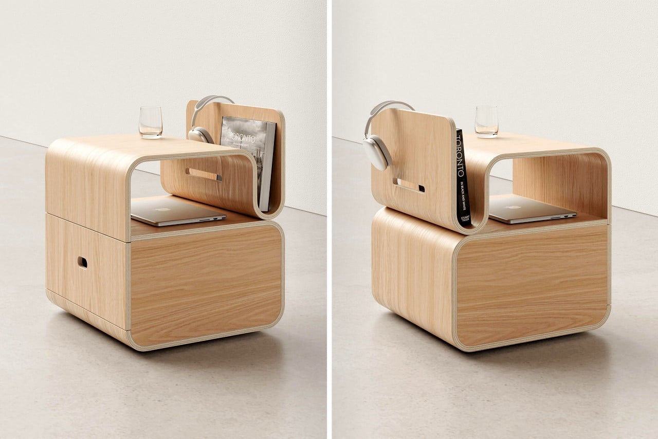
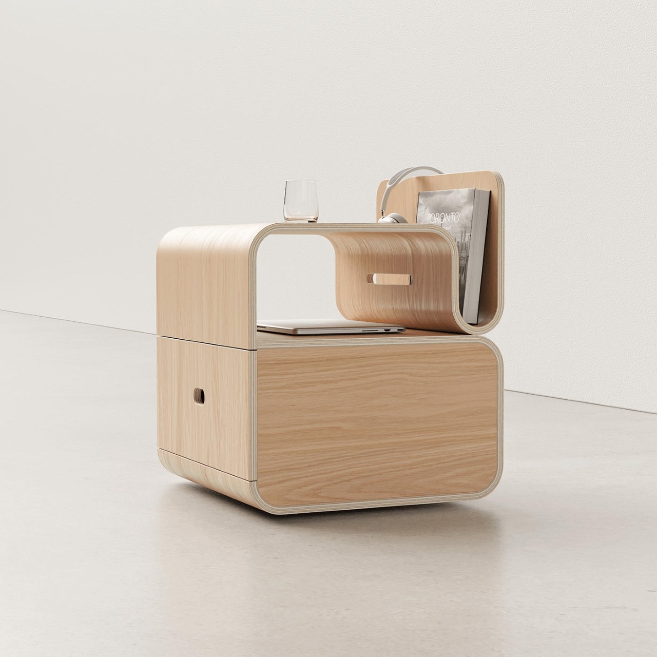
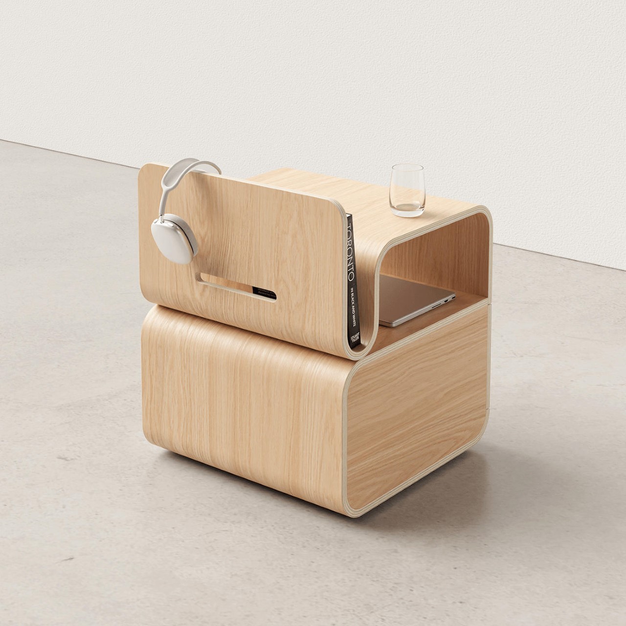
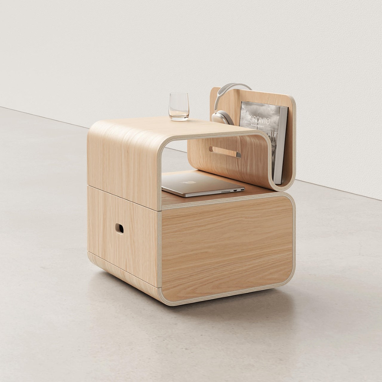
Practically a master of his craft at this point, Teixeira’s ‘Cozy Night Stand’ showcases the designer’s creativity as well as bent plywood’s versatility with a block-ish form that’s still incredibly functional. The nightstand features a drawer for bulky items, a nook for hideaway essentials like your laptop, a flat tabletop surface for your phone, bedside clock, and glass of water, and a nifty wedge-shaped storage area for books, magazines, etc. Designed to hold all your essentials, the Cozy still manages to look minimal without abstracting or combining features and details into one form. With the Cozy’s bent plywood construction, there’s still space for nuance while looking slick and lightweight.

Designer: Teixeira Design Studio

You can position the Cozy Nightstand with either its iconic profile facing the front, or with the drawer (which is on the side) facing the front. Having the drawer on the front does take away the charm of the Cozy’s serpentine upper half, but lets you pack furniture into your room without leaving space for the drawer to open.

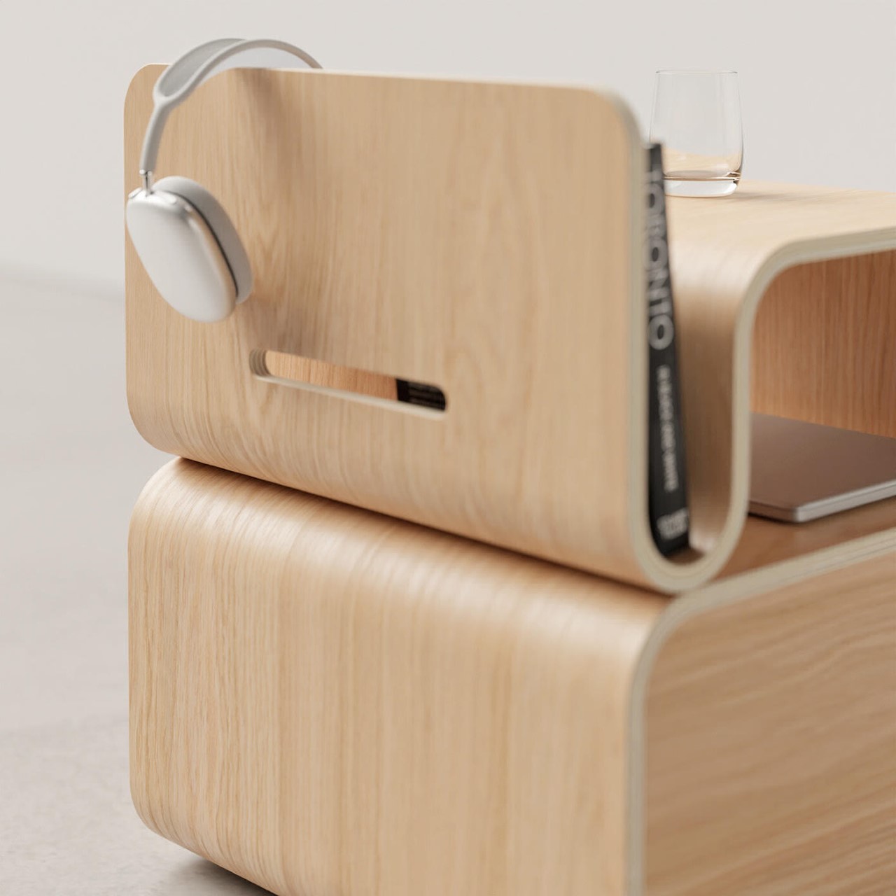
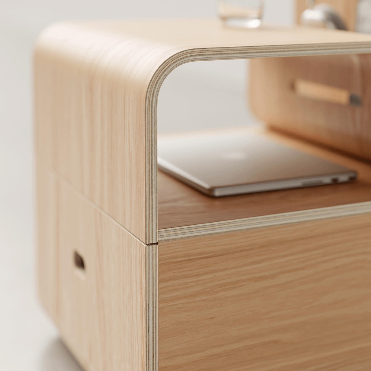
The drawer aside, the nightstand also has a nook to store essentials, along with the tabletop surface itself for keeping items like your glass of water, smartphone, charger, spectacle case, contact lenses, etc. A wedge on the side lets you keep books you may be reading or important documents you need to have with you for your WFH. Meanwhile, the extreme end of the wedge doubles as a pretty useful headphone stand or even a bookmark, should you choose to drape your open book over the table’s end!

The entire table is fabricated from curved sheets of plywood, giving the Cozy Nightstand a lightweight design and a rounded appeal that you don’t usually get from boxy plywood furniture pieces. Bent plywood is usually perceived as a budget material, but through Teixeira’s explorations, the Portuguese designer has uplifted its perception, building an entire movement of fluid yet functional pieces of haute furniture with them. You can check out all his work here.

The post Charmingly Minimalist Nightstand with a Bent Plywood Design holds your Books, Gadgets, and Essentials first appeared on Yanko Design.
Minimal stackable stool features slim wooden legs that fit perfectly into grooves of the cork seat

I’m at a point in my life where I’m team stools over chairs, and I truly believe stools deserve to be given way more credit than they get. Stools are often overlooked, maybe because they occupy minimum space, and aren’t really overbearing. But these traits are what make stools so great in my opinion! I mean, they’re compact, and a great space-saving furniture option for our modern homes. They are also super portable. And, a stool design I recently came across, and would love to get my hands on is the Drum stool by Teixeira Design Studio.

Designer: Teixeira Design Studio

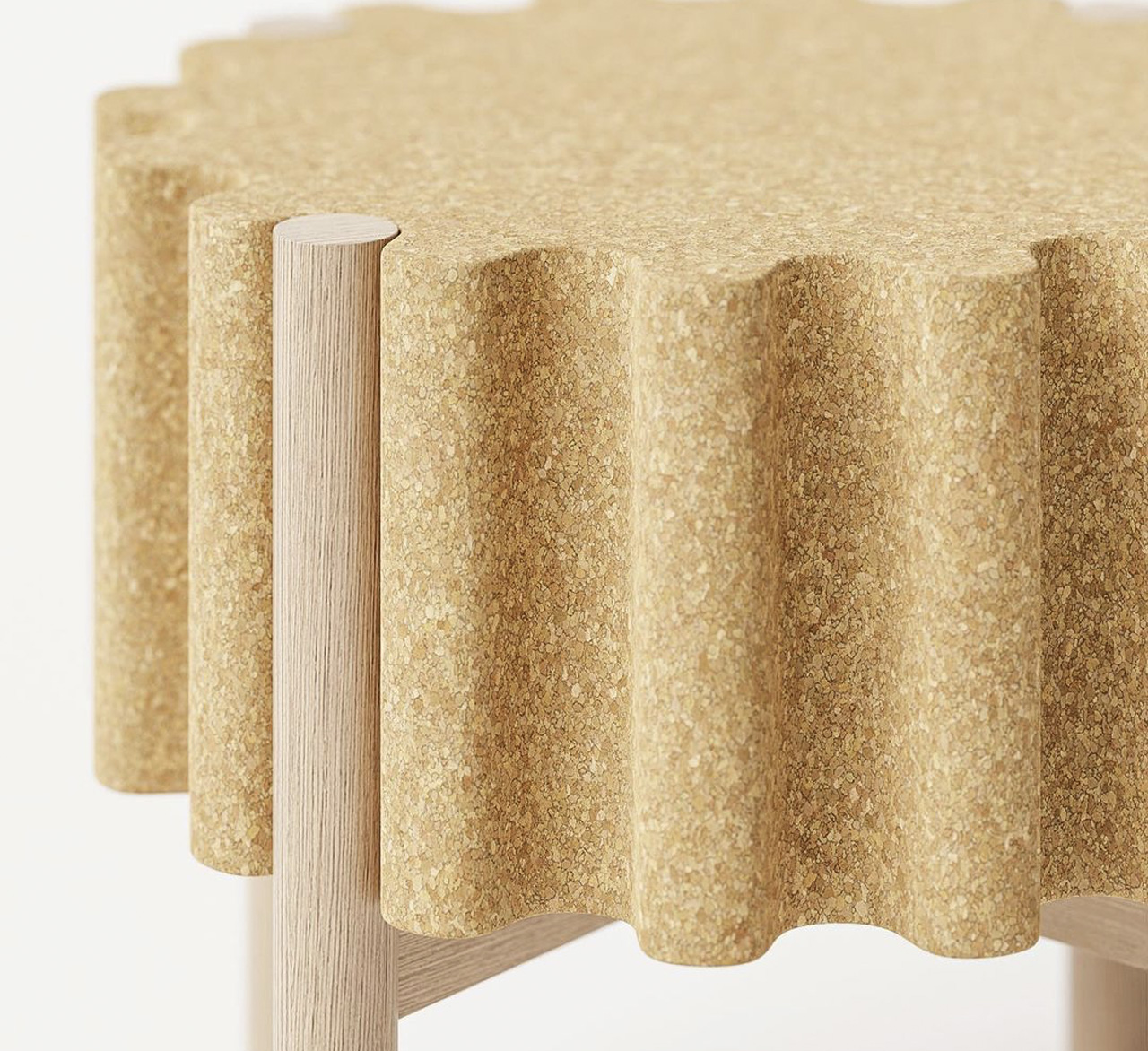
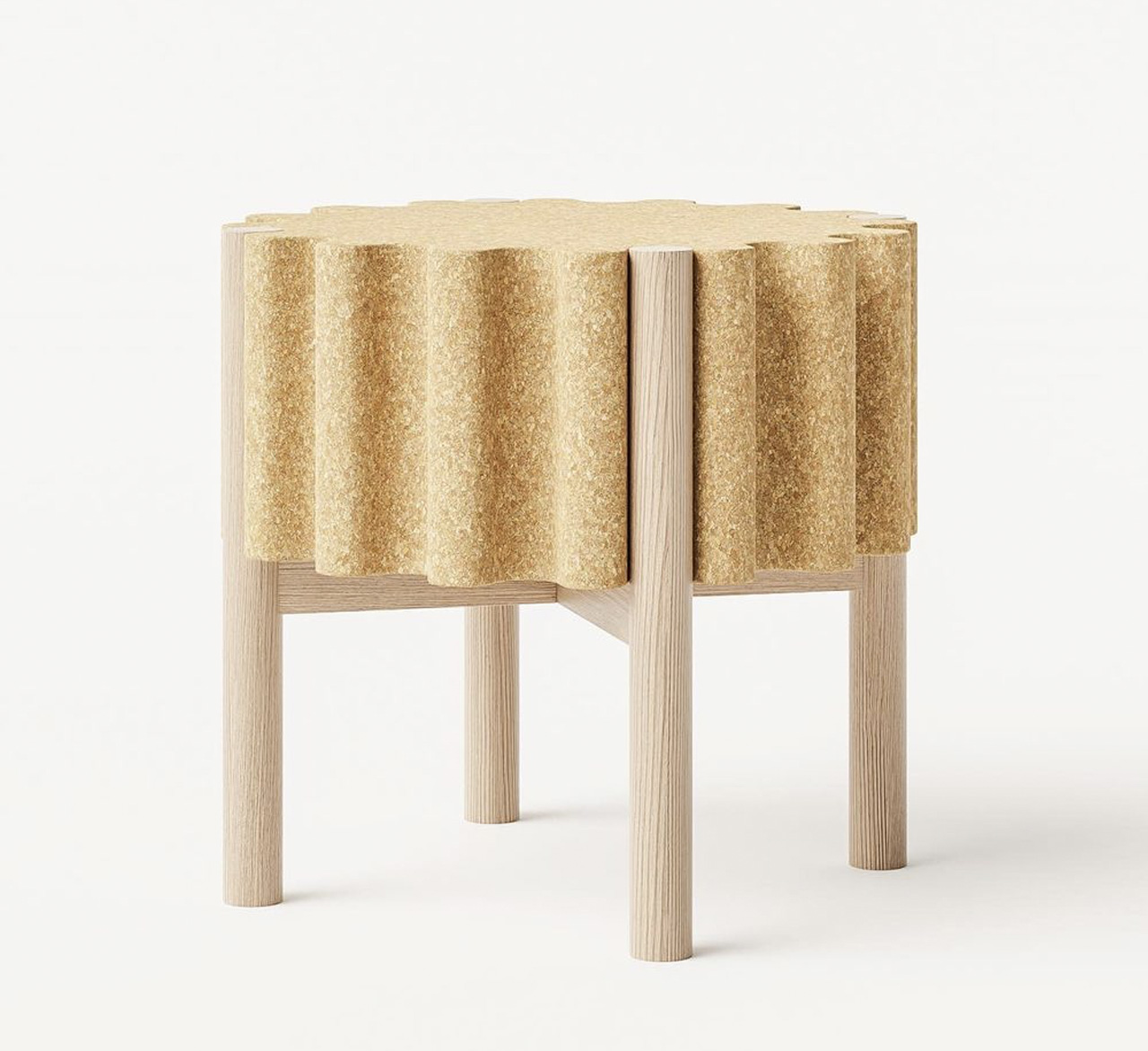
I’ve seen a lot of stool designs, and let’s be honest some of them do tend to get predictable. But the Drum stool is anything but predictable. The Drum stool is minimal, elegant, stackable, and not to mention sustainable! At first glance, the Drum stool looks like a cute little wine cork to me. But when you dig deeper, you realize it has much more to offer than its adorable good looks. Teixeira picked materials such as cork and wood to build the stool, instantly rating it high on sustainability. Cork was used to create the seat, while wood was the material of choice for the legs.

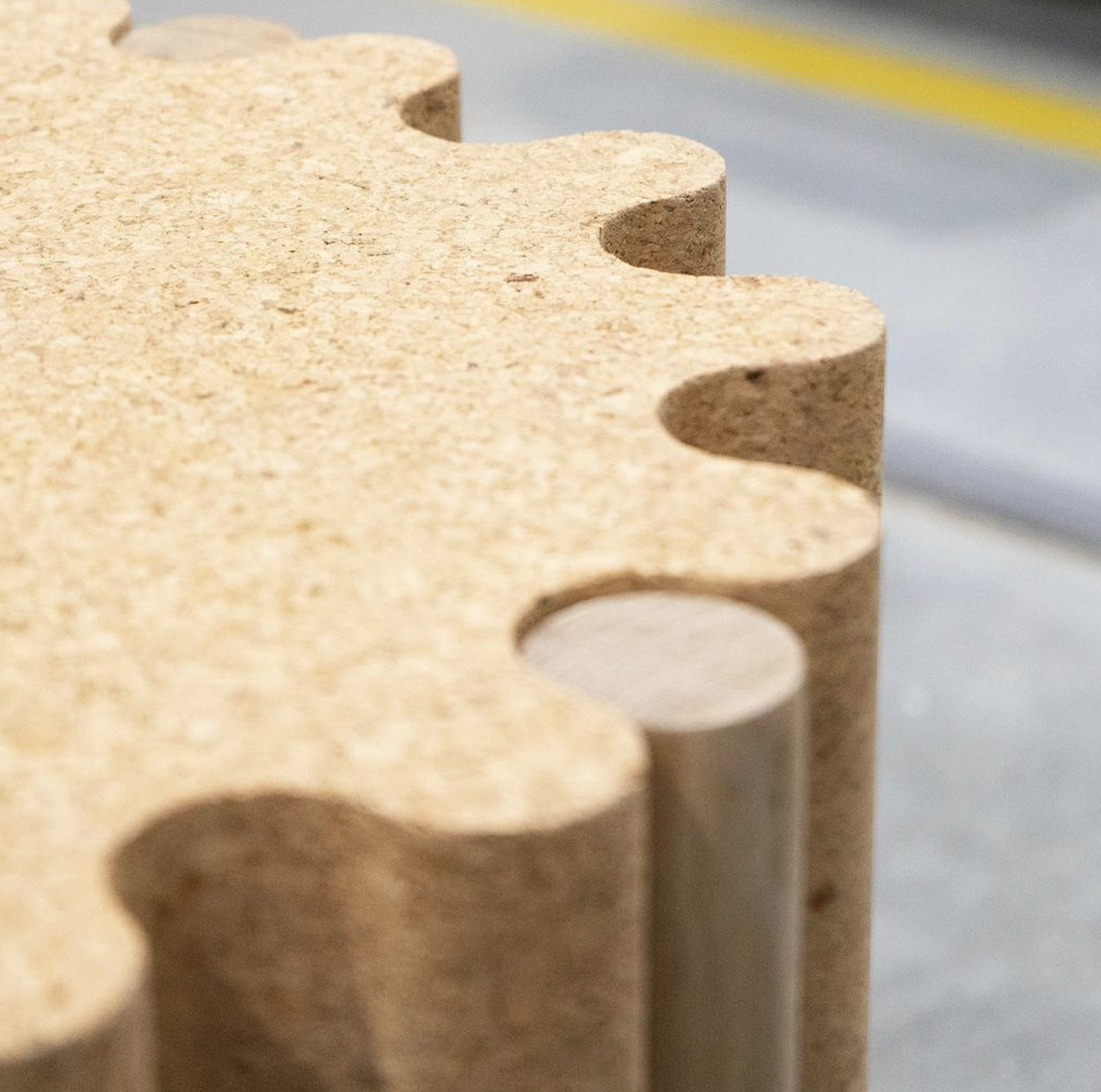
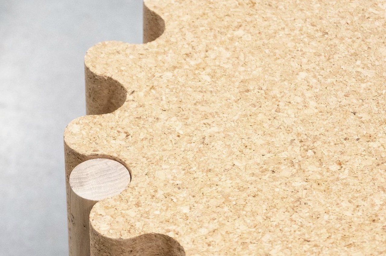
The cork seat features round trimmed surfaces, giving it a rather fun and playful shape. The trimmed seat is further supported by slim wooden legs that effortlessly blend with the seat, creating a furniture piece with a cohesive and harmonious personality. I love how the sleek legs deftly slide into the grooves on the cork seat! The cork seat is comfortable and inviting and provides a grip while handling, so the stool is quite easy to move around and place in different positions. As mentioned earlier, the Drum stool is stackable, which means you can stack up multiple drum stools one on top of the other, making them super easy to store away when not in use.

The Drum stool’s aesthetics are quite warm and minimal, allowing it to perfectly merge with the interiors of different living spaces. It’s the kind of versatile furniture piece that you can slyly slide into your living room, bedroom, or even your home office – it just fits right everywhere!

The post Minimal stackable stool features slim wooden legs that fit perfectly into grooves of the cork seat first appeared on Yanko Design.
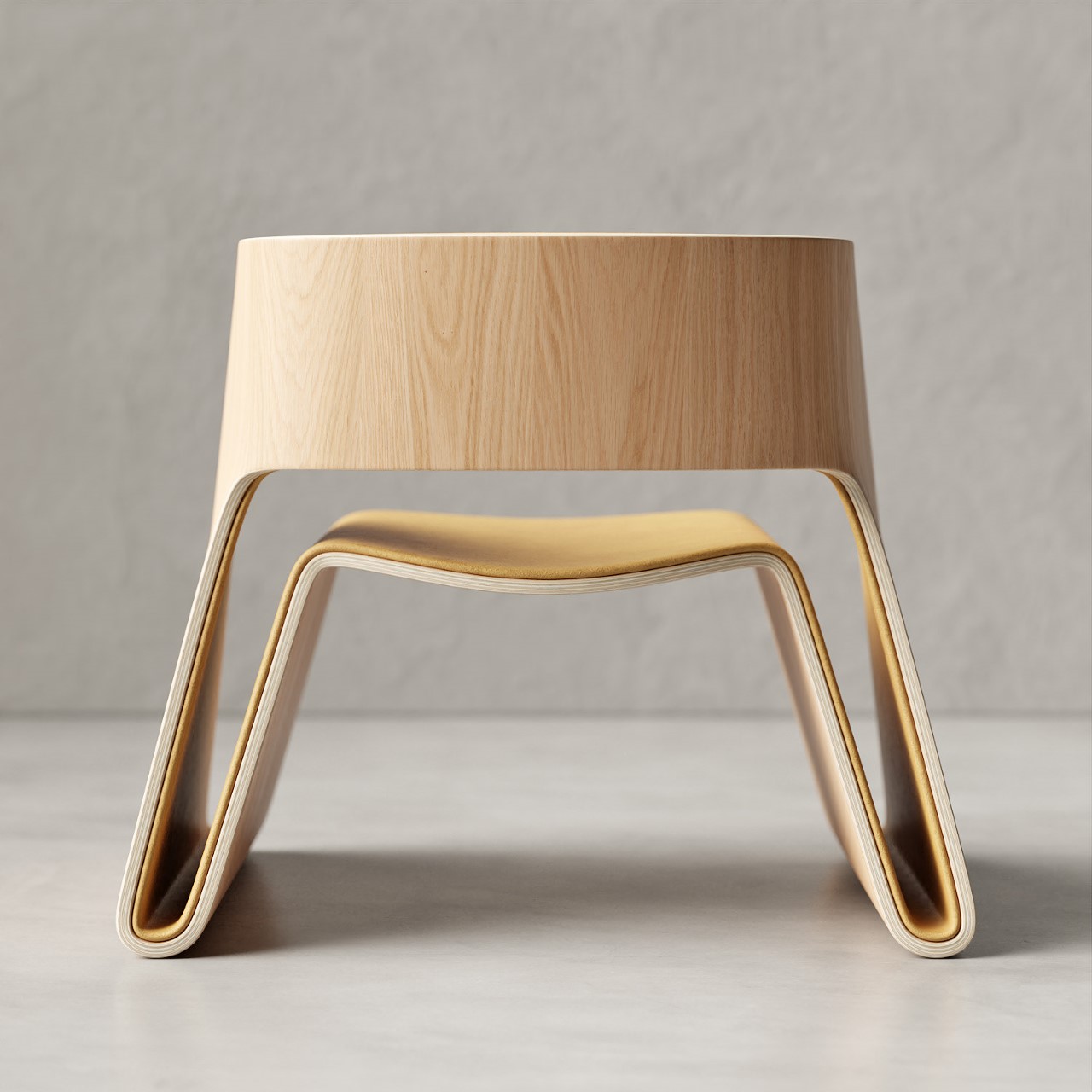
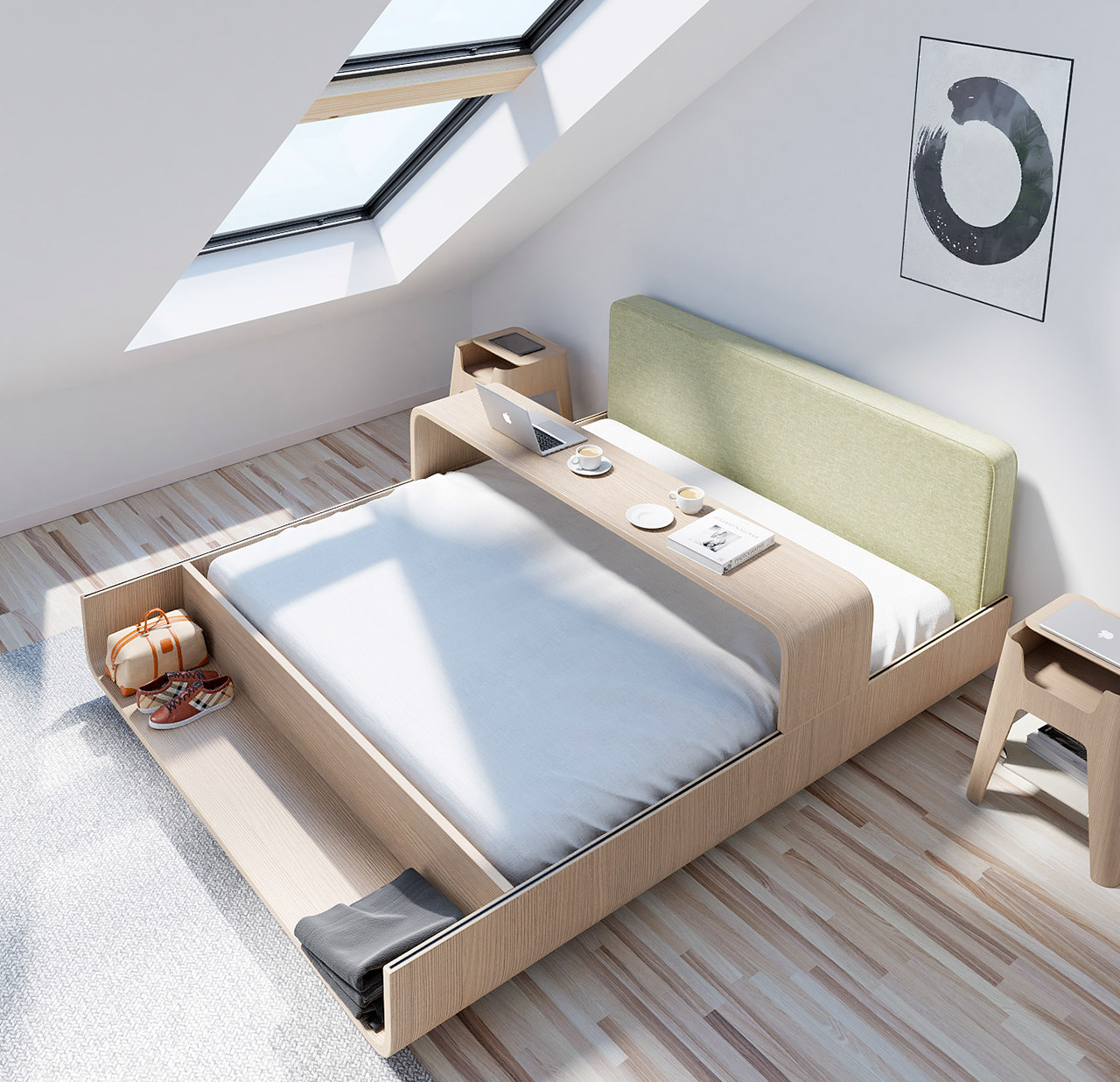
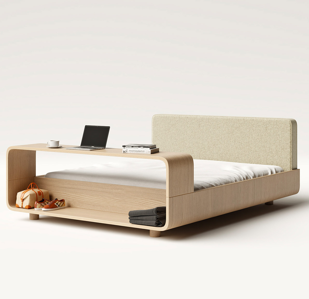
The Boomerang bed features an integrated table + storage area making it ideal for small homes

Our bedroom is our haven, our safe space, to which we rush after a bad day at work or simply a bad day in general. My bedroom is my private kingdom, and my bed its bejeweled crown. We all know the importance and need for a great bed. And, we have for sure come across some amazing beds – for example, the HiBed with its 70-inch retractable screen and health monitoring system. Another bed that we came across recently was the Boomerang Bed. Although it isn’t quite as techy and smart as the HiBed… its immense functionality and USP lay in its very simplicity.

Designer: João Teixeira

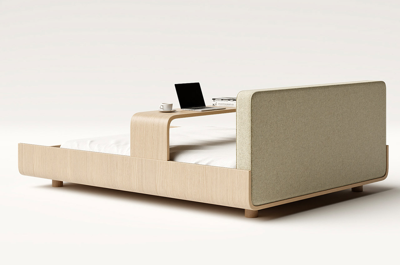
Designed by Teixeira Design Studio, the Boomerang Bed is another innovative creation by him. From a bedside table designed with a detachable laptop tray to a slim shelf that looks like an open book encouraging you to read – Teixeira’s designs are simple, functional, and yet unlike any other furniture pieces you’ve seen around the block. The Boomerang bed attempts to be more than just a bed. Teixeira transformed a simple bed into a little living area of its own with the help of an integrated table.

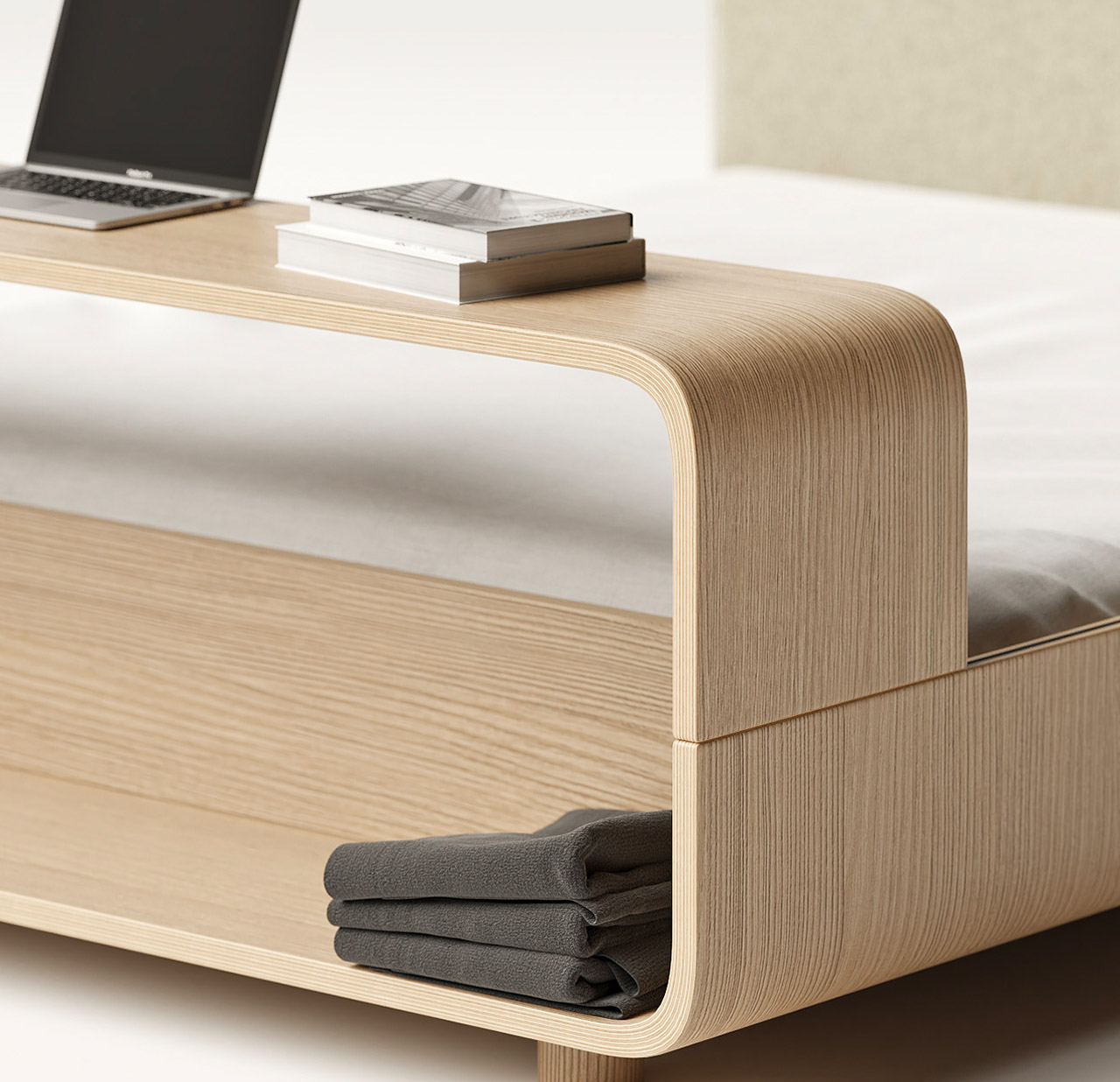
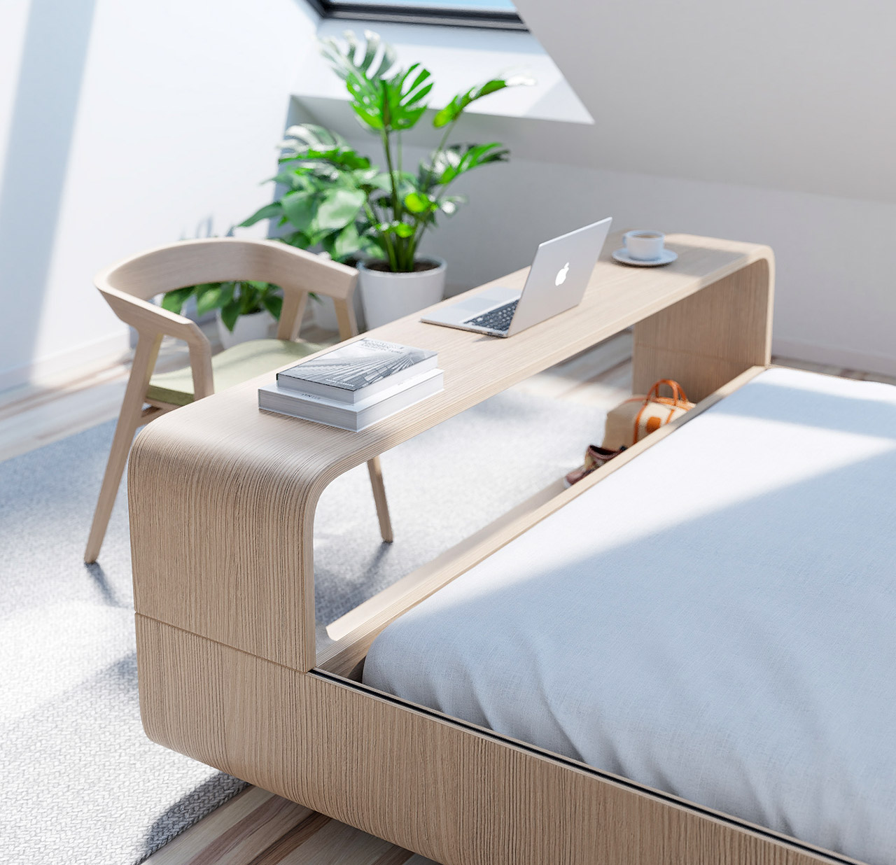
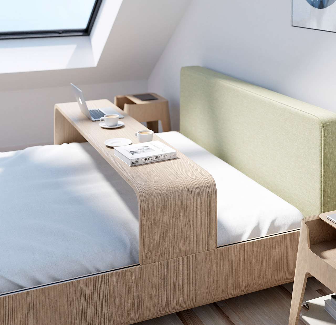
The integrated table can be considered the star of this furniture piece. Just like its name, this handy table “comes and goes”. By simply shifting the table or changing its placement, the adjustable table can adopt various roles and perform multiple functions. You can slide the table from one end of the bed to the other. If you position it at the edge of the table, it can function as a regular desk for you to place your laptop on and work from home! Or you can pull it closer to you, transform it into a bed tray, and have your breakfast on it every morning. It can even function as a TV stand for your weekend-long Netflix marathons. I love how a simple desk can be repurposed for so many uses, allowing you to do almost everything in your bed – from eating to working (not that you should, it is important to get out of bed).

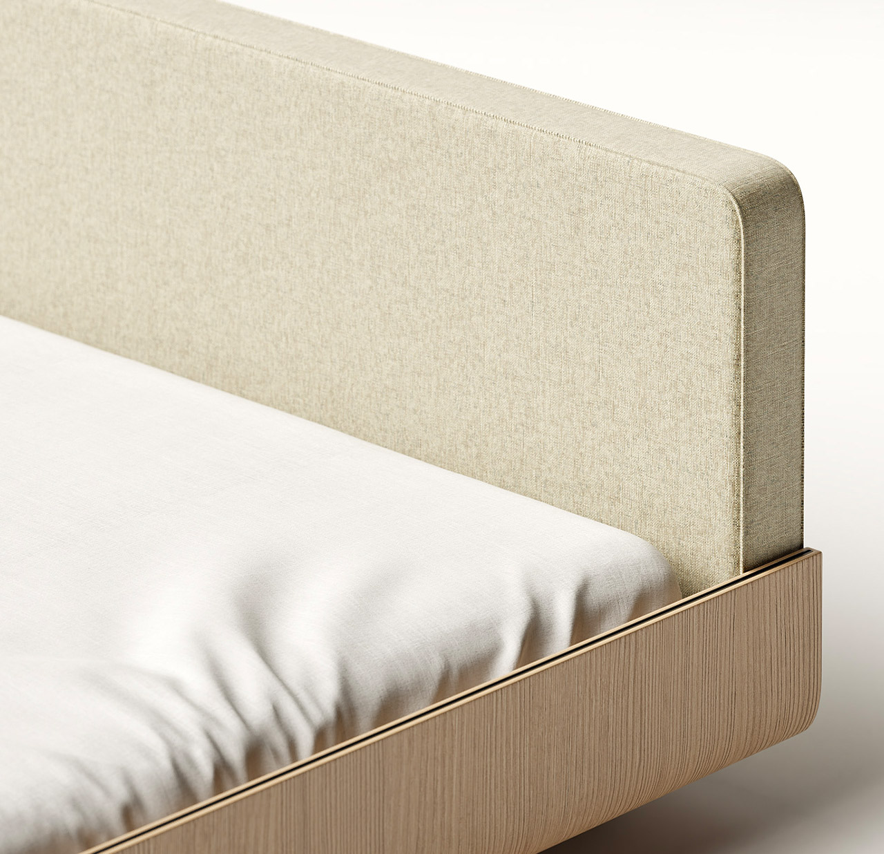
The headboard is upholstered, so it’s pretty cozy to rest against while eating your meals or working on your laptop. Teixeira integrated curved lines into the bed, giving the surface a rather elegant and sophisticated texture, and even giving the impression of a floating bed at certain angles!

Teixeira says, “The prospect for hidden storage was discarded to avoid a saturated and heavy design.” Instead, he opted for an open storage area at the bottom of the bed which functions as a nifty shoe rack or even as a resting spot for your pet.

The Boomerang bed is a simple yet ingenious design that could work well for smaller and compact homes. It’s a furniture design that caters to multiple needs while occupying minimal space.

The post The Boomerang bed features an integrated table + storage area making it ideal for small homes first appeared on Yanko Design.
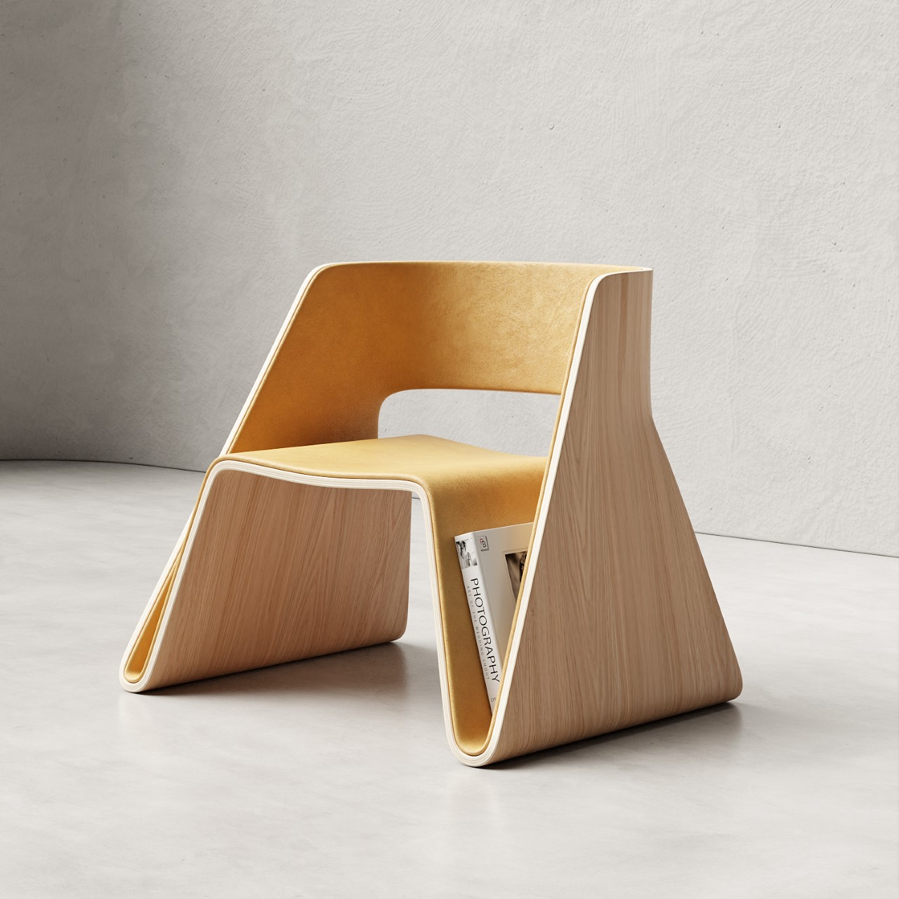
This slim shelf’s minimal design looks like an open book to encourage you to read!

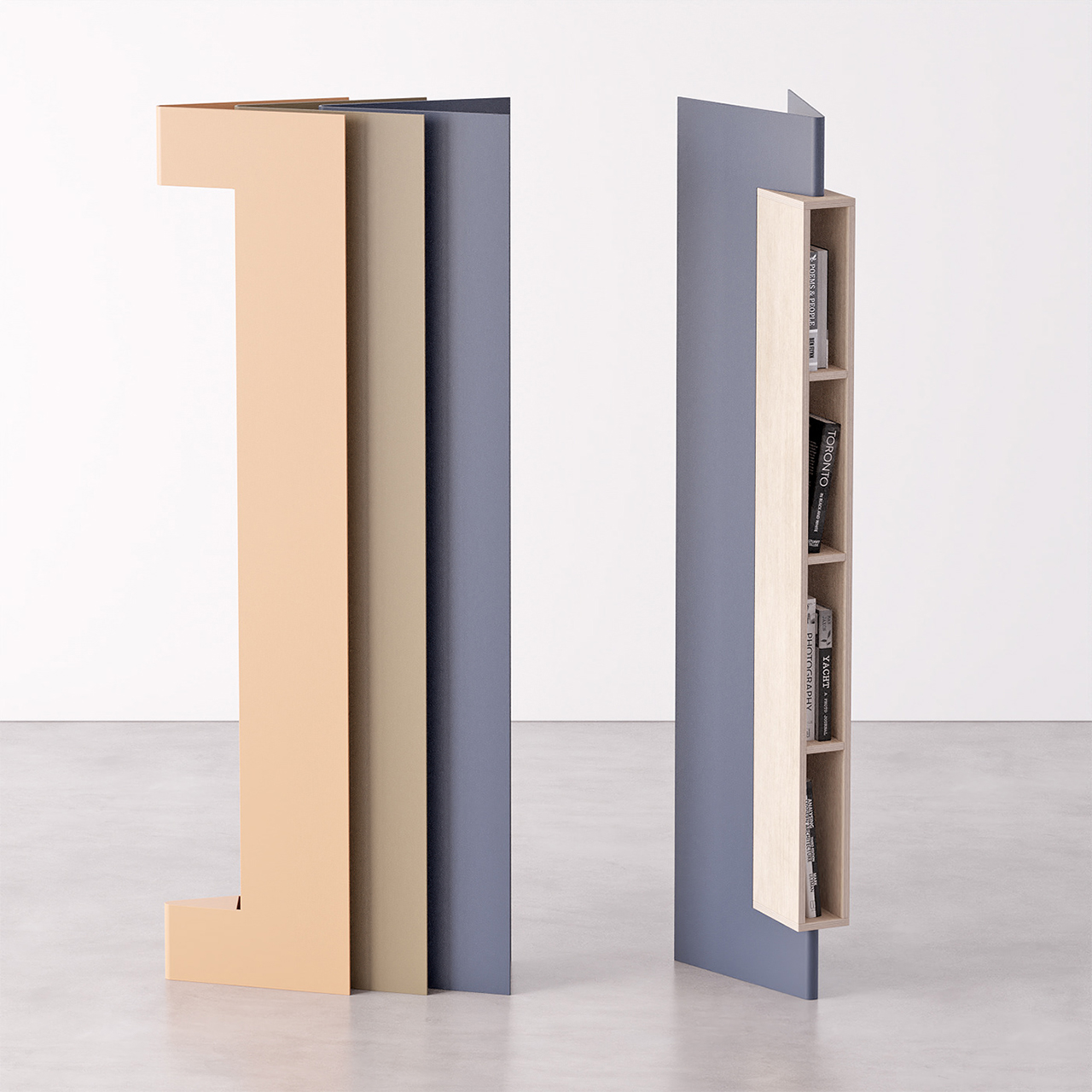
Imagine instead of having a self-care app send you a notification that reminds you to read (especially if that is your resolution for the new year), the furniture itself can be a reminder! That is what Slice essentially is, a minimal, compact, elegant bookshelf that looks like an open book so that it can nudge you to read without having any more screens or digital stimulation.

“In amazingly digital era books aren’t easily opened, having this in mind ‘Slice’ is a bookshelf that intends to motivate individuals to read more often,” says Portuguese designer Joao-Teixeira who is known to always understand the assignment and delivers every single time with unique pieces like this.

Slice connects the environment, the activity, and the user very seamlessly through its form and function. Besides its emotional character, the bookshelf also takes on an aesthetic approach based on minimalistic and sleek shapes. Its elegantly formal look allows the product to become modular, enabling dynamic configurations as a means to highlight its presence and therefore its use.

You can access books from both sides (front or back) easily and the shelf was deliberately created with a slim profile to better fit in smaller spaces. It is horizontally stackable if you want to add more colors or create a piece for your home library, but Slice is certainly a slice of heavenly furniture for every book lover out there with big dreams and little floor space!

Designer: João Teixeira

The post This slim shelf’s minimal design looks like an open book to encourage you to read! first appeared on Yanko Design.
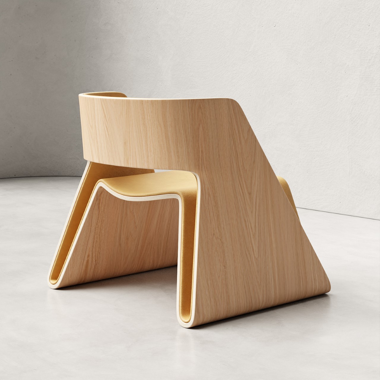
This flatpack cat tower comes with integrated scratching posts and a top bed for functionality and comfort!

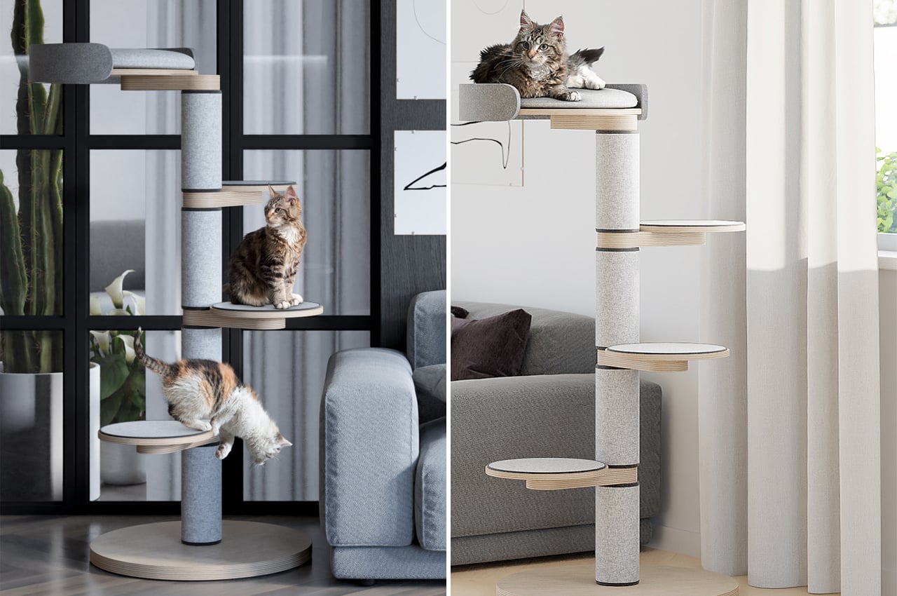
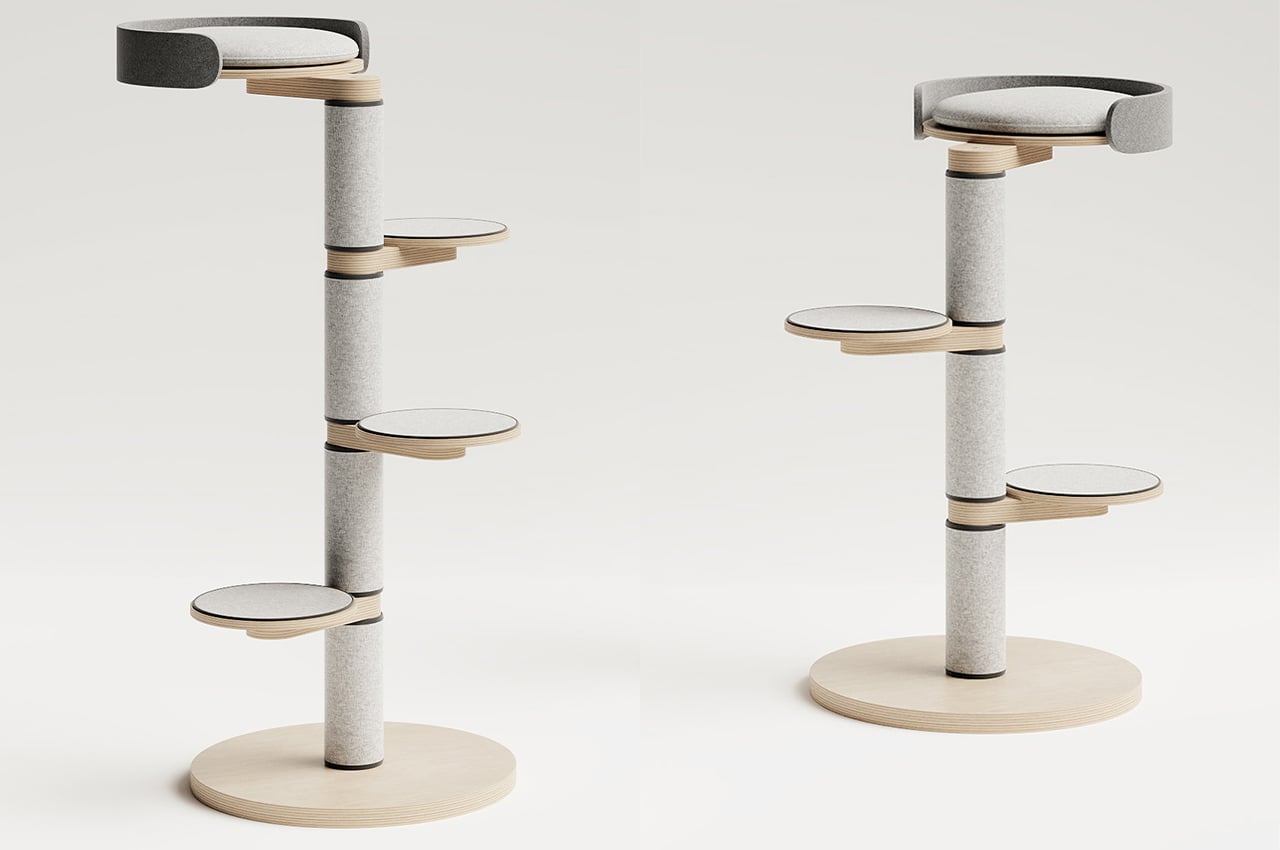
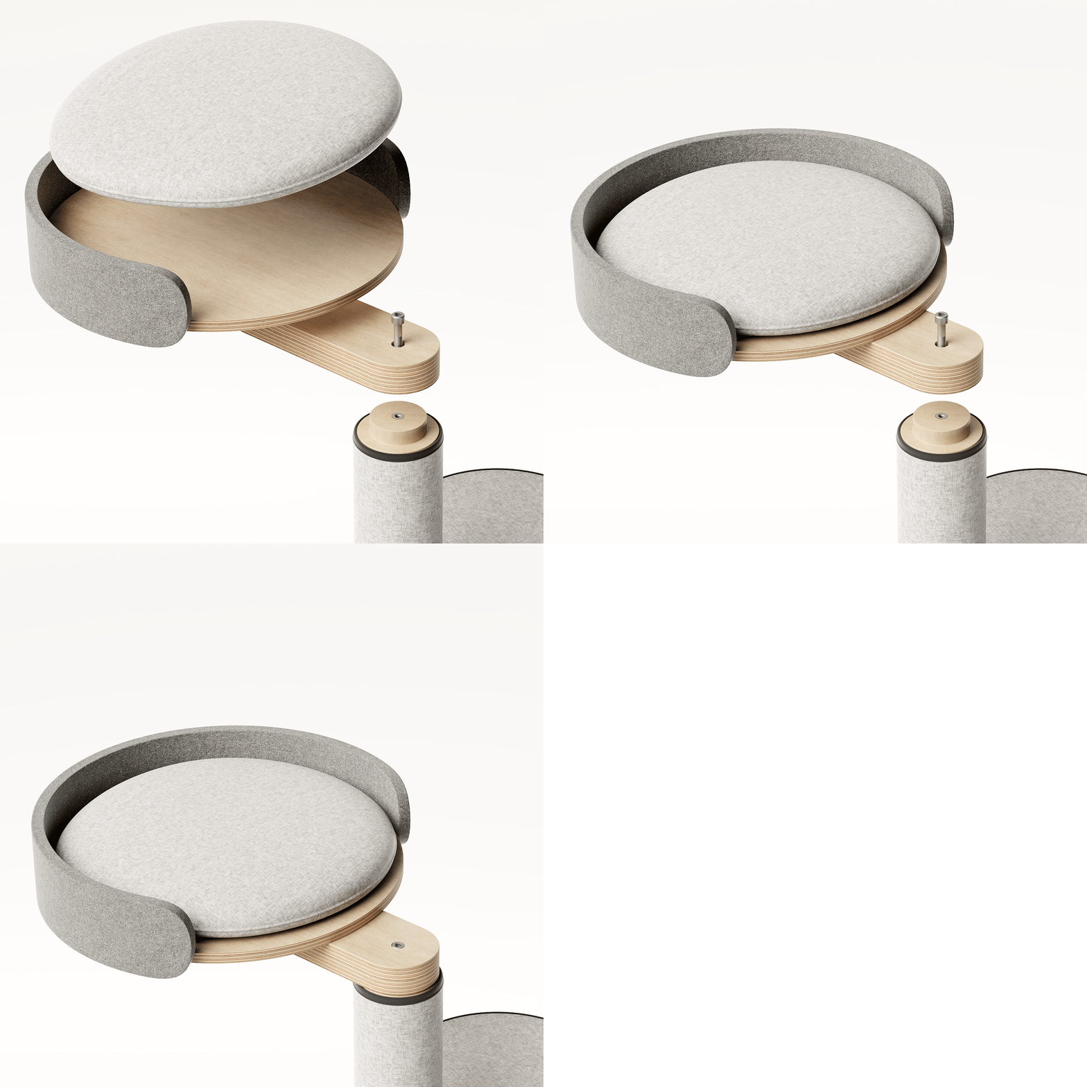
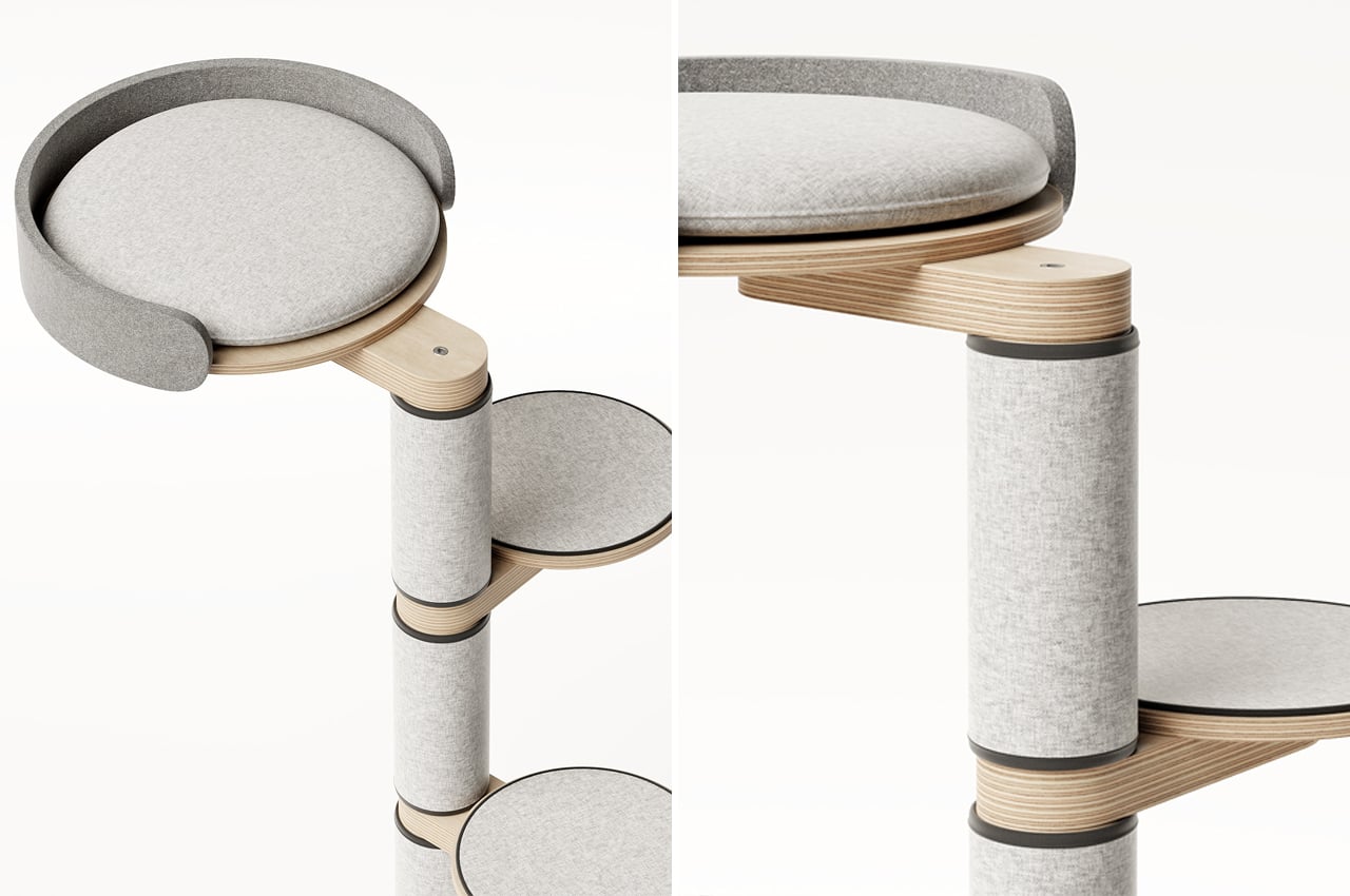
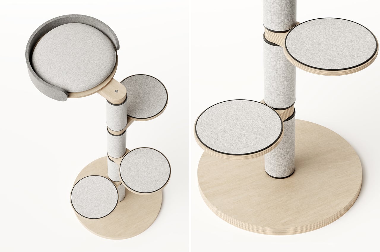
Float is a flatpack cat tower with built-in scratching pads that can be assembled in just a few steps.

Keeping cats entertained is a losing game. With all of the toys we buy for our feline friends, they still seem to prefer the armchair for scratching and balls of yarn for chasing. But then, that rare piece of furniture comes along made specifically for them that becomes their favorite spot for a midafternoon cat nap.

It might come through as a scratching post that catches their claws in just the right spots, or a cushioned bed that’s snugger than the corner of the couch. Or, it might be Float, a four-tier cat tower designed by João Teixeira that blends versatile design with comfort and simplicity.

Amounting four levels, Float is a flatpack cat tower with integrated features like scratching posts and movable seat rests. Following a client’s specifications and criteria, Teixeira designed Float so that it would blend into any modern home. Taking on a Scandinavian-inspired overall look, Float achieves a minimalist profile through natural, unstained wooden rods as well as cool, gray felt cushions.

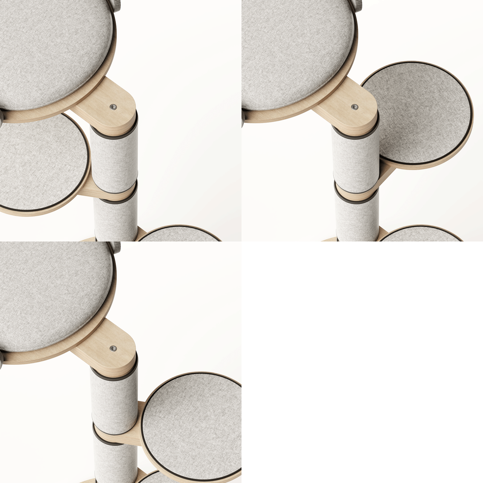
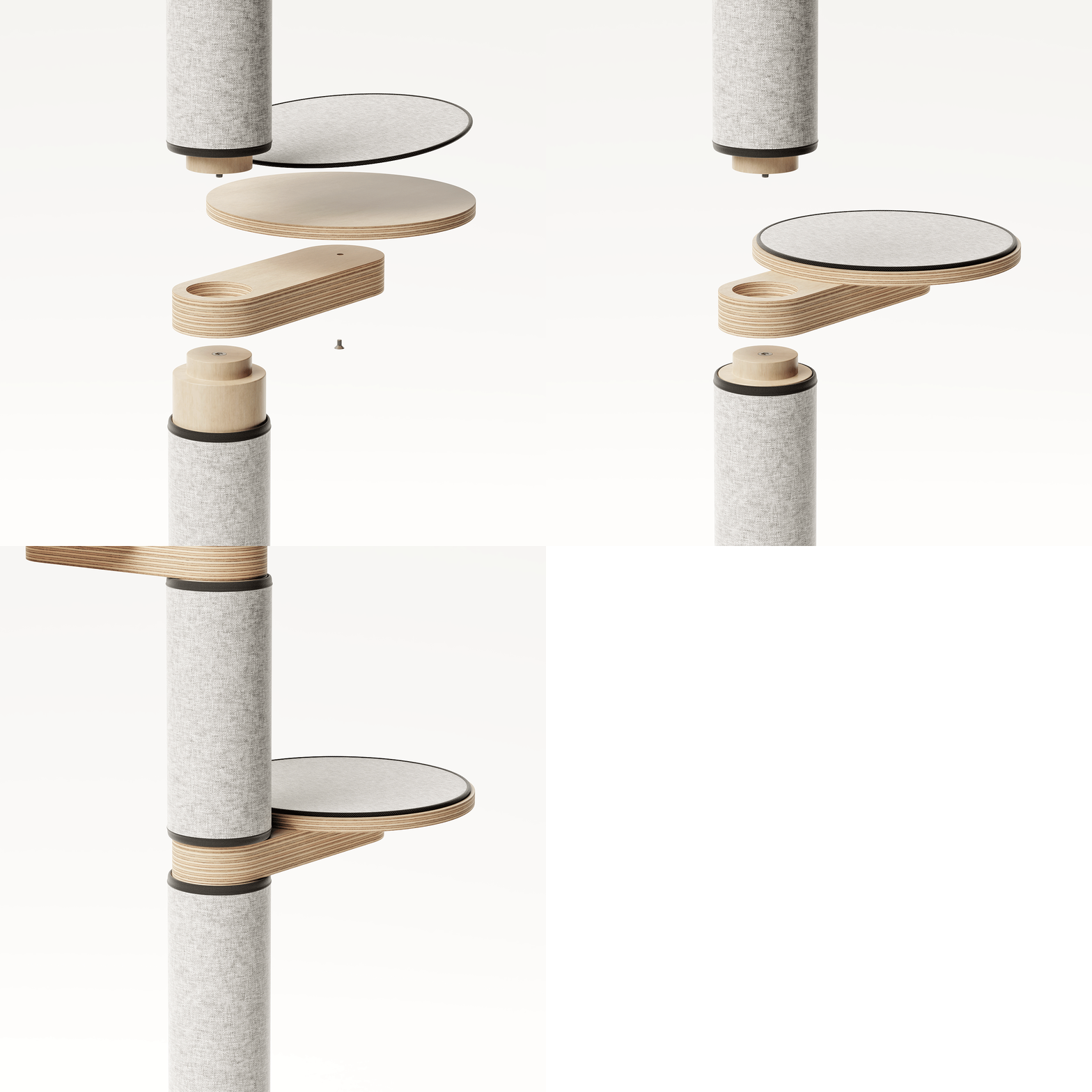
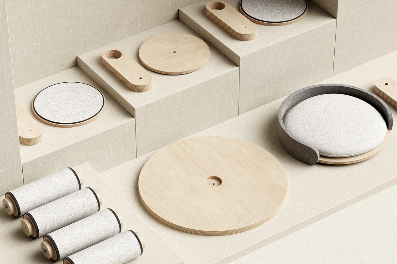
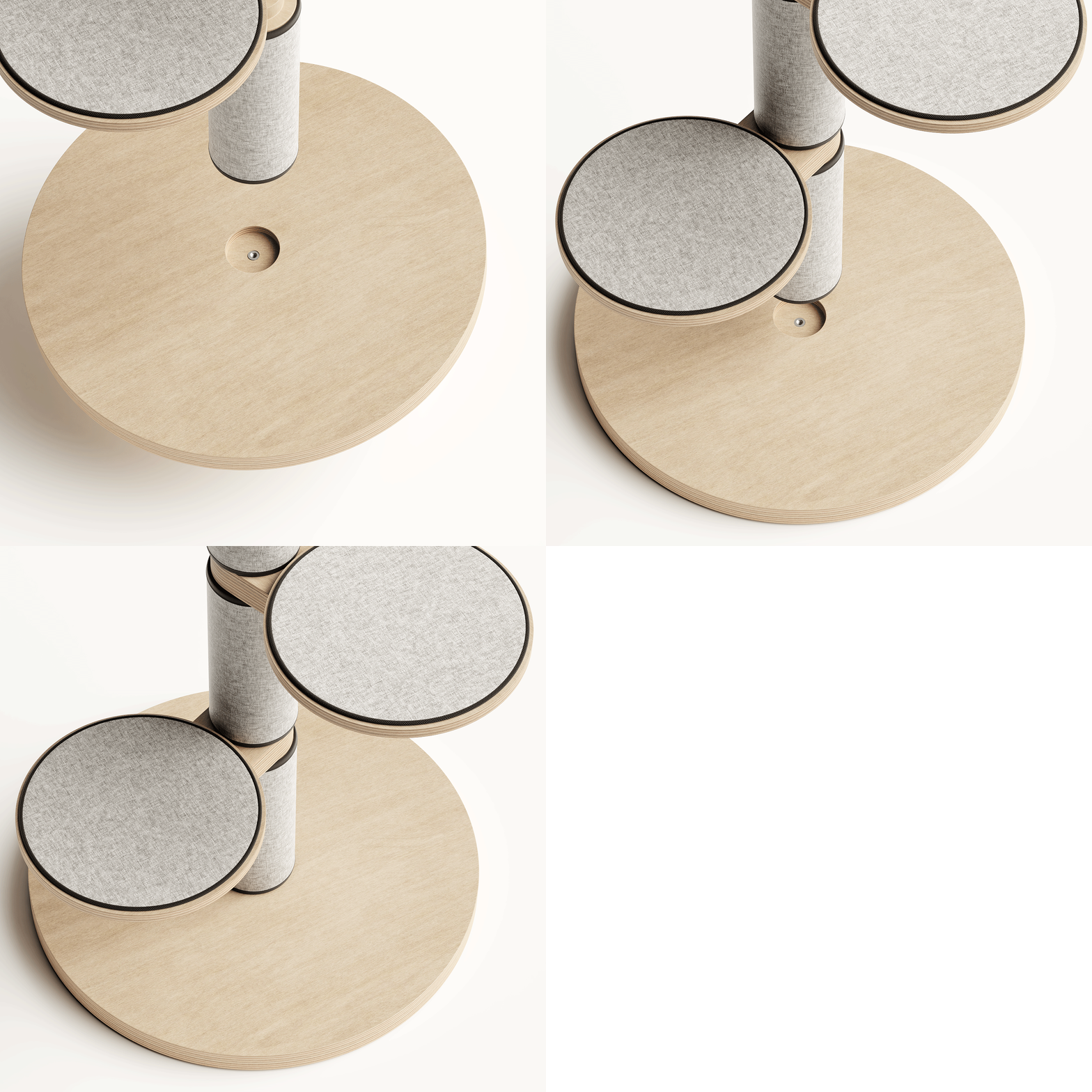
From its final look to its assembly process, Float was designed to optimize functionality and versatility. Opting for a vertical, single tower build, Float is aptly sized for smaller homes as well as larger living rooms, fitting snugly in any corner of the room. Comprised of only a few parts, Float has been given a plywood base that bolsters wooden rods connected to one another by elastic tubing.

Throughout the main wooden rod’s length, Teixeira incorporated scratching posts so that cats will always be within paw’s reach of a scratchy surface. Before tightening the whole tower together, cat owners can adjust the distance between each felt pad as well as the overall height of the Float cat tower. Based on an assembly process of threaded wooden rods, the height can be adjusted by adding or removing modules.

Designer: João Teixeira

The post This flatpack cat tower comes with integrated scratching posts and a top bed for functionality and comfort! first appeared on Yanko Design.
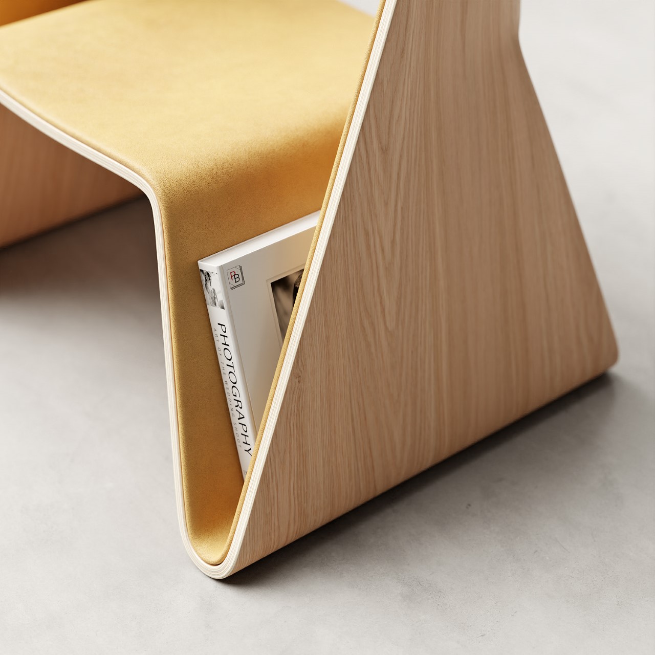
This sleek modern desk finds versatility and simplicity through a system of organizational wooden bars!

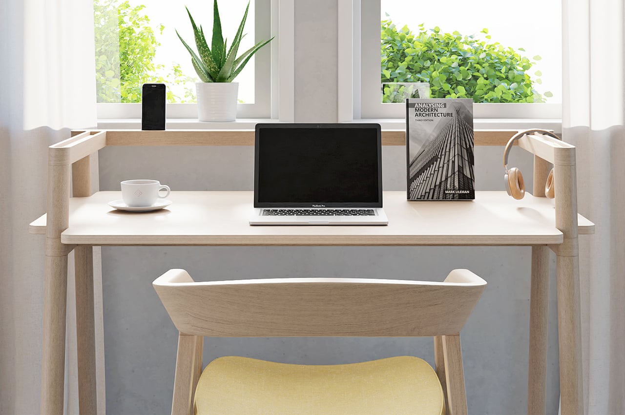
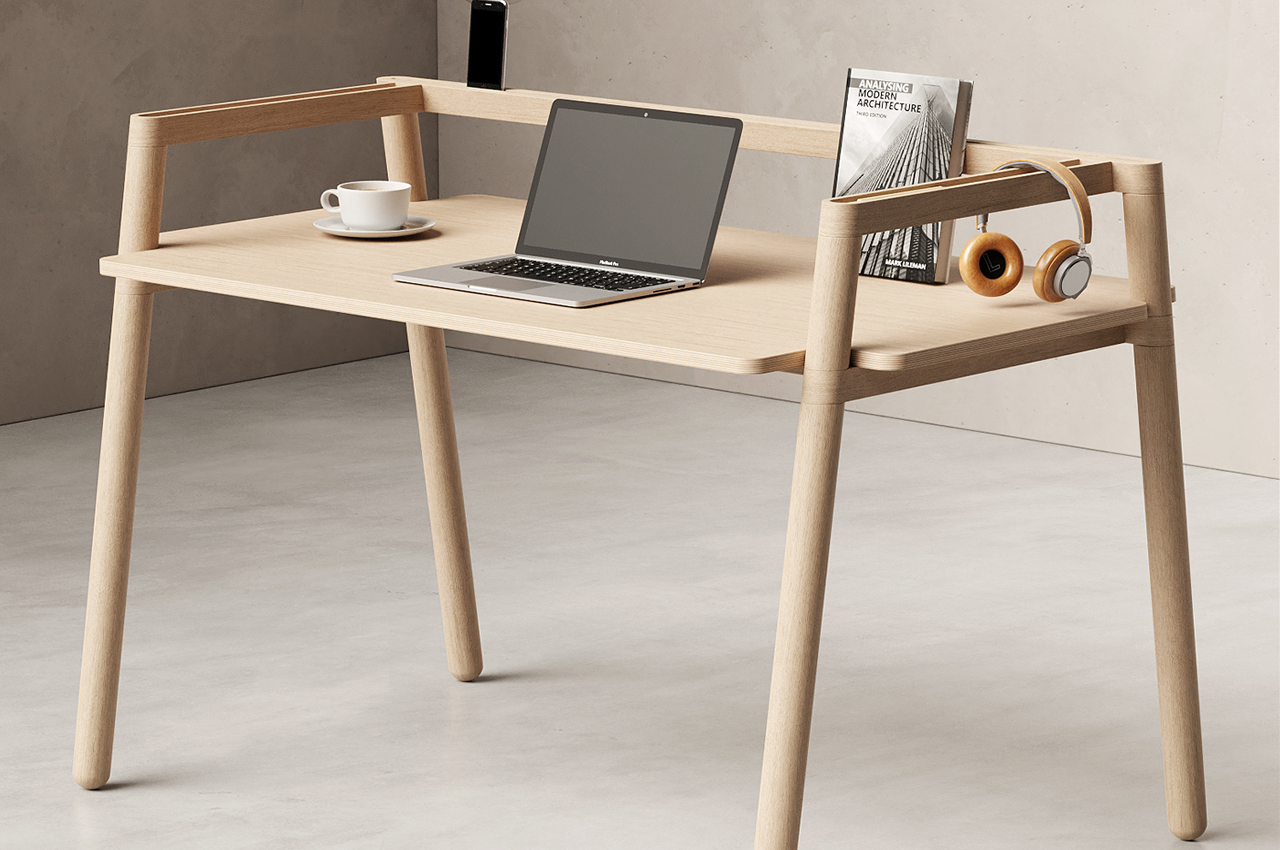
Bars is a Scandinavian-inspired desk design that finds versatility and simplicity through an organizational system of wooden beams.

Desks do it all for us. Not only do we work there, but they become our storage bins, our mail sorting cabinets, our coffee tables. With all of their versatility, these different uses aren’t typically put into consideration when designing desks.

When desks are built too simply, they run the risk of not being able to handle all of the supplemental uses we impose on them. The more complex the desk, the less likely we are to intuit all of its uses. Product designer, João Teixeira understood the assignment when he designed Bars, a minimalist wooden desk that’s built on intuitive design principles to balance versatility with simplicity.

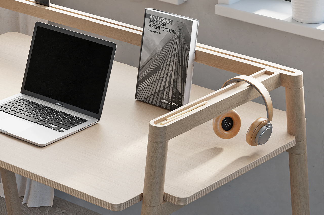
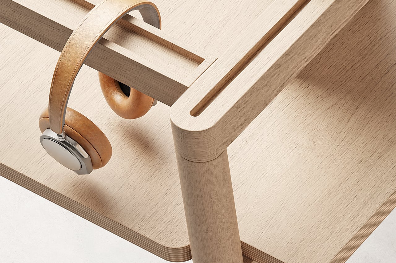
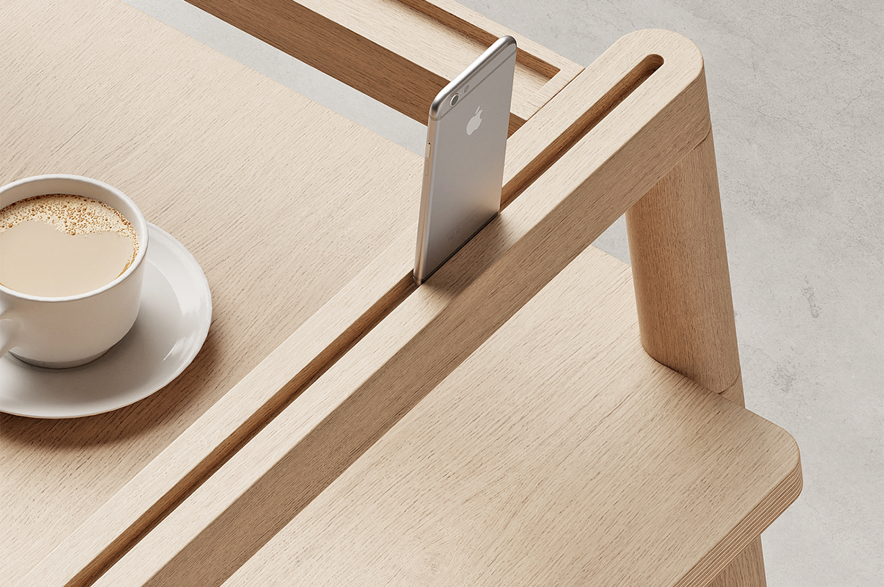
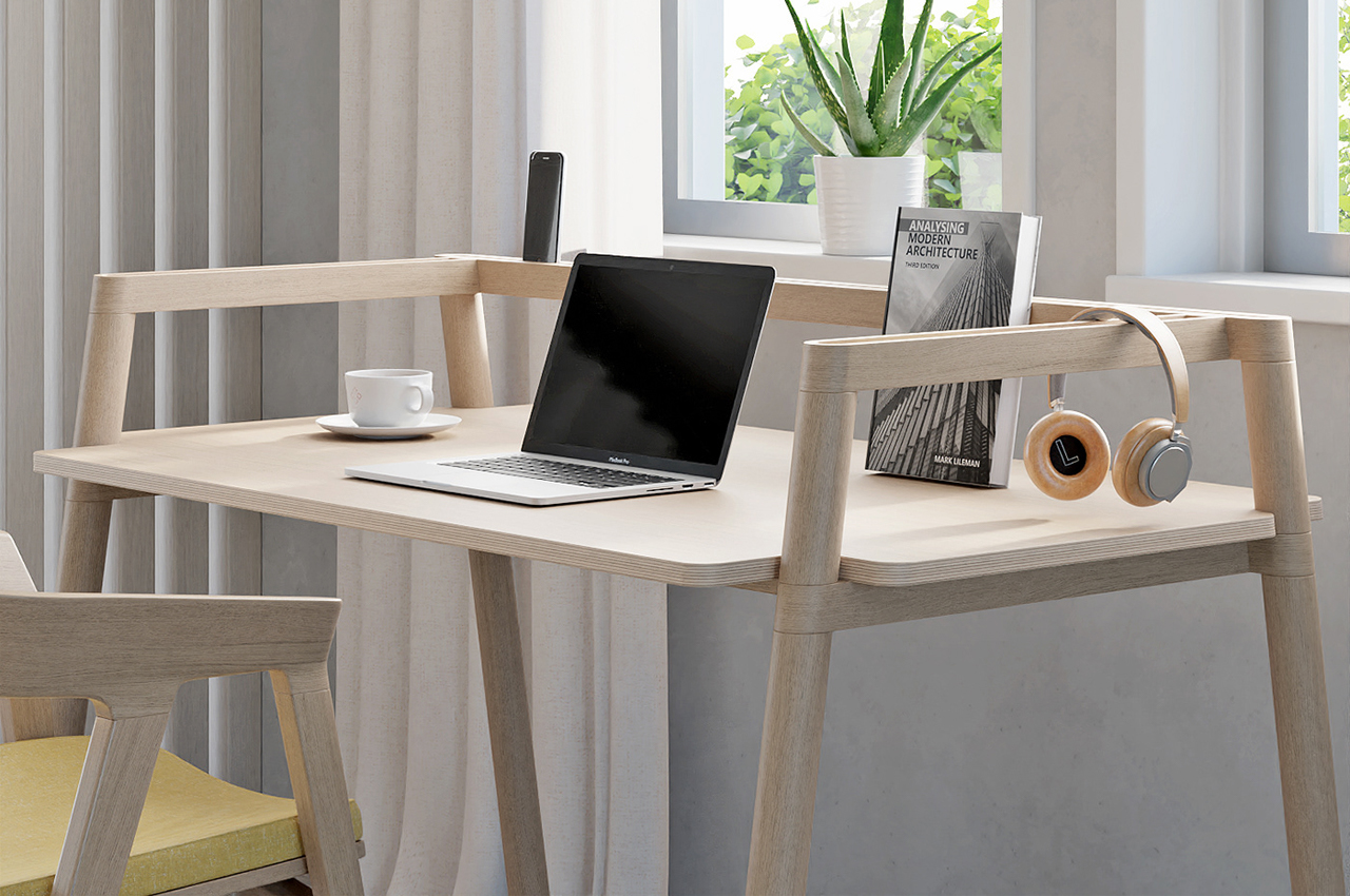
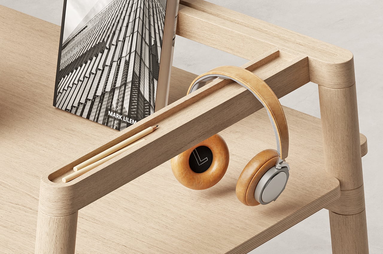
Aptly named, Bars is a modern desk that finds multiple uses through an overlapping system of wooden bars. Designed to help organize our work and off days, the system of bars provides clever, integrated storage options to keep our writing utensils and smartphones in designated areas and keep our working space free of clutter. Carved along each one of the wooden beams, Teixeira incorporated narrow, sunken storage bins that are just the right size to keep our erasers, pens, and stationery.

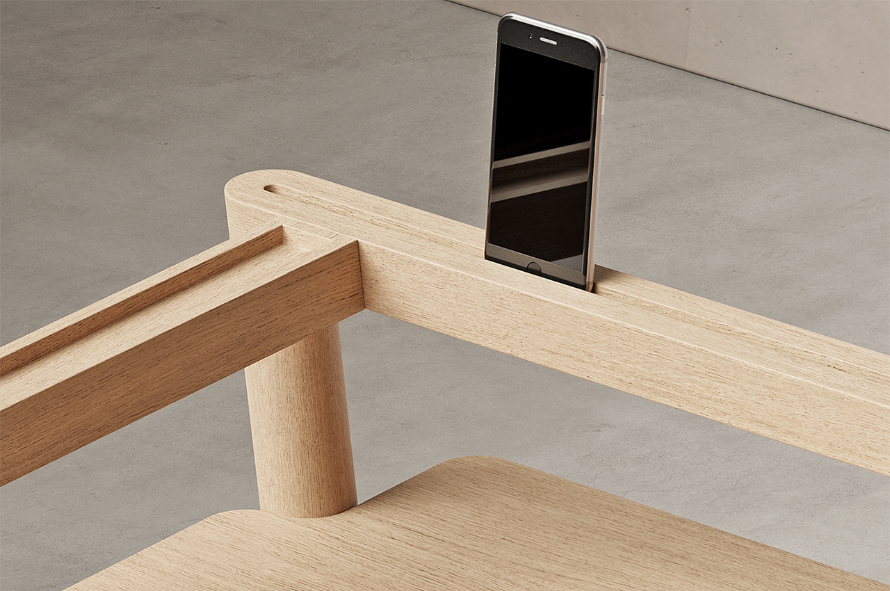
Along the desk’s rear wooden beams, Teixeira hollowed out a lengthy slot that fastens our smartphones into place while we work, keeping the threat of endless scrolling at arm’s length. Teixeira also envisioned the bars working as a sort of resting place for bulkier work-related items like over-ear headphones. Wrapping around three sides of Bars, the organizational system of wooden beams helps keep the desk’s working space free of mess so our workdays can be too.

Designer: João Teixeira

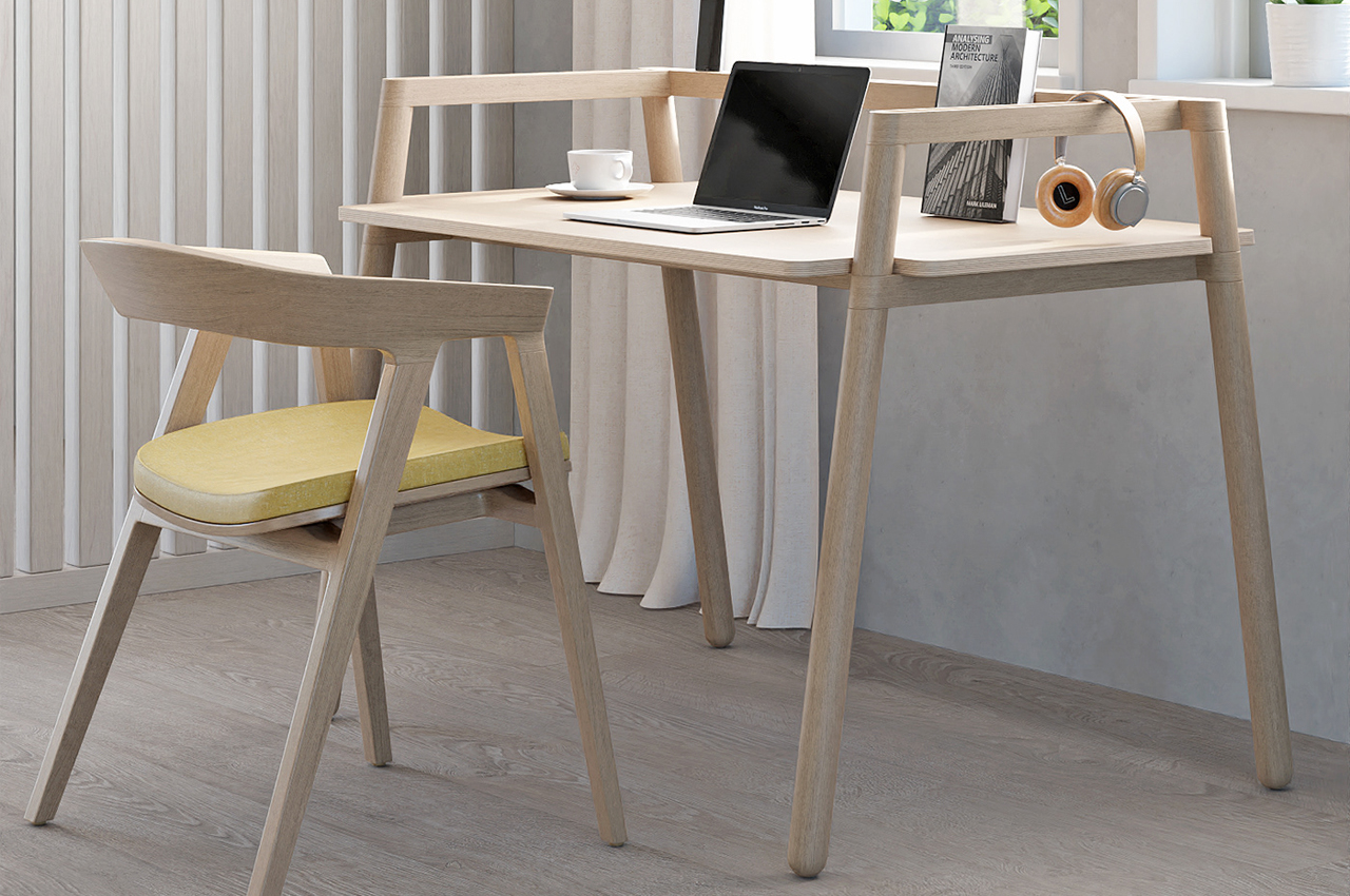
Bars is a simply built, yet versatile desk that keeps a modern, minimalist profile.

Inspired by Scandinavian design, Bars is minimalist by design and keeps a natural, polished wooden look. 

The post This sleek modern desk finds versatility and simplicity through a system of organizational wooden bars! first appeared on Yanko Design.
This minimal desk’s special design element is inspired by pianos!

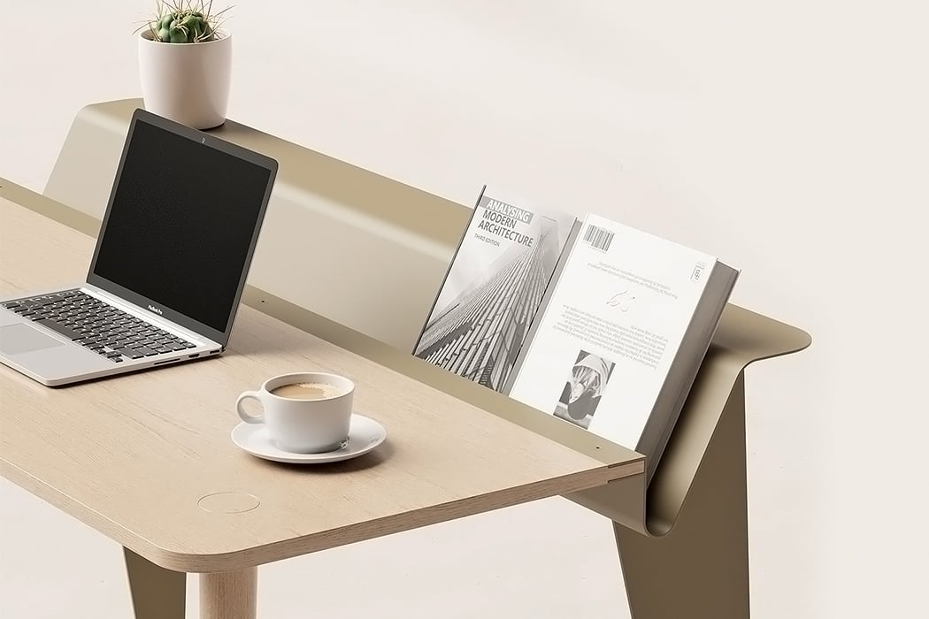
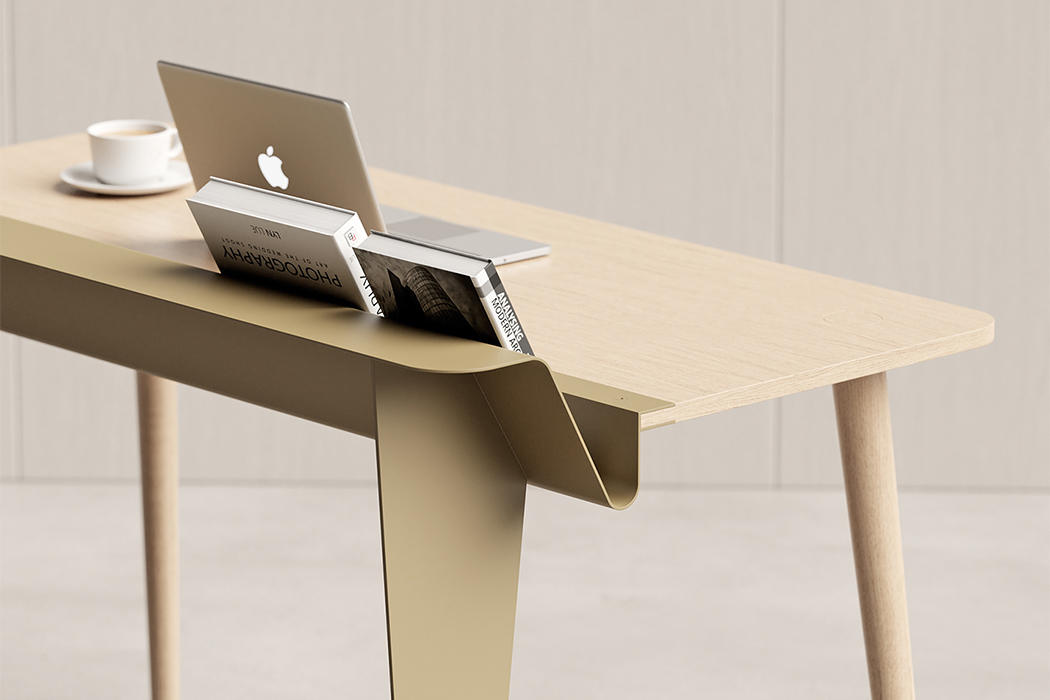
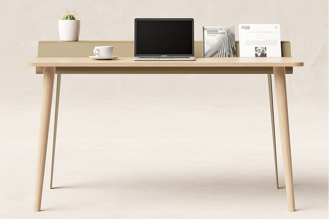
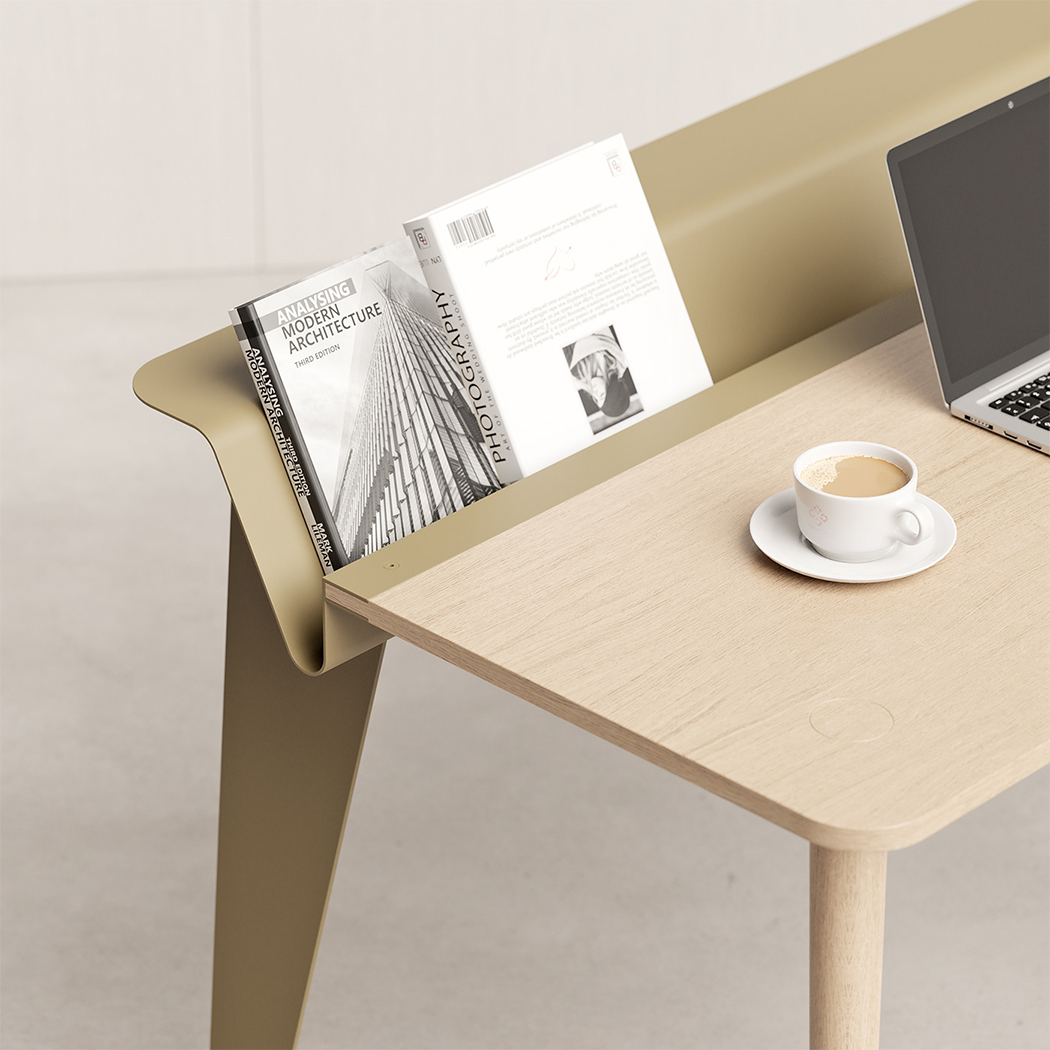
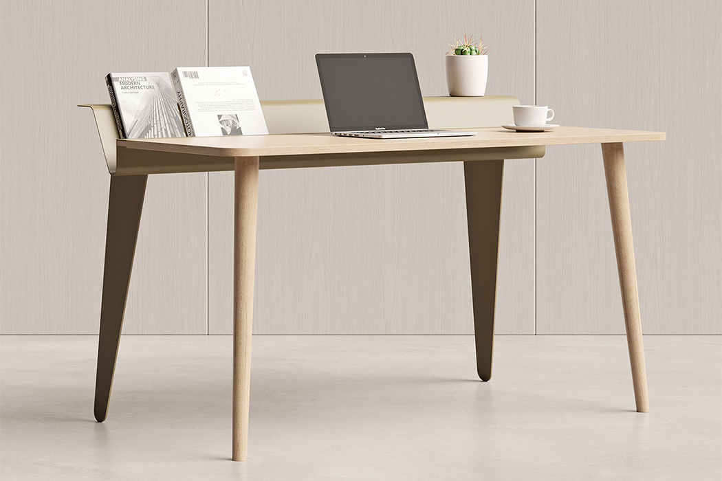
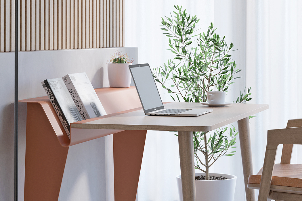
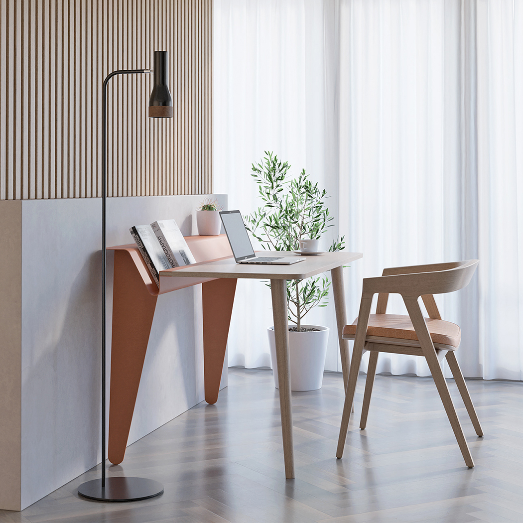
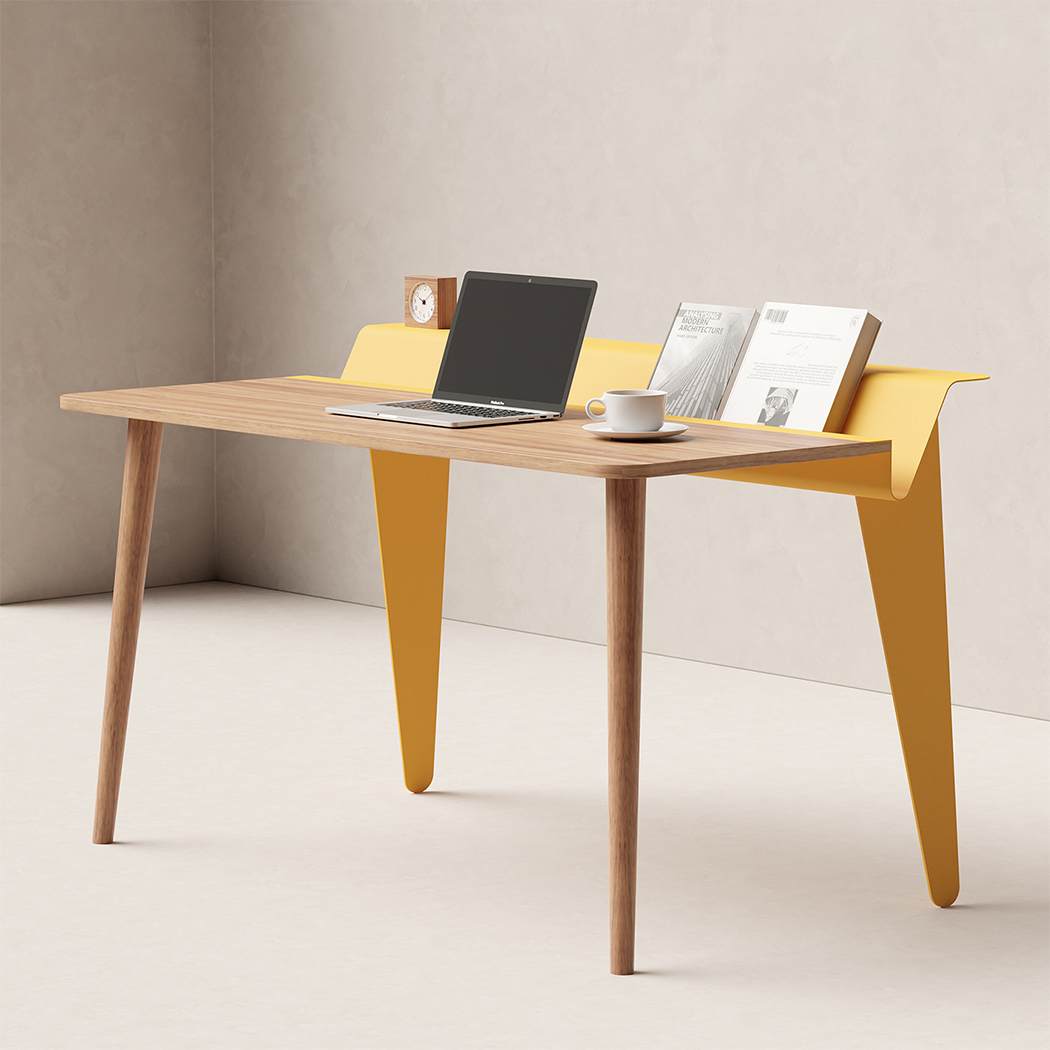
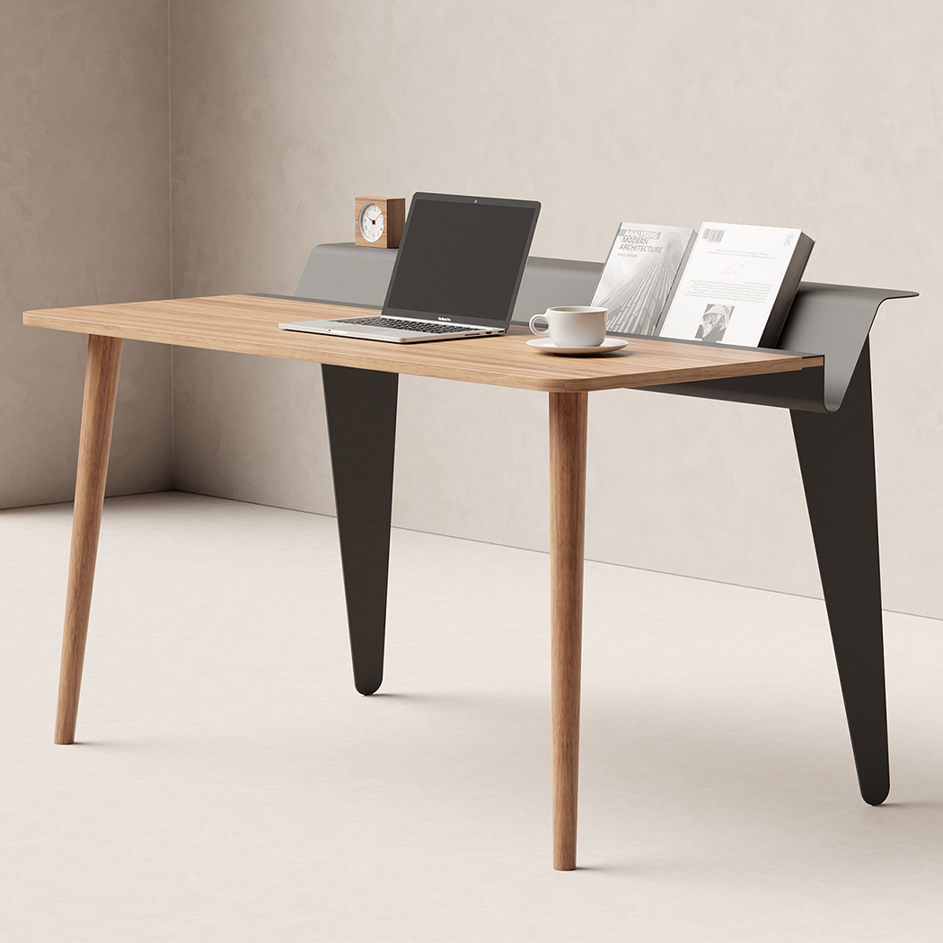
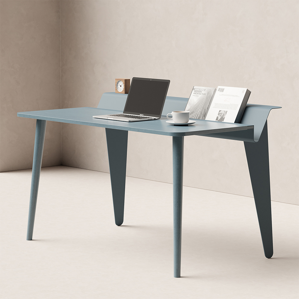
I played piano for a decade and I was so used to reading with my book upright on the music shelf (the little fold-out flap where you keep your music sheet) that I started to keep my textbooks for school upright too – it just felt more convenient! The Piano desk gives that traditional design a nod by incorporating it into your familiar wooden desk with some additional inspiration from the Standard chair by Jean Prouvé that elevates the minimal piece.
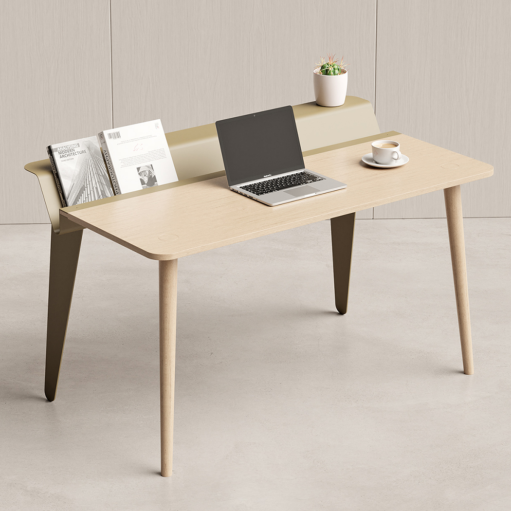
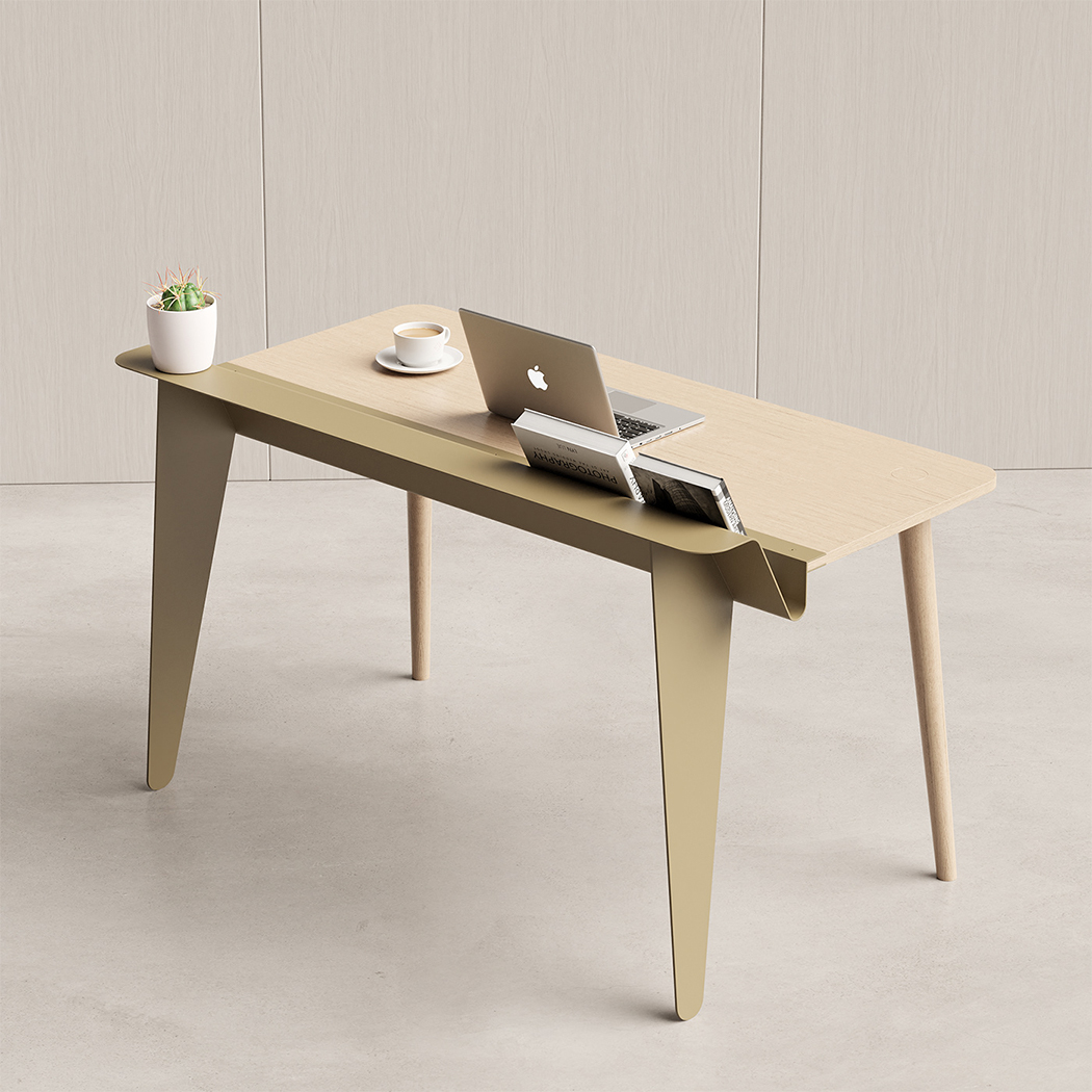
The Piano desk created so the designer could experiment with a hybrid material selection and play with interesting visual contrasts. On the one hand, we have metal which is a cold material that is beautifully balanced by the warmer wood. On the other hand, the same metal which allows for a slimmer silhouette is given the sturdiness with the addition of wood. The key factor in the briefing was to design a product with a democratic approach. That is how the minimal desk without any complex production processes was born while still featuring a small design element that other minimal desks didn’t have – the dipped shelf!

It has rounded corners on both wooden and metallic parts which smoothly connects both shapes and materials visually. The choice of discarding drawers led to a different conceptual solution that came from looking at the way some piano players hold their music notes, hence the name. The metal stand is perfect to hold books and documents and it is a fair substitute for the drawer in some cases. You can also add some decor like a succulent or your favorite bobblehead! The Piano desk is perfect for your home office with its pleasing CMF, evergreen character, and improving its integration within the space in the most eloquent way.

Designer: João Teixeira