Cup o’ Music!

ai_plus_cover

ai_plus

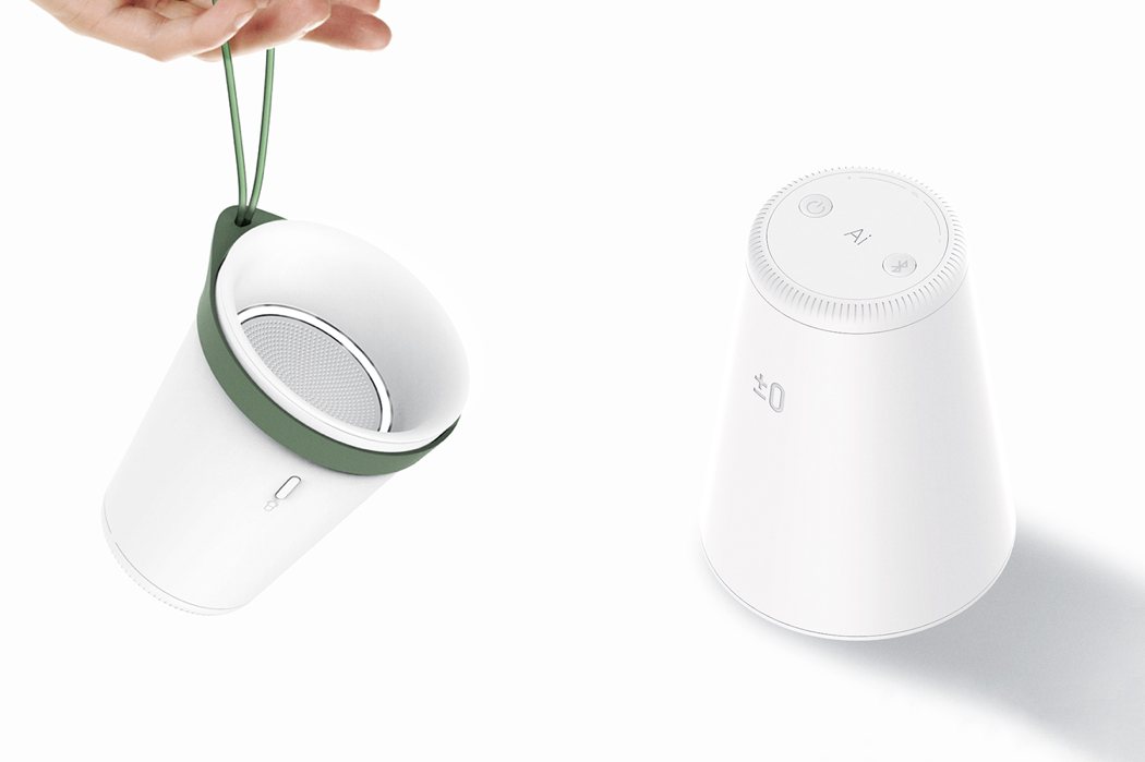
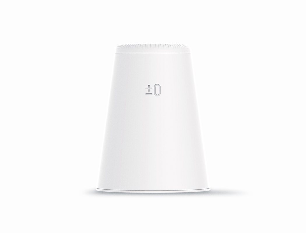
Ai means love in the Japanese language. In english, AI stands for artificial intelligence. Wth this in mind, the thoughtfully designed Plus Minus Zero speaker aims to bring individuals closer.

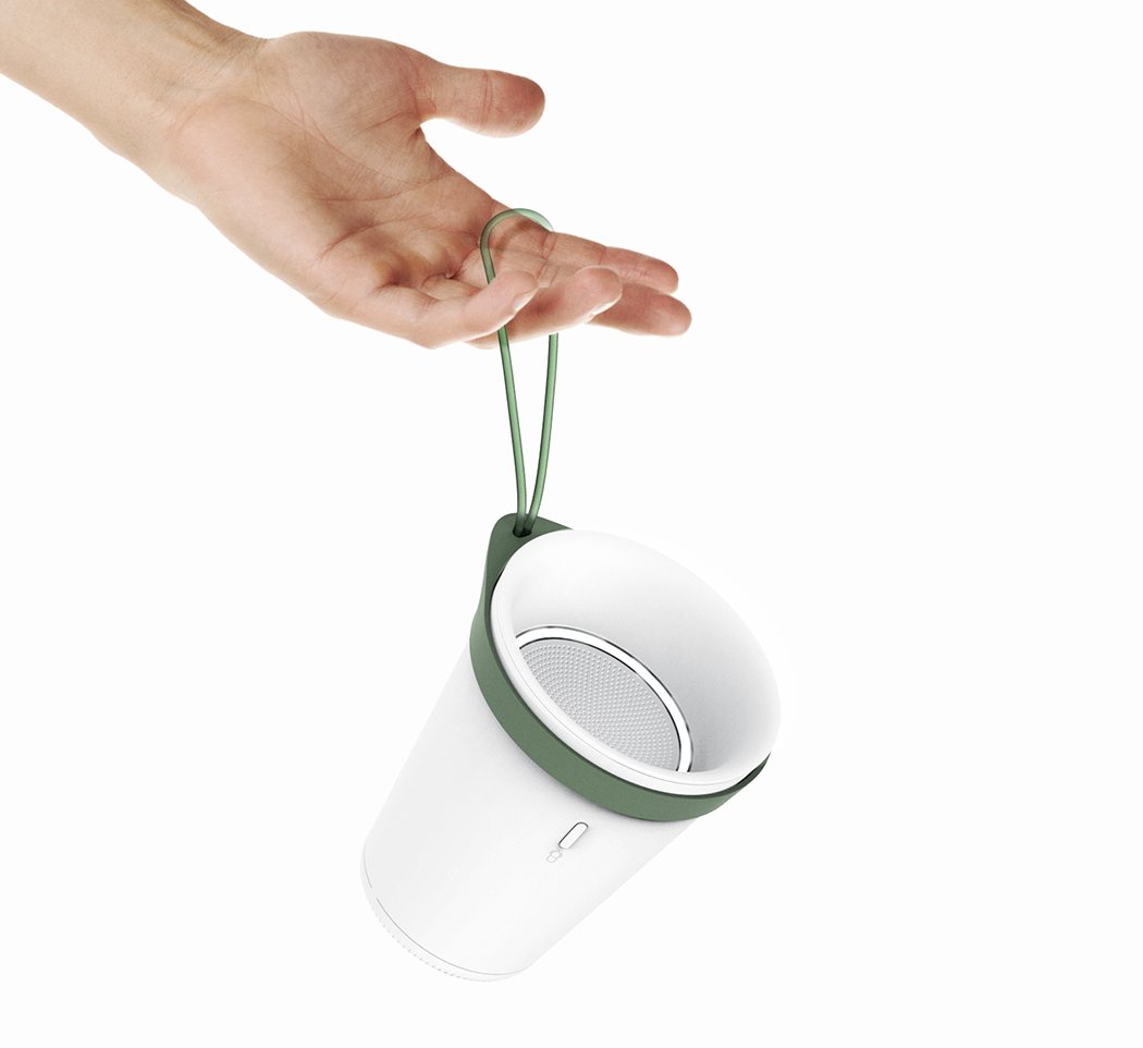
For centuries, the cup has always been at the center of communication. Whether it’s over hot coffee or a cold beer, we talk and share our emotions with each other over the cup! The cup also acts as a faux phone for kids to communicate during playtime. This sentiment drove the familiar form of the device which is equally playful, functional, and intuitive to use!

Designer: Steve Bae

ai_plus2

Inspired from the Movie ‘Her’

From the movie ‘Her’ Theodore and Samantha communicates very deeply, showing the possibilities of sympathy between man and machine. This was very inspiring and I thought the communication between an AI and human should be in this kind of way. I tried to find some link to make the communication flow in a very human-like way.

ai_plus3

Metaphor: Cup

The cup acted as a communication device for every children, which most people sympathy in the memories of their childhood. I took motive from the essence of a cup as a communication between human individuals.
ai_plus4

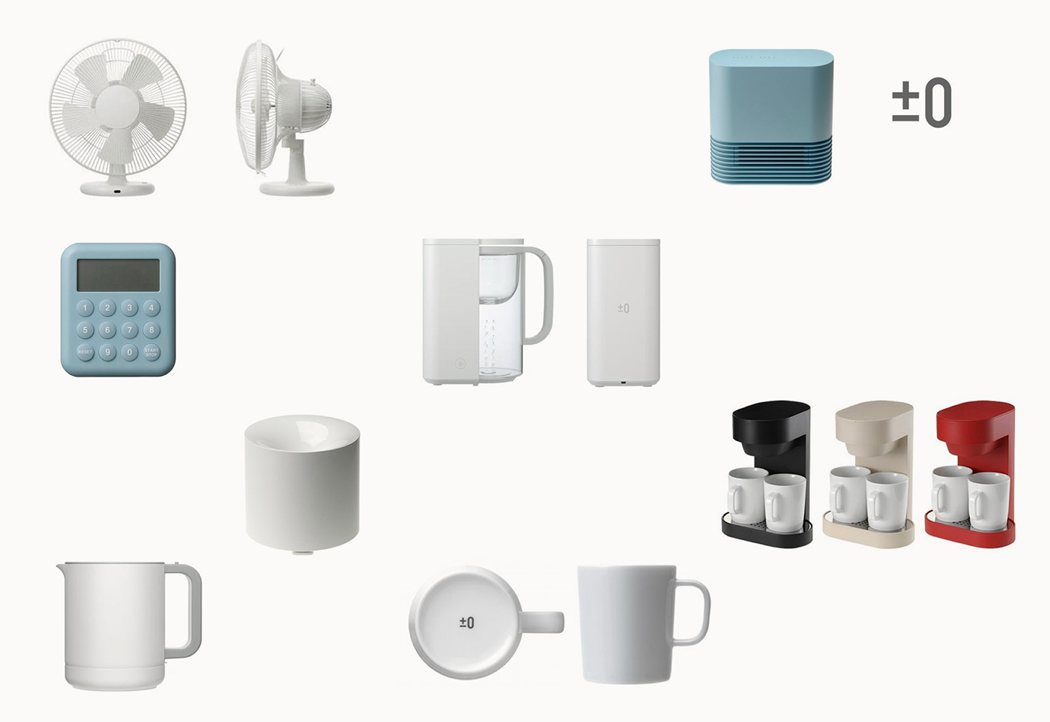
Shape Study on Plus Minus Zero

Japanese design brand Plus Minus Zero’s design focuses on human nature and how a product should be used in our daily lives. I focused on the proportions and the design languages that come from the simplicity of the design and tried to blend them in to his own.
ai_plus5

ai_plus6

Designed with Simplicity

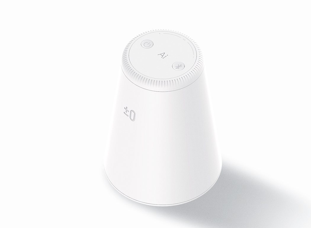
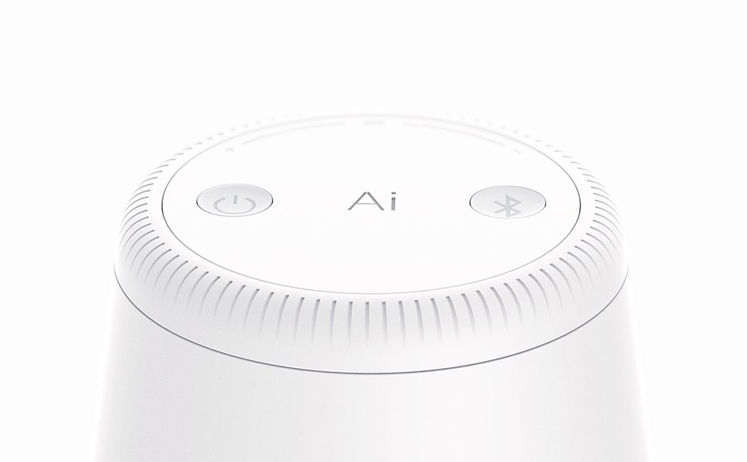
It was a big challenge to refine a paper cup shape product with details. While finding proportions of the whole product and seeking for the components I could add details to, I found the simplicity for this project.
ai_plus7

ai_plus8

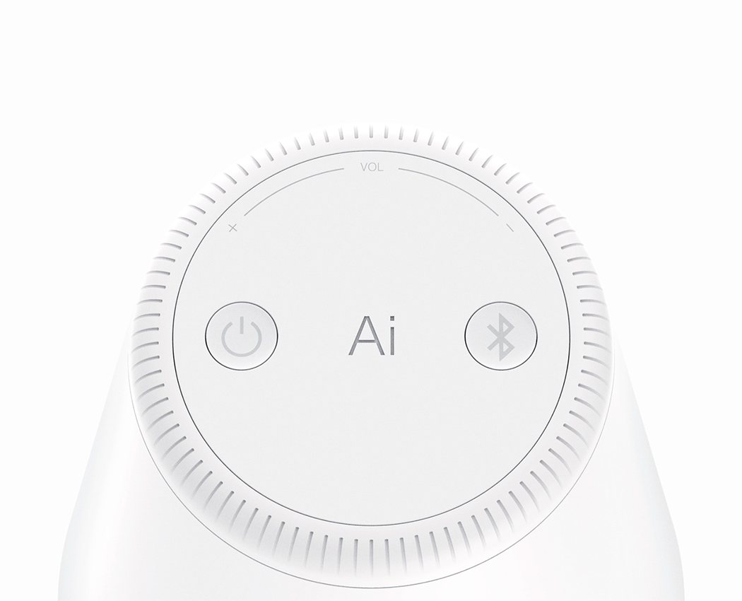
Easy Volume Control

The Ai was designed with a volume jog dial at its bottom for easy control, With in the simple design language i wanted to make some difference through pattern surfaces that smoothly fades away like a gradient.
ai_plus9

ai_plus10

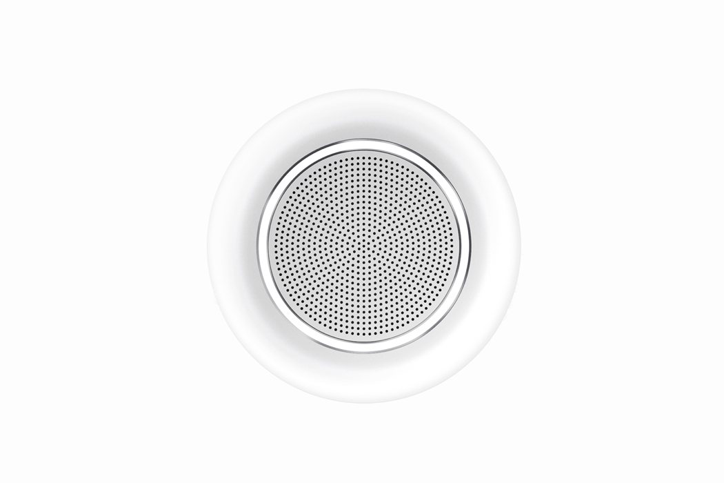
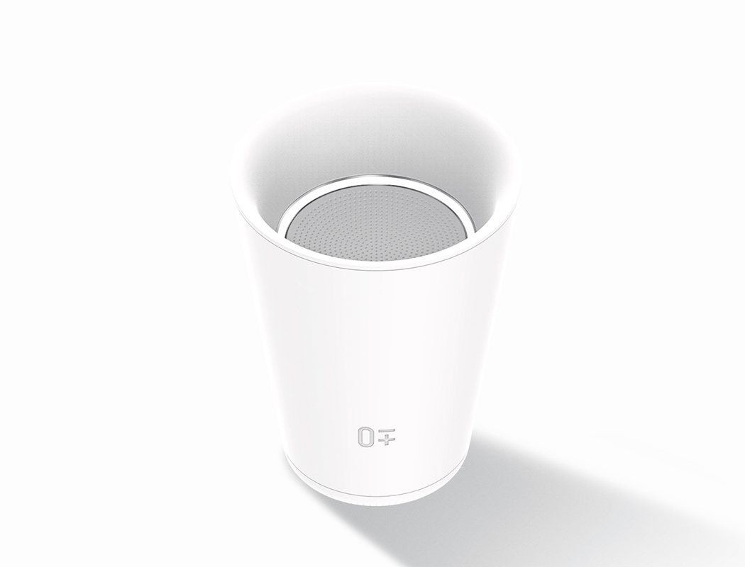
Concave Designs

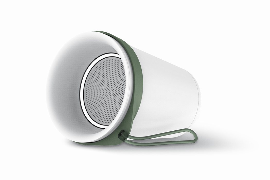
To maximize the traits of a cup, the product was designed in a concave shape. Also, the concave keeps the sound in direction, and at the same time, the mic can catch exact orders from the user. The indicator interacts with the user when a command is input.
ai_plus11

ai_plus12

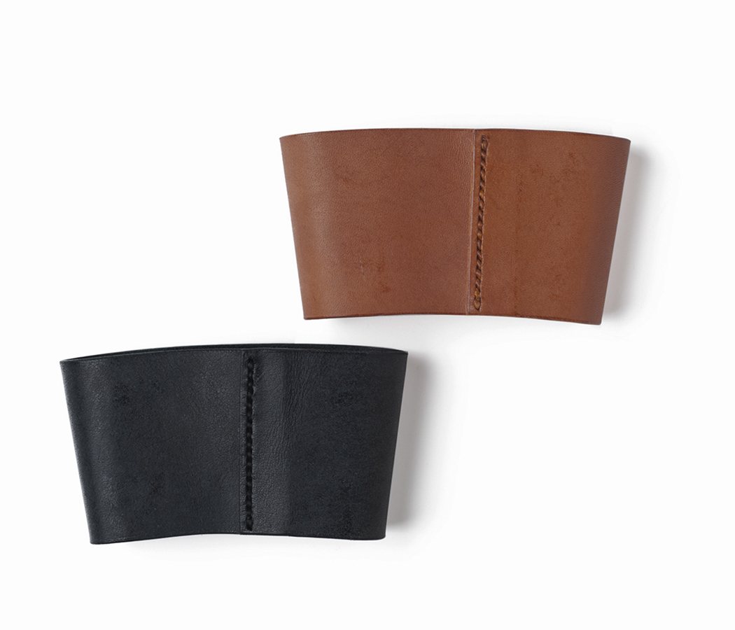
Expanding Metaphor: Cup Sleeve

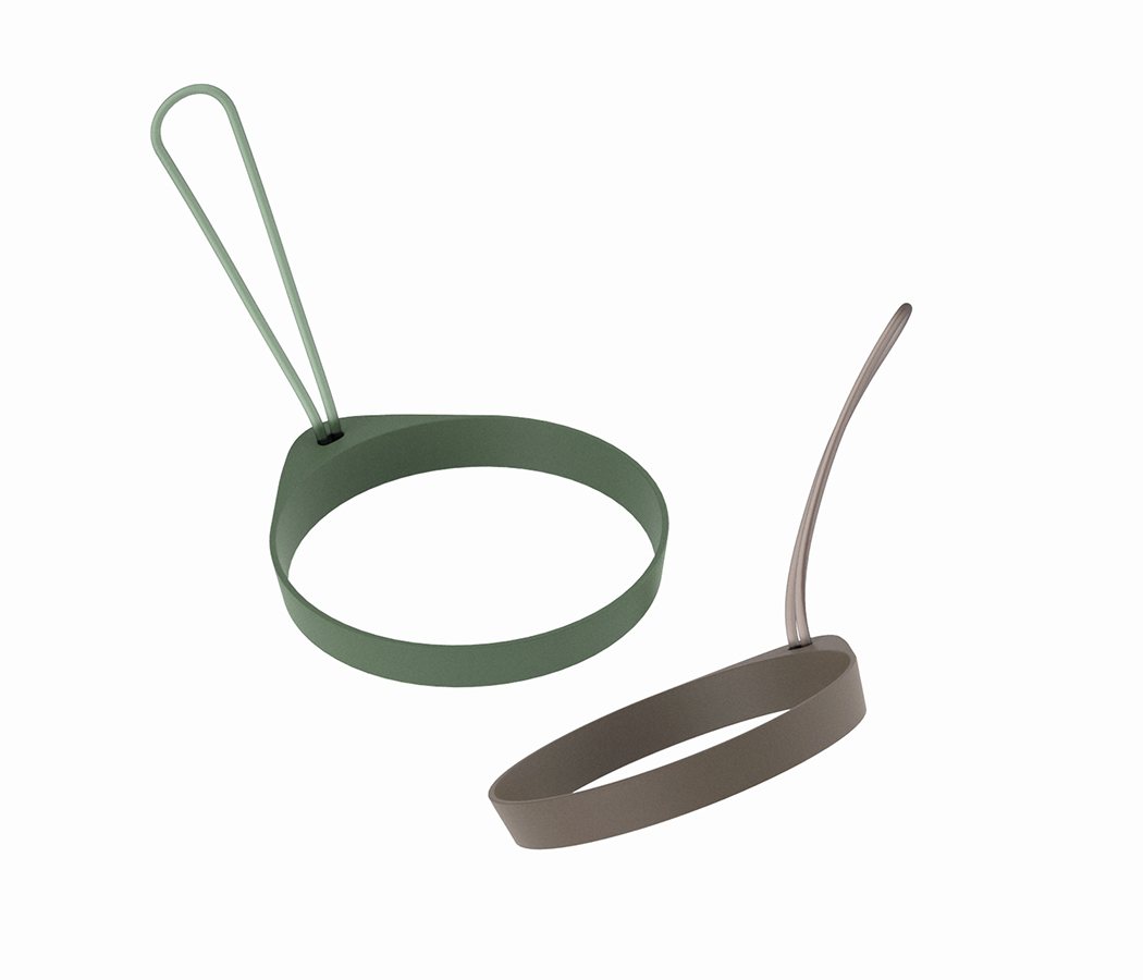
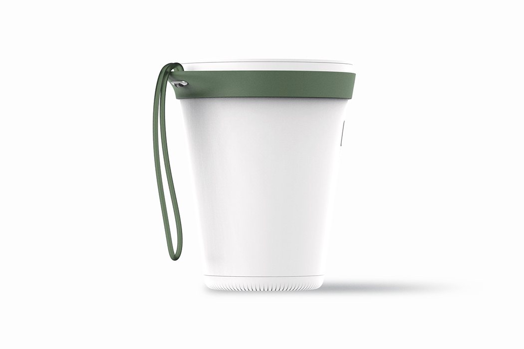
To maximize the essence traits of the cup, I designed an accessory which took metaphor from a cup sleeve. The cup sleeve accessory can give expansion for the usage of the product.
ai_plus13

ai_plus14

ai_plus15

Slip on, Lay down, Take anywhere

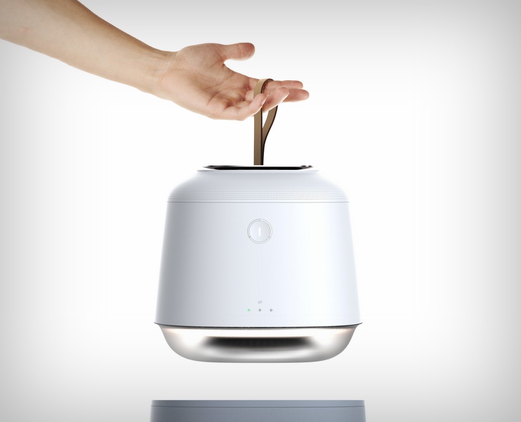
The sleeve design provide variety of user scenarios, which prevents Ai from rolling and at the same time, you can carry Ai easily with the translucent straps.
Earphones for the white collar!

samsung_gear_icon_earphones_1

Samsung does premium phones well. The Galaxy series handle functionality and multitasking with great ease (hardware ‘problems’ aside!). Even Samsung’s Gear watch looks absolutely dapper… However I have an issue with the Gear Icon X earphones. They’re too sporty. While they work like a charm, they don’t fit well into Samsung’s premium portfolio. Jong Hyuk Bae’s Gear Icon C concept earphones correct that anomaly. They use clean flat surfaces and geometric shapes, giving the product the premium edge it deserves. Metallic accents and a beautiful color palette only enhance that. Let’s hope the guys at Samsung get some inspiration!

Designer: Jong Hyuk Bae

samsung_gear_icon_earphones_2

samsung_gear_icon_earphones_3

samsung_gear_icon_earphones_4

samsung_gear_icon_earphones_5

samsung_gear_icon_earphones_6

samsung_gear_icon_earphones_7

samsung_gear_icon_earphones_8

Advanced Appliance Aesthetics!

belyse_air_purifier_1

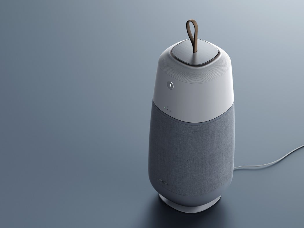
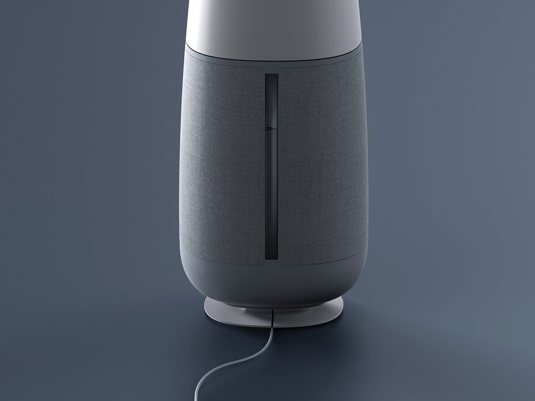
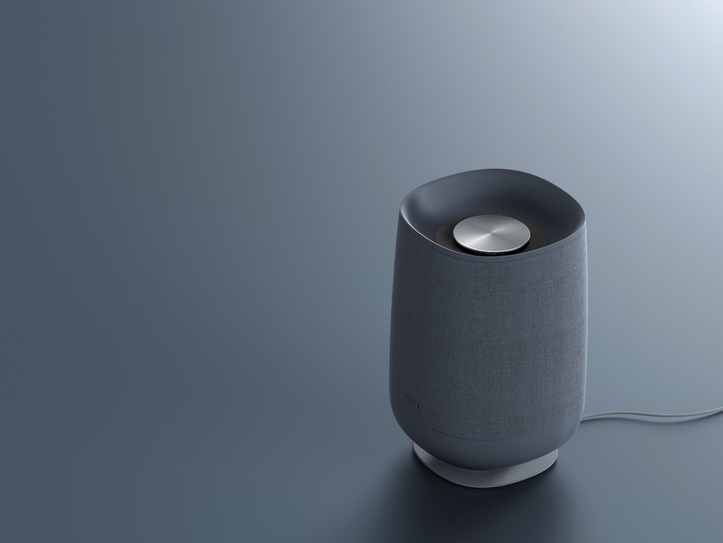
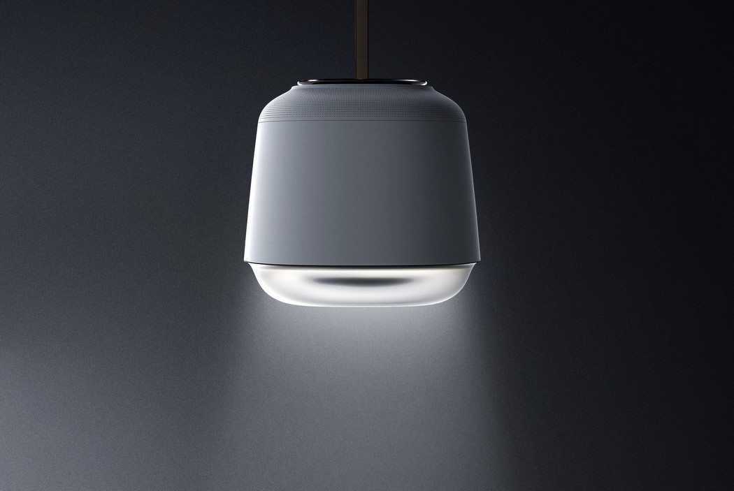
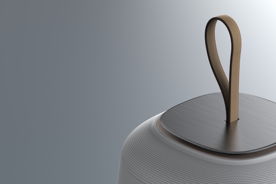
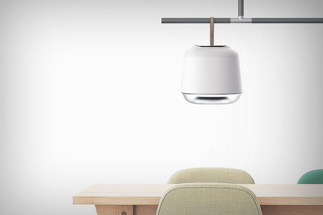
The Belyse air purifier is a part of that era of products that celebrates ‘form follows emotion’. The designer raises the question that everything in the modern day house has an element of emotional design today. Home Decor is bought purely out of personal tastes and emotions, so appliances must follow suit. The Belyse is a result of that outlook, thus being a Scandinavian inspired design that celebrates purity with its white and grey color scheme and clean surface treatment. The upper white element works as a purifier while the base is responsible for being a charging dock. The purifier can be hung over the cooking or dining area and even doubles up as a lamp. You can also use it in ‘air-wash mode’, while having it docked and running on the charging base. While the air-purifier doesn’t really break barriers in the functionality department, it’s a wonderful exercise in creating an aesthetic that is triggered by emotional cues. What do you think?

Designer: Jong Hyuk Bae

belyse_air_purifier_2

belyse_air_purifier_3

belyse_air_purifier_4

belyse_air_purifier_5

belyse_air_purifier_6

belyse_air_purifier_7

Elementary, my dear Watson.

holmes_01

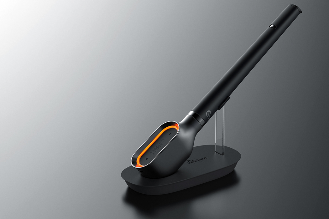
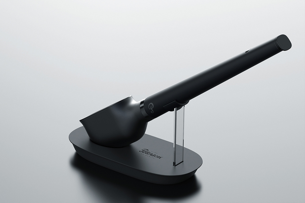
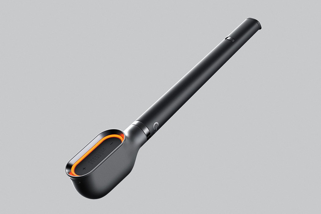
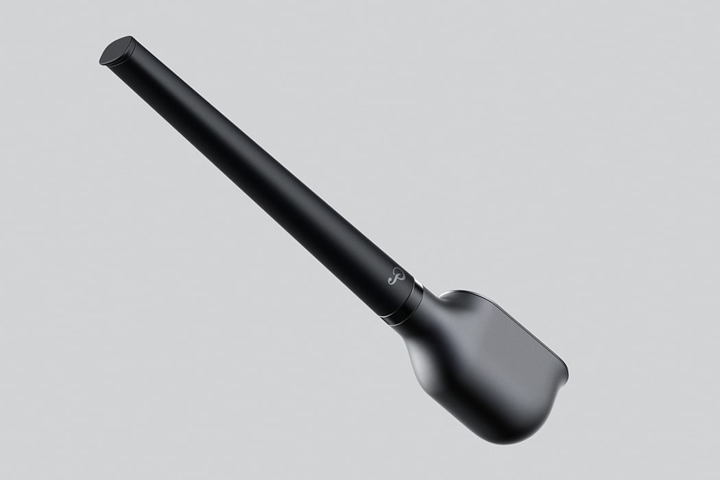
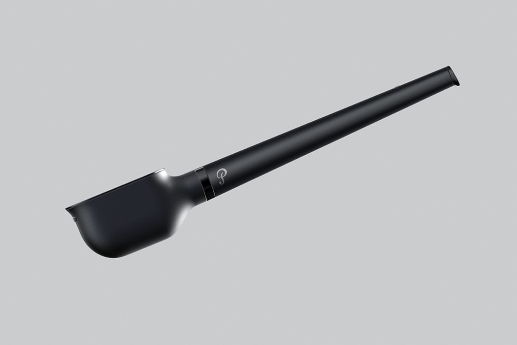
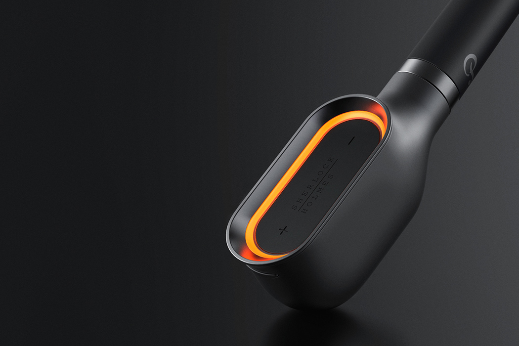
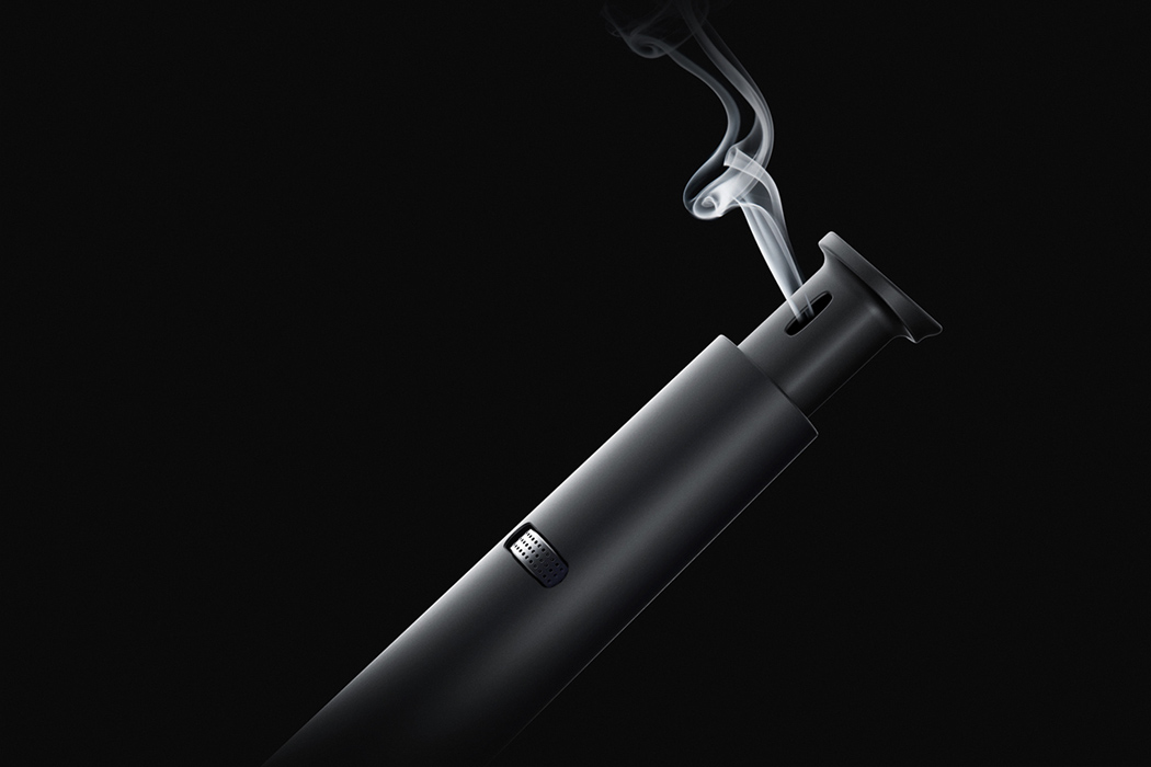
Throughout all his adventures, Sherlock Holmes’ iconic pipe is perhaps the most memorable recurring element. It’s also the inspiration for cigar pipe maker Peterson of Dublin’s popular Sherlock Holmes Series loved by pipe smokers.

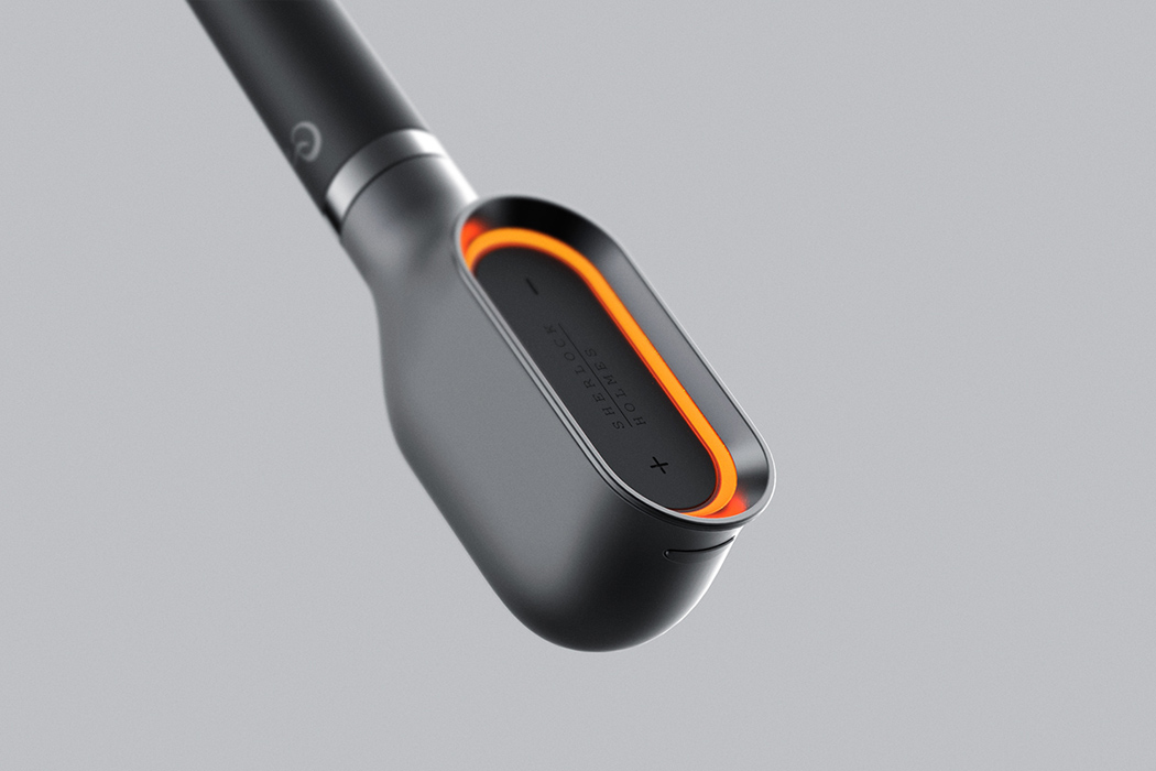
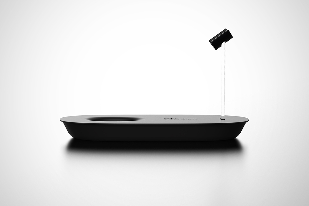
To commemorate their 150th anniversary, designer Jong Hyuk Bae developed this next-gen pipe that’s perfect for today! An abstraction of elegant pipes of the past, this vaporizer’s form takes a modern twist that sleek and minimal. Sherlock Holmes is also well-known for his iconic deerstalker hunting cap. The hat’s character lines fall smoothly from the top to the brim of the cap and the designer applied this iconic shape to the design.

The led indicator on the bowl interacts to the inhalation of the pipe, making a swirl of light just like the original pipe. This essential design element gives vapers to feel the analog sentiments of original pipes.

Designer: Jong Hyuk Bae

holmes_02

holmes_03

holmes_04

holmes_05

holmes_06

holmes_07

holmes_08

holmes_09

holmes_10