What if Coca-Cola made a phone?

cocacola_phone_1

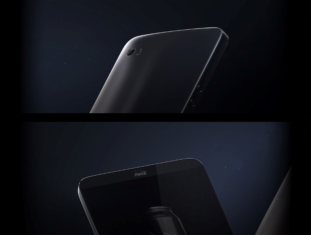
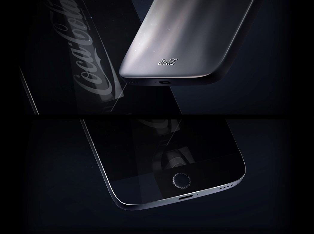
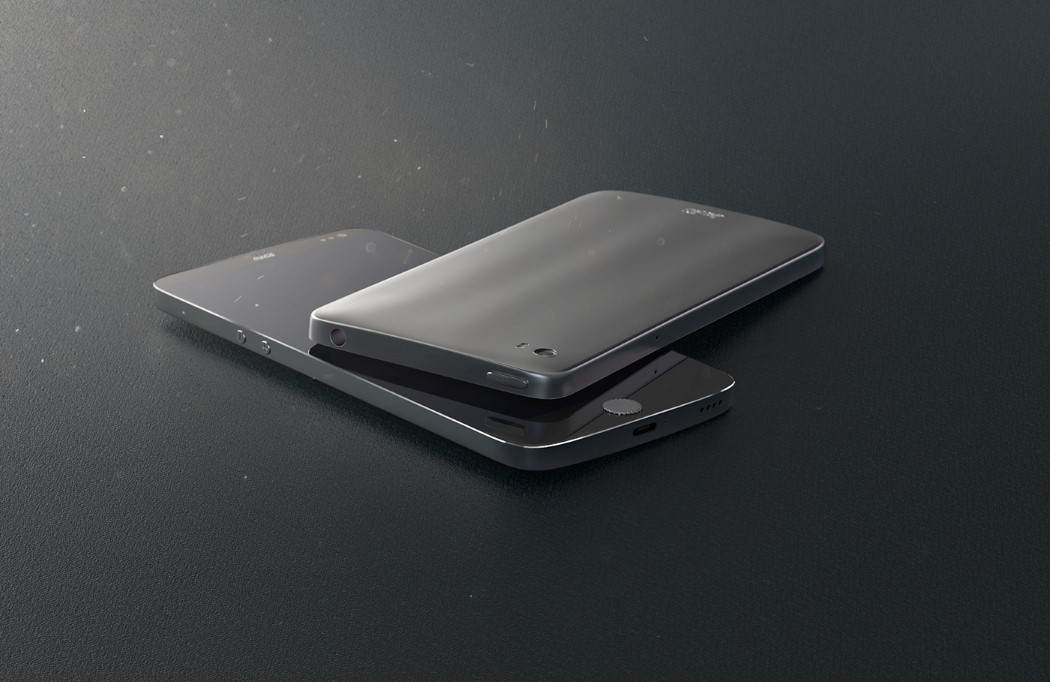
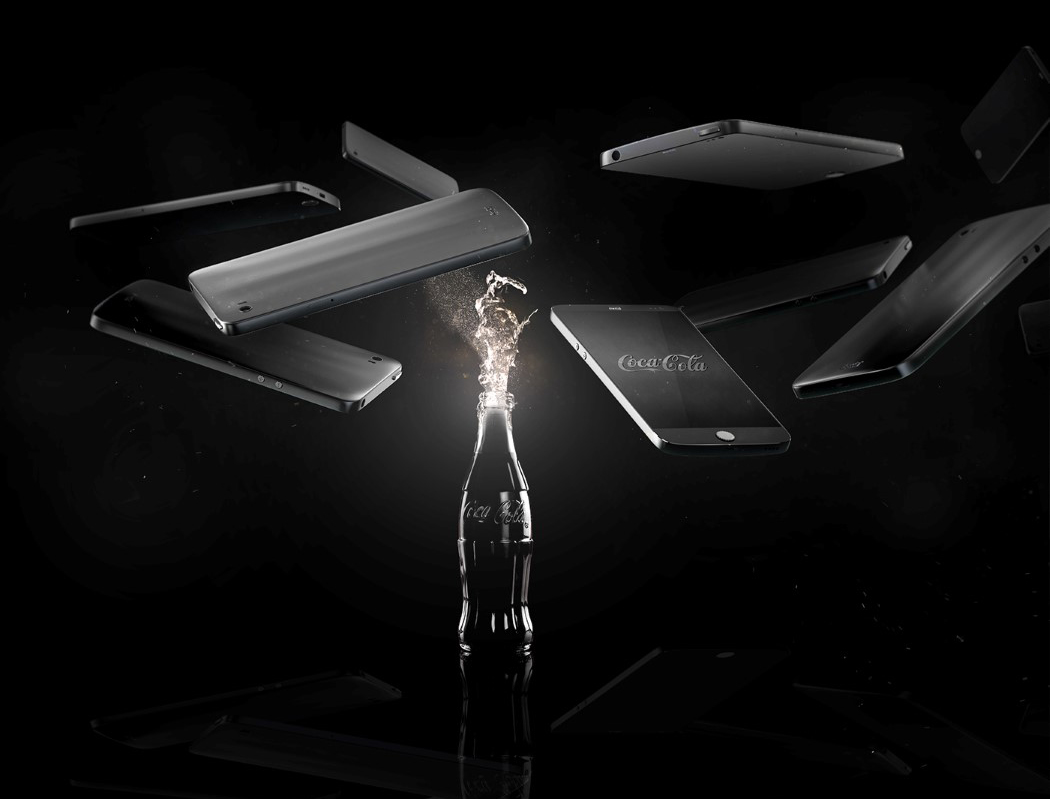
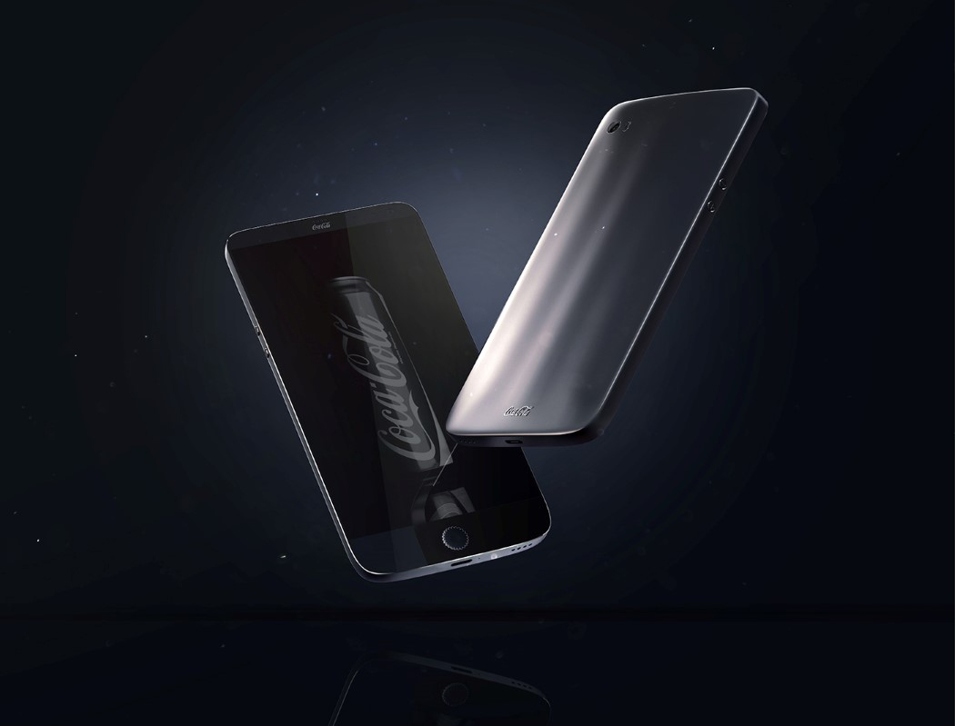
Remember the Nescafe hairdryer post from yesterday? Today we delve further into visual semantics and ask “What if Coca Cola made a phone?” The Coca Cola smartphone by Junguk Shin brilliantly articulates that absurd possibility. The back of the phone has subtle curves that you see on the iconic bottle’s waist. The cherry on the cake however, is the home button (could also be a fingerprint scanner). It resembles the iconic glass bottle cap design that one associates with soft drinks. The design of that very element speaks volumes, connecting Coca Cola to the smartphone design in an unabashed and beautiful way!

Designer: Junguk Shin
cocacola_phone_2

cocacola_phone_3

cocacola_phone_4

cocacola_phone_5

cocacola_phone_6

Maestro Made Easy

maestro_01

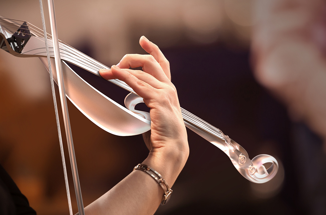
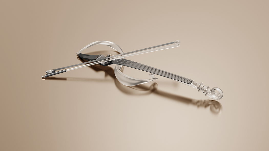
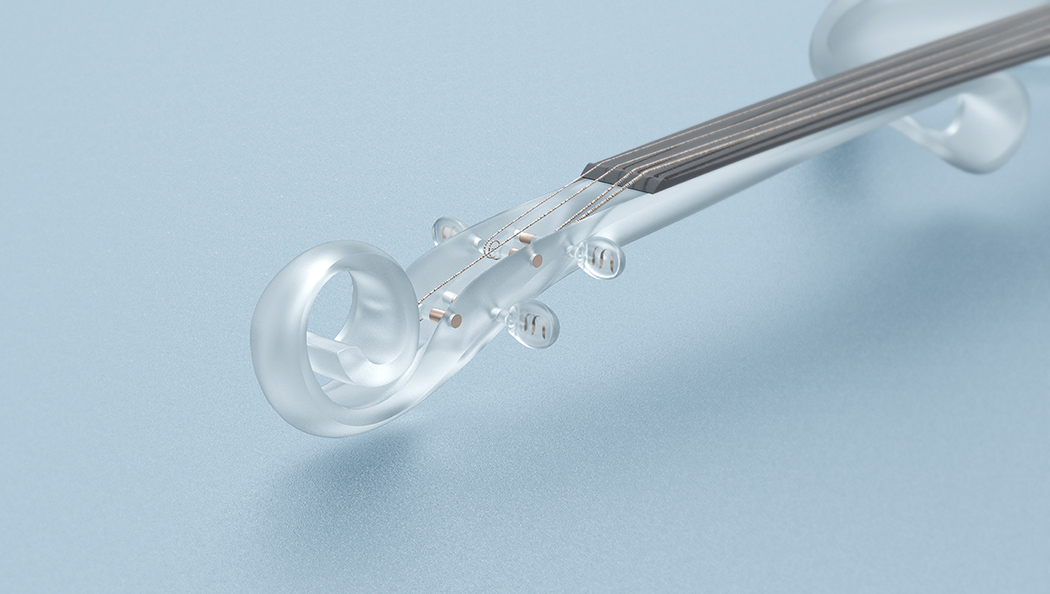
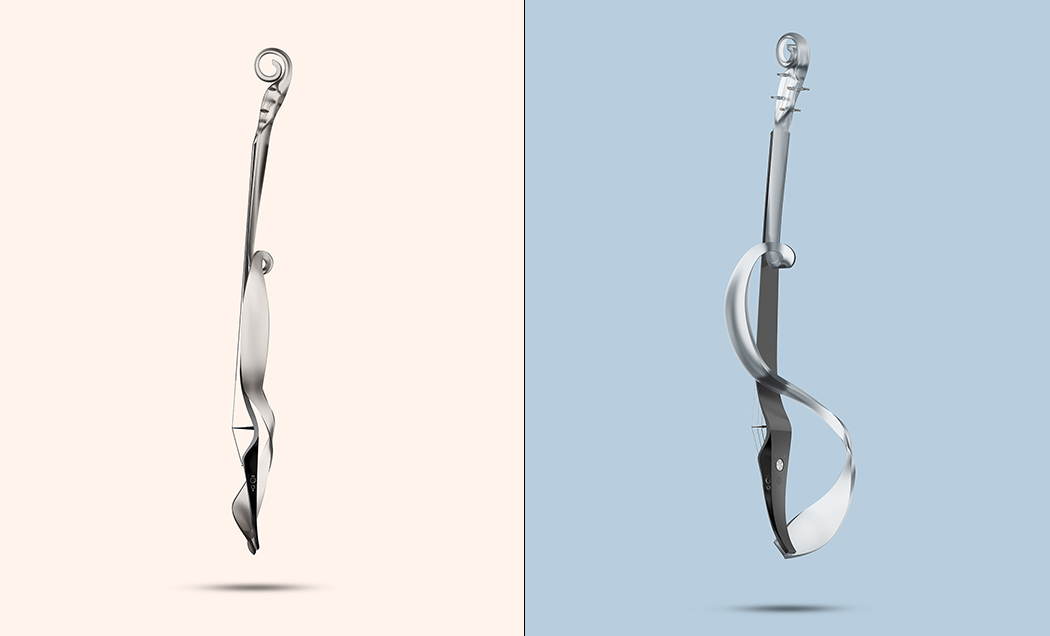
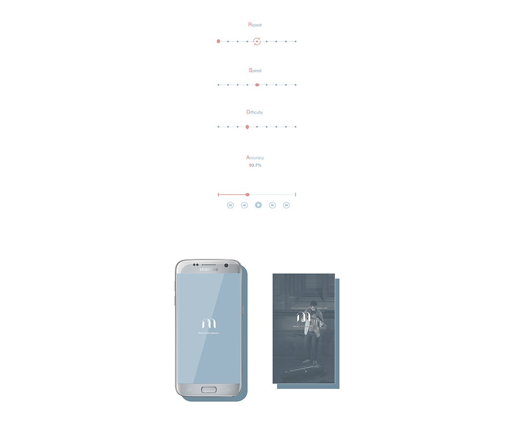
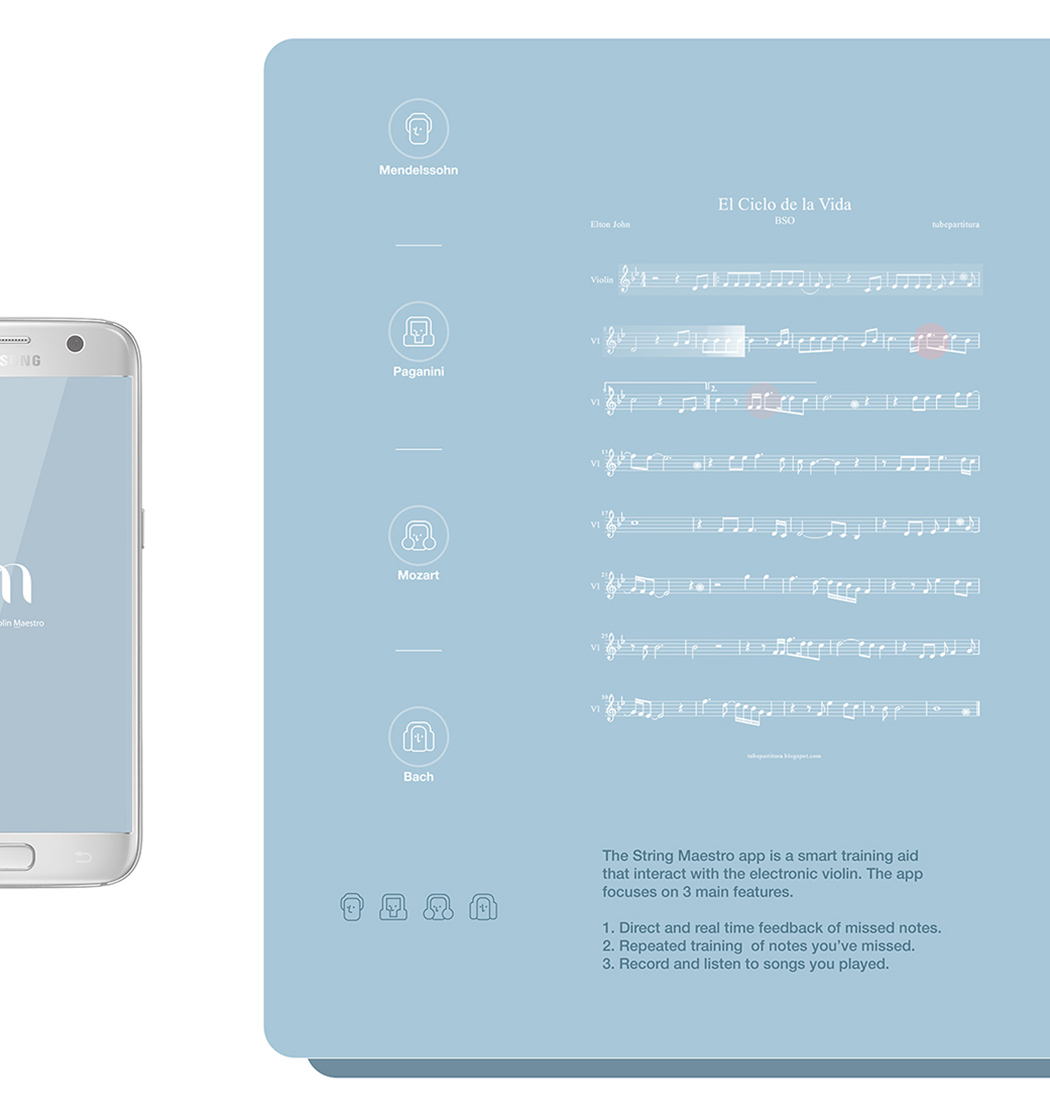
Known for its high entry barriers, the violin is one of if not the most difficult instrument to master. To make things a little easier, the Maestro electric violin introduces an innovative LED learning system that assists new players in tackling the basics. Thoughtfully placed lights within its translucent body indicate to the user where to grab or place fingers to accurate produce specific notes and tones. A programmable smart app works in tandem to teach everything from basic lessons to full compositions at the players own pace without intimidation!

Designer: Junguk Shin

maestro_02

maestro_03

maestro_04

maestro_05

maestro_06

maestro_07