Wheelbarrow-inspired drinks-cooler is easy to pull around, and can float on water too!


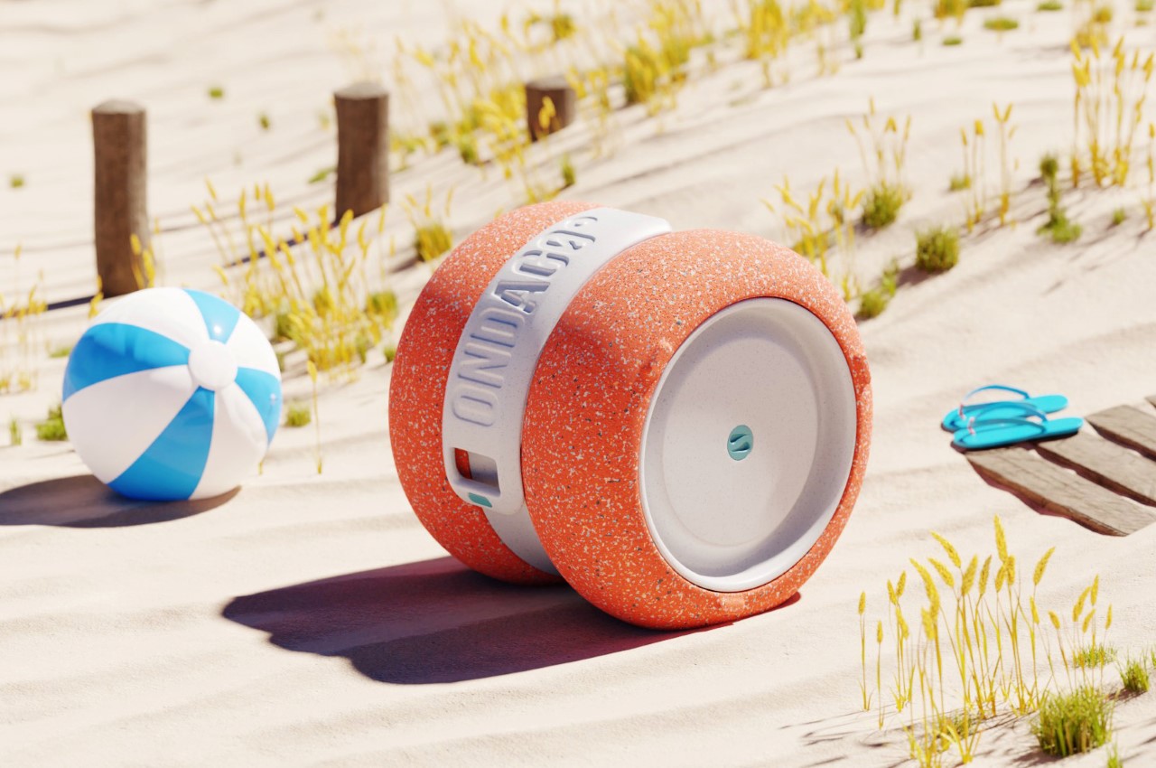
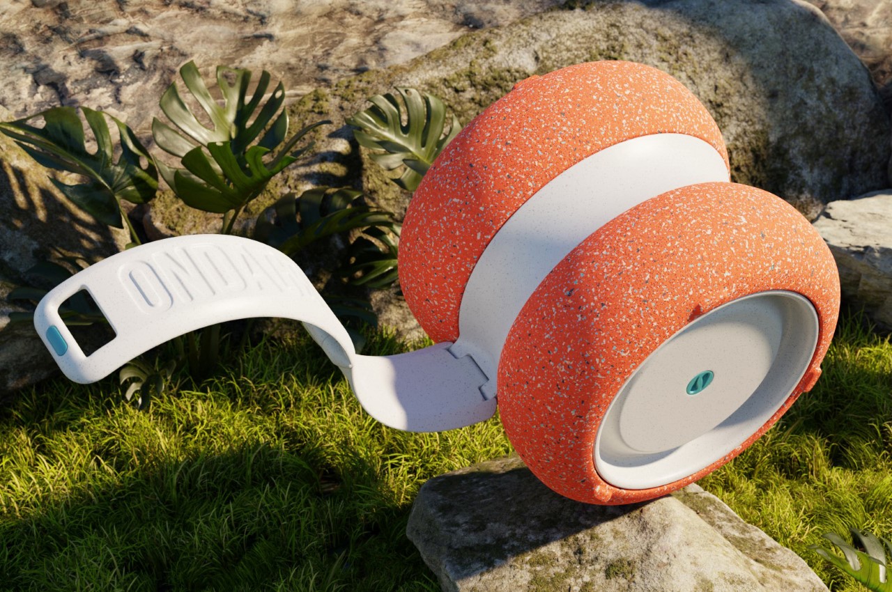
The Ondago goes where your party goes. With a tire-inspired rubber exterior, it rolls around wherever you want, and it’ll float on water too, for the ultimate pool/riverside party!

Close your eyes and imagine a drinks cooler. Chances are you thought of something boxy, with a blue or red base and a white lid. Sure, a boxy cooler makes sense because it provides more internal storage space for your cylindrical drink-cans, but that’s about all it’s good for. It isn’t really easy to transport (imagine having to lift that box around with you wherever you go), and it really turns a pool party into a by-the-pool party because your cooler can’t float on water. Clearly annoyed by these limitations, our friends at Knack Design Studio and DERRK decided to go back to the drawing board with the drink cooler and see if they could make it, well, better.

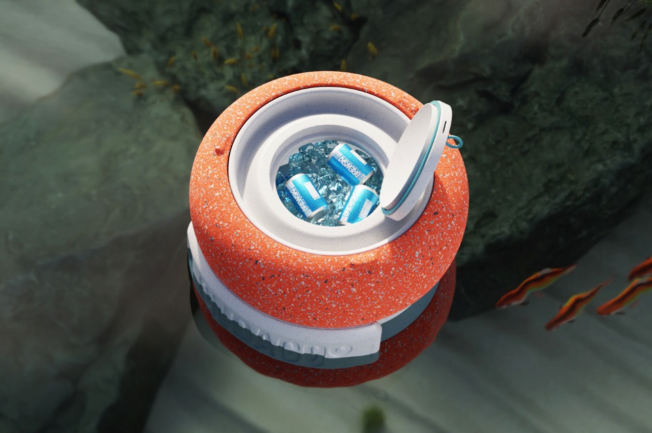
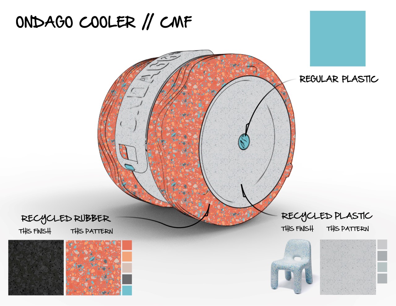
The Ondago cooler is best described as a cooler that “encourages adventure instead of limiting it”, according to Kelly Custer from Knack Design Studio. It ditches that cuboidal form factor for something more cylindrical (inspired by balloon tires), and a handle built into the cooler’s design lets you easily pull it around like a trolley. The fact that the entire cooler is basically wheel-shaped means it rolls equally well on gravel, sand, and on rocks. Once you reach your destination, the handle folds inwards and you can simply tip the Ondago over to stand vertically (to stop it from rolling as well as to access the contents of your cooler). The entire outside of the cooler comes made from recycled rubber that lets the cooler roll on rough terrain, and the rest of the cooler uses recycled plastic too, allowing it to have somewhat of minimized carbon footprint!

The Ondago’s unique design wasn’t envisioned to just conquer terrain… it was designed to float too! The drinks-cooler doubles up as a floating beer caddy, so you can have pool parties unencumbered. Ace 3D Designer and YouTuber Derek Elliot (also known by his internet moniker DERRK) even conjured up a video to show the Ondago in action as it goes from sand to soil to water without breaking a sweat, and while keeping your brewskis cool! Let’s see your ugly, bulky, heavy drink cooler do that? Or in other words, they see the Ondago rollin’… they hatin’.

Designer: Knack Design Studio and DERRK

Timeless or Trendy: How to choose the right design direction for your consumers

Hi, I am Kelly from Knack, where we help mobility brands make their products irresistible.
I recently wrote an article about how to design timeless products. The comments and discussion that followed highlighted the fact that trendy and timeless products serve different purposes. One isn’t necessarily better than the other. However, one IS more irresistible, depending on who your customer is.

So, in this article, we’re going to dive into what makes a product either trendy or timeless and determine which type is right for your product.

IRRESISTIBILITY

To be irresistible, a product must possess an enticing aesthetic, solve a meaningful problem, deliver a delightful user experience, and have a no-brainer price tag. An irresistible product must check all of these boxes, but can also be either trendy or timeless to boot.

It is important that you understand what makes a product trendy or timeless so that your product’s fate is not accidental, but instead part of your design strategy.

Let’s take a close look at each:

TRENDY

The Cambridge Dictionary defines trendy as, “modern and influenced by the most recent fashions or ideas.” Trendy products flaunt hot, popular attributes.

To design a trendy product, focus your product development efforts on exploiting the in-thing your customer is most obsessed with. Trendy products require an understanding or prediction of the current fads and quick action to deliver a relevant product before the trend fades.

With a design that’s trendy, you’ll be able to ride the wave of buyer interest created by the current craze. Heavily influenced by emotion, your consumers will buy more impulsively to fill an immediate need or desire.

TIMELESS

Unlike trendy designs that are focused on being relevant in the present day, timeless design is focused on staying relevant and looking appropriate for many years to come.

When setting out to design timeless products, avoid clues of the current time. Instead, strive for a proper proportion, functional form, and classic colors that were cool way back when, now, and for many years to come. Designing timeless products requires an extra level of thoughtful refinement, void of frivolous aesthetics, often yielding an understated product.

Achieving timelessness in your design gives your product staying power, sparing you a great deal of future new product development costs while allowing your product’s fan base to compound over time.

WHICH ONE?

Again, whether your product should be trendy or timeless depends on your consumer. While many designers would argue that a product should always be timeless, timelessness requires an extra level of aesthetic refinement and subtly that a here-today-gone-tomorrow product can’t always afford.

If your consumer values keeping up with the times, looking cool and flashy in the moment above all else, your product needs to be trendy. A consumer who is obsessed with the latest and greatest will inevitably be onto the next big thing soon. In this case, there’s no reason to over-invest in a timeless aesthetic.

If your consumer values products that endure the test of time and don’t look dated in just a few years, or you just simply want to invest in a product that doesn’t need to be revamped every 3 years, you should pursue a timeless design.

Note: With strategic industrial design execution, it is possible for a product to be both trendy and timeless.

Do you know what your consumer desires? As soon as you do, you’ll be one step closer to achieving irresistibility.


ABOUT THE AUTHOR

Kelly Custer is the Founder + Design Director of Knack

Pairing her transportation design education from the College for Creative Studies in Detroit, Michigan with over 8 years of design consulting experience in consumer products, Kelly has built a strong passion for mobility. She founded Knack in 2014 and leads the studio to deliver irresistible simple mobility products.

When she’s not in the studio, she can be found on a mountain bike trail, trying to keep up with her husband on her dirt bike, or exploring the Tennessee river on their vintage stand-up jet skis.

Follow Knack on Instagram

Why Do So Many Self-Driving Vehicles Look ‘Cute’?

Hi, I am Kelly from Knack, where we help mobility brands make their products irresistible.

Self-driving vehicles: We’re seeing them pop up all around us and maybe you’ve even been lucky enough to have a first-hand encounter with one.

Sure, these vehicles look new and different, that makes sense. But why exactly do a majority of them look so… well, cute? You know, they look like little friends that are just begging for a smile and a wave.

The answer lies within a great example of functional aesthetics. By intentionally designing self-driving vehicles to look cute, manufacturers are able to accomplish a few pretty big feats:

Encourage Adoption

Getting people to try and then ultimately adopt self-driving vehicles requires that they are approachable. Unfortunately, the technology behind self-driving vehicles is complex and unfamiliar to the general public. Consequently, the helpful intent of these vehicles is overshadowed by intimidation.

By wrapping the self-driving tech in a “cute” shell, the manufacturers of these vehicles are able to visually simplify the complex and make what could be scary appear friendly. In other words, making self-driving vehicles look cute gives them a fighting chance at being accepted.

In regards to Amazon’s Scout, Sean Scott shared, “One of our favorite parts of this journey so far has been witnessing how excited customers are when they see the delivery device for the first time and how they’ve welcomed Scout into their neighborhood. We have a lot of pride packed inside these cooler-sized devices and love to see such a positive reaction from the community.”

Increase Ridership

Once people are willing to accept these vehicles into their communities, there is yet another feat in getting people to use the product for themselves. “Cute” styling also helps with this.

In order for someone to want to use one of these vehicles, they have to trust it. Because of this, the manufacturers of these vehicles have put an incredible emphasis on safety and respect. The product’s “cute” aesthetic broadcasts this message.

Michael Mauer, Head of Design at the Volkswagen Group, explains, “Powerful bodywork pillars, distinctive wheelhouses, and short overhangs give SEDRIC an impressively robust appearance as the epitome of safety and trustworthiness.”

If you need further convincing… Which one of the examples below would you be comfortable walking up to?

Companies like Postmates pride themselves in delivering a vehicle that is a respectful member of the community. Postmates describes Serve as a “cheerful, trusty sidewalk delivery robot that delivers right to your place.”

With a humble stance, rounded forms, and calming colors, “cute” vehicles seem less foreign and more familiar. A cute aesthetic transforms the vehicle from a machine into a character- something us humans can better emotionally connect with. Similarly, the vehicles seem harmless and respectful instead of brash and unpredictable.

Build Loyalty

While introducing a new vehicle to our streets, self-driving vehicle design teams are taking the opportunity to inject some light-hearted positivity into our communities. To combat the suspicion that naturally arises around an unfamiliar new neighbor, vehicles are being equipped with friendly faces and positive personalities to drive cheer instead of fear.

On Local Motors’ Olli 2.0, “the screen in the front can be shown as eyes, making Olli 2.0 more approachable and anthropomorphic.”

Over time, the vehicle’s cheerful and respectful demeanor pays off as its neighbors accept, grow to love, and eventually defend it- earning product and brand loyalty.


ABOUT THE AUTHOR

Kelly Custer is the Founder + Design Director of Knack

Pairing her transportation design education from the College for Creative Studies in Detroit, Michigan with over 8 years of design consulting experience in consumer products, Kelly has built a strong passion for mobility. She founded Knack in 2014 and leads the studio to deliver irresistible simple mobility products.

When she’s not in the studio, she can be found on a mountain bike trail, trying to keep up with her husband on her dirt bike, or exploring the Tennessee river on their vintage stand-up jet skis.

Follow Knack on Instagram

How Designers Can Thrive (Not Just Survive) in Uncertain Times

How are you feeling? Let me guess… uncertain, a bit scared… even cheated maybe? The unique thing about this problem is that it’s affecting everyone globally… and while everyone’s facing the impact of this pandemic, the way we react to it is what sets us apart. What if I told you that your outlook towards this problem could help you thrive as a designer?

If the core of what we do as designers is to solve problems, there’s no better time than uncertain times to do what we do best. If you ditch your fearful mindset, be perceptive towards opportunity, and put in the work to adapt, you could not only survive, but thrive in these uncertain times.

Let’s dive into exactly what you’ll need to do to pull this off:

Reframe Your Aim

When times are good, companies focus on making money. When things take a turn for the worse, companies shift their focus towards not running out of money. To stay valuable, you too need to shift in order to help them do just that. It’s important that you reapply your skills in a way that aligns with your client’s current goals.

How can you reshape your once revenue-focused expertise to now support your client or company with their cost-saving efforts? Now more than ever, your contributions need to be directly tied to business results that create an immediate return on investment.

Pivot To A Pressing Problem

Does your design role now seem irrelevant? That is because your job solves a problem that is no longer a priority. During uncertain times, external forces come along that drastically change the landscape we had gotten used to. With the new reality, comes new problems. These problems probably look drastically different than they did before the change.

To thrive in a downturn (or really any market), you need to solve a relevant and important problem. This is what makes your role valuable. If the problem you solve is no longer relevant, then you’re no longer valuable.

Let go of what has now become irrelevant, keep your finger on the pulse of what your clients or company is struggling with and then figure out how you can use your expertise to help them in the best way that you can.

Within uncertain times lies great opportunity. Those who are the quickest to adapt will thrive.

Create Certainty Through Strategy

Just as you’ll need to pivot, your client/company may have to do the same. If they find that their product has now become irrelevant due to the new landscape, they’ll need to adapt their product to solve a new problem.

As designers, our superpower is to see the future. Not by guessing, but by empathizing with users, understanding the big picture, utilizing our creative thinking to connect the dots, and visualizing solutions before they ever exist. This ability of ours, offers foresight and confidence to place the right bets- just what your client needs in order to act in the face of uncertainty.

To help your client navigate these uncertain times, offer your strategic expertise. Help them to understand their current predicament, their customer’s needs, the new landscape, and how they could pivot to solve a more valuable problem for their customers. Designers thrive when their clients thrive.

Support Not Sell

These unforeseen events have created uncertainty, for both you and your client. Your client feels the pressure to keep their people and business in good health. You feel the pressure to land a project or two before your savings dry up. Rather than desperately pitching your service to an unwilling client, now is the time to stop selling and start supporting.

Instead of trying to convince your already nervous prospects, to hire you, let them come to you when they are ready. (p.s. if your service doesn’t address a problem that is important to them, they’ll never be ready.) Tap into your runway of savings while you thoughtfully pivot your offer and find ways to help both your current and future clients.

Do not go silent, but instead keep showing up. Take advantage of extra free time to invest sweat equity into building and strengthening your relationships. Focus on being genuinely helpful and supportive. Share informative content through blogging and social media. Find ways to relieve the new found pains that your connections are experiencing.

What this does is builds trust and loyalty as clients see that you are there for them- providing value in both good times and bad. Play the long game and you’ll build a long-lasting business.

Serve A New Space

While there are a lot of people and businesses hurting right now, there are quite a few that are busier than ever. Take some time to do your research on which industries are booming because of this new landscape. Businesses in these industries (such as healthcare, sanitization, and virtual tools) may need design and your expertise now more than ever.

You don’t have to stick with what you’ve always done and who you’ve always done it for. Pay attention to where the demand is and then redirect your efforts to serve in that space. Be flexible. Get creative. Remember, those who are the quickest to adapt will thrive.


ABOUT THE AUTHOR

Kelly Custer is the Founder + Design Director of Knack

Pairing her transportation design education from the College for Creative Studies in Detroit, Michigan with over 8 years of design consulting experience in consumer products, Kelly has built a strong passion for mobility. She founded Knack in 2014 and leads the studio to deliver irresistible simple mobility products.

When she’s not in the studio, she can be found on a mountain bike trail, trying to keep up with her husband on her dirt bike, or exploring the Tennessee river on their vintage stand-up jet skis.

Follow Knack on Instagram

A Designer’s Three Opportunities for Impact

Hi, I am Kelly from Knack, where we help mobility brands make their products irresistible.

I want you to think back to the last time a new pair of shoes caught your eye. Something tells me they weren’t the same pair that were already on your feet. Instead, they might have had a fresh new look. They could’ve had self-tying laces that promised you a tailor-fit. Or, they could’ve been a whole different type of shoe altogether. Maybe they were a waterproof work boot that deemed your old sneakers obsolete.

In today’s noisy markets, products have to first get noticed in order to be desired. They do so by doing something different from their competitors. There are three factors that differentiate and then drive desire for products: purpose, experience, and aesthetic.

Since our job as designers is to create desire to ultimately drive demand for a product, these three factors are our opportunities for impact.

Pain-Relieving Purpose

By solving a meaningful problem that no other product does or solving an existing problem better, a product will naturally attract people who are experiencing that problem. Conversely, if a product doesn’t solve a new problem or offer a better solution, it gets buried in a sea of similar offerings.

At the start of your next design project, ask yourself, “Will this product provide relief to a meaningful problem that no other product does?” If your answer is no, dive deeper into understanding your customer to get to the heart of what they really need.

Delightful Experience

When a product works better and delivers a more seamless experience than any other product, it rises to the top. The ideal scenario would be to have a product deliver a delightful user experience.

Thoroughly walk through the user’s journey and observe real users interacting with the product you’re designing. What hurdles do they face? What issues become apparent as they use your product? Work to resolve every point of friction and then go one step further to incorporate interactions that will delight them.

Enticing Aesthetic

This one is a little more obvious since designers are usually pegged for their contribution to aesthetics. However, how a product looks and feels can play two significant roles. One, it can grab attention. Two, it can resonate with the user.

When establishing the aesthetic of your next product design, make sure that you choose the aesthetic that is both attention-getting AND compelling to the user. Your product’s aesthetic should connect with the user on an emotional level and to do so, you need to understand your user on an emotional level.

Which of these three factors are you focusing your design efforts on? Are you able to contribute to more than just one? An irresistible product requires all three.


ABOUT THE AUTHOR

Kelly Custer is the Founder + Design Director of Knack

Pairing her transportation design education from the College for Creative Studies in Detroit, Michigan with over 8 years of design consulting experience in consumer products, Kelly has built a strong passion for mobility. She founded Knack in 2014 and leads the studio to deliver irresistible simple mobility products.

When she’s not in the studio, she can be found on a mountain bike trail, trying to keep up with her husband on her dirt bike, or exploring the Tennessee river on their vintage stand-up jet skis.

Follow Knack on Instagram

What Designers can do to design irresistible products

Hi, I am Kelly from Knack, where we help mobility brands make their products irresistible. I’ve come to realize that designing irresistible products feels elusive. High hopes and good intentions pour into one end of the product development pipeline and mundane products squirt out the other.
You see plenty of seductive product designs on Pinterest and here on Yanko, so you know it’s possible. But what exactly do the designers of these products do differently in order to achieve irresistibility?
If you want to elevate your products out of the sea of obscurity and into the pond of “gotta have it”, you need to do these five things:

1. Don’t Believe The Brief

Unless you were involved in writing the brief, you should never take the brief as truth. Instead, set the brief aside, ignore the scope, and first get to the heart of the problem you’ve been asked to solve.
How on earth do you do this? It’s quite simple actually. Listen. Listen and then ask why. Then, keep asking questions until you reveal the root of the problem.
As designers, our first job is to investigate. As Chris Do states, “Your value is determined by the quality of questions you ask.”
Imagine going into a surgeon’s office complaining of chest pain. When you tell him that you probably have a clogged artery, he says “OK” and wheels you into the O.R. to begin operating on you.
Wait, what?! There’s no way you’d go for that.
You expect the surgeon to ask you some probing questions, run a few diagnostic tests, and consult with other doctors to either validate your self-diagnosis or discover the true cause of your pain.
Just as you are not the healthcare expert, your client isn’t the design expert. Why are you letting them diagnose their own condition and then write the prescription?

2. Cut Out The Jargon

Now imagine you roll into a tire shop with a flat. You ask them to repair the tire you already have, explaining that your budget is tight and you are in a hurry to get back to work.
Instead of following your orders directly, they take a minute to look at your tire and the mechanic says, “A plug? You want a plug? It’s going to take me thirty minutes to dismount, submerge and inspect. I’ve got a low-mileage replacement. Do you want that instead?”
…Huh?
What if instead, the mechanic had explained to you that rather than repairing the tire, they can replace the flat with a used tire to get you back on the road twenty minutes sooner? While the replacement will cost $15 more, the used tire will last much longer, saving you money in the long run.
We have to educate our clients on the proper design process. We do that by first speaking their language (not ours), aligning what we are saying with their goals (why should they care?), and being available to answer their questions.

3. Just Walk Away

A hot project opportunity pops up in your inbox and you’re stoked. You jump on a call with the potential client and in response to your thoughtful questioning, the client exclaims, “Everyone is our customer!” You explain that knowing who your specific target customer is and having a deep understanding of them is the difference between a product that drives demand and one that flops.
The client cuts you off mid-sentence to tell you that they are short on time and need to start the design work right away. They don’t have time for research and just need you to execute the design vision that they have in their heads.
If you’ve genuinely listened, thoughtfully explained to your prospect the best way to solve their problem and they still insist on cutting corners, it’s your job to say “no, thanks.”
Don’t make an exception, don’t lower your standards, just walk away. Stand up for yourself, the design process, and what’s best for the client… even if they disagree.
Designing good products requires saying no to bad projects.

4. Stop Thinking Design Is Everything

At the end of the day, design makes up less than 10% of the entire product launch process. Instead of assuming that design trumps all, you must understand the big picture of the product launch battle your client is up against. Acting like design is the only thing that matters will actually hurt the final product.
Instead, we must strive for a more frequent and seamless collaboration between all of the product development teams. Compromise is inevitable, so if your team members can deliberately pick the compromises that are in the best interest of the overall product strategy, you’ll be on your way to irresistibility.

5. Push It

Now that you’ve recognized that you’re just one piece of a massive endeavor, you must make sure that you are delivering an unparalleled contribution. In other words, mediocre ain’t gonna cut it. Heck, excellent might not even be enough to achieve an irresistible product.
Bring the heat and do everything in your power to push the design to be the best it can be. Take a break and then find a way to improve it one step further.

Use these five tools to lay the groundwork for an irresistible product. If the proper foundation can’t be set, walk away and go find an opportunity that’ll embrace your superpowers.


ABOUT THE AUTHOR

Kelly Custer is the Founder + Design Director of Knack
Pairing her transportation design education from the College for Creative Studies in Detroit, Michigan with over 8 years of design consulting experience in consumer products, Kelly has built a strong passion for mobility. She founded Knack in 2014 and leads the studio to deliver irresistible simple mobility products.
When she’s not in the studio, she can be found on a mountain bike trail, trying to keep up with her husband on her dirt bike, or exploring the Tennessee river on their vintage stand-up jet skis.
Follow Knack on Instagram

A self-parking scooter that chauffers you around

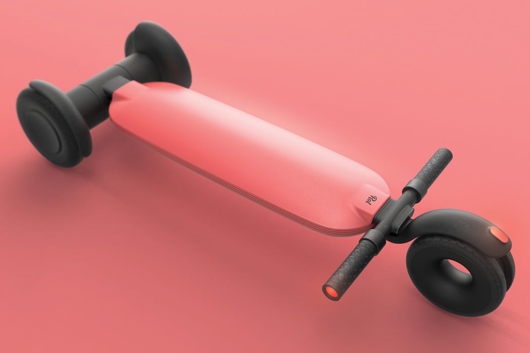
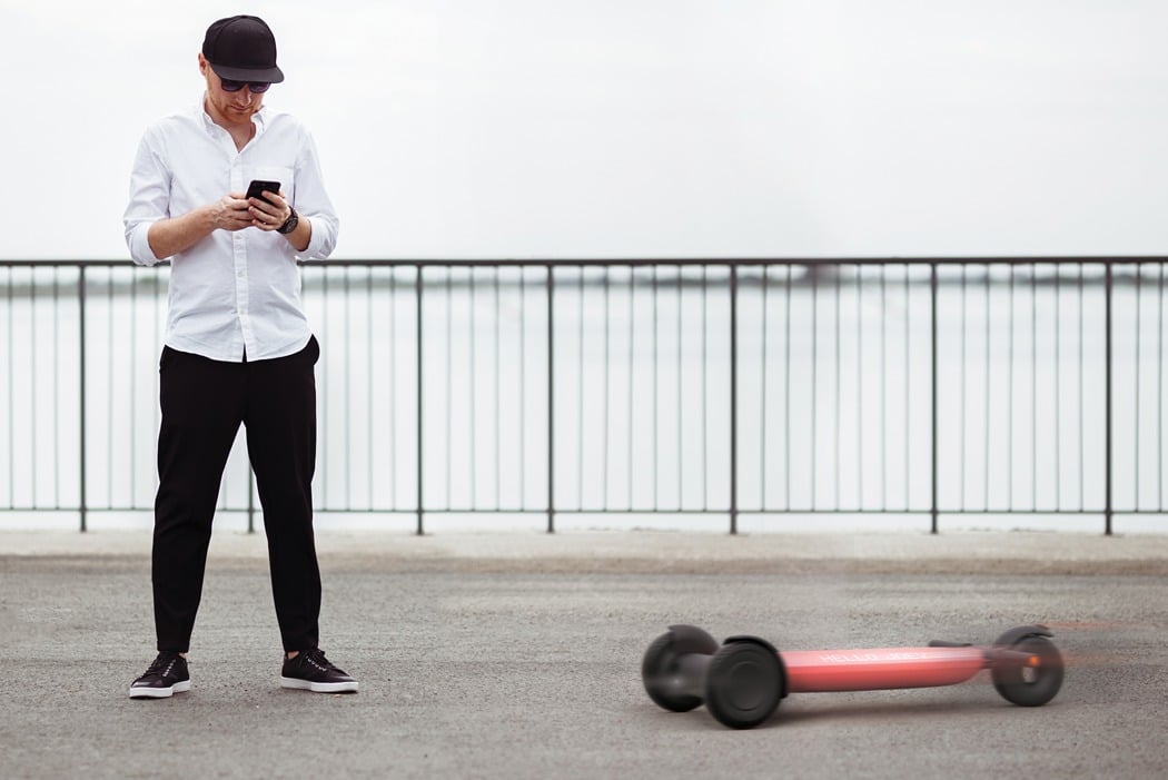
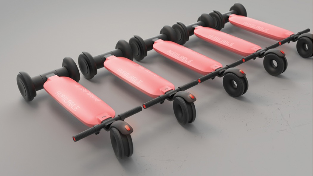
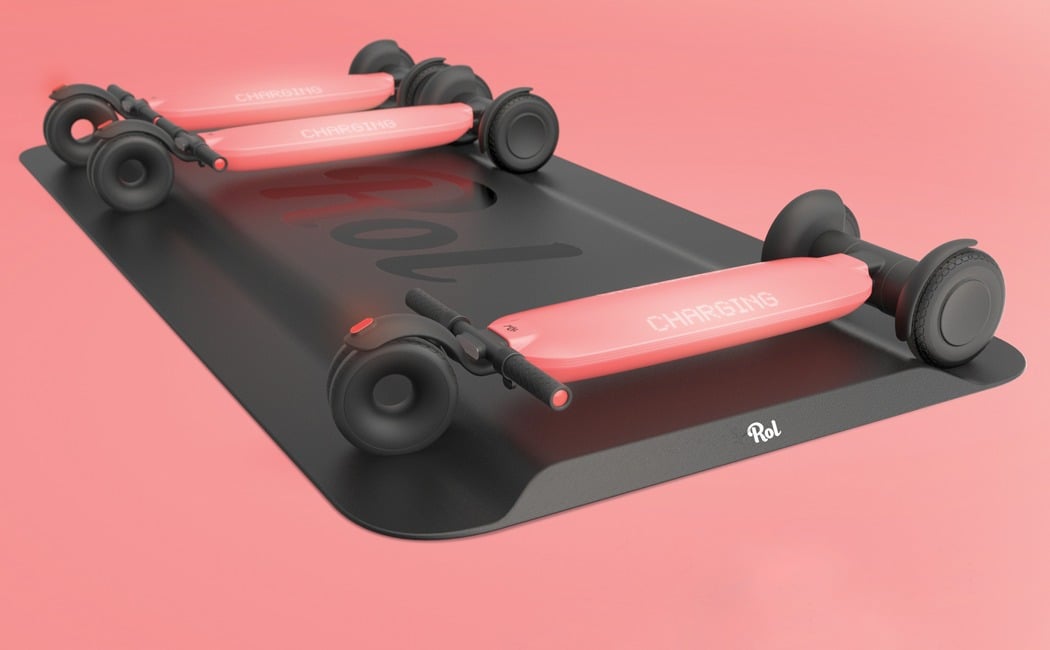
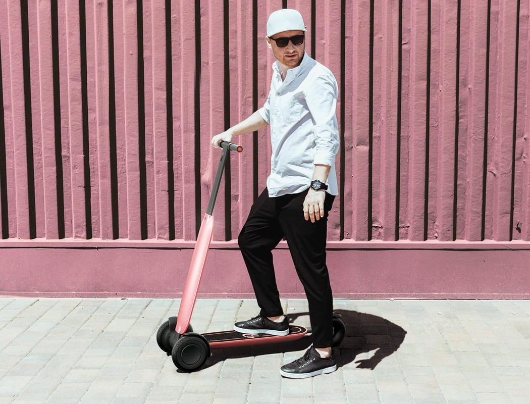
With shared scooters being the new go-to mode of transport for inner-city commuters and tourists alike, we have seen an infestation of these two-wheeled contraptions. However, their similar looks can make it a challenge to differentiate between the companies and the nature of their use leads to them littering our streets. ROL may just be the answer to both of these annoyances.

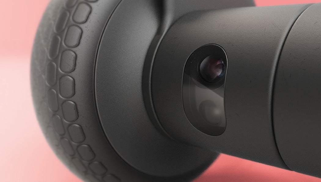
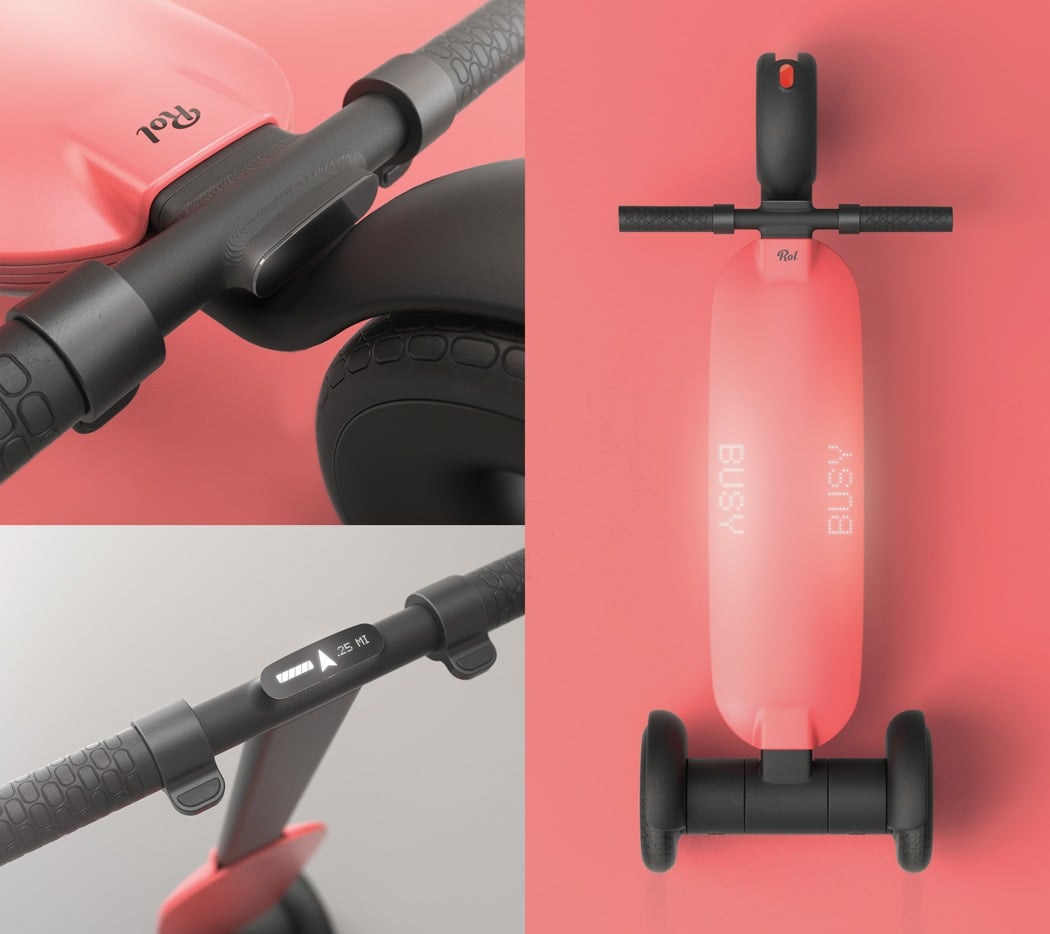
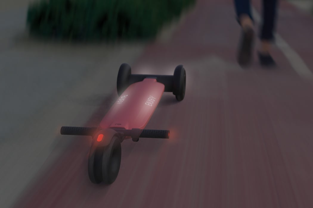
ROL completely transforms the user experience by removing the scooters reliance on manual intervention completely! This has been achieved by autonomizing the scooter’s ecosystem; immediately after the journey is complete, ROL automatically returns itself to an area of high demand, thus removing the rider’s responsibility! This automated-element also brings with it another handy benefit… no more searching for a scooter! Users can request ROL at the press of a button, where it will then travel to pick them up.

Automated elements aside, there is no denying that ROL carries unique, unparalleled aesthetics that have led to a distinguishable product which stands out from its sea of competitors!

Designer: Kelly Custer