Apple’s Magic Mouse gets its biggest ‘design upgrade’ with this ergonomic, wireless charging concept

The design upgrade makes Apple’s Magic Mouse more comfortable to use, and also gives it a new, highly-needed feature in the form of a wireless charging mousepad!

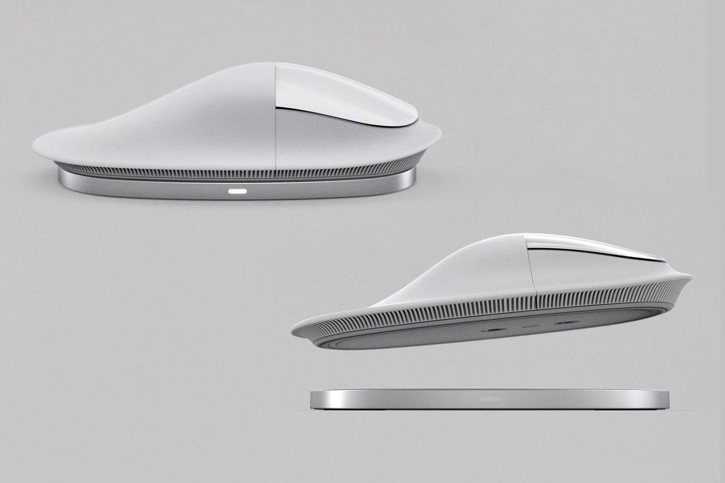
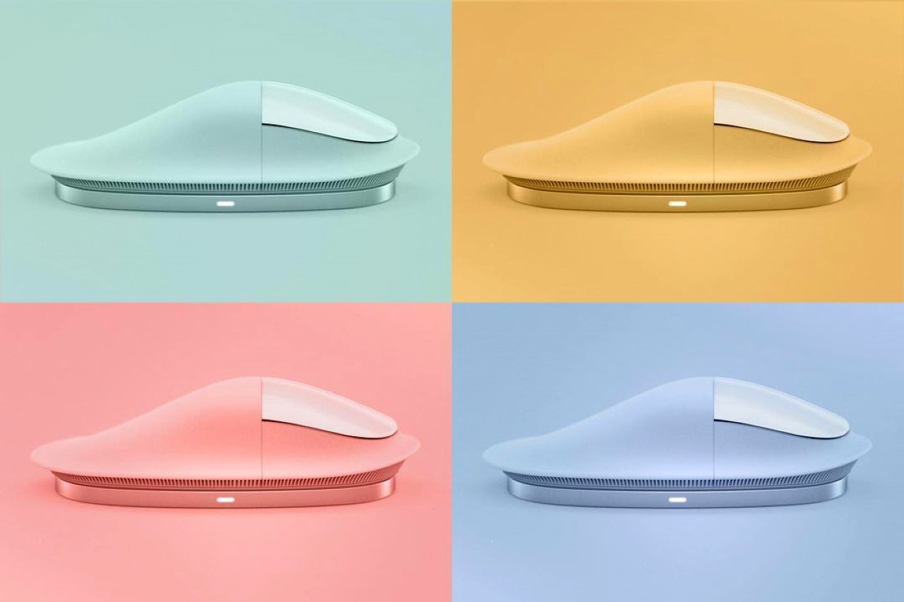
Created by designer Kevin Clarridge who spent a good 3 months just reviewing the shapes and forms of various ergonomic mice, the Apple Magic Mushroom Mouse (I honestly just love the name) fixes two of the most nagging problems with the mouse’s current design – firstly, the horrendously ill-designed charging system, and secondly, its poor ergonomics. With an elongated wrist-support, and a base that allows you to wirelessly charge the mouse, the Magic Mushroom Mouse positions itself as the ‘Pro’ in the mouse category. After all, the iPhone, iPad, MacBook, and AirPods have Pro variants, so why not the mouse??
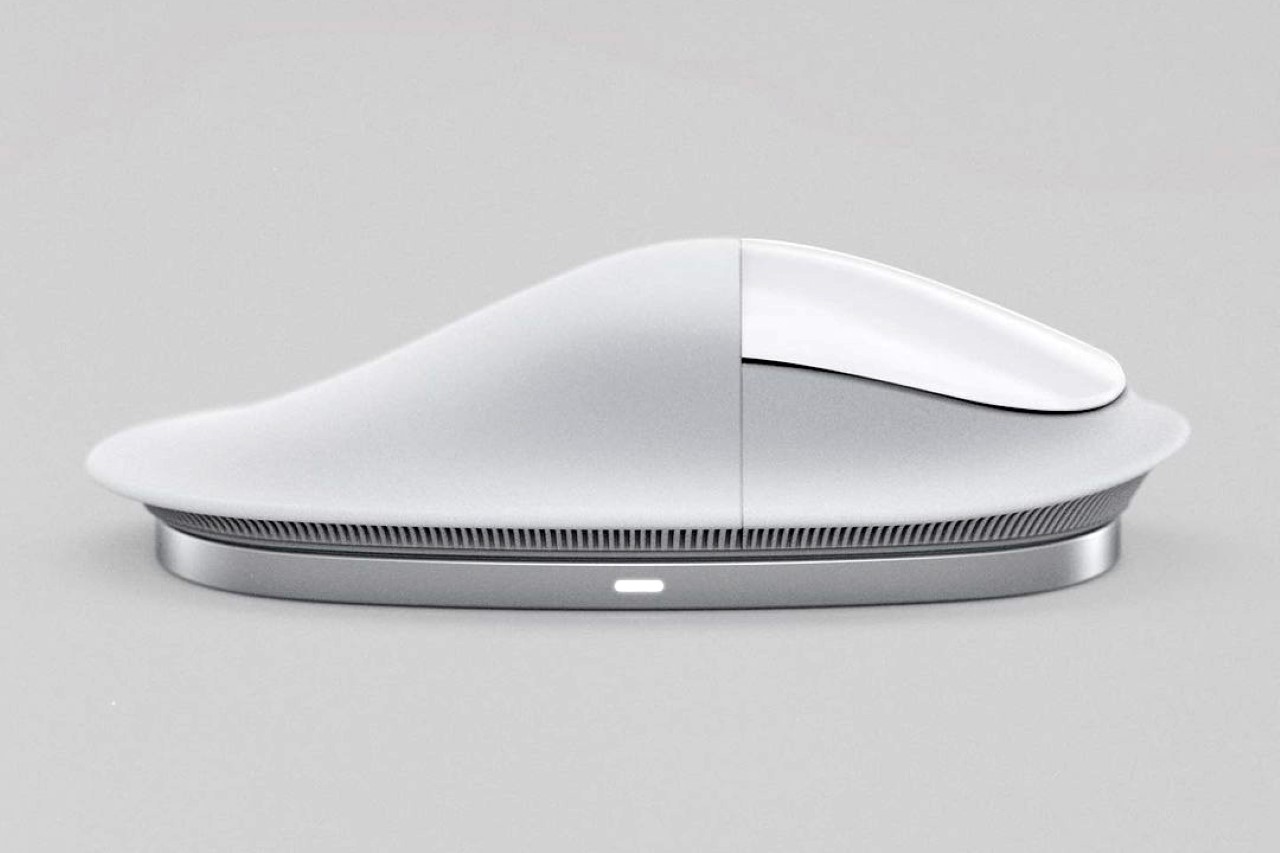
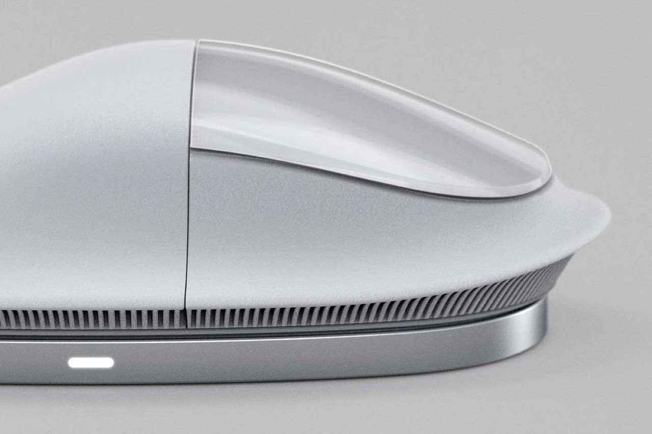
“The Magic Mouse has some amazing touch capabilities, but never felt great in the hand, especially if used daily”, said Clarridge who began working on analyzing mouse forms back in September. After hundreds of iterations in the form of CAD models and even a few 1:1 scale test prototypes (you can see the entire process here), Clarridge arrived at the mouse’s ‘mushroom’ form, which he claims offers a solution that no other mouse offers… an elongated wrist support that’s molded from a flexible elastomer that bends to contour to the wrist’s shape, giving you comfort over extended use. The mushroom inspiration also carries forward in the ‘gill-shaped’ details running around the base of the mouse, designed to allow the rim to flex according to the shape of your hand’s contours. The upper part of the mouse, however, retains the extended multi-touch panel that makes the Magic Mouse such a wonderful work-horse.
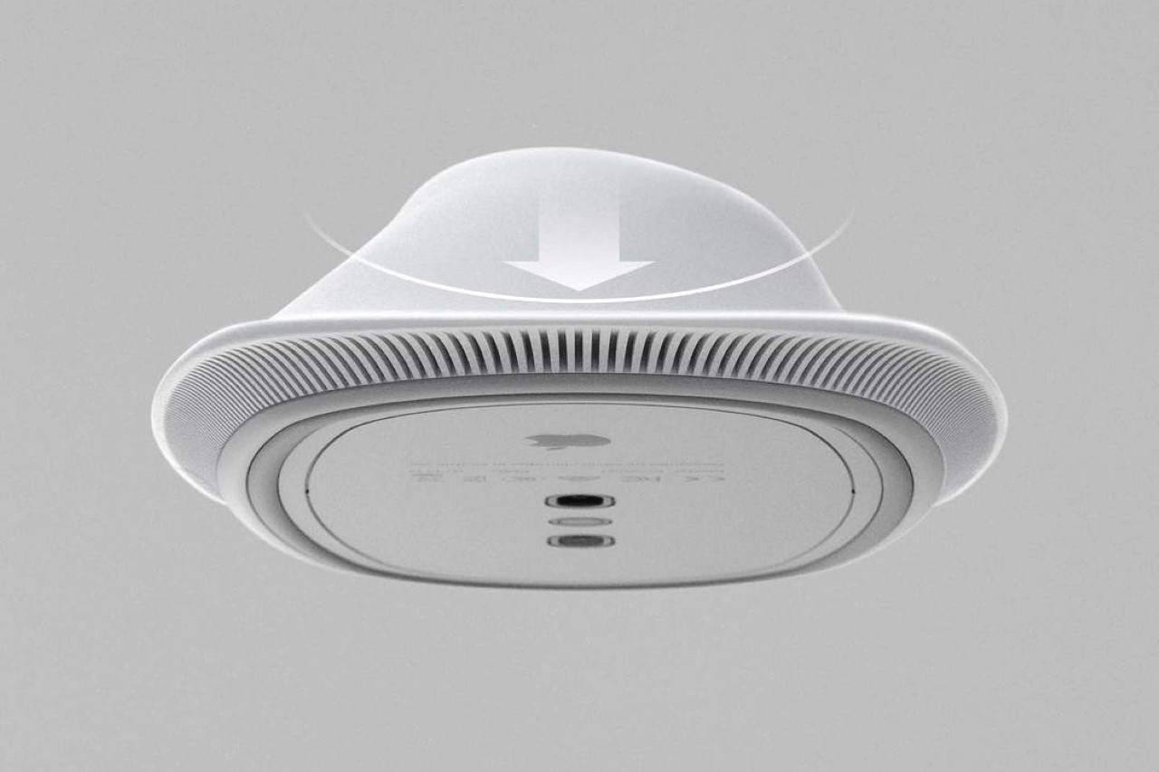
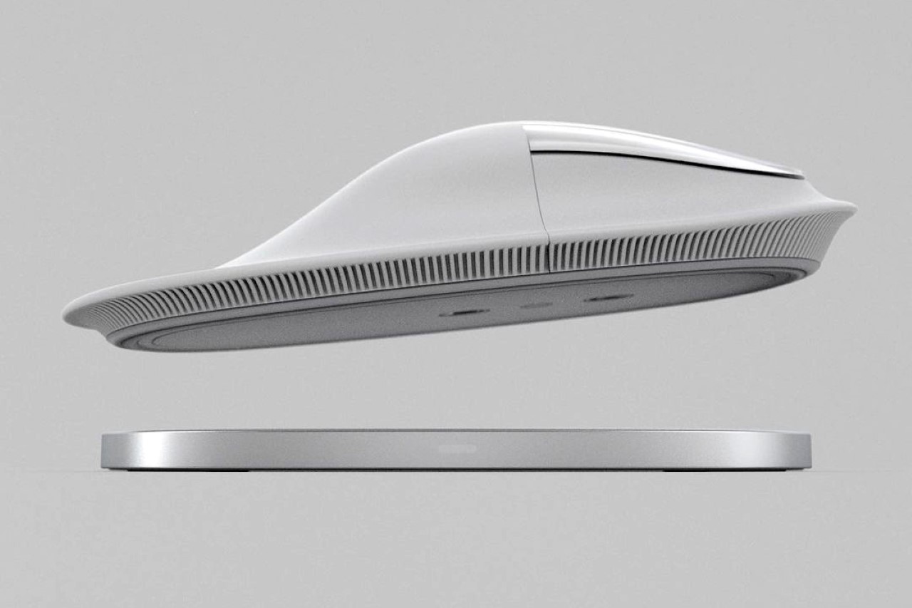
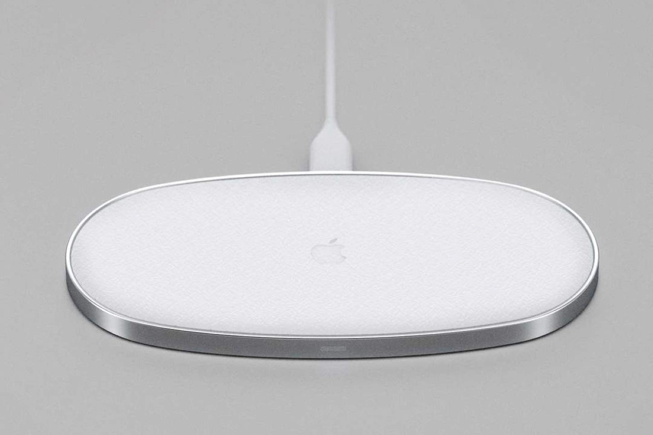
Clarridge’s design also fixes one of the biggest flaws in Apple’s entire product line (and sort of a lasting detail in Jony Ive’s legacy of odd design decisions)… its charging system. The current Magic Mouse remains infamous for having a charging port located on its base, making it absolutely useless when you need to plug a wire into its underbelly to charge it. The Magic Mushroom Mouse, however, provides the perfect solution in the form of an elegant wireless charging pad that snaps to the base of the mouse using Apple’s MagSafe tech. You can’t really use the mouse while it’s on the charging pad (because the pad doesn’t have the laser tracking system to track cursor movement), but the idea is that the pad serves as a place to rest the mouse when not in use… basically turning dormant time into charging time, so you never really have to worry about ever running out of charge. Cleverly enough, when the charging pad is sitting idle (while you’re using your mouse), you can just use it as a wireless charger for your iPhone or AirPods! Talk about two birds with one stone?!
The Magic Mushroom Mouse exists as just a concept for now, although Clarridge is determined on testing out and validating his design with 3D printed prototypes and even some made out of flexible resin. You can follow his journey and process on his Instagram page and collectively wish and pray that Apple finally fixes its most ill-conceived design decision since #bendgate…

Designer: Kevin Clarridge
The post Apple’s Magic Mouse gets its biggest ‘design upgrade’ with this ergonomic, wireless charging concept first appeared on Yanko Design.
The no-paste-waste brush!

squeeze_toothbrush_1

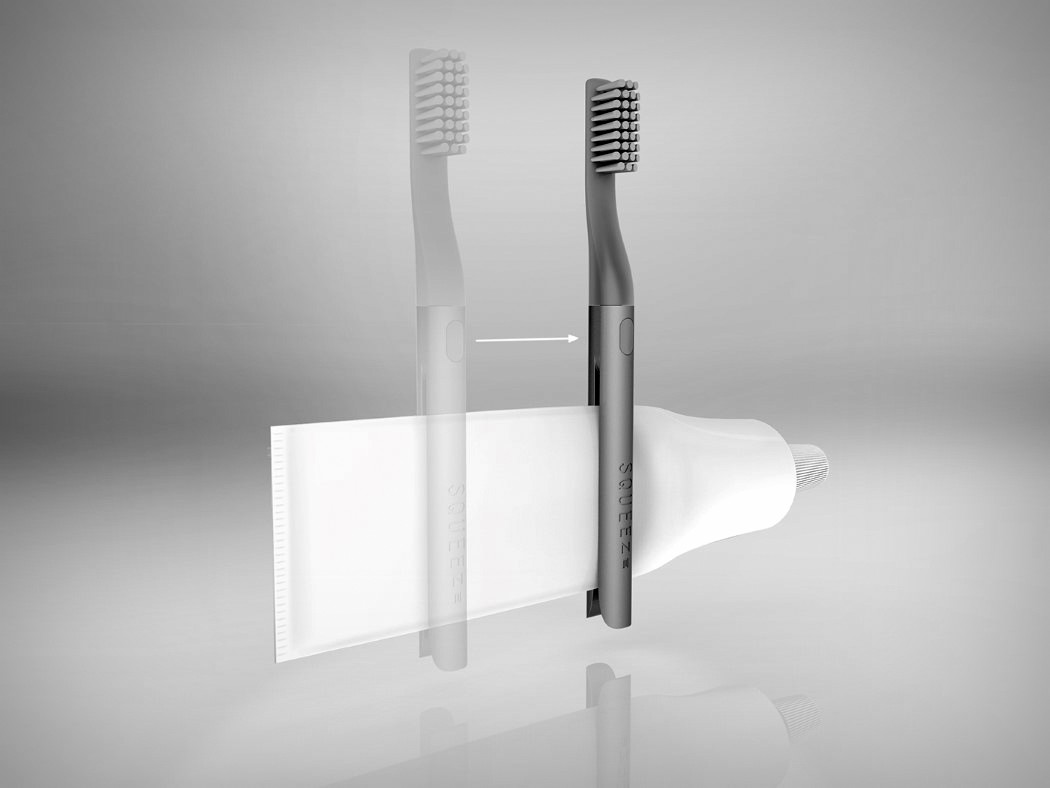
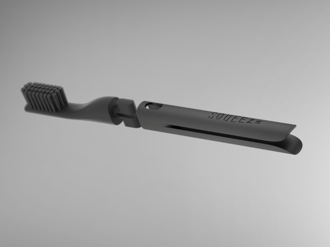
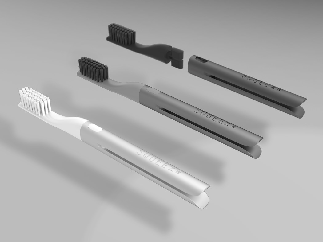
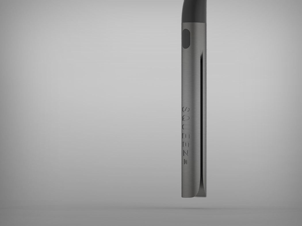
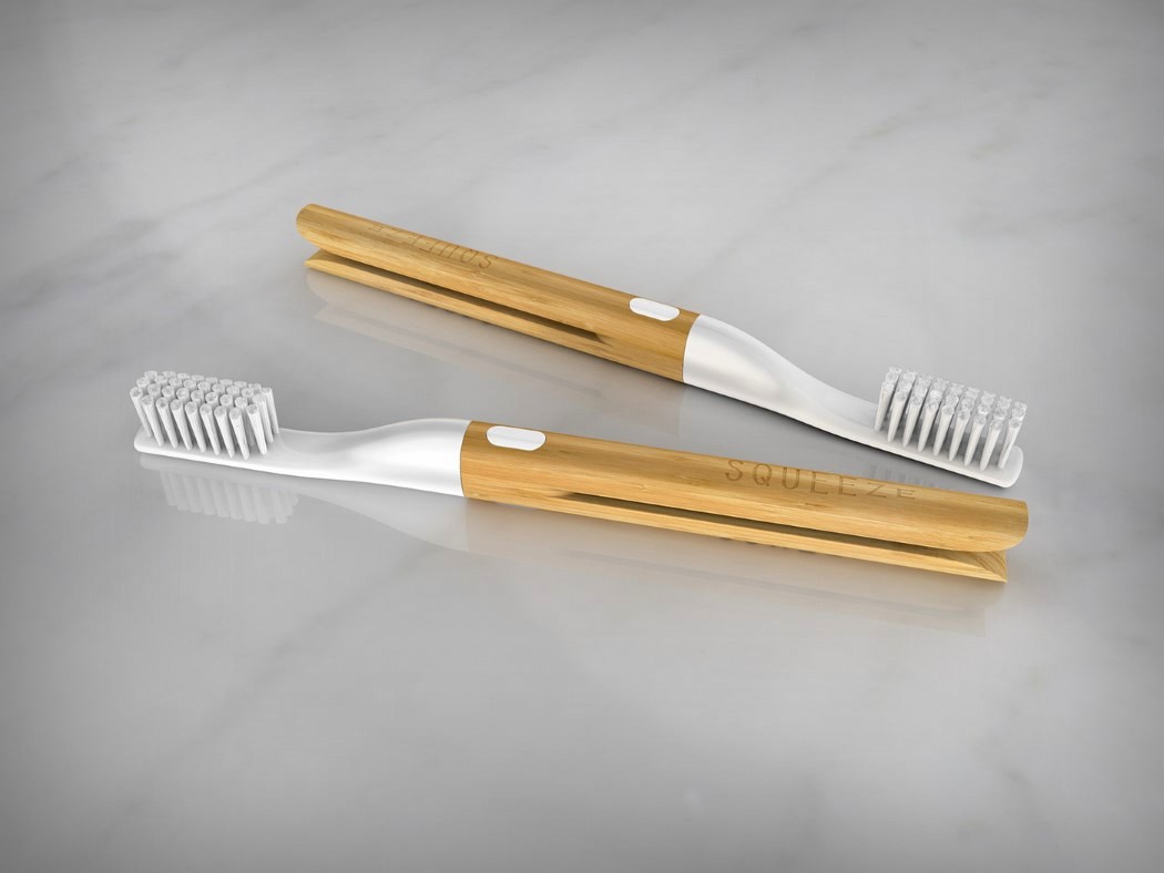
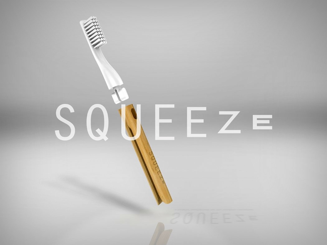
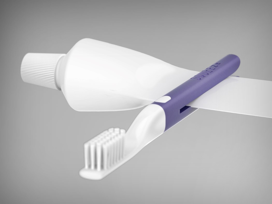
How simply convenient! The Squeeze toothbrush by Kevin Clarridge allows you to extract every bit of toothpaste from that dang tube… because if you can’t design a better tube, design a better toothbrush!

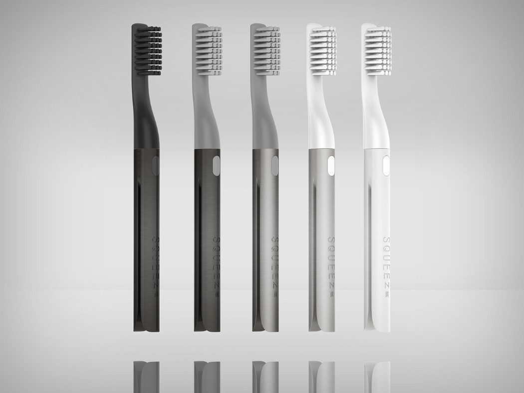
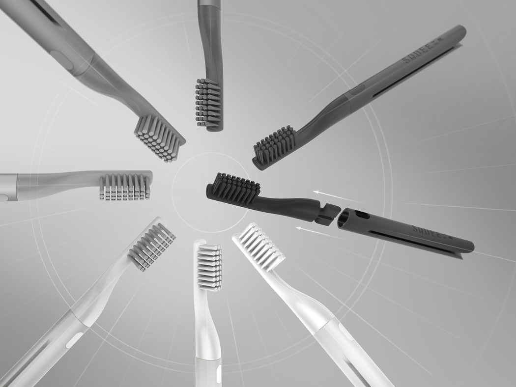
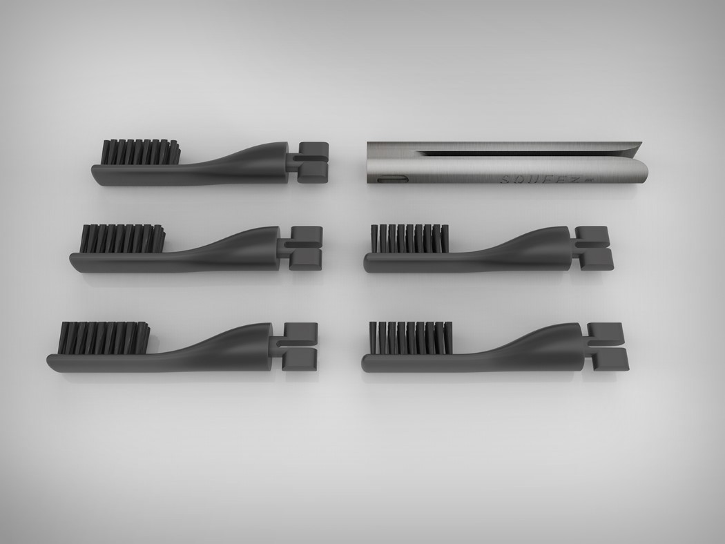
Changing a toothpaste tube is a massive market exercise because toothpastes are heavily tied with brands, and no brand really has the eagerness to experiment with something that works (the if-it-ain’t-broke syndrome). The Squeeze toothbrush however provides a rather wonderful solution. With its peg-like base, it allows you to manually steamroll each and every ounce of toothpaste from your tube. The toothbrush comes in two components, so you can retain the base and just switch the bristled top every couple of months! What’s more, the peg-shaped base even helps to dock the toothbrush on the rim of any tumbler, or on a line, need be.

Designer: Kevin Clarridge

squeeze_toothbrush_2

squeeze_toothbrush_3

squeeze_toothbrush_4

squeeze_toothbrush_5

squeeze_toothbrush_6

squeeze_toothbrush_7

squeeze_toothbrush_8

squeeze_toothbrush_9

squeeze_toothbrush_10

You don’t need to be an Axe-pert!

tomahawk_axe_1

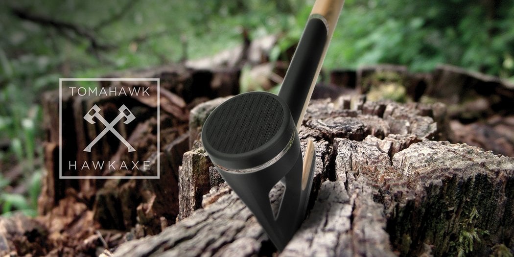
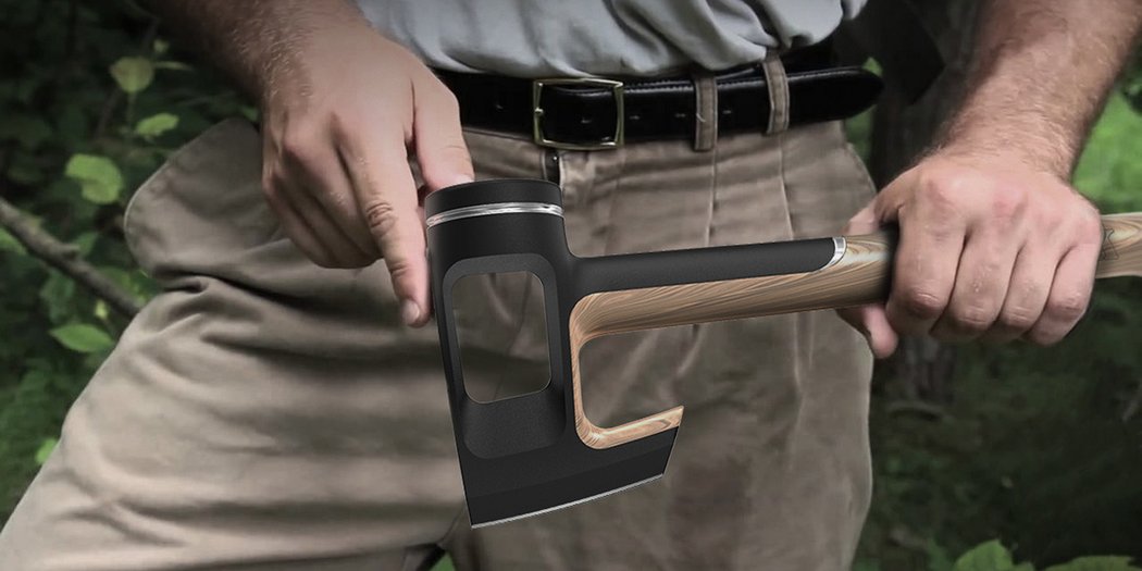
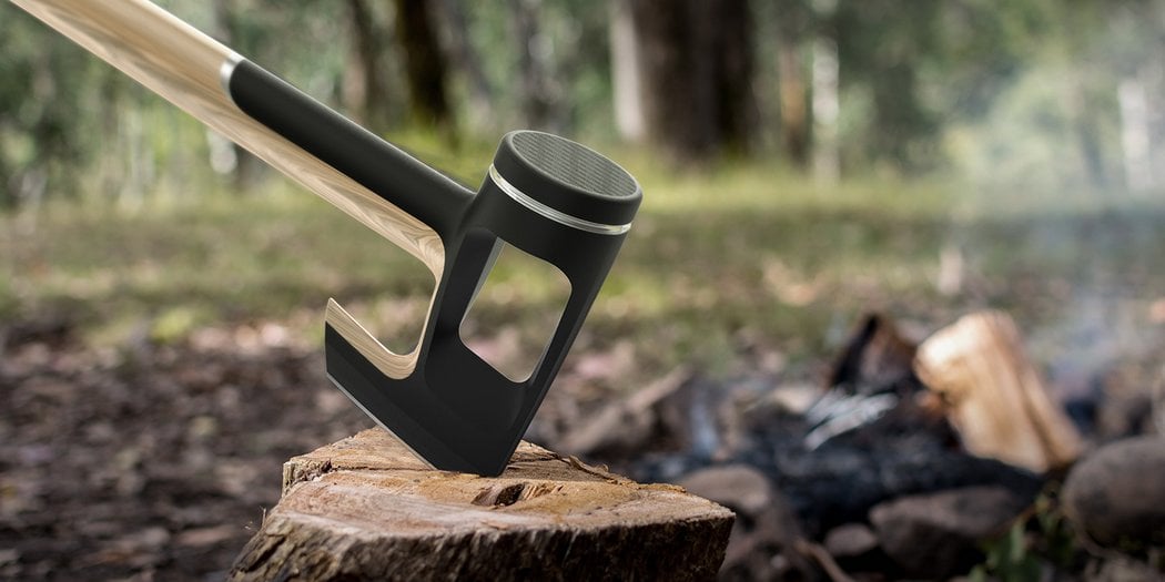
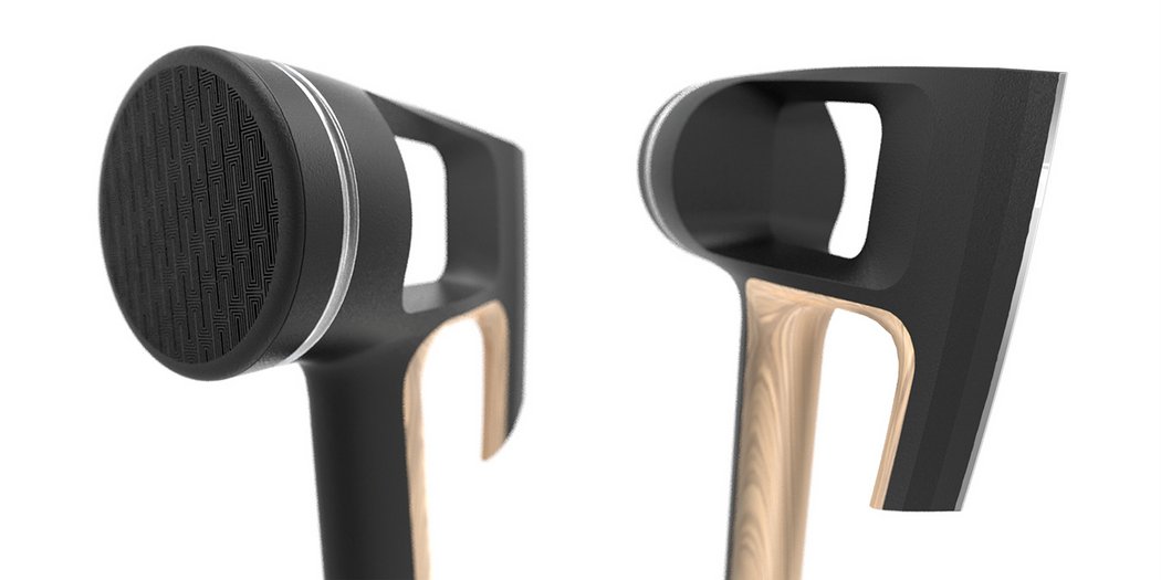
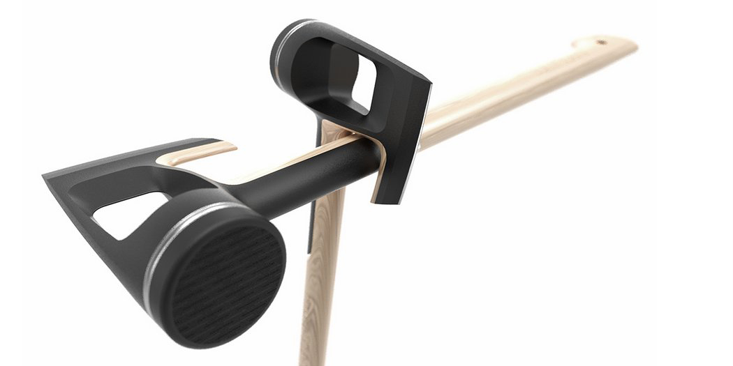
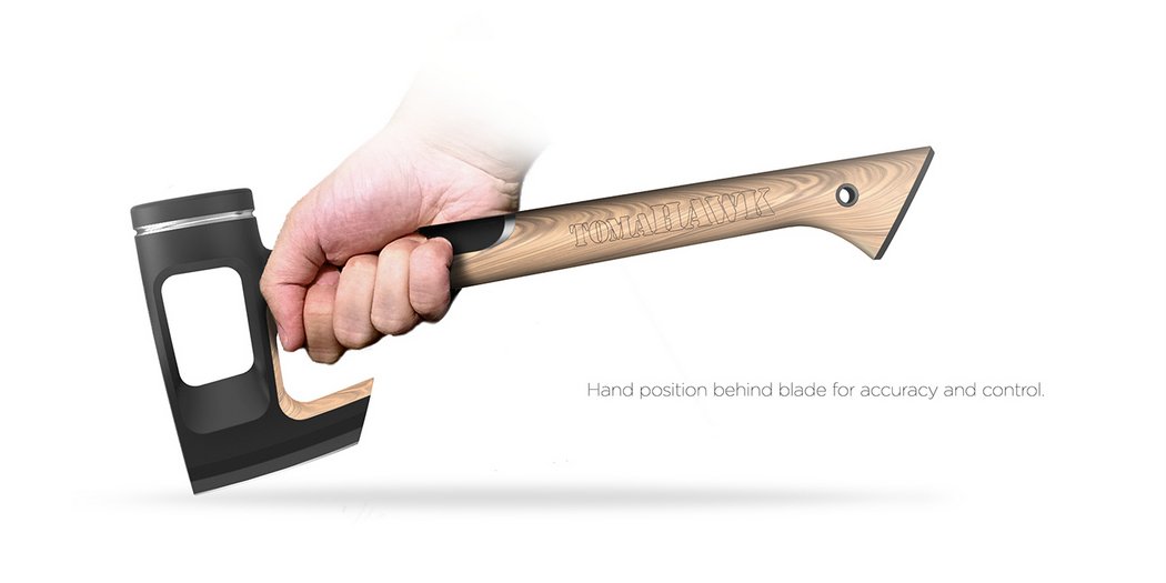
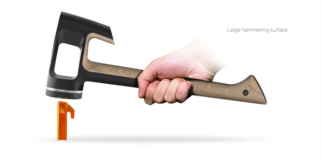
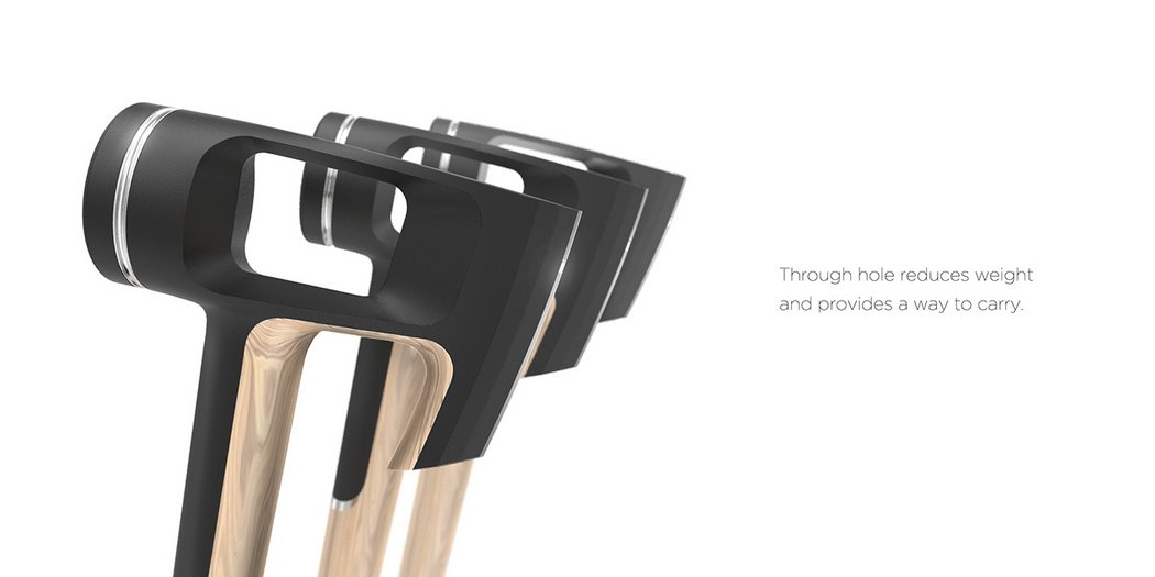
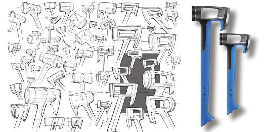
Not many people are experts with hatchets. The Hound from Game of Thrones makes it look really easy to tear through timber using an axe, but I’ll be honest, I’ve got the upper body strength of a cheap mannequin. Moreover, it’s important to know how to use an axe too. After all, you don’t want to be blindly swinging such a deadly weapon! The Tomahawk Hawkaxe is designed to not just be efficient, but also promote the correct style of using the axe. Its hollow blade area makes it unbelievably light, which means you need to hold the axe near the blade to exert force, because there isn’t much momentum with an axe this light. This little hack actually gets us to operate the axe the right way!

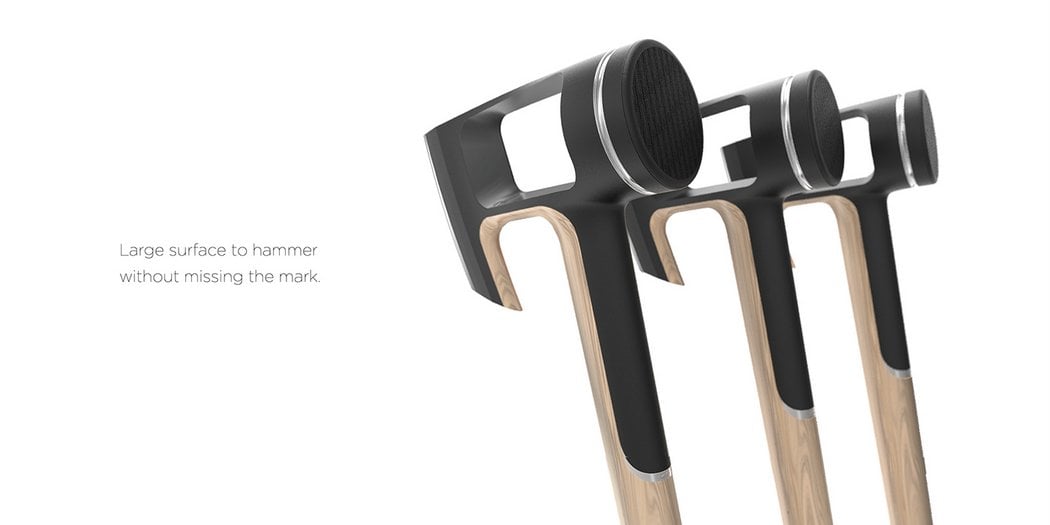
The axe also comes with a hammer-head on the back, making it a multi-tool. The hammer adds some much needed weight to the blade area, making sure the contraption isn’t too light. The design is inspired by its namesake, the Hawk. The blade resembles the hawk’s raptorial beak, giving it a unique cut-away shape at the bottom that makes it easy for the hand to hold onto the axe right behind the blade to ensure and enhance accuracy. What a wonderfully coincidental bit of bio-mimicry, eh?? 💡

Designer: Kevin Clarridge

tomahawk_axe_2

tomahawk_axe_3

tomahawk_axe_4

tomahawk_axe_5

tomahawk_axe_6

tomahawk_axe_7

tomahawk_axe_8

tomahawk_axe_9

tomahawk_axe_10

The Grand Slam Cam

iris_gyrocam_1

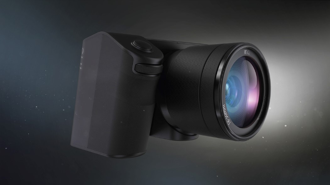
You can have a camera, you can have a gimbal. You can’t have both. Designer Kevin Clarridge begs to differ. His re-imagination of the Point and Shoot camera is quite ground-shaking, pun not intended! The handheld camera isolates the lens completely, and adds a 3 axis stabilization system to it. It is, in theory, a Point and Shoot, but in practicality, it’s just a Shoot. Designed to overcome all sorts of hurdles (physical ones too) the lens can adjust itself to focus on the target. The design, if I may add after all this technological wizardry, is quite classy too! So when’s this hitting Indiegogo, Kevin?? 					</div><!-- .entry-content -->
		
		<footer class= Posted in Uncategorized | Tagged , , , , , , ,