This tiny functional magnetic kitchen countertop makes optimum use of compact space

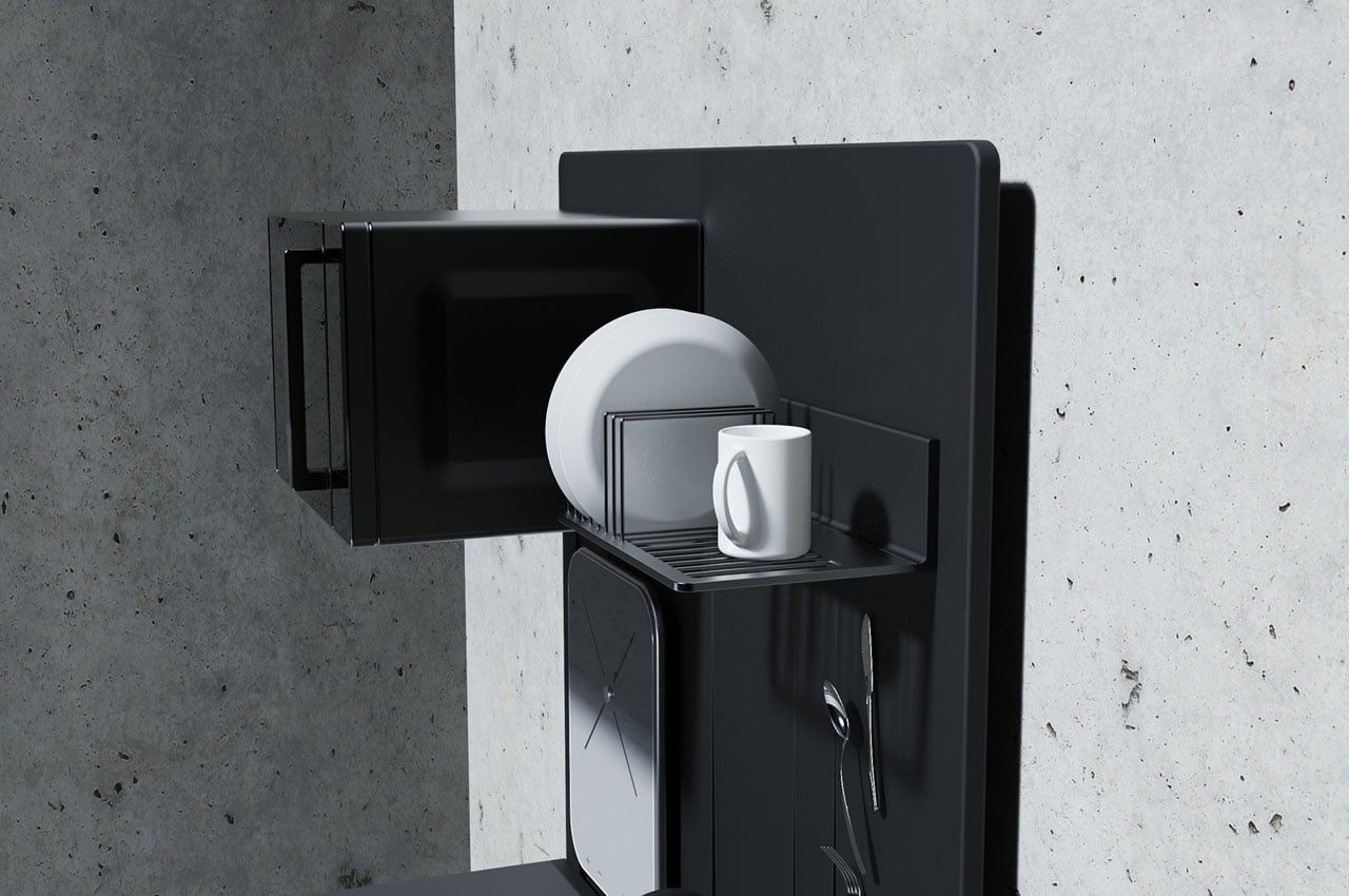
A functional kitchen countertop that employs magnetism to make optimum use of the vertical space available in a kitchen. Truly, a clever countertop design apt for city apartments and small kitchens where space-saving is the key.

Space is at a premium in modern studio apartments owing to the limited scope of keeping things like furniture or kitchen appliances. The latter is very important to organize properly, making use of every inch with intuition to save space without compromising function. It’s easier said than done when the right look for the kitchen is in question with the apt functionality of course. Designer Juliana Juleva wants to achieve this with her thoughtful design for a kitchen countertop that employs science to get the desired result.
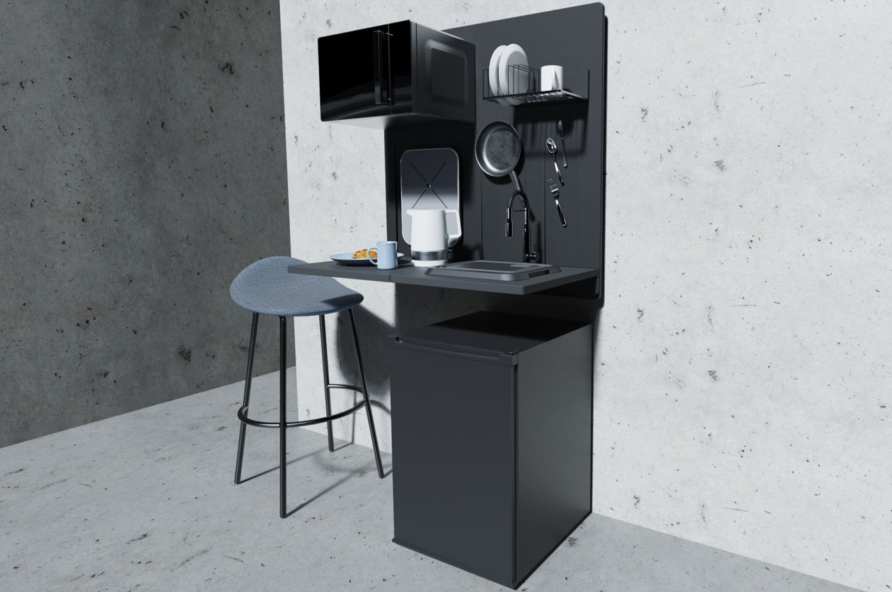
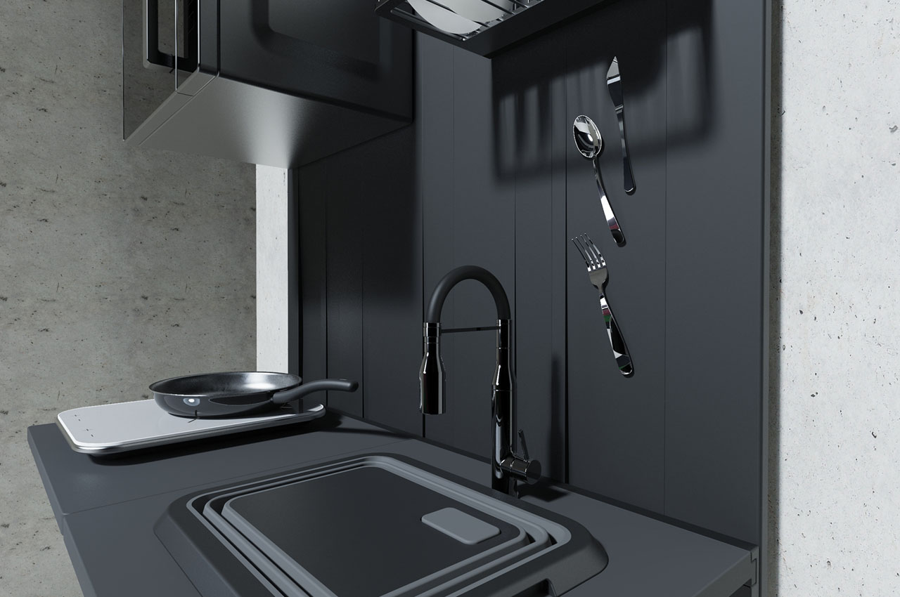
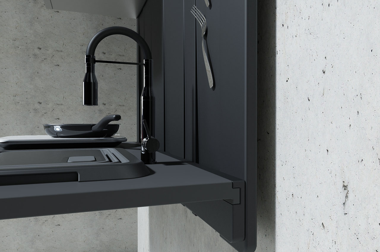
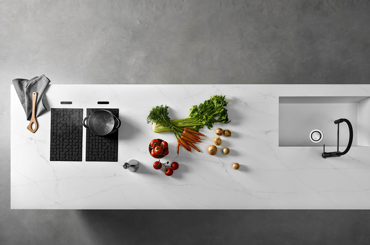
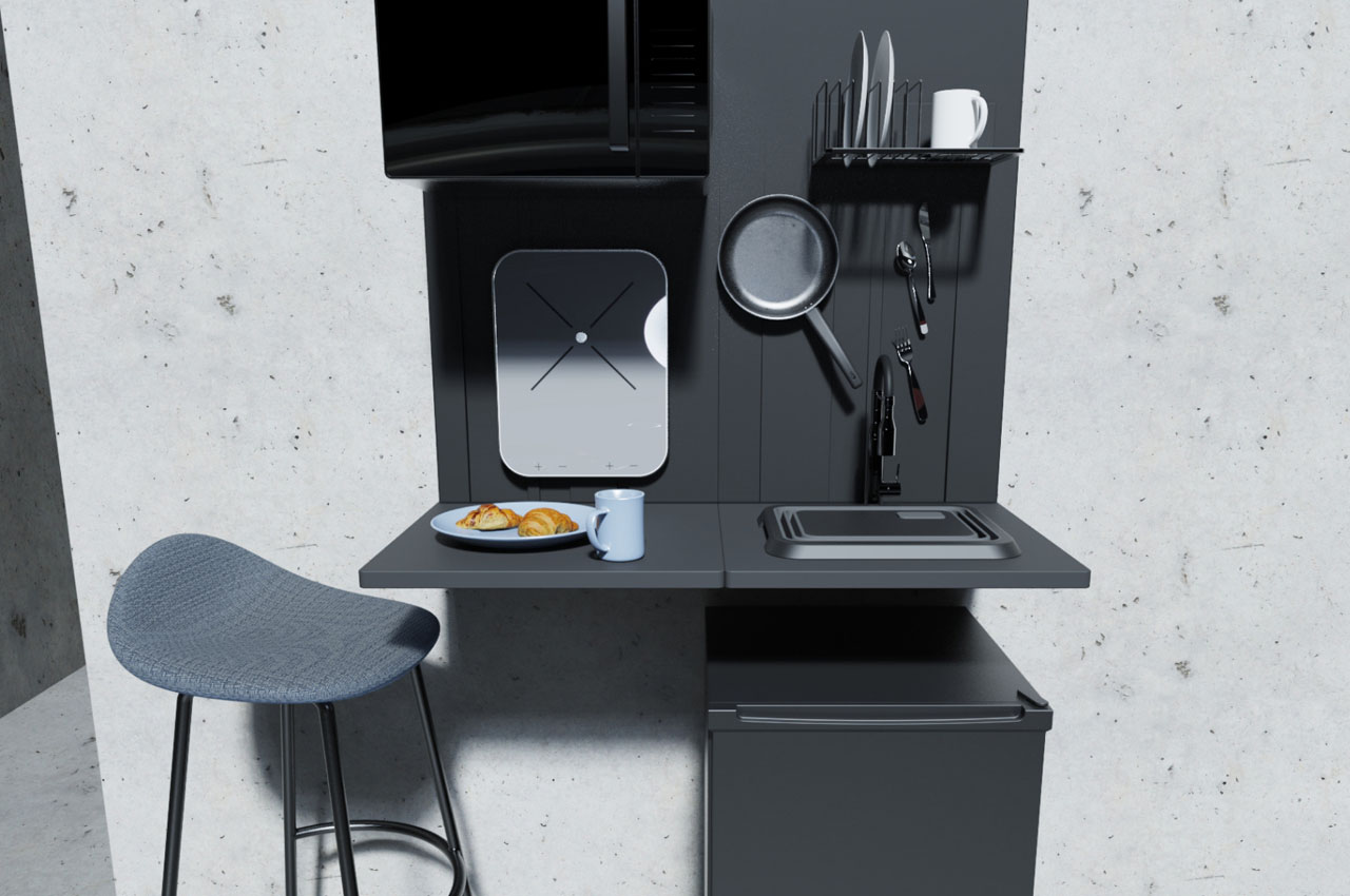
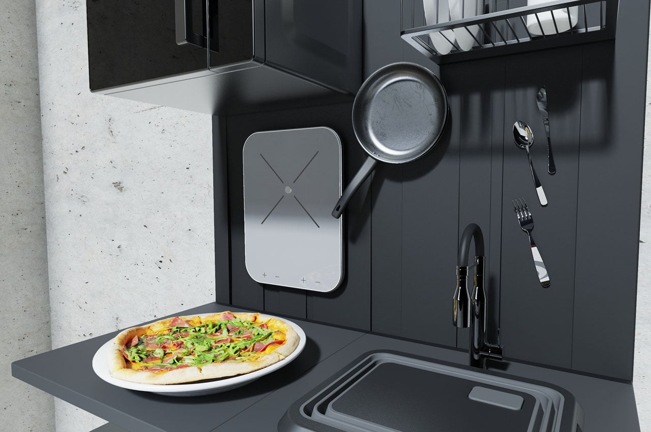
According to her (and I also agree), even when you choose the most compact accessories and appliances, they still eat up a lot of space. This is attributed to their own individual design philosophies and shape. Any which way, with the smallest sized appliances and kitchen accessories, the convenient and practical aspect is still unfulfilled. In small studio apartments, the kitchen unintentionally becomes the center of attention due to this and the magnetic kitchen proposed by Juliana sets things right in the most subtle way. The one square meter magnetic panel seen here is fixed to the wall and acts as the base for the compact countertop that has a cutting board that doubles as a folding sink (or vice versa) and of course the magnetic properties to keep all the utensils in place.
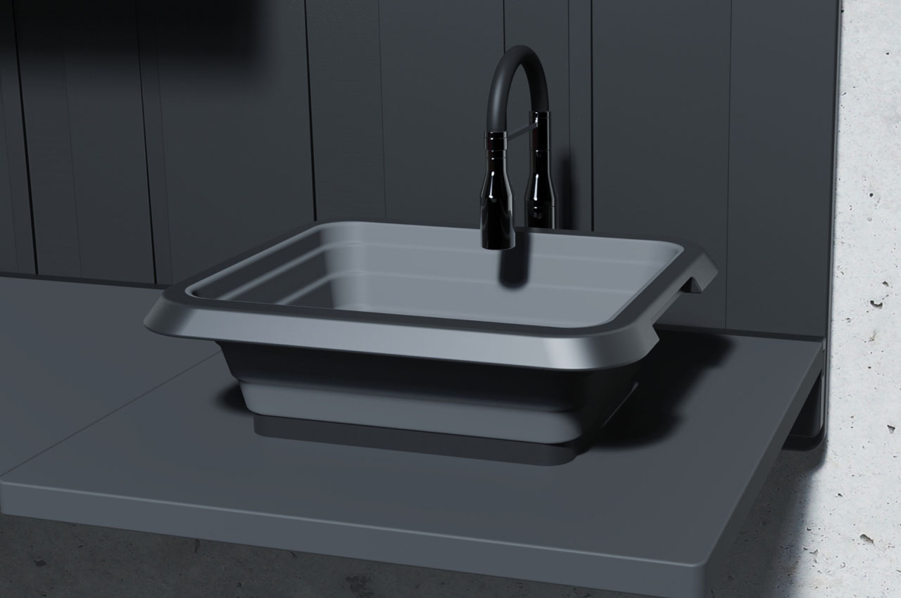
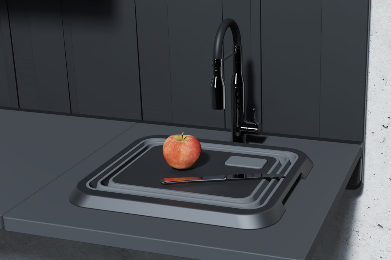
The sink can be concealed from plain sight to increase the kitchen’s working space and used as a cutting board for random use. Anything that sticks to a magnet can be put up on the vertical section – things like spoons, forks, pans, induction cooktop, oven, or custom-made shelves which further hold the plates and other non-magnetic objects. The limitation here is the objects need to be made of metal housing to stay put in place. For other things like water bottles or mugs, the horizontal countertop makes up for the required space. A mini-fridge can be placed under the sink area to make more optimum use of available space.

Designer: Juliana Juleva
The post This tiny functional magnetic kitchen countertop makes optimum use of compact space first appeared on Yanko Design.
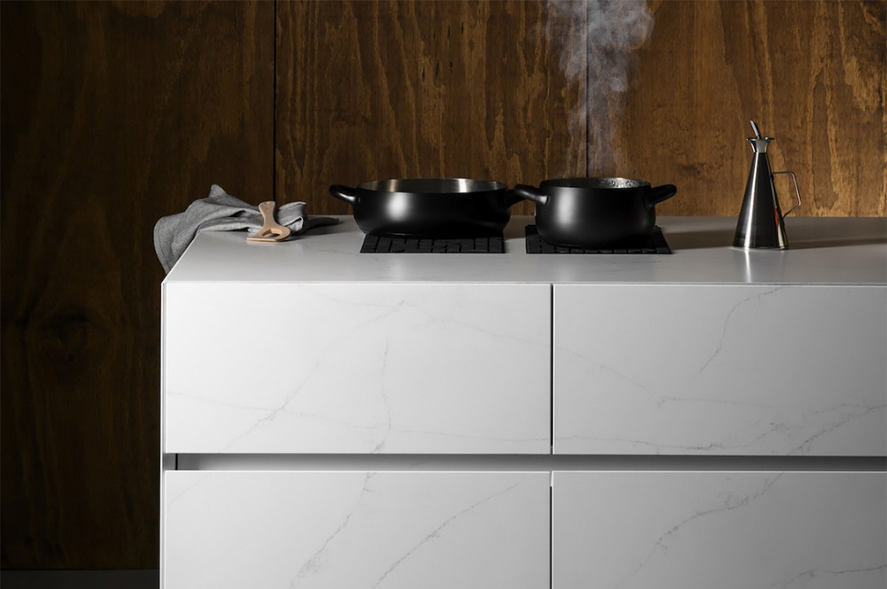
A hidden induction cooking unit is the best part of this modern, tech-savvy kitchen!

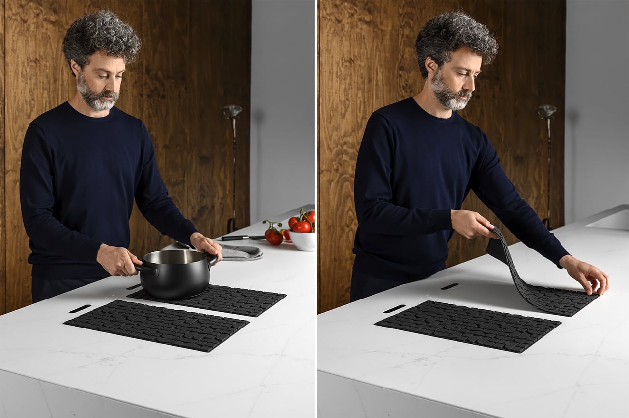
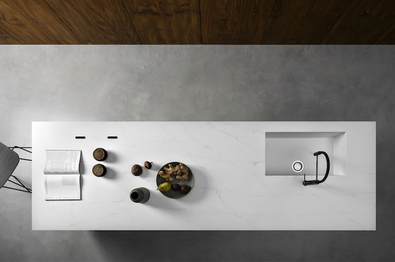
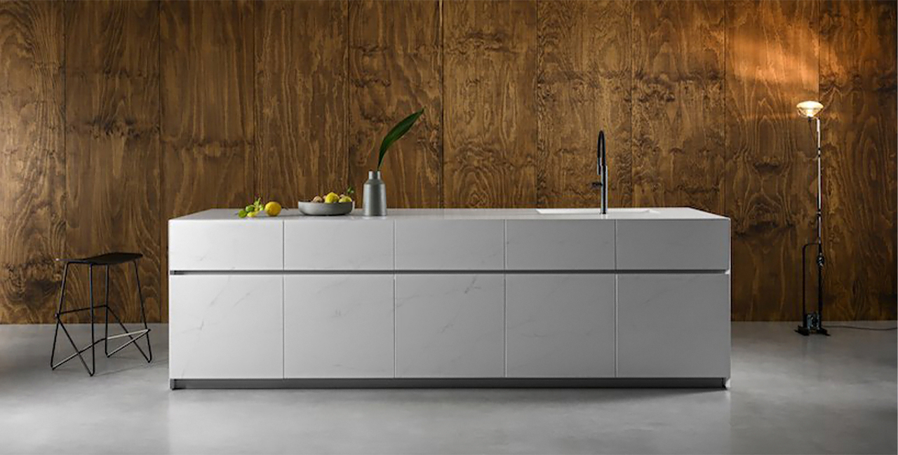
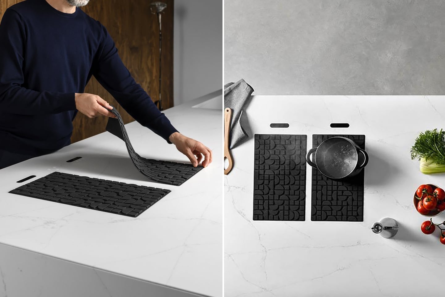
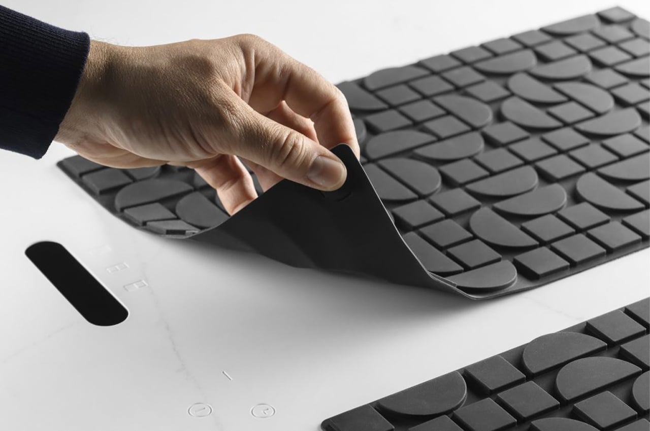
This kitchen’s secret sauce is a flexible, hidden, induction cooktop – and it is flexible! Lapitech, an Italian company, created a cooking system that could be fully concealed under a modern sintered stone kitchen counter! It is activated by a technological cooking mat and the innovative system features an electrothermal part developed in collaboration with the University of Padua. Lapitec Chef was brought to life after years of research and is patented.

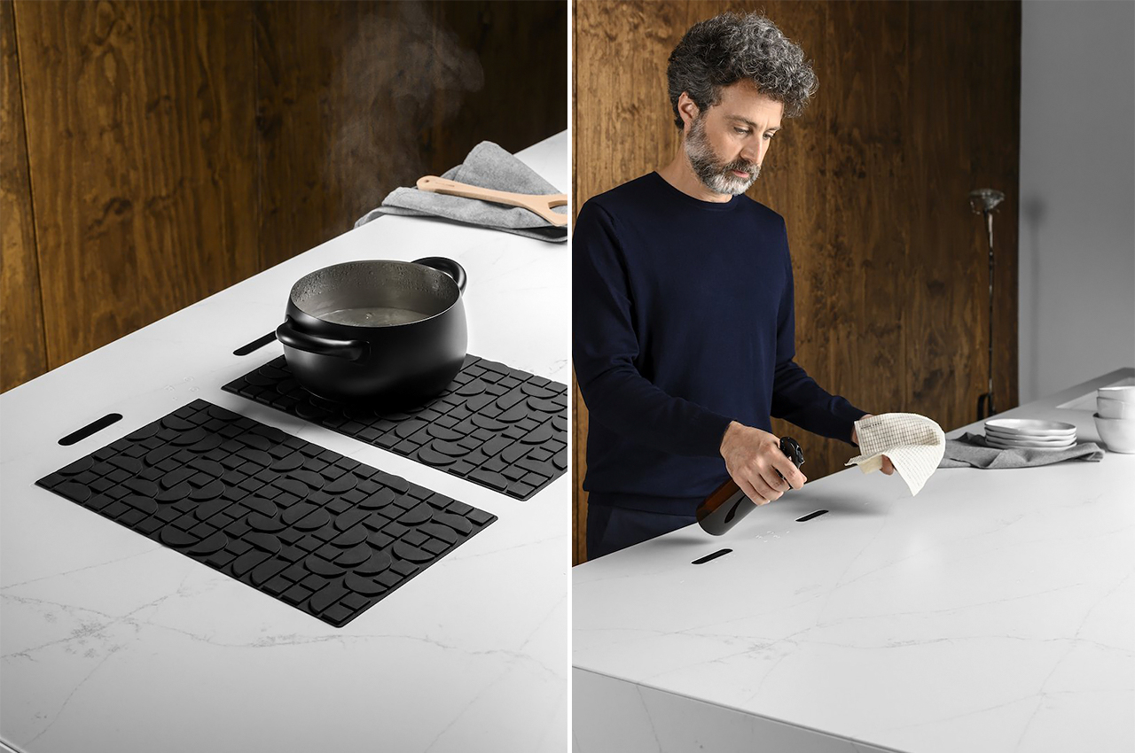
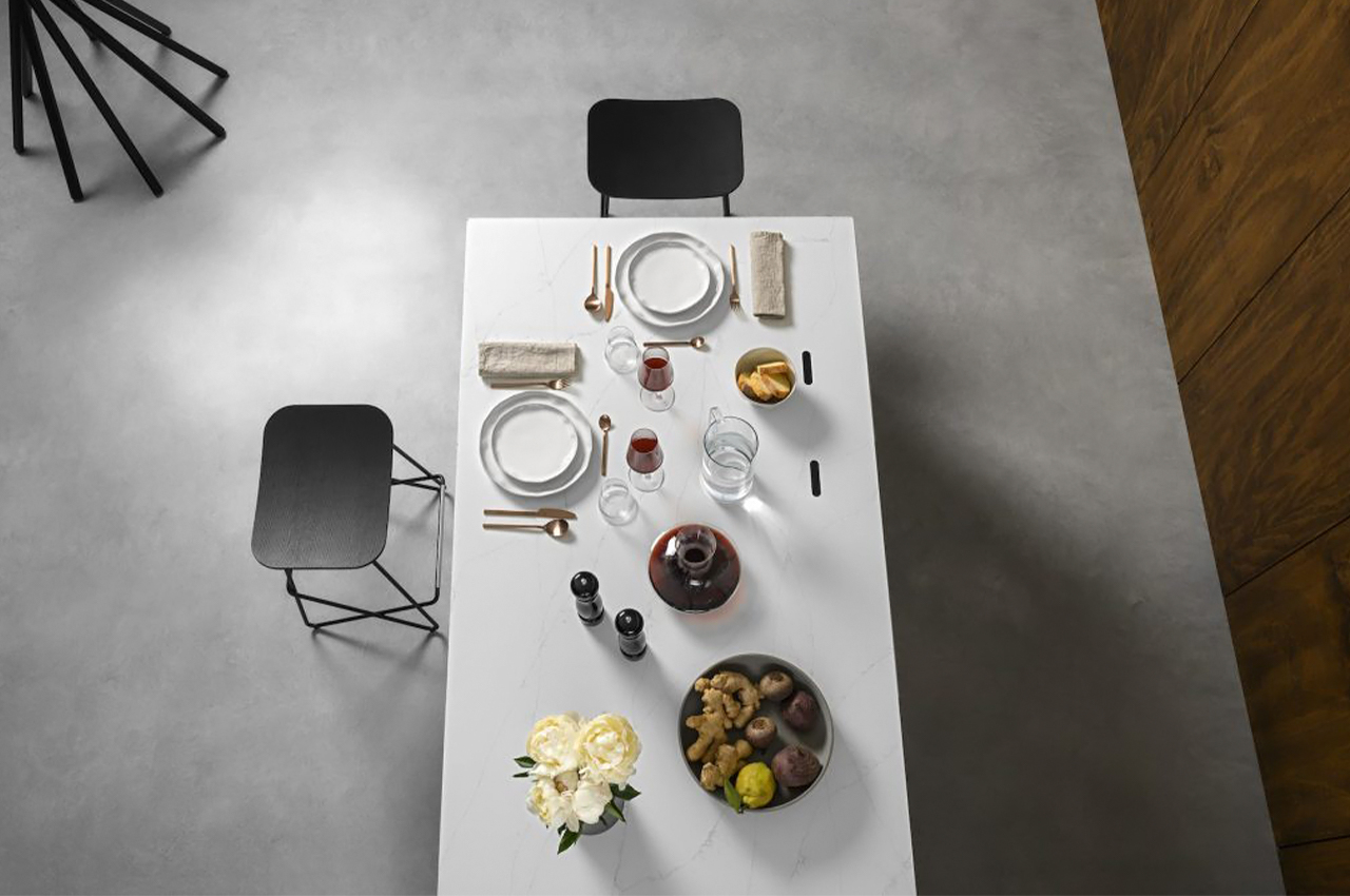
The induction cooking system is seamless and very easy to operate. All you have to do is place the Lapitec Chef silicone mat on your worktop to activate the touch controls and switch on the system. The mat is key, without it the induction unit and controls will be inactive and the worktop is like any other kitchen counter only distinguished only by small engravings that align with the mat’s controls.

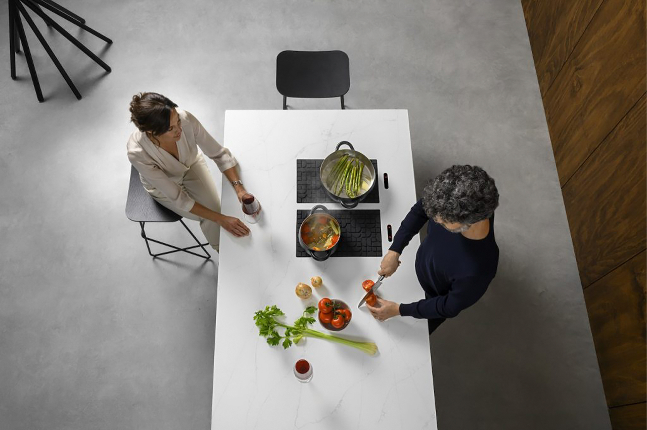
Lapitec Chef allows for easy cleaning and storage so the counter can be used for other activities like preparing food, plating dishes and hosting social occasions. Interestingly, Lapitec is a 100% sintered stone and it is also non-porous, non-absorbent as well as resistant to chemicals which makes it ideal for both indoor and outdoor kitchens. You can choose to have either two or four cooking rings for your induction system.

The one-of-its-kind cooking mat looks like a normal silicone mat but comes equipped with magnetic sensors and a hidden coil. Lapitec Chef is compatible with all induction cookware and the best part is that it is also dishwasher safe! For additional safety,  it can be configured to work in bridge and child lock mode. You can choose from different finishes to match the induction system with your kitchen’s aesthetic while integrating the technical potential of sintered stone to elevate your cooking game!

Designer: Lapitec

This modular terracotta clay pot keeps food cool without any electricity for refrigeration!

The Terracooler is a modern interpretation of the traditional Zeer pot or pot-in-pot refrigerator, an evaporative cooling refrigeration device that has been used for centuries and is still used today in countries across the globe, such as India and Nigeria.

Zeer pots, or pot-in-pot refrigerators, carry a rich, enduring history. Dating back to as early as 3000BC, Zeer pots have been used in the kitchen as evaporative cooling refrigeration devices across the globe for centuries. Comprised of two clay pots, the porous outer pot is lined with wet sand and surrounds a glazed inner clay pot where food items can be stored for refrigeration.

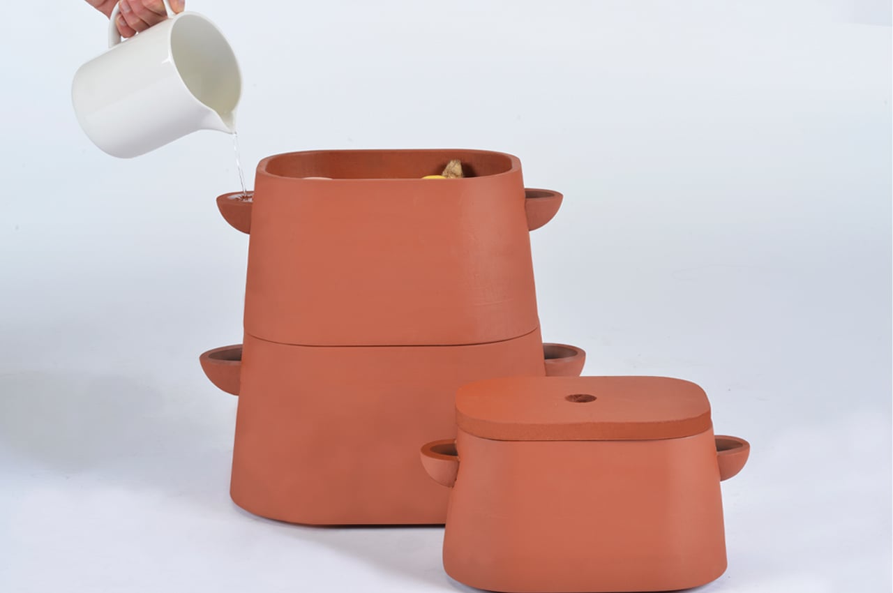
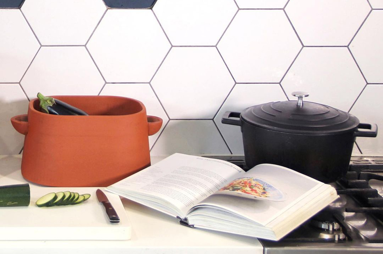
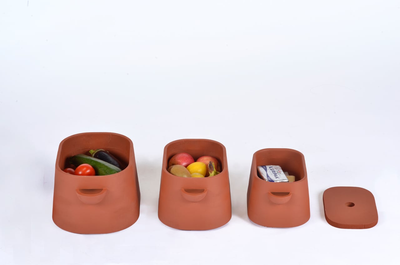
Requiring no electricity whatsoever, Zeer pots only need a source of water and some dry air to keep produce and other food items cool. Reinterpreting the Zeer pot for modern use, London-based designer Ellie Perry created the Terracooler, a tri-tiered pot-in-pot refrigerator that fits right at home on the kitchen counter.

Like many designers today, Perry felt compelled to design her Terracooler after learning that 10% of household energy is taken up by domestic refrigerators. However, in the UK, where Perry is based, 14 million tons of food waste is accumulated each year. The Terracooler was designed by Perry to make sense of that perplexing ratio.

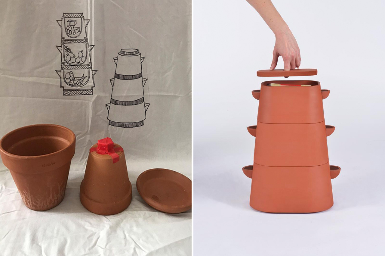
Inspired by the modern use of Zeer pots in countries like India and Nigeria, Perry devised sketches and models before taking to CNC milling to produce a wooden model of her Terracooler. Using the wooden model as a plaster mold, Perry slipped cast from the mold to create a version made from terracotta clay.

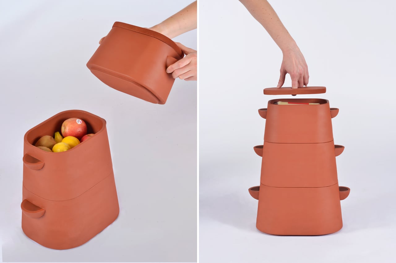
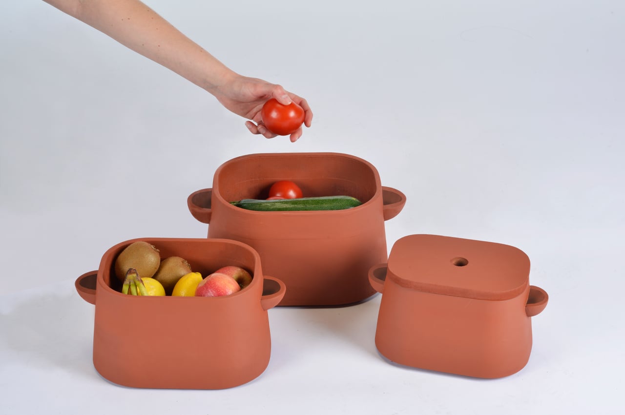
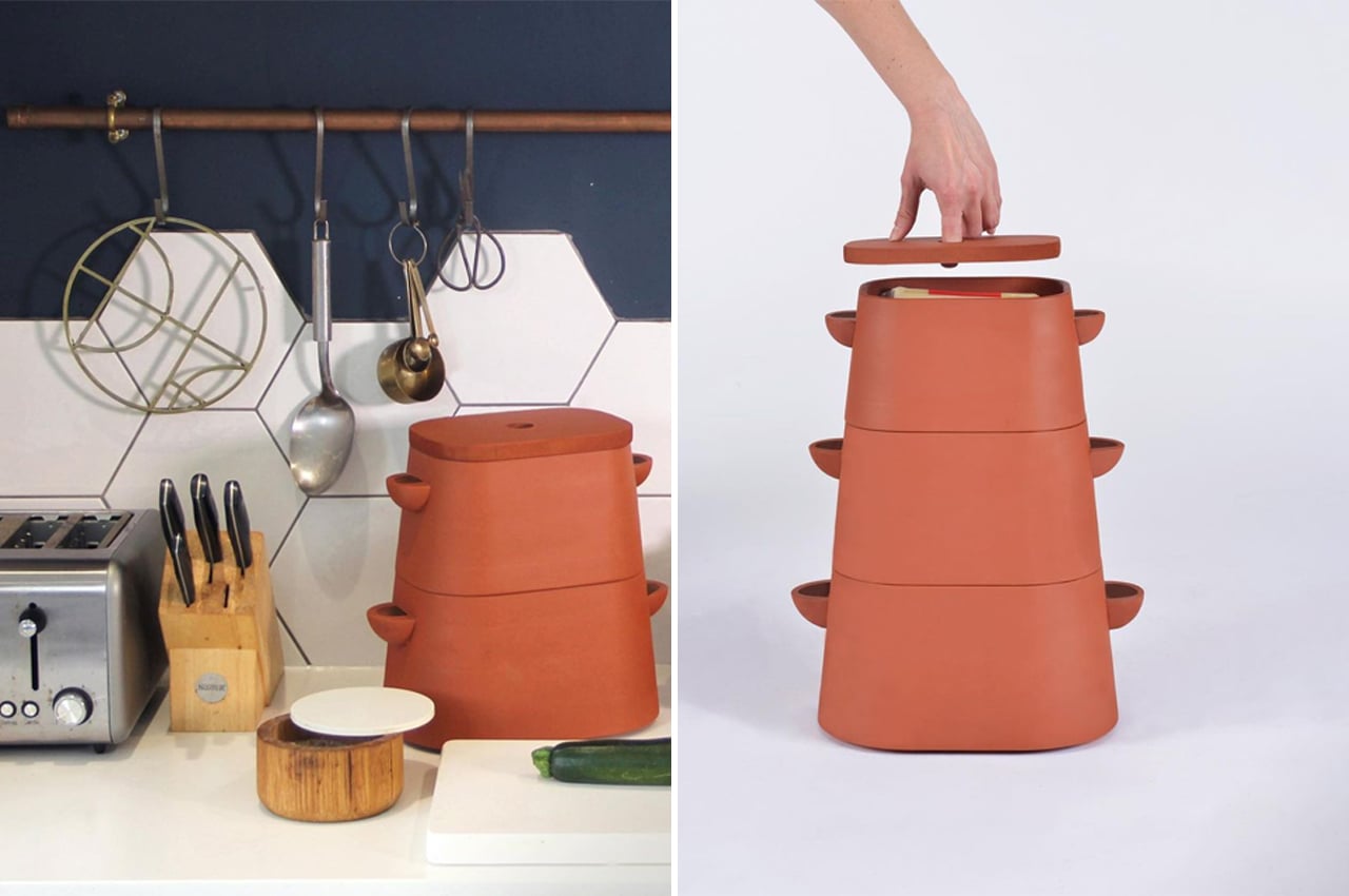
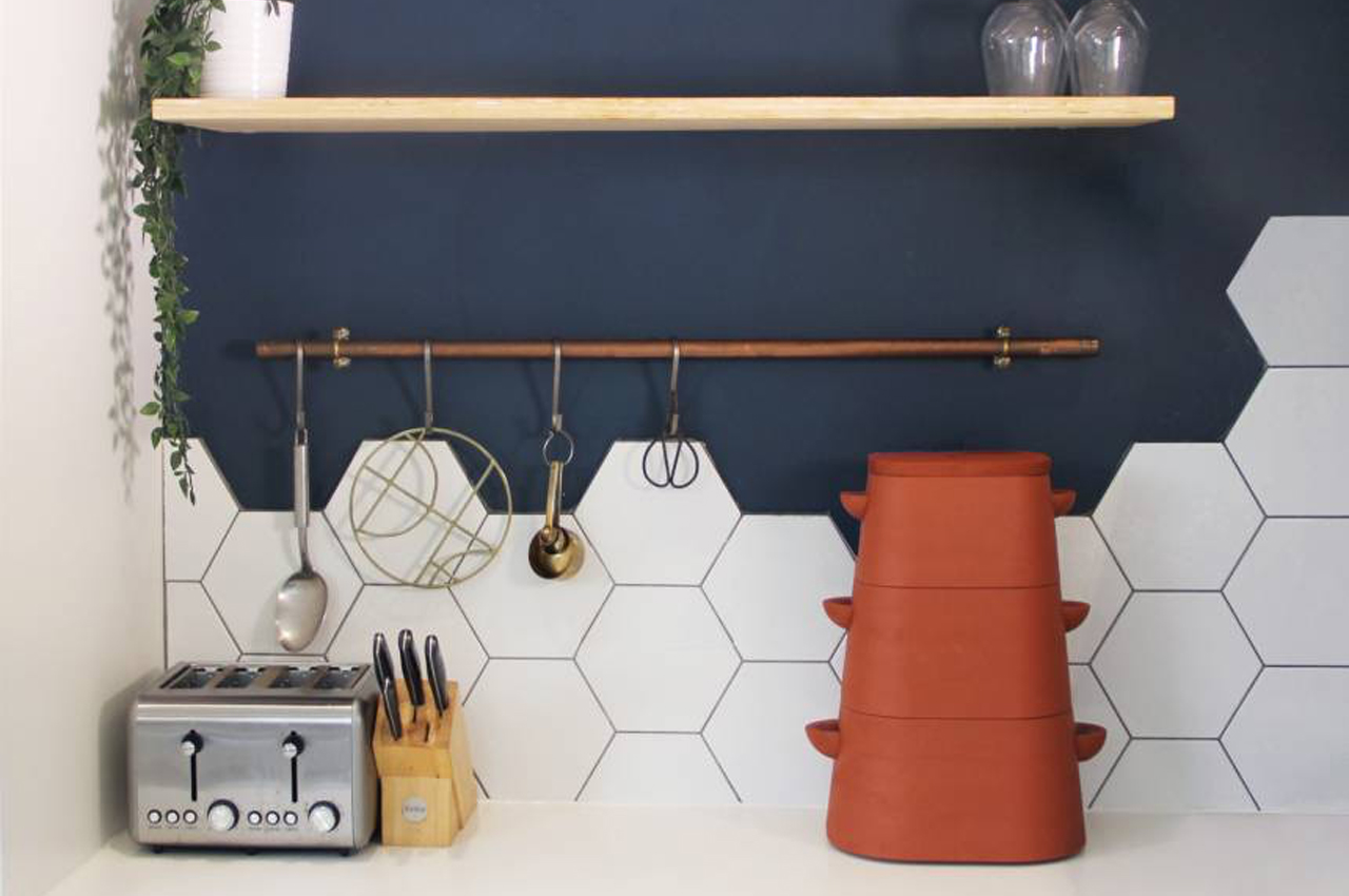
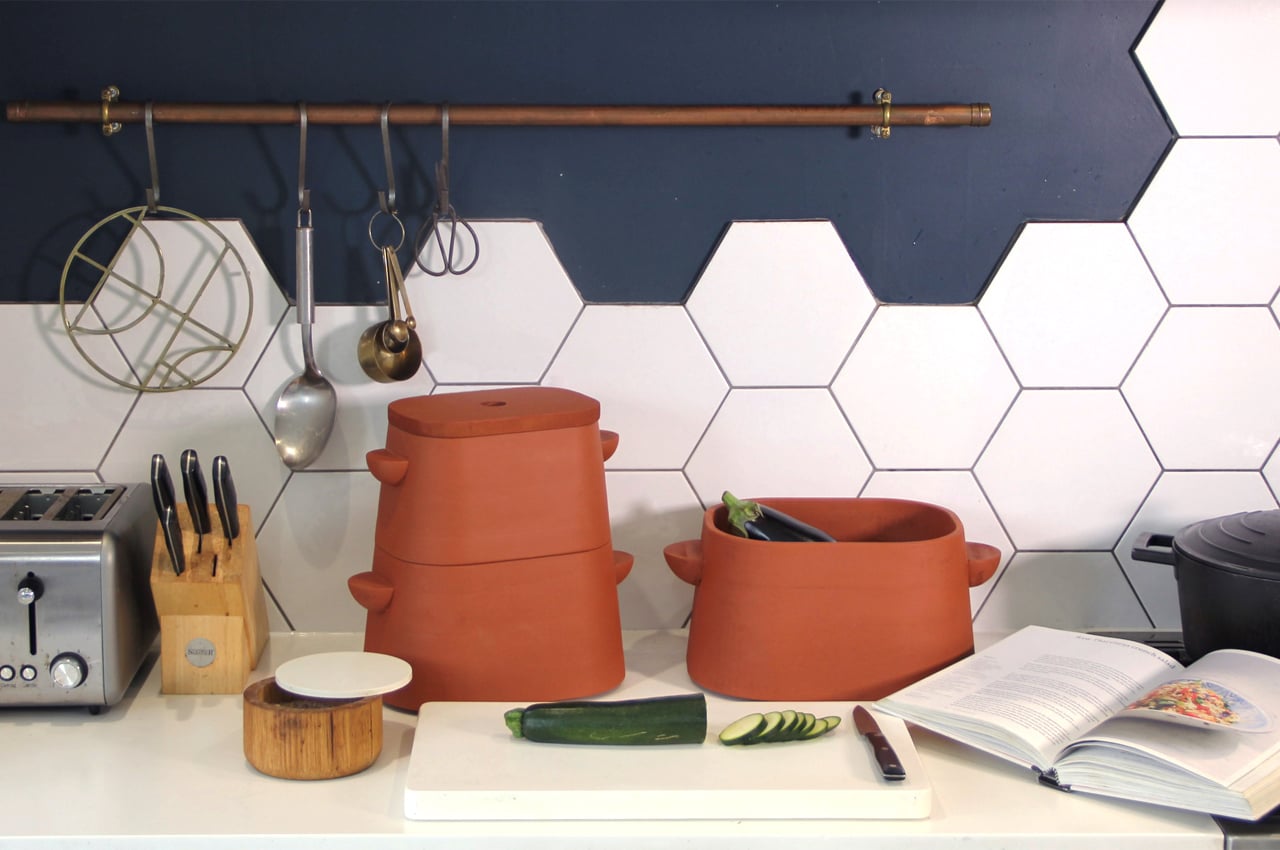
Using the traditional build of pot-in-pot refrigerators, Terracooler is formed from three tapered, double-sided slip cast pieces with built-in handles. The handles stem from both sides of each individual pot and also work as spouts for water to pour through and provide evaporative cooling. With a vertical, modular design, Terracooler fits snugly on any kitchen counter and can be disassembled for access to the food items inside each pot.

Designer: Ellie Perry


This redesign of the kitchen sink was built on a scheme of chamfers and angled edges for one-handed users to use as leverage!

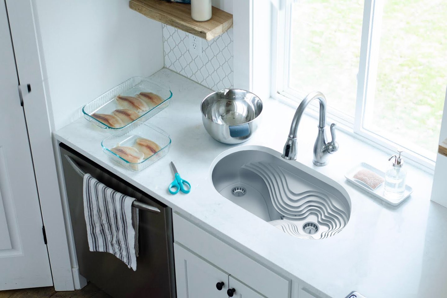
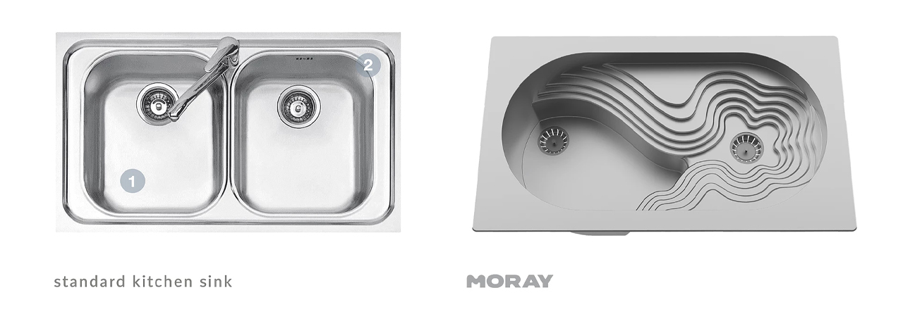
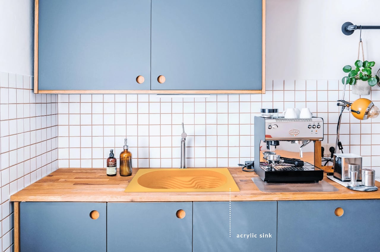
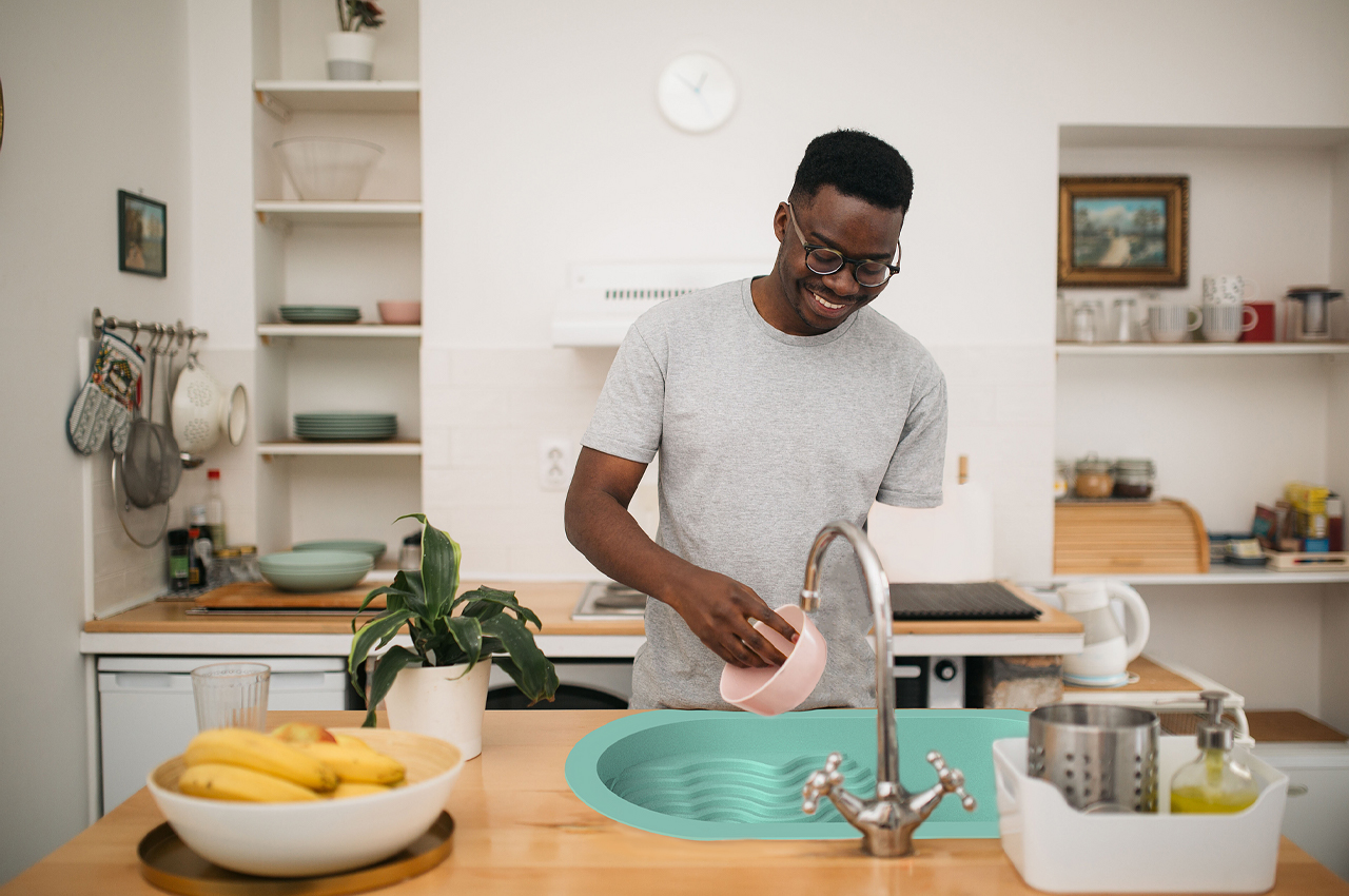
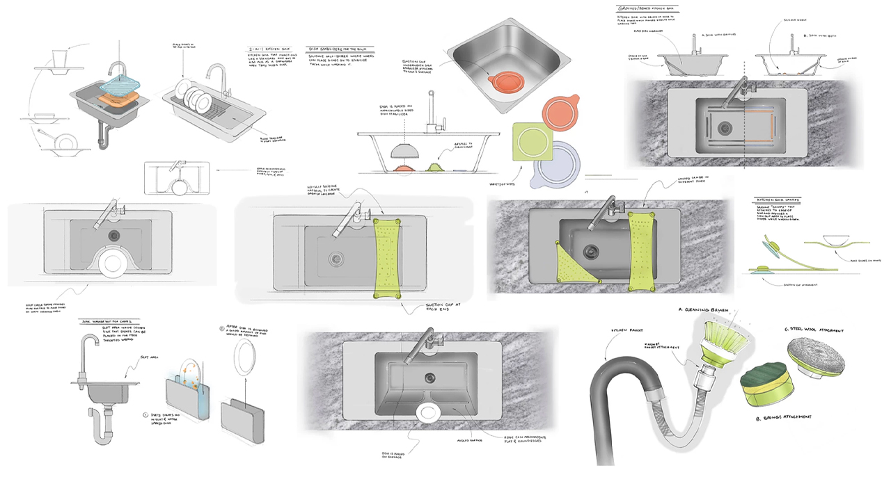
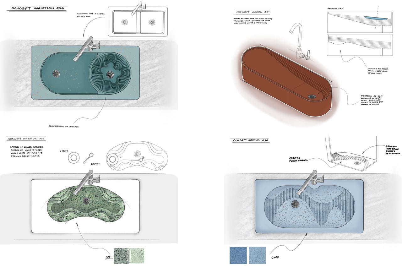
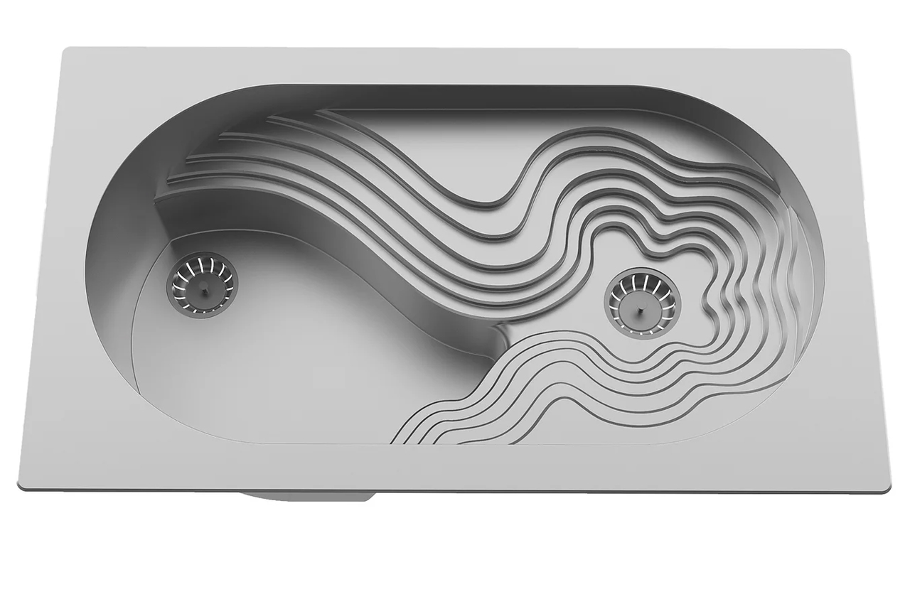
Moray is a statement kitchen sink built on a scheme of chamfers, angled surfaces, and curved edges designed for one-handed users like amputees, parents, and those with an injured upper limb to use as leverage when washing dishes.

Even those who claim to enjoy washing dishes put it off sometimes. And don’t hold your breath for the rest of us. While it can feel like a mindless chore for some of us–amputees, parents of young children, and people with injured upper limbs must consider their best approach when washing dishes because conventional sinks don’t cater to one-handed dishwashing techniques. Changing this, Natalia Baltazar, a Bay Area industrial design student developed a statement kitchen sink that’s designed to be universal.

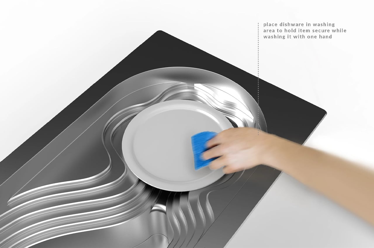
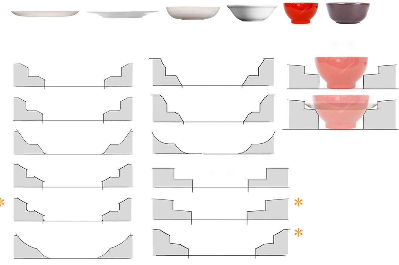
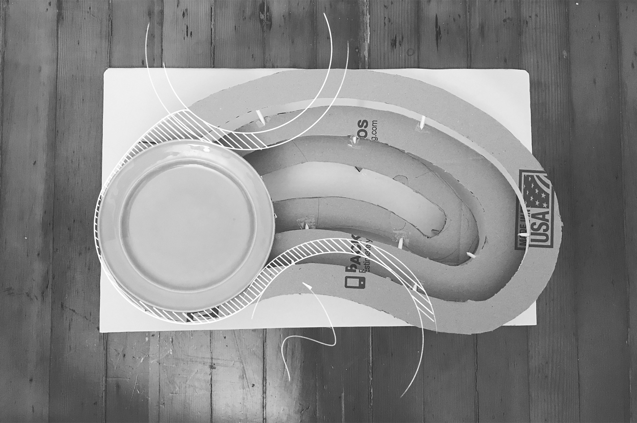
Providing leverage for one-handed users, Moray is built with an assortment of chamfers, angled surfaces, and curved edges that hold dishes in one place while they’re getting washed. In refining her universal kitchen sink, Baltazar identified the obstacles faced in the kitchen for one-handed dishwashers and sought to solve them with Moray. Following a series of indirect observation and ideation periods, Baltazar learned that it’s less so about introducing new tools and more about redesigning the sink from the basin up.

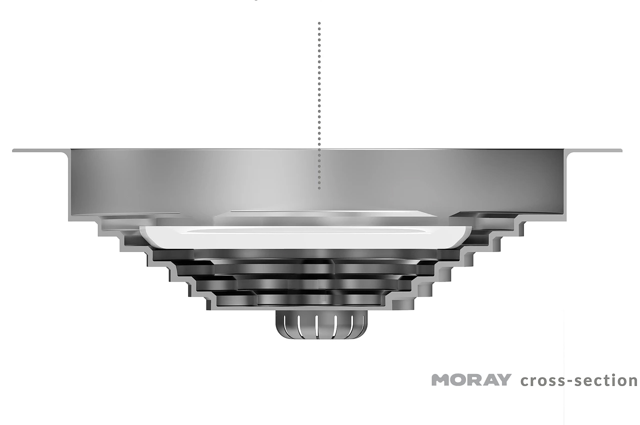
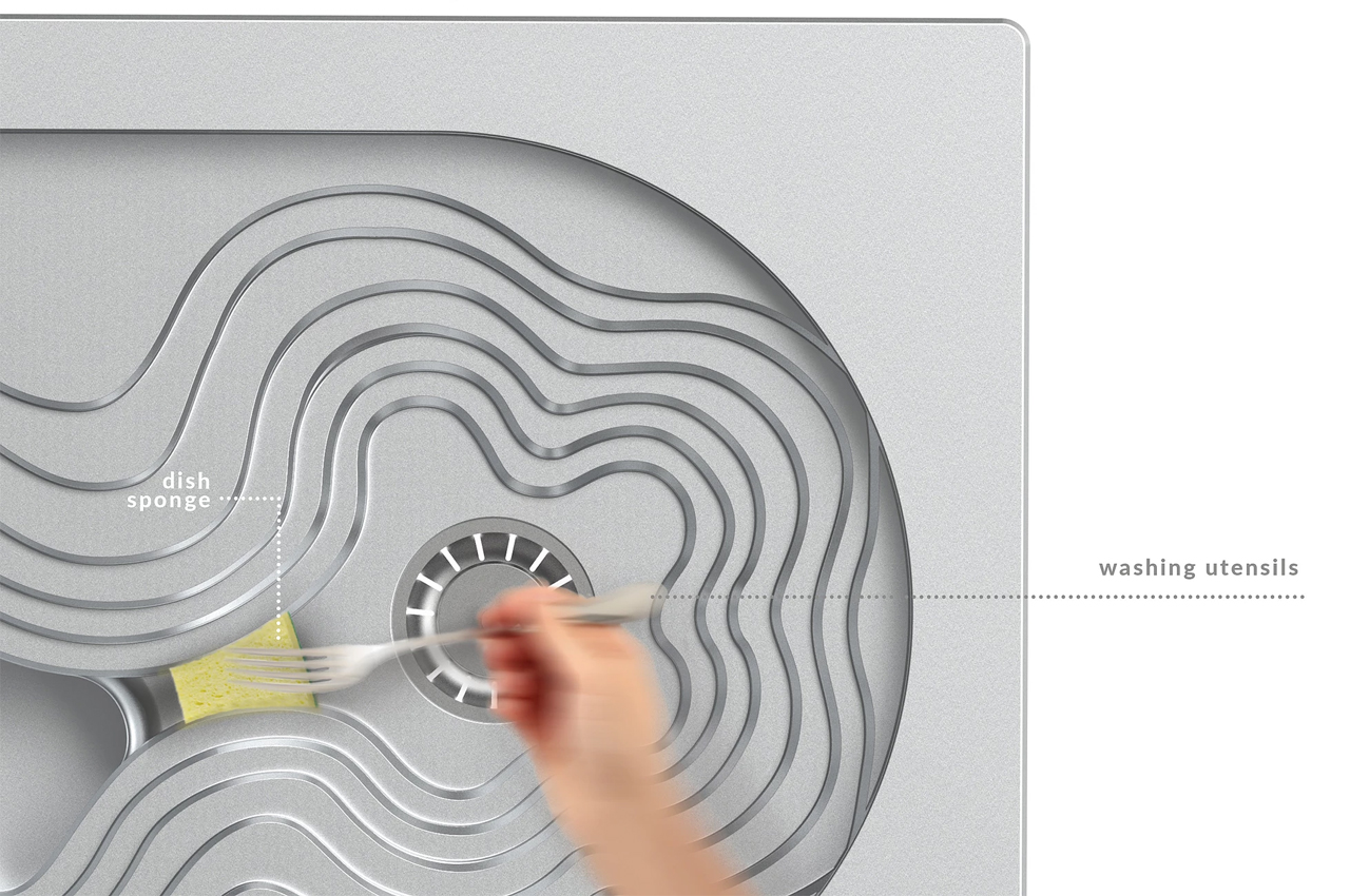
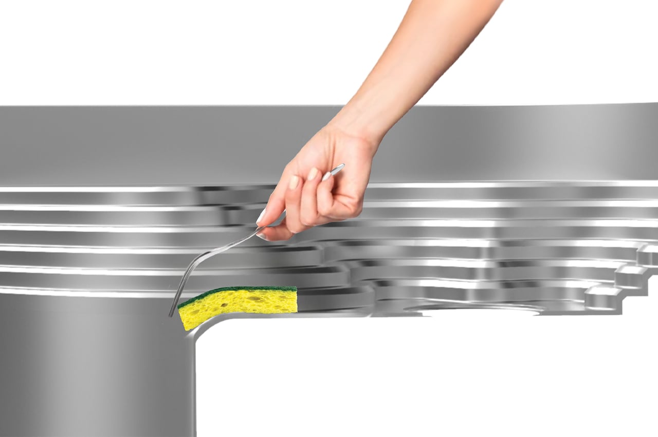
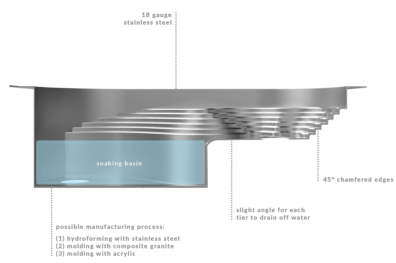
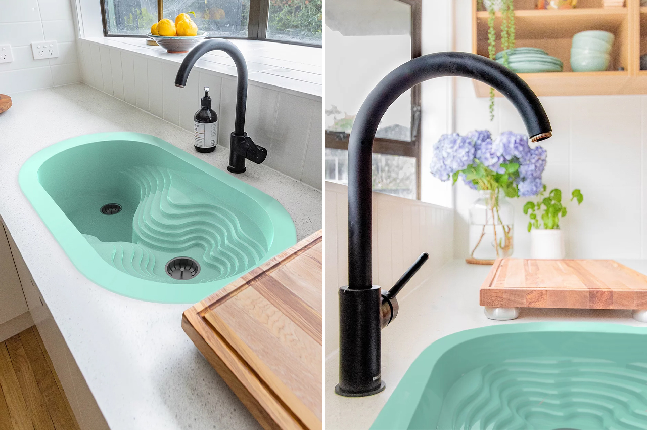
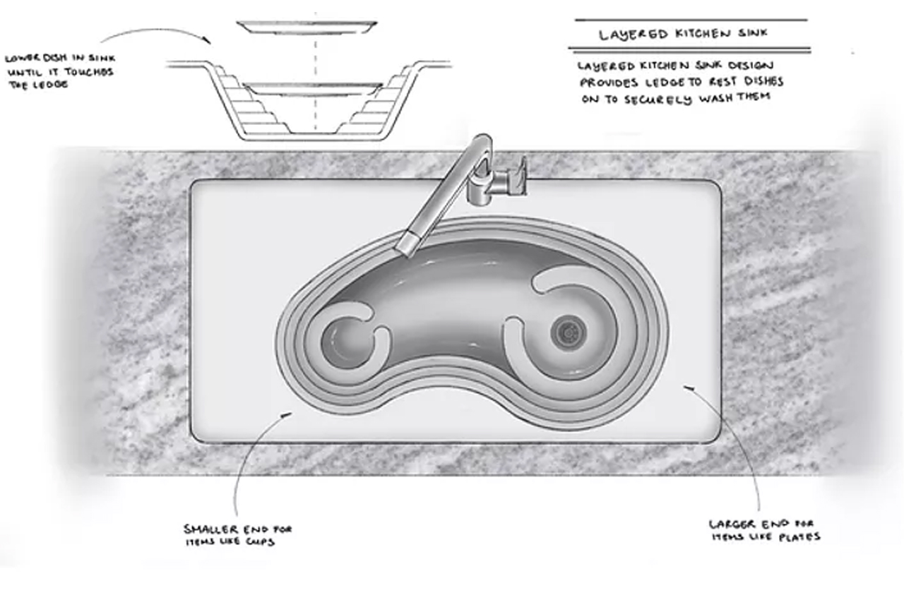
Inspired by the traditional dual-basin sink, Moray features a deep soaking basin where dishes can soak before getting scrubbed down with a sponge and soap. Inspired by terrace farming, undulating chamfers, ridges, and angled edges are located beside the water basin where dishwashers can position the plates to remain in place while scrubbing them down. Baltazar even thought of a cavity in the design scheme where dishwashers can wedge sponges to wash utensils.

The curvilinear design of the dish racks are points of leverage for dishwashers and completely drain of water thanks to their rounded edges. The only difference between Moray and the traditional sink is the appearance. Users can even install Moray the same way they’d install a conventional kitchen sink, with the option of an overmount or under-mount installation.

Designer: Natalia Baltazar x Smll Design

Baltazar incorporated narrow cavities where users can wedge sponges to clean utensils.

Users would have the choice of an overmount or under-mount installation for Moray. 

Inspired by the traditional kitchen sink, Moray has a sink basin and an area with chamfers for leverage.

After finalizing the functionality of Moray, Baltazar conceptualized it in different acrylic colors.

Users place dishes on the right side of Moray to hold them in place while they get washed.

Following an involved ideation and research period, Baltazar settled on a final form for Moray.

Deciding against the incorporation of new tools, Baltazar went ahead and redesigned the kitchen sink from the basin up.

The post This redesign of the kitchen sink was built on a scheme of chamfers and angled edges for one-handed users to use as leverage! first appeared on Yanko Design.
This zero waste kitchen has a built-in herb garden & composter – a super multifunctional kitchen design!

Did you know that 75 years ago, every kitchen was a zero-waste kitchen? Fun fact: in 1926, Austrian architect Margarete Schütte-Lihotzky’s kitchen had a wall of bins to store ingredients without any packaging at all! The concept of a zero-waste kitchen is not new and is certainly still in practice in many South Asian and East Asian countries that still use traditional storing and packaging methods. Obviously, our lives have changed and advanced tremendously over the last 75 years, so Ivana Steiner of Vienna is designing a zero-waste kitchen that fits our modern lifestyle and homes.

Steiner visited six zero-waste stores in Vienna for research and as an architect who has always loved working on kitchens, she took it upon herself to bring change through design. She wanted to dedicate her kitchen design to work around the current climate crisis while combating it. “Zero Waste does not hope that politics and business will tell you how and when you will implement your environmental measures and goals, but rather that each of us can actively contribute to climate protection through a resource-saving lifestyle. Zero waste not only includes avoiding waste but also how we deal with nutrition and cooking. If we concentrate on fewer, regional foods without packaging, we can actually implement changes in our immediate surroundings,” says Steiner.
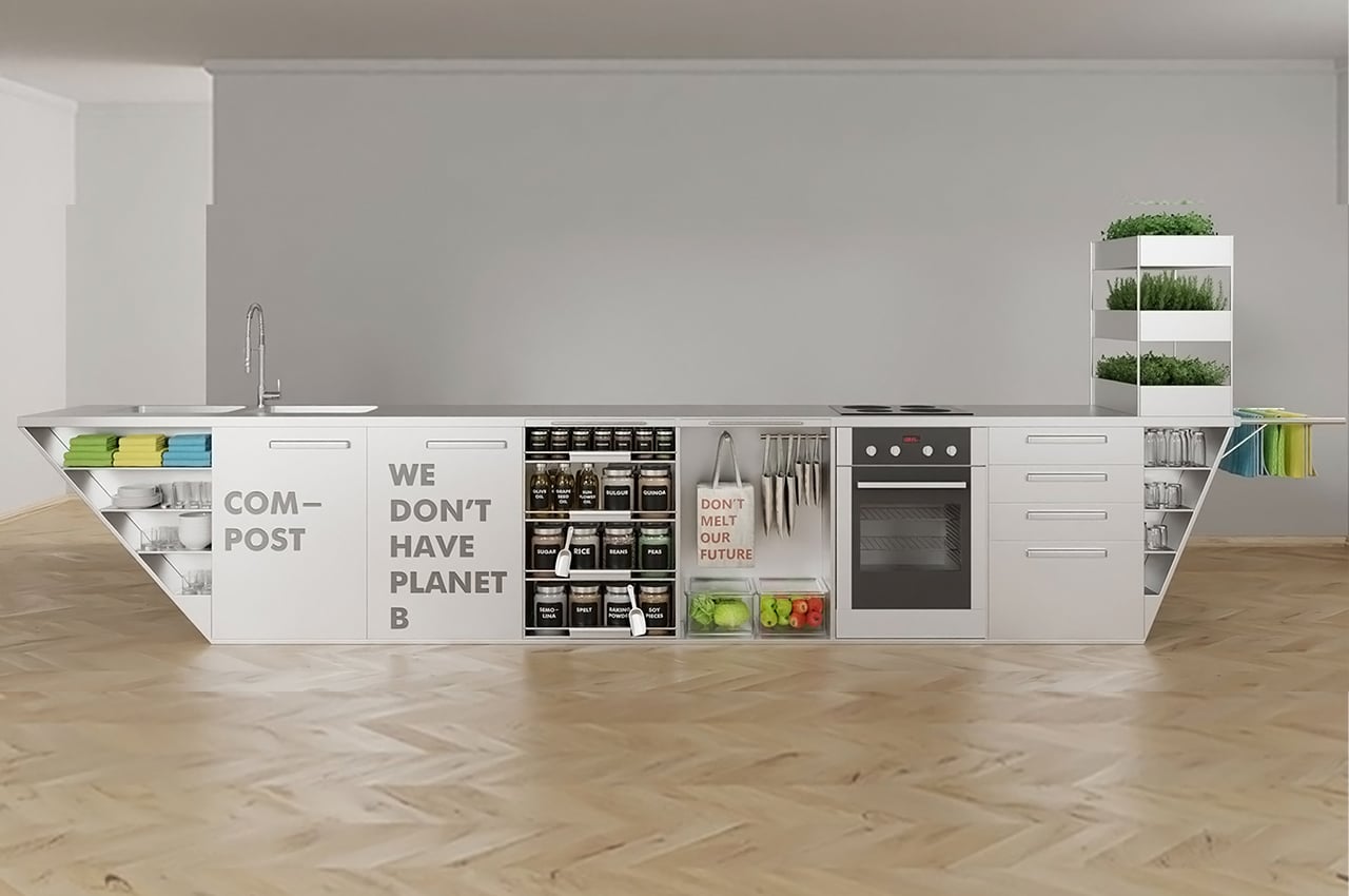
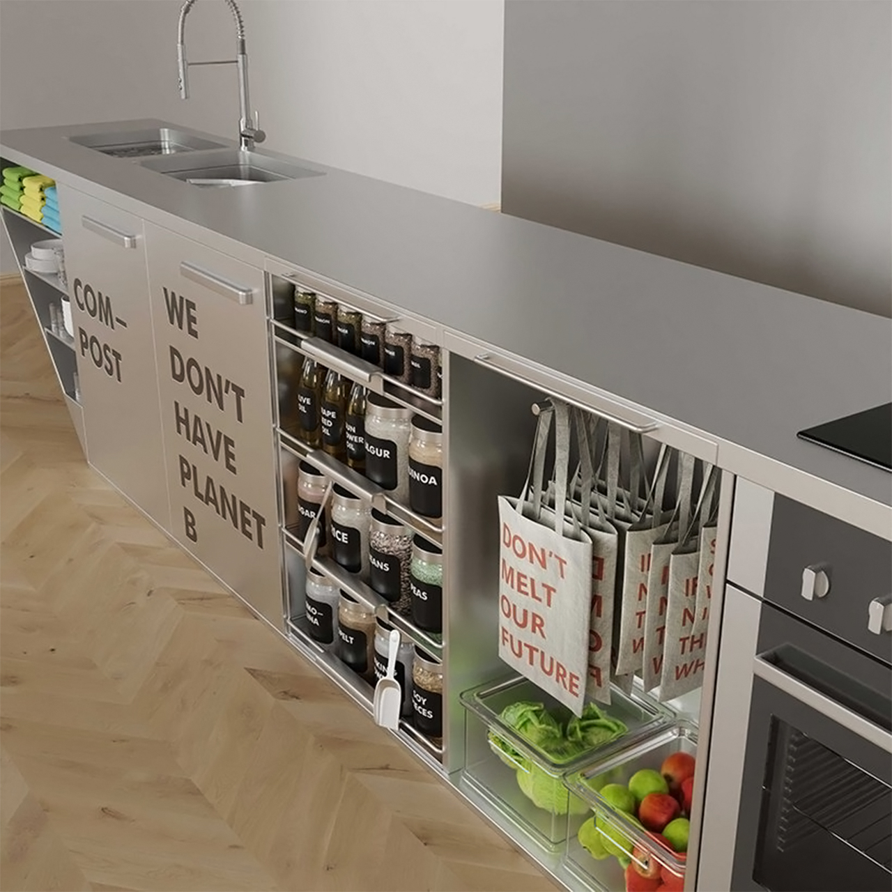
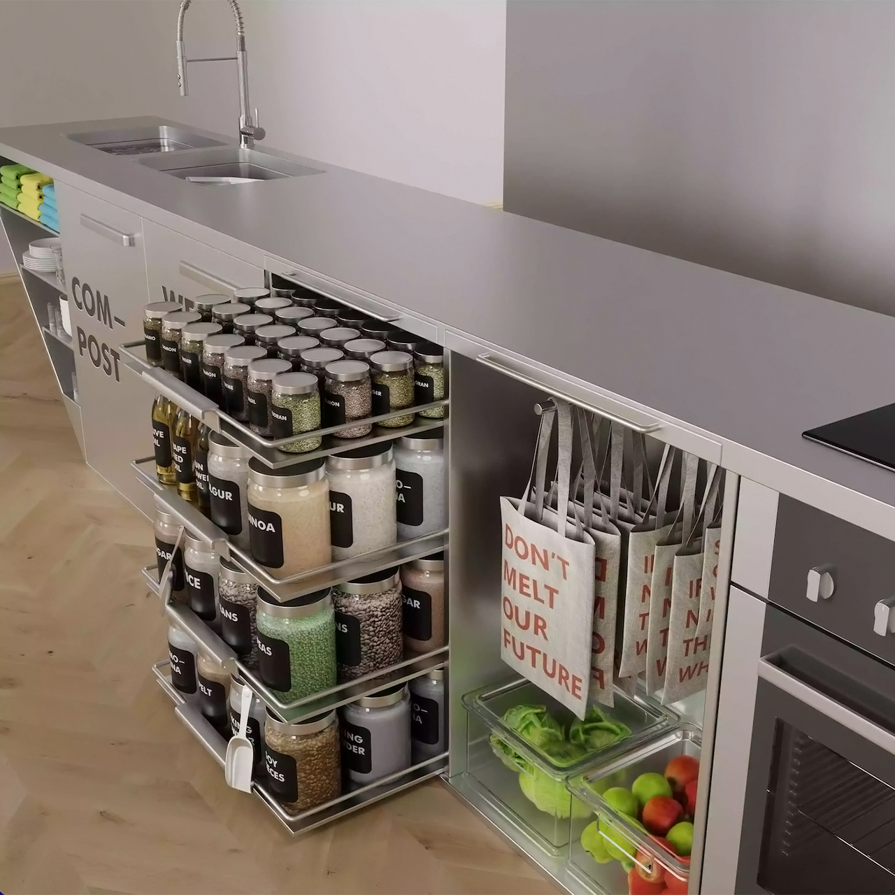
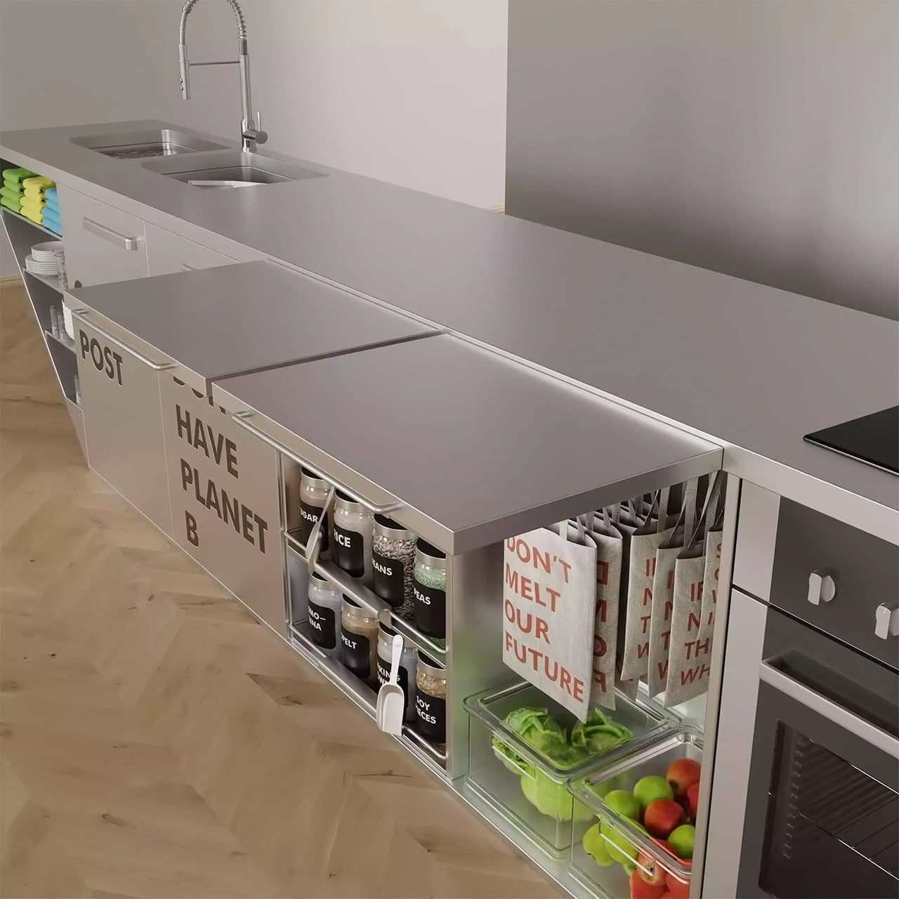
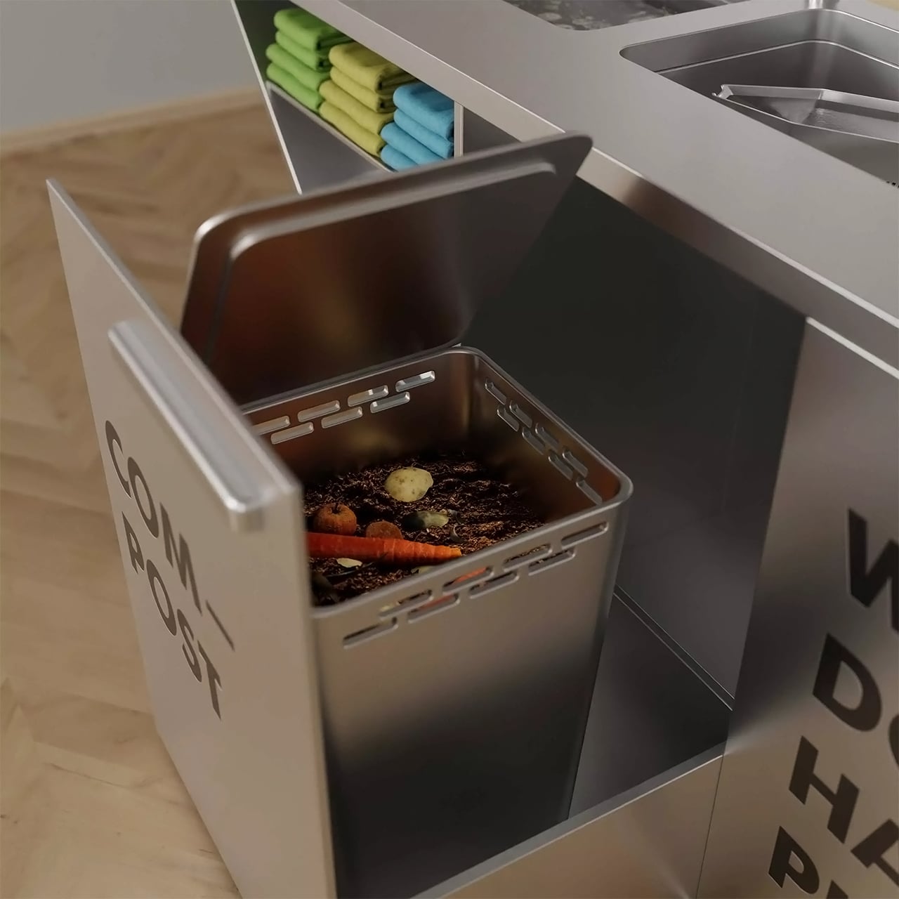
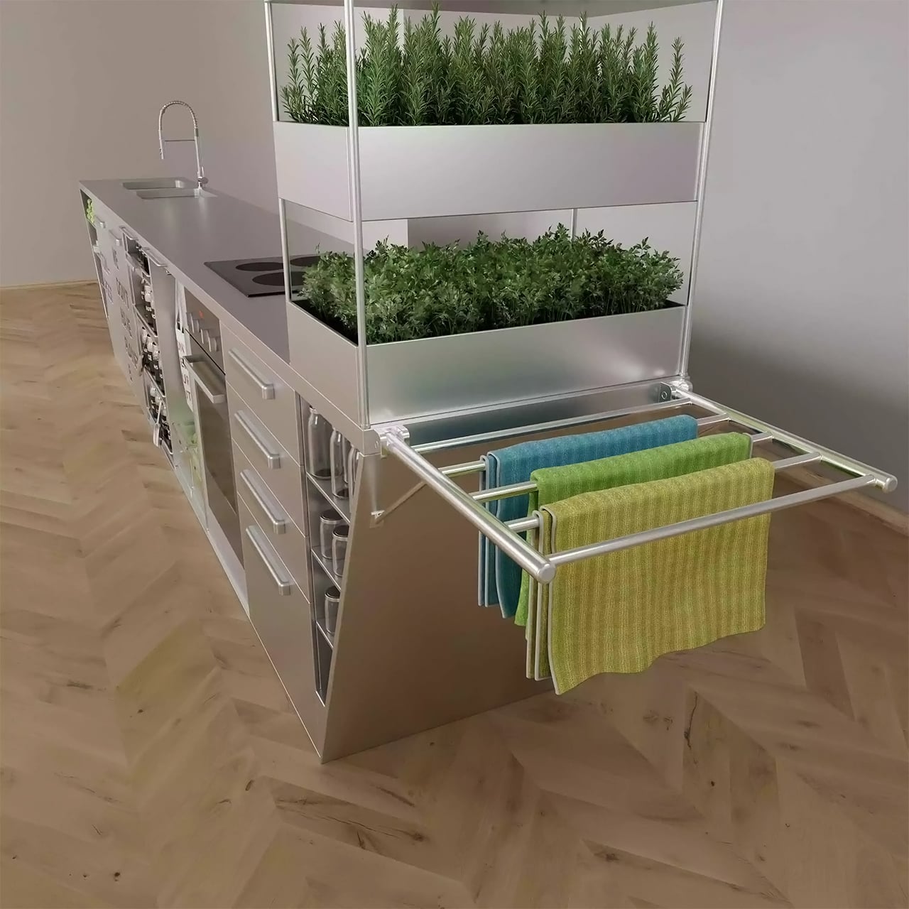
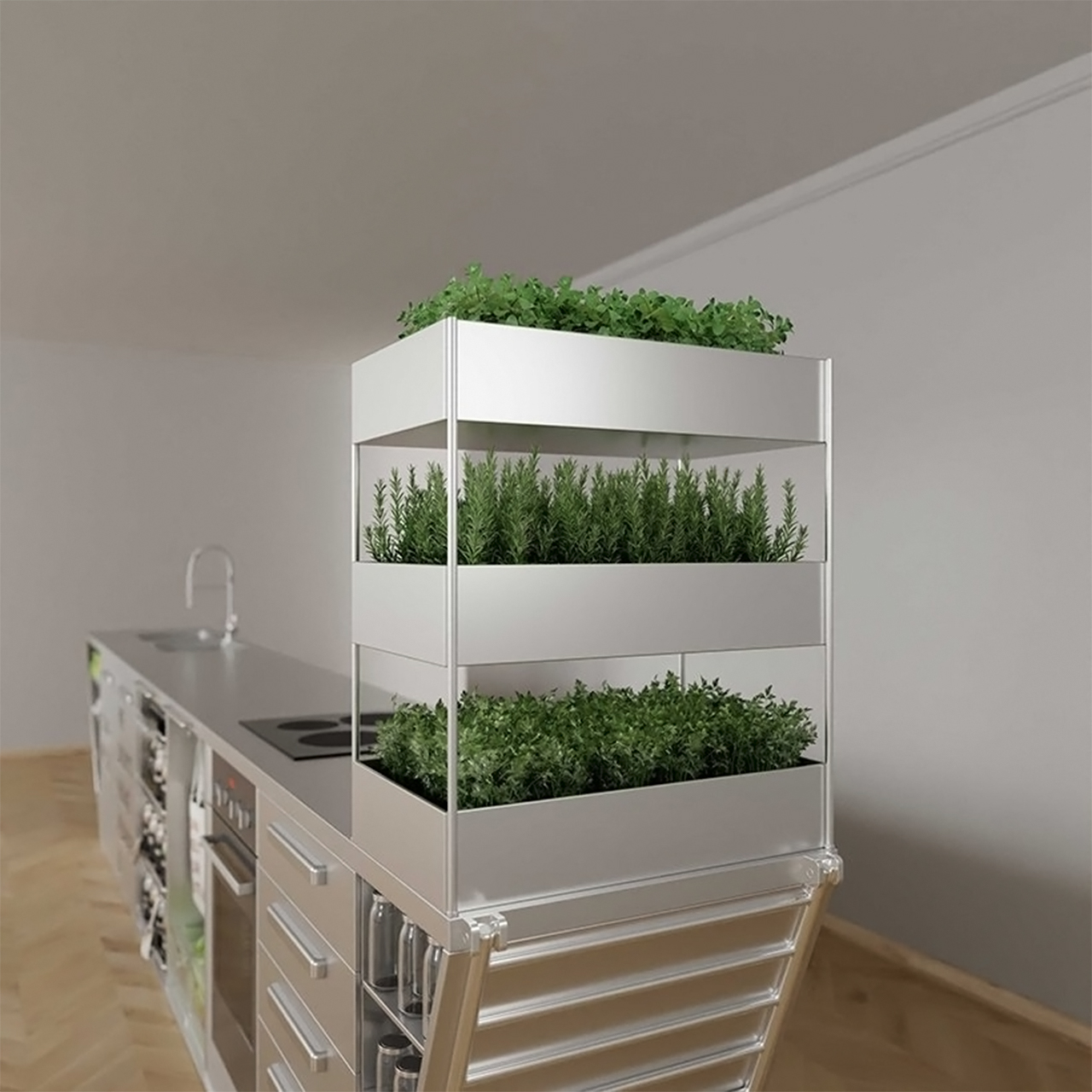
This zero-waste kitchen is built from recycled stainless steel made in electric arc furnaces and it lasts forever. The large table is the core of the design, it is meant to be used as a cooking and eating surface. The structure has designated areas for glass containers, baskets for fruit and vegetables, a worm box, storage space for multi-purpose vessels, linen bags, and a vertical herb garden – it is indeed a highly functional and multi-faceted design! The worm box regularly provides humus which can be used for the herb garden and if the kitchen is in a dark area of the house or if you live in a country with little sunlight then you might need a daylight lamp for your herb garden.
The built-in herb garden and worm composter together make the process very efficient even for those who are taking beginner steps into a sustainable lifestyle – this way, you’re set up for success because the maintenance is integrated into how the kitchen functions. This kitchen stores everything in jars to avoid producing waste in the form of bin liners. Jars are also easier to refill if you take them to your grocery store. This was a fairly calculated design decision as the buying trend moves towards more unpacked items, especially in urban areas where the food is stored and sold in glass containers to encourage reuse. Glass jars are also sealed tightly compared to bins making it a more sanitary option.
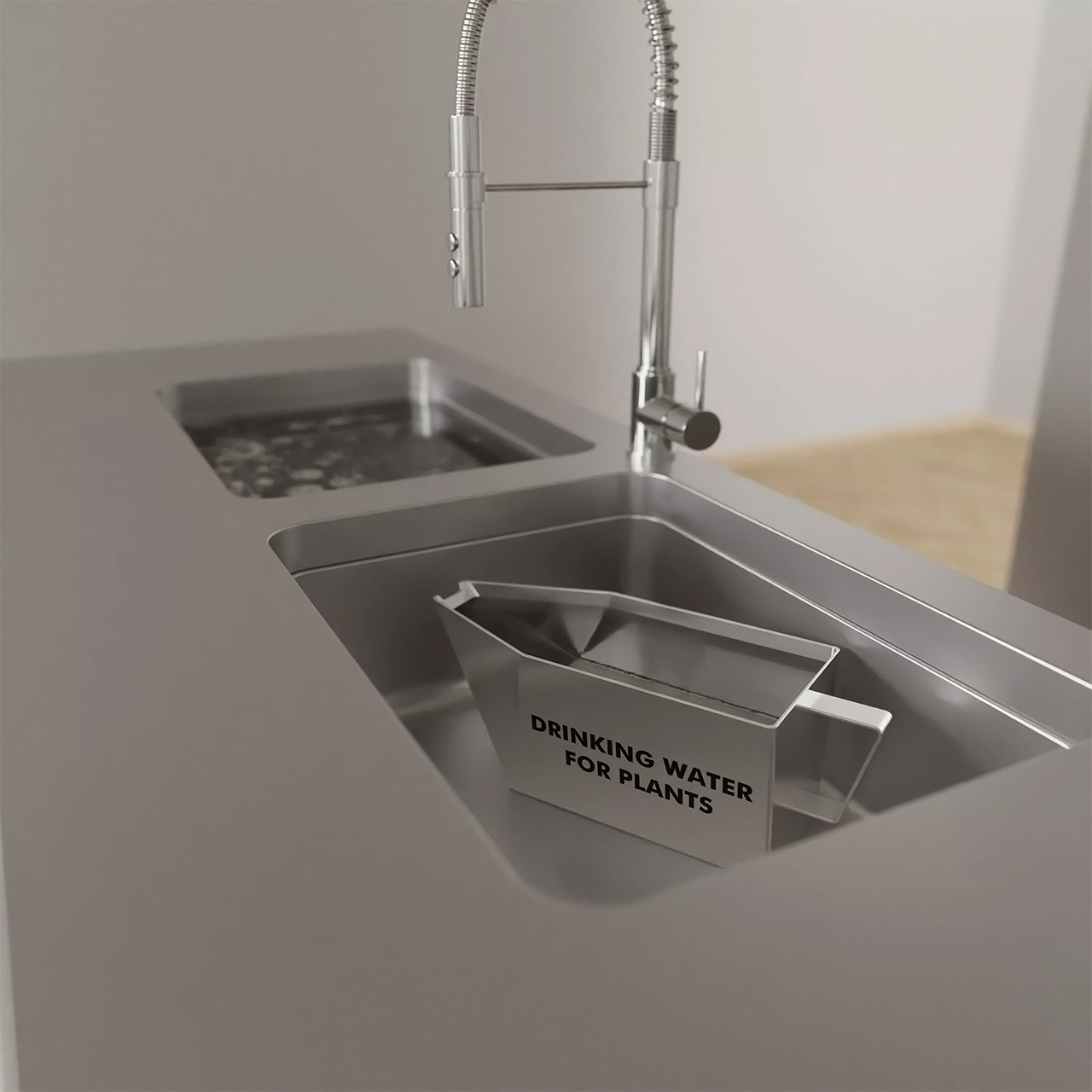
Since the design is based on a minimalist lifestyle, the kitchen deliberately does not include upper cupboards or extra storage. You only keep things that you use every day – a limited number of 12 deep plates, 12 flat plates and 12 small flat plates, 12 water glasses, and 8 wine glasses are used and stored comfortably in the zero-waste kitchen. There is no dishwasher but it does come with a double sink for all intents and purposes as well as a rack for dishtowels. However, studies have shown that dishwashers are actually more efficient and save resources!

The European-style kitchen has a lot of prep space in form of pullout panels, a small oven as well as a tiny fridge behind the Planet B typography. Zero Waste Kitchen is small, deliberate, and purposeful in every detail and encourages a life of fresh food without waste!

Designer: Ivana Steiner

This smart wok is the kitchen superhero sidekick that automates your work every time you cook!

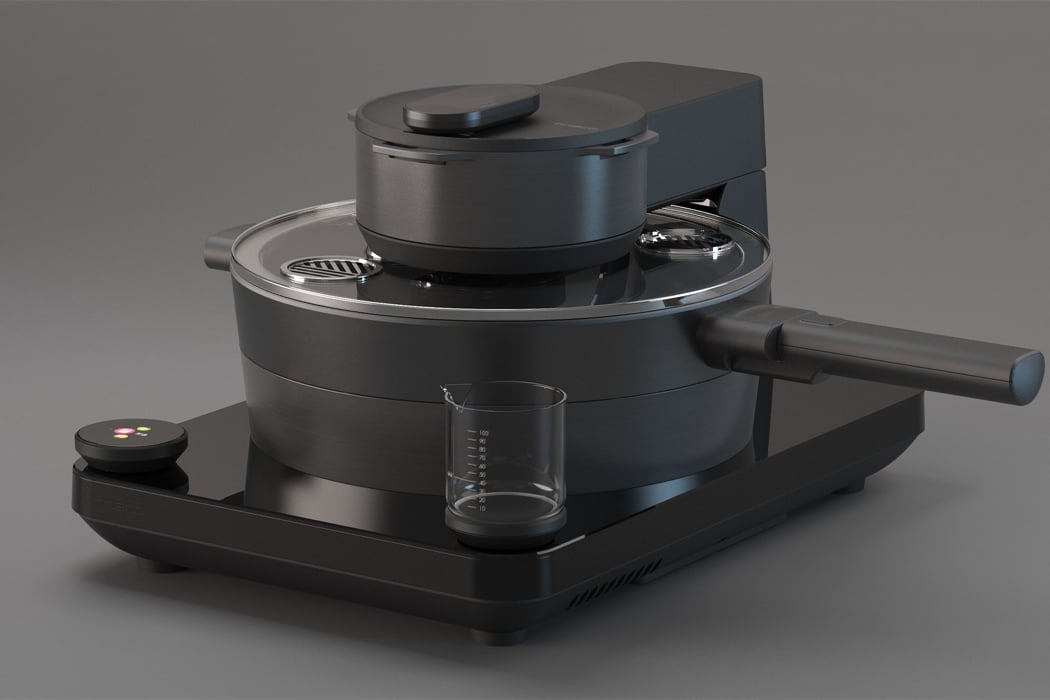
Quarantine has pushed a lot of us into the routine of cooking all of our own meals, which has been an easier dance to follow for some of us than others. If you enjoy cooking, then falling into the groove of routine meal prep might have been easy enough, but for those who don’t enjoy cooking, finding the inspiration, time, and space, might feel like a chore. Tineco, a smart home appliance company, has designed Food One, a smart wok for the kitchen that makes the process of cooking meals throughout the day a lot more efficient.

Food One was designed for young people living in cities who don’t have either the time or skill set for cooking multiple meals throughout the day. Beginning early 2020, the pandemic’s quarantine orders forced many of us out of restaurant booths and into our kitchens to cook our own meals. Fully integrated with smart technology, Food One operates as a classic smart assistant, with Bluetooth connectivity and app compatibility to connect to your smartphone or other smart devices. After connecting to Food One’s app, users can choose from a long list of available recipes suitable for cooking with the smart wok. Alternatively, those who enjoy cooking can upload their own recipes to Food One’s app for others to learn and follow.

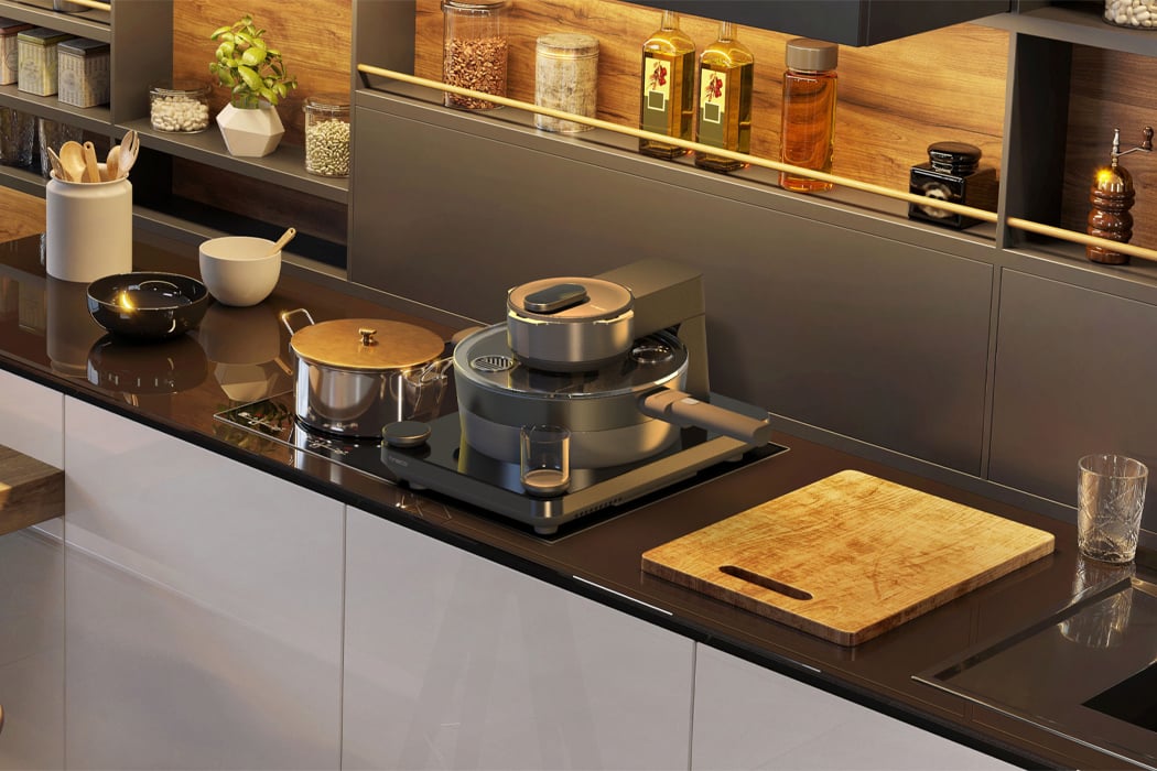
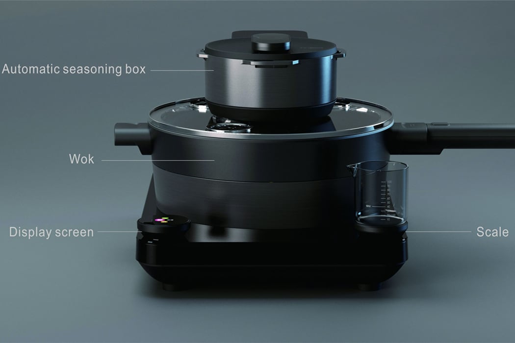
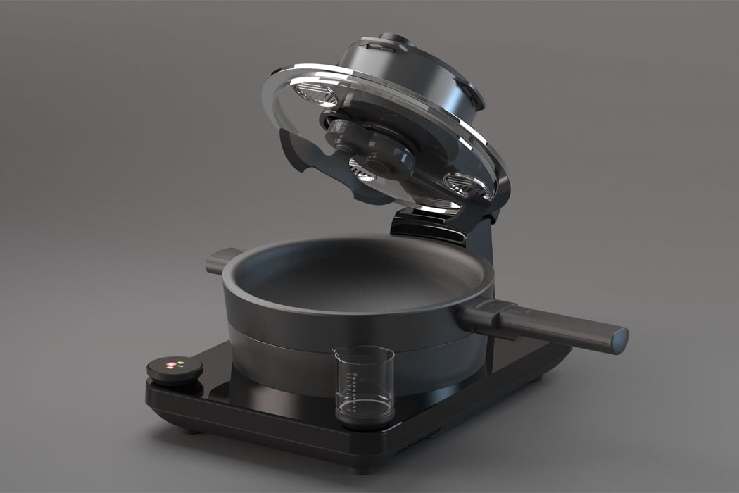
Each unit from Food One features a seasoning compartment above the wok dish where users can toss in the different spices a recipe calls for and let the wok finish the job. Joined together with an attached scale and digital display screen, Food One comes equipped with all the tools necessary for a meal at home that gives your go-to dish from your favorite restaurant a run for its money.

Designer: Tineco

Equipped with an attached scale, digital display screen, seasoning compartment, smart wok, Food One comes with all the tools needed for a meal at home.

Food One was designed for young people living in cities, so maintaining a relatively compact size was a top priority.

Users can activate Food One through its accompanying app that stores recipes and ideas for the kitchen.

This space-saving sink features a top-load dishwasher to create counter space in tiny kitchens!

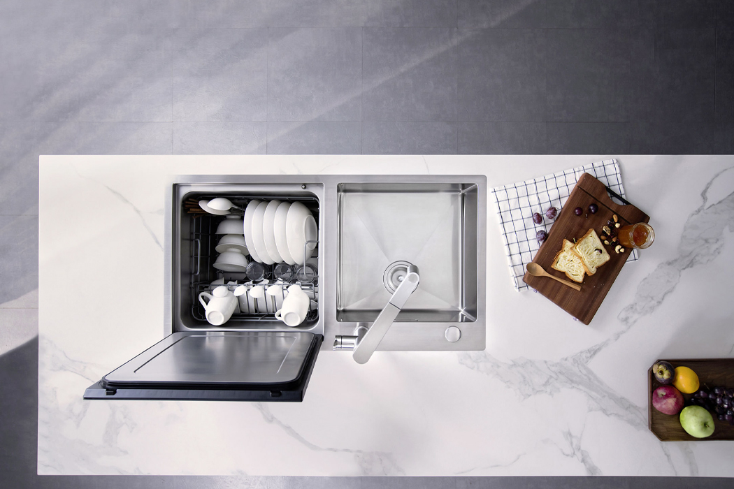
There are two types of people in the world: those who pretend to enjoy doing the dishes and those with dishwashers. If like me, you’re the former, then there’s probably a reason you don’t already have a dishwasher and it’s safe to say that reason most likely has something to do with limited space. Blanco, a design studio oriented around finding water-based solutions for sinks, has launched Vita Neo, their take on the kitchen sink that saves space with an accompanying top-load dishwasher.

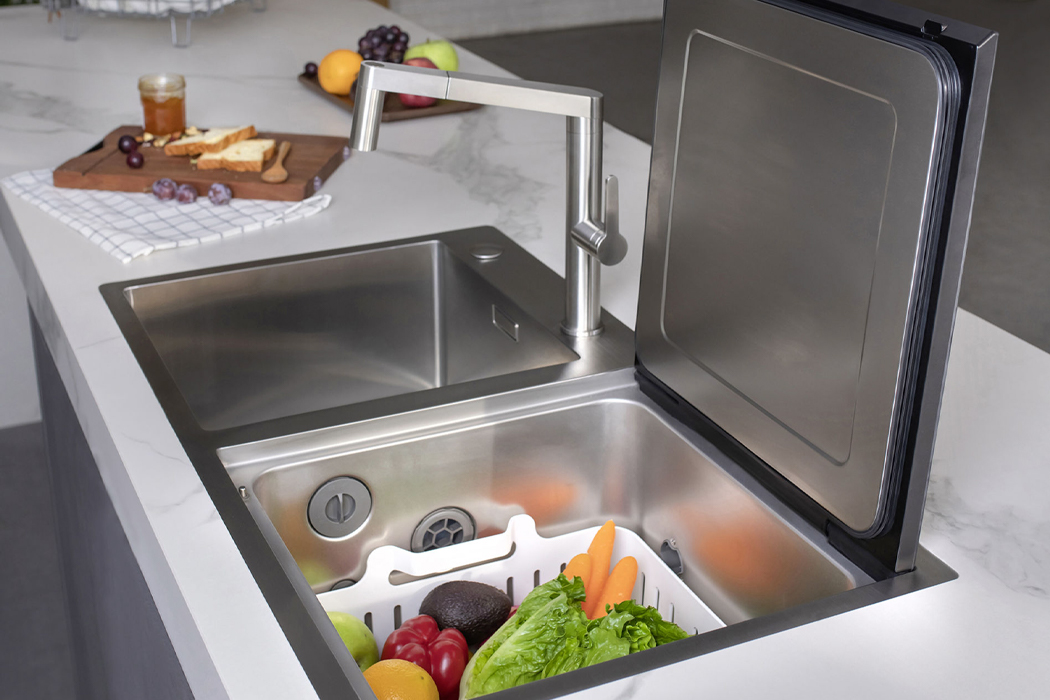
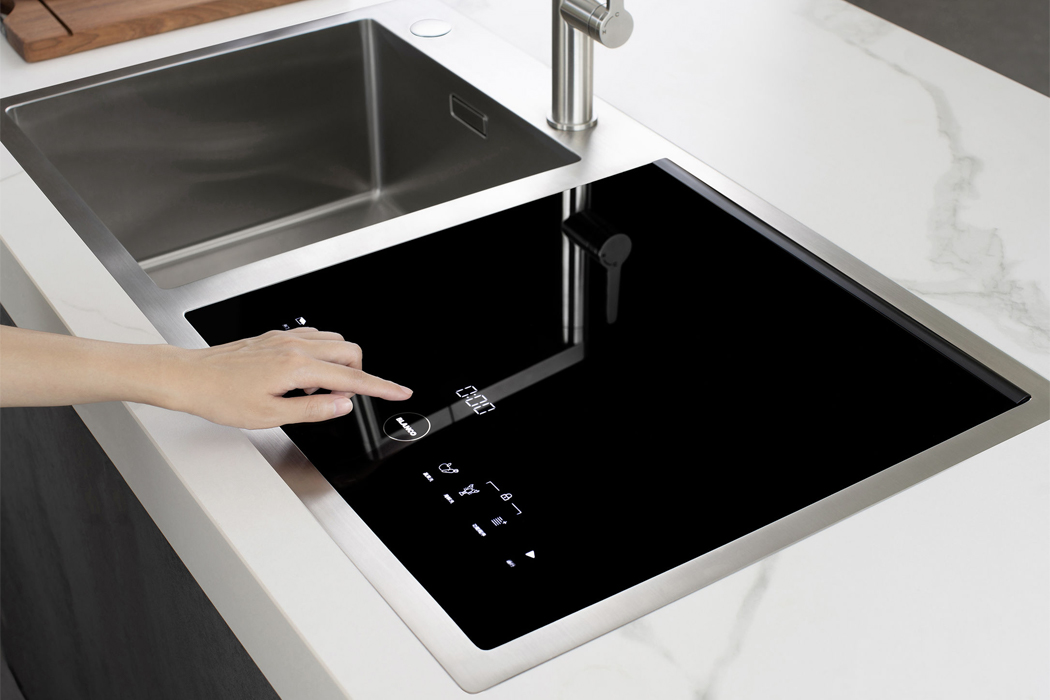
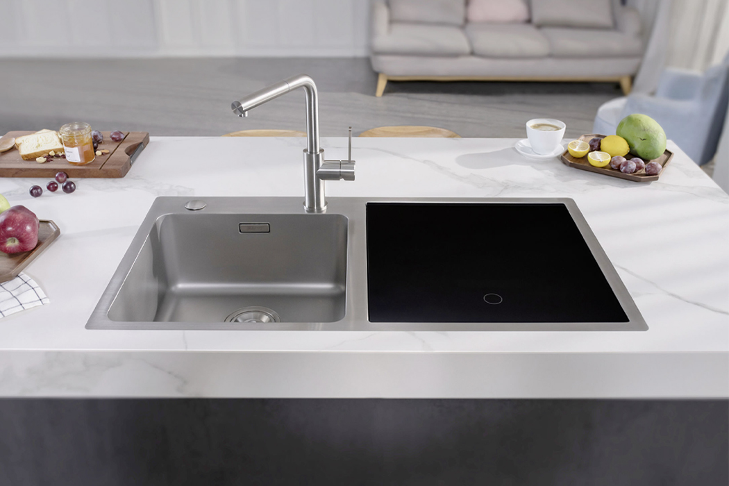
Vita Neo was designed and built to create space in the kitchen by merging the kitchen sink and dishwasher. The countertop sink features a stainless steel finish that mimics the jet-black, reflective nature of classic induction stovetops. When inactive, Vita Neo’s surface is continuous and discreet, creating more counter space when cooking or preparing the kitchen. Whenever users choose to activate the dishwasher, a sensor-operated LED display screen brightens up to reveal the different functions of Vita Neo, including vegetable and crustacean-washing along with dishwashing. Built with what appears as a soft-close lid, Vita Neo enacts the use of embedded swing hinges and cushioned, suctioned lining to open and close.

Unless you’re looking at compact, portable dishwashers, built-in dishwashers often require a substantial amount of space in the kitchen. Thinking of even the smallest of details, Blanco reduced the size of a typical dishwasher and merged it with a faucet and sink that fits on most kitchen countertops. Co-developed with German engineers and backed by over 90 years of experience in kitchen-based solutions, Blanco designed Vita Neo for today’s minimal, yet versatile kitchen.

Designer: Blanco

An LED display screen brightens up to reveal the dishwasher’s menu against its reflective, jet-black finish.

Amounting to the size of a large kitchen sink, Vita Neo is two-in-one: a kitchen sink and dishwasher.

When inactive, Vita Neo assumes an idle screen to create more kitchen counter space.