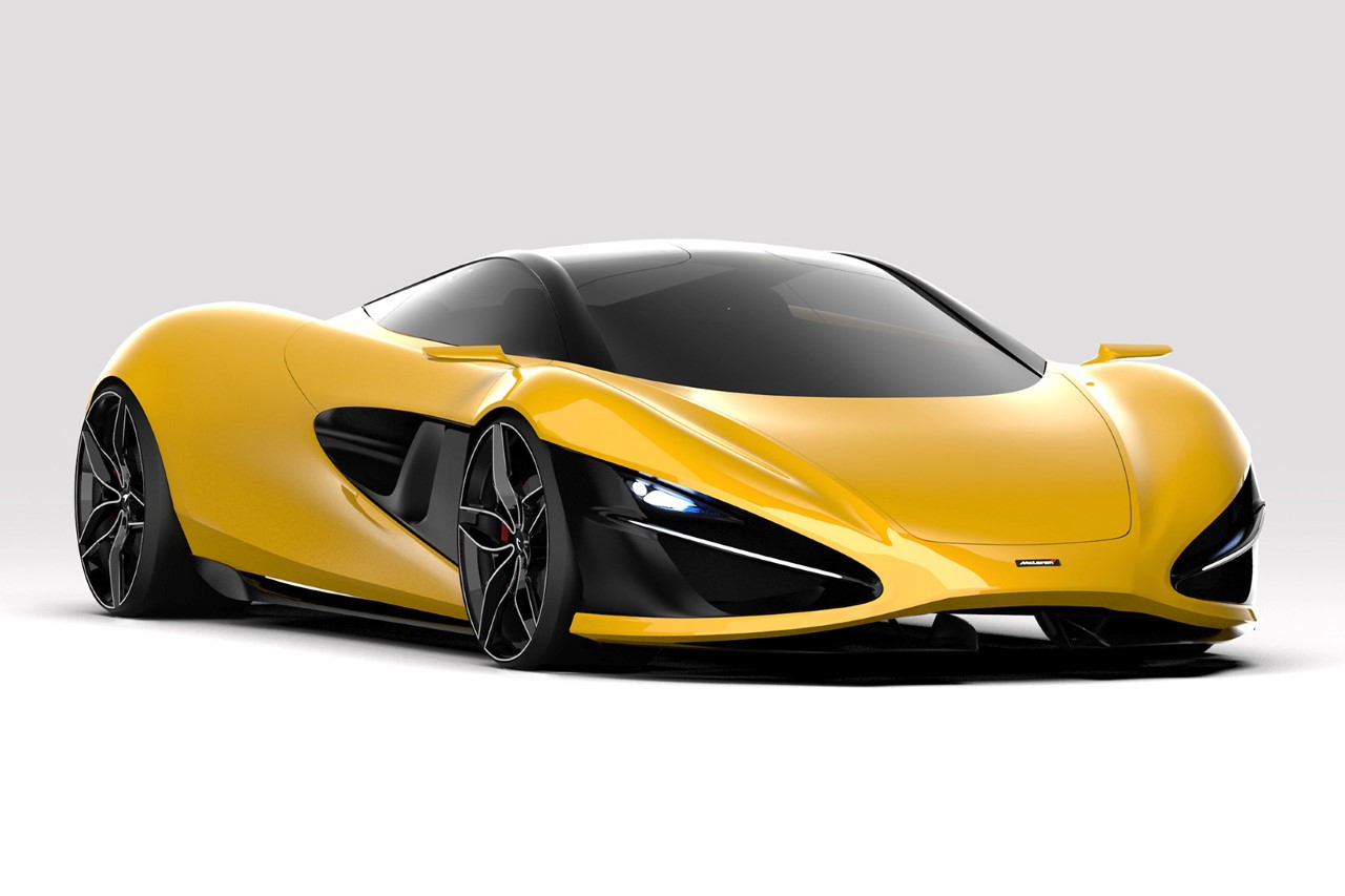
If done correctly, designers can create a very powerful tie between their products and their brand in a way that makes them instantly recognizable even to the average Joe. The Cybertruck is unapologetically linked to Tesla, the Blue and Black paint job along with the horseshoe radiator is unmistakably Bugatti, and back in the earlier days, if a car had an aggressive aesthetic with a vibrant citrus yellow/green/orange paint job, it was almost always a Lamborghini. The Meliora Concept aims at establishing that same connection with the McLaren brand. Envisioned by India-based automotive designer Krishnakanta Saikhom, the Meliora encapsulates McLaren’s signature style in a car that’s simple yet has a strong character… and looks like a McLaren from a mile away.
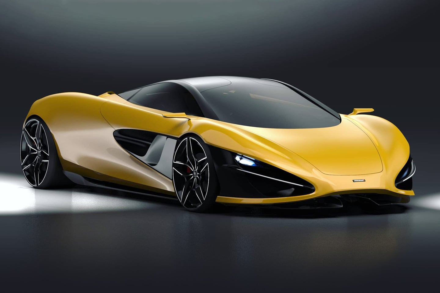
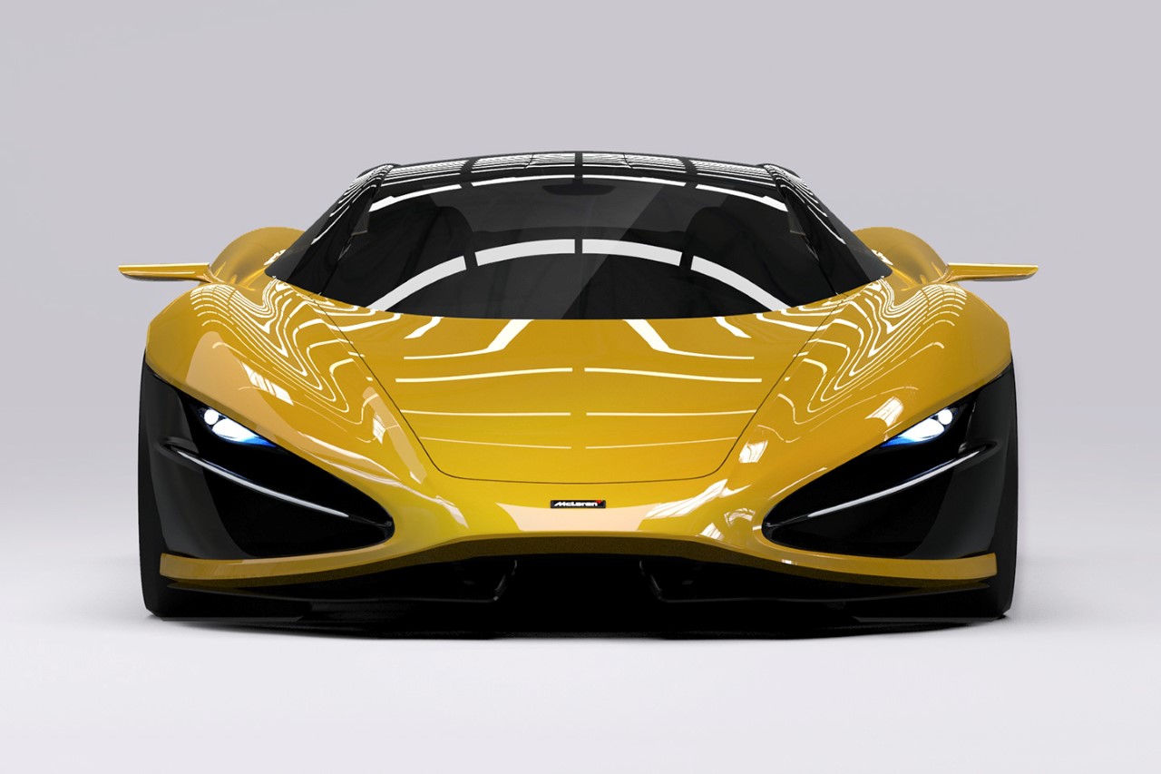
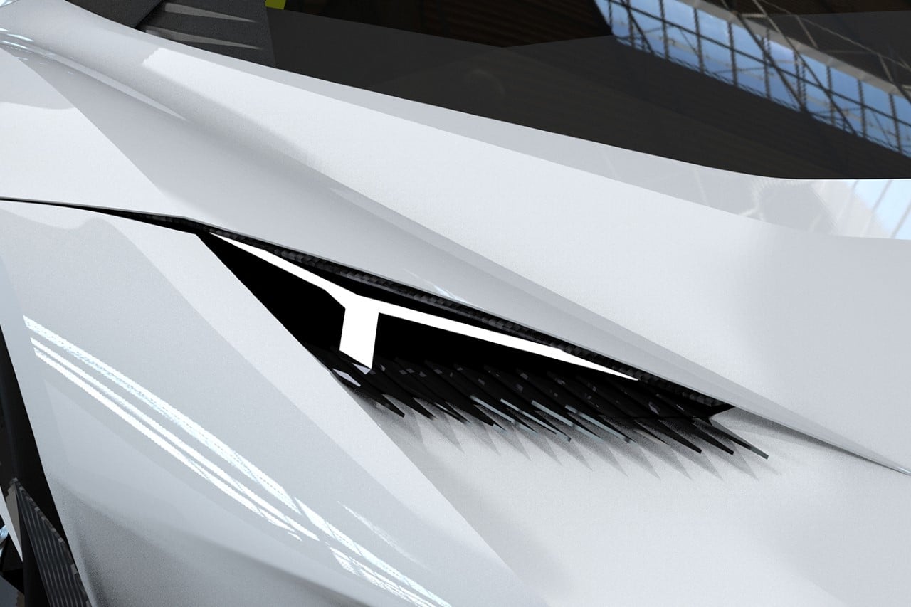
The icon of the Meliora’s design is the ellipse element located around its headlights. Inspired by the color and surface-split details often seen with McLaren’s cars around their headlights (especially the 720S), the Meliora doubles down on the detail, creating a car with a captivating pair of eyes that just lock your gaze the moment you look at them. The ellipse doesn’t end on the front… instead, it continues well into the sides of the car, cutting through the tires and becoming a pair of vents located on each side. To ensure that this black detail stands out, Saikhom gave the Meliora a yellow paint-job, creating that perfect contrast required for the car to absolutely pop.
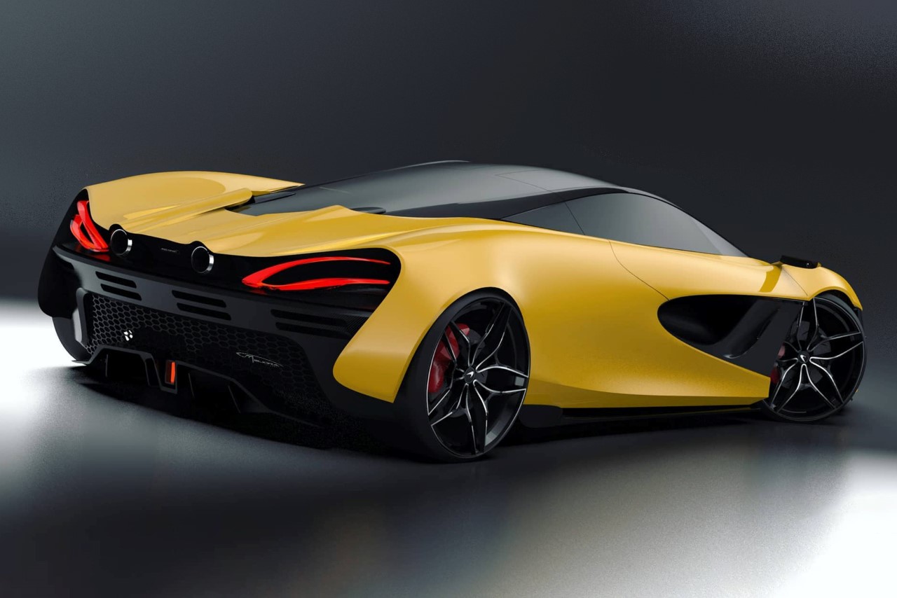
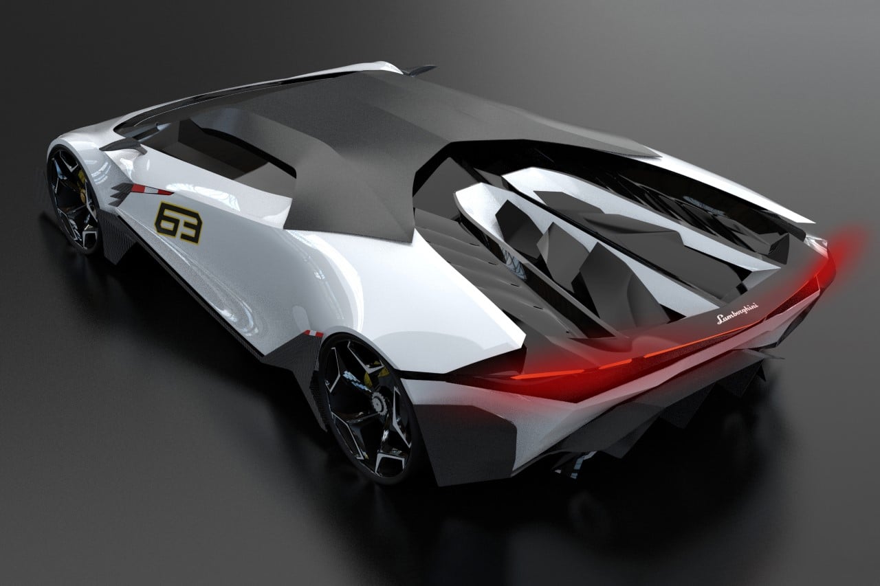
The rear feels distinctly McLaren-inspired too, with its taillights that remind me of the 570S, and the two exhausts between them that are classically seen on the Artura and the 720S. All in all, the rest of the surfacing on the Meliora is rather simple, focusing on pristine elegance instead of exaggerated self-assertion. Just as its name suggests (Meliora is Latin for ‘the pursuit of better’), Saikhom’s Meliora concept focuses on succinctly and effectively communicating the McLaren brand in as little detail as possible.
Designer: Krishnakanta Saikhom
