Pixel 9a leaked renders look pretty barren without the distinctive camera bar

With the Pixel 6 in 2021, Google embarked on a new design language and visual identity for its smartphones. Like it or not, and some definitely didn’t, the camera “visor” has become an identifying mark of the Pixel phones since then, something that no other brand dared to even try. It underwent a few refinements until it was finally replaced by the camera “bar” in this year’s Pixel 9. Some loved it, some despised it, and some even wanted to have the old visor back. It seems that Google isn’t done playing around with the design just yet if these early unofficial renders for next year’s “mid-release” Pixel phone. And if the Pixel 9a is any indicator of the direction that Google will take in the future, it’s bound to split camps yet again.

Designer: Google (via AndroidHeadlines and OnLeaks)

It’s not that hard to understand how divisive the Pixel camera design is. On the one hand, it is big, visible, and distracting, but on the other hand, it is executed elegantly, balances the phone on your desk, and gives your index finger something to rest on when holding the phone. What both camps will probably agree is that the camera visor or bar is an identifying mark of the Pixel phone, and it’s something the Pixel 9a might lack.

Based on the first CAD renders made from leaked information, the next mid-range Pixel phone will ditch the camera bar for a flatter design. Curiously, the cameras aren’t placed closer to the upper left corner of the phone’s back even without the bump, and it seems to be in the exact same position if it did have that bar. It’s almost as if Google just did a magic trick like pulling out the tablecloth from under the cameras, leaving them in the exact same place. At the same time, however, the camera island isn’t completely flush with the rest of the phone’s back as it has a raised lip around the oval, perhaps for protection. Whether it will make the wobble is something that can only be tested with an actual unit.

Other than that, the rest of the Pixel 9a’s design is pretty similar to the Pixel 9, down to having only two cameras on its back. The exact dimensions of the upcoming phone remain undisclosed, so we don’t know yet how bigger or smaller it is compared to the Pixel 9. The bezels around the display, however, do look a little thicker, giving it a less premium appearance overall.

The Pixel “a” series often carries the design from the same generation, so it would be surprising to see this big a change for the phone. It could also be Google’s strategy to further differentiate the Pixel 9a from the Pixel 9, giving it an aesthetic that definitely looks more “mid-range” than the flagship models. You can still see signs of the Pixel DNA if you look hard enough, but other than the position and orientation of the cameras, it’s almost too easy to pass the Pixel 9a over for some more visually interesting mid-tier phones.

The post Pixel 9a leaked renders look pretty barren without the distinctive camera bar first appeared on Yanko Design.
Google Pixel 9 Pro XL Leaked Hands-on: A First Look at Its Stunning New Design and Features

The Google Pixel 9 Pro XL is generating buzz even before its official release. Thanks to a lucky break, a YouTuber on Andro-News.com managed to get their hands on one early. While we might wonder how they pulled it off, the real excitement comes from seeing the device in action. My initial impression? The design is quite impressive.

Designer: Google

The Pixel 9 Pro XL marks a significant shift for Google in aesthetics. The flat edges, reminiscent of the iPhone, give it a sleek, modern look that sets it apart from previous models with rounded edges. This change makes the phone look more streamlined and sophisticated. The polished metal frame feels premium, although it might be prone to scratches like the iPhone 13 Pro Max. The back of the phone is made of Gorilla Glass Victus 2 with a matte finish, combining durability with a refined appearance. The phone is also IP68 certified, protecting against dust and water.

Another highlight is the 6.8-inch LTPO display on the Pixel 9 Pro XL. With a resolution of 1344×2992 pixels and a 120 Hz refresh rate, the screen offers vibrant colors and excellent contrast, perfect for watching videos and browsing photos. The flat screen, a departure from the 2.5D curved edges of earlier models, enhances the device’s sleek and modern look. HDR10+ support ensures that the visual experience is top-notch.

One of the Pixel 9 Pro XL’s most talked-about features is its camera system. The camera bump houses three lenses: a 50 MP wide-angle, a 48 MP ultra-wide with autofocus, and a 48 MP periscope telephoto with 5x optical zoom and optical image stabilization. Additional elements like a temperature sensor, flash, extra microphone, and a white balance sensor enhance its photographic capabilities. The front camera has been significantly upgraded to a 42 MP sensor, promising sharper selfies and video calls.

Under the hood, the Pixel 9 Pro XL runs on Google’s Tensor G4 chip, offering a 15% performance boost over the previous generation and emphasizing energy efficiency. While it might not compete directly with the latest Snapdragon chips in sheer power, the Tensor G4 ensures smooth performance for everyday tasks. The battery is confirmed to be 5,050 mAh, improving efficiency for more prolonged use between charges.

The Pixel 9 Pro XL ships with Android 15 and will receive updates for seven years, ensuring long-term support and security. AI features like the Pixel Screenshot function use artificial intelligence to provide contextual information based on user screenshots. Additionally, the device includes a one-year subscription to Gemini Advanced, offering advanced language models, cloud storage, and document analysis tools.

The Pixel 9 Pro XL holds up well compared to the iPhone 15 Pro Max and Galaxy S24 Ultra. It offers a comfortable grip with dimensions similar to the iPhone 15 Pro Max but is slightly taller. The flat edges might appeal to users who prefer a less sharp-edged device compared to the Galaxy S24 Ultra. The new color options — black, gray, pink, and porcelain — offer more personalized choices.

Overall, the Google Pixel 9 Pro XL impresses with its sleek design, solid performance, and innovative AI features. While it might not lead in raw processing power, its focus on energy efficiency, excellent cameras, and long-term software support make it a compelling choice in the flagship smartphone market. The various memory options and colors offer a premium experience that caters to a wide range of users.

The post Google Pixel 9 Pro XL Leaked Hands-on: A First Look at Its Stunning New Design and Features first appeared on Yanko Design.
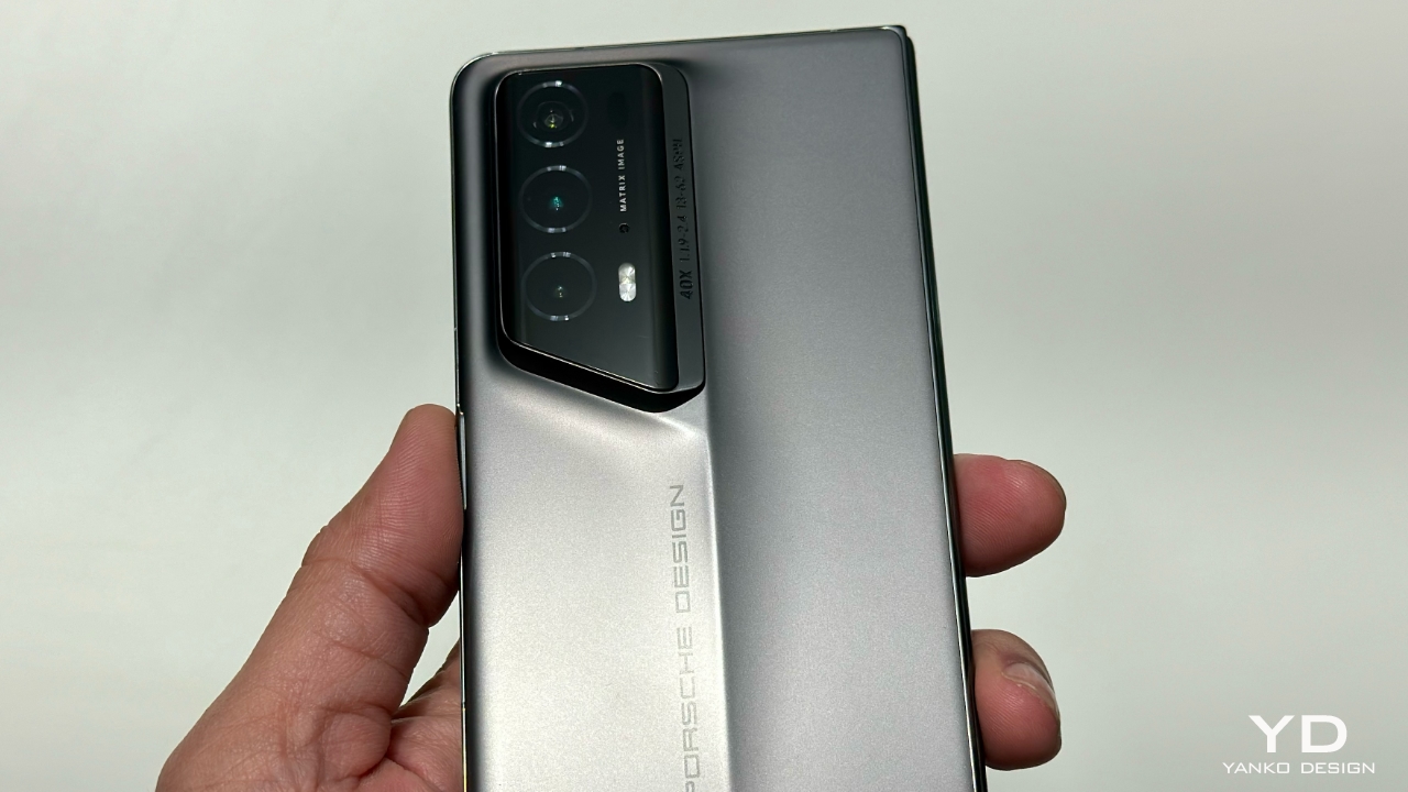
Honor Magic V3 Leaked and Rumored to Have a Crazy Thin Foldable at 6mm with Advanced Features Set to Impress

Honor has been a significant player in the smartphone world, particularly with its foldable devices. The Honor Magic V2 set a high standard with its sleek design and impressive features. Now, with the Magic V3 on the horizon, Honor is set to push the envelope even further. Let’s take a closer look at what made the Magic V2 special, including the Porsche Edition, and what we can expect from the upcoming Magic V3.

Designer: HONOR

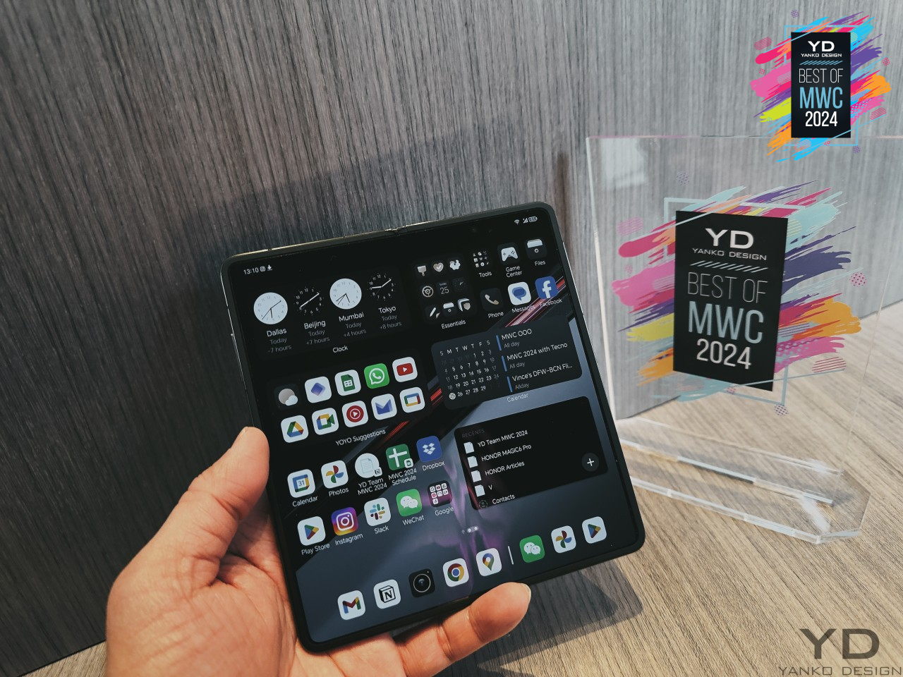
The Honor Magic V2 quickly became a favorite among tech enthusiasts when it launched. At just 9.90 mm thick, it was one of the slimmest foldable phones available. This was no small feat, considering it still packed all the high-end features you’d expect from a flagship device. The design of the Magic V2 blended style with practicality seamlessly. The hinge mechanism was designed to be both smooth and durable. The use of lightweight materials made the phone easy to handle without feeling flimsy. The Porsche Edition of the Magic V2 added an extra layer of sophistication. With premium materials and a unique design, it offered something special for those who appreciate finer details.

Honor Magic V2 Porsche Edition

The Magic V2 featured a bright and vivid display that made everything look great, whether you were browsing, watching videos, or playing games. Performance was top-notch too, thanks to its powerful internals that handled everything smoothly, from multitasking to demanding apps. Battery life on the Magic V2 was impressive, lasting through a full day of use without any issues. When it did need a charge, the 66W wired charging ensured it powered up quickly, minimizing downtime. The camera setup on the Magic V2 was another highlight. The 50 MP “eagle eye camera” captured detailed and vibrant photos, making it a reliable companion for photography enthusiasts.

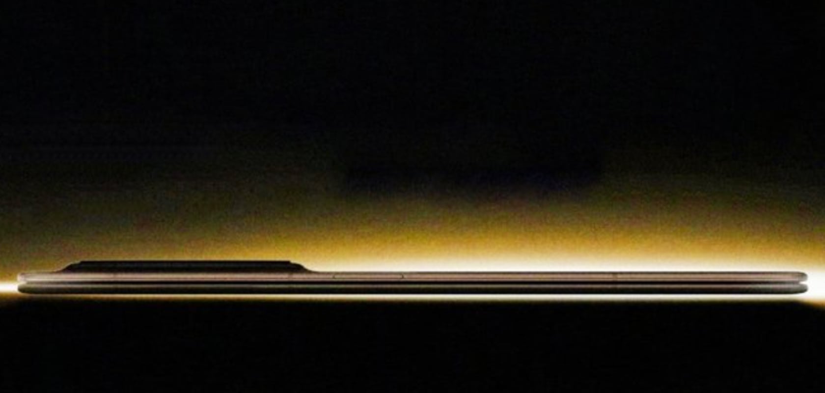
While Honor has been tight-lipped about the specifics, leaks and rumors have given us a good idea of what to expect from the Magic V3. The upcoming device is rumored to be even thinner than the Magic V2, potentially around 6.xx mm. This would make it one of the slimmest foldable phones on the market, continuing Honor’s tradition of pushing design boundaries. The Magic V3 is expected to be powered by the Snapdragon 8 Gen 3 chipset, promising fast and efficient performance. In addition to standard connectivity options, the Magic V3 will support “5.5G” and satellite connectivity (in China), ensuring you stay connected in more places and more ways than before.

Battery capacity is expected to be between 5,000 mAh and 5,990 mAh, with the same fast 66W charging. This means you’ll get long battery life and quick recharges, just like with the Magic V2. The camera setup is another area where the Magic V3 is expected to excel, featuring a 50 MP “eagle eye camera” that promises high-quality photos. An ultra-thin USB Type-C connector is also anticipated, fitting perfectly with the overall sleek design of the device.

Honor’s Magic V2 set a high bar, but the Magic V3 looks set to surpass it. The combination of a thinner design, powerful performance, advanced connectivity, and robust battery life makes the upcoming Magic V3 a highly anticipated device. With the advancements hinted at in the leaks, it seems Honor is ready to redefine the standards for foldable smartphones once again. As we look forward to its debut at MWC Shanghai 2024, the Honor Magic V3 is set to impress and push the boundaries of what a foldable phone can be.

The post Honor Magic V3 Leaked and Rumored to Have a Crazy Thin Foldable at 6mm with Advanced Features Set to Impress first appeared on Yanko Design.
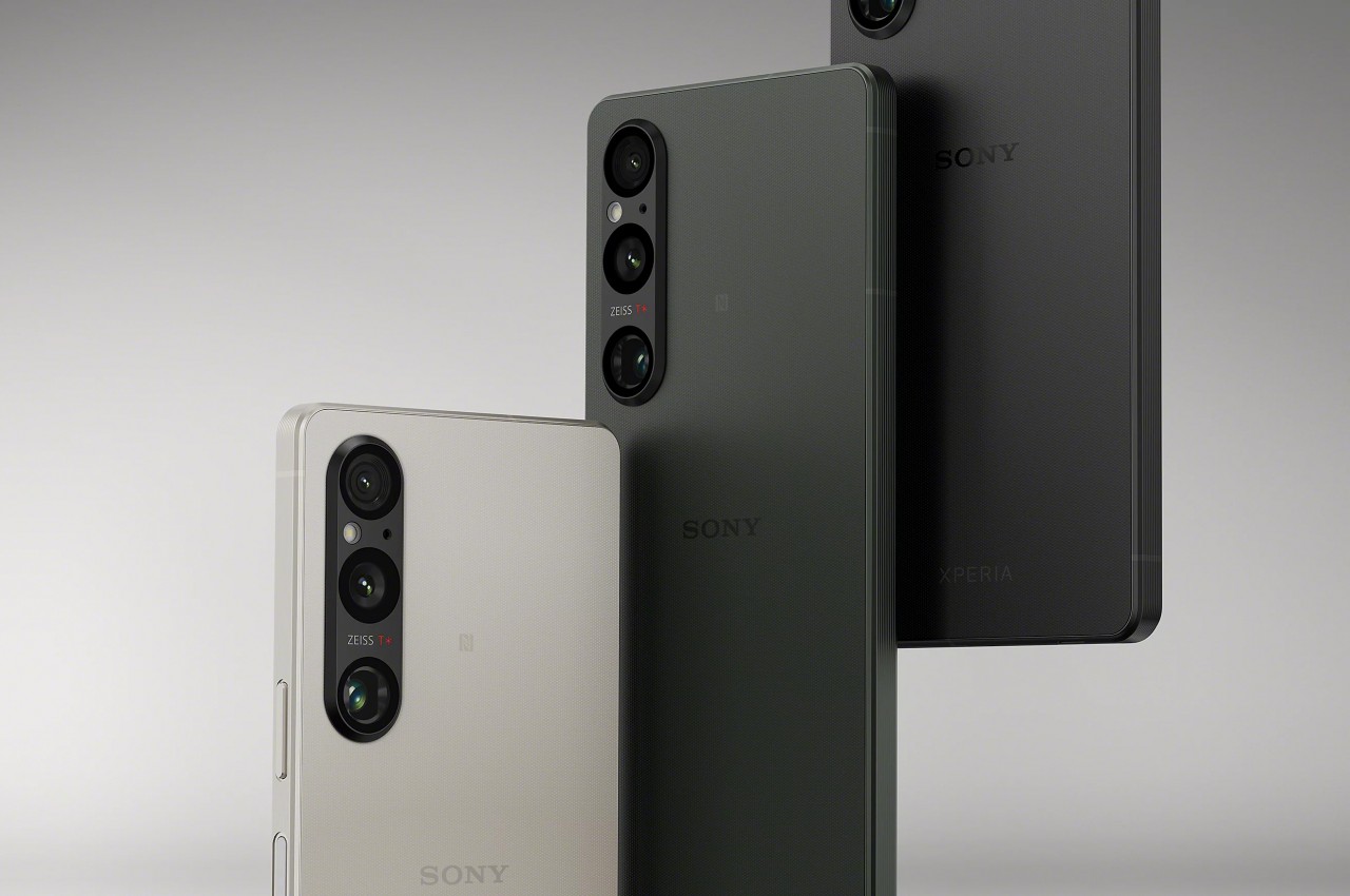
Sony Xperia 1 VI phone design might lose what makes it special

It might come as a surprise to some that Sony actually makes smartphones. Actually, it might even come as a bigger surprise that it still makes smartphones at this point in time. Its mobile business has definitely fallen on hard times, forcing the brand to exit some global markets and sell only through online channels in others. Despite all that, Sony still believes that a smartphone has a place in its portfolio, especially as a means to access its treasury of entertainment-related content. That has been the guiding principle behind the design of its premium Xperia 1 smartphone series, but it seems that the product line’s sixth iteration will make some small but significant changes that almost undermine all of that in one fell swoop.

Designer: Sony (via zackbuks on Weibo)

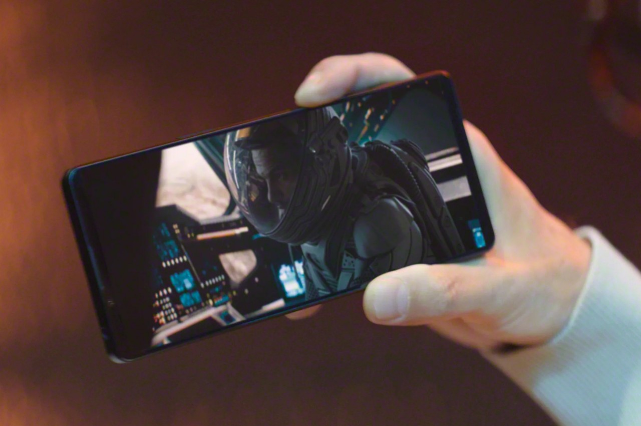
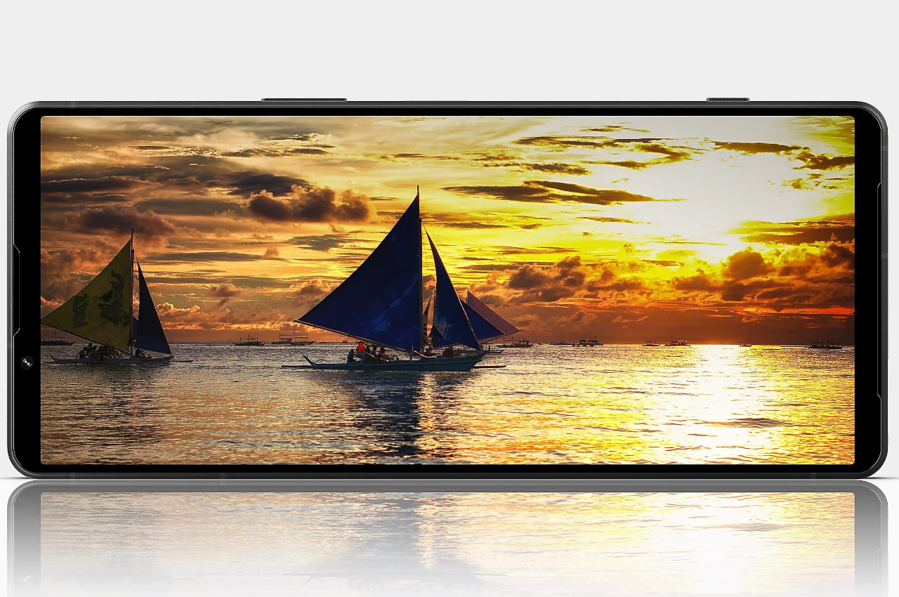
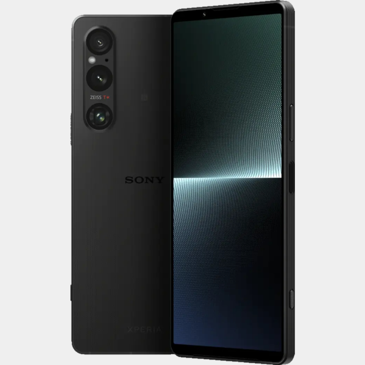
Truth be told, the Sony Xperia 1 design has always been an oddity among its peers even today. It easily stands out from the crowd almost literally because of its extra tall and narrow body, designed to support a 21:9 screen aspect ratio that Sony has been advertising as the perfect format for ultra-wide content. It also distinguished itself with its 4K display resolution when all its competitors continue to play in 2K or even 2.5K figures only.

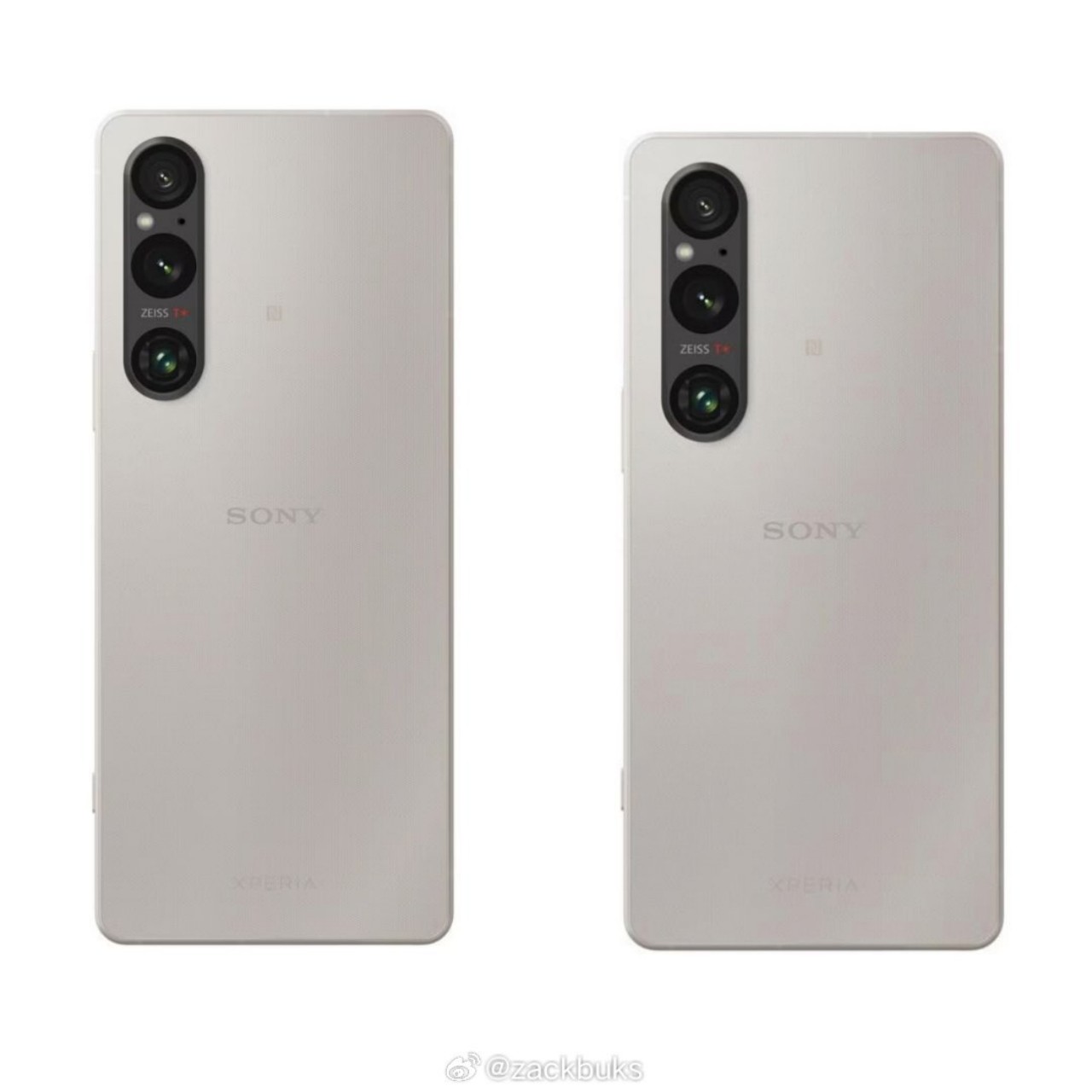
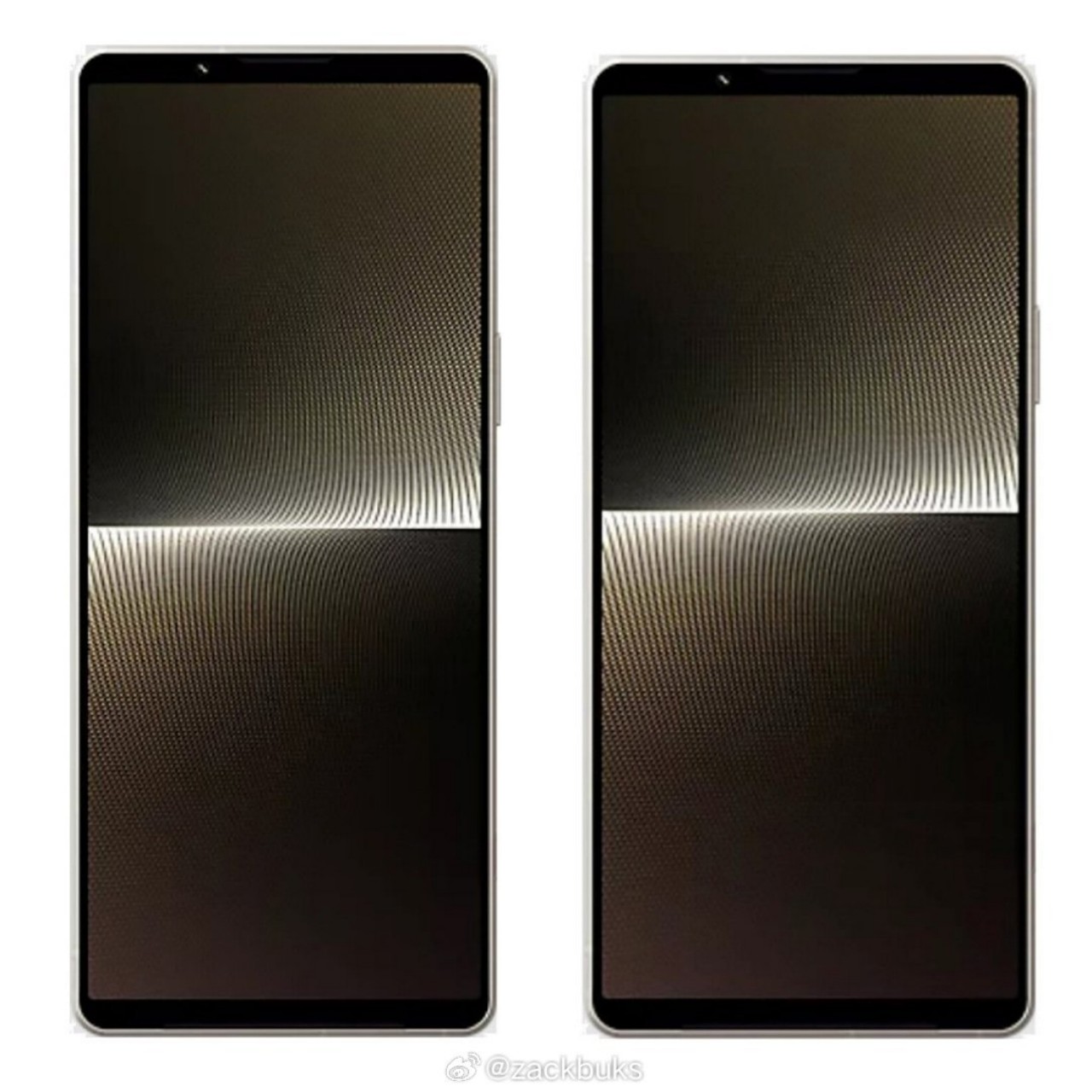
The latest rumor, however, changes the narrative a bit. According to the source, Sony will be downgrading that 4K resolution to something like 2K+ or QHD+, more in line with other high-end smartphones in recent years. More importantly, it is also making the screen a bit wider and shorter to achieve a more “normal” 19.5:9 aspect ratio, again similar to flagship devices from the likes of Samsung and Apple. It’s by no means going to be significantly smaller, as these leaked images show, but it definitely changes the shape of the phone to be less distinctive.

It sounds perplexing that Sony, which has never really minded smartphone trends and fads, would make such drastic changes, but it might all boil down to price. Sony Xperia phones have been notorious for their higher price tags compared to their peers, so downgrading one of the most expensive and uncommon components could actually do a lot to drive the cost down. Unless, of course, Sony decides to offset those savings by including features and hardware that incur just as much expenses.

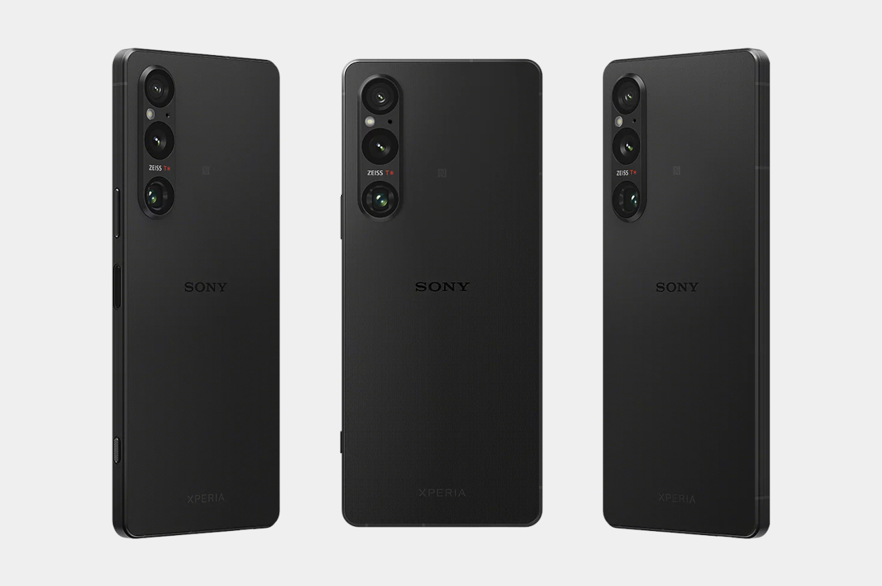
That’s not to say that the Xperia 1 VI will be bereft of any notable features. Another selling point of the phone is its use of camera hardware close to Sony’s own Alpha line of mirrorless cameras. That said, its photography prowess has rarely been praised mostly because the phone barely reaches people’s hands, so making the next Xperia flagship more affordable could actually help remedy that situation.

The post Sony Xperia 1 VI phone design might lose what makes it special first appeared on Yanko Design.
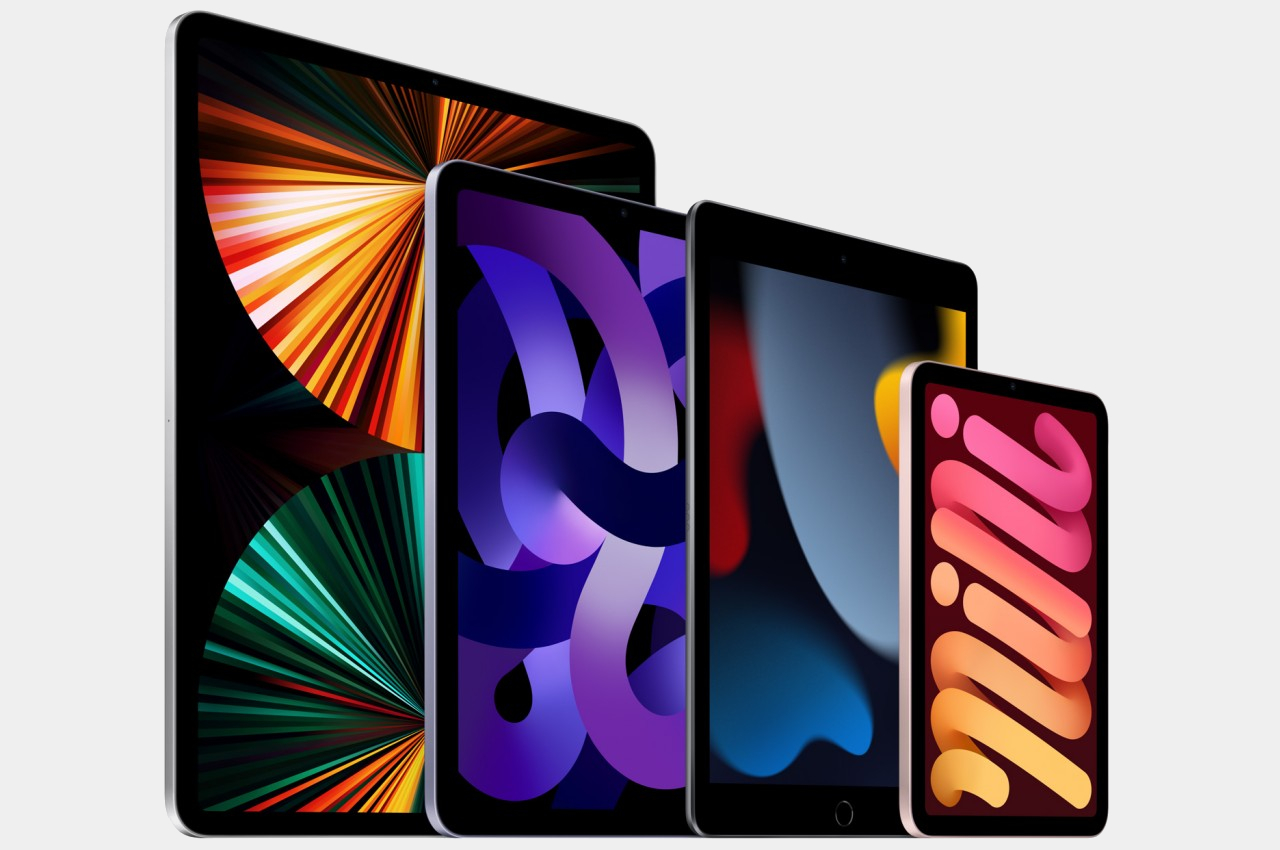
12.9-inch iPad Air renders suggest a cheaper way to go Pro

When Apple launched the iPad Pro, it tried to justify its existence with a slogan that questioned what computers really are these days. It pushed forward the thought of the iPad Pro as a laptop replacement, which made sense for an iPad with the largest display available of its kind. Although smaller models eventually launched, it was only the iPad Pro that could boast having the largest screen among Apple’s tablets, but that might no longer be the case soon. Leaked information suggests that Apple will be mixing things up a bit and might introduce a 12.9-inch iPad Air that could add more choice for consumers but also make its message a little bit more confusing as well.

Designer: Apple (via 91mobiles)

Putting the largest iPad under the “Pro” model makes perfect sense considering what it empowers users to accomplish. With that much screen real estate, multi-tasking with two apps side-by-side is not only easy but even comfortable, while having a large digital canvas frees creators to do their best work. The size also implies having bigger or better hardware capabilities, and indeed, the 12.9-inch iPad Pro always has the latest and greatest that Apple has to offer on any iPad.

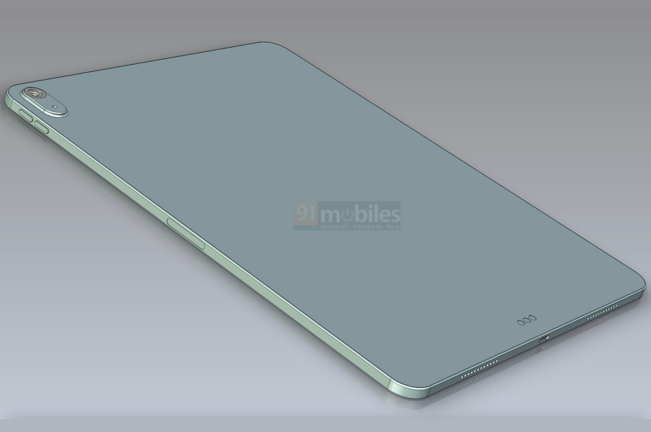
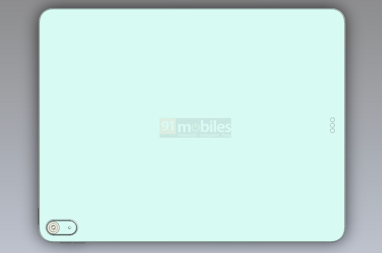
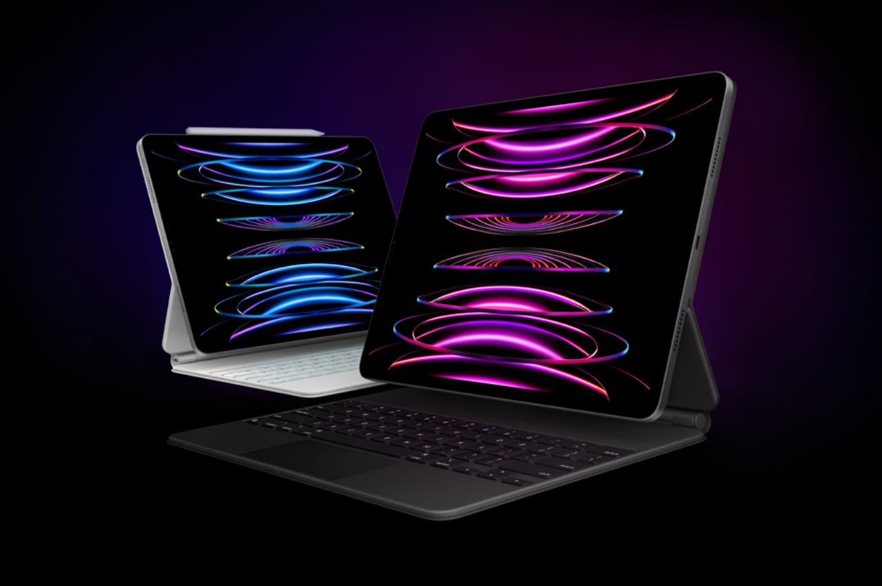
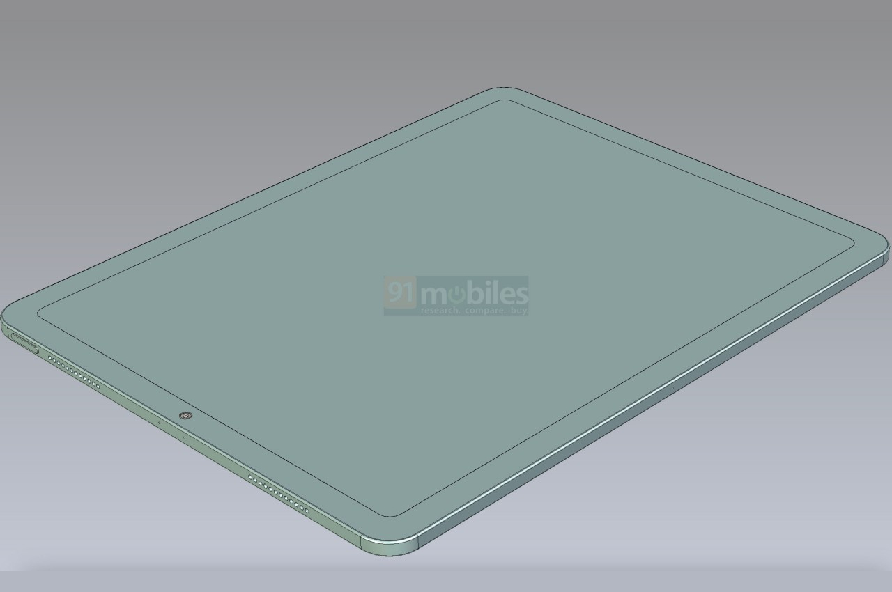
Unofficial CAD schematics, however, herald the coming of a 12.9-inch iPad Air, a family of tablets better known for their accessible price tags and, more often than not, more modest specs. The renders don’t come with any launch date, which means it could happen this year or never at all. Leaks never carry 100% accuracy, but the mere idea that Apple will be launching what will be the largest iPad Air is quite curious and could spark even more interest in the iPad line.

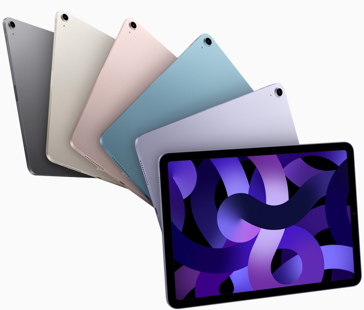
For all intents and purposes, this 12.9-inch iPad Air is a stretched-out regular iPad Air, and all the design cues of the current model are evident. There are thick bezels, at least compared to the iPad Pro of the same size, and a single camera. That camera, however, is also the only place where the 12.9-inch design diverges, using a pill-shaped island to enclose both the camera and LED flash instead of a single circle for the lens itself.

This 12.9-inch iPad Air could be Apple’s attempt to offer an extra-large iPad without the bells and whistles that make the 12.9-inch iPad Pro quite expensive. It’s the same strategy it is using with the iPhone Plus models, which isn’t exactly raking in sales. It does give consumers more choices, but considering how the iPad Air is already a watered-down iPad Pro in terms of many features, including Apple Pencil support, it does weaken the appeal of the iPad Pro line by having what is practically a cheaper iPad Pro.

The post 12.9-inch iPad Air renders suggest a cheaper way to go Pro first appeared on Yanko Design.
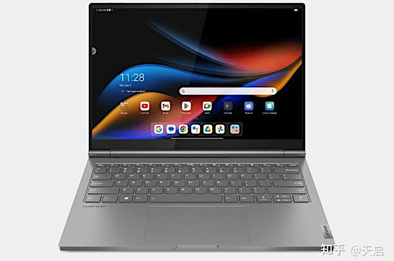
Lenovo ThinkBook Plus leak shows a laptop with an Android tablet as the screen

Laptops are no longer what they used to be. Sure, the majority still come in the standard clamshell design, but even those sometimes have touchscreens or even second displays. And then there are laptops that are actually tablets in disguise, folding backward or splitting in half. These convertibles and detachables, respectively, have shifted the landscape of portable computers, opening the doors to more use cases and features. For the most part, however, they’re all still typical Windows laptops, but Lenovo might be putting an odd twist to the design with a 2-in-1 laptop whose screen transforms into an Android tablet when detached from its main body.

Designer Name: Lenovo (via “Apocalypse“)

The idea behind a 2-in-1 laptop, popularized by the likes of the Microsoft Surface Pro, is actually the reverse of a laptop. Technically, it’s more of a tablet that you can attach to a keyboard, whether that keyboard simply serves as a cover or a weighted base like a regular laptop. All the electronics are actually behind the screen, from the processors to the storage to even the battery, making the screen completely standalone.

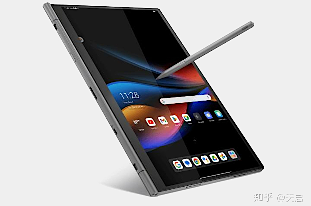
What Lenovo might have in mind, however, is to have two different operating systems installed on the device, working independently depending on the situation. When the screen is docked on the keyboard, it will display Windows that’s running in the base. Once pulled out, however, that screen becomes a standalone tablet running Android and not Windows.

ASUS Transformer Book Duet

As odd as that might sound, it’s not exactly completely new. Back in 2014, ASUS announced what would have been the crowning glory of its Transformer Book line of 2-in-1 detachable laptops. The Transformer Book Duet could run both Android and Windows, though you have to boot into each one separately. Here, all the computing hardware is still on the display, and the keyboard is just an accessory to keep the screen anchored down. ASUS’s ambitions, however, were allegedly crushed by both Microsoft and Google who didn’t want their operating systems to be living under the same roof. That was nearly a decade ago, however, and Lenovo might be thinking it’s time to stir things up again.

What isn’t clear is whether it will be a case of a dual-boot tablet again or if Lenovo will be doing things a little differently. It’s possible to have a complete set of hardware inside the keyboard, running Windows, while the tablet has its own hardware dedicated to running Android. That makes the division of labor a little simpler and you don’t have to reboot over and over again to switch between operating systems. Unfortunately, that would also mean you can’t use Windows in tablet mode and take advantage of the stylus for creating digital art. Then again, Windows hasn’t really been great on tablets, which is why there would be interest in putting Android there in the first place.

The post Lenovo ThinkBook Plus leak shows a laptop with an Android tablet as the screen first appeared on Yanko Design.
All-screen iPhone with Under-Display Camera is coming but not too soon

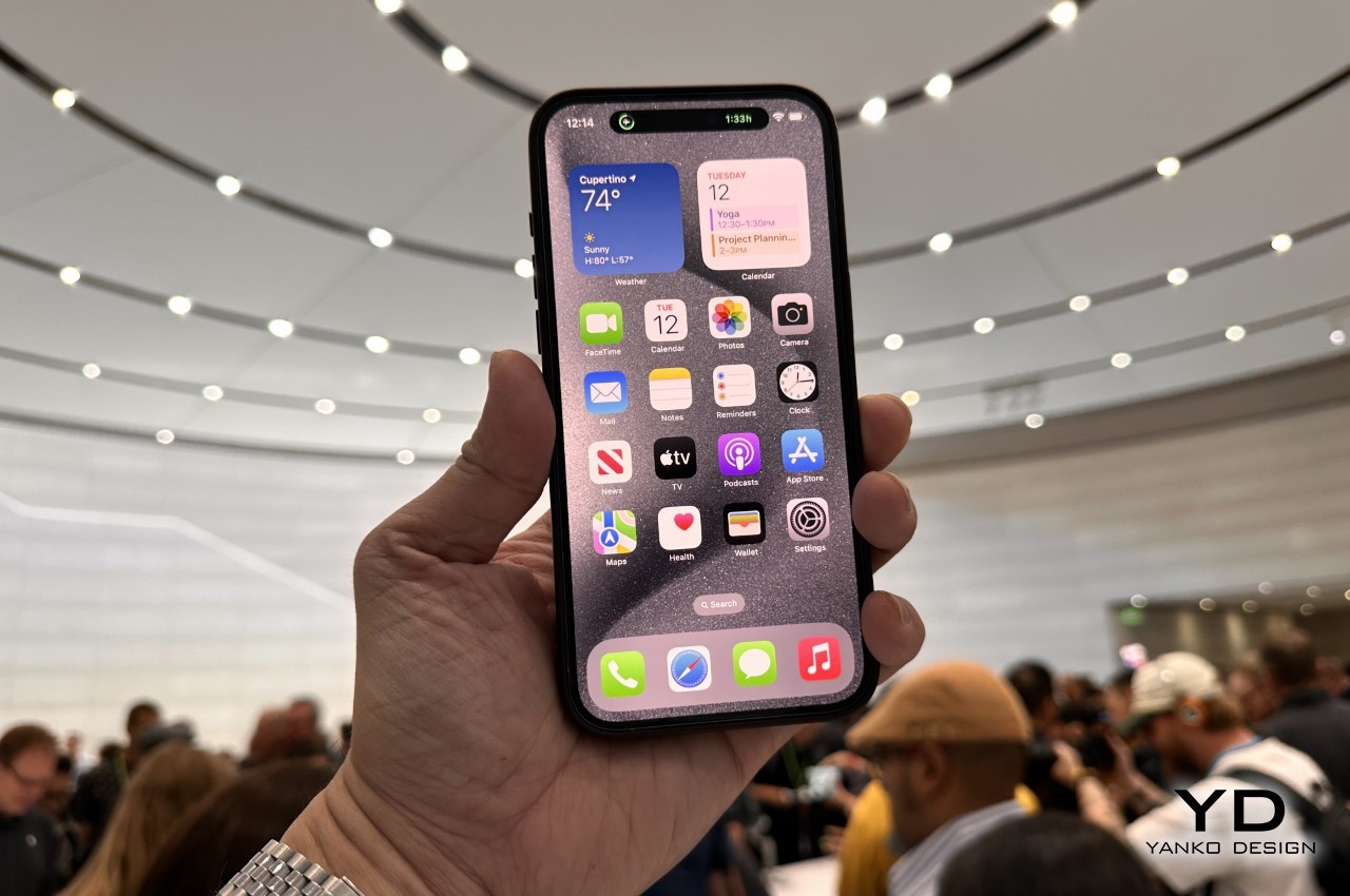
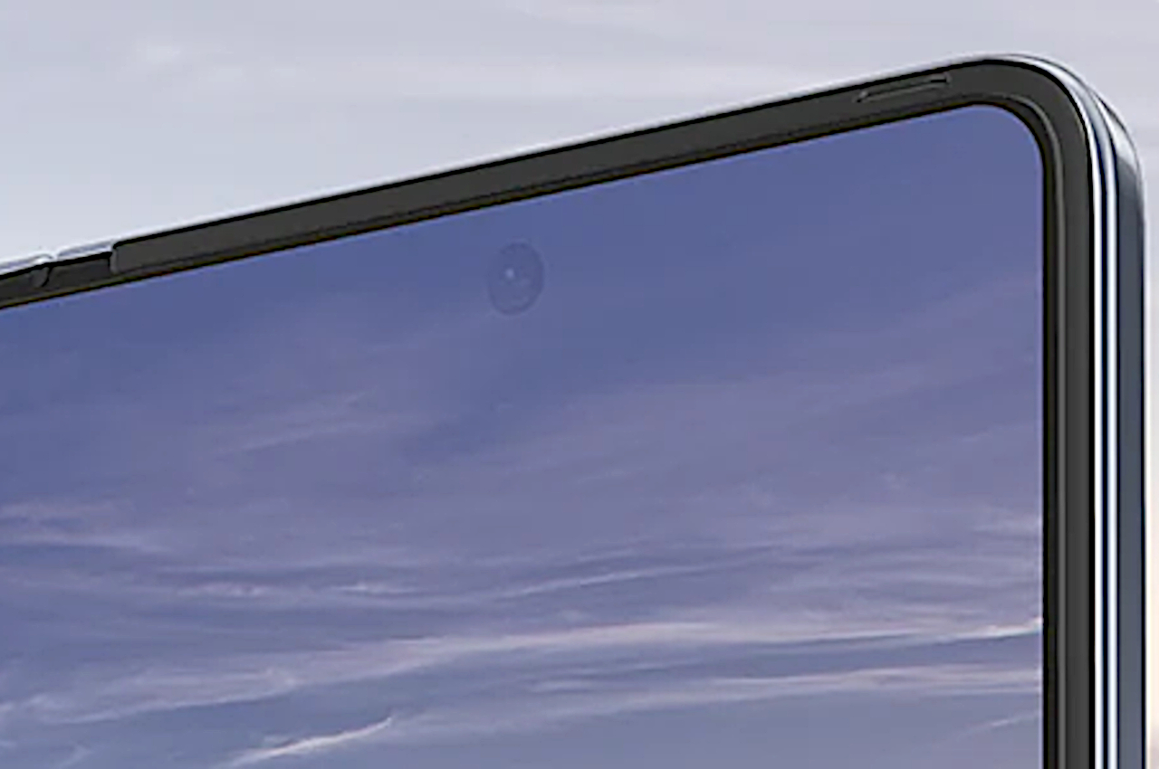
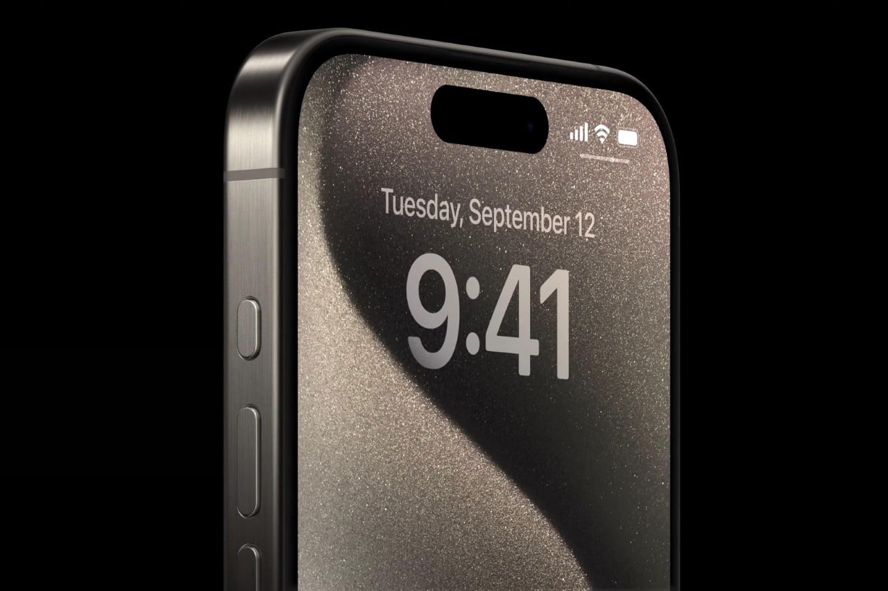
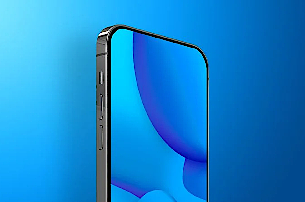
Although notches and cutouts, including Apple’s Dynamic Island ‘pill,” have become the industry standard for cramming front-facing cameras and sensors on smartphones, they are hardly the ideal solution. Because of the blemish they put on the phone’s display, not to mention the area of unusable space they incur, they’re both unattractive and wasteful. The ideal solution and Holy Grail that designers and manufacturers have been chasing after is having no cutout at all, with the camera invisibly hidden beneath the screen. As many smartphones, including the Galaxy Z Fold series, demonstrate, that’s easier said than done. That said, everyone seems to be moving in that direction, including Apple, which might already be preparing for an iPhone that’s all-screen, coming in 3 or 4 years.

Designer: Apple (via The Elec)

Image courtesy of Samsung

Hiding a camera lens or other sensors beneath the screen is no easy task. A camera will need to capture light from the outside in order to actually form a picture, but a screen is mostly opaque so no light will reach it normally. This is why Under-Display Cameras (UDC) or Under-Panel Cameras (UPC) actually have a lower resolution in the area directly above the camera compared to the rest of the screen. A lower resolution means fewer pixels, which means some light will be able to pass through to the sensor beneath. At the same time, however, the resolution shouldn’t be too low that you can make out the individual pixels with the naked eye, destroying the illusion.

There are other technical considerations with UDCs, including how the display’s own illumination could bleed into the camera, a flaw that Samsung is probably too familiar with. With so many parts of the puzzle, it’s no wonder that Apple isn’t in a rush to adopt this rather young technology, even if other brands like Samsung and ZTE have already jumped on the bandwagon. It won’t hold off forever, of course, and it seems that the ball has started rolling for an iPhone with that design in 2027 at the earliest.

Image courtesy of MacRumors

According to industry sources, LG has started work on a solution to the deterioration of image quality due to the loss of light in under-display cameras. It’s designing a special lens that is composed of multiple lenses to be able to gather more light despite the screen’s pixels blocking most of the area. Of course, the technology is still under heavy development, so even if Apple were to use it, won’t be happening even in the next two years.

In fact, Apple is expected to first adopt a familiar circular punch-hole cutout for either the iPhone 16 Pro next year or the iPhone 17 Pro. The iPhone 17 Pro is also speculated to be the first to use an “Under Panel Face ID” technology before Apple finally jumps to an all-screen iPhone design after 2026, possibly with the iPhone 20 Pro, if that will be its name.

The post All-screen iPhone with Under-Display Camera is coming but not too soon first appeared on Yanko Design.
OnePlus 12 wood texture leak fires off Internet debates on bold design choice

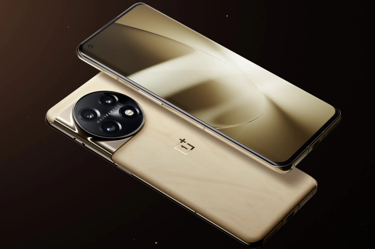
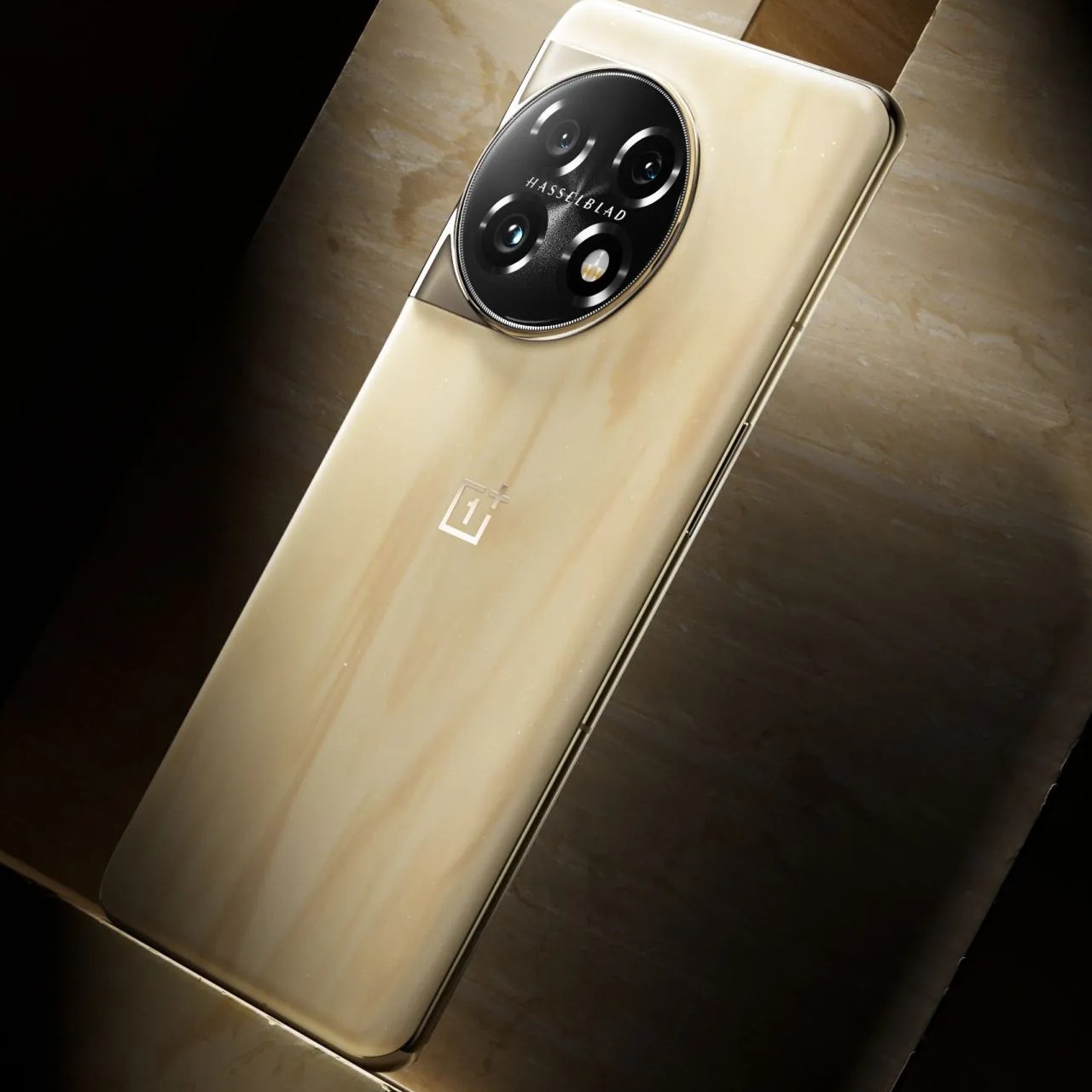
Although it seems to have become a bit quieter and more business-minded of late, OnePlus was a brand that boasted bucking trends both in the way it designed phones and how it conducted its business. The first OnePlus phone, for example, sported a removable back cover and cover designs that included uncommon materials like sandstone and wood. More recent OnePlus designs have become less daring and more conventional, though the company does offer unique variations or accessories from time to time. Such a time might be coming later this year with the new OnePlus 12, which might don a wooden back yet again, whether as an integrated rear panel or an aftermarket accessory.

Designer: OnePlus (via Digital Chat Station)

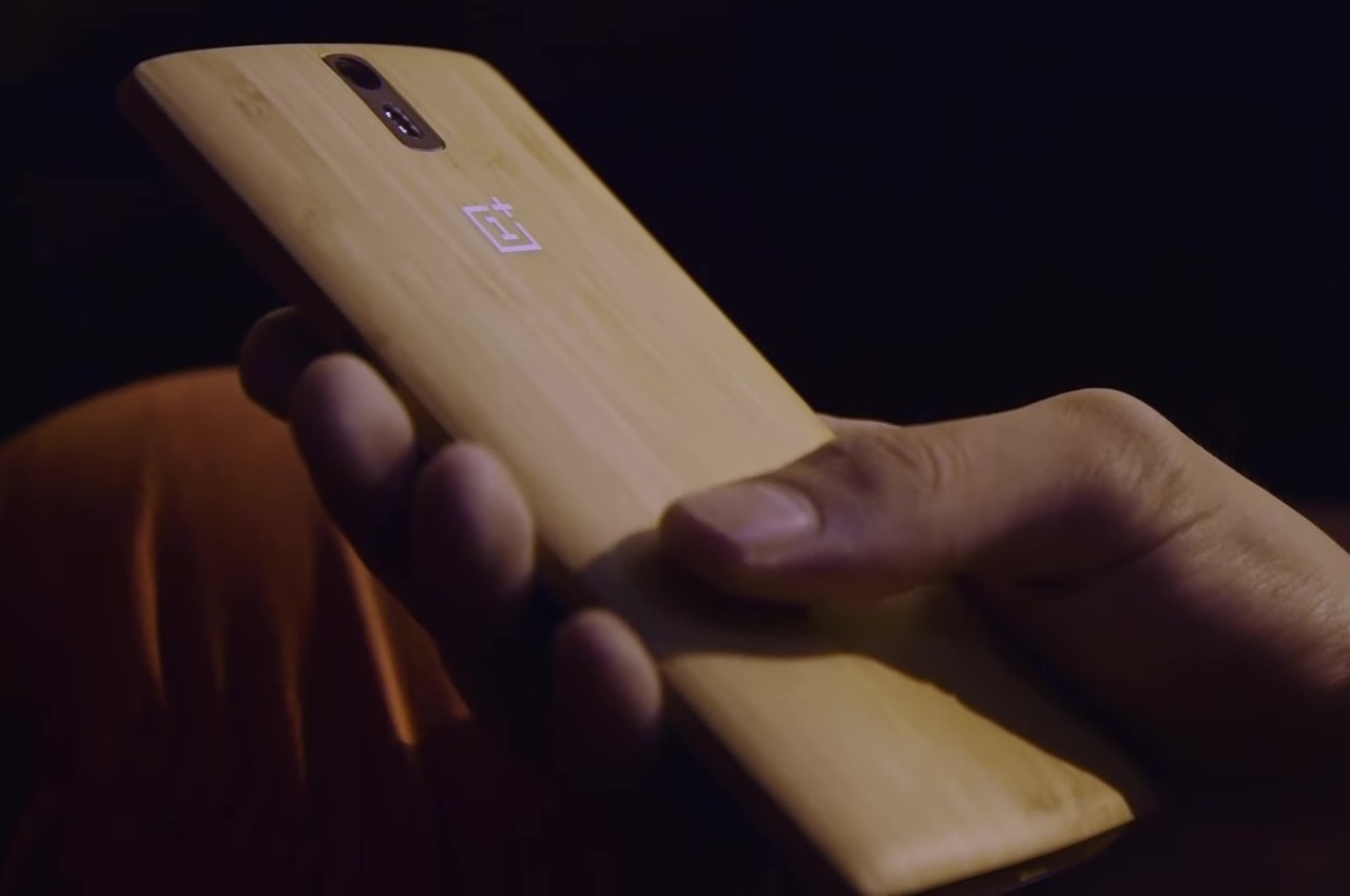
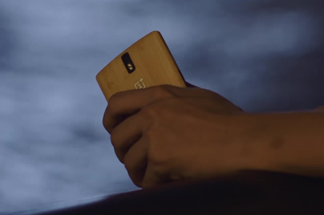
The OnePlus One was quite the rebellious teen when it launched back in 2014. It carried flagship specs but dangled a price tag that sounded too good to be true. It brought back removable batteries and back covers that you could swap to your heart’s delight. The latter was an important detail that appealed to a style-conscious market, a market that tends to make things go viral on the Internet, which is probably what helped make OnePlus an overnight sensation. Those days are long gone, but the company might be making a throwback soon, depending on how you interpret this latest leak.

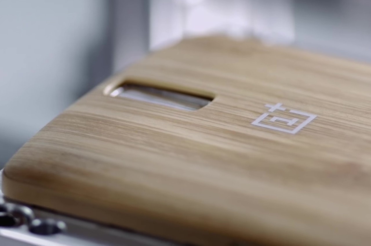
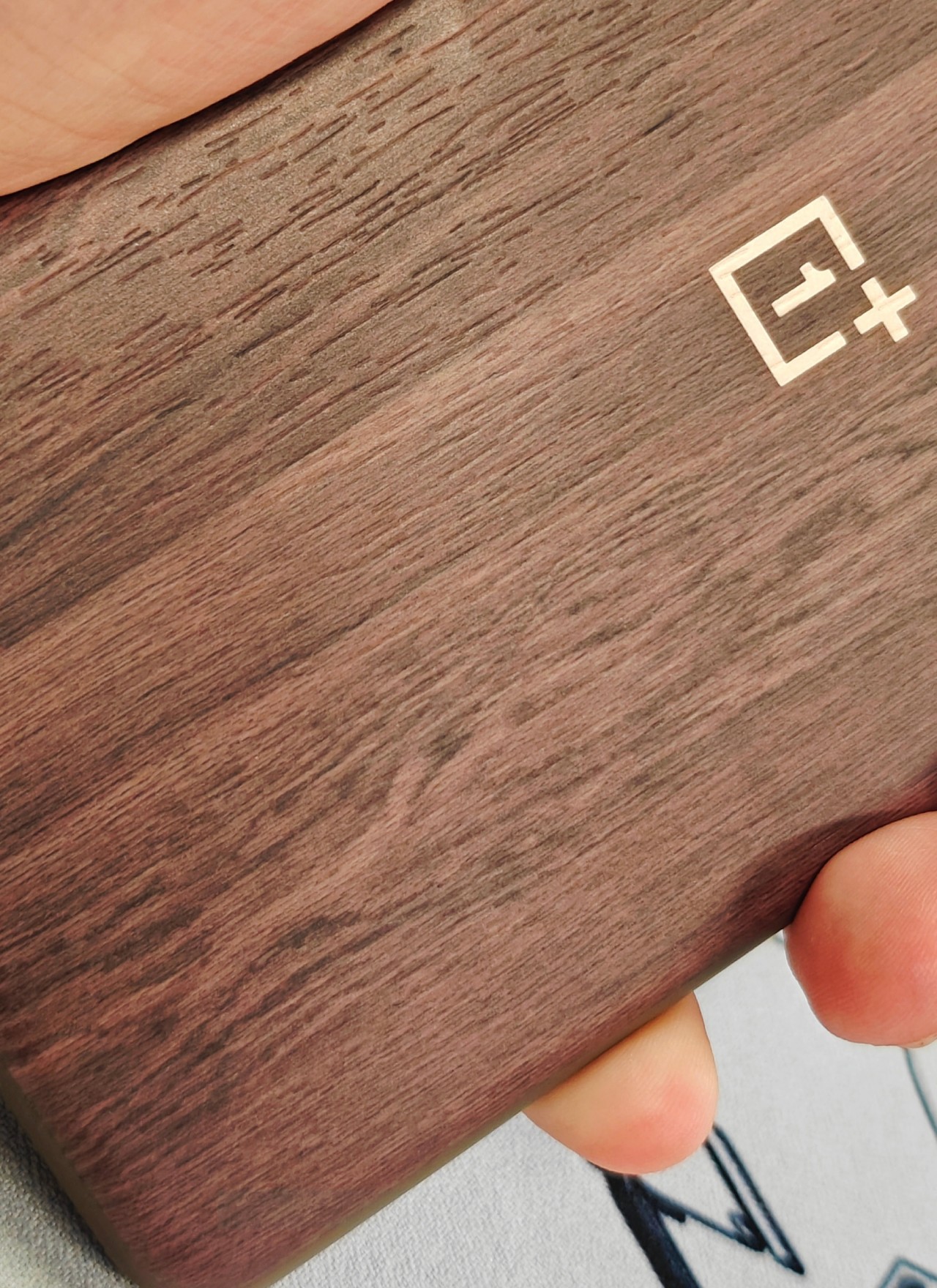
According to a reliable tipster, the OnePlus 12 will feature a “classic wood grain shell,” a phrase taken from an auto-translation of the original text. The image below shows proof of that, complete with all the unevenness and imperfections that give wood its natural beauty. Naturally, with only one part of the phone’s back shown, the revelation sparks plenty of discussions and speculations on what that “shell” really means.

On the one hand, it could be a completely new variant that uses wood or “faux wood” as the material for the OnePlus 12’s back panel. This is a possibility if you consider that OnePlus no longer makes its back covers removable, just like every other smartphone in the market today. On the other hand, it could simply be a special edition of protective cases, though it would seem to be extra slim if that were the case (no pun intended).

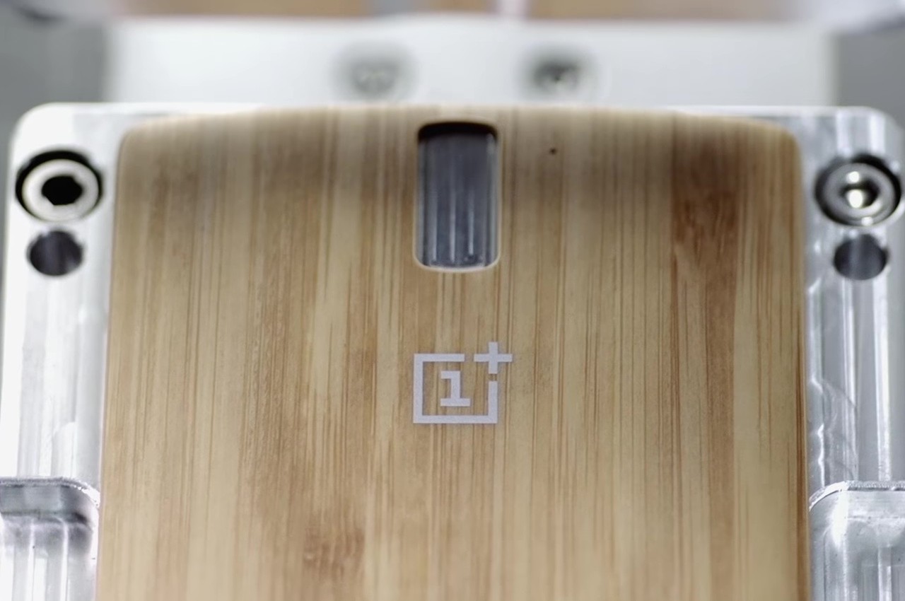
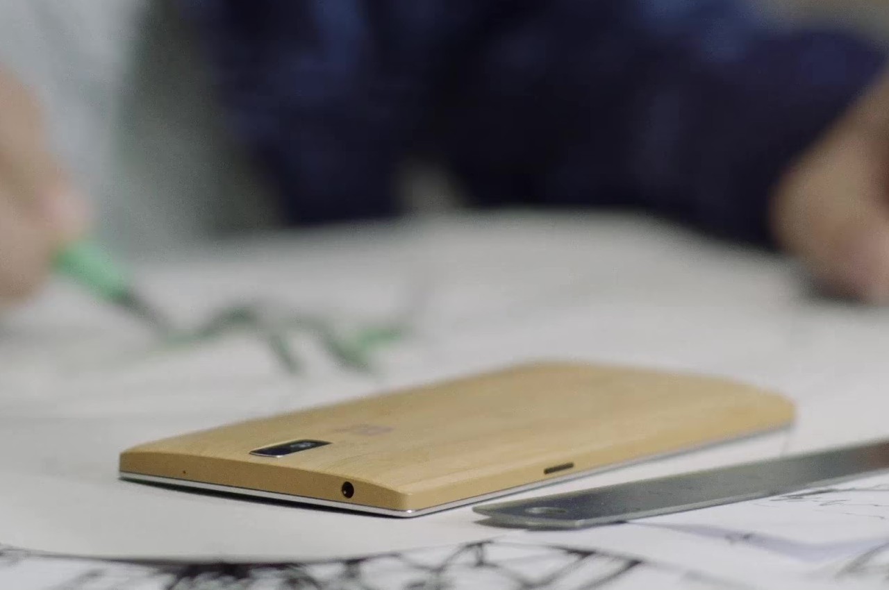
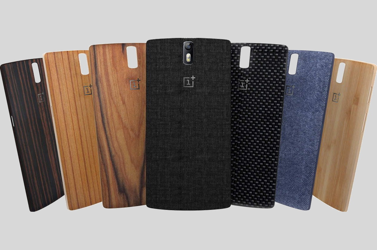
What makes the guessing game a bit more complicated is that OnePlus has actually done all of those over the course of its history. The OnePlus One, for example, was notable for its SwitchStyle covers that included bamboo, walnut, and sandstone textures. More recently, it launched a limited “Marble Odyssey” edition of the OnePlus 11 5G that employed 3D microcrystalline rocks to achieve the unique look and feel of marble. Suffice it to say, OnePlus is at least still keen on pushing the boundaries of materials, textures, and designs that give its smartphones more personality than your average handset.

The post OnePlus 12 wood texture leak fires off Internet debates on bold design choice first appeared on Yanko Design.
iPhone 16 Pro punch-hole camera cutout is still possible but 2025 is more likely

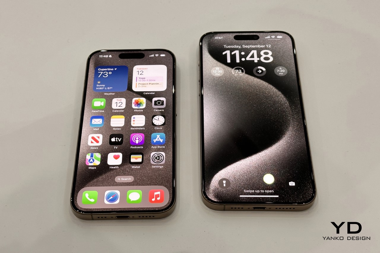
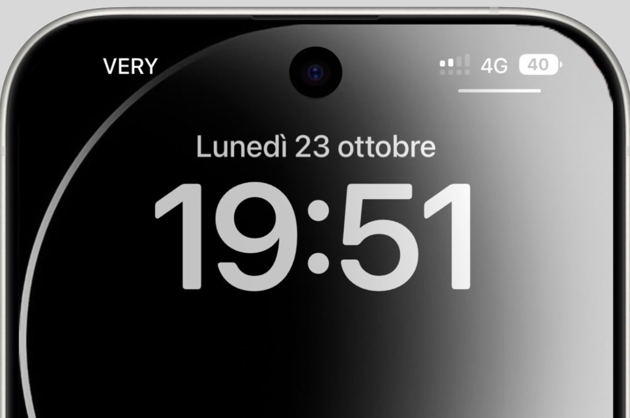
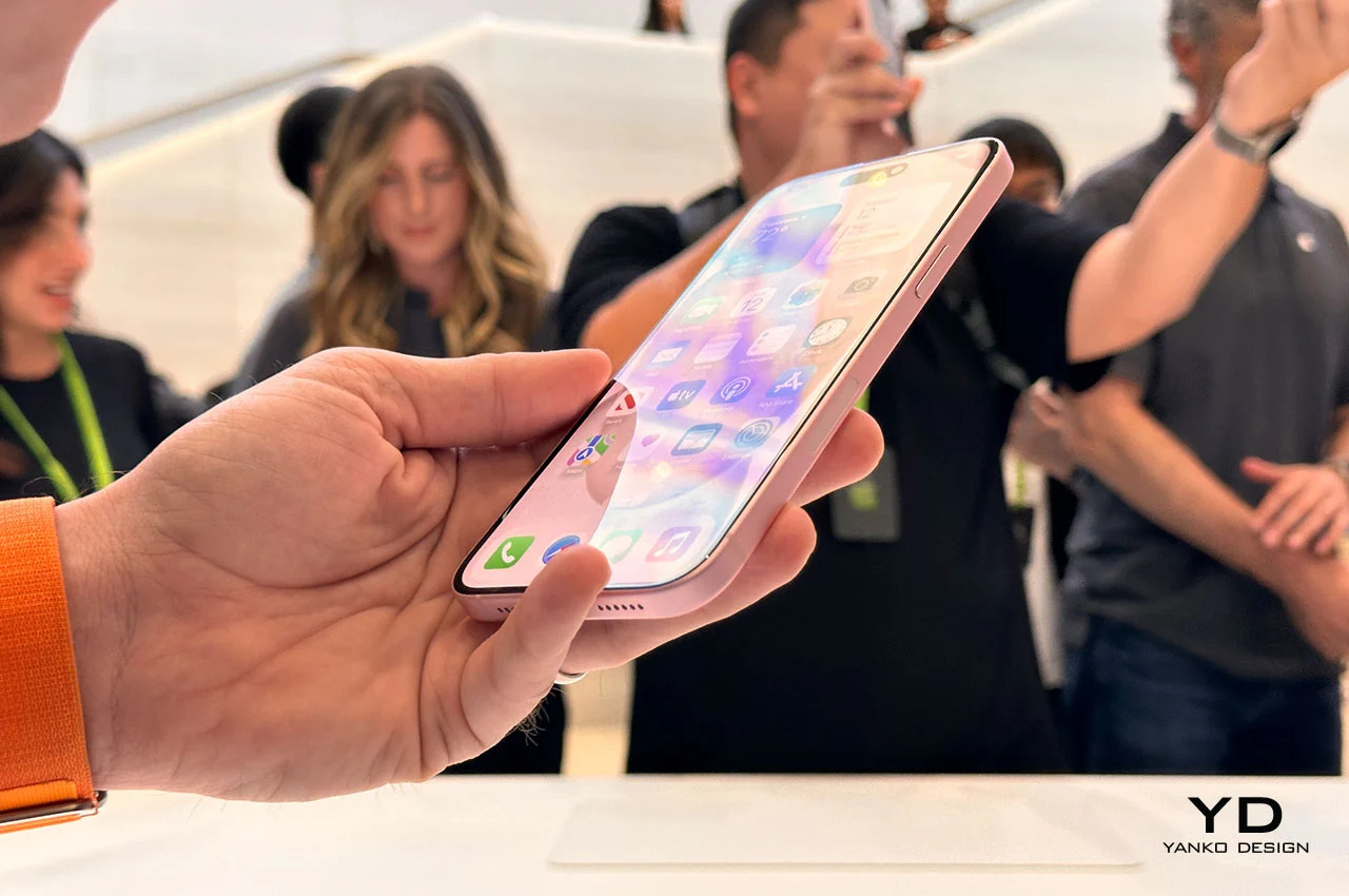
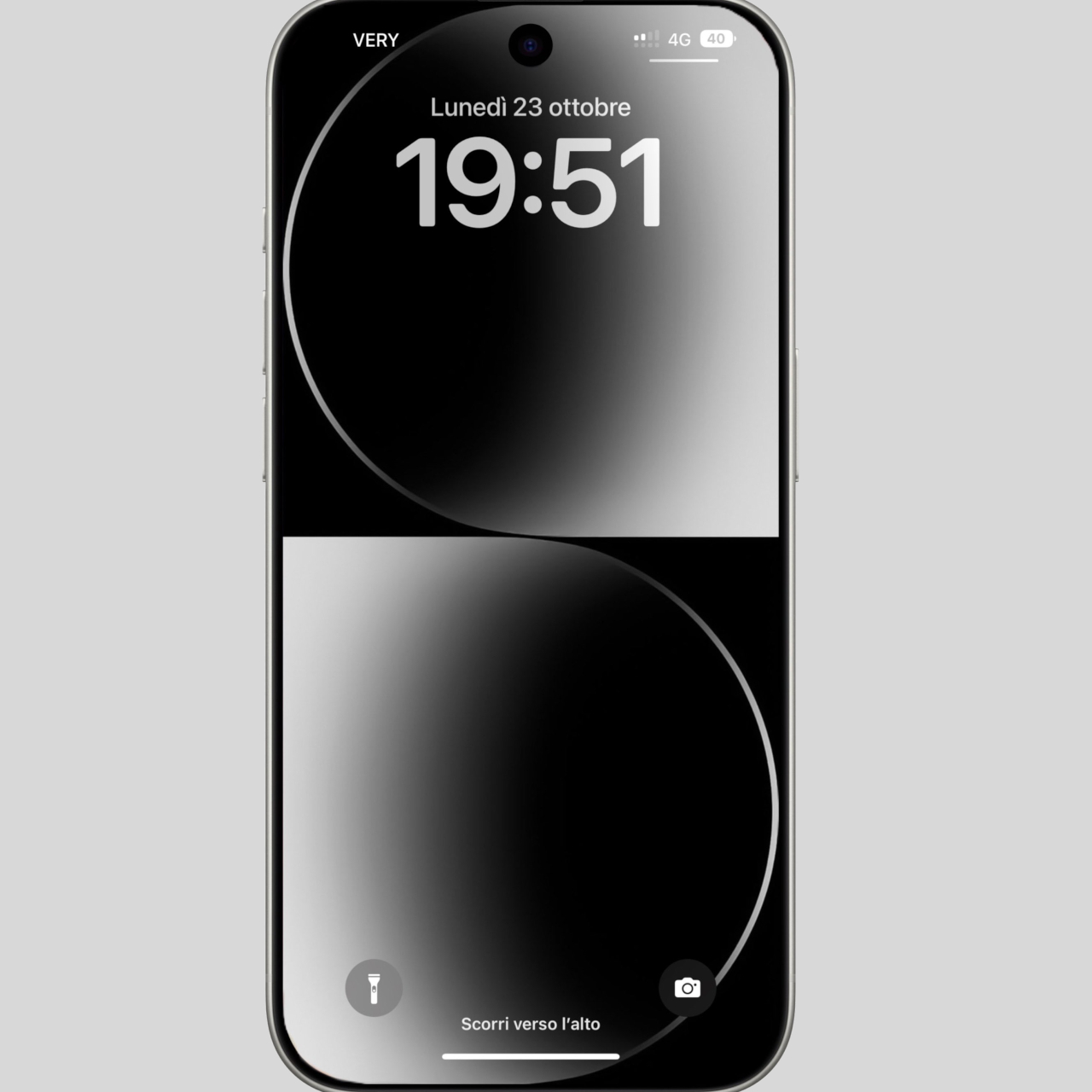
Ever since the iPhone X in 2017, Apple has stayed faithful to the notch despite numerous criticisms. Last year, however, it finally changed direction for the first time while still staying away from the dominant “punch-hole camera” design of most smartphones today. The Dynamic Island, which is unsurprisingly now being copied by other brands, presented a unique and interesting way to hide the presence of front sensors like the Face ID camera while still making that area usable and, well, dynamic. There are, however, whispers that Apple will soon go all-in on the prevalent design trend and will implement its first punch-hole design on the iPhone 16 Pro next year, though chances of that happening in 2025 might be a bit more realistic.

Designer: Apple (via Majin Bu)

Although the smartphone industry seems to have settled on what is described as punch-hole or hole-punch cutouts, the debates have never really stopped on what is the better design. The old iPhone notch, in addition to being seen as stale, also took up too much precious screen real estate that could otherwise be used to display things. The smaller circle does minimize the footprint but still leaves a lot of room for improvement in terms of elegance and functionality. The Dynamic Island introduced last year is Apple’s creative and ingenious solution to combine the best of both worlds, but it seems that even design-conscious isn’t done changing things.

According to rumors, Apple is already testing a punch-hole design that could make its way as early as next year’s iPhone 16 Pro. The insider tip even shows a render with a rather large hole at the top of an iPhone’s display. The cutout is noticeably larger than most punch-holes on Android phones that have been trying to make that design less conspicuous. There’s a good reason for that, which is the same reason Apple couldn’t completely abandon the notch and why it created the Dynamic Island design. Face ID hardware is more than just a simple front-facing camera, and Apple will need to make room for those sensors in such a constrained space.

Even if Apple does change to a punch-hole camera design, expect it to be unlike what you see on Android phones so far. We could see a redesigned Dynamic Island implemented for this kind of cutout that takes advantage of the smaller space. Or we could see Apple completely revise iOS 18 to have a different interface now that there’s more room for icons and whatnot up there.

That said, even the tipster admits that there is a bigger chance that this design change will happen with the iPhone 17 series in 2025 instead. All that depends on what the company decides in March next year when it finally decides on the iPhone 16 design. Truth be told, there is very little reason for Apple to make another change so soon, with Dynamic Island still in its infancy. After all, Apple isn’t one to simply jump on trends, so it might be a while before we see it changing its direction again.

The post iPhone 16 Pro punch-hole camera cutout is still possible but 2025 is more likely first appeared on Yanko Design.
Meta Watch V2 surfaces online in leaked photos, confirming the suspected dual-camera design

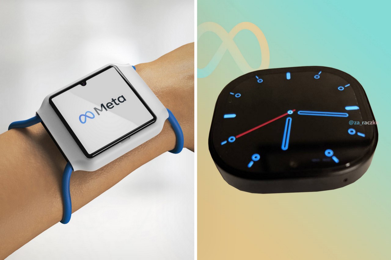
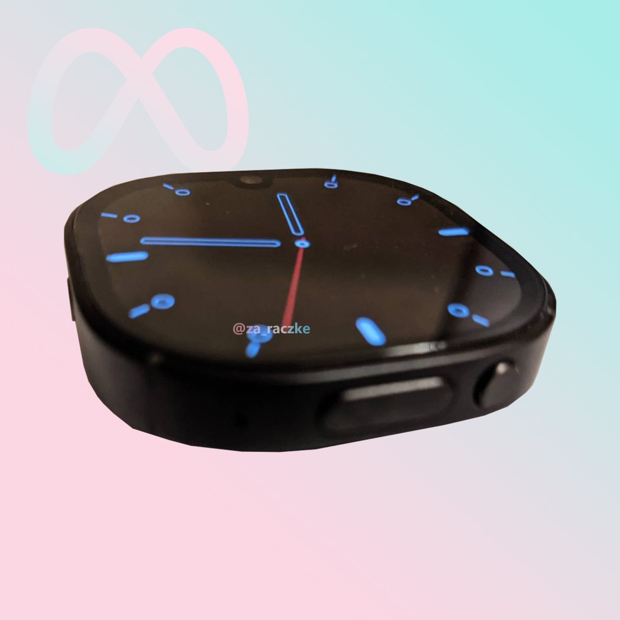
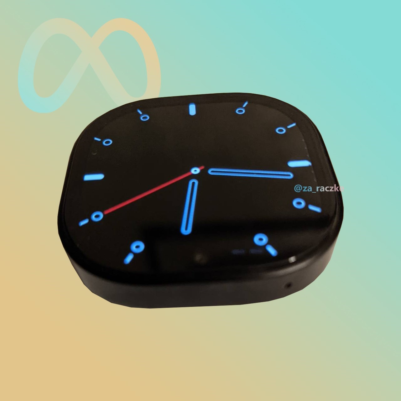
Although it was suspected that Meta had axed all plans to make their wearable around 8 months ago, new photos show that the watch’s design has now entered a more advanced stage, suggesting a fleshed-out V2 that’s probably inching closer to a finished product. Revealed by Twitter user Kuba Wojciechowski, this new iteration confirms all our previous suggestions, including a detachable module featuring a watch face on the front with a notch and a front-facing camera, and a secondary, larger camera at the back that lets people record POV videos and BeReal-style picture-in-picture content.

Image Credits: Kuba Wojciechowski

The images show a rounded-square-shaped device running a watch face, with a pretty sizeable bezel containing a notch and a front-facing camera. The watch shape feels rather odd because it’s neither square nor circular, sitting somewhere in between. I imagine designing the UI for such a device would be weird, given that you can’t really watch videos in such a rounded-square display anymore, making it hard to consume content from Meta’s social media sites at Facebook, Instagram, and its chatting app WhatsApp. There are, however, two buttons on the side of the device, although it’s tough to say what their function is at this point.
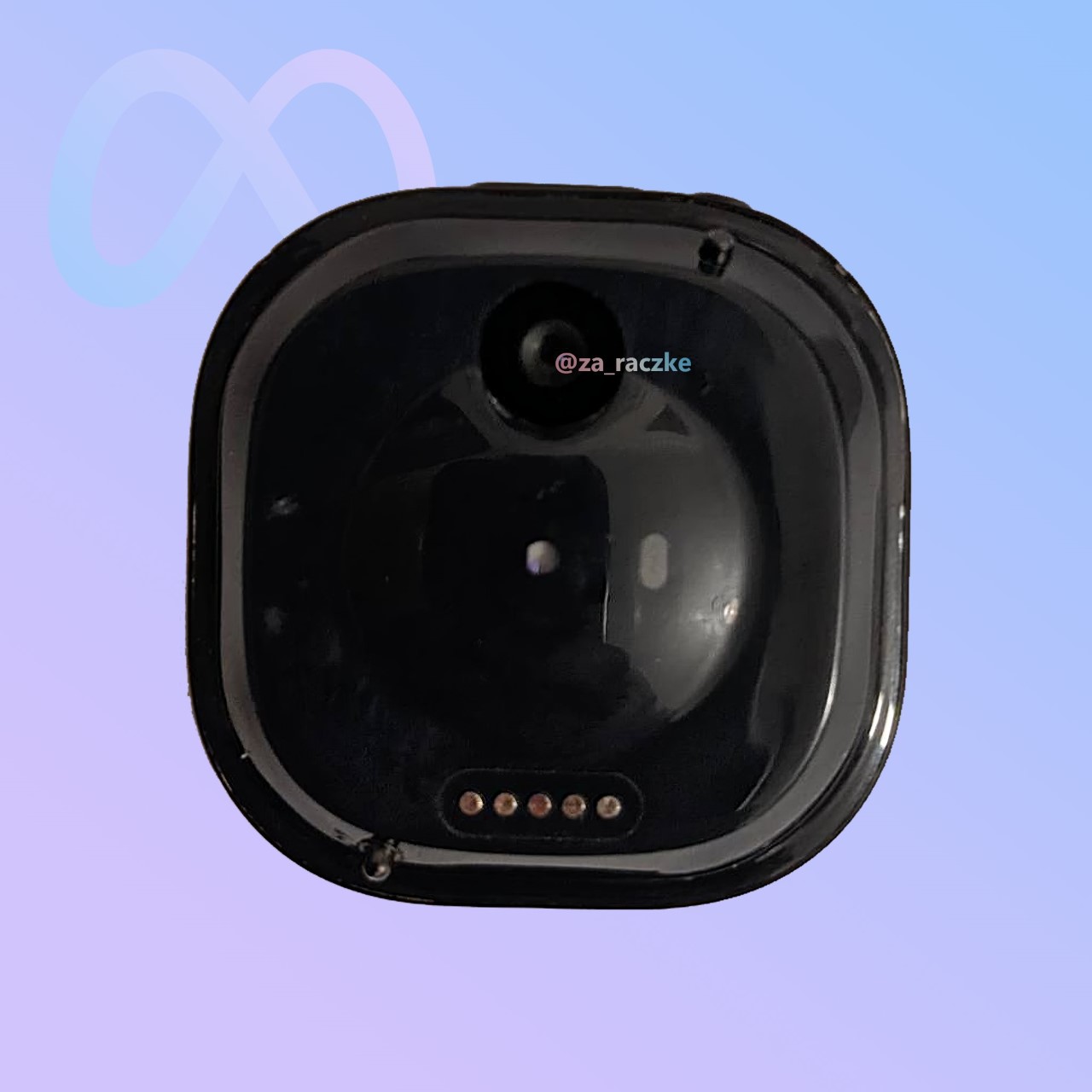
The one set of details that still remains, however, is the presence of dual cameras. The front-facing camera eats into the display, while the rear camera (slightly larger) hovers right above a bulge that contains what I assume are the heart-rate sensors. You’ve even got contact pins on the other side that I assume are for charging purposes.

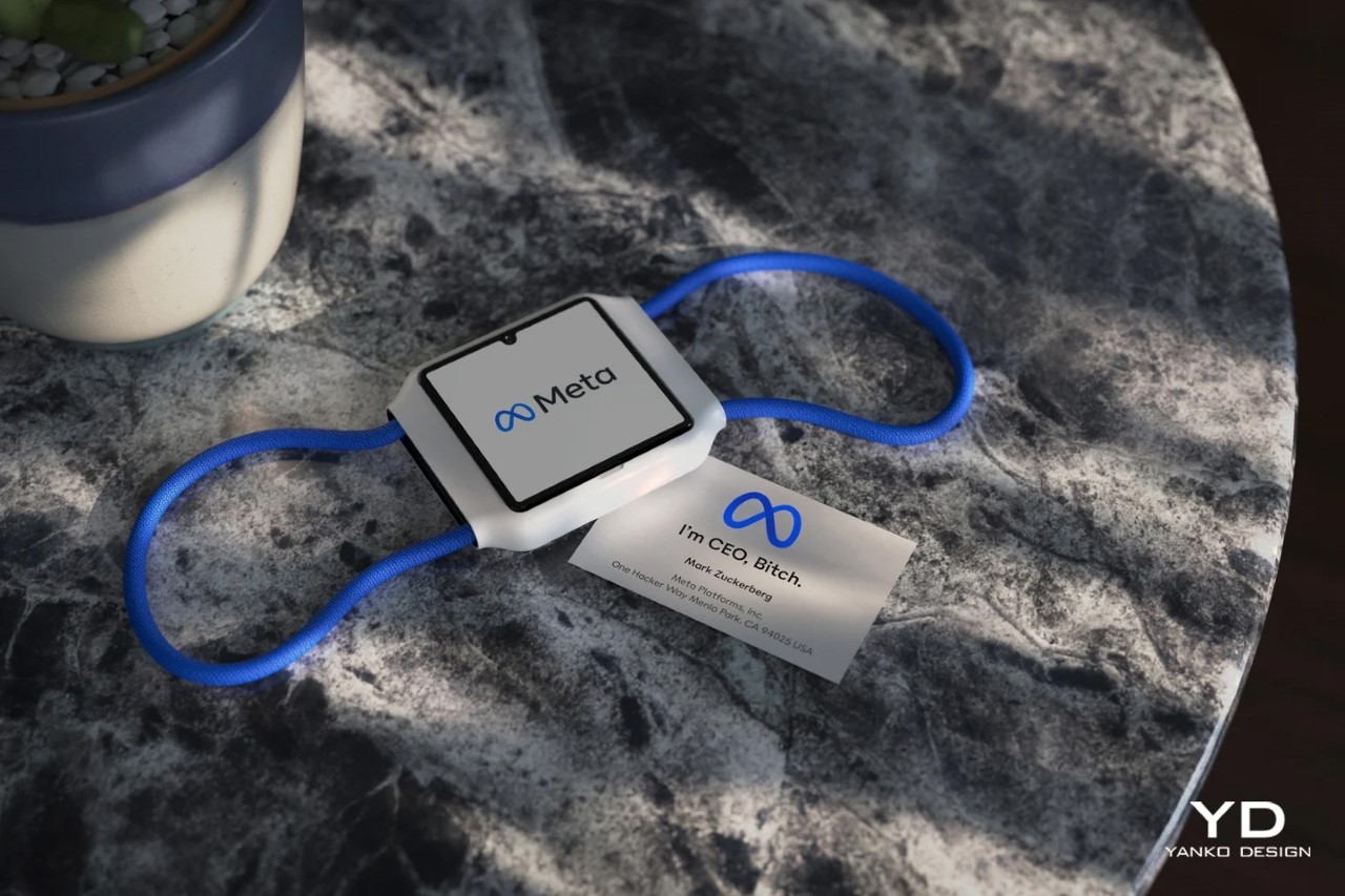
There aren’t too many details about the device’s build and specs, although Kuba mentions that it isn’t running Google’s WearOS, but rather a fork of its open-source Android OS. Facebook has for long played with the idea of building their own ecosystem and app network to escape the monopolies of Apple and Google, and this could just be it. There’s also a Qualcomm chipset on the inside, although it isn’t mentioned which one, and the outer case and band are still to be revealed to the public, although we did put together our own concept just about a year ago, right before it was suspected that work on the wearable had halted indefinitely.

Earlier last year, we covered the Meta Watch too, bringing life to its speculative patent-file images through renderings. If you want to read our coverage on the band from last year, click here.

The post Meta Watch V2 surfaces online in leaked photos, confirming the suspected dual-camera design first appeared on Yanko Design.