Did We Get Duped by This Leaked Galaxy Z Fold6 Invitation?


Happy Mobile Monday! Today, the tech world finds itself wrapped in yet another mystery. Over the weekend, a video surfaced showing what appeared to be an invitation to a Samsung fold event, hinting at the launch of a new Galaxy foldable device. But here’s the twist: is this invitation real, or is it an AI-generated prank designed to ignite excitement among fans eagerly awaiting the Galaxy Z Fold 6 Special Edition? Let’s break down what we know and what remains uncertain about this mysterious leak.

With its elegant design, the leaked invitation features an envelope that unfolds to reveal a sleek message reading “You’re Invited,” seemingly displayed on a foldable screen. The presentation is intimate and exclusive, evoking a formal, old-world charm contrasting with Samsung’s typical mass-market marketing style. The premium choice of typography and colors hints at something more significant than a standard product launch. Yet, the October 21, 2024, date—which happens to be today—casts serious doubt on the authenticity, given the absence of any official announcement. With AI capable of creating remarkably convincing content, how much can we trust these leaks?

Samsung Galaxy Ring and Fold6

There is no denying that Samsung, much like Apple, follows a predictable yearly release schedule, and we know they’re planning a major event. The only question is when. Most sources suggest this event will feature either the Galaxy Z Fold 6 Slim or a Special Edition—a version that pushes the boundaries of foldable technology while focusing on style and portability. As always, rumors must be taken with a grain of salt, especially when tied to specific dates. So, is this invitation authentic, or is it just another bait using generative AI?

A Premium Touch: Breaking Down the Design Elements—Or Is It Meant to Fool Us?

Looking closely at the invitation, its elegance and minimalism offer an interesting contrast to past Samsung event invitations. The carefully staged unwrapping, paired with the luxurious appearance of the invitation, suggests this product launch is something special—almost like an intimate gallery reveal rather than a tech event. If future invitations are this extravagant, it only adds credibility to the theory that Samsung could launch a Special Edition Z Fold—designed for true enthusiasts who value exclusivity and innovation.

The “You’re Invited” message is presented with understated simplicity as if giving a sly nod to those who think they’re in on an exclusive secret—though, let’s be honest, some of those people are probably laughing away in their parent’s basement, thinking they’re masterminds. It could be an invitation intended for a select few—those who still believe pigs are pink and can fly—hinting at a limited release or an exclusive event. Given the rumored scarcity of the Special Edition Z Fold6, this seems plausible. Eventually, the truth will come out, and maybe we’ll all have a good laugh. But for now, the question stands: Is this elegance the work of Samsung’s designers, or is AI simply tricking us into craving exclusivity?

What We Know About the Galaxy Z Fold6 Special Edition

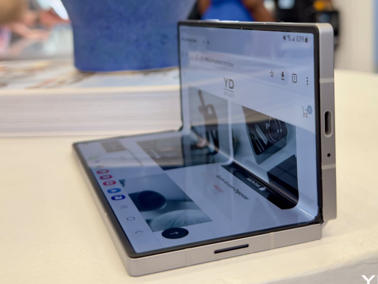
Rumors and speculation about this device suggest significant changes compared to the standard Galaxy Z Fold 6. First and foremost, these changes focus heavily on the physical hardware—particularly the slimness of the device. The Special Edition is expected to be just 10.6mm thick when folded, making it slimmer and likely lighter than its predecessor, which is 12.1mm thick. The reduction in thickness aims to make the foldable more practical and less cumbersome, suited for everyday use. This appears to be Samsung’s response to users who want portability without giving up the spacious screens foldable offer.
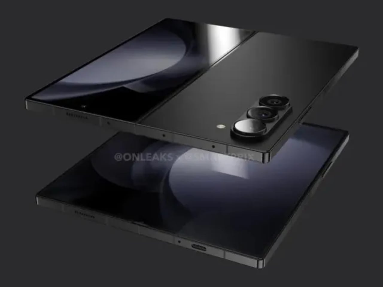
Speaking of screens, the Galaxy Z Fold 6 Special Edition is rumored to feature an even larger foldable display, increasing it to 8 inches compared to the regular Fold 6’s 7.6-inch panel. The cover screen will also grow, reaching 6.5 inches versus the previous 6.3 inches. This larger footprint suggests Samsung is targeting those who see their Z Fold as a productivity powerhouse—more screen space means fewer compromises when multitasking, viewing documents, or streaming content.

Adding to the design allure are rumors of a boxy structure with a brushed metal finish, giving the Special Edition an industrial yet refined look. The separate, protruding camera module hints at Samsung embracing a bolder design. The decision to let the camera stand out suggests that the photography experience is being taken up a notch. In fact, the under-display camera—a feature that received mixed reviews in earlier models—is rumored to get an upgrade to 5MP from the standard version’s 4MP.

Real or AI Prank—Does It Matter?

Whether the leaked invitation is real or just AI-generated hype, one thing is clear—it has caught the attention of the tech community. It fits into a narrative that Samsung could be heading towards more exclusive launches, releasing devices that are reserved for a select few rather than for the masses. However, today is October 21, and without an official announcement in sight, the doubts about this invitation are growing. The uncertainty has created a mixture of buzz, disappointments, and even grief, keeping tech enthusiasts guessing and questioning what’s true.

At the end of the day, whether the invitation is real or fake doesn’t change the fact that we are anticipating an ambitious, more refined foldable. One that is slimmer, offers larger displays, and showcases a unique design aimed at making a statement. If Samsung delivers what this invitation suggests, the Galaxy Z Fold 6 Special Edition could easily be one of the most memorable foldables they’ve produced—a device less about mass-market appeal and more about exclusivity, just as the invitation implies.

The post Did We Get Duped by This Leaked Galaxy Z Fold6 Invitation? first appeared on Yanko Design.
Samsung Galaxy S25 Ultra Leaks: Rounded Corners, Slimmer Design, and Internal Upgrades Revealed

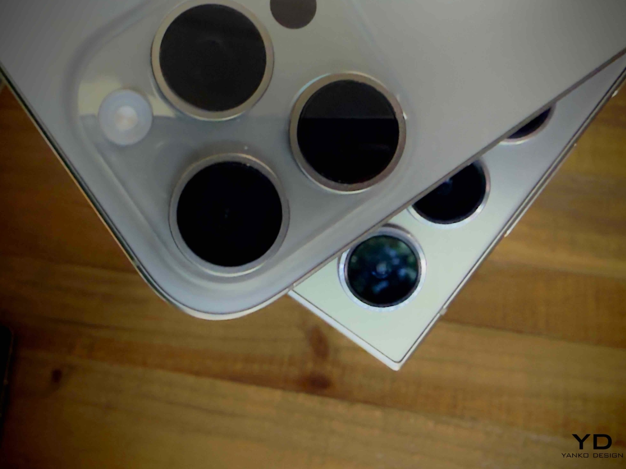
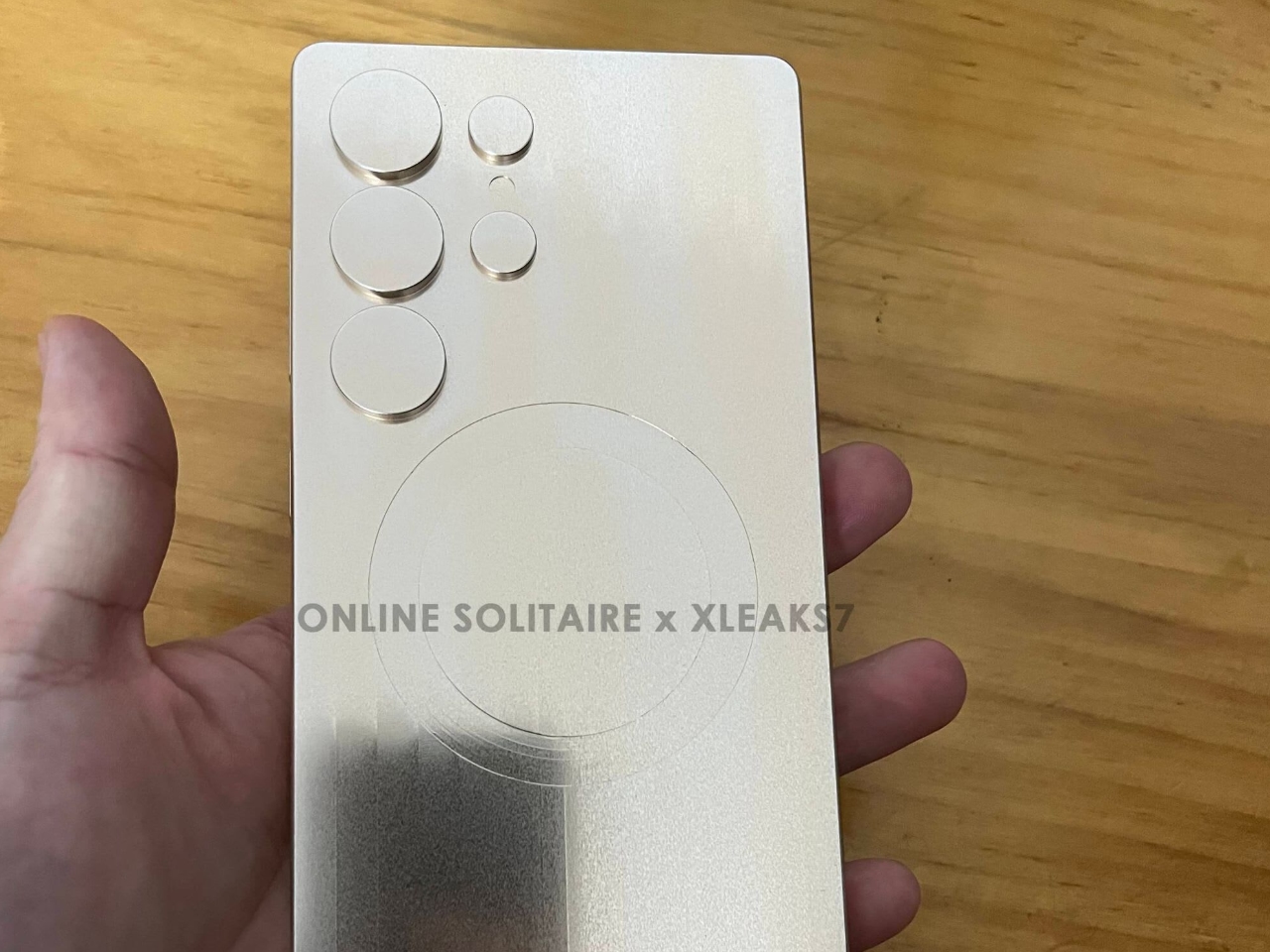
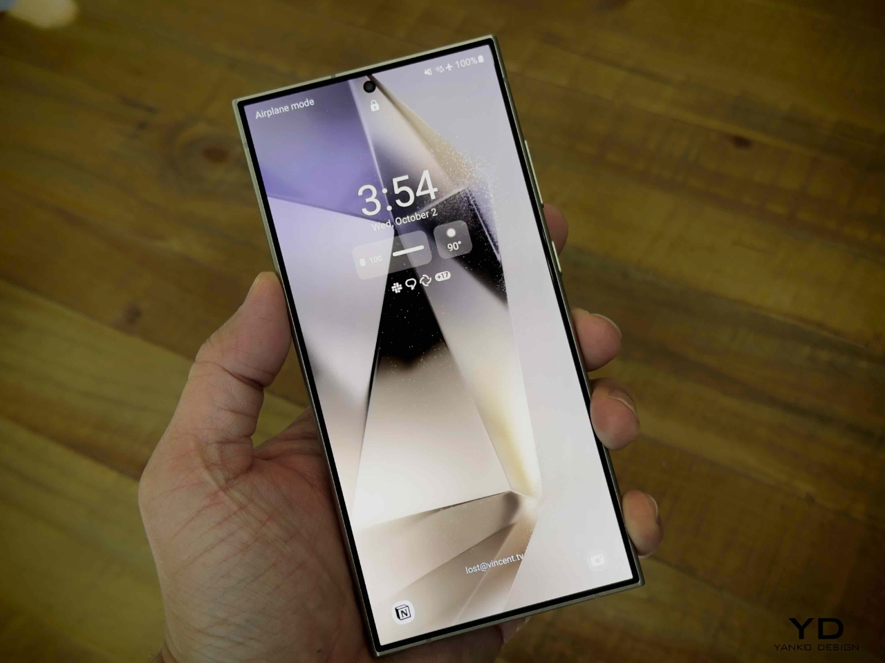
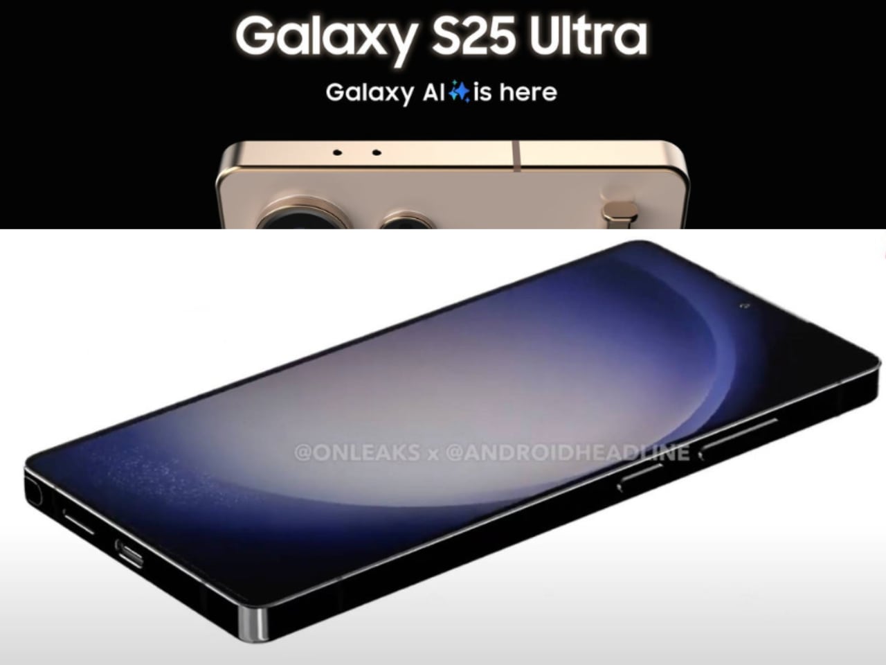
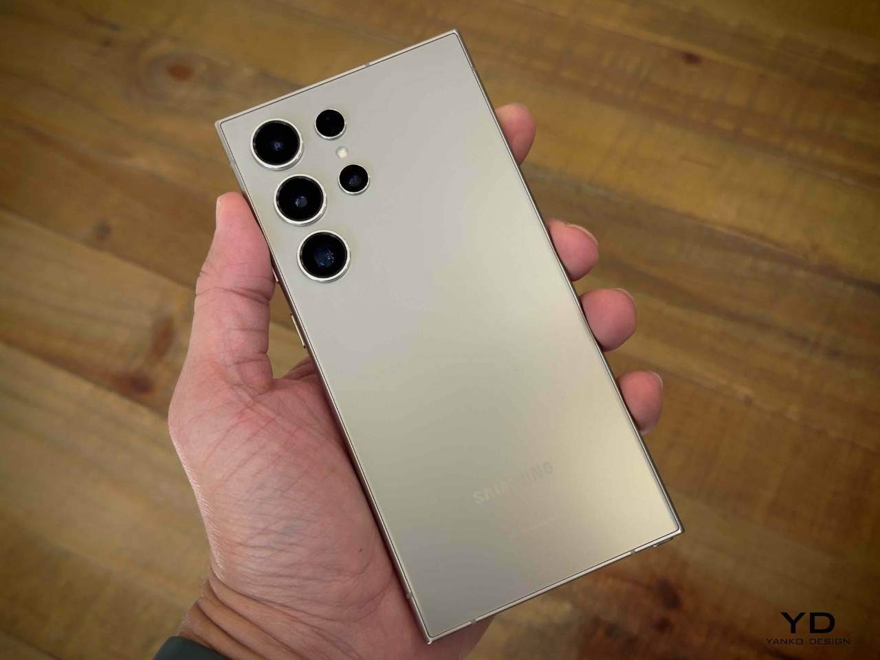
According to the latest leaks, Samsung’s Galaxy S25 Ultra is shaping up to introduce key design changes. The shift from sharp, angular edges to more rounded corners is the most notable update aimed at improving comfort and usability. In addition to these changes, the device is expected to be taller, narrower, and thinner than its predecessor, the Galaxy S24 Ultra. These refinements reflect Samsung’s focus on delivering a more ergonomic and user-friendly flagship device while also maintaining the powerful performance the Ultra series is known for.

Designer: Samsung

Design Changes

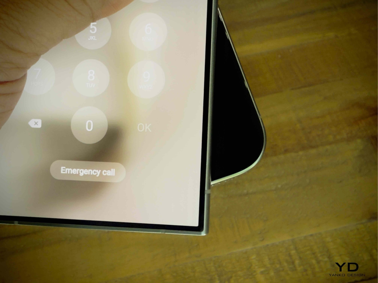
The most significant design shift is the move to rounded corners, which replaces earlier models’ sharp, boxy edges. This change is expected to make the phone easier to handle and more comfortable for prolonged use. Samsung seems to be addressing feedback from users who found the sharp edges of the Galaxy S23 and S24 Ultra too rigid. The S25 Ultra also features slimmer bezels, which offer a more immersive display without increasing the phone’s overall size. Combined with the sleeker profile, this design update focuses on comfort and practicality without compromising the premium aesthetic.

The Galaxy S25 Ultra is also rumored to be slightly taller, narrower, and thinner than the S24 Ultra, enhancing its handling and comfort in daily use. These updates mark a shift in Samsung’s design philosophy, prioritizing usability while maintaining the premium quality and performance that users expect from the Ultra series.

Other Rumored Specs

Beyond the design changes, the Galaxy S25 Ultra is expected to feature some serious hardware upgrades. It will likely be powered by the Snapdragon 8 Gen 4 chipset, which will deliver improved performance and energy efficiency thanks to its 3nm architecture. The device is also rumored to feature the new Adreno 830 GPU, making it a powerhouse for gaming and graphic-heavy applications. Users can expect smoother performance, particularly in multitasking and gaming scenarios.

Sources: Online Solitaire x Xleaks7

Additionally, the S25 Ultra will reportedly come in both 12GB and 16GB RAM configurations, ensuring plenty of power for multitasking and AI-driven applications. Samsung’s development of thinner memory chips allows these RAM options without increasing the device’s bulk, maintaining the slim profile that defines the Ultra line. The device will be a performance powerhouse while still focusing on sleek design.

Why’s the S24 Ultra Noteworthy?

The Galaxy S24 Ultra is notable for being one of the most feature-packed devices Samsung has ever released. Thanks to the S-Pen, its incredible display, and its versatile camera system, it’s a powerhouse in productivity, creativity, and media consumption. Integrating AI tools makes it even more dynamic, giving users smarter ways to interact with content, from photo editing to overall system efficiency. For users who need a device that can do it all, the S24 Ultra has been a top contender.

Yanko Design’s Take on the Galaxy S24 Ultra: 5 Things We Love

1. S-Pen Integration

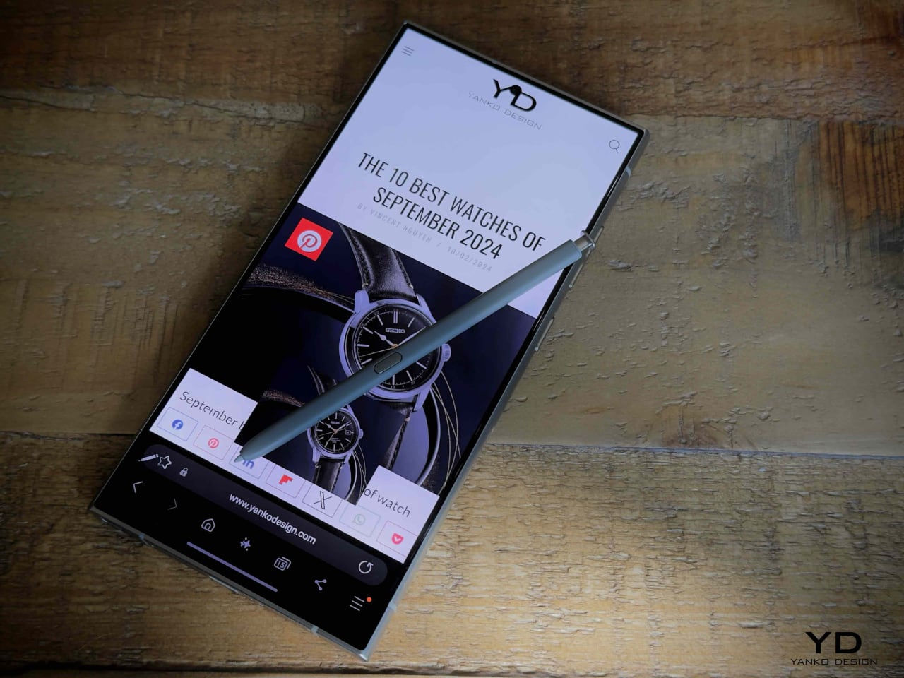
The Galaxy S24 Ultra continues Samsung’s tradition of integrating the S-Pen into its Ultra series, making it an excellent productivity tool. Whether you’re sketching, taking notes, or remotely controlling the camera, the S-Pen enhances the overall experience, offering functionality beyond that of a typical smartphone.

2. Versatile Camera Setup

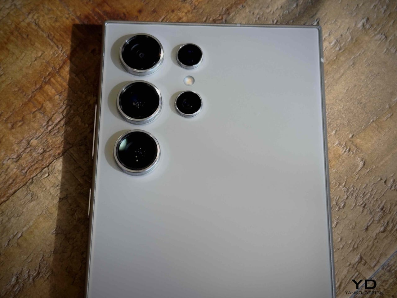
With a 200MP primary sensor, the S24 Ultra offers one of the most powerful and flexible cameras on the market. Its ability to shoot in various lighting conditions and impressive zoom capabilities provide professional-grade results in a compact form.

3. Display Quality

The 6.8-inch Dynamic AMOLED 2X display remains one of the best in class, offering deep blacks, vibrant colors, and smooth 120Hz refresh rates. This makes media consumption and gaming highly immersive experiences.

4. Battery Life

The S24 Ultra’s 5000mAh battery ensures users can get through a day of heavy usage, whether streaming, using the S-Pen, or multitasking between apps, without worrying about recharging mid-day.

5. AI-Powered Features

Samsung’s recent software updates have enhanced the AI capabilities of the S24 Ultra. Features like scene optimization and enhanced object removal tools in the camera app make it a great choice for users who love to edit photos and videos on the go.

3 Things We Dislike

1. Weight and Bulk

The Samsung Galaxy S24 Ultra weighs 233 grams, making it slightly heavier than many other flagship smartphones on the market. This weight, combined with its large 6.8-inch display and durable titanium frame, contributes to its premium feel but can also make it feel bulky for users who prefer a more streamlined and lightweight design. The size and weight can be particularly noticeable when using the phone one-handed for extended periods.

This bulkiness is one of the aspects that some users might find uncomfortable, especially when compared to lighter devices, although the premium materials like titanium and Gorilla Glass are designed to offer enhanced durability.2. Slow Charging Speeds

While the S24 Ultra provides reliable battery performance, its wired and wireless charging speeds lag behind some competitors. Faster charging would make the phone more convenient for users who are constantly on the go.

3. Sharp Edges

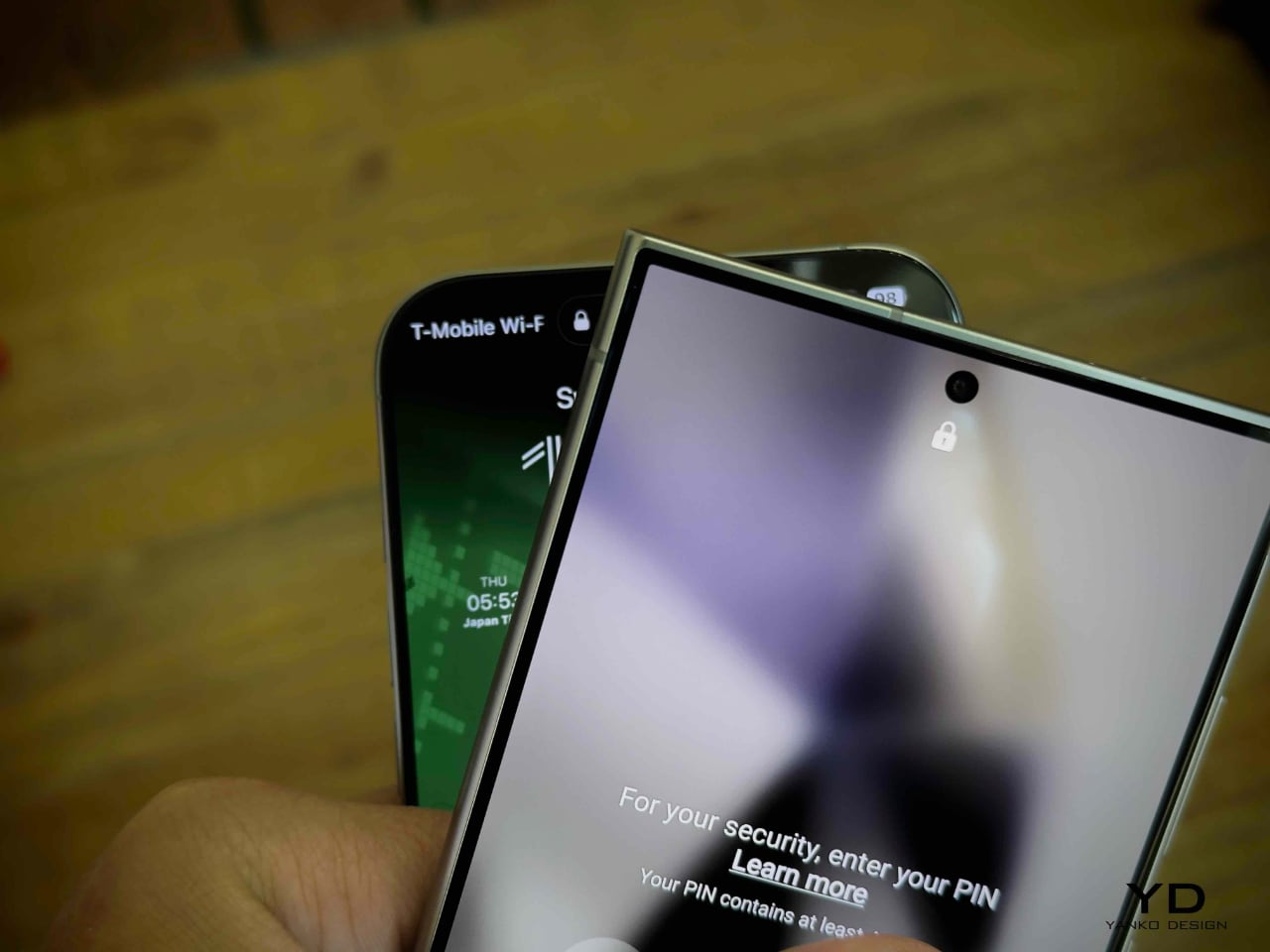
The S24 Ultra’s sharp, boxy design can feel uncomfortable in the hand, particularly during prolonged use. This is an area where we hope to see Samsung address user feedback with the rumored rounded corners of the S25 Ultra.

Is It Worth the Upgrade?

With the rumored design changes, like rounded corners for better comfort and slimmer bezels, the Galaxy S25 Ultra promises a more ergonomic experience. Powered by the Snapdragon 8 Gen 4 chipset and featuring up to 16GB of RAM, it offers significant performance improvements. But is that enough to warrant an upgrade? Whether you’re an iPhone user, a previous-gen Samsung owner, or loyal to Android, these refinements in design and power could make the S25 Ultra the flagship device you’ve been waiting for. Will these upgrades convince you to take the plunge?

The post Samsung Galaxy S25 Ultra Leaks: Rounded Corners, Slimmer Design, and Internal Upgrades Revealed first appeared on Yanko Design.

Pixel 9a leaked renders look pretty barren without the distinctive camera bar

With the Pixel 6 in 2021, Google embarked on a new design language and visual identity for its smartphones. Like it or not, and some definitely didn’t, the camera “visor” has become an identifying mark of the Pixel phones since then, something that no other brand dared to even try. It underwent a few refinements until it was finally replaced by the camera “bar” in this year’s Pixel 9. Some loved it, some despised it, and some even wanted to have the old visor back. It seems that Google isn’t done playing around with the design just yet if these early unofficial renders for next year’s “mid-release” Pixel phone. And if the Pixel 9a is any indicator of the direction that Google will take in the future, it’s bound to split camps yet again.

Designer: Google (via AndroidHeadlines and OnLeaks)

It’s not that hard to understand how divisive the Pixel camera design is. On the one hand, it is big, visible, and distracting, but on the other hand, it is executed elegantly, balances the phone on your desk, and gives your index finger something to rest on when holding the phone. What both camps will probably agree is that the camera visor or bar is an identifying mark of the Pixel phone, and it’s something the Pixel 9a might lack.

Based on the first CAD renders made from leaked information, the next mid-range Pixel phone will ditch the camera bar for a flatter design. Curiously, the cameras aren’t placed closer to the upper left corner of the phone’s back even without the bump, and it seems to be in the exact same position if it did have that bar. It’s almost as if Google just did a magic trick like pulling out the tablecloth from under the cameras, leaving them in the exact same place. At the same time, however, the camera island isn’t completely flush with the rest of the phone’s back as it has a raised lip around the oval, perhaps for protection. Whether it will make the wobble is something that can only be tested with an actual unit.

Other than that, the rest of the Pixel 9a’s design is pretty similar to the Pixel 9, down to having only two cameras on its back. The exact dimensions of the upcoming phone remain undisclosed, so we don’t know yet how bigger or smaller it is compared to the Pixel 9. The bezels around the display, however, do look a little thicker, giving it a less premium appearance overall.

The Pixel “a” series often carries the design from the same generation, so it would be surprising to see this big a change for the phone. It could also be Google’s strategy to further differentiate the Pixel 9a from the Pixel 9, giving it an aesthetic that definitely looks more “mid-range” than the flagship models. You can still see signs of the Pixel DNA if you look hard enough, but other than the position and orientation of the cameras, it’s almost too easy to pass the Pixel 9a over for some more visually interesting mid-tier phones.

The post Pixel 9a leaked renders look pretty barren without the distinctive camera bar first appeared on Yanko Design.
Leaked Google Pixel 9a image shows a MAJOR Design Change and No Camera Bump

It seems like the Pixel’s A-series is a victim of its own success. While the last few A-series phones like the Pixel 6a, 7a, and 8a have been phenomenal retail successes (sometimes even being preferred by people over the flagships), this year might be different. If these leaked images are any indication, the upcoming Pixel 9a might see a major design update… but there’s probably a good reason why.

The recent leak of the Google Pixel 9a suggests a fresh approach to design in Google’s mid-range offering, one that may mark a departure from the aesthetic norms established by previous Pixel devices. The leaked renders, shared by @VNchocoTaco on X, reveal a design that forgoes the familiar visor-like camera bar seen on its predecessors. Instead, the Pixel 9a opts for a sleek, minimalistic camera island. This module, positioned on a flat back panel, introduces subtle design refinements that indicate a clear intention by Google to redefine the visual identity of its A-series line. Why, you ask? I can think of a few potential reasons.

Rendered Image Representation of the Google Pixel 9a

Like I mentioned earlier, the Pixel A-series has a reputation for being a little too popular. Even though it’s touted as a budget phone, most YouTubers and reviewers claim that it’s just as good as its flagship counterpart, if not better. It looks just like the flagship, with a very similar design, and an equally good camera. The A-series only gets a few minor downgrades in the form of screen quality, processor speed, lack of wireless charging, larger bezels, and notably a lower price… all of which are fairly acceptable trade-offs. As a result, most budget phone lovers prefer the A-Series phones OVER the flagships, leading to more sales while Google tries to push the more expensive models instead by providing offers/discounts, etc. This dramatic redesign is probably Google’s way of making sure the Pixel 9a doesn’t steal the 9 and 9 Pro’s thunder. If Google’s last keynote was any indication, the company is making a HARD pivot to Gemini, and the Pixel 9a will probably get the same Tensor G4 chip to support those Gemini features (otherwise nobody will buy the phone). By cutting back on the design but still providing remarkable AI functionality (along with camera chops), the Google team seems to be future-proofing their flagship phone while still making the A-series fairly lucrative. It’s a nice strategy, although the Pixel 9a images (if they’re real) show a phone that lacks any character.

The images show a phone with flat sides that curve gently at the edges, just like the Pixel 9, 9 Pro, and 9 Pro Fold. This shift creates a more ergonomic experience, addressing one of the criticisms directed at the earlier A-series models, which were sometimes described as cumbersome in hand. Despite this redesign, the bezel size remains largely unchanged compared to the Pixel 8a. For some, this may be a missed opportunity for a more streamlined display experience, especially when considering the bezel trends across mid-range competitors. Nevertheless, these design choices suggest that Google is focused on maintaining the practicality and accessibility that the A-series has become known for, rather than chasing industry trends.

Though the images’ authenticity remains unverified, the source claims that the leak originates from a Compal employee. Compal, a well-known manufacturing partner for Google, has been involved in producing various Pixel devices. It’s also rumored that the Pixel 9a will drop at the end of this year (rather than 2025) and will be available in 4 colors. If this information holds true, it adds credibility to the likelihood that these design changes are indeed intended for the upcoming Pixel 9a. Such a move to alter the design language signals that Google is perhaps aiming to establish a different identity for its A-series, distancing it from the flagship models while still retaining core features that are essential for a consistent user experience across the lineup.

The post Leaked Google Pixel 9a image shows a MAJOR Design Change and No Camera Bump first appeared on Yanko Design.
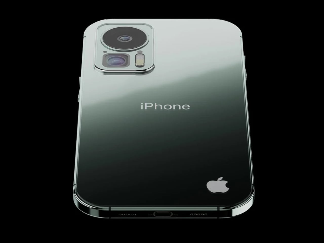
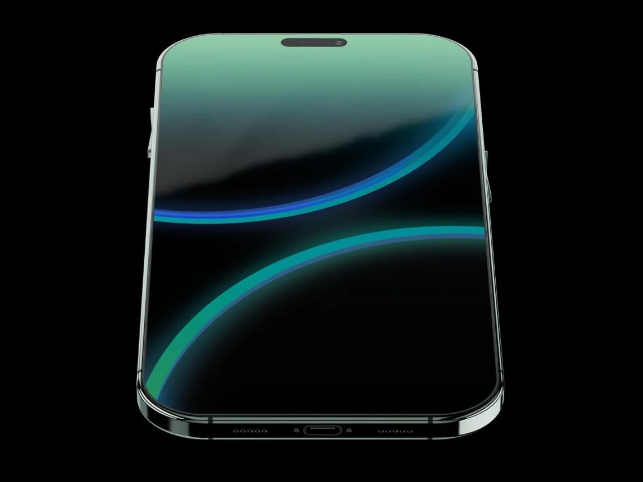
The Future of Apple design language: iPhone 17 Slim and the Shift Towards Ultra-Thin Devices

Rumors are swirling that Apple might be dropping its “Plus” iPhone models, starting with the iPhone 17, potentially replacing them with a more premium offering. Over the years, the appeal of the “Plus” models has waned as standard, and Pro models have become more capable. The latest leaks suggest Apple is set to introduce a new “Slim” iPhone to fill this gap, a move that could revolutionize the future of Apple’s products and excite tech enthusiasts.

Designer: Apple

Remember that iconic moment when Steve Jobs wowed the world by pulling the MacBook Air out of a manila envelope? Could Apple be gearing up for another “MacBook Air moment” with the iPhone 17 Slim? If the rumors are true, we might witness a similarly groundbreaking reveal that redefines expectations for smartphone design and performance.

On July 20, details emerged on Weibo indicating that the iPhone 17 line-up will not include a Plus model. Instead, Apple is reportedly planning to launch an “iPhone 17 Slim,” set to become the most premium model in the line-up, much like the Apple Watch Ultra. This new model will take design cues from the ultra-thin iPad Pro M4, launched in May.

iPhone Concept

The iPhone 17 Slim is rumored to be significantly thinner than its predecessors and other models in the line-up. It is also said to feature an LTPO display with a 120Hz refresh rate, a feature currently exclusive to Pro models. This shift means every iPhone 17, from the base model to the Pro Max, will offer ProMotion technology.

Speculation also suggests that the iPhone 17 series will be powered by Apple’s A19 and A19 Pro processors. The iPhone 17 Slim will likely include the A19 Pro, making it the most advanced and expensive model in the range. Rumors suggest a starting price of $1,299, making it pricier than the current iPhone 15 Pro Max. However, the potential of the iPhone 17 Slim to meet and exceed consumer expectations in terms of performance and design is reassuring.

Here’s a look at the potential iPhone 17 line-up:

  • iPhone 17: $799, A19 processor, 6.27-inch LTPO (ProMotion) display, 8GB of RAM
  • iPhone 17 Pro: $1,099, A19 Pro processor, 6.27-inch LTPO (ProMotion) display, 12GB of RAM
  • iPhone 17 Pro Max: $1,199, A19 Pro processor, 6.86-inch LTPO (ProMotion) display, 12GB of RAM
  • iPhone 17 Slim: $1,299, A19 Pro processor, 6.65-inch LTPO (ProMotion) display, 12GB of RAM

Apple’s push towards thinner designs extends beyond the iPhone. The company is rumored to work on slimmer versions of all its main products, including MacBooks and Apple Watches. This ambition presents significant challenges, particularly regarding battery life and durability. A thinner design often means a smaller battery, which could compromise battery life. Ensuring the iPhone 17 Slim has comparable or superior battery performance to existing Pro Max models will be crucial.

Interestingly, with the development of the M4 and potentially M5 chips, these processors are expected to be much more efficient by the time the iPhone 17 is released. This efficiency could allow Apple to use a smaller battery while retaining the same battery life as current models. While battery capacity is a significant factor, I would much rather have a faster wired and wireless charging rate to top off as needed quickly.

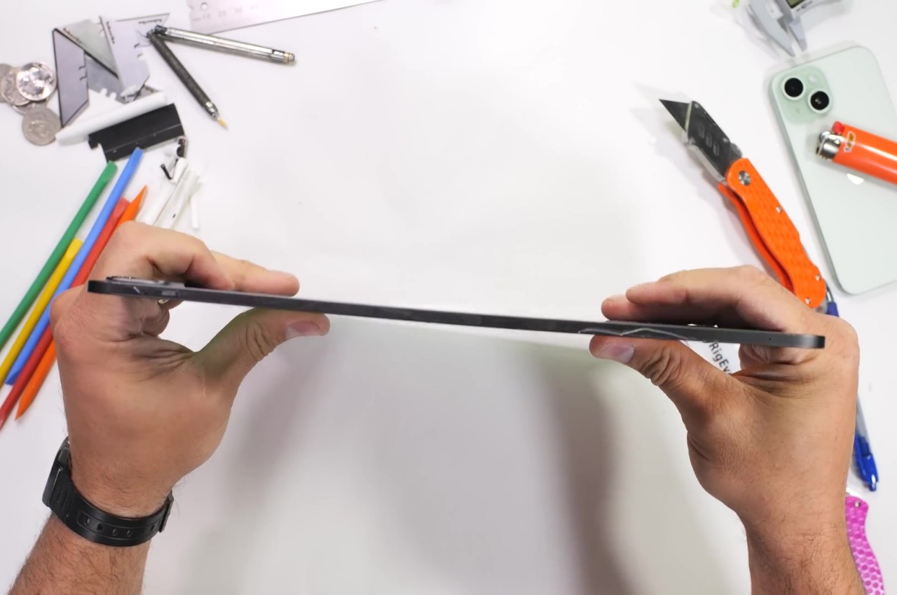
The design elements of the iPad Pro M4 are noteworthy, with its skinny profile and raw processing power setting a new standard for Apple’s devices. Imagine the iPhone 17 Slim adopting this same level of thinness combined with the A19 Pro processor. This would not only deliver a powerhouse device with exceptional performance and a gorgeous display but also set a new benchmark for smartphone design in the tech industry. Additionally, thinner devices can be more susceptible to bending and other durability issues, making robust design and engineering essential. However, Apple seems to have resolved this issue with the iPad Pro M4, giving confidence that the iPhone 17 Slim will be both durable and sleek—hallelujah!

Interestingly, recent leaks about the Pixel 9 Pro and the newly released Galaxy Fold6 and Flip6 show a trend towards flat edges, similar to the iPhone 15 Pro and Max. This design trend across brands highlights the industry’s move towards sleek, flat-edged devices. The Pixel 9 Pro will feature a refined design focusing on high-end performance. At the same time, the Galaxy Fold6 and Flip6 continue to innovate in the foldable phone market, combining cutting-edge technology with stylish designs.

Samsung Galaxy Fold6

Pixel 9 Pro Fold

The iPhone 17 Slim’s anticipated ultra-thin design would fit right into this trend, offering a visually stunning and powerful device that appeals to users looking for the best form and function. The ultra-thin design not only enhances the device’s aesthetics but also makes it more portable and comfortable to use, thereby enhancing the overall user experience.

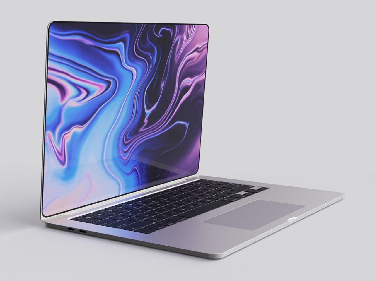
Apple’s ultra-thin tech game plan doesn’t stop at the iPhone. The upcoming MacBooks and Apple Watches are also expected to feature thinner designs, making them more portable and stylish while maintaining high performance. The challenge will be to balance this thinness with functionality, ensuring that battery life and durability are not compromised.

MacBook Concept

With the iPhone 16 around the corner, are these early iPhone 17 leaks compelling enough to keep you holding on to your current device for another cycle? The promise of the iPhone 17 Slim, with its ultra-thin design, powerful A19 Pro processor, and stunning LTPO display, could be worth the wait. As Apple continues to innovate, we can expect these design principles to set new industry technology and design standards, inspiring the tech industry and consumers alike.

The post The Future of Apple design language: iPhone 17 Slim and the Shift Towards Ultra-Thin Devices first appeared on Yanko Design.
Samsung Galaxy Z Fold 6 and Z Flip 6 Leak: Complete Specs and Features

Samsung is gearing up to reveal its latest foldable smartphones, the Galaxy Z Fold 6 and Galaxy Z Flip 6. With the Samsung Unpacked event just around the corner, detailed specs for both devices have already leaked, giving us a sneak peek at what’s coming.

Designer: Samsung

Samsung Galaxy Z Fold 6

The Galaxy Z Fold 6 comes with some exciting upgrades. The 7.6-inch inner screen now boasts a max brightness of 2,600 nits, up from 1,750 nits, making it much easier to see in bright daylight. The outer screen remains a useful 6.3 inches, with slight improvements in size and resolution for a better overall viewing experience.

Image via Evan Blass

Under the hood, the Z Fold 6 is powered by the new Snapdragon 8 Gen 3 processor, which promises faster and more efficient performance. You’ll also get an extra hour of LTE internet use and two more hours of video playback, perfect for those long days out. Design-wise, the Fold 6 is 14 grams lighter and a bit more compact, making it easier to carry around. It’s 1.4mm shorter, 1mm wider, and 1.3mm thinner when folded, and 1.4mm shorter, 2.7mm wider, and 0.5mm thinner when unfolded. The improved Armor Aluminum frame ensures better durability without adding extra weight. A minor yet noteworthy change is the secondary screen being 0.1 inches larger. The main display resolution has slightly changed to 2160×1856 from 2176×1812. However, the cameras, battery capacity (4400mAh), and Gorilla Glass Victus 2 cover glass remain the same.

Image via Evan Blass

The design of the Z Fold 6 also focuses on functionality and portability. Despite its large display, the device is slim and lightweight, making it pocket-friendly. Samsung has improved the hinge mechanism, offering a smoother folding experience. The Z Fold 6 also supports the S Pen, making it a versatile tool for note-taking and productivity on the go.

Image via Evan Blass

Samsung Galaxy Z Flip 6

The Galaxy Z Flip 6 is also getting some cool updates. The main camera is now a powerful 50MP, up from 12MP, while retaining the same f/1.8 aperture for stunning photos. Another significant change is the switch to an IPS display from OLED, which might affect color quality slightly but could improve durability.

Image via Evan Blass

Equipped with the new Snapdragon 8 Gen 3 processor and upgraded to 12GB of RAM from 8GB, the Galaxy Z Flip 6 ensures smooth multitasking and performance. The higher capacity 4,000mAh battery (up from 3,700mAh) extends internet usage by two hours and video playback by three hours, making it a reliable companion for prolonged use. When folded, the device is 0.2mm thinner, with other dimensions and weight remaining unchanged. A notable aesthetic update is that the entire phone reflects your chosen color, not just one panel on the back, for a more unified and stylish look. Like the Fold 6, the Flip 6 is protected by Gorilla Glass Victus 2.

Display Comparison: Z Flip 4, 5, and 6

We see some exciting changes when comparing the display sizes across the Z Flip series. The Z Flip 6 has a 6.7-inch inner screen and a 3.4-inch outer screen, consistent with the Z Flip 5, but a significant jump from the Z Flip 4’s 1.9-inch outer screen. This increase provides a more useful and interactive external display, enhancing functionality without unfolding the device. Additionally, the Z Flip 6’s switch to an IPS display for the outer screen, from OLED, indicates a focus on durability and other display qualities.

Image via Evan Blass

New Features and Improvements

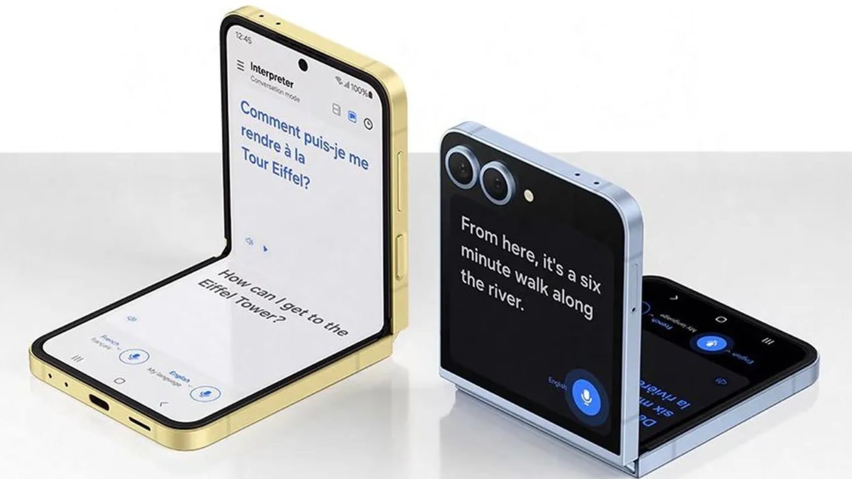
The Galaxy Z Flip 6 introduces several innovative features. The front cover screen now supports Samsung’s language-translating Interpreter Mode, allowing you to communicate more effectively in different languages. It also has Chat Assist, which lets you send messages directly from the front display with suggested replies curated by context-sensitive AI. The Circle to Search with Google feature enables users to instantly circle an object or text and get search results.

Image via Evan Blass

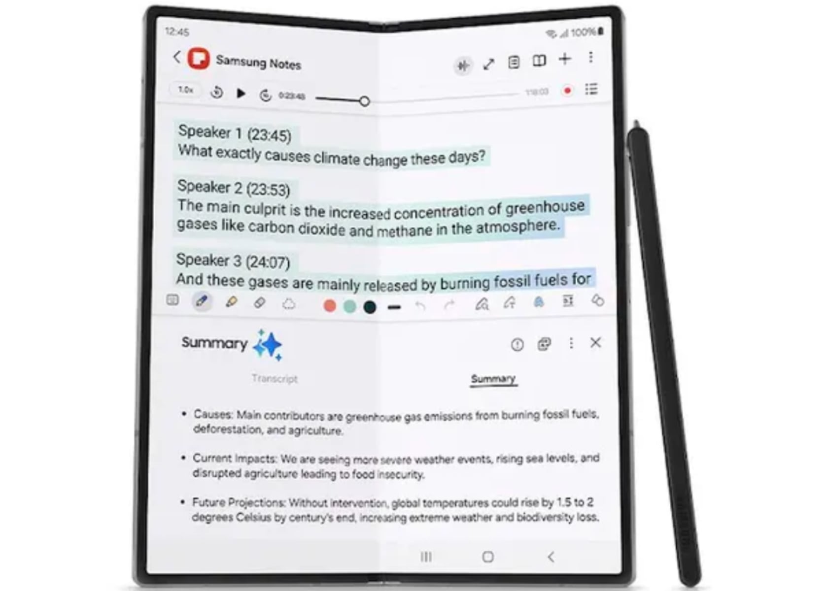
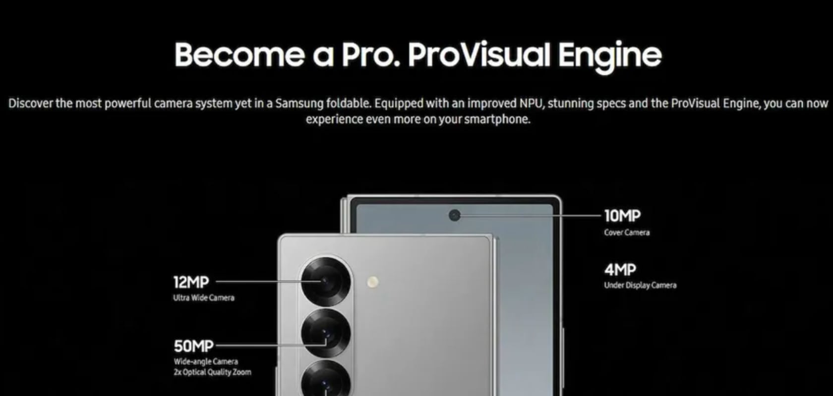
On the Galaxy Z Fold 6, the AI Note Assist helps summarize notes, making organizing your thoughts and ideas more accessible. The device also offers an immersive gaming experience with its high-brightness display and improved performance. The ProVisual Engine on both devices enhances camera capabilities, providing clear zoom and detailed photos powered by AI.

Image via Evan Blass

With the official launch on July 10th, these leaks have given us a comprehensive look at what to expect. Whether you’re after better performance, enhanced camera features, or stylish design tweaks, the Samsung Galaxy Z Fold 6 and Galaxy Z Flip 6 are shaping up to be great new additions to the foldable phone market.

The post Samsung Galaxy Z Fold 6 and Z Flip 6 Leak: Complete Specs and Features first appeared on Yanko Design.
Apple Watch X Leaks: 10th Anniversary Edition Rumored to Feature Larger Display and Magnetic Band

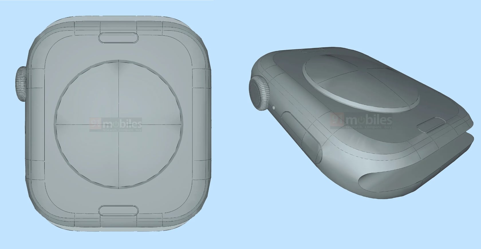
Apple is gearing up to celebrate the 10th anniversary of its iconic wearable, and anticipation around the upcoming Apple Watch Series 10, or possibly Apple Watch X, is building. This milestone edition is rumored to bring significant updates and design enhancements, as suggested by recent leaks and renders from 91mobiles.

Designer: Apple

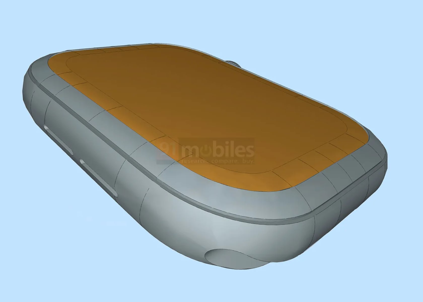
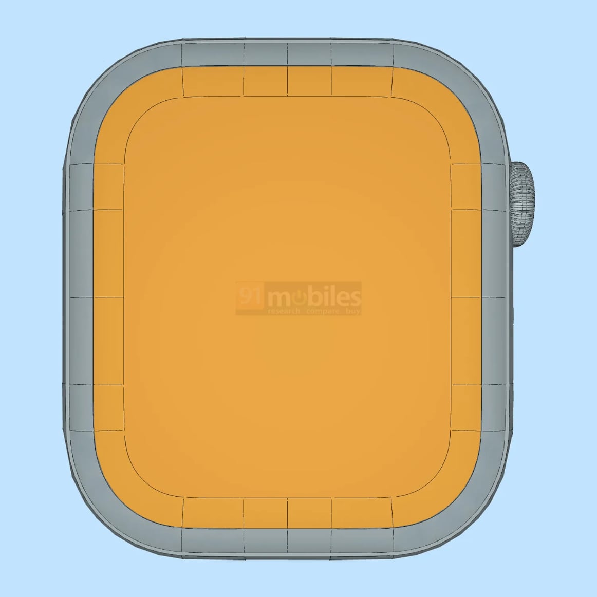
One of the most notable changes, as highlighted by 91mobiles, is the larger 2-inch display, the biggest ever on an Apple Watch. This new screen size is set to exceed the 1.93-inch display of the Apple Watch Ultra and the 1.7-inch display of the Apple Watch Series 9. According to the renders, the dimensions of the Series 10 are approximately 46 by 39.7 by 11.6 mm, making it larger than the Series 9 but still smaller than the Ultra.

Source 91mobiles.com: Apple Watch Series 10 CAD render

Another intriguing rumor is the potential redesign of the band connection system. The Apple Watch Series 10 might introduce a new magnetic band attachment system, replacing the current slide-in mechanism. This change could free up valuable internal space, possibly allowing for a larger battery or additional components. However, the CAD renders from 91mobiles do not show clear evidence of this new band attachment system. If it does make its way into the final design, the magnetic connection could contribute to a thinner overall watch.

Source 91mobiles.com: Apple Watch Series 10 CAD render

Despite these possible changes, the renders suggest that the Apple Watch Series 10 will maintain several familiar design elements. The iconic square display, digital crown, and side button appear to stay in their usual places. This consistency ensures that while the watch may evolve, it retains the recognizable aesthetic that has become synonymous with the Apple Watch brand.

Source 91mobiles.com: Apple Watch Series 10 CAD render

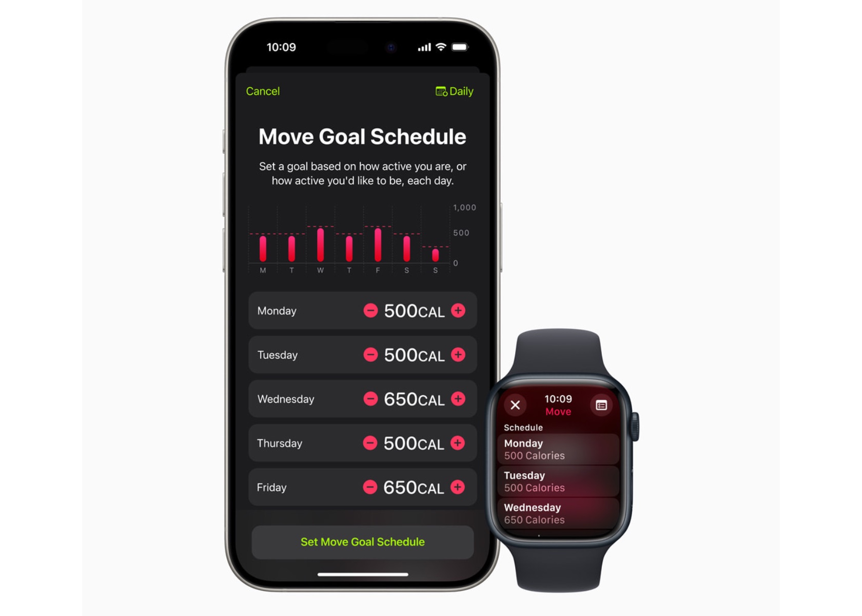
Adding to the excitement, WWDC 2024 introduced several new features we look forward to seeing in the Apple Watch Series 10. One of the most anticipated is the enhanced mental health monitoring capabilities, which will offer users a more comprehensive view of their well-being. Another is the advanced sleep tracking feature, providing detailed insights and personalized recommendations for improving sleep quality.

The upcoming watchOS also promises better integration with Apple Fitness+, bringing more guided workouts and real-time metrics directly to the wrist. A redesigned Siri interface, now more intuitive and responsive, will make interacting with the watch easier and more efficient. Finally, the new low-power mode is expected to extend battery life significantly, a welcome improvement for users who rely on their watch throughout the day and night.

While these leaks and renders from 91mobiles provide an exciting glimpse into the potential features of the Apple Watch Series 10, it is essential to approach them with caution. The actual design and features will only be confirmed with the official announcement, expected to coincide with the launch of the iPhone 16 series in September.

As Apple continues to innovate and refine its wearable technology, the Apple Watch Series 10 promises to be a significant step forward. It will combine a larger display, potential new band attachment system, and familiar design elements with the exciting new features announced at WWDC 2024. Fans and users eagerly await the official reveal to see how these rumored enhancements will translate into the next generation of the Apple Watch.

The post Apple Watch X Leaks: 10th Anniversary Edition Rumored to Feature Larger Display and Magnetic Band first appeared on Yanko Design.
Unreleased Beats Pill Speaker spotted with LeBron could be announced at the Apple Keynote

Hot on the heels of the new Beats Solo 4 headphones and Solo Buds earbuds, eagle-eyed fans spotted F1 driver Daniel Ricciardo and basketball star LeBron James carrying what appears to be a brand new Beats Pill speaker. This has ignited speculation about a potential revival of the popular portable speaker line, discontinued in early 2022.

The original Beats Pill, launched in 2012, quickly gained a loyal following for its compact size, bold design, and surprisingly good sound quality. After Apple acquired Beats in 2014, they introduced the slightly larger Pill+ in 2015, addressing some sound quality concerns and adding a Lightning port for charging (likely to be replaced with USB-C in the new iteration).

These celebrity sightings with the new Pill come across as a calculated marketing strategy, similar to how the Beats Pill gained traction in the past. The new Beats Pill maintains the familiar pill-shaped design of its predecessors, measuring roughly 8 inches long and 2.5 inches wide. It retains the clean look with just the Beats logo adorning the front grille. A continuous rubberized strip separates the front and back speaker grilles, and rubber feet on the bottom keep it from rolling around.

For reference, the discontinued Pill+ earned praise for its significantly improved sound quality thanks to an internal redesign. It also sported a Lightning port for charging, which will likely be swapped for USB-C in this new iteration. The Pill+ offered a respectable battery life of 12 hours. While details remain scarce, the leaked images show a design that stays true to the classic Beats Pill silhouette. A lanyard attachment hints at portability remaining a key feature.

The post Unreleased Beats Pill Speaker spotted with LeBron could be announced at the Apple Keynote first appeared on Yanko Design.
Apple’s Big Mistake with the iPhone 16 Series is Focusing TOO MUCH on the Camera

When Jobs took the stage to announce the iPhone back in 2007, he used three terms to describe the revolutionary device – a widescreen iPod with touch controls; a revolutionary mobile phone; and a breakthrough Internet communications device. However, ever since the iPhone 7 introduced a dual-lens main camera system on the phone, the Apple team has sort of obsessed with making sure the iPhone has a great camera first, and phone-adjacent features later. Almost like a handheld camera with an App Store, the iPhones now are just a shadow of what they could be. No foldable technology, no AI-based enhanced features, and not even a damn-near decent voice assistant. In fact, it took Apple YEARS to get 5G to their iPhones. Apple spends nearly 30-40% of each iPhone keynote talking about the camera and screen, and now rumors are indicating that the iPhone 16 will introduce a dedicated ‘capture’ button that lets you click photos like you would with a professional camera. The problem with this is that it’s diluting the very definition of a smartphone… and I feel like it might be deliberate.

Earlier this week, leaks showed a new hardware feature coming to the iPhone – a Capture Button that would sit on the top right corner of your phone if you held it in landscape mode. Surprising as it is, considering Apple has been trying to go buttonless and portless for a while now, the Capture Button seems like an odd addition to a phone. Not a single other smartphone has a camera shutter button. In fact, the de facto position is to turn your volume button into a capture button while the camera is running… so what’s driving Apple to add YET ANOTHER button to their phone, following the addition of the Action Button last year?

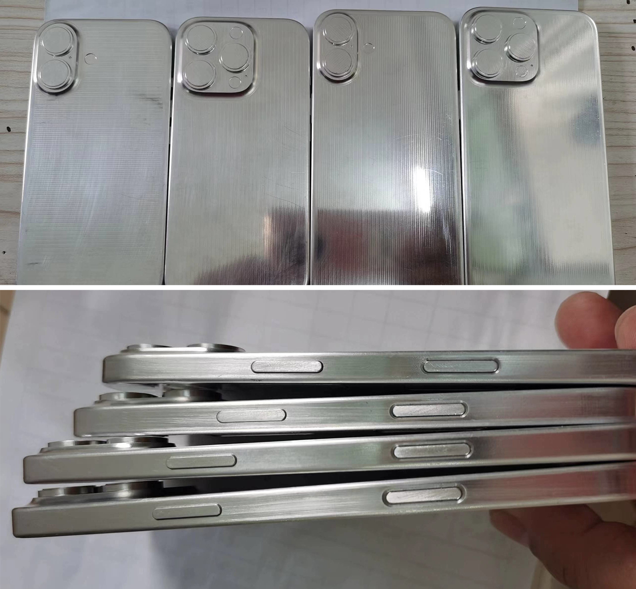
Leaked images of iPhone dummies used for case designs

Last month, I pointed out that the iPhone 16 is just going to be one of those boring phones worth missing, and this Capture Button seems to reinforce that fact. Every 3 years, Apple launches a ‘boring’ iPhone with a minor design upgrade just to keep things moving before a radical change and it’s been 2 years since the Dynamic Island, so this is probably Apple’s boring year. But why a Capture Button? Nobody said we needed it, not a single Android competitor has a Capture Button, heck if anything we’d appreciate bringing the 3.5mm audio jack back. So why is Apple going ahead with this hardware change?

There are two ways to look at it. The first is a simpler explanation – Apple’s run out of ideas. This is just one of those years where Apple pushes out something so it can tick that annual release box and make a few sales before something bigger and better in 2025. It’s a theory that holds merit given that the iPhone 8 was the ‘boring’ phone for the iPhone X, the iPhone 13 hardly had any extra features (unless you count Cinematic Mode as a game-changing upgrade) before the iPhone 14 ushered in the Dynamic Island. This basically means it’s business as usual and 2024 is just going to be a boring year for iPhones… but there’s yet another explanation.

Close-up of the purported Capture Button

The second explanation is a little more layered and vague, considering there’s no concrete proof to the fact. The explanation is that Apple’s pretty much resigning the iPhone to its fate – the camera. With the Vision Pro becoming Apple’s new breakthrough device, the iPhone will eventually take second place, quite like the iPod did 12 years ago. There are multiple rumors that Apple’s building a cheaper Vision headset (without the ‘Pro’ title) for the mass market to immerse in spatial computing… and when that happens, the iPhone won’t be anything except for a glorified photography device. It still doesn’t explain why Apple’s adding a Capture Button to their phone, given that people already use the volume button to capture photos… but that’s the vague part, because we really don’t ever know what’s going on inside the heads of Tim Cook and the Apple team until and unless they tell us. But as far as the iPhone 16 goes, I’d recommend you give it a miss unless you were long due for a smartphone upgrade.

Renders by Sarang Sheth

The post Apple’s Big Mistake with the iPhone 16 Series is Focusing TOO MUCH on the Camera first appeared on Yanko Design.
iPhone SE 4 Leaked Images Show a Radical New Design with a Notch Display and a Bigger Main Camera

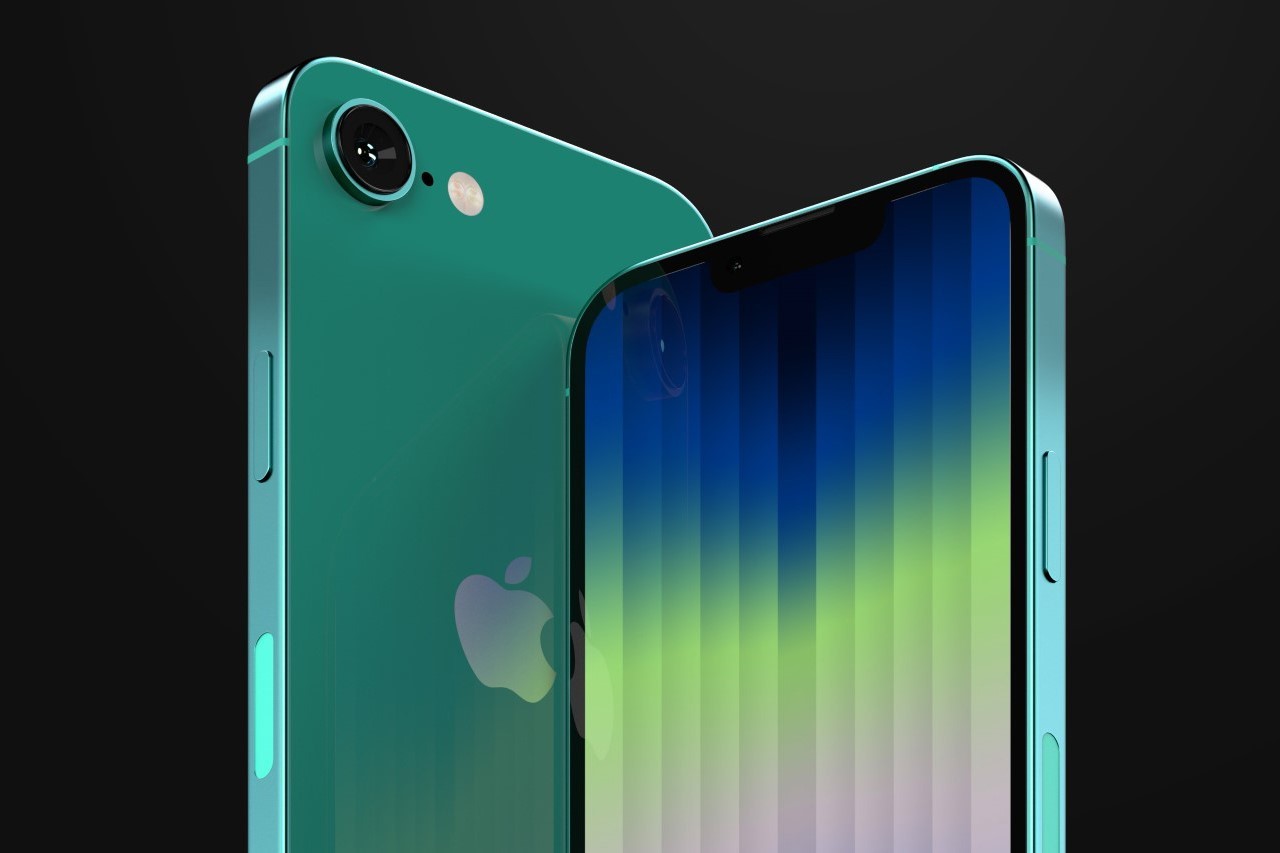
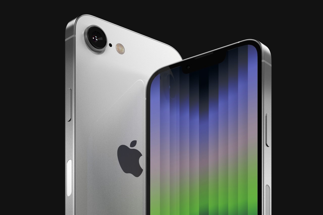
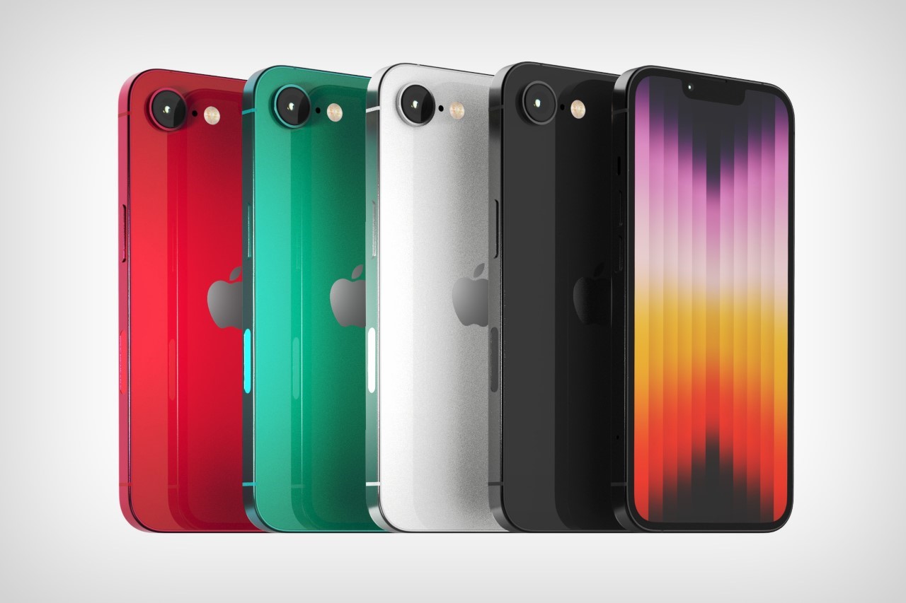
Apple’s budget iPhone is due for a refresh and for the first time ever, it’s getting a major design upgrade that does away with the TouchID, finally putting the technology in the rear mirror for the smartphone industry. Leaked images from China (you can see them at the end of this article) show dummy units of an upcoming iPhone SE with a refreshed design that now features the notch and FaceID system, along with a flat body reminiscent of the iPhone 12 and 13. Chances are that Apple’s probably repurposing older iPhone 12 chassis for the new 4th Gen SE that’s rumored to drop along with Apple’s iPad refresh next month.
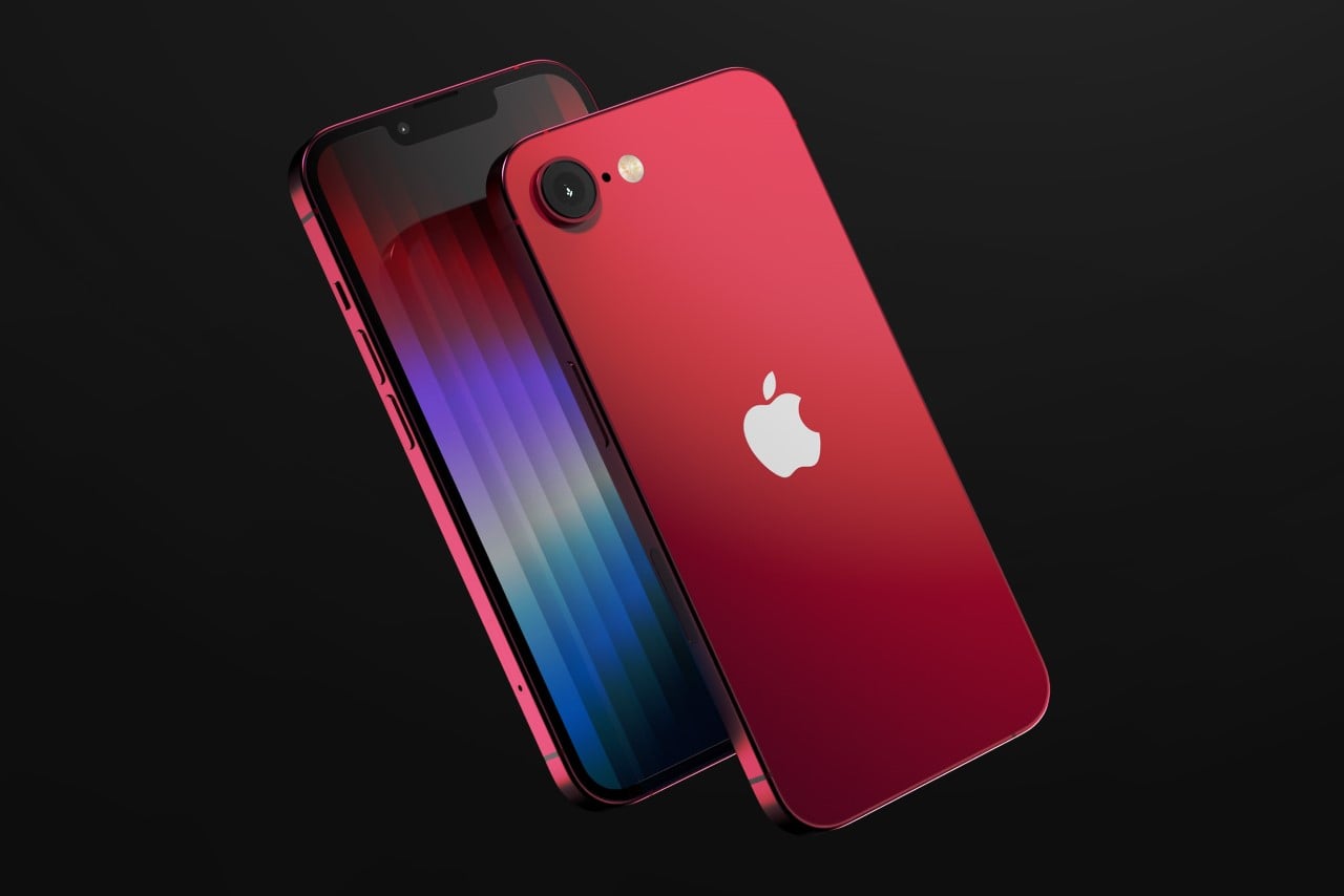
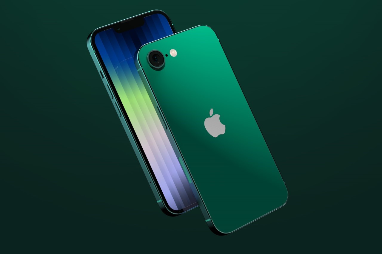
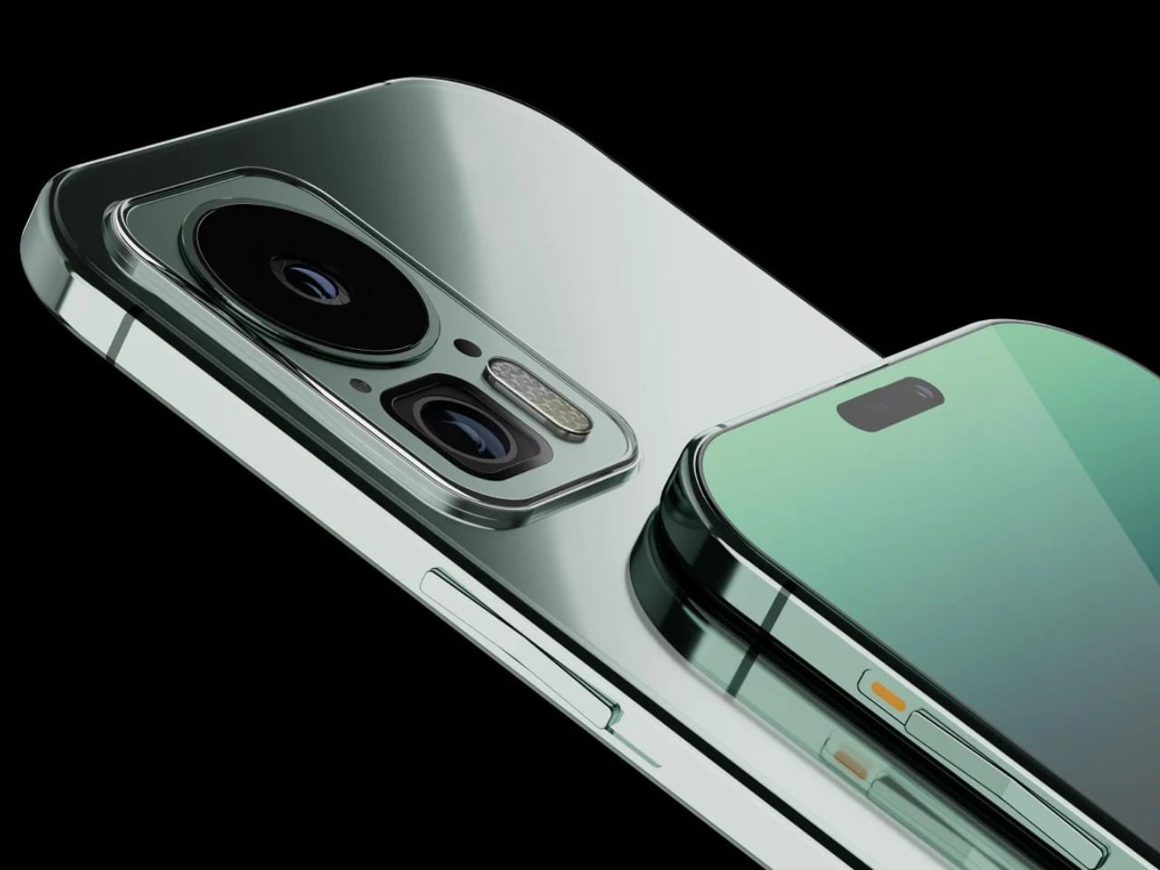
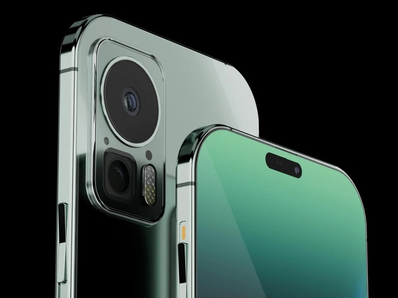
With four straight years of the iPhone SE having the same design (both Gen 2 and Gen 3 models used the same chassis as the iPhone 8), the iPhone SE 4 finally gets the upgrade we’ve all been waiting for. Now that the notch is pretty much history for the flagship iPhone, which has adopted the dynamic island, it makes sense for the technology to finally arrive to Apple’s budget line. The new SE 4, as indicated by pretty credible leaks at this point, uses the same body as the one used in the iPhone 12 and 13, sporting what leakers indicate is a 6.1-inch display on the front, a single-lens camera on the back, a FaceID system for facial unlocking, and a mute slider as opposed to the Action Button which Apple unveiled with the iPhone 15.

The 4th Gen iPhone SE is rumored to be a pretty big upgrade for budget customers, allowing Android users to make the iPhone shift with zero compromises. The large screen and thin bezels look just as gorgeous as the iPhone 14 from 2022, and the new SE is rumored to have 5G too, along with what I can only hope is USB-C, because of strict EU regulations that kick in at the end of the year. It’s still conceivable that Apple sticks to their guns and keeps the lightning connector on the SE, while just limiting sales within the EU, which isn’t really its budget market anyway.

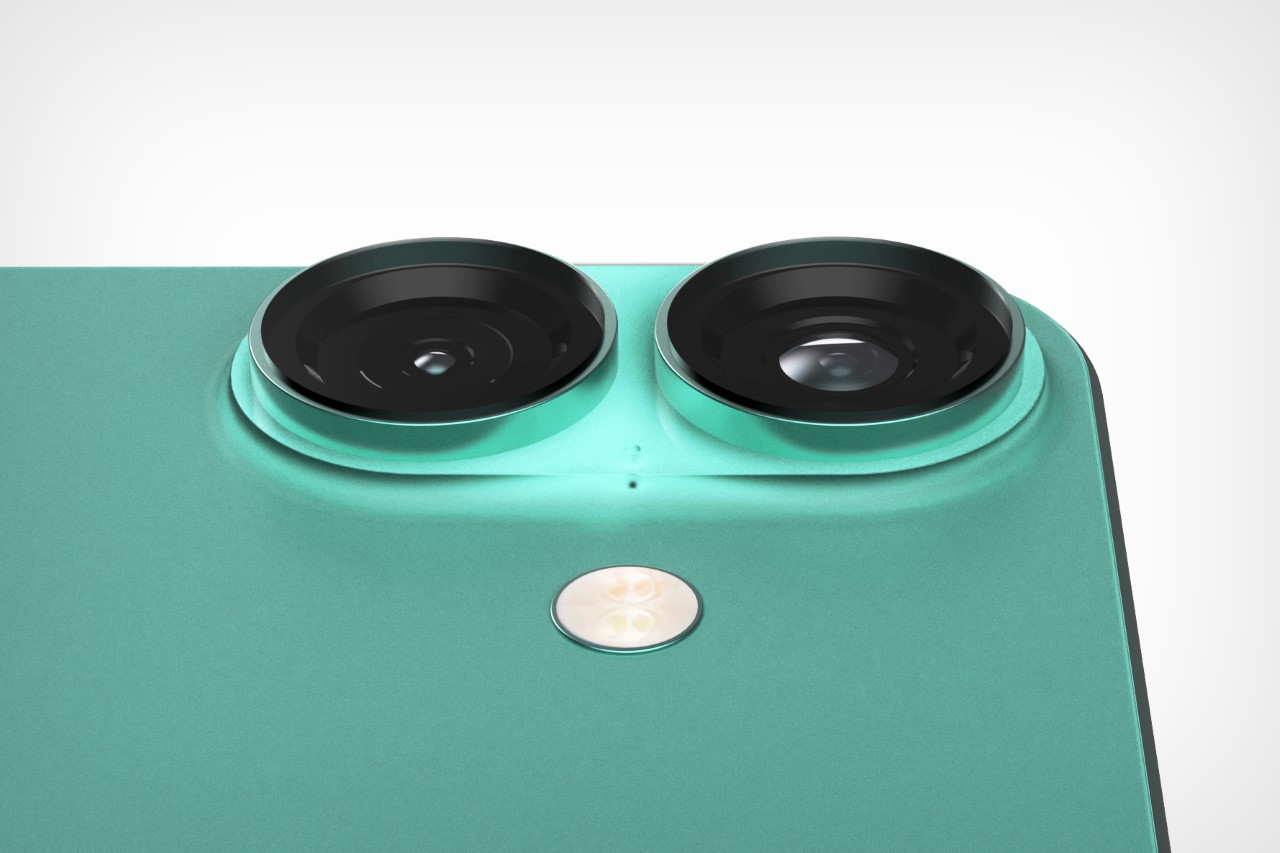
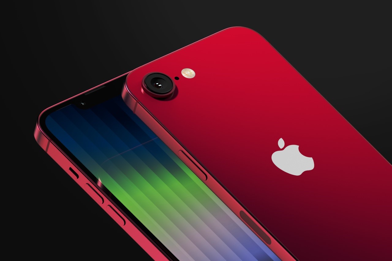
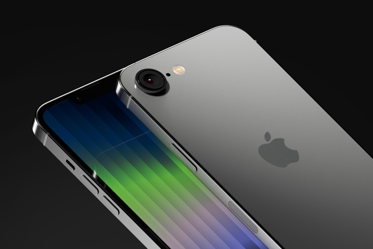
Notably the new iPhone SE 4 has a pretty large camera, which may make up for past models not having great photography capabilities. While details are scarce on what this new camera will be, the big sensor is probably rumored to be an all-purpose lens WITHOUT ultrawide capabilities to keep costs lower.

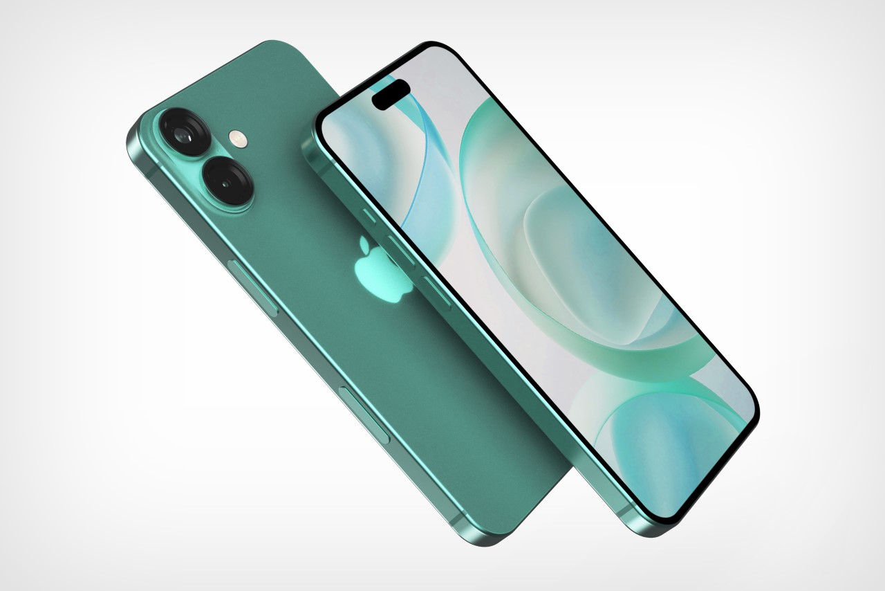
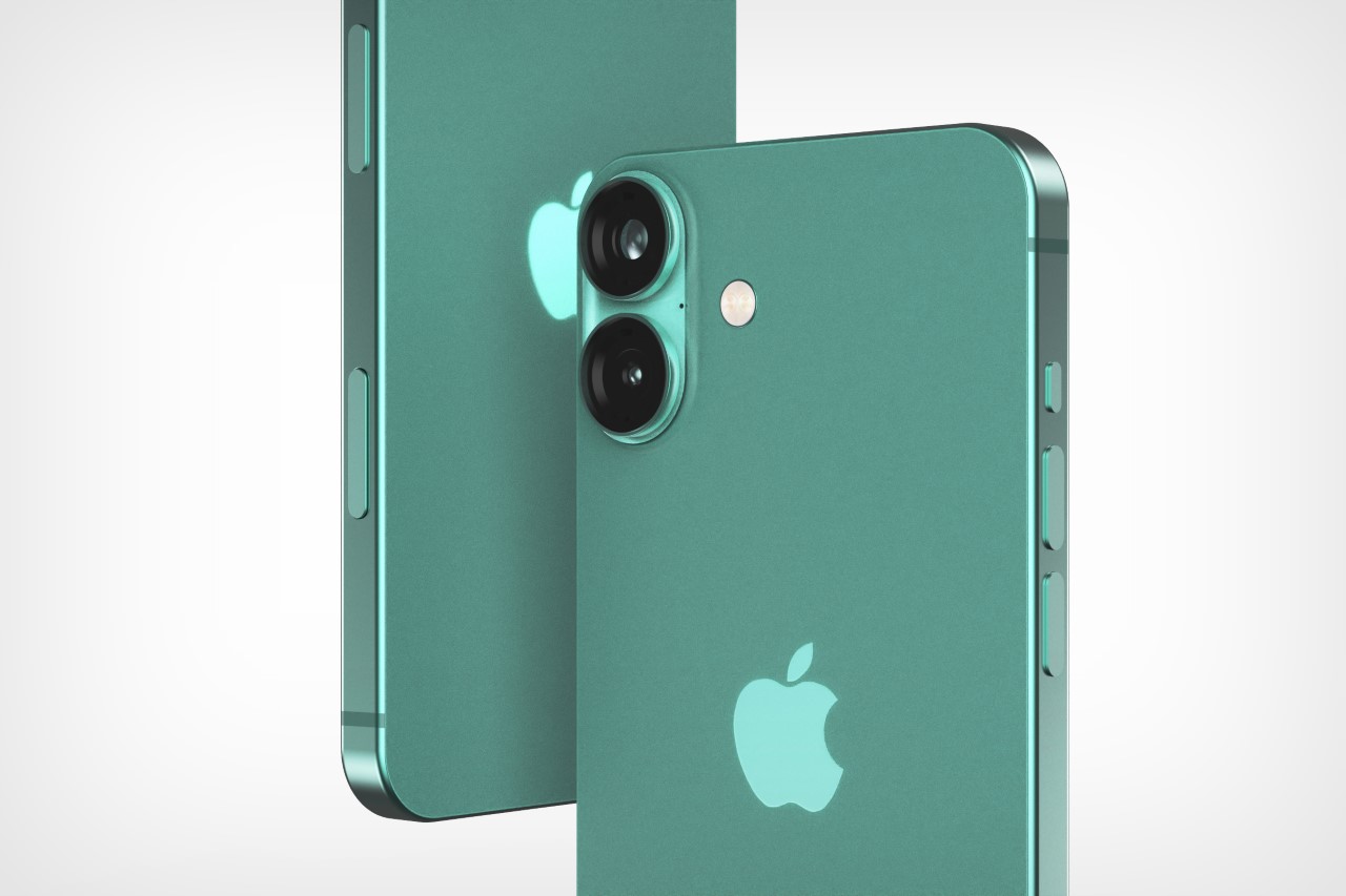
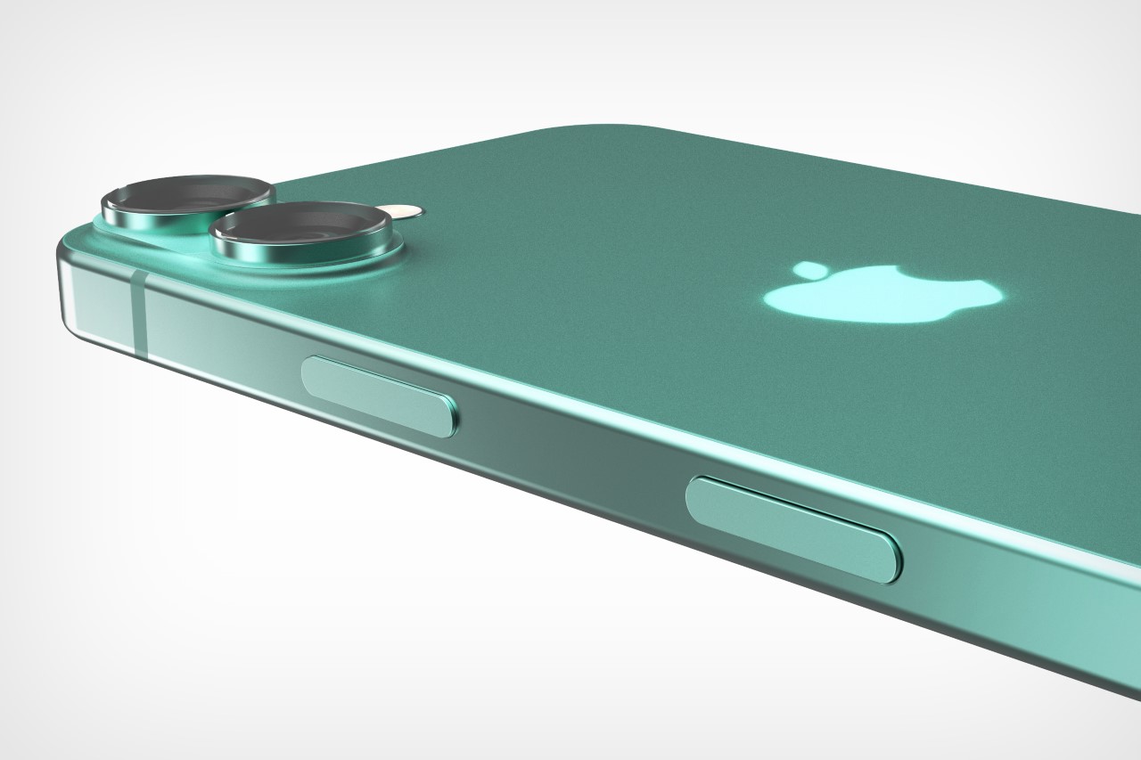
The above renders, created by Yanko Design, are based on leaked images from a Weibo user, showing case designs for the upcoming iPhone. The dummy model, which clearly reads iPhone SE 4, comes with a notched display, a single-shooter primary lens along with a flash, a flat aluminum frame, and all indications that the mute slider will still remain as a detail in the SE 4. As far as colors go, there’s really no concrete indication that Apple plans on adding any new colors to the range. The existing SE range has only 3 colors – black, white, and Project RED. For visualization purposes (and also because of an initial render found on the internet), we’ve also added a Forest Green color variant.

The post iPhone SE 4 Leaked Images Show a Radical New Design with a Notch Display and a Bigger Main Camera first appeared on Yanko Design.