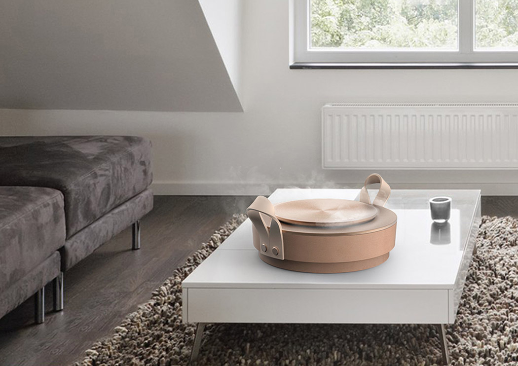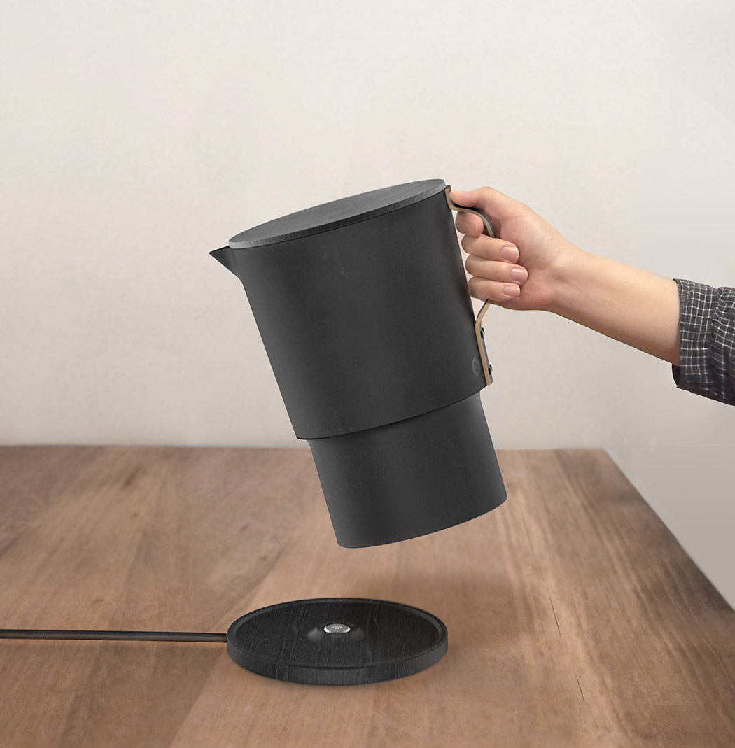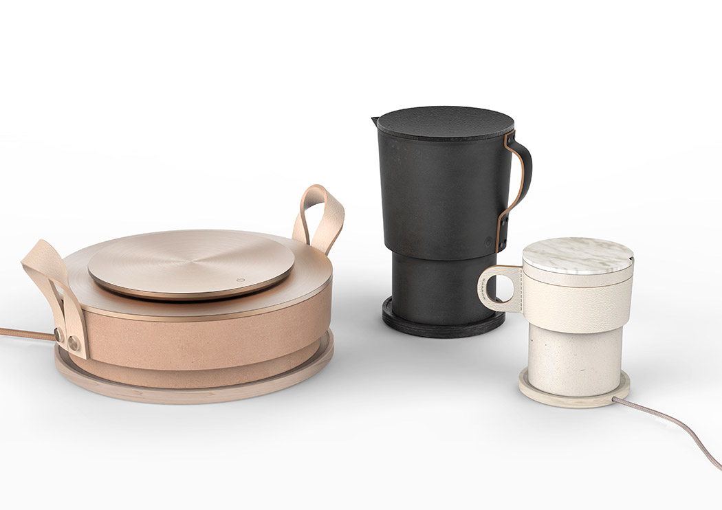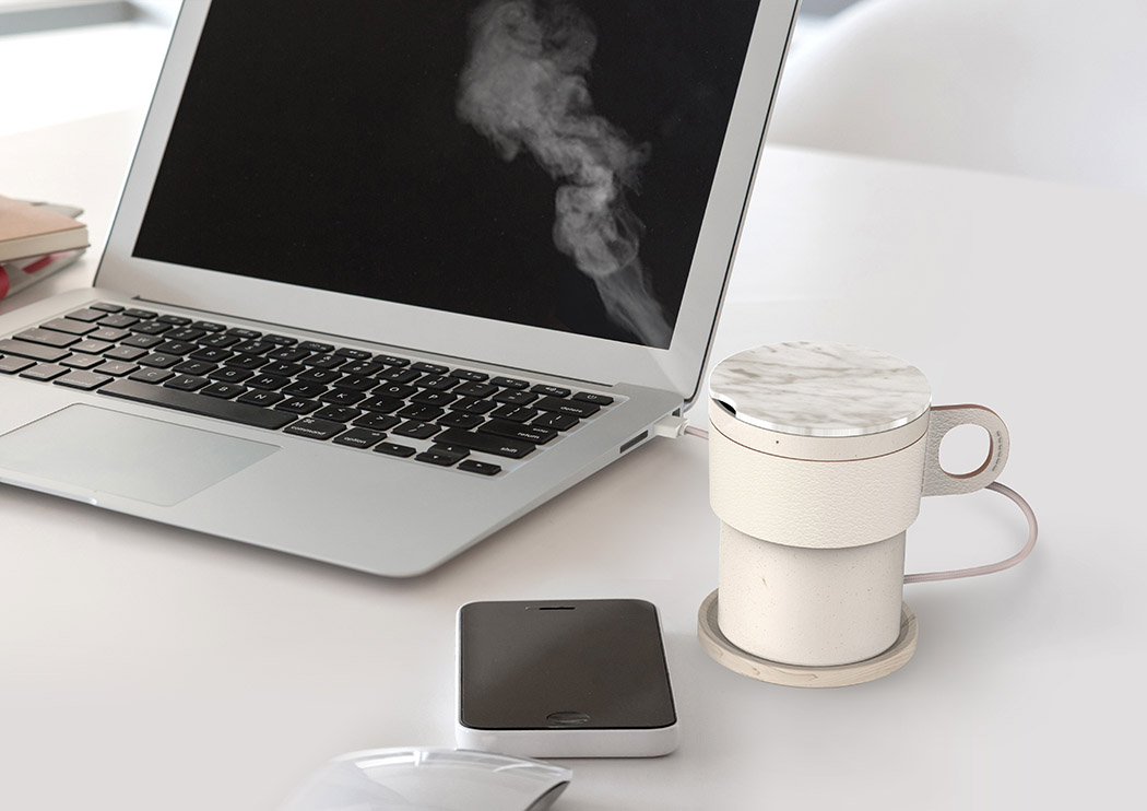
If you close your eyes and picture a humidifier, there’s a 99% chance you’re envisioning something totally cringeworthy! It’s also why this cleverly designed collection of humidifiers won a Red Dot Design Concept Award… because they look NOTHING like a humidifier! In fact, they’re designed with a disguise. Each looks like another, less aesthetically invasive product to make things feel more cozy.
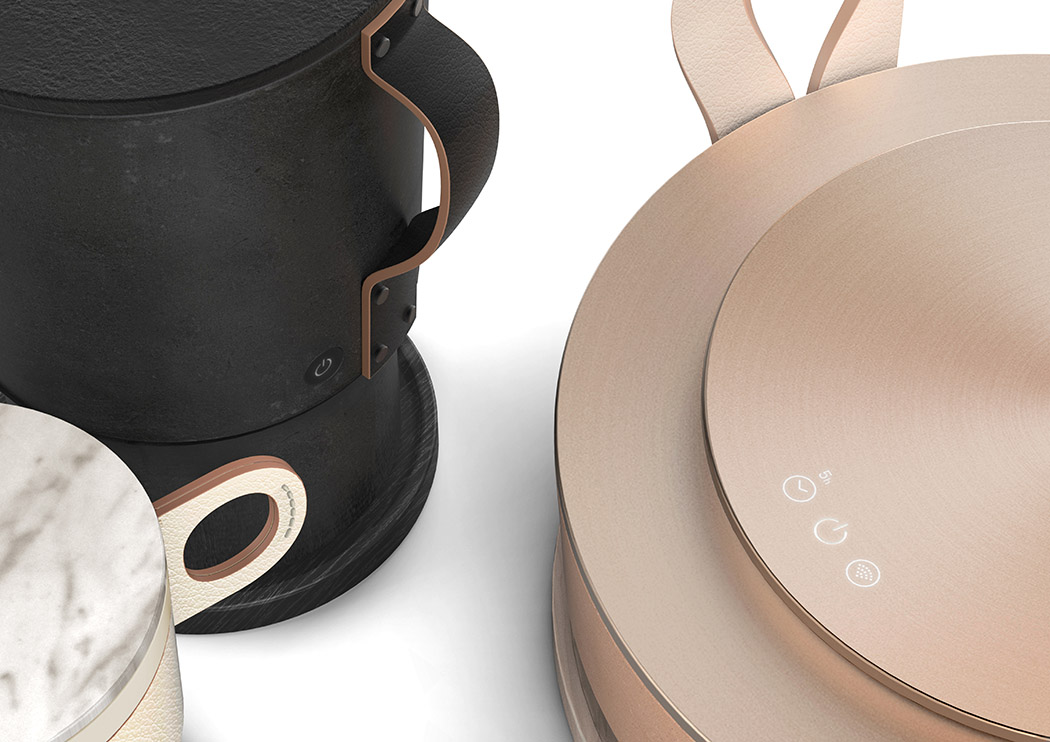
The pot, the biggest in the series, is designed for the living room or more spacious areas. Instead of emitting steam directly from a single, small, hole-type outlet, moisture is released along the circular rim of the top disk. This spreads the steam out over a wider area. In addition, the user interface is subtly micro-perforated on the top disk. — The kettle, a medium-sized option, has a capacity that makes it highly portable. With its convenient handle and purposefully placed spout, it’s ideal for bedrooms and other mid-size rooms. — The cup, the smallest of the series, looks like an average mug on your desk and is perfectly sized to humidify your workspace and other micro areas. Its dock station, the smallest of the 3, is compact enough to leave on your desk top or keep by your bedside.
Designer: Choi Jueun, Kim Bitnuri, Lee Soojin, Hong Hyekyung
