Leica’s New 4K ‘Cine Play 1’ Projector Brings a Massive 300-Inch Screen to Your Home

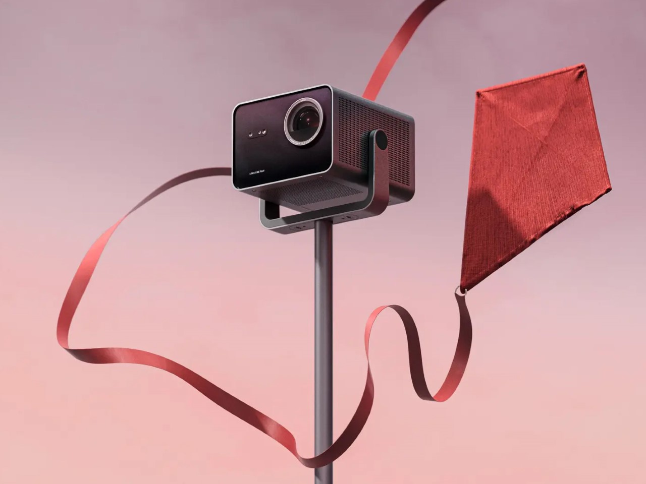
You may know Leica for their expensive pro-grade cameras, but did you know the company makes expensive projectors too? Aside from high-end cameras, the company has made in-roads in quite a few industries that rely on optics, like binoculars, televisions, and projectors. Although the brand is most known for building products with a premium price tag, their latest projector, the Cine Play 1 has an unusually affordable price, considering its 4K output and ability to output a massive 300-inch screen to rival most cinemas.

I’ve long been an advocate for projectors. They’re the same price as TVs, while being portable and having the ability to cast displays nearly 5x larger than most televisions. While the Cine Play 1’s $3,795 price tag isn’t really “affordable”, it does feel so when compared to something like Samsung’s 146-inch “The Wall” 4K television that has an eye-watering $220,000 market price. Contrast it with any other leading 4K long-throw projector brand too, and the Cine Play 1 fits well within the $2000-$4000 range for its category.

Designer: Leica

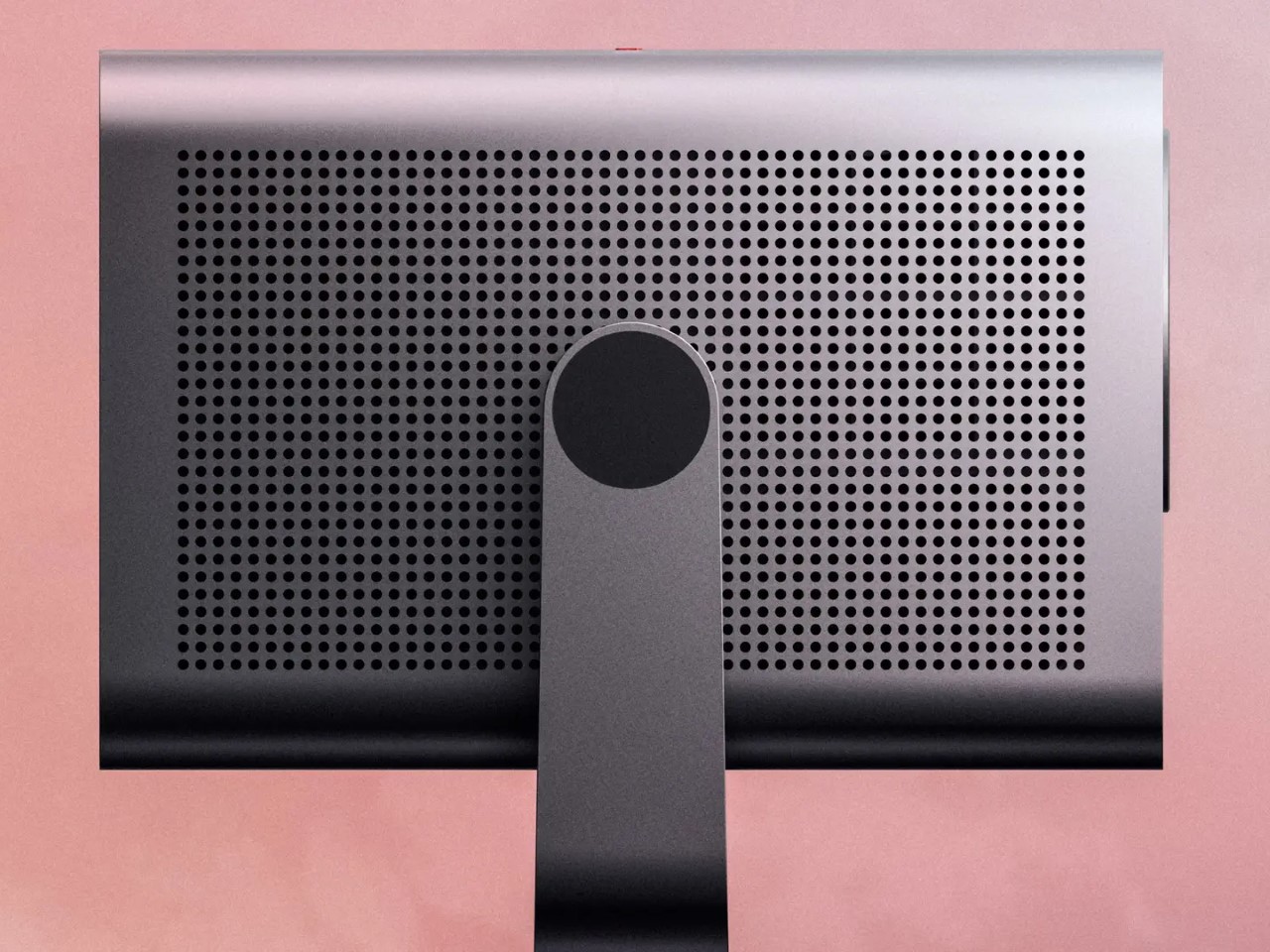
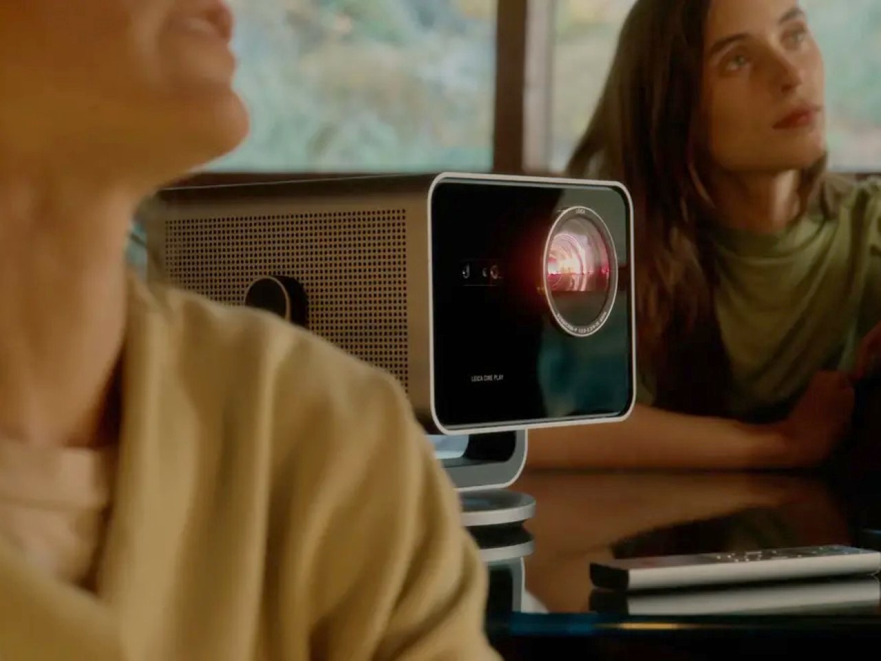
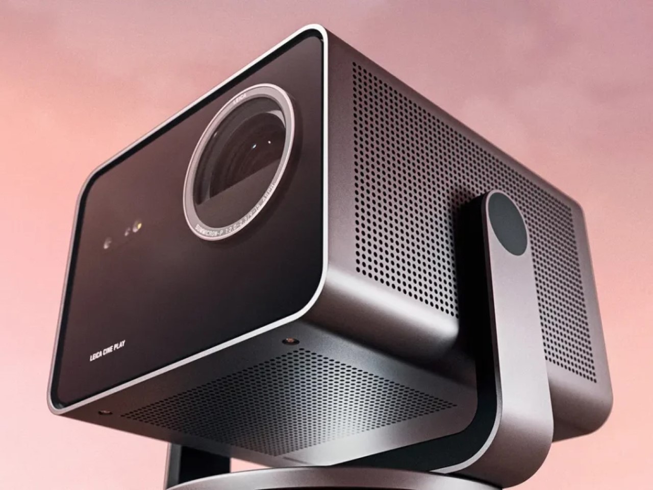
So, what makes it special? For starters, the Cine Play 1’s compact design. We’re talking a sleek 10.3 x 9.5 x 9-inch box that packs a mighty 3,000 lumens, making it versatile enough for various settings—even well-lit rooms. Thanks to its triple RGB laser tech and Leica Image Optimization, colors remain balanced and vivid, while its 4K clarity holds strong even as you scale down to 65 inches. This adaptability makes it ideal for any space, whether you’re hosting a gaming night or screening movies under the stars.

The overall design is a nod to Leica’s strong minimal-metal visual DNA. With a Bauhaus-inspired single-piece aluminum body and glass front, it’s a minimalist piece that complements any space. As an optional add-on, Leica also lets you buy a floor stand that complements your projector with an all-metal design and hidden power connections that route cables through the stand’s central cylindrical pillar, rather than having the cable dangle aimlessly around and ruin your room’s aesthetic.

You’d expect anything with Leica’s brand name to nail the visuals and optics, but the projector does a stellar job with audio too. The Cine Play 1 is built-in 10-watt speakers feature DTS Virtual:X, simulating surround sound to create an immersive audio experience. This means there’s no need to fuss with external speakers; you’re set with crisp highs and rich bass tones right out of the box. User experience features like automatic image alignment save you from the usual trial-and-error of projector placement. And with HDR10+ and Dolby Vision support, Leica wants you to enjoy content in the quality it was meant to be seen.

With built-in WiFi, the projector also lets you stream directly from your favorite apps, turning any surface into a high-quality viewing experience without additional gear or hassles. The inclusion of Apple Airplay, Bluetooth, Wi-Fi, and multiple ports allows you to stream from smartphones, tablets, laptops, or external drives. The VIDAA smart system gives you quick access to popular streaming apps, while smart home integration lets you control it with just your voice.

Priced at $3,795, the Cine Play 1 is definitely a more affordable entry in the Leica lineup, aimed at enthusiasts who appreciate high-end design but are conscious of budget. And if you’re short on surface space, Leica offers a compatible tripod stand for an extra $495, so you won’t be restricted to a countertop setup. For those ready to elevate their viewing game without a massive home theater overhaul, the Cine Play 1 feels like an intriguing blend of luxury and practicality.

The post Leica’s New 4K ‘Cine Play 1’ Projector Brings a Massive 300-Inch Screen to Your Home first appeared on Yanko Design.

Aether creates special jacket for photographers, designed with Leica

I’ve had the opportunity to see some of my photographer friends in action while shooting sports and events. It’s not just as simple as carrying around a camera anymore as they also have to carry a lot of accessories and gears while running around. Bags are of course handy but wouldn’t it be better if they had something lighter to wear and still be able to hold all of their stuff?

Designer: Aether for Leica

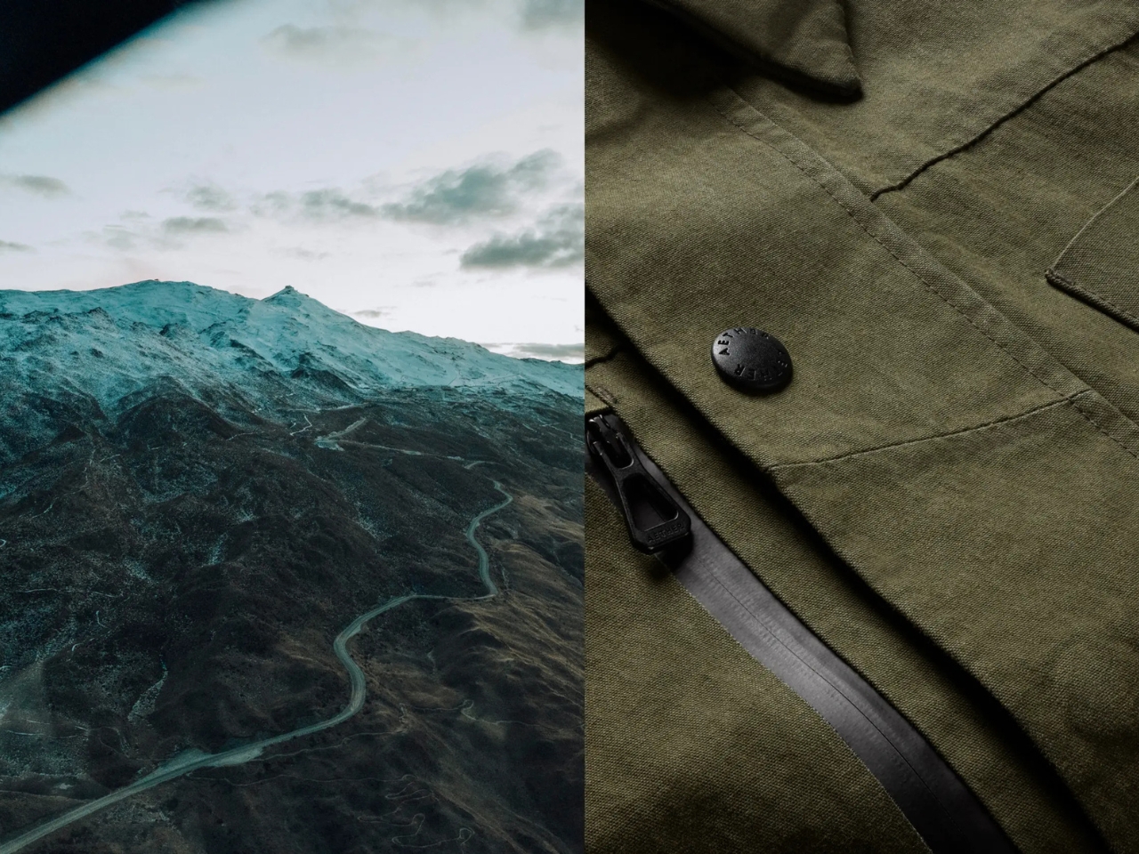
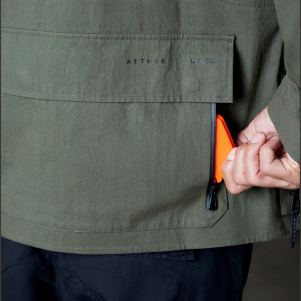
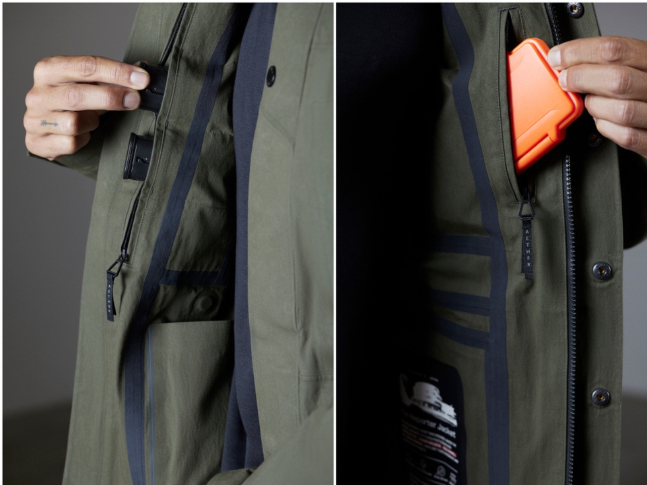
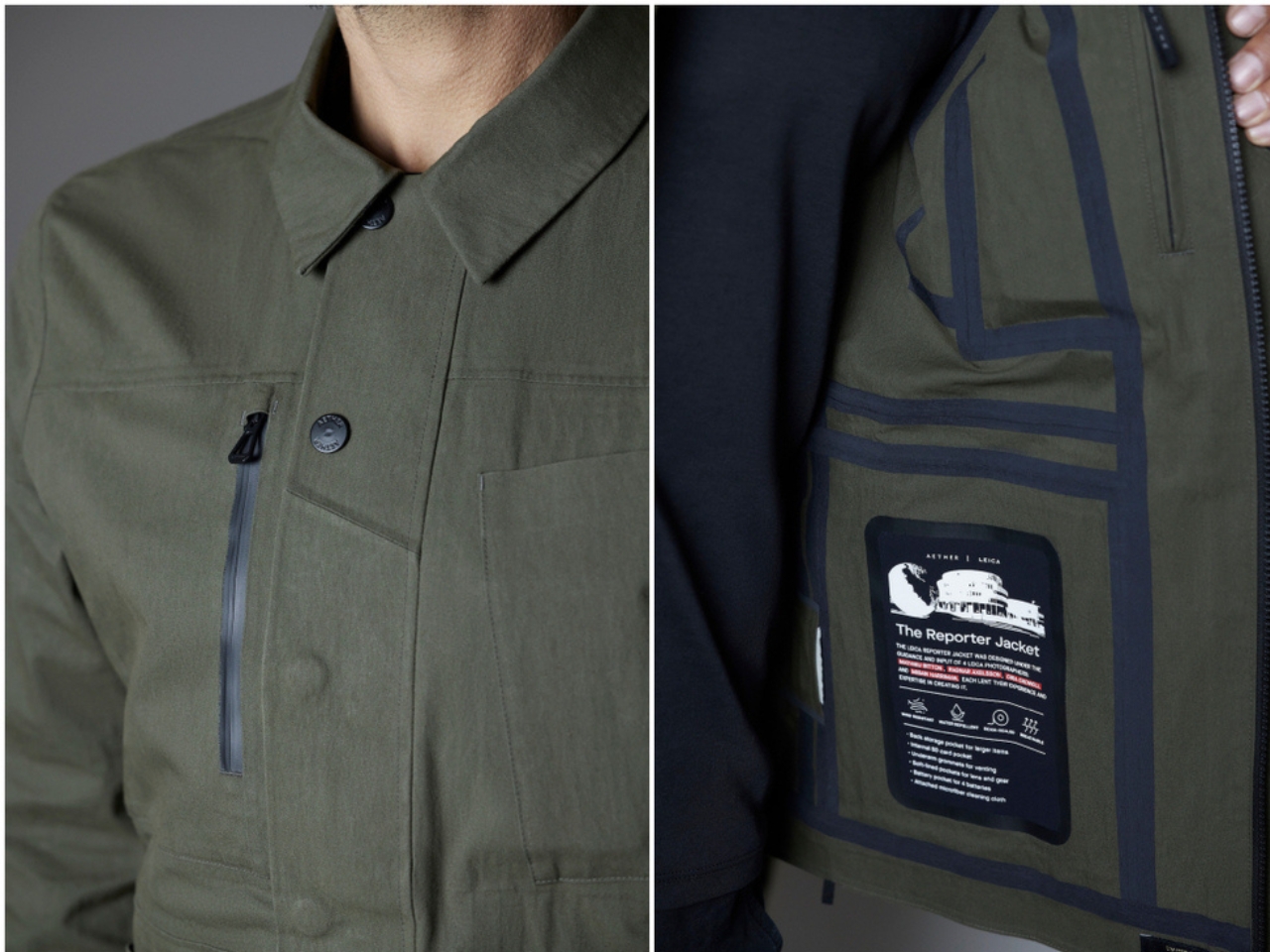
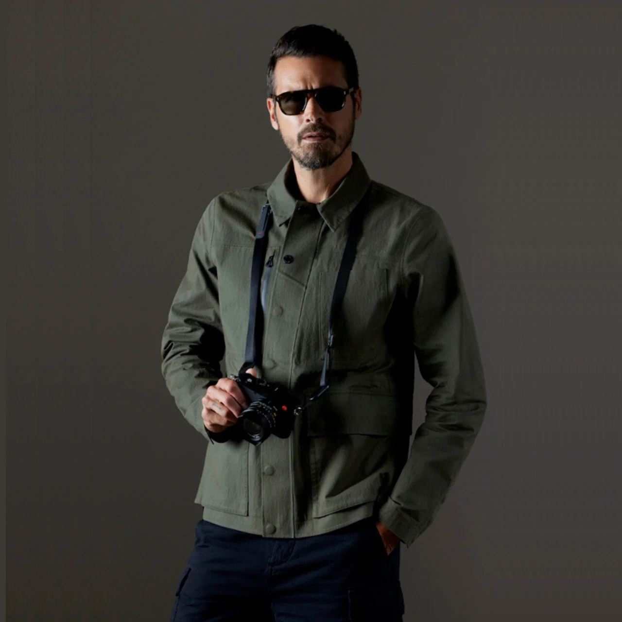
The AETHER + Leica Reporter Jacket is one such item that would be convenient for photographers and even just mere travelers. It was designed with Leica photographers so they had the input of the actual people who will use it. Well, if they’re one of the 125 people who can get a hold of this limited edition jacket, which actually matches the Reporter camera series of Leica, color-wise. As expected, this jacket is designed for all kinds of weather and has a lot of pockets and compartments to hold their gear.

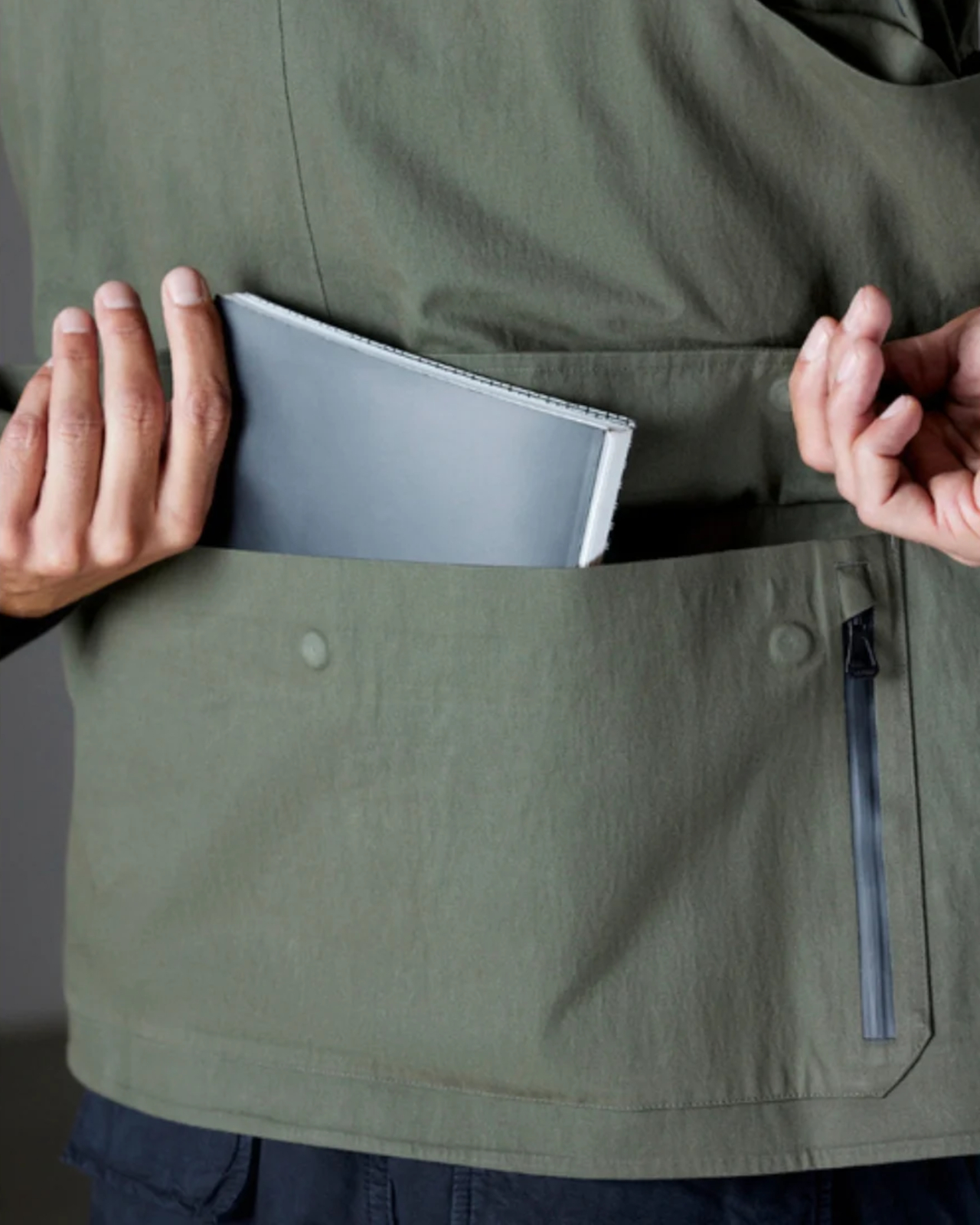
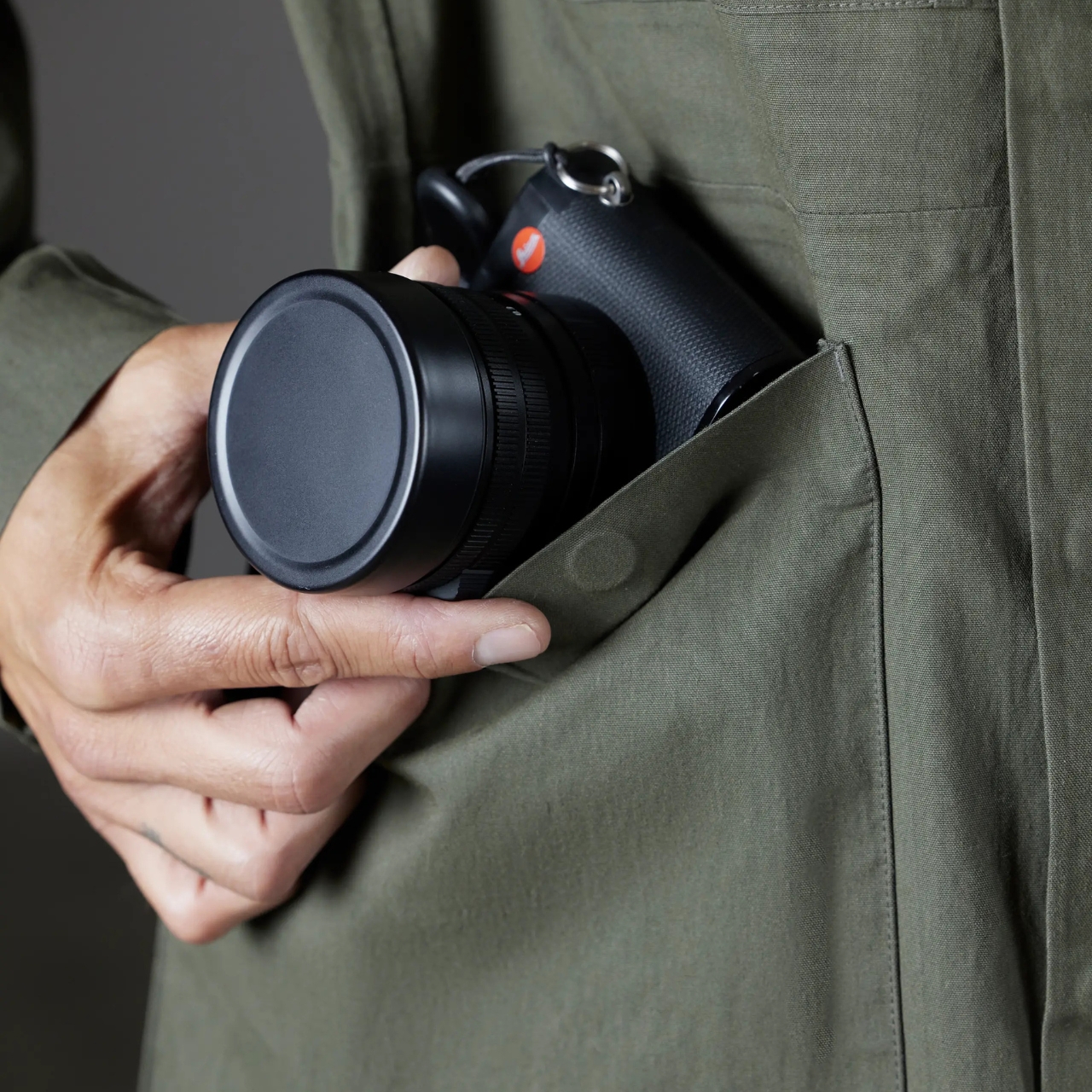
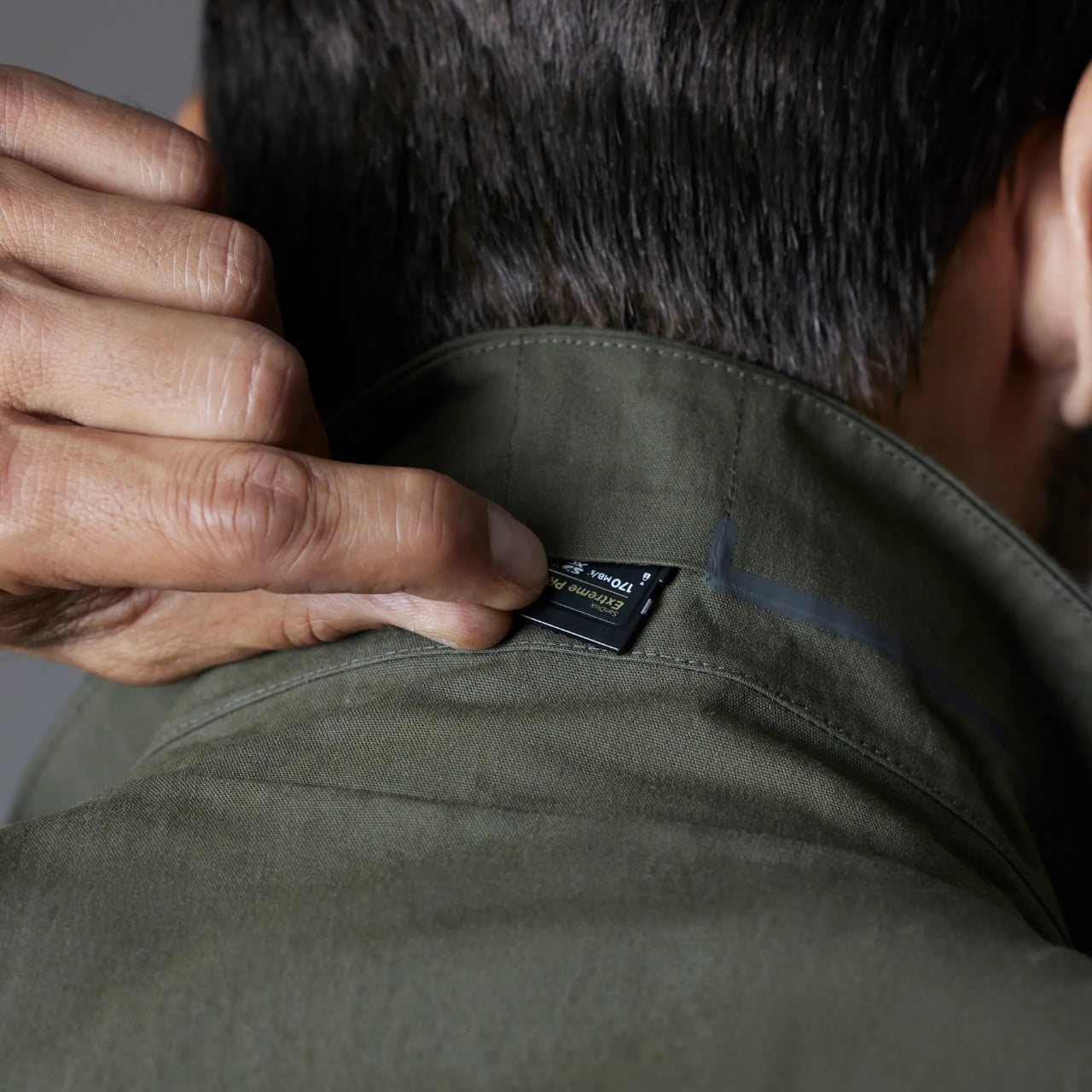
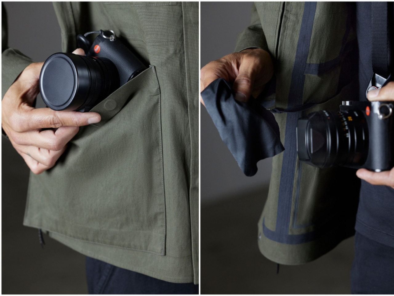
The army green colored jacket is weather-resistant and has waxed cotton-nylon blend fabric. This means it becomes breathable in warm weather but when it becomes colder, it creates a windproof barrier as well. The front pockets can fit a Leica camera, specifically any of the Q or M series while the back stash pocket can carry larger items like lens and even a tablet. It also has a built-in microfiber cloth so you can use it to clean your lens. The internal pocket is able to hold 4 Leica batteries while the chest pocket can hold your SD card case. There’s even a hidden SD card pocket at the collar, in case you need to hide something.

These features of the jacket can also be used by non-photographers who want to carry around stuff while traveling without using a bag. But they were of course specifically built for photographers and there are only limited items available. So if you have $795 to spare, you should get it while you still can.

The post Aether creates special jacket for photographers, designed with Leica first appeared on Yanko Design.

Xiaomi 14T Pro Review: Flagship Features Without the Flagship Price

PROS:


  • Solid camera performance

  • Fast wired and wireless charging capabilities

  • Bright and easy-to-eyes display


CONS:


  • Uninspiring color options

  • Minor hardware upgrade from the predecessor


RATINGS:

AESTHETICS
ERGONOMICS
PERFORMANCE
SUSTAINABILITY / REPAIRABILITY
VALUE FOR MONEY

EDITOR'S QUOTE:

With its combination of features and competitive pricing, the Xiaomi 14T Pro delivers a well-rounded experience that is sure to satisfy the needs of most users.

2024 has been a year of remarkable growth and innovation for Xiaomi. Building upon its success in the smartphone market, the company has expanded its horizons with the launch of its first electric vehicle, the SU7, back in March. The company then proceeded with the launch of its first-ever flip phone, the Xiaomi MIX Flip, as well as the fourth iteration of its flagship foldable, the MIX Fold 4. Impressive sales figures for the SU7 and the positive reception of the MIX Flip and MIX Fold 4 demonstrated Xiaomi’s ability to capture market shares in diverse product categories. It is clear that Xiaomi wants to take advantage of this moment and solidify its position as a leading global technology brand with the launch of the Xiaomi 14T and 14T Pro. Part of its budget-friendly numbered T series, the Xiaomi 14T Pro boasts flagship features similar to its flagship Xiaomi 14 and 14 Ultra phones, such as cameras co-developed with Leica. But does Xiaomi still have its magic touch or has it spread itself too thin? Read on to find out.

Aesthetics

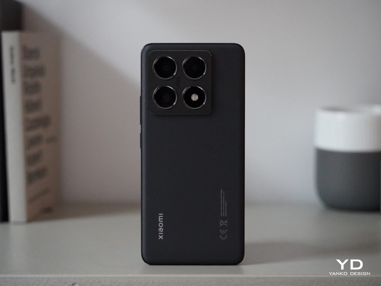
The Xiaomi 14T Pro’s understated design is its strength. While it doesn’t offer groundbreaking aesthetics, its simplicity is elegant. The familiar design language from its predecessor is carried over into this model. Available in Titan Gray, Titan Blue, and Titan Black, but choosing a color shouldn’t be a challenge as they all offer similar aesthetics. I wish Xiaomi had explored more fun color options. We received the Titan Black variant. The matte black back panel is speckled for a light-catching effect and features a velvety texture that resists fingerprint smudges.
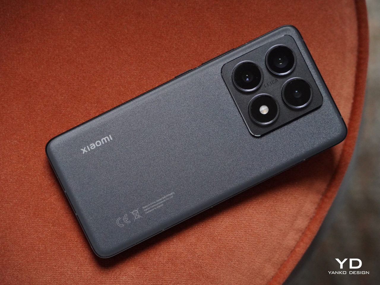
The device’s square camera island is big but maintains a discreet profile that matches the color of the back panel. The camera island’s smooth surface contrasts with the back panel’s textured finish. The arrangement of the cameras and LED light is perfectly symmetrical, centered around the Leica logo. Each camera and LED light is housed in a raised circular enclosure, making it slightly more challenging to clean dust that may accumulate. That said, it carries a sort of LEGO block vibe that makes it stand out a bit, especially from the rest of the Xiaomi 14 series.
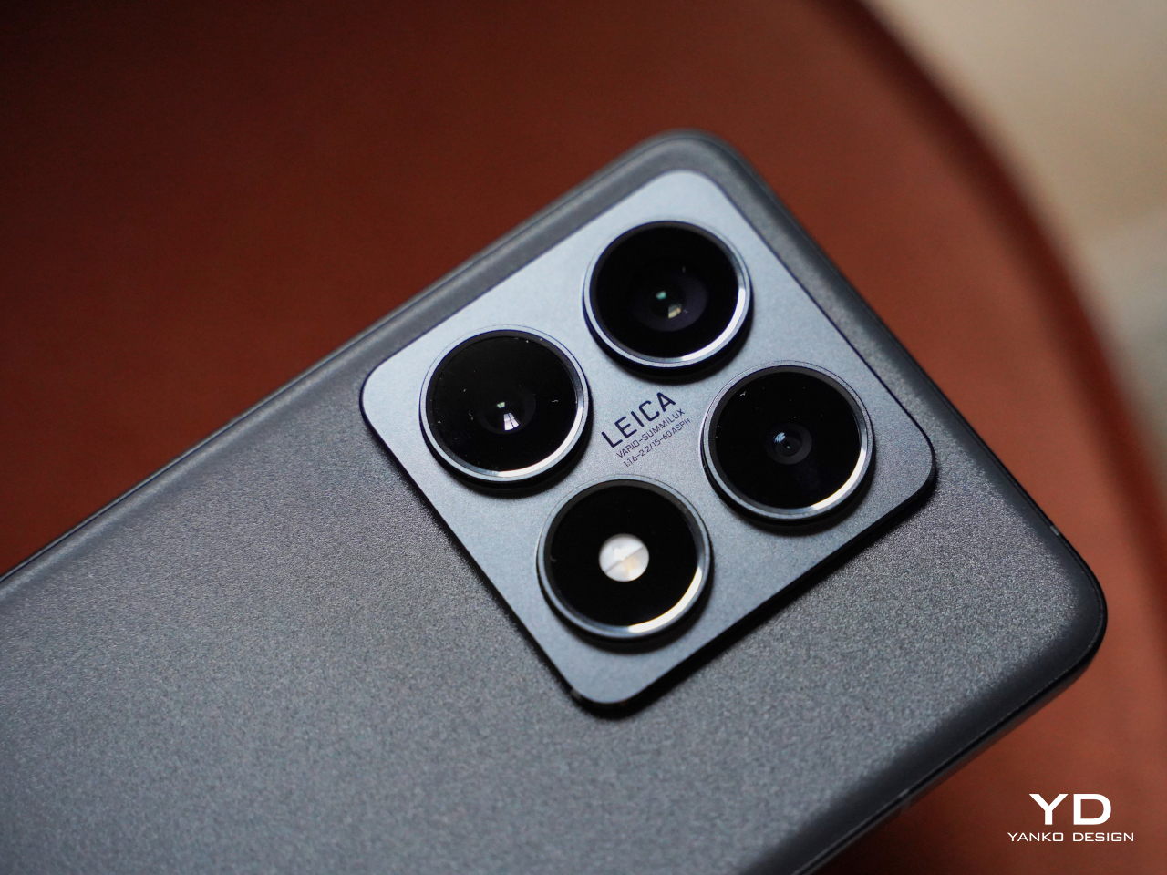
The small Xiaomi logo in silver is positioned on the lower left and the regulatory icons and text on the lower right. Overall, 14T Pro offers a clean design, while the matte textured back panel and metallic aluminum alloy frame give it a premium feel. It is simple and direct, a breath of fresh air from the visually noisy designs of recent smartphones.

Ergonomics

Measuring 160.4mm x 75.1mm x 8.39mm and weighing 209g, the Xiaomi 14T Pro leans towards the larger side of the spectrum. Despite its size, the device feels comfortable to hold, whether with one or both hands. All edges slightly curve into the frame giving comfort, while the flat sides provide a better grip when you hold the device in your hand.

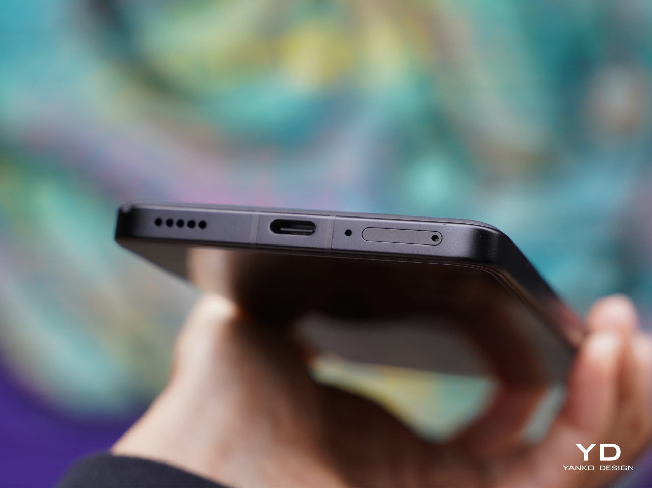
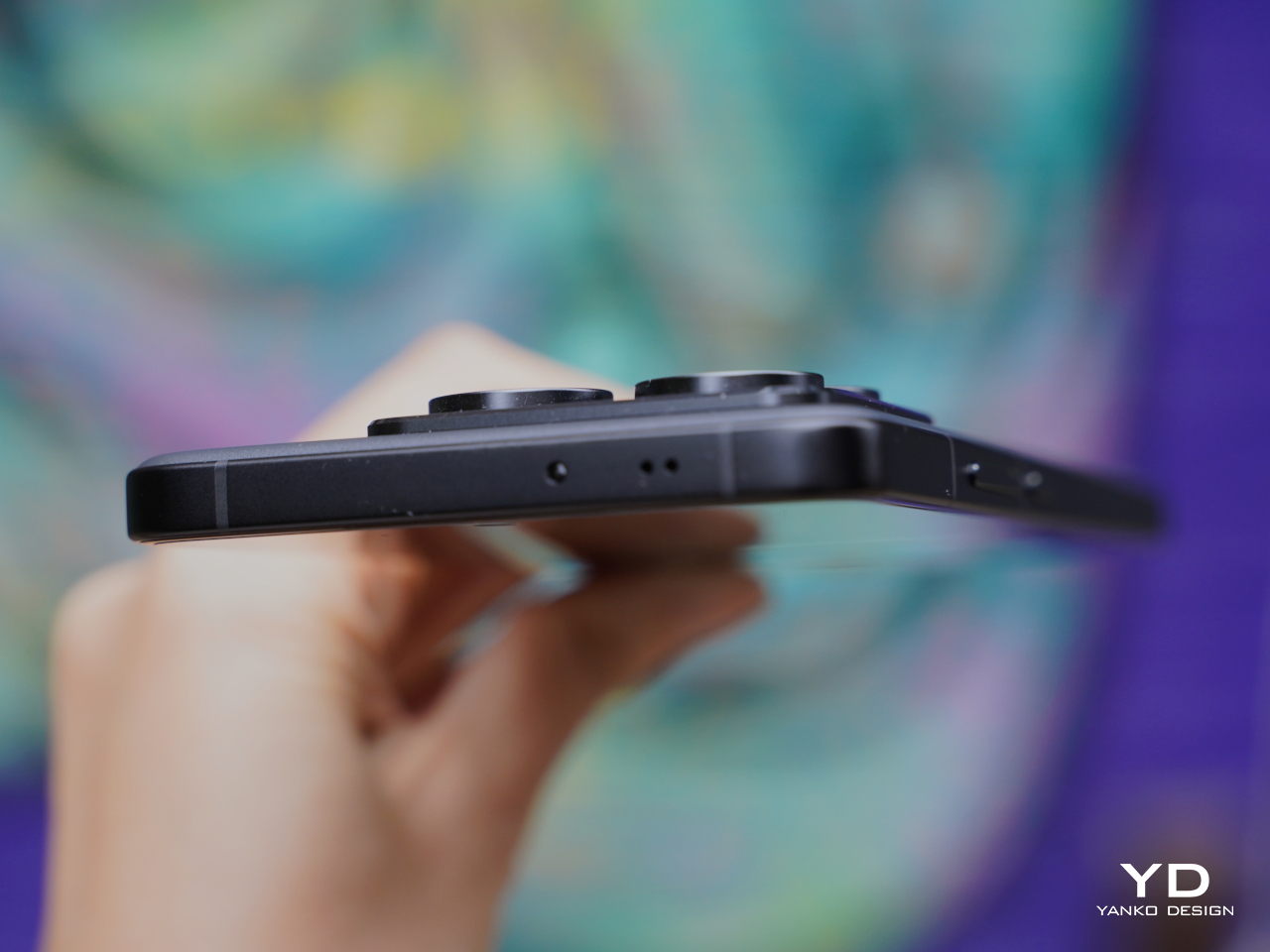
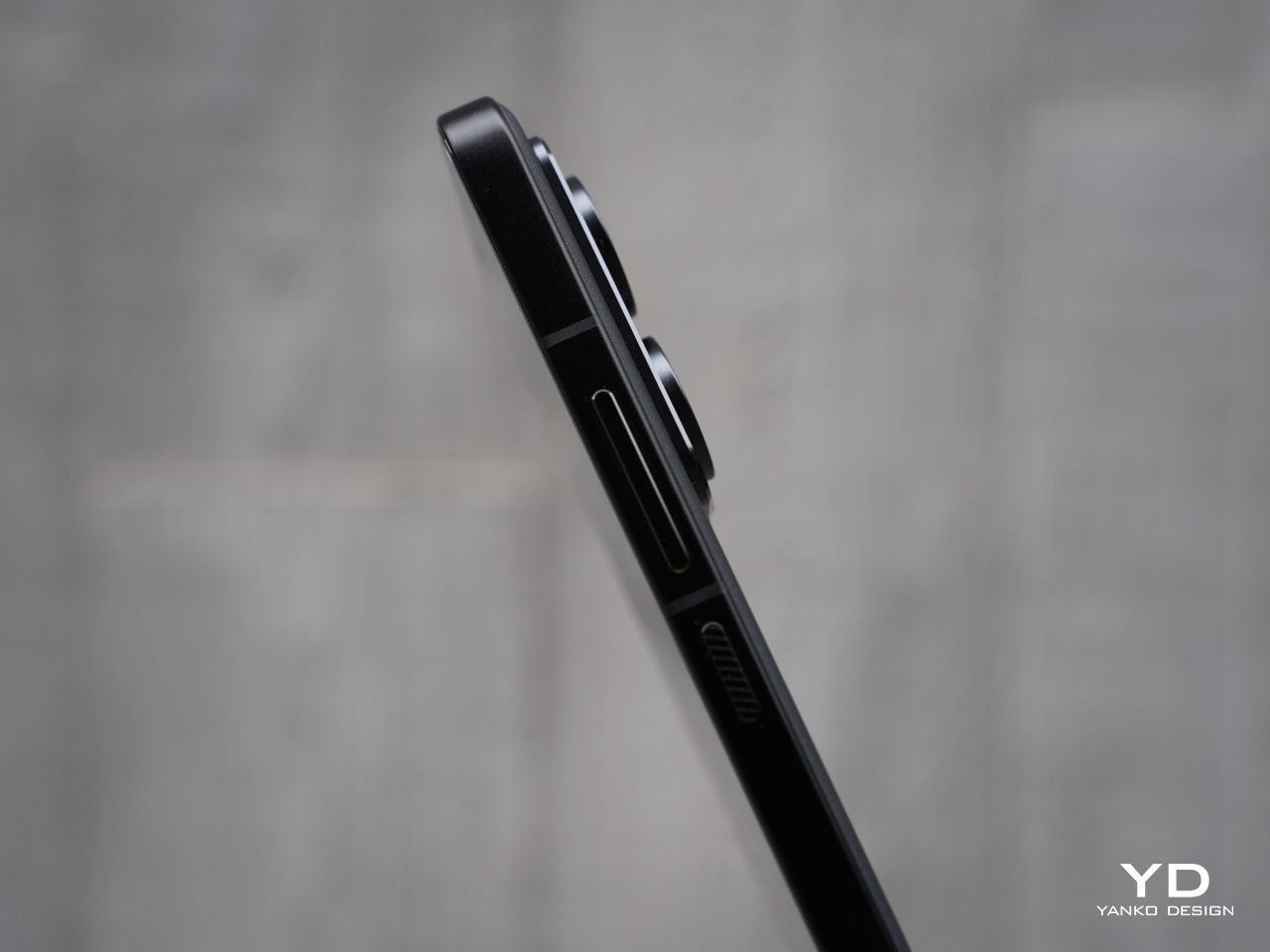
The right side of the phone features volume and power buttons with diagonal engraving, while the left side remains clean except for antenna cutouts. The top houses an IR blaster and speaker, while the bottom accommodates a dual SIM slot, microphone, USB-C port, and speaker. The sides might be busy with these many parts, but they visually blend into the frame and stay out of the way of your fingers or your palm when you hold the phone.
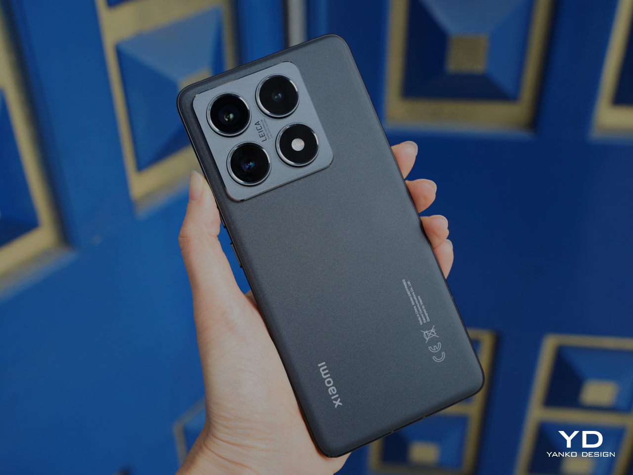
The off-center camera module can cause the phone to wobble slightly on flat surfaces which might be a minor inconvenience if they are sensitive to such details. Nothing that a case wouldn’t fix, of course, and it’s a design trait shared by almost all smartphones these days. The Xiaomi 14T Pro is thankfully not uncomfortable to hold and use despite its large size, though it doesn’t stand out as an example of good ergonomics either.

Performance

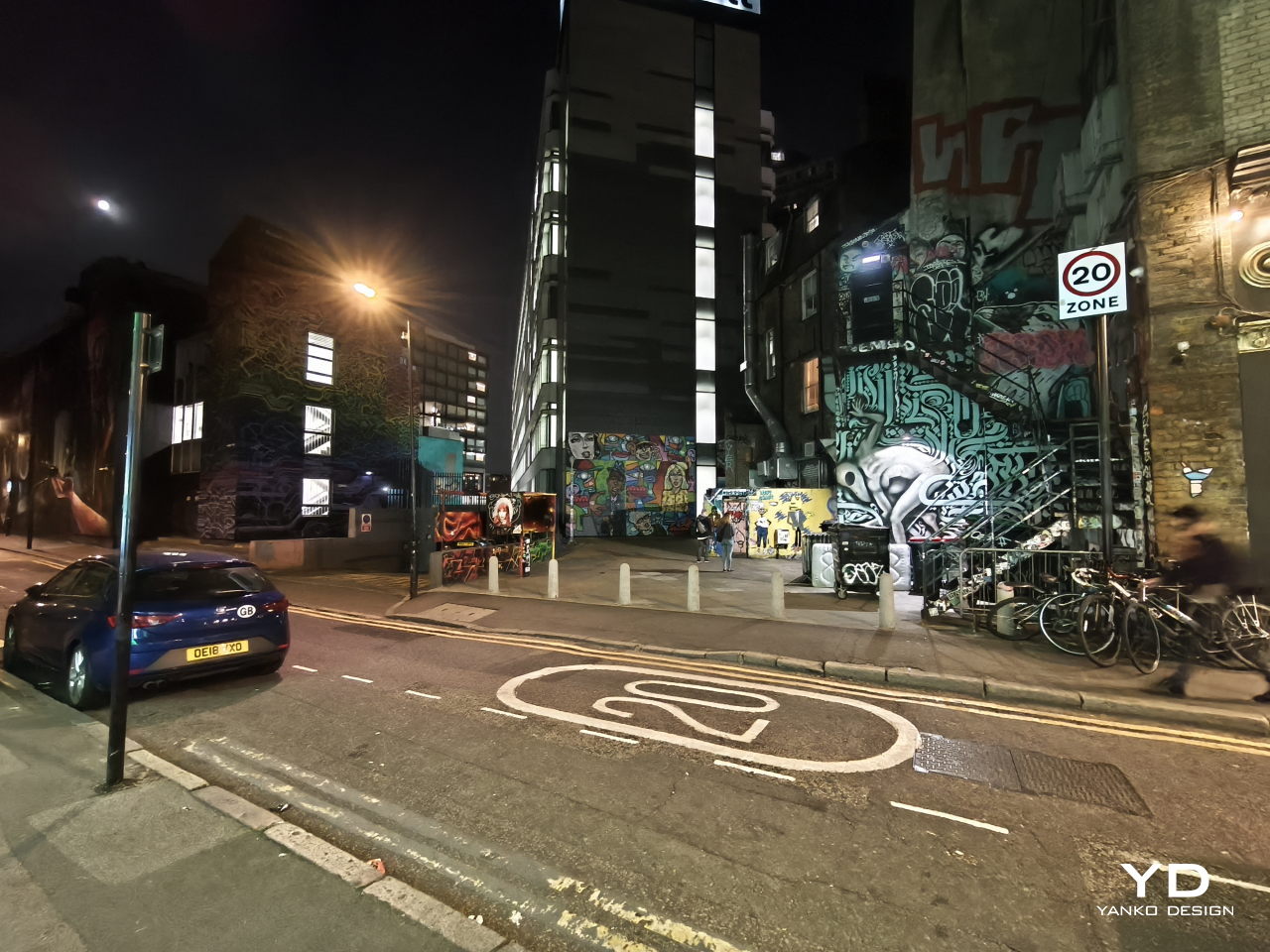
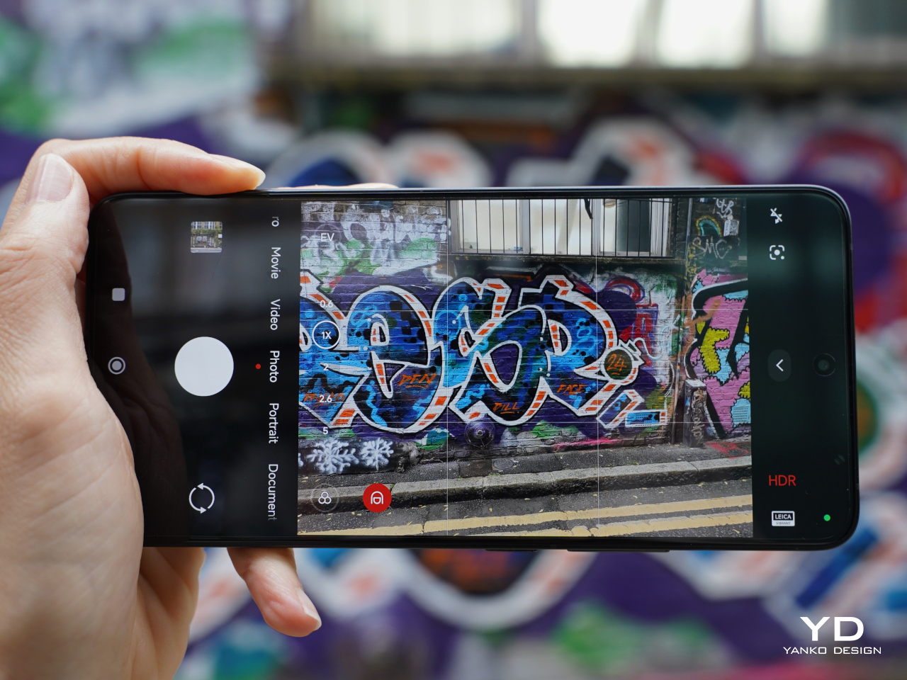
Xiaomi’s collaboration with Leica has significantly elevated its camera capabilities, resulting in exceptional photo and video quality. This partnership continues as Xiaomi works with Leica on its more budget-friendly flagship models, ensuring high-quality imaging remains accessible. The 14T Pro features a triple camera setup, including a 50MP main camera with an f/1.6 aperture, a 50MP telephoto camera with an f/2.0 aperture, and a 12MP ultra-wide camera with an f/2.2 aperture. All three cameras offer two Leica photographic styles: “Leica Vibrant” and “Leica Authentic.”

The main camera features a Light Fusion 900 sensor and delivers great photos with nice detail, wide dynamic range, natural colors, and minimal noise in both daylight and low-light conditions. While the dynamic range is generally great, exposure often skews toward the brighter end, leading to washed-out highlights and crushed shadows in some situations. Additionally, HDR performance struggles with motion, especially in low-light environments, leading to blurry images of moving subjects.

Ultrawide (0.6x)

1x

2x

2.3x

The telephoto camera performs well in most scenarios, maintaining good detail and color accuracy. In contrast, the ultra-wide camera produces acceptable photos, but it tends to lack sharpness and detail in challenging conditions.

Telephoto (5x)

Telephoto (10x)

Telephoto (20x)

Portrait mode offers four focal lengths, 23mm, 35mm, 60mm, and 75mm, with the default set to 60mm. While the 60mm and 75mm portraits are captured with the telephoto camera, the 23mm and 35mm portraits are shot with the main camera. All portrait photos I took, regardless of focal length, exhibited impressive subject isolation and pleasing bokeh.

Normal (1x)

Portrait (60mm)

Although color rendering remains consistent across different cameras and magnifications in regular photo mode, a noticeable shift in white balance can be observed between photos captured with the telephoto and main cameras in portrait mode.

Portrait (23mm)

Portrait (35mm)

Portrait (75mm)

On the opposite side, the upgraded 32 MP front camera with f/2.0 aperture takes satisfactory photos, which isn’t that surprising given the hardware. The Xiaomi 14T Pro can record videos up to 8K at 24 or 30 fps with the main camera, while the telephoto and ultra-wide cameras are capable of shooting videos up to 4K at 60 fps. The front-facing camera can record up to 4K at 30 fps and 1080p at 60 fps. The 4K footage from the main and telephoto cameras is impressive, showcasing good detail, realistic colors, and a wide dynamic range, all complemented by excellent stabilization.

While the Xiaomi 14T Pro offers incremental hardware improvements compared to its predecessors, its most significant advancements lie in its AI capabilities. The device supports Google Gemini and introduces Circle to Search, a first for Xiaomi devices. Additional AI features include AI Interpreter, AI Notes, AI Recorder, and AI Subtitles. These AI features and Circle to Search will be available via an over-the-air (OTA) update starting September 26th, which means they aren’t accessible during this review period.

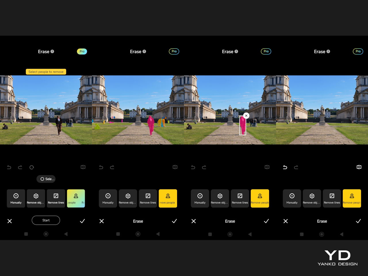
One of the AI features I was able to test was AI Erase Pro, and it was remarkably effective. The tool offers four modes: Manual, Remove Object, Remove People, and Remove Lines. The Remove People mode was particularly impressive, accurately recognizing individuals and color-coding them. Even when people were positioned in a staggered formation, the AI could identify each person. However, while erasing people from the photos worked well, the shadows were left unmanipulated.
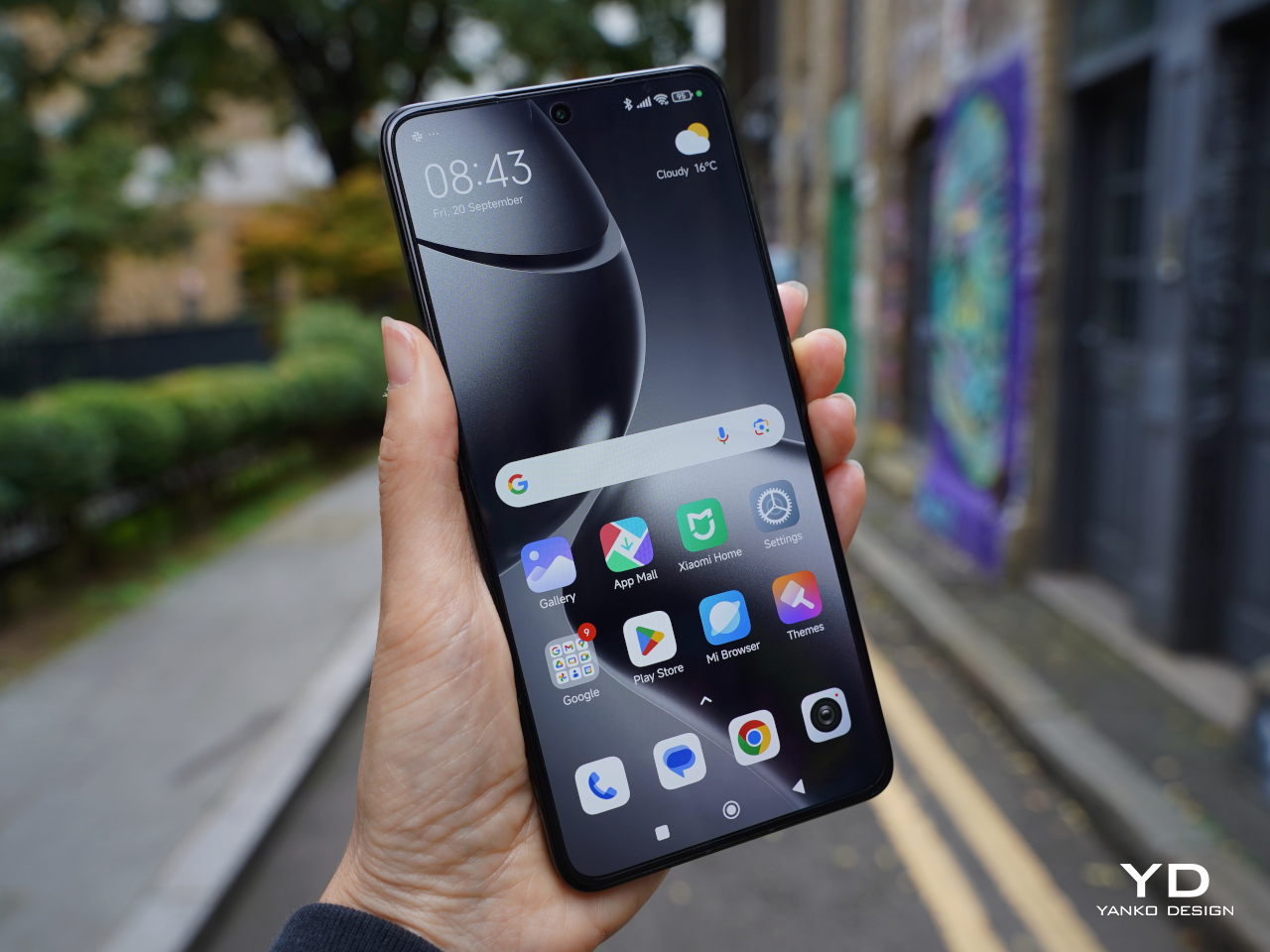
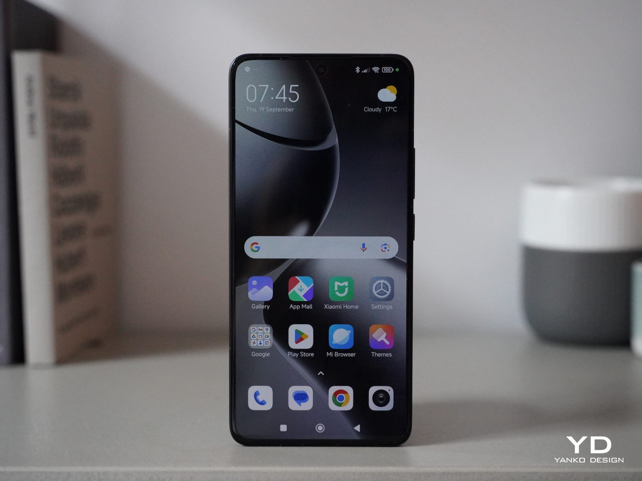
The other impressive feature of the Xiaomi 14T Pro is a big 6.67-inch AMOLED flat screen that boasts a 1.5K resolution (2,712 x 1,220), a 144Hz refresh rate, and a pixel density of 446 ppi. Supporting 12-bit color depth, HDR10+, and Dolby Vision, the display delivers sharp, vibrant visuals. Even under direct sunlight, the peak brightness of 4,000 units ensures excellent visibility while the 3,840 Hz PWM dimming reduces eye fatigue. Also, the stereo speaker is plenty loud and produces nice sounds, making the phone great for enjoying movies.
The 5,000mAh battery provides sufficient power for a full day of use. If you need a quick boost, Xiaomi’s 120W HyperCharge technology allows for incredibly fast wired charging, reaching a full charge in about 19 minutes, as stated by the company. Additionally, the 14T Pro supports 50W wireless charging, a much-welcome upgrade. Xiaomi claims that the device can be fully charged with a wireless charger in approximately 45 minutes. My personal experience aligns with these impressive capabilities.
The device runs HyperOS based on Android 14 and Google services are thankfully available out of the box. Powered by MediaTek’s flagship Dimensity 9300+ chipset and paired with 12GB or 16GB of LPDDR5X RAM and 256GB, 512GB, or 1TB of UFS 4.0 storage, the Xiaomi 13T Pro delivers great performance. The device handles multitasking seamlessly, with no noticeable lag or stutter even when running multiple apps simultaneously. Additionally, it does not get hot during extended video shoots or gaming sessions, enhancing the overall user experience.

Sustainability/Repairability

The Xiaomi 14T Pro promises a 1,600 battery life cycle and delivers IP68 dust and water resistance, ensuring both durability and longevity. Its longevity and overall sustainability aspects, however, are not as promising, especially in the area of software updates. This is somewhat disappointing for a company that is becoming one of the industry’s leading players. As the tech industry increasingly emphasizes environmental responsibility, Xiaomi has an opportunity to take a leading role by integrating sustainability into all of its products and, hopefully, it won’t let that opportunity pass it by.
Value

The Xiaomi 14T Pro positions itself as a compelling option for those seeking a high-performance smartphone without breaking the bank. It offers a blend of flagship-level features and a more affordable price point. While its camera may not quite reach the heights of the Xiaomi 14 Ultra, it still delivers excellent results for everyday photography and videography. It delivers much of what it promises on paper, but the real question is whether it is something you will reach for in your next smartphone buy.
Xiaomi is definitely not the only player in this field, including in the mid-range market where there are dozens of brands and models to choose from. And while the Xiaomi 14T Pro is definitely good, it doesn’t exactly stand out in any specific way. It’s a well-balanced phone, no doubt, but it might overlooked when placed side-by-side with other mid-range phones with better cameras, higher performance, or, more importantly, lower price tags.

Verdict

The Xiaomi 14T Pro may not be the most exciting phone, but there is no doubt it offers a tempting value proposition. Its solid camera performance, powerful processor, fast-charging capabilities, and vibrant display make it a compelling option for users who prioritize performance and affordability. It may not offer the absolute pinnacle of smartphone technology, leaving that for its more powerful and more expensive non-T siblings, but it doesn’t lag behind in any significant way either. With its combination of features and competitive pricing, the Xiaomi 14T Pro delivers a well-rounded experience that is sure to satisfy the needs of most users.
The post Xiaomi 14T Pro Review: Flagship Features Without the Flagship Price first appeared on Yanko Design.
The Leica M Camera Gets A Minimalist Makeover

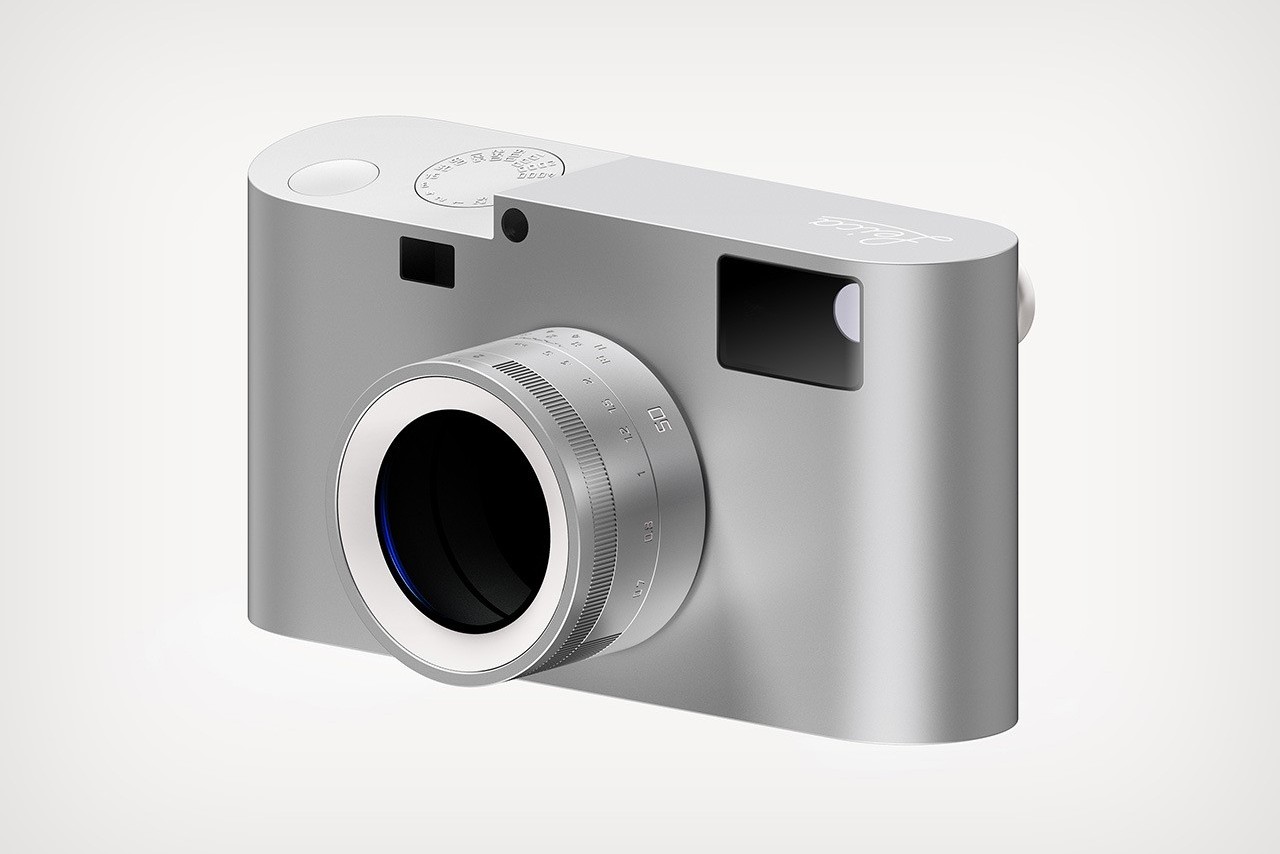
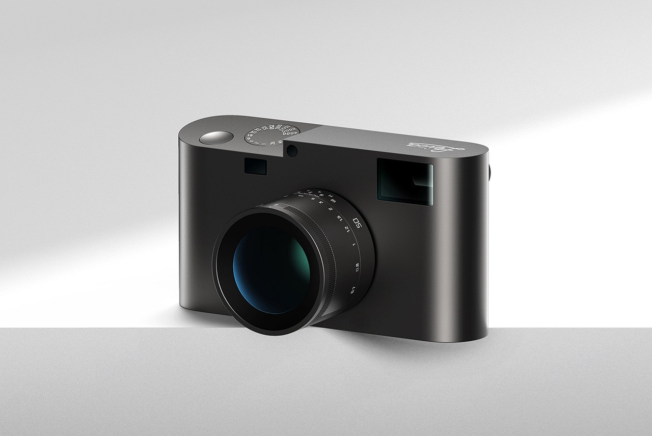
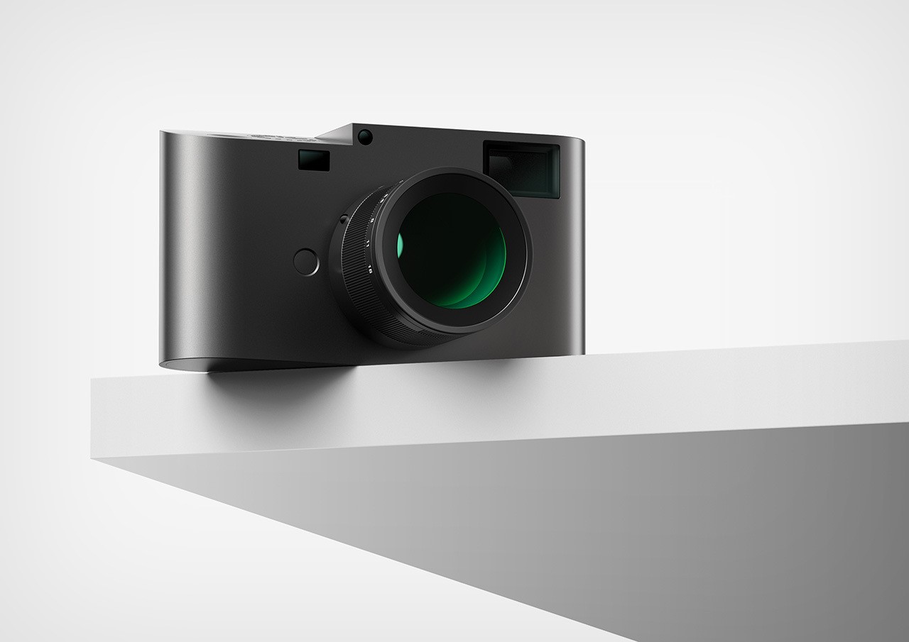
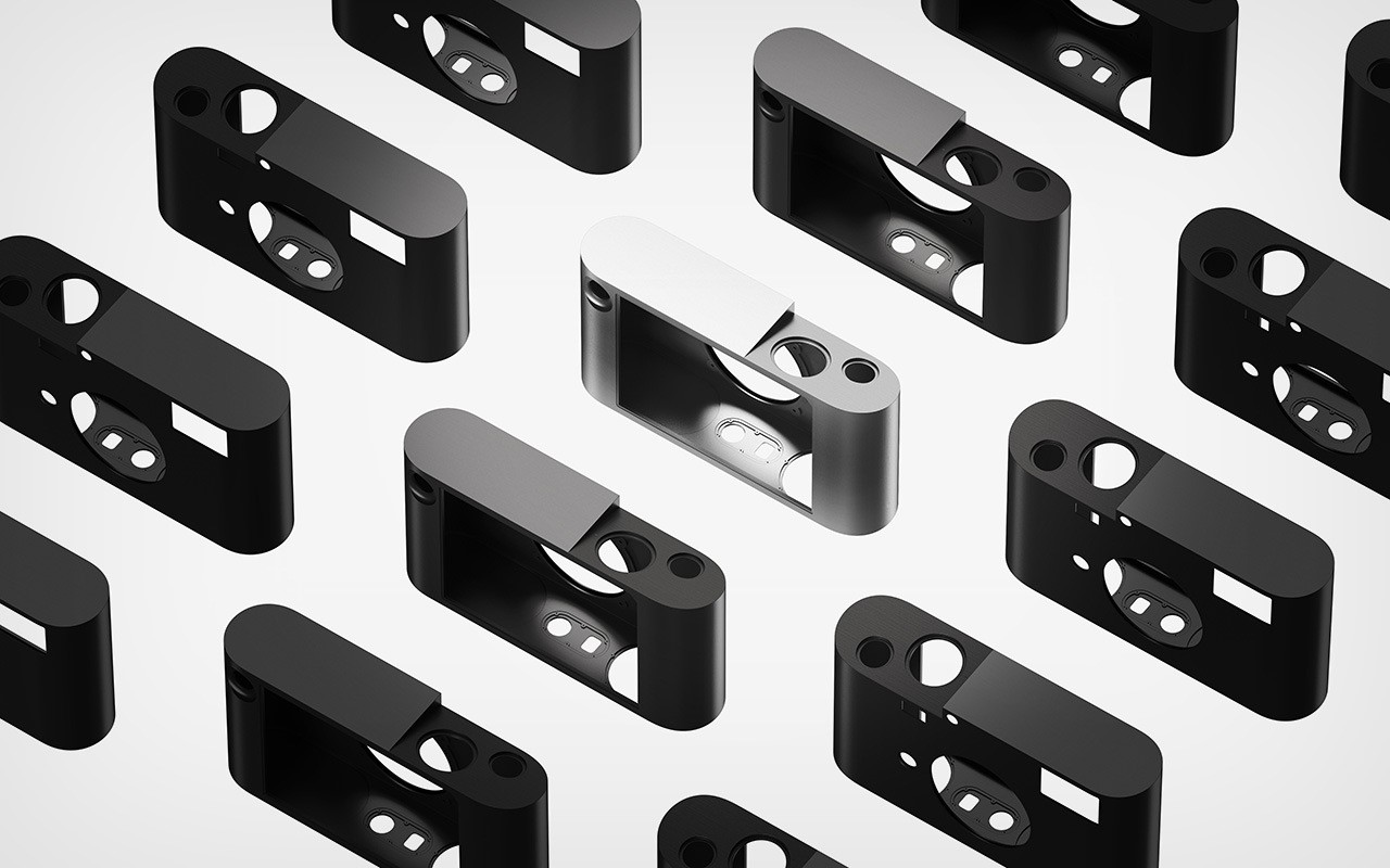
We’re officially in an age of remakes and reboots. Whether it’s movie franchises, music genres, vinyl discs, or even cars like the Lamborghini Countach getting a modern revival, the words ‘Old Is Gold’ seem to hold true for nostalgic classics… Now, Shanghai-based designer Wencheng Zhang is reviving yet another classic from the mid-50s. Perhaps one of the most iconic cameras of its time, the Leica M gets a minimal redesign thanks to Zhang. Crafted from a single block of aluminum, the redesigned camera combines old-world analog charm with a modern aesthetic and cutting-edge features that bring the 1954 classic shooter well into the year 2024.

Designer: Wencheng Zhang

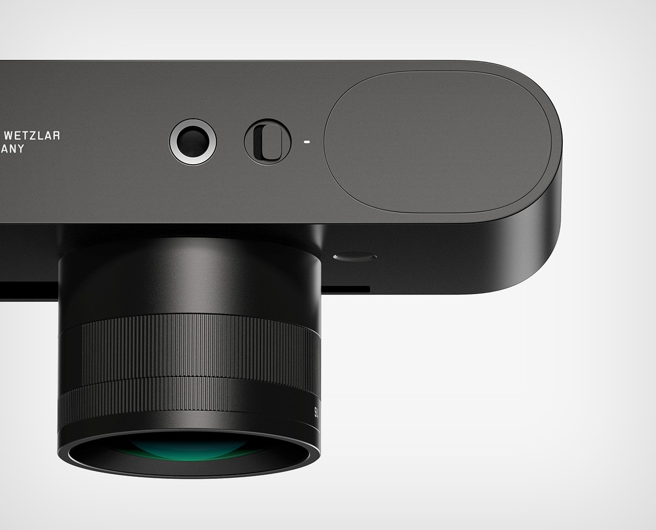
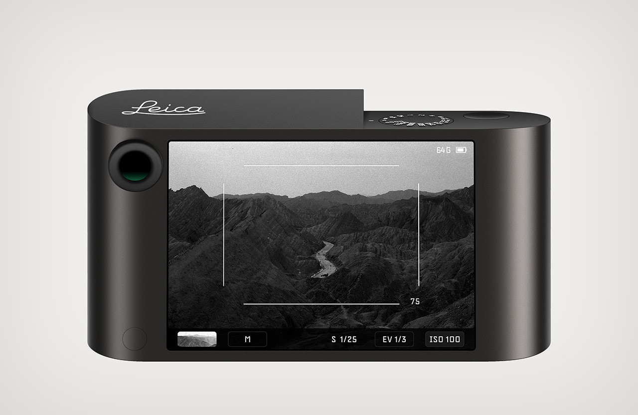
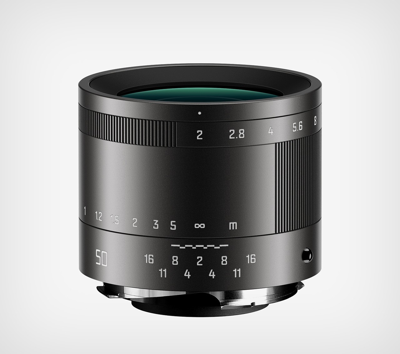
Zhang’s concept reimagines the Leica M for the modern era, stripping away unnecessary elements to create a truly minimalist design. Imagine a camera precisely carved from a single block of aluminum, echoing the unibody confidence of classic Leicas while hinting at the sleek lines of the Leica TL2. Zhang mentions that the inspiration for this form came from none other than Leica’s very first camera, the Ur-Leica Replica.

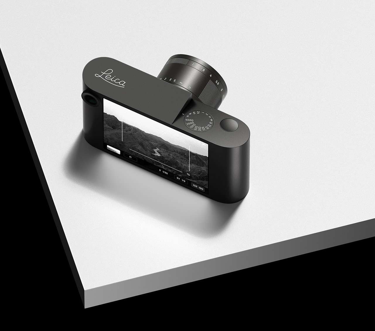
While the classic Leica M layout is instantly recognizable, Zhang incorporates subtle tweaks to enhance ergonomics. A gently angled top plate improves in-hand feel, while the familiar viewfinder and large touchscreen display (borrowed from the M11) remain. However, in the spirit of minimalism, Zhang removes the M11’s three customizable function buttons.

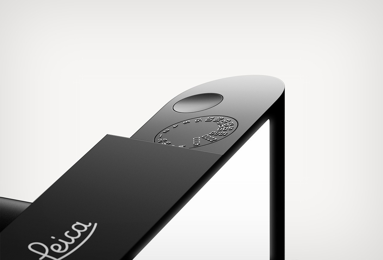
Essential physical controls are consolidated on the top plate, just like a classic Leica. Raised numbers provide a nice textural contrast on the shutter speed dial, which sits perfectly flush with the camera body alongside the shutter button. The overall design prioritizes clean lines and seamless interaction.

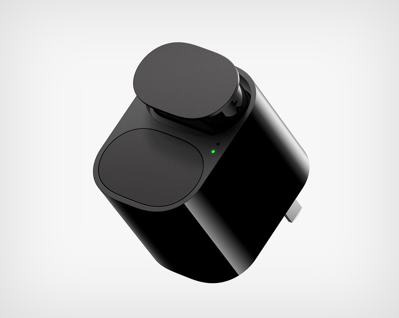
Zhang even extends the minimalist concept to the charger, featuring a compact dual-slot design for convenient battery management on the go.

The post The Leica M Camera Gets A Minimalist Makeover first appeared on Yanko Design.

Leica EDC Multitool was designed for camera tinkerers as well as seasoned outdoor enthusiasts

Multitools have a special place in an adventurer’s life, who must always be prepared for an emergency when venturing outdoors. The best preparation against the unforeseen is having a multitool in the everyday carry gear. Offering a number of simple and effective ways to tackle a range of problems when outside the house, or in the everyday routine at home, for that matter, a multitool in its portable format is a constructive option.

If you’re an enthusiast, or for the knowledge of the not-so-familiar, Victorinox and Leatherman are arguably the two most prominent names in the multitool industry. With the use of new materials and formats, many competitors and young designers are reinventing the wheel. A case in point is the Leica Multi, which is an EDC designed for the famed optics giant with impressions of its cameras reflected in the form factor.

Designer: Marco Barbosa

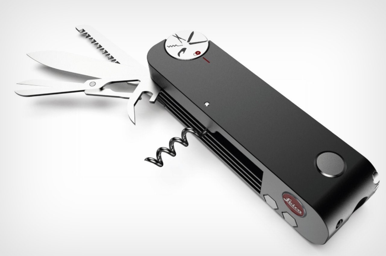
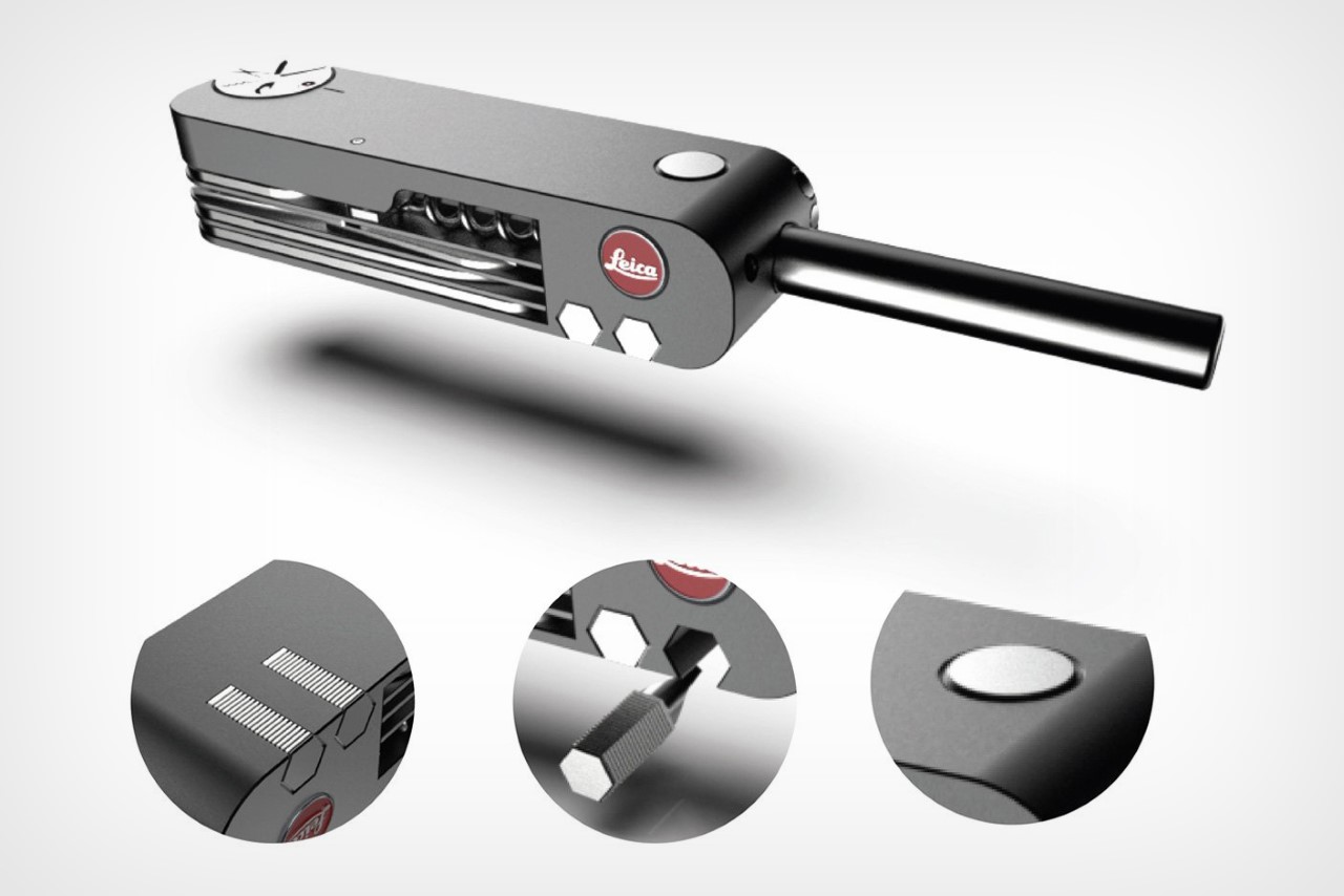
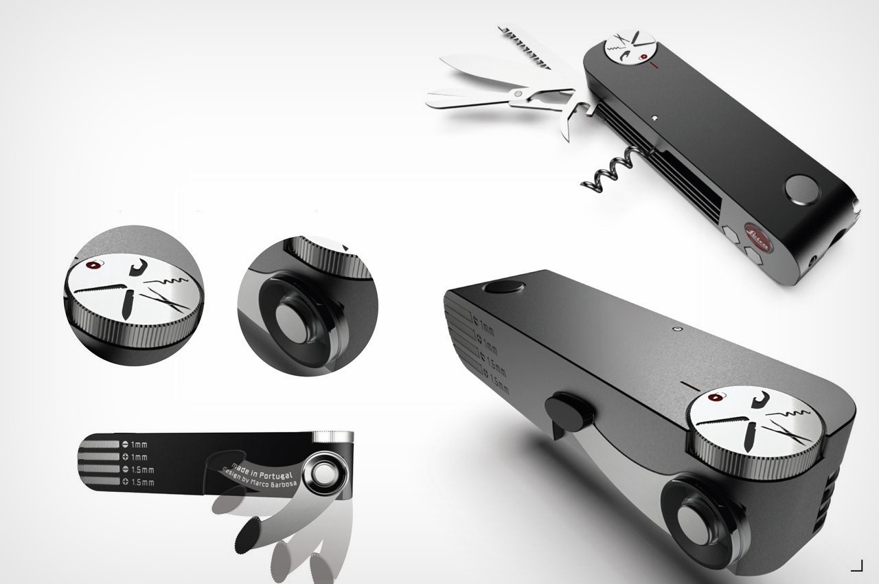
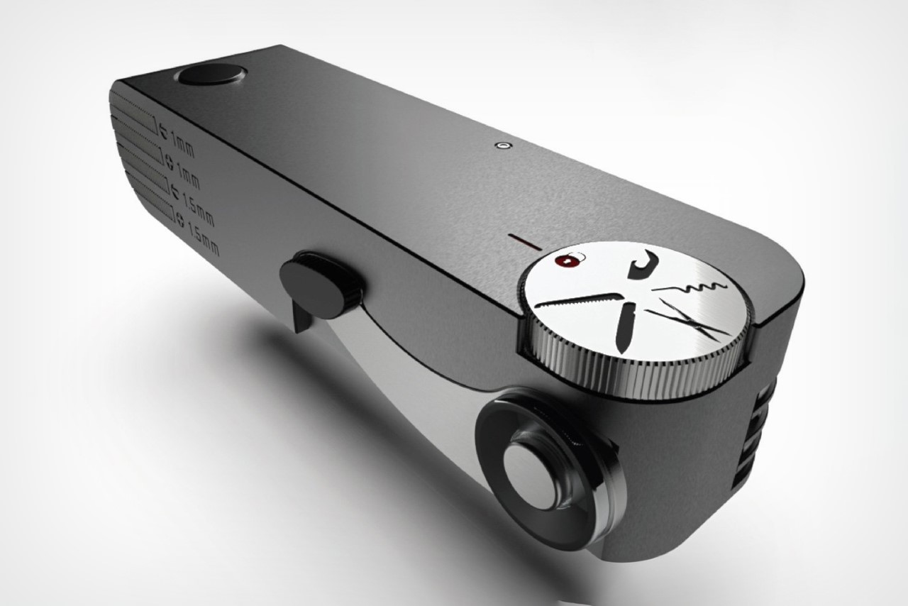
Over the years with its unrelenting simplicity and compactness, the Leica cameras have paved the way for all types of modern photography. Now the Leica M forms the basis for the design of a multitool that draws more than its looks from the SL2 camera. The Leica Multi has a similar machined aluminum body and is manually assembled for precision and quality.

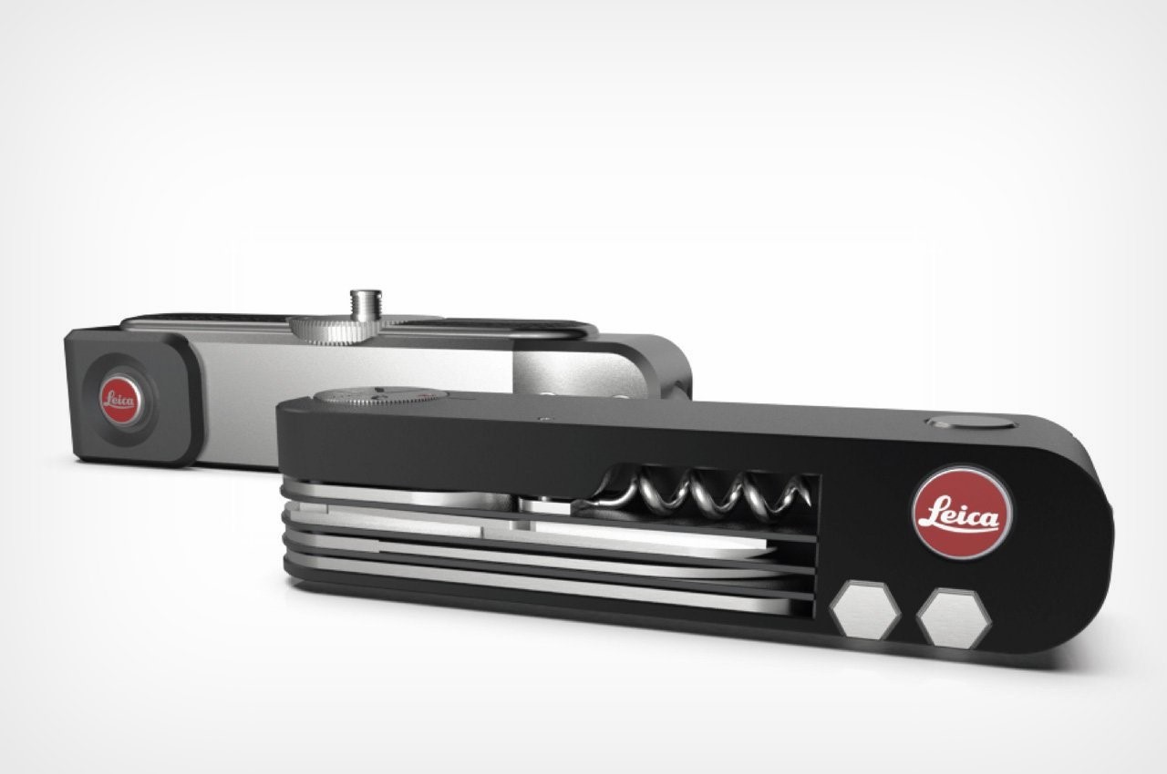
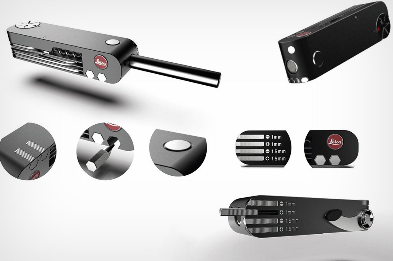
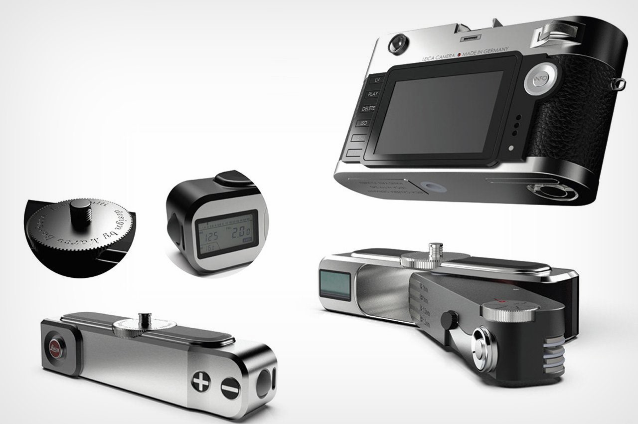
The smallest of design features of the Marco Barbosa’s multitool reflect the Leica brand image and closely represent its analog camera details, which would allow the familiar customers to use the multitool easily due to the acquired knowledge from using Leica cameras. To keep it in line, and more productive for Leica users, the Multi is made to stick (through a housing) to the bottom of a Leica camera where the tripod does. To ensure the everyday carry gear is even more versatile to use its housing includes a spatial reading photometer that harks back to the analog days.

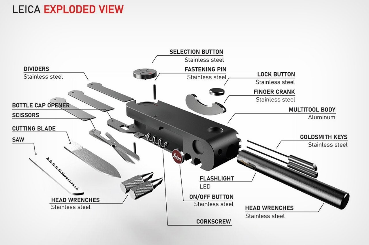
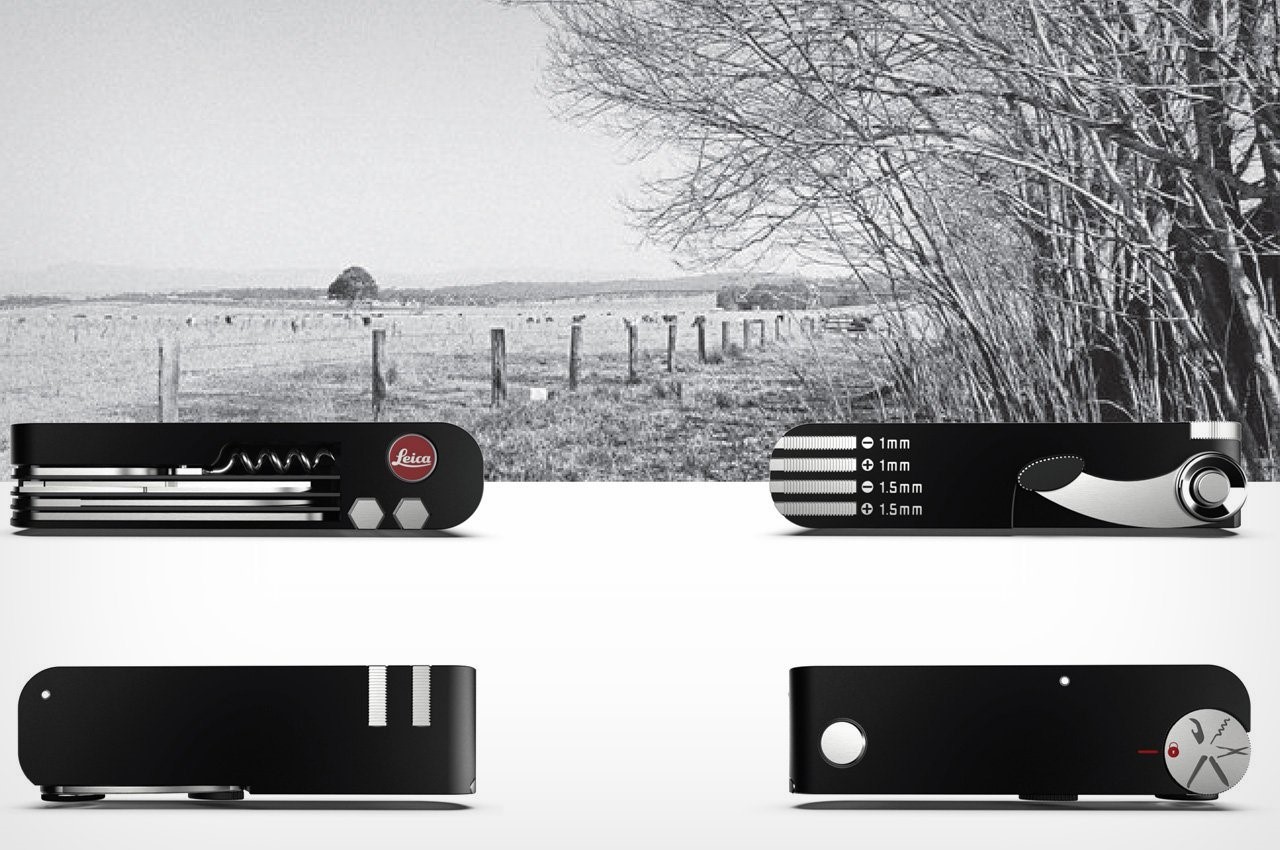
Talking of versatility, the Leica Multi is designed in two parts. The screwdriver, Philips screwdriver, saw, knife, scissors, corkscrew, and cap opener are located on one side, while the precision instruments like the flashlight and goldsmith’s keys are placed on the other. Opening these individual tools is easy: select the tool and rotate the handle.

When the particular tool is fully open, it locks into place so it is hassle-free to use, and pressing the shoot button unlocks the tool to retrieve it back to its residing space. All the tools have a magnetic tip and the flashlight on the Multi goes on and off with the press of the Leica logo onboard. The Leica Multi, bare bone is directed toward Leica customers, but its design and effectiveness, I presume, will leave many outdoorsy yearning!

The post Leica EDC Multitool was designed for camera tinkerers as well as seasoned outdoor enthusiasts first appeared on Yanko Design.

The Leica Sofort 2 hybrid camera lets you print before you post

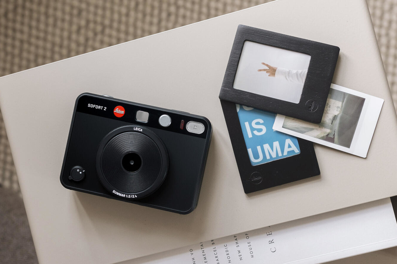
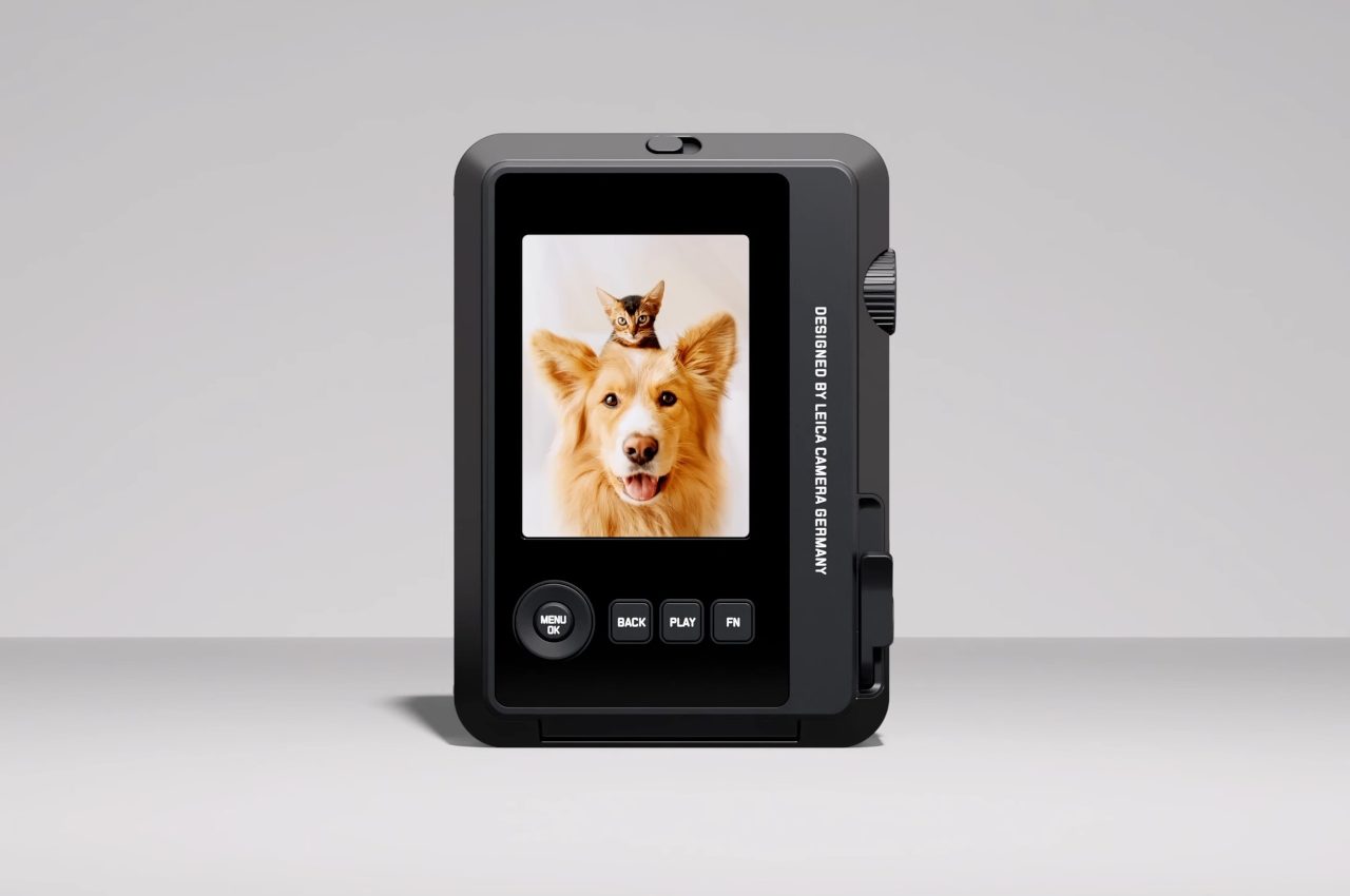
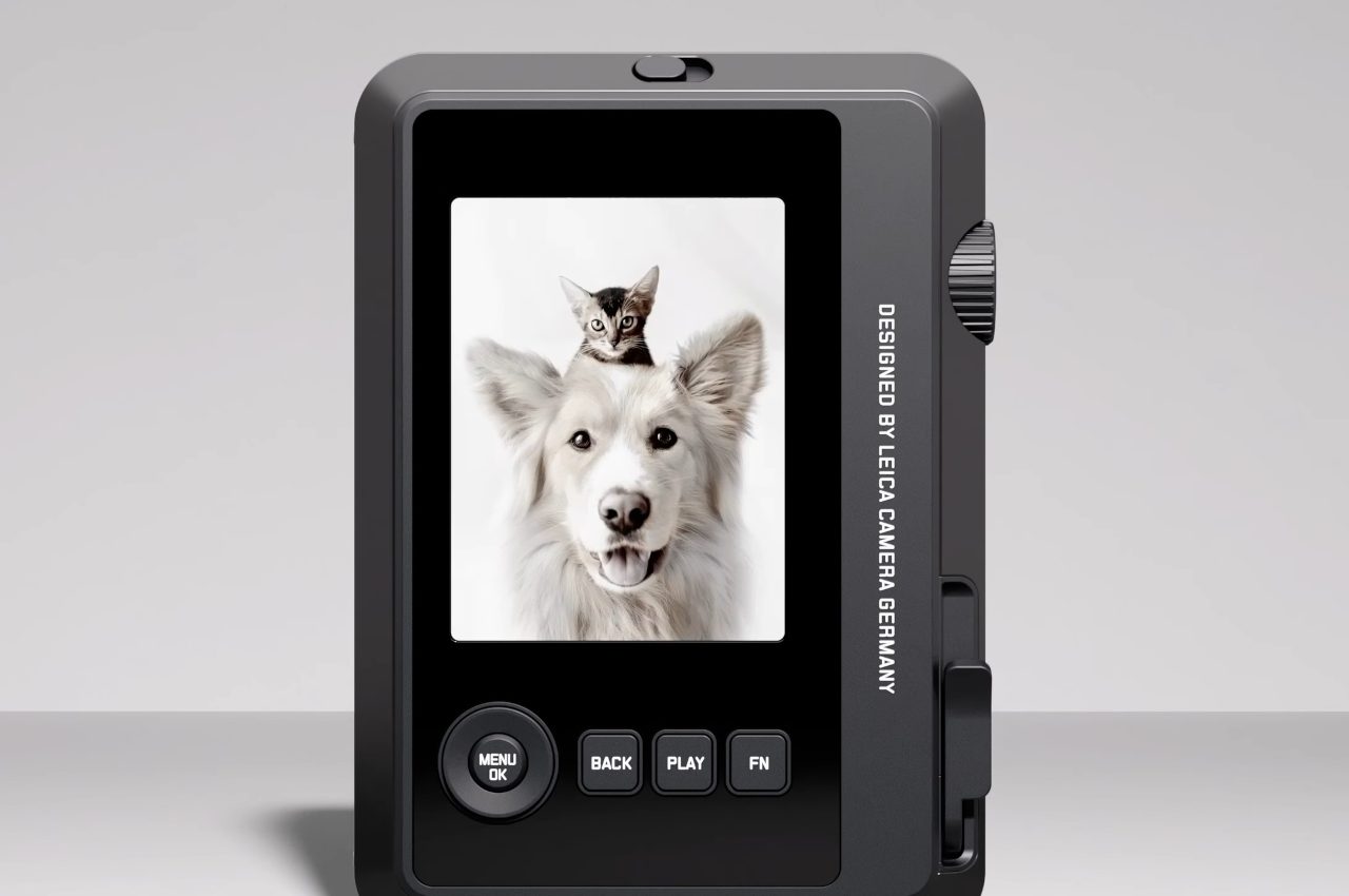
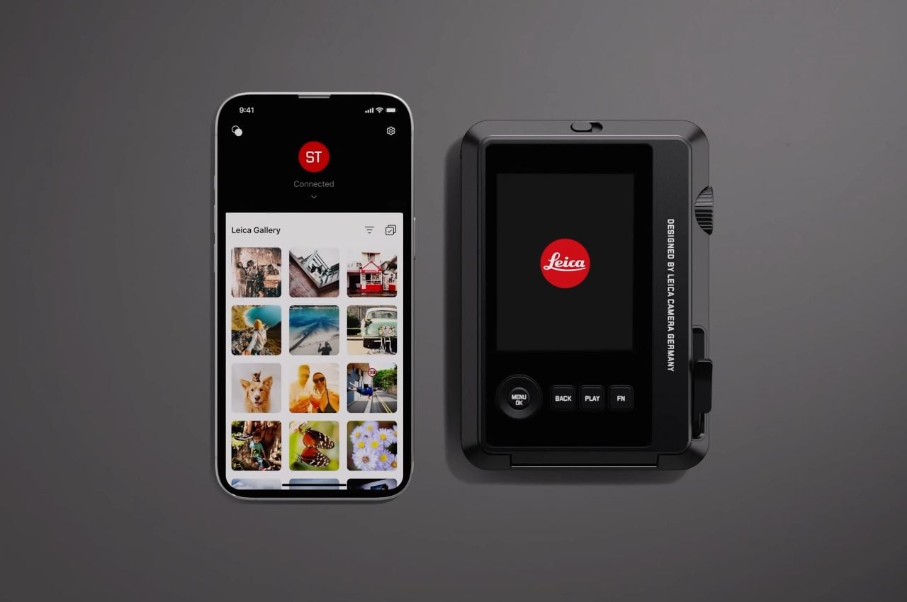
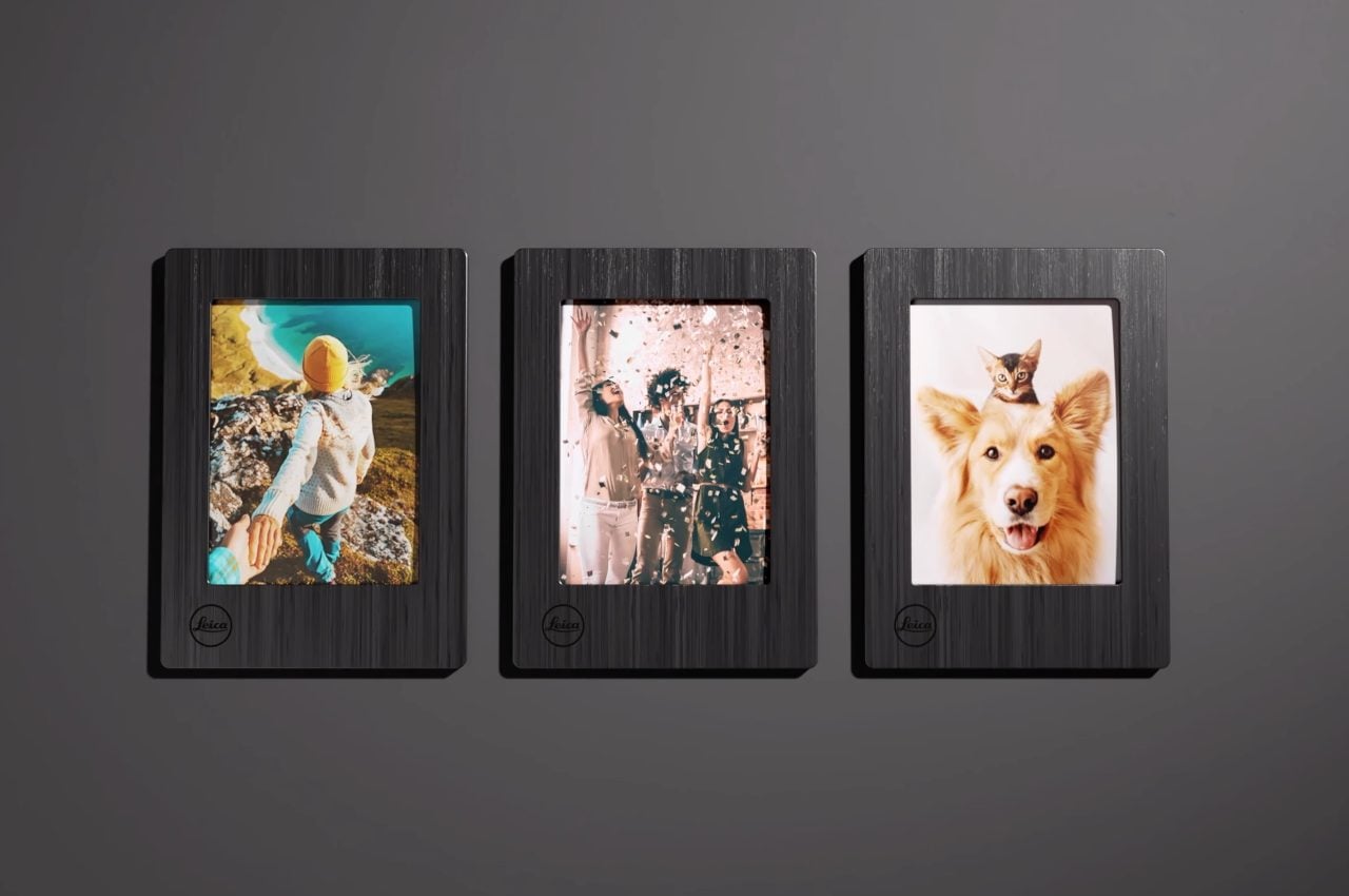
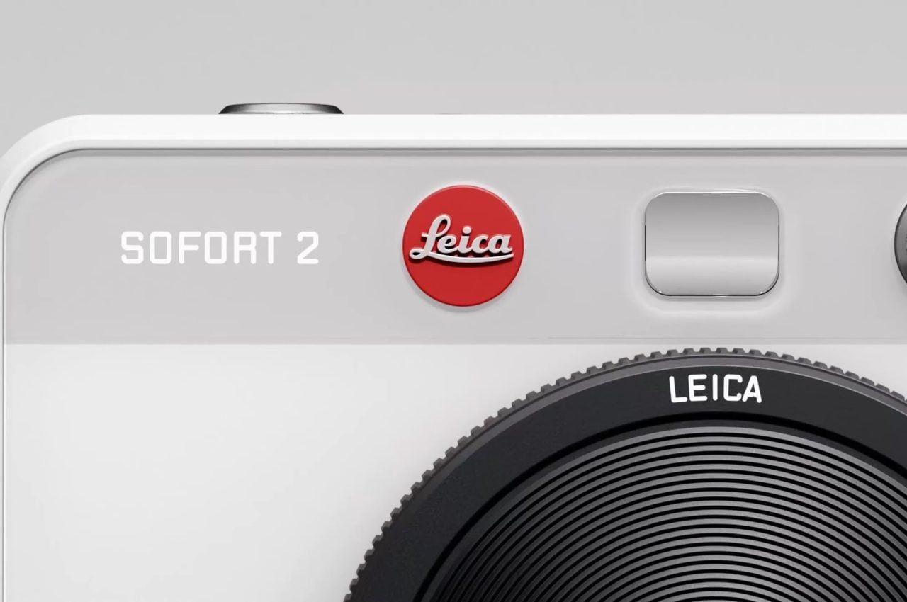
Hybrid digital cameras are a great alternative to smart phone cameras for two reasons: you can theoretically store more digital photos on an SD or micro SD card, and you can print your digital photos out like a polaroid camera. The newly announced Leica Sofort 2 competes against some of the best hybrid digital cameras around, like the Fujifilm Instax Mini Evo, thanks to its versatile set of features – including built-in connectivity with Leica’s FOTOS smartphone app for seamless photo transfer between devices.

Bells and whistles aside, Leica is notorious for developing durable cameras that are easy to operate, yet produce images which immediately look great without any extra color balancing, contrast boosting, or general tweaking. At an MSRP of $389, the Sofort 2 may seem pricy compared to other hybrid digital cameras, but its secret weapon – aside from the aforementioned FOTOS app, which lets you instantly print your smartphone photos out of the Sofort 2’s built-in 86×54 mm printer – is Leica’s signature lenses that are known to produce an incredible mix of contrast, sharpness, and bokeh out of the box.

Designer: Leica

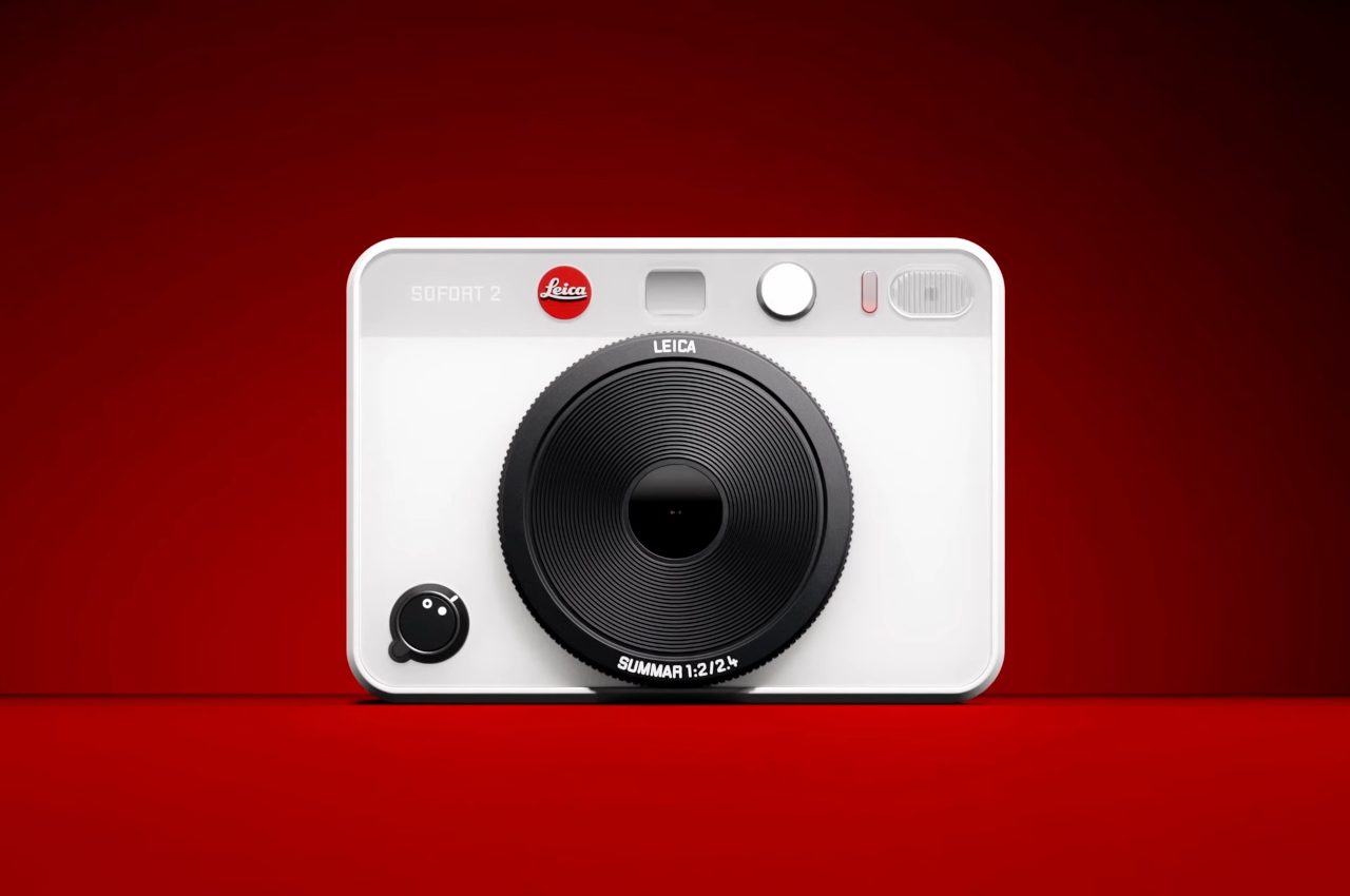
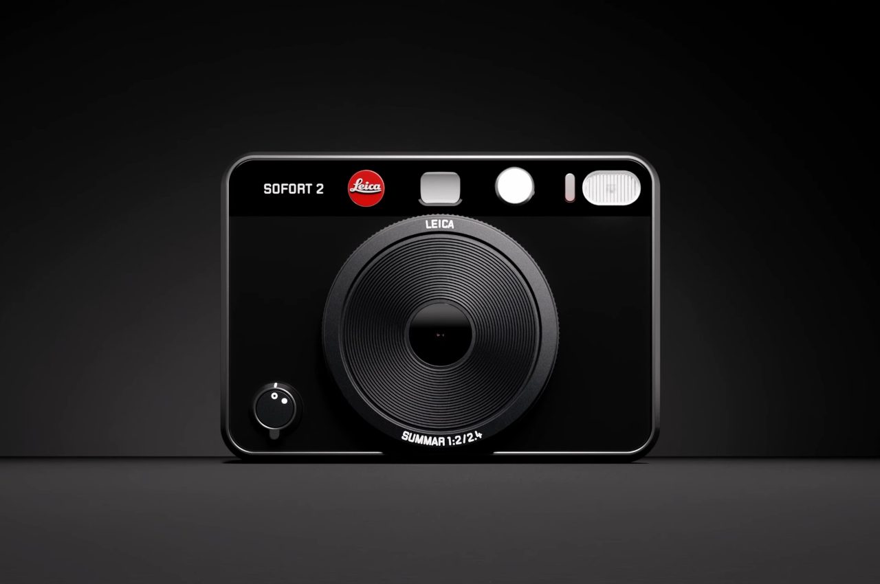
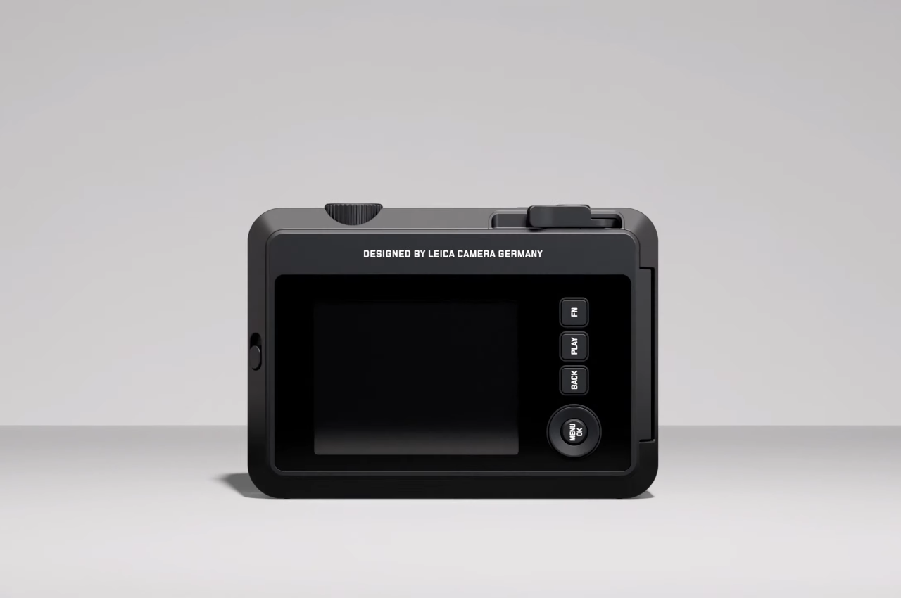
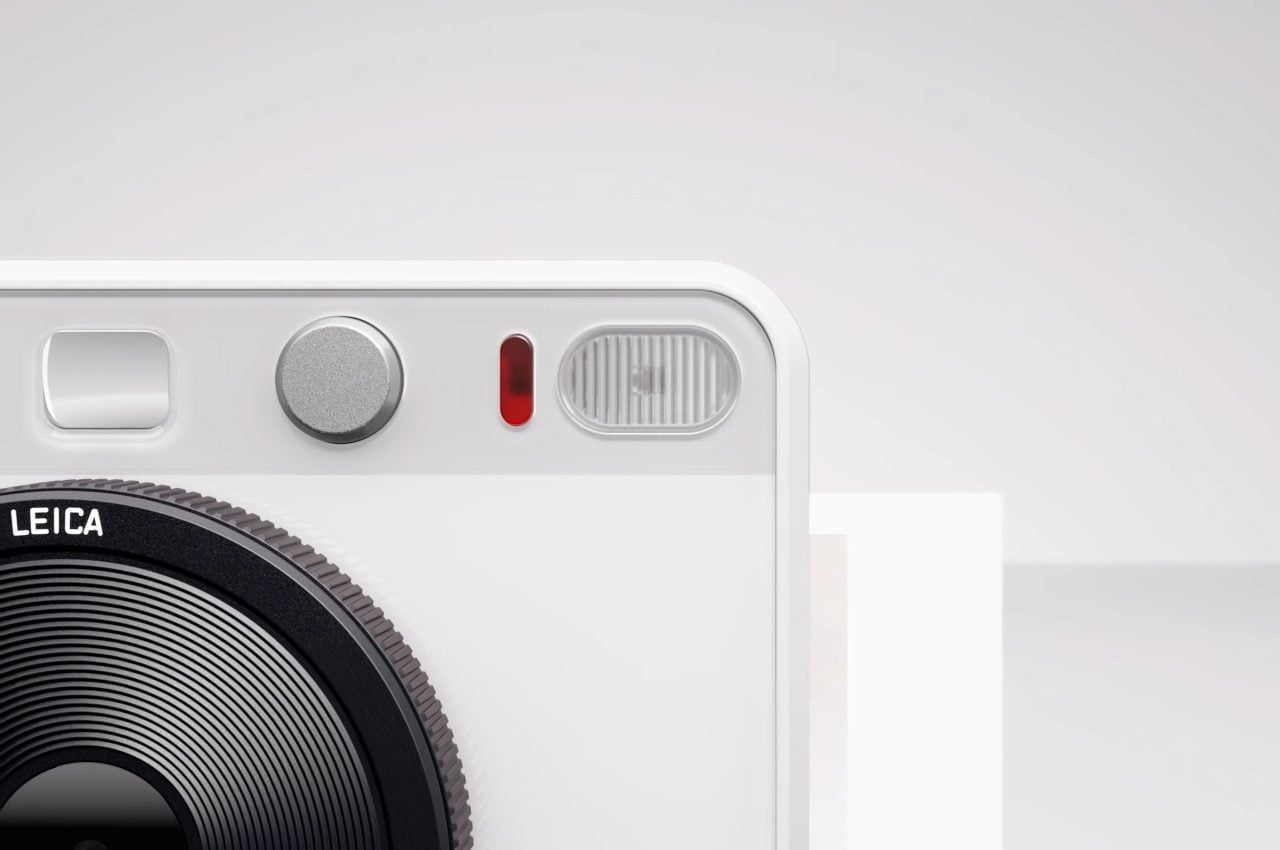
The Sofort 2 is designed for a balance of convenience and quality, thanks to its lightweight and compact design rated to weigh no more than 320 grams – or 0.7 lbs. It also features a decent array of manual controls and buttons for an intuitive, even nostalgic, analog user experience.  There are dials for digital flash and optical zoom, but there’s also a manual print lever that should make the instant photo printing experience more authentic.

Its Leica Summar 2.4 f/2 lens is rated to include a solid aperture range of f2 to f16, its shutter speeds can range between 1/4s to a blazing fast 1/8000s, and its 5 megapixel 1.5″ CMOS sensor is designed to produce 2560×1920 sRGB photos – taking up about 1.2 megabytes per shot. Its internal memory can contain about 45 photos taken by the Sofort 2 (though larger photos transferred via the FOTOS app may take more space), but that can be expanded with a micro SD or micro SDHC card, letting you store up to 850 photos internally per 1GB of external SD storage.

Despite its balance of high-quality features and ease of use, regular users of hybrid digital cameras have been openly skeptical of the Leica Sofort 2’s design on forums like Reddit – mainly because of its similarities to comparable hybrid digital cameras from competing brands like Fujifilm and Polaroid. It doesn’t help that Leica’s instant film pack costs $15 per 10 exposures on its official store, whereas it can be much cheaper to buy film for other instant cameras.

Skeptics do still seem to love the FOTOS app, which is known for being well-designed from a UX standpoint, conveniently allowing transfer between Leica cameras and any modern smartphone. This means you can post your Leica Sofort 2 photos to social media instead, or you can even download photos off of other devices or directly from social media and print them via the Sofort 2’s built-in printer.

The Leica Sofort 2 comes in three color variations: black, red, and white. All look compact and stylish, so you can’t go wrong. It also seems like important peripherals like a USB-C charging cable and carry strap are bundled with the camera itself. However, it looks like you’ll need to shell out extra for any carrying bags – an accessory you may want (for peace of mind) if you’re afraid of damaging your new camera by storing it with other items in the same bag.

You can currently pre-order the Sofort 2 and any accessories you’d like, including the aforementioned carry bags and any extra carrying straps, from the Leica web store. Pre-orders end on November 9 when the new camera begins shipping out to customers across the globe.

The post The Leica Sofort 2 hybrid camera lets you print before you post first appeared on Yanko Design.

The Adidas M is a Leica-inspired film camera concept to tantalize shutterbugs and sports aficionados

I’ll be waiting for my Nike 360° camera and my Under Armour FPV drone too, thanks…

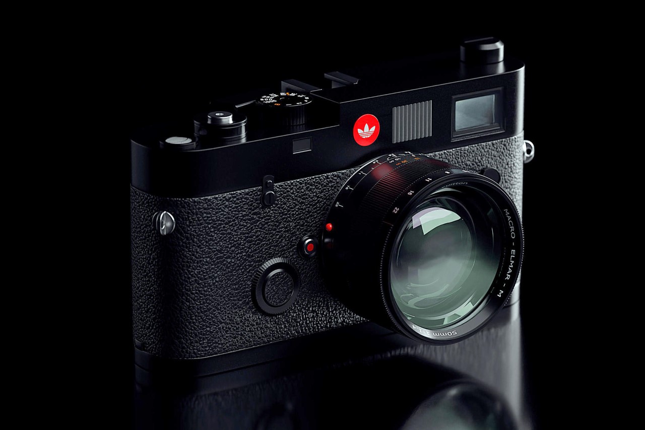
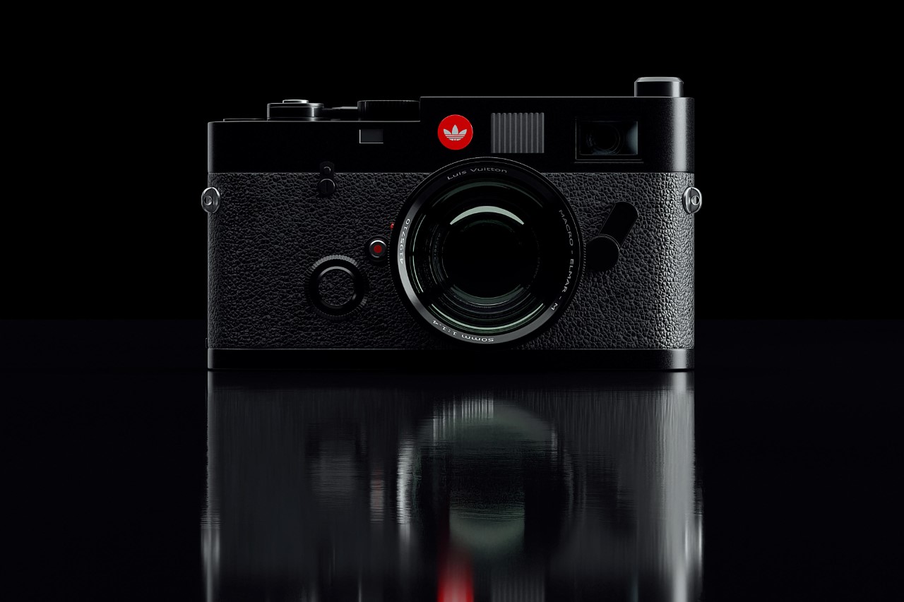
Although I’m fairly certain Adidas isn’t trying to enter the photography world after abandoning its $1.3 billion deal with Kanye, this Adidas M film camera concept absolutely made me do a spit-take. Not for one second did I think that the company’s retro branding would carry forward so well onto high-end camera brands, but this concept by Thiago Botelho has me absolutely hooked. The camera styles itself on the Leica M6, but with a cheeky rebranding featuring the same camera body (albeit a little cleaner) along with a new lens, and a red Adidas logo on the top… As the company says, Impossible Is Nothing.

Designer: Thiago Botelho

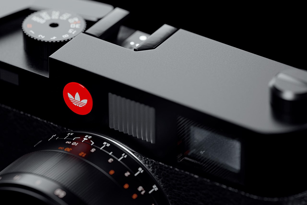
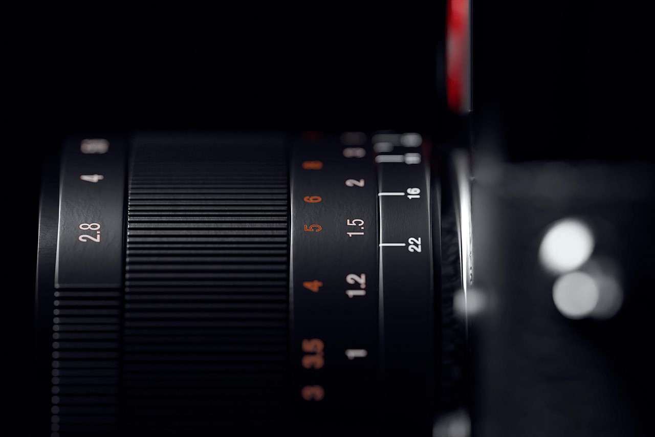
The camera is unapologetically a Leica, although that Adidas branding on it really feels like a winning collab to me. There’s a macro Elmar 50mm lens mounted on the front, and the rest of the camera’s details and trimmings are on point too, from the textured body to the controls on the top that give you the flavor of full analog photography.

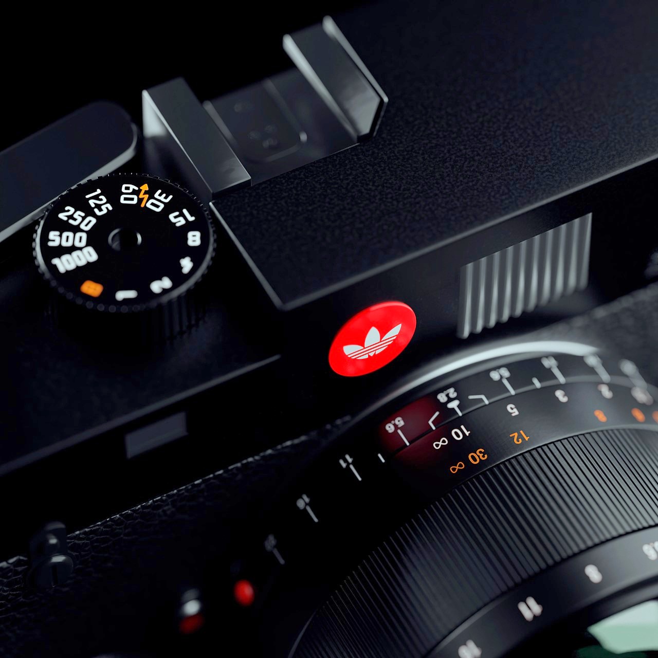
Right beside the Adidas branding is the camera’s built-in flash (although there’s a mount for an external flash too), and a viewfinder on the top right corner.

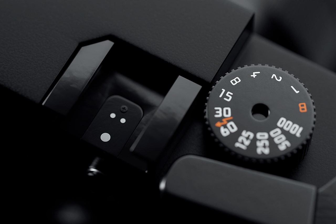
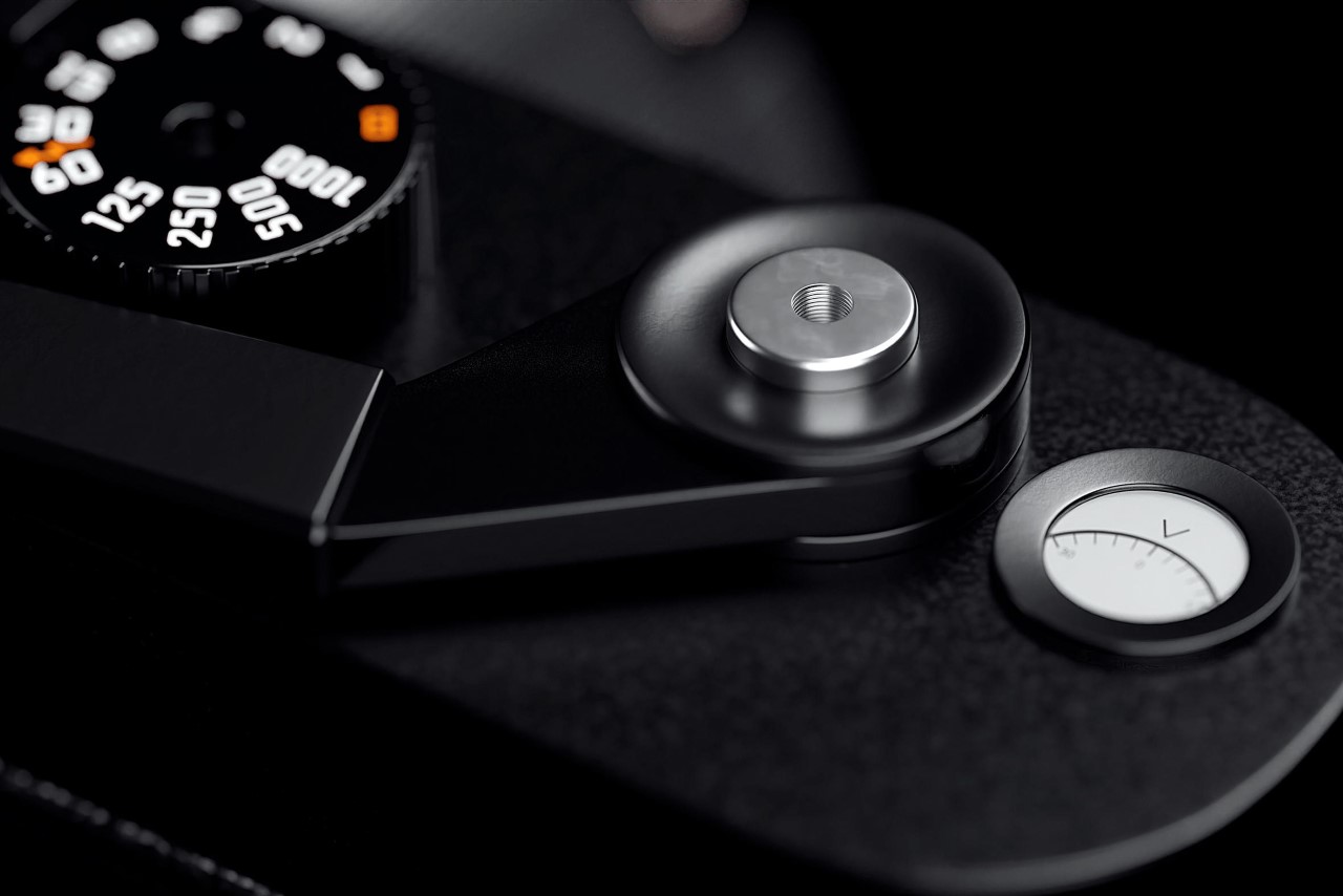
A textured knob on the top helps you control the camera’s shutter speed, offering the only real control on the camera apart from the focus ring on the lens itself. Beside it lies the camera’s “accessory shoe” that’s used to mount external flash modules for a more powerful light source while shooting in low light or at high shutter speeds. On the other side, lies the shutter button with a threaded socket for ‘cable release’, and a reel counter that lets you know how many more photos you can click.

Designed as a CGI exercise by Botelho, a Brazil-based designer, photographer, and CG artist, the Adidas M shows that there’s really no limit to how versatile some logos can be. The three-leaf logo really feels like it belongs on the camera, although the best way to really make this a Leica x Adidas collab would be to also include a highly powerful sports photography mode within the shutter speed knob. Also, is it just me or would an entirely red camera look even more appealing?

The post The Adidas M is a Leica-inspired film camera concept to tantalize shutterbugs and sports aficionados first appeared on Yanko Design.