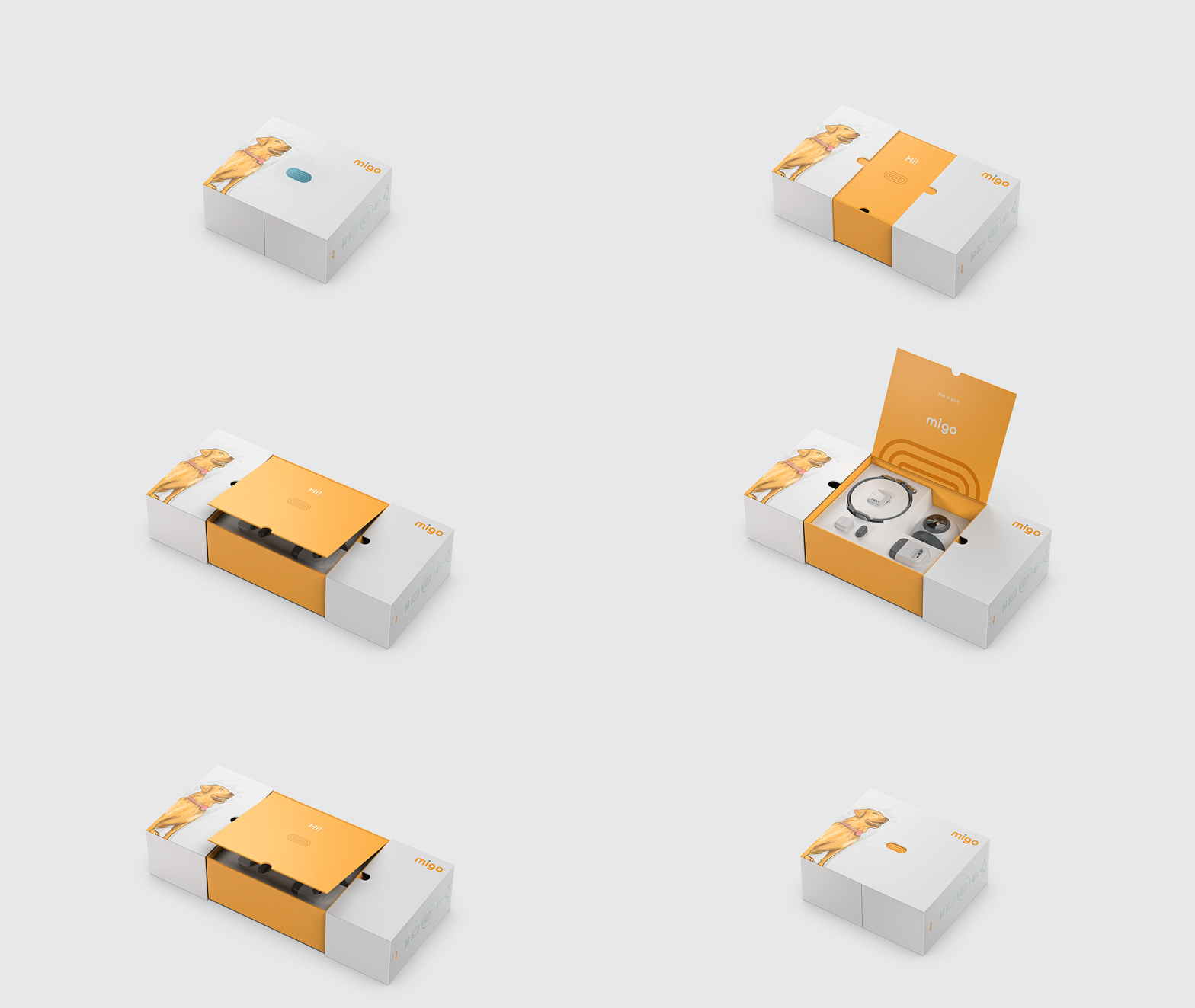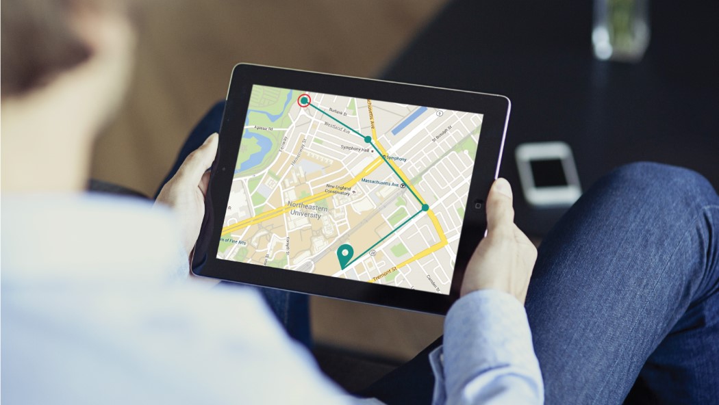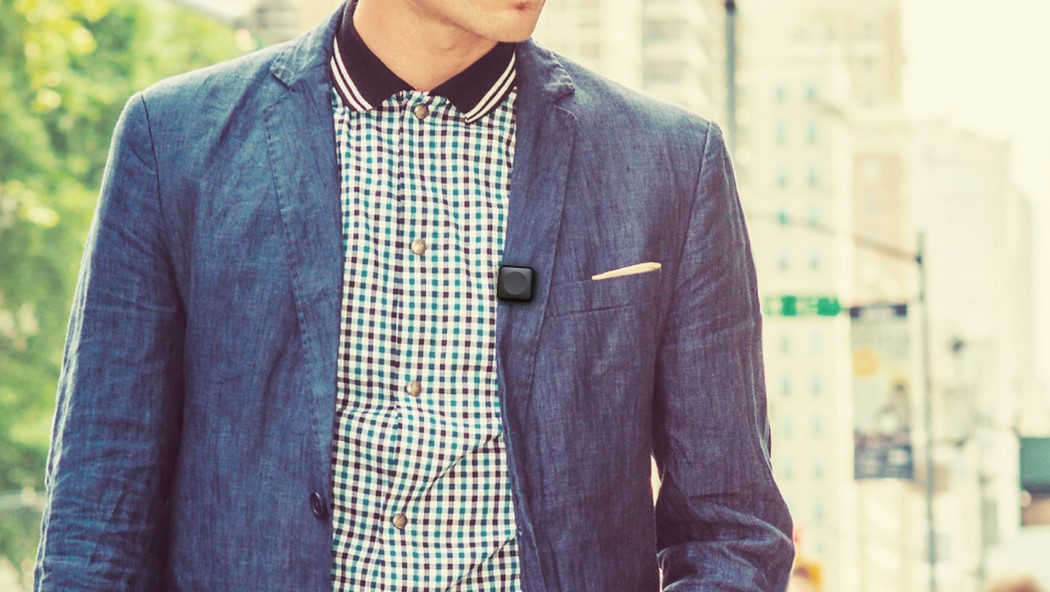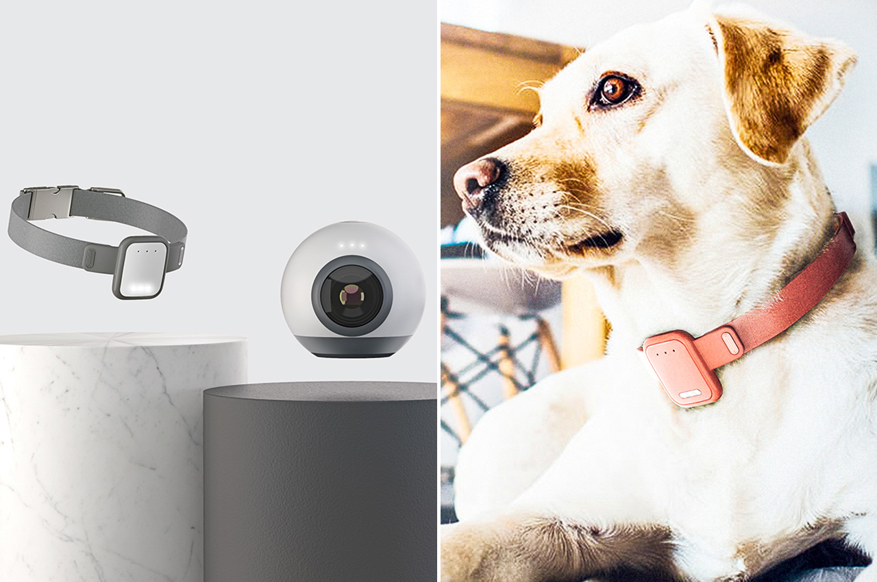
These IoT pet devices uses smart technology to allow owners to interact with their dogs while away from home!

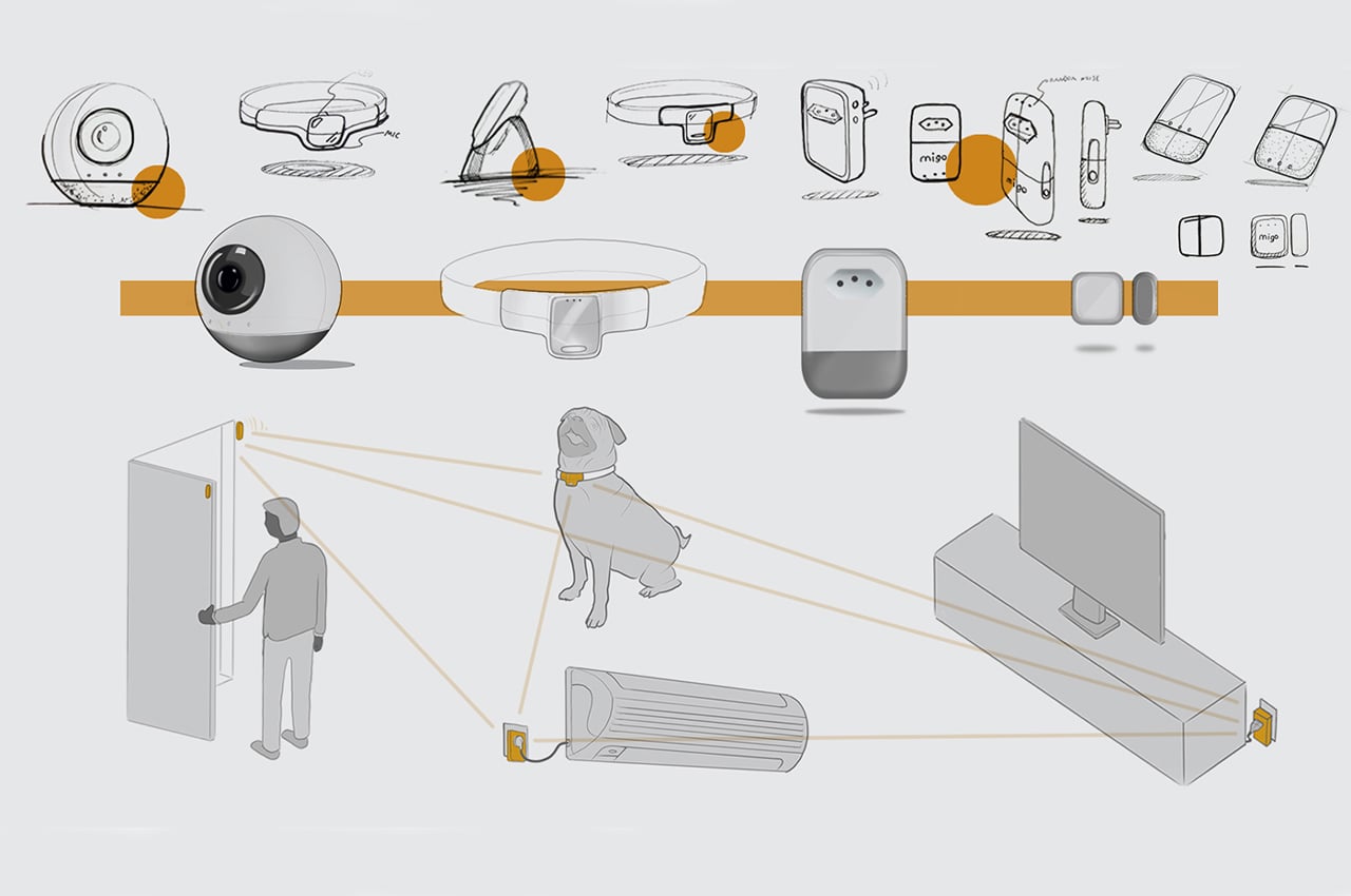
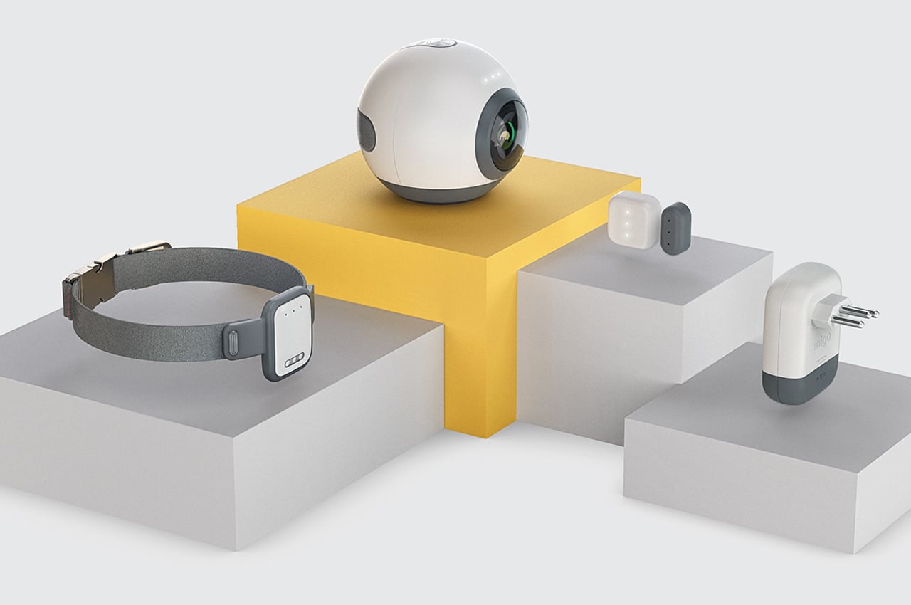
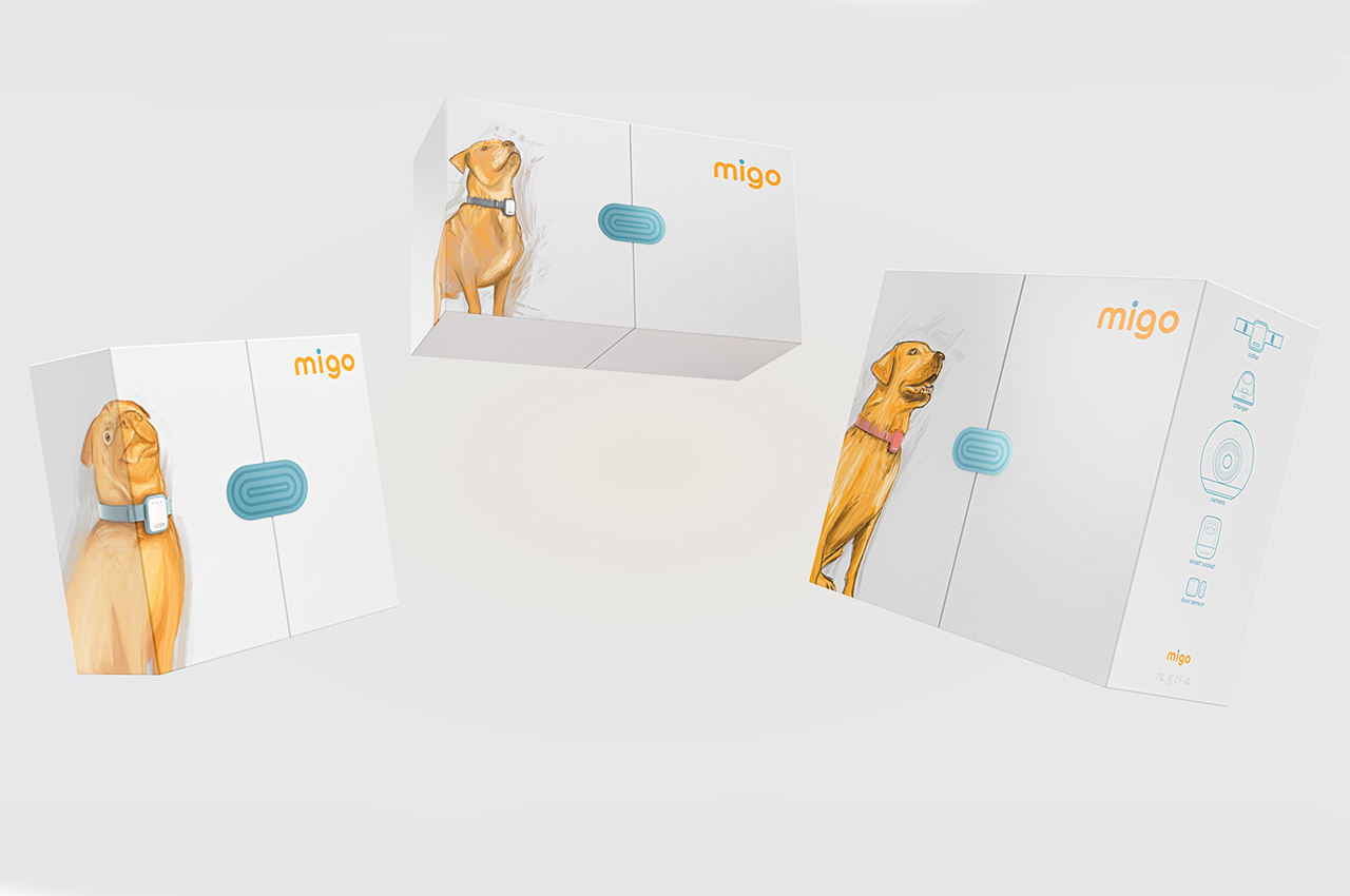
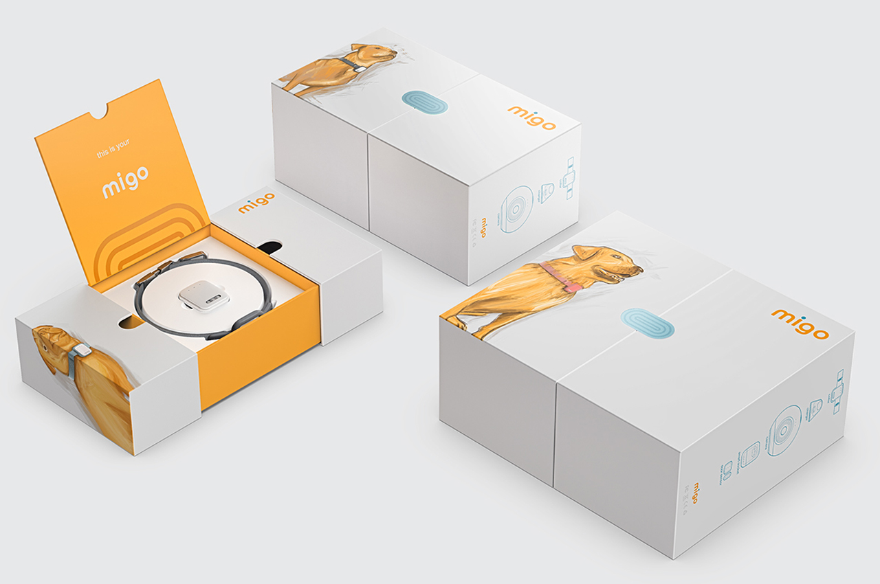
Named after the Spanish and Portuguese nickname for ‘amigo,’ which means ‘friend,’ Migo’s IoT system consists of four main components: a collar, camera/speaker, door sensor, and smart socket.

Let’s face it–our separation anxiety is just as bad as our dogs. Closing the front door on our crying dog is possibly harder than coming home to a shredded couch and floor filled with ripped-up foam cushioning. What happens at home when the dog’s left alone remains a mystery until our return and then we wish it stayed that way. Created by Norway-based designer Lucas Couto, Migo is a kit of IoT devices that leans on smart technology to provide remote interaction between dogs and their owners while they’re away.
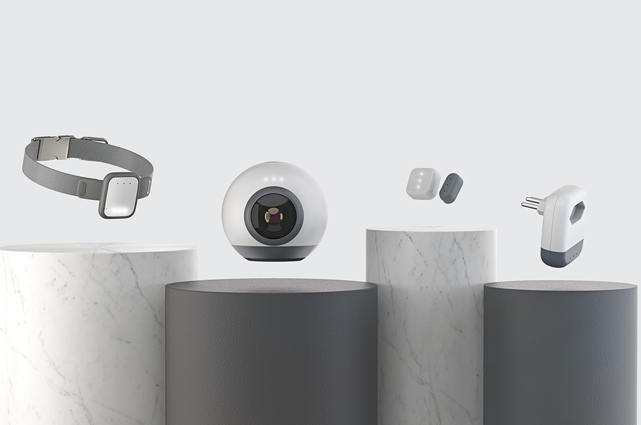
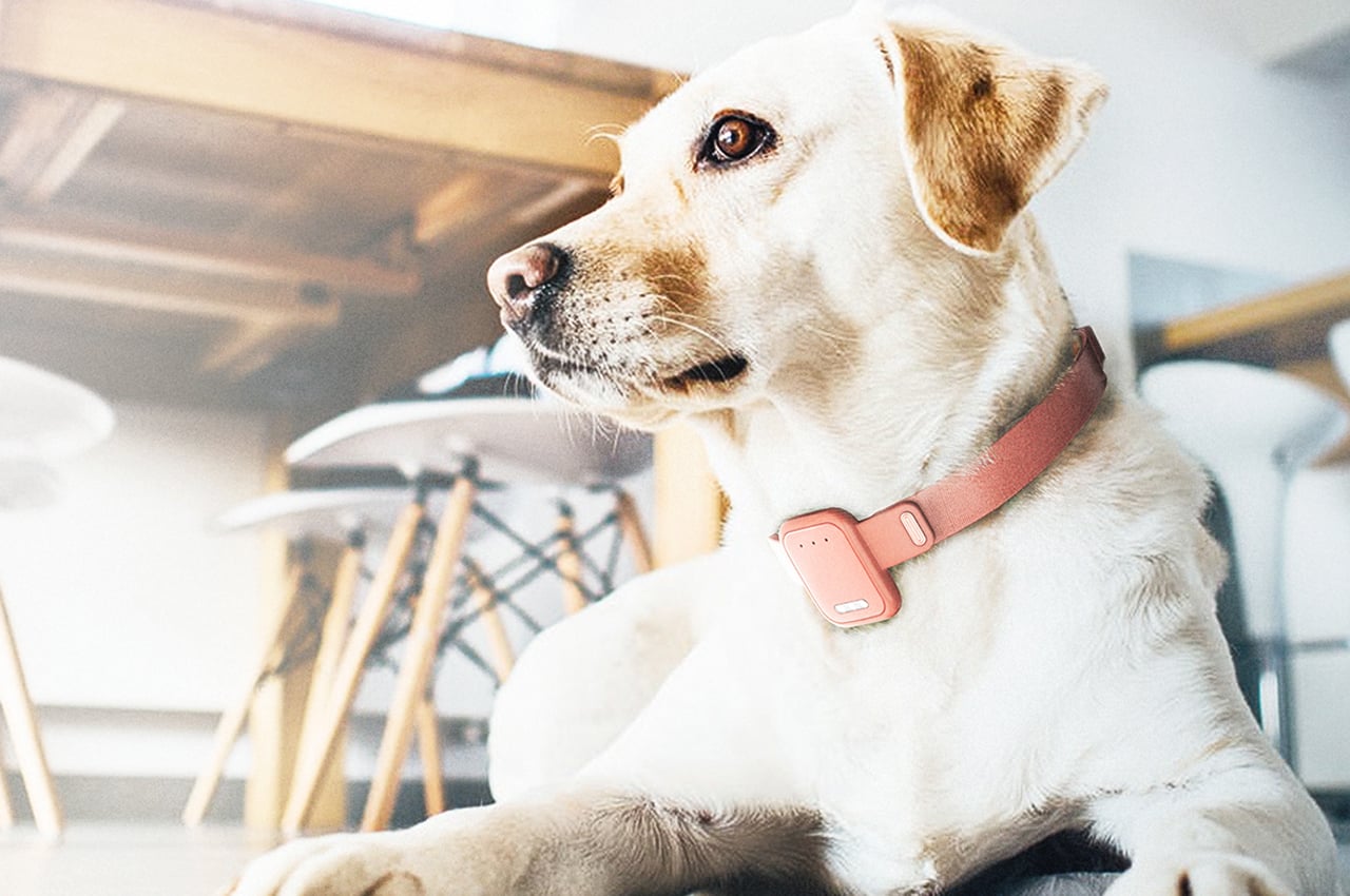
Migo is short for ‘amigo,’ which means ‘friend’ in Spanish. Each component of Migo communicates and connects to one another via Bluetooth, which allows for remote interaction between dogs and their owners. The system’s main appeal is the collar since it comes equipped with a tracking system, temperature sensor, heart rate monitor, audio output, and an LED flashlight. Owners can also have all eyes on their dog at home through the camera unit that functions as a traditional surveillance camera. The camera even comes with a speaker so that owners can speak to their dogs whenever anxiety levels seem to rise.
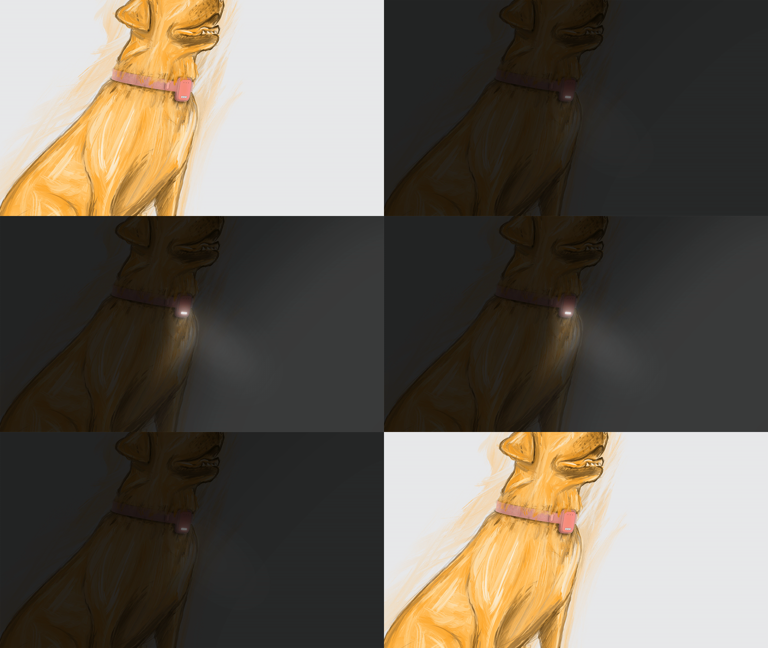
As soon as owners leave through their front door, Migo’s door sensor instantly sends a signal to another IoT device to turn it on and distract the dog. For example, once the door is opened and then closed, Migo sends a signal to the television to distract the dog. The chief component, however, would probably be the smart socket. The smart socket has audio output capabilities and receives signals from all the other devices to turn them on or off. The owner can keep tabs on their dog’s every movement from the convenience of an accompanying app that allows owners to watch and interact with their pups from anywhere.

Designer: Lucas Couto
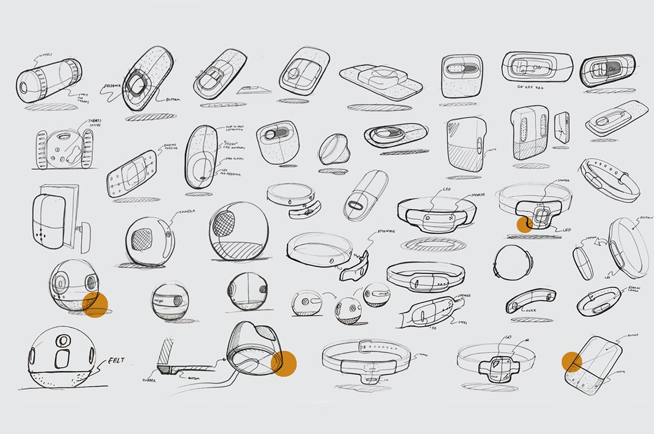
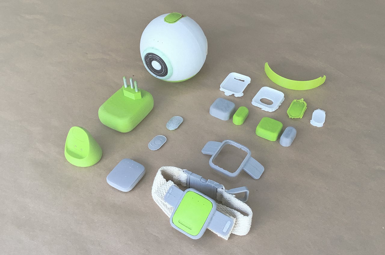
The IoT system of smart devices is easy to assemble and comfortable for your dog to wear. Migo consists of four main components: a tracking collar, camera/speaker, smart socket, and door sensor. The devices have an inconspicuous design so they can be placed anywhere throughout the house.
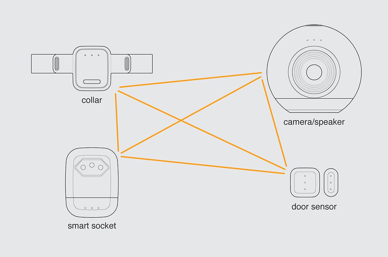
Each component of Migo communicates via Bluetooth connectivity.

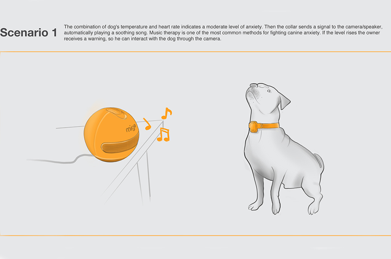
Owners can remotely control Migo’s appliances from anywhere, so when your pup feels anxious, a calming song can be broadcasted through the camera speakers.
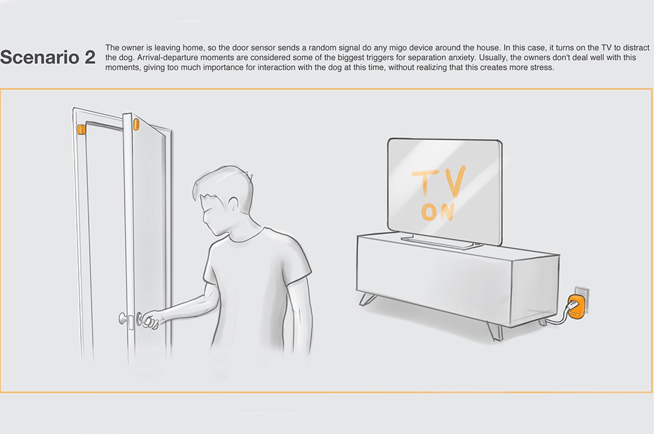
As soon as the owner closes the front door, Migo sends a signal to the television to turn on and distract your pup from separation.
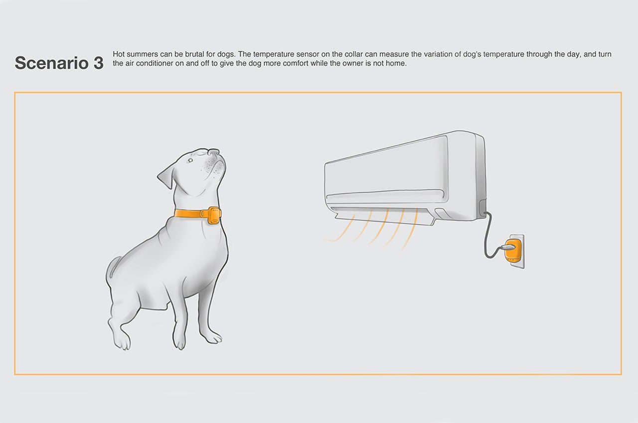
With built-in temperature sensors, the collar can remotely activate AC units to ensure your dog is always comfortable.
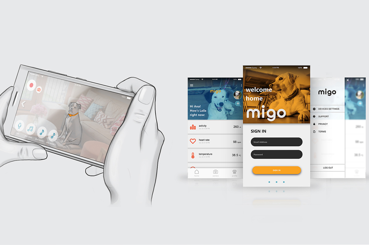
Owners are able to interact with each component of Migo while using the system’s accompanying app.
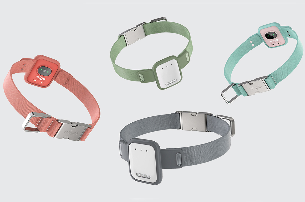
Migo’s smart collars come in an array of different colors to match your pup’s personality.
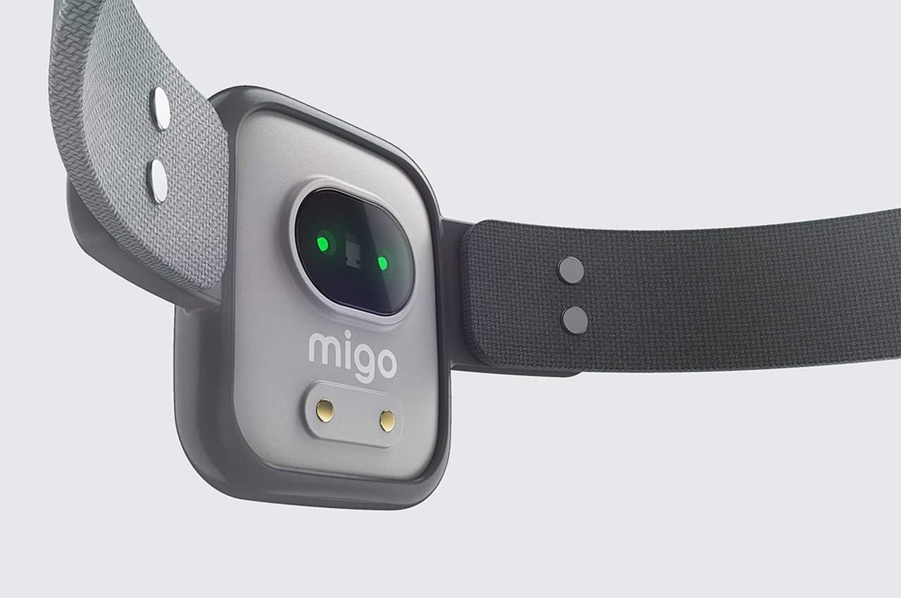
Embedded heart rate monitors also come with the smart collar to keep track of your dog’s anxiety levels. The tracking collar comes equipped with an LED flashlight that can either be manually or remotely controlled.
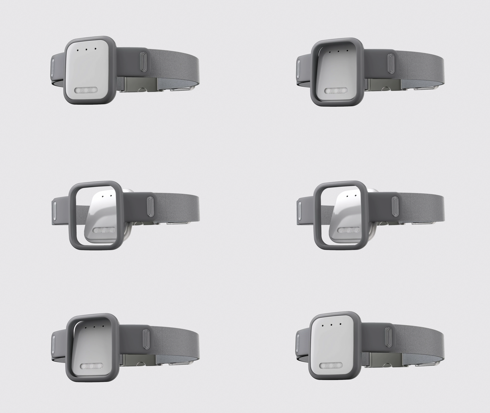
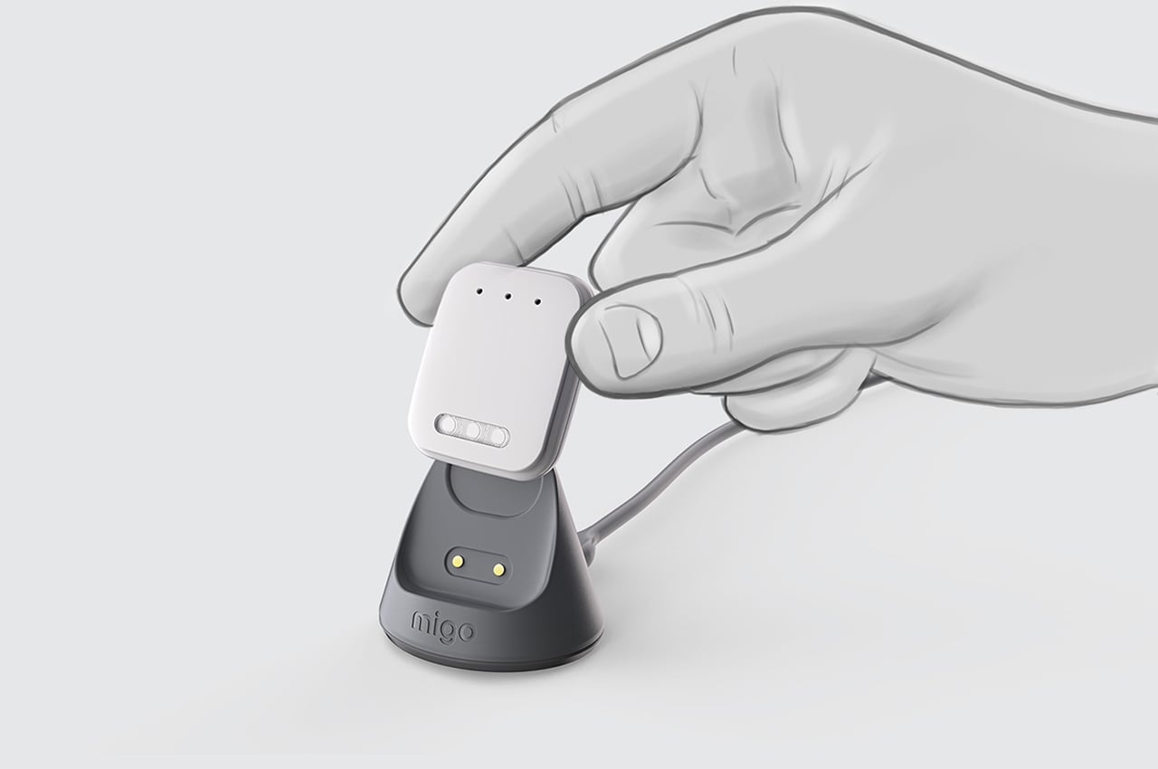
Owners can remove the smart aspect of the tracking collar to charge it between use.
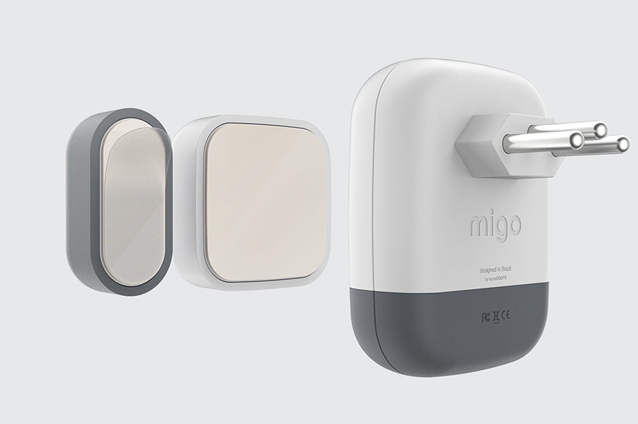
The smart socket works as the chief operator for Migo, controlling and receiving signals from every other IoT device.
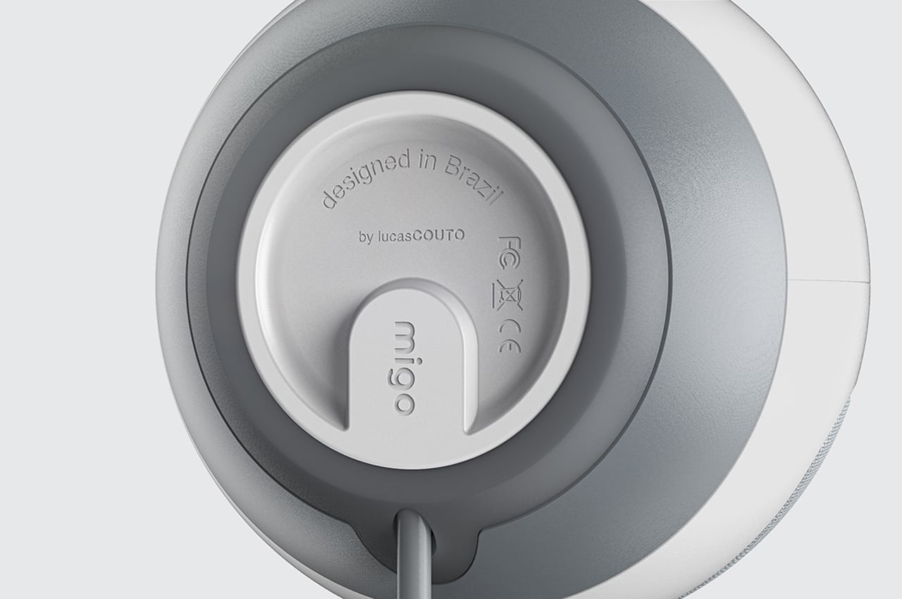
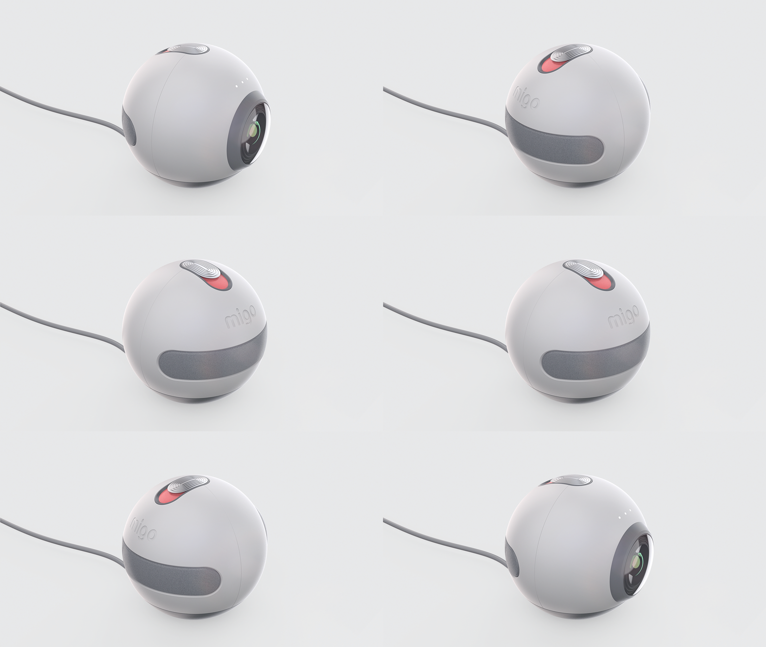
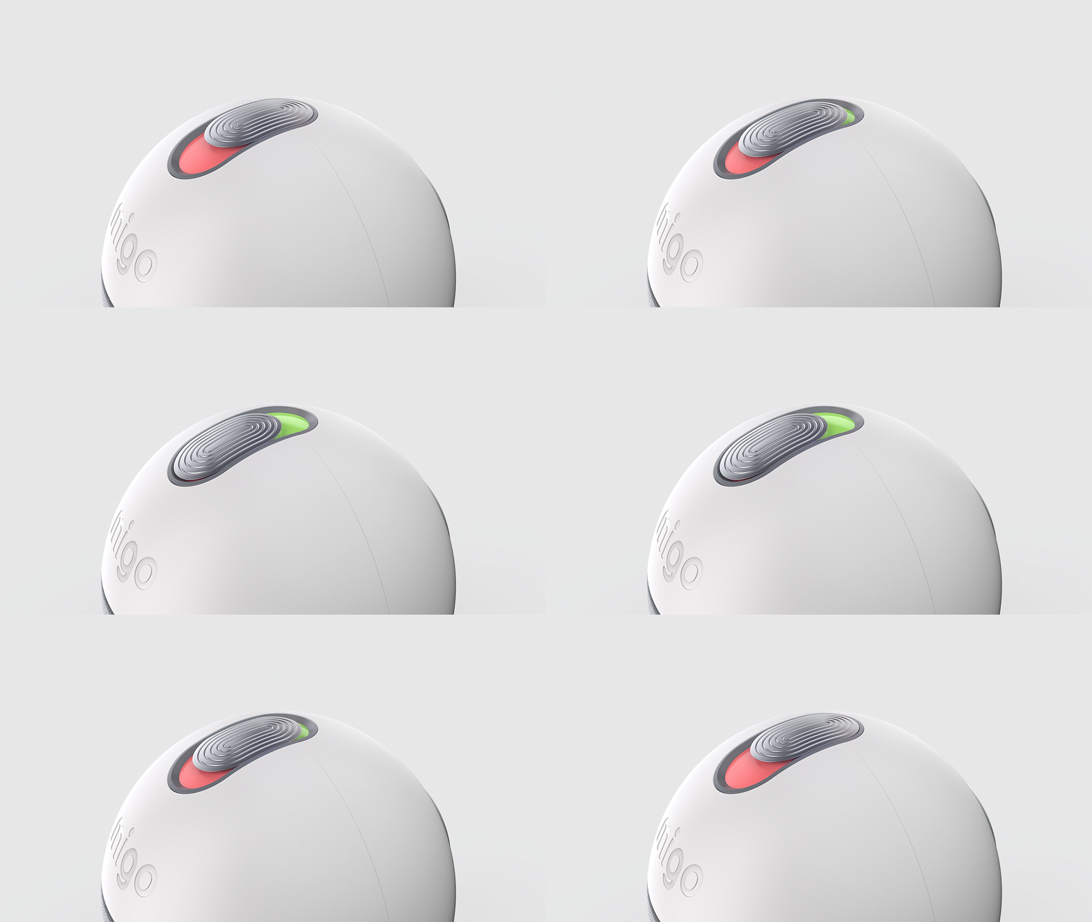
The camera can be turned on and off using remote technology so owners can always keep a watchful eye over their dogs no matter where they are.
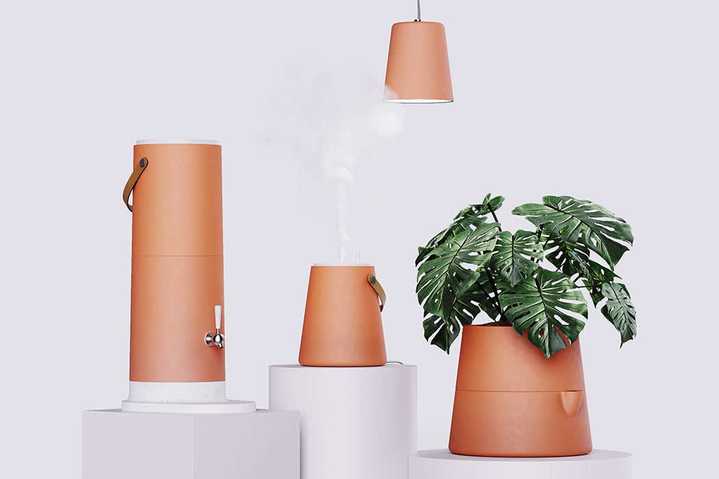
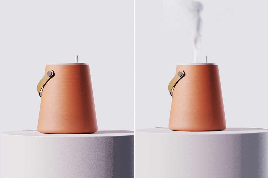
This clay humidifier, filter, lamp and planter is inspired from sustainable Brazilian traditions!

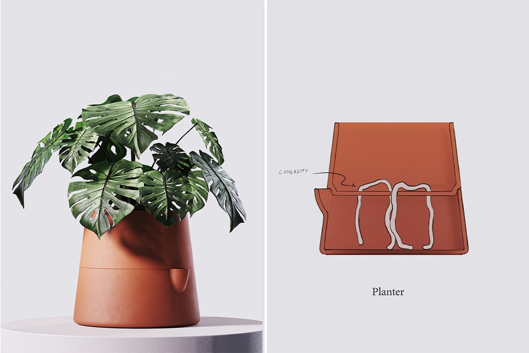
Clay filters are common in Brazilian homes and designer Lucas Couto brings the best of them to more household appliances. Clay is an organic and natural material used by many developing nations because it is cost-effective, versatile, and easily available. Terracotta earthenware in the kitchen is an ingenious practice that is finding its way back into our modern lives and Couto extends the benefits of this material to lamps, filters, and humidifiers.

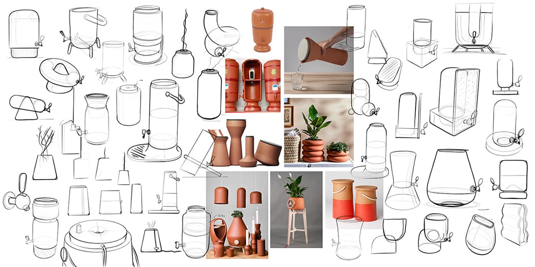
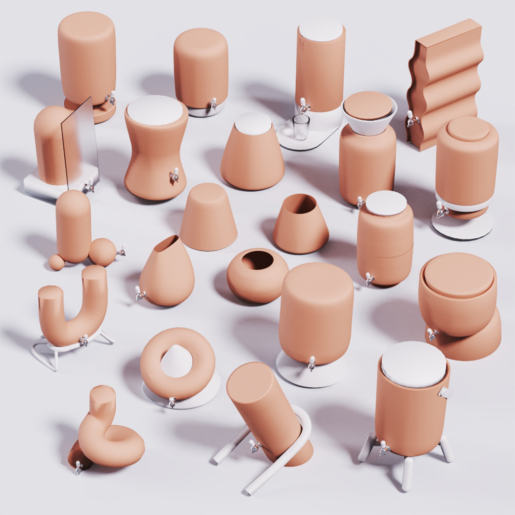
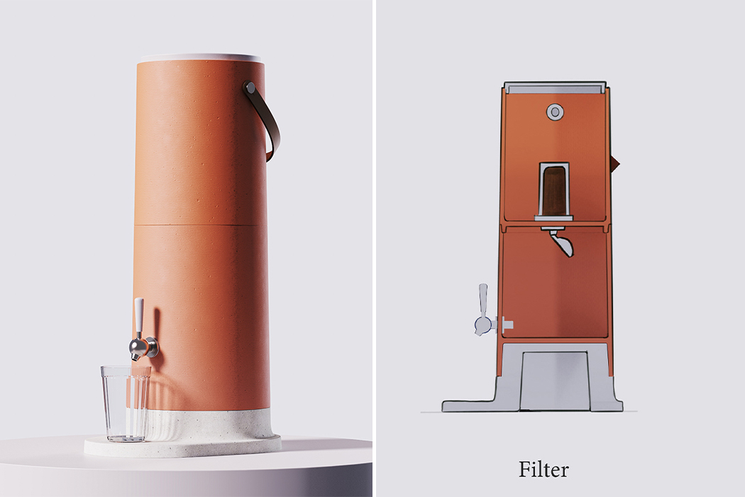
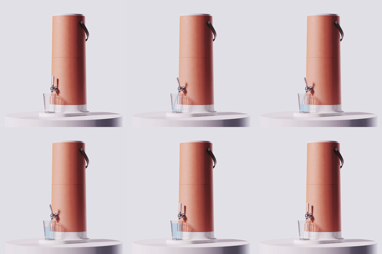
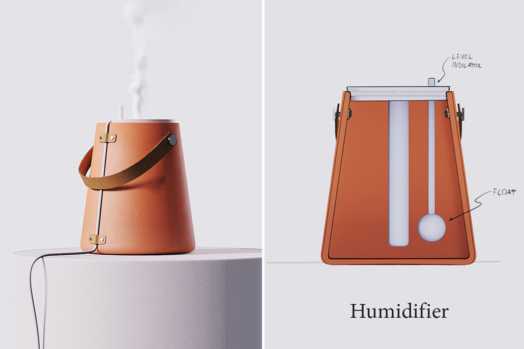
“I intended to respect the heritage, avoiding an approach to simply “modernize” the filter. I wanted to create a unique form factor that takes advantage of the materials and manufacturing process while introducing new functional features, such as a handle to assist in lifting the upper reservoir and a base to support a drinking glass,” he adds, “The cooling property of the ceramic inspired me to design a humidifier. This is a much-needed item in my hometown of Belo Horizonte, where the air can get very dry throughout the year.” Clay filters are actually proven to eliminate toxins from water through its existing properties while also keeping it cool according to research published in the book The Drinking Water Book: How to Eliminate Harmful Toxins from Your Water. The efficient filtration is a result of the gravity process, where water passes through the candles and drips slowly into the lower reservoir.

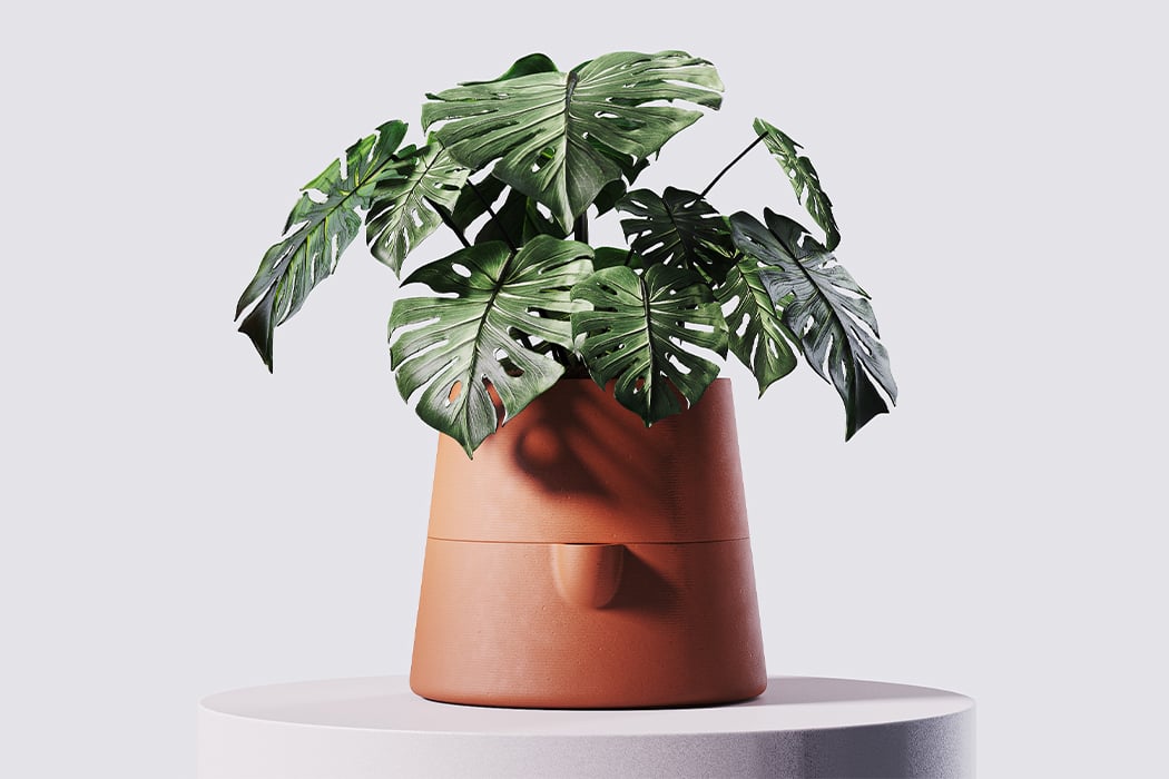
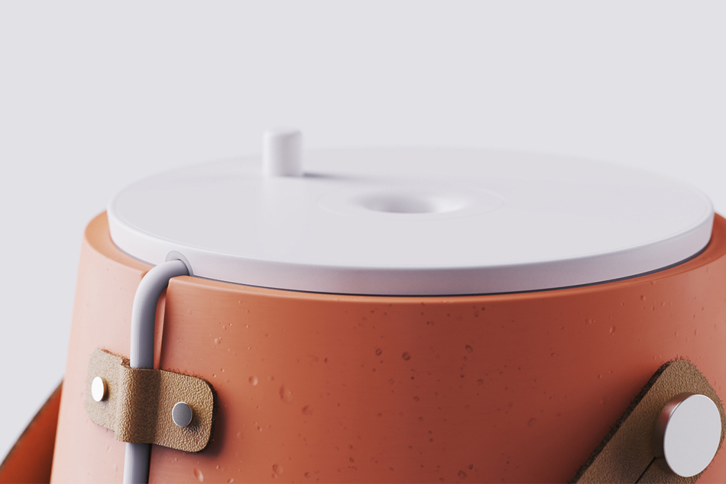
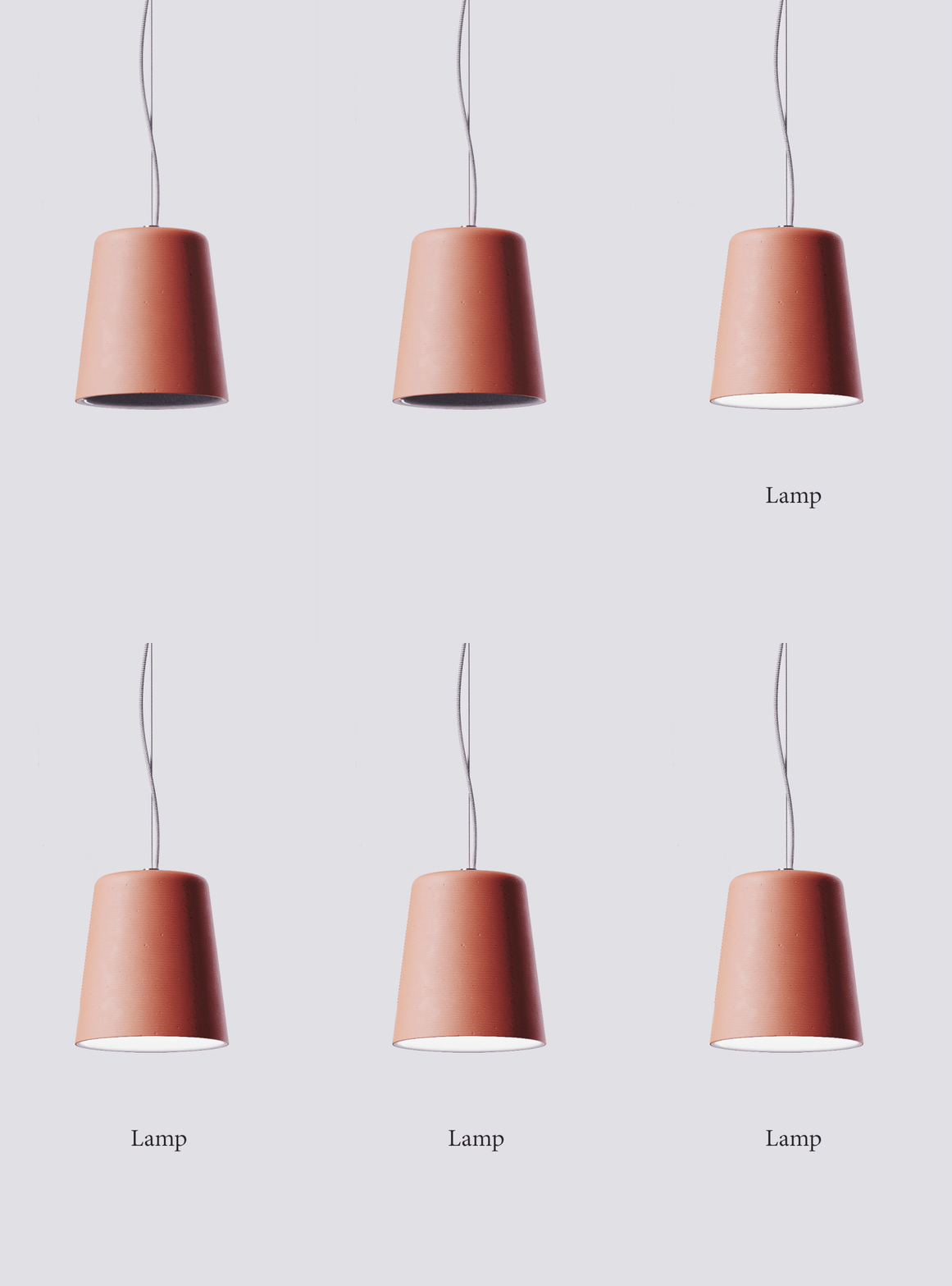
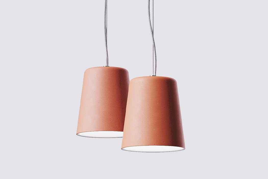
Couto wanted to create a multi-sensorial experience fostered by the terracotta. He retained the color, the textures, and the gradient caused by water absorption for visuals and touch. The water drops inside the filter and the vitrified sound of the material produce a soothing sound. Terracotta naturally smells like earth after rain and it also adds a unique flavor to water. The cooling property of the ceramic is why Couto made the humidifier too. All components are placed in the lid, which also contains a level indicator to assist the user with keeping the humidifier filled. The lamp and the planter were additions to the series to showcase the material in various forms outside the kitchen use. The planter has a two-compartment design to take advantage of capillarity for petrichor! The inner part of the pendant lamp is covered with a white glaze to increase light reflection while the terracotta prevents it from overheating. The clay range is organic, warm, functional, and aesthetic!

Designer: Lucas Couto

clayfamily1

clayfamily2

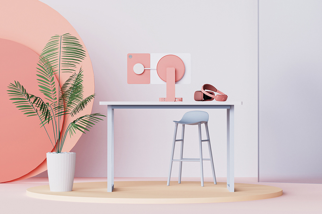
This WFH setup is our dream workstation, including everything from virtual reality to detachable screens!

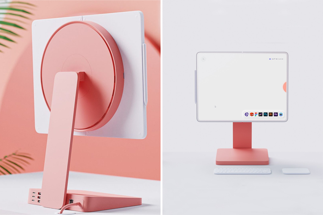
Now that we’ve had a taste of what working from home feels like, we’re all noticing the ways our work setups can be improved. It might be that your desk is too short or that your wires desperately need some organizing. No matter what you do, your workspace should feel comfortable and accessible so that you can move through the workday as smoothly as possible. After one year of intermittently working from home, Lucas Couto dreamed up his ideal WFH setup and it’s safe to say, we all want in.

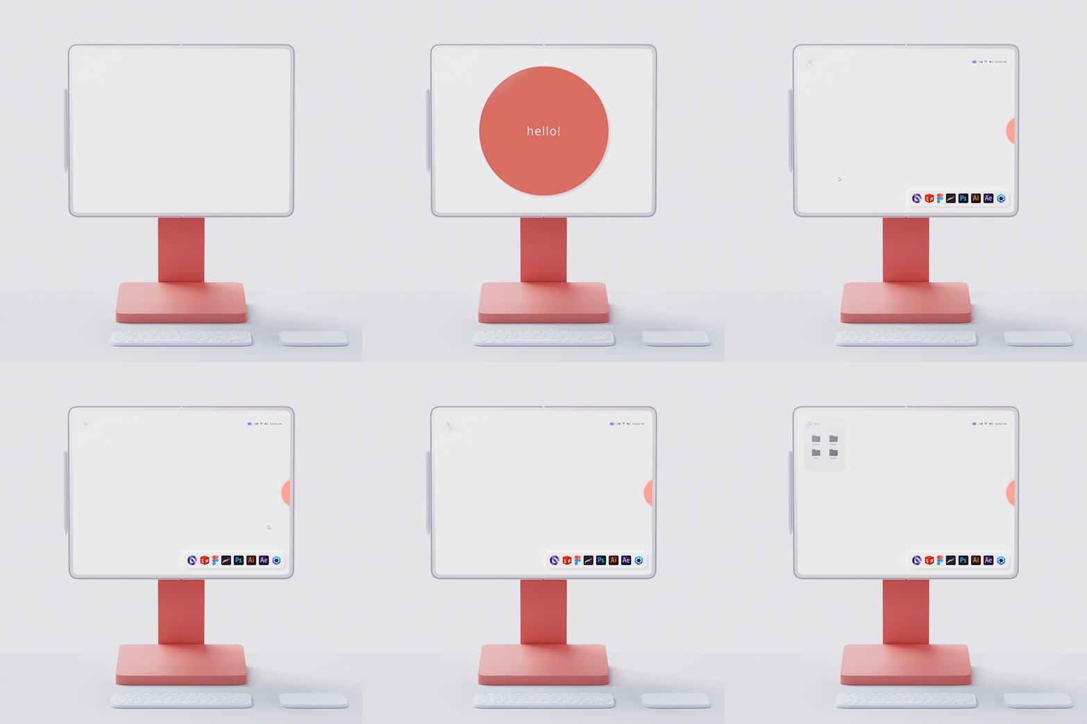
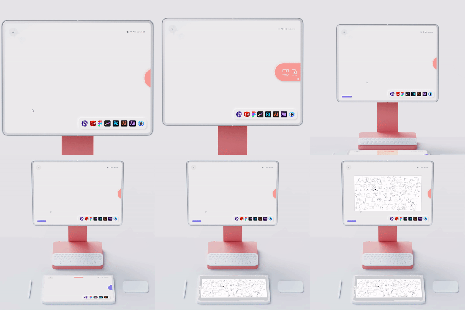
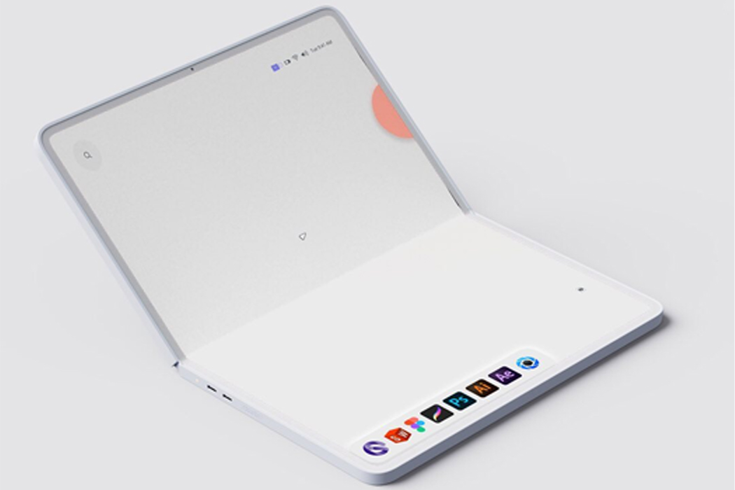
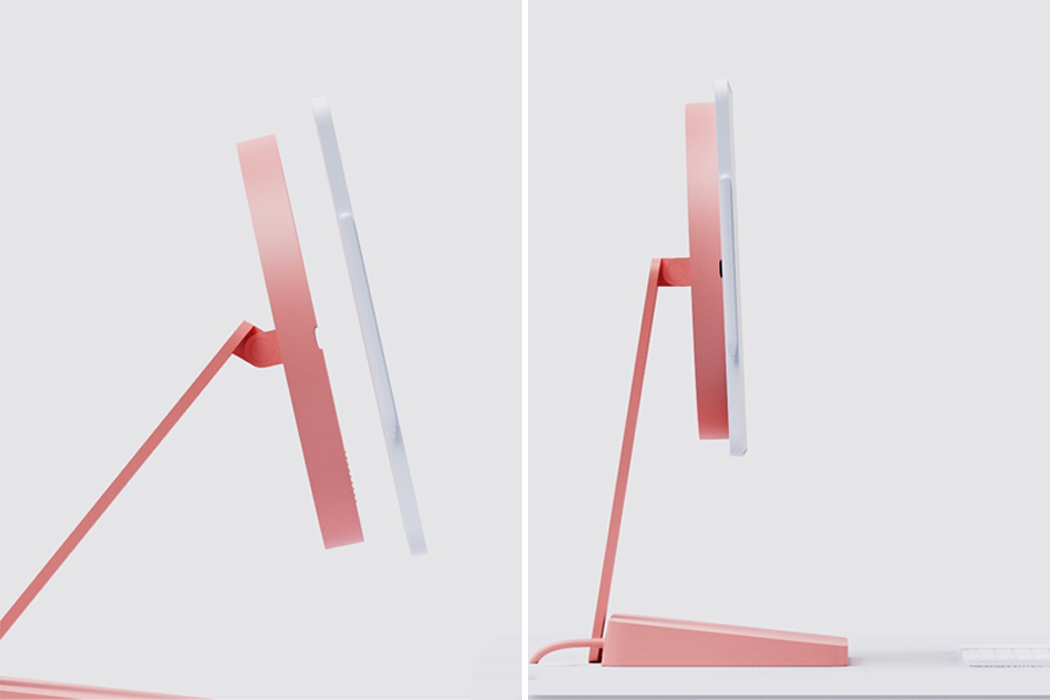
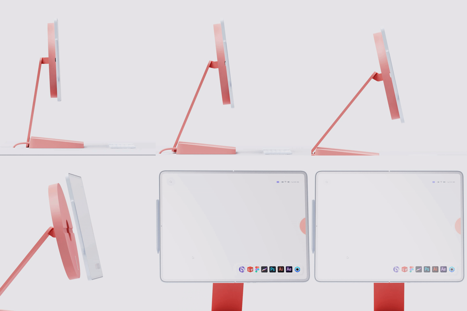
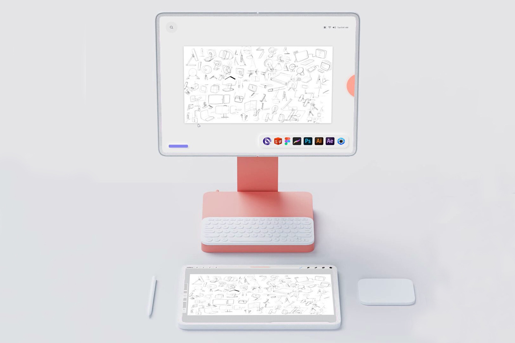
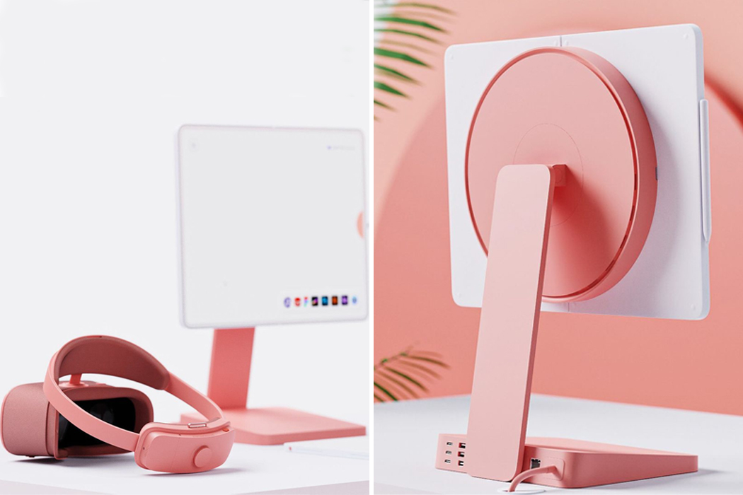
What appears as a simple computer desk setup turns out to be so much more. For starters, Couto’s workstation setup, “Future of Work,” features a retractable display screen that detaches into a foldable tablet/laptop. The simple OS desktop functions as the workstation base, where files can be created and stored. Then, when Couto needs a tablet or laptop for easy portability, the same files will be made available on the go.
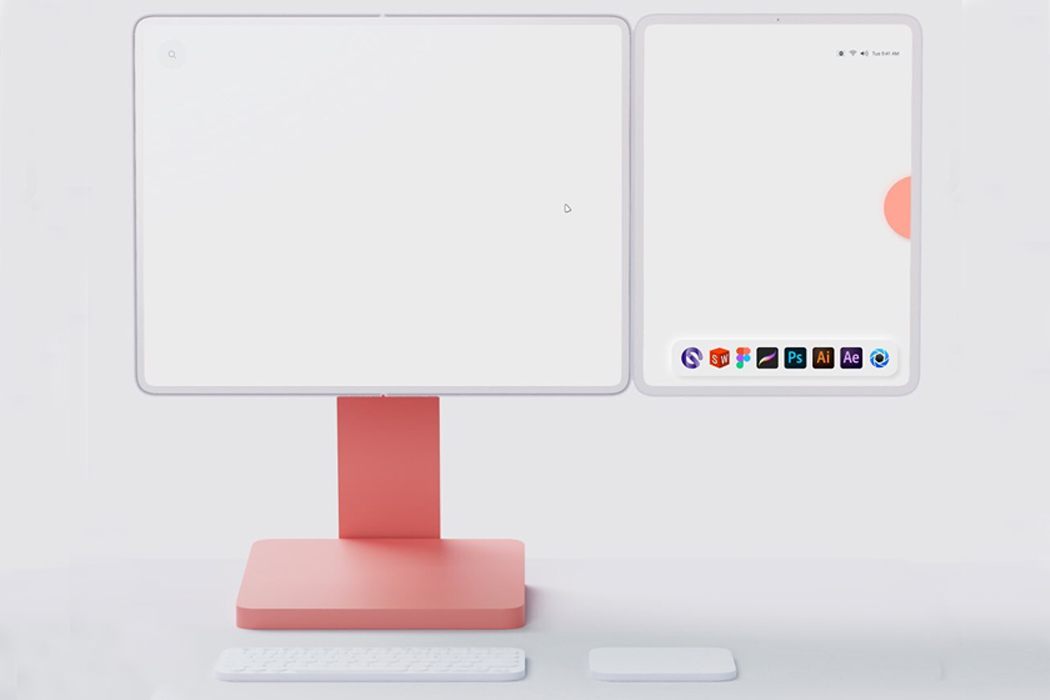
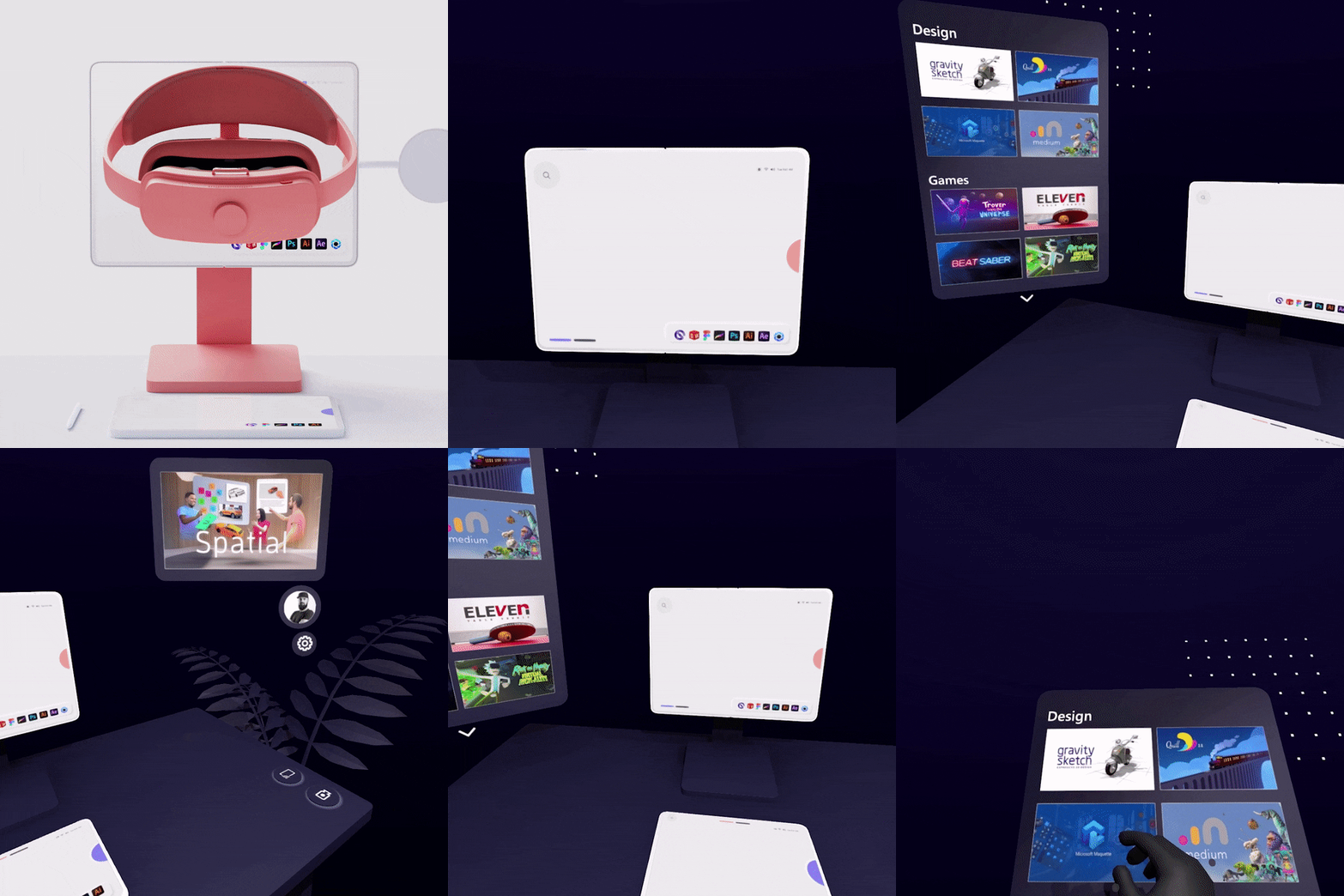
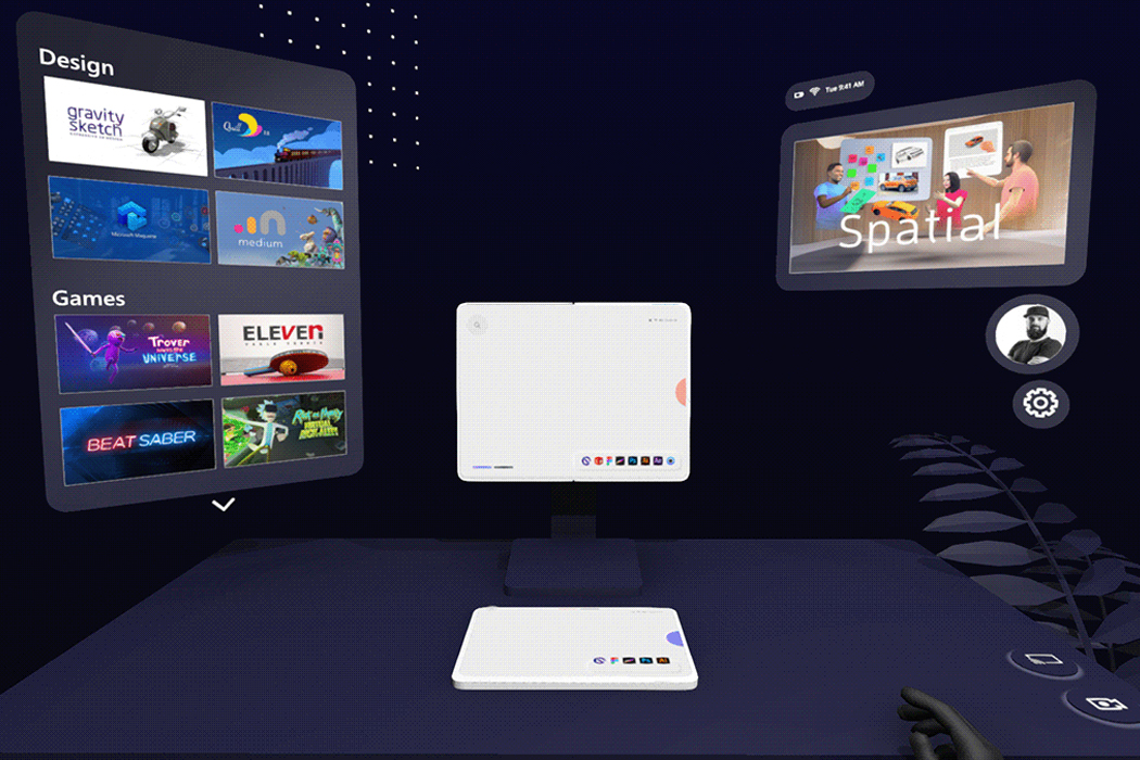
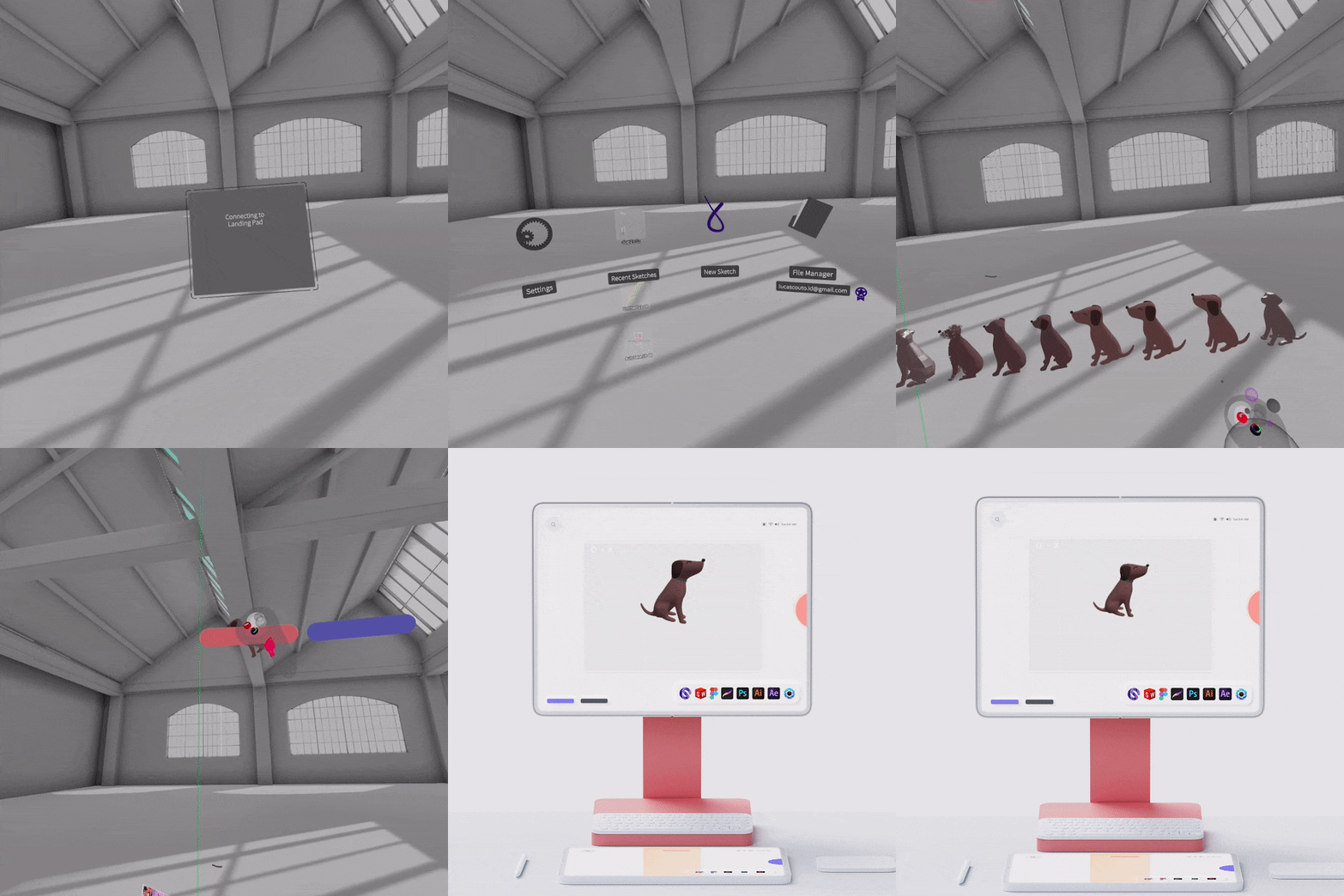
In addition to the desktop’s detachable screen, Couto’s design features another tablet that can attach itself to the desktop for an extended display, offering quick file sharing and supplemental portability. Finally, Couto’s “Future of Work” setup comes equipped with VR compatibility, providing a headset that turns into a dashboard where all of the work station’s appliances are connected. The integration of VR allows for seamless file transferring between devices, like sharing CAD models between devices and other file formats.

Nowadays, it’s important for the technology we use to cater to our needs, from getting stuff done for work to using it at our leisure. When technology doesn’t flow the way we need it to, it can feel like our whole workday has been derailed. Couto’s “Future of Work” conceptual design realizes the ultimate cohesive work setup through multiple device connectivity for a smooth workflow, convenient portability for busier days, and integrative VR assistance for intuitive file transferring.
Designer: Lucas Couto

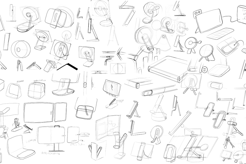
Following multiple ideations, Couto conceptualized the WFH setup of his dreams.

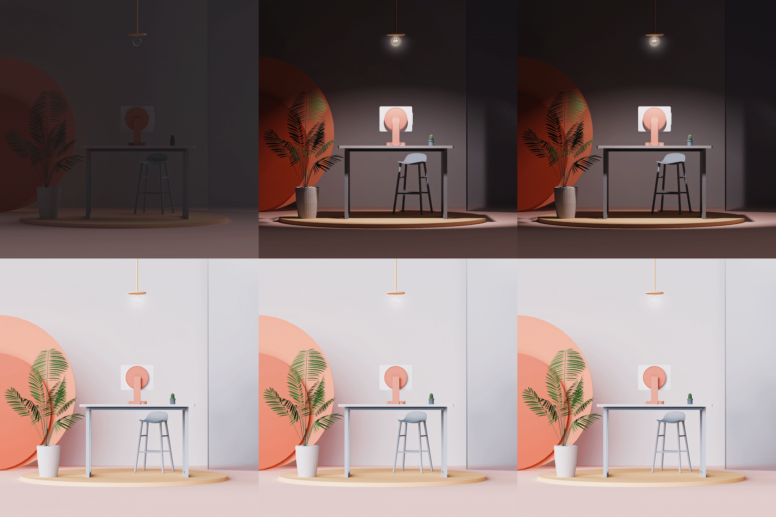
Following a year’s worth of intermittently working from home, Couto designed a WFH station that includes multiple device sharing platforms and seamless file transferring.

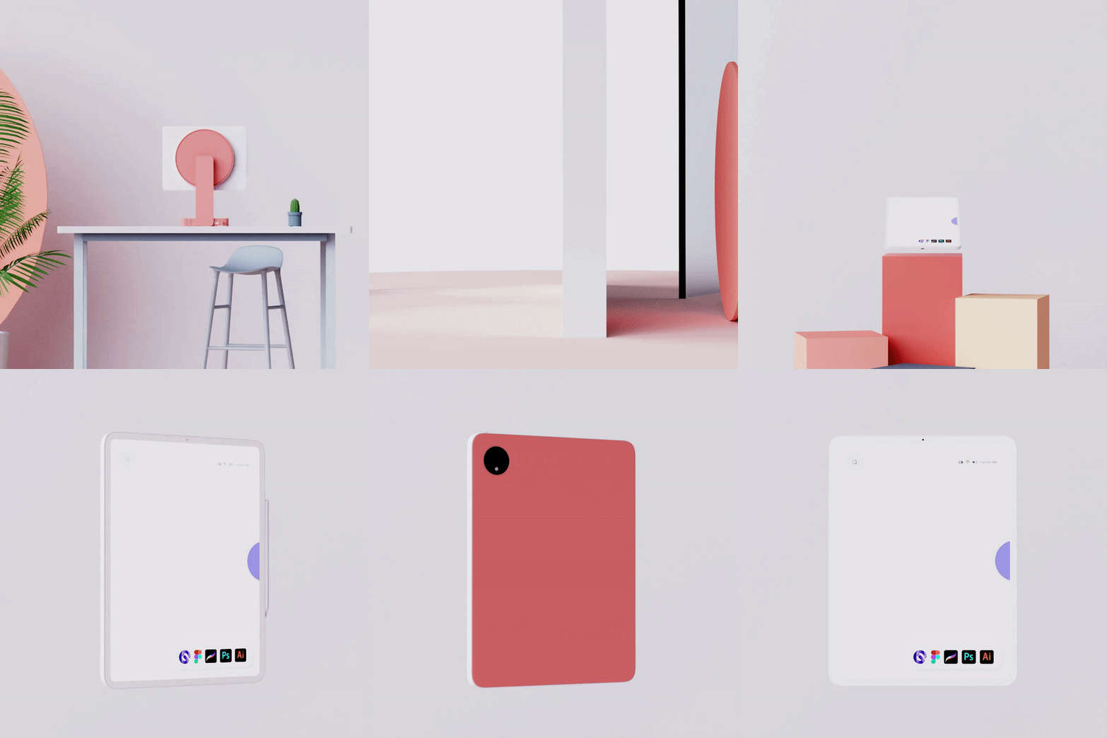
Hinging on portability and accessibility, Couto’s WFH system includes a tablet that transforms into a laptop.

Featuring retractable screens that turn into standalone tablets, Couto’s WFH setup is designed for convenience.

After working on the tablet, it can then be transferred to the desktop’s screen just by dragging your fingers.

By incorporating a supplemental tablet, the desktop’s display screen can nearly double in size.

By including a VR headset, Couto makes it easy to search through his dashboard and organize his work across multiple device platforms.

One beautiful, bendy phone

orbit_smartphone_layout

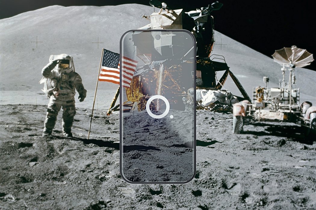
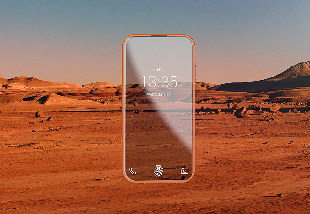
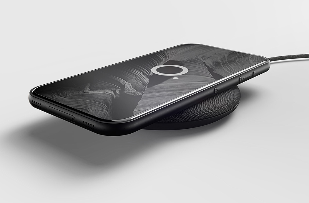
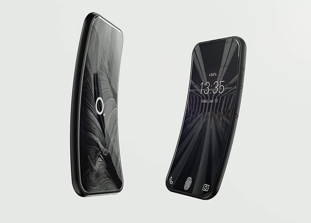
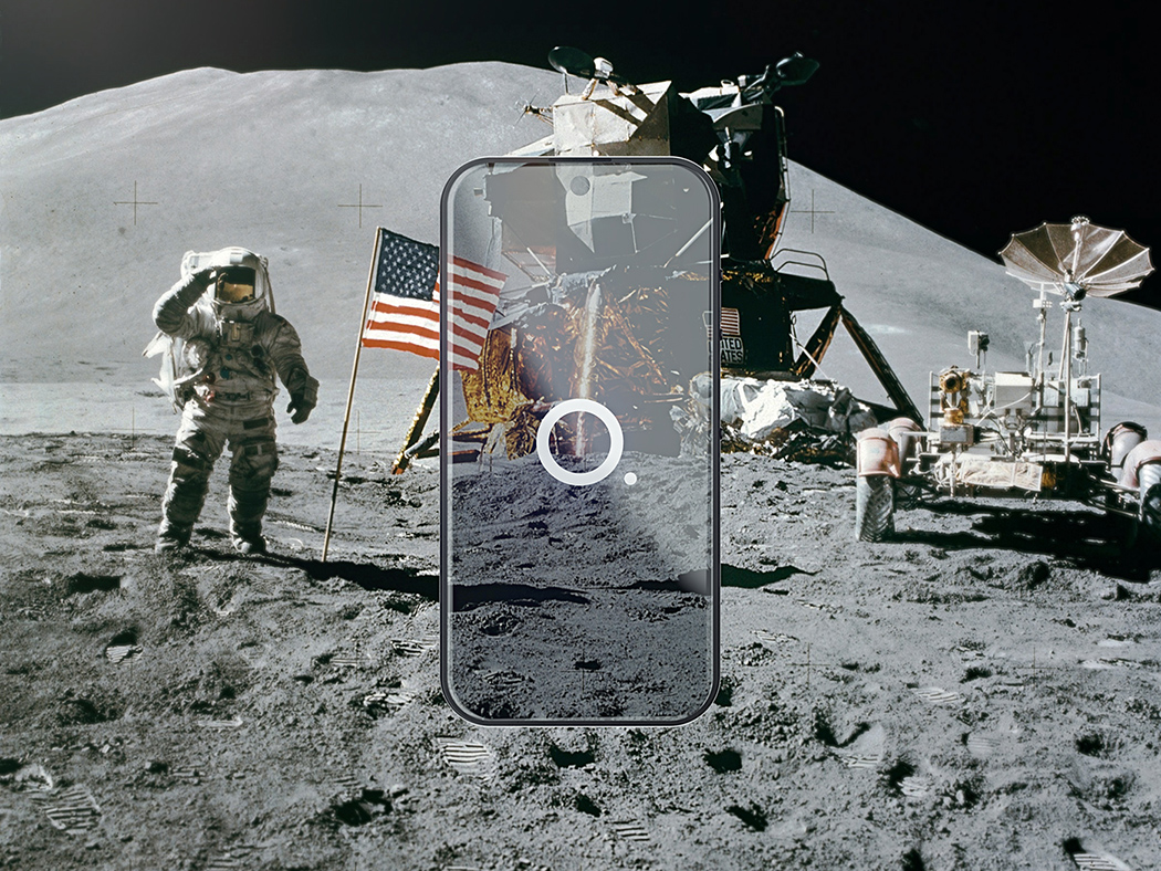
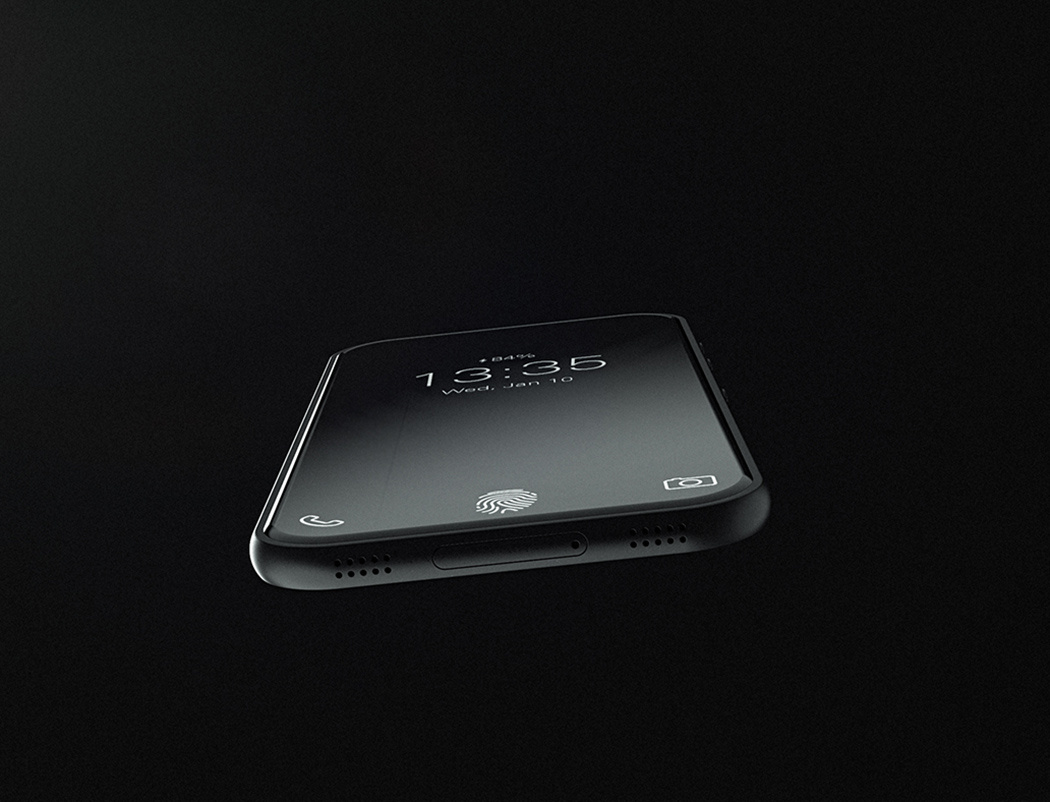
Until we get a fully transparent display, the Orbit smartphone will have to do! It expands on the trend of bezel-less design with a feature that makes it almost seem transparent – a camera that remains on and constantly reflects the environment behind it.

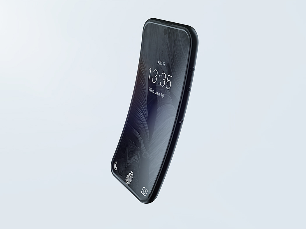
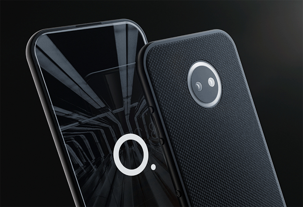
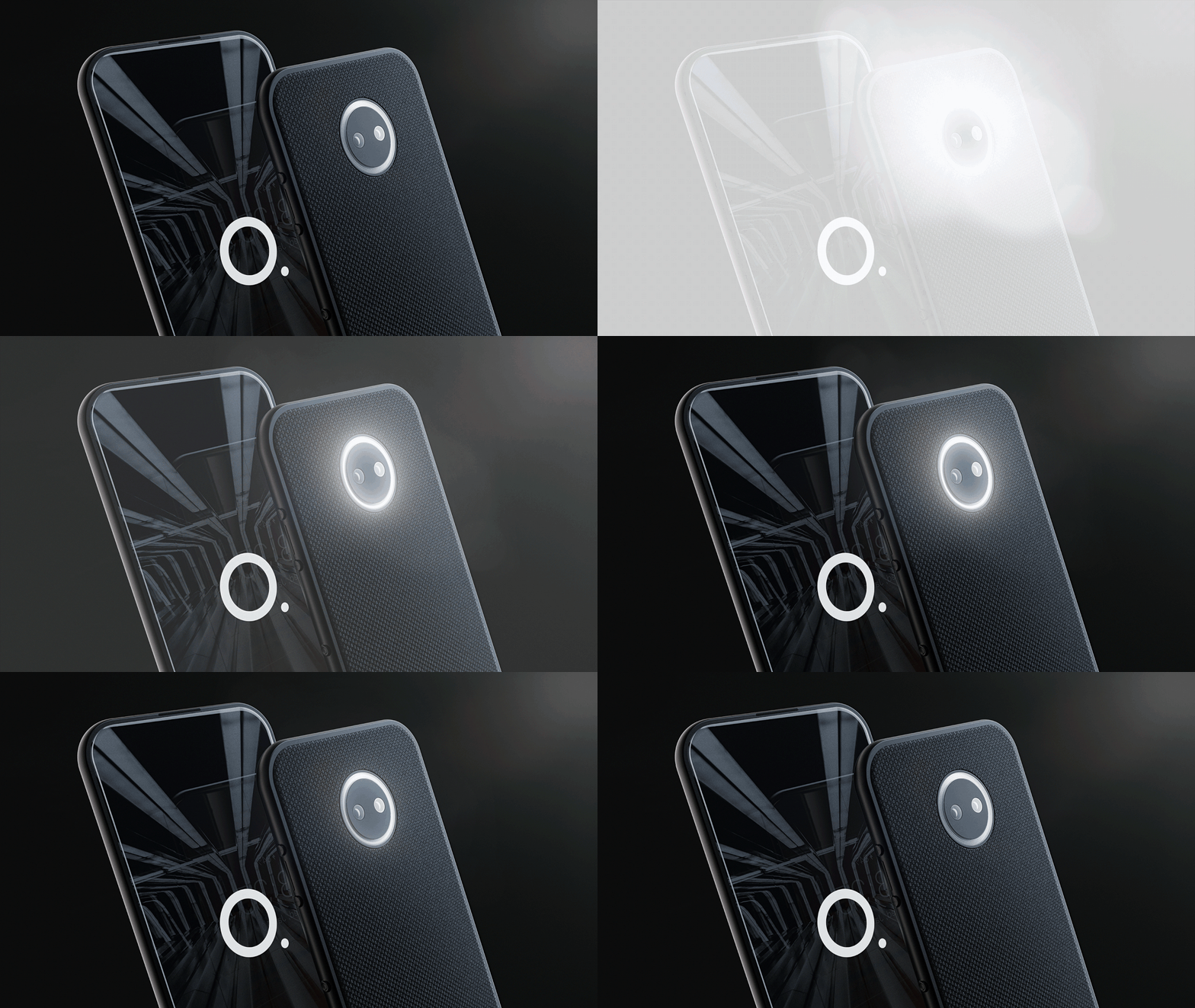
Other cool features include a flexible OLED screen and ductile enclosure that not only give it an ergonomic bend for ergonomics but make it near-unbreakable (which is exactly what we’ve been craving from phones that only seem to get MORE breakable). Another is a circular, centered flash ring that’s capable of delivering variations in light intensity to create the perfect amount of flash for each photo and to apply a neat “ring flash eye effect” in the subject’s eyes.

Designer: Lucas Couto

Orbit phone is a conceptual project idealized to test new interactions and materials possibilities for the smartphone market.

orbit_01

The bezel-less design was thought to bring a notion of transparency to the phone in-sync with the possibility of having one of the cameras working all the time, projecting image in the interface’s background, simulating how could it be to have a transparent phone.

orbit_05

The phone uses a flexible OLED screen combined with a ductile enclosure to deliver a near-unbreakable smartphone to the user.

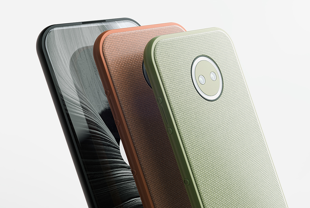
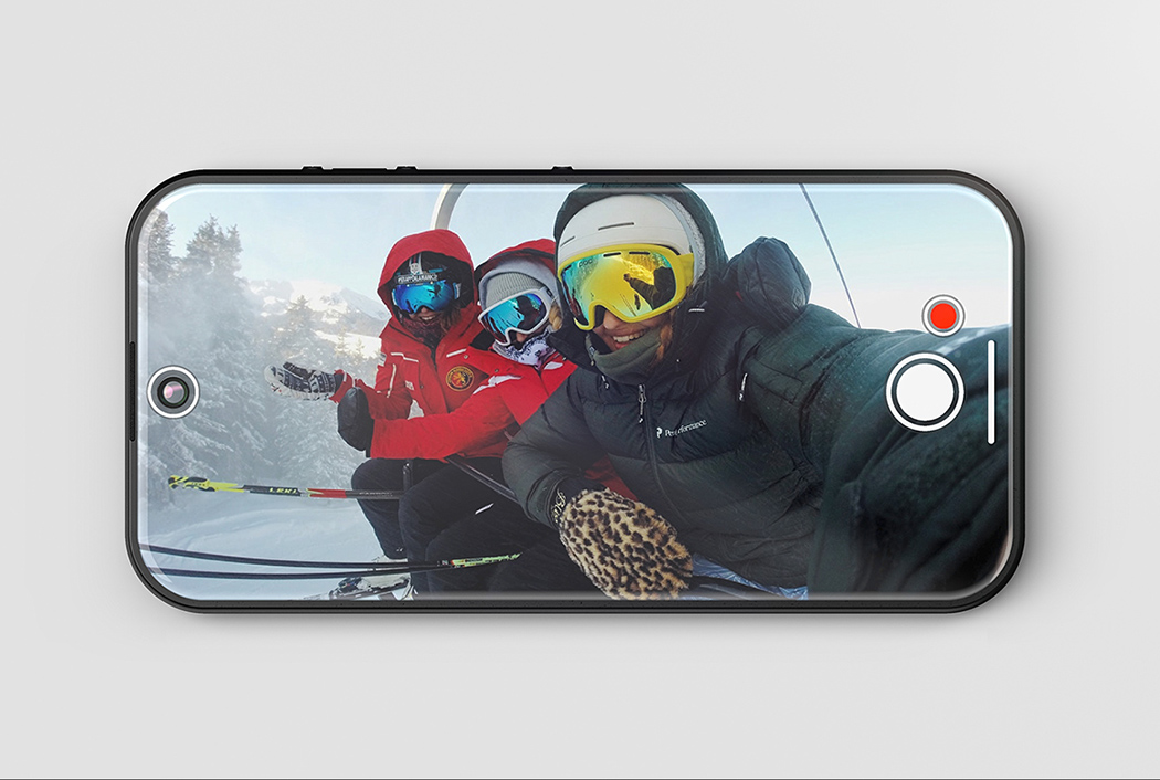
A circular flash was designed to deliver variations of light intensity and to create the “ring flash eye effect” in the eyes of those being photographed.

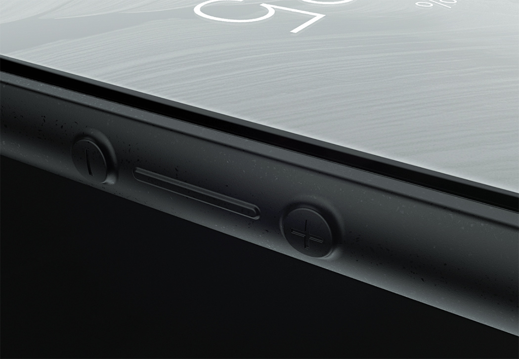
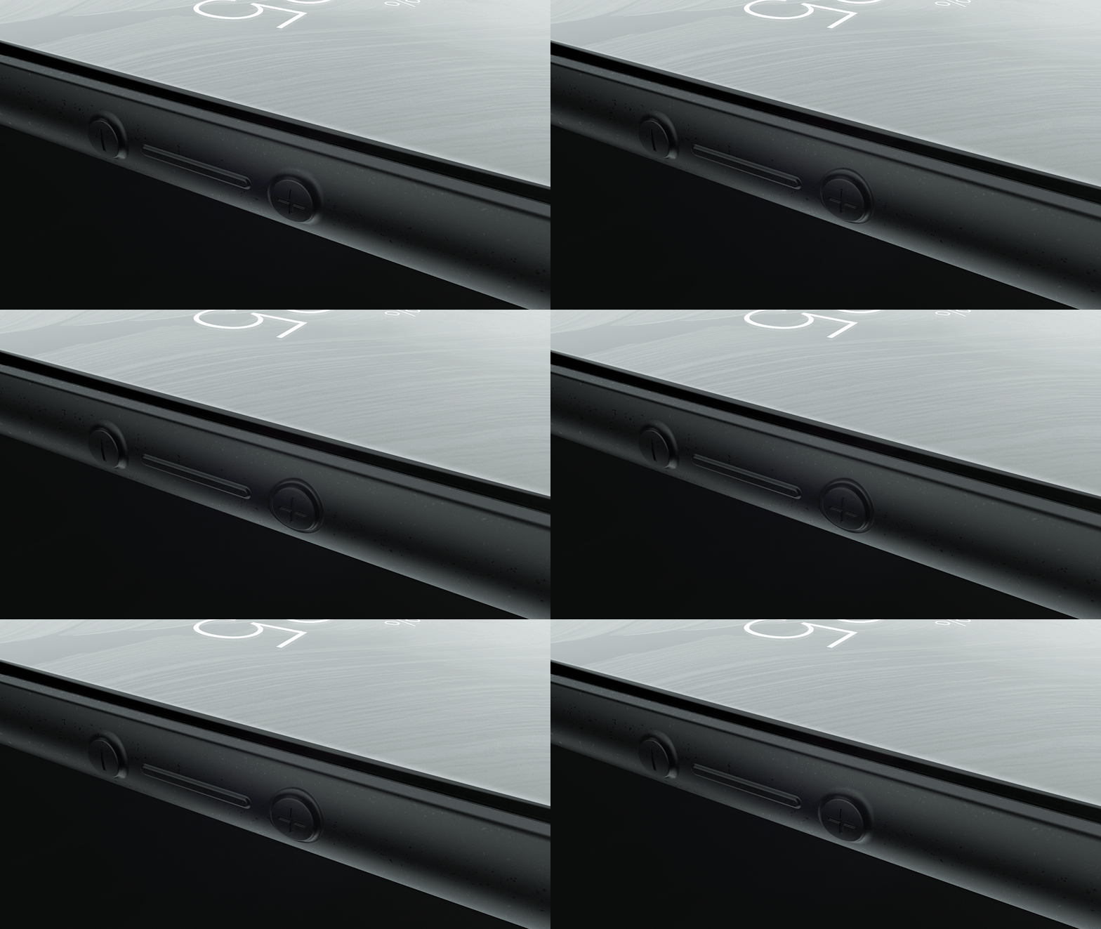
Taking advantage of the ductile material, the buttons were designed seamlessly in the enclosure. The interaction with the buttons was inspired by Olivetti Divisumma 18.

orbit_09

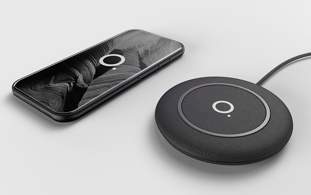
In a world with no headphone jack, the next thing to eliminate is the charging port to allow phones to be thinner and lighter.

orbit_08

orbit_07

A fabric cover was chosen both for the phone and the wireless charger to bring a closer connection with the users, delivering a warm touch, a scratchless surface and a contemporary aesthetic that fits every personality.

orbit_03

orbit_06

The transparent OLED allows the front camera to be visible when needed.

orbit_04

One Beautiful, Bendy Phone

orbit_01

Until we get a full transparent display, the Orbit smartphone will have to do! It expands on the trend of bezel-less design with a feature that makes it almost seem transparent – a camera that remains on and constantly reflects the environment behind it.

Other cool features include a flexible OLED screen and ductile enclosure that not only give it an ergonomic bend for ergonomics but make it near-unbreakable (which is exactly what we’ve been craving from phones that only seem to get MORE breakable). Another is a circular, centered flash ring that’s capable of delivering variations in light intensity to create the perfect amount of flash for each photo and to apply a neat “ring flash eye effect” in the subject’s eyes.

Designer: Lucas Couto

orbit_02

orbit_03

orbit_04

orbit_05

orbit_06

orbit_07

orbit_08

orbit_09

orbit_10

orbit_11

Hey Taxi!

take_me_button_1

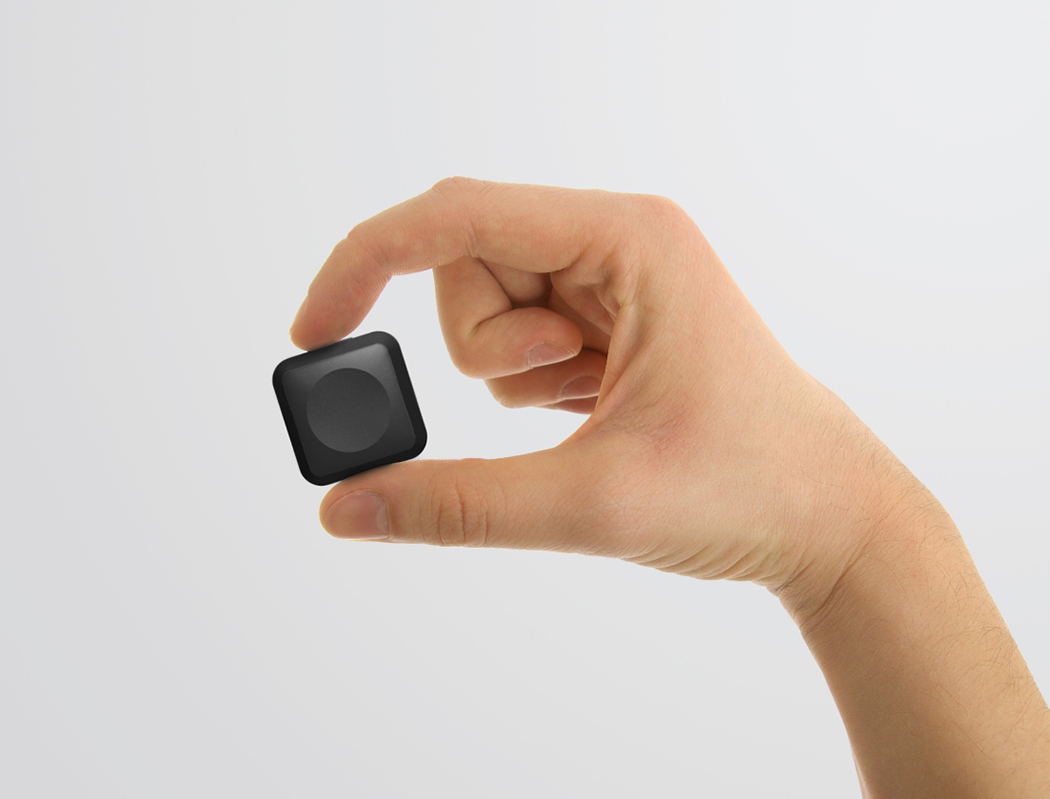
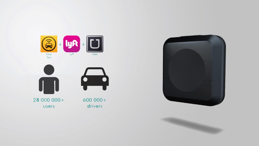
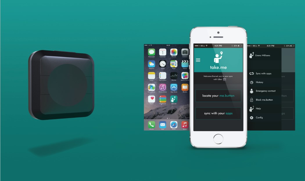
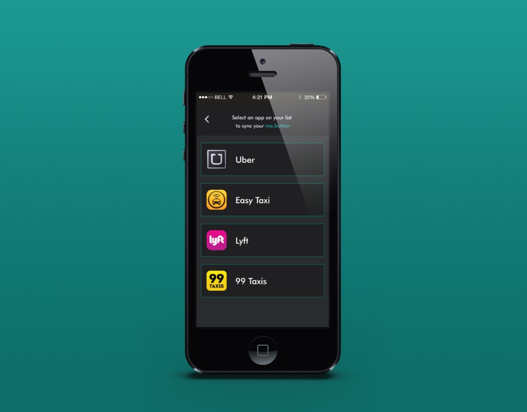
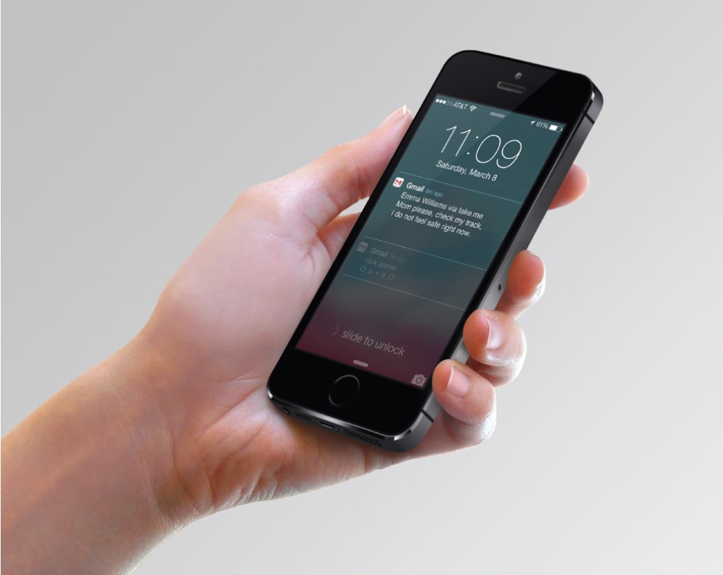
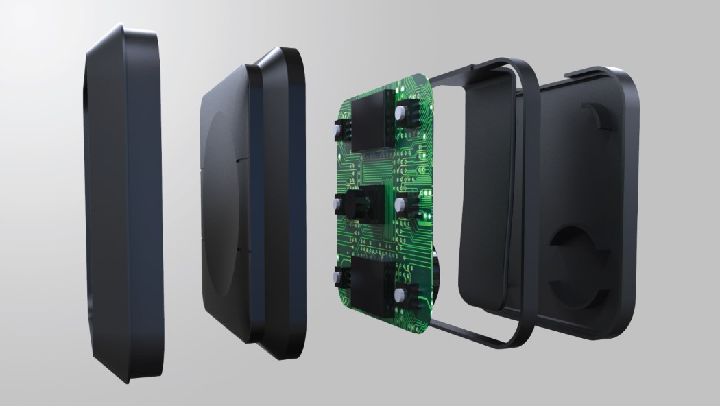
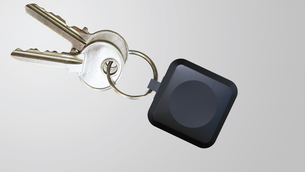
If you’ve been keeping up with consumer technology, you may heard of Amazon’s Dash Button. Just press the button and you’ll have your groceries delivered to you instantly. Imagine if you could do that with a cab. Press a button, hail a taxi. Sounds simple? That’s because it is. The Take.Me IoT accessory is a nifty little cabbie signalling switch. Just press the button in the center and the Take.Me app on your phone connects to Easy Taxi, Uber and Lyft to get you the nearest cab. Literally at the push of a button!

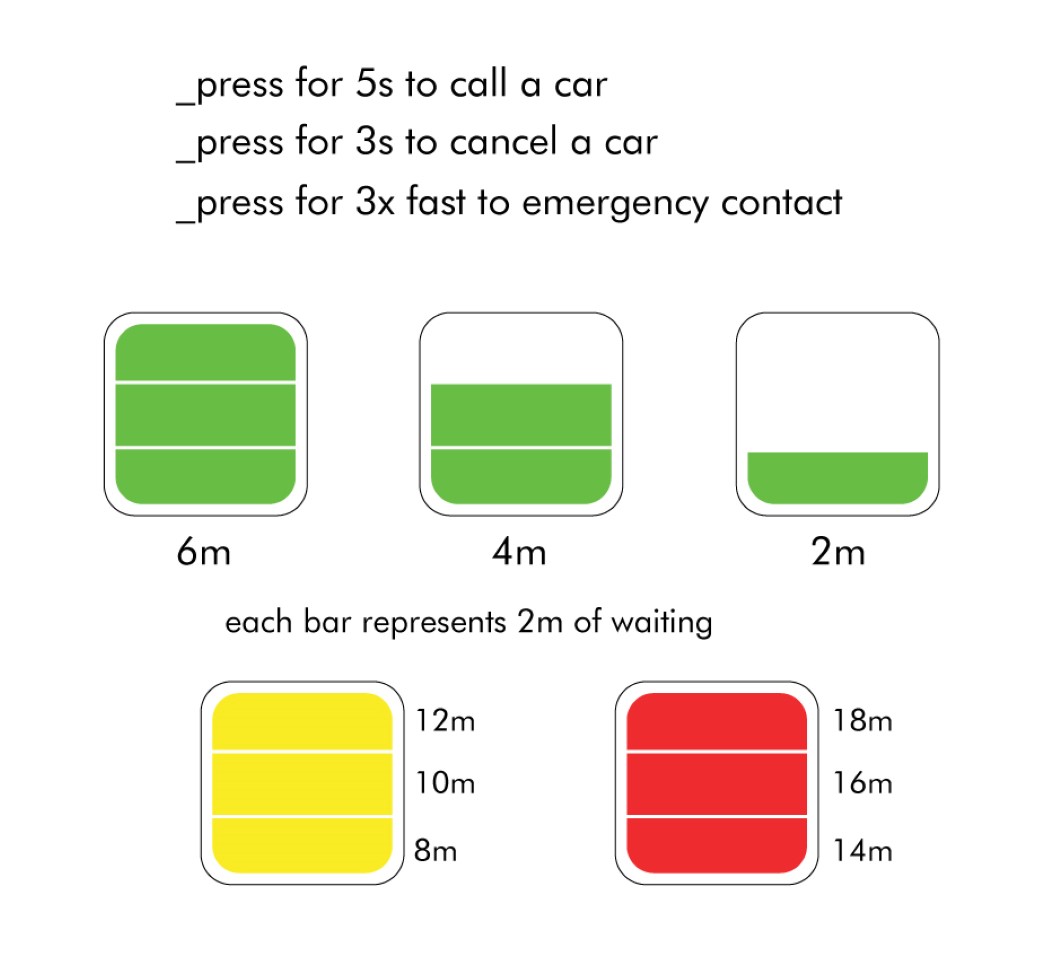
To make the design foolproof, the button works only when you press it for a duration of 5 seconds. After that, press it for 3 seconds if you want to cancel the ride. Press it repeatedly to send out an emergency response. Simple, innit?

Designer: Lucas Couto

take_me_button_2

take_me_button_3

take_me_button_4

take_me_button_5

take_me_button_6

take_me_button_7

take_me_button_8

take_me_button_9

take_me_button_10

take_me_button_11

take_me_button_12